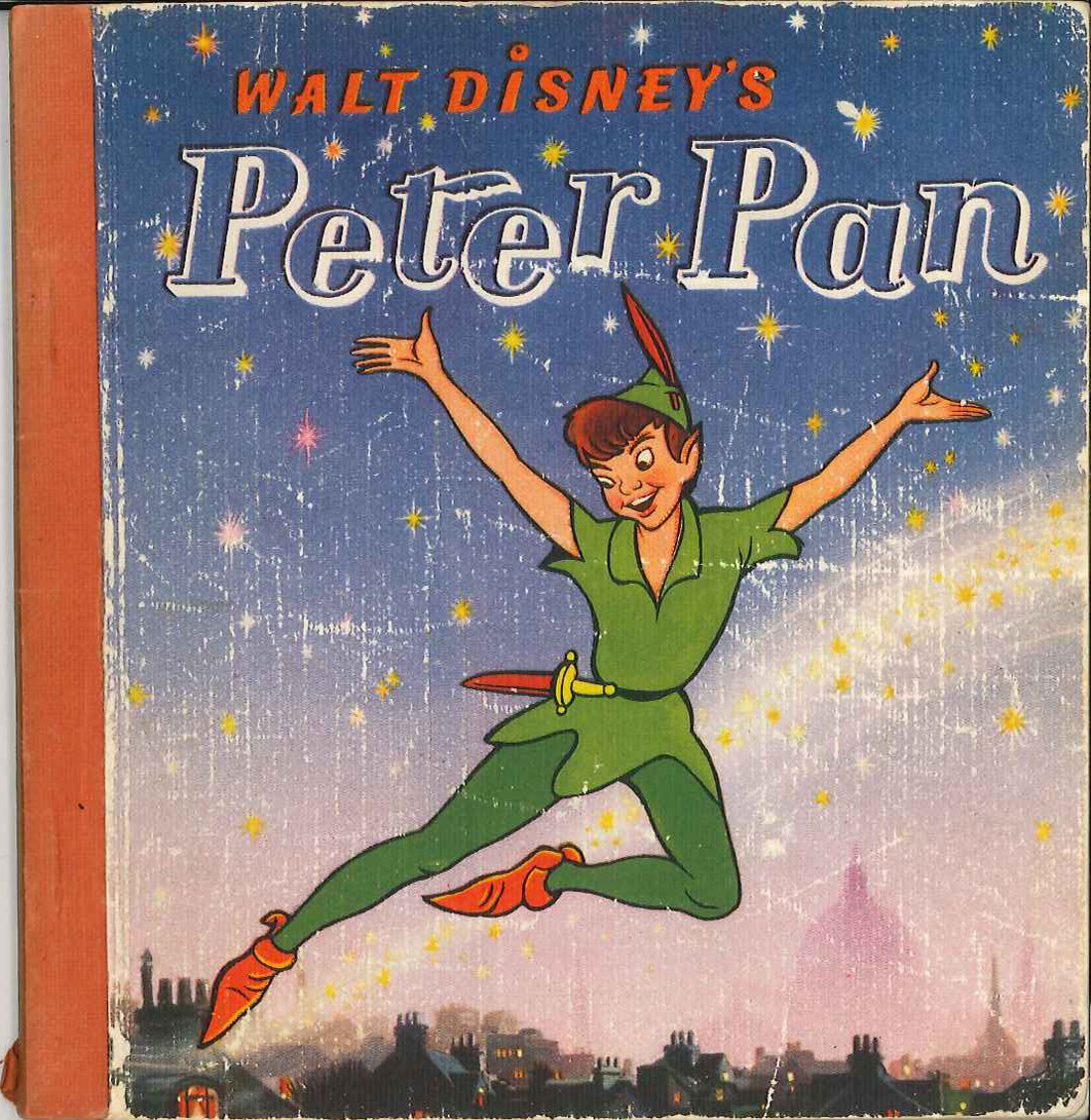
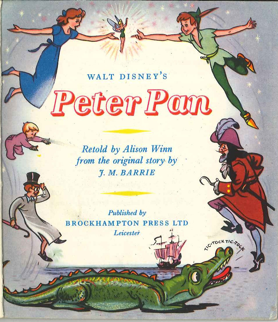
Here is the third of the three adaptations of Peter Pan sent to my from the UK by Peter Hale. Since the original Barrie book is considered something of a national treasure by the Brits, and especially since I wasn’t even award of these editions, it is valuable to see these British adaptations done at the time of the film’s release. I couldn’t be more grateful to Peter Hale for sharing these finds with us.
Here’s Peter Hale’s intro to this book:
These are the scans from the hard back book. The volume is small (5½” x 7½”) as it is designed for children. It is the same size as the Hodder & Stoughton ‘Peter Pan and Wendy‘ illustrated by Mabel Lucie Attwell, but the text layout is different (although the text itself is the same).
The copy I own has no dust jacket. I have included a scan of the dust jacket from a 1956 edition, as the front illustration, at least, is probably the same.
I hope this is of some interest, although I don’t expect you will wish to post all of these scans.
Not all of the pages of the book are included here. The idea is to give you a feel for the book and to show how the illustrations were used for this edition. I think you can get that from this post. Many thanks to Peter Hale for sending them. (I doubt I’d even know that there were so many editions and varieties of text . But it makes perfect sense, and it probably was a political hassle for the Disney people to deal with in making this early adaptation.
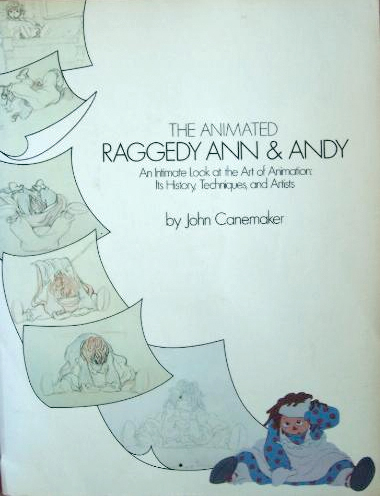
John Canemaker took all the photos, himself, which led to a more intimate look at an animated film. There were no photo decisions by committee; it was decided to use a photo if it told the story John was trying to relay. For that reason, the book really is one of the best “Art of . . .” type books on the market. (I’m not just saying that because there were photos of me in there – though that would be a good reason, too.)
The book was as exciting – in the making – as was the film. Too bad at the last minute the train of a film ran wildly off the tracks. In a way, I wish the book were written after the film was completed so that we could read the true story of what happened in those last six months of chaos.
The decision was slow in growing and fast when it finally fell, that the movie was enormously over budget. I was in on all the morning production meetings where managers and supervisors and directors would all meet. Those had started off nicely, at the beginning of the film, and went insanely wrong before long. There was the time when I was ordered to fire – that day – two inbetweeners. I was told that we had to give the staff a lesson that they had to work harder. (That might have been hard to do since everyone was giving it their all.) It so happened that one new inbetweener, on her first scene, ignored my instructions (and her immediate supervisor’s) by erasing all of Jack Schnerk‘s drawings. She felt she could animate the scene better, and she set out to prove that.
One down. The second person to fire was someone I was told (by Dick Williams, himself,) that I had to fire. It was obvious that there was a personality conflict since the guy was a great artist and definitely someone who should have stayed on. I was able to arrange for him to be switched to the BG department, thus fired by me from doing inbetweens and hired by them, in the same day, to do watercolors. He continues on, even today, working at a top position in design at Blue Sky. I don’t know about the woman, but I hope she gained a little humility that day 30-something years ago. That story didn’t make it into the book.
What there was in the production was a great first year of production where the art of animation was treated in its highest form. We were all out to make the greatest film of all time and bring it to the big screen. We had some of animation’s finest animators gathered to work on it. Assistants and Inbetweeners in New York were offered classes, after hours, which tried to teach animation to the new. With teachers like Tissa David and Art Babbitt and more experienced Assistants; a lot was conveyed. I was usually too busy to make it to many of these classes, but I always kept a close eye on what was taught. It really was fun and incredibly valuable to many of us.
At some point along the way, the LA studio was closed and key people from there came here. All of our space was overcrowded and uncomfortable. The Xeroxing in NY, a sweet grey line that took a while to construct, was replaced by a thick back line, when management sent work to Hanna-Barbera to outsource the xerography and some of the painting. Shadows were eliminated. Color copiers were rented. Scenes that had been animated in a non-photo blue pencil on 16 fld paper were being copied and reduced, at the same time, in B&W so that they could use 12 fld cels to color the art. A penny saved is a penny gained; I guess. This meant that a number of my inbetweeners were used to put 4 sets of crosses on the animation drawings so that there’d be some form of registration on the reduced artwork. Certainly the registration went all to hell in the process, thus allowing the latter half of the film to have a lot of slippage on the big screen. Lots of weaving animation in scenes that were rushed.
Emery Hawkins‘ amazing taffy pit took a big hit when it was animated more like a limited animation movie. All that beautiful rolling motion Emery had created on the cinemascope screen suddenly hits the wall and stasis sets in. The film was never going to be a classic of he silver screen, but it should have been a hell of a lot better.
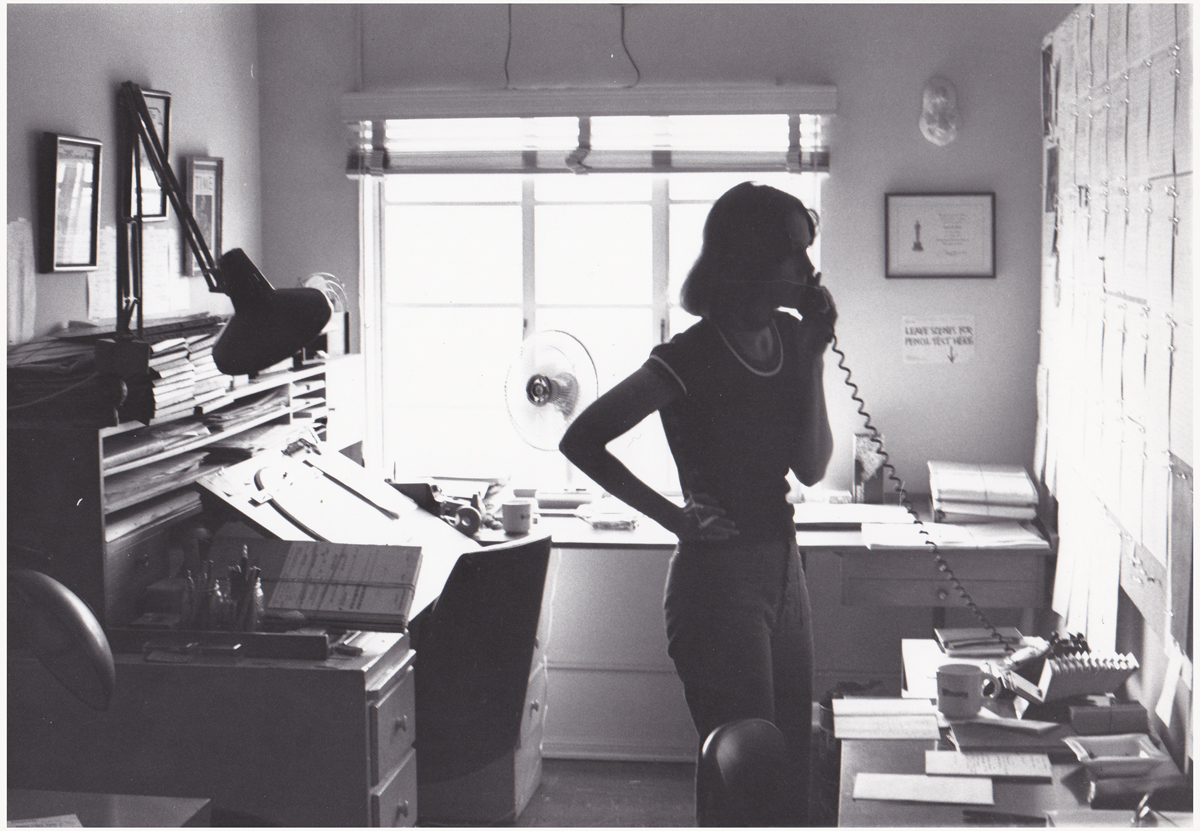
1
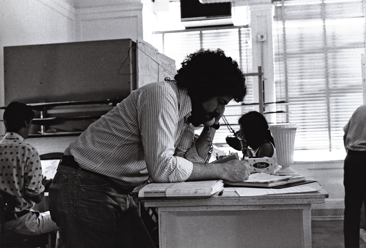
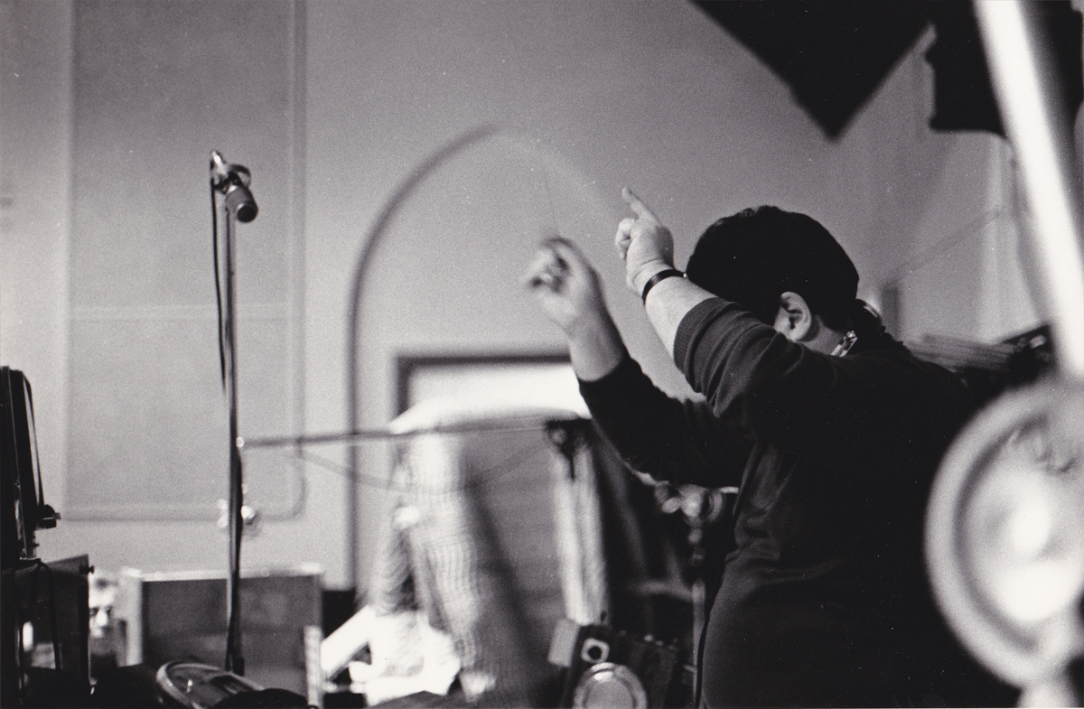
Here I am doing what I did most of the day.
I talked on the phone. Ennervating stuff.
A young Kevin Petrilak is in the rear left. He was an inbetweener
in the Taffy Pit. Dan Haskett ran that group of people.
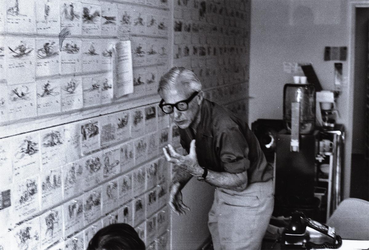
2
Here’s Art Babbitt teaching. He loved doing that. Dick tried to
recreate the classes he’d had in London a couple of years earlier. We – all New York -
sure appreciated the two weeks of lessons. I have Dick’s notes from these sessions.
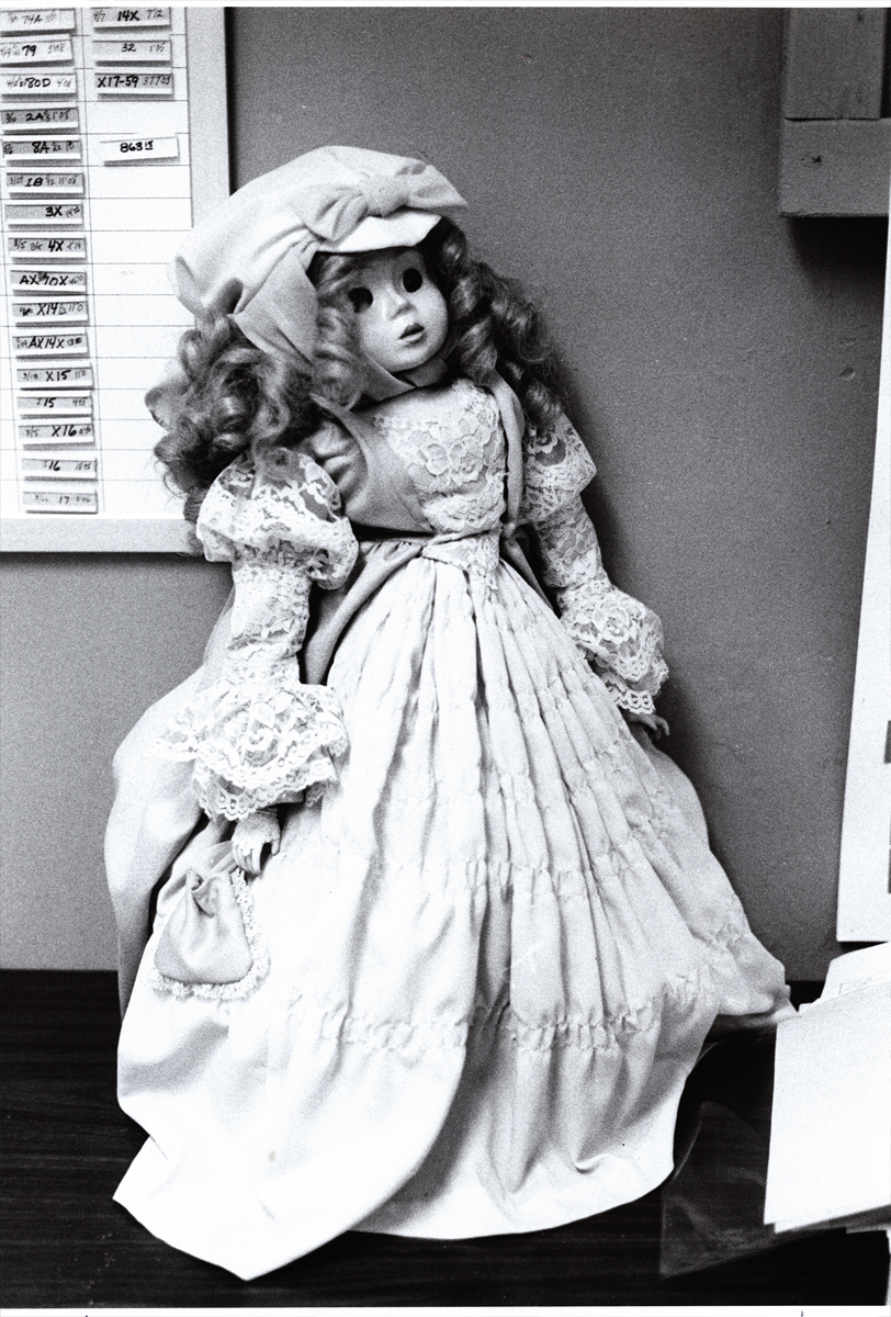
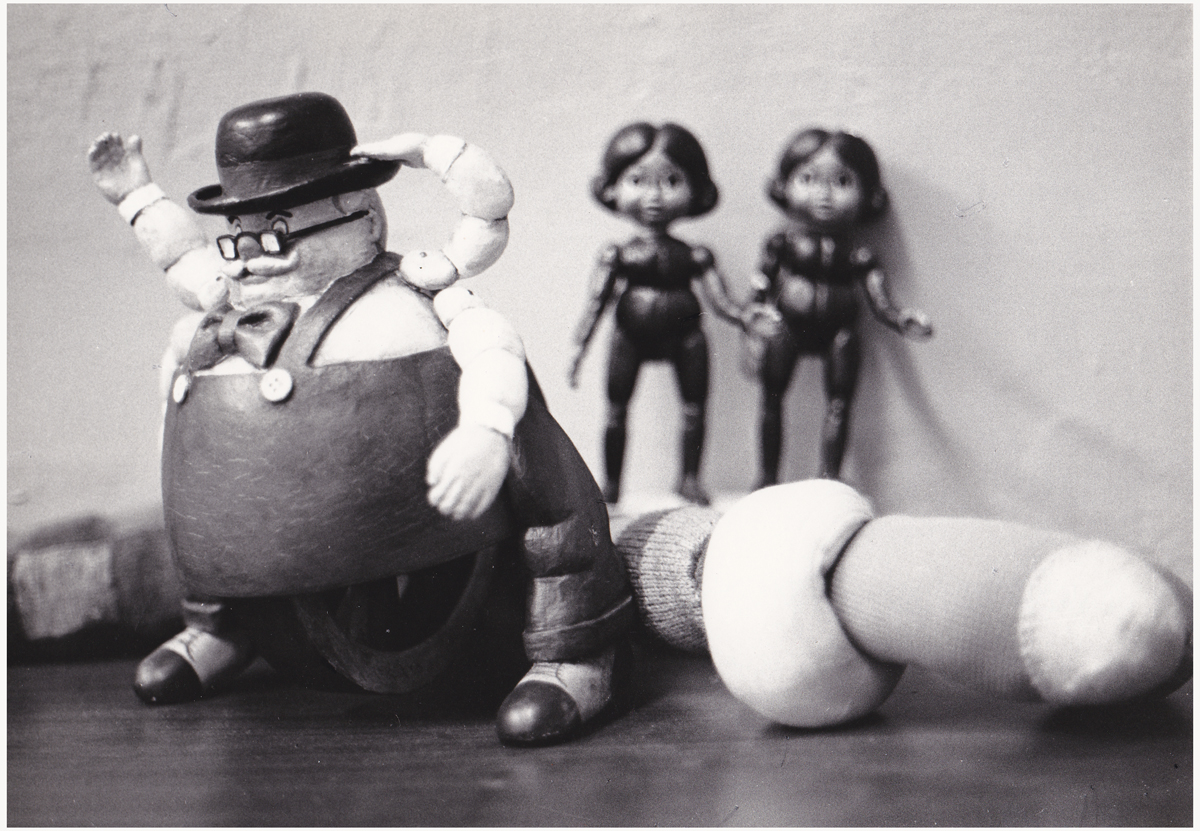
3
This is a beautiful doll. Babette. She was at the film’s center.
The Pirate kidnaps her and takes her to sea. Raggedy Ann & Andy
take off in pursuit of her to bring her back to the playroom.
4
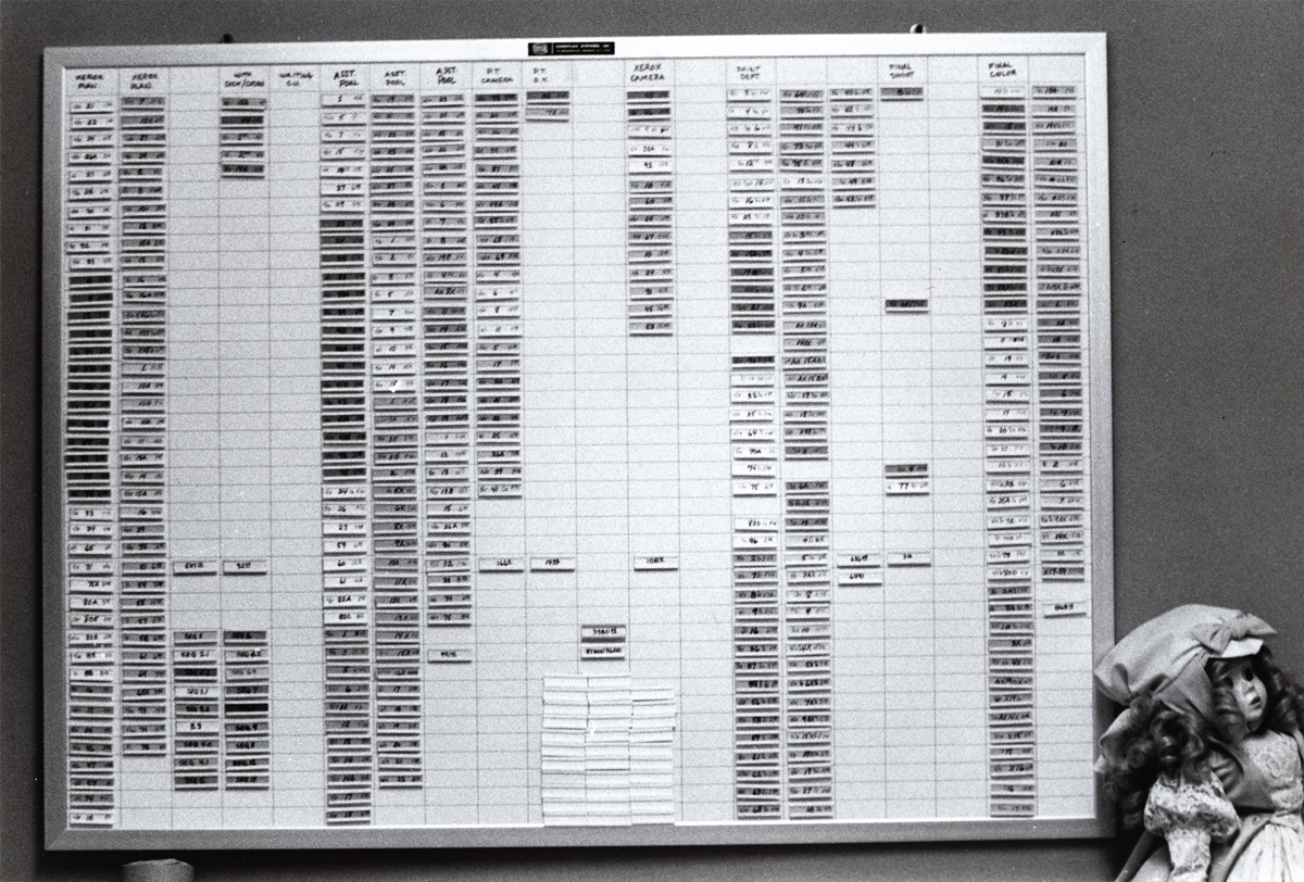
This is a wall of stats. It represents footage counts produced in
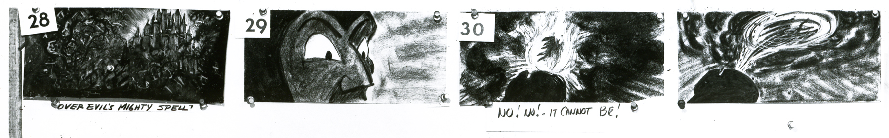
every department working on the film. This hung in Mike Sisson’s office.
He was the production manager who tried to usurp the entire production.
A couple of weeks before everything changed, managerially, on Raggedy, Sissons
approached Cosmo Anzilotti and me at lunch. He saw us at the restaurant and came
over to us. He wanted to lead a take over cutting Dick out of the film and
putting Cosmo in to finish directing the film. I’d be made Cosmo’s assistant.
I had no intentions of being another Iago, and said as much.
5
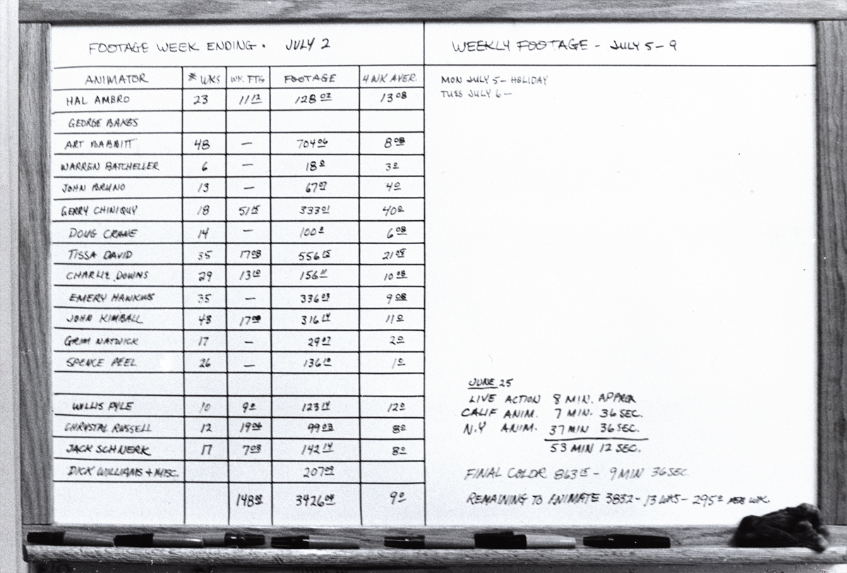
This chart covered the animators footage counts. A running record.
I told Cosmo that Dick had brought me onto the film, and I’d do anything for
him. If it meant leading a large group to quit the show, I’d do that. Cosmo
seemed relieved. He wanted to do the same and we both told Sissons how we
felt. He greeted our news with an ass’ smile and thanked us. We were no
longer on the winners’ side, and I watched closely to know when to exit.
6
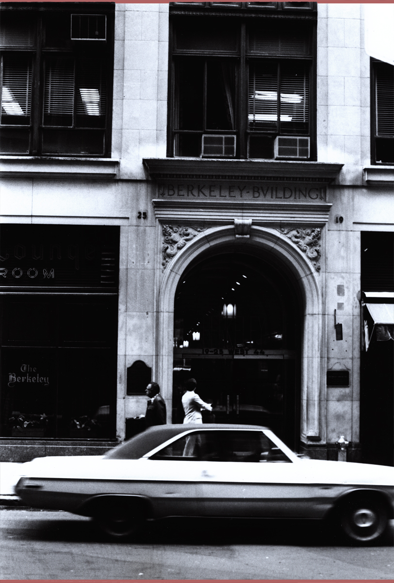
This was where the NY headquarters were planted. In the middle of 45th Street.
Most studios in the forties and fifties had places on 45th Street. Paramount,
Hal Seeger’s studio, lots of other smaller studios such as Pablo Ferro or Ray Seti’s.
7
Didi Conn was the actress who voice Raggedy Ann. When the VOs were coming
to an end, Didi worked late and her mother was with her. They needed help
getting home (Long Island.) The mother was afraid to drive. I volunteered
and drove them home. I took the Long Island Rail Road back to the City.
8
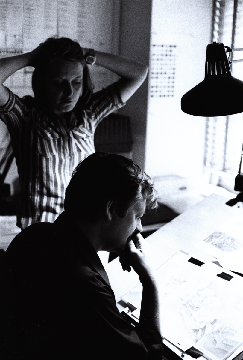
This is Sue Butterworth with Dick Williams. She was the watercolorist who
led the BG department and designed the wc style of the film. I thought her
work a bit inconsistent and often lacked the dynamic look good BGs require.
9
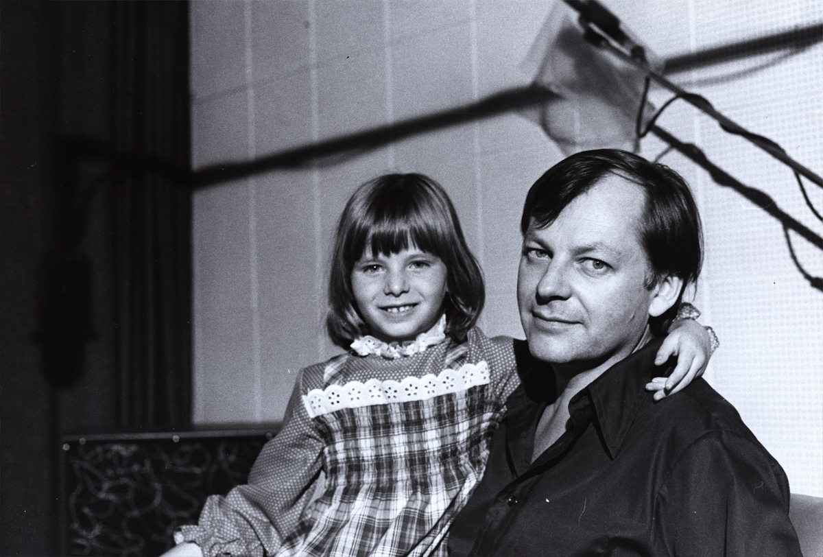
Here’s a picture of Dick Williams with his daughter,Claire.
Claire played the part of Marcella, the little girl at the film’s start.
They shot the live action in Boonton, NJ during the first days of the
production. All those hours they were out filming, I watched the shop.
Alone in an enormous darkened most of the time in the enormous office,
I could only spend time reading and rereading the script and sketching
my idea of some of the characters.Infrequently, the financial manager
of Lester Osterman Prods., the production company, would pass through.
10 George Bakes was a fiercely independent animator who worked a short
while on the film. He must have started at Disney on Sleeping Beauty. He’d often
show a lot of Milt Kahl drawings he’d had from that film.
11
Baskes animated many of the cereal commercials of the day -
Trix, Honey Bee, Sugar Crisp bear, etc. For Raggedy he did the “gazooks.”
12 Gerry Chniquy was a brilliant animator straight out of WB.
He’d done a lot of Yosemite Sam animation for Friz Freleng.
It wasn’t far to go to cast him as the blowhard of a King, King Coo Coo.
Marty Brill voiced the character. Gerry Chiniquy,of course, did a fine job,
13 John Celestri had a style all his own although he idolized Bill Tytla.
Not a bad person to pick for a role model. John was an Assistant on
the film. Here he’s working with inbetweener, Amanda Wilson. Amanda was
the daughter of the great cartoonist and animation designer, Rowland Wilson.
The last of these photos will come next week. Many thanks to John Canemaker for the loan of the images. Any opinions tossed about here, are all mine and John is not to blame for them.
This week we saw a couple of excellent entertanment pieces that weren’t too taxing on either my fanny or my brain.
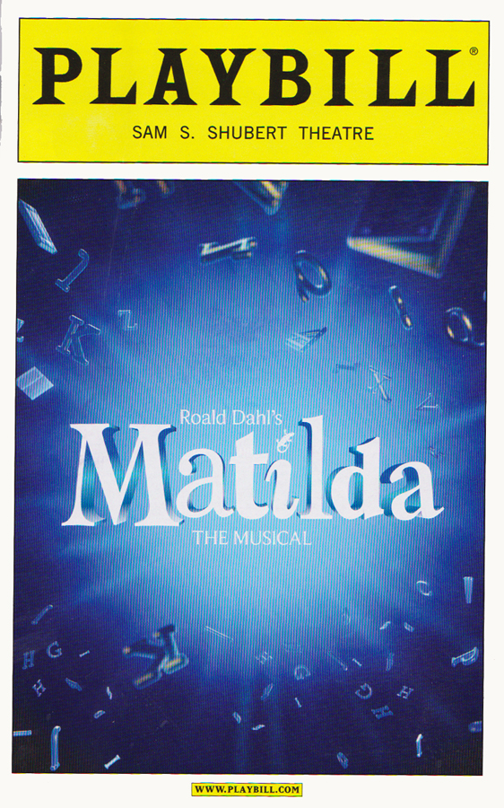
We went to see the hottest ticket in town last Tuesday, Matilda. It’s a theatrical musical which adapts Roald Dahl‘s great children’s novel. Years ago, when the book had just come out, I contacted Dahl’s agent trying to get the rights to make an animated film out of it. It turns out we were competing with a “Hollywood” company which was Danny DeVito’s company, Jersey Films. Naturally and expectedly, Jersey Films won the rights. I loved in Quentin Blake‘s glorious illustrations and would have animated the film in his style.
Eventually, Danny DeVito directed the cartoon of a live-action movie. It was built to be nasty and unpleasant. The film wasn’t a very good version of Roald Dahl‘s words, at least not in my eyes. The film wasn’t a flop, but it wasn’t very good either. It was more about her family and the school teacher and the gym teacher-villain, Mrs. Trunchbull.
The stage musical is better, but not brilliant storytelling, either. Both the film and the play are more interested in characters other than Matilda. They’re all exotic, and it’s easier to write for them than for the little girl who is the center of the story. In the play, Bertie Carvel, plays the part of the villain, Miss Trunchbull. The actor is the one person who has been reaping all the awards – whether in England or the US. He had won the Olivier Award in London and was nominated for the Tony, here.
In the musical, the dialogue whether in the songs or out, is hard to understand despite being miked. I found myself uninterested in the show which was long, at more than two hours forty minutes. I was certainly unimpressed given all the awards.
There is a major problem with theater seats lately. They’ve tightened the aisles, so one’s knees are smack up against the row in front of you, and your legs go numb before the first act ends. That was NOT the case with this theater. I repeat, that was not the case with this theater seat. It was ALMOST comfortable. For me to say that is saying a lot. Not its money’s worth ($132 per ticket), but at least no physical pain.
____________
Then on Thursday night there was an Academy screening of The Great Gatsby as directed by Baz Luhrmann. You’ll remember that he was the director/writer of Moulin Rouge a few years ago. Many people loved it, I did not. As a matter of fact, I truly disliked it. On Thursday we were to see the film and attend an after screening Q&A with Luhrmann and his wife, costume designer, Catherine Martin.
The film was a long two hours and thirty minutes (not quite as long as Matilda but certainly a more attractive movie.) ___________________Baz Luhrmann & Catherine Martin
Leonardo DiCaprio played Jay Gatsby, and he did well in the part. The choices all seemed to be good ones. The film is done in 3D, and is enormously attractive. Just as Life of Pi seemed to have found the need for the 3D camera, so, too, does The Great Gatsby.
Mind you I was bored silly for moments, but there were also so many other moments that were extraordinarily gorgeous or tautly rigged that the energy was just wonderful often. ____________Patrick Harrison, Baz Luhrmann & Catherine Martin
It’s quite the movie.
We were told that the Q&A would last between 20-30 minutes. But Luhrmann and his wife were both so compelling and wanted to talk about this work of art that they’d just completed – the talk went on for almost an hour. It was compelling, to say the least.
There are a number of films coming this month that I’m looking forward to. The Iceman stars Michael Shannon as the cold-blooded version of Tony Soprano. This time a mobster who actually existed. There will also be Sarah Polley‘s new documentary, Stories We Tell. Ms. Polley will be there to tell us some stories in person Epic is the new film from Blue Sky, which was directed by Chris Wedge. Perhaps Mr. Wedge will join us for a Q&A.
_____________________________
Aardman’s Winter Trees
- Aardman Animation teamed with the group, The Staves, to create a truly fine animated music video. This company, Aardman, has famously produced technically excellent work, consistently and reliably. This video was created using a mix of Flash and CGI.
The video was directed by Karni and Saul from the song by the British group The Staves, three sisters, Emily Staveley-Taylor – vocals, Camilla Staveley-Taylor – vocals and ukulele, Jessica Staveley-Taylor, vocals and guitar. There is an interview with Karni and Saul, who made the imagery, directed and animated it. Essentially they here talk about the making of.
This video seems to have been inspired by many of the recent bouts of weather we’ve been having over the planet. Episodes such as Hurricane Sandy are going to become more and more prevalent, and this video seems to take it as the natural course of things. The film work is not only a remarkable technical achievement but an an intellectual one as well.
Congratulations to both Aardman and The Staves.
_____________________________
Gepetto’s Namesake
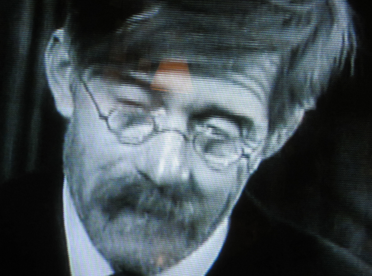
Last night TCM aired a film called, For the Greater Glory, which was directed by Frank Borzage. It was a post WWI drama where some children defend their home-turf, a vacant lot, with a gang they’ve formed. In the cast, playing a watchman who should be watching the vacant lot, is the actor, Christian Rub.
When making Pinocchio, after a difficult start with a VO that wasn’t working as “Gepetto”, Disney hired Christian Rub, and he became the voice of Gepetto. It was a problem which was resolved at the start of the film.
You’ll see from the image above that Christian Rub actually looked like Gepetto. The designers solved the problem. Not only the voice but the appearance of the character changed overnight.
Lately I have been seeing a lot of theater, from the British musical, Matilda, to my wife, Heidi‘s sweet and loving adaptation of Sondheim‘s Into the Woods. From Odet‘s dark and difficult The Big Knife to so many numerous others, recently. There have been great highs and mediocre lows, both sets of shows get my excitement level high and challenges me to think key thoughts on direction, acting, music, sets and costumes.
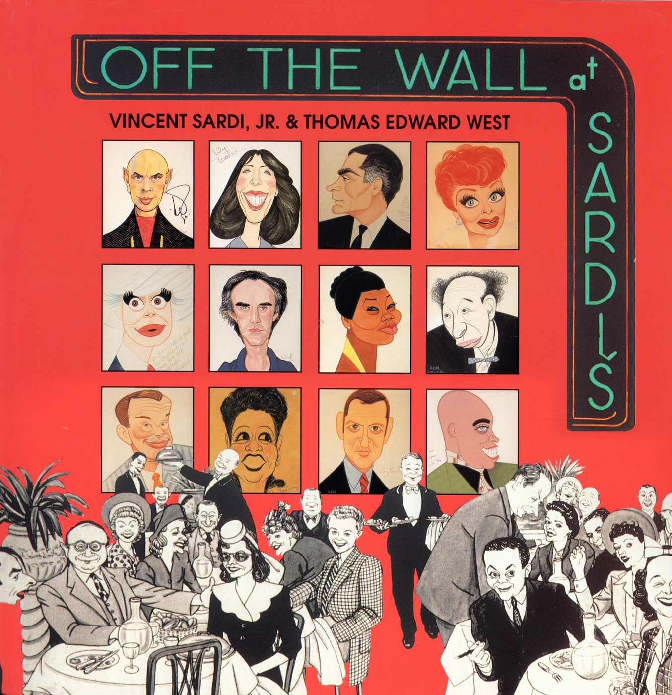
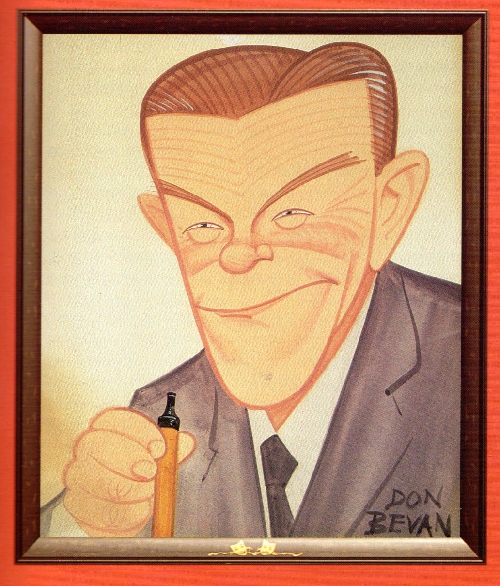
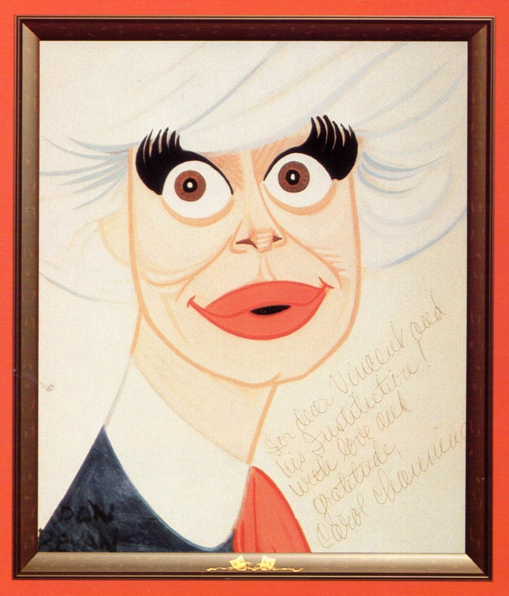
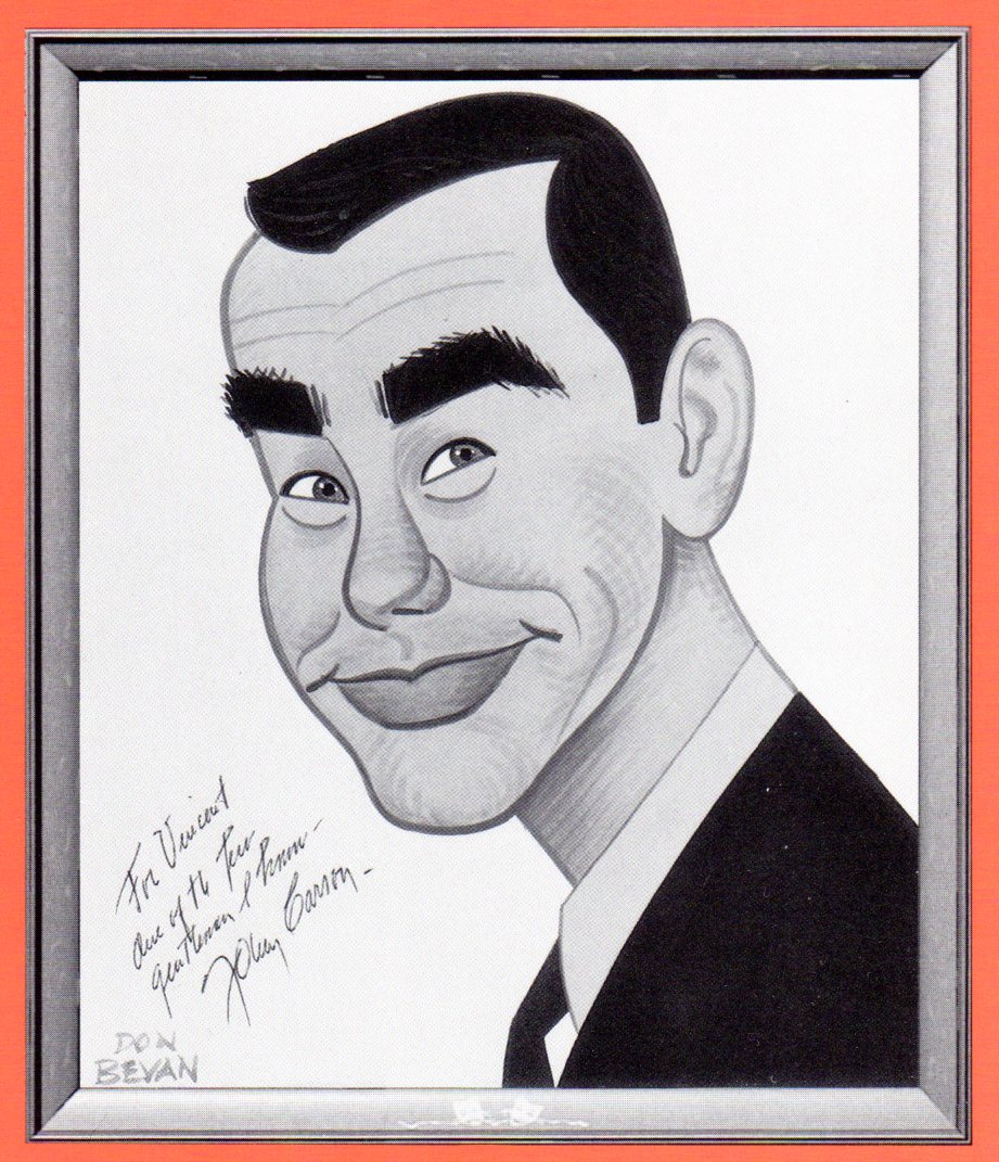
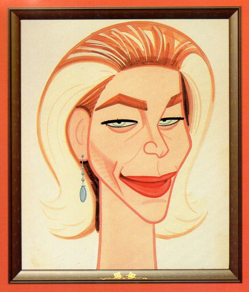
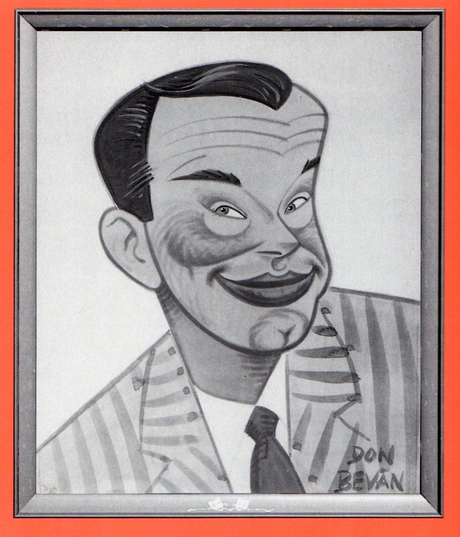
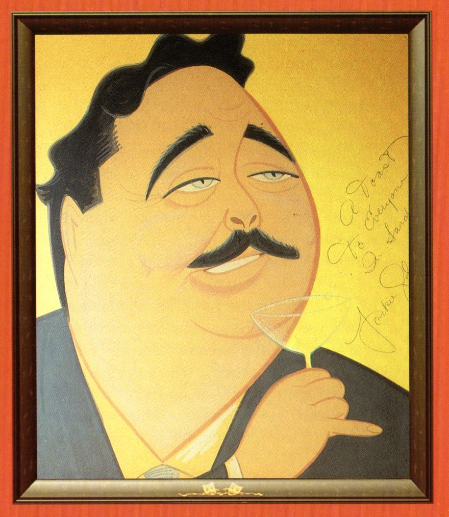
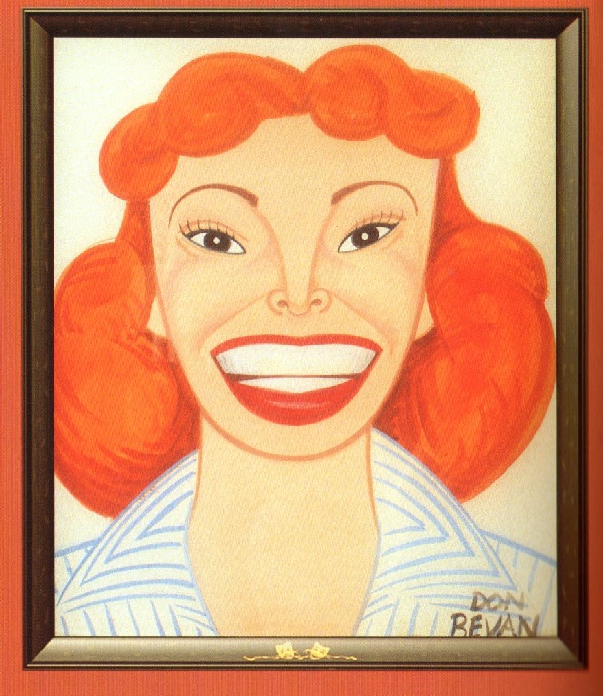
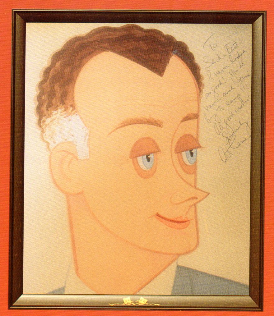
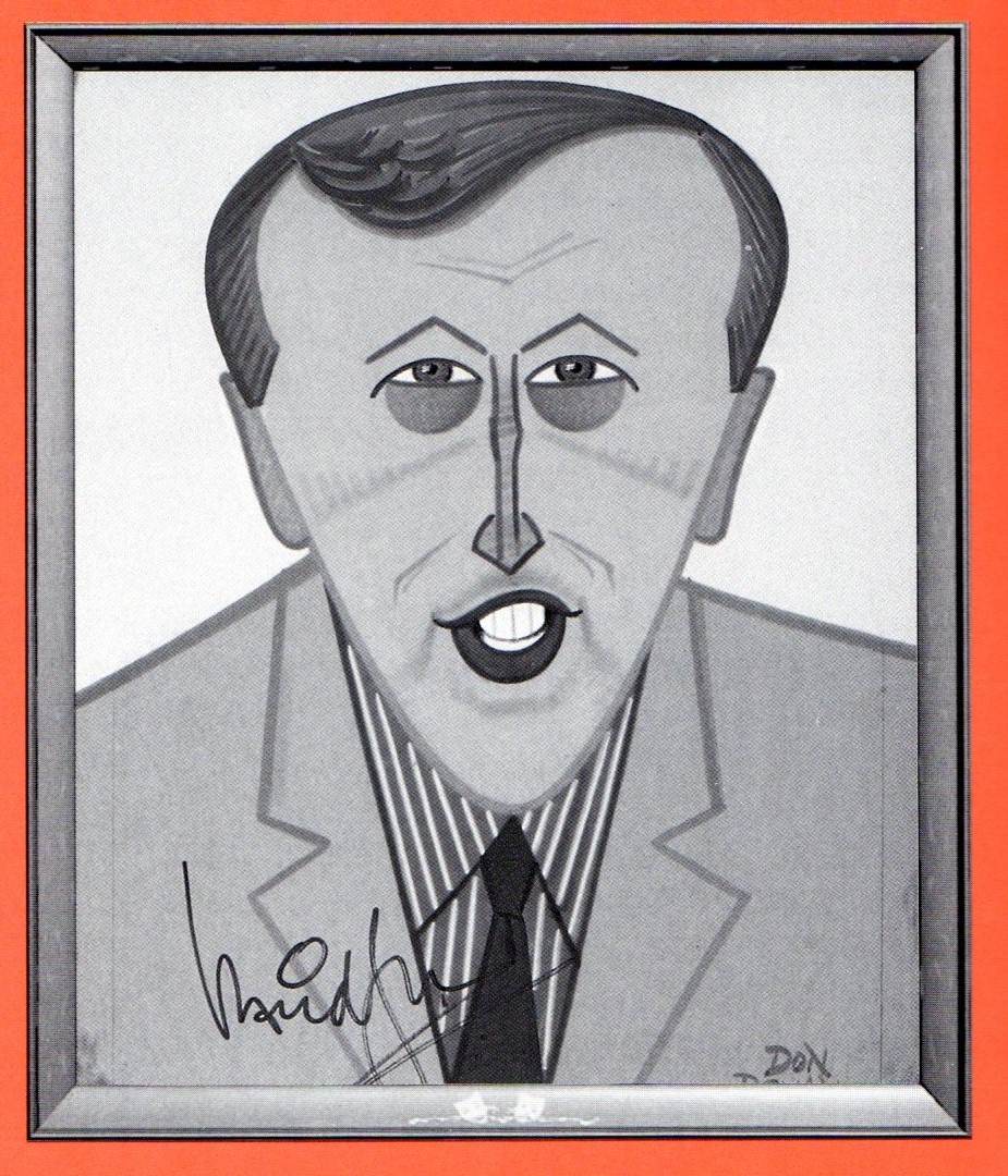
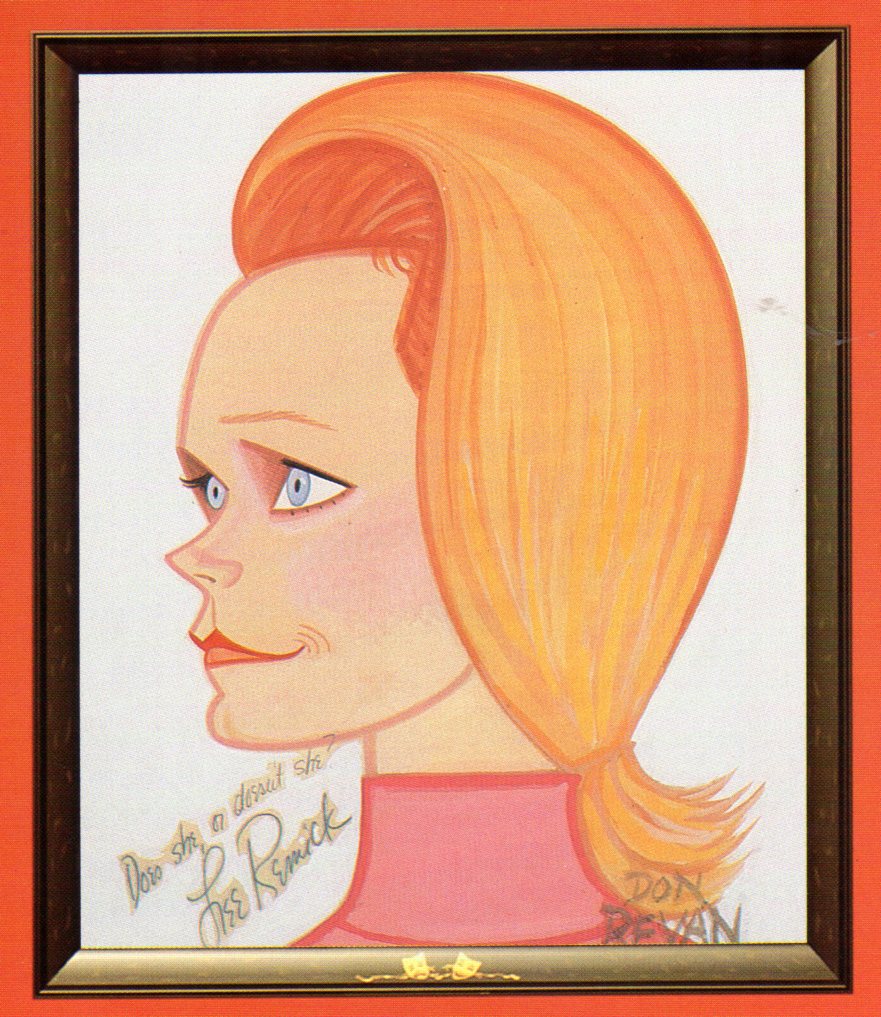
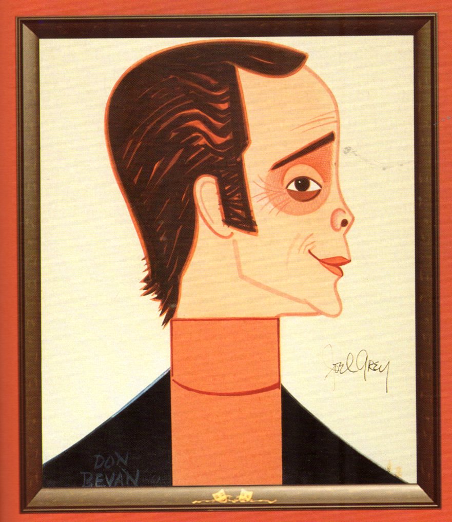
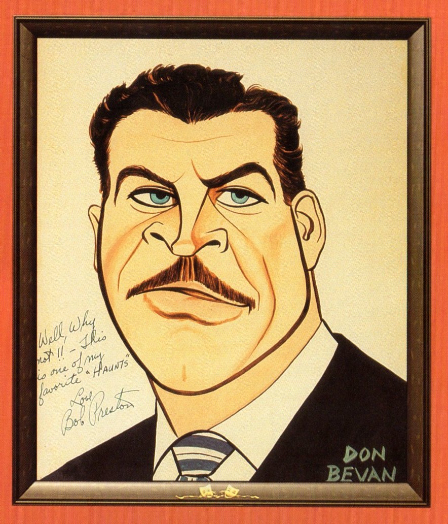
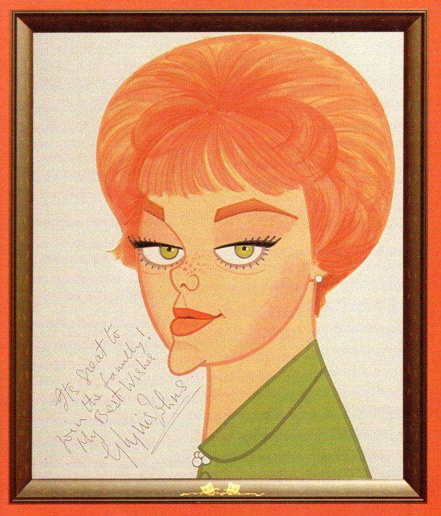
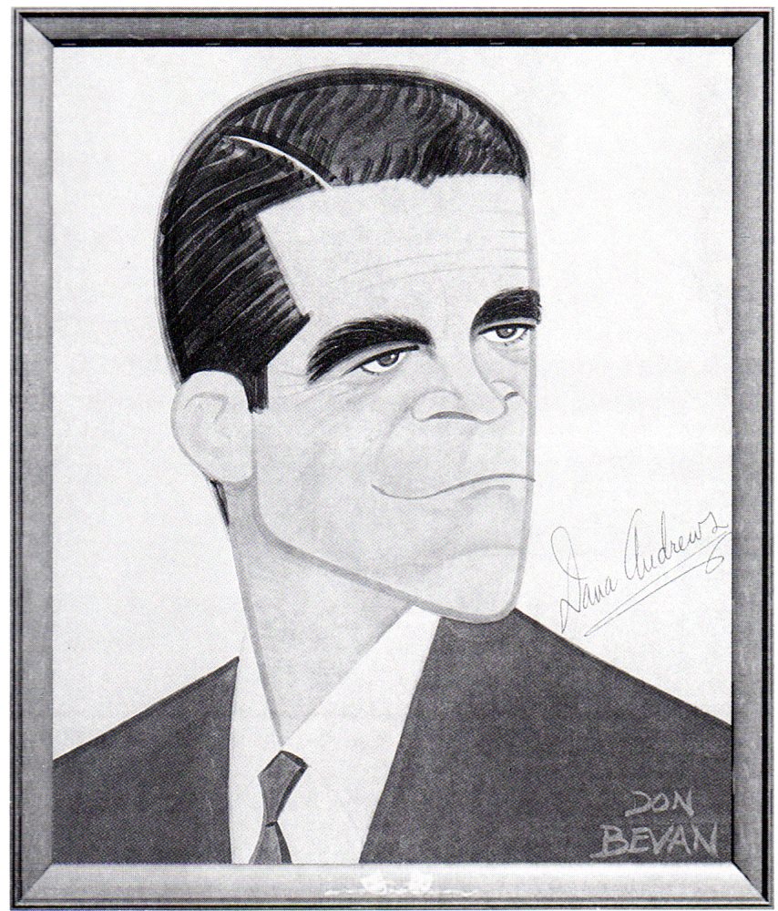
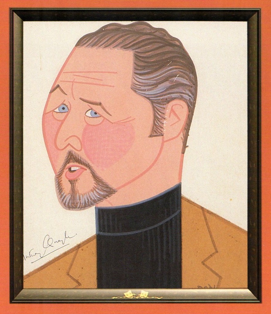
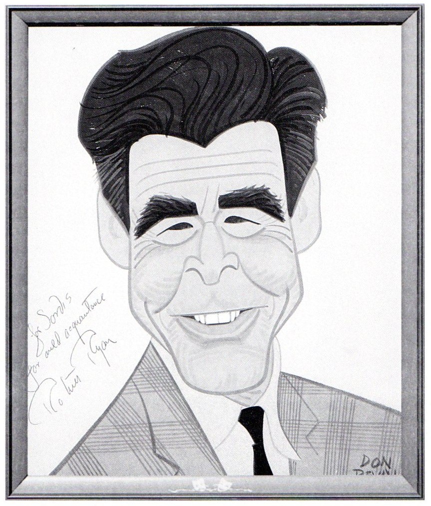
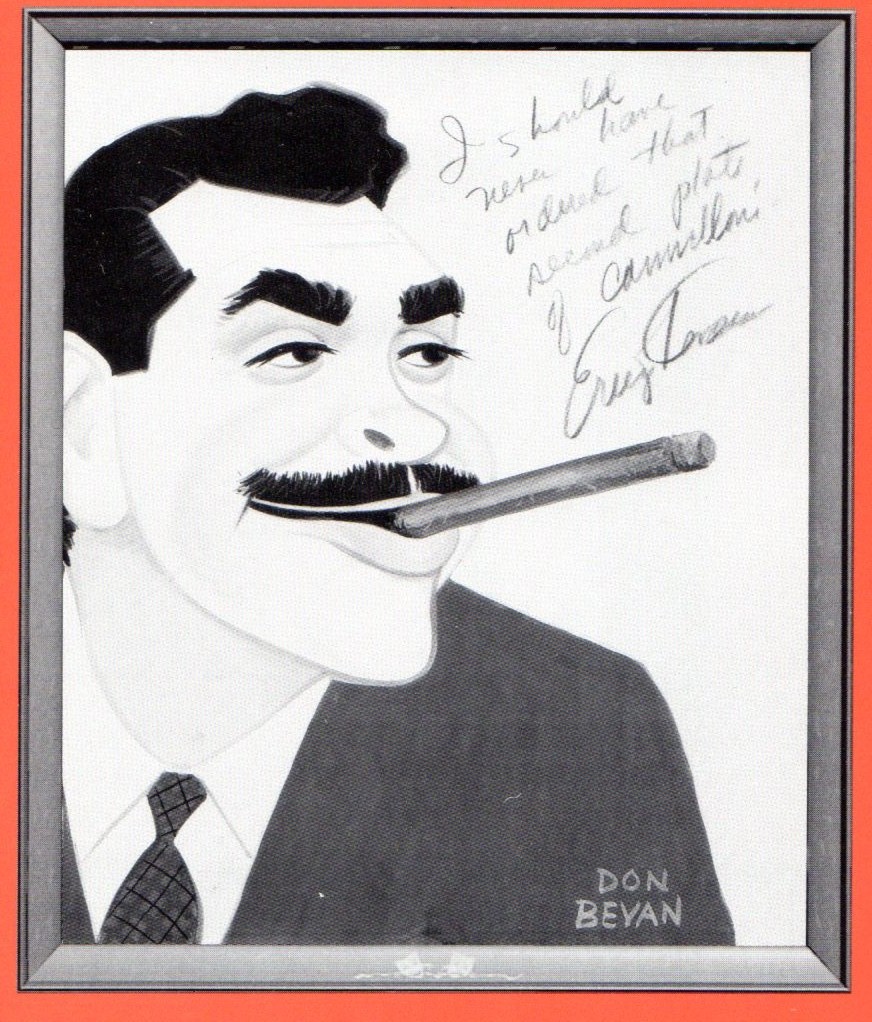
How interesting for Bill Peckmann to send me some caricatures off the walls of Sardi’s restaurant where I’d eaten just a few nights back, and Bill reminds me strongly of the evening. This just after hearing, last night, Baz Luhrman and wife, Catherine Martin, talk about their very theatrical film, The Great Gatsby. It made for a rich and notable program. Film and theater and animation are all so intricately entwined and wonderfully connected. We need to admit it and salute these connections more often.
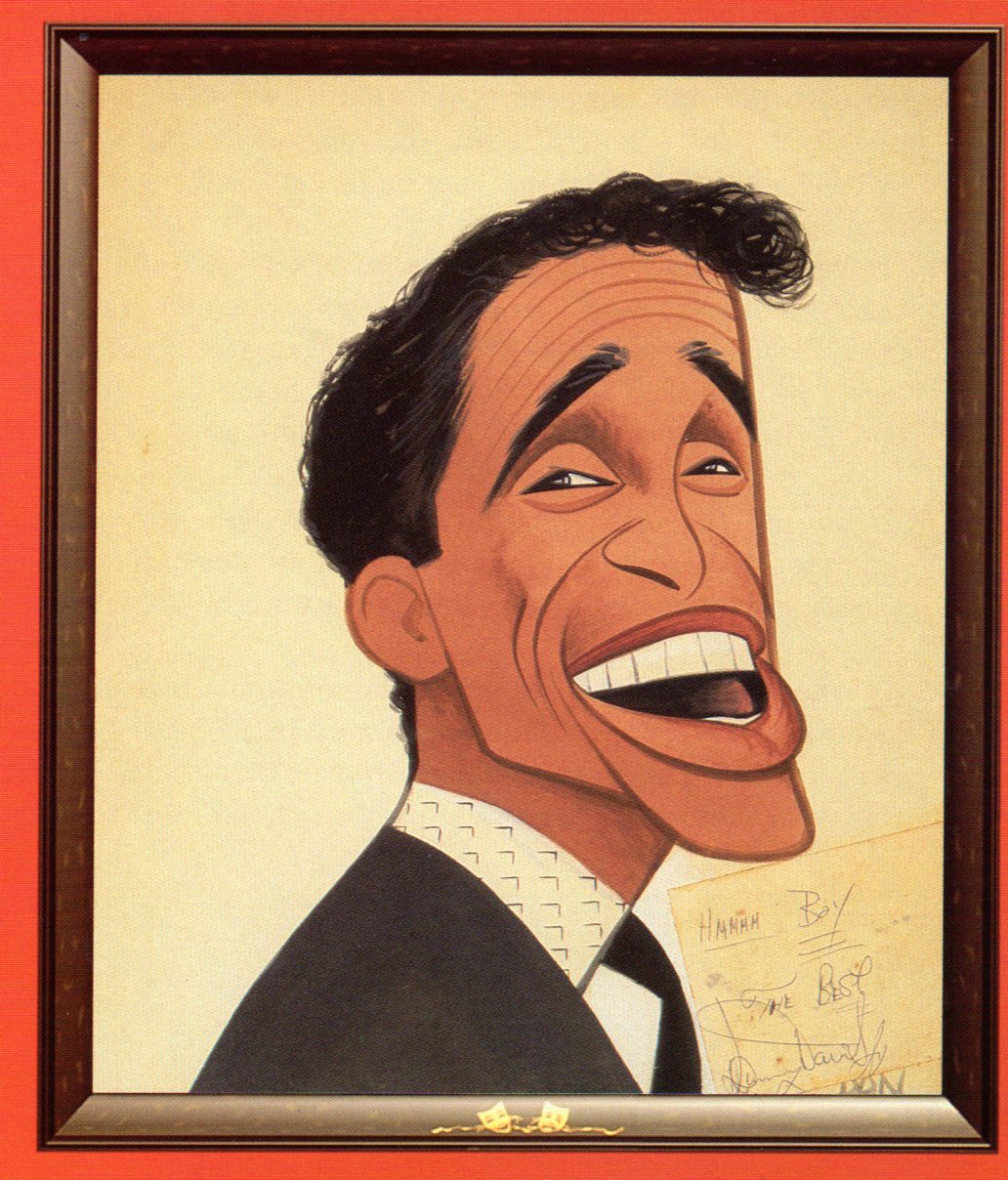
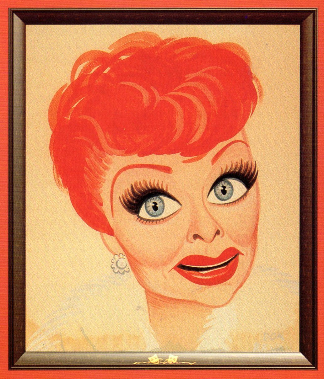
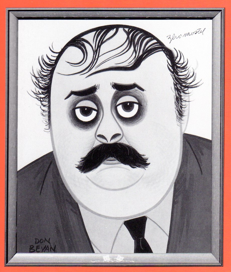
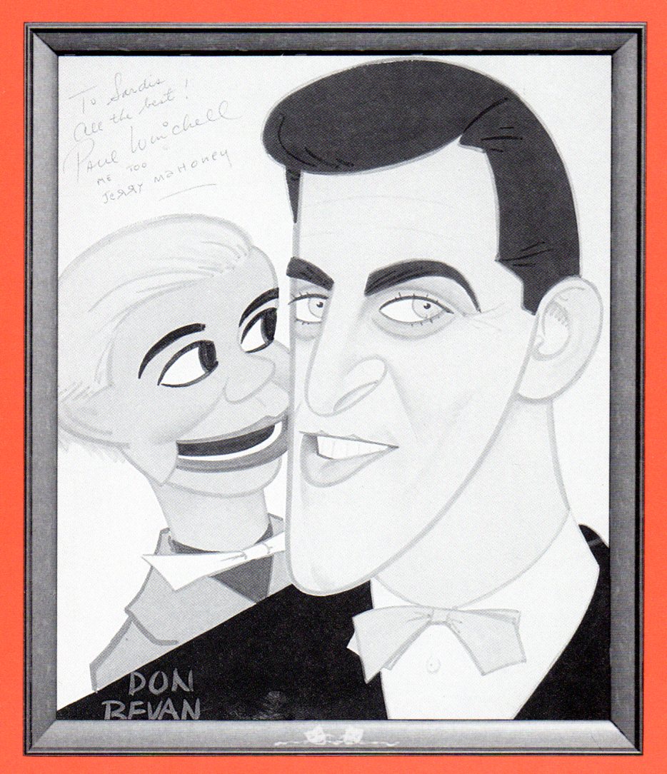
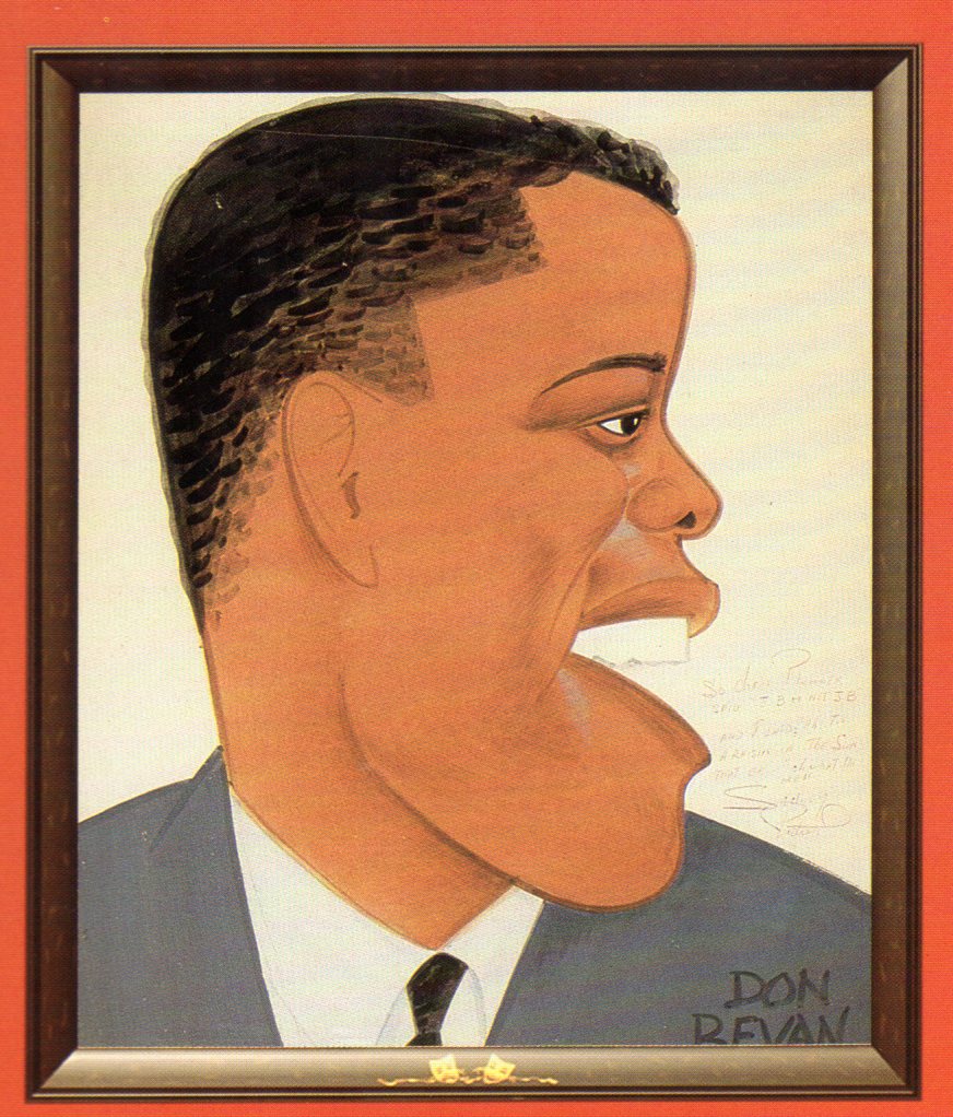
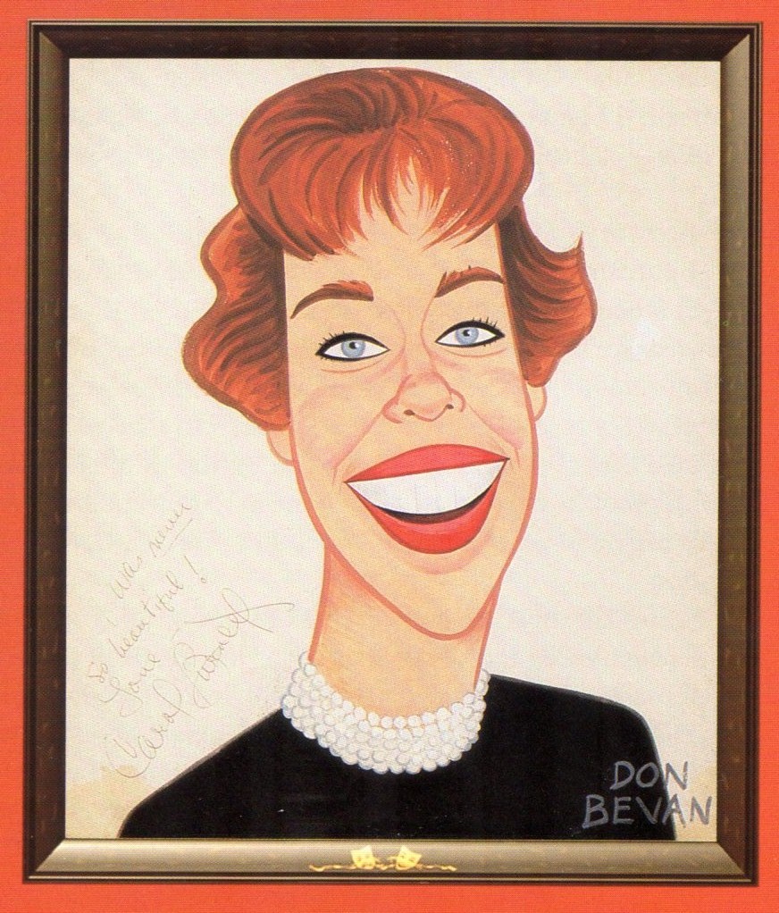
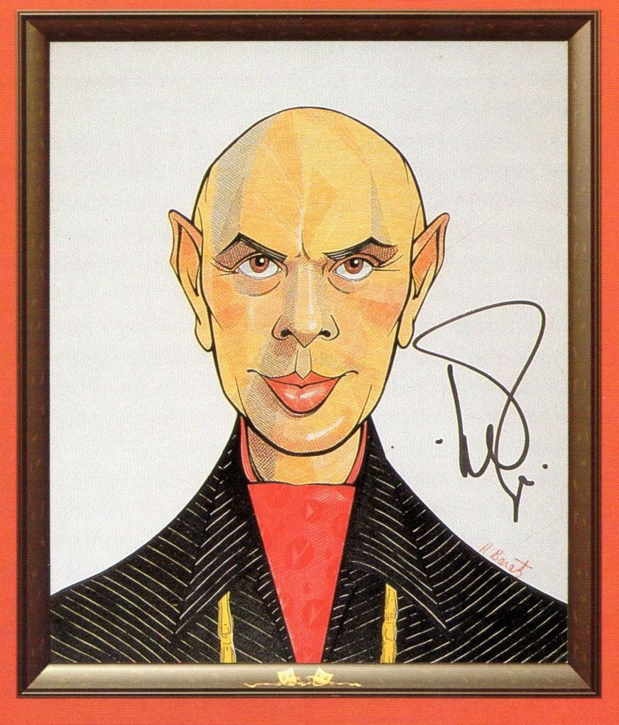
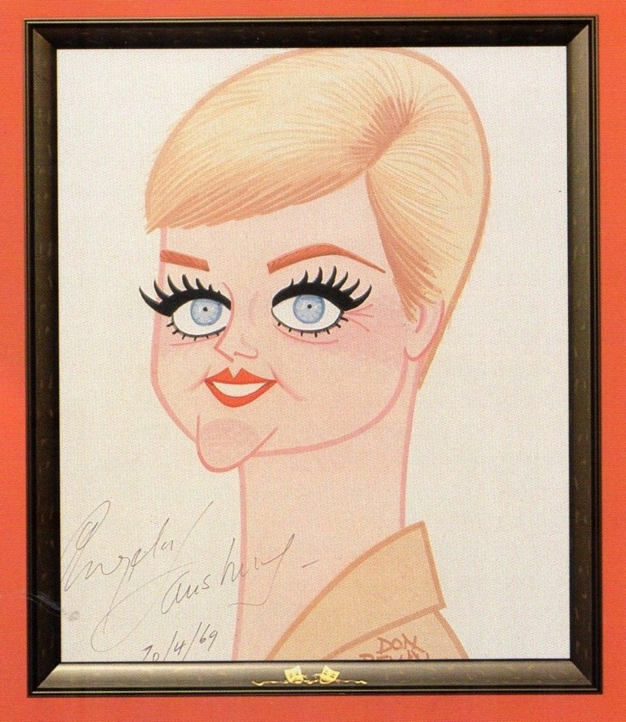
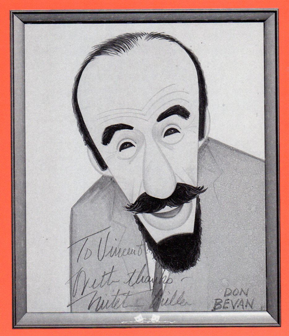
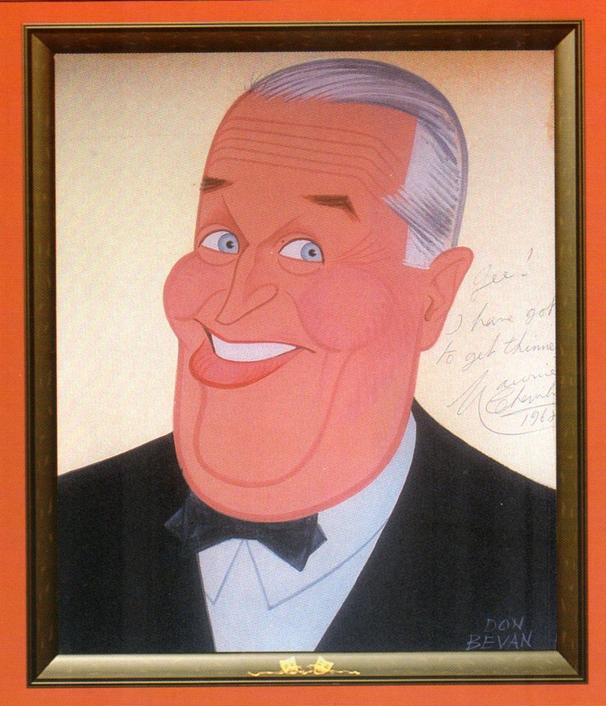
How wonderful for me and how grateful I am to Bill Peckmann for sharing images from the walls of Sardi’s restaurant in New York. The celebrated celebrity caricatures directly off the walls of that restaurant are all wonderful. So easy to identify the images, so beautifully defined his style which doesn’t define the drawings but blesses them gently. All of these drawings in this book are by cartoonist/illustrator, Don Bevan. I didn’t need to refer to the book to identify the celebrity for the caricature in the blog. I’d say that’s a sign of a good caricaturist.
As you can tell, from some of my recent postings, I have always had a love affair with puppet animation. There’s something extraordinary about that medium that has drawn me in. I’ve always demanded a tactile approach to animation, including all of the 2D work I’ve done.
I remember seeing Lady & The Tramp in 1955, on its first release (I was nine.) It was then that I consciously noted that one of the backgrounds in the “Bella Notte” sequence (I can now see that it was an Eyvind Earle BG) had texture in its paper. The board it was painted on came through the animation photography and reached out to me. The human hand became evident in the film.
Perhaps, this was what I loved so much about animation in the first place. Humans did it, and it was self-evident. Being reminded of it, in the subtlest ways – usually unintentional, added to my joy.
Perhaps this is what brought me to John Hubley’s films. Those films were so obviously painted: characters and BG were both used by the photographer to combine for us, and the unintentional was often caught on screen. (I immediately loved those highlighted rings double-exposed around the characters in Moonbird, the brush strokes of The Hole, the transparency of the characters’ paper in Of Stars and Men.) It added to the experience.
In a sense, I was brought out of the film but held in it and given the opportunity to love it even more.
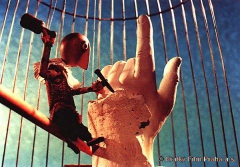
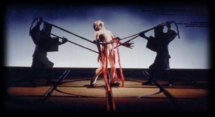
I’ve had this same sense with the best 3D animation. Though I was always there viewing it, I was also caught up in the emotions of the film. Trnka’s masterful film, The Hand, had my understanding those tears and sweat on the little potter were moistened ink that had been his painted eyes. But the anguish I felt the first time I saw the film and that effect has never left me. The perfections of the Human Hand in that film forced the imperfections of the puppet potter to be revealed until it destroyed him.
Perhaps this is also what keeps me from embracing cgi animation. Despite the faked textures of the computer, it’s so obvious that it is not real. At least not when the characters are cartoons.
A very small example of what I’m trying to communicate stands out for me in Cars. The paint job of newer cars has a flecking/speckling of glitter within the paint. In the right light, the main character, Lightning McQueen, had this paint job. Everytime I saw it, I was distracted and pulled out of the film. Like the real paint on a real car, that flecking was embedded within the paint, itself. It didn’t feel like the byproduct of a human hand; it felt like a computer trick. I am no more capable of coloring the computer skin of that computer hand than I am of painting a real car. It isn’t tactile for me, it’s just distracting.
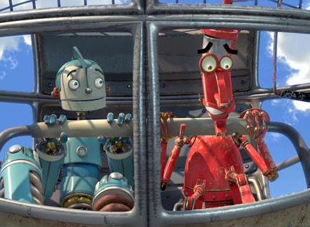
It’s just something I never feel I can reach out and touch. This is something that has been overcome, for me, in a couple of films. The Incredibles gets very close often. Moments of Robots, such excellent design for the medium. Some of Toy Story. (Click on any image to enlarge and enjoy the textures.)
Of course, I recognize that this is my problem. However, I recognize it’s a problem that other people probably have and wonder if there isn’t a solution. In The Iron Giant, the Giant is animated by a computer. I was told that the animation had to be rigged to be animated on “two’s” so that it wouldn’t separate from the rest of the hand-drawn animation. Oddly, it felt totally acceptable to me; I saw no problem and accepted that robot. There has to be, in there, a way to resolve it – I’m just thinking here and don’t expect anyone to try to follow what I’m saying. Perhaps if “human” problems, technical problems, were added to the animation. . . No this is even too stupid for me.
Barry Purves has made a number of absolutely beautiful films and has created in his own studio some masterfully realized pieces. His work has a discriminating taste, graceful and controlled movement with superb acting, and an intelligence that is rarely found in animation today.
He was nominated for the Academy Award for his film Screenplay, a virtuoso work which follows the rules of Kabuki theater and presents a double-layered story of a man watching and revealing a story from his past which eventually rips through the past and tears at the present. It’s a work of animated puppetry, displayed as theater and a stunning film that should have won its Oscar.
Rigoletto presents the opera in a condensed version that has been reduced for television. It’s a packed half-hour which places you into the full opera and allows you to follow it without any confusion. It has a majesty in its sweeping and dynamic camera moves which whisk you along in the luscious music; they carry you along through the depths of the complex story. It’s a wonderful film that certainly grows richer with each viewing.
Other works he’s done include a wonderful film about Gilbert & Sullivan: The Very Models gives us the pair as seen through the eyes of D’Oyle Carte. A rich and entertaining diary into the making of this film can be found on AWN and a short clip of the film is available there as well.
As a matter of fact, I found his diary there so entertaining, I’ve also followed the diary he keeps on his own website.
You can get a small glimpse of Barry Purves‘ craft by viewing the clip reel at Acme Filmworks. But you’re left without the full heft of his work until you’ve seen the complete storytelling ability he presents in the whole films.
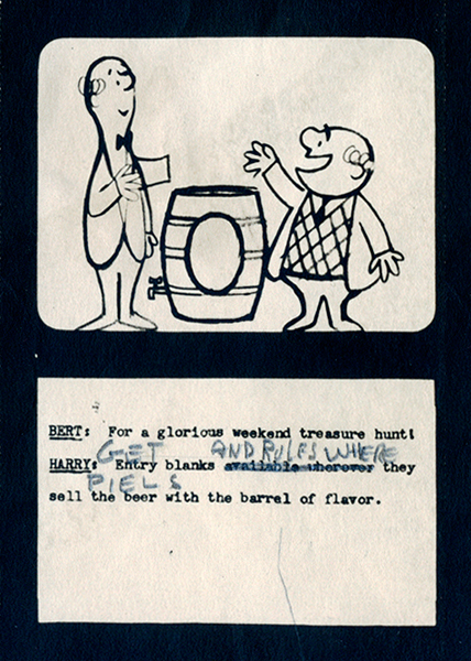
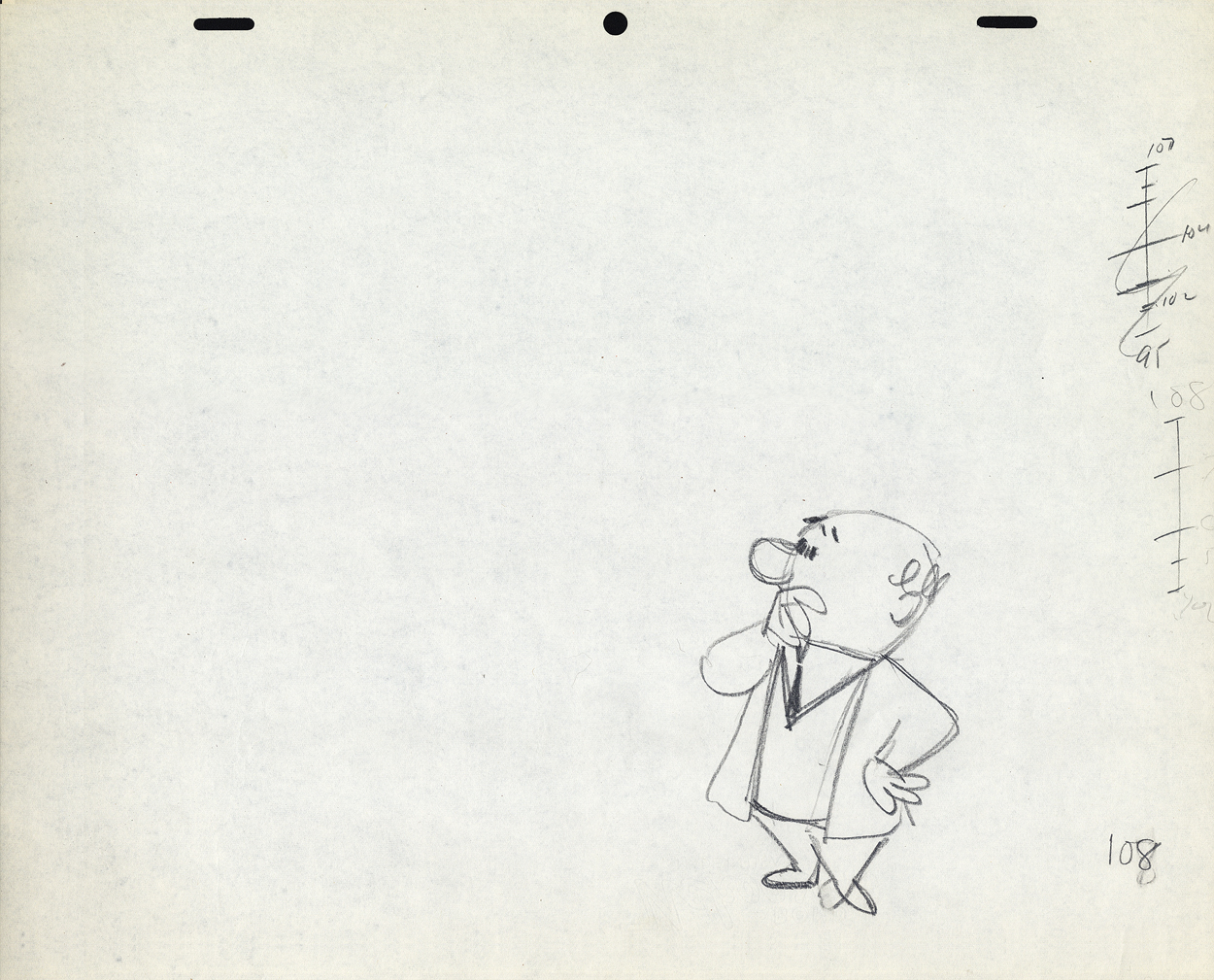
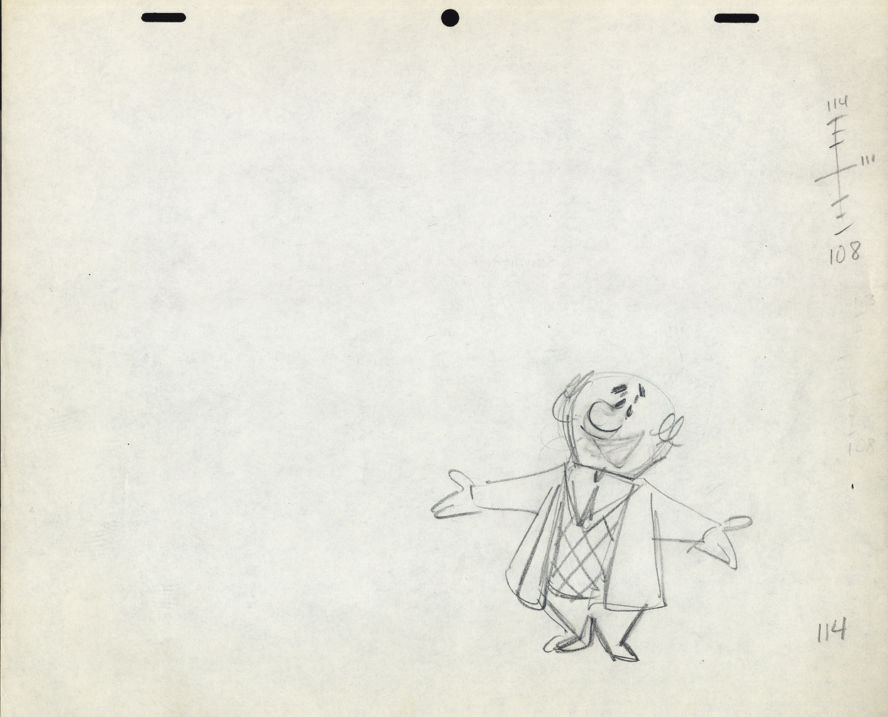
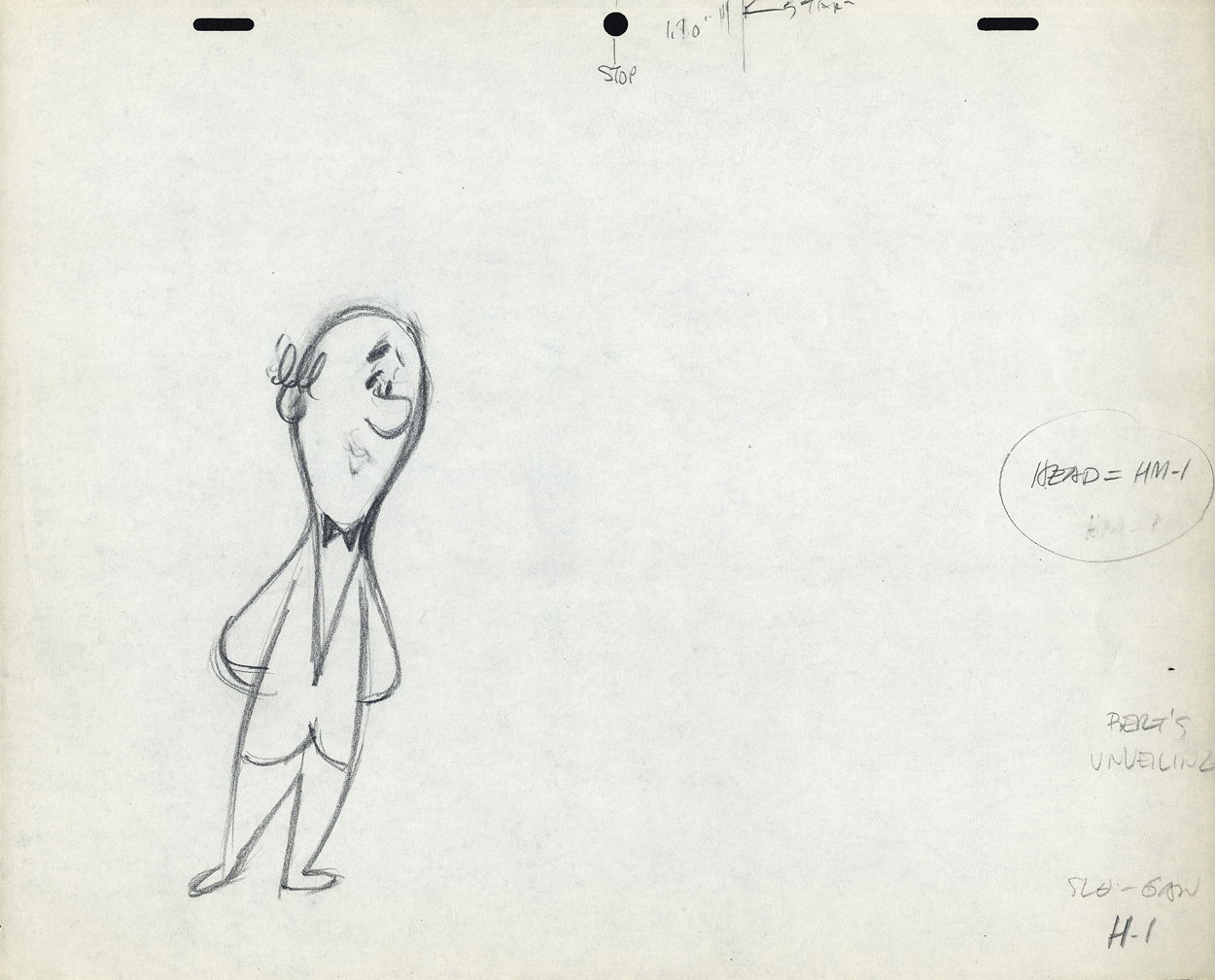
Here’s the last of the three posts I’ve been able to cull from the drawings left behind in Vince Cafarelli‘s things. The 60 second spot was animated by Lu Guarnier and clean-up and assisting was by Vinnie.
Within this post there are drawings from two separate scenes. If you look at the storyboard (I’d posted the entire board in another post, but I’ve pulled the particular frames from the board to show again here), you can see what it is the characters are saying. I don’t have all the drawings for these two scenes; just those I’ve posted.
I’m also going to use these drawings of Lu’s to write about his style of animation. I was taught from the start that this was completely done in an incorrect way. I don’t mean to say something negative about a good animator, but it is a lesson that should be learned for those who are going through the journeyman system of animation.
Right from the get-go I had some difficulty assisting Lu’s scenes. He started in the old days (early-mid Thirties) at Warner Bros, in Clampett’s unit, and moved from there to the Signal Corps (Army); then to New York working at a few studios before landing at UPA’s commercial studio. After that, he free lanced most of his career, as had so many of the other New York animators. They’d work for six months to a year at one studio then would move on to another.
I suspect the problems in Lu’s animation all generated from the training he’d gotten at WB. Lu worked in a very rough style. No problem there. An animator should work rough. These drawings posted aren’t particularly rough, but in his later years (when I knew him) there was hardly a line you could aim for in doing the clean-up. His style was done in small sketchy dashes that molded the character. Rarely was it on model, and always it was done with a dark, soft leaded pencil. There were others who worked rougher, Jack Schnerk was one, but Lu’s drawing was usually harder to clean up.
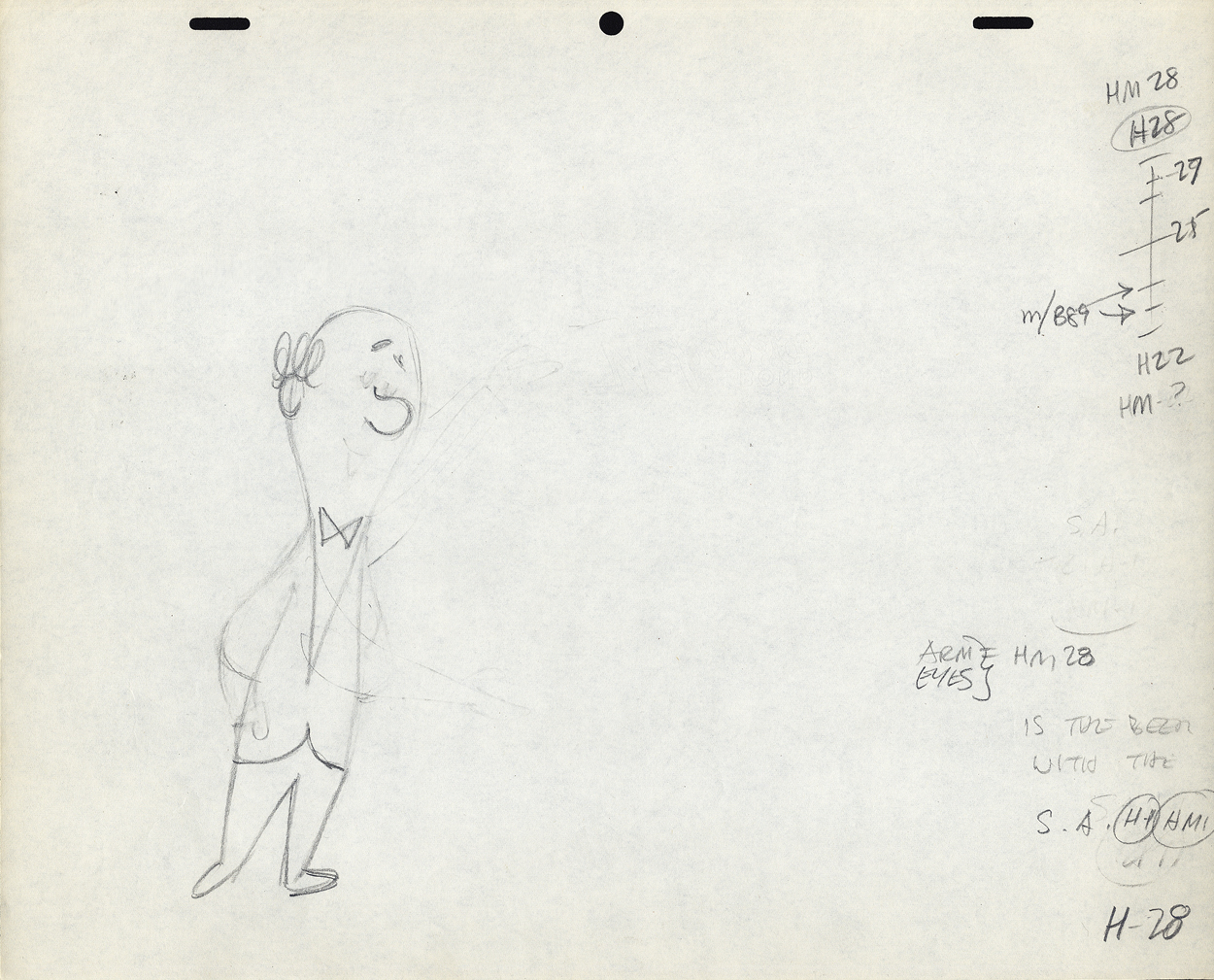
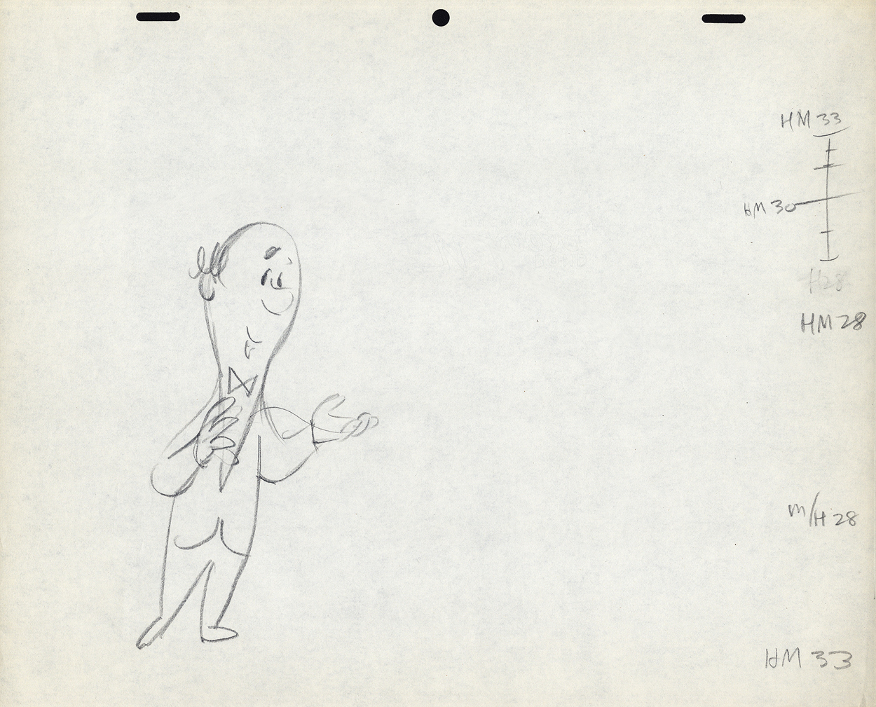
There was a rule that came out of the Disney studio, and, as both an animator and an assistant, I’ve followed it closely. When doing the breakdown charts (those ladders to the right of the drawing) all inbetween positions had to be exactly half way between drawing “A” and drawing “B”. If the animation called for it to be 1/4 of the way, you’d indicate that half-way mark then indicate your 1/4. If a drawing had to be closer or farther away – say 1/3 or 1/5th of the way – the animator should do it himself. This, as I learned it, was the law of the land. However, Lu would rarely adhere to it, and an assistant’s work became more complicated. The work was too easily hurt by a not-great inbetweener. I’ll point out an example of Lu’s breaking this rule as we come to it).
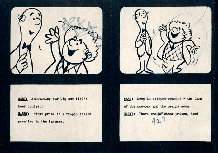
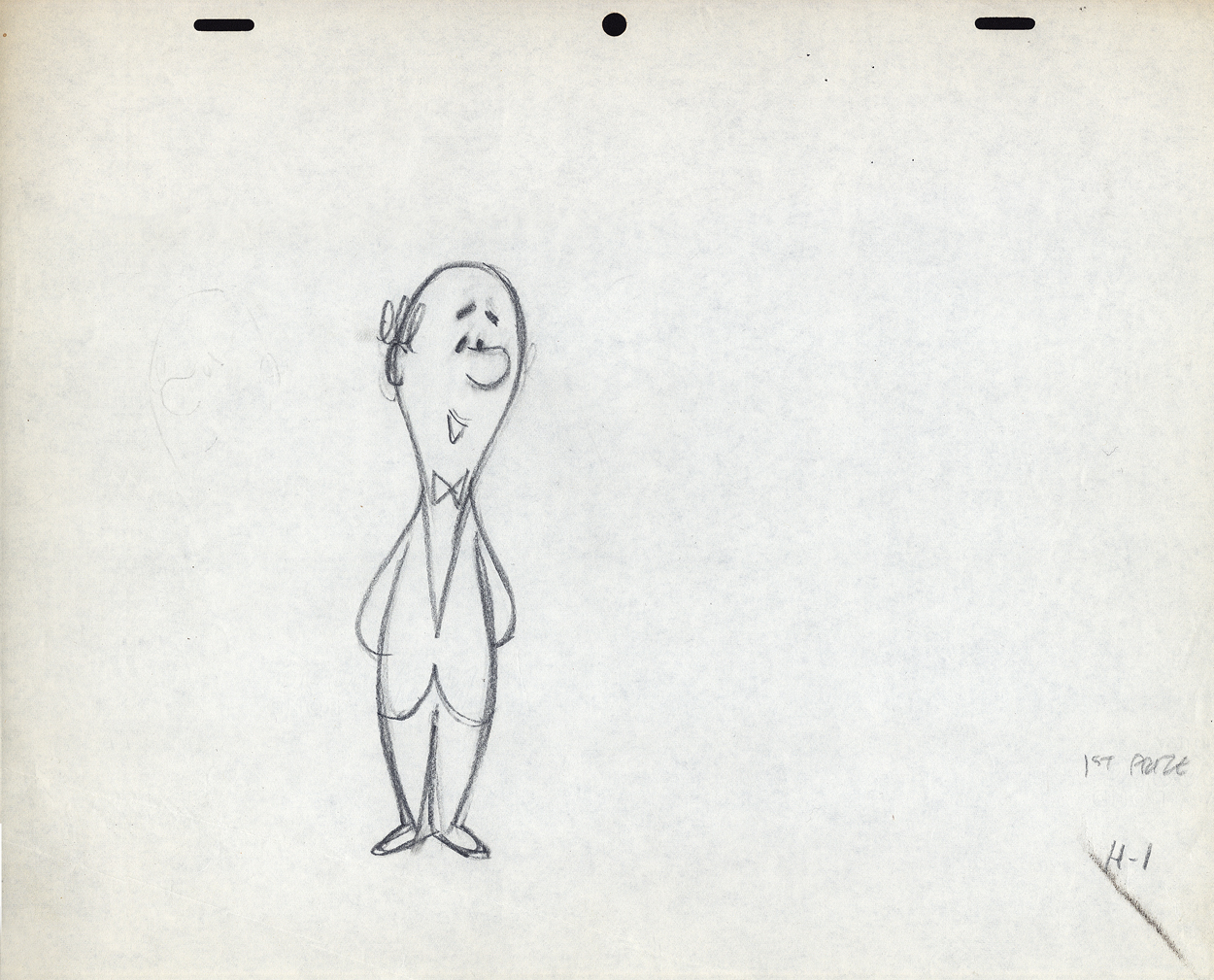
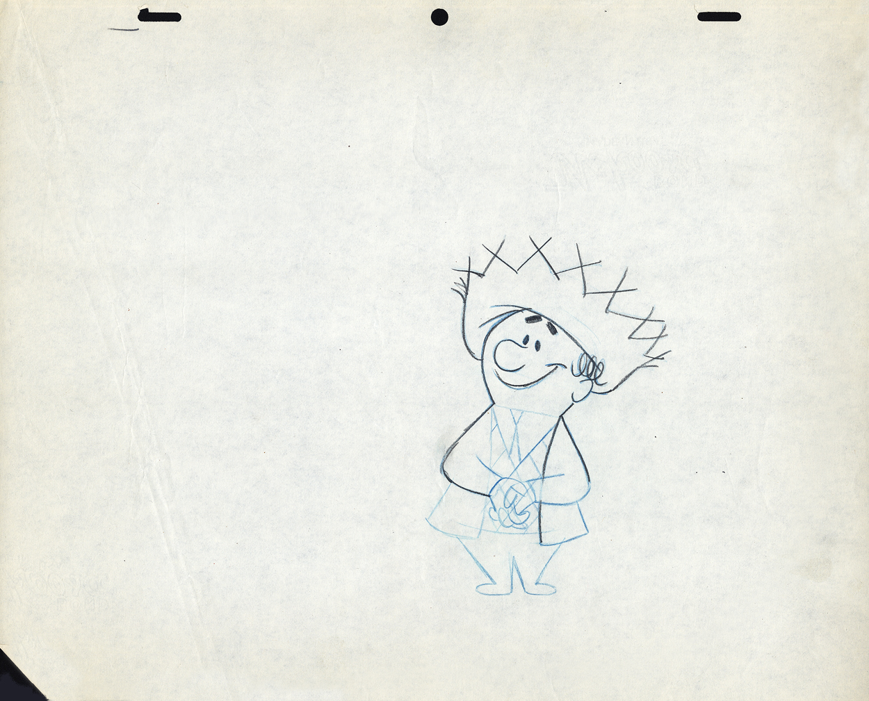
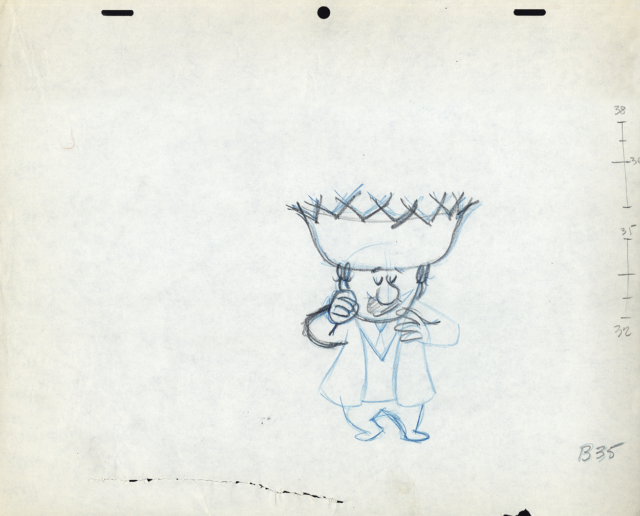
The First scene
bd.1
H1
B7
B35
These ladders are done correctly, per the Disney system.
#34 is half way between #32 & #35;
#33 is half way between #32 & #34.
#36 is half way between #35 & #38;
#37 (the 1/4 mark) is half way between #36 & #38.
However, Grim Natwick told me
- demanded of me –
that all ladders should appear on the lower numbered drawing.
The ladder here should be on drawing #32 for all art
going into the upcoming extreme, #38.
Lu never followed this rule, which means the
assistant generally had to search for the chart.
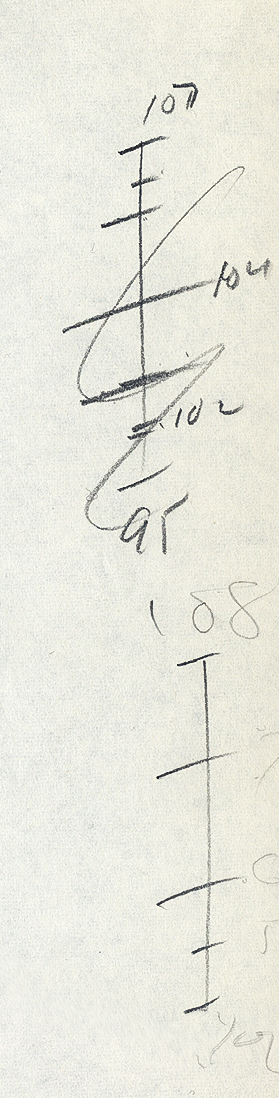
The Second scene
bd.2
B108
This ladder is typical of Lu’s animation.
It would seem that #106 is 1/3 of the way between #108
and #105 is half way between #106 and #109.
and it also looks like #107 is 2/3 of the way between #108 and #109.
Because the numbers come on the last of the extremes, here,
more confusion is allowed to settle in.
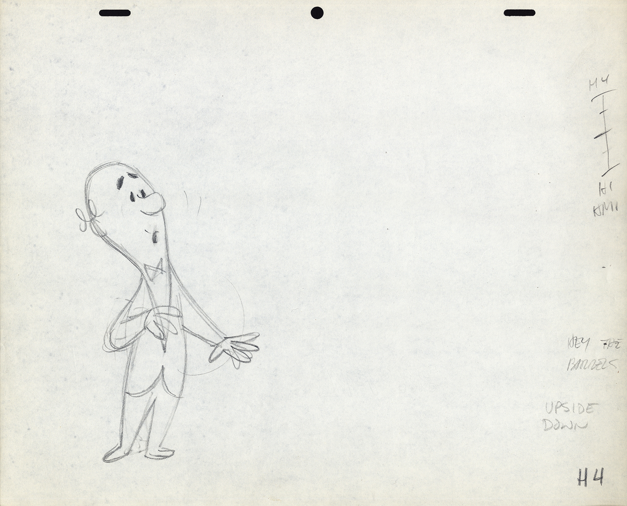
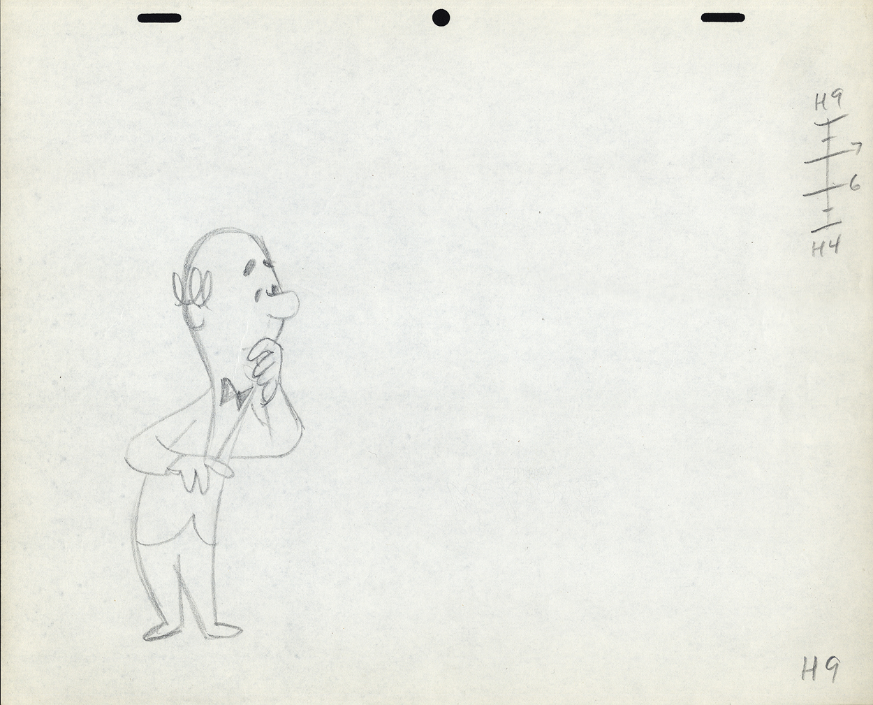
B114
H1
H4
H9
Again, the ladder appears on the later extreme. The assistant
shouldn’t have to go looking for it. The ladder should be on
the first drawing involved in the breakdown.
Again, the breakdown drawings are on 1/3′s, and
the inbetweens are 1/2′s of that. It makes it harder on the
people following up on the clean-up & inbetweens.
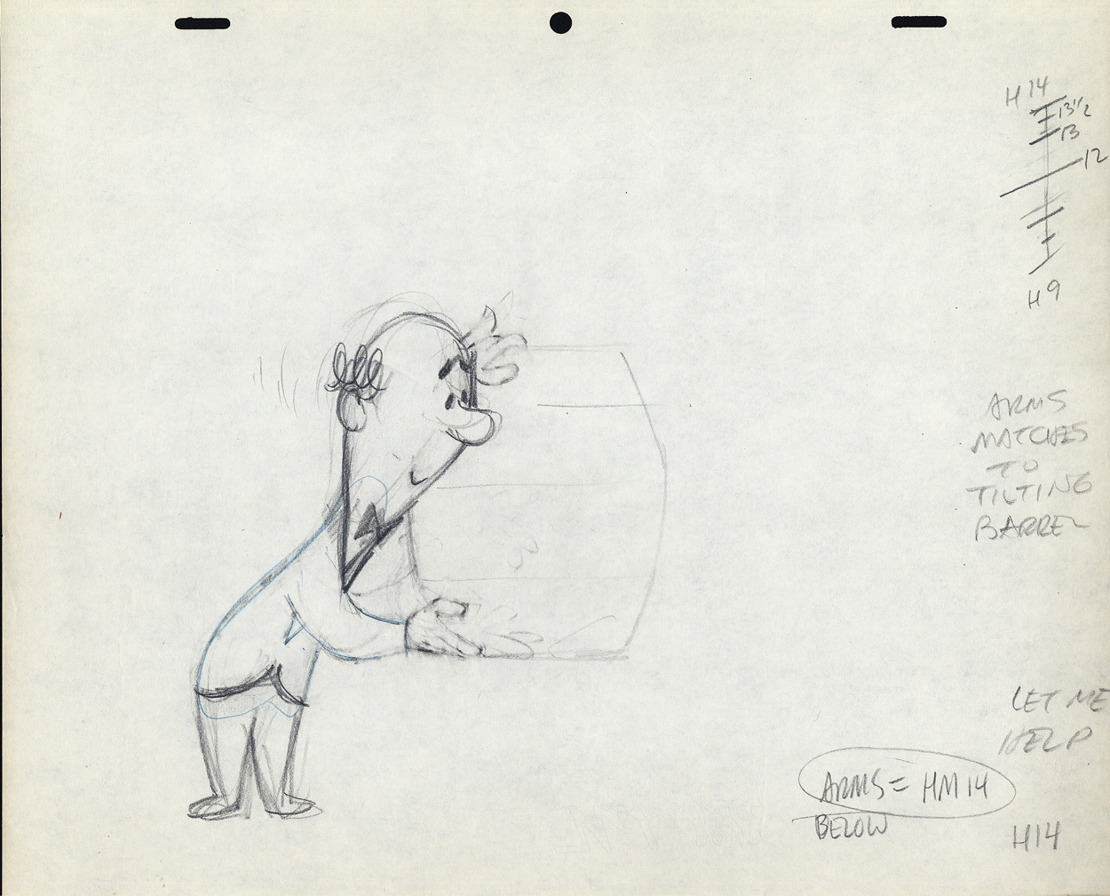
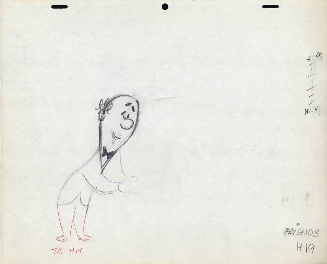
H14
H19
H28
H33
H34
I don’t know if this style of Lu’s was a product of where he learned to animate or not. Jack Schnerk, a comparable animator – whose work I loved (even though he had a rougher, harder to clean up drawing style) – always broke his timing in halves and halves again. There were times when his animation went to one’s and he did most of all the drawings. I assumed he had an unusual timing, and he didn’t want to burden the Assistant with his schema. He also always carried the breakdown charts on the earlier numbered drawing – per Grim Natwick’s comment. In some way I felt that Lu was rushed to get on with the scene, and whatever method he used would be to get him there more quickly. (It was the assisting that was slowed down.) This may have been a product of his attempts to devise some type of improvisation in the animation. Lu’s work, on screen, was usually excellent, so he didn’t much hurt anything in his method.
It might also have been his method of trying to put SNAP into the animation. This was a WB trait from the mid-late Thirties. It was certainly in Lu’s animation. No doubt a hold-over from Clampett’s early days of directing.
The final thing to note is that Lu usually worked on Top Pegs. Animating on Top Pegs makes it impossible to “roll” the drawings and check on the movement of more than 3 drawings. You can only “flip” the three, checking the one inbetween, but it didn’t give you a good indication of the flow of the animation. This is obviously necessary in animating on paper. It also made it difficult for the cameraman as well as those following behind the animator. If there were a held overlay, this would have to be on bottom pegs since the animation is on top pegs. That requires extra movement of the expensive cameraman to change all the animation cels after lifting the bottom pegged overlay. It also risks the possible jiggling of the overlay as it’s continually moved for the animating cels.
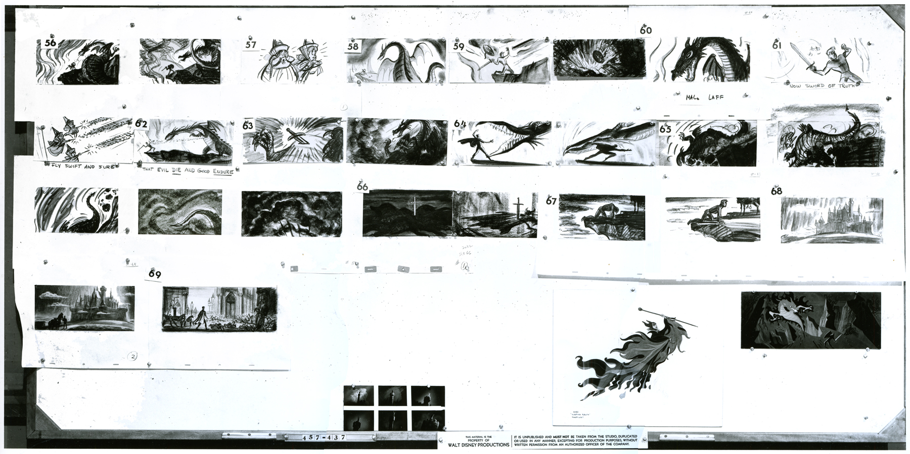
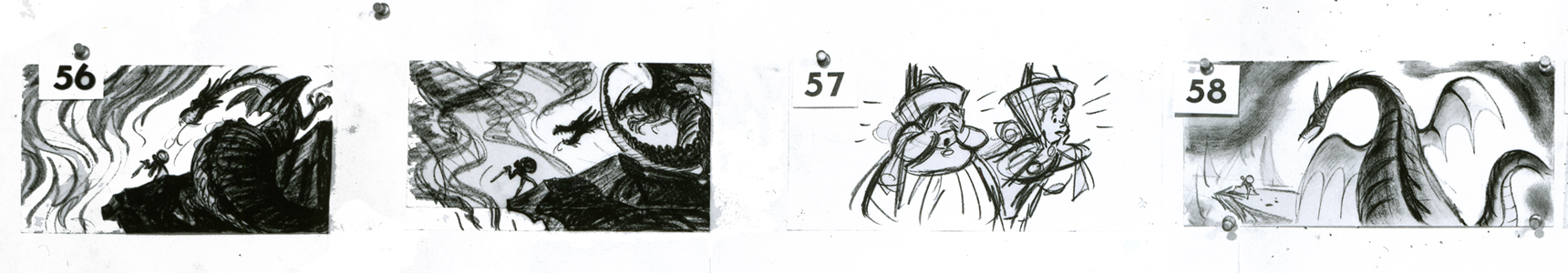
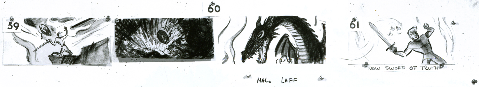
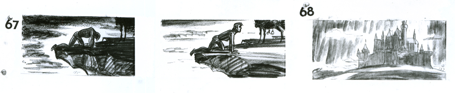
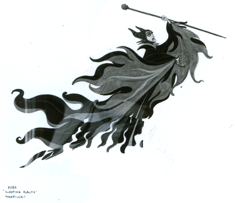
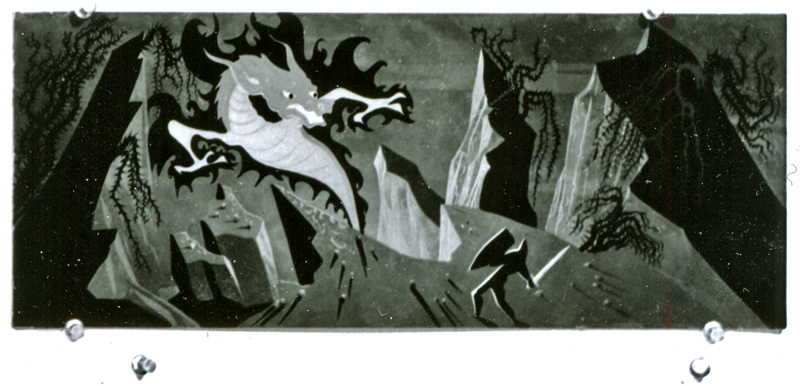
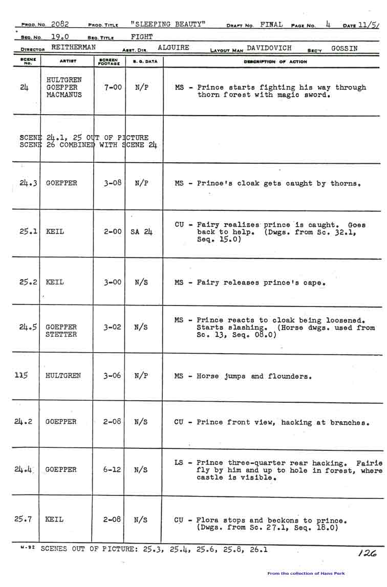
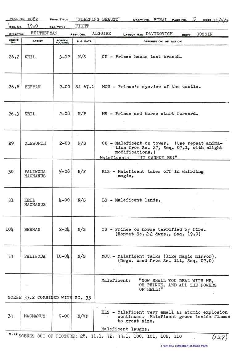
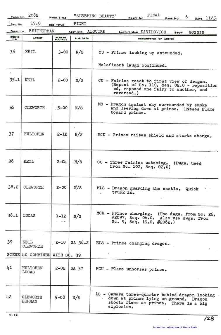
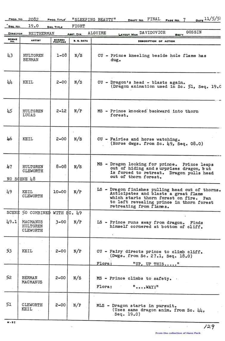
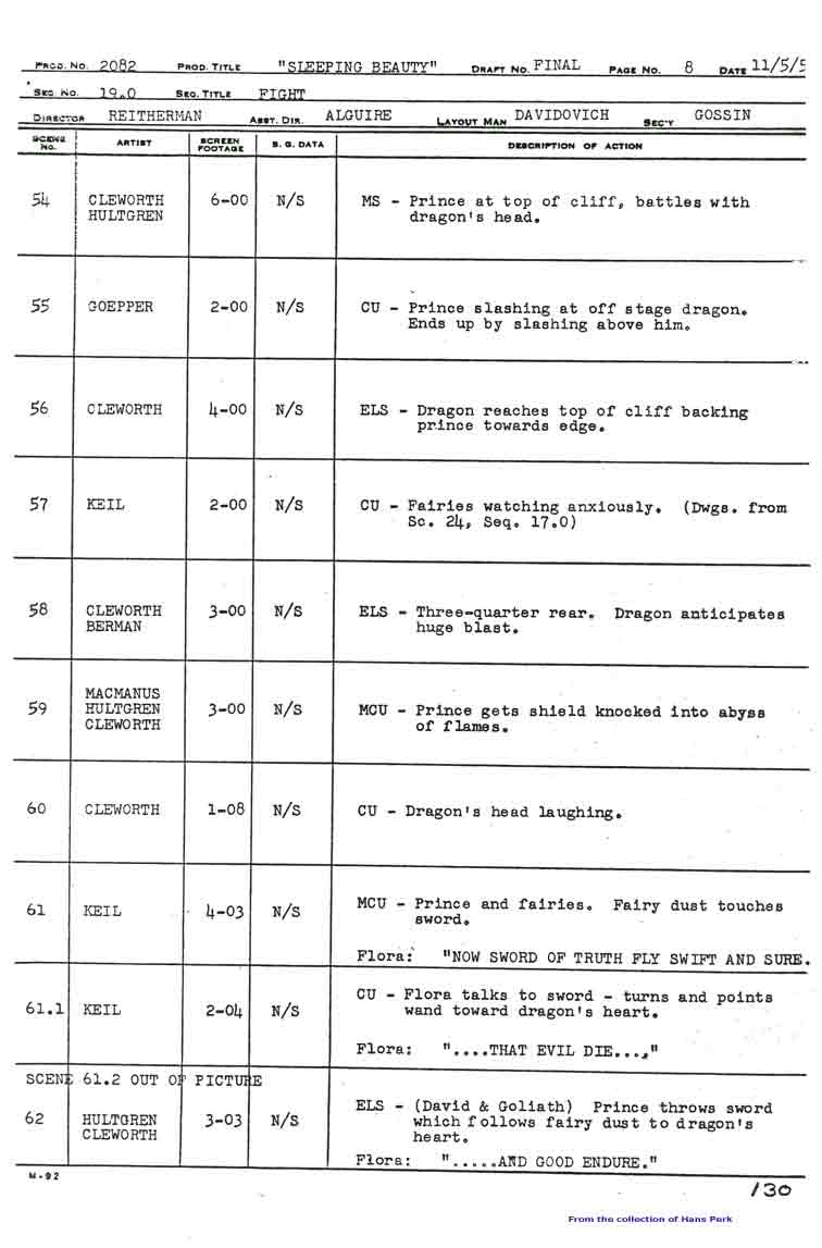
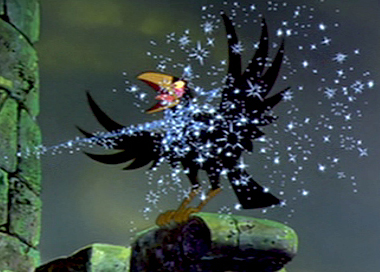
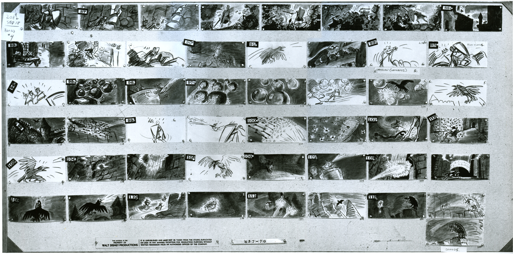
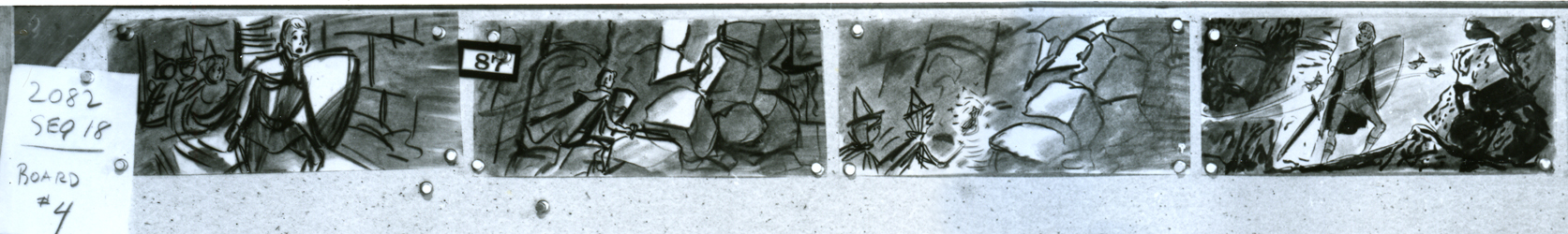
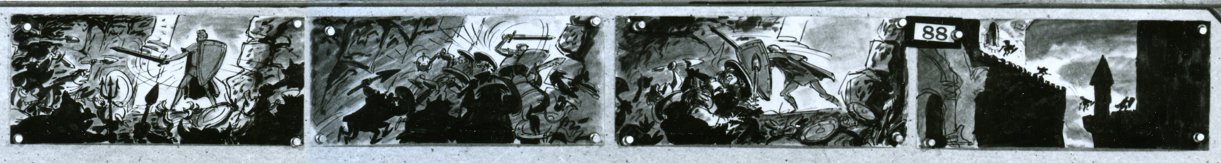
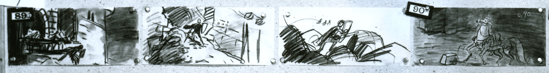
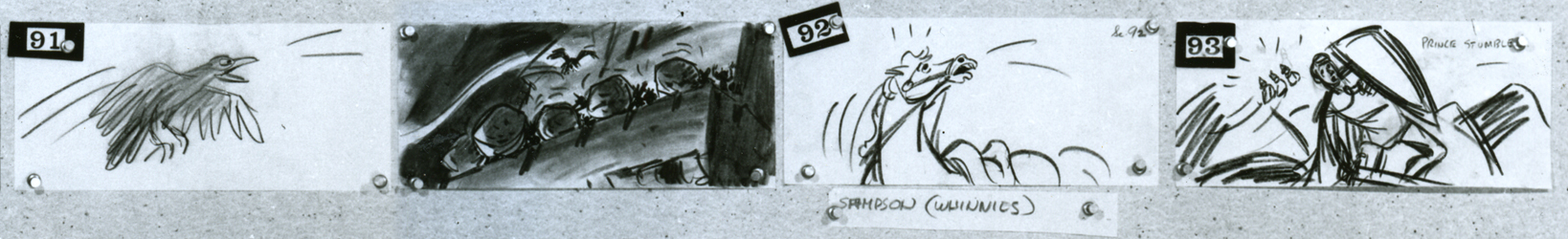
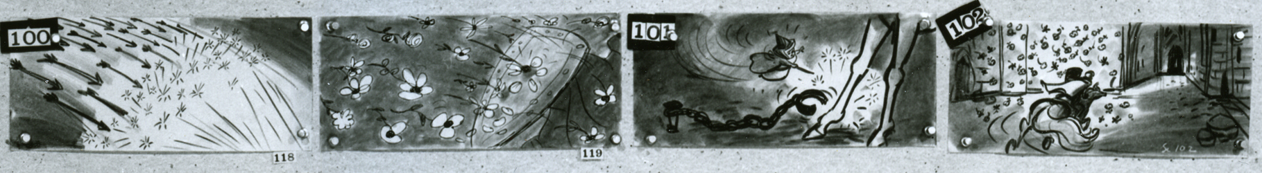
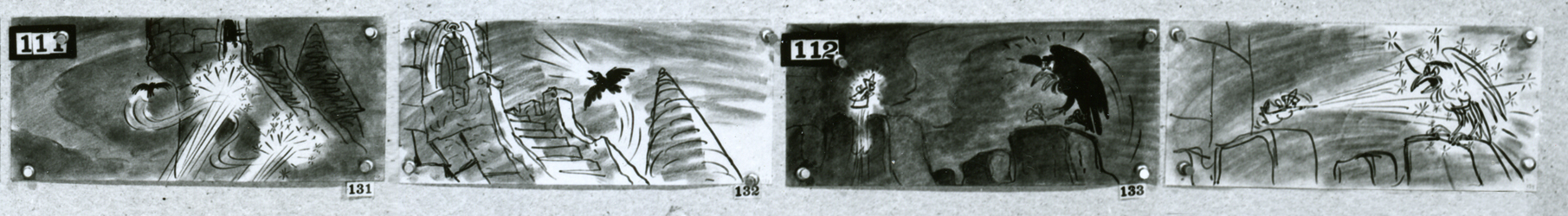
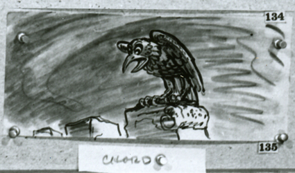
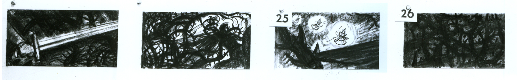
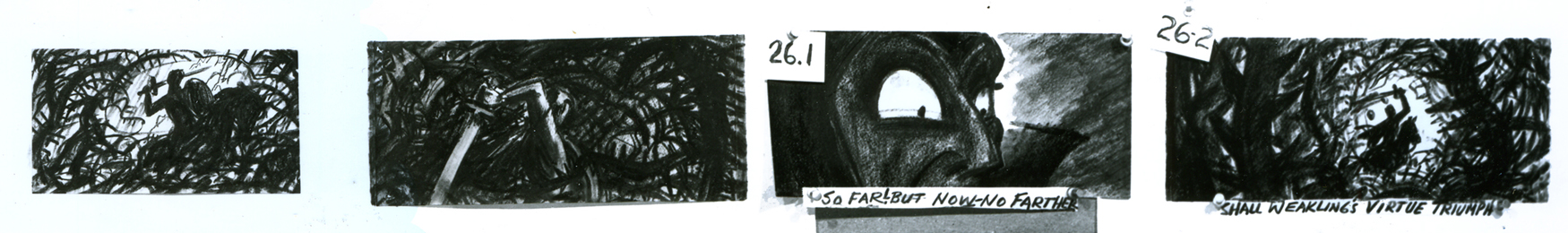
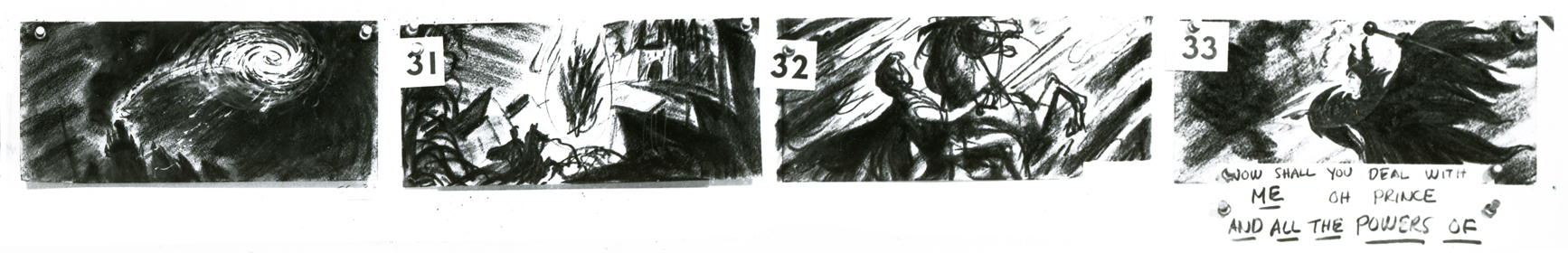
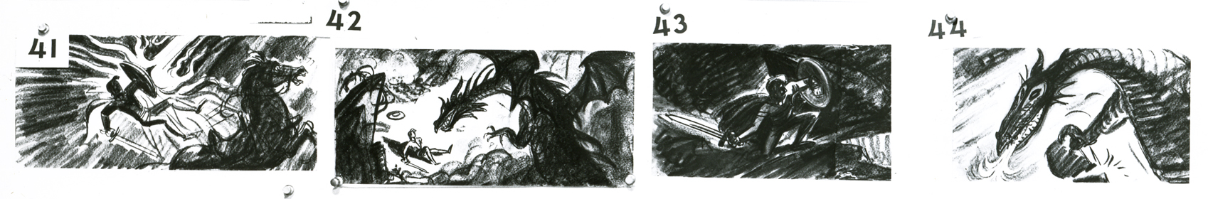
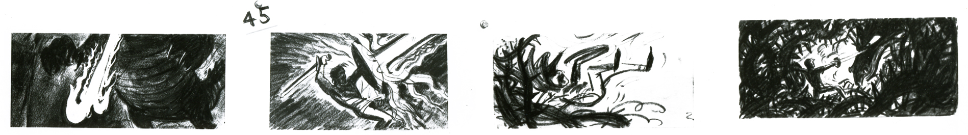
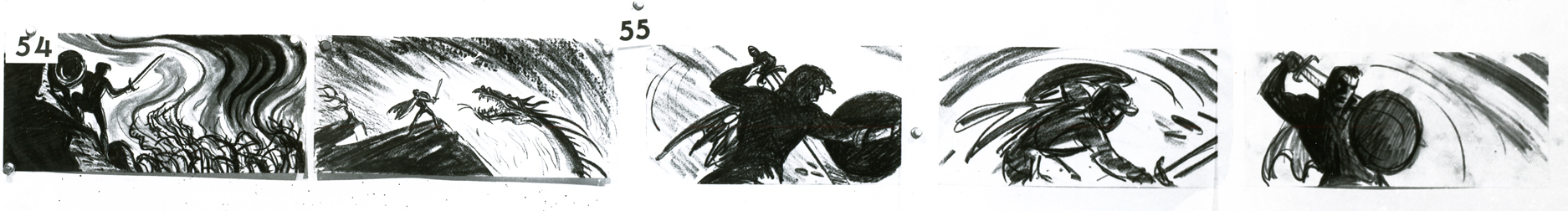
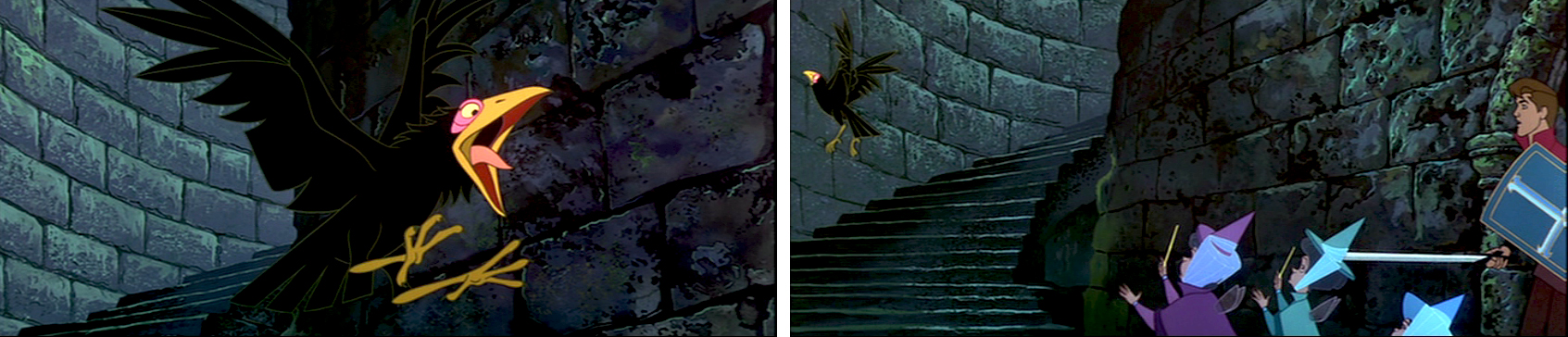
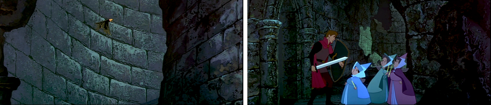
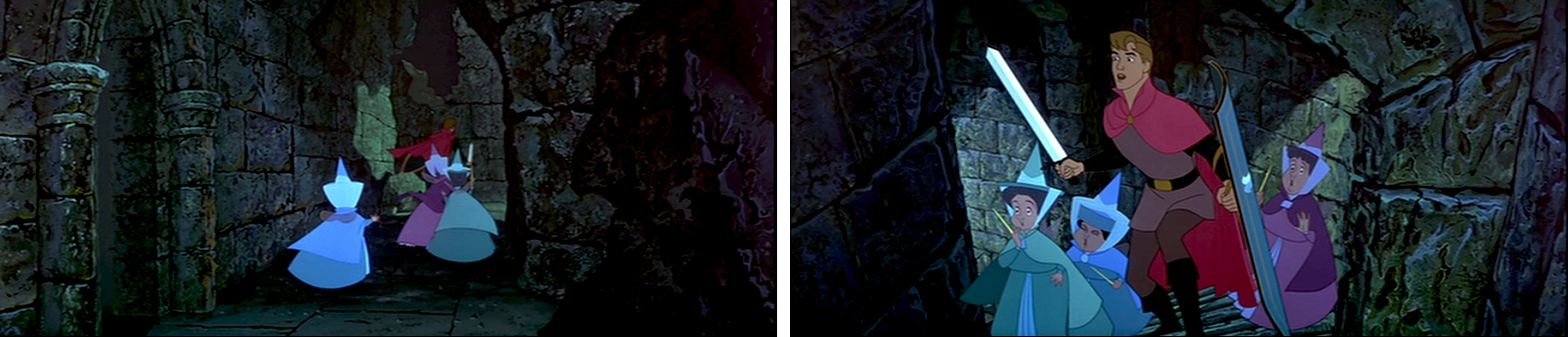
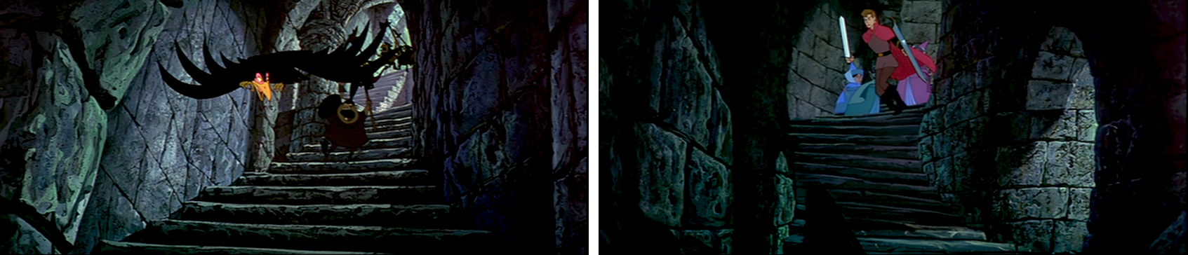
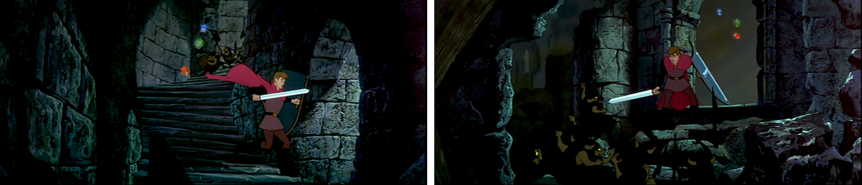
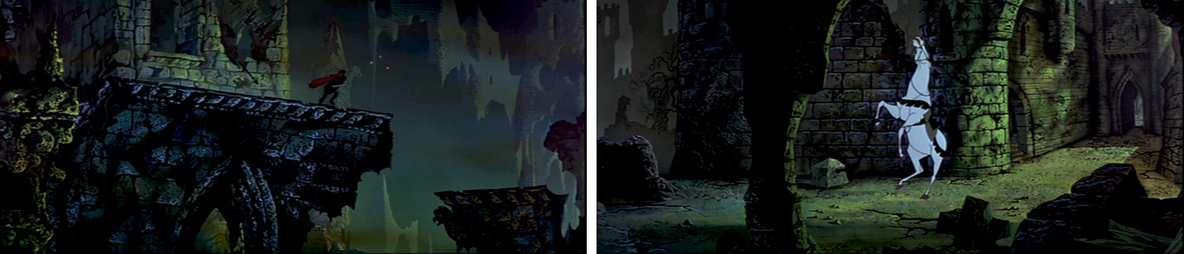
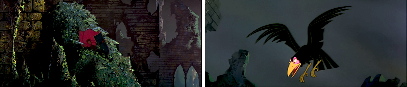
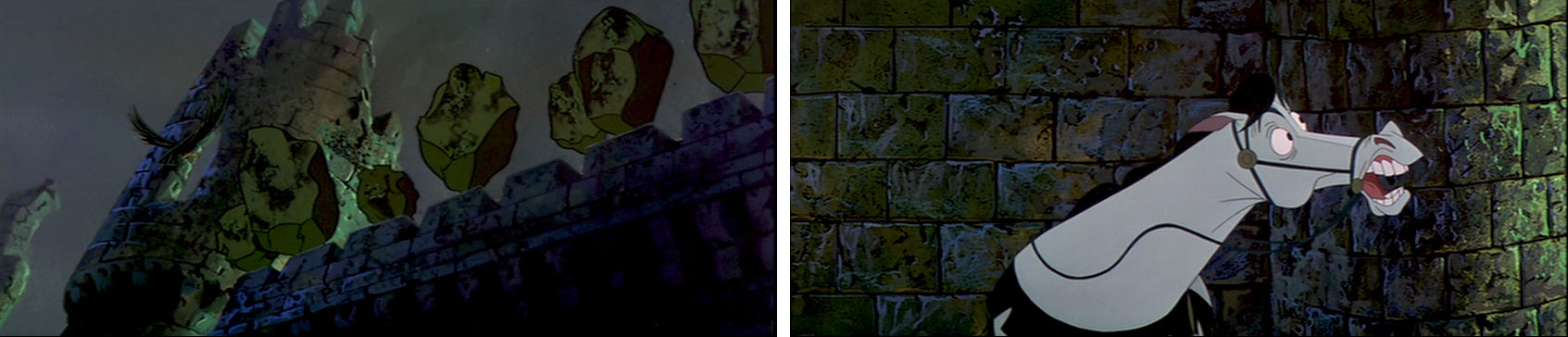
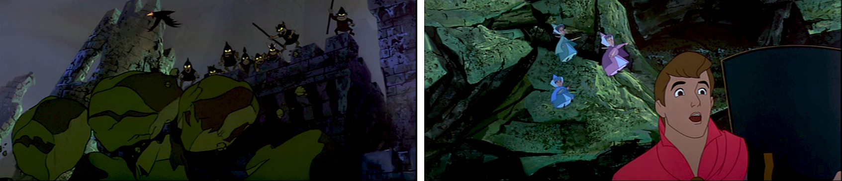
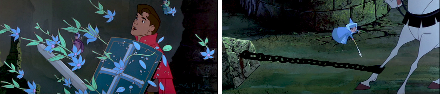
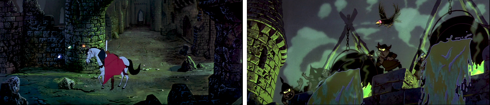
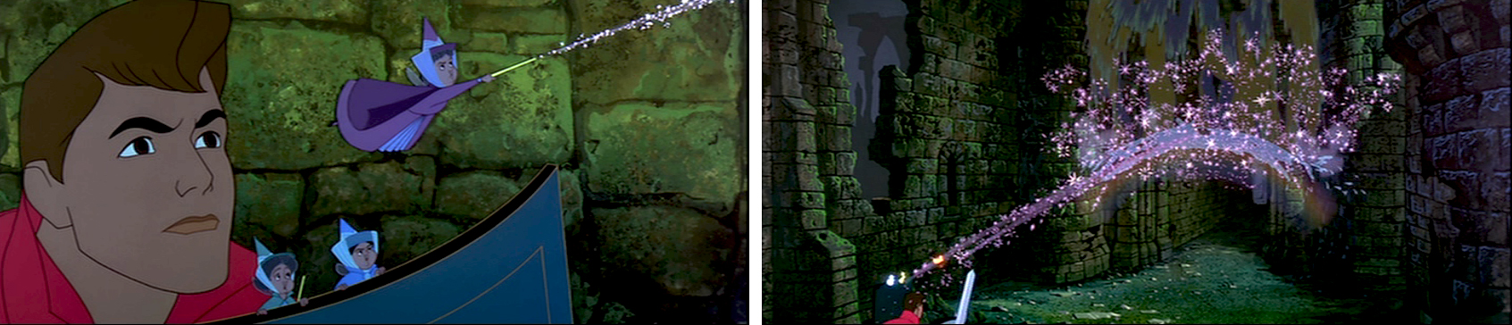
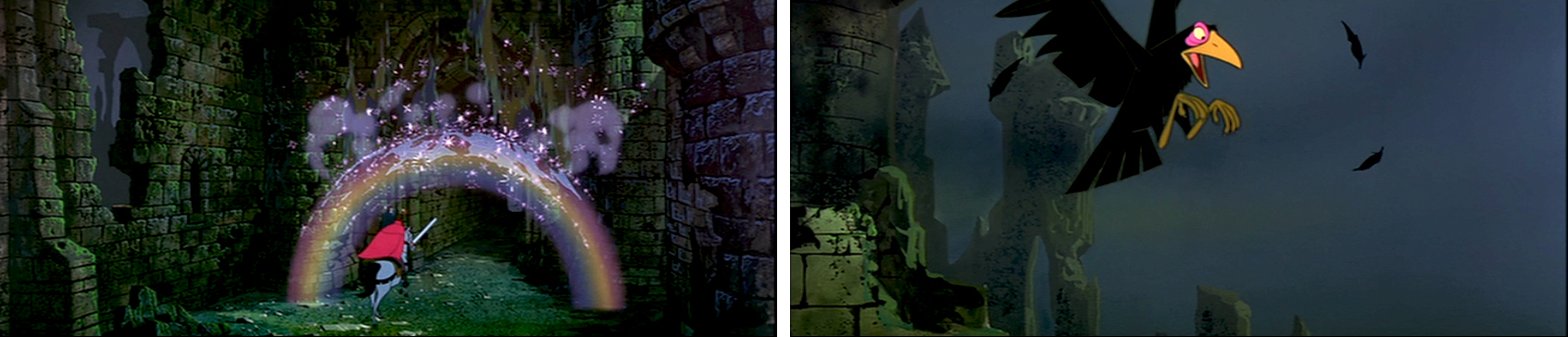
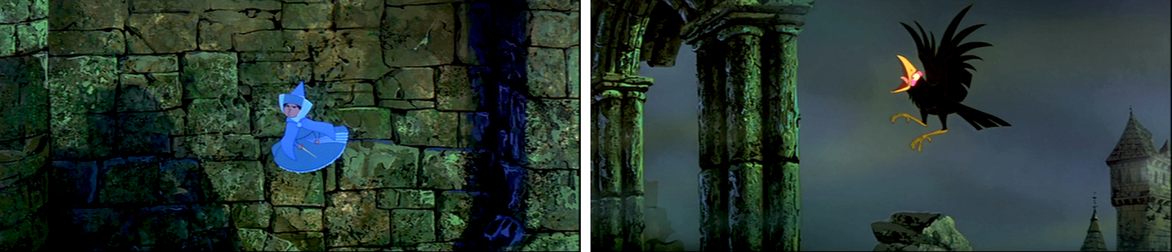
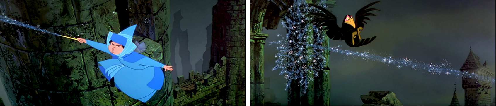
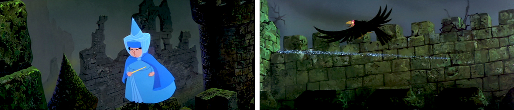
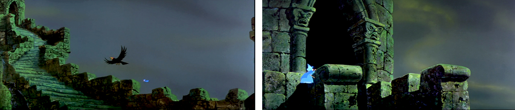
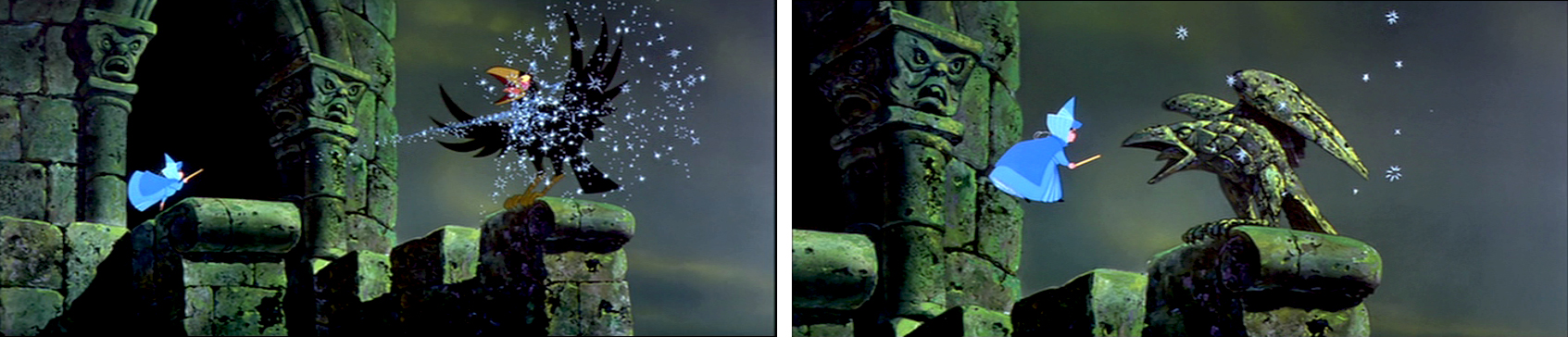
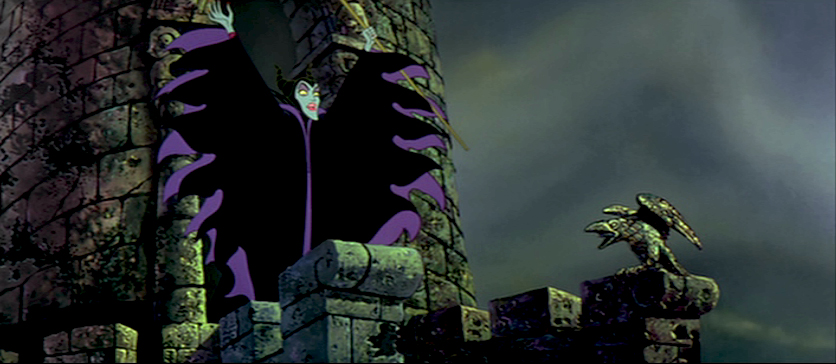
My apologies, I should have included this page among those from the Sleeping Beauty battle which I’d posted yesterday. This concludes the dragon fight.
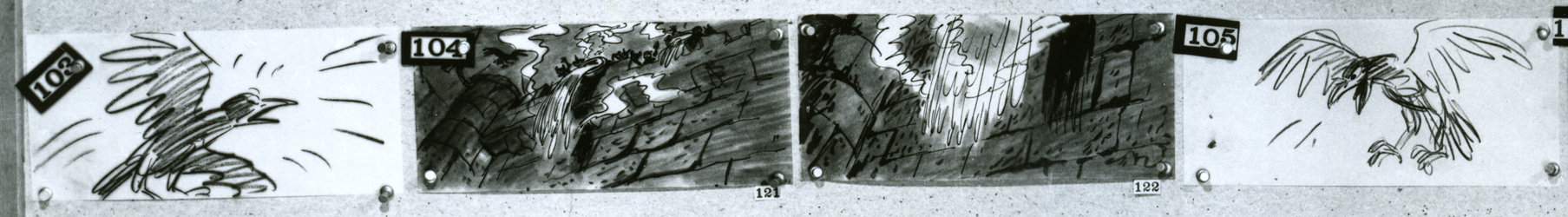
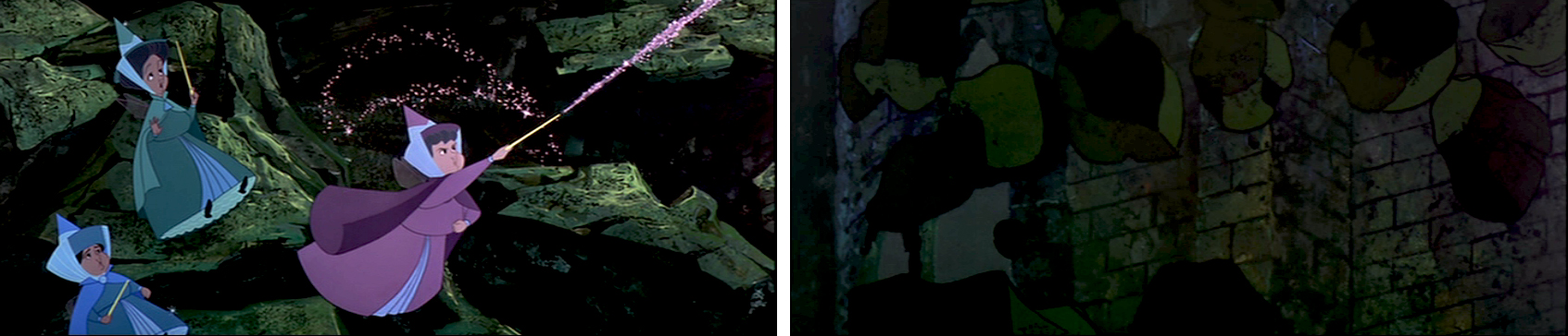
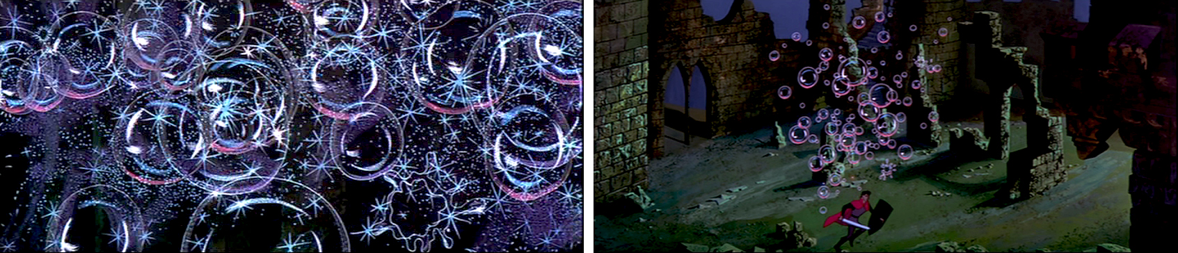
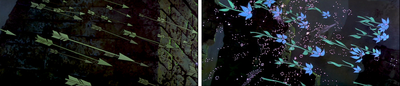
- This is the final photo/page of the Ken Anderson board for Sleeping Beauty. John Canemaker loaned me the series (which I’d posted in June of 2006) that includes Sequences 18 & 19 of the film. They’re the climax of the film – Prince Phillip’s battle with the thorns and the dragon, ultimately killing off Maleficent.
This is the whole photo as is:
(Click any image to enlarge.
Here, I’ve broken the photo into rows cutting the rows in half. This way I can post them as large as possible for viewing.
1a
1b
2a
2b
3a
3b
4
These last are tiny thumbnails at the base of the photo.
These two basic setups are also pinned to the board.
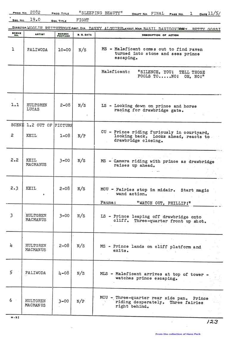
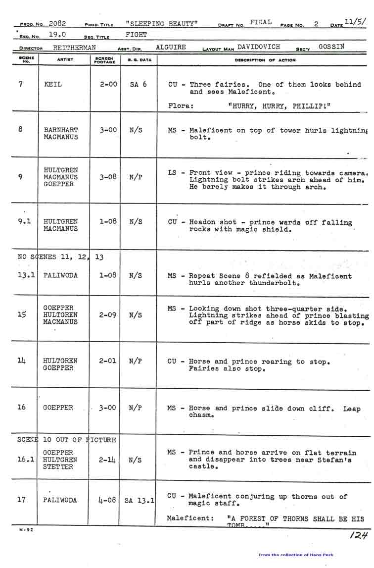
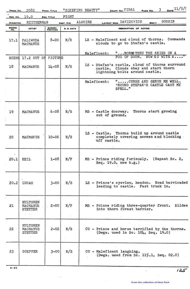
Here are the pages of the animator’s draft to inform you as to who animated the scenes of sequence 19:
1 2
3 4
5 6
7 8
9 10 Click any image to enlarge.
Many thanks also to Hans Perk who, on his blog A Film LA, has posted the animator drafts of this film (like so many others he’s shared with his readers). None of this work could have been done without that reference.
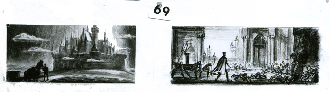
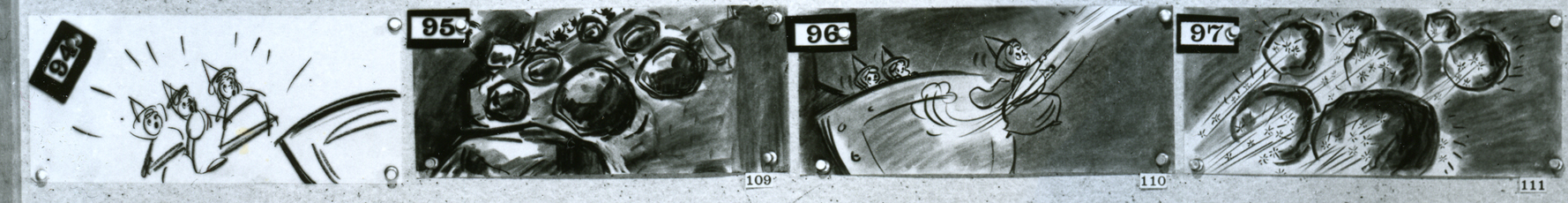
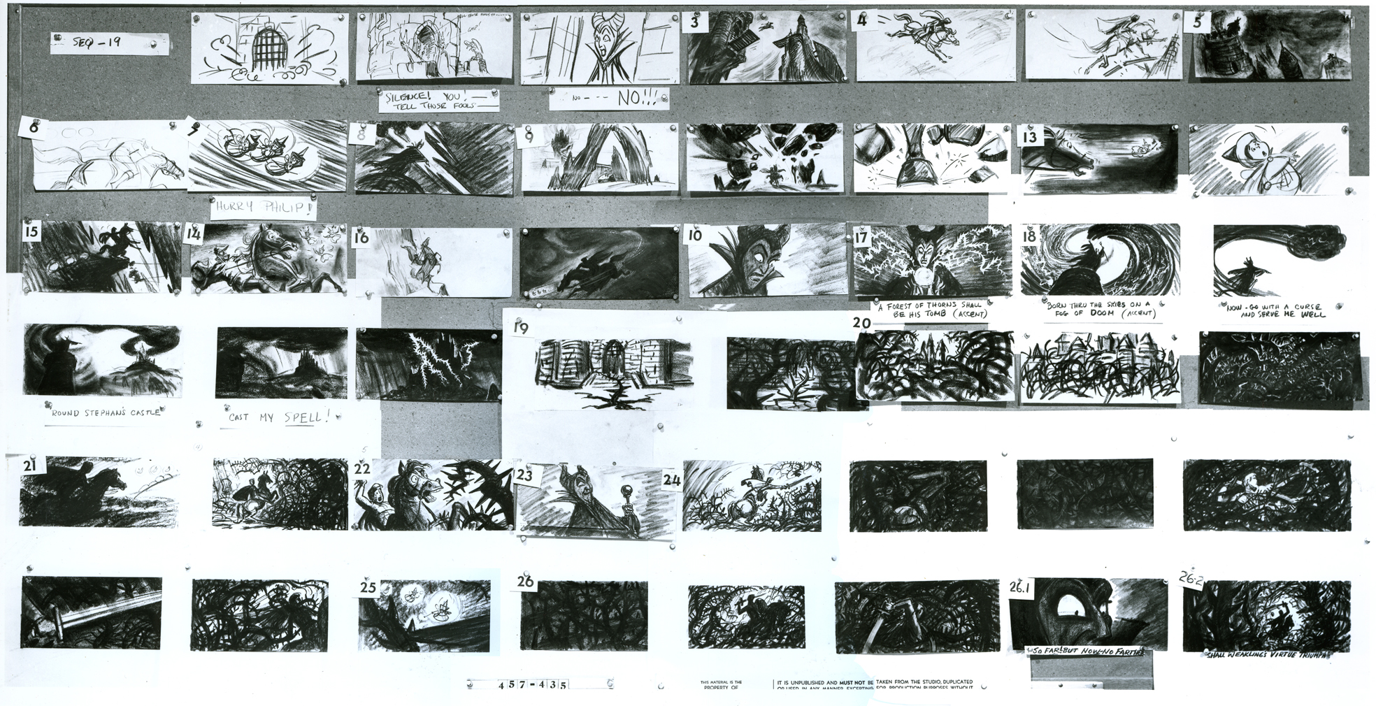
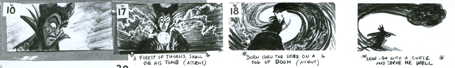
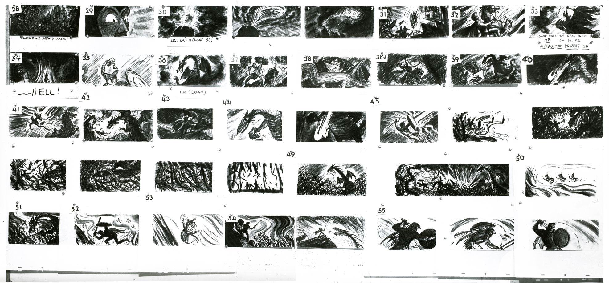
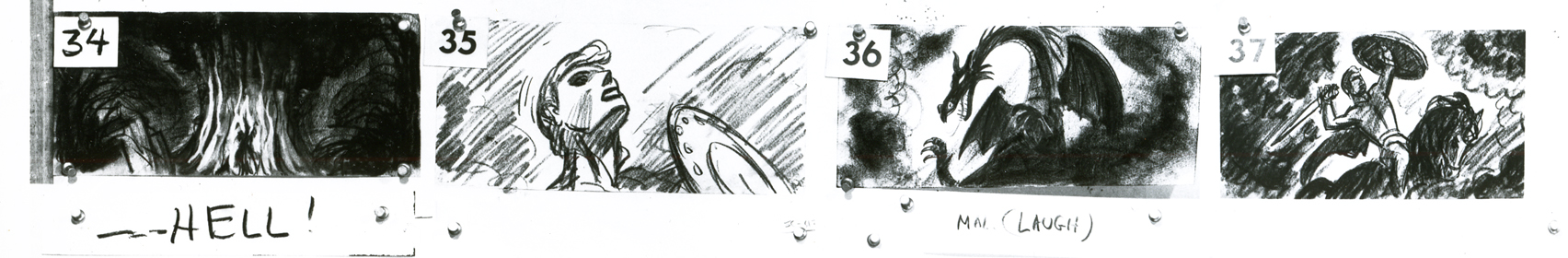
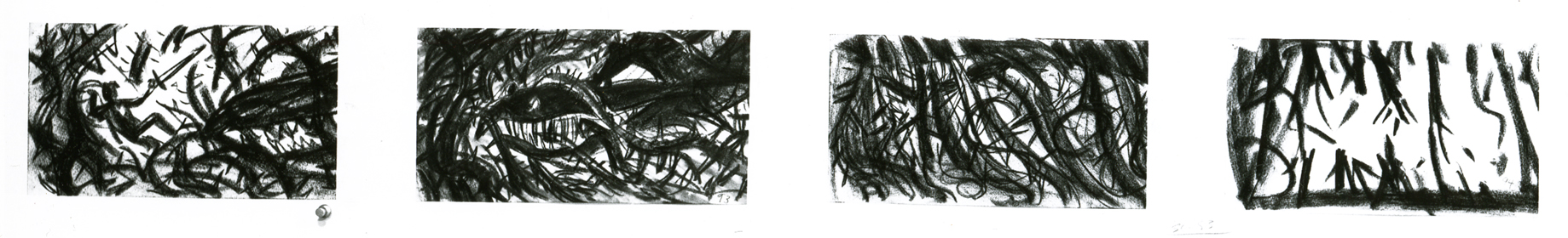
- John Canemaker had loaned me the final sequences of the storyboard to Sleeping Beauty, detailing the dragon fight and climax of the film. I originally posted this in three parts. I’ve combined them all here, making for one long post.
I’m not sure who did the artwork, but there’s a good chance it’s Ken Anderson‘s work.
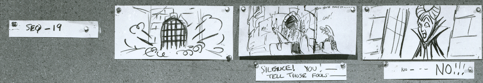
As with past boards, I’ll post the whole photograph as is, then take it apart row by row so that you can enlarge them as much as possible. Here’s the storyboard sequence #19 from Sleeping Beauty.
The full board follows below:
(Click any image to enlarge.)
The breakdown of that full board follows:
1a
1b
2a
2b
3a
3b
4a
4b
5a
5b
6a
6b
7
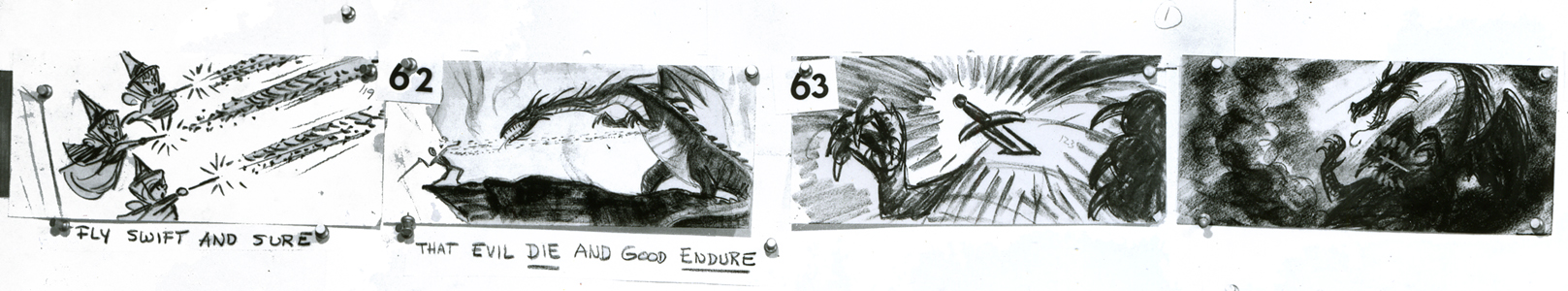
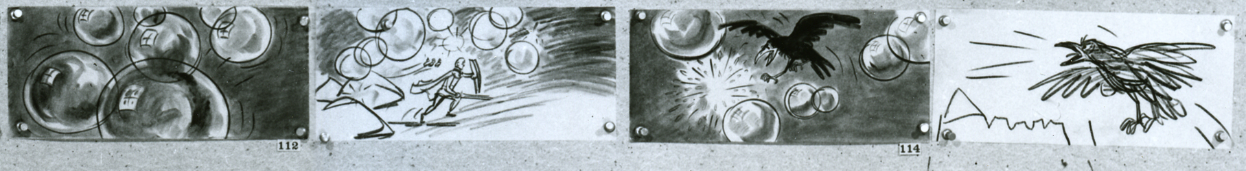
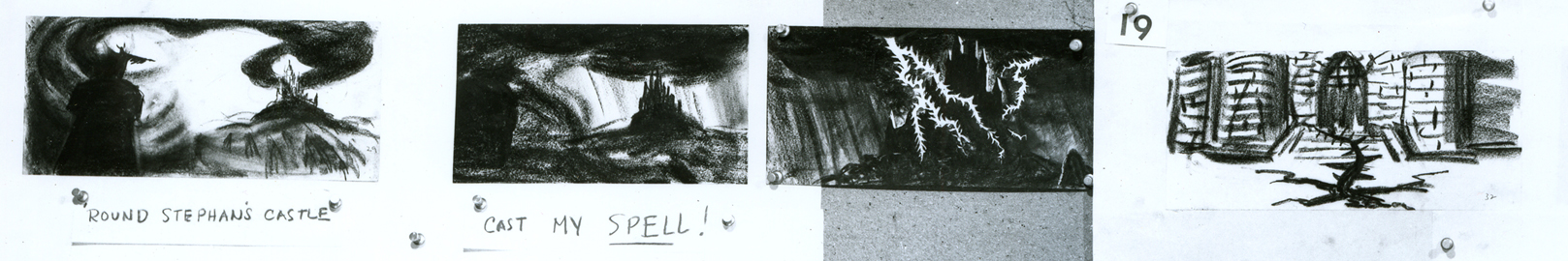
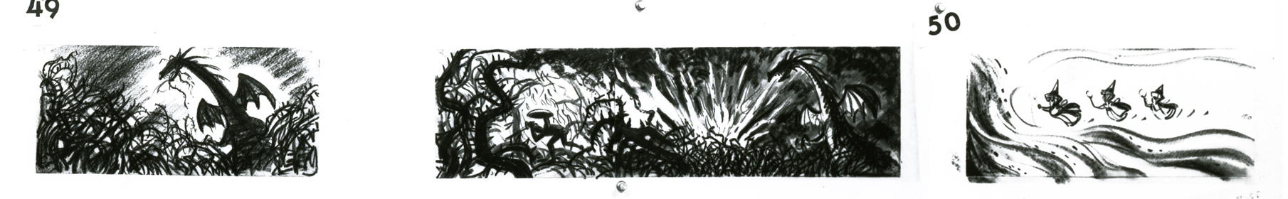
Here’s the next full page of storyboard as is:
(Click any image on the page to enlarge.)
Again, I follow with the board broken up into segments, half a row at a time.
1a
1b
2a
2b
3a
3b
4a
4b
5a
5b
6a
6b
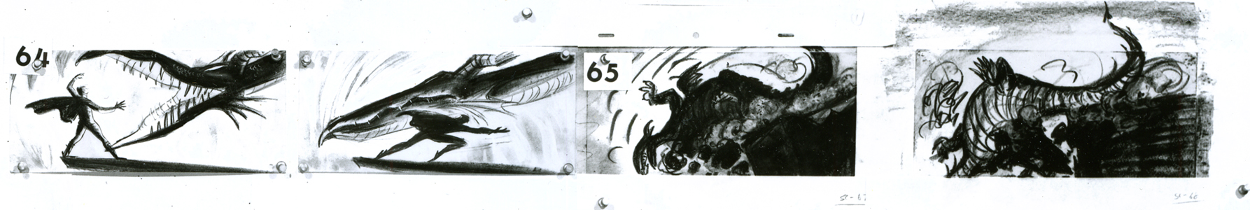
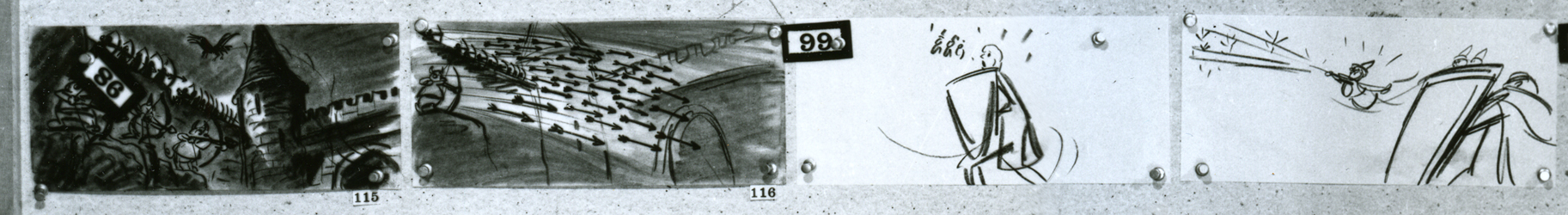
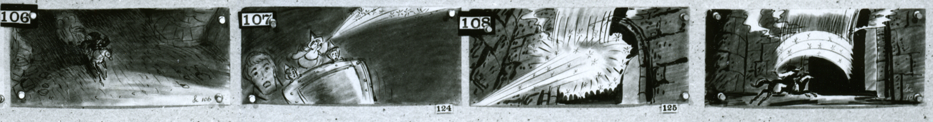
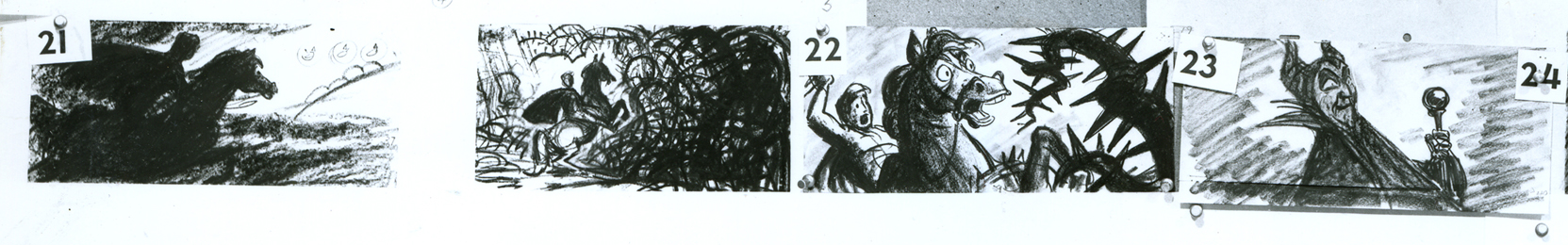
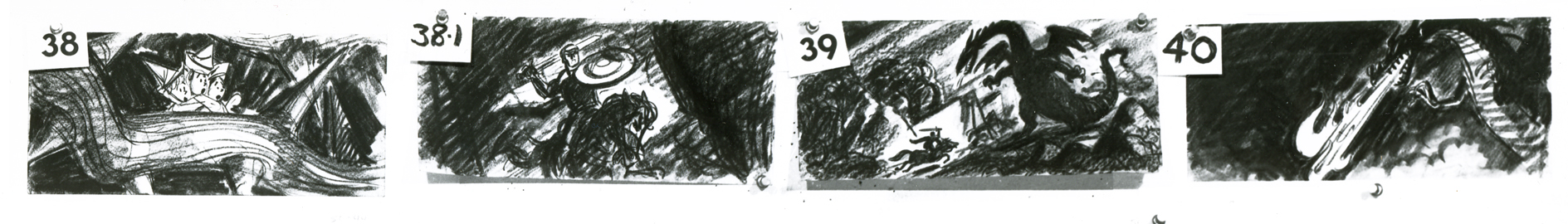
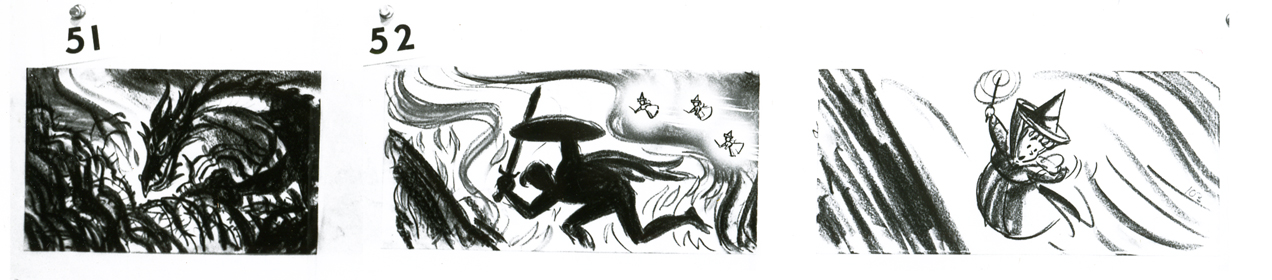
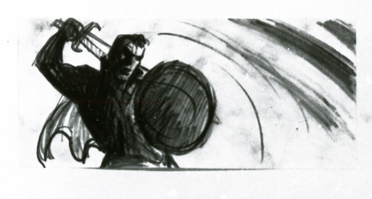
This is this photo of the next page of the board as it came to me:
(Click any image to enlarge.)____________
Here are the rows of the board broken into two so that I can post them a bit larger.
1a
1b
2a
2b
3a
3b
4a
4b
5a
5b
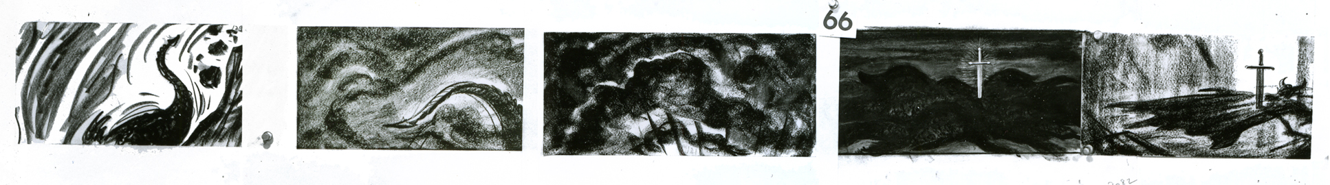
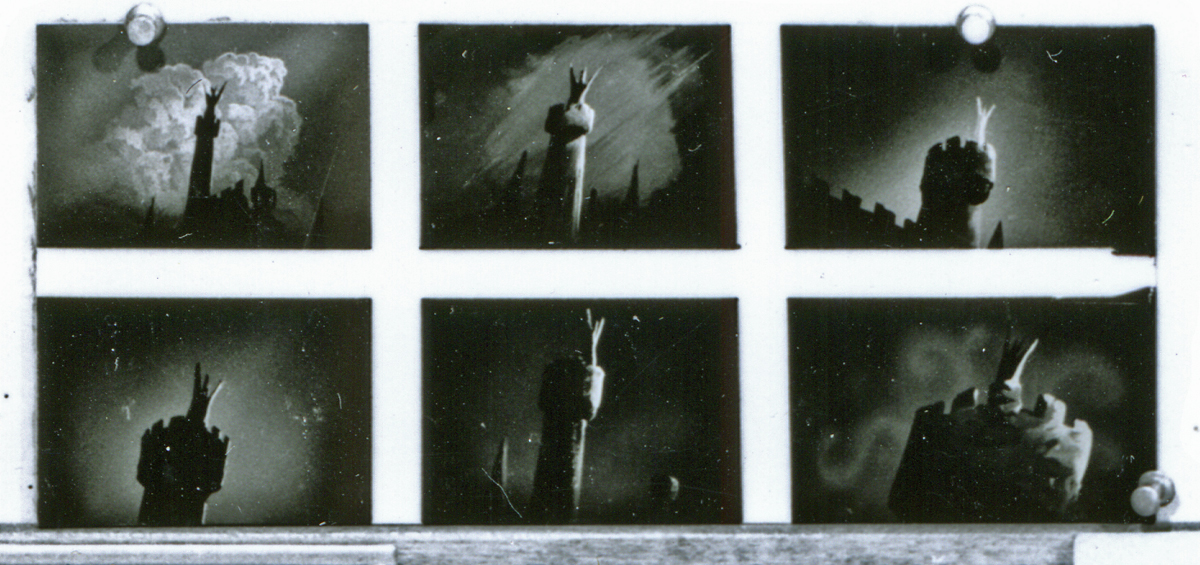
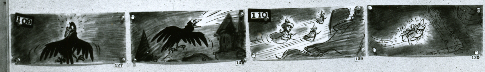
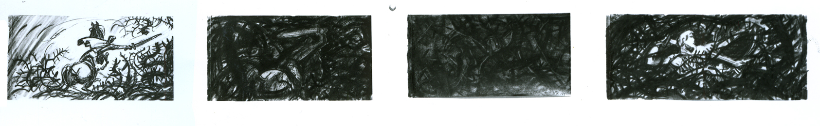
If only he knew what he was going to face next.
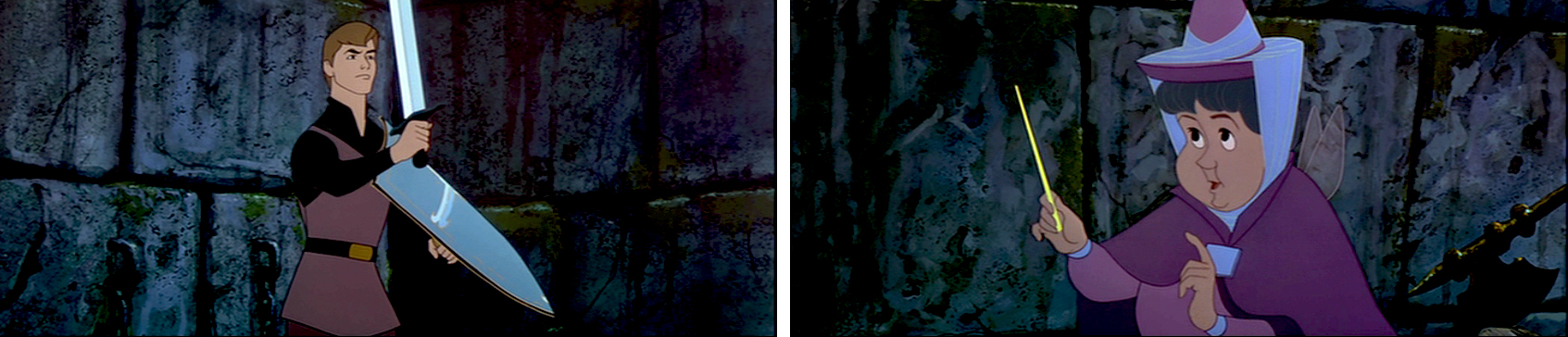
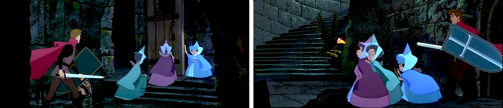
I’ve decided to get the frame grabs for the sequence and post them as well. I thought the comparison of board to actual film would be interesting.
__________
These images come from the “Special Edition” of the dvd, not the “Platinum Edition” now on the market. Using Hans Perk‘s posts of the drafts for these scenes, on his blog A Film LA, I was able to identify the animators’ names.
sc 82 (L) Milt Kahl – sc 82.1 (R) Frank Thomas
sc 82.2 (L) Kahl & Thomas – sc 82.3 (R) George Nicholas & Jerry Hathcock
sc 82.4 (L) Nicholas – sc 82.5 (R) Nicholas & Hathcock
Nicholas & Hathcock (L) sc 82.6
Nicholas & Hathcock (L) sc 83
sc 84 (L) Ken Hultgren – sc 85 (R) Nicholas & Hathcock
sc 87 (L) Nicholas & Sibley – sc 88 (R) Nicholas & Hathcock
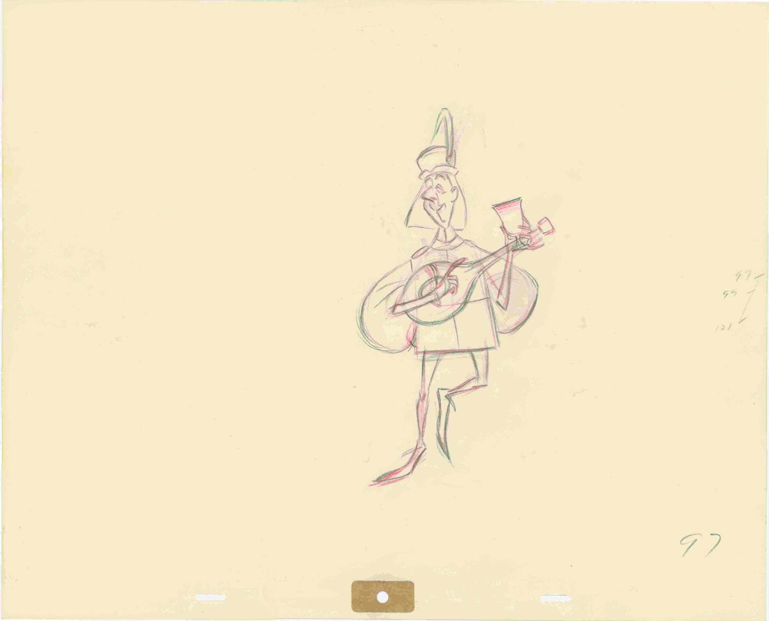
- Let’s end this post from Sleeping Beauty by posting a couple of drawings I have for the “Skumps” sequence. Again, Hans Perk on his blog A Film LA, posted the animator drafts for this sequence and I was able to I.D. the animators. (I have to say I guessed correctly in three out of four shots, so I’m pleased with myself.)
I’m posting closeups of the drawings. By clicking on any of them you’ll see the full sized animation paper. I’m also posting frame grabs beneath the drawings so you can see how they looked in the film.
This is a Milt Kahl scene, seq 13 sc 8. This drawing is undoubtedly a clean up,
so it’s not one of Kahl’s drawings – just his pose. It’s an extreme.
It is interesting that Kahl animated both characters.
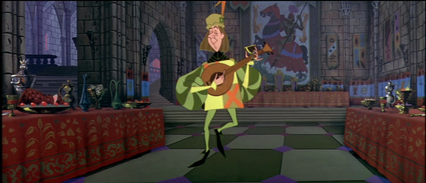
This is a John Sibley ruff. Seq 13 sc 17.
It’s a very odd, uncoordinated dance number by the drunk lackey.
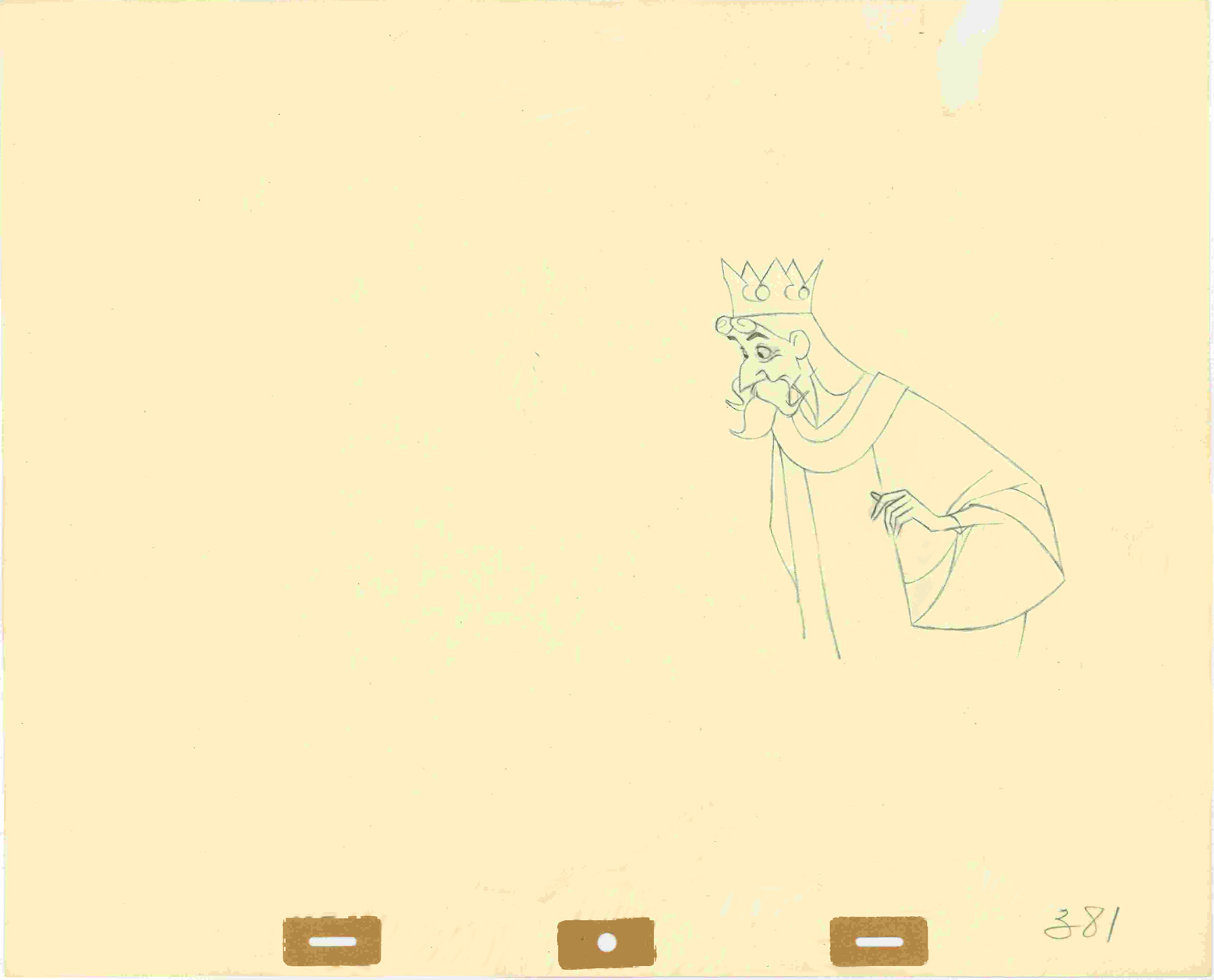
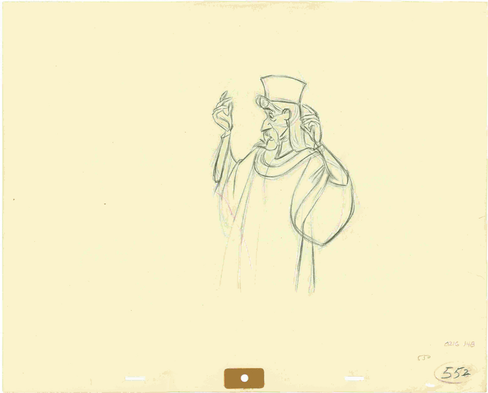
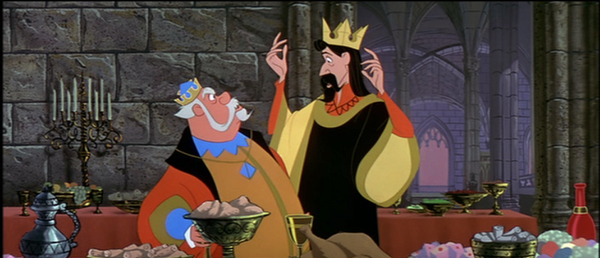
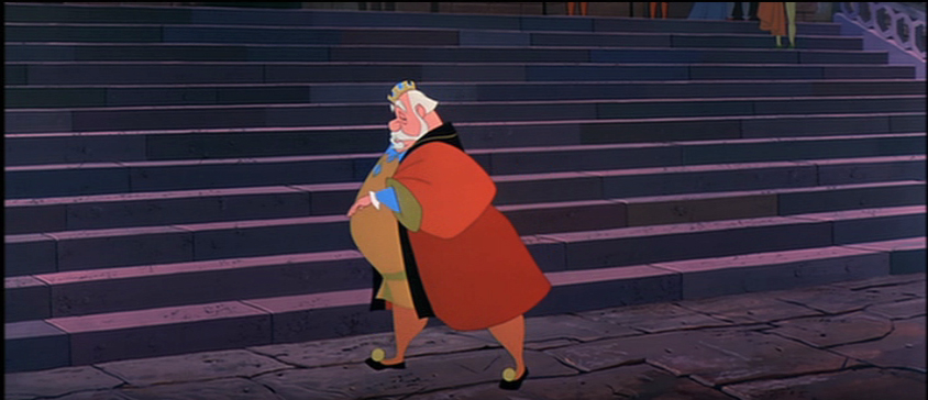
This is my favorite of these four. It’s a John Lounsbery ruff of King Stefan.
Another extreme from seq 13 sc 26.
I like this character.
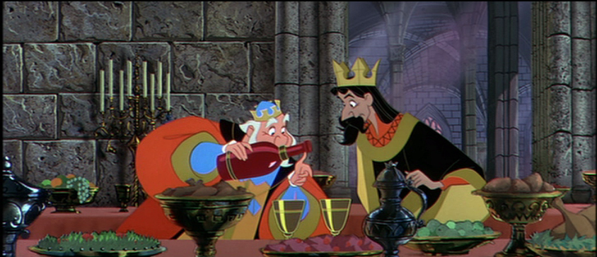
This is also another beautiful ruff by John Lounsbery. It’s King Hubert in the
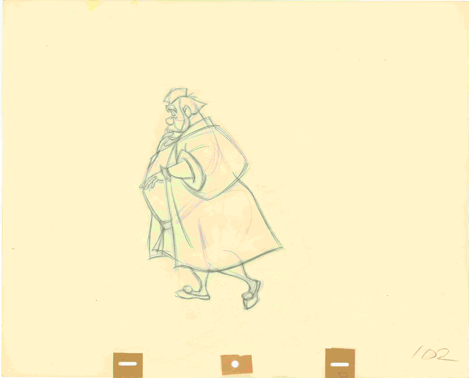
very last scene of seq 13, sc 57.
it comes just prior to Hubert’s turning and sitting on the palace steps.
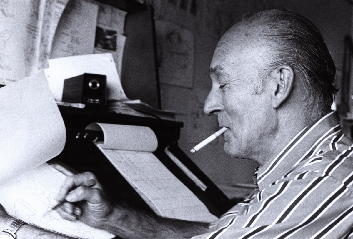
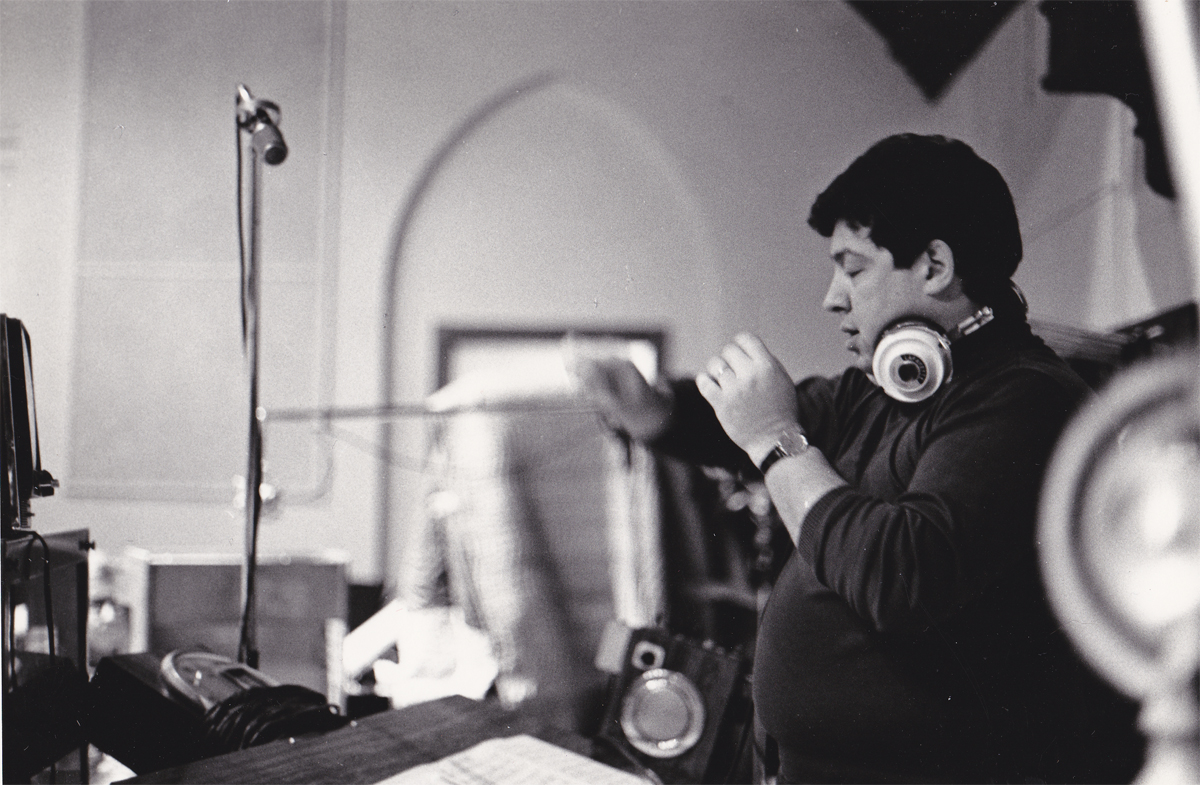
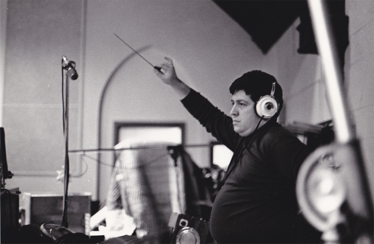
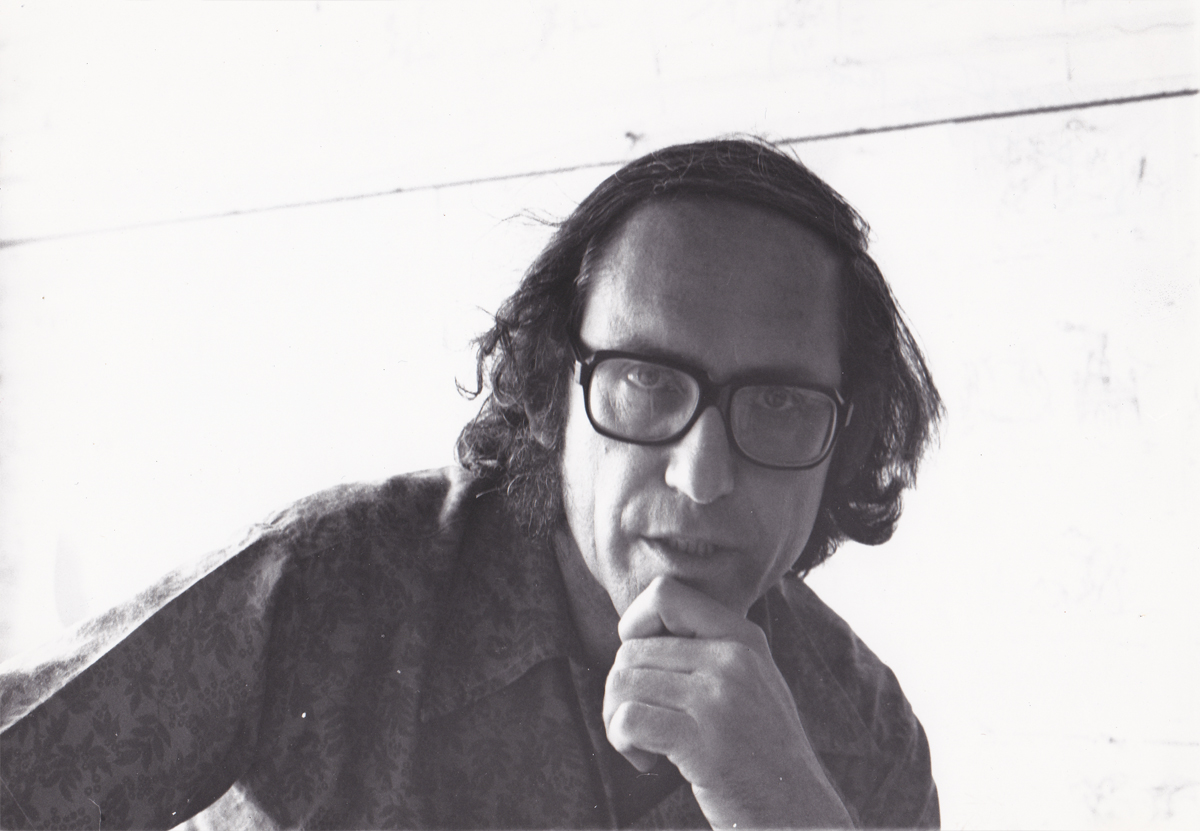
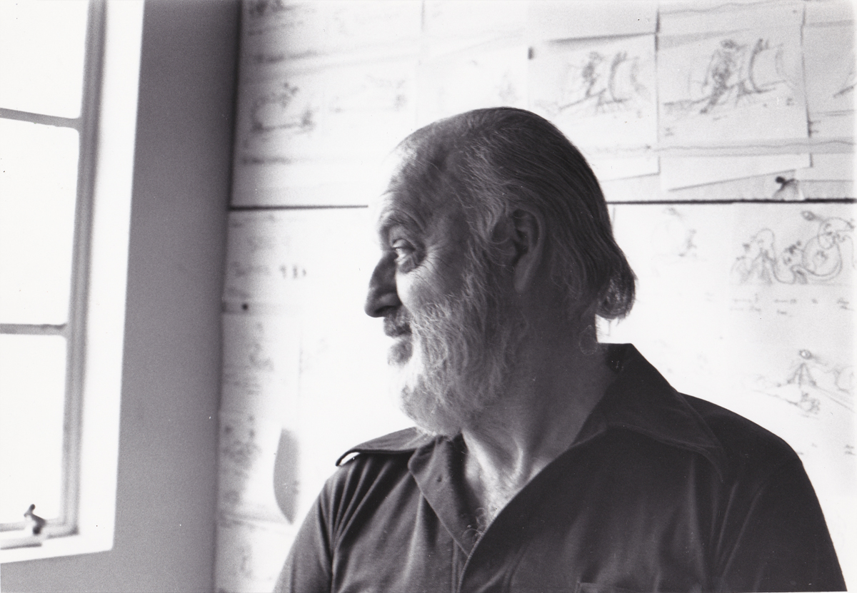
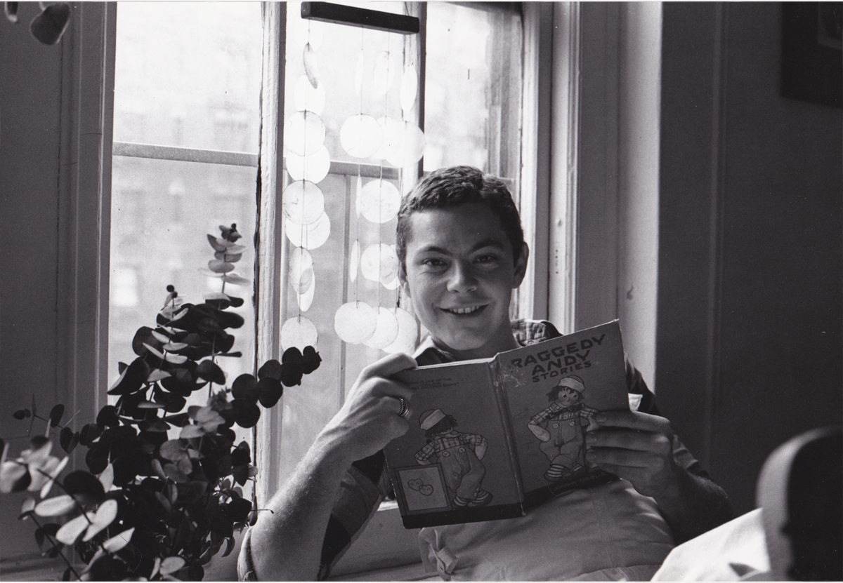
- John Canemaker recently loaned me a stash of photos of the Raggedy Ann crew. These were pictures that were used in his book on the “making of”. It was a better book than movie (as they often are). There are also some photos that didn’t make it to the book. John Canemaker shot all the photos, himself and all copyright belongs to him.
I thought I’d post the pictures and add some comments that pop off the top of my head. Hopefully, a couple of interesting stories will show up in my memories.
There are enough photos that it’ll probably take about three posts to get them all in. The next two Sundays are booked, I’d guess.
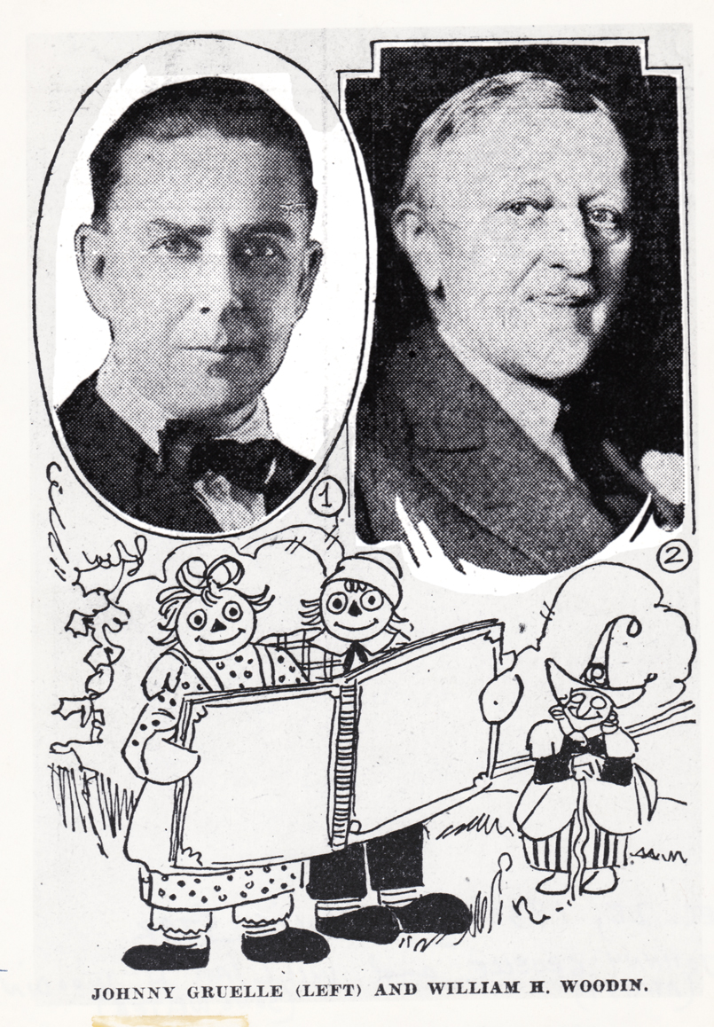
1 Johnny Gruelle (artist, writer) and William H. Woodin (song writer)
Dec.28, 1930 Indianapolis Star – “Raggedy Ann’s Sunny Songs”
This was apparently a theatrical piece Johnny Gruelle
put together with his very successful characters.
2
It all started with Joe Raposo, the composer of “Bein’ Green”
and many other hit Sesame Street songs. He wrote a musical for “Raggedy Ann
and Andy” and was made to see that it would make a wonderful animated musical.
3
He wrote a lot of songs for the slim script and they prerecorded
the songs for the animation. We lived with a soundtrack of about
a dozen musicians playing this very nice score to the delicate voices
that sang the tuneful pieces.
4
We heard this at least once a week as the animatic/story reel
grew into a full animated feature shot completely in Cinemascope.
5
When the final film was released, that 12 person orchestra
became 101 strings and a big over-polished sound track.
No matter where you went the music was there and in the way.
It was too big, and the movie was too small. It was bad.
The track was incredibly amateurish. The composer had too much control.
6
This was Richard Horner. He was one of the two producers of the film. Stanley Sills (a Broadway producer and Beverly’s brother) was the
other producer who didn’t know what he was doing.
They represented Bobbs-Merrill who owned the property.
I really liked Mr. Horner. We met again a number of years later
when Raggedy Ann was distantly behind us. I’d offered to take Tissa to church,
one Easter Sunday; Richard Horner and wife were there. He asked to meet with me.
He sought advice on some videos of artists and their work that he was producing,
and hoped I could offer my help in leading him to some distributors.
7
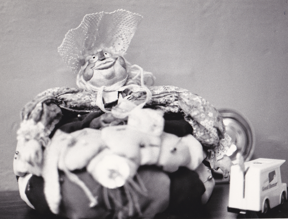
This is one of the dolls in the play room, Susie Pincushion. She was charming.
8
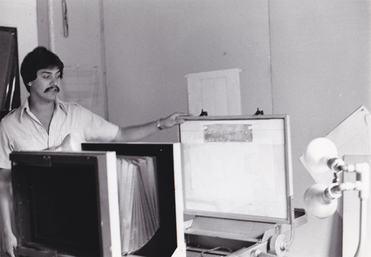
This is Cosmo Pepe; he was one of the leaders of the Xerox department.
It was Bill Kulhanek‘s department, but Cosmo really did great work.
They had this room-sized machine that they converted drawings into cels.
It was all new to NY, and the whole thing was so experimental.
Especially when Dick decided to do the film with grey toner rather than black.
The film always felt out of focus to me (even though it wasn’t.)
In the end when they rushed out the last half of the film, Hanna Barbera
sub-contracted the Xeroxing, and it was done in a sloppy and poor black line.
9
This is Corny Cole. He was the designer of the film, and all the great art
emanated out of his Mont Blanc pen nib. Or maybe it was a BIC pen.
Whatever, it was inspirational.
I wrote more about him here.
10
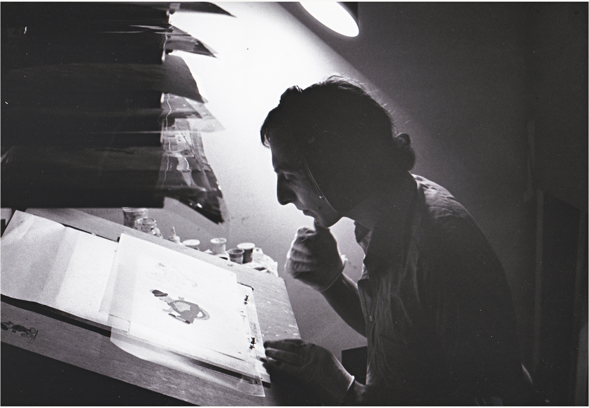
The gifted and brilliant animator, Hal Ambro. Can you tell that
I admired the man? I wanted badly to meet him during this production,
but that never was to happen. Now, I can only treasure his work.
11
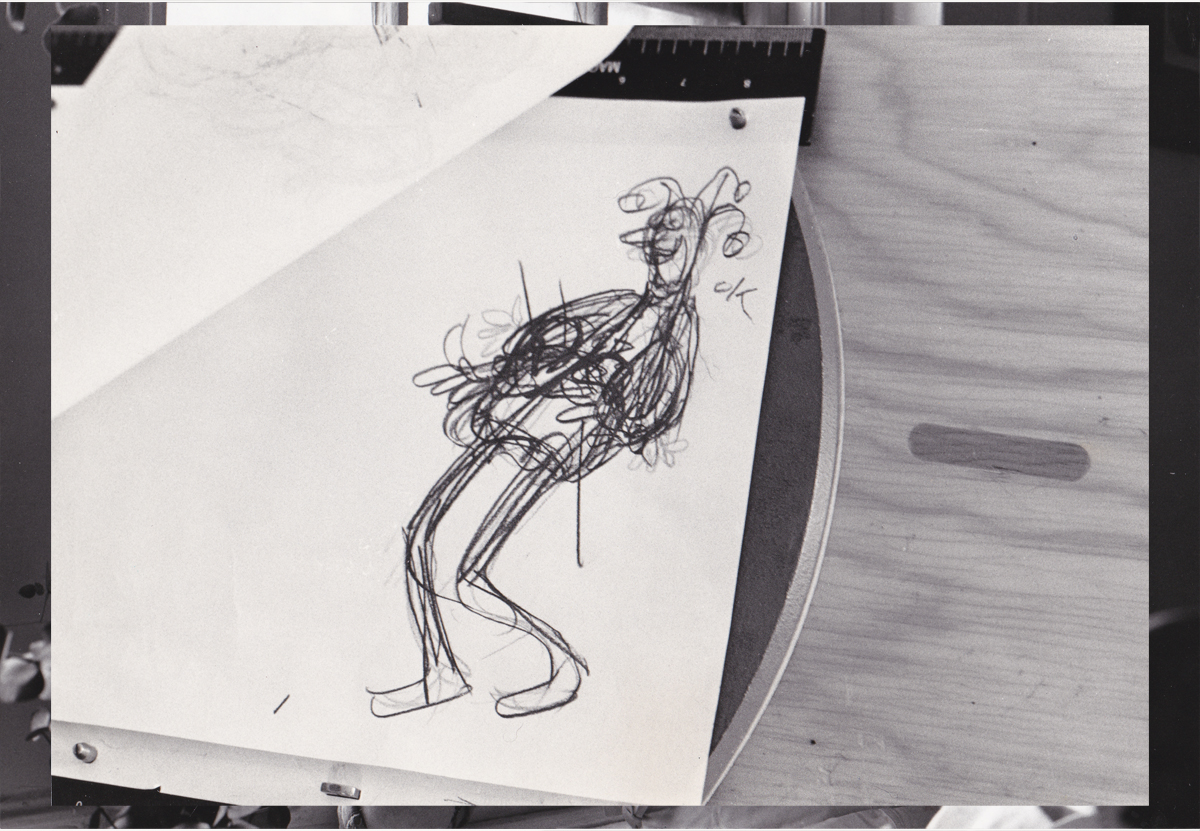
This is a very rough planning drawing that Grim Natwick did on
the Jack-in-the-Box he animated. See the scene here.
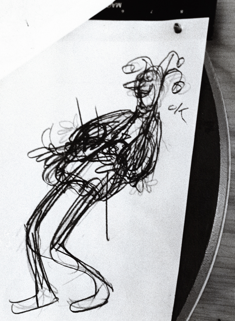
12
Here’s a close up of that very same drawing.
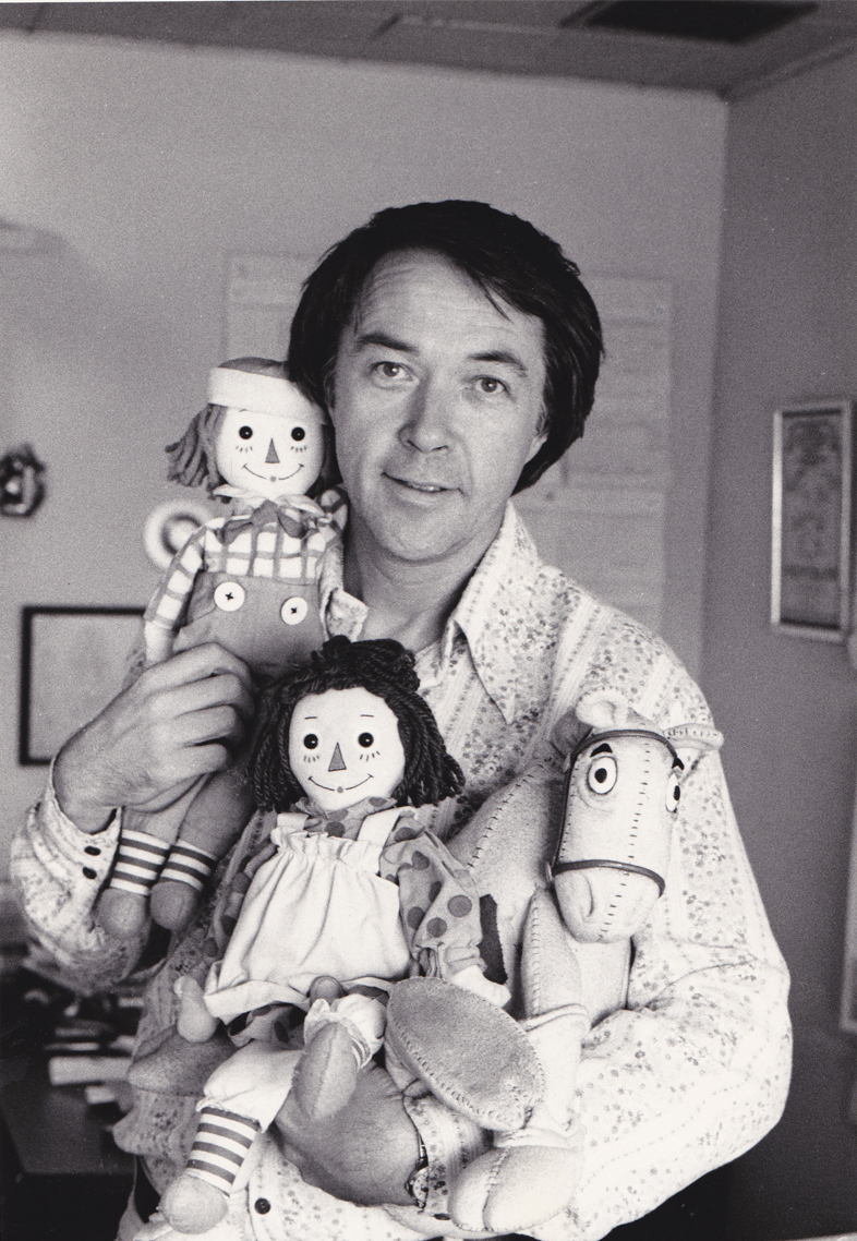
13 Mark Baker did the voice of Raggedy Andy.
He’d won the Tony Award as Best Featured Actor in the musical, Candide.
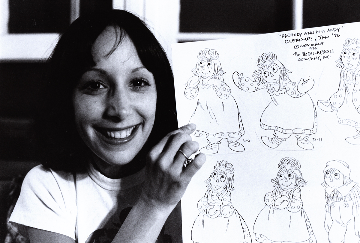
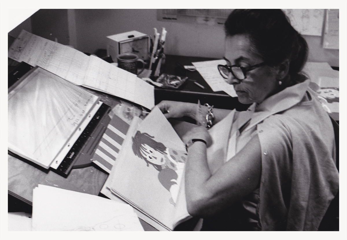
14 Didi Conn, the voice of Raggedy Ann, with Chrystal Russell, an animator
of Raggedy Ann. She backed up Tissa David who was the primary actor for
that character and did most of the film’s first half. Chrystal did many
scenes in the first half and most of the second.
She had a rich identifiable style all her own.
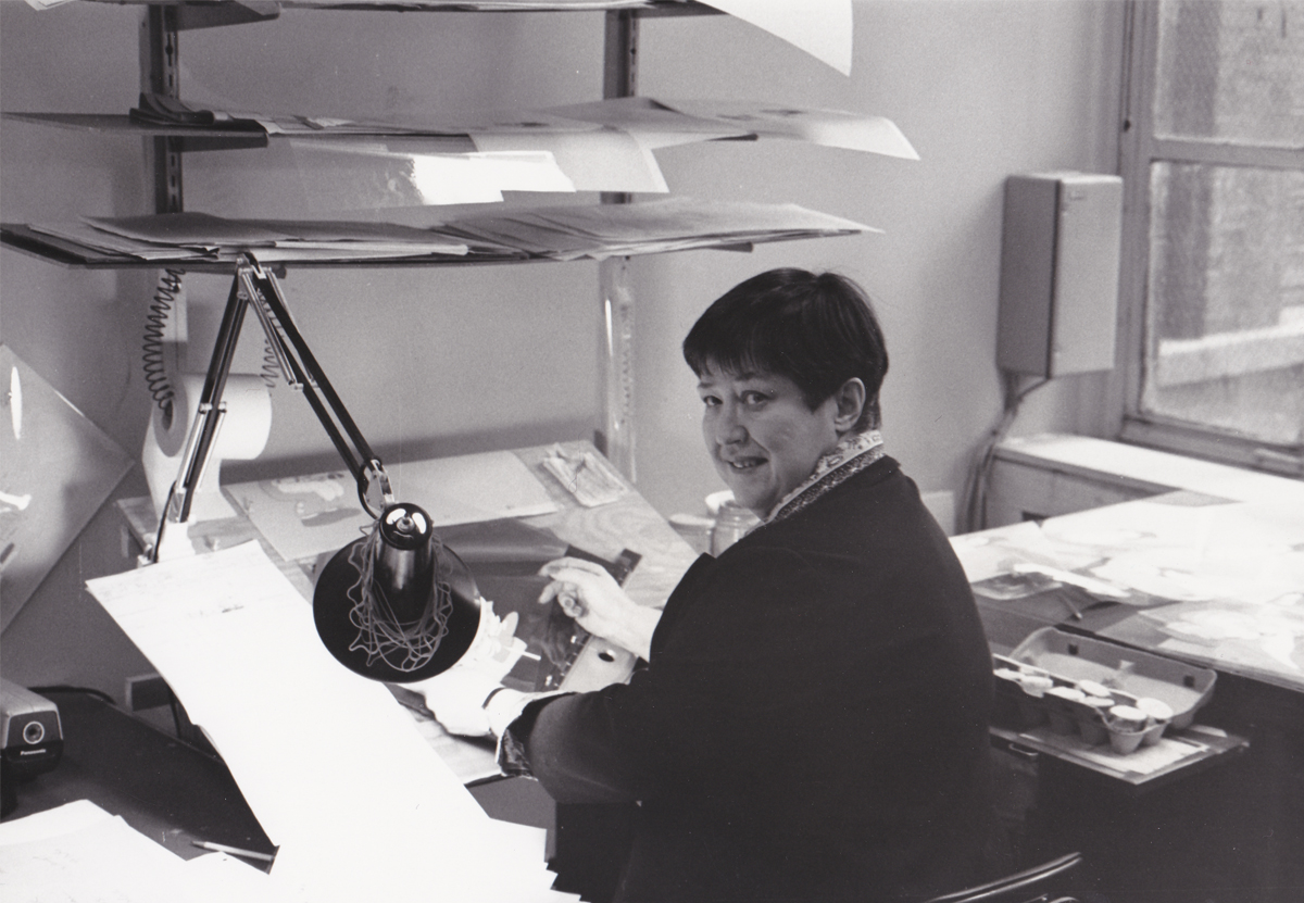
15 Sue Butterworth, head of the BG dept who designed the watercolor style
of the film. Michel Guerin, her assistant, can be seen in the rear. Bill Frake was the third part of that BG department.
16
Painter, Nancy Massie. A strong and reg’lar person
in the NY animation industry. She’d been working forever for a reason.
On the average, I spent about an hour a day down in the Ink & Pt dept.
Often they had problems to resolve with some animator’s work. Either the
exposure sheets were confusing or they didn’t match the artwork, or there
was some question that they found confusing. My being available made it
helpful to them, and I did so without hesitation.
17
Checker, Klara Heder. Another solid person
within the NY industry.
Generally, before a scene left my department for the I&Pt dept., I’d
have studied the exposure sheets and felt I knew the scenes before
they were handed out to the Inbetweener or Assistant. It meant taking
a lot of time with the work in studio so that I was not only prepared
to answer questions of a checker but the Inbetweener as well.
18
Sorry I don’t know who this is. If you have info,
please leave it for me. For some reason, I’d thought
he was an inbetweener (which would’ve made it odd for
me not to recognize him by name.) Apparently he’s a painter.
19 Carl Bell was the West Coast Production Coordinator.
We spoke frequently during the making of the show.
When I left the film, I went to LA for a couple of weeks. Chrystal Russell threw a small party for me, and Carl came.
(I think he might have brought Art Babbitt, who was there.)
The group was small enough that we could have a talk that we all
participated in. We talked for some time (though not about
Raggedy Ann.) It was great for me.
20 Jan Bell, Carl’s wife, was the West Coast Office Manager.
21 Maxie Fix-it. This was a great doll that wound up to get the legs going.
He rolled around the floor beautifully. The “Twins” in the back were animated
by Dan Haskett. though I’m not sure they gave him credit for it. I was a bit
embarrassed by these characters. They were just a naked bit of racism running
about our cartoon movie for very young children.
22 Gerry Potterton (left) and John Kimball (right).
Gerry was one wonderful person. I always enjoyed spending time with him.
He produced/directed a number of intelligent, adult animated films.
This includes an animated Harold Pinter‘s Pinter People.
After Raggedy, I tracked Gerry down to get to see Pinter’s People. It was
rather limited but full of character. Gerry knew how to handle the money
he was given, unlike some other directors. John Kimball was, at the time, not in the caliber of Babbitt or Ambro or David or Hawkins or Chiniquy. However, he did some imaginative play
on a few scenes which were lifted whole from strong>McCay’s Little Nemo
in Slumberland. One of these scenes I animated but was pulled
from it before I could finish it. I had too much else to do with the
tardy inbetweens of Raggedy Ann (an average of 12 drawings per day)
and the stasis of the taffy pit (an average of 1 inbetween per day).
Too many polka dots on Ann and too much of everything in the pit.
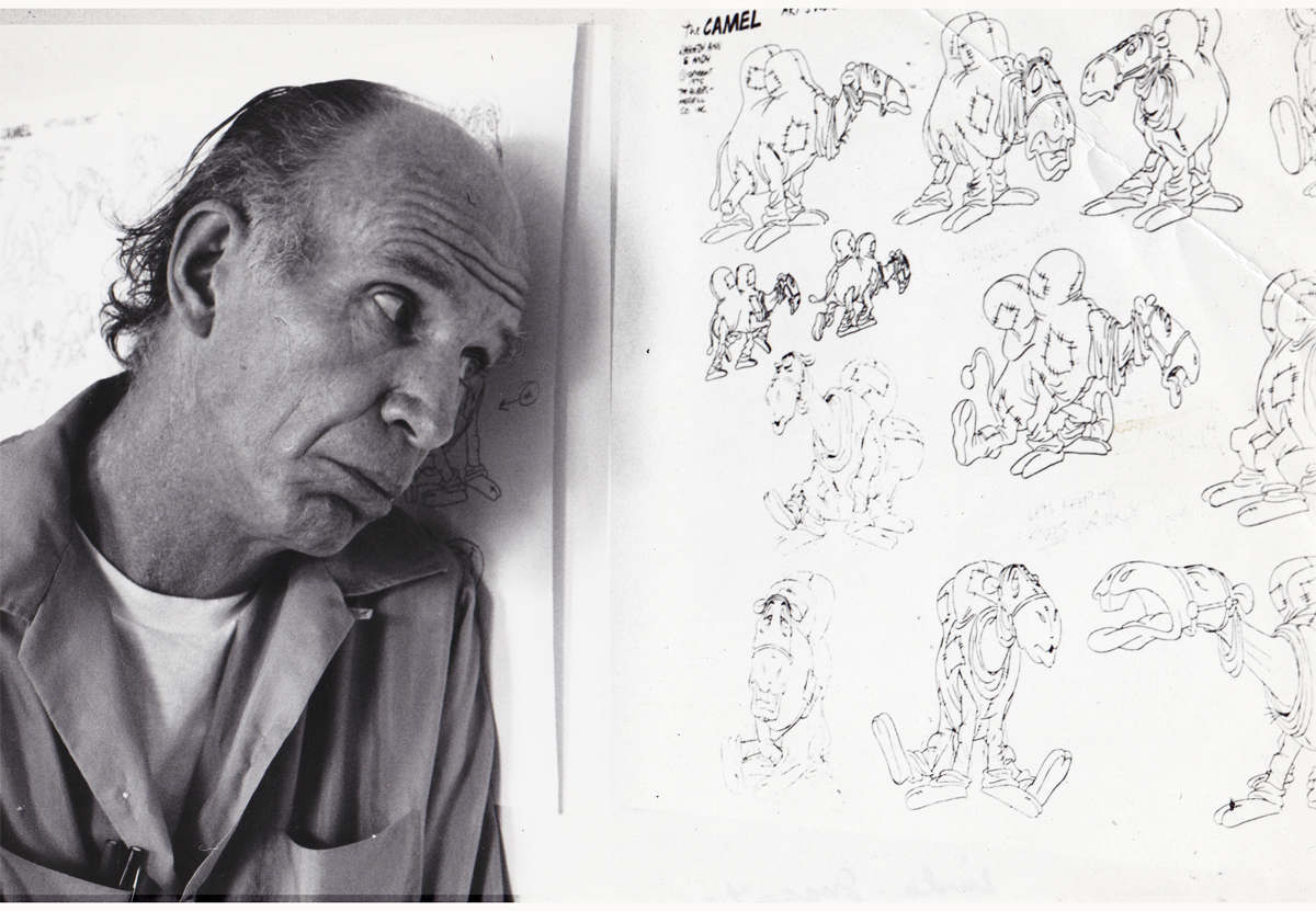
23 Fred Stuthman, the voice of the camel with the wrinkled knees.
He did add a great voice for the camel, though for some reason
I remember his being a dancer, predominantly.
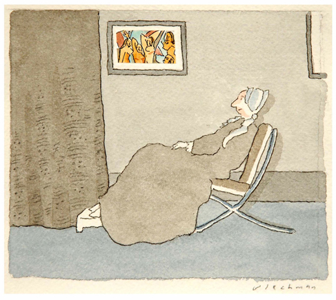
R.O. Blechman: The Inquiring Line is an exhibition that will take place at the Norman Rockwell Museum in Massachusetts and will run from May 11 through June 30, 2013.
Joyce K. Schiller, PhD., the curator of the Rockwell Center for American Visual Studies writes: “Quavering and active with telling starts and stops, the marks of the artist’s hand are an essential aspect of (Blechman’s) art. His fine calligraphic strokes are a kind of nervous energy that gives the sense that his drawings could spring from the page.”
There will be an exhibition opening where you can meet the artist. On Saturday, May 11, from 6 to 8:30 p.m. There will be an Artist Commentary at 6:30 p.m. A festive reception will follow, including refreshments and a cash bar. Members free, guests $20. Please RSVP at (413) 931-2221 or rsvp@nrm.org.
Then on Saturday, June 15, 5:30 p.m., there will be “A Conversation with R.O. Blechman and Nicholas Blechman.” Father and son will discuss each other’s work. Bob is the illustrator, designer, film director and producer. Nicholas is the Art Director of the New York Times Book Review. The fee to attend the talk is $10 ($7 for Museum members).
_____________________
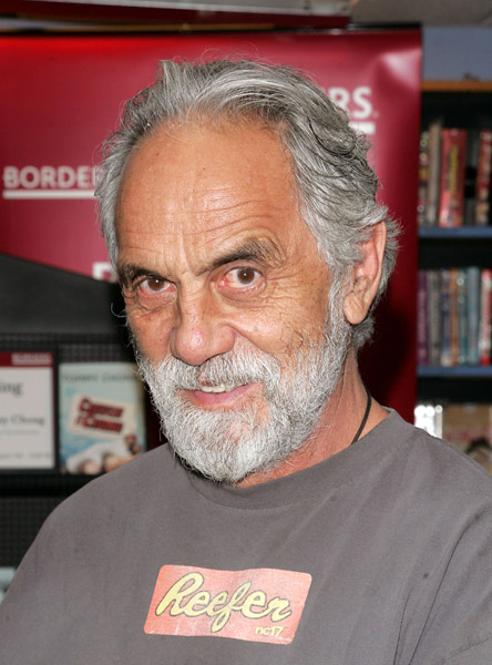
Richie Havens
– The recent passing of Richie Havens brought back a short memory I have from a number of years ago. I think it was 1984.
I’d received a call out of the blue from Mr. Havens. Now, remember I grew up in the Sixties and was a part of the “Woodstock Generation.” I loved the music of the period and Havens was a big part of that – especially to a New Yorker. This call was a shock. I was asked to come meet with him about an animation project he was assembling. No questions asked, I got the date and time and showed up.
(Thanks to Annulla who photographed the picture to the left for her blog, Blather from Brooklyn)
It was in the very theatrical (albeit seedy at the time) area of 8th Avenue and 56th Street. I arrived to a very large open space. A very wide open, not-overly-furnished space. After a brief greeting, I was directed to the only other seat in the room – easily ten or more feet away in the somewhat dark room. Richie Havens, dressed in dashiki, was graced with some light that offered a halo around his head, and I sat out of the spotlight.
Apparently, Tommy Chong had decided to make an animated feature. He wanted to film a Kung fu style movie in live action and rotoscope this into an animated film. Richie Havens was acting as his representative and was interviewing me for the position of assisting Mr. Chong in any way possible to get this film made. They saw this as a complete breakthrough feature for animation. Nothing had been done like it before.
My alarms went off, and I decided I shouldn’t be too enthusiastic about the project. I didn’t want to turn them down on the spot, but I didn’t want to be involved. Rotoscoping and Kung fu movies were not my – - – interest.
It was a not very long meeting; there weren’t many specifics Mr. Havens could offer at the time. It was the earliest of stages. I left my samples, shook his hand again, and still remember the meeting some twenty years later. I think it was another of those films that never got made.
Perhaps the film would have looked like this.
_____________________
Gun Violence
A few weeks back, I was chatting with a friend, Peggy Stern. She was the producer for John Canemaker on his Academy Award winning film, The Moon and the Son: An Imagined Conversation. Peggy talked about working with Philip Seymour Hoffman on a PSA. Soon enough, and just in time for the US Senate to vote it down, a video arrived via email to promote the idea of getting Congress to come up with some gun safety legislation. (Fat chance in this country!)
The video is the one Peggy had produced and not only has Philip Seymour Hoffman, but it also works with Julianne Moore narrating. It’s a nicely animated Flash piece, but the message is everything. (I wish I had been involved – it would have had more REAL animation instead of Animatic-like moving imagery. This is an issue I believe in and support, and I’d have done it gratis.)
The press line for the video reads:
Mayors Against Illegal Guns, recruited dozens of the nation’s best cartoonists for the short film, which encourages citizens and lawmakers to take action to end gun violence in the U.S.
Take a look for yourself.
_____________________
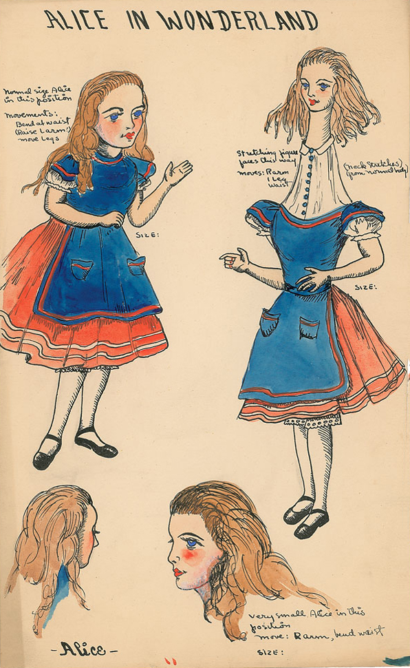
Lou Bunin at Auction
I received word that a portion of the Lou Bunin estate including some of their Alice in Wonderland Collection is currently up for sale at RR Auction. Go here.
You can see some of the items on view; these include puppets, drawings, watercolors and figurines. The prices are workable, and the items include many gems.
Don’t forget Disney
Oh, yeah. They’re also auctioning some Disney material. Most of it is later things (Winnie the Pooh cels, etc.) but there are quite a few other collector’s items available and worth a look.
_____________________
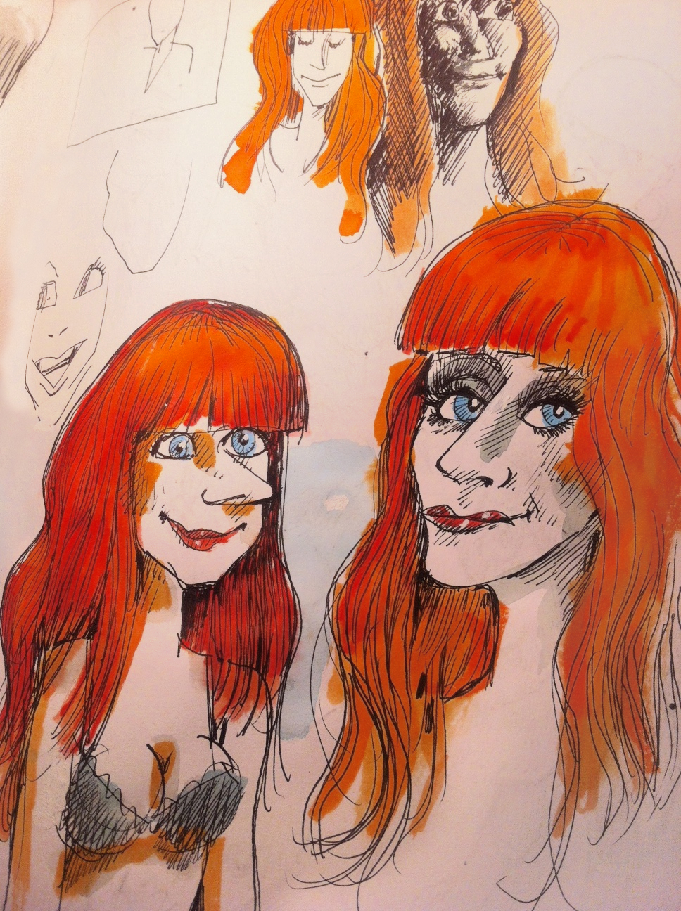
Ginger
Tom Hachtman continues his series of redheaded women. This is the latest sketch of many he’s sent me.
_____________________
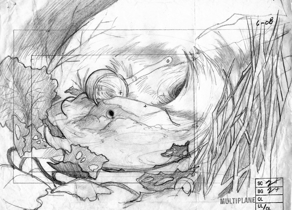
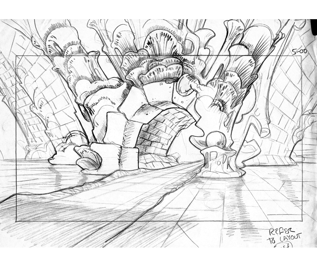
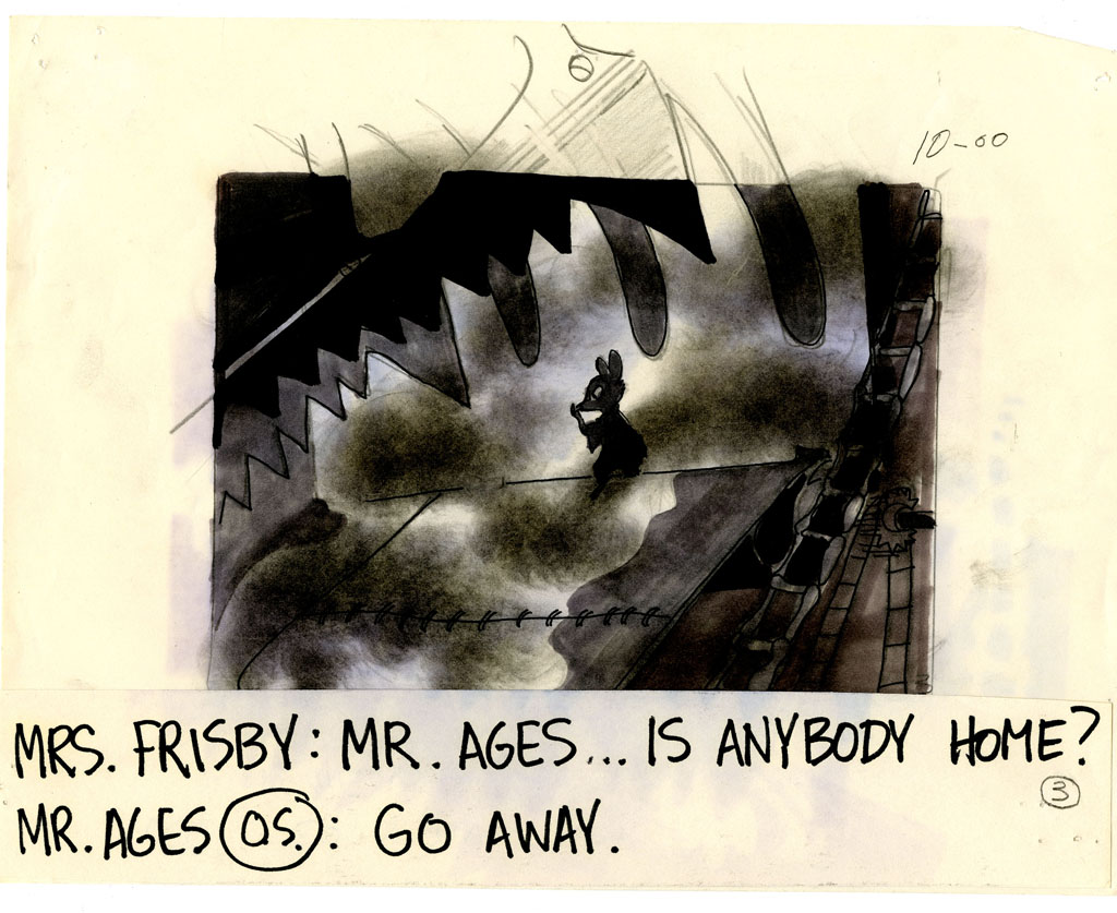
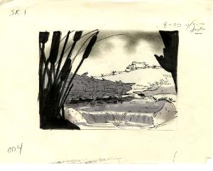
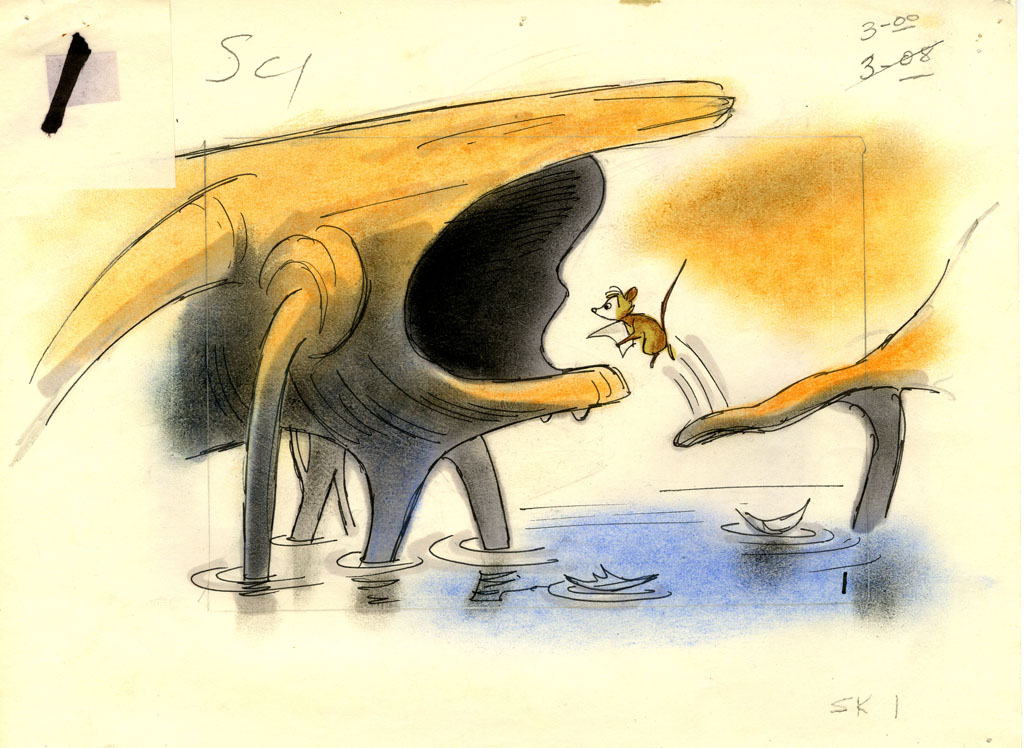
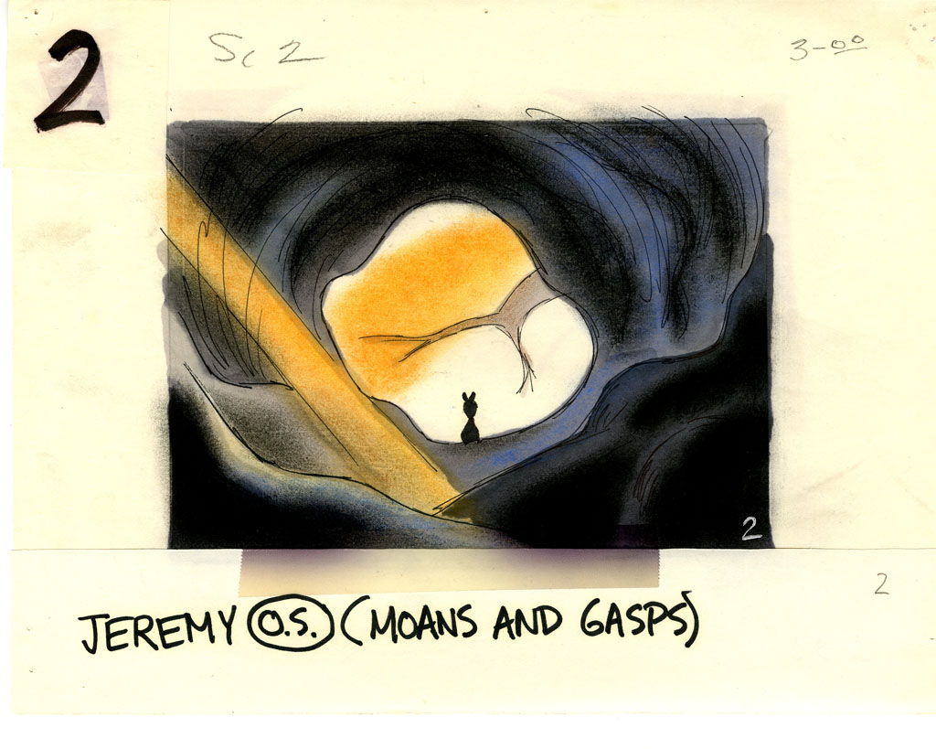
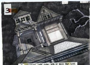
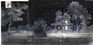
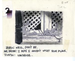
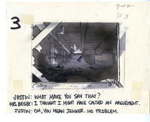
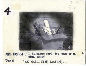
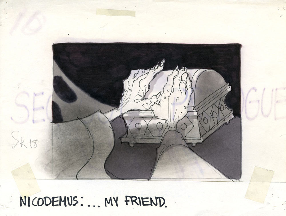
Bluth Art
Mark Sonntag contacted me this last week to let me know that the Don Bluth collection of Animation Art was now located at the Savannah College of Art and Design and could be viewed on line. There, you can find art from Anastasia, Banjo the Woodpile Cat, Dragon’s Lair, Rock-A-Doodle, Secret of Nimh, Space Ace and Thumbelina. These include storyboards, preproduction art, background layouts and cel setups.
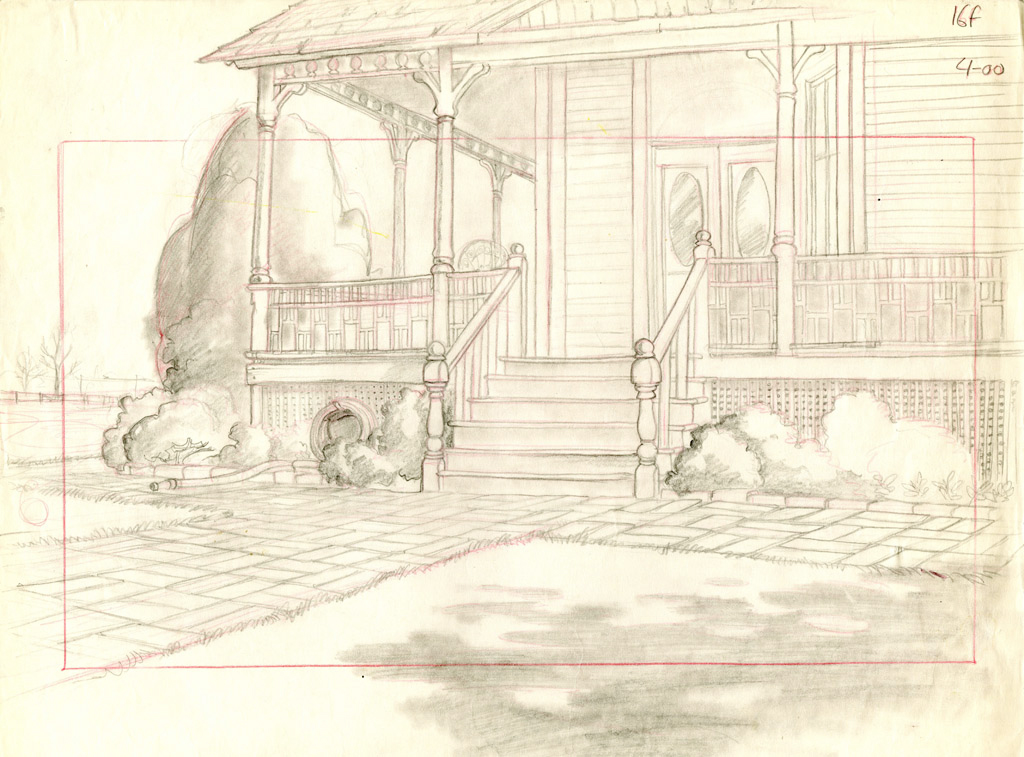
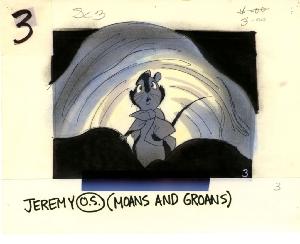
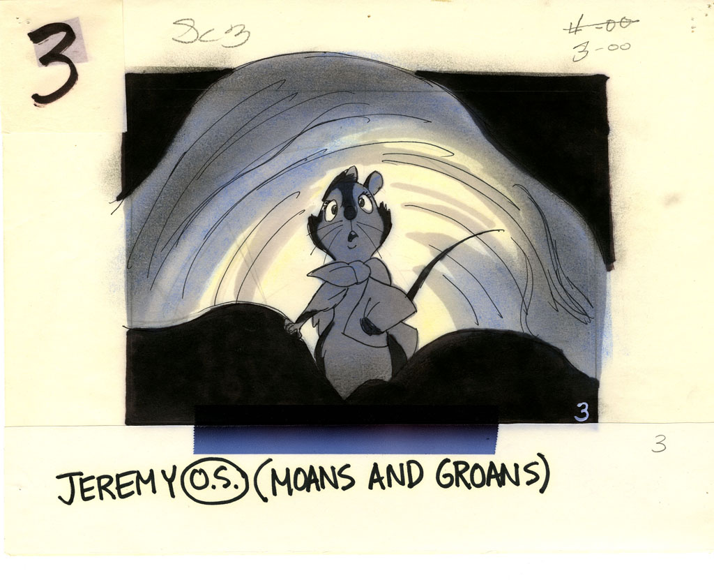
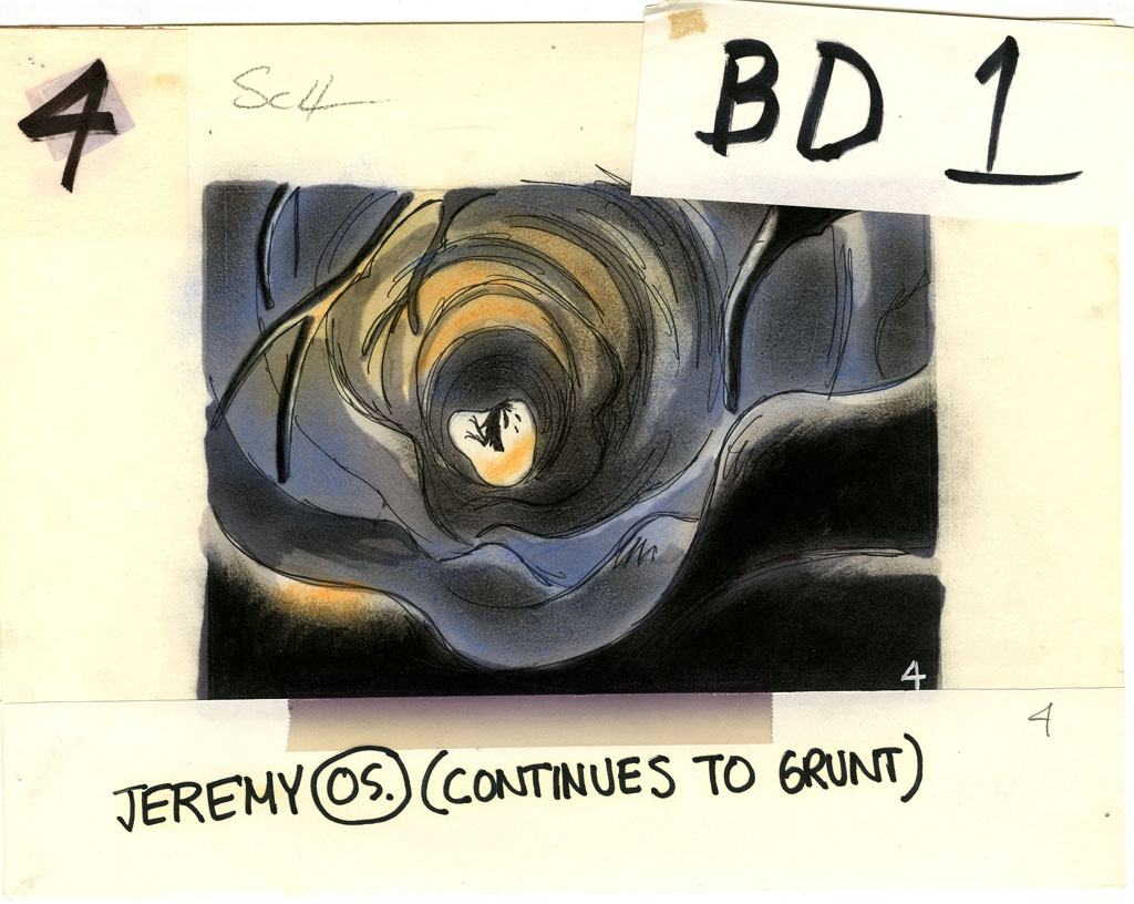
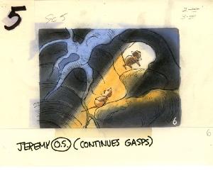
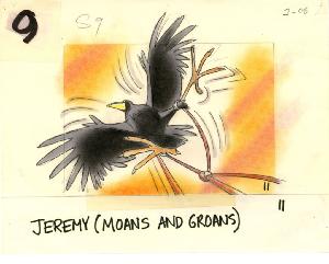
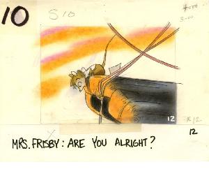
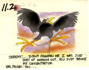
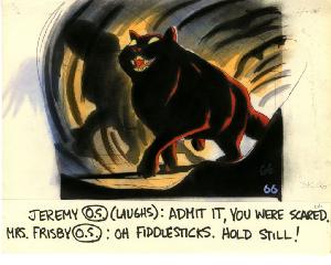
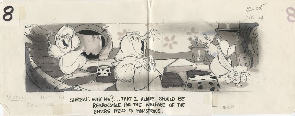
Here are some pieces I pulled from The Secret of Nimh, my favorite of the Bluth films (for all its many faults.)
Background Layouts
1
2
3
4
5
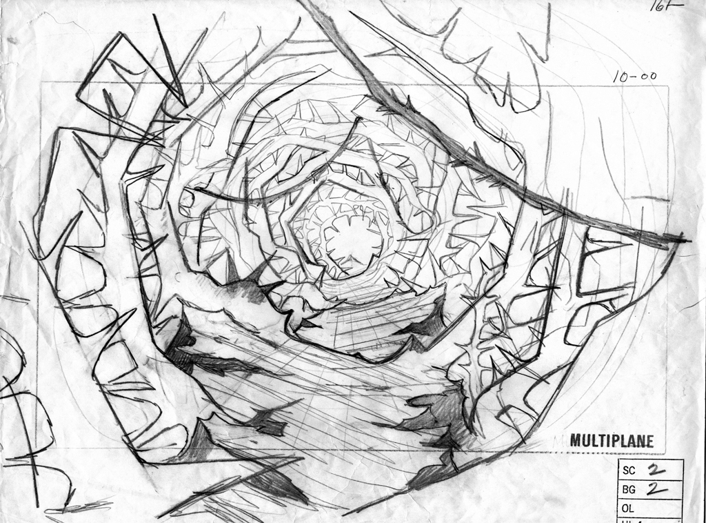
Storyboard Sketches
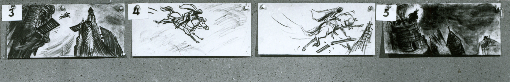
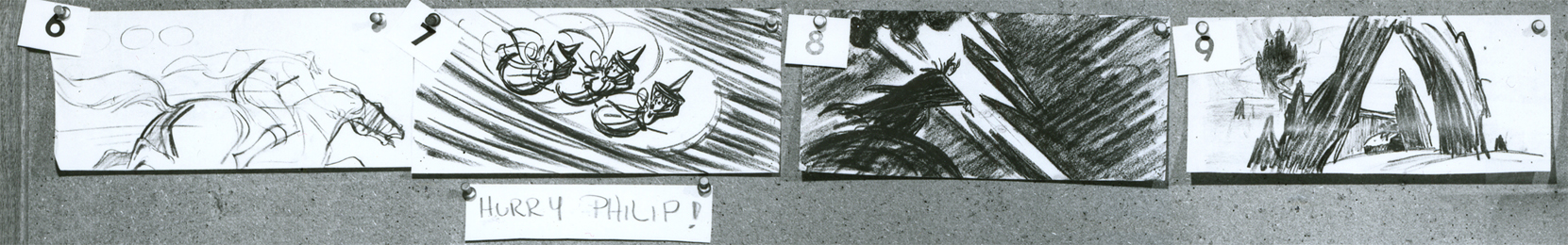
A short sequence
1 2
3 4
5 6
7 8
9 10
11 12
13 14
15 16
17 18
19 20
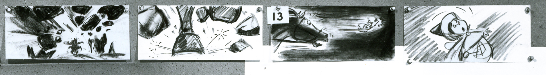
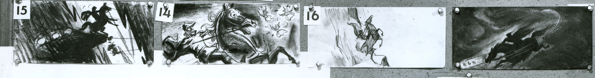
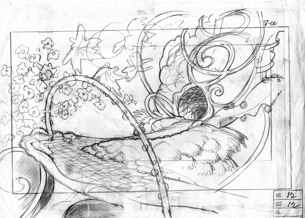
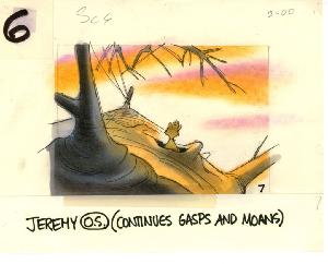
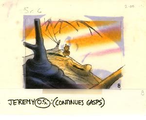
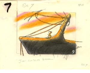
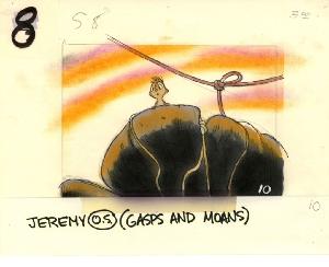
Random Bd Sketches
1
2
3
4 5
6 7
8 9
10 11
12
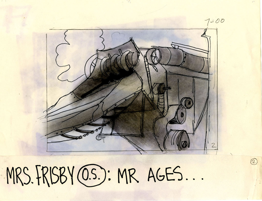
Many more are on display at the site. It’s the entire storyboard for The Secret of NIMH that can be viewed, one sequence at a time. Beautiful artwork, indeed.
 1
1
 2
2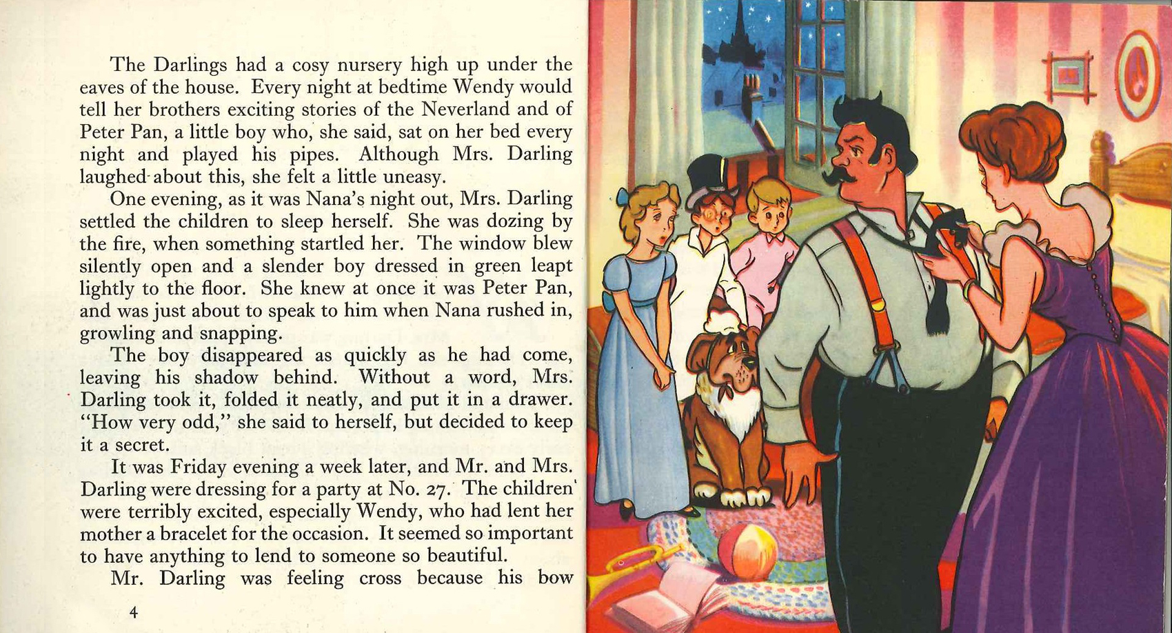 4
4 7
7 11
11 12
12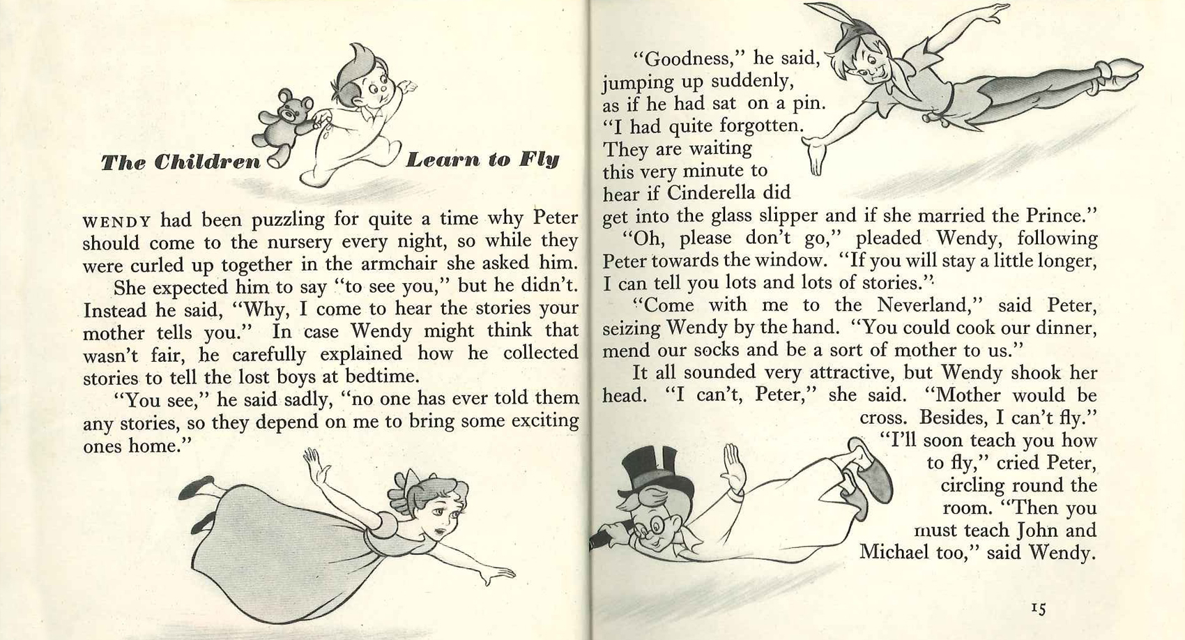 14
14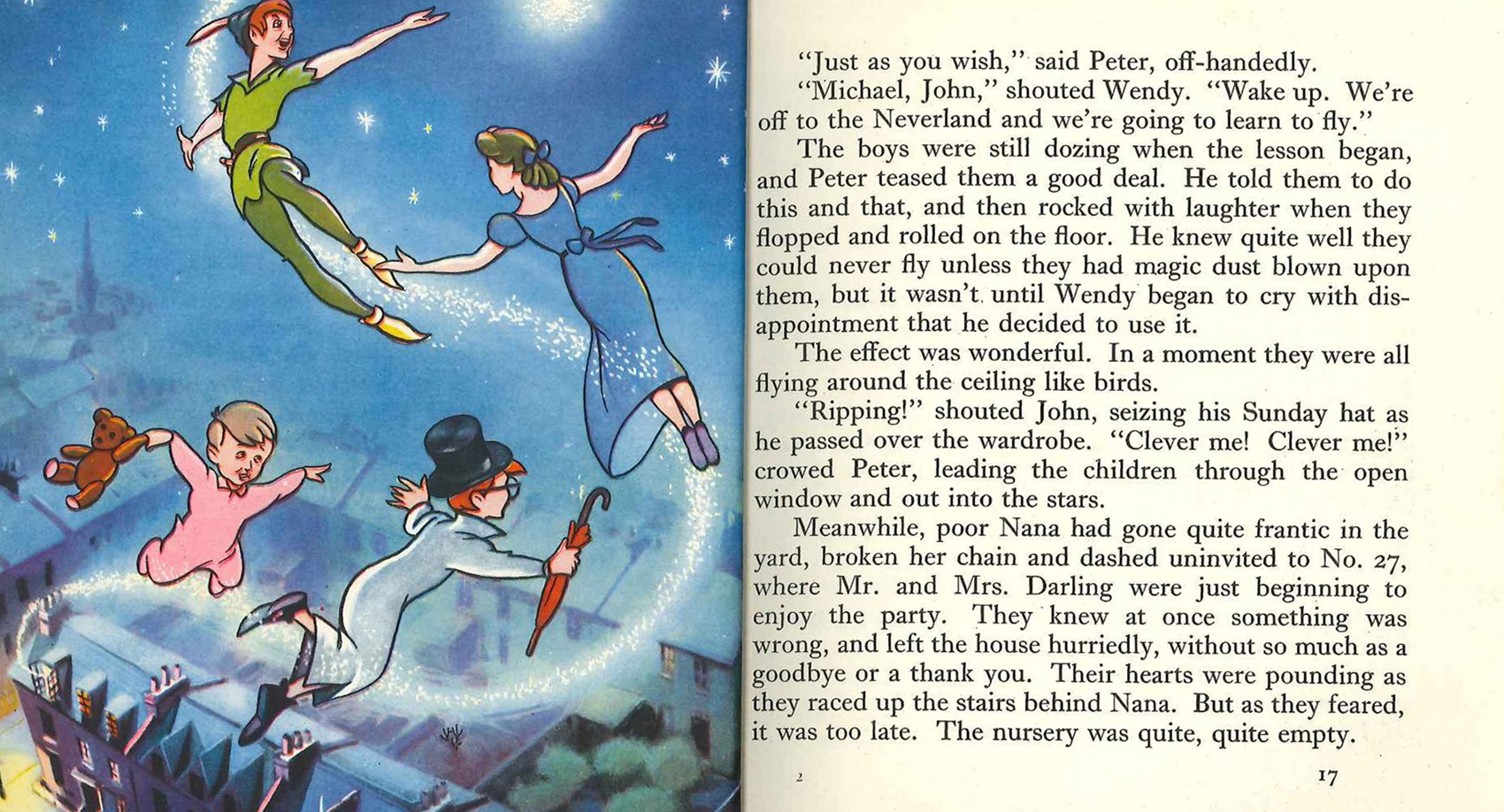 16
16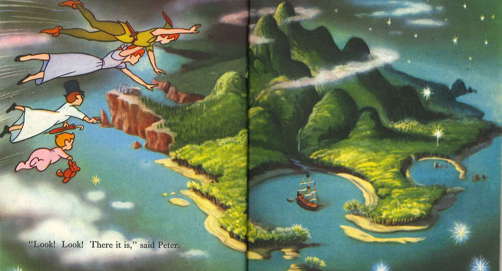 20
20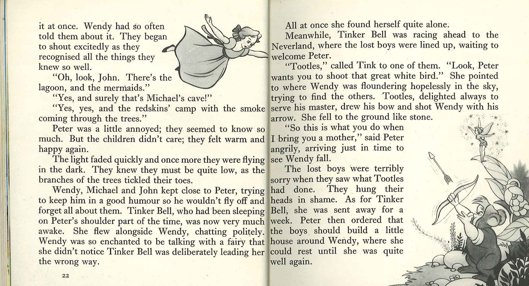 22
22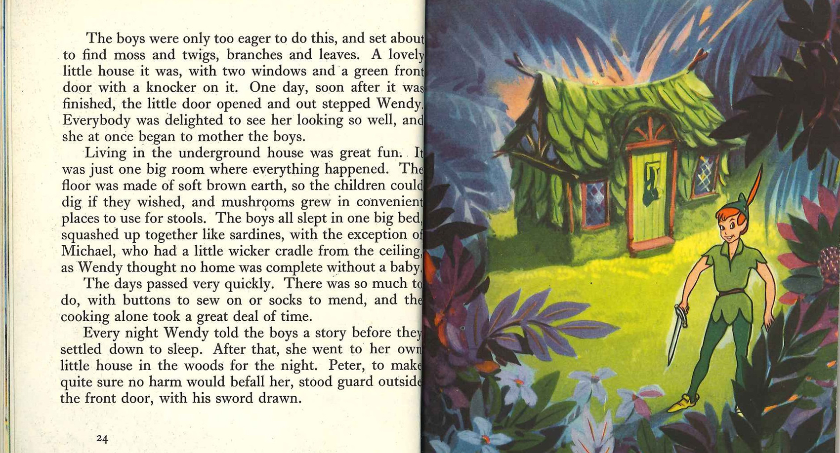 24
24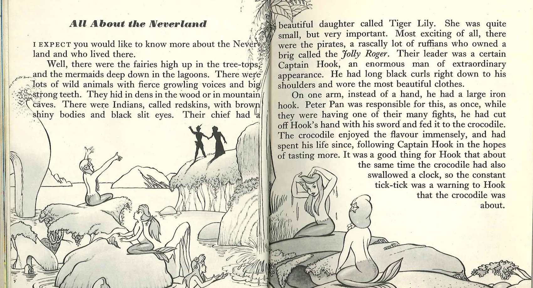 26
26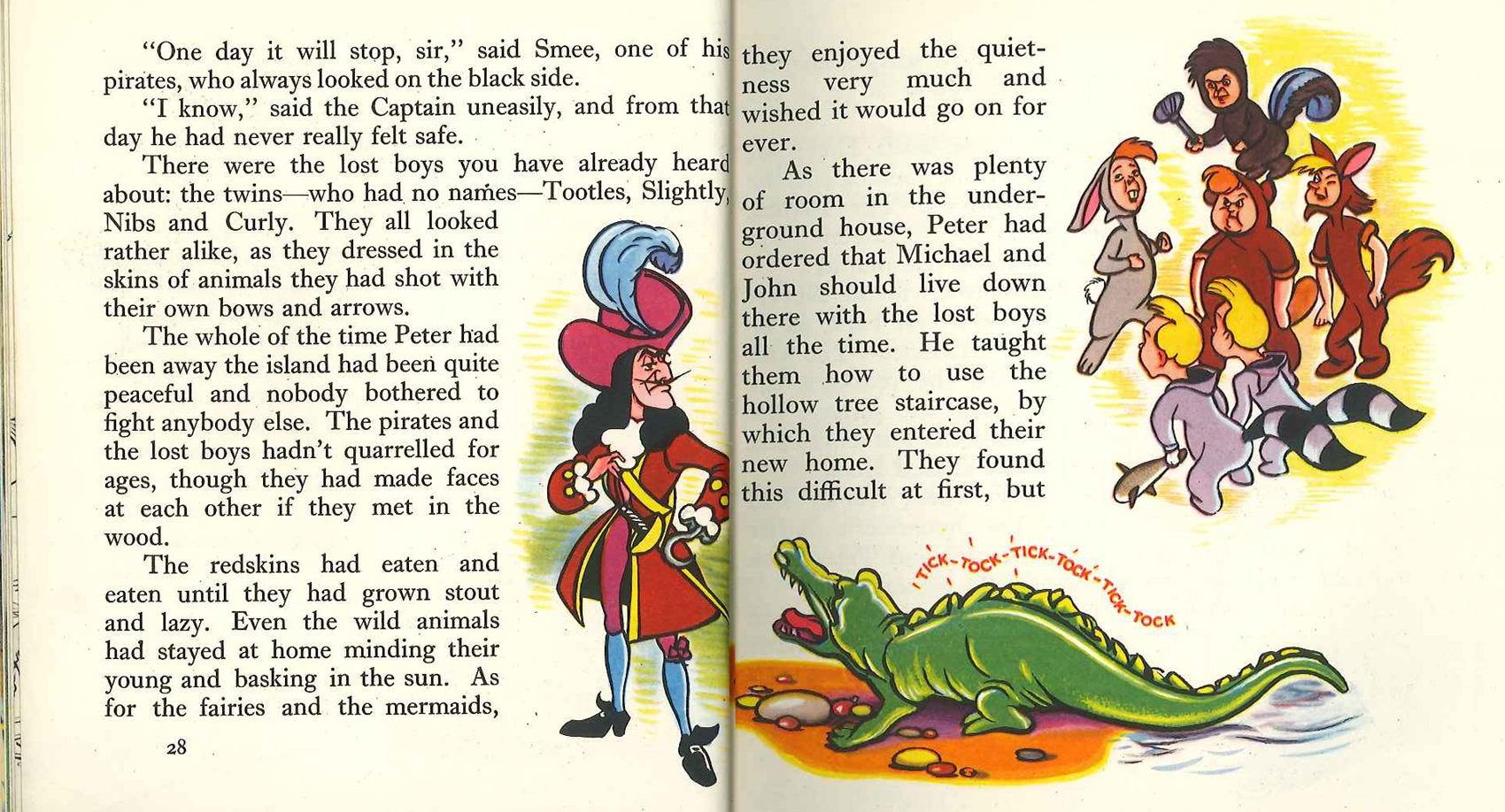 28
28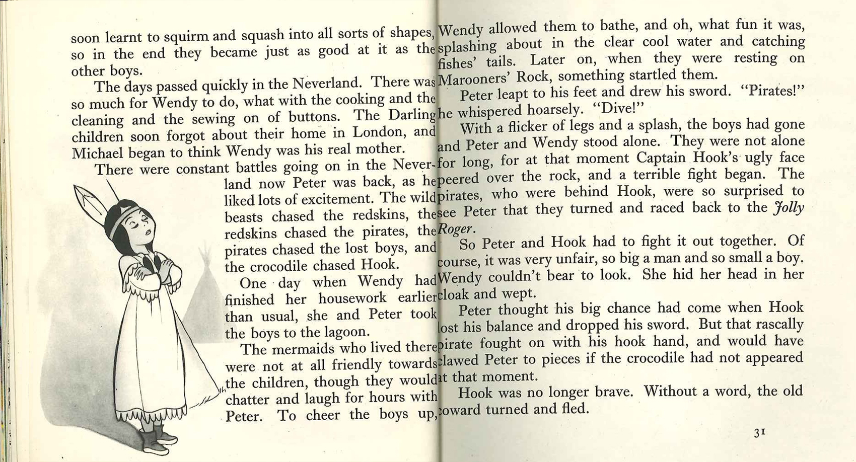 30
30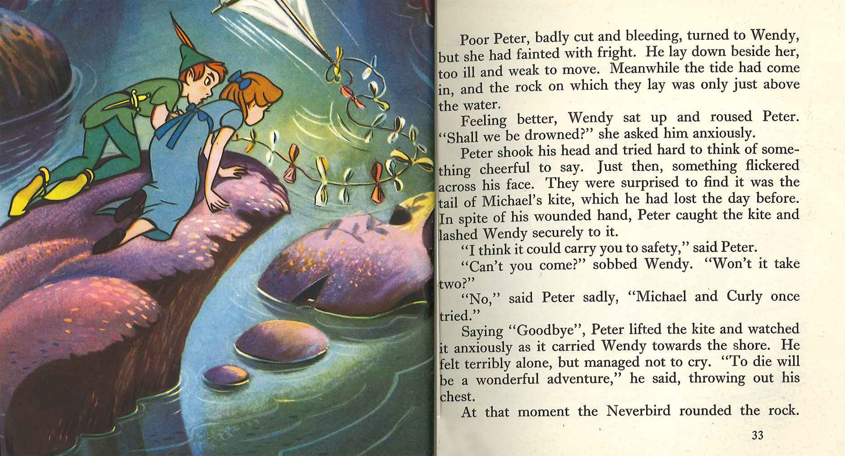 32
32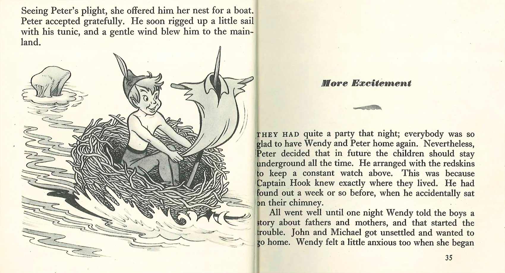 34
34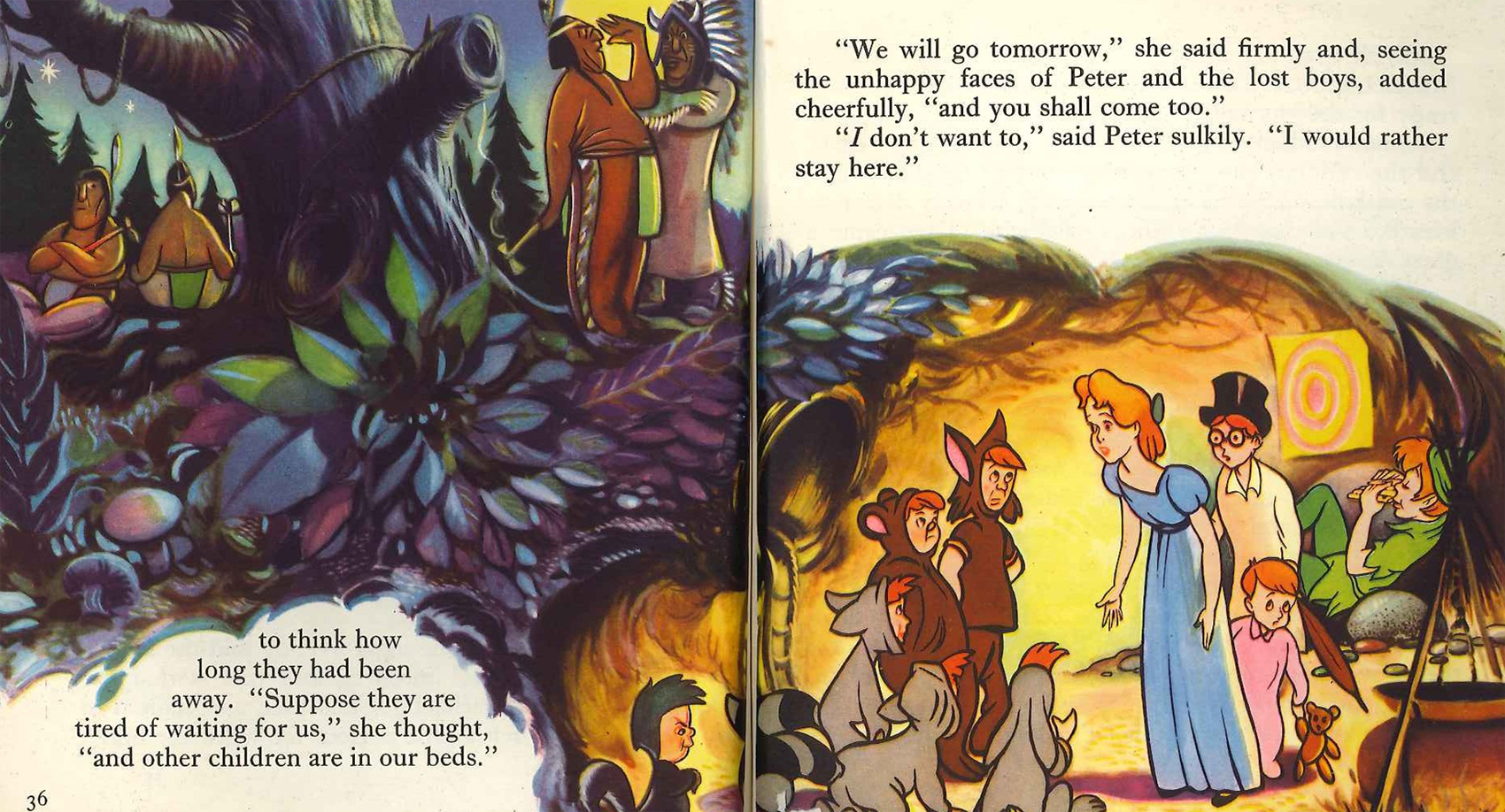 36
36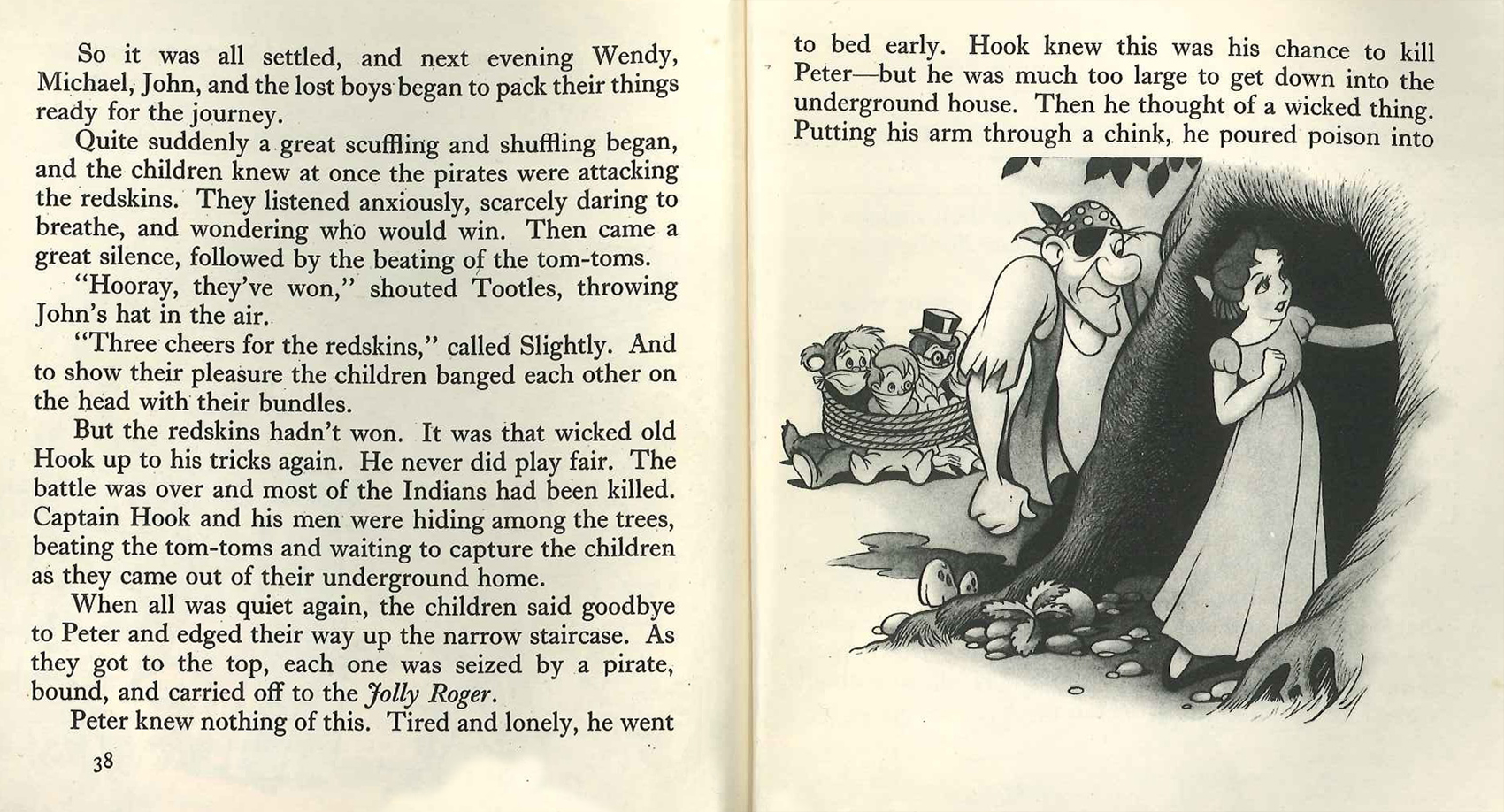 38
38 40
40 42
42 44
44 46
46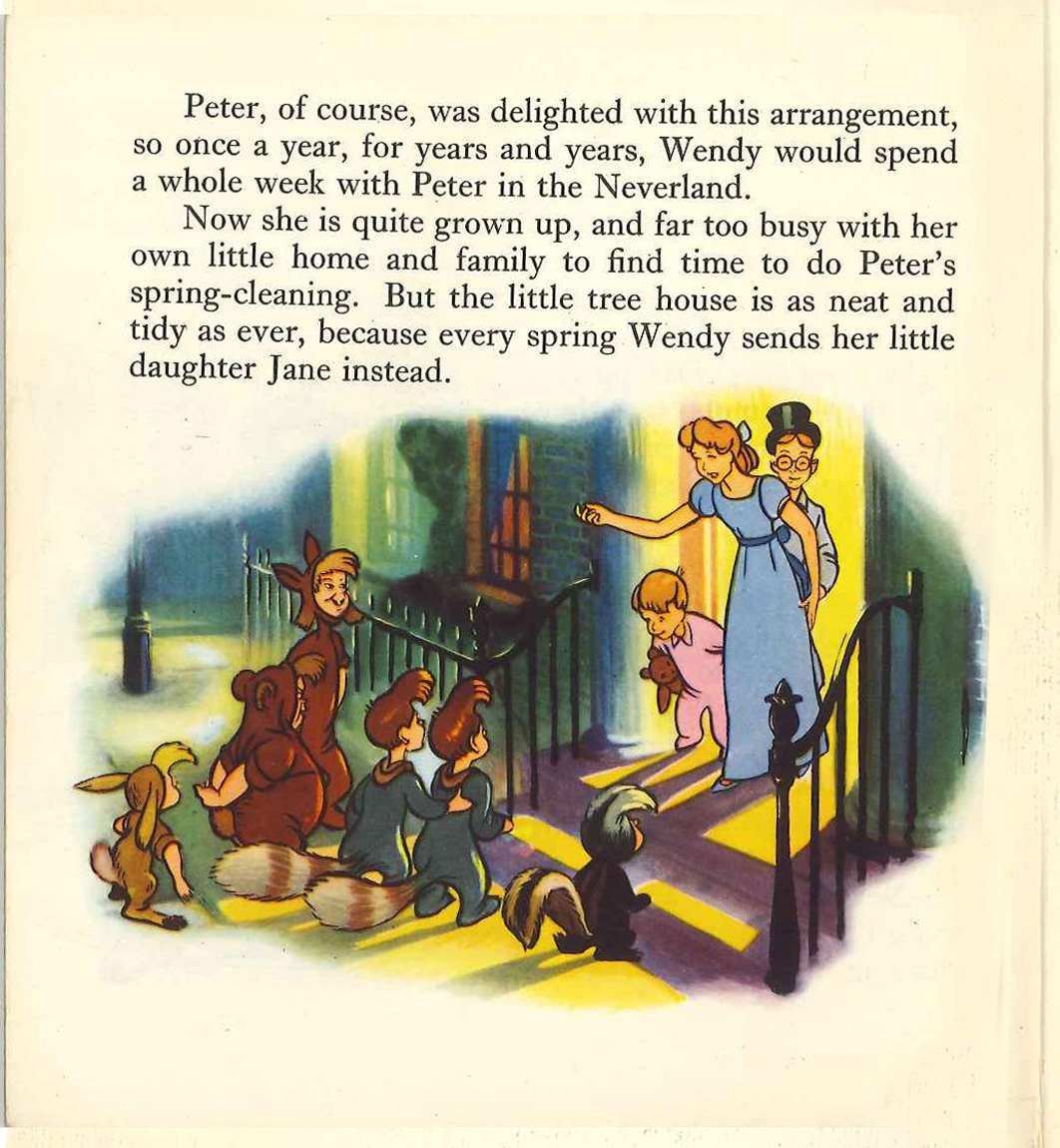 48
48