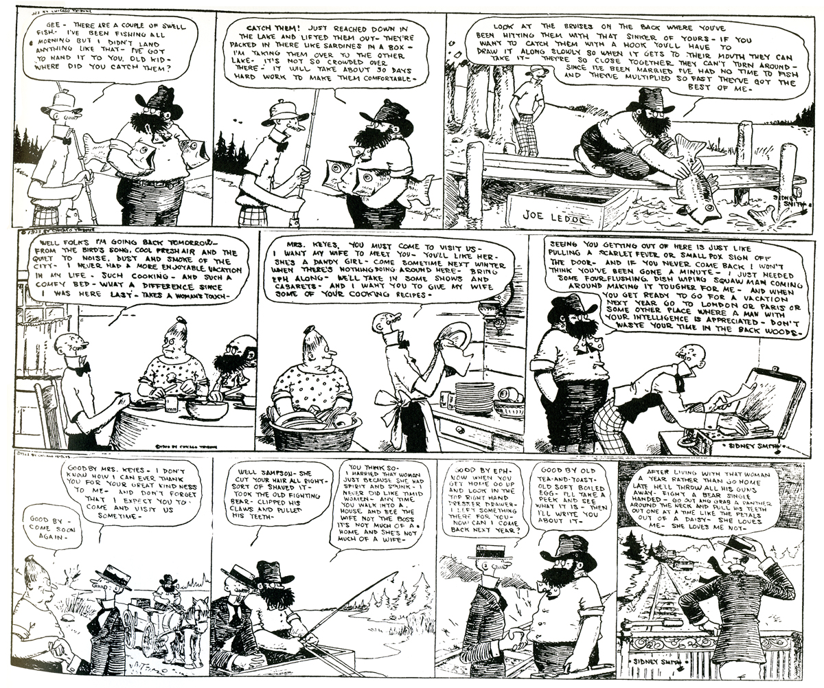
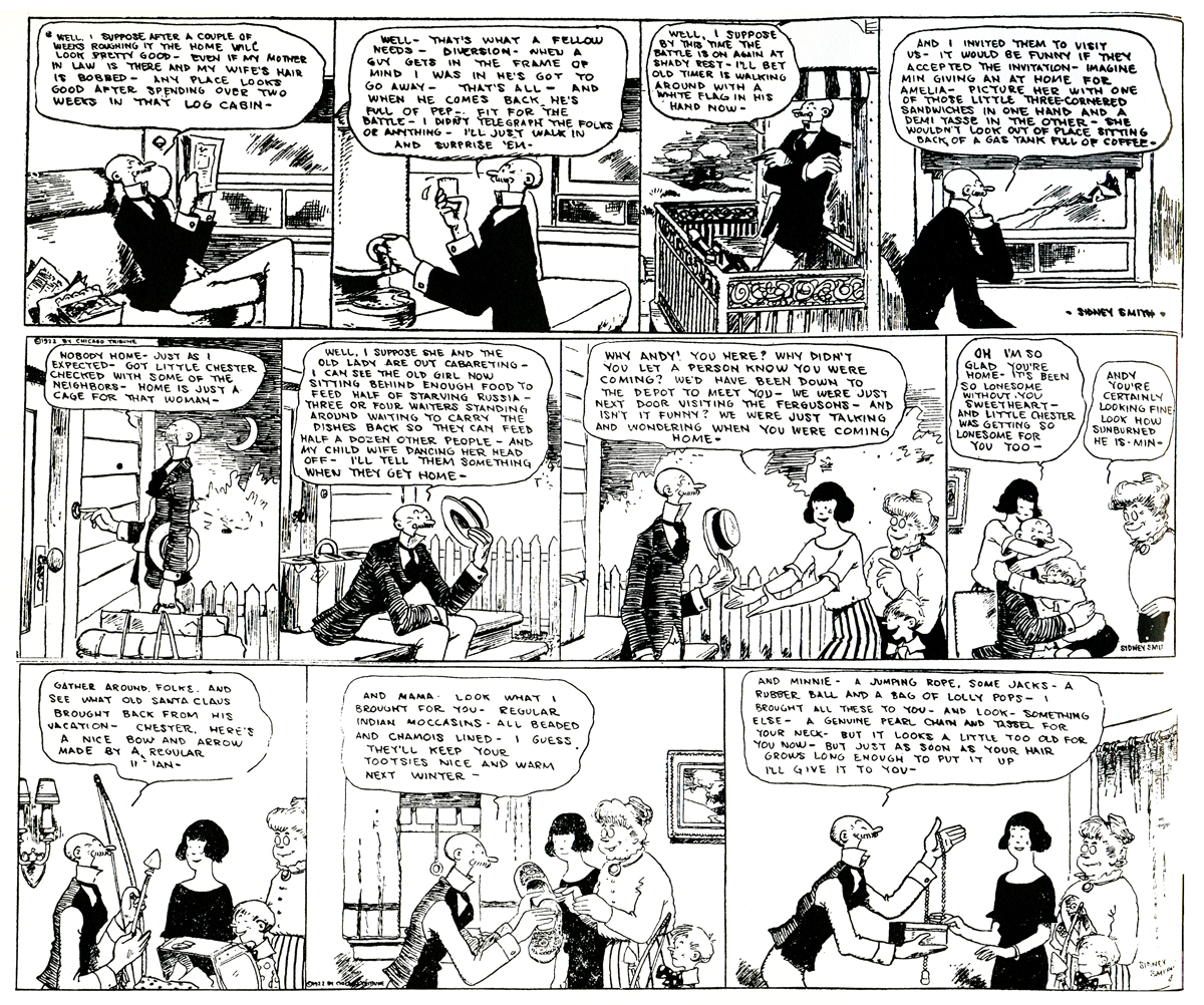
Commentary 18 Oct 2007 08:02 am

Persepolis Thoughts

- Persepolis was very much the film I expected to see. The story was more sophisticated than can usually be found in animated features, and the artwork was more daring. It didn’t look or feel like any other film I’d seen. However, this also created problems that I expected, albeit none that really undermined the positives to be found in the film.

Marjane Satrapi and Vincent Paronnaud have crafted a thinking and thoughtful film about some very real problems in the world. In its finest moments, it speaks volumes about the problems of independent-minded women and is particularly interesting for this reason.

It doesn’t follow the Hollywood formula with heightened climaxes and overmodulated set pieces. There aren’t many phony emotions on display, and I can’t tell you how enjoyable that was for a change. Live action and animated films, these days, bring nothing less than the predictable, so it was nice to see something quieter and more valuable.

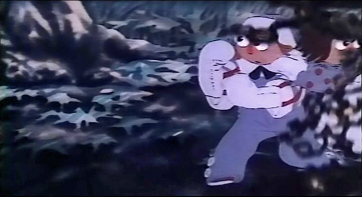
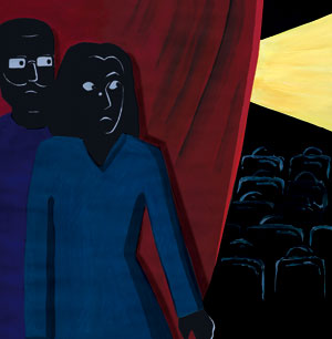
The film, of course, is an adaptation of Marjane Satrapi’s graphic novel. (Since it’s very much the real-life story of Ms. Satrapi one wonders if it should be called a “novel.”) The story takes its cues from this novel, and in the big picture it is an enormous task to have pulled off. As we follow young Marjane growing up and her relationships with her parents and grandmother, we also see the political changes in Tehran, Iran as that country twists and turns politically.

_

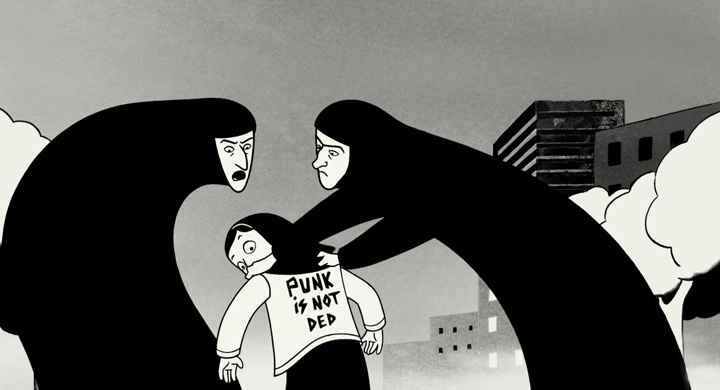
The adaptation from graphic novel to screen created the biggest complaint I had with the film. Like all graphic novels, the story develops in chapters, and the film closely follows suit. Each chapter has its own climax, and I’m not sure many are significantly larger than the other. Hence, there is a sameness that comes across as we move through the film. The art style also heightens this constancy to the point where it gets a bit tiring. One truly welcomes the few scenes done in muted colors whenever they slip into the story.

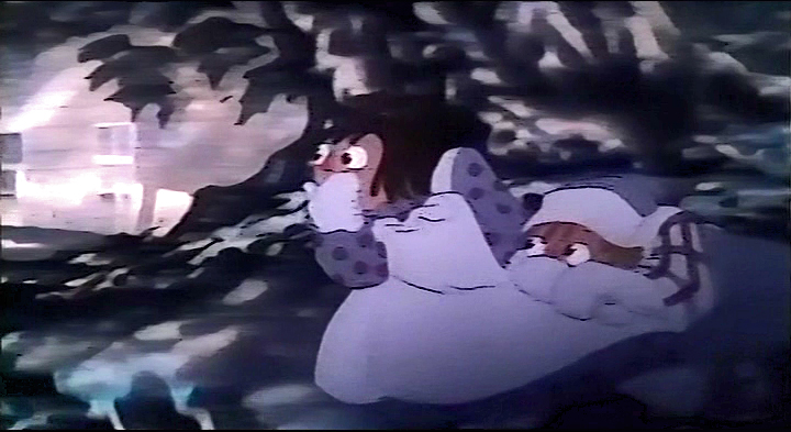
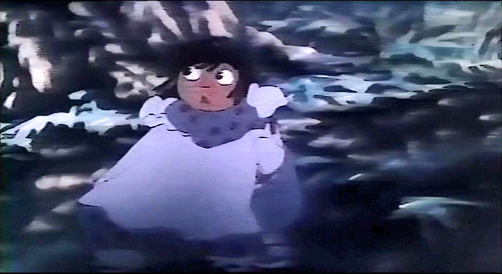
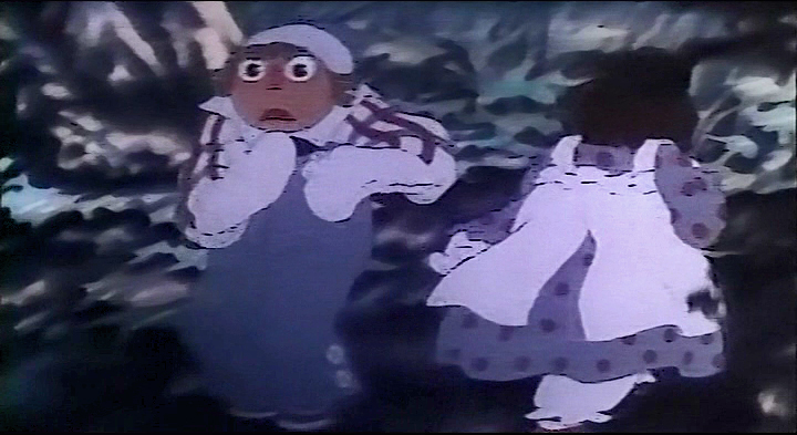
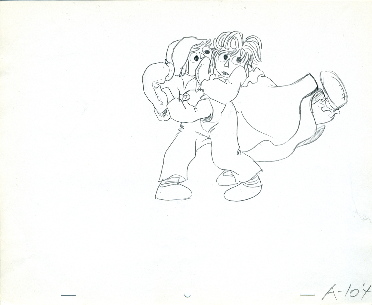
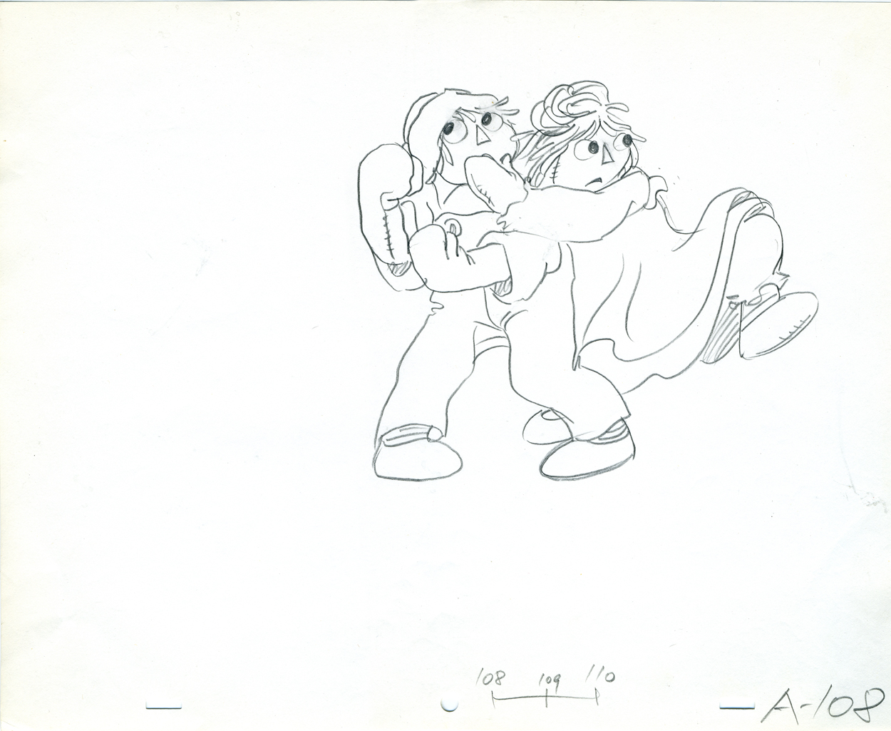
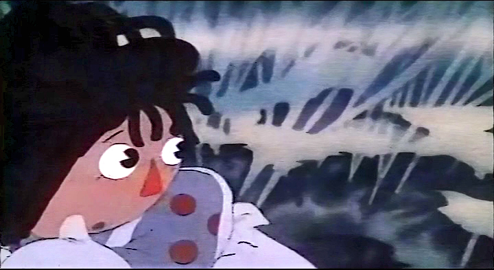
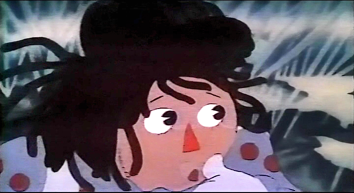
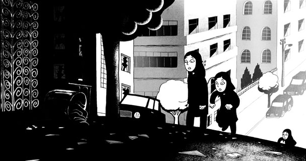
The art style faithfully adapts the art in the book, though it’s obvious that some of the illustration has gotten significantly more sophisticated enroute the big screen. There is often a level of transparent textured whites overlaying the characters giving it some real depth. Images in mirrors, for example, are depicted via this texture. Smoke and haze are also designed using these whites.

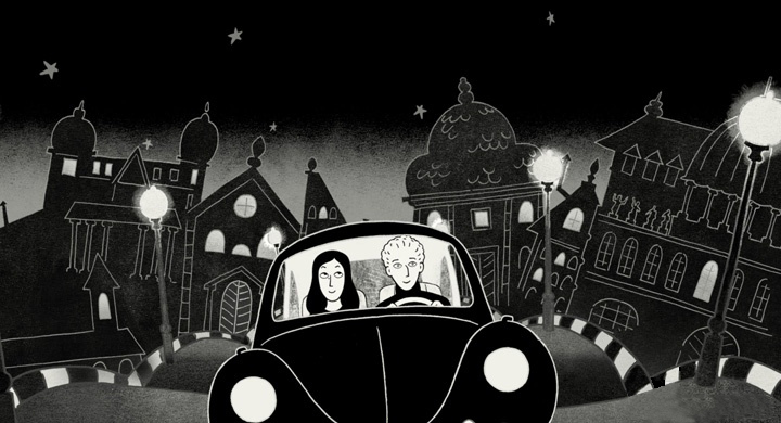
Some of the backgrounds are lovely in their own simplicity with textured off-whites over gray buildings. It takes on a look all its own; at times I felt a hint of some of Hubley’s more impressionist work. None of this seems to come across in the graphic novel nor in the film stills I’ve seen. These small sparks of strong graphic art were welcome in the otherwise stark black and whites. It’s amazing how far they were able to push this style. However, the art style doesn’t do much to allay the problem I had with the story; there’s an overall sameness to the style – however beautifully controlled it is.

The screening I saw was of a film in French with English subtitles. Matthew Clinton, a leading animator in my studio saw the film with me. He commented afterward that he had problems enjoying the graphics because he had to continuously read the subtitles. He felt the graphic style of the subtitles was jarring with the hard-lined style of the animated film. I, on the other hand, wondered if this made the film’s visual style richer because my brain had to take in two visual elements at the same time. Of course, I’ll see the dubbed version when it’s released and will let you know if it changed for me.

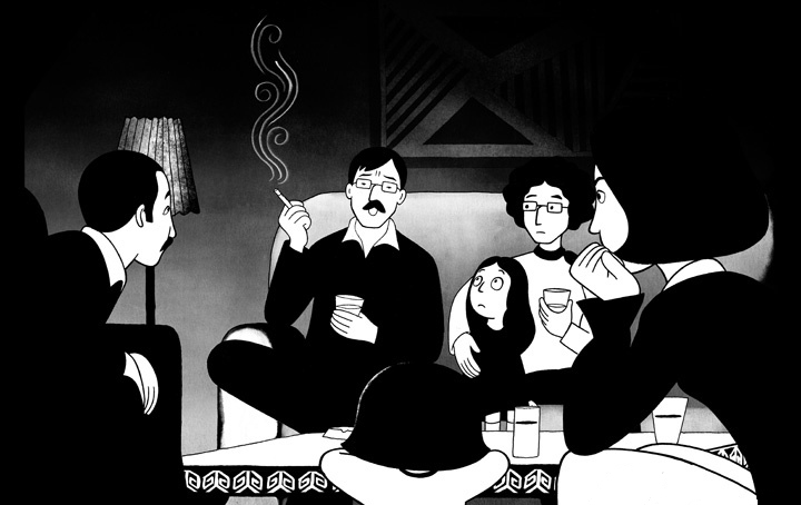
The film is a film; it’s not a cartoon. (Although there are a few annoying cartoon moments that pop up from time to time as they try to exaggerate the character, Marjane’s, emotions for comic effect.) The voices were excellent, particularly Danielle Darrieux as the grandmother and Catherine Daneuve as the mother. Of course, with those two actresses one would hardly expect less.

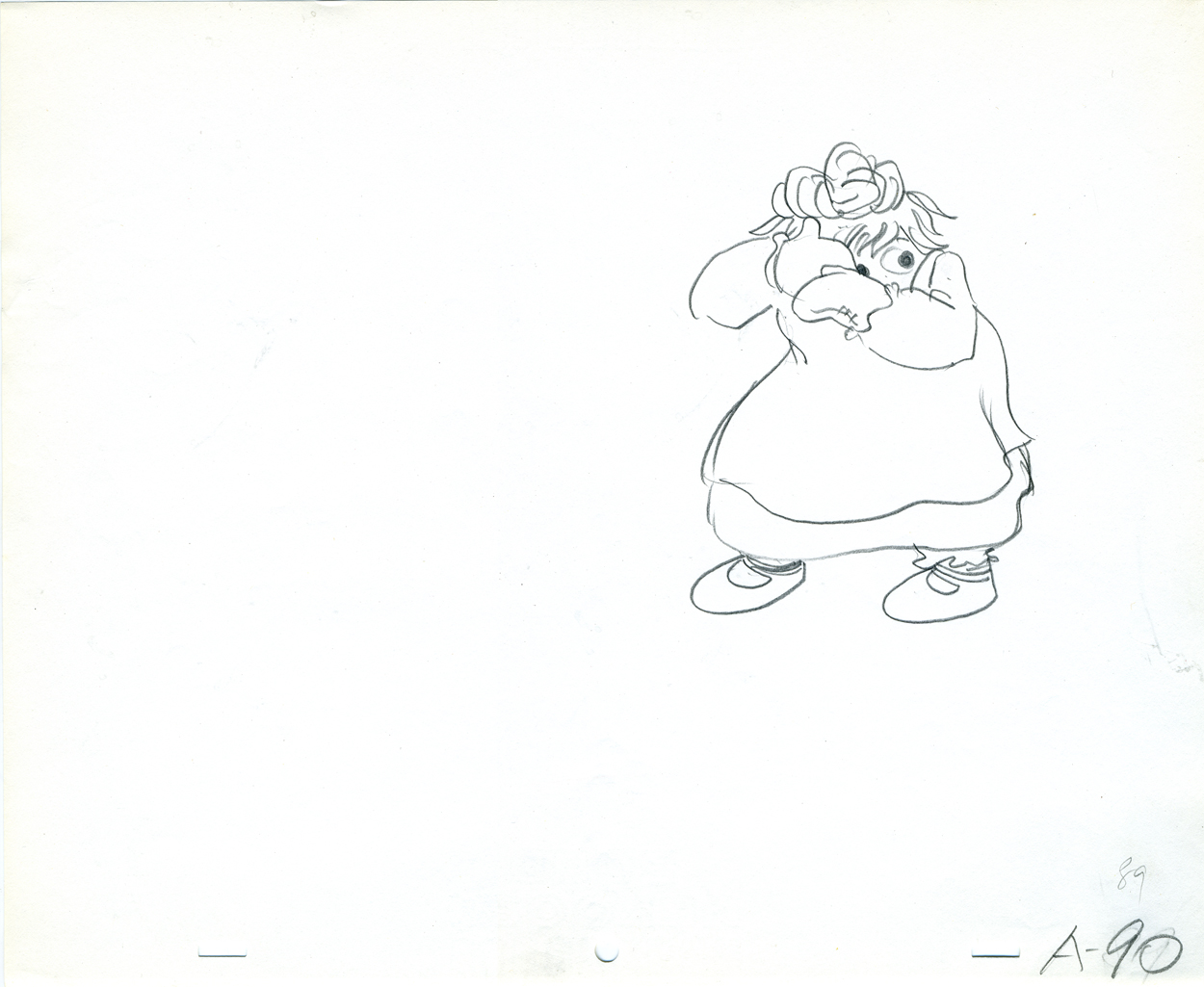
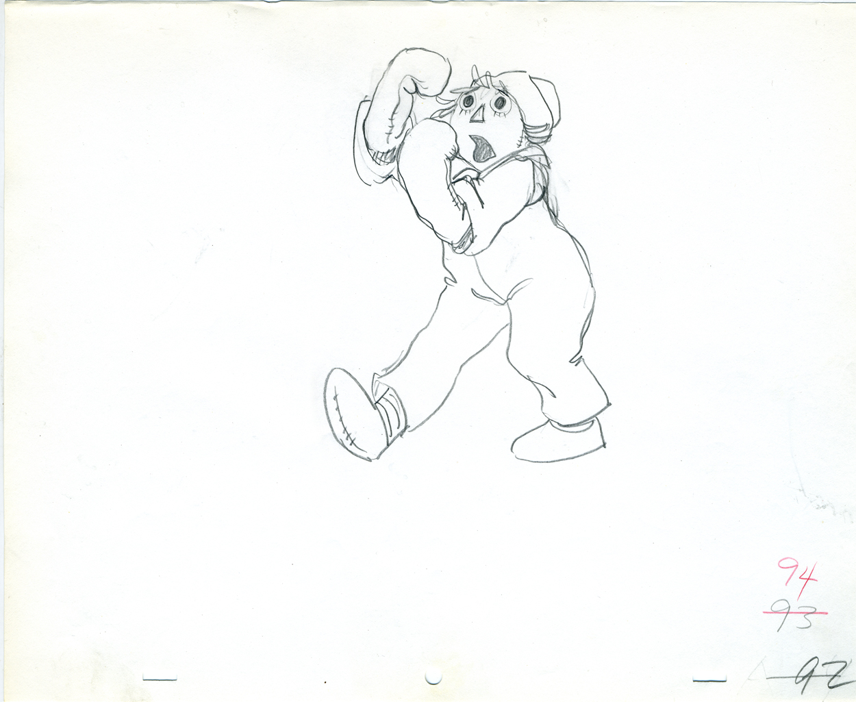
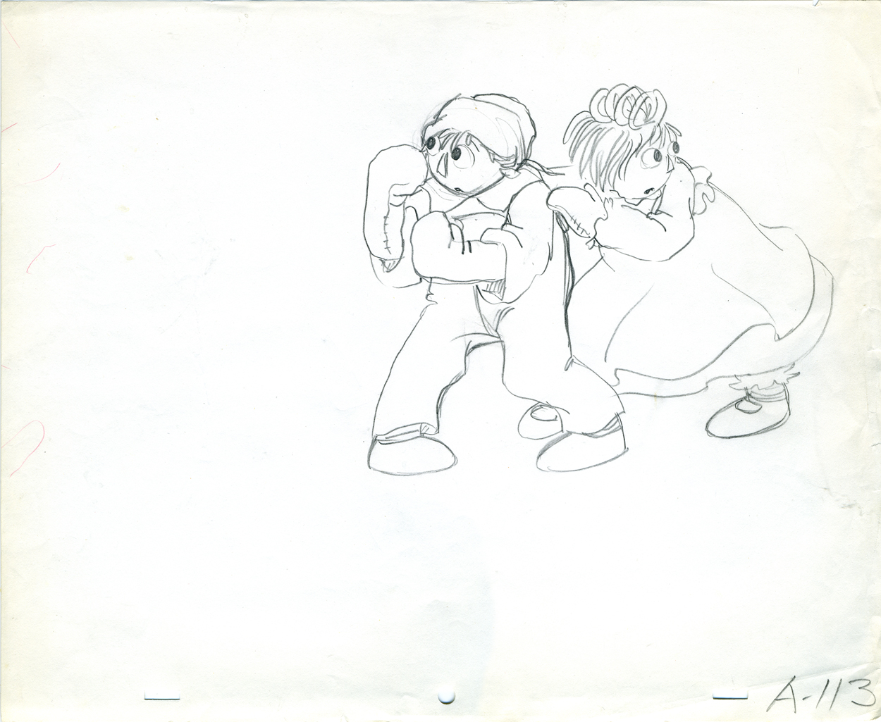
The animation moves quite fluidly, though I never quite felt that there was real personality in the movement. (That, however, is a complaint I have with even the highest budgeted film these days.) Vincent Parronaud was more the director of the animation than Marjane Satrapi, and Marc Jousset was the Art Designer. Christian Desmares was the Animation Director. There were twenty animators who drew the film in France. All of them should be proud of their accomplishment. The film was done for about 6 million Euros ($8.5 million).

This film takes animation in a direction it should be headed. It doesn’t try to revisit the mold that Disney developed nor does it try to cash in on cheap theatrics. It’s the best animated film I’ve seen in some time, and I hope it does well at the box office. Perhaps, then, there will be another film by this group.

Books &Comic Art 17 Oct 2007 07:48 am

Gumps III – On Vacation

- Here’s the third cache of comic strips featuring The Gumps.
This is from an excellent book that was edited in 1974 by Herb Gallewitz and published by Scribners called Sidney Smith’s The Gumps.

As I mentioned in the last two posts, The drawing is funky, but the story is brilliant. I’m posting these so that you can get an idea of the rhythm of the strip and the characters. In the next couple of batches I post we’ll start getting into some serious story material.


___(Click on any image to enlarge.)

__

__

Daily post 16 Oct 2007 08:12 am

Cooking Things Up

– Sunday night marked the closing of the NY Film Festival. The closing film of the festival was Persepolis, and it was reviewed in the NY Times by Stephen Holden. Here are a couple of quotes from his review:

    Because it is animated, “Persepolis” is a bold choice for the festival’s closing-night selection. “A cartoon?” you may sniff. “How dare they?” But the movie is so enthralling that it eroded my longstanding resistance to animation, and I realized that the same history translated into a live-action drama could never be depicted with the clarity and narrative drive that bold, simple animation encourages.

    “Persepolis” makes you contemplate the processes of history. Buried under each wave of “reform,” it suggests, are cultural traditions that will eventually resurface no matter how repressive the climate of the moment. The movie is also tacitly feminist in its depiction of Islamist patriarchs as ludicrous misogynist prudes.

    “Persepolis” has a lot in common with last year’s closing-night film, “Pan’s Labyrinth,” which portrays life in the wake of the Spanish Civil War through the eyes of girl who transmutes fear into ritualized fairy-tale fantasy. Both films are immeasurably enriched by examining war and social upheaval through innocent female eyes.

I saw the film last night and have had a lot of mixed thoughts about it. Ill report on those thoughts later this week after I’ve allwed them to settle for a bit.

Mark Mayerson, yesterday, found and posted some interviews with Marjane Satrapi answering questions at the NYFilm Fest. They’re worth a look if you’re interested.

________________________________

- Are you interested in knowing what Chris Robinson‘s Mango Salad tastes like? Or would you like to know how Bruno Bozzetto makes Spaghetti and Meatballs. For desert would you like Jerry Beck‘s recipe for cupcakes?

The Art Institute of Pittsburgh has just such the cookbook for you. A bunch of animators have put their cooking thoughts on their favorite foods into menus for you.

Chocolate Crackel, Marillenknodel, Lamb Korma, Hot Cross Buns, Croque Monsieur, Fish Heads & Rice & Fried Bananas (yes animators are CWAZY!) These recipes are among many others in this great little book; the profits of which support the EDMC Education Foundation of the Art Institue of Pittsburgh.

To order the book, send checks or money orders payable to the
EDMC Foundation. The book sells for $10.

(Proper way to address the envelope)
Angela Love
Media Arts & Animation
Art Institute of Pittsburgh
420 Blvd. of the Allies
Pittsburgh, PA 15219

This is the Art Institute‘s site.

If you’d like to see an animated ad for the book go here.

Animation Artifacts &Books &Disney &Models &Story & Storyboards 15 Oct 2007 07:59 am

Rite of Spring Pics


- Continuing my posting of the art in the 1940 book, published by Simon & Schuster, Deems Taylor’s Fantasia, I focus on the Rite of Spring segment from the film. There are some fine images here, and I’m pleased to post them.

If anyone has any idea of who drew any of these stills, I’ll be glad to give appropriate credit to the artists. I know that
_______ William Martin,
_______ Leo Thiele,
_______ Robert Sterner and
_______ John Fraser McLeish were credited for Story Development Research,
and
_______ McLaren Stewart,
_______ Dick Kelsey and
_______ John Hubley were the segment’s Art Directors.

Here, then, are the stills. A number of them are beauties.


(Click any image to enlarge.)

Photos 14 Oct 2007 09:28 am

Hats off Photosunday

– You’ll remember back in August I promised to give you some more photos of the Art in the BMT. No, you don’t remember? I’d posted some photos from the Prince Street subway station which displays some silhouettes artistically tiled into the walls.

Well, I remember it, and today’s the day. I have images from the 23rd Street BMT station which displays hats. Yes, HATS. I wasn’t sure what this has to do with the subway or the BMT, but there are lots of hats floating about that station, and it intrigued me. So I went to the station specifically to take these photos. In fact, I was walking past it when I remembered that I wanted to photograph them.


(Click any image you’d like to enlarge.)

_
The exhibit is called Memories of 23rd Street and was designed and constructed by Keith Godard. A London-born graphic designer and artist Mr. Godard also designed the
14 ft. high-relief bronze historical plaques on the Brooklyn Bridge that, he insists, were inspired by Lorenzo Ghiberti’s ”Gates of Paradise” in Florence.


I learned that Mr. Godard’s idea for the piece is, apparently, two. First, he honors all the people who probably stood at this intersection since the station was built by picturing their hats.

_
Secondly, the Flatiron Building (just above this station) once was notorious for the wind tunnel it created above ground. Hats went flying everywhere up and down 23rd Street.
Hence, the flying hats and the term “23 Skidoo.”

_
If you have the time (a train could be coming into the station just as you arrive, and you’ll have to rush on board missing the artwork), you can go in close to study the elaborate tile constructions.

_
All of the hats are identified with little labels a couple of feet below the images. If you
check out the MTA’s site, you can see whose hats are flying about.

_

_

_
Since I came to see the HATS, I had all the time I wanted. I stood about snapping pictures and had the few early morning riders watching me. There, of course, were hats up and down both platforms in the subway station. I stayed on the one side – going Downtown.


I let a couple of trains go by before leaving when I felt I’d shot enough.

Animation Artifacts &Articles on Animation &Disney 13 Oct 2007 08:00 am

Very Special Mouse

- This article came into my hands, and, unfortunately, I have no way of knowing where it was published. It apparently was published in the 50′s or early 60′s (the clue is the drawing on the last page of Mickey through the ages.)

At any rate I thought it was worth sharing. Interesting that it talks, predominantly, about Mickey in the 30′s.

_
(Click any image to enlarge.)

_

Animation &Animation Artifacts &Disney 12 Oct 2007 08:13 am

Kahl’s Jungle Book

– Since there was such popularity with the post I had put up earlier this week about The Jungle Book, and since the new DVD is being celebrated everywhere, I thought I’d post some more bits I have from that film.

These are some of the drawings by Milt Kahl from a sequence featuring King Louie doing a dance. It’s interesting that I think immediately of Shere Kahn as Milt Kahl’s work, and I don’t think of Louie. Yet I’ve had these copies for the past 25 years.

Somewhere – I have to find it – I remember Walt Disney being quoted as having said the one thing you should never animate is a monkey. They’re funny enough in real life; animation can’t improve on them. I remember thinking of that quote the day I first saw this film. I also wondered how Louis Prima felt knowing that they were representing him as an orangutan. I suppose that’s not a monkey.

The copies of these drawings I have are xeroxes. I’m posting them for the magnificent drawing alone; I don’t have timing sheets to be able to work out the movement. Honestly, with Milt Kahl’s work, looking at the images alone should be enough. I apologize if these are at all fuzzy or grey; that’s the quality of the images I have. They’re also not full sheets of animation paper. I copied only the peg holes and drawings.

01 21
(Click any image you’d like to enlarge.)

31 37

44 52

55 60

66 75
Talk about breaking of joints,
_______________this scene couldn’t be a greater lesson in animation for you.

31 89

00 21
I know I don’t have to say, but I will; these drawings are extraordinary.
#100, here on the left, is a masterpiece in weight, balance, forshortening and sheer brilliance. And it’s only one frame from a scene.

49 61

65 67

_____________________________

By the way, Michael Barrier is back (Oct.11th), and he opens with some comments about The Jungle Book as well as a reprint of his 1978 Funnyworld review.

Daily post 11 Oct 2007 07:57 am

Out There

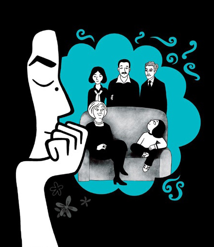
– This cartoon by Marjane Satrapi illustrates an article in this week’s Village Voice about the films at the New York Film Festival. Persepolis closes the Festival this coming Sunday.

The Voice mention of Persepolis comes with this praise:
__You’d have to be blind not to
__see the excellence of Persepolis,
__an affecting, amusing, visually
__arresting adaptation of Marjane
__Satrapi’s graphic-novel memoir
__about growing up during the
__Iranian Revolution and coming of
__age amid the punk-rock
__intellectuals of Vienna.

The accompanying caption reads:
____________________________Closing-night jitters: Writers/directors Vincent Parannaud
____________________________and Marjane Satrapi will screen Persepolis on the last
____________________________night of the festival, October 14. Satrapi imagines it will
____________________________go something like this.

_______________________
__
– There’s another great film by Jeff Scher posted on the NY Times Op Ed page. The Times now makes this available to everyone, and I encourage you to take a look. The pieces are not done in Flash (meaning it’s real animation) and are pure art.

This piece is about Grend Central Station during the morning hour rush. Jeff has this to say about the animated piece on the NYTimes site:
__. . . I shot a two-minute roll of film before rushing off
__to catch my train. Most of the film was shot with a 75-year-old 16 mm Bell and Howell
__Filmo, which was one of the first home movie cameras ever mass-marketed. There is a
__lot of this beautiful old camera’s personality in this film. I used black-and-white because
__Grand Central is always black-and-white in my mind. This particular film has a very low
__sensitivity to light (A.S.A. 6) and is very contrast-y. The only way to make an exposure
__was to literally shoot the pools of window light. As people move through the light, it’s
__almost as if they are sculpting it with their passing silhouettes.

A Weegee for a new century. It’s a good call for the NY Times to post these pieces every month, and I have to believe that the more hits it receives the more the NY Times will be encouraged to run more of them. Stop reading this now and Go.

_______________________
_

– A couple of sites have devoted some attention to the actual residences of some of the Golden Age animators and artists.
Joe Campana‘s Animation – Who & Where, an excellent site, seems to have started it with this post on some Santa Barbara artists, Paul Julian and Erni Nordli . Now there’s this post on Fred Moore and Tex Avery‘s residence.

By the way, this is a GREAT site. Browse around if you’re unfamiliar with it.

Hans Perk on his site, A Film LA, has a more general post about the artists working at the 1933 Hyerion Studio. Maps give us a good guide to how far a travel these guys had to their homes. It all seems so close, until you think about the kind of roads they had to travel, the kinds of autos they drove and the traffic in general.

I can’t imagine doing the research these guys are offering us, but I love. I love it.

By the way, Hans Perk has today posted video clips on this site of Roy Disney presenting and Floyd Norman accepting his Disney Legend award. Congratulations to Floyd, I’m truly happy for him. A well deserved recognition of his achievement for some of the great work he’s done in animation.

Comic Art 10 Oct 2007 08:19 am

The Gumps II

- The Gumps debuted in a peculiar way. Old Doc Yak was the comic strip that Sidney Smith drew at the Chicago Tribune. Joseph Patterson, an editor at the paper, came up with the idea of The Gumps and asked Smith to move onto it. Old Doc Yak, a talking animal strip, had run its course and Smith agreed to move onto a strip about ordinary people in their lives.

In the last strip, Old Doc Yak and his family were evicted from their house by the landlord. The last panel of the last strip showed that empty house standing there. The next day’s strip showed the Gump family moving in and taking over the strip occupied by the Yak family.

Comic strips were more of an art form back then. First off, they were large enough to be able to read them. They also had a large enough popularity that they were able to grab a regular and large readership. This allowed them to be daring enough to try to grab a larger audience through whatever means necessary.

The Gumps was clever in many ways and provided the goods with an exceptional story line that had a very large audience.
(Click any image to enlarge.)

Here’s part 2 of the Early Years of The Gumps.

+_

Animation &Animation Artifacts &Richard Williams &Tissa David 09 Oct 2007 08:09 am

Raggedy Tissa

- Tissa David did some of her most elaborate and fluid animation in Raggedy Ann and Andy. Her first scene to animate (after the pilot) was the introduction to her song number. This scene was a whopping long one and was particularly elaborate. It was also the first whole scene put into production.

The cameraman Al Rezek constructed a makeshift multiplane setup for it. This was a bit difficult to do in Panavision, but he did it. There had to be an ominous shadow of a bush overlapping the pair of dolls as they entered the deep dark woods. The scene must have been shot a dozen or more times until we were happy with it.

I have all the drawings to this scene, rough and clean up. There are a lot of them. I’ll post a couple of Tissa’s roughs here to give you an idea of the scene. Dick Williams cleaned it up, himself, and it took him a while. In a future posting, when I have more energy I’ll post more of the roughs against Dick’s clean ups.

I’m also posting some frame grabs from a bad pirated dvd version I have of the film.


(Click any image to enlarge.)

__

__

__

__

__

« Previous PageNext Page »

eXTReMe Tracker
click for free hit counter

hit counter