Search ResultsFor "101 dalmatian"
Commentary &SpornFilms 21 Jan 2012 06:48 am
The Week in Revue
 - I must say I was happy with a couple of the posts this past week. The John Wilson piece on Monday can only be bettered by this coming Monday’s piece on Irma La Douce. On Tuesday, the 1953 magazine article on Geoffrey Martin‘s designs for Animal Farm made for an excellent piece. Many thanks to Chris Rushworth for that. I also have wanted to combine all four of the walk cycles from 101 Dalmatians and have thought about it for over a year. I’m glad I finally got around to doing it. And, naturally, the fine posts from Bill Peckmann‘s collection rounded out the week. So, in all, I was pleased with what I got to post. Sorry to boast, just thinking aloud. It’s day to day here, so I’m often surprised with what shows up.
BAFTAs
The BAFTA nominations were revealed on Tuesday morning. The award for Best Animated Short includes the following three nominees:
Abuelas (Grandmothers) by Afarin Eghbal, Kasia Malipan & Francesca Gardiner is a mixed-media short.
Bobby Yeah by Robert Morgan is a stop motion animation film that looks like it came out of the hands of David Lynch.
A Morning Stroll by Grant Orchard & Sue Goffe is a film that’s been out there for a bit, seen at many film festivals and on the Oscar short list. (This is the film I like most.)
Congratulations to all the film makers.
The BAFTA nominees for Animated Feature include: TINTIN, ARTHUR CHRISTMAS and RANGO. Let’s hope for RANGO to win, but I expect the Brits to give it to ARTHUR CHRISTMAS. (Please, not TINTIN!)
NAACP Nomination
- Speaking of nominations, I learned on Thursday that I was nominated for an NAACP Image Award for Outstanding Children’s Program. My show, I CAN BE PRESIDENT, was nominated. This is big for me, and I’d love to win it.The show had such a low budget and was such a problematic schedule that it was a terror to get through production. I’m pleased it came out so well. Congratulations also to the guys that helped make it: Matt Clinton, Katrina Gregorius, and Christine O’Neill.
Outstanding Children’s Program
A.N.T. Farm – Disney Channel
Dora the Explorer – Nickelodeon
Go, Diego! Go! – Nickelodeon
I Can Be President: A Kid’s-Eye View – HBO
My Family Tree – Disney Channel
Mars Needs Moms
 - The Oscar watch was down to the last (and I do mean the last) animated feature. MARS NEEDS MOMS was better than Hoodwinked and Chipwrecked, and I also think it was better than TINTIN – another MoCap film. Simon Wells directed MARS, and his work is reliably stable. (He directed PRINCE OF EGYPT, BALTO and WE”RE BACK.) He and Wendy Wells also wrote the script from Berkeley Breathed’s book. Like TINTIN, the film had a breakneck pace, but unlike TINTIN it didn’t ignore some of the basic rules of cinema. No annoying swooping spins around the characters, with an endlessly moving camera; it also didn’t feature lots of busy work (as if to prove it was animated)l nor did it have a breathless pace (as if to create Action! Adventure! and Tedium!). No, unlike TINTIN, MARS NEEDS MOMS was more craftily observant of the audience’s reaction. It knew when to stop the action, then go back to the danger. It knew when to add humor instead of just running, running, running.
However, like TINTIN the dead eyes were hard to get into, and the graphics were horrible to look at. Sure, it’s MoCap and tied to the live action, but does it have to have a faux-realistic look to it? Couldn’t it have been more cartoon? (Couldn’t TINTIN have been flattened to look like the comic strip, despite the MoCap?) The lead boy looked to have 5 o’clock shadow on his face in all the scenes on Earth.
The filmmakers want it to be called animation, but under the end credits they include footage of all the live actors doing key lines and being shot with all the tennis balls and helmets. Maybe it should have been live action with just the martians and sets done with MoCap. The film didn’t work, but it worked better than the Spielberg’s animation effort, TINTIN. Unfortunately, it won’t get an Oscar nomination or a Golden GLobe, like TINTIN. Neither film deserves one.
In voting for this award, I sat through:
PUSS IN BOOTS,
CARS 2,
RIO,
WINNIE THE POOH,
TINTIN,
HOODWINKED TWO,
HAPPY FEET 2,
RANGO,
ALVIN & THE CHIPMUNKS: CHIPWRECKED,
WRINKLES,
A CAT IN PARIS,
CHICO & RITA,
ARTHUR CHRISTMAS,
KUNG FU PANDA 2,
ALOIS NEBEL,
GNOMEO & JULIET and
MARS NEEDS MOMS.
The only one I couldn’t sit through to the end was HOODWINKED.
It was worth it to see CHICO & RITA, A CAT IN PARIS and even WRINKLES.
I also didn’t mind RANGO, KUNG FU PANDA and HAPPY FEET 2.
None of them compared to Sylvain Chomet’s THE ILLUSIONIST.
Gene & Zdenka
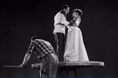
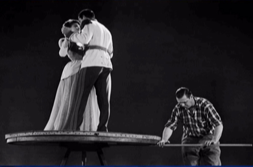
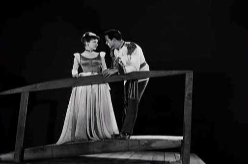
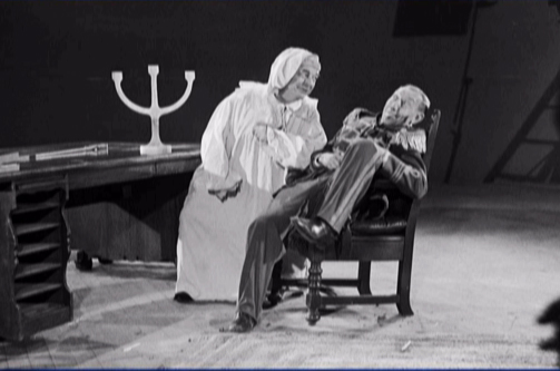
 - Gene Deitch has added two pieces to his blog, his first arrival in Czechoslovakia being met by “Lulka” the emissary from the Czech studio. Then the second post details the meeting with Zdenka, who soon became the love of his life and his wife.
They’re both warm and wonderful reads.
The surprise and the gem of the Zdenka piece is a long video (scroll all the way down) which gives the history of their studio and their relationship. It’s quite a sweet film that’s well worth watching to see if only to see what changes the animated studio has undergone in the years that Mr. Deitch has been in charge. You also get to feel more at home with this great animation director and almost feel as though you know him by the end of it. It’s a really good piece that I don’t think you’ll regret viewing. (I was surprised at how quickly the one hour video downloaded.)
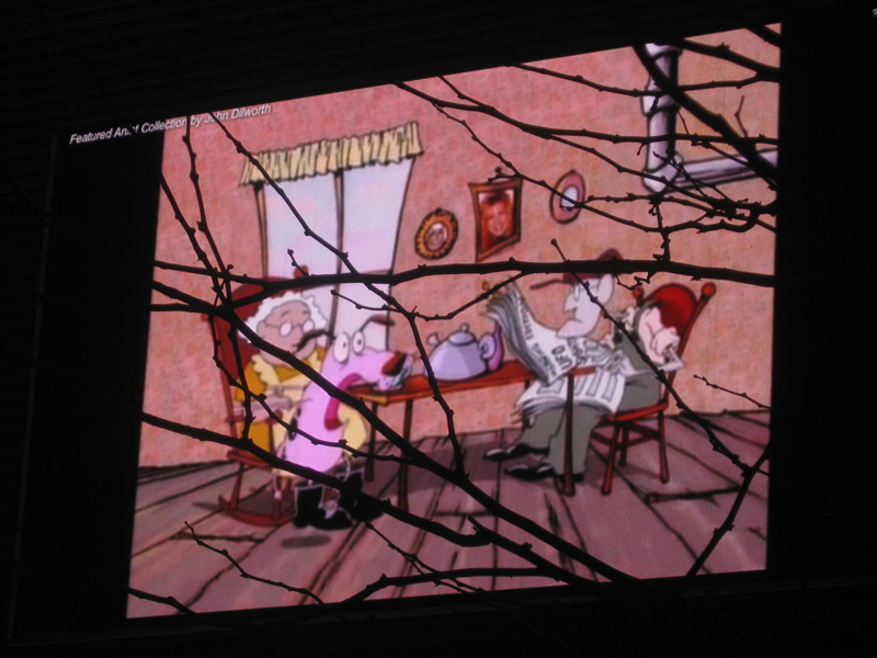
- John Dilworth reported this week that his last film, Bunny Bashing, is now available on YouTube. So I’ve embedded it, above.
And here’s an interesting use of animation in this video designed to
inform Liberals why they shouldn’t despair over the work by Obama –
which, in fact, is remarkably good despite the unyielding criticism
from the Left and the Right.
Found on Andrew Sullivan’s site, The Daily Beast.
Animation &Disney &repeated posts &walk cycle 18 Jan 2012 05:23 am
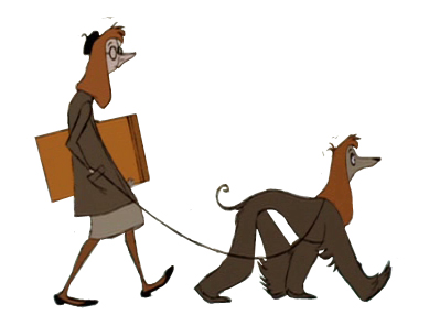
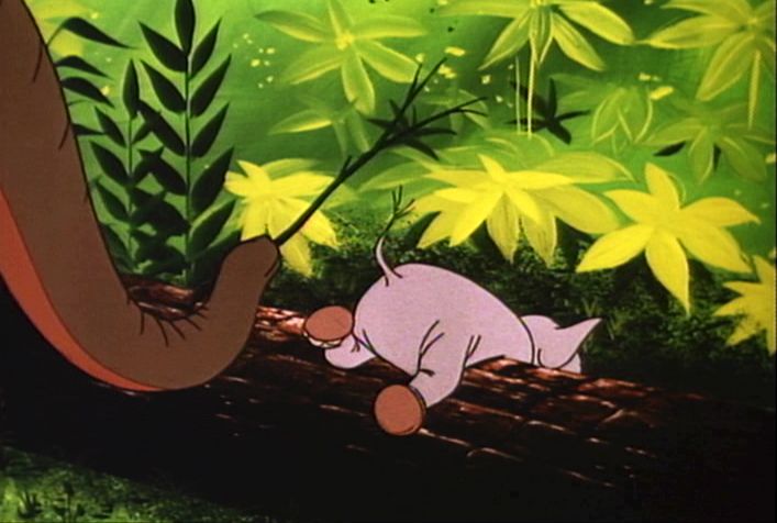
101 Dalmatians Walk Cycles
.
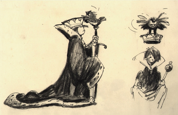
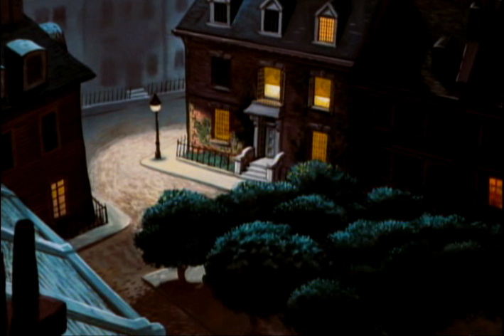
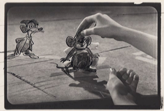
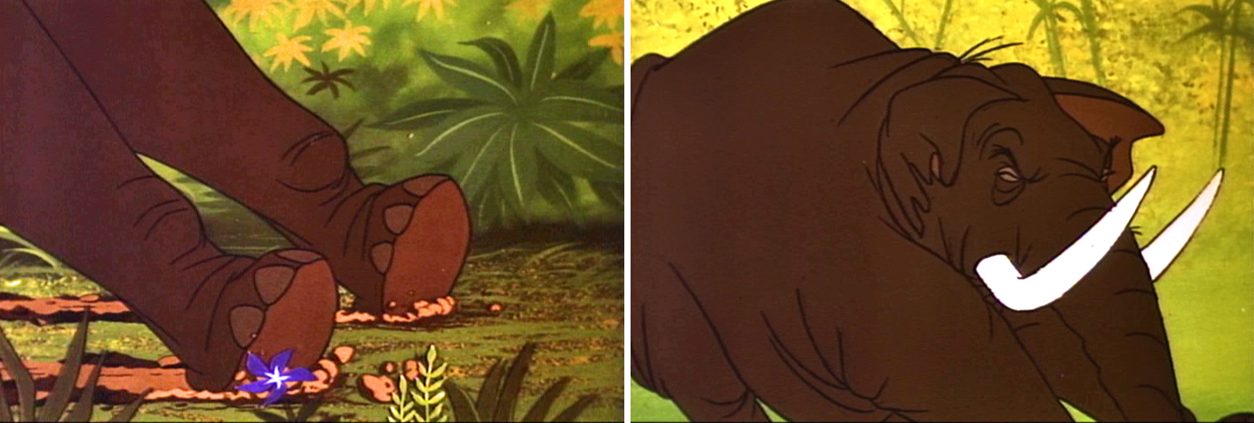
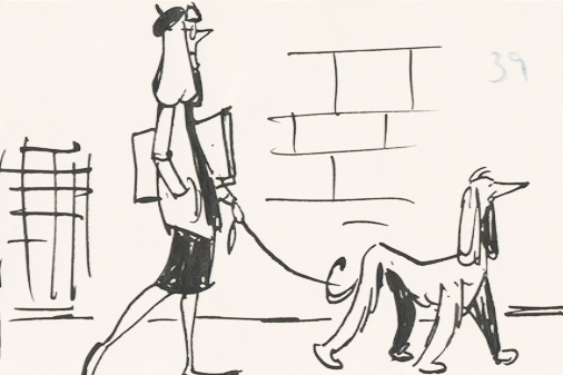 - When I was young, as I’ve pointed out many times, there were few books available about animation and as few illustrations and photos which ellicited the art of animation. Hence, it was always a treat when a Disney feature was released. The adjoining publicity would provide a trove of material, some worth saving. An encyclopedia my parents bought at about the time of release of 101 Dalmatians included several key images of Pongo running. One of those photos of many cels overlayed to detail the cycle. I loved that picture and frequently looked at that encyclopedia under “Cartoons, Animated” to study the photo of the cels.
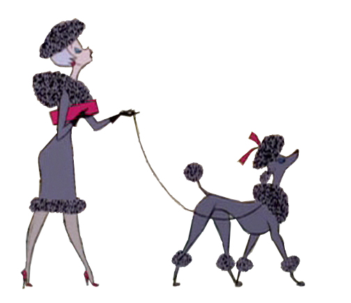
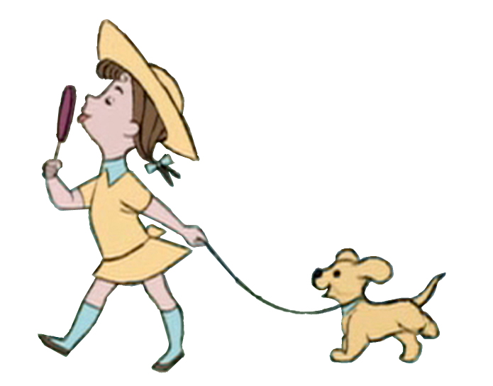
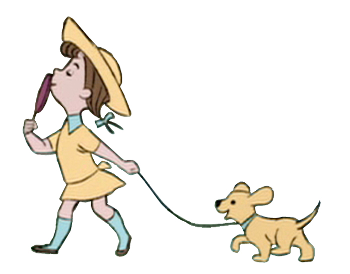
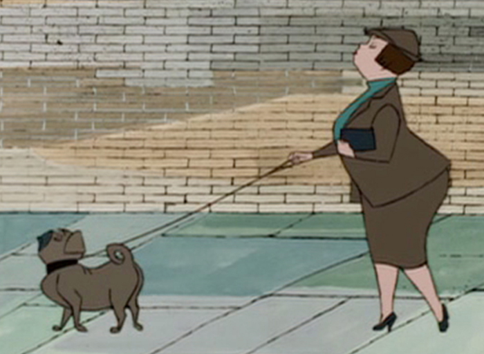
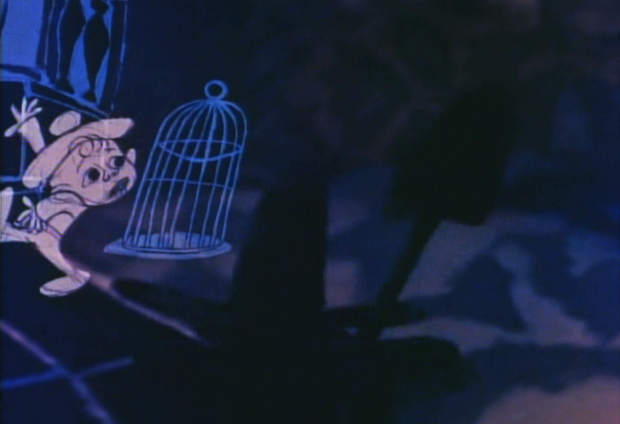
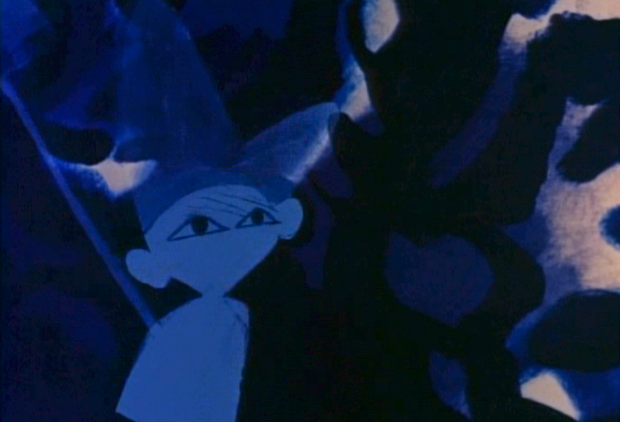
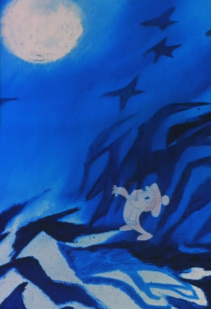
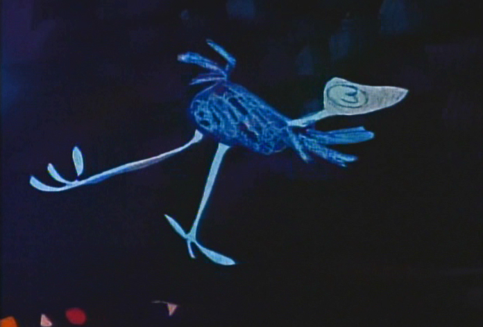
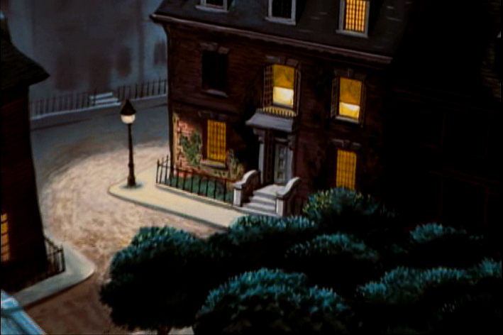
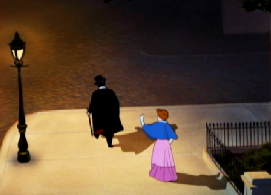
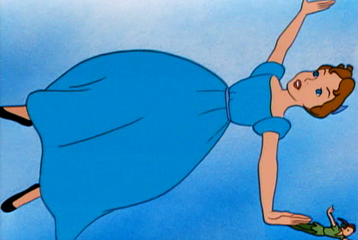
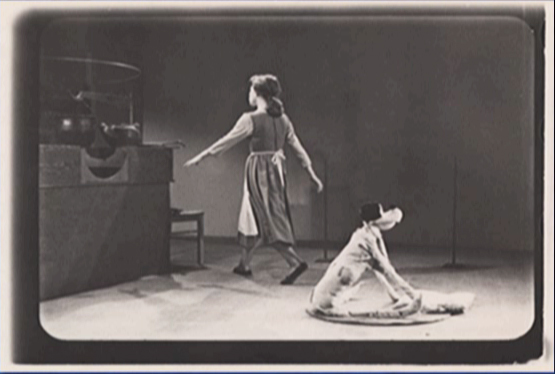
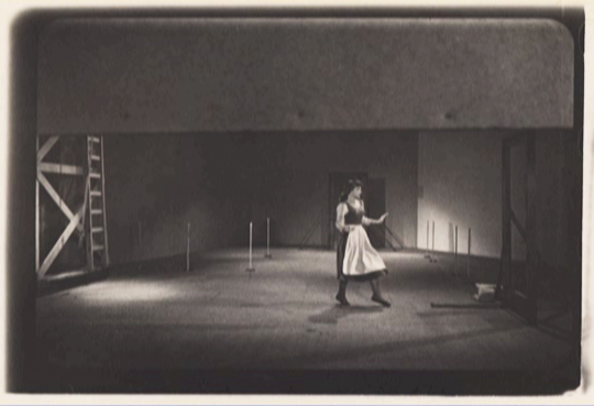
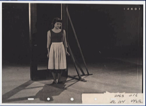
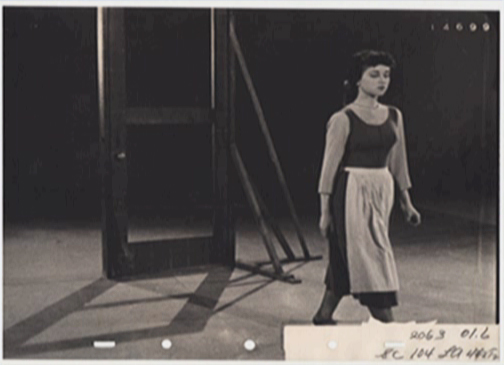
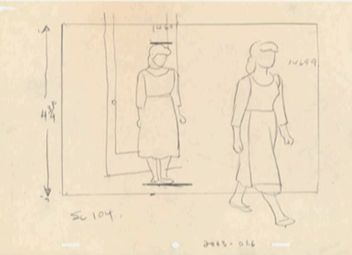
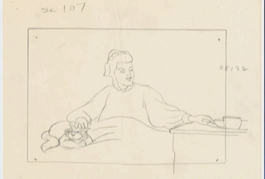
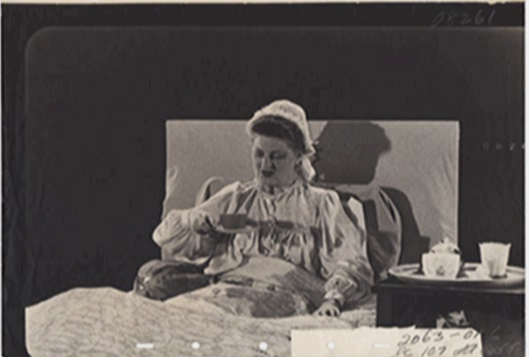
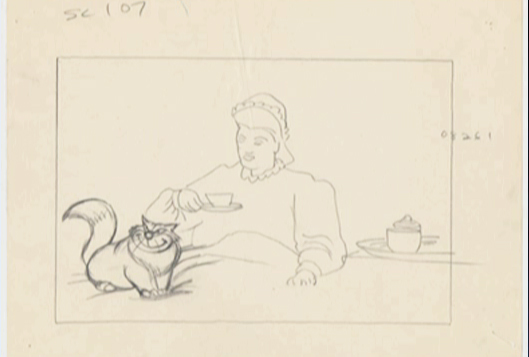
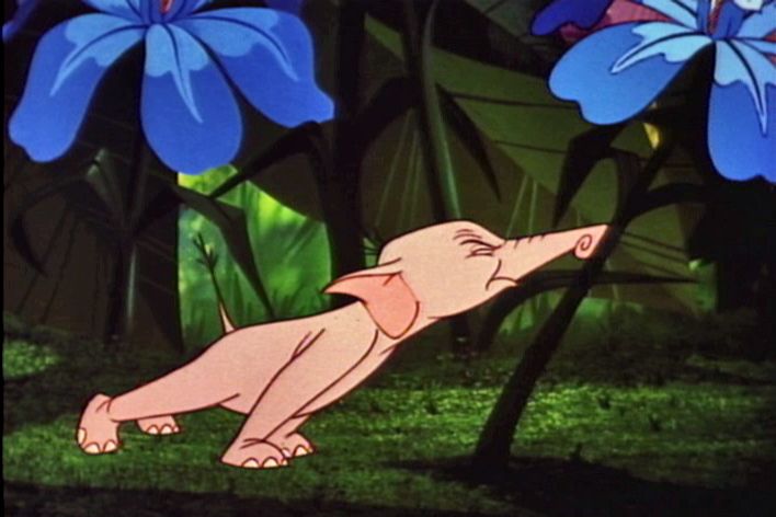
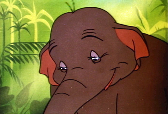
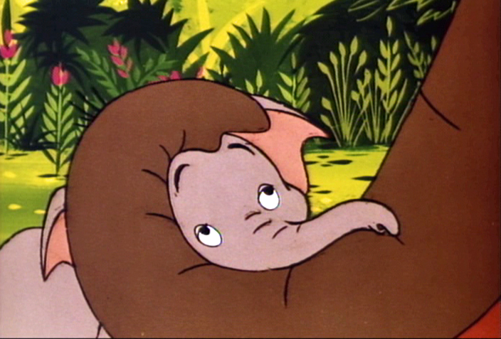
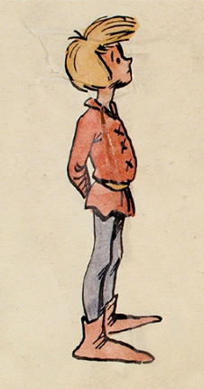
At the very beginning of 101 Dalmatians, Pongo looks out onto the street to search for a good mate for both himself and Roger, his owner. At this point we’re treated to a number of walk cycles that I think are brilliant. A number of women are perfectly matched to the dogs that they walk.
Now with DVDs available to us, we can see that the characters originated in the storyboard drawings, and we can study these walk cycles. I’m determined to take these animated bits apart to watch them a bit closer.
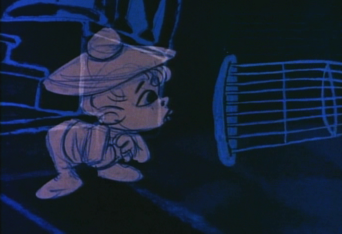
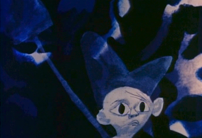
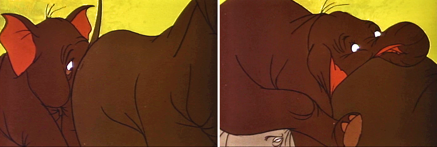
The first of these is the “girl art student” as described in the drafts (which can be found on Hans Perks’ excellent site A Film LA.) Oddly, from my very first viewing of this film back in 1961, I identified her as a “beatnik,” which was the fashionable joke back then. Now I find out she was an “art student.” I guess that makes sense.
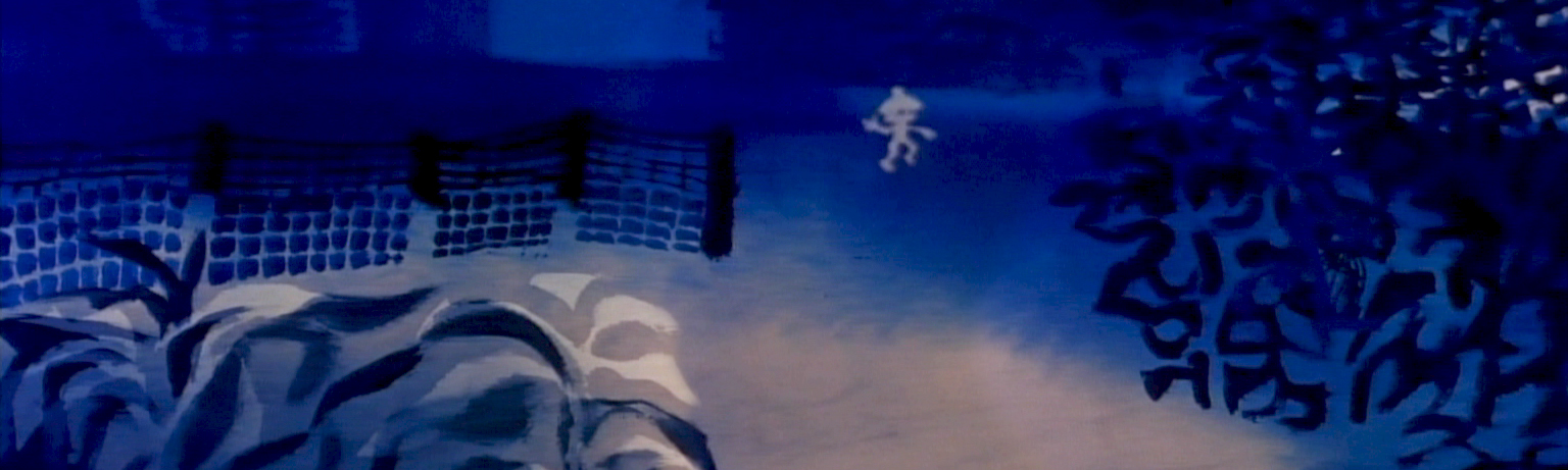
Here’s the pan BG that this scene employs.
(Click any image to enlarge.)
And here is the walk cycle animated by Frank Thomas and Blaine Gibson.
Gibson handled the following scene which pans across the bodies of the pair as they walk.
 1
1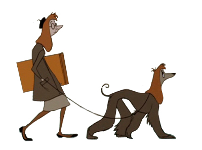 2
2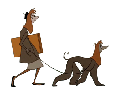 3
3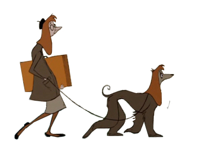 4
4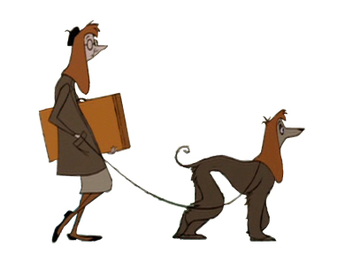 5
5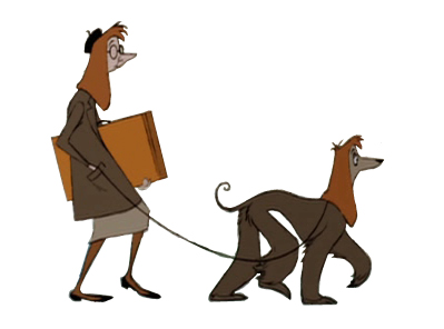 6
6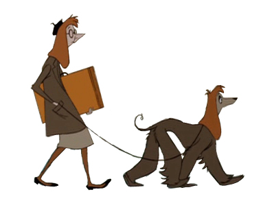 7
7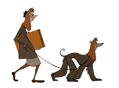 8
8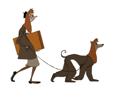 9
9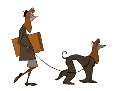 10
10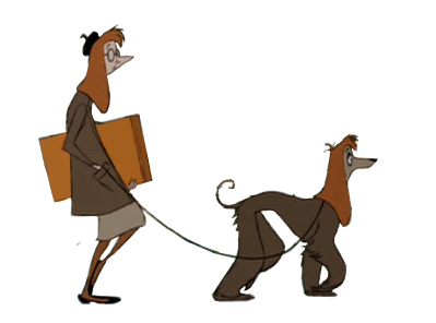 11
11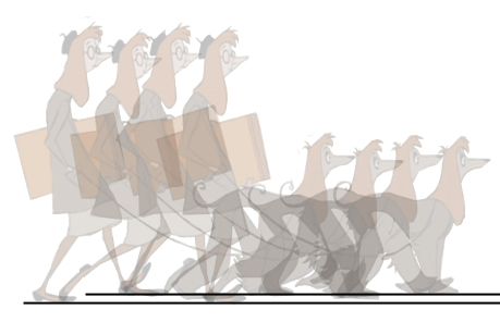
Animation note: The two separate feet are divided by a short space. The left foot is on one plane, and the right foot is on another. This is a BASIC precept for animators to follow, and it’s something that is not appearing in a lot of the recent walk cycles I’ve been seeing. It’s annoying.
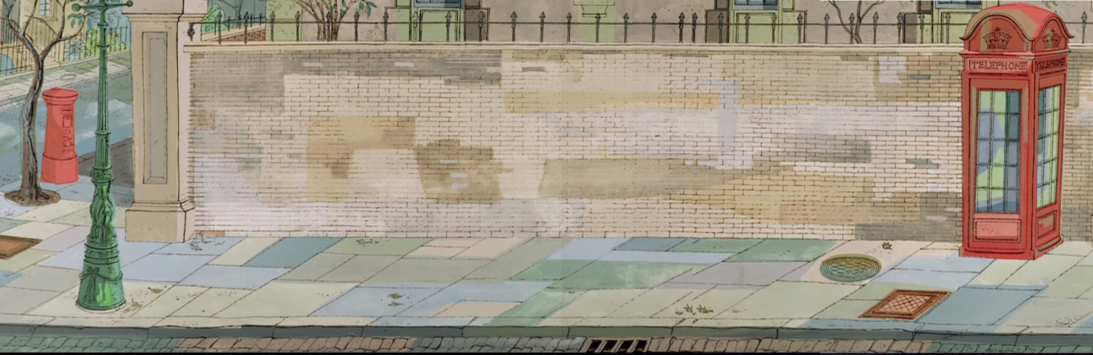
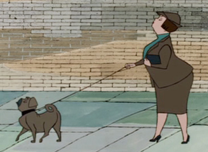
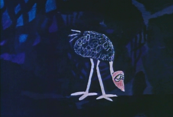
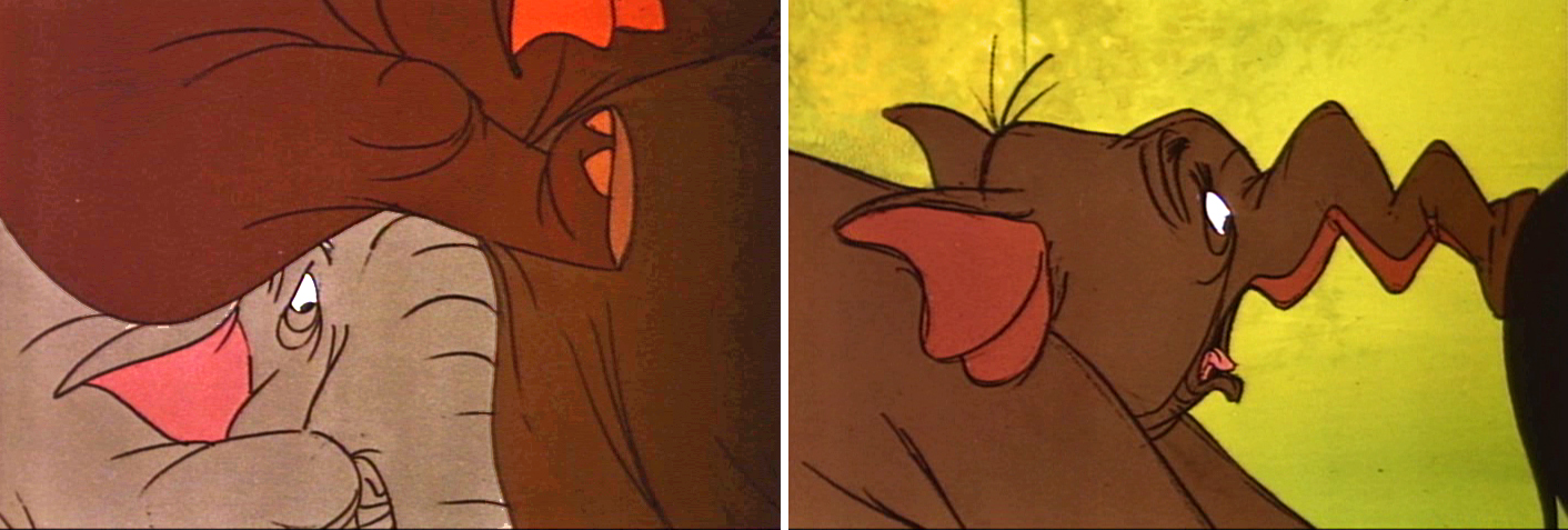
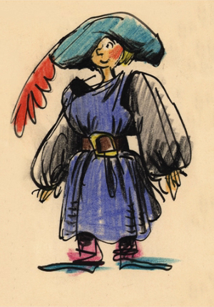
Here’s scene 21 “French girl walks French poodle” animated by Blaine Gibson. It employs the same BG as scene 14, the art student (posted Apr 3), but it extends, beyond what we’ve seen before, to include a telephone booth.
______________(Click any image to enlarge.)
This is a slightly faster walk than others, and I’ve been able to grab all of the drawings. It’s animated on “ones.”
 1
1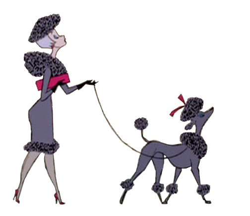 2
2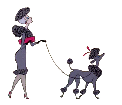 3
3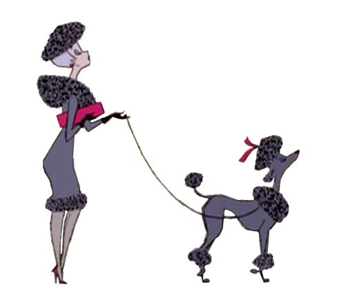 4
4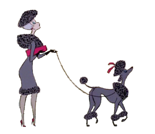 5
5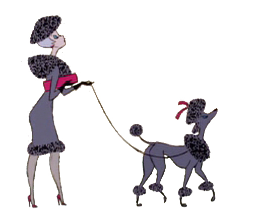 6
6 7
7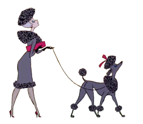 8
8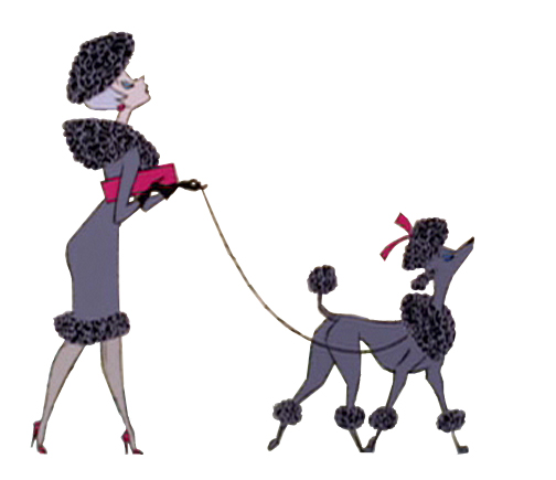 9
9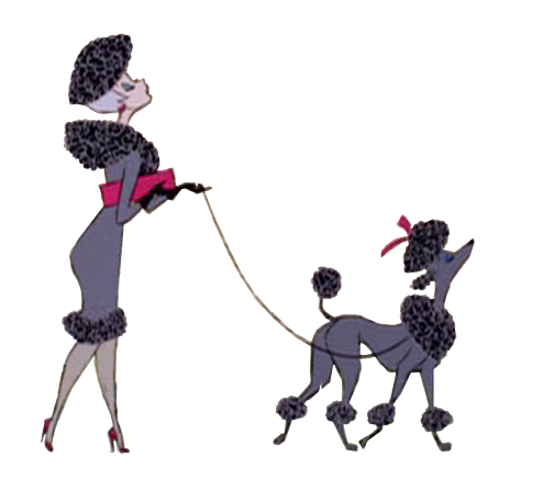 10
10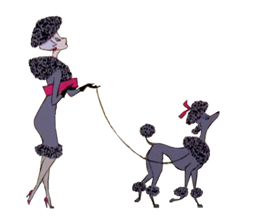 11
11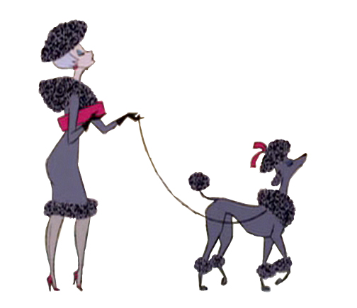 12
12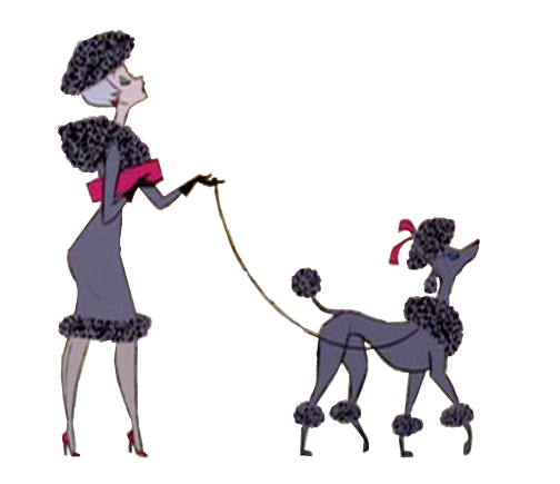 13
13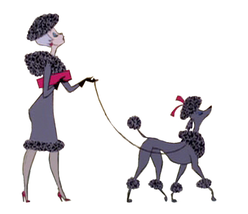 14
14This walk is an absolute gem !
Once again, check out Hans Perk‘s excellent site A Film LA to get the drafts for this film to be able to identify who was behind what. Then go to see Mark Mayerson‘s arduously constructed and informative mosaics as well as his detailed commentary about the film and its animators.
Check out Floyd Norman‘s story about Blaine Gibson on Jim Hill Media.
Here’s the young child with her puppy. She not only walks, but she licks her lollipop. The pup is just an absolute innocent. It’s another great walk by Blaine Gibson.
 1
1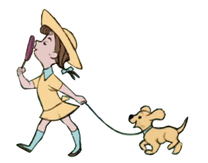 2
2
_______(Click any image to enlarge.)
 3
3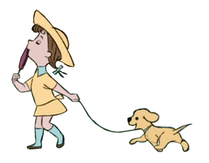 4
4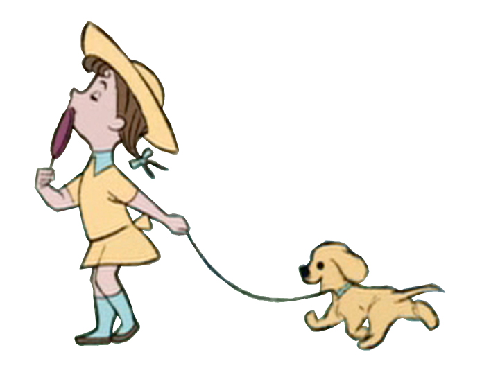 5
5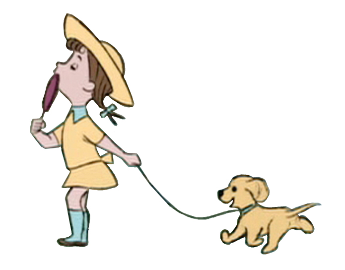 6
6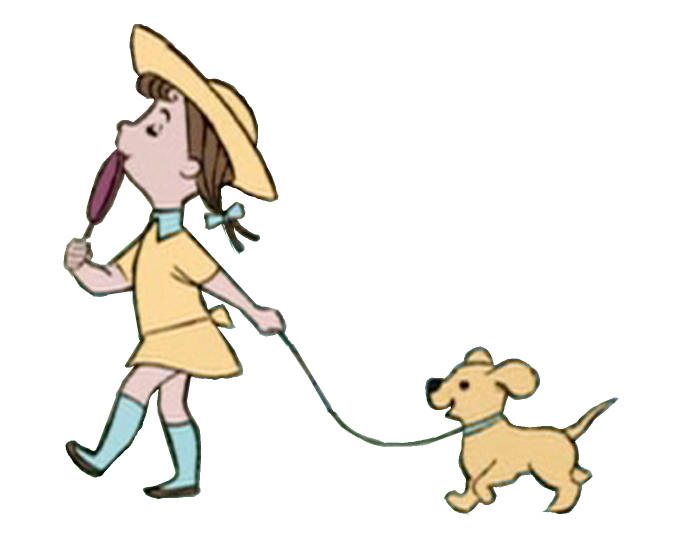 7
7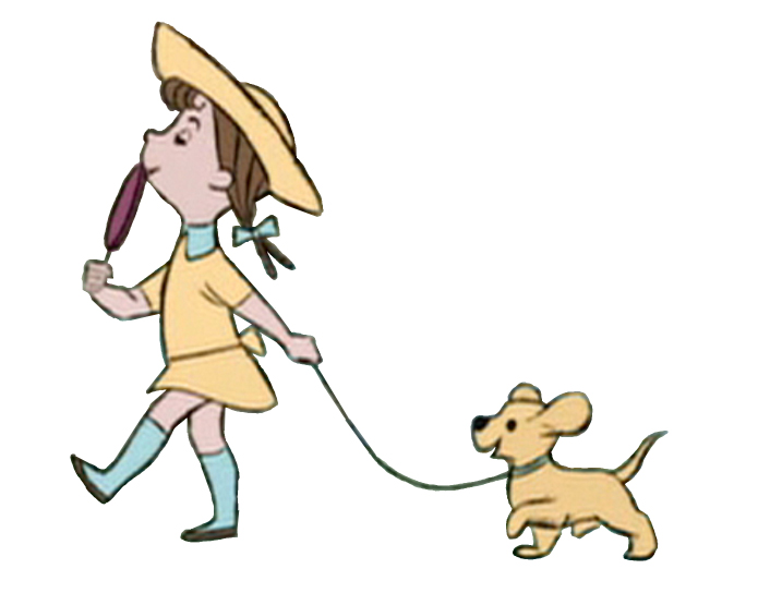 8
8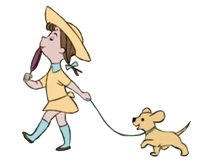 9
9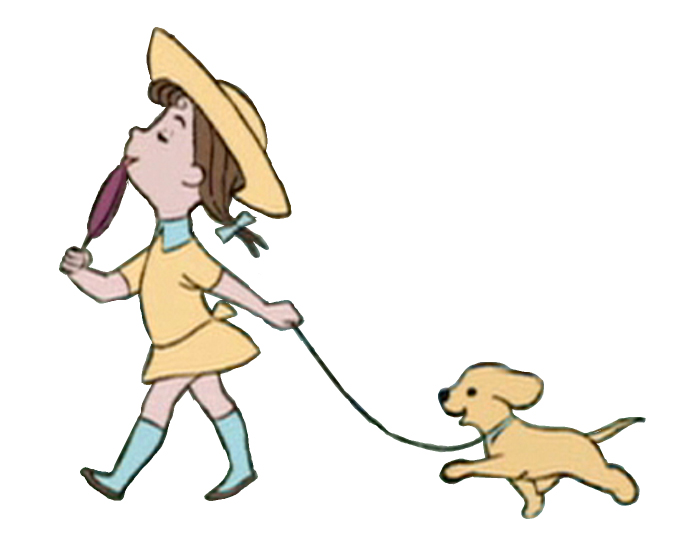 10
10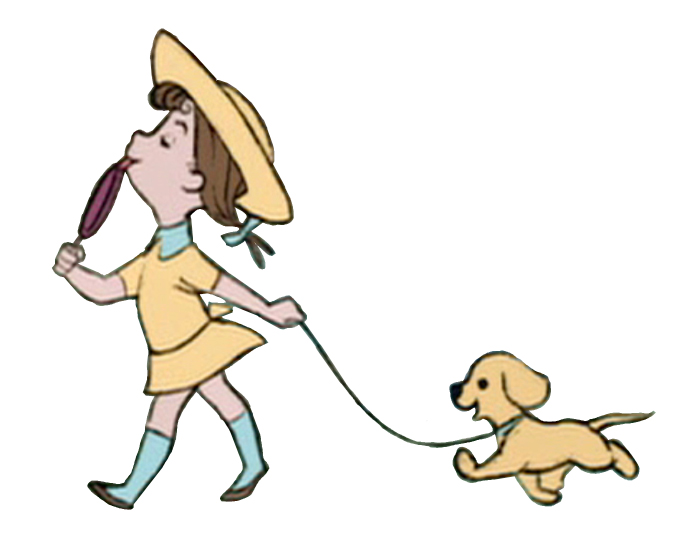 11
11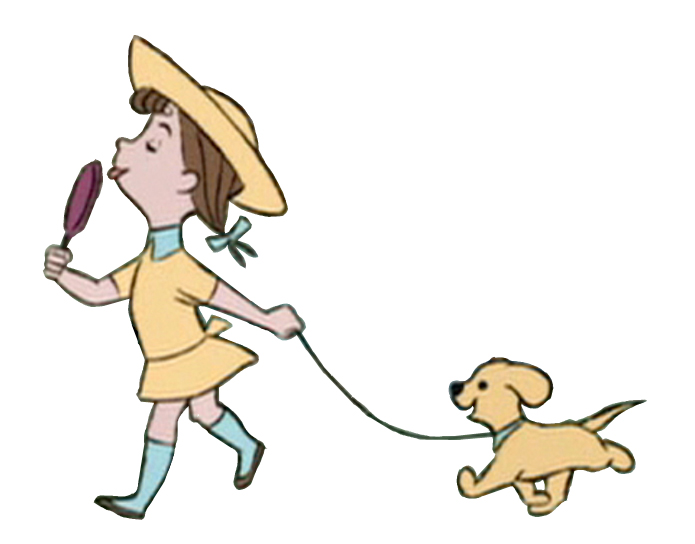 12
12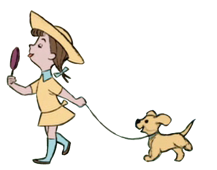 13
13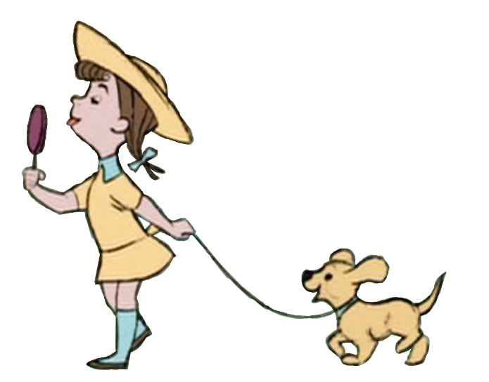 14
14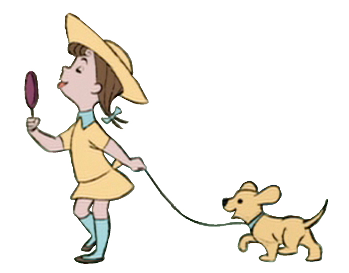 15
15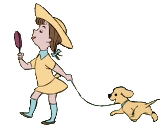 16
16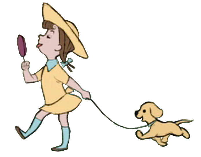 17
17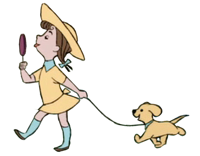 18
18The piece, in the film, includes a zoom into the cycle. I’ve tried to adjust for it but don’t think I was wholly successful. There’s a marginal enlargement of the drawings as it goes on – noticeable only in motion. It’s actually interesting in the walk.
Here’s Blaine Gibson’s animation for what is labelled in the drafts “Buxom Girl and Bulldog”. I left the backgrounds in this one for you to get an idea of the BG movement.
 1
1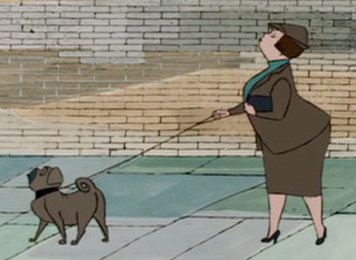 2
2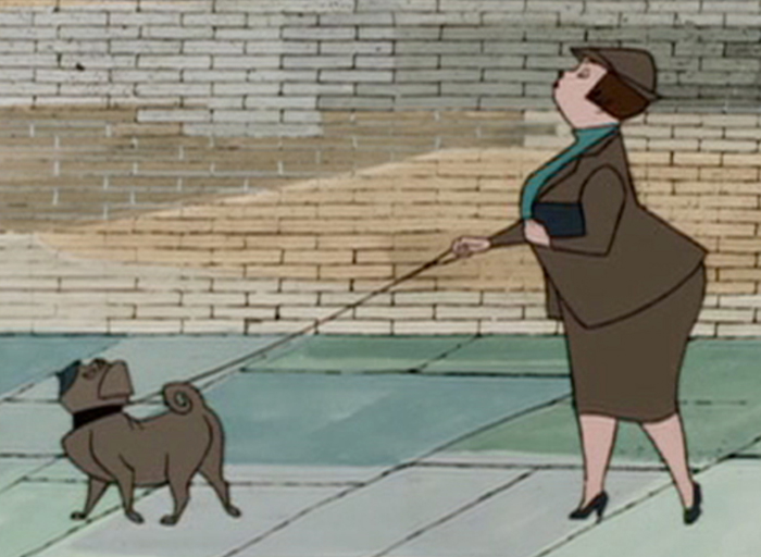
 4
4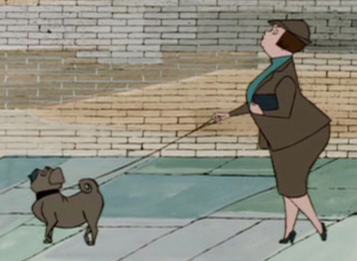 5
5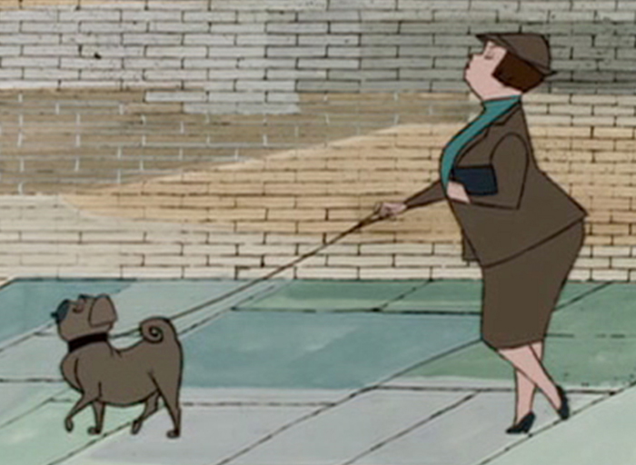 6
6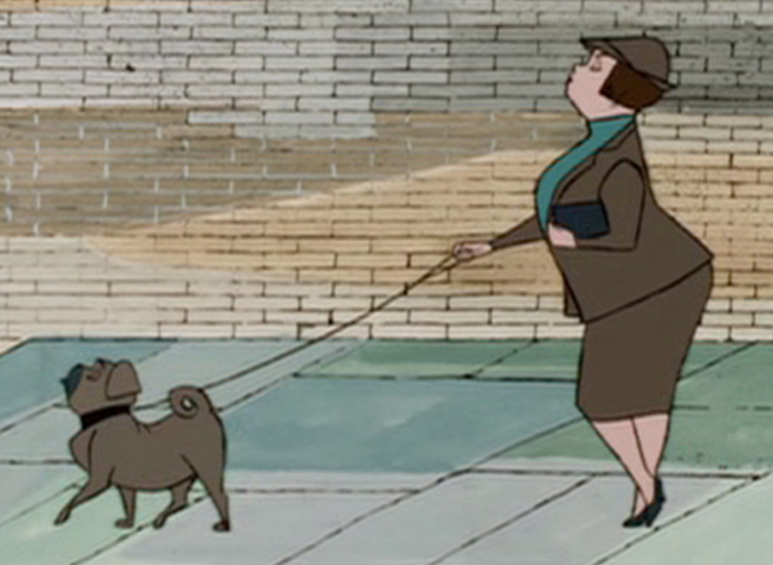 7
7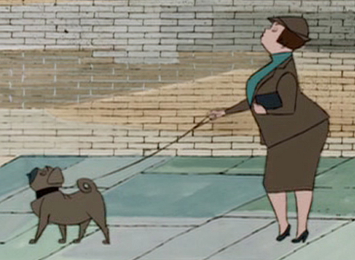 8
8 9
9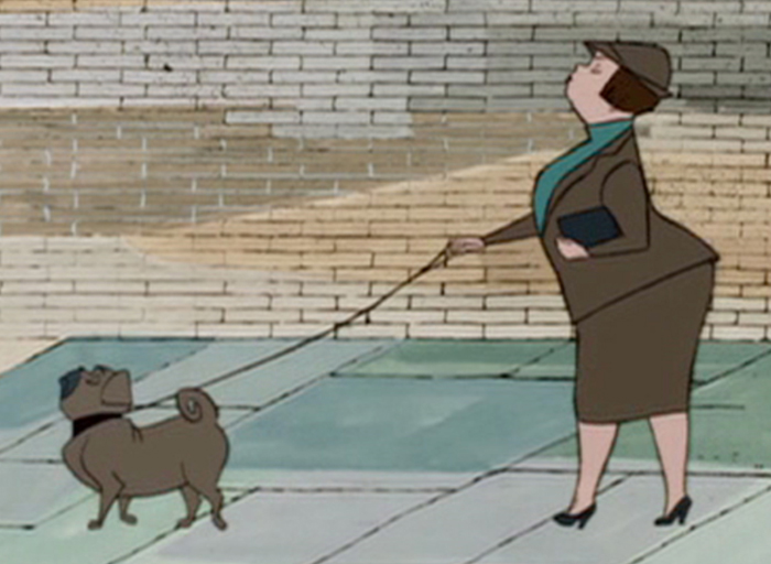 10
10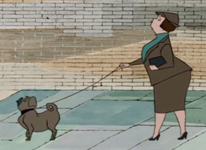 11
11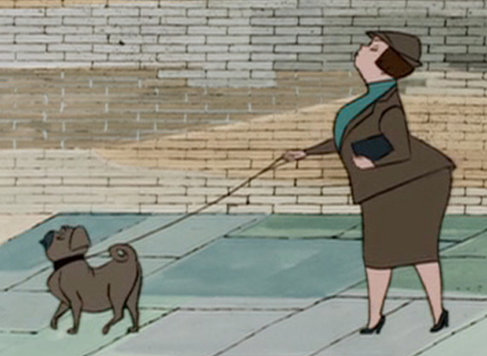 12
12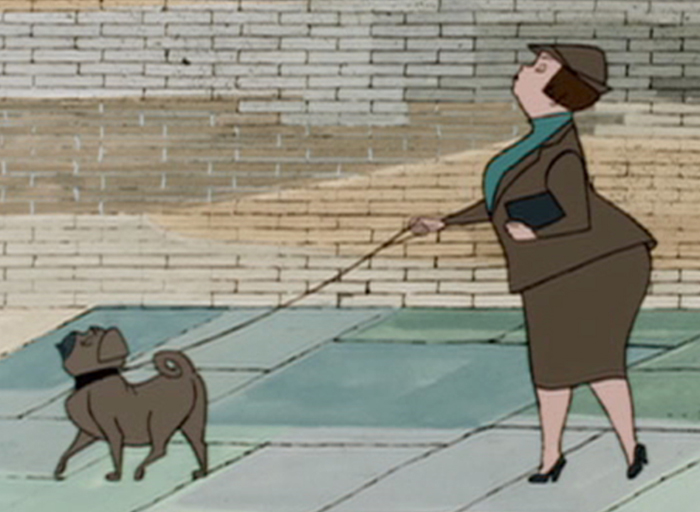 13
13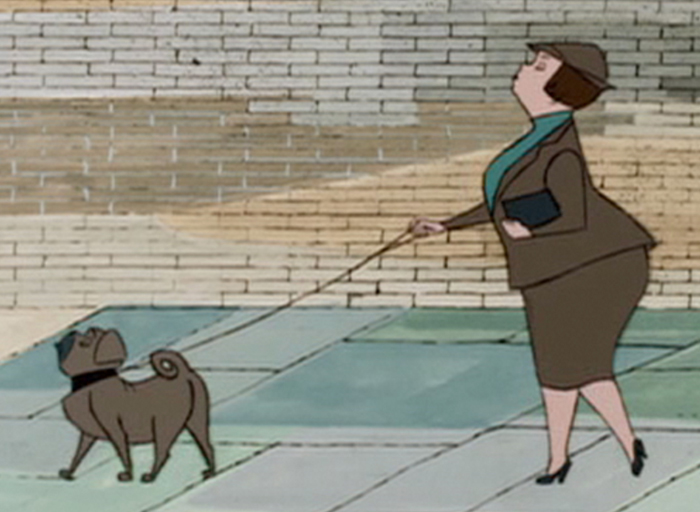 14
14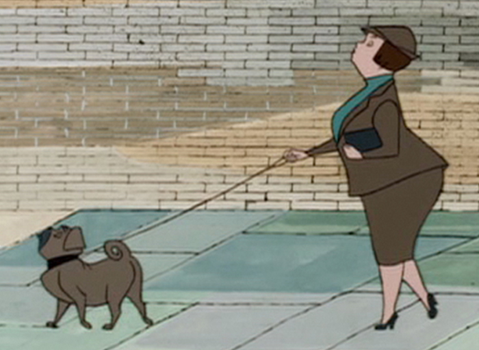 15
15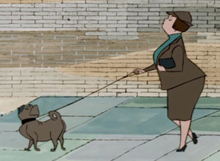 16
16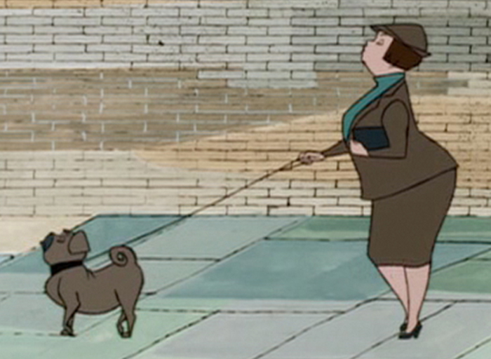 17
17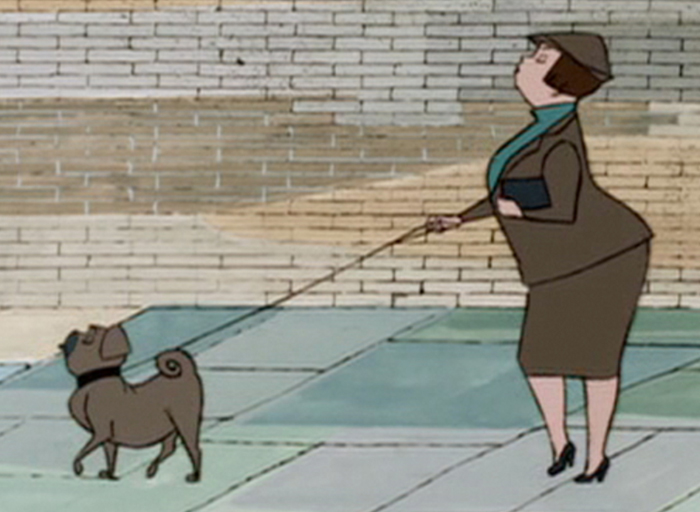 18
18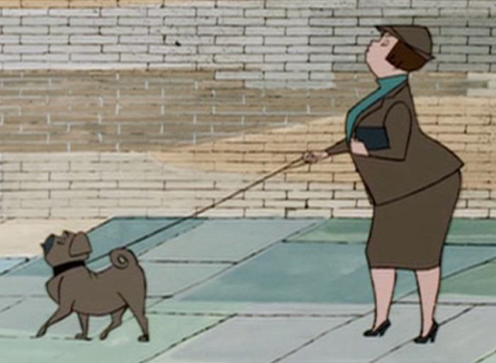 19
19 20
20
Commentary &Frame Grabs &Hubley 19 Sep 2011 07:23 am
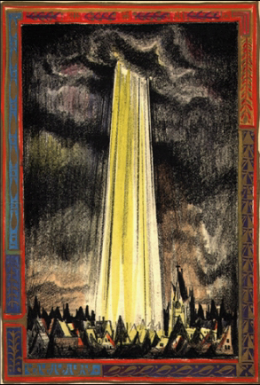
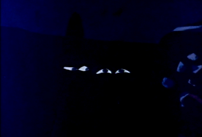
Moonbird
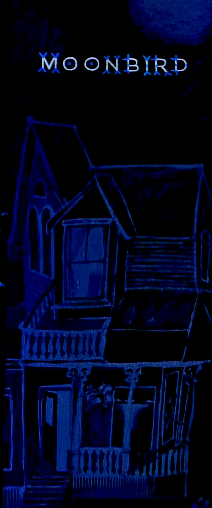
Opening title pan down- Moonbird
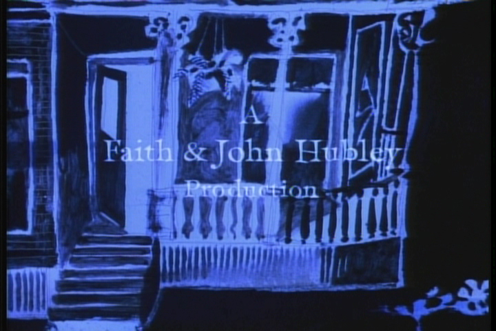
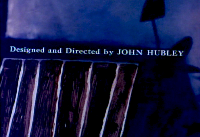
- In 1964, John and Faith Hubley‘s film, Of Stars and Men opened at the Beekman Theater in Manhattan. This was their first feature; it was accompanied by a number of their short films. I was in High School, and this is the first time I saw any of the Hubley films, and my life had changed at that screening.
 The flat colors of the Disney and Warner Bros cartoons were suddenly replaced with textures. It wasn’t only the backgrounds that had a texture; it was the characters as well. I’d already taught myself quite a bit about animation, but this was something new for me. I sat with saucer eyes watching every element and filmic device John Hubley came up with in creating these flms.
 It was so clear that Hubley was using a system of double exposures, doubling the characters in at an exposure of about 60% so that the white paper would be somewhat translucent over the dark backgrounds. The rough pencil lines of the animators clearly delineated the characters in this technique, though they picked up some of color of the Bgs. Obviously, the white paper of the character had been painted black – up to the animator’s lines so that the extraneous parts of the paper was matted out. What a brilliant idea!
I explain this process in depth in this post from the past.
.
This enabled us, the audience, to see the rough lines of the animators and brought the same life the Xerox line had brought to 101 Dalmatians. It was thrilling for me.
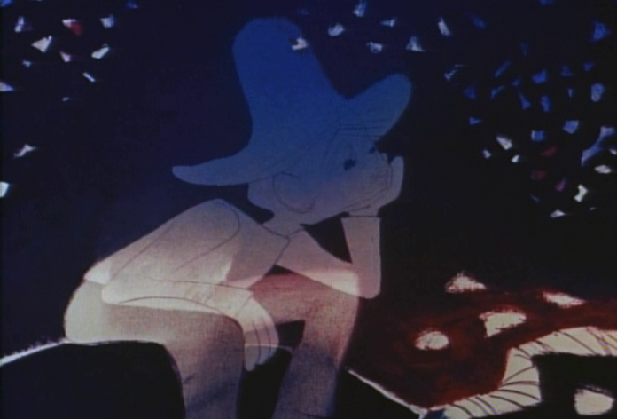
The sing-song muttering of a child introduces us to “Hampy”.
The rough lines of animator, Bobe Cannon, are a treat on the screen.
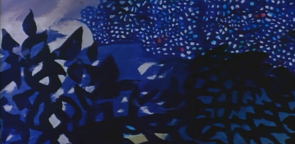
Glorious textures!
Every oil painting background beautiful, alive and modern.
The other amazing thing was that the films used real dialogue.
It didn’t sound like a script. It was obviously, somehow, improvised.
It took me a while to learn how this was done
and what a wonderful way they had of doing it.
Moonbird was different from the other shorts of that period.
Its soundtrack was completely improvised by the
two boys of the Hubleys, Mark and Ray.
. . . but it also used NO music track.
This is very different for the Hubley films that had
such a devotion to the use of jazz on the soundtrack.
The film not only looked different for the time, 1959,
but it sounded different.
This film had clearly been the results of years of experimentation.
After all those brilliant UPA shorts, particularly Rooty Toot Toot.
The original Hubley produced shorts took a new, brilliant turn.
Adventures of an * moved animation forward
in its pursuit of 20th Century Art.
Picasso and Steinberg had been mimicked in the UPA films.
With Adventures of an * the Abstract Expressionists
came under the magnifying glass as John Hubley used
the New York school as his inspiration.
With Tender Game they moved that style into a more emotional
character animation, and by the time they did Moonbird, they
had settled into a very rich style that animation hadn’t noticed.
Two of animation’s finest animators delivered
the brilliant lyricism in this film.
Bobe Cannon, for years, had delivered great animation.
His work with Chuck Jones had produced new and rich
experimental heights particularly in the 1942 short, The Dover Boys.
Hubley had stated that this film was an inspiration
in the move to 20th Century graphics in animation.
Cannon’s work with UPA, both directing and animating,
brought a new sense of poetry to the medium that finally
plays out in this film, Moonbird.
The young Ed Smith rose to great heights
while working for Hubley. His work on Tender Game
showed a natural warmth that spills over in this film.
Animation, double exposures, oil painted Bgs,
improvised voices, no music all pushed this film
to the forefront of animation at the time.
Despite the looseness of the style, it all blends
together as if it had been done by the one artist.
I love the soft airbrushed look Hubley was able
to pull off with much of this double-exposed artwork.
And yet the characters always remain front and center.
A tribute to the two animators and the directoral staging.
This delicate and lyrical film was followed by an anmiated
discussion of nuclear warfare and armament. The Hole
was twice the length and had a political point to make.
The characters’ colors change and fluctuate and sparkle
even as scenes progress, but this all becomes part of
the style which the Hubleys pursued for
the rest of their filmmaking life.
As in Moonbird, the voices in The Hole were improvised
. . . but this time by adults, Dizzy Gillespie and George Mathews.
The Hubleys took their process of improvisation to a new level.
In the end, animation grew up, once upon a time.
The question is whether we’ve squandered that development
and have retrogressed to the 19th Century illustration styles
that Disney pursued. Recently, we seem to have had only
bad drawing or cgi puppets to choose from.
Time to step up, ladies and gentlemen.
Commentary 03 Sep 2011 06:55 am
Schmoozing
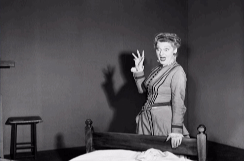
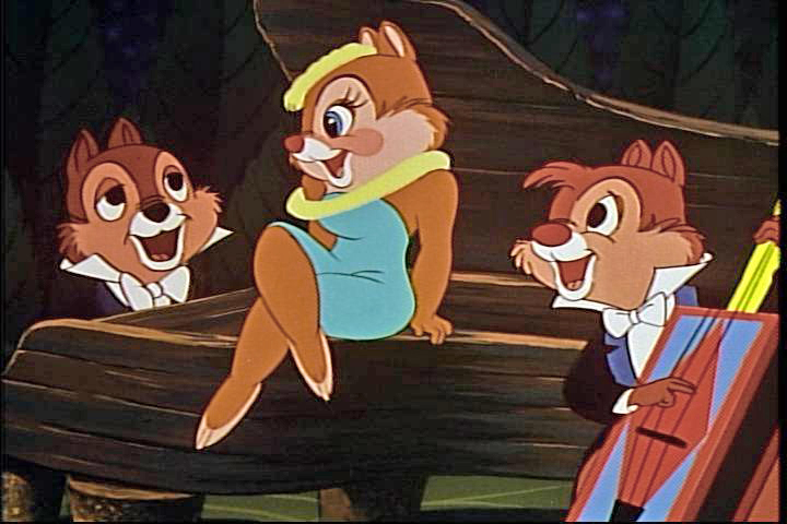 - Mike Barrier posted a letter on his site. Kevin Hogan questions Mike’s ability to enjoy an animated film now that his taste has been formed by a lot of information learned over a lifetime of study. Mr. Hogan gives as an example the Chip n’ Dale cartoon Two Chips and a Miss. He loved this short as a child and found himself not enjoying it quite as much seeing it as an adult. He suggests that Mike’s knowledge might get in the way of the “innocence” he had as a child in enjoying some of these films. It’s an honest question, and it opened into a full discussion with Thad Komorowski and Milt Gray among others discussing the theory. Mike talks about enjoying the Three Stooges in his younger days but not quite enjoying them as much in recent days. His knowledge of film and this thoughts on the filmmaking process inform his judgment (thank god).
I probably would have gone to Alfred Hitchcock. Here’s someone who made films that can and should be appreciated on so many levels. They’re done for the public, and the manipulation Hitchcock maneuvers to create his films gets that audience by the throat, and Hitchcock enjoys doing so. Yet that same manipulation becomes obvious to the informed film student. However, for that same knowledgeable filmgoer, it doesn’t lessen the value of the film knowing how and what is coming. It makes it more fun because Hitchcock was a Master.
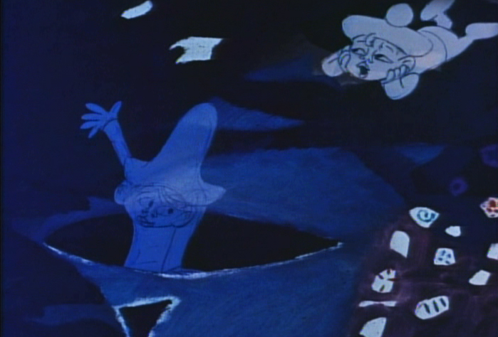
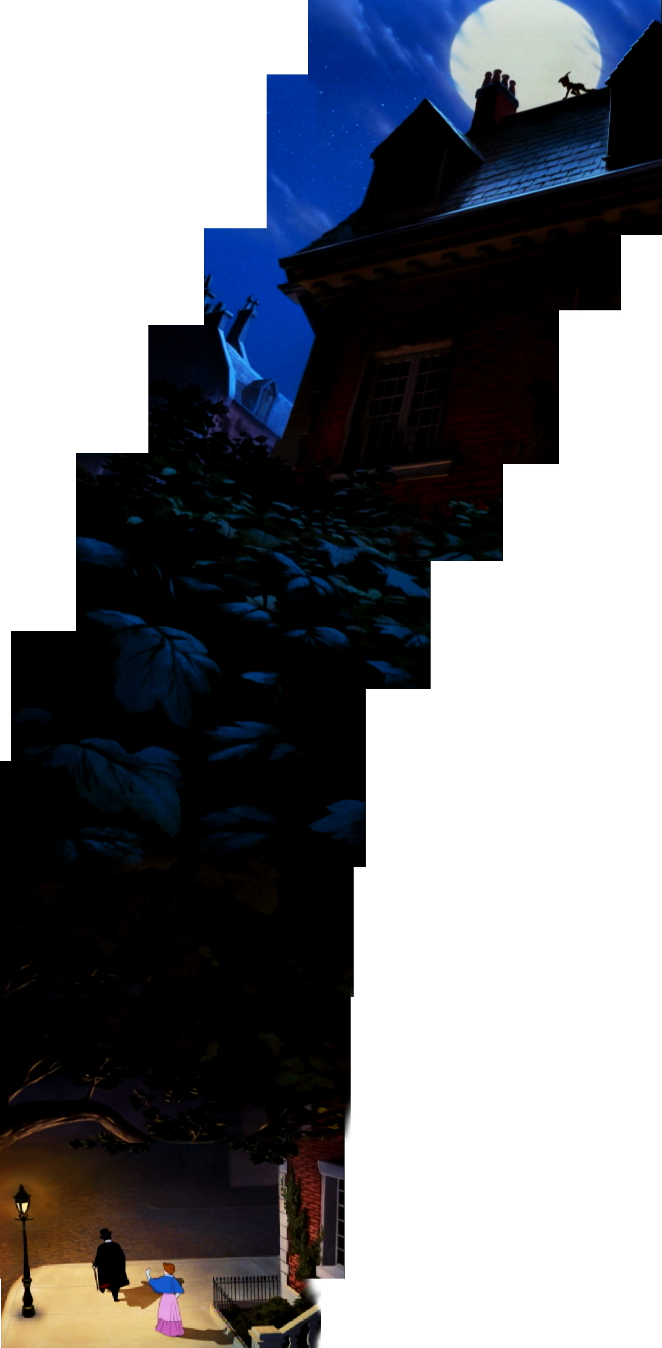
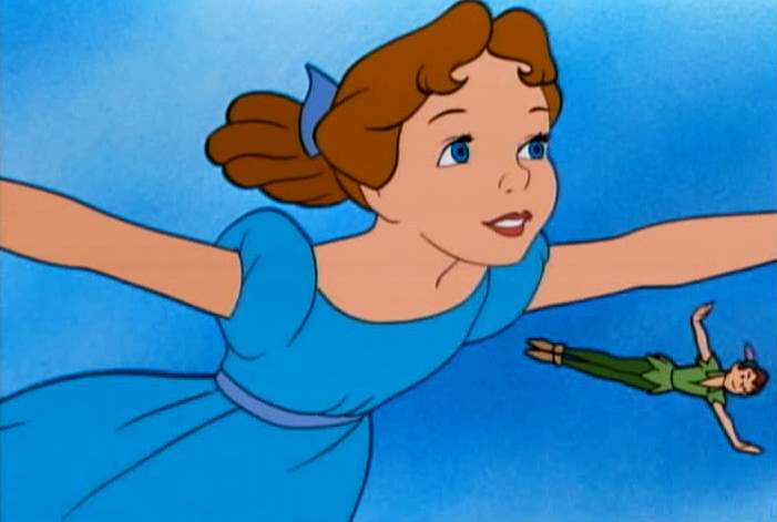
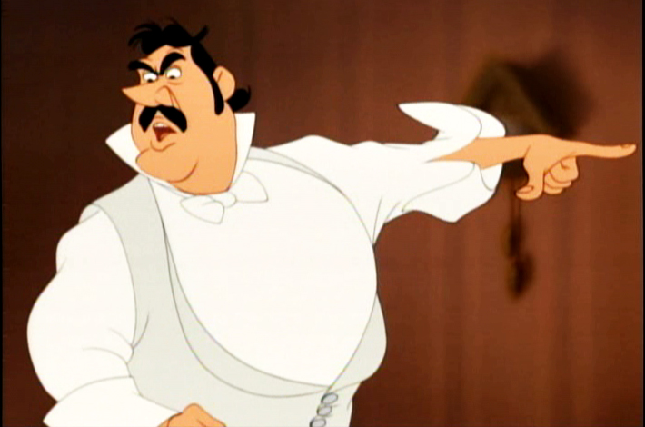
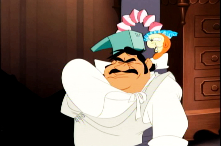
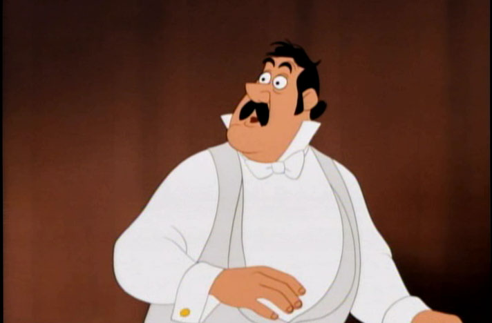
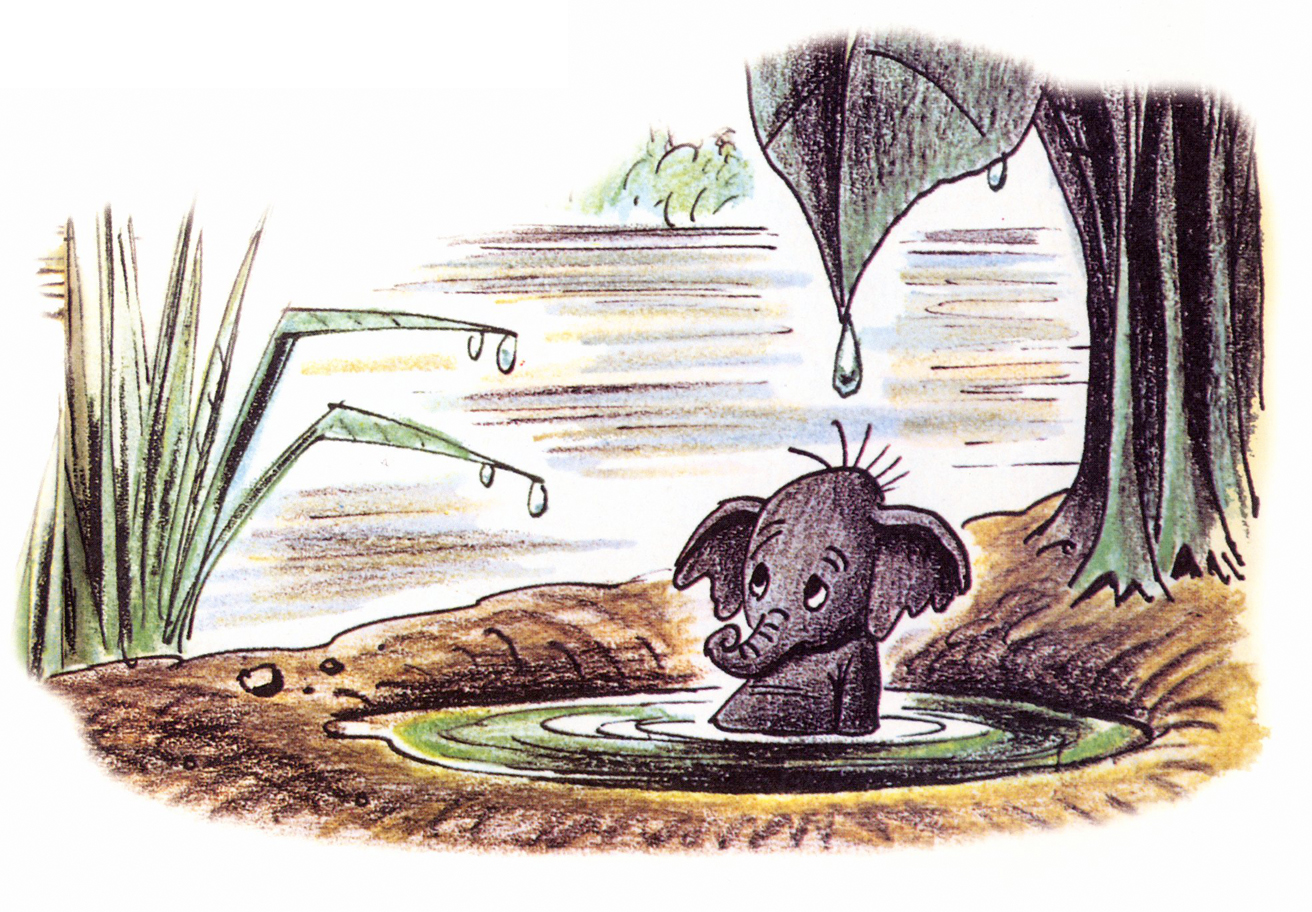
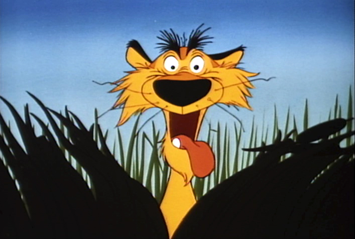
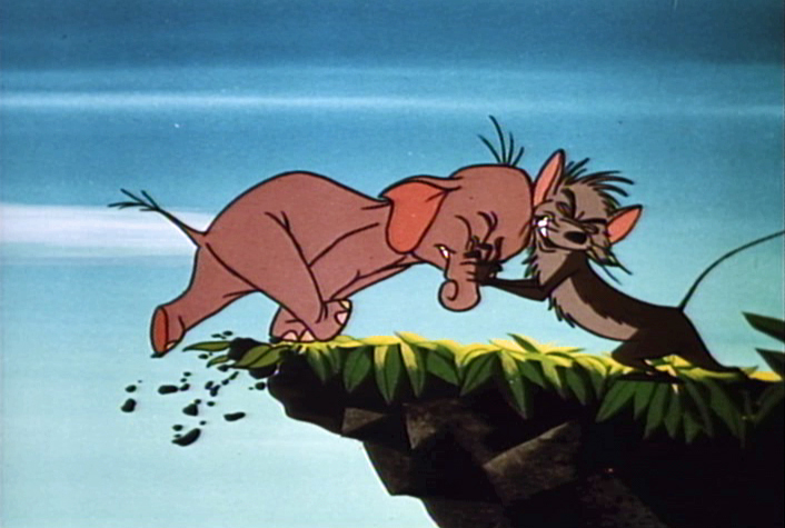
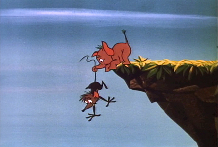
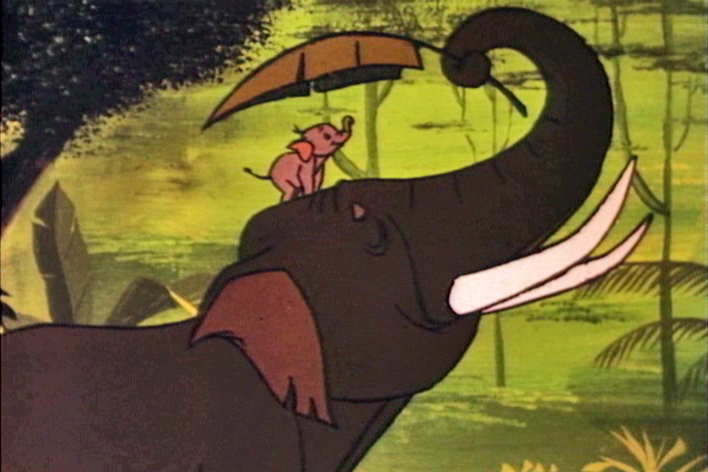
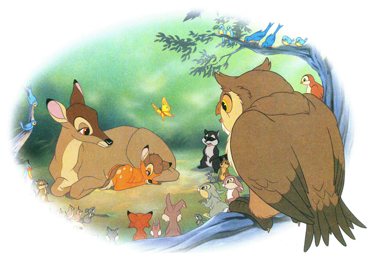
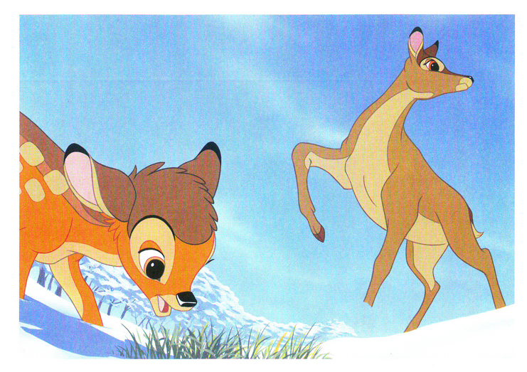
 - As a 14 year old child, I was blown away by 101 Dalmatians. Those first ten minutes were heaven to me. I loved the design and the animation of Cruella de Ville, Pongo & Perdita, and even some of the pups. I was not as enthralled by the middle action-adventure section (immediately following the “Twilight Bark”). I had a lot of respect for what was being done, but I preferred the London portion of the film. I did know a lot about animation when I first saw it, but I know a lot more now. I also, now, know quite a bit about 101 Dalmatians, itself. The odd thing is that my opinion hasn’t changed a bit since that first screening. Today, I am in awe of the beautiful walk cycles Blaine Gibson animated at the beginning of the film as Pongo eyes potential mates. Throughout the film, I can see all the cuts, cel shadows, interesting effects and mistakes within them, and, yet, I still love the movie. Everything has changed within me, but nothing has changed within the movie that I first saw. It’s still excellent.
- Jeffrey Pepper’s excellent website 2719 Hyperion has featured the odd Disney short, Donald and the Wheel, in a fine analysis. The article was originally posted on the site in 2009, but this is the first time I’ve caught up with it.
 I initially saw this short when it was originally released in 1961. It played locally in New York on a bill with a non-Disney live-action feature (which I can’t remember.) I have to say that I wasn’t in tune with this short, but I enjoyed the surprise of seeing it in the theater back then.
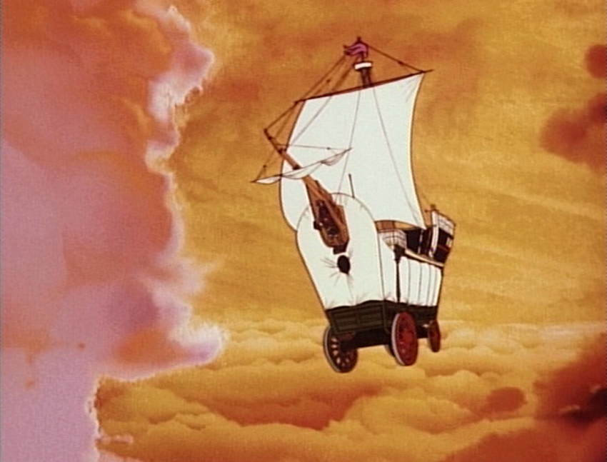
An even greater delight for me was seeing Symposium of Popular Song with the film, P.T. 109 in 1963. Also on that bill was the Disney animated short, The Saga of Windwagon Smith. I don’t remember that much about the feature (other than an image of Cliff Robertson as JFK), but I do remember the two shorts which I’ve seen many times. I absolutely love Windwagon Smith and have studied it backwards and forwards. I also bought a couple of drawings when I saw them available on ebay. Symposium of Popular Song took the TV creation, Ludwig Von Drake and introduced him to theaters in this Bill Justice/Xavier Attencio short that was primarily stop-motion cut out animation. What a double bill! And I’m talking about the shorts, not the feature.
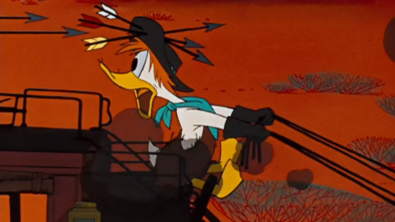 I had seen Donald in Mathmagicland many times prior to ever seeing this newer film. I can’t say I have the same love for Donald and the Wheel. I had a very hard time accepting the two narrators: the Spirits of Progress, Sr., and Progress, Jr. They’re silhouettes done using the Sodium Process invented by Ub Iwerks and used in Hitchcock’s The Birds and Disney’s Mary Poppins. The halo around the characters is all we see of them, and they’re boring, and their song was worse. (I remember spending a lot of time back then trying to figure out how they were done.) As 2719 Hyperion points out Donald and the Wheel did some experimenting with the Xerographic process preparing the way for features like 101 Dalmatians and Sword In The Stone.
But I do pine for the time when a feature – not even a Disney feature – would be accompanied by two such animated shorts. Seeing a Pixar short attached to a Pixar long is not the same thing, believe me. 1963 was also a time beyond the Saturday morning kids matinees in theaters when 10 “Color Cartoons” were featured with a Francis the Talking Mule film. No, it was just part of the filmgoing process to be able to see an animated short on a big screen.
- This week I received an email from Louai Abuosba. Along with a number of others, he’s come up with a “meetup.com group aimed at providing a structure for student and professional NYC area. Animators to teach each other skills they don’t have or want to sharpen.” They met this past week in Dumbo and have plans for future meetings. If anyone is interested, you can sign up using Facebook or just go to the site and send Louai a note. (Sorry I didn’t get this out in time for the Sept. 1st meeting, their first, but I got the information too late to get it on the Splog.)
Commentary &Disney &Frame Grabs 13 Jun 2011 06:33 am
Peter Pan Multiplane
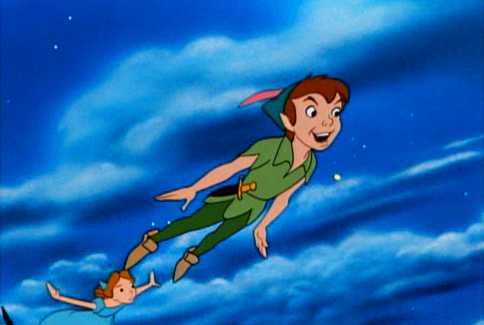
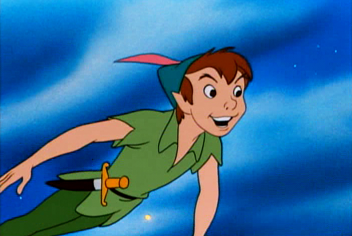
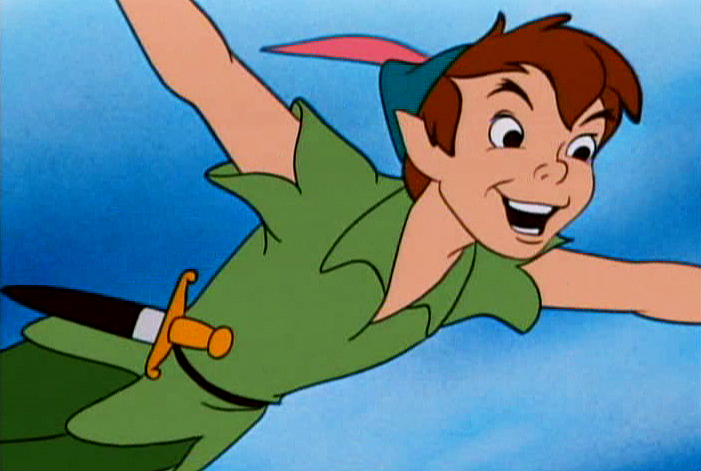
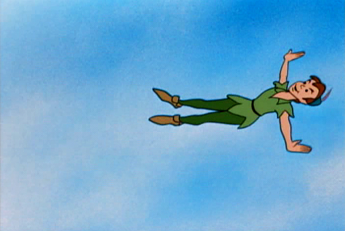
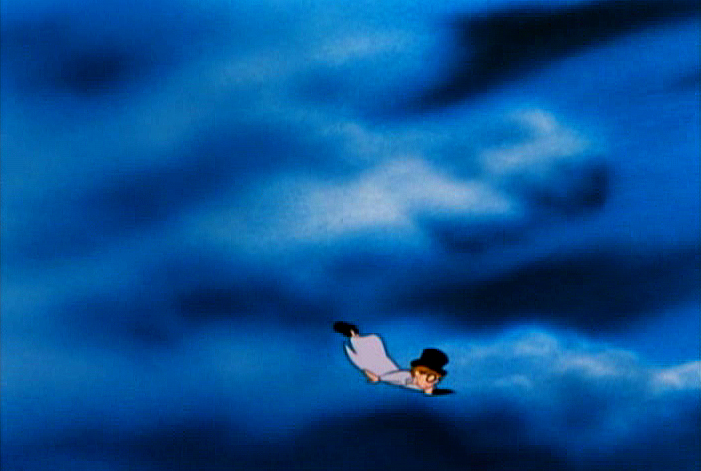
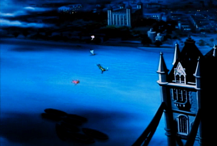
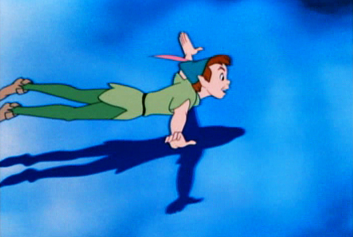
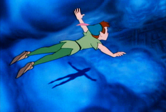
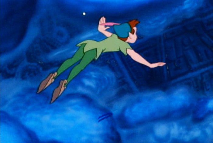
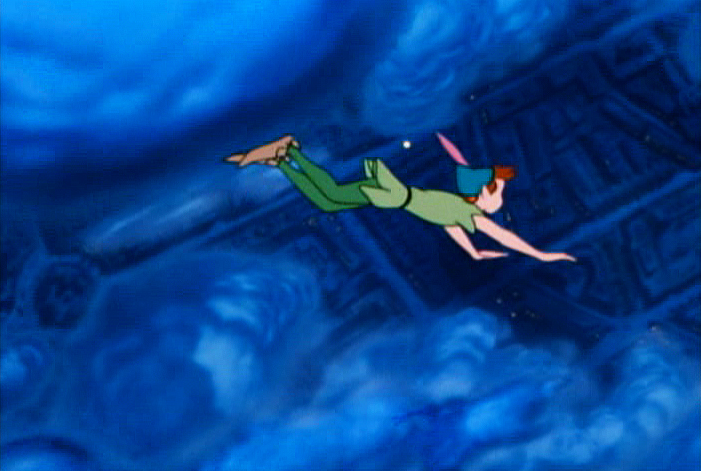
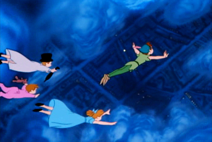
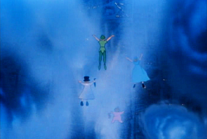
- I had remembered Peter Pan as utilizing the multiplane camera quite a bit to set up the show. In the most obvious ways, where I thought they used the camera, I was wrong. There’s, of course, the one famous flying scene with Peter, Tink and the family over lots of clouds. But other shots of London and the opening of the house are not dimensional. They were painted on one level.
In a way, this film, despite the success of Cinderella, is an equally austere production. Gone are the days of Pinocchio and Fantasia where the multiplane camera was enormously effective and often used. Hello to the days of tight budgets.
Let’s take a look.
This is the opening once we hit London (down from a star).
We pan from London to the fog.
No multiplane camera use is evident. It’s a single-level Bg.
Dissolve to
 1
1
The Darling townhouse. Camera trucks in slowly.
 2
2
There are no separate levels, no use of the multiplane.
 3
3
This is disappointing given how good the similar scene which opens
101 Dalmatians looks using a simple multiplane setup.
Once inside the Darling household there is no obvious use of the multiplane.
The next scene to question starts as Mr. & Mrs. Darling prepare to go off to their party leaving the children behind.
This next pan starts at the base as the Darlings
walk away from the camera into the distance.
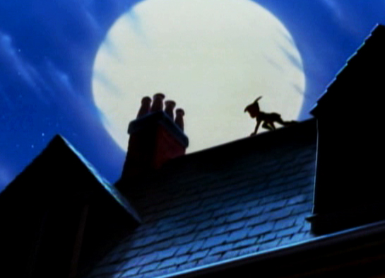
We pan up to the rooftop to see Peter Pan in silhouette.
This is the full Bg.
There is no use of the multiplane camera.
Nor are there separate levels – it’s all one piece.
So, it would seem that the multiplane has not been used to this point.
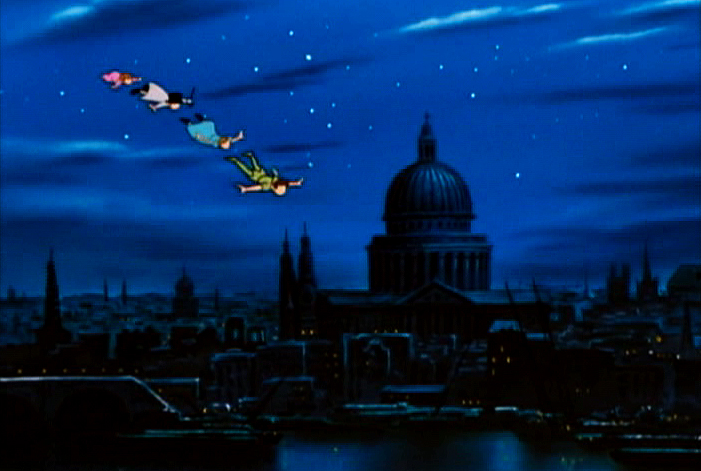
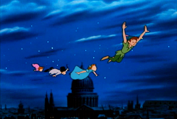
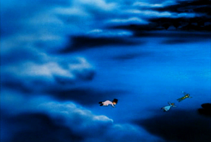
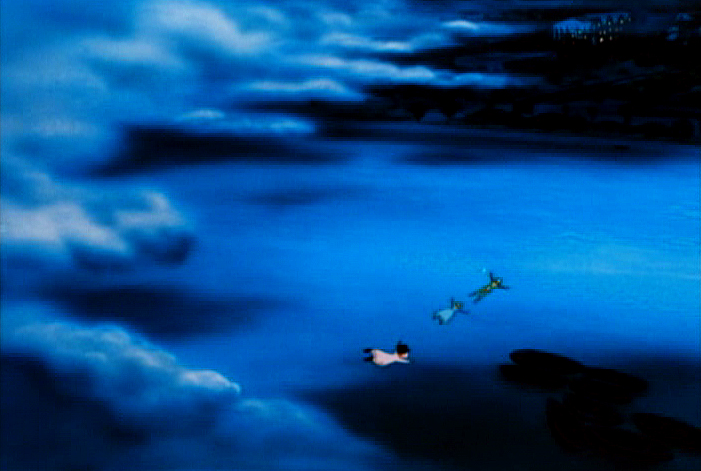
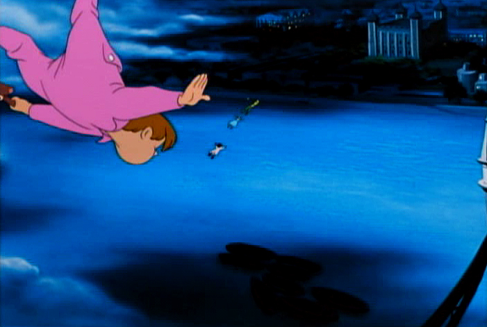
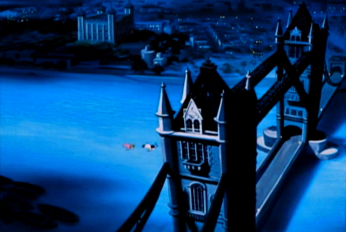
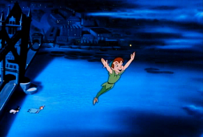
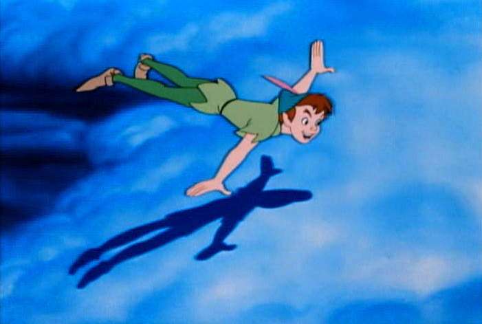
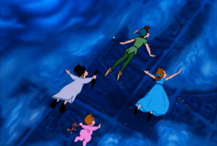
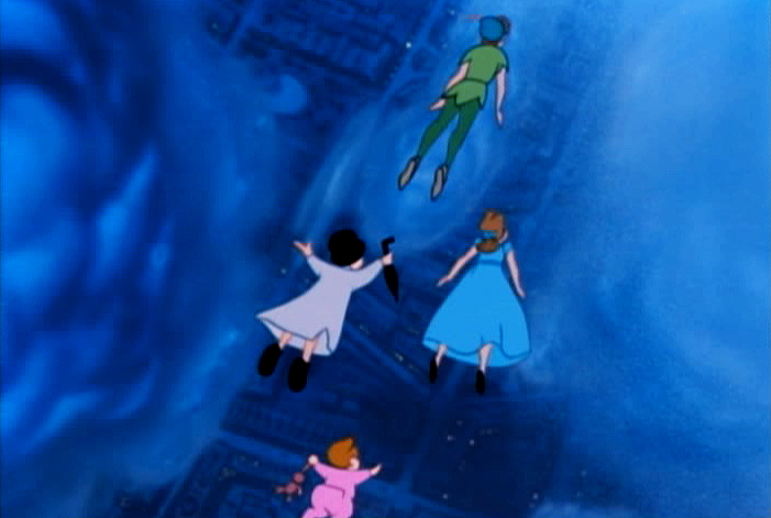
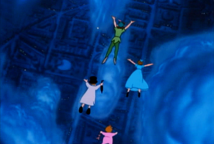
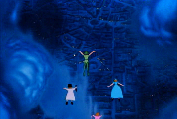
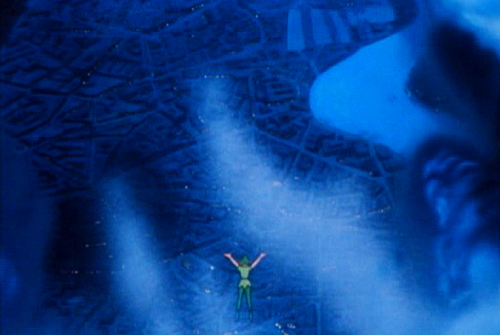
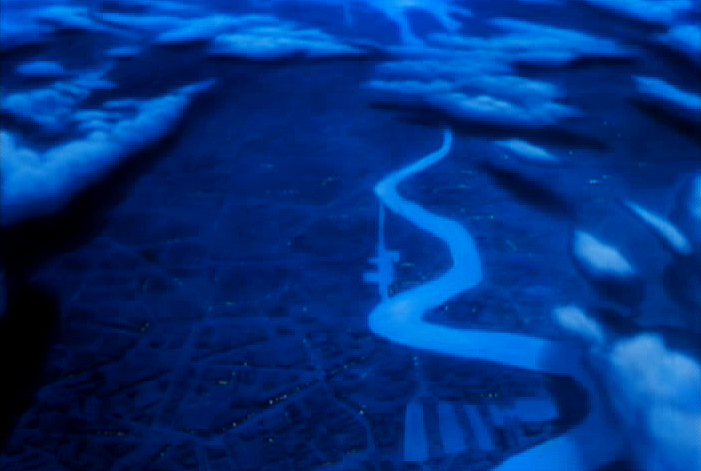
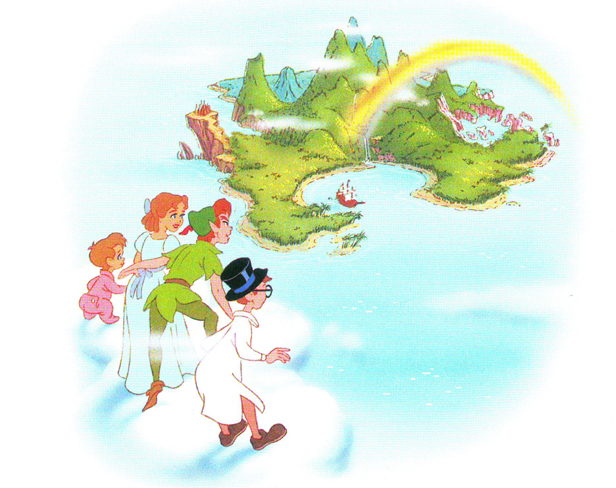
The big flying scene comes just as they’re about to fly out of London and on to Neverland. It serves as the bridge from everyday life on to the magical land of Peter Pan. You need something big here, and they’ve got it – one of the biggest multiplane scenes ever. The layout for this scene is extraordinary, and the animation couldn’t be better. It’s quite a scene.
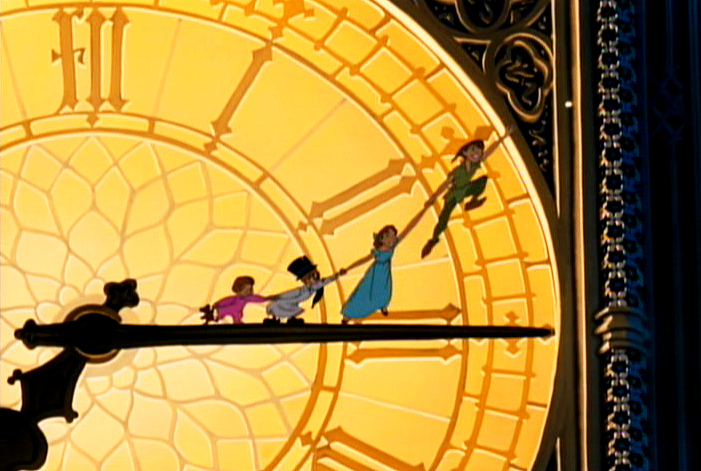 1
1We cut from this shot of the clock.
 2
2
Peter & gang fly over clouds on flat Bg.
 3
3
 4
4
 5
5
 6
6
 7
7
Still one level.
 8
8
 9
9
 10
10
 11
11
All done with some brilliant animation.
 12
12
 13
13
 14
14
 15
15
Still a flat Bg.
 16
16
 17
17
 18
18
 19
19
 20
20
 21
21
Suddenly the bottom drops out and it’s multiplane.
 22
22
 23
23
Many levels of clouds.
 24
24
 25
25
The camera also turns to have the characters flying North.
 26
26
 27
27
 28
28
 29
29
 30
30
 31
31
The camera zooms past them . . .
 32
32
. . . and moves up to star.
 33
33
It sparkles as we move in on it.
 34
34
Dissolve to this final star.
There are one or two other small uses of the multiplane camera on Neverland. Typical of these is this shot of the Indian Village. As we pull in, only the sky is separated and allowed to go out of focus as the camera moves in.
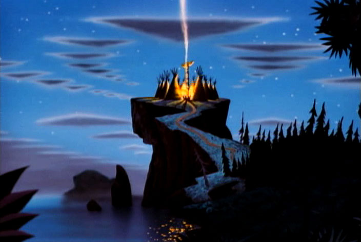
.
But basically that would seem to be it for the use of the multiplane camera in the film. There’s the one big scene, the flying scene, which shows it off as well as any scene to that point in Disney animation, and a couple of other much smaller scenes.
But on second look we find that there was some use of it in the nursery.
The Bgs contain stripes and obviously brought some concern that there would be strobing, especially in cutting from one set of stripes to another – one CU to another.
It appears to me that they put the Bgs for the closeups out of focus by putting them on a lower level of the multiplane camera and shot the characters in focus. It’s a simple trick (given there were no camera moves) that didn’t up the budget very much.
AfterNote: I am wrong about this. Milt Gray, in the comments section, had proof that the Bgs were painted with Airbrush to soften them.
I’d recently read that they were thinking of utilizing this trick at one point in Cinderella. They ultimately decided against it. (I think it was an interview with Wilfred Jackson, but I haven’t located that reference quickly. When I do, I’ll put the quote in here.)
Here are a number of examples:
 1
1There’s a soft focus on the Bg – not very extreme.
 2
2
We go from this half-shot leaving the shot in focus . . .
 3
3
. . . to this shot of John where the focus is soft.
 4
4
Father stands, here, with an in-focus Bg.
 5
5
Wendy has a very soft Bg.
 6
6
Back to the parents with the Bg still in focus.
 7
7
Wendy, very soft focus.
 8
8
Now father stands against a very soft Bg.
It probably didn’t work cutting back and forth with the Bgs in focus.
 9
9
This scene is the only one with a big camera move as . . .
 10
10
. . . father flies across the room and . . .
 11
11
. . . hits a night table.
The stripes are out of focus. The foreground night table is
in focus, meaning it would be on the same level as father.
 12
12
The finish comes a couple of scenes later. It’s all, now, in focus.
Back in the nursery at the end of the film, the soft focus comes back in two or three short scenes.
This shot of the father is typical of the soft Bgs. They seem to build
from in-focus to getting softer and softer (behind father) as he realizes
that he’s “seen that ship before.”
Many of the other shots at this point are in focus.
I wonder, in this shot, if the ship were on another level so that it would read soft.
This scene has such magic in it, somehow I think they HAD to use the multiplane camera.
Animation Artifacts &Disney &Photos 11 May 2011 07:09 am
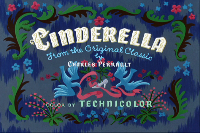
Cinderella Photos – 1
 - Hans Perk sparked my interest. He recently began posting the drafts to Disney’s Cinderella on his resourceful and brilliant site, A Film LA. I’ve had a love/like relationship with Cinderella since I was a kid. It’s a strong film with some solid story work, some magnificent character animation as well as some workmanlike animation. The design goes from beautiful to ordinary and back again.
 (I know, I’m a harsh critic.)
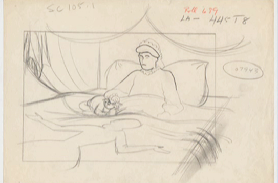
To play along with Hans’ posts, I thought of doing a series of mosaics à la Mark Mayerson, but I’m looking for something else. I haven’t quite figured that out yet, but I thought I’d post some photos to celebrate getting my hands on those wonderful drafts.
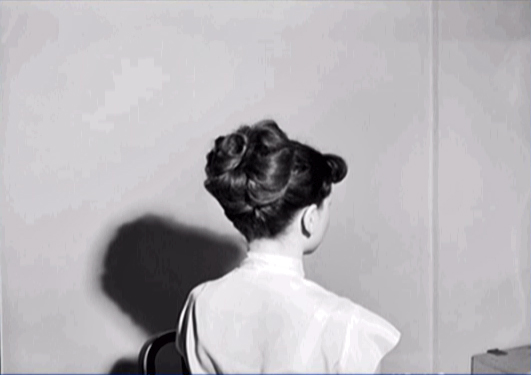
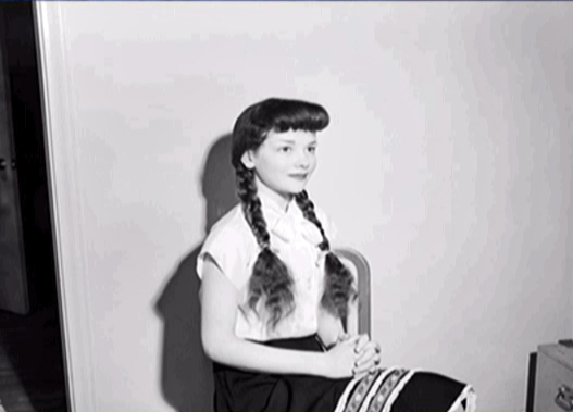
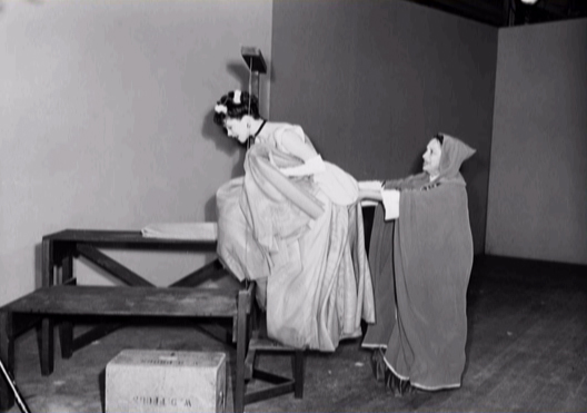
The first group of photographs comes from the live action reference that was done. This filmed material wasn’t shot for the purposes of rotoscoping, but it was shot to give animators some reference on how the characters might move. Then, if they requested it, the animators would get registered print-outs of the images.
I’m currently reading Didier Ghez‘ first book of interviews with Disney artists. Walt’s People: vol. 1 is just one of 11 books of interviews available. I suggest you get these; there’s so much information in them. (And they’re absolutely addicitive reading.) In vol. 1 Marc Davis talks about this reference foto material:
- “Since I was involved with the animation of so many humans there was generally some live-action footage to work from or some sort of footage you looked over.”
“Someone asked me just the other day, ‘Didn’t you fellows just rotoscope everything?’ and that’s a term I dislike immensely. When you just trace over film footage, everything has a tendency to become very broad. Every woman you drew would turn out looking like this Roseanne character on television. I see quite a lot of this thing on Saturday-morning cartoons where they’ve worked from live footage and it has a very traced look about it and it looks dead. Live action shows people doing things and it’s right on the nose. However, in animation, I try to stay two or three frames ahead of everything; action, then reaction. You’re talking about 24 frames per second that are going through the projector, so it’s a minute thing that you really can’t see. It’s highly synchronized.”
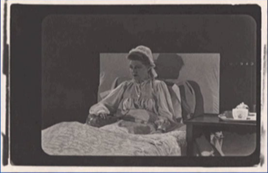
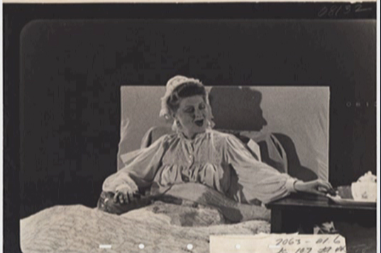
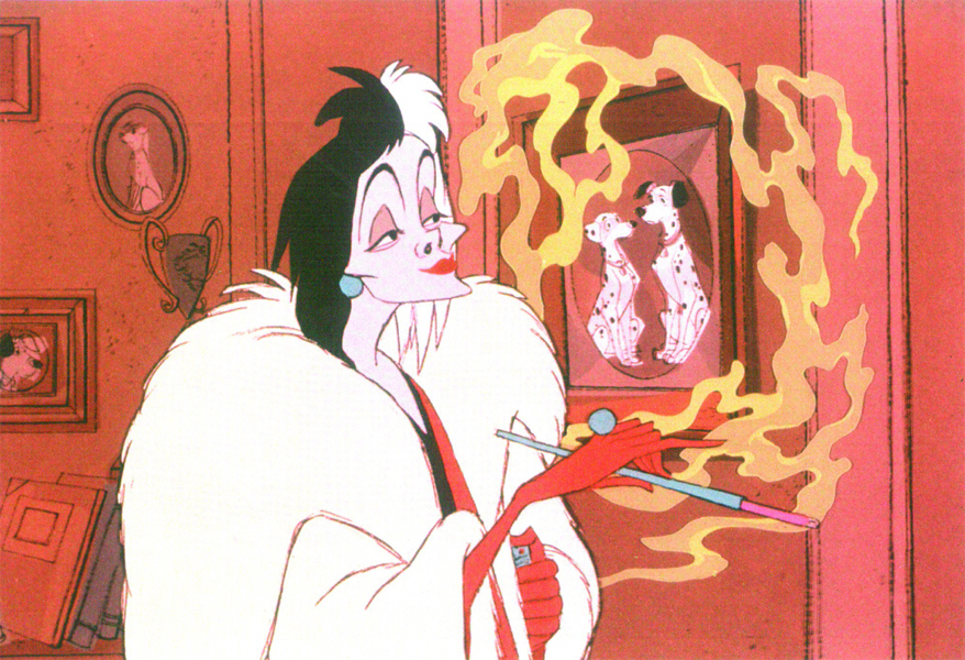
“Action that is difficult to do, such as a dancer, I would want to see a performer do it and then look at the film, not trace it. This is very true with my Cruella de Vil for 101 Dalmatians. We had a wonderful actress, Mary Wickes, who did some great live action. I used her suggestions and made them more so. If you looked at the footage of Mary and then the character, you would have a difficult time seeing the resemblance. It’s suggestion you need, and that’s why I dislike the term ‘rotoscope.’”
“Live action may be used as a blueprint, as a reference, but never traced. I see some of our films now and it’s easy to spot who was doing that sort of thing.”
Here are some of those Photo references:
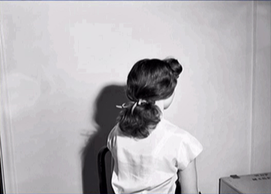 1
1Helene Stanley
Obvously these are hair references.
 2
2
 3
3
Helene Stanley
She almost doesn’t look real in this photo.
 4
4
Here’s director Wilfred Jackson with Stanley.
 5
5
 6
6
 7
7
What they didn’t use a real mice to model for Gus and Jacques?
 8
8
 9
9
 10
10
 11
11
 12
12
Helene Stanley with stand-in Bruno.
 13
13
I can imagine that reference helped with this balancing sequence.
 14
14
 15
15
 16
16
 17
17
 18
18
I didn’t realize they were still using the 5-hole paper this late in the ’40s.
 19
19
 20
20
Down to 3-hole paper.
 21
21
Eleanor Audley, the voice of the Step-mother,
also acted the part for this reference material.
 22
22
 23
23
 24
24
 25
25
 26
26
 27
27
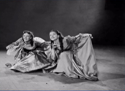
Helene Stanley also acted as “Anastasia.”
Rhoda Williams played “Drizella.”
 28
28
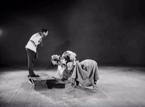
I’m not sure who’s directing the actress. If any out there
can identify him, please leave a comment.
 29
29
 30
30
This is Ilene Woods, the voice of “Cinderella” but
Verna Felton was the voice of the Fairy Godmother;
Claire Du Brey performed the part for the reference material.
 31
31
 32
32
 33
33
 34
34
 35
35
 36
36
 37
37
Anyone know who the man in plaid is?
 38
38
 39
39
 40
40
Eleanor Audley, again.
 41
41
 42
42
Trying on the shoe.
 43
43
 44
44
Animation Artifacts &Books &Disney &Illustration 12 Apr 2011 06:56 am
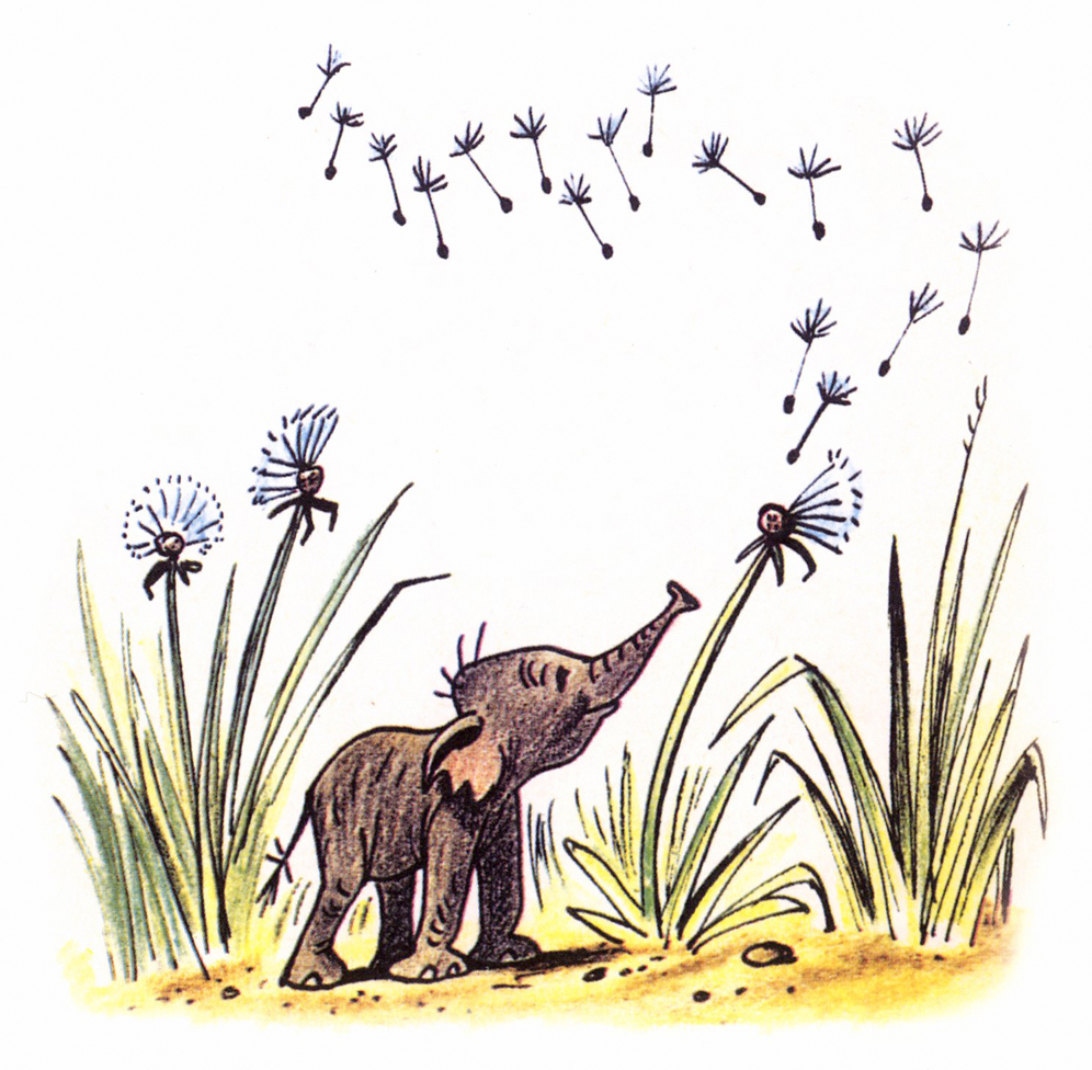
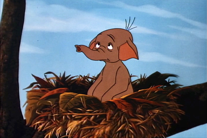
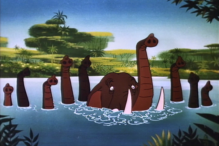
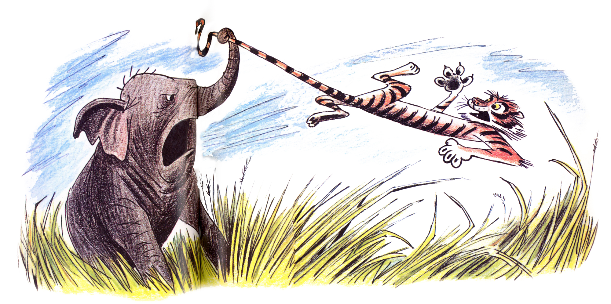
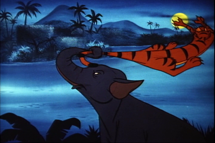
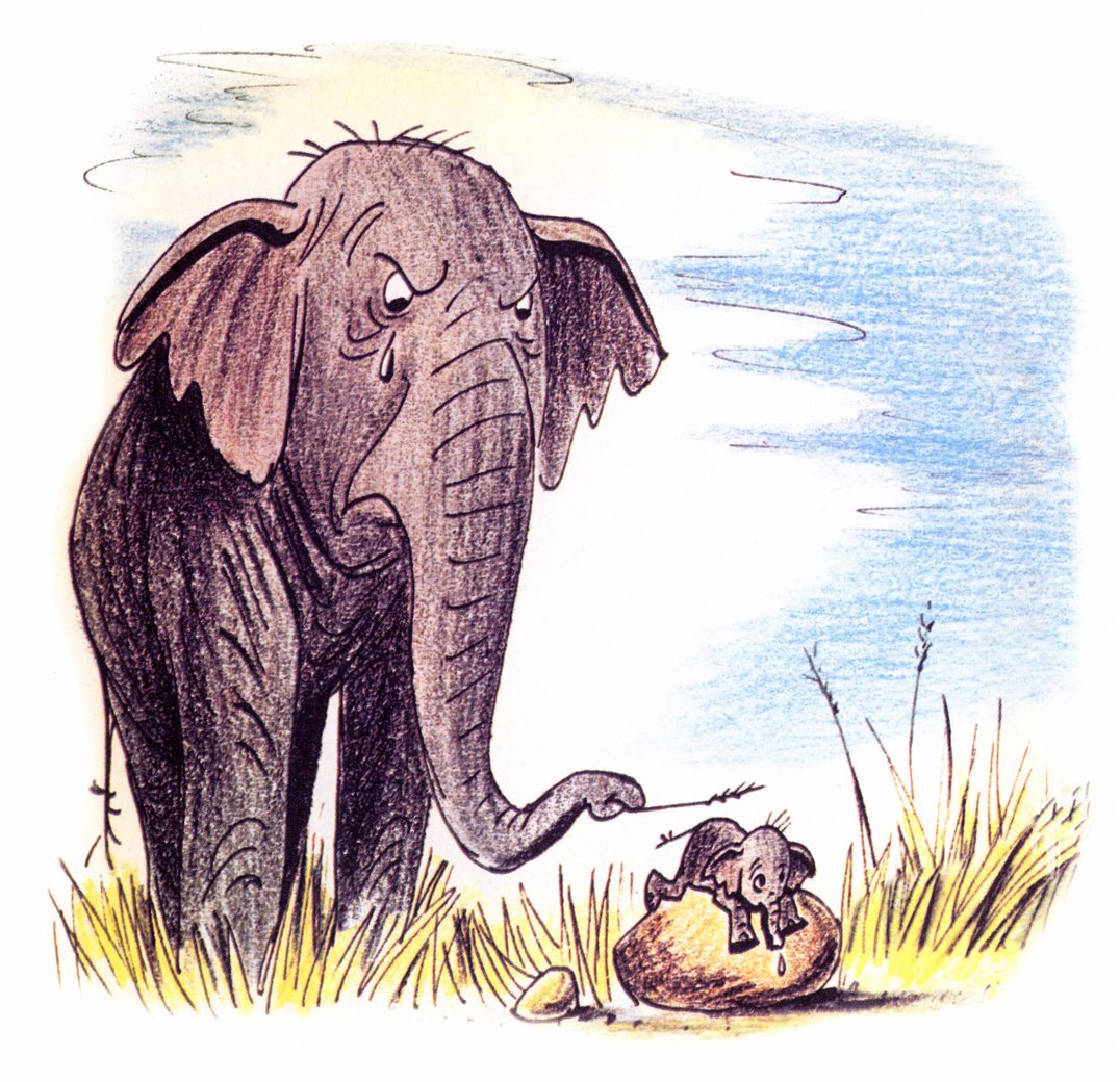
Goliath II
- I feel very fortunate. Jason Hand, following my posts on Bill Peet’s great book illustrations, has sent me the illustrations to the book, Goliath II. This book grew out of the Disney featurette. Peet, in his autobiography, says he pulled the story from one he had written to be made into a book. When he was in the doghouse at Disney, sentenced to working on commercials for the likes of Peter Pan Peanut Butter, he stopped Walt in the hallway and showed him the story outline. Disney put it into production immediately.
It was an important film in that it was the first to use Xerography to copy the animators’ lines onto the cels. This was an extremely important step before they moved onto 101 Dalmatians.
I thought this was a great invitation for me to add some frame grabs from the film which match the illustrations of the book, to see how closely the two matched. After looking at the book, one can see that the film is very two dimensional. Every action happens east – west. None of the action moves in perspective (toward or away from you). This, of course, is a product of the limited budget. The film is also all closeups. Little of the action takes place in Long Shot (the better to keep the budget down.) The film, naturally, is a disappointment when compared to Peet’s illustrations.
Here are the illustrations followed by the correlative frame grabs:
 1
1A delicate drawing of something that doesn’t appear in the film.
 1
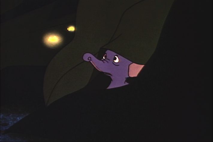
1
The closest thing to floating dandelions is Goliath watching
a couple of fireflies toward the last half of the film.
 2
2
 2
2
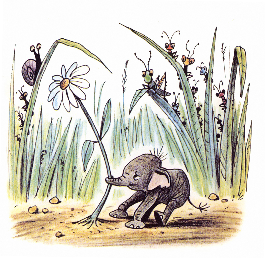
 3
3
 3
3
This scene isn’t played well in the film.
It’s perfectly clear in the book.
 4
4
 4a
4a
They couldn’t handle this scene in a single shot.
They broke it into two closeups. TV direction.
 4b
4b
Shades of Dumbo.
 5
5
 5
5
This is about as close as I can come to a match.
Peet’s drawing is so full of life.
 6
6
 6
6
 7
7
 7
7
This scene actually comes later in the film.
There was no bathing scene early on.
 8
8
No relation to this scene is in the film.
 9
9
 9
9
There’s no real correlative to this illustration in the film.
The closest appears toward the beginning.
 10
10
 10
10
More John Lounsbery than Bill Peet.
 11
11
 11
11
Mama throws the tiger.
 12
12
 12
12
A very different approach in the film.
 13
13
 13
13
 14
14
 14a
14a
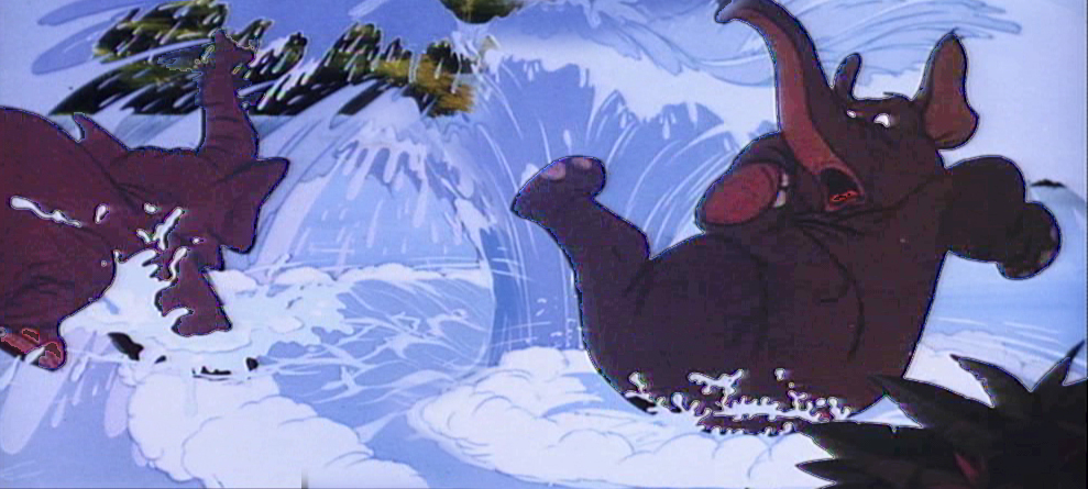
The elephant pile up illustrated by Bill Peet has to be broken
into a number of short scenes cutting back past the elephants.
 14b
14b
This makes animation easier to do and, consequently, fewer drawings.
 14c
14c
 15
15
 15a
15a
The elephants end up in water, but they jump in
one at a time. Better for the reuse of animation.
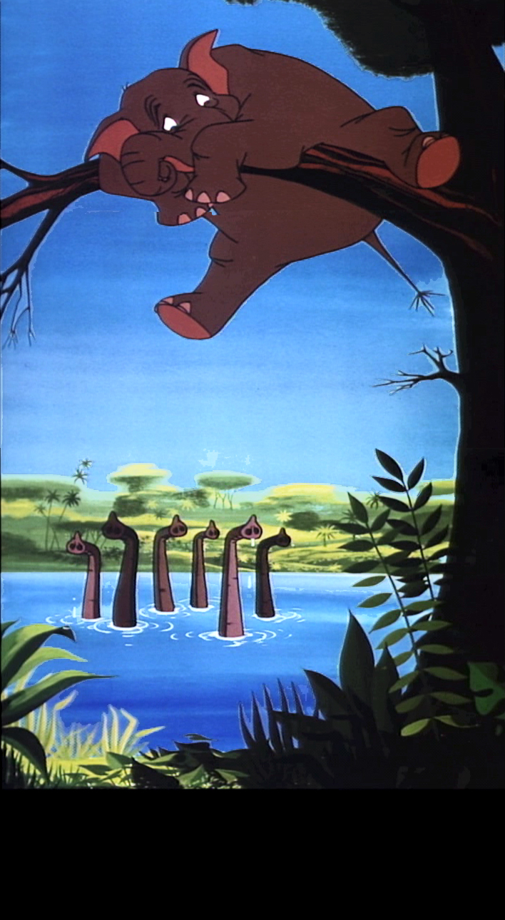 15b
15b
 16
16
 16
16
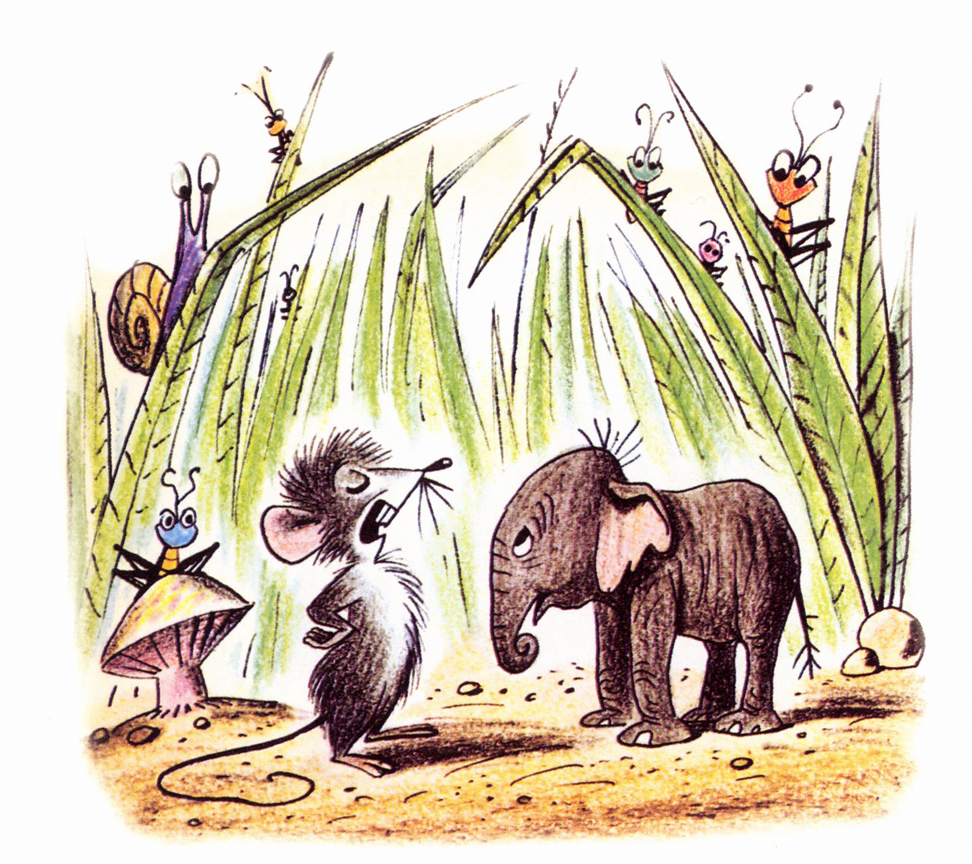
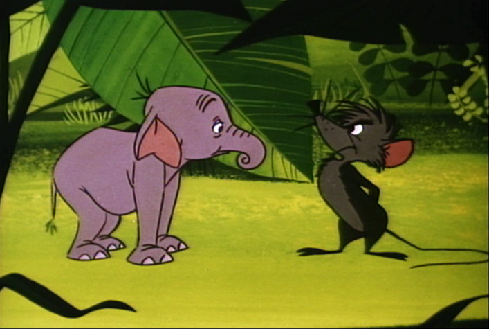
The mouse enters the story.
 17
17
 17a
17a
The mouse throws Goliath in a very different way.
 17b
17b
Unfortunately they’ve plotted the entire move
with an overlay that cuts up part of the action.
 18
18
 18
18
 19
19
 19
19
 20
20
 20
20
Commentary 02 Apr 2011 08:23 am
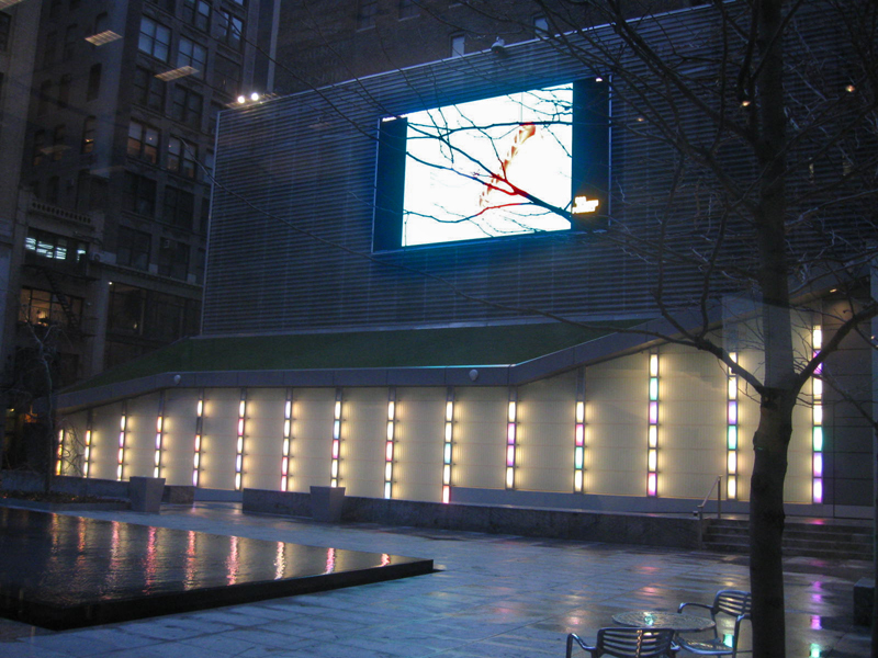
Dilworth and 100 Features and Thursday
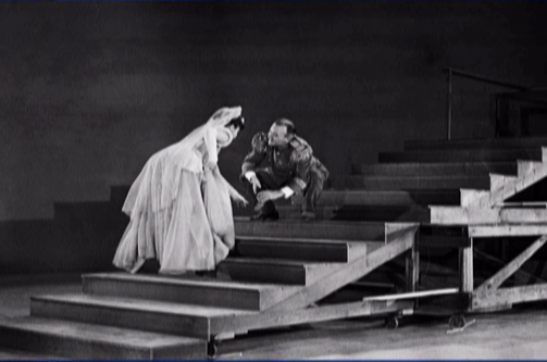
The Dirty Birdy
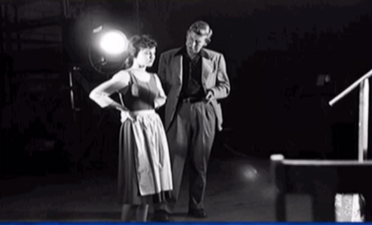
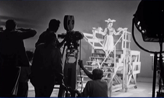
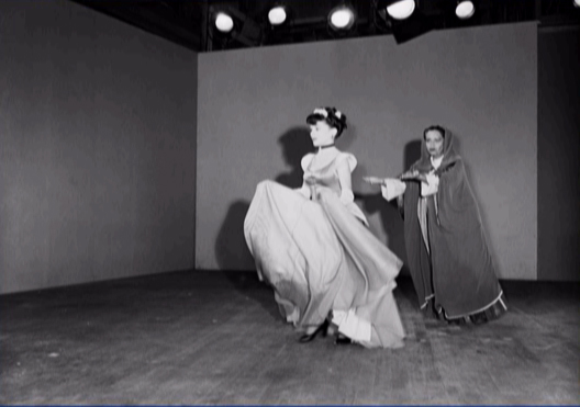
- Last night was John Dilworth night at the Big Screen Project. As you can see from the above photo, this is a 30 foot video screen plunked mid block off Sixth Avenue between 29th & 30th Streets. John invited lots of friends for the two screenings. Unfortunately, the weather didn’t cooperate, and we had a cool, windy, rainy night.
The event, however, wasn’t spoiled because there was an enclosure into the building, and we were able to look out at the monitor. They hand out closed circuit radios (with earplugs – you take home with you) to hear the sound track (in stereo) while watching from the warm comfort of the building. It’s a food court so there’s plenty of food to purchase or you can have a drink, since the area we watched from was a pub. It made for a fun and interesting experience.
The program was well organized and coordinated by Jaime Ekkens for Big Screen Project.
Looking out to the screen from the bar.
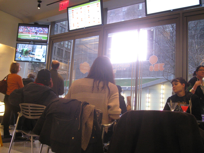
The films absolutely seemed to glow on the crystal clear monitor.
The Oscar nominated CHICKEN FROM OUTER SPACE.
There are plenty of other animators up this April to showcase their films. Go here to see the April schedule. Emily Hubley‘s films are up next on April 11th.
 - This past week I received a book in the mail, 100 Animated Feature Films. When the book arrived, I was so taken by the cover design (an image from Lotte Reiniger‘s Prince Achmed, the first full length animated feature) that I immediately opened and started into the book.
I was curious about the taste of the author, Andrew Osmond. Would it be another list that would be more studio oriented or more, perhaps, something a bit more siding with the Independent studio. Would his taste run more to the current films or the Golden Age? He’s written a number of articles about Satoshi Kon and Miyazaki for Britain’s The Guardian, so one has a good idea of his preferences.
 In fact, I found myself pretty well pleased with a lot of the listings. It’s a bit more Anime than I would have gone toward, but I can easily understand the choice. However, there are many expected and deserved choices within the book. I’m glad to see Reininger’s Prince Achmed listed, as, of course, is Snow White. Other Disney titles include: Pinocchio, Bambi, Fantasia, Dumbo, Beauty and the Beast. There are also a bunch of Pixar films, some of which are: only one Toy Story (the original), The Incredibles, Monsters Inc., Finding Nemo and Up.
Surprises were finding some titles such as:
 The Thief and the Cobbler. The final film version of Richard Williams’ feature, on the market, is horrible. The one in the works for 30 years was visually stunning. This is listed here for what it might have been.
Sita Sings the Blues. This is the only Flash animated feature included. A truly solo work, Nina Paley, created a thinking film with a lot of glorious sections.
Batman Beyond: Return of the Joker. This is a spin-off the television series, and doesn’t have the weight that any title in such a book deserves.
A Scanner Darkly. I might have chosen Waking Life over this title, but I suppose this has a more coherent story. Regardless, I’m glad to see one of Richard Linklater’s films included.
Avatar. Jim Cameron fought to make sure people didn’t consider this animation. I guess, he’s lost. Animation or Live Action, it’s not a very good film.
Both of Sylvain Chomet‘s films: The Illusionist and The Triplettes of Belleville. They both belong here.
Surprises not found in the book:
 Gulliver’s Travels. Osmond includes Hoppity Goes to Town, but leaves Gulliver out. Excuse me, but Batman Beyond OVER the beautiful Fleischer gem? Something doesn’t smell so good.
Ratatouille. This is certainly one of the best of Pixar’s films. To include Finding Nemo and not this excellent feature by Brad Bird is just crazy. I suppose he had Bird’s The Incredibles and he wanted to write about Andrew Stanton.
And if you’re going to include films for the sake of the director, wouldn’t Chuck Jones‘ only feature, The Phantom Tollbooth, be included?
Neither UPA feature: Magoo’s 1001 Arabian Nights and Gay Purr-ee were both left out of the book. Given the heavy number of Japanese features, I would have found one to keep out to include a UPA example.
 However despite any gripes, I have to say the book is solidly written and intelligently put together with a lot of thought going into the choices. It’s expected I’d have opposing thoughts on the titles included, but I admit to being intelligently challenged by the author. Andrew Osmond did a fine job, and the book is graphically attractive. I do wish, though, that the type were a bit larger. It looks like it’s about 8pt. and it’s too small for my aging eyes. The book was published by BFI Screen Guides.
The images above can be found in the book.
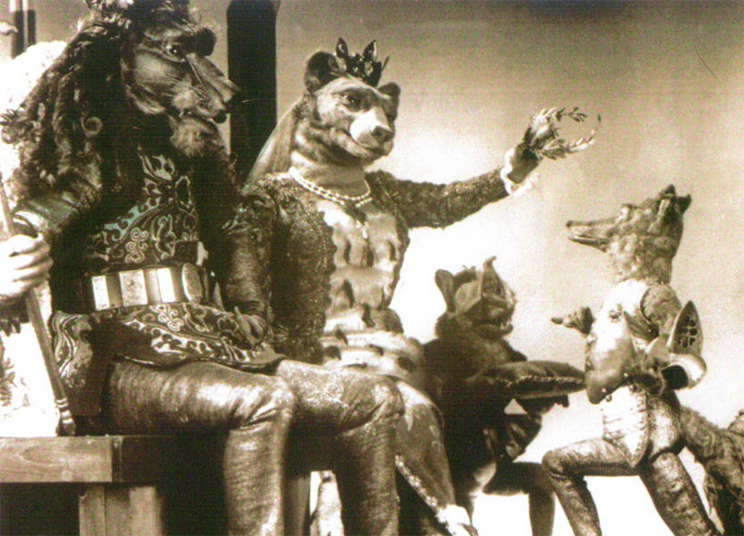
1) Animal Farm
2) 101 Dalmatians
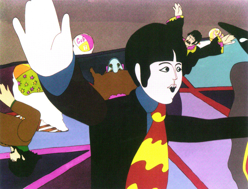
3) The Yellow Submarine
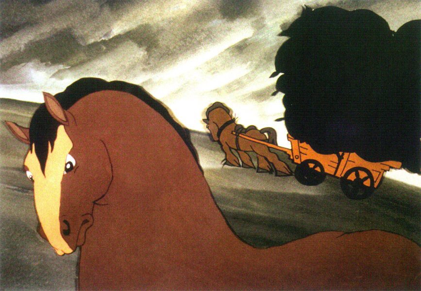
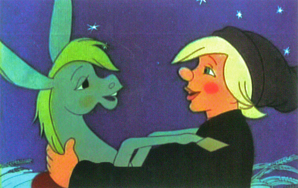
4) Ivan and His Magic Pony
5) The Tale of the Fox
I saw this film on line last Tuesday. Cartoon Brew posted it on Wedneday. If you saw it there, I’m pleased; if not this is for you. Matthias Hoegg‘s BAFTA nominated short, Thursday, can be seen online here. It’s an excellent film with a lot of the character necessarily developed through the animation. At the same website, there’s also an interview with Matthias about the making of the short. Take the 7 minutes to watch the film. A good use of cgi and 2D.
He’s represented by Beakus. Their site also showcases a number of his films.
Books &Commentary 24 Mar 2011 07:15 am
Disney books
- Lately, Disney’s book divisions have done some wonderful work. The Archive series: Animation, Story, Design and soon to come Layout & Bg are all stunningly attractive books. These are top of the line items from Disney Editions. John Canemaker‘s Two Guys Named Joe also comes from the same division, and it’s a beautifully designed and attractively produced book.
But what about the lower end of the Disney Publishing empire? In the bygone days the animated features would be made into Little Golden Books utilizing artists from the studio. Mary Blair, Al Dempster, Bill Peet, and Eyvind Earle all contributed to books for the Western Publishing offshoot. Today there are still some Little Golden Books being made from Disney material. The Pixar product, such as Toy Story and Wall-E, as well the Disney Princesses and The Princess and the Frog all have editions.
However, I came upon something even lower down the pipeline. Here are three books that were produced for Walgreen’s pharmacy megastores. Heidi bought them 3 for $3.98. None of the books gives a hint of illustrator or writer. The illustrations, on a very cursory glance, look as though they might have been frame grabs pulled from the movies.
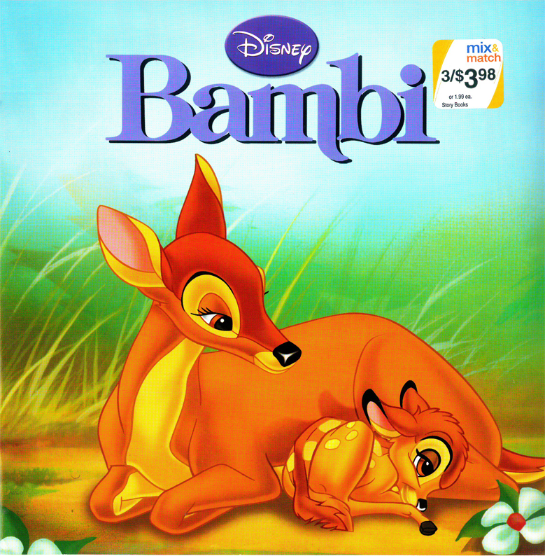
Bambi’s cover. It’s a nice watercolor evocative of the film. Though one
wonders why they played with the logo’s type. The “m” now has a
little swoosh on its lower right. Not part of any other version of this title.
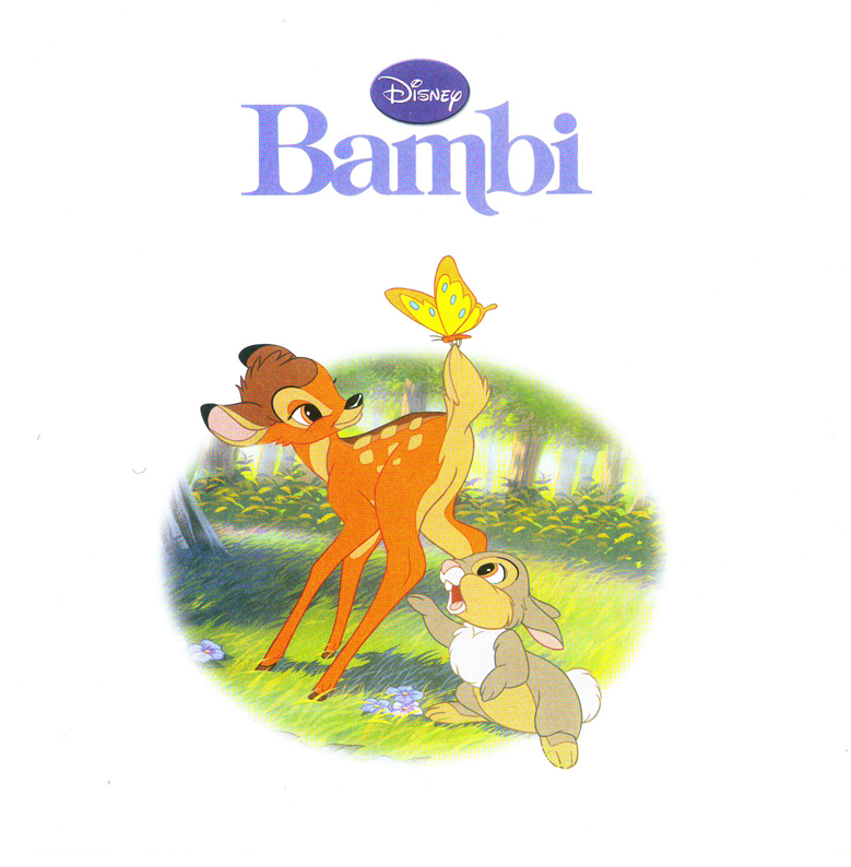
Our first interior illustration looks like it might
have been a frame grab from the film, itself.
This tries hard to look like it might have come from the film.
But all the characters are moved around differently.
They do a nice job of layout using this iconic image against the type.
Looking at this book, I’m amazed how many well-know still images there
are in the original feature. Those old guys knew what they were doing.
Here are a couple of double page spreads. I like the way they
handle them in these books. You can see that there is a plan.
By now, the illustrations look more like Bambi 2 than the original.
The characters were obviously done on separate levels. Notice the
mother’s leg doesn’t match the background. She’s out of place.
Something you might have seen back in the days with the use of cels.
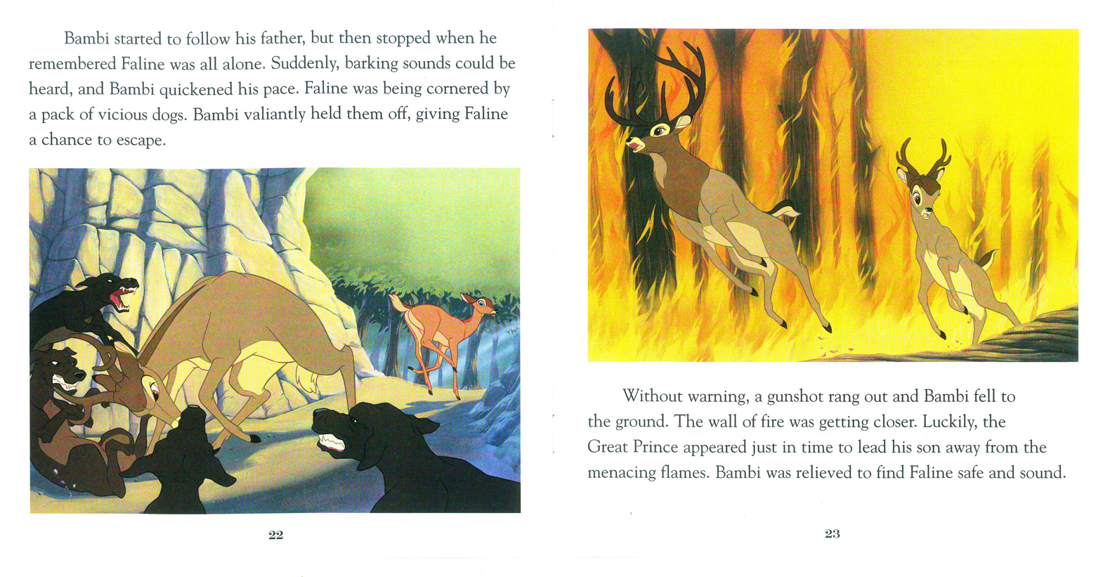
Two pages covers the climax of the film, Faline’s encounter
with the dogs and the fire rates one illustration.
The final illustration takes us into “Bambi’s Children” and
has nothing to do with the original film, anymore.
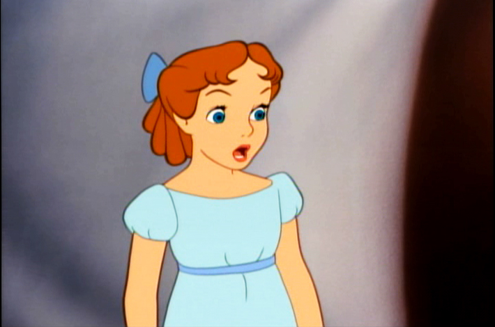
Peter Pan
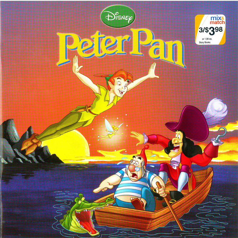
Peter Pan gets off to a bad start with a RED cover
and an action illustration. Not quite the film.
Get to the title page, and Peter is WAY off model.
Oh well.
When I think of that beautiful opening shot in the film, it isn’t
quite this. I’m afraid, the Bambi book will be the best of the lot.
The double-page spreads do still play a bit with the form.
Not much magic left in this Neverland.
Some nice action.
Most of the book is done in Long Shots. I’d say that’s
not the best choice for smallish illustrations. And the
airbrushed white is too opaque to work as a border; it
gets to look like a virus in the air.
The book is too much on the red side. Everything here is
violet and yellow. Not quite the colors invoked by the
orinal designers.
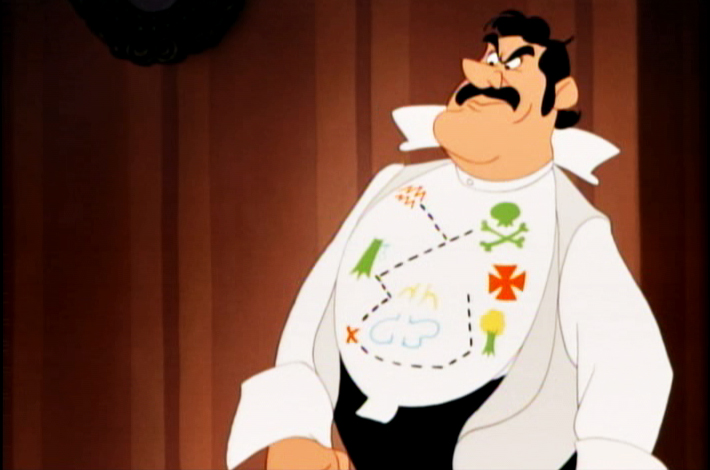
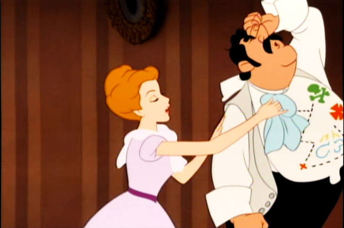
101 Dalmatians
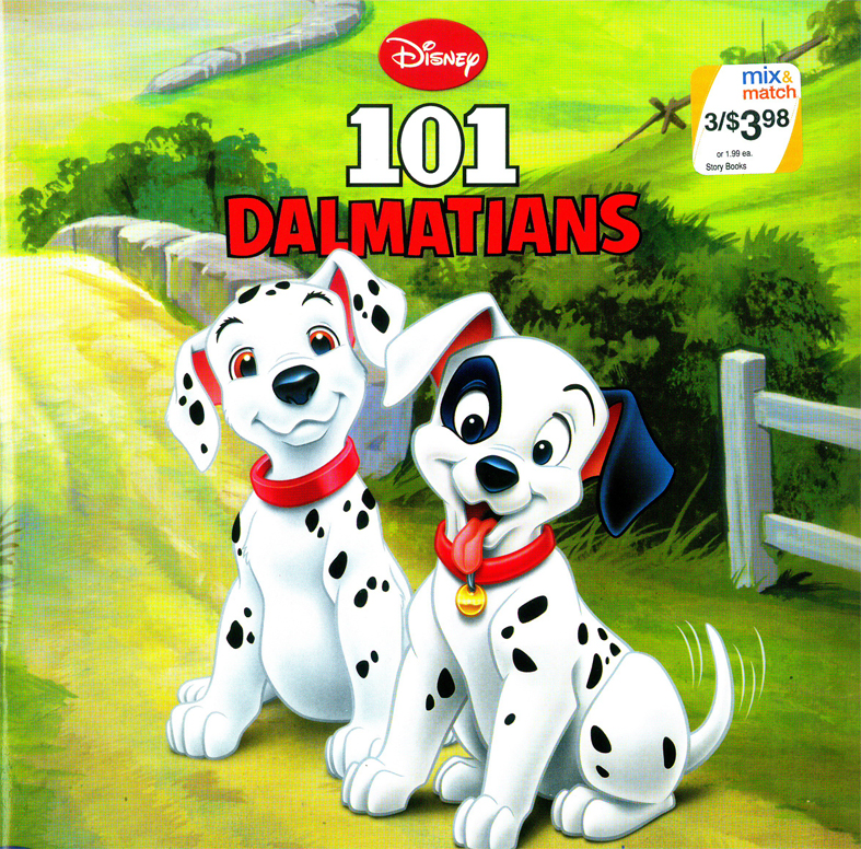
Uh oh, we’re in trouble.
The title page makes for a good composition with bad colors.
The technique, using gouache starts to peek through.
They’ve captured the pose and lost the film.
Where’s that beautiful cut-glass rose in the door?
Too bad they’ve ignored the wonderful background styling
of Ken Anderson and the painting of Walt Peregoy.
A lot of action. Not a bad image though Cruella’s been simplified.
We’ve ignored the great design of the film and have gone to “storybook 2009″.
(The books were done in 2009.)
The two page spread makes use of its format, I have to say that.
Gone the xerographic look, this is how they end this book.
All in all, I’d have to say it’s probably not a bad deal for parents looking for cheap books to entertain their children. The Bambi book holds up nicely. Peter Pan wastes a great story and 101 Dalmatians works hard to reduce their story into a small book you’d buy in a drug store.
The art and delicacy of the Little Golden Books is gone. Take a look at this, or this, or this. They all varied wildly from the film, but with a sense of originality and design. These three Walgreen books all try doggedly to resemble the film while losing the artistry in the book.
Animation Artifacts &Disney &Illustration &Story & Storyboards 10 Mar 2011 07:57 am
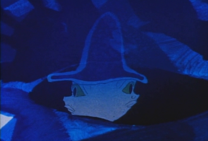
recap – Peet’s Wizard’s Duel
Now that I’m posting some of the illustrations from Bill Peet’s book, Capyboppy, I thought it might be a good time to recap his storyboard for the wizard’s duel in Sword and the Stone. It’s not bad to compare his storyboard drawings with his children’s book illustrations.
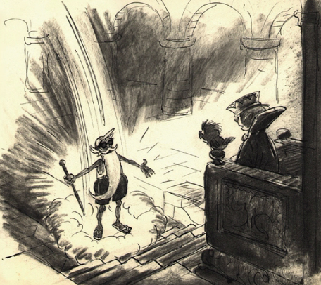
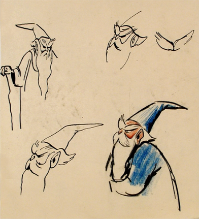
 – Here is a preliminary storyboard done by Bill Peet of the Wizard’s Duel from Disney’s Sword In The Stone. It’s another gem on loan from John Canemaker, and is a companion to the piece I posted last Friday by Peet. The oddity of this board is that it’s dated April 1949. (The numbers at the bottom of the board clearly read “449.”) I didn’t have any clue that this film was in development that early. The book was published in 1938, so it’s quite feasible.
If that date is accurate, it’s amazing how close the characters stay to their final models. This could easily be explained with the heightened use of xerography in animation after 1958. Post 101 Dalmatians, this loose style was easy to translate into animation, and Ken Andersen was easily able to adapt to this style by Bill Peet that all of the animators in the studio loved.
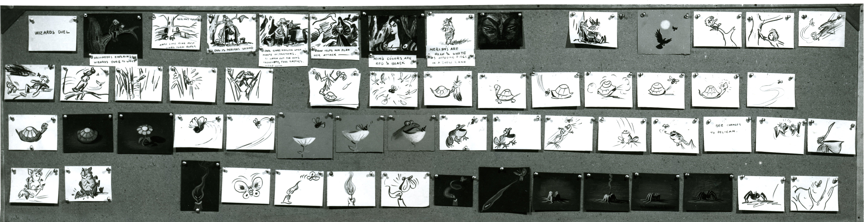 A
A
Click on any image to enlarge
 B
B
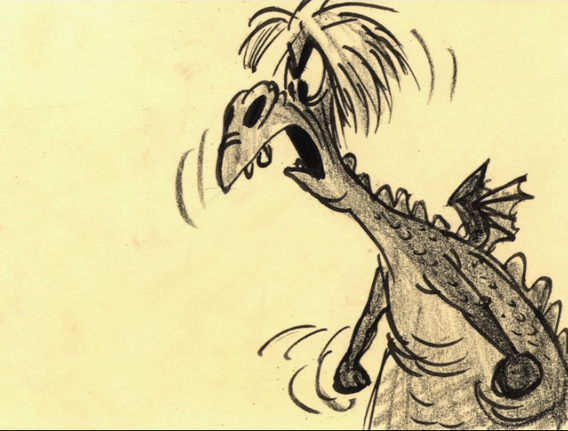
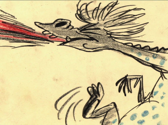
Note in row 2 how the spider turns into the tiger’s face; it’s a graphic turn. This never would have made it to the final in a Disney film, and it didn’t.
 C
C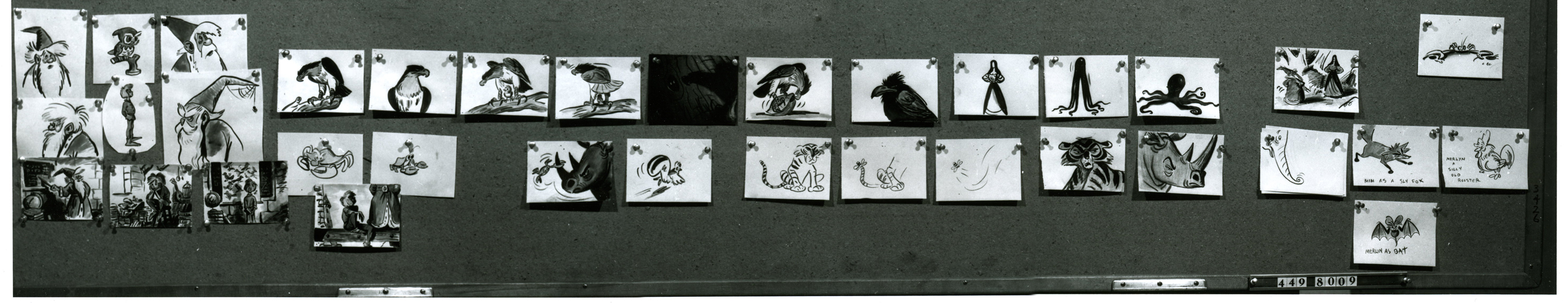 D
D
I love how extra drawings which have been pulled make it to the bottom of the second board.
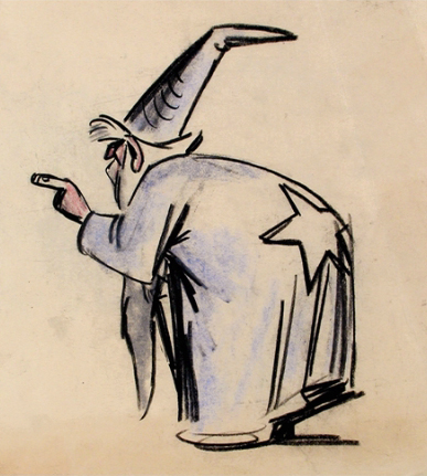
 - I always thought Disney’s The Sword In The Stone a somewhat underrated film. The background art is sensational, and several sequences are brilliantly animated.
Bill Peet‘s adaptation from TH White‘s book, The Once and Future King, loses some of its poetry in the adaptation, but the book’s storyline features a lot of rambling making it hard to construct a screen story. I’ve watched this film quite a few times over the years, and somehow it always gives me a bit of a charge that comes with many of the older classics.
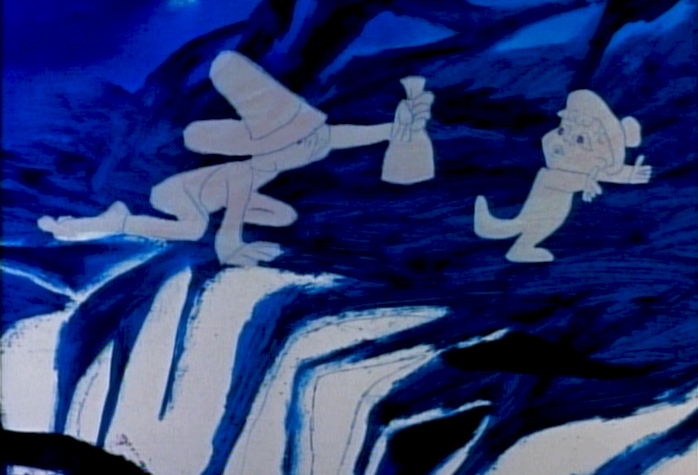
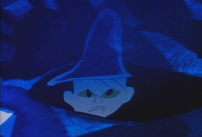
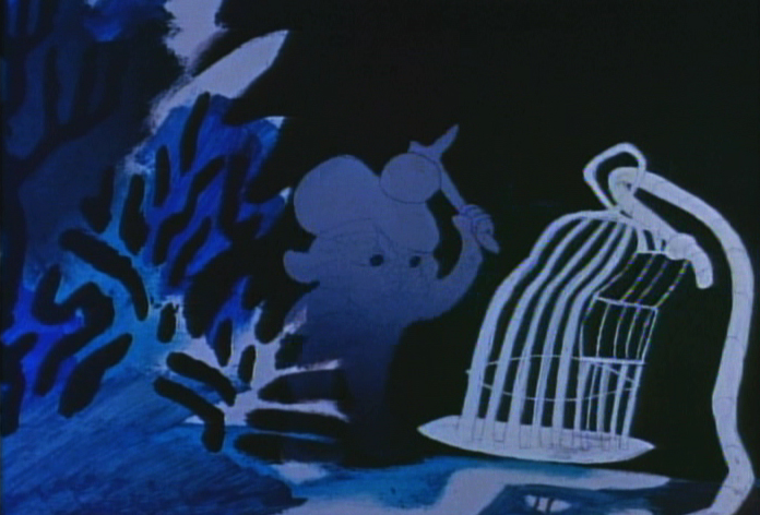
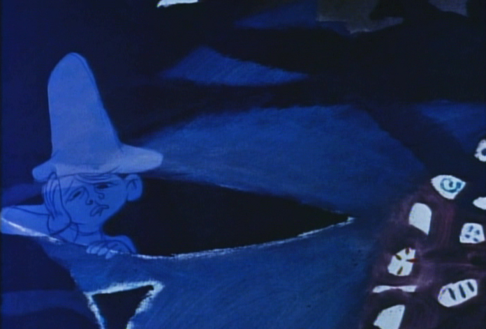
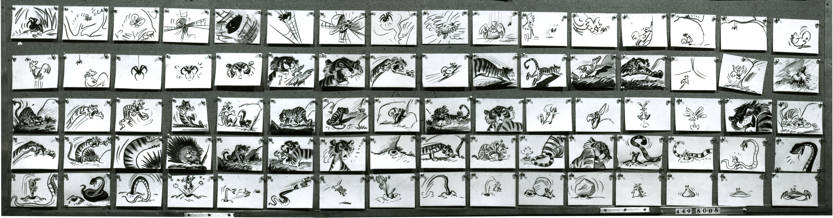
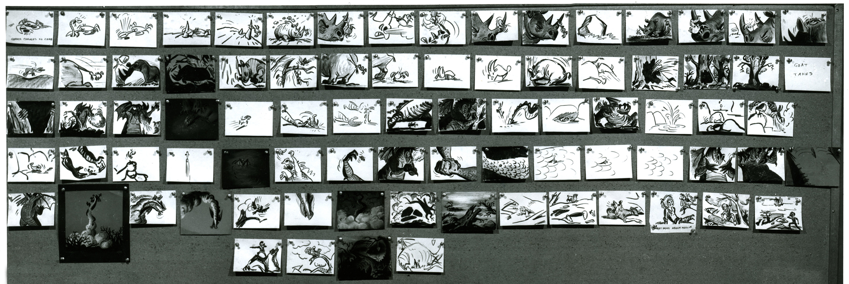
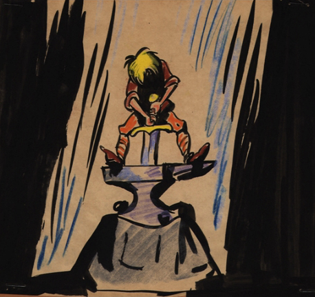
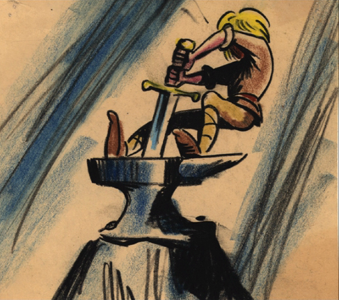
The extras on the dvd seems to consist predominantly of storyboard drawings by Bill Peet. So why not show them off? There’s no continuity to attend to, hence the images are gathered in small clusters. The sequence everyone jumps to analyze and discuss is the Wizard Duel between Merlin and Madame Mim (animated by Milt Kahl.) Consequently, a lot of the drawings on the dvd come from this sequence. I, personally, would have loved seeing some of the squirrel section. I found it quite moving and full of real character stuff. It would be nice to see how Peet developed this.
There’s no hint of a continuity on the dvd, but I’ve heard that the storyboard drawings in the vault are just placed in manilla envelopes with no suggestion of an order. It would make sense that they’ve just plopped these images on the dvd as they have with no order, details or related information.
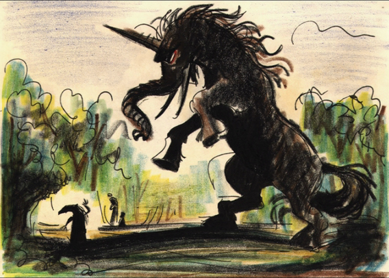
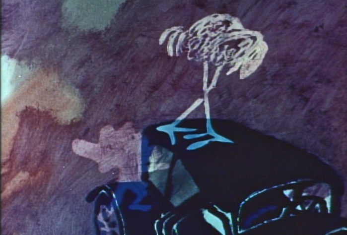
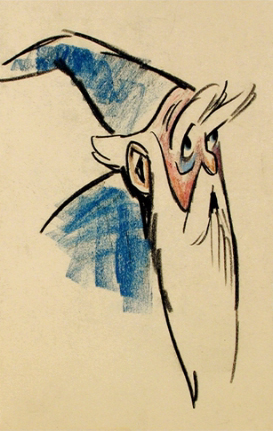
_______Here’s a creature that never made it to the battle of the wizards.
 _
_
_________________________(Click any image to enlarge.)
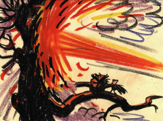 _
_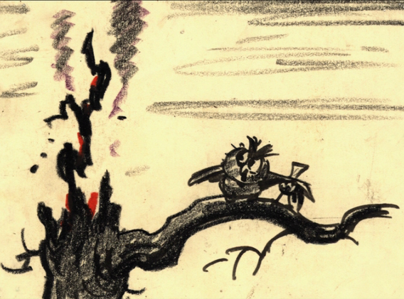
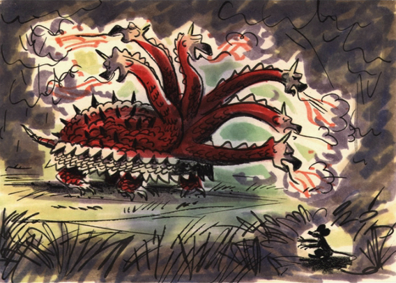
___________Another fantastic creature that didn’t make it into the film.
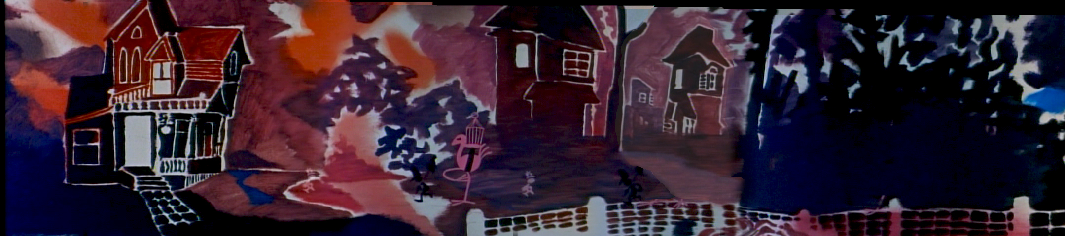
I’m not sure if this drawing is also from the duel. Or was it another sequence where Wart becomes an animal – cut out of the film?
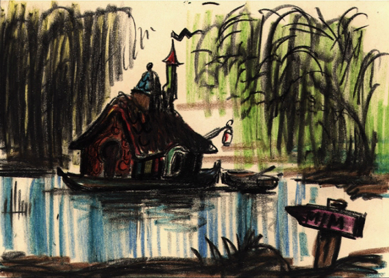
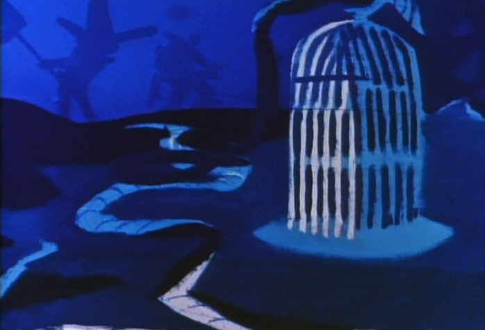
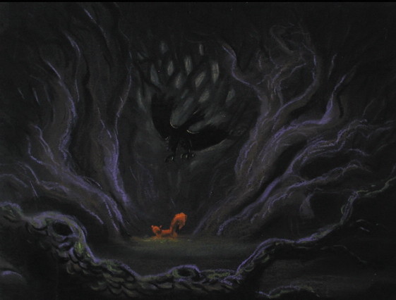
This looks like it may have been planned as a home for Madame Mim. Did it inspire anything for The Rescuers?
 _
_
___________It’s magic !
_____
Here are a couple of models Peet obviously did –
_______________________probably more for himself than anything.
__+___
__+___
______ _
_
___________
______
________________ _____
_____
______