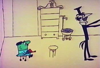
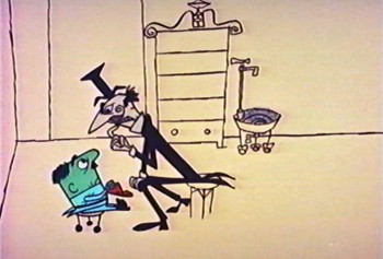
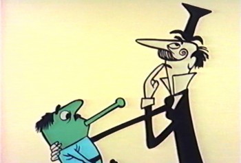
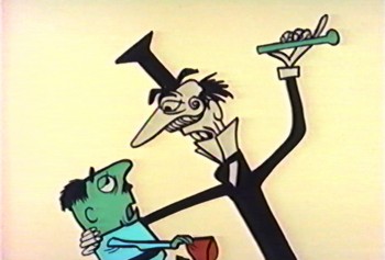
Category ArchiveFrame Grabs
commercial animation &Frame Grabs &repeated posts &Richard Williams &Title sequences 19 Mar 2013 04:58 am
A Funny Thing Happened – again
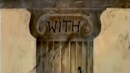
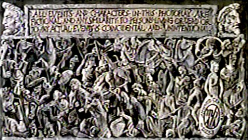
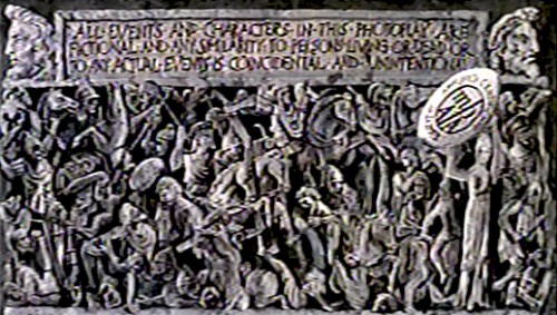
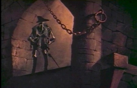
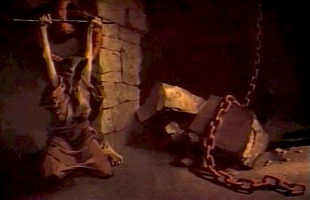
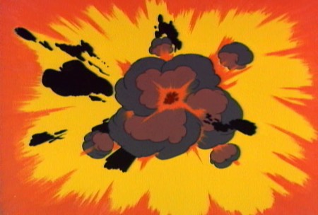
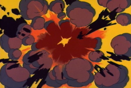
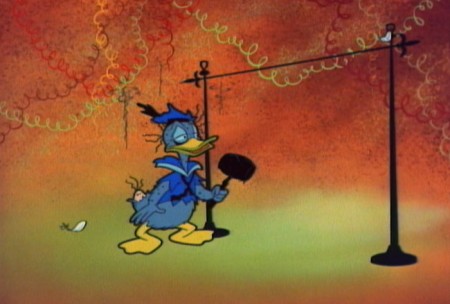
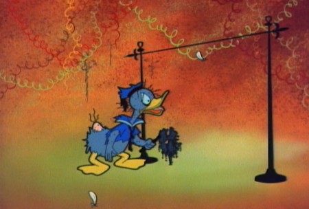
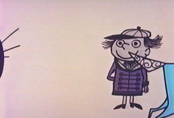
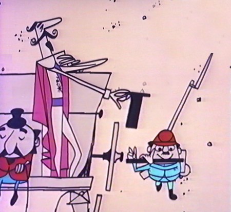
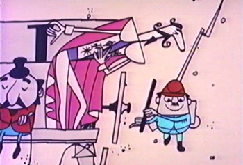
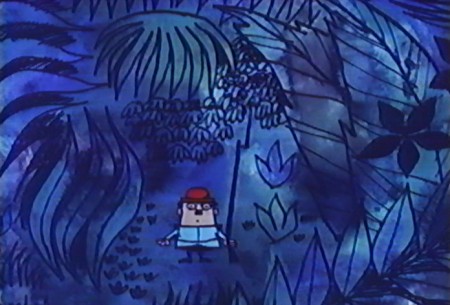
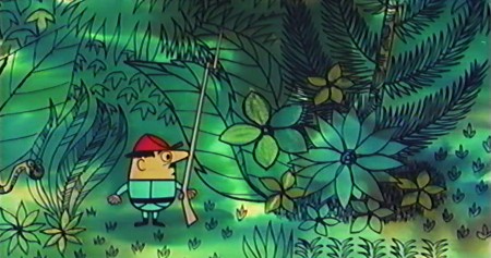
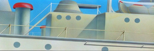
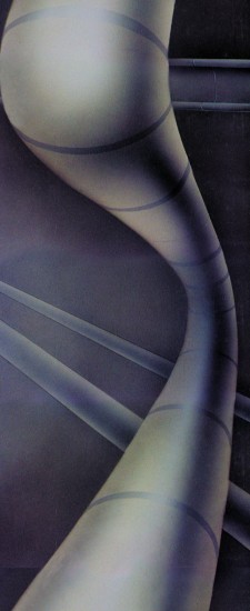
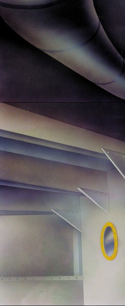
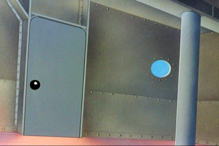
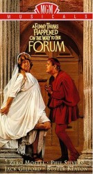 - Today marks the 80th birthday of RIchard Williams. To celebrate, I’ve chosen to post these images from the credit sequence of A Funny Thing Happened On The Way To The Forum. My first introduction to Richard Williams and his work came by way of a BBC documentary from 1965, The Creative Person: Richard Williams. It aired on WNDT’s ch 13 in New York (PBS before PBS existed.) Within the sequence there is once scene of a girl smelling a flower. (The Annette Andre credit.) I remember this as part of that doc, and Richard said that at times you should slow down the animation of a character if you want it to seem more real. There’s a dissolve animation going on here.
This is a great theatrical show and a mediocre movie. Despite the great cast, the brilliant people working behind the scenes (from Tony Walton‘s sets and costumes to Nicholas Roeg‘s extraordinary photography; from the incredible song score by Stephen Sondheim to Ken Thorne‘s excellent incidental music), somehow it all doesn’t really work.
However, animation enthusiasts would be primarily interested in the animated credit sequence by Richard Williams‘ fine animation. This was a sequence that brought Williams out of the cartoon world and into the more serious fold. Suddenly, his studio grew up.
Since we didn’t get to see his brilliant ads in the US, we had to seek out his title work. Credit sequences for future films such as The Charge of the Light Brigade, The Pink Panther sequels and What’s New Pussycat easily demonstrated how he really lifted his studio into the big time.
I’ve made frame grabs of the sequence from my recording, and thought I’d post them for your amusement. Sorry that the copy I have isn’t the most pristine and that the frames available are a bit soft. But I guess the idea comes across.
______________________________________(Images enlarge slightly by clicking them.)

The sequence starts at the end of the film. Buster Keaton runs on a circular treadmill, and dissolves to an animated version of himself.

He grows in the frames as some large-sized flies enter from the left.

Cut out to see a small Buster disappearing. The camera whips across to a picture of fruit. The flies zip over there and eat the picture. (This image of fruit was very dark on screen.)
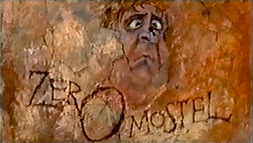
A fly lands on the nose of a CU caricature of Zero Mostel. His eyes cross watching the fly.
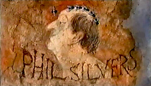
Flies land on Phil Silvers’ bald head and march across.

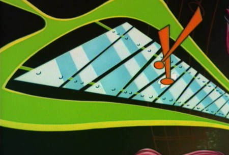
Buster runs across a painted frieze on the way to a series of inlayed boxes.
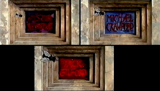
Zip to the second box credits Michael Crawford. Pan to the third box which features Jack Gilford’s name.
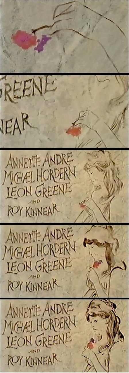
Dick talked with me about this scene in the film. He felt that to create realistic
characters in animation one had to slow everything down. He did it with dissolves.
It’s a technique he came back to often, quite noticeably in The Charge of
the Light Brigade.
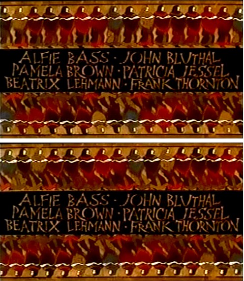
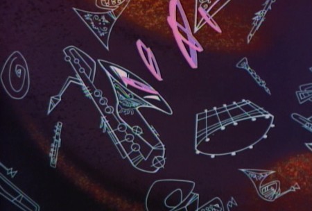
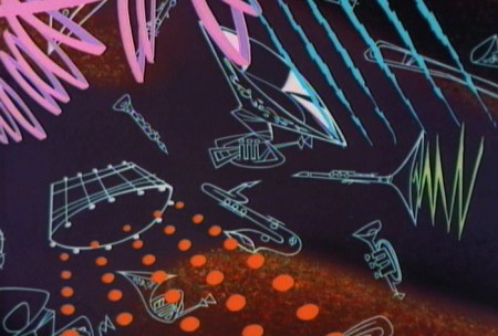
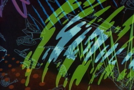
Errol LeCain’s art seems to be featured in this elaborate scene. The entire group – top
and (upside down) bottom – dance.
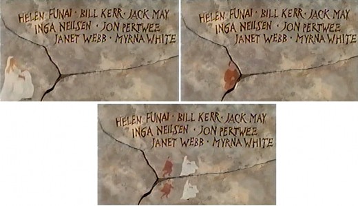
An animated version of Zero Mostel chases a female through and across a painted wall moving into and across the cracks.

The cornucopia of fruit starts in full color but goes to B&W before it’s done, in honor of the great cinematographer.
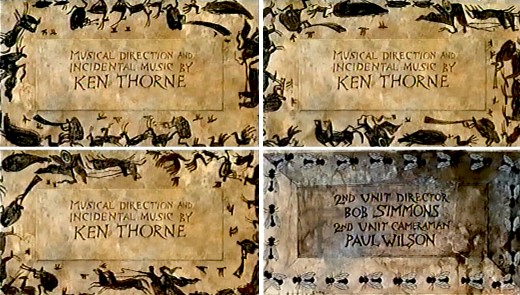
A very large cast of shilhouettes runs around this credit for Ken Thorne. There is no cycle here. This is a Dick Williams piece, so they’re all fresh drawings. They turn into flies for the next credit.

A Roman version of an Escher wall painting animates, confusing the fly trying to walk across.
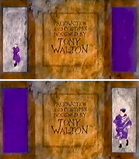
The animated Buster Keaton runs toward us on one side
and away from us on the other side.
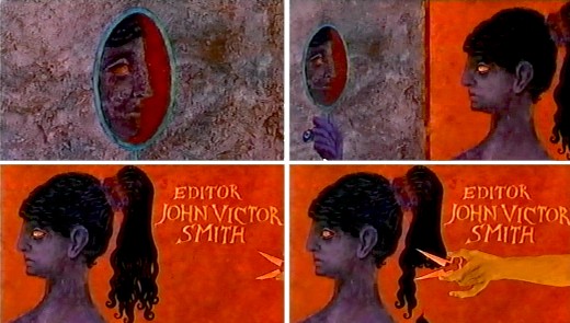
For the editor’s credit, a female looks at herself in a mirror. A hand comes in and clips off her pony-tail.
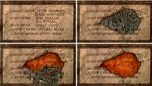
A slew of credits rots in one spot. This falls off revealing the choreographers’ names.
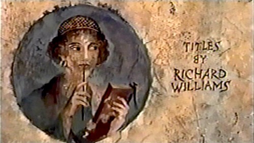
I’m always fascinated by the credit the designer gives himself. No sign of anyone else
who worked on this sequence. Titles have changed since then.
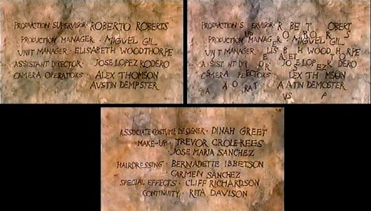
This is the first time I remember seeing letters from the type of one card falling down to match letters from the next card.
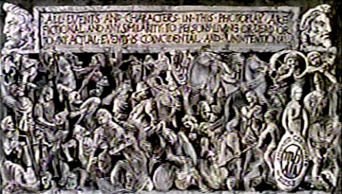
This card, the least significant one, comes back several times.
Of course it’s overanimated though it looks like a cycle.

The camera moves in on a fly crossing a checker board.
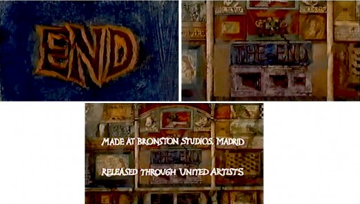
Truck out from “End” past “The End” to reveal several more boxes.
Happy Birthday, Richard. Thanks for all the wonderful gifts you gave animation, not the least being the obvious: a new respect for a medium that was dying when you stepped up to the plate. You restored its dignity at least once.
Disney &Frame Grabs 31 Jan 2013 06:35 am
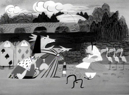
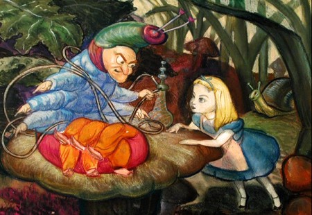
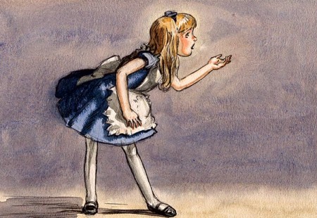
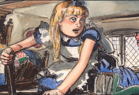
Operation Wonderland Redux
- On the DVD of Alice in Wonderland, there’s an extra little short that supposedly gives you a tour of the studio and a lesson in how animated films are made. (Do you think we’ll ever see one about Dreamworks or Pixar? I’d like to get a video tour of either studio.)
Since I’ve been focussing on Alice’s Milt Kahl scenes, I thought it’d be interesting, as an accompaniment, to post some frame grabs from this theatrical short that was done to promote Alice.
 1
1(Click any image to enlarge.)
 2
2
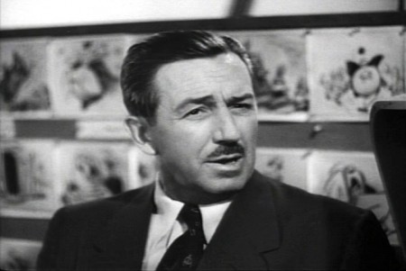
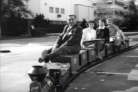
Of course, the film has to start with Walt
riding a toy train around the studio.
 3
3
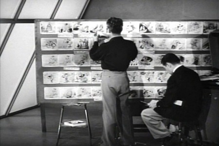
Two storyboard guys sitting in the middle of the studio.
 4
4
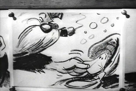
Storyboard: the walrus grabs a clam.
 5
5
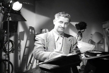
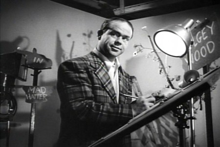
Ward Kimball in a funny jacket.
 6-7
6-7
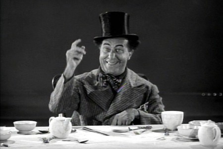
The actor posing as the Walrus for the camera.
 9-10
9-10
The Walrus & Carpenter sequence.
 12
12
Walt and Winston Hibler. Hibler eventually narrated
most of the Disneyland shows and True-Life adventures.
 14
14
Flowers from storyboard to final film.
 15
15
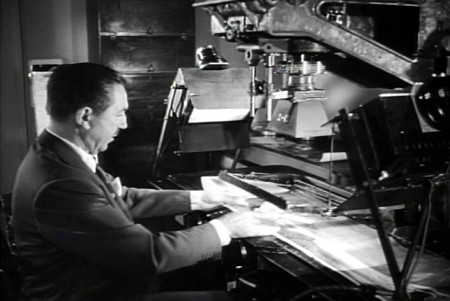
Walt gives a demo of the animation camera and
seems to be wrinkling the cels as he does this.
 16
16
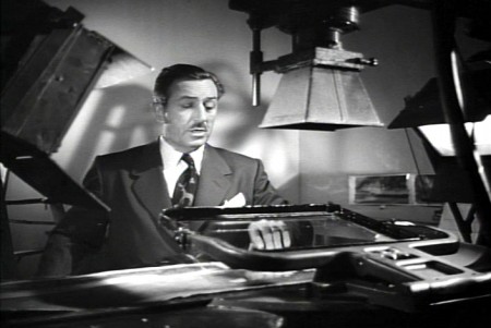
Walt operating an animation camera. Ludicrous.
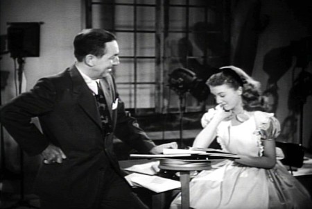 17
17
Walt and Kathryn Beaumont (who’s
supposed to be doing schoolwork.)
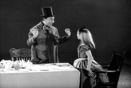 18
18
Kathryn Beaumont and Ed Wynn.
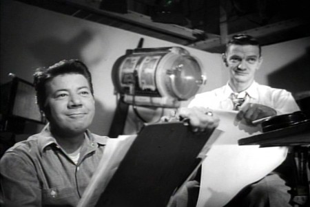 20
20
John Lounsbery on the right. The other animator looks to be
Fred Moore. Older and heavier than we’ve seen him in the past.
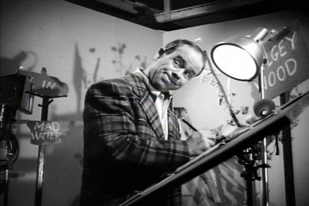 22
22
More of wacky Ward Kimball pretending to draw.
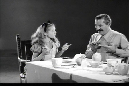 23
23
Kathryn Beaumont and Jerry Colonna.
 25
25
Jerry Colonna leads us into pencil test of the scene.
 27
27
This scene was animated by Ward kimball & Cliff Nordberg.
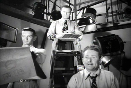 46
46
John Lounsbery is on the left.
I’m not sure who the other two are.
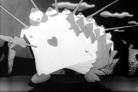 47
47
The cards in action in the film.
 49
49
One of the highlights of the film is this dancer doing
march steps for the cards – to be studied.
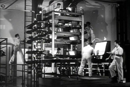 50
50
The multiplane camera in operation.
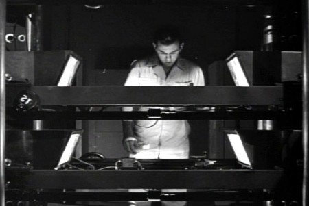 51
51
The cameraman at the top always looks a bit devilish.
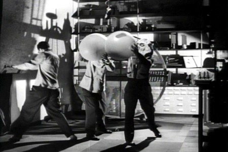 52
52
No “how animation is made” film would be complete
without the sound effects guys making a racket.
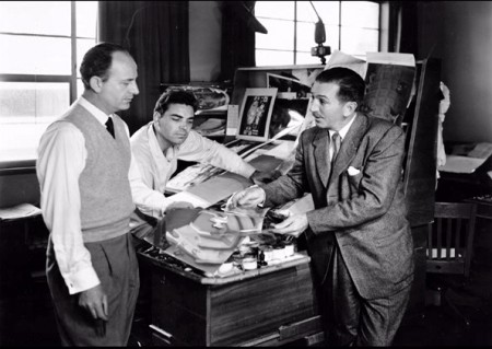 54
54
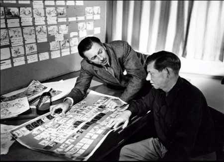
Walt going over some artwork with
John Hench (L) and Claude Coats (center)
Thanks to Hans Bacher and Gunnar Andreassen for identifying them.
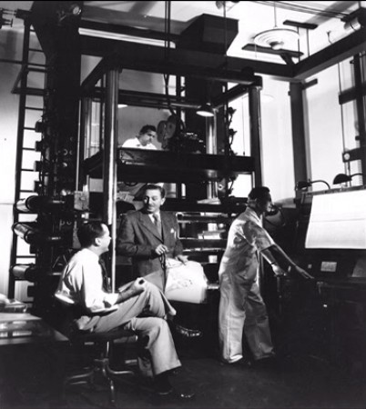 55
55
Before riding his toy train into the sunset, Walt sits
in front of his real toy, the multiplane camera.
If anyone can identify any of those I couldn’t, or if you think I’ve mistakenly identified anyone, please leave a comment.
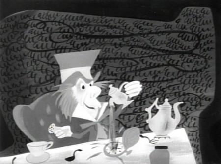
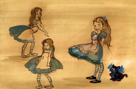
There’s an art gallery of images, many of which are by Mary Blair (and I’ve already posted her pictures a while back.) I’ll finish this post with some more of the images on the dvd.
 1
1Mary Blair in B&W.
 4
4
Thiis looks like it comes from HOPPITY GOES TO TOWN.
To see more Mary Blair designs for Alice go here.
Frame Grabs &Layout & Design &Title sequences 28 Jan 2013 06:18 am
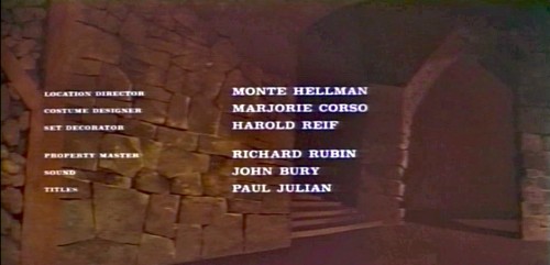
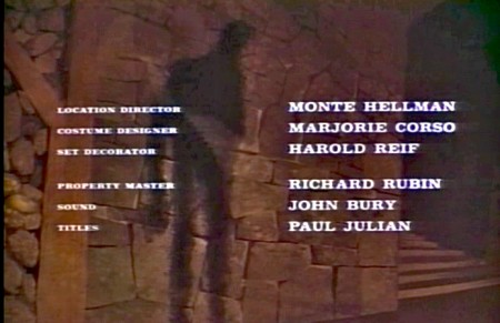
Paul Julian’s The Terror titles – redux
After posting the book, Piccoli, a week or so ago, I’ve grown more interest in Paul Julian‘s work. He’s known predominantly for the Bgs he did at Warner Bros and the art direction he did on The Tell Tale Heart. However, there’s more film work he did independently.
The Hangman was a short film he did with co-director Les Goldman. Maurice Ogden’s poem is read by Herschel Bernardi in a very earnest tone. The artwork by Julian absolutely saves this film which was nomainted for the Oscar.
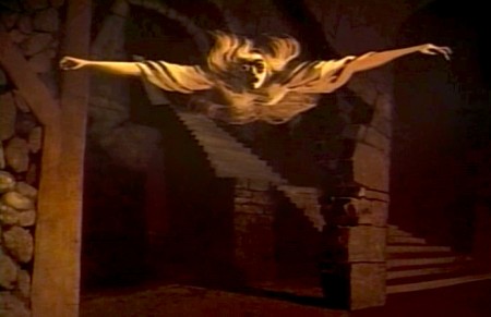
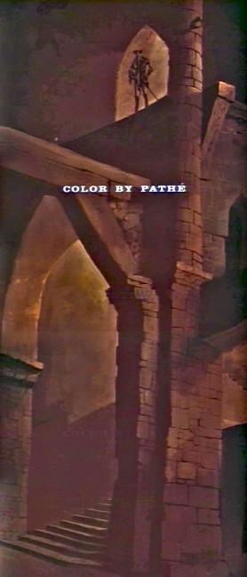
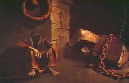
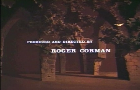
Roger Corman also used Paul Julian for a number of opening title sequences for the low budget films he did in the 60s. I’m going to try pulling some frame grabs from a number of these title sequences so that I can place some focus on Julian’s work in these forgotten films.
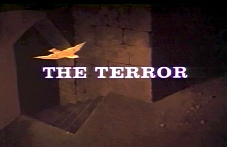
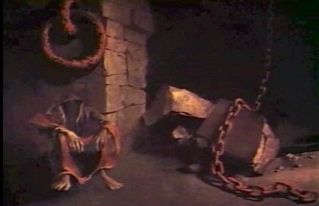
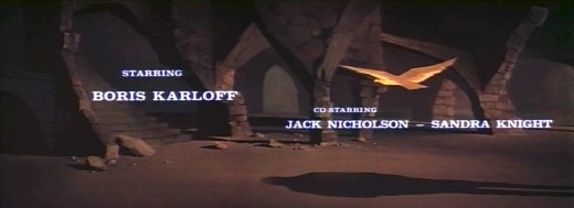
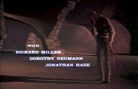
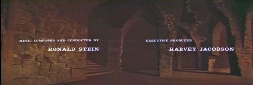
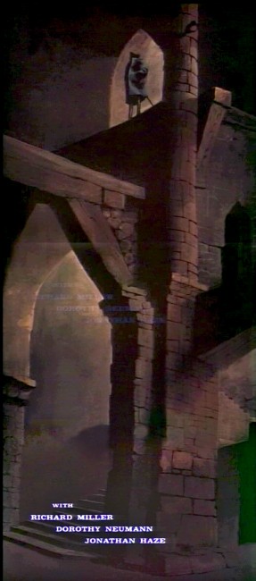
I start here with The Terror a film Starring Boris Karloff and Jack Nicholson. Julian uses a couple of pieces of artwork that he works over the course of the sequence with lots of lateral camera moves. Quite expressive work, though certainly not on a par with Tell Tale Heart.
 1
1(Click any image to enlarge.)
 6
6
Starts at the bottom and pans up.
You can watch a grayed-out version of this video on YouTube. The credits come on about a minute into it.
Animation Artifacts &Disney &Frame Grabs 17 Jan 2013 07:20 am
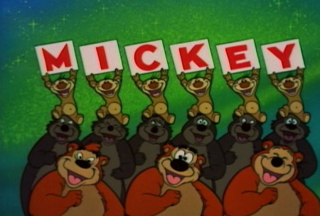
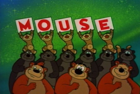
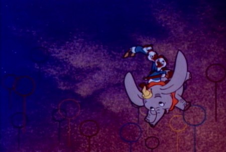
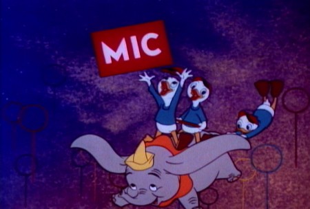
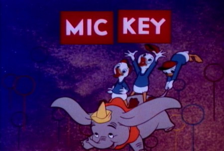
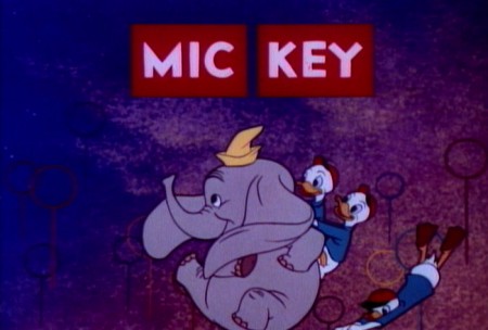
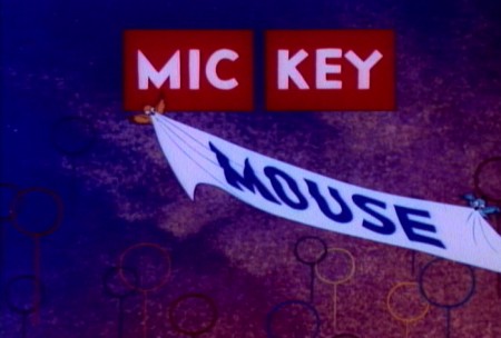
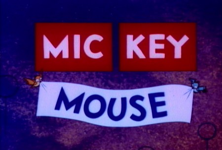
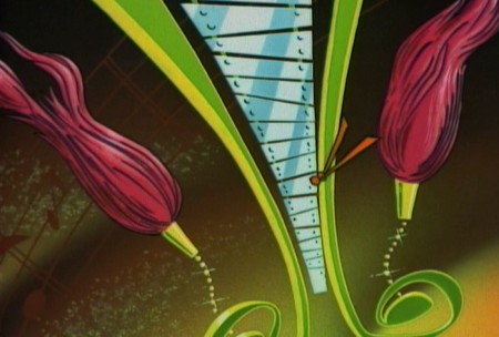
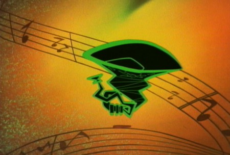
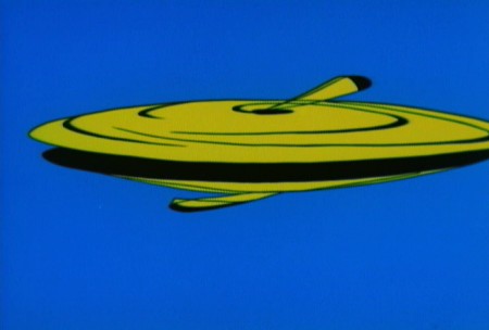
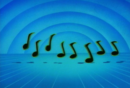
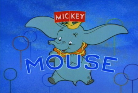
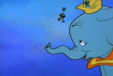
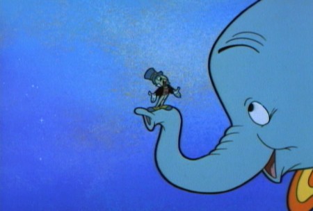
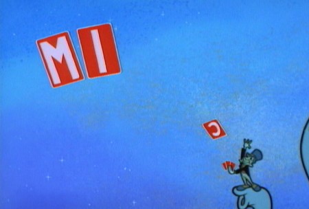
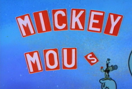
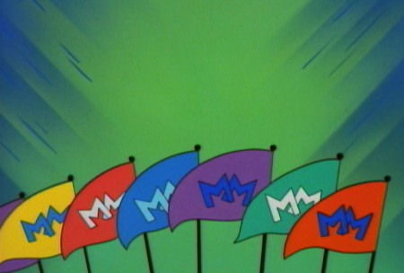
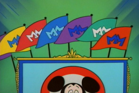
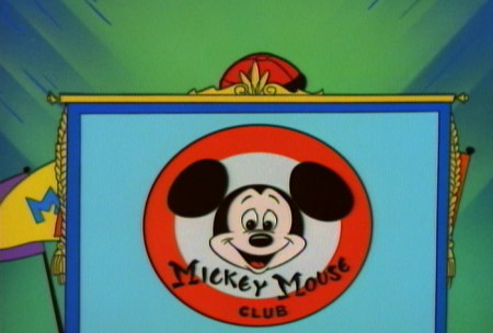
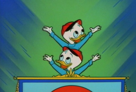
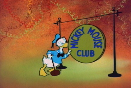
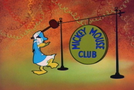
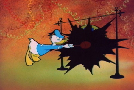
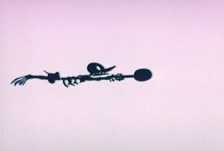
Mickey Mouse Club Abstract
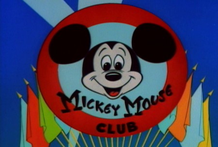
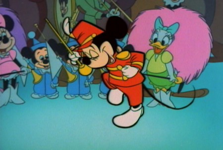
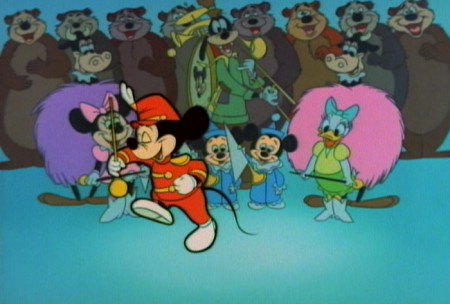
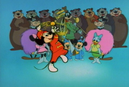
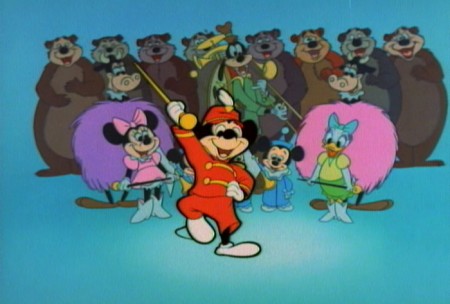
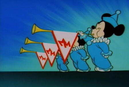
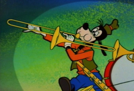
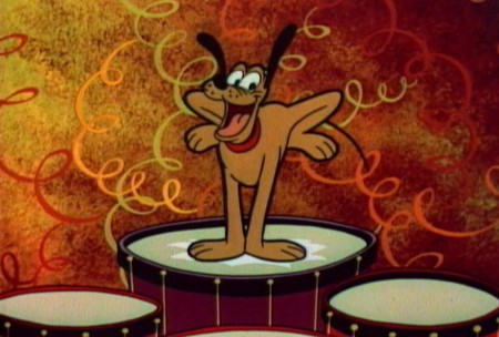
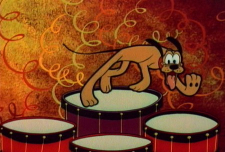
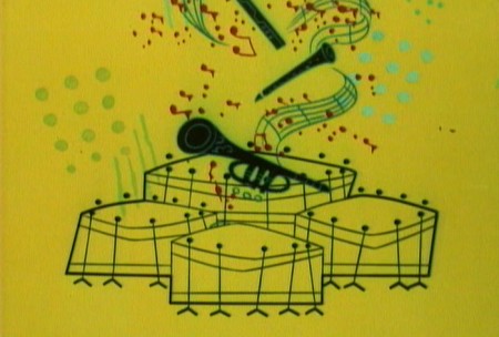
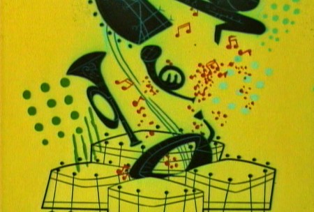
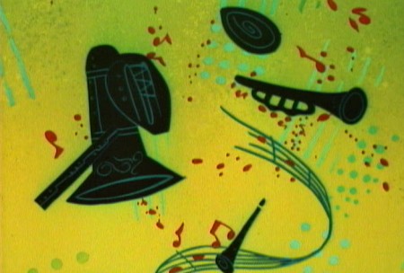
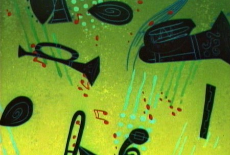
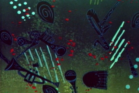
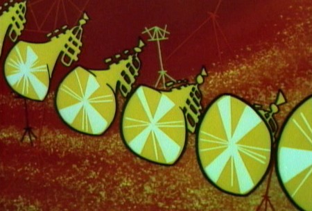
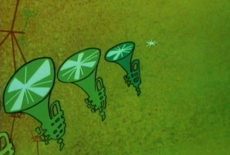
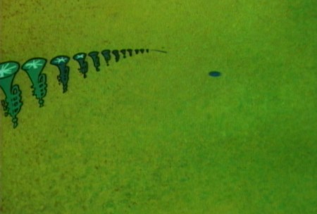
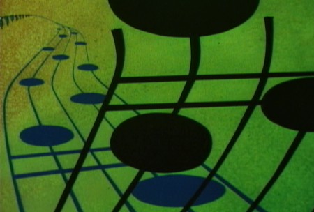
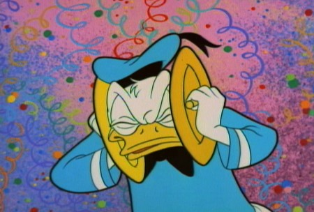
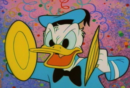
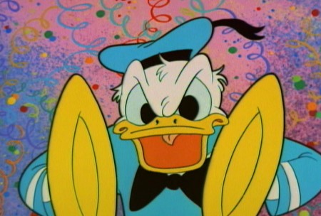
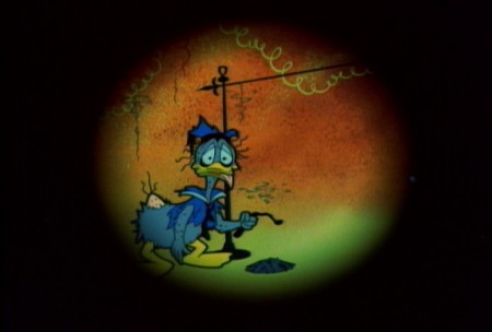
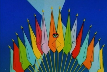
- Back during the black out of Hurricane Sandy (when we had no electricity or heat), John Canemaker invited us up to his apartment to use his computer so that we could check email etc. I spent a nice couple of hours with John that day, and one of the things he pulled out was the DVD of the Mickey Mouse Club. (One of those expensive, tin boxes I didn’t own.) On the extras of the program was a colored version of the animated opening to the show. The original Mickey Mouse Club aired in B&W, which is how I remember it. It was fun sitting through that piece of animation, and I was charmed by a somewhat abstract section, a musical interlude that was rarely shown in the B&W version. It reminds me of Toot Whistle Plunk & Boom in its styling.
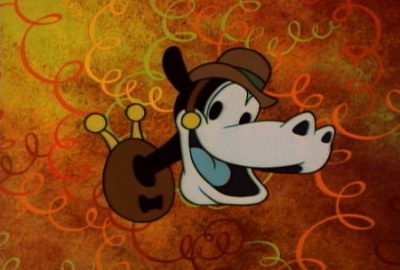
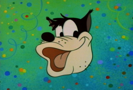
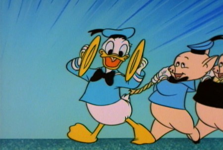
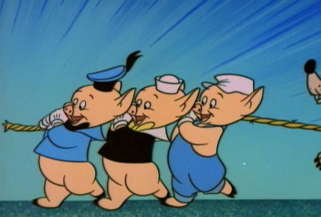
I recently bought a copy of that DVD and went directly to that extra. I’ve pulled some frame grabs of the center sequence and will post those here. But then I couldn’t stop there. I went back and did the entire piece. The abstract sequence stands away from the poorly designed Mickey, Donald & Goofy. Those thick outer lines against the thin inner lines reminds me of the bad imitation UPA art that was going on at the time. It was their idea of “modern art,” I guess.
 1
1
 44
44
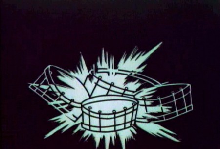
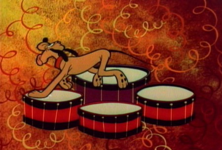
Pluto’s drums burst in a B&W flash.
 75
75
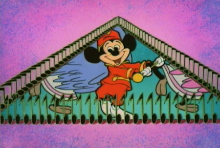
Mickey comes back in with an awkward optical.
 77
77
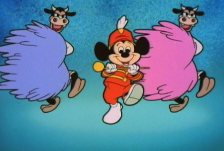
. . . and the song continues.
I wonder if Ward Kimball had anything to do with this.
Ken O’Connor was the Art Director for Kimball including:
Mars and Beyond, Man in Space and Man and the Moon
Victor Haboush was the Asst. Art Director, and he had an important role
in the Mr. Magoo TV show as well as the Dick Tracy show back in 60s.
He was also the Art Director on Gay Purr-ee.
Commentary &Frame Grabs &Miyazaki 06 Jan 2013 07:02 am
Happy B’day Hayao
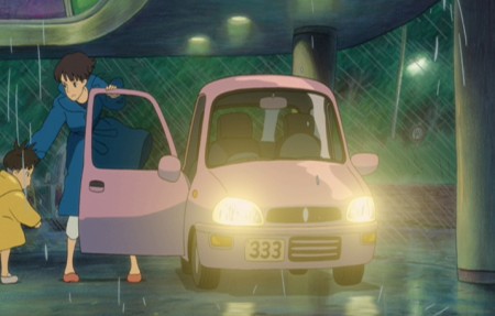
- Yesterday was the 72nd birthday of Hayao Miyazaki. Most people found out through his Facebook page. He has a lot of friends. In celebration, I’ve chosen to post frame grabs from one of the most exhilarating film sequences ever made – animated or otherwise. It’s from Ponyo, a film I absolutely love. The treat of seeing it in a theater a couple of times is just a veritable high when this sequence rolls around. Here. I cut it short a bit, since I felt I’d gotten the point across by the 100th frame grab, and it was also a perfect place to cut out.
 1
1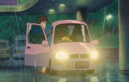 2
2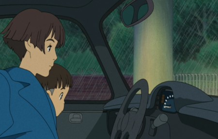 3
3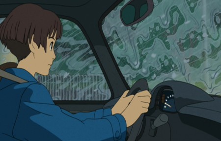 4
4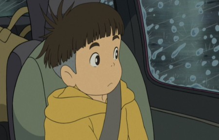 5
5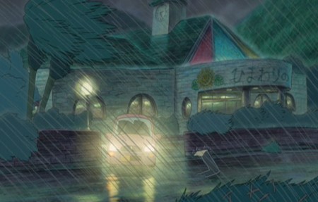 6
6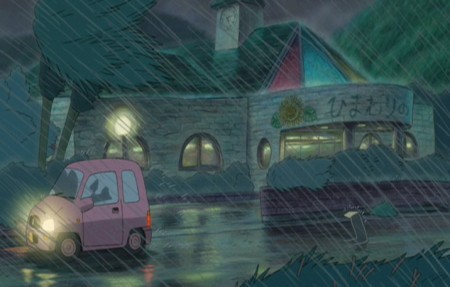 7
7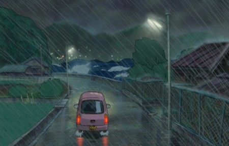 8
8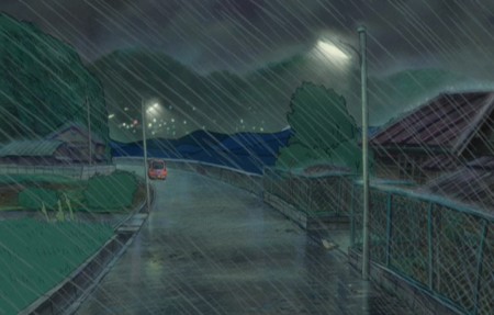 9
9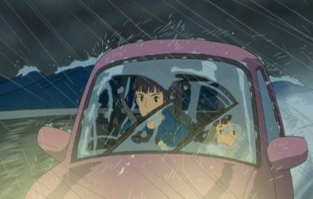 10
10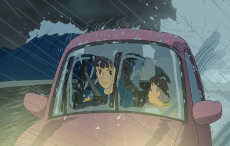 11
11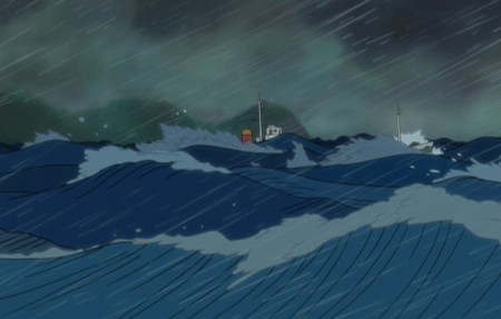 12
12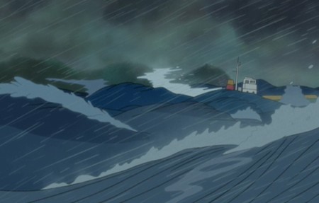 13
13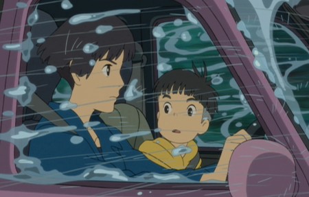 14
14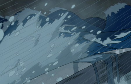 15
15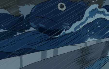 16
16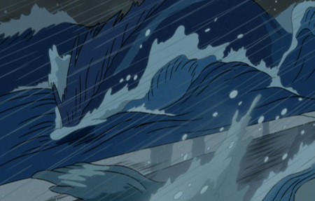 17
17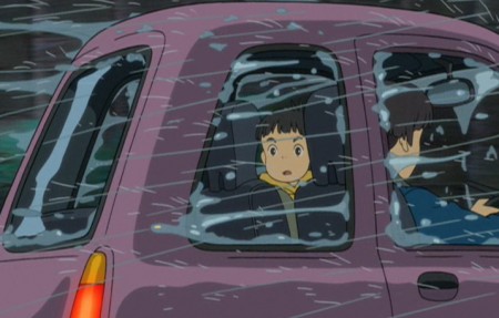 18
18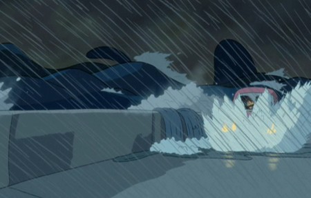 19
19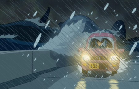 20
20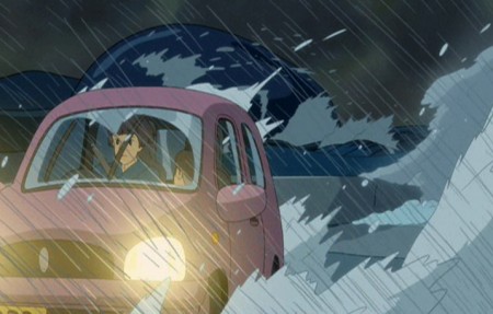 21
21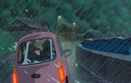 22
22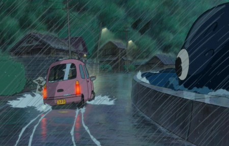 23
23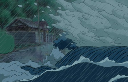 24
24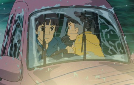 25
25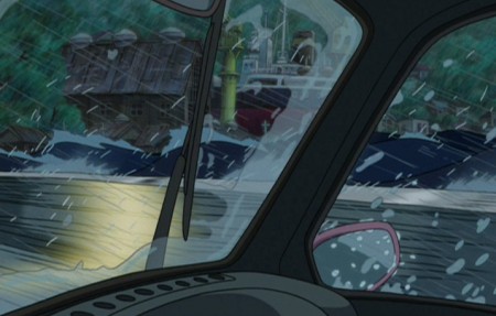 26
26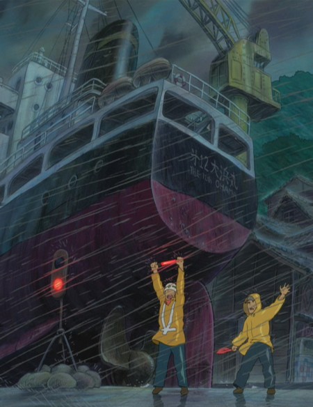 27
27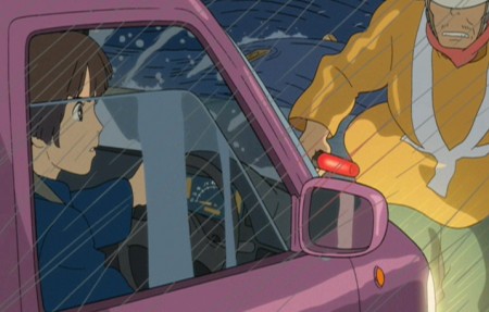 28
28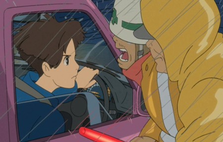 29
29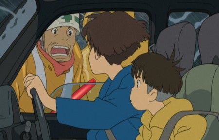 30
30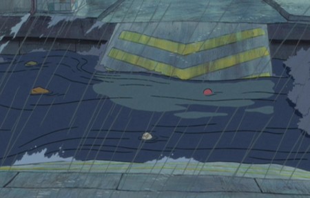 31
31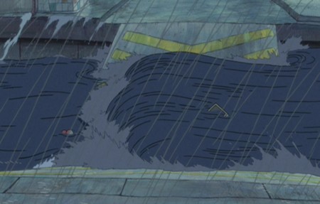 32
32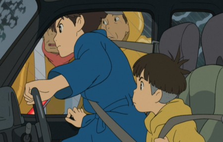 33
33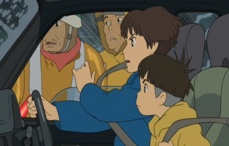 34
34But you can’t go that way . . .
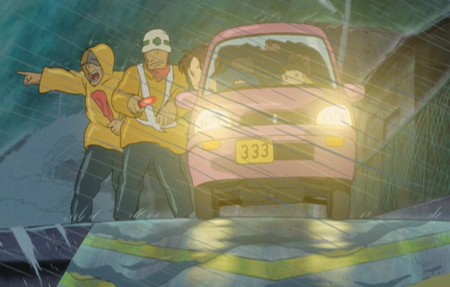 35
35The bridge is out!
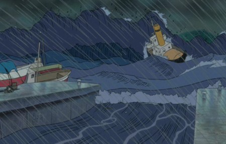 36
36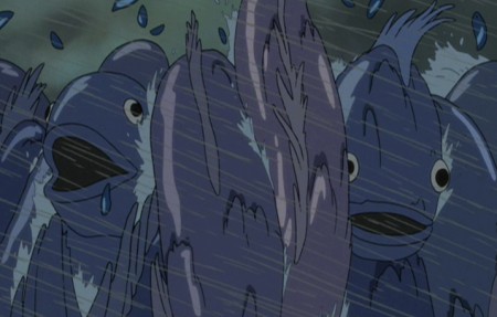 37
37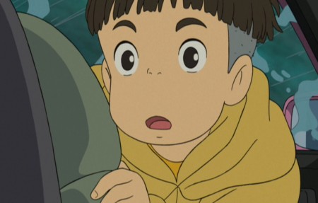 38
38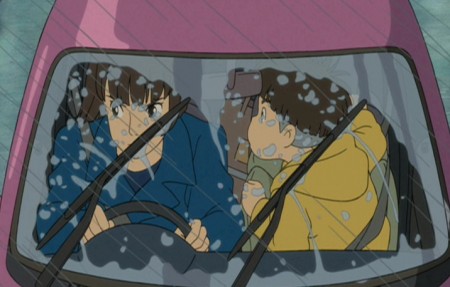 39
39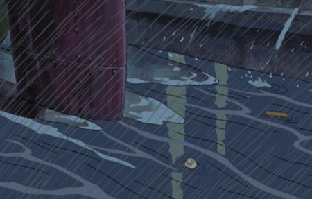 40
40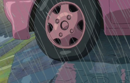 41
41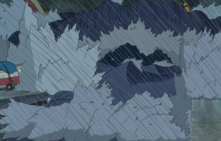 42
42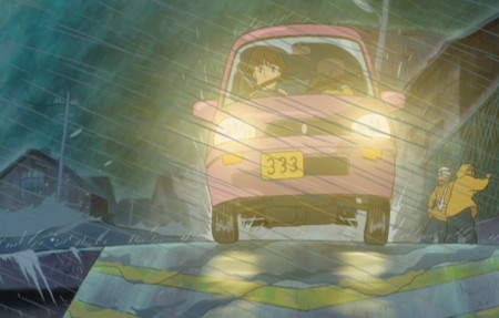 43
43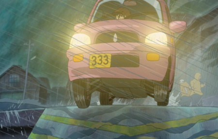 44
44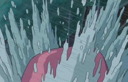 45
45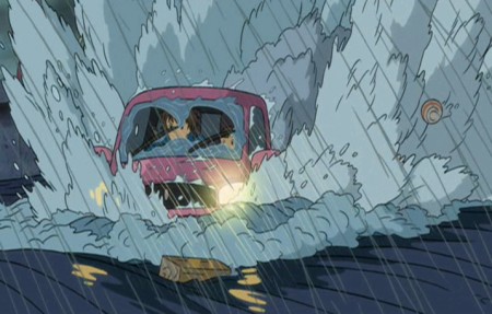 46
46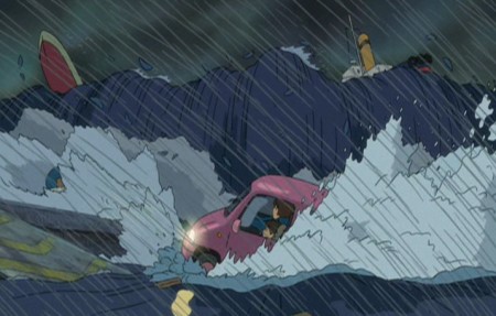 47
47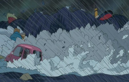 48
48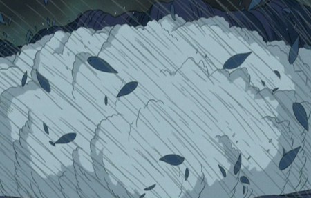 49
49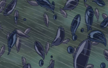 50
50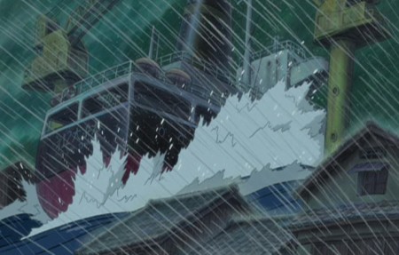 51
51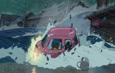 52
52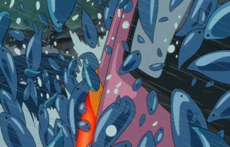 53
53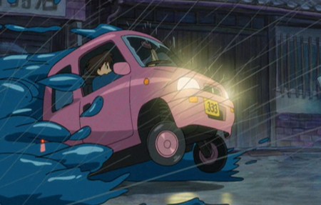 54
54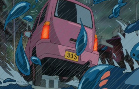 55
55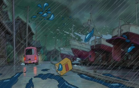 56
56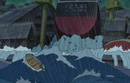 57
57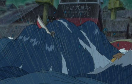 58
58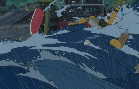 59
59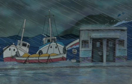 60
60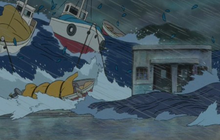 61
61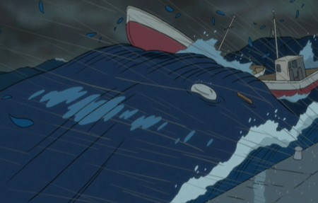 62
62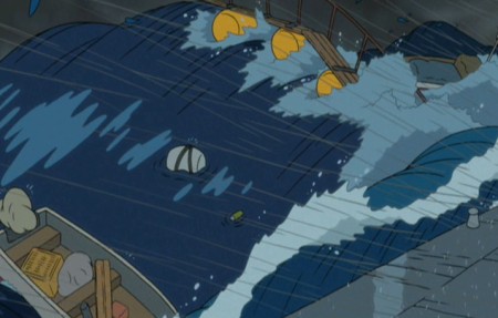 63
63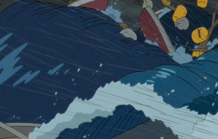 64
64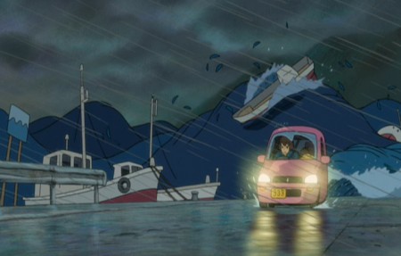 65
65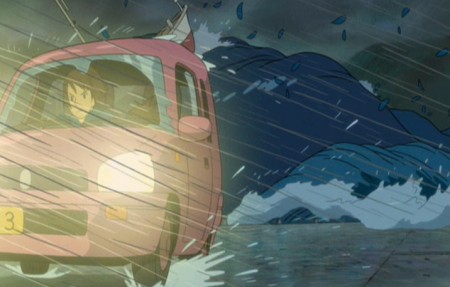 66
66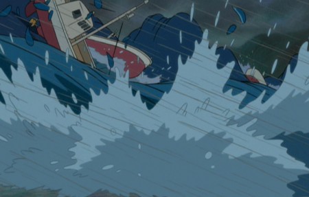 67
67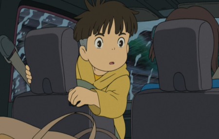 68
68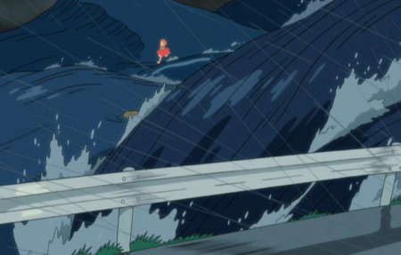 69
69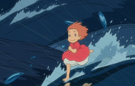 70
70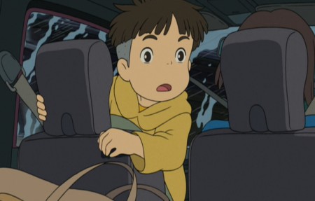 71
71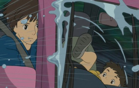 72
72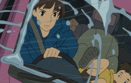 73
73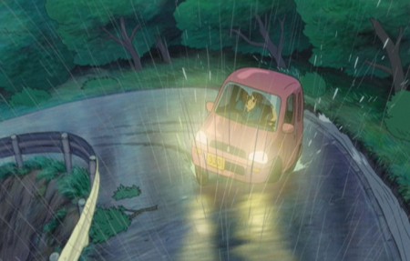 74
74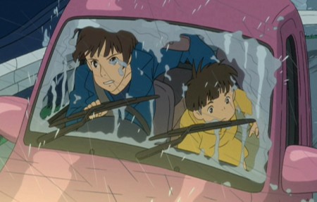 75
75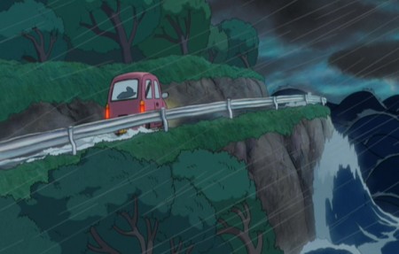 76
76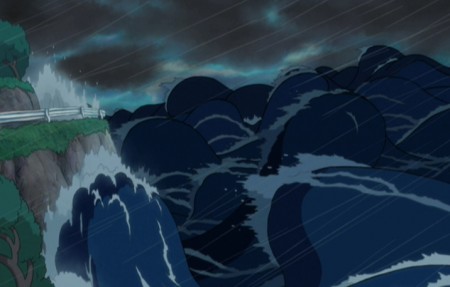 77
77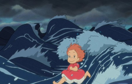 78
78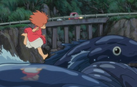 79
79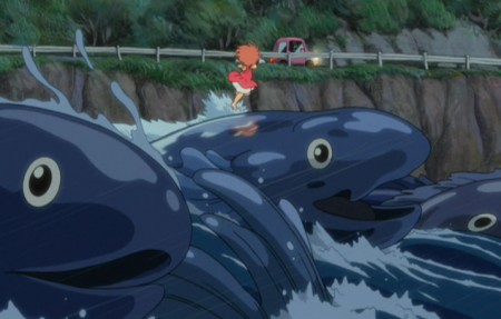 80
80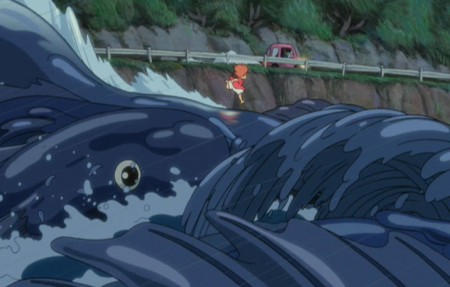 81
81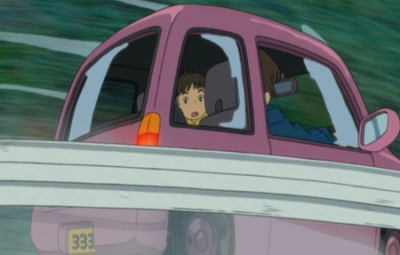 82
82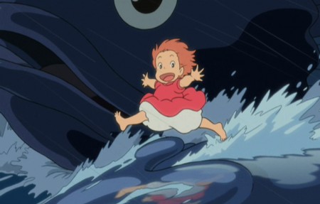 83
83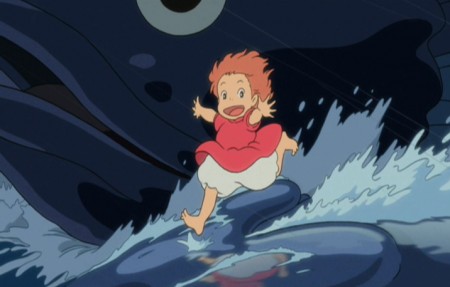 84
84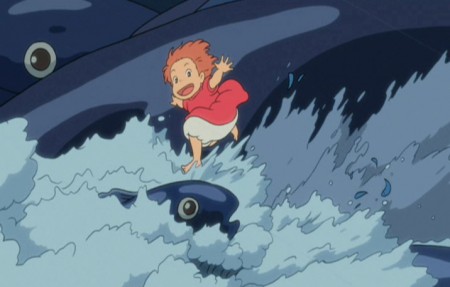 85
85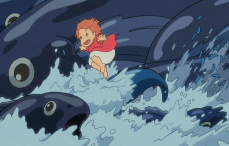 86
86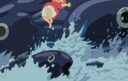 87
87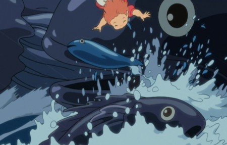 88
88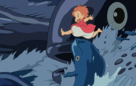 89
89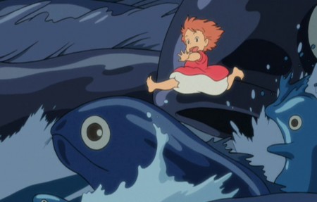 90
90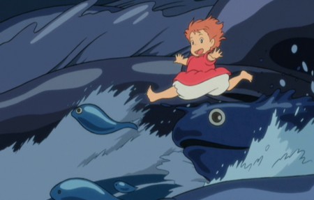 91
91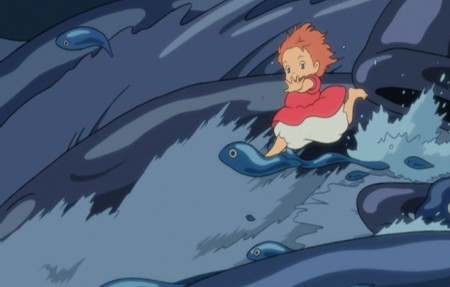 92
92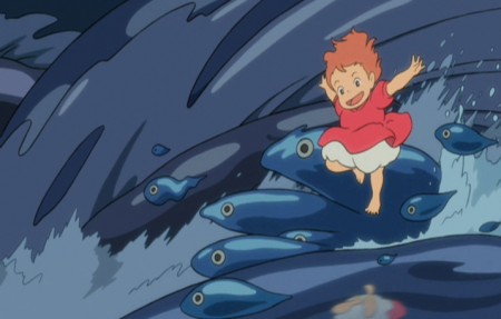 93
93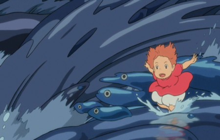 94
94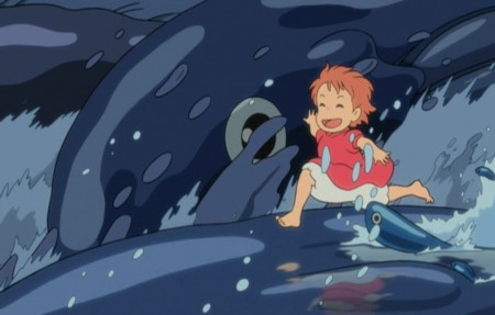 95
95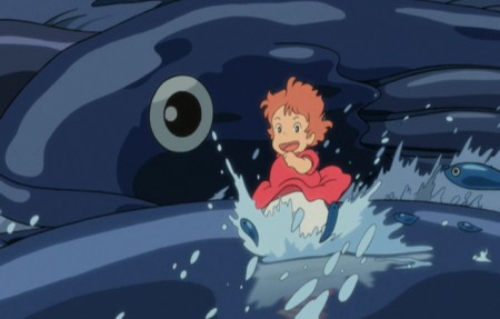 96
96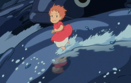 97
97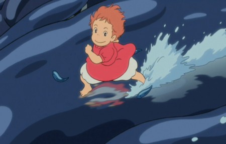 98
98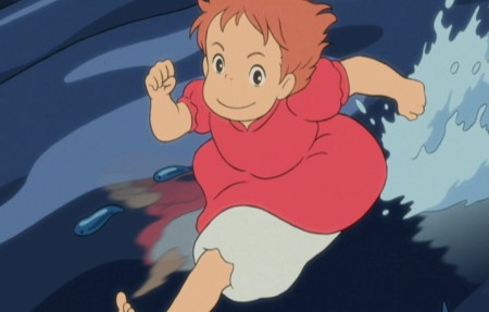 99
99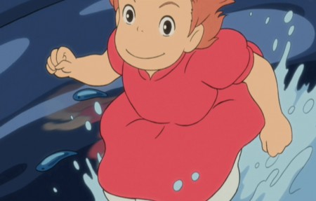 100
100
Happy Birthday, Hayao Miyazaki
Frame Grabs &UPA 26 Nov 2012 05:48 am
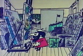
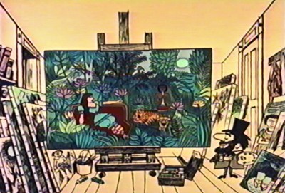
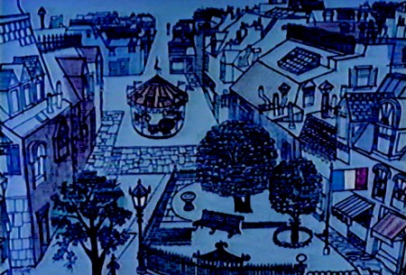
Rousseau’s Carousel
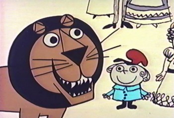
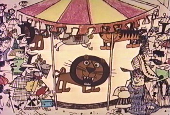
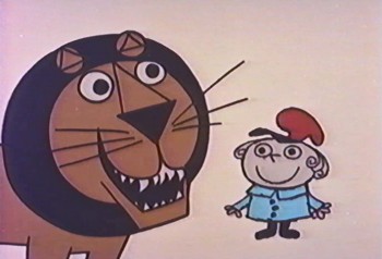
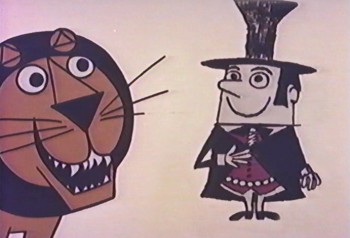
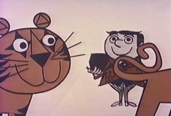
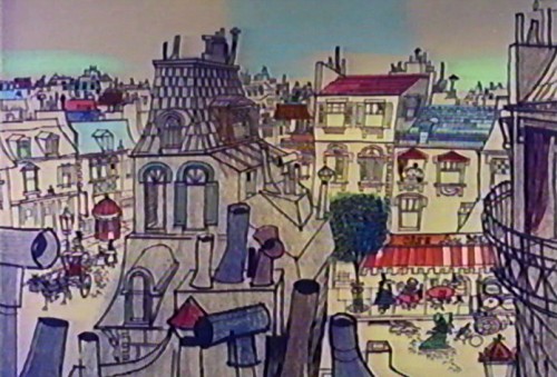
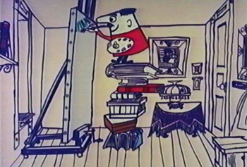
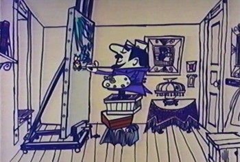
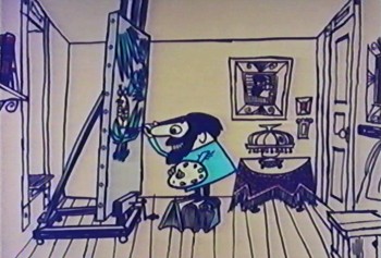
- The Gerald McBoing Boing Show, in the 1950′s had a number of animated pieces on poets, painters and other artists. Of these the most famous film is probably The Invisible Moustache or Raoul Dufy. Another interesting film is one on the Post-Impressionist artist, Henri Rousseau.
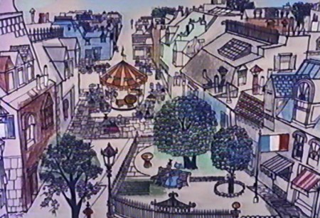 1
1
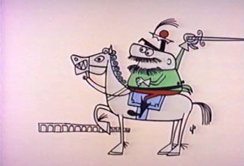
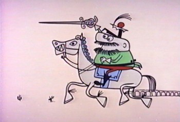
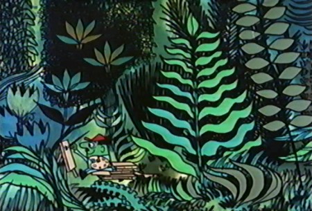
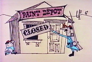
The film is obviously a fiction, and a most peculiar one at that.
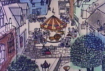 2
2
In the film’s story, Rousseau was in love with . . .
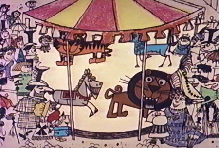
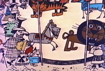 3
3
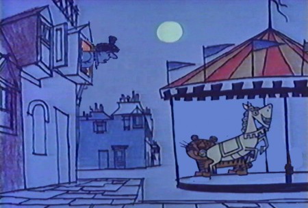
. . . the wild animals to ride on a local Carousel.
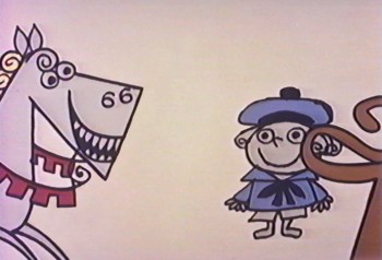 7
7
As he grew older, those wild creatures . . .
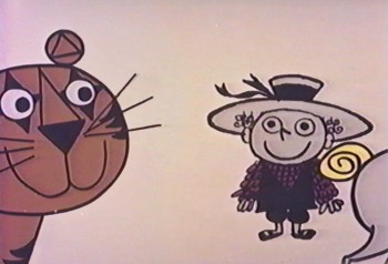 8
8
. . . which he used to ride as a child, remained . . .
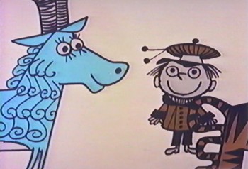 9
9
. . . repressed in his consciousness.
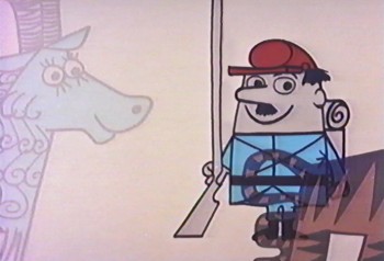 13
13
Once he goes into the military, he worked closely . . .
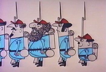 14
14
. . . with the Emperor Maximilian.
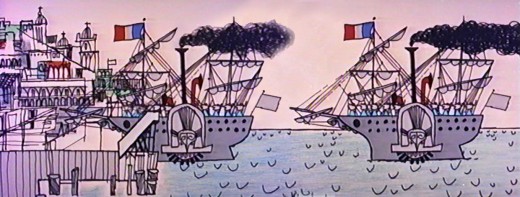
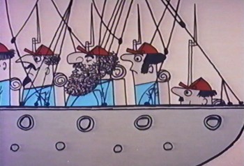
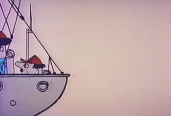
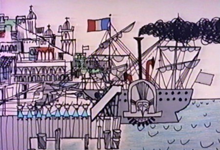
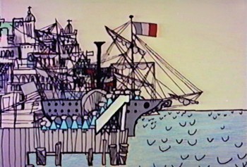
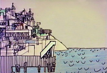
The ship pulls into the harbor . . .

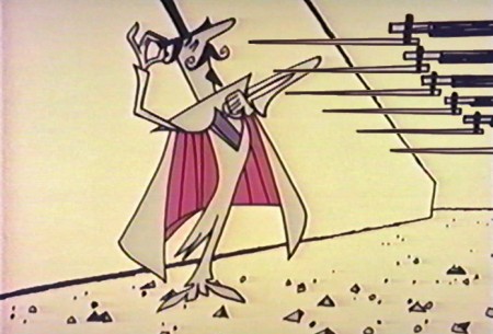
The troops move right to left through the frame leading the Emperor forward.
(Click on the image to enlarge it.)
 22
22
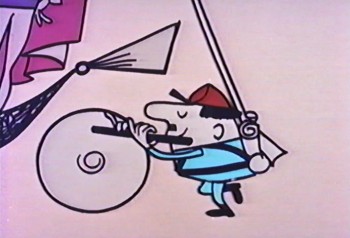
The tardy Rousseau walks behind the Emperor’s carriage . . .
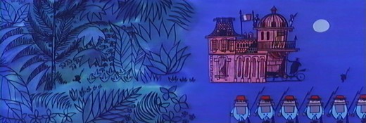
The Emperor’s carriage pulls into the palace,
and the soldier, Rousseau, goes into the forest.
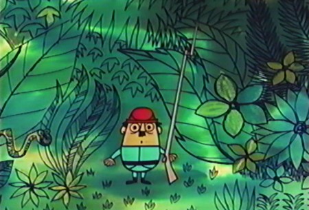 27
27
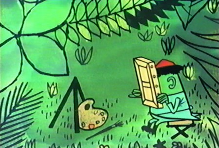
His prescription was to take up a hobby, painting.
 30
30
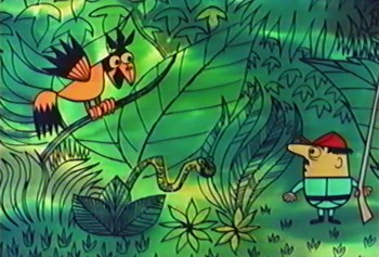
Once, on guard in the forest . . .
 31
31
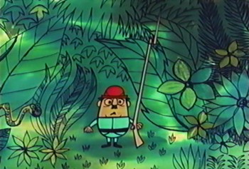
. . . Rousseau grew very ill.
 34
34
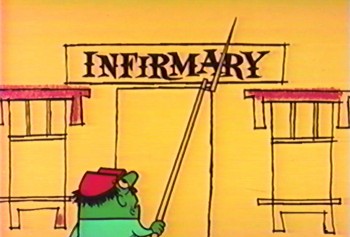
He took himself to a doctor.
 40
40
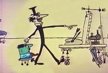
The prescription was for him to take up painting.
 41
41
Everyone else in the military was doing it.
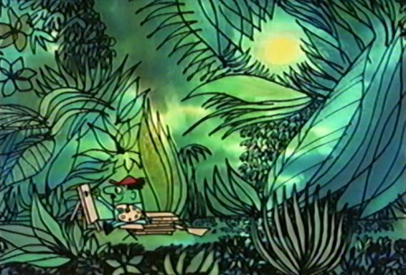 42
42
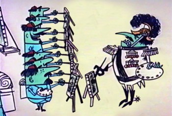
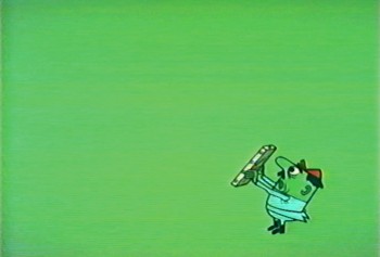
He did painting after painting . . .
 46
46
He wasn’t happy with the results.
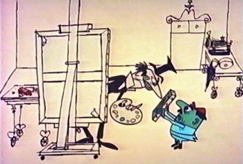 47
47
The doctor then became his number 1 critic
telling him to paint with brighter colors . . .
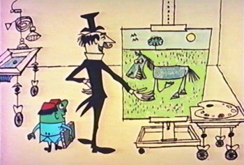 48
48
. . . and to paint the things he knew.
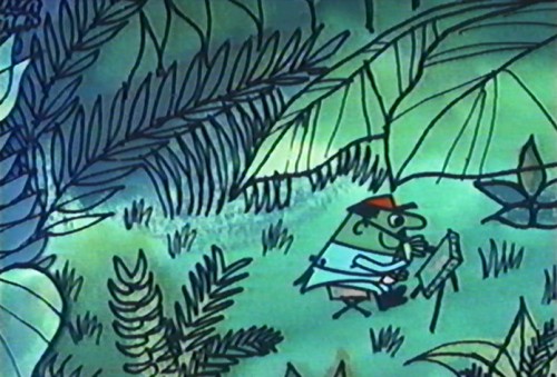 49
49
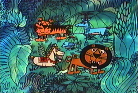
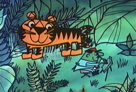
So Rousseau painted the forest and . . .
 50
50
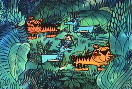
. . . began adding those carousel animals.
 53
53
While in the military, there was a shortage of paint.
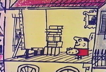 59
59
He had to wait until he was home to take up painting again.
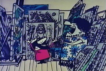 64
64
He served as a music teacher to locals, offering voice . . .
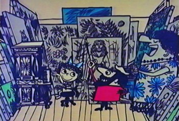 65
65
. . . piano, violin and flute lessons.
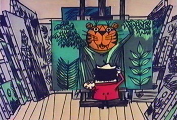 67
67
Meanwhile he painted. The paintings became famous.
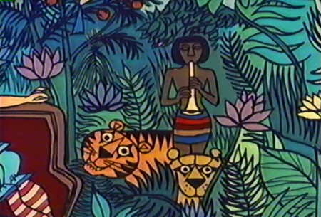 69
69
That’s not quite the true story.
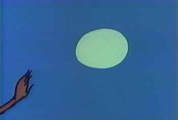 70
70
He did serve in the military under the Emperor Maximilian . . .
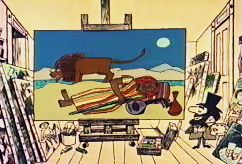 71
71
and he did work out of a lowly garret in Paris.
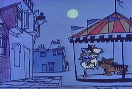 72
72
Working as a customs officer, he did his painting on the side.
 73
73
The art did achieve fame but not during Rousseau’s lifetime.
Just the same, the art is stunning as is the art from the film.
My copy of the film has no credits though no doubt Shirley Silvey
was the designer and my guess is that
Ted Parmalee was probably the director.
The video credits three animators for the three films on the video:
Fred Crippen, Frank Smith and Phil Duncan.
The animation is so limited that it might have been anyone.
I’d have guessed that Phil Duncan would have done more movement
as an older animator in the group.
Commentary &Frame Grabs &Photos &Steve Fisher 21 Oct 2012 04:40 am
Woody Et Al
- Before I get into today’s photo blog twist, I want to share with you a letter I received very late last night. It’s from Tom Stathes, who has one of the greatest, if not the best, collection of silent animation in the world. He’s supplying TCM with some gems tonight, and that’s what he writes about:
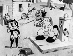 It’s with great honor that I report to you that an hour’s worth of rare silent-era animation from my collection will be airing on Turner Classic Movies, *tonight*, at 12am eastern/9pm pacific. For this very special and long overdue broadcast event, we’ve curated several rare, once-thought lost, historically significant or just downright funny cartoons produced in New York City between 1907 and 1926.
That’s not all, though–TCM host Robert Osborne, with Jerry Beck co-hosting, are also presenting both Fleischer features, a block of UPA cartoons, and The Adventures of Prince Achmed in addition to the early NYC shorts.
 It’s not to be missed! I hope some or many of you can tune in or set your DVR in time. Important links pertaining to this event below…
My guide to the early NYC animation: here
Jerry Beck’s rundown of the entire evening’s broadcast: here
Want to see more programming like this on TCM? Tell TCM how you feel here: here
The Facebook pre-party has been going on for weeks now! Join in on the fun, and see all the great images and comments that have been posted in anticipation this past month: here
I welcome (and hope to receive) any comments, questions, or discussions any of you have…either here, as follow-up posts on my blog entry, or whatever strikes your fancy.
Excitedly and cordially yours,
Tom Stathes
This, to me, is one of the most important animation events we’ve seen coming to television in the past few years. I often wondered if TCM would get smart and feature some silent animation during their silent film series on Sunday nights. Thanks to Tom, among others, we can say yes. Hopefully there’ll be more.

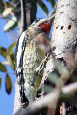
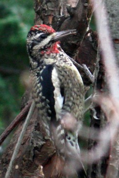
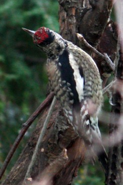
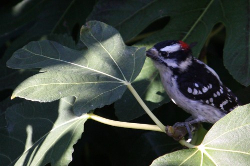
Now, to today’s prime feature. I’m a Woody Woodpecker fan – well, early, early Woody Woodpecker. Steve Fisher gave me a good excuse to write about it. Many thanks to Steve for the great photos of woodpeckers.
- The legend goes that Walter and Gracie Lantz had gone to the
country for a vacation. However, they were kept up night after night by a rat-a-tat-tatting on their roof. It turned out to be a woodpecker pecking away at their cabin’s rooftop, usually when they were ready for sleep.
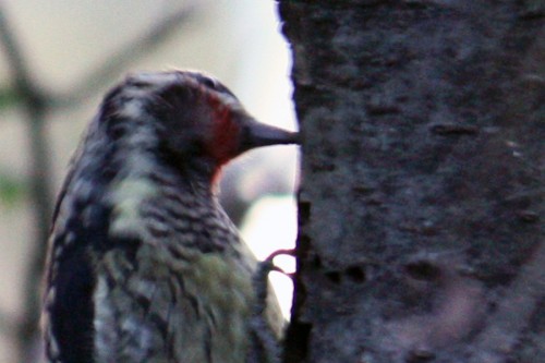
Woodpeckers peck at the wood in search of food – insects buried deep within holes of the trees the birds are attacking. A long, sticky tongue pushes through the bill to wrap itself around the insect and bring it home to be eaten. To seriously peck at the wood, the bills are rarely curved and are longer than usual. To prevent brain damage, woodpeckers have evolved with small-sized brains that have moved to grow in a safer area of the skull. The eyes are protected from the flying wood chips by a small membrane that automatically covers the eye which goes to a slit when the pecking begins. Likewise, the nostrils are just slits that are covered by a feather.
The woodpecker has strong feet with four toes, two pointing forward and two outer toes pointing backward. This allows the bird to grab tightly onto trees and branches. The legs are short to help in the foraging of trees and to maintain balance. The tail feathers are stiff. They press them against the tree surface to help support their weight and to maintain their balance.
 1
1
Generally, the woodpecker is an ecologically sound creature in that it helps rid trees of infestation from insects and grubs. The bird eats them. Most North American woodpeckers live in forests and wooded areas. Hence, it would make sense that the Lantz family found their bird in the “country.”
 5
5 Walter Lantz took the lemon and made lemonade by bringing the bird back to his home to costar in an Andy Panda cartoon, Knock Knock. Andy was Lantz’ big character, and this new character gave some fresh material for the animators to play with. The bird was popular enough that he soon had his own series of cartoons. And Woody Woodpecker was born.
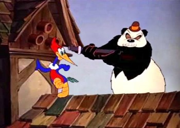
A frame from Knock Knock.
the first Woody cartoon.
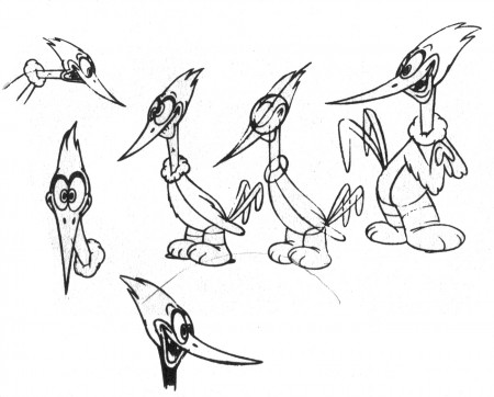
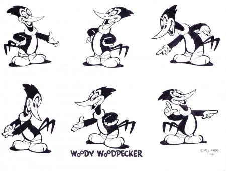
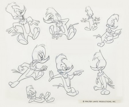
As I think I wrote previously on this blog, I’ve had a love/hate relationship with Woody Woodpecker. I truly love those very first Woody cartoons. However, I think there were too many changes. The most aggressive for me, and where I think they started to go wrong, was with the Shamus Culhane version of the character. Shamus, inspired by the films Tex Avery was doing at MGM and Bob Clampett was doing at Warner Bros, moved the pace up to a chaotic breakneck speed. The design of the character became more stylized and, in many ways, cuter. The number of lines on his body became fewer as did the number of colors on the character. The straight, chisel-like bill developed a curving roundness.
But don’t get me wrong. This design as well as the violent speed is enjoyable in each of the individual films; it’s alluring and attractive. However, it’s also a turn that could never be recalled.
 8
8
Dick Lundy‘s Woody was cuter, less manic and rounder, and the pace of the films slowed down a bit. Still theirs was an attempt to keep up with what Warner Bros. cartoons were doing in the late 40′s. Once Tex Avery moved over to Lantz’ studio, his attention was on the lesser characters like Chilly Willy or on the one-off specials. Design-wise, he followed the direction of UPA, bringing sharp-angled, flat stylization to the backgrounds and characters.
 10
10 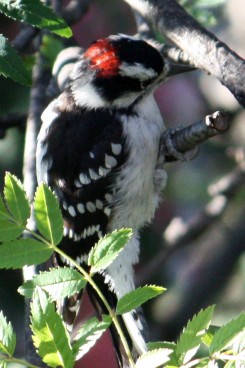 11
11At first Woody began as a zany character in the early Bugs Bunny/Daffy Duck mold. Just as Bugs eventually transformed into a variant of Mickey Mouse, so too did Woody. Interesting that the Disney people always complained that there wasn’t much they could do with Mickey, yet two other studios fashioned their characters to impersonate Mickey’s personality.
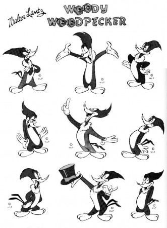
Freddy Moore, the Mickey specialist, drew
this version of Woody for Walter Lantz.
(Borrowed from The Walter Lantz Story by Joe Adamson.)
By the time Woody had hit the 60s, it was DOA. The design of the character was just bad, there was no real style to the shorts, and the stories were poor and poorly animated. Whereas Hanna Barbera had found something strong in some solid limited animation making early Huckleberry Hound and Yogi Bear shorts and, especially, the early Flintstones strong examples of a new brand of animation for TV, Lantz had turned flat (meaning dull) with the worst of limited animation. The films being made at the end of Lantz’ run were just not good, and the studio’s soutput was not missed when they finally stopped making shorts.
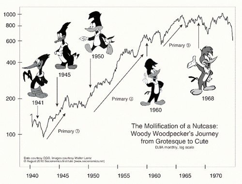
A chart I saw on line, no credjt was found.
Animation &commercial animation &Frame Grabs &Hubley 13 Aug 2012 05:28 am
Hubley Bumper – recap
- Last week, Emily Hubley told me that some people up at WNET (previously WNDT), the local PBS chapter, saw this piece on my blog. They were hoping to get copies of the Hubley spots to show in celebration of their upcoming 50th anniversary. It’ll be great to see these films alive again.
Here’s my post on a couple of the films.
 - One of my all time favorite pieces of Hubley animation was a station ID for WNDT-TV, New York’s public service station back in the 60′s. I thought of this spot last week when I posted the piece about Stanley Kaufman’s Art of Film for that station. It ultimately became WNET, NY’s PBS channel 13.
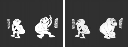
This spot was undoubtedly animated by Bill Littlejohn, and I think it’s one of his finest pieces. The timing is excellent. He obviously animated straight ahead; the characters distort and morph to the needs of the animation. It’s a full 2mins: 40 secs, so it would qualify as a short film these days,
The piece ran in B&W. It employed the multiple exposure technique. The characters had black paint filling everything but the animation drawing. This was double exposed over the BG, hence a see-through quality to the characters. This technique was used on Moonbird, The Hole, Of Stars and Men and several other Hubley shorts.
Here are some frame grabs of the spot.
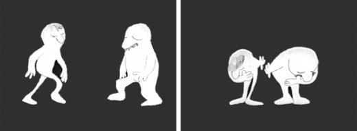
The two guys come out on to the stage and take a bow.
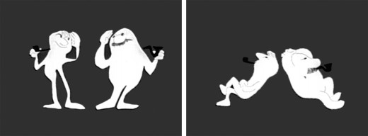
They greet each other, light up and sit down.
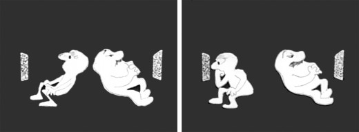
A little bored, they both turn on TV’s. The little guy gets involved.
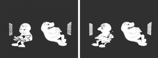
He takes out a book and takes notes comparing it with what’s going on his TV.
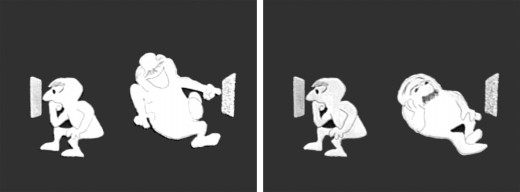
He goes back to watching. The big guy laughs at something until he gets bored again.
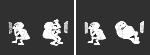
The big guy practices some wrestling moves until that gets dull.
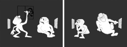
Little guy does some brush painting. Big guy laughs again.
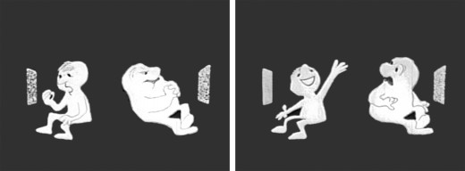
Little guy practices Russian. The big guy gets annoyed.
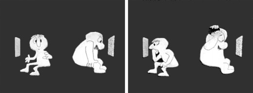
The big guy takes out a comb and starts combing until . . .
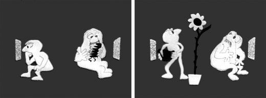
.. he has grease all over his head. The little guy grows a plant.
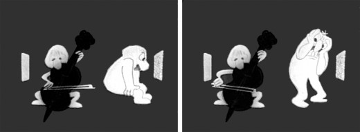
The little guy takes out a cello and starts to play. This annoys the big guy.
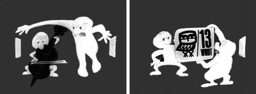
He pulls up the little guys screen. Public Television !
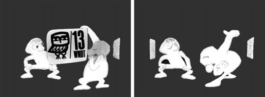
Embarrassed, he bows to the “Arts” station.
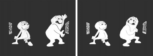
He turns to it on his own TV. He’s planning for something great.
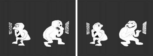
They watch intently until the big guy makes sure little guy knows he’s still watching.
“Brain food” They watch intently.
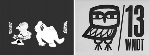
The big guy falls asleep while the little guy goes back to his book. Dissolve to station card.
I love how the shapes of the characters shift and distort and change throughout the piece always coming back to the original models. This is a sure sign of straight ahead animation, and it almost makes the acting feel like an improvisation exercise by two actors. It supercedes animation and becomes acting.
The obviously loose time of the piece shows that the animator was probably given a lot of leeway with his timing, and he took it. As I said, I have no proof that Bill Littlejohn animated it, but I’ve never doubted it for a moment. It’s certainly as much his style as it is Hubley’s.
That is the odd thing about working for a director with a strong personality. I remember the day that I looked at one of my drawings and realized that it looked like one of my drawings, but there was no doubt it was a Hubley. Something happens, and you just end up drawing in their style.
Animation &Animation Artifacts &Chuck Jones &Frame Grabs &Layout & Design &repeated posts 06 Aug 2012 06:38 am
Conrad – again
I repeat this post for good reason. This is one of the prime films John McGrew planned for Chuck Jones, and the work is just dazzling. However, to our eyes it hardly looks unusual. Many of the tricks here were done for the first time, and others are so seamlessly done that we hardly notice them. It just looks like another War cartoon from WB. It ain’t.
It’s special.
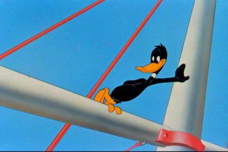
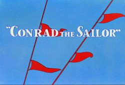 - Regulars to my blog know that I’m a big fan of the work of John McGrew. He was a designer/Layout Artist working in Chuck Jones’ crew at Warner Bros. in the late Thirties/early Forties. His work was daring beyond compare, and, I think, with support from Jones, he changed the look of modern animation backgrounds.
He designed the seminal film The Dover Boys as well as amazing pieces like Aristo-Cat, Inki and the Lion and Conrad the Sailor.
In an interview conducted by Greg Ford and RIchard Thompson, Chuck Jones was asked about McGrew’s style: 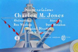
- Q: What about John McGrew’s style and approach, as compared with Noble’s?
A: John McGrew didn’t really have a style; he was experimenting all the time. Maurice does have a style. John McGrew, you might say, was more of an intellectual. You could be intellectual, and get away with it— but if you’re solely intellectual as a director, you weren’t going to get away with it. The result was, however, that he goosed me into thinking that it might be worthwhile to try some different things with backgrounds and so forth. And later on, I would find this kind of thing very useful, in that often it would make your gag work, and sometimes you wouldn’t even know why. Like that little abstract background at the end of Duck Amuck, with the sharply angled lines going off.
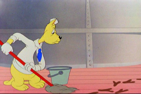
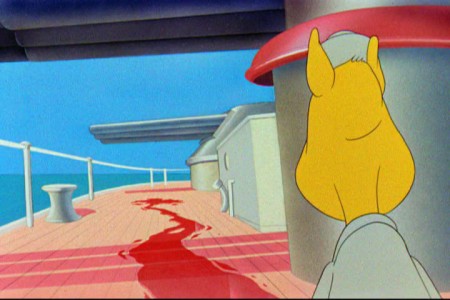
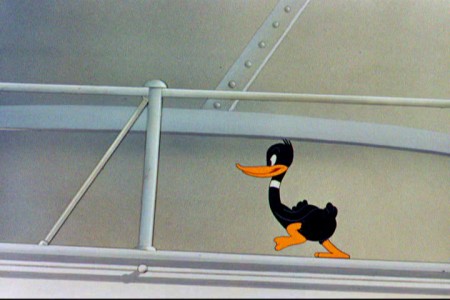
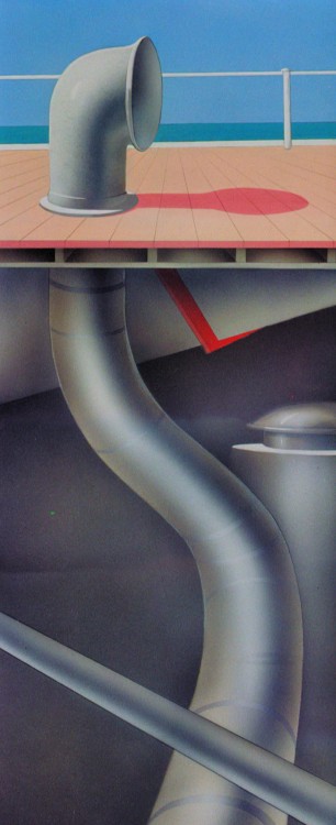
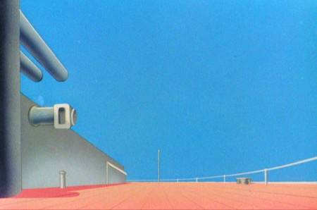
Today I’d like to feature some frame grabs from Conrad the Sailor. Where I could, I separated the characters from the backgrounds to just feature the Bgs. My guess is that the Bgs were painted by Paul Julian, but they were planned by McGrew.
The one scene I don’t illustrate is the most original in the film. Daffy is shot into the air with a bullet. (illus #18) The camera does a 360° turn to head back to the ship. The Bgs don’t hold up on their own. Lots of blue sky and wisps of cloud. It works in motion.
Of this short & McGrew, Jones says:
- . . . we used a lot of overlapping graphics on that particular cartoon so that one scene would have the same graphic shape as an earlier scene, even though it would be a different object: first we’d show a gun pointing up in the air, then in the next shot, there’d be a cloud in exactly the same shape. It gave a certain stability which we used in many of the cartoons after that. John McGrew was the artist responsible for that sort of thing. Conrad was also the one where we used the first complete 360° turn, when the characters went up through the air.
For more information read Mike Barrier’s excellent interview with John McGrew.
 1
1(Click any image to enlarge.)
The following BG pan can be seen in full to the left. I’ve broken it into three parts for a closer look.

 12a
12a .
.
———-(Continue scrolling down.)
.
.
.
.
.
.
.
.
.
.
 13
13
 15
15
A bicycle pan that keeps moving to the left.
 16
16
Continue moving right to left.
And here’s the cartoon.
Pay attention to the Layout in the sky from 6’25″ to the end.
It’s amazing.
Action Analysis &Animation Artifacts &Disney &Frame Grabs &repeated posts 31 Jul 2012 05:12 am
Elmer Elephant X-Sheets – recap
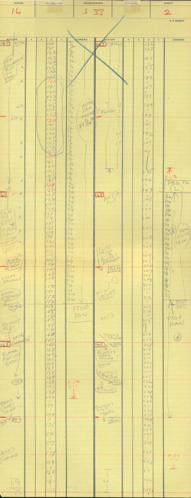
- This old post on Exposure Sheets was a popular one back in March, 2009. Today most animators work with the track and no track reading or record of the moves they’ve done. It’d be a nightmare to try to reconstruct what they’ve done in a scene. All we now have to go on is the completed scene. A lot is lost in the history of animation being done today. For that reason, I thought it’d be nice to take a look at all we can learn from one simple X-Sheet.
Robert Cowan sent me an exposure sheet that was tucked into an envelope in the Ingeborg Willy Scrapbook, which he owns. (Ingeborg Willy was an inker working at Disney’s during the 30′s and made a photographic scrapbook of her stay.)
The sheet is from the Silly Symphony, Elmer Elephant (1935).
(Click any image to enlarge.)
The film’s about a bunch of baby animals.
Elmer is the shy kid who gets laughed at by the other kids.
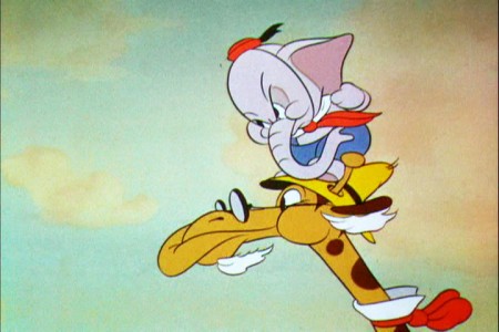
Eventually with the help of an old giraffe he saves the day by putting out a fire …
This exposure sheet is about a sequence wherein Elmer is pushed across a row of animals and is poked and prodded in absolute humiliation.
Let’s review what’s on the sheet for the completely unitiated viewer:
There are several columns: Action, 4,3,2,1 and camera.
These are basic to all X-sheets. Sometimes you get 5 numerals, oftentimes you get a column for Bg. Uusaly there’s also a Track column.
Below these descriptives you have lines. Each light blue line represents one frame of film. If the drawing’s on twos or threes or more it’s indicated as in #149. Other numbers are on ones – one frame per drawing.
In the “Action” column, the director writes notes telling where he wants some action to happen. For example: the director has noted that he wants Elmer to try to stop his turn from frames 32 through 49. The animator will follow this as best as possible.
The numbered columns represent cel levels. #1 is the bottom cel and #4 is the top cel. Most sheets also have a column for the Background so you know what number Bg is called for.
The “Camera” column indicates any special camera movements or effects. There we see a pan. The Bg is moving from screen right to left. The actual amount of the physical movement is indicated on every frame. 1/2 is a half inch, 1/4 is a quarter inch etc. Pans usually slow down as they come to a stop and gear up when they start out. This is why it goes from 1/2 to 3/8 to 1/4 to 3/16 to 1/8 to 1/16 before you reach STOP PAN.
You’ll see the sound track indicated at red marked 163 top line middle of the sheet. A character is saying, “Bye Elmer.” The actual number of frames it takes is broken down for you. The animator would animate the mouth accordingly.
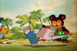
Here are frame grabs for the part exposed.
 1
1 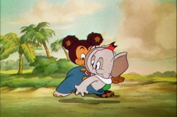 2
2
Let’s analyze the exposure sheet a bit. (For those not familiar with X-sheets, I have more of a breakdown below.)
First off, for me it’s an oddity. There seem to be two sheets combined onto the one. It’s split down the middle into two full sheets – all using only one cel level.
Secondly, there are some highlighted numbers – 160 through 165.
These fall at every 32nd frame. I’m not sure why. It’s not a foot (16 frames) or a second (24 frames). Is it a beat? I notice that the action calls for “ACC” at each of these markings. I assume it stands for “Accent” which would make that part of a musical tempo. Every 16th frame is also marked in red. This would be the only indication that this is what it is.
The pan moves are indicate in FRACTIONS ! I’m not sure why since it created a difficult transposition to decimals for the camera operator. I mean 3/8 of an inch equals what? Quickly now. Time is money. How about 1/16th? I have only met fractions which divided into 20ths. When did the change come in? John Oxberry, anyone?
Of course, some master checker would probably do the math before the scene got to camera.
Some of the drawings are exposed on twos, even for a short bit during the pan. This would be anathema in modern day animation, yet it hasn’t gotten better.
The track reading isn’t the most detailed I’ve seen, yet it does the job, doesn’t it?
The film is directed by Wilfred Jackson. I assume the “Action” column was filled out by him. I think the animation was by Paul Hopkins.
There’s a lot of information that can be pulled out from this one exposure sheet of a film done 73 years ago. Is that enough reason to advocate for continued use of the Exposure Seet?
