Category Archiverepeated posts
Animation &Animation Artifacts &Chuck Jones &Frame Grabs &Layout & Design &repeated posts 06 Aug 2012 06:38 am
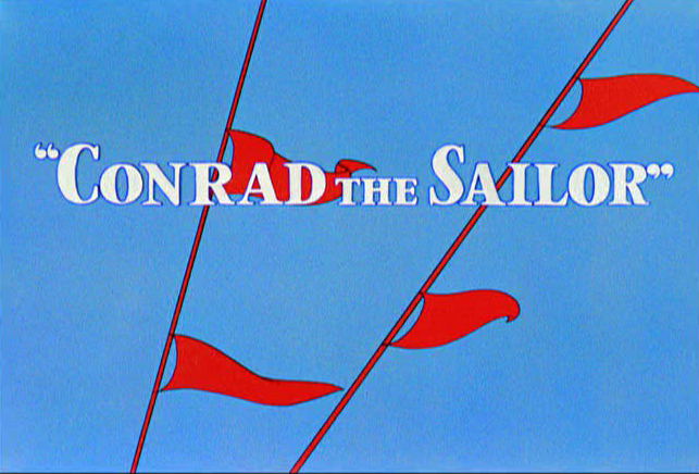
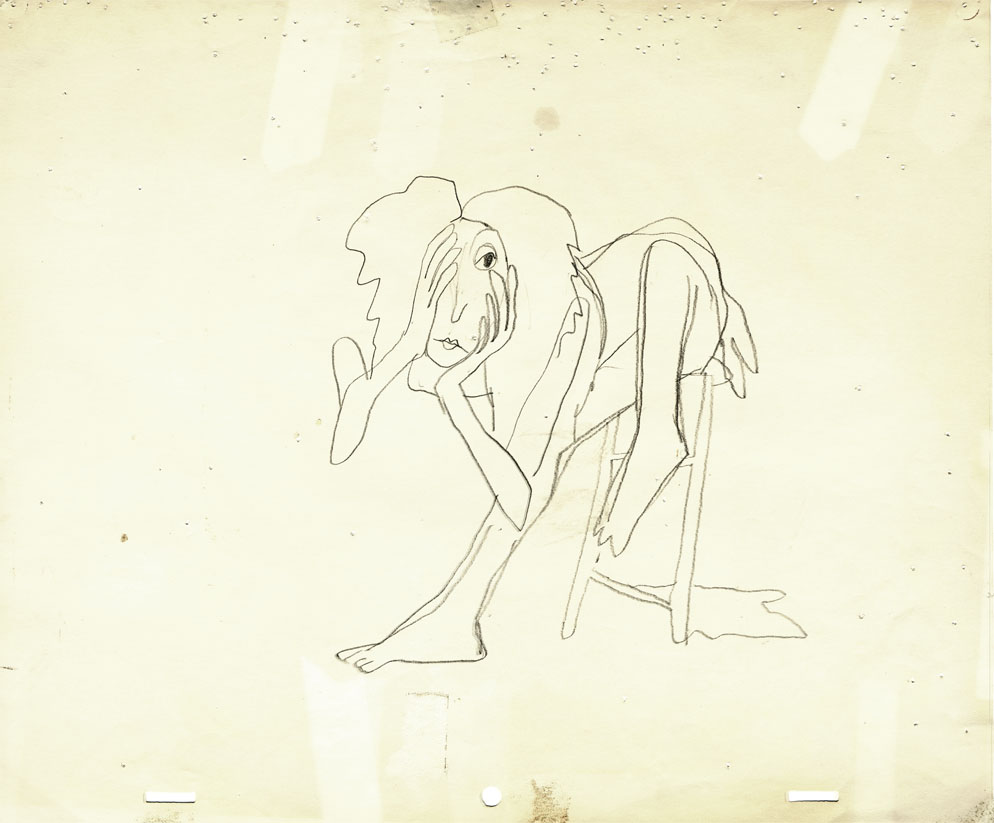
Conrad – again
I repeat this post for good reason. This is one of the prime films John McGrew planned for Chuck Jones, and the work is just dazzling. However, to our eyes it hardly looks unusual. Many of the tricks here were done for the first time, and others are so seamlessly done that we hardly notice them. It just looks like another War cartoon from WB. It ain’t.
It’s special.
 - Regulars to my blog know that I’m a big fan of the work of John McGrew. He was a designer/Layout Artist working in Chuck Jones’ crew at Warner Bros. in the late Thirties/early Forties. His work was daring beyond compare, and, I think, with support from Jones, he changed the look of modern animation backgrounds.
He designed the seminal film The Dover Boys as well as amazing pieces like Aristo-Cat, Inki and the Lion and Conrad the Sailor.
In an interview conducted by Greg Ford and RIchard Thompson, Chuck Jones was asked about McGrew’s style: 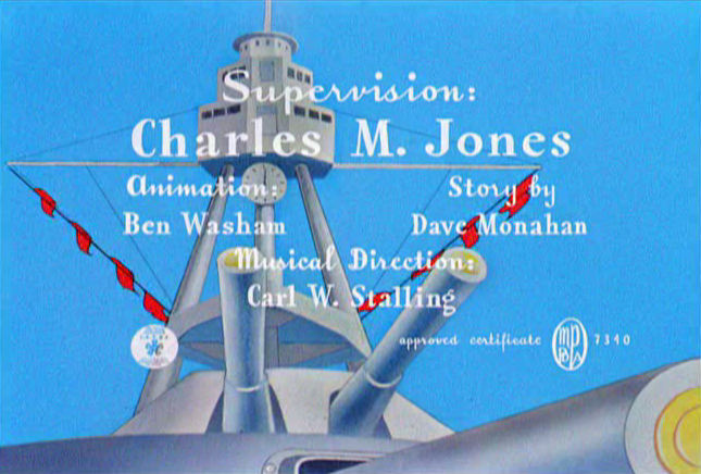
- Q: What about John McGrew’s style and approach, as compared with Noble’s?
A: John McGrew didn’t really have a style; he was experimenting all the time. Maurice does have a style. John McGrew, you might say, was more of an intellectual. You could be intellectual, and get away with it— but if you’re solely intellectual as a director, you weren’t going to get away with it. The result was, however, that he goosed me into thinking that it might be worthwhile to try some different things with backgrounds and so forth. And later on, I would find this kind of thing very useful, in that often it would make your gag work, and sometimes you wouldn’t even know why. Like that little abstract background at the end of Duck Amuck, with the sharply angled lines going off.
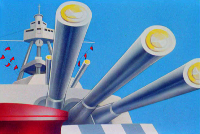
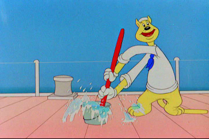
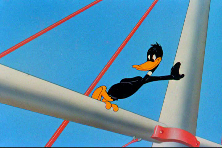
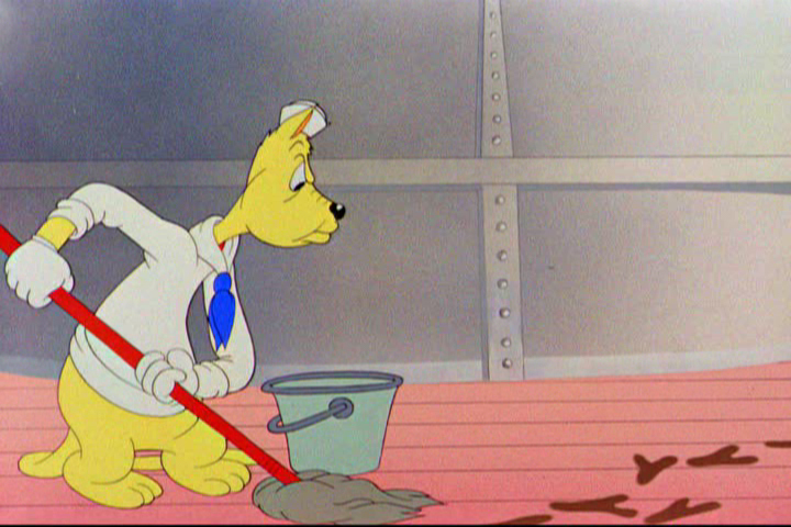
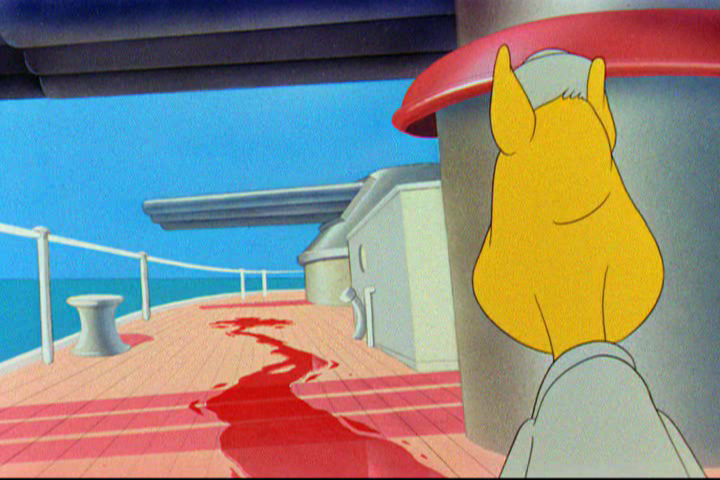
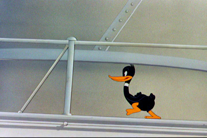
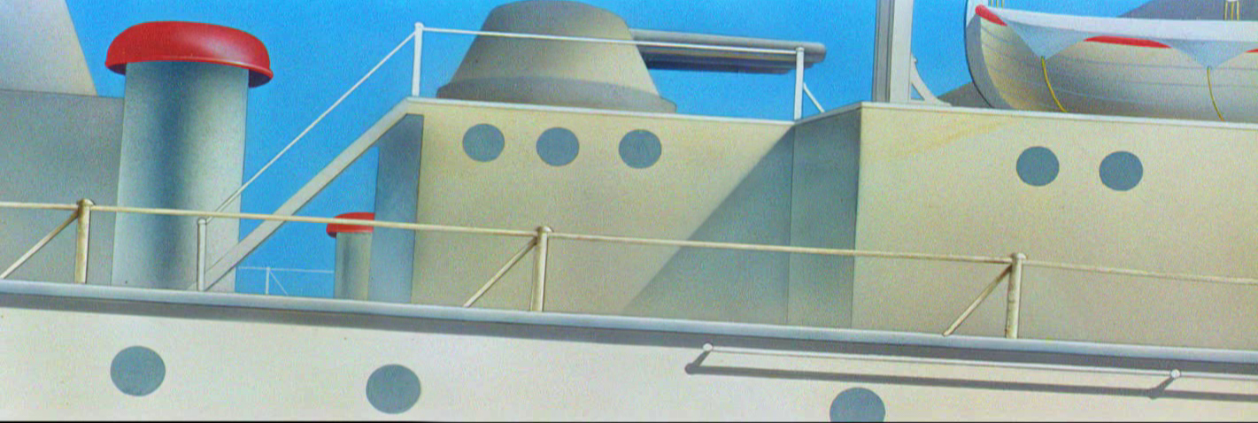
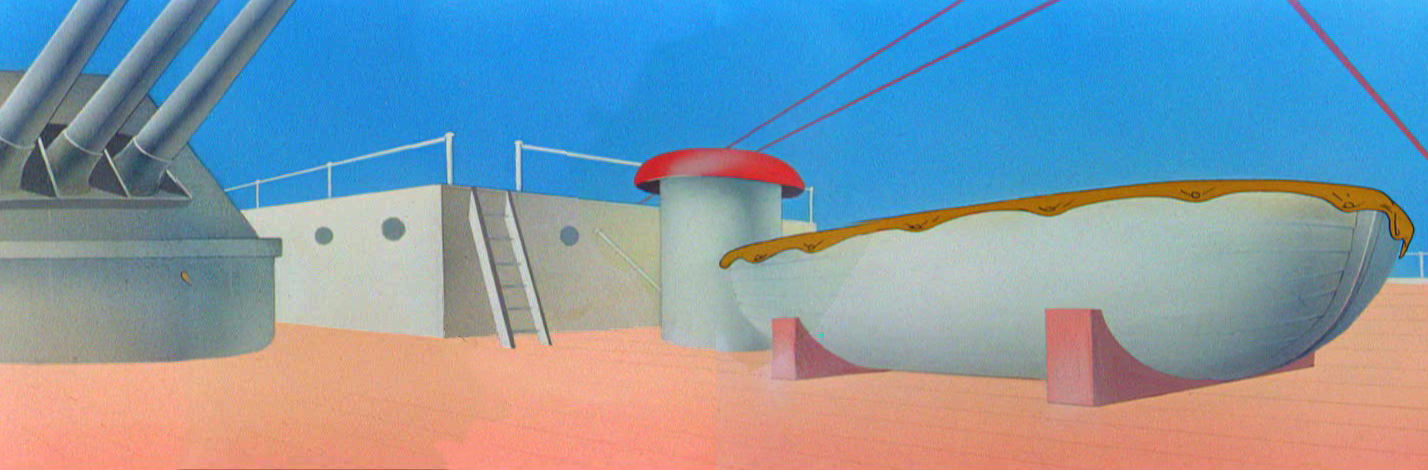
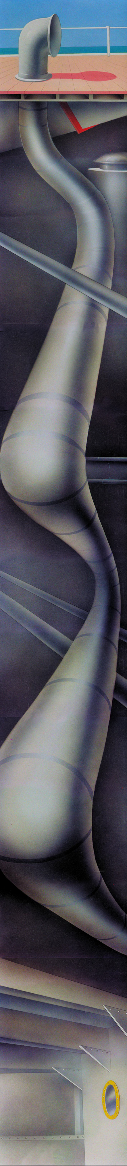
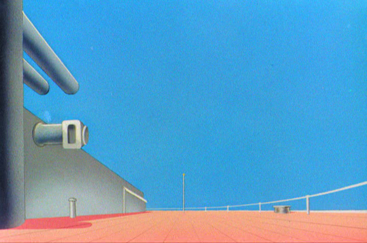
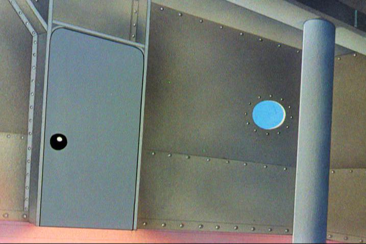
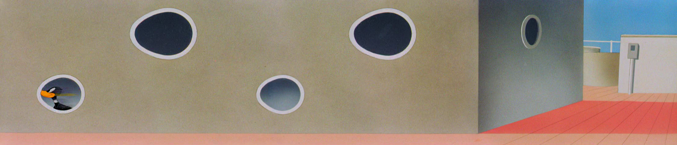
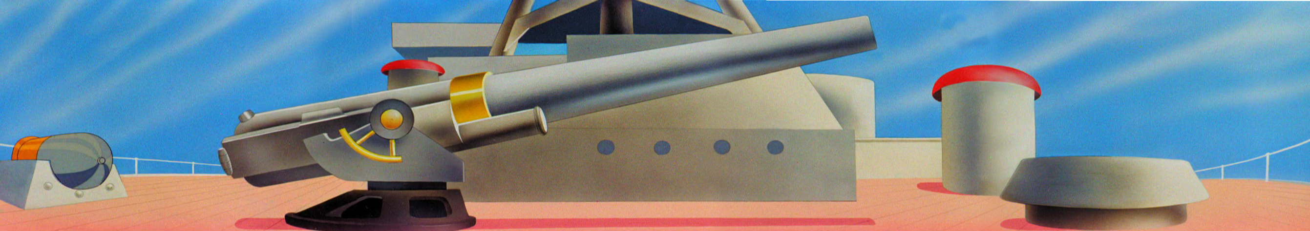
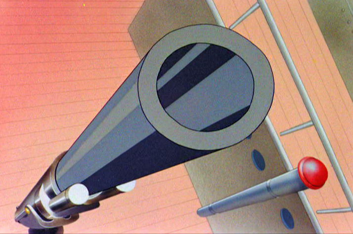
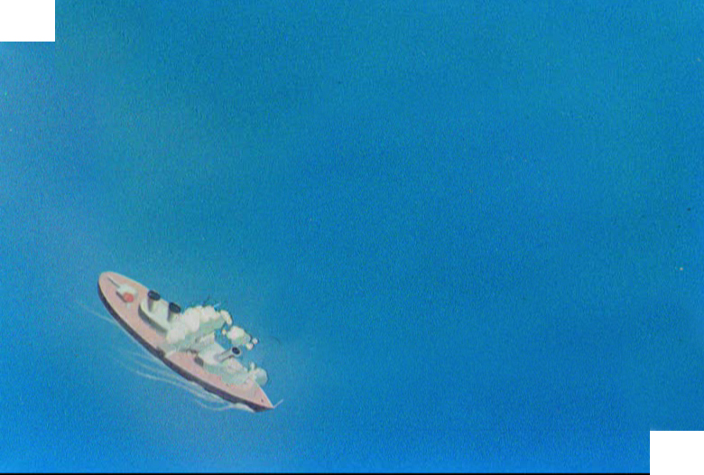
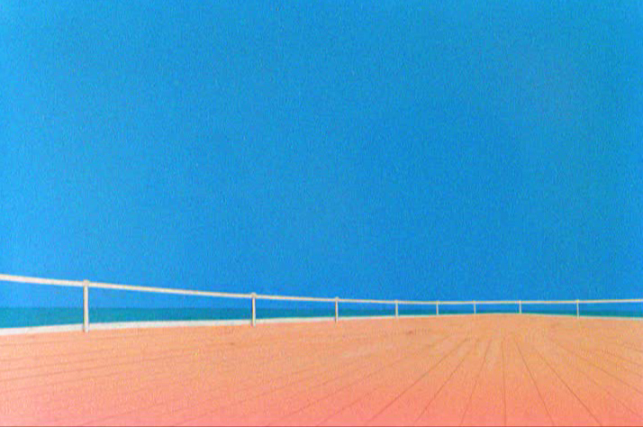
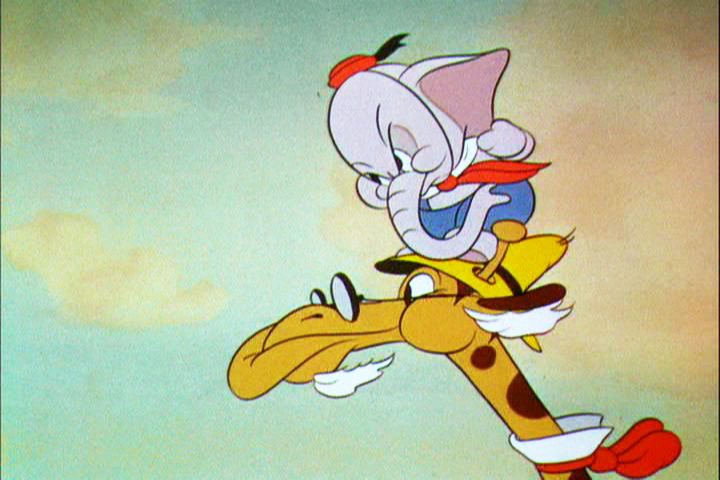
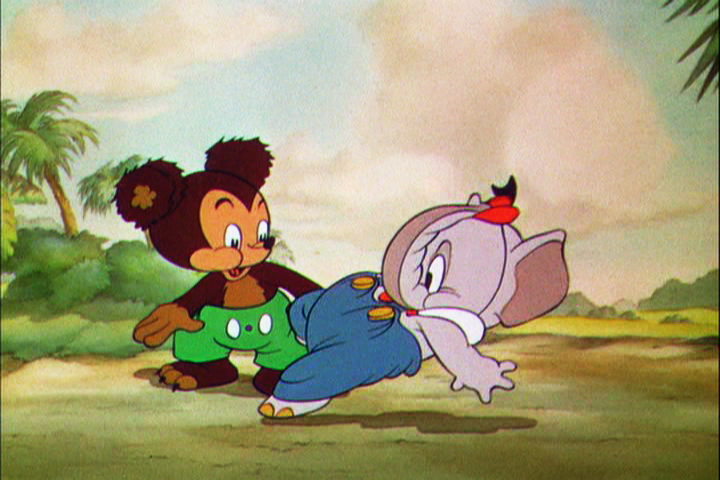
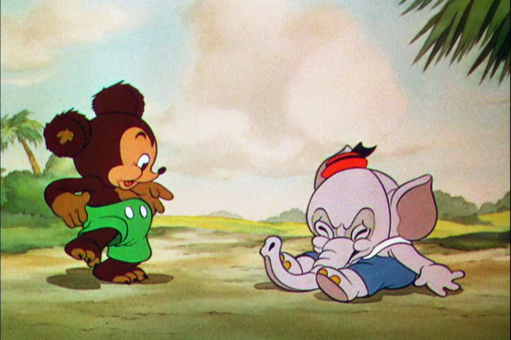
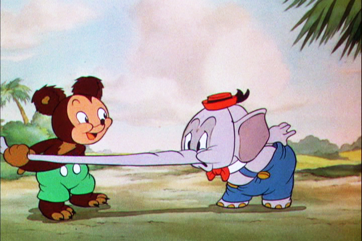
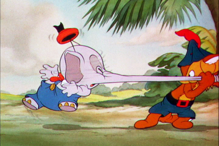
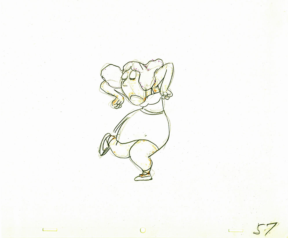
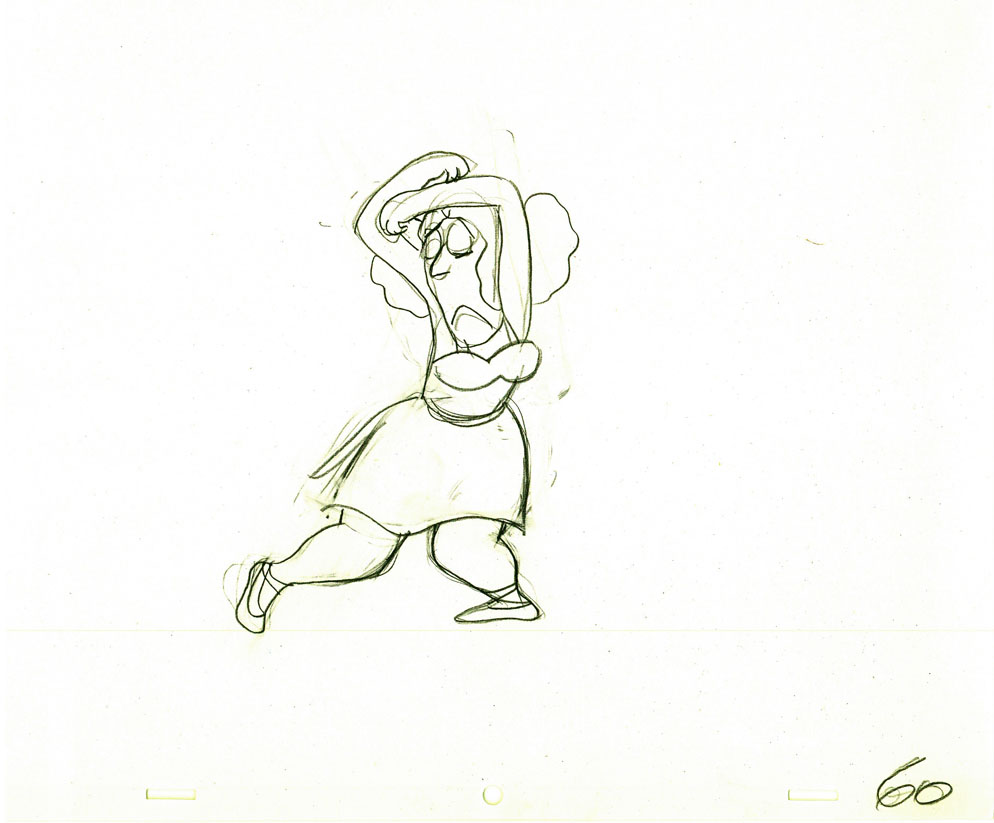
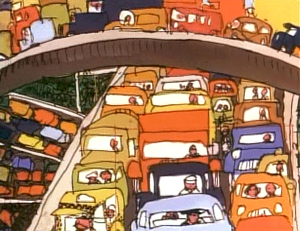
Today I’d like to feature some frame grabs from Conrad the Sailor. Where I could, I separated the characters from the backgrounds to just feature the Bgs. My guess is that the Bgs were painted by Paul Julian, but they were planned by McGrew.
The one scene I don’t illustrate is the most original in the film. Daffy is shot into the air with a bullet. (illus #18) The camera does a 360° turn to head back to the ship. The Bgs don’t hold up on their own. Lots of blue sky and wisps of cloud. It works in motion.
Of this short & McGrew, Jones says:
- . . . we used a lot of overlapping graphics on that particular cartoon so that one scene would have the same graphic shape as an earlier scene, even though it would be a different object: first we’d show a gun pointing up in the air, then in the next shot, there’d be a cloud in exactly the same shape. It gave a certain stability which we used in many of the cartoons after that. John McGrew was the artist responsible for that sort of thing. Conrad was also the one where we used the first complete 360° turn, when the characters went up through the air.
For more information read Mike Barrier’s excellent interview with John McGrew.
 1
1(Click any image to enlarge.)
 4
4
 5
5
 6
6
 7
7
 8
8
 9
9
 10
10
 11
11
 12
12
The following BG pan can be seen in full to the left. I’ve broken it into three parts for a closer look.
 12a
12a .
.
———-(Continue scrolling down.)
.
.
.
.
.
.
.
.
.
.
 12b .
12b . 12c
12c
 13
13
 14
14
 15
15
A bicycle pan that keeps moving to the left.
 16
16
Continue moving right to left.
 17
17
 18
18
 19
19
 20
20
 21
21
 22
22
And here’s the cartoon.
Pay attention to the Layout in the sky from 6’25″ to the end.
It’s amazing.
Photos &repeated posts 05 Aug 2012 07:41 am
Snow Again – recap
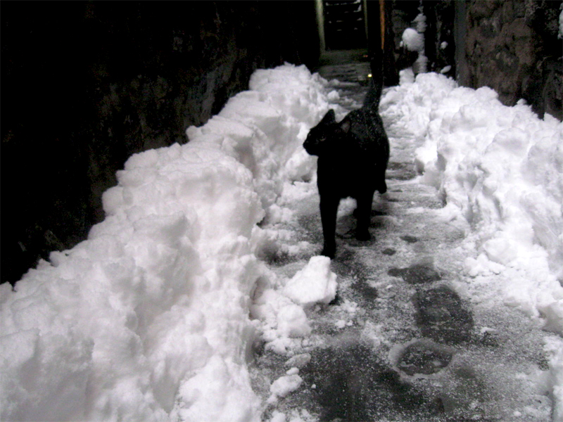
With all the weather we’ve been having lately, I had to laugh at this post from Feb., 2010. There’s more to it, really. When I moved out of my office space, I moved Robbie into my home – a one bedroom apartment where 2 cats already lived and had made peace with each other. Robbie’s a big guy, but he’s not the alpha male. Alex is. We expected raging battles, but no. The 2 boys act like long lost brothers. They fight every day for fun (lotsa flying fur.) It’s the girlio, Lola, who is the problem. She gets along fine with Alex, but if she SEES Robbie she turns into a screaming banshee waking our entire building and the ghosts that live in our walls. She’s taken private residence in the bedroom and the rest of us (excepting, of course, Robbie) have to pay homage a couple of times a day. Oh, for the problems of animation!
Anyway, here’s February, 2010 and Robbie’s romp in the snow.
- Sorry folks, but I just can’t help myself when it comes to big snowfalls. We had about 12″ this week, so that seemed a lot to me. The newscasters were saying upwards of 20″, but they’re always fulla crap.
 1
1  2
2On the left you can see the weather at the end of Thursday.
On the right it’s the start of the new day, Friday.
 3
3
On Thursday night, going home it was a mess. It had rained all day
sort of a soupy, slushy mess of wet goo. Every corner had about a
foot of water you had to step in, around or through to get across
the street. Let me tell you it gets annoying.
 4
4
I walked across Bleecker Street heading toward the subway, at
about 7pm. It looks nice here, but it was a wet mess.
By the way, I couldn’t help leaving the blue/greenish tint to the snow
caught in these photos. The street lights at night give it that tone.
 5
5  6
6
The colors remind me of those the Disney BG artists painted snow in a Donald cartoon
where he fights his nephews in a snowball fight. Donald’s Snow Fight.
 7
7
The snow was wet wet wet and heavy.
 8
8
By 5:30 the next morning there was a different picture as I left
my apartment on 30th Street. This was the height of the storm.
Big thick, fluffy snowflakes everywhere.
 9
9
Here’s Park Avenue. No cars in sight. It was impossible driving,
though a bus crawled past me at one point.
 10
10
The over-busy construction site was drawn to a lull.
 11
11
 12
12
This was Bleecker Street from the vantage point of the
old Portuguese Church on Carmine Street.
 13
13 14
14
Across from the church are two planters full of tiny trees.
 15
15
Here’s the view of my studio street, Bedford Street.
 16
16
Looking down the block toward my tiny sign.
 17
17
I was the last person to see the entrance steps look like this.
I cleared each step as I walked down.
 18
18
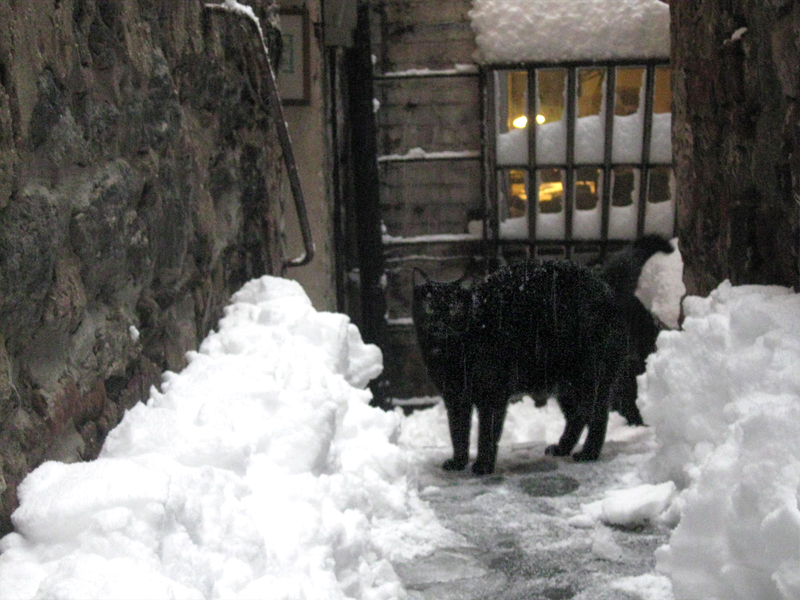
I went inside and put my things away and went out to shovel.
My boy Robbie came out to keep me company and try to
figure out what had happened.
 19
19
He kept going out all morning and coming back in covered
with wet snow. I regret I didn’t call him Snowball.
Action Analysis &Animation Artifacts &Disney &Frame Grabs &repeated posts 31 Jul 2012 05:12 am
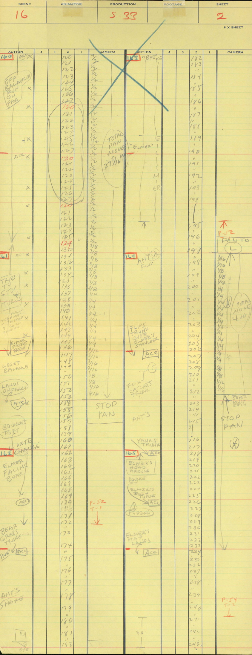
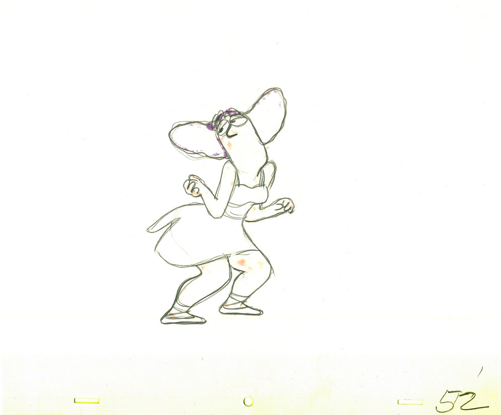
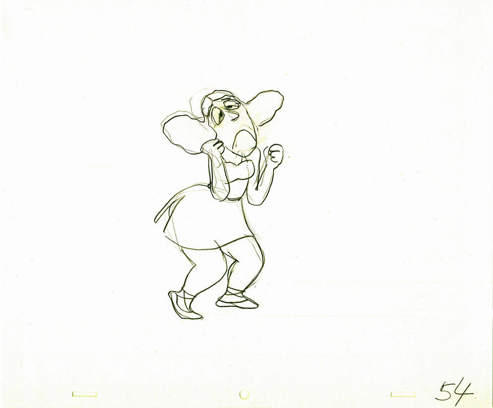
Elmer Elephant X-Sheets – recap
- This old post on Exposure Sheets was a popular one back in March, 2009. Today most animators work with the track and no track reading or record of the moves they’ve done. It’d be a nightmare to try to reconstruct what they’ve done in a scene. All we now have to go on is the completed scene. A lot is lost in the history of animation being done today. For that reason, I thought it’d be nice to take a look at all we can learn from one simple X-Sheet.

Robert Cowan sent me an exposure sheet that was tucked into an envelope in the Ingeborg Willy Scrapbook, which he owns. (Ingeborg Willy was an inker working at Disney’s during the 30′s and made a photographic scrapbook of her stay.)
The sheet is from the Silly Symphony, Elmer Elephant (1935).
(Click any image to enlarge.)
The film’s about a bunch of baby animals.
Elmer is the shy kid who gets laughed at by the other kids.
Eventually with the help of an old giraffe he saves the day by putting out a fire …
… and winning the girl.
This exposure sheet is about a sequence wherein Elmer is pushed across a row of animals and is poked and prodded in absolute humiliation.
Let’s review what’s on the sheet for the completely unitiated viewer:
There are several columns: Action, 4,3,2,1 and camera.
These are basic to all X-sheets. Sometimes you get 5 numerals, oftentimes you get a column for Bg. Uusaly there’s also a Track column.
Below these descriptives you have lines. Each light blue line represents one frame of film. If the drawing’s on twos or threes or more it’s indicated as in #149. Other numbers are on ones – one frame per drawing.
In the “Action” column, the director writes notes telling where he wants some action to happen. For example: the director has noted that he wants Elmer to try to stop his turn from frames 32 through 49. The animator will follow this as best as possible.
The numbered columns represent cel levels. #1 is the bottom cel and #4 is the top cel. Most sheets also have a column for the Background so you know what number Bg is called for.
The “Camera” column indicates any special camera movements or effects. There we see a pan. The Bg is moving from screen right to left. The actual amount of the physical movement is indicated on every frame. 1/2 is a half inch, 1/4 is a quarter inch etc. Pans usually slow down as they come to a stop and gear up when they start out. This is why it goes from 1/2 to 3/8 to 1/4 to 3/16 to 1/8 to 1/16 before you reach STOP PAN.
You’ll see the sound track indicated at red marked 163 top line middle of the sheet. A character is saying, “Bye Elmer.” The actual number of frames it takes is broken down for you. The animator would animate the mouth accordingly.
Here are frame grabs for the part exposed.
 1
1  2
2
 3
3 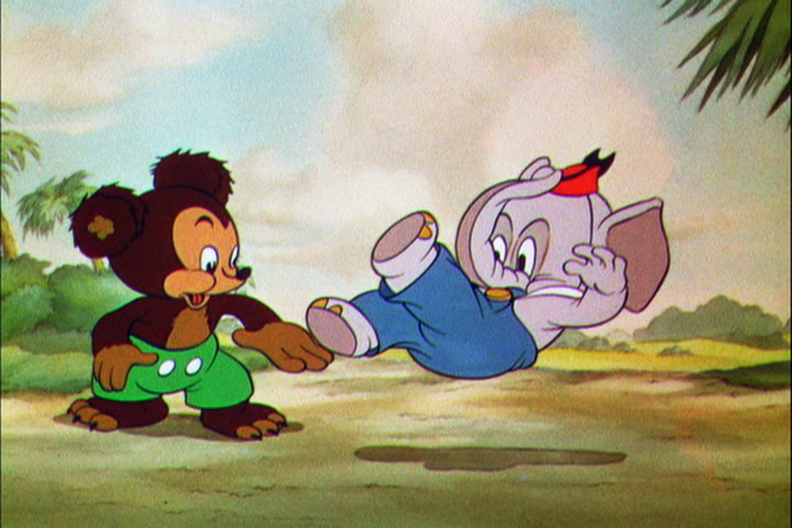 4
4
 5
5 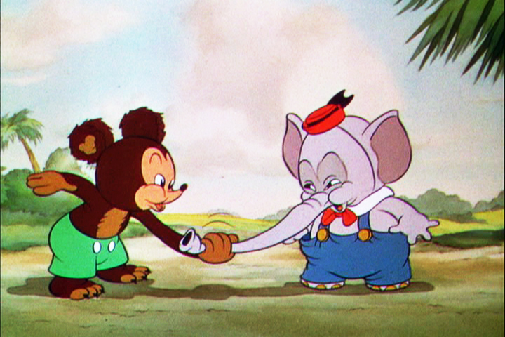 6
6
 7
7 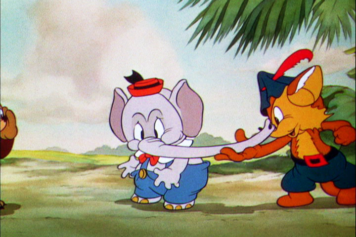 8
8
 9
9 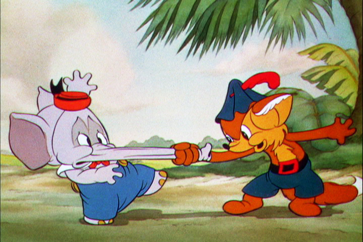 10
10
Let’s analyze the exposure sheet a bit. (For those not familiar with X-sheets, I have more of a breakdown below.)
First off, for me it’s an oddity. There seem to be two sheets combined onto the one. It’s split down the middle into two full sheets – all using only one cel level.
Secondly, there are some highlighted numbers – 160 through 165.
These fall at every 32nd frame. I’m not sure why. It’s not a foot (16 frames) or a second (24 frames). Is it a beat? I notice that the action calls for “ACC” at each of these markings. I assume it stands for “Accent” which would make that part of a musical tempo. Every 16th frame is also marked in red. This would be the only indication that this is what it is.
The pan moves are indicate in FRACTIONS ! I’m not sure why since it created a difficult transposition to decimals for the camera operator. I mean 3/8 of an inch equals what? Quickly now. Time is money. How about 1/16th? I have only met fractions which divided into 20ths. When did the change come in? John Oxberry, anyone?
Of course, some master checker would probably do the math before the scene got to camera.
Some of the drawings are exposed on twos, even for a short bit during the pan. This would be anathema in modern day animation, yet it hasn’t gotten better.
The track reading isn’t the most detailed I’ve seen, yet it does the job, doesn’t it?
The film is directed by Wilfred Jackson. I assume the “Action” column was filled out by him. I think the animation was by Paul Hopkins.
There’s a lot of information that can be pulled out from this one exposure sheet of a film done 73 years ago. Is that enough reason to advocate for continued use of the Exposure Seet?
Animation &Animation Artifacts &Hubley &repeated posts 30 Jul 2012 04:55 am
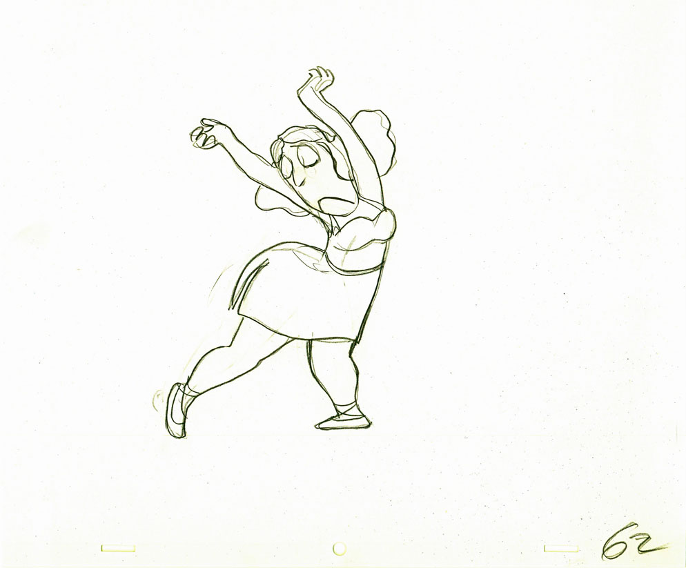
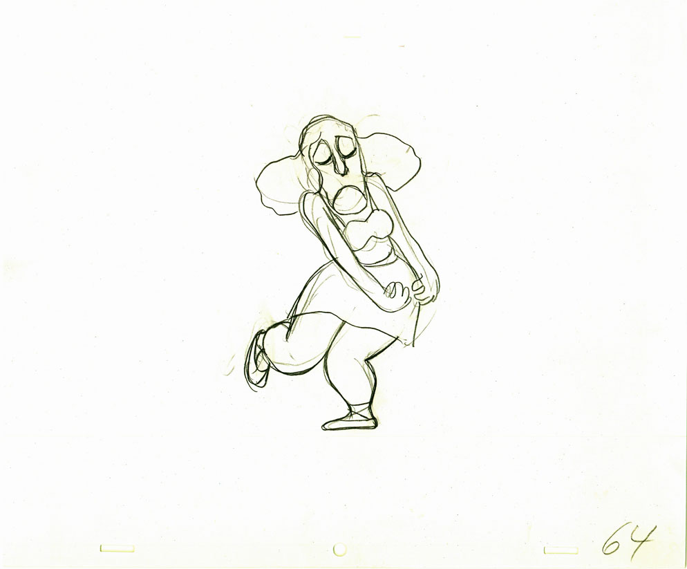
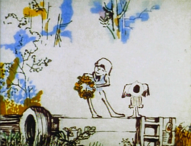
Tissa’s Glad Gladys – revisited
-Tissa David animated a lot of the Electric Company pieces for John Hubley. Hubley would design and write the spots, and he would get some real pros to do the tracks. In the case of this film, I believe it was the jazz legend, Billy Taylor, who wrote the music and did so for a number of Hubley’s Electric Co. films.
I’d like to post John Hubley’s LO drawings and follow it up with a few of Tissa’s animation drawings. John would usually do the loosest of layout drawings – usually in the presence of the animator as part of a discussion – and then hand it off to this person he trusted. Of course, the more he trusted the animator, the less he had to do in the LO.
In the case of this spot, Tissa received the following drawing. (That’s right ONE drawing.)
(If you click any the image, you’ll
reveal the full sized animation drawing.)
Enlarge the image, and you’ll notice tape marks and pin holes where Tissa attached it to her wall.
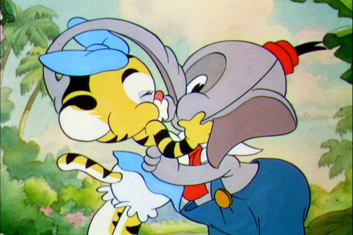
Here’s a short sequence of drawings done by Tissa. The missing mouths are on a separate level. This piece is built on reuse done artfully.
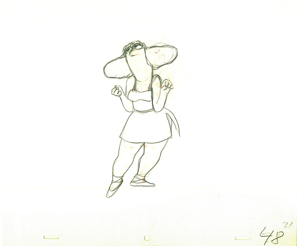 48 49
48 49
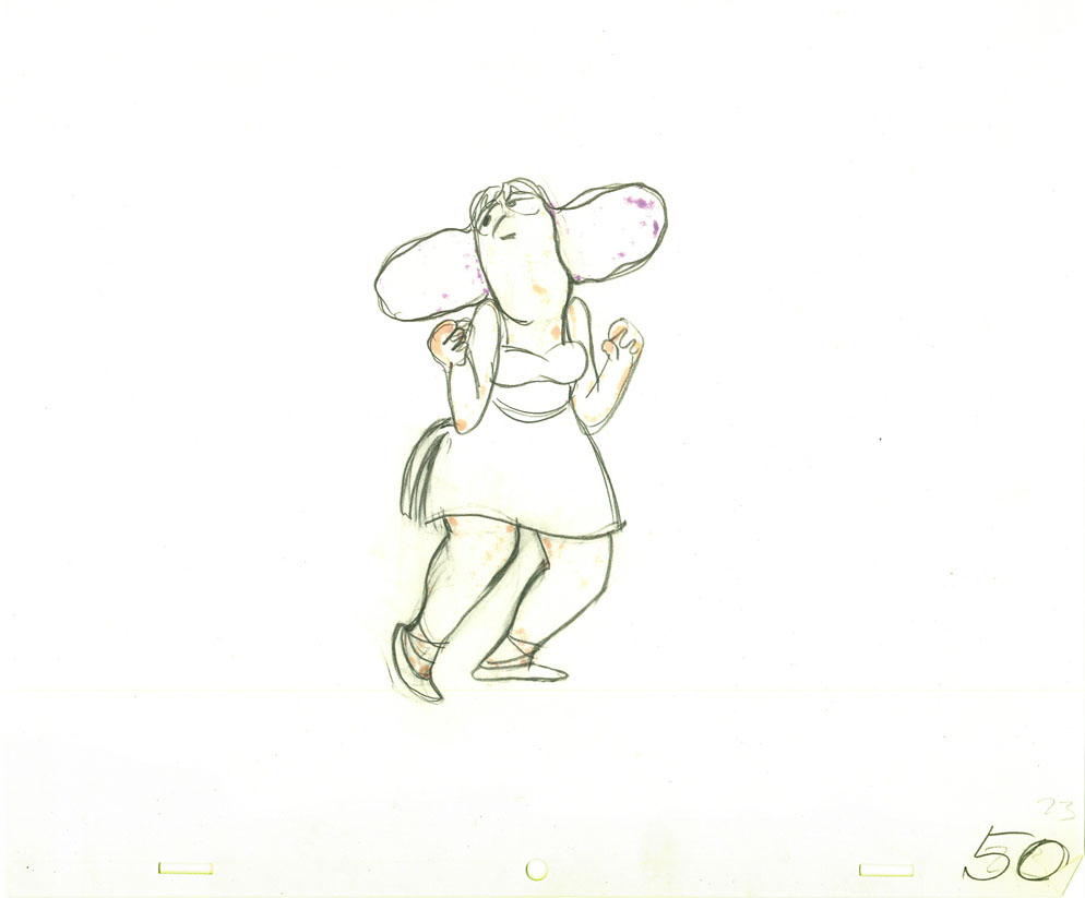 50
50 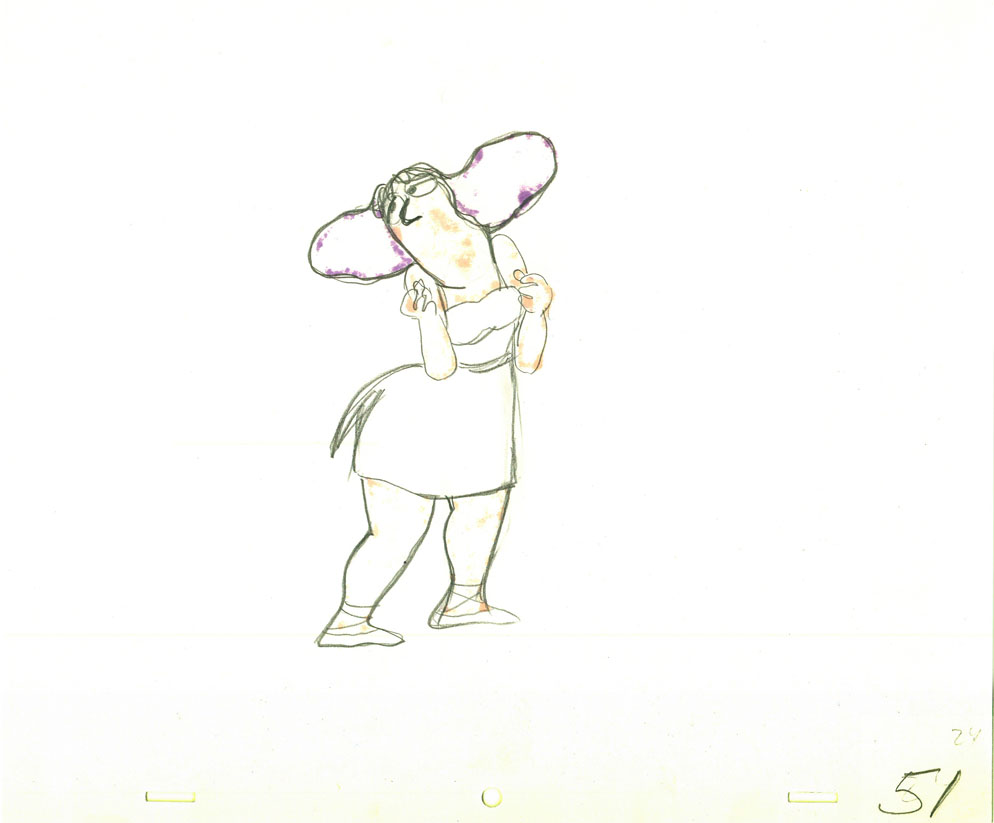 51
51
 52
52 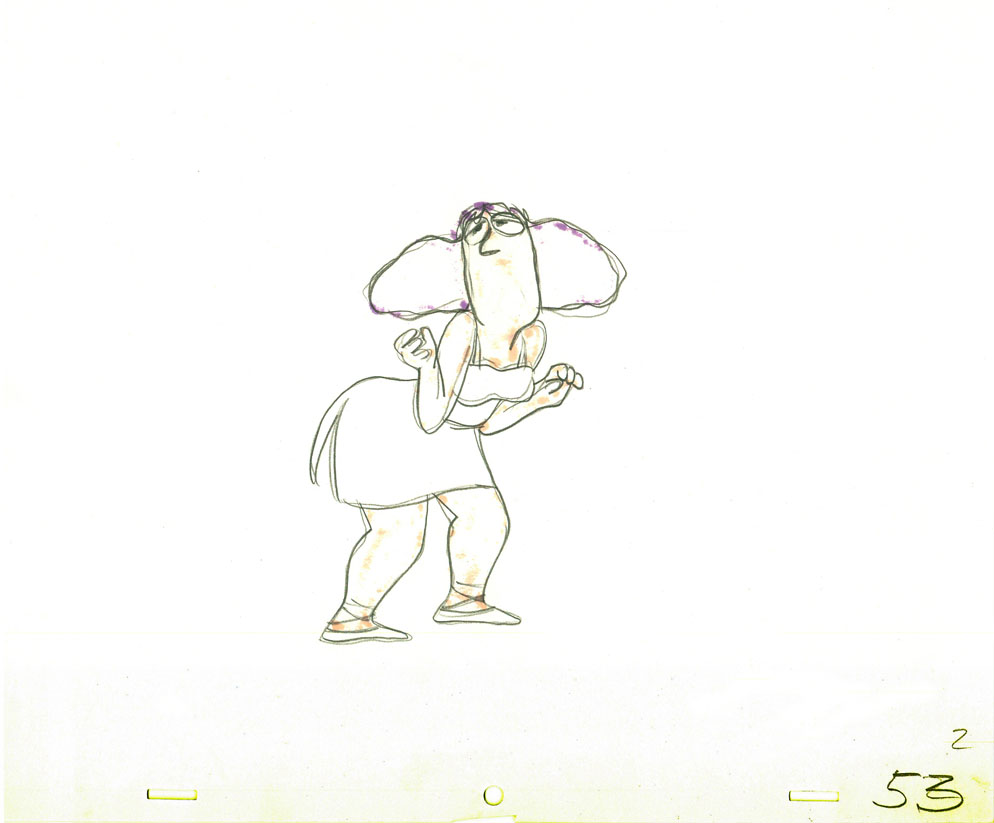 53
53
 54
54 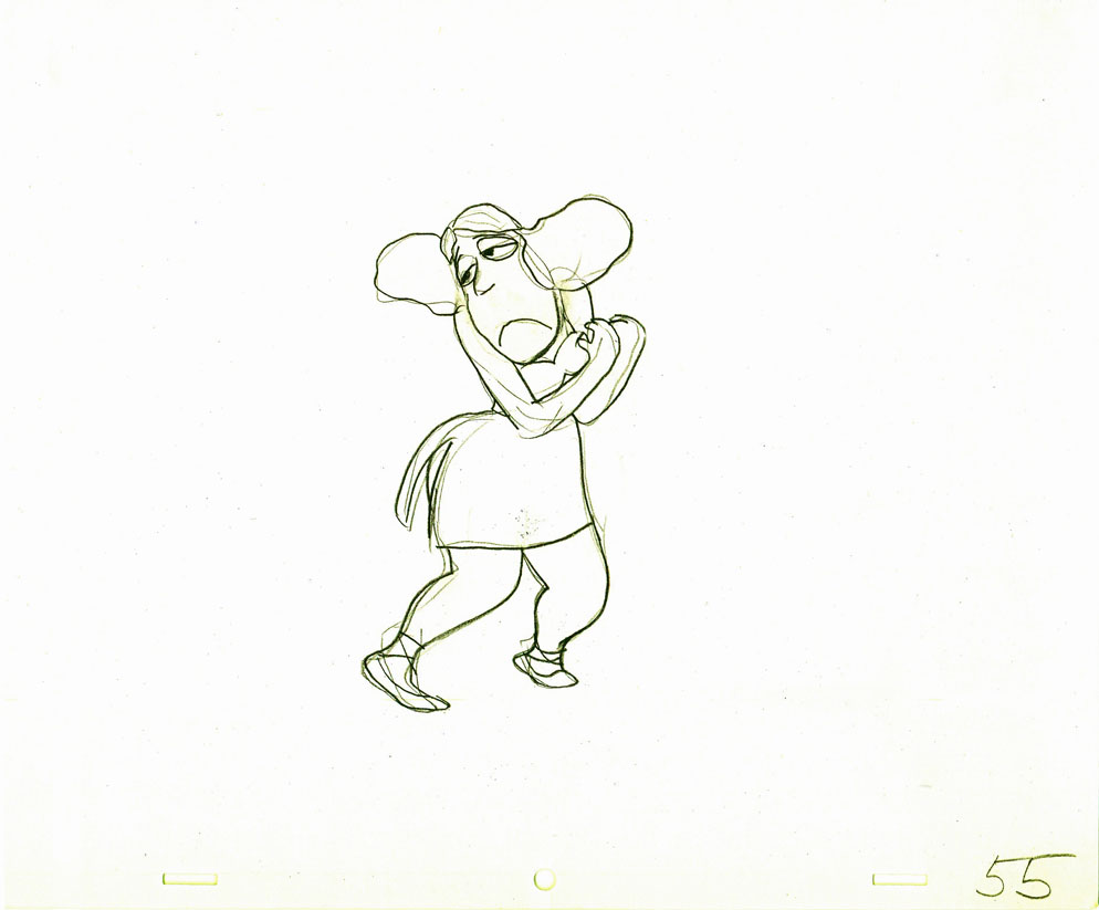 55
55
 57
57 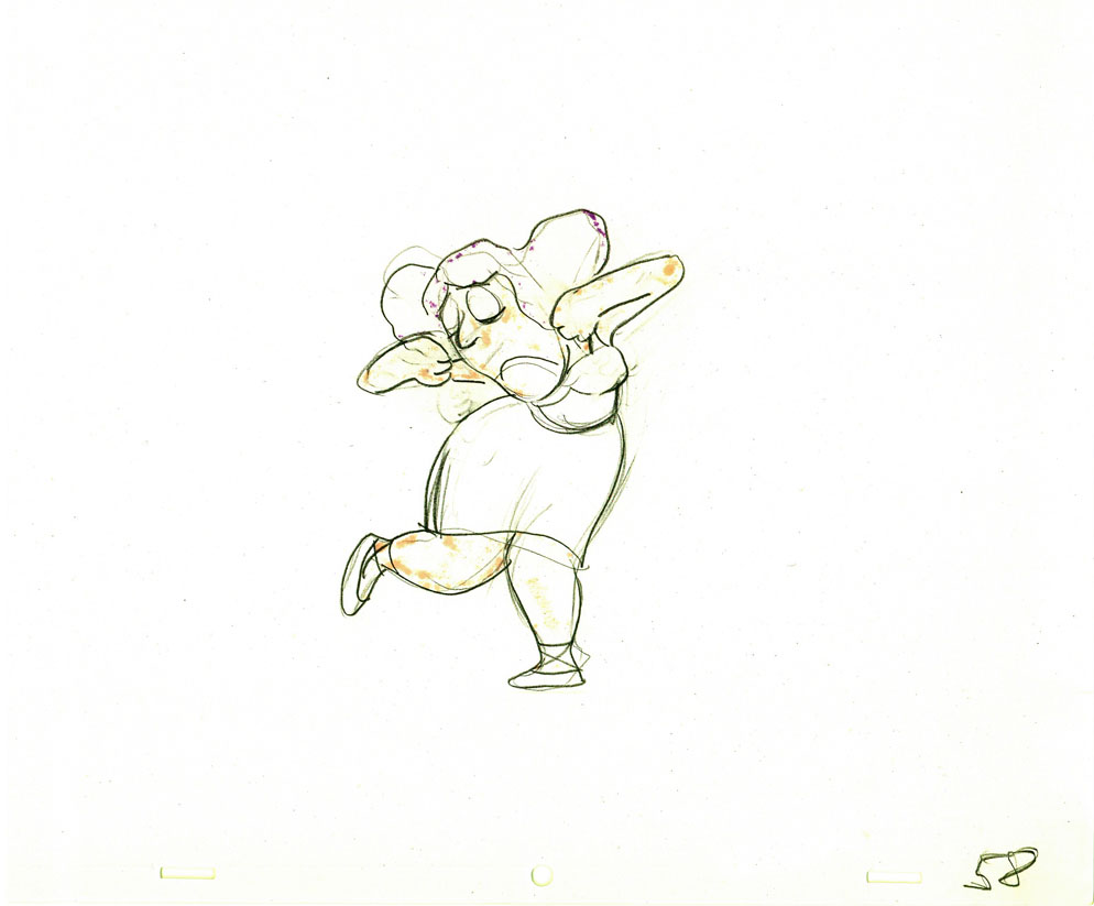 58
58
 60
60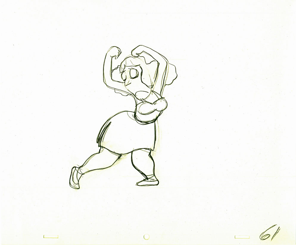 61
61
 62
62 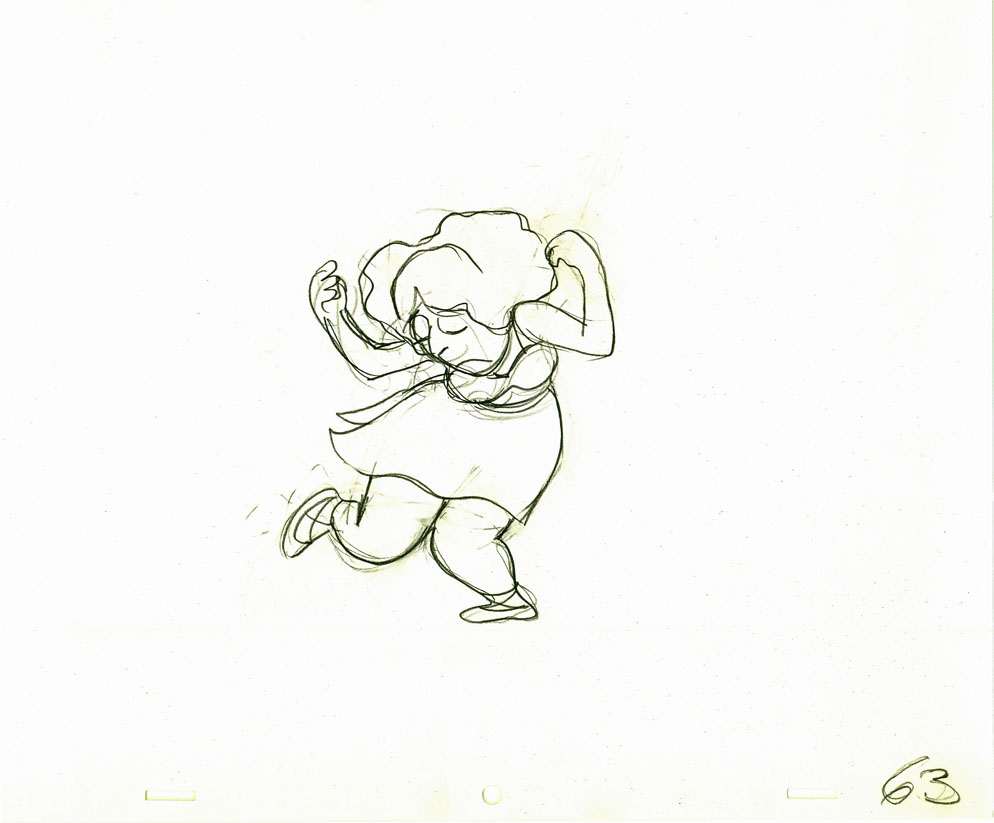 63
63
 64
64
Here’s how the drawings looked when they were colored. They were colored on heavier paper. Sharpie outlines and marker coloring. The white background was all they used for the final. The animation carried the piece.
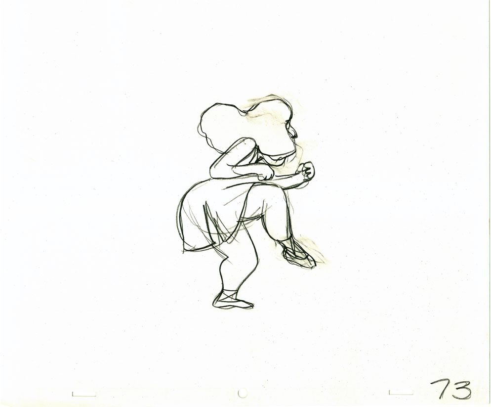 73
73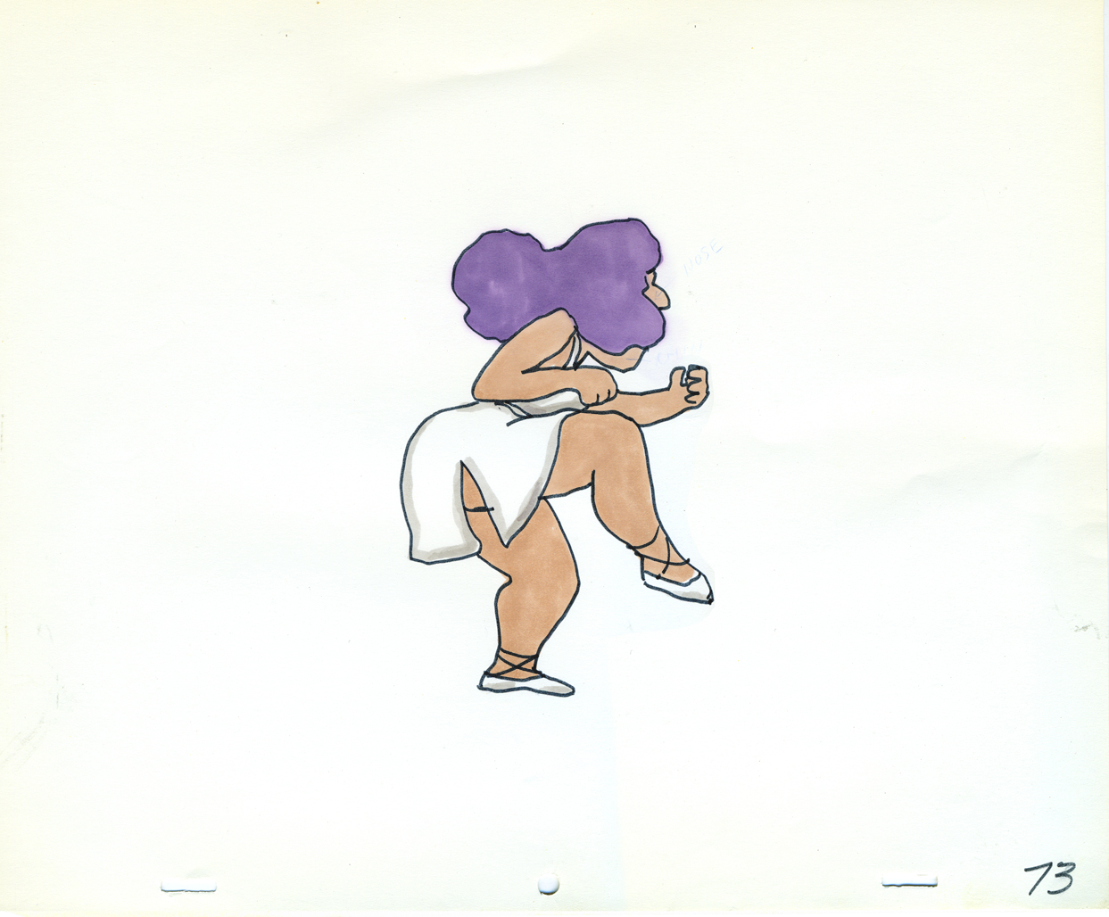 73
73Finally, here’s a copy of the film found on YouTube:
Articles on Animation &John Canemaker &repeated posts &Tissa David 22 Jul 2012 04:46 am
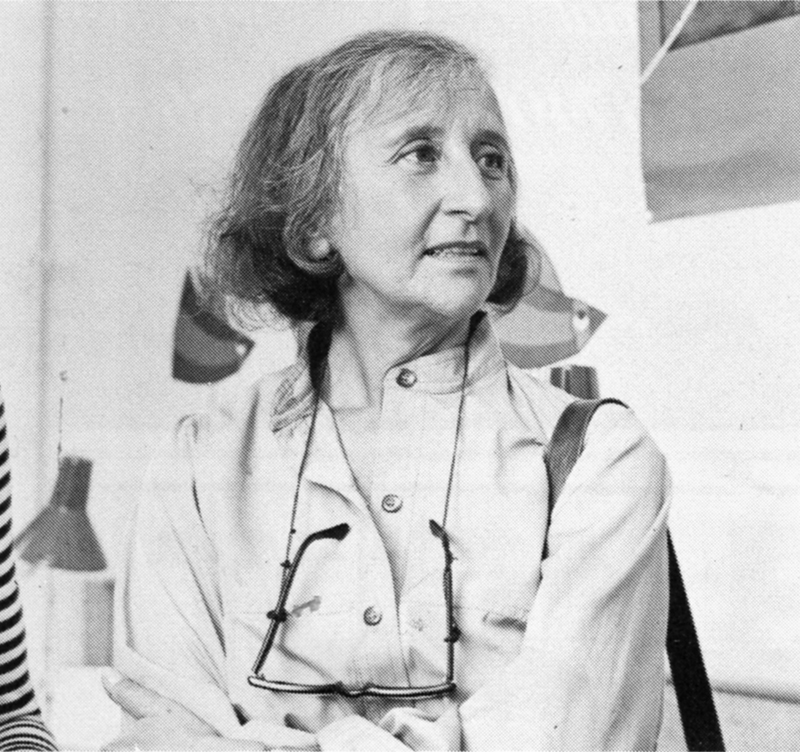
Tissa – 1975
- The 1975 issue of Millimeter Magazine is an animation issue. There are a number of enormously informative articles. I was rereading a copy of the magazine, this past weekend, when I came across the Close Up section, wherein a couple of bios appear.
I’d like to show one for Tissa David that was included. I assumed John Canemaker authored the piece; there is no byline. When I asked him, he responded thus: “I wrote the article on Tissa. The quotes are from my first formal interview with her. It was for Millimeter when I was the animation editor and put together special animation issues.”
Tissa looks so young in that photo.
-
“I am a frustrated comedienne, for sure,” Tissa David will tell you, only if you ask. “I am a clown. If I weren’t shy, I’d probably be on the stage.” Instead she is an animator, one of the world’s best and busiest, and one of the few women to have reached the top in the traditionally male-dominated animated cartoon field.
She joyfully toils in her East-Side New York apartment, a warm, plant-filled place that often smells of baked apples. Classical music swirls quietly from a radio and the glow cast from the light under her animation board gives her the look of a sorceress.
 The lady has class—a fact one gathers upon first meeting, but a fact that is reaffirmed by catching a look at the creatures she is conjuring to life on her drawing board. The graphic line is strong and free, yet elegant (as is the artist); and when the drawings are flipped, the creatures move through their paces with a deliciously droll humor, a wit that is uniquely Tissa David’s.
As a child in her native Hungary, Tissa saw Disney’s SNOW WHITE and thought (as so many others have thought after experiencing that film masterpiece), “Now this is something I want to do.” After graduating from art school, she became an assistant animator at Magyar Film Iroda in Budapest; a little more than a year later, in 1945, she was a co-owner of the Studio Mackassy and Trsi supervising all phases of production including story and camera and was sole animator of the puppet and cartoon films.
She left Hungary in 1950 during the height of the Stalin regime, and finally landed in Paris.
Jean Image Productions hired her in September 1951 and for two years she read sound tracks, planned layouts, animated, and did the entire editing of the feature-length, BONJOUR PARIS (1953). That studio closed and Tissa animated at La Comete next, a studio that had been Paul Grimault’s.
“I had absolutely no relatives outside of Hungary except in the United States. So I asked for a visa in 1950. It took at that time five years to get a visa, that was still the quota system. So I came to New York…I loved the U.P.A. cartoons. I decided I wanted to work in that studio.” In 1956, the United Productions of America’s New York Studio was the last tenant in a brownstone on Fifth Avenue and 53rd Street slated to be torn down for the construction of the 666 Tishman Building. There was a French girl in the UPA studio and so she introduced me,” Tissa recalls. “I had no sample reel. I went in once to make a sort of tryout. I was scared; I didn’t speak English, so I was just waiting, waiting, and Grim came by…Grim Natwick is the history of animation and I can rave about him. He created Betty Boop and animated the character of Snow White all the way through. UPA had an awful lot of work and they needed an assistant to Grim.”
At that initial meeting, Natwick boomed, “Now, you know what animation is!” Tissa quietly answered, “Animation is—animation.” Natwick laughed, “You can’t argue with that!” and thus began a professional partnership that lasted twelve years. “Isn’t it strange,” says Tissa today, “that SNOW WHITE got me into animation and I really learned my animation from Grim. I know a great deal about animation, I know I know, because even today I don’t do one line without something in my brain Grim told me.”
After UPA closed in 1958, Tissa and Grim freelanced as a team on countless TV commercials, and since Grim’s retirement, Tissa has soloed successfully and most notably on several John Hubley projects, i.s.: Of Demons and Men (1970), Eggs (1970), Children’s Television Workshop segments Cool Pool Fool, True Blue Sue, Truth Ruth and others, and Cockaboody (1973). Her latest animations include three CTW Letterman episodes, a scene in Shamus Culhane’s Noah’s Ark production, and over 110 feet of Hubley’s Bicentennial film, People, People, People. She has just completed some experimental animation fora Dick Williams project and is now starting, also for Hubley, a TV special based on Erik Erikson’s writings.
A description of Tissa David’s style of animation is difficult; for while it is a distillation of the Disney influence in timing, the UPA sense of humor-through-graphic-design, and the strong, poetic John Hubley mode, it also contains a different character, unique to Tissa David, that she calls the “female difference…If the same scene is animated by a man and by me, there will be a great difference, not in quality but in interpretation. John Hubley told me I have a fine sense for detail, not in the drawing itself because I make very loose drawings, but in a scene, in expressing feelings. I am a very intuitive animator—I never know when I sit down to work what will happen.”
 For all her gentleness, Tissa also contains an inner core of strength exhibited in her single-minded devotion to her art. Her opinions about that art, herself and other topics, is disarmingly to-the-point: “I believe very strongly that one must know how to draw,” she will offer on the subject of how-to-animate. “Even if you just animate objects, you must have a knowledge of drawing.” As for her struggles securing her place in animation, Tissa will admit, “…its very hard. Women can find work in animation if they have enough will to follow through and really do it. Even today, I’m always saying if I keep busy long enough, I will become a good animator.”
At the time this piece was written, Tissa was completing work on a pilot for Dick Williams’ film, Raggedy Ann & Andy; this one minute piece got Dick the film over Joe Oriolo and Shamus Culhane. She would thereafter work on John Hubley’s Doonsebury Special (just as he died mid film); and she was to animate for R.O.Blechman’s Simple Gifts.
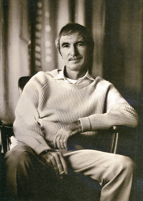
Here’s a more recent photo of Tissa.
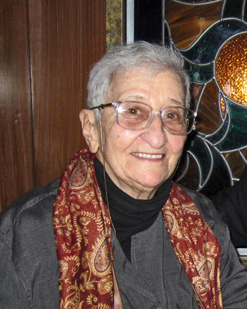
Tissa David was 91 last January.
Animation Artifacts &repeated posts &SpornFilms &Title sequences 08 Jul 2012 07:05 am
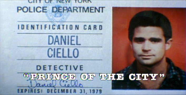
Prince of the City – recap
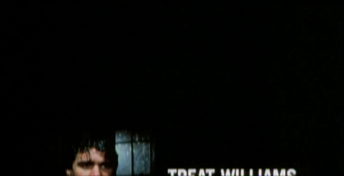
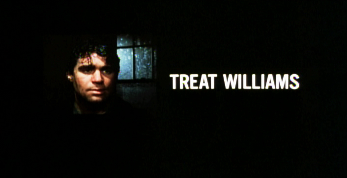
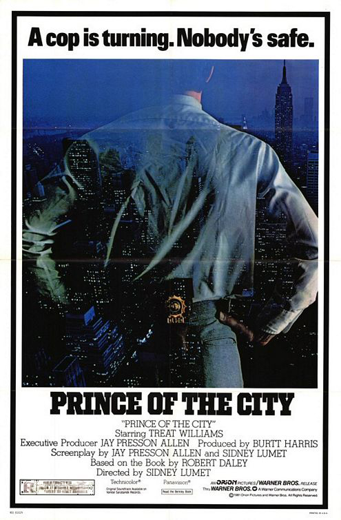 - One of my studio’s very first jobs was to do the titles to a big Sidney Lumet feature film, Prince of the City. (Feb, 1980) The film was a hard-nosed crooked cop drama brilliantly directed by Lumet. The problem it had was that few of the actors in the large cast were known, and the audience was having a recognition problem. Treat Williams was in his break-out role and the only other identifiable actor was Jerry Orbach.
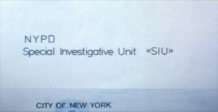
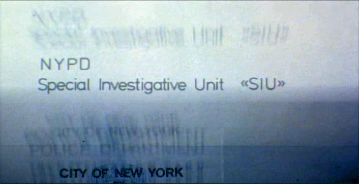
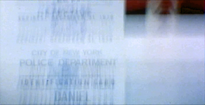
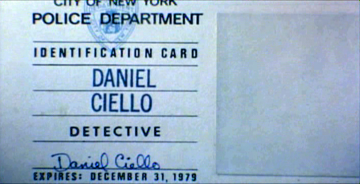
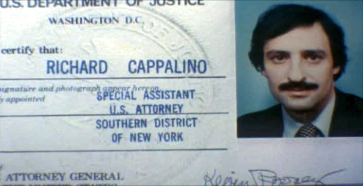
I was hired to ID all of the cops, lawyers, good guys and bad with what-looks-like live action identification cards. I also did title cards throughout the film, breaking it into chapters. Finally there were the end credits (no opening credits.)
I pulled in a friend and film genius, Phillip Schopper. Together we shot the actors with Polaroid film trying to make the photos look a bit cheesy, as the real items would. Phillip took the Polaroids and doctored them to our needs. Treat Williams, for example, had moved onto another film and came back only for these photos. His hair was now jet black for the new movie, so Phillip had to recolor his hair in the doctoring (in those years before computers.) Jerry Orbach had a blemish on his lip that he wanted retouched. There were plenty of little things to deal with on the photos.
I had to locate the real identification cards (NYC police dept, NYState Supreme Court judges and DA’s, etc.)
Then I had to forge them. I worked with a printing shop in NY that didn’t ask questions. We chose to actually print the cards as if they were done via mass production so that they would look authentic. The cards should have that slightly embossed feel as if the letters were pressed into the card stock. (Printing these days has the type laying on the paper without pressing into it.) I also had to find appropriate paper and laminating machines to get the actual look of these cards. This was all done before the wide use of computer technology.
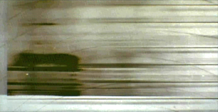
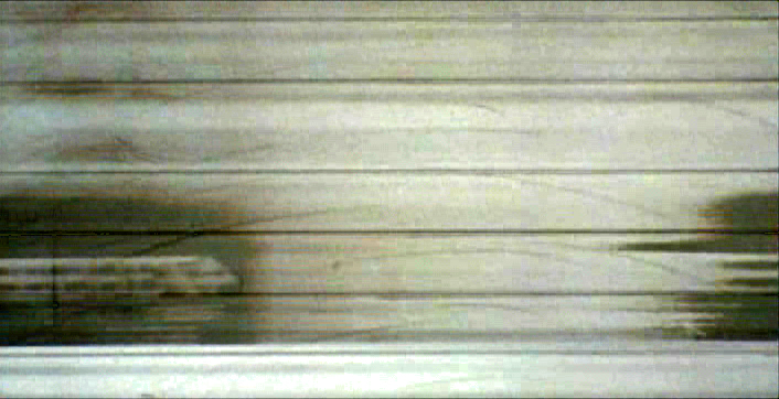
We had to film the sequences.
We worked with animation cameraman, Gary Becker for about a week and took over his Oxberry. We built miniature sets to hold the ID cards at odd angles, and we relit the cards with shadows built in. We wanted these cards to have a gritty reality to them that an animation stand didn’t generally offer.
The cards were animated moving as if a machine were printing them or a folder were being opened or papers were being tossed aside. This involved a lot of work getting out-of-focus images in the animation. When a folder opens, it moves in soft focus. The folder will pick up the top sheet and let that drop back again. We had to manipulate this all in stop motion to get it to work properly.
(Click any image to enlarge.)
 2
2 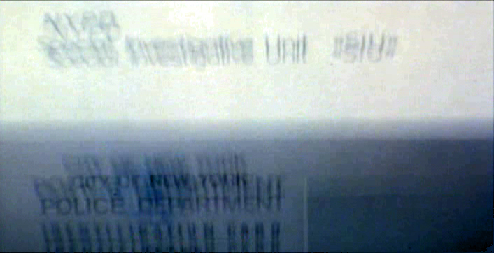 3
3
 4
4  5
5
 6
6 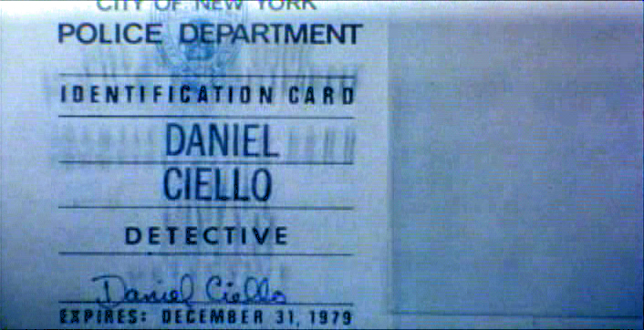 7
7
 8
8 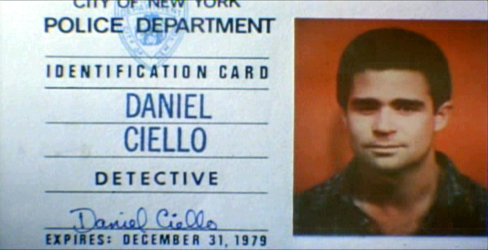 9
9
 10
10
These cop cards (about five of them – one for each
of the five cops) appear twice. Once for the new enthusiastic cops.
Another for the tired and jaded cops.
There were about 8 insert sequences about a minute each.
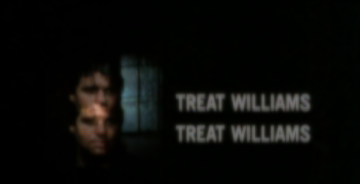
When it came time for the end credits, we chose to include photos of the actors with their names so that people would be able to recognize them from the film, without having to have had to memorize their characters’ names. We pushed these cards up as if a machine were printing the titles, a card at a time. The cards had to move in out-of-focus, as well. It was long and arduous shoot.
 2
2 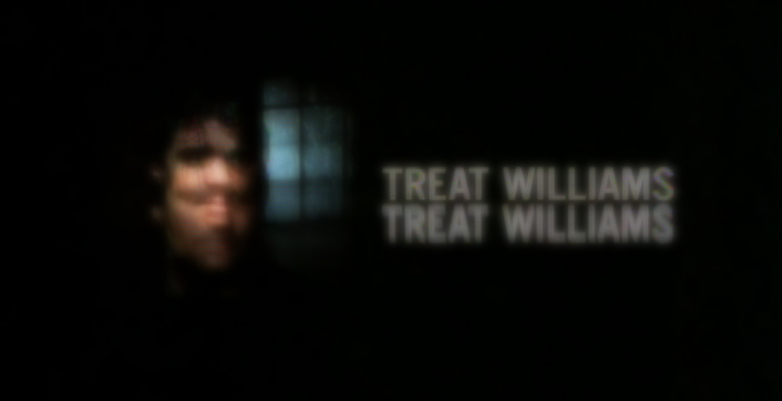 3
3
 4
4
All of the credits came up at varying speeds, timed to the music.
This was helpful in that all titles go through changes after they’re done.
Our system gave us a lot of flexibility to addd or change cards as
necessary without having to reshoot them all.
Sidney Lumet didn’t want me to have a company credit. I couldn’t include the studio name, Michael Sporn Animation, Inc. because he felt that people would try to figure out what was animated. He didn’t want them to know there was any animation in the film. Hmmmm.
I put both my name and Phillip’s as doing the titles and insert shots.
 1
1  2
2
 3
3
There’s actually a four frame fade out of the old credit list
as the new list zips up and in / out-of and into-focus.
I did quite a few other title sequences for Sidney as a result of this job, and I was pretty proud of the film and the job that I had done.
 1
1
Records in a folder. The embossed stamp was a headache.
We shot the back of a card’s actual stamp in shadow, then we
printed it on a document in reverse on the front of our card.
 2
2  3
3
 4
4 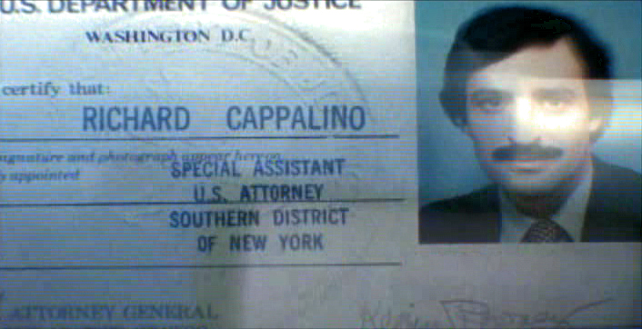 5
5
 6
6
.
 1
1
The microfilm look for mug shot records.
The slightly bad guys in B&W.
 2
2 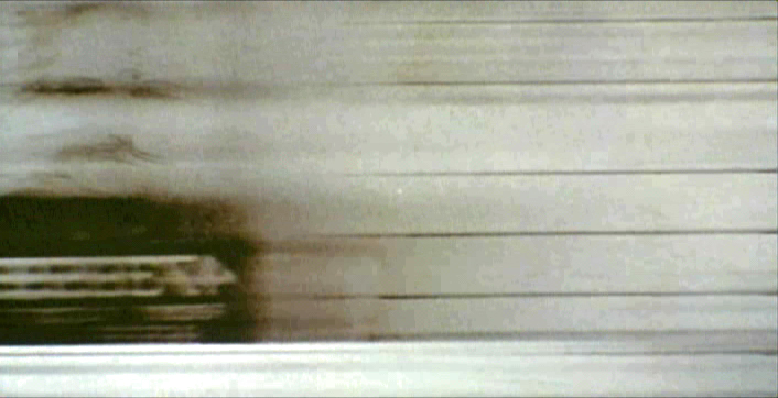 3
3
 4
4
Animation &Commentary &Hubley &Independent Animation &Layout & Design &repeated posts 25 Jun 2012 06:29 am
Everybody Rides – repost
I posted this in the summer of 2008. I’ve ganged two parts together to make one read.
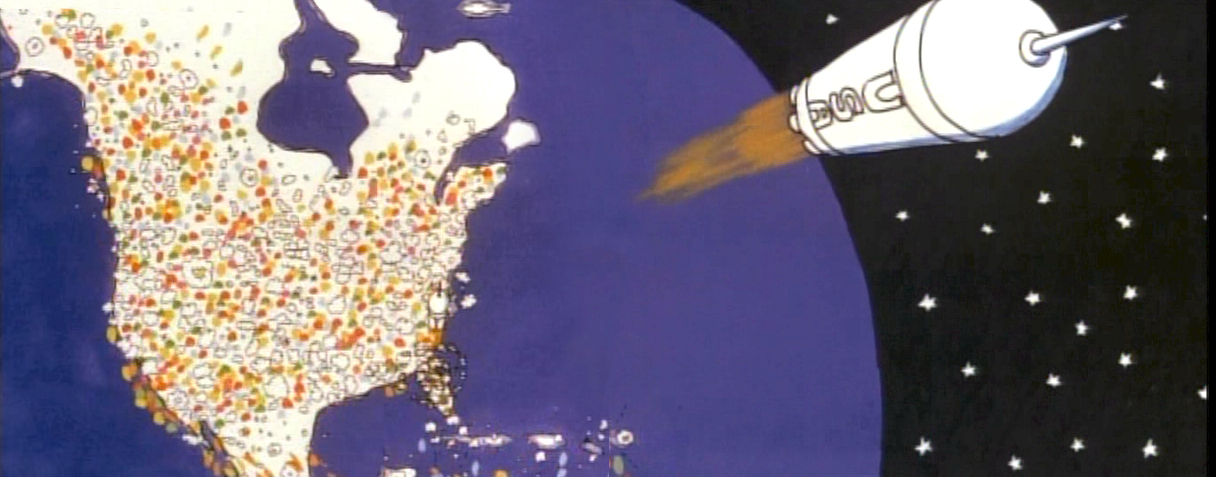
 - Back in 1976, I was working on John Hubley‘s Bicentennial flm, PEOPLE PEOPLE PEOPLE. This was a short film, four minutes long, that had about a million scenes. It told the history of the US (from the standpoint of populating and overpopulating) beginning 17760 BC and ending in 1976 AD.
It started with some lengthy scenes. As the film moved on, the cuts came faster, until they hit about 6 frames apiece toward the film’s end. The final scene, from space, was the longest in the film.
There were no characters that appeared in any more than one scene. That meant that with each scene, there were new setups, new characters, new colors, new everything. As a result, it took much longer than other films and was a difficult one to pull off. But like all other Hubley efforts, it was fun. Tissa David, Jack Schnerk, Lu Guarnier, Phil Duncan and Bill Littlejohn animated it. I colored about 2/3 of the film and animated at least a dozen or two scenes (some really were only 6 frames – like that auto shot posted). I also assisted/inbetweened all of the animators.
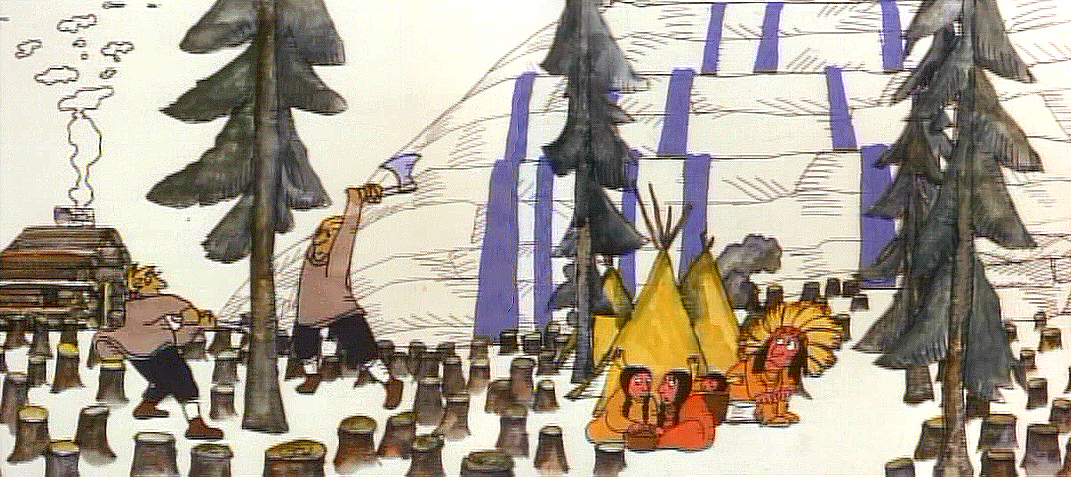
Swedes cut down all the trees in PEOPLE PEOPLE PEOPLE.
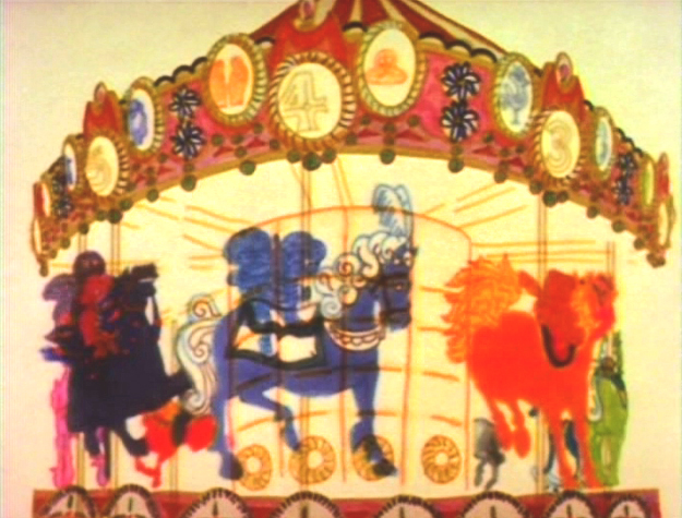
The studio, at the time, was buzzing because John and Faith had just sold a dream project to CBS. EVERYBODY RIDES THE CCAROUSEL was an adaptation of Erik Erikson‘ 1956 book, Eight Stages of Development. Erikson was a psychologist who theorized that man goes through eight stages of development from birth to death, and he proceeds to break them down. The Hubleys took this book and broke these eight stages into horses on a carousel.
 The three half hour Special shows for CBS would be about these carousel horses and the ride.
Each of the stages would be broken into two different subsets, and these would be depicted through stories which were roughly developed visually by John and Faith. Once the funding started to tricle in (about $450,000 for all three shows) they would cast their many actors and have them improvise in the recording studios to the storyboarded set pieces.
While those recordings progressed, the small studio staff was busied in completing animation, artwork and rendering of PEOPLE PEOPLE PEOPLE.
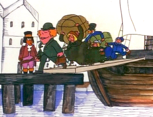
The man on the moon and the Irish immigrants.
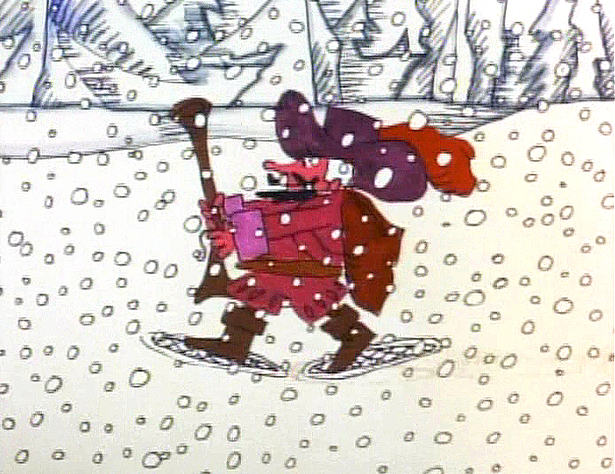
Jack Schnerk animated the French trapper sequence. There was such a rush
on the scene that I remember Jack bringing it in saying he hoped it would work.
He’d done two drawings of snow for the blizzard. Both wildly different from each other.
He asked me to ink them, then flop the drawings and ink them again.
He’d exposed the four drawings on fours. He also had the trapper with
snowshoes walking on fours. He felt it would help us feel a struggle in his
walking through the snowstorm. He felt the fours might add weight.
The scene worked beautifully, and was excellent the first time out.
Not quite the way they’d have done it at Disney. Tricks of the trade.
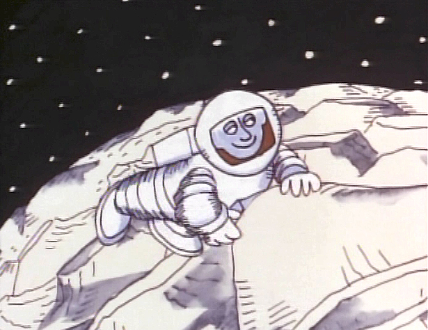
Tissa animated a majority of the film. The ending, the man going to the moon to escape
the overpopulated earth was hers. I have the drawings somewhere and will post some of them soon.
 – We started slowly on Everybody Rides the Carousel. There was a six month schedule for about 72 mins of animation. Three half-hour original tv shows for CBS about 24 mins each. They’d air in the late summer of 1975 just prior to the start of the new tv season. Each show would air a day apart from the others – three nights in a row.
John and Faith spent a lot of time – a lot of time – at RCA studios on 45th Street. (It’s
____ The carousel was bottom lit & became soft focus.____-_ now an IRS office.) They recorded many of the voices playing the numerous parts in their show. I tried to time meeting them there a couple of times hoping to meet some of the actors (I particularly wanted to see Jack Gilford in action. He was doing an hilarious part with his wife, playing a couple of cranky old people in a diner.) It didn’t work out that way, but I did see the facility and heard parts in process.
 The key staff working IN the studio (not counting animators who would, for the most part, work freelance) included Ida Greenberg. Ida was a brilliant checker / coordinator who’d started back in the Florida days of the Fleischer studio. (She told me a few great stories about Gulliver’s Travels.) Ida was a great woman, with the thickest New Yowk accent, who never seemed to buckle under pressure. I grew very close to her. I tried after that to have Ida everywhere I worked. She led Raggedy Ann’s I&Pt and R.O.Blechman’s special.
Kate Wodell was a student of the Hubleys at Yale. She was a talented artist who’d moved into production during the making of Cockaboody and continued on staff there. Sometimes she colored, sometimes she animated, sometimes she did whatever was necessary. This was exactly how I moved into the studio and loved the experience. She worked with Faith for many years after John died.
Earl James was an animator who’d worked in the backroom of many NY studios from Paramount to Terrytoons to NY Institute of Technology. He also had done some comic strip work.
Earl was given the carousel to animate. This came from a couple of elaborate drawings John did. Earl worked 16 fld. using a 96 drawing cycle. It gave us a lot of opportunity to move in tight or stay wide. However, it was a nightmare that took forever. Joe Gray was hired to assist Earl. (Joe started during the Terrytoons strike and never left. Many of those who knew him as a “scab” never forgave him and had only horrid things to say about him to me some thirty years later. He was a lifetime assistant like a handful of other noted names in NY.)
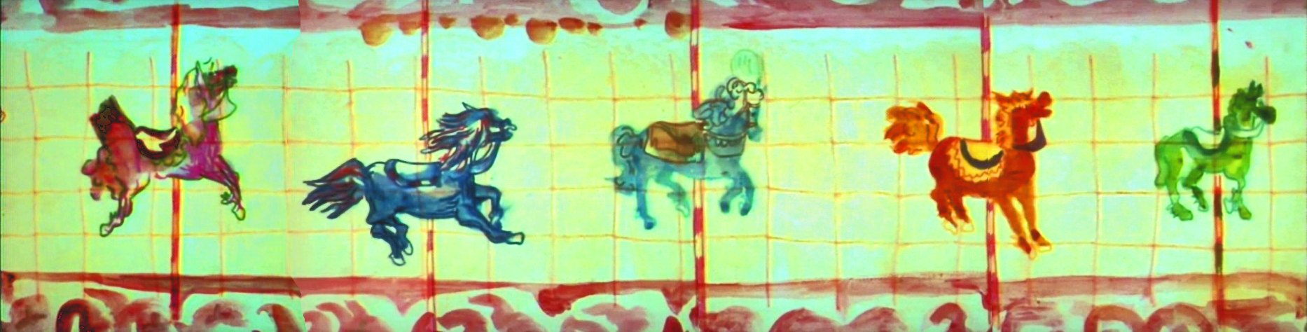
This scene moved so slowly through production that I kept jumping in to assist as well. I was a fast assistant, but that carousel slowed even me down. 8 horses moved in perspective in a circle; there were 96 different rotating views of all the horses. I’d guess the scene took about 10 weeks to complete.
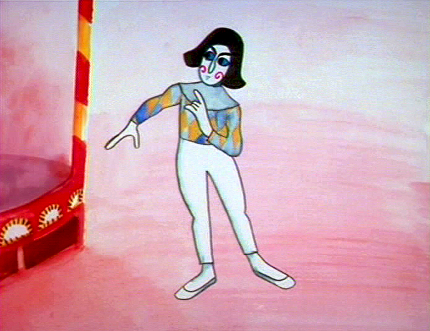
I was also doing layout and animation of a lot of connecting scenes throughout the production. These were scenes that would have to blend from one animator to another, or John had decided to go in tight for a closeup. In one case with Art Babbitt’s mime character, I was asked to change it from two’s to four’s with a dissolve technique John taught me (he said they’d used it on Fantasia.)
There were four people in my room, Earl, Joe, me and Mark Hubley. He worked alongside me for most of the film. He colored artwork given him by Ida, who was working in the larger room next door. Mark and I had a good releationship going back the many years I worked there. He joined the studio once he completed college. Emily Hubley worked alongside Kate and Ida.
Two younger, more experimental animators were brought in by John. Adam Beckett had made a name for himself with the films he was doing at CalArts.
Fred Burns was doing some incredible work at UCLA. They both were very different and added their unique touch.
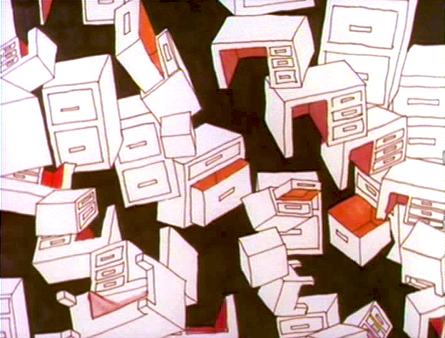
___________ Adam Beckett’s scenes included these two surreal images.
Adam did a scene a couple of scenes wherein office furniture floated about in a very complicated surreal cycle. Fred did this amazing scene of a roller coaster from the POV of the rider. He and I worked together a number of times after that, and we’ve stayed friends.
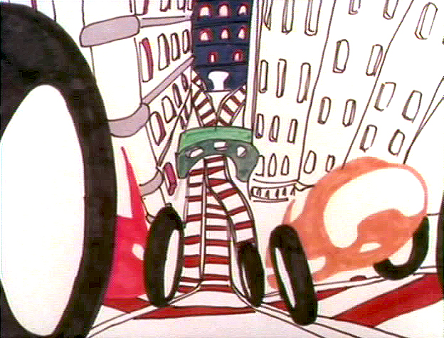
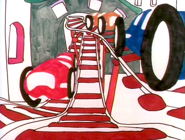
______________ Fred did this very elaborate sexual roller coaster.
I hope to have more to say about some of these films I worked on.
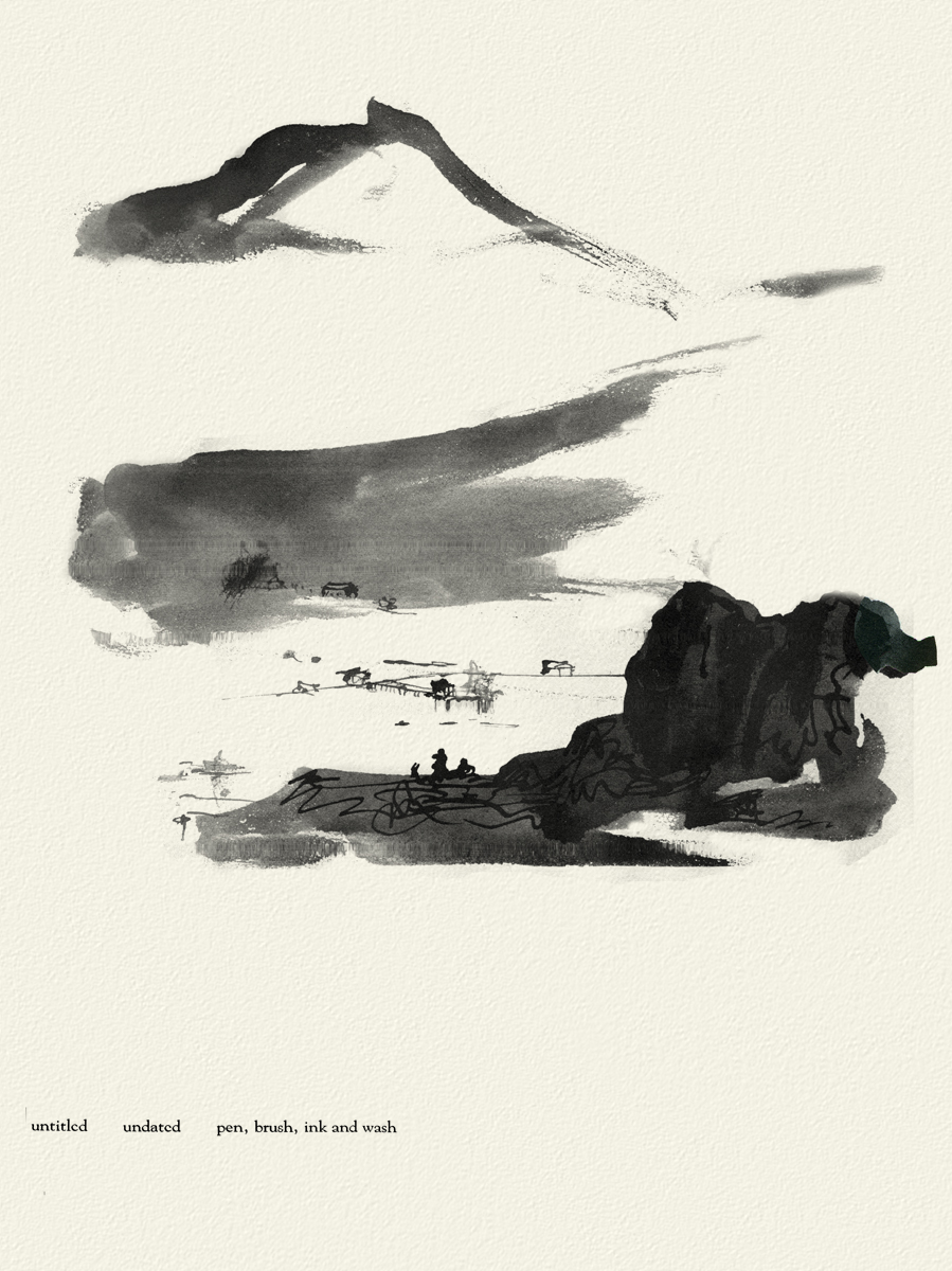
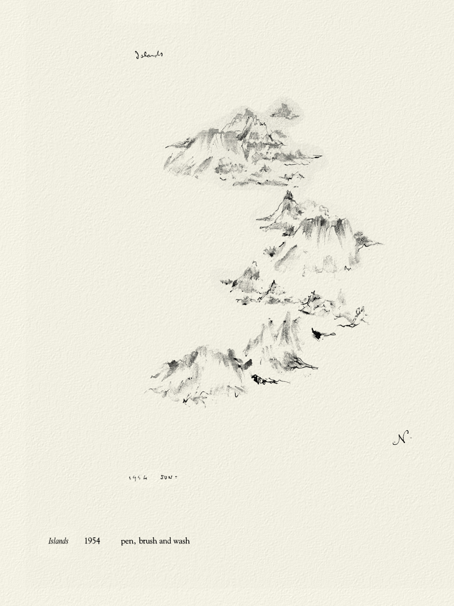
Art Art &Books &Illustration &Independent Animation &Layout & Design &repeated posts 19 Jun 2012 06:23 am
Norman McLaren Drawings – repost
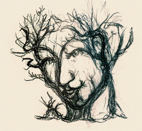 - I don’t intend to give an introduction to Norman McLaren or his work here, but he obviously was one of the solidly great film makers on the “Art” side of animation. His films are worth studying for their timing, if not for their sheer genius. As a matter of fact, his exercise films on timing are incredible (though I have no idea how you’d get to see them today.)
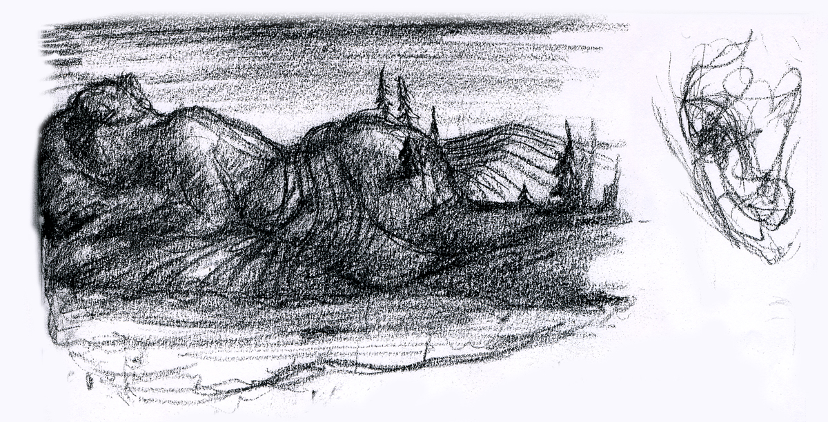
I do have a book of some drawings by him, and given the stories about China in the news today, I thought I’d post some of his drawings done in China. The book isn’t printed on the best of papers, so the quality of these drawings isn’t all it could be. However, I thought it might be worth showing this other side to his art.
 _
_

 _
_
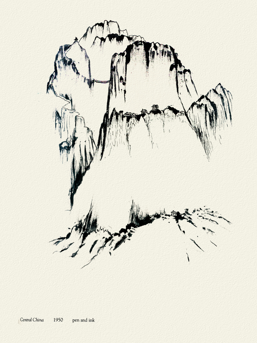
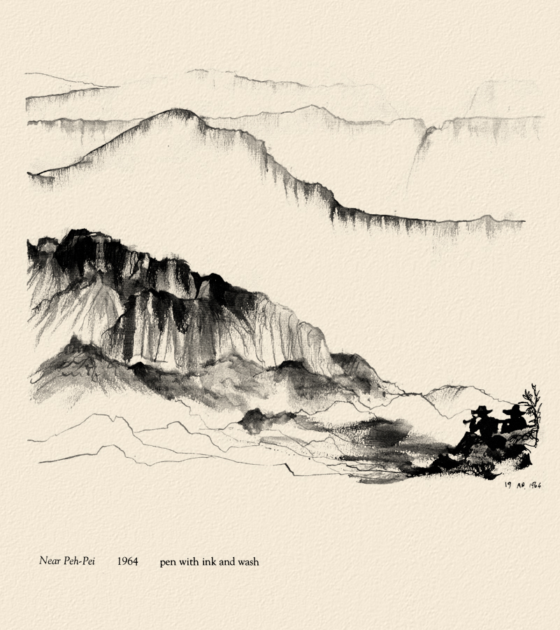
Moving away from China, there are two other drawings I thought compelling and
would like to share here.
 _
_

McClaren was certainly a brilliant artist, and his experimentation and developments brought about a real maturation of the art form. I wonder how he would have dealt with the technology we’re using today. Remember, he realized that the soundtrack could be drawn and did his own exploration of this part of the process.
The book was published in 1975 by Tundra Books.
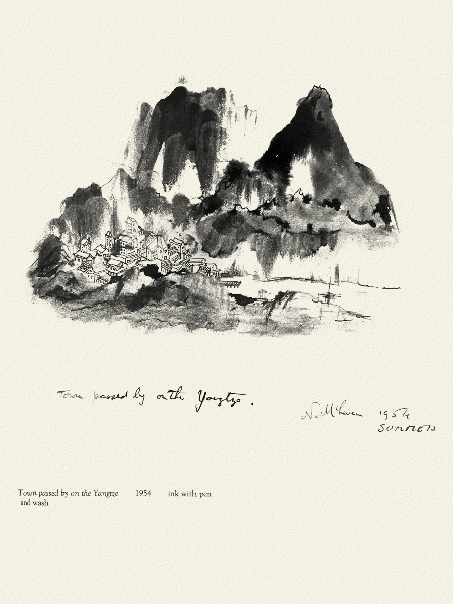
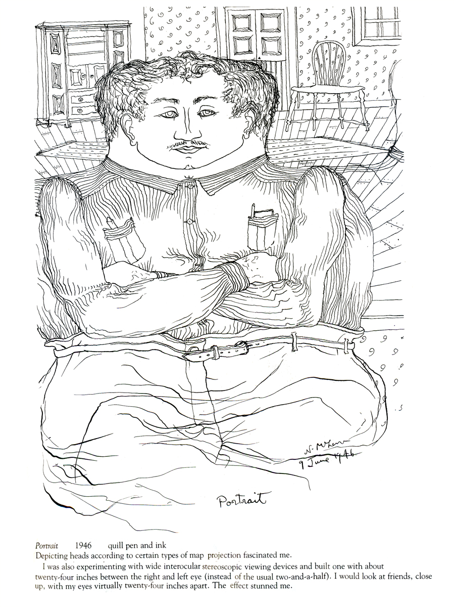
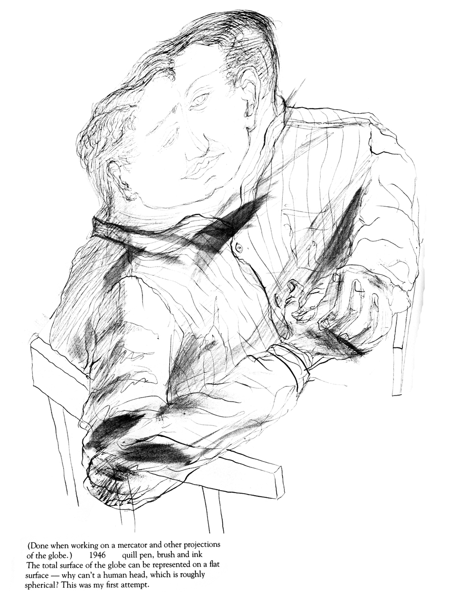
Because the one illustration which graces the book’s cover, was of such interest to those reading my piece, I’ll start with the rest of that page. It’s a series of sketches done for the film, “LÃ -haut sur ces montagnes” and was drawn in 1945.
__________________
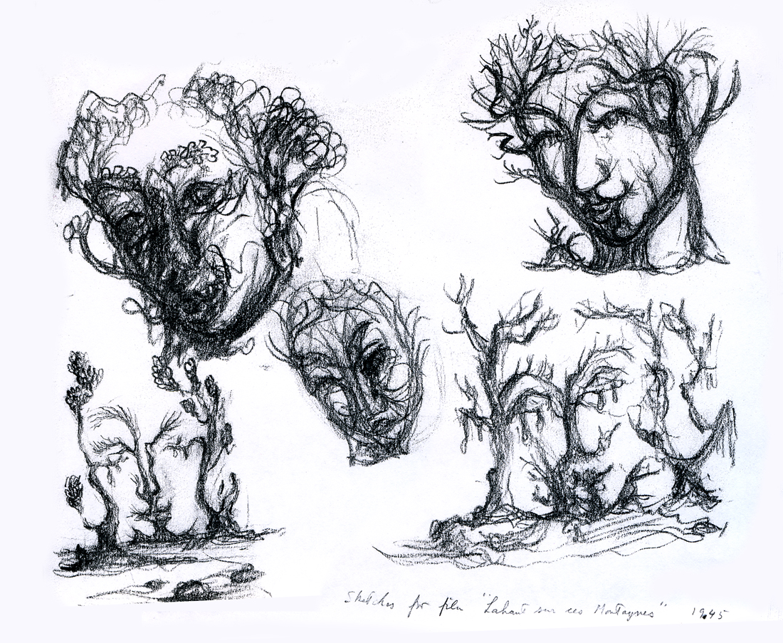
The two illustrations above are connected on the same page. I separated them .
The entire page is labelled: Sketches for the film, “LÃ -haut sur ces montagnes.”
“Interlocking faces”
“Untitled”
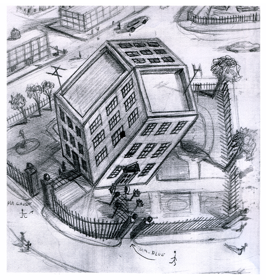
“Tesseractine House”
I’m fascinated that a number of his illustrations look not too unlike Steinberg’s work. It’s obvious he was an influence for a lot of animators in the late ’40′s.
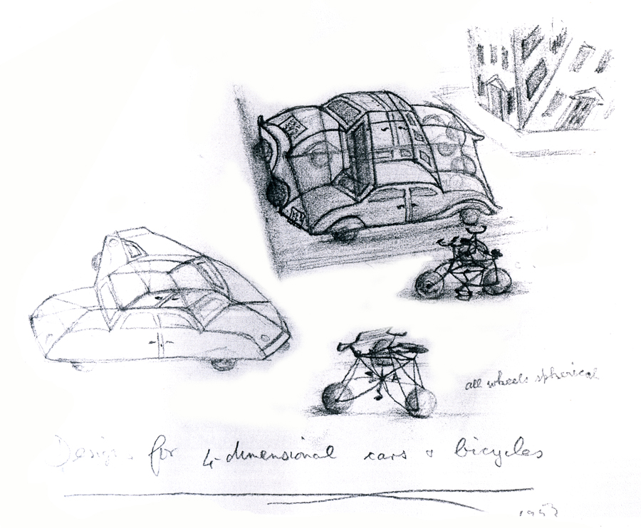
“Four Dimensional Cars and Bicycles”
“Memory of A Mexican Beach”
“St. George and the Porcupine”
Articles on Animation &Hubley &repeated posts &Story & Storyboards 17 Jun 2012 05:15 am
Hub Boards – repost
Yesterday, I posted some comments about a recent piece on Signe Baumane‘s blog. This made me think about this piece I wrote back in 2007. I think it’s worth a repeat.
- The conversation on storyboard use goes way back – before the internet. If you check out the 1969 book by John Halas, Techniques of Film Animation, there’s a Q&A session wherein a number of animation greats were asked several questions, and the answers are given by question.
Here’s one question about storyboards and the answers given:
To what extent to you think a storyboard should be developed prior to production?
- GENE DEITCH: I believe in complete scene and shot breakdown in story-board or a thumbnail board form before production begins. I use a thumbnail storyboard as a sort of bar-sheet, indicating all effects, dialogue and music cues, scene transitions, etc. Great savings in cost, and an overall perspective of the film in advance are to be gained.
JOY BATCHELOR : As fully as possible without detriment to the following phases of production.
STEHPEN BOSUSTOW: If time and money allow, the storyboard should include as many details as possible, particularly if it is to be assigned to a large production unit. However, if only a few people are to be working on the picture, the storyboard can be quite sketchy, with the details being developed during production by the key people who have an overall feeling for and knowledge of the story.
ADRIAN WOOLERY: The storyboard is the first step, after the idea. Every problem must be solved and the story completely resolved on the board prior to consideration of any production.
 JOHN HUBLEY: It has been my experience that the more detailed a story-board and the more carefully it is designed to reflect the appearance of the finished production, the more successful the film.
GEOFFREY SUMNER: The storyboard, or breakdown of the film, has as many different forms as there are ways of putting actions in relation to one another.
The classic storyboard is the set of working drawings of the sequence of a film used in large studios on the Disney model where numbers of subsidiary workers must conform to a total pattern they can almost never see.
It is used in conjunction with model sheets. It could be called the “model sheet” of the sequence of the film.
It is strictly for use within a studio and should not be shown to dangerous people like sponsors.
An earlier stage is the treatment, which can be specifically directed at sponsors. If the basic idea of the film is simple, the treatment need be no more than half a dozen drawings and a brief synopsis to convey a ten minute film.
A storyboard must necessarily be constructed after the music has been done. The musician and the director can work together from a stage following the treatment. From the finished recorded track the storyboard is made.
 For years prior to even meeting Hubley, I had remembered his response to this question. It impressed me. His storyboard development was pretty intense. The scripts generally were done visually and tacked to the wall.
I don’t remember ever seeing text up there. John would present the board to key people, and he would give an indication of dialogue verbally. We all knew this would ultimately be ad-libbed by actors.
With the Carousel feature, sections were boarded but then developed in greater  length through improvised sessions. The boards then grew out of the edited tracks. The voices often came first, here.
I suspect this is probably also true of the films like Cockaboody, Windy Day and Moonbird which were dependent on the children’s verbal play at the microphone. Something like The Hole or Voyage To Next were boarded visually, then recorded improv sessions which were adapted in newer boards.
Of course it has to be remembered that the two features done within this studio, Everybody Rides The Carousel and Of Stars and Men, both started out as text. Both were heavy-duty books that were adapted for film. In the case of Of Stars and Men, the author, mathematician Harlow Shapely had major involvement in the film’s script and narrated it as well. The concepts for both films were fully worked out before anyone started boarding. So essentially a script – of sorts – existed. Since CBS financed Everybody Rides The Carousel, you know they had to approve a script.
I, of course, only remember the board.
Animation &Articles on Animation &Disney &repeated posts 14 Jun 2012 05:57 am
Marc Davis Interview
- On Tuesday, Andreas Deja posted a beautiful pair of drawings showing the transformation of Maleficent from a storyboard drawing to a Marc Davis animation drawing. The rise of draftsmanship, composition and performance was exhilarating. It reminded me of this interview with Mr. Davis which I posted back in June 2007. I’ve decided it’s a good time to post it again. Well worth rereading.
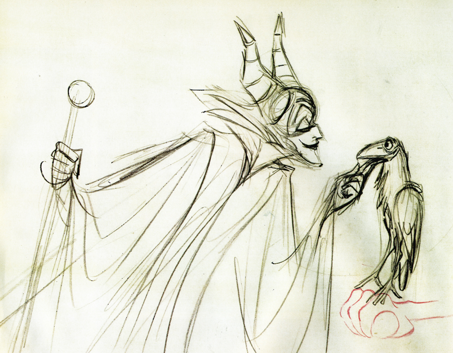 – Years ago I had a copy of a lecture that Marc Davis had given in which he compared the differences and the similarities between two characters he animated, Cruella De Vil and Maleficent. He discussed their motivations and their style of exposition. It was quite an extraordinary commentary, I’d thought, but somehow I seem to have lost that interview.
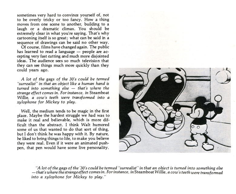
It was a great acting lesson from a great animator, and it seemed to offer depth that I haven’t found elsewhere. I’ve found myself paraphrasing from the comments Davis had made and thought to search for the document. I have found this interview that was conducted by A. Eisen for Crimmer’s: The Harvard Journal of Pictorial Fiction. This was published in 1975.
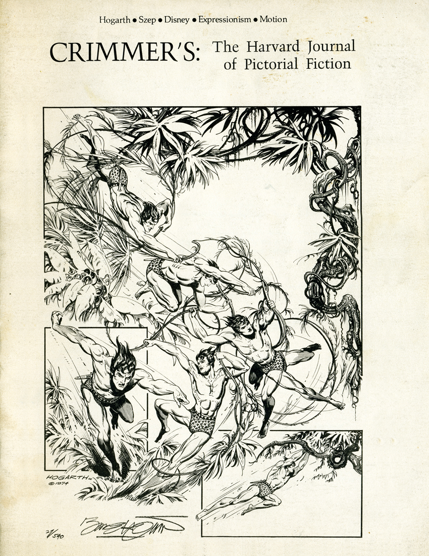 A
A  1
1
(Click any image to enlarge.)
There are other interviews with Marc Davis available. One of the best done with John Province seems to have been taken off line and now appears only in Didier Ghez‘s book, Walt’s People Vol. 1. It’s worth the book.
