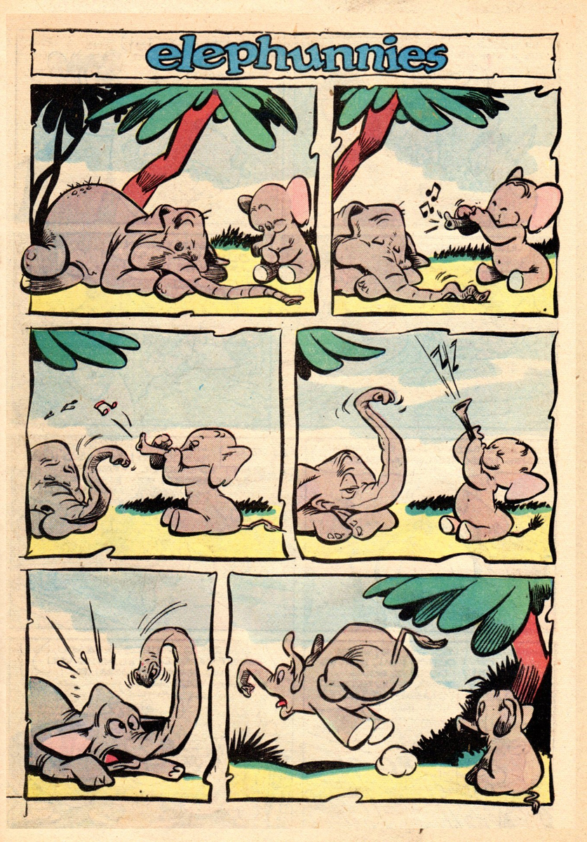
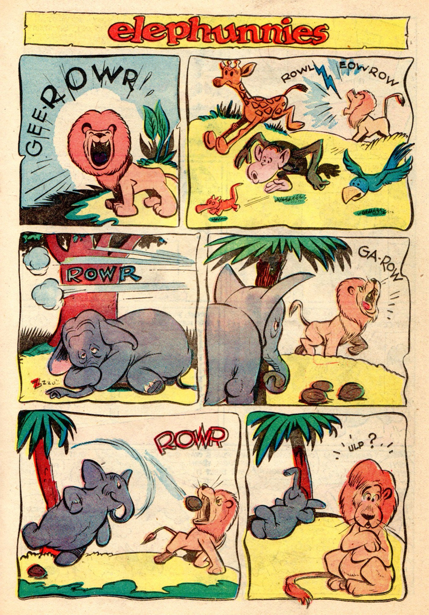
Category ArchiveIndependent Animation
Animation &Frame Grabs &Independent Animation &SpornFilms 08 Mar 2012 05:48 am
Fritz BGs & Set Pieces
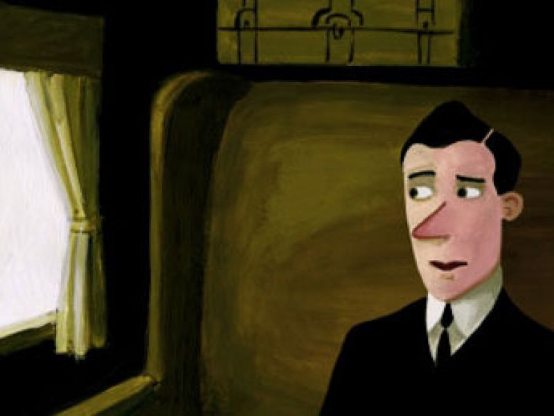
- For some reason I was inspired to watch some of Bakshi‘s Fritz the Cat, this past week. I remember posting in the past on a couple of the sequences.
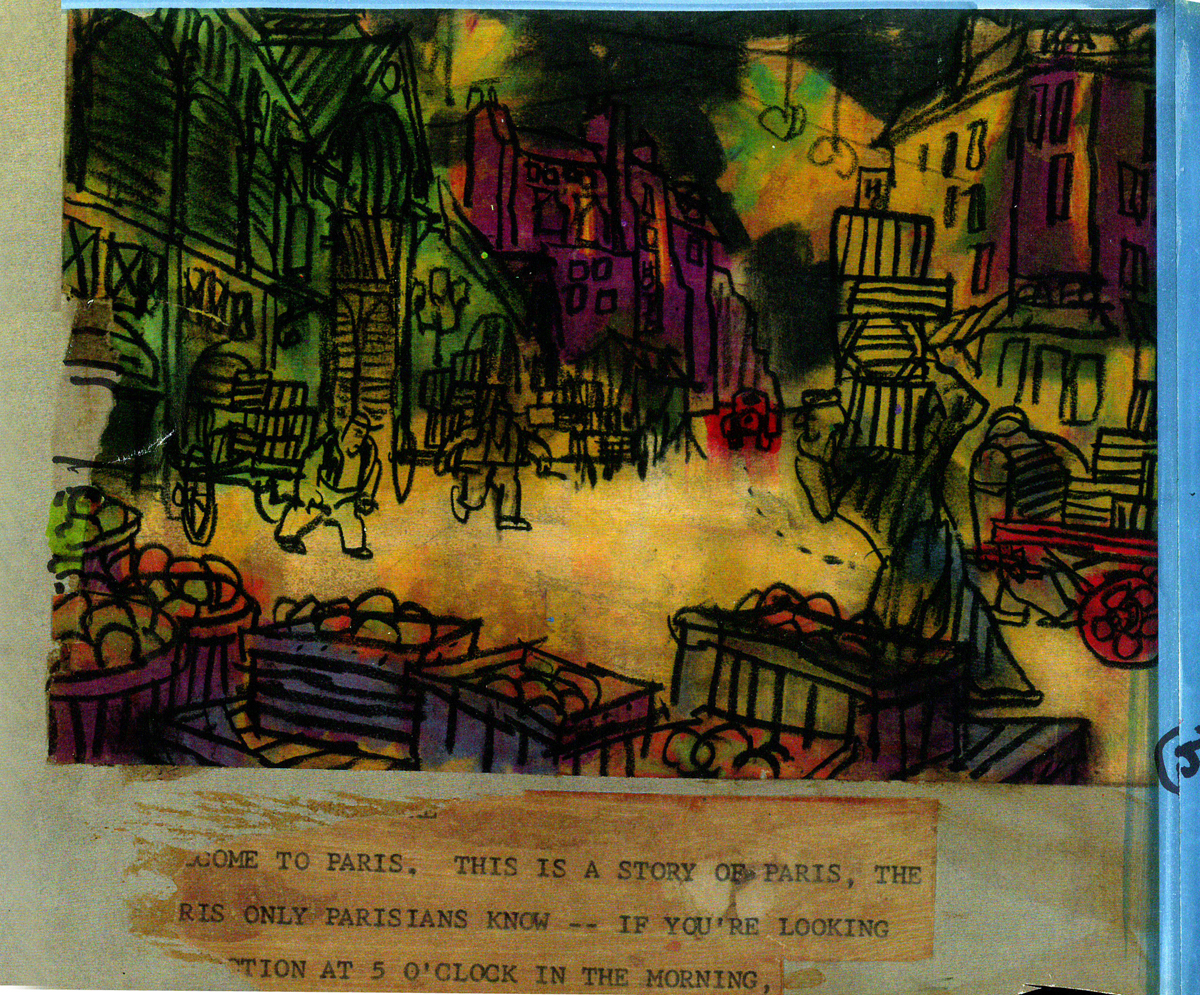
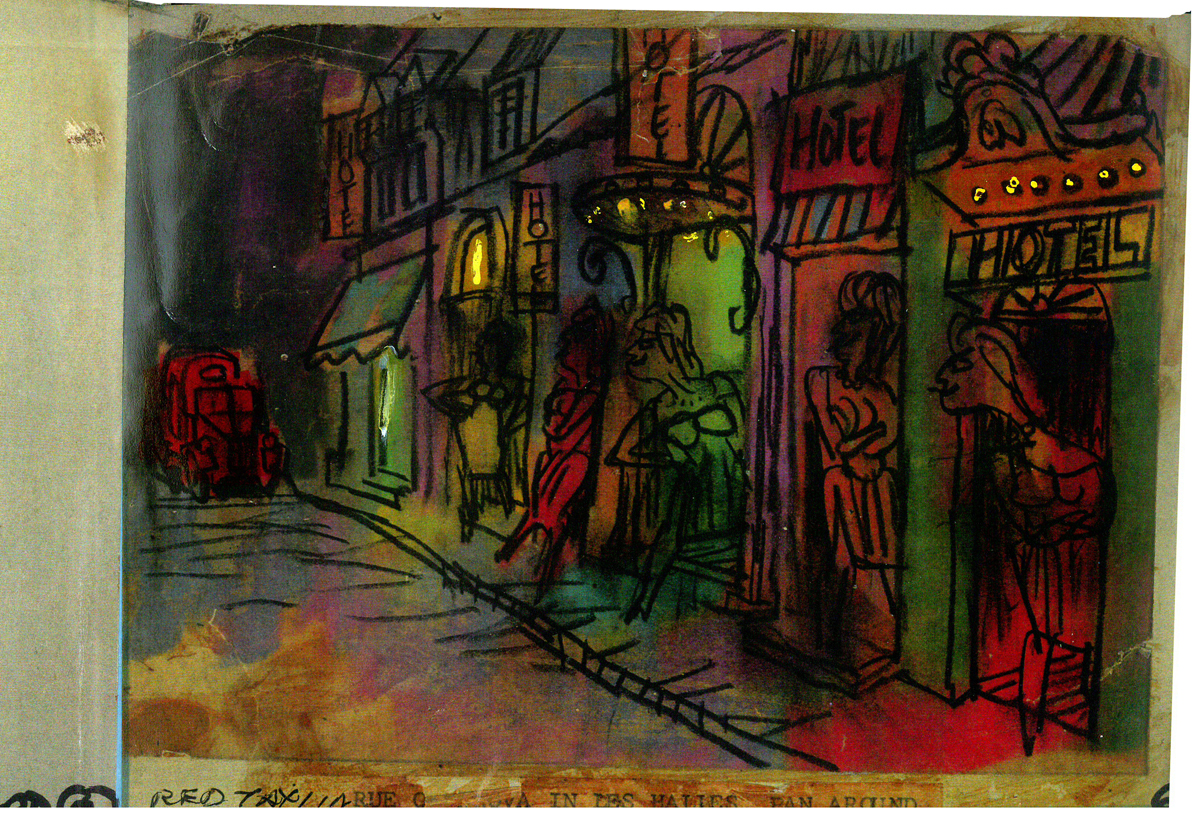
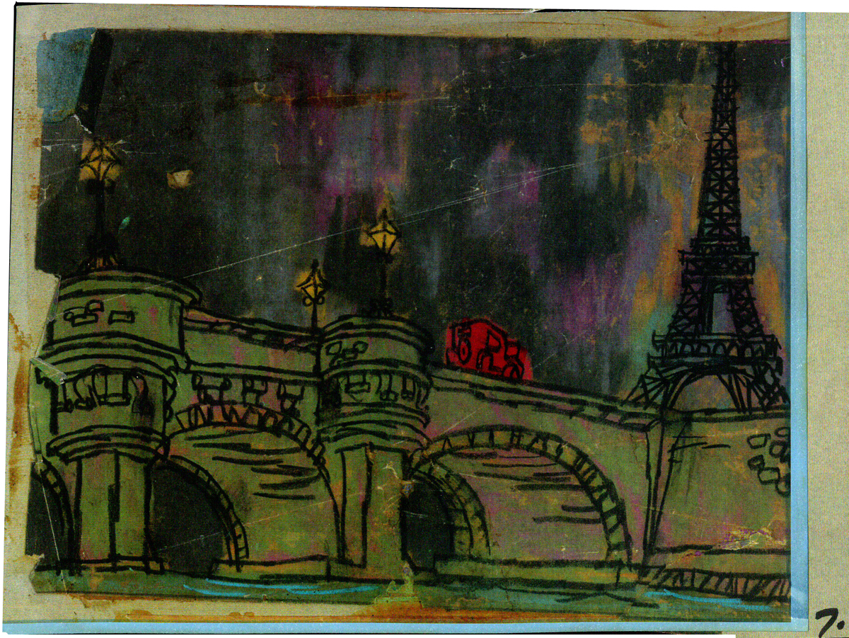
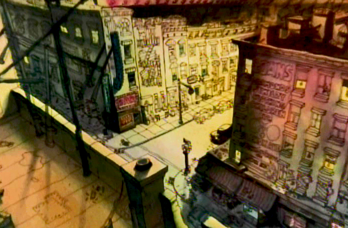 There was one on Johnny Vita‘s dynamic BGs at the time. They were a bit revolutionary for what they were. Johnny had gone through Greenwich Village with Bakshi photographing the environs. He then did a line drawing over the photos and painted the art under the lines, using Luma dyes. Bright shiny colors that he sometimes was able to mute. (It’s hard to tell the real colors from the DVD which all look like mud. I enhanced everything in photoshop to try to get colors that I remembered from 1972.) These were almost ragged versions of what Ken Andersen had done on 101 Dalmatians, but they were done on the fly. No time or money. Here’s that original post.
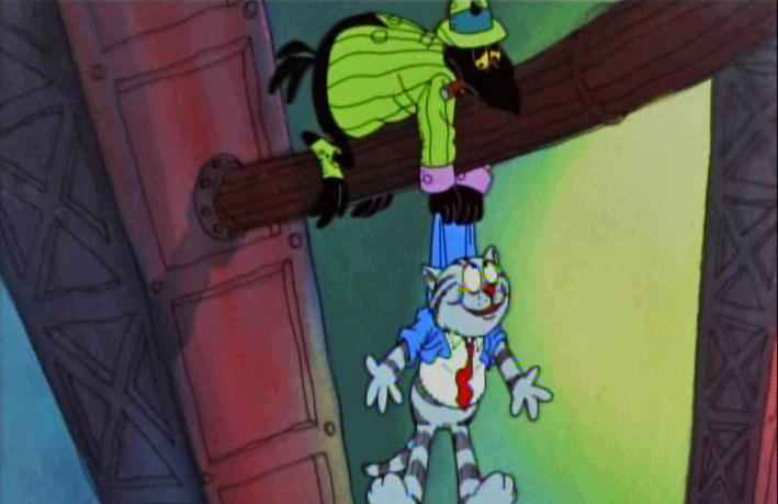
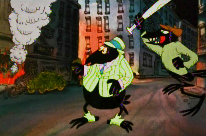
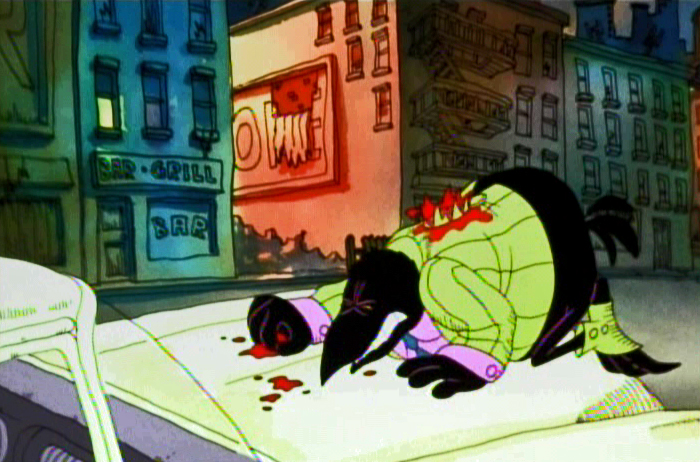
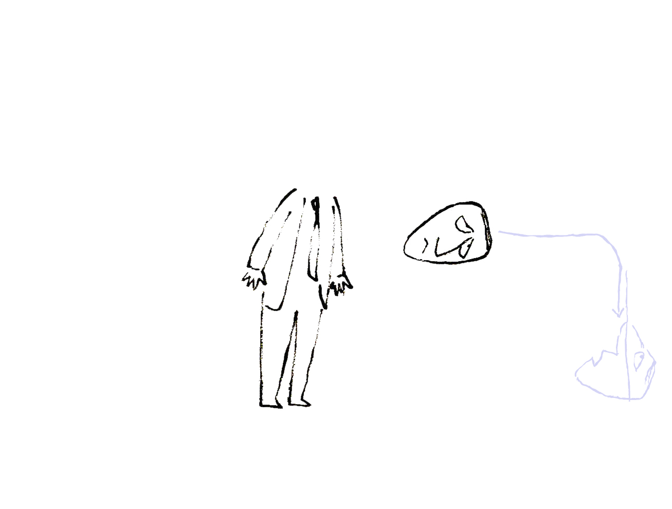
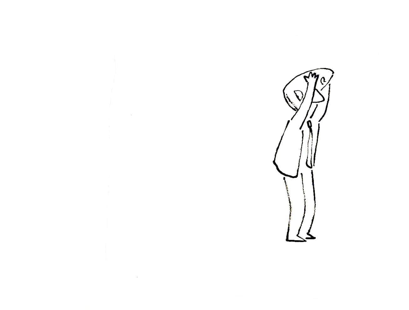
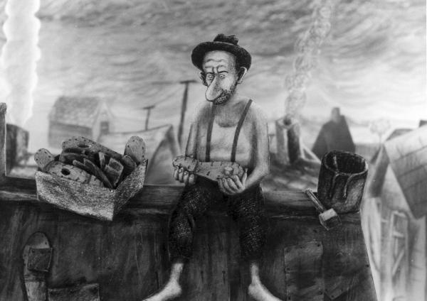
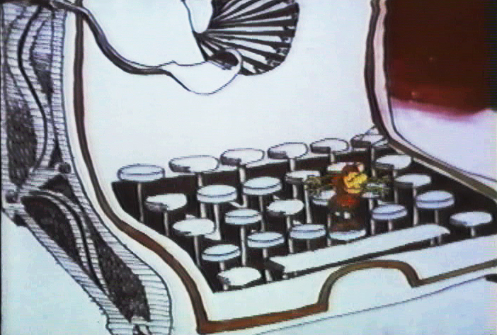
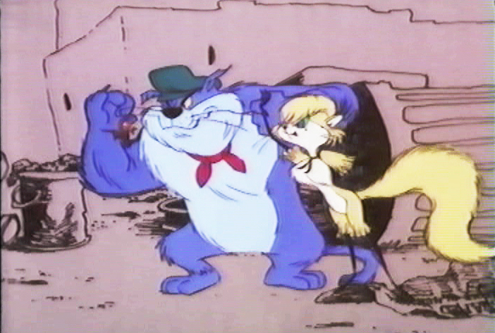
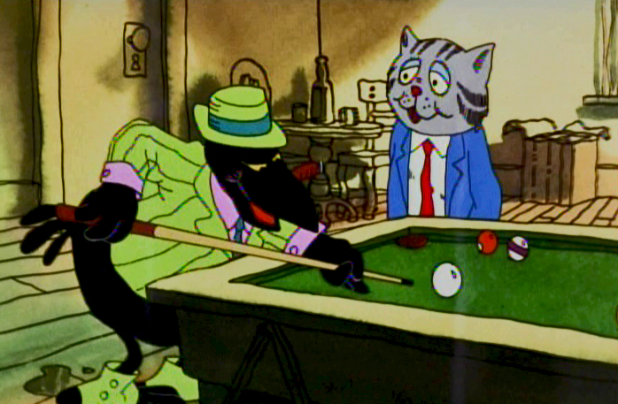 Then I did one on a scene in a bar where Fritz meets Duke, the crow, who will not only save his life but will take a bullet at Fritz’ sheer stupidity. Here are some drawings from Marty Taras of that scene.
Then, I also did a post on some storyboard drawings of the bathtub orgy at the film’s beginning. You can find those drawings here.
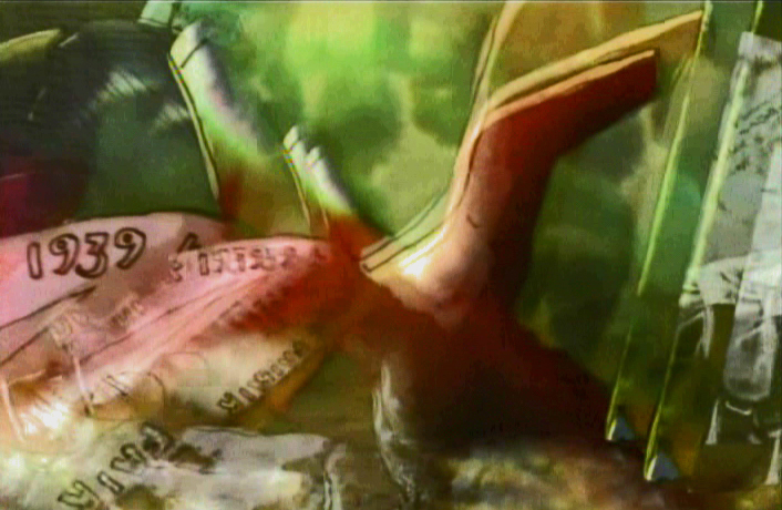
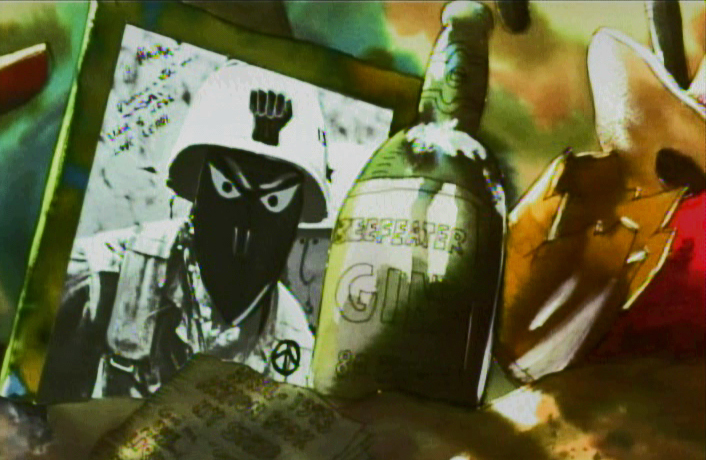
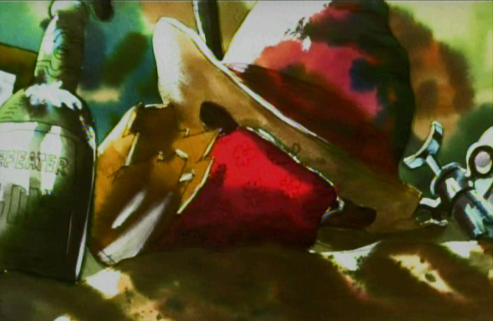
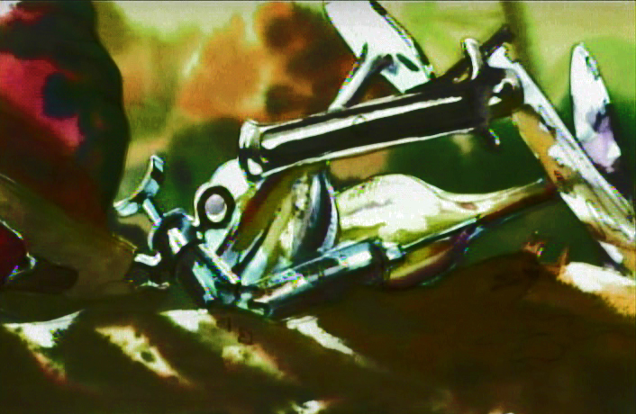
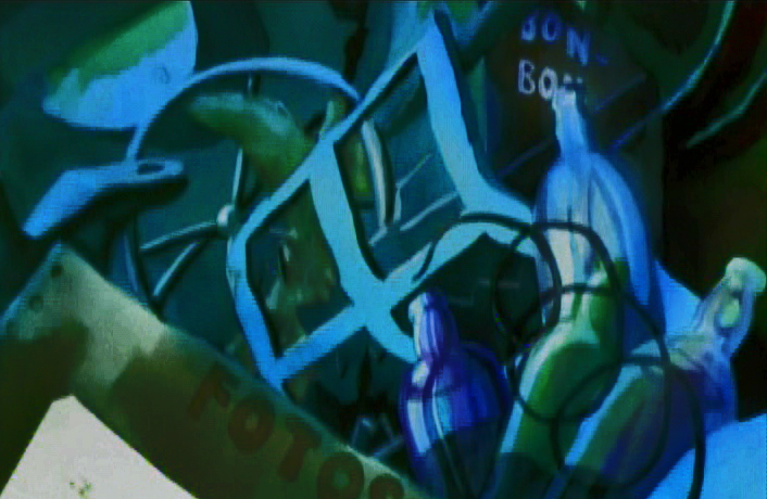
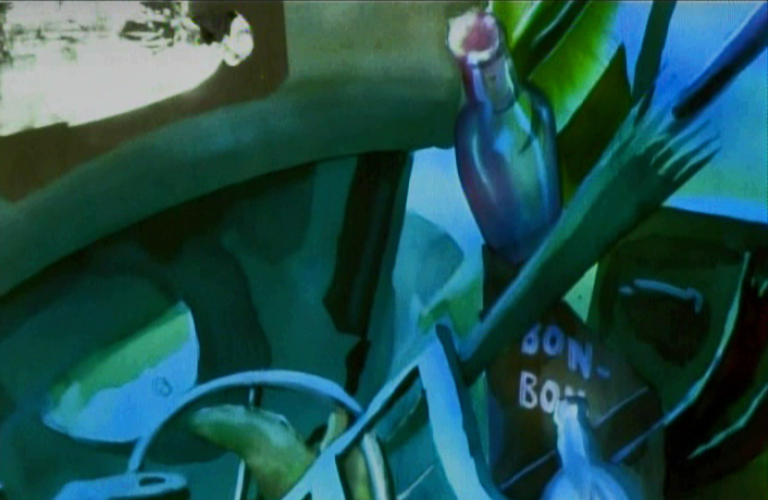
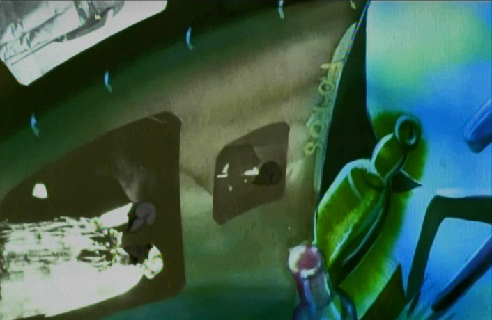
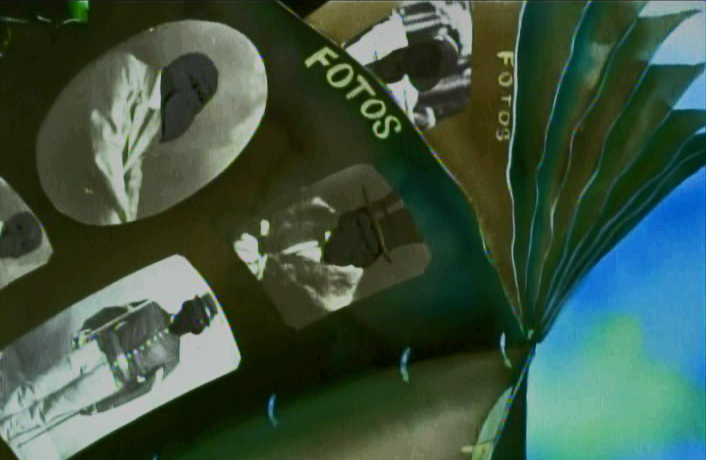
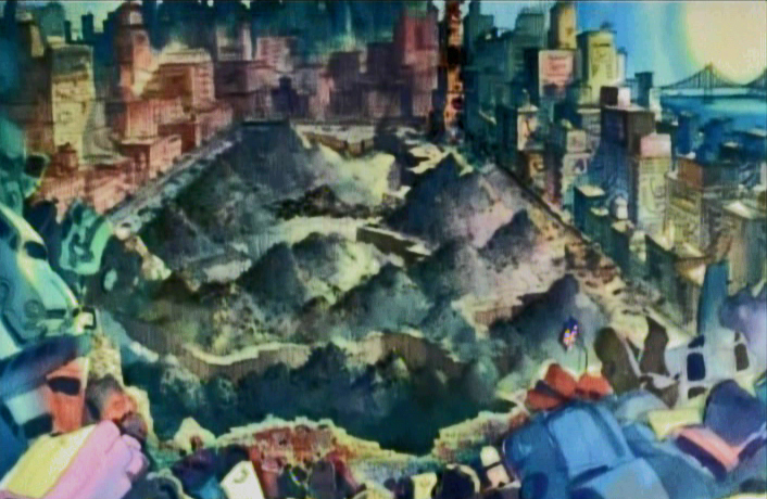
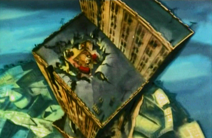
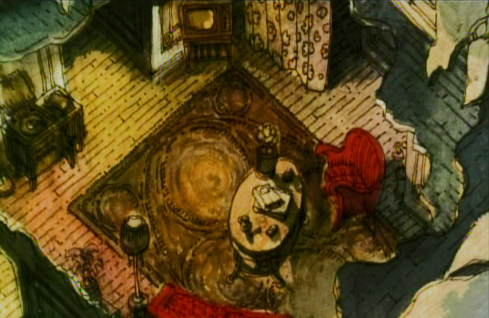
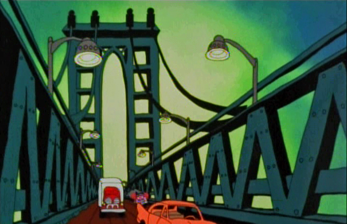
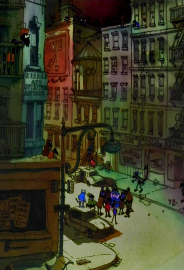
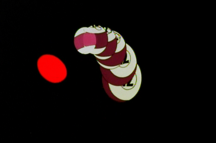
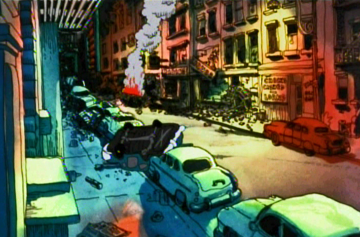
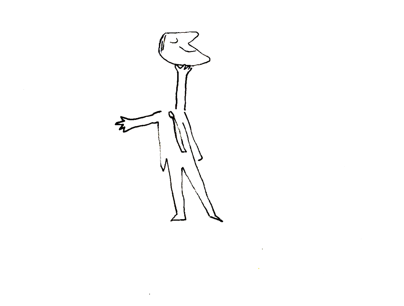
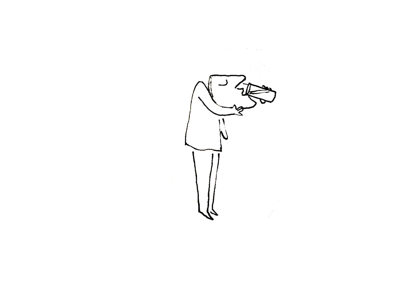
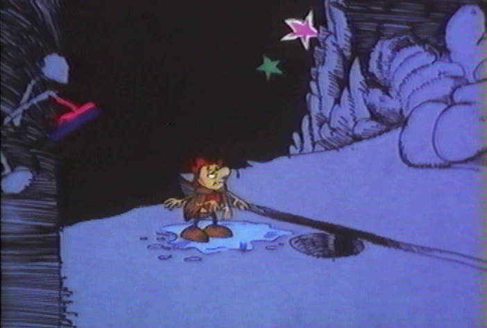
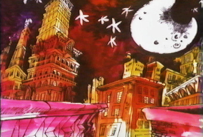
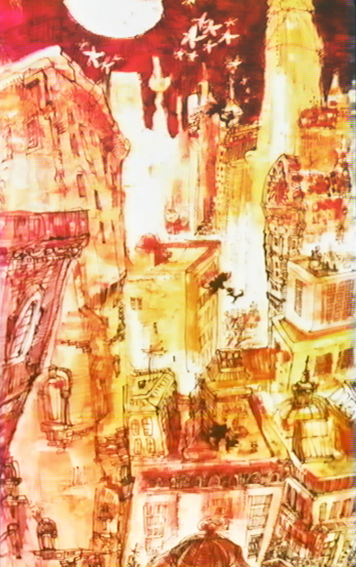
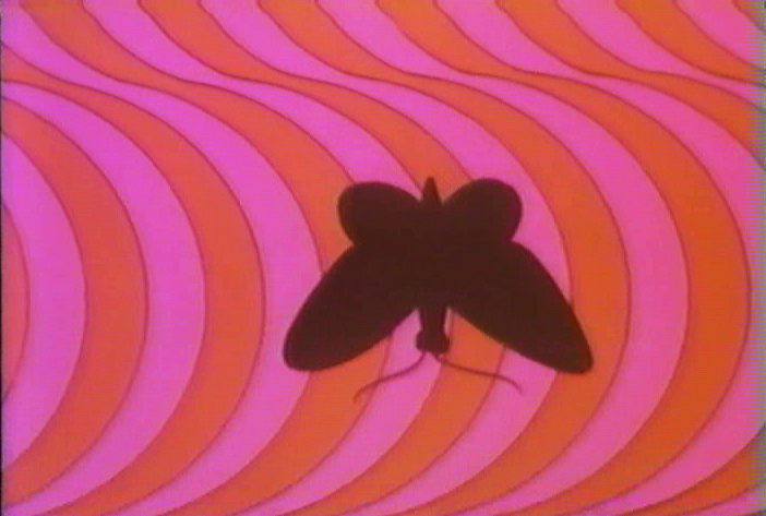
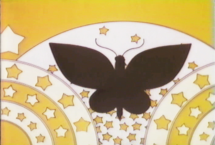
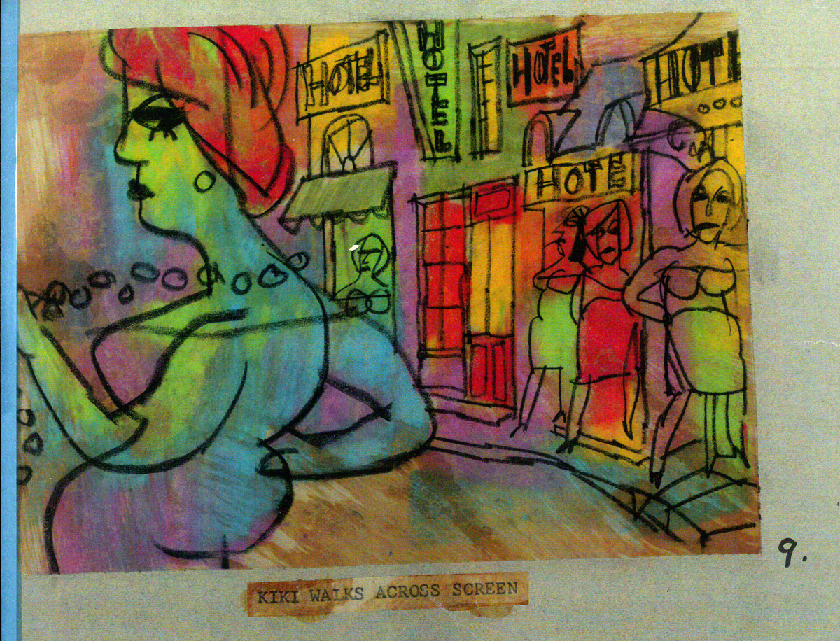
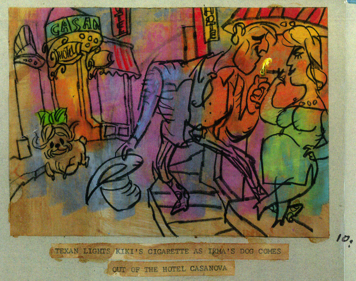
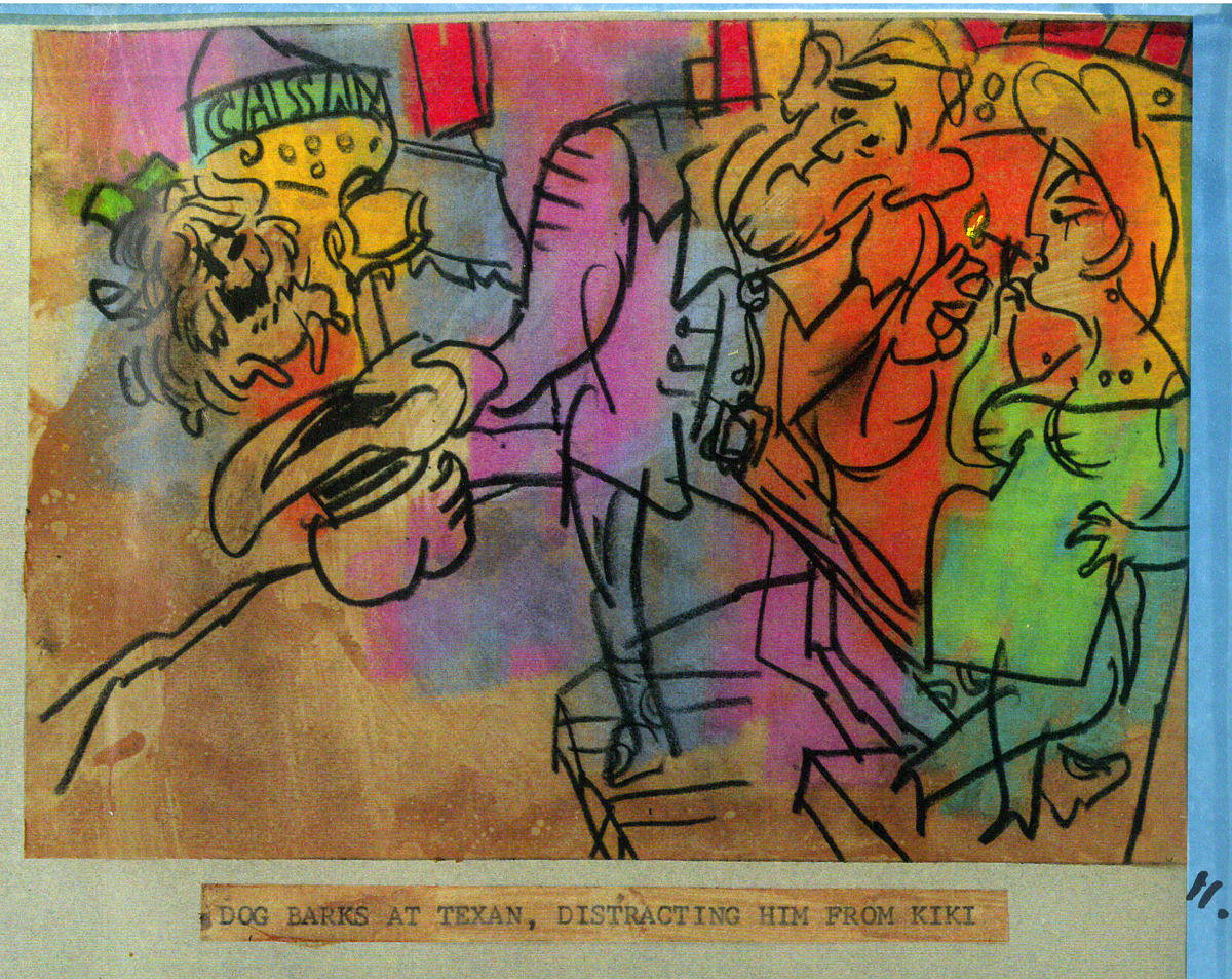
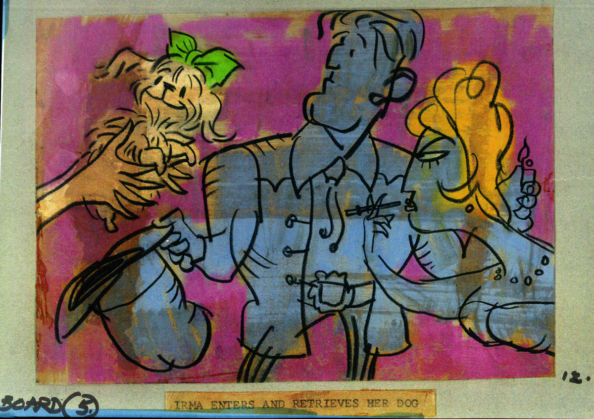
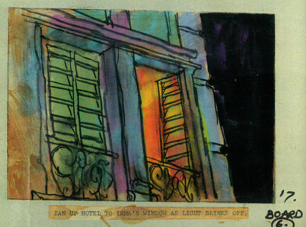
Here’s another set piece, a series of pans. I’ve hooked a couple of the pans together, but have kept many as single frame elements to be better seen. A whole melange of styles mixed in here, and no doubt Bakshi had seen what Hubley was doing to pan through screen time.
Opening part of a multiple exposure pan.
 2
2
 3
3
 4
4
 5
5
 6
6
 7
7
 8
8
 9
9
 10
10
 11
11
 13
13
 14
14
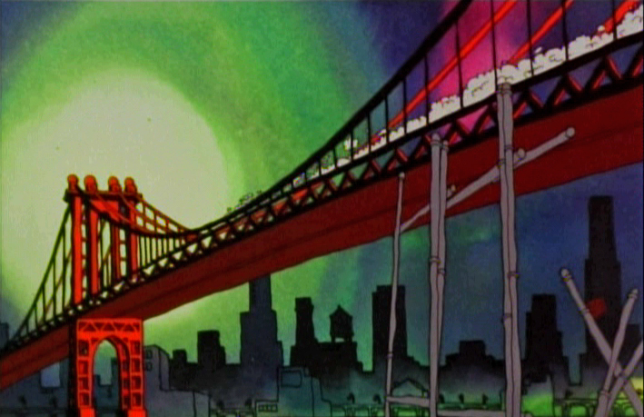
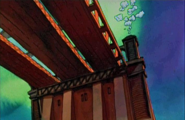
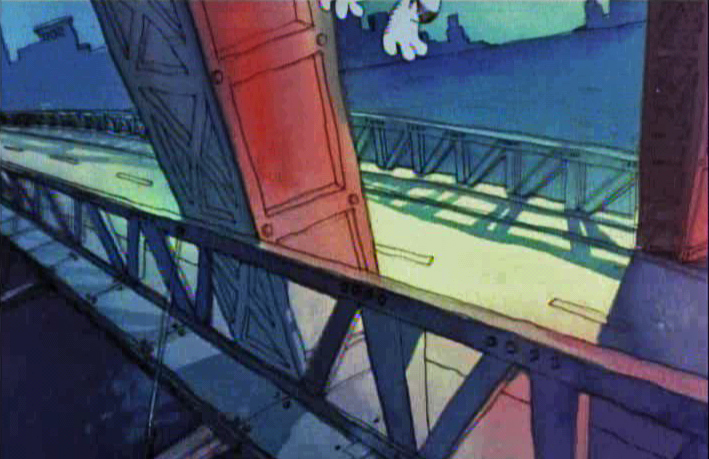
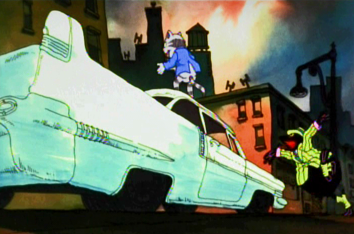
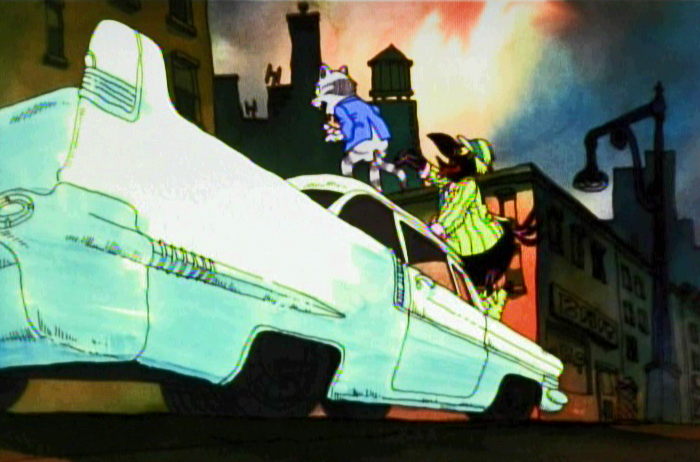
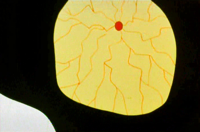
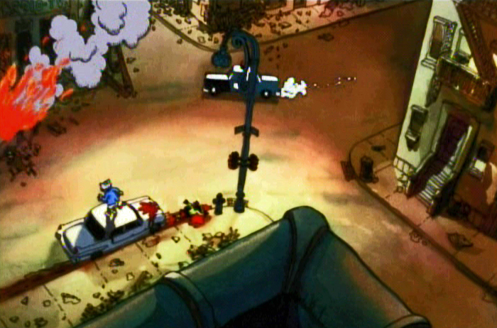
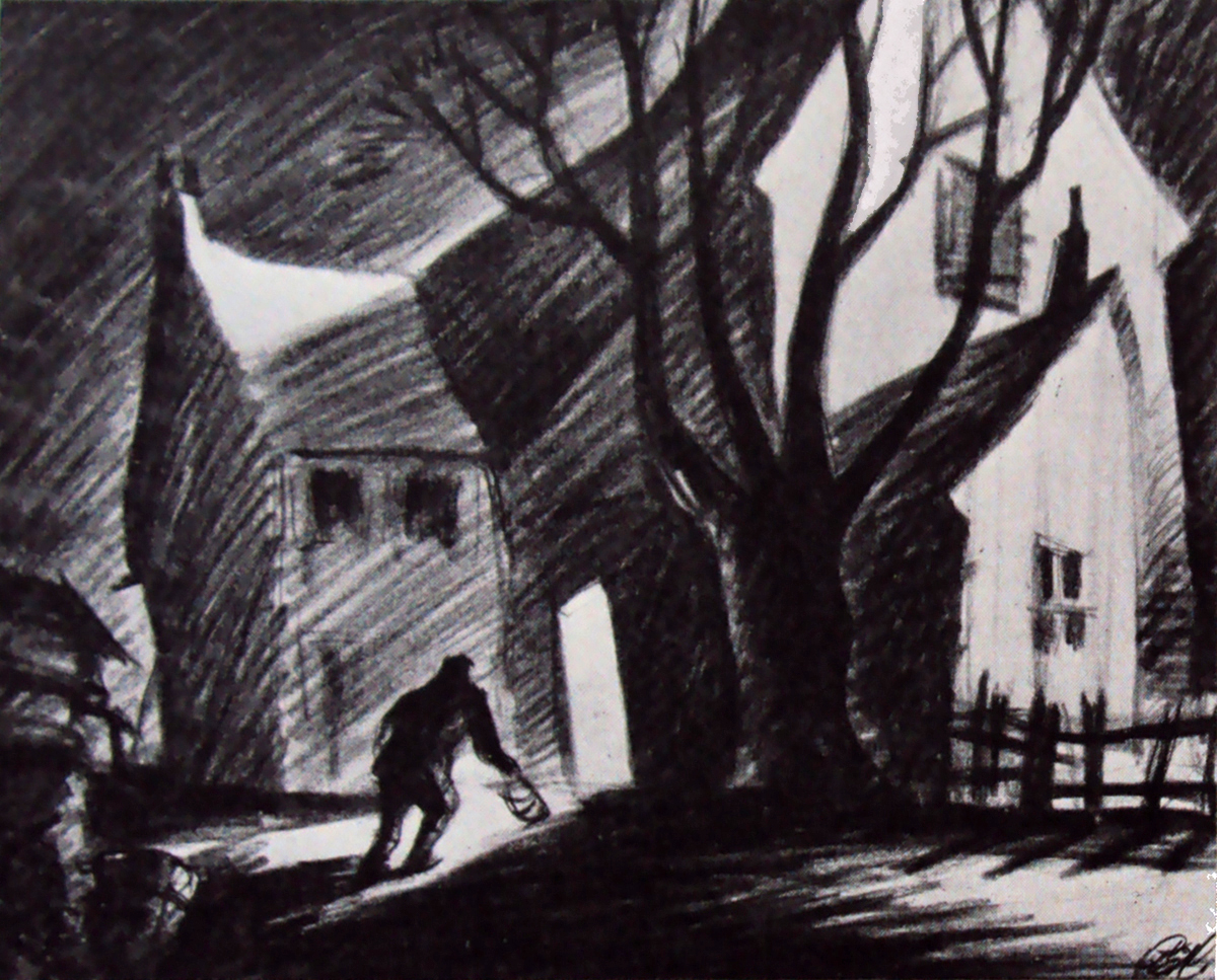
Then there’s the flight over the Brooklyn Bridge where Fritz crashes the car and the Duke saves Fritz’ life.
 1
1
 2
2
 3
3
 4
4
 5
5
 6
6
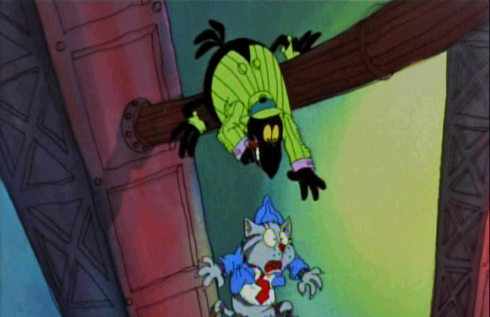
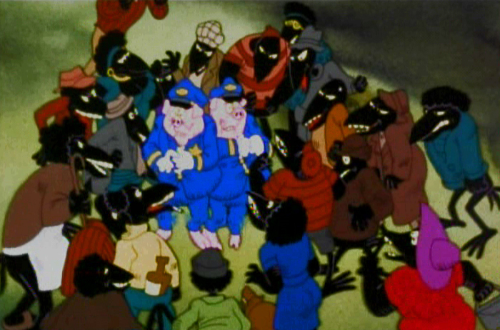
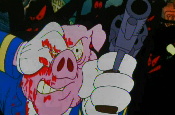
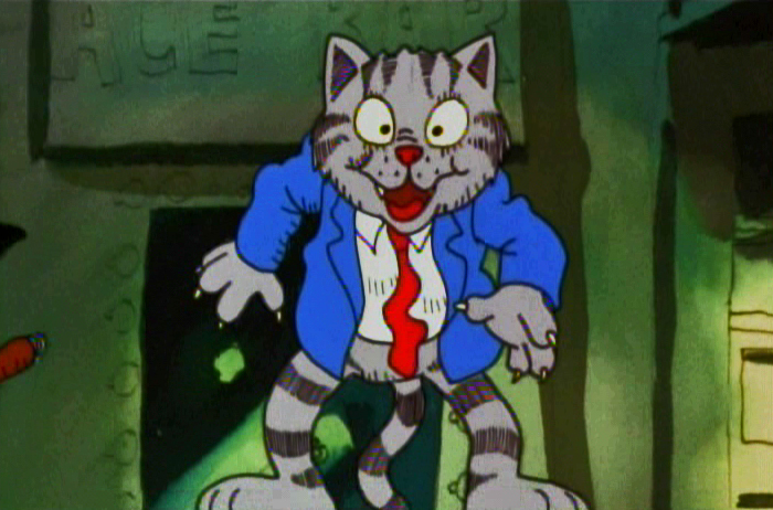
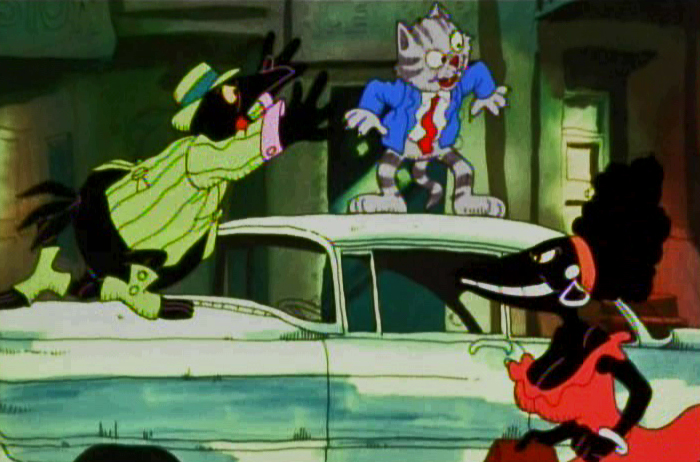
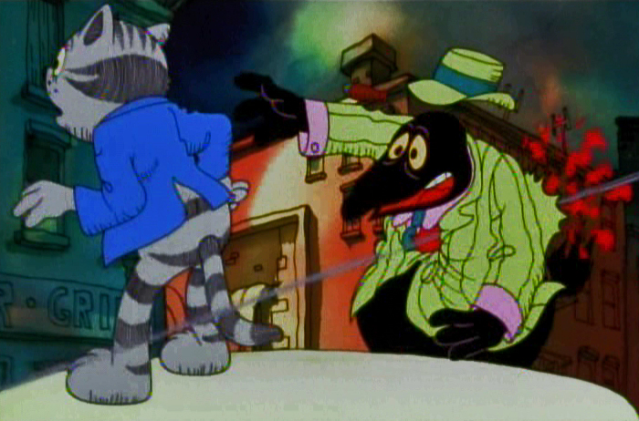
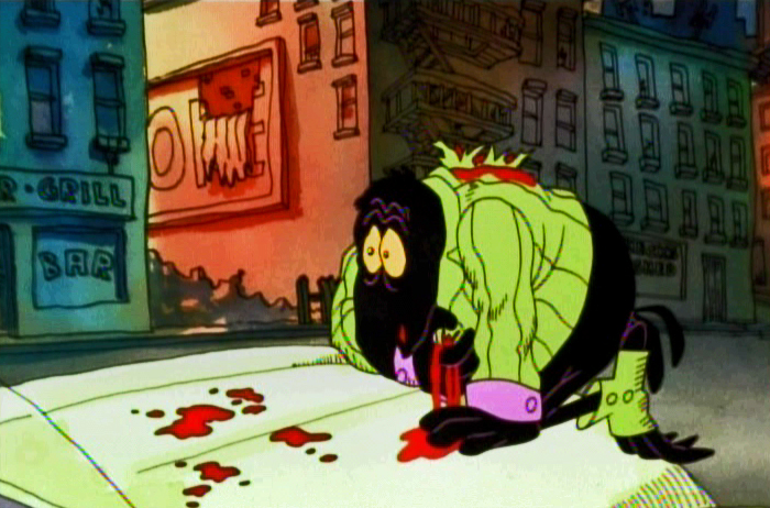
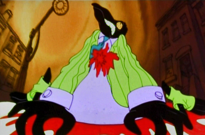
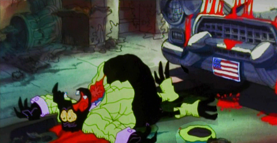
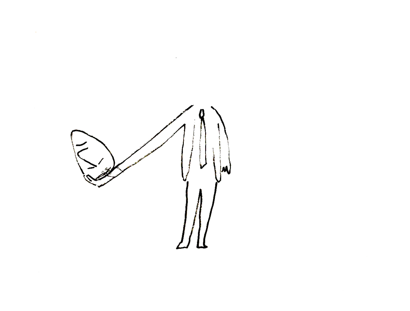
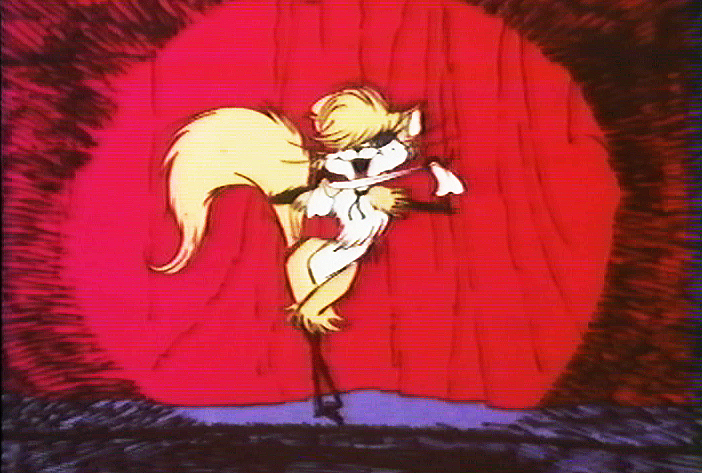
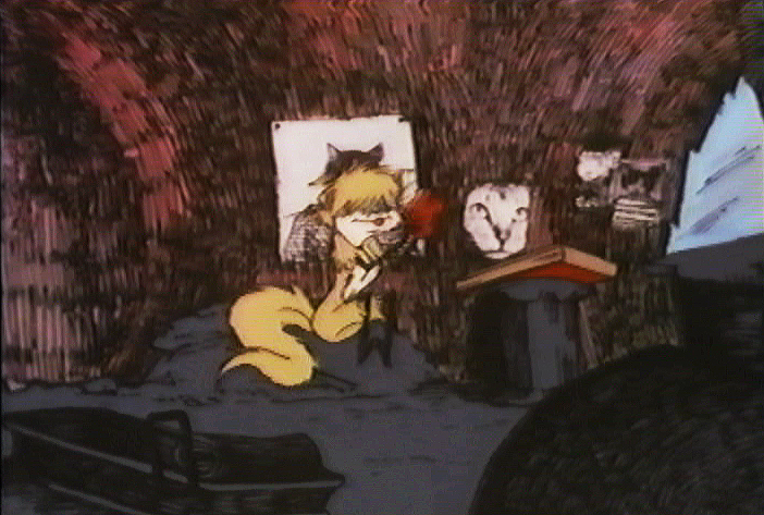
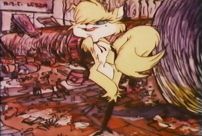
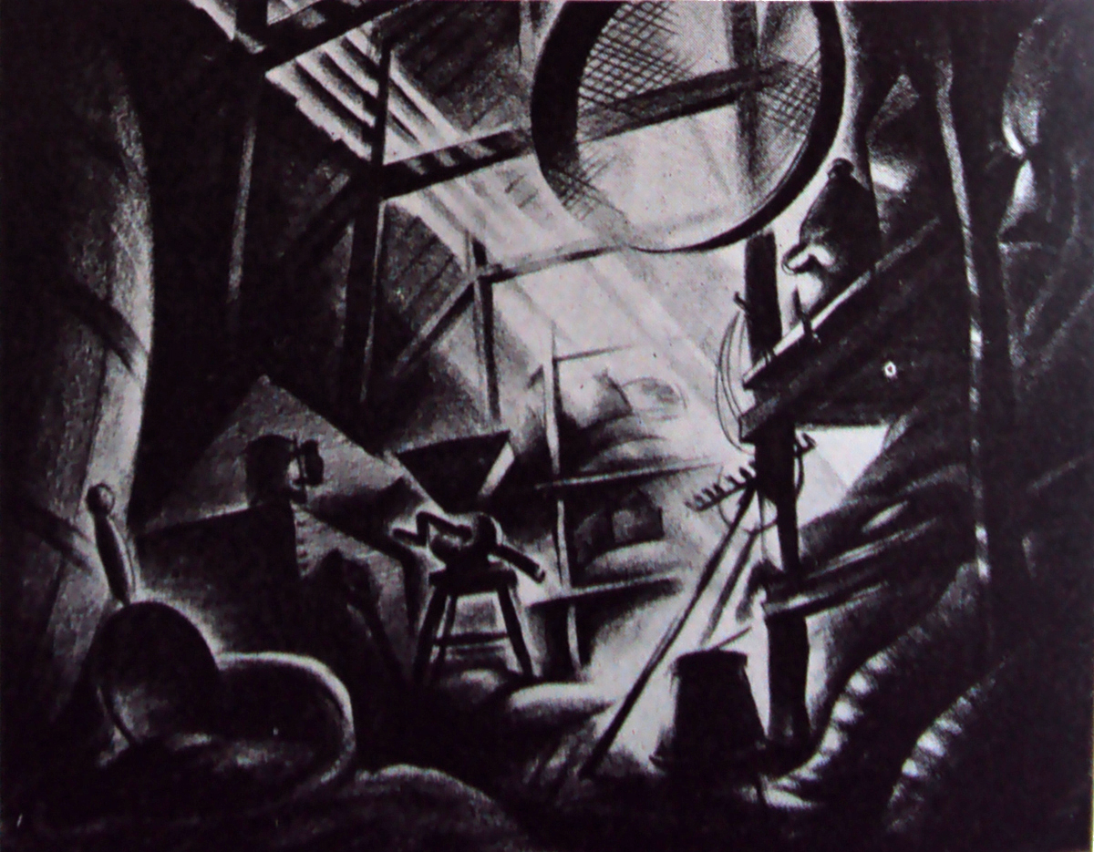
And finally, we have the best set piece of the movie. The climax that falls in the middle of the film, and the rest of the film can’t get over it.
Minor mayhem breaks out in Harlem, Duke gets killed, accidentally, and a riot breaks out. It’s all Fritz’ fault, of course, and he naturally runs from the scene at the end of the sequence.
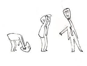
Cosmo Anzilotti, the AD told me that this was Jim Tyer‘s scene. It doesn’t quite look like his work – rock steady and beautiful. I can and do believe that it is his work. Some great great poses.
Supposedly, Tyer hated working on the film. He was a die-hard Catholic who hated the cursed animation being done. Bakshi loved Tyer, as well he should have.
 1
1
 2
2
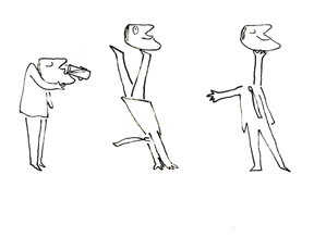
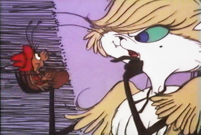
The cops are pushed into a corner.
 3
3
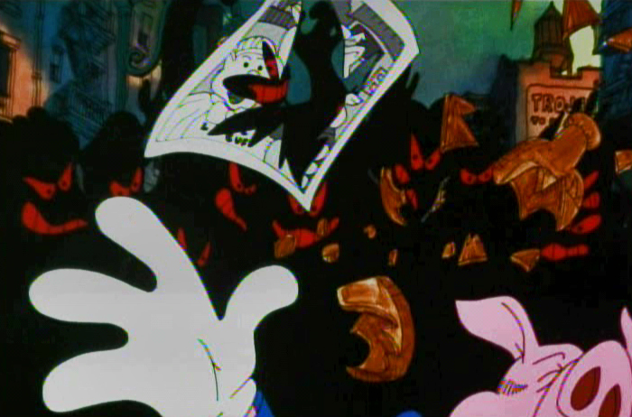
A rock hits one . . .
 4
4
. . . who pulls out a gun and fires.
 5
5
 6
6
 7
7
 8
8
 9
9
 10
10
 11
11
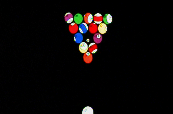
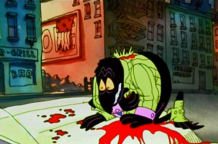
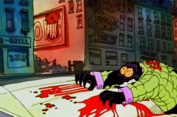
Duke is hit.
 13
13
 14
14
 15
15
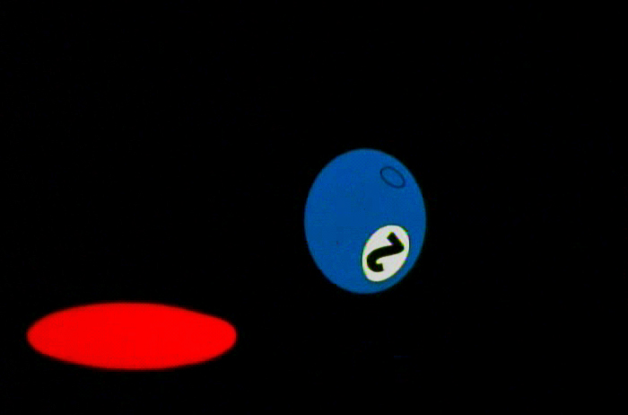
The metaphor of pool balls sinking into their holes
represents Duke’s last breaths on earth.
 16
16
 17
17
 18
18
 19
19
 20
20
Duke is dead.
 22
22
 23
23
The most important piece of writing on Fritz the Cat is an older piece done by Mike Barrier and readily available on his site. Read it if you have any interest in the film. Part 1 – Part 2 – Part 3 -Part 4 – Part 5
- Ah you didn’t think I’d forget the HARD SELL, did you? Unfortunately, I can’t. I am trying to get my little epic into the production hard line.
POE is a telling of Edgar Allan Poe’s short life story, and we’ve done a lot of art and preparation. Now we want a couple of minutes of good final product to show how great it’ll be.
Kickstart POE is the project in the works, and I need your help. Please take a look at the page, give any small support you can, even if it’s just to tell your friends about it.
Many thanks.
Animation &Independent Animation &SpornFilms 07 Mar 2012 12:15 am
Kickstarting Poe
Many of you know that I have been working hard developing an animated feature built to tell the biography of Edgar Allan Poe. Lots of artwork has been drawn, storyboards developed and shot as animatics, voices recorded, test animation done.
Well it can’t be held down anymore. The art is literally bursting out of the box ready to go forward, and I’ve made the decision to use a Kickstarter Campaign to raise a small and reasonable amount of money to complete a few minutes of Final animation.
We want that opening two minute teaser done, wherein young Edgar is dragged from theater to theater by his squabbling actor parents as they perform up and down the 1820s East Coast. They fight, perform, separate and ultimately Poe’s mother dies as the three year old sits watching the last theater, in Richmond, VA., burn to the ground, leaving him an orphan at the film’s start.
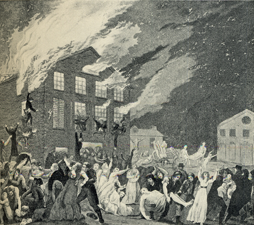
The Burning of the Theater in Richmond, VA.
This was the theater in which Elizabeth Arnold Poe,
mother of Edgar Allan Poe, was acting shortly
before her death in December 1811.
Then we have over 20 minutes of animatic that Master Aimator, TIssa David (age 91) has produced for us. We want to turn a couple of these sequences into the final animated version, rather than loose animatic.
In short we want the film moving forward, and this seems the most honest way of progressing.
I hope we will get support of the industry and our friends and those out there who will see a good investment.
We’re offering many perks from Posters, to DVDs to T-Shirts to actually getting your caricature in our animated feature. It’s all in good fun, and it’s a strong attempt to get a movie started.
Please take the time to check out the Kickstarter page, and if you can contribute anything, thank you. If not, tell your friends. It’s the friends and the friends of friends who will help us move forward.
And.please forgive me, I’m going to be raising this post until we finish up the campaign. I’m desperate to get POE in motion. Pure hard sell to come.
Animation &Animation Artifacts &Art Art &commercial animation &Independent Animation &SpornFilms 05 Mar 2012 06:22 am
Steig Alka Seltzer Drawings
 I thought today I’d post anew some layout drawings done by William Steig for an Alka Seltzer commercial produced in the early 60′s.
Obviously, for the purpose of viewing, I’ve reconfigured the poses so that several of them are on each set-up. There are actually 15 drawings to the commercial, all on separate sheets of rice paper.
 The commercial was done by Elektra Studios. Steig worked with a bamboo reed cut to form a point. He dipped that in ink and drew. The paper is particularly thick and is designed to absorb the ink. They’re punched with Oxberry peg holes top and bottom. I have one of the bamboo “pens” he used to draw these layouts. The final commercial was basically an ink line drawing against a white field.
 I’ve been a big fan of Steig‘s since my earliest days when I first discovered him in the New Yorker Magazine. By the time I’d made it to college, I’d already seen two art exhibits of his artwork.
 By the time I saw my third exhibit of his work, I was able to barely afford one of the New Yorker drawings. It’s done on rice paper with the same type of “pen”. Years later, when I told Steig that I’d bought it, he said that it was the only drawing to have sold at that exhibit.
It was real luck for me to have been able to adapt a couple of his children’s books to animation. I not only got to meet him and his wife, Jeanne, but worked with his flutist son, Jeremy, on a number of projects.
I’m rather partial to Abel’s Island as a film. There were only about two dozen B&W pen and ink illustrations in the book, so we had to do quite a bit of designing in the style of Steig Bridget Thorne, who art directed the film, did some of her finest work ever on the backgrounds – beautiful pieces that I still treasure. I think this is one of Steig‘s best books, and I think we more than did it justice. Too bad negative feelings developed toward the end of that film as Jeremy sought some kind of financial greed, and I had to move on past him to protect the film, itself. - I still wonder what Shrek might have looked like if they’d followed Steig‘s book illustrations.
The original one minute spot.
These are some of the layout drawings done by William Steig for an Alka Seltzer commercial produced in the early 60′s.
 2
2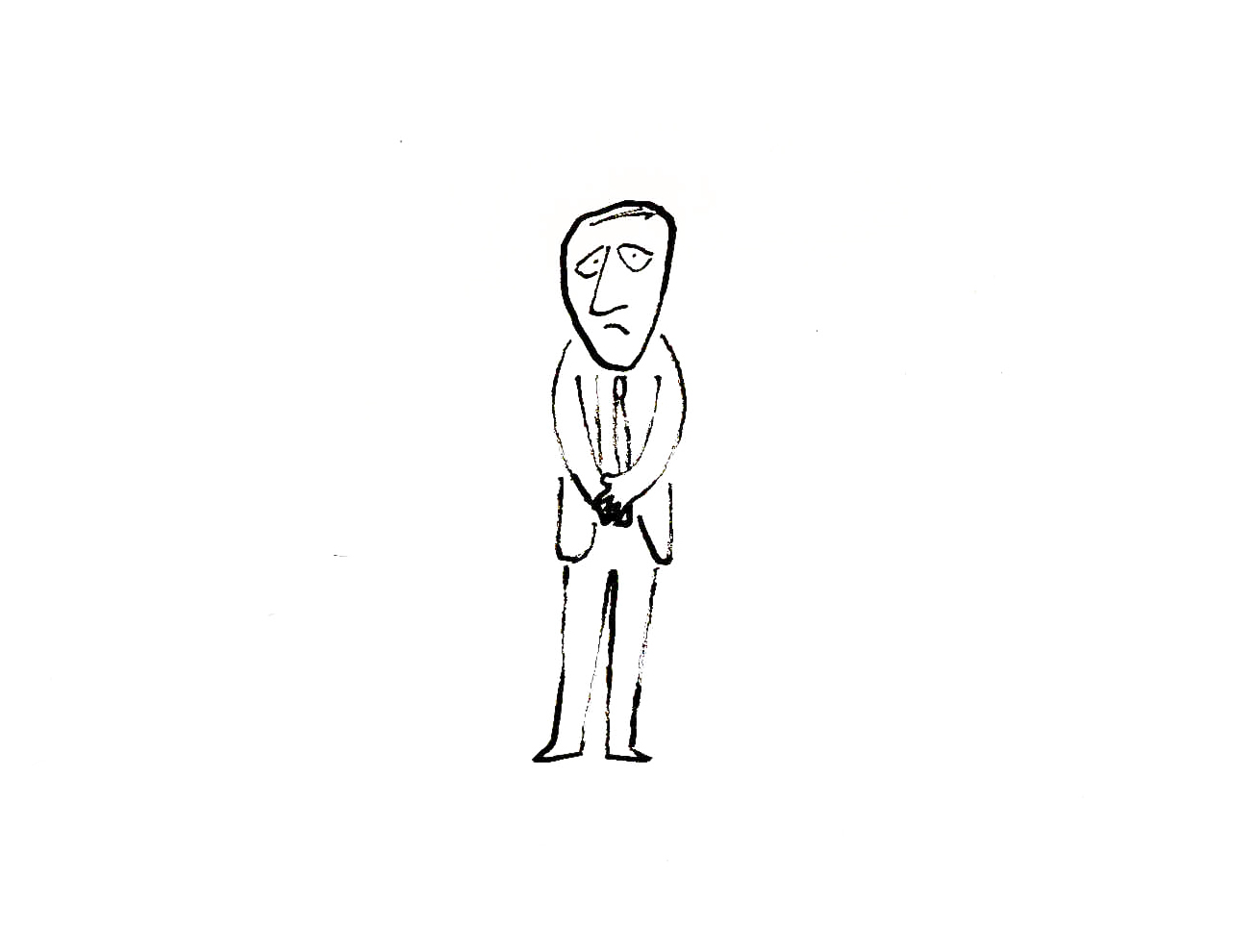 3
3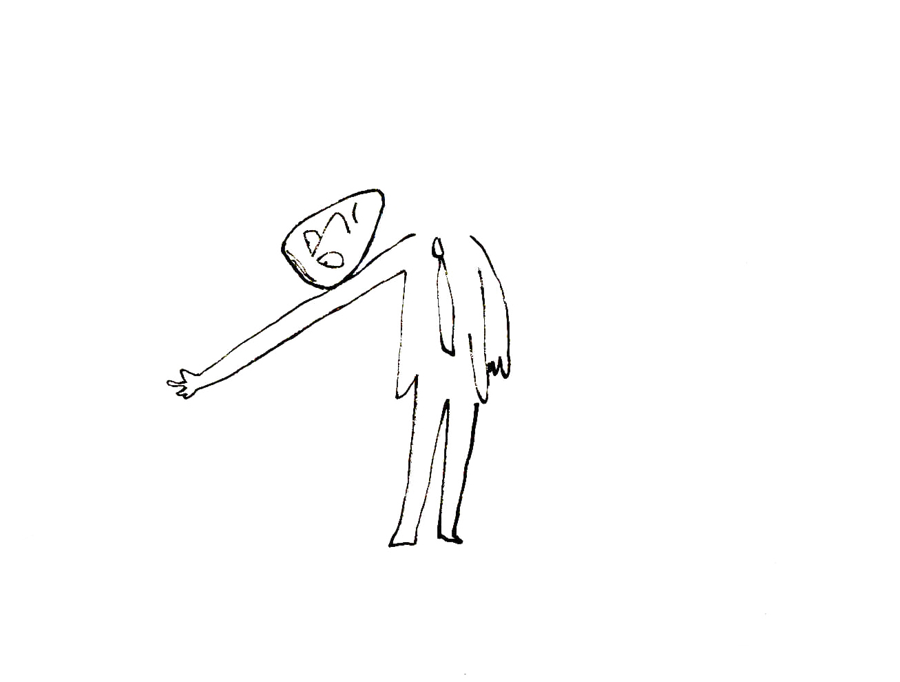
The commercial was done by Elektra Studios. Steig worked with a bamboo reed cut to form a point. He dipped that in ink and drew. The paper is particularly thick and is designed to absorb the ink. They’re punched with Oxberry peg holes top and bottom. I have one of the “pens” he used to draw these layouts. The final comercial was basically an ink line drawing against a white field.
 7
7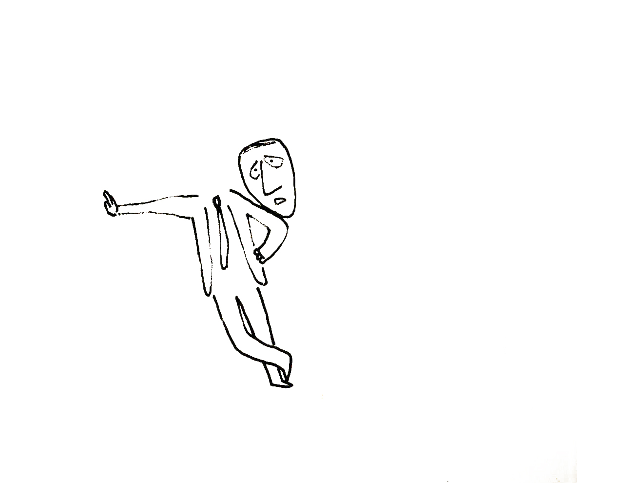 9
9I’ve been a big fan of Steig‘s since my earliest days when I first discovered him in the New Yorker Magazine. By the time I’d made it to college, I’d already seen two art exhibits of his artwork.
 12
12 13
13By the time I saw my third exhibit of his work, I was able to barely afford one of the New Yorker drawings. It’s done on rice paper with the same type of “pen”. Years later, when I told Steig that I’d bought it, he said that it was the only drawing to have sold at that exhibit.
 15
15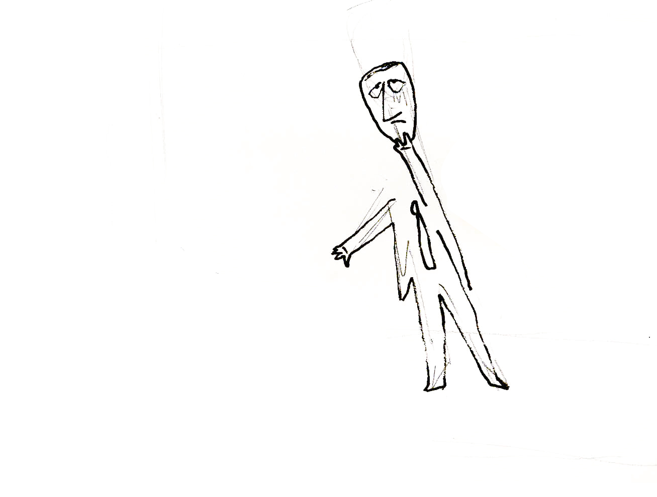 17
17It was real luck for me to have been able to adapt a couple of his children’s books to animation. I not only got to meet him and his wife, Jeanne, but worked with his flutist son, Jeremy, on a number of projects.
Bridget Thorne, who art directed the film, did some of her finest work ever on the backgrounds – beautiful pieces that I still treasure. I think this is one of Steig‘s best books, and I think we did it justice. 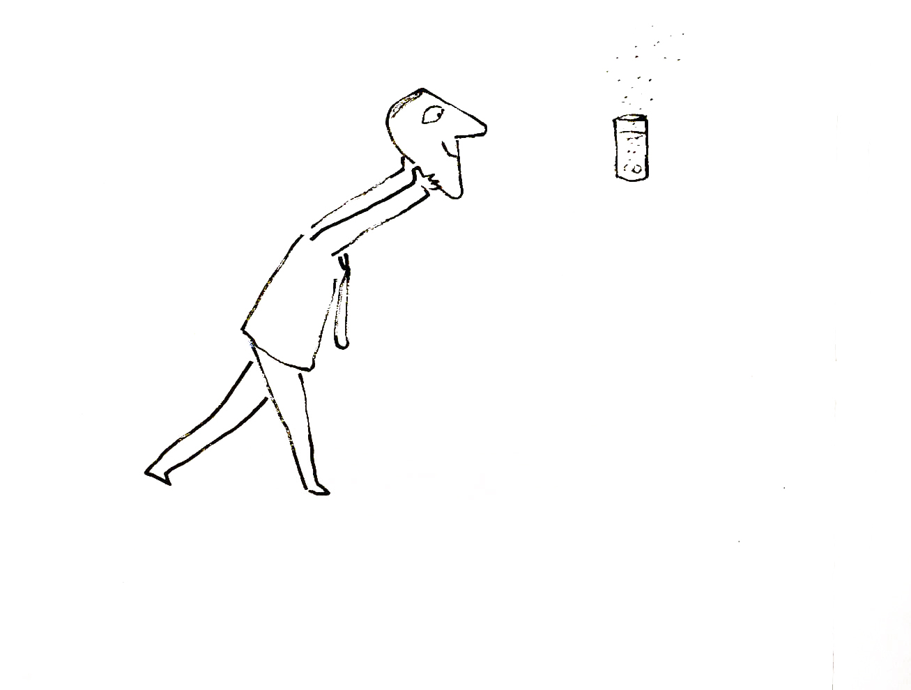
I’m rather partial to Abel’s Island as a film. There were only about two dozen B&W pen and ink illustrations in the book, so we had to do quite a bit of designing in the style of Steig
 24
24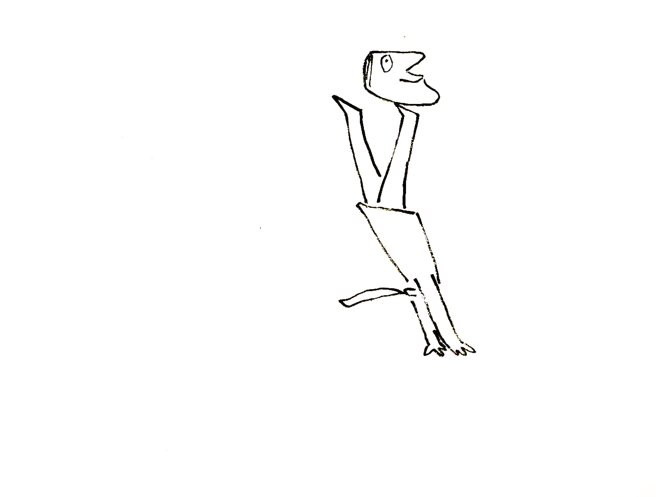 27
27
Commentary &Independent Animation 03 Mar 2012 06:11 am
More Crits, Quips and Cracks
- Last week I wrote about my reading Andrew Osmond‘s BFI monograph for the film Spirited Away. I quite enjoyed the short book and immediately read through it twice. Of course, I also enjoy Miyazaki’s film Spirited Away, so I had a lot to visit in the read.
In the rear of the book, there are notes and references for further reading. One of these was a commentary article by Michael Barrier which is still posted on his site, about Monsters Inc. and Pixar’s animation as well as mention of a couple of Miyazaki films, Princess Mononkone and Spirited Away.
My first thought on going back and rereading Mike’s article was in how much the comment and material holds up over the years. There’s some very specific arguments being made about the animation of all the films mentioned, and I can’t take issue with much of what he has to say.
I’d like to quote a few paragraphs from this article:
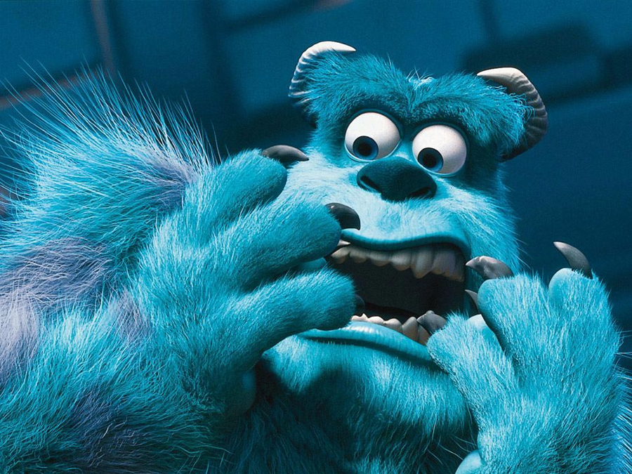 Computer animation’s technology has from all appearances advanced at an even faster rate than the techniques of the Disney animators in the thirties. It’s becoming clear, though, that, in contrast to what happened seventy years ago, there’s no necessary connection between mastering the technology and putting more convincing characters on the screen. When a character is covered with millions of precisely rendered hairs, and his on-screen environment is richly three-dimensional, it’s reasonable to expect him to move with a real creature’s subtlety. Sulley does not pass that test. He is less persuasive than many drawn characters whose caricatured movements are simpler and more direct. It is Sulley’s voice (by John Goodman) that brings him to life, far more than the animation; in that respect, the Pixar characters are indistinguishable from Homer Simpson or, for that matter, Huckleberry Hound.
 And about Spirited Away:
 Stylization, the ready answer, or excuse, for Japanese animators’ cavalier handling of their characters, doesn’t really serve in Miyazaki’s case, because he is so good at atmospherics—his settings seem real even when the characters don’t. To the extent that Chihiro, Miyazaki’s ten-year-old protagonist, wins our sympathy, it’s not because the animation brings her to life (except perhaps in fleeting moments when she slips into the paralysis of fear), it’s because Miyazaki places her in an environment as persuasively weird as those in the most obvious of his sources, Lewis Carroll’s Alice in Wonderland and Through the Looking Glass. But how much more powerful the film would be—how much more involving—if Chihiro had been animated so that she were wholly present on the screen . . .
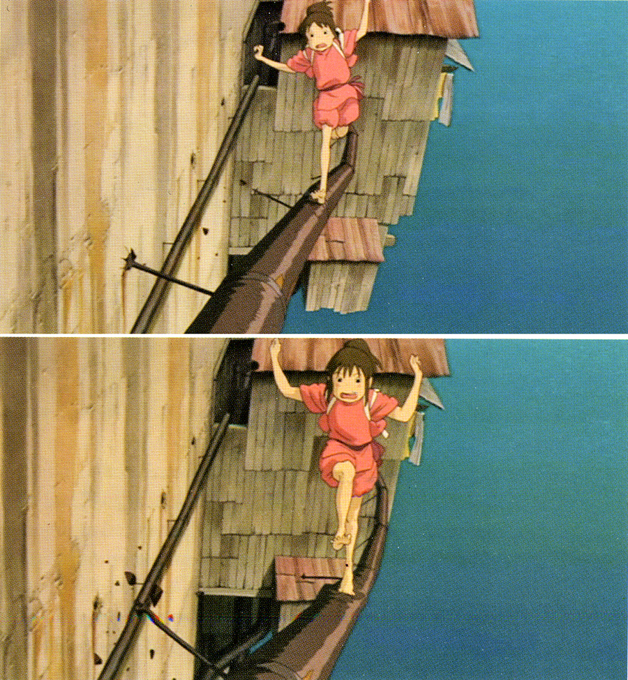
Mike is definitely right. The animation of the early, pre-Brad Bird Pixar films is not quite sophisticated enough to take control of the well performed celebrity voices that dominate the characters. (Bird, I think, was able to coax bits of fine original animation out of the animators and the complex system of cgi animation.) Likewise, through Spirited Away, I see a simplicity in the animation of the characters. However, it is with this film that I believe some real animation starts to enter the Miyazaki films. The scene where Chihiro crosses a treacherous metal pipe outside the bath house. The character makes a strong change in personality with this animation, and it has to be taken note that this is not in the voice over but in the artwork. Miyazaki made the choice to change the personality here against the arguments of his animation director, and we can see that the character development has clearly stepped into the studio’s animation, no matter how slowly. From this point forward, Chahiro has a marked change in her character.
Yes, as Mike suggests, the atmospherics have strongly supported the obvious animation, up to this point, but I believe something stronger is entering the films.
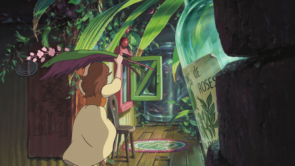 This to me is quite clear in seeing The Secret World of Arrietty. Things have taken an enormous leap, and some of the animation is very personable, completely without artifice and wholly based on human action and interaction. Certainly, it still has many wooden scenes, but there is enough original work in there, that I have to have enormous pleasure in witnessing real 2D animation making its presence felt. This non-generic animation is hard to find in western work, and that’s almost inexplicable to me.
Mike Barrier in his commentary article on Disney’s Tangled has different thoughts about cgi animation. I have to say I don’t quite agree with him on this film, but I understand what he has to say.
- Where CGI is concerned, it seems to me that a complete naturalness in the characters’ movements, like that in parts of Tangled, does not limit the animators to a deadening literalness. Instead, it creates the potential for more subtle and expressive animation of a distinctly non-literal kind, just as the Disney animators’ growing mastery of hand-drawn animation in the 1930s meant that cartoon characters like the Seven Dwarfs could be more insistently present on the screen than characters that were drawn with superficially greater realism.
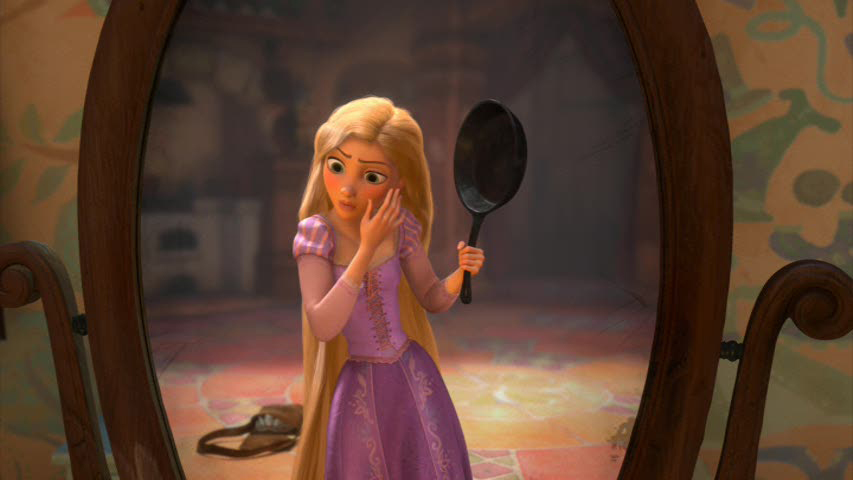 Where Mike sees glimmers of a reality in the animation, I see it all ripped away by generic popping movements, oftentimes covered with blurred motions. What you get are the slow moving gestures immediately followed by popping cartoon-like actions. This goes for both Rapunzel and her Prince. The end result is that their motions, to me, are identical, and there is no personality shining through beyond the voice acting (which I don’t think is great. Mandy Moore couldn’t be more generic.) The realistic movements, to me, are with the witch/stepmother. Here, Donna Murphy‘s voice over has a lot to do with the character, but I don’t discount what the character, herself, is doing in the animation.
In short, I have to say that there’s a veritable treasure trove of material on Mike Barrier‘s site. Dig in and take a look at some of these articles. His is a singular, articulate voice, and there’re books worth of ideas and living commentary on this site. And it’s all for free. but then if you really love animation, you already know this.
 - I’m pleased to see that Ian Lumsden has returned to posting more videos on his blog, The Animation Blog. Ian’s taste is quite fine, and the work posted is always of a generally high caliber. Recently he posted Eugene Federenko and Rose Newlove‘s beauty of a film, The Village Idiots. Federenko is an artist of the most devoted kind, and to watch his films is always my pleasure. Believe me, I’ve seen many of them MANY times, and the welcome doesn’t wear thin for me.
Such films as Mr. Federenko’s makes me long for the National Film Board of even fifteen years ago when capital was a little more available, and the beautiful films
 were plentiful. (I’m grateful for any short they’re still making and I wait for them at Festivals and Academy runoffs. This year’s Wild Life by Wendy Tilby and Amanda Forbis and Dimanche by Patrick Doyon were both superb gems, and those filmmakers deserved the high praise they received in being nominated for the Oscar. I’d hoped for Wild Life to win, but am pleased they got as far as they did. It’s story is the best of those that were in the running.)
- The Oscars came and went, and neither of my animation choices won, though I’m not ocmpletely dissatisfied with Rango‘s win. At least it was the more eccentric of the cgi films.
As for The Fantastic Flying Books of Mr. Morris Lessmore, I find the film completely opaque. It’s obviously and attractive and seems to think it’s about something, but I’ll be damned if I can understand it. Except that the guy likes books and doles them out from his ersatz library in the middle of nowhereland. Oh yes, he’s lonely. All he has is a Humpty Dumpty animated illustration book to keep him in good company.
This is one of those design-y stories where everything is built around conceit, and the audience is fed schmaltz about nothing. It’s a poor meal to swallow.
A film like Wild Life is about many things and told its story beautifully, graphically and was well animated.
Just the same, congratulations to William Joyce and Brandon Oldenburg
I’m pleased that they’re onto other projects at Moonbot Studio.
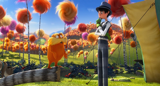 - Of the local critics, AO Scott of the NYTimes was particularly harsh on THE LORAX
- Don’t be fooled. Despite its soft environmentalist message “The Lorax†is an example of what it pretends to oppose. Its relationship to Dr. Seuss’s book is precisely that of the synthetic trees that line the streets of Thneedville to the organic Truffulas they have displaced. The movie is a noisy, useless piece of junk, reverse-engineered into something resembling popular art in accordance with the reigning imperatives of marketing and brand extension.
and then later in the review . . .
- In the film as in the book, the Once-ler ravages the landscape and destroys the Truffula trees to manufacture thneeds, knitted garments that have multiple uses but no real utility. Demand for them is insatiable for a while, and then, once the trees are gone, the thneeds are forgotten, partly because nobody really needed them in the first place. There is an obvious metaphor here, but the movie is blind to it, and to everything else that is interesting or true in the story it tries to tell.
It sounds like the trailer I saw for the film, as I waited patiently through many animated junk trailers, on the way to see The Secret World of Arrietty in a theater. The film screens for Academy members on this upcoming Thursday. Maybe I’ll muster the courage to sit through it.
But then, Eliabeth Weitzman in the NYDaily News seemed to enjoy the film calling it, “A Tree-mendous Animated Movie.”
- While softening Geisel’s darker themes, they still meld a valuable message into catchy songs, bright images (nicely done in 3D) and funny characters.
- Even adults are likely to walk out wondering how our own society has strayed so far from any sensible path … before hopping into their Lorax-approved Mazda and heading to IHOP for some Truffula Chip pancakes.
And, finally, the NYPost‘s Kyle Smith is merciless:
- I am the critic, I speak to displease:
“The Lorax†is awful, like chronic disease.
There’s no fun in “The Lorax,†no joy in its theme;
It’s as boring as sales tax.
I’m ready to ream.
Bill Peckmann &Books &Comic Art &Independent Animation 01 Mar 2012 07:00 am
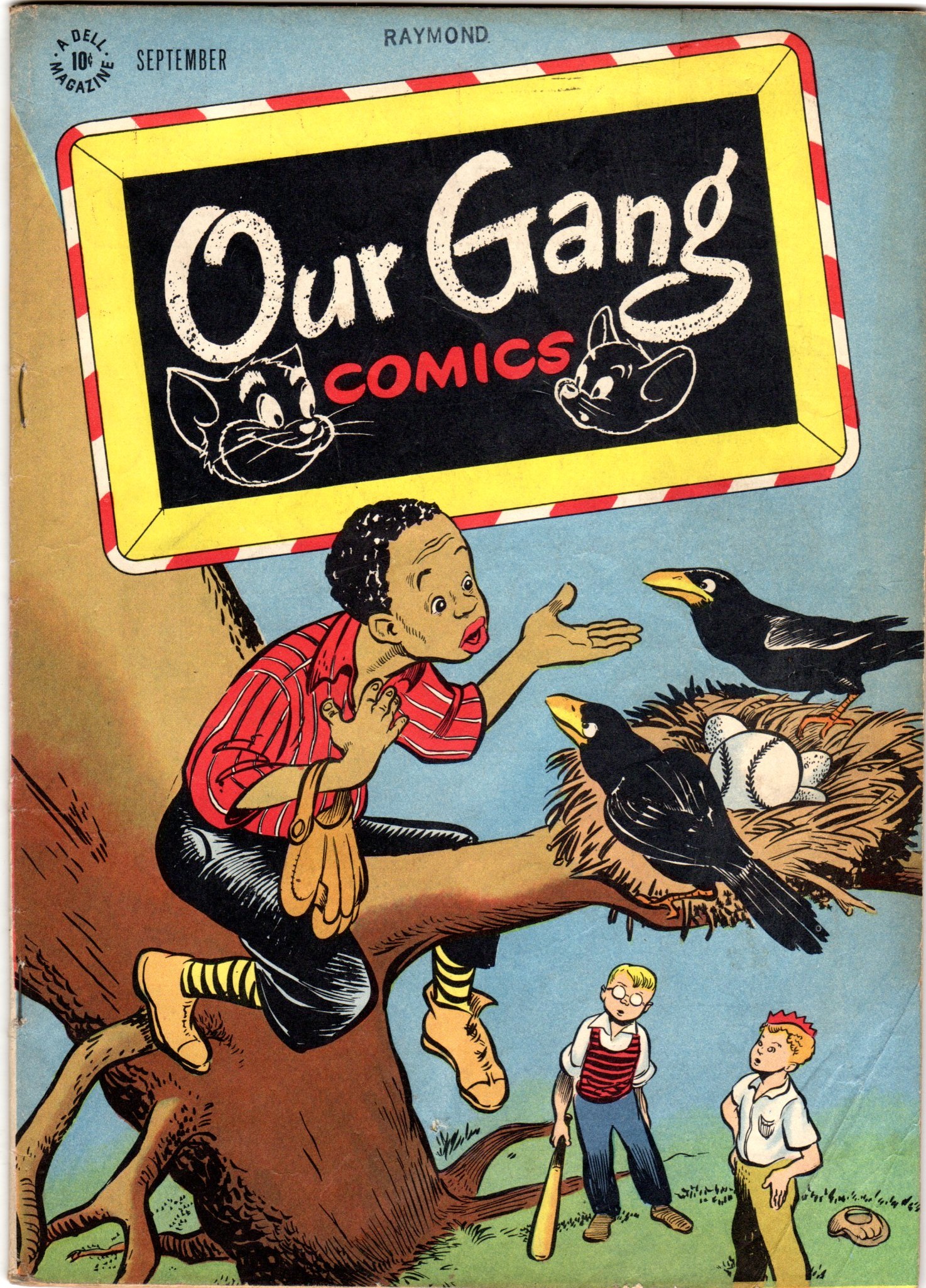
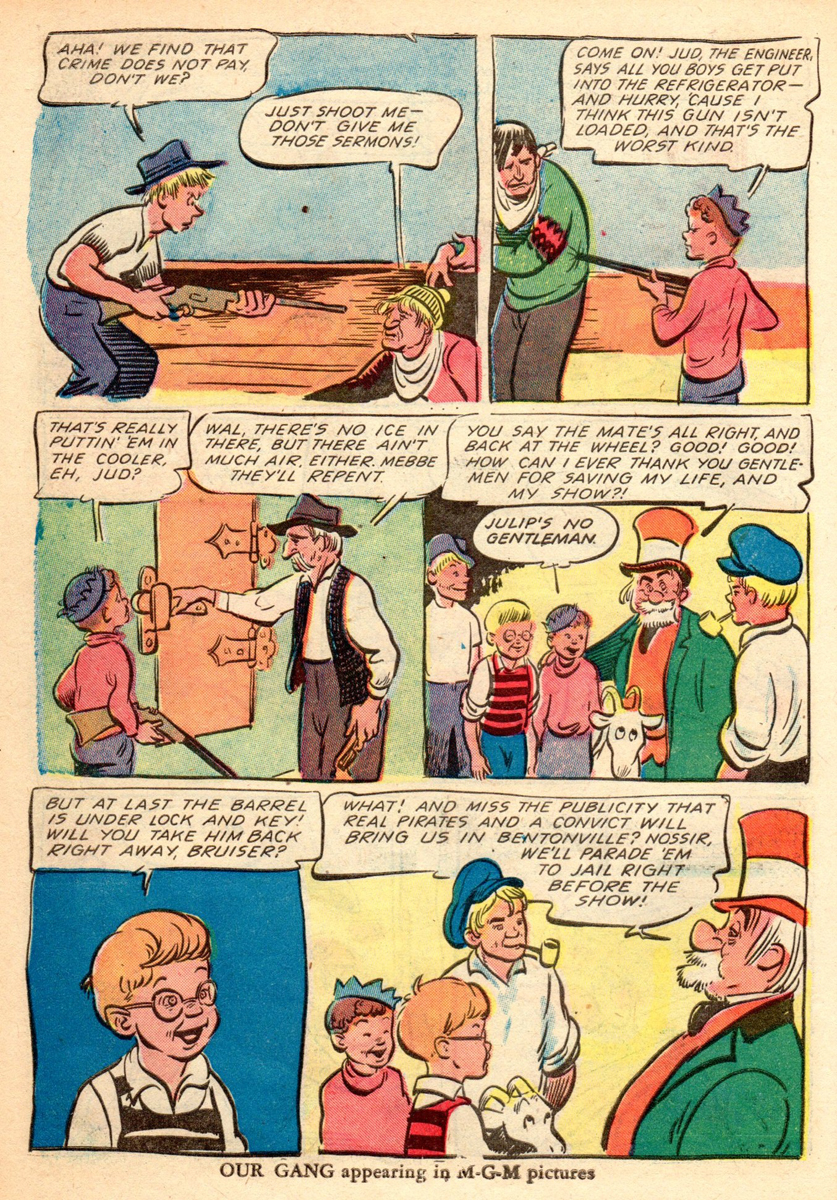
Walt Kelly’s Our Gang
Today and tomorrow we’ll focus on some of the early and brilliant art of Walt Kelly.
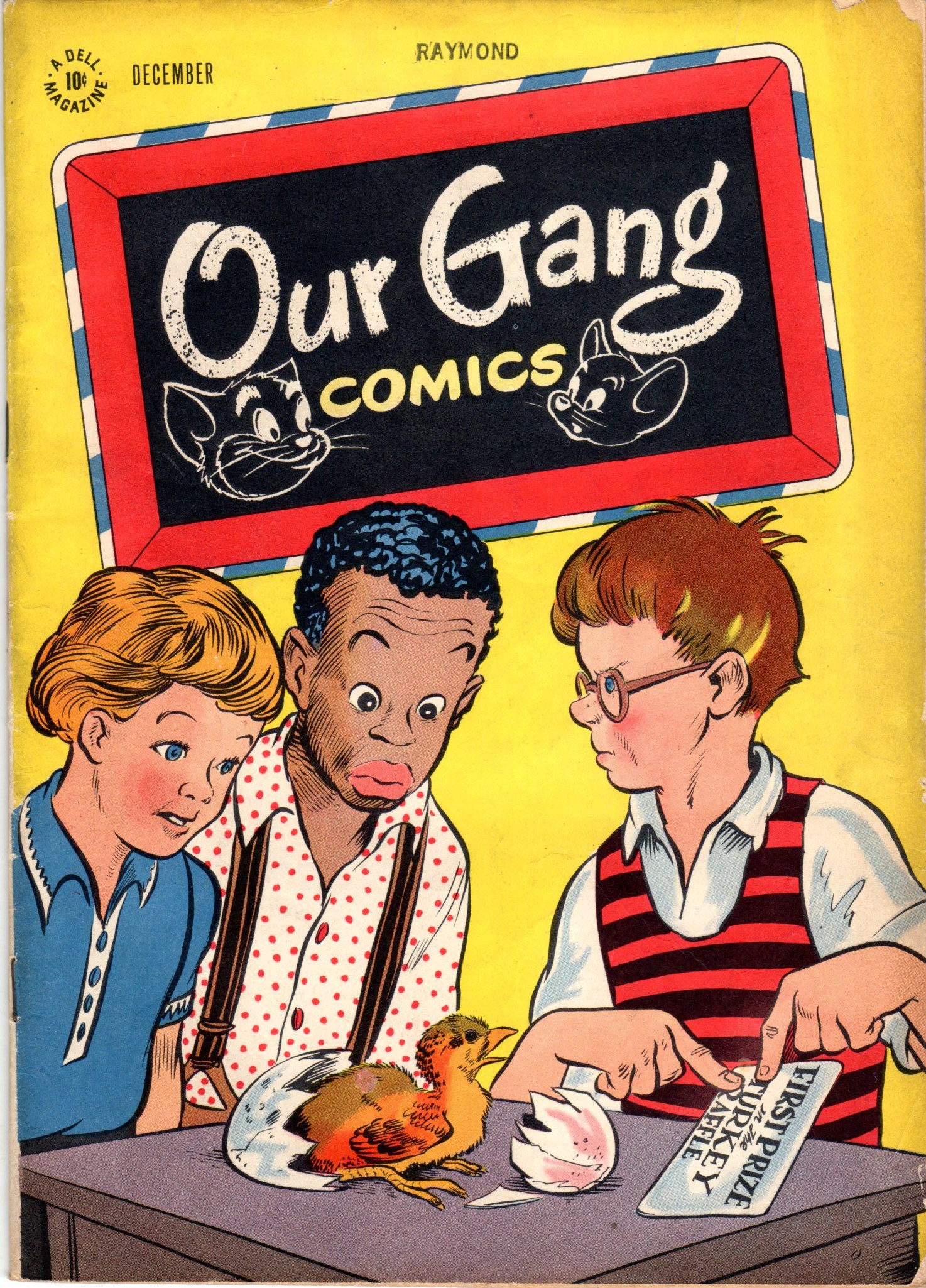
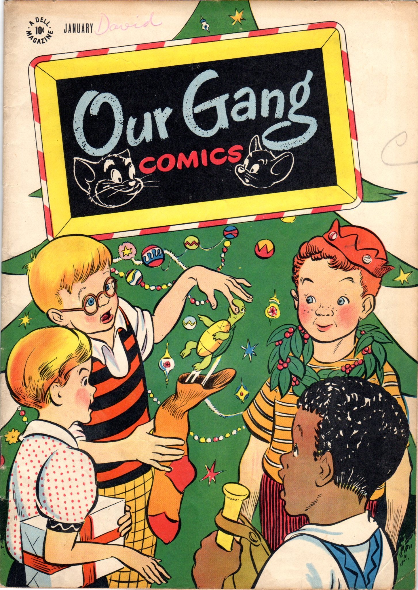
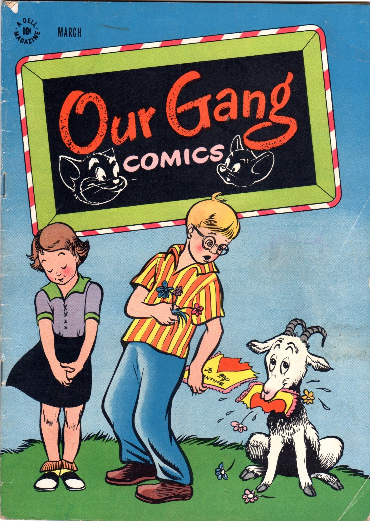
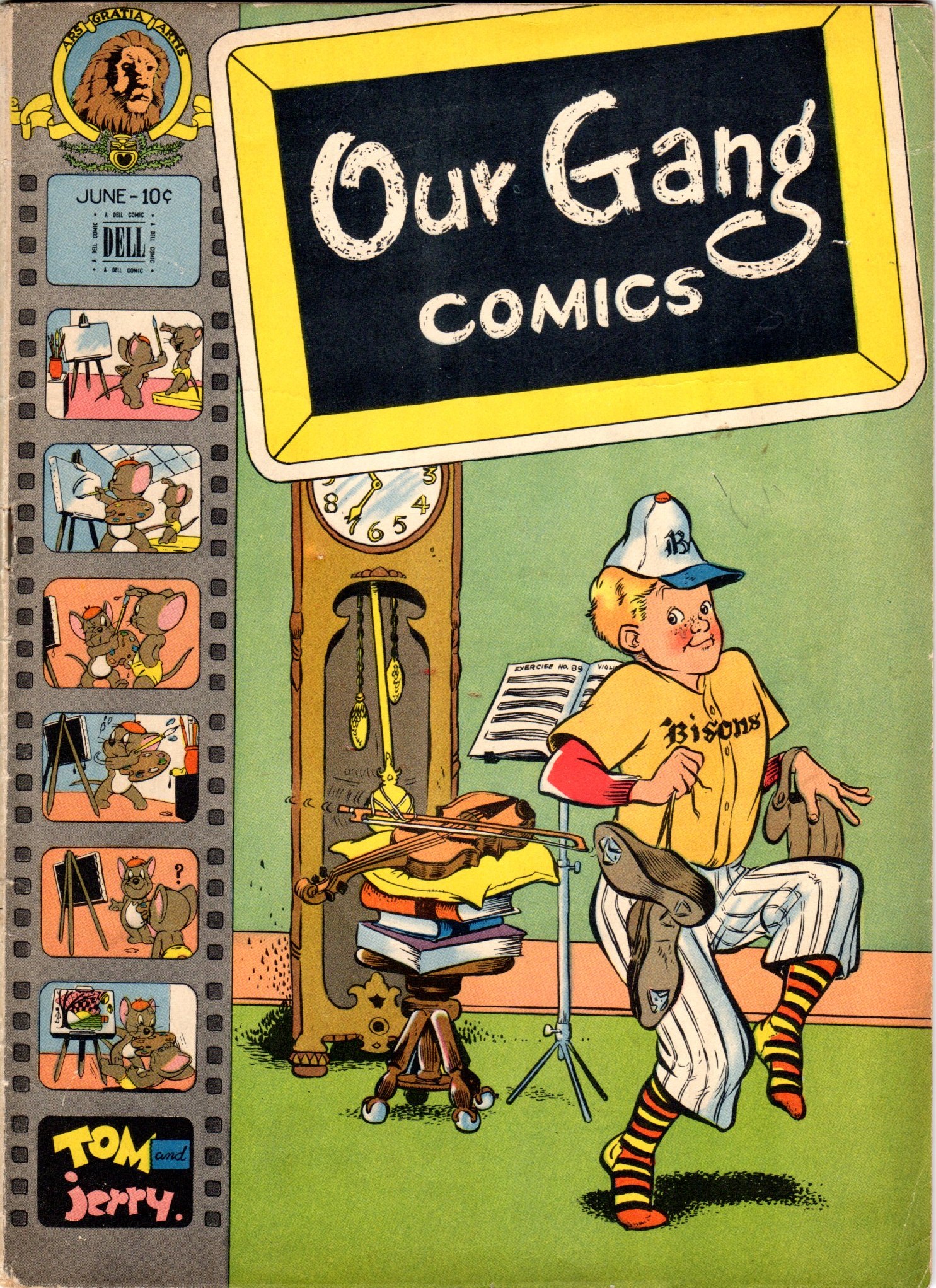
- Bill Peckmann has forwarded some of the covers from Walt Kelly‘s Dell comic books, the “Our Gang” series, dated 1946 & 1947. Also included in this stash are a couple of the interior stories.
Bill writes:
- I certainly wish I had more than these 7 issues of Walt Kelly’s “Our Gang” comic books published by Dell, but looking at these covers, they will give you a sense of what Kelly was up to.
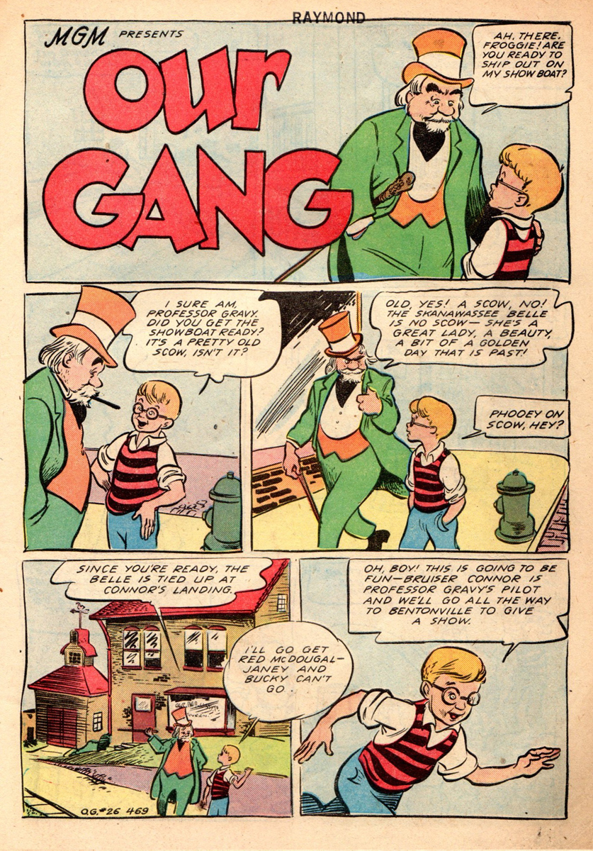
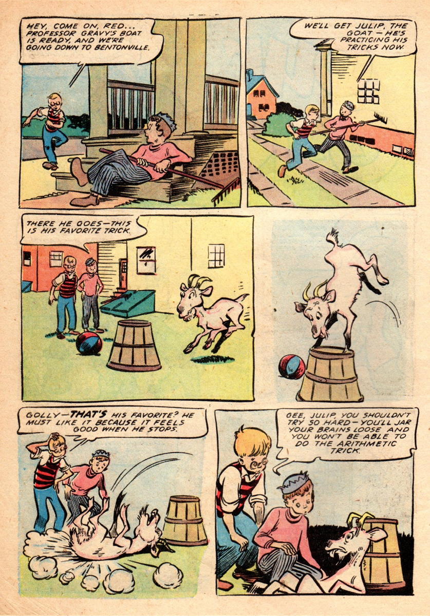
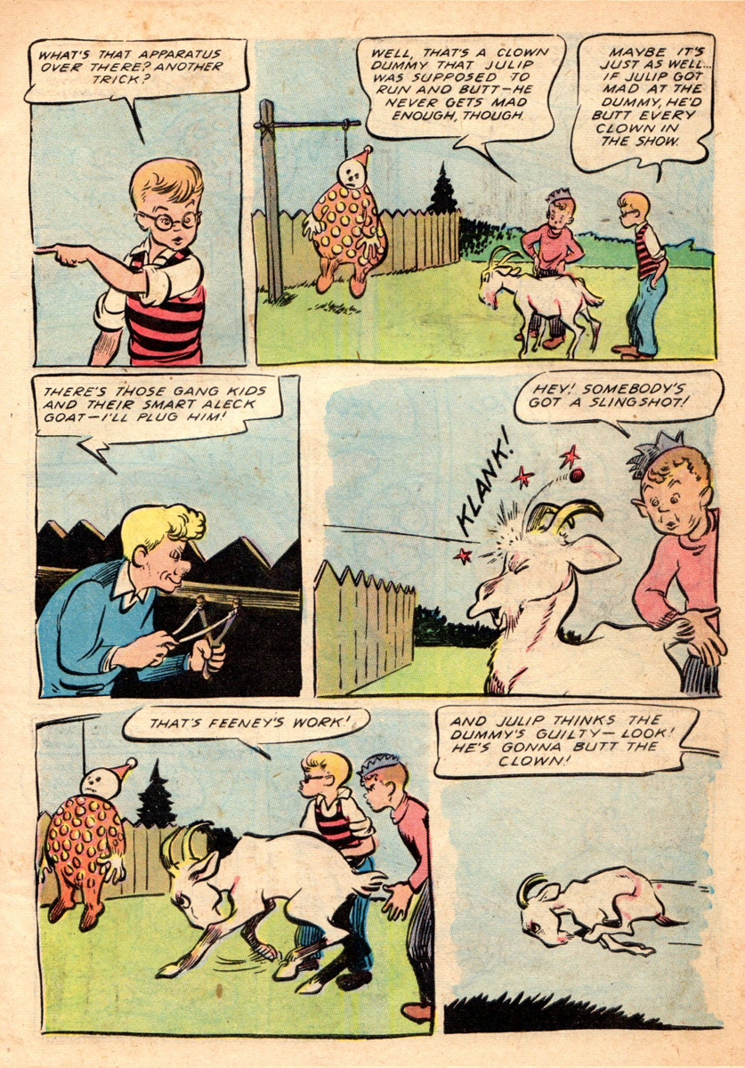
- Each issue contained a 14 to 16 page “Our Gang” story done by Kelly, a “Tom and Jerry” story, a “Flip and Dip”, a Carl Barks “Barney Bear and Benny Burro” piece and ended with an appearance by “Wuff the Prairie Dog”.
- I’ll include one “Our Gang” story and one “Barney Bear” to round out the post and save the “Pogo” comics for a post by themselves.
 1
1August 1946
 2
2
September 1946
 3
3
December 1946
 4
4
January 1947
5
February 1947
 6
6
 7
7
June 1947
 8
8
back cover
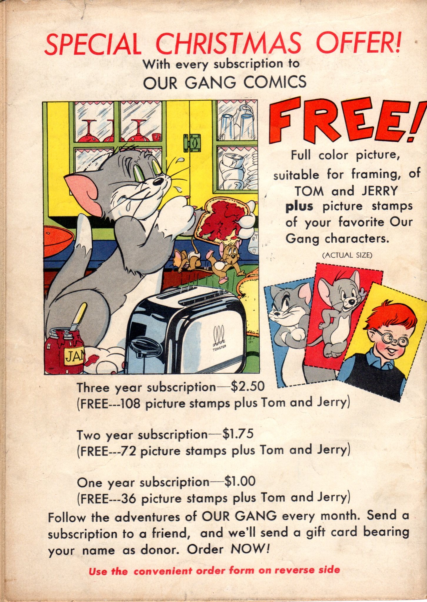
All the back covers have basically the same subscription ad,
but I thought I’d send one along for the “currency” shock of it.
What happens when you pour deceptively simple and totally charming into a bottle and shake ‘em up? Why out pours Walt Kelly’s “Our Gang” comics of course! What a touch he had for combining “cartoony” and “straight” in those stories, not an easy thing to pull off, he and Roy Crane were masters of it! Norman Maurer of “Boy” and “Daredevil” comics also had that wonderful ability.
 1
1
 2
2
 3
3
 4
4
 5
5
 6
6
 7
7
 8
8
 9
9
 10
10
 11
11
 12
12
 13
13
 14
14
 15
15
 16
16
 1
1
Here are two Walt Kelly single page gags from the same issue.
 2
2
Animation &Commentary &Independent Animation &Richard Williams 18 Feb 2012 08:56 am
Sheldon Cohen & John Gaug and Arrietty and NAACP Image Award
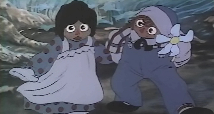
Tissa David‘s enormous seminal Raggedy Ann scene.
The rest of the film was built on the back of this one.
- Back in 1976, I was lucky enough to get hired onto Raggedy Ann and Andy, a feature film Bobbs Merrill was financing with Richard Williams as the newly employed director. I was the first non-animator hired (three animators were hired before me: Tissa David, Art Babbitt, and Emery Hawkins. Corny Cole was designing and doing the storyboard; Gerry Potterton was the assistant director.
When the studio was set up, with its headquarter in New York, they chose a space in a building that had entrances on 45th and 44th Streets just off 5th Ave. The space was enormous and dark. Many of the lights were usually left off. Sometimes the office manager, Bruce , would be there. but for the most part, while the voices were being recorded, I was alone in the space.
I decided to start buying animation desks and discs and other equipment. I did this and worked with someone to get holes cut and lighting set up in the desks. We started prepping partitions and just setting up everything. Once bits of animation started coming in Assistant Animators were hired. Jim Logan was the first, and he and I worked together for several months with little to do but laugh and do bits of inbetweening for animation tests.
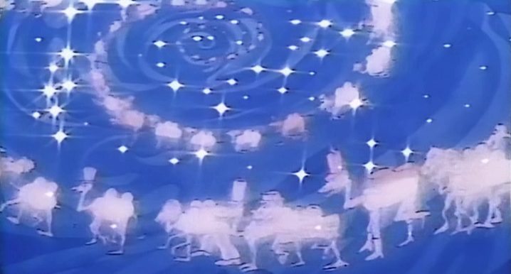 Dick Williams gave me a scene of a mirage the Camel with the Wrinkled Knees would have. 97 dancing camels spiraling into the distance would be superimposed over the Camel’s head. I worked for about six weeks on this one scene, and until I had to be taken off it. The scene near completion went to the newly hired John Kimball who was going to do a number of other similar scenes, and he’d build them all into the film. I moved to head of Assistants and Inbetweeners and definitely had a lot of work to do.
Hiring lots of people in New York and training many of the new faces was foremost. We ended up with seven rooms with about 15 Assistants and Inbetweeners in each room. Finding new people wasn’t always easy, and they didn’t all work out.
In 1976, the Ottawa Animation Festival had its inauguration year. (That was when Caroline Leaf took over the animation world, becoming a star with her film, The Street.) It was here that I went to look for talent, and I found it in several people. John Gaug came down from Atkinson Film Arts in Ottawa. He was a gifted talent and a very tight style. Sheldon Cohen was closer to my heart. His sensitive drawings and warm approach to the artwork made him a definite person to hire. After getting back to New York I let the powers-to-be know that I was hiring the two and made the calls. Both moved dpwn to the City.
 Both continued on after Raggedy Ann ended.
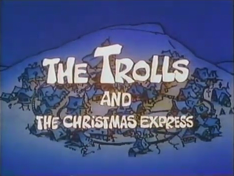
John Gaug moved on to the Williams studio in London where he became an animator, moved back to Ottawa to direct Trolls and the Christmas Express (where I animated freelance for him). Then he moved back to New York working in the commercial studios (I got to hire him again at R. O. Blechman’s studio) until he died in 1984.
.
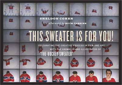
 Sheldon Cohen moved back to Montreal where he became a unique artist for the National Film Board. He directed and animated a number of strong films. His most famous, The Sweater, showed an artist in full bloom seemingly right out of the box. He continues doing a number of children’s books and recently has written a oersonal memoir called This Sweater Is For You! published by ECW Press in Toronto. The book will soon be on the market, I’ll get a copy and will definitely review it. I’d also like to interview Sheldon about his 40 year career of making art.
In the meantime, you can see a number of Sheldon’s films on the NFB site. I’ve linked those films below.
The Sweater is an adaptation of a Mordecai Richler short story.
I Want a Dog is based on the book by Dayal Kaur Khalsa.
Snow Cat starts out with the feel of the book Goodnight Moon
but soon turns to a very graphic and textured look.
It’s a 23 minute film with wonderful narration by Maureen Stapleton.
Pies, a film about blind prejudice, is based
on a short story by Canadian author Wilma Riley.
_______________________________________________________
Ghibli’s The Secret World of Arrietty opened yesterday to generally positive reviews.
- Manohla Dargis in the NYTimes praised the Ghibli approach to female characters, who often are the leads, but was bothered by some of the elements lost in adapting the original novel, however
 “. . . it’s initially a letdown that Arrietty and Shawn aren’t just friends, as in the book, but also something like impossible romantic foils. Yet this disappointment proves mostly premature because Studio Ghibli and Arrietty have a way of taking you where you may not expect, whether you’re scrambling through rooms as large as canyons or clambering into the safety of an outstretched hand, a simple gesture that says it all.”
 - Lou Leminick in his 3 star review in the NYPost writes:
- Studio Ghibli is at the forefront of keeping traditional hand-drawn animation alive — and it works well even for a story that’s less fantastical than Miyazaki’s signature works.
- Many animated and live-action films have dealt with miniature humans, but few have depicted a sheer sense of scale as effectively as this one.
“The Secret World of Arrietty’’ is a feast for the eyes that will engage the entire family.
- Phillip French in The Observer writes a very positive review:
- At the heart of the film, is the tender, trusting friendship between Shawn, the boy of the house, and Arrietty. Theirs is a beautiful, perfect love, but ultimately doomed like so many relationships in myths and fairytales. This moving, amusing and resonant tale also touches on environmental and ecological concerns, on xenophobia and the fear of the threatening other. And it has taken on new meanings about the respect and preservation of disappearing species and the need to treasure and recycle valuable resources.

.
- Finally, the good news, last night, I won the NAACP IMAGE Award for Outstanding Children’s Program. I’m proud of this one, thankyou very much.
Outstanding Children’s Program
“A.N.T. Farm”
“Dora the Explorer”
“Go, Diego! Go! ”
WINNER: “I Can Be President: A Kid’s-Eye View”
“My Family Tree”
.
Articles on Animation &Independent Animation &Tytla 07 Feb 2012 06:28 am
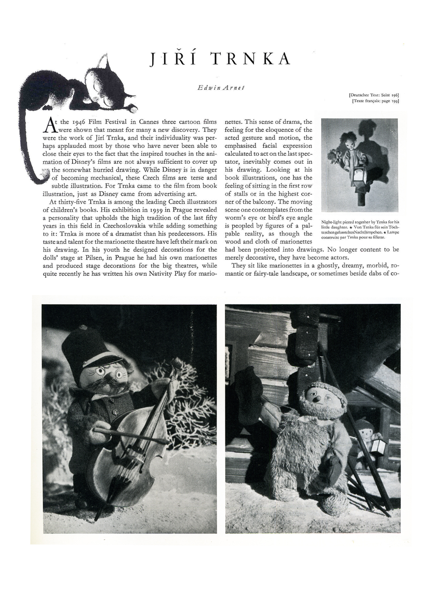
Trnka in Graphis, 1947
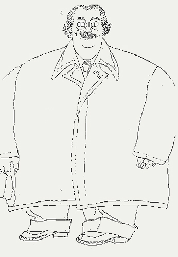 - Last week I linked to a post that Gene Deitch offered covering the Centennial of Jiřà Trnka‘s birth.
That got me to look back on some of the material I have featuring this exceptional artist. One of my favorite pieces appears in Graphis Magazine published in their 1947 edition. I’d posted this article in 2008 and am offering it again. I’d cut a few pages, which I’ve restored, and have also done a better scan of the pages.
It must be remembered that this article was published before any of the great Trnka films: The Hand, Archangel Gabriel and Mother Goose, or Midsummer’s Night Dream. Much of the piece is about his illustration work.
Regardless, it’s amazing how many beautiful images appear in his earlier films featured in this article.
(Note: Graphis is printed in three languages; all of the English is included.)
 1
1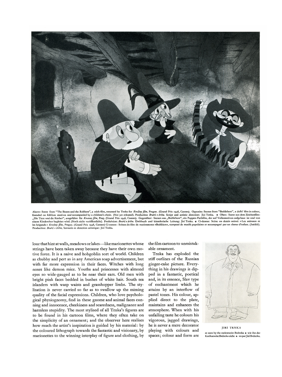 2
2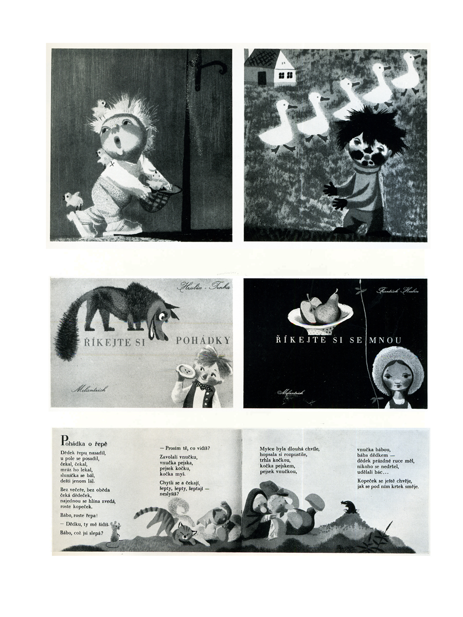 3
3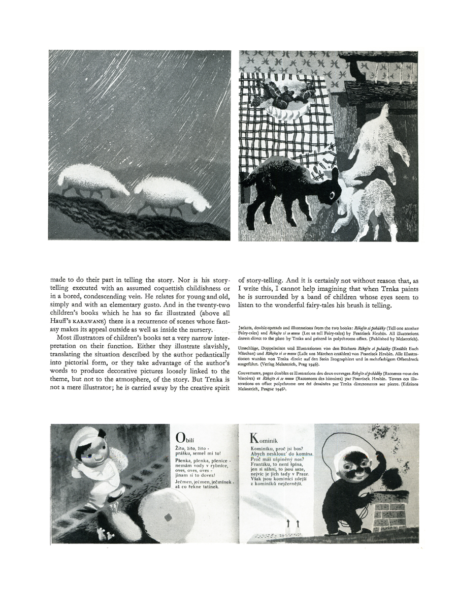 4
4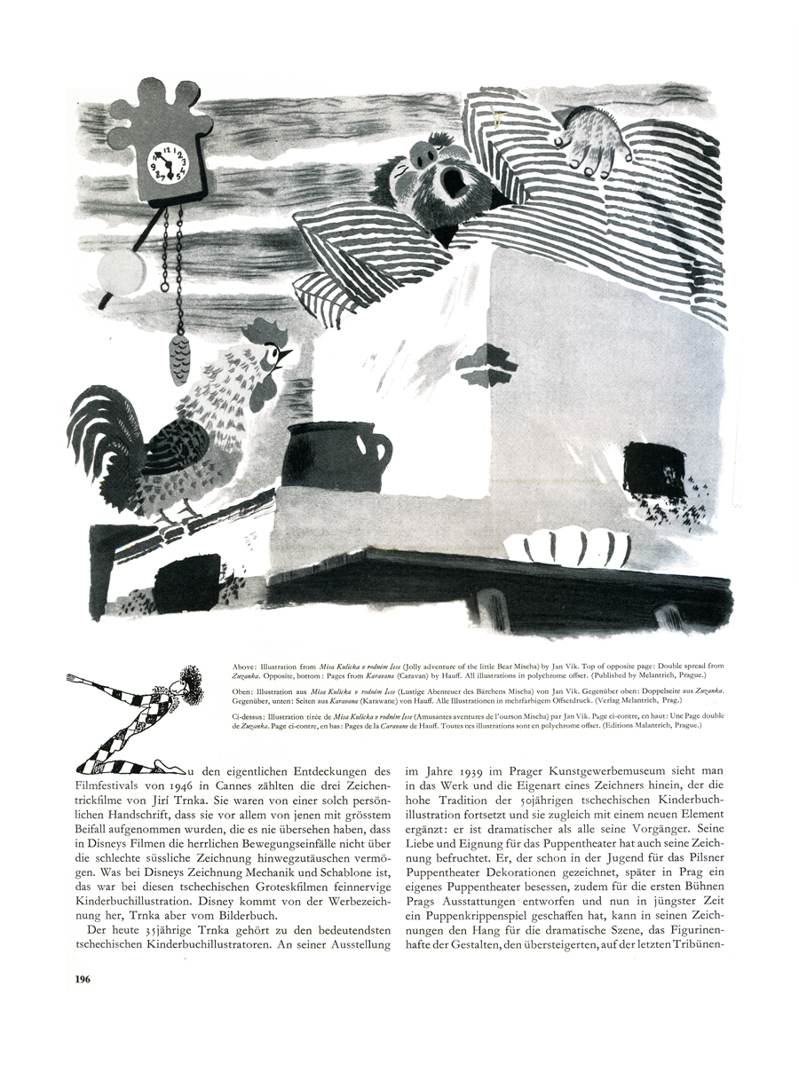 5
5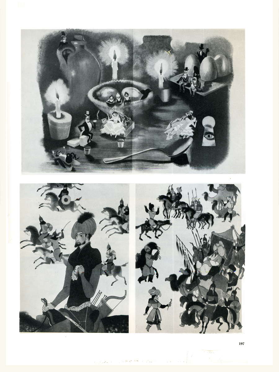 6
6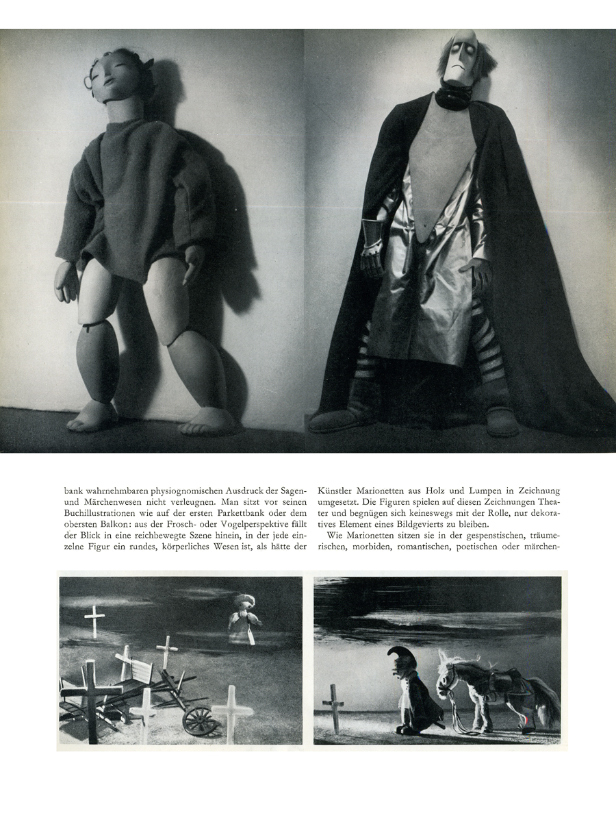 7
7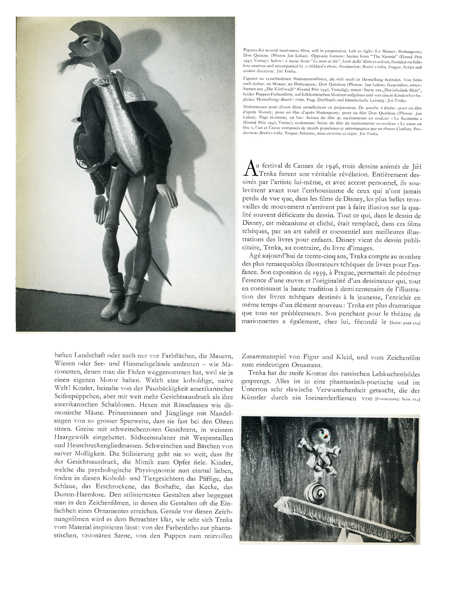 8
8
Animation &Commentary &commercial animation &Independent Animation &repeated posts 06 Feb 2012 06:49 am
John Wilson – part 5
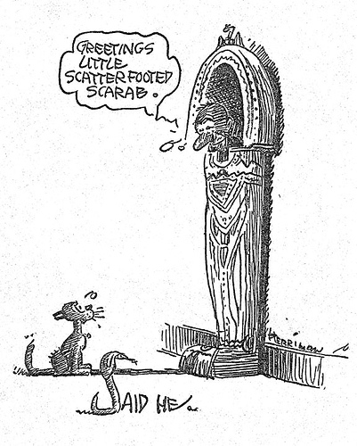
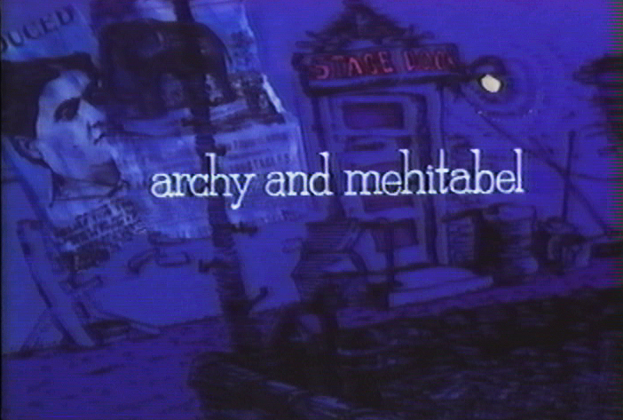
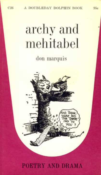 - Don Marquis‘ book, Archy and Mehitabel, garnered fame quickly and not least because of the extraordinary illustrations of George Herriman, the creator of Krazy Kat.
The first book was published in 1927 and others followed in 1933 and 1935. It wasn’t until the third book that Herriman took over the characters created by Marquis in his book of short stories, developed mostly, in poetry. An on-again off-again love affair, the story had two principal characters: a cat, Mehitabel, and Archy, cockroach. (You can read these poems on line here.)
In 1953, writer Joe Darion along with composer George Kleinsinger (the creator of Tubby the Tuba) wrote a musical theater piece. Tenor Jonathan Anderson played Archy and soprano Mignon Dunn was Mehitabel. At about the same time a recording of the showtunes was recorded with Carol Channing as Mehitabel and Eddie Bracken as Archy. The record was a success.
With the help of the young writer, Mel Brooks, they were able to get their show to Broadway in 1957, but it was now named Shinbone Alley. After 49 performances, the show closed, but the original cast album was recorded that same year. The songs stayed in the permanent repetoire of Carol Channing and Eartha Kitt.
 In 1971, John Wilson directed an animated feature starring the voices of Channing and Brackett and using the songs from the musical. The love affair between Archy and Mehitabel was penned by Archy, the cockroach; his poems tell their story.
The film suffers from its music. The songs are simple and sound as if they’re written for children, but the lyrics pull from the poems which are definitely designed for adults. It gets a bit confusing, as a result, and is a bit picaresque; the poems are short and illustrating them in animation would take more adaptation than seen here.
 John Wilson had developed his studio, Fine Arts Films, on the back of the weekly, animated, music videos he did for The Sonny and Cher Show, an enormous hit in the early 70s.
These music videos were loose designs animated quickly and lively around the songs Sonny & Cher would schedule each week. There would always be one or two of these pieces, and they were highlights in the weekly one-hour musical/variety program.
 The graphics of Shinbone Alley aren’t too far from these Sonny & Cher videos. Loose design and animation with a design style not too far from the Fred Wolf’s made-for-ABC feature, The Point. This was the first feature made for television and featured the songs and story of Harry Nilsson, although Shinbone Alley featured a wilder color pallette.
Jules Engel, Corny Cole and Sam Cornell all worked in design on the film. The long list of 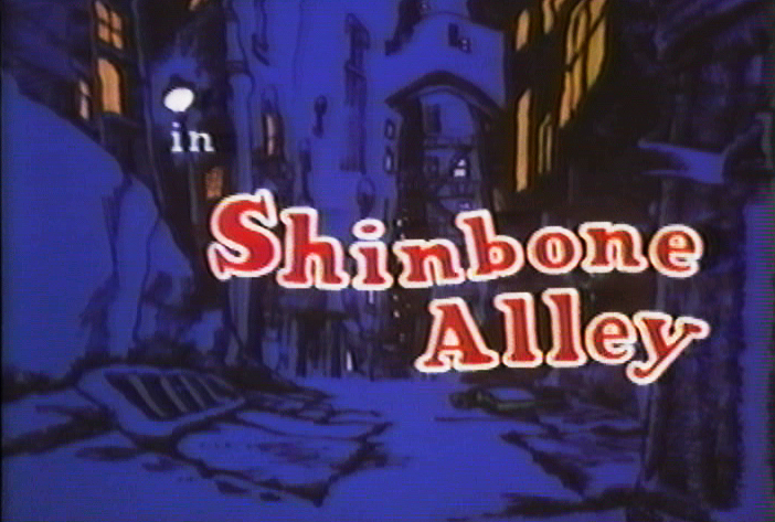 animators included Barrie Nelson, John Sparey, Spencer Peel, Eddie Rehberg and Jim Hiltz. Mark Kausler was an assistant on the show.
The film wasn’t an enormous success, but that was probably explained much by the limited distribution and the poor marketing of the film. I saw the film when it came out; I was living in Washington DC at the time (in the Navy). I was very disappointed. The animation is very limited and the style was a real let-down having known the George Herriman illustrations from the Don Marquis book. We’d already seen those limited animation Krazy Kat cartoons from King Features, so I knew the style could be done adequately – even on a budget. The style in this film just seemed a little too Hollywood cute, at the time, and it felt dated when it came out. I don’t feel too differently about it watching the VHS copy I own.
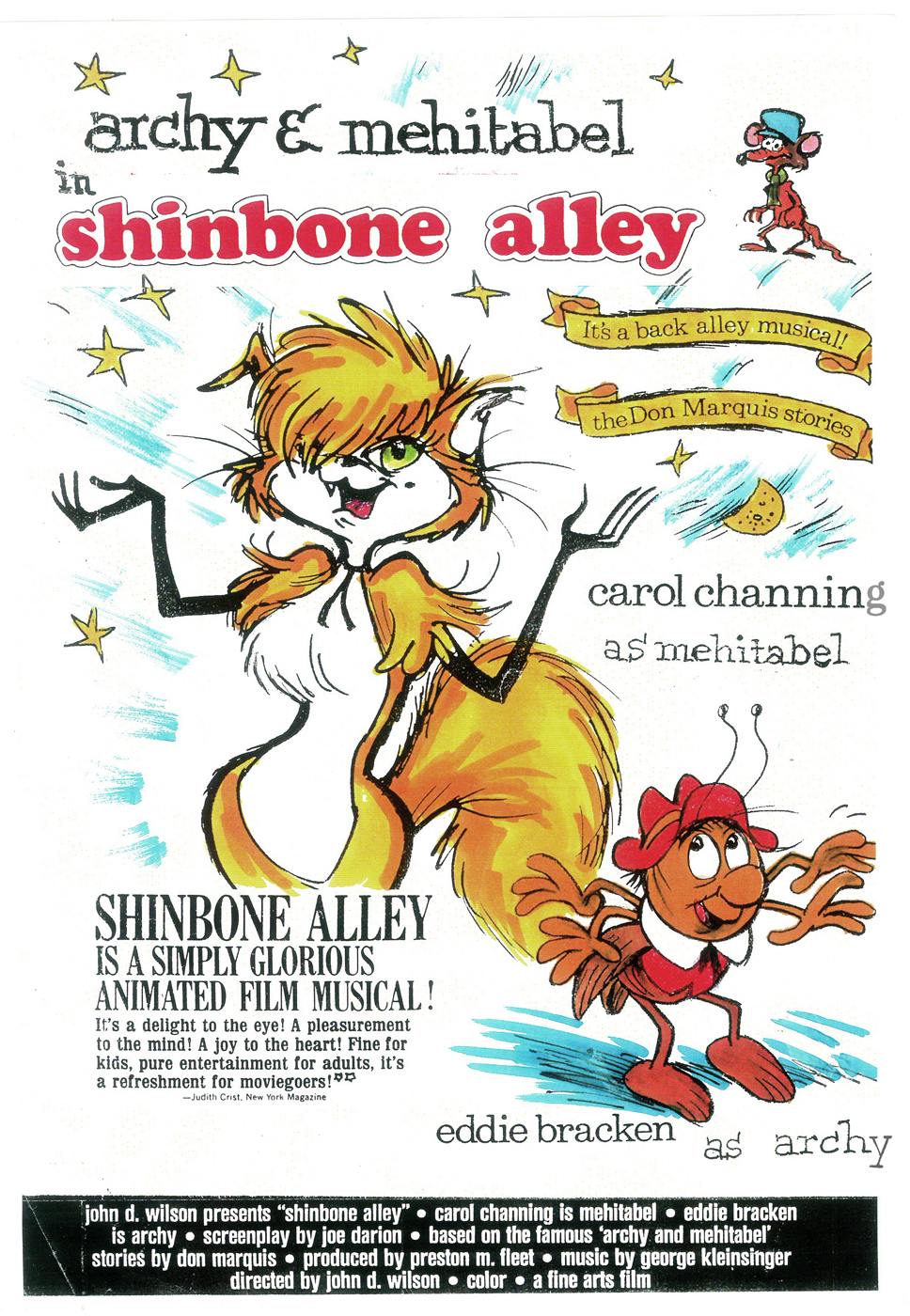
the film’s poster
Here are some frame grabs from the first 1/4 of the film:
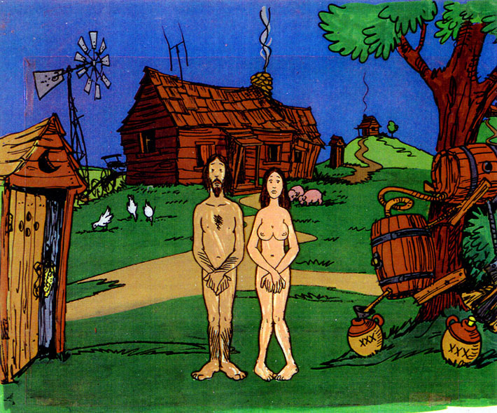
We’re introduced to Archy right off the bat as he
flies out of the river onto the dock. He realizes that he,
the poet, tried to kill himself and was sent back as a cockroach.
He soon finds a typewriter and goes straight back to work.
Mehitabel is a performer – with Carol Channing’s voice.
The two meet cute.
She has another boyfriend, voiced by Alan Reed,
who is also the voice of Fred Flintstone.
A song video takes us outside.
pan down.
Another music video brings us into Peter Max’s style.
Life in Shinbone Alley.
Part of this post was originally on this Blog in February 2010.
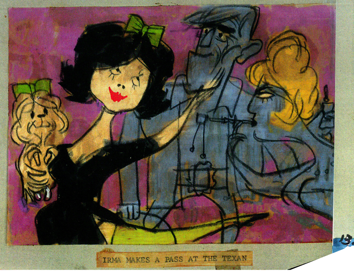
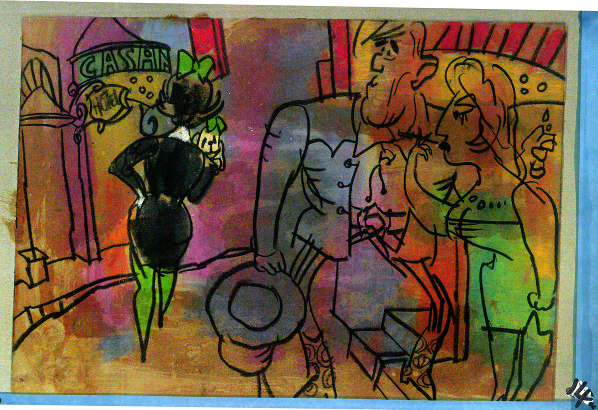
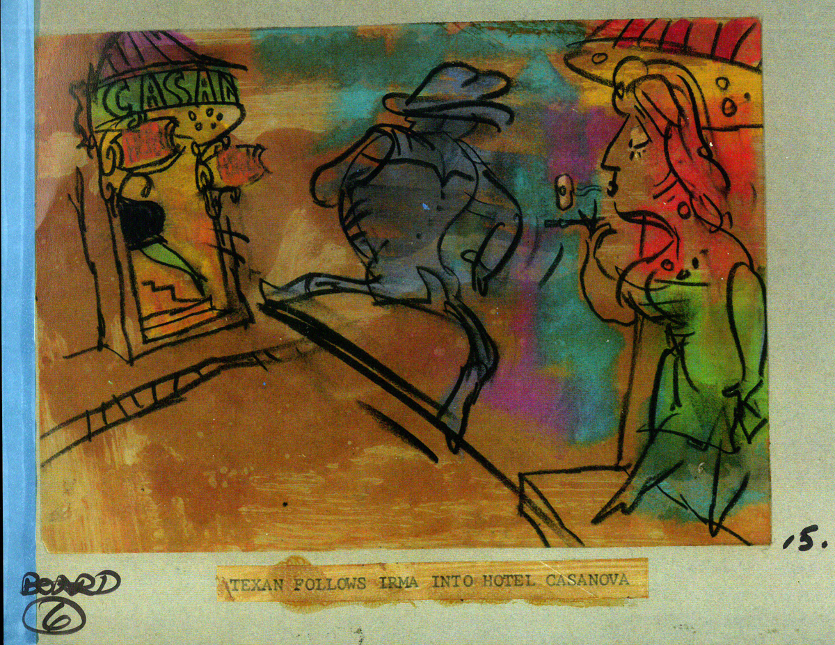
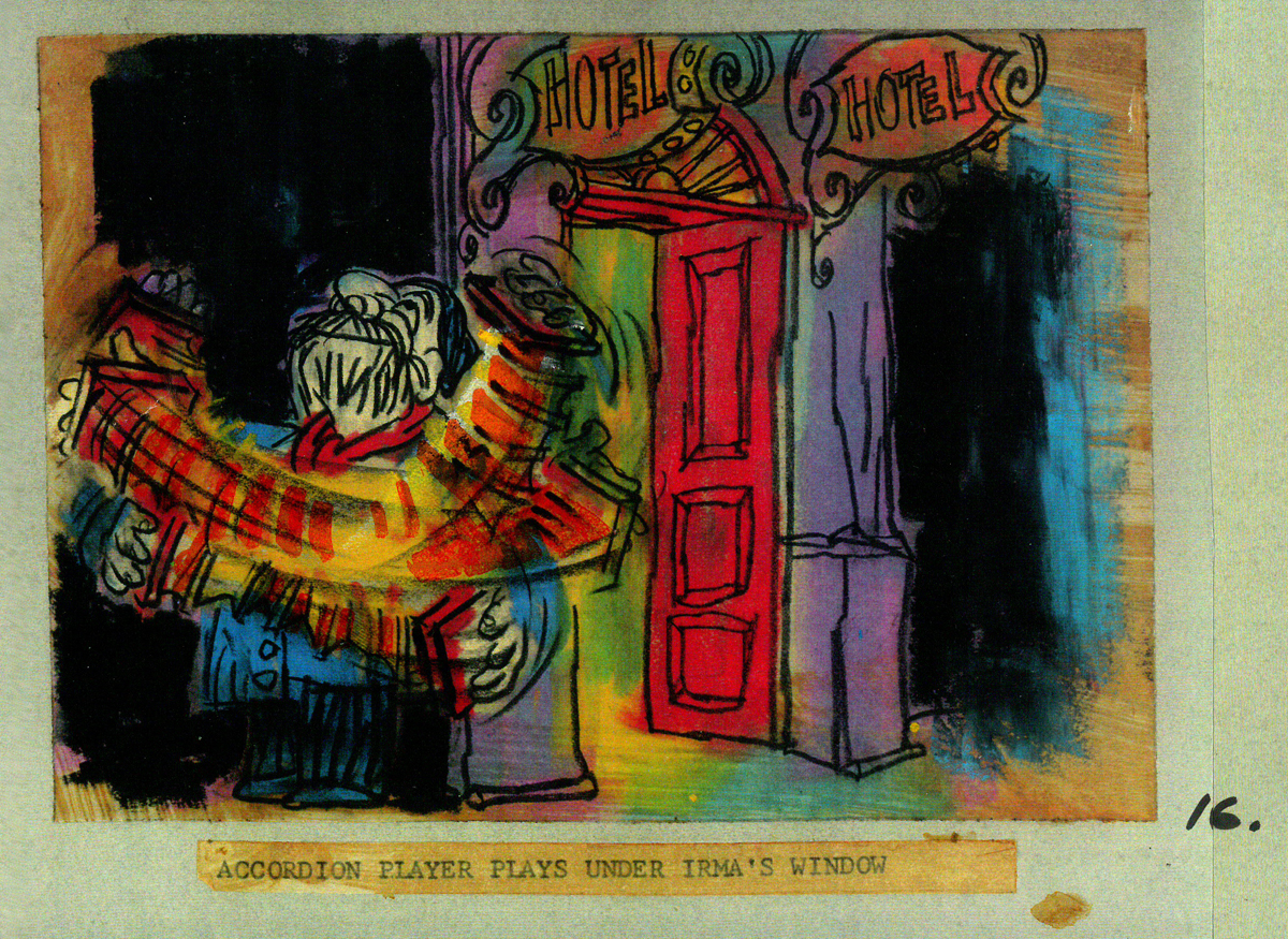
Animation Artifacts &commercial animation &Illustration &Independent Animation &Story & Storyboards 23 Jan 2012 05:33 am
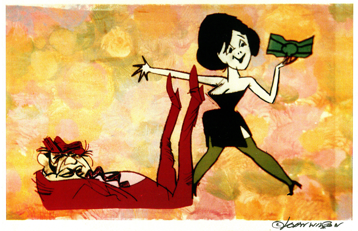
John Wilson/Fine Art Films – part 3
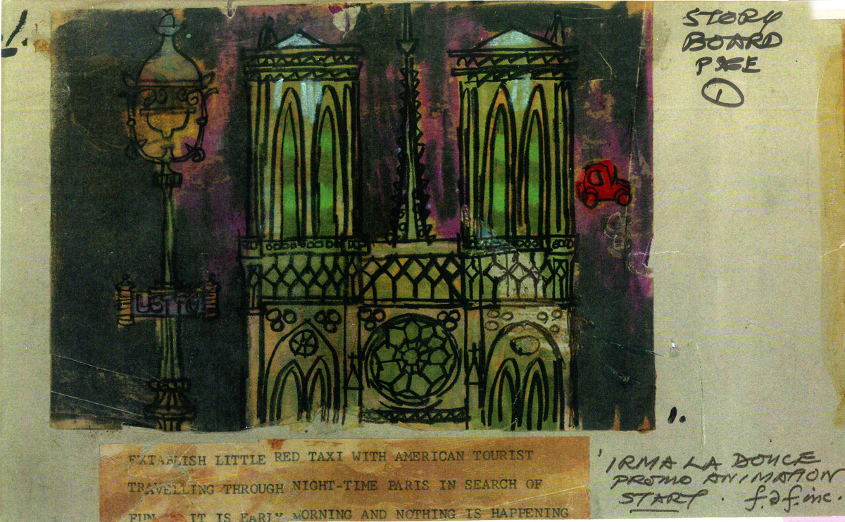
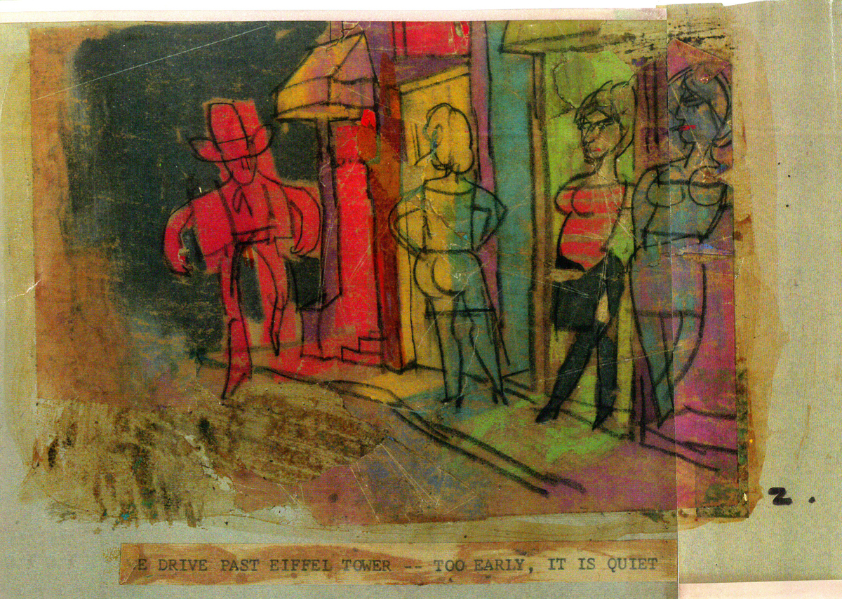
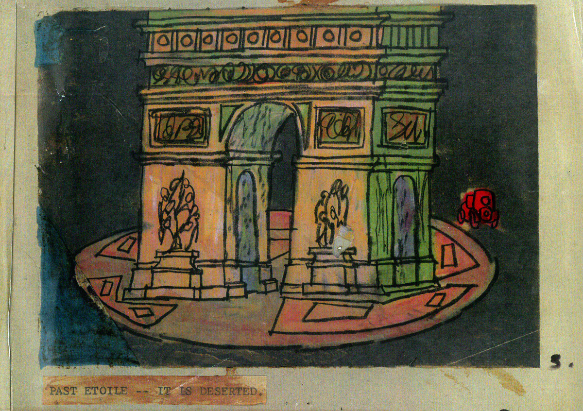
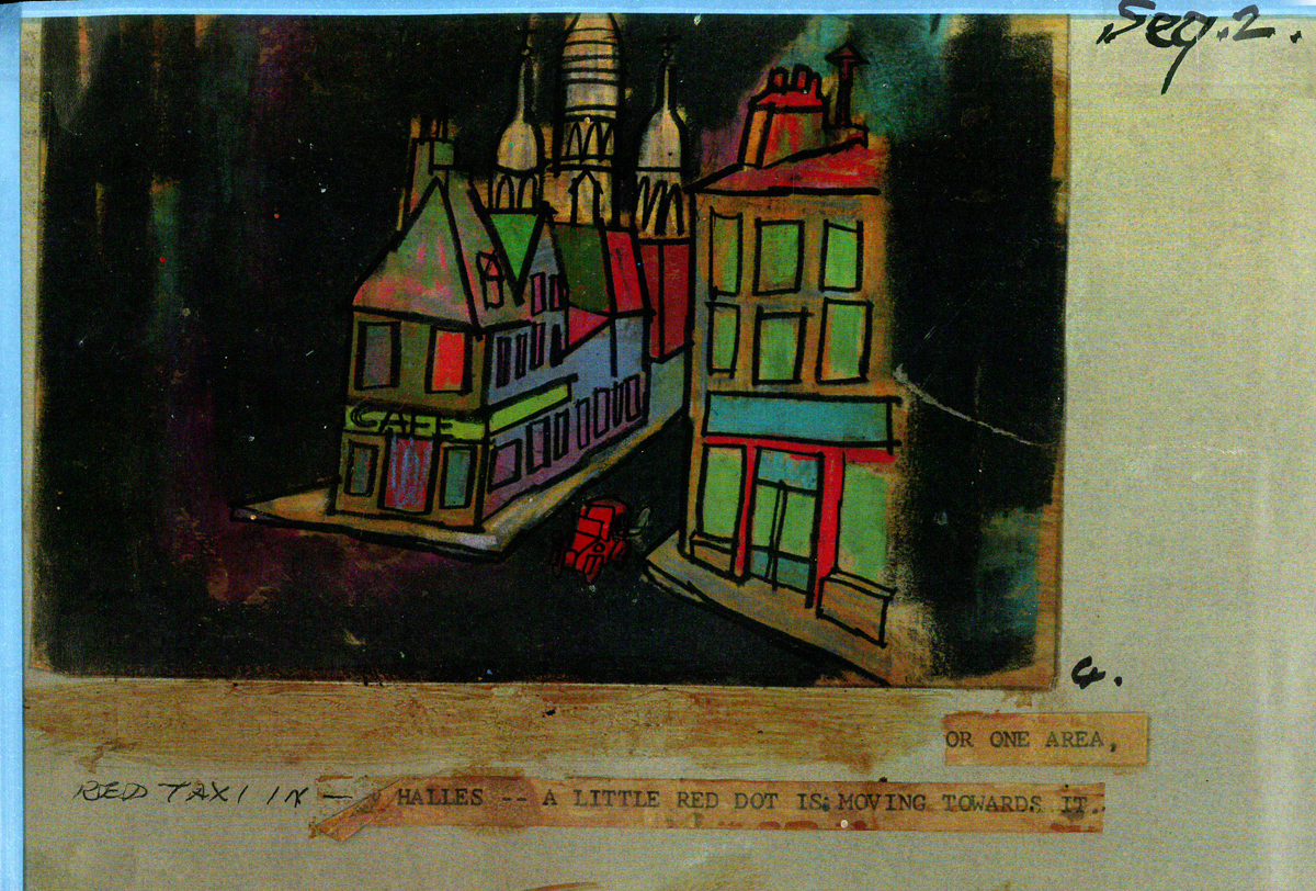
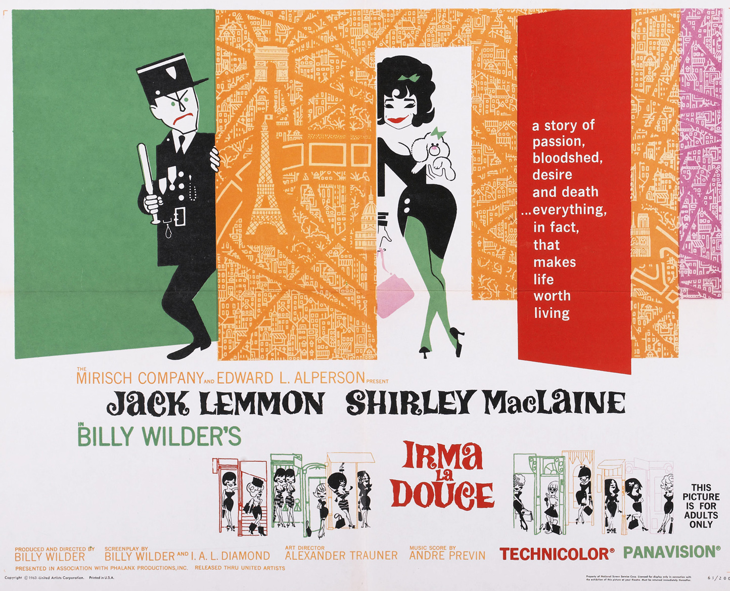 - This week in my focus on John Wilson‘s early work with his company, Fine Art Films, let’s take a look at Irma La Douce. This was a racy film written and directed by Billy Wilder that starred Shirley MacLaine as a Parisian prostitute and Jack Lemmon as a French policeman who falls in love with Irma (Shirley MacLaine.) The film, for its time was daring, and came up with (heaven forbid) a “C” for Condemned rating from the Catholic church. This made it off limits for anyone under the age of 18. I was determined to go see the film, so I ignored the ban and went by myself. Naturally enough, no one tried to stop me. I wasn’t jaded by the movie anymore than I had been disturbed by the violence in all the Warner Bros. cartoons I’d seen. Looking back on Irma La Douce, it really is an innocent film, hardly risqué in any way shape or form.
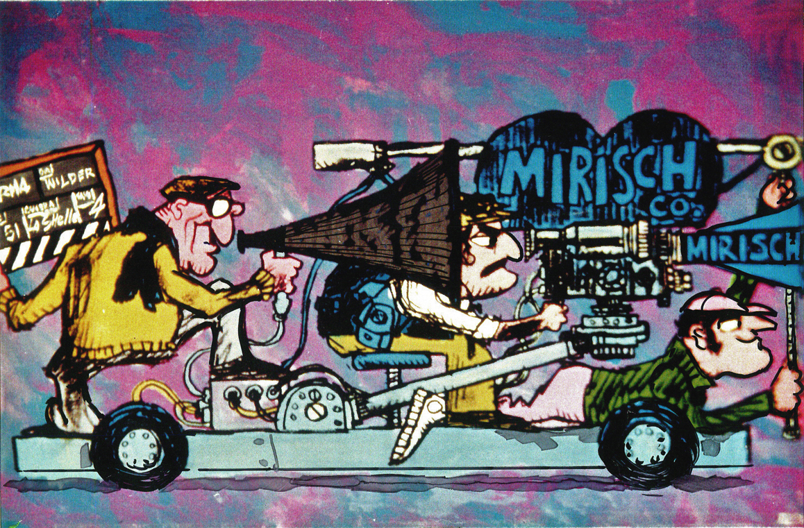
The film started with some nicely drawn animated credits which were done by John Wilson’s studio. Until recently I hadn’t known that Wilson also produced an animated short promoting the feature for the Mirisch Company. I have some preproduction art from that short as well as the color storyboard. The board is large enough that I’ve decided to break it into two parts. We’ll see part one today and the second part next week.
Each section of three images is long enough that unless I post one drawing at a time, it’ll be too tiny to see unless enlarged. I’d like to post each storyboard sketch a nice viewing size and still give you the option of enlarging it.
Let’s start with some production and post production stills so you can see what it looked like.
 1
1
 2
2
 3
3
 4
4
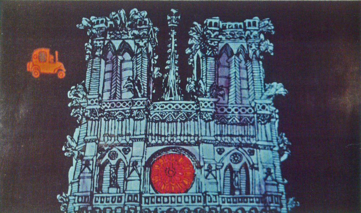
A couple of pre-production drawings:
 1
1
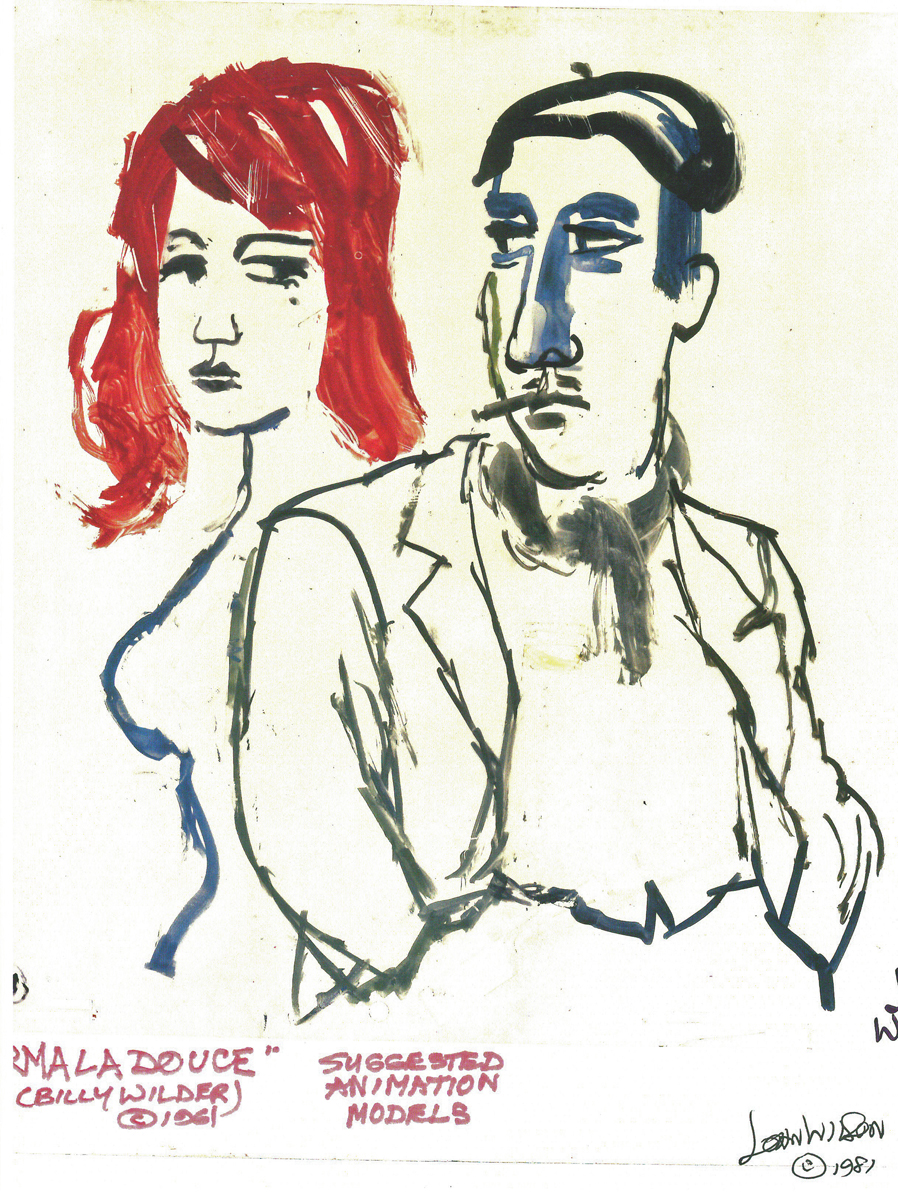 2
2
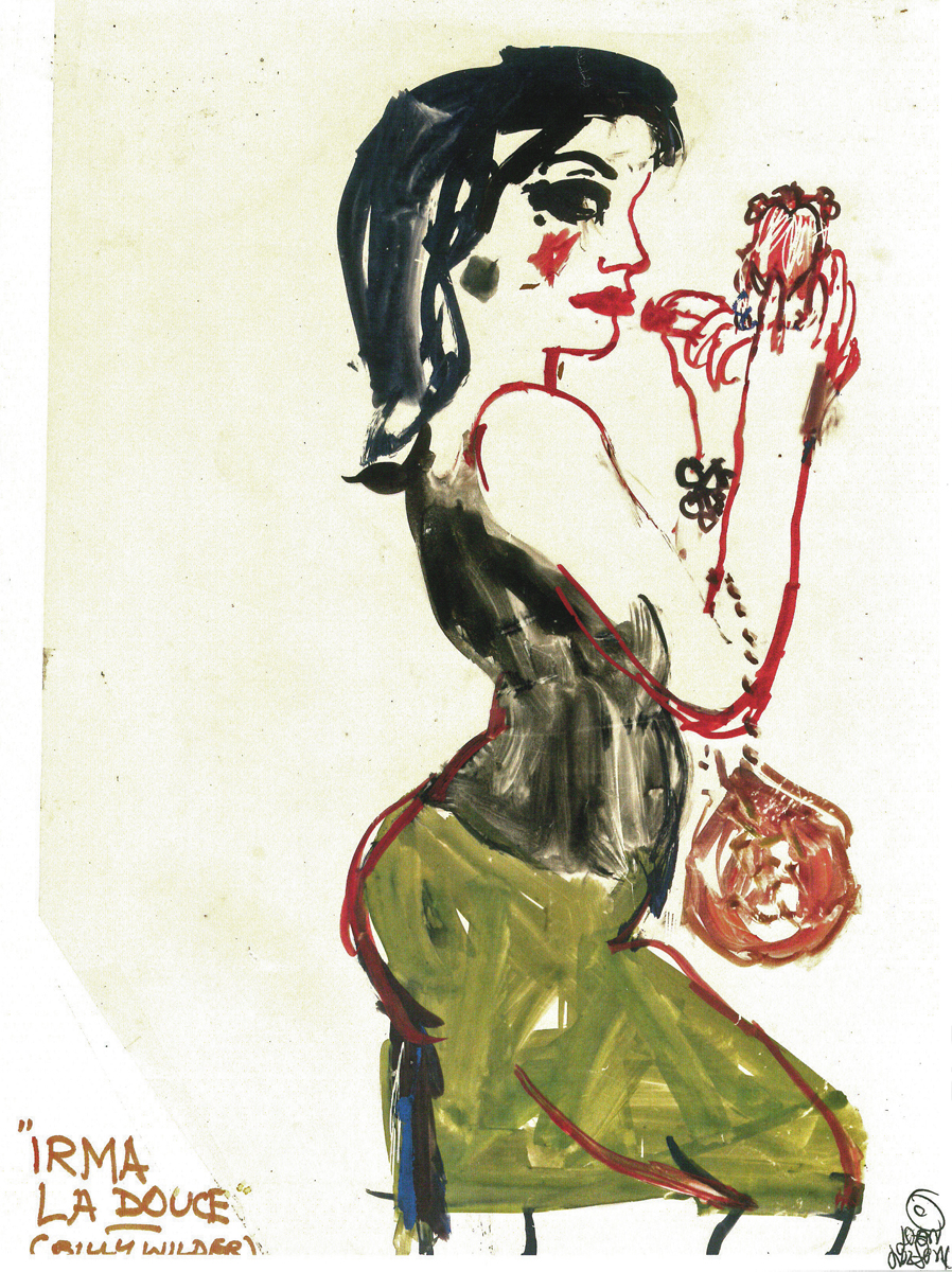 3
3
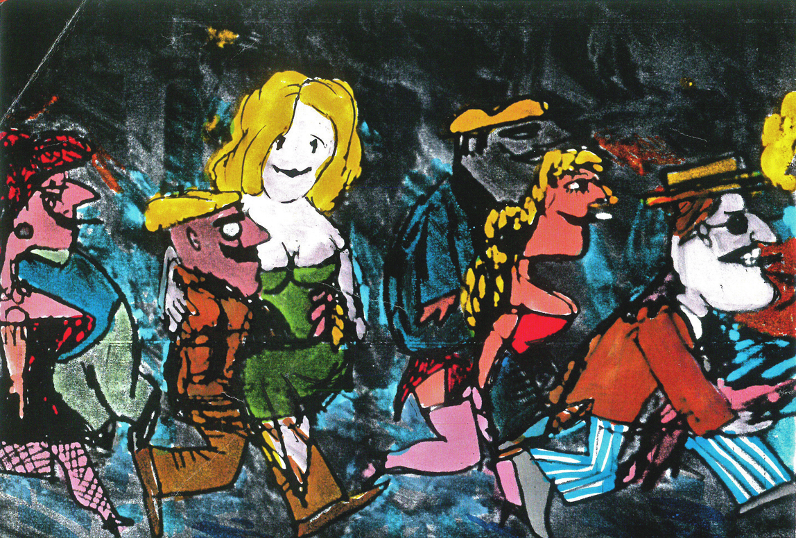
Then, there’s the storyboard. I’ll give an example of the three panel pull out and follow that with each individual image.
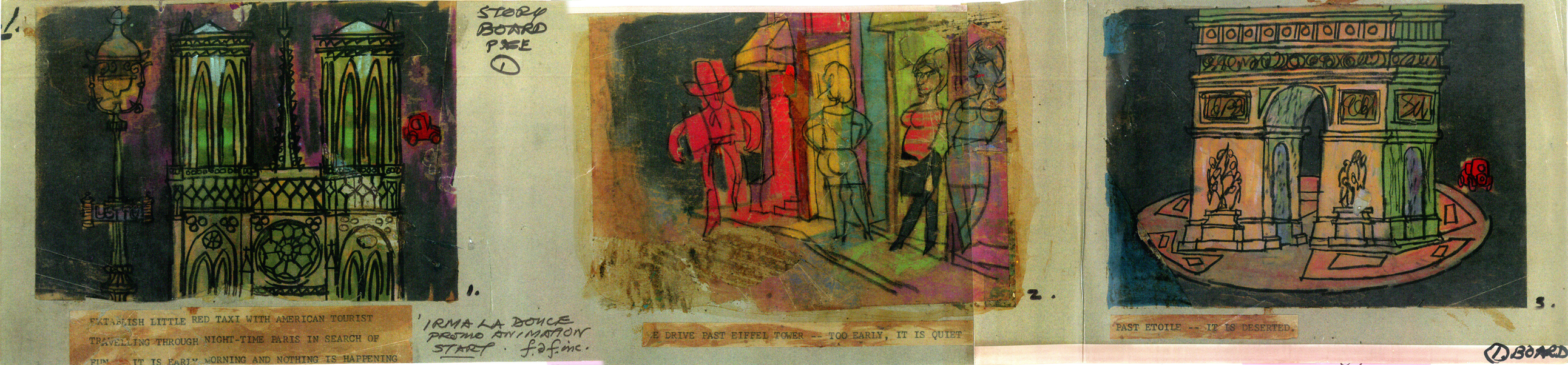
You can see why I’ve decided to enlarge the images.
 1a
1a
 1b
1b
 1c
1c
 2a
2a
 2b
2b
 2c
2c
 3a
3a
 3b
3b
 4a
4a
 4b
4b
 4c
4c
 5a
5a
 5b
5b
 5c
5c
 6a
6a
 6b
6b
 6c
6c
The remainder of the storyboard will be posted next Monday.
Articles on Animation &Independent Animation &Layout & Design 17 Jan 2012 07:00 am
Designing Animal Farm
Chris Rushworth, whose site AnimalFarmWorld, is dedicated to the collection of material about and from the Halas & Batchelor feature animated film, Animal Farm, has sent me an article he’s found and which I thought extraordinarily interesting. It’s from a UK publication called “Art & Industry” dated September 1953.
Since there were difficulties with the scans, I had to retype the article so it could be legible and I played with the images in photoshop trying to bring some clarity to the sketches. I think they work well enough for this posting.
Geoffrey Martin, a senior member of the design team of the
Halas & Batchelor Cartoon Studios, describes his work on the production
of George Orwell’s ANIMAL FARM as a full-length feature cartoon film.
The painter and the film and stage designer work with similar motives but from varying standpoints. One one hand, the painter needs only to justify himself, while on the other, the work of the designer must fit within the framework of another man’s concept. The painter is more or less free to stand apart, and need not e called upon to explain his motives or analyze his emotions. The designer, to achieve his ends is dependent on others, and must therefore rationalize and be able to explain every nuance of his work in order to amplify the trends and emotions in a story and convey them to an audience.
The principles of designing a cartoon film are little different from those involved in a live-action film, With the obvious difference of the medium and its flat dimension, the other elements involved derive purely from the mechanics of animation. Both films set out to tell a story, to corner an idea, and to induce a reaction from the audience.
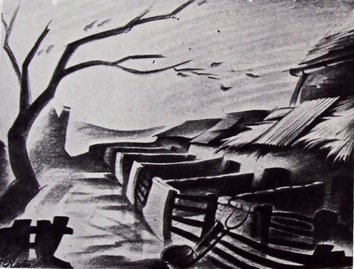
One of Geoffrey Martin’s rough atmosphere sketches
embodying his conception of the farm in relation to the story
in which the animals revolt and dispossess the farmer. The
mood of Orwell’s political satire is excellently captured in this scene.
This sketch shows a corner in the farm’s food store
and was created to suggest possible props.
The cartoon designer is, if anything, more directly concerned with, and responsible for, the graphic impression on the screen than the art director in a live-action studio. To him falls the choice of angle of every sot and the responsibility of ensuring that the angle cuts smoothly to another, while constantly preserving the audience’s sense of time and place.
Once having designed and built his settings, the art director on the live-action film is largely in the hands of the director and his lighting cameraman; on these people depends how much of his original attempt is retained in the finished film. It is in this respect that the cartoon set designer is more fortunate; he has much more control over his medium, and is able to assess the result of his work more immediately by seeing the designs in actual use soon after leaving his drawing-board.
Above: The final interpretation of the scene shown opposite
painted by Matvyn Wright, principal background artist on the
production. Colour heightens the dramatic impact of the scene.
Until comparatively recent years, cartoon films were more or less and American monoply, but just ten years ago John Halas and his wife, Joy Batchelor, set up in London what is to-day the largest cartoon production group in Europe. Wisely, perhaps, they never attempted to emulate the exuberant style of M.G.M.’s ‘Tom and Jerry’ and others who work in similar vein, and as far as the feature field was concerned, Walt Disney, with his lavish and technically superb productions, reigned supreme. Instead, the concentrated on an entertaining series of educational and sponsored subjects with a definite adult flavour.
In late 1951, American producer Louis de Rochemont (‘The House on 92nd Street,’ ‘Boomerang,’ and ‘The March of Time’ series) asked the Halas and Batchelor studios to prepare an animated version of George Orwell’s sharp-edged political satire, Animal Farm. De Rochemont felt the studios to possess a style markedly different from their American counterparts – a style eminently suited, moreover, to what was, to all intents and purposes, a paradox, a ‘serious’ cartoon.
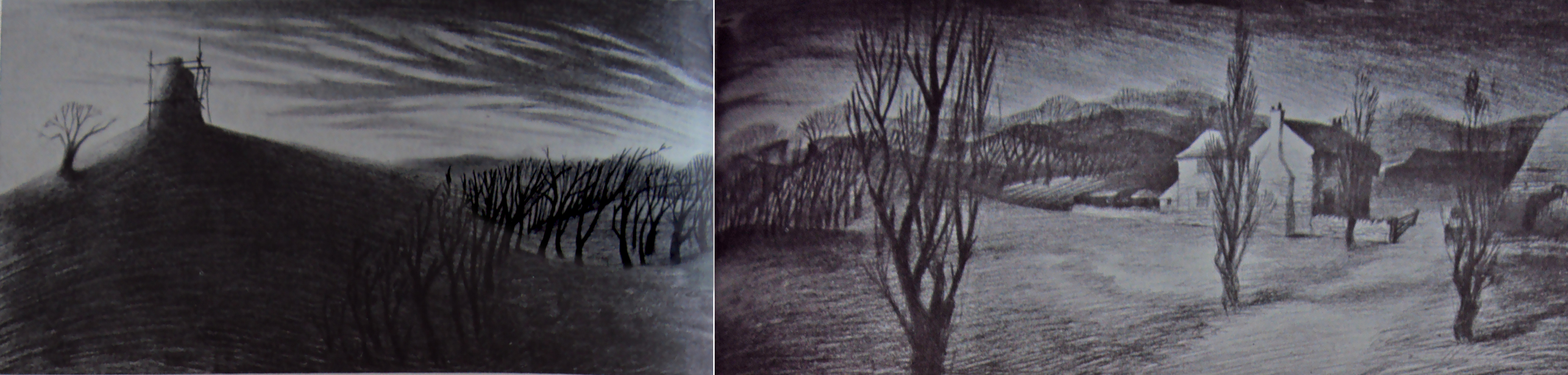
Above: Winter landscape. The half completed windmill
and the farmhouse are shown in this sketch suggesting
the starkness and economy of the settings.
When the studios first embarked on the subject, I was, as a designer, faced with many new problems. For although I possessed considerable experience of short films, Animal Farm was the first feature cartoon to be produced in this country and in length alone, was something completely new to me.
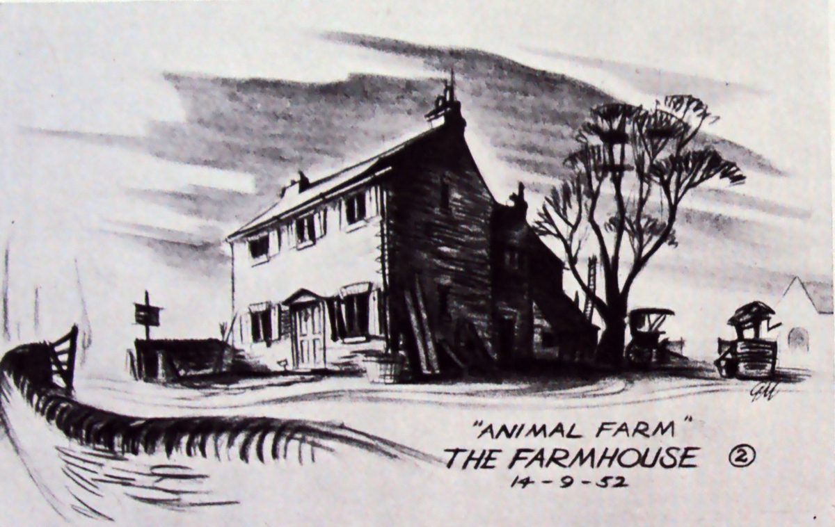
A first attempt to specify the
general style of the farmhouse.
After discussing the story with John Halas and Joy Batchelor, I made a considerable number of atmosphere sketches and rough plans. In these, I attempted to embody our many ideas regarding the conception of the farm in relation to the story.
On reading the book, I had been impressed by the windswept starkness of the farm-qualities contrasting strongly with the warm normality of the local Inn and the village, representing the outside world. We decided that the coulour would eventually go a long way towards emphasizing the contrast between those two main locations.
Since much of the designer’s work is dependent on other departments, I feel that at this point it would be well to describe the production processes of a cartoon studio. Firstly, a word here about animation, itself. In the layman’s view the animator merely ‘makes the characters move’. He does more than that, in effect, he is the very ‘life’ of the film. To make a character move does one thing, but to invest him with the spark of life and a distinct personality is a major achievement, and an element nowadays too often taken for granted.
Audiences have become accustomed to such miracles. Without character there can be no story; the characters within a play are the play. A cartoon film needs a gifted team of animators to bring life and conviction to the characters, and on their work it stands or falls.
To return to actual production, however, the story is broken down into convenient sequences to facilitate handling. In Animal Farm, we have 18 sequences, varying between three and four minutes of screen time each; this represents some 6,400 feet of film in all.
The animation director, who is to the cartoon what the choreographer is to the dance, must then time the action of each scene with stopwatch and metronome. The entire action is planned against a musical score, and to various tempi: so many bars per minute and hence per foot of film.
It is here that the designer enters the picture again. He must work to present the action the director has visualized in the most direct way possible. His department must produce the layout of each scene and the finished drawings of the settings – including sketches of the characters and their size in relation to their settings and notations as to camera movements within the scene.
A panoramic view of the farm – used to establish
the relationship of the outbuildings to the farmhouse.
Sets of the drawings are then passed to the animation team responsible for the sequence. On completion of the work, a test shot is made of their rough drawings.
This test is checked and corrected to refine and smooth out the action. I no drastic alterations are required, the layout drawings are passed to the background department who render them in colour. The animation is traced on to sheets of celluloid and coloured with opaque paint, and the characters on the ‘cells’ are finally united with their appropriate backgrounds under the Technicolor camera.
In planning the finished layout of each scene and staging each individual piece of action, we sometimes found that perhaps the story-line demanded a change in the location of a basic set. Having solved such a problem quite happily, we might then have to rearrange our set as it was originally a demand imposed, perhaps by a later sequence.
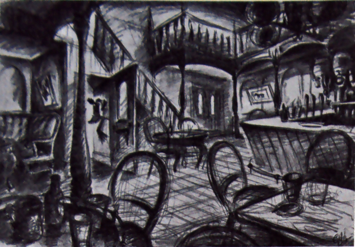
Tentative design for the interior of the village inn.
There is, in fact, a period in every cartoon film when the settings are in a continual state of change and compromise. The designer must bear in mind all the miscellaneous action which takes place in any given location throughout the film and work with this in mind.
The live-action film director is at an advantage in that once his sets are built, the are constant. He can modifu his ideas about camera angles as he goes along. But for us, any slight change of angle withina setting means a new drawing and it is quite possible to accumulate ten or fifteen layouts featuring the same doorway from various angles -made simply in order to stage differing pieces of action.
Such a process involves problems of continuity, for in each drawing ever stone and subtlety of texture must be identical from each angle. Inevitably, it becomes necessary to simplify in order to reduce the amount of work in reproducing every detail; pet ideas are swept away, and like any artist, one is sometimes reluctant to change what one feels to be an eminently satisfactory piece of design. But hard as this may be, there s the final satisfaction of knowing that one’s sets are completely workable.
Another atmosphere sketch depicting
the general appearance of the pigstys.
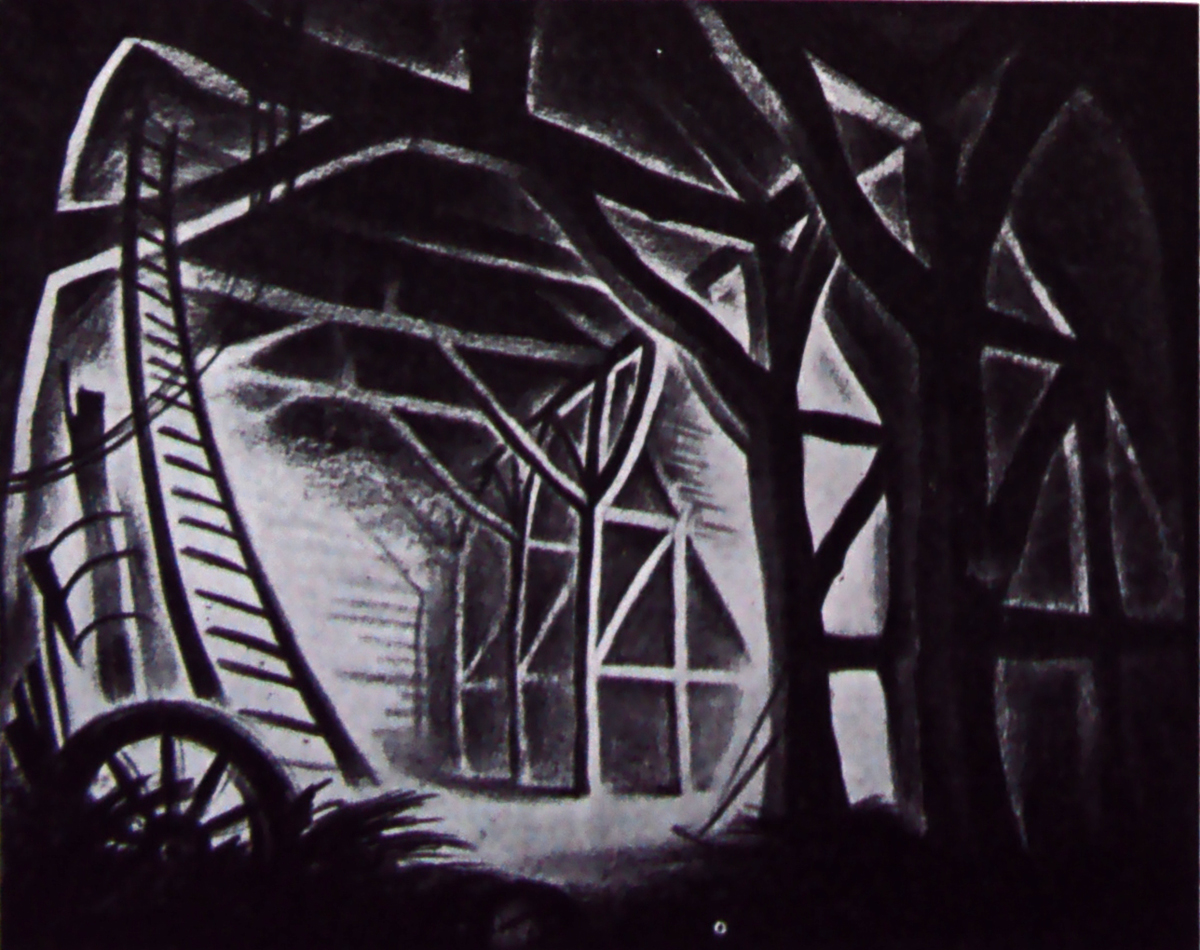
Interior of the great barn, the mise-en-scène
for the planning of the revolution.
Adaptability is, I feel, the first requisite of any setting, whether for stage, film or cartoon. Admittedly, it must carry the fight amount of atmospheric quality, but this must never hamper or dominate the actors – it is essentially a mounting, yet strong enough to be felt by the audience.
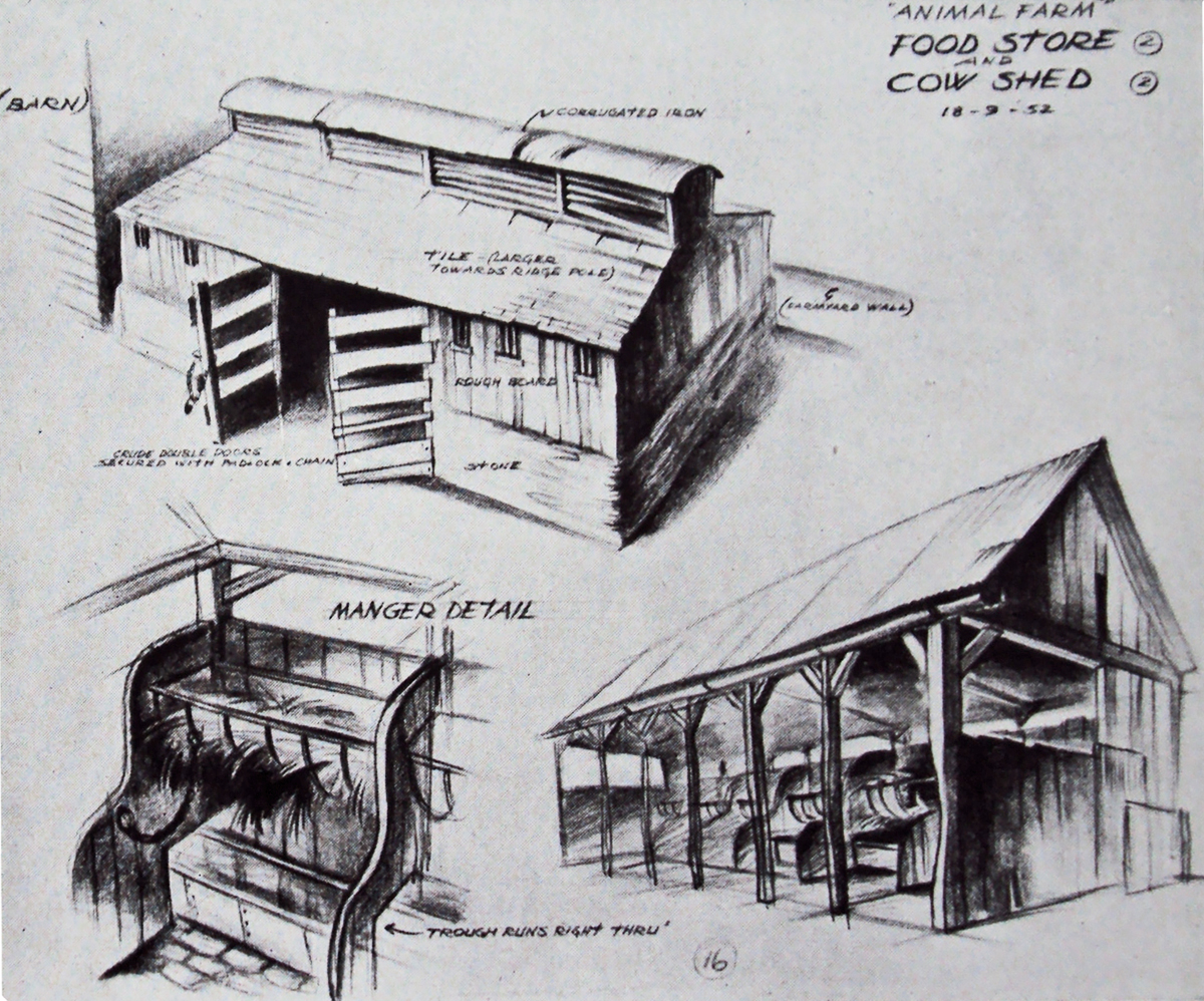
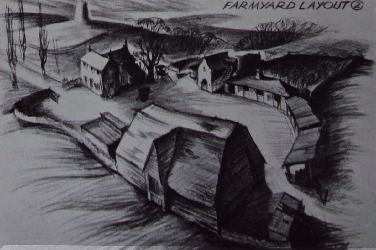
Designs establishing the appearance of farm outbuildings
and a detail of one of the mangers.
One of the main problems of designing for Animal Farm has been that the action takes place over a period of years. We have been faced with the problem of reproducing the same settings time and time again – sometimes in bright sunshine, and sometimes, in the depth of winter. It is here that the designer depends very greatly on the background department, and in Matvyn Wright, the principal background artist ont he production, we have been very fortunate. He has a reat feeling for mood and overal texture – qualities with which each of his paintings is invested. It is ovious, of course, that the background painters can make or mar the designer’s work; the effects striven for can be over-stated or lost completely. As an artist he is in the unenviable position of having to work on second-hand ideas. The initial conception is not his, only the interpretation. So often our first rough sketches have a life and excitement that is hard to reproduce.
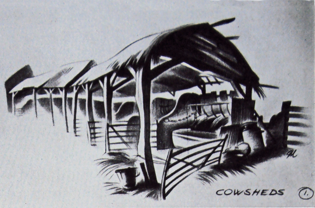
Sketch finalising the type of structure used for housing the cows.
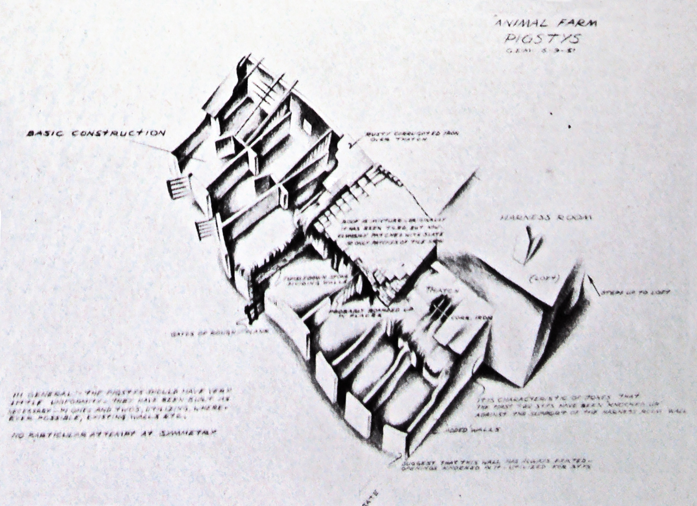
Sketch indicating constructional details of the pigstys.
The reader may now begin to understand that the cartoon studio is a closely integrated unit. It is, in fact, an essentially co-operative art. Although each and every person working on the production is an artist in his own right, we are all, to greater or lesser extent, interpreters, each of us contributing towards the achievement of a common idea.
The designer is dependent on a basic idea, and depends yet again on others to finalize his own individual contributions. The designer depends on the background artist; the animator depends on his assistants to refine his rough drawings, and the people who trace and colour his work. No one thing appearing on the screen can truly be claimed as any artist’s sole property, since we all of us have had a hand in it to a greater or lesser degree. The original conception came from George Orwell’s story – we have interpreted his ideas to the best of our several abilities. The final assessment of the studio’s work rests, as always, with the public.
.
Thanks, again, to Chris Rushworth for passing this article on.
I wasn’t even aware of its existence, but find it quite valuable.
.
