Monthly ArchiveMarch 2008
Articles on Animation 11 Mar 2008 08:36 am
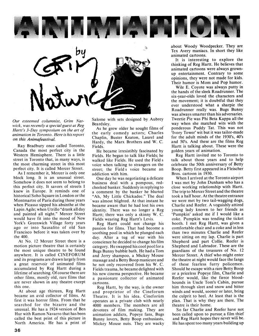
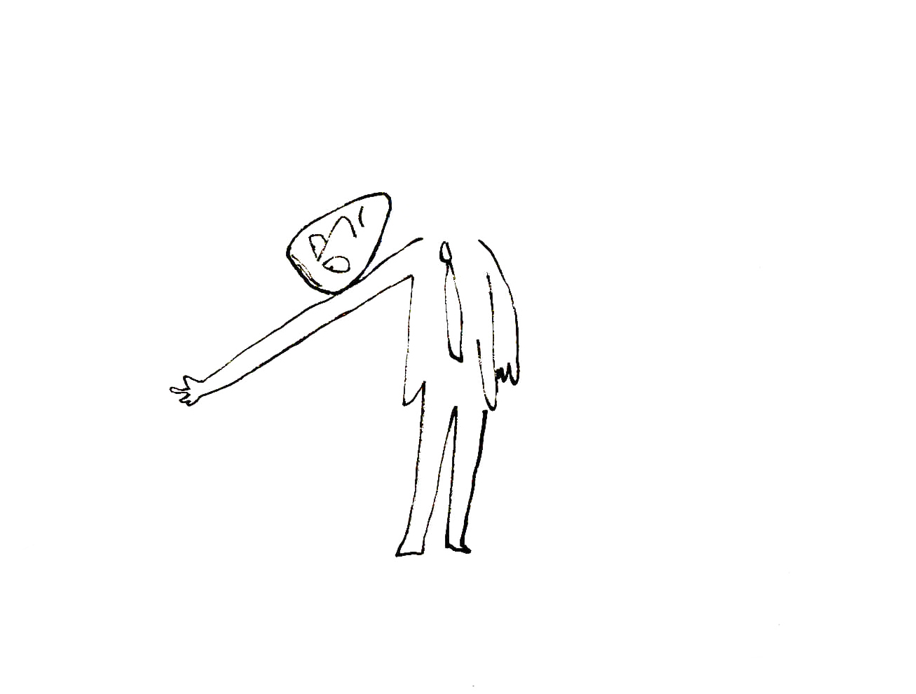
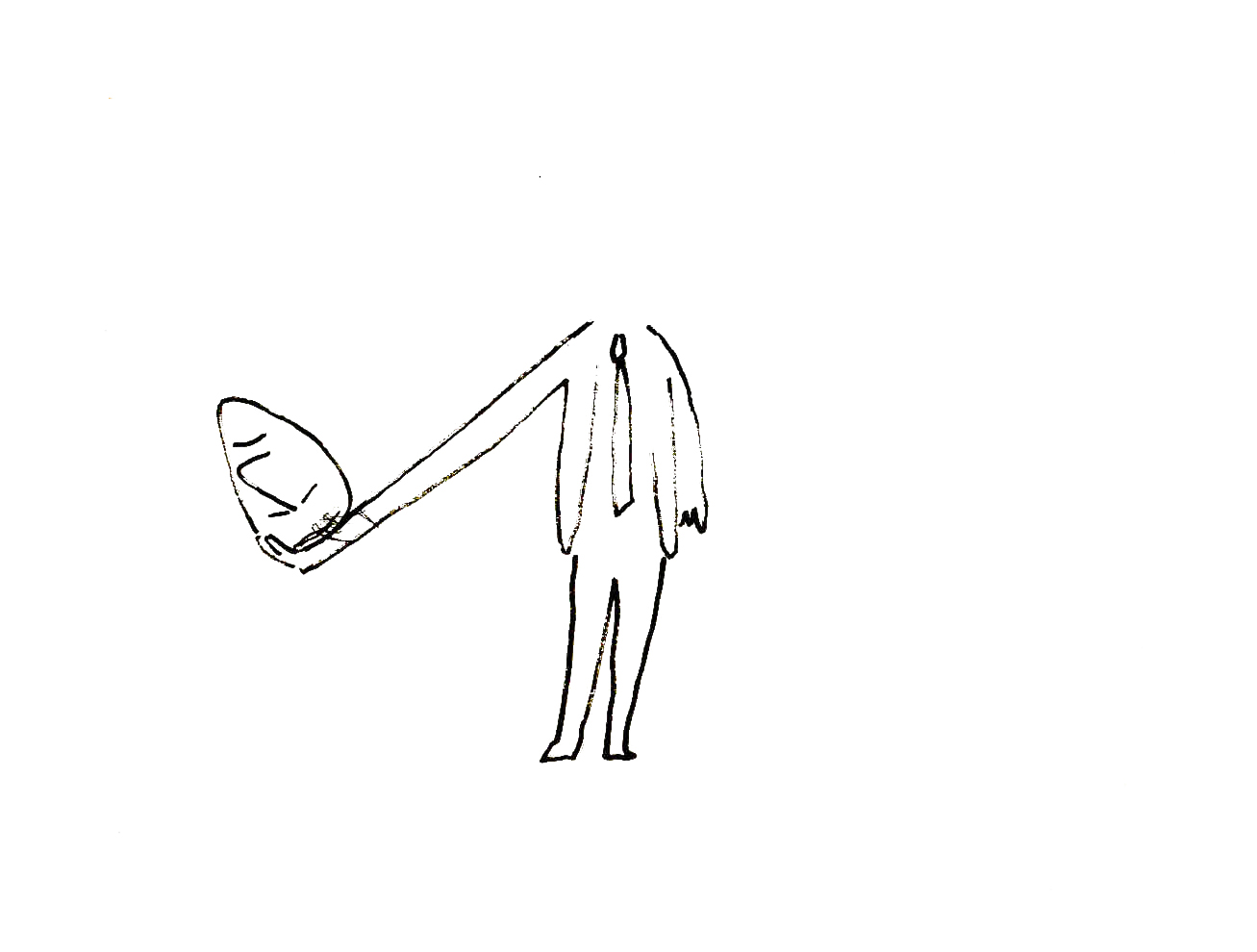
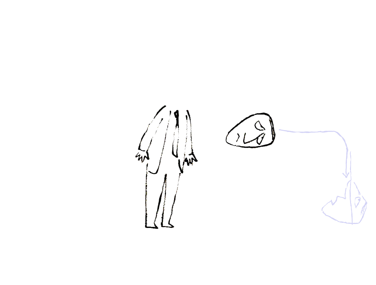
Grim Feastival
In 1980 Reg Hart invited Grim Natwick to Toronto to talk with animators there about his many years in animation. In celebration of Betty Boop’s 50h anniversary they had a cake.
Grim Natwick, in one of his pieces for Cartoonist Profiles Magazine, wrote about this trip and included a number of photos. I thought it worth posting this short piece from the December 1980 issue of this publication.
 1
1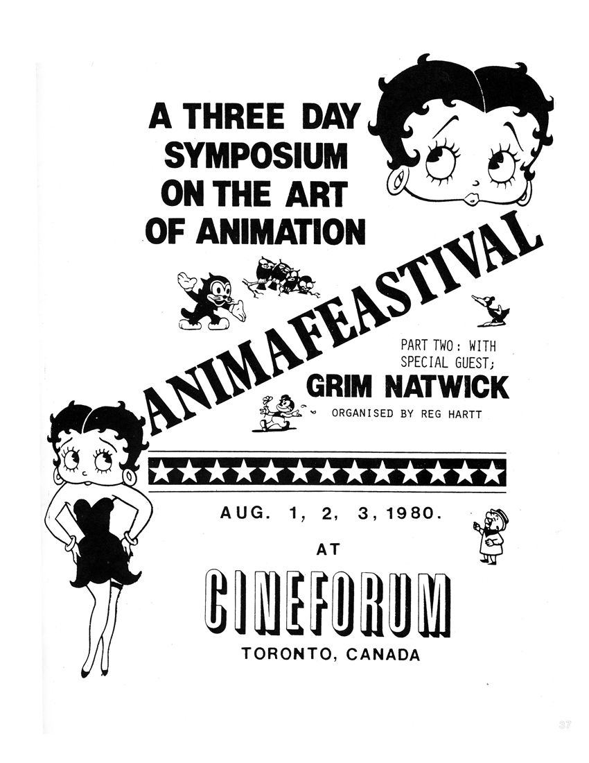 2
2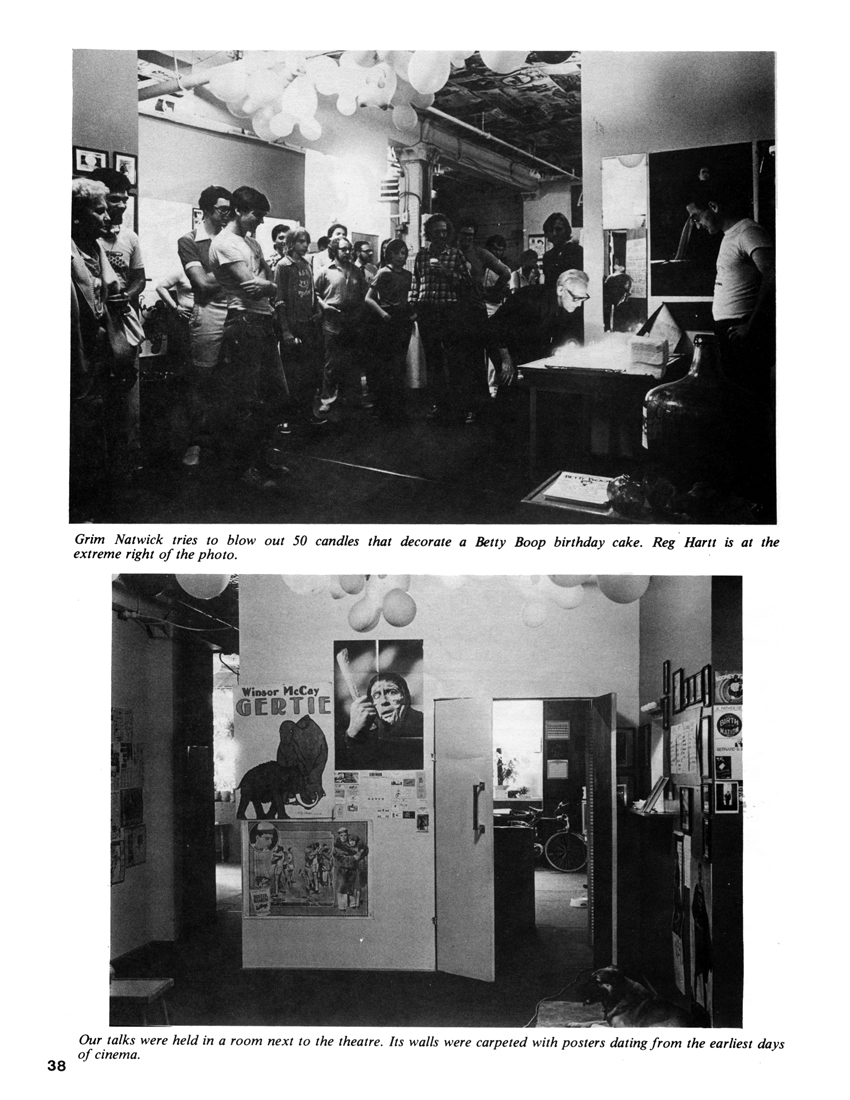 3
3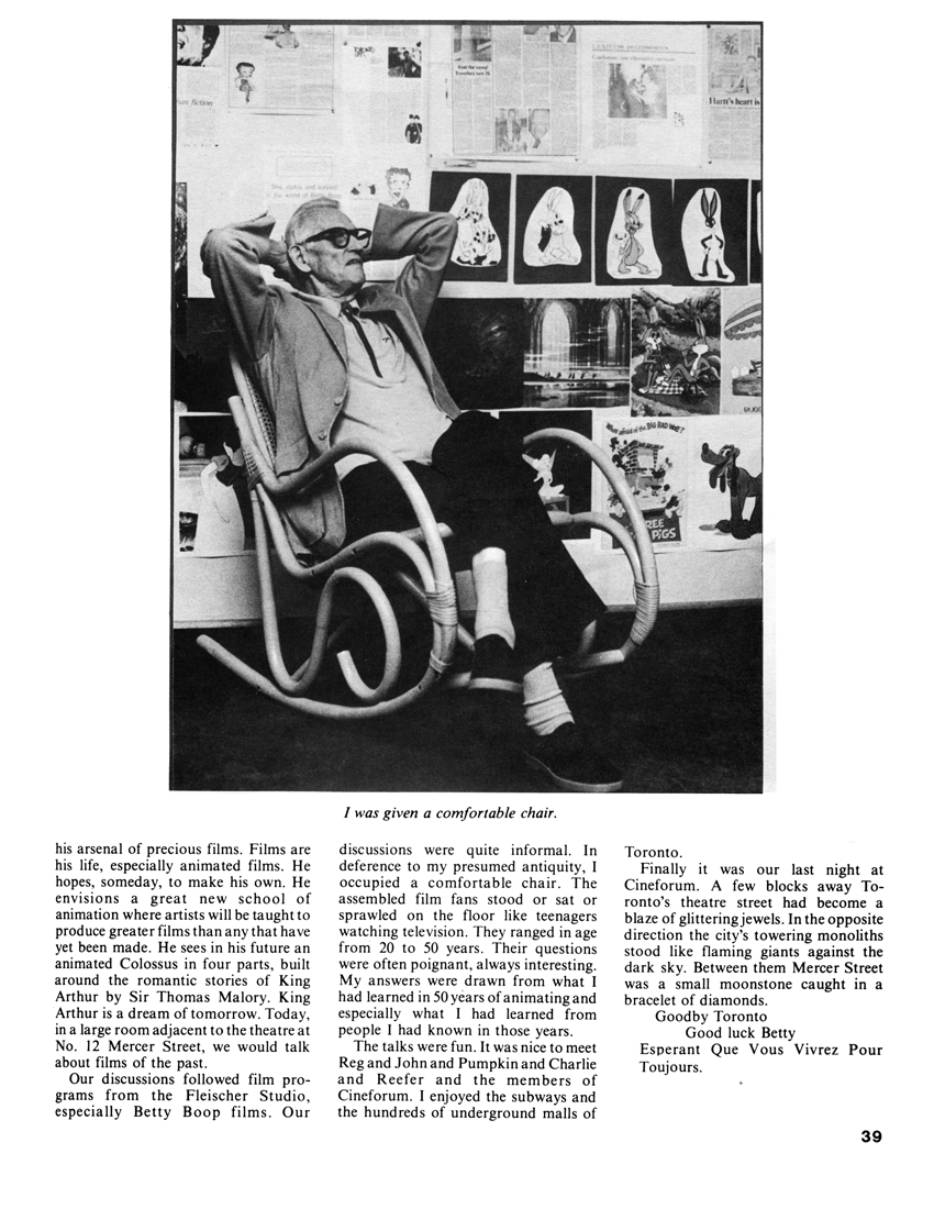 4
4Note that I have two other columns by Grim Natwick here and here.
Animation &Commentary &Fleischer &Frame Grabs &walk cycle 10 Mar 2008 08:12 am
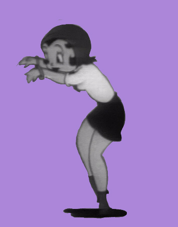
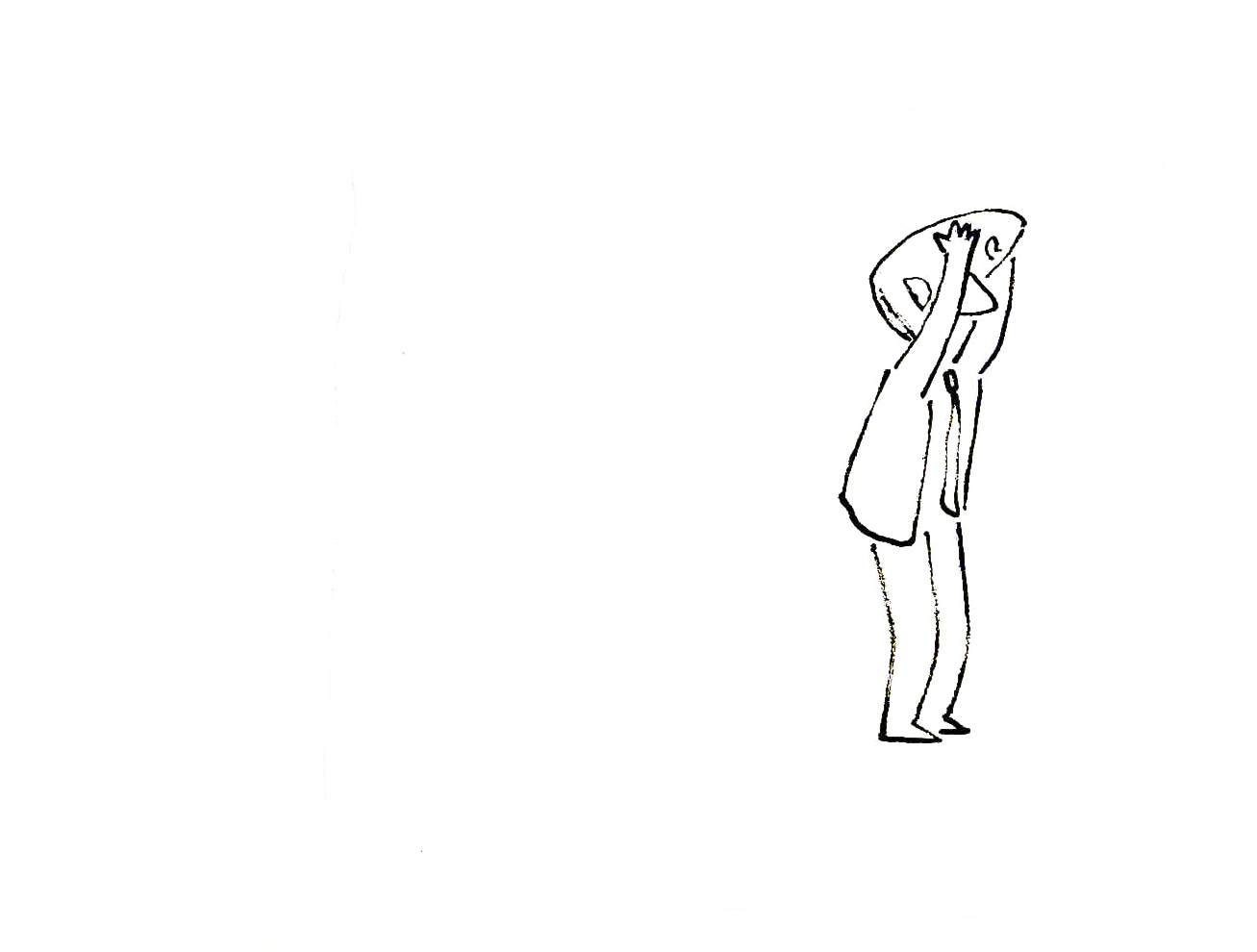
Betty Walks Backwards
Thad Komorowski posts a Popeye cartoon Popeye Meets William Tell which he surmises that Shamus Culhane is the director (he receives top animation billing under Dave Fleischer’s name.) The only other animator listed is Al Eugster. The cartoon is certainly an oddity, and I’m glad Thad highlighted it for me. It looks like an afterthought from the Gulliver’s Travels team. I don’t remember seeing it before, though I must have. It’s not that great a Popeye short; just an odd one.
There’s a curious thing happening in a walk in the opening of that film, and I hoped I had the film somewhere so that I could take a better look at it frame by frame. I don’t have it so will have to wait until I receive vol.2 of the Popeye dvd.
However I started looking a little closer at some Fleischer shorts. There are no end of interesting walks in those films. I found in the last Betty short Rhythm On the Reservation, that Betty walks backwards through about 1/3 of the film. She’s supposed to be conducting a beat for the Native Americans she’s visiting. What comes out is an interesting cycle that was probably animated by Myron Waldman.
I thought I’d share this walk with you.
 1
1  2
2 (Click any image to enlarge.) Betty walks backwards keeping time on three’s.
 3
3 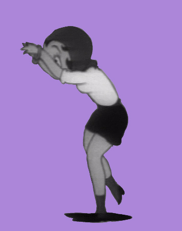 4
4  5
5 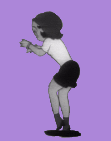 6
6 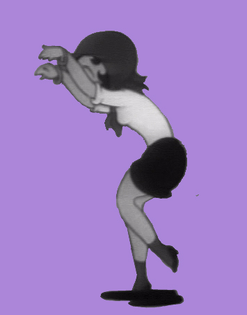 7
7 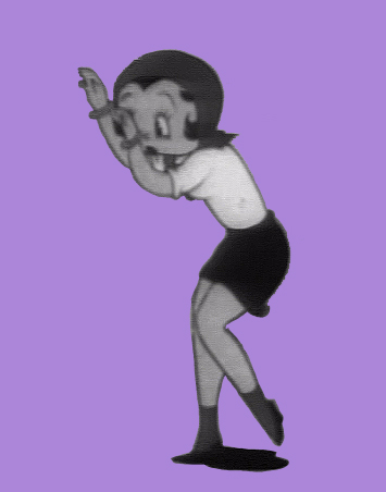 8
8 I can’t help but note that the Fleischer walks always seem to include
a complete turn of the head from left to right.
All animation is exaggeration.
Photos 09 Mar 2008 08:41 am
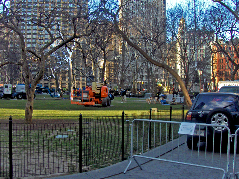
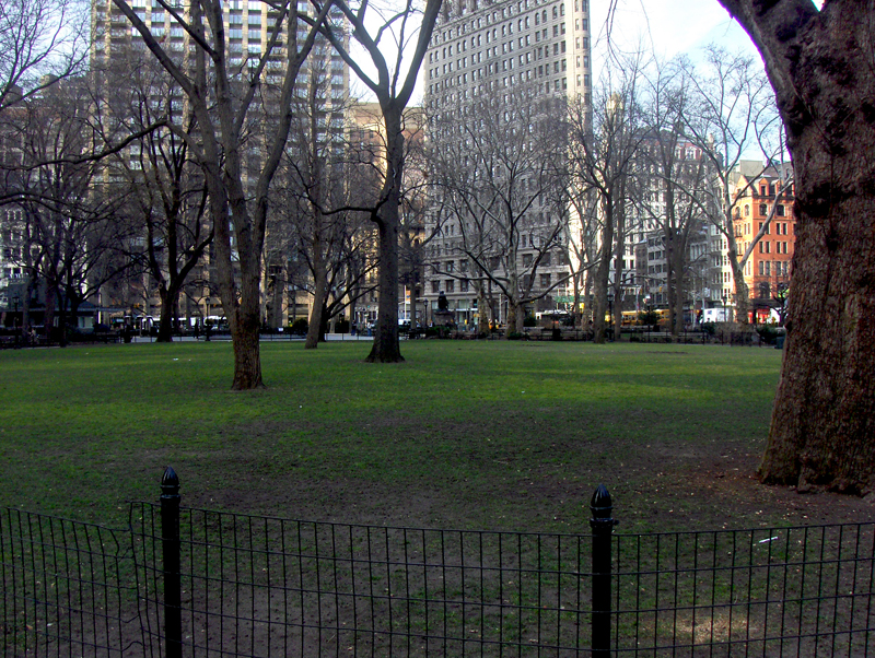
Steel Trees Down : Photo Sunday
- Perhaps you’ll remember that I posted a couple of pieces about the rise of a sculpture placed in the center of Madison Square Park. These were four trees, two together and another two standing alone. There was also a large steel rock. (see those posts here and here.)
These trees were constructed last April, in time for Spring.

You can see from this photo how well integrated they worked
into the atmosphere of the park.

Just last week I posted this photo showing how
they absorbed the snow around them.
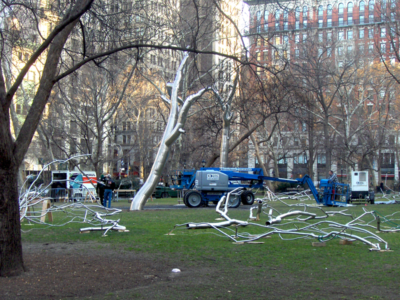
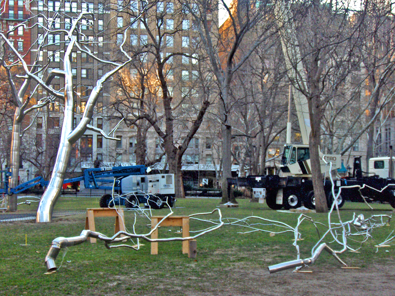
Well, now the trees are coming down. All week long the deconstruction of the trees has developed. I snapped a couple of pictures to record the end of the art pieces and to close the book on this chapter.
I knew the writing was on the wall when the main path
leading closest to the trees was closed to the public.
It didn’t take long for the cranes to arrive.

(Click any image to enlarge.)

Since the principal road was closed for this tear down,
you had to walk the long way around the mall.
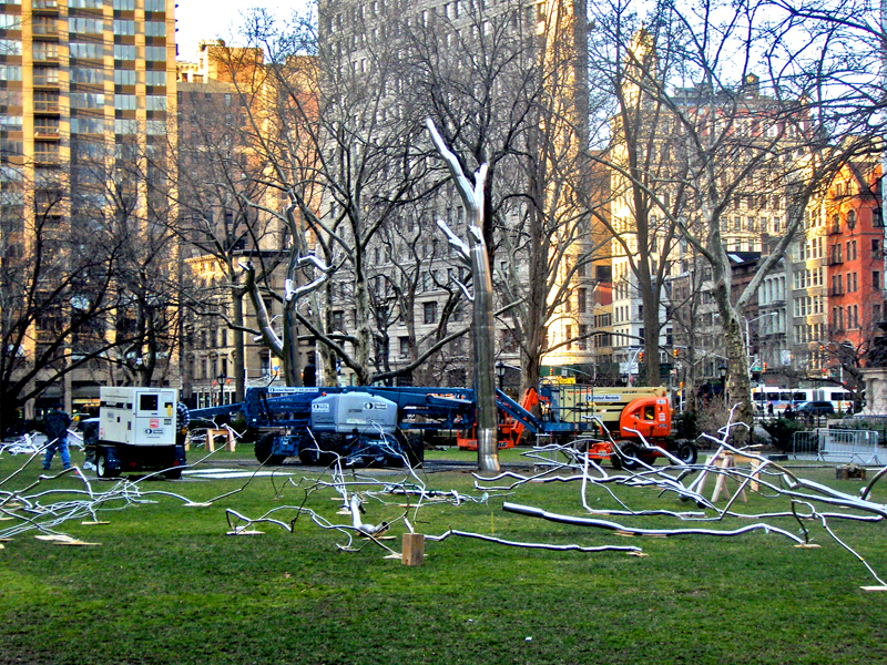

I found it noteworthy that they lay out the pieces of the branches in a
controlled way so that they could all be properly reassembled.
Part A goes into Part D attaches to Part R.

Tree in a cage.
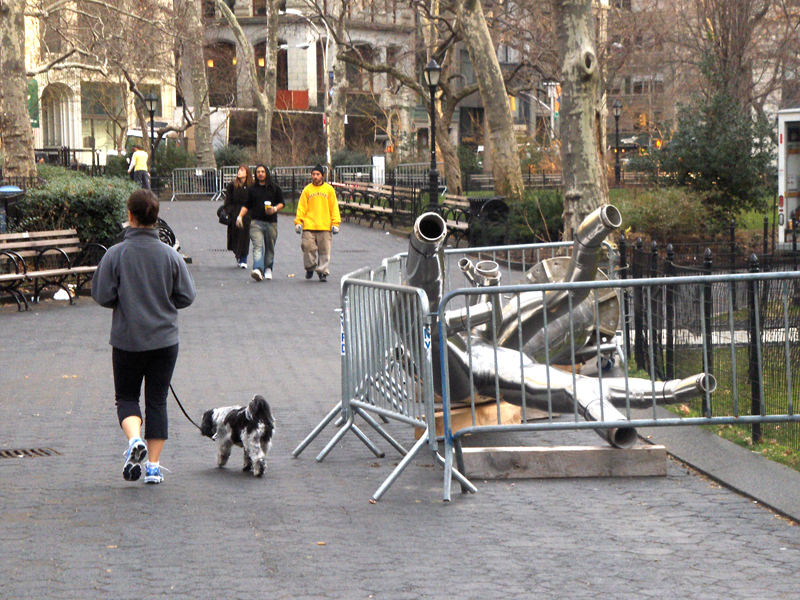

Meanwhile, the solo trees are coming down in one big piece.

No more steel trees.
The artist for these pieces is Roxy Paine. You can read about this installation at the Madison Square Park website. The site also includes a video interview with the artist about the sculptures.
They’re officially called, “Conjoined,” “Defunct,” and “Erratic.”
You can see images of other sculptures he’s created at the artist’s site.
Commentary 08 Mar 2008 09:34 am
Just my Opinion

- I’ve a been bit confused by what is going on at Michael Barrier‘s site.
To begin with he’s posting some absolutely amazing photographs. Many pictures of Disney and his family tavelling around the world. Most of these photos are unidentified, and Mike locates the picture for us and many of the people in them. There are also stunning pictures of some of the WB animators at work and play.
These images are the first rate stuff of animation history. They’re essential to those of us who want to know more about some of these animators who constructed the business in the first place. They’re also fun. (Who ever expected to see a photo of Tex Avery in swim trunks?)
 However much I enjoy these photos, I come to MichaelBarrier.com not for visuals; I come for the writing. Way back in the very early 70′s (or maybe it was the ’60s) I discovered this budding animation historian – when no such thing existed – through his magazine, Funnyworld. Immediately, my world began to hinge on this publication. Back in the day. there was no such writing as this; no interviews with animators; no serious reviews of animated films by reviewers who completely understood all aspects of the medium. Yet here it all was, and, what do you know, the writing was first rate.
In those days, I swore by the film criticism of Andrew Sarris, whose American Cinema, taught me worlds about film and the world of the director. Now, I’d found the equivalent of an Andrew Sarris in animation reviewers and historians.
Barrier and I became friends in the ’70s and have remained thus. I contributed a letter or two and was once asked to write a review or a piece about Watership Down. (I had been close to John Hubley who was nastily removed from that film. Perhaps I had some insight to offer.) I took it in stride and all humility when that review wasn’t included. I had no – none – hard feelings. Mike’s review wasn’t as negative as I was, and he offered more insight.
When Funnyworld went through its struggle to stay alive, I watched from the front row of the bleachers, and I was enormously sad when it all ended. Needless to say, I was enthralled when the internet brought it back to me, but I wasn’t prepared for the wealth that would keep coming. The printed magazine came once or twice a year – if we were lucky. The site gets updated frequently, and the material Mike shares with us is enormous.
So, you ask, what causes me confusion? It was this essay posted on March 5th, Accentuating the Negative. Obviously, some of the foul mouthed irritants of the internet misunderstood and internalized some of the comments Mike has posted. They took it personally, for whatever reason, and lashed back in confused, muddled repsonse. Barrier has felt the obligation to defend himself from their comments. It all amazes and confounds me.The world has changed – and not all for the better.
There was a time when criticism was just that. It was necessary for the reviewer to know his(her) business and have a bigger idea of the world to defend. You sidled up to the reviewers you most appreciated.
 If you were into directors, you went to Andrew Sarris or André Bazin and Cahiers du Cinema. If you were into writers, you went to Pauline Kael or Richard Corliss. The point was that there was a big picture. Now you have a choice between thumbs up or thumbs down or one to four stars. In New York it’s one to five apples. All critics today write is Black or White, a description of the story, and I like it or don’t. There is no depth in most reviews, and the language is pedestrian at best. It’s hard to read film reviewers today.
There are a few – just a few – animation critics who’ve earned their salt. Their taste is refined and their opinions are valuable. Michael Barrier leads this group, whether you like it or not. His opinion isn’t for everyone, but that’s irrelevant. I’ve disagreed with him as much as I’ve agreed. No one will ever be able to explain to me how or why he likes Polar Express. That’s my opinion vs his, and it doesn’t mean that I should say he’s an idiot and attack him. It just means I don’t agree with him. The thing is that I respect his writing so much that I paid attention to what he had to say about that film and went back to see the film a second time to try to understand his taste.
However, we’ve always agreed about one thing. Good animation is essential for the continuation of the Art form. The problem is that there’s just so little of it these days. There’s plenty of animation, but there’s just so much chaff for too little wheat.
 John Canemaker once, many years ago, had a small dinner party around a private screening of Fantasia. John, his companion, me and mine, and Tissa David sat through a projection of that film. John and I still like to joke about Tissa’s response, spoken in heavy Hungarian accent, at the very moment the lights came back on. “That film is HORRIBLE!â€
(Actually, I’m not sure if that’s the exact quote – I’m not sure any of us remember since we’ve joked around it for so long imitating Tissa’s Hungarian accent. She loved the teasing.) We all laughed.
On that day, John was, I think, hurt on some small scale. Fantasia was an important film to him and his development, and it’s germinal to a lot of what inspired his own artwork. Here was this great animator that he respected enormously, and she bluntly tore the film down.
I dredge up this story because it has some small relevance here. A good critic, one who is completely honest with himself and his medium, is obliged to be honest. We have to hear the truth, or we can’t learn anything. Mike Barrier has given me some enormously positive reviews, but he’s also given me some negative ones. I’m convinced that he’s been a bit more sensitive so as not to hurt my feelings, but he has still been honest. I’ve always taken good reviews with pleasure, but I’ve taken the more negative ones more seriously. I can learn from both, but the negatives – if they’re well written and informed – have more to teach me.
 There’s a current healthy exchange going on there between Mike and Nick Cross, a Canadian filmmaker. His film, The Waif of Persphone, was negatively reviewed and Mike admits that he may have been too curt. As a result he’s ordered a dvd copy of the film to look at it again and give his second thoughts. He’s using his own coin to look again at a film he didn’t like; he simply wants to be sure that he gave his open and honest opinion. You couldn’t expect more from an animation reviewer.
I guess my confusion comes when an excellent writer and historian has to bow down to those who are cursorily judging him for not agreeing with them. This is a guy who is respected as the top of the game by ALL of the other animation historians out there. Yes, they all have quibbles at times over Mike’s personality, but the same is true of all of them. The important thing is that the knowledge and the truth gets out there and should not, can not be censored. Mike’s criticism and historical writing, whether we agree with it or not, is part of that truth.
Maybe if Barack Obama gets into office this will all get a bit better.
Animation Artifacts &Layout & Design 07 Mar 2008 09:24 am
Recap Fridays: Steig Lay Outs
- I initially posted these Steig Lay Out drawings in February 2006. They’re important enough (to me at least) for me to re post them. I’ve reshaped the images for better viewing.
These are some of the layout drawings done by William Steig for an Alka Seltzer commercial produced in the early 60′s.
 2
2  3
3
_________(Click any image to enlarge.)
The commercial was done by Elektra Studios. Steig worked with a bamboo reed cut to form a point. He dipped that in ink and drew. The paper is particularly thick and is designed to absorb the ink. They’re punched with Oxberry peg holes top and bottom. I have one of the “pens” he used to draw these layouts. The final comercial was basically an ink line drawing against a white field.
 7
7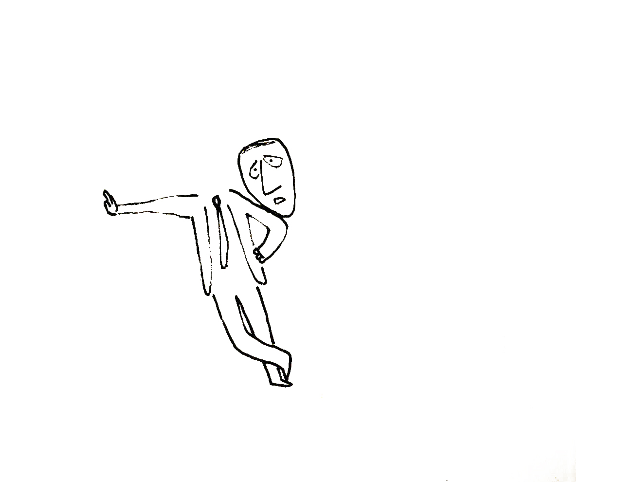 9
9I’ve been a big fan of Steig‘s since my earliest days when I first discovered him in the New Yorker Magazine. By the time I’d made it to college, I’d already seen two art exhibits of his artwork.
 12
12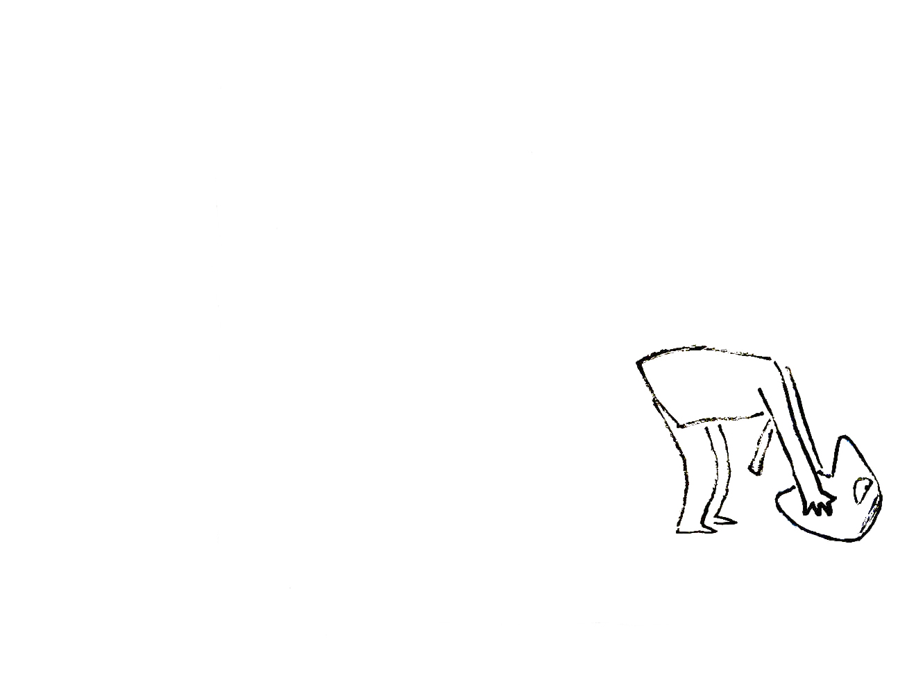 13
13By the time I saw my third exhibit of his work, I was able to barely afford one of the New Yorker drawings. It’s done on rice paper with the same type of “pen”. Years later, when I told Steig that I’d bought it, he said that it was the only drawing to have sold at that exhibit.
 15
15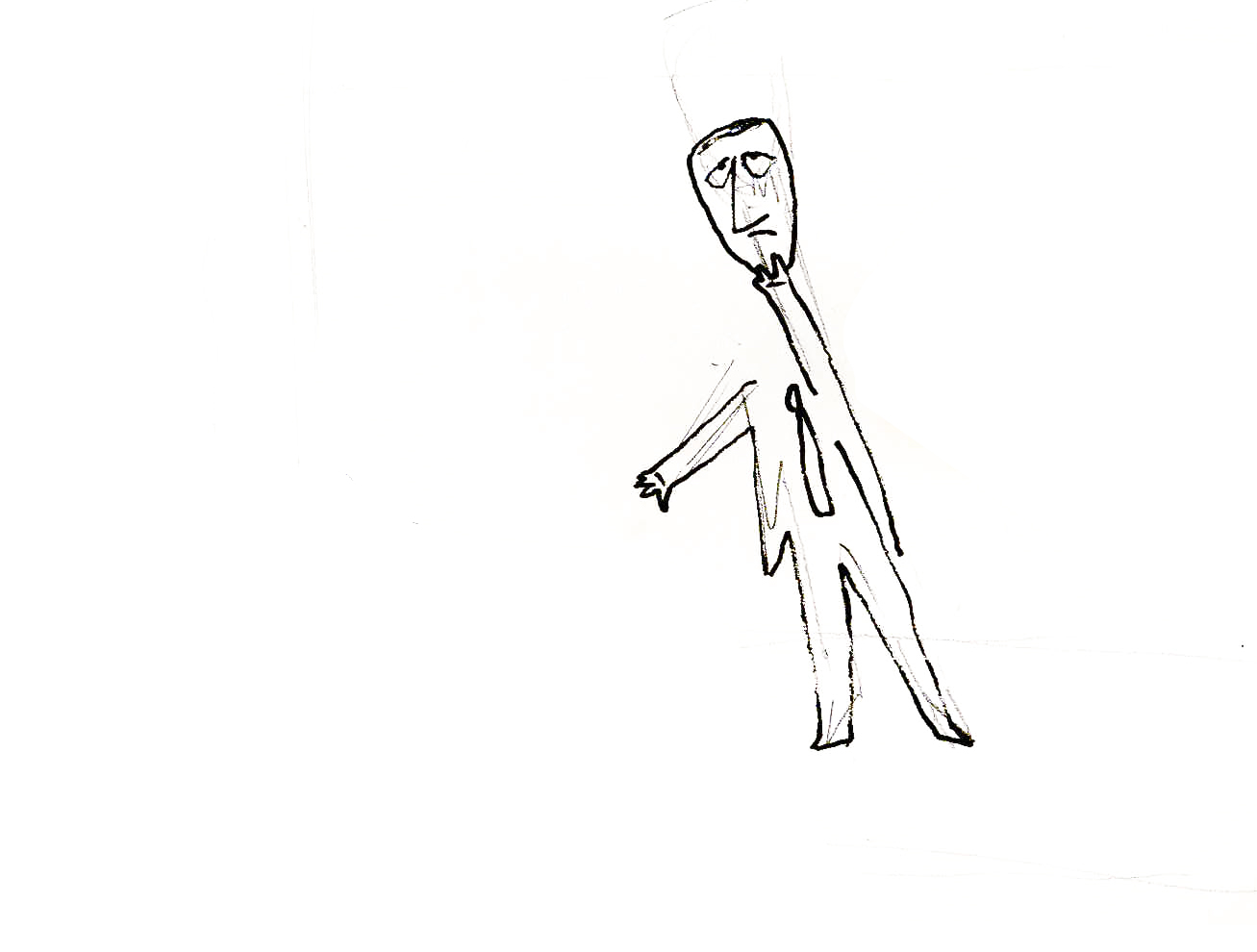 17
17It was real luck for me to have been able to adapt a couple of his children’s books to animation. I not only got to meet him and his wife, Jeanne, but worked with his flutist son, Jeremy, on a number of projects.
Bridget Thorne, who art directed the film, did some of her finest work ever on the backgrounds – beautiful pieces that I still treasure. I think this is one of Steig‘s best books, and I think we did it justice. 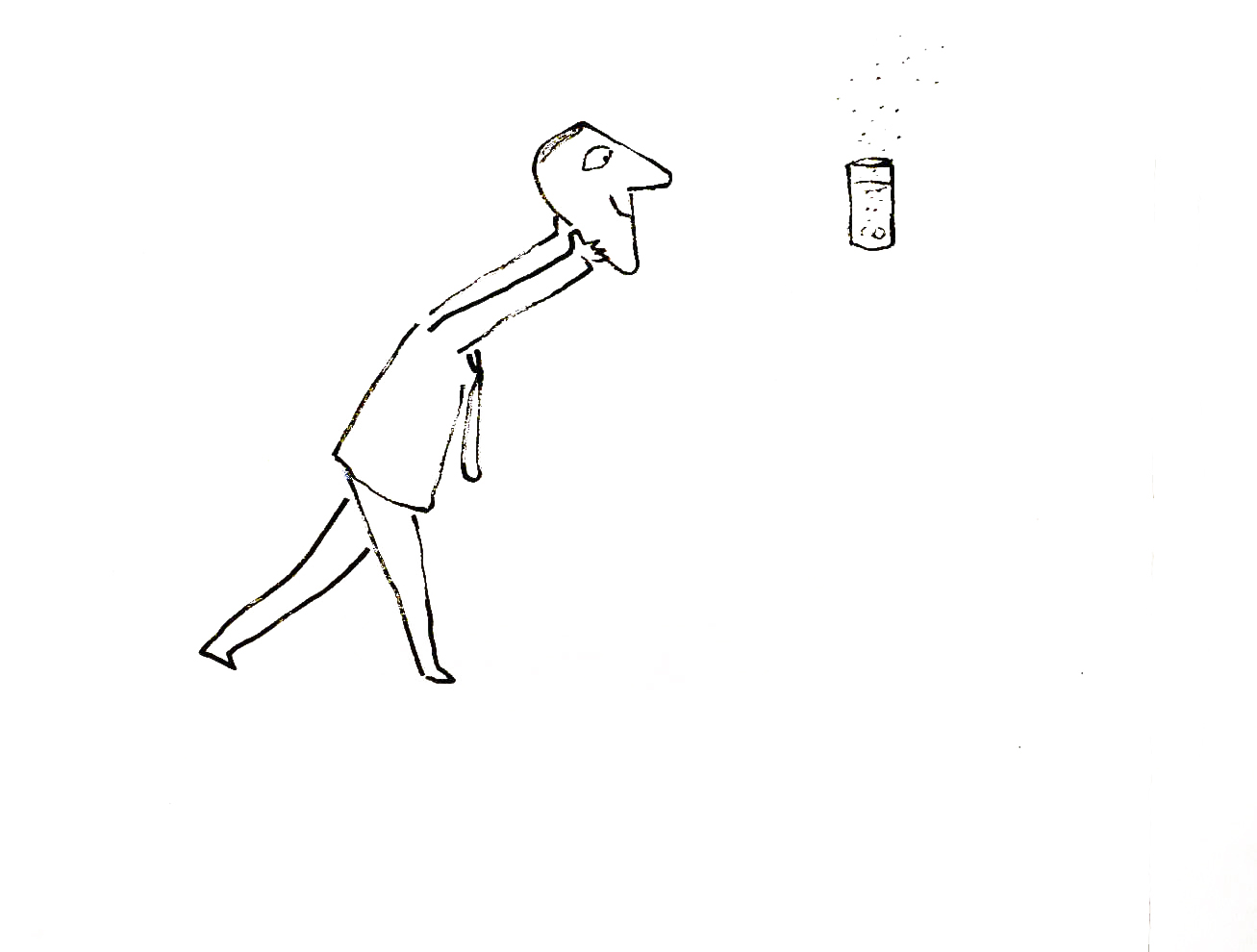
I’m rather partial to Abel’s Island as a film. There were only about two dozen B&W pen and ink illustrations in the book, so we had to do quite a bit of designing in the style of Steig
 24
24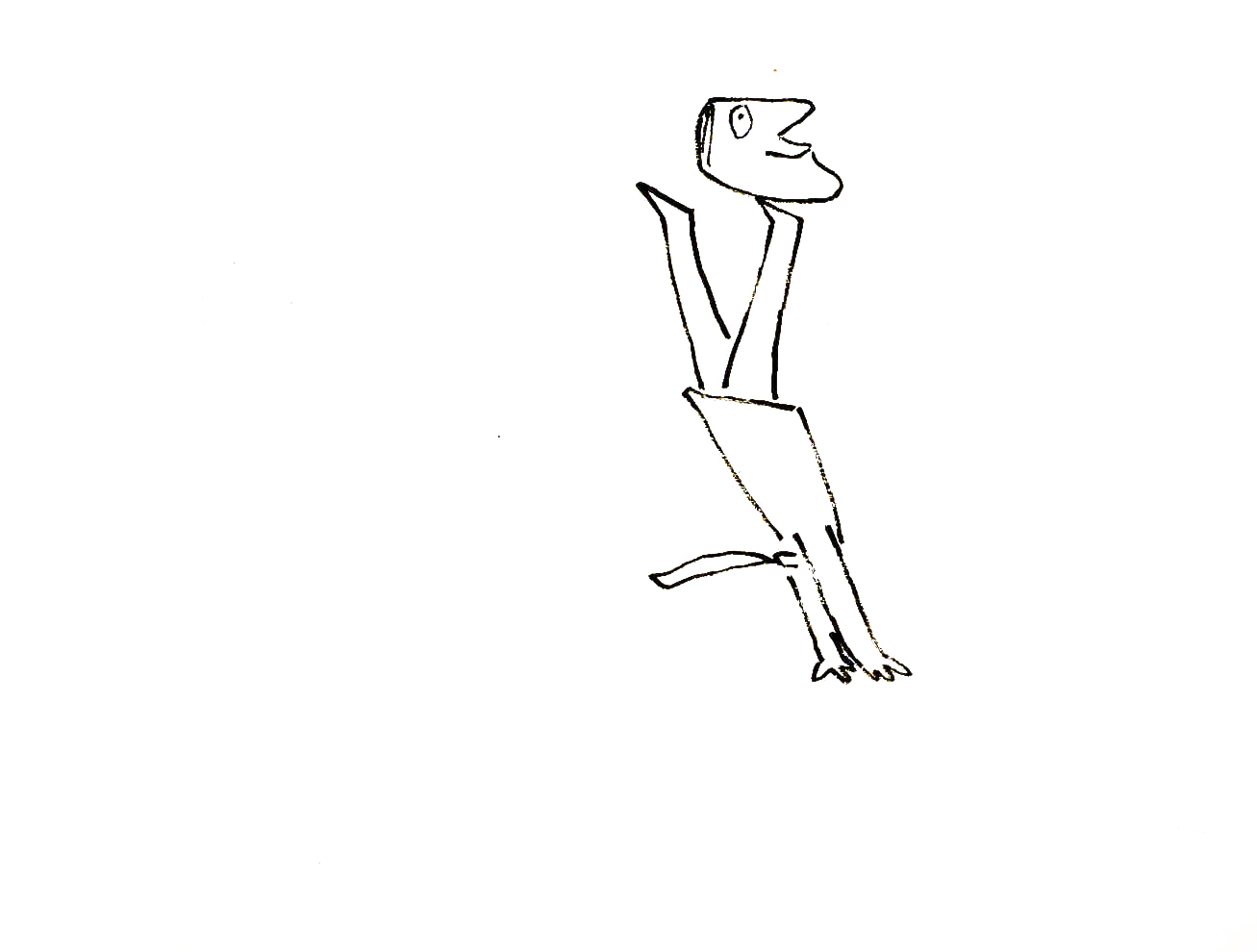 27
27
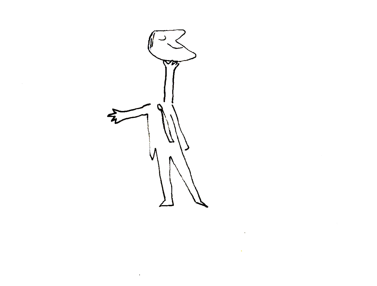
Frame Grabs &UPA 06 Mar 2008 09:11 am
The King and Joe
 - The Gerald McBoing Boing show aired in 1956. This program collected many new shorts hinged with some small bits featuring the title character. Many of the shorts were built around themes such as artists or inventors or even circuses. Some of these shorts were collected onto vhs tapes. To my knowledge, they haven’t been released in dvd.
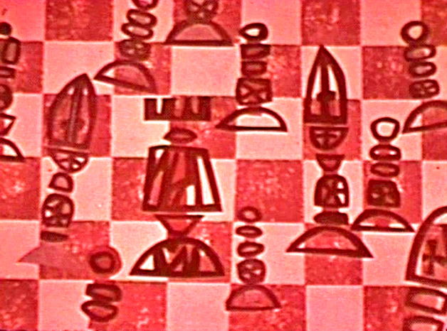
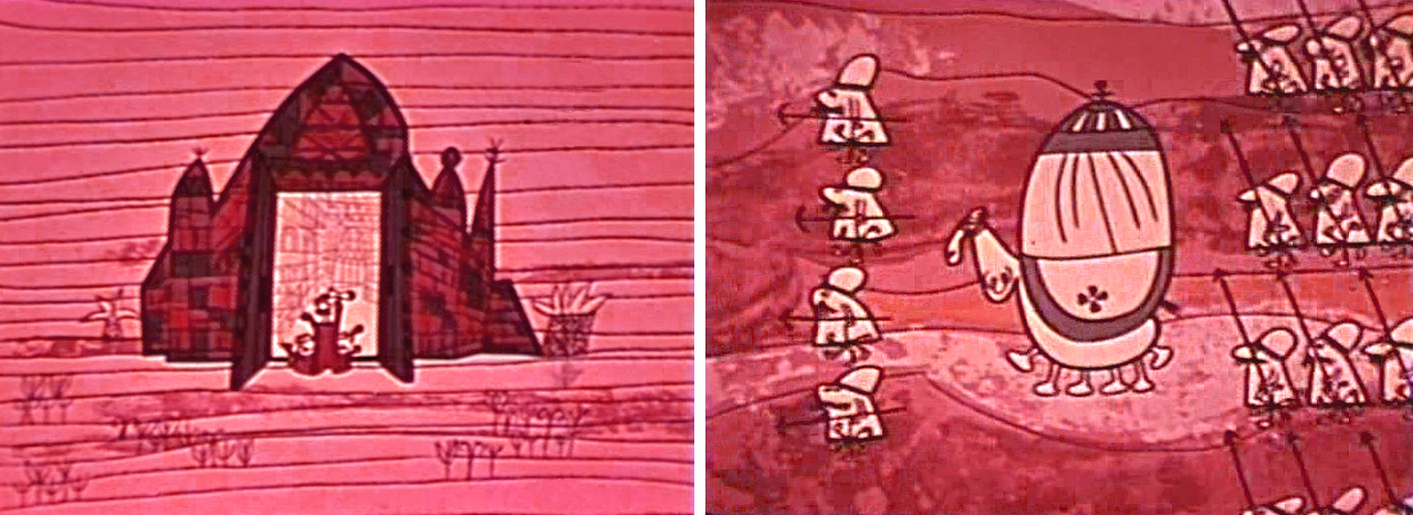
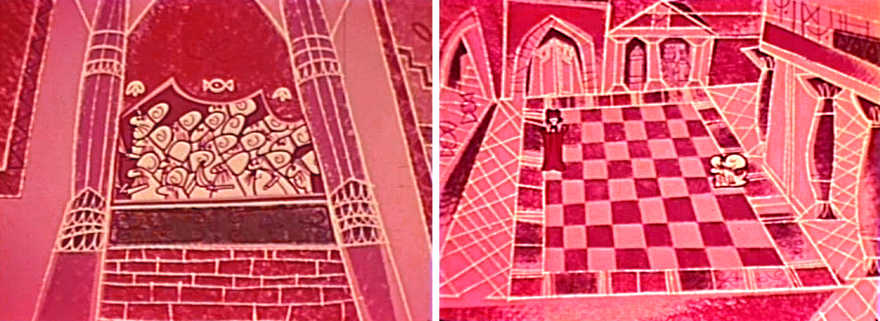
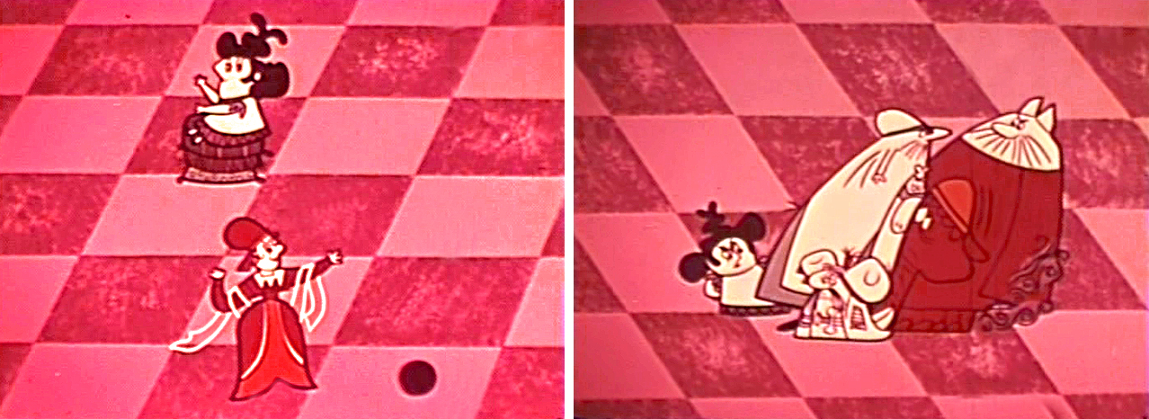
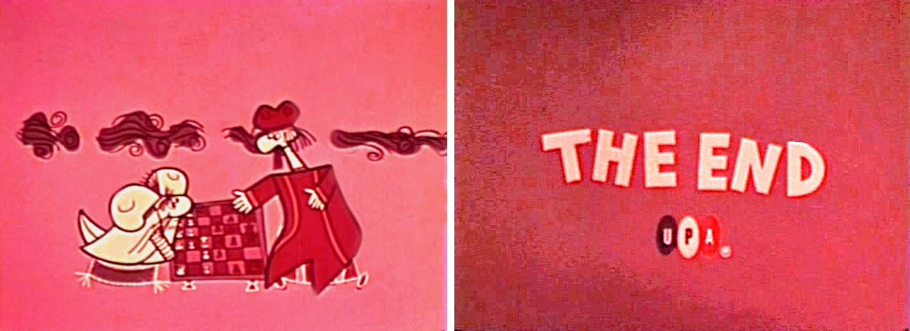
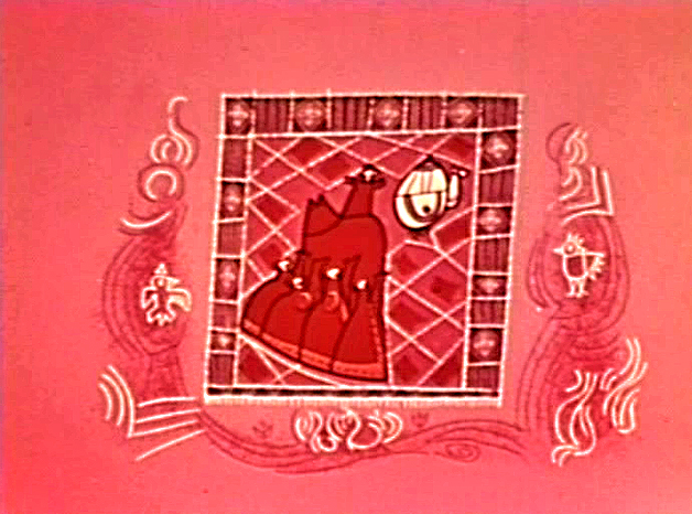
Many of the shorts were inspired by different artists’ work, even if they had no real relevance to the story. The short, The King & Joe tells the story of the invention of the game of chess. The design style was pulled from some of Paul Klee’s work, and I’ve always found this short curious. It’s a bit long and it feels longer to sit through (as do many of the films in this series), but the artwork sometimes is inspired.
Mind you, this is not a great short; as a matter of fact, I’m not sure it’s really even good. However, it’s stuck with me for years.
Maybe as a way of exorcising it from my brain, I decided to look at it a bit closer. I’ve chosen to pull some frame grabs to show off this short. The color of the print is quite deteriorated; I’ve tried to enhance the images displayed here. Hopefully, my choices are close.

_________________(Click any image to enlarge.)
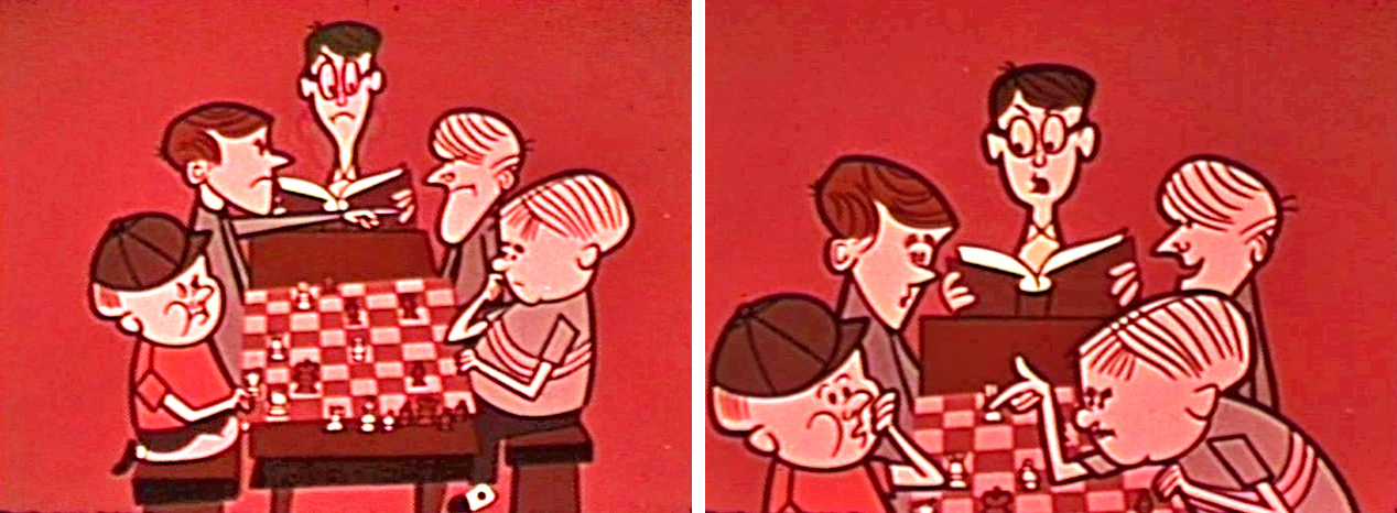
__They use the device wherein the story starts with current day characters playing chess,
__and we go back in time to reveal the history of the game.
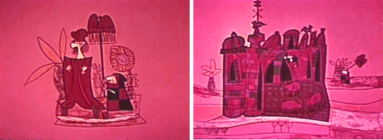
__Basically it’s the story of warring Arabic nations who ultimately play a game to
__conclude the endless battles.
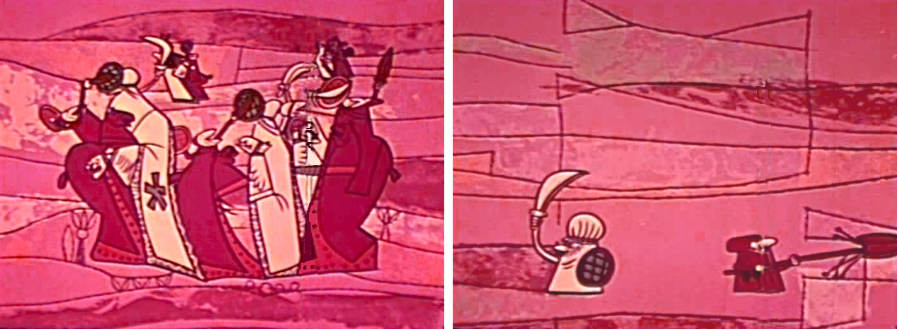
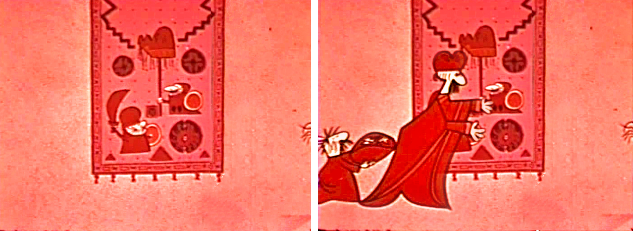
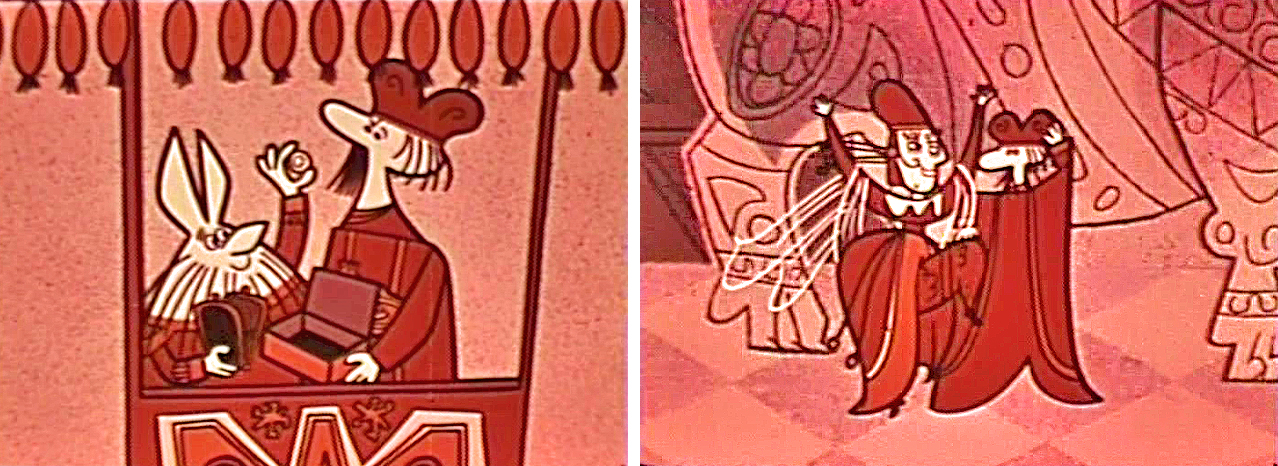
__Elements in the design of this piece remind me of work UPA would do later in
__1001 Arbian Nights with Mr. Magoo.
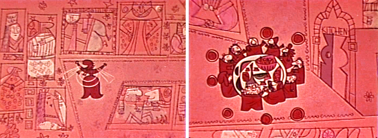
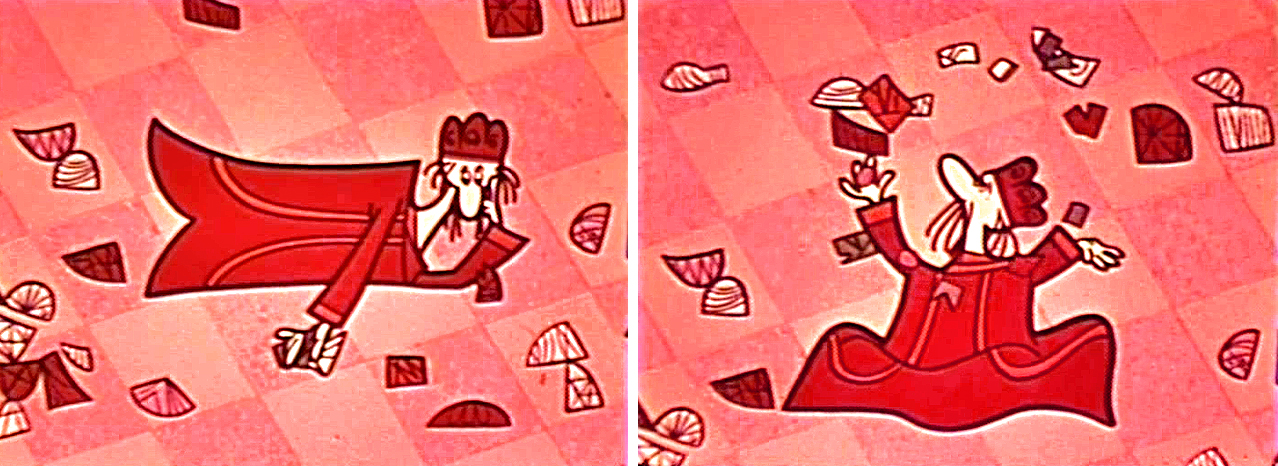
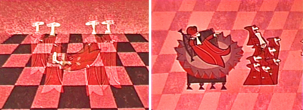
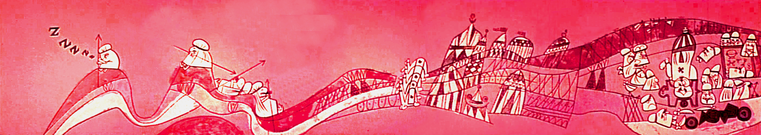
__This BG pan is more like one of Klee’s paintings than anything else in the short.
Art Art 05 Mar 2008 09:00 am
Art and Titles
 - The artist Raul Vincent Enriquez has developed a site for flipbook portraits. He’s created a series of multiple screen portraits using several Quicktime images anchored together.
Digital self-portraits taken by photo booth visitors and then animated by the artist to resemble flipbook images will be broadcast onto the Times Square Lumacom screen. This began yesterday, March 4th, and will run for two months.
The photo booth quality of the portraits makes for unusal imagery. It reminds me of some early multiple screen works by the likes of Nam June Paik
You can get an idea of these pieces on line by going here. You’re also given the opportunity to participate in these photo booth animations by contacting the artist at this site.
The title artist, Saul Bass, gets a lot of attention at the site Erin Laing: Film and Process which features a lot of YouTube movies of the title sequences for The Man With The Golden Arm, Around the World in 80 Days, Psycho, Seconds, Alien, and Scorcese’s Cape Fear. ( Great scores as well Elmer Bernstein, Bernard Herrman and Jerry Goldsmith.)
She also gives links to: Anatomy of a Murder, North by Northwest, Walk on the Wild Side, It’s a Mad Mad Mad Mad World and Casino.
Bass was something of an inspiration for me in my early days. I was particularly excited when I got the job of designing titles for a number of films. I took great pleasure in reworking the type for all the films I did and even designing a typeface for one of the films. I always felt the connection to animation in all the work and artwork I did for these titles even though it wasn’t always apparent.
On my first title design, which was for Prince of the City, I did a number of sequences of identification for many of the actors who were unfamiliar to audiences. We wanted to make sure the audience always knew who was who. When it came time for my credit, Sidney Lumet didn’t want my company, Michael Sporn Animation, to get credit. He thought audiences would question what was animated. I had to just use my name and that of Phillip Schopper, who photographed all the ID’s and shared a lot of the work. Someday ‘ll write more about this film.
My interest in title sequences, of course, continues. I hope to post a bit more about Saul Bass, and the brilliant but quietly executed work of Dan Perri. He hasn’t gotten the attention he certainly deserves. His most recent work for In The Valley of Elah is just as good as Gangs of New York or Raging Bull or any of his older titles. I guess animators wouldn’t get a charge out of his work, but designers certainly should.
Daily post 04 Mar 2008 09:14 am
Missed events and AnimalFarmWorld
 - A couple of events passed through New York in the last couple of days, and I’m sad to say that I missed them all. If anyone out there attended any of these, please feel free to let us know what you thought.
- Last night, there was a panel discussion at the Jewish Museum re the art of William Steig. Participating in this panel were:
- - Leonard Marcus who discussed Steig’s career as a
__ children’s book illustrator and author.
- Jeffrey Katzenberg, Chief Executive Officer of
__ DreamWorks Animation, discussed bringing the
__ character of Shrek to life on film.
- Chris Miller, director of the Shrek the Third film,
__ offered a movie director’s take on Shrek.
- Jason Moore, director of the forthcoming SHREK THE MUSICAL
- David Lindsay-Abaire, book and lyrics for SHREK THE MUSICAL, spoke about
__ the creative process that is driving the musical stage production.
Yesterday, there was a NYTimes article about Steig and the exhibit. It was obviously also in anticipation of the discussion.
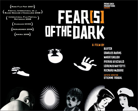 - On Saturday night, as part of the the “Rendez-Vous With French Cinema” – a short series of new French films playing at several venues aroung town – there was a single screening of Fear(s) of the Dark played at the IFC center.
This is the animated feature directed by six different animators, including Charles Burns, Blutch, Marie Caillou and Richard McGuire. The film has been playing at a number of festivals recently, including Cinequest in San Jose, and Brussels’ Anima International Festival.
Fear(s) of the Dark was produced in France by Prima Linea Productions. Their site describes the film with a lot of stills (appropriately enough) and these words:
- Six of the worlds hottest graphic artists and cartoonists have breathed life into their
 nightmares, bleeding away colour only to retain the starkness of light and the pitch black of shadows.
Their intertwined stories make up an unprecedented epic where phobias, disgust and nightmares come to life and reveal Fear at its most naked and intense…
Variety reviewed the film positively at Sundance. They had glowing things to say about Richard McGuire‘s segment. I report this because McGuire, a New Yorker, introduced the film this past Saturday. It’s unfortunate that there was relatively little press about it, and that there was only the one screening. it conflicted with other plans I’d made, and I learned too late to alter my plans.
Postscript: Commentor Masako Kanayama left the information that the film will be screened again this Sunday March 9, at 1:30pm, at the Walter Reade Theater (Lincoln Center). You can buy advanced tickets online: www.filmlinc.com or at the box office.
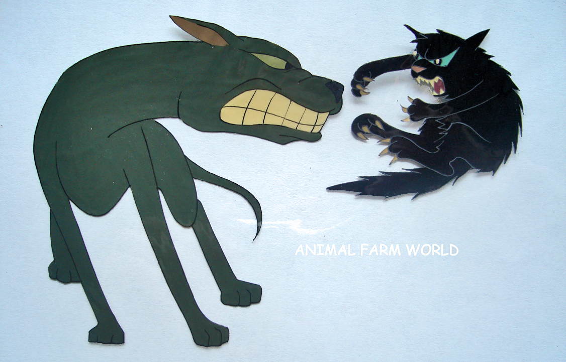 - Something I have not missed lately is Chris Rushworth’s web site,
Animal Farm World.
Chris is an ardent fan of the Halas and Batchelor feature, Animal Farm. As such he has collected quite a few drawings and cels from the 1955 feature. He also has many editions of the novel featuring work from different illustrators.
I first learned of this site when Chris responded to a post I’d written about the illustrations by Joy Batchelor for a tie-in edition of the book released in 1955. I’ve written more than a few pieces about this book and film to give you a good indication that I’m a fan as well.
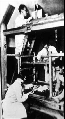 Harvey Deneroff has an excellent article on his site about the history of the multiplane camera. He tries to track Willis O’Brien’s rear screen projection developments and the influence that may have had on the three studios that developed their cameras: Ub Iwerks, Max Fleischer or Disney.
He also details a bit about the multiplane setup developed by Lotte Reiniger utilized in producing Prince Achmed.
The connection between stop motion animation and the machinery is interesting. Given that both Iwerks and Fleischer used horizontal animation stands, it seems a natural that 3D animation was an obvious by product. Indeed, the little sets that Fleischer’s studio created are virtually 3D animation sets.
It’s a good article with excellent observations.
Lotte Reiniger pictured to the left.
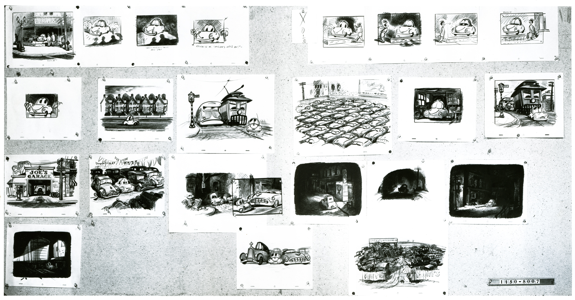
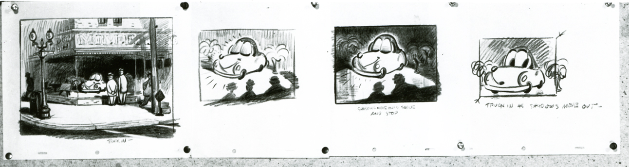
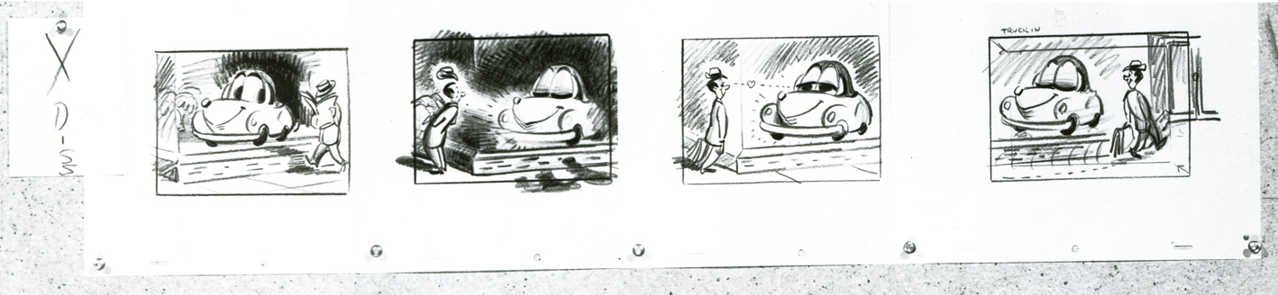
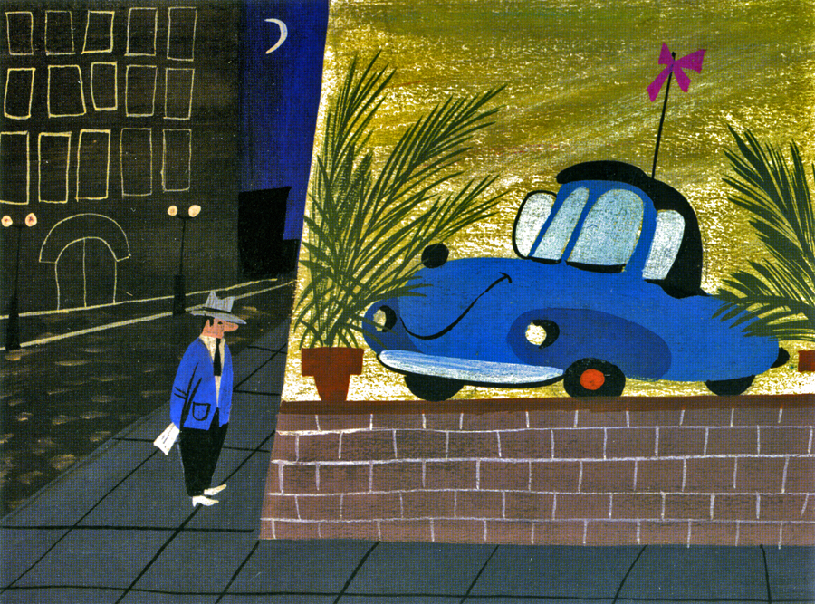
Animation Artifacts &Disney &Mary Blair &Peet &Story & Storyboards 03 Mar 2008 09:00 am
Last of Susie
- In the past two weeks I’ve posted a number of boards and preliminary artwork for Susie the Little Blue Coupe, the 1952 Disney short. Bill Peet did all of the storyboard drawings posted last week, and he did a storybook prep for the film posted the week before.
All of this material came to me via a generous loan from John Canemaker.
Here’s the final board in the series. It seems to be LO drawings and doesn’t appear to be part of the storyboard. Perhaps it was prepared for a Leica reel? Regardless, the drawings are interesting, though I doubt Bill Peet did them all.
__As with other recent posts of storyboard material, I’ve broken it up and repositioned
__the images so that you can enlarge them for better viewing. The above image rep-
__resents what the photo given me looks like.
 1a
1a
____________ (Click any image to enlarge.)
 1b
1b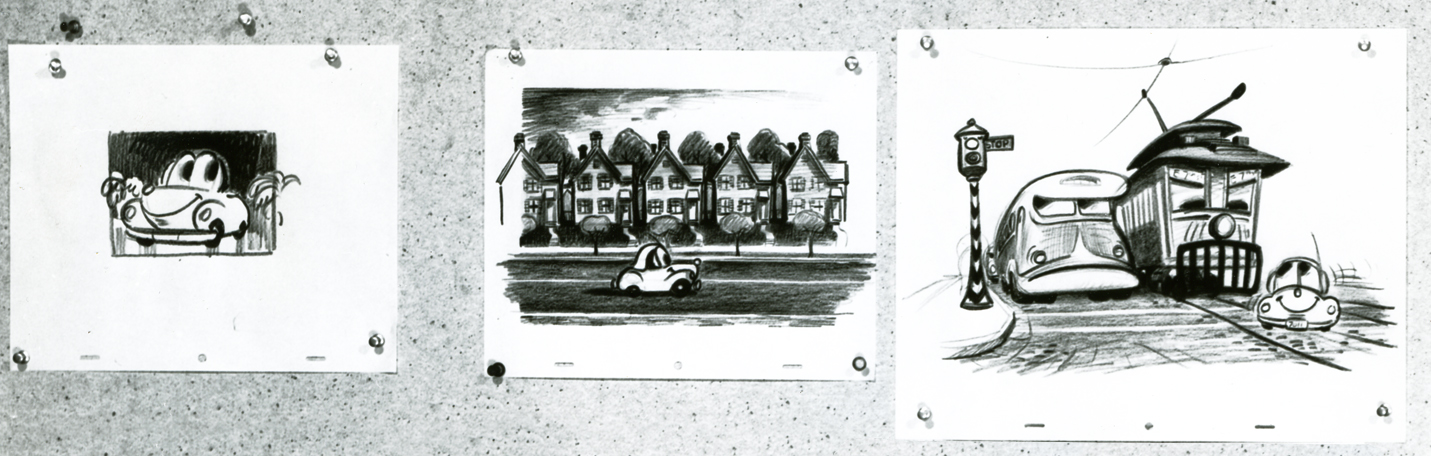 2a
2a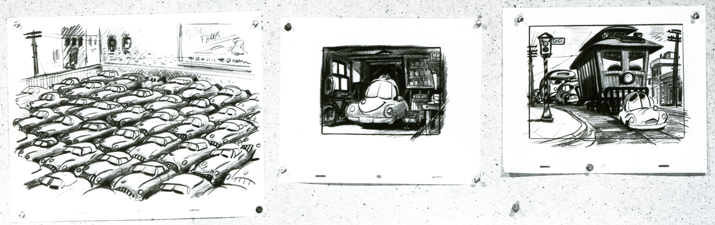 2b
2b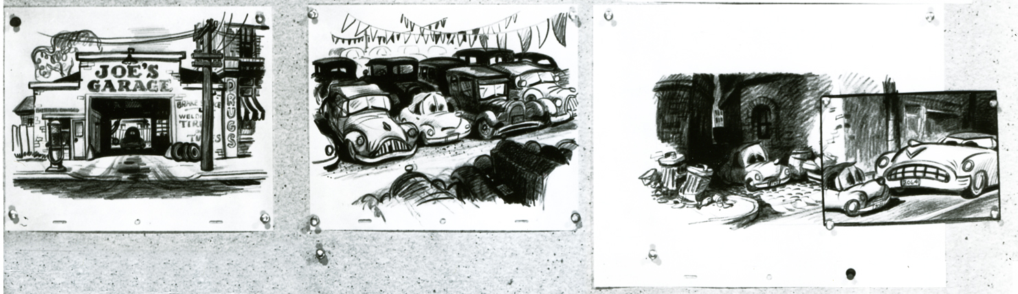 3a
3a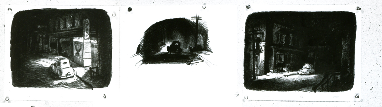 3b
3b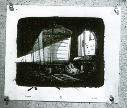 4a
4a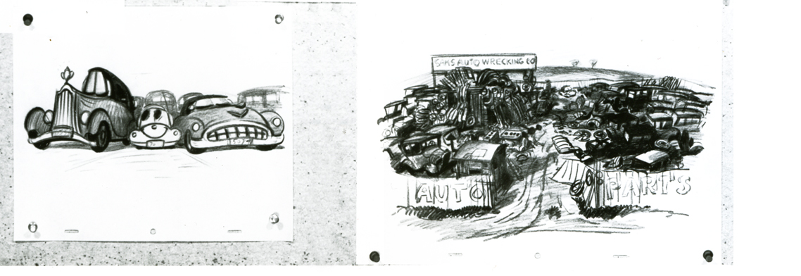 4b
4bFinally, I wanted to give an indication of the film’s color, so I’ve gone back to John Canemaker’s book The Art and Flair of Mary Blair and have poached this color sketch she did in styling the film.
Photos 02 Mar 2008 09:34 am
Black Snow – Sunday Photos
 - Back during the production of Raggedy Ann, in New York, there was an Assistant Animator named, Duane Ullrich, whose company I enjoyed much. He came from the West (I’m thinking maybe Oklahoma, but I honestly can’t remember) and had a lot of amusing comments. One that stuck with me was his surprise in finding “black snow” in New York. He thought that this might be one of the most interesting things he’d seen here.
This thought occurs to me every year that it snows in New York. Last week, we had one of our first real snowfalls this year. Within a day the snow was disappearing. When I saw the “black snow” I decided to share some images with you.
These were all taken on a 20 block walk I made enroute to work. It was misting a hail-like rain while I shot. And cold.

(Click any image to enlarge.)__________
 1_
1_ 2
2
______Snow naturally sidles up to corners and crevices when it hits cement.
 3_
3_ 4
4
______Any object it can lean against is where to look for it.
 5_
5_ 6
6
___Curbs and news vending machines seem to be among the last places to find snow.
 7_
7_ 8
8
_Of course, once you enter a park there’s plenty of snow, but it stays fresh and white.
 9_
9_ 10
10
_Here are a couple of trees and shrubs and bushes collecting snow – not quite black yet.
__11
___These steel trees stood tall through the winter storm and didn’t collect a lot of snow.
___However, they’ve started taking them down. I guess the loan of these art pieces has
___come to an end. (Or else they’ve found some rust.)
