Monthly ArchiveOctober 2011
Frame Grabs &Hubley &repeated posts 11 Oct 2011 06:54 am
Hubley and the Telephone
- The Hubley show last night was brilliant. A first rate job by John Canemaker. Most of the prints were spotless and beuatiful (something you rarely see with Hubley films – the DVD copies are soft focus and poorly transferred.) I’ll write about it later in the week. I have a lot of photos to add to that post.
I’ve been posting some pieces about the Hubley work. Given the start I had concentrating on it, I can’t come down so quickly. There’ll be a couple more posts on his work this week. This piece is something you won’t see projected any time soon. It’s an industrial done for AT&T originally posted back in July, 2009.
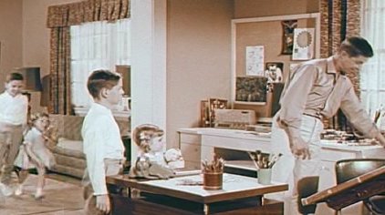
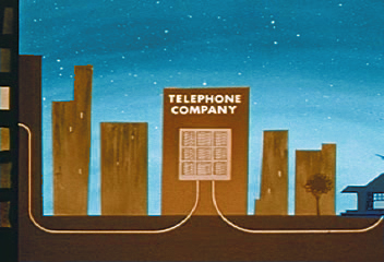
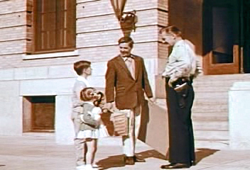
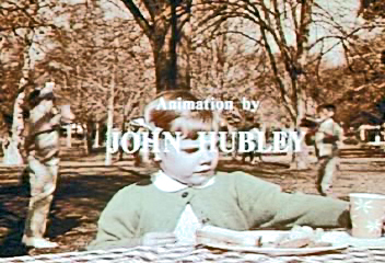
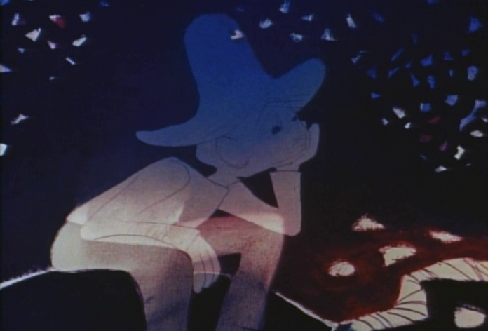
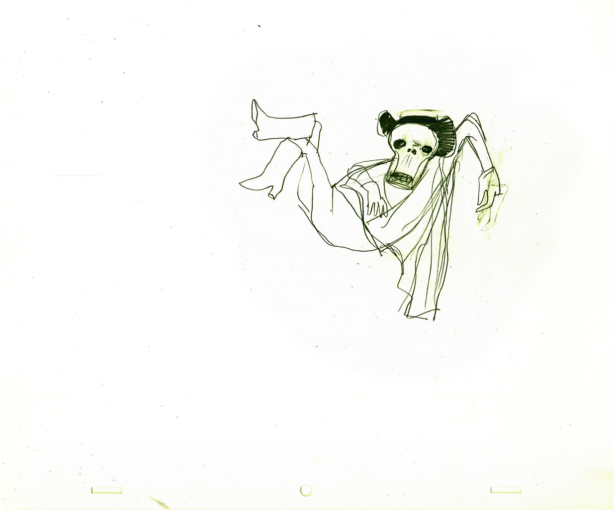
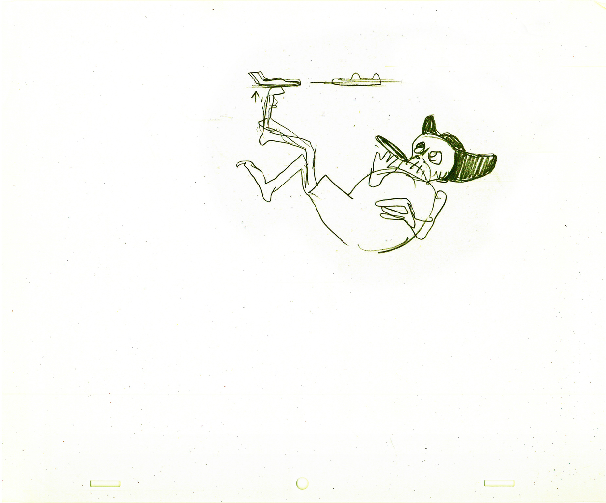
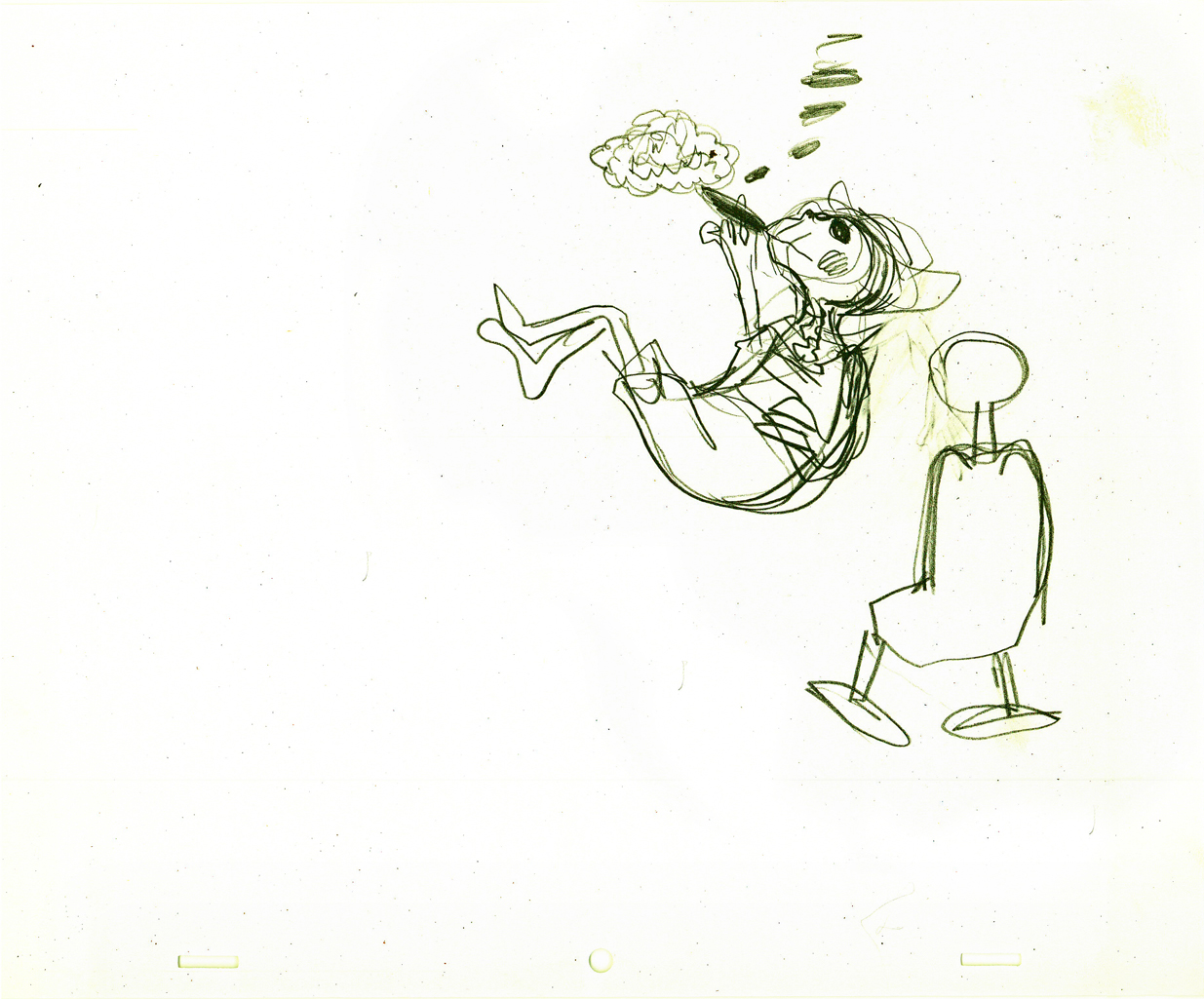
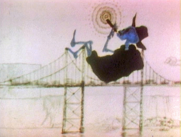
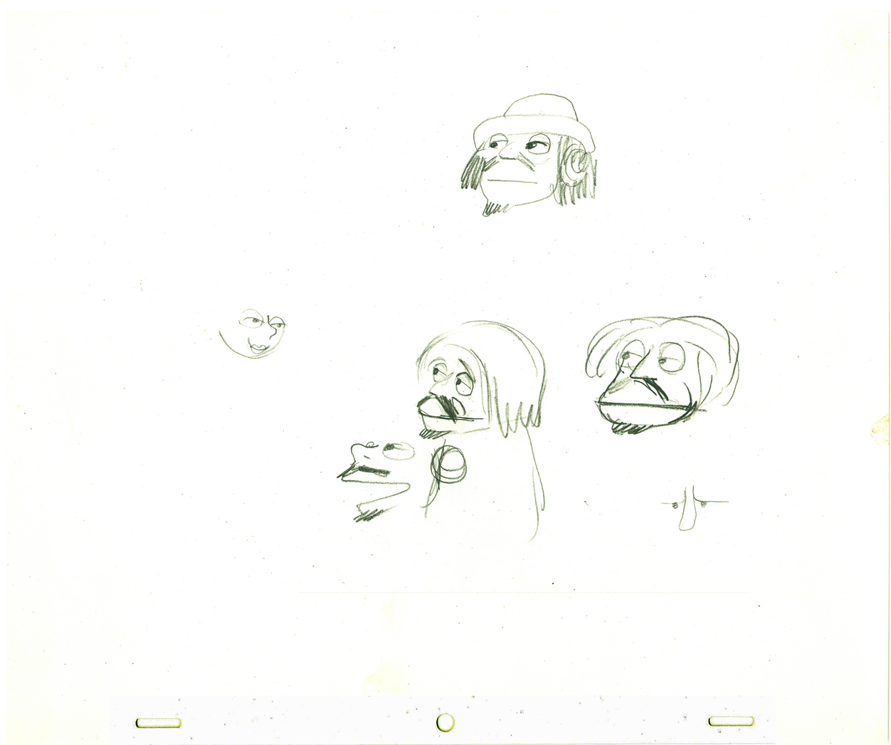
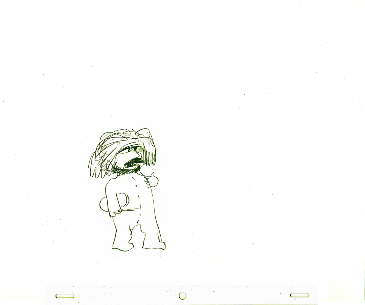
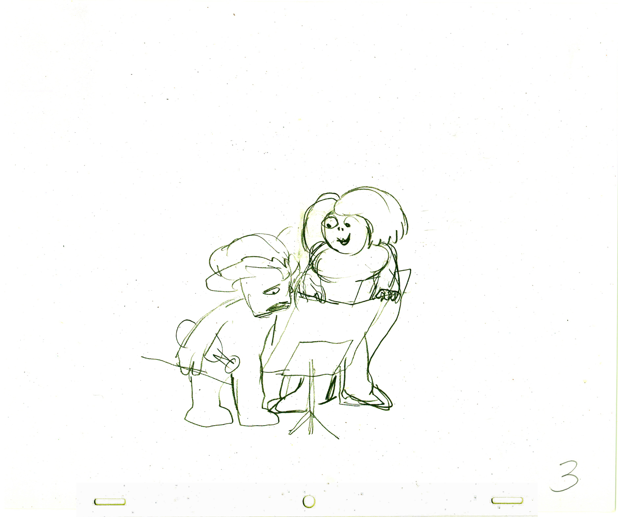
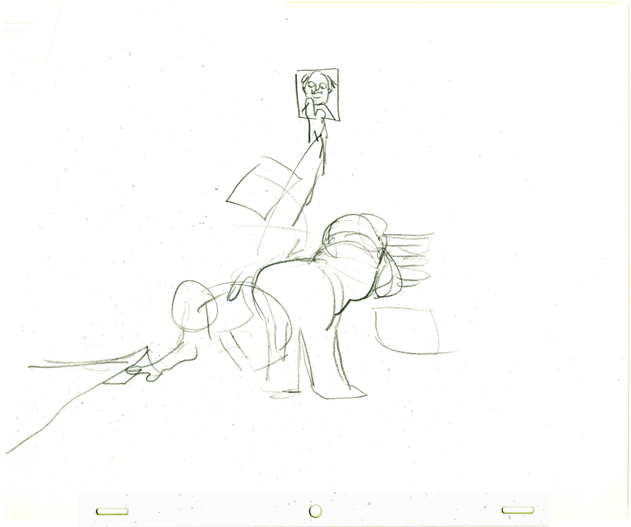
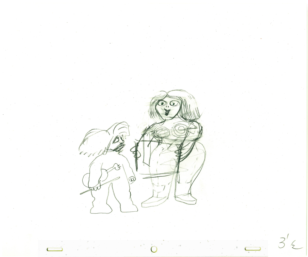
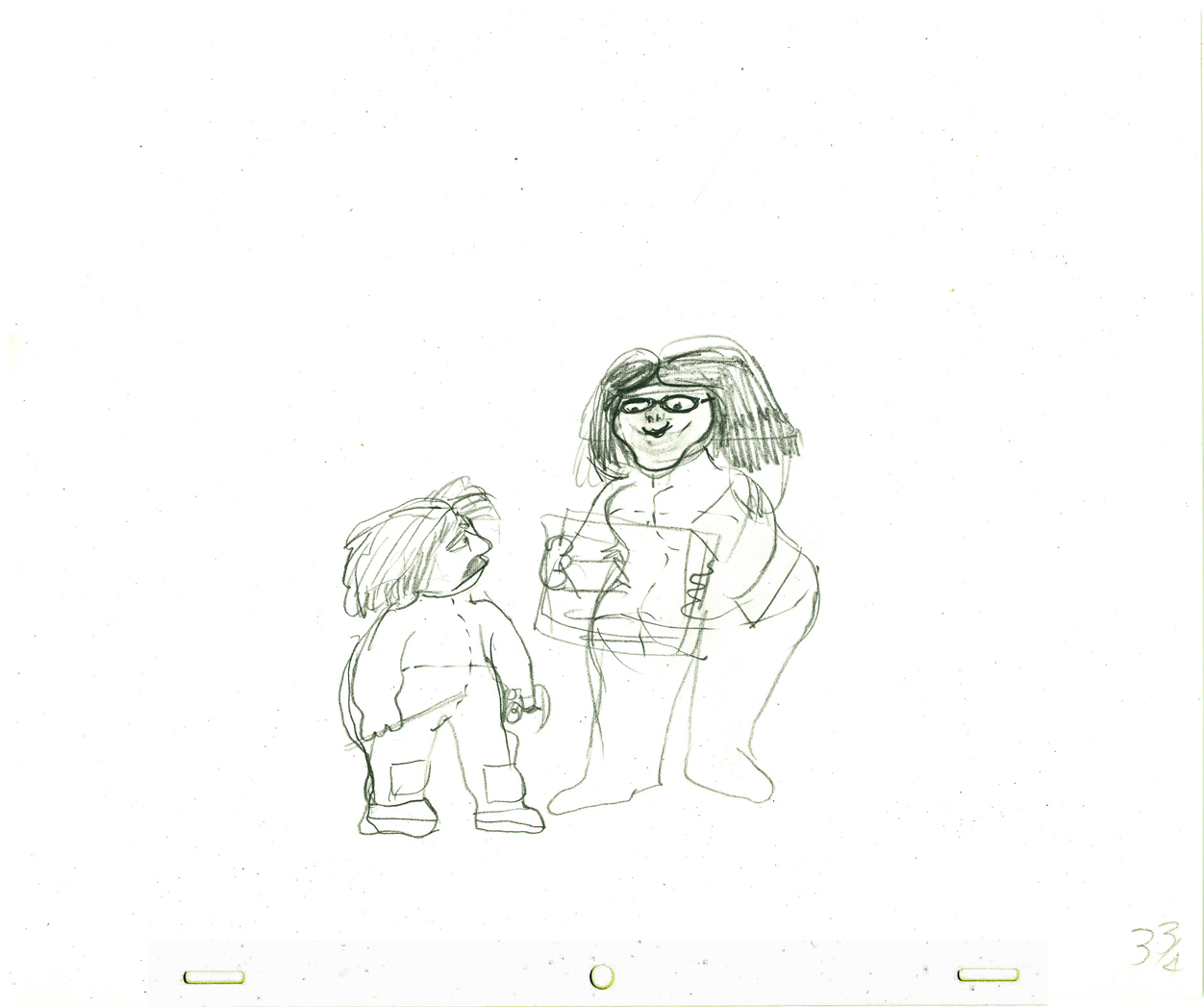
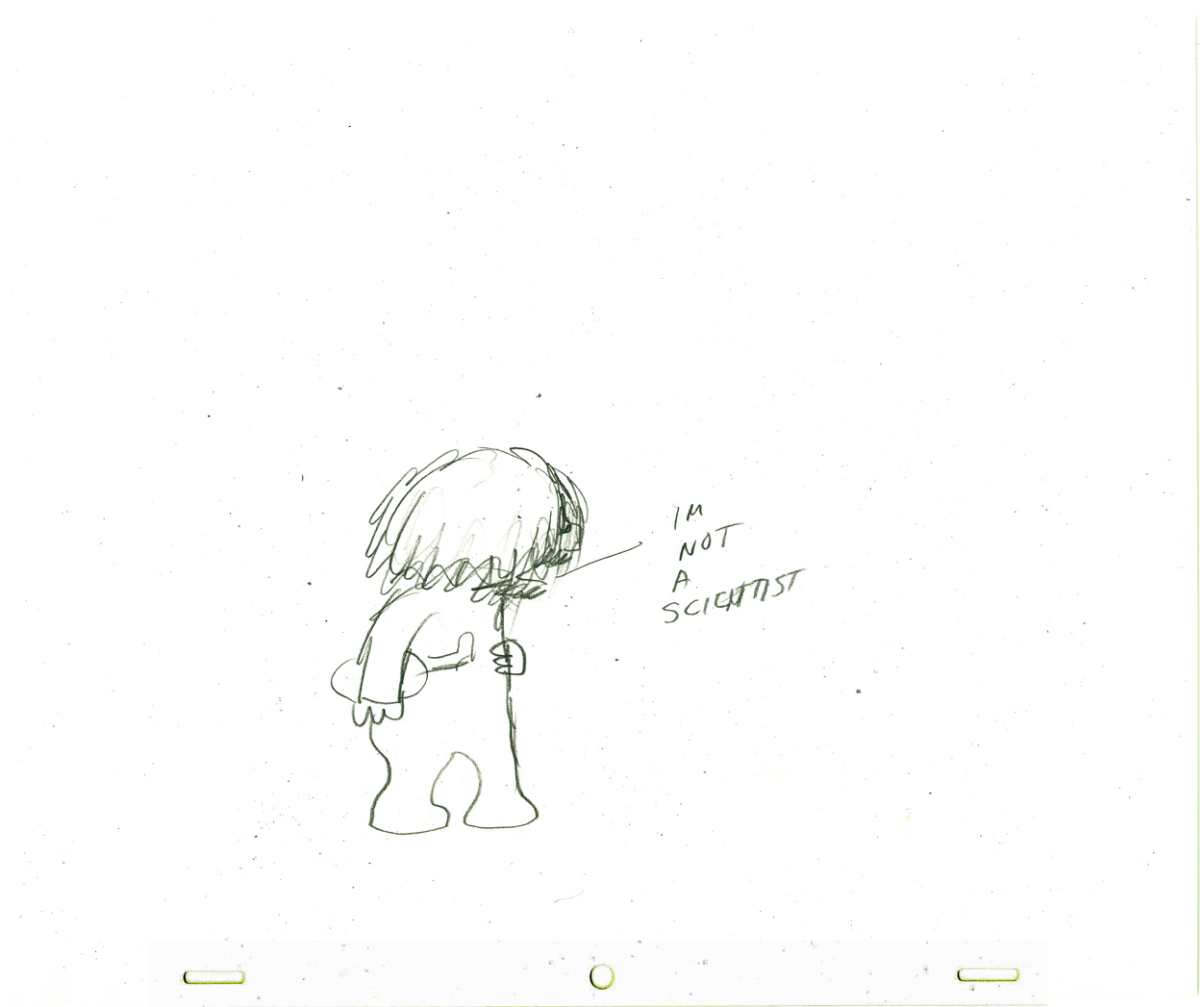
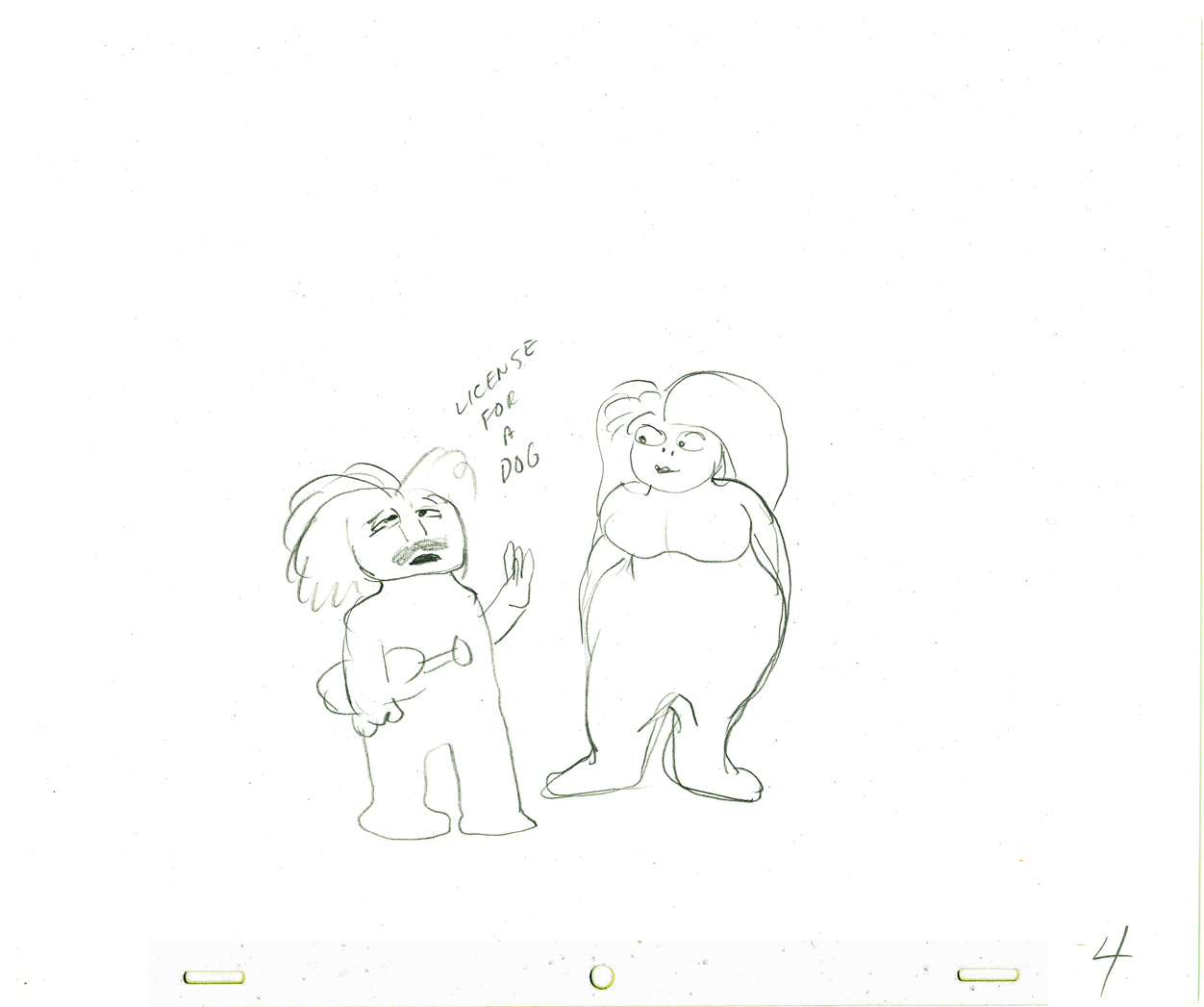
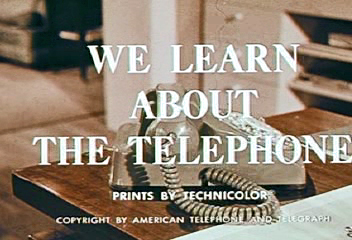 – In 1965, John Hubley directed animation inserts for an educational film for Jerry Fairbanks Productions and AT&T. It’s the story of the history of the telephone and how it works. The story, such that it is, tells about two kids visiting their uncle, an animator (actually, an actor playing an animator). He gives them an animated lecture on the story of the phone.
The film reminds me very much of another film done by the Hubley studio. UPKEEP was the history of the IBM repairman. We travel through history to see how the repairman has worked over the years. It’s a successful device that works in John’s hands.
The film is available to view on the Prelinger Film Archives. I’ve made some frame grabs to post to give an idea of the style. The characters seem to shift a bit stylistically from the humans at the beginning to those later at the circus. From Hubley to Jay Ward. This was a period where John Hubley was beginning to experiment with more expeditious styles for the jobs that came in. The more artful Maypo style was a bit complicated to pull off. The cels, here, are cel-painted traditionally. (I actually have a hard time believing the date on this film – 1965. It feels more like late 50′s.)
The backgrounds are all by John Hubley, and they remind me of those he would do for UPKEEP and PEOPLE PEOPLE PEOPLE. Lots of white space and soft images. The animation looks like it was done by several people. I recognize Emery Hawkins‘ style, and I also can see Bill Littlejohn in there.
 1
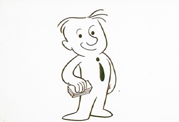
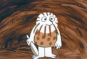
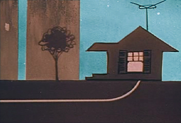
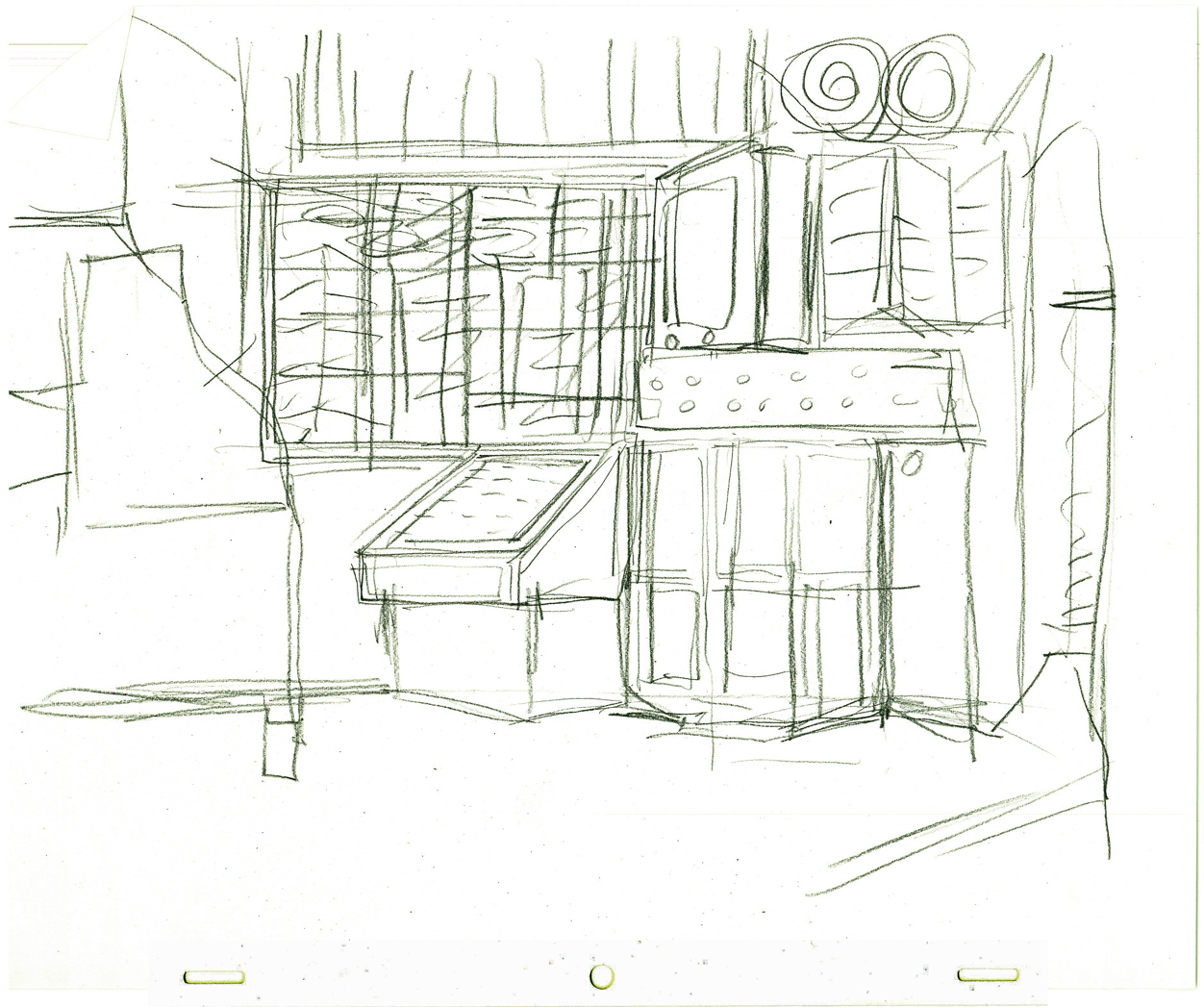
1The animator’s studio.
 2
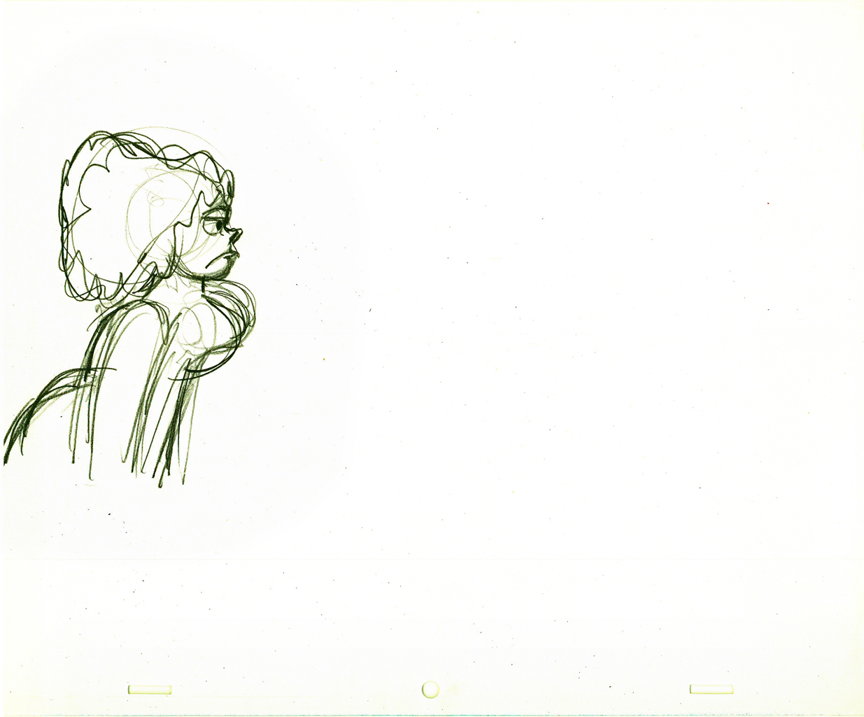
2
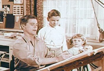
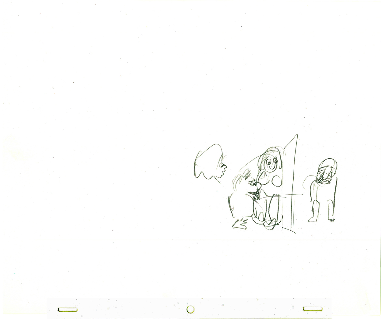
Kids are always fascinated when an animator draws.
 3
3
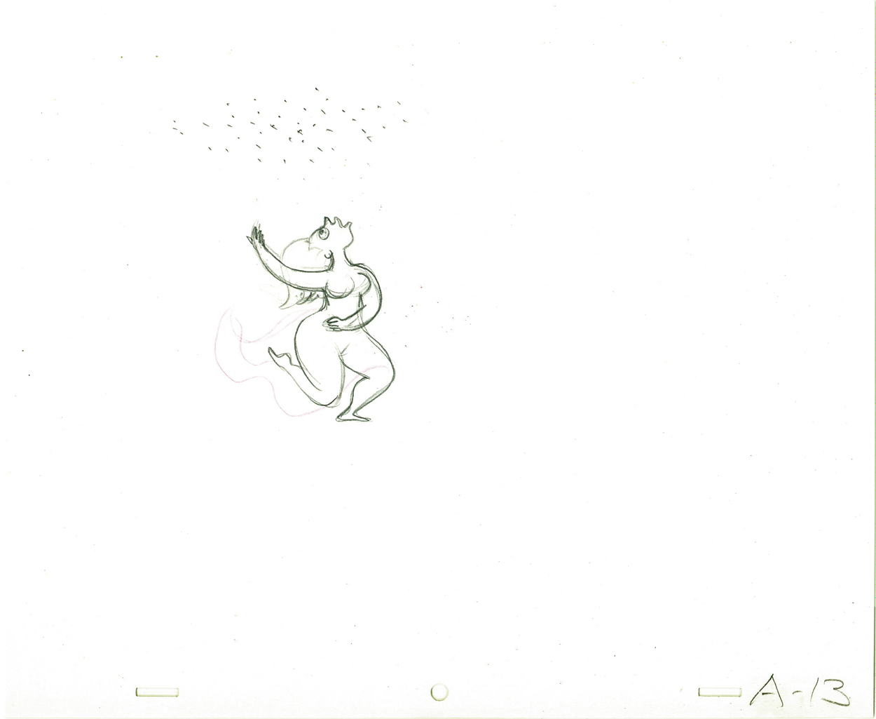
The character goes from this . . .
 4
4
. . . to this.
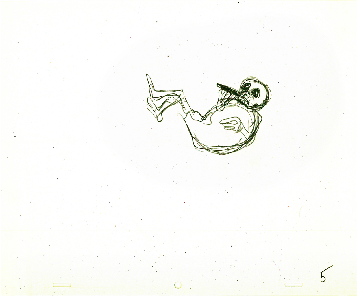
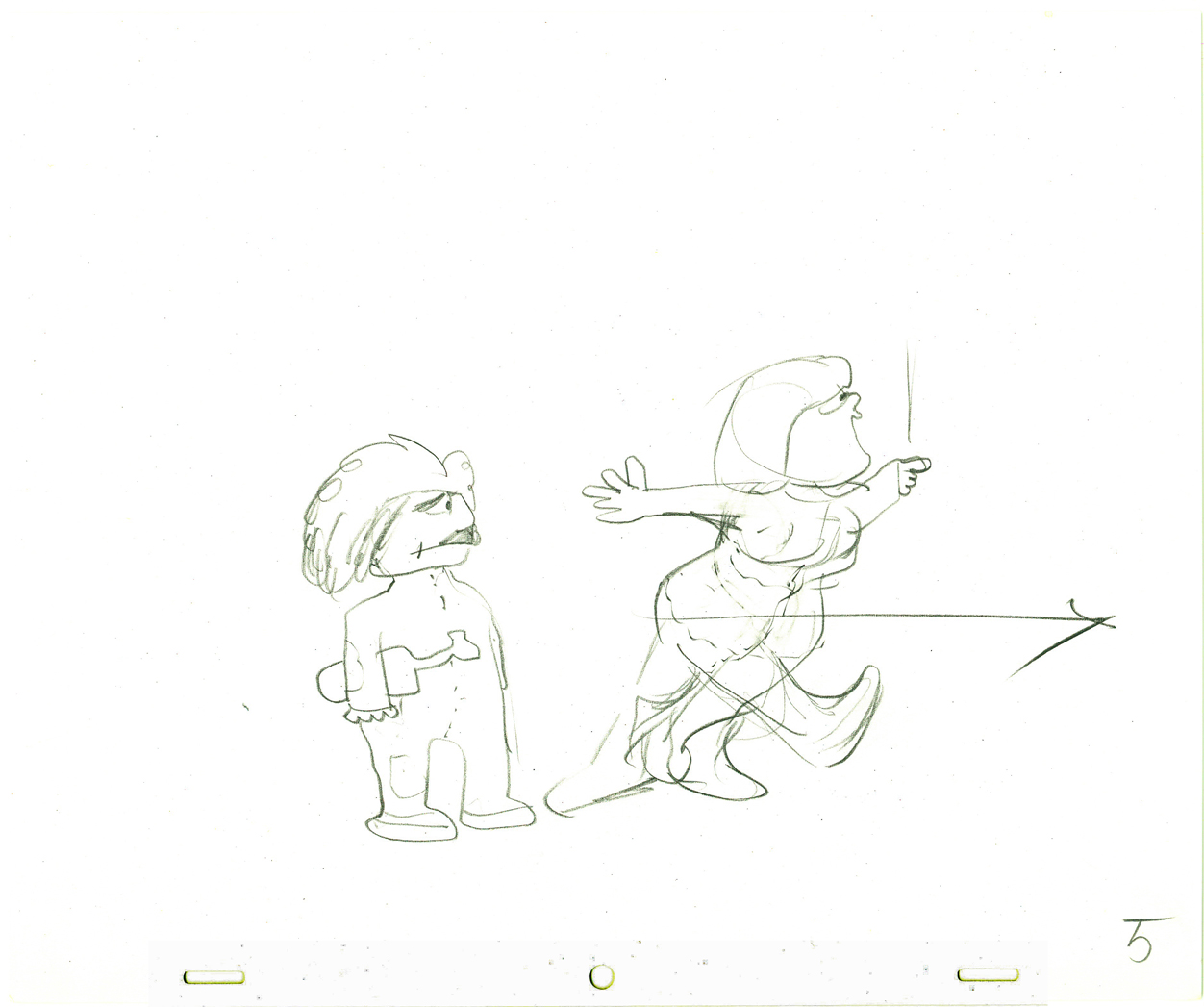
 5
5
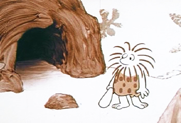
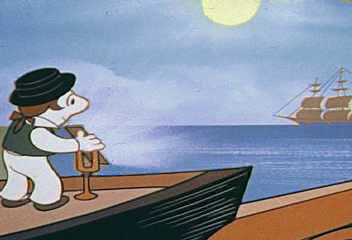
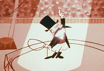
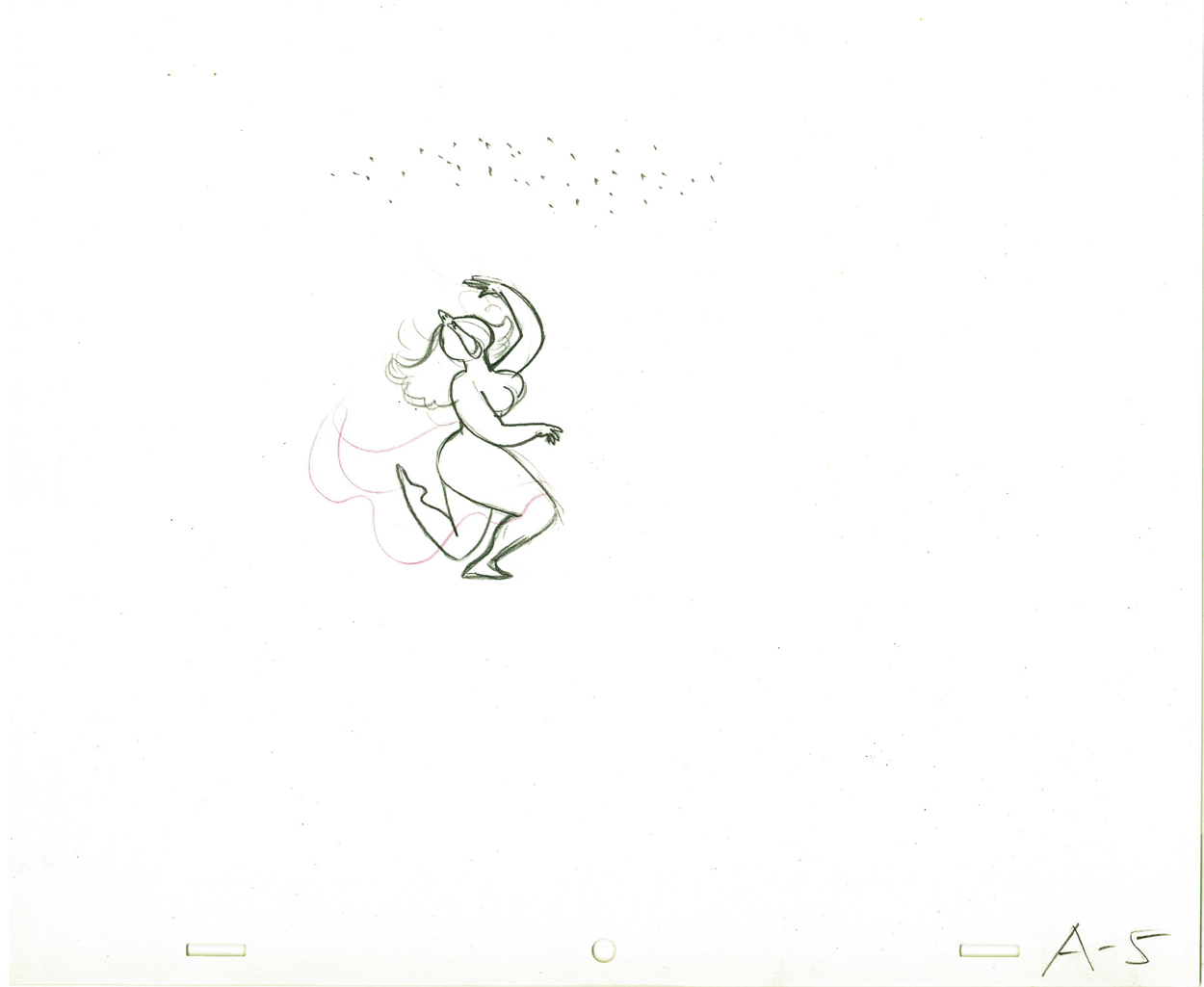
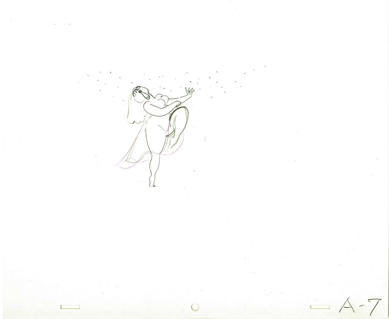
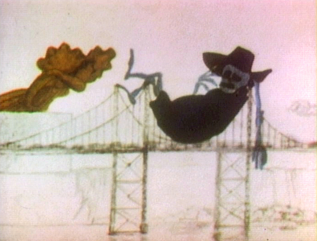
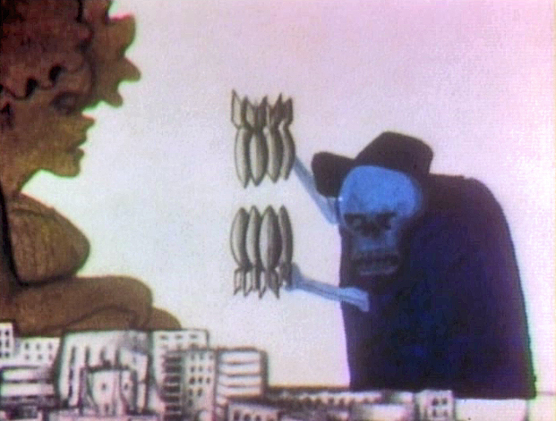
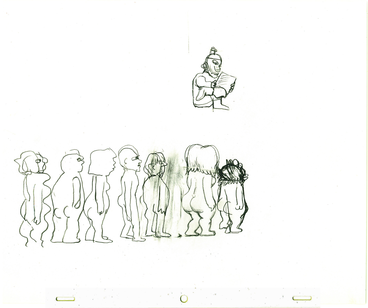
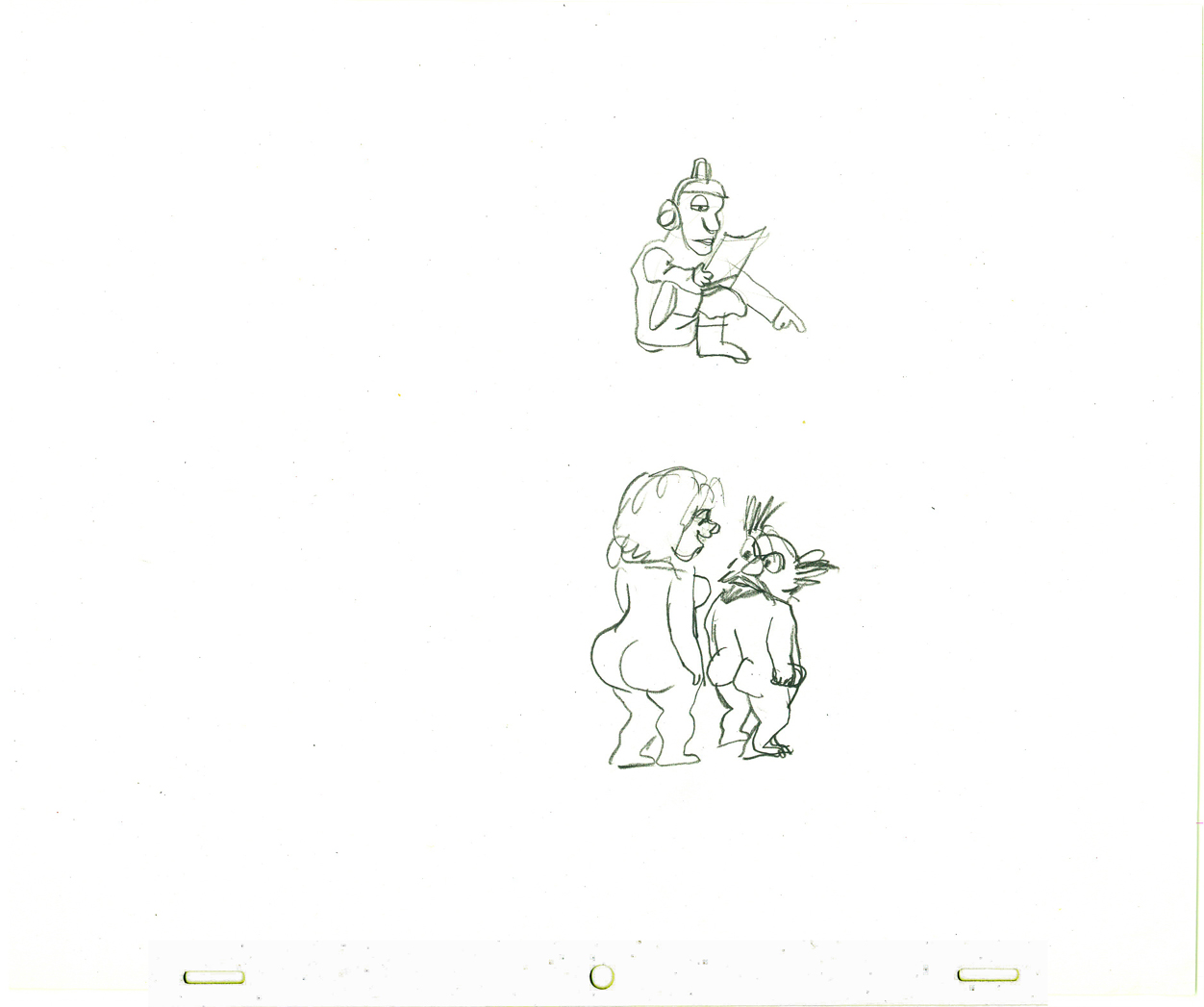
The caveman has to deliver a message.
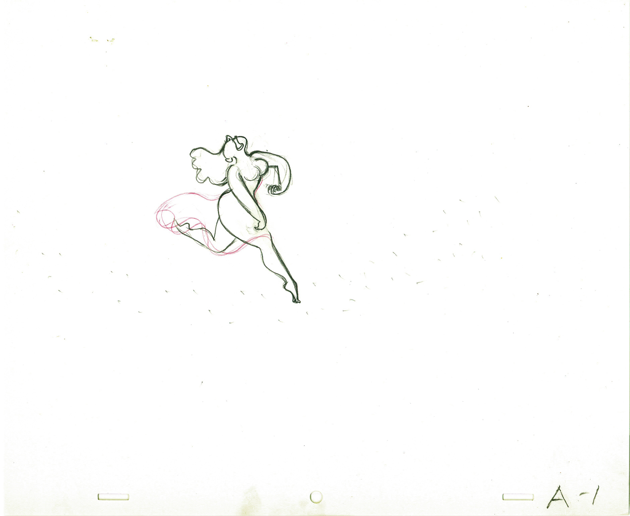
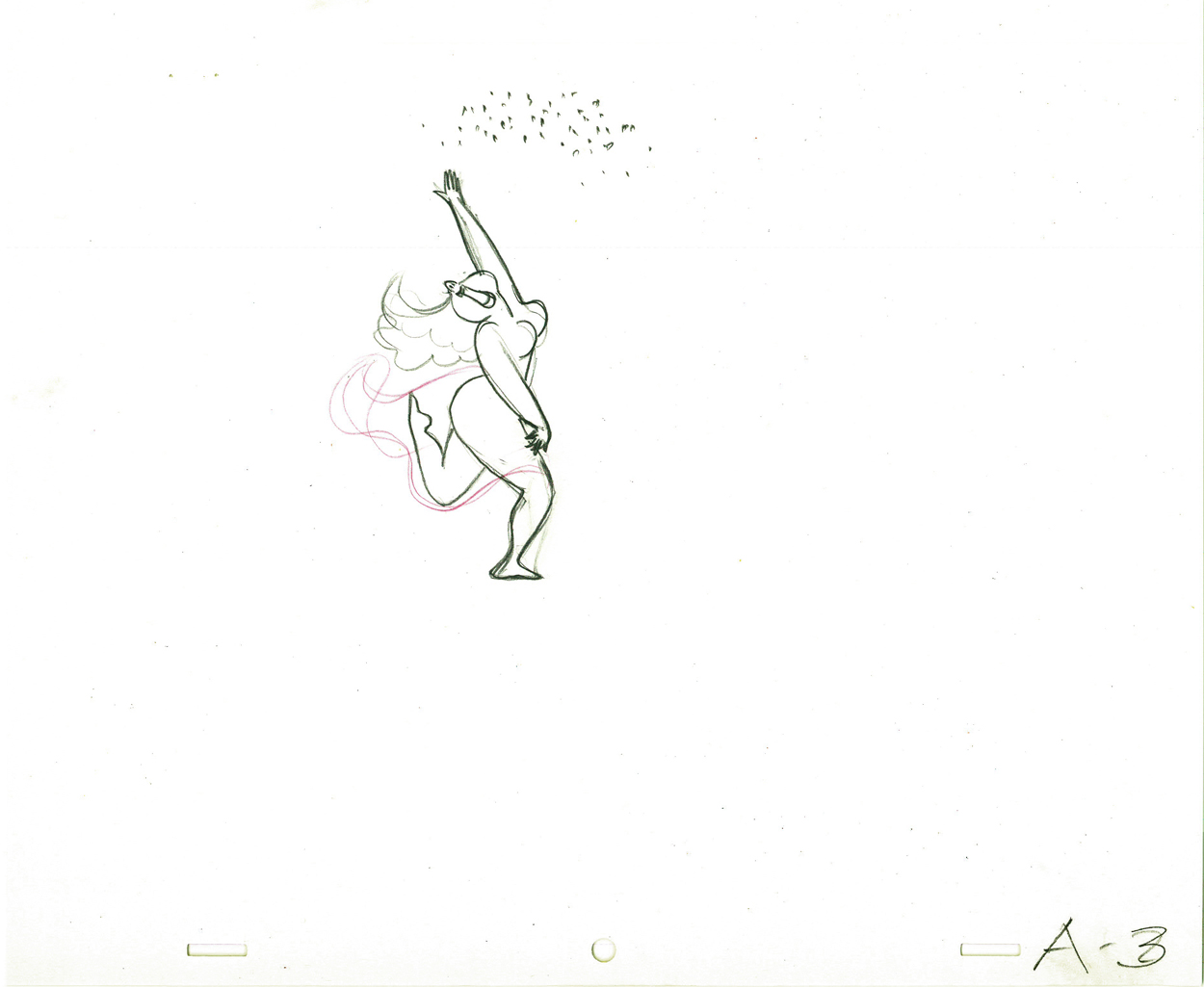
![]()
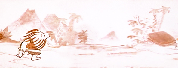
This is the full length of his run, the pan wherein the character
runs from being a caveman to an Egyptian to a Roman.
Here’s the same BG broken into four parts:
 A
A
 B
B
 C
C
 D
D
 6
6
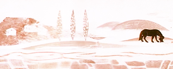
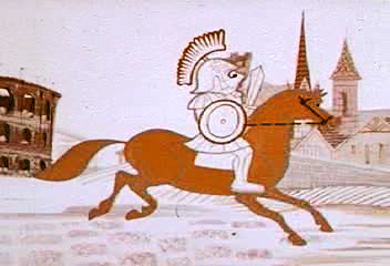
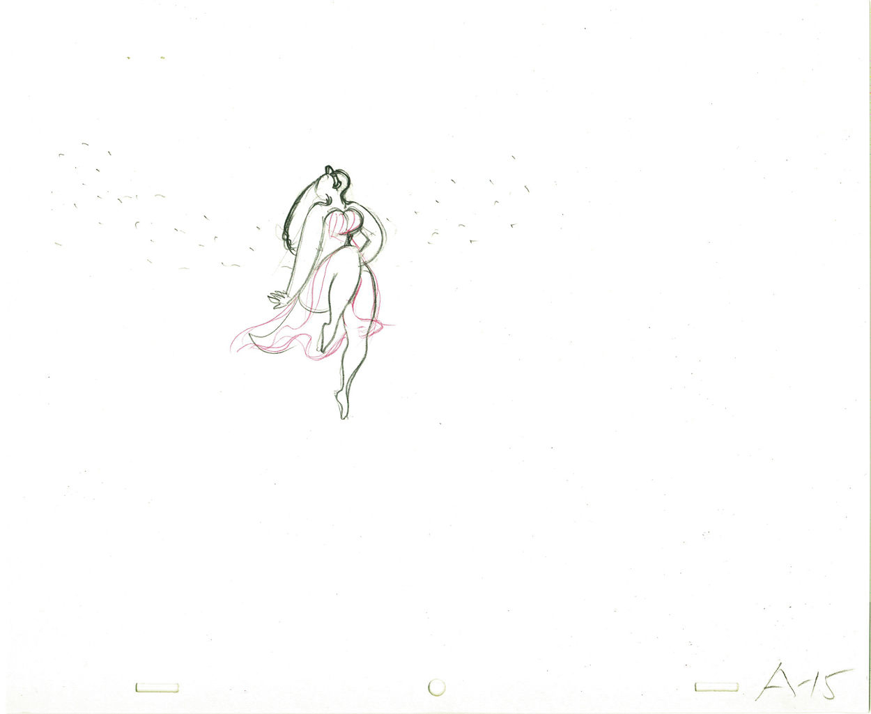
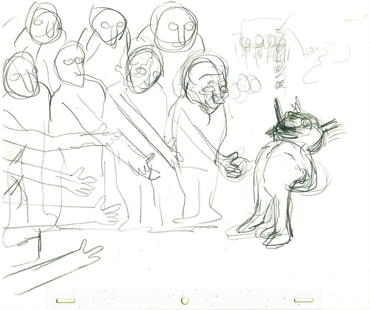
Once on horseback, man travels through
the middle ages to the pony express.
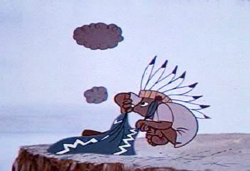 7
7
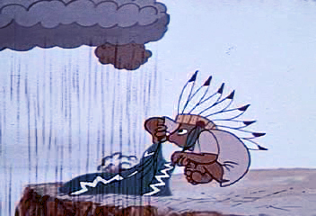
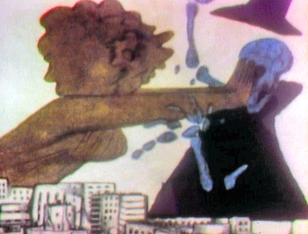
Man turns to smoke signals to communicate.
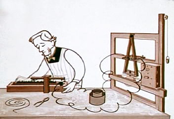
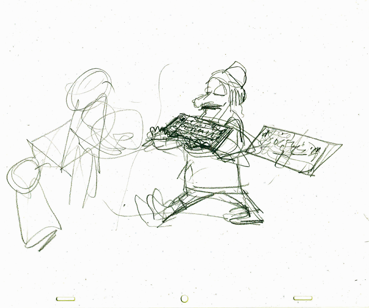
 8a
8a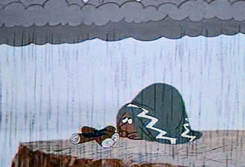 b
b
 9
9
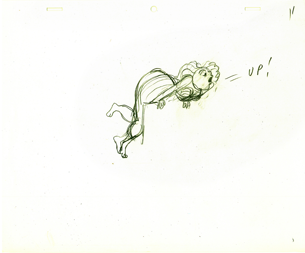
Then flashing lights.
 10
10
 11
11
Morse invents the telegraph.
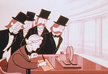 12
12
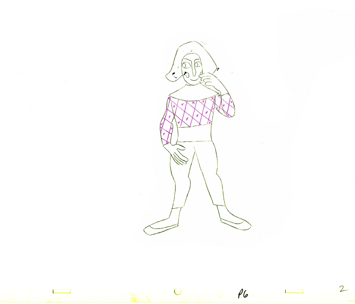
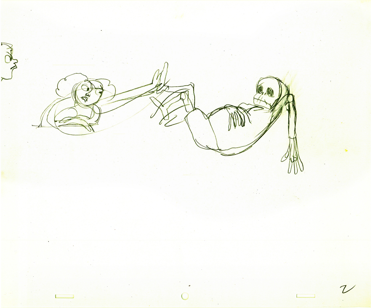
Alexander Graham Bell invents the telephone.
 13
13
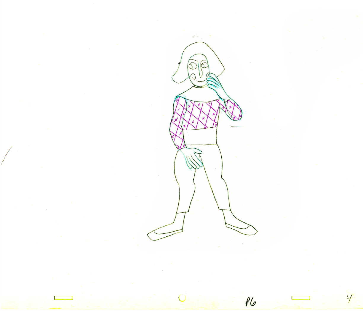
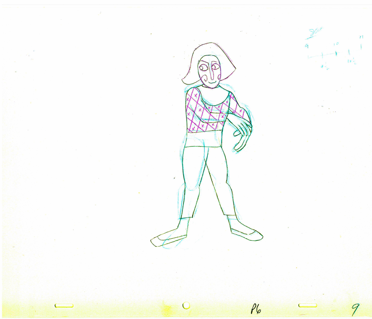
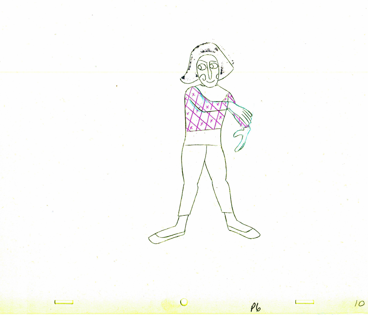
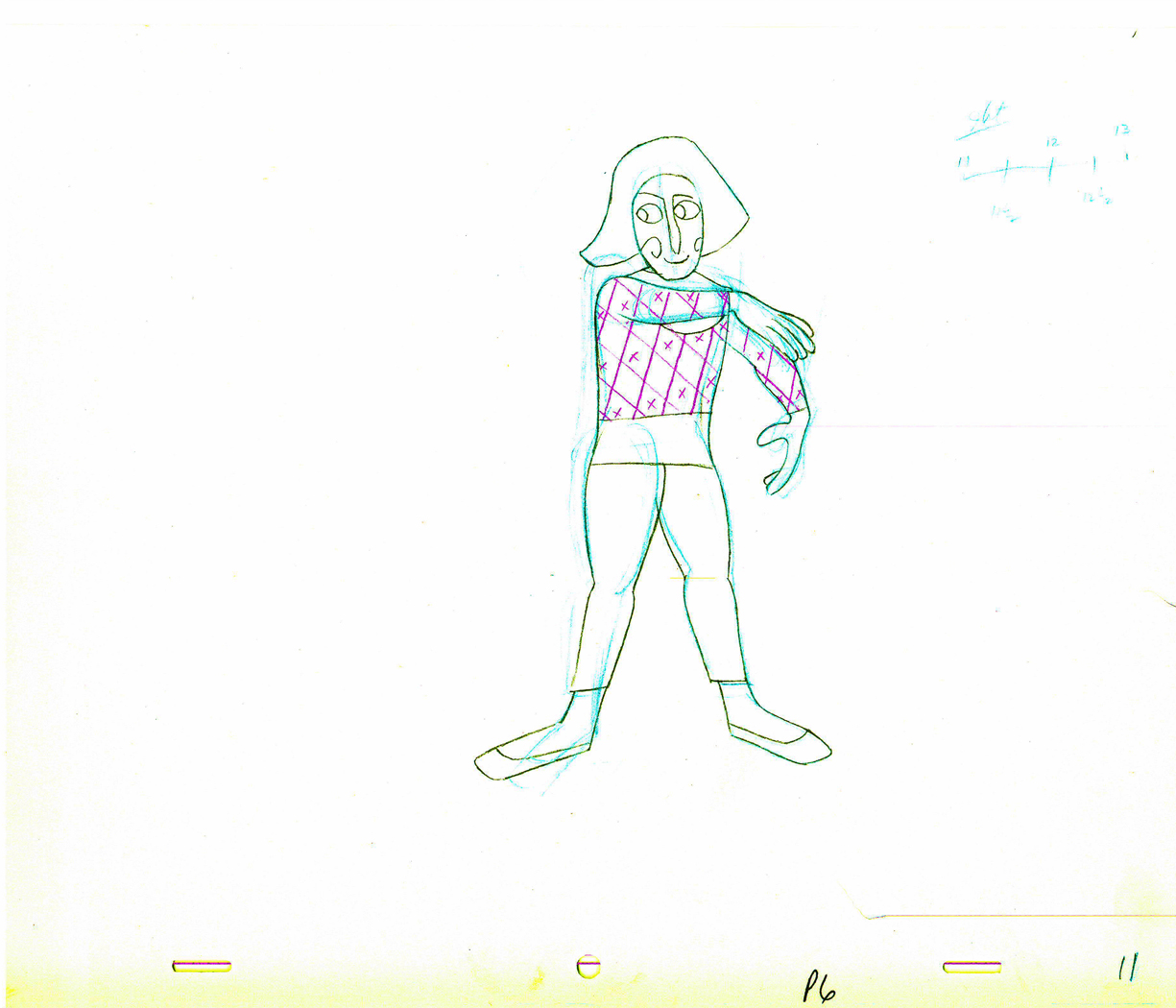
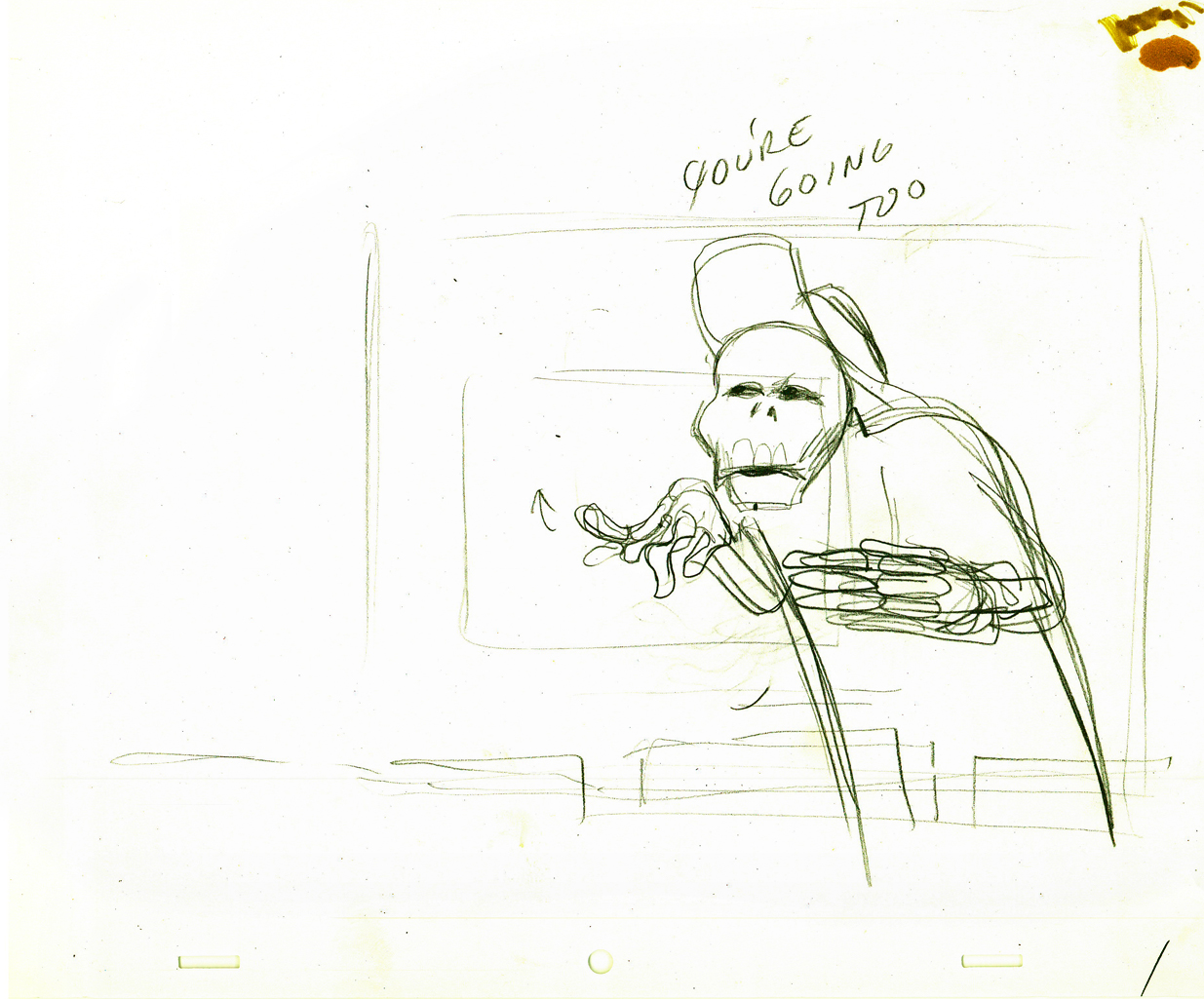
Now the animator explains how the telephone works
to two very interested children. .
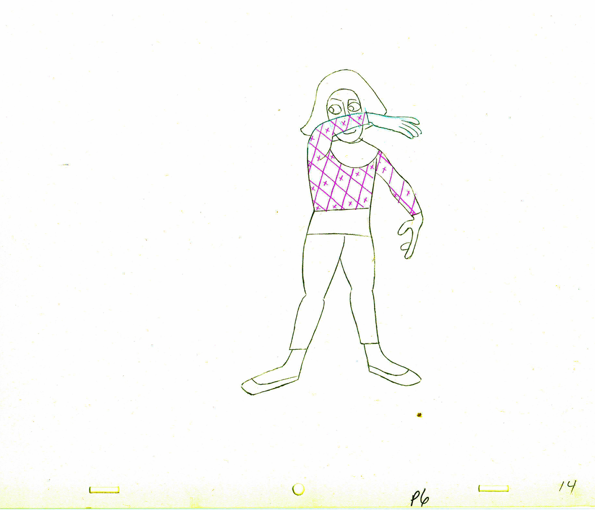
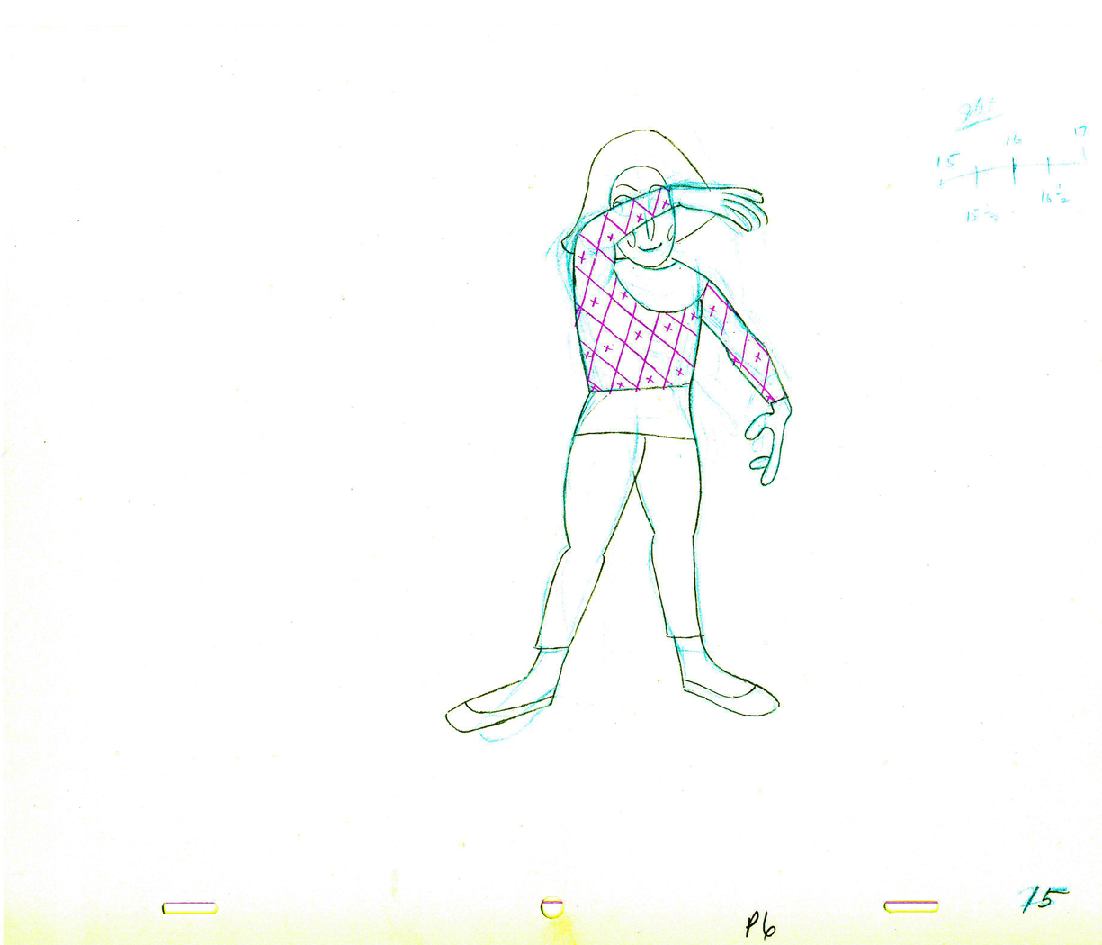
 14
14
 15
15
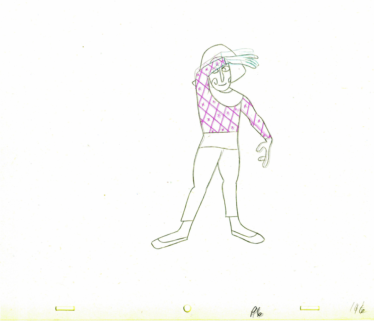
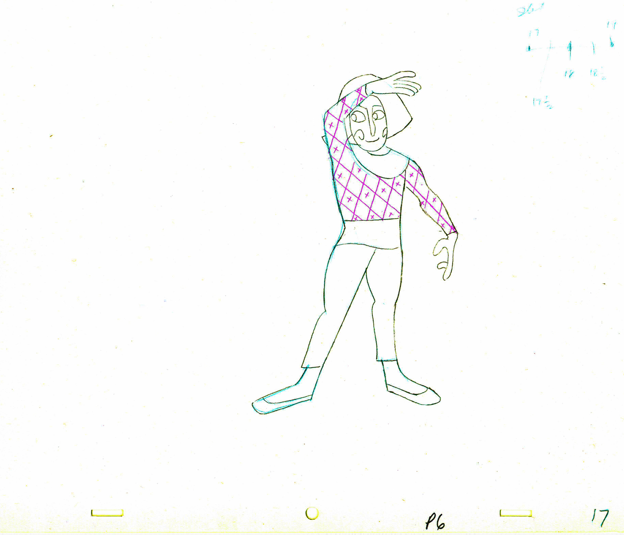
 17
17
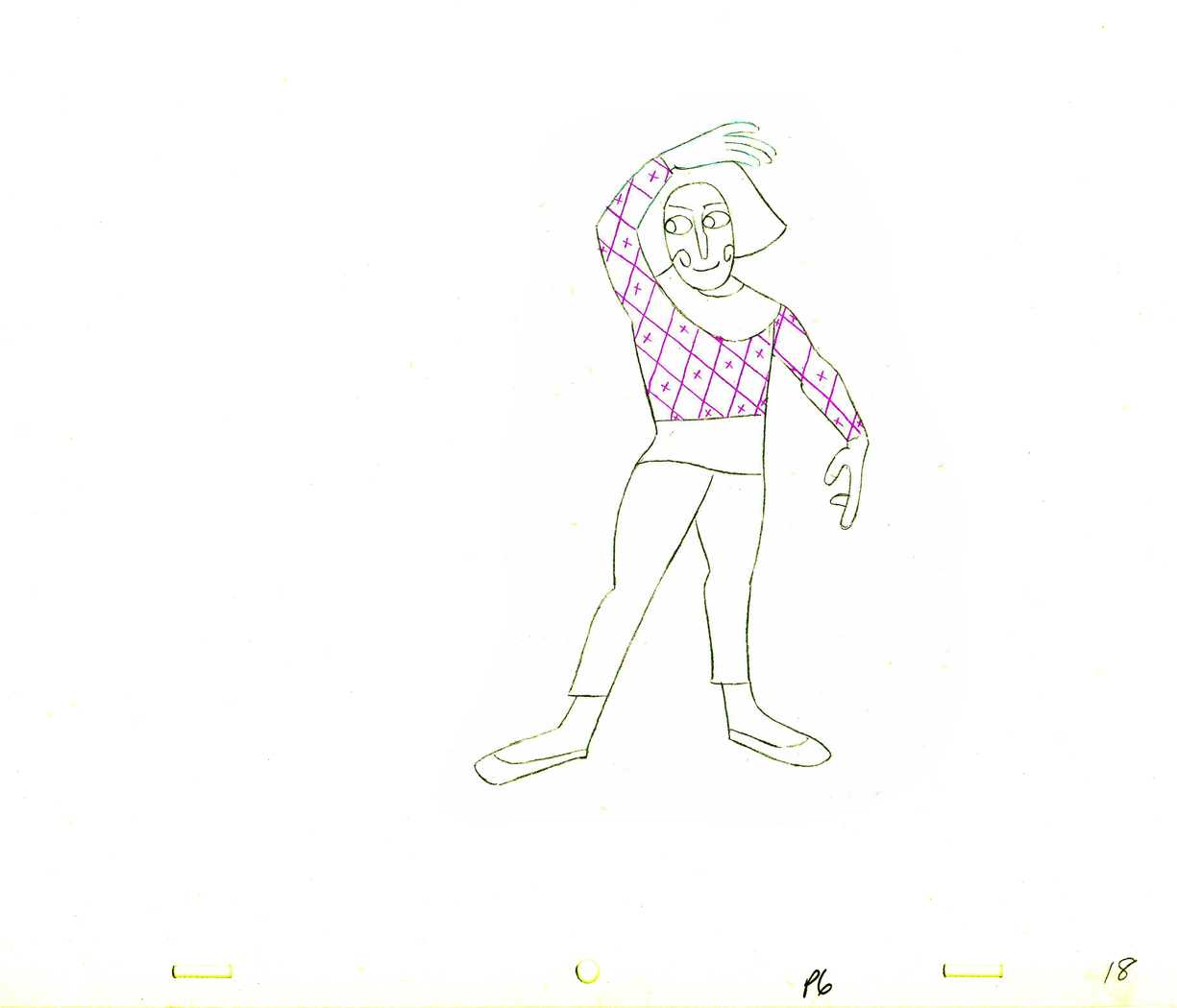
 18
18
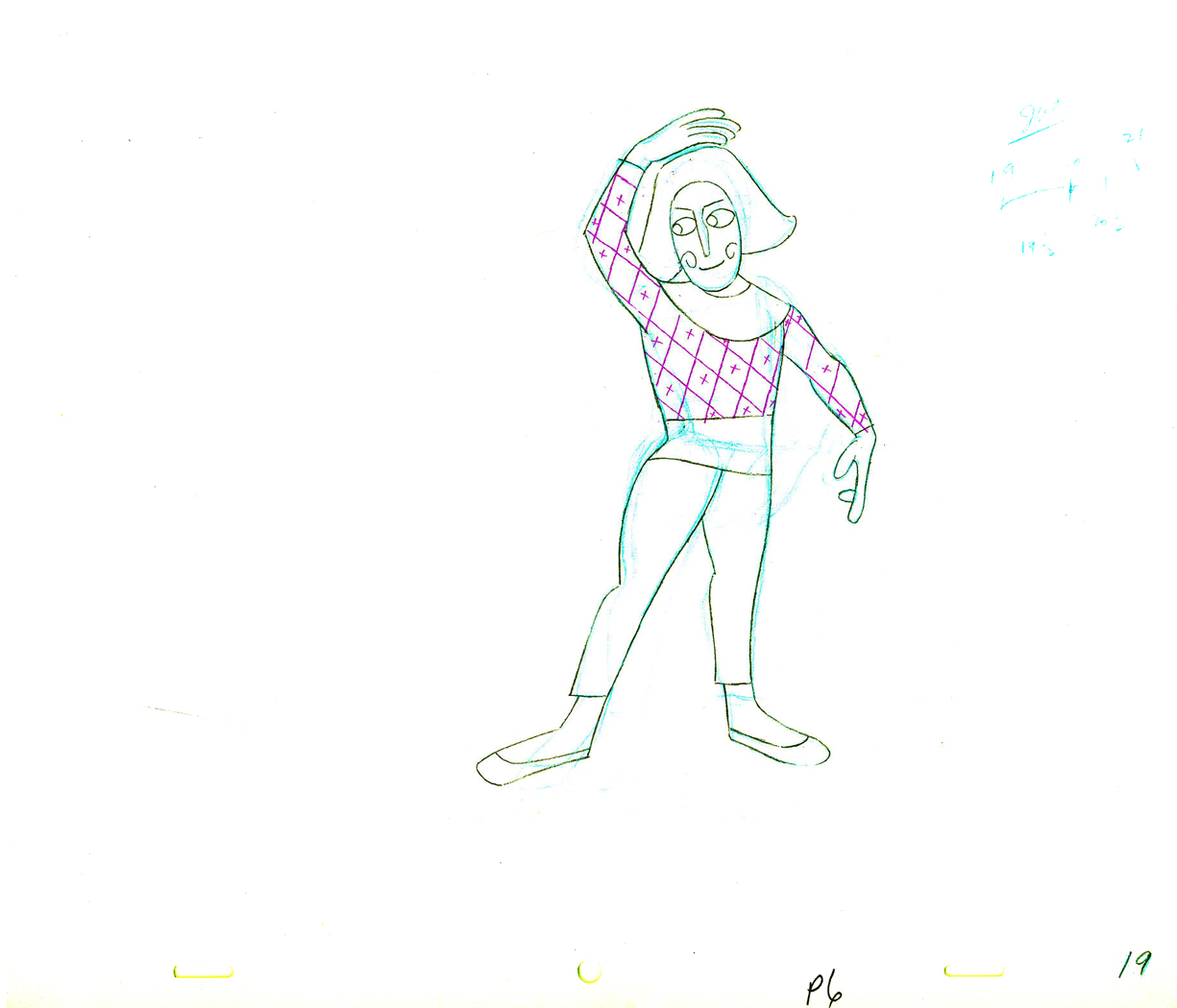
 19
19
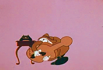
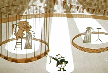
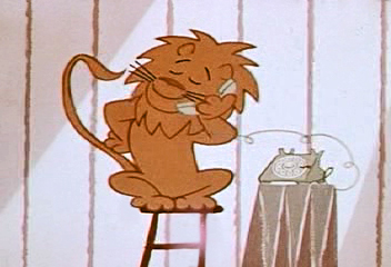
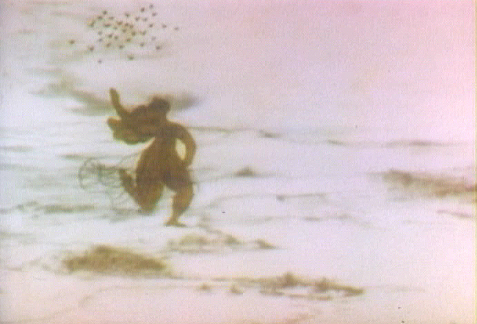
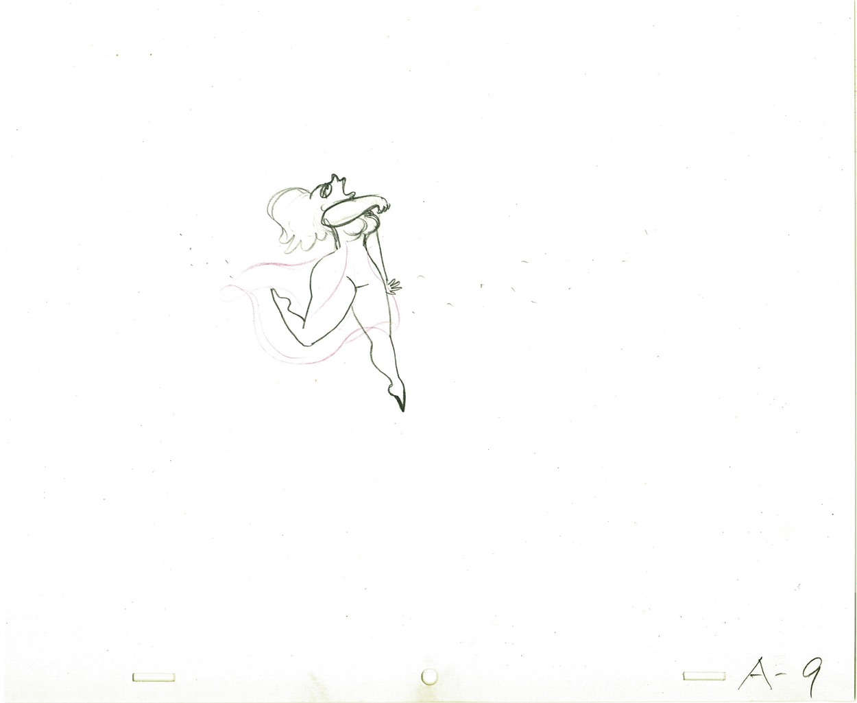
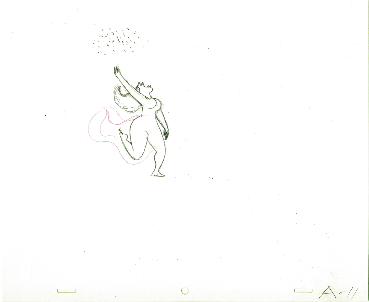
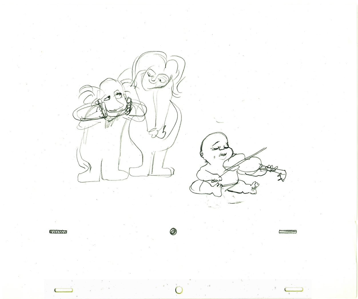
We get the fable about the lion who calls . . .
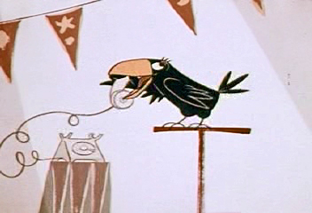 20
20
. . . a raven.
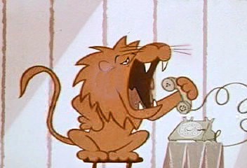 21
21
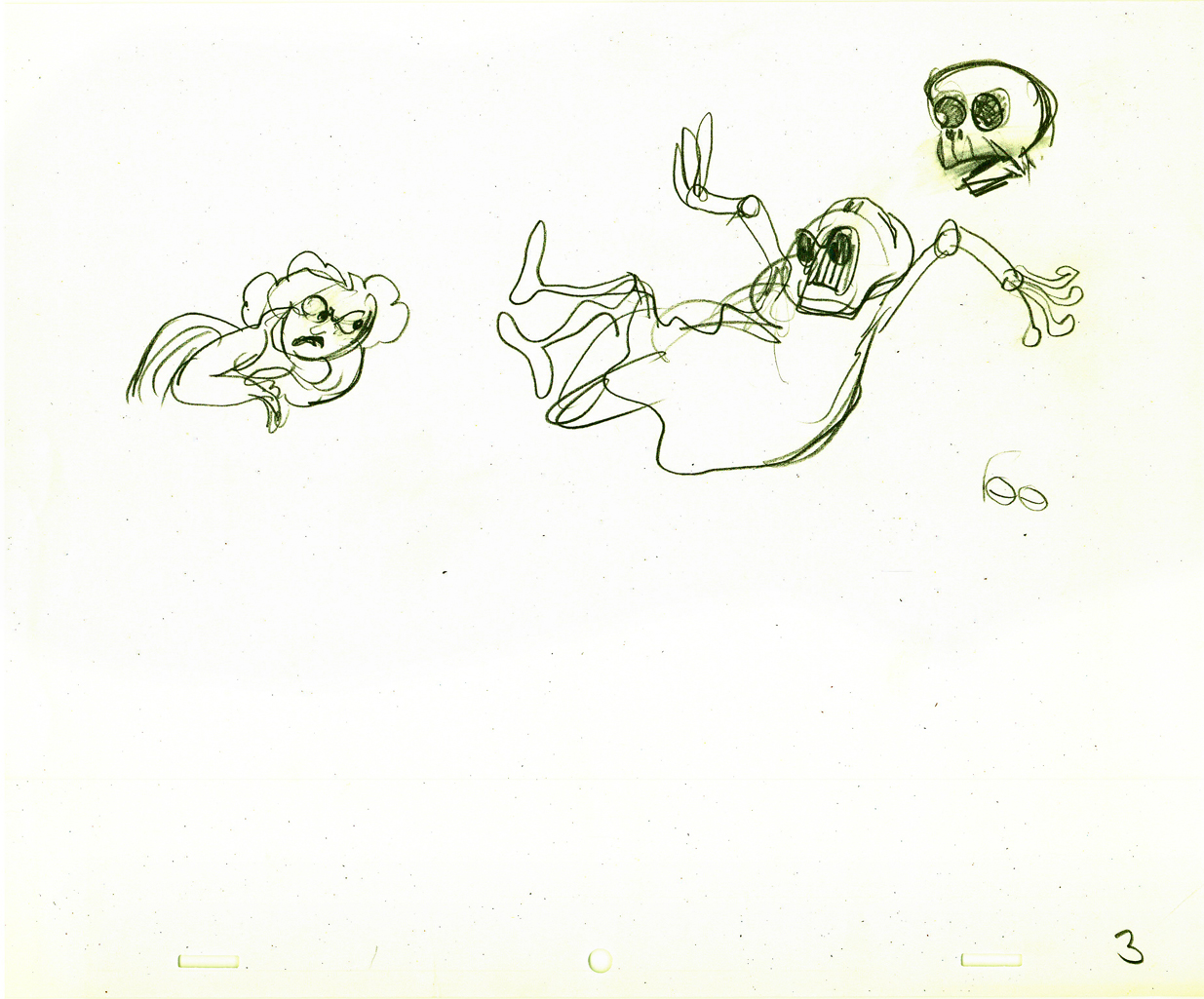
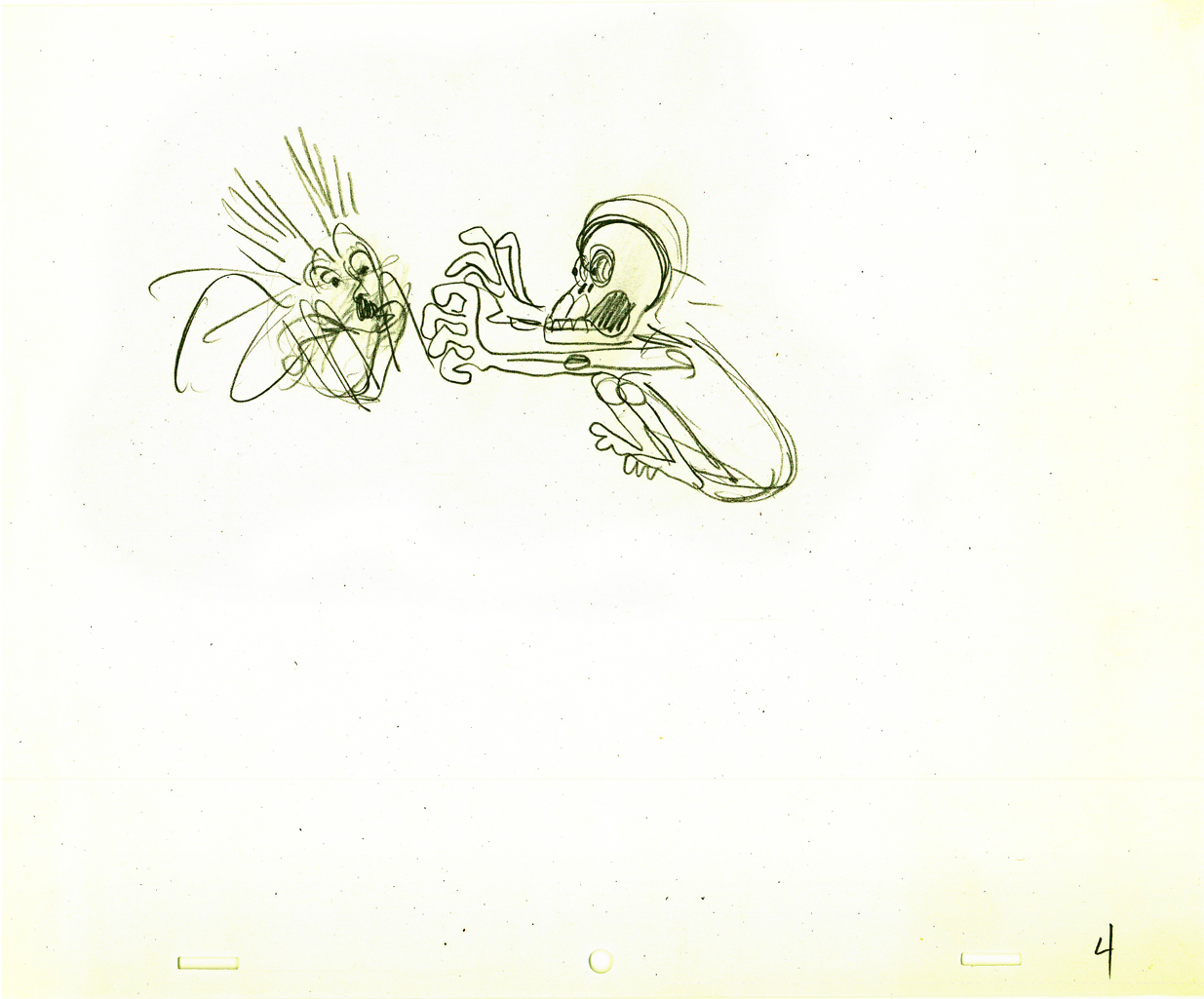
Though he shouts too loudly into the phone.
 22
22
 24
24
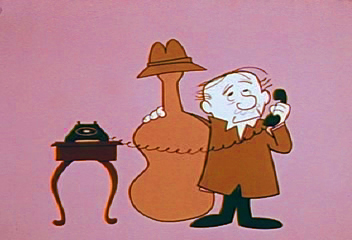
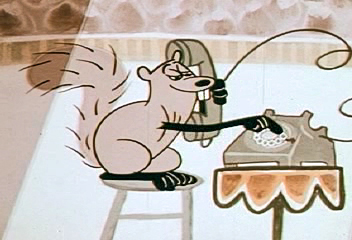
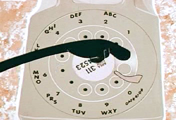
Then there’s the squirrel who can dial the phone . . .
 25
25
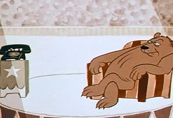
. . . and the bear who answers the phone too late.
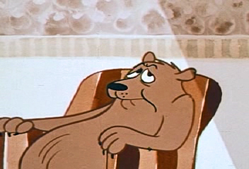 26
26
No one there.
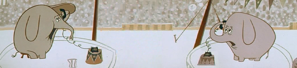
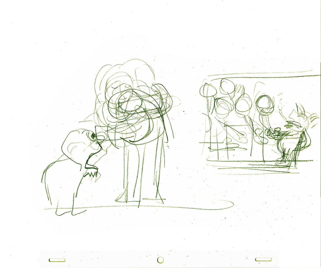
Then there’s the elephant who dials the wrong number.
 28
28
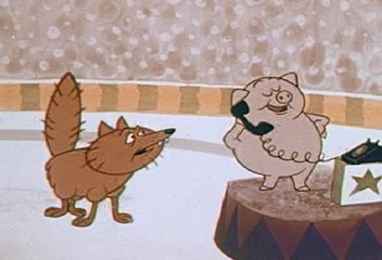
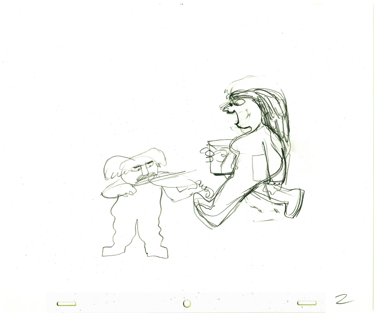
Finally there’s the pig who won’t get off the phone
so the fox can make an important call.
 29
29
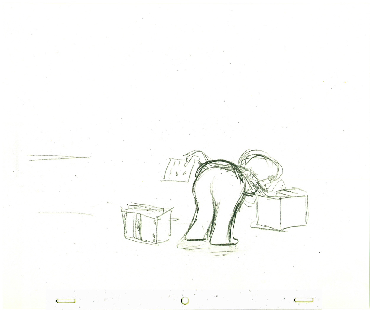
Next the animator takes the kids to the police station.
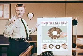 30
30
This way the cop can tell the kids how to make emergency calls.
The End. Too bad John & Faith didn’t write it.
Hubley 10 Oct 2011 08:02 am
Hubley Program
This will be the program for the Hubley show at the Academy in New York, tonight at 7pm.
I believe there many be some tickets still left for it, but check before you come.
The Academy of Motion Picture Arts and Sciences presents
A SALUTE TO JOHN HUBLEY (1914-1977)
October 10, 2011
Program curated by John Canemaker and Emily Hubley
Hosted by John Canemaker
1. PERSONAL REPORT – excerpt from 10 April 1963 Channel 13 TV kinescope with John Hubley and Harlow Shapley –
film courtesy Hubley Family Collection
2. Power Point introduction by John Canemaker
3. BROTHERHOOD OF MAN (1945) (UPA/United Auto Workers) – film courtesy AMPAS
Direction: Robert Cannon
Screen Story: Ring Lardner, Jr.; Maurice Rapf; John Hubley; Phil Eastman
Animation: Robert Cannon, Ken Harris, Ben Washam
Production Design: John Hubley, Paul Julian
Background: Boris Gorelick
Music: Paul Smith
Executive Producer: Stephen Bosustow
Source: “Races of Mankind” (1943) by Ruth Benedict and Gene Weltfish
4. FLAT HATTING (1946) (UPA/US Navy) – film courtesy NARA/AMPAS
Director: John Hubley
Layout: John Hubley, William Hurtz
Story: Millard Kaufman
Voice: William Conrad]
5. THE MAGIC FLUKE (1949) (UPA/Columbia) – film courtesy Sony/AMPAS
Direction: John Hubley
Supervision: Ade Woolery
Production: Ed Gershman
Story: Sol Barzman
Music: Del Castillo
Design: Herb Klynn, Jules Engel, Bill Hurtz
Technical: Max Morgan, Mary Cain
Animation: Bob Cannon, Rudy Larriva, Willy Pyle, Pat Mathews [sic]
Executive Producer: Steve Bosustow
6. THE RAGTIME BEAR (1949) UPA/Columbia Jolly Frolics) – film courtesy Sony/AMPAS
Direction: John Hubley
Story: Millard Kaufman
Production: Ed Gershman
Design: William Hurtz
Color: Herb Klynn, Jules Engel
Animation: Art Babbitt, Pat Matthews, Rudy Larriva, Willy Pyle
Technical: Max Morgan, Mary Cain, Jack Eckes
Music: Del Castillo
Executive Producer: Steve Bosustow
7. ROOTY TOOT TOOT (1952) (UPA) – film courtesy Sony/AMPAS
(released for Oscar consideration in 1951)
Director: John Hubley
Lyrics: Allen Alch
Music: Phil Moore
Choreography: Olga Lunick
Writers: John Hubley, Bill Scott
Animation: Art Babbitt, Pat Matthews, Tom McDonald, Grim Natwick
Color and Design: Paul Julian
Technical Supervision: Sherm Glas
Production Manager: Herb Klynn
Executive Producer: Stephen Bosustow
INTERMISSION
8. TV COMMERCIAL REEL (14 spots, c. 1950s & 60s) Hubley’s Storyboard Studio – film courtesy Hubley Family Collection
Design/layout: John Hubley
Animation by various artists, including Art Babbitt, Emery Hawkins.
9. ADVENTURES OF AN ASTERIX (1957) (Hubley Studio) –
film courtesy MoMA
Design and Direction by John Hubley
Story by John Hubley and Faith Elliot
In collaboration with James Johnson Sweeney
Animation: Emery Hawkins
Assisted by Ed Smith
Film Editor Faith Elliot
Music by Benny Carter
10. THE TENDER GAME (1958) – Hubley Studio –
film courtesy MOMA
Design and Direction by John Hubley
Editing by Faith Elliot
Musical interpretation by The Oscar Peterson Trio
Vocal by Ella Fitzgerald
Animation: Ed Smith, Robert Cannon, Jack Schnerk, Emery Hawkins
11. VOYAGE TO NEXT (1974) – Hubley Studio –
film courtesy AMPAS
Directed by John Hubley
Produced by Faith Hubley
Scenario by Faith and John Hubley
Music composed and conducted by Dizzy Gillespie
Voices: Maureen Stapleton and Dizzy Gillespie
Design and backgrounds by John and Faith Hubley
Animation: Phil Duncan, Bill Liuttlejohn, Earl James.
Assisted by Michael Sporn.
12. FACADE (c. 1960s) – Hubley Studio -
35mm animatic storyboards for unfinished short of William Walton/Edith Sitwell 1927 abstract music score –
film courtesy of Hubley Family Collection
No credits available.
13. John Canemaker moderates Q&A with Emily Hubley and Michael Sporn.
Photos &Steve Fisher 09 Oct 2011 08:06 am
Public Sculpture
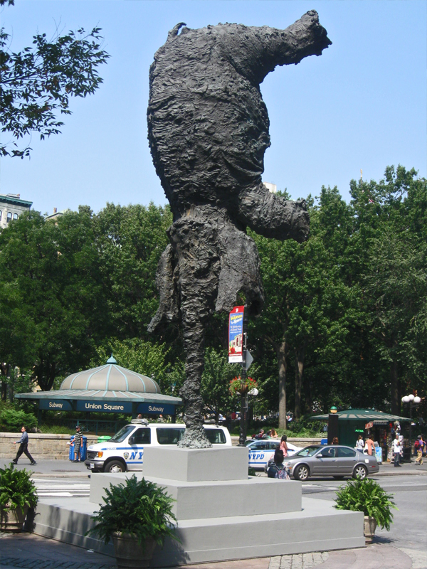
- Here are three pieces of Public Sculpture that New Yorkers see on a daily basis and probably don’t see as they move right on by.
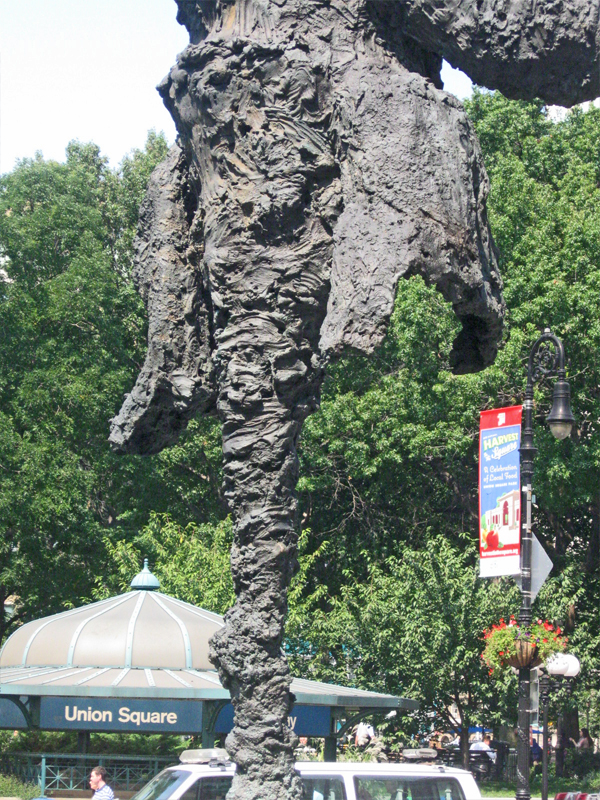
One that stands out is this balancing elephant just off U-nion Square park.
 1
1Spanish artist Miquel Barcelò has contributed a
gravity-defying elephant to U-nion Square. The 15,000 pound,
26-foot tall bronze sculpture, “Gran Elefandret”, has traveled from
Madrid and Barcelona and now sits amidst the transportation and
cultural bridge between Uptown and Downtown Manhattan.
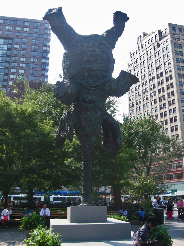
 2
2
Brought to NYC by the Marlborough Gallery in conjunction with the
U-nion Square Partnership, the elephant balances on its trunk with
its four legs outspread above its sagging skin. “The Gran Elefandret”,
completed in 2008, is a continuation of the zoological themes found
in much of Barcelò’s former work. In addition, the detail of the
textured skin recalls the artists’ highly tactile, layered paintings,
many of which take the form of sculptures on canvas.
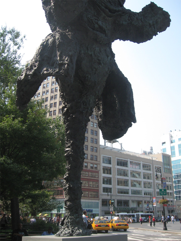
He draws inspiration from nature, from artists such as Jackson Pollock a
nd Willem de Kooning, and from his time in West Africa.
 3
3
Born in Mallorca in 1957, Barcelò has been an active artist since the 1970s.
He was a part of Taller Llunátic which voiced its socio-political opposition to
the Spanish government during the 1970s and also pushed the boundaries
of the established art world. Barcelò now collaborates with the Fundación
Vicente Ferrer and the Eyes of the World Foundation and participates in projects
for Sahrawi refugee camps. He has received international awards and
commissions during his expansive career as an artist.
 4
4
The “Gran Elefandret” will be on view until May 2012.
The second and more permanent part of New York is the enormous “Unisphere” globe that arrived with the NY World’s Fair back in 1964.
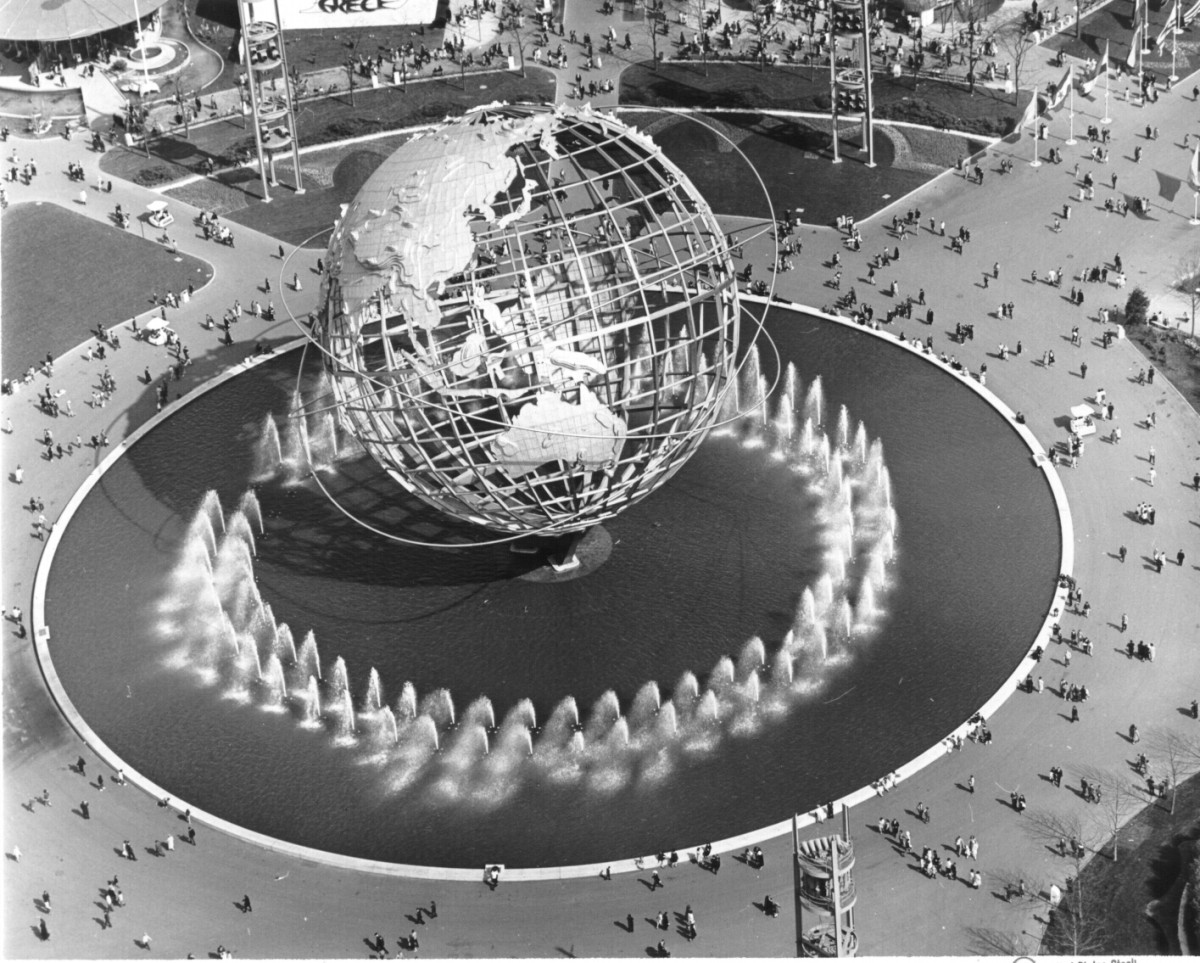 1
1This is pretty much what it looked like on opening day.
It sits in Flushing Meadow Park in Queens, NY.
It was one of the few buildings not destroyed
when the Fair ended in 1965.
 2
2
This is pretty much what it looks like today.
 3
3
Steve Fisher sought a more intimate look in these remaining photos.
 4
4
 5
5
 6
6
 7
7
Steve Fisher also photographed these tiny sculptures in the 14th Street train station at 8th Avenue. They’re bronze and just a bit out of the way, so they can be easily missed.
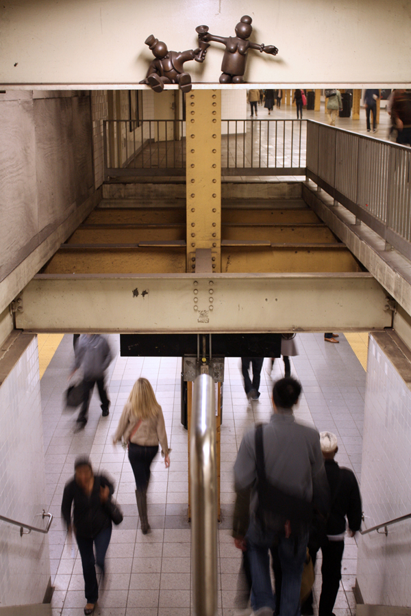 1
1
 2
2
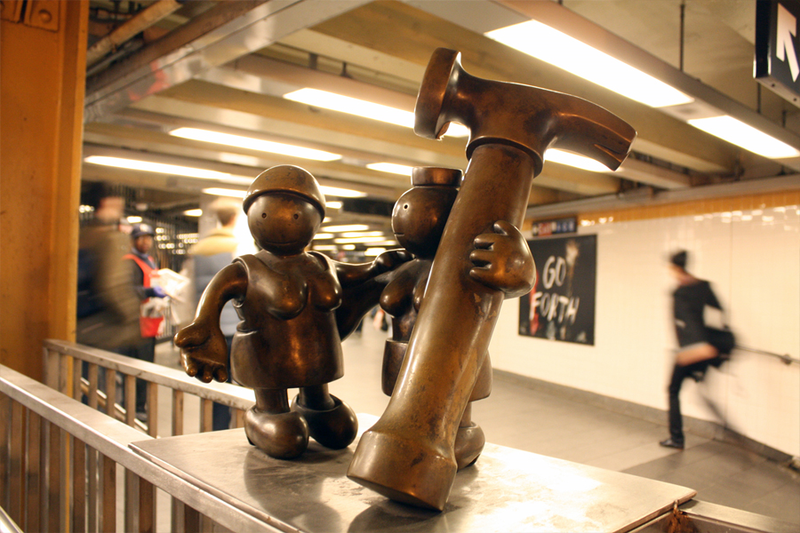 3
3
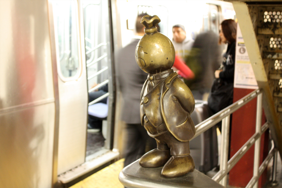 4
4
 5
5
Greenwich Village is probably half owned by NYU. There are endless numbers of housing units for teachers and students spread out all over the area. One little enclosed area off University Place had this quiet little walkway on which I found the following statue.
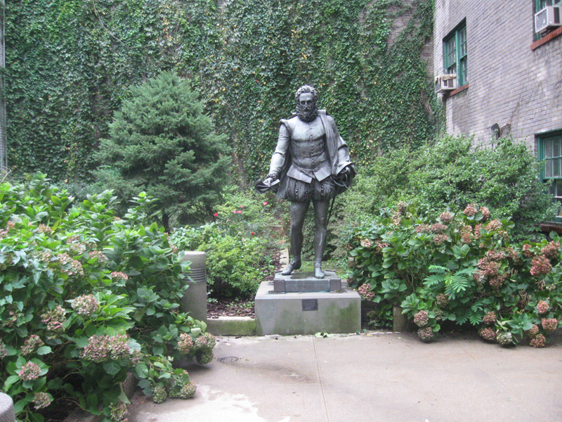 1
1
 2
2
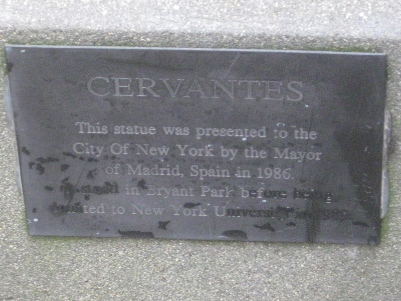
It reads: This statue was presented to the City of New York
by the Mayor of Madrid, Spain in 1986.
Presented in Bryant Park before being entrusted
to New York University in 1989.
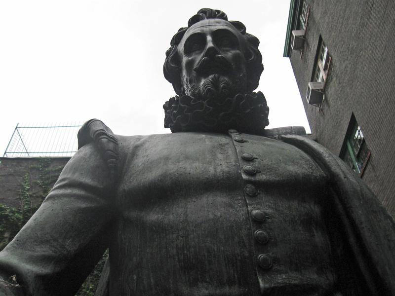 3
3
Finally, we have this clock on Houston Street in the village that has a man waving. Very peculiar. This photo also came via Steve Fisher.

The story behind this building is simple.
It was named “Red Square” by Michael Rosen who built it.
Tibor Kalman was hired to complete it. The Statue of Vladimir Lenin
atop “Red Square” luxury apartments in NY City’s East Village is by
Sculptor Yuri Gerasimov and was Installed on the building in 1994.
Commentary 08 Oct 2011 06:33 am
Really Rambling
- I enjoy reviewing and assessing the past week on these Saturday blog posts. It gives me a chance to reflect on what had happened in the recent past and spilling my thoughts out here.
 In the last week, I purposefully put John Hubley front and foremost on my blog’s mind. With the upcoming AMPAS show on Monday, I found a good excuse to pull together a lot of the past pieces I’d done on Hubley’s work and drawing. He was one of the foremost fine artists of animation’s past, and it seems to me his name, like many others of the period, are falling into the historic dumpster of time. His accomplishments were many that helped shape who and what we and animation are today. Yet, it feels as though we’ve stepped back into the mid-thirties with the computerized-accomplishments of cgi.
Animation HAS taken an enormous step backward, yet it keeps the future-seeking part of the business in the line of vision.
By that I mean that cgi has forced a concentration of life-like looking little puppet characters that appear superficially “real.” It’s nothing more than a cartoon version of 19th century illustration. Gone are
John Hubley all the strides that 2D animation had made
are left to the 2nd rate TV animation or the small-time boutique filmmakers. Any progress that graphic stylization and animation graphic motion has developed over the years has been put out to pasture in the business model of 2011 and sent to the low-budget creators. This, to me, is probably a sure sign that animation will wither, at least for a while, except in the hands of the creative entrepreneurs and feisty animators.
 John Kricfalusi has this week shown off a nice graphic piece of animation he did for Cartoon Network’s Adult Swim. He’s successfully experimented with movement and has fallen back on his usual sense of graphic design. The piece is a real contribution to the language of animation (perhaps equal to a new punctuation mark), but we have to take note that this is relegated to a bumper for a lot of terrible TV animation designed for 16 year old boys. It’s wasted there. In a way, more successful was his guest animation for the __________John Kricfalusi
opening titles of The Simpsons. Actually,
this animation in its content and stylization (both graphic and animated) were more daring. It brought back memories of the coarse and graphic animation done by Klasky-Csupo for the first incarnations of The Simpsons. One wonders whether the show would have been as successful if they had continued doing what they’d done in those first pieces and episodes of Matt Groening’s work.
But back to John Hubley. He has to have been the finest artist and the best draw-er I’ve met in animation. His loose scribbles revealed worlds beneath them and his oil paintings burst with imagination and lively colors. Nothing was unintentional although it all worked in an improvisational way. Like the ad-libbed voices, Hubley liked seeing his artists improvise their way out of scenes. He called on the creativity of the lowliest employee to create those wonderful films. For those who didn’t want every 16th frame drawn out and planned for them, Hubley’s method was liberating and challenging and wonderful. Animators like Tissa David and Bill Littlejohn and Barrie Nelson thrived on the way they were handed whole films and pushed to create. Films like Windy Day or Cockaboody or Of Stars and Men glowed off this improvisation, and whole new bits of language sprouted from these works.
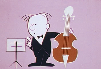
Animators: Bill Littlejohn, Tissa David, and Barrie Nelson
Those who worked for Hubley felt as though they were creating something important, films that had something to say and looked beautiful. Needless to say, they (we) loved the experience. Isn’t that all we could hope for in this business?
.

- Talking about extreme design, John Schnall has to be one of the most entertaining guys out there. He continually comes up with funny and artful pieces which he puts on his website. His most recent piece is an interactive keyboard called The Interactive Crappy Piano. I suggest you try playing it and see where it gets you.
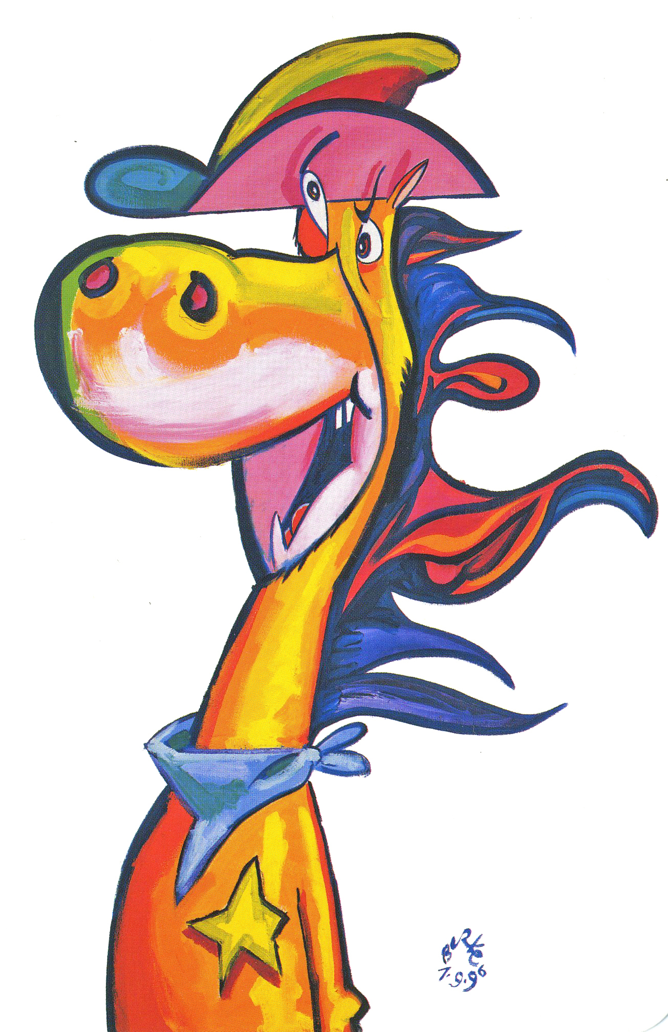
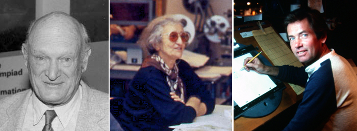
Phillip Burke’s QUICKDRAW
- J.J. Sedelmaier has an entertaining piece on the Imprint site about the first elements used to showcase the sale of Hanna-Barbera and the rise of Cartoon Network. You’ll be entertained by the beautiful cards on display. (Especially if you have a fondness for the early HB years.)
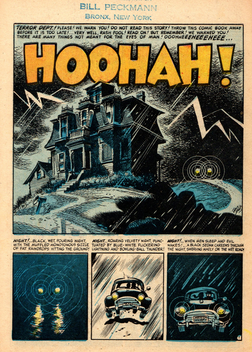
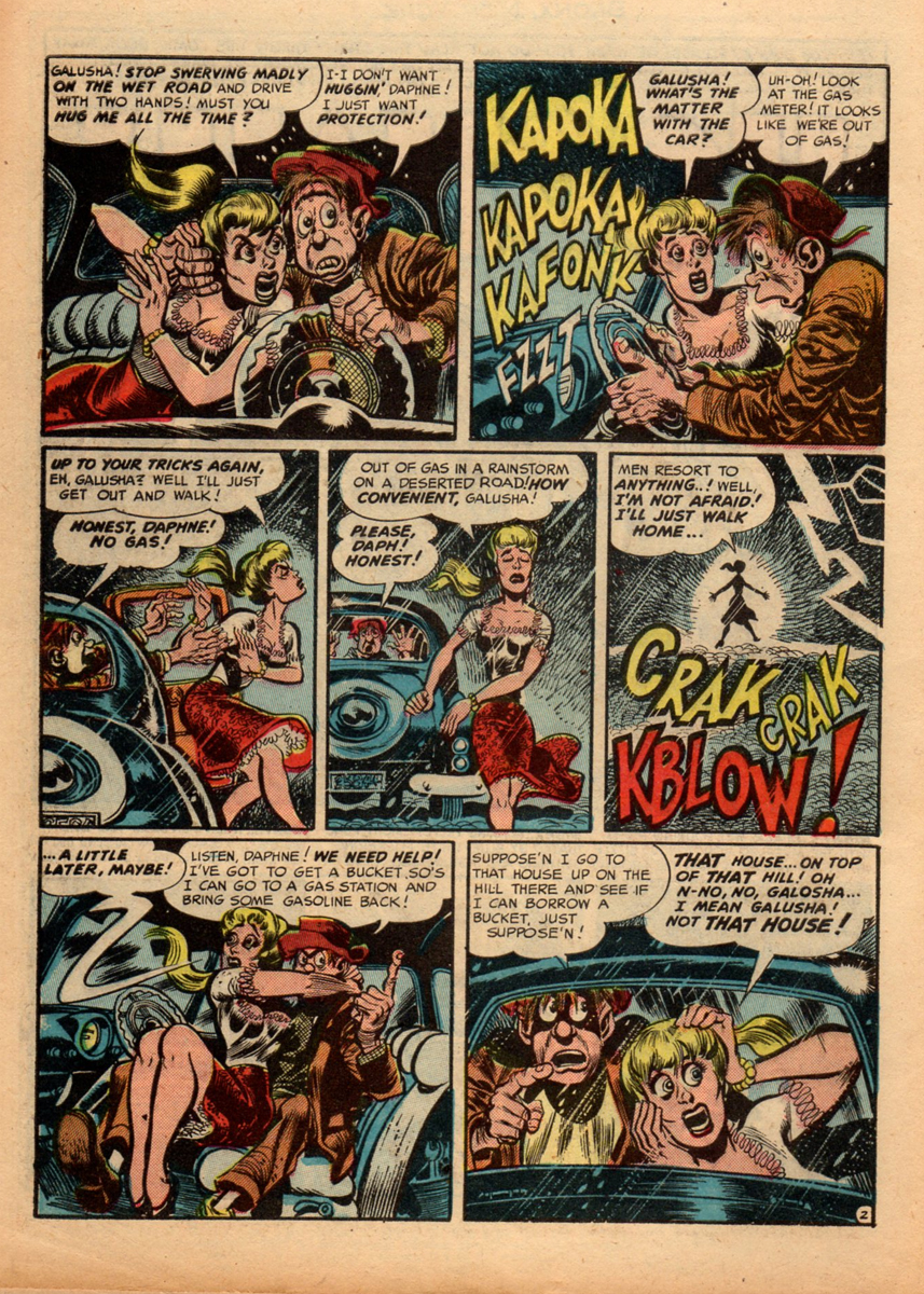
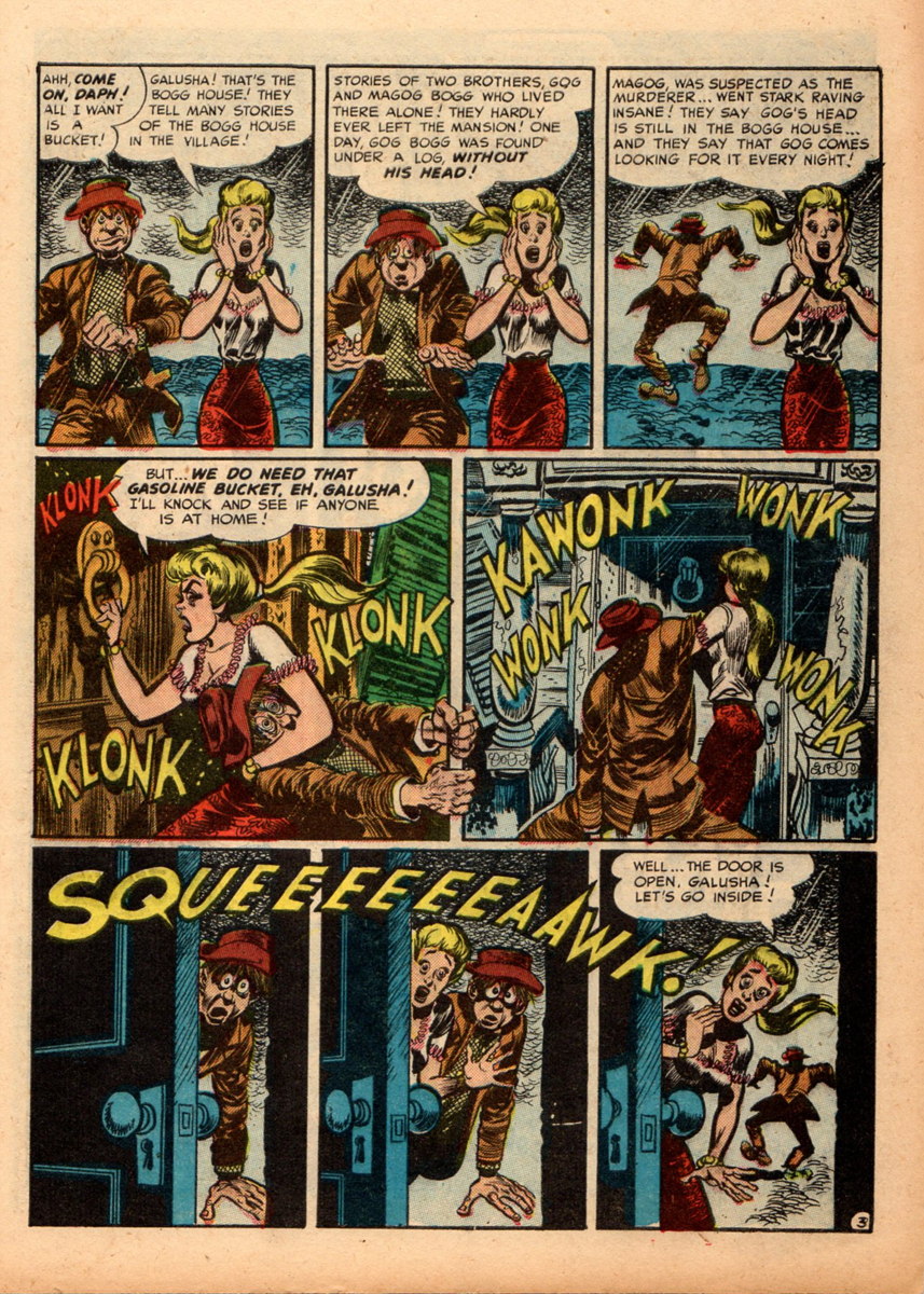
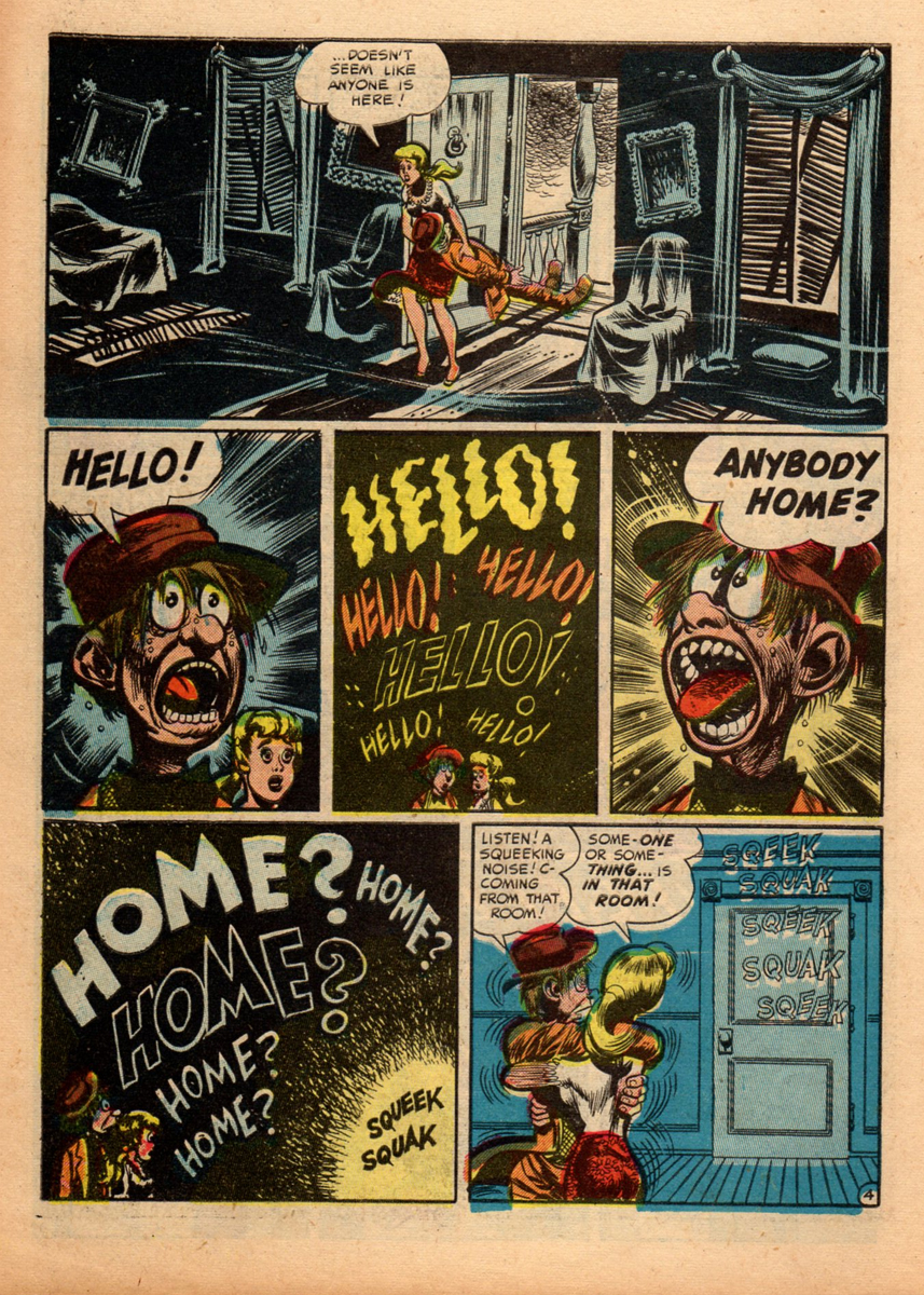
Bill Peckmann &Comic Art &Daily post &Illustration 07 Oct 2011 06:47 am
Harvey and Jack – part 1
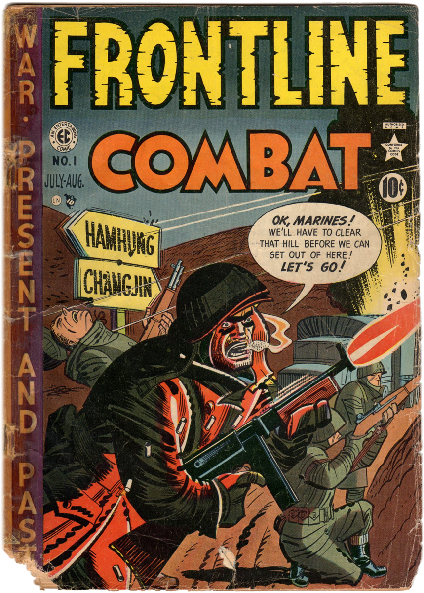
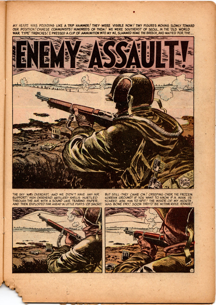
- Bill Peckmann sent me a couple of comics that demonstrated a great collaboration between Harvey Kurtzman and Jack Davis. With that small bit of information, let me turn it over to Bill:
- I thought it would be fun to give your readers some milestones in the collaborating efforts of Harvey Kurtzman and Jack Davis. It will be done in the form of showing #1 issues of certain comic book and magazine titles. I’ve always felt that the relationship of Harvey, and Jack was not that dissimilar from that of John Ford and John Wayne. All men were very successful in their own right but when they teamed up there was that extra spark in their art. Ford and Kurtzman would lay these wonderful creative foundations and then Davis and Wayne came in to add the finishing touches. For both teams, the final product always seemed so effortless and seamless.
Part 1 – FRONTLINE COMBAT (comic book) and MAD (comic book)
Part 2 – MAD (magazine) and TRUMP (magazine)
Part 3 – Humbug (magazine) and HELP ( magazine)
Here are those pages, with Bill’s comments:
 1
1
 2
2
 3
3
 4
4
 5
5
 6
6
 7
7
 8
8
 9
9
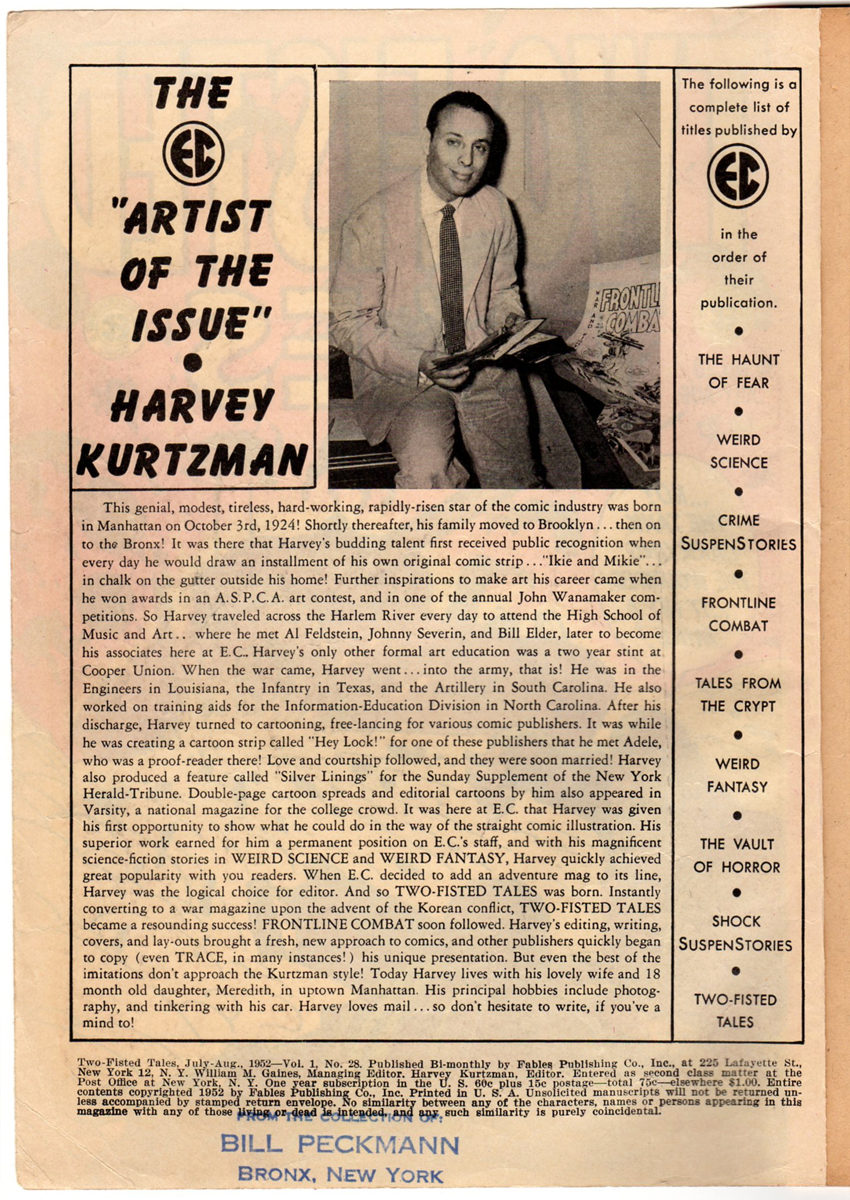
Harvey’s bio that ran in EC Comics
during the publication of the war comcs.
 10
10
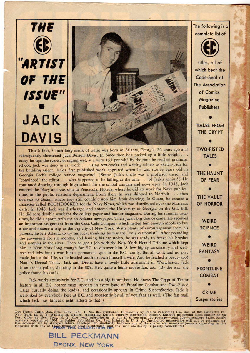
Jack’s bio.
 11
11
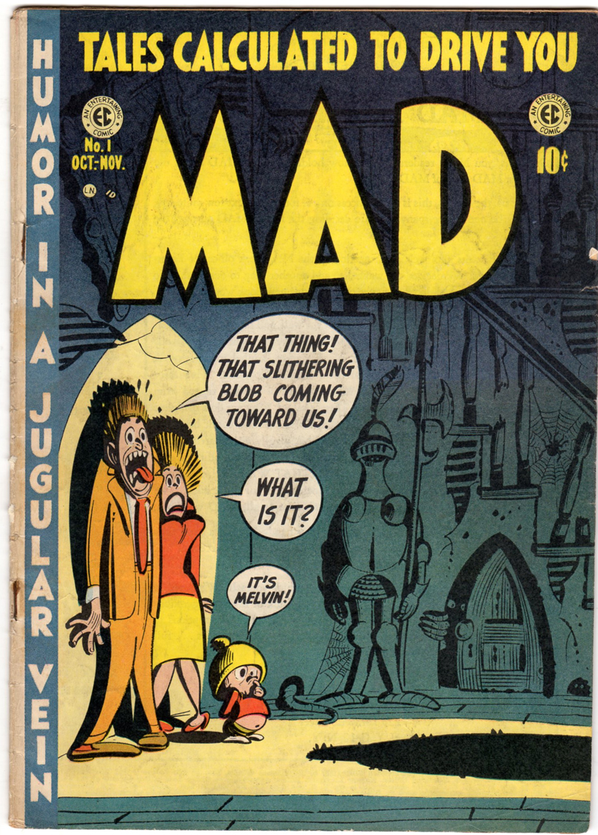
A little over a year after FRONTLINE COMBAT came out in 1951, MAD started in 1952.
 12
12
This is the first page of the first comic book that started
an institution that is still with us almost 60 years later.
 13
13
 14
14
 15
15
 16
16
 17
17
 18
18
 19
19
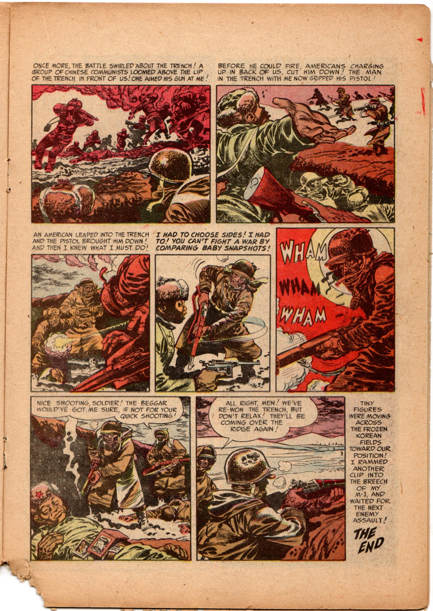
It’s easy to forget, but up until this time, there had never been
quite a story like this in comic books.
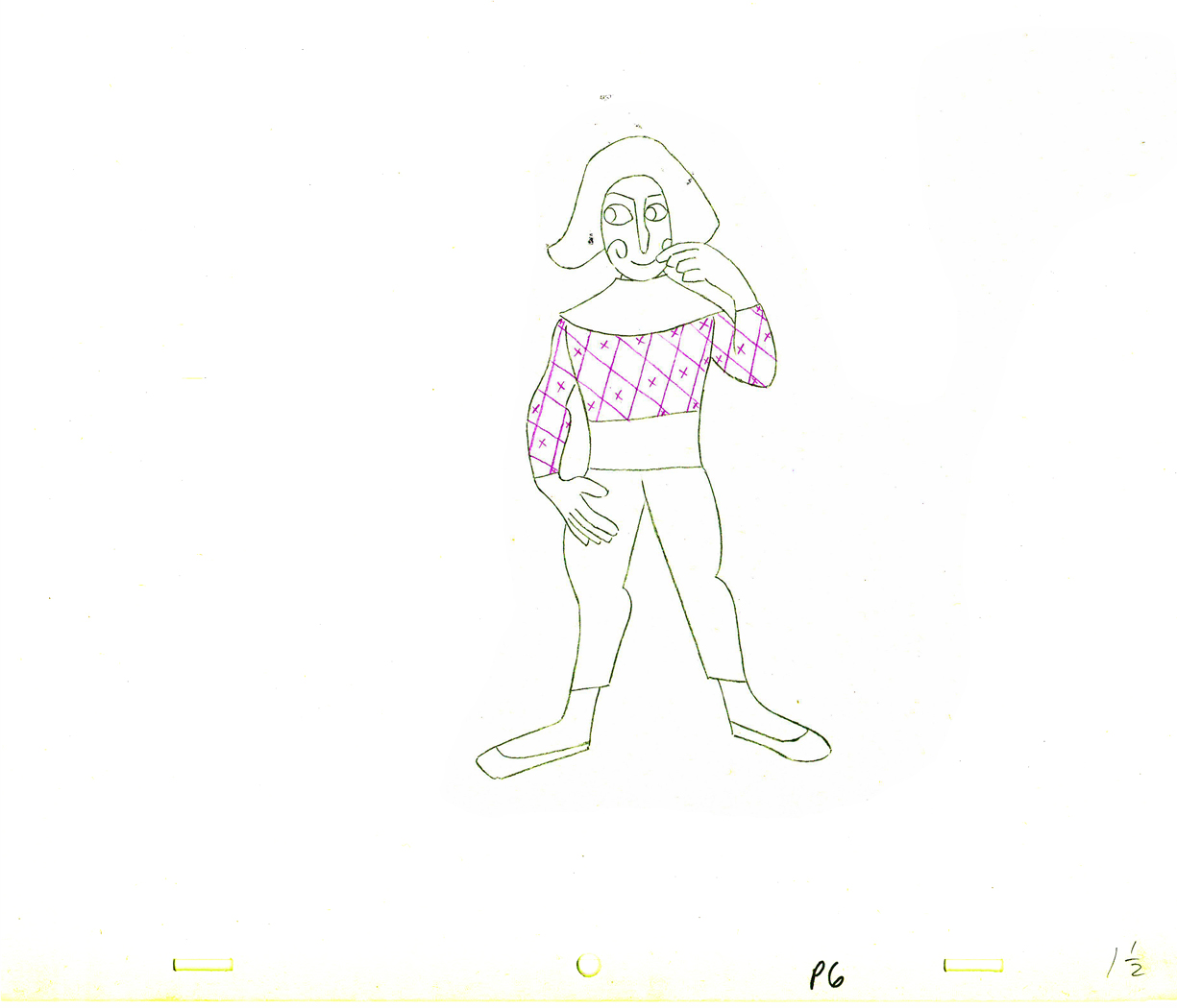
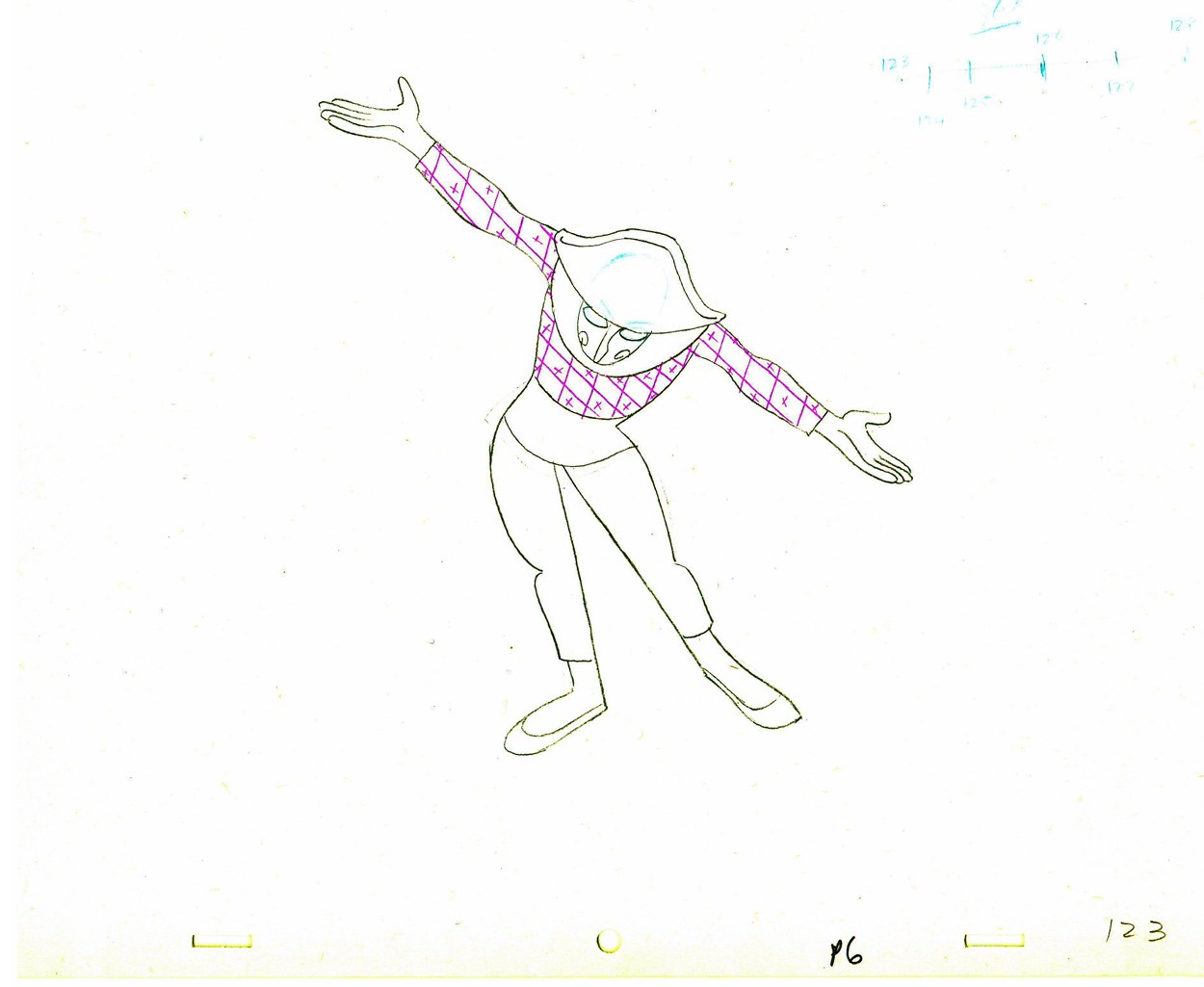
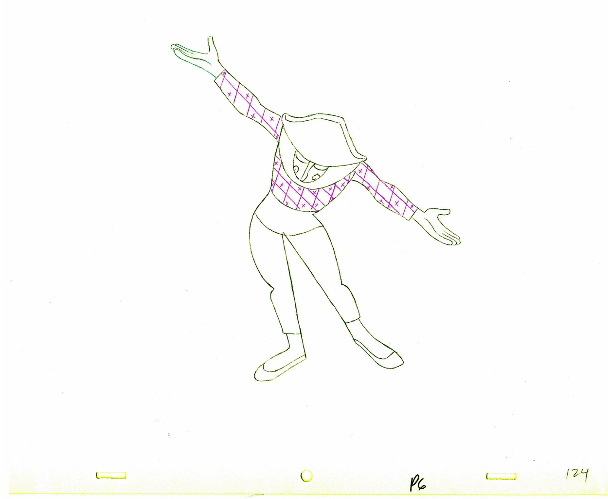
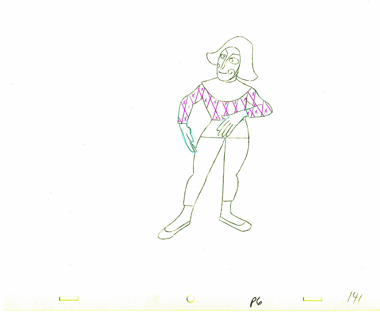
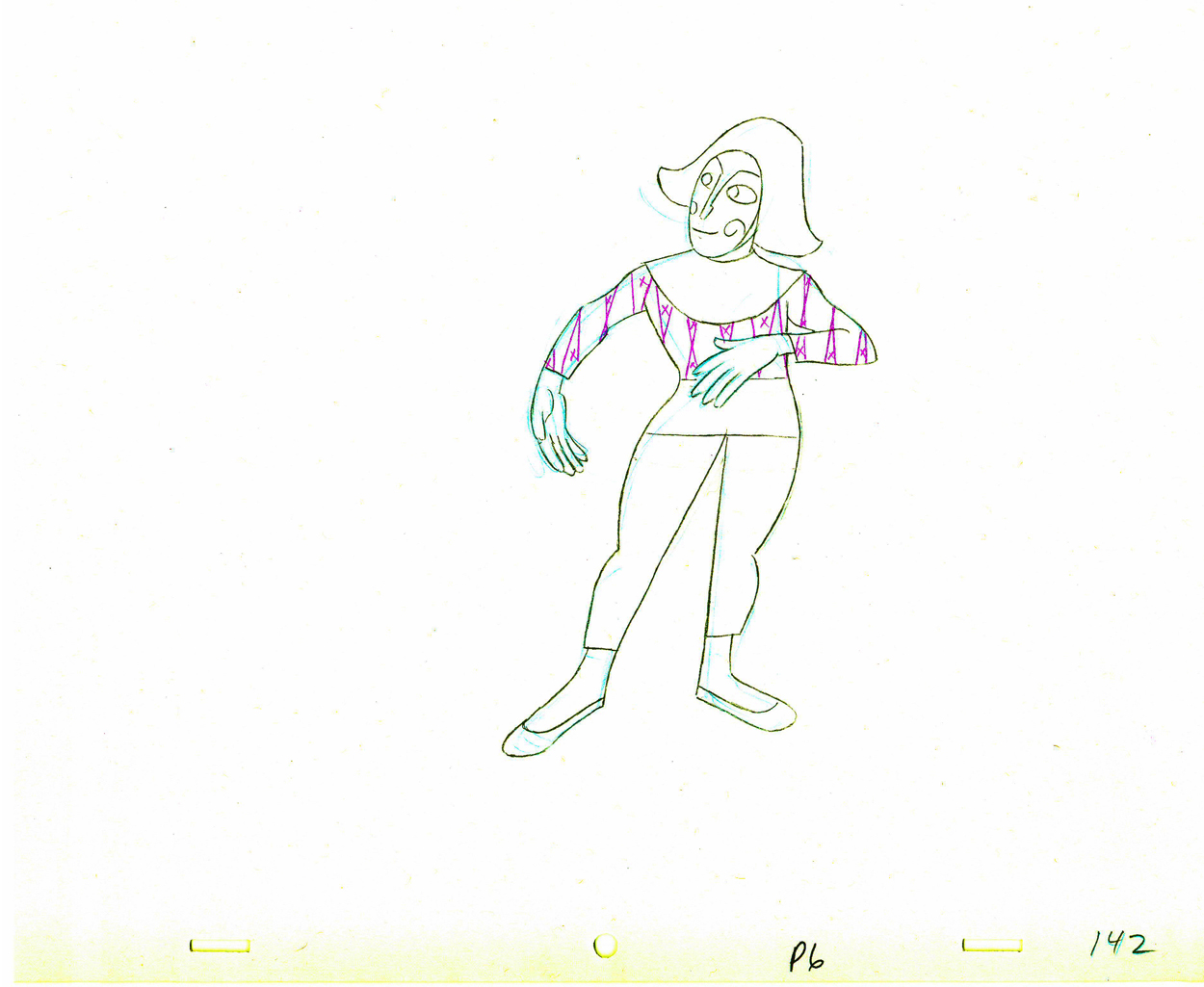
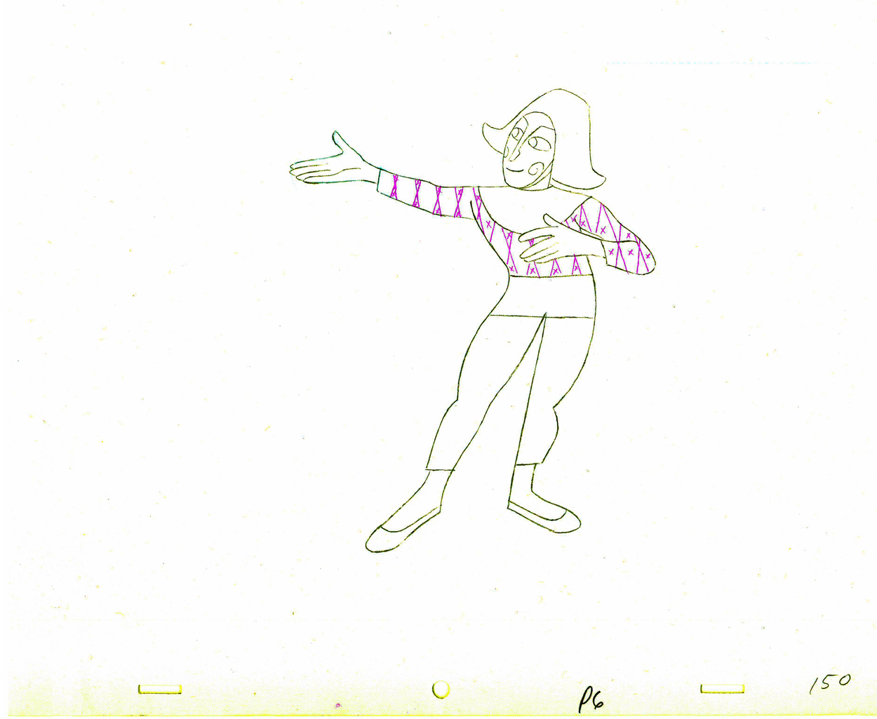
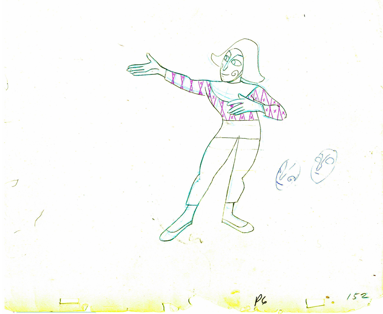
Animation &Animation Artifacts &Hubley 06 Oct 2011 06:46 am
Babbitt’s Carousel Mime – revisited
- John Hubley appreciated great animation, and consequently hired only the best of animators to work for him. During his commercial heyday in the ’50s Emery Hawkins, Art Babbitt and Bobe Cannon were regulars animating his spots. When he moved to the short subjects, Bill Littlejohn, Babbitt, Tissa David, Bobe Cannon, Barrie Nelson and Phil Duncan did a lot of the work with others such as Ed Smith and Gary Mooney filling the bills.
On Everybody Rides the Carousel, Art Babbitt animated the introductory scene and was displeased with what happened to the very long scene. He left the film and Barrie Nelson took over the character he was animating, the Mime/Narrator of the film.
In five past posts (Sept. 2010) I put up all the drawings of the scene and added a QT movie. Rather than post all those drawings again, I offer the first and the fifth parts of the piece and give you links to the other three if you want to study the drawings more closely.
- John Hubley‘s feature film, Everybody Rides the Carousel, was adapted from Erik Eriksons’ Eight Stages of Man, a Psychosocial Theory of Human Development.
The Hubleys designed the feature (which started out as three half hours for CBS and then was rushed to fill it to 90 min feature length in the final 3 months of production) around a carousel. 8 horsees represented different stages of life. The narrator was a mime we see throughout at the carousel. Art Babbitt was hired to animate him, and things got bad pretty quickly and he left after animating a couple of early scenes. Barrie Nelson completed the character in the show.
John took one look at the pencil test of this scene on a movieola and proclaimed it to me as the greatest animation he had ever seen. It wasn’t long that he took the scene – basically exposed on twos throughout – and asked me to change it exposing it on four frame dissolves throughout. This would extend the scenes and the character and would milk the scenes for everything possible. Art Babbitt was furious and never spoke to John again. For the full story go to this past post.
The scene is about 200 drawings long. I’ll break it into parts and post each part here in about 4 or 5 segments. Here’s the first part. As you can see there are a lot of ½ drawings. Animation extender – it’s a very slow moving character. A lot of poetry.
The QT will be done using Art’s exposure on twos.
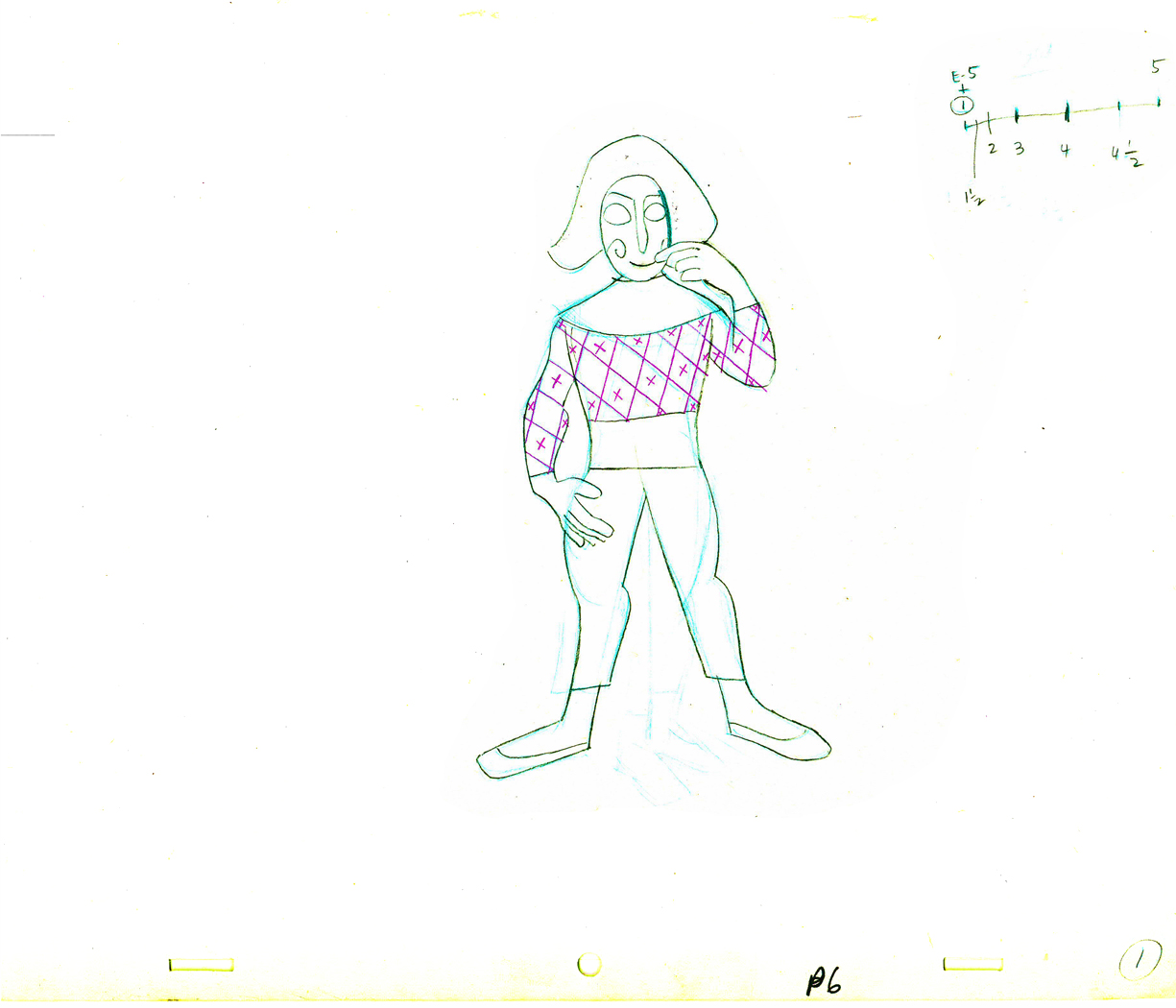 1
1(Click any image to enlarge.
 E1
E1 E5
E5
There are five pair of eyes; I give you the first and last.
 1½
1½
Lots of half drawings in the scene.
 2
2 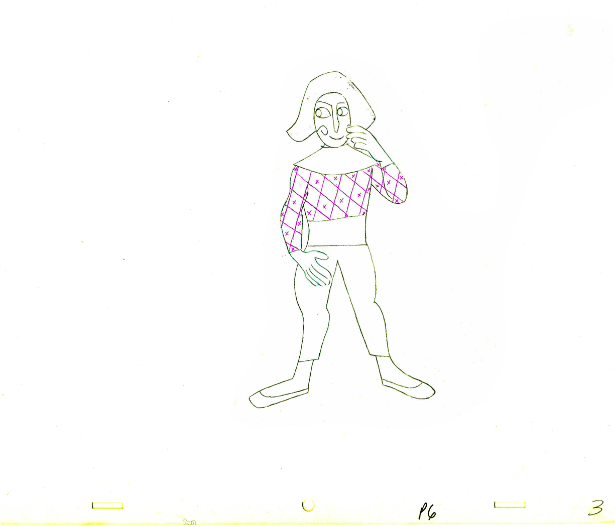 3
3
 4
4 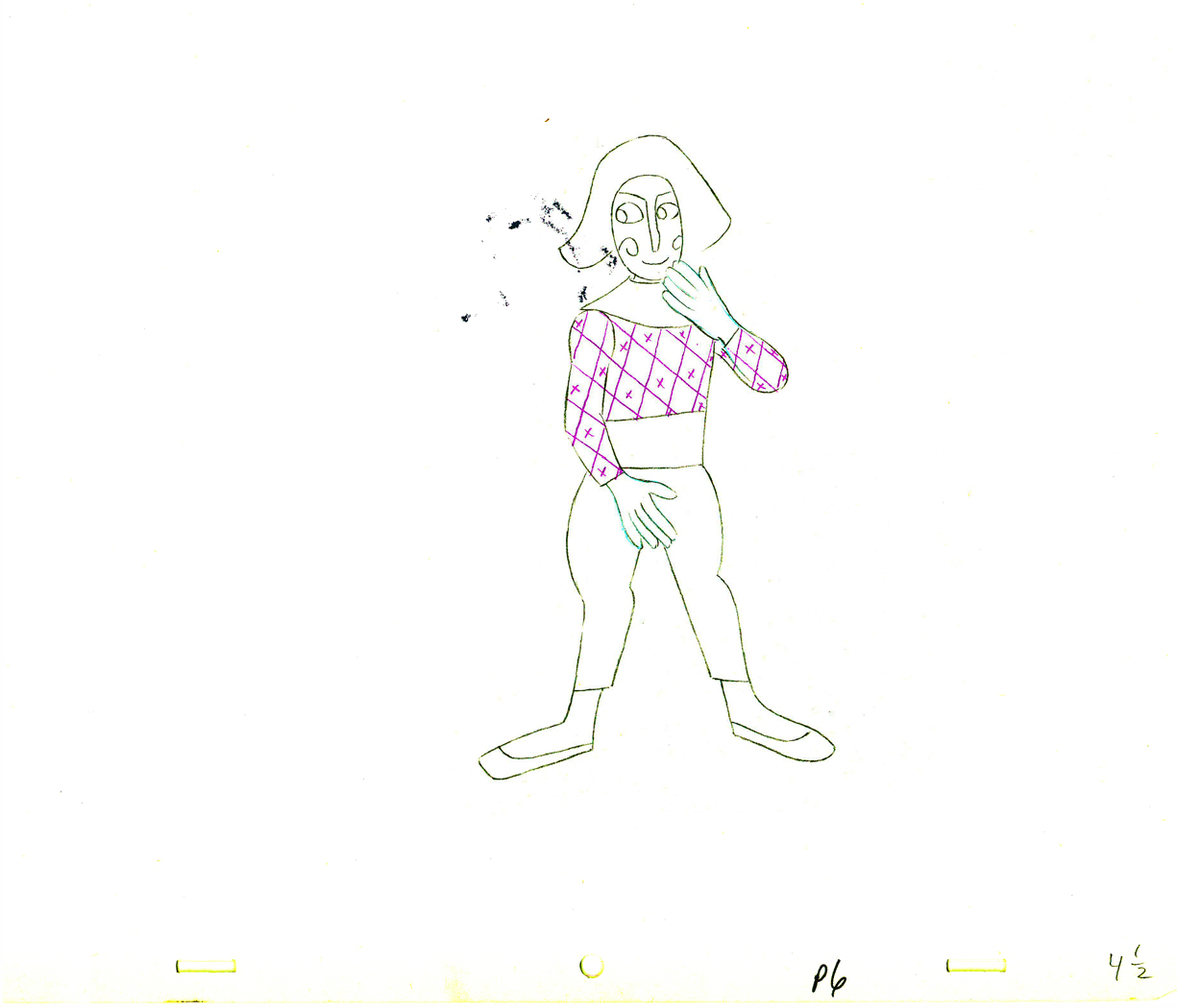 4½
4½
 5
5  5½
5½
 6
6  6½
6½
 7
7  7½
7½
 8
8  8½
8½
 9
9
 10
10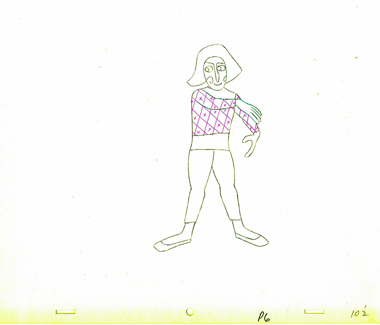 10½
10½
 11
11 11½
11½
 12
12 12½
12½
 13
13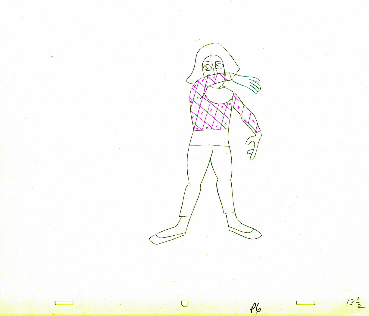 13½
13½
 14
14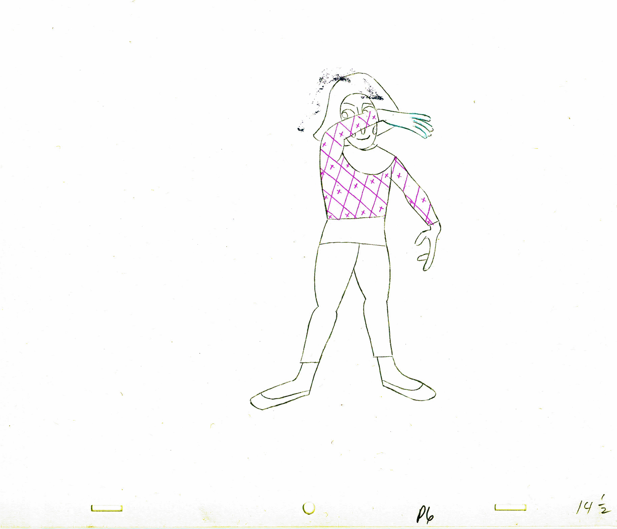 14½
14½
 15
15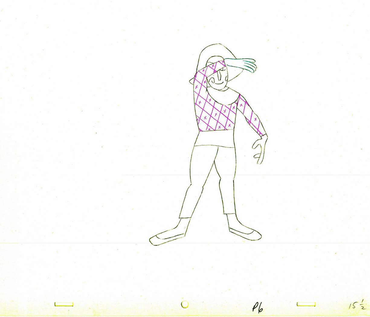 15½
15½
 16
16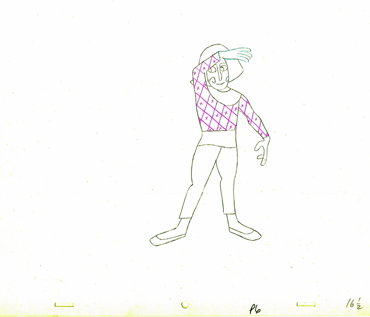 16½
16½
 17
17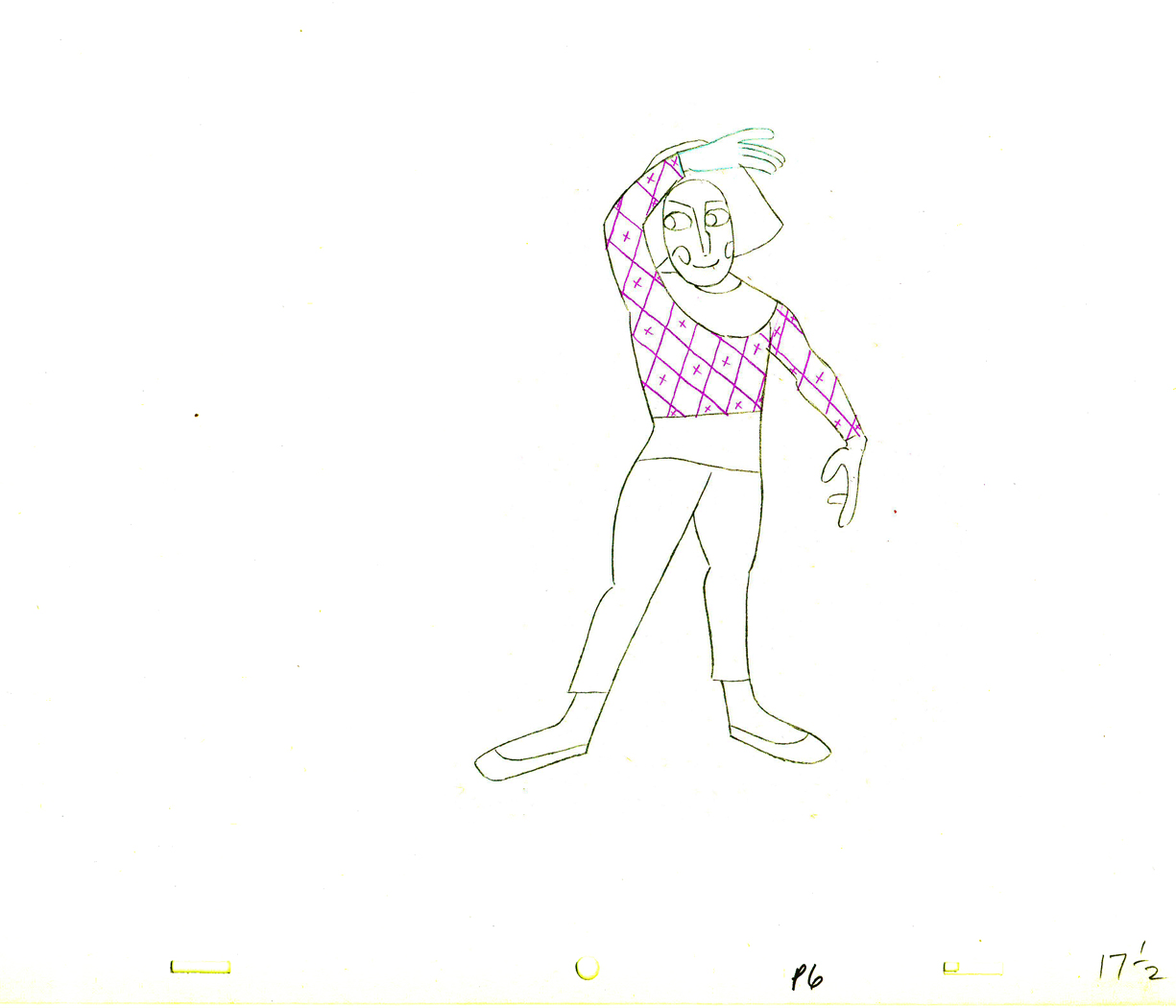 17½
17½
 18
18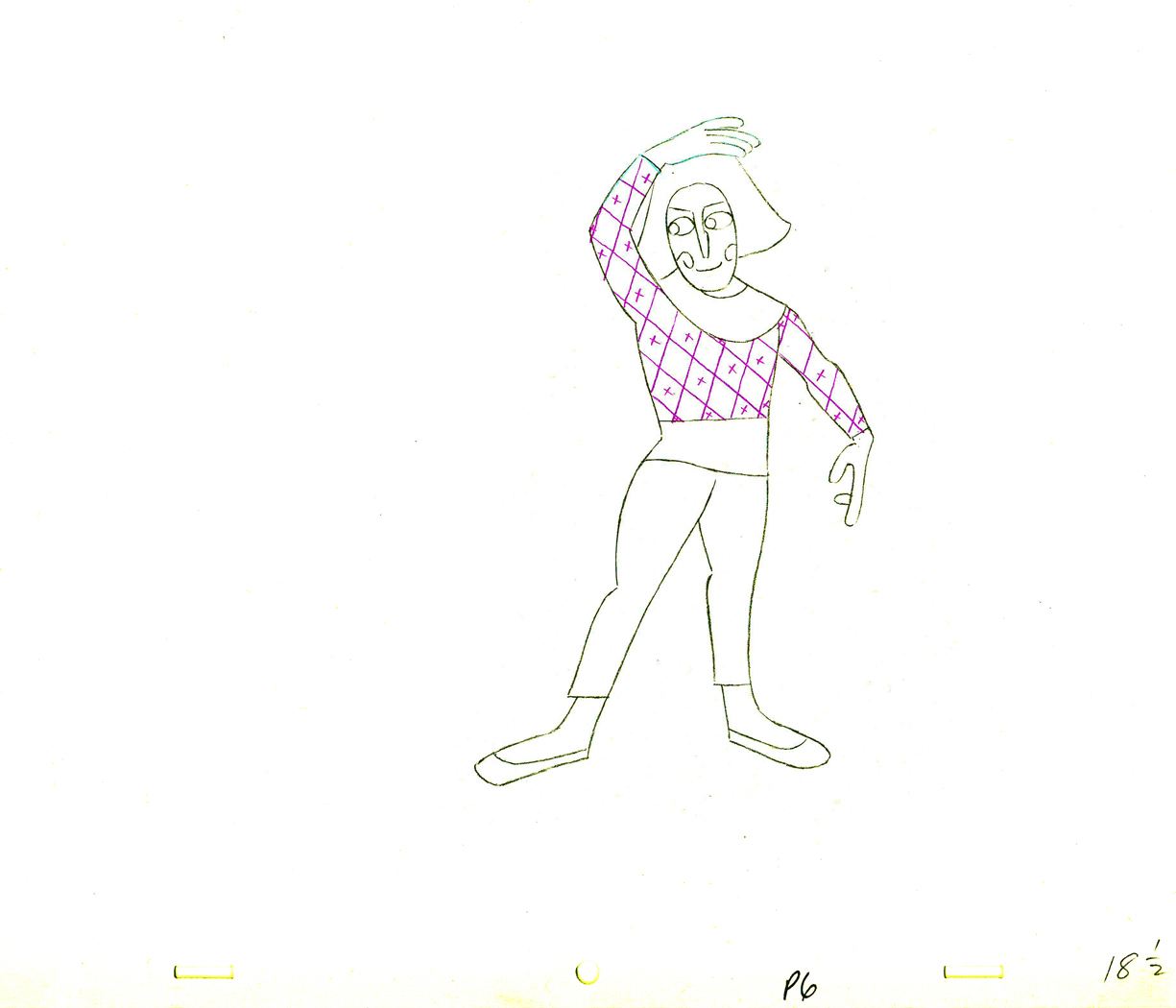 18½
18½
 19
19 19½
19½
 20
20 20½
20½
 21
21 21½
21½
2121½
 22
22 22½
22½
 23
23 23½
23½
 24
24
 24½
24½
 25
25 25½
25½
 26
26 26½
26½
 27
27
______________________
Part 4
Part 5 follows:
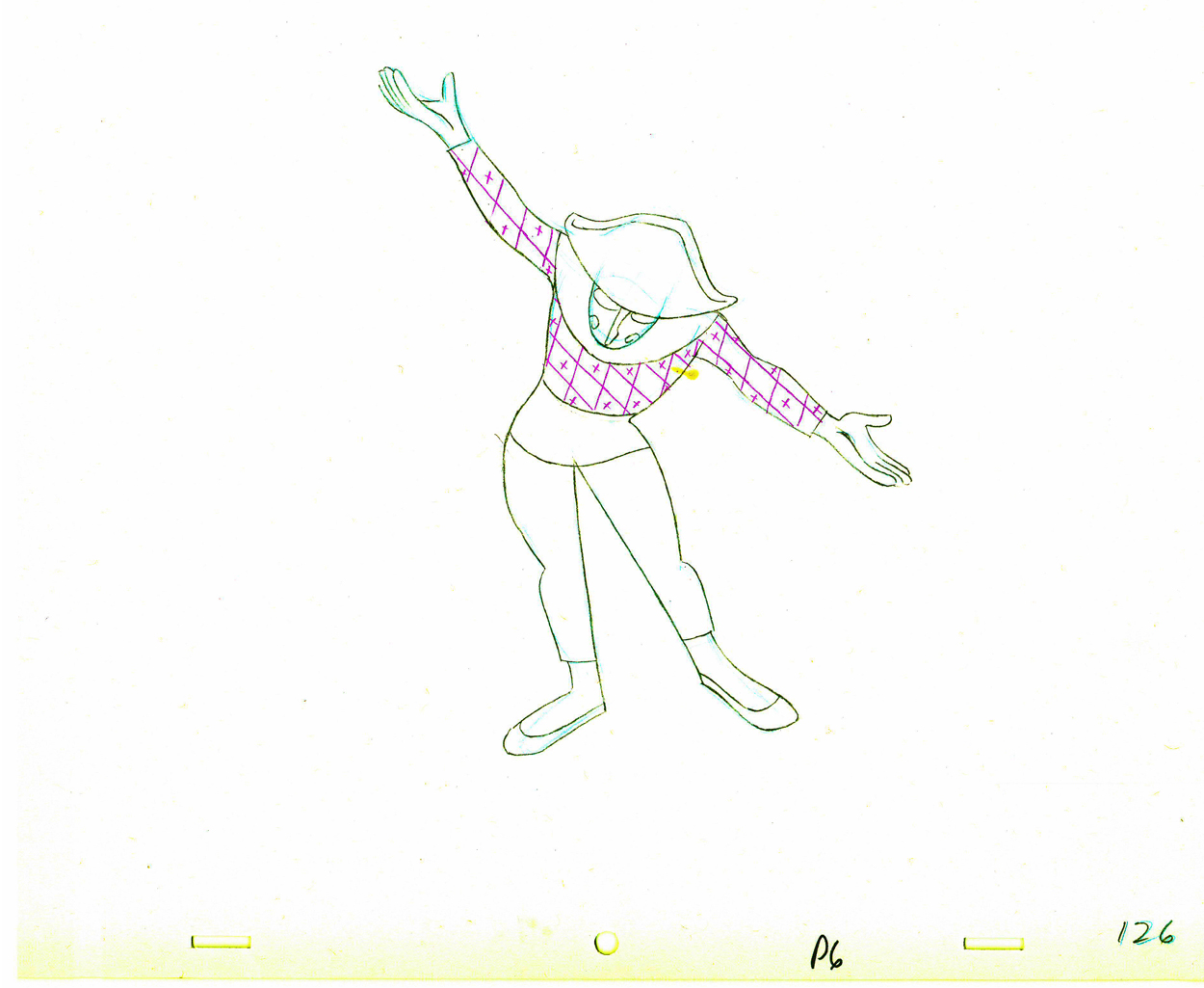
- The Hubley feature film, Everybody Rides the Carousel, was adapted from Erik Erikson‘s Eight Stages of Man, a Psychosocial Theory of Human Development.
The Hubley conceit was to make the 8 stages of life as a carousel with 8 horses representing those different stages. The narrator was a mime and was animated, at first, by Art Babbitt, with Dave Palmer as his personal assistant. After animating a couple of early scenes, Babbitt left annoyed. Barrie Nelson completed the character in the show.
For the full story behind the rift between Hubley and Babbitt go to this past post.
The scene is 152 drawings long. This is the final section as the mime comes to rest. It’s a very slow moving character with short quick spurts of movement.
We begin with the last drawing from last week, #123.
 123
123(Click any image to enlarge.)
 24
24 25
25
 26
26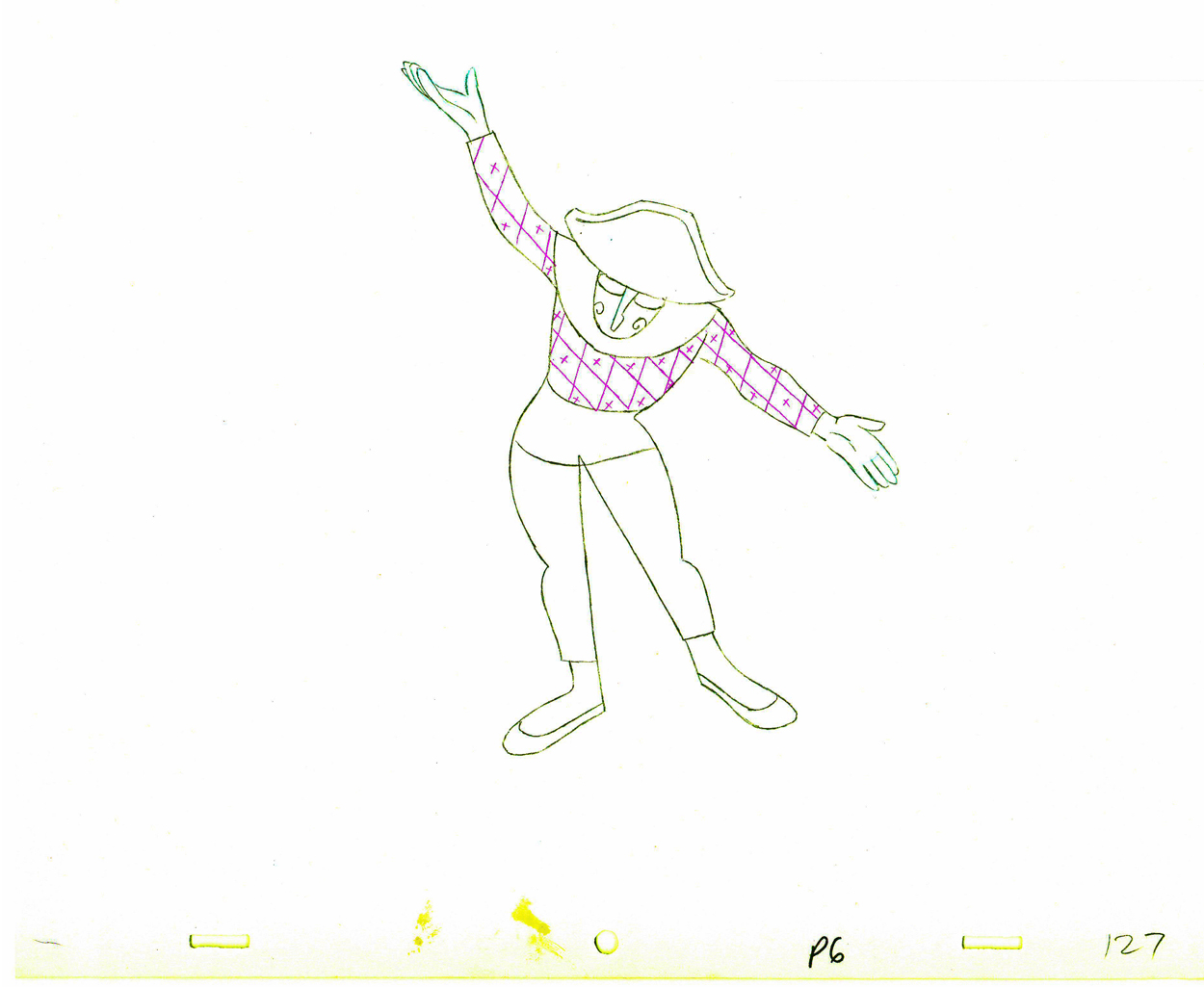 27
27
 28
28 29
29
 130
130
 31
31 32
32
 33
33 34
34
 35
35 36
36
 37
37 38
38
 39
39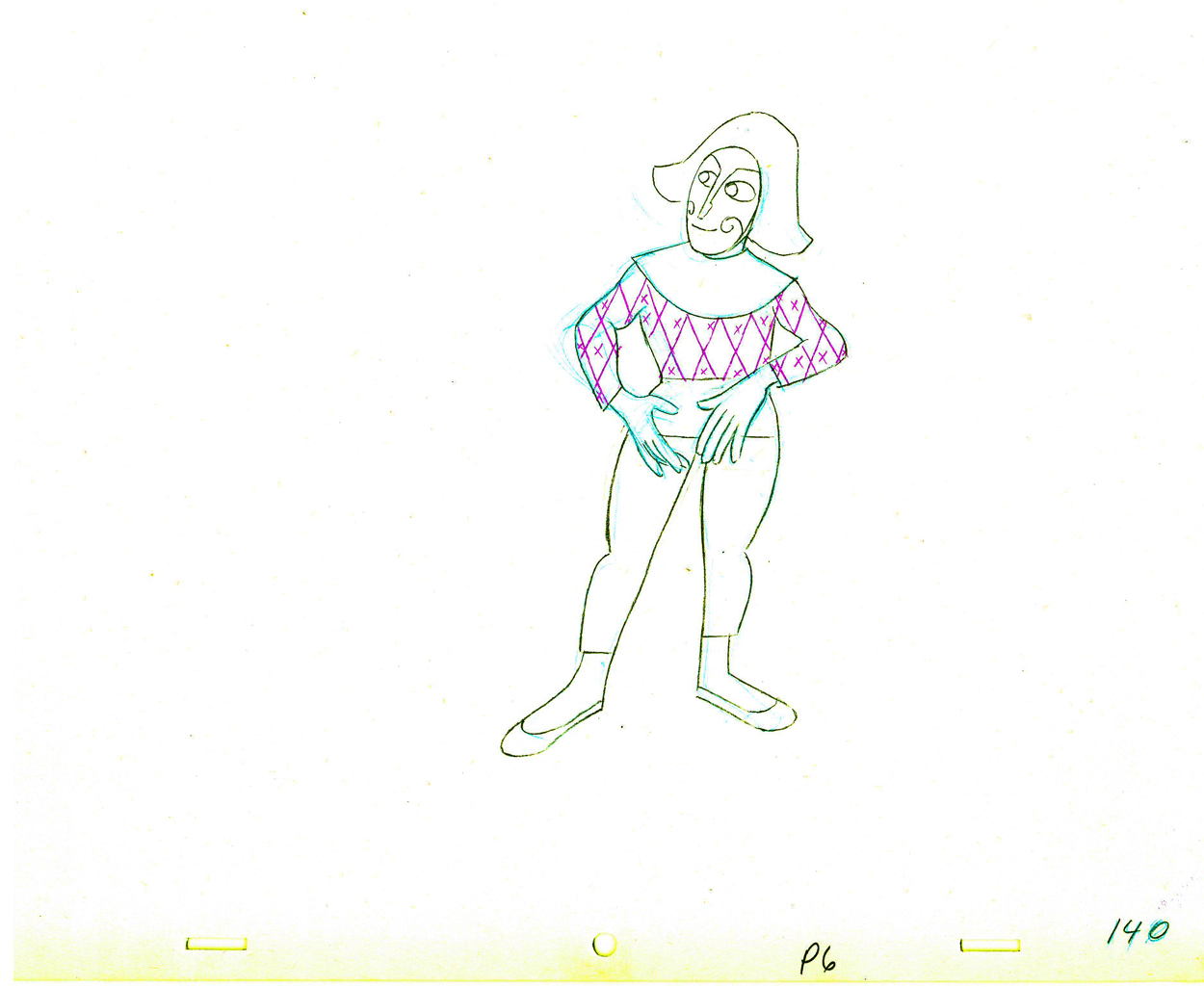 40
40
 141
141
 42
42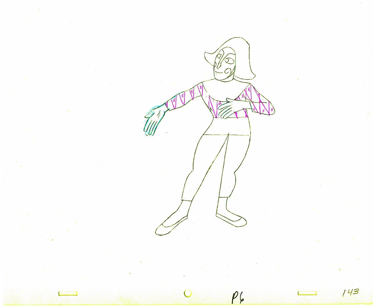 43
43
 44
44 45
45
 46
46 47
47
 48
48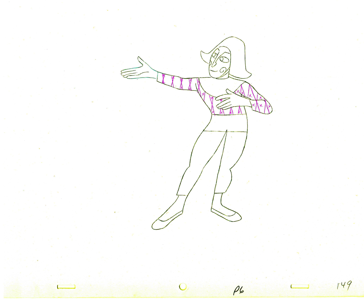 49
49
 50
50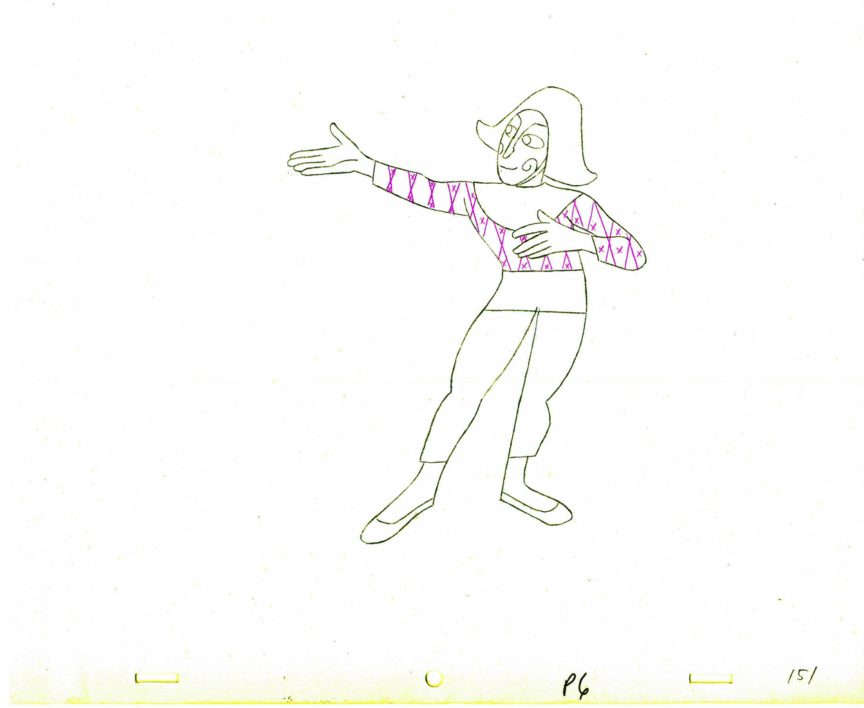 51
51
 152
152
The following QT movie represents all of the drawings in the scene
exposed as Babbitt wanted them, on twos.
Right side to watch single frame.
You can watch this scene from the final film here.
Animation &Animation Artifacts &Hubley &repeated posts 05 Oct 2011 06:55 am
Seeding revisited
- Tissa David did a lot of animation for the Hubleys from about 1958 through 1977. She did whole films on her own and EGGS is one of them. I posted this cycle a few years back and to tie it in with my piece on Monday and leading up to the Hubley retrospective, I’m posting it again, today. I think it’s wonderful.
-Tissa David animated the entire film for John & Faith Hubley. This short, as I said in previous posts, was done for PBS’ Great American Dream Machine for producer, Elinor Bunin. As Bob Blechman verified, they were given very little money and time to do an 8 min. short. The Hubleys gave life to the short by putting it on the theatrical and festival circuit.
Here’s a rough run cycle Tissa did for the Goddess of Fertility, who goes about inseminating the world with her seed. Tissa adds to its eccentricity with having the low point in the cycle the passing drawing. She comes up as each leg hits the ground.
 1
1 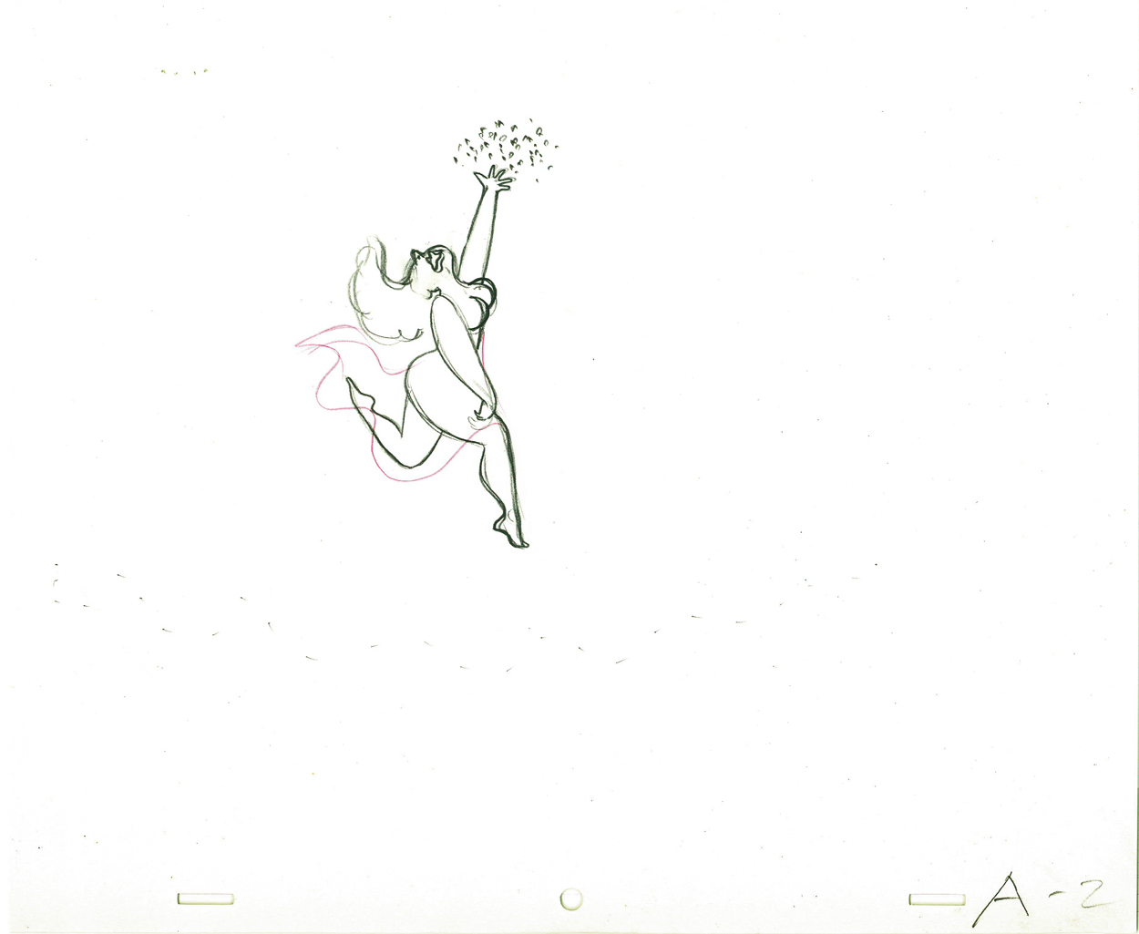 2
2
 3
3 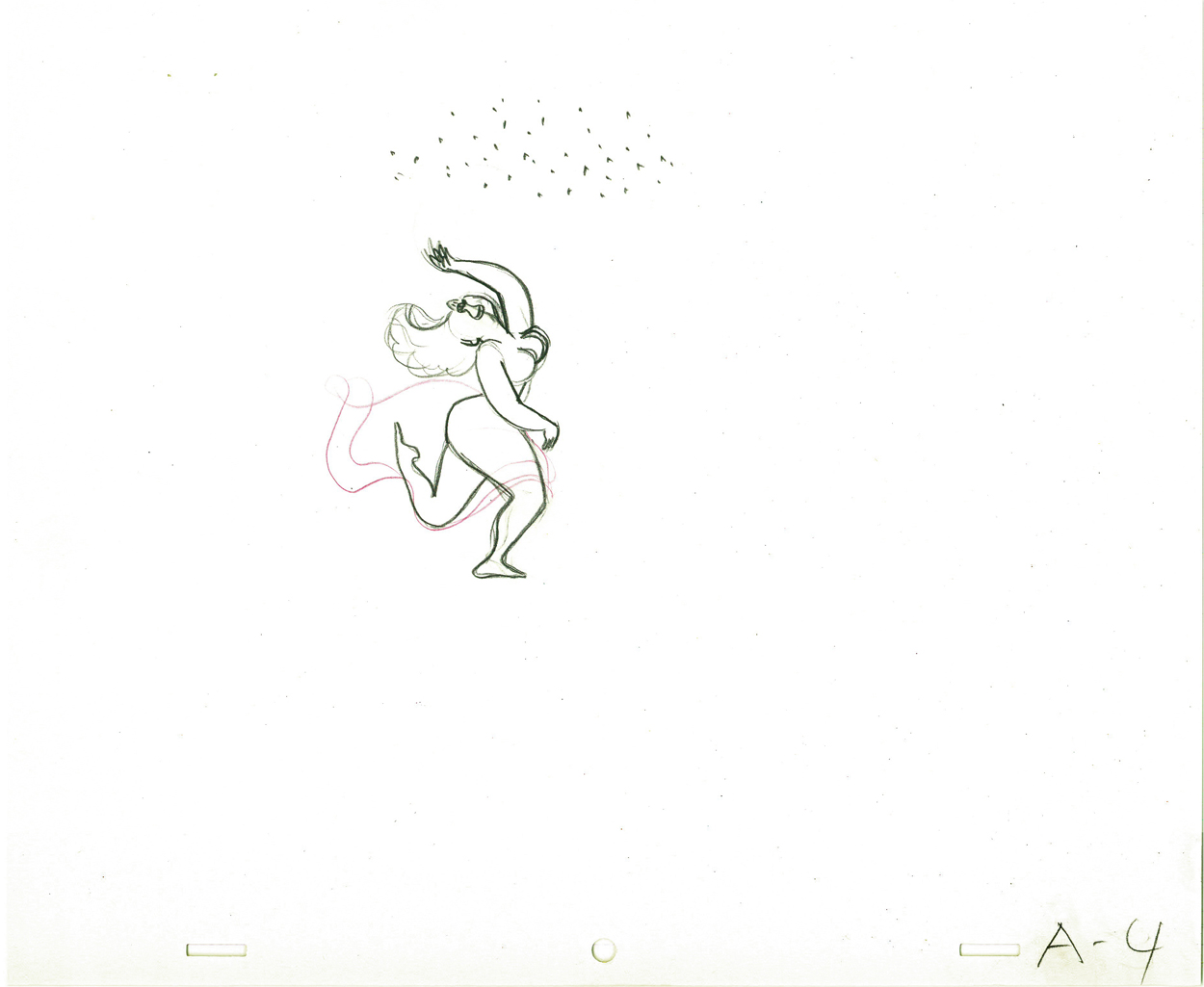 4
4
 5
5 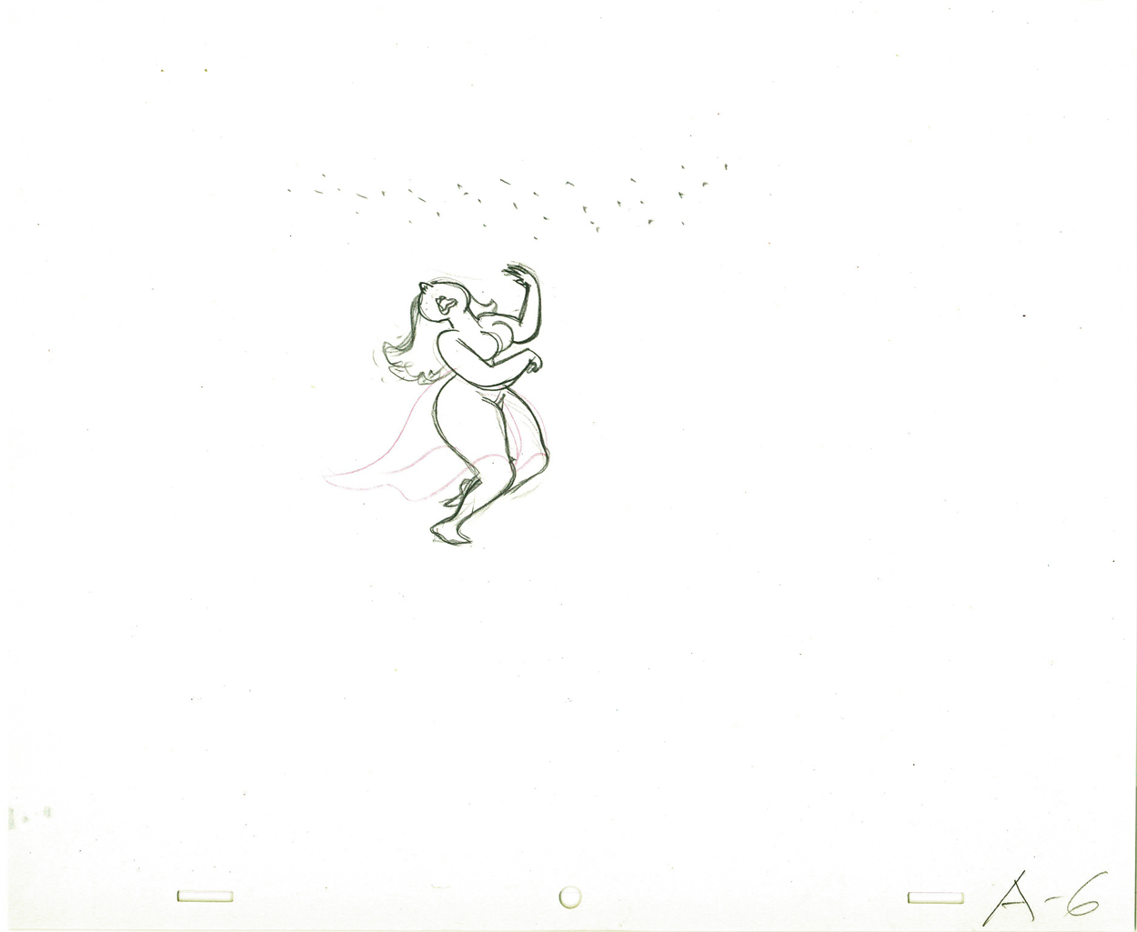 6
6
 7
7 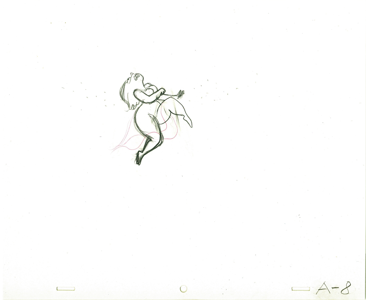 8
8
 9
9 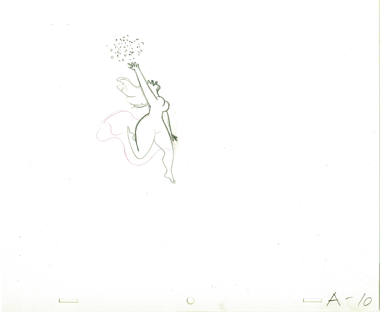 10
10
 11
11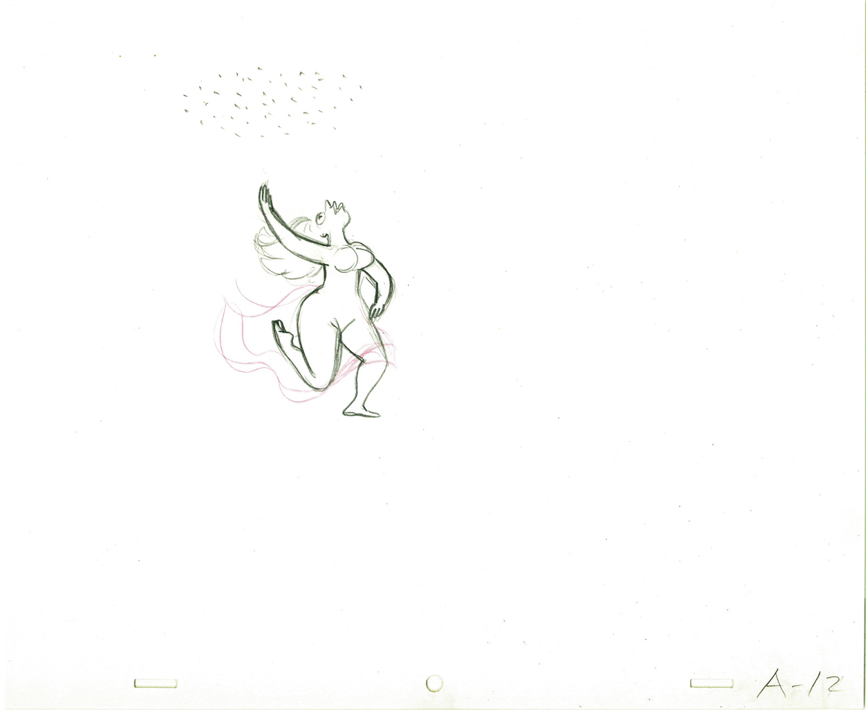 12
12
 13
13 14
14
 15
15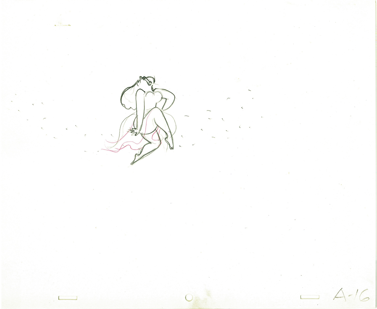 16
16
On threes at 24FPS
Click left side of the black bar to play.
Right side to watch single frame.
Commentary 04 Oct 2011 06:39 am
Hubley/Blair
- Two shows are about to take place; one in New York (Monday October 10th An Academy Salute to John Hubley), another in Los Angeles (Thursday October 20th, Mary Blair’s World of Color; A Centennial Tribute). I wish I could attend bothh of them; I’m happy to be in NY to attend the John Hubley program (and be a small part of it.)
Interesting that these two shows appear in the same month at two different AMPAS stations. Yet, the two artists couldn’t be more diametrically opposed in their work. One was more of an illustrator, albeit a brilliant illustrator, and the other was more a fine artist.
.
Everything about Blair’s work, from The Little Golden Books to the designs for the Disney features of the early 50′s to the overall design for It’s a Small World in Disneyland, are all glorious testaments to a first rate, gifted illustrator of the highest caliber. She radically changed her style on the trip to South America with the Disney group, and she brought these brilliant color mixes back with her to the work she did at Disney. The colors were almost there for the sake of the colors, alone. The work developed and grew more sophisticated with all that she did, and her color schemes became more radical as she designed for the Disney features.
.
.
The grand statement of the art . . . well, there was no grand statement. It was done to further the films or the projects, and had no message. It was beautiful production art, but it was not really “Art.”
.

.
 Hubley’s work sought to create art, and the style and growth continued upward through his years. The work at Disney’s studio started as gifted illustration (Snow White), then turned to a looser feel with oils (Pinocchio) and watercolor (Bambi). As he moved to UPA, the art followed Steinberg and Picasso closer to the world of abstraction. Ultimately, with Adventures of an * and films that followed (done by and for himself and his wife Faith) the Abstract Expressionists ruled, and Hubley’s art went far into that direction and stayed there through most of his films.
.
Tender Game, which followed Adventures of, was a variation that seemed to emulate some of the work of Baziotes. Moonbird was where Hubley came into his own and created a very rich style that was all his own. Variations on it came with The Hat, The Hole and Of Stars and Men. A new direction came with Windy Day. By the time we reached Cockaboody, a softness settled into that very same style and watercolor backgrounds dominated. There was throughout all this work a beautiful development where one phase grew out of another which had grown out of another.
.
And there was a grand statement: all art, abstract or realistic was an abstraction and it touched all of our lives regardless of our thoughts about it. Picasso could be dismissed by those not in the know, but eventually the masses would warm up to him and eventually take it for granted that this, too, was Art. Hubley helped make that world – this world – so. Acceptance and understanding was part of his oeuvre.
.
One wonders if Hubley had remained at Disney’s as long as Blair had whether any of his rich design style would have controlled the films as her work had. Of course, the answer is obvious. He never would have been able to remain at Disney’s studio. His penchant for the further development of the art – out of the 19th century illustration – would not have allowed him to sit still there. By leaving, he not only pushed his own work into a higher realm, but he pulled animation there with him.
.
.
In a sense, without his work, animation would still be stuck in the 19th Century graphics and would not have moved into the 21st Century. We can see evidence of this with all the cgi features being done today. Those little fabricated computerized puppets are wholly stuck in 19th Century art, yet 2D has moved on. We accept “Beavis & Butthead” or “Aqua Teen Hunger Force” (both badly drawn works that are most definitely 21st century graphics) because Hubley changed things. Not that John Hubley was the only one who wanted to do more, graphically, in animation, but others seem content with modernized cartooning. Chuck Jones, for example, who led the way in 1941 settled into a stylized cartooning in the 1950s. Hubley sought art – something different and deeper than was acceptable to others.
Picasso led to acceptance of Andy Warhol and Robert Rauschenberg; Hubley led to acceptance of “South Park” and Yurij Norshtein.
.
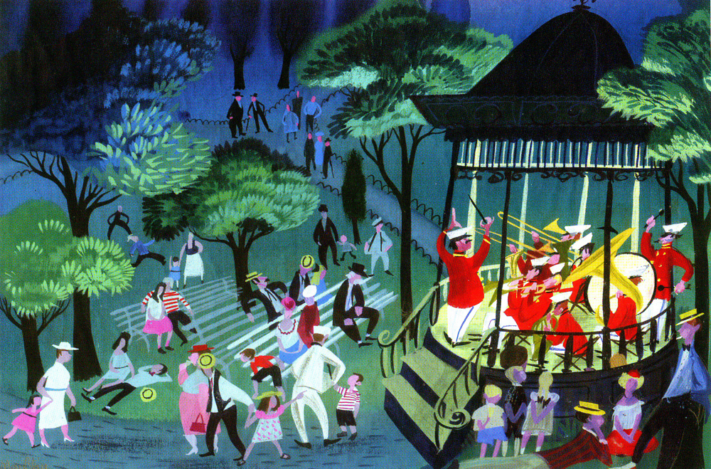
Pictures:
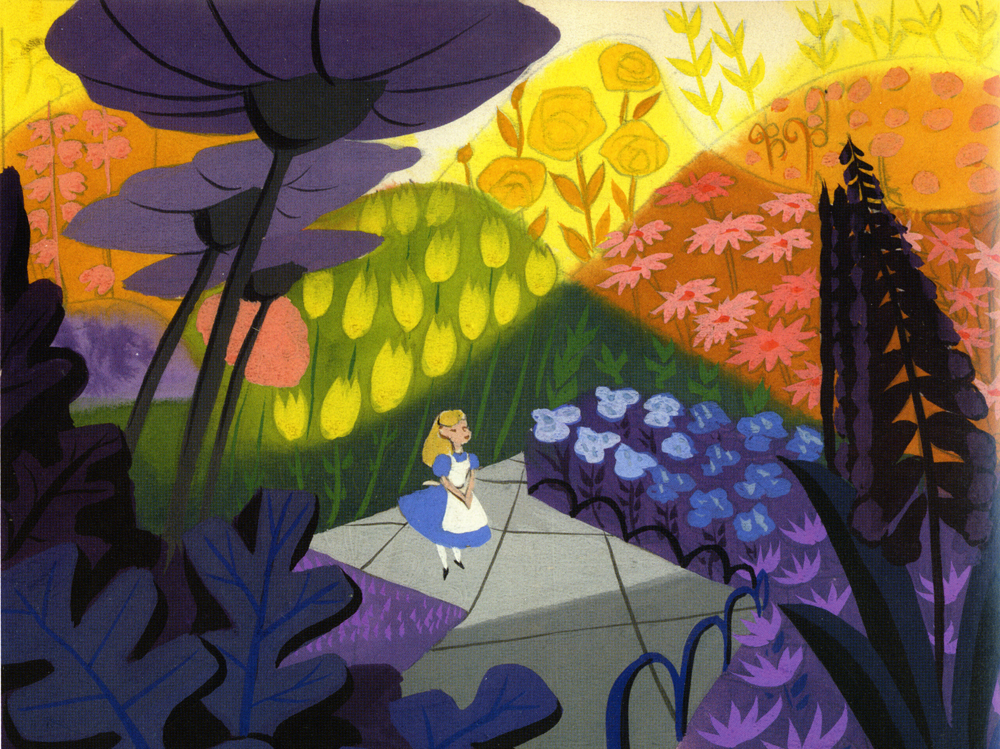
1. Mary Blair – personal painting
2. Mary Blair – Alice In Wonderland
3. John Hubley – Bambi
4. John Hubley – Brotherhood of Man
5. John Hubley – Everbody Rides the Carousel
6. John Hubley – Moonbird
Animation Artifacts &Hubley &Layout & Design &Tissa David 03 Oct 2011 06:53 am
Eggs recap
Leading up to the Hubley show next Monday at AMPAS in NY, I’ve said I’ll be posting a lot of Hubley artwork. Today and Wednesday I have a couple of pieces from EGGS.
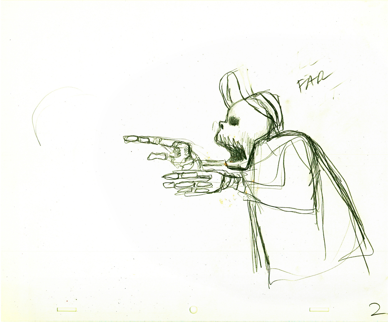
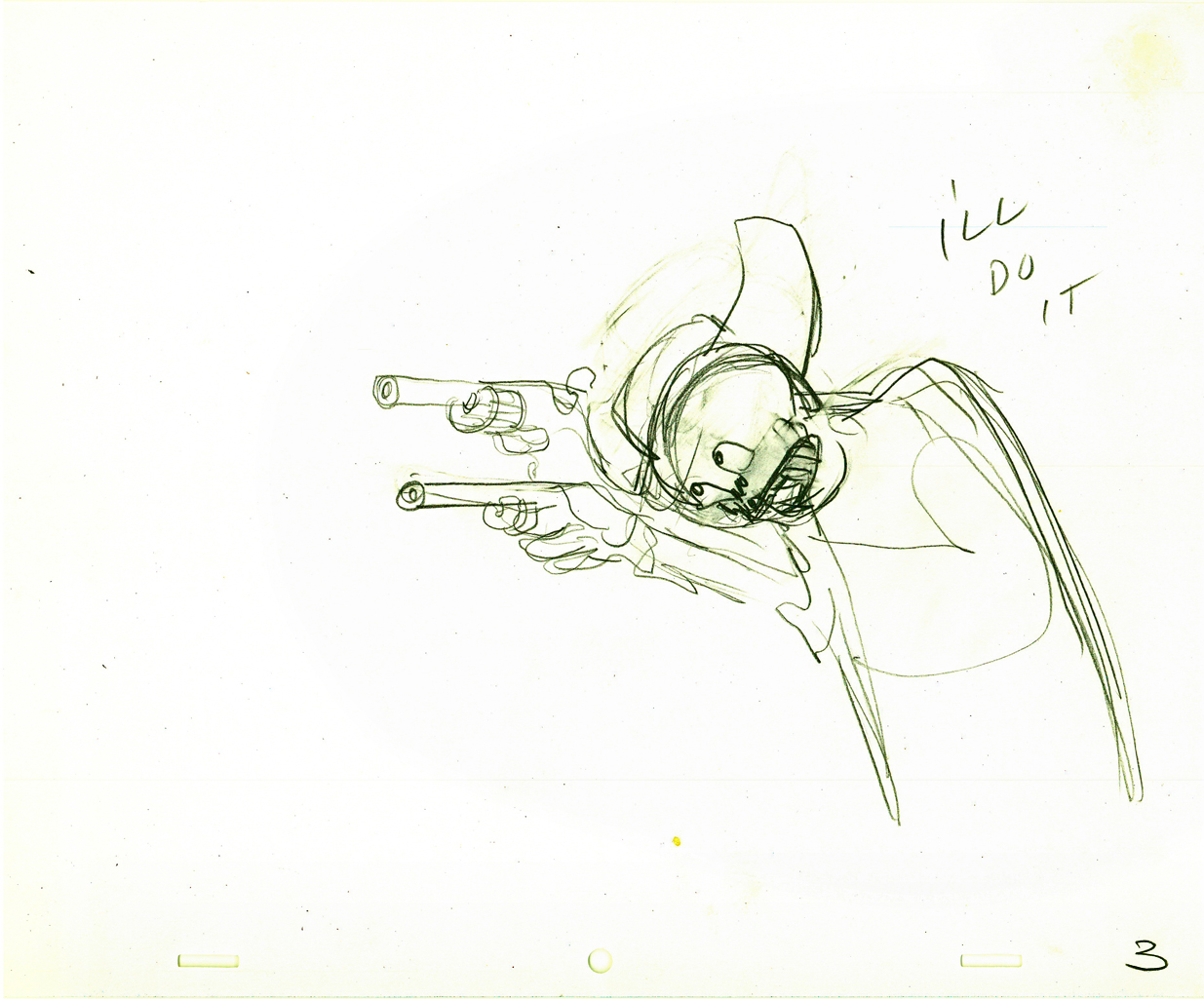
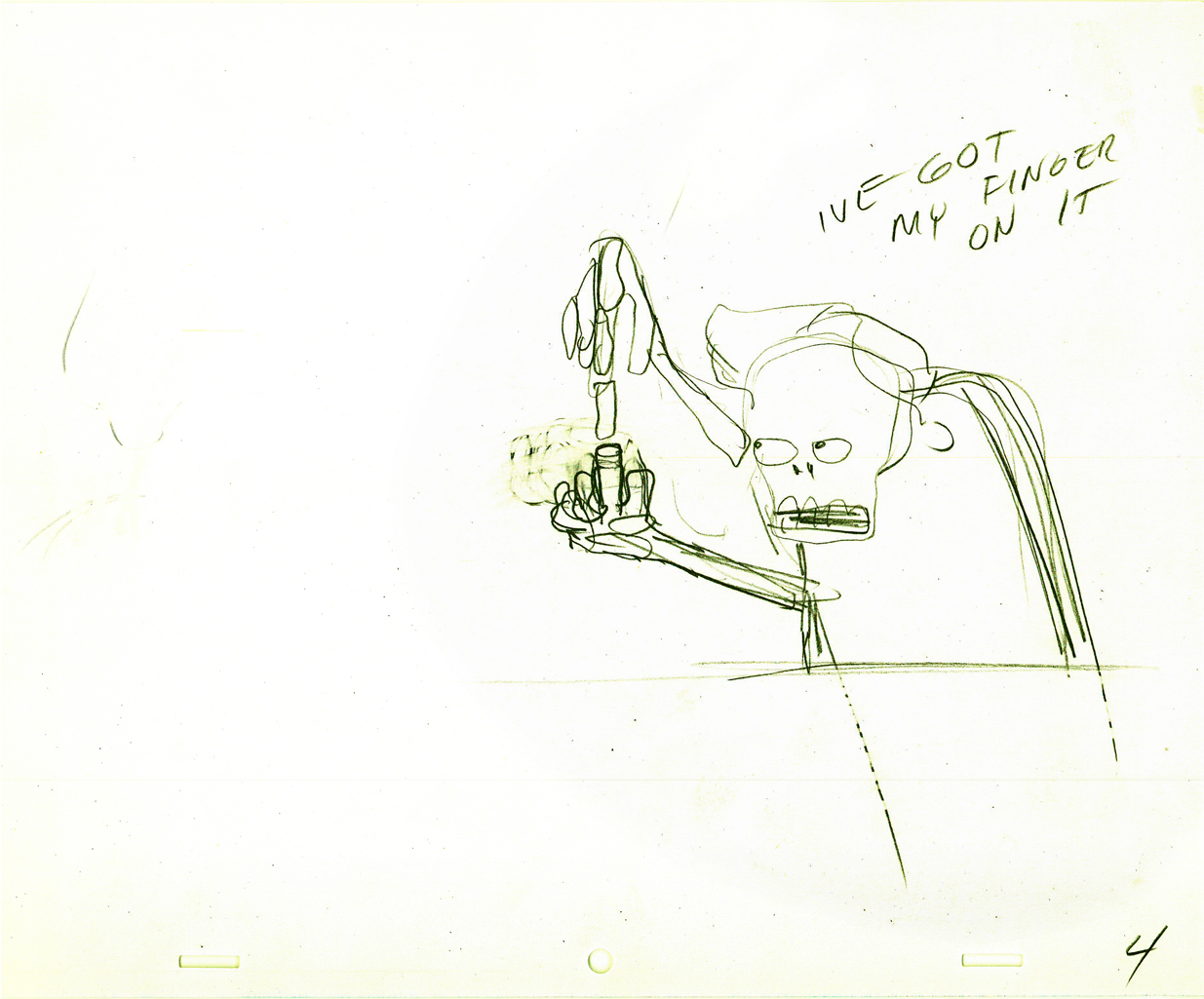
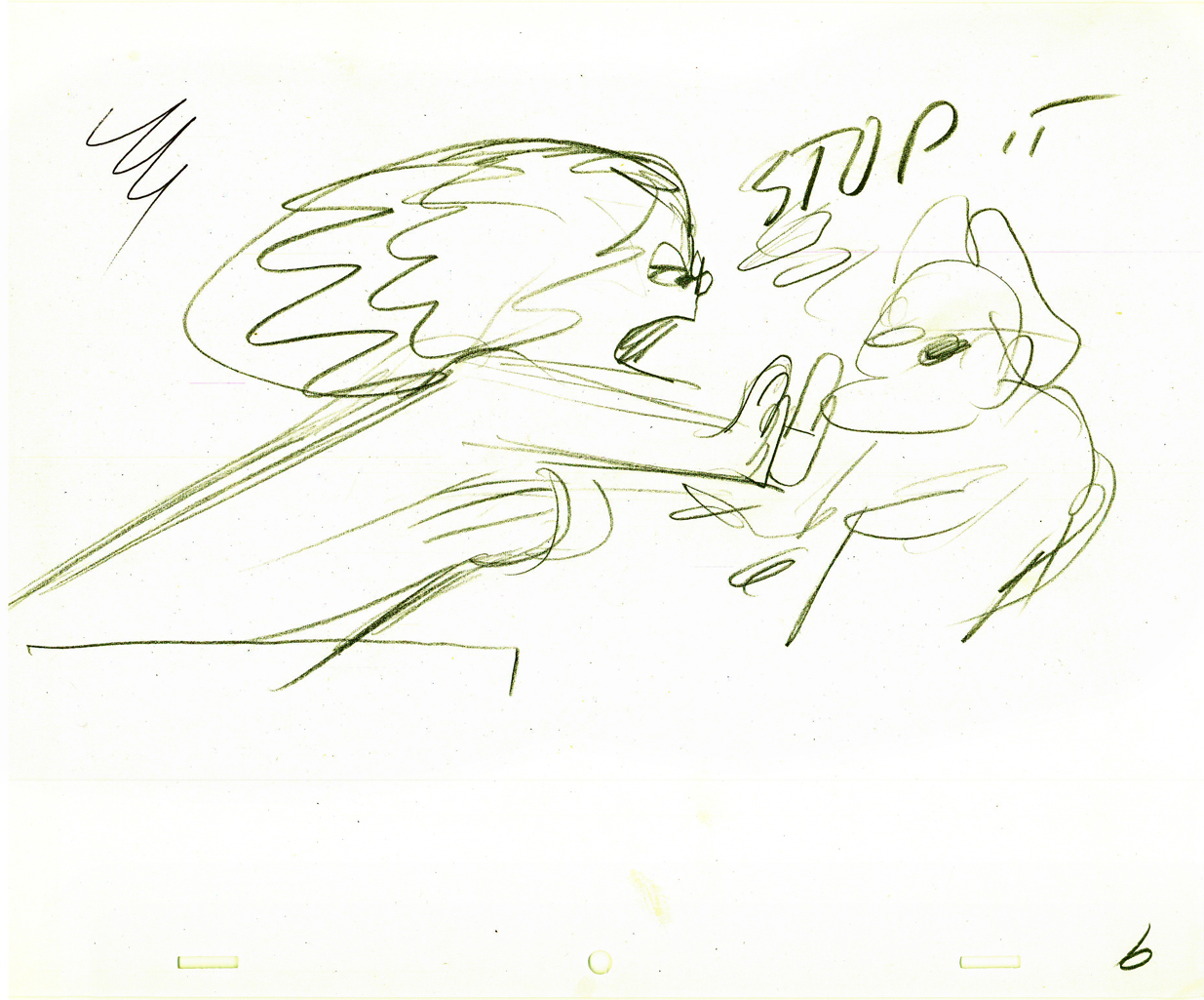
- I have a lot of artwork from the Hubley short, EGGS, which was wholly animated by Tissa David.
One of the two characters starring in the short is a skeleton, symbolic of death and destruction. The other is a nymph, who represents fertility. The show is basically about the complications overpopulation has presented to the world.
I thought it appropriate for today to post some of the drawings and models for the death character. The images displayed are cropped from the full animation sheets; when you click these displayed it’ll enlarge to the full page. Here they are.
The first model of the character came close to the final.
This is a drawing by John Hubley.
He soon solidified in this model by Hubley.
Tissa David finally worked out some of the problems for herself
and created this working model sheet.
Here’s a beautiful working drawing by Tissa as
she started to pose out the scenes.
Tissa’s roughs are deceptively simple but convey so much. These drawings
are for her eyes only, usually, she’ll clean it up somewhat for animation.
Unfortunately the dvd is a bit soft partially because of the nature of the
underlit final artwork. Perhaps someday there’ll be a better digital transfer.
Fertility is oozing sexuality in every drawing. This is part of the
same scene as she converses with death about the human race.


Eggs was a short film which was rushed out at a low budget for a PBS show called The Great American Dream Machine, which was produced by designer, Elinor Bunin.
The film follows the political thoughts of John and Faith; they were concerned about overpopulation (there are at least four shorts they made about the subject) and were able to blatantly make a political short for this TV series.
These three drawings are character Layouts by John Hubley.
This is a BG Layout John gave Tissa.
This drawing and all the remaining are Tissa David’s drawings.
She would block out her own rough Layout
before jumping in in to animate.
It gave her the chance to thoroughly think out what
little information John had given her. Usually just a
conversation with some very rough sketches.
This is Tissa’s Bg Layout for this scene.

Here’s a YouTube interview with John & Faith Hubley done in 1973. They discuss Eggs and Voyage to Next.
The video of EGGS starts at 4:50.
Photos 02 Oct 2011 06:55 am
Foodcart recap
Originally posted in Feb 2009, but given all the attention to mobile food vans on the Food Channels, I felt inclined to show off the NY contingent in this recap.
- Paddy Doyle’s novel, “The Van,” made me realize that we had a lot in common with our British and Irish friends. The travelling food sellers are a common dressing though the cuisine sold, I’m sure, is different.
 A major part of the look and feel of New York is in the food carts that are standing everywhere. In the past, my childhood, the carts were basically hot dog vendors. Then they added the salted pretzel, and things started to develop.
With the new immigrant class in the city, lots of new foods entered the picture, and in fact, I believe, they’ve taken over. Today it’s almost impossible to find a hot dog vendor. I’ve searched for one in the last week and was coming up empty-handed until I saw one late last night. A vendor was wheeling his cart home after what was, obviously, a long and tiring day. Unfortunately, I didn’t have my camera.
They still sell the hot dog and the pretzel, but you can add “Halal” foods to that menu. Shish-ke-bob, sausages, and so much more have been added.

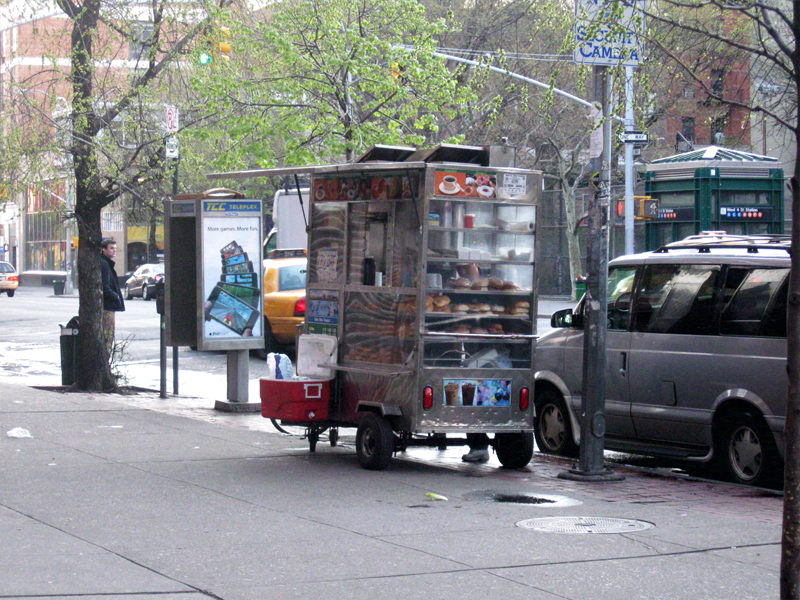
This is what carts look like today. They come in larger sizes and smaller
sizes. They sell everything from shish-ke-bob to hot dogs to pretzels.
Their prices are usually a good deal, if you trust the sanitation.

Many of these carts sell sandwiches, bagels and breakfast pastries in
the morning. Sandwiches in the afternoon. They usually are established
locations and the same people occupy a space for many years.


Here’s that very same cart as the vendor sets up in the morning –
I shot this at 6am. This same cart has been here for at least 12 years.

In the wee hours of the morning, carts are delivered to the requisite areas.
Oftentimes, if the cart is small, you’ll see the vendor pushing it himself.
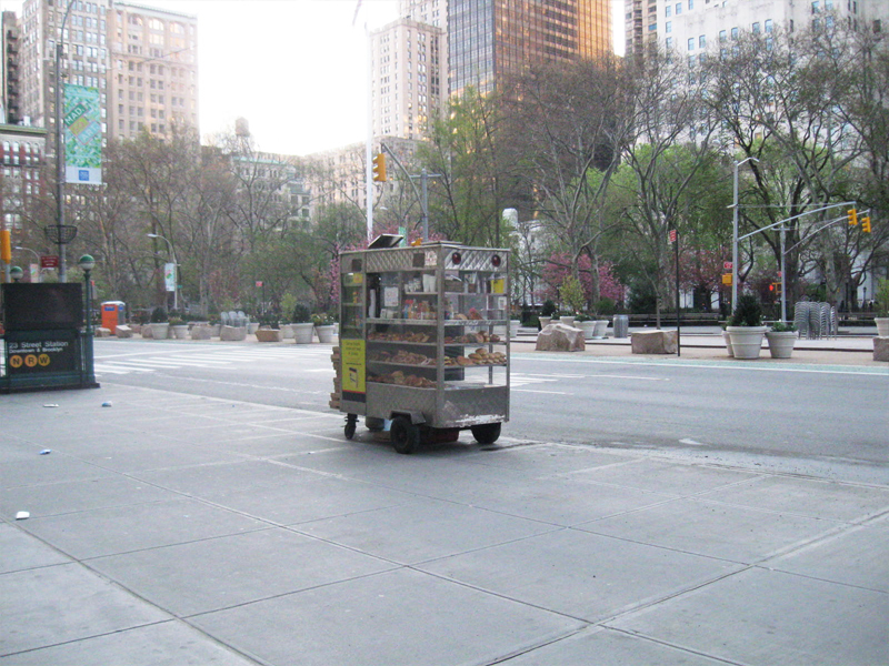
This one is setting up early morning across from
Madison Square Park on 23rd Street and Broadway.

Stocking the shelves with pastries, preparing coffee and icing juices.
Getting ready for the morning rush about to start.

Another similar cart, in the Village, all ready for the crowds. This one has an
overhang, to protect patrons from the rain, and a external cooler with drinks.


This guy is parked outside the IFC center downtown.
As you can see his menu is quite varied and ethnic.
Quite tempting.

You can also find fruit vendors around town. The prices of various fruits is about
half what the local supermarkets charge, and the quality is generally good.

Here’s a virtual travelling store. This truck is set up daily on 28th Street
off Madison Avenue to serve breakfast. They’ll cook the eggs for you.
Later in the day they move around the corner to Madison off 28th St. to serve dinner.
They’re open all night with lines of taxi drivers waiting to buy food from them.
I have to admit, I’m always tempted but haven’t tried it yet. After all,
can all those taxi drivers be wrong? The vendor must be doing
something right.

I also caught this truck downtown and wondered if they were
establishing a spot on Bleecker Street. But they never set up.
On the move.
