Monthly ArchiveJanuary 2012
Commentary &SpornFilms 21 Jan 2012 06:48 am
The Week in Revue
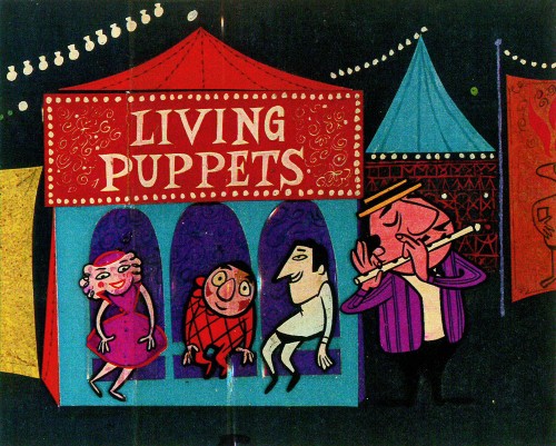
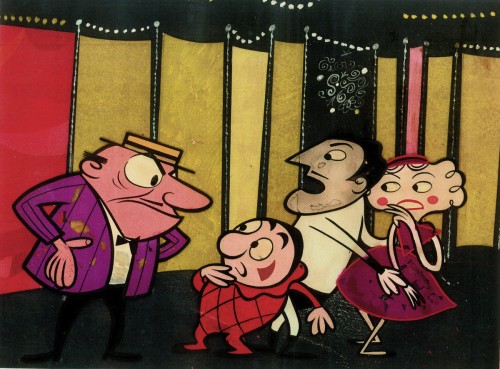
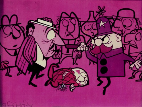
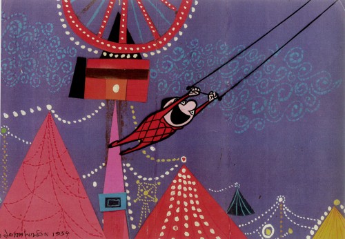
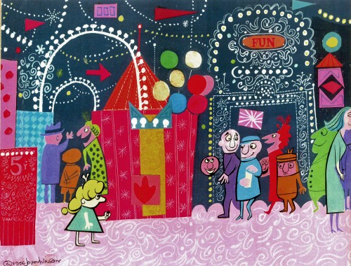
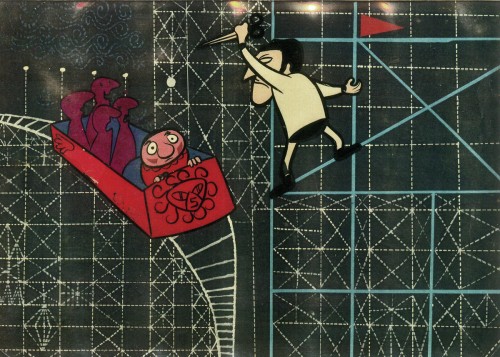
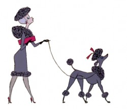
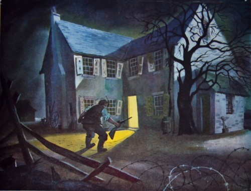 - I must say I was happy with a couple of the posts this past week. The John Wilson piece on Monday can only be bettered by this coming Monday’s piece on Irma La Douce. On Tuesday, the 1953 magazine article on Geoffrey Martin‘s designs for Animal Farm made for an excellent piece. Many thanks to Chris Rushworth for that. I also have wanted to combine all four of the walk cycles from 101 Dalmatians and have thought about it for over a year. I’m glad I finally got around to doing it. And, naturally, the fine posts from Bill Peckmann‘s collection rounded out the week. So, in all, I was pleased with what I got to post. Sorry to boast, just thinking aloud. It’s day to day here, so I’m often surprised with what shows up.
BAFTAs
The BAFTA nominations were revealed on Tuesday morning. The award for Best Animated Short includes the following three nominees:
Abuelas (Grandmothers) by Afarin Eghbal, Kasia Malipan & Francesca Gardiner is a mixed-media short.
Bobby Yeah by Robert Morgan is a stop motion animation film that looks like it came out of the hands of David Lynch.
A Morning Stroll by Grant Orchard & Sue Goffe is a film that’s been out there for a bit, seen at many film festivals and on the Oscar short list. (This is the film I like most.)
Congratulations to all the film makers.
The BAFTA nominees for Animated Feature include: TINTIN, ARTHUR CHRISTMAS and RANGO. Let’s hope for RANGO to win, but I expect the Brits to give it to ARTHUR CHRISTMAS. (Please, not TINTIN!)
NAACP Nomination
- Speaking of nominations, I learned on Thursday that I was nominated for an NAACP Image Award for Outstanding Children’s Program. My show, I CAN BE PRESIDENT, was nominated. This is big for me, and I’d love to win it.The show had such a low budget and was such a problematic schedule that it was a terror to get through production. I’m pleased it came out so well. Congratulations also to the guys that helped make it: Matt Clinton, Katrina Gregorius, and Christine O’Neill.
Outstanding Children’s Program
A.N.T. Farm – Disney Channel
Dora the Explorer – Nickelodeon
Go, Diego! Go! – Nickelodeon
I Can Be President: A Kid’s-Eye View – HBO
My Family Tree – Disney Channel
Mars Needs Moms
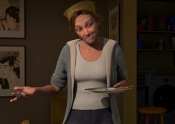 - The Oscar watch was down to the last (and I do mean the last) animated feature. MARS NEEDS MOMS was better than Hoodwinked and Chipwrecked, and I also think it was better than TINTIN – another MoCap film. Simon Wells directed MARS, and his work is reliably stable. (He directed PRINCE OF EGYPT, BALTO and WE”RE BACK.) He and Wendy Wells also wrote the script from Berkeley Breathed’s book. Like TINTIN, the film had a breakneck pace, but unlike TINTIN it didn’t ignore some of the basic rules of cinema. No annoying swooping spins around the characters, with an endlessly moving camera; it also didn’t feature lots of busy work (as if to prove it was animated)l nor did it have a breathless pace (as if to create Action! Adventure! and Tedium!). No, unlike TINTIN, MARS NEEDS MOMS was more craftily observant of the audience’s reaction. It knew when to stop the action, then go back to the danger. It knew when to add humor instead of just running, running, running.
However, like TINTIN the dead eyes were hard to get into, and the graphics were horrible to look at. Sure, it’s MoCap and tied to the live action, but does it have to have a faux-realistic look to it? Couldn’t it have been more cartoon? (Couldn’t TINTIN have been flattened to look like the comic strip, despite the MoCap?) The lead boy looked to have 5 o’clock shadow on his face in all the scenes on Earth.
The filmmakers want it to be called animation, but under the end credits they include footage of all the live actors doing key lines and being shot with all the tennis balls and helmets. Maybe it should have been live action with just the martians and sets done with MoCap. The film didn’t work, but it worked better than the Spielberg’s animation effort, TINTIN. Unfortunately, it won’t get an Oscar nomination or a Golden GLobe, like TINTIN. Neither film deserves one.
In voting for this award, I sat through:
PUSS IN BOOTS,
CARS 2,
RIO,
WINNIE THE POOH,
TINTIN,
HOODWINKED TWO,
HAPPY FEET 2,
RANGO,
ALVIN & THE CHIPMUNKS: CHIPWRECKED,
WRINKLES,
A CAT IN PARIS,
CHICO & RITA,
ARTHUR CHRISTMAS,
KUNG FU PANDA 2,
ALOIS NEBEL,
GNOMEO & JULIET and
MARS NEEDS MOMS.
The only one I couldn’t sit through to the end was HOODWINKED.
It was worth it to see CHICO & RITA, A CAT IN PARIS and even WRINKLES.
I also didn’t mind RANGO, KUNG FU PANDA and HAPPY FEET 2.
None of them compared to Sylvain Chomet’s THE ILLUSIONIST.
Gene & Zdenka
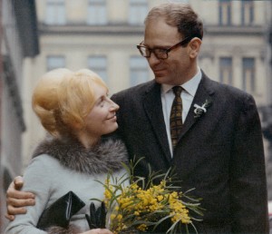 - Gene Deitch has added two pieces to his blog, his first arrival in Czechoslovakia being met by “Lulka” the emissary from the Czech studio. Then the second post details the meeting with Zdenka, who soon became the love of his life and his wife.
They’re both warm and wonderful reads.
The surprise and the gem of the Zdenka piece is a long video (scroll all the way down) which gives the history of their studio and their relationship. It’s quite a sweet film that’s well worth watching to see if only to see what changes the animated studio has undergone in the years that Mr. Deitch has been in charge. You also get to feel more at home with this great animation director and almost feel as though you know him by the end of it. It’s a really good piece that I don’t think you’ll regret viewing. (I was surprised at how quickly the one hour video downloaded.)
- John Dilworth reported this week that his last film, Bunny Bashing, is now available on YouTube. So I’ve embedded it, above.
And here’s an interesting use of animation in this video designed to
inform Liberals why they shouldn’t despair over the work by Obama –
which, in fact, is remarkably good despite the unyielding criticism
from the Left and the Right.
Found on Andrew Sullivan’s site, The Daily Beast.
Bill Peckmann &Comic Art 20 Jan 2012 07:19 am
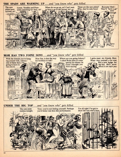
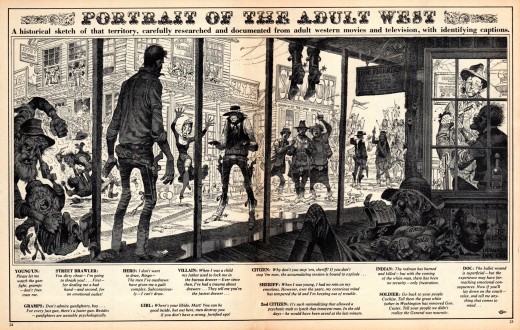
Kurtzman & Davis – Movies
- Bill Peckmann sends along more examples of Harvey Kurtzman and Jack Davis‘ movie spoofs. It’s all great artwork, of course. Here are Bill’s comments:
- Nothing could bring a smile faster to your face than when Harvey Kurtzman took out his sharp writing and layout pencil and starting bursting Hollywood’s bubbles with it. Add to that Jack Davis‘ powerhouse perfect pen and brush work to finish off the job, and there my friend, you had in your hands one of the best duos in comic books doing their funniest stuff! Then and now!
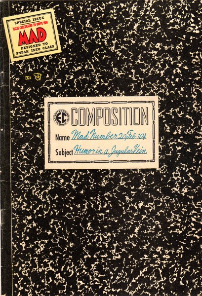
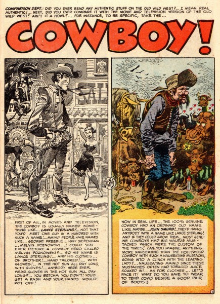
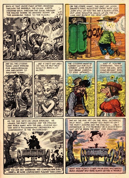
- Since most cartoonists seem to be movie buffs, the following pages must have been a labor of love. The first story “Cowboy!”, is from MAD comic book #20, Feb. 1955. The unique coloring sets up the story beautifully, Harvey in full creative mode!
 1
1Here’s the cover of MAD #20.
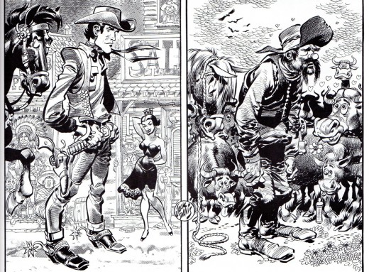
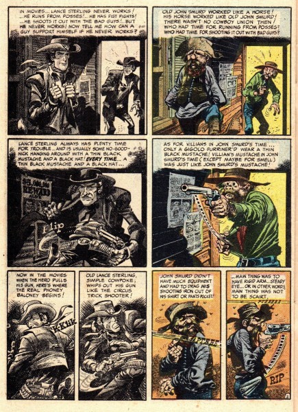
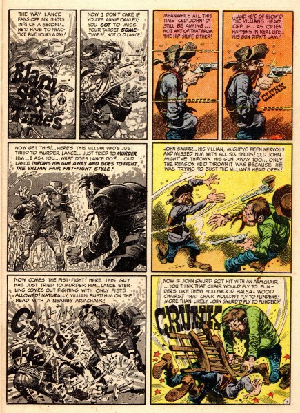
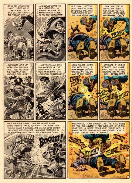
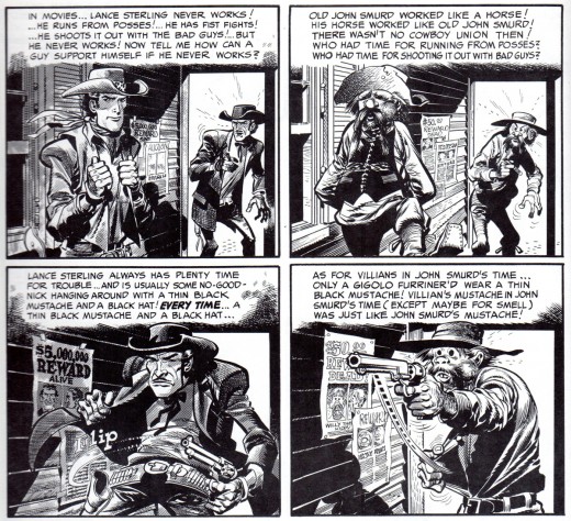
Here are a few panels from “Cowboy!” in Jack’s
original black and white, to show every lovely line.
 9
9
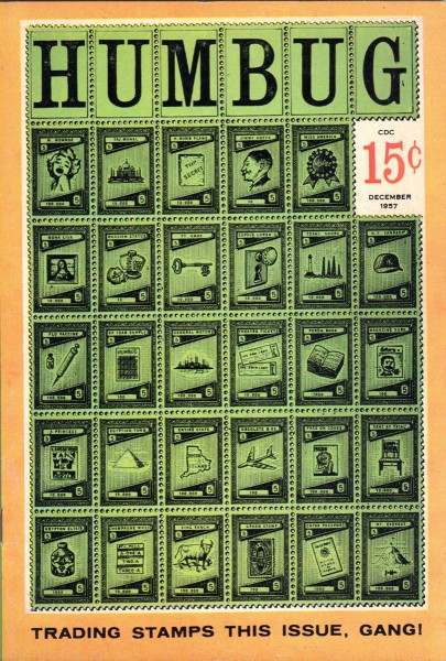
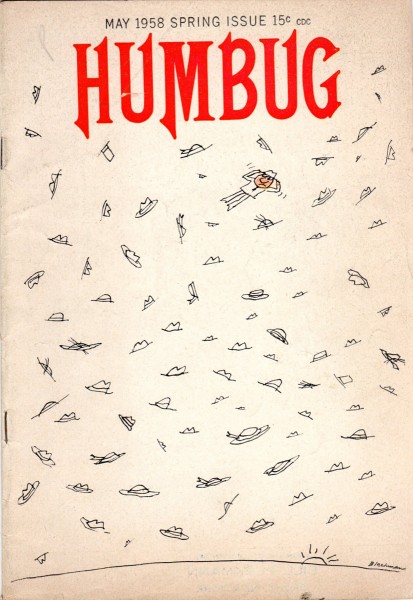
HUMBUG #5 cover
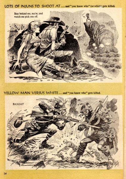
Two years later, 1957, in HUMBUG magazine #5,
Kurtzman and Davis continue their wonderful riffs on Hollywood movies.
 11
11
Here’s the cover by Bob Blechman.
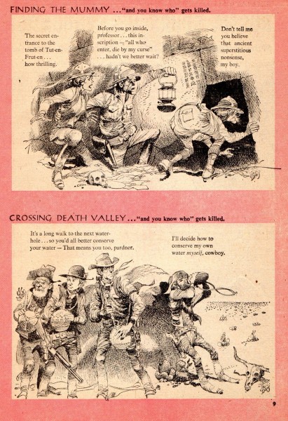
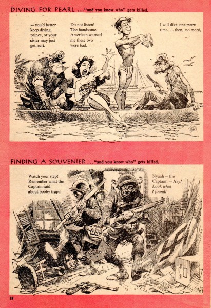
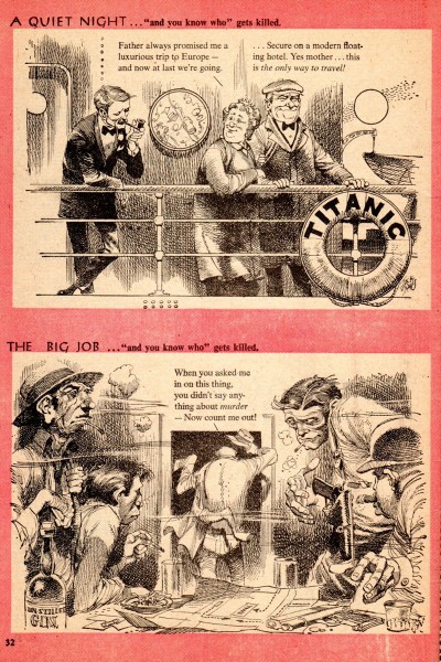
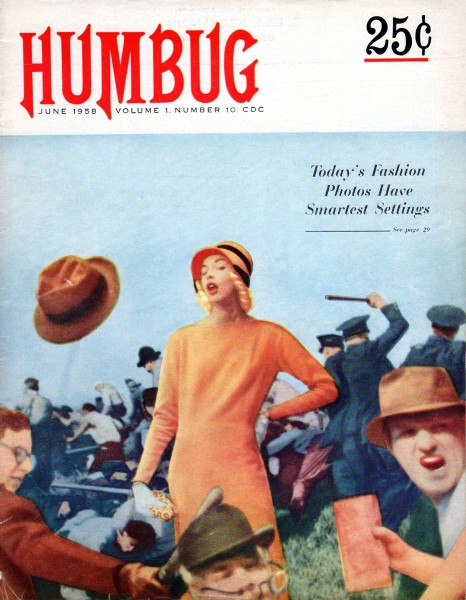
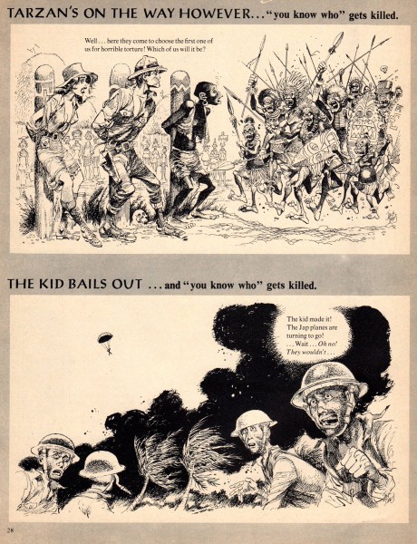
The next three pages are from HUMBUG #9, 1958.
 17
17
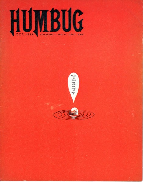
The cover of HUMBUG #11, the last issue.
 20
20
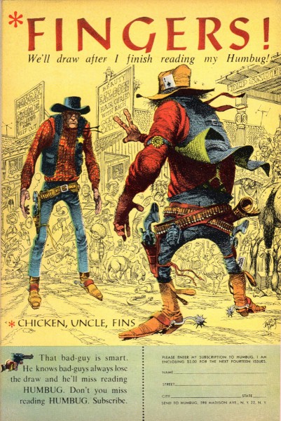
A small back cover bonus, Jack’s cowboys with a HUMBUG subscription offer.
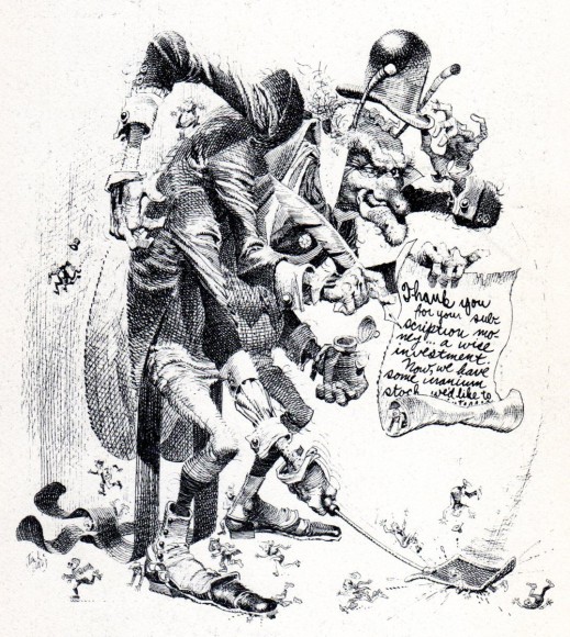
And Jack’s thank you note for getting a HUMBUG subscription.
There’s a nice and long audio interview with Jack Davis by Drew Friedman on The Comics Journal site.
Bill Peckmann &Books &commercial animation &Illustration &SpornFilms 19 Jan 2012 06:11 am
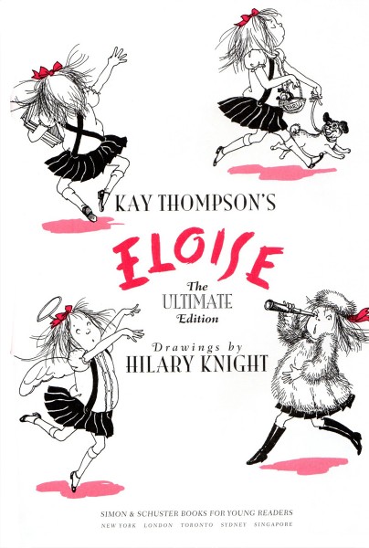
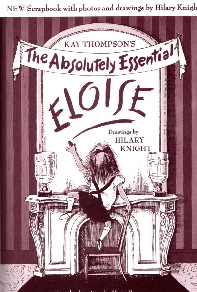
Hilary Knight
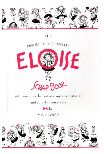
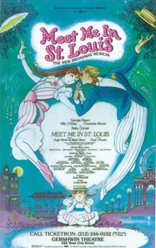 - Bill Peckmann sent me a number of scans on Hilary Knight, the noted illustrator who had gained fame in illustrating the Eloise books authored by Kay Thompson. On receiving them I suddenly remembered that I had animated a commercial done in the style of Mr. Knight’s poster for the Broadway show, Meet Me In St. Louis.
I had completely forgotten about that job which we did back in 1989. We’d been employed by a South African art director of the Broadway show to do an Overture and an Entr’acte for the musical play. The Overture would play to a Currier & Ives type animation we produced, then the scrim would lift revealing the town. For the Entr’acte, we would end with a group of people ice skating on a pond. It would be lit from behind, and our drawing would turn to live action as the actors skated on a simulated pond on stage.
With the job came a 30 sec. spot animating the poster that Hilary Knight had illustrated. I can remember just about nothing about the spot. The entire job, spot, musical and the entire experience was a horrible one. The client was nasty and moody and continually changed his mind about what he wanted. He thought of himself as an auteur and kept pulling ideas out of his hat while we tried to fight the low budget and tight deadline.
The one positive memory was going to see the rough film projected on the Broadway stage. While waiting for them to find the projectionist, I noticed one older man sitting across from me in the theater. I walked over to him and asked if he was Hugh Martin. He was, and I told him how glad I was to meet him. We spoke for another couple of minutes until the theater went dark and projection started. Martin was the composer of the show; he’d written all those great, original songs for Judy Garland and the others in the movie. I was pleased to have recognized him and met him.
Unfortunately, I didn’t get to meet Hilary Knight, but I did have some of his original artwork in hand. He drew some models for us. They’re somewhere in our storage, and a quick search wasn’t able to turn up anything. Time is moving on, and I wish I had put more emphasis on preserving some of my art materials back when.
The parting note on that job was that they spelled my name incorrectly in the Playbill. How appropriate. They promised to correct it in future copies, but I didn’t even bother to see if they’d done the correction.
Here’s the material Bill Peckmann had sent me, starting with a comment from Bill:
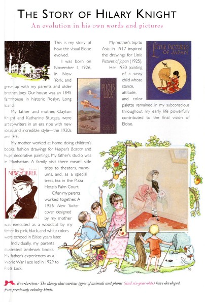
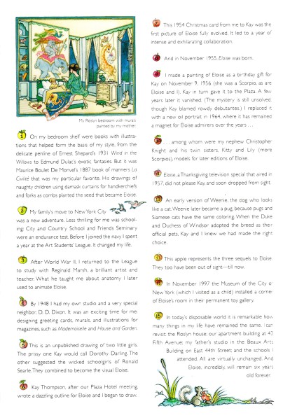
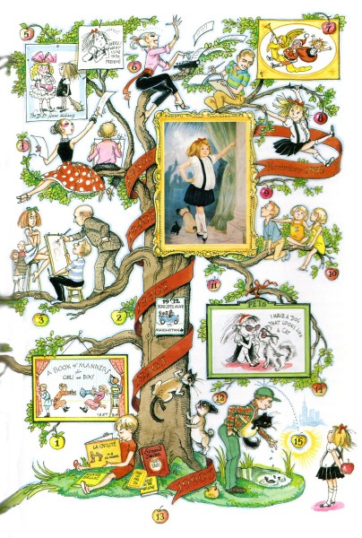
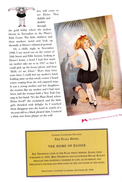
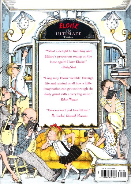
- In 1999 a collection of four of Hilary Knight’s “Eloise” books was published. Aside from it having all those great books between two covers was the fact that it also had Hilary’s eight page autobiography in it! And here it is.
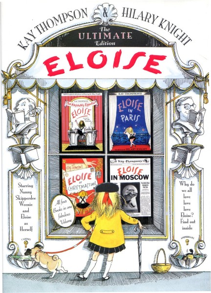 1
1The book cover
Animation &Disney &repeated posts &walk cycle 18 Jan 2012 05:23 am
101 Dalmatians Walk Cycles
.
 - When I was young, as I’ve pointed out many times, there were few books available about animation and as few illustrations and photos which ellicited the art of animation. Hence, it was always a treat when a Disney feature was released. The adjoining publicity would provide a trove of material, some worth saving. An encyclopedia my parents bought at about the time of release of 101 Dalmatians included several key images of Pongo running. One of those photos of many cels overlayed to detail the cycle. I loved that picture and frequently looked at that encyclopedia under “Cartoons, Animated” to study the photo of the cels.
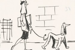
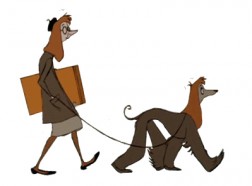
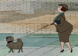
At the very beginning of 101 Dalmatians, Pongo looks out onto the street to search for a good mate for both himself and Roger, his owner. At this point we’re treated to a number of walk cycles that I think are brilliant. A number of women are perfectly matched to the dogs that they walk.
Now with DVDs available to us, we can see that the characters originated in the storyboard drawings, and we can study these walk cycles. I’m determined to take these animated bits apart to watch them a bit closer.
The first of these is the “girl art student” as described in the drafts (which can be found on Hans Perks’ excellent site A Film LA.) Oddly, from my very first viewing of this film back in 1961, I identified her as a “beatnik,” which was the fashionable joke back then. Now I find out she was an “art student.” I guess that makes sense.
Here’s the pan BG that this scene employs.
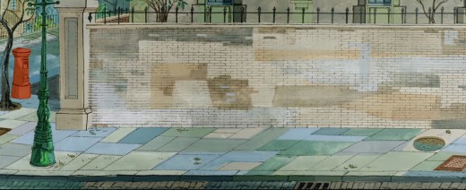
(Click any image to enlarge.)
And here is the walk cycle animated by Frank Thomas and Blaine Gibson.
Gibson handled the following scene which pans across the bodies of the pair as they walk.
Animation note: The two separate feet are divided by a short space. The left foot is on one plane, and the right foot is on another. This is a BASIC precept for animators to follow, and it’s something that is not appearing in a lot of the recent walk cycles I’ve been seeing. It’s annoying.
Here’s scene 21 “French girl walks French poodle” animated by Blaine Gibson. It employs the same BG as scene 14, the art student (posted Apr 3), but it extends, beyond what we’ve seen before, to include a telephone booth.

______________(Click any image to enlarge.)
This is a slightly faster walk than others, and I’ve been able to grab all of the drawings. It’s animated on “ones.”
This walk is an absolute gem !
Once again, check out Hans Perk‘s excellent site A Film LA to get the drafts for this film to be able to identify who was behind what. Then go to see Mark Mayerson‘s arduously constructed and informative mosaics as well as his detailed commentary about the film and its animators.
Check out Floyd Norman‘s story about Blaine Gibson on Jim Hill Media.
Here’s the young child with her puppy. She not only walks, but she licks her lollipop. The pup is just an absolute innocent. It’s another great walk by Blaine Gibson.
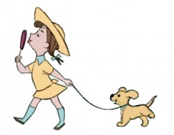 1
1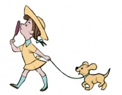 2
2
_______(Click any image to enlarge.)
The piece, in the film, includes a zoom into the cycle. I’ve tried to adjust for it but don’t think I was wholly successful. There’s a marginal enlargement of the drawings as it goes on – noticeable only in motion. It’s actually interesting in the walk.
Here’s Blaine Gibson’s animation for what is labelled in the drafts “Buxom Girl and Bulldog”. I left the backgrounds in this one for you to get an idea of the BG movement.
Articles on Animation &Independent Animation &Layout & Design 17 Jan 2012 07:00 am
Designing Animal Farm
Chris Rushworth, whose site AnimalFarmWorld, is dedicated to the collection of material about and from the Halas & Batchelor feature animated film, Animal Farm, has sent me an article he’s found and which I thought extraordinarily interesting. It’s from a UK publication called “Art & Industry” dated September 1953.
Since there were difficulties with the scans, I had to retype the article so it could be legible and I played with the images in photoshop trying to bring some clarity to the sketches. I think they work well enough for this posting.
Geoffrey Martin, a senior member of the design team of the
Halas & Batchelor Cartoon Studios, describes his work on the production
of George Orwell’s ANIMAL FARM as a full-length feature cartoon film.
The painter and the film and stage designer work with similar motives but from varying standpoints. One one hand, the painter needs only to justify himself, while on the other, the work of the designer must fit within the framework of another man’s concept. The painter is more or less free to stand apart, and need not e called upon to explain his motives or analyze his emotions. The designer, to achieve his ends is dependent on others, and must therefore rationalize and be able to explain every nuance of his work in order to amplify the trends and emotions in a story and convey them to an audience.
The principles of designing a cartoon film are little different from those involved in a live-action film, With the obvious difference of the medium and its flat dimension, the other elements involved derive purely from the mechanics of animation. Both films set out to tell a story, to corner an idea, and to induce a reaction from the audience.
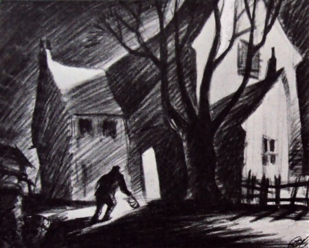
One of Geoffrey Martin’s rough atmosphere sketches
embodying his conception of the farm in relation to the story
in which the animals revolt and dispossess the farmer. The
mood of Orwell’s political satire is excellently captured in this scene.
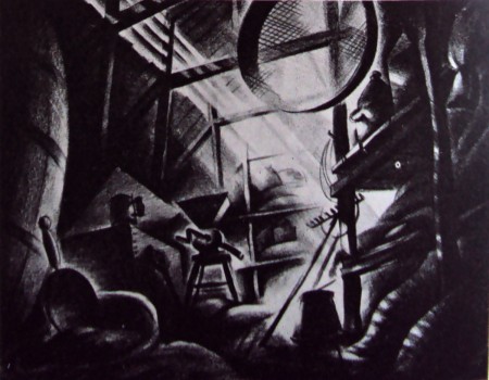
This sketch shows a corner in the farm’s food store
and was created to suggest possible props.
The cartoon designer is, if anything, more directly concerned with, and responsible for, the graphic impression on the screen than the art director in a live-action studio. To him falls the choice of angle of every sot and the responsibility of ensuring that the angle cuts smoothly to another, while constantly preserving the audience’s sense of time and place.
Once having designed and built his settings, the art director on the live-action film is largely in the hands of the director and his lighting cameraman; on these people depends how much of his original attempt is retained in the finished film. It is in this respect that the cartoon set designer is more fortunate; he has much more control over his medium, and is able to assess the result of his work more immediately by seeing the designs in actual use soon after leaving his drawing-board.

Above: The final interpretation of the scene shown opposite
painted by Matvyn Wright, principal background artist on the
production. Colour heightens the dramatic impact of the scene.
Until comparatively recent years, cartoon films were more or less and American monoply, but just ten years ago John Halas and his wife, Joy Batchelor, set up in London what is to-day the largest cartoon production group in Europe. Wisely, perhaps, they never attempted to emulate the exuberant style of M.G.M.’s ‘Tom and Jerry’ and others who work in similar vein, and as far as the feature field was concerned, Walt Disney, with his lavish and technically superb productions, reigned supreme. Instead, the concentrated on an entertaining series of educational and sponsored subjects with a definite adult flavour.
In late 1951, American producer Louis de Rochemont (‘The House on 92nd Street,’ ‘Boomerang,’ and ‘The March of Time’ series) asked the Halas and Batchelor studios to prepare an animated version of George Orwell’s sharp-edged political satire, Animal Farm. De Rochemont felt the studios to possess a style markedly different from their American counterparts – a style eminently suited, moreover, to what was, to all intents and purposes, a paradox, a ‘serious’ cartoon.

Above: Winter landscape. The half completed windmill
and the farmhouse are shown in this sketch suggesting
the starkness and economy of the settings.
When the studios first embarked on the subject, I was, as a designer, faced with many new problems. For although I possessed considerable experience of short films, Animal Farm was the first feature cartoon to be produced in this country and in length alone, was something completely new to me.
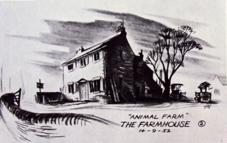
A first attempt to specify the
general style of the farmhouse.
After discussing the story with John Halas and Joy Batchelor, I made a considerable number of atmosphere sketches and rough plans. In these, I attempted to embody our many ideas regarding the conception of the farm in relation to the story.
On reading the book, I had been impressed by the windswept starkness of the farm-qualities contrasting strongly with the warm normality of the local Inn and the village, representing the outside world. We decided that the coulour would eventually go a long way towards emphasizing the contrast between those two main locations.
Since much of the designer’s work is dependent on other departments, I feel that at this point it would be well to describe the production processes of a cartoon studio. Firstly, a word here about animation, itself. In the layman’s view the animator merely ‘makes the characters move’. He does more than that, in effect, he is the very ‘life’ of the film. To make a character move does one thing, but to invest him with the spark of life and a distinct personality is a major achievement, and an element nowadays too often taken for granted.
Audiences have become accustomed to such miracles. Without character there can be no story; the characters within a play are the play. A cartoon film needs a gifted team of animators to bring life and conviction to the characters, and on their work it stands or falls.
To return to actual production, however, the story is broken down into convenient sequences to facilitate handling. In Animal Farm, we have 18 sequences, varying between three and four minutes of screen time each; this represents some 6,400 feet of film in all.
The animation director, who is to the cartoon what the choreographer is to the dance, must then time the action of each scene with stopwatch and metronome. The entire action is planned against a musical score, and to various tempi: so many bars per minute and hence per foot of film.
It is here that the designer enters the picture again. He must work to present the action the director has visualized in the most direct way possible. His department must produce the layout of each scene and the finished drawings of the settings – including sketches of the characters and their size in relation to their settings and notations as to camera movements within the scene.
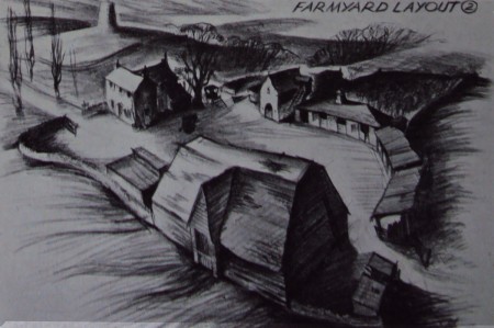
A panoramic view of the farm – used to establish
the relationship of the outbuildings to the farmhouse.
Sets of the drawings are then passed to the animation team responsible for the sequence. On completion of the work, a test shot is made of their rough drawings.
This test is checked and corrected to refine and smooth out the action. I no drastic alterations are required, the layout drawings are passed to the background department who render them in colour. The animation is traced on to sheets of celluloid and coloured with opaque paint, and the characters on the ‘cells’ are finally united with their appropriate backgrounds under the Technicolor camera.
In planning the finished layout of each scene and staging each individual piece of action, we sometimes found that perhaps the story-line demanded a change in the location of a basic set. Having solved such a problem quite happily, we might then have to rearrange our set as it was originally a demand imposed, perhaps by a later sequence.
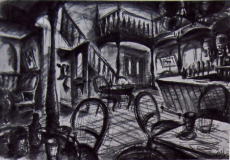
Tentative design for the interior of the village inn.
There is, in fact, a period in every cartoon film when the settings are in a continual state of change and compromise. The designer must bear in mind all the miscellaneous action which takes place in any given location throughout the film and work with this in mind.
The live-action film director is at an advantage in that once his sets are built, the are constant. He can modifu his ideas about camera angles as he goes along. But for us, any slight change of angle withina setting means a new drawing and it is quite possible to accumulate ten or fifteen layouts featuring the same doorway from various angles -made simply in order to stage differing pieces of action.
Such a process involves problems of continuity, for in each drawing ever stone and subtlety of texture must be identical from each angle. Inevitably, it becomes necessary to simplify in order to reduce the amount of work in reproducing every detail; pet ideas are swept away, and like any artist, one is sometimes reluctant to change what one feels to be an eminently satisfactory piece of design. But hard as this may be, there s the final satisfaction of knowing that one’s sets are completely workable.
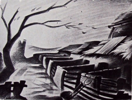
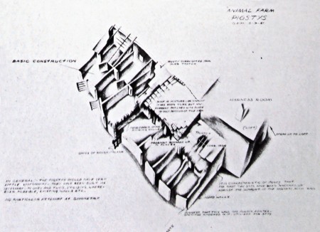
Another atmosphere sketch depicting
the general appearance of the pigstys.
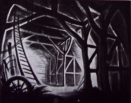
Interior of the great barn, the mise-en-scène
for the planning of the revolution.
Adaptability is, I feel, the first requisite of any setting, whether for stage, film or cartoon. Admittedly, it must carry the fight amount of atmospheric quality, but this must never hamper or dominate the actors – it is essentially a mounting, yet strong enough to be felt by the audience.
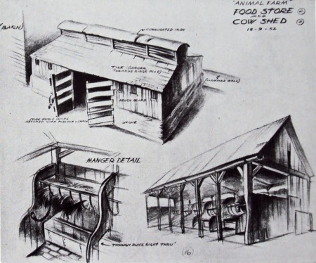
Designs establishing the appearance of farm outbuildings
and a detail of one of the mangers.
One of the main problems of designing for Animal Farm has been that the action takes place over a period of years. We have been faced with the problem of reproducing the same settings time and time again – sometimes in bright sunshine, and sometimes, in the depth of winter. It is here that the designer depends very greatly on the background department, and in Matvyn Wright, the principal background artist ont he production, we have been very fortunate. He has a reat feeling for mood and overal texture – qualities with which each of his paintings is invested. It is ovious, of course, that the background painters can make or mar the designer’s work; the effects striven for can be over-stated or lost completely. As an artist he is in the unenviable position of having to work on second-hand ideas. The initial conception is not his, only the interpretation. So often our first rough sketches have a life and excitement that is hard to reproduce.
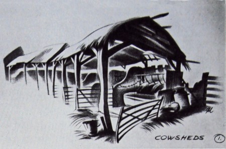
Sketch finalising the type of structure used for housing the cows.
The reader may now begin to understand that the cartoon studio is a closely integrated unit. It is, in fact, an essentially co-operative art. Although each and every person working on the production is an artist in his own right, we are all, to greater or lesser extent, interpreters, each of us contributing towards the achievement of a common idea.
The designer is dependent on a basic idea, and depends yet again on others to finalize his own individual contributions. The designer depends on the background artist; the animator depends on his assistants to refine his rough drawings, and the people who trace and colour his work. No one thing appearing on the screen can truly be claimed as any artist’s sole property, since we all of us have had a hand in it to a greater or lesser degree. The original conception came from George Orwell’s story – we have interpreted his ideas to the best of our several abilities. The final assessment of the studio’s work rests, as always, with the public.
.
Thanks, again, to Chris Rushworth for passing this article on.
I wasn’t even aware of its existence, but find it quite valuable.
.
Animation &Animation Artifacts &Independent Animation 16 Jan 2012 06:17 am
John Wilson/Fine Art Films – part 2
- After completing the film, Tara the Stone Cutter in 1955, John Wilson and his newly formed company,Fine Arts Films, was able to sell the idea of an animated version of Stravinsky’s Petroushka to NBC. They aired the 16 min. film in 1956 as part of The Sol Hurok Music Hour. Stravinsky, himself, arranged and conducted the shortened version of the score using the LA Philharmonic Orchestra.
The film was designed by John Wilson and Dean Spille; animation was done by Bill Littlejohn, Art Davis, and Phil Monroe. Chris Jenkyns, Dean Spille and Ed DeMattia designed the show from Wilson’s storyboard. This is considered the first animated Special ever to air on TV.
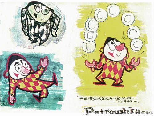
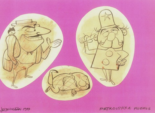
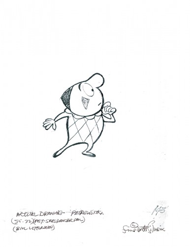
Here are some stills from that film and its artwork.
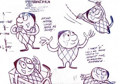 1
1Petroushka – model 1
 11
11
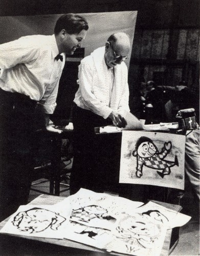
John Wilson and Igor Stravinsky preparing for recording of Petroushka
with the Los Angeles Philharmonic Orchestra (1955).
Here are copies of two reviews:
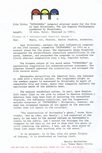
Los Angeles Time review (1956)
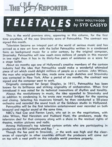
Hollywood Reporter review )1956)
(Click any image to enlarge.)
Petroushka was released on VHS tape combined with a number of the song pieces he did for the Sonny and Cher program. This tape, John Wilson’s Fantastic All Electric Music Movie, can still be found on Amazon but is pricey.
Thanks to Amid Amidi for the material.
Independent Animation &John Canemaker &repeated posts &Richard Williams &SpornFilms &Theater 15 Jan 2012 06:02 am
Photo recap – Woman of the Year
Recently, I found myself talking about my work on this show. It made me go back in search of this post from January 2007, and I thought I’d recap today. Hope you don’t mind.
Woman of the Year was a project that came to me in the second year of my studio’s life – 1981. Tony Walton, the enormously talented and fine designer, had gone to Richard Williams in search of a potential animator for WOTY (as we got to call the name of the show.) Dick recommended me. But before doing WOTY, there were some title segments needed for Prince of the City, a Sidney Lumet film. (I’ll discuss that film work some other day.)
Tony Walton designed the character, Katz, which would be the alter-ego of the show’s cartoonist hero, played by Harry Guardino. Through Katz, we’d learn about the problems of a relationship with a media star, played by Lauren Bacall.
.
It turned out to be a very intense production. Three minutes of animation turned into twelve as each segment was more successful than the last. There was no time for pencil tests. I had to run to Boston, where the show was in try-outs, to project different segments weekly; 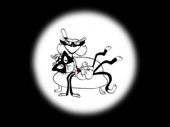 these went into the show that night – usually Wednesdays. I’d rush to the lab to get the dailies, speed to the editor, Sy Fried, to synch them up to a click track that was pre-recorded, then race to the airport to fly to the show for my first screening. Any animation blips would have to be corrected on Thursdays.
There was a small crew working out of a tiny east 32nd Street apartment. This was Dick Williams’
apartment in NY. He was rarely here, _______(All images enlarge by clicking.)
and when he did stay in NY, he didn’t
stay at the apartment. He asked me to use it as my studio and to make sure the rent was paid on time and the mail was collected. Since we had to work crazy hours, it was a surprise one Saturday morning to find that I’d awakened elderly Jazz great, Max Kaminsky, who Dick had also loaned the apartment. Embarrassed, I ultimately moved to a larger studio – my own – shortly thereafter.
Here are a couple of photos of some of us working:
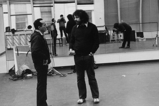
Tony Charmoli was the show’s choreographer. He worked with me in plotting out the big dance number – a duet between Harry Guardino and our cartoon character. I think this is the only time on Broadway that a cartoon character spoke and sang with a live actor on stage. John Canemaker is taking this photograph and Phillip Schopper is setting up the 16mm camera.
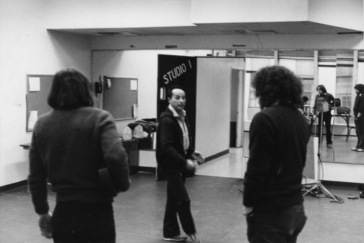
Here Tony Charmoli shows us how to do a dance step. Phillip Schopper, who is filming Tony, figures out how to set up his camera. We used Tony’s dancing as reference, but our animation moves were too broad for anyone to have thought they might have been rotoscoped.
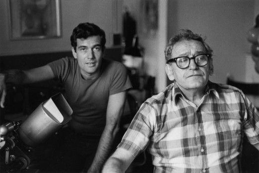
John Canemaker is working with Sy Fried, our editor. John did principal animation with me on the big number. Here they’re working with the click track and the live footage of Tony Charmoli to plot out the moves.
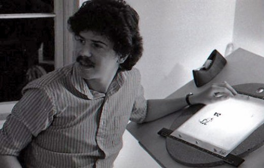
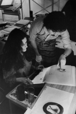
Steve Parton supervised the ink and paint. To get the sharpest lines, we inked on cels and didn’t color the drawings. It was B&W with a bright red bowtie. A spotlight matte over the character, bottom-lit on camera by Gary Becker.
 5
5 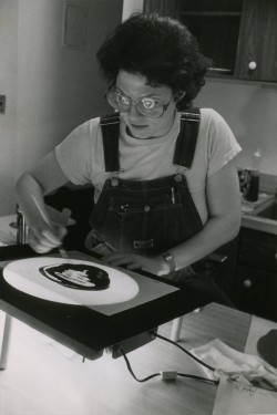 6
6
5. Steve Parton works with painter Barbara Samuels
6. Joey Epstein paints with fire in her eyes.
 8
8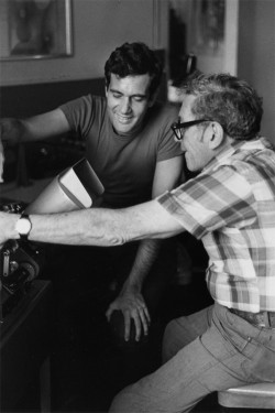 9
9
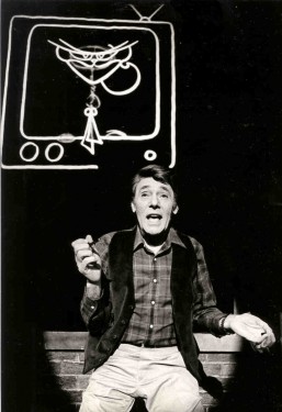
8. Harry Guardino on stage with the creation of “Tessie Kat” developing on screen behind him. This was Harry’s first big solo.
9. John Canemaker gets to see some of his animation with Sy Fried, editor.
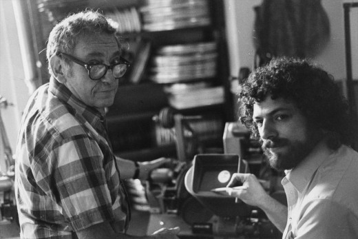
One of my quick stops from the lab on the way to Boston? No, I think this is a posed photo.
Commentary 14 Jan 2012 07:43 am
Scene this past week
- The movies are running down, and things are getting quieter for Oscar voters. Our ballots are due next Monday. These are for only the one category – Best Picture. We choose our favorites in order of choice. Then there’ll be a complicated calculation of the votes to come up with the 5 to 10 top pictures. There were only three films to see this past week – all animated.
Tuesday
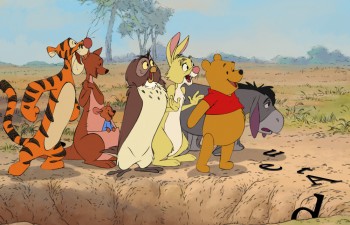 Winnie the Pooh – I went into this film fully anticipating something excellent. The reviews I’d scanned were positive, and some of my favorite animators were back doing a 2D film for Walt Disney Studios.
I’m confident Walt would not have been happy. I’m also sure that the Nine Old Men would have gone into retirement rather than work on this film. Don’t get me wrong, the graphics are as brilliant as you might expect. The animation is never less than fine and often brilliant. The backgrounds are at least as good as any of the Winnie the Pooh series done by Disney. The voices are surprisingly adept at recapturing and reworking the sounds of the past films.
It’s the story that’s god awful. The writers talk down to the two year olds in the audience and make all of the characters seem challenged, to say the least. They don’t come off as children but all sound and act simple minded and totally unbelievable. (I wonder in retrospect if ANY words are spelled correctly in this film.) The movie was certainly a challenge to sit through at the very long and tedious one hour, eight minute length.
It really got me angry. Is Disney so incapable of writing a workable script for animation? It would seem so. And given the horrible story of Cars 2, John Lasseter has his name and approval on two of the worst written films of the year. It’s a shame. I know these comments will make some of my friends in animation angry, but you have to recognize how poor the material is in this film. A relatively low budget and tight schedule for studio animation is no excuse. It would have been better to have a good script and still pictures. Go back and look again at the wonderful first Winnie the Pooh from Disney. Then look at the Russian Winnie the Pooh by Fyodor Khitruk . Look at any of Norstein’s brilliant stories such as Hedgehog in the Fog. (I could easily name a hundred better films for this age group.)
To say the least, I was disappointed.
The second animated feature that night was scheduled to be The Smurfs, but it was disqualified by the Academy for not having enough animation in it.
Thursday
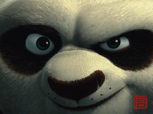 Kung Fu Panda 2 – This, obviously, is a reworking/sequel to the original film, Kung Fu Panda (1) and an outgrowth of that film which is also, now, a Nickelodeon tv series. Lotsa money here, and the film did well. The primary point of publicity I’ve read for this film is that the director, Jennifer Yuh Nelson, is now the director who’s garnered the highest gross box office of any female. A dubious accomplishment from my vantage point, but it is something to tout, I suppose. The thing is she did a great job as director of the film.
It’s not quite as special as the first film, but it’s sure darned entertaining, and there’s quite a few nicely animated scenes. It’s obvious that they’ve gone to great length to add a lot to the Angelina Jolie character so that they could maximize the voice. (No doubt there was rewriting to do once she took a look at the script.) Dustin Hoffman’s character takes a beating, getting quite a bit less of a part. The film gets a bit too Kung Fu for my taste with more than a few wildly active sequences that you have to tread through, but overall it’s miles above Puss In Boots.
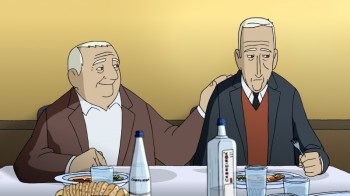 Wrinkles – This is a Spanish animated feature adapted from Paco Roca’s graphic novel. Stylistically, to me, it was very ordinary. Nothing to write home about, and the animation was TV lite – very limited in an H&B way. I can’t remember one good walk cycle in the entire film.
However, the writing was extraordinary. Despite the limited graphics, you really fall for the two lead guys in this show so that you really care about them. The Spanish voice overs were very effective and all of the characters were believably acted. This film should be seen if you get the chance. It’s an intelligent and adult film.
As a matter of fact, this is the opposite of Winnie the Pooh. It has a great script with poor animation whereas WTP has very bad script with nice animation. I prefer Wrinkles and wonder if I can ever make it through Pooh again.
- Only one film left to see, on Tuesday, Mars Needs Moms. Looking forward to it. I do generally like Simon Wells‘ work; he was an “additional story artist” on Kung Fu Panda 2.
- Last week, you’ll remember, I wrote about going to the memorial party for Vince Cafarelli, who passed away in December. Candy Kugel and others at Buzzco teamed to make a video of the event as well as photos taken at the party. It raced through Facebook this week, but I thought I’d post it here for anyone who’s missed it. (I rarely go to Facebook, so I seem to be missing out on a lot of things and assume there must be others like me.) To see the stills alone, they’re also on Facebook with IDs.
I have to say, I’m a bit disappointed with the lack of commentary on Vince’s passing on ASIFA East‘s multiple sites. Their newsletter went out this week – no mention. It took me a bit of searching to find a reposting of this video on their Facebook page. They sent me a dozen notices about their auction to raise money for the organization, but when a member (who’s been a member since its first day) dies, there’s barely a notice. We have to honor some of those who served on the front line and shaped the history of NY animation, instead they’re virtually ignored. There aren’t too many of the originals with us anymore, and I’d like to hear more about them, too. ASIFA East posts plenty of interviews with people who have been in the business for a year or two, yet nothing about the founders of the feast: Ed Smith or Tissa David or Vinnie Bell or Phil Kimmelman or Bill Peckmann or Bill Feigenbaum or some others out there.
By the way, ASIFA Hollywood has already contacted Candy to get information about Vinnie for their Day of Remembrance coming at the end of February.
Forgive me, I’m just ranting, and I shouldn’t be taken seriously. It just doesn’t seem like the ASIFA East I used to know.
Maybe I’ll start interviewing some of those people for this blog. What the hell. Gotta get their thoughts and a bit of their history SOON.
Bill Peckmann &Comic Art 13 Jan 2012 06:14 am
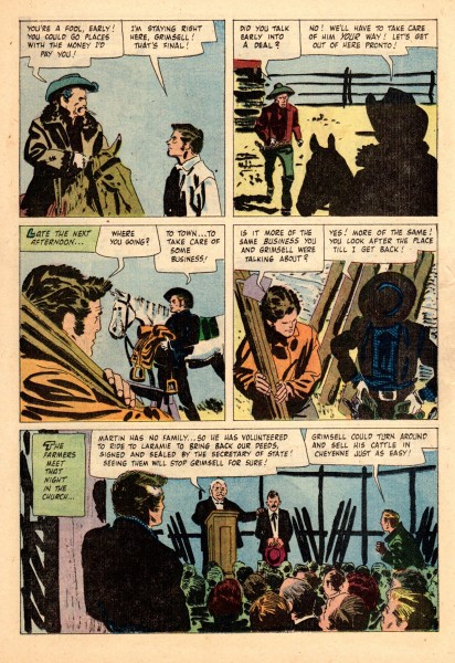
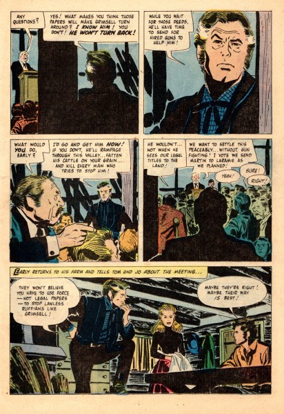
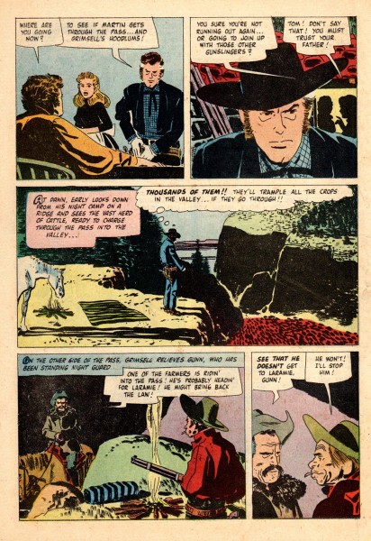
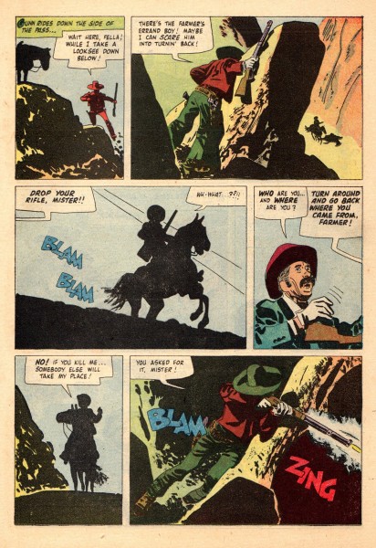
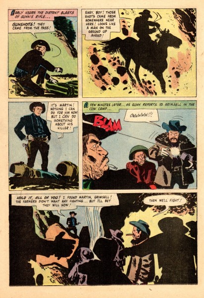
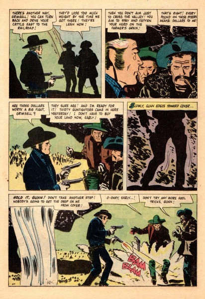
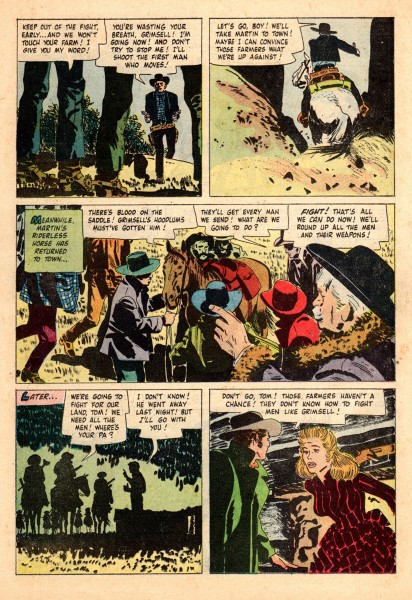
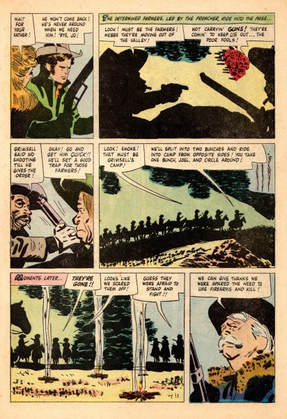
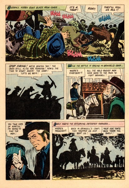
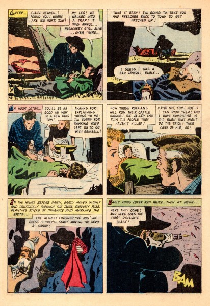
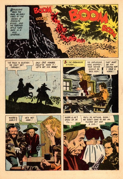
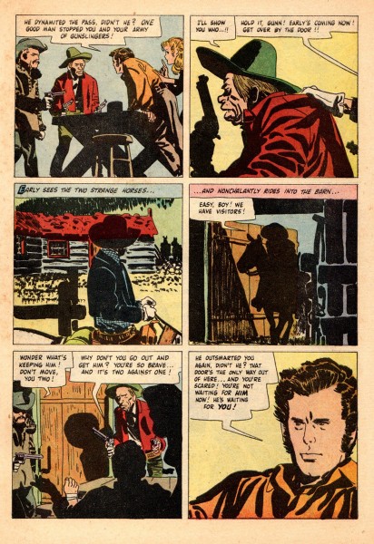
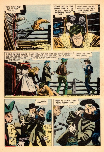
Toth’s Gun Glory – pt. 2
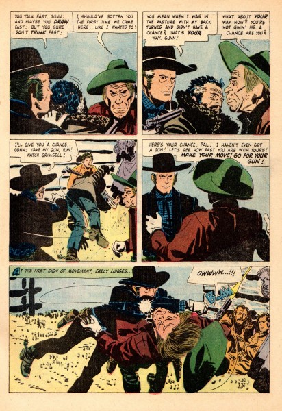
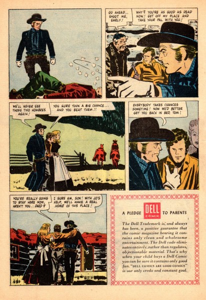
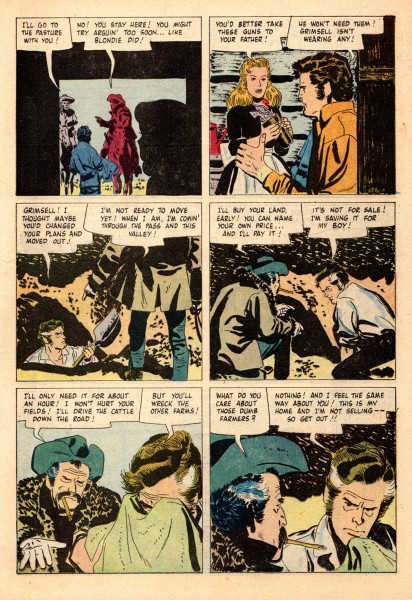
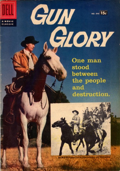 - Last week we saw thje first half of Alex Toth‘s comic book adaptation of the Stewart Granger film, Gun Glory. Here, we post the remainder of the story. Bill Peckmann is to be thanked for opening up his archive to us. Here’s his comment:
- I’d venture a guess that the quality of Alex’s original pages in “Gun Glory” has to be the same as it was in the original pages of his “Land of the Unknown” Dell comic book, meaning outta sight! (See earlier Splog posting of that art.) Unfortunately, so much just gets lost in the “pulp” printing, arrrgh!!!
- His earlier Dell/Western Pub. movie adaptation titles, like “Gun Glory”, are still by far the best of his tenure at Dell. The later titles towards the end of his run there, because of many reasons, mainly lack of appreciation, creativity, monies, etc., seemed like they were just being phoned in.
- His best stories for Dell give an inkling of what was to come down the pike a few years later with the black and white pages he would do for Warren Publishing, which was some of the best continuity art that he ever did.
- Also after leaving Dell, in the early 1960′s, was just about the time Alex would start to dabble in the art of animation, lucky for us!
 16
16
Books &Disney &Illustration &repeated posts 12 Jan 2012 06:45 am
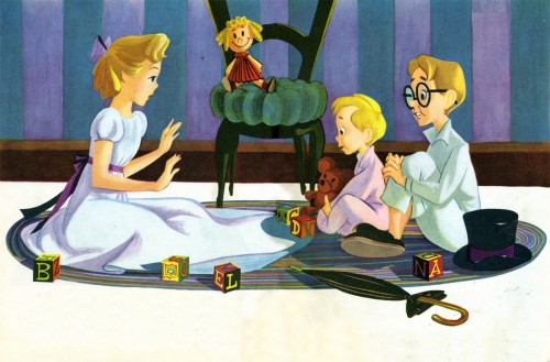
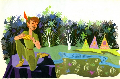
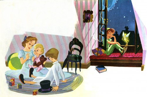
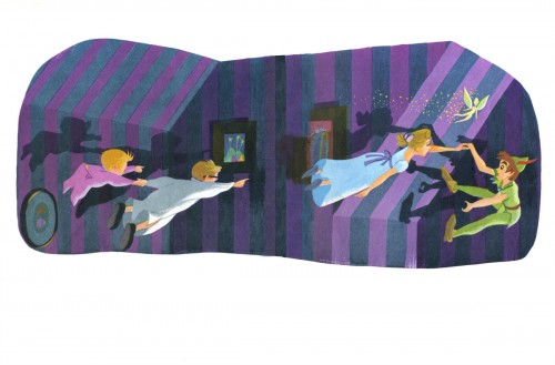
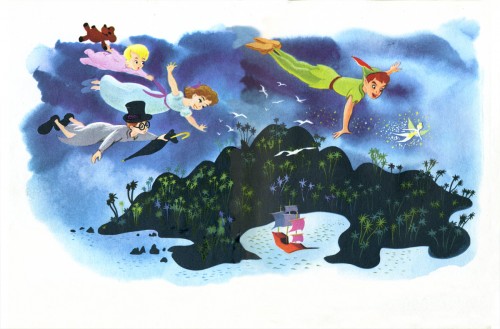
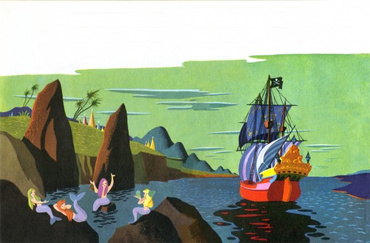
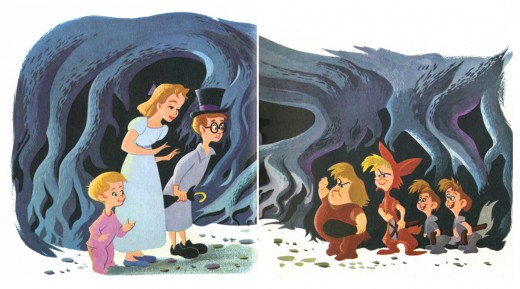
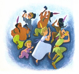
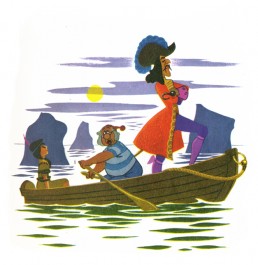
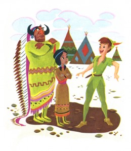
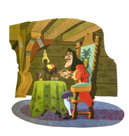
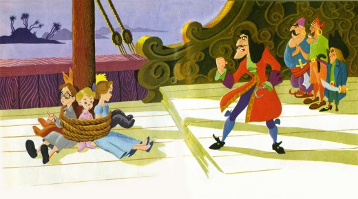
Eyvind Earle – Peter and Wendy
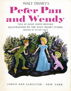
Back in 2007, I posted this piece on Eyvind Earle’s Peter Pan illustrations. I’ve combined the two parts and repost it here.
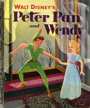 – I’m an Eyvind Earle fan. I have been ever since getting my hands on Bob Thomas‘ original version of The Art of Animation (1959), which promoted Sleeping Beauty and its artwork, and then going up to Radio City Music Hall to see the first theatrical run of the film.
After the Disney film, I saw Earle’s Nativity film on the Tennessee Ernie Ford show and Paul Bunyan and other Disney shorts of the period made me more of a fan.
I got to meet the man thanks to Michael Barrier. We had one of the craziest interviews ever when we drove upstate to his house and sat in a somewhat darkening room as the afternoon dimmed and Earle continued to quietly answer the questions.
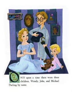
I loved that day, but I loved Earle’s work even more. After posting Retta Scott‘s Golden Book of Cinderella, I realized that I had this book, Peter and Wendy, which is Earle’s odd adaptation of Peter Pan. He’s obviously in love with Cinemascope in that most of the book’s illustrations are two-page spreads. Sort of wide screen proportions. This is unusual for a Little Golden Book.
The images look a bit like the backgrounds in Paul Bunyan, and the characters are not quite on model with the film. The printing, as with most of these books, is pretty dull. You know a lot has been lost in the transfer.
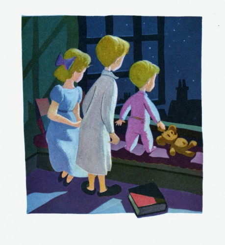
This last illustration is my favorite.
 1
1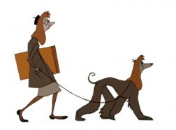 2
2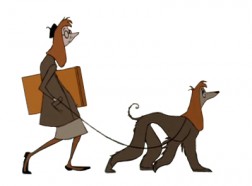 3
3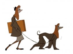 4
4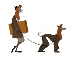 5
5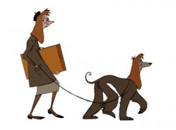 6
6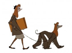 7
7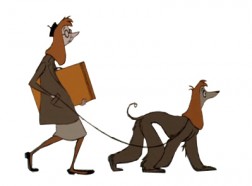 8
8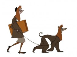 9
9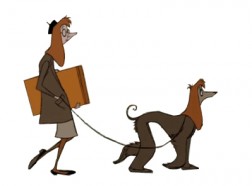 10
10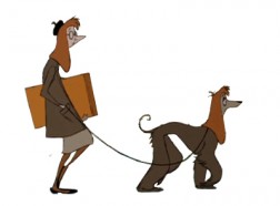 11
11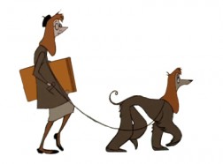 12
12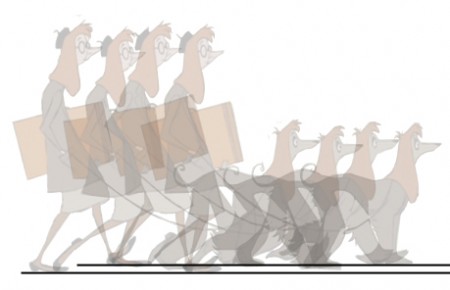
 1
1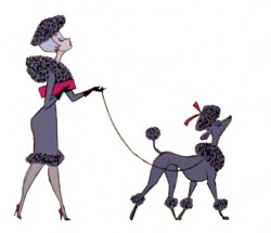 2
2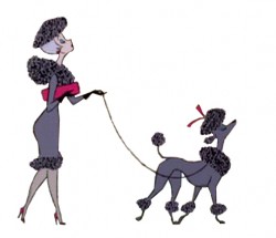 3
3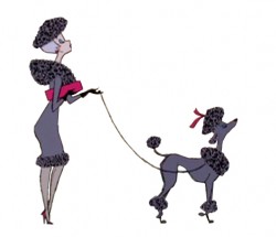 4
4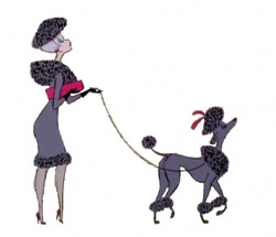 5
5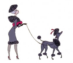 6
6 7
7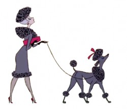 8
8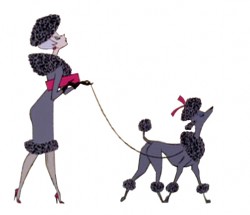 9
9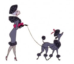 10
10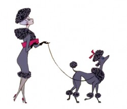 11
11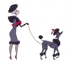 12
12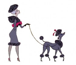 13
13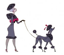 14
14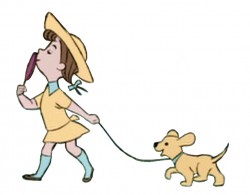 3
3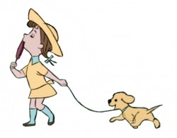 4
4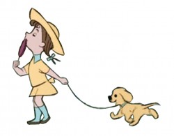 5
5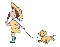 6
6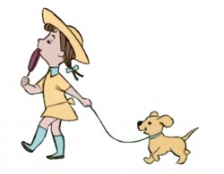 7
7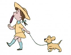 8
8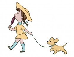 9
9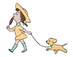 10
10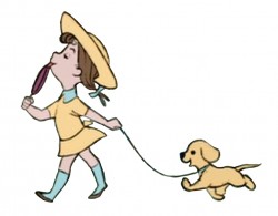 11
11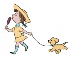 12
12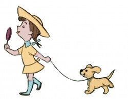 13
13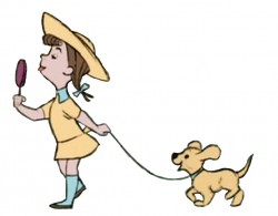 14
14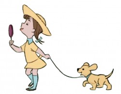 15
15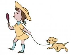 16
16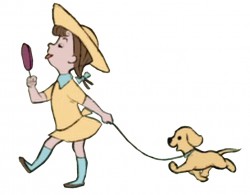 17
17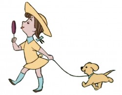 18
18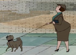 1
1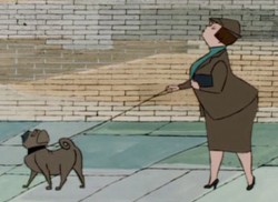 2
2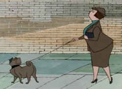
 4
4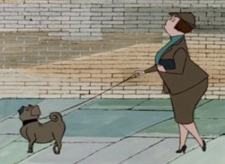 5
5 6
6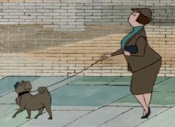 7
7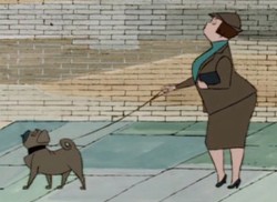 8
8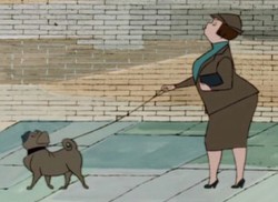 9
9 10
10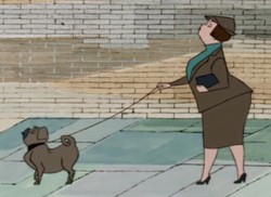 11
11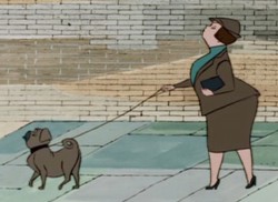 12
12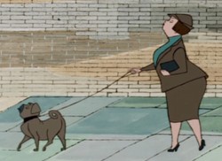 13
13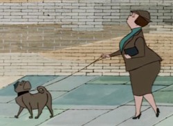 14
14 15
15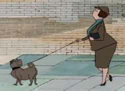 16
16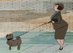 17
17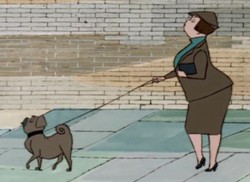 18
18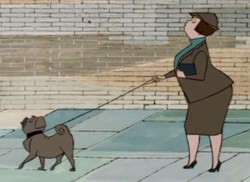 19
19 20
20