 - About two weeks ago I started thinking about the state of animated short films. This was the result of my viewing the most recent Pixar short, “Day & Nightâ€. This film had a lot of the problems most Pixar shorts have, and I came to realize that it’s the same problem most shorts being made today have. The word is sophomoric.
The stories, to my taste, are just too lacking in real intelligence. Early shorts from Pixar seemed to be trying to advance their hardware; for example, “For the Birds” was pushing the envelope on cgi rendering of feathers. (As it turns out, this is one of their better short films; the story is well written and timed.) Later shorts from them are trying to push some other limit, but they just are not.
I’m not concerned with the technique used in these films or the quality of the animation. After all Pixar is paying millions of dollars for these tiny films; they should be well animated, designed and produced. And, for the most part, they are. Pixar tags them onto a blockbuster effort like Toy Story 3 and is able to recoup the investment – something the average Independent will probably never do.
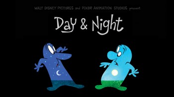
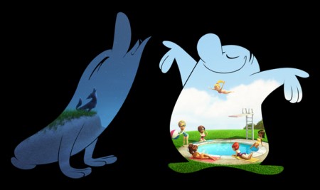
In this film, “Day & Night”, the two principal characters, drawn in 2D animation, are surrounded with a black matte. The interior coloring of the characters is filled with computer animation images of day, for the first character, and night, for the second. One is jealous of the other – until, of course, midnight passes and Day becomes Night, and vice versa. Over the last minute or so, we’re given some pompous narration to make it sound like it’s an important theme and film. The whole enterprise feels lifted from other, more original films done many years ago. The only difference, really, is that this is in gorgeous 3D – a nice package.
“Day & Night†utilizes character designs that seem to come out of the groovy seventies. This is a Hollywood version of Zagreb, which was a Yugoslavian variation of UPA, and the filmmakers try to attach a story that also feels redundant of some of those many seventies student films.
 Teddy Newton, the director, seems to like the “moderne” style of animation. His past directoral effort, Boys Night Out (co-directed with Bert Klein), and his character designs all push toward what I call the CalArts style, an angular take on mid-Fifties animation styling. Basically, to me, this style has nothing to do with art and all to do with regurgitating the work of other artists who reworked art. It’s all too intermural – there’s nowhere for it to go.
I can’t just stop with this Pixar short; many other shorts made recently have this same feeling as though they’re pushing some limit. In fact, what they’re all doing is limiting themselves with the past history of animation, and not always the best animation.
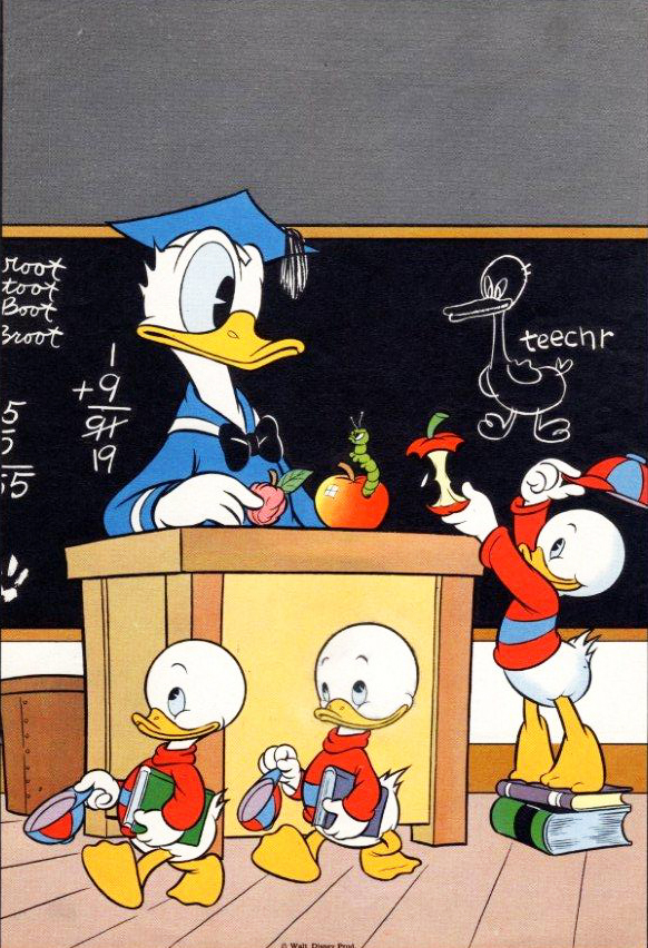
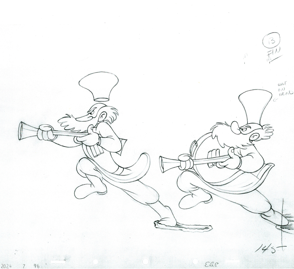
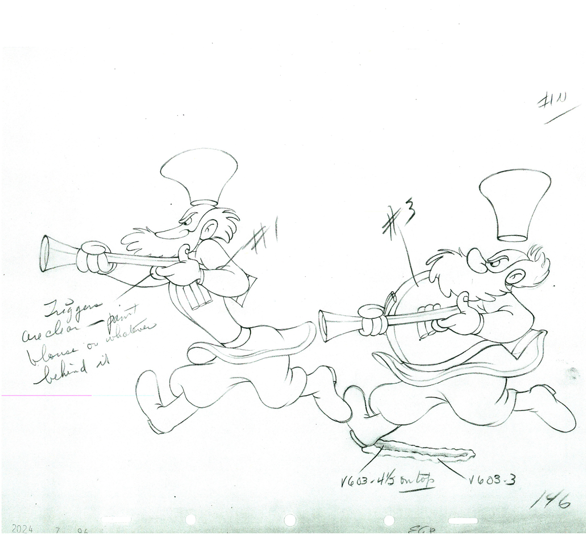
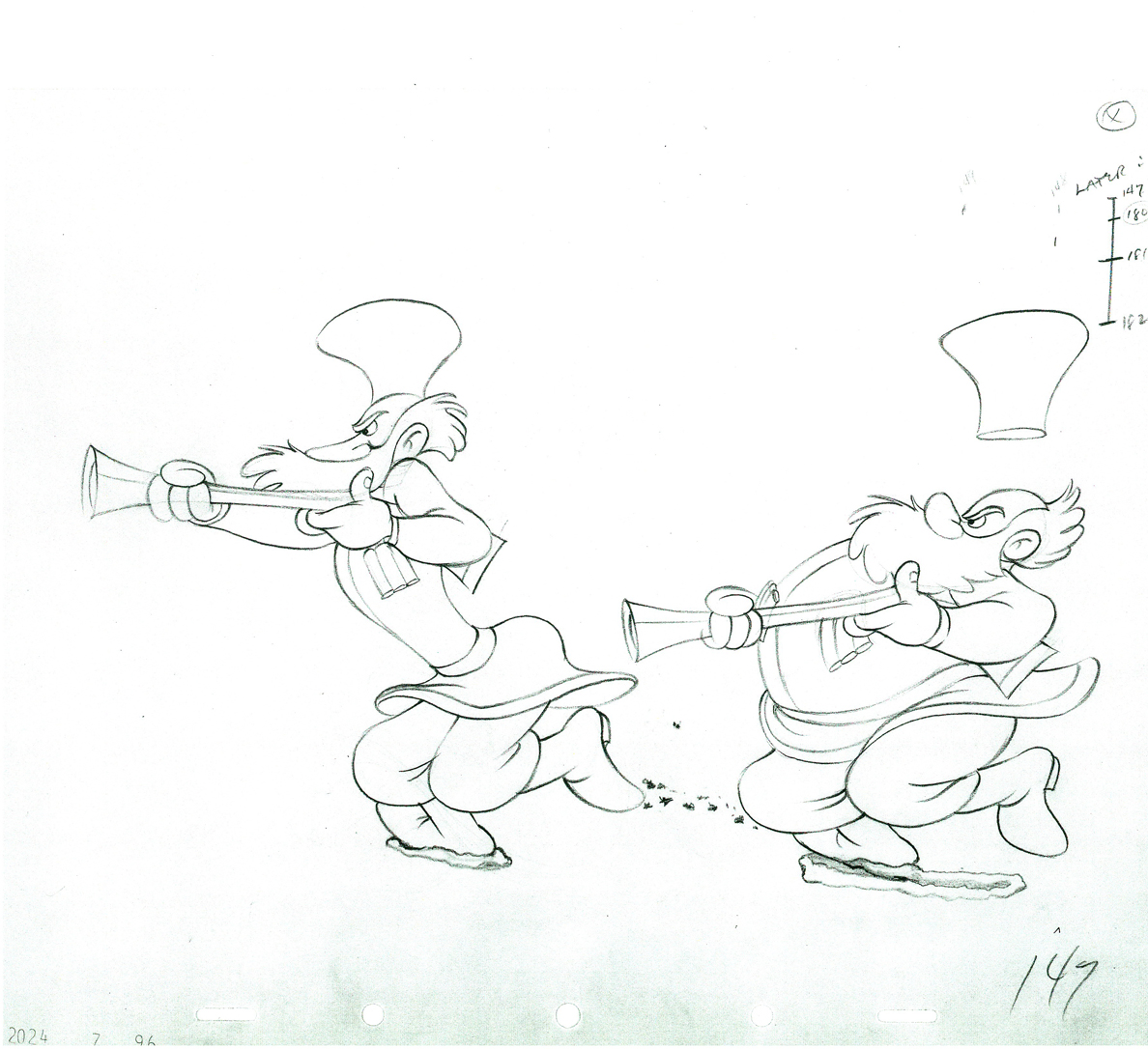
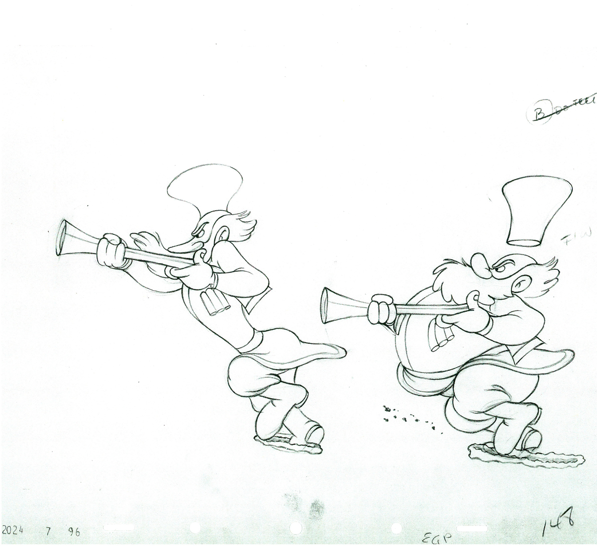
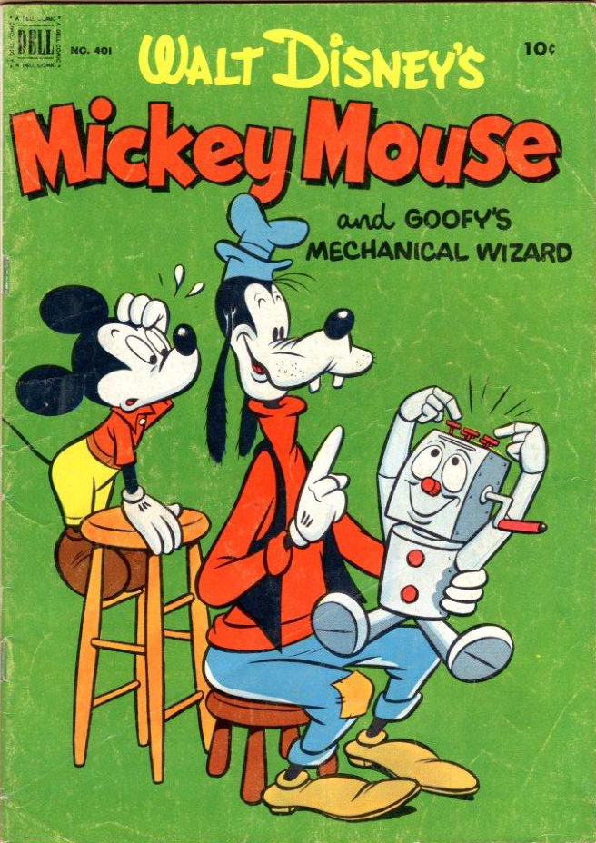
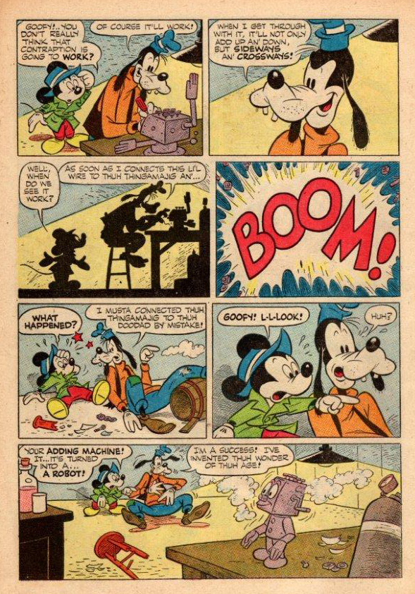
When the Lasseter/Disney troupe decided to rework Goofy in a Hollywood short a couple of years ago with Goofy How to Hook Up Your Home Theater, to me there was more honor in the workman-like effort as they purposefully borrowed from some mediocre shorts. It might have been a more complex effort had they tried doing a good Mickey short, but they pulled this film off.
Hundreds of short films are being made quickly via the new media. We can see them all over YouTube these days. Student films glut websites; one or two of them actually are well-realized. I just wish there were more concern for story. More attention has to be paid to this part of the film; it’s more imortant than the animation, the design or the music.
Day & Night makes me feel as though they started with the style and tried to work the story into it. It really doesn’t work on any intellectual level. I wonder how many young people actually go about making their films this way. Start with the look and the design, then wrap a story into it. Yet, the reason to see a film has nothing to do with the design; it’s all about the story. What do you have to tell me?
Actually, I’m not sure it ever was a better time for the short film. It always seems to come down to one or two films, every year. They dominate the market and Festivals everywhere; those are the one or two films that create the conversations after those Festivals. In fact, it’s the one or two smart artists that come up with these shorts, and there will always be these infrequent artist among the many.
Here are a handful of random shorts and filmmakers (off the top of my head) I’ve liked recently:
The House of Small Cubes by Yojiro Takita, was a beautifully constructed, animated and produced short that deserved its Oscar. It gave us several ADULT themes that were finely developed and executed.
Skhizein by Jérémy Clapin was a well crafted film with an idea that, at first, seemed to clever for its own sake, but turned out to be a short piece of genius that held up viewing after viewing. The use of cgi to creat a mix of flat and 3D surfaces just added to film’s depth.
Andreas Hykade‘s most recent short, Love and Theft, is a beautifully graphic free flowing paean to animation and linear art. Like all other Hykade shorts it turns to rich primary colors that seem to be all his own style. He seems to be entering the master class of animation film makers.
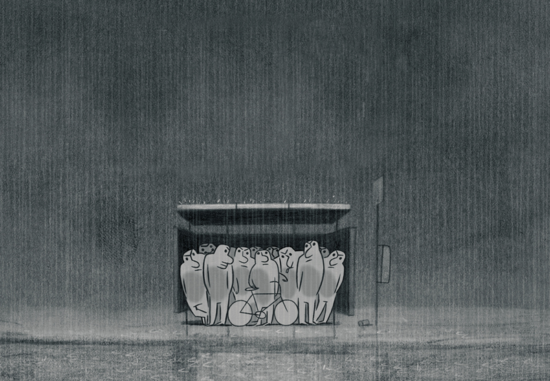
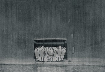 In Rains by David Coquard-Dassault, a sudden rainstorm initiates a lovely and poetic piece that simply gives us delicate images of those reacting to the weather. It’s so quiet, witty and original.
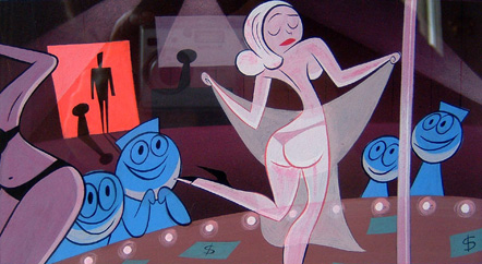
Aardman seems to have perfected the animated short film. Their last Wallace & Gromit film was so well-tuned, one almost took it for granted. Yet, in most of the shorts seen last year, this one stood out for extraordinarily high filmmaking standards. Even their more experimental shorts, such as the The Pearce Sisters Directed by Luis Cook does 2D animation using cgi and creates a dark mood with simple and effective means. All of their shorts are well written, well cut and intelligent; always crafted at the highest possible caliber. This includes every one of the films they’ve done for television. Pixar should study their films a little closer.
The Simon’s Cat series by Simon Tofield are beautifully done shorts featuring the same cast, beautiful linear design and well animated characters. The films are wordless, yet they all have a love of humanity and observation of the world around us that comes across as funny and touching, both at the same time. These shorts are made using Flash, yet don’t have that tedious cut-out feel of the tiresome pop from-pose-to-pose animation that the medium seems to engender.
Word is out that the next Pixar feature will also be preceded by a short. Cars 2 will have a Toy Story short accompanying it. How appropriate. Hopefully, they’ll get it right with the stable of characters the whole world loves. Perhaps it’ll give them the chance to show us what really happened to Bo Peep.
_________________
By the way, a good place to see shorts that are more challenging is at Ian Lumsden’s Animation Blog. It’s worth paying attention. The videos he features and analyzes often don’t show up elsewhere.
 180
180
 81
81 82
82 83
83 84
84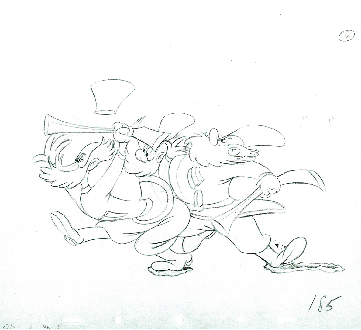 85
85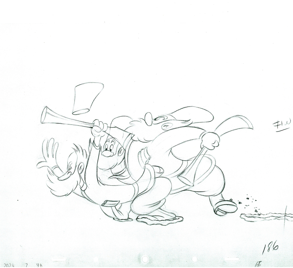 86
86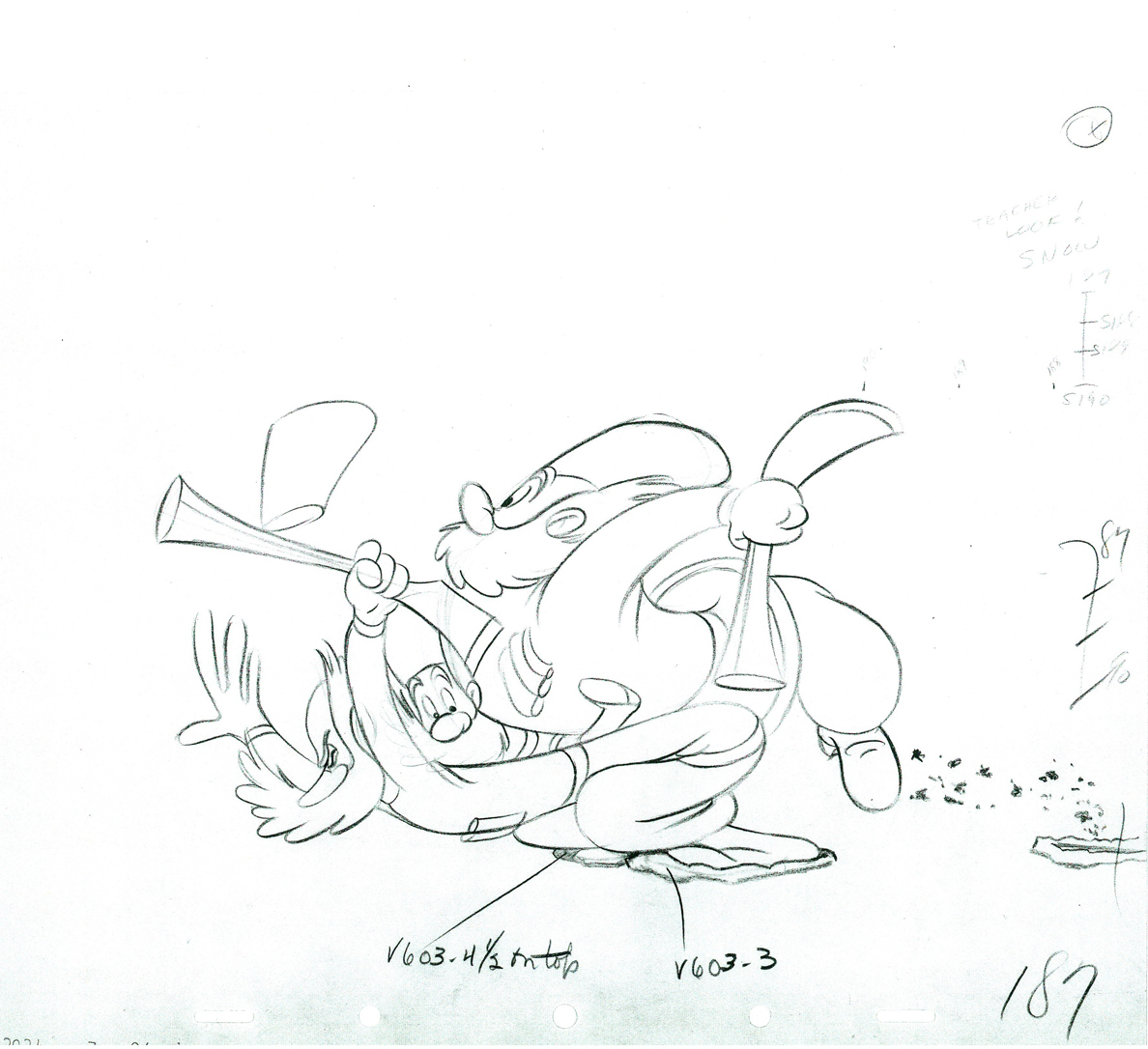 187
187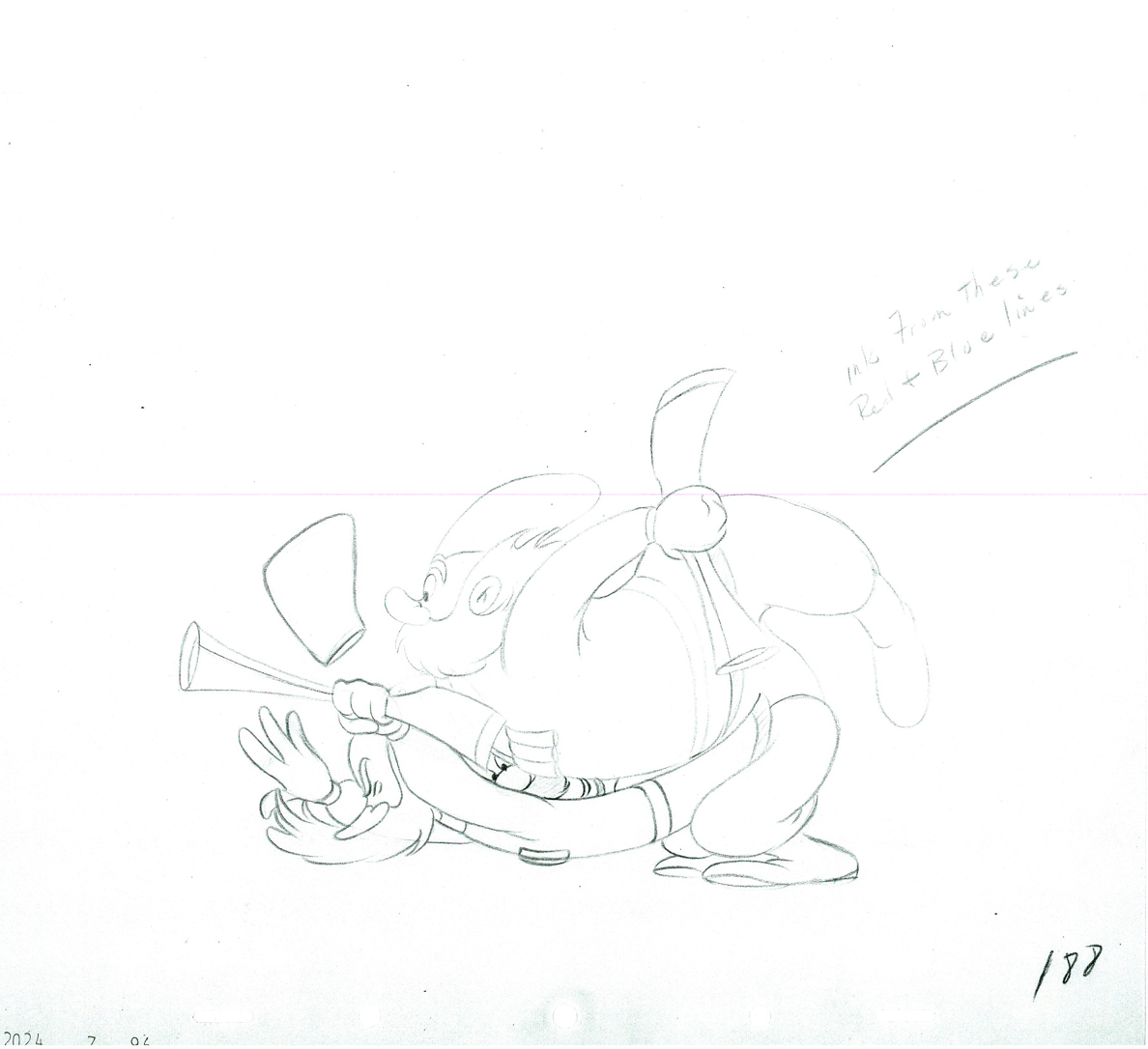 88
88 89
89 90
90 91
91 92
92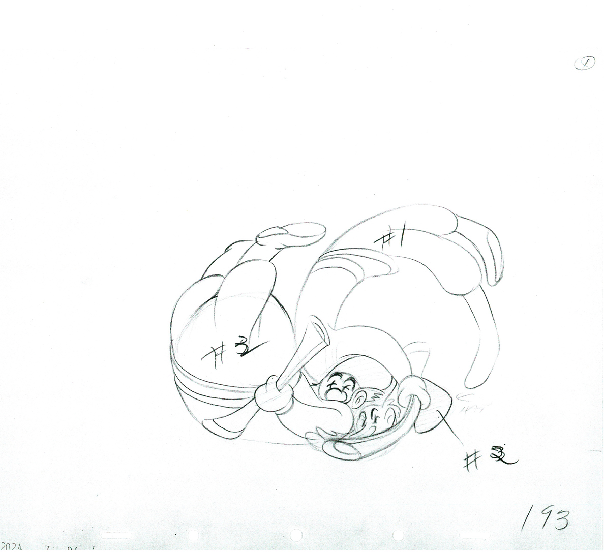 93
93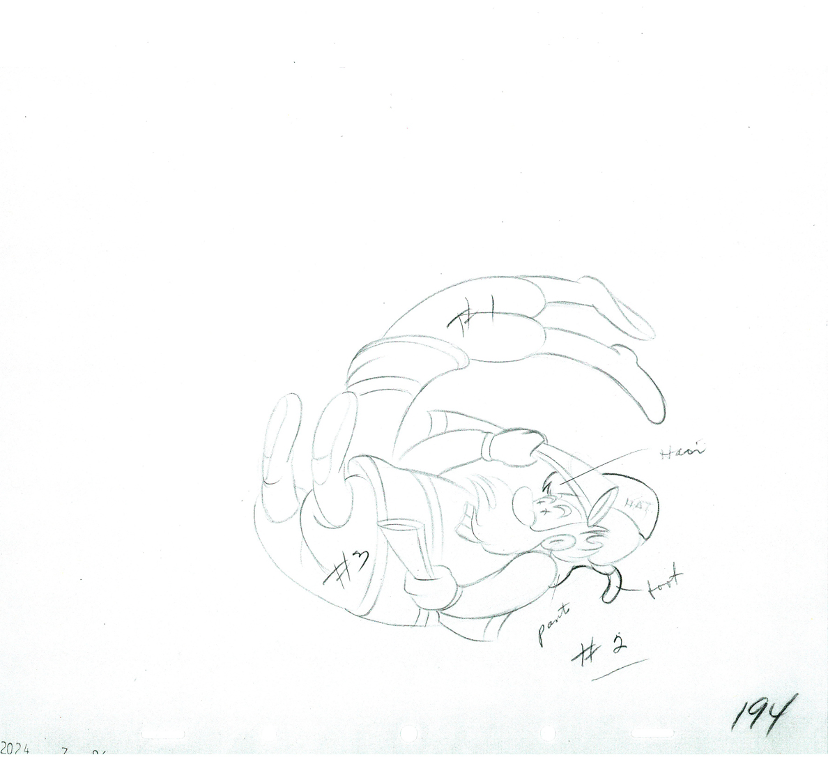 94
94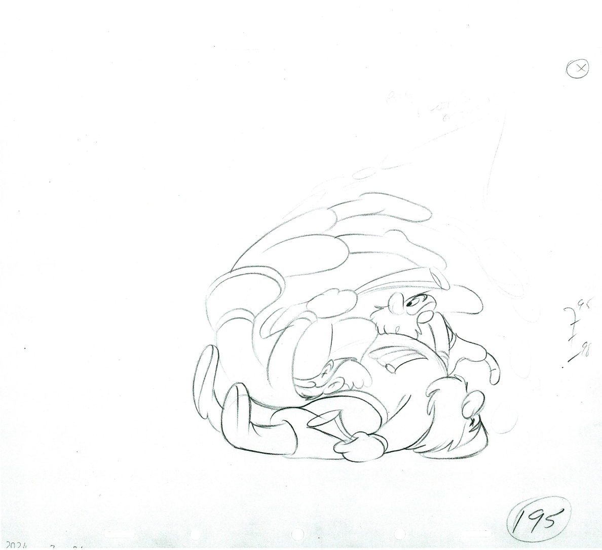 95
95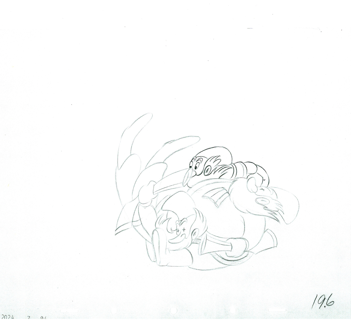 96
96 97
97 198
198 99
99 00
00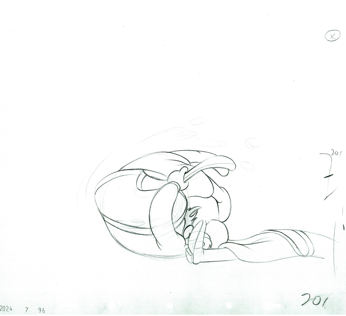 01
01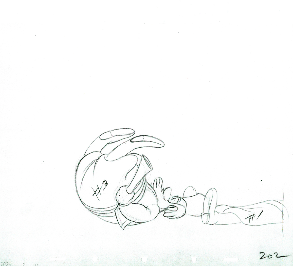 02
02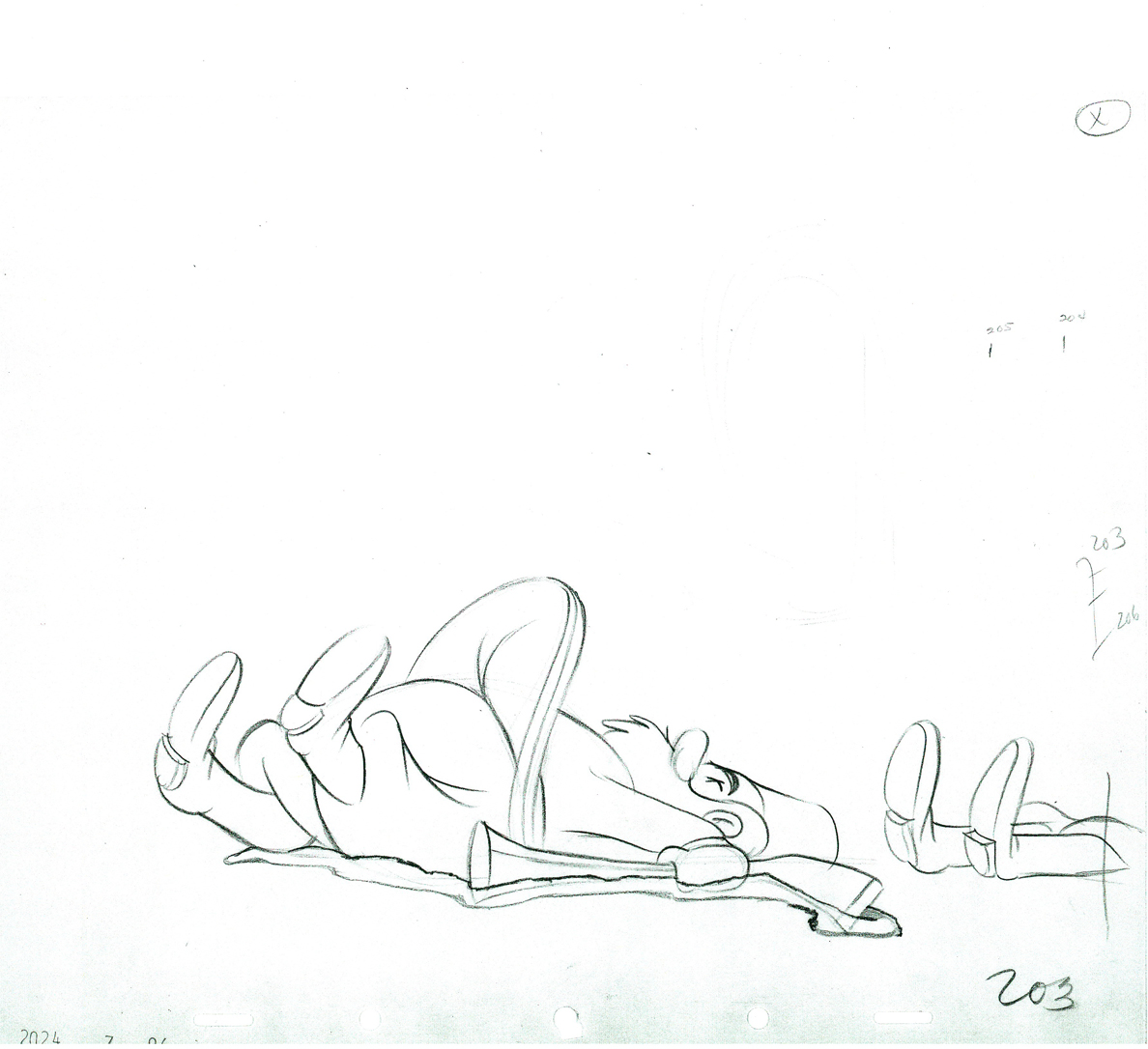 03
03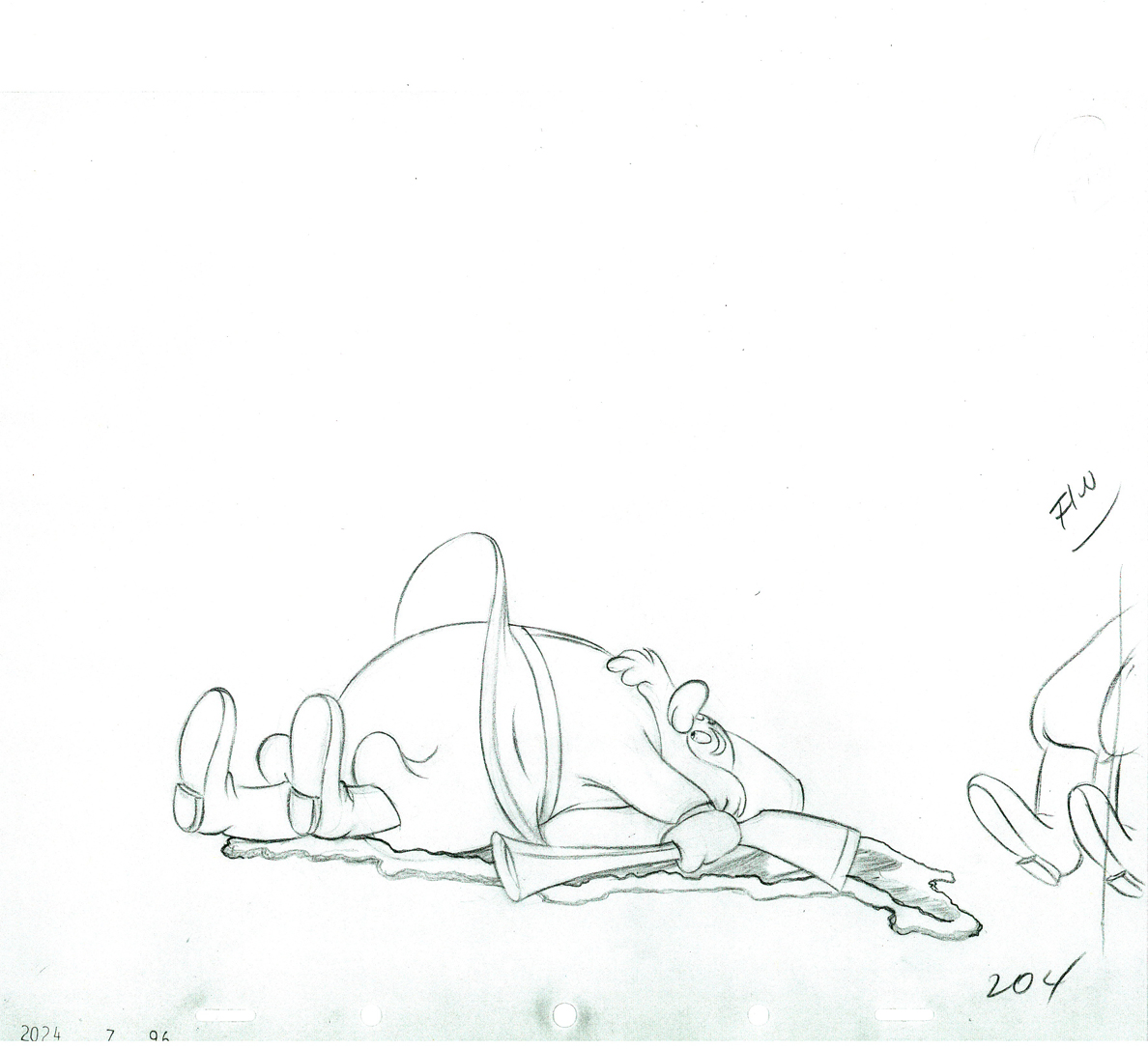 04
04 205
205 06
06 07
07 08
08 09
09 10
10 11
11 12
12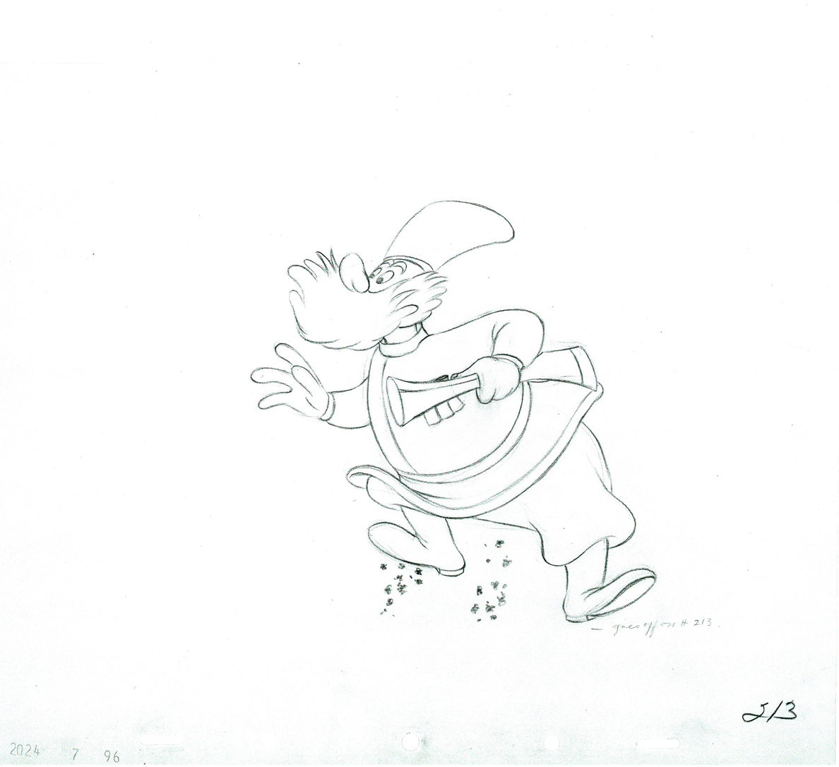 13
13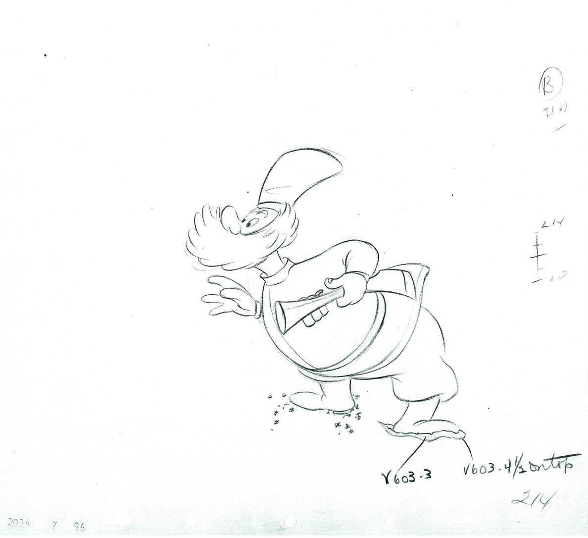 14
14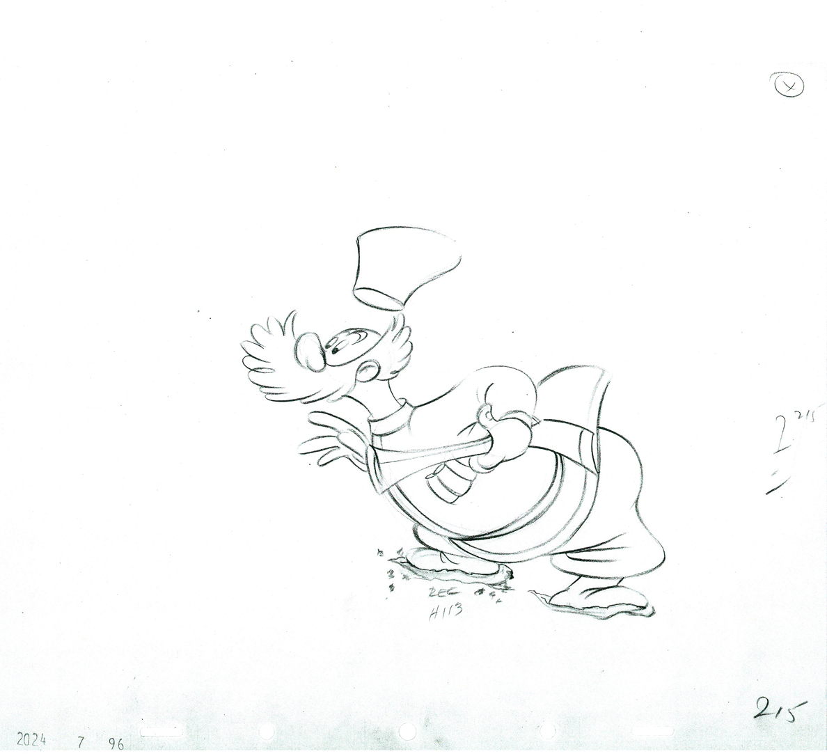 15
15 216
216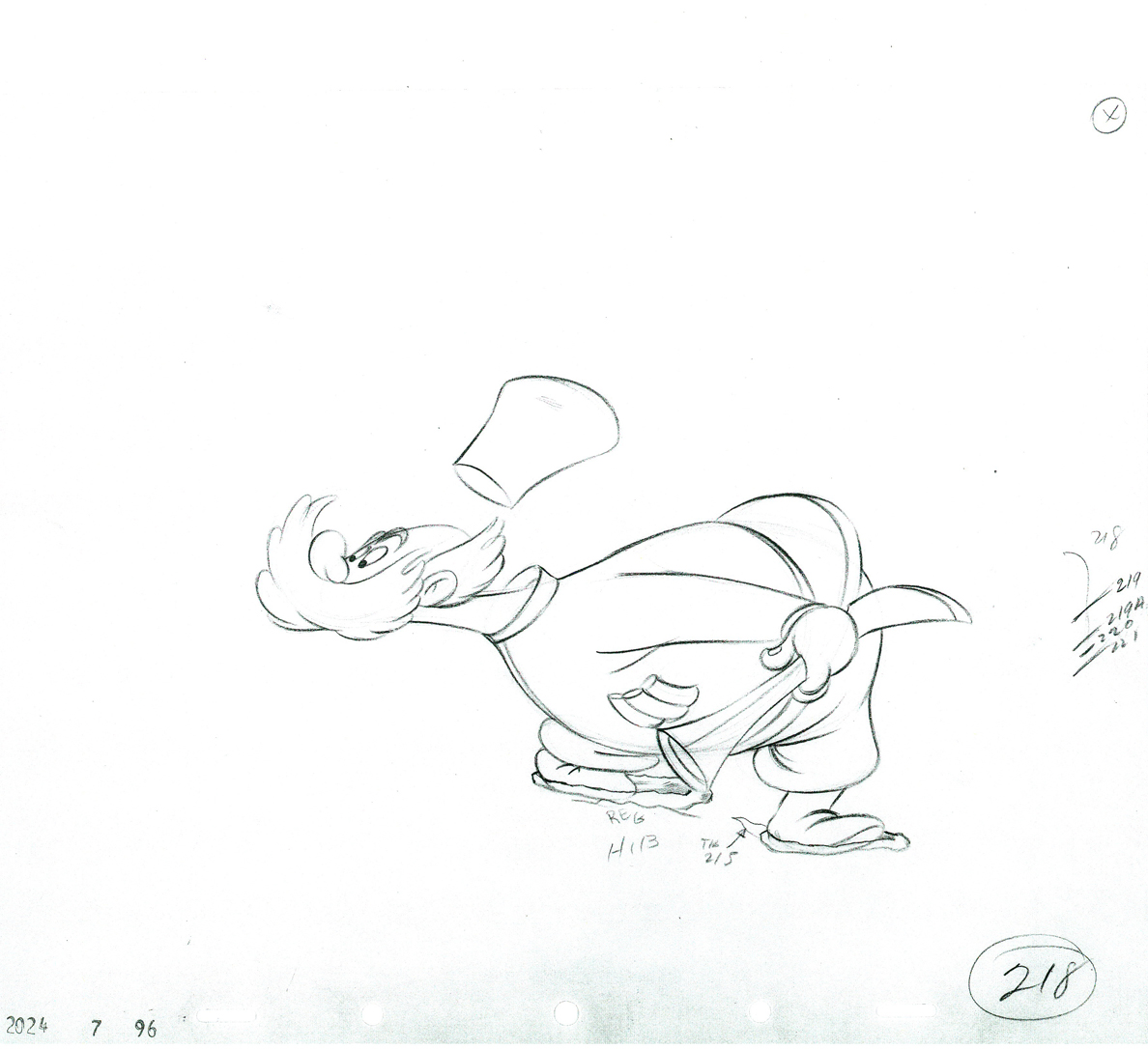 218
218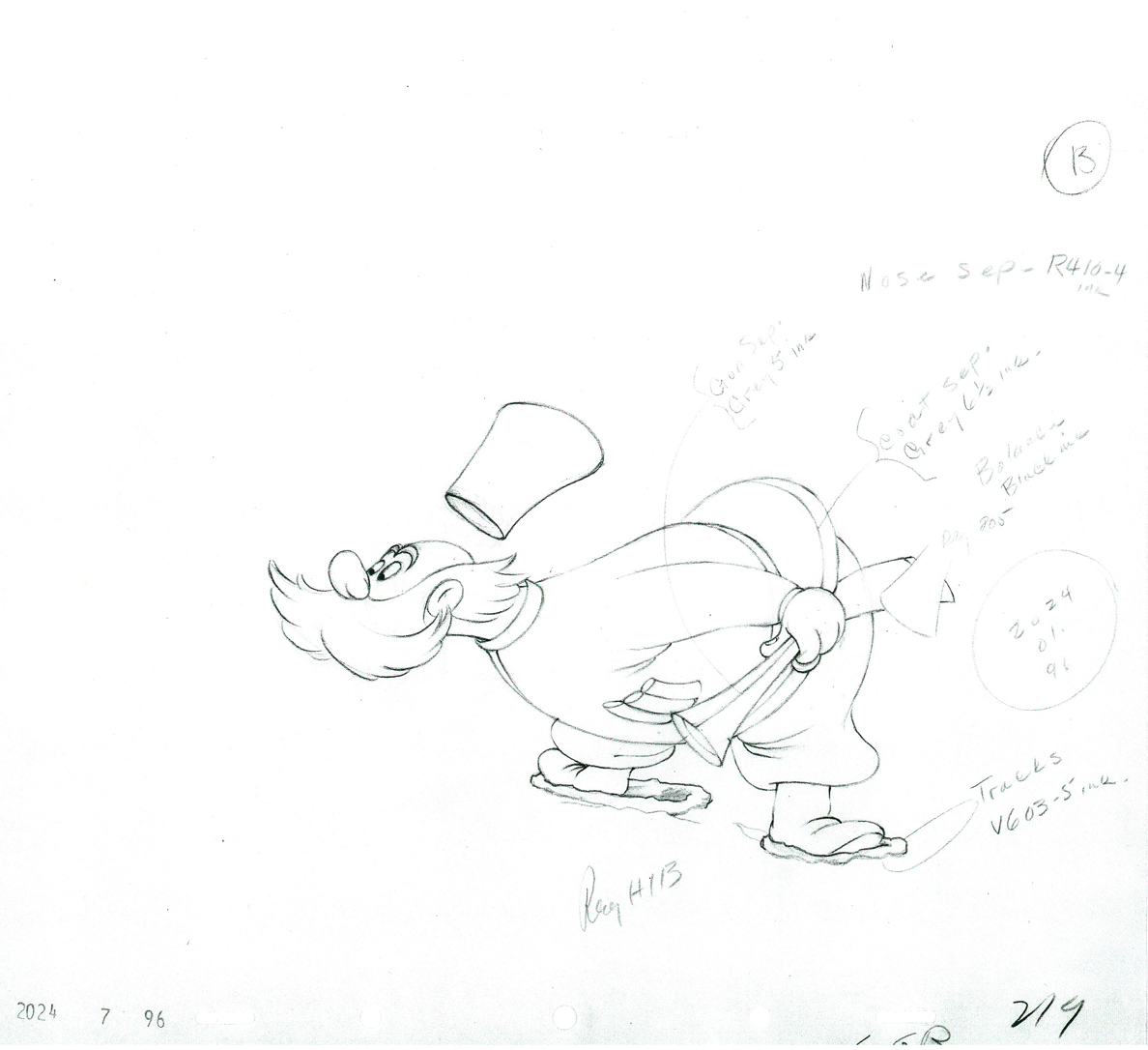 19
19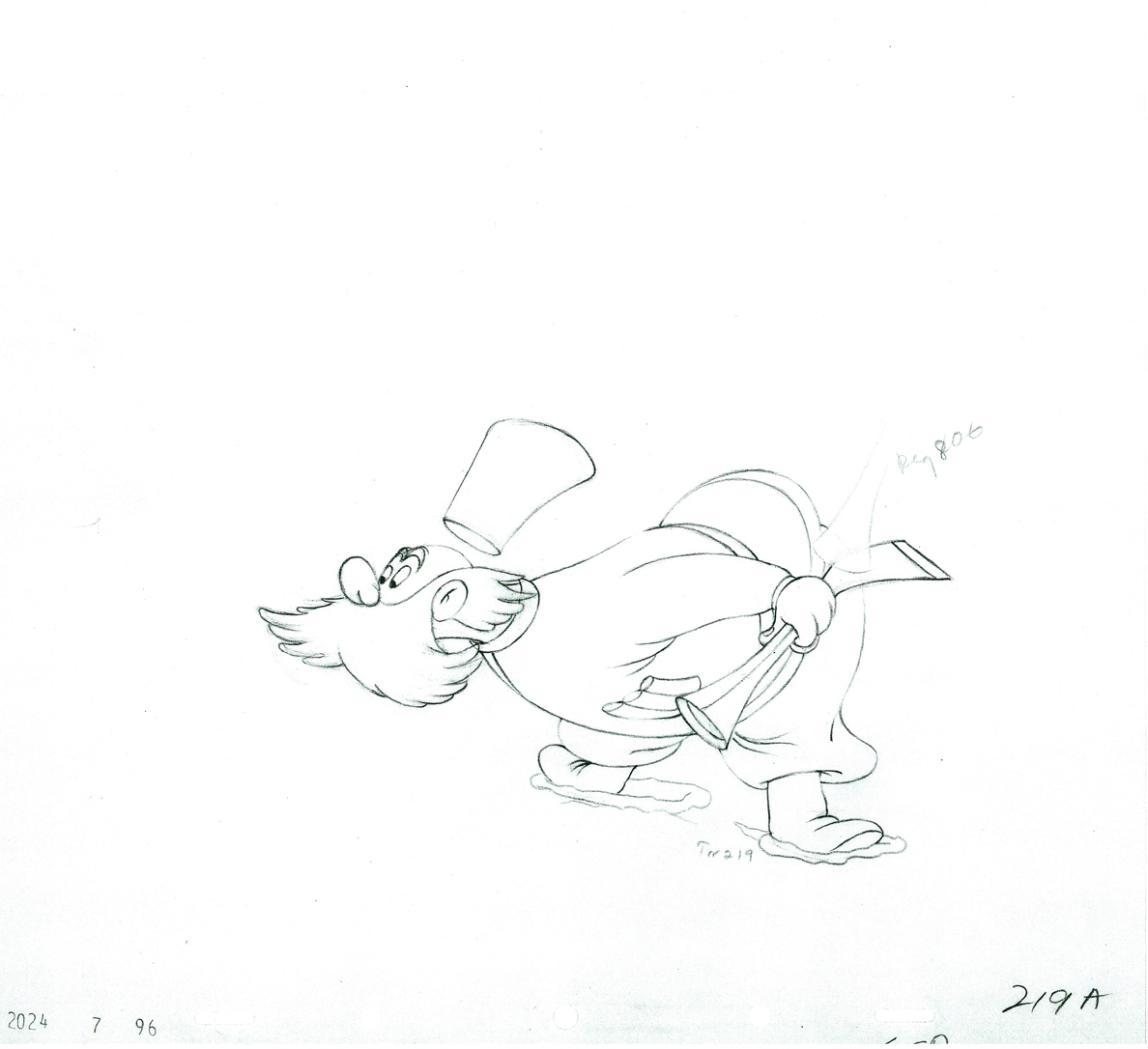 9a
9a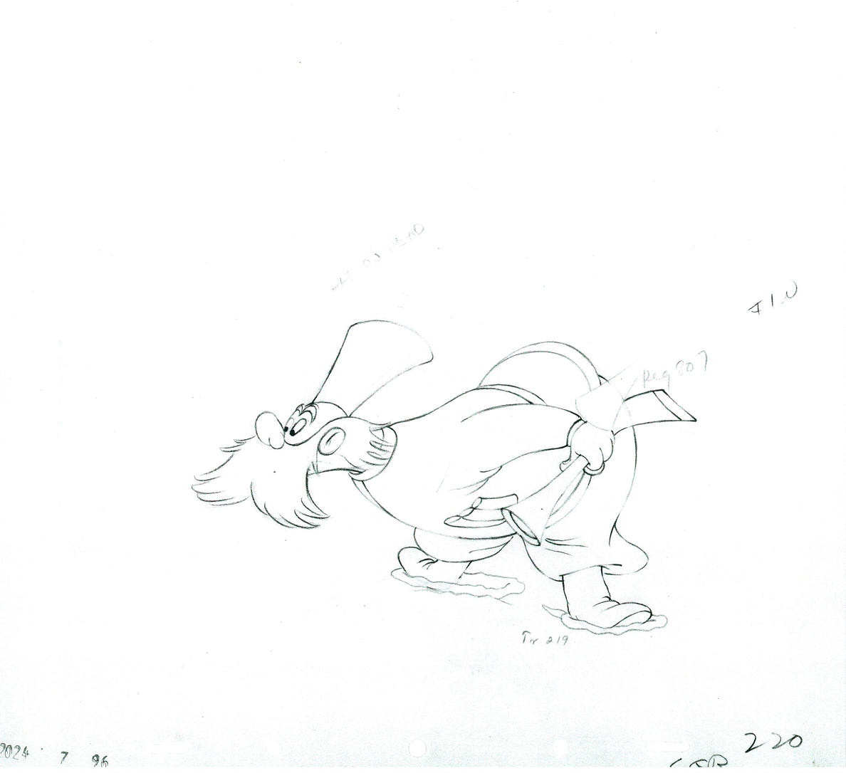 220
220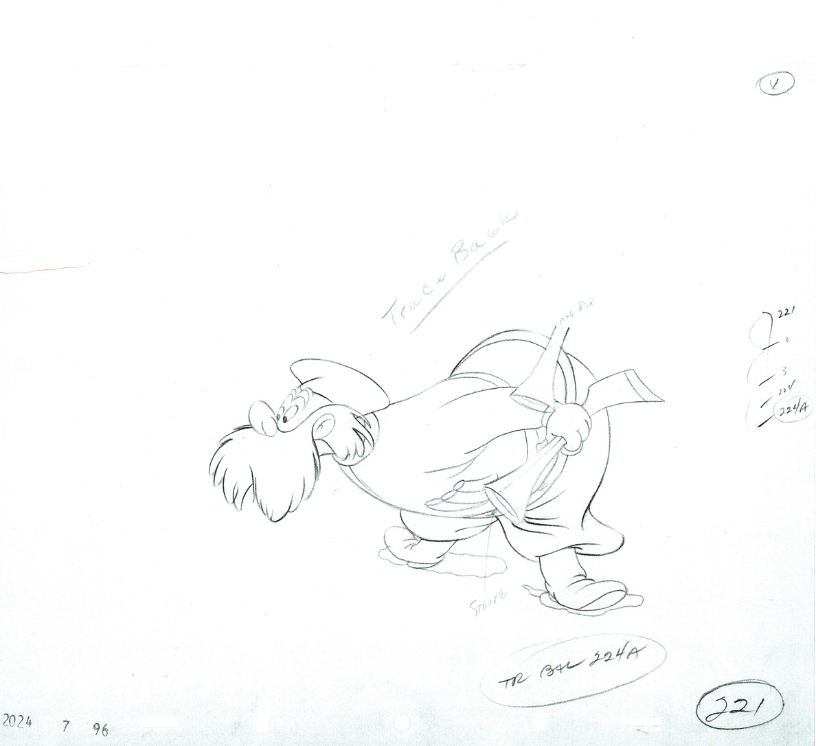 21
21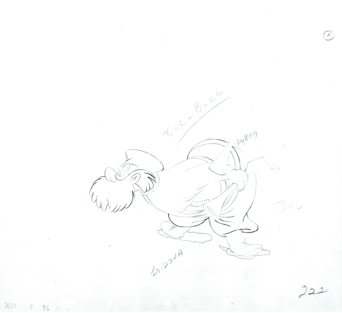 22
22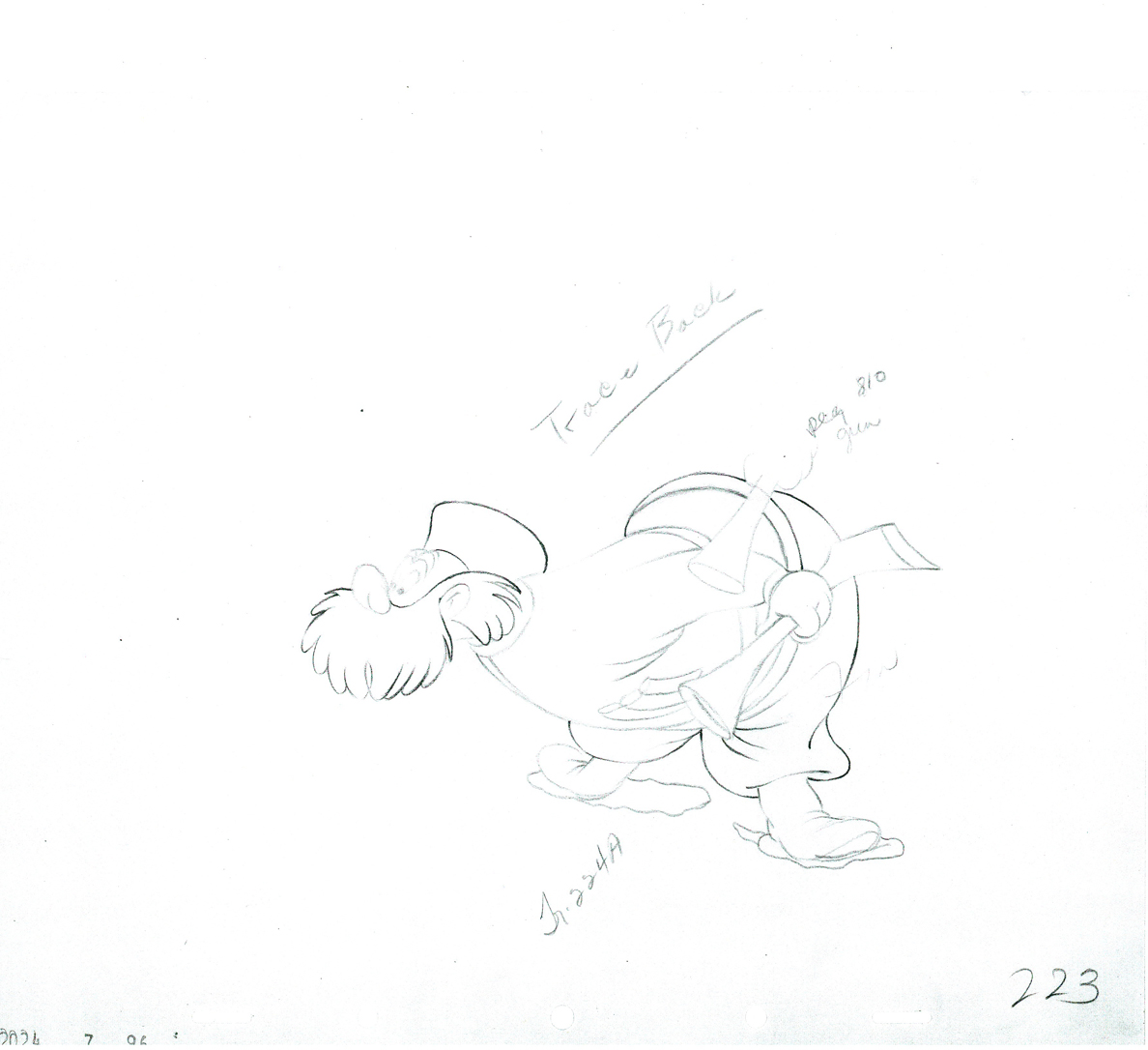 23
23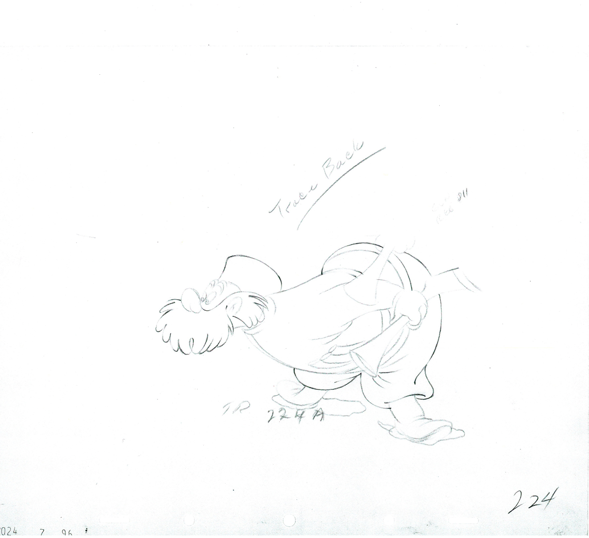 24
24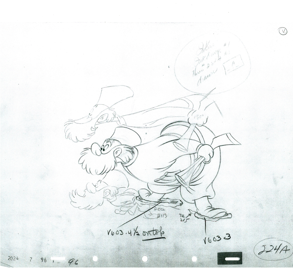 224a
224a