Search ResultsFor "cockaboody"
Animation &Commentary &Hubley &Models &repeated posts 17 May 2012 07:17 am
Hub Eyes – repost
Here’s a post I wrote in 2009 that I still think is valuable, so I’m going to put it up again.
 - It was 1973, and I was happily – I can’t tell you how happily – ensconced in the Hubley Studio working on Letterman, a new series for an upcoming CTW show, The Electric Company.
It was my first animation job. I inked it all (directly from animator roughs), I assisted & inbetweened it all, and I animated odd scenes including all the title sequences. I was a novice, and I was doing it all. Excited and happy is all I can remember.
I was alone one morning in the small room wherein I worked. I made a habit of getting into work before anyone and leaving after everyone. I wanted to make sure I was indispensible.
 A month into the gig, and I think I’d only spoken with my hero, John, about a half dozen times. I was rushing through one of the Johnny Gent “Spellbinder” sequences. I inked all of his scenes, then inbetweened the drawings in ink. No time to work in pencil for this schedule. Johnny was completely off character, in a very old fashioned way, and I had to rework them all closer to the models – in ink. The schedule just gave me no time to be proud of what was happening. (A year or so later I apologized to Johnny for what I did to his artwork. I was so inexperienced and had such a dominant role in how the final art looked in that series.)
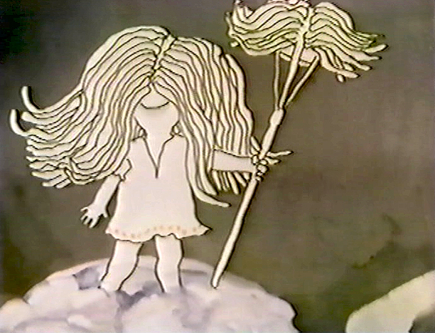
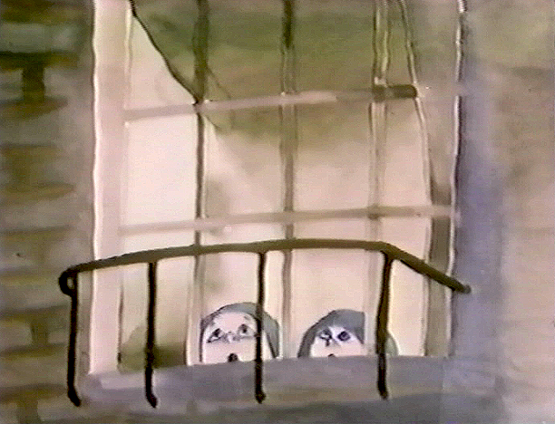
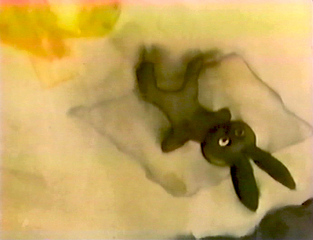
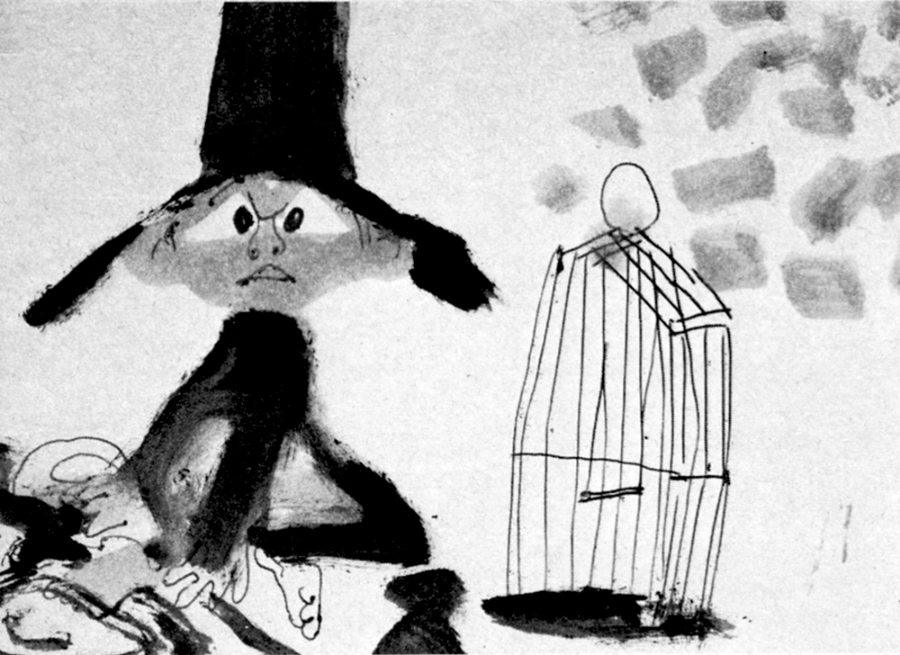
John Hubley ran in to give me something and made a quick comment about the character I’d been drawing. He said it was a “Paramount eye.” I looked at the drawing, then at him. Then John drew on a small piece of paper a “Disney eye,” then a “Terrytoon eye.” He laughed aloud and told me to try to “square off” the eyes a bit. Then he ran out.
 I learned a lot in a very short time. I watched eyes that day and probably all that week. I ran Hubley films at lunchtime (I’d made it a habit to project their films in the kitchen during many of the lunch breaks. The entire group working there enjoyed these sessions) and watched the eyes. I talked with Tissa David about eyes in one of our evening tutorials – she was trying to teach me how to inbetween properly.
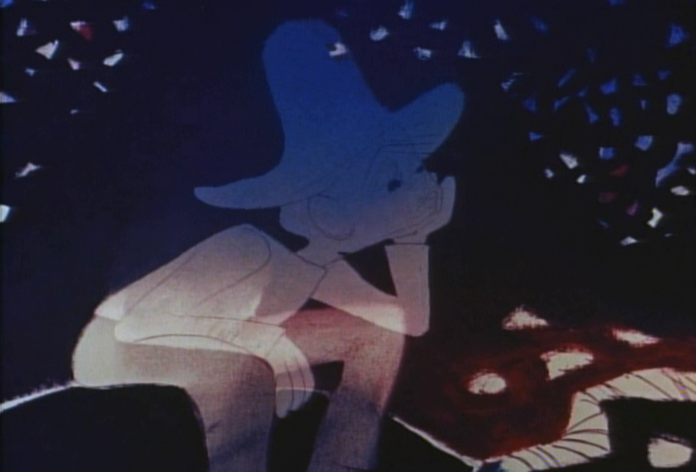
I was reminded of this moment when Chuck Rekow commented on the Moonbird Walk posted weeks ago. “The shape of the eyes on the boys is a real departure from almost anything in the cartoon world —even 50′s era. It’s closer to real life, and reminds me of the graphic style of Ben Shahn. It lends the film an aura of “seriousness”, even though it’s a cute film about two boys and an imaginary bird. Obviously, the pre-recorded sound is a major deal, but this gem is loaded with touches of inventive detail.”
How right he is, and I love being reminded of it.
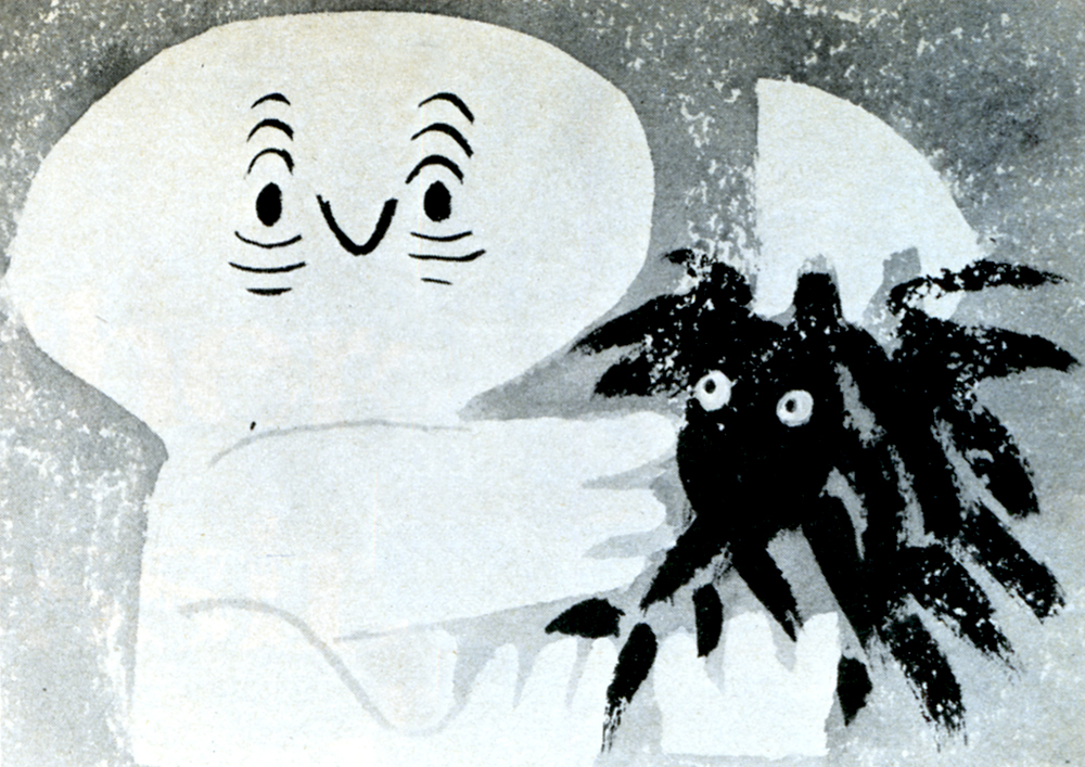
 The eyes are the direct route to the soul of a person and, consequently, an animated character as well.
After working for the Hubley studio, for a short bit, I worked for Phil Kimmelman and Associates. This was a hardy commercial studio doing tight designer-based animation. Rowland Wilson was doing a lot of their design work, and the animation clean-up was tight. Animators Jack Schnerk, Sal Faillace and Dante Barbetta did a lot of the work the few months I was there. Jack Schnerk was also animating for Hubley, so I knew his very complicated-to-clean-up style. I worked primarily as an inbetweener and learned some hard and tight lessons while there.
 After the very loose work I’d been doing for the Hubley films, it was not only difficult for me, but good to keep me towing the proper line. I wanted to learn animation, and all of it was important.
Here, too, an empahsis was on the eyes. No Disney eyes, no Hubley eyes, either. But now I was just concerned with keeping those lines tight tight tight. No shimmer on the eyeballs. After all, I was told, people stared into the characters’ eyes, and any flaws in the animation would show up first in those eyes.
I worked for PK&A for about three or four months. I’d also worked for Tubby the Tuba at NY Institute of Technology under Johnny Gentilella, where we got somewhat close and I was able to discuss all sorts of animation problems with him. That was the only redeeming element, everything else about that studio was wretched. My displeasure ultimately led to my leaving as soon as I could.
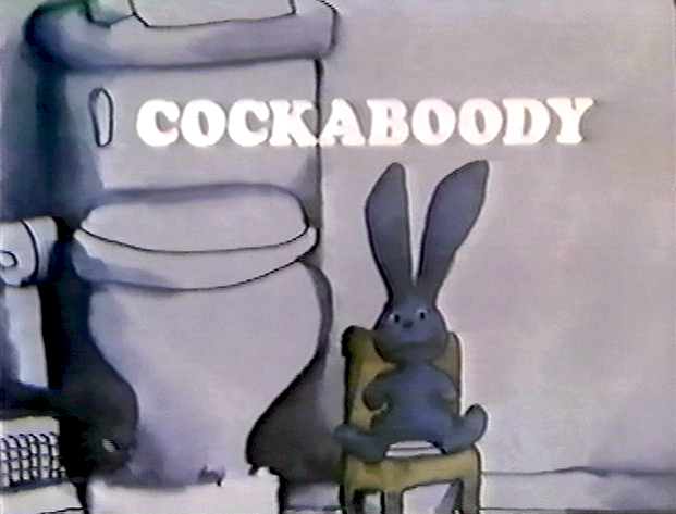
Eventually, I was back at the Hubley studio helping to finish up the short Cockaboody.
The tightening of my inbetwees only brought positives to what I could now do for John Hubley’s studio’s animation.
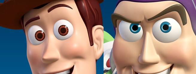 To this day, I still watch eyes closely. For some reason, the tighter the linework, the closer I watch the assistant’s work. The looser the line, the more I watch the design. I prefer watching the design. Often it means eyes that can be easily labelled: Disney, Paramount, or Terrytoons. I suppose today, you’d say: Pixar, Dreamworks or Blue Sky. (And believe me, you can see those differences even in cg.)
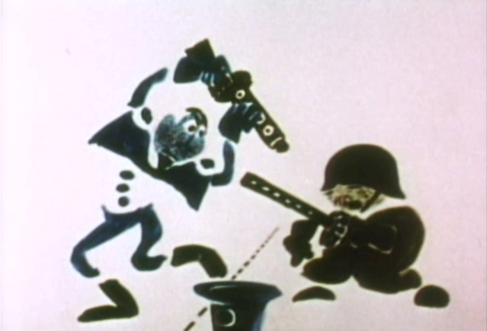
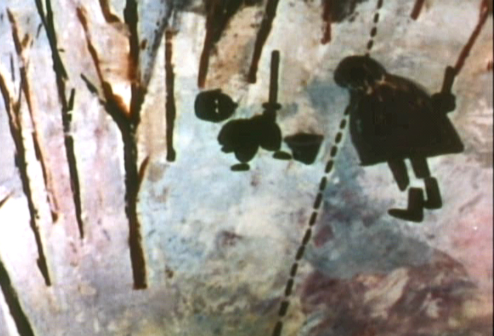
The images above are from the following films:
Commentary 08 Oct 2011 06:33 am
Really Rambling
- I enjoy reviewing and assessing the past week on these Saturday blog posts. It gives me a chance to reflect on what had happened in the recent past and spilling my thoughts out here.
 In the last week, I purposefully put John Hubley front and foremost on my blog’s mind. With the upcoming AMPAS show on Monday, I found a good excuse to pull together a lot of the past pieces I’d done on Hubley’s work and drawing. He was one of the foremost fine artists of animation’s past, and it seems to me his name, like many others of the period, are falling into the historic dumpster of time. His accomplishments were many that helped shape who and what we and animation are today. Yet, it feels as though we’ve stepped back into the mid-thirties with the computerized-accomplishments of cgi.
Animation HAS taken an enormous step backward, yet it keeps the future-seeking part of the business in the line of vision.
By that I mean that cgi has forced a concentration of life-like looking little puppet characters that appear superficially “real.” It’s nothing more than a cartoon version of 19th century illustration. Gone are
John Hubley all the strides that 2D animation had made
are left to the 2nd rate TV animation or the small-time boutique filmmakers. Any progress that graphic stylization and animation graphic motion has developed over the years has been put out to pasture in the business model of 2011 and sent to the low-budget creators. This, to me, is probably a sure sign that animation will wither, at least for a while, except in the hands of the creative entrepreneurs and feisty animators.
 John Kricfalusi has this week shown off a nice graphic piece of animation he did for Cartoon Network’s Adult Swim. He’s successfully experimented with movement and has fallen back on his usual sense of graphic design. The piece is a real contribution to the language of animation (perhaps equal to a new punctuation mark), but we have to take note that this is relegated to a bumper for a lot of terrible TV animation designed for 16 year old boys. It’s wasted there. In a way, more successful was his guest animation for the __________John Kricfalusi
opening titles of The Simpsons. Actually,
this animation in its content and stylization (both graphic and animated) were more daring. It brought back memories of the coarse and graphic animation done by Klasky-Csupo for the first incarnations of The Simpsons. One wonders whether the show would have been as successful if they had continued doing what they’d done in those first pieces and episodes of Matt Groening’s work.
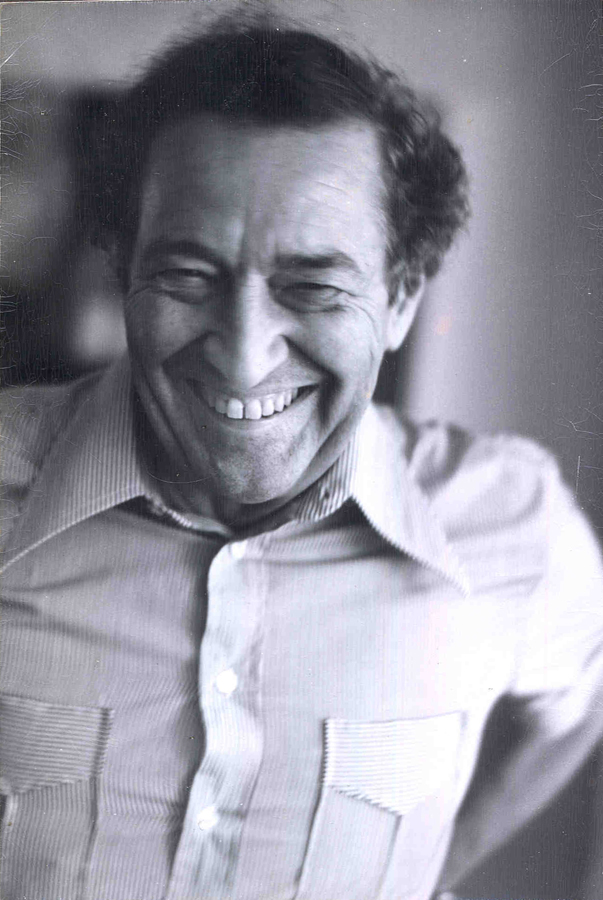
But back to John Hubley. He has to have been the finest artist and the best draw-er I’ve met in animation. His loose scribbles revealed worlds beneath them and his oil paintings burst with imagination and lively colors. Nothing was unintentional although it all worked in an improvisational way. Like the ad-libbed voices, Hubley liked seeing his artists improvise their way out of scenes. He called on the creativity of the lowliest employee to create those wonderful films. For those who didn’t want every 16th frame drawn out and planned for them, Hubley’s method was liberating and challenging and wonderful. Animators like Tissa David and Bill Littlejohn and Barrie Nelson thrived on the way they were handed whole films and pushed to create. Films like Windy Day or Cockaboody or Of Stars and Men glowed off this improvisation, and whole new bits of language sprouted from these works.
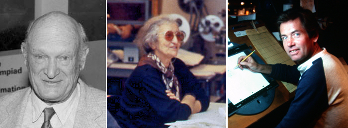
Animators: Bill Littlejohn, Tissa David, and Barrie Nelson
Those who worked for Hubley felt as though they were creating something important, films that had something to say and looked beautiful. Needless to say, they (we) loved the experience. Isn’t that all we could hope for in this business?
.
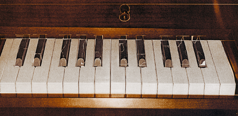
- Talking about extreme design, John Schnall has to be one of the most entertaining guys out there. He continually comes up with funny and artful pieces which he puts on his website. His most recent piece is an interactive keyboard called The Interactive Crappy Piano. I suggest you try playing it and see where it gets you.
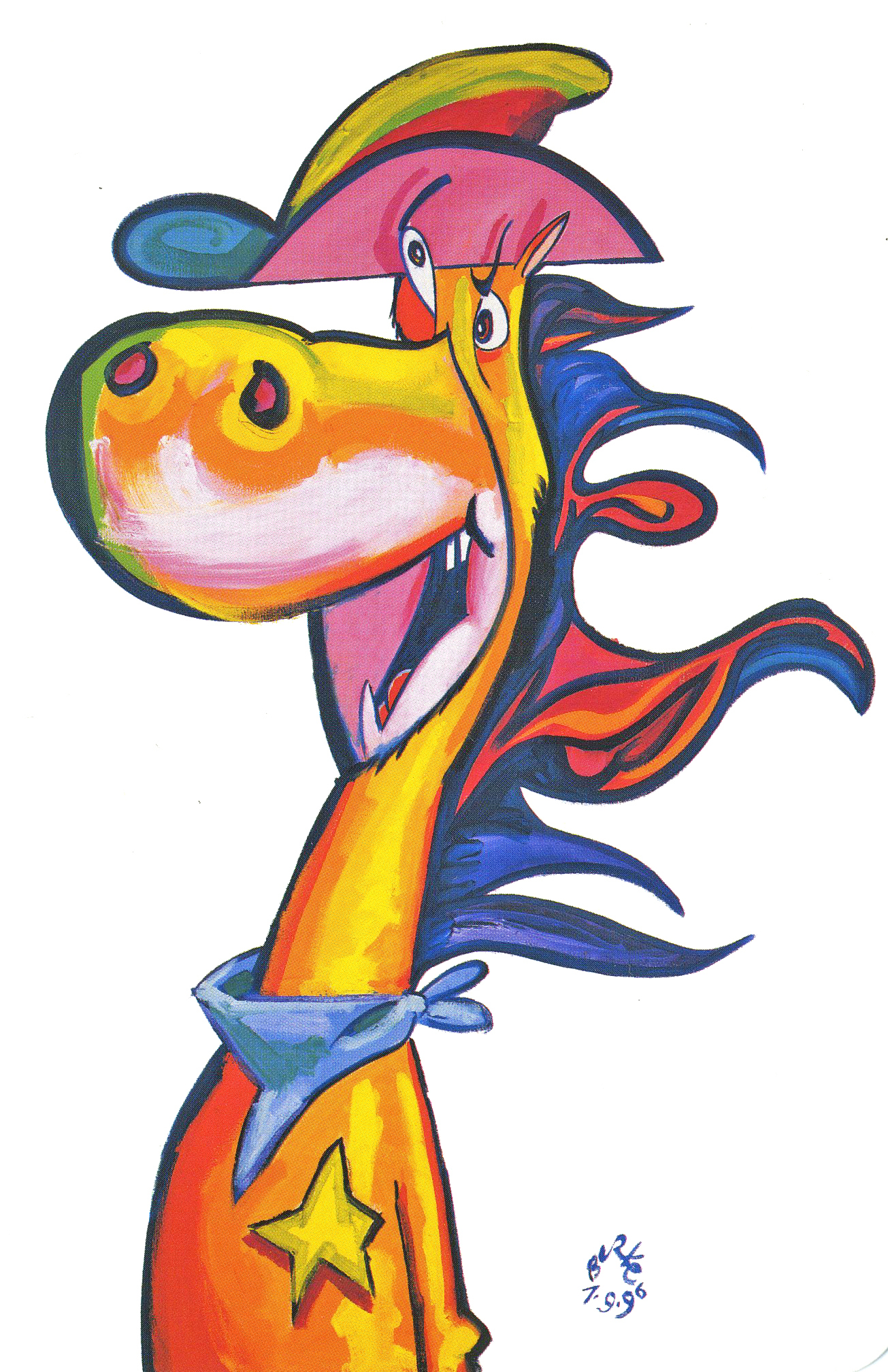
Phillip Burke’s QUICKDRAW
- J.J. Sedelmaier has an entertaining piece on the Imprint site about the first elements used to showcase the sale of Hanna-Barbera and the rise of Cartoon Network. You’ll be entertained by the beautiful cards on display. (Especially if you have a fondness for the early HB years.)
Commentary 04 Oct 2011 06:39 am
Hubley/Blair
- Two shows are about to take place; one in New York (Monday October 10th An Academy Salute to John Hubley), another in Los Angeles (Thursday October 20th, Mary Blair’s World of Color; A Centennial Tribute). I wish I could attend bothh of them; I’m happy to be in NY to attend the John Hubley program (and be a small part of it.)
Interesting that these two shows appear in the same month at two different AMPAS stations. Yet, the two artists couldn’t be more diametrically opposed in their work. One was more of an illustrator, albeit a brilliant illustrator, and the other was more a fine artist.
.
Everything about Blair’s work, from The Little Golden Books to the designs for the Disney features of the early 50′s to the overall design for It’s a Small World in Disneyland, are all glorious testaments to a first rate, gifted illustrator of the highest caliber. She radically changed her style on the trip to South America with the Disney group, and she brought these brilliant color mixes back with her to the work she did at Disney. The colors were almost there for the sake of the colors, alone. The work developed and grew more sophisticated with all that she did, and her color schemes became more radical as she designed for the Disney features.
.
.
The grand statement of the art . . . well, there was no grand statement. It was done to further the films or the projects, and had no message. It was beautiful production art, but it was not really “Art.”
.
.
 Hubley’s work sought to create art, and the style and growth continued upward through his years. The work at Disney’s studio started as gifted illustration (Snow White), then turned to a looser feel with oils (Pinocchio) and watercolor (Bambi). As he moved to UPA, the art followed Steinberg and Picasso closer to the world of abstraction. Ultimately, with Adventures of an * and films that followed (done by and for himself and his wife Faith) the Abstract Expressionists ruled, and Hubley’s art went far into that direction and stayed there through most of his films.
.
Tender Game, which followed Adventures of, was a variation that seemed to emulate some of the work of Baziotes. Moonbird was where Hubley came into his own and created a very rich style that was all his own. Variations on it came with The Hat, The Hole and Of Stars and Men. A new direction came with Windy Day. By the time we reached Cockaboody, a softness settled into that very same style and watercolor backgrounds dominated. There was throughout all this work a beautiful development where one phase grew out of another which had grown out of another.
.
And there was a grand statement: all art, abstract or realistic was an abstraction and it touched all of our lives regardless of our thoughts about it. Picasso could be dismissed by those not in the know, but eventually the masses would warm up to him and eventually take it for granted that this, too, was Art. Hubley helped make that world – this world – so. Acceptance and understanding was part of his oeuvre.
.
One wonders if Hubley had remained at Disney’s as long as Blair had whether any of his rich design style would have controlled the films as her work had. Of course, the answer is obvious. He never would have been able to remain at Disney’s studio. His penchant for the further development of the art – out of the 19th century illustration – would not have allowed him to sit still there. By leaving, he not only pushed his own work into a higher realm, but he pulled animation there with him.
.
.
In a sense, without his work, animation would still be stuck in the 19th Century graphics and would not have moved into the 21st Century. We can see evidence of this with all the cgi features being done today. Those little fabricated computerized puppets are wholly stuck in 19th Century art, yet 2D has moved on. We accept “Beavis & Butthead” or “Aqua Teen Hunger Force” (both badly drawn works that are most definitely 21st century graphics) because Hubley changed things. Not that John Hubley was the only one who wanted to do more, graphically, in animation, but others seem content with modernized cartooning. Chuck Jones, for example, who led the way in 1941 settled into a stylized cartooning in the 1950s. Hubley sought art – something different and deeper than was acceptable to others.
Picasso led to acceptance of Andy Warhol and Robert Rauschenberg; Hubley led to acceptance of “South Park” and Yurij Norshtein.
.
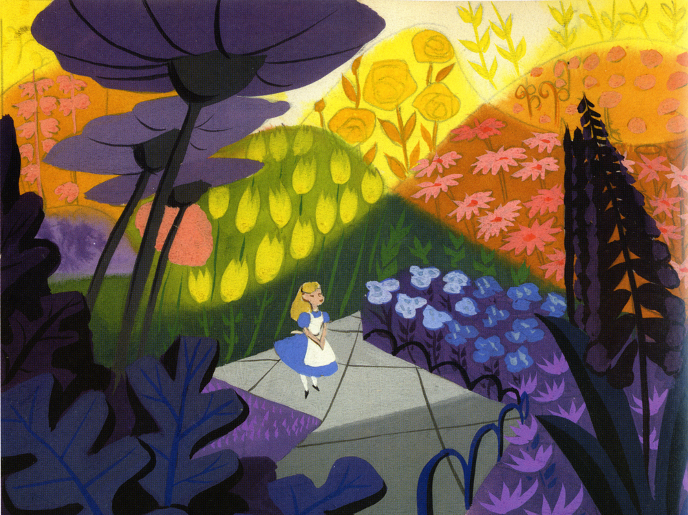
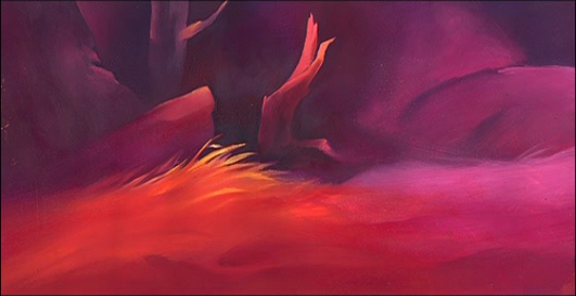
Pictures:
1. Mary Blair – personal painting
2. Mary Blair – Alice In Wonderland
3. John Hubley – Bambi
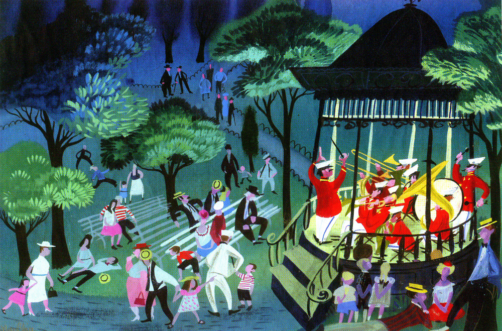
4. John Hubley – Brotherhood of Man
5. John Hubley – Everbody Rides the Carousel
6. John Hubley – Moonbird
Books &Daily post &Hubley 28 Sep 2011 07:33 am
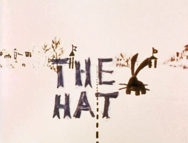
The Hat – even Bigger
As I wrote on Monday, with the AMPAS show about Hubley animation coming this Oct 10th, I intend to put a lot of focus on the work of John & Faith. This piece about THE HAT was originally posted in March, 2011. I’ve added to it.
- The interview Mike Barrier conducted with John Hubley has me thinking about Hubley and my years back there and then. You might say, I’m in a Hubley frame of mind these past few days, so I’m into reminiscing. I posted part of this back in March, 2008; here, I’ve extended the article a bit.
 New York’s local PBS station, WNDT – that’s what it was called in the old days – used to have a talk show hosted by film critic, Stanley Kaufman.
(It turns out that this show was produced by the late Edith Zornow, who I once considered my guardian angel at CTW.)
This talk show was quite interesting to me, a young art student. I remember one show featured Elmer Bernstein talking about music for film. He gave as his example the score for The Magnificent Seven. He demonstrated that the primary purpose of the score, he felt, was to keep the action moving, make the audience feel that things were driving forward relentlessly. I still think of that show whenver I see a rerun of the film on tv.
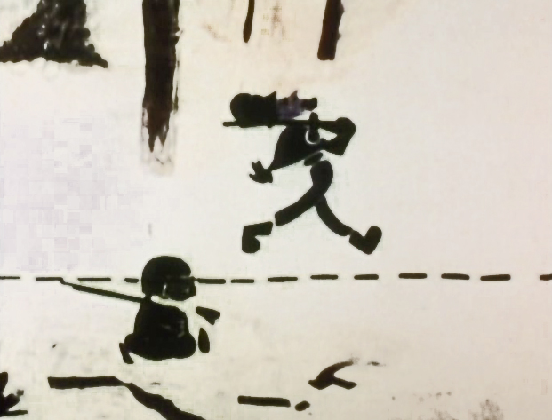
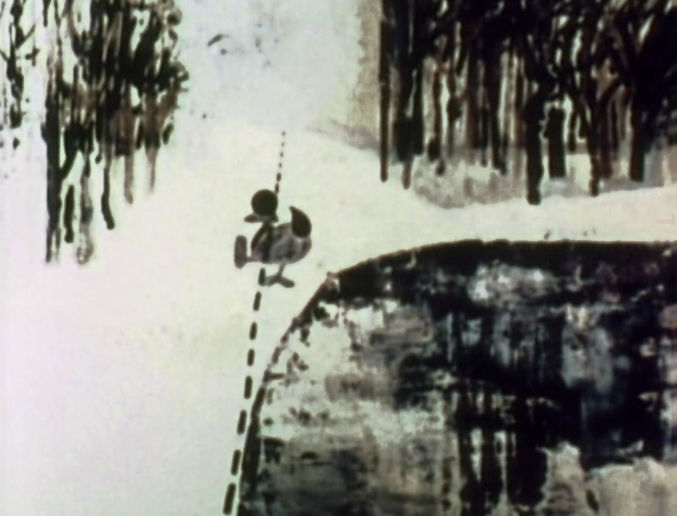
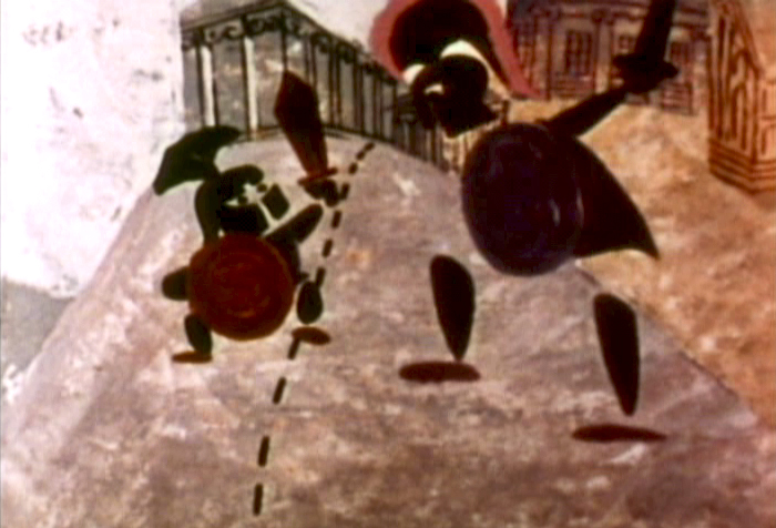
The surprise and exciting program for me came when John and Faith Hubley turned up on the show to demonstrate how animation was done. They were using as an example a film they had currently in production, The Hat. This film was about the silliness of border lines. One of two guards, protecting their individual borders, loses his hat on the other side of the line. Of course, all he needs do is to step over and pick up the hat, but he can’t. The other guard won’t allow him to cross the border illegally – even to pick up his hat.
The voices were improvised by Dudley Moore and Dizzy Gillespie (much as the earlier Hubley film, The Hole, had been done.) The two actor/musicians also improvised a brilliant jazz score.
John’s design was quite original. The characters were a mass of shapes that were held to-gether by negative space on the white on white backgrounds.
 The animation of the two soldiers was beautifully done by Shamus Culhane, Bill Littlejohn, Gary Mooney and “the Tower 12 Group“.
Culhane animated on a number of Hubley films during this period, most notably Eggs and a couple of commercials.
Bill Littlejohn animated on many of the Hubley films from Of Stars and Men up to Faith’s last film.
Gary Mooney animated on The Hole and Of Stars and Men. He was an Asst. Animator at Disney, animated for Hubley then moved on to some of the Jay Ward shows before moving to Canada where he continues to animate.
Tower 12 was the company formed by Les Goldman and Chuck Jones at MGM. Apparently they were between jobs when Hubley was finishing this film, and Chuck offered help.

Of course, the colors of the film as represented by the dvd are pathetically poor.
It’s hard to even imagine what the actual film looks like, and it’d be great to see
a new transfer of all the Hubley films.
 The design style of the film was an original one for 1963. It’s one that would often be copied by other animators afterwards. The characters were searated at their joints. No reel ankles, just open space. They were also broken at the wrists and belts. The taller man seems to have a collection of ribs and shoulders for his torso. Like the dotted line they walked but could not cross, these people were also a gathering of parts.
 This was one step removed from the earlier film, The Hole, which had just won the Oscar and went on to enormous success for the Hubleys. That film used what they called the “resistance” technique. They first colored the characters with a clear crayon. Ten painted watercolors on top of that. The crayon would resist the watercolor and a splotchy painterly style developed. The Hat literally broke those splotches into parts of the characters and put some of the control in the animators’ hands.
.
 The film was obviously political. Anti-nuclear politics played strongly in the story. This was a step just beyond The Hole. In that film, two sewer workers converse on what violent things might be happening above ground. The film ends with an accident, or possibly a nuclear crash.
In The Hat, the two partisan soldiers discuss a history of man’s aggression all within their reach. At one point, it would seem, each of
 them is ready to press the red button calling for nuclear assistance – or, at the very least, a buildup of military force.
While walking up and down that line, they comment on how we reached the point of no return. All the while, bugs and small animals cross the line, indeed, walk on or over the “hat” lying on the ground.
The backgrounds for this history of War grow more violent, more expressionist. John’s painterly style comes to the fore, and the brush strokes take on a force we haven’t seen to this point.
When we return to the two leads, we find that they’ve changed. They’re darker, and they both have lines scratched into the paint of their bodies. Not as much emphasis is placed on their disjointed body parts.
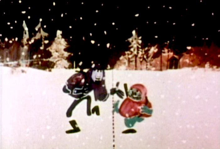
We leave them as we found them, walking that line. At this point, both of their hats lay on the ground and they’re deep into conversation. They don’t seem to notice anymore.
It has started to snow.
.
.
Shamus Culhane wrote about The Hat in his autobiography, Talking Animals and Other People. Here’s some of what he wrote:
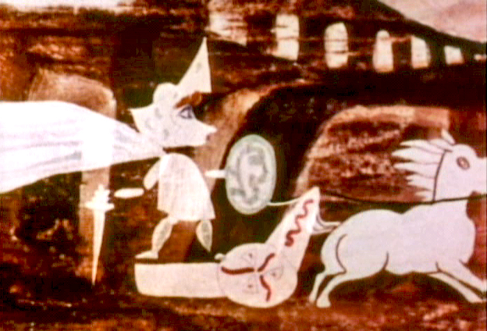
- In 1964 the Hubleys wrote a short subject called The Hat. It was subsidized by an international peace organization. The picture featured two sentries marching on opposite sides of a boundary line. A clash occurs when one soldier’s hat accidentally rolls into enemy territory, and the other soldier refuses to return it until he has checked on the necessary protocol. During the ensuing discussion the two men become friendly, and the film ends on an optimistic note.
Although there were other characters and animals in the picture, the two soldiers accounted for about 80 percent of the footage. When Hubley asked me if I could do all of the animation of the sentries myself, I jumped at the chance. The last time I had drawn full animation, other than one-minute spots, was about twenty years before, when I worked with Chuck Jones at Warners.
The Hubleys were exciting to work with because they had a strong sense of adventure in their filmmaking. John was never tied down to techniques that he was already familiar with. Each picture was a new experience, because the appearance of the film was always dictated by the content. The Hat was no exception.
The design of the two sentries presented some odd problems in animation, in that the action was going to be normal, but the arms and legs were not attached to the bodies. Although we had detailed model sheets of each soldier, Hub’s layouts paid scant heed to his original designs. As the picture progressed his drawings of one of the soldiers became more and more Christ-like.
While I animated the picture at home, Hubley and I worked very closely together. Whenever I had a few scenes finished, we would have a conference on this work and the following scenes. Hubley was a very enthusiastic director. He would pick up the newly animated shots with obvious excitement, flip the drawings, and burst out laughing. His pleasure was so infectious that I would laugh, too. We shared a feeling of joy in the whole process or filmmaking.
The animation of The Hat took many months. During that time, with my usual curiosity about the working methods of great artists I have worked with, I studied Hubley’s approach whenever I could. In the first place he worked in a room that was crammed with the largest collection of art books I have ever seen in private hands. The subjects ranged from prehistoric cave paintings to Picasso, Klee, Chagall, and other modern artists. There were books on the art of every culture imaginable, Aztec, Mayan, Chinese, Persian, Greek, etcetera.
At the beginning of a picture Hubley would pore over a random selection of art books. Seemingly they had no relationship to each other, but he was using them to inspire his own sense of design. However, the final appearance of a Hubley film was never blatantly derivative. In The Hat, for example, I have the feeling that he was influenced (if that is the right term) by Chinese scroll painting, but that is just my own intuition.
Since Hubley was going to paint his own backgrounds, the layouts were usually little more than a vague series of scrawls with little or no detail, unless the background and the animation were going to be closely related.
Unlike Disney Studio, where the dialogue is broken down for the animator in meticulous detail, Faith gave me a very loose track analysis. Neither Faith nor John seemed to be concerned with precise synchronization of the mouth action and the dialogue track.
John’s instructions for the movement of the characters were also very loosely indicated on the exposure sheets. It seemed to be his feeling that the pace of the animation should be the shared responsibility of both the director and the animator.
The Hubley children had to be the luckiest kids in New York City. Not only were they encouraged to draw, write, and paint, but in their Riverside Drive apartment the Hubleys had built a small stage, so it must have been easy for the family to create the sound tracks for such imaginative films as Moonbird, Windy Day, and Cockaboody.
Like John Cassavetes, the Hubleys believed in the value of ad-libbing sound tracks, so a good deal of the children’s dialogue in these pictures was completely spontaneous material.
Whatever his formal education had been, Hubley was a very well-informed person, with a sophisticated view of life. One Saturday morning I dropped in to find John working alone, and in a very depressed mood. It happened that I was on the down side myself that morning. After we had talked over the work in the new scenes, our conversation drifted off into a very open discussion about the problem of being an alienated personality. We exchanged anecdotes about incidents that had happened to us because of alienation.
Somehow our talking acted as a catharsis, and we both found our moods lightened. We ended up laughing, and agreed that being alienated in our kind of society had more merit than most people realized. It was a very stimulating discussion.
Animation Artifacts &Disney &Story & Storyboards 26 Sep 2011 06:47 am
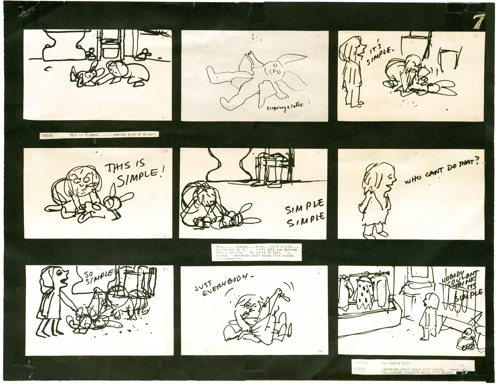
Cockaboody Board – recap
- On October 10th the Motion Picture Academy will present a program of films by John & Faith Hubley. John Canemaker and Emily Hubley have assembled the program and although it is composed mostly of films by John (I’m not sure he would have been happy about that), there will be a lot of his early films like Flathatting (for the Navy) and The Magic Fluke and Rooty Toot Toot (for UPA.) There will also be recently restored prints of Adventures of an * and Tender Game as well as the late film, Voyage To Next. The show will have plenty of surprises of very rarely seen and hard-to-find material.
To reserve a seat go to Oscars.org. Academy members – $3.00. General Public – $5.00. or you can pay by mail with a form you’d get on line. Don’t wait; it’s probably sold out by now.
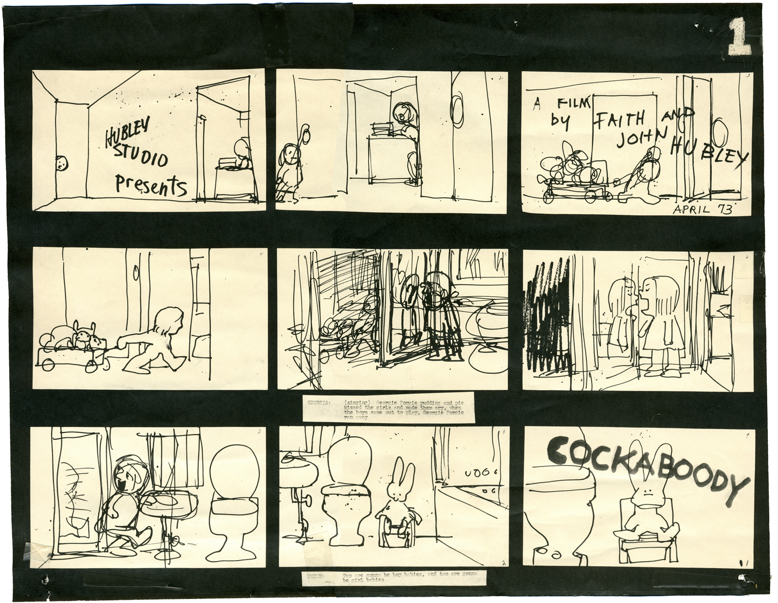
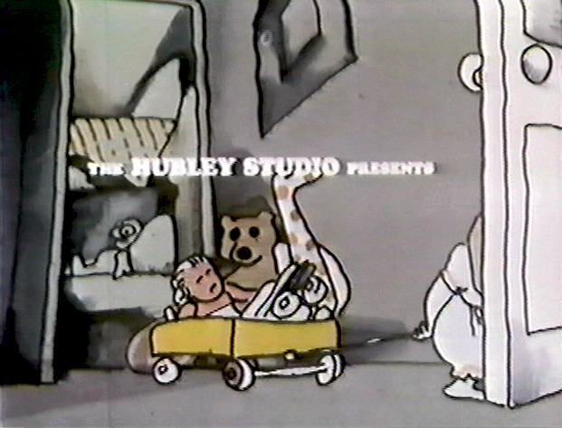
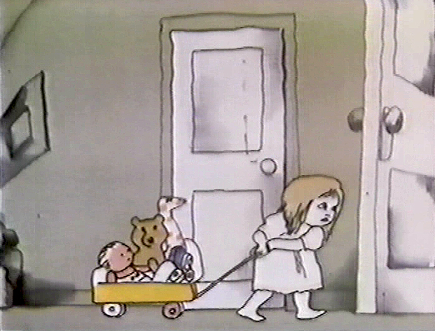
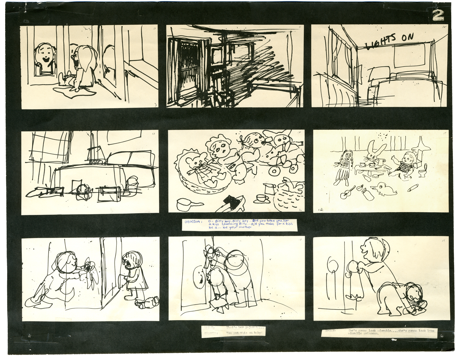
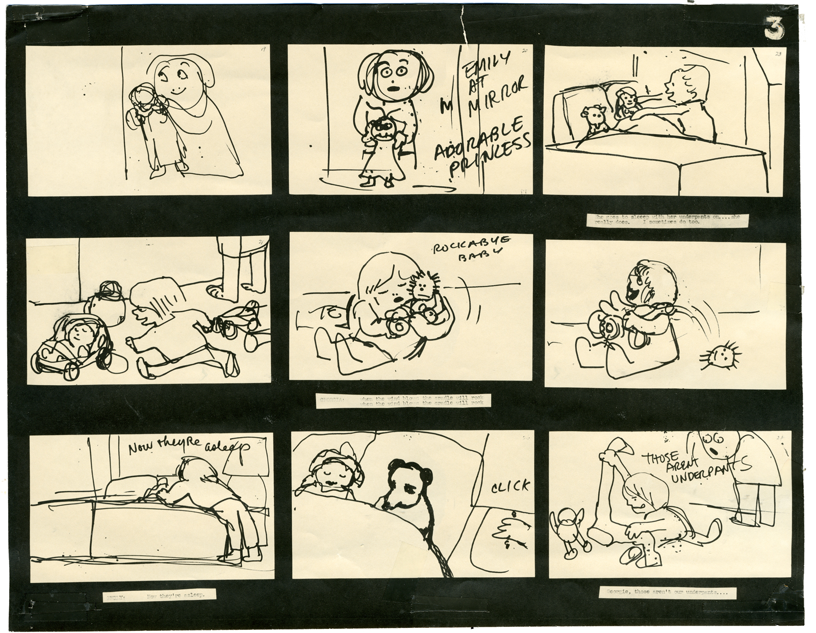
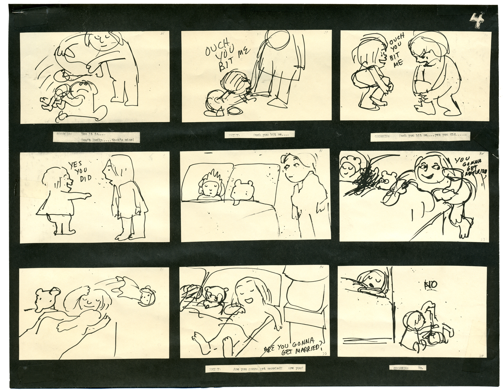
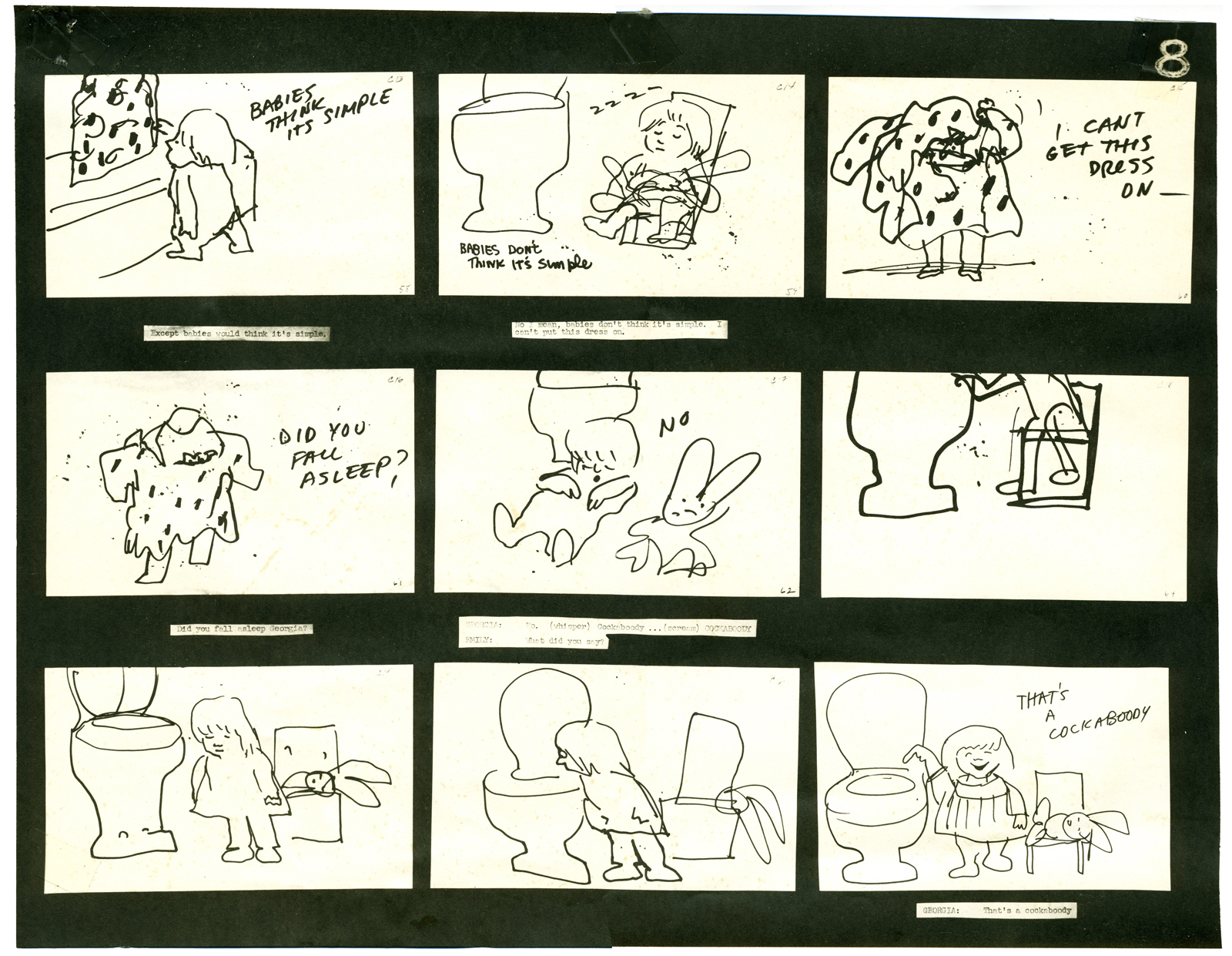
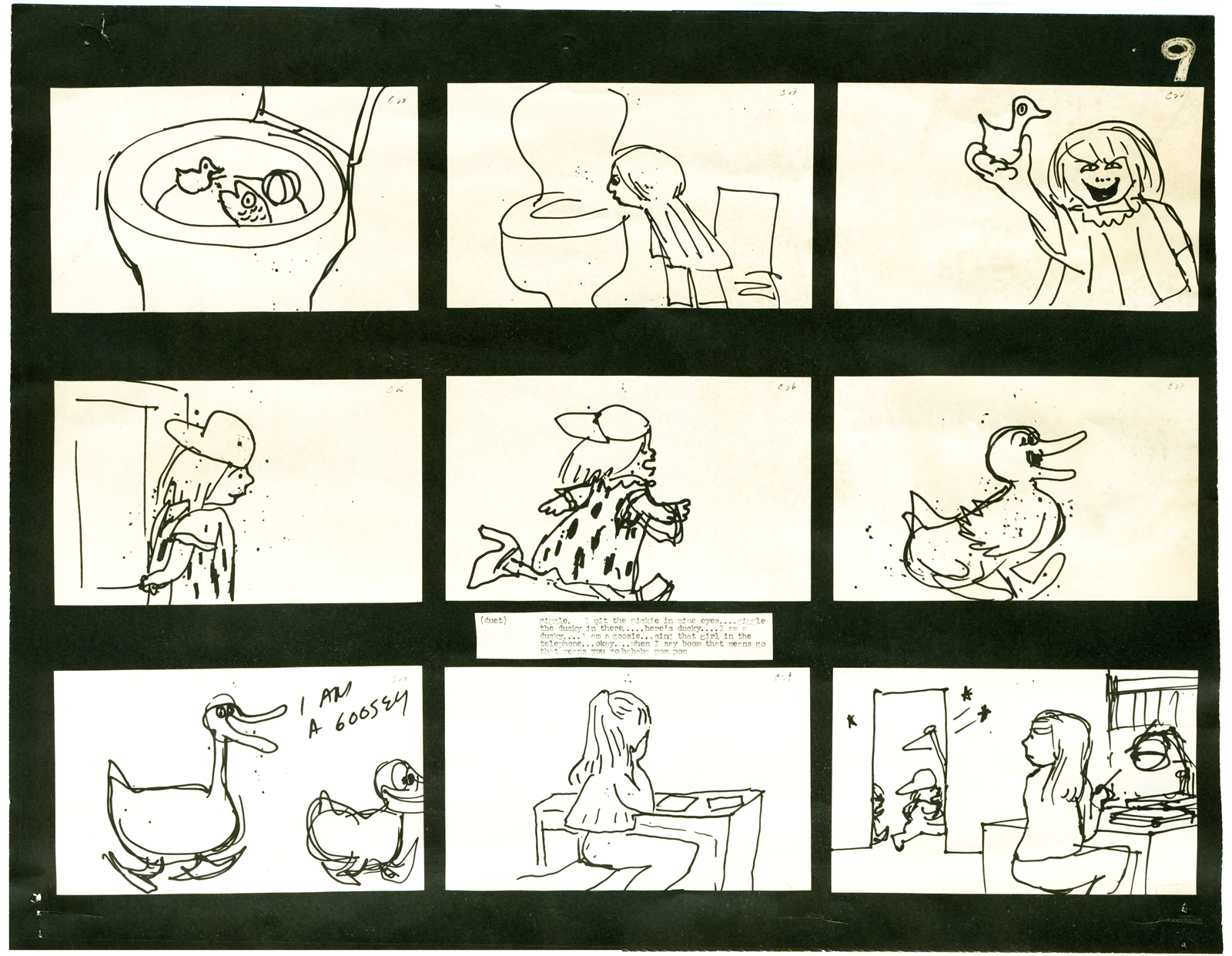
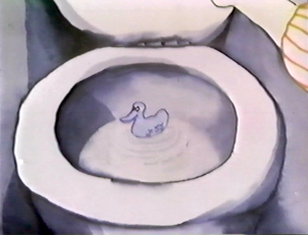
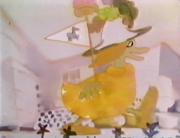
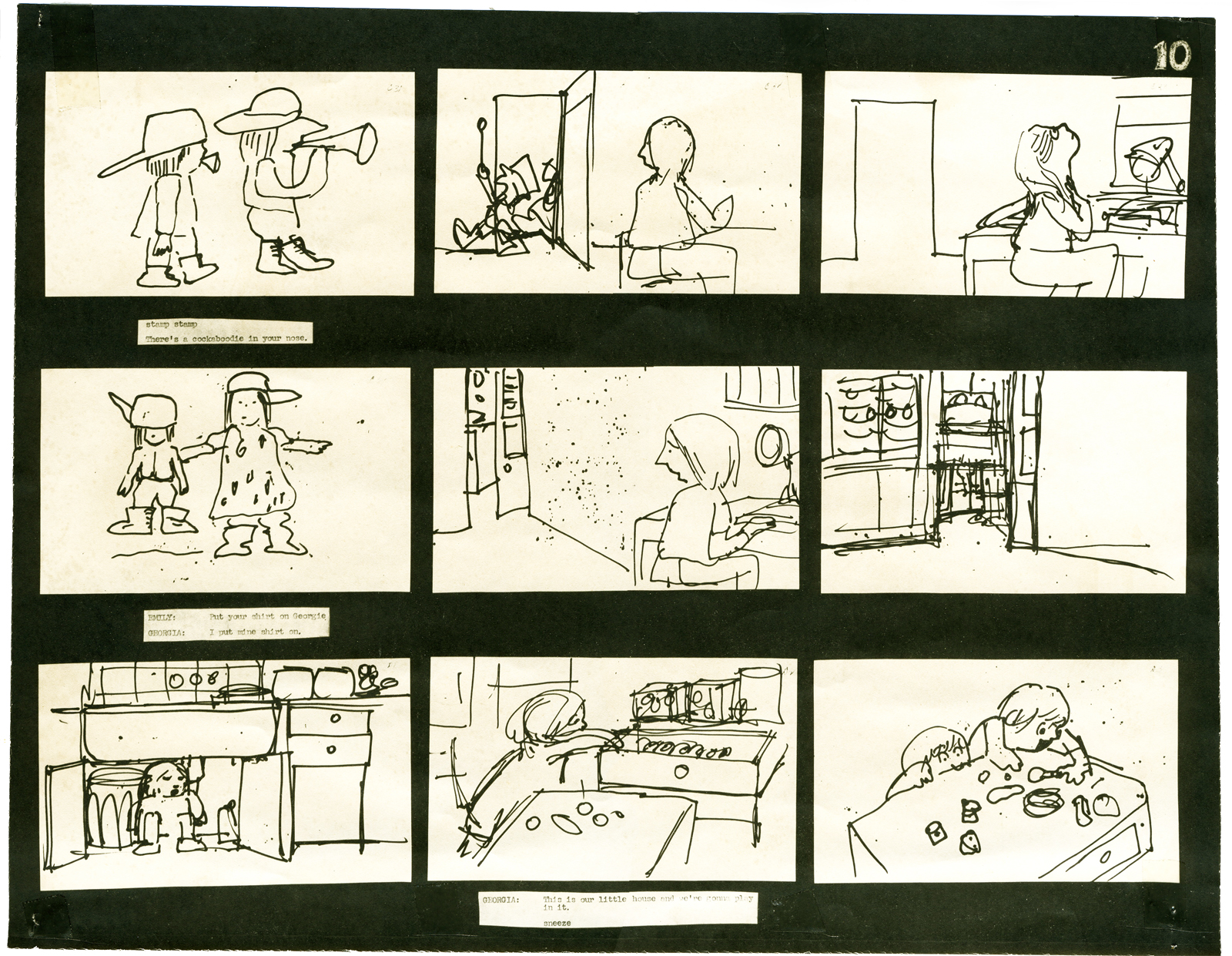
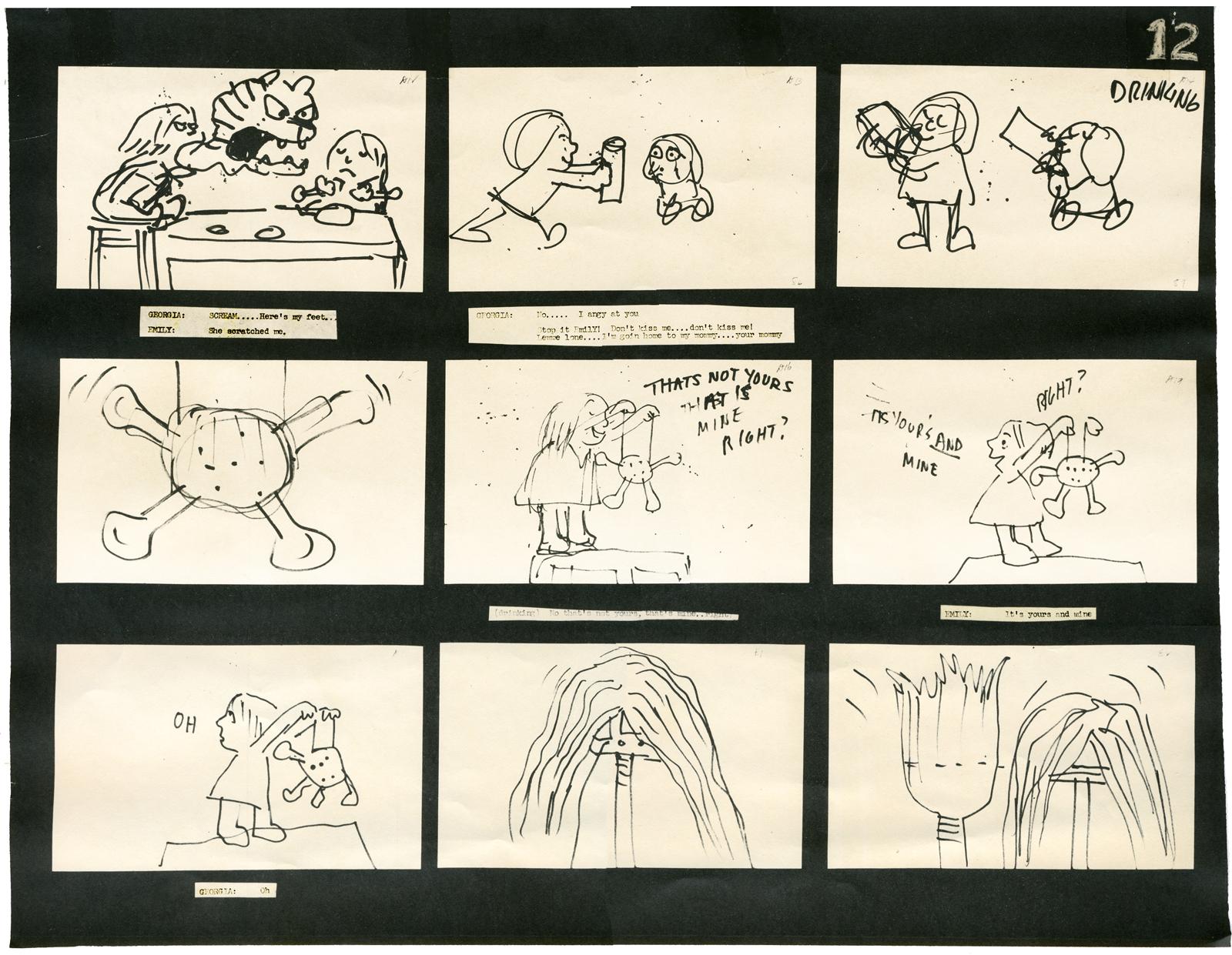
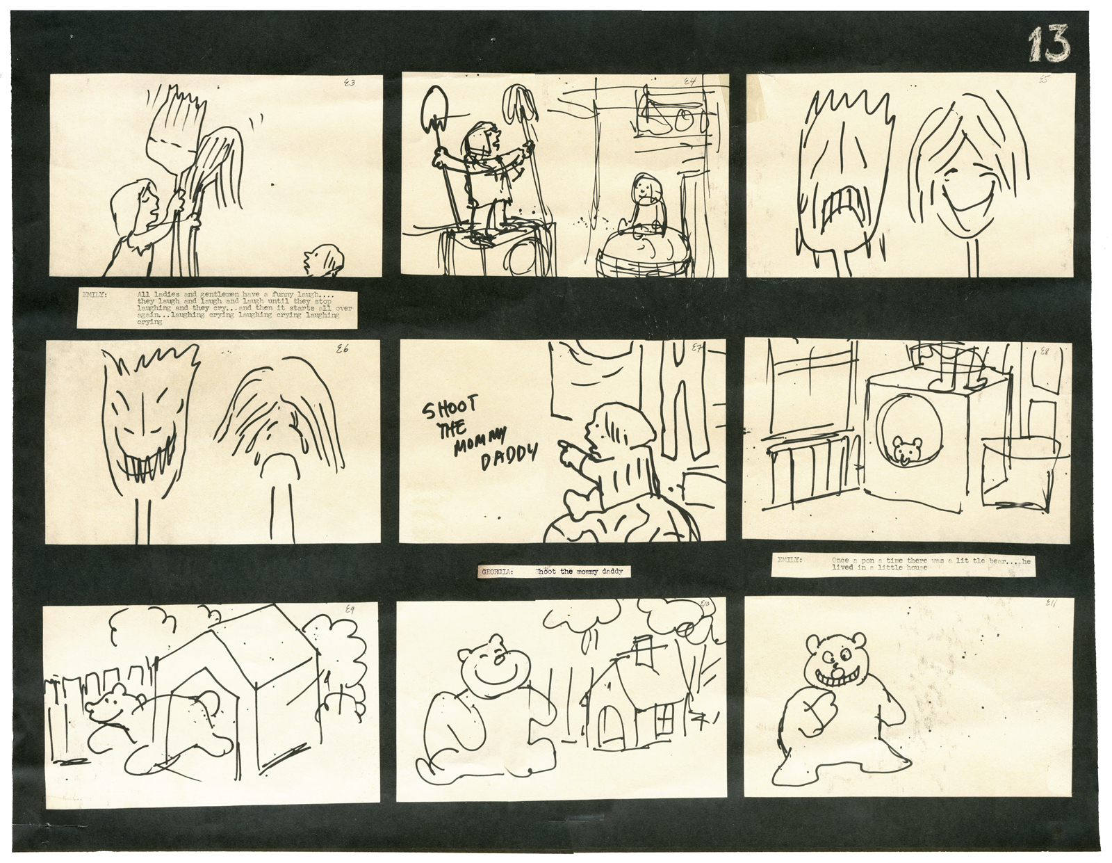
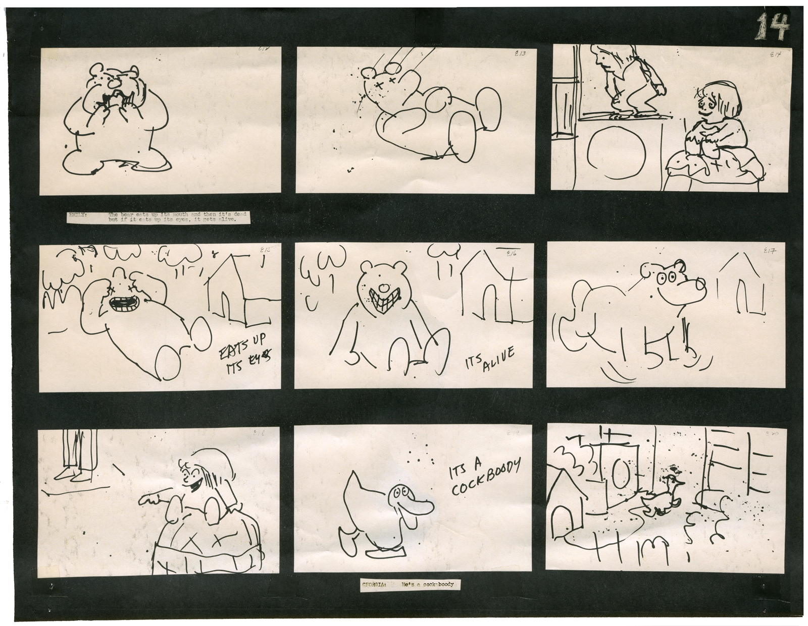
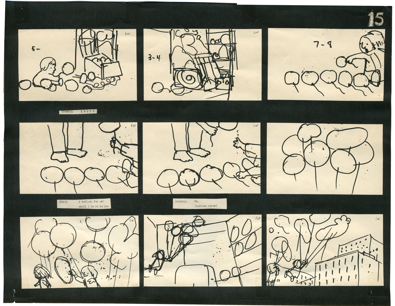
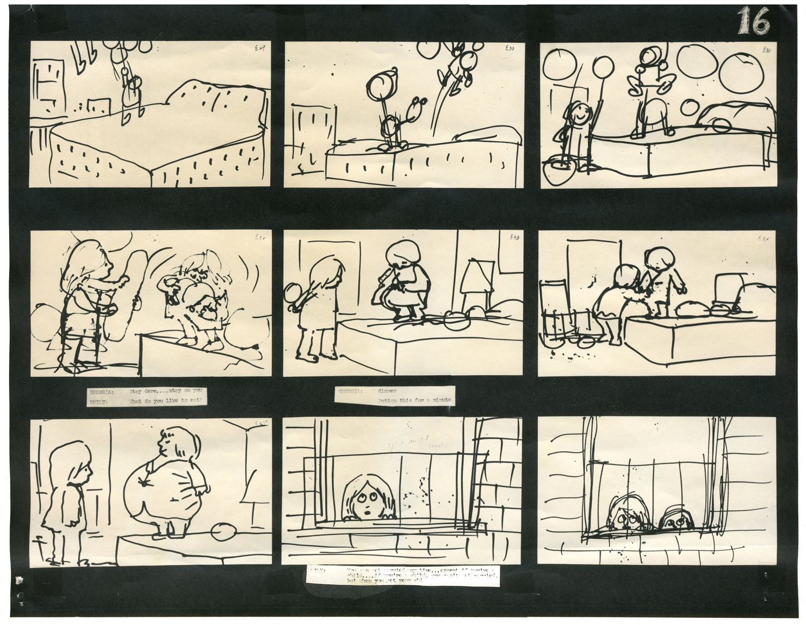
I will be posting as much of the Hubley art as I can in celebration of this show. To start with here’s the storyboard for Cockaboody.
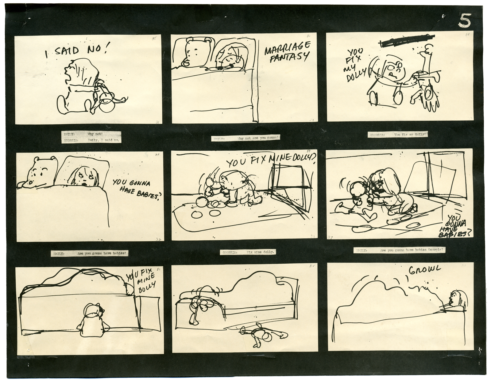
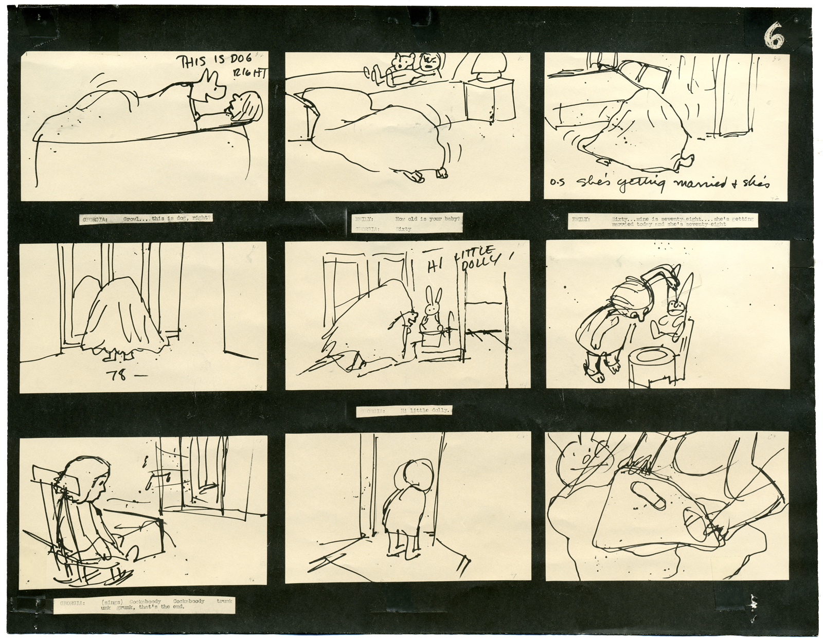
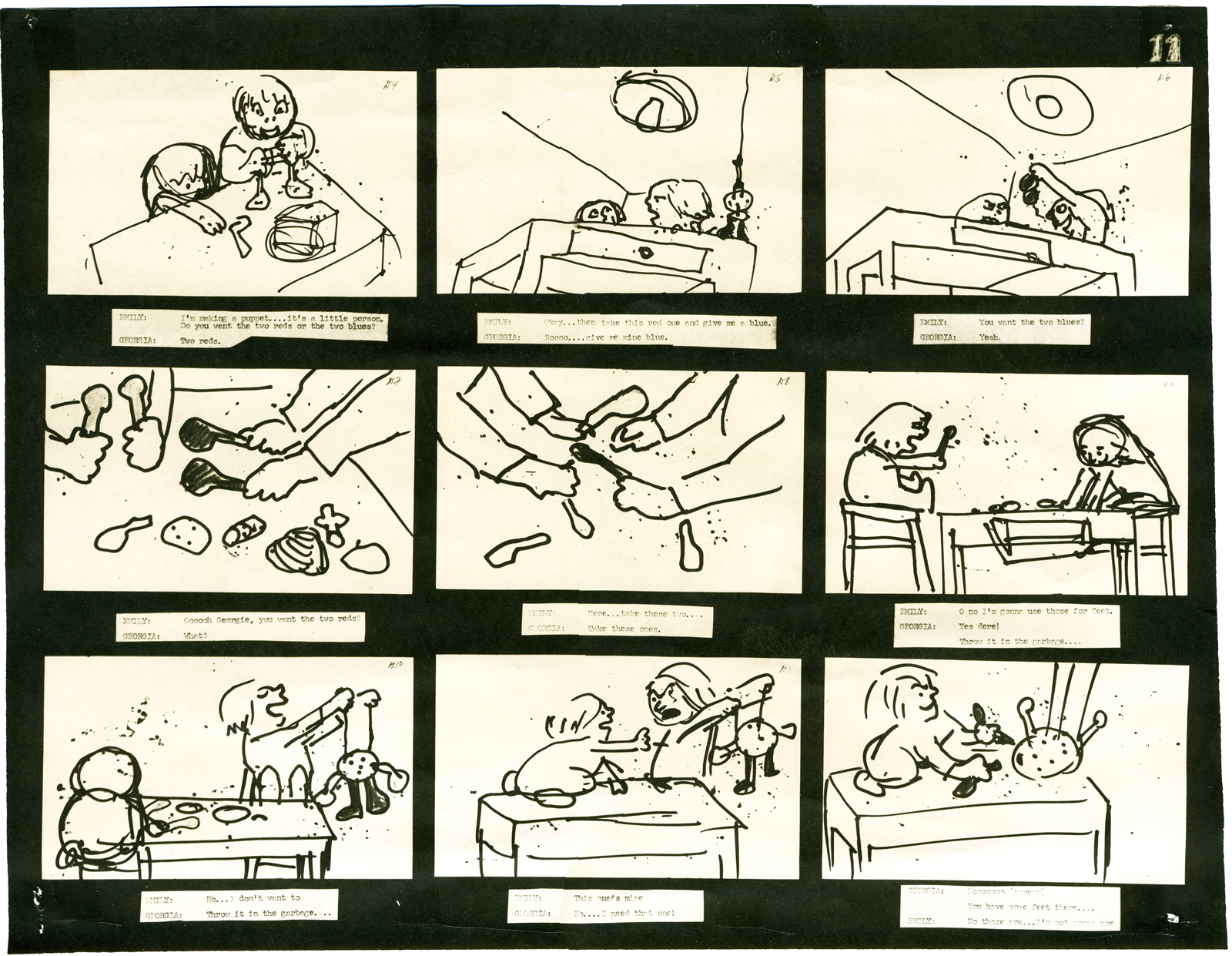
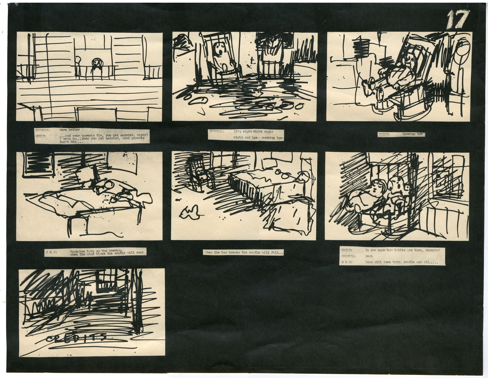
 – I have a photostat copy of the storyboard to John and Faith Hubley‘s short film, Cockaboody. So I thought I’d post it to give a good demo of a storyboard from a master. The board was done in 1973.
I had worked at Hubley’s for four months on Letterman and was layed off when that work ran out. They started preliminary work on Cockaboody while I was working on the feature Tubby The Tuba.
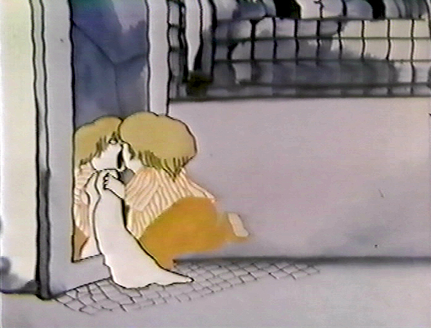
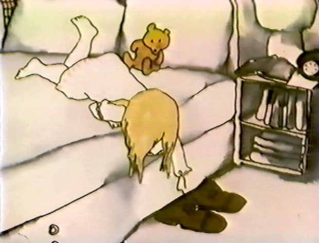
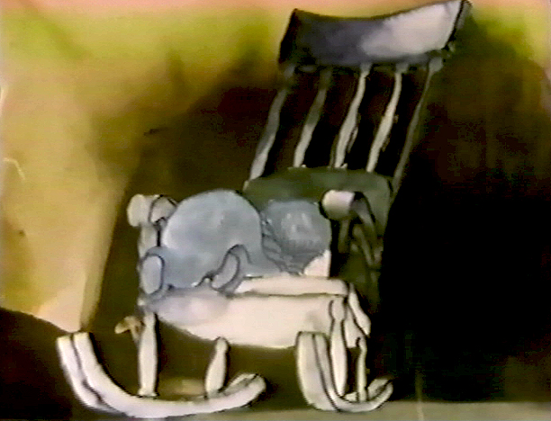
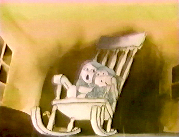
I left that project in time to get back to see the final scenes of Cockaboody colored, and I did a little animation of a rocking chair, with the two girls cradling it, at the film’s end. I didn’t do enough work on the film to receive credit, but I can still see my pencil lines on those two girls at the end of the film.
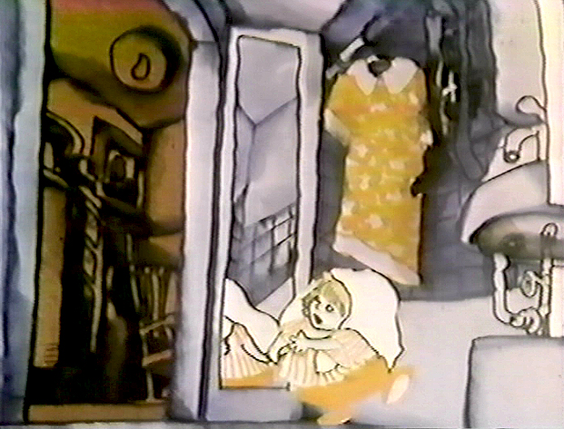
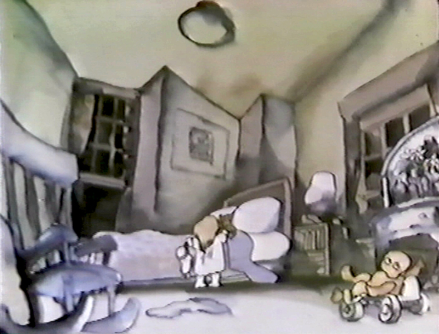
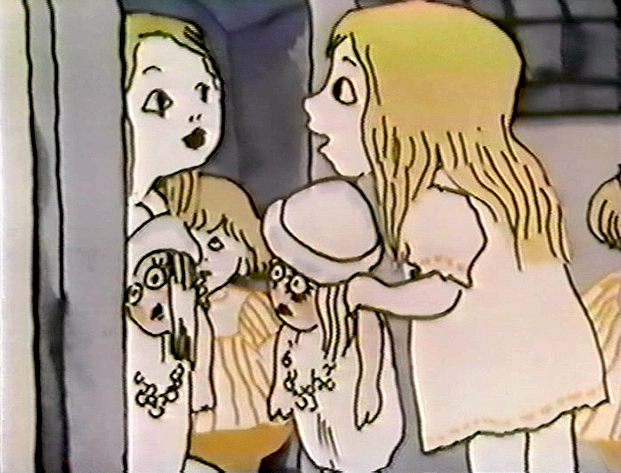
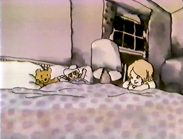
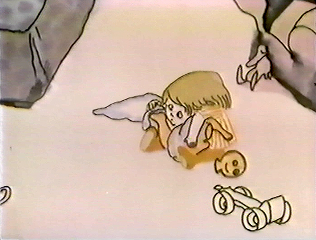
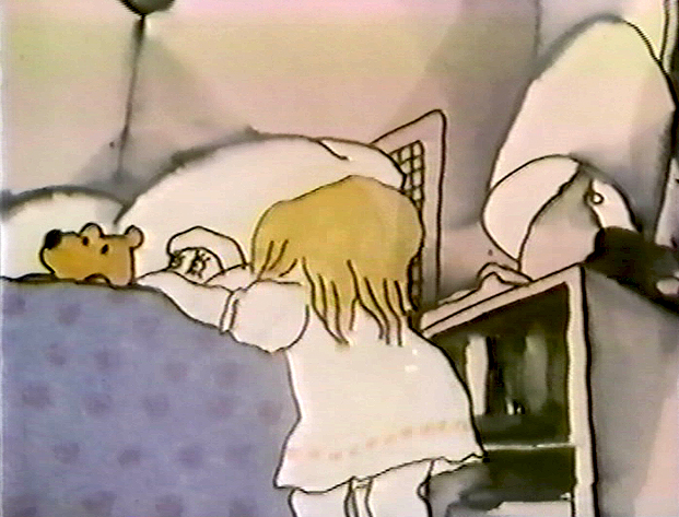
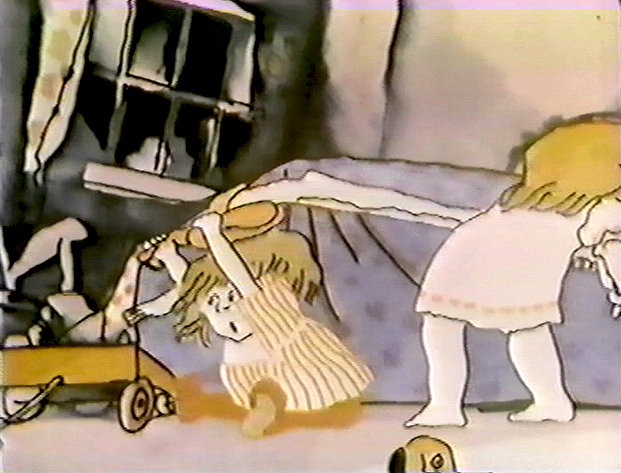
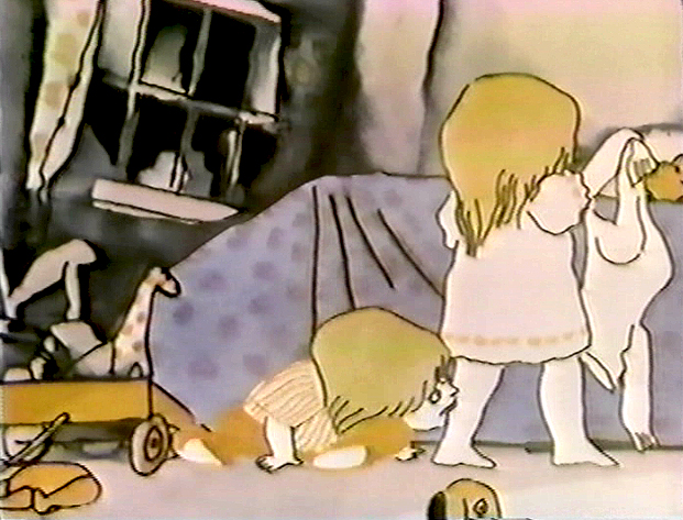
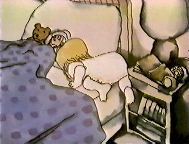
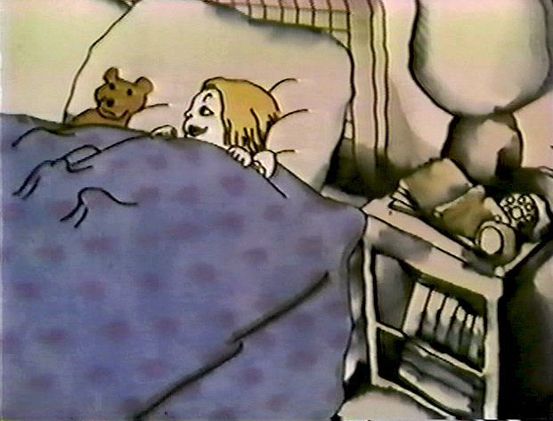
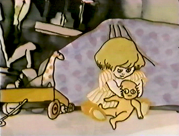
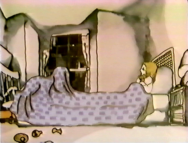
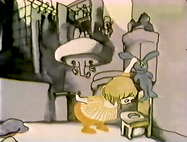
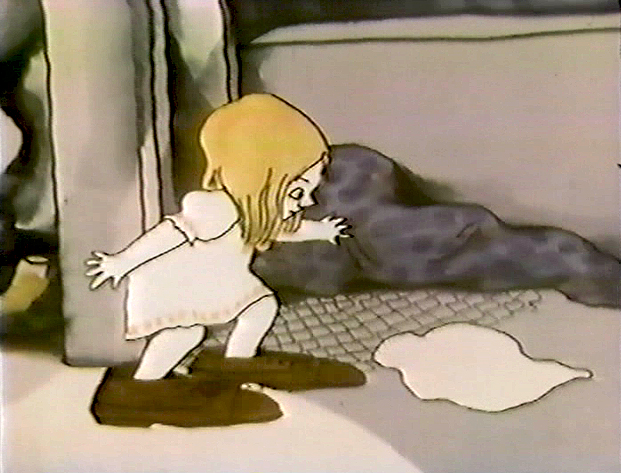
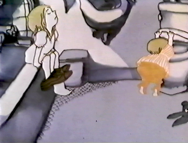
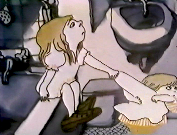
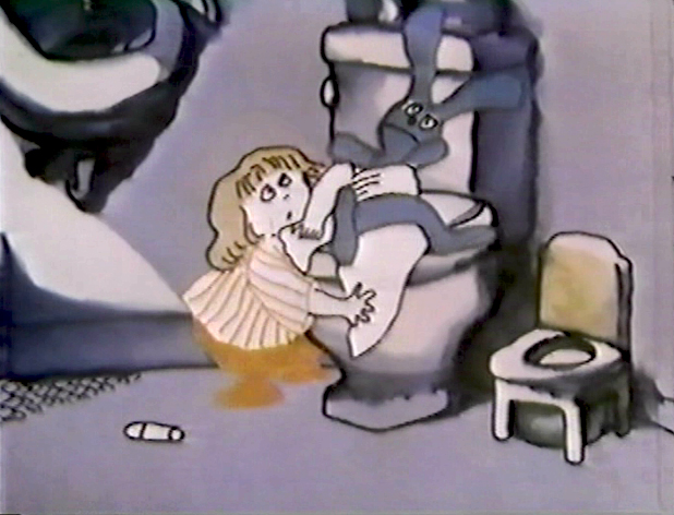
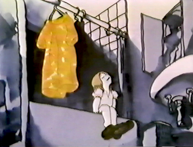
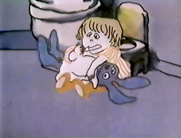
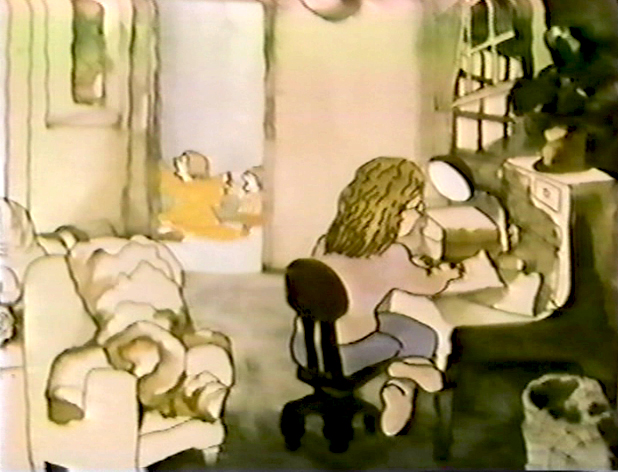
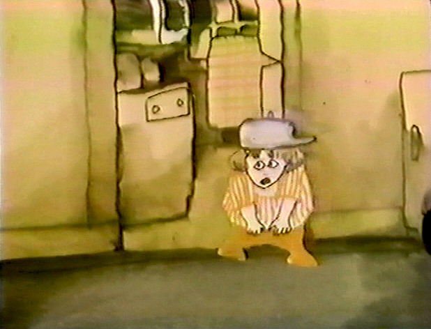
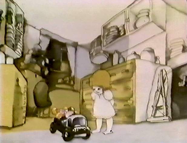
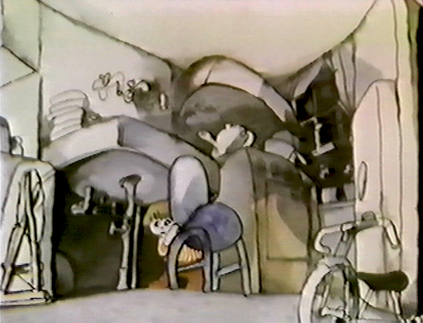
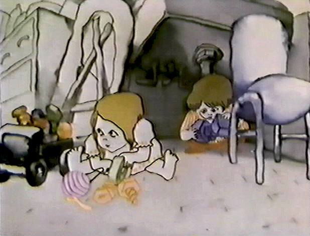
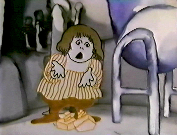
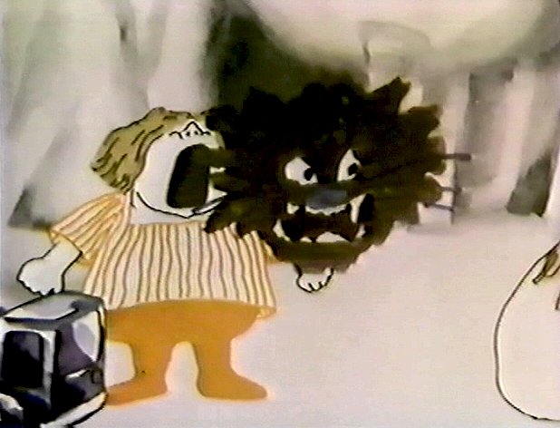
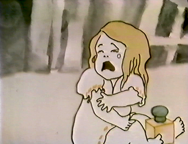
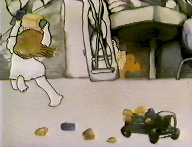
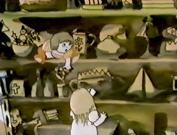
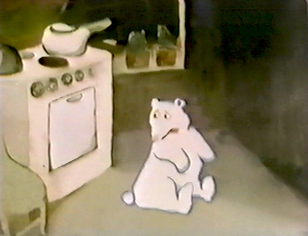
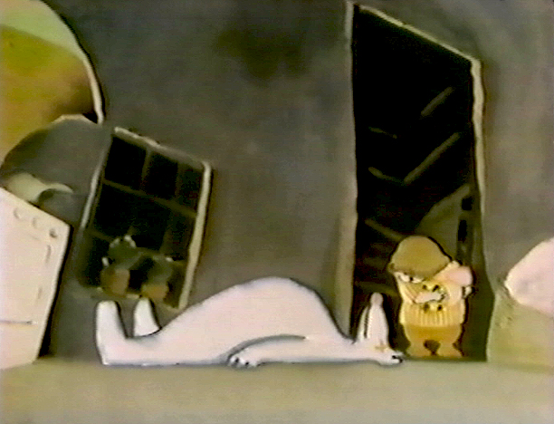
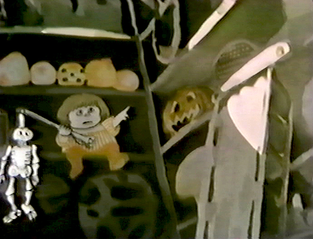
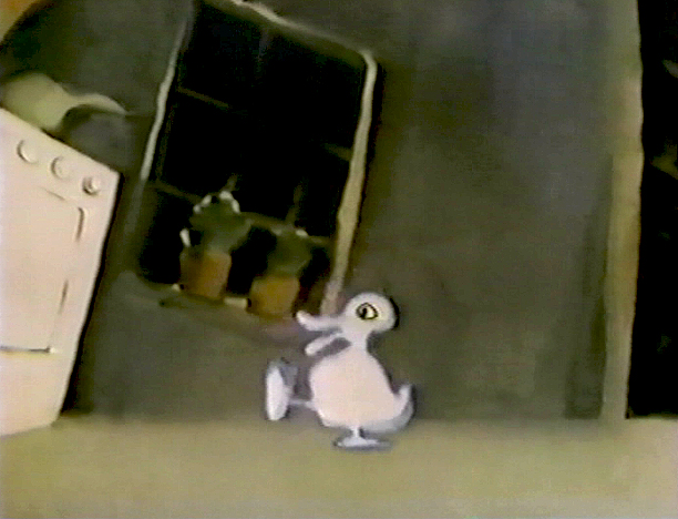
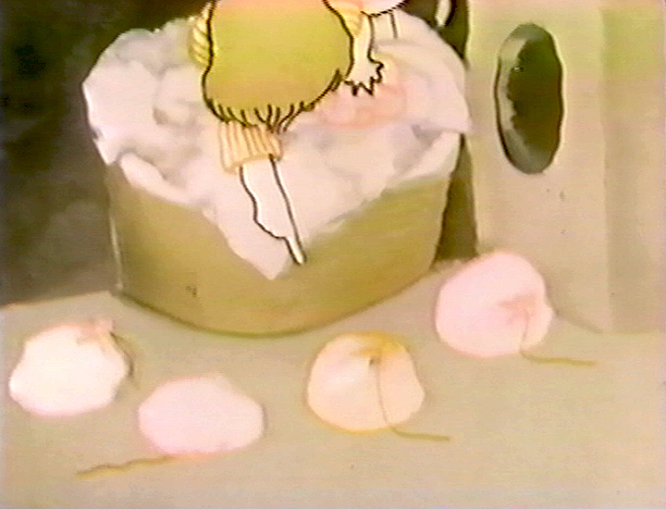
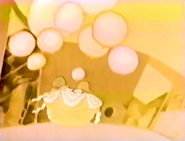
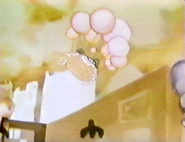
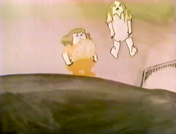
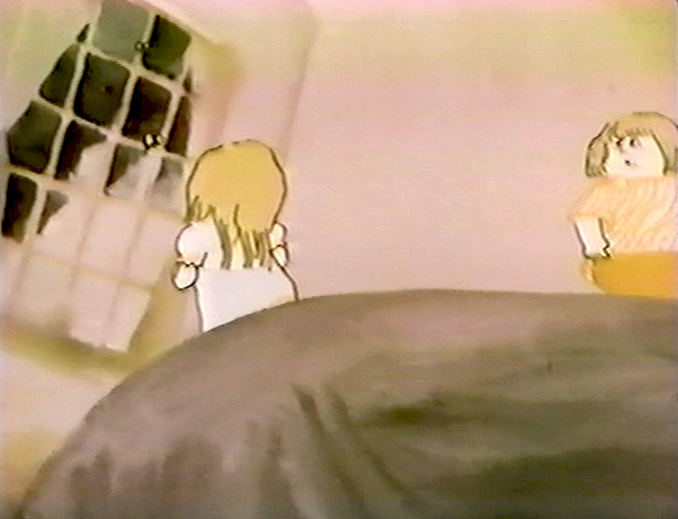
The film tells the story of two girls playing in a room next door to their babysitter. They laugh they cry they laugh they cry.
The audio track was improvised by Emily and Georgia Hubley in a recording studio years before they started the film. From the edited tracks a story was culled, and a storyboard formed. John did all of the drawings in storyboarding it.
There are 17 pages of board in all. I’ve inserted frame grabs so you can see how the final turned out. Tissa David animated the entire film.
___(Click any image to enlarge.)
_
_
_
_
_
_
The storyboard, with all of the drawings done by John, was developed in conjunction with the Hubley’s class at Yale. The students actively discussed the board and offered their participation in the growth of the film’s origin. A documentary was also produced showing the production of the animated short.
You’ll notice that the action in the film varies from the setups in the storyboard. This undoubted had to do with Tissa’s involvement. She would often rework things with John and alter the filmmaking. John, and most of the directors Tissa works with, was open to this. She has a masterful sense of camera placement and uses it throughout this film.
(Click any image to enlarge.)
_
_
_
_
_
The film was an outgrowth of an early recording John and Faith made of their two daughters, Emily and Georgia. While teaching at Yale the Hubleys worked with the students in their class to help develop this storyboard. One of the students, Kate Wodell, came to work in the studio and was a mainstay there for many years and continued for a while helping Faith on many of her shorts after John died.
__
__
 _
_ _
_
__
__
__
 _
_ _
_
_
__
__
 _
_ _
_
__
__
__
 _
_ _
_
__
__
__
 _
_ _
_
__
__
__
 _
_ _
_
Articles on Animation &Hubley &Independent Animation 29 Jun 2010 07:46 am
Traditional Animation Transformed
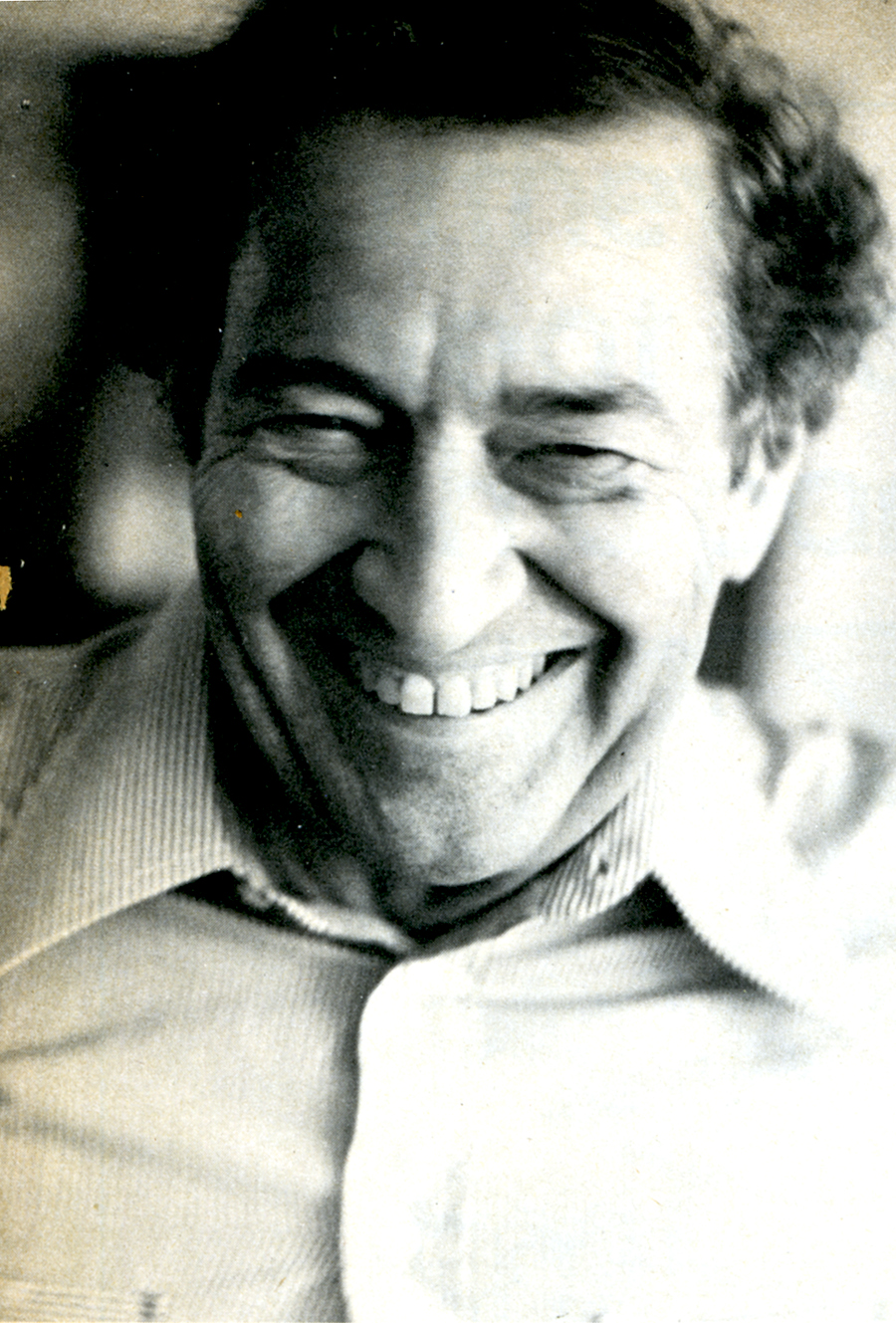
- Mike Barrier wrote an excellent article on the Hubleys for the 1977 Millimeter Magazine animation issue. Short and concise, it really put their careers and their work into fine focus. The magazine was released in February 1977, just prior to John’s death, February 27th of that year.
With Mike’s consent, and my grateful thanks, I’m posting it here. (I haven’t given enough attention to John and Faith lately.)
Traditional Animation
Transformed
by Mike Barrier
For more than 20 years, John and Faith Hubley have been hacking an idiosyncratic path through the jungle of post-war animation. Temperamentally — one might almost say ideologically — they are avant-garde, but they have little in common with the frauds and bores who have appropriated that label for themselves; you will not find their names in the index for the new book Experimental Animation. They have firmly and frequently turned their backs on the animation tradition rooted in Walt Disney’s cartoons — yet their films are linked to that tradition in various and subtle ways. The Hubleys have made films for television, but of all the people who have worked in that medium, they would seem the least likely to work on an animated special that was in any way conventional. However, they have now turned their hands to a TV special based on a comic strip.
Neither the comic strip nor the Hubley’s method of transferring it to the small screen are conventional, however. The comic strip is “Doonesbury,” and the Hubleys are making the special in close collaboration with Garry Trudeau, the strip’s artist-author. The storyboards are a mixture of Hubley and Trudeau drawings, and Hubley says that he, Faith and Trudeau cast votes of equal weight when decisions are made on the story. The special will be on NBC, probably in either the spring or early summer of 1977.
Trudeau and the Hubleys are not strangers; they met in 1968, when Trudeau was a student at Yale and the Hubleys were teaching their first classes in a course called “The Visualization of Abstract Concepts.” Animation courses are common now on U.S. campuses, but the Hubleys’ course is markedly different from most others. The students are not taught how to animate; instead, they are taught to think in certain ways. In effect, they are encouraged to devise animatable symbols for abstract ideas. The ideas generated in the course are converted into animated films later by the students as well as the Hubleys and their staff. Voyage to Next — in which nationalism is represented by boxes filled with people, floating aimlessly on the stream of history – went through the Yales class process as did Cockaboody and EVERYBODY RIDES THE CAROUSEL, a feature-length film, based on the writings of Erik Erikson, that was shown last fall on CBS.
Despite its origins in Yale’s rarefied atmosphere, the “Doonesbury” special will be aimed at a larger audience than the Hubleys have ever sought before (except in the TV commercials they used to make). It is, unavoidably, a highly commercial project, and so, filled with pitfalls for two filmmakers who have steadfastly turned their backs on mass taste.
Cockaboody, a tender and sensitive commentary on childhood.
John Hubley ventured into the world of big money and high-powered entertainment in August 1975, when he became the director of an animated version of WATERSHIP DOWN. He was discharged from that job a year later, after sharp disagreements with the producer, Martin Rosen, over creative and production control of the film. Hubley had spent half of the 12 months he worked on the film in England, and half in the U.S., working with both American and British crews. (Bill Littlejohn and Phil Duncan were among his American animators.) Hubley’s comments about the break with Rosen are guarded, because he has filed a suit against Rosen for breach of contract; but it seems plain that Rosen wanted a more violent and emotional film than Hubley was prepared to give him.
Throughout their long collaboration, the Hubleys seem to have been happiest when they could work in an atmosphere entirely free of commercial considerations. Since they began working as a team in 1956, their work has fallen, roughly, in three categories: purely commercial films, like TV spots; sponsored films, which come equipped with fixed budgets but considerable creative leeway; and their purely personal work — Moonbird, Tender Game — which they financed with their earnings from the other kinds of films.
In all three types of films, the Hubleys have employed a dazzling variety of techniques, ranging from traditional line animation to the animation of blocks of color to the animation of cutouts. Two elements have been constant. All of their films reflect the influence of modern art — or, to be frank about it, modern art as it has been adapted and domesticated by commercial artists and designers. More important than the graphic style itself is the use to which the Hubleys have put it (and this is the second constant in their work): abolishing the traditional distinction between characters and backgrounds.
In a typical Hollywood cartoon of the ’30s or ’40s, the characters move against the backgrounds like actors working in front stage settings. The characters are composed of lines and flat, bright colors, against settings that are realistically modeled and painted in muted colors. The characters are treated as color accents; they “read” against settings that are designed to set them off.
A still from Moonbird.
In most of the Hubleys’ films, no such boundary exists; characters and settings are cut from the same bolt. Movement alone sets them apart. This integration of characters and backgrounds — not any simple enthusiasm for modern art — was at the heart of the UPA studio’s rebellion against the Disney style in the middle ’40s. It was a layout man’s rebellion. The ultimate effect was to elevate design — the overall “look” of a film — at the expense of animation. Layout men, who had been subordinate to the animators at Disney’s, were now in the driver’s seat.
Two of UPA’s three original partners — Zack Schwartz and Dave Hilberman — had been Disney layout men, as John Hubley was. When Hilberman and Schwartz broke with Steve Bosustow (the third partner) in 1947, Hubley became a vice president of the studio, and its creative head. Hubley supervised the work of directors like Robert Cannon and Pete Burness, and directed a number of films himself, most notably Rooty Toot Toot (1952). The most distinctive UPA films thus bear Hubley’s stamp, more than that of any other man.
Hubley left UPA in the early ’50s; he was a victim, like many other UPA staffers, of the witch hunts by the House Committee on Un-American Activities. He formed his own TV-commercial studio, Storyboard, and then he married Faith Elliott, who had been hired as his assistant for an aborted production of Finian’s Rainbow. Faith — who had worked in live-action films before marrying John — has been his collaborator ever since; but their films are, in some ways, extensions of the work that John Hubley did at UPA, but reflect a less commercial, more personal approach. (Faith Hubley has completed two films of her own in the last two years: W.O.W. and Second Chance.)
UPA sold itself not only as an alternative to the Disney style, but as a repudiation of it. John Hubley still talks that way on occasion, and the Hubley films sometimes become pretentious and didactic. Films like The Hole (1963) and The Hat (1964) while nice to look at, suffer from windy, enervating dialogue tracks; the lessons they offer — about international boundaries and nuclear war — are too simple to bear repetition for even a few minutes. Of Men and Demons (1970), is also a “lesson” film — this time the Hubleys are concerned about the environment — but it is much better because the villains of the piece (demons representing fire, wind and rain), are ingratiating scoundrels; the characters are stronger than the ideas they are supposed to serve.
Adventures of an *.
Here we come to a paradox in the Hubley films. The best ones — the ones in which the Hubleys’ own feelings and experiences are to the fore — have a great deal in common with the Finest cartoons in the despised Disney tradition. Some of the very best Hubley films, such as Moonbird, Windy Day, Cockaboody and the opening sections of Everybody Rides the Carousel, are tender and sensitive commentaries on childhood. The graphic devices, the quicksilver metamorphoses — as children become what they imagine themselves to be, and beasts lunge from the mouths of howling babies — all serve, in the end, not to explicate ideas but to delineate character. In other words, these films are as much concerned with personality as are the best Disney films; they are very different from the Disney films to be sure, but they have sprung from the same seed, the urge to create new life.
The best Hubley films do not spit in the face of animation’s greatest tradition. Instead, they show how that tradition could be transformed and enriched, if it were still in the hands of people who cared as much about their work as the Hubleys care about theirs.
© 1977 Mike Barrier
Animation &Hubley &repeated posts &walk cycle 09 Jul 2009 08:12 am
Recap – Georgia walk
 – Having posted a piece about John and Faith Hubley‘s Cockaboody yesterday, I thought I’d take the opportunity of showing off another older piece from Aug ’07. This walk cycle was animated by Tissa David. The drawings are partic-ularly rough – her first shot at the walk designed for her eyes only.
Tissa is careful not to use too much paper. Hence she reuses old paper for her very rough preliminaries as she figures out her animation.
It’s frequent, when visiting her work space, to see lots of pages featuring characters on both sides of the paper upside down as well as sideways. She doesn’t often let these rough roughs out of her hands before she throws them out. I guess I was there at the right time and talked her into giving me these drawings.
She animates the walk, here, on top pegs bacause that’s all she has left of space. Tissa nomally works on bottom pegs. Actually, since this is going to be a sliding cel, it would have been done top pegs anyway.
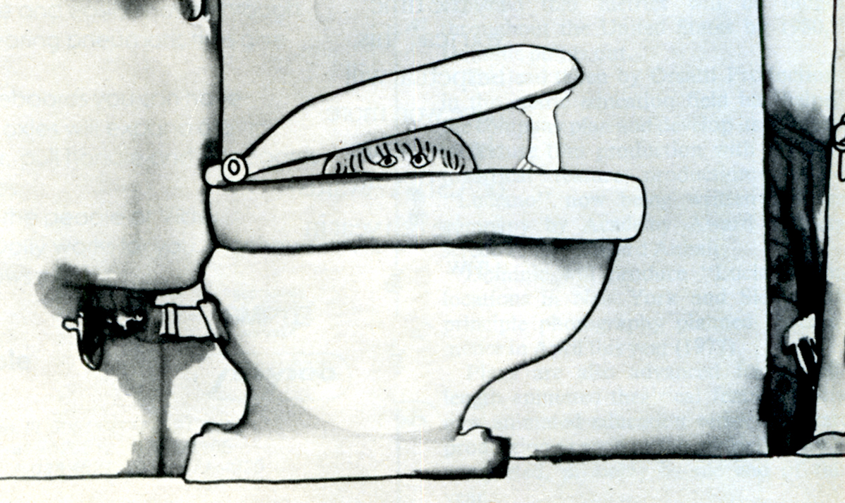
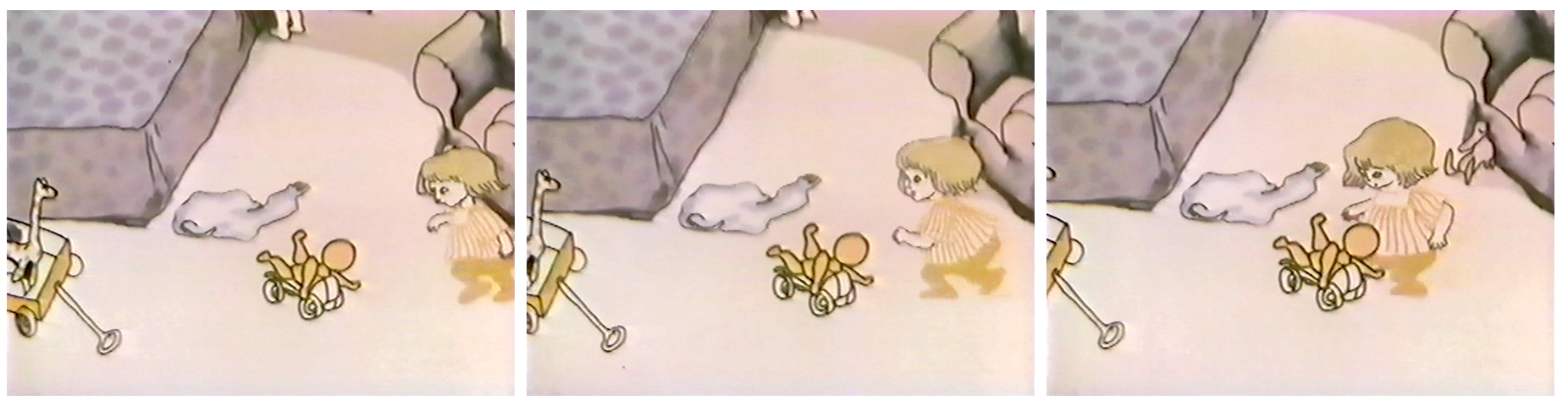
Georgia, the younger girl, leaves the bathroom and moves to the floor to play with a doll (whose head she accidentally pulls off).
 1
1 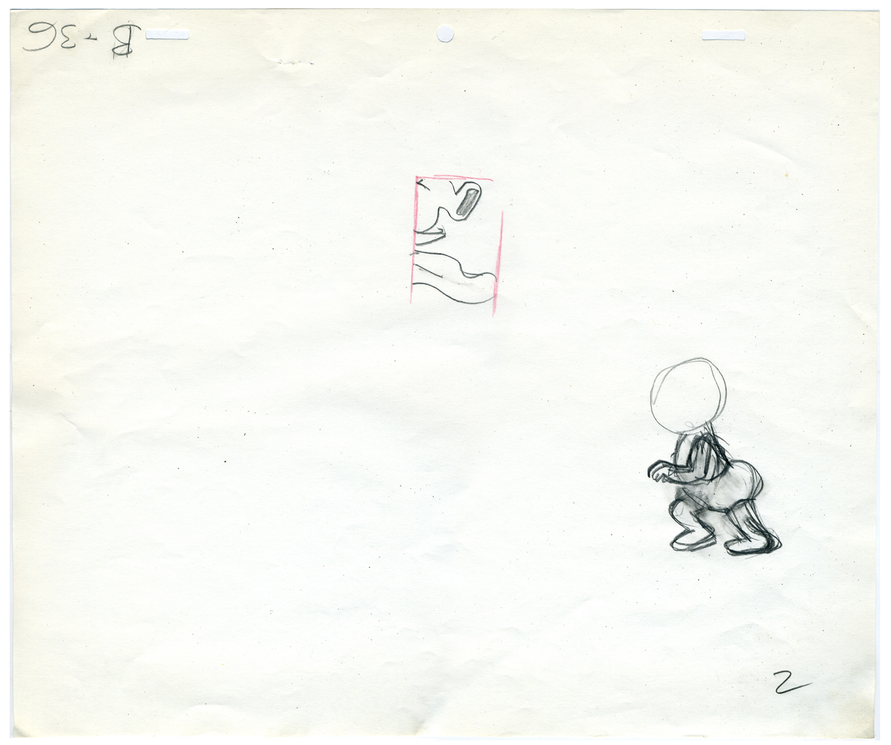 2
2
(click any image to enlarge.)
3 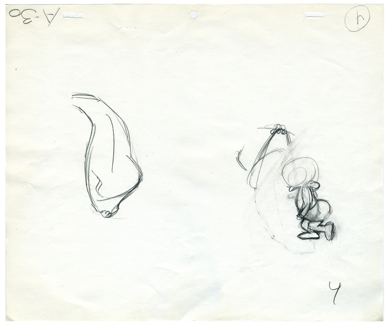 4
4
The walk is heavy and a bit flatfooted. She doesn’t come down on her toes but plants the entire foot.
 5
5 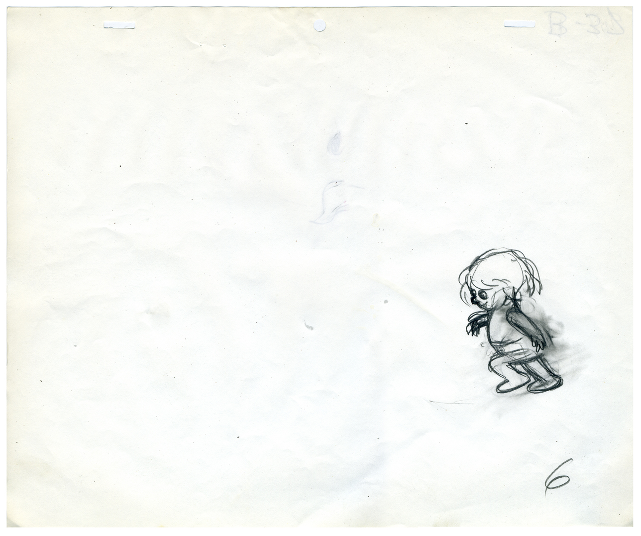 6
6
Her arms are high because, a baby, she’s still a bit off balance.
Click the very lower left to put the QT into motion.
Click the lower right to watch it a frame at a time.
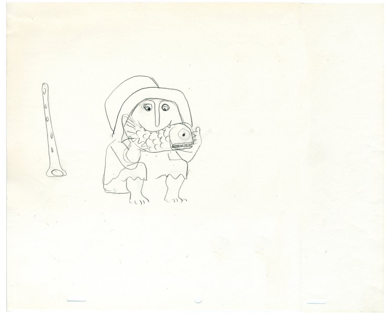
Animation Artifacts &Hubley 08 Jul 2009 07:30 am
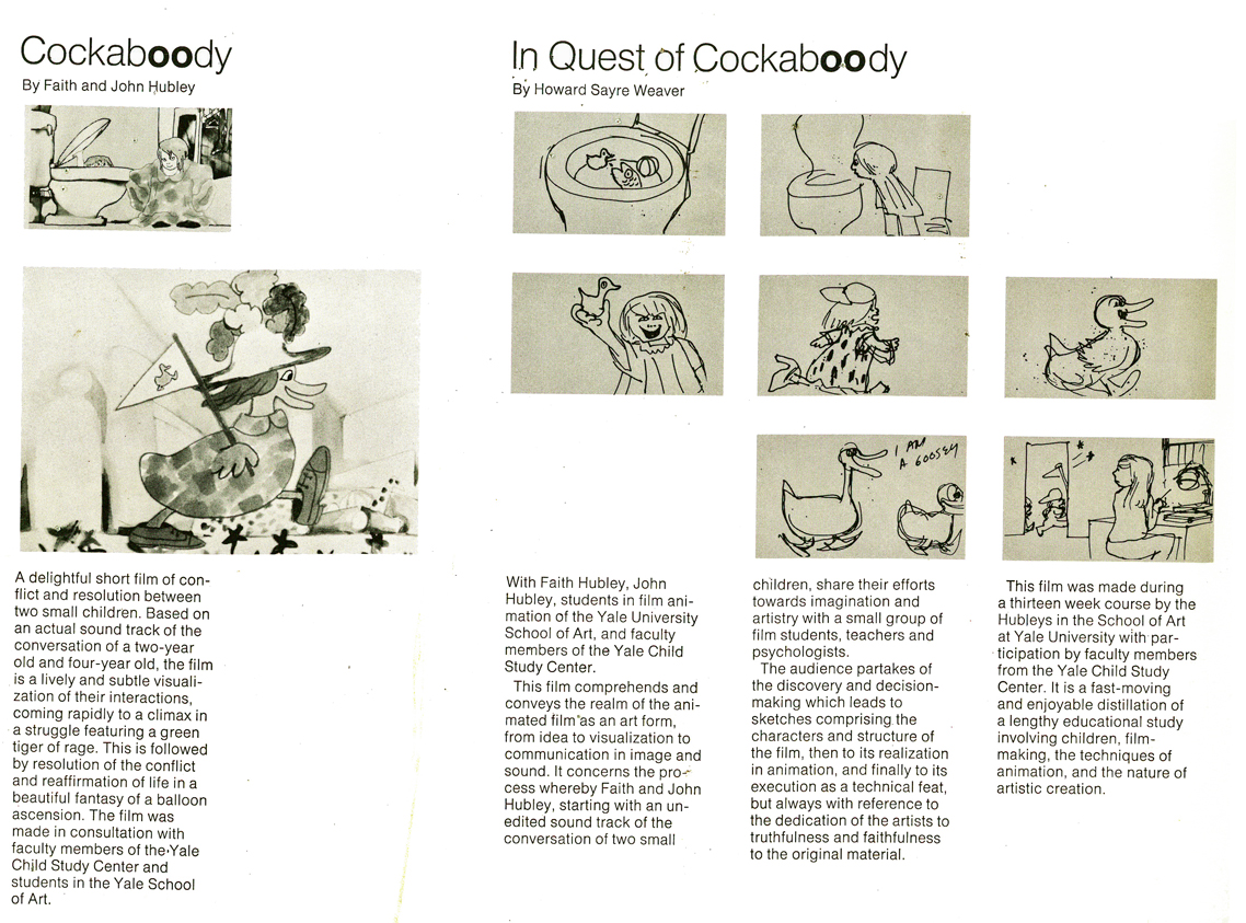
In Quest of Cockaboody
- John & Faith Hubley‘s short Cockaboody was a gem of a film culled from the vocal play of their two daughters, Georgia and Emily. I’d posted the storyboard for this back in July 2007 in three parts:
Part 1
Part 2
Part 3
The film was developed within the Hubleys’ animation class at Yale, and the school shot a short documentary on the making of the animated film as it progressed. This documentary was an absorbing look, not only at the film in progress, but at the process of animation as well as the methods of Hubleys as their work grew. In Quest of Cockaboody premiered Dec. 13, 1973, and here’s the invitation that was sent out for the film shown in conjunction with Cockaboody, itself.
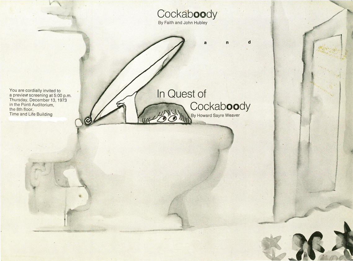
Front (Click any image to enlarge.)
Back
I’ve only seen the documentary once. There must be a copy floating around, but I haven’t seen it in 35 years. Needless to say, it’d be interesting to see it again.
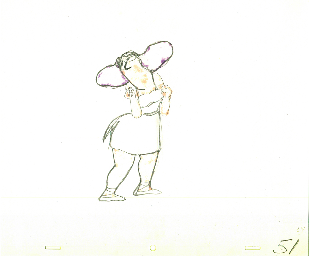
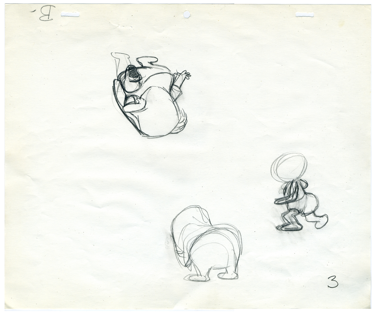
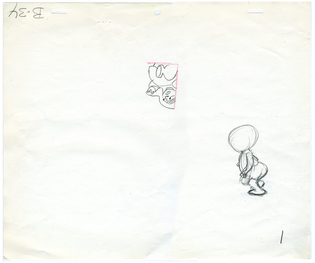
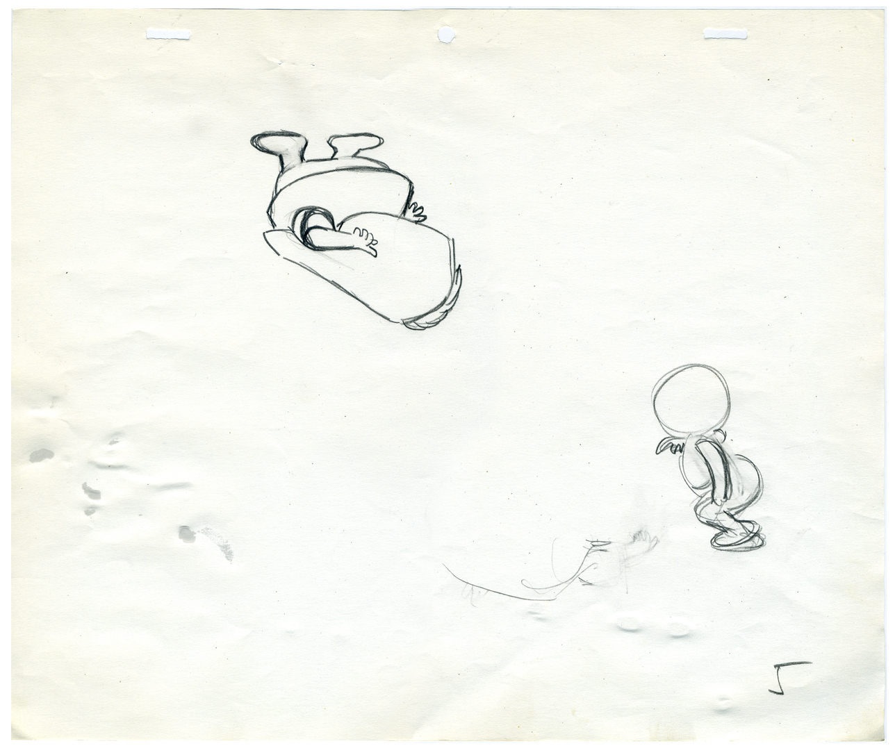
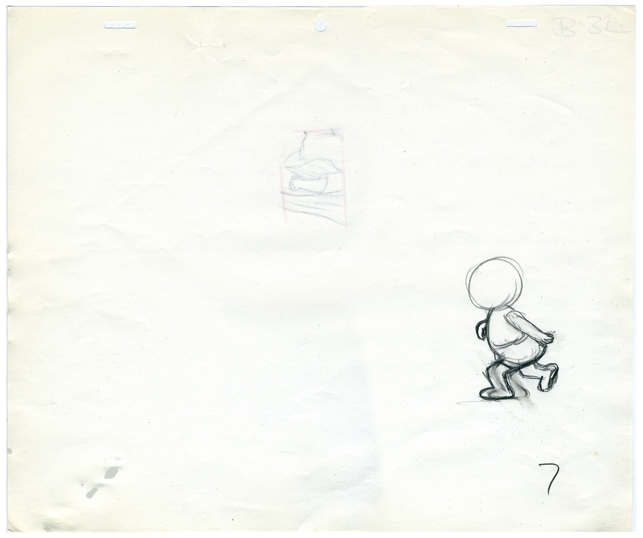
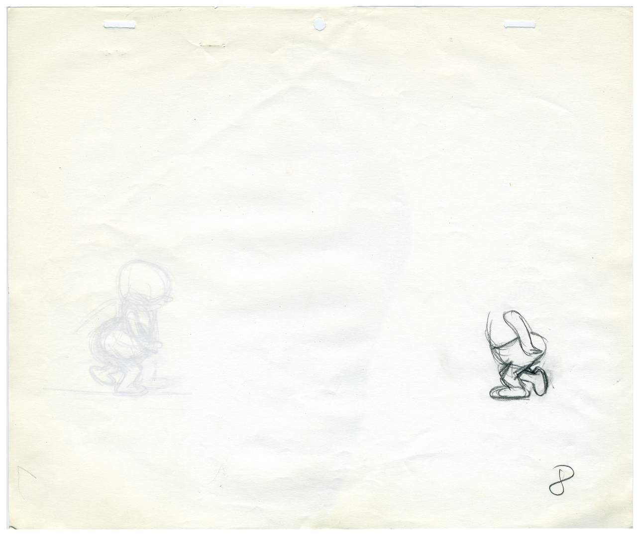
Cockaboody was animated, entirely, by Tissa David. Here are some of poses she used in prepping the film for herself.
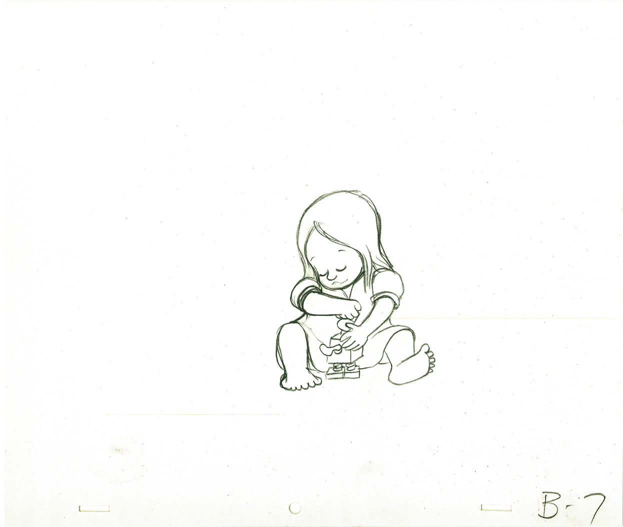 B7
B7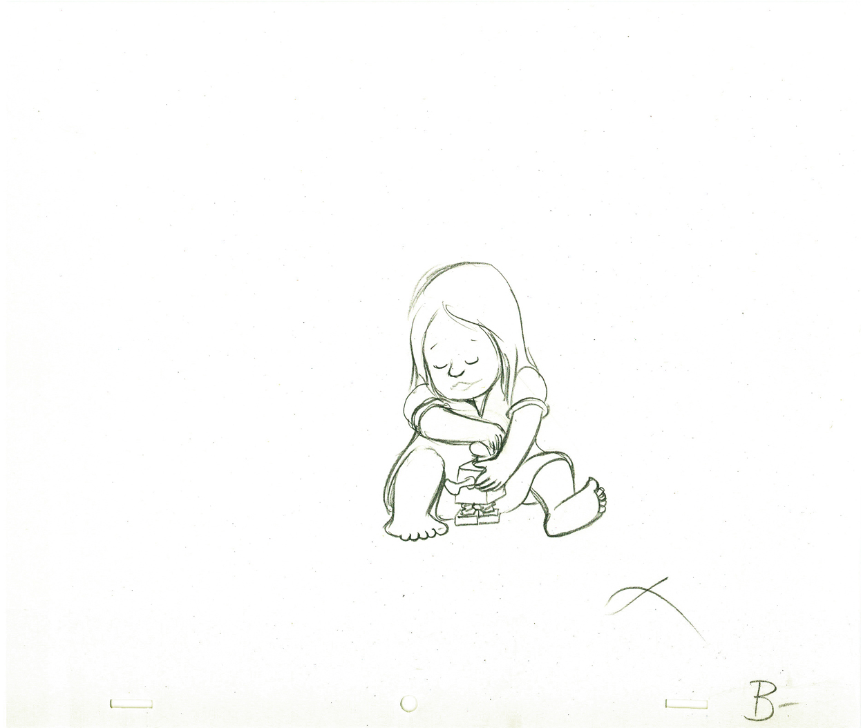 B -
B -
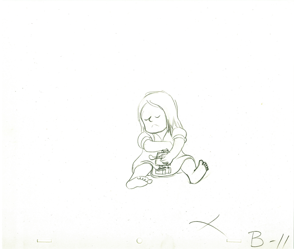
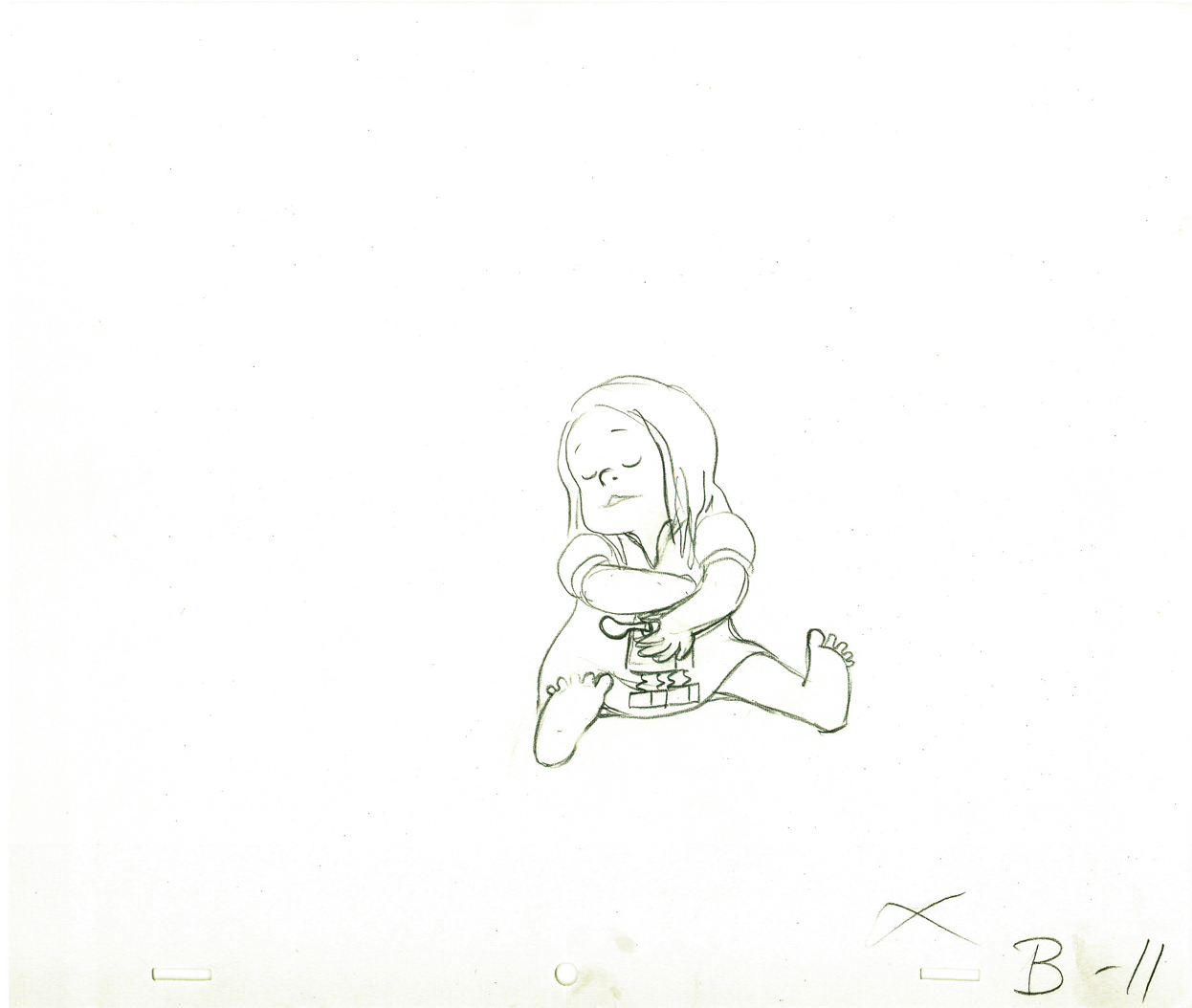
B11 | B11alt
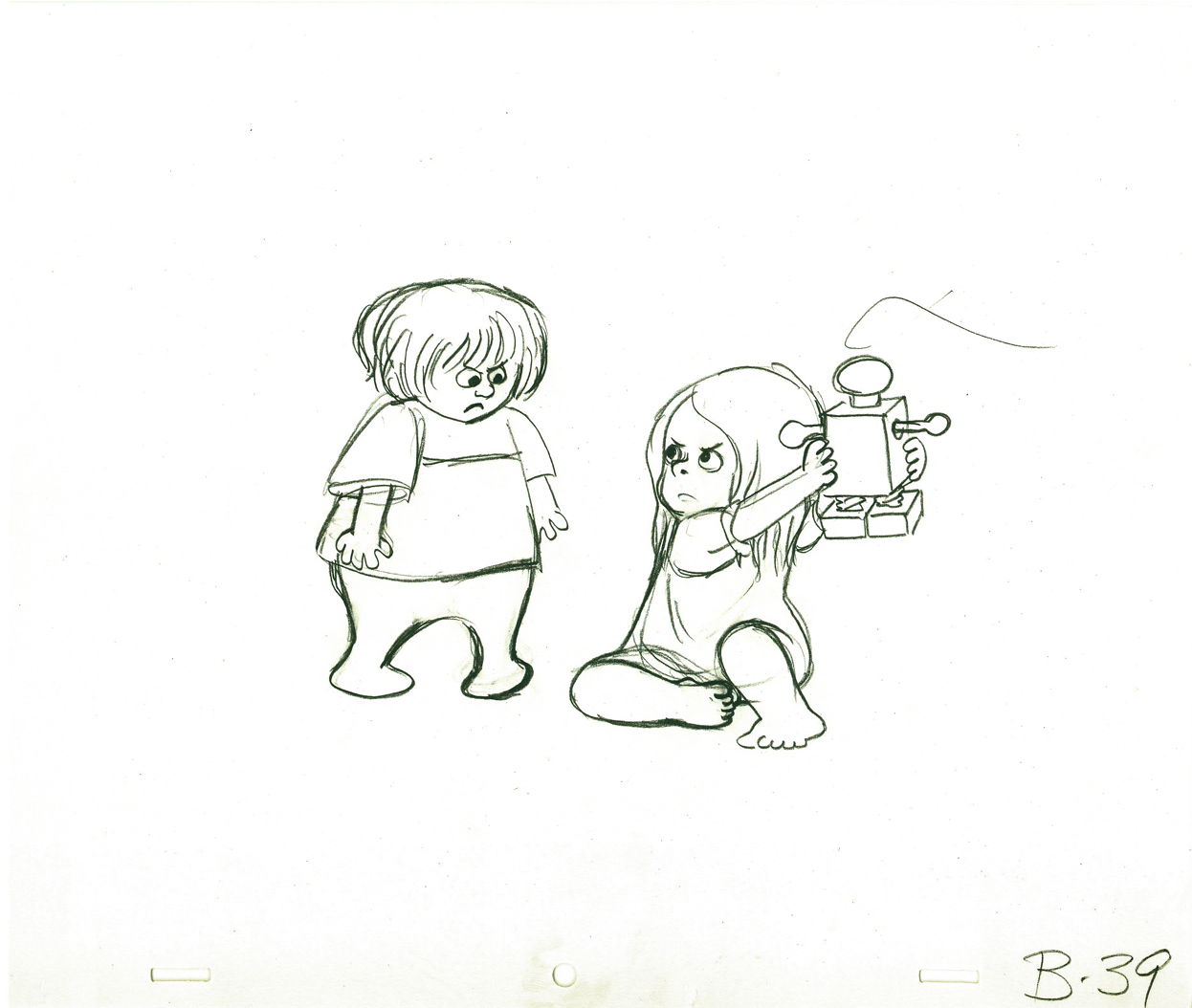 B39
B39
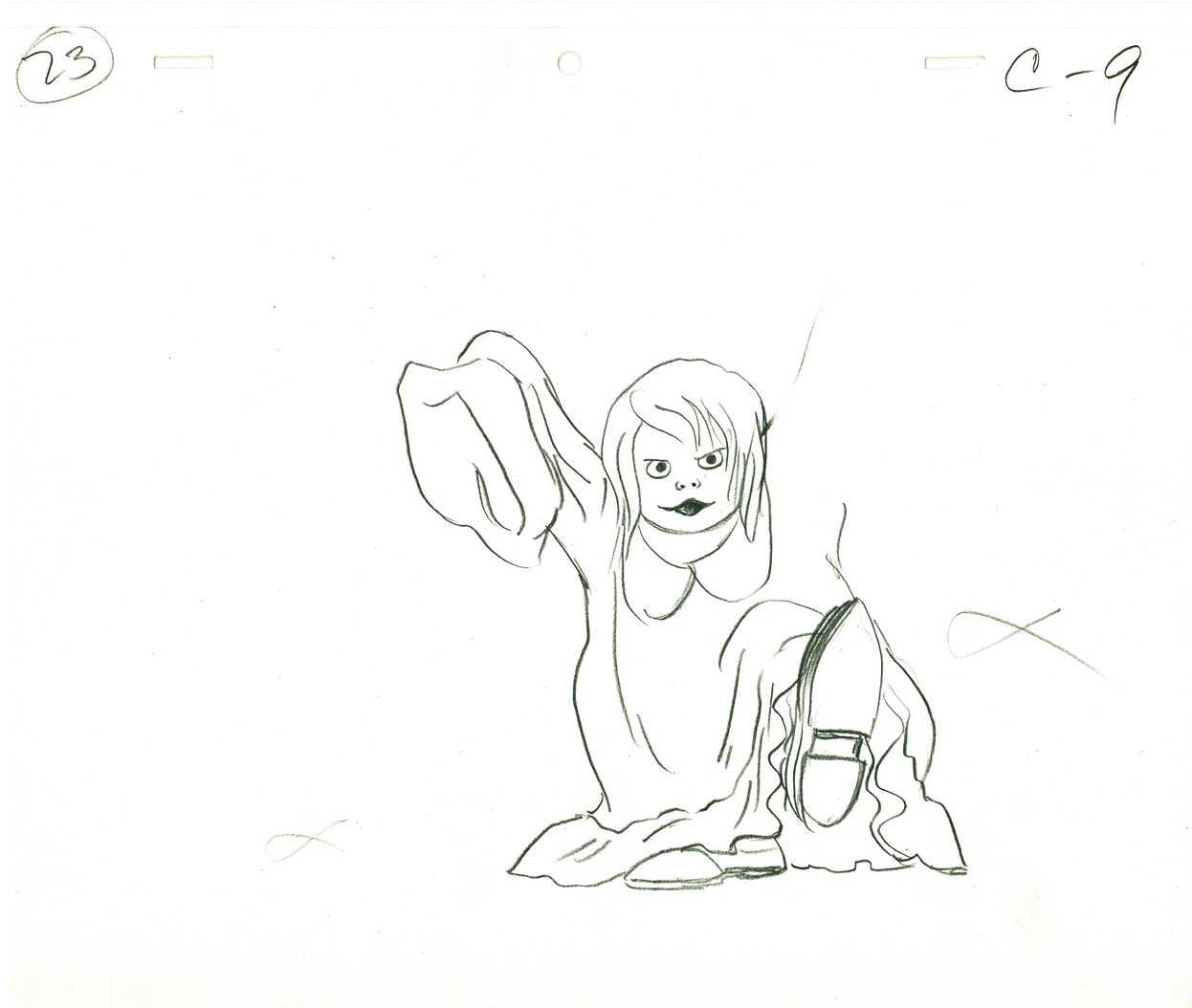
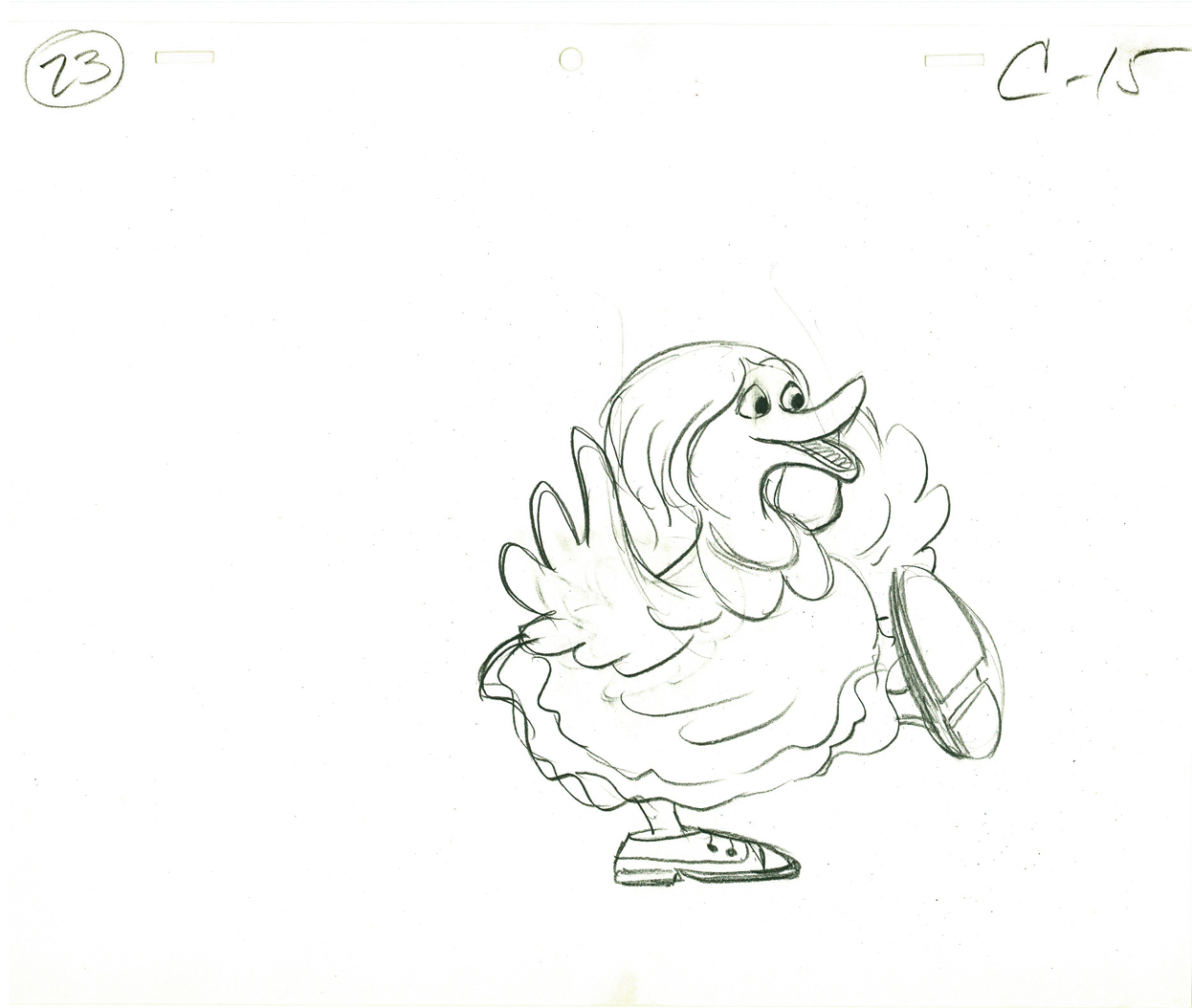
C9 | C15
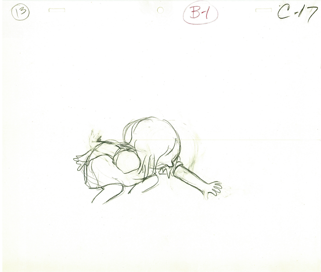 C17
C17
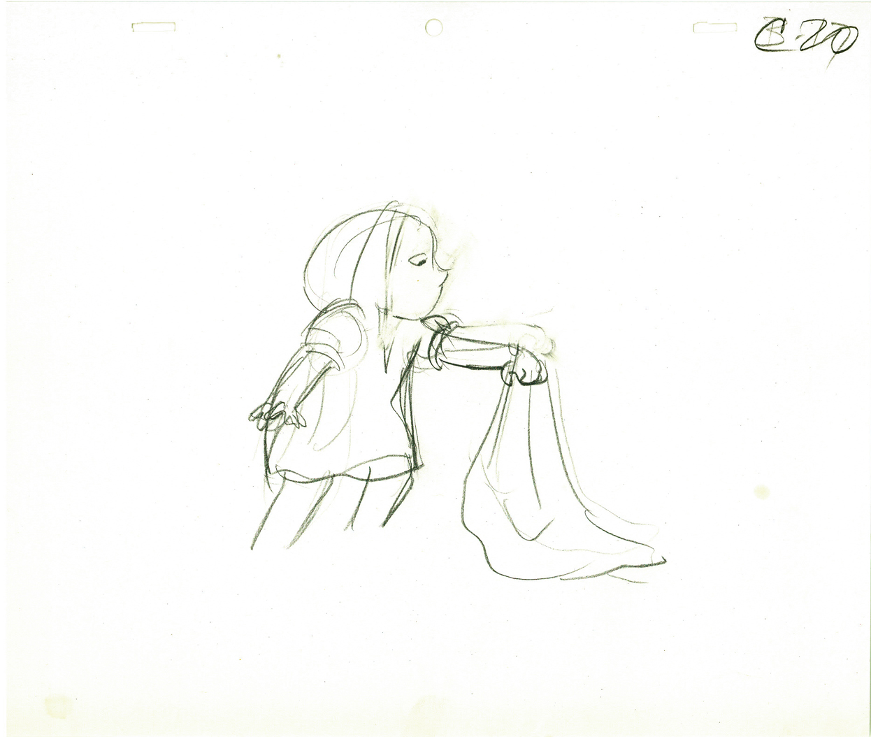 C20
C20
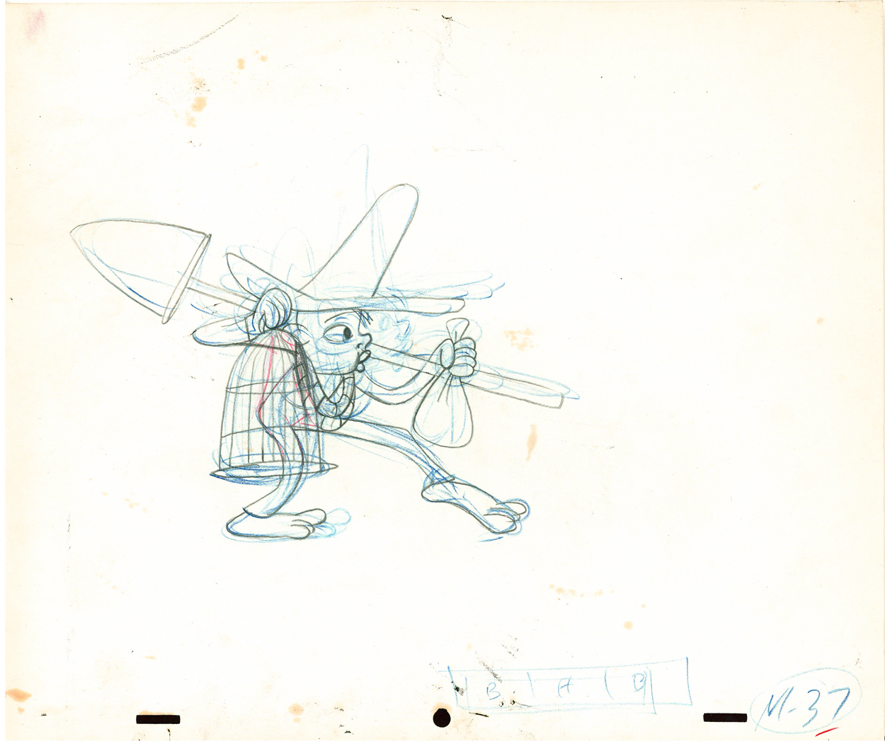
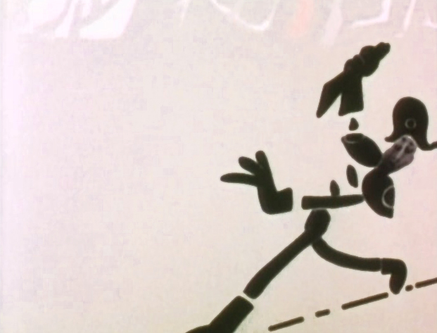
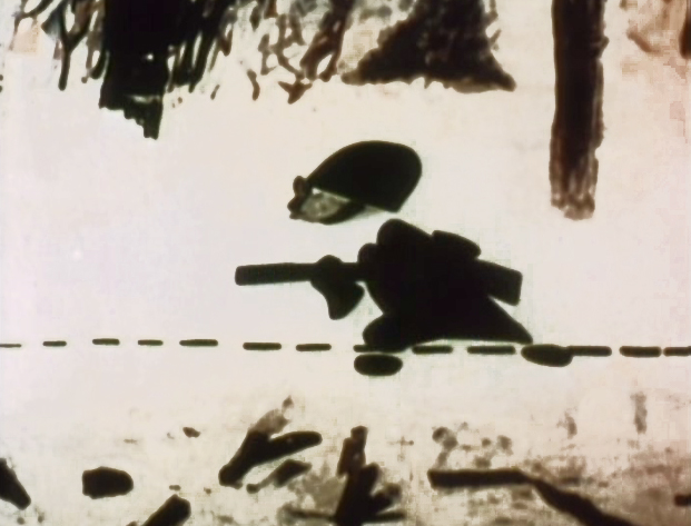
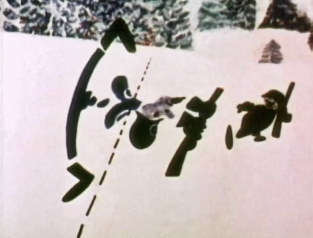
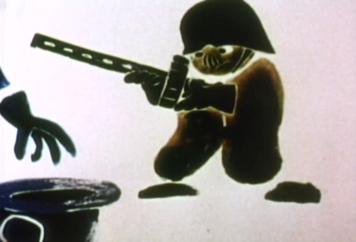
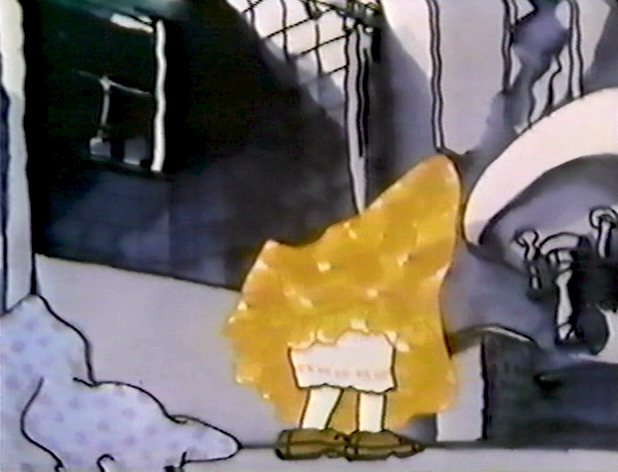
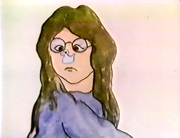
Animation &Hubley 15 Apr 2009 07:44 am
Hub Eyes
- It was 1973, and I was happily – I can’t tell you how happily – ensconced in the Hubley studio working on Letterman, a new series for an upcoming CTW show, The Electric Company.
It was my first animation job. I inked it all (directly from animator roughs), I assisted & inbetweened it all, and I animated odd scenes including all the title sequences. I was a novice, and I was doing it all. Excited and happy is all I can remember.
I was alone one morning in the small room wherein I worked. I made a habit of getting into work before anyone and leaving after everyone. I wanted to make sure I was indispensible.
A month into the gig, and I think I’d only spoken with my hero, John, about a half dozen times. I was rushing through one of the Johnny Gent “Spellbinder” sequences. I inked all of his scenes, then inbetweened in ink the drawings. No time to work in pencil for this schedule. Johnny was completely off character, in a very old fashioned way, and I had to rework them all closer to the models – in ink. The schedule just gave me no time to be proud of what was happening. (A year or so later I apologized to Johnny for what I did to his artwork. I was so inexperienced and had such a dominant role in how the final art looked in that series.)
John Hubley ran in to give me something and made a quick comment about the character I’d been drawing. He said it was a “Paramount eye.” I looked at the drawing, then at him. Then John drew on a small piece of paper a “Disney eye,” then a “Terrytoon eye.” He laughed aloud and told me to try to square off the eyes a bit. Then he ran out.
I learned a lot that day. I watched eyes that day and probably all that week. I ran Hubley films at lunchtime (I’d made it a habit to project their films in the kitchen during many of the lunch breaks. The entire group enjoyed these sessions) and watched the eyes. I talked with Tissa David about eyes in one of our evening tutorials – she was trying to teach me how to inbetween properly.
I was reminded of this moment when Chuck Rekow commented on the Moonbird Walk posted weeks ago. “The shape of the eyes on the boys is a real departure from almost anything in the cartoon world —even 50′s era. It’s closer to real life, and reminds me of the graphic style of Ben Shahn. It lends the film an aura of “seriousness”, even though it’s a cute film about two boys and an imaginary bird. Obviously, the pre-recorded sound is a major deal, but this gem is loaded with touches of inventive detail.”
How right he is, and I love being reminded of it.
The eyes are the direct route to the soul of a person and, consequently, an animated character as well.
After working for the Hubley studio, for a short bit, I worked for Phil Kimmelman and Associates. This was a hardy commercial studio doing tight designer-based animation. Rowland Wilson was doing a lot of their design work, and the animation clean-up was tight. Animators Jack Schnerk, Sal Faillace and Dante Barbetta did a lot of the work the few months I was there. I worked primarily as an inbetweener and learned some hard and tight lessons while there.
After the very loose work I’d been doing for the Hubley films, it was not only difficult for me, but good to keep me towing the proper line. I wanted to learn animation, and all of it was important.
Here, too, an empahsis was on the eyes. No Disney eyes, no Hubley eyes, either. But now I was just concerned with keeping those lines tight tight tight. No shimmer on the eyeballs. After all, I was told, people stared into the characters’ eyes, and any flaws in the animation would show up first in those eyes.
I worked for PK&A for about three or four months. I’d also worked for Tubby the Tuba at NYInstitute of Technology under Johnny Gentilella, where we got somewhat close and I was able to discuss all sorts of animation problems with him. That was the only redeeming element, everything else about the studio was wretched. My displeasure ultimately led to my leaving as soon as I could.
Eventually, I was back at the Hubley studio helping to finish up the short Cockaboody.
The tightening of my inbetweening only brought positives to what I could now do for John Hubley’s animation.
To this day, I still watch eyes closely. For some reason, the tighter the lnework, the closer I watch the assistant’s work. The looser the line, the more I watch the design. I prefer watching the design. Often it means eyes that can be easily labelled: Disney, Paramount, or Terrytoons. I suppose today, you’d say: Pixar, Dreamworks or Blue Sky. (And believe me, you can see those differences even in cg.)
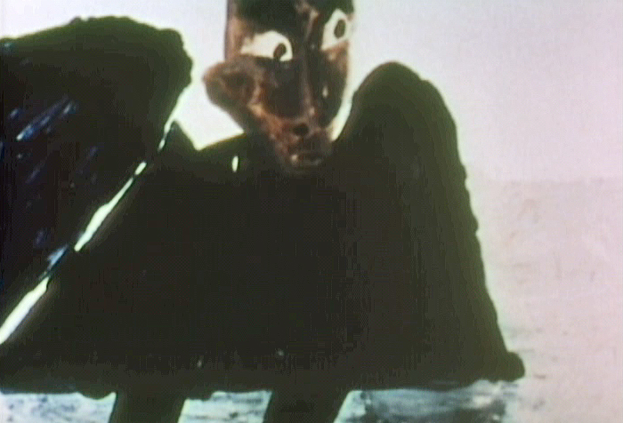
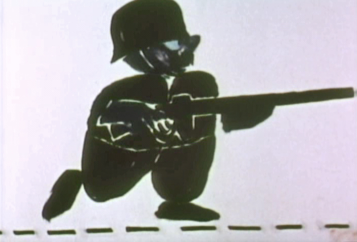
The images above are from the following films:
Animation &Articles on Animation &Tissa David 21 Oct 2008 08:03 am
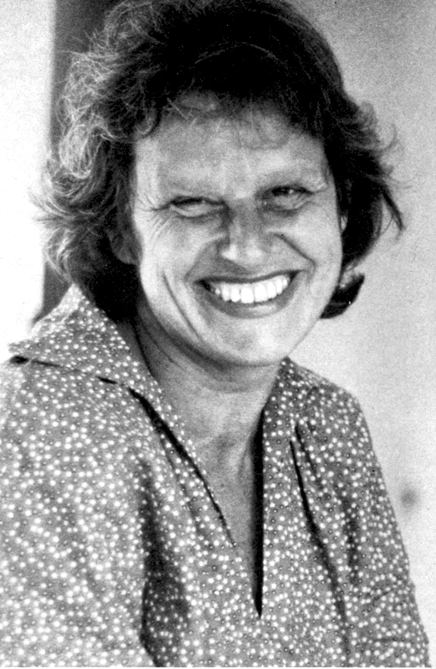
Tissa – 1975
- The 1975 issue of Millimeter Magazine is an animation issue. There are a number of enormously informative articles. I was rereading the copy of the magazine, this past weekend, when I came across the Close Up section, wherein a couple of bios appear.
I’d like to show one for Tissa David that was included. I assumed John Canemaker authored the piece; there is no byline. When I asked him, he responded thus: “I wrote the article on Tissa. The quotes are from my first formal interview with her.It was for Millimeter when I was the animation editor and put together special animation issues.”
Tissa looks so young in that photo.
-
“I am a frustrated comedienne, for sure,” Tissa David will tell you, only if you ask. “I am a clown. If I weren’t shy, I’d probably be on the stage.” Instead she is an animator, one of the world’s best and busiest, and one of the few women to have reached the top in the traditionally male-dominated animated cartoon field.
She joyfully toils in her East-Side New York apartment, a warm, plant-filled place that often smells of baked apples. Classical music swirls quietly from a radio and the glow cast from the light under her animation board gives her the look of a sorceress.
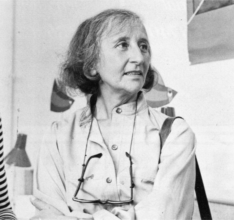 The lady has class—a fact one gathers upon first meeting, but a fact that is reaffirmed by catching a look at the creatures she is conjuring to life on her drawing board. The graphic line is strong and free, yet elegant (as is the artist); and when the drawings are flipped, the creatures move through their paces with a deliciously droll humor, a wit that is uniquely Tissa David’s.
As a child in her native Hungary, Tissa saw Disney’s SNOW WHITE and thought (as so many others have thought after experiencing that film masterpiece), “Now this is something I want to do.” After graduating from art school, she became an assistant animator at Magyar Film Iroda in Budapest; a little more than a year later, in 1945, she was a co-owner of the Studio Mackassy and Trsi supervising all phases of production including story and camera and was sole animator of the puppet and cartoon films.
She left Hungary in 1950 during the height of the Stalin regime, and finally landed in Paris.
Jean Image Productions hired her in September 1951 and for two years she read sound tracks, planned layouts, animated, and did the entire editing of the feature-length, BONJOUR PARIS (1953). That studio closed and Tissa animated at La Comete next, a studio that had been Paul Grimault’s.
“I had absolutely no relatives outside of Hungary except in the United States. So I asked for a visa in 1950. It took at that time five years to get a visa, that was still the quota system. So I came to New York…I loved the U.P.A. cartoons. I decided I wanted to work in that studio.” In 1956, the United Productions of America’s New York Studio was the last tenant in a brownstone on Fifth Avenue and 53rd Street slated to be torn down for the construction of the 666 Tishman Building. There was a French girl in the UPA studio and so she introduced me,” Tissa recalls. “I had no sample reel. I went in once to make a sort of tryout. I was scared; I didn’t speak English, so I was just waiting, waiting, and Grim came by…Grim Natwick is the history of animation and I can rave about him. He created Betty Boop and animated the character of Snow White all the way through. UPA had an awful lot of work and they needed an assistant to Grim.”
At that initial meeting, Natwick boomed, “Now, you know what animation is!” Tissa quietly answered, “Animation is—animation.” Natwick laughed, “You can’t argue with that!” and thus began a professional partnership that lasted twelve years. “Isn’t it strange,” says Tissa today, “that SNOW WHITE got me into animation and I really learned my animation from Grim. I know a great deal about animation, I know I know, because even today I don’t do one line without something in my brain Grim told me.”
After UPA closed in 1958, Tissa and Grim freelanced as a team on countless TV commercials, and since Grim’s retirement, Tissa has soloed successfully and most notably on several John Hubley projects, i.s.: Of Demons and Men (1970), Eggs (1970), Children’s Television Workshop segments Cool Pool Fool, True Blue Sue, Truth Ruth and others, and Cockaboody (1973). Her latest animations include three CTW Letterman episodes, a scene in Shamus Culhane’s Noah’s Ark production, and over 110 feet of Hubley’s Bicentennial film, People, People, People. She has just completed some experimental animation fora Dick Williams project and is now starting, also for Hubley, a TV special based on Erik Erikson’s writings.
A description of Tissa David’s style of animation is difficult; for while it is a distillation of the Disney influence in timing, the UPA sense of humor-through-graphic-design, and the strong, poetic John Hubley mode, it also contains a different character, unique to Tissa David, that she calls the “female difference…If the same scene is animated by a man and by me, there will be a great difference, not in quality but in interpretation. John Hubley told me I have a fine sense for detail, not in the drawing itself because I make very loose drawings, but in a scene, in expressing feelings. I am a very intuitive animator—I never know when I sit down to work what will happen.”
 For all her gentleness, Tissa also contains an inner core of strength exhibited in her single-minded devotion to her art. Her opinions about that art, herself and other topics, is disarmingly to-the-point: “I believe very strongly that one must know how to draw,” she will offer on the subject of how-to-animate. “Even if you just animate objects, you must have a knowledge of drawing.” As for her struggles securing her place in animation, Tissa will admit, “…its very hard. Women can find work in animation if they have enough will to follow through and really do it. Even today, I’m always saying if I keep busy long enough, I will become a good animator.”
At the time this piece was written, Tissa was completing work on a pilot for Dick Williams’ film, Raggedy Ann & Andy; this one minute piece got Dick the film over Joe Oriolo and Shamus Culhane. She would thereafter work on John Hubley’s Doonsebury Special (just as he died mid film); and she was to animate for R.O.Blechman’s Simple Gifts.
