Category ArchiveHubley
Frame Grabs &Hubley &UPA 21 May 2012 05:15 am
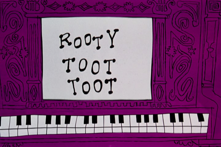
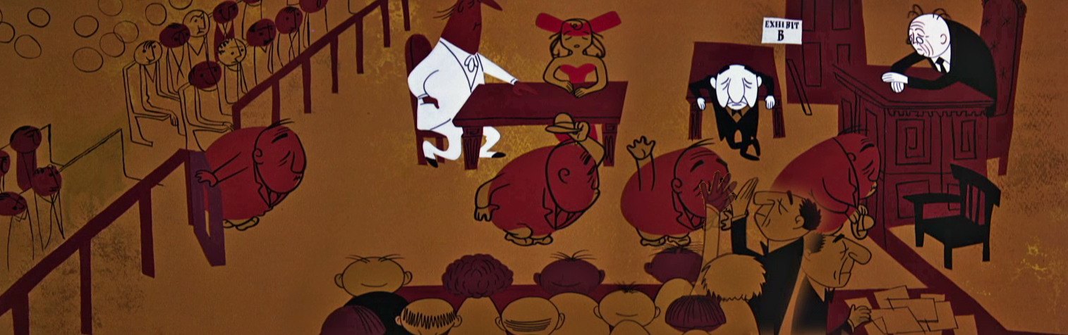
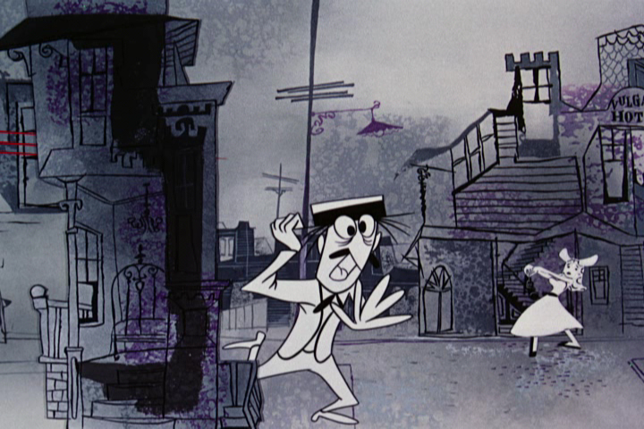
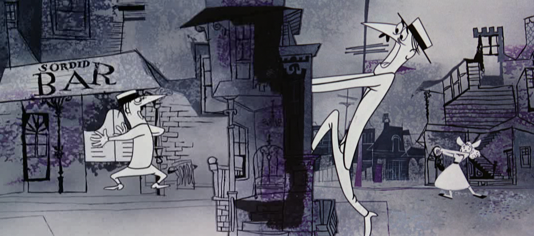
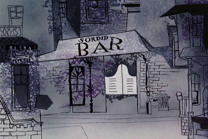
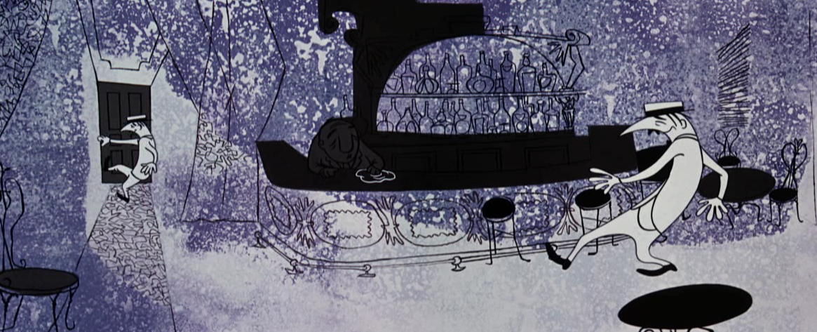
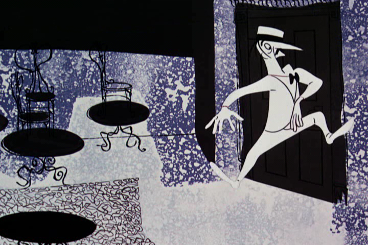
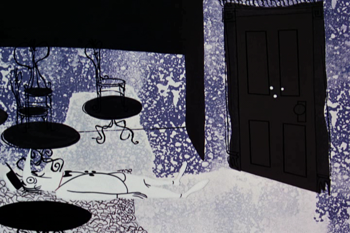
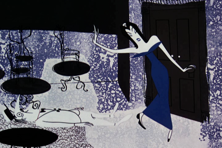
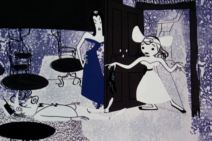
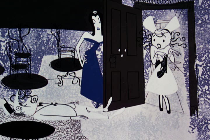
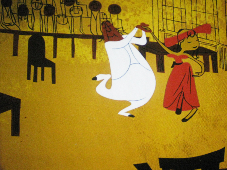
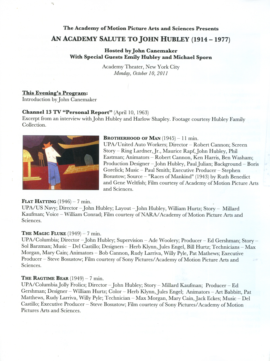
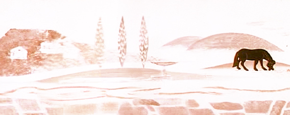
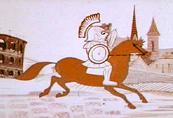
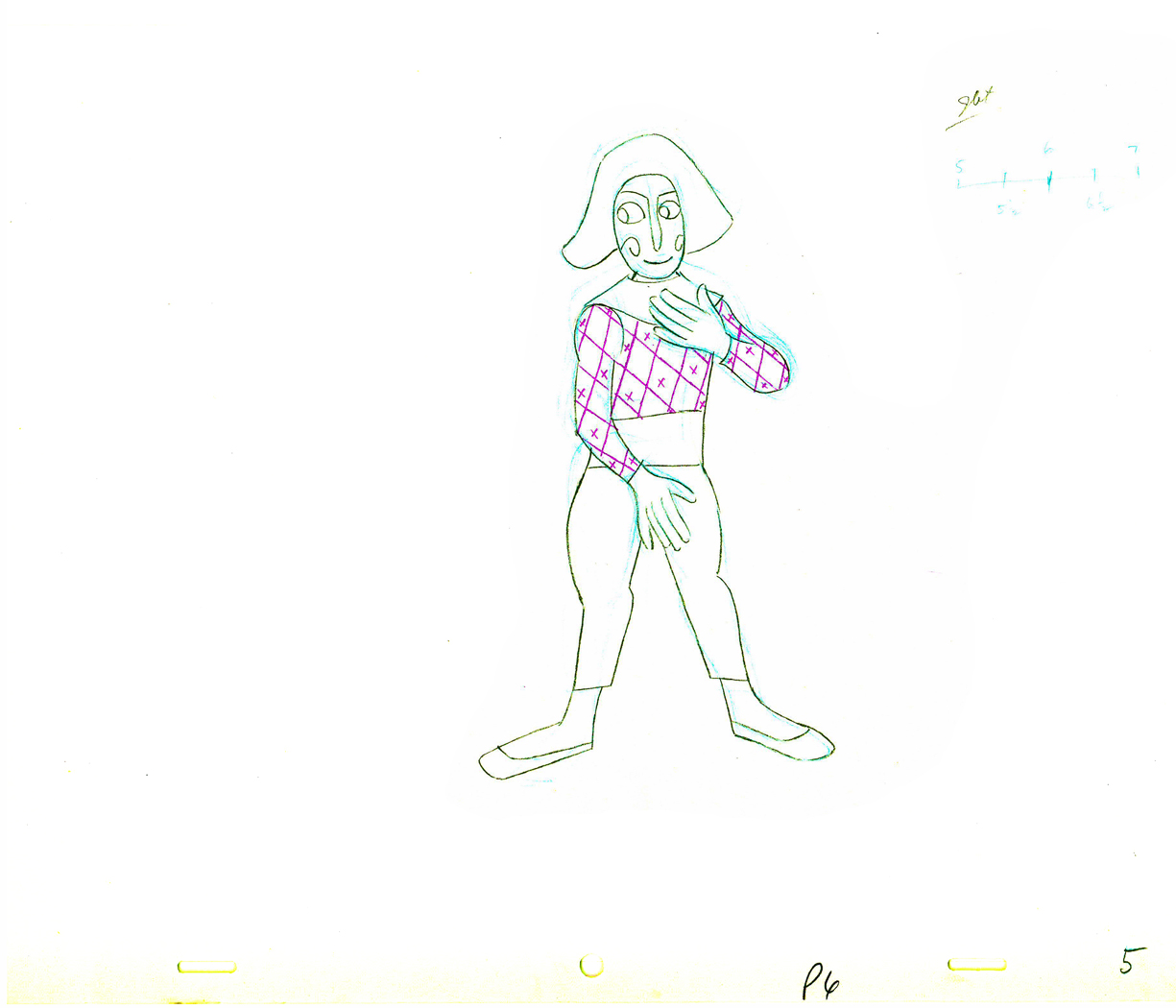
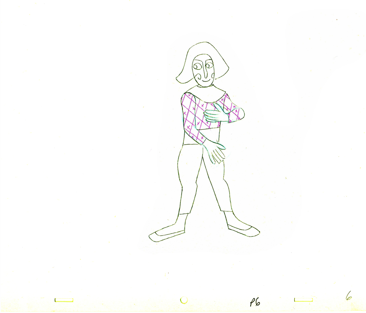
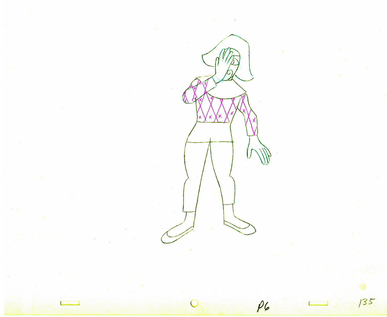
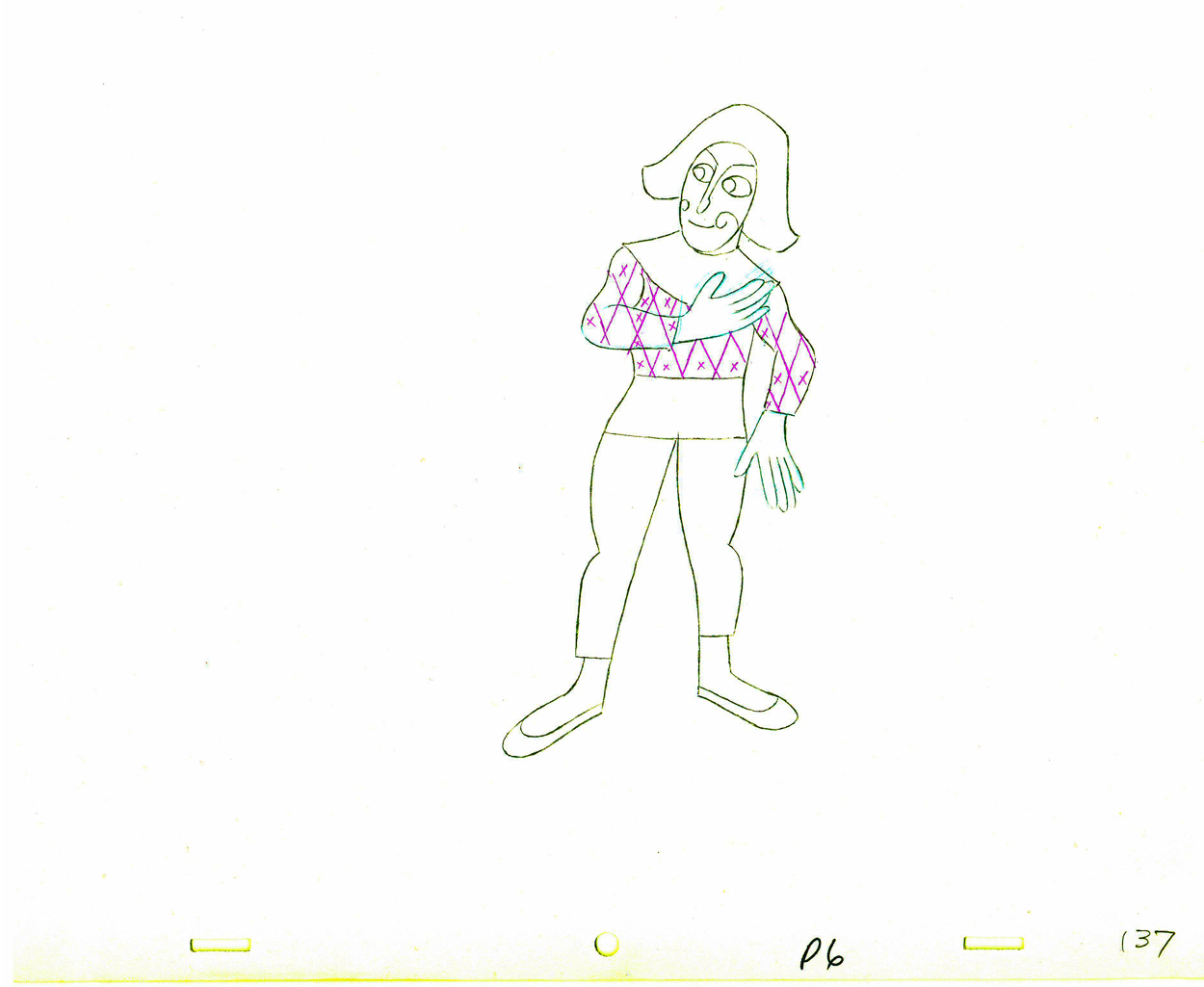
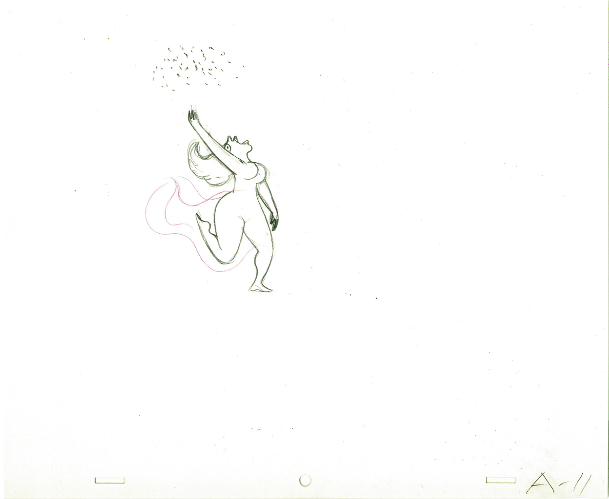
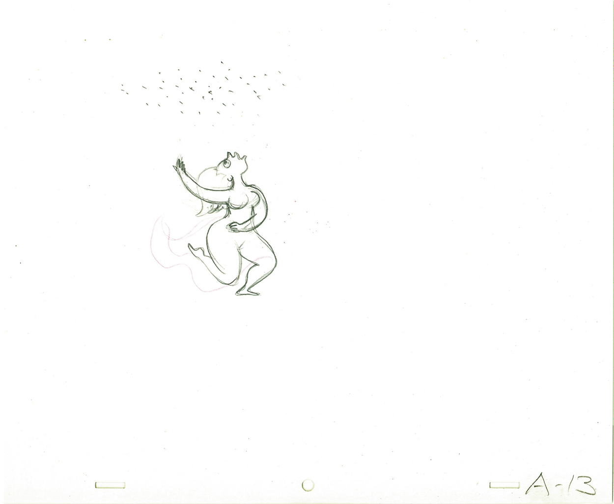
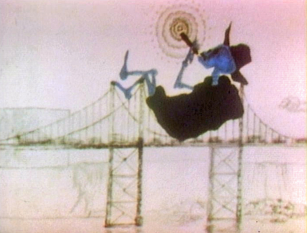
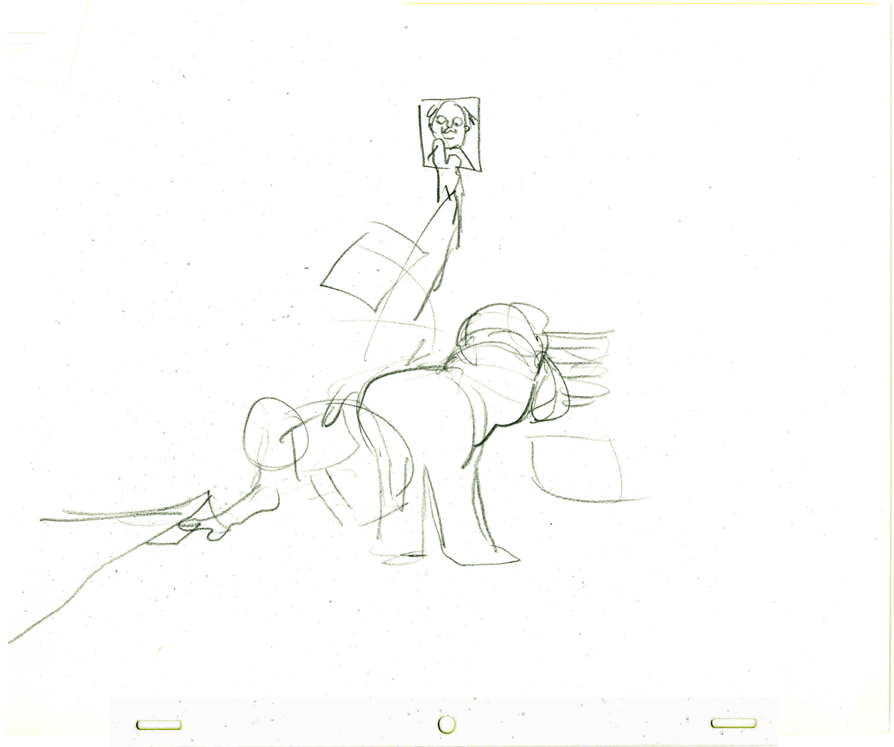
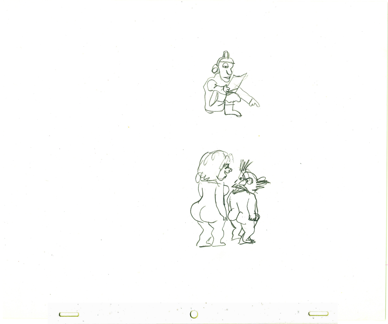
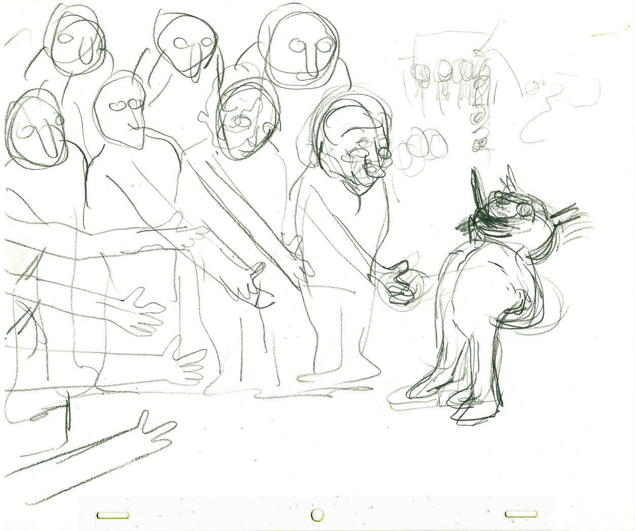
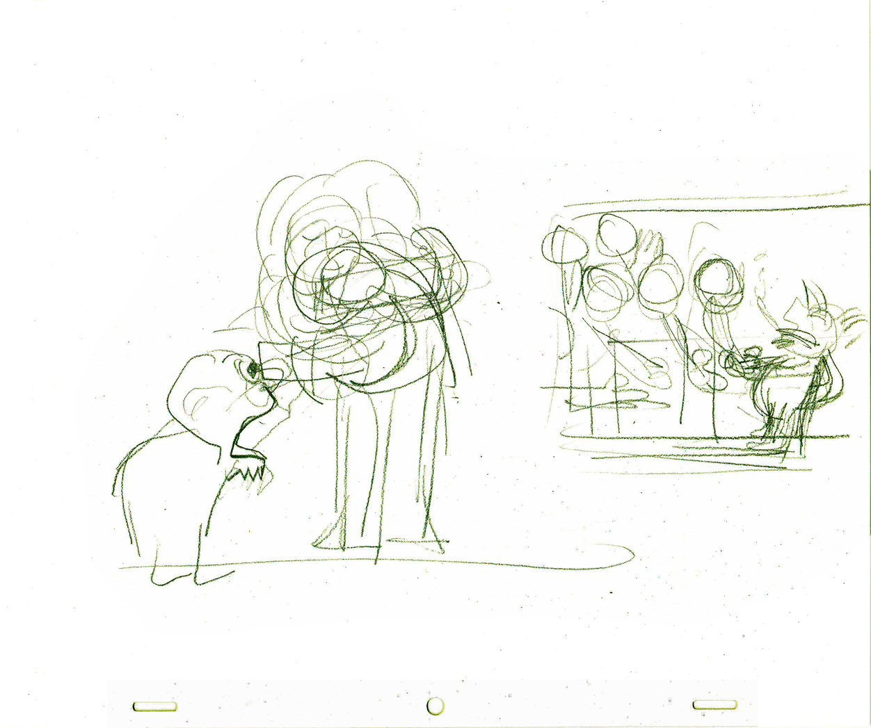
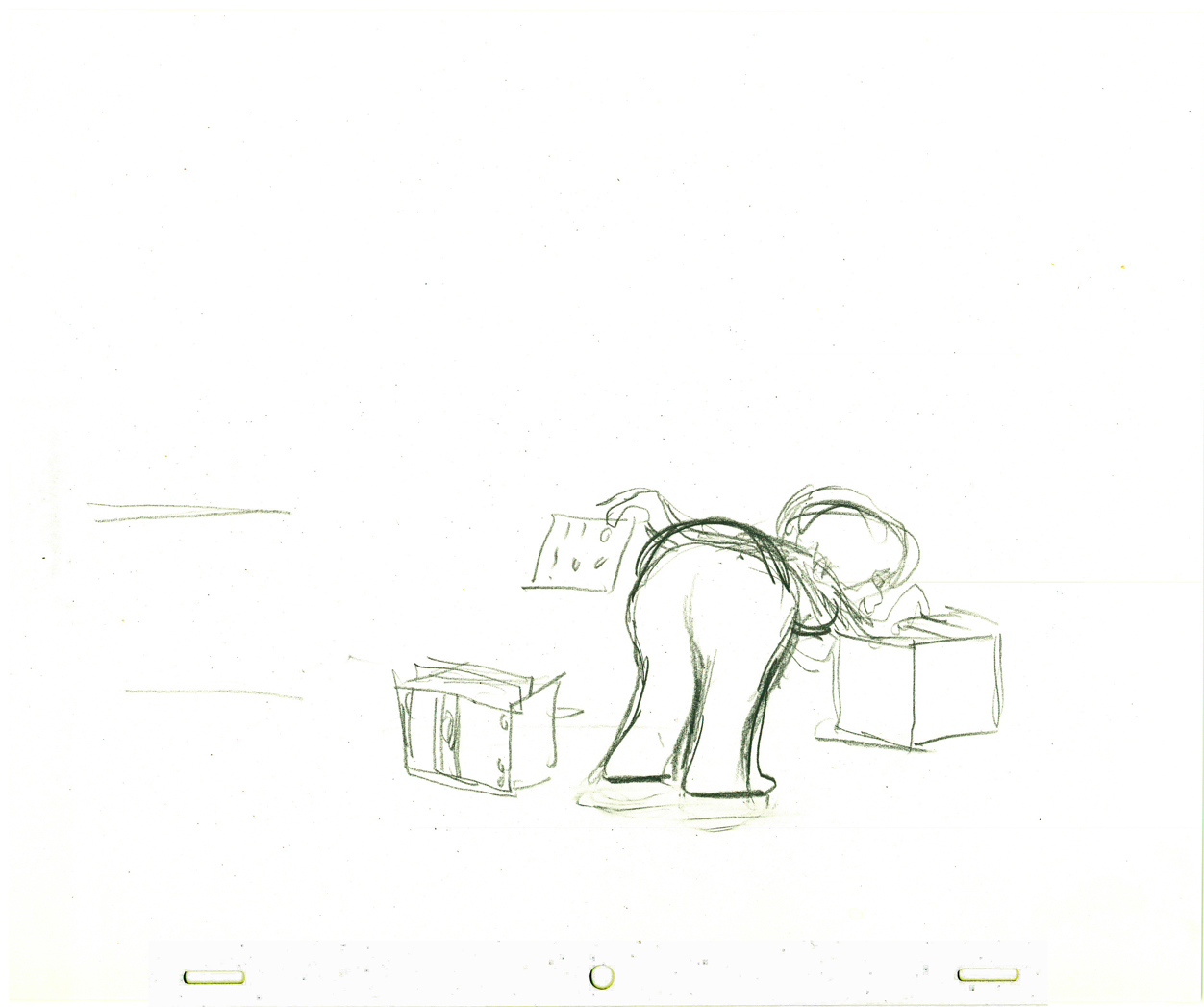
Rooty Toot Toot
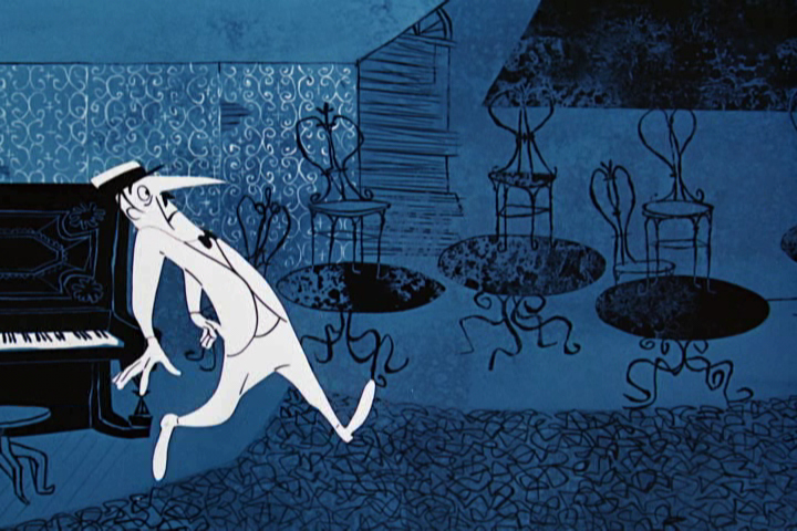
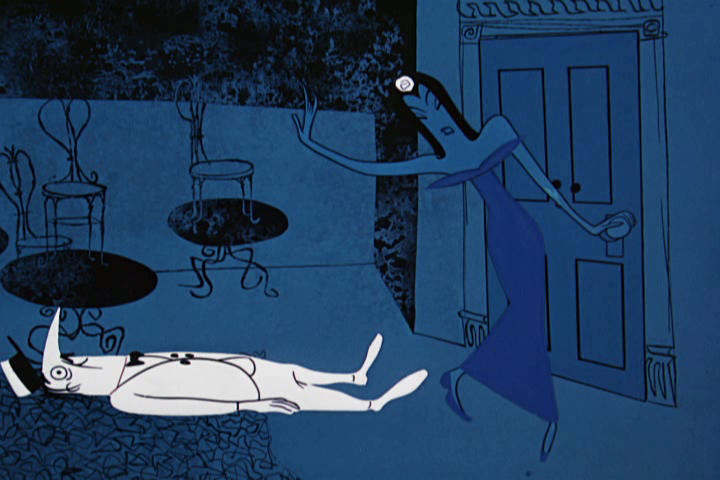
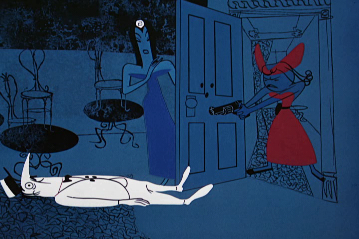
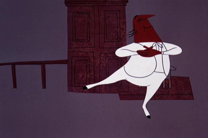
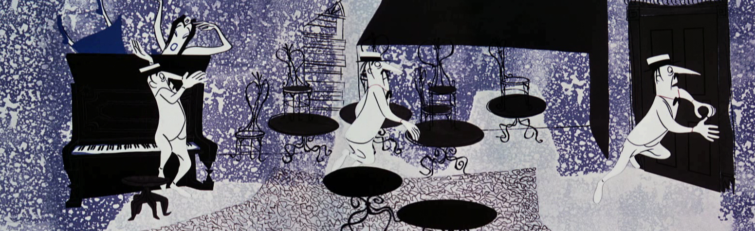
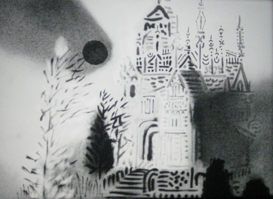
 - As you know, I like this cartoon. Rooty Toot Toot. I think it’s one of the very best animated films ever made. The film combines brilliant design, with great animation, and an extraordinary story.
Kurosawa had directed Roshomon in 1950, and it had just touched down in the US. This tells of several people who meet up while waiting out a rain storm as they tell their differing versions of the killing of a samurai. It  takes place in 12th Century Japan. There is no doubt that Hubley saw this film and does his cartoon adaptation of Frankie & Johnny using the same schema. It was not only daring for animation, but it was daring for film. It took the hands and eyes of a master to pull it off, and Hubley succeeded in the short 8 min cartoon.
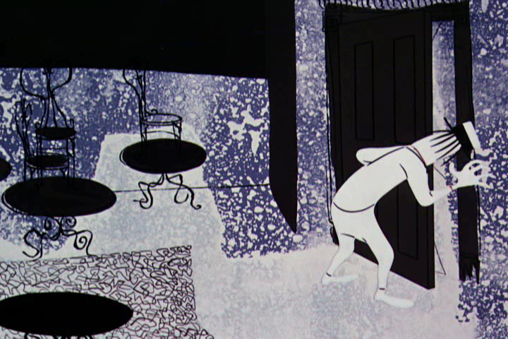
There is the legend that Steve Bosustow tried to get Hubley to speed up the
 storyboard/writing process where finally the director had to lock himself and the board in to keep the production on hold until he thought it was finished. Eventually, according to the story, Bosustow broke down the door and put the film into its next phase. I don’t know what truth is in this, but I assume there must be a little something to it.
Unlike most other UPA films, this movie was made for an adult audience and it had no
 children to speak down to. Unlike most other UPA films, the art style came from 20th century art, not “illustration.” The inspiration was more Steinberg, Ben Shahn and WPA than Vanity Fair or the New Yorker.
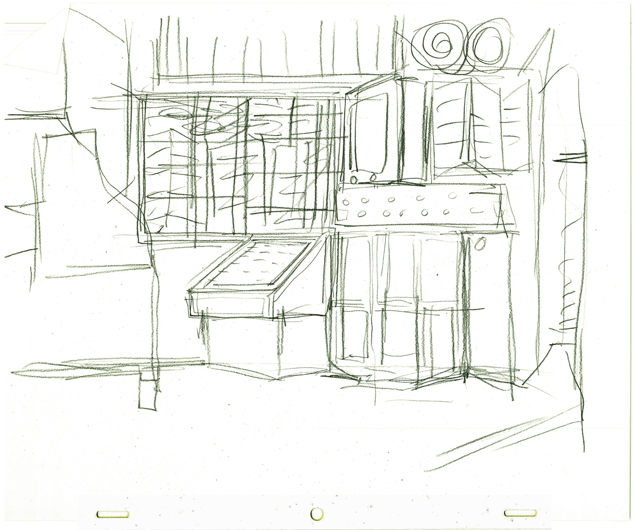
I’ve decided to pull frame grabs from the film, but that can only account for some still graphics. You really have to see this in motion, and I suggest you watch the version on the TCM Jolly Frolics DVD. It’s the only version that has a good transfer which does the design justice.
 1
1
 2
2
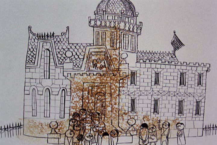
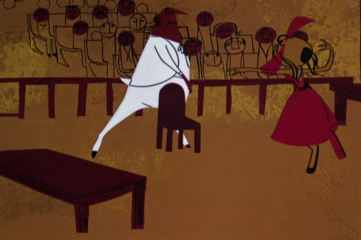
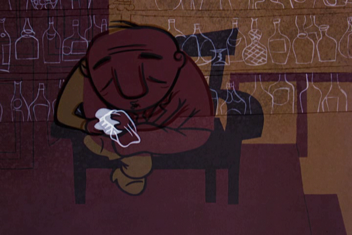
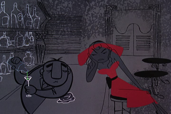
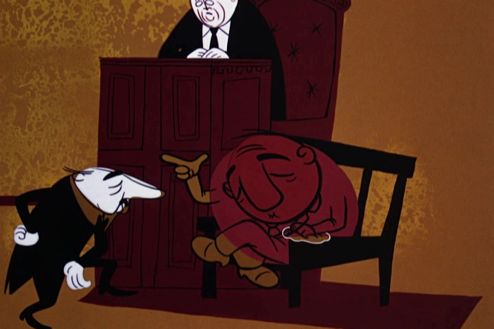
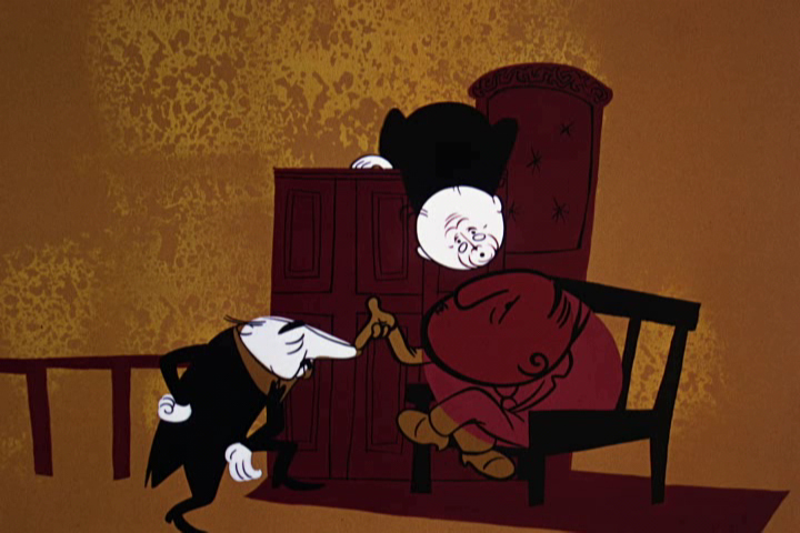
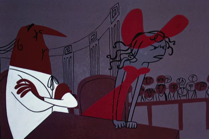
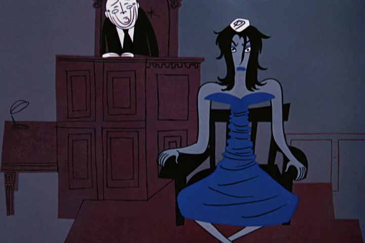
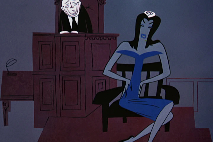
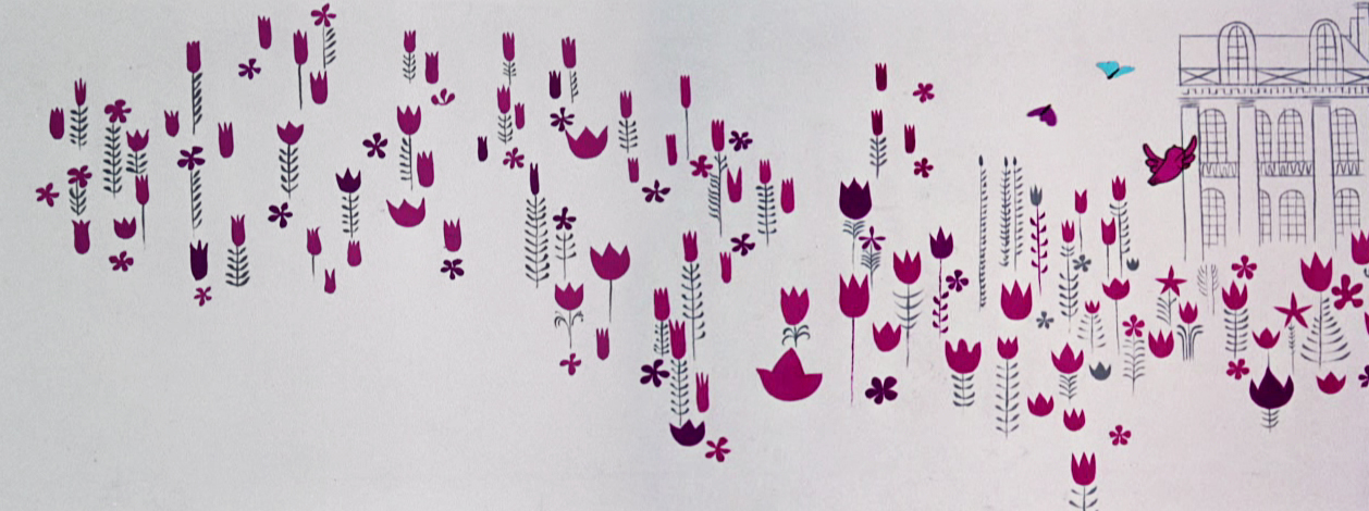
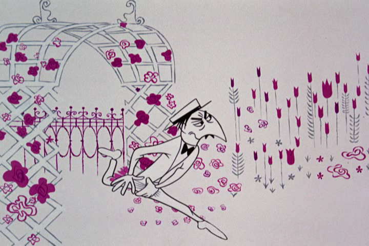
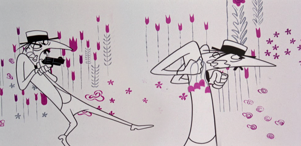
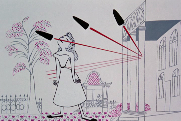
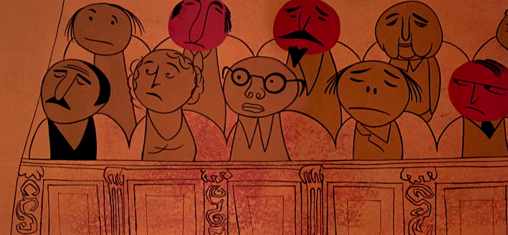
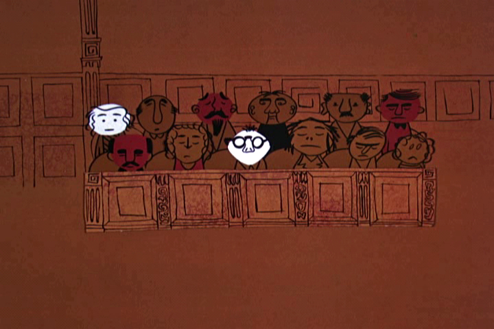
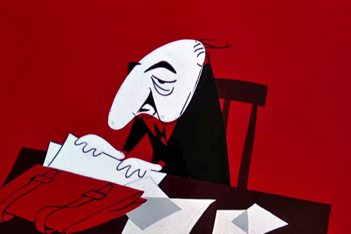
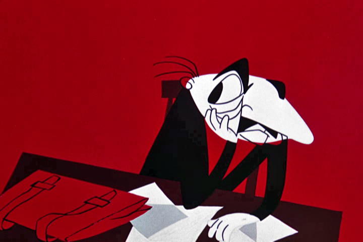
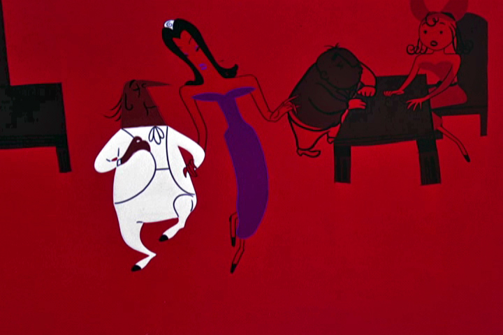
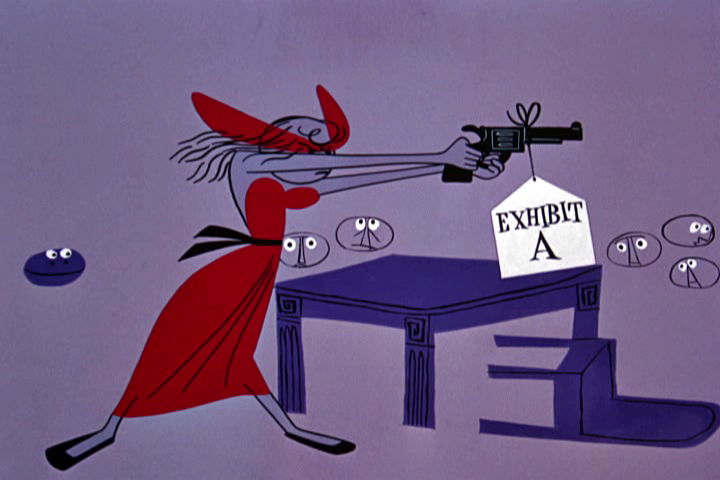
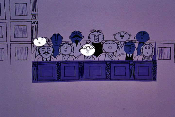
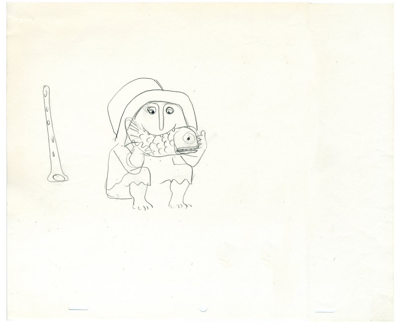
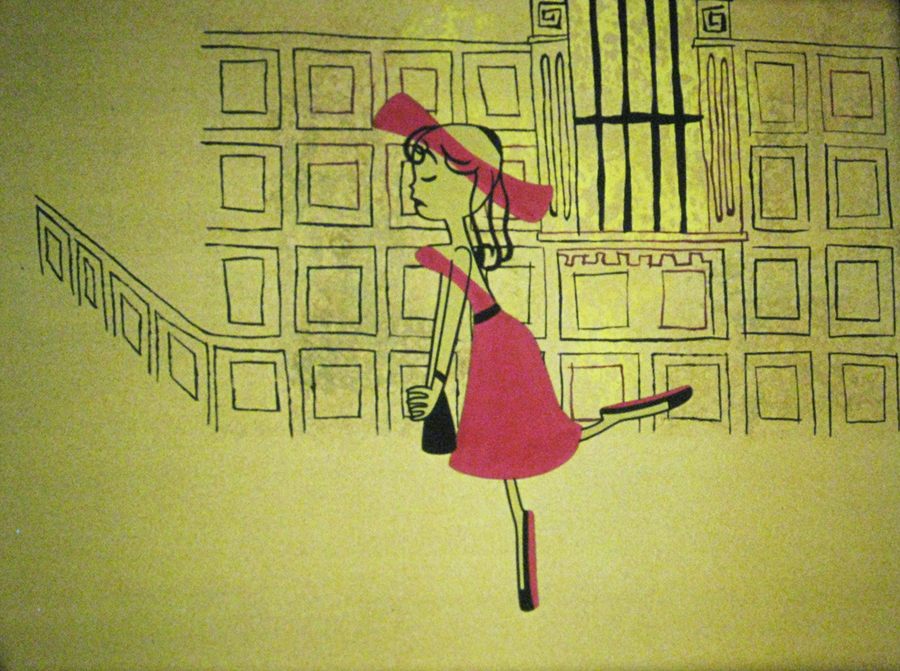
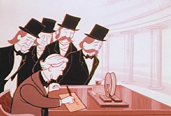
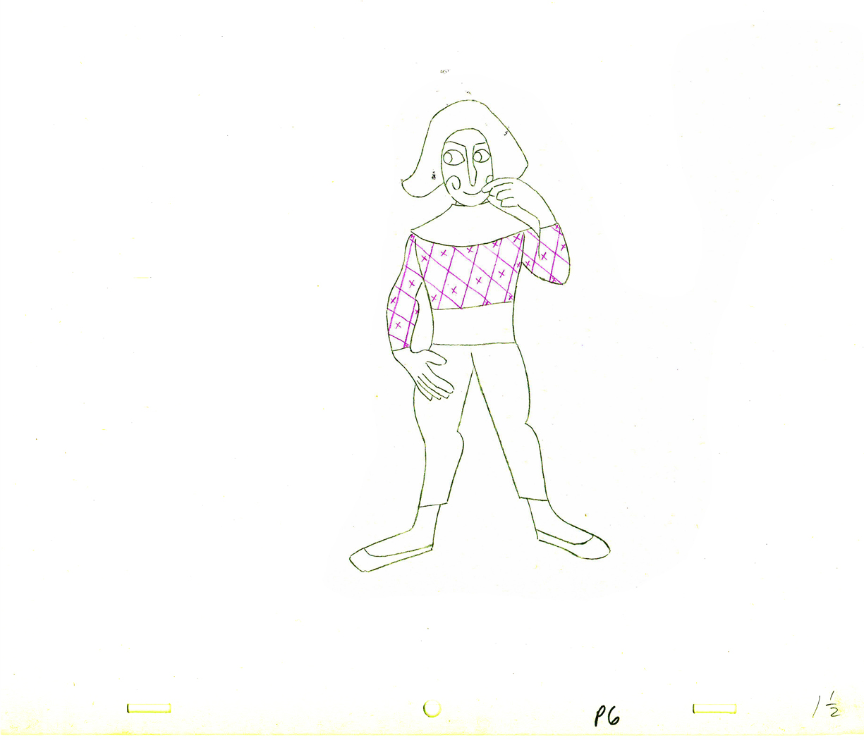
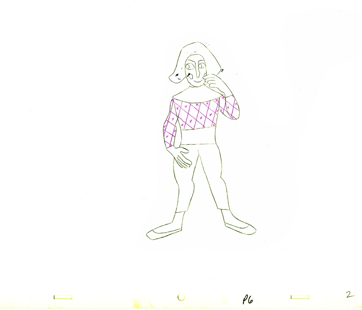
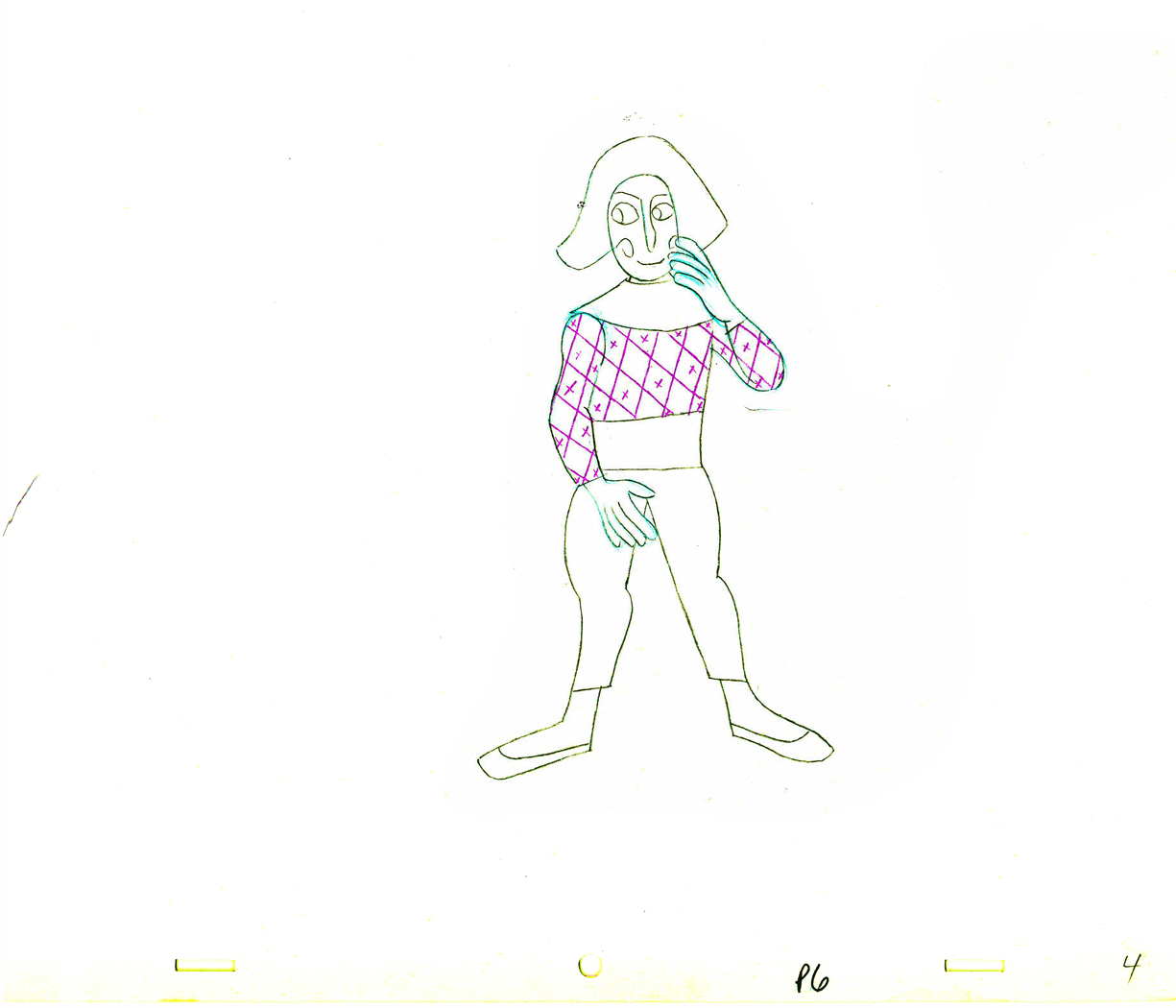
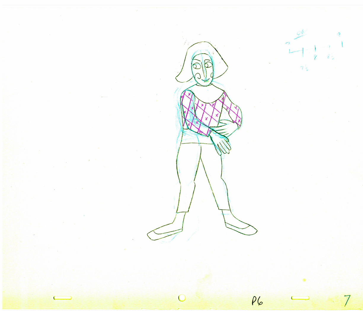
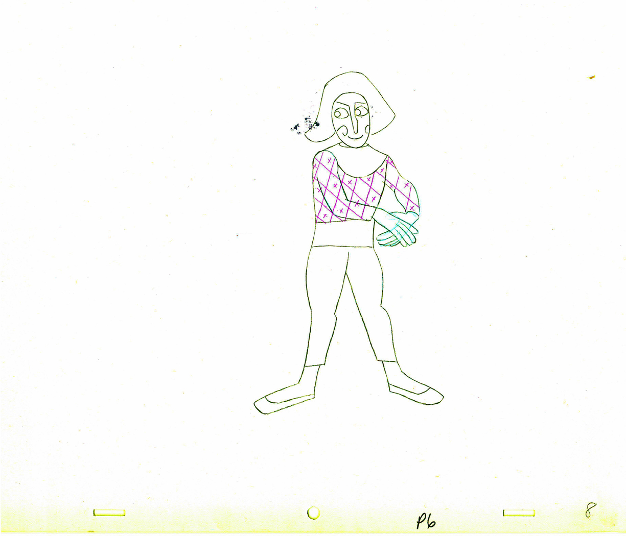
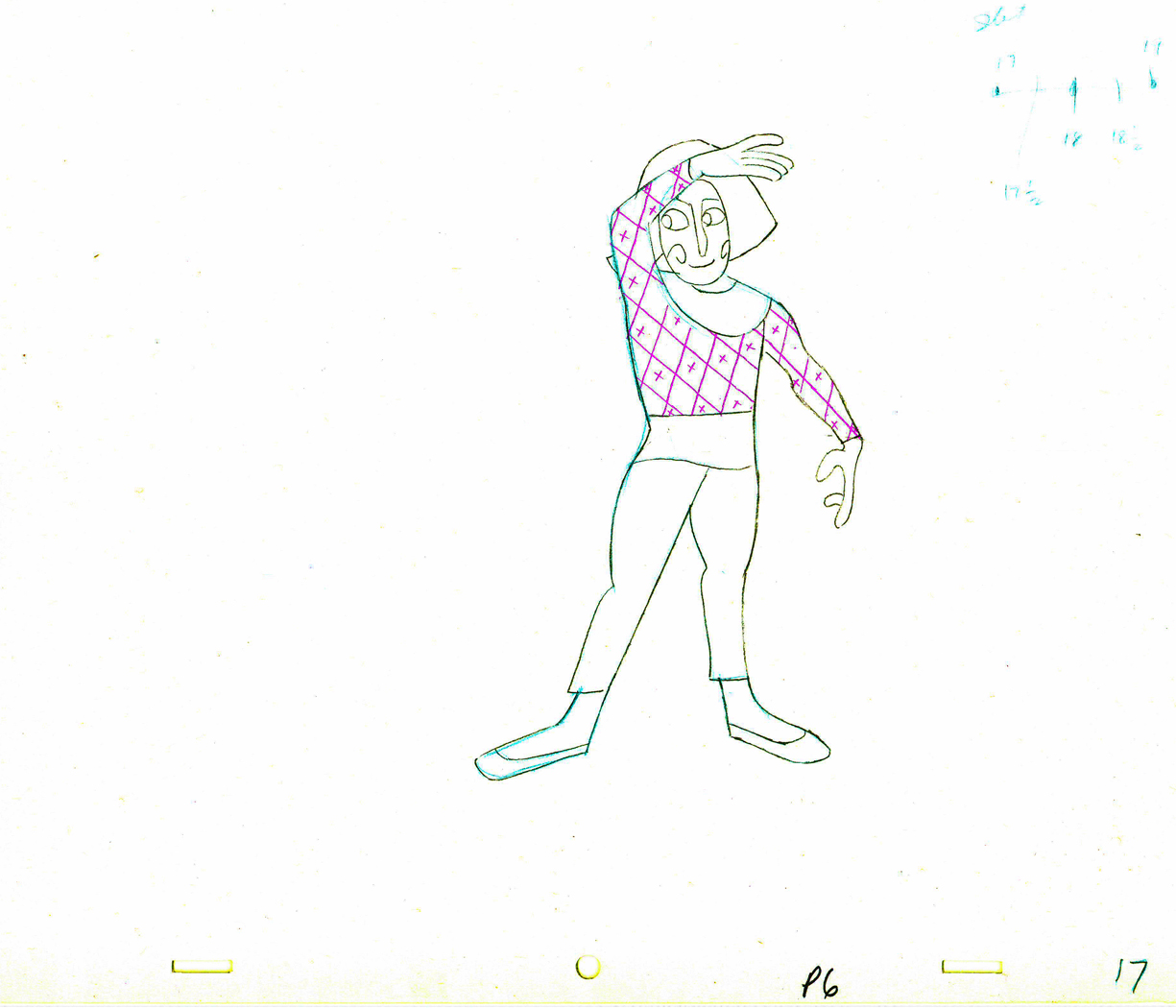
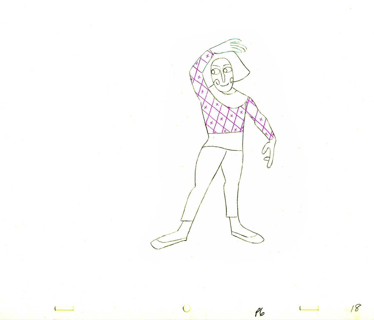
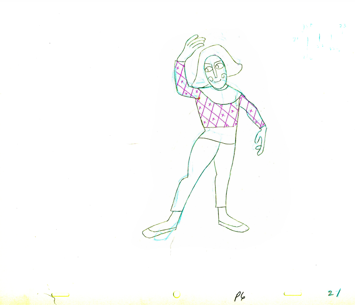
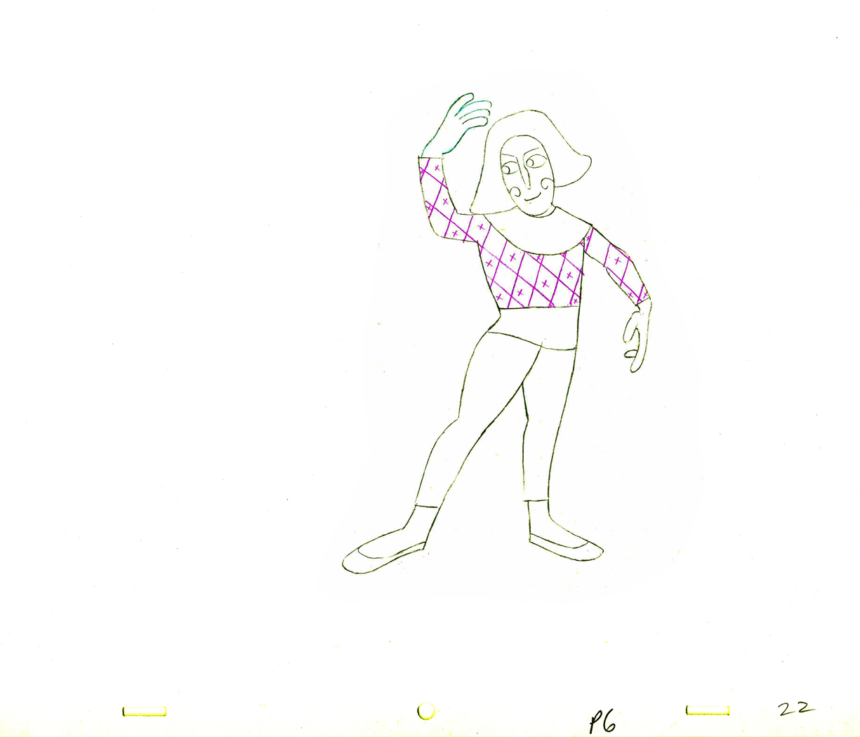
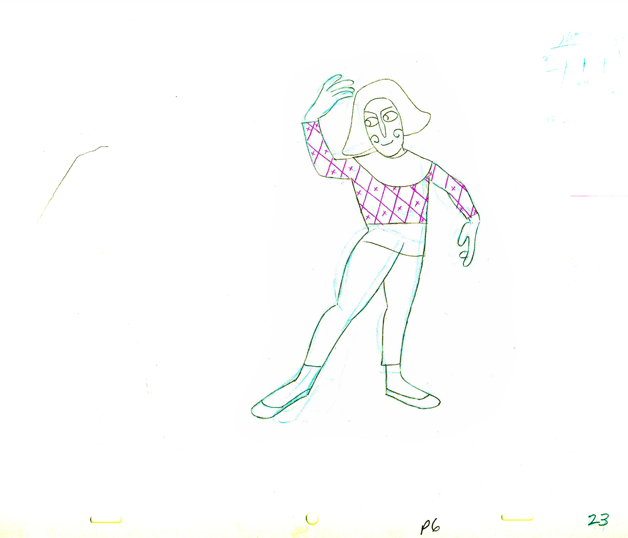
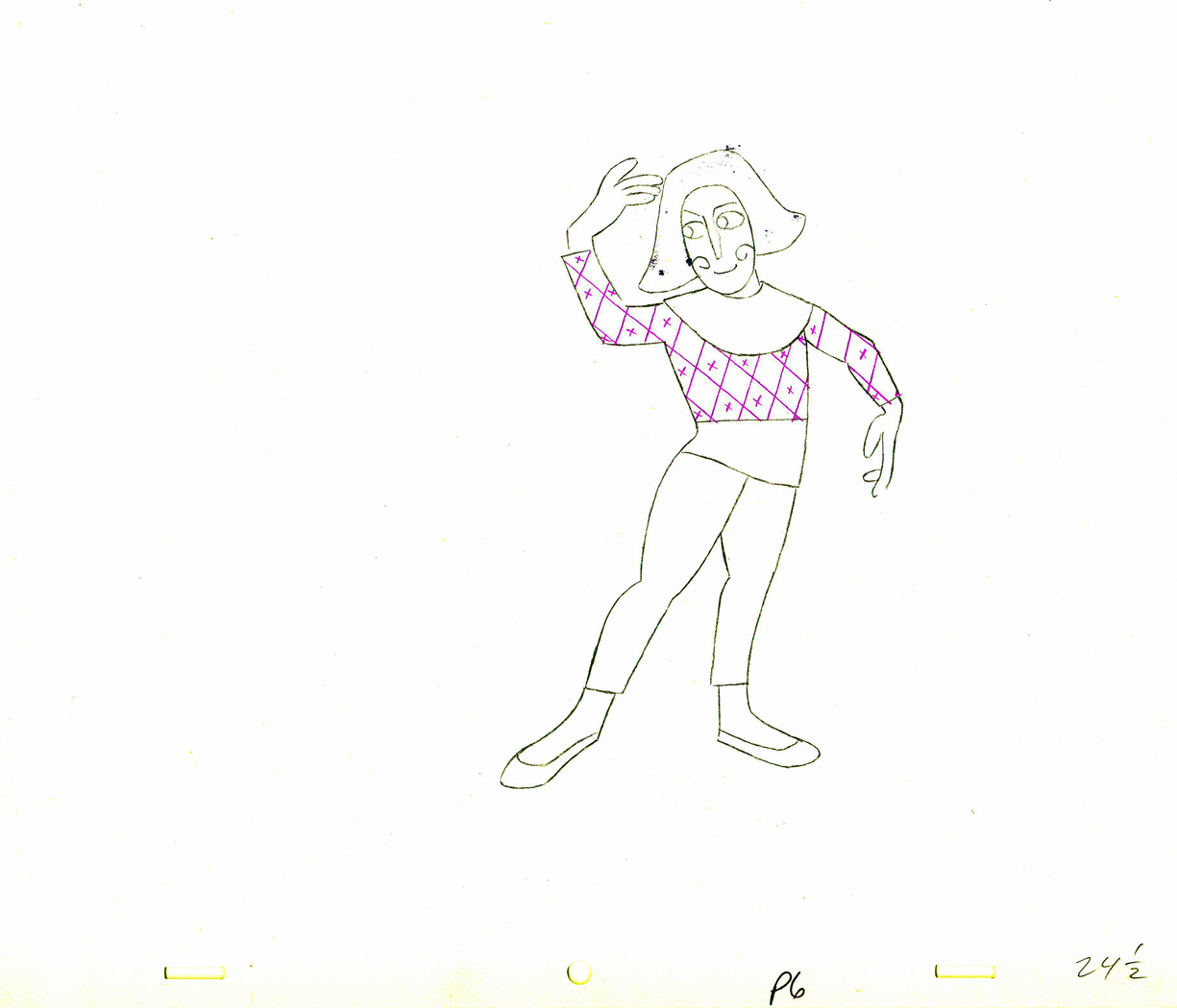
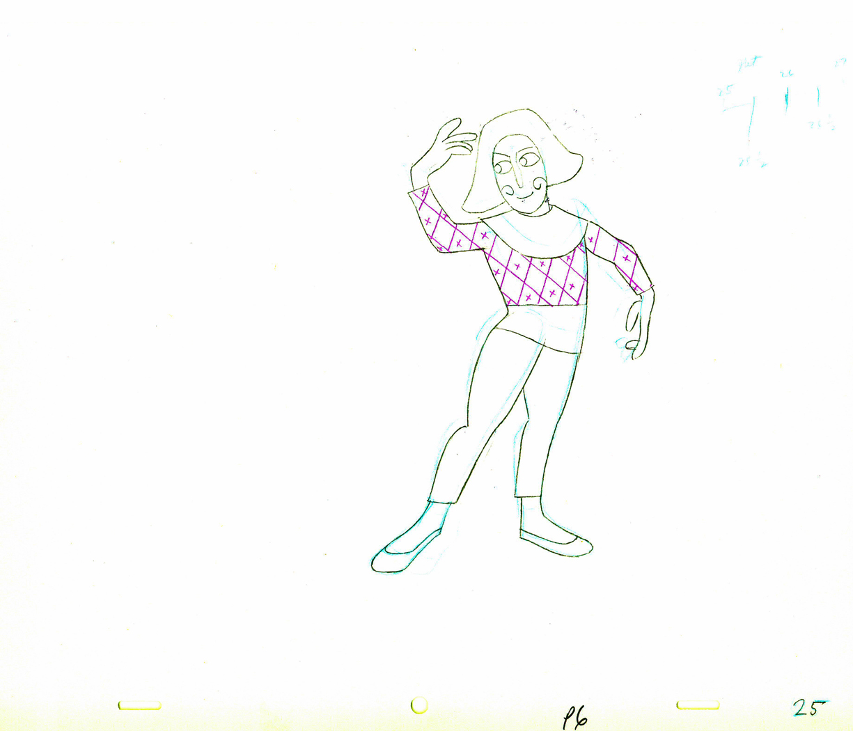
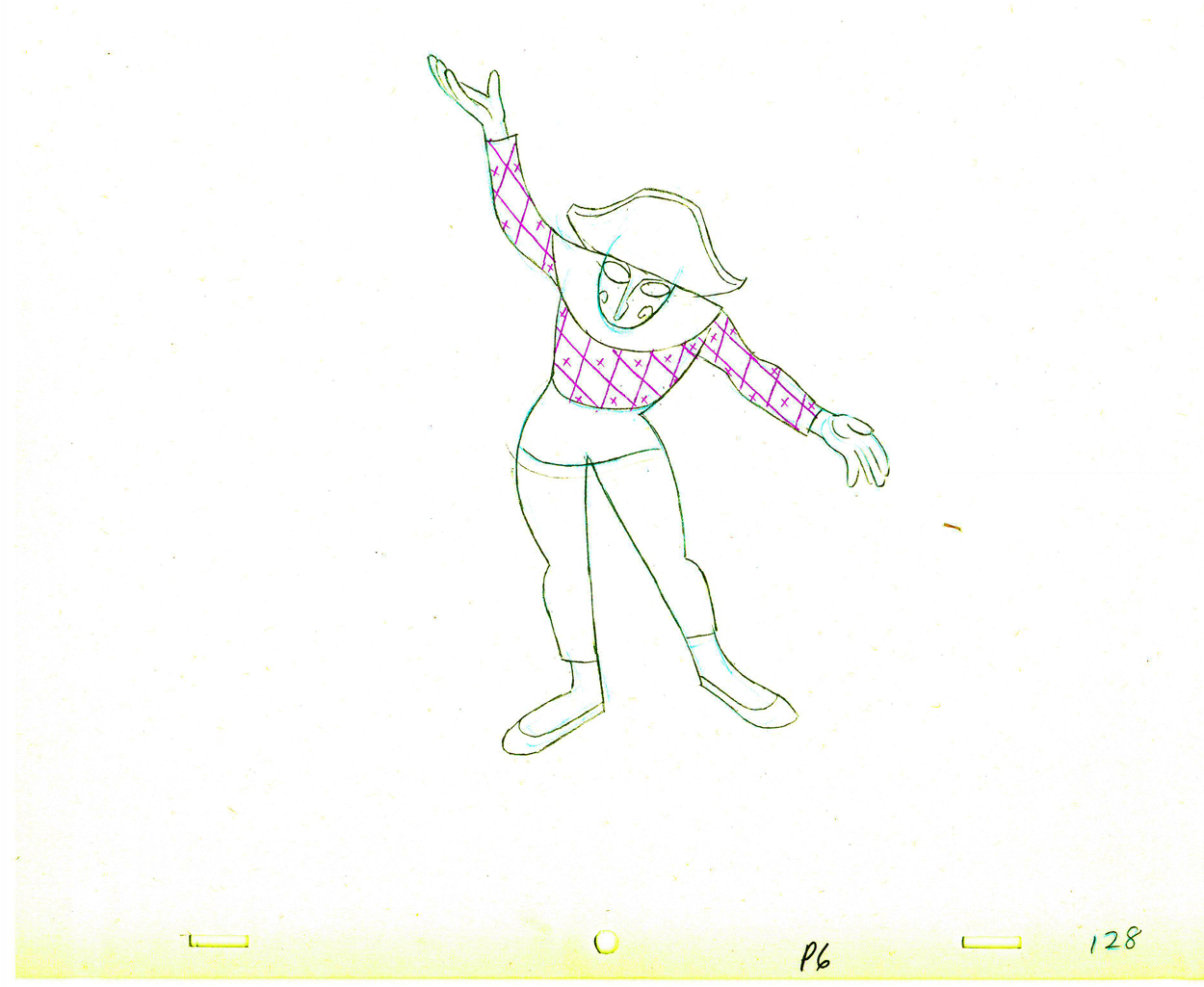
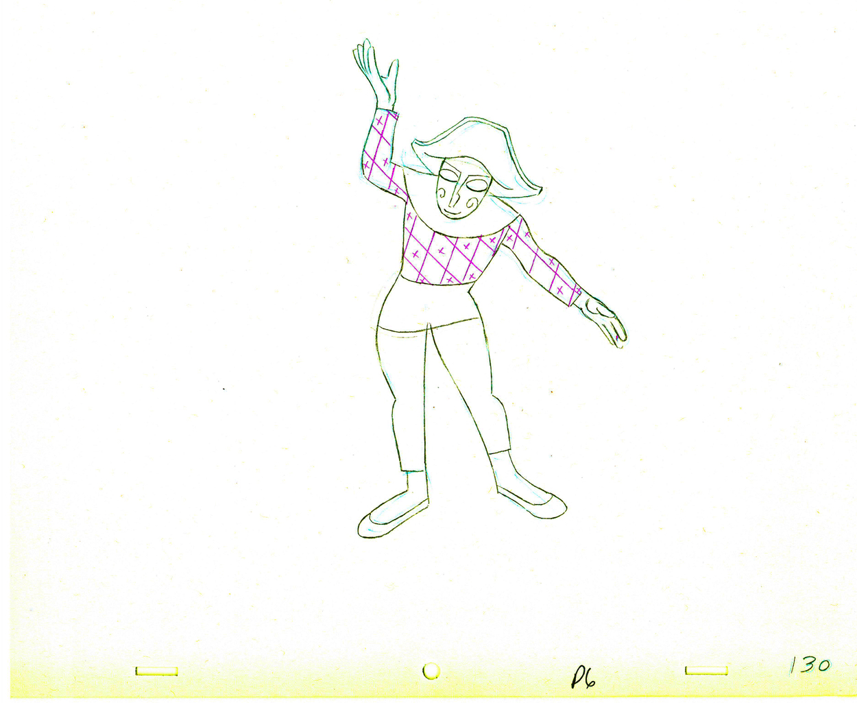
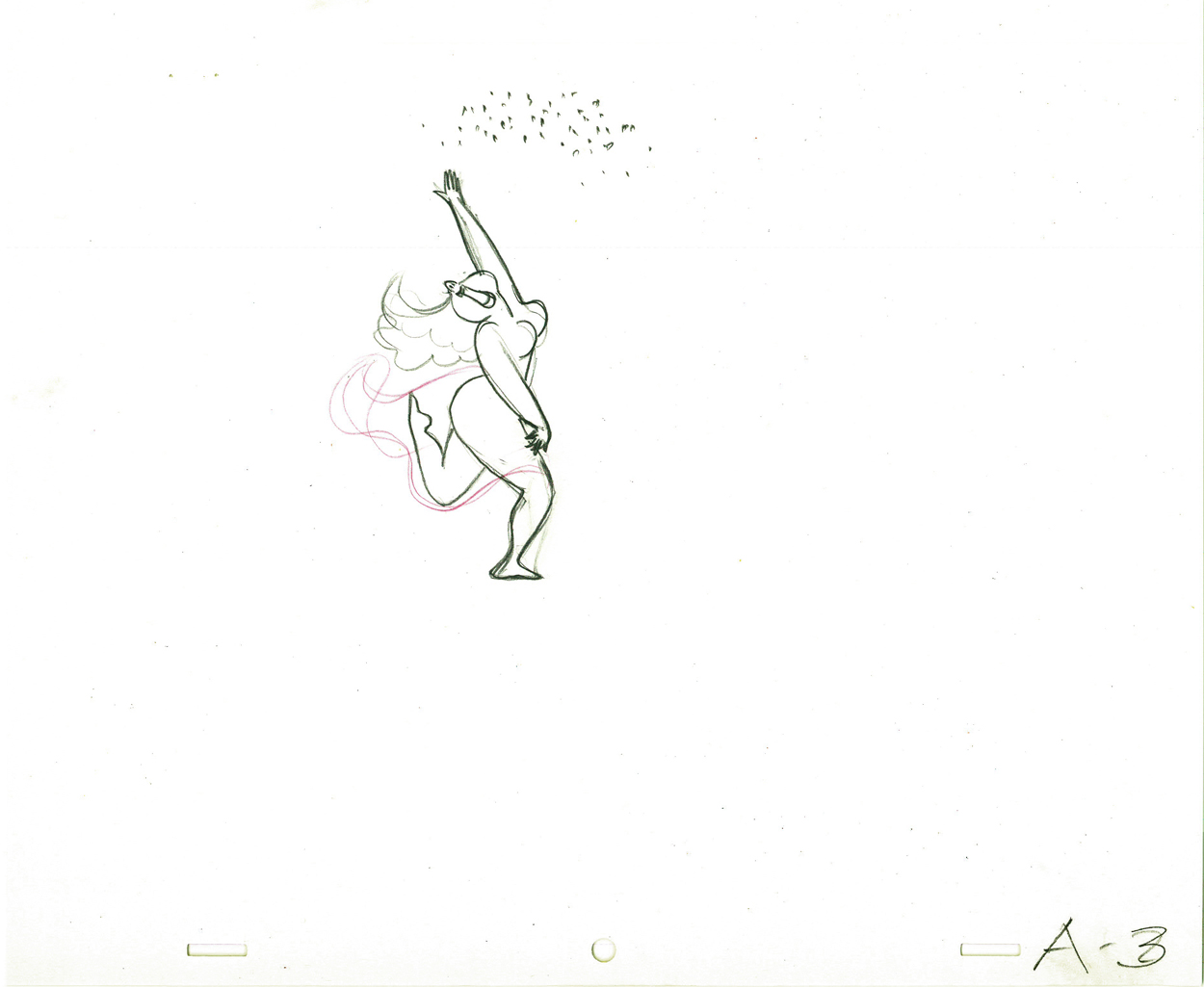
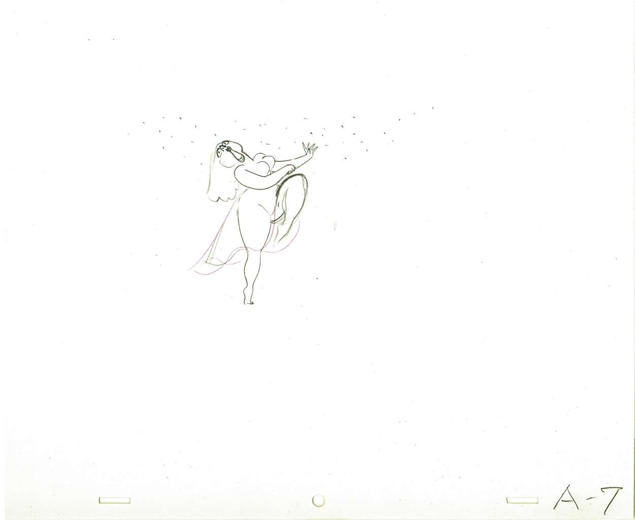
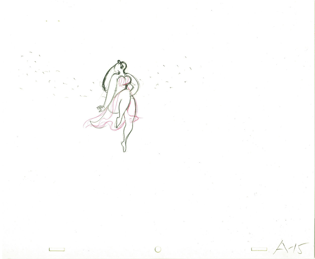
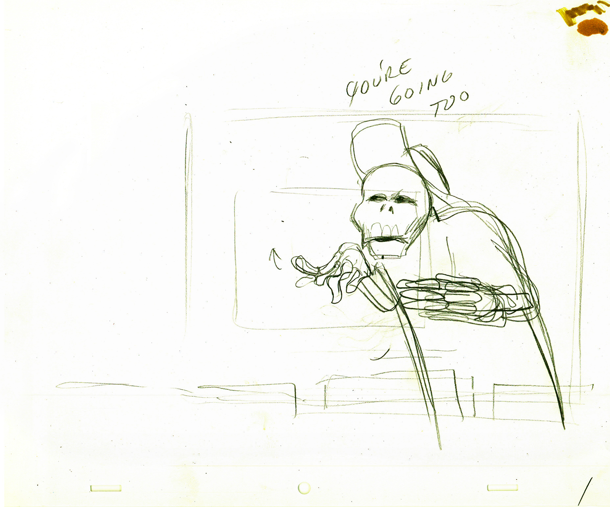
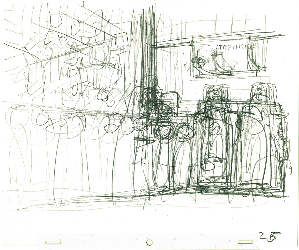
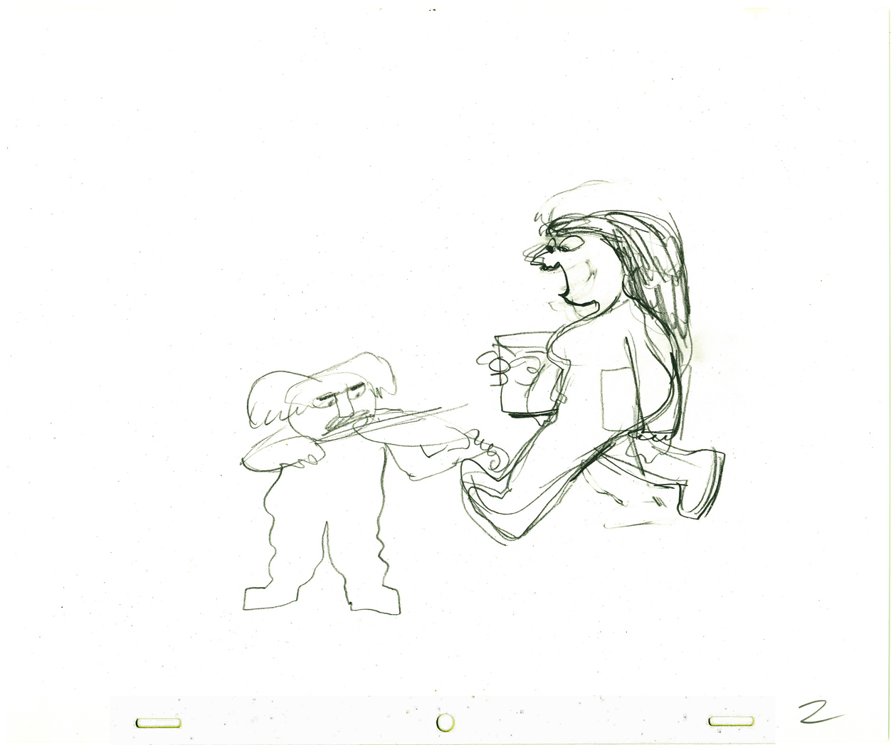
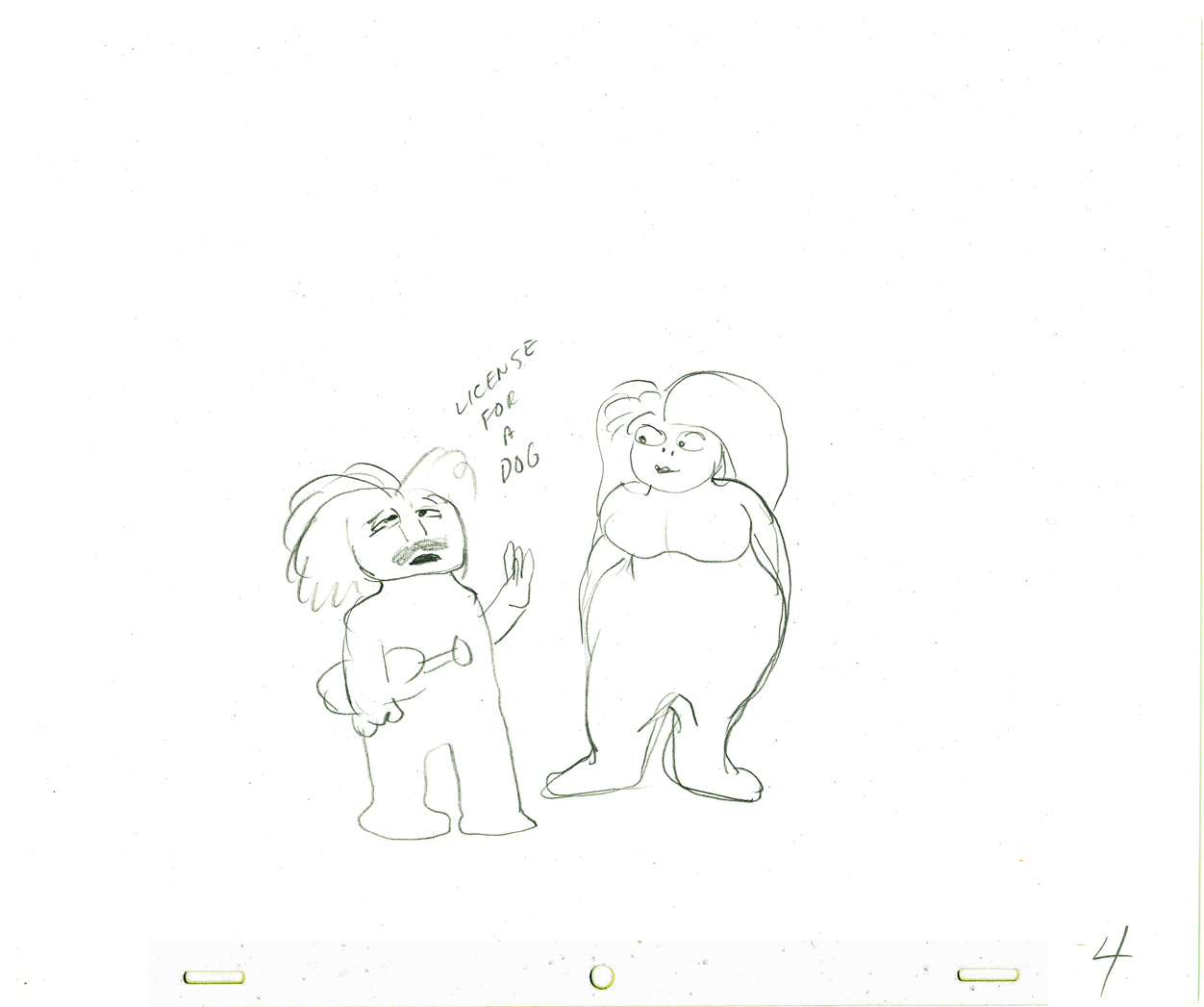
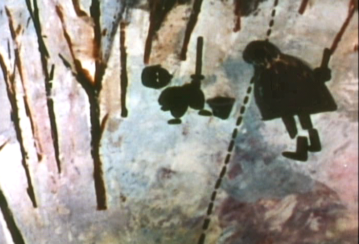
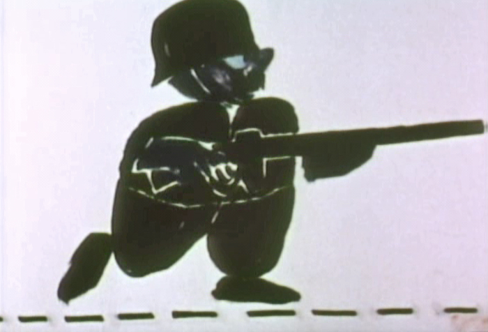
Gold colors dominate the opening of the trial,
except for Frankie’s bright red dress.
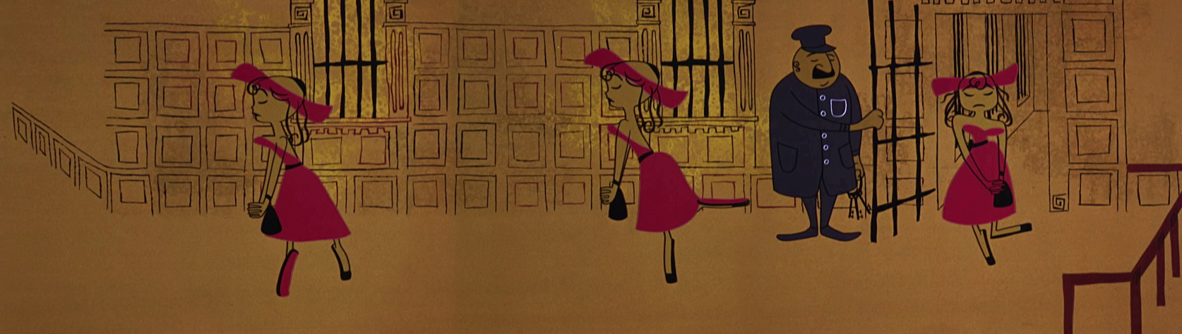
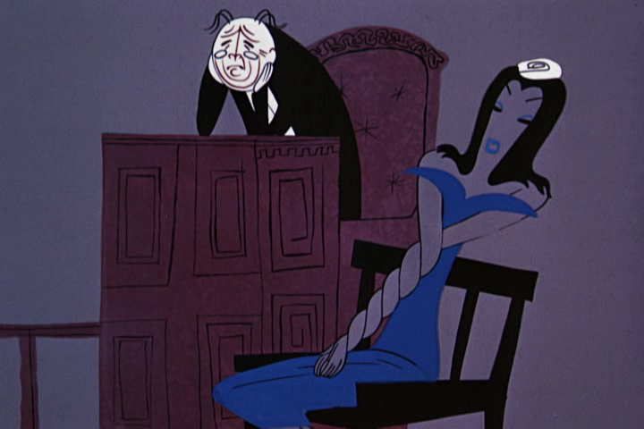
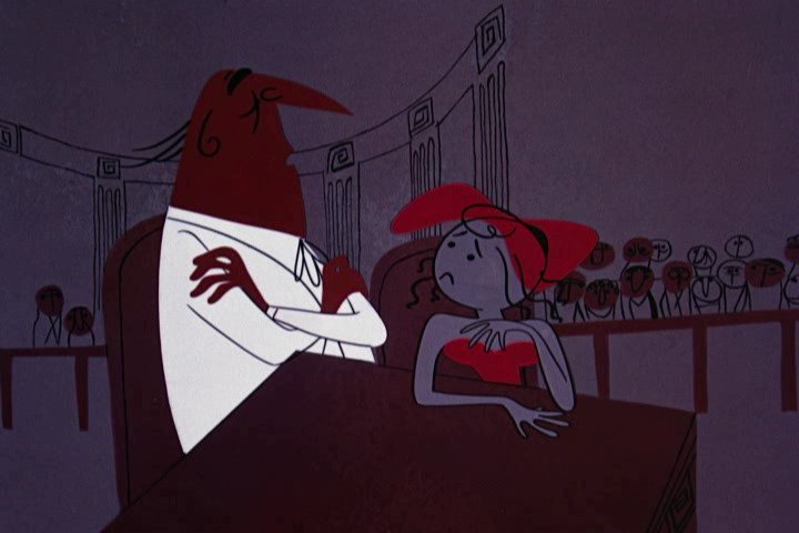
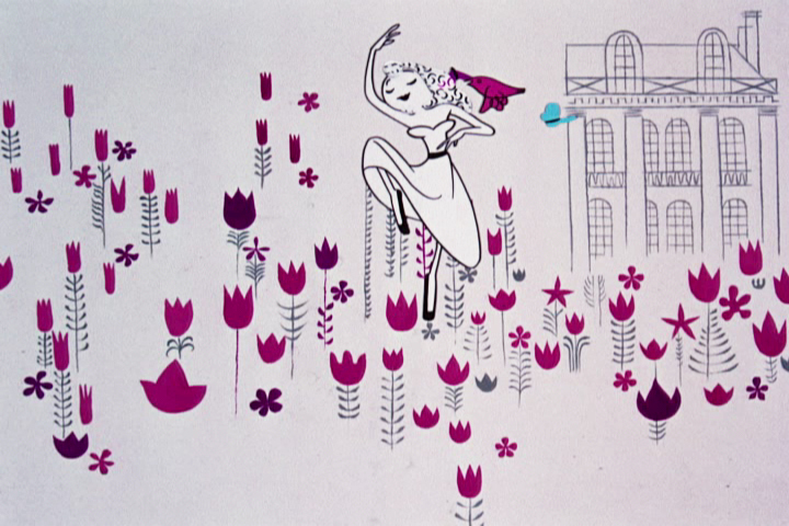
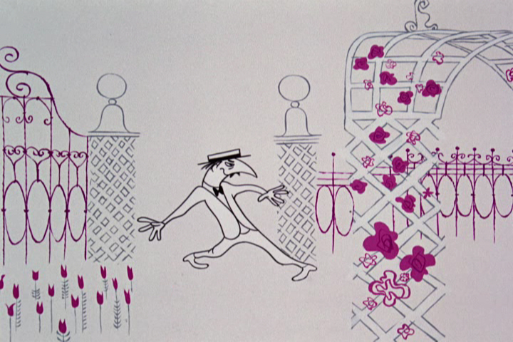
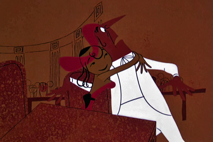
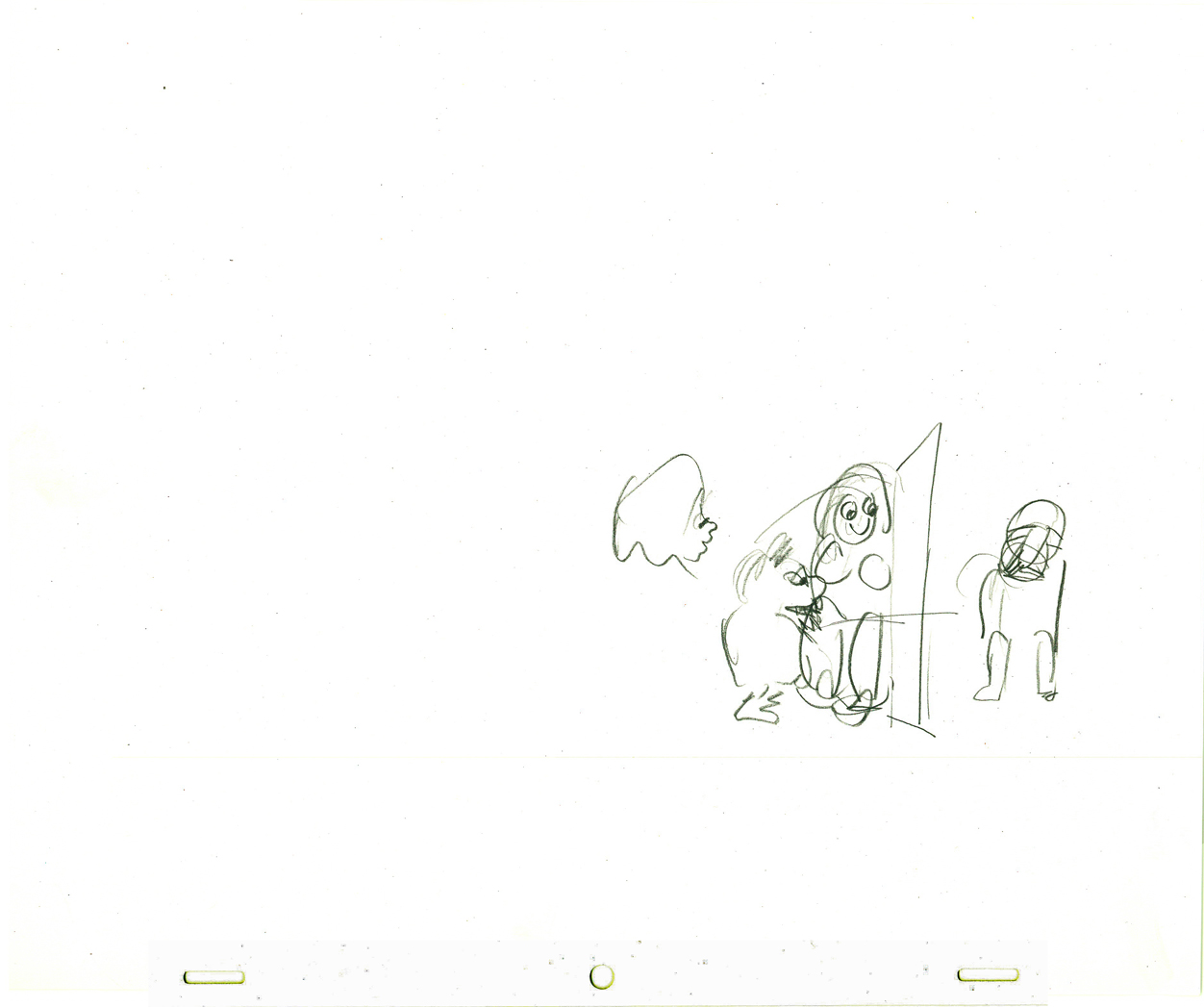
Frankie appears, to stand trial.
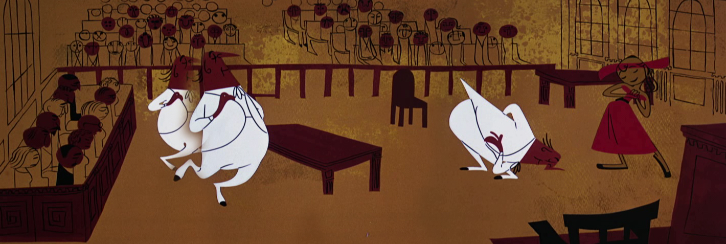
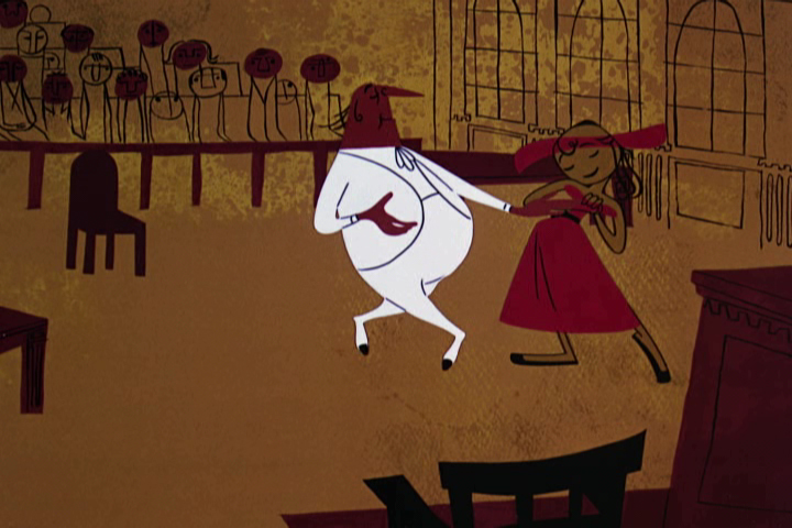
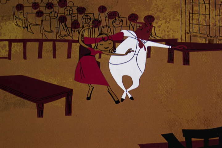
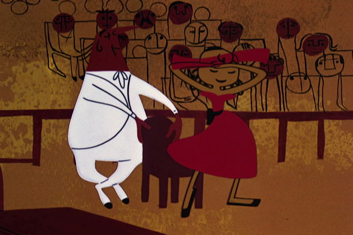
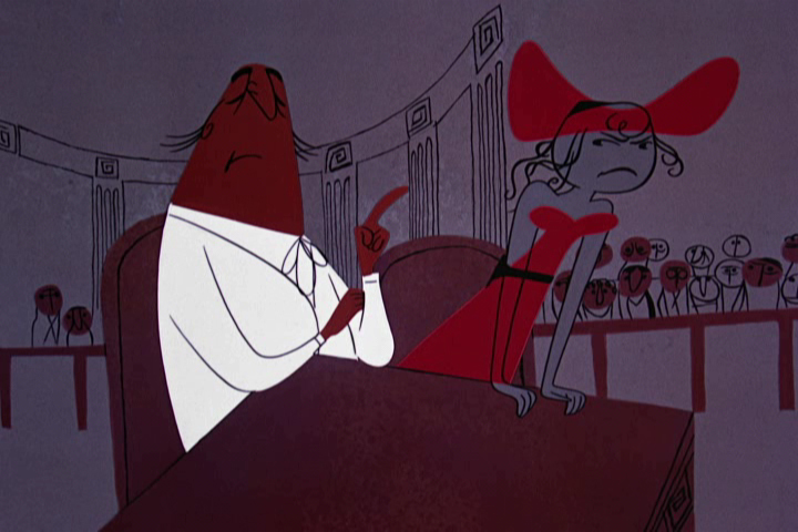
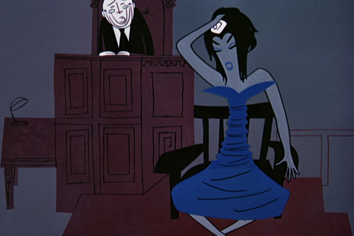
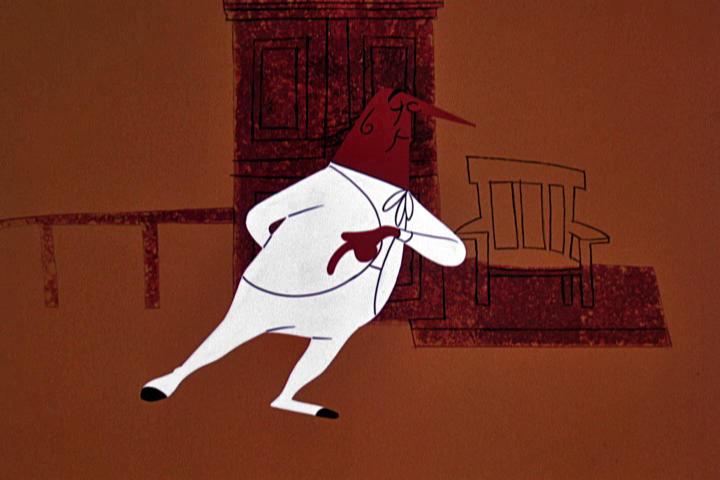
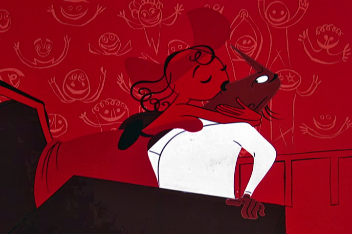
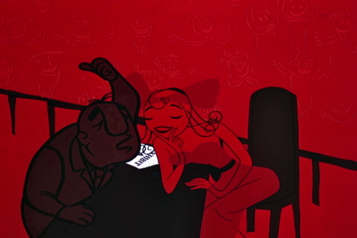
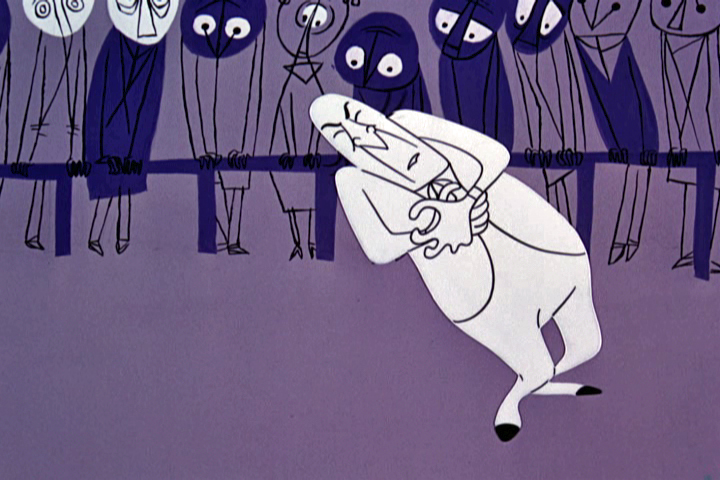
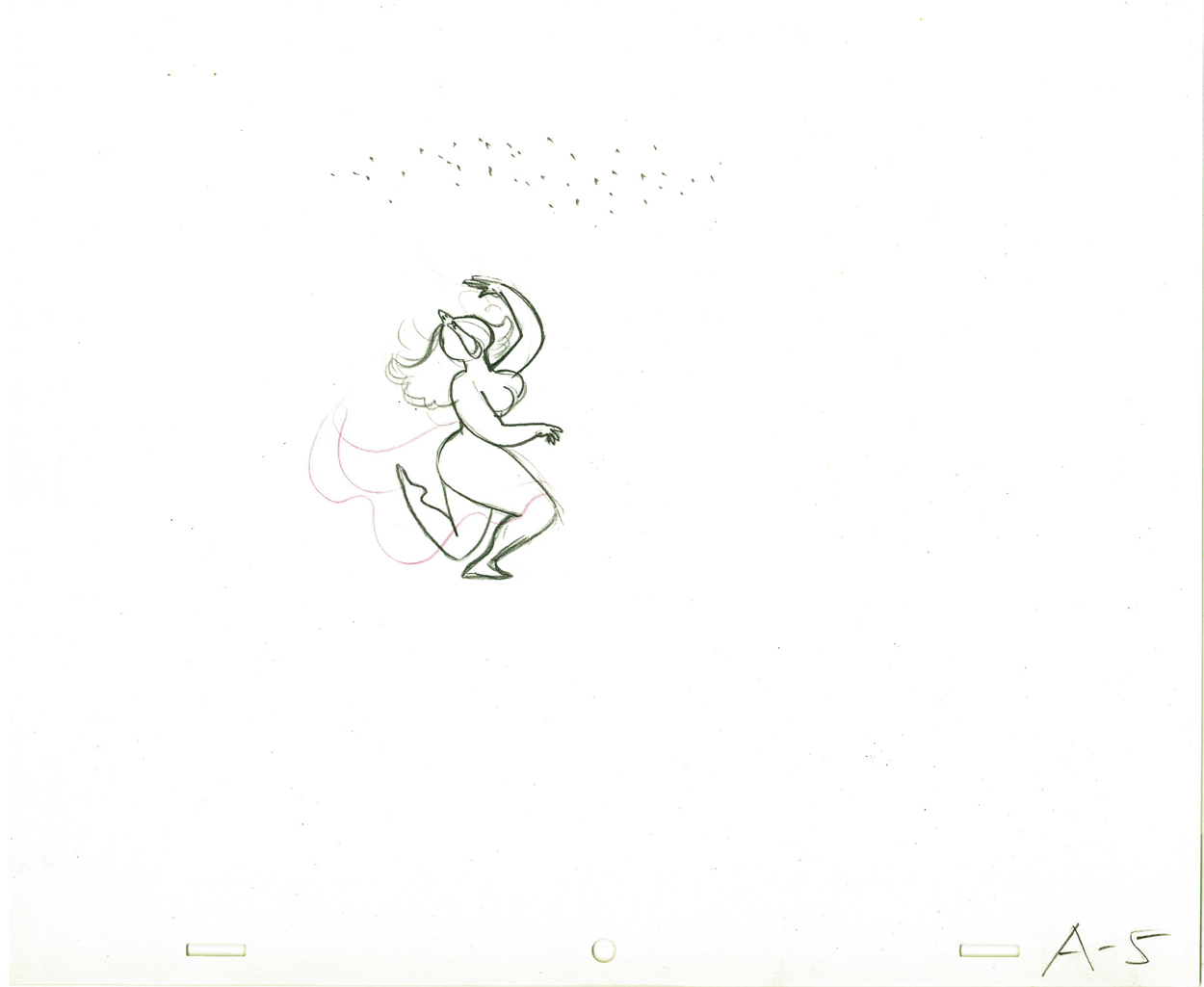
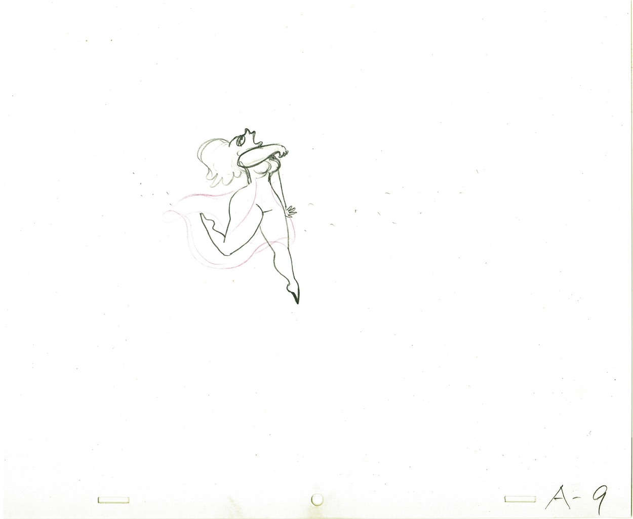
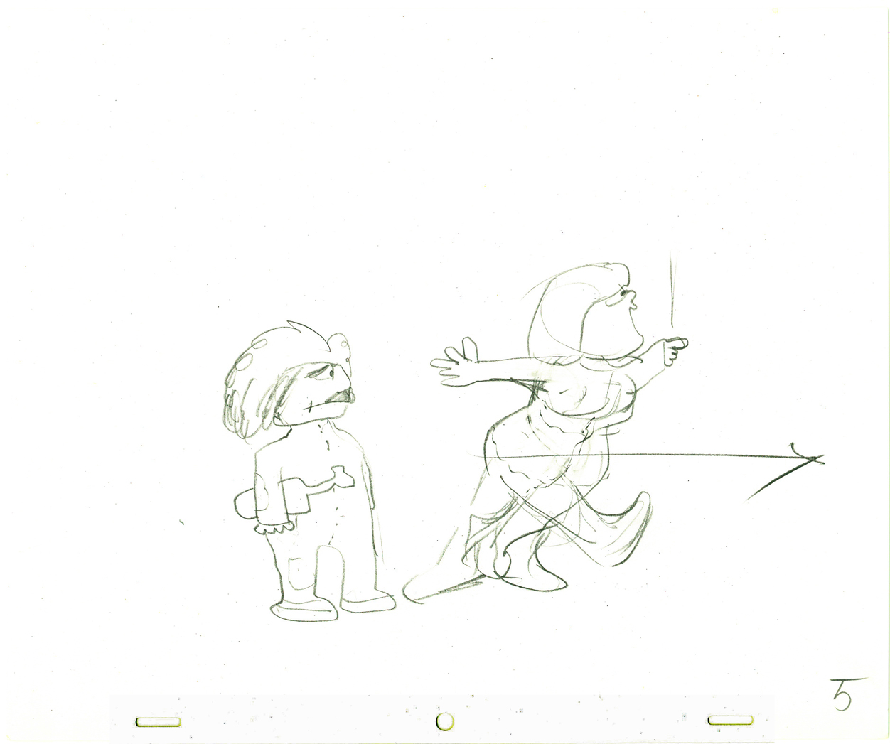
The defense does a dance with Frankie
as he caresses his client.
 5
5
 6
6
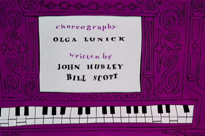
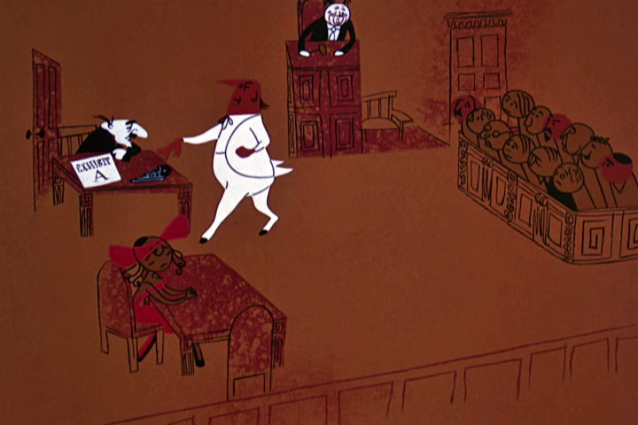
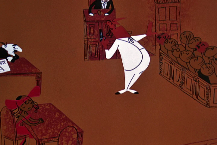
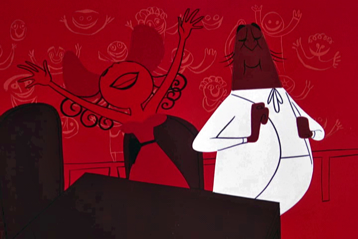
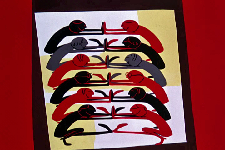
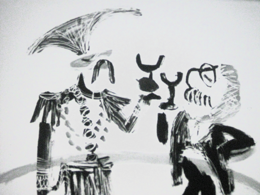
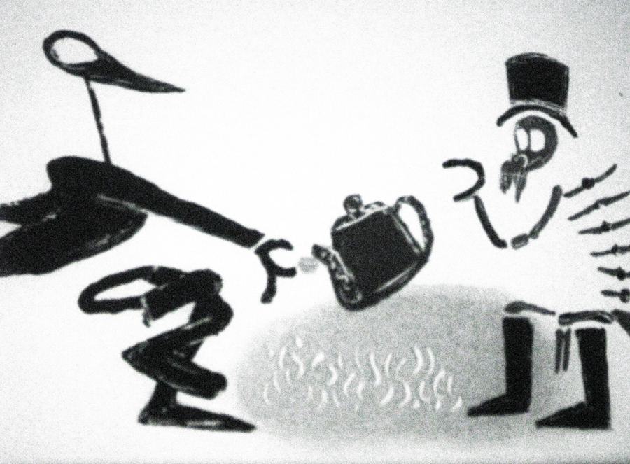
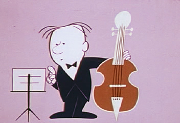
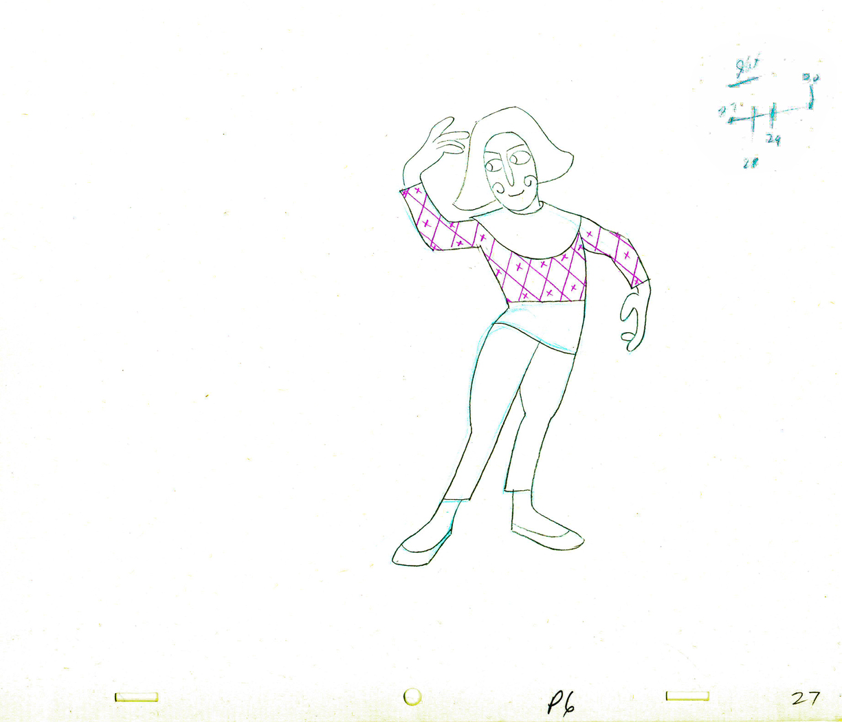
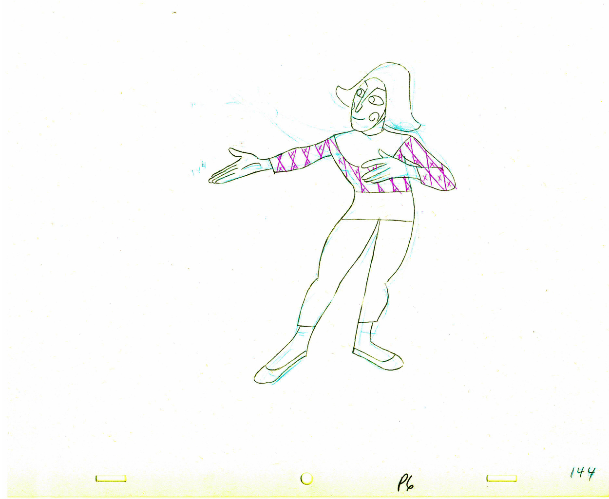
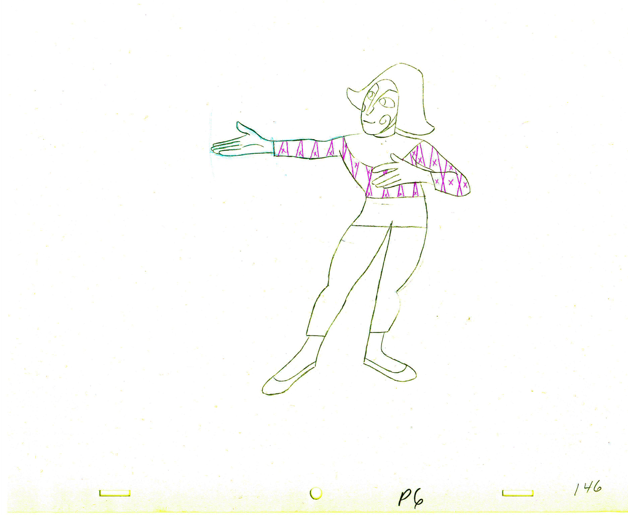
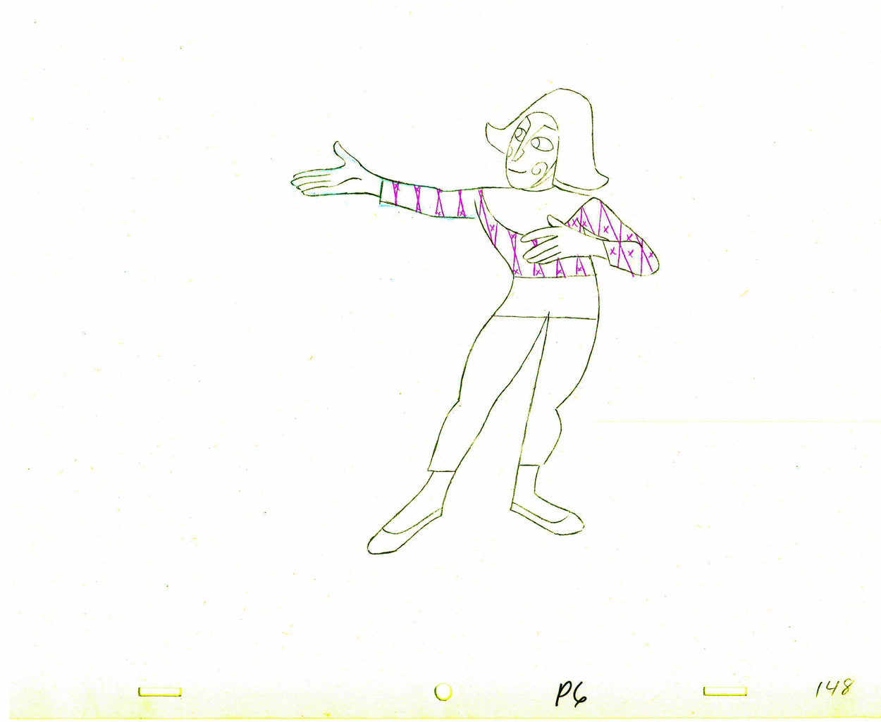
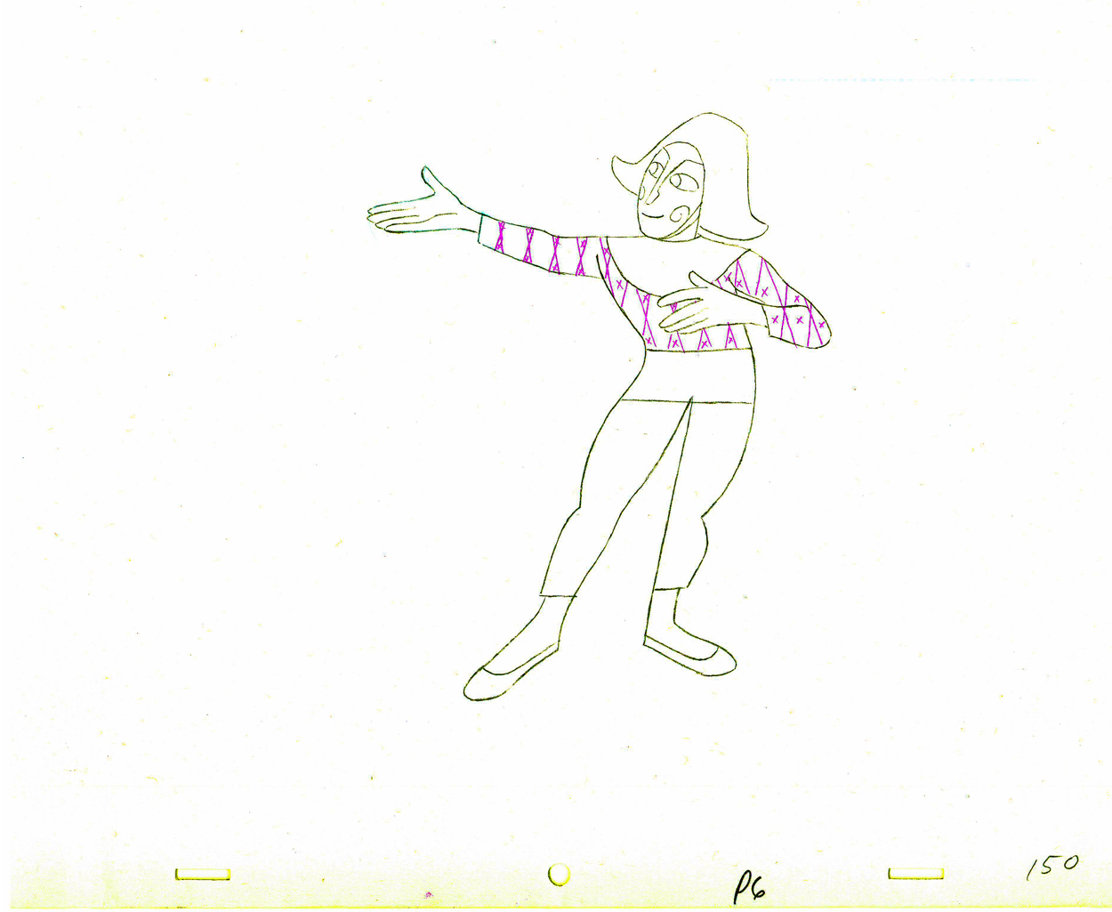
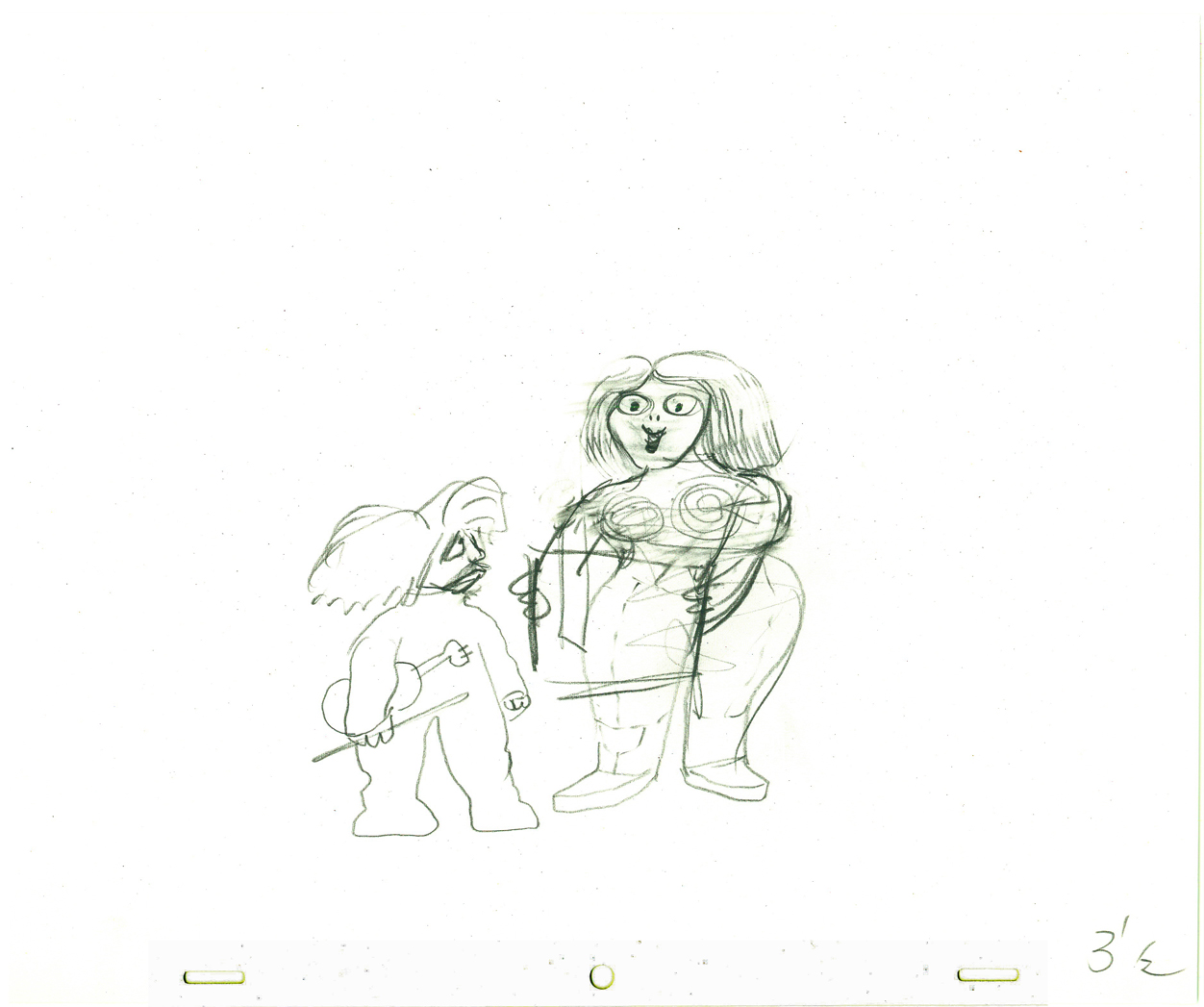
Choreographer Olga Lunick earned her money on this scene.
 7
7
 8
8
 9
9
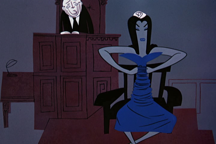
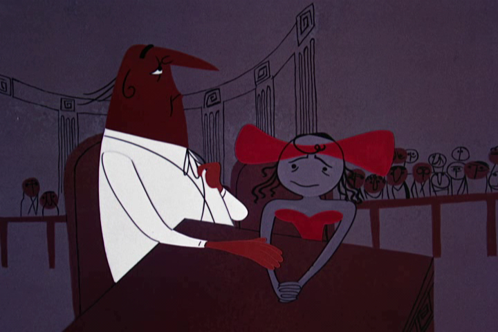
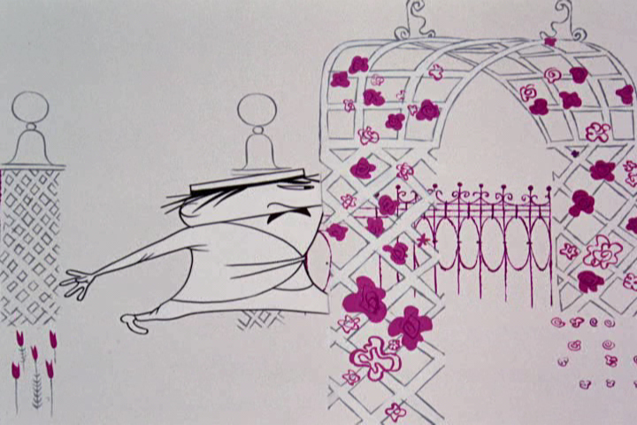
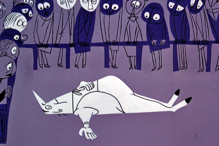
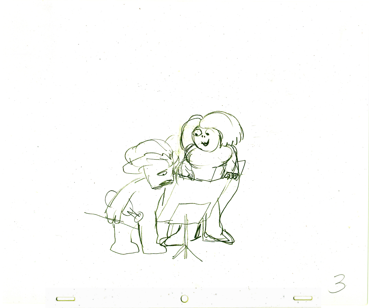
He eventually seats her.
 10
10
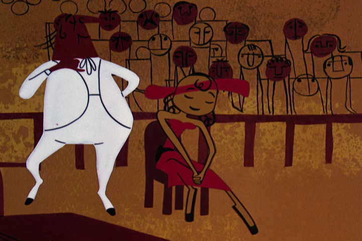
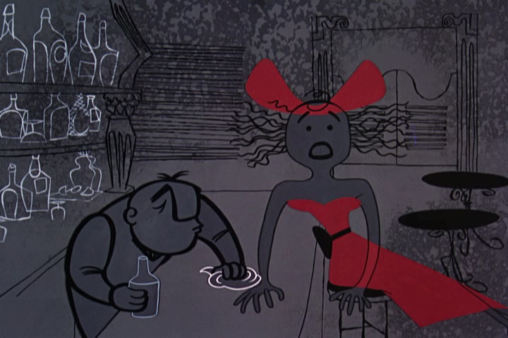
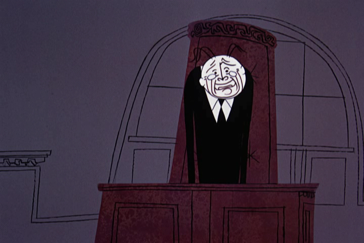
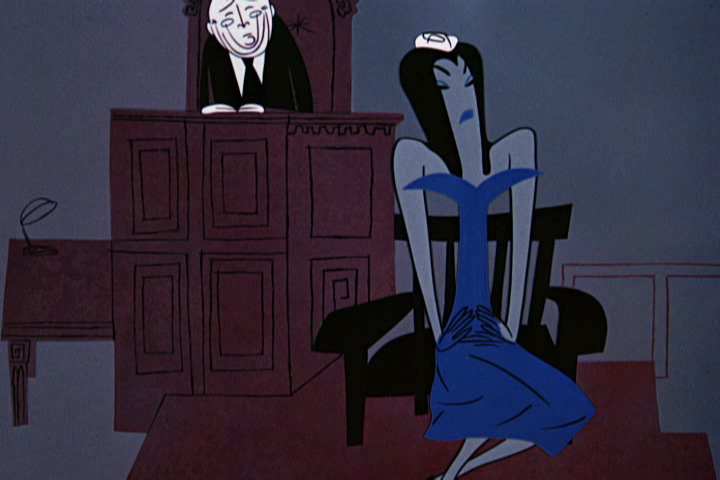
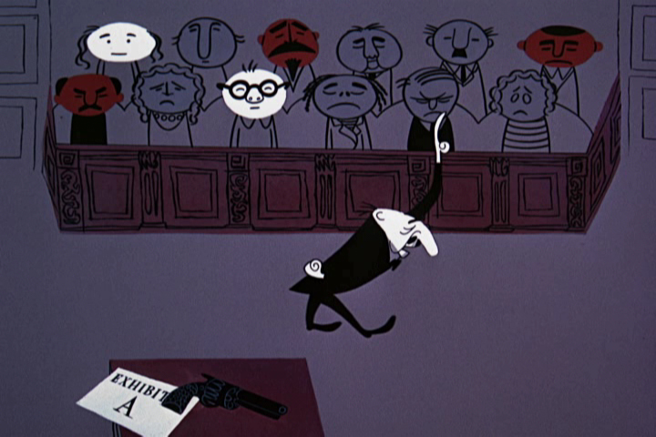
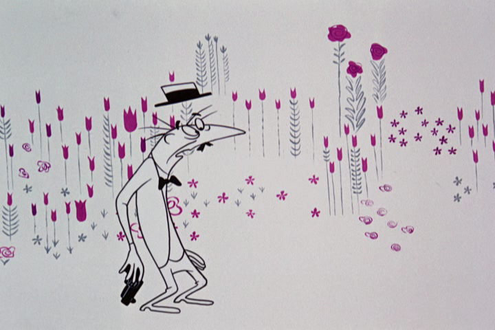
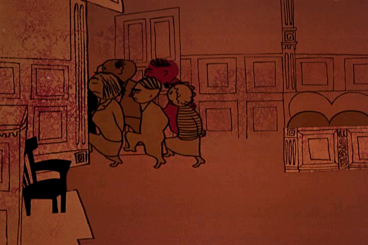
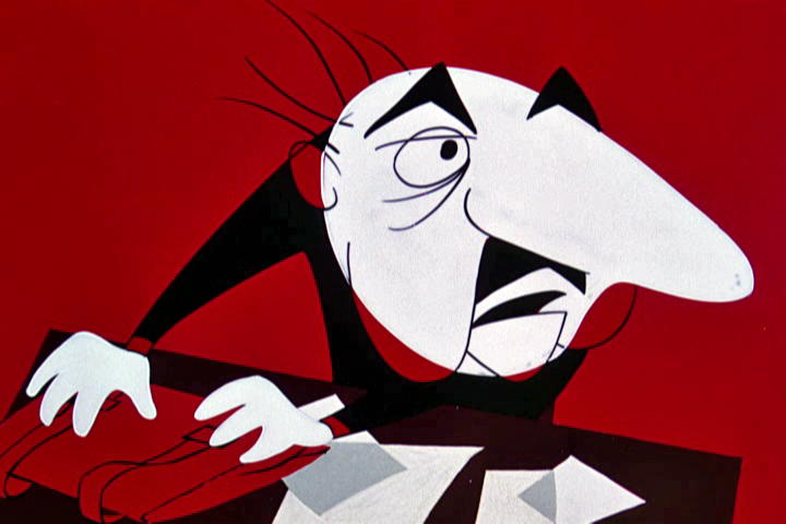
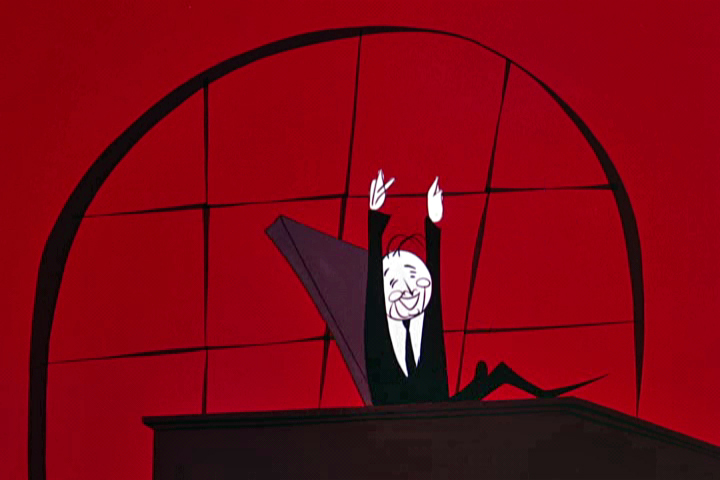
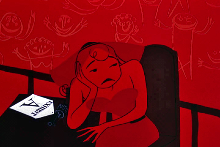
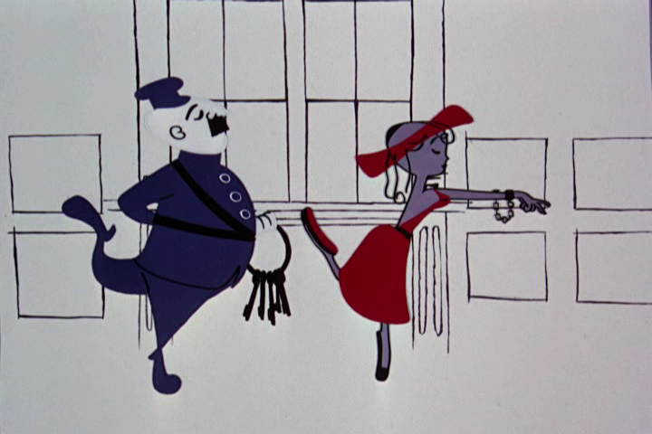
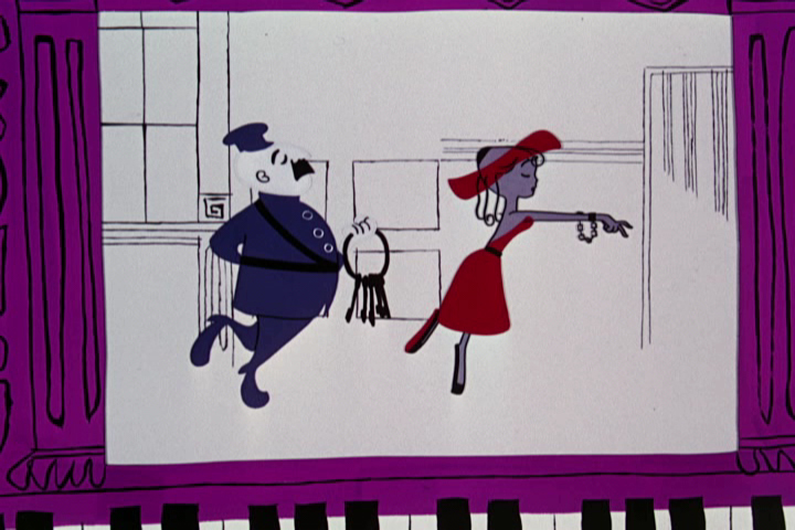
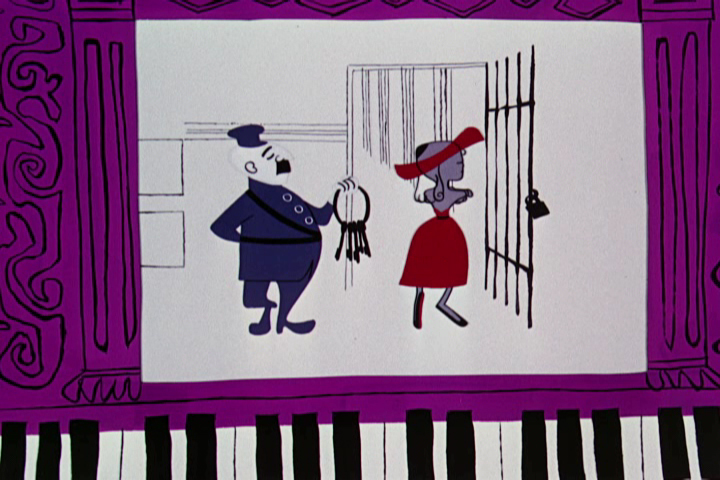
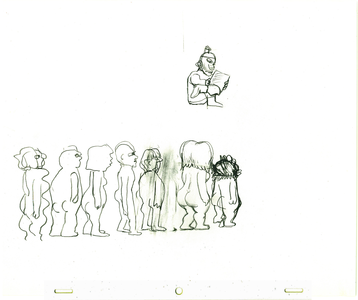
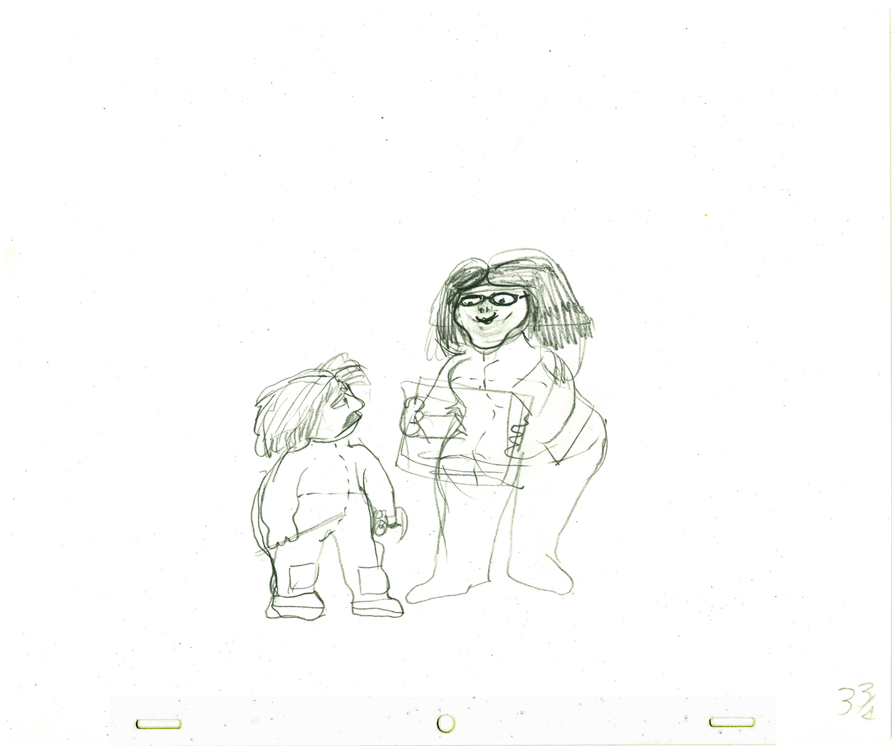
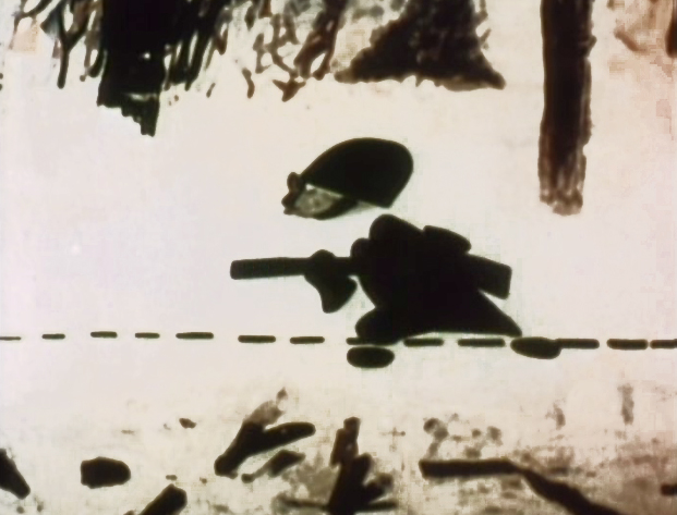
An open and shut kind of case.
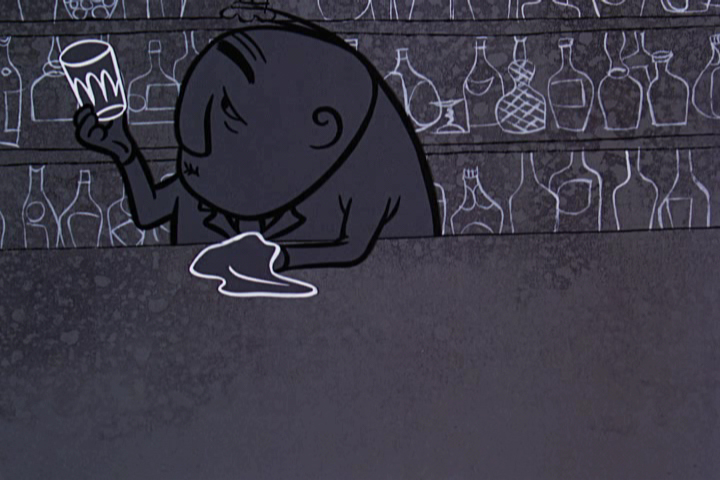
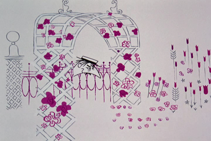
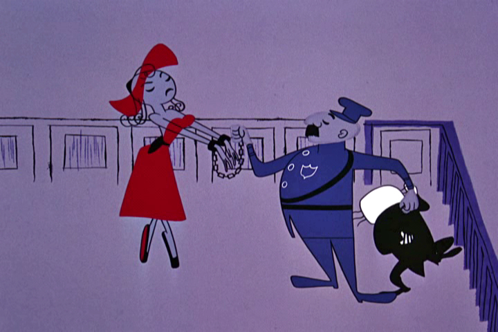
The bartender is the first witness.
He waves hello to half those seated,
before raising his right hand to be sworn in.
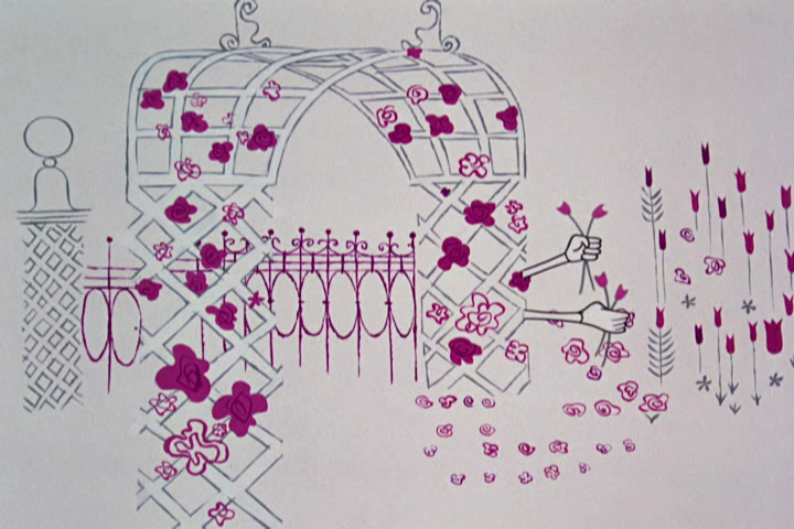
 12
12
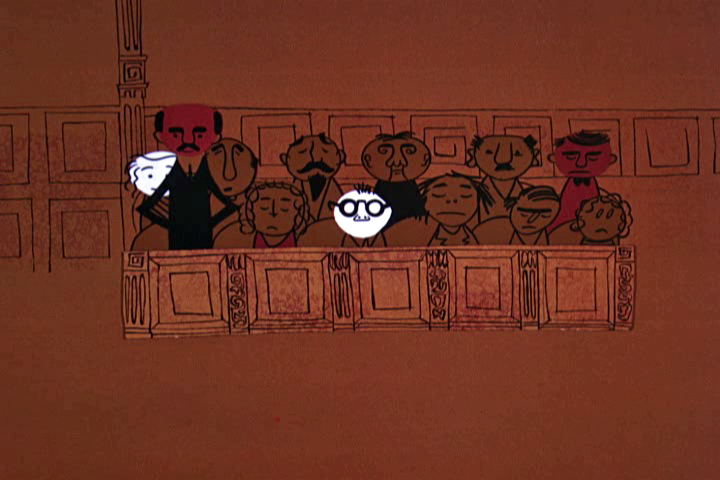
The bartender brings a subtle color change as
we move from gold hues to brownish colors.
 13
13
 14
14
 15
15
 16
16
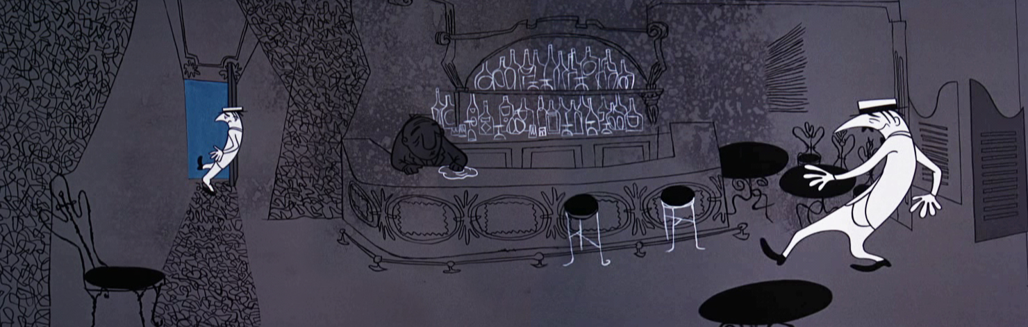
Once we go back to the bar, bluish grays take the scenes.
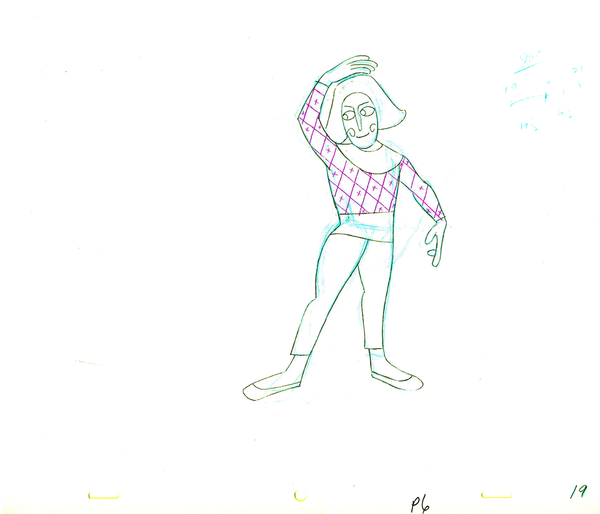
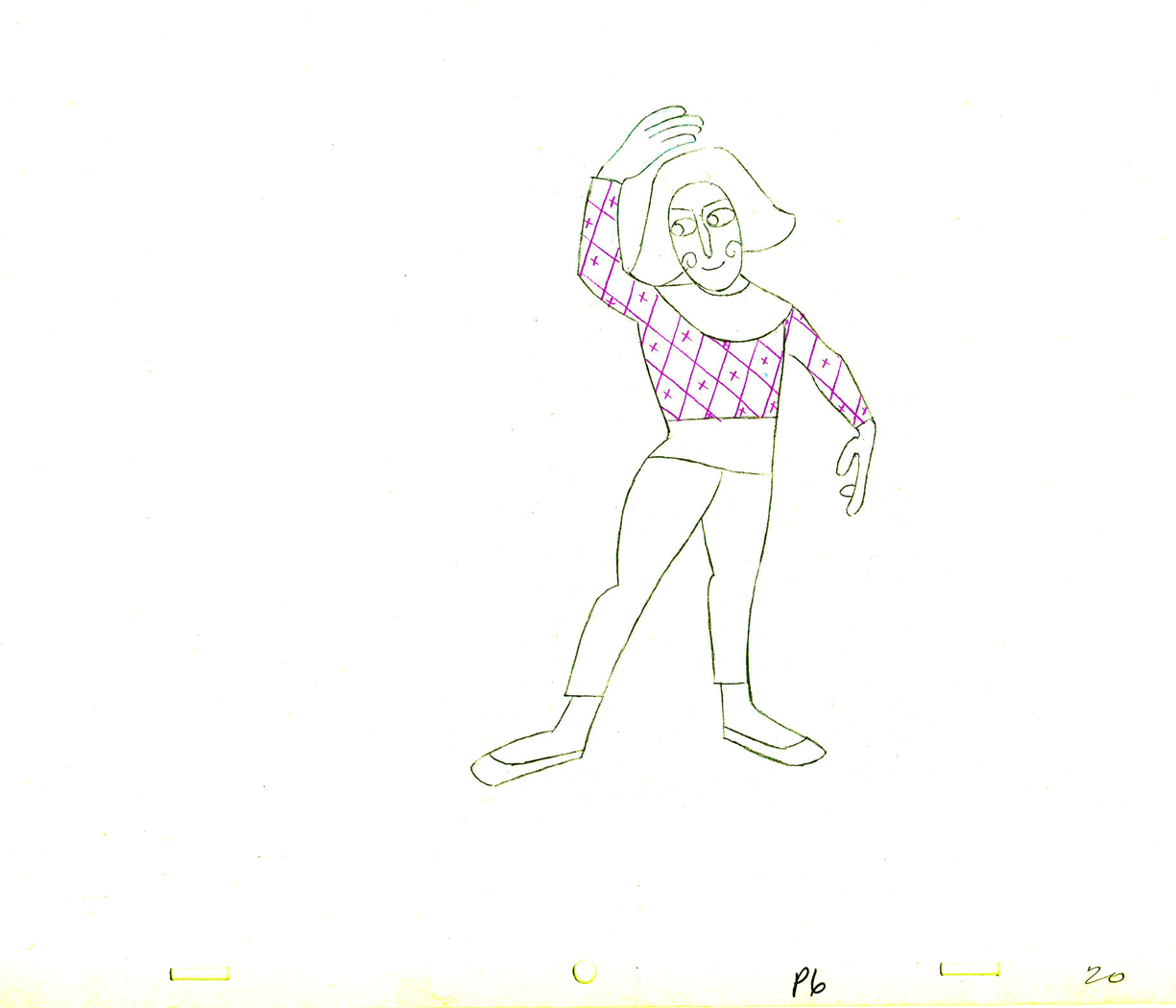
 19
19
 20
20
The bartender revealing Nellie Bly in the back room
foreshadows his reveal at the end of the film.
 21
21
 22
22
 23
23
 24
24
Back to the browns and ochres in the courtroom.
 25
25
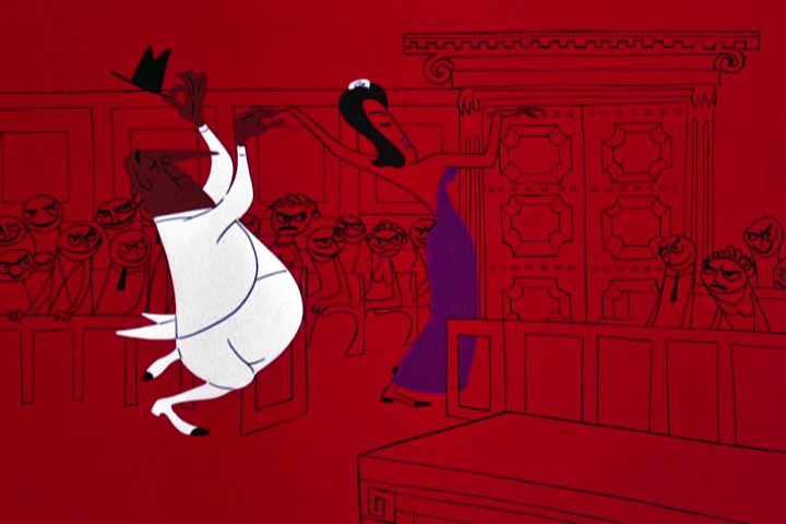
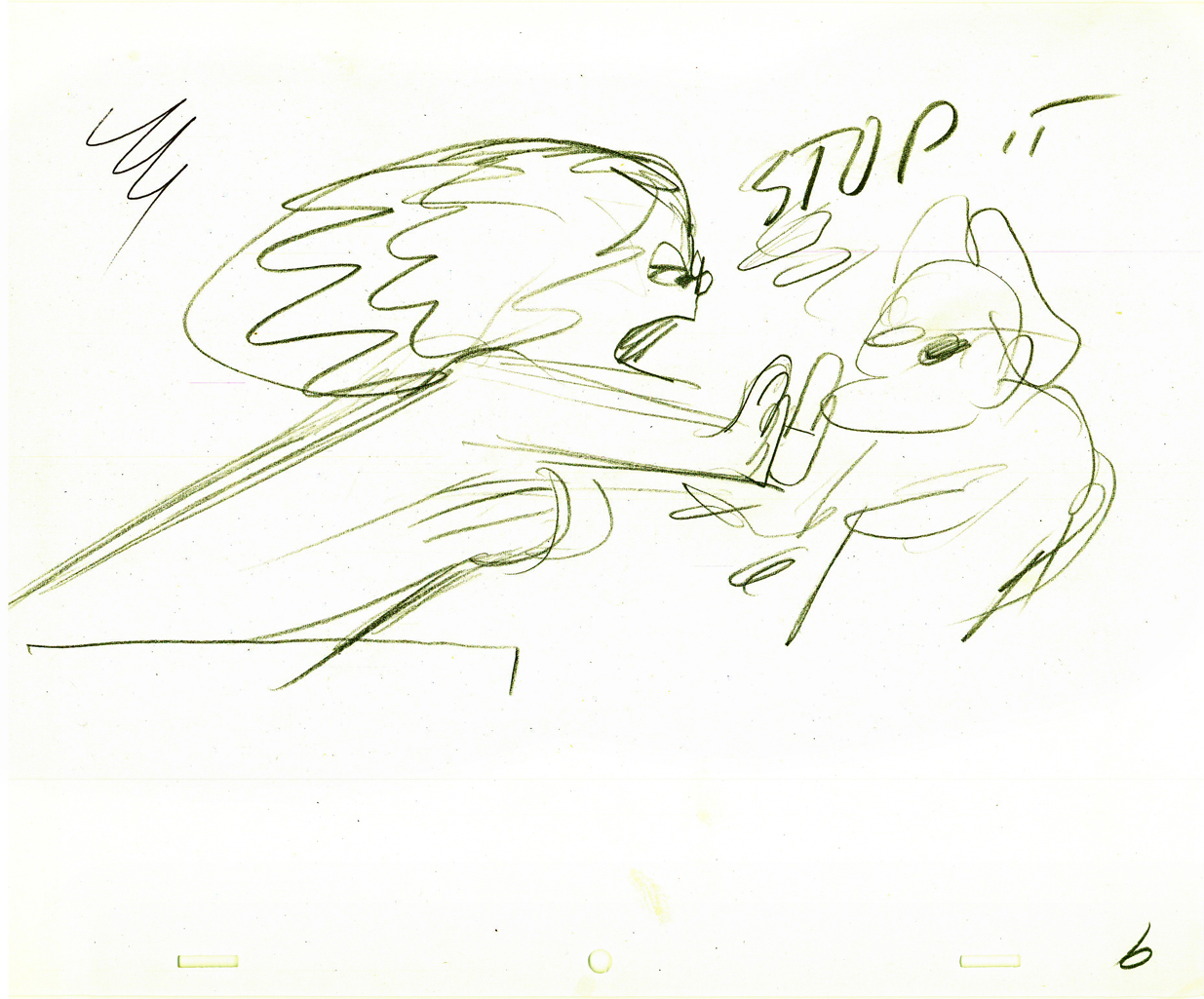
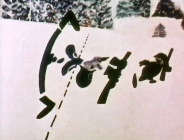
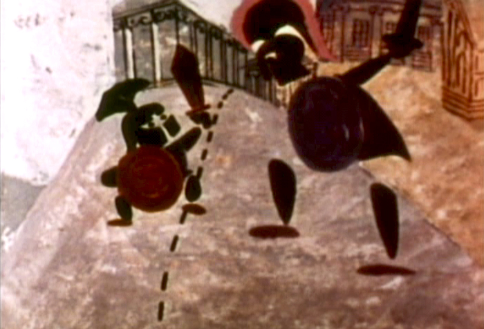
“Right in the snoot . . . ”
 26
26
 27
27
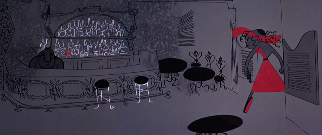
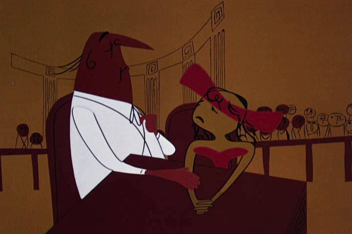
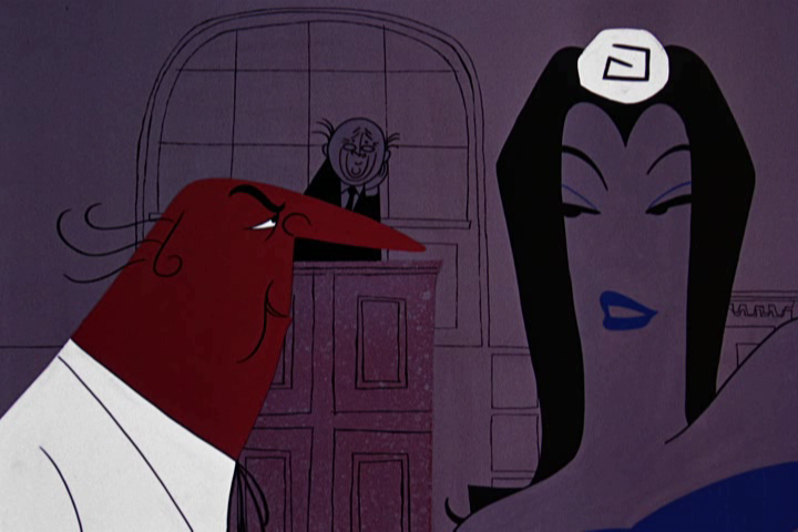
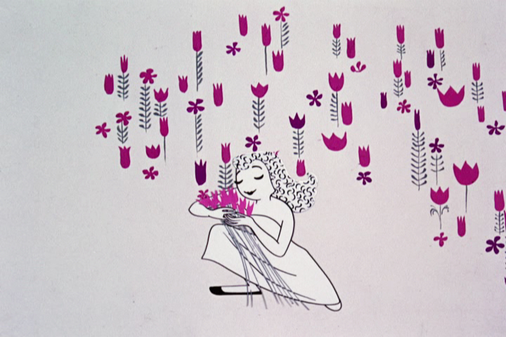
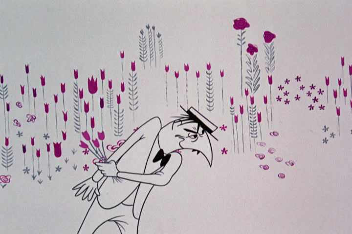
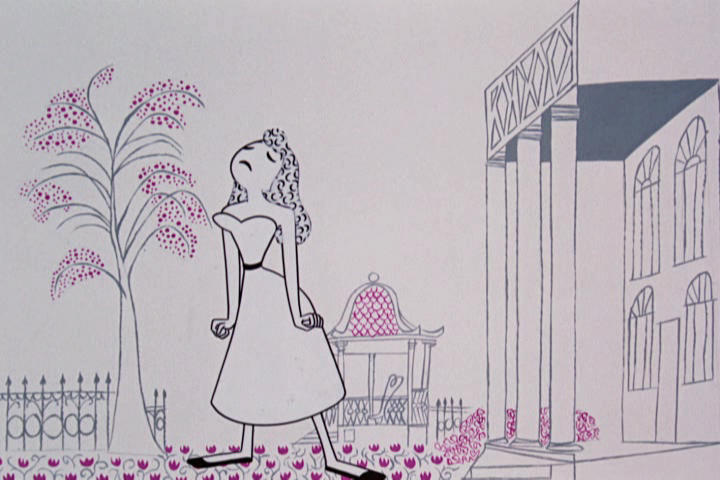
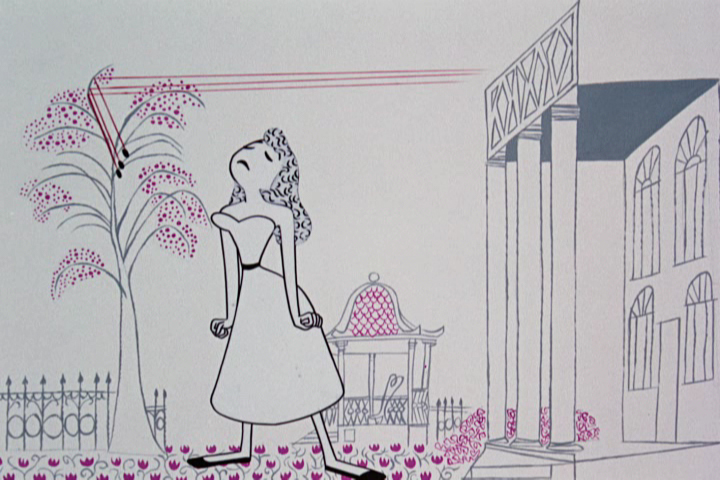
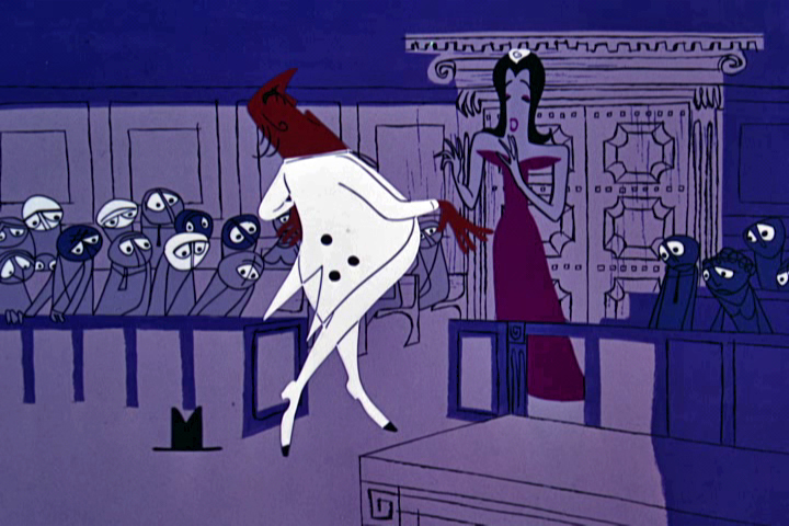
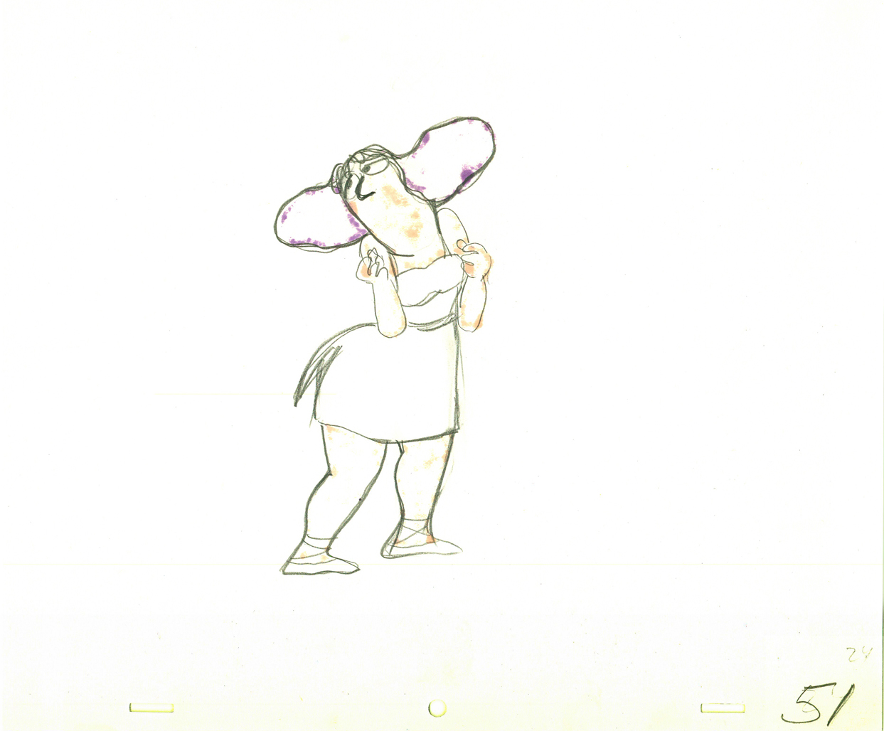
Nellie Bly brings her violets, lavenders and blues.
The exact opposite of Frankie’s colors.
 28
28
“It’s a lie !”
 29
29
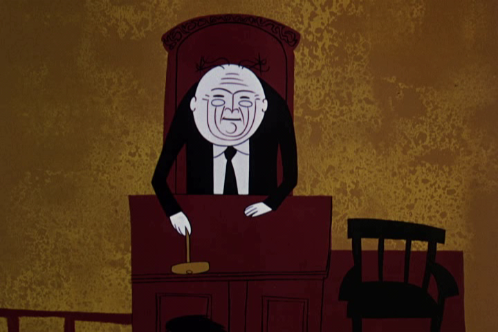
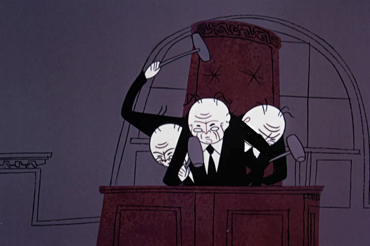
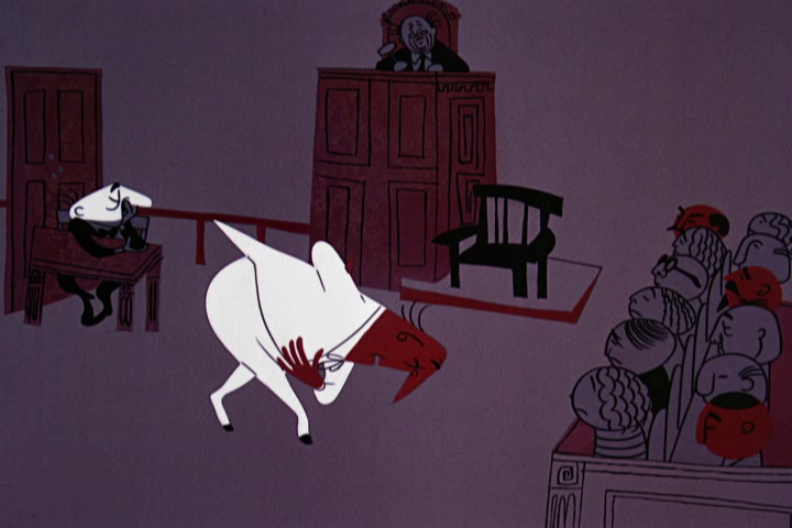
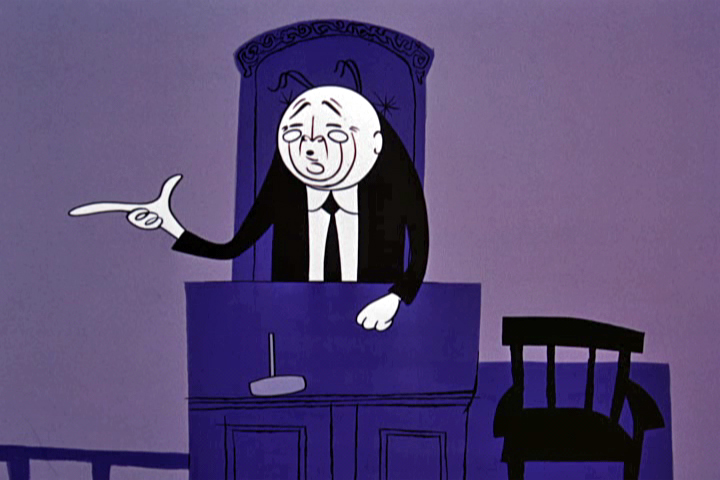
Order in the court.
The judge doesn’t smear; he breaks into multiple versions
of himself frenetically hammering his desk.
 30
30
 31
31
 32
32
 33
33
Straightening out the story . . .
 34
34
. . . and the dress.
 35
35
 36
36
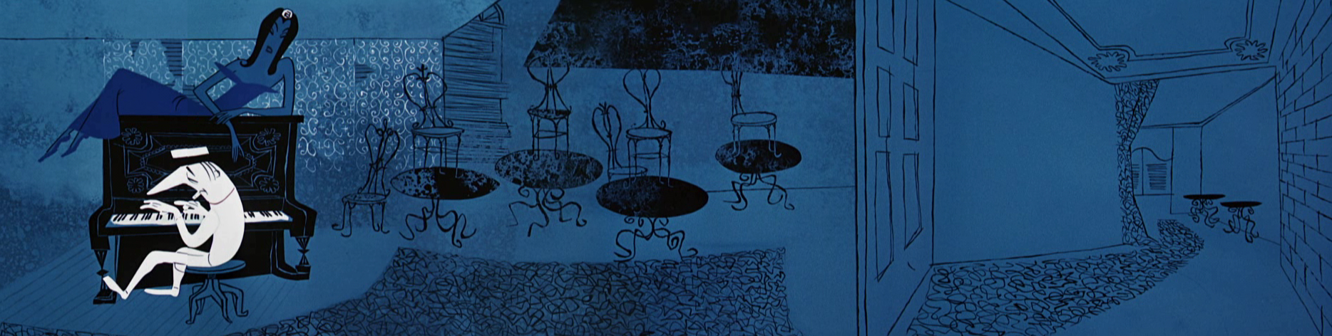
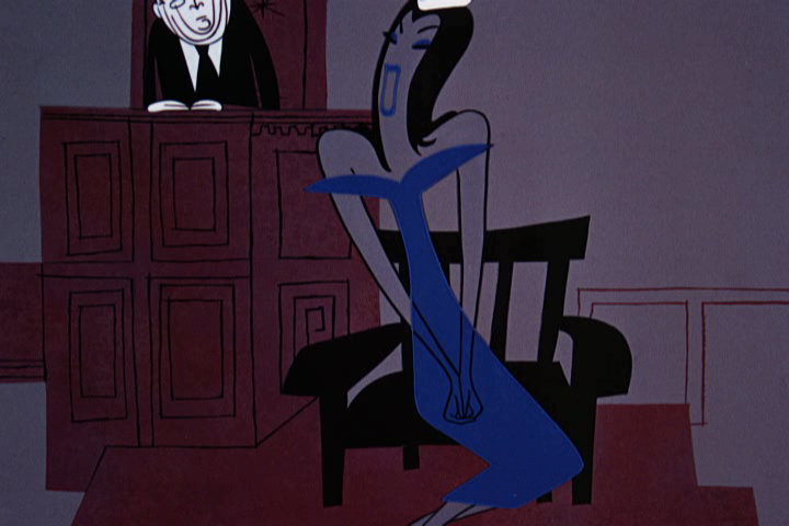
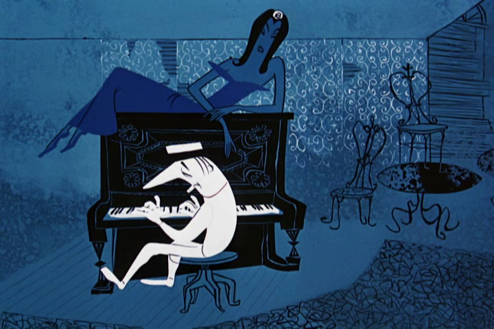
All blues.
 38
38
 39
39
 40
40
 41
41
 42
42
 43
43
 44
44
 45
45
All blues except for that dress.
 46
46
 47
47
 48
48
 49
49
 50
50
 51
51
 52
52
Frankie’s story comes in lily whites and white on white.
 54
54
 55
55
Her hair in this sequence was matted into the animation.
The decorative pattern didn’t move within the body of the hair.
A real pain in the butt for a design technique. Multiple camera runs.
 56
56
 57
57
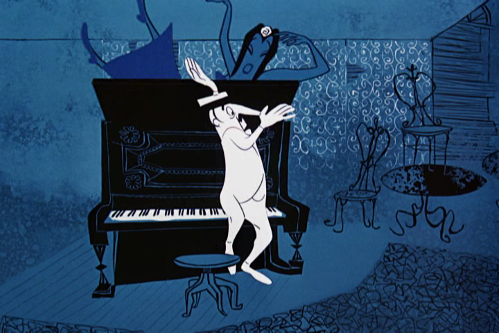
Smear frames are used in this sequnce for Johnny.
 58
58
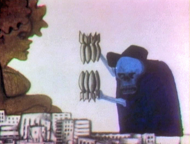
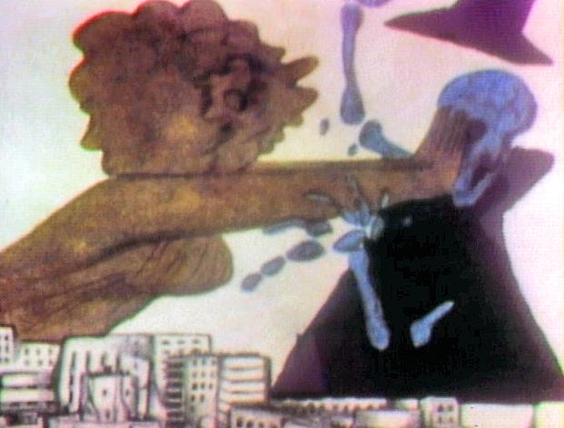
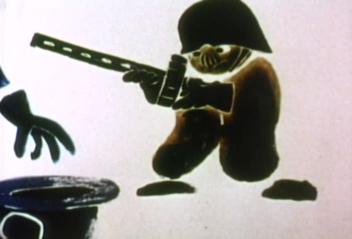
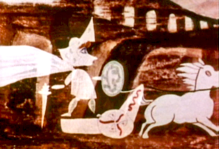
the victim is made to be the evil one.
 59
59
 60
60
 61
61
 62
62
 63
63
 65
65
 66
66
 67
67
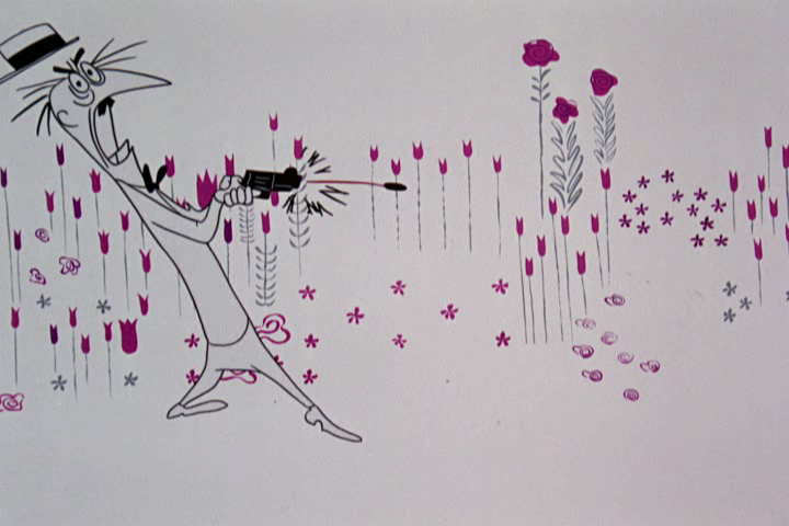
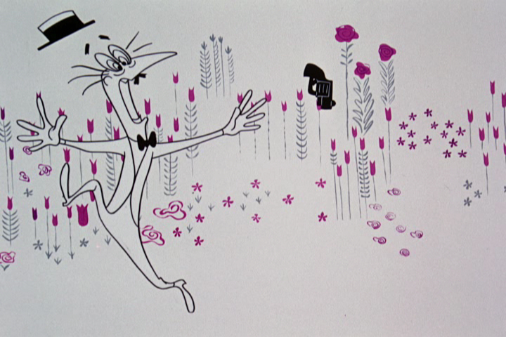
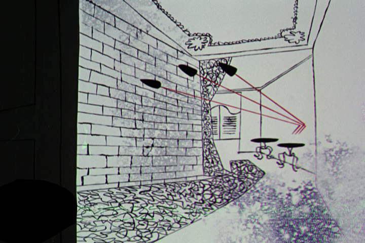
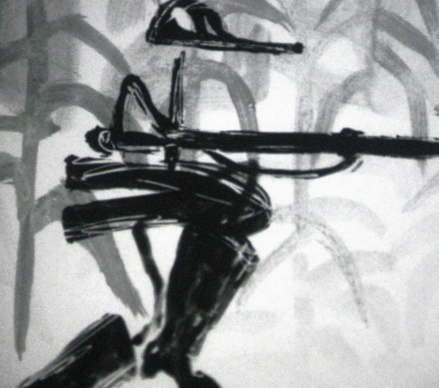
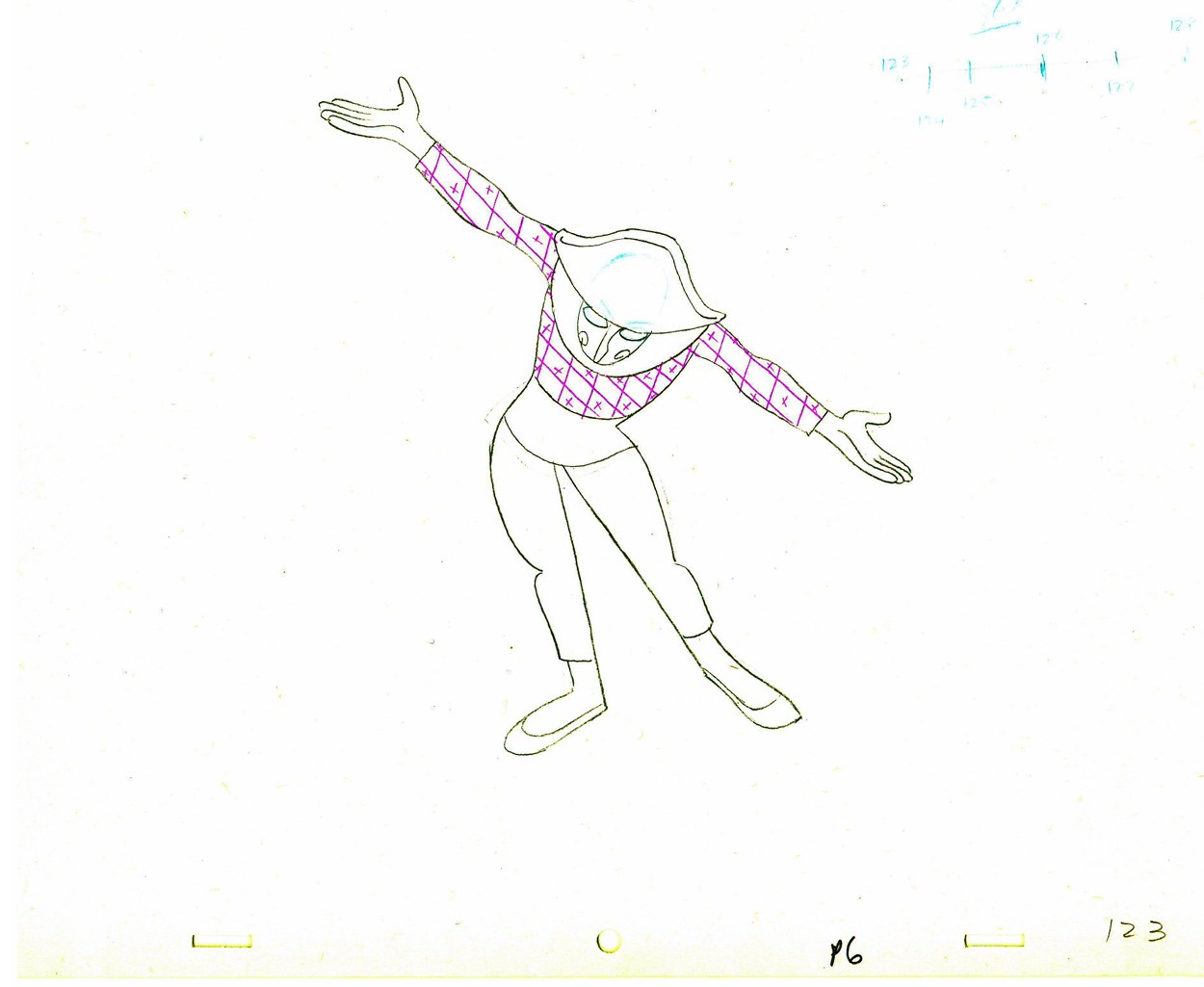
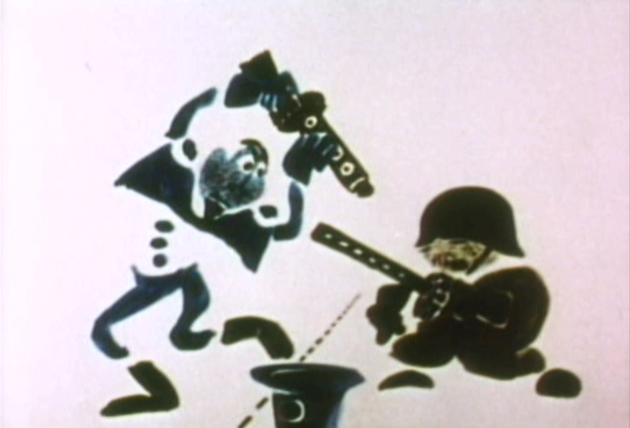
The bullets ricochet, musically, all over the place.
 68
68
 69
69
 70
70
 71
71
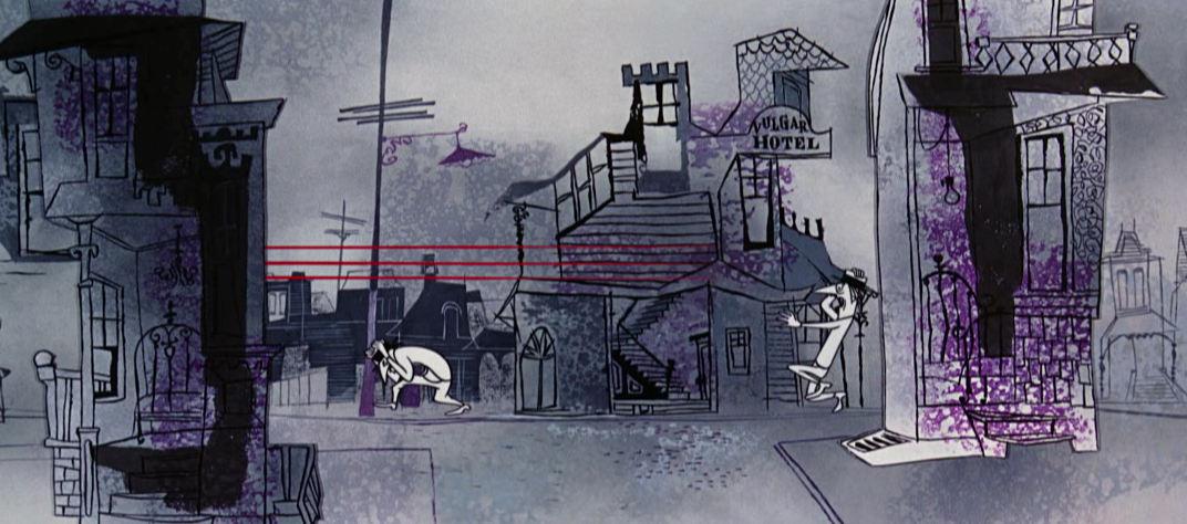
The pure whitish backgrounds turn to dirty grays.
 73
73
 75
75
 78
78
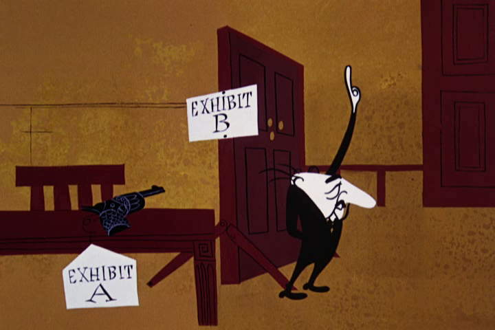
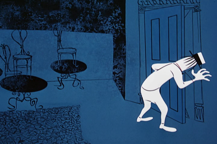
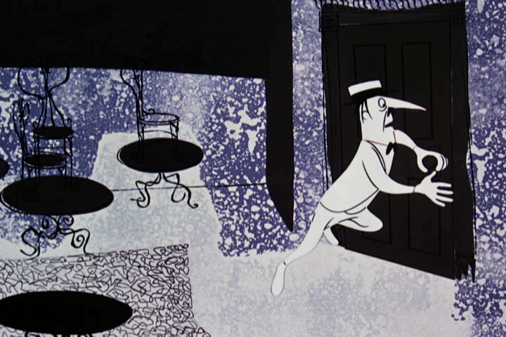
There’s a reuse of the gag as he looks out the door (see #40 on),
but the animation is different. No expense spared on this film.
 79
79
 80
80
 81
81
 82
82
 83
83
 84
84
 85
85
 86
86
 87
87
 88
88
Back to the courtroom, vermillion is the color dominating.
 90
90
 91
91
 92
92
 93
93
 94
94
 95
95
 96
96
 97
97
Back to the courtroom, vermillions turn to
deep reds as the innocent verdict is revealed.
 98
98
 99
99
 100
100
 101
101
 102
102
 103
103
Very short quick scenes scream at the audience.
 104
104
 105
105
 106
106
 107
107
 108
108
The attorney’s murder brings bright violets and lavenders.
 109
109
 110
110
 111
111
 112
112
 113
113
 114
114
 115
115
 116
116
The lavenders dominate until we pull out
on the purple player piano.
 117
117
 118
118
This film, like Nordshtein’s Tale of Tales, is proof that animation can and should be as sophisticated as live action and as adult as any film. This is most certainly one of the classics in animation history. It’s only the animators and producers that hold the medium back.
Animation &Commentary &Hubley &Models &repeated posts 17 May 2012 07:17 am
Hub Eyes – repost
Here’s a post I wrote in 2009 that I still think is valuable, so I’m going to put it up again.
 - It was 1973, and I was happily – I can’t tell you how happily – ensconced in the Hubley Studio working on Letterman, a new series for an upcoming CTW show, The Electric Company.
It was my first animation job. I inked it all (directly from animator roughs), I assisted & inbetweened it all, and I animated odd scenes including all the title sequences. I was a novice, and I was doing it all. Excited and happy is all I can remember.
I was alone one morning in the small room wherein I worked. I made a habit of getting into work before anyone and leaving after everyone. I wanted to make sure I was indispensible.
 A month into the gig, and I think I’d only spoken with my hero, John, about a half dozen times. I was rushing through one of the Johnny Gent “Spellbinder” sequences. I inked all of his scenes, then inbetweened the drawings in ink. No time to work in pencil for this schedule. Johnny was completely off character, in a very old fashioned way, and I had to rework them all closer to the models – in ink. The schedule just gave me no time to be proud of what was happening. (A year or so later I apologized to Johnny for what I did to his artwork. I was so inexperienced and had such a dominant role in how the final art looked in that series.)
John Hubley ran in to give me something and made a quick comment about the character I’d been drawing. He said it was a “Paramount eye.” I looked at the drawing, then at him. Then John drew on a small piece of paper a “Disney eye,” then a “Terrytoon eye.” He laughed aloud and told me to try to “square off” the eyes a bit. Then he ran out.
 I learned a lot in a very short time. I watched eyes that day and probably all that week. I ran Hubley films at lunchtime (I’d made it a habit to project their films in the kitchen during many of the lunch breaks. The entire group working there enjoyed these sessions) and watched the eyes. I talked with Tissa David about eyes in one of our evening tutorials – she was trying to teach me how to inbetween properly.
I was reminded of this moment when Chuck Rekow commented on the Moonbird Walk posted weeks ago. “The shape of the eyes on the boys is a real departure from almost anything in the cartoon world —even 50′s era. It’s closer to real life, and reminds me of the graphic style of Ben Shahn. It lends the film an aura of “seriousness”, even though it’s a cute film about two boys and an imaginary bird. Obviously, the pre-recorded sound is a major deal, but this gem is loaded with touches of inventive detail.”
How right he is, and I love being reminded of it.
 The eyes are the direct route to the soul of a person and, consequently, an animated character as well.
After working for the Hubley studio, for a short bit, I worked for Phil Kimmelman and Associates. This was a hardy commercial studio doing tight designer-based animation. Rowland Wilson was doing a lot of their design work, and the animation clean-up was tight. Animators Jack Schnerk, Sal Faillace and Dante Barbetta did a lot of the work the few months I was there. Jack Schnerk was also animating for Hubley, so I knew his very complicated-to-clean-up style. I worked primarily as an inbetweener and learned some hard and tight lessons while there.
 After the very loose work I’d been doing for the Hubley films, it was not only difficult for me, but good to keep me towing the proper line. I wanted to learn animation, and all of it was important.
Here, too, an empahsis was on the eyes. No Disney eyes, no Hubley eyes, either. But now I was just concerned with keeping those lines tight tight tight. No shimmer on the eyeballs. After all, I was told, people stared into the characters’ eyes, and any flaws in the animation would show up first in those eyes.
I worked for PK&A for about three or four months. I’d also worked for Tubby the Tuba at NY Institute of Technology under Johnny Gentilella, where we got somewhat close and I was able to discuss all sorts of animation problems with him. That was the only redeeming element, everything else about that studio was wretched. My displeasure ultimately led to my leaving as soon as I could.
Eventually, I was back at the Hubley studio helping to finish up the short Cockaboody.
The tightening of my inbetwees only brought positives to what I could now do for John Hubley’s studio’s animation.
 To this day, I still watch eyes closely. For some reason, the tighter the linework, the closer I watch the assistant’s work. The looser the line, the more I watch the design. I prefer watching the design. Often it means eyes that can be easily labelled: Disney, Paramount, or Terrytoons. I suppose today, you’d say: Pixar, Dreamworks or Blue Sky. (And believe me, you can see those differences even in cg.)
The images above are from the following films:
Books &Hubley &UPA 07 Apr 2012 07:20 am
When Magoo Flew & Jolly Frolics
 – Adam Abraham‘s new book, When Magoo Flew: the Rise and Fall of Animation Studio UPA, is a gem. It’s an intensely researched and informed book about a studio that has gotten little real attention before this. There have been bits and pieces about specific films and people at the studio, and there’s the extraordinary chapter in Mike Barrier’s Hollywood Cartoons which encapsulates much of the material in this book.
When Magoo Flew starts off in a political mode, and in some way it stays there throughout. Perhaps that’s at the heart of the UPA story. At first, we read about the Disney strike which caused many artists and renegades to leave the Disney studio and strike out for something bigger, freedom to draw in a more modern mode. The book stays with politics as we see the formation of the UPA studio; there’s so much in fighting as partners turn on each other to take control of the studio. Once they’re in the heyday of the studio it’s the politics of who’s doing what. Animosities played a large part. When John Hubley didn’t like the painting of Herb Klynn, (“I cannot stand another touch of that Klynn green!”) he brings the brilliant painter, Paul Julian, into the studio. When Jack Heiter refused to listen to Jules Engel‘s demand to change to color ofthe sky in a background, Heiter was fired. Eventually we move to the politics of the HUAC hearings and the McCarthy era anti-Communist attacks on Hollywood. Finally, it gets down to the politics of selling and reselling the studio and the archives.
It’s a compelling story.
Within this book of politics, we see every film develop and succeed or fail. From Hell Bent for Election to Ragtime Bear (and Mr. Magoo) to Gerald McBoing Boing to Rooty Toot Toot. We see the careers of John Hubley, Bobe Cannon, Pete Burness, and many others develop and grow. All the info is in there: the history of the key shorts as well as the many feature attempts amd the two completed, as well as the mini-bios of all the people. It’s one of those books where you trust the facts and are sure the author did the homework. (The only quibble I had was in his saying that Hubley had one “big” shot at a feature with Watership Down, when in fact Hubley produced and directed two features of his own within his studio, although maybe Abraham didn’t mention them because they weren’t “big”.)
This is what I consider to be an important book in my collection, and I’d encourage everyone interested in animation history to get a copy if they can. At least, get yourself to a library to read it. I’d also like to suggest that you check out Mike Barrier‘s comments about the films of UPA in his review of the DVD. He links to the chapter in his book about the history of the films.
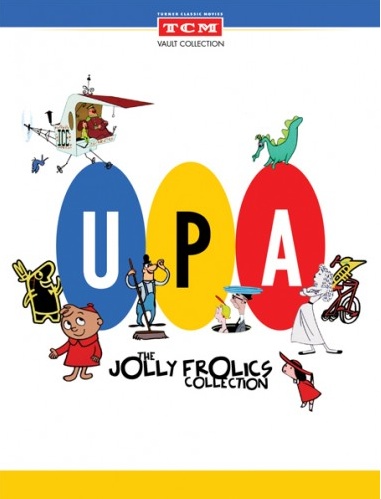 There’s also a companion piece – a DVD that was released by Turner Classic Movies, and it, too, is a treasure. Jolly Frolics, the UPA Collection contains beautifully reconstructed copies of many of the one-off films, the Jolly Frolics. These, for the most part, were the non-Magoo shorts. (There will be an all Magoo release this coming June.) Many were directed by Bobe Cannon, but there are plenty of othrs by Hubley, Babbitt, and Burness as well. (I ceertainly plan to use this DVD to really go into the films and comment on some of them in the future. There’s too much wealth here for me to pass by.)
The brilliance of Rooty Toot Toot or Gerald McBoing Boing or The Tell Tale Heart stands out against many of the others which here seem even more ordinary. The Man on the Flying Trapeze or Baby Boogie or Giddyap prove that not all UPA films are gems. Like any other cartoon studio’s product, there were good, bad and, mostly, mediocre films.
However, this collection are all marvelously brought back to their original life with this release, and TCM has to be applauded for this first collection of cartoons among their releases. The extras on the DVD includes commentary tracks by Jerry Beck and Leonard Maltin. These are worthless, as far as I’m concerned. Half of their comments involve complimenting the newly found colors of the DVD copies. Neither seems to know more than the basics about UPA. After the first commentary track, they’re all the same. With this DVD, you’re buying them for the fantastic originals on display.
When I was 11 The Gerald McBoing Boing Show premiered on CBS. Anything to do with animation meant it was playing on my family’s TV set. Ohere than these cartoons, everything anmated on TV meant the old B&W WB cartoons featuring the fat Porky Pig. There were early B&W Terrytoons as well, and even some Aesop’s Follies (silent cartoons with classical music tracks added) running on ABS. Of course, there were the special Disneyland TV shows which ran not often enough for my taste.) But the UPA cartoons were different. They looked different, they moved differently, and they struck my young eyes as important. I became an instant fan. I’ve waited for this book and DVD most of my life. It was worth the wait.
Commentary &Hubley &Independent Animation &John Canemaker 12 Oct 2011 06:51 am
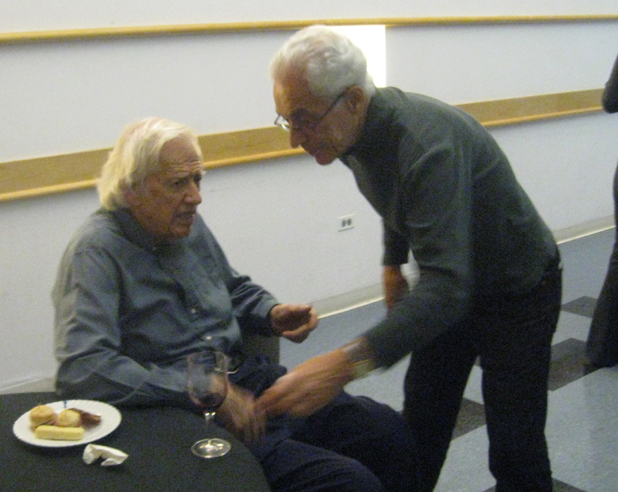
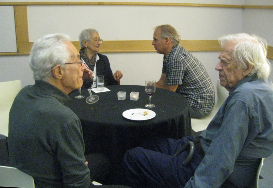
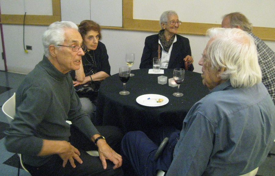
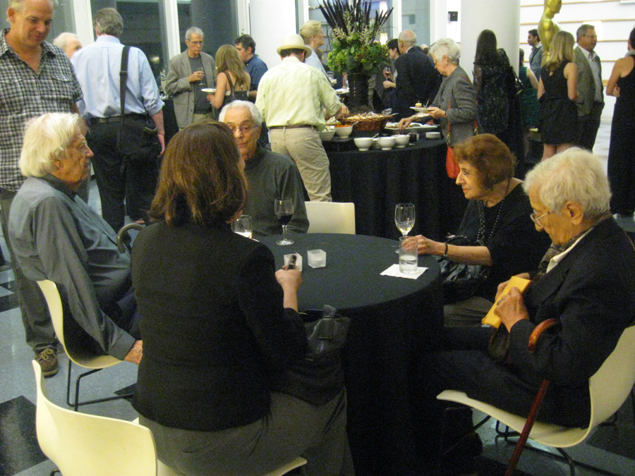
A Hubley Affair
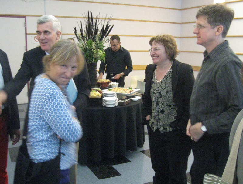
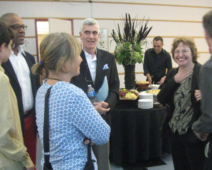
 – The AMPAS program celebrating the early work of John Hubley went off wonderfully on Monday evening. The show started at 7pm, but prior to it there was a cocktail party for about 50 people. I have no idea who was invited to this, but it seemed to be Academy members who might have know the Hubleys as well as friends of the Hubley family. All four of the Hubley children were there including: Emily, her husband, Will Rosenthal, and their son, Max; Georgia and husband, Ira Kaplan (both part of the group Yo Lo Tengo); Ray Hubley, and Mark Hubley.
Also there, were Tissa David, Ed Smith, Candy Kugel, George Griffin, Vinnie Cafarelli, Lee Corey, Ruth Mane, John Canemaker (of course) with Joe Kennedy and others I probably have forgotten. Patrick Harrison and John Fahr ran and hosted the event for the Academy.
At the program I saw: Ray Kosarin, Linda Beck, Stephen MacQuignon, Richard O’Connor, Bill Plympton, and a hundred others that I recognized. The house was full.
As we entered the theater, prior to the start of the show, the soundtrack to Finian’s Rainbow was playing. Frank Sinatra, Ella Fitzgerald, Louis Armstrong, Ella Logan and Barry Fitzgerald.
The actual program began as all Academy events do, exactly on time. Patrick Harrison spoke for two minutes promising that next month the event would be a retrospective of the work of Saul Bass done in conjunction with MOMA. He then introduced John Canemaker, and we were off and running.
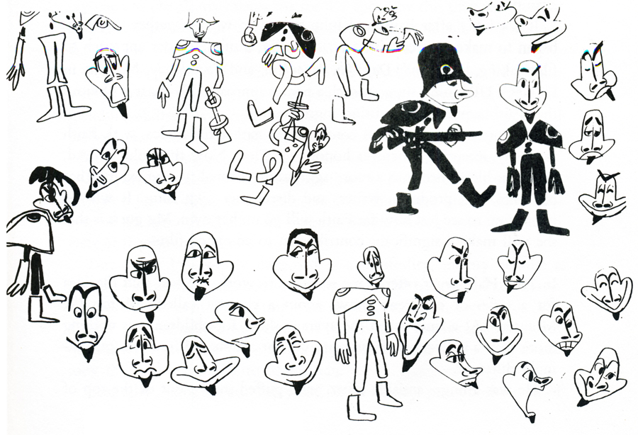
 John started with a PowerPoint presentation that showed the child, John Hubley, his surly uncle who became the model for Mr. Magoo; we saw some childhood drawings as well as a number of strong influences including classmate, Alvin Lustig, who designed the UPA logo. These were followed by some of the artwork Hubley did for Disney, which included a lot of Layouts and preliminary Background sketches. We saw art done during the War as well as preliminary art for many of the UPA films. John Canemaker featured a lot of Hubley in-house cartoon drawings peppered throughout the presentation.
This talk ultimately led to screening the movies.
Unfortunately, it started with the only 16mm print, a soft-focus soft color print of Brotherhood of Man. Somewhere a good print of this film exists, and I don’t know when it’ll be found – hopefully in my lifetime. It’s such an enormously powerful film, designed in a style which was borrowed from Saul Steinberg‘s work at the time.
Flat Hatting followed with a beautiful 35mm print. This is a brilliantly directed film showing how much good can be done with limited animation. It never felt limited, nor does it feel like an educational film for pilots. It’s very entertaining and drew a lot of laughs. Hubley had spent years directing mediocre films under Frank Tashlin at Columbia and a number of films for the military. This film shows how much he had learned as a director in such a short time.
The Magic Fluke is probably the best of the Fox and Crow series. This film has a great sense of design featuring that famous background by Jules Engel of the concert hall. I’m not sure Hubley was best cast as the director of a lightning quick comedy cartoon, but, for the most part, it works well. The print, again, was sterling.
Following this was a beautiful print of Ragtime Bear, the first Magoo cartoon. I hadn’t remembered how fluid the animation was; there was some beautiful distortion on Magoo later in the film. My guess is that it was a Pat Mathews scene. The film offers all of Magoo’s traits, but the character design is far away from what Pete Burness ended up directing.
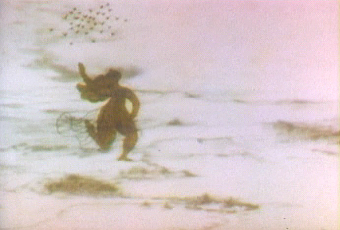
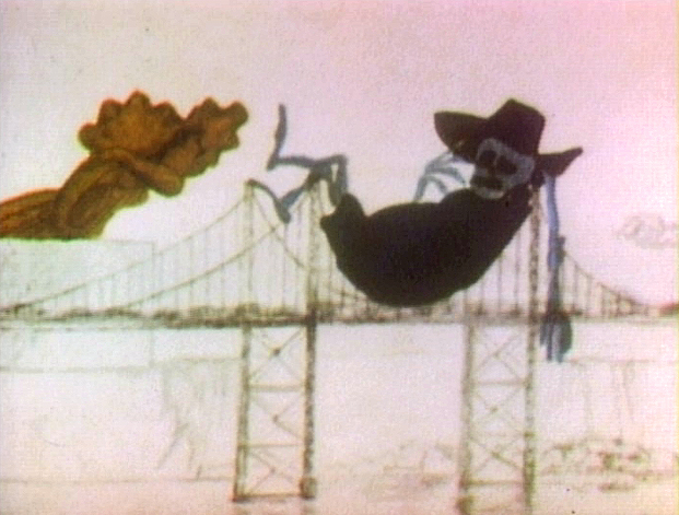
The cr̬me de la creme of the evening: Rooty Toot Toot followed. What a beautiful, big 35mm print. What a stunner of a scene Рthat great Grim Natwick animation of Nelly Bly Рall blue Рcorkscrewing her hands and arms in the witness chair. Beautiful and funny. This is certainly one of the great films ever created.
An image photographed off the screen
There were a stash of commercials – both West and East coast – from the original Storyboard Prods. I own prints of all screened except for my favorite: a spot for Mennen aftershave. A rectangle of wrinkles around a pair of eyes. Mennen helps the lines smooth out, and the commercial uses abstraction for a very funny commercial. It was the first time I’d seen this commercial. They certainly were creative back then. Hubley repeated the use of abstraction in a number of other, later spots. I’m thinking particularly of one done in the early 70s for AT&T; Tissa David animated.
Beautiful reconstructed prints from MOMA included Adventures of an * and Tender Game. One was more beautiful than the other. Both are great films.
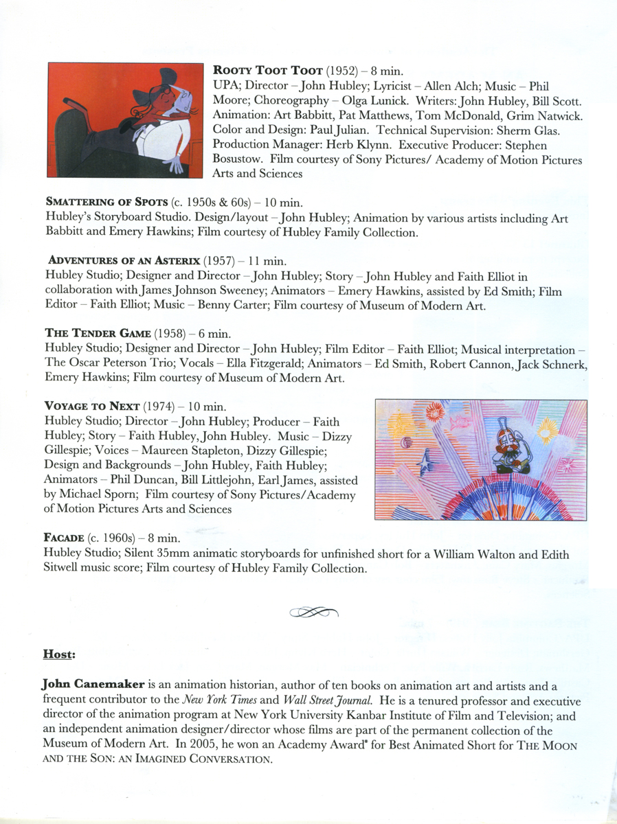
Voyage to Next was represented with a beautiful print, though I have to say, I never really liked this film. I had a lot to do with the making of it, and it really was a challenge and a great learning experience. About a third of the way through the production money ran out, and we had a film to get out with a small but great staff. There was a lot of stylistic improvisation done to try tokeep on a vbery tight budget, while being artful. It was a tough time for the Hubleys, and they stayed true to the film at hand.
Finally, the evening ended with a beautiful animatic called Facade. These were storyboards filmed (with slates) for a William Walton and Edith Sitwell score. John Canemaker actually located and got the rights to a version with Edith Sitwell, herself, actually doing the narration. Miraculously, it all seemed well in sync. This piece was done in 1964 as a sample for PBS., though the film was never completed. A real find for Canemaker straight from the Hubley collection. A film not seen by the public (and it hasn’t made its way into animation history books, either.)
All in all the show was so invigorating that the Academy had a hard time getting rid of us. People stayed and chatted in the lobby. It was a great event.
John and Joe, Heidi and I went out for dinner so we could chat about the program. I had a blast all night; it was one of the finest animation events I’d attended in many years.
Here are pictures I took during the evening.
.
 1
1
 2
2  3
3
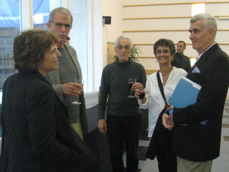
The cocktail party
 1
1
LtoR: John Canemaker, Georgia Hubley, Emily Hubley, Will Rosenthal
 2
2
LtoR: unknown, Patrick Harrison, Georgia Hubley, John Canemaker,
unknown in rear, Emily Hubley, Will Rosenthal
 3
3
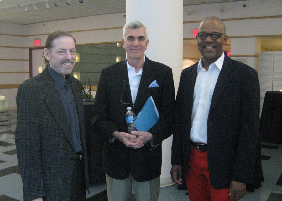
LtoR: me, John Canemaker, Patrick Harrison
 4
4
LtoR: Emily Hubley, George Griffin, Vinnie Cafarelli,
Candy Kugel, John Canemaker
 5
5
LtoR: Mark Hubley, Candy Kugel, Vinnie Cafarelli
 6
6
LtoR: Ed Smith, Vinnie Cafarelli
 7
7
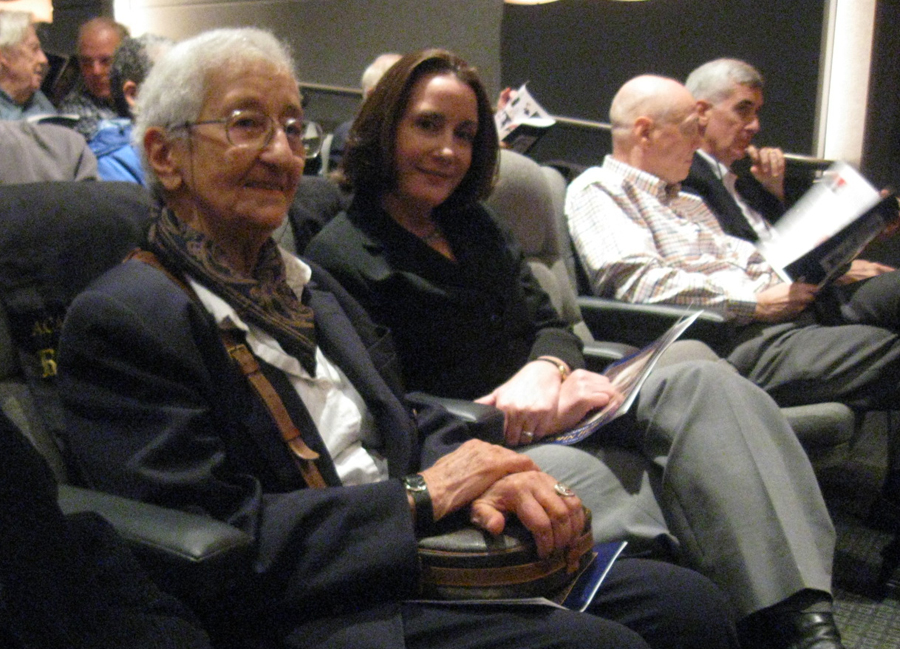
LtoR: Vinnie Cafarelli, Tissa David, Lee Corey, Ed Smith
 8
8
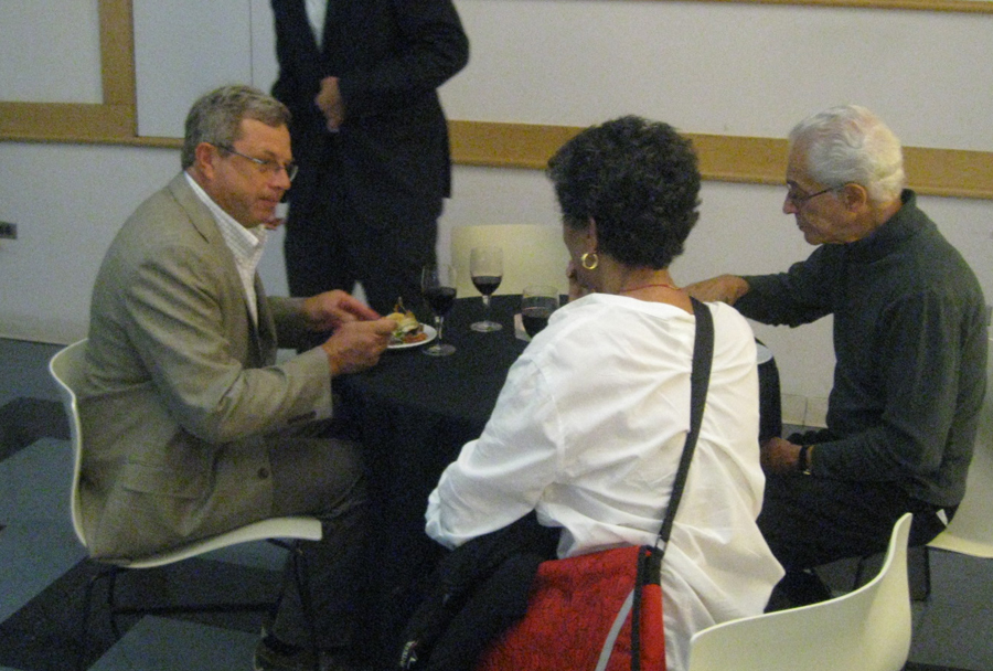
LtoR: Vinnie Cafarelli, Ruth Mane, Tissa David
Lee Corey (partially hidden), Ed Smith
 9
9
at table LtoR: Ed Smith, Heidi Stallings, Vinnie Cafarelli,
Ruth Manne, Tissa David
in rear, standing with winde glass: George Griffin w/Jeff Scher and wife, Bonnie.
 10
10
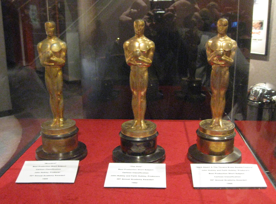
The three Hubley Oscars for (LtoR): Moonbird,
The Hole, The Tijuana Brass Double Feature.
 11
11
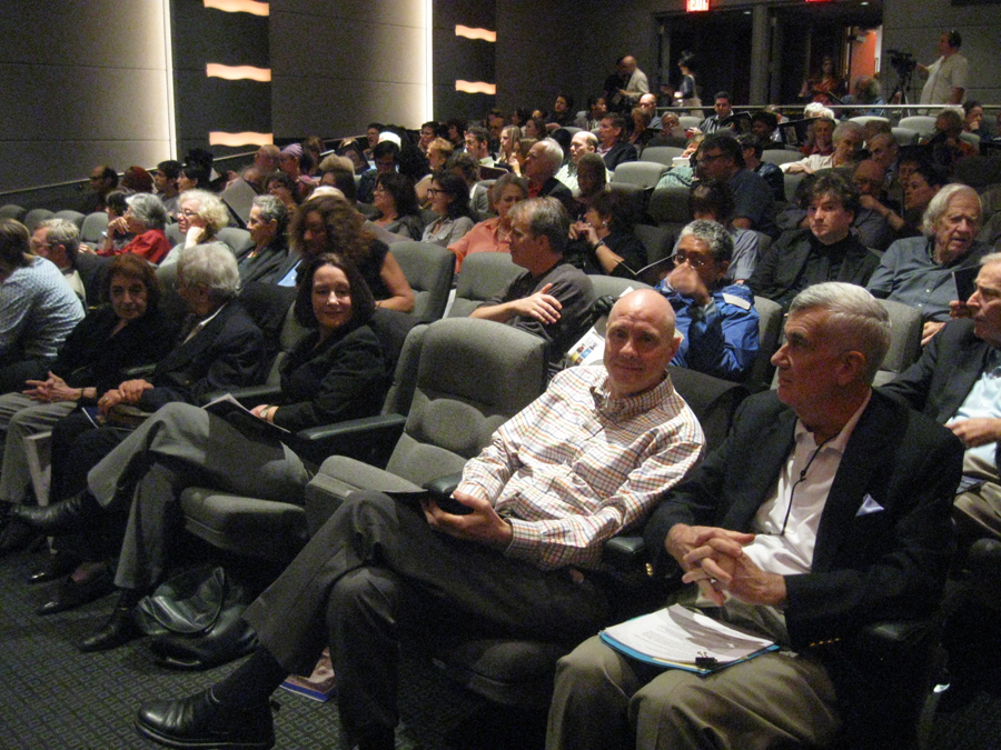
Audience front row (RtoL):
John Canemaker, Joe Kennedy, my empty seat,
Heidi Stallings, Tissa David, Ruth Mane
2nd Row, over empty seat: Stephen MacQuignon
3rd row (RtoL): Ed Smith, Richard O’Connor
 12
12
LtoR:Tissa David, Heidi Stallings, Joe Kennedy, John Canemaker
 13
13
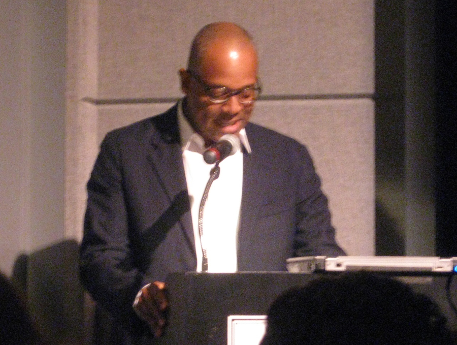
Patrick Harrison giving thanks and introducing John Canemaker.
 14
14
John Canemaker giving PowerPoint presentation
The following images were photograped during the PowerPoint
presentation or during the films. Consequently, they often soft focus.
With apologies.
.
 15
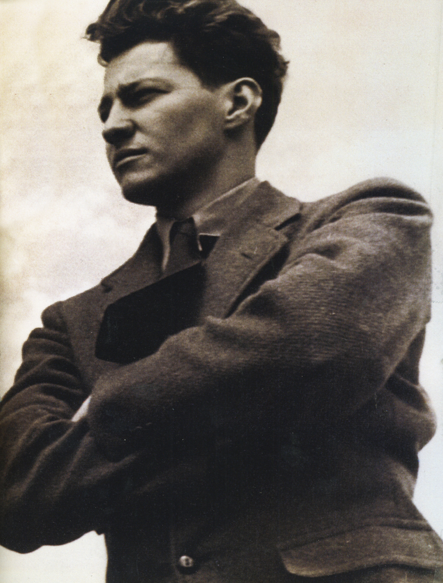
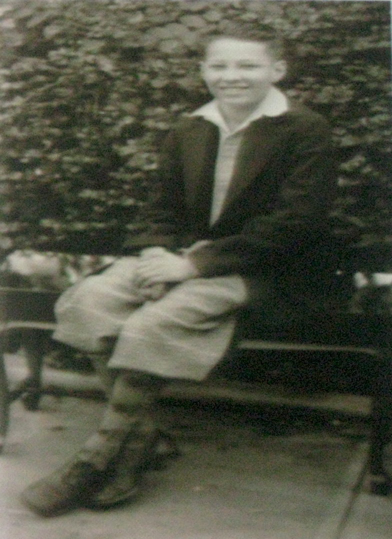
15A very young John Hubley
 16
16
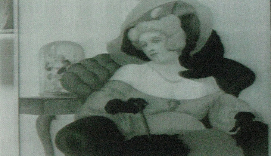
An early John Hubley painting
 17
17
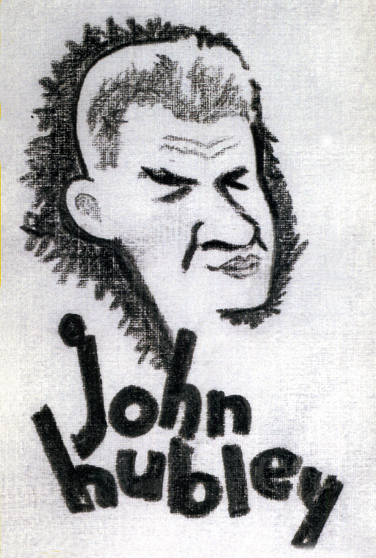
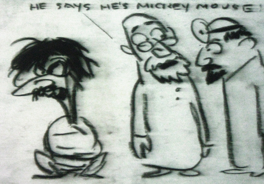
A gag cartoon from Hubley. Self portrait in straight-jacket.
 18
18
Rooty Toot Toot
Images from Facade follow:
 1
1
The animatic was done in 1964.
 2
2
Stylistically it feels like:
Moonbird, The Hole and The Hat crushed into one.
 3
3
Beautiful B&W oil paintings
 4
4
Very much like Moonbird
 5
5
The Hat for this animated duck-like character
 6
6
Toward the end of the film there was one extremely long vertical pan.
It was an oil painting done by John, beautiful in its simplicity, perfectly
planned to fill a good 45 secs to a minute of screen time and yet it
was so compositionally correct and glosiously layed out.
All I can say is that I am so pleased to have had the opportunity to have
worked with John & Faith Hubley; it was all that it could have been and more.
One of the high spots of my life.
Frame Grabs &Hubley &repeated posts 11 Oct 2011 06:54 am
Hubley and the Telephone
- The Hubley show last night was brilliant. A first rate job by John Canemaker. Most of the prints were spotless and beuatiful (something you rarely see with Hubley films – the DVD copies are soft focus and poorly transferred.) I’ll write about it later in the week. I have a lot of photos to add to that post.
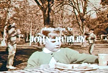
I’ve been posting some pieces about the Hubley work. Given the start I had concentrating on it, I can’t come down so quickly. There’ll be a couple more posts on his work this week. This piece is something you won’t see projected any time soon. It’s an industrial done for AT&T originally posted back in July, 2009.
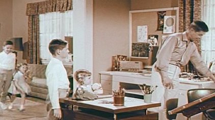
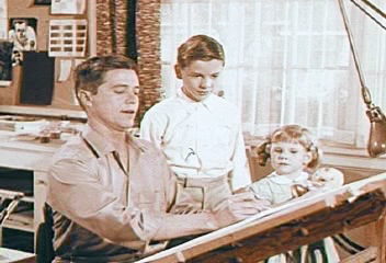
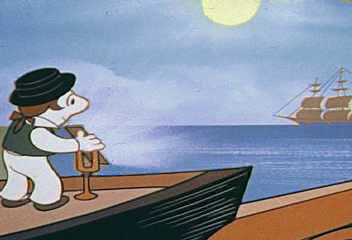
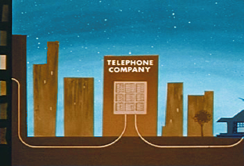
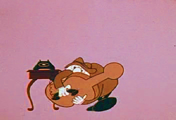
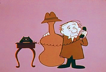
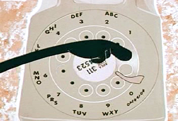
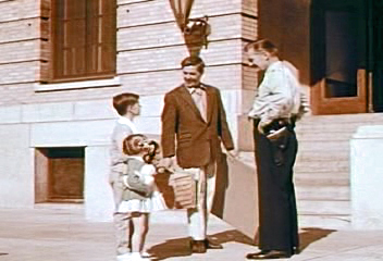
 – In 1965, John Hubley directed animation inserts for an educational film for Jerry Fairbanks Productions and AT&T. It’s the story of the history of the telephone and how it works. The story, such that it is, tells about two kids visiting their uncle, an animator (actually, an actor playing an animator). He gives them an animated lecture on the story of the phone.
The film reminds me very much of another film done by the Hubley studio. UPKEEP was the history of the IBM repairman. We travel through history to see how the repairman has worked over the years. It’s a successful device that works in John’s hands.
The film is available to view on the Prelinger Film Archives. I’ve made some frame grabs to post to give an idea of the style. The characters seem to shift a bit stylistically from the humans at the beginning to those later at the circus. From Hubley to Jay Ward. This was a period where John Hubley was beginning to experiment with more expeditious styles for the jobs that came in. The more artful Maypo style was a bit complicated to pull off. The cels, here, are cel-painted traditionally. (I actually have a hard time believing the date on this film – 1965. It feels more like late 50′s.)
The backgrounds are all by John Hubley, and they remind me of those he would do for UPKEEP and PEOPLE PEOPLE PEOPLE. Lots of white space and soft images. The animation looks like it was done by several people. I recognize Emery Hawkins‘ style, and I also can see Bill Littlejohn in there.
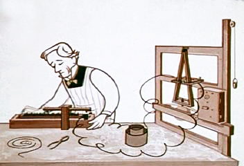
 1
1The animator’s studio.
 2
2
Kids are always fascinated when an animator draws.
 3
3
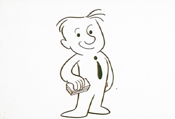
The character goes from this . . .
 4
4
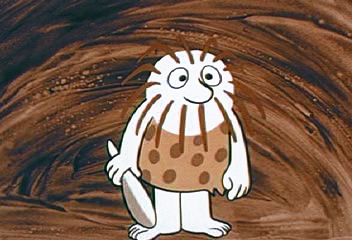
. . . to this.
 5
5
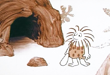
The caveman has to deliver a message.
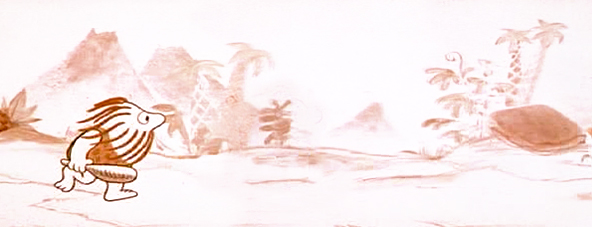
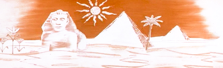
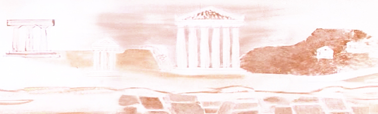
![]()
This is the full length of his run, the pan wherein the character
runs from being a caveman to an Egyptian to a Roman.
Here’s the same BG broken into four parts:
 A
A
 B
B
 C
C
 D
D
 6
6
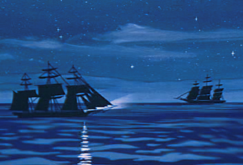
Once on horseback, man travels through
the middle ages to the pony express.
 7
7
Man turns to smoke signals to communicate.
 8a
8a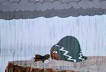 b
b
 9
9
Then flashing lights.
 10
10
 11
11
Morse invents the telegraph.
 12
12
Alexander Graham Bell invents the telephone.
 13
13
Now the animator explains how the telephone works
to two very interested children. .
 14
14
 15
15
 17
17
 18
18
 19
19
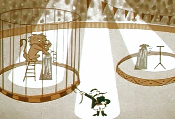
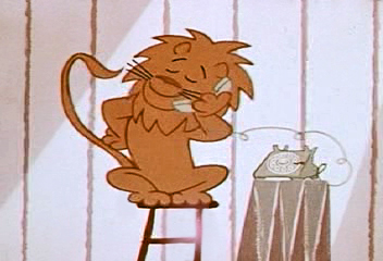
We get the fable about the lion who calls . . .
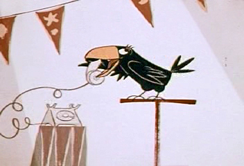 20
20
. . . a raven.
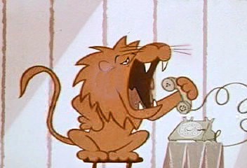 21
21
Though he shouts too loudly into the phone.
 22
22
 24
24
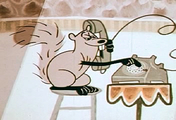
Then there’s the squirrel who can dial the phone . . .
 25
25
. . . and the bear who answers the phone too late.
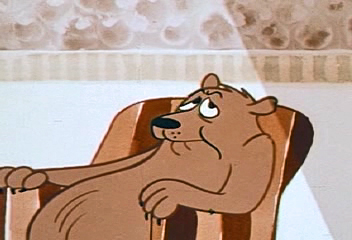 26
26
No one there.
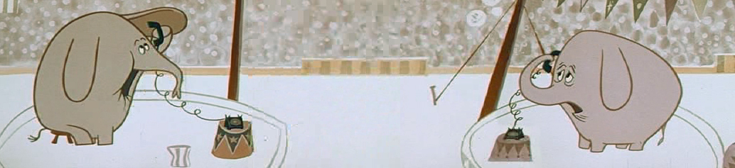
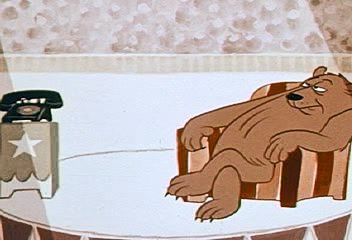
Then there’s the elephant who dials the wrong number.
 28
28
Finally there’s the pig who won’t get off the phone
so the fox can make an important call.
 29
29
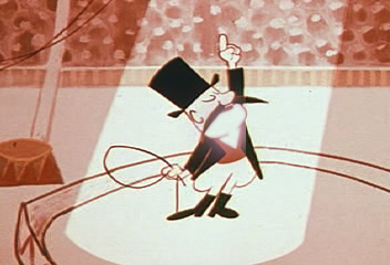
Next the animator takes the kids to the police station.
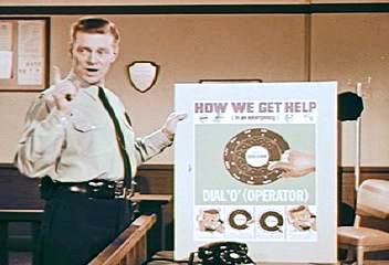 30
30
This way the cop can tell the kids how to make emergency calls.
The End. Too bad John & Faith didn’t write it.
Hubley 10 Oct 2011 08:02 am
Hubley Program
This will be the program for the Hubley show at the Academy in New York, tonight at 7pm.
I believe there many be some tickets still left for it, but check before you come.
The Academy of Motion Picture Arts and Sciences presents
A SALUTE TO JOHN HUBLEY (1914-1977)
October 10, 2011
Program curated by John Canemaker and Emily Hubley
Hosted by John Canemaker
1. PERSONAL REPORT – excerpt from 10 April 1963 Channel 13 TV kinescope with John Hubley and Harlow Shapley –
film courtesy Hubley Family Collection
2. Power Point introduction by John Canemaker
3. BROTHERHOOD OF MAN (1945) (UPA/United Auto Workers) – film courtesy AMPAS
Direction: Robert Cannon
Screen Story: Ring Lardner, Jr.; Maurice Rapf; John Hubley; Phil Eastman
Animation: Robert Cannon, Ken Harris, Ben Washam
Production Design: John Hubley, Paul Julian
Background: Boris Gorelick
Music: Paul Smith
Executive Producer: Stephen Bosustow
Source: “Races of Mankind” (1943) by Ruth Benedict and Gene Weltfish
4. FLAT HATTING (1946) (UPA/US Navy) – film courtesy NARA/AMPAS
Director: John Hubley
Layout: John Hubley, William Hurtz
Story: Millard Kaufman
Voice: William Conrad]
5. THE MAGIC FLUKE (1949) (UPA/Columbia) – film courtesy Sony/AMPAS
Direction: John Hubley
Supervision: Ade Woolery
Production: Ed Gershman
Story: Sol Barzman
Music: Del Castillo
Design: Herb Klynn, Jules Engel, Bill Hurtz
Technical: Max Morgan, Mary Cain
Animation: Bob Cannon, Rudy Larriva, Willy Pyle, Pat Mathews [sic]
Executive Producer: Steve Bosustow
6. THE RAGTIME BEAR (1949) UPA/Columbia Jolly Frolics) – film courtesy Sony/AMPAS
Direction: John Hubley
Story: Millard Kaufman
Production: Ed Gershman
Design: William Hurtz
Color: Herb Klynn, Jules Engel
Animation: Art Babbitt, Pat Matthews, Rudy Larriva, Willy Pyle
Technical: Max Morgan, Mary Cain, Jack Eckes
Music: Del Castillo
Executive Producer: Steve Bosustow
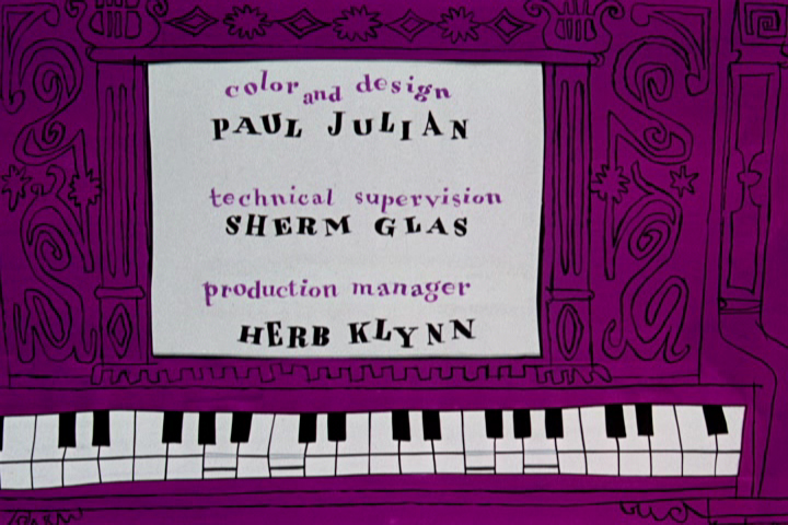
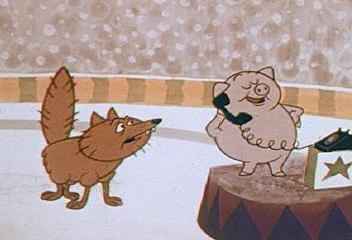
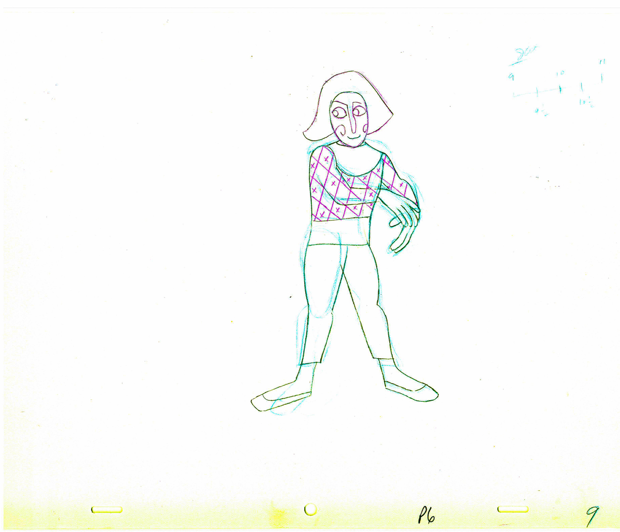
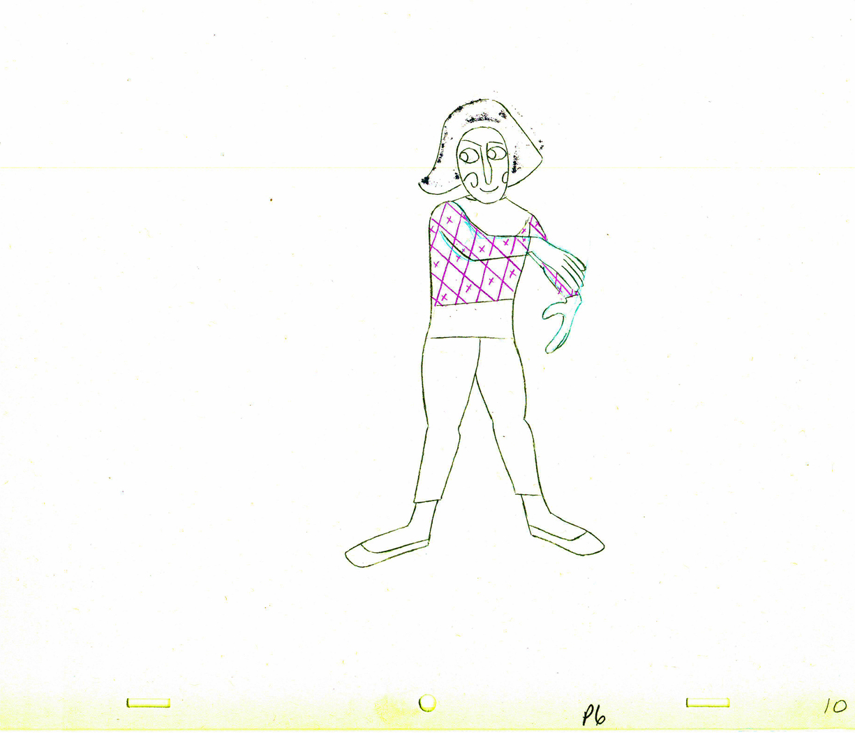
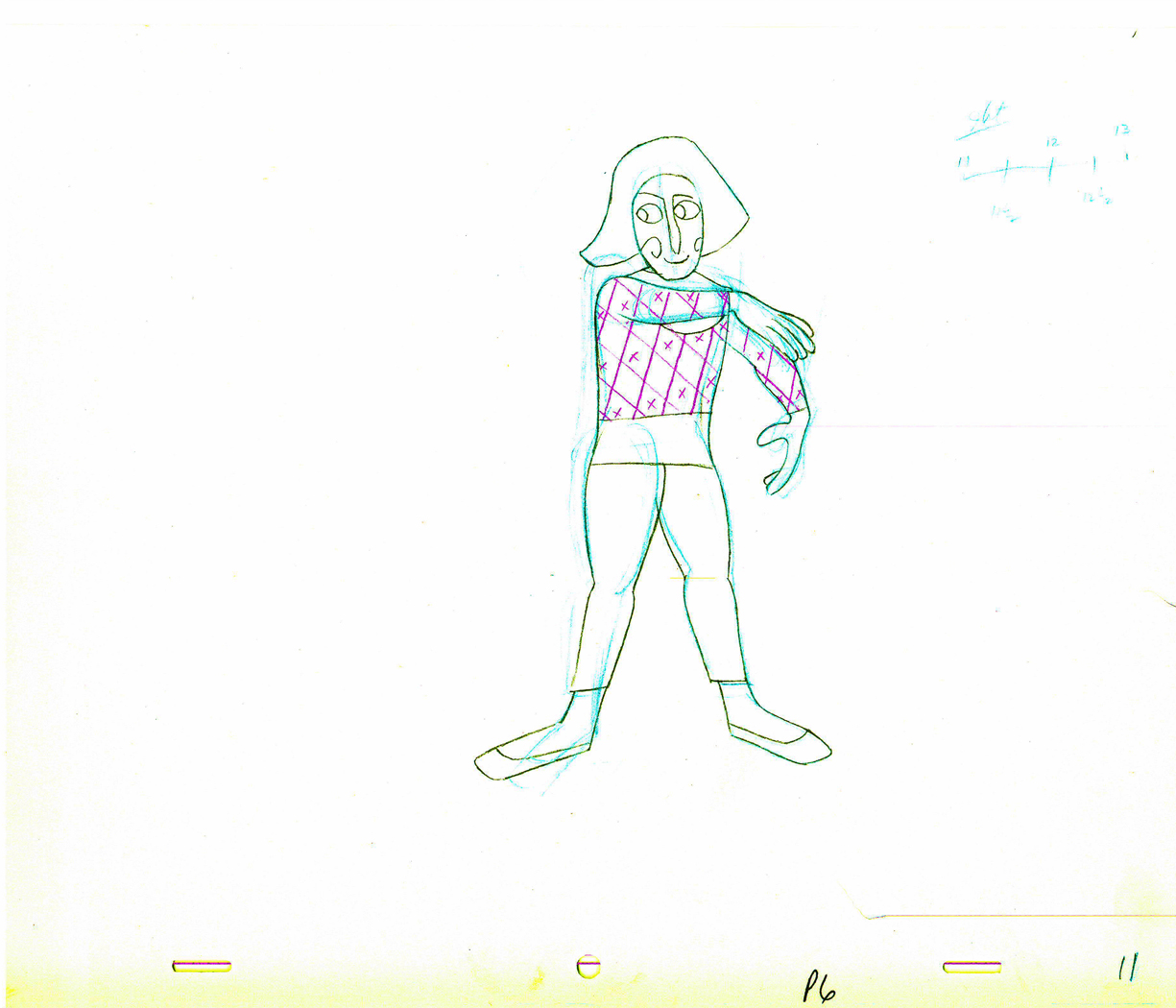
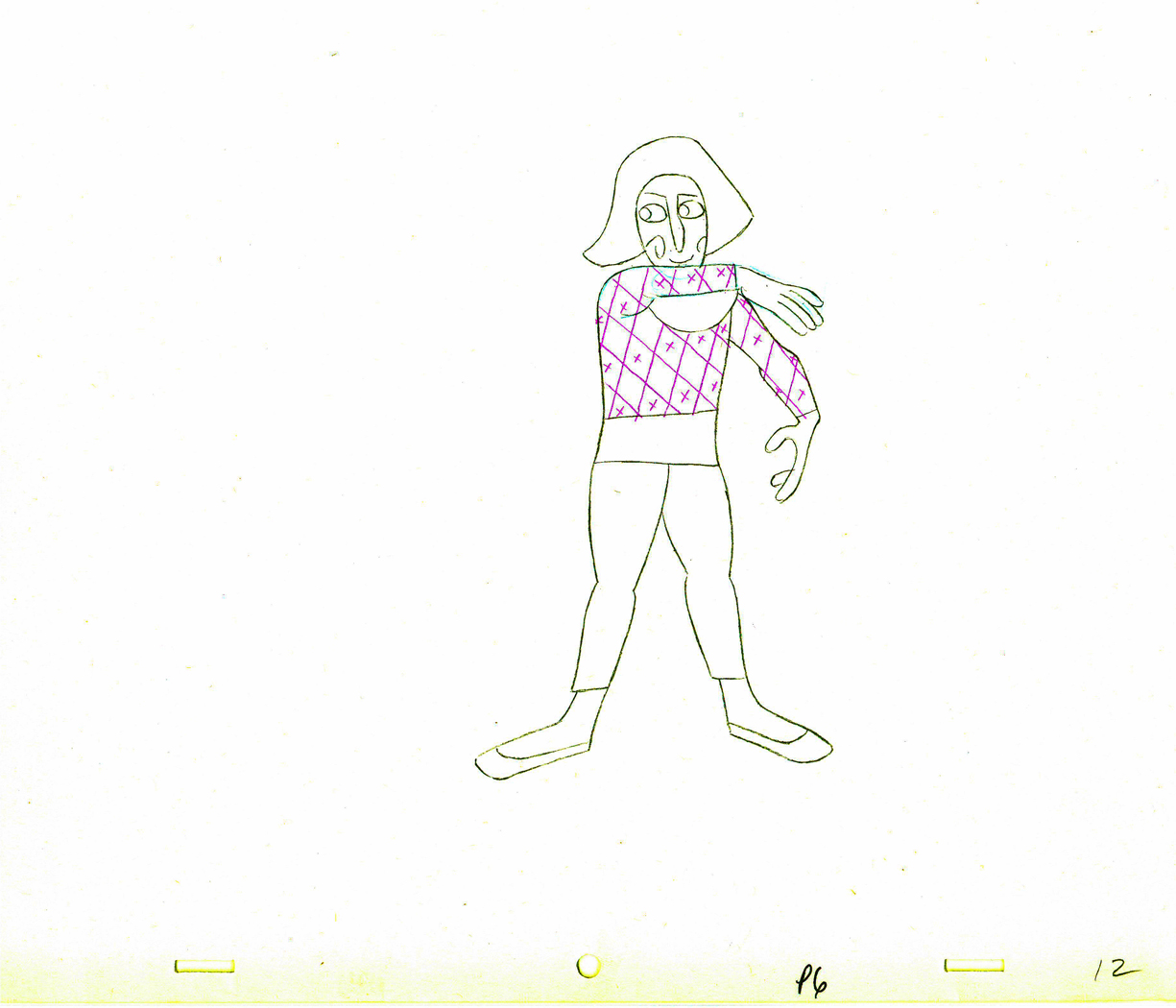
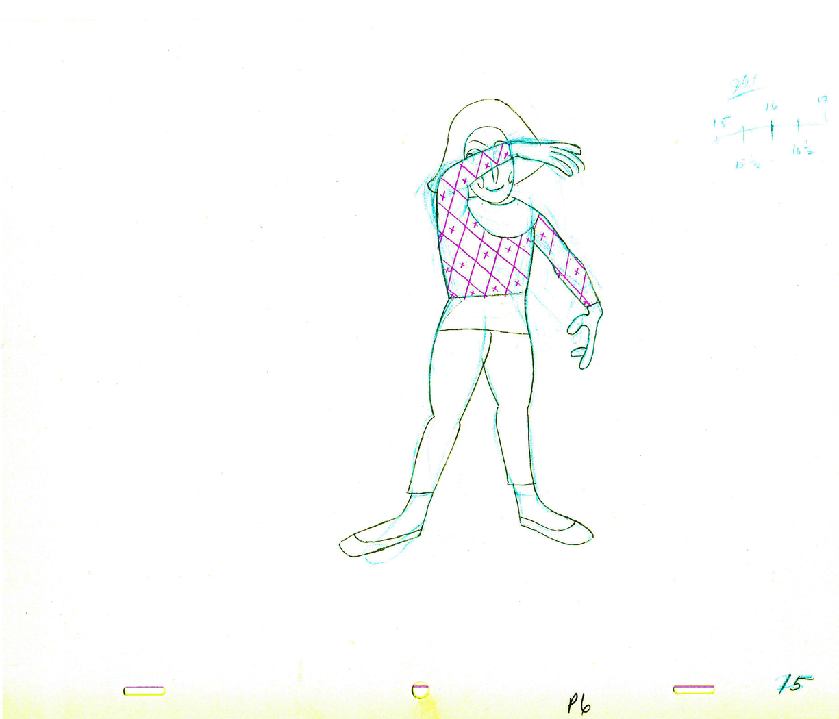
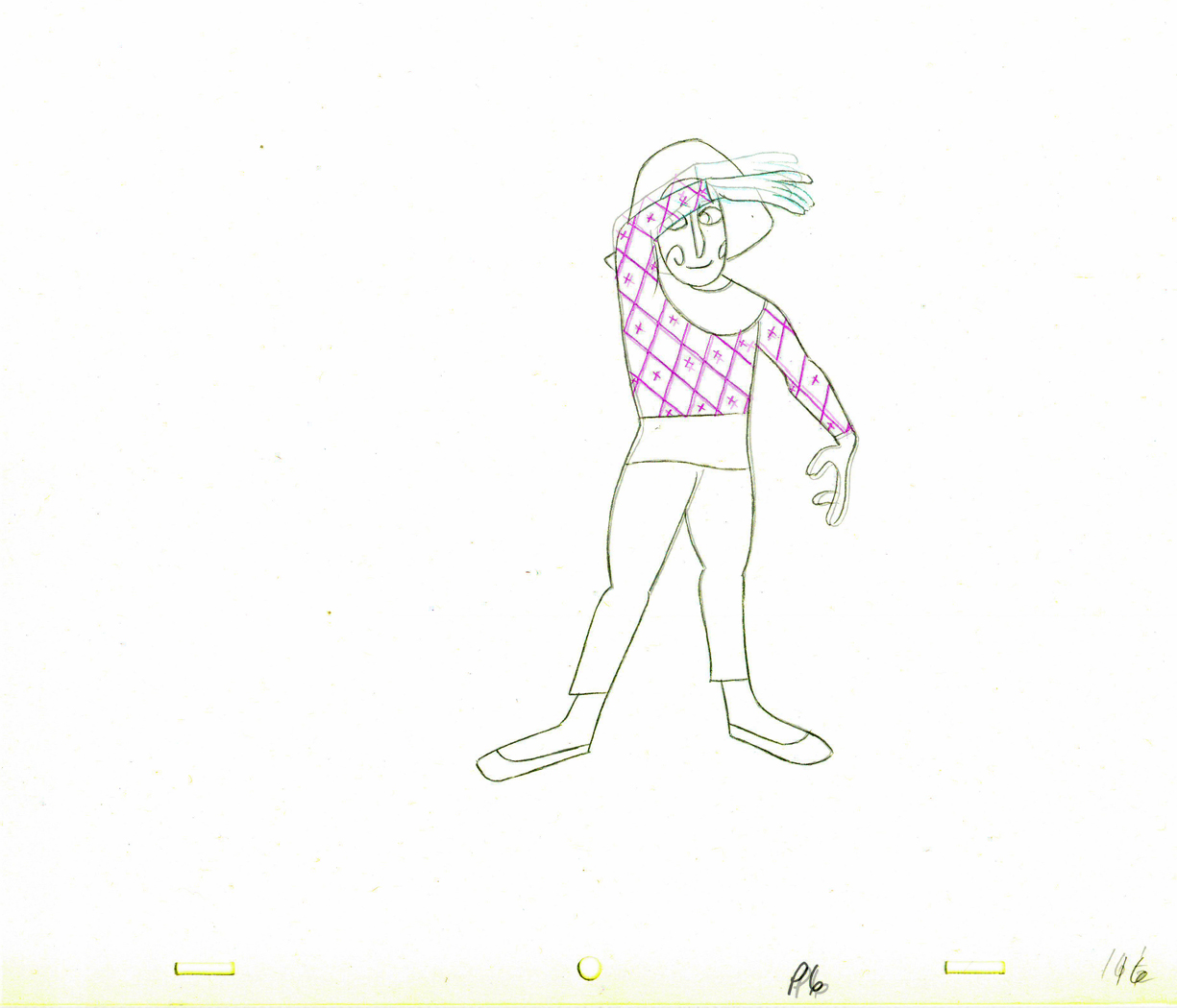
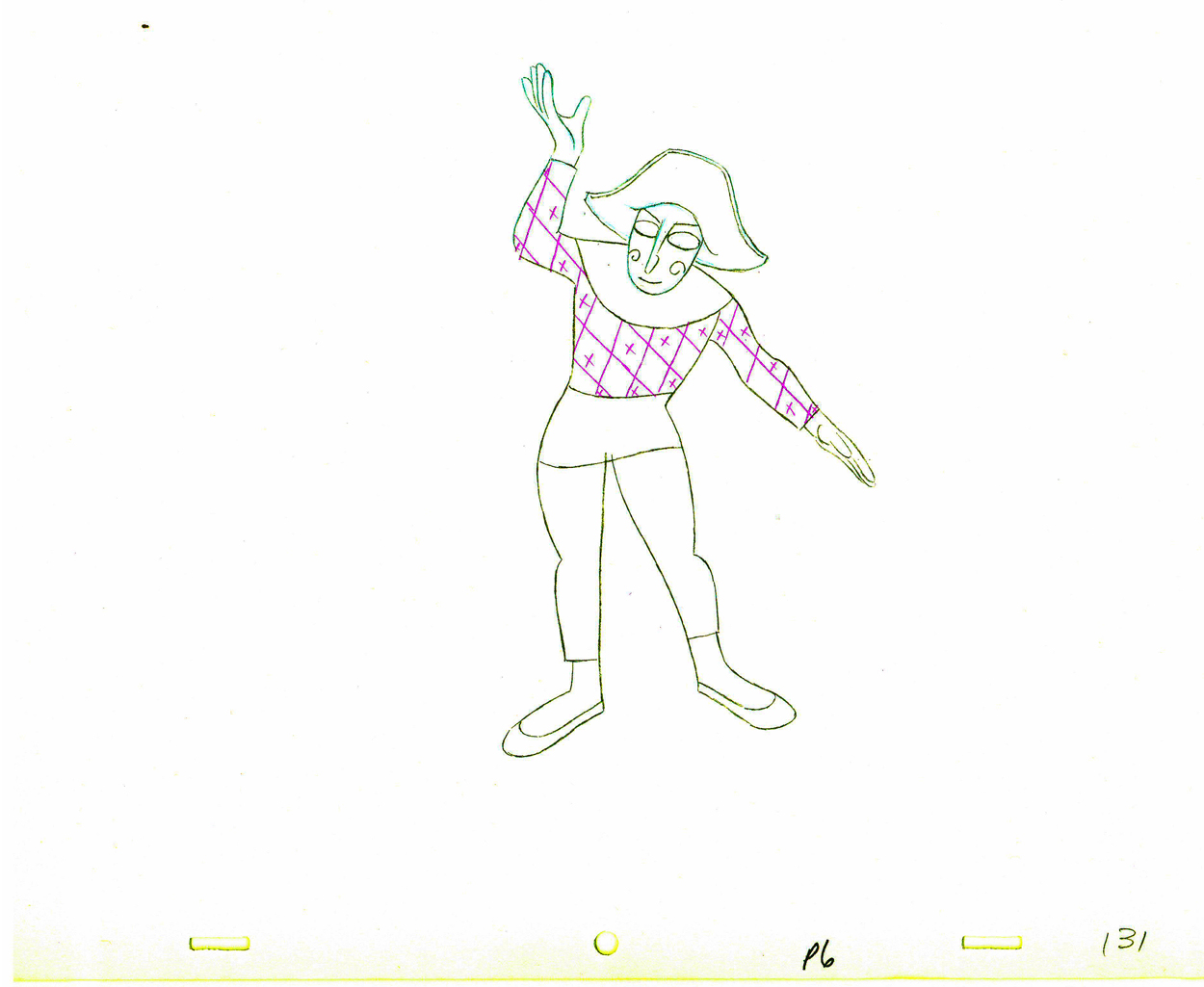
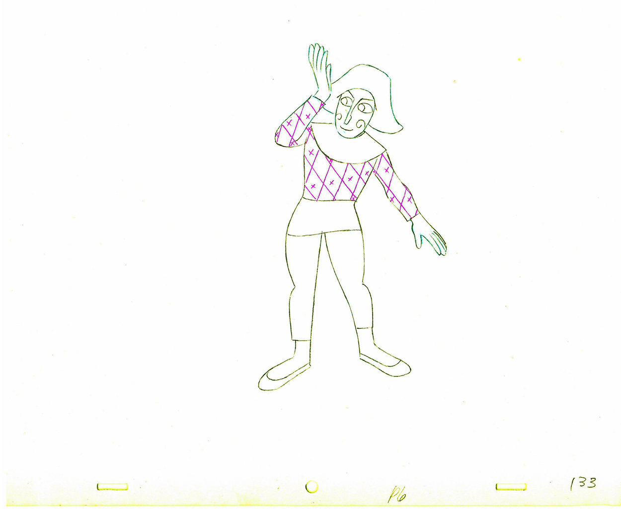
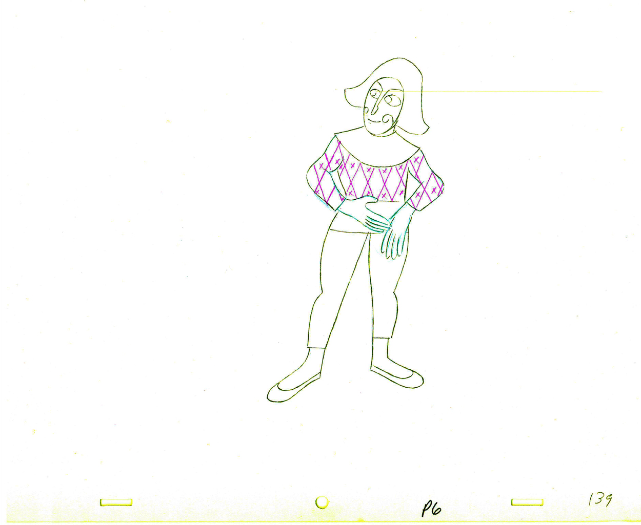
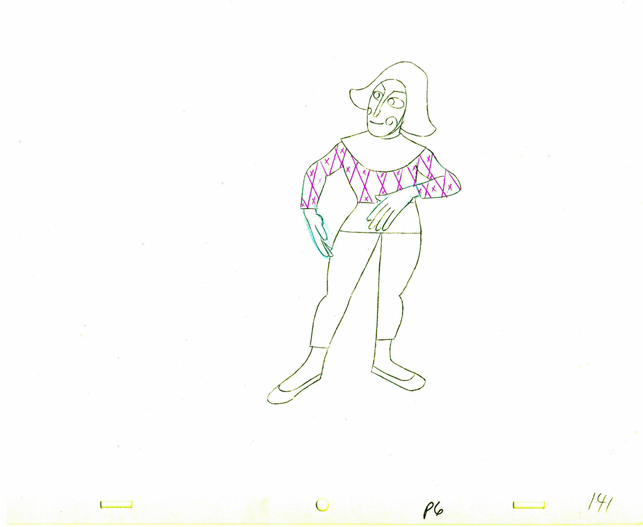
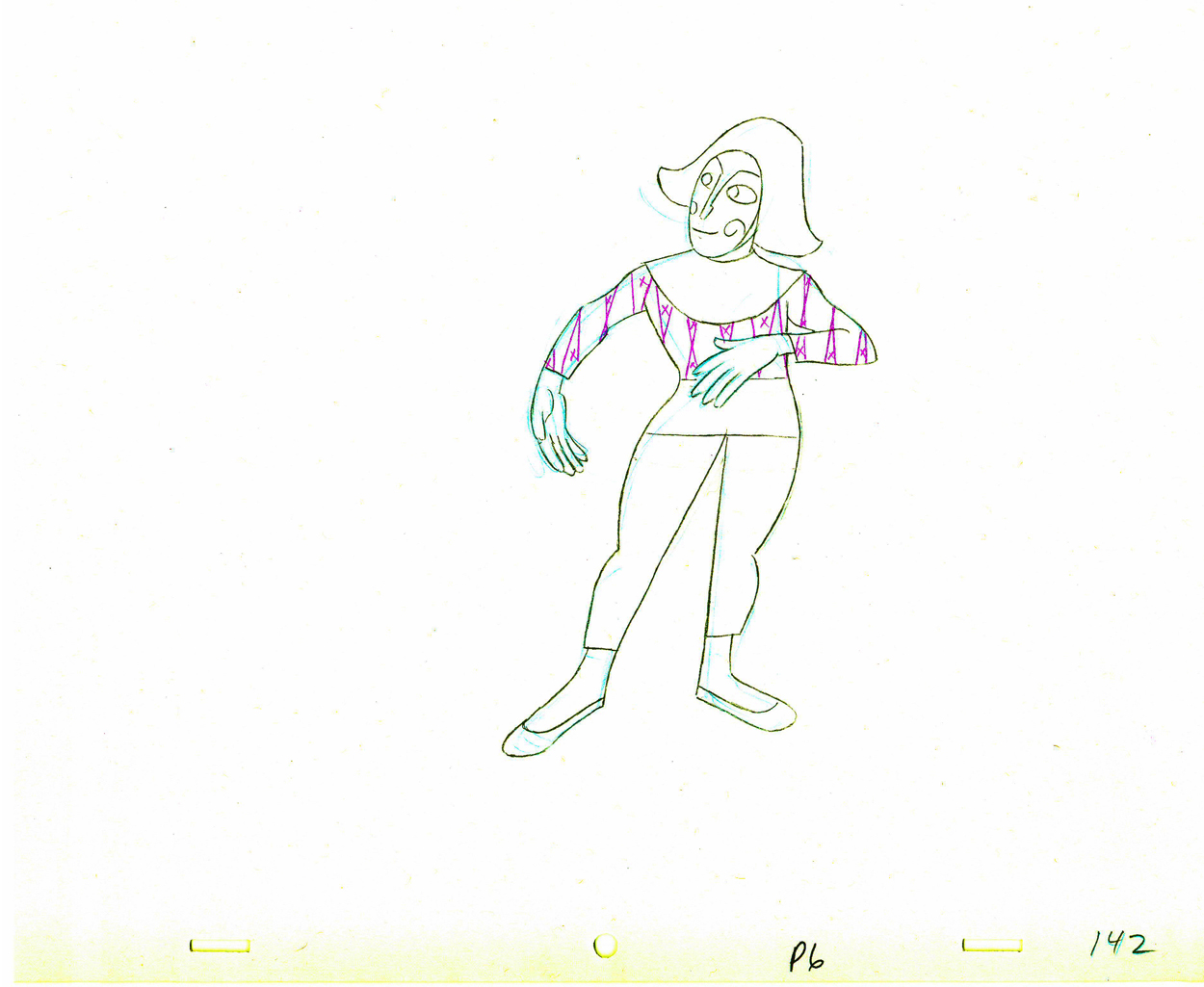
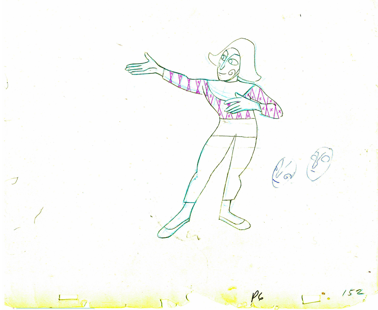
7. ROOTY TOOT TOOT (1952) (UPA) – film courtesy Sony/AMPAS
(released for Oscar consideration in 1951)
Director: John Hubley
Lyrics: Allen Alch
Music: Phil Moore
Choreography: Olga Lunick
Writers: John Hubley, Bill Scott
Animation: Art Babbitt, Pat Matthews, Tom McDonald, Grim Natwick
Color and Design: Paul Julian
Technical Supervision: Sherm Glas
Production Manager: Herb Klynn
Executive Producer: Stephen Bosustow
INTERMISSION
8. TV COMMERCIAL REEL (14 spots, c. 1950s & 60s) Hubley’s Storyboard Studio – film courtesy Hubley Family Collection
Design/layout: John Hubley
Animation by various artists, including Art Babbitt, Emery Hawkins.
9. ADVENTURES OF AN ASTERIX (1957) (Hubley Studio) –
film courtesy MoMA
Design and Direction by John Hubley
Story by John Hubley and Faith Elliot
In collaboration with James Johnson Sweeney
Animation: Emery Hawkins
Assisted by Ed Smith
Film Editor Faith Elliot
Music by Benny Carter
10. THE TENDER GAME (1958) – Hubley Studio –
film courtesy MOMA
Design and Direction by John Hubley
Editing by Faith Elliot
Musical interpretation by The Oscar Peterson Trio
Vocal by Ella Fitzgerald
Animation: Ed Smith, Robert Cannon, Jack Schnerk, Emery Hawkins
11. VOYAGE TO NEXT (1974) – Hubley Studio –
film courtesy AMPAS
Directed by John Hubley
Produced by Faith Hubley
Scenario by Faith and John Hubley
Music composed and conducted by Dizzy Gillespie
Voices: Maureen Stapleton and Dizzy Gillespie
Design and backgrounds by John and Faith Hubley
Animation: Phil Duncan, Bill Liuttlejohn, Earl James.
Assisted by Michael Sporn.
12. FACADE (c. 1960s) – Hubley Studio -
35mm animatic storyboards for unfinished short of William Walton/Edith Sitwell 1927 abstract music score –
film courtesy of Hubley Family Collection
No credits available.
13. John Canemaker moderates Q&A with Emily Hubley and Michael Sporn.
Animation &Animation Artifacts &Hubley 06 Oct 2011 06:46 am
Babbitt’s Carousel Mime – revisited
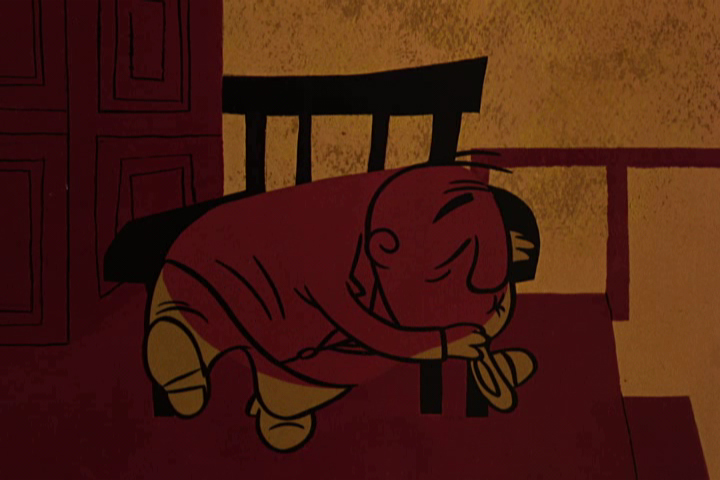
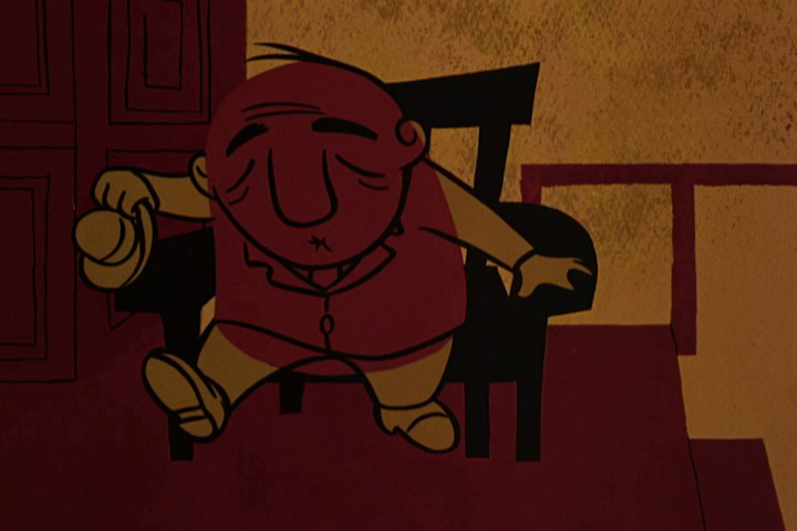
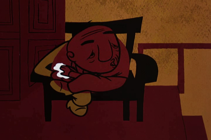
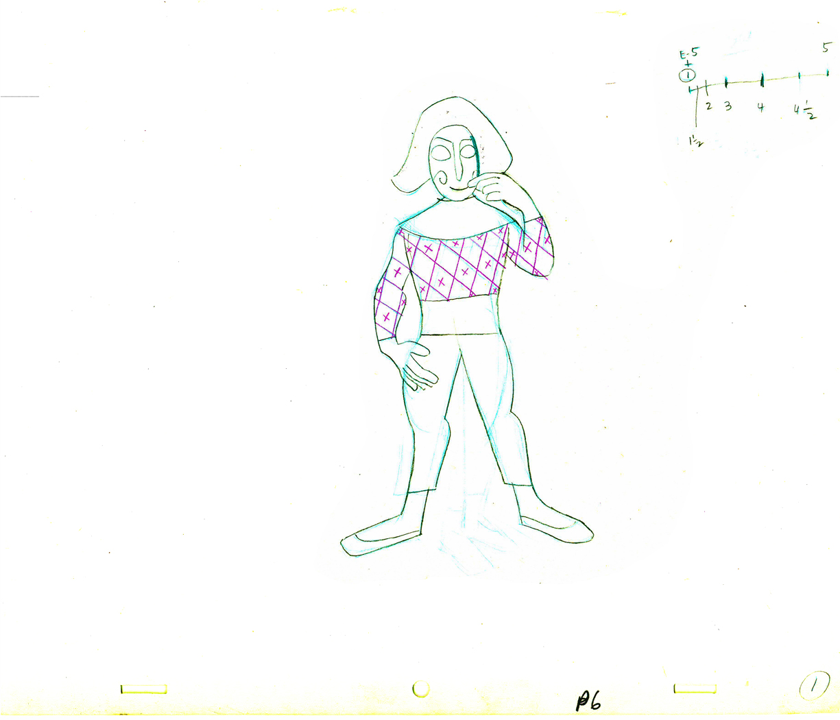
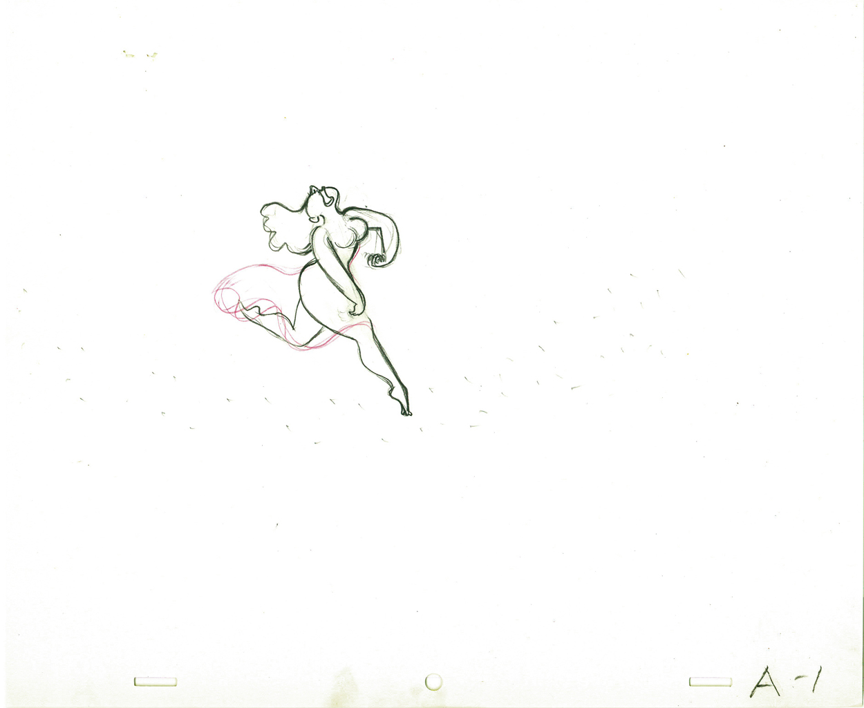
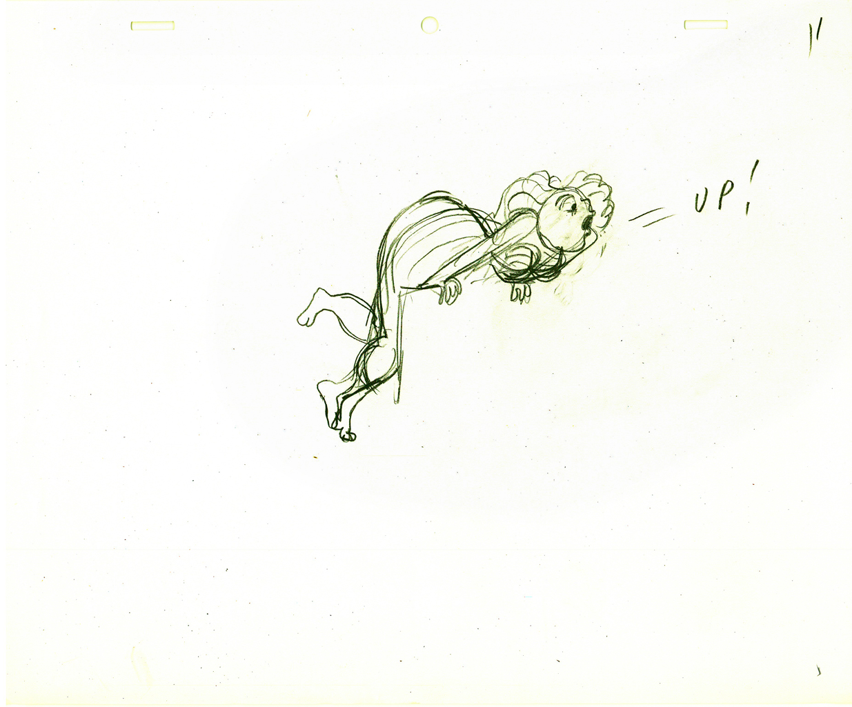
- John Hubley appreciated great animation, and consequently hired only the best of animators to work for him. During his commercial heyday in the ’50s Emery Hawkins, Art Babbitt and Bobe Cannon were regulars animating his spots. When he moved to the short subjects, Bill Littlejohn, Babbitt, Tissa David, Bobe Cannon, Barrie Nelson and Phil Duncan did a lot of the work with others such as Ed Smith and Gary Mooney filling the bills.
On Everybody Rides the Carousel, Art Babbitt animated the introductory scene and was displeased with what happened to the very long scene. He left the film and Barrie Nelson took over the character he was animating, the Mime/Narrator of the film.
In five past posts (Sept. 2010) I put up all the drawings of the scene and added a QT movie. Rather than post all those drawings again, I offer the first and the fifth parts of the piece and give you links to the other three if you want to study the drawings more closely.
- John Hubley‘s feature film, Everybody Rides the Carousel, was adapted from Erik Eriksons’ Eight Stages of Man, a Psychosocial Theory of Human Development.
The Hubleys designed the feature (which started out as three half hours for CBS and then was rushed to fill it to 90 min feature length in the final 3 months of production) around a carousel. 8 horsees represented different stages of life. The narrator was a mime we see throughout at the carousel. Art Babbitt was hired to animate him, and things got bad pretty quickly and he left after animating a couple of early scenes. Barrie Nelson completed the character in the show.
John took one look at the pencil test of this scene on a movieola and proclaimed it to me as the greatest animation he had ever seen. It wasn’t long that he took the scene – basically exposed on twos throughout – and asked me to change it exposing it on four frame dissolves throughout. This would extend the scenes and the character and would milk the scenes for everything possible. Art Babbitt was furious and never spoke to John again. For the full story go to this past post.
The scene is about 200 drawings long. I’ll break it into parts and post each part here in about 4 or 5 segments. Here’s the first part. As you can see there are a lot of ½ drawings. Animation extender – it’s a very slow moving character. A lot of poetry.
The QT will be done using Art’s exposure on twos.
 1
1(Click any image to enlarge.
 E1
E1 E5
E5
There are five pair of eyes; I give you the first and last.
 1½
1½
Lots of half drawings in the scene.
 2
2 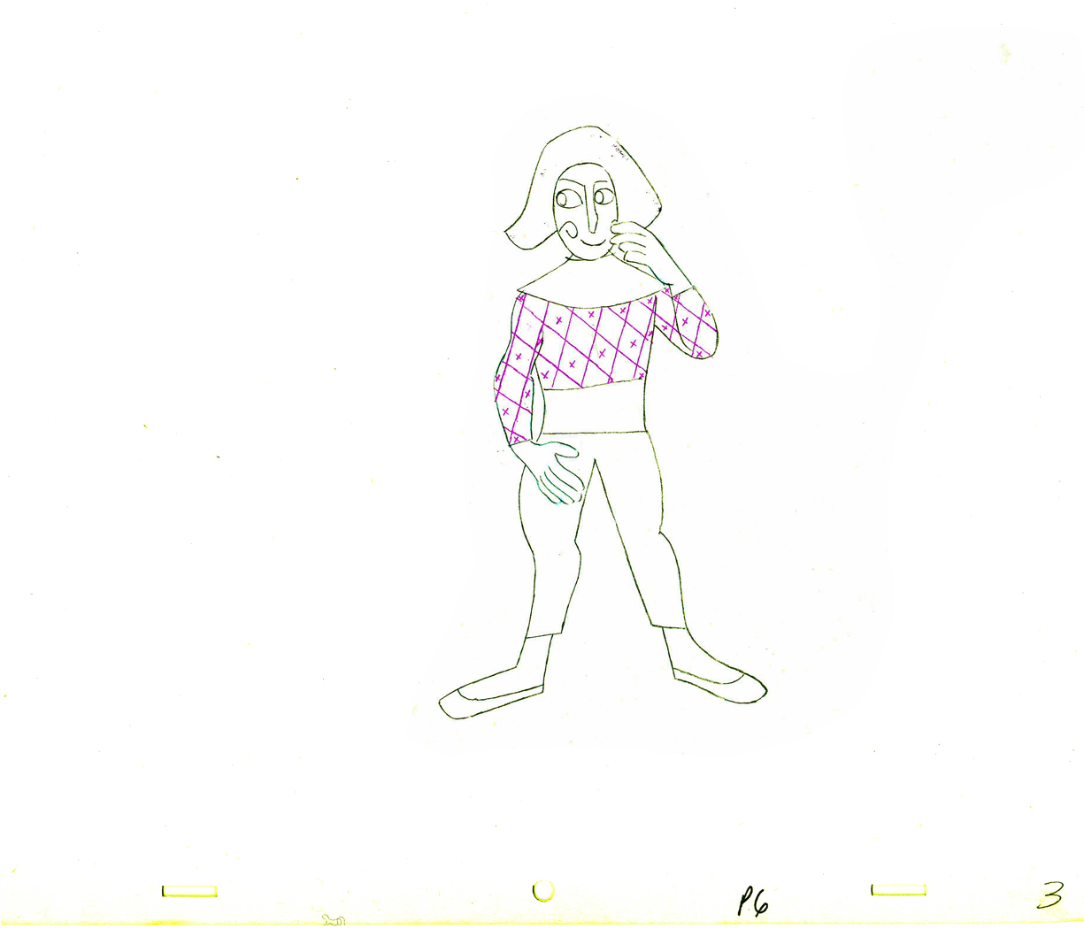 3
3
 4
4 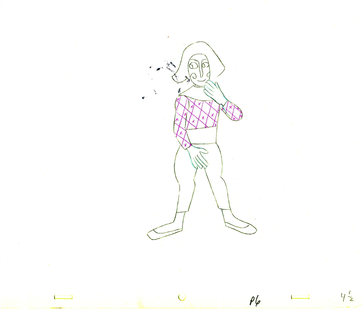 4½
4½
 5
5 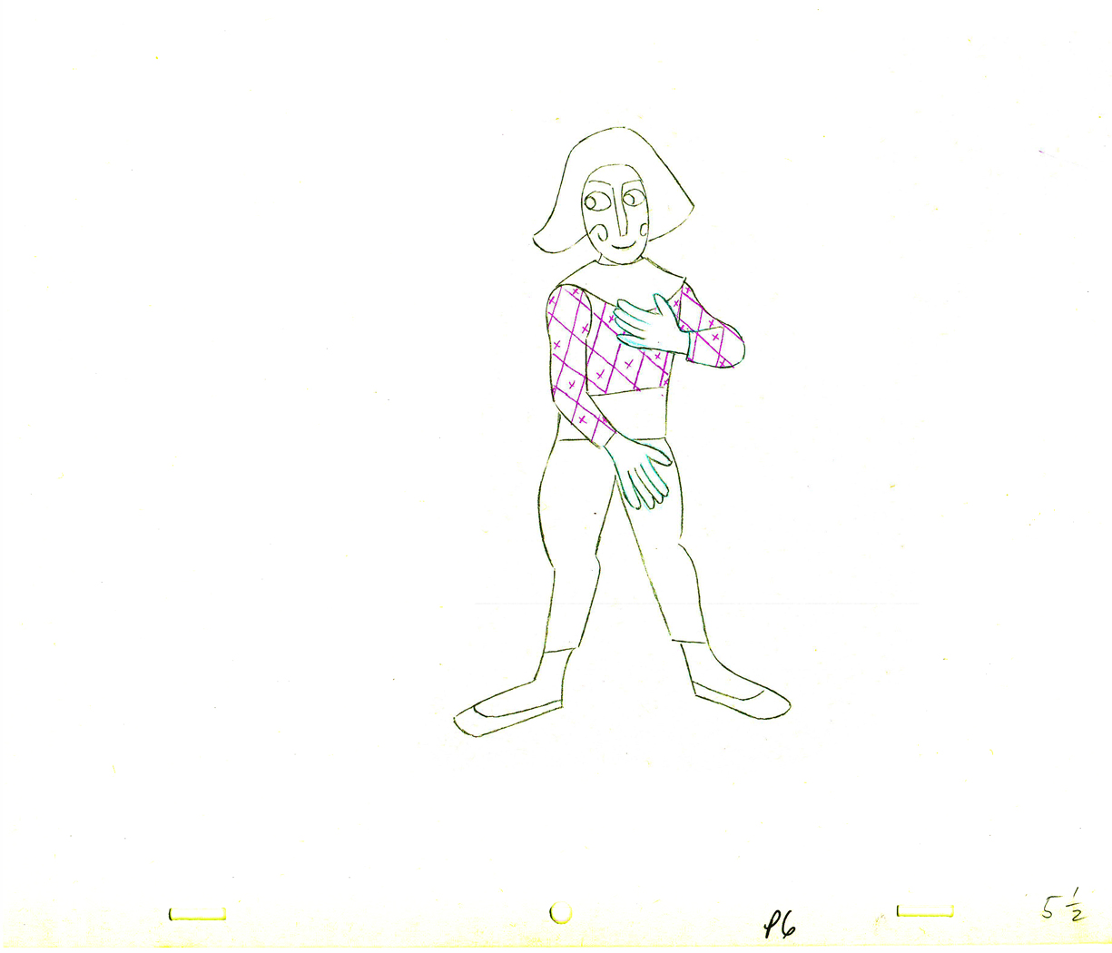 5½
5½
 6
6 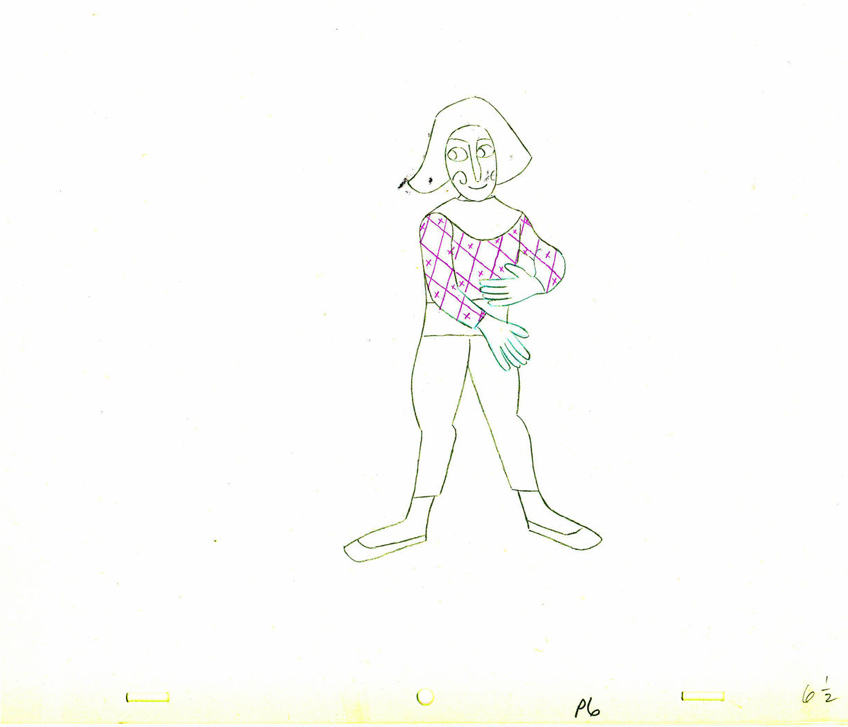 6½
6½
 7
7 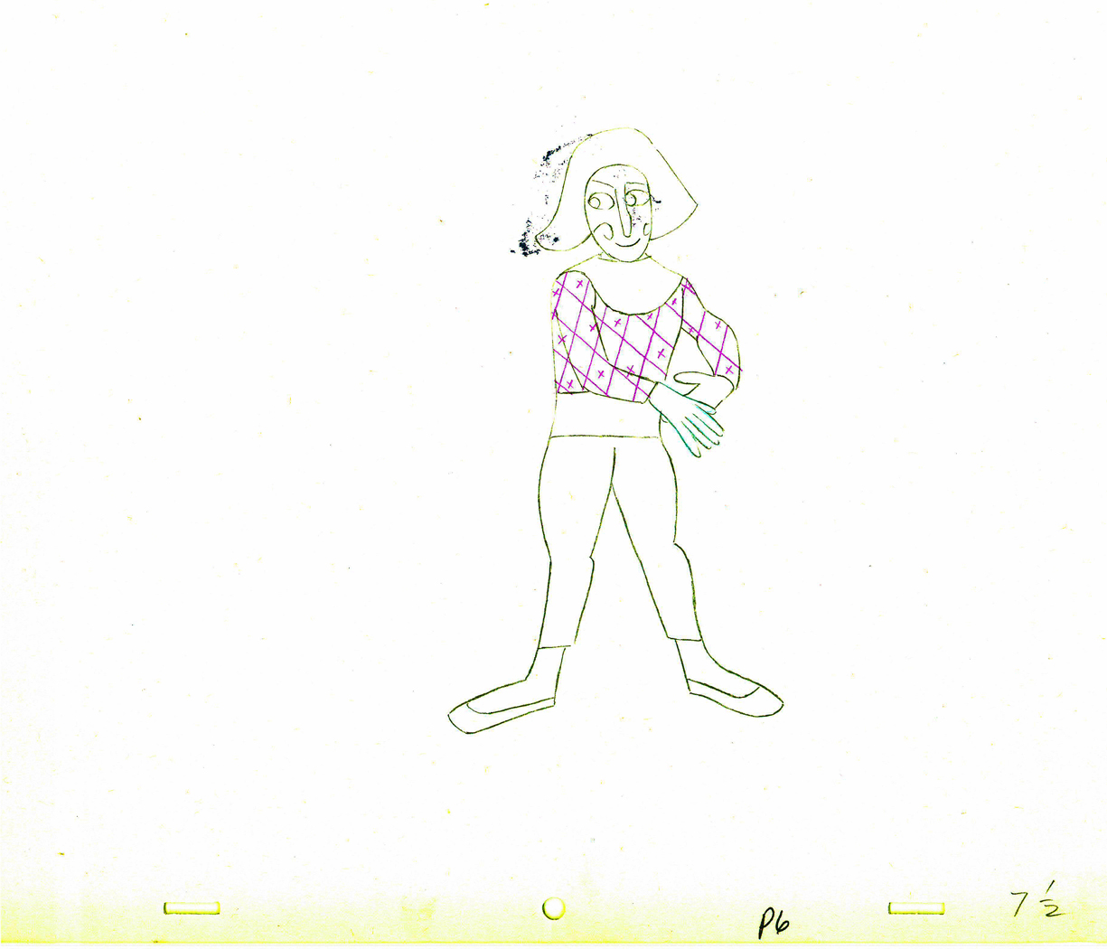 7½
7½
 8
8 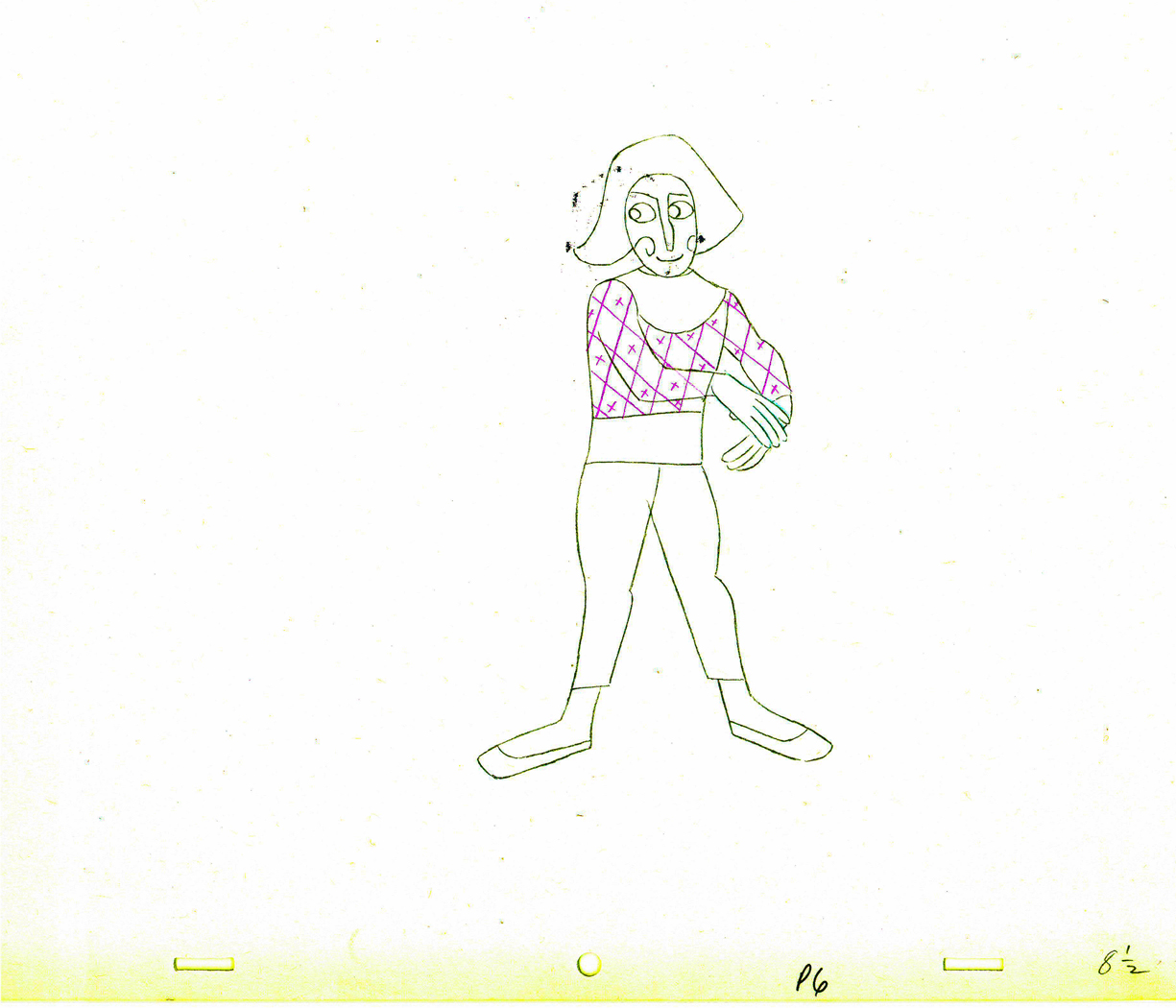 8½
8½
 9
9
 10
10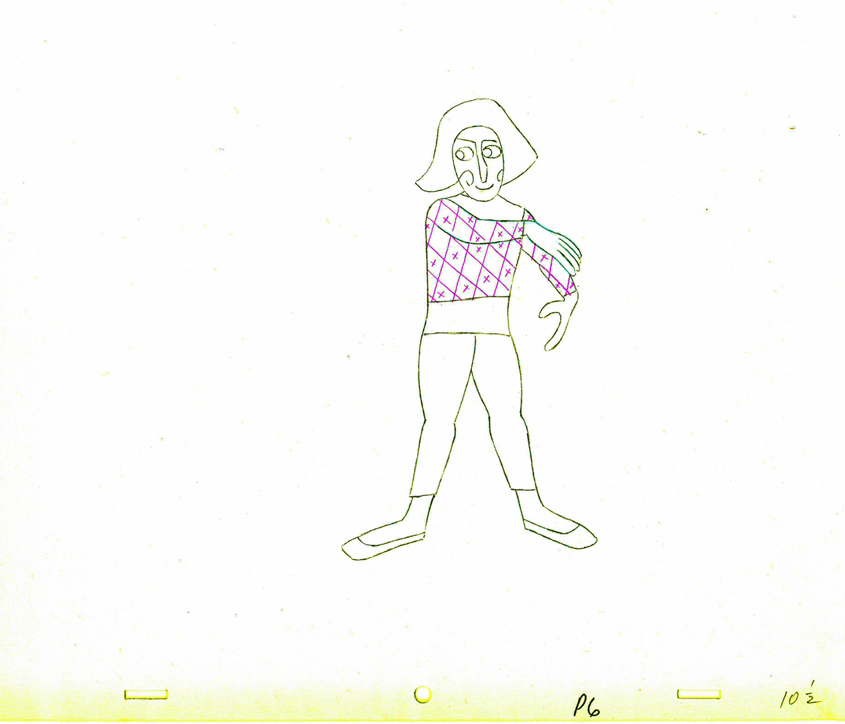 10½
10½
 11
11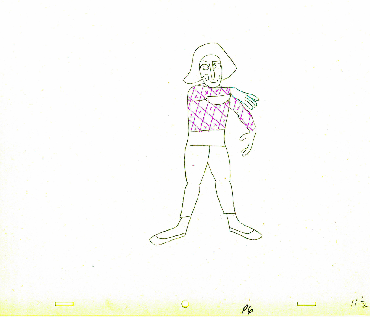 11½
11½
 12
12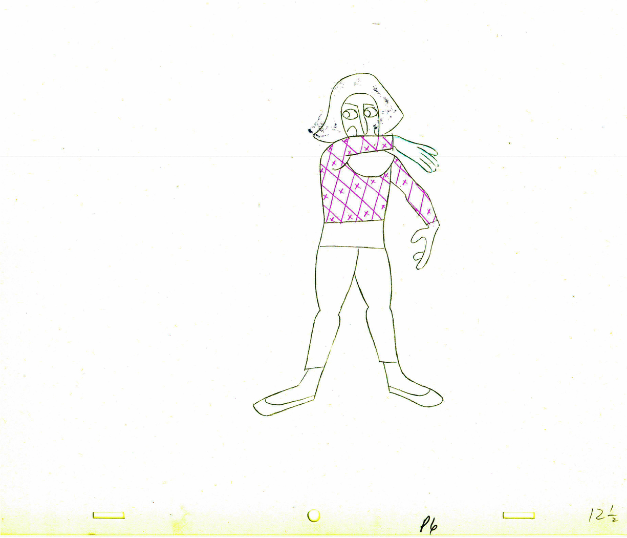 12½
12½
 13
13 13½
13½
 14
14 14½
14½
 15
15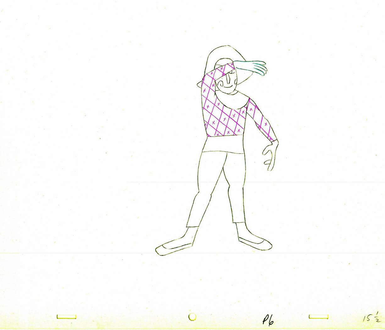 15½
15½
 16
16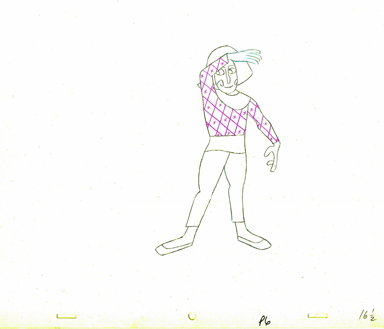 16½
16½
 17
17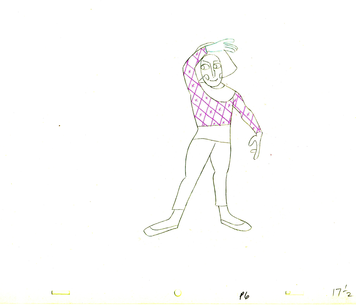 17½
17½
 18
18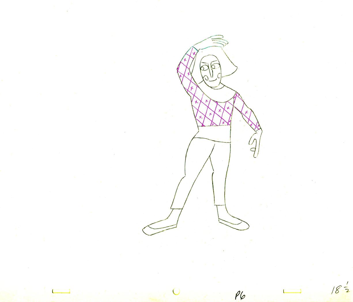 18½
18½
 19
19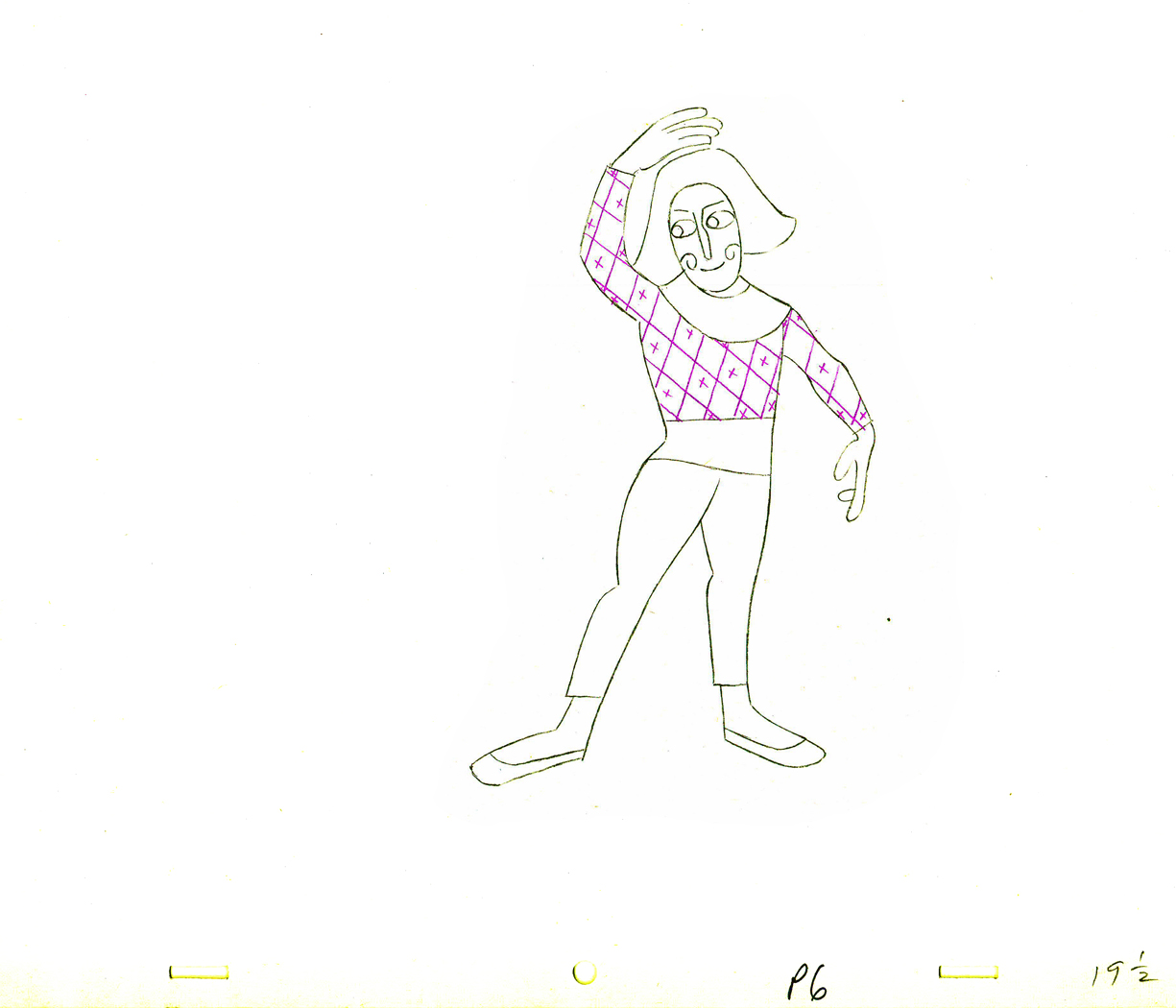 19½
19½
 20
20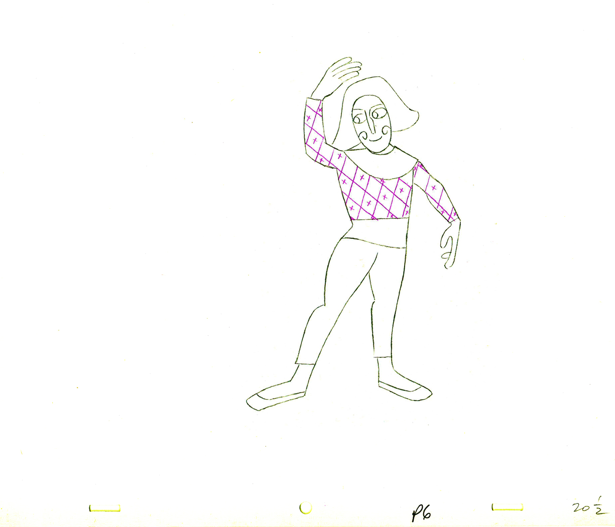 20½
20½
 21
21 21½
21½
2121½
 22
22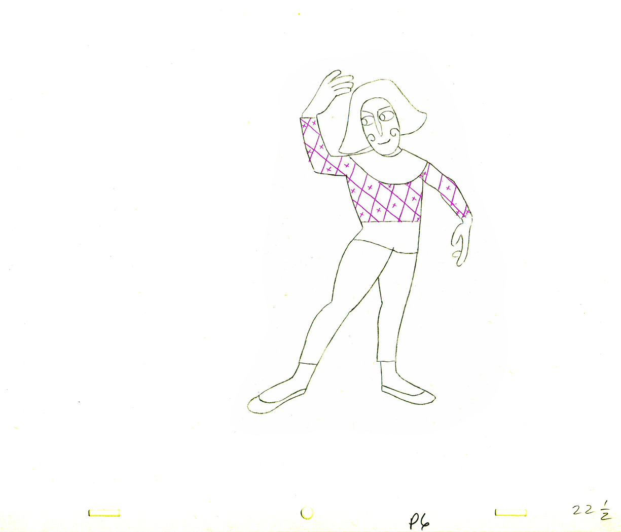 22½
22½
 23
23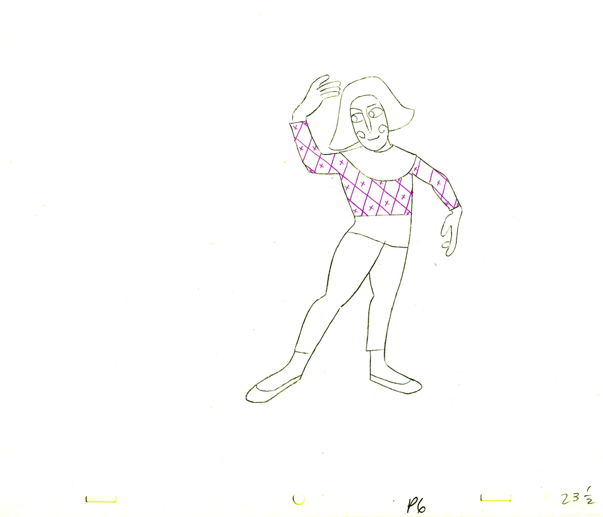 23½
23½
 24
24
 24½
24½
 25
25 25½
25½
 26
26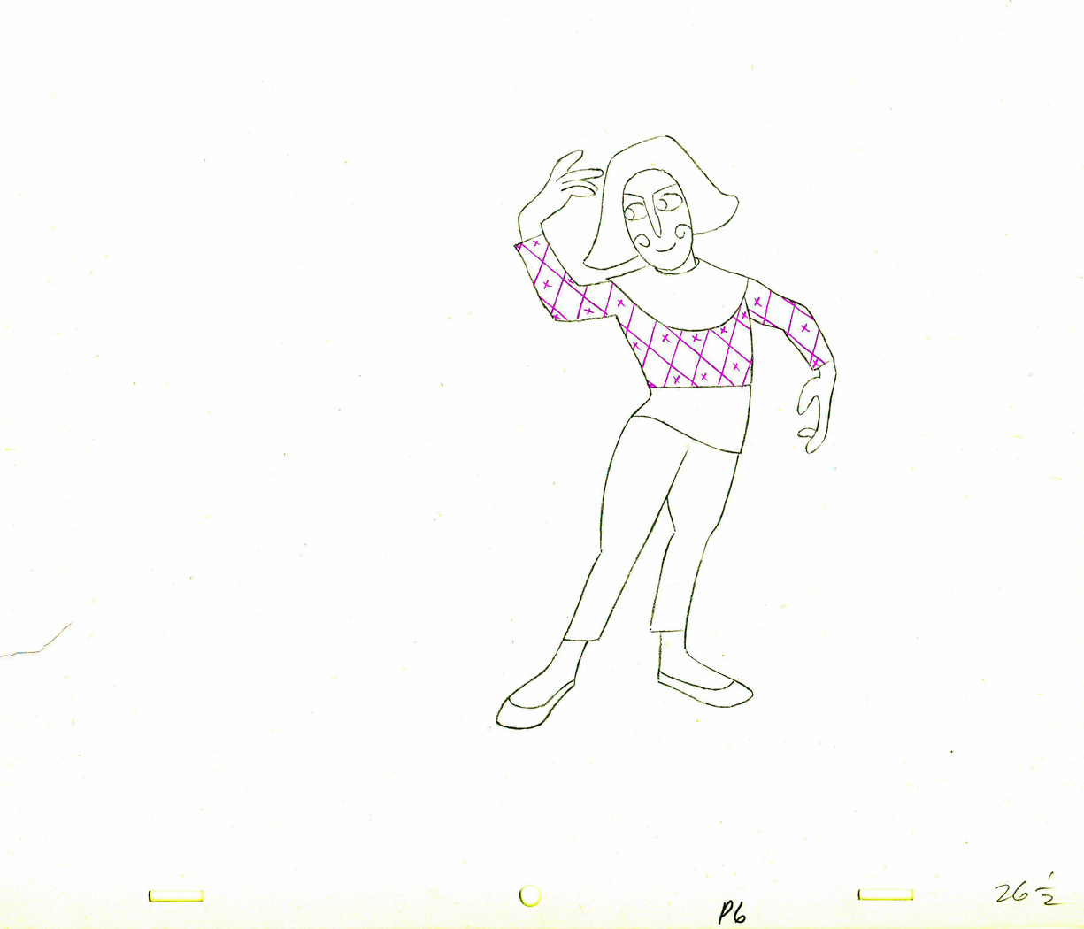 26½
26½
 27
27
______________________
Part 4
Part 5 follows:
- The Hubley feature film, Everybody Rides the Carousel, was adapted from Erik Erikson‘s Eight Stages of Man, a Psychosocial Theory of Human Development.
The Hubley conceit was to make the 8 stages of life as a carousel with 8 horses representing those different stages. The narrator was a mime and was animated, at first, by Art Babbitt, with Dave Palmer as his personal assistant. After animating a couple of early scenes, Babbitt left annoyed. Barrie Nelson completed the character in the show.
For the full story behind the rift between Hubley and Babbitt go to this past post.
The scene is 152 drawings long. This is the final section as the mime comes to rest. It’s a very slow moving character with short quick spurts of movement.
We begin with the last drawing from last week, #123.
 123
123(Click any image to enlarge.)
 24
24 25
25
 26
26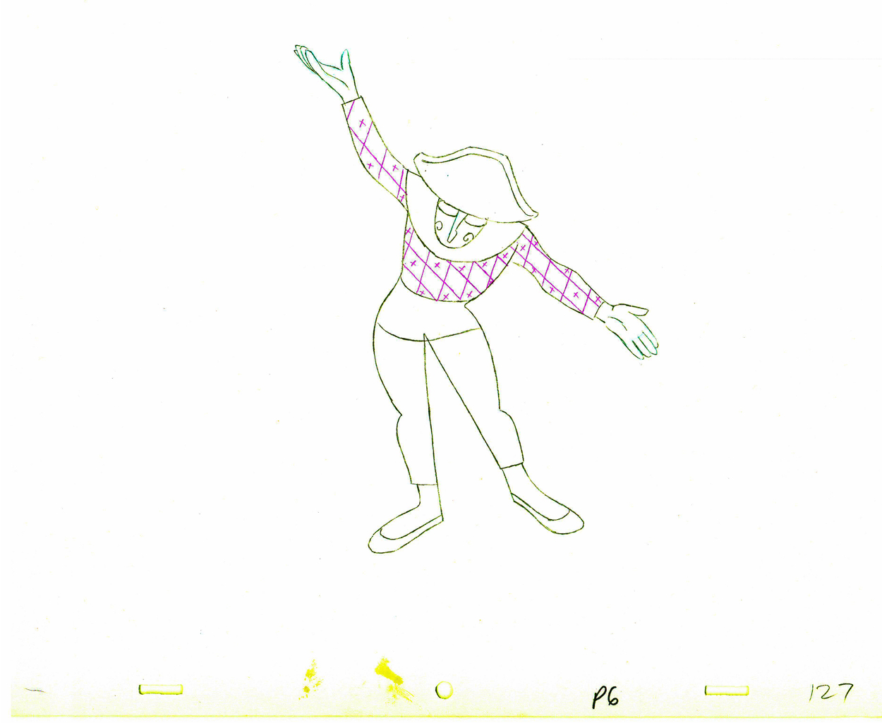 27
27
 28
28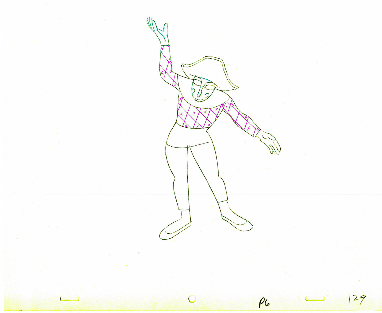 29
29
 130
130
 31
31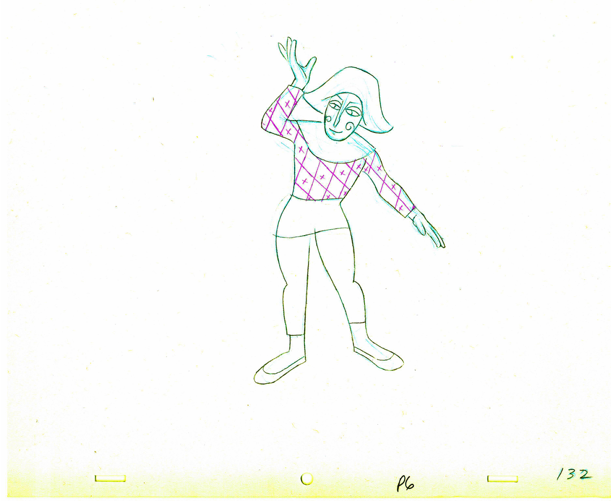 32
32
 33
33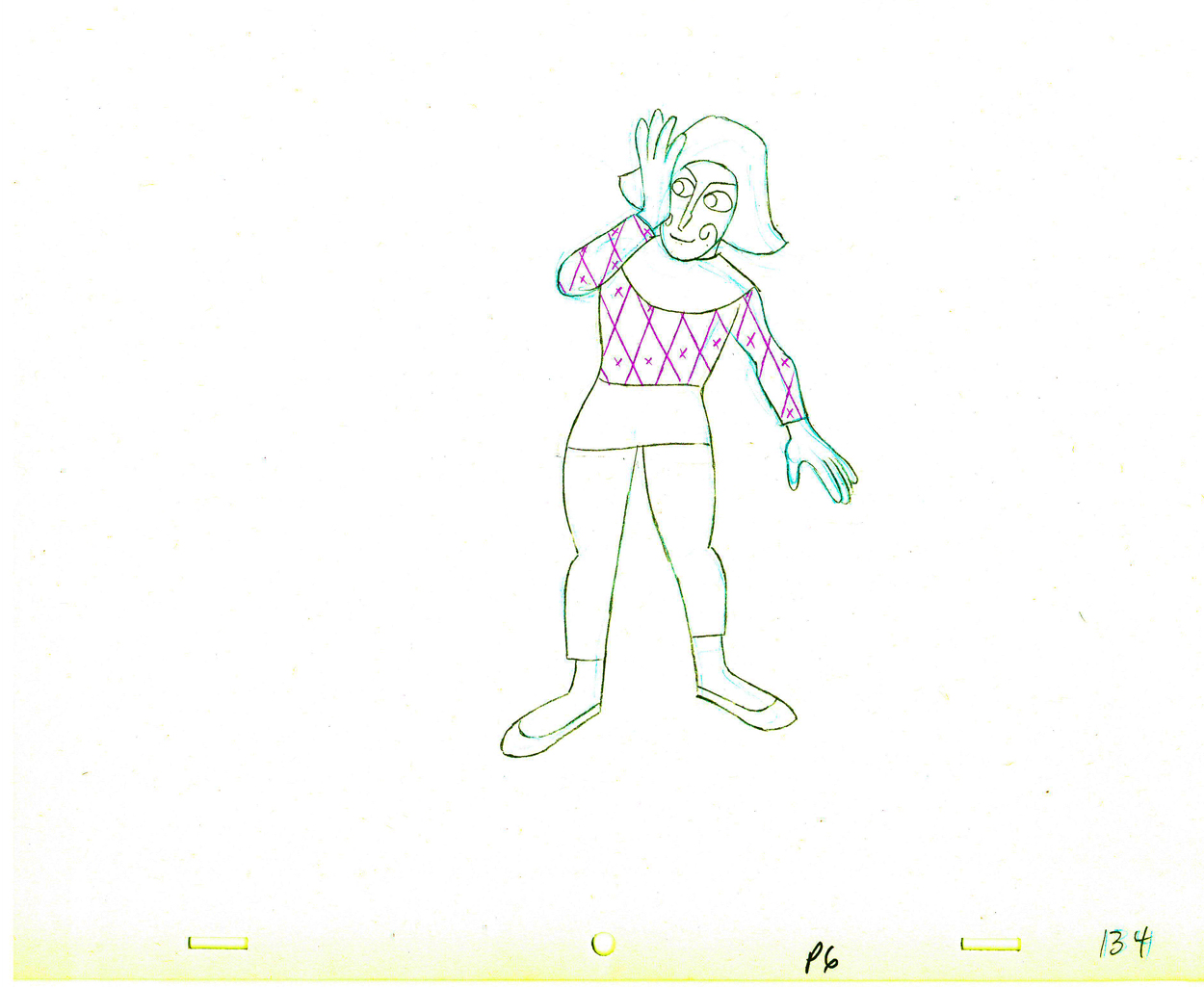 34
34
 35
35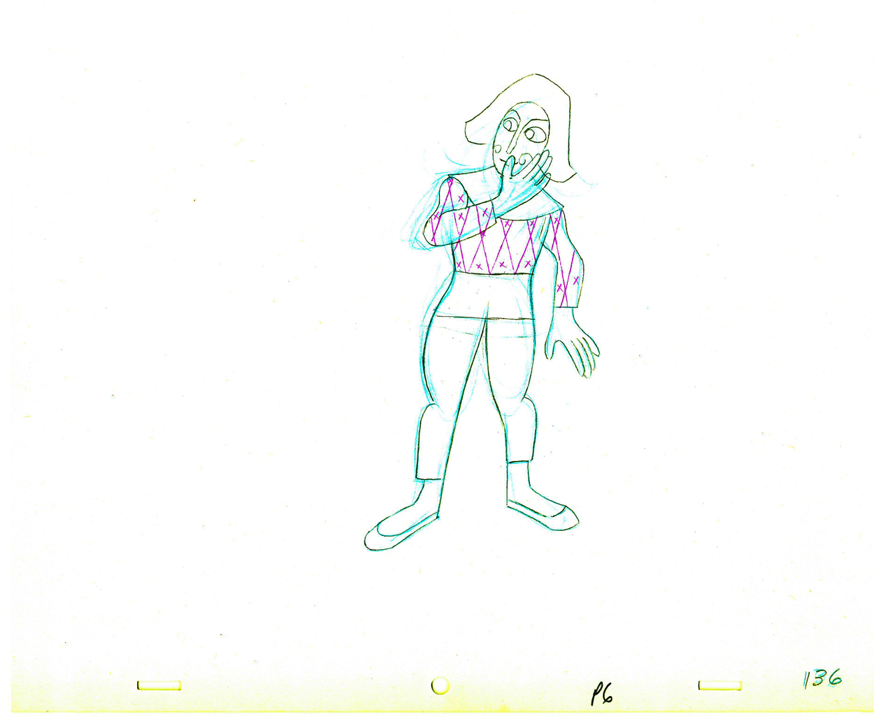 36
36
 37
37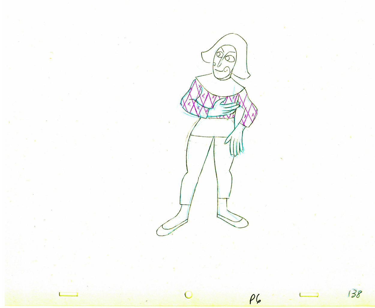 38
38
 39
39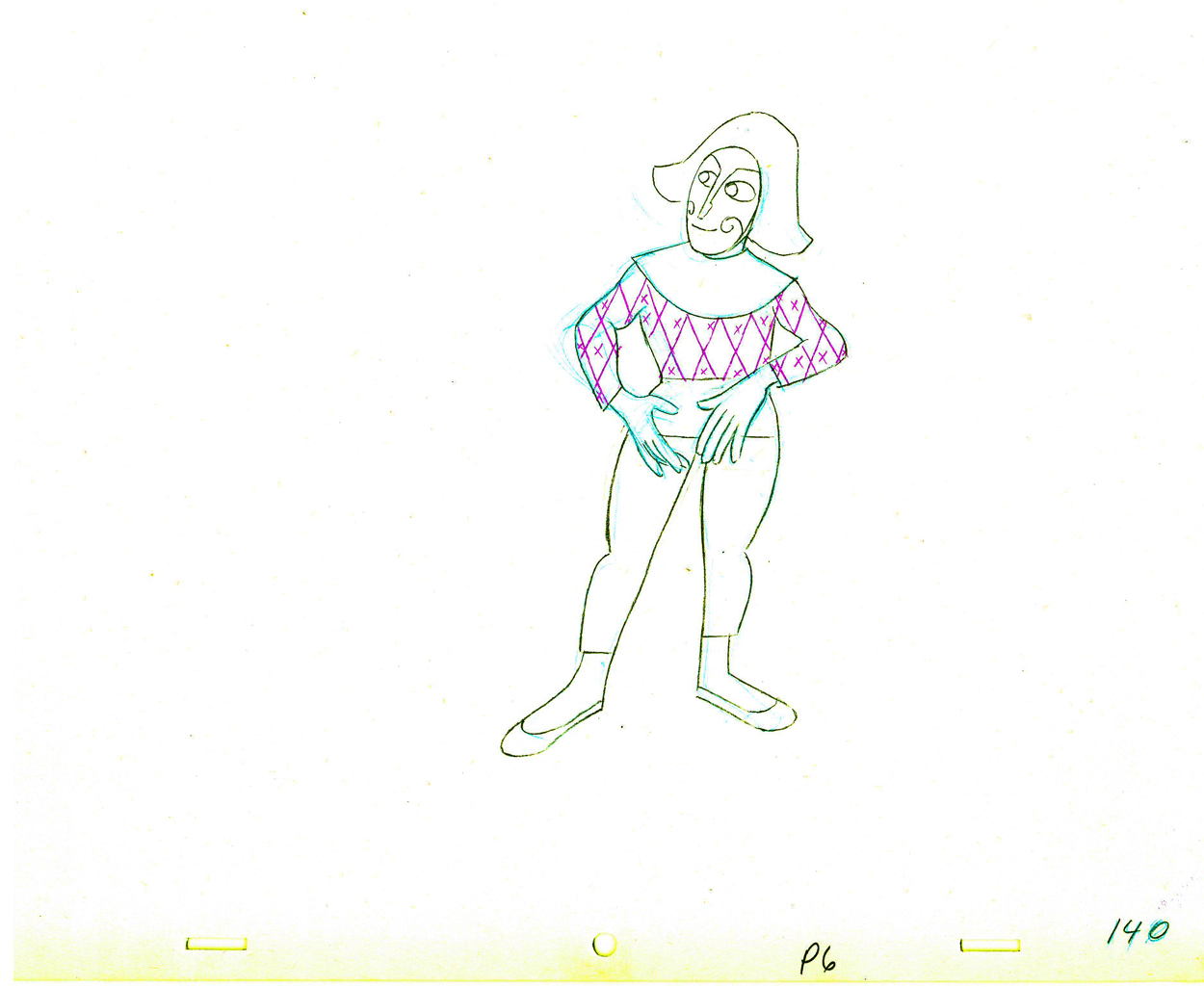 40
40
 141
141
 42
42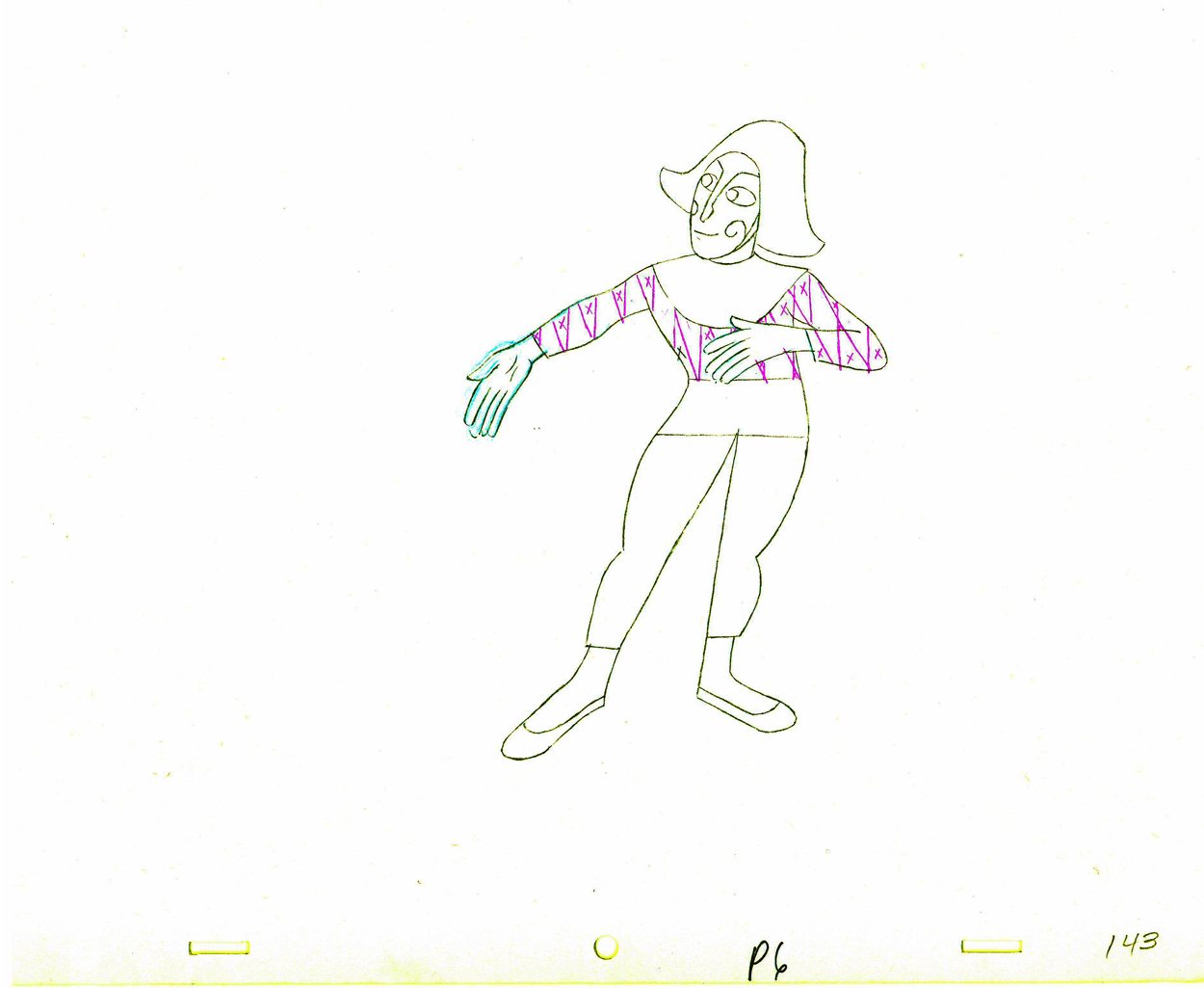 43
43
 44
44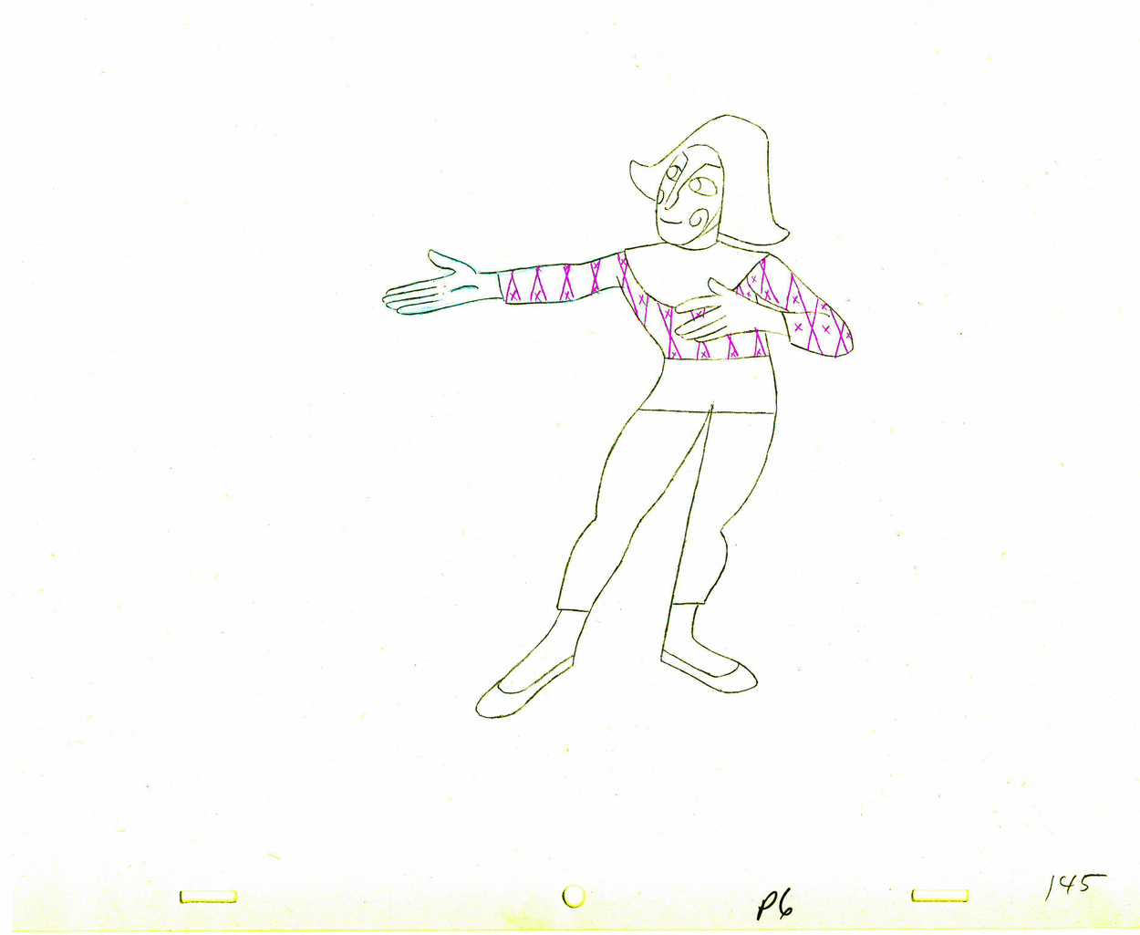 45
45
 46
46 47
47
 48
48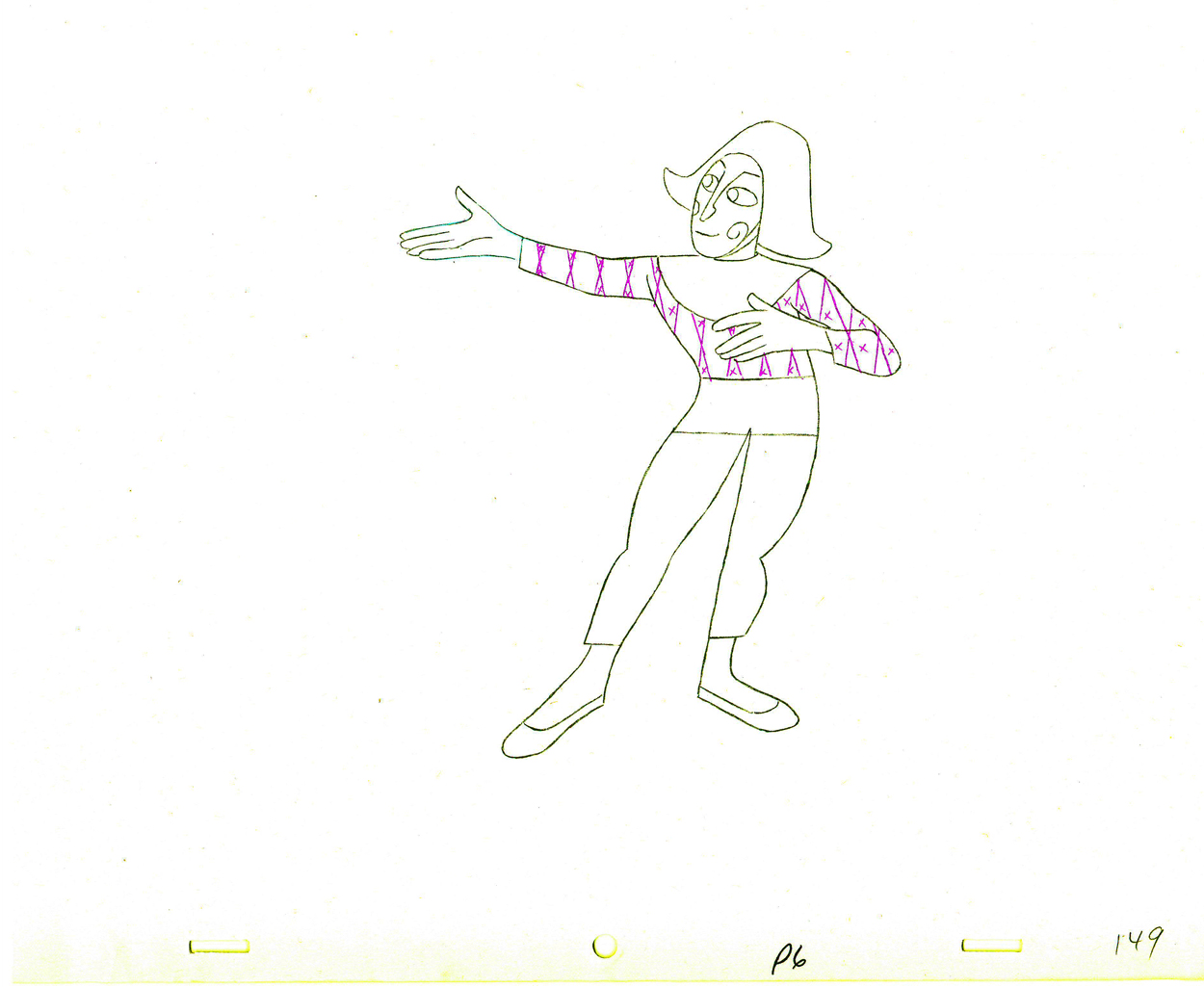 49
49
 50
50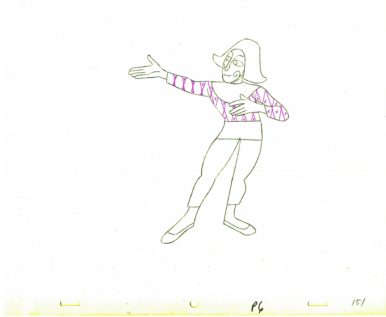 51
51
 152
152
The following QT movie represents all of the drawings in the scene
exposed as Babbitt wanted them, on twos.
Right side to watch single frame.
You can watch this scene from the final film here.
Animation &Animation Artifacts &Hubley &repeated posts 05 Oct 2011 06:55 am
Seeding revisited
- Tissa David did a lot of animation for the Hubleys from about 1958 through 1977. She did whole films on her own and EGGS is one of them. I posted this cycle a few years back and to tie it in with my piece on Monday and leading up to the Hubley retrospective, I’m posting it again, today. I think it’s wonderful.
-Tissa David animated the entire film for John & Faith Hubley. This short, as I said in previous posts, was done for PBS’ Great American Dream Machine for producer, Elinor Bunin. As Bob Blechman verified, they were given very little money and time to do an 8 min. short. The Hubleys gave life to the short by putting it on the theatrical and festival circuit.
Here’s a rough run cycle Tissa did for the Goddess of Fertility, who goes about inseminating the world with her seed. Tissa adds to its eccentricity with having the low point in the cycle the passing drawing. She comes up as each leg hits the ground.
 1
1 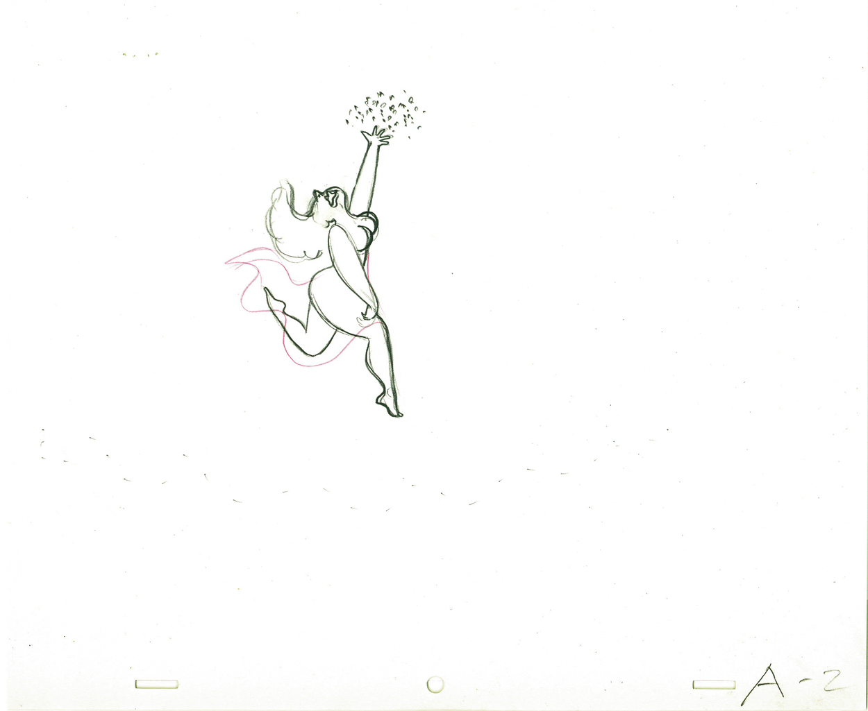 2
2
 3
3 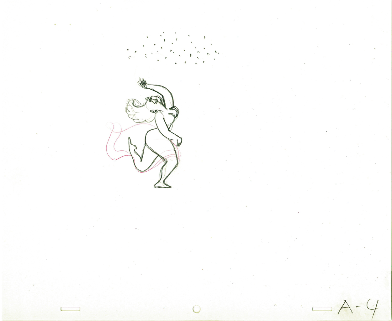 4
4
 5
5 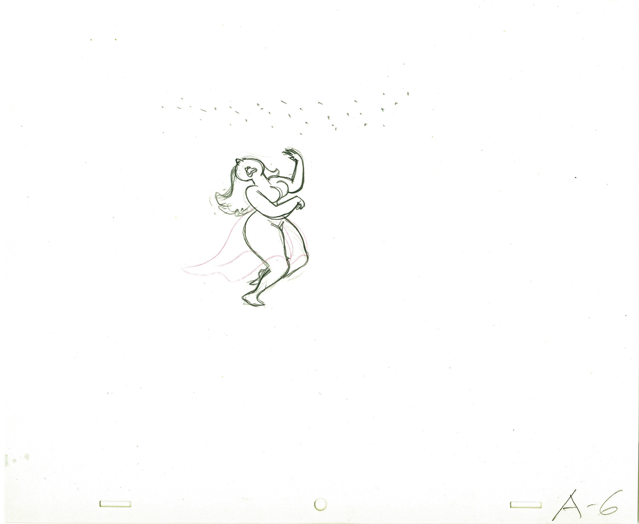 6
6
 7
7 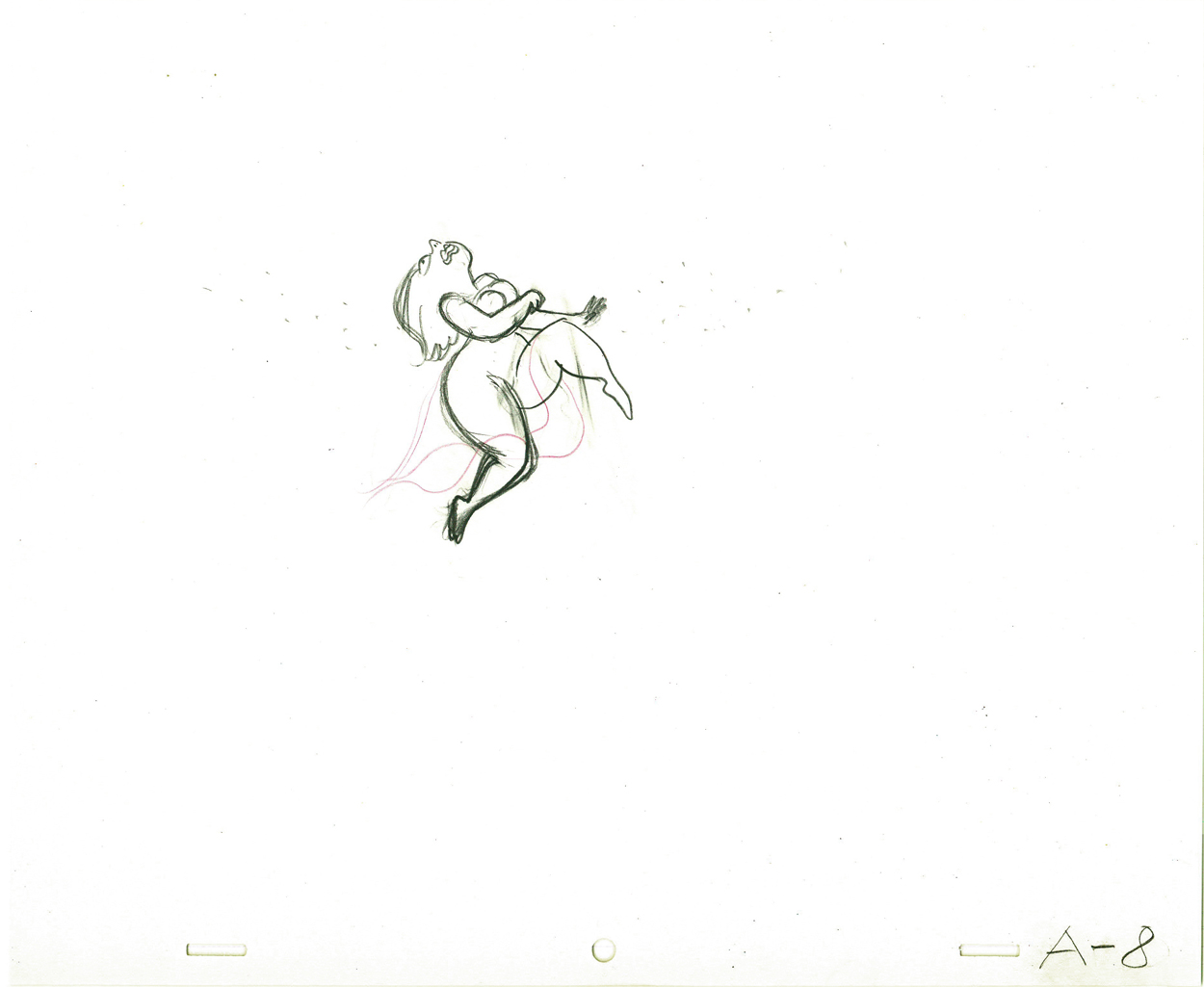 8
8
 9
9 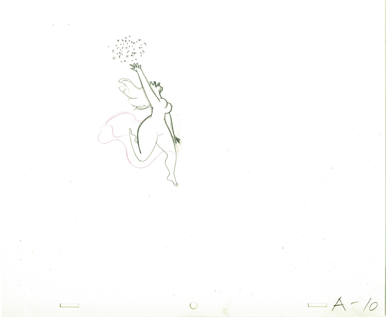 10
10
 11
11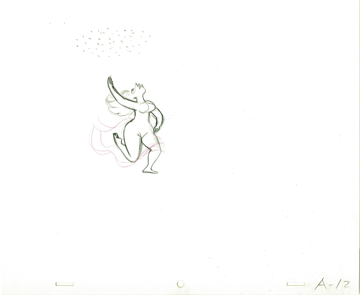 12
12
 13
13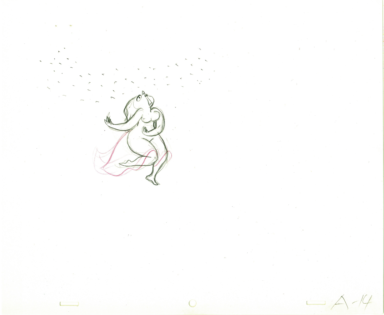 14
14
 15
15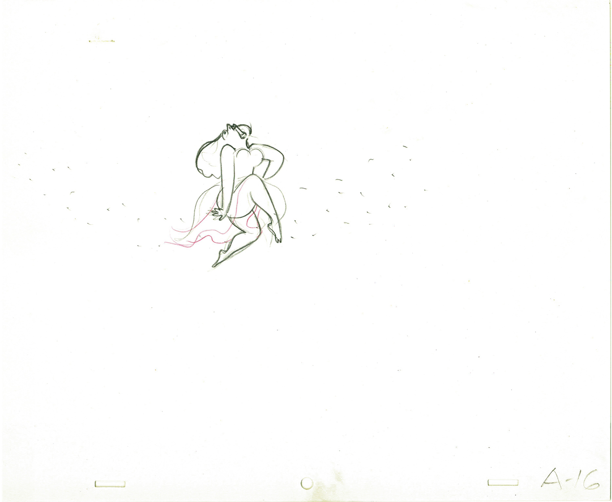 16
16
On threes at 24FPS
Click left side of the black bar to play.
Right side to watch single frame.
Animation Artifacts &Hubley &Layout & Design &Tissa David 03 Oct 2011 06:53 am
Eggs recap
Leading up to the Hubley show next Monday at AMPAS in NY, I’ve said I’ll be posting a lot of Hubley artwork. Today and Wednesday I have a couple of pieces from EGGS.
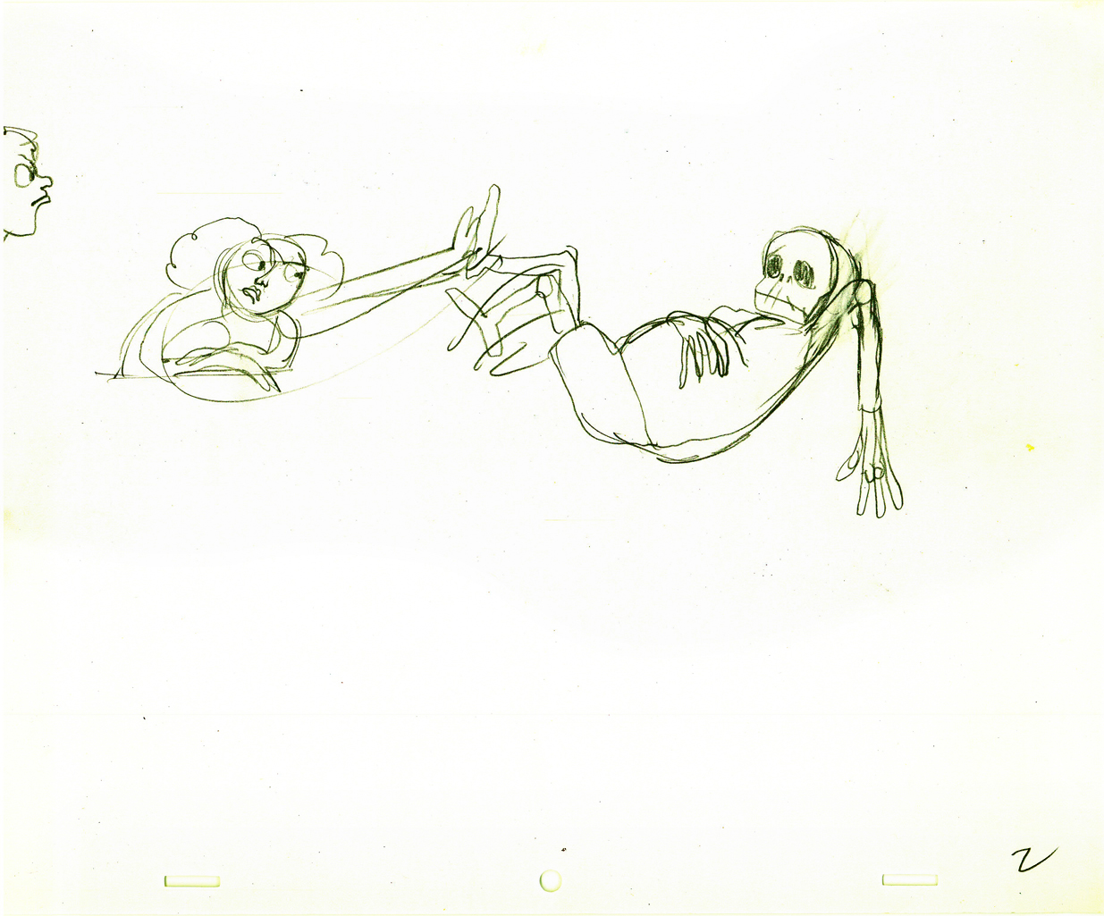
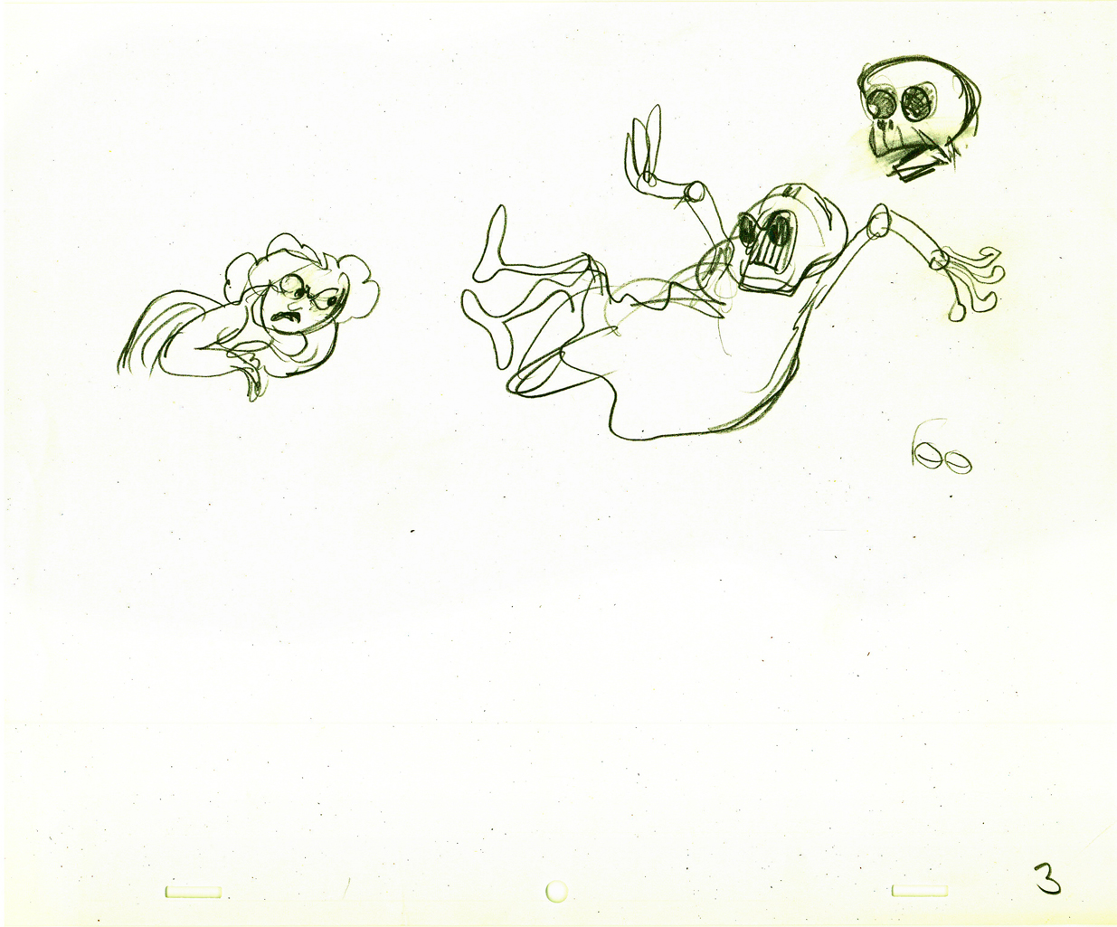
- I have a lot of artwork from the Hubley short, EGGS, which was wholly animated by Tissa David.
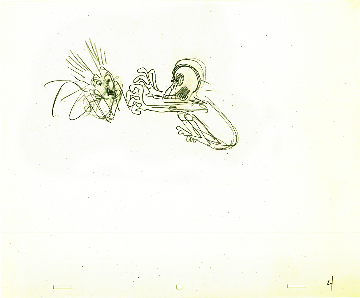
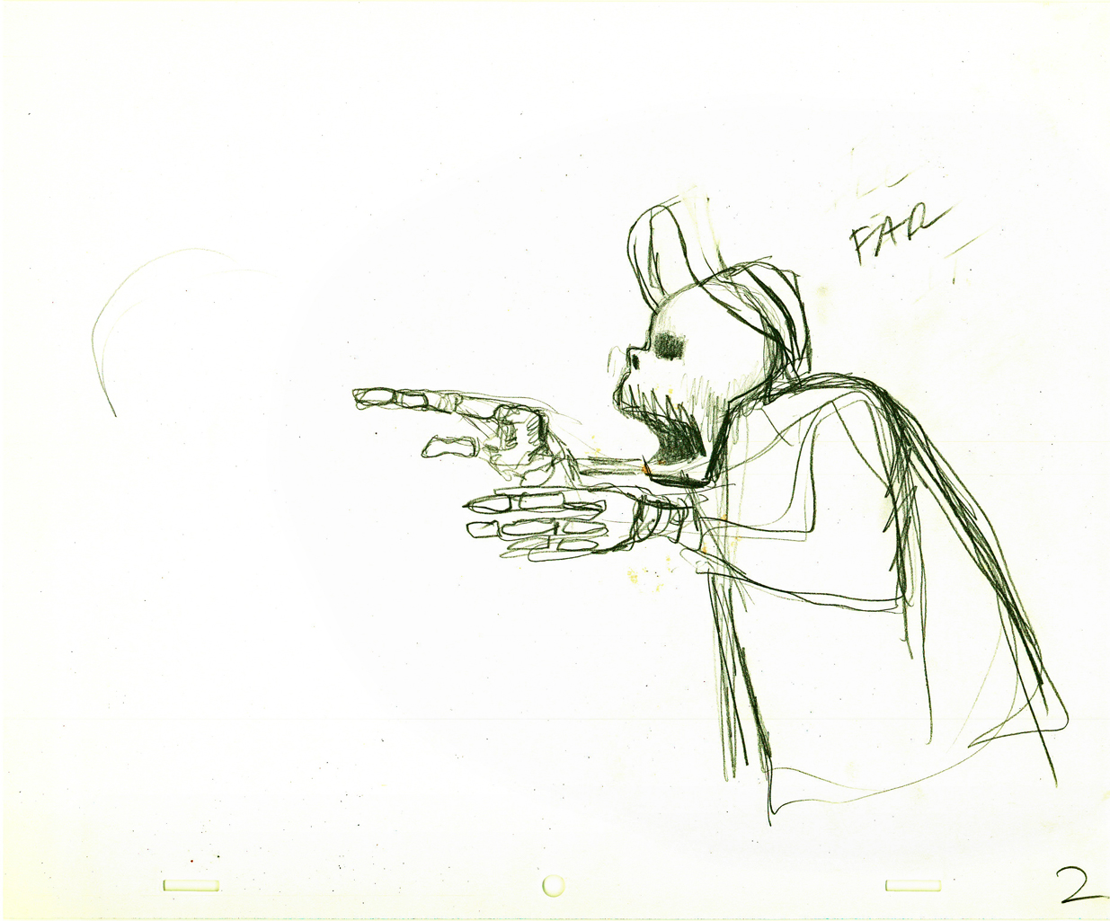
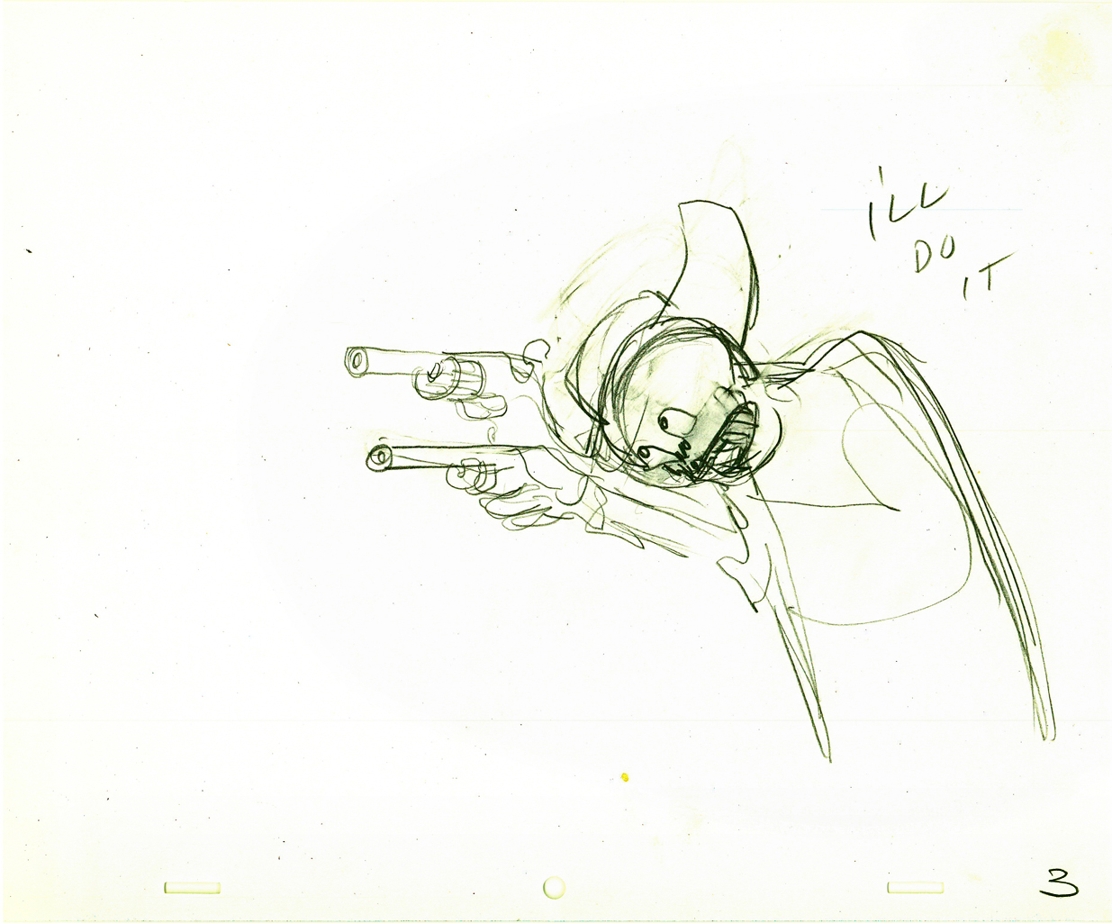
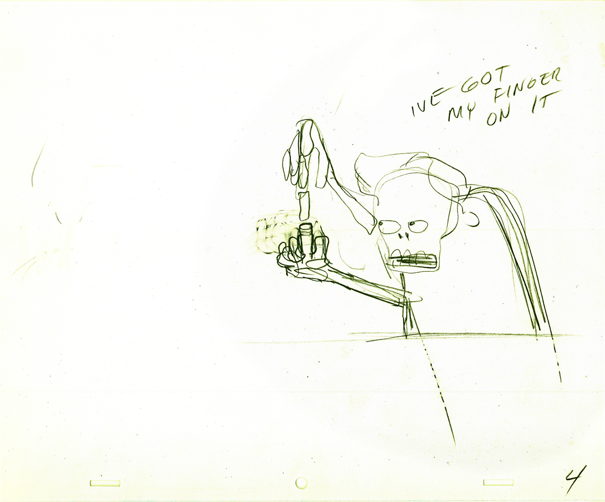
One of the two characters starring in the short is a skeleton, symbolic of death and destruction. The other is a nymph, who represents fertility. The show is basically about the complications overpopulation has presented to the world.
I thought it appropriate for today to post some of the drawings and models for the death character. The images displayed are cropped from the full animation sheets; when you click these displayed it’ll enlarge to the full page. Here they are.
The first model of the character came close to the final.
This is a drawing by John Hubley.
He soon solidified in this model by Hubley.
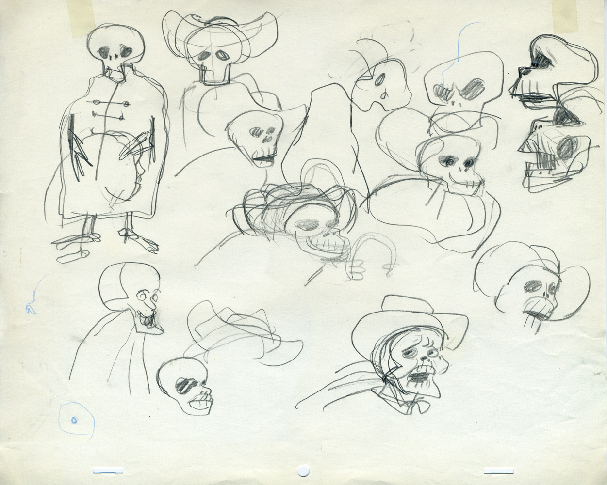
Tissa David finally worked out some of the problems for herself
and created this working model sheet.
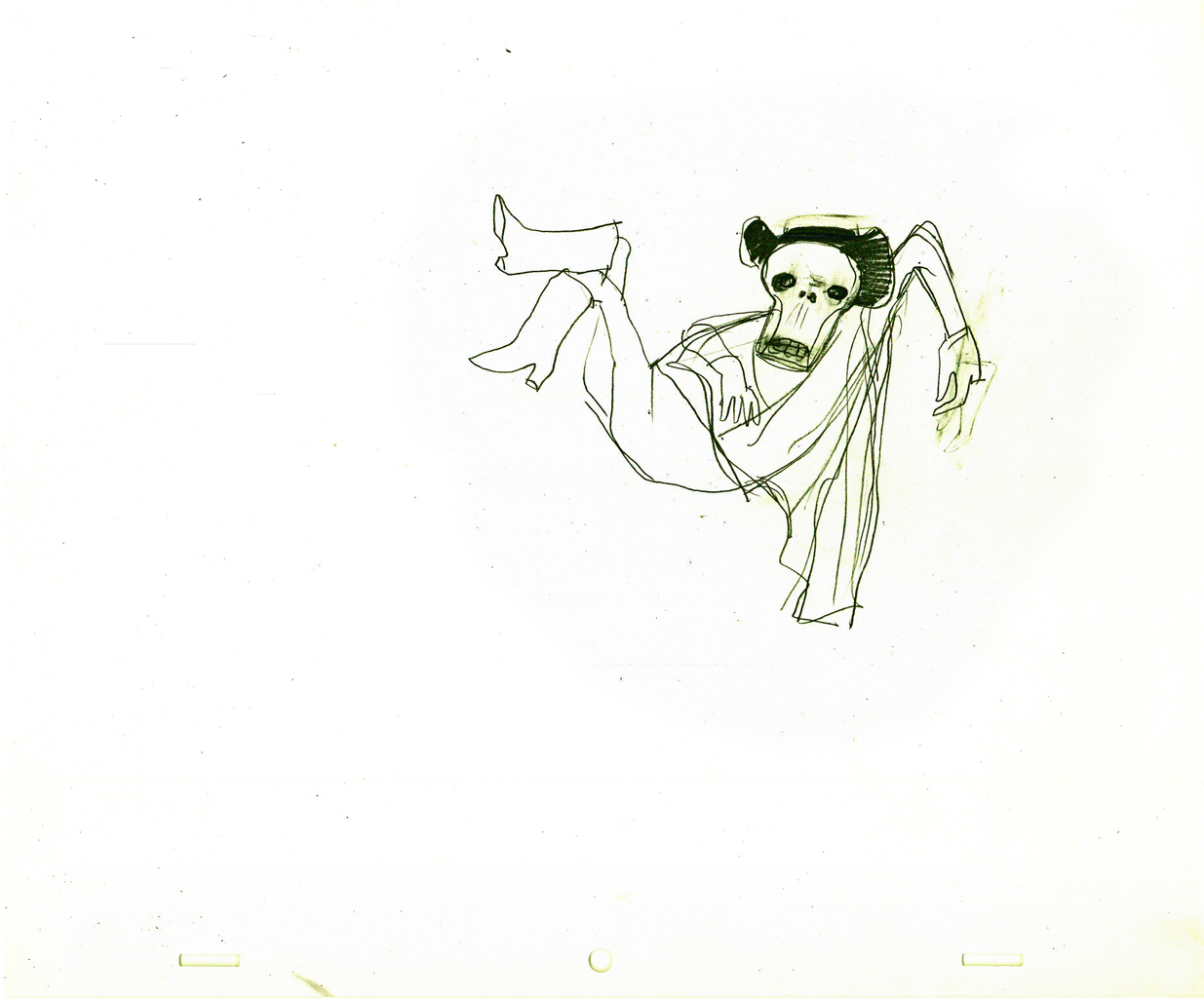
Here’s a beautiful working drawing by Tissa as
she started to pose out the scenes.
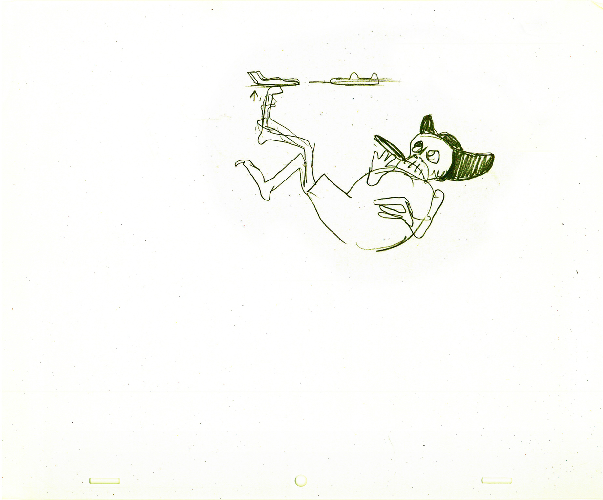
Tissa’s roughs are deceptively simple but convey so much. These drawings
are for her eyes only, usually, she’ll clean it up somewhat for animation.
Unfortunately the dvd is a bit soft partially because of the nature of the
underlit final artwork. Perhaps someday there’ll be a better digital transfer.
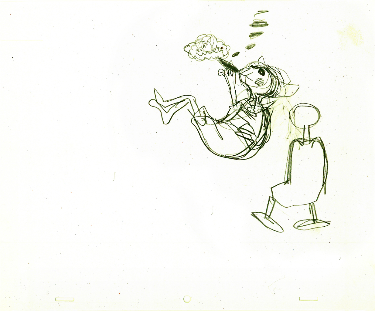
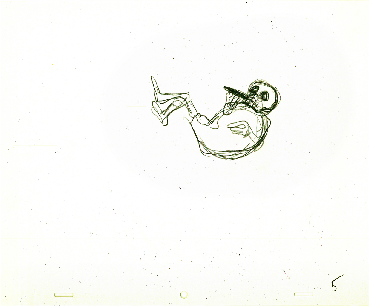
Fertility is oozing sexuality in every drawing. This is part of the
same scene as she converses with death about the human race.


Eggs was a short film which was rushed out at a low budget for a PBS show called The Great American Dream Machine, which was produced by designer, Elinor Bunin.
The film follows the political thoughts of John and Faith; they were concerned about overpopulation (there are at least four shorts they made about the subject) and were able to blatantly make a political short for this TV series.
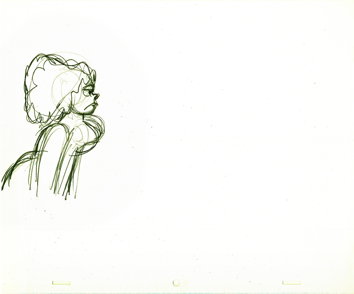
These three drawings are character Layouts by John Hubley.
This is a BG Layout John gave Tissa.
This drawing and all the remaining are Tissa David’s drawings.
She would block out her own rough Layout
before jumping in in to animate.
It gave her the chance to thoroughly think out what
little information John had given her. Usually just a
conversation with some very rough sketches.
This is Tissa’s Bg Layout for this scene.

Here’s a YouTube interview with John & Faith Hubley done in 1973. They discuss Eggs and Voyage to Next.
The video of EGGS starts at 4:50.
Books &Daily post &Hubley 28 Sep 2011 07:33 am
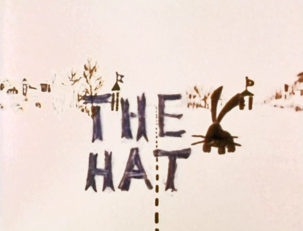
The Hat – even Bigger
As I wrote on Monday, with the AMPAS show about Hubley animation coming this Oct 10th, I intend to put a lot of focus on the work of John & Faith. This piece about THE HAT was originally posted in March, 2011. I’ve added to it.
- The interview Mike Barrier conducted with John Hubley has me thinking about Hubley and my years back there and then. You might say, I’m in a Hubley frame of mind these past few days, so I’m into reminiscing. I posted part of this back in March, 2008; here, I’ve extended the article a bit.
 New York’s local PBS station, WNDT – that’s what it was called in the old days – used to have a talk show hosted by film critic, Stanley Kaufman.
(It turns out that this show was produced by the late Edith Zornow, who I once considered my guardian angel at CTW.)
This talk show was quite interesting to me, a young art student. I remember one show featured Elmer Bernstein talking about music for film. He gave as his example the score for The Magnificent Seven. He demonstrated that the primary purpose of the score, he felt, was to keep the action moving, make the audience feel that things were driving forward relentlessly. I still think of that show whenver I see a rerun of the film on tv.
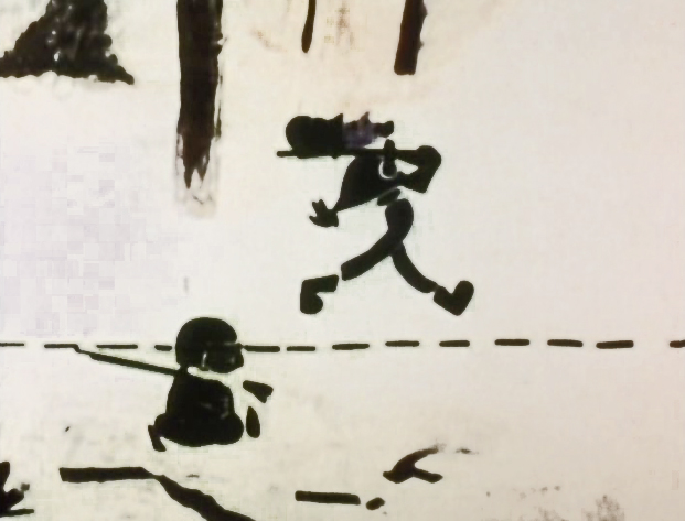
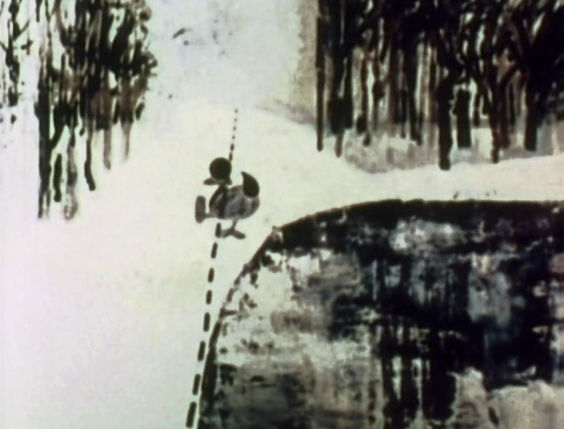
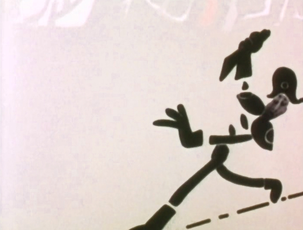
The surprise and exciting program for me came when John and Faith Hubley turned up on the show to demonstrate how animation was done. They were using as an example a film they had currently in production, The Hat. This film was about the silliness of border lines. One of two guards, protecting their individual borders, loses his hat on the other side of the line. Of course, all he needs do is to step over and pick up the hat, but he can’t. The other guard won’t allow him to cross the border illegally – even to pick up his hat.
The voices were improvised by Dudley Moore and Dizzy Gillespie (much as the earlier Hubley film, The Hole, had been done.) The two actor/musicians also improvised a brilliant jazz score.
John’s design was quite original. The characters were a mass of shapes that were held to-gether by negative space on the white on white backgrounds.
 The animation of the two soldiers was beautifully done by Shamus Culhane, Bill Littlejohn, Gary Mooney and “the Tower 12 Group“.
Culhane animated on a number of Hubley films during this period, most notably Eggs and a couple of commercials.
Bill Littlejohn animated on many of the Hubley films from Of Stars and Men up to Faith’s last film.
Gary Mooney animated on The Hole and Of Stars and Men. He was an Asst. Animator at Disney, animated for Hubley then moved on to some of the Jay Ward shows before moving to Canada where he continues to animate.
Tower 12 was the company formed by Les Goldman and Chuck Jones at MGM. Apparently they were between jobs when Hubley was finishing this film, and Chuck offered help.

Of course, the colors of the film as represented by the dvd are pathetically poor.
It’s hard to even imagine what the actual film looks like, and it’d be great to see
a new transfer of all the Hubley films.
 The design style of the film was an original one for 1963. It’s one that would often be copied by other animators afterwards. The characters were searated at their joints. No reel ankles, just open space. They were also broken at the wrists and belts. The taller man seems to have a collection of ribs and shoulders for his torso. Like the dotted line they walked but could not cross, these people were also a gathering of parts.
 This was one step removed from the earlier film, The Hole, which had just won the Oscar and went on to enormous success for the Hubleys. That film used what they called the “resistance” technique. They first colored the characters with a clear crayon. Ten painted watercolors on top of that. The crayon would resist the watercolor and a splotchy painterly style developed. The Hat literally broke those splotches into parts of the characters and put some of the control in the animators’ hands.
.
 The film was obviously political. Anti-nuclear politics played strongly in the story. This was a step just beyond The Hole. In that film, two sewer workers converse on what violent things might be happening above ground. The film ends with an accident, or possibly a nuclear crash.
In The Hat, the two partisan soldiers discuss a history of man’s aggression all within their reach. At one point, it would seem, each of
 them is ready to press the red button calling for nuclear assistance – or, at the very least, a buildup of military force.
While walking up and down that line, they comment on how we reached the point of no return. All the while, bugs and small animals cross the line, indeed, walk on or over the “hat” lying on the ground.
The backgrounds for this history of War grow more violent, more expressionist. John’s painterly style comes to the fore, and the brush strokes take on a force we haven’t seen to this point.
When we return to the two leads, we find that they’ve changed. They’re darker, and they both have lines scratched into the paint of their bodies. Not as much emphasis is placed on their disjointed body parts.
We leave them as we found them, walking that line. At this point, both of their hats lay on the ground and they’re deep into conversation. They don’t seem to notice anymore.
It has started to snow.
.
.
Shamus Culhane wrote about The Hat in his autobiography, Talking Animals and Other People. Here’s some of what he wrote:
- In 1964 the Hubleys wrote a short subject called The Hat. It was subsidized by an international peace organization. The picture featured two sentries marching on opposite sides of a boundary line. A clash occurs when one soldier’s hat accidentally rolls into enemy territory, and the other soldier refuses to return it until he has checked on the necessary protocol. During the ensuing discussion the two men become friendly, and the film ends on an optimistic note.
Although there were other characters and animals in the picture, the two soldiers accounted for about 80 percent of the footage. When Hubley asked me if I could do all of the animation of the sentries myself, I jumped at the chance. The last time I had drawn full animation, other than one-minute spots, was about twenty years before, when I worked with Chuck Jones at Warners.
The Hubleys were exciting to work with because they had a strong sense of adventure in their filmmaking. John was never tied down to techniques that he was already familiar with. Each picture was a new experience, because the appearance of the film was always dictated by the content. The Hat was no exception.
The design of the two sentries presented some odd problems in animation, in that the action was going to be normal, but the arms and legs were not attached to the bodies. Although we had detailed model sheets of each soldier, Hub’s layouts paid scant heed to his original designs. As the picture progressed his drawings of one of the soldiers became more and more Christ-like.
While I animated the picture at home, Hubley and I worked very closely together. Whenever I had a few scenes finished, we would have a conference on this work and the following scenes. Hubley was a very enthusiastic director. He would pick up the newly animated shots with obvious excitement, flip the drawings, and burst out laughing. His pleasure was so infectious that I would laugh, too. We shared a feeling of joy in the whole process or filmmaking.
The animation of The Hat took many months. During that time, with my usual curiosity about the working methods of great artists I have worked with, I studied Hubley’s approach whenever I could. In the first place he worked in a room that was crammed with the largest collection of art books I have ever seen in private hands. The subjects ranged from prehistoric cave paintings to Picasso, Klee, Chagall, and other modern artists. There were books on the art of every culture imaginable, Aztec, Mayan, Chinese, Persian, Greek, etcetera.
At the beginning of a picture Hubley would pore over a random selection of art books. Seemingly they had no relationship to each other, but he was using them to inspire his own sense of design. However, the final appearance of a Hubley film was never blatantly derivative. In The Hat, for example, I have the feeling that he was influenced (if that is the right term) by Chinese scroll painting, but that is just my own intuition.
Since Hubley was going to paint his own backgrounds, the layouts were usually little more than a vague series of scrawls with little or no detail, unless the background and the animation were going to be closely related.
Unlike Disney Studio, where the dialogue is broken down for the animator in meticulous detail, Faith gave me a very loose track analysis. Neither Faith nor John seemed to be concerned with precise synchronization of the mouth action and the dialogue track.
John’s instructions for the movement of the characters were also very loosely indicated on the exposure sheets. It seemed to be his feeling that the pace of the animation should be the shared responsibility of both the director and the animator.
The Hubley children had to be the luckiest kids in New York City. Not only were they encouraged to draw, write, and paint, but in their Riverside Drive apartment the Hubleys had built a small stage, so it must have been easy for the family to create the sound tracks for such imaginative films as Moonbird, Windy Day, and Cockaboody.
Like John Cassavetes, the Hubleys believed in the value of ad-libbing sound tracks, so a good deal of the children’s dialogue in these pictures was completely spontaneous material.
Whatever his formal education had been, Hubley was a very well-informed person, with a sophisticated view of life. One Saturday morning I dropped in to find John working alone, and in a very depressed mood. It happened that I was on the down side myself that morning. After we had talked over the work in the new scenes, our conversation drifted off into a very open discussion about the problem of being an alienated personality. We exchanged anecdotes about incidents that had happened to us because of alienation.
Somehow our talking acted as a catharsis, and we both found our moods lightened. We ended up laughing, and agreed that being alienated in our kind of society had more merit than most people realized. It was a very stimulating discussion.
