Category ArchiveArt Art
Art Art &Bill Peckmann &Books &Daily post 12 Oct 2012 05:30 am
Western Art
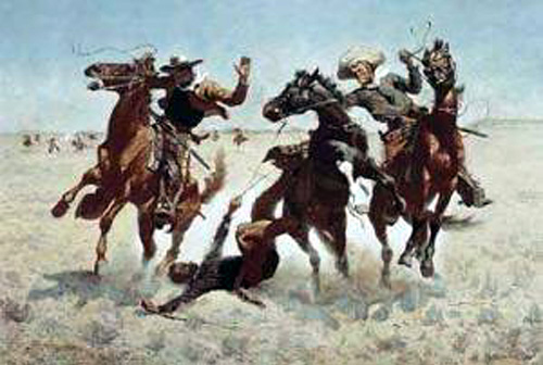 – I have a love/hate relationship with western art. The truly great, such as Remington, give a power and majesty through an extraordinarily honest approach to the world they found, pristine of the footsteps of western man. Many of the later followers are not quite as brilliant to my taste. I appreciate the extraordinary artistry and craftsmanship of many of these painters, but they stand on a plateau much lower than that of the great. Of course, there’s a wide variation among these artists, and they were searching for something very different than a Remington or a Charles M. Russell or Albert Bierstadt.
Bill Peckmann has sent some beautiful works of what seem to be predominantly early 20th century art. There’s a nice variation among the artists, some are on the genius level others aren’t quite as great. Some such as Thomas Hart Benton don’t seem to fit properly into the overall scheme as a “Western” artist. He seems more like a Mid-Western painter, a WPA artist, rather than a Western one, but I’ll post anything by him anytime. He’s exceptional, to say the least.
Here are Bill’s comments:
- Growing up in the Bronx with all of that asphalt, bricks and mortar years ago, it was very easy at that time to become enamored with the wide open spaces and succulent sagebrush scenery of comic book, movie and TV westerns. Like all first loves, those images had a way sticking with you through life. (In most of those oaters, I’d say the scenery often got the upper hand with a lot of those gunslinging heroes.) Somewhat older now, (and hopefully with a little better handle on the arts) it’s nice to see that ‘fine art’ western painting still has that same ability to make you want to become an ol’ cowhand.
Here is a sampling from different art books of a few of the artists who captured the best of the West.
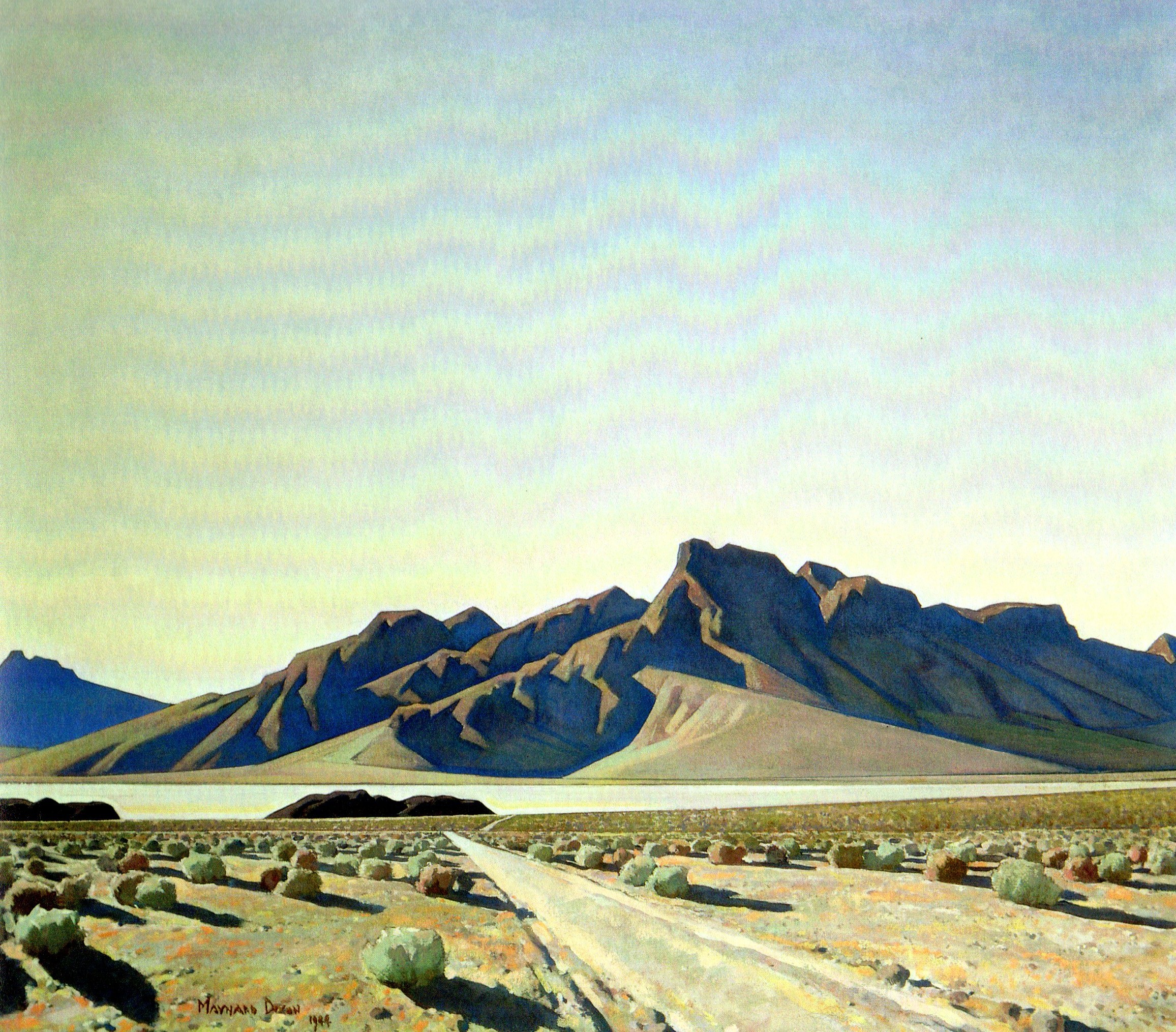
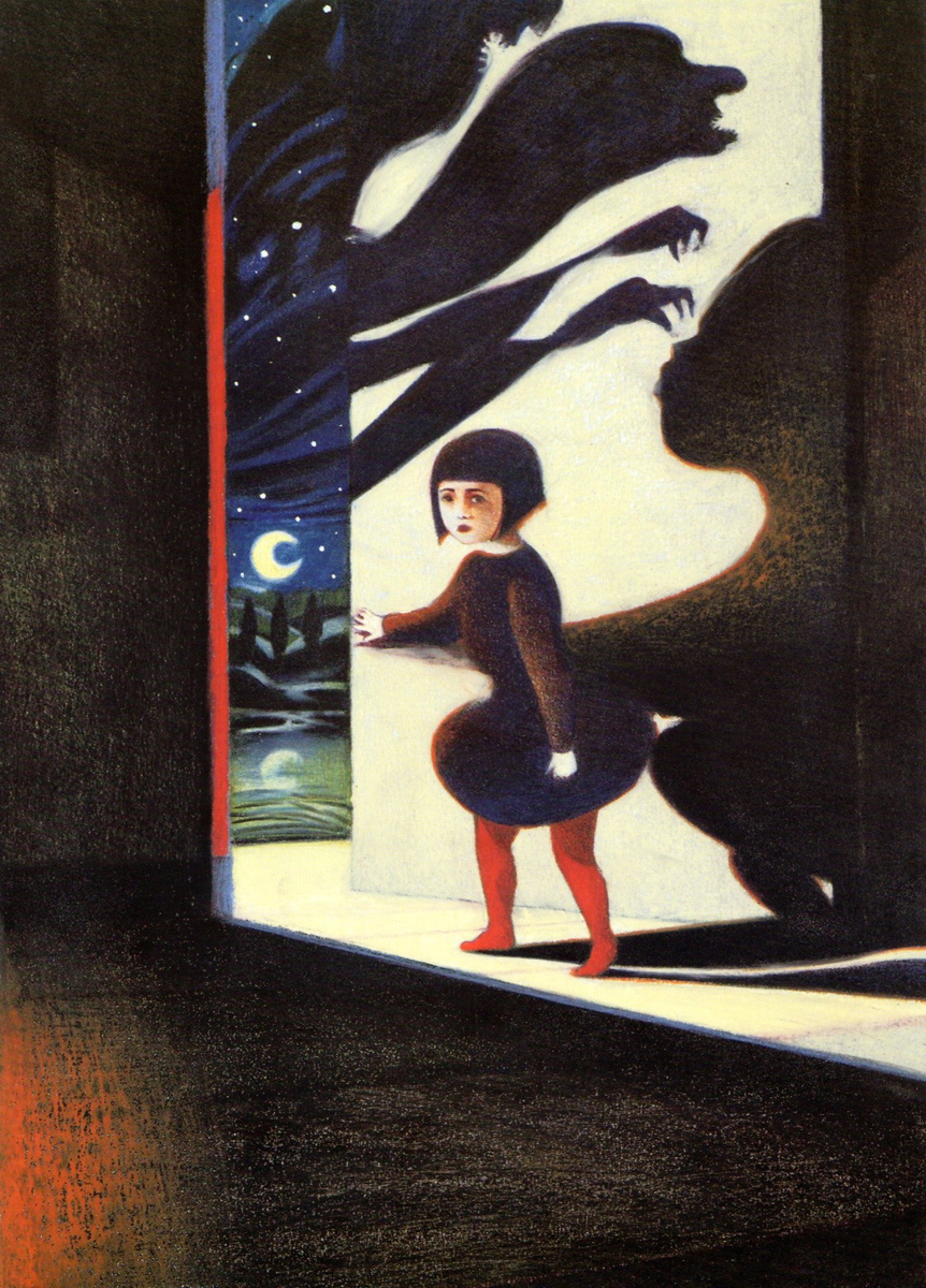
 1
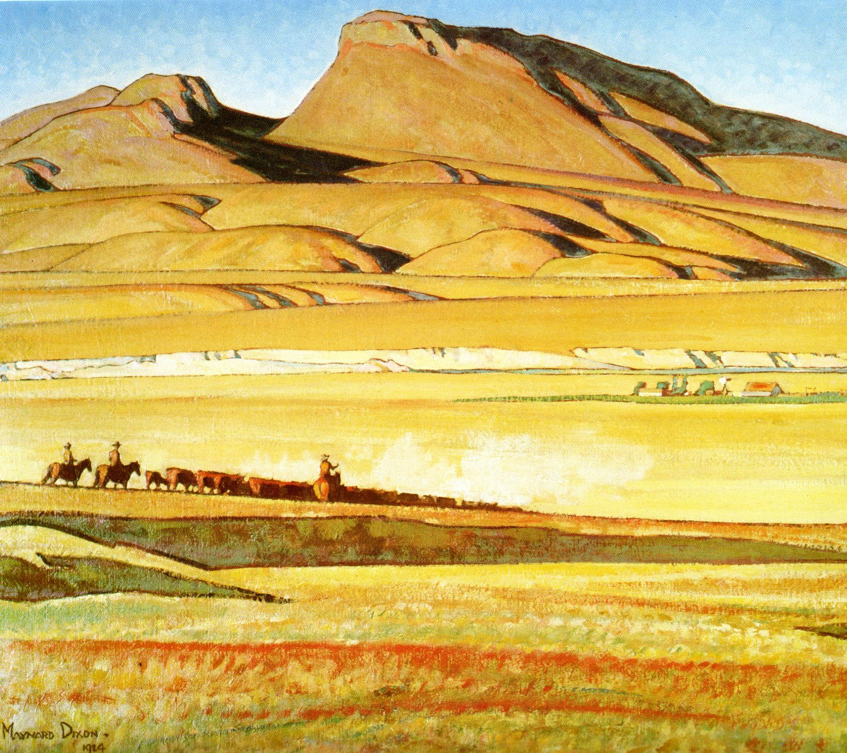
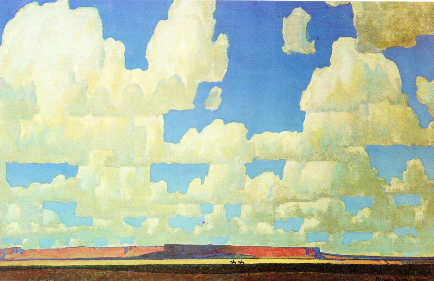
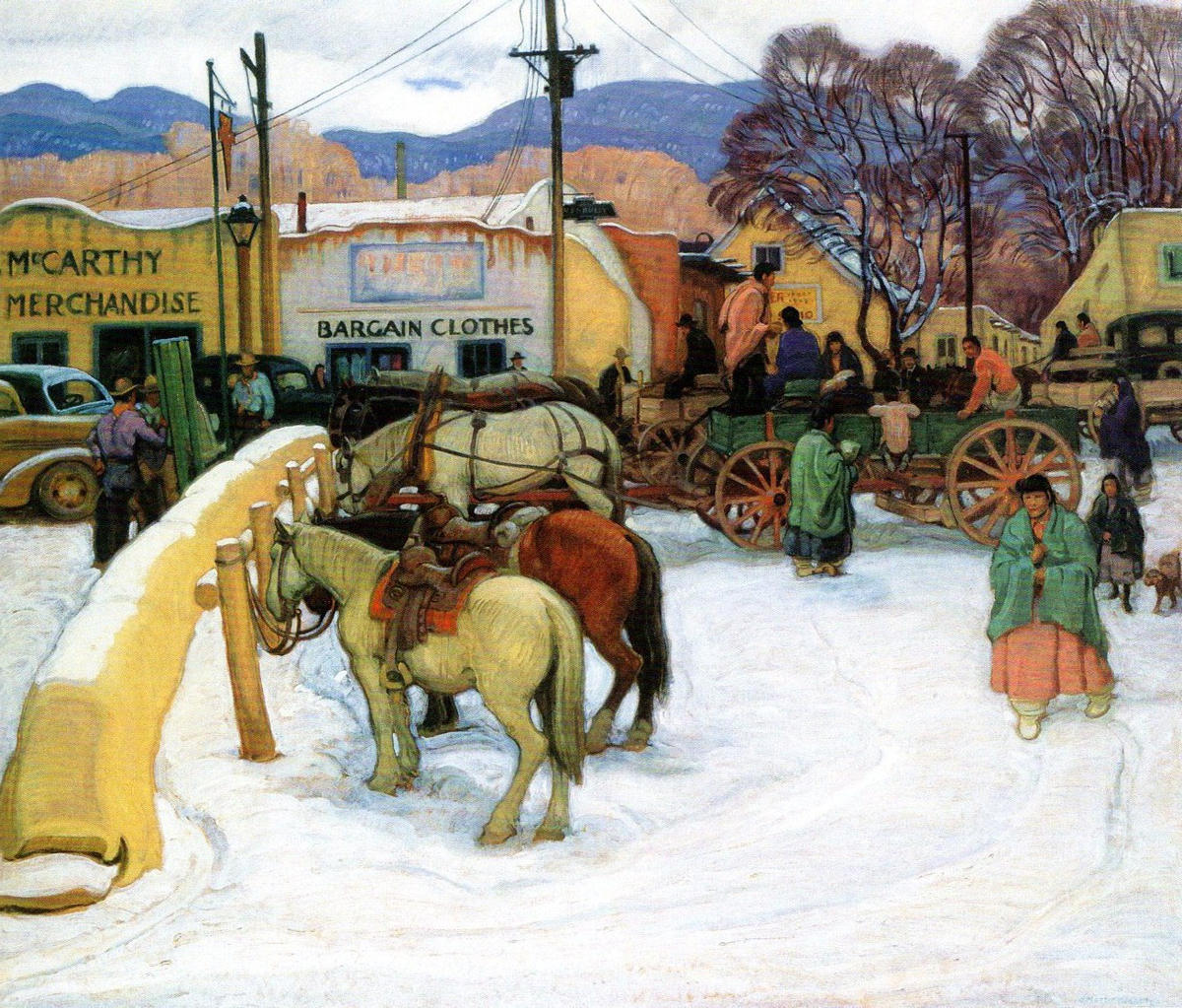
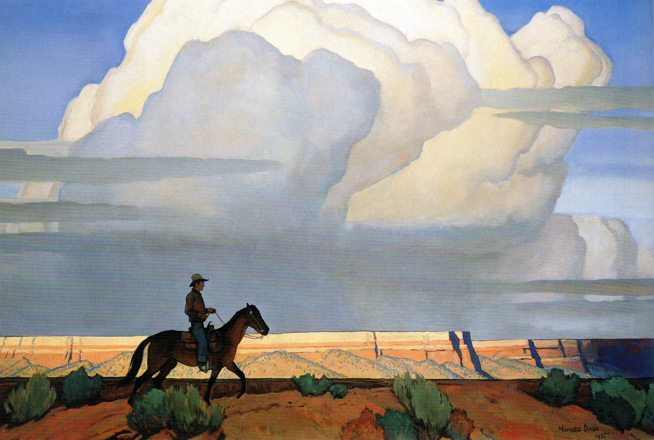
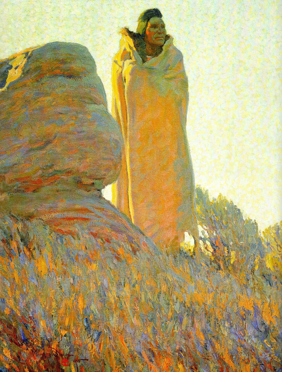
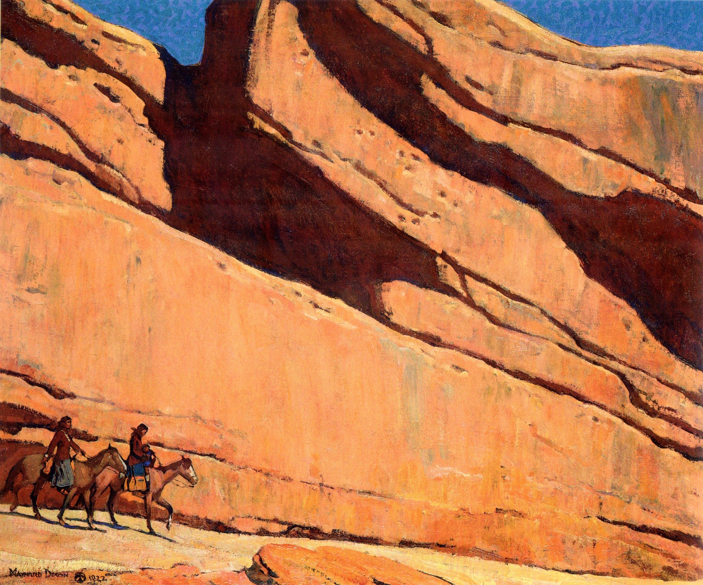
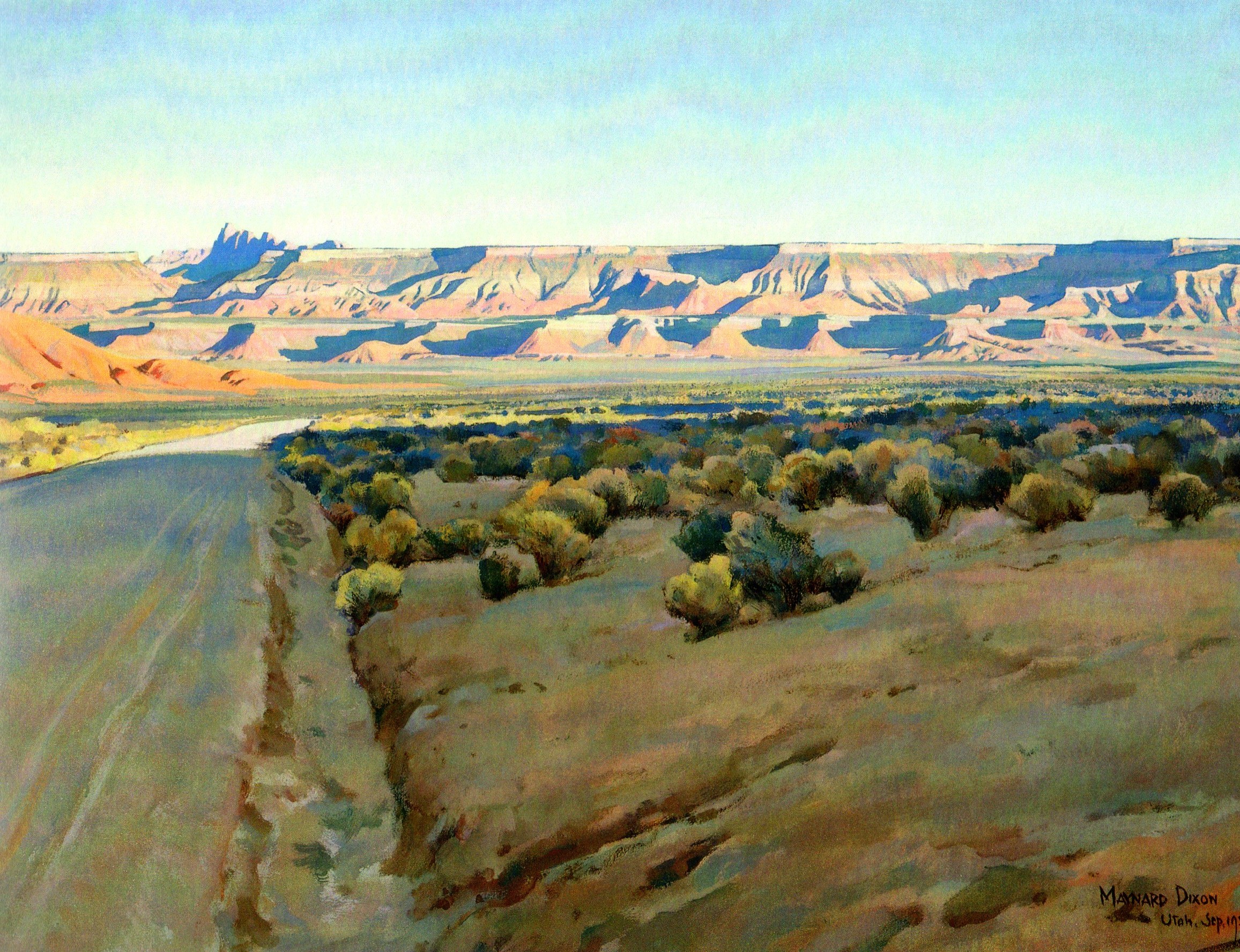
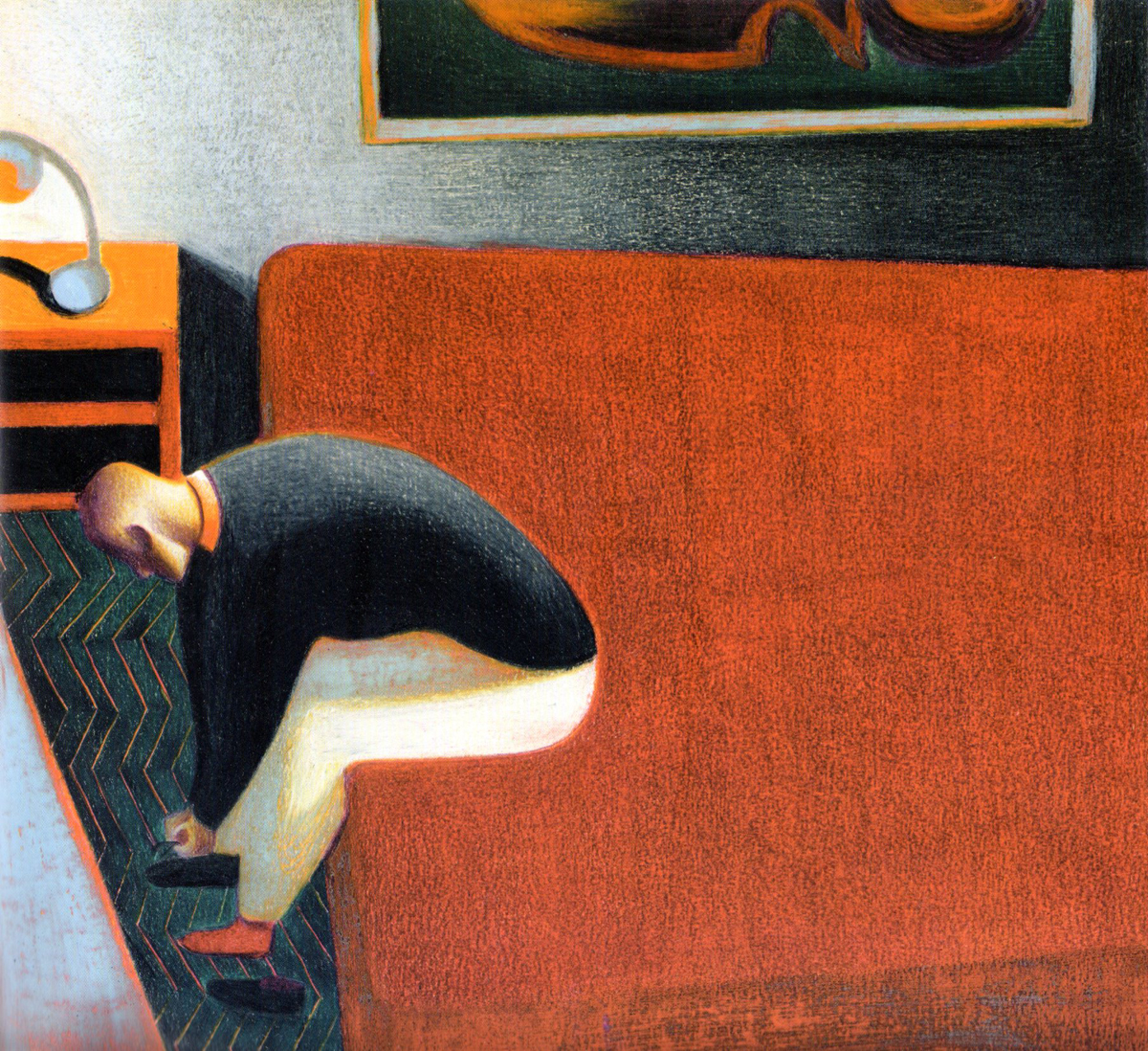
1Here is Maynard Dixon. (IMHO one of the greats, a western Edward Hopper.)
 2
2
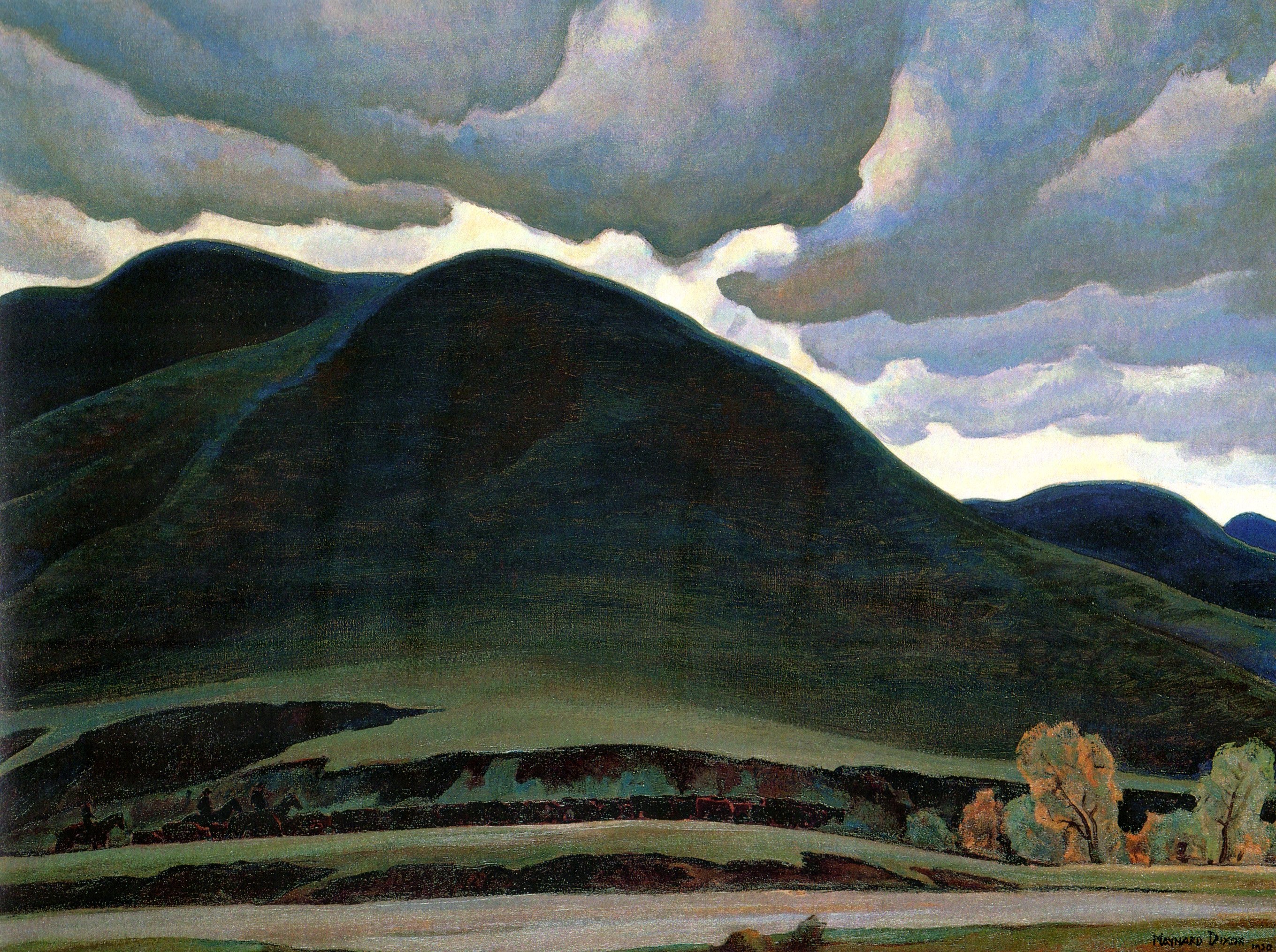
Maynard Dixon
 3
3
Maynard Dixon.
 4
4
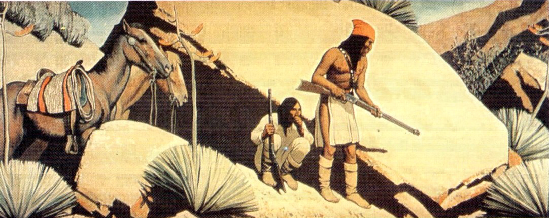
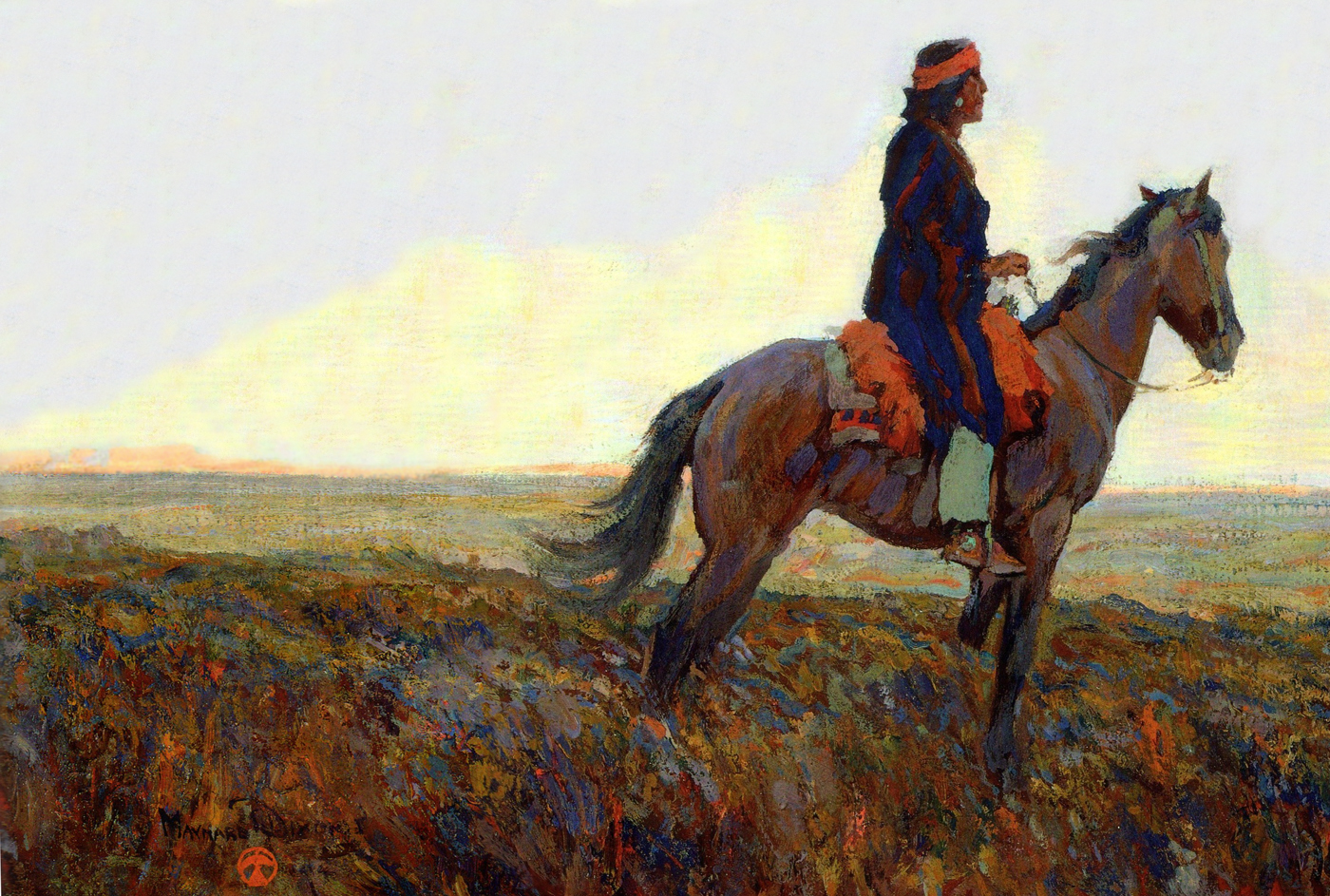
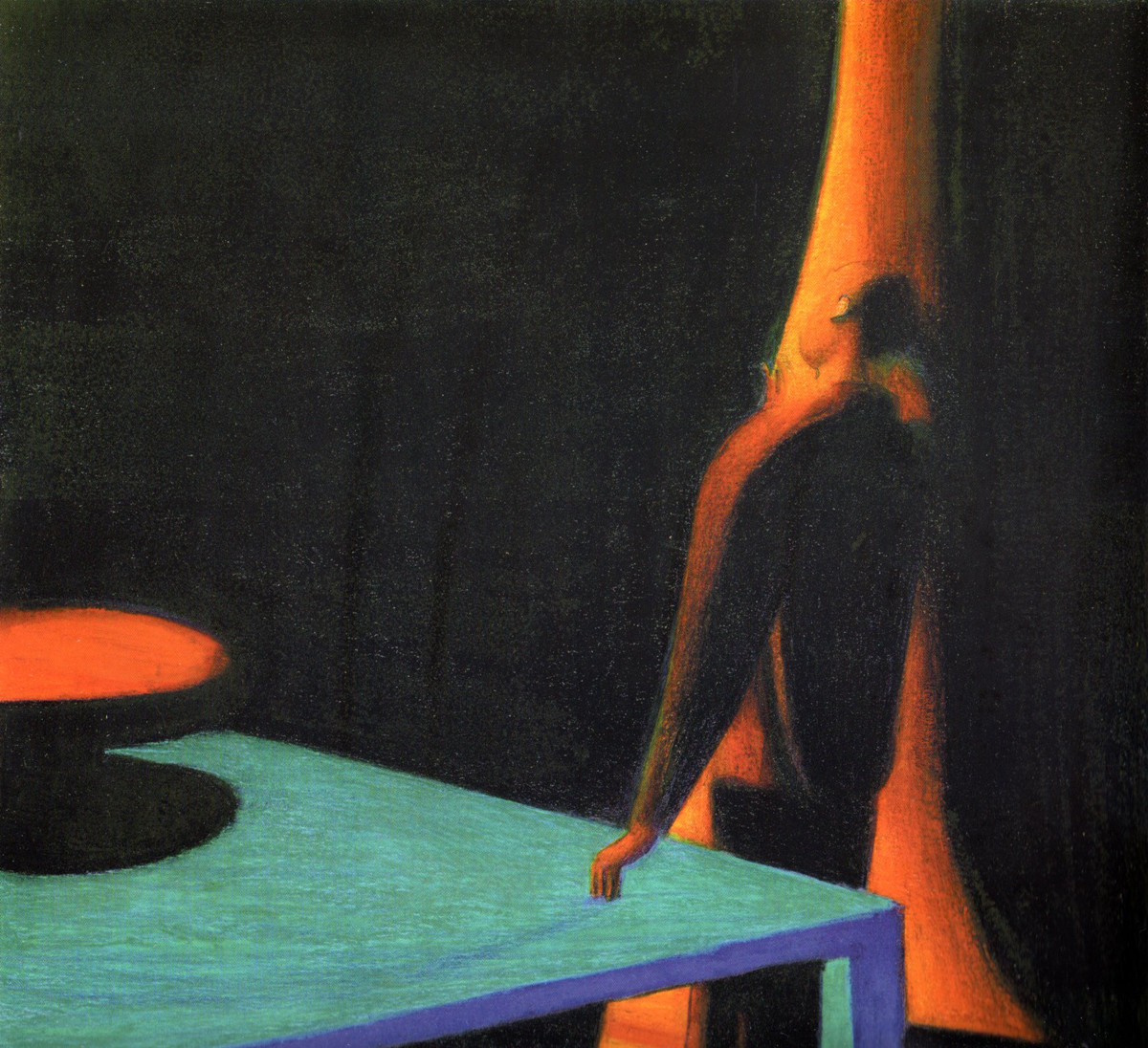
E. Martin Hennings
 5
5
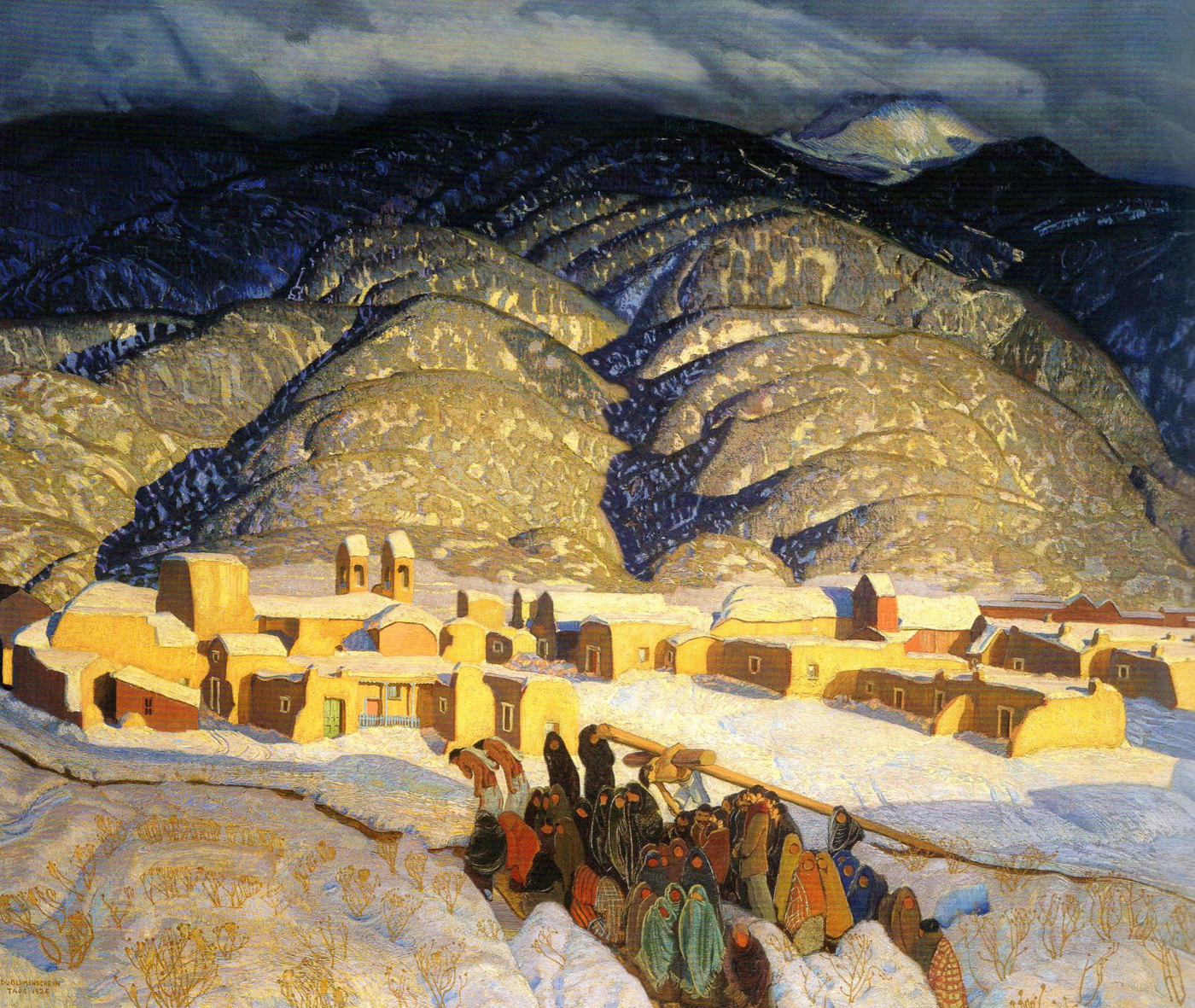
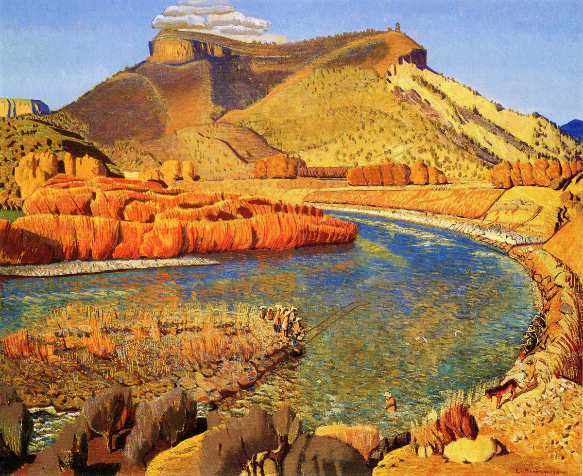
Ernest Blumenschein.
(This painting still floors me every time I look at it.)
 6
6
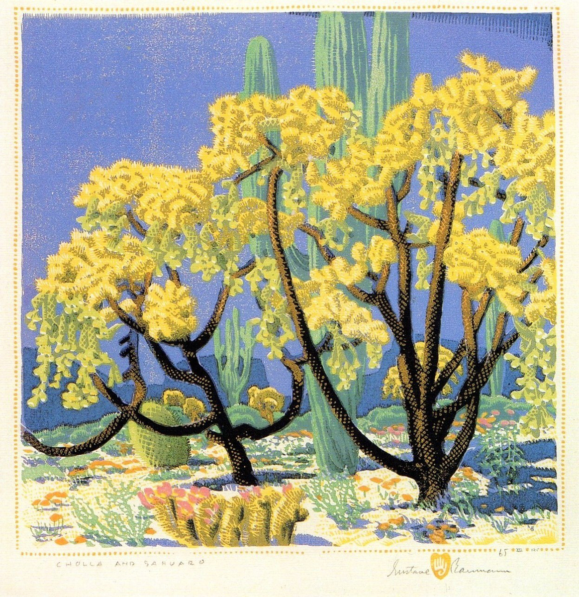
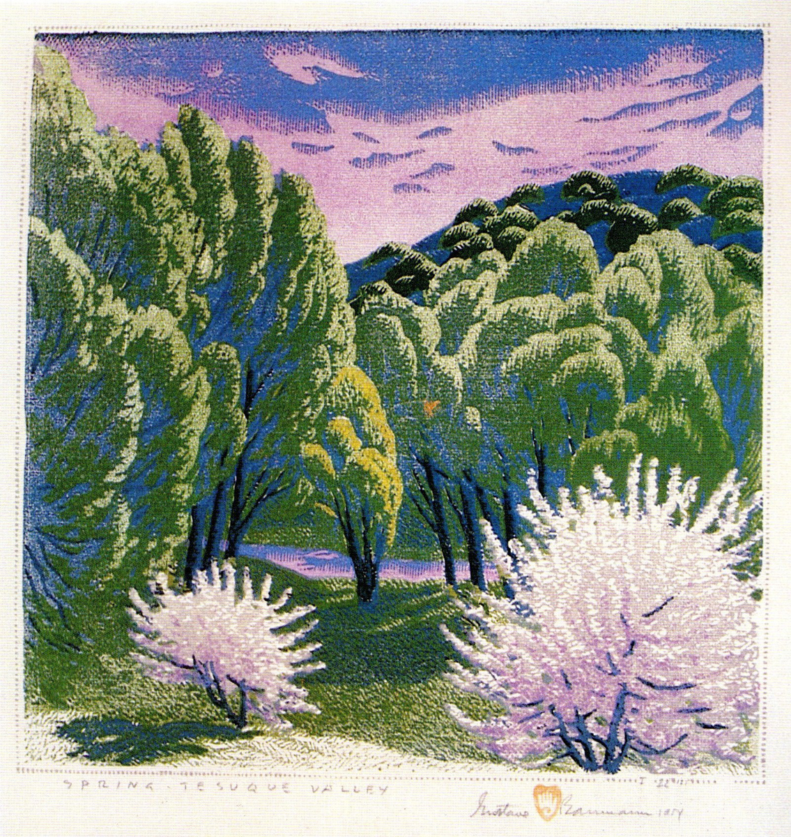
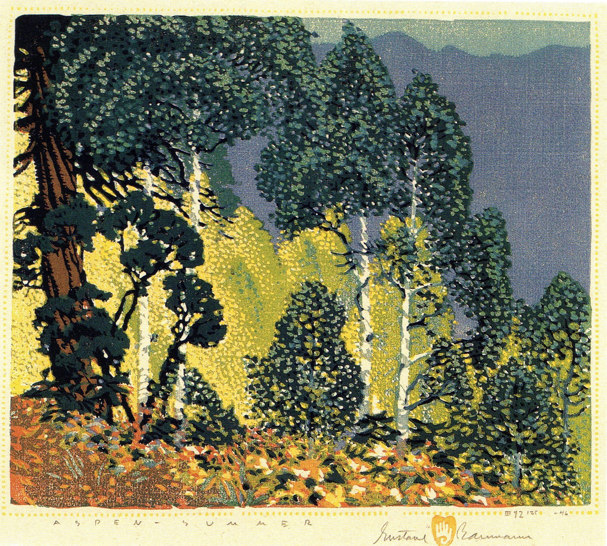
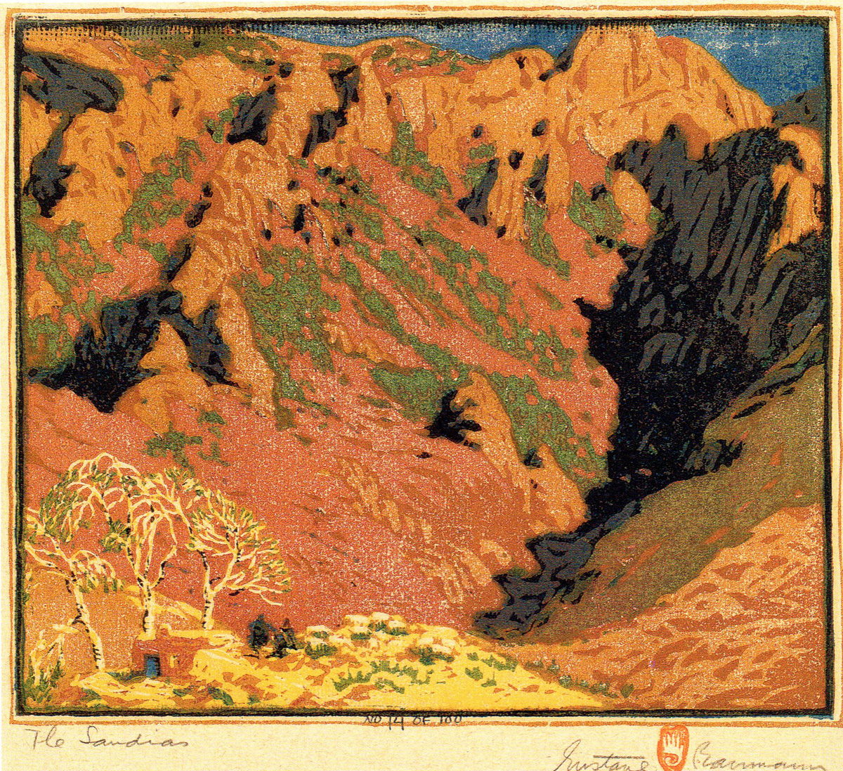
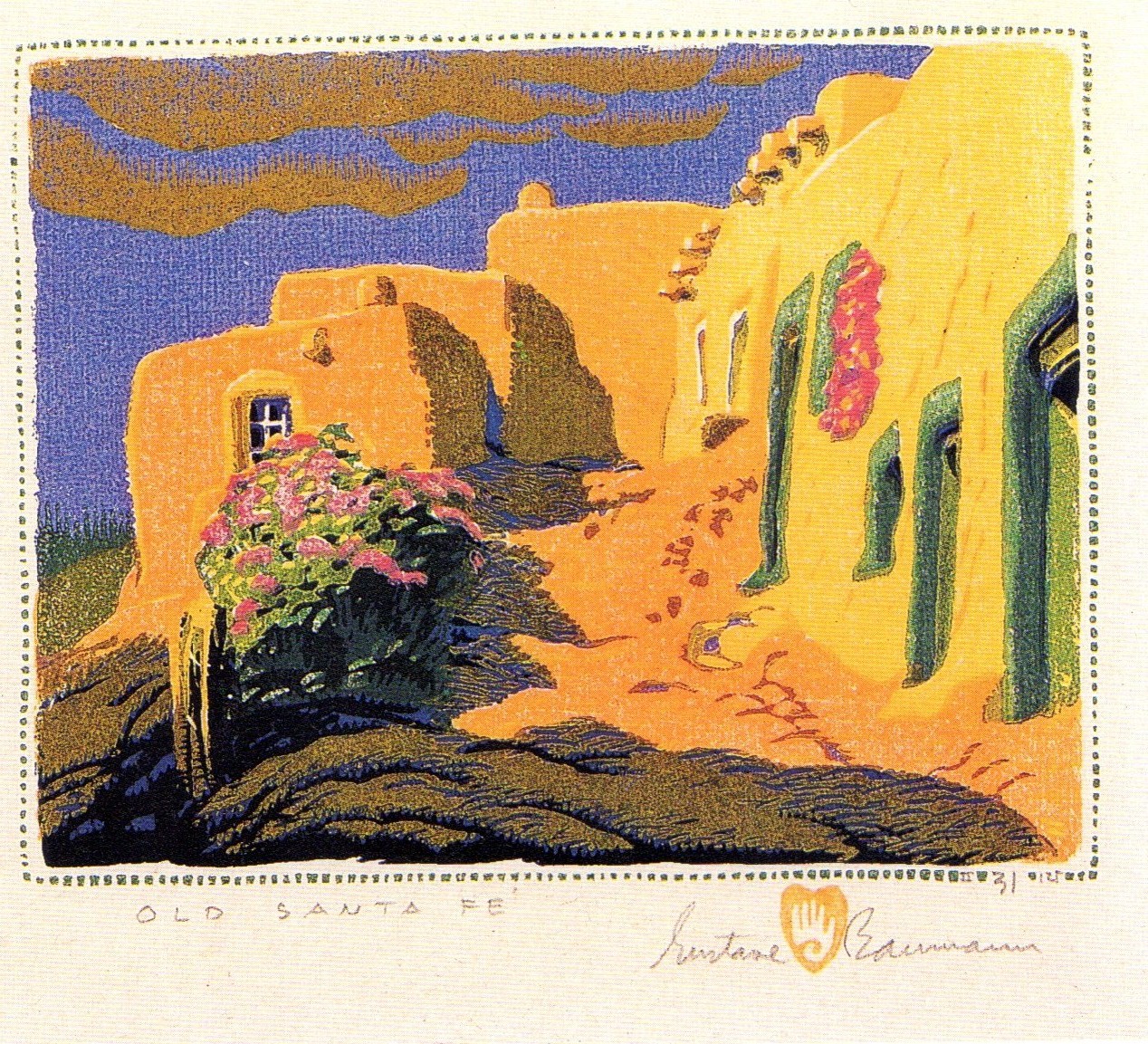
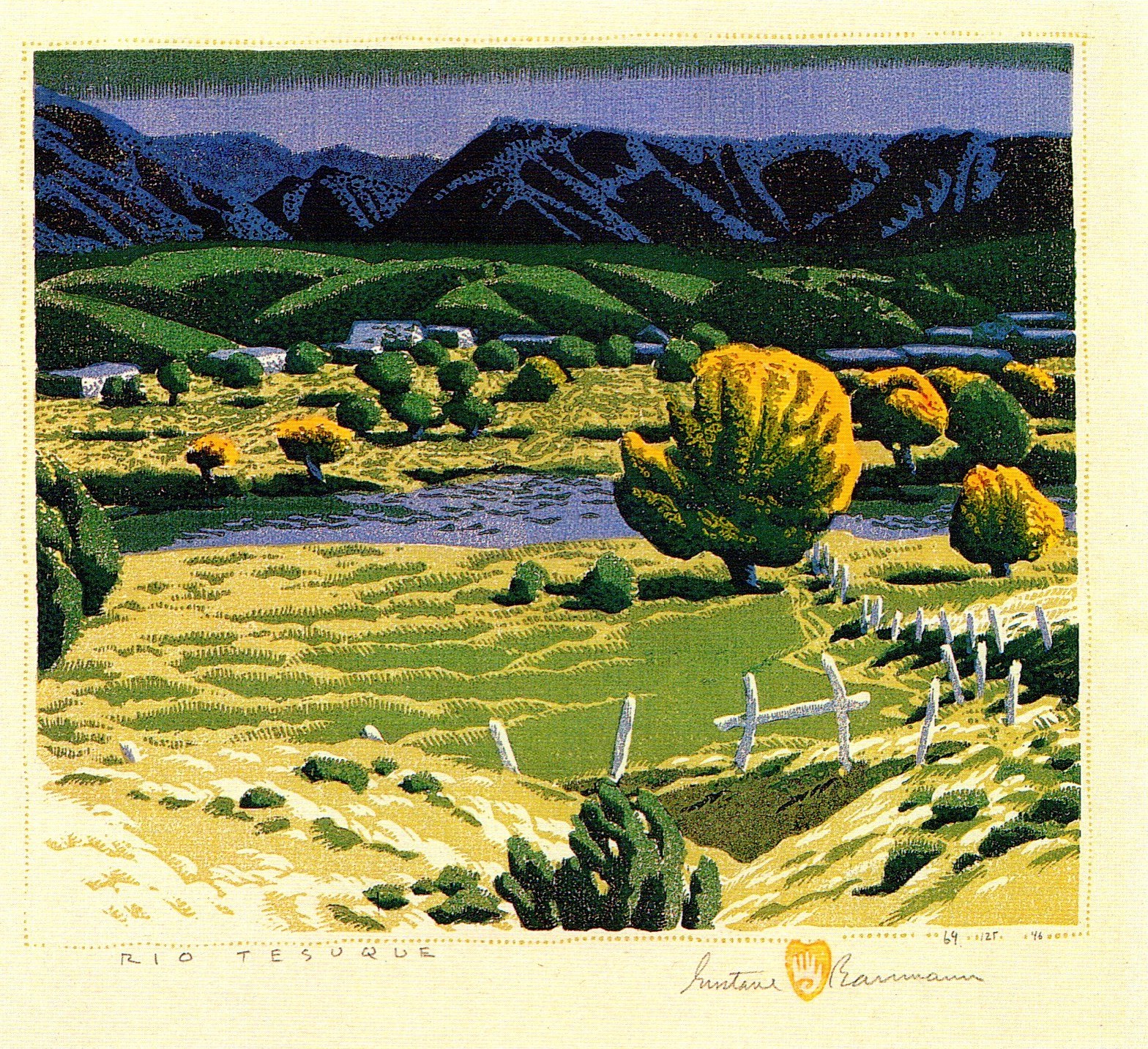
Gustave Baumann.
A western woodcut artist, a niche he made all his own.
 7
7
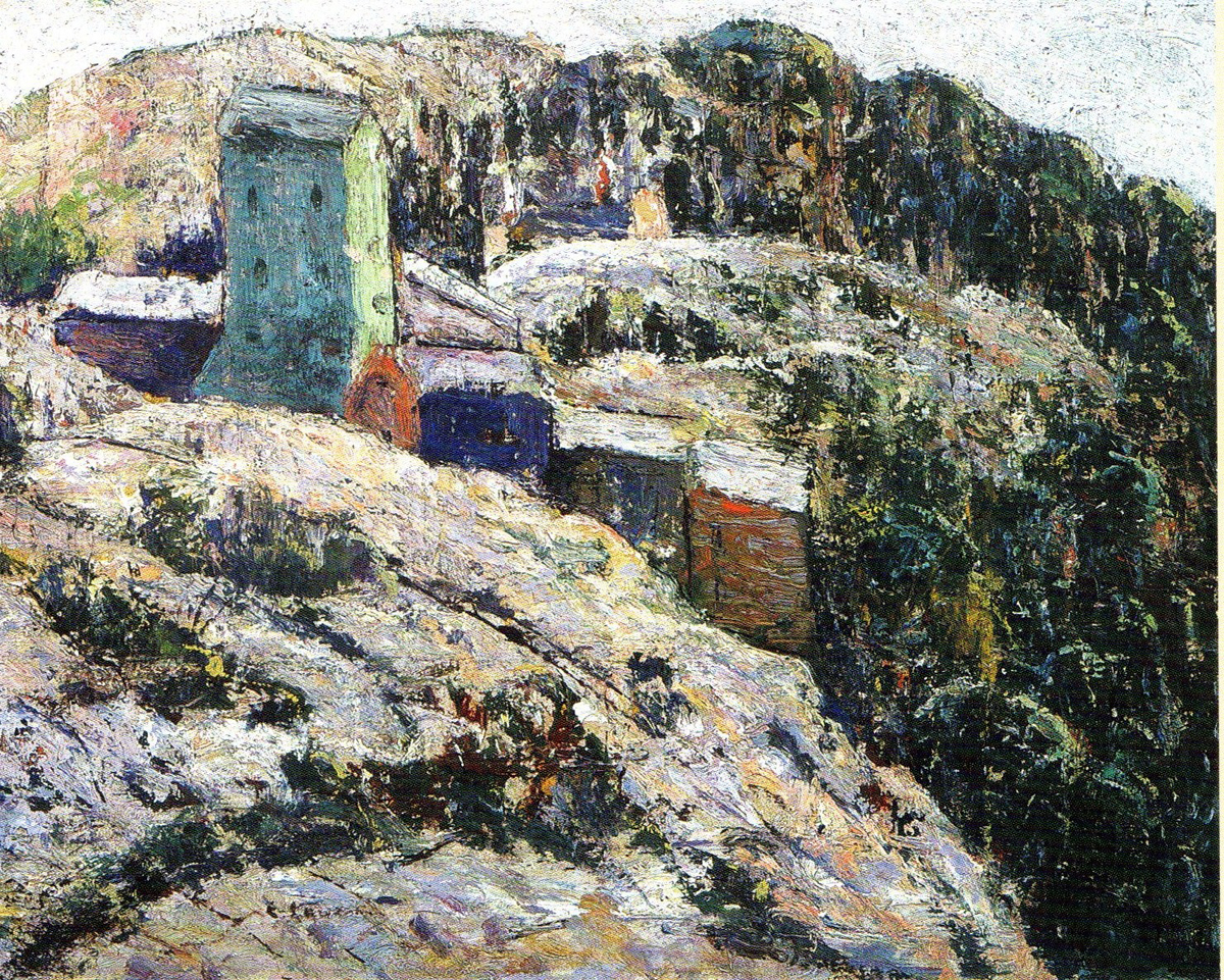
Ernest Lawson.
 8
8
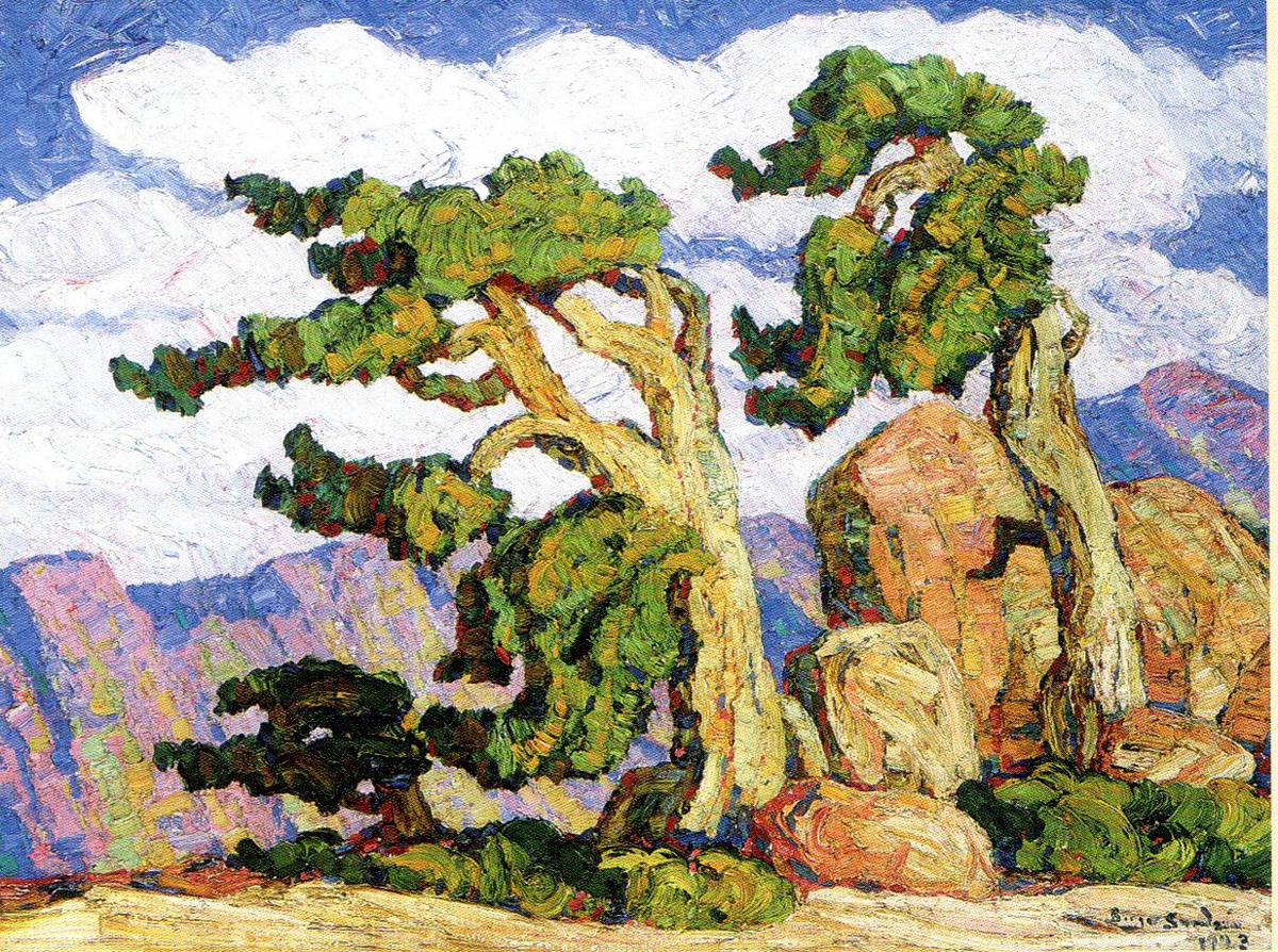
Birger Sandzen
 9
9
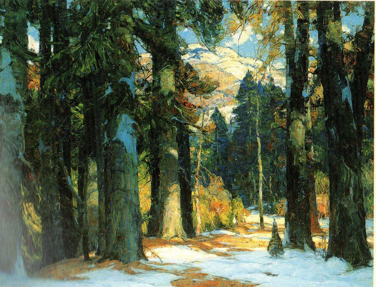
John F. Carlson
 10
10
Maynard Dixon
 11
11
Gustave Baumann
 12
12
Ernest Blumenshein
 13
13
Maynard Dixon

Georgia O’Keefe
 15
15
Gustave Baumann
 17
17
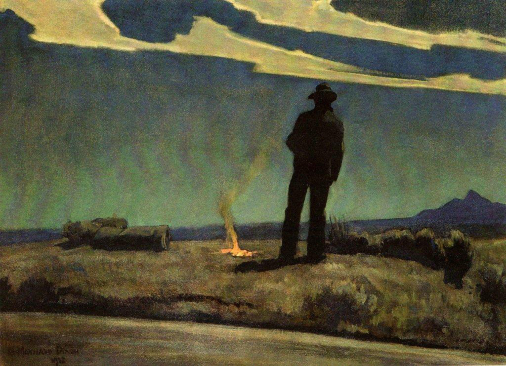
Maynard Dixon
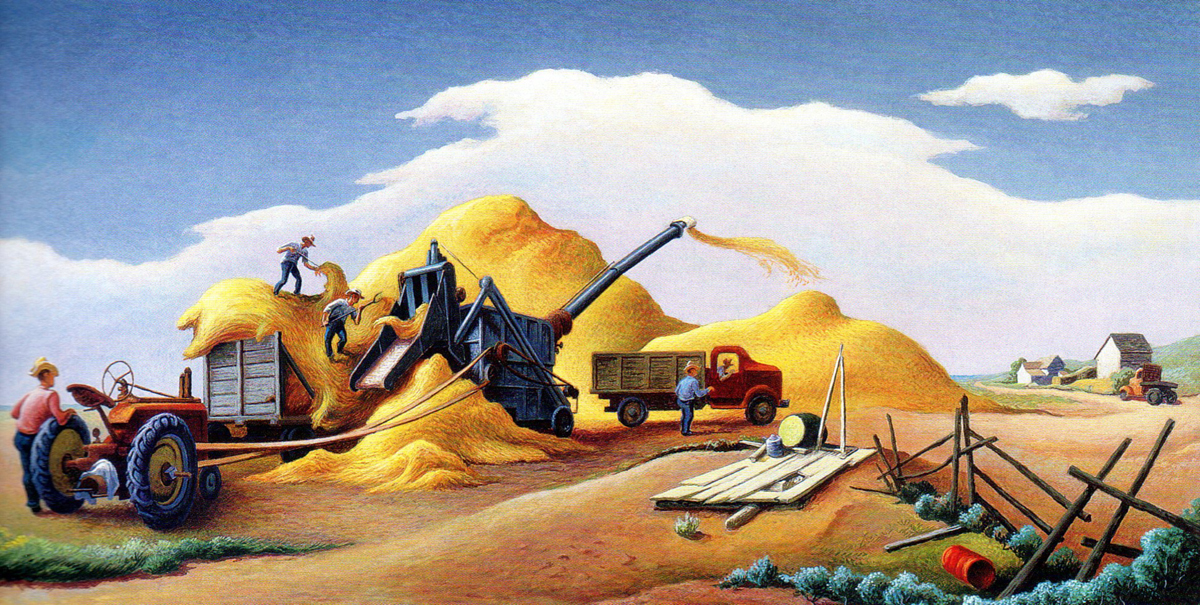
Thomas Hart Benton
 19
19
Gustave Baumann
Maynard Dixon
 21
21
Maynard Dixon
 22
22
Gustave Baumann
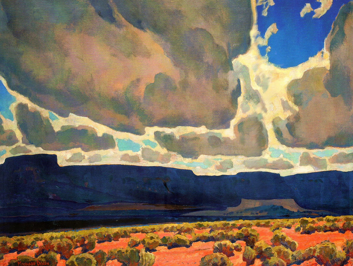
Maynard Dixon
 24
24
Maynard Dixon
 25
25
Gustave Baumann
 26
26
Maynard Dixon
 27
27
Maynard Dixon
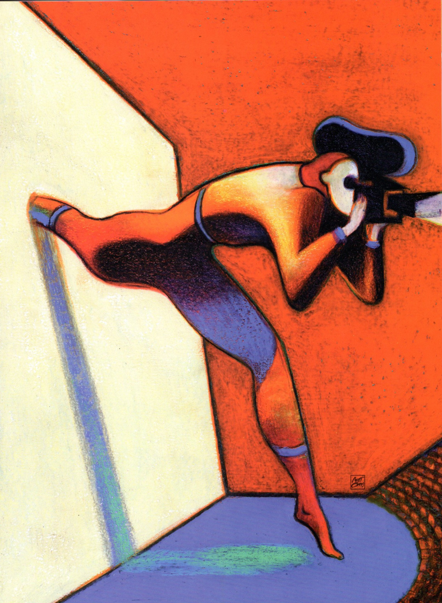
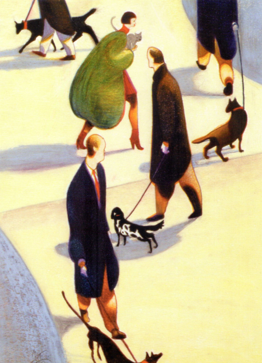
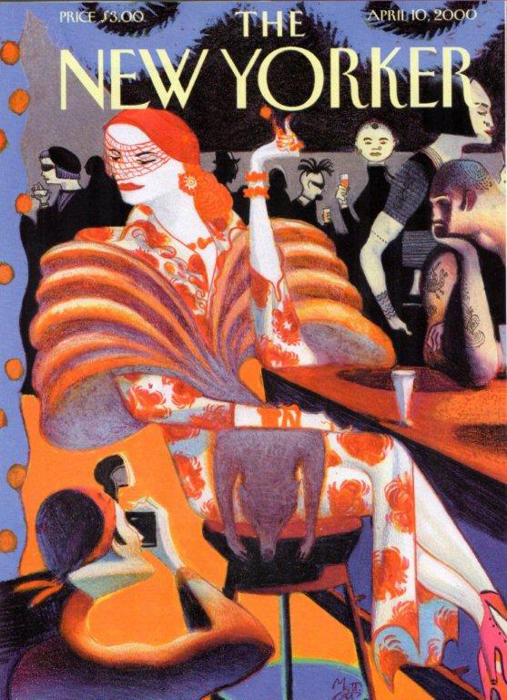
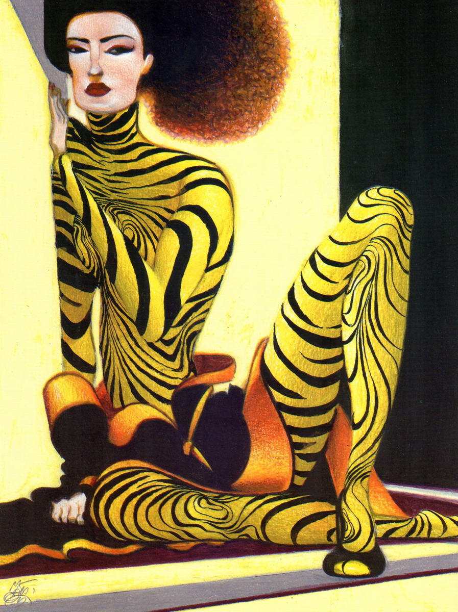
Art Art &Bill Peckmann &Illustration 09 Oct 2012 05:43 am
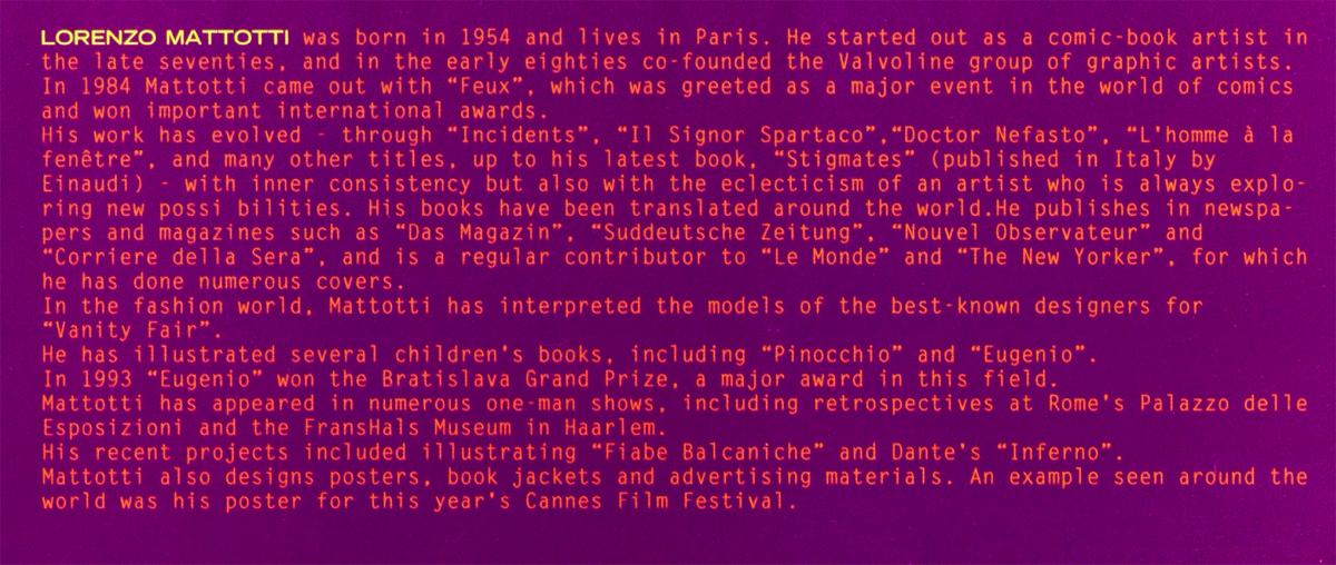
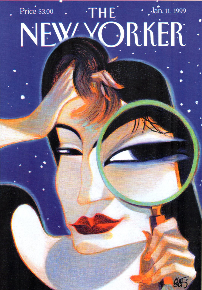
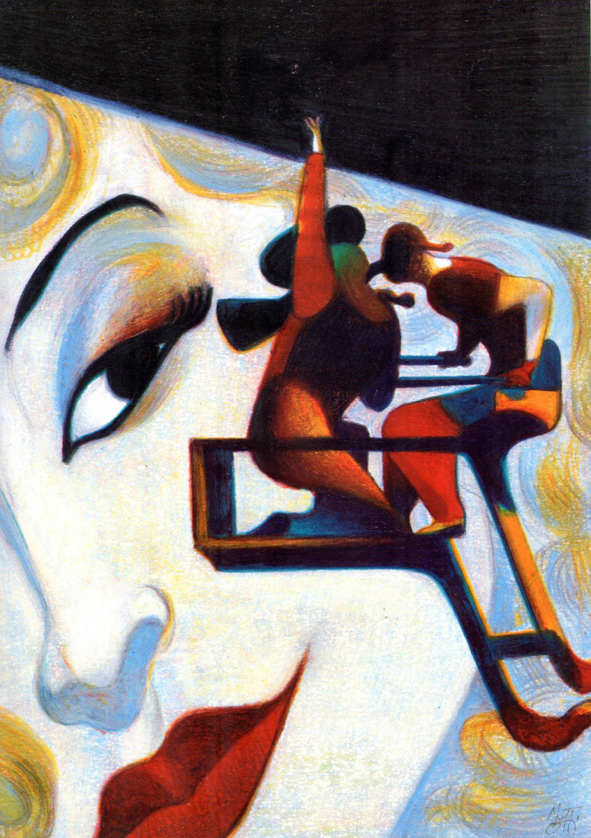
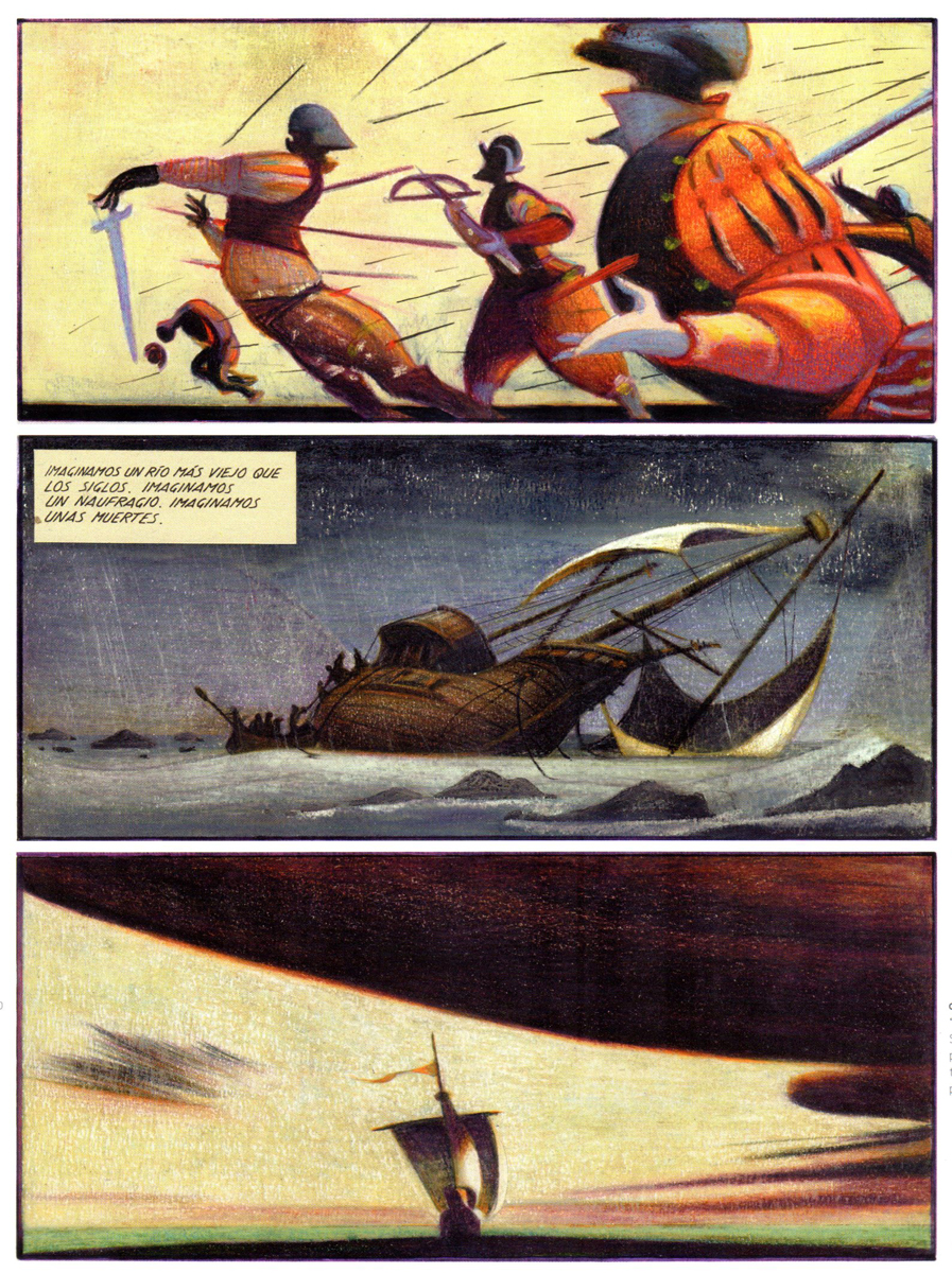
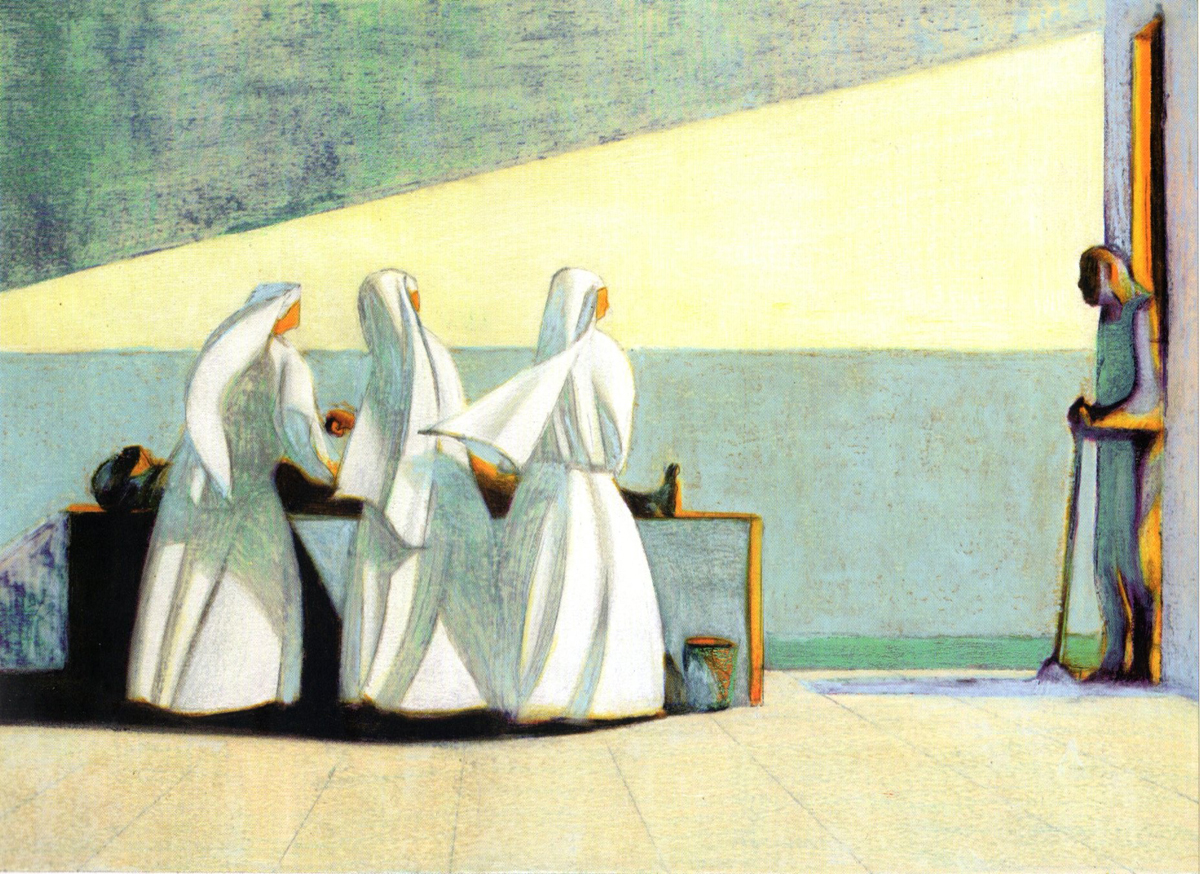
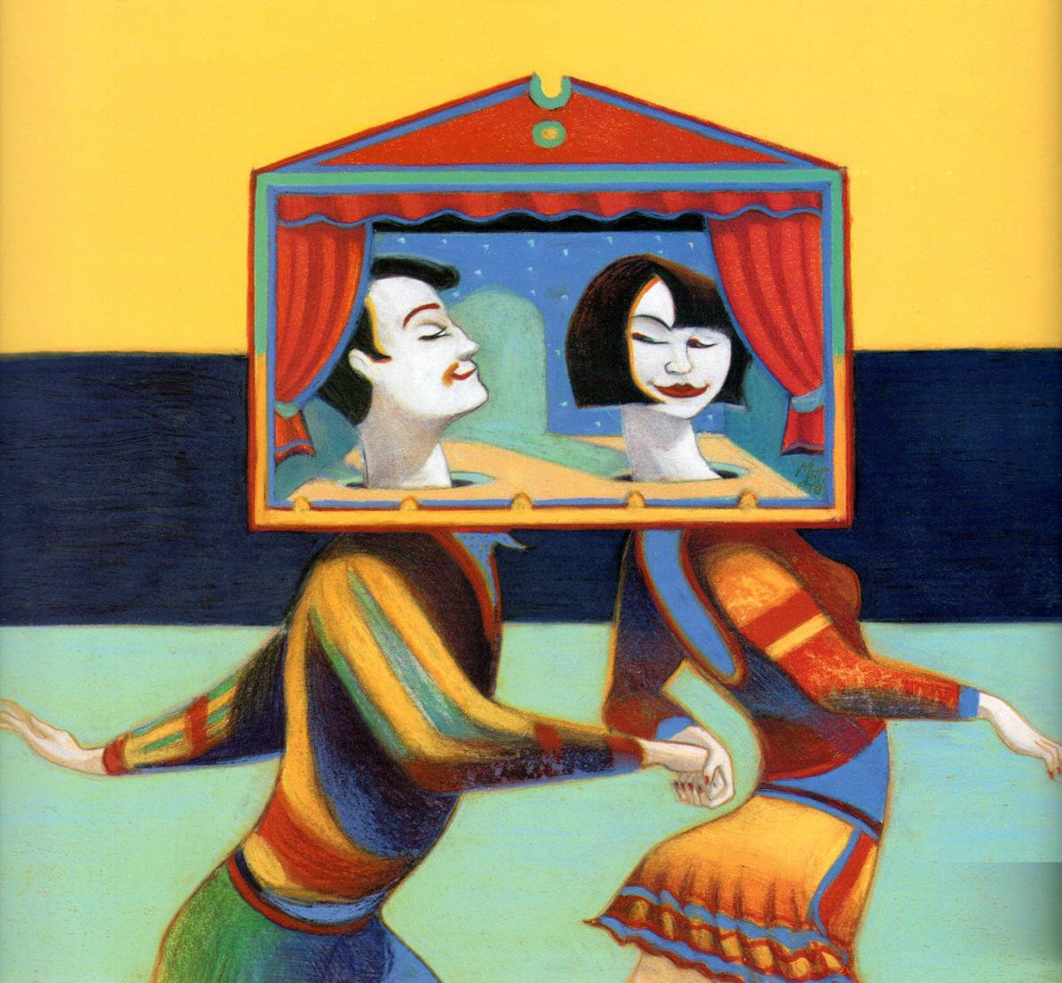
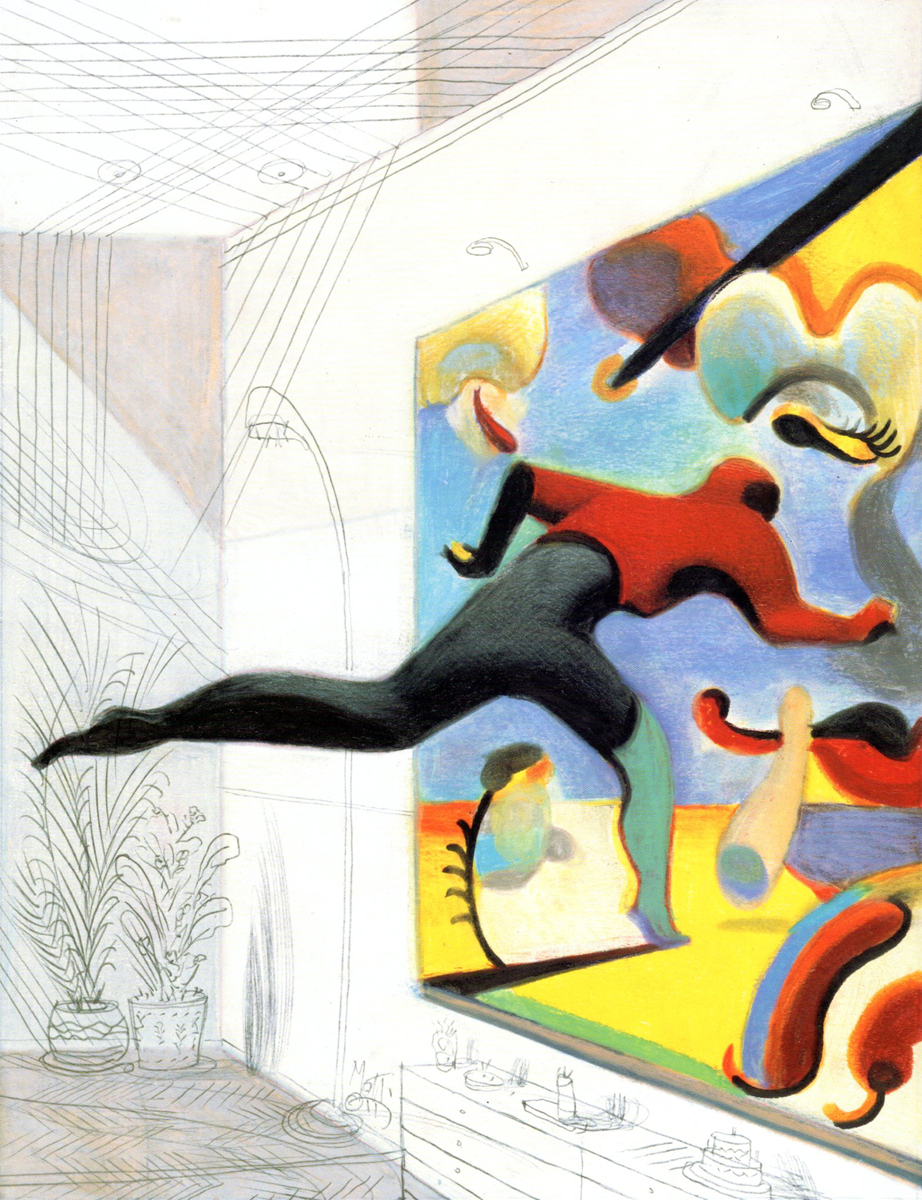
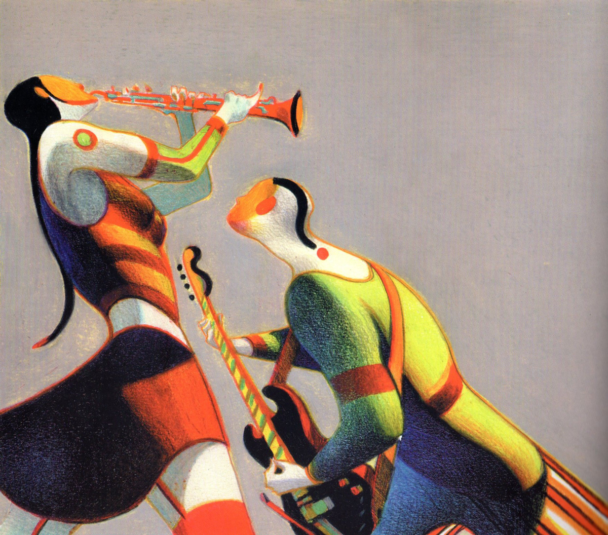
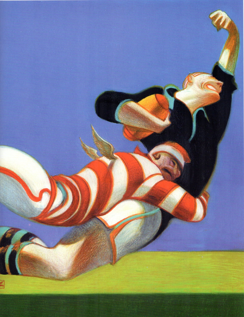
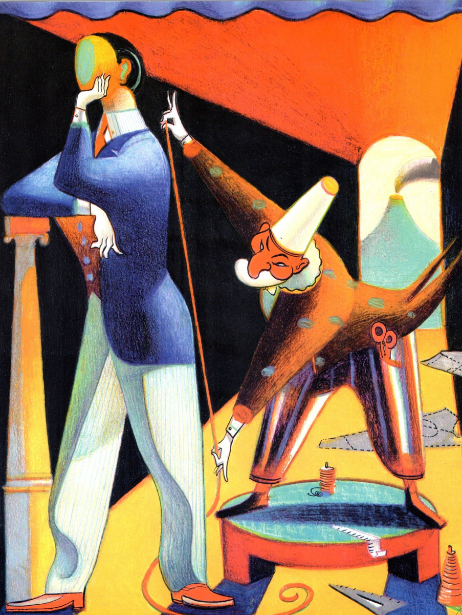
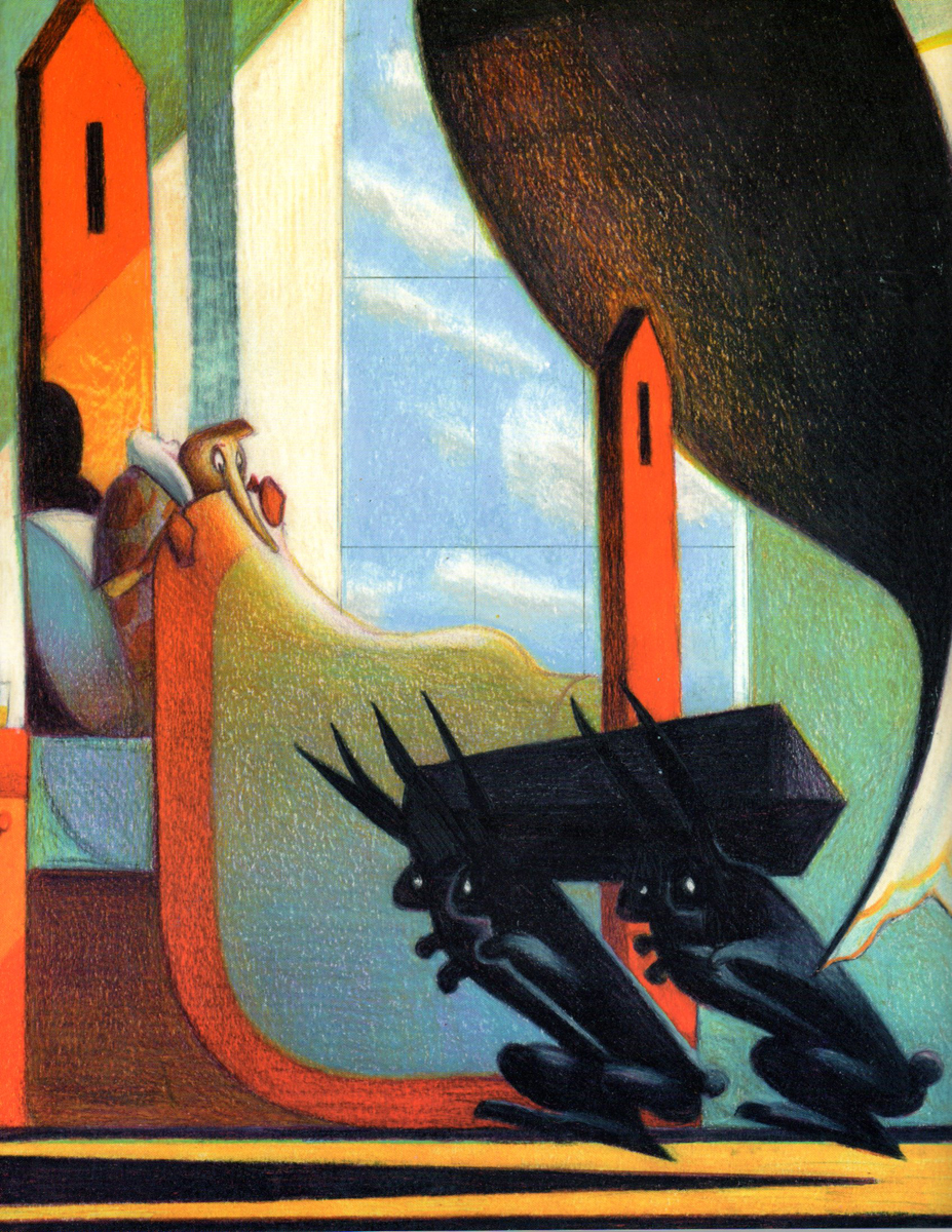
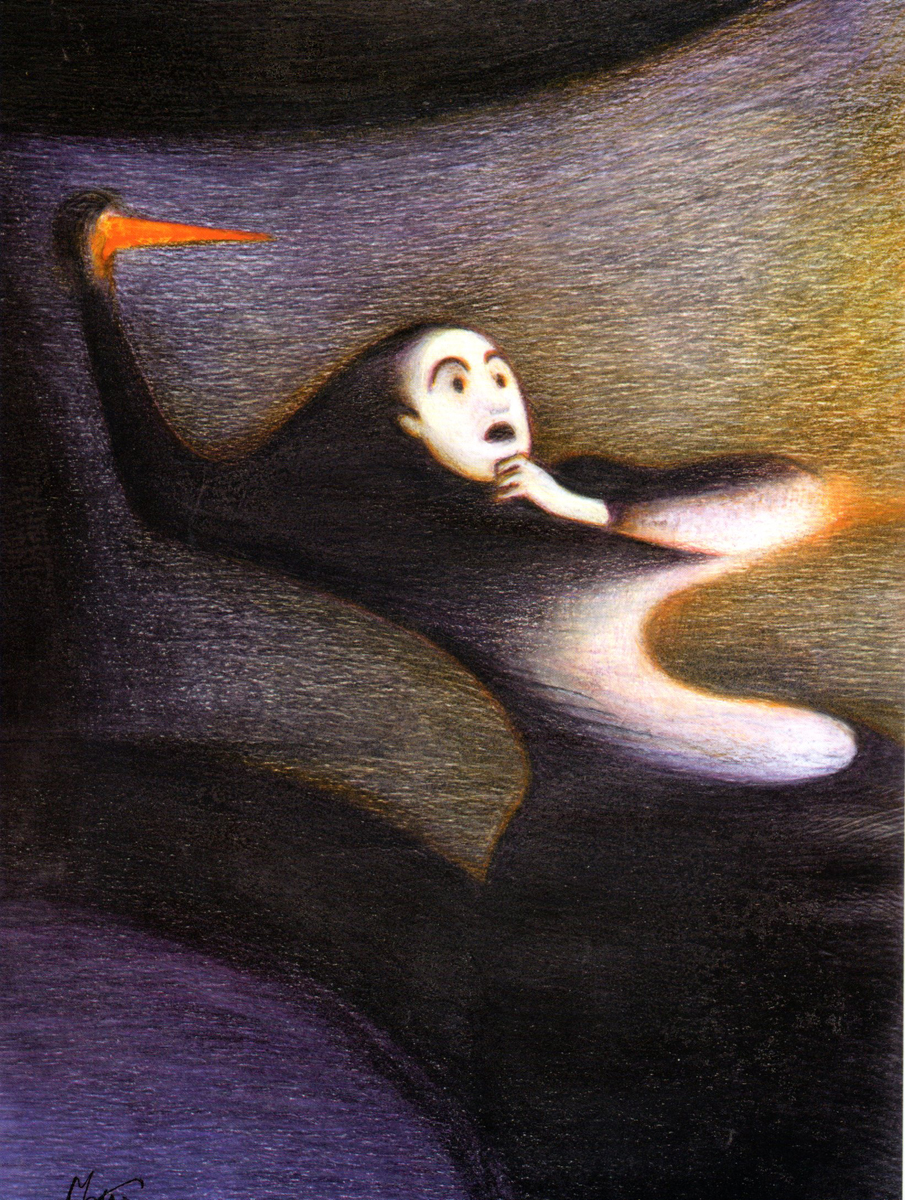
Lorenzo Mattotti
- Bill Peckimann reminded me of a great illustrater/artist who did many New Yorker covers for a short period of time. Lorenzo Mattotti is a sterling artist whose work always inspired. Bill put together quite a few pages from Mattotti’s book of artwork, and the results are exciting. Here are Bill’s comments:
- In the late 1990′s, Lorenzo Mattotti‘s New Yorker covers always had a way of jumping out of the newsstands and right into one’s briefcase! So it was a real delight when this book of his collected works came out in 2000.
If there happens to be a dark and dingy day and you want/need inspiration, this is it!
There are more beautiful drawings, sketches and colored images at:
the Official website (in English)
Mattotti blog (in Italian)
Here are some of his works:
Click any image to enlarge.
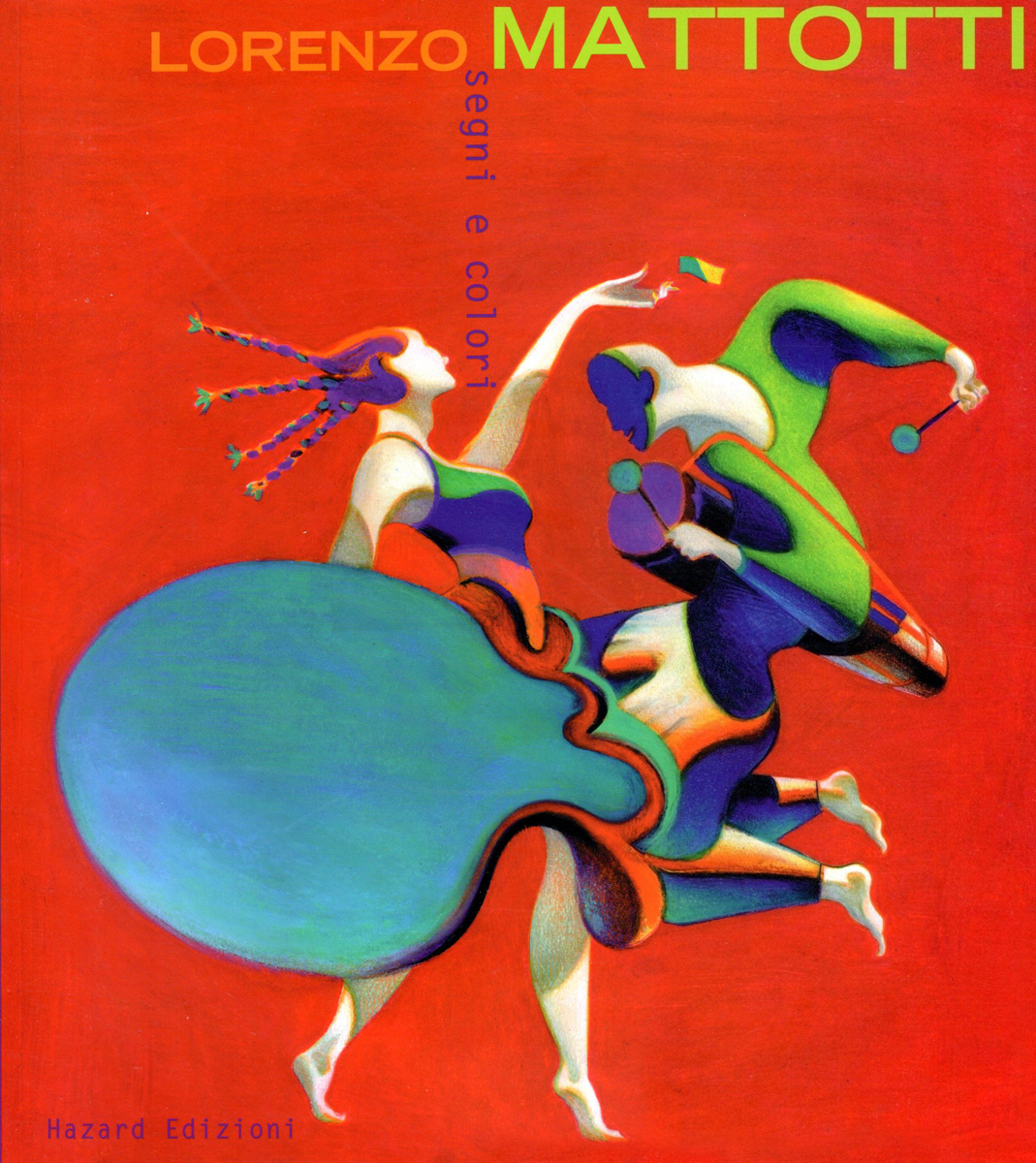
The book’s cover
 2
2
1999
 3
3
1995
 4
4
1989
 5
5
1992
1998
1998
 8
8
1998
 9
9
2000
 10
10
2003
 11
11
2000
 12
12
1995
2000
 14
14
2000
 15
15
2000
 16
16
1990
 17
17
1997
 18
18
1996
1999
2000
1999
2000
Art Art &Illustration &Layout & Design &Puppet Animation 09 Aug 2012 06:04 am
the brothers Quay
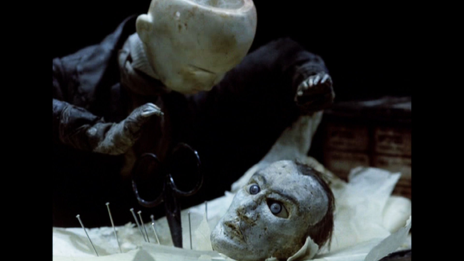
- This week marks the opening of the large show of art and films of the twin brothers, Stephen and Timothy Quay, at the Museum of Modern Art.
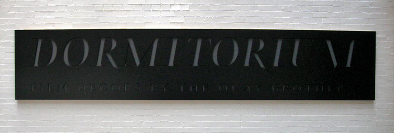
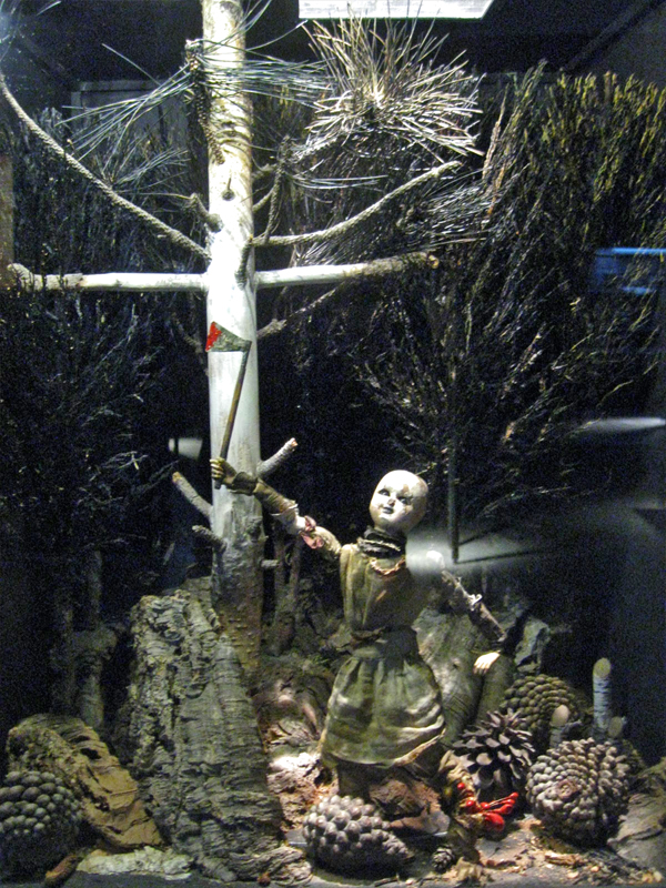
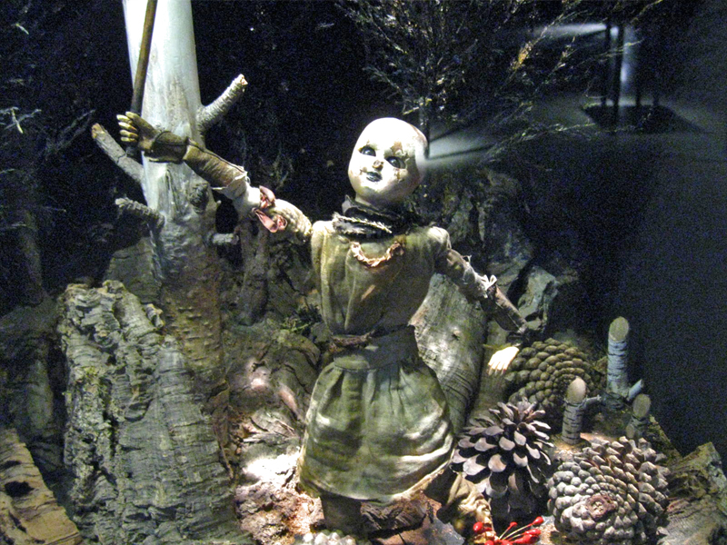
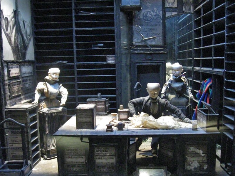
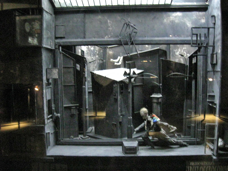 Part of the show is the display of the glass and reflective casings they’ve constructed called Dormitorium.
This was previously displayed in New York at the Parson’s School of Design in 2009, and it was well covered on this blog. Here.
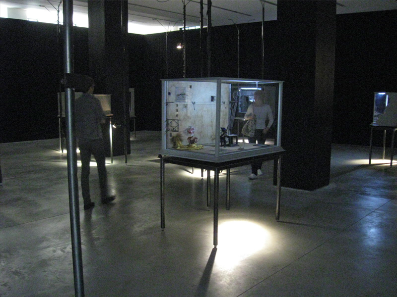
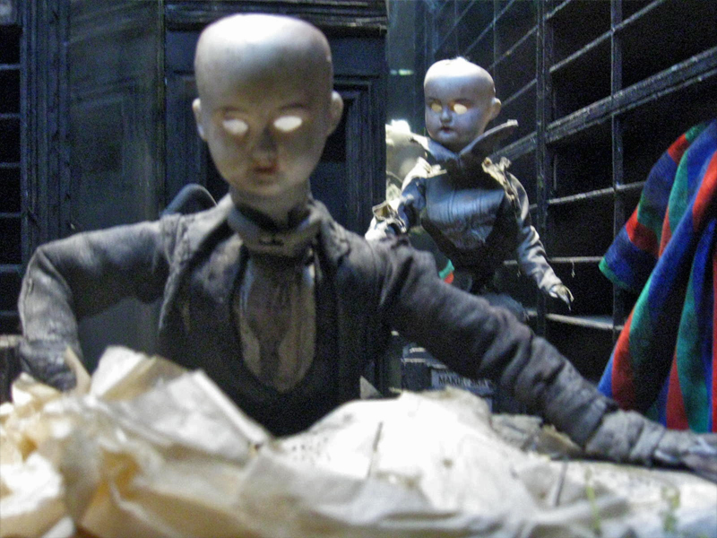
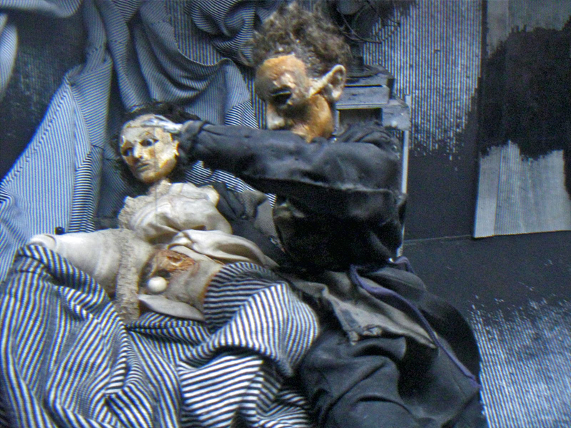
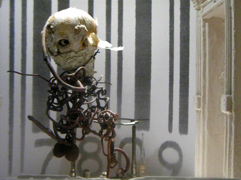
This part of the show is still exciting and interesting. Magnifying and distorted glasses  reveal portholes within boxes wherein struggling puppets exist within very tactile worlds. Harsh strokes of bark mix with feathers, muslin and strong textile designs. I’m not sure if anything is being stated within these boxes except a display of the world of isolation and dissonance Kafka has already introduced to us. However, it’s certainly hypnotic peering through these cracked glasses at the prepared tableau.
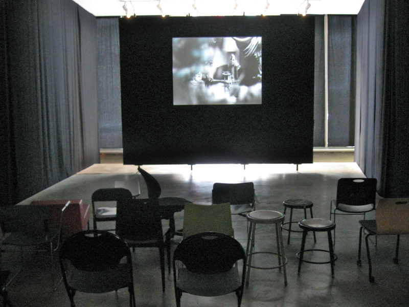
The displayed art fills the vestibule leading to the Titus 1 theater on the lowest level of the museum. It might take a good half hour to properly view all of these constructions. Yet, one is always in awe of the detailed work that has gone into construction of the enclosed world and the many hours of intense labor it took to produce. Patterns and studied period costumes meticulously constructed; props of foliage and raw wood blend with iron and other mixed metals. Then, light calligraphic type blends softly with all these course grains. There’s a lot to absorb in the tiny claustrophobic boxes. This world relates well with the similar animated stop-motion films of the brothers.
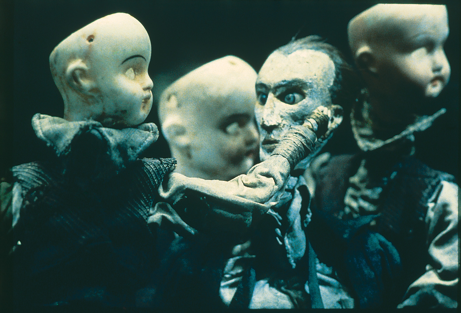 The principal part of the show sits upstairs on the second floor just around the corner from the main cafe. Small rooms have walls covered with delicate photographs, etchings, and drawings. Puppets encased in glass enclosures sit within these walls of flat art. It’s assembled chronologically, and at the very beginning we see separate pieces of art signed by the two brothers. Two landscapes, one by Stephen, one by Tim – both 8 years old. This is the only piece of art not attributed to the Quay Brothers – the pair of them. Very delicate drawings with the signature of both brothers. There are no exceptions within this show other than those two tiny landscape paintings. One easily understands the dual signature on films or even etchings where different responsibilities can be joined. This is difficult to understand two names attributed to an extremely delicate and detailed pencil drawing. However, this is the universe they’ve established, and it’s an original distinction. It fits into the world of the Quays, where everything feels man-made, done at the turn of the Century (19th to 20th Century). It’s a world wrought by the Industrial Revolution, an art that has nothing to do with digital anything. You can feel the hands that have molded these artworks.
 There are many rooms wherein films, the principal part of their art, play out on warm gray walls. A few black folding chairs sit in front of these screens in the tight spaces. Visitors can sit and watch for a minute or for the entire film. I stopped for all of the films but sat through only one, Igor, a film about Igor Stravinsky, Jean Cocteau and Vladimir Mayakovsky. This was the first of the animated biographies they did for Channel 4 out of their own studio in London, Atelier Koninck. It works through Constructivist art to move the three through Paris and their art world. The studio was founded in conjunction with Keith Griffiths, another student they met at the Royal College of Art who became a lifelong partner in producing their works of art.
The first film that the brothers made that grabbed my attention played at the 1980 Ottawa Animation Festival. Nocturna Artificialia confused half the audience of cartoon lovers and excited the other half. Art was alive at that Festival and it felt a small disappointment that the brothers (very new to the animation world – in fact, no one had heard of them back then) had not come to the Festival with their film. This is a case, though, where the film certainly did all the talking that it had to. Tale of Tales deservedly won the Grand award that year, but the Quay brothers were well introduced to American animators.
Street of Crocodiles
It was only a few short years later, 1986, that the film, Street of Crocodiles, would make its debut and make the brothers famous. This still remains one of their best known films, although the music video for Peter Gabriel’s Sledgehammer would be their best known work.
The MoMA exhibit continues through to the end of its space, packed to overflowing. Many works stand out from the rest though they all display a singular vision – that of the Quay Brothers.
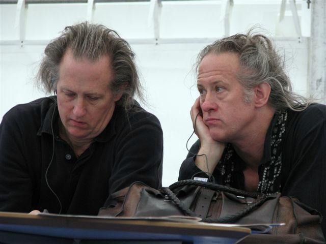 I attended a Q&A with the brothers Quay led by Ron Magliozzi who organized the show as the Associate Curator of the Dept. of Film. At first, there was a brief conversation with the four, including Peter Reed, the Senior Deputy Director of Curatorial Affairsfor MoMA. This was eventually opened to the audience, which meant some not very interesting questions were asked. I’d recorded it with the idea of transcribing the session for this blog, but the questions were so mundane that the brothers were almost astonished, and I dismissed the notion of transcribing as pointless. One person asked if they’d had nightmares as children to be able to create such dreamworlds. The answer was no, they didn’t dream and the art is not a dream world. Another questioner asked if they felt they’d had a nutritional shortage as children which might have created such ideas as adults. Tim immediately answered, “Yes,” to that, and Stephen quickly responded, “Too much white bread and peanut butter.”
I went to the Press Preview in the morning to be able to view the show at length. The only two I saw there that I knew were Candy Kugel (of Buzzco) and Richard O’Connor (of Ace and Son.) I came back in the evening for the official opening party. Drinks and hors d’ oeuvres with a moderately crowded audience that covered the first floor of the museum and swelled out to the MoMA sculpture garden. It was a warm and humid evening, so it was nice outside, but air conditioned inside. Groups traveled upstairs and down to see the art, but to drink, eat and socialize many just stayed on the main floor. I met up with plenty of people I knew including Emily Hubley, John Canemaker, Candy Kugel, Jeremiah Dickey, Josh Siegel (of MoMA), George Griffin and Karen Cooper, among others. Though I’d only seen Stephen Quay at the opening, I was told that Tim was outside in the garden. It was an eventful day that felt filled with art and animation.
Art Art &Theater 29 Jul 2012 08:20 am
Sue Coe in Nightcourt – revisit
- Just in the past couple of weeks, one of my favorite current artists, Sue Coe, had a show in NY at the Galerie St. Etienne. Ms. Coe is very much akin to my favorite current playwright, Caryl Churchill. They’re both so brilliantly political. Last night, I saw an excellent production of Ms. Churchill’s anti-Thatcher play, Serious Money. Despite the very low budget, off-Broadway production, the show was every bit as great as I’d hoped. I tried to find something that was marginally related for today’s Splog, and I’ve decided to recap this Sue Coe post. Especially because it links to others about Ms. Coe’s work, I thought it very appropriate.
I feel as though I need a larger dose from the Coes and Curchills of the world as Mitt Romney bounds about the airwaves these days.
 – Sue Coe is one of my favorite current artists. A wholly political artist, it seems to me that she is the extension of the German Expressionists, focusing on man’s inhumanity to man, or Goya‘s Caprichos or Ben Shahn‘s attention to political injustice. All of her work seems to fit into this form, and I am completely attracted to it.
She is represented by the Galerie St. Etienne, in New York. Years ago, I was there, arranged by HBO, to see some paintings by Grandma Moses. While they pulled out the paintings for me, I was able to see a stack of lithographs by Sue Coe, and it made for a memorable day for me.
I’ve posted a number of other pieces about her and will probably do it again. You can view a couple here and here.
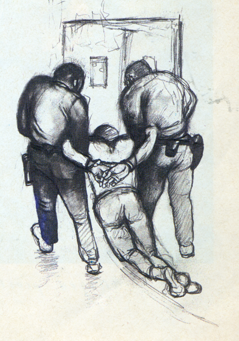
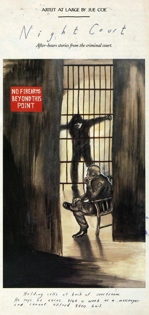
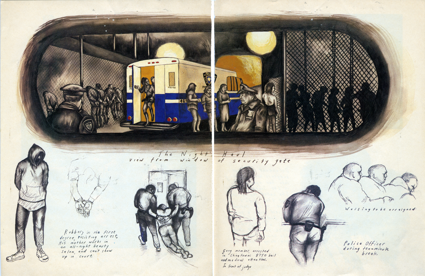
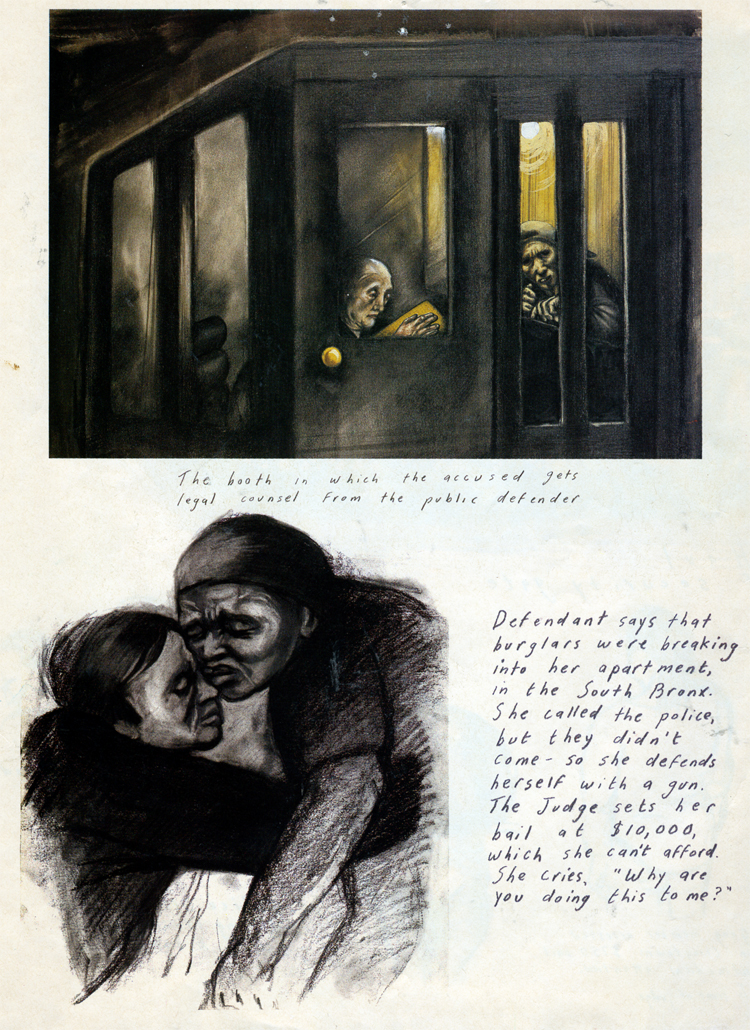
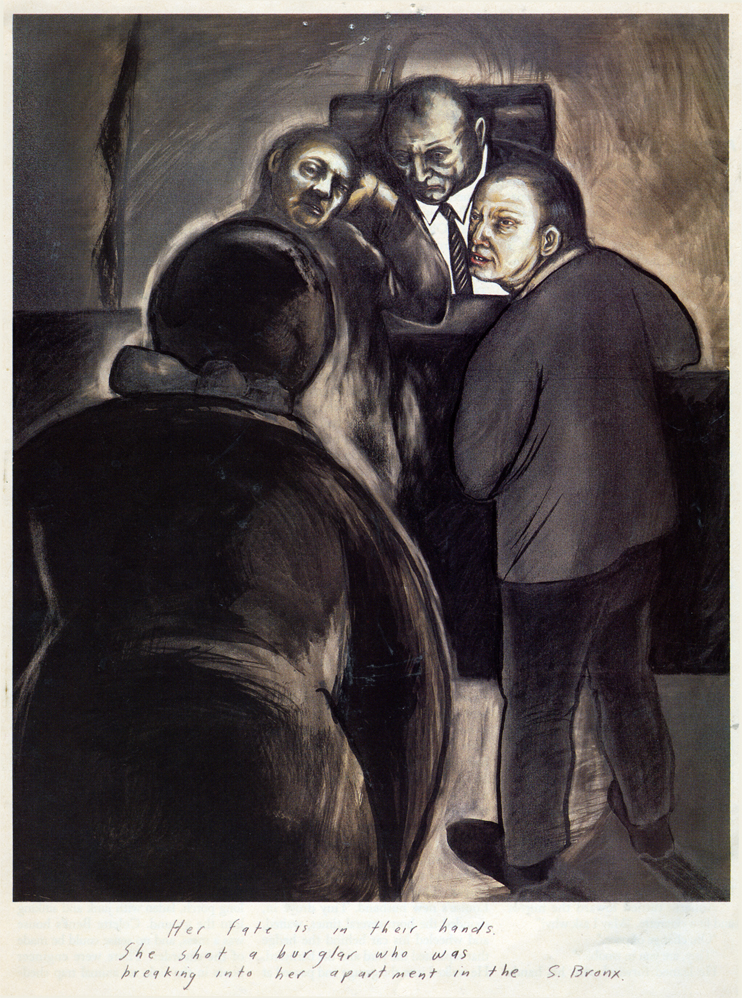
About 15 years ago, The New Yorker magazine, printed a number of pictoral essays by her, and I’ve saved several of them. Here’s her study of “Nightcourt” in the Bronx. I believe these images were represented by Galerie St. Etienne.
_ __
__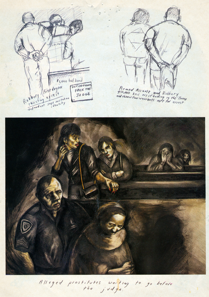
___(Click any image to enlarge.)
_
_
_
Animation Artifacts &Art Art &Independent Animation &Layout & Design &Photos &Puppet Animation 15 Jul 2012 05:43 am
Quay Dormitorium – repost
August 11th a big show and retrospective of the work of the Quay Brothers will open at the Museum of Modern Art. Part of the exhibit will be a small puppet world within glass casings that they created called “Dormitorium.” This was actually exhibited in New York several years ago, and I photographed that presentation. I thought this might be a good time to repost it, getting us all in the mood for the world of Quay.
The Brothers Quay have an exhibition on display at Parsons School of Design, 2 West 13th Street on the ground level. It’s on exhibit from now through October 4, 2009.
Stephen and Timothy Quay claim writers Franz Kafka and Robert Walser, animators Walerian Borowczyk and Jan Lenica, puppeteers Wladyslaw Starewicz and Richard Teschner, and composers Leoš Janácek, Zdenek Liška, and Leszek Jankowski among their influences. All of these artists can be felt with each of the constructions on display.
 1
1On entering you see a darkened room with boxes about
the size of your torso – maybe 3′ x 4′ – on display.
Of to the side there’s a theater with constantly running films
showing Quay brother works. One of every kind of chair.
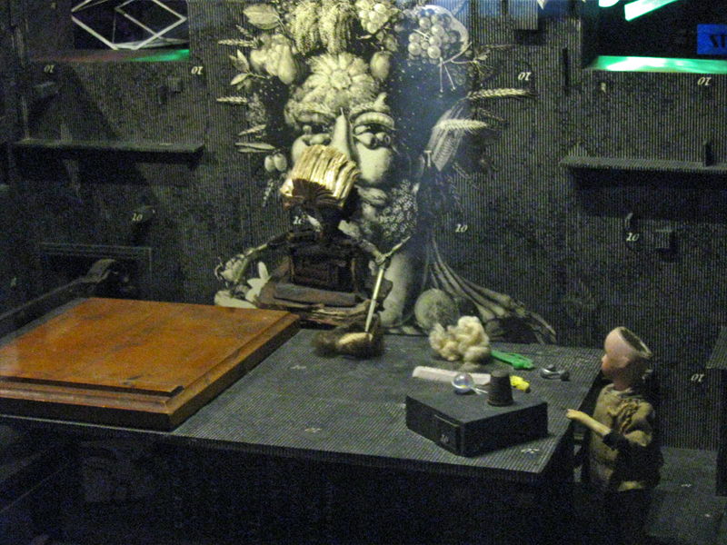
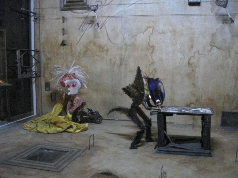
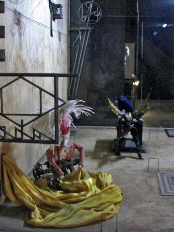
Within the boxes there are whole worlds.
Magnificent detail upon detail.
To the next box for a wholly different world.
Again the amazing detail is brought to the enclosure.
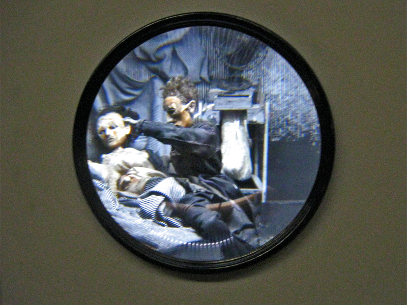
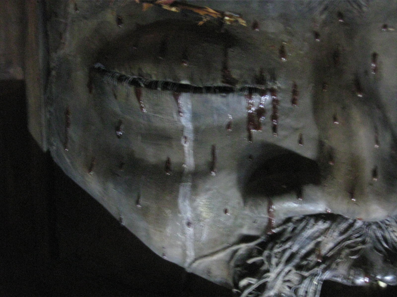
A couple of the boxes are seen through a prism.
The interior is magnified.
You have to get close to it to get real clarity.
You virtually enter these little rooms.
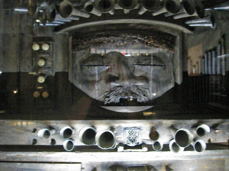
Some of these worlds seem enormous.
There are many closeups one could take given all there is to see.
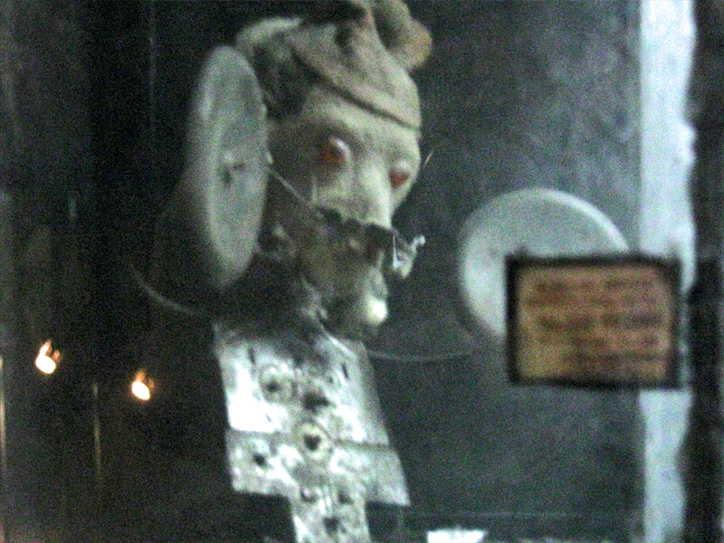
This little scene is in the upper left box of the full view above.
The central character on the main stage.
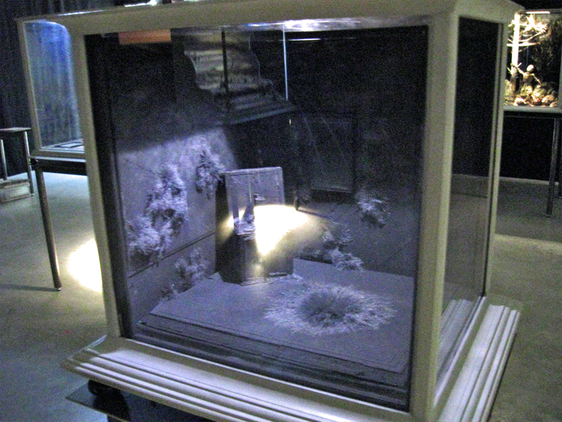
You can get an idea of the cases and the display.
All contain their own little worlds.
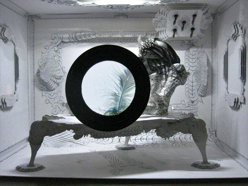
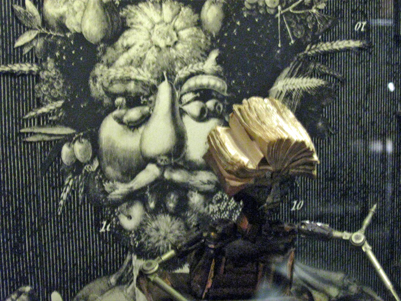
Another magnifying glass focuses on a feather.
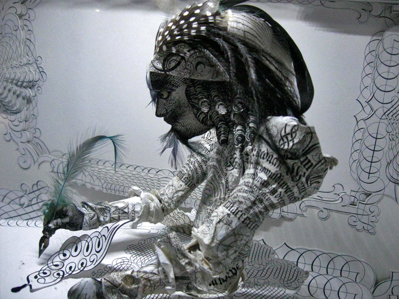
Just beyond the feathered quill there’s the writer.
The last box near the exit has a label within.
Many of the cases can be viewed
from three different perspectives.
Art Art &T.Hachtman 03 Jul 2012 07:03 am
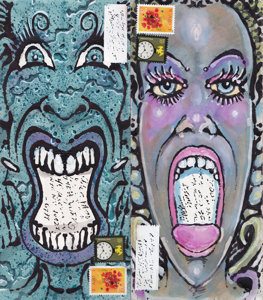
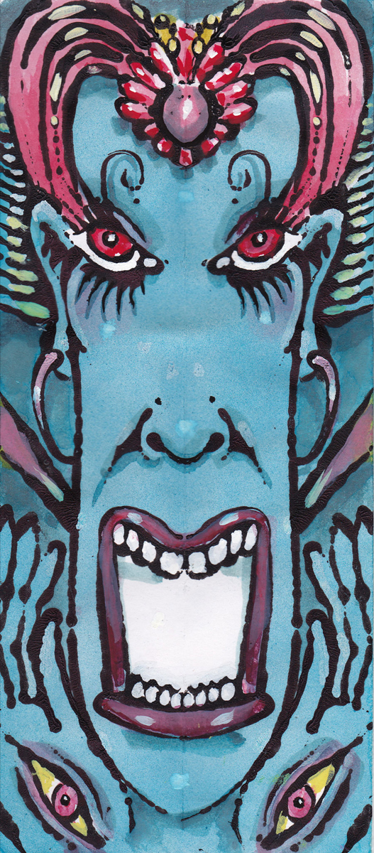
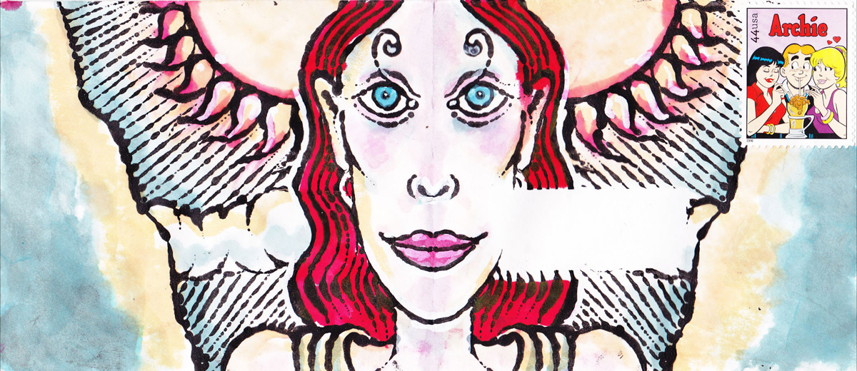
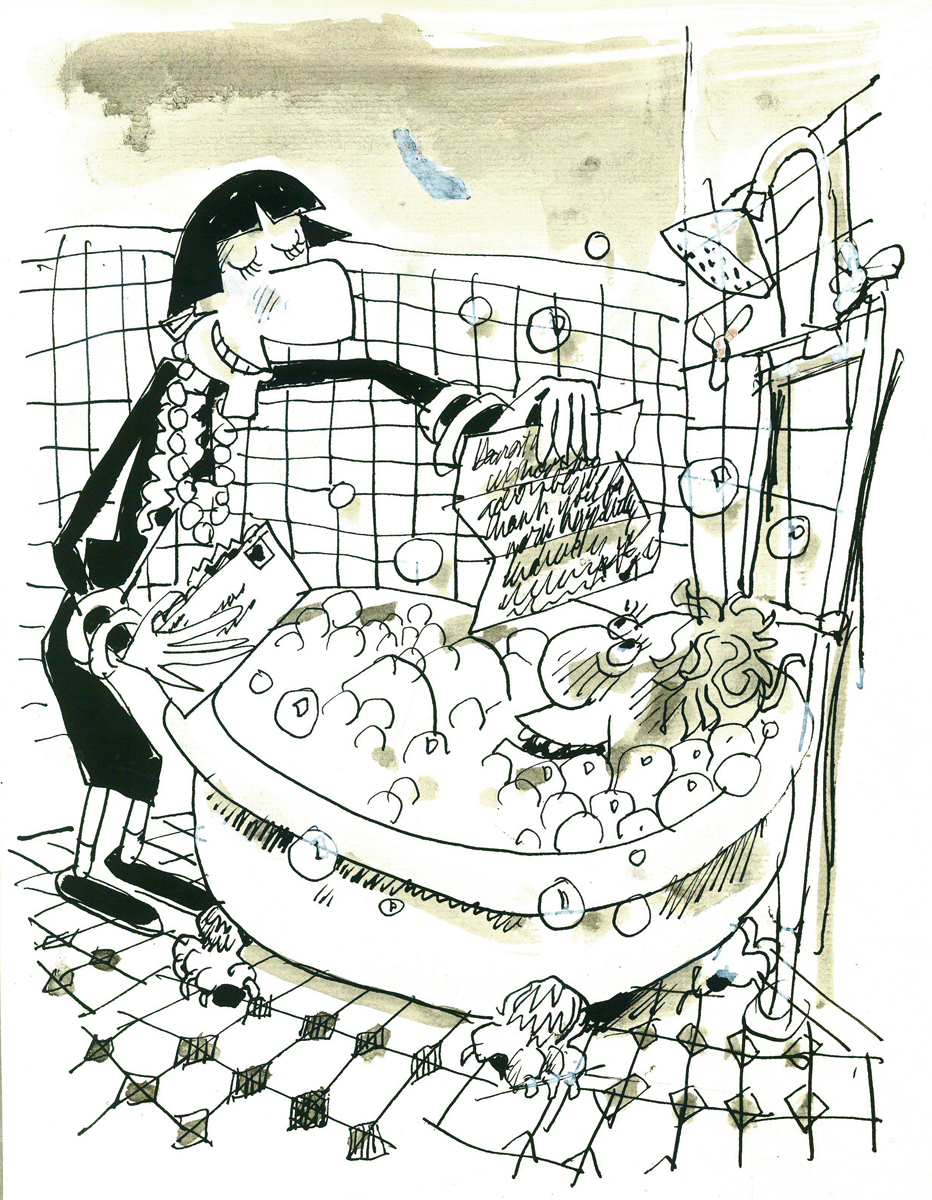
Screaming Envelopes
- I received a full email from friend, Tom Hachtman, this week. He had sent something that got me smiling. I’ve often seen his sketchbooks, and they’re usually some old book that he’s drawn or painted over the type within. This gives him the opportunity of ignoring the type or including it in the picture. This fascinates me, and makes me wonder what an animated film on such pages would look like. (I will try that some time as an exercise.)
Now he’s sent me a series of envelopes which he’s used as his sketchpad. Some were started or inspired by his wife, Joey, or his niece, April. It’s really all self explanatory, though Tom sent this note:
- i did a few new envelopes – or, actually, coloring some old envelopes…thought you might enjoy seeing them…the one that is not an envelope? The cute redheaded nude is out of one of Joey’s sketchbook from thirty years ago. The ugly guy is from one of April’s sketchbooks done I’m not sure when – could be recent or ten years ago…and the background is out of a Thomas Kinkade book. Joey draws the cutest gals and April draws the ugliest guys – I can’t resist putting them together.
Feel free to post any of these – but maybe remove any addresses…thanks.
t
Here are the envelopes.
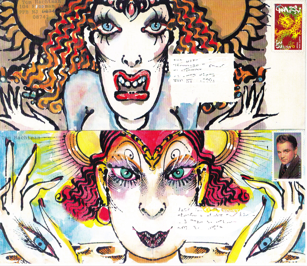
Two Envelopes
“Mail Art”

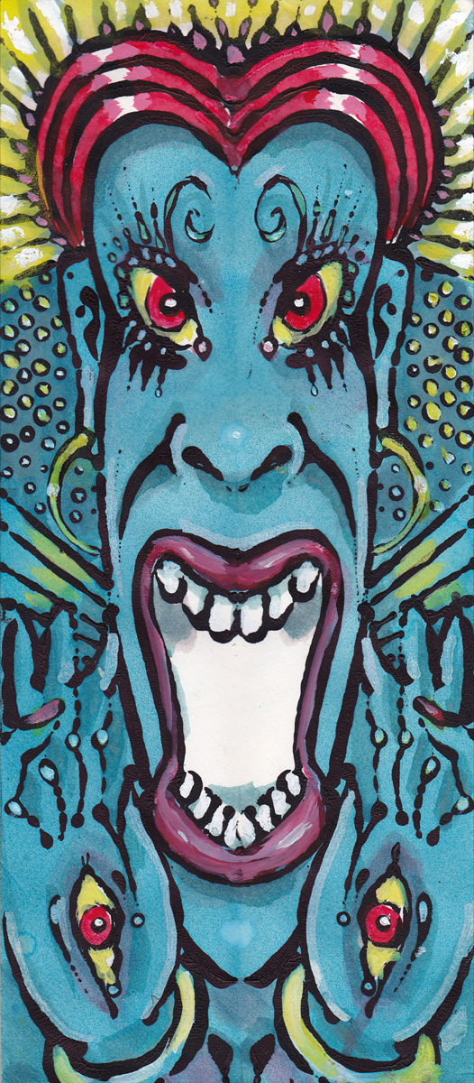
“Blue Scream” | “Blue Scream A”

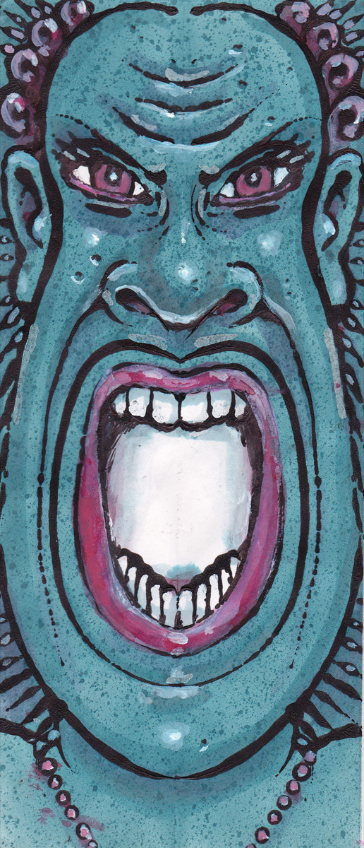
“Blue Scream B” | “Blue Scream C”


“Blue Scream D” | “Blue Scream E”
“Blue Scream F”


“Blue Scream G” | “Blue Scream G-01″
“Not Screamng”
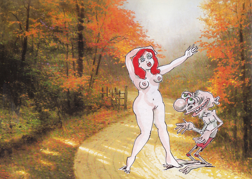
“Ugly and Cute in the Road”
A Picture Postcard
Art Art &Books &Illustration &Independent Animation &Layout & Design &repeated posts 19 Jun 2012 06:23 am
Norman McLaren Drawings – repost
 - I don’t intend to give an introduction to Norman McLaren or his work here, but he obviously was one of the solidly great film makers on the “Art” side of animation. His films are worth studying for their timing, if not for their sheer genius. As a matter of fact, his exercise films on timing are incredible (though I have no idea how you’d get to see them today.)
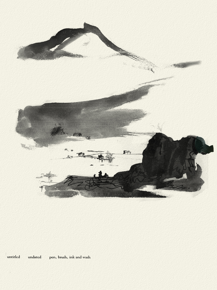
I do have a book of some drawings by him, and given the stories about China in the news today, I thought I’d post some of his drawings done in China. The book isn’t printed on the best of papers, so the quality of these drawings isn’t all it could be. However, I thought it might be worth showing this other side to his art.
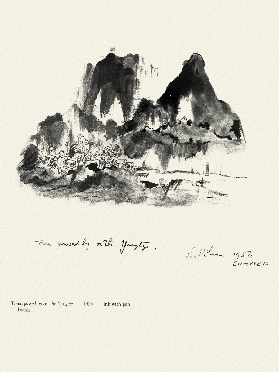 _
_
 _
_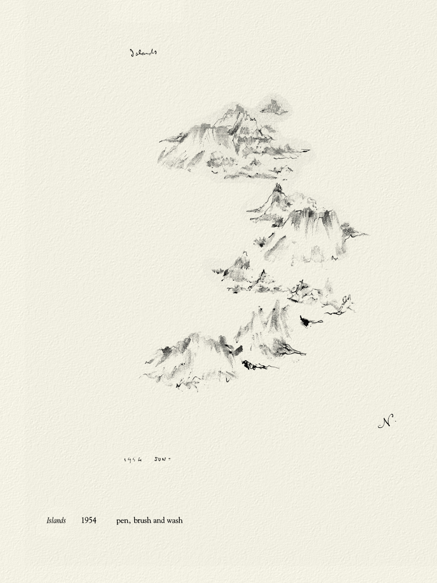
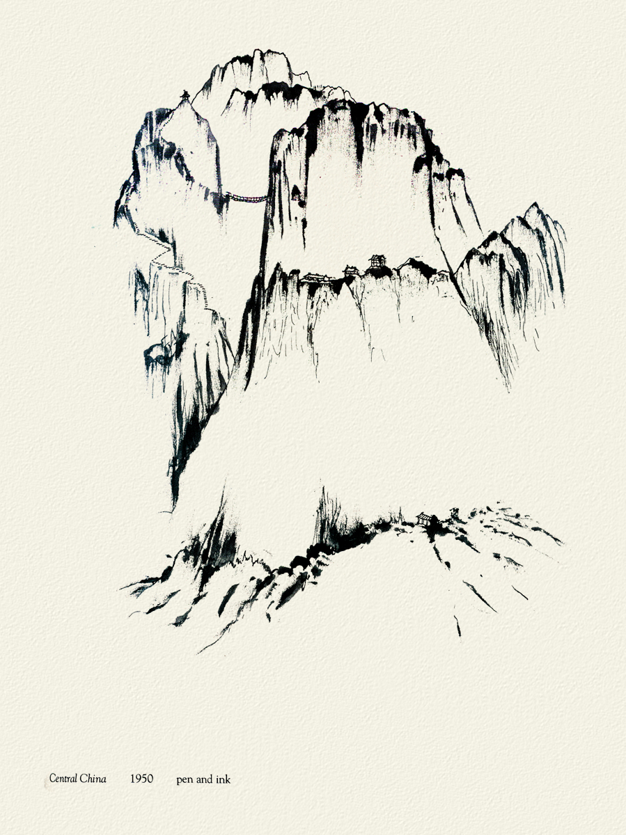
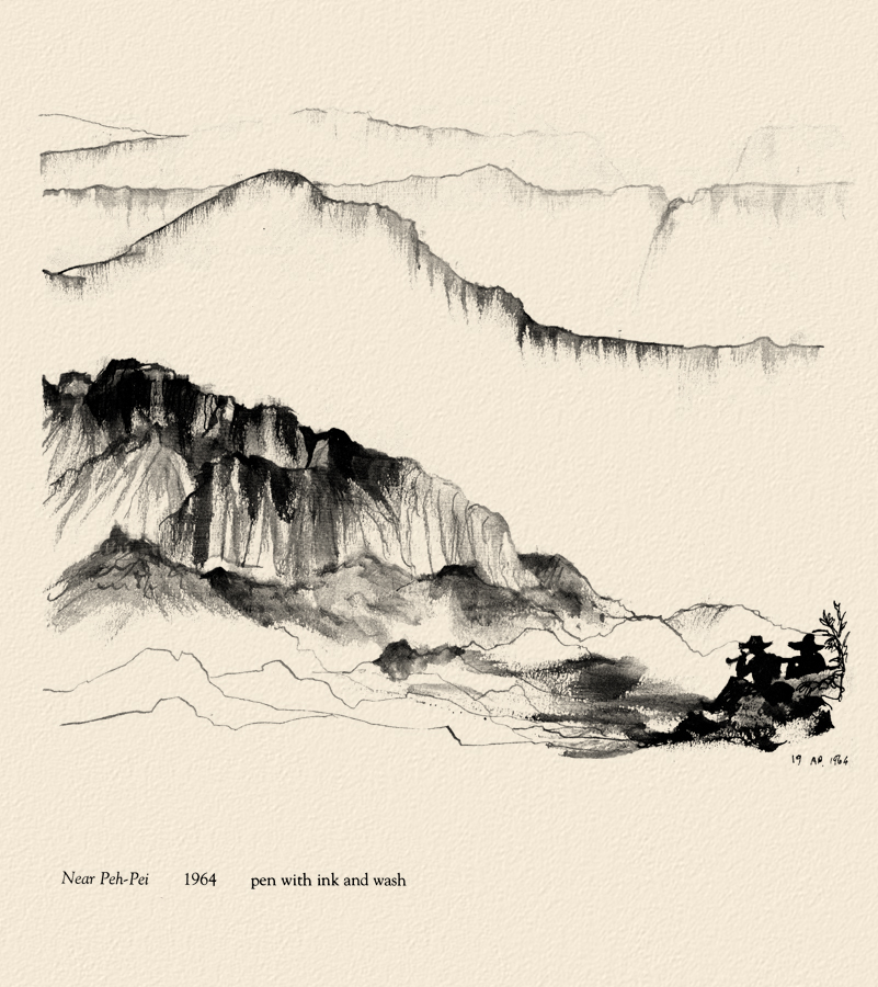
Moving away from China, there are two other drawings I thought compelling and
would like to share here.
 _
_

McClaren was certainly a brilliant artist, and his experimentation and developments brought about a real maturation of the art form. I wonder how he would have dealt with the technology we’re using today. Remember, he realized that the soundtrack could be drawn and did his own exploration of this part of the process.
The book was published in 1975 by Tundra Books.
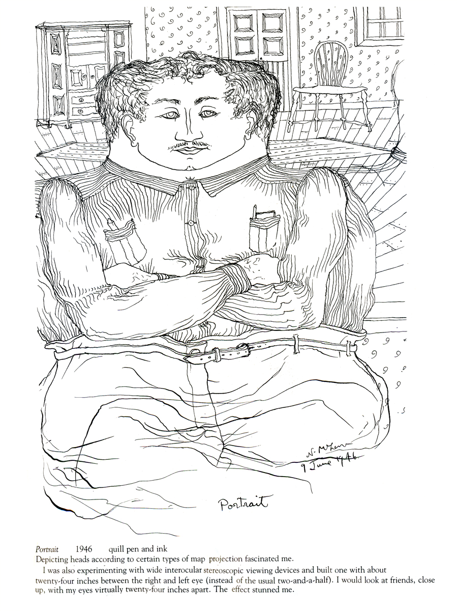
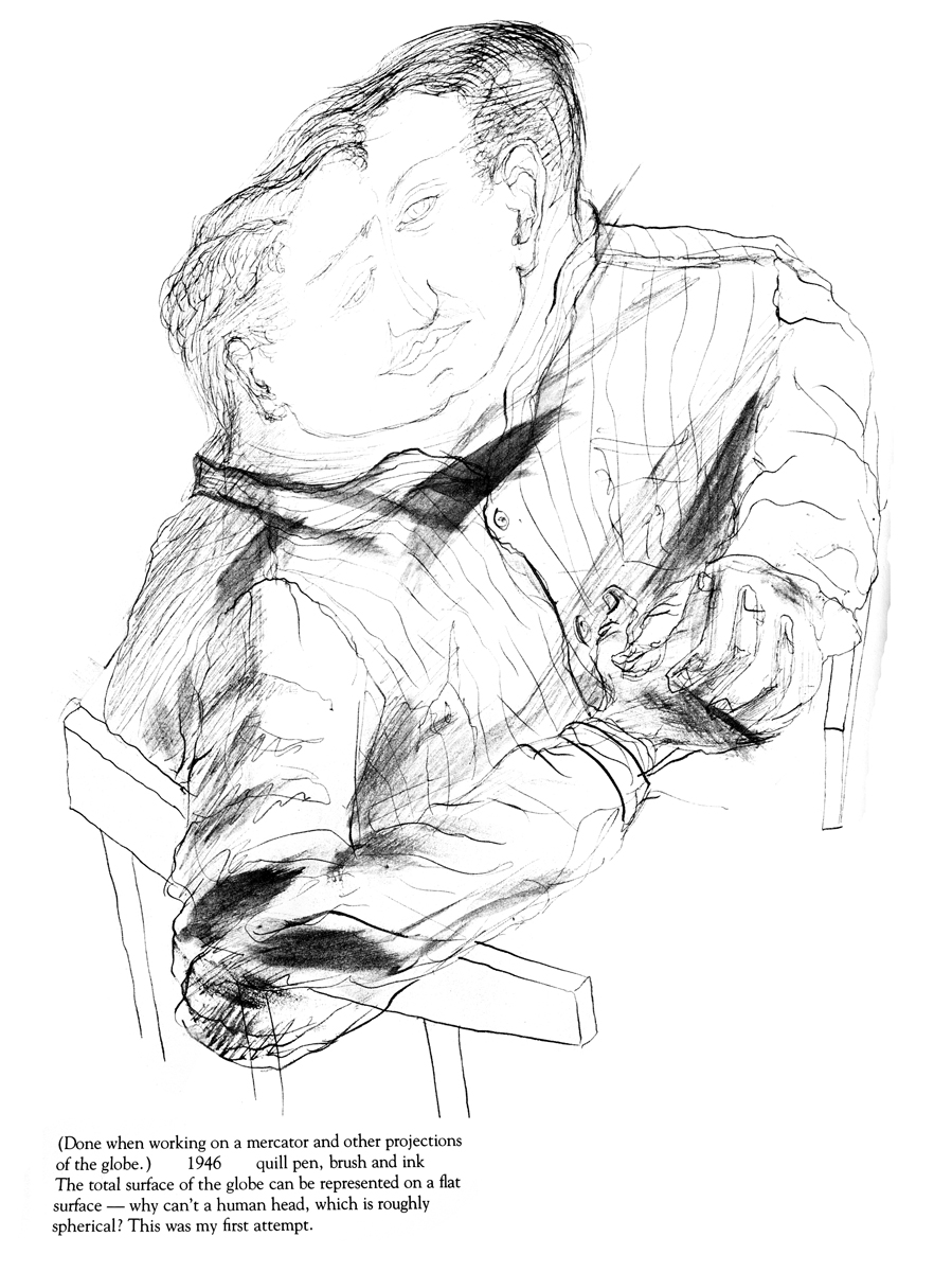
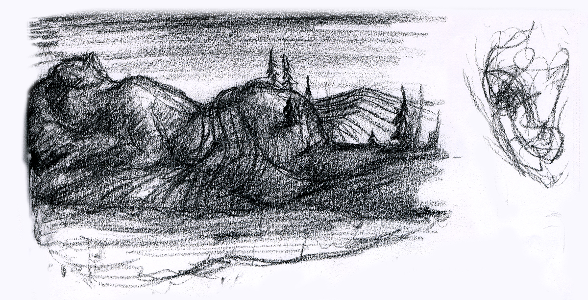
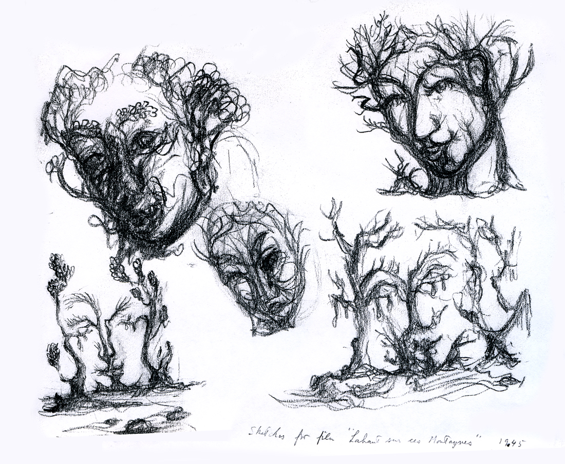
Because the one illustration which graces the book’s cover, was of such interest to those reading my piece, I’ll start with the rest of that page. It’s a series of sketches done for the film, “LÃ -haut sur ces montagnes” and was drawn in 1945.
__________________
The two illustrations above are connected on the same page. I separated them .
The entire page is labelled: Sketches for the film, “LÃ -haut sur ces montagnes.”
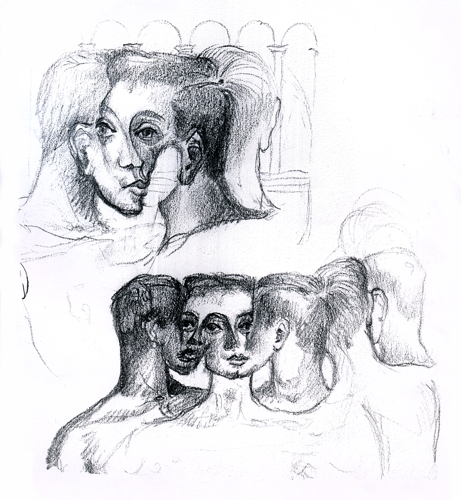
“Interlocking faces”
“Untitled”
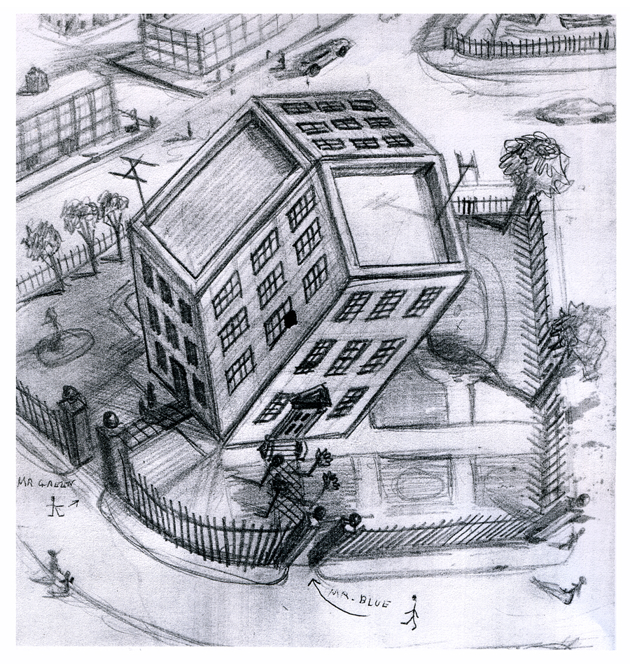
“Tesseractine House”
I’m fascinated that a number of his illustrations look not too unlike Steinberg’s work. It’s obvious he was an influence for a lot of animators in the late ’40′s.
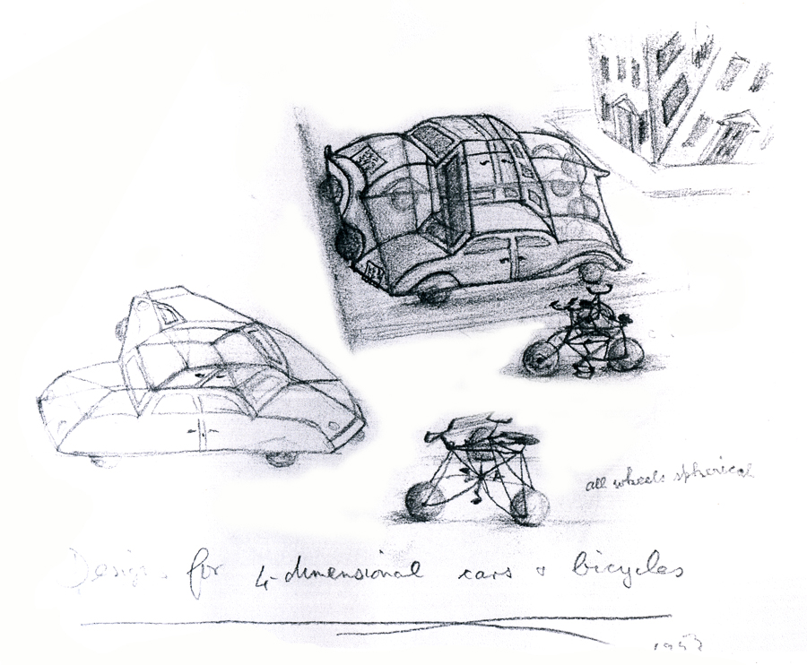
“Four Dimensional Cars and Bicycles”
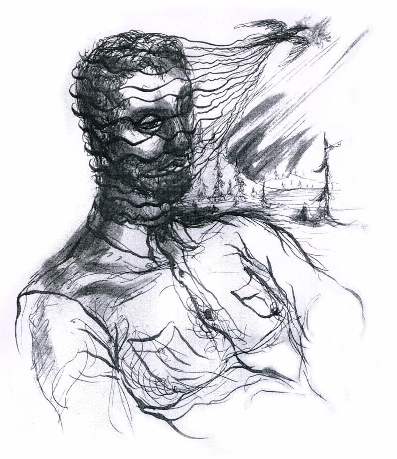
“Memory of A Mexican Beach”
“St. George and the Porcupine”
Art Art &Commentary 16 Jun 2012 06:06 am
Promises
 - I don’t know about you, but I love to read interviews. The longer the better. When things go a while and there’s been nothing available, I’ll turn to Mike Barrier‘s site and find something in the archive to reread. For my money, the animation interviews he posts are by far the best available to me. There’s so much in his interview scripts that even rereading for the fifth or sixth time, there’s still plenty to be gleaned in them. I’ve certainly read the _________________Barrier & John McGrew
John Hubley, John McGrew and
David Hand interviews more than six times. You’d think I’d be taking notes, by now. No, I just enjoy them as reading material. It’s almost like rereading a Barbara Pym novel, I gobble them up and absorb the characters at play; I enjoy the thrust of the lives in discussion and it doesn’t matter that I know where the story is going. Of course, it helps a lot that I have a real interest in the players and what they’ve gone through, and, in fact, I’ve known a few of them. Many of the others, i feel as though I’ve known them from reading about them and/or studying their work.
Somehow it’s more fun to me to read them rather than listen to audio recordings of them. Especially if the interviewers are good. Michael Barrier and his coauthor, Milt Gray, are formidable at the job, and they seem to get so much out of even the quietest apple. The interview with Fred Kopietz is a fine example. He’s someone who didn’t dominate animation history, but the story he tells is enormous. We get such a good view and an understanding of some of the studios he attended. An interview like his doesn’t always happen; there are some who leave too many questions about what they’re remembering. Of course, the guide makes all the difference. Barrier so often gently coaxes the interviews onto a straight and arrow path. His mechanics in interviewing aren’t always evident, but one feels safe in his hands.
And then when a new interview is posited in the archive, it’s pure delight. This past week saw a very complex interview with Phil Monroe join the roster, and I’ve already read it three times. They’re too hard to read on line, so I usually print them out and have them in hand to read; That’s what I did with the Monroe interview. He had a lot to say about the organization of the Warner cartoon setup, and the material seemed relatively new for me. He had a lot to say about some curious characters – those directors, Jones, Clampett, Freleng and McKimson.
 The audio interviews at the Animation Guild Blog are good examples of the usual audio interviews. Steve Hulett does the interviewing and posts the pieces on the site. For the most part, they’re the voices of the living artist who has had a major career behind them. They have full histories that is usually trippingly told. It’s nice to hear the characters’ voices and the sound of their speech, but often the interviews are halting or repetitious and cumbersome. Sometimes, the interviews feel as though they’re forced in the approach and the stories don’t unfold simply. The interviewer becomes a character in his own right, and you almost feel as though you’re listening to two people being interviewed at the same time. You can tell when Mr. Hulett is excited by the material, and you can also hear when he’s not so involved in his part of the interview. __ Steve Hulett
There are always two personalities to follow in every one
of the interviews. I always listen to those Mr. Hulett posts, but I usually approach it more as a chore than as a pleasure. There’s something more enjoyable about the written word, and I sure prefer those. But I still don’t miss Mr. Hulett’s audio posts; I just haven’t been inspired to go back to listen to any of them a second time.
For the record, I have read Didier Ghez‘s collection of animation interviews, Walt’s People, and have gone through most of his books at least twice.
I’ve alslo enjoyed Don Peri‘s two books: Working with Walt and Workng with Disney. They’re both excellent books.
Animated Features
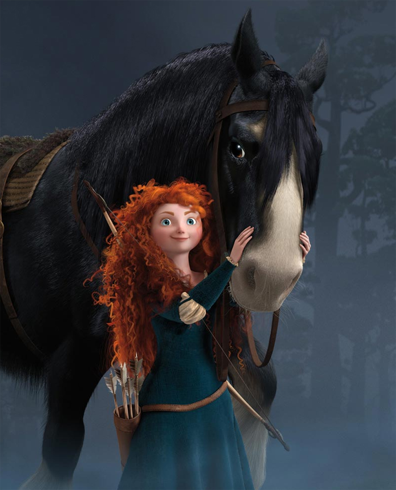 - This coming Tuesday, the Academy is screening Pixar’s Brave. I’ll certainly see it, and I’ve invited a number of people to the screening. I want to make sure it has a good audience for that first screening. I wish I were a bit more excited about it, but I’m not and I don’t know why. I hope to enjoy it and will report on my thoughts next week.
Up to now, I’ve pushed to see any animated feature the Academy screens. Last year I had to sit through two full weeks of animated features to be able to vote for the Oscar nominees. It was a lot to take in, especially since most of the films aren’t great. So it’s better to take them on one-at-a-time during the actual year in order to assure I won’t have to cram them all in. I wish the Academy had screened Madagascar 3 for us, so that won’t be one of those many features I’ll be forced to absorb at the last minute.
Oh wait. I just remembered that the Academy isn’t going to let the NY contingent vote to select the animated feature nominees. Too few people showed up at last year’s event and the cost of shipping the films and screening them was prohibitive – given those who’d shown up. I have to admit I was disappointed that too few took part, but that’s the game.
Consequently, that means I’ll probably only see Madagascar 3 on DVD. And I guess I won’t get to see this year’s Whiskers or Chico & Rita unless I actually go to a theater to see them – if they become available. Whiskers still hasn’t played in NY. I could have seen it if I went, this year, to Annecy, but I didn’t.
Let’s face it, the animation members don’t all have the opportunity of voting on their category. This means that a few people in LA will control who gets nominated next year. The unfortunate thing is that it doesn’t make for the best for the category. The larger the vote, the better would be the outcome. The members, themselves, in NY are the problem, but what can be done. Personally, I think they should probably get rid of the category. Pixar will put a billion dollars into publicity to make sure the few in LA pick their movie, and it’ll probably win. It may even deserve it. But, to me, too few are selecting the sample, and the politics aren’t easy to overcome.
Harvestworks
 Harvestsworks is hosting an animation art program by artists, Gregory Barsamian, Emily Hubley, George Griffin, Holly Daggers and Jeff Scher. This art show and screening at Harvestworks is curated by Phyllis Bulkin-Lehrer. The works all explore the use of digital production in creating traditional projection methods. Whether using New Media or keeping it at arms length.
The show opened in New York this past Thursday and will continue thru until June 28th.
Location:
Harvestworks – www.harvestworks.org
596 Broadway, #602 | New York, NY 10012 | Phone: 212-431-1130
Subway: F/M/D/B to Broadway/Lafayette, R to Prince, 6 to Bleecker Street
The installation is open 1 – 6 pm Tuesdays – Saturdays and is FREE
Storyboard Approach
 - There’s an interesting post up at Signe Baumane‘s site. She does a video post of how she does storyboards for her in-progress feature, Rocks In My Pockets. She also posts a short video by Bill Plympton which explains how he does storyboards and how he uses them. The two have very contrasting methods.
Bill is an ex comic strip artist. To me, his storyboards are more comic strip than storyboard. They move from dynamic pose to dynamic pose without logically following the language of film. It tends to make for some uncomfortable cuts within his films but helps them appeal to the cartoonists out there. (I don’t think there’s a Plympton film that doesn’t have a cut where he crosses the 180, making it very frustrating to watch for people like me.)
Signe is a writer, so she doesn’t do storyboards. Or so she says. She starts each scene by going to the script and selecting text to illustrate/animate. Though she doesn’t properly board these scenes, she does a bevy of thumbnails for them. Then she plows into the animation and does the work. The interesting thing, to me, is that Signe DOES follow all the rules of filmmaking. My guess is that she does this instinctively from a long history of watching and absorbing film.
Two different approaches and unexpected results.
Take a look at the videos; they’re short.
Animation &Animation Artifacts &Art Art &commercial animation &Independent Animation &SpornFilms 05 Mar 2012 06:22 am
Steig Alka Seltzer Drawings
 I thought today I’d post anew some layout drawings done by William Steig for an Alka Seltzer commercial produced in the early 60′s.
Obviously, for the purpose of viewing, I’ve reconfigured the poses so that several of them are on each set-up. There are actually 15 drawings to the commercial, all on separate sheets of rice paper.
 The commercial was done by Elektra Studios. Steig worked with a bamboo reed cut to form a point. He dipped that in ink and drew. The paper is particularly thick and is designed to absorb the ink. They’re punched with Oxberry peg holes top and bottom. I have one of the bamboo “pens” he used to draw these layouts. The final commercial was basically an ink line drawing against a white field.
 I’ve been a big fan of Steig‘s since my earliest days when I first discovered him in the New Yorker Magazine. By the time I’d made it to college, I’d already seen two art exhibits of his artwork.
 By the time I saw my third exhibit of his work, I was able to barely afford one of the New Yorker drawings. It’s done on rice paper with the same type of “pen”. Years later, when I told Steig that I’d bought it, he said that it was the only drawing to have sold at that exhibit.
It was real luck for me to have been able to adapt a couple of his children’s books to animation. I not only got to meet him and his wife, Jeanne, but worked with his flutist son, Jeremy, on a number of projects.
I’m rather partial to Abel’s Island as a film. There were only about two dozen B&W pen and ink illustrations in the book, so we had to do quite a bit of designing in the style of Steig Bridget Thorne, who art directed the film, did some of her finest work ever on the backgrounds – beautiful pieces that I still treasure. I think this is one of Steig‘s best books, and I think we more than did it justice. Too bad negative feelings developed toward the end of that film as Jeremy sought some kind of financial greed, and I had to move on past him to protect the film, itself. - I still wonder what Shrek might have looked like if they’d followed Steig‘s book illustrations.
The original one minute spot.
These are some of the layout drawings done by William Steig for an Alka Seltzer commercial produced in the early 60′s.
 2
2 3
3
The commercial was done by Elektra Studios. Steig worked with a bamboo reed cut to form a point. He dipped that in ink and drew. The paper is particularly thick and is designed to absorb the ink. They’re punched with Oxberry peg holes top and bottom. I have one of the “pens” he used to draw these layouts. The final comercial was basically an ink line drawing against a white field.
 7
7 9
9I’ve been a big fan of Steig‘s since my earliest days when I first discovered him in the New Yorker Magazine. By the time I’d made it to college, I’d already seen two art exhibits of his artwork.
 12
12 13
13By the time I saw my third exhibit of his work, I was able to barely afford one of the New Yorker drawings. It’s done on rice paper with the same type of “pen”. Years later, when I told Steig that I’d bought it, he said that it was the only drawing to have sold at that exhibit.
 15
15 17
17It was real luck for me to have been able to adapt a couple of his children’s books to animation. I not only got to meet him and his wife, Jeanne, but worked with his flutist son, Jeremy, on a number of projects.
Bridget Thorne, who art directed the film, did some of her finest work ever on the backgrounds – beautiful pieces that I still treasure. I think this is one of Steig‘s best books, and I think we did it justice. 
I’m rather partial to Abel’s Island as a film. There were only about two dozen B&W pen and ink illustrations in the book, so we had to do quite a bit of designing in the style of Steig
 24
24 27
27
Art Art &Books &Comic Art &Illustration &John Canemaker &T.Hachtman 03 Dec 2011 07:45 am
Paul & Sandra and John and Tom and Bill
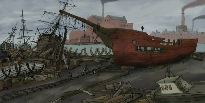
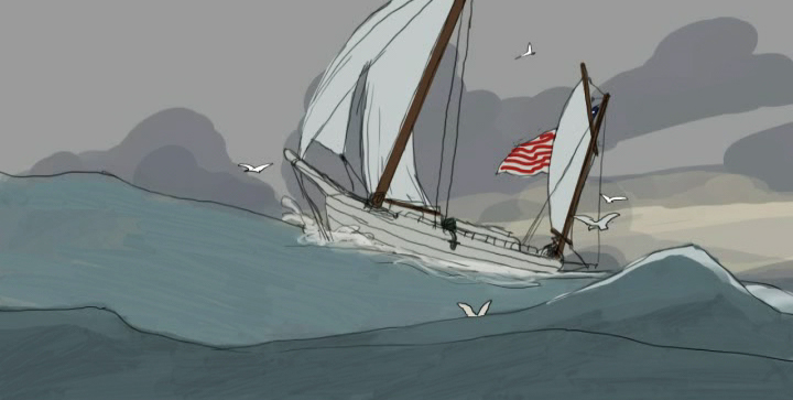
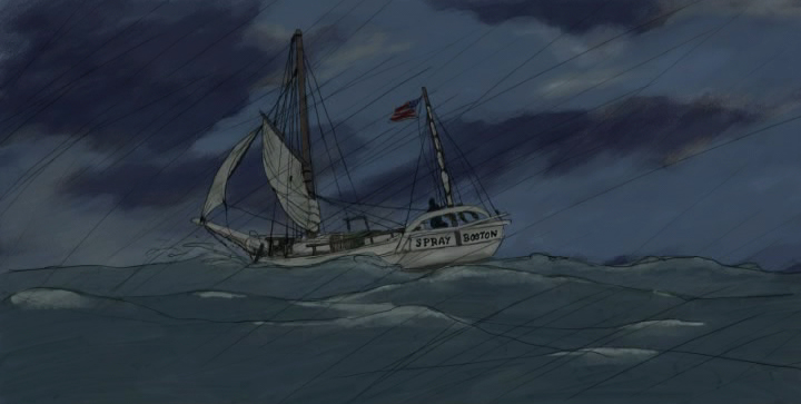
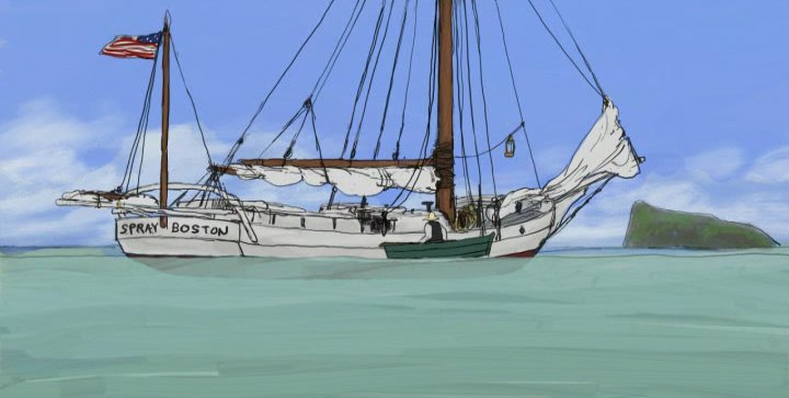
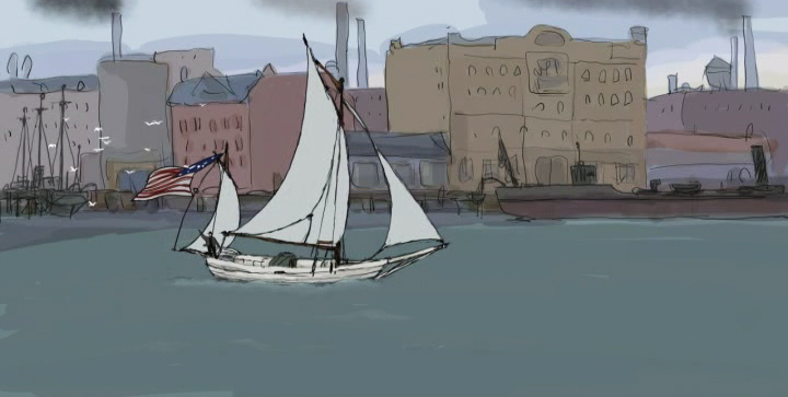 - This past Thursday night, Paul and Sandra Fierlinger presented an hour’s worth of their latest project at Parson’s School. The film, Slocum at Sea with Himself, tells the story of the first person to have sailed SOLO around the world.
The film was a work in progress in every sense of the phrase. It started in full color, included scenes over final Bgs that weren’t colored and had other scenes that were pure pencil test. The sound was predominantly music composed and performed by the brilliant Shay Lynch. (You may know his music from the many films he did for Jeff Scher.) Yet, it all stood with a great dignity as a strong piece.
The film was full of potential to be even greater than their last feature, My Dog Tulip. Imagery was stunning and beautifully designed and animated (as usual from this team). It was a real treat seeing the work in progress, and it was easy to fill in the gaps. The movie takes place almost completely on water, and it’s amazing the effects they’ve achieved in animating such a difficult project. I was wholly taken by it.
As monumental as the screening was – truly inspirational, the talk Paul gave in advance was thought provoking. They are making the film with their own money and planning to release it online in short segments. All told the feed would take about six months to receive the entire feature. To buy these feeds, which will be built into a website that would constantly change for each segment, will cost about $30 in total. They’re hoping for a built-in audience of boaters and leisure craft enthusiasts around the world. Slocum is a well-known story to these folk, and the likelihood that they’d have interest in the subject is great.
Theirs is a provocative idea for distributing the film, and the business model Paul presented seemed original and probably a successful one. It will take some time before the feature is finished, but I’ll be watching closely to see how successful they’ll be. I’d bet on them, too.
There is no doubt of the love they’re pouring into this project. Take a look at these stills:
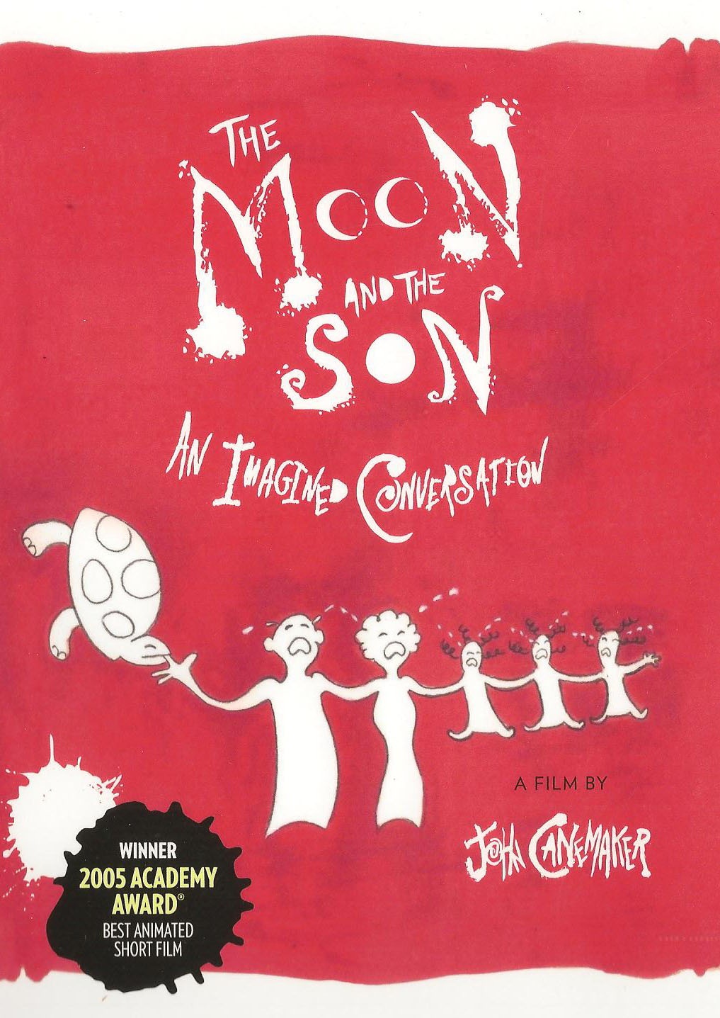
- The Moon and the Son: An Imagined Conversation, John Canemaker’s animated short, is now available in a special edition DVD. This powerful and moving film, which has won both the Academy Award and the Emmy Award, explores the difficult emotional terrain of father/son relationships as seen through Canemaker’s own turbulent relationship with his father.
The Moon and the Son combines many different elements from John’s remembered versions of the facts, to the actual evidence of the life on screen: the trial transcripts, audio recordings, home movies, and photos. The original and stylized animation tells the true story of an Italian immigrant’s troubled life and the consequences of his actions on his family. The film features the voices of noted actors Eli Wallach and John Turturro in the roles of father and son.
The DVD includes the complete 28-minute film and the following bonus materials:
- A new documentary detailing the film’s creative evolution, influences and reception, with animation director/designer John Canemaker and producer Peggy Stern.
- The first rough cut (working title: “Confessions of my Fatherâ€) with original soundtrack
- A Photo gallery of production sketches, preliminary artwork and storyboards
I enjoyed thumbing through all the extras on this DVD. When the film was being made, John shared its progress with me at several stages. I’m intrigued with how much material was there in the development. As a long time friend with John, I felt I’d known some of the story over the years. But the film, and now the new material, give me larger insight to the full story. Spending time reading the storyboard (one of the extras) again – having seen the film several times – allowed me to see some of the background which shaped John’s quest to tell this story.
The DVD is available now on Amazon.
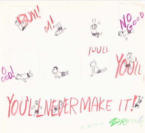
A somewhat Feiffer-like page within the storyboard.
Smart sketches grow in color.
A very “Canemaker” sketch that reminds me a bit of a Picasso sketch.
There’s lots more on the DVD.
____________________________________
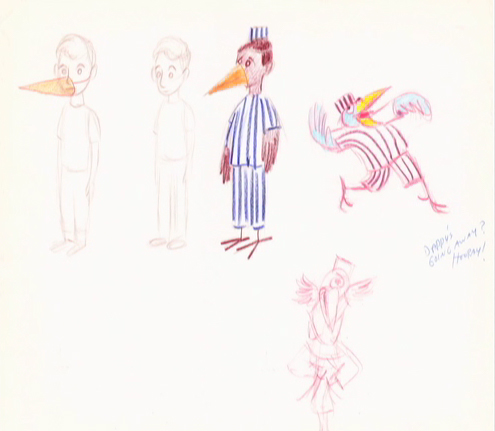
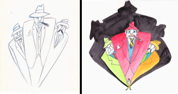
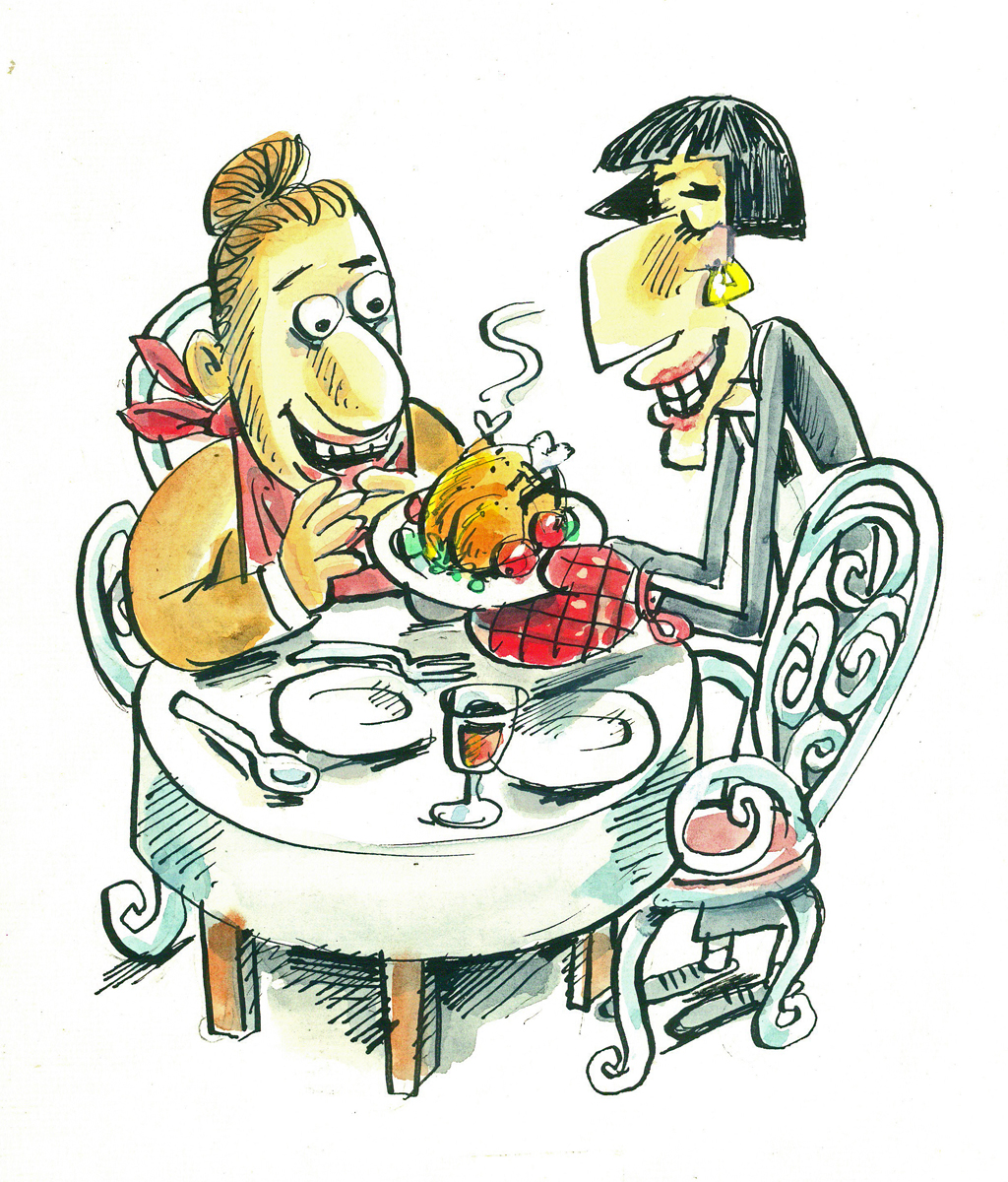
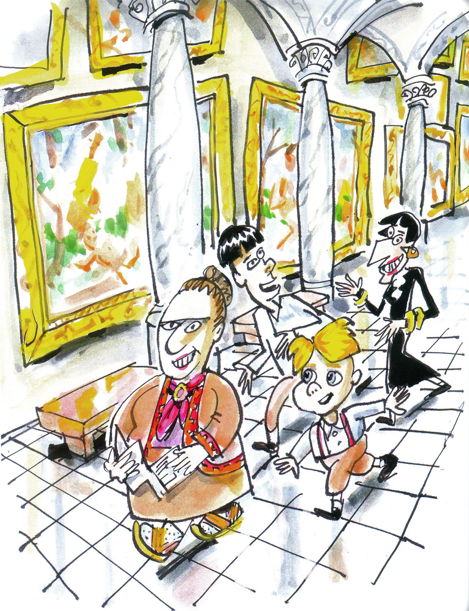
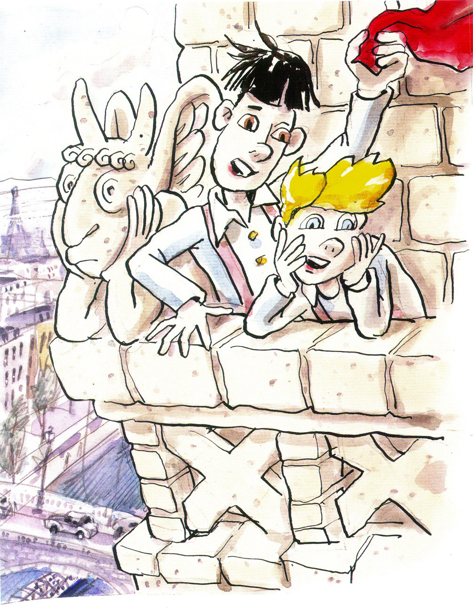
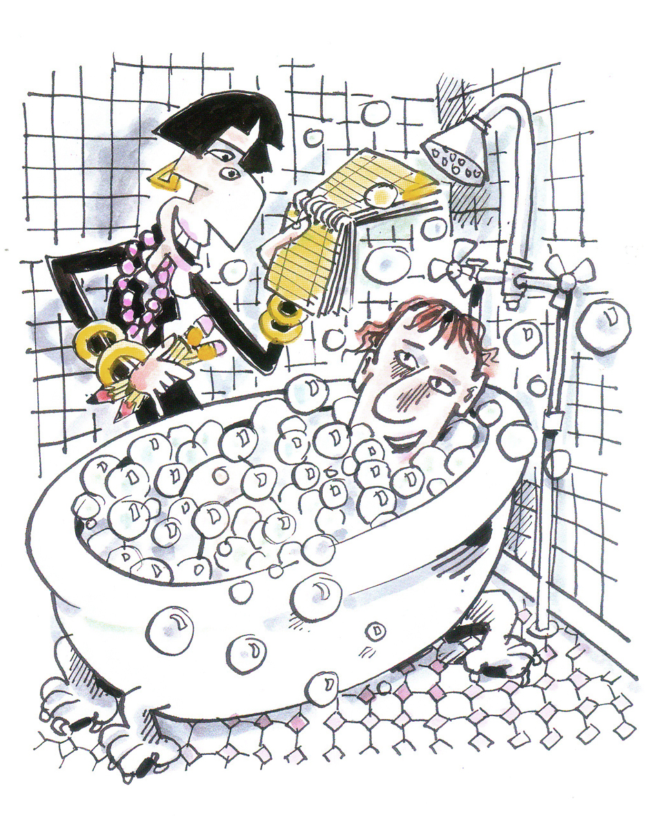
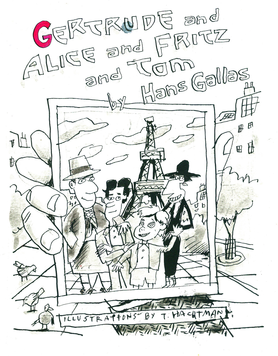
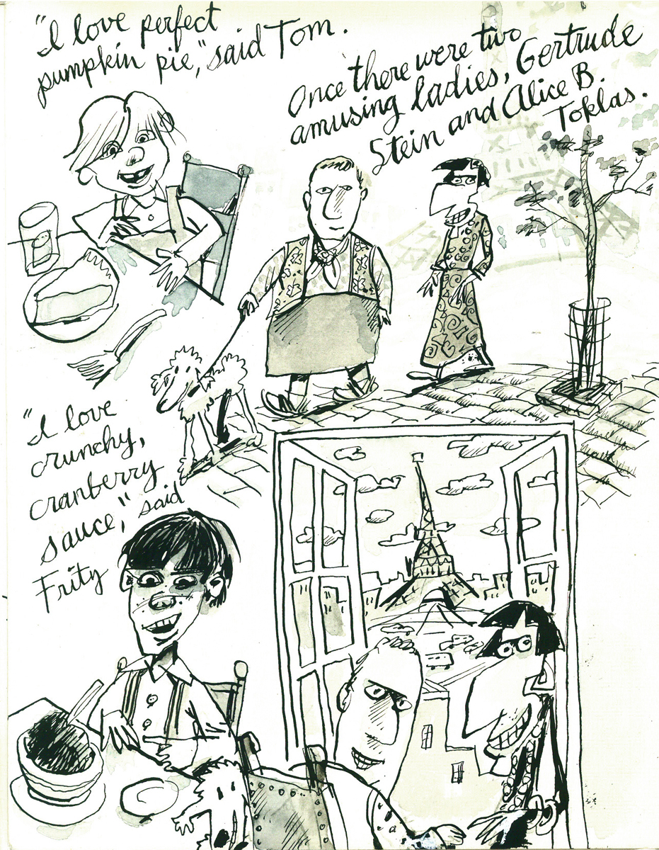
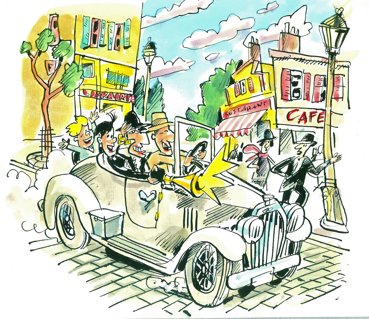
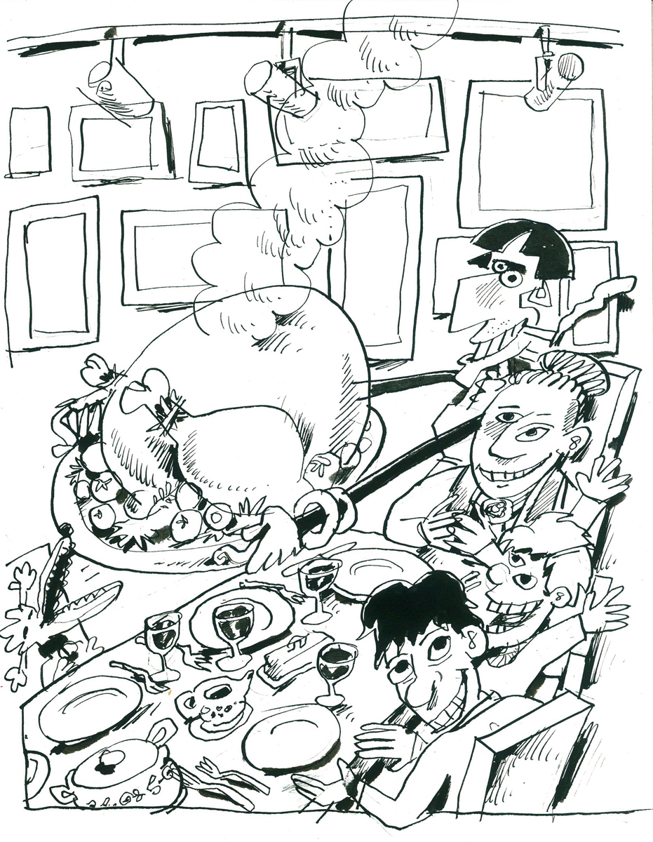
- Tom Hachtman has seen an unusual turn with his Gertrude and Alice characters. You’ll remember that he’d developed a comic strip, Gertrude’s Follies, built around Gertrude Stein and Alice B. Toklas. A friend and admirer of the strip, Hans Gallas, has written a children’s book around Tom’s characters, and Tom illustrated the book. Now that book’s been published, and can be purchased from their site. Gertrude and Alice and Fritz and Tom is a charming account of what happens when Gertrude and Alice have to take care of a couple of young boys during their stay in Paris.
Here are some of the book’s exuberant illustrations.
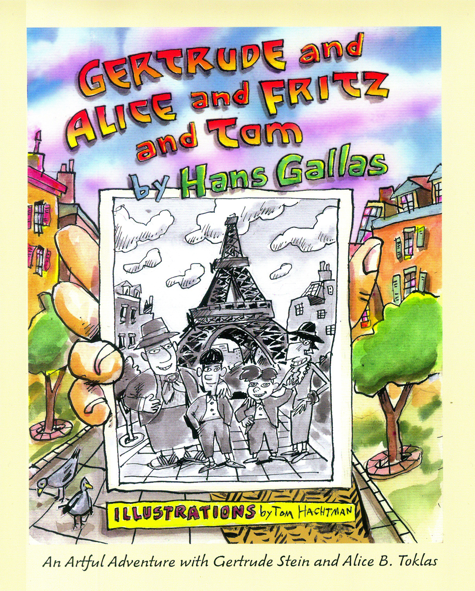
The book’s cover
And here are some of Tom’s original sketches for the book.
Original sketch for the cover.
Très different from the final.
A preliminary sketch for a lot of pages
_____________________________________________________________________
_____________________________________________________________________
- Bill Benzon, on his blog New Savannah, has finally completed his treatise on Fantasia and has published it in a PDF form. You can download this here for a great read. 96 pages of intelligent discourse on the feature. This document contains his original, and shorter commentary on the Pastoral sequence. For his longer take on that sequence download this document.
