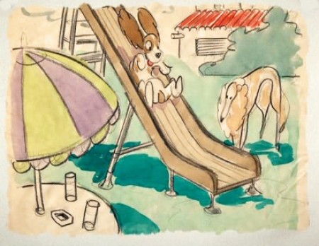
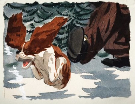
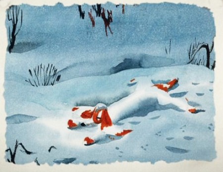
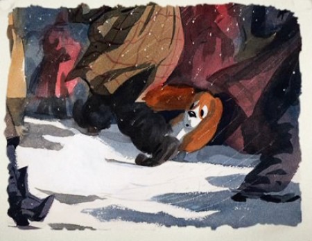
Category ArchiveLayout & Design
Books &Disney &Illustration &John Canemaker &Layout & Design 19 Jun 2013 06:53 am
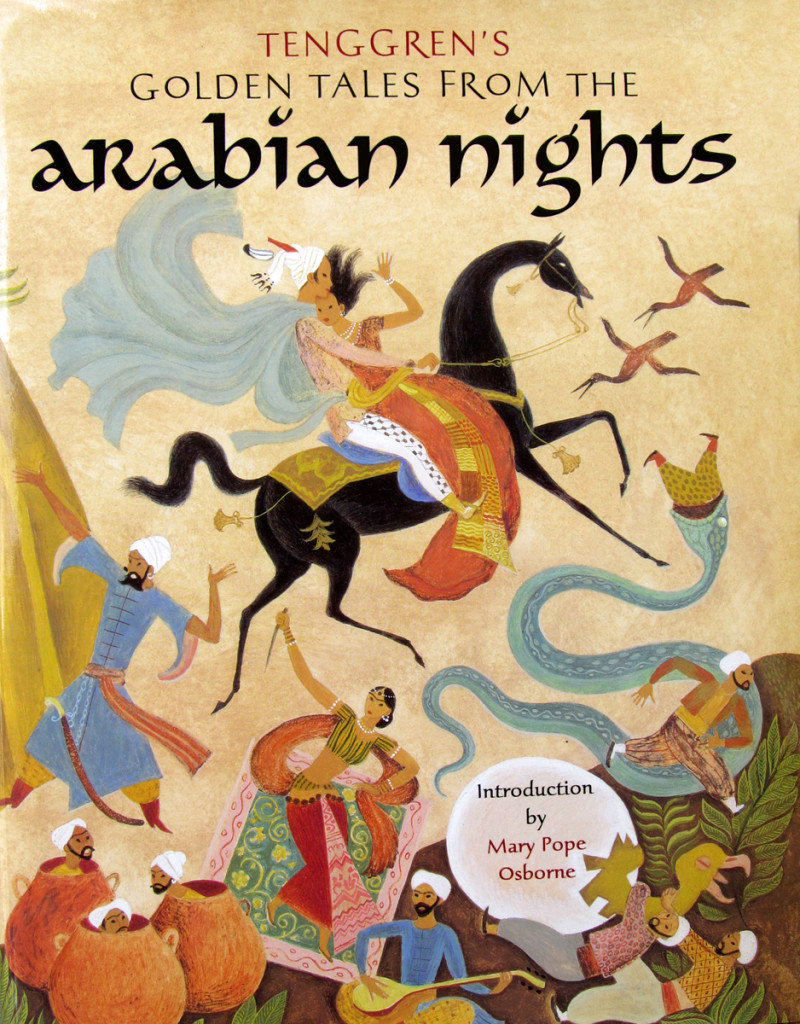
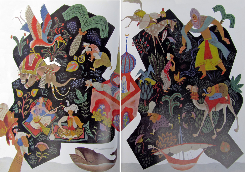
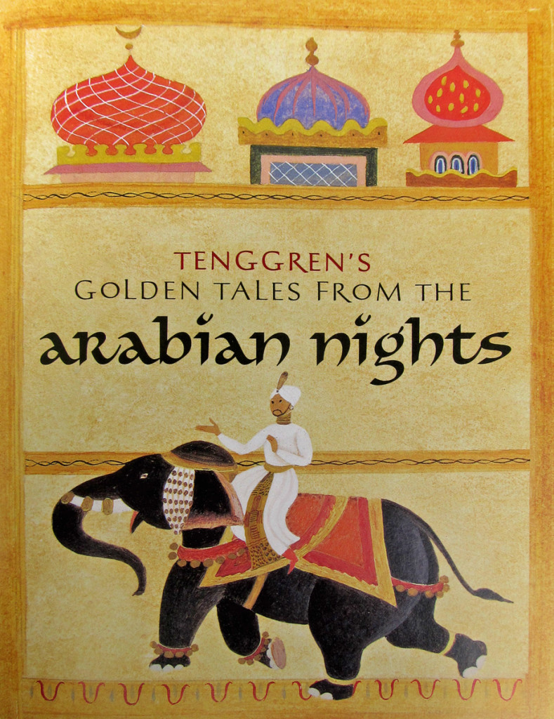
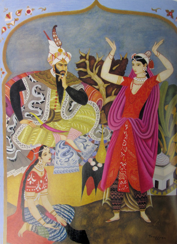
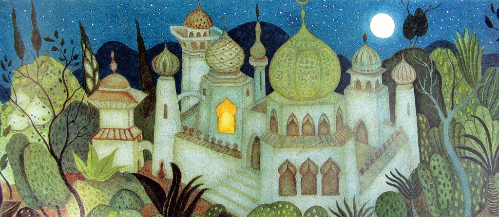
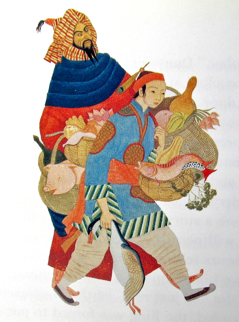
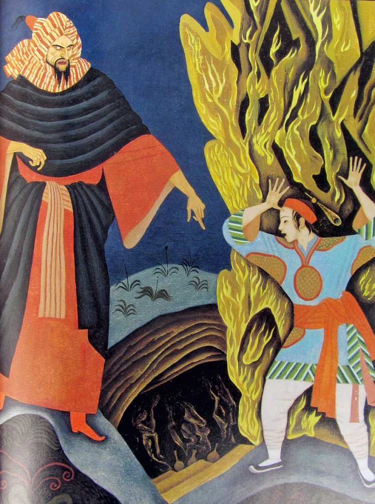
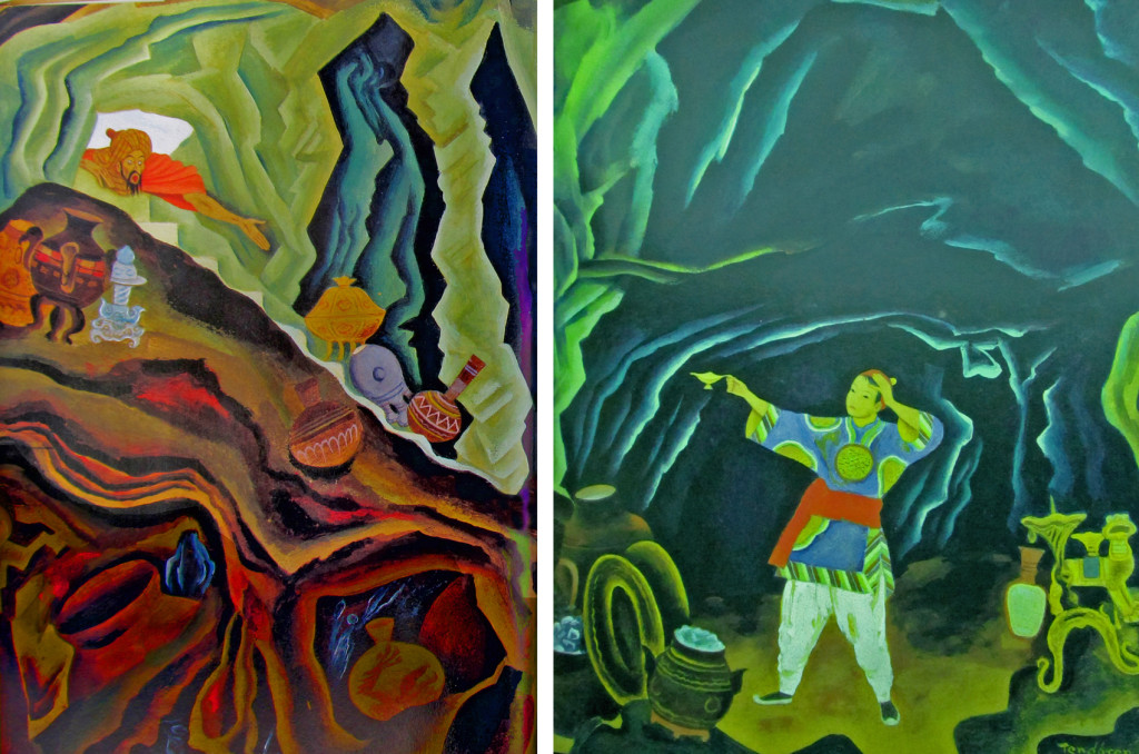
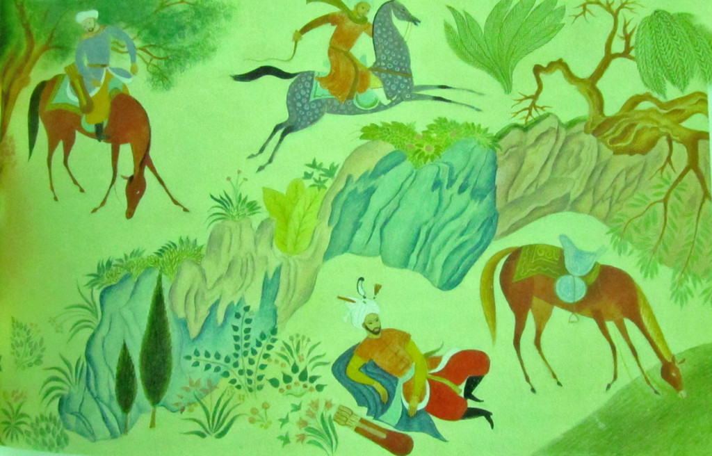
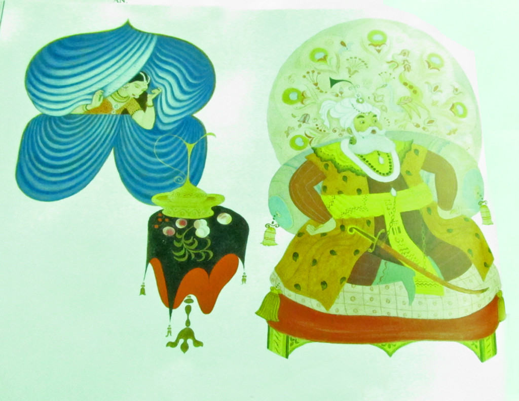
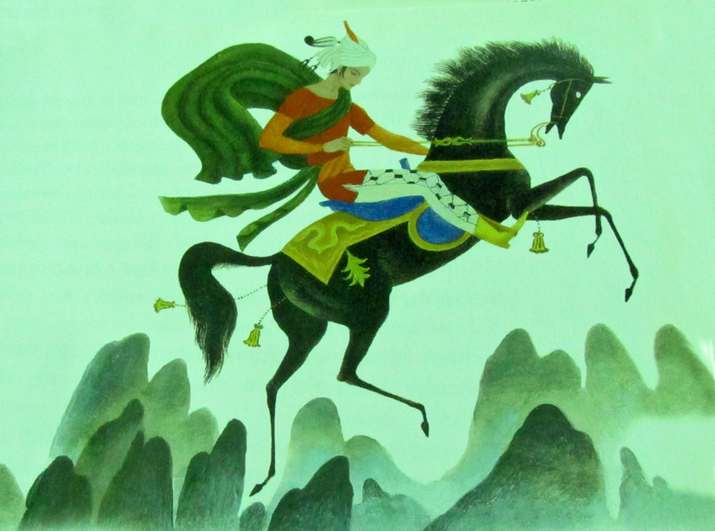
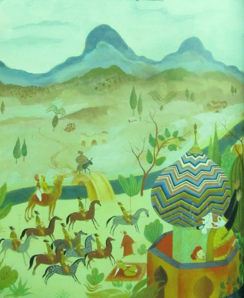
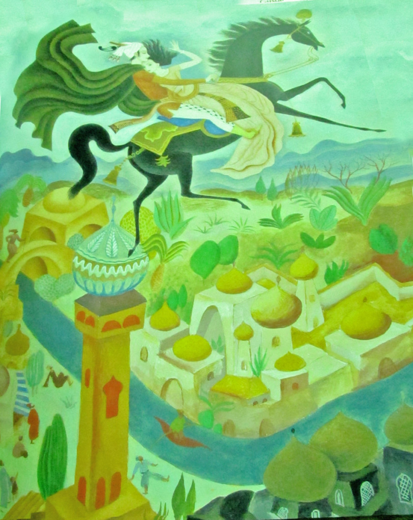
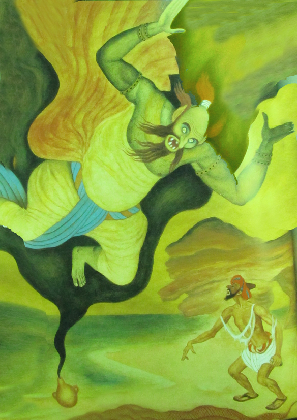
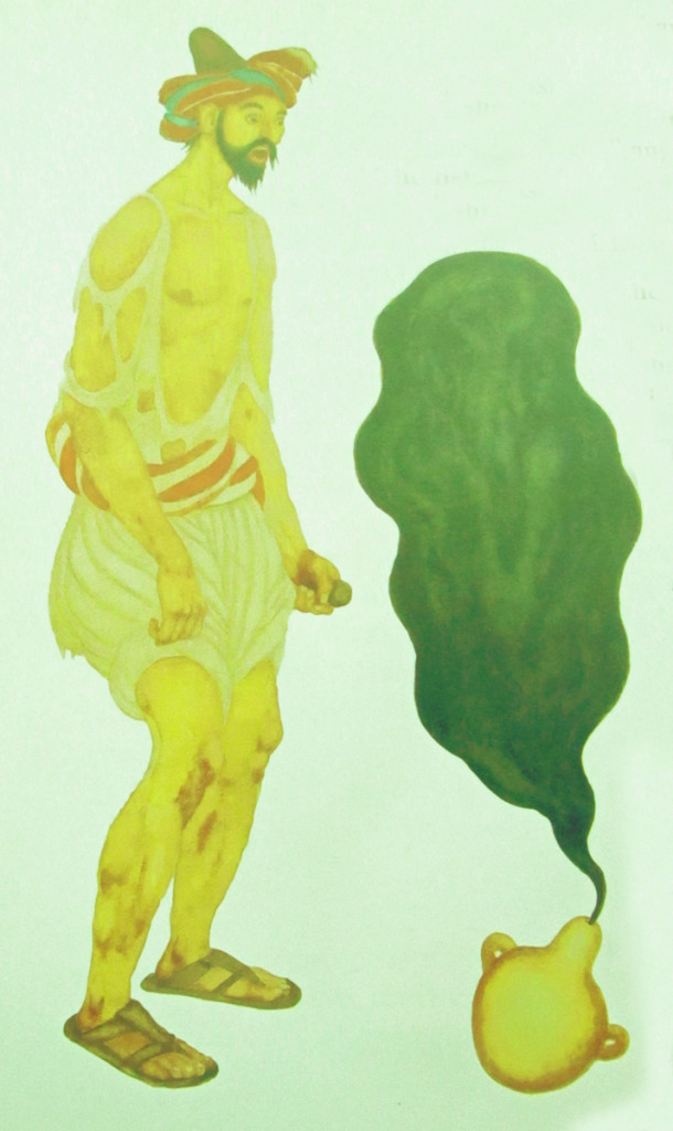
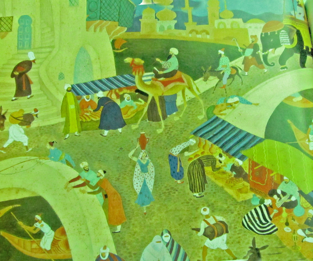
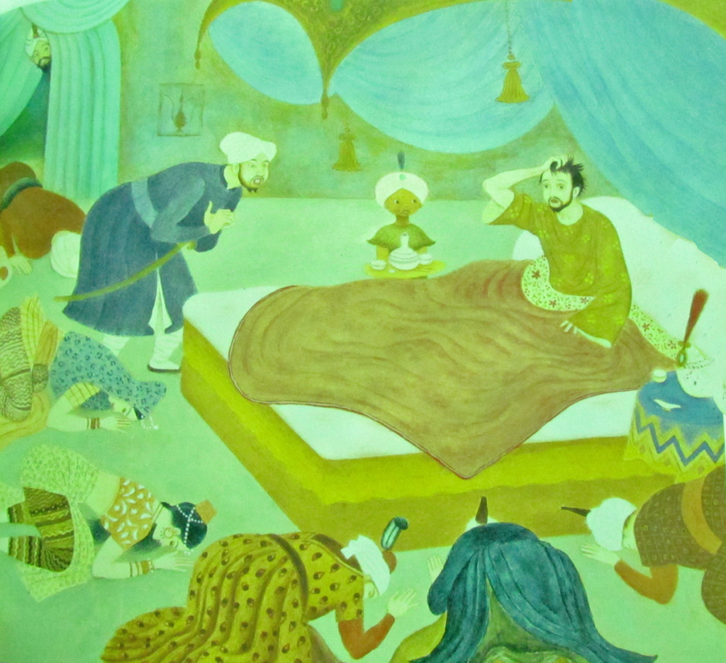
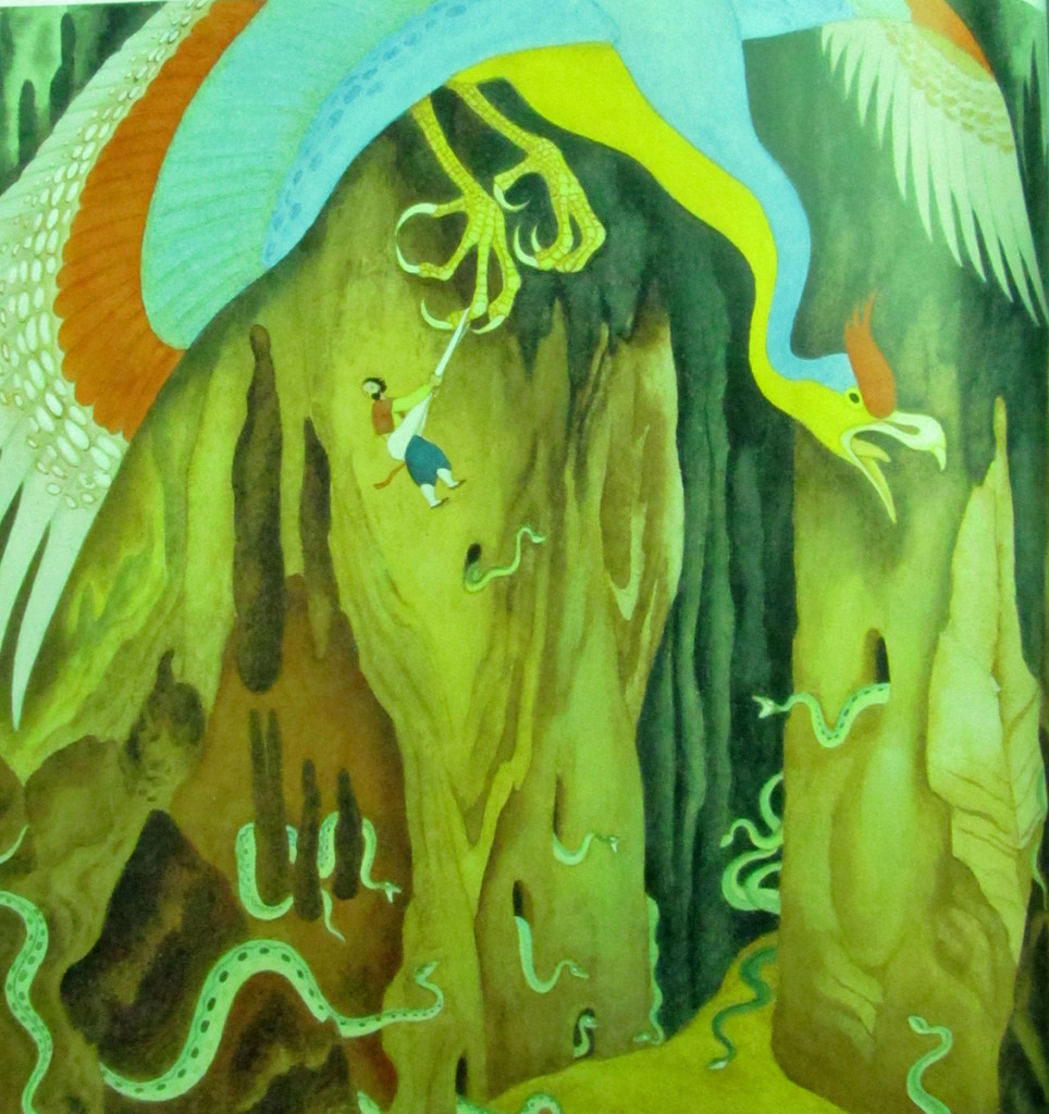
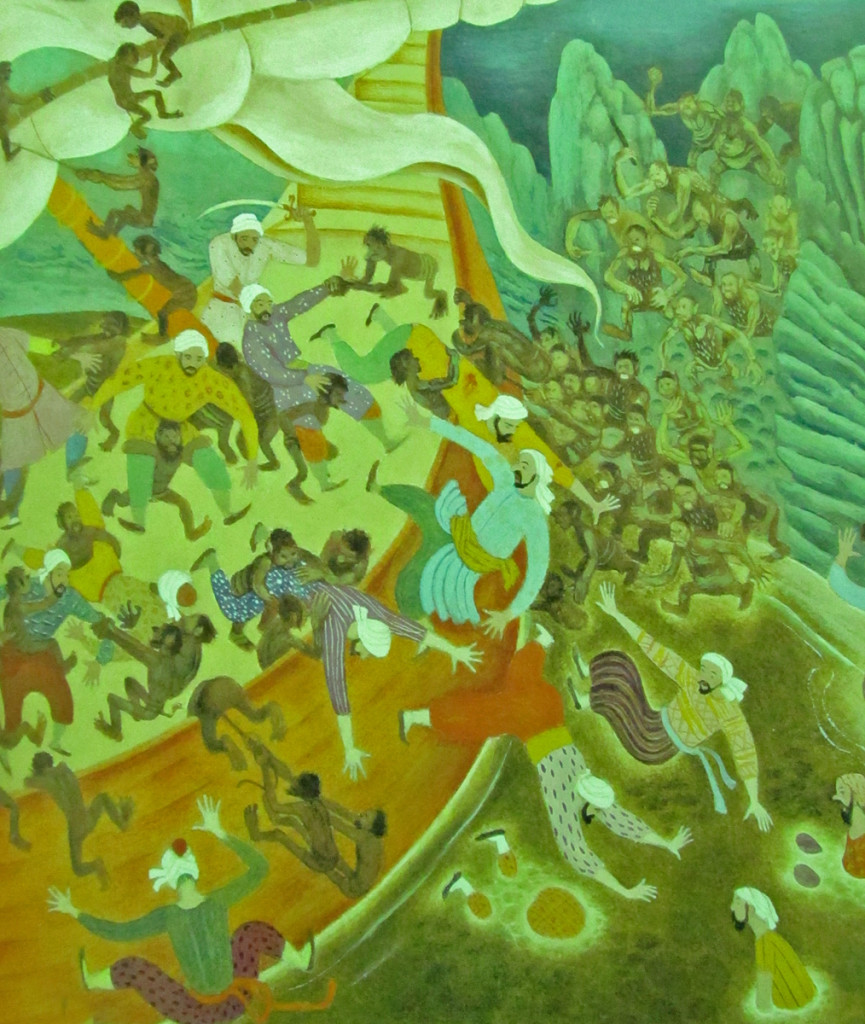
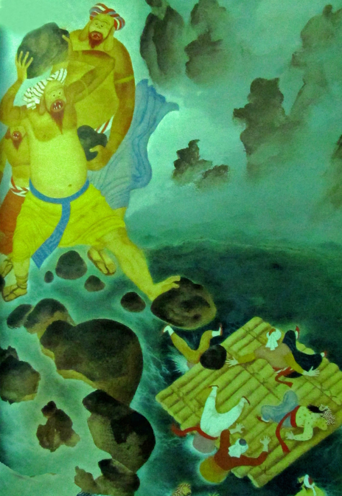
Tenggren’s Arabian Nights
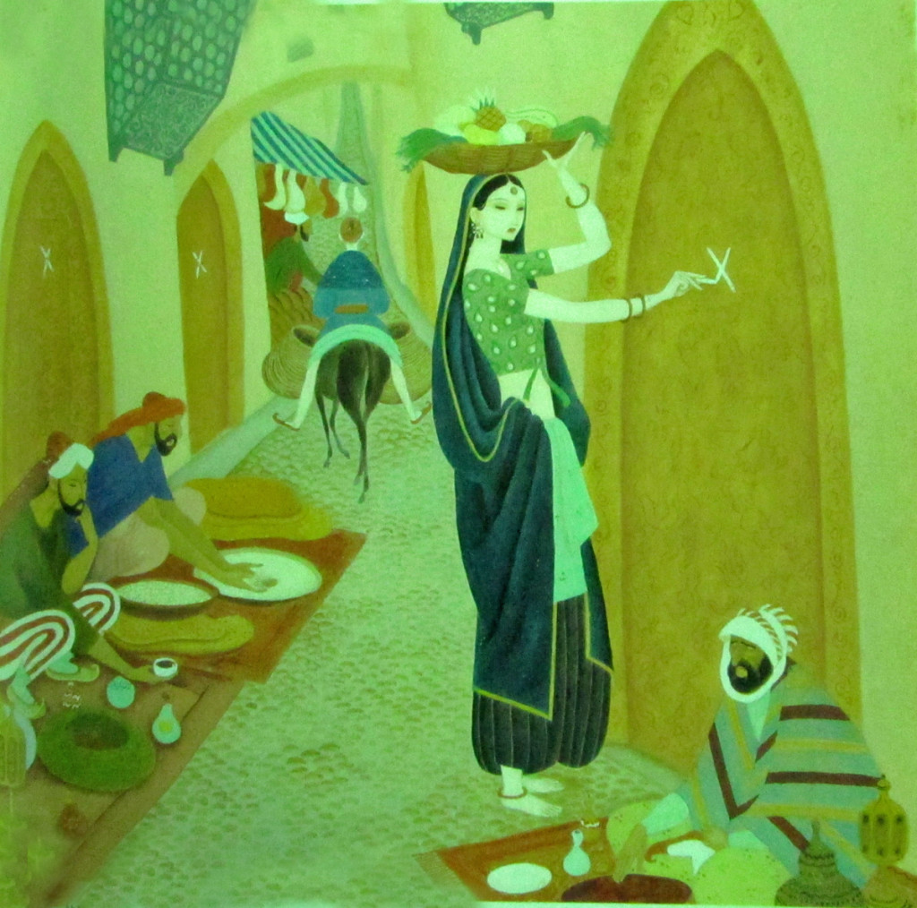
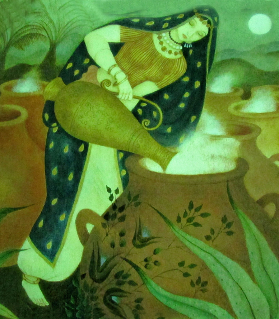
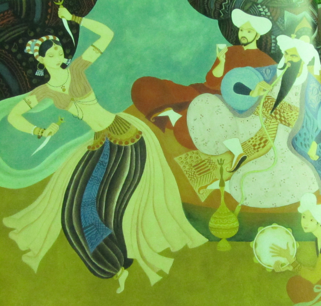
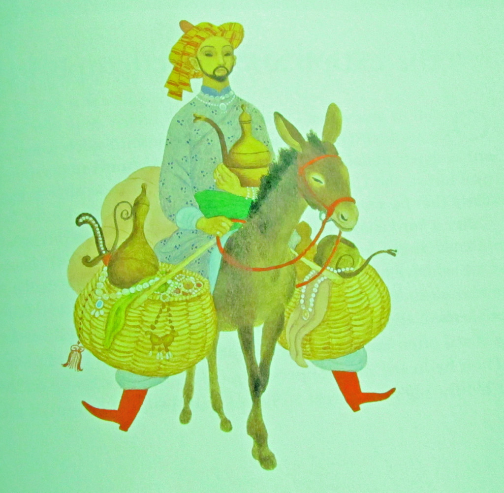
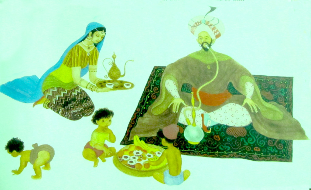
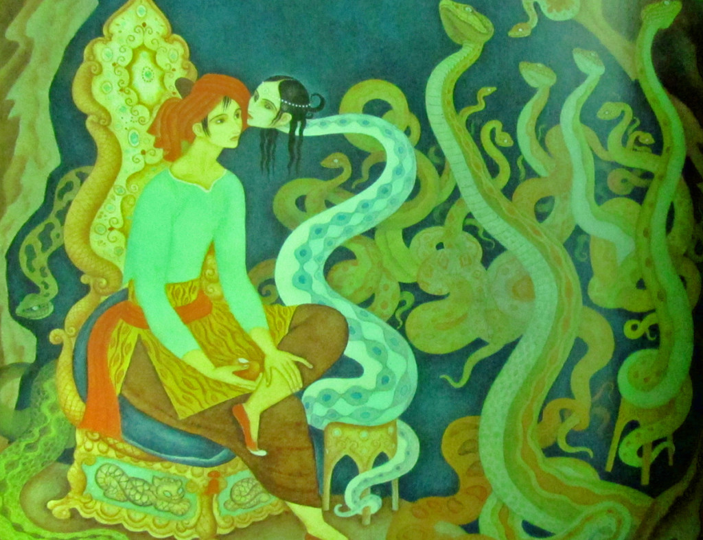
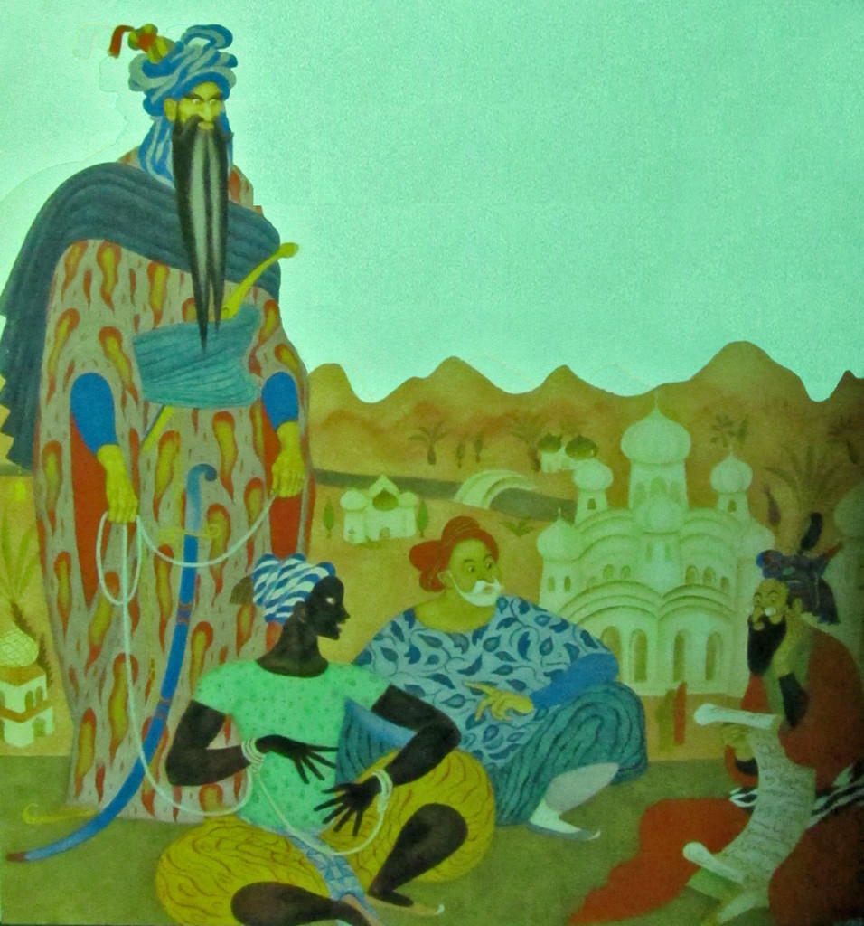
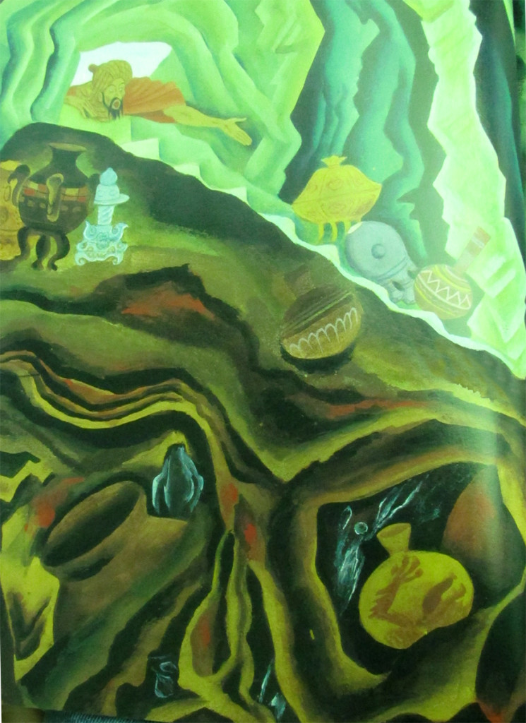
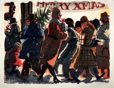
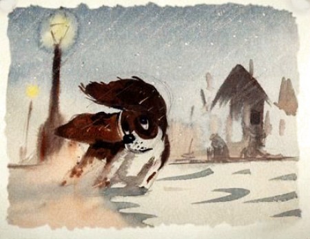
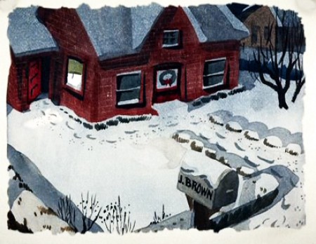
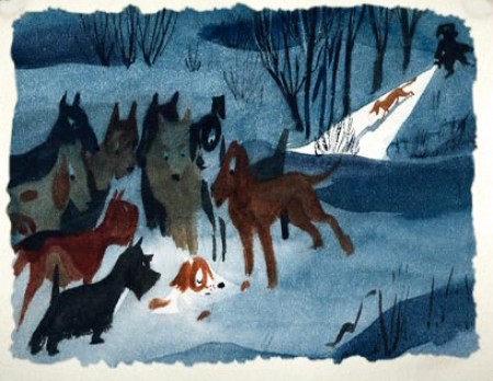
Gustaf Tenggren, of course, was the designer who worked at Disney’s studio during the thirties creating art which became models for Snow White, Bambi, and Pinocchio. John Canemaker wrote extensively about Tenggren in his book, Before the Animation Begins.
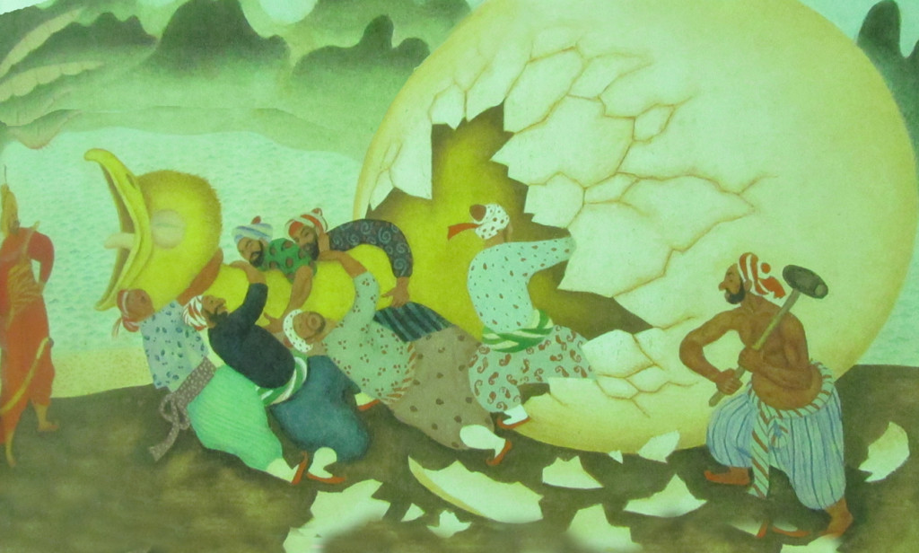
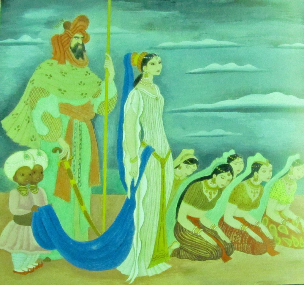
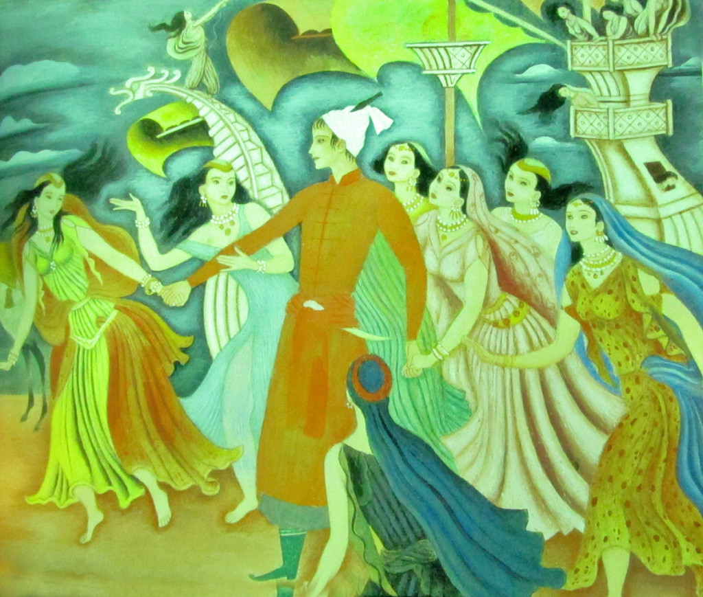
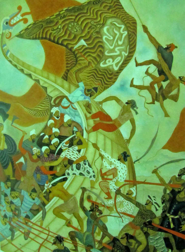
The artist moved into publishing after work at the Disney studio where he created The Poky Little Puppy for Little Golden Books. The Tales of the Arabian Nights was another of the many books Tenggren did for them. While visiting John Canemaker I saw the book and photographed some of the illustrations. Hopefully, the quality will be good enough so that I can share them with you. They’re completely original for Mr. Tenggren; not at all inspired by the many European-styled work he was known for. A true artist.
Animation &Animation Artifacts &Disney &Layout & Design &repeated posts 05 Jun 2013 03:29 am
The Story of the Dogs – repost
To keep in accord with Hans Perk‘s recent posting of the drafts to Lady and the Tramp, I am reposting a couple of these valuable past posts. Here’s one I like a lot.
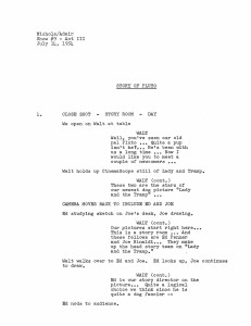
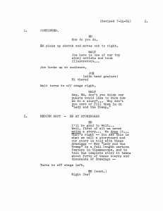
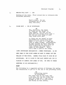
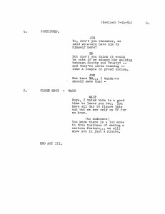
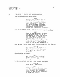
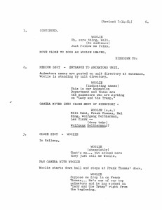
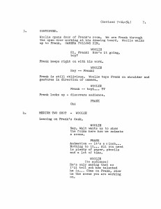
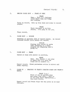
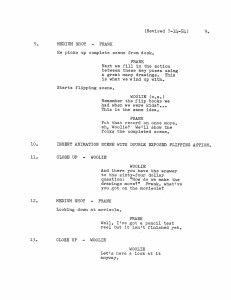
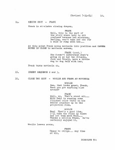
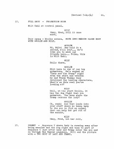
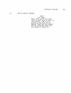
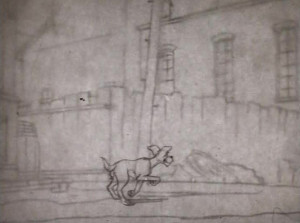
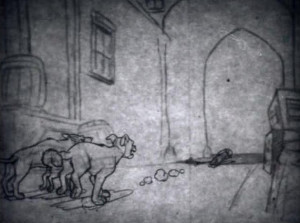
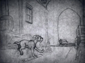
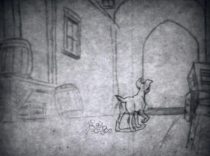
- A friend (who asked to remain anonymous) sent a copy of this script of “The Story of Pluto,” an early episode of the Disneyland TV show. This document obviously follows the show very closely, but I think a lot of the on screen dialogue is actually missing. Regardless, I thought it a good opportunity to go back to the show (which when it hit TV was called “The Story of Dogs.” (At least, the video on the Lady and the Tramp DVD, which has the same date listed is longer.)
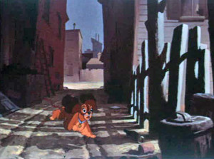
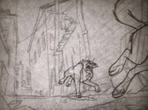
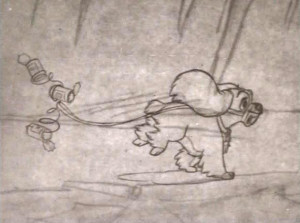
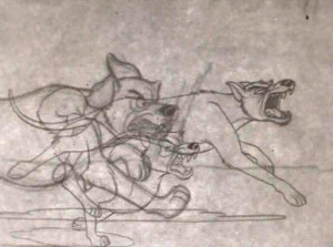
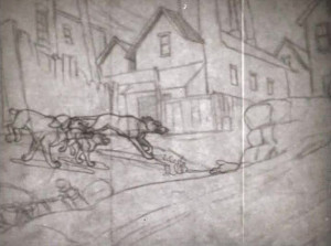
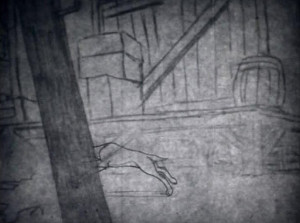
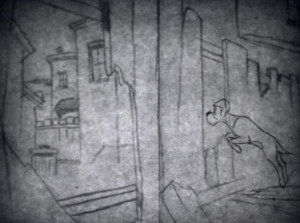
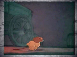
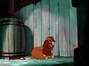
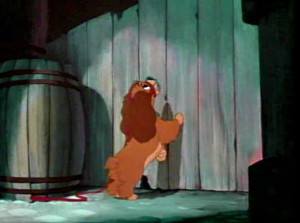
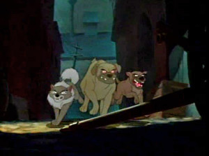
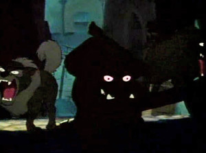
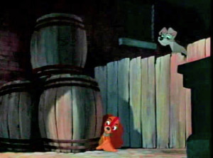
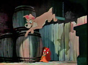
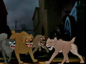
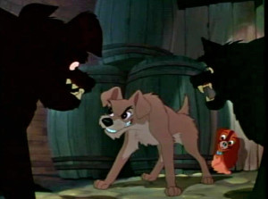
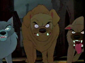
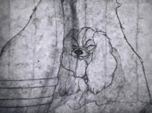
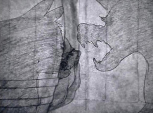
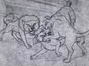
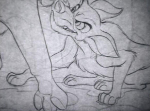
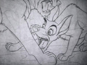
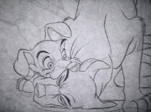
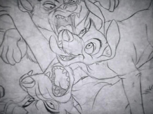
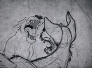
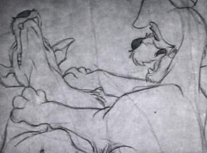
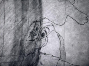
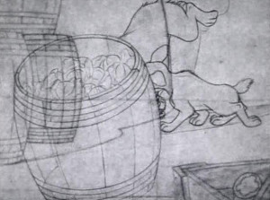
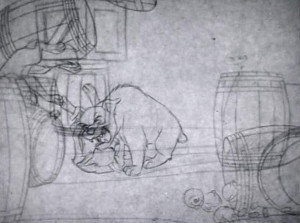
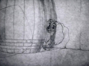
I’ll first post the “script” and then will follow with frame grabs from the TV program wherein Lady runs from some rough dogs who are chasing her, and Tramp comes to her rescue. The original show aired in B&W, but this version mixes B&W PT to color ruff-cut. It’s one of my favorite sections of the film with a lot of animation by Woolie Reitherman. (It comes on page 11 of the script.)
Here are the script pages:
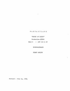
Script Cover
This sequence is followed immediately by Milt Kahl‘s sequence where Lady and the Tramp go to the zoo. They seek the help of the beaver to remove her muzzle.
Animation Artifacts &Disney &Frame Grabs &Layout & Design &repeated posts &Story & Storyboards 03 Jun 2013 04:17 am
Lady Drawings – repost
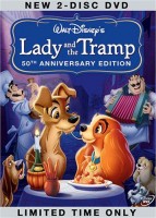 - The recent posts by Hans Perk on his blog A Film LA of the animation drafts to Lady and the Tramp have led me to add to the mix by posting some of these older posts.
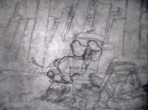
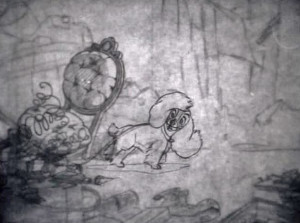
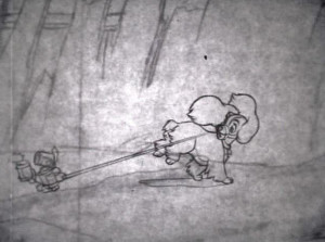
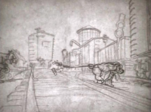
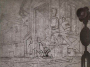
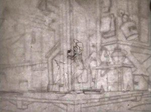
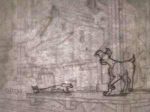
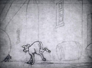
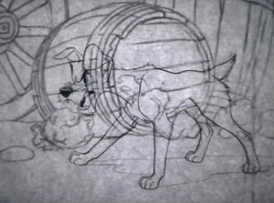
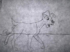
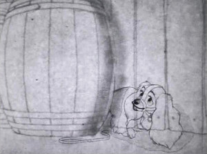
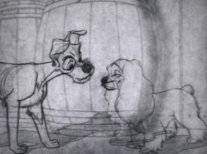
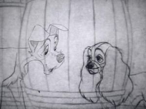
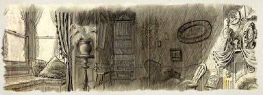
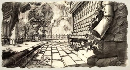
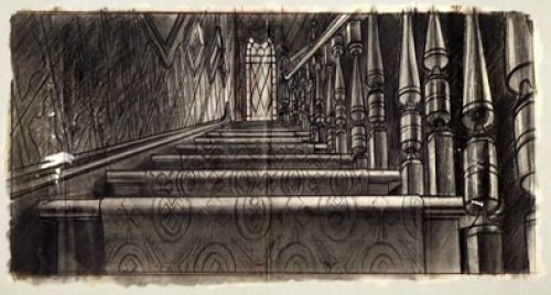
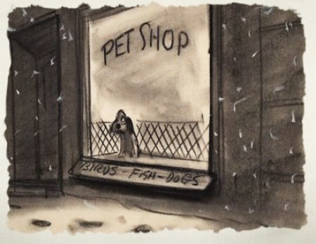
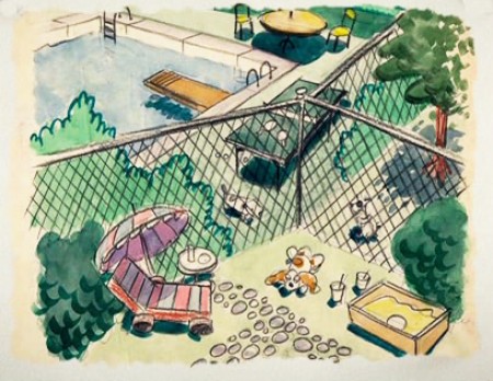
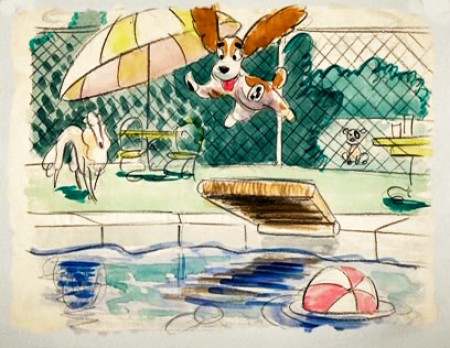
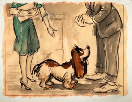
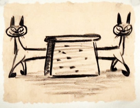
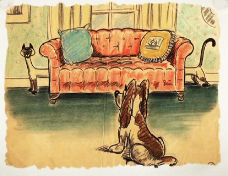
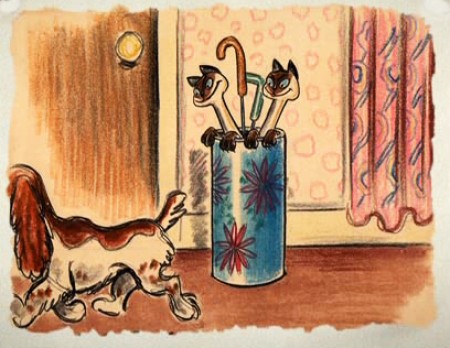
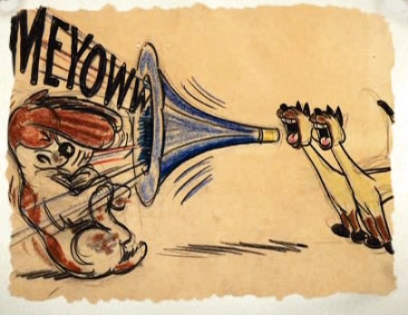
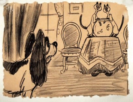
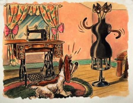
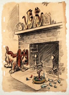
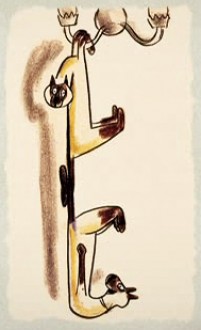
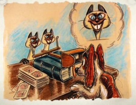
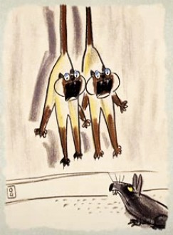
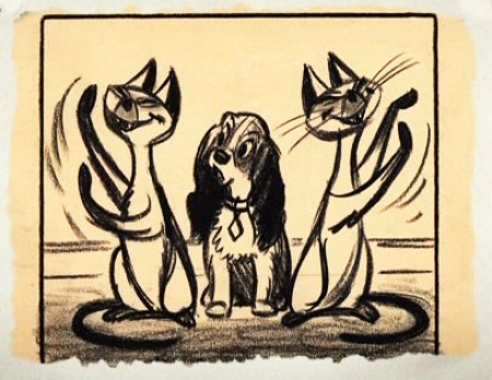
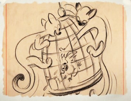
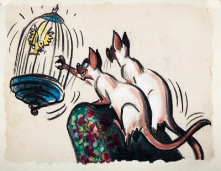
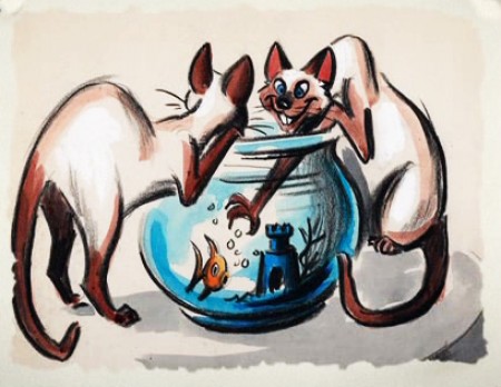
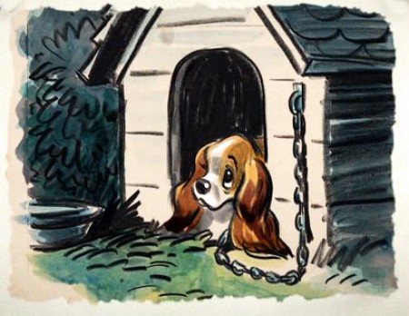
Here are a lot of drawings done predominantly by Joe Grant in the early forties in preparation for the movie.
The illustrations – some are obviously BG layouts, others storyboard drawings – have a light and jaunty feel. They’re very cartoon in nature, and belie the actual feature they produced which, at times, is quite beautiful. Disney truly got the feel of “Main Street, USA” in this film.
I’m interested that most of the images don’t take in Cinemascope (since they were obviously done before the decision to go Scope.Cnemascope didn’t come into being until 1953) Most of them are also fast drawings that don’t feature the Tramp as we know him, and even Lady takes on a different form.
You get the feeling this film was pushed out relatively quickly. The results are excellent, regardless. Sonny Burke and Peggy Lee wrote an excellent pop-song score that doesn’t quite capture the turn-of-the-century, but it does capture the atmosphere of early 50s USA.
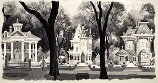
This drawing is in B&W on the DVD, but it appears in
Bob Thomas’ 1958 book, “The Art of Animation.”

Bg for The Princess and the Frog.
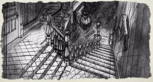
This looks not too different from a shot in Hitchcock’s Psycho.
You can find more Bgs from Lady and the Tramp on Hans Bacher‘s site, one1more2time3.
The following are Joe Grant development drawings.
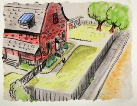
We seem to be in the Little Golden Book territory
with some of these images.
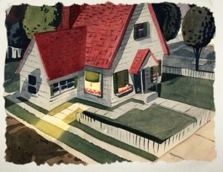
An earlier and different view.
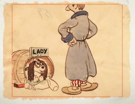
Or did I mean the New Yorker circa 1948?
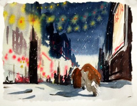
I love weather and would have applauded more of it in the film.
—-
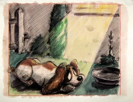
(Click any image to enlarge.)
One more post of these to go. On Friday.
.
John Canemaker &Layout & Design &Models &Photos &Rowland B. Wilson 05 May 2013 05:55 am
More Raggedy Ann Photos – 2
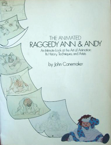 - Last week, I posted a stash of photos taken by John Canemaker for the book he wrote called, “The Animated Raggedy Ann and Andy.”
John Canemaker took all the photos, himself, which led to a more intimate look at an animated film. There were no photo decisions by committee; it was decided to use a photo if it told the story John was trying to relay. For that reason, the book really is one of the best “Art of . . .” type books on the market. (I’m not just saying that because there were photos of me in there – though that would be a good reason, too.)
The book was as exciting – in the making – as was the film. Too bad at the last minute the train of a film ran wildly off the tracks. In a way, I wish the book were written after the film was completed so that we could read the true story of what happened in those last six months of chaos.
The decision was slow in growing and fast when it finally fell, that the movie was enormously over budget. I was in on all the morning production meetings where managers and supervisors and directors would all meet. Those had started off nicely, at the beginning of the film, and went insanely wrong before long. There was the time when I was ordered to fire – that day – two inbetweeners. I was told that we had to give the staff a lesson that they had to work harder. (That might have been hard to do since everyone was giving it their all.) It so happened that one new inbetweener, on her first scene, ignored my instructions (and her immediate supervisor’s) by erasing all of Jack Schnerk‘s drawings. She felt she could animate the scene better, and she set out to prove that.
One down. The second person to fire was someone I was told (by Dick Williams, himself,) that I had to fire. It was obvious that there was a personality conflict since the guy was a great artist and definitely someone who should have stayed on. I was able to arrange for him to be switched to the BG department, thus fired by me from doing inbetweens and hired by them, in the same day, to do watercolors. He continues on, even today, working at a top position in design at Blue Sky. I don’t know about the woman, but I hope she gained a little humility that day 30-something years ago. That story didn’t make it into the book.
What there was in the production was a great first year of production where the art of animation was treated in its highest form. We were all out to make the greatest film of all time and bring it to the big screen. We had some of animation’s finest animators gathered to work on it. Assistants and Inbetweeners in New York were offered classes, after hours, which tried to teach animation to the new. With teachers like Tissa David and Art Babbitt and more experienced Assistants; a lot was conveyed. I was usually too busy to make it to many of these classes, but I always kept a close eye on what was taught. It really was fun and incredibly valuable to many of us.
At some point along the way, the LA studio was closed and key people from there came here. All of our space was overcrowded and uncomfortable. The Xeroxing in NY, a sweet grey line that took a while to construct, was replaced by a thick back line, when management sent work to Hanna-Barbera to outsource the xerography and some of the painting. Shadows were eliminated. Color copiers were rented. Scenes that had been animated in a non-photo blue pencil on 16 fld paper were being copied and reduced, at the same time, in B&W so that they could use 12 fld cels to color the art. A penny saved is a penny gained; I guess. This meant that a number of my inbetweeners were used to put 4 sets of crosses on the animation drawings so that there’d be some form of registration on the reduced artwork. Certainly the registration went all to hell in the process, thus allowing the latter half of the film to have a lot of slippage on the big screen. Lots of weaving animation in scenes that were rushed.
Emery Hawkins‘ amazing taffy pit took a big hit when it was animated more like a limited animation movie. All that beautiful rolling motion Emery had created on the cinemascope screen suddenly hits the wall and stasis sets in. The film was never going to be a classic of he silver screen, but it should have been a hell of a lot better.
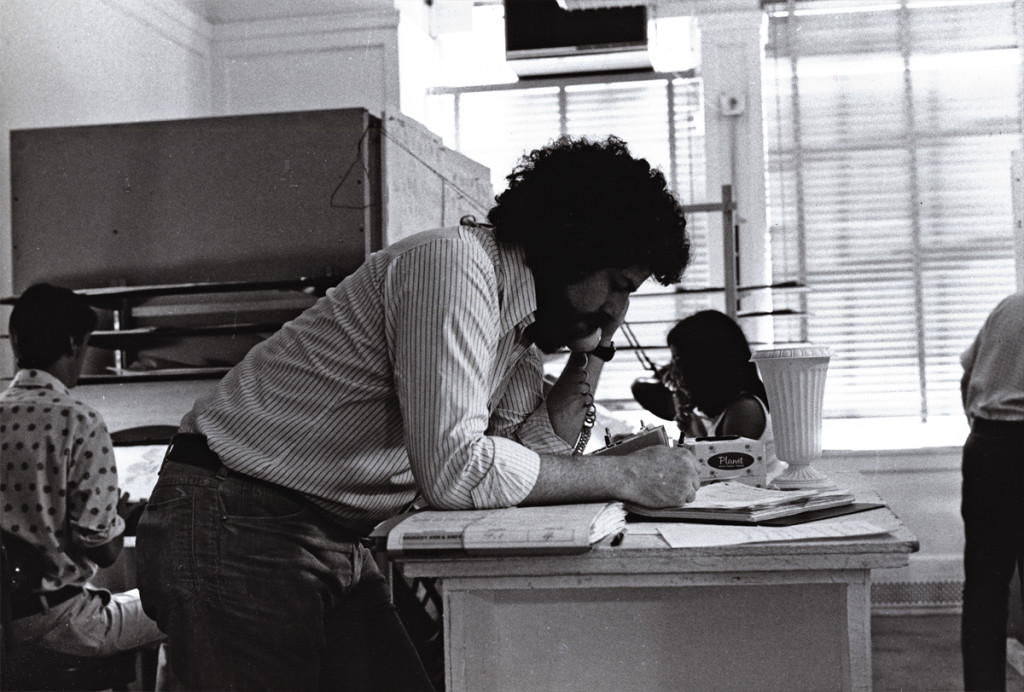 1
1Here I am doing what I did most of the day.
I talked on the phone. Ennervating stuff.
A young Kevin Petrilak is in the rear left. He was an inbetweener
in the Taffy Pit. Dan Haskett ran that group of people.
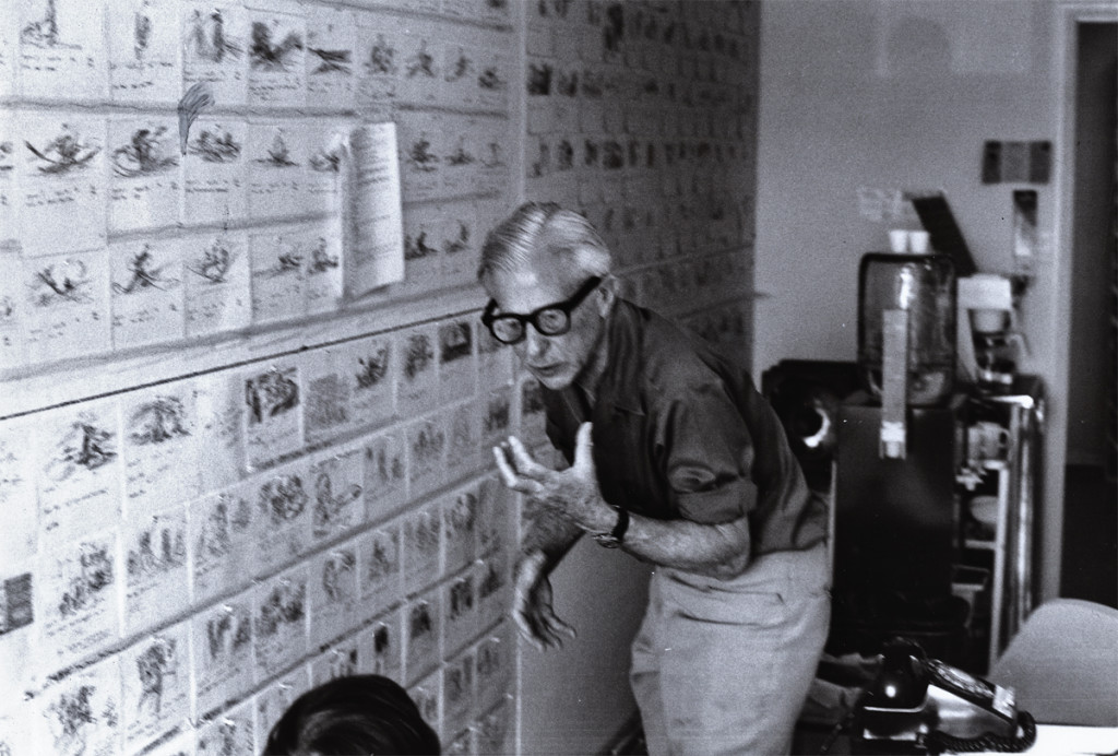 2
2
Here’s Art Babbitt teaching. He loved doing that. Dick tried to
recreate the classes he’d had in London a couple of years earlier. We – all New York -
sure appreciated the two weeks of lessons. I have Dick’s notes from these sessions.
 3
3
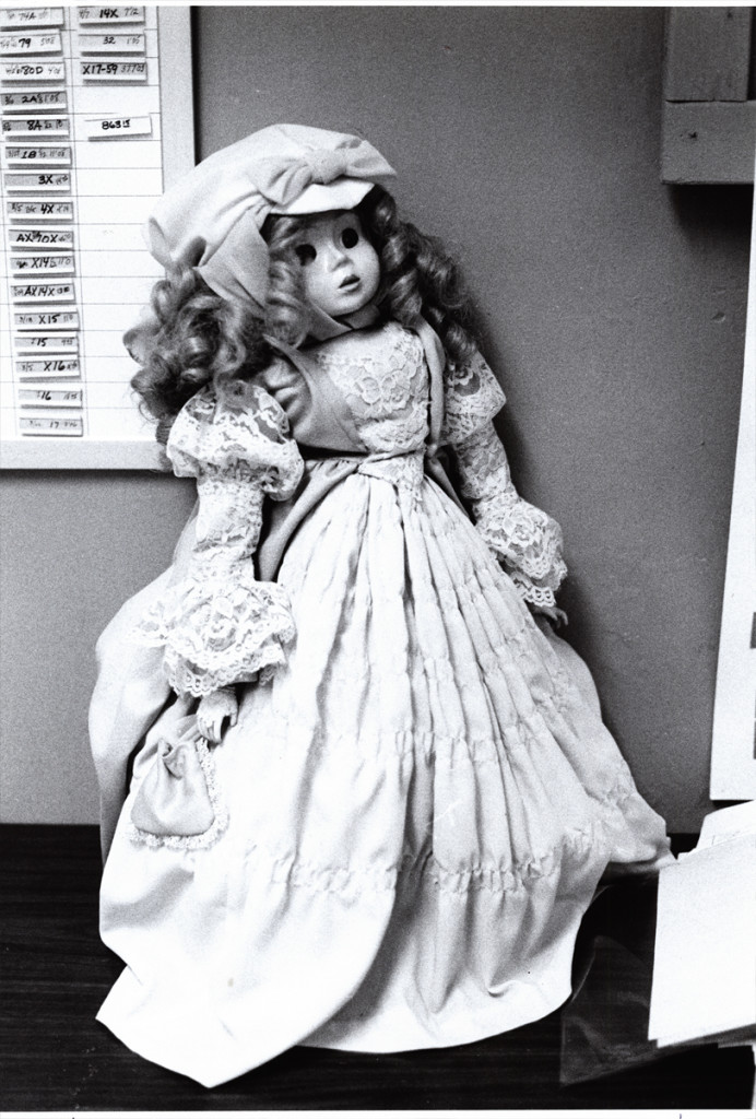
This is a beautiful doll. Babette. She was at the film’s center.
The Pirate kidnaps her and takes her to sea. Raggedy Ann & Andy
take off in pursuit of her to bring her back to the playroom.
 4
4
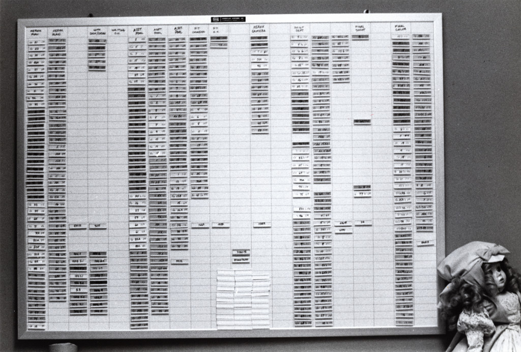
This is a wall of stats. It represents footage counts produced in
every department working on the film. This hung in Mike Sisson’s office.
He was the production manager who tried to usurp the entire production.
A couple of weeks before everything changed, managerially, on Raggedy, Sissons
approached Cosmo Anzilotti and me at lunch. He saw us at the restaurant and came
over to us. He wanted to lead a take over cutting Dick out of the film and
putting Cosmo in to finish directing the film. I’d be made Cosmo’s assistant.
I had no intentions of being another Iago, and said as much.
 5
5
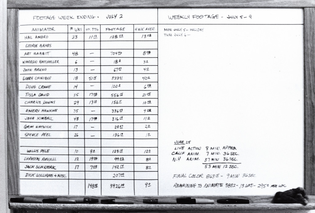
This chart covered the animators footage counts. A running record.
I told Cosmo that Dick had brought me onto the film, and I’d do anything for
him. If it meant leading a large group to quit the show, I’d do that. Cosmo
seemed relieved. He wanted to do the same and we both told Sissons how we
felt. He greeted our news with an ass’ smile and thanked us. We were no
longer on the winners’ side, and I watched closely to know when to exit.
 6
6
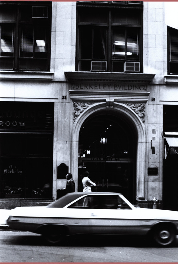
This was where the NY headquarters were planted. In the middle of 45th Street.
Most studios in the forties and fifties had places on 45th Street. Paramount,
Hal Seeger’s studio, lots of other smaller studios such as Pablo Ferro or Ray Seti’s.
![]() 7
7
Didi Conn was the actress who voice Raggedy Ann. When the VOs were coming
to an end, Didi worked late and her mother was with her. They needed help
getting home (Long Island.) The mother was afraid to drive. I volunteered
and drove them home. I took the Long Island Rail Road back to the City.
 8
8
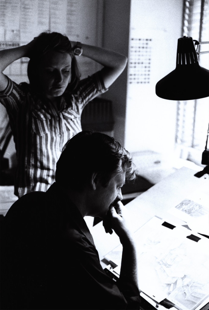
This is Sue Butterworth with Dick Williams. She was the watercolorist who
led the BG department and designed the wc style of the film. I thought her
work a bit inconsistent and often lacked the dynamic look good BGs require.
 9
9
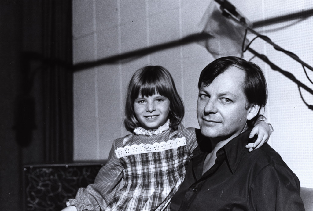
Here’s a picture of Dick Williams with his daughter,Claire.
Claire played the part of Marcella, the little girl at the film’s start.
They shot the live action in Boonton, NJ during the first days of the
production. All those hours they were out filming, I watched the shop.
Alone in an enormous darkened most of the time in the enormous office,
I could only spend time reading and rereading the script and sketching
my idea of some of the characters.Infrequently, the financial manager
of Lester Osterman Prods., the production company, would pass through.
 10
10
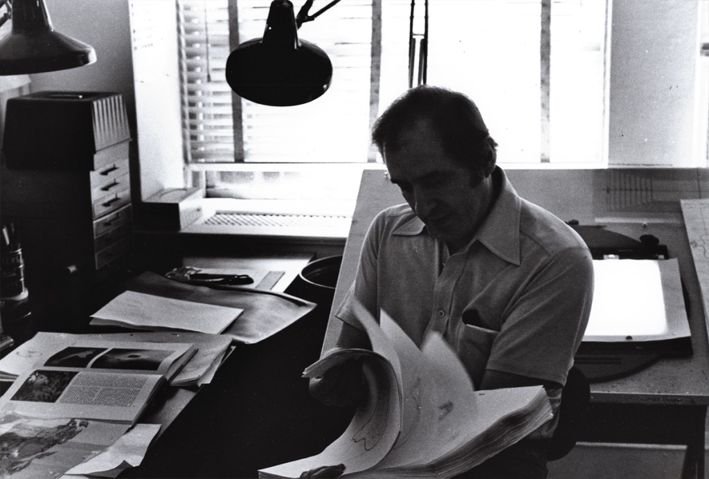
George Bakes was a fiercely independent animator who worked a short
while on the film. He must have started at Disney on Sleeping Beauty. He’d often
show a lot of Milt Kahl drawings he’d had from that film.
 11
11
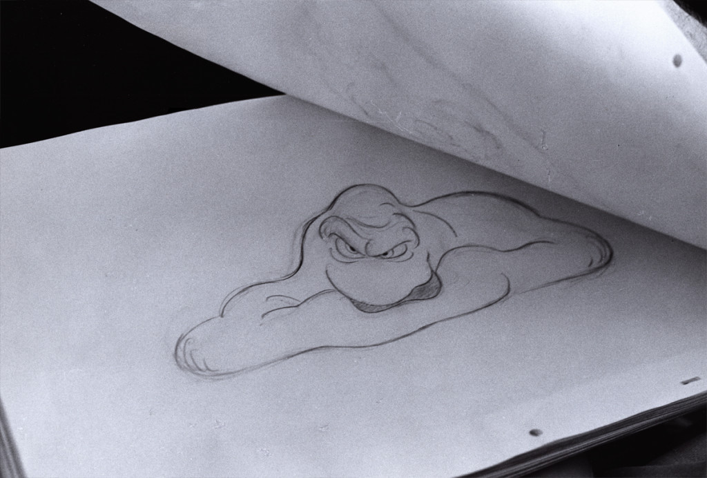
Baskes animated many of the cereal commercials of the day -
Trix, Honey Bee, Sugar Crisp bear, etc. For Raggedy he did the “gazooks.”
 12
12
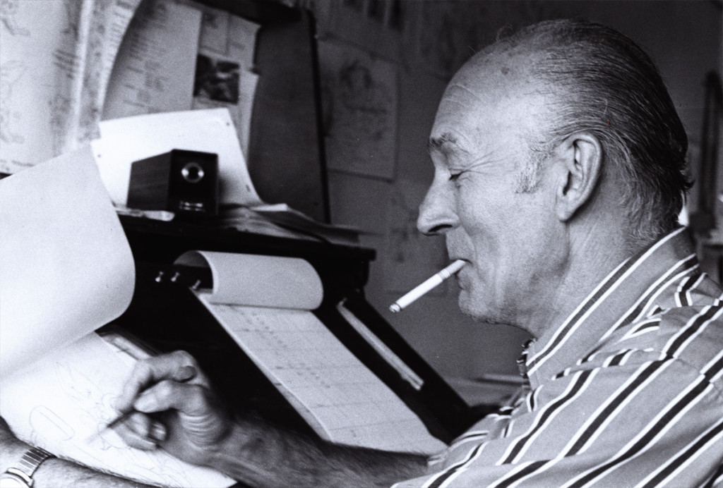
Gerry Chniquy was a brilliant animator straight out of WB.
He’d done a lot of Yosemite Sam animation for Friz Freleng.
It wasn’t far to go to cast him as the blowhard of a King, King Coo Coo.
Marty Brill voiced the character. Gerry Chiniquy,of course, did a fine job,
 13
13
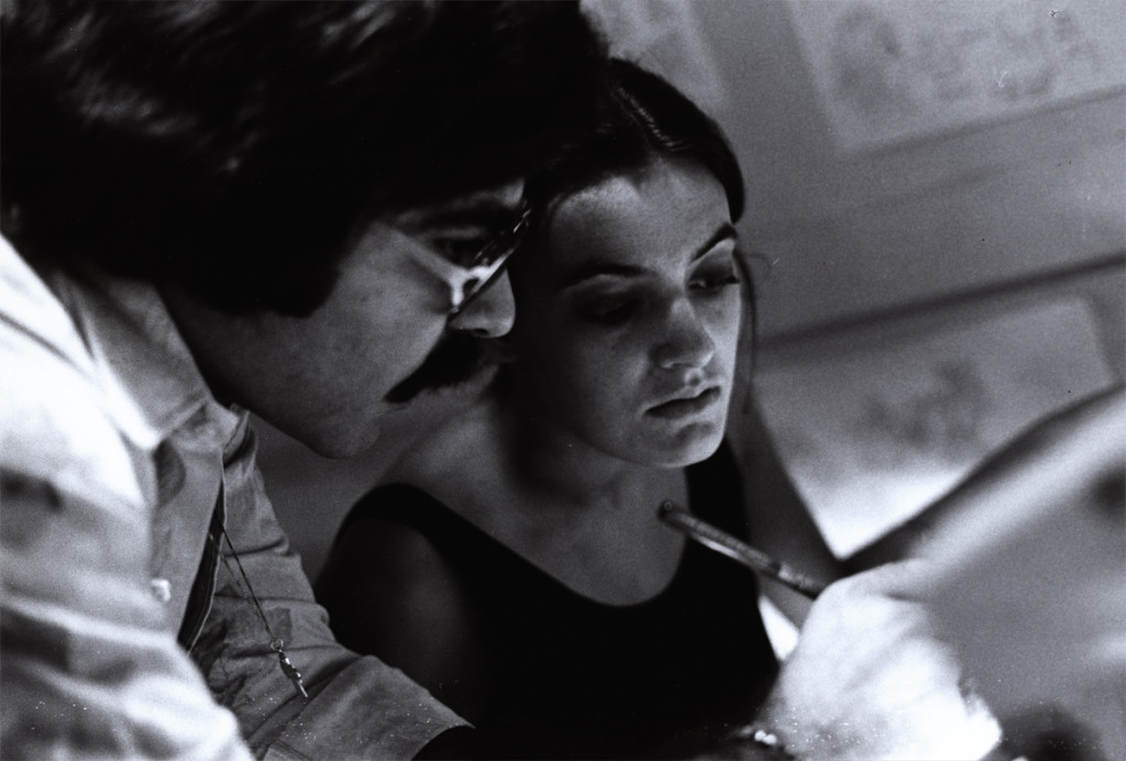
John Celestri had a style all his own although he idolized Bill Tytla.
Not a bad person to pick for a role model. John was an Assistant on
the film. Here he’s working with inbetweener, Amanda Wilson. Amanda was
the daughter of the great cartoonist and animation designer, Rowland Wilson.
The last of these photos will come next week. Many thanks to John Canemaker for the loan of the images. Any opinions tossed about here, are all mine and John is not to blame for them.
Action Analysis &Animation &Animation Artifacts &commercial animation &Layout & Design 17 Apr 2013 05:51 am
Piels Bros. Odds & Ends
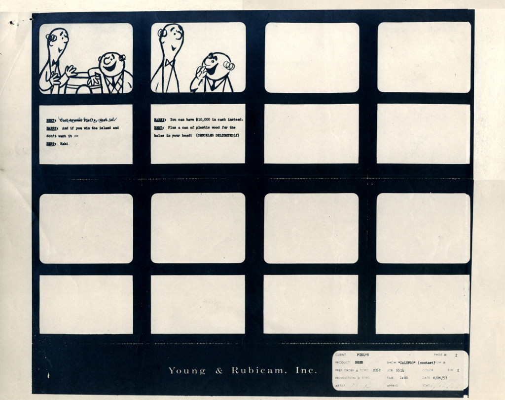
Among Vince Cafarelli‘s remaining artifacts there are lots of bits and pieces from several Piels Bros. commercial spots. I decided to put some of it together – even though they’re not really connected – into this one post.
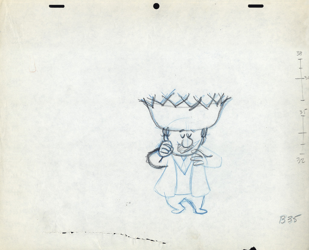
There are animation drawings I’ll try to post in other pieces.
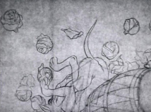
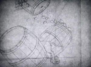
Here, we have a storyboard for a spot; I believe this is an abbreviated spot promoting some contest Piels beer was running. I think this is from a shortened version of a one minute spot since there are animation drawings which are obviously from the same setup, but they’re not part of this storyboard. (There’s an unveiling of the barrel, which is upside down.)
Since the boards are dated 1957, and given the use of signal corps pegs, I believe these were done for UPA.
Regardless, the drawings are excellent. I presume they’re hand outs to Lu Guarnier, animating, and Vince Cafarelli, assisting.
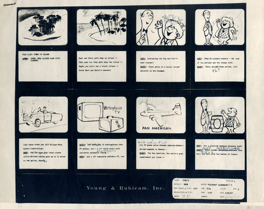 1
1
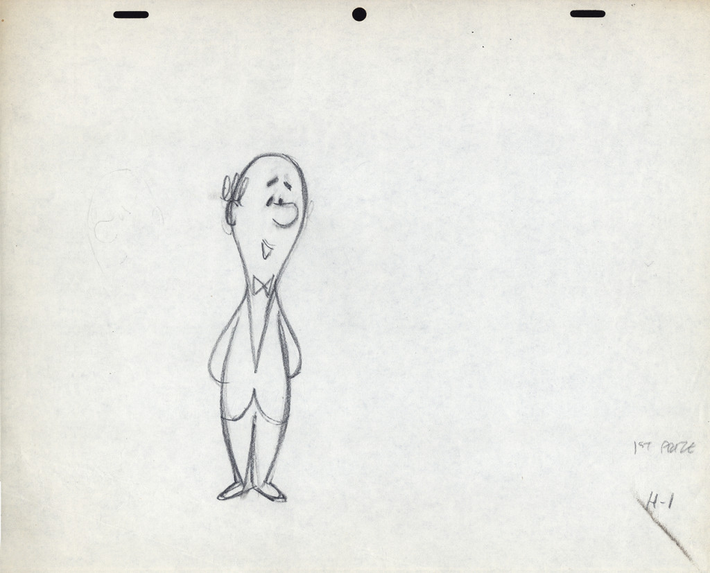
The following are three drawings from the opening scene of this storyboard. Others from this scene weren’t saved.
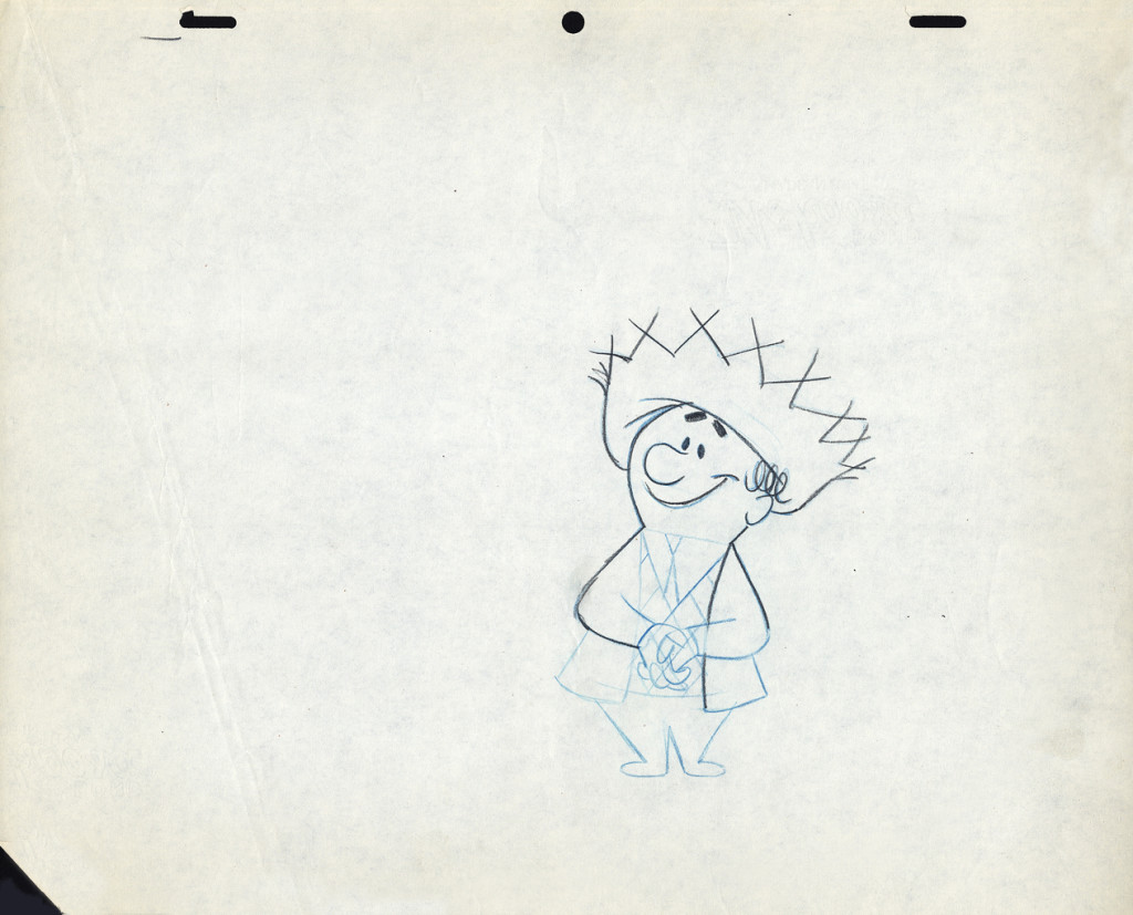 1
1Here’s Bert.
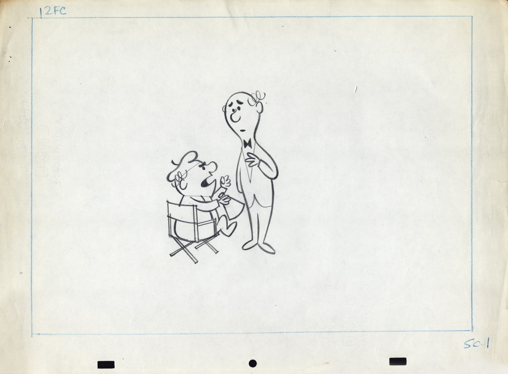
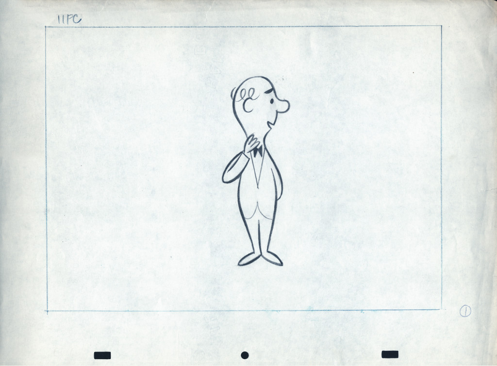
Let’s follow that with layout drawings from two different spots. The first doesn’t really offer much, but the quality of the clean-ups and the drawing is first rate. I’m pleased to post it:
 1a
1a
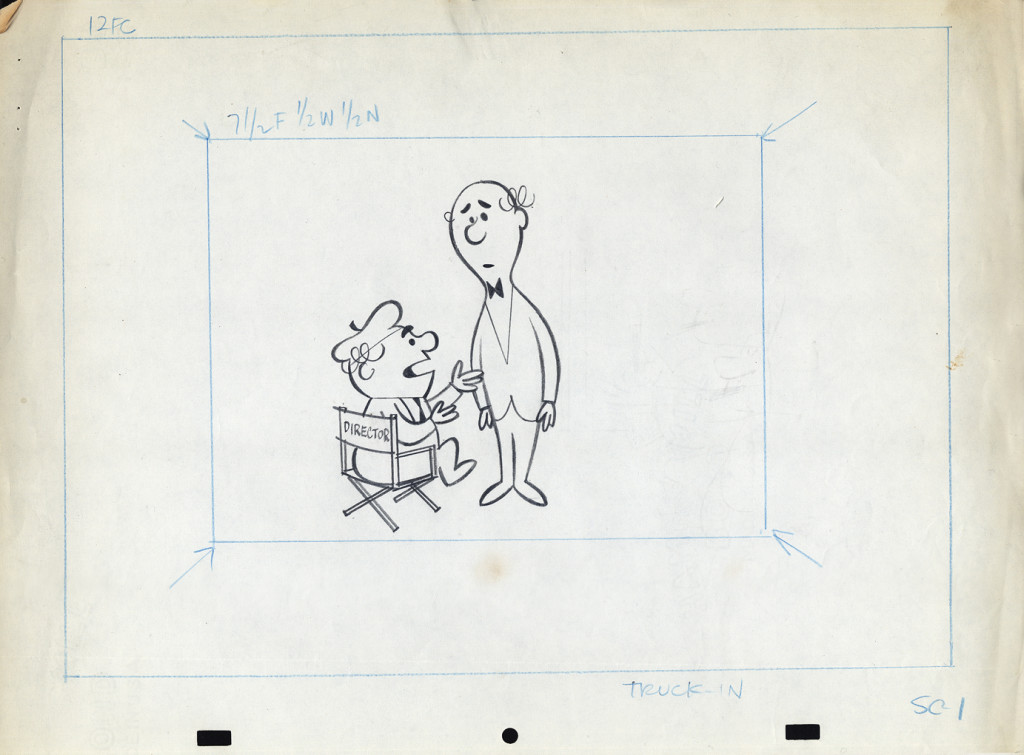
Here are layout drawings for the second of the two spots I have in hand. I presume this is also a spot promoting that contest.
 1
1
In the next week or two, I’ll post some of the animation drawings left behind so you can get an idea of the movement and Lu Guarnier‘s animation. I’ll probably have some to say about Lu’s style of movement. It drove me crazy when I had to assist him. The movement always looked great on screen, but it took a lot for an assistant to get it there.
Books &Illustration &Layout & Design &repeated posts 07 Apr 2013 05:01 am
Joy Batchelor’s Animal Farm – recap
- When the film Animal Farm was released, a tie-in book was published which republished George Orwell‘s novel with line drawings from the film by “Joy Batchelor and John Halas.”
It’s probable that Joy Batchelor did illustrate the book. On a recent post, Rudy Agresta remembered Vivien Halas discussing her mother’s illustrating it in the book Halas & Batchelor Cartoons. I haven’t found that passage in Vivien’s book.
The animated film was produced by Louis D. Rochemont Associates in 1955 at a studio they set up in Stroud, Gloustershire in England. The studio was formerly the home of the Anson-Dyer company and GB Animation wherein ex-Disney veteran, David Hand, made his short films for Rank.
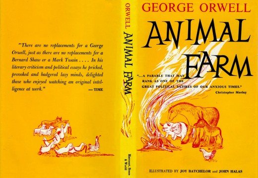
This is the book’s dustcover._________________________ (Click any image to enlarge.)
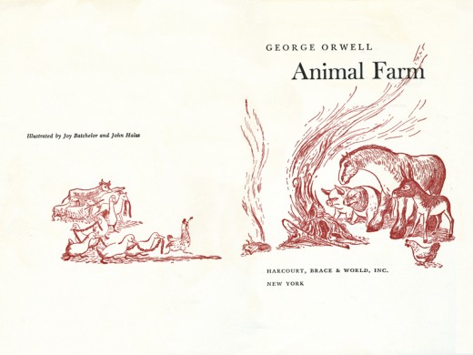
This is the double/title page.
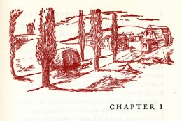
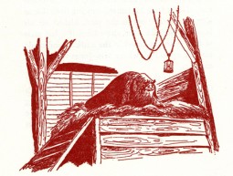
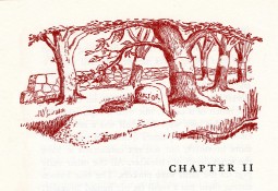
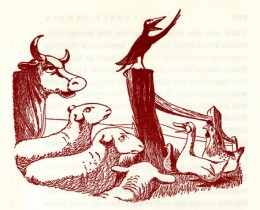
Each chapter has its own heading, and there are usually one to two stills within the body of each chapter.
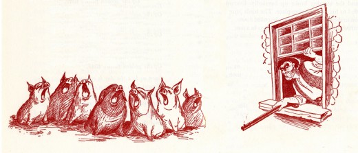
Some of the illustrations, like this one, spread across two pages under the type.
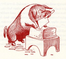
For those of you unfamiliar with this story, it tells the tale of a farm wherein the animals are mistreated.
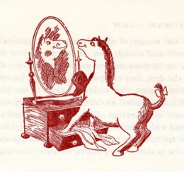
Under the guidance of the pigs, the animals take over the farm and create an animal collective.
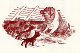
However, the pigs grow lazy and do less of the work as they take charge of the others.
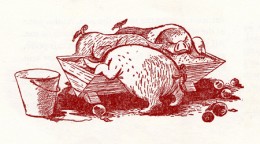
They eat more than their share of the food and mistreat the animals who do the greatest amount of work.
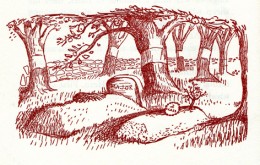
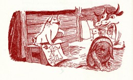
As animals begin to die under the guidance of the lazy pigs, there is some grumbling among the masses.
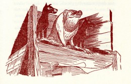
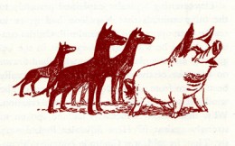
The pigs dominate and rule with a heavy hand.
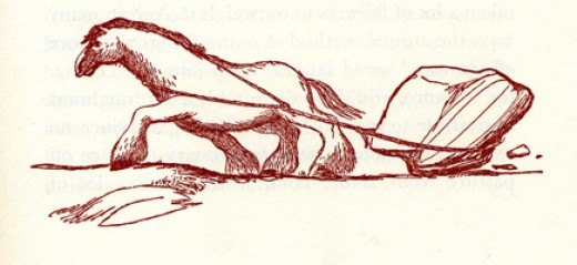
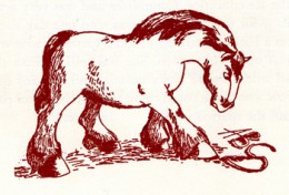
Boxer, the horse, is the figure of strength and symbolically the real leader of the animals.
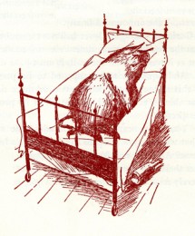
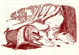
The pigs move into the farmer’s house and become little more than a replacement for “man”.
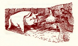
Many animals take the lead of Boxer and try to do their share, while the pigs fight for the lazy leadership.
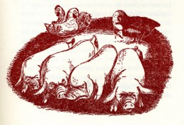

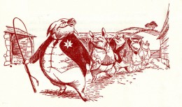
The pigs push Boxer to the limits and use the dogs as their personal guards and force their will on the others.
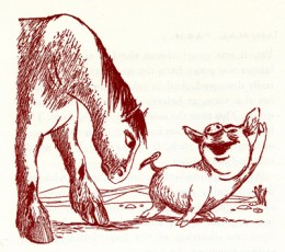
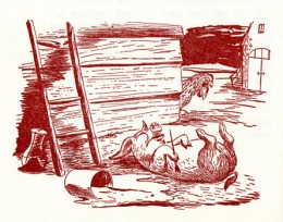
Boxer grows ill as the pigs grow lazier.
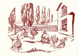
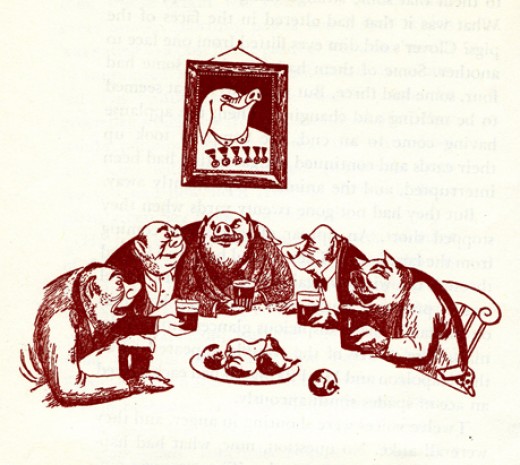
The lazy pigs celebrate their success. Animals hear gossip about the humans planning a charge to take back the farm.
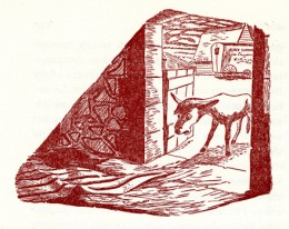
The weakened Boxer, no longer useful to the pigs, is sold for glue.
Eventually the humans return, and in some eyes of the animals they blend with the pigs.
The line illustrations do a nice job of representing the film. They’re also quite consistent.
You can watch Animal Farm on YouTube by going here.
Commentary &Layout & Design &repeated posts 14 Mar 2013 04:38 am
Tubby – looking back
Sometimes the bad films we work on leave the greater mark, and it’s good to look back, infrequently, to assess the damages.
- I was reading the 1957 Disney Studio Directory posted on Joe Campana‘s site, Animation – Who & Where. when I came upon the name of Howard Diettrich. This threw me back to 1973 and Tubby The Tuba.
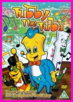 I’d just been layed off at the Hubley Studio, after completing the first 20 (of 60) episodes of Letterman. Officially, I had been categorized as an “inbetweener” in the u-nion. I’d done everything from animate to ink at Hubley’s, but that was my category. I received a call from Johnny Gentilella. We’d met through Hubley, and he was now working for NY Institute of Technology. They were in the early stages of production on their feature, Tubby The Tuba, and I was offered the job of Assistant Animator, a categorical promotion.
NYIT was the school I’d graduated from and received my BFA; it was located in Old Westbury, Long Island – about an hour’s drive from Manhattan. It’d be interesting, returning to my old school just to see how it had changed. By taking the Long Island Rail Road, I was able to cut down that ride by a few minutes and leave the driving to someone else. I was picked up at the station and driven to the animation building, a small cottage on the campus. Everyone was out to lunch except for Johnny Gent(ilella), and he drove me (about a couple hundred yards) to meet Sam Singer, the producer recently hired to do the film.
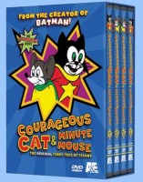 Singer had done all those Courageous Cat cartoons that had infested children’s programming back in the late 60s/early 70s. Oddly, I enjoyed them; I always was a glutton for bad animation. Love those cel flares, shadows, scratches and cel edges.
I was directed to his office. In there was another producer, Barry Yellin, who had broken his ankle and was on crutches. I got to meet the two of them and listen to them kibbitz around me, virtually ignoring me for a few minutes. Singer was chewing on a cigar, and I couldn’t take my eyes off the spittle that seemed to be moving down the cigar in his mouth. When I finally left to return to the animation building, I saw that Singer was also on crutches. He had a clubbed foot.
I sort of remembered that meeting as an omen of things to come. The entire place, while I was there, felt like it was on crutches.
I liked Johnny Gent a lot; we got along well at Hubley’s; on Letterman I got to mangle quite a few scenes by him as I learned how to inbetween properly.
There were only about 8 others at NYIT at the time. Other people I met included Walt Kubiak, another assistant who I enjoyed talking to; animator, Chuck Harriton, who I’d met at Hubley’s (and never really was crazy about); Lou Marcus who was filming the work on an Oxberry. Lou had gone back in animation for many years and had plenty of stories to tell. (See Andrew Marcus’ comment below.)
The person I most associated with was the editor of the film, Phillip Schopper. He was a young guy who took the LIRR everyday from Brooklyn to Old Westbury. We’d meet daily on the train and laugh over the events of the days out there. I’ve stayed friends with Phillip, who has become a first-rate filmmaker; we rarely talk about those days at NYIT.
It was not a fun place to work. At the time, everyone chatted over their cubicle walls. I was in the front of the studio with full view of the front door. I was constantly getting notes from Chuck Harriton who persistently altered the models of the characters in ways that no one else was drawing. I was forced to work his scenes off-model. Johnny Gent always had a beautiful drawing style and made it easy for assistants to follow and inbetween. He and I spent most of our lunch hours alone together in the studio. We were able to have quite a few conversations; I loved that part.
Everyone seemed to back talk everyone else as they walked out the front door. I couldn’t help wondering what they said about me when I left. Too much swiping makes for an unpleasant working condition.
At one point, Sam Singer brought in a number of his people from California. I’d already been there about four weeks so was glad to see some new blood. Many of the few people were ex-Disney people, so there was a lot for me to learn. Nino Carbe, was a good example of this. He had done some incredible work at Disney’s on Fantasia and other films. He was an artistic force and a nice guy to meet.
Howard Diettrich was a virtuoso assistant who had worked on Sleeping Beauty. Unfortunately, he was an alcoholic who had a big problem. Sam Singer took him under his wing and had decided to cure him. Hypnotherapy came in, and Howard went through the mill for Singer. It made a soap opera of a story for all of us working there, and it was hard for me to watch.
I decided to leave. They wouldn’t allow me to quit without going to Alexander Schure. He was the President of the school – yes, NYIT was still predominantly a school – and he was financing the whole thing. His idea, ultimately, was to introduce computer animation to the world, and he invested heavily there. Some of the brilliant people who grew out of this department moved on to develop Lucas and Pixar.
So I went to Alexander Schure, and he argued with me for about 30 minutes. I told him that the travel time was too much. He didn’t accept that. He liked the fact that I was an art school grad from his school and was working there. He offered to have his son pick me up and drive me.
I knew that there was no solid directorial voice coming from the top, and the film could never be good. My artless tactic was to say as much. He told me that he was going to take over from Sam Singer, and he would be the voice of clarity. Now I knew I really had to get out. He finally surrendered, and I left. Happily.
I was back with Hubley within two weeks. Even better.
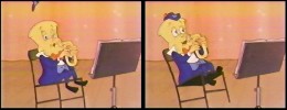 I didn’t get to see the film until I borrowed a vhs copy from Dante Barbetta, who eventually joined their staff to animate when it got significantly larger.
That was not a good film, as a matter of fact it was incredibly bad. I’m not sorry I left, though I would have enjoyed more time with Johnny Gent; it was the last time I worked with him. I also still wonder what happened to Howard Diettrich.
Note: Last year, John Celestri wrote about the later period in the making of this film on Mark Mayerson‘s site. Part I and Part 2.
Animation Artifacts &Commentary &commercial animation &Layout & Design &Models 12 Mar 2013 03:43 am
Larry Riley Recap Plus
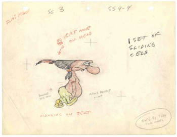 In celebration of the new season of baseball I have a couple of model sheets from a Paramount cartoon.
Larry Riley, a story writer, gave me these drawings back in 1972, but he never told me the film’s title. Thanks to Thad Komorowski and Bob Jaques – both left comments when I originally posted hese in 2007 – we know the drawings come from Heap Hep Injuns (1950).
______________(Click images to enlarge.)
Larry Riley was a wild guy. On my first commercial job at Phil Kimmelman & Ass. he and I were the inbetweeners working side-by-side on some of the Multiplication Rock series. Larry had had a long and busy career in animation.
He had been an asst. animator at Fleischer‘s, a story writer at Paramount, an animator at many studios. Like many other older animators, he ended up doing anything – including inbetweening at Kimmelman’s for the salary and the u-nion benefits.
The stories Larry told me kept me laughing from start to finish. There was no doubt he had been a writer for years. In a not very exciting job, it made it a pure pleasure for me to go to work every day to hear those hilarious stories. I can’t see Lucky 7 without thinking of laughing. It wasn’t the stories per se that were funny, it was his take on it.
Larry told me of his years at Fleischer’s in Florida where he was an assistant. He and Ellsworth Barthen shared a room, and, according to Larry, had lined one of the walls of their room with empty vodka bottles. Now, I’ve heard of frats doing this with beer cans, but doing it with vodka bottles requires some serious drinking. One of the many times I got to work with Ellsworth, I asked him about the story, and he reluctantly backed it up telling me what a wild guy Larry was.
Ellsworth was an interesting character in his own right. There were a group of lifetime Assistant Animators in New York when I started out. This is what they did and all that they aspired to do. They liked the steady work and didn’t want heavy pressure. Those I can name, off the top of my head, were: Helen Komar, Jim Logan, Gerry Dvorak, Tony Creazzo, Eddie Cerullo, Joe Gray, and Vincent Barbetta. They all have interestng stories I could tell. Maybe another time.
Ellsworth Barthen was one of these permanent Asst. Animators. He had his work life and he had his play life. Ellsworth lived in New Jersey with his brother and spent much of the time in his garden growing orchids. He had specialty breeds of orchids that he’d grow and enter in flower shows. Ellsworth loved it.
The other thing he loved was performing as Franklin D. Roosevelt. Just about everywhere he went, he took his pince-nez and would pop it on his eyes and go into character. Now I was born after Roosevelt had already died, so I couldn’t tell you if Ellsworth had been doing an accurate impersonation, but I saw him do it pretty often.
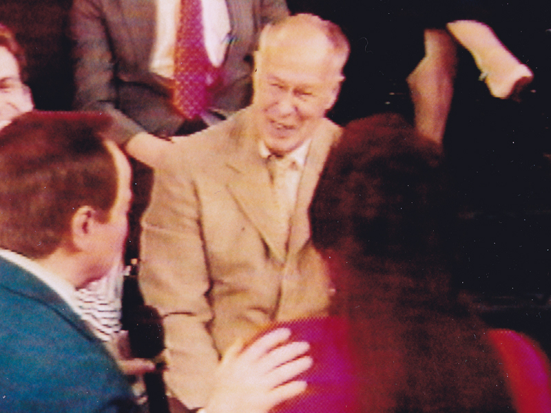
Ellsworth appearing on the Joe Franklin Show in NY
as Franklin D. Roosevelt. Joe Franklin is bottom left.
At Grim Natwick’s 100th Birthday Party in LA, Ellsworth came in character and stayed there all night. He was basically a big and shy guy, but this Roosevelt impersonation would bring him out and loud. Very curious character.
Back to Larry Riley:

________Forgive the racist pictures, but I guess they’re a product of their times.
Larry also told of a 3D process he’d developed for Paramount in the 50′s when the movies were all going 3D. I believe there were two Paramount shorts done in this process: Popeye: The Ace of Space and Casper: Boo Man. Larry offered to give me the camera on which he shot these films – he had it stored in his basement. He was afraid it would get thrown out when he died. I didn’t have room for it.
My regret; I still hear the sadness in Larry’s voice.
(When I originally posted this in 2006, Larry’s grandson, John, wrote to tell me that another collector took possession of the camera and kept it from destruction.)
The animator who drew these is Tom Johnson (he signs the second one), and they were approved by the director Isadore (Izzy) Sparber per the first one.
The drawings are deteriorating, obviously. The pan above uses a lot of glue to hold it together, and that’s eating away at the paper.)
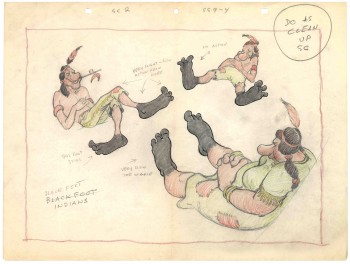 – This is the final model I have from Heap Hep Injuns a 1950 Paramount cartoon. Tom Johnson drew this image, prior to animating it, and Izzy Sparber directed the film. I’d heard some stories about I. Klein regarding this film, though he’s not credited, so I suspect he may have had something to do with model approvals, as well. Actually, he may have been the “Izzy” referred to on the pan posted yesterday.
______________(Click images to enlarge.)
I was never a big fan of the Paramount cartoons. Growing up in New York, we’d always get Paramount or Terrytoons shorts playing with features in the theaters. Only rarely did a Warners cartoon or a Disney short show up. (I don’t think I saw a Tom & Jerry cartoon until I was 17 when they started jamming the local TV kidshows with them.)
Saturdays there was always the placard outside the theater advertising “Ten Color Cartoons”. A haughty child, I naturally wanted to know why they didn’t show B&W cartoons – that’s what we saw on television, and I usually liked them more. I must have been insufferable for my siblings to put up with me.
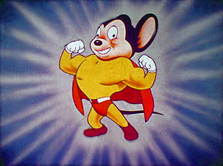
The starburst at the beginning of the Mighty Mouse cartoons always got an enormous cheer in the local theaters. I don’t remember ever hearing that for the Popeye or Harveytoons.
(I love that if you go on a “Google search” for images of Larry Riley, you get dozens of title cards from Paramount cartoons. Go, Larry.)
Commentary &Layout & Design &SpornFilms 10 Mar 2013 03:18 am
Bridget’s Art
It’s time to put up some more Sporn Studio art. I had a couple of posts that celebrated BG art of Bridget Thorne. I’m putting a couple of these together and posting anew. Personally, I love this stuff and can’t get enough of it. I want to see Bridget doing BGs again; it’s been a while.
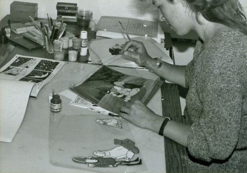
Bridget Thorne did the storyboard for
The Hunting of the Snark with me back in 1980.
We didn’t finish the film until 1989. She also painted the
backgrounds for the last third of the movie.
Bridget Thorne is someone who has been an invaluable part of the history of my films.
She has been an extraordinary Art Director and Background painter on quite a few of my favorite films produced within the studio, and I’ve put together a random sampling of some of those films.
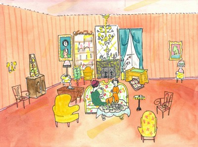
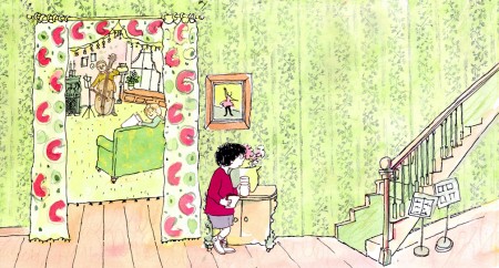
(Click image to enlarge) Lyle, Lyle Crocodile (1987)
This painting is a key transition point in Lyle, Lyle Crocodile. The film had a looseness  that Bernard Waber‘s original book art had engendered. I felt very much at home in Waber’s style, and I think Bridget did as well.
She worked out a color scheme for the film, and we both agreed to follow it closely through the film. Liz Seidman lead the character coloring. Bridget, of course, had a strong hand in all those character models, as well.
The scene pictured above follows the introduction of Autumn on “East 88th Street”, and the background brings us full force into it as we get “the girl’s first song” – Mrs. Primm’s report on what it’s like to have a crocodile living in your house.
 – Ira Sleeps Over was the second children’s book by Bernard Waber that we adapted. This is a very sweet story which involves a sibling rivalry; it focusses on a teddy bear and a sleep-over party. I pulled composer, William Finn, into the film and he wrote some great tunes for it. Prior to doing the script, I gave him the book and asked him to figure out where he would like the songs. In a week he had already written all the songs for the film, and they were brilliant. It turned out he used all the words of the book in his songs, and now I had to find a way of telling the same story using past, present and future tenses, as he did in the songs. It was a good challenge that worked out well and created a fabulous construction for the story.
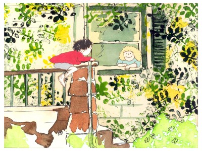 The style in this book was, if anything, looser than in Lyle. Waber did a lot of his illustration featuring duplicating printing techniques. Lino cut enabled him to repeat decorations throughout the settings. Bridget played with the lino cuts and was able to succesffully duplicate the technique in the backgrounds. In this one bg, at the beginning of the film, the foliage is a good example of this technique, printed over watercolors. The characters are markered paper drawings cut out and pasted to the cel overlays.
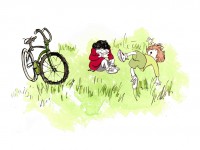
The book, like Lyle, featured a lot of white space, so we followed suit. When a book’s been in circulation for over 25 years, you have to realize there’s been a reason for it; find the reason and the heart, and take advantage of it. This use of white space made the actual backgrounds oftentimes little more than abstract shapes of color with a solid object on the screen. Here, for example, we see Ira and his friend, Reggie, playing against a blast of green and a bicycle.
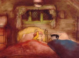
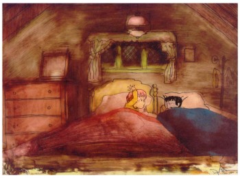 – At the end of the film, Ira and Reggie talk in the dark at the sleep-over. To get the look of the dark Bridget had to come up with something clever. The book resorted to B&W washes of gray and wasn’t very helpful. She came up with some dyes that were used for photo retouching. By quickly painting these lightly onto cel levels with a wide brush, she was able to get translucent cels with the brush strokes imbedded in the color overlays. By placing these overlays over the characters and backgrounds, we got the desired effect that let it feel connected to the very loose style of the film.
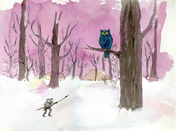 -Abel’s Island is one of the few films we did that I treasure for its artwork. Bridget’s work on the backgrounds was, to me, extraordinary. The looseness I love was developed into enormously lush backgrounds using shades of green that I didn’t know could be captured in the delicate watercolors.
This film was a complicated problem that seemed to resolve itself easily and flow onto the screen without much struggle. The book had won a Newberry Award as best children’s writing of its year. It was not a picture book but a novel. The more than 120 pages featured fewer than 20 B&W spot drawings by author/illustrator, William Steig. We were on our own with the color.
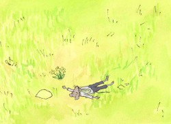 However, we had adapted Doctor DeSoto and The Amazing Bone as shorter films and could use what we’d learned from Steig on Abel. Bridget topped herself.
Several of the animators gave us more than I could have expected. Doug Compton‘s animation of Abel sculpting his statuary and living in his log was heart rending; Lisa Craft‘s animation of the big pocket watch, the big book and the leaf flying sequences was nothing short of inspired; and John Dilworth‘s animation of the owl fight was harrowing. This was all set up and completed by Tissa David‘s brilliant animation of Abel in the real world with wife, Amanda. She established our character.
 – At the end of the film, Abel, who has been separated from his new bride, trapped on an island for over a year, finally gets to come home. He sees Amanda in a park at twilight but decides to hold back. He races on ahead of her to greet her, privately, at home. The park sequence has a busyness as an acute counter to the lonliness we’ve watched for the previous 90% of the half-hour program. Setting it at early evening gave an opportunity for rich, royal colors. Bridget took full advantage of the opening, and underscored it all with a regal green not seen earlier. It was stunning and is one of my favorite backgrounds in the film.
Here are two more films Bridget Thorne designed for me.
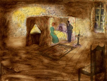 A Child’s Garden of Verses presented new and different problems to explore.
It was a project generated by HBO. Charles Strouse and Thomas Meehan were going to write the book and song score. We met several times trying to discover a way into the book of poems. I’d suggested we use the verses in Robert Louis Stevenson‘s book to illustrate the author’s early childhood.
(Click on any image to enlarge.)
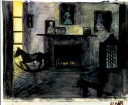 Stevenson was a sickly boy who was always confined to his dark room. He was not expected to live long. The only visitor for days on end was his overprotective mother.
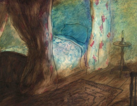
For much of the film, we had only the dark, child’s bedroom to explore. Artistically, I asked Bridget to delve deeper into the photgraphic dyes that she had discovered and used so well in Ira Sleeps Over. These dyes would allow us to keep the style, once again, loose while exploring dark areas and brush strokes to simulate the darkness “Robbie” lived in.
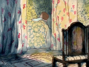
For the wallpaper throughout the house, Bridget used real wallpaper which was photostated; scaled down and reshaped to fit the backgrounds. Then watercolor washes colored these backgrounds and overlays were mixed and matched to get the desired results.
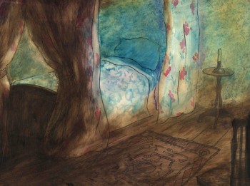 I was never quite pleased with this film. The elements that worked well worked really well. Bridget’s work was a highlight. The acting was extraordinarily good. Heidi Stallings performed with an enormous amount of emotion yet barely raised her voice above a whisper. Jonathan Pryce was brilliant as Robert Louis Stevenson, the narrator and even sang a song when asked at the last minute. Gregory Grant as the young “Robbie” was vulnerable, sweet and all we could have hoped for.
However, there was too much of a rush given the delicacy of the piece, and the exterior backrounds done by me for the end of the film are poor. The animation is also hit and miss. Oddly enough, my favorite sequence used little actual animation but intense camera work. Ray Kosarin was the animator in charge of it, and it’s an impressive sequence.
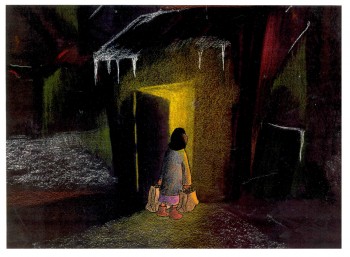
- The Talking Eggs was done for a PBS series called Long Ago & Far Away. It was an adaptation of a Creole Folk Tale which Maxine Fisher updated for me. (Lots of discussion between WGBH, Maxine & me about what distinguishes a Folk Tale from a Fairy Tale. It seriously impacted the story we were telling and I wanted what I wanted and got.)
Bridget chose to use pastels and we searched for a paper that would bring out the most grain. I loved the end result. The characters, to match the look of the Bgs, were xeroxed onto brown kraft paper and colored up from there with prismacolor pencils. This was cut out and pasted to cel.
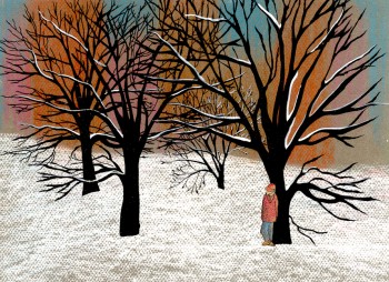 Danny Glover was the narrator, and we chose to make him an on-screen character appearing intermitently in the film. His narration was recorded on a rush as he stopped off in LA from SF on his way to direct a film in Africa.
There’s a focus in these backgrounds that matches the content and mood of the piece, and it worked wonderfully for my purposes. I always like it when the medium is front and center; I want audiences to know that they’re watching animated drawings, and texture usually helps to do this. Of course, I also want the films to have a strong enough story that the audience gets past the point of knowing, to enter the film. It works some of the time, and I’m in heaven when it does.
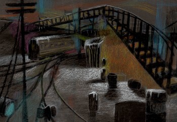 Bridget altered the color of the paper on which she was coloring with the chalks, and the different colored papers represented varied moods from sequence to sequence.
Naturally, there were some problems with the chalks under camera. All the fixative in the world didn’t stop the chalks from bleeding onto the cels or platen on the camera. (Lots more cleaning involved than usual.) We heard constantly from our cameraman, Gary Becker. The extra effort was worth it; the look was unique and successful.
The following is a short interview that we did in a publication I generated back in the ’80s.
Behind the Scenes with
Bridget Thorne
Interview by Denise Gonzalez
Bridget Thorne is a background designer who has been an important part of Michael Spom Animation for more than fifteen years. In that time she has enhanced the look of MSA films with beautiful backgrounds that are, in a way, part of the characters rather than just a scenic backdrop.
 DG: How long have you been working with Michael Sporn?
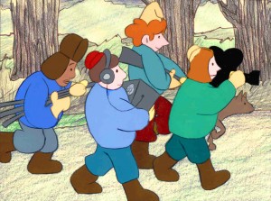
BT: I first started working for Michael in 1979 on Byron Blackbear And The Scientific Method, a fifteen minute short for the Learning Corporation of America. It is actually one of my favorites. I started out as a scenic painter for plays. I worked with a designer and basically dressed the set. We’d paint the exteriors, lay in wallpaper, marbleizing floors, etc. I started at Williamstown and at Playwright’s Variety in New York, I did a lot of off Broadway and off-off Broadway.
DG: Do you see background painting as a complete picture or as a supplement to animated artwork?
BT: It’s a supplement.
 DG: How do you take that into consideration when you start the backgrounds?
BT: Ideally, I take into consideration how the characters are designed. I like the characters to be part of the picture, not stand out like they do in Saturday morning cartoons. It all fits into a stylistic sensibility or pace more than anything else. I’m not a cartoon snob, I’m more of a two dimensional artist than a filmmaker. I design my backgrounds and line style according to the way the characters are designed. What I used to try and do was color the backgrounds, to match the colors of the characters. You work out of your home rather than at the studio. What are the benefits or drawbacks of working this way? I’ve just started doing this and yes, there are benefits. I can get into my own head, and I take off more with ideas because I’m not interrupted as much. But I like being in the studio and staying with the rest of the production as it goes along.
DG: Do you prefer working on original stories or from an existing book?
 BT: It depends on the story. Let’s say IRA SLEEPS OVER, it was great working out here on that because with an existing story you have a style to imitate, and it is easy for a whole bunch of people to follow that when they’re all working in different places. So as far as production goes, that makes it easier. The great thing about original scripts is that they allow for an incredible amount of individual input. What do you take into consideration when designing the look of a film and what preparation is involved? It depends on the story. I tend to have a knee jerk reaction at first or an impulse. I have a Fine Arts background, and I tend to rely on painters. I find fine artists are more in tune stylistically with Michael’s films than the more hard-edged graphic cartoons. (Though I will look at Disney inspirational drawings.)
Then I look at the layouts and the character design, so I sort of work on intuition and impulse. Then I look at the existing elements and put those all together and come up with a design. As far as preparation goes, what I consistently do is make 5×4 sketches of design ideas. For ABEL’S ISLAND I did lots and lots of little paintings of winter and fall and spring.
First three illustrations pictured above:
1. BYRON BLACKBEAR AND THE SCIENTIFIC METHOD.
2. A CHILD’S GARDEN OF VERSES.
3. IRA SLEEPS OVER
DG: When designing the film do you take into consideration that this will be seen by a child?
BT: I’m not a cartoony person so I don’t think about that. I tend to think more — sometimes I run into trouble this way — I think of it in a frame and ideally what I really want is a balanced look on the screen. A lot of times that’s hard because what I see in front of me is so different when it is filmed.
DG: What do you consider to be the best example of your work thus far?
BT: I guess ABEL’S ISLAND. I was able to abstract a little. I wasn’t confined to chairs and bureaus. I was able to match the mood of the movie to the backgrounds. If Abel was in trouble, I could put colors that indicated that, or I could abstract it. If something was calm I could paint it calmly. Abstraction, or looseness, is more my personal style. This is true of Michael’s style, as well.
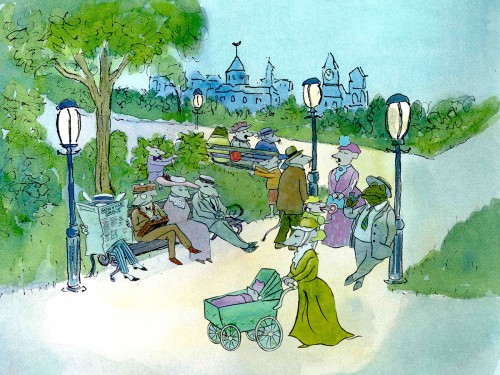
A scene toward the end of ABEL’S ISLAND.
DG: Have you ever worked on a film you couldn’t connect with?
BT: I’d say yes. It’s a hard question to answer off the top of my head. I sort of think of movies like they were kids; they are either noisy or funny or quiet or sad. They all have their own characteristics, and it is really the process of making the movie that attracts me to animation. I tend to have different feelings about each movie. But yes, sometimes a story irritates me or something comes in and it doesn’t suit my style or what I imagined. It can be very difficult. That’s an interesting thing about animation; there is really a sense of compromise; you are compromising all the time.
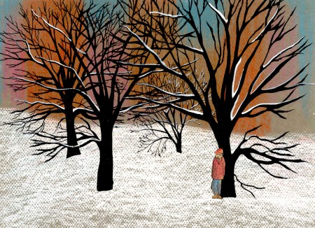
A scene of the narrator at the end of THE TALKING EGGS.
Commentary &Disney &Layout & Design &Models 14 Feb 2013 05:47 am
Witch – redux
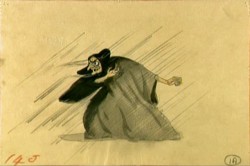
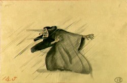
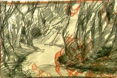
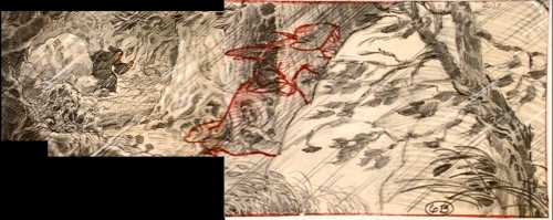
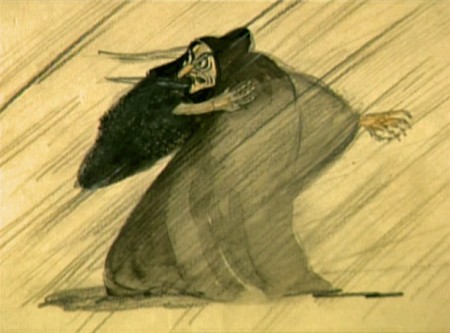
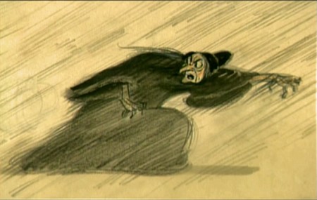
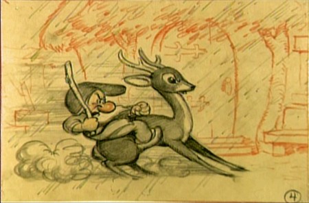
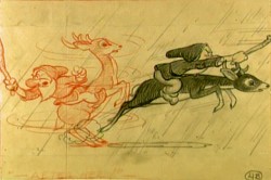
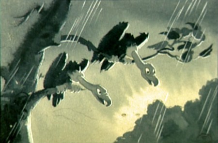
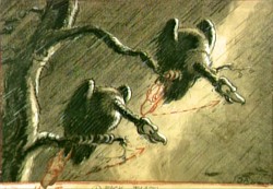
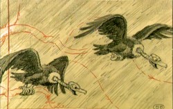
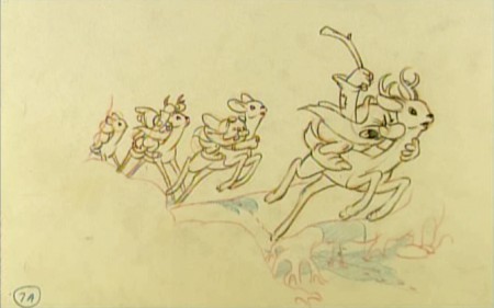
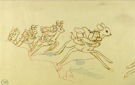
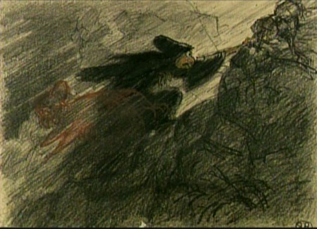
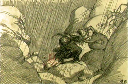
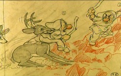
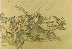
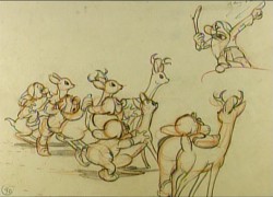
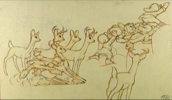
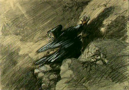
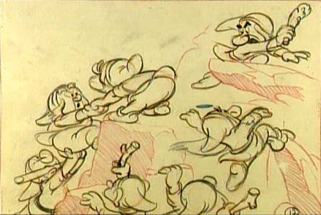
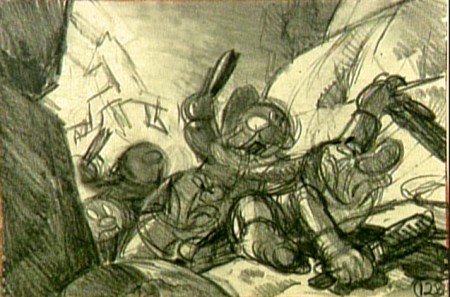
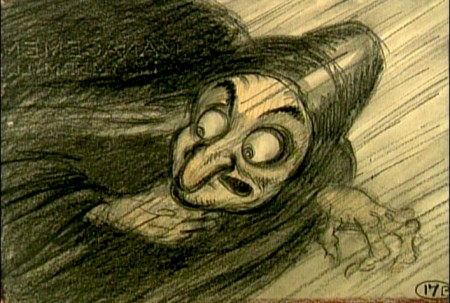
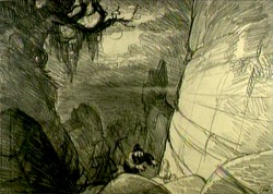
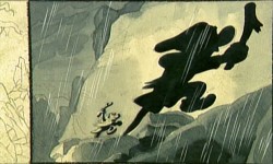
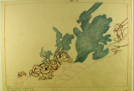
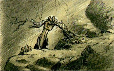
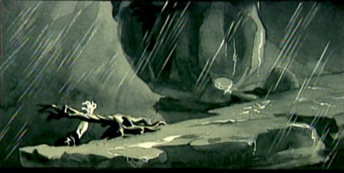
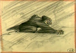
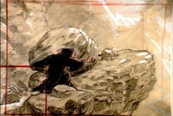
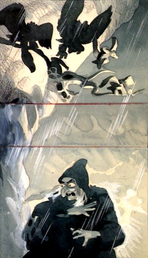
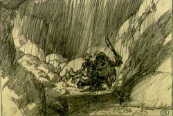
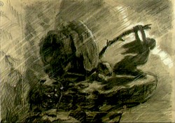
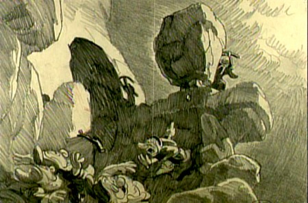
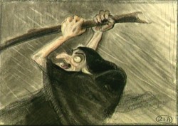
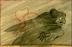
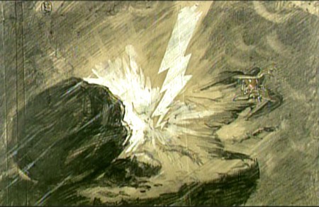
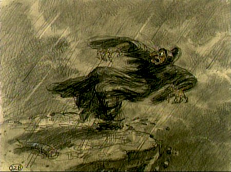
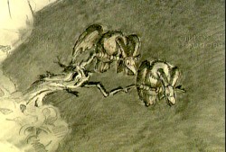
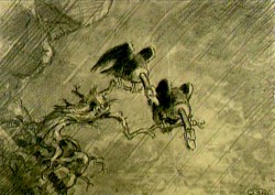
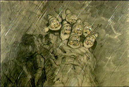
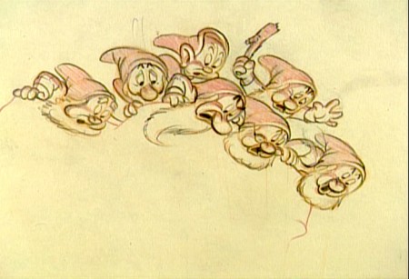
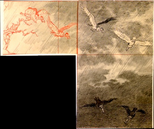
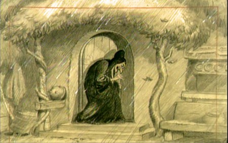
- It’s not always easy to kill a witch. This sequence from Snow White couldn’t be designed better. It’s short, it’s tense, it’s a tight sequence that handily does its job. The witch is killed in record time. Today, the sequence would be dragged out for half the length of the film.
Some of these drawings are great.
 1
1(Click any image to enlarge.)
