Monthly ArchiveAugust 2012
Commentary &Photos 12 Aug 2012 05:19 am
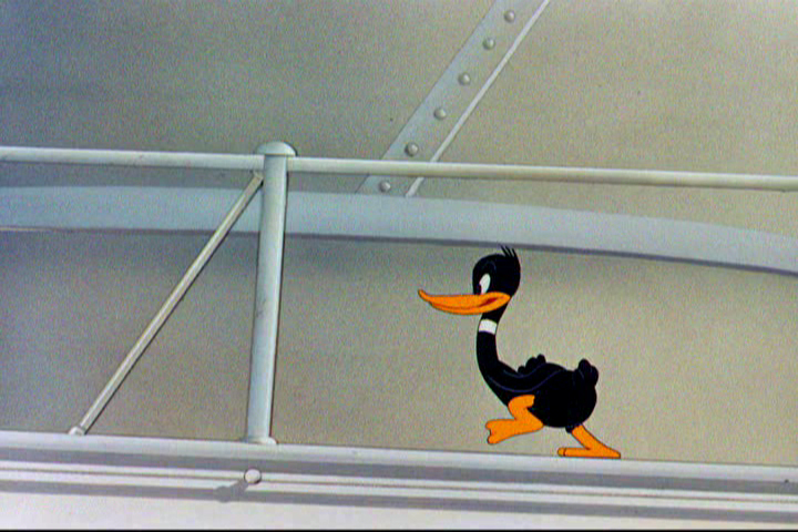
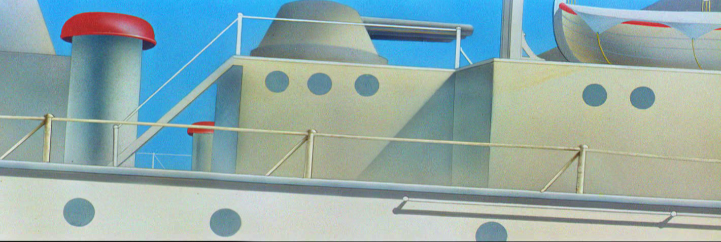
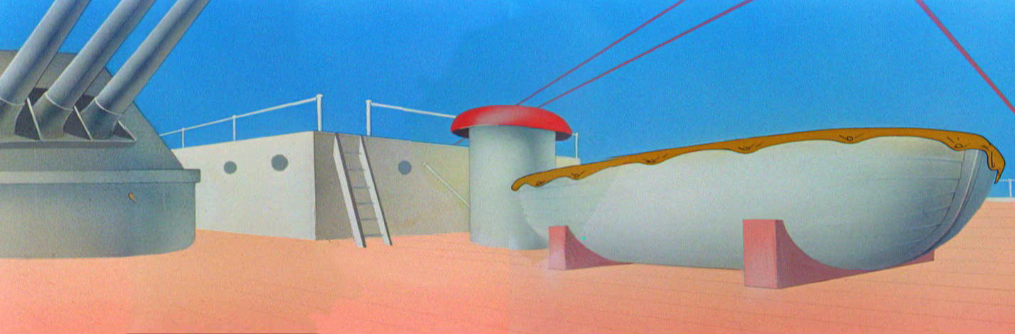
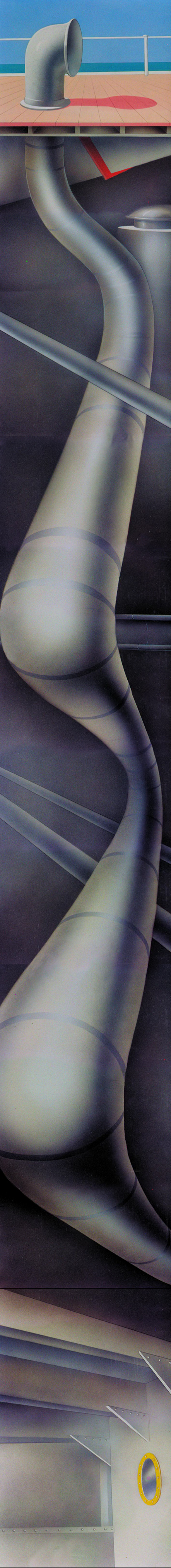
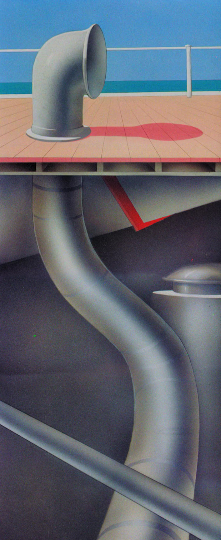
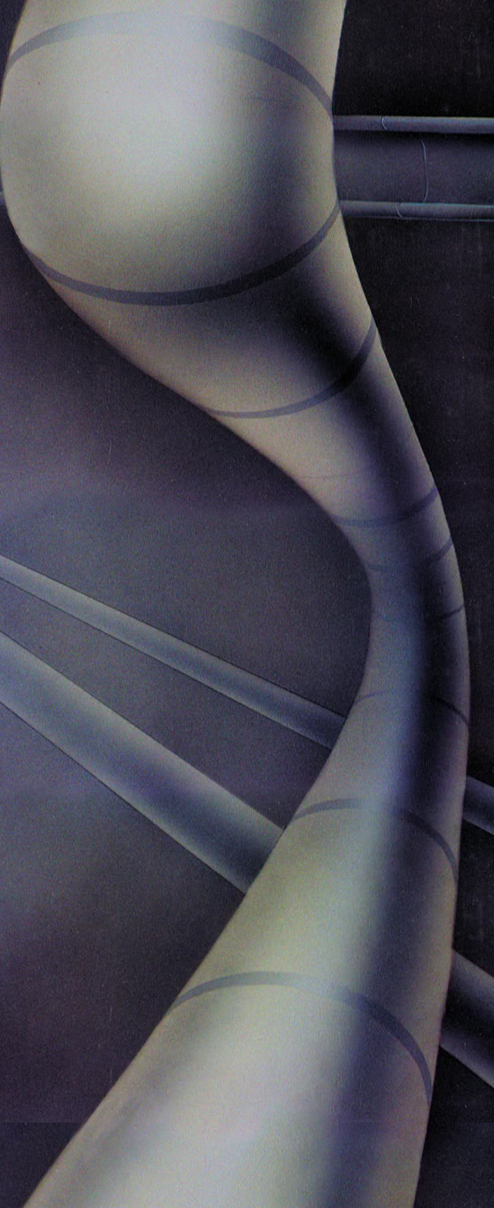
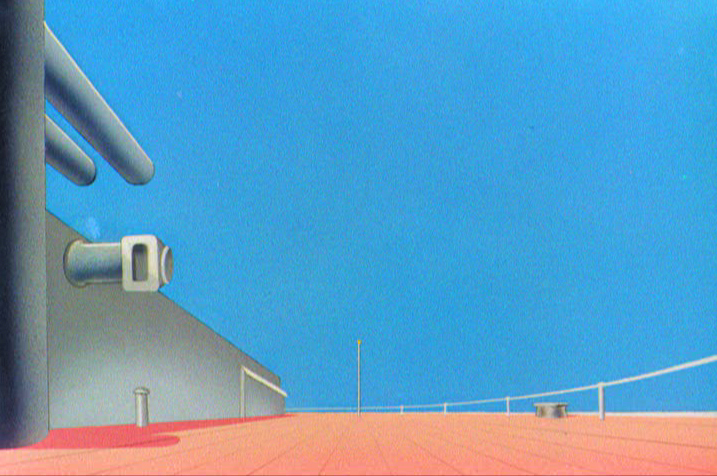
America the Beautiful
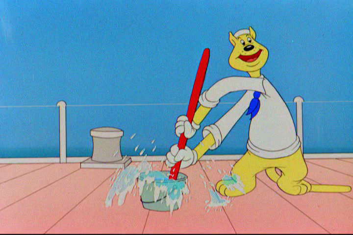
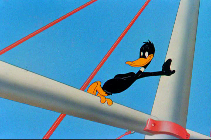
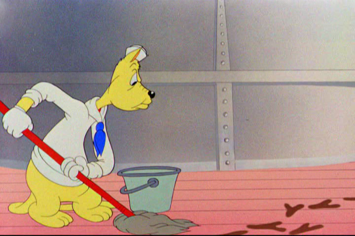
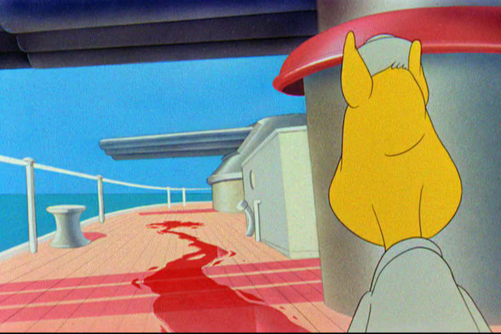
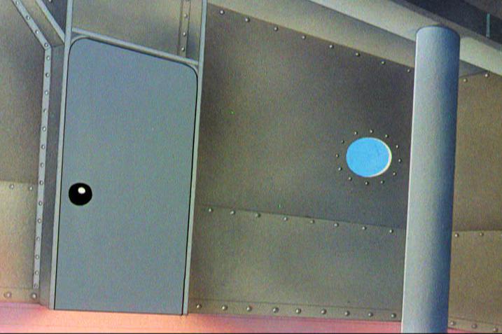
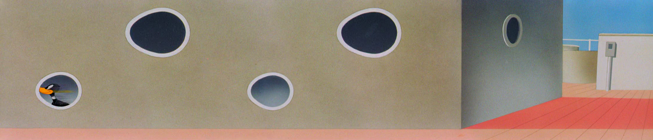
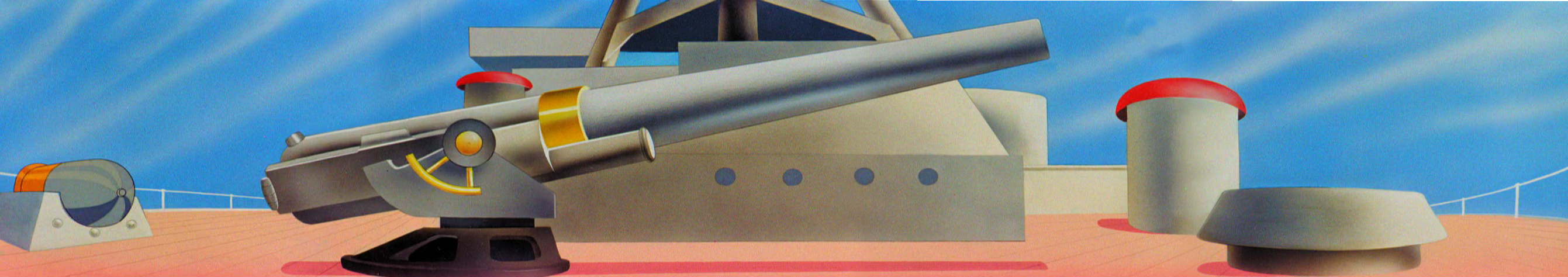
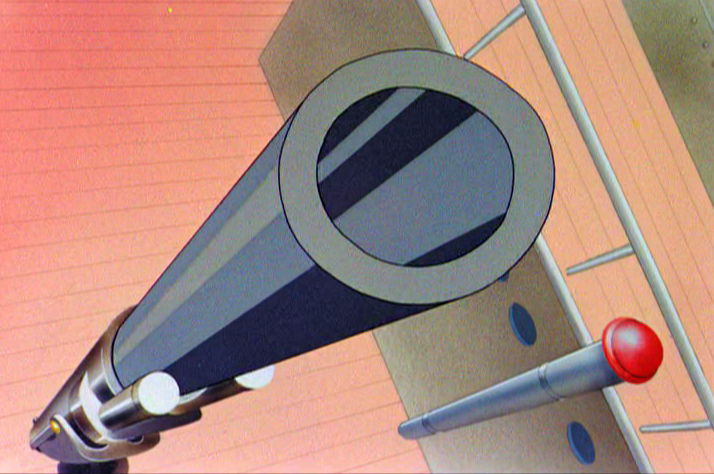
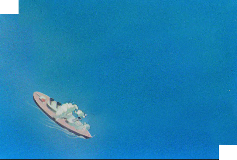
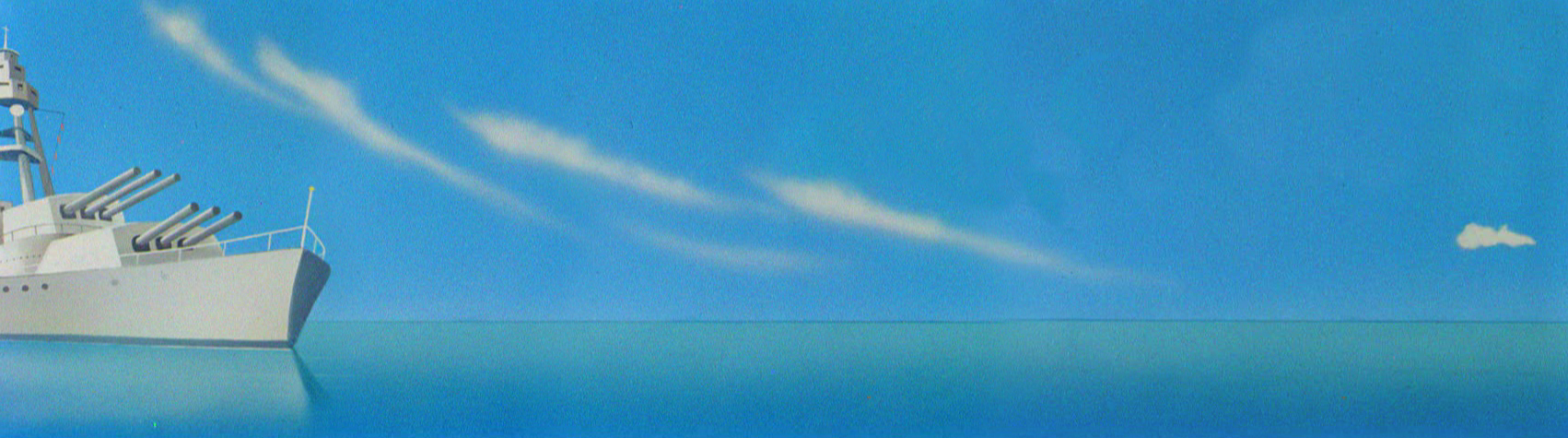
- Given the selection of Paul Ryan as Romney‘s running mate, I had to tune in to the speeches of excess. The pair followed the George Bush lead as they appeared, running off a Navy ship (albeit a retired one), to make their speeches. Thus we can see that these great Republicans are would-be military men (except that neither of them has served any time in the military.)
I had to celebrate today by selecting some well placed flags from past blog posts and wave them high.
Again.
God Bless America.
(Of course, I’m nervous that Obama won’t win and these two will get in and completely derail America. They sure try hard but are completely unsympathetic to me or my family or my way of life. Read the editorial in today’s NYTimes.)

The first and last pictures are the brilliant handiwork of Steve Fisher. Thank you, Steve.


That’s about enough of that.
Happy Sunday.
.
Commentary &Puppet Animation 11 Aug 2012 06:16 am
Puppet Animation
- When I was young I was into puppets. All kinds of puppets. I made puppets, all different type of puppet. Marionettes were made of wood and string or muslin and string. Hand puppets were made of muslin and other types of cloth. I never really went into sock puppets; they were too easy. But I did buy puppets. There was a whole line of marionettes made of a wood-like resin of the Disney characters I had the Tramp and Lady. I had Mickey Mouse and Donald. I had a puppet theater in the back yard, and the kids of the neighborhood would pay to see shows I put on with a couple of siblings. The candy counter made a lot more money for us.
Even more interested in animation, I spent most of my time trying to teach myself everything about film. Naturally, puppet animation was something I worked a lot. It’d take time to animate drawings and then more time to color them and shoot them. It was faster to animate puppets. Once you had the model, you could just keep going. I have all this 8mm film of different types of puppets animated. For some reason a “Twist-o-flex” Goofy running from a Lionel train chasing him down a track stands out. It was fun.
I was in love with Georg Pal‘s films and watched all that I could get my eyes on. I watched a lot of European animation on some of NY’s local channels. They’d infrequently have stop-motion Eastern European films. Once in a while some local channel wold run Lou Bunin‘s feature, Alice in Wonderland, or I remember watching Jiri Trnka‘s feature version of A Midsummer Night’s Dream. Richard Burton narrated it and did all the voices. That Sunday afternoon was heaven. I’m not sure if it was the film or the fact that I had some alone time in my house. (When you have a family of seven, you appreciate those quiet moments.) It didn’t take much for me to become a fan of Trnka’s work; his work sang to me. The more I looked into it, the greater he became.
This was just when Jim Henson was breaking on the scene. The muppets didn’t exist yet. I give this all as introduction to what this past week has meant to me. It was a week of puppet animation in New York.
Alice
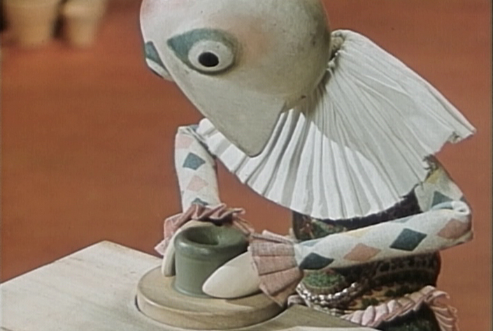
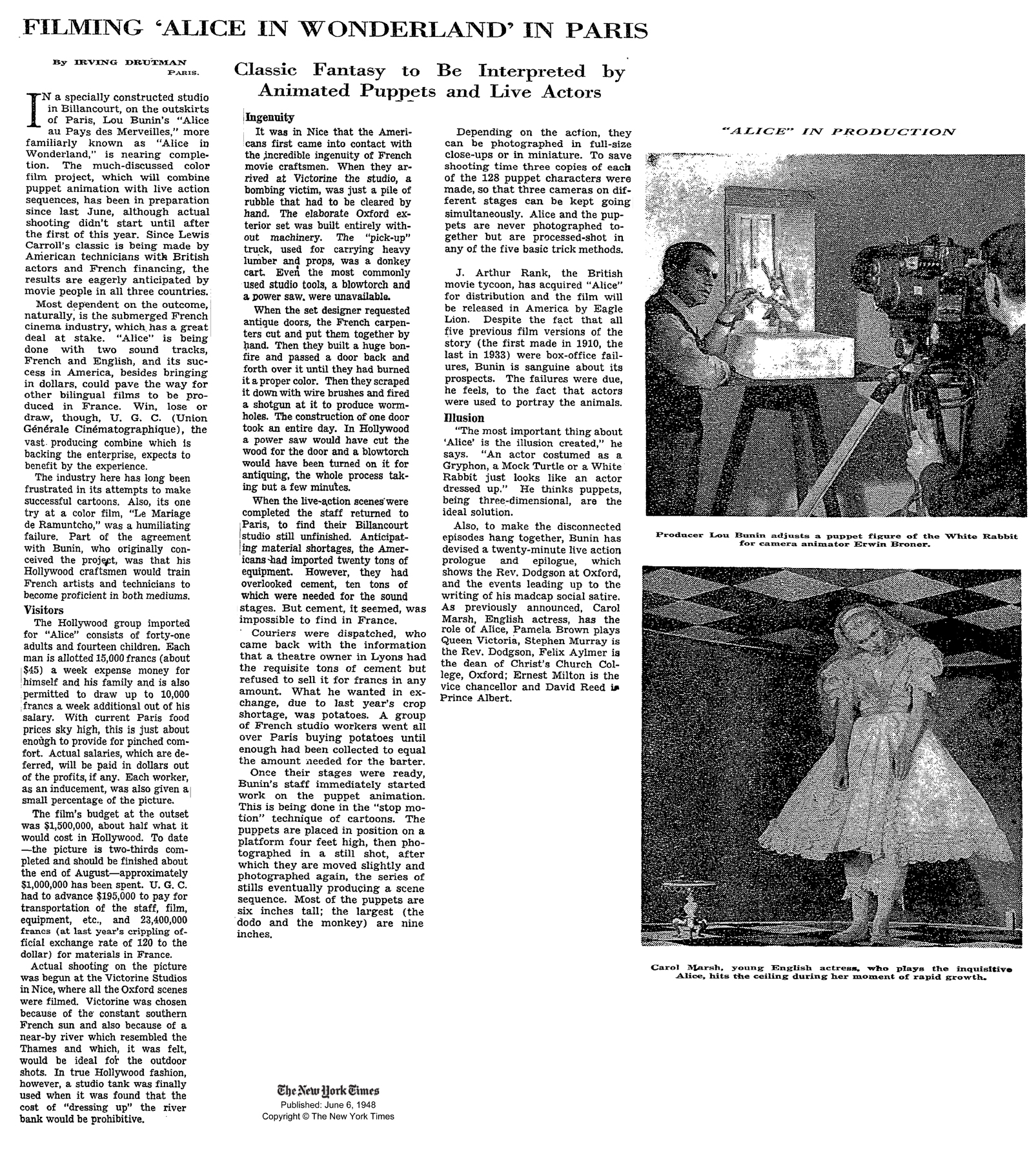
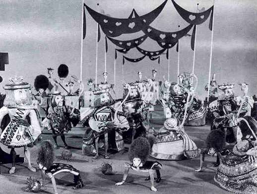 Monday night, the Museum of Modern Art had a screening of Lou Bunin‘s 1950 feature film, Alice in Wonderland. Heidi and I went to the screening that had about half of the seats filled. I’d forgotten that the film was shot in AnscoColor. This was post WWII, and England didn’t have access to the three strip Technicolor. The film was limited to red and green colors, so everything looked chartreuse or orange. In other words, ugly.
The brown mixture grew more and more annoying as the 90 minute feature progressed. The costumes were designed to exploit the two strip color hues, and this might have been a mistake. Alice was dressed in a chartreuse and orange dress, and she might have stood out more attractively had she been wearing white. In fact, the film looks much better when shown in B&W.
 The state of puppet animation wasn’t quite so sophisticated in 1950, at least as it would seem from this feature. Many clunky character moves revealed the budget constraints of the film. The magic and grace of the George Pal shorts felt missed on Lou Bunin’s film, but there, again, the disparity of the budgets had to have been noticed.
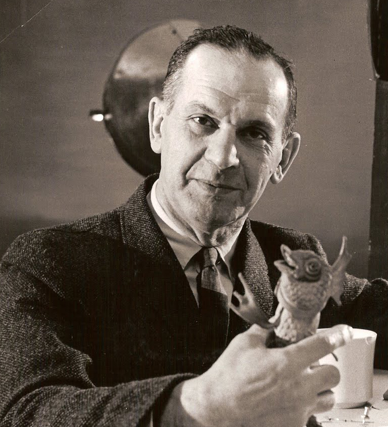
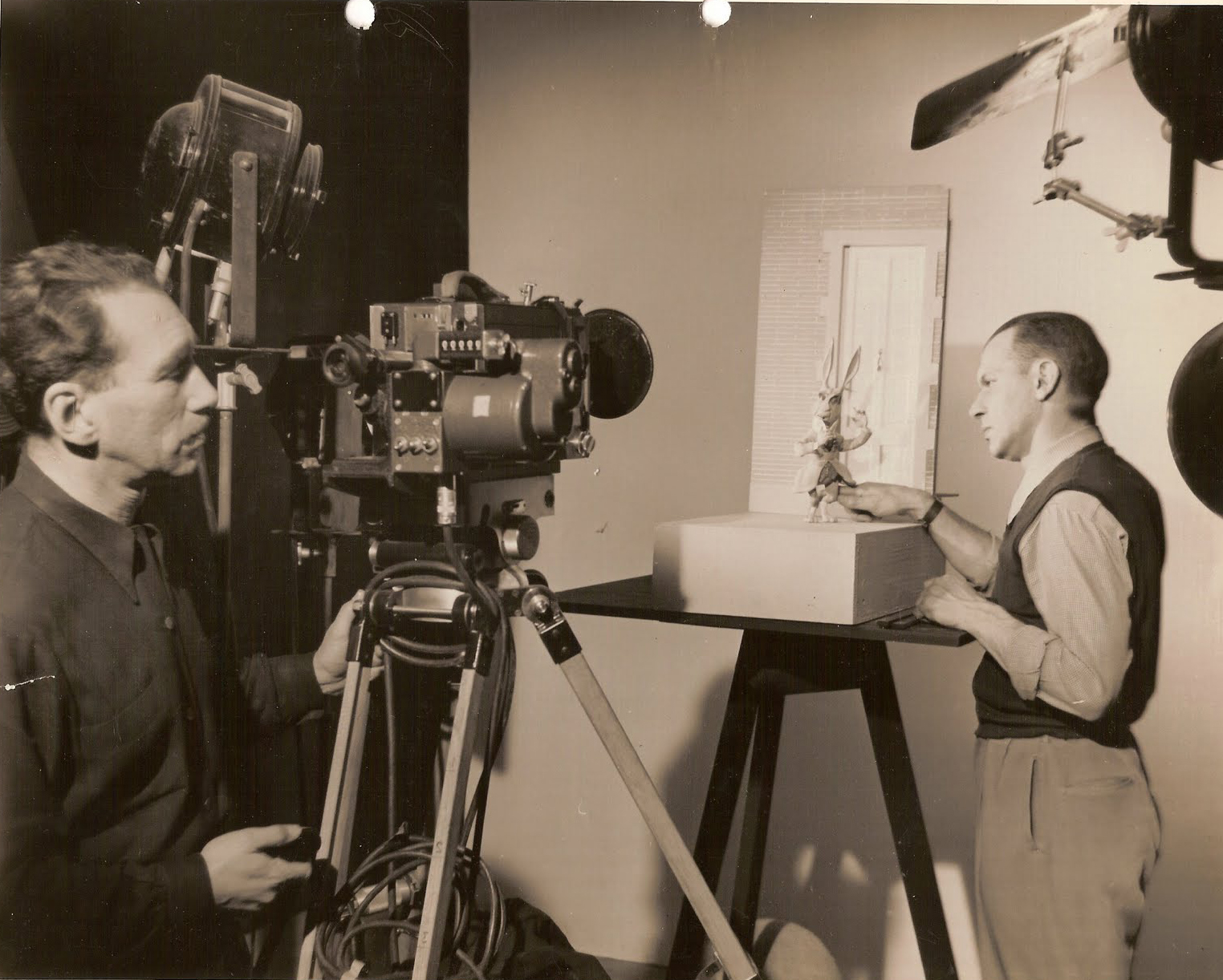
I briefly met and worked with Lou Bunin in the early days of my career. John Gati, a stop motion animator in New York hired me to work on a Care Free Sugarless Gum commercial. Care Free and Trident gums undressed and jumped onto a scale with Care Free weighing more for your money. It took a week to do the 20 secs. of animation in the spot. But just as we were completing animation, we learned that Trident had changed their packaging, and we had to redo the entire spot. At the end of the second week, and the second version of the spot, we learned that Care Free would update their packaging, as well, and we had to do the spot a third time. One week’s work stretched to three, but the work was getting redundant and irritating.
In the middle of that third week, Lou Bunin moved into a corner of the studio. I learned that he was doing a test spot. He was doing a version of the Lucky Charms elf as a puppet and animating it. The puppet was a beauty, and I convinced Lou to allow me to work for him (for free) to assist in the spot. I enjoyed myself for a few more days, and got to meet the man who’d made the only stop motion animated feature.
A news item during the making of Lou Bunin’s Alice.
Quay Brothers
- Just 12 hours later, at 10am on Tuesday, there was a Press showing of the Quay Brothers exhibit at MoMA. I was invited, and I took the opportunity to see the show with the fewest numbers of people who would gather around the smallish artwork. They told us where to go in the Museum (which had another hour before opening) and left us on our own. I went back in the evening to the opening party. Go here to read my review.
 I reviewed this in detail this past Thursday. The show was exhilarating for me. Since getting the first taste of the Quay brothers back in 1980 when I saw their early film Nocturna Artificialia at the Ottawa Animation Festival. A good half of the audience didn’t know what to make of the movie and were impatient. The other half were completely taken by the film and knew it was one of the best of the films we’d seen. The jury at that festival deservedly gave top prize to Tale of Tales. That was the same year that Yurij Norshtein took the world with his masterwork of a film. Indeed, Tale of Tales was (and still is) a greater film than Nocturna Artificialia. (Interesting that Tale of Tales is a cut out animation film – essentially also stop motion.)
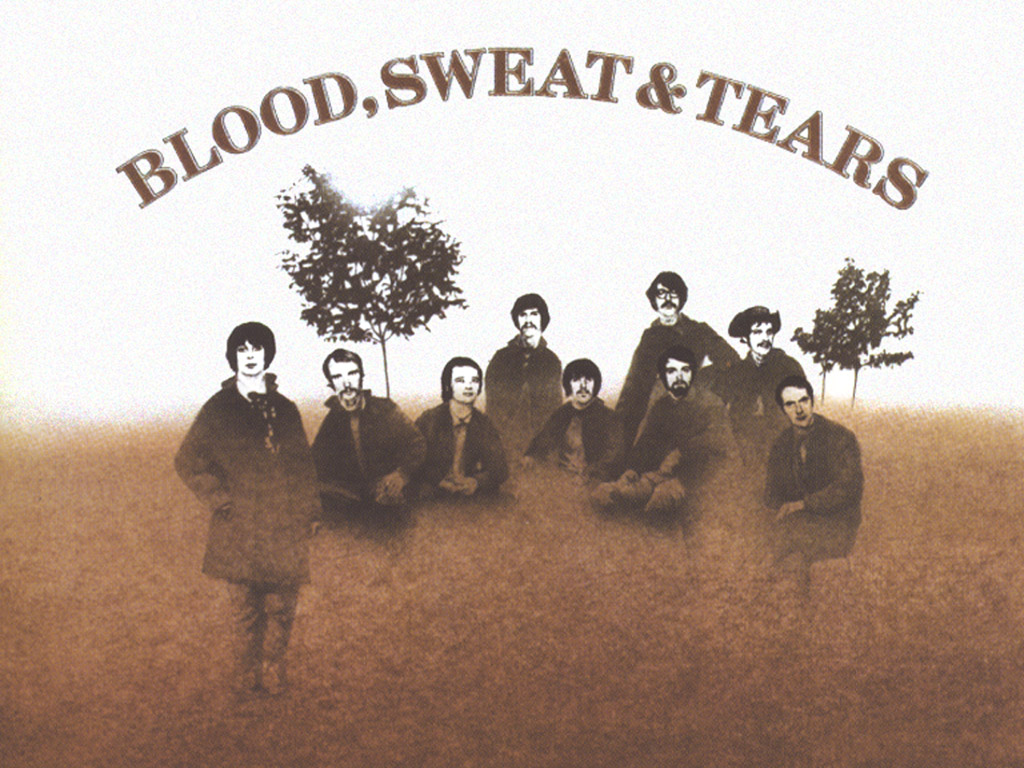 Of course, the brothers Quay are more than stop-motion filmmakers. They’ve done live action as well as documentary films; they’ve designed theater sets and books and record albums. The Blood Sweat and Tears first album cover is theirs. They were asked to design the cover without heads on the musician’s bodies. According to the brothers, the record company didn’t trust them to do the heads correctly; so the producers pasted hi-contrast images on the heads of the bodies, and they didn’t match the graphics the brothers had done. (Actually, the story isn’t properly told on the museum’s wall note; they make it sound as if the brothers had decided to leave the musicians headless, and the record company had to correct the situation. At the very least, it’s ambiguous and led to someone questioning the brothers during the museum’s Q&A.)
ParaNorman
- Then there’s ParaNorman. This film is scheduled to open next week. It’s a stop-motion animated feature from Laika, the company that backed Henry Selick in the making of Coraline. They got rid of Mr. Selick, and made a follow-up feature about zombies called ParaNorman. I’m scheduled to see that film tomorrow morning in an industry screening. In fact, I’ve been asked to lead the talkback, a Q&A with the directors: Chris Butler and Sam Fell. Mr. Butler had been the storyboard supervisor on Coraline, and Mr. Fell had been a director of the cgi features, Flushed Away, the first non-puppet feature from Aardman, & The Tale of Despereaux.
I’ll report on the event and review that film on Tuesday.
By the way, when I last spoke to them yesterday, I was told there’d be some extra seats. So if you’d like to see ParaNorman on Sunday at a 10am show try going to this link: ParaNorman. Note that they say that RSVPing doesn’t necessarily guarantee a seat. At the moment, I know there are seats available; hopefully everyone will be able to get in.
RSVPs.
SUNDAY, AUGUST 12TH
10:00 AM
AMC Loews Kips Bay 15
570 Second Avenue (@ East 32nd Street)
The NYTimes today has an article about ParaNorman and puppet animation.
Some After Thoughts
 Gene Deitch‘s birthday was this week (he likes to point out that his birthday was 8/8 (August 8th when he turned 88.) He’s still keeping the blog up and he’s writing a new book. (If you haven’t read his book, How to Succeed in Animation, on AWN, go get it now – it’s free.
There are a couple of key things about puppet animation on his site, Roll the Credits. The information about his firendship with Jiri Trnka is worth the price of admission.It’s just great reading with lots of key photos.
Gene also has a video tour of the Kratky Puppet Studio, a walk-through with Bretislav Pojar. This is a handy llittle treasure of a video. Thanks to Gene from all of us who love puppet animation.
Articles on Animation &Books &Rowland B. Wilson 10 Aug 2012 03:34 am
Trade Secrets
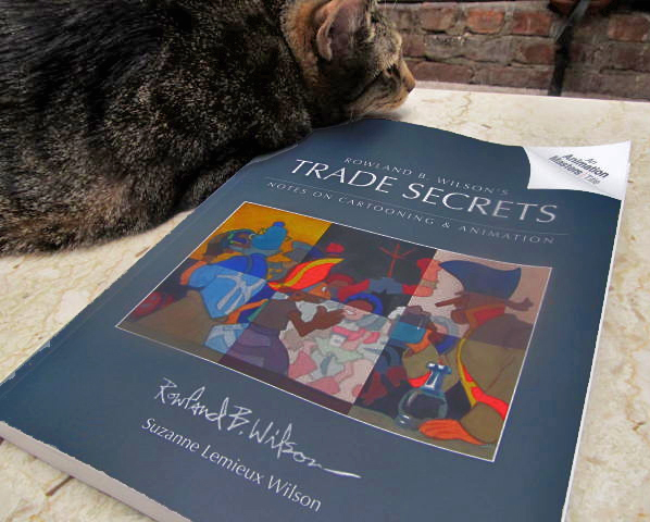 – Finally, I’ve received my copy of the book by Rowland and Suzanne Lemieux Wilson.
Rowland B. Wilson’s Trade Secrets / Notes on Cartooning and Animation.
I’d been waiting for this book to come to me since last April when I ordered it. With barely a few hours to scan through it, I can attest to the fact that I think it was well worth the wait. There’s so much there there.
The depth of information on every page is enormous, and just perusing the book, flipping the pages, takes time because the material within is elaborate and complicated. Yet, watching Rowland Wilson break down the information makes you realize what you already know from studying his cartoons: this guy knows a lot, and all of it goes into the choices he’s made in every cartoon.
Consequently, with the book in my hands for only a couple of days, I can’t possibly review it. It’s going to take a long bit of time. I’ll give you a couple of sample pages from the book, so you can see what you’ll be getting if you buy the book (and let me tell you, you should buy this book. It’s a gem, a masterwork of information that’s near-impossible to see collected anywhere. But it takes time.)
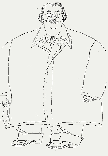
The book gives many and varied sheaves of information. At first, I’ve scanned a couple of pages of thoughts on character models. Here are two:
one on women:
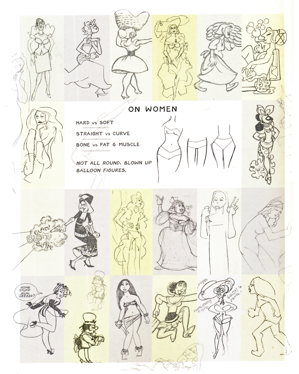 1
1and one on stocky characters:
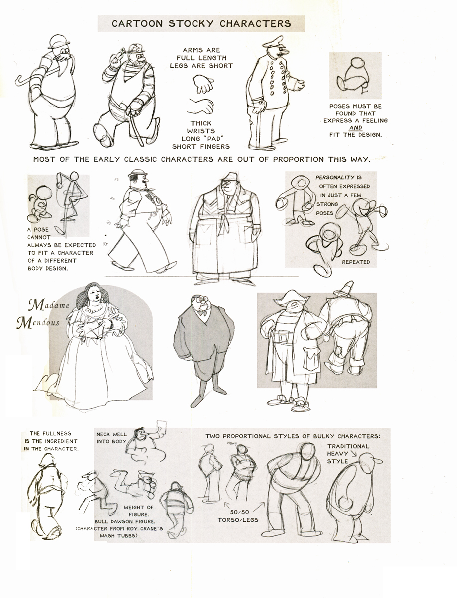 2
2When he gets into the images being created, there’s even a page about iconic imagery within the images being developed. Drawings within drawings.
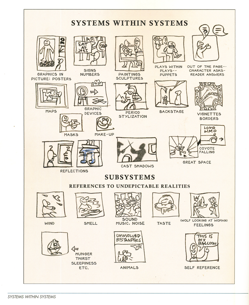 3
3Rowland gets very serious about color and color theories. Here are two adjoining pages which give an overview of color created by varying lighting systems within the drawing.
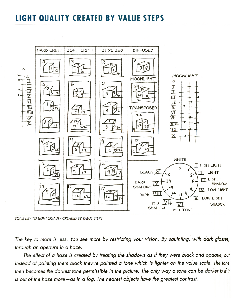 4
4
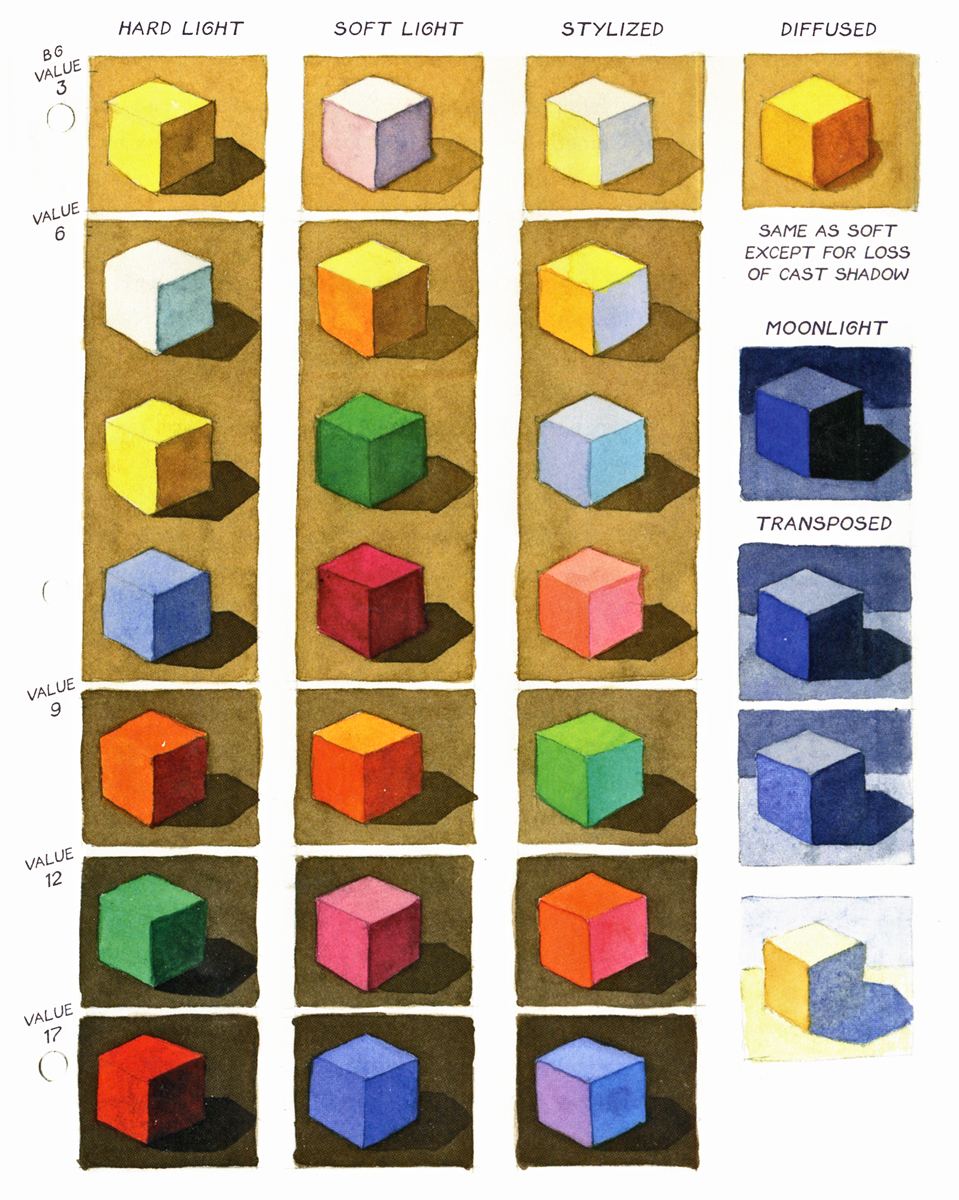 5
5
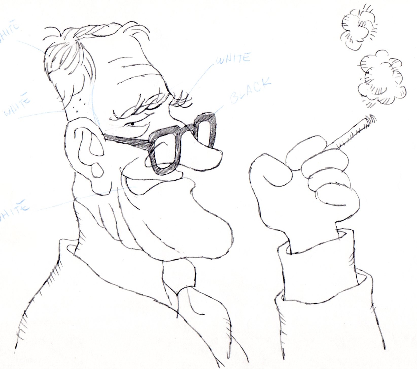
Then there is the section on notes by the great animators, Grim Natwick and Art Babbitt. This section comes from notes Rowland took at the Richard Williams studio when the two came through the London studio. There were lecture courses given for the studio, and this first page includes some caricatures done at the time.
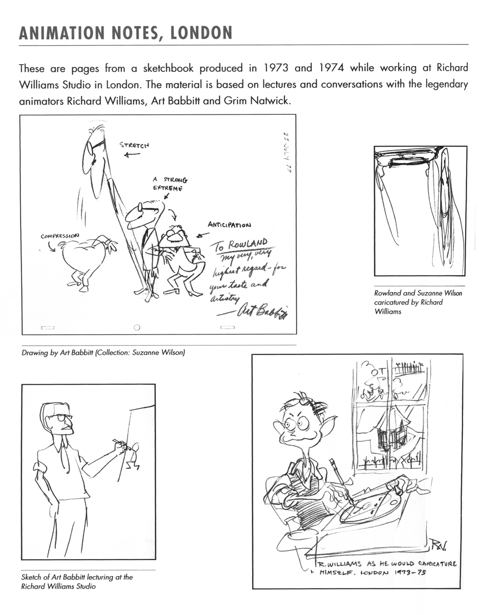 6
6Caricatures done at the Williams’ Studio in Soho Sq.
Here’s a bit of the commentary on Grim Natwick’s lessons:
- GRIM NATWICK AT RICHARD WILLIAMS STUDIO, LONDON
- Grim Natwick was considered one of the world’s greatest animators. He gave a series of talks to animators and was also available for informal conversation during this period (1973-74). We shared the same block of flats and I talked to him often at the studio and after hours. The following is a summation of these talks rearranged according to subject matter.
- GRIM AND THE TRACK— At the time Grim was here I was working on Count Pushkin Vodka (The Trans-Siberian Express animated commercial) and searching for a way to visualize dramatically a musical track. Grim placed great emphasis on the track and the importance of getting to know it thoroughly in order to draw it. At the time he was here I had not started to evolve the the theory of musical form being the basis for animation form. Although Grim never spoke of animation structure as being the same as music structure, on looking back, I see that a number of things he advocated fit into music structure. Art Babbitt’s successive breaking of joints and overlapping action is comparable to the idea of sounding a group of notes in succession, rather than simultaneously. I suspect that the best animators have worked intuitively to principles that are analogous with musical principles. Grim and Art never expressed them that way, exactly.
- DRAWING/ECONOMY— The most controversial theory of Grim’s was to set up a series of related drawings and go into them and out of them and through them in the course of a scene. The animators here felt that the system was not economical due to the amount of mental calculation it took to incorporate a pose in a new way once you had used it. They found the numbering confusing and the doping difficult. Grim presented the idea as an economy and they rejected it on that basis.
- Later in music class it occurred to me the analogy of Grim’s practice with musical practice. The practice of starting with a first and second subject, going through it, repeating it, et cetera,
- I think that Grim’s idea could be called “using a series of HOME KEYS” (animation keys] and is vindicated on aesthetic grounds if not on economic ones.
There’s plenty more where that came from.
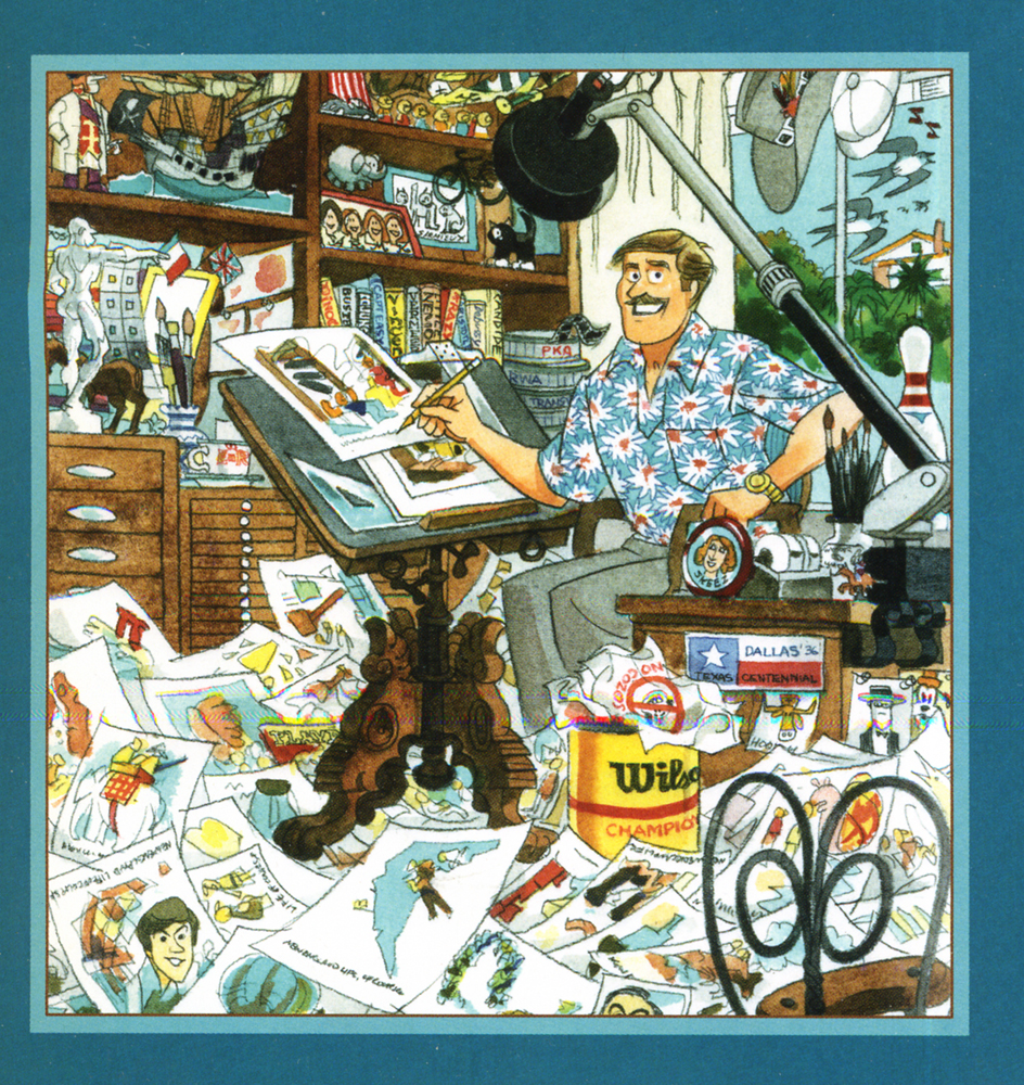
Of course, finally, I had to copy this chapter page which includes this great self-caricature by Rowland.
This is a book filled to overflowing with knowledge and information. It makes me realize how little I know and how much there is to learn from masters like Rowland Wilson. He talks briefly about the ad he designed/directed for Riichard Williams, Count Pushkin Vodka. Seeing this ad, alone, is enough to tell you how brilliant Mr. Wilson is and how key it is to learn from such a master. It also says a lot about the man that he spent time preparing these lessons. It also tells me how grateful I am to Suzanne Lemieux Wilson for organizing this material and getting it into shape for publication; I’m sure that was no easy task. I’ll have this book in hand for quite some time to come. In a way, it compares favorably to Richard Williams’ own book on animation, The Animator’s Survival Kit. The difference is that Williams’ book is about acting, performance, and animation; this book is about design, direction and the bigger picture.
Art Art &Illustration &Layout & Design &Puppet Animation 09 Aug 2012 06:04 am
the brothers Quay
- This week marks the opening of the large show of art and films of the twin brothers, Stephen and Timothy Quay, at the Museum of Modern Art.
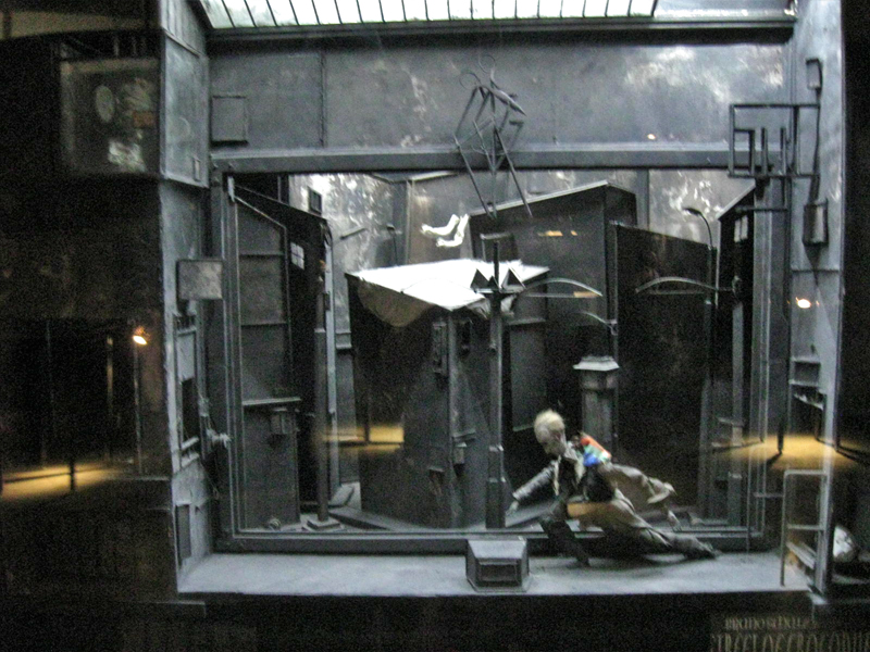 Part of the show is the display of the glass and reflective casings they’ve constructed called Dormitorium.
This was previously displayed in New York at the Parson’s School of Design in 2009, and it was well covered on this blog. Here.
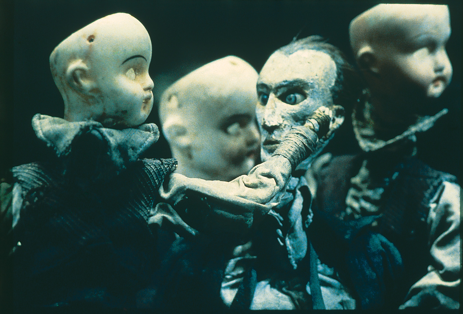
This part of the show is still exciting and interesting. Magnifying and distorted glasses 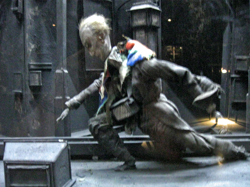 reveal portholes within boxes wherein struggling puppets exist within very tactile worlds. Harsh strokes of bark mix with feathers, muslin and strong textile designs. I’m not sure if anything is being stated within these boxes except a display of the world of isolation and dissonance Kafka has already introduced to us. However, it’s certainly hypnotic peering through these cracked glasses at the prepared tableau.
The displayed art fills the vestibule leading to the Titus 1 theater on the lowest level of the museum. It might take a good half hour to properly view all of these constructions. Yet, one is always in awe of the detailed work that has gone into construction of the enclosed world and the many hours of intense labor it took to produce. Patterns and studied period costumes meticulously constructed; props of foliage and raw wood blend with iron and other mixed metals. Then, light calligraphic type blends softly with all these course grains. There’s a lot to absorb in the tiny claustrophobic boxes. This world relates well with the similar animated stop-motion films of the brothers.
 The principal part of the show sits upstairs on the second floor just around the corner from the main cafe. Small rooms have walls covered with delicate photographs, etchings, and drawings. Puppets encased in glass enclosures sit within these walls of flat art. It’s assembled chronologically, and at the very beginning we see separate pieces of art signed by the two brothers. Two landscapes, one by Stephen, one by Tim – both 8 years old. This is the only piece of art not attributed to the Quay Brothers – the pair of them. Very delicate drawings with the signature of both brothers. There are no exceptions within this show other than those two tiny landscape paintings. One easily understands the dual signature on films or even etchings where different responsibilities can be joined. This is difficult to understand two names attributed to an extremely delicate and detailed pencil drawing. However, this is the universe they’ve established, and it’s an original distinction. It fits into the world of the Quays, where everything feels man-made, done at the turn of the Century (19th to 20th Century). It’s a world wrought by the Industrial Revolution, an art that has nothing to do with digital anything. You can feel the hands that have molded these artworks.
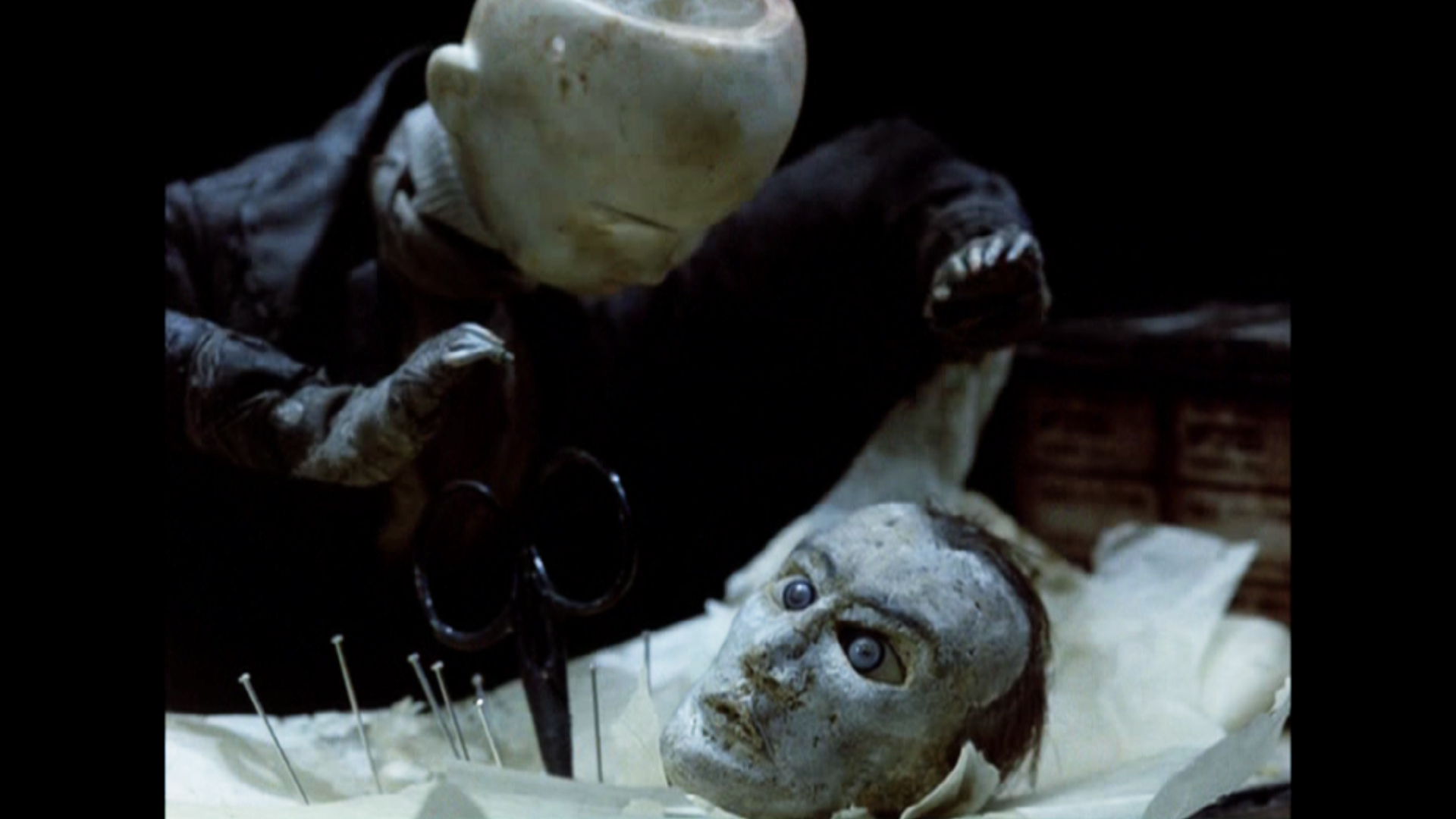
 There are many rooms wherein films, the principal part of their art, play out on warm gray walls. A few black folding chairs sit in front of these screens in the tight spaces. Visitors can sit and watch for a minute or for the entire film. I stopped for all of the films but sat through only one, Igor, a film about Igor Stravinsky, Jean Cocteau and Vladimir Mayakovsky. This was the first of the animated biographies they did for Channel 4 out of their own studio in London, Atelier Koninck. It works through Constructivist art to move the three through Paris and their art world. The studio was founded in conjunction with Keith Griffiths, another student they met at the Royal College of Art who became a lifelong partner in producing their works of art.
The first film that the brothers made that grabbed my attention played at the 1980 Ottawa Animation Festival. Nocturna Artificialia confused half the audience of cartoon lovers and excited the other half. Art was alive at that Festival and it felt a small disappointment that the brothers (very new to the animation world – in fact, no one had heard of them back then) had not come to the Festival with their film. This is a case, though, where the film certainly did all the talking that it had to. Tale of Tales deservedly won the Grand award that year, but the Quay brothers were well introduced to American animators.
Street of Crocodiles
It was only a few short years later, 1986, that the film, Street of Crocodiles, would make its debut and make the brothers famous. This still remains one of their best known films, although the music video for Peter Gabriel’s Sledgehammer would be their best known work.
The MoMA exhibit continues through to the end of its space, packed to overflowing. Many works stand out from the rest though they all display a singular vision – that of the Quay Brothers.
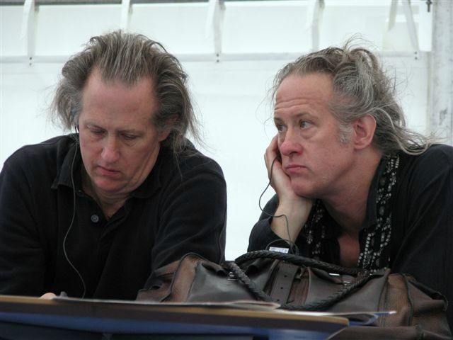 I attended a Q&A with the brothers Quay led by Ron Magliozzi who organized the show as the Associate Curator of the Dept. of Film. At first, there was a brief conversation with the four, including Peter Reed, the Senior Deputy Director of Curatorial Affairsfor MoMA. This was eventually opened to the audience, which meant some not very interesting questions were asked. I’d recorded it with the idea of transcribing the session for this blog, but the questions were so mundane that the brothers were almost astonished, and I dismissed the notion of transcribing as pointless. One person asked if they’d had nightmares as children to be able to create such dreamworlds. The answer was no, they didn’t dream and the art is not a dream world. Another questioner asked if they felt they’d had a nutritional shortage as children which might have created such ideas as adults. Tim immediately answered, “Yes,” to that, and Stephen quickly responded, “Too much white bread and peanut butter.”
I went to the Press Preview in the morning to be able to view the show at length. The only two I saw there that I knew were Candy Kugel (of Buzzco) and Richard O’Connor (of Ace and Son.) I came back in the evening for the official opening party. Drinks and hors d’ oeuvres with a moderately crowded audience that covered the first floor of the museum and swelled out to the MoMA sculpture garden. It was a warm and humid evening, so it was nice outside, but air conditioned inside. Groups traveled upstairs and down to see the art, but to drink, eat and socialize many just stayed on the main floor. I met up with plenty of people I knew including Emily Hubley, John Canemaker, Candy Kugel, Jeremiah Dickey, Josh Siegel (of MoMA), George Griffin and Karen Cooper, among others. Though I’d only seen Stephen Quay at the opening, I was told that Tim was outside in the garden. It was an eventful day that felt filled with art and animation.
Animation &Animation Artifacts &commercial animation &Layout & Design &Models &Story & Storyboards 08 Aug 2012 07:00 am
Vince Cafarelli Grabbag
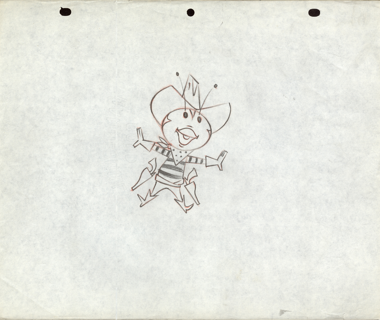
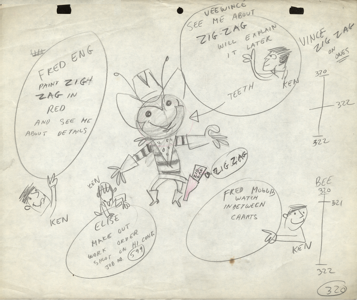
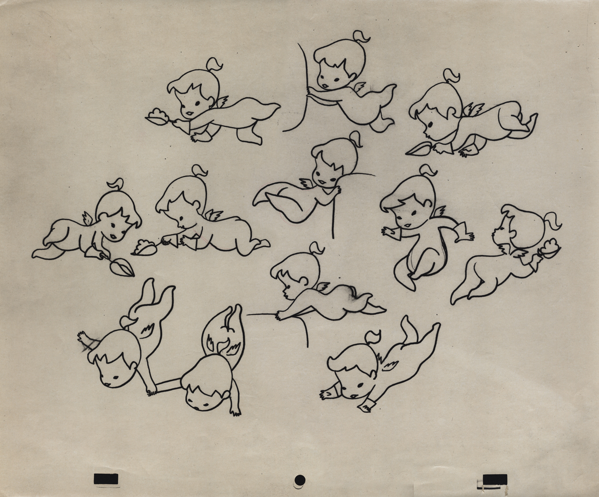
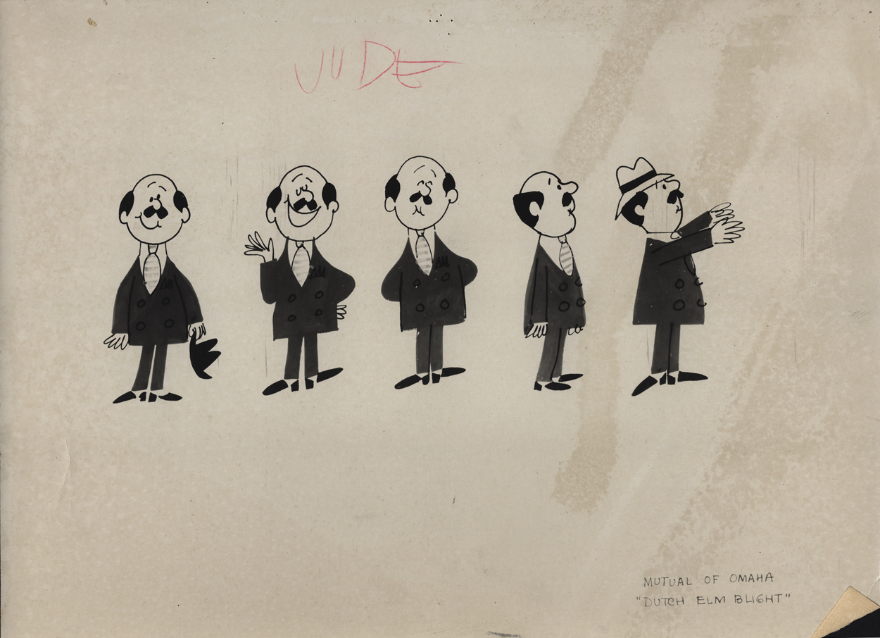
- Today we have a mix of odds and ends from Vince Cafarelli’s collection of animation artwork. We start with some artwork from the commercial studio in NY in the 1950s-60s.
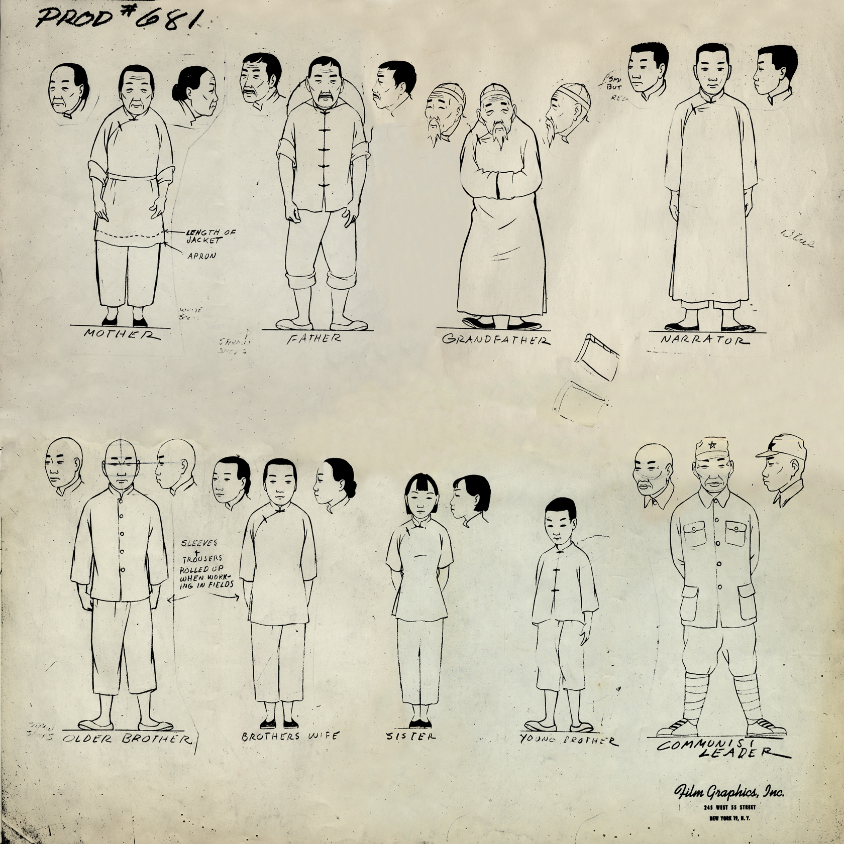 1
1This is a model sheet for something done
at Film Graphics. No doubt it’s not a commercial
but probably some kind of Educational film.
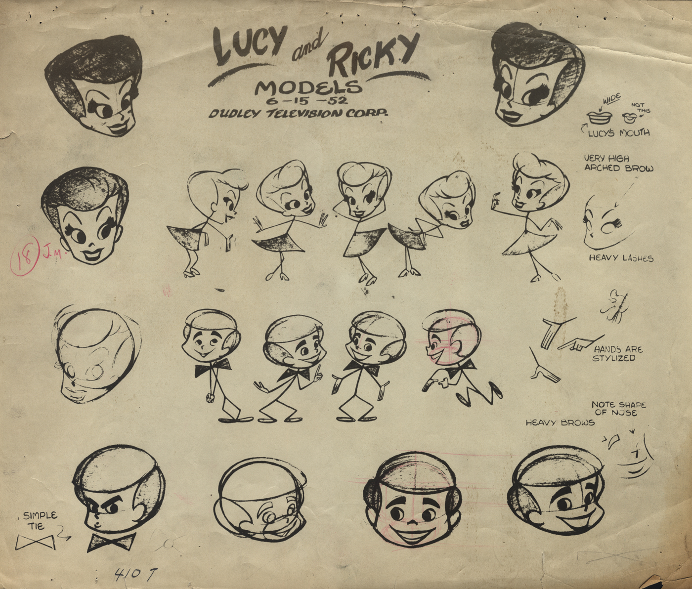 2
2
This is a model sheet for the opening titles to
the “I Love Lucy” show. My guess is that
this also comes from Film Graphics.
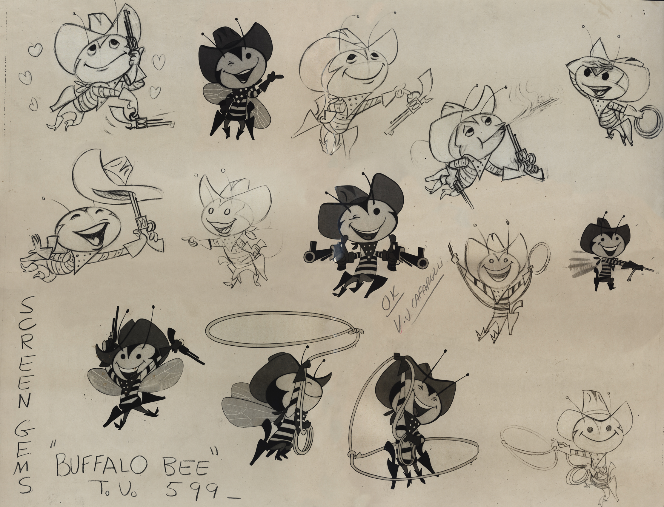 3
3
The Buffalo Bee model sheet for the Nabisco
Wheat Honeys commercials. Mae Questel was the voice.
This was probably done for the Gifford Studio.
 4
4
 5
5
 6
6
A model for a little angel. I assume this is for a
paper product commercial. Again, I think it’s the Gifford Studio
 7
7
A turn-around model for a Mutual of Omaha commercial.
Again, since it’s with other Gifford Studio material I’d guess the same.
 8
8
Here are two bear drawings from some commercial.
It looks like Dick Williams’ Cresta Bear (only this was
done years before that.)
9
The three round peg holes is certainly unique.
Fleischer used a similar system for a wile as did
Krantz Studio on Fritz the Cat.
I don’t know where these are from.
 10
10
I’m sure this comes from the Gifford Studio.
 11
11
An interesting design. I assume it’s from a spot.
Peg holes look like the Gifford Studio.
 12
12
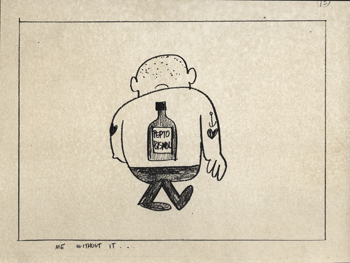
A storyboard drawing for a Pepto Bismol commercial.
UPA had this account for a long time.
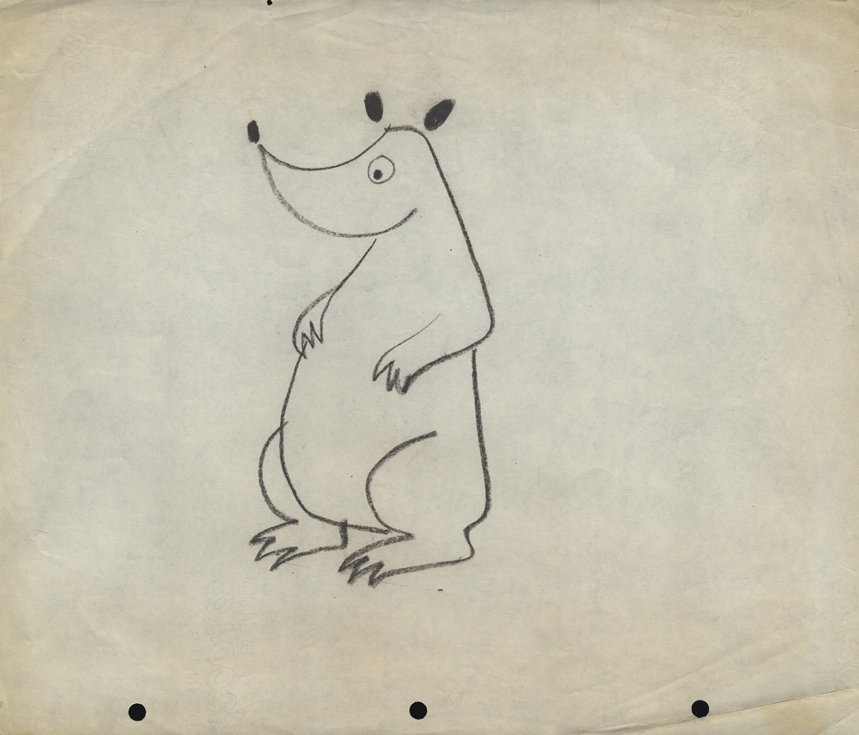
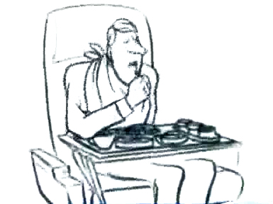
The following three drawings are two animator’s drawings (#106 & 108) and one Inbetween (#107). I believe the animator is Frank Endres; the inbetweener is Vince Cafarelli. For some reason I think this is from a Little Lulu cartoon directed by Bill Tytla, but I can’t vouch for that. I’m sure one of you visitors will let me know how wrong I am, and I welcome it.
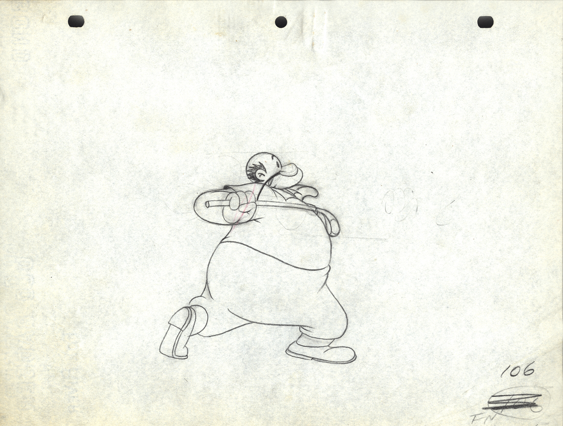
Drawing # 106 – animator’s drawing
I’m surprised at how small the paper is; not quite 8½ x 11.
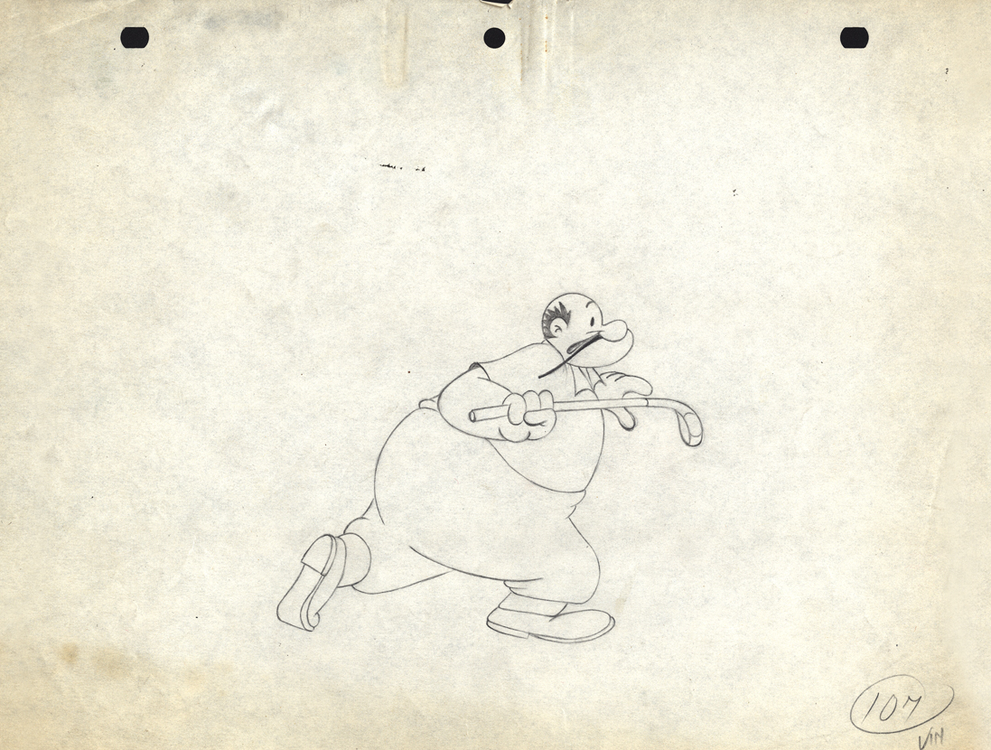
Drawing # 107 – inbetweener’s drawing
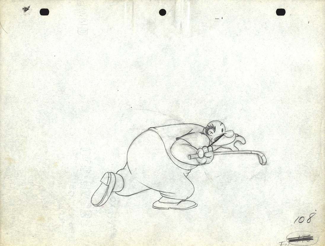
Drawing # 108 – animator’s drawing
The peg holes are Signal Corps.
Animation &Commentary 07 Aug 2012 06:20 am
Jack Schnerk, again
 - Jack Schnerk‘s daughter, Mary Schnerk Lincoln, has put three of her father’s commercial sample reels onto YouTube .
Just last week I found myself using one of those reels to showcase a Rowland Wilson designed commercial done for Phil Kimmelman & Ass. Seeing that reel again, brought me back to the other two reels on YouTube, and the great work animated by Jack. There are a number of well-known and collector’s item commercials in these reels. Included are spots designed by the likes of Gahan Wilson, Tomi Ungerer, Charles Saxon and, of course, Rowland Wilson.
Jack Schnerk was a great animator who deserves considerably more attention. He was a strong influence on me in the first eight years of my career and taught me quite a few large principles about the business. He also told me a few stories of his work as an assistant at Disney’s on Bambi and Dumbo as well as the great times animating at UPA and the difficulties of animating at Shamus Culhane’s studio. Actually, he didn’t tell me about his problems with Shamus; another animator did. Jack complained about the business, but never about how he was treated.
He did have an exercise which he thought was important for an animator to pass. He suggested you animate a character walking in a 360° circle away from and back toward the camera. This is a tough test of mechanical ability, and Jack is right; it’s tough and can prove your mettel. (Milt Gray does just that with his somewhat vulgar character, Viagri, but the animation is impeccable. Milt’s a first rate animator.)
 I wish I had more samples of the many scenes Jack animated that I assisted. He worked in a very distinct style – I don’t think I’ve seen anyone else ever draw that way. Somehow, the very rough drawings weren’t hard to clean up, and, though he worked very rough, he didn’t leave the bulk of the work for the people following him. He was concerned about the timing and did every drawing he needed to make sure that timing worked. Most of the time we worked together, he had no chance to see pencil tests. Only on Raggedy Ann did he have that luxury, yet he was always taking a chance on the scene, pushing to some new way of doing it. I think of all those Hubley scenes that went to color art, yet Jack had done some daring moves that could have made some of the scenes go bust. None ever did.
I met Jack at the Hubley studio, then again when I worked for Phil Kimmelman. At Raggedy Ann, I dropped Jack’s name as often as I could until Dick Williams finally saw him, and brought him on board. There was no doubt he would, Jack was that gifted. At least once a week at Raggedy Ann, Jack would give me some original piece of advice, and the more I followed it, the better my work grew. Something as simple as draw rough. I’d been an assistant too long, and my clean line would assure that my animation would never move out of those lines.
Jack Schnerk animated the French trapper sequence. There was such a rush
on the scene that I remember Jack bringing it in saying he hoped it would work.
Jack had a dark side, that I appreciated, but he also brought a lightness and individual sensibility to the work he did. He took chances in his animation and timing and sometimes failed but usually succeeded with them. That’s more than I’ll say for most of the animators I’ve met in the business.
See
Though not always the best quality, you can also watch a few of the longer, famous short films Jack animated on:
- Gerald McBoing Boing by Bobe Cannon. Jack told me that this includes the first scene he ever animated, even though he didn’t get credit. He did Gerald running alongside the train (starts at 4:41)
Tender Game by John & Faith Hubley
Really Rosie directed by Maurice Sendak
A Nose by Mordi Gerstein
The Violinist by Ernie Pintoff
Give Me Liberty by Ralph Bakshi is one of many bad shorts done for Terrrytoons at the end when Bakshi was in charge.
After reading this post today, Bill Peckmann sent the following note:
 Hi Michael,
Your post today on Jack was just wonderful!
When I broke into the business in 1962 at Elektra Films, Jack’s room was the one they put me into. It was pure heaven! As a super, wet behind the ears novice, to be in the same room with someone that had ACTUALLY worked at Disney and UPA, you gotta be kiddin’!
My luck held out further because I assisted/followed up Jack (at Focus and PK&A) on all of the print cartoonist/designer spots you mentioned today. I would have done that work without pay! The combination of Rowland and Jack on a job, I still need smelling salts.
As when we all worked on Rowland’s spots, where I did those caricatures of Jack, ‘Sounds of Focusville’ and ‘Kimmelman of the Klondike’, I also did this caricature (attached) in Gahan’s style of Jack when we worked on ‘Carter Hall, Pipe Tobacco’ together.
I will pull together Xerox copies, pencils and stats of the art of Gahan, Bob Weber, who ever I can lay my hands on, etc. of the spots that Jack animated plus a JS rough or two.
We can look forward to more of Jack Schnerk next week, thanks to Bill’s collection.
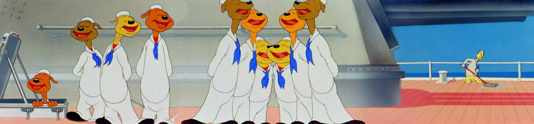
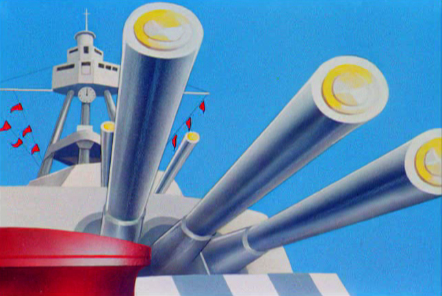
Animation &Animation Artifacts &Chuck Jones &Frame Grabs &Layout & Design &repeated posts 06 Aug 2012 06:38 am
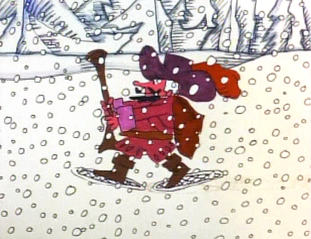
Conrad – again
I repeat this post for good reason. This is one of the prime films John McGrew planned for Chuck Jones, and the work is just dazzling. However, to our eyes it hardly looks unusual. Many of the tricks here were done for the first time, and others are so seamlessly done that we hardly notice them. It just looks like another War cartoon from WB. It ain’t.
It’s special.
 - Regulars to my blog know that I’m a big fan of the work of John McGrew. He was a designer/Layout Artist working in Chuck Jones’ crew at Warner Bros. in the late Thirties/early Forties. His work was daring beyond compare, and, I think, with support from Jones, he changed the look of modern animation backgrounds.
He designed the seminal film The Dover Boys as well as amazing pieces like Aristo-Cat, Inki and the Lion and Conrad the Sailor.
In an interview conducted by Greg Ford and RIchard Thompson, Chuck Jones was asked about McGrew’s style: 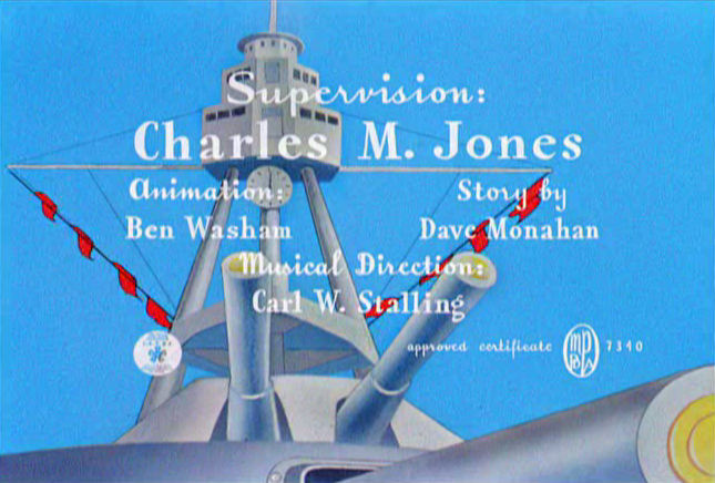
- Q: What about John McGrew’s style and approach, as compared with Noble’s?
A: John McGrew didn’t really have a style; he was experimenting all the time. Maurice does have a style. John McGrew, you might say, was more of an intellectual. You could be intellectual, and get away with it— but if you’re solely intellectual as a director, you weren’t going to get away with it. The result was, however, that he goosed me into thinking that it might be worthwhile to try some different things with backgrounds and so forth. And later on, I would find this kind of thing very useful, in that often it would make your gag work, and sometimes you wouldn’t even know why. Like that little abstract background at the end of Duck Amuck, with the sharply angled lines going off.
Today I’d like to feature some frame grabs from Conrad the Sailor. Where I could, I separated the characters from the backgrounds to just feature the Bgs. My guess is that the Bgs were painted by Paul Julian, but they were planned by McGrew.
The one scene I don’t illustrate is the most original in the film. Daffy is shot into the air with a bullet. (illus #18) The camera does a 360° turn to head back to the ship. The Bgs don’t hold up on their own. Lots of blue sky and wisps of cloud. It works in motion.
Of this short & McGrew, Jones says:
- . . . we used a lot of overlapping graphics on that particular cartoon so that one scene would have the same graphic shape as an earlier scene, even though it would be a different object: first we’d show a gun pointing up in the air, then in the next shot, there’d be a cloud in exactly the same shape. It gave a certain stability which we used in many of the cartoons after that. John McGrew was the artist responsible for that sort of thing. Conrad was also the one where we used the first complete 360° turn, when the characters went up through the air.
For more information read Mike Barrier’s excellent interview with John McGrew.
 1
1(Click any image to enlarge.)
 4
4
 5
5
 6
6
 7
7
 8
8
 9
9
 10
10
 11
11
 12
12
The following BG pan can be seen in full to the left. I’ve broken it into three parts for a closer look.
 12a
12a .
.
———-(Continue scrolling down.)
.
.
.
.
.
.
.
.
.
.
 12b .
12b .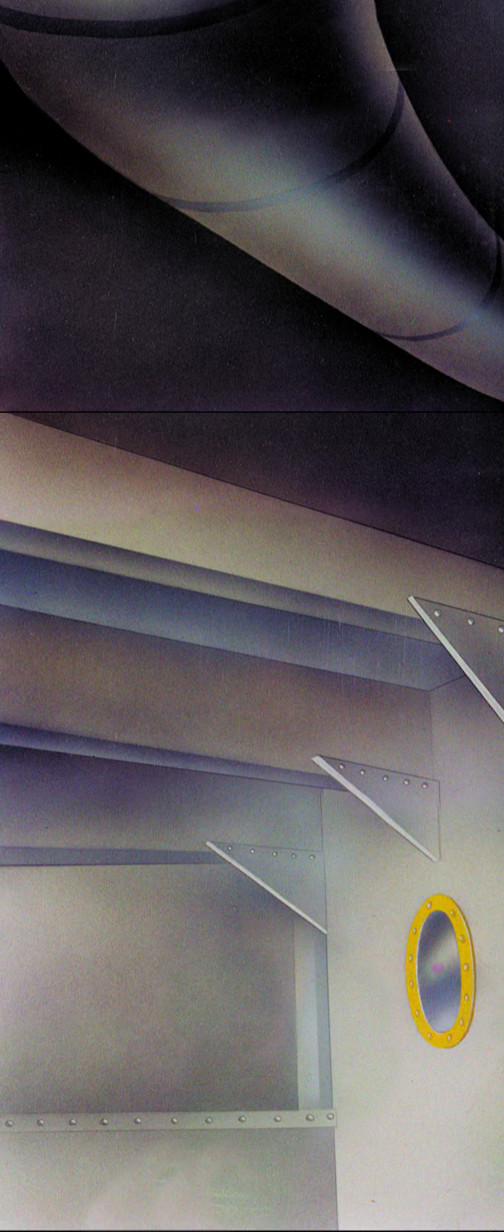 12c
12c
 13
13
 14
14
 15
15
A bicycle pan that keeps moving to the left.
 16
16
Continue moving right to left.
 17
17
 18
18
 19
19
 20
20
 21
21
 22
22
And here’s the cartoon.
Pay attention to the Layout in the sky from 6’25″ to the end.
It’s amazing.
Photos &repeated posts 05 Aug 2012 07:41 am
Snow Again – recap
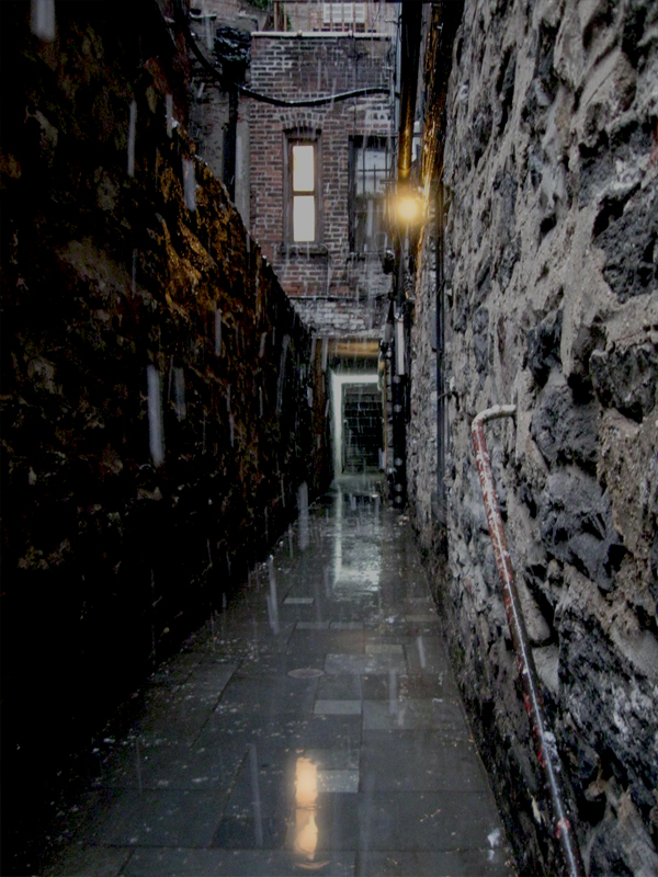
With all the weather we’ve been having lately, I had to laugh at this post from Feb., 2010. There’s more to it, really. When I moved out of my office space, I moved Robbie into my home – a one bedroom apartment where 2 cats already lived and had made peace with each other. Robbie’s a big guy, but he’s not the alpha male. Alex is. We expected raging battles, but no. The 2 boys act like long lost brothers. They fight every day for fun (lotsa flying fur.) It’s the girlio, Lola, who is the problem. She gets along fine with Alex, but if she SEES Robbie she turns into a screaming banshee waking our entire building and the ghosts that live in our walls. She’s taken private residence in the bedroom and the rest of us (excepting, of course, Robbie) have to pay homage a couple of times a day. Oh, for the problems of animation!
Anyway, here’s February, 2010 and Robbie’s romp in the snow.
- Sorry folks, but I just can’t help myself when it comes to big snowfalls. We had about 12″ this week, so that seemed a lot to me. The newscasters were saying upwards of 20″, but they’re always fulla crap.
 1
1  2
2On the left you can see the weather at the end of Thursday.
On the right it’s the start of the new day, Friday.
 3
3
On Thursday night, going home it was a mess. It had rained all day
sort of a soupy, slushy mess of wet goo. Every corner had about a
foot of water you had to step in, around or through to get across
the street. Let me tell you it gets annoying.
 4
4
I walked across Bleecker Street heading toward the subway, at
about 7pm. It looks nice here, but it was a wet mess.
By the way, I couldn’t help leaving the blue/greenish tint to the snow
caught in these photos. The street lights at night give it that tone.
 5
5  6
6
The colors remind me of those the Disney BG artists painted snow in a Donald cartoon
where he fights his nephews in a snowball fight. Donald’s Snow Fight.
 7
7
The snow was wet wet wet and heavy.
 8
8
By 5:30 the next morning there was a different picture as I left
my apartment on 30th Street. This was the height of the storm.
Big thick, fluffy snowflakes everywhere.
 9
9
Here’s Park Avenue. No cars in sight. It was impossible driving,
though a bus crawled past me at one point.
 10
10
The over-busy construction site was drawn to a lull.
 11
11
 12
12
This was Bleecker Street from the vantage point of the
old Portuguese Church on Carmine Street.
 13
13 14
14
Across from the church are two planters full of tiny trees.
 15
15
Here’s the view of my studio street, Bedford Street.
 16
16
Looking down the block toward my tiny sign.
 17
17
I was the last person to see the entrance steps look like this.
I cleared each step as I walked down.
 18
18
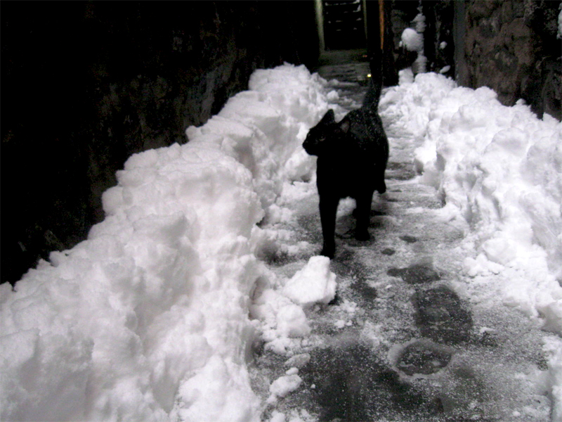
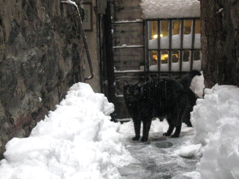
I went inside and put my things away and went out to shovel.
My boy Robbie came out to keep me company and try to
figure out what had happened.
 19
19
He kept going out all morning and coming back in covered
with wet snow. I regret I didn’t call him Snowball.
Commentary 04 Aug 2012 06:21 am
Kenyan Notes and Other Stuff
The Kenyan Animation Industry
- Fraser MacLean, the author of the brilliant and beautifully illustrated book, Setting the Scene: The Art & Evolution of Animation Layout, contacted me a couple of weeks ago to introduce me to a young animator from Nairobi called Daniel Muli. Daniel is currently in New York for a short visit – he’s also a musician recording with his group – and Fraser was hoping to set up a meeting.
I’ve decided to give you a bit of that letter from Fraser and Daniel for you to get an idea of what was happening in Africa.
Daniel writes:
- “The Kenyan animation industry… It’s not the most active, sadly. It’s still in those early stages where everyone who’s trying to make it work is a crazy enthusiast, so I guess it makes for cool vibes when people get together, you get a lot of people trading information and stuff they’ve been watching, comic books they’ve been reading or whatever. Manga/anime’s pretty popular. And there’s a lot of people experimenting with what African art would be like translated into the animation medium.
- I guess another reason you find that most of the animators working right now are coming from a fan perspective is because the schools here are kind of uninspiring. I taught a couple of classes at one of them when I was in uni, and it was a difficult situation, the facilities, and students who were sent there more because they didn’t have much else to do rather than because they like the work… It was kind of exhausting. But the college I was at did a short intense course in collaboration with Truemax, a European 3D animation school, which seems to have gone well. (That was after I left.) There aren’t big employers of animators at the moment; the first and biggest so far was the Tinga Tinga Tales project that was done with Disney and the BBC.
Opening song from Tinga Tinga Tales.
See episodes of Tinga Tinga Tales here.
Fraser Maclean continues writing:
- Since that project wrapped, all the animators kind of just went back into the random freelance lifestyle. Some of them find less work in animation and more in design and advertising, or such things. I guess the best thing would be if we had more projects that were based here, and were a bit more sustainable, and I’m sure that’ll happen soon, but so far the attempts to start something, from u-nions to big film projects, are brought down by infighting and politics or whatever…
Does all this sound bleak?”
I did get to meet with Daniel this past week, and “bleak” is certainly not the word. We talked a bit about New York, a bit about Kenya. We met at Candy Kugel’s studio, Buzzco, and their EMMY on display got Daniel to tell me about Well Told Story a project he was involved with which won the first International EMMY for Africa. Much of his free-lance stories sound very much like freelancing in New York. In ways, animation is probably he same the world over.
Daniel Muli has made the most of his two week stay in New York recording for several days and performing for others. He’d also spoken at Bard College and today, Saturday, at 3pm he’ll perform in Central Park as part of their Summer Stage series. I’m looking to go and listen to his music. If it’s at all as vibrant as he, it’ll make for a great show.
Here are two of the creative (and community) projects that Daniel is currently involved in: go here and here.
- Summer Stage
Saturday, August 4, 2012 | 3 p.m.
Amadou & Mariam / Theophilus London / Just a Band
Presented in Association with: Museum for African Art
Free!
SummerStage is located at Rumsey Playfield near the 5th Avenue and 69th Street entrance to Central Park.
Take a look at Just a Band‘s music video samples below:
This one uses puppets.
Here’s one that uses flash animation.
______________________________
A Couple of New Animated Features
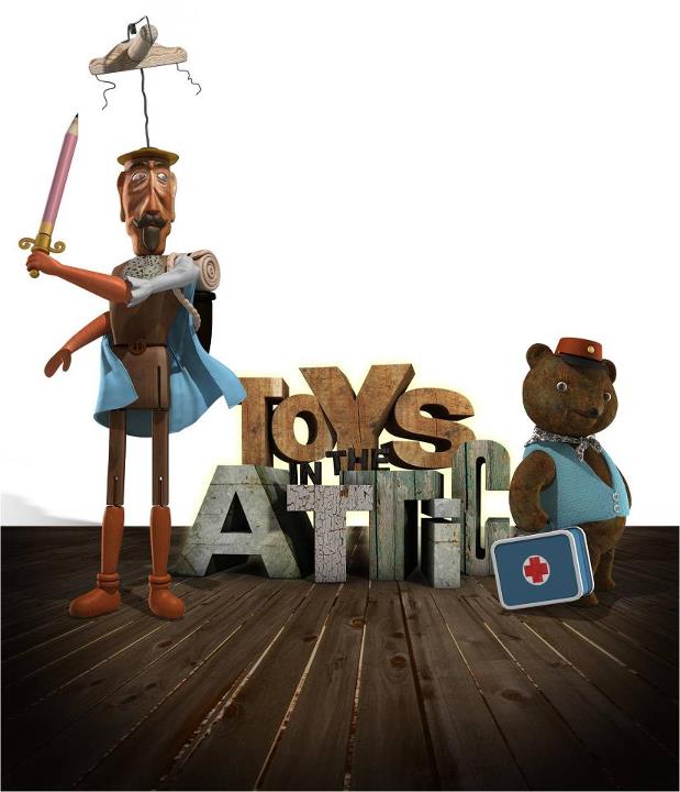
- Toys In the Attic is a multimedia animated film combining 3D stop motion, 2D animation, pixillation and live action. The film stars the voices of Forest Whitaker, Joan Cusack and Cary Elwes in their English language version. The film was directed by Jiri Barta, who is sometimes called the Tim Burton of the Czech Republic. The English version is being released to theaters on September 7th.
However, if you want to see the film sooner than that, it’s playing as part of the International Children’s Film Festival. That will take place on:
Saturday & Sunday, August 25-26, 11:00am
at the IFC Center.
May I also remind you that Cat in Paris (the Oscar nominated 2D animated feature from France) continues to play at the Cinema Village on 12th St & University Pl. This film has been playing in NY for three consecutive months. The film’s only an hour long, but it’s good. Go here for the schedule.
By the way Brave is also playing at the theater, and I’m not sure if it’s on the same bill – one price for both films. From the schedule it looks like it is.
Toys In the Attic is another of many 3D stop motion films being released this year, including one from Tim Burton, the American Tim Burton. That one is Frankenweenie. Paranormal will be released within the next month. That’s a big budget stop motion feature that comes from Laika, the Oregon company that financed Henry Selick‘s last film, Coraline. They apparently felt they could get along well without Mr. Selick. It’ll be curious to see what they do without him: it’ll be fun to see if they did.
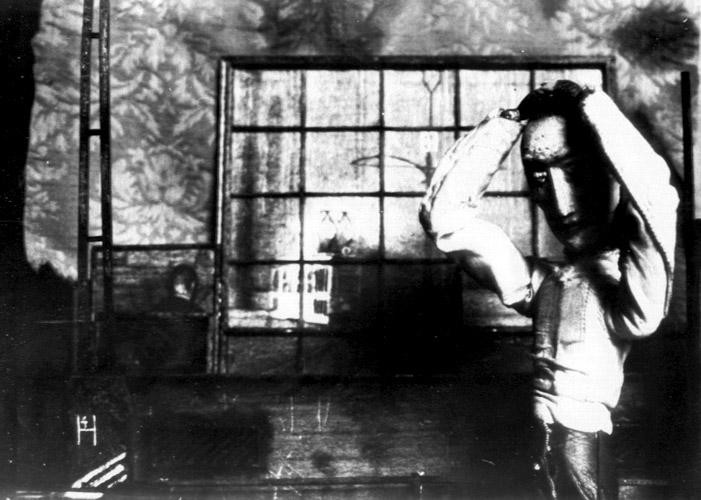
Lou Bunin behind the camera on Alice
- A 3D puppet animated feature from 1950 will have it’s last theatrical showing of the season this coming week. The Museum of Modern Art is screening Lou Bunin‘s Alice in Wonderland this Monday at 8pm. This film gave Disney agita when it was released at the very same time as his Alice feature. He tried to stop the American release of Bunin’s film, but lost that contention.
I previously wrote about this Bunin film here and here and here and included the NYTimes press clipping about the Disney vs Bunin trial.
Dreamworks Sets Their Schedule
- DreamWorks Animation has announced its release calendar through 2014, setting dates for seven animated features.
-
Madagascar 3 opened on June 8
Rise of the Guardians will open in theaters Nov. 21, 2012.
The Croods goes out on March 1, 2013.
Turbo bows on June 7, 2013.
Me and My Shadow, combining traditional animation with CGI, opens Nov. 8, 2013.
Mr. Peabody & Sherman goes out in theaters March 21, 2014.
How To Train Your Dragon 2 opens June 20, 2014.
Art Meets Animation
- Richard O’Connor (Ace and Son) directed me to a gallery showing in New York currently on display. Suzan Pitt‘s film, Asparagus is on display at the Harris Lieberman gallery at 508 West 26th Street, in Chelsea, through Aug. 17th. It’s quite amazing that a 33 year old film is still circling the art galleries and getting the lead attention in the NYTimes art reviews. Congratulations to Suzan Pitt, proof positive that animation can be art.
- Richard also noted that Natalie Djurberg has a show at the New Museum.
Art News reports: The Swedish artist Nathalie Djurberg works with animation films which are inhabited by clay figures in a strange universe. The short films are often no longer than five minutes but they manage however to tell stories about the human condition mixed both with black humour and seriousness.
Art and animation mix in NYC.
MoCCA Moves
- A couple of weeks ago a small article in the NYTImes (July 10th, to be exact) reported with this headline: Museum of Comic and Cartoon Art Says That’s All, Folks – for Now. The article read; “The MoCCA, in SoHo, announced, without elaboration, on its Web site on Monday that it was closing its “physical location,†effective immediately.”
It continued: “’Plans are afoot to continue MoCCA in a new and exciting incarnation,’ according to a statement on the Web site.”
Then yesterday I received an email from MoCCA. This one stated: The Museum of Comic and Cartoon Art (MoCCA) and the Society of Illustrators have announced plans for MoCCA to transfer its assets to the Society, creating a single cultural institution supporting and celebrating illustration, comics, and animation. This will give MoCCA a long-desired street-level location, in the Society’s building at 128 E. 63rd Street.
So there you have it; life goes on.
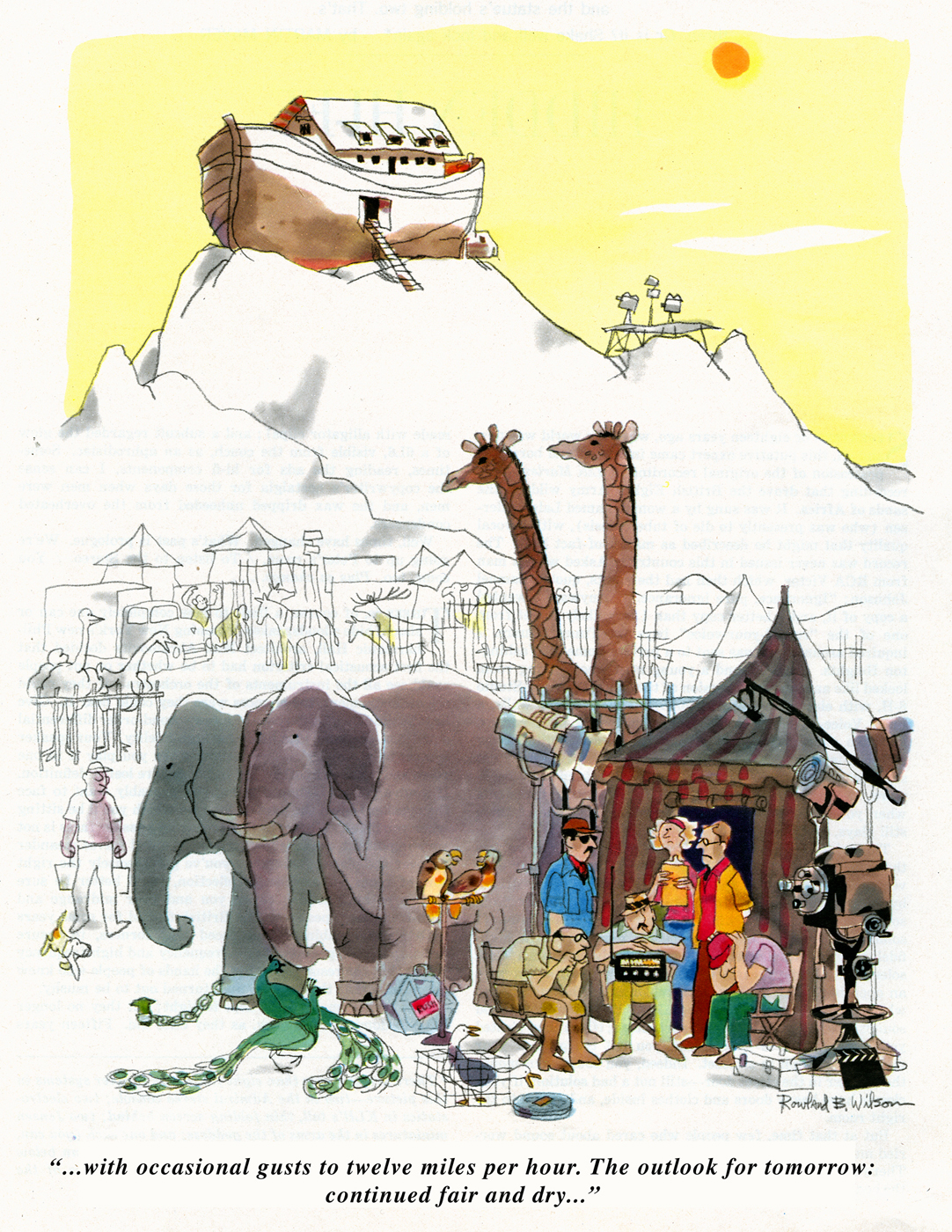
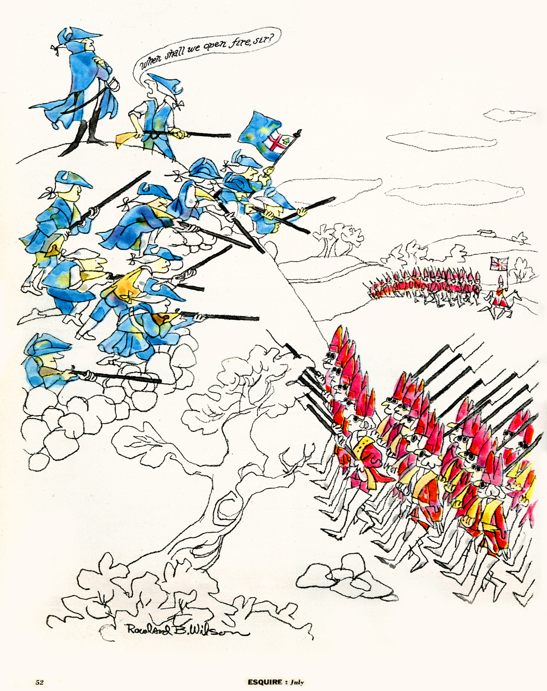
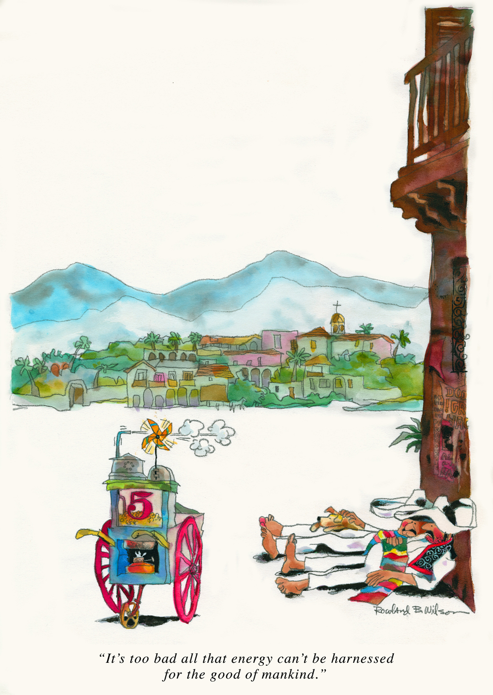
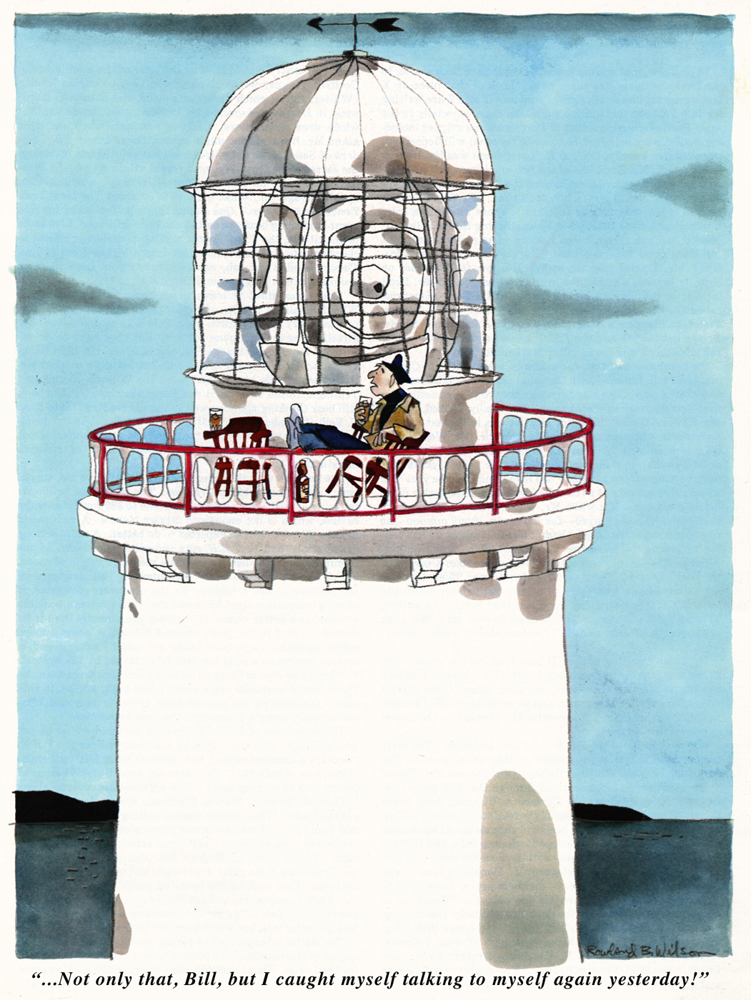
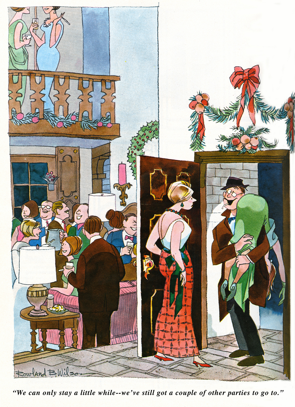
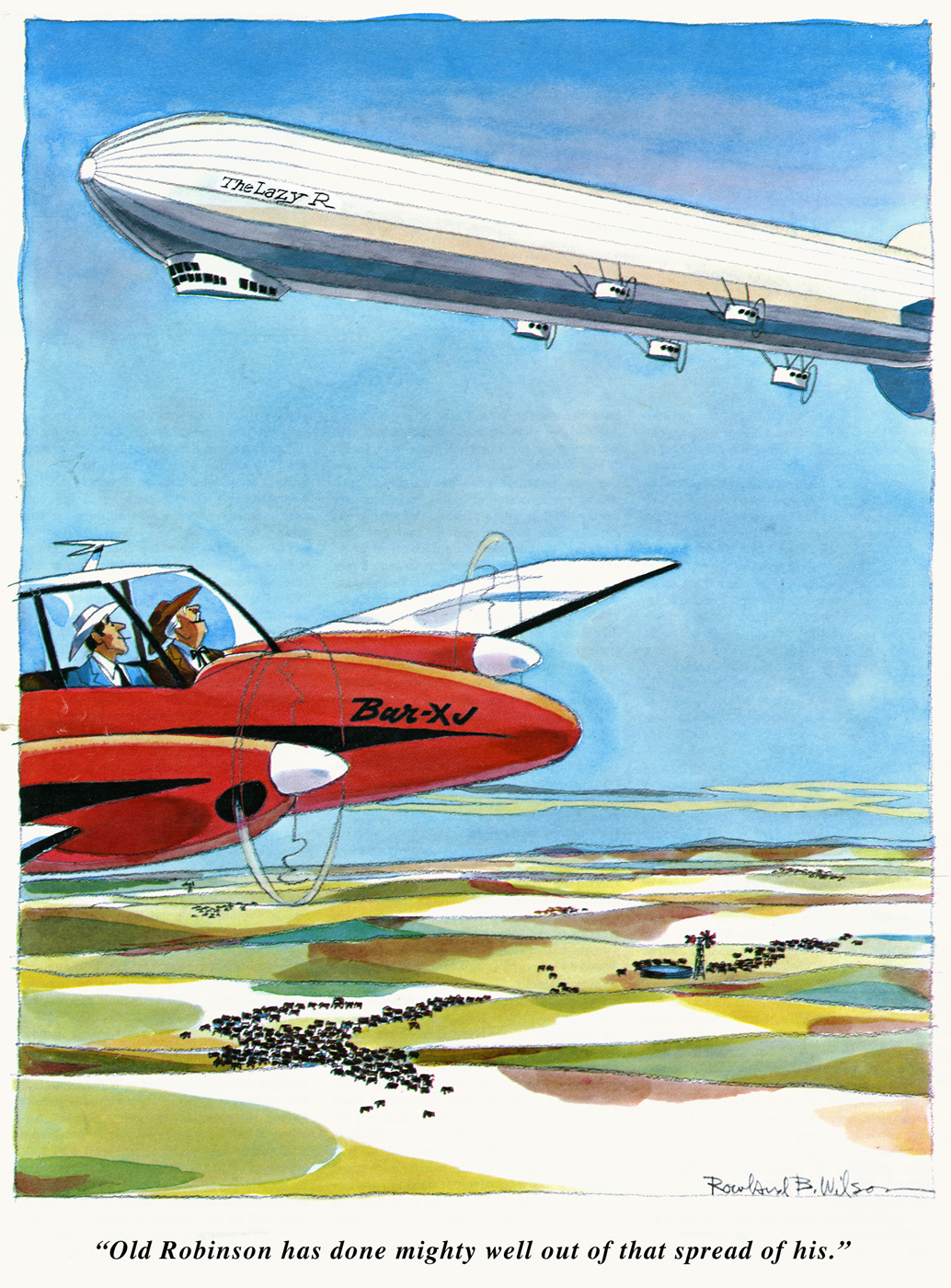
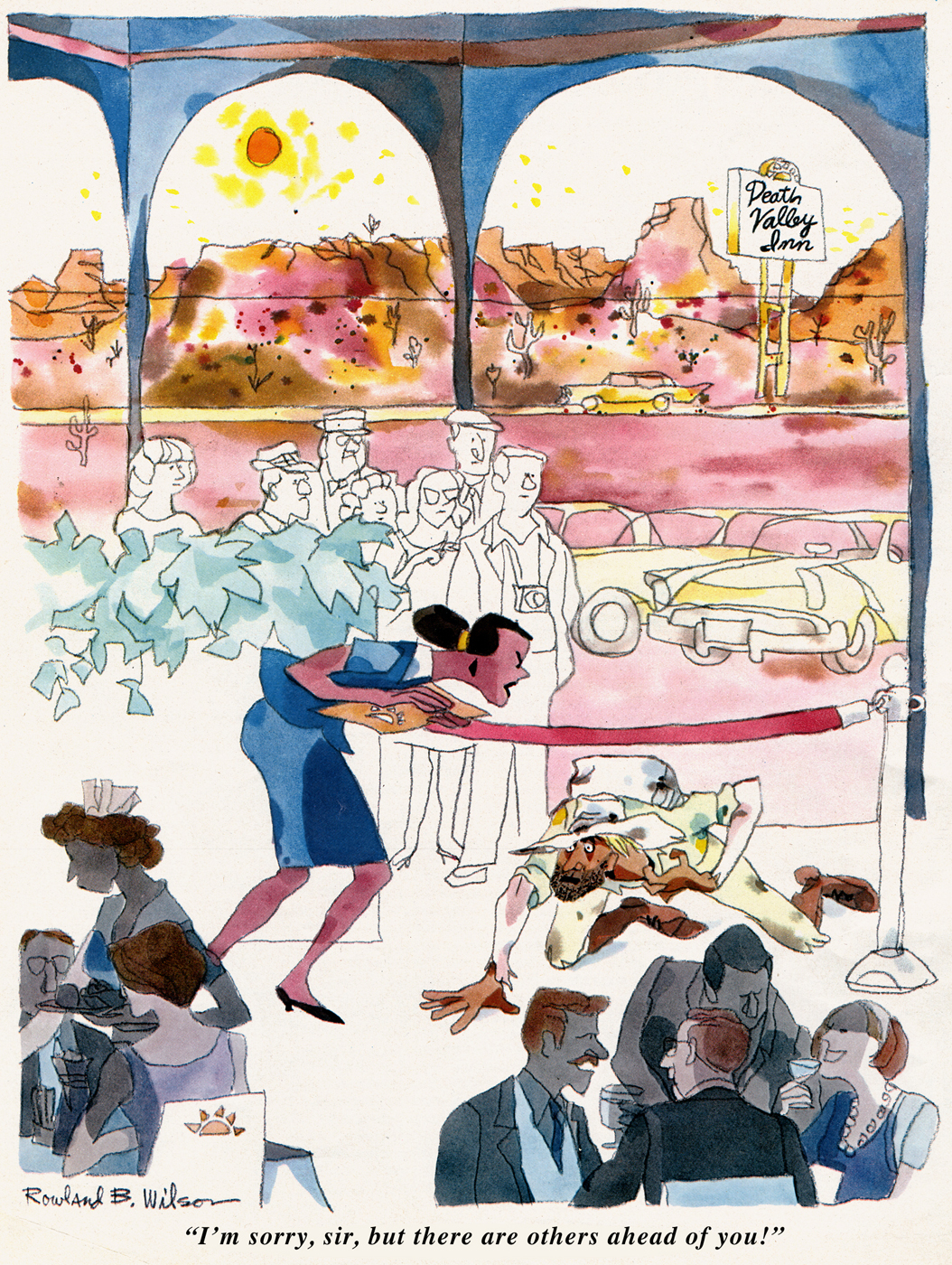
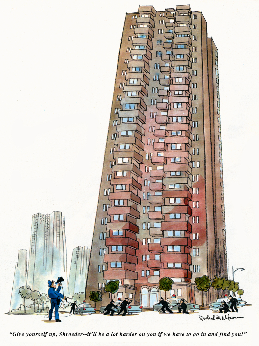
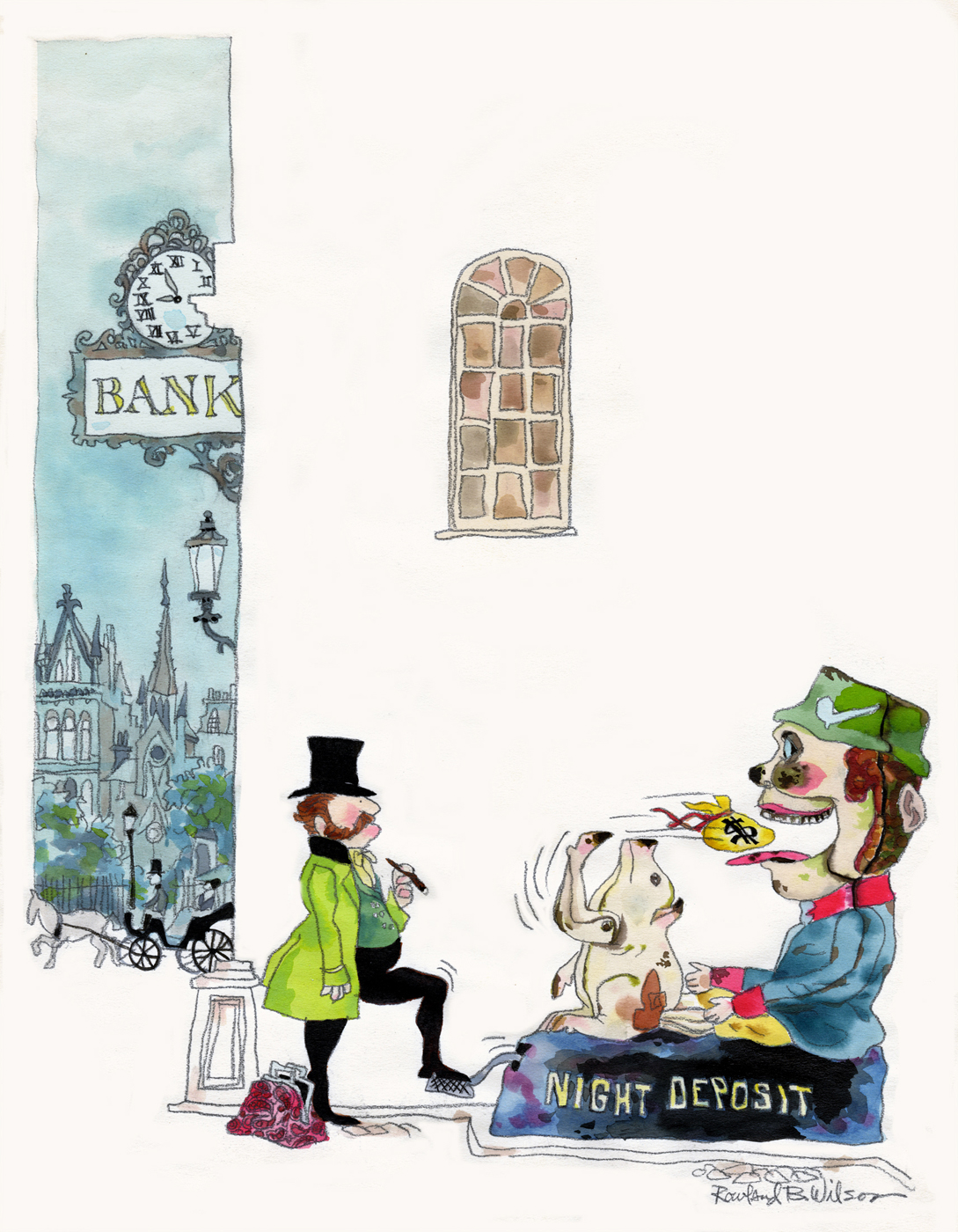
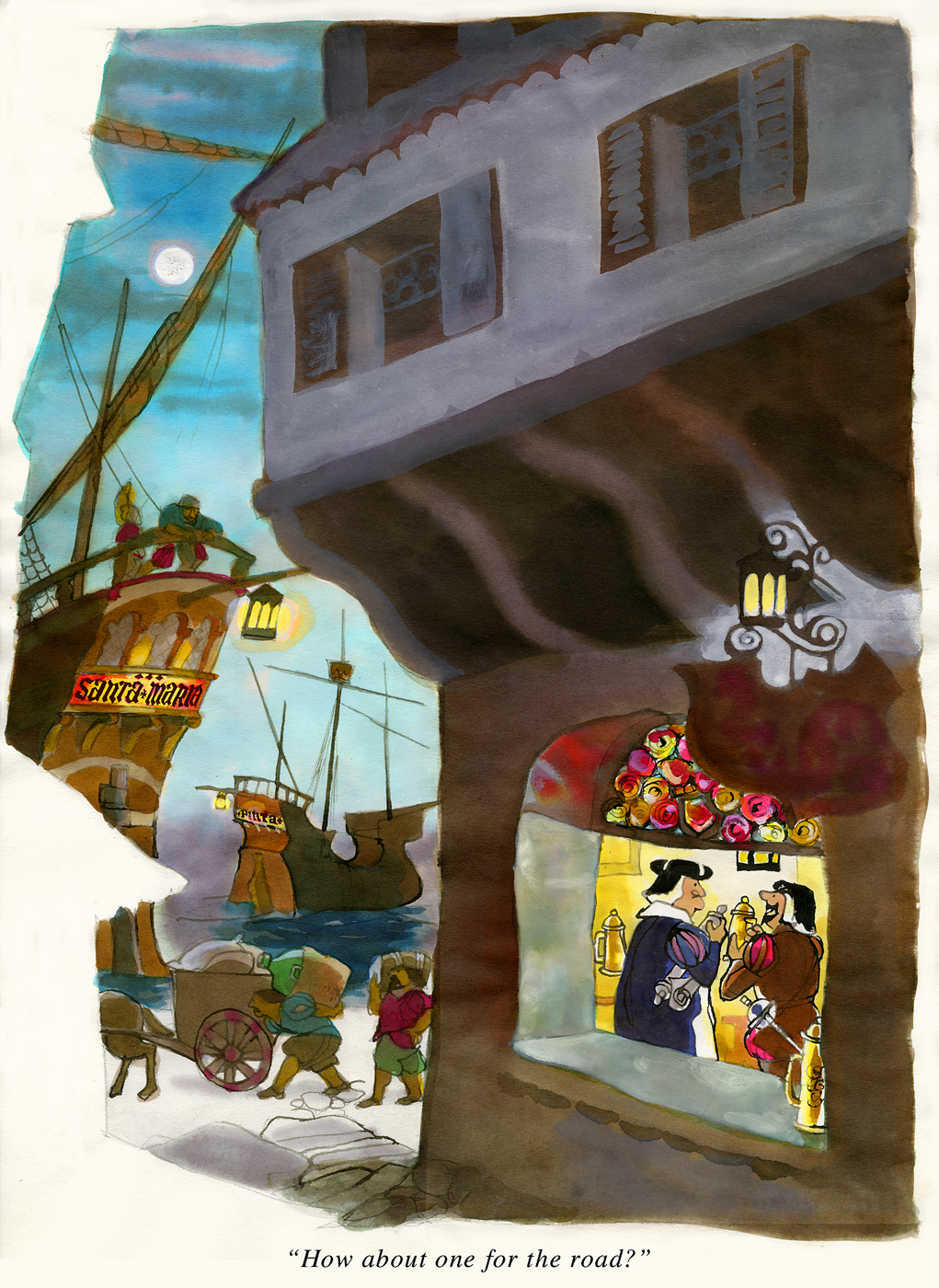
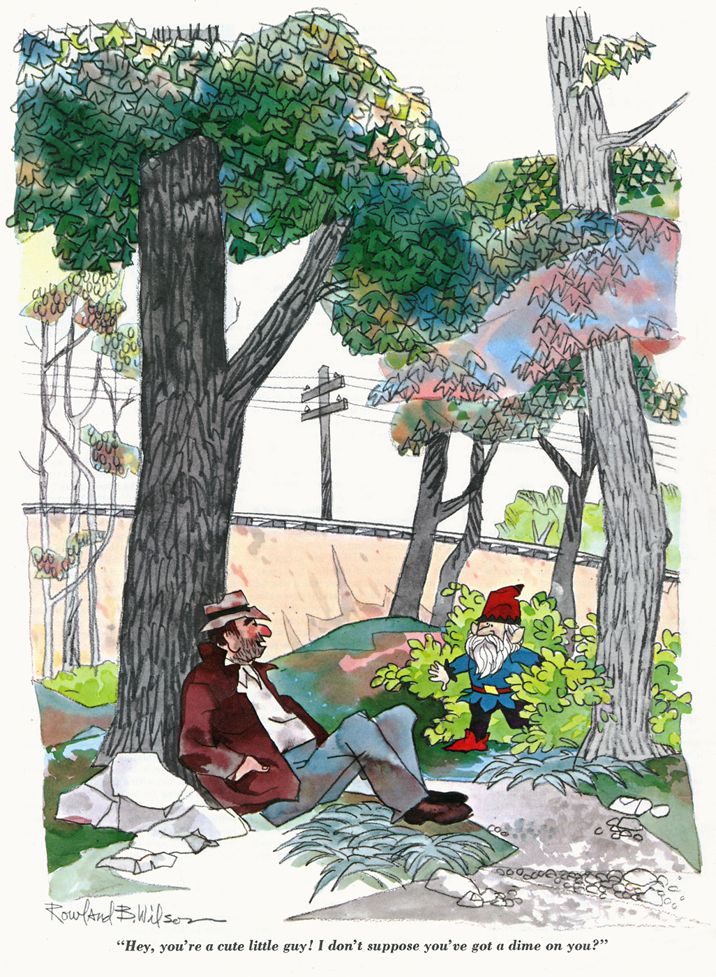
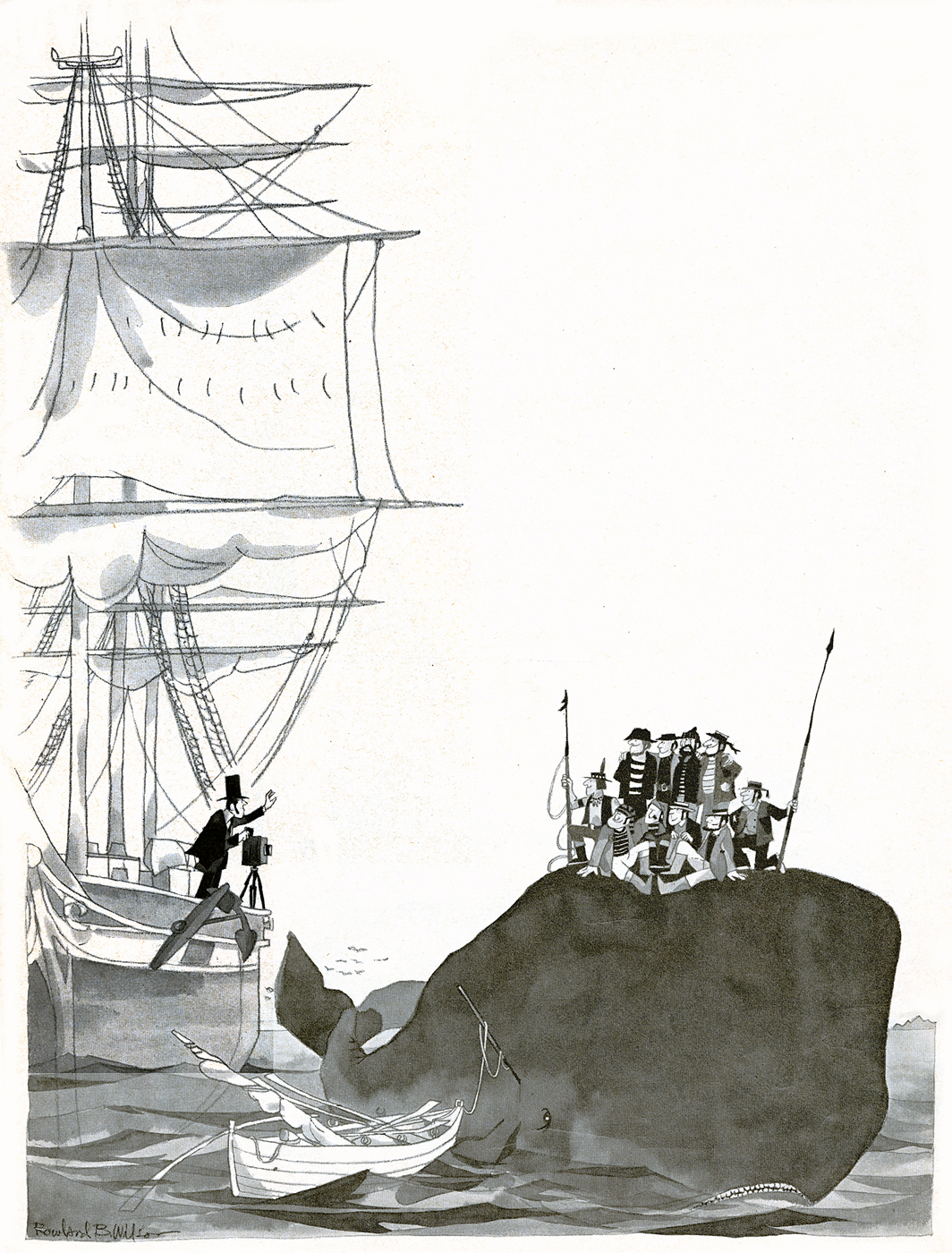
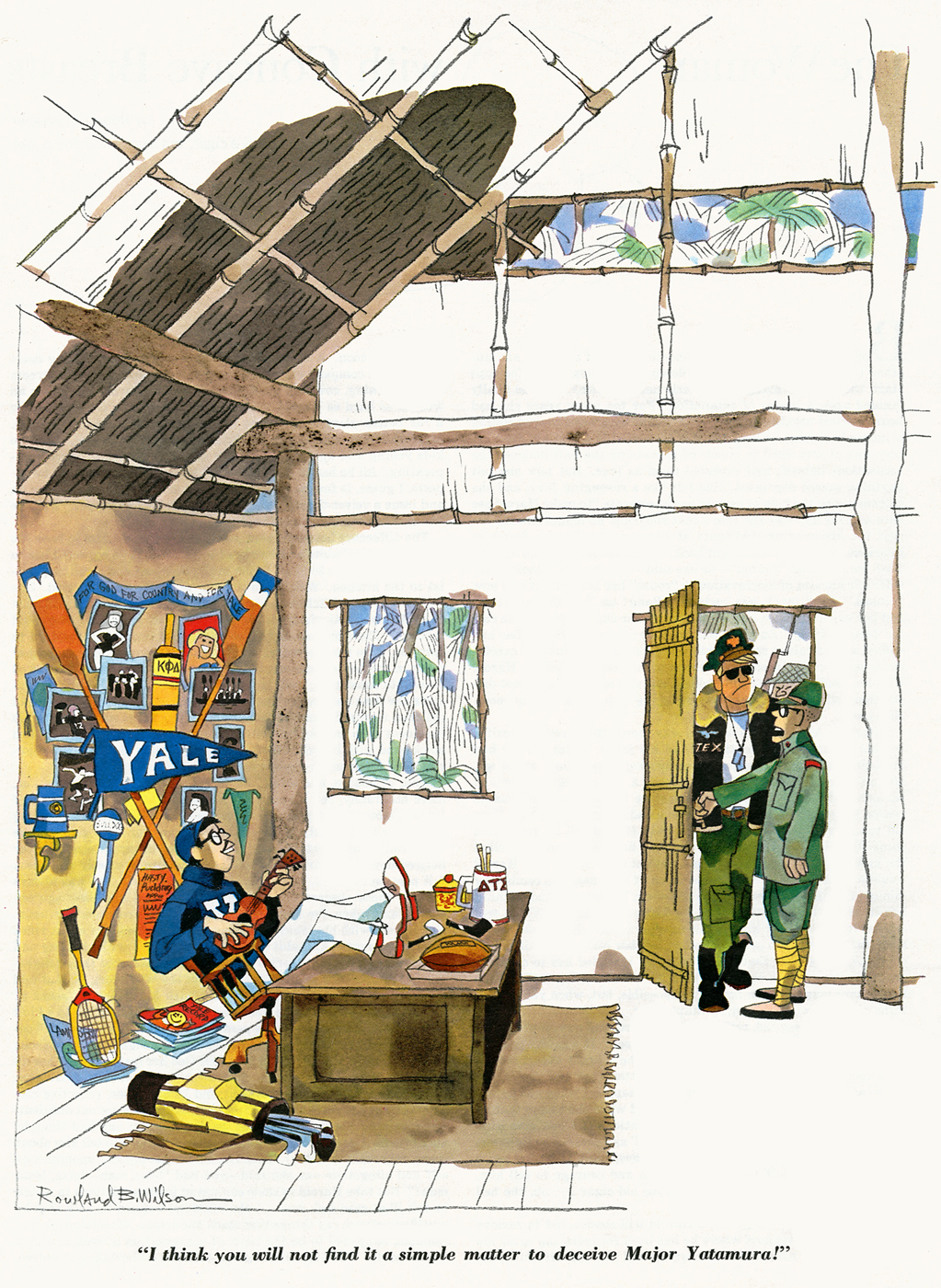
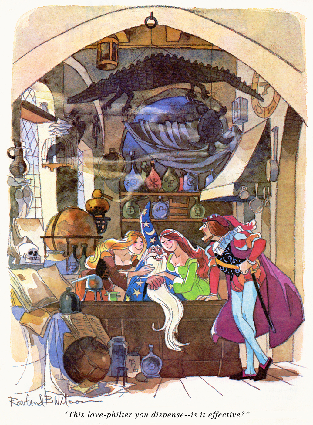
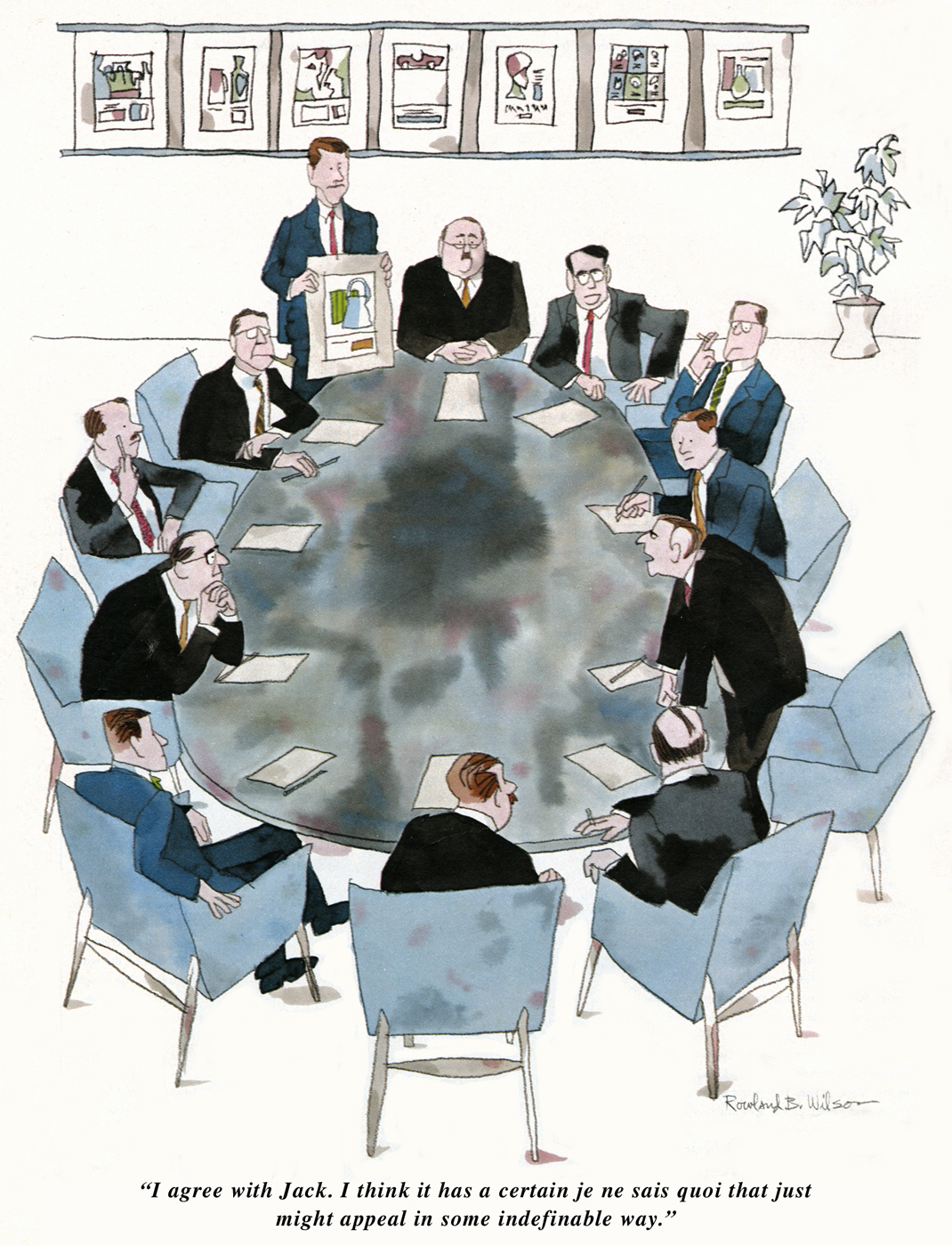
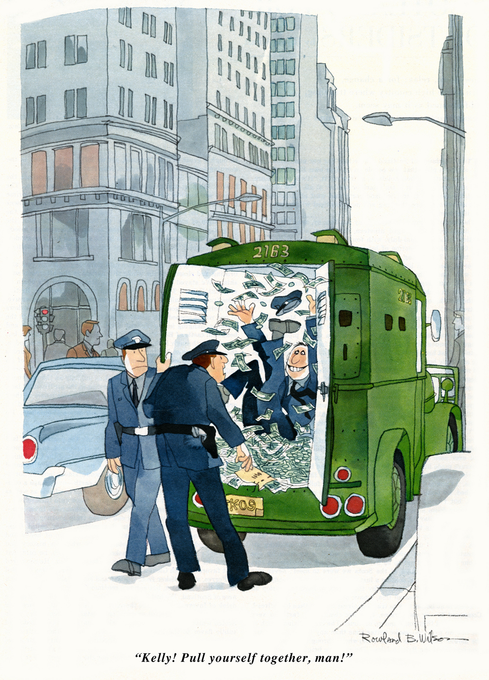
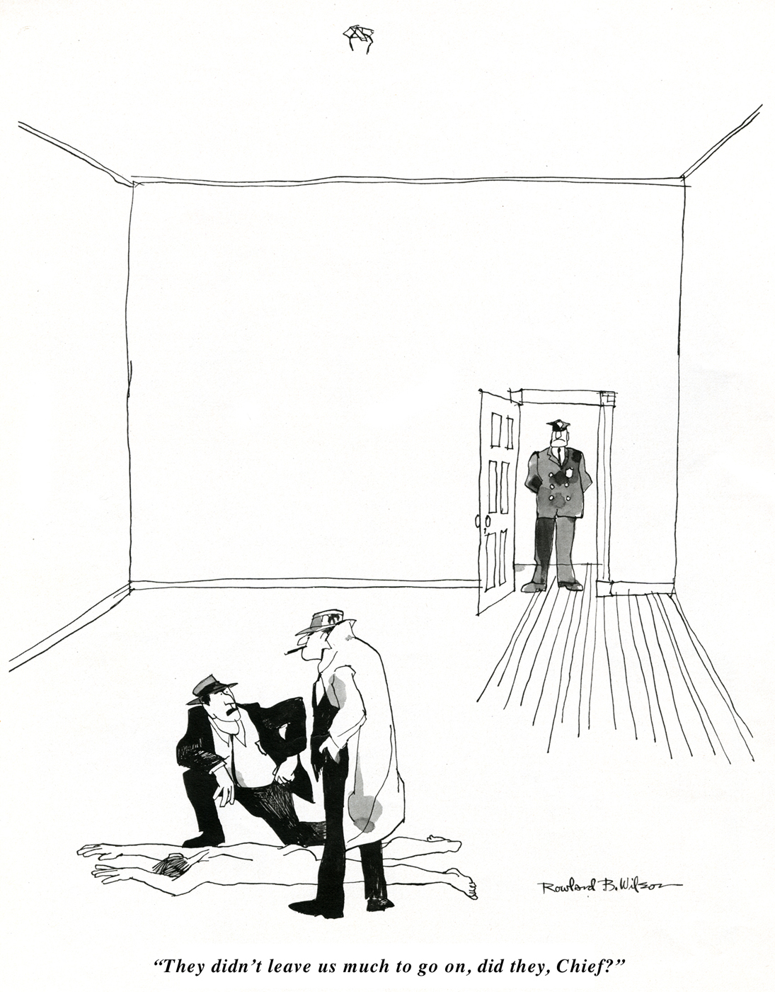
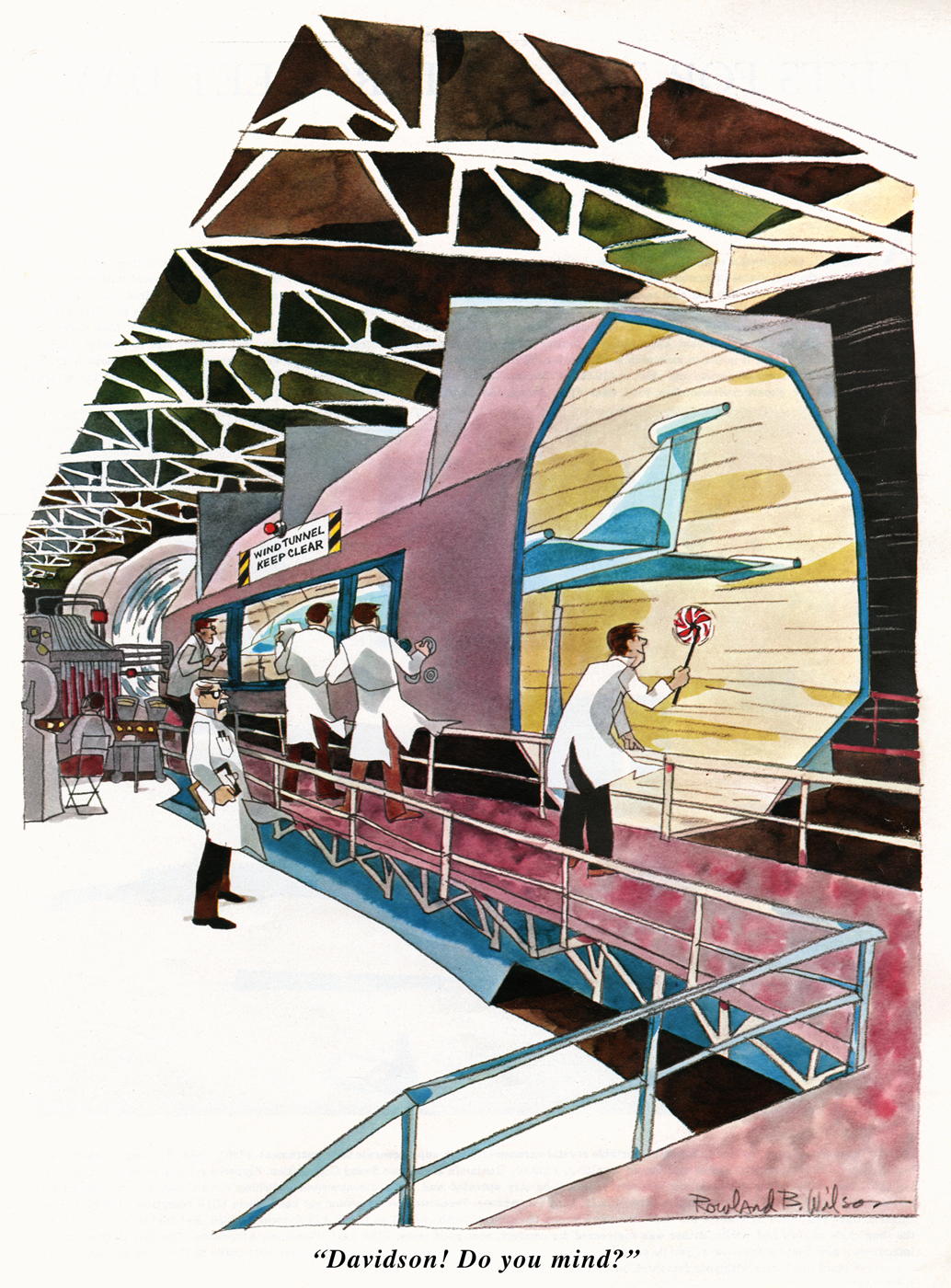
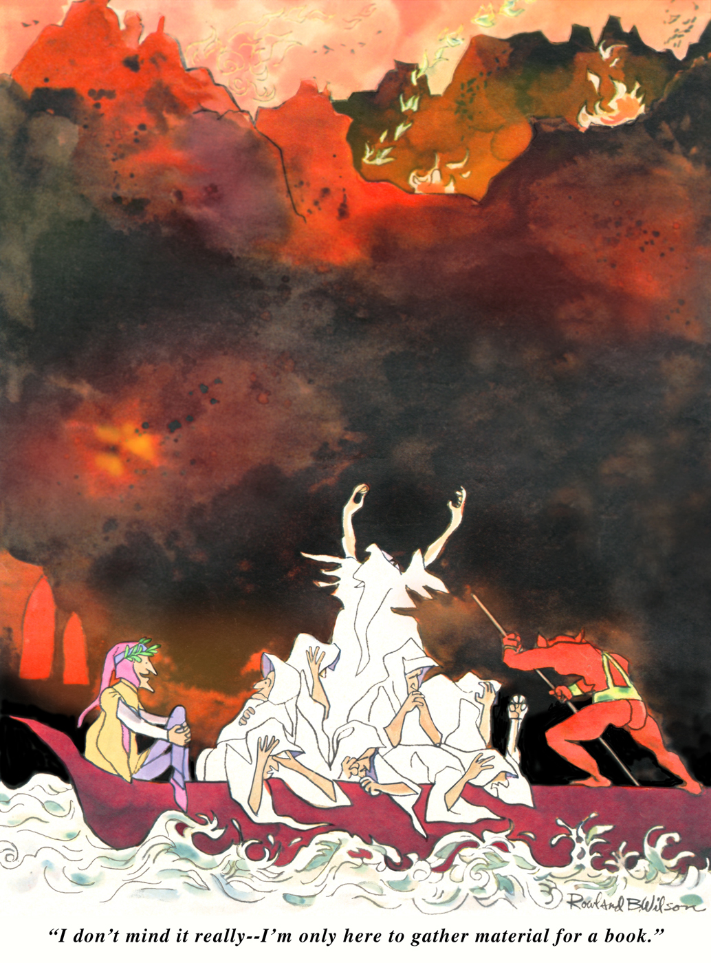
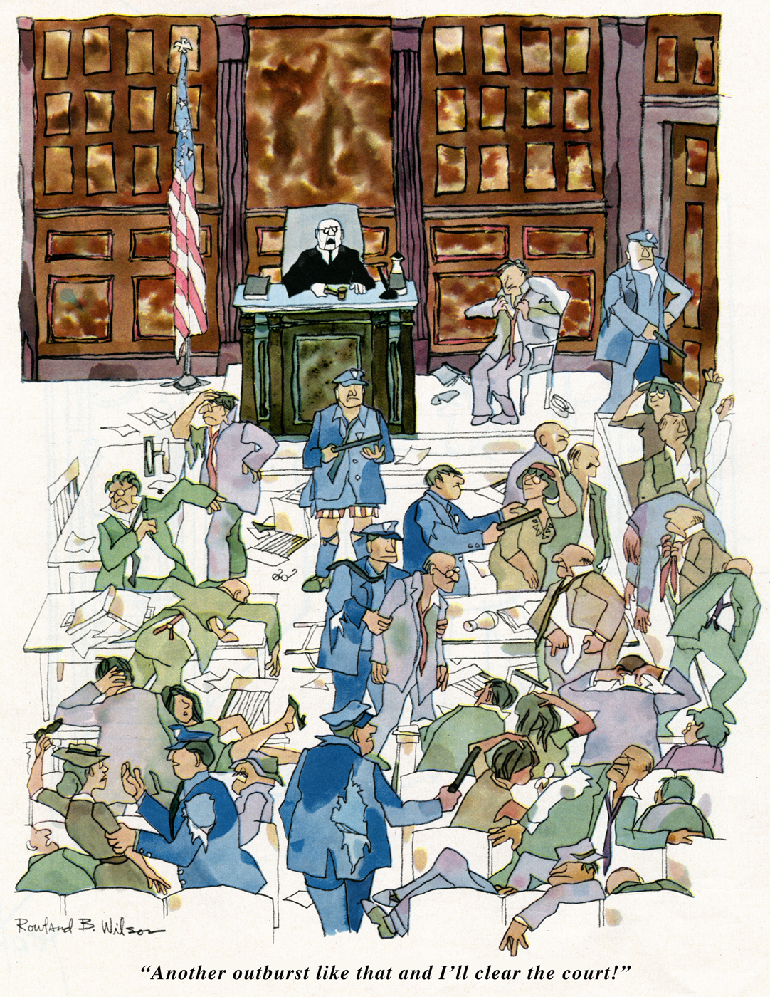
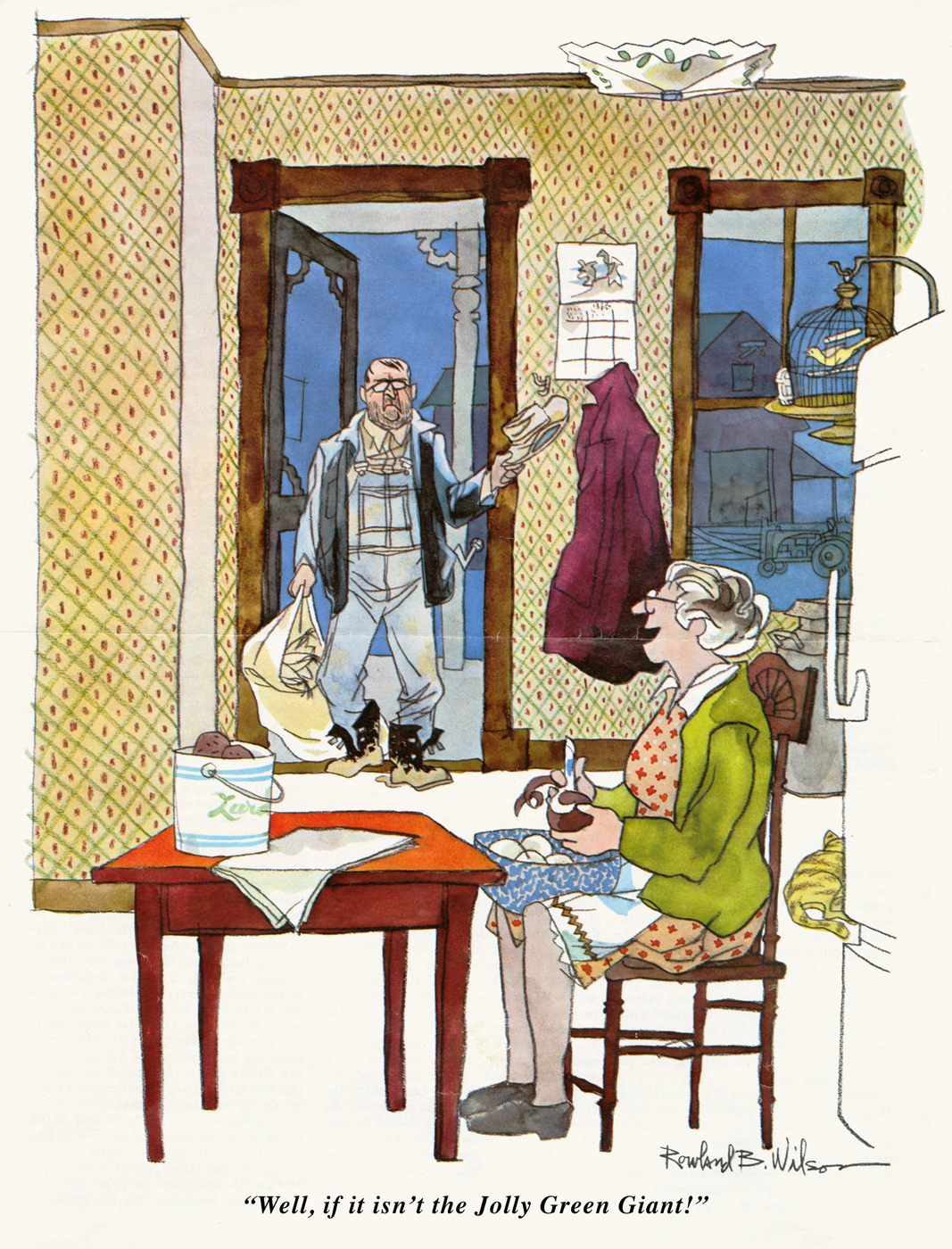
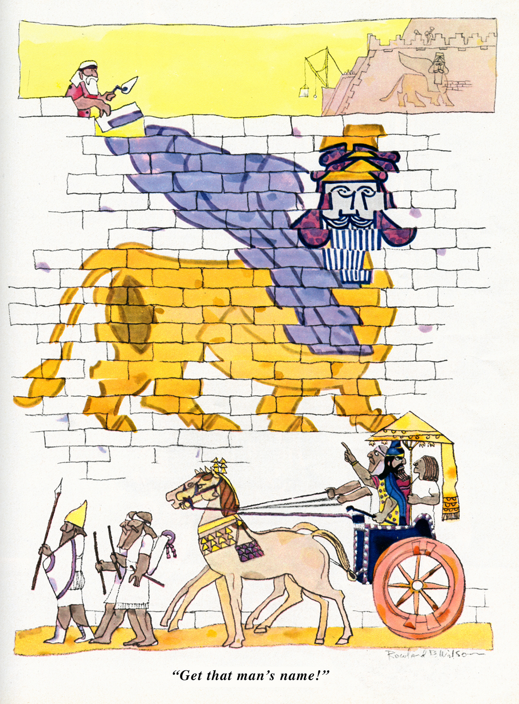
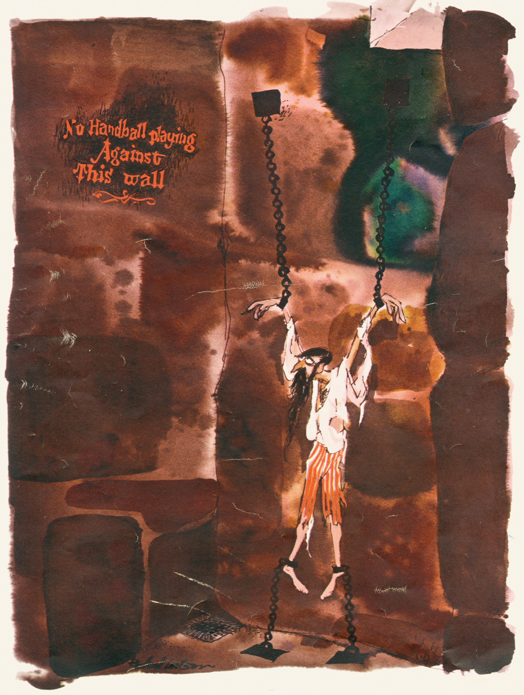
Books &Comic Art &Illustration &Rowland B. Wilson 03 Aug 2012 05:38 am
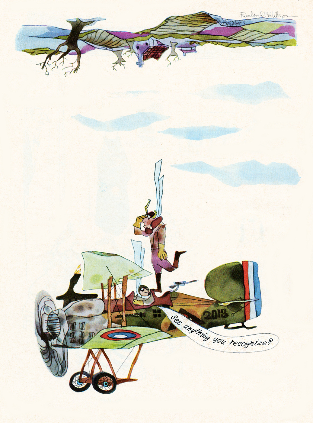
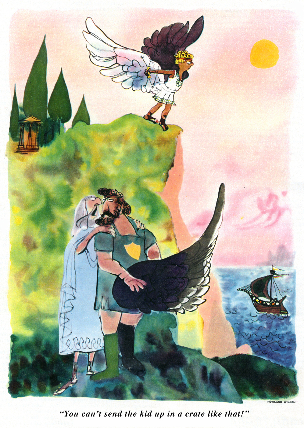
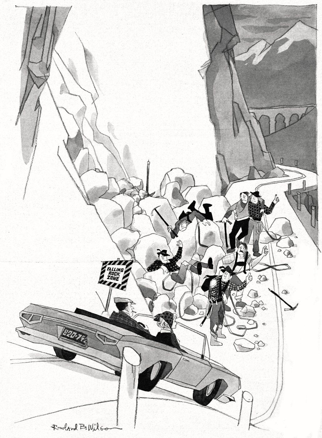
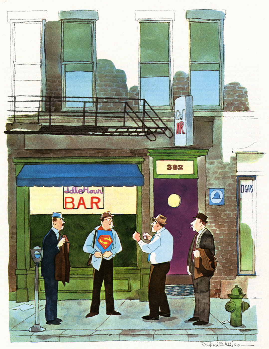
Rowland Wilson – Esquire

Today’s the anniversary of Rowland B. Wilson‘s Birthday,
and I have a great post to celebrate it.
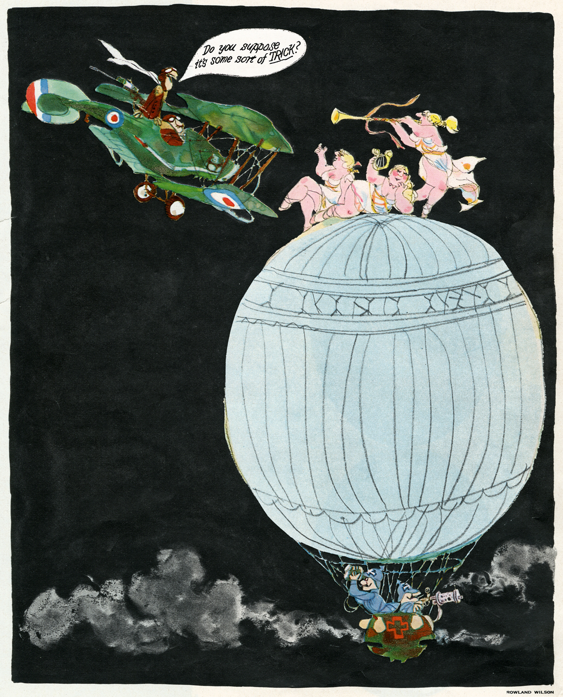
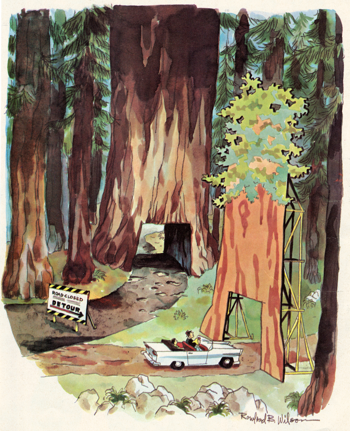
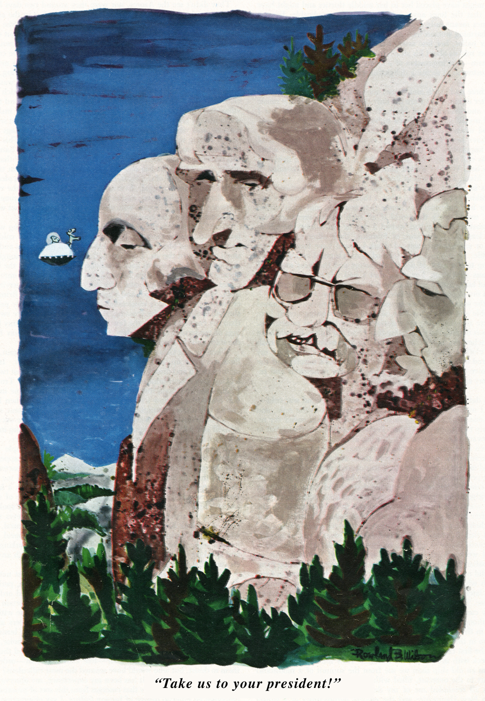
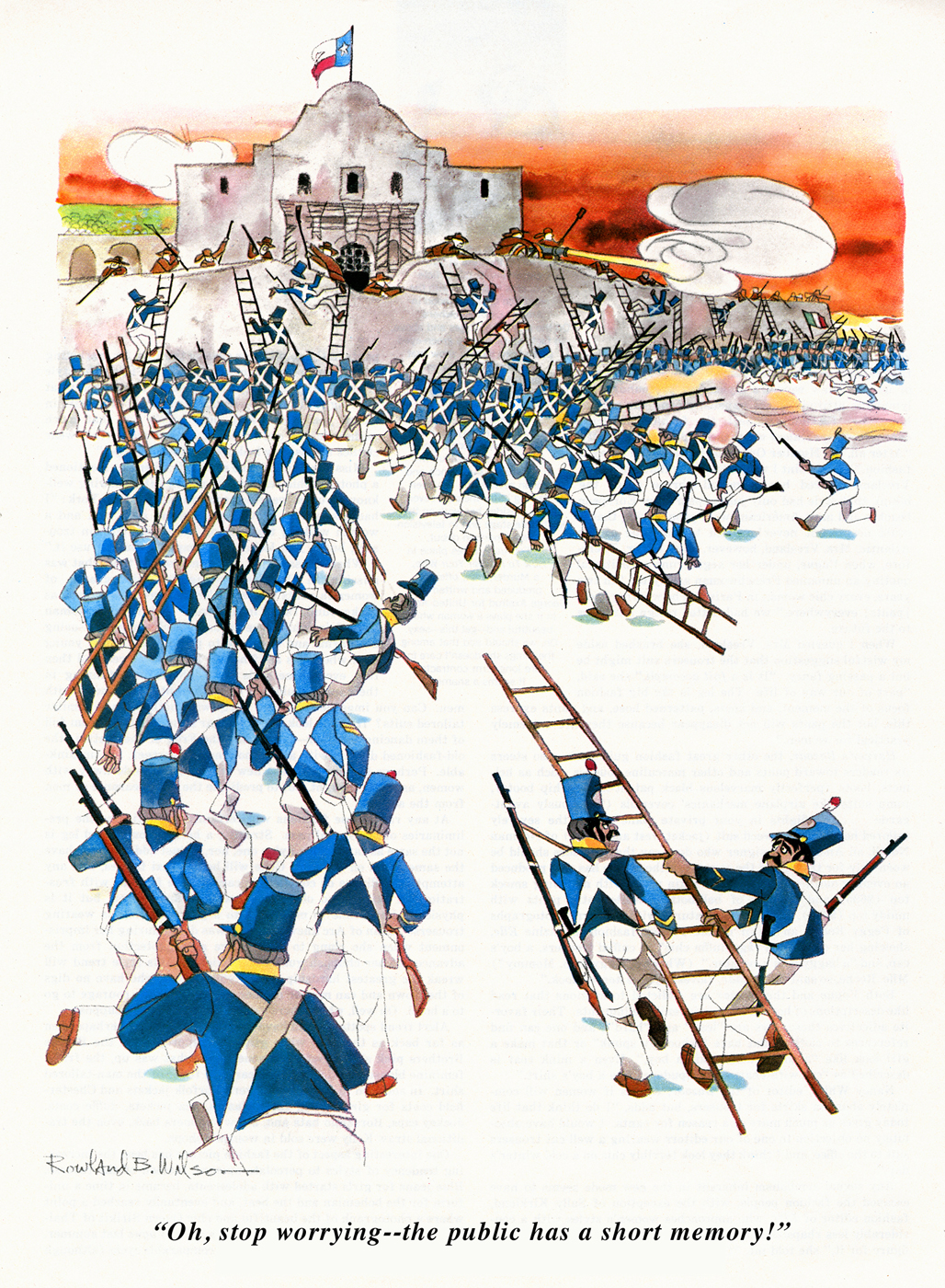
- Completing the scanning and posting of Rowland Wilson‘s book, Whites of Their Eyes, I received a note from Suzanne Wilson and a series of scans of some beautiful color art by Rowland. Here’s that note:
- Hello Michael,
- It’s exciting to see Rowland B. Wilson’s “The Whites of Their Eyes” revisited. Perhaps your posting will initiate another half-century of shelf life to these cartoons!
- Originally, most of them were presented in color but due to printing restraints of the time they did not appear that way in the book. I think Rowland said he had to rework some of them as line drawings.
- I thought it might be of interest to make a comparison with the color versions. In the process I came across additional material from Esquire that wasn’t included in “Whites”, as well as from some unknown publications. They are interspersed here in no particular order.
- Image 07, the lighthouse keeper, was selected by the great psychologist, Carl Jung as an illustration in “Man and His Symbols”. It was reprinted recently in “Understanding Psychology”, published by McGraw-Hill.
- Thank you for keeping the RBW humor and oeuvre alive.
- Sincerely,
Suzanne
 1
1
 2
2
 3
3
 4
4
 5
5
 6
6
 7
7
 8
8
 9
9
 10
10
 11
11
 12
12
 13
13
 14
14
 15
15
 16
16
 17
17
 18
18
 19
19
 20
20
 21
21
 22
22
 23
23
 24
24
 25
25
 26
26
 27
27
 28
28
 29
29
 30
30
 31
31
 32
32
 33
33
 34
34
 35
35
 36
36
 37
37
Finally, here are two drawings in honor of the Olympics:
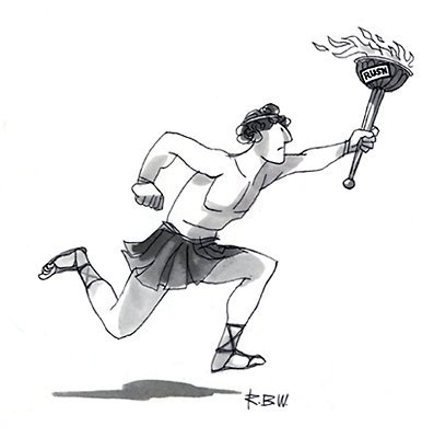
This first one was published in Saturday Evening Post.
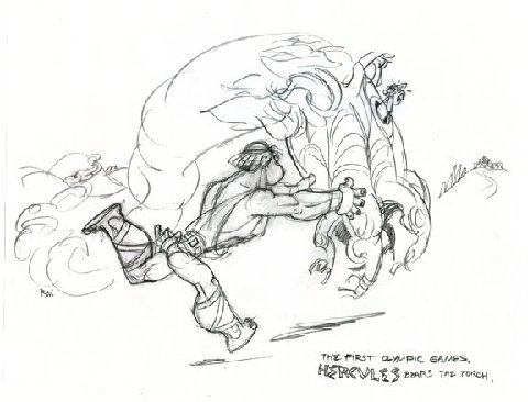
This sketch comes from RBW’s work on Disney’s Hercules.
According to Amazon, Suzanne Wilson’s book, Rowland B. Wilson’s Trade Secrets: Notes on Cartooning and Animation, was released yesterday, and is Out of Print with LIMITED AVAILABILITY. I guess that when I said to get one soon, a lot of people were listening.
This is a book I’ve been looking forward to reading for quite some time. I’m curious about the “Cartooning” part, but I’m wildly interested in seeing the “Animation” part. Rowland was a master of design when he worked in animation; I want to read anything he has to say about it.
