Monthly ArchiveOctober 2012
Animation &Books &Tissa David 11 Oct 2012 04:56 am
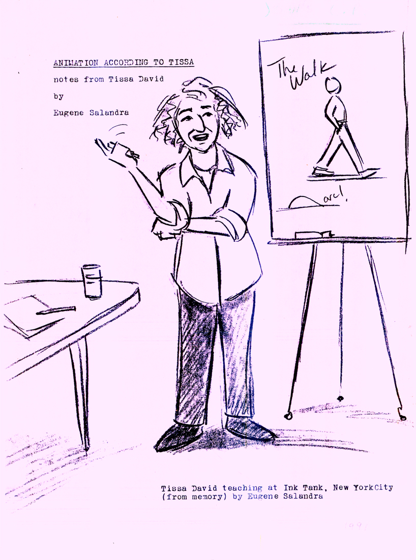
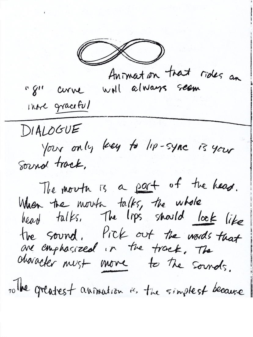
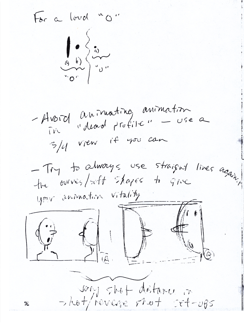
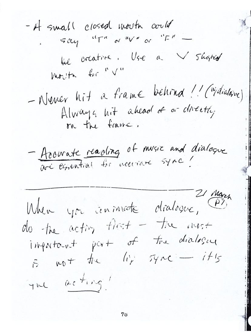
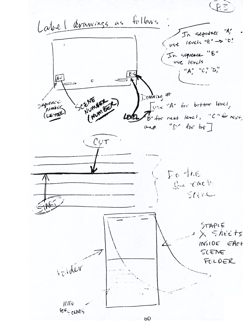
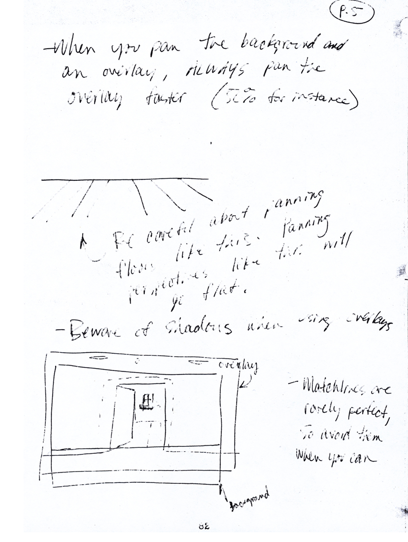
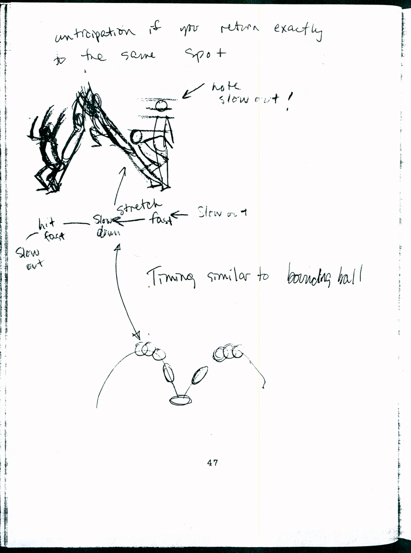
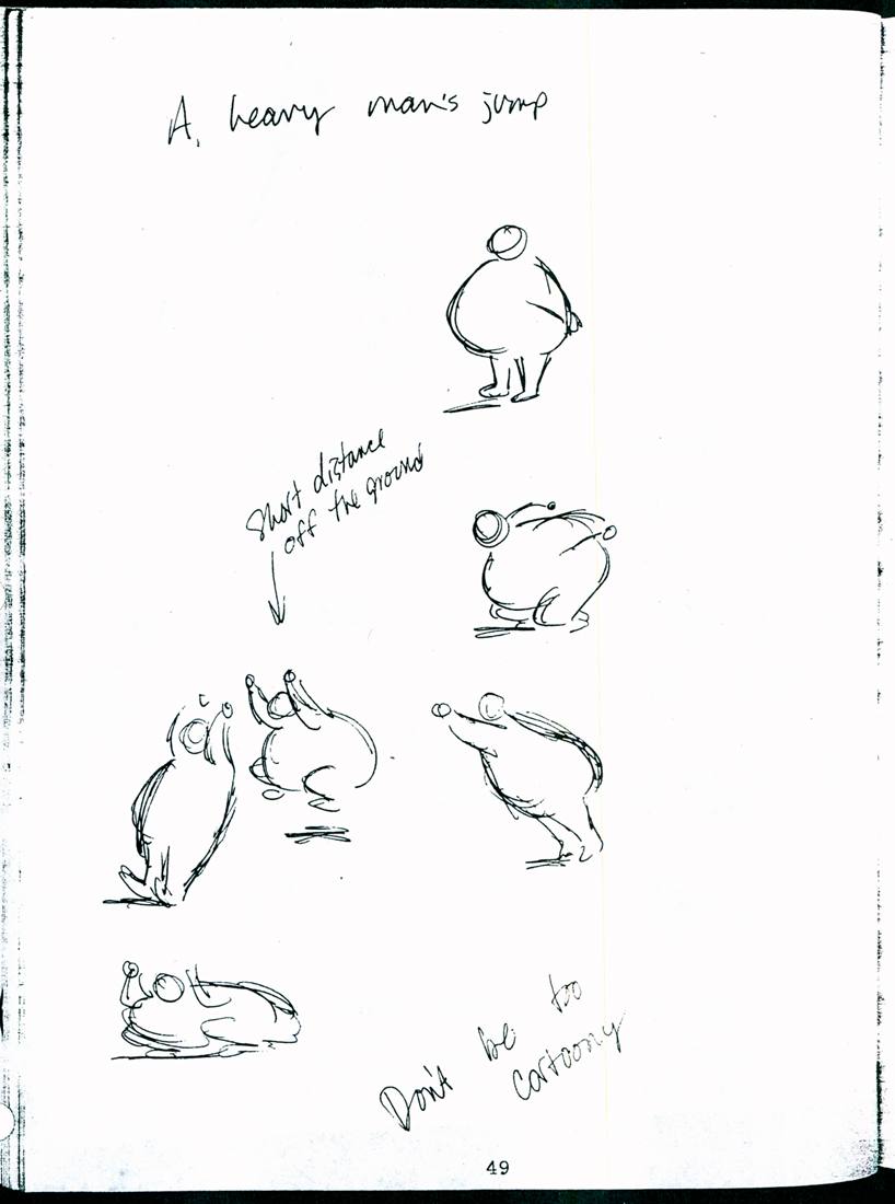
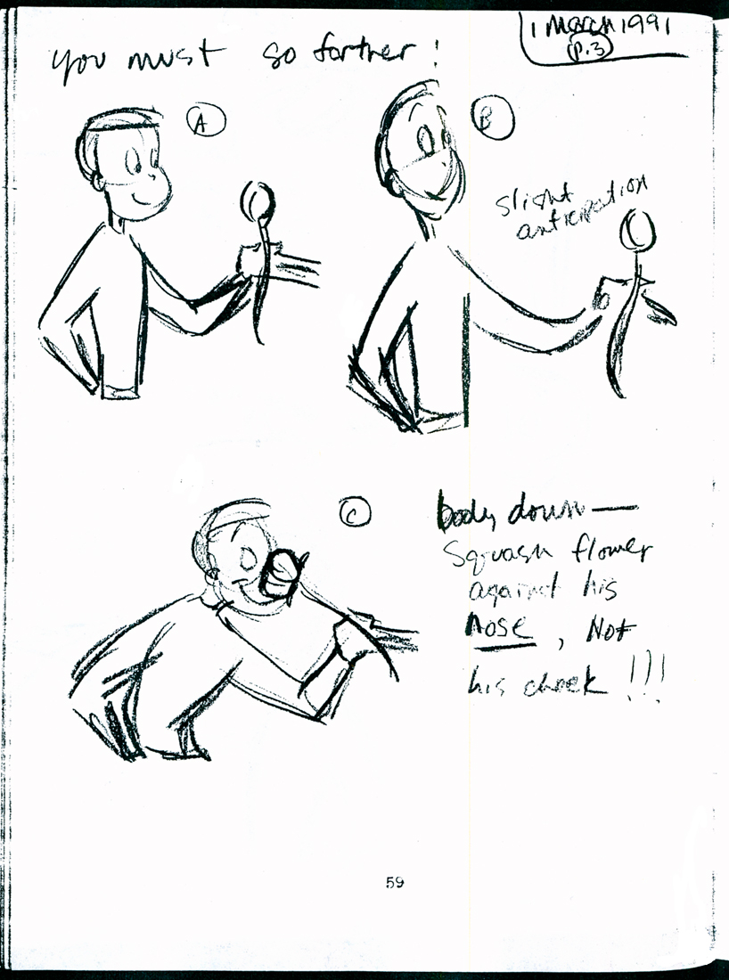
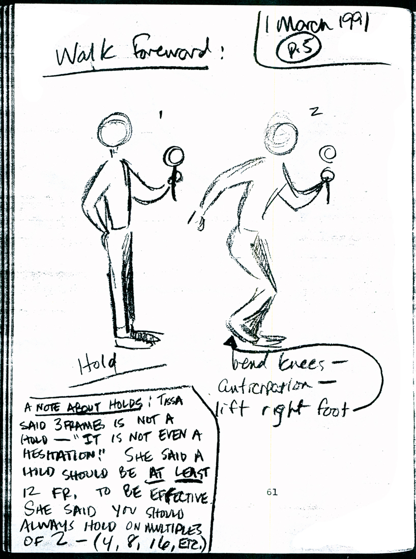
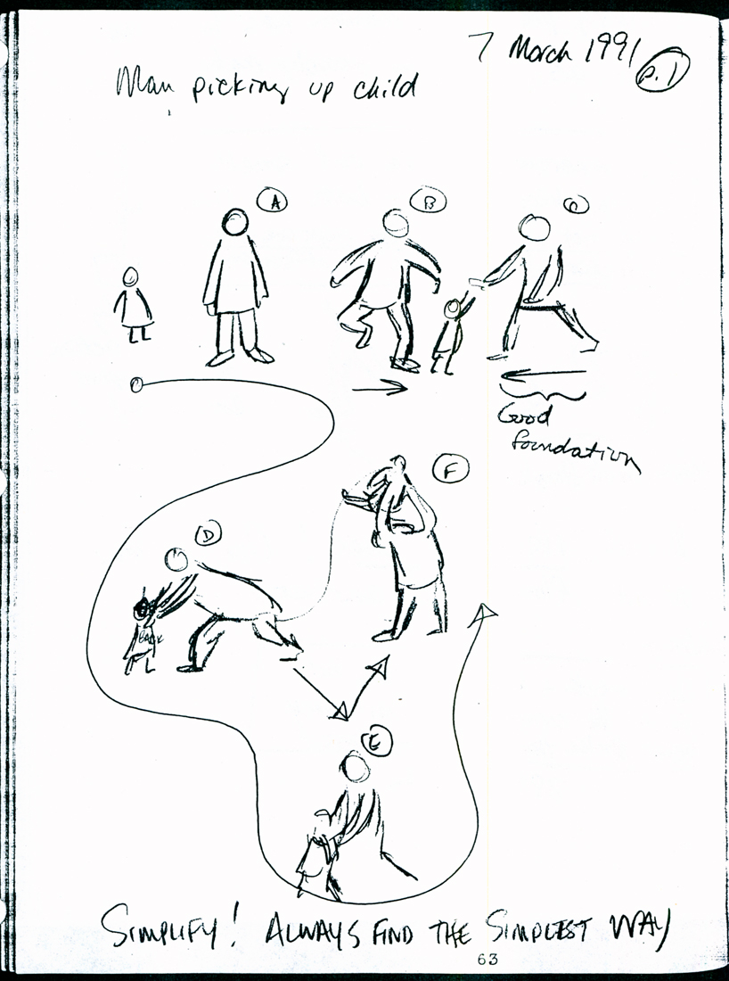
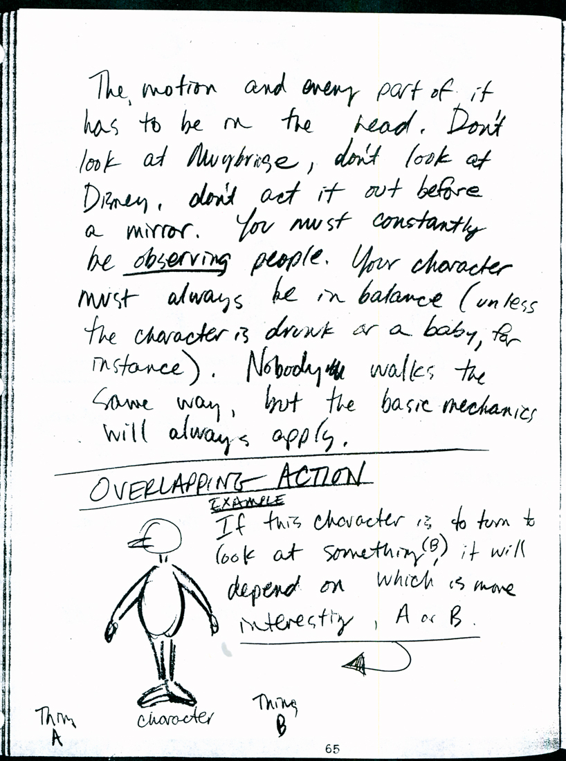
Tissa’s Class – part 3
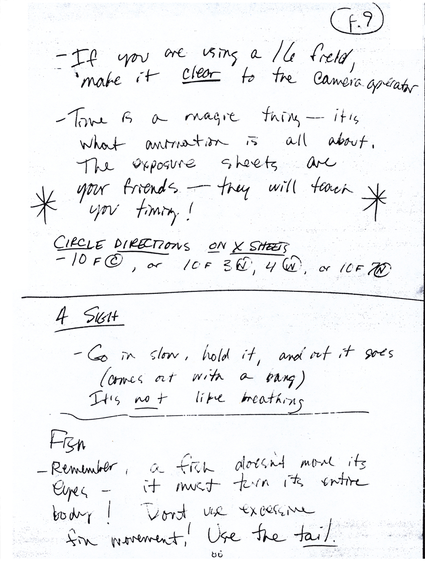
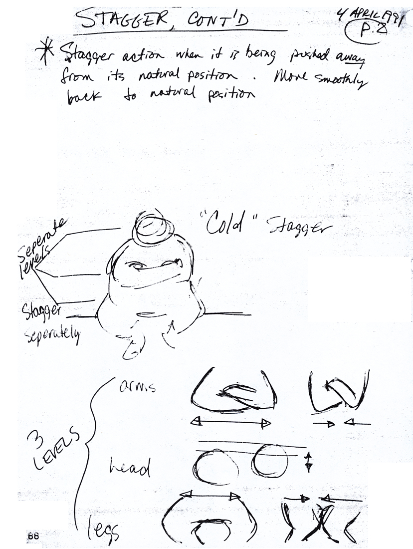
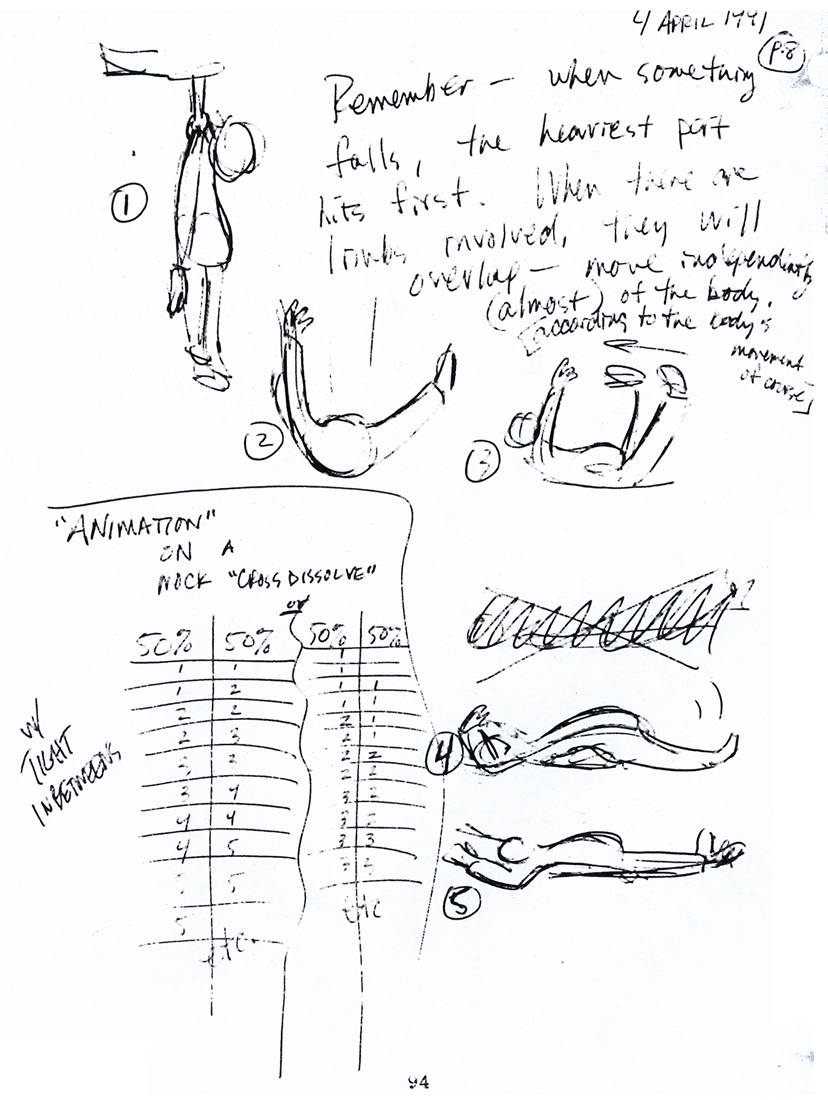
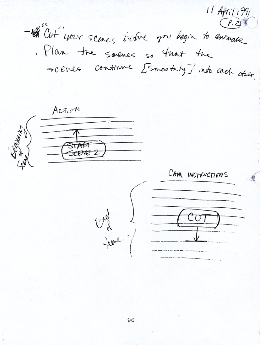
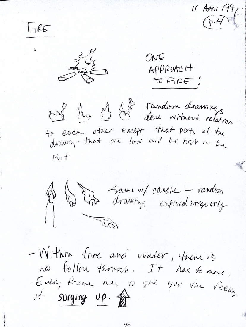
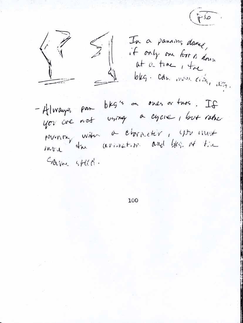
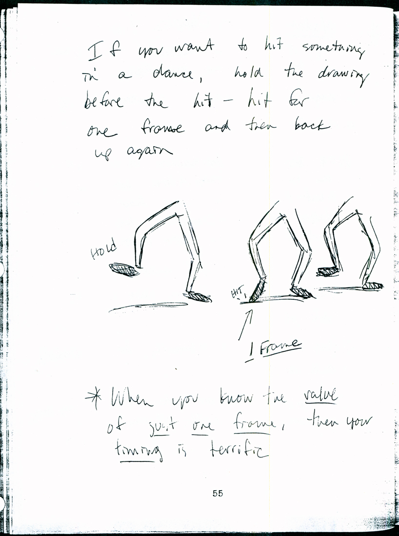
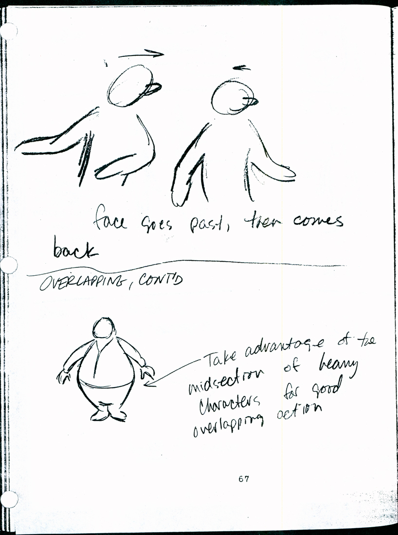
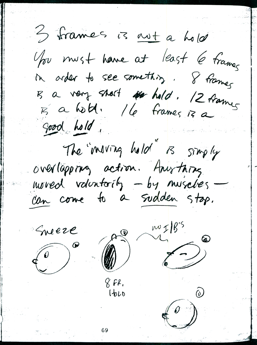
- Tissa David taught a class in animation out of R.O.Blechman‘s studio, the Ink tank, back in 1991. Eugene Salandra attended the class and kept wonderful notes on the sessions/ With his permission I’m posting the notes from that class. As I scan them, I’ve been reading them. They’re enormously informative and act as a wonderful reminder of many of the basics that sometimes slip through the cracks. So even though we’ve been using these rules forever, it’s good to just read them again.
Anyway, here’s part 3:
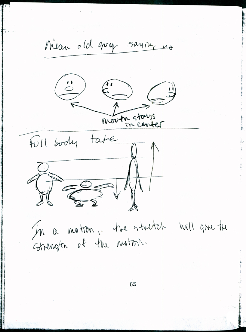
 1
1  2
2I repeat these first two pages.
(Click any image to enlarge.)
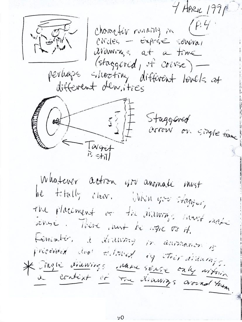
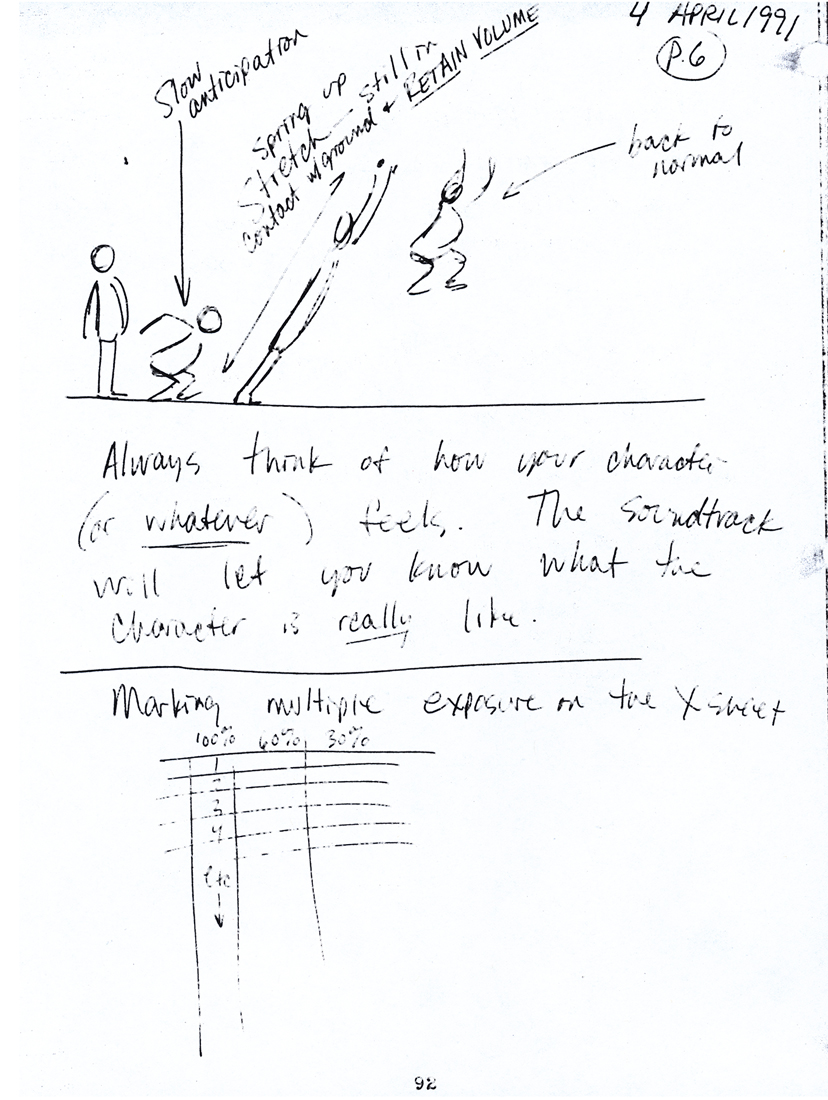
This section also includes a number of bits about animation points for the past’s generosity. There’s a section on Exosure sheets. Another on timing charts. Both are richly informative to the youngsters of today who might not want to know this for the future especially when it’s so obviously part of the past.If you end up knowing that material, believe me, you’re so much the better for it, and your rules will develop into the certifiably strong. He didn’t hold onto those drawings for theft; I think they know it.
 70
70 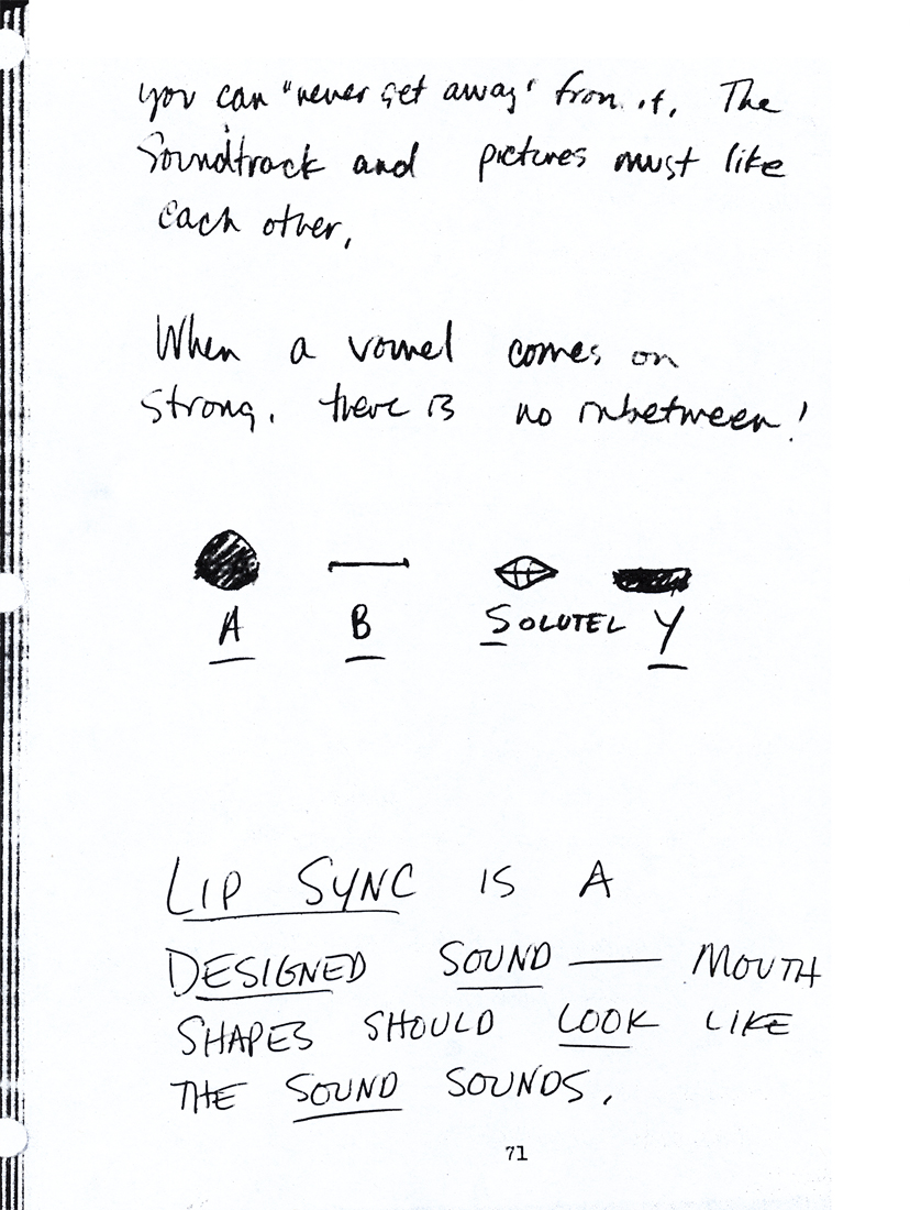 71
71
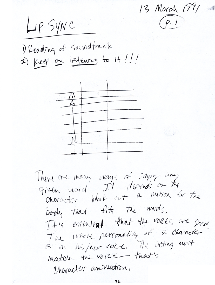 72
72 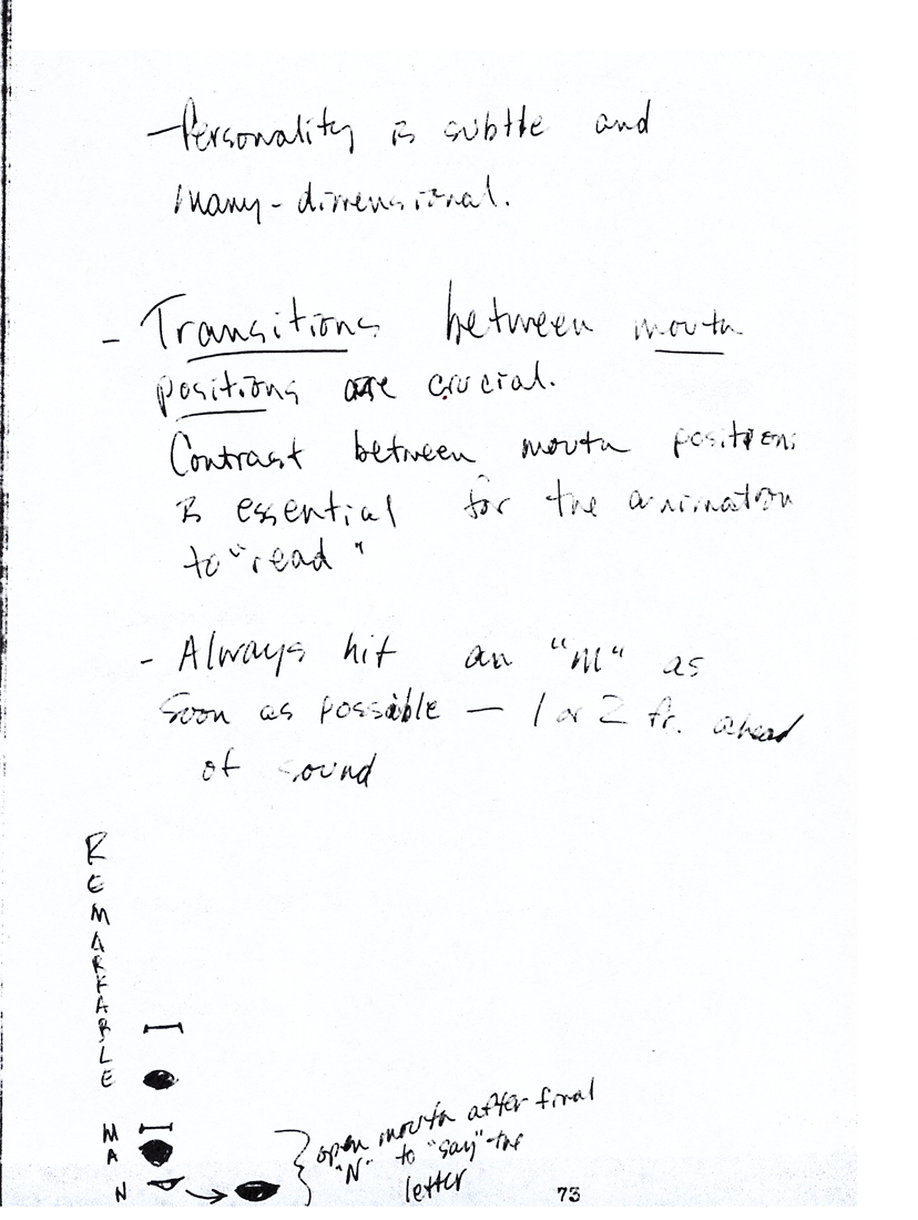 73
73
 74
74 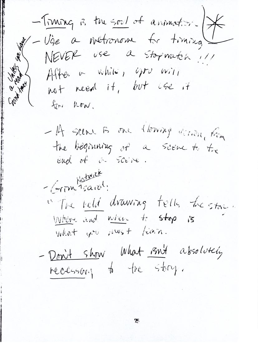 75
75
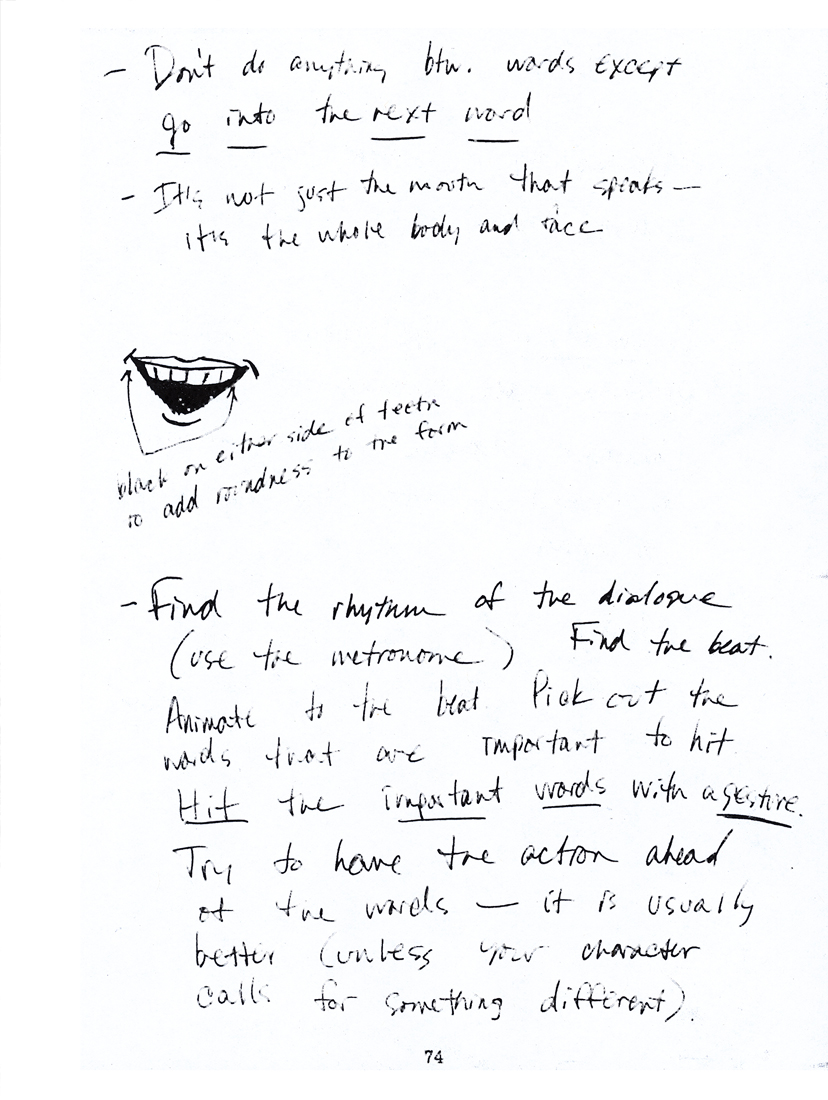
 76
76 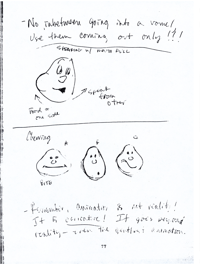 77
77
 78
78 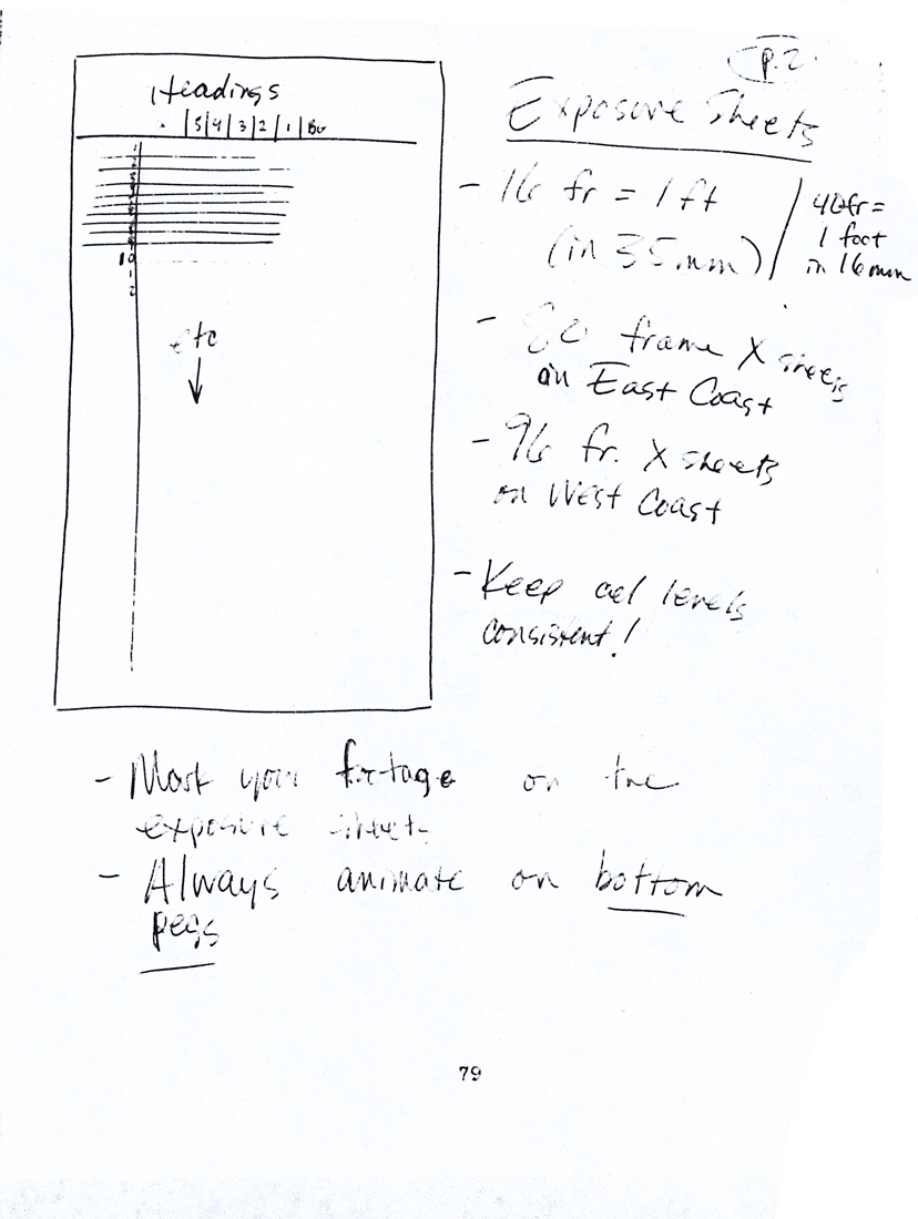 79
79
 80
80 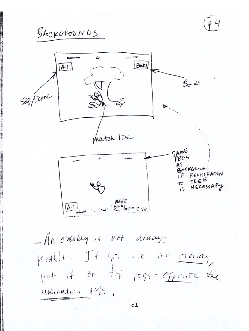 81
81
 82
82 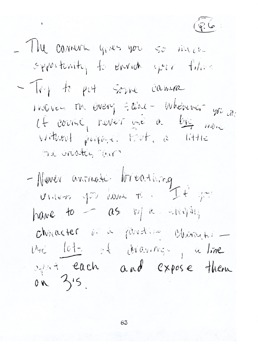 83
83
 84
84 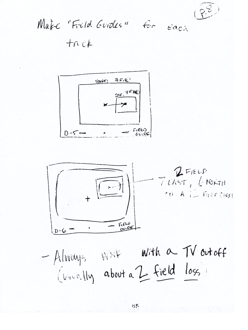 85
85
 86
86 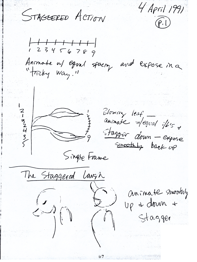 87
87
 88
88 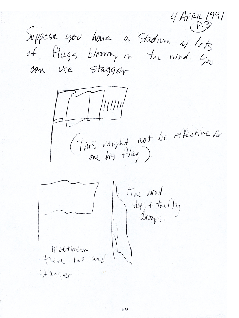 89
89
 90
90  91
91
 92
92 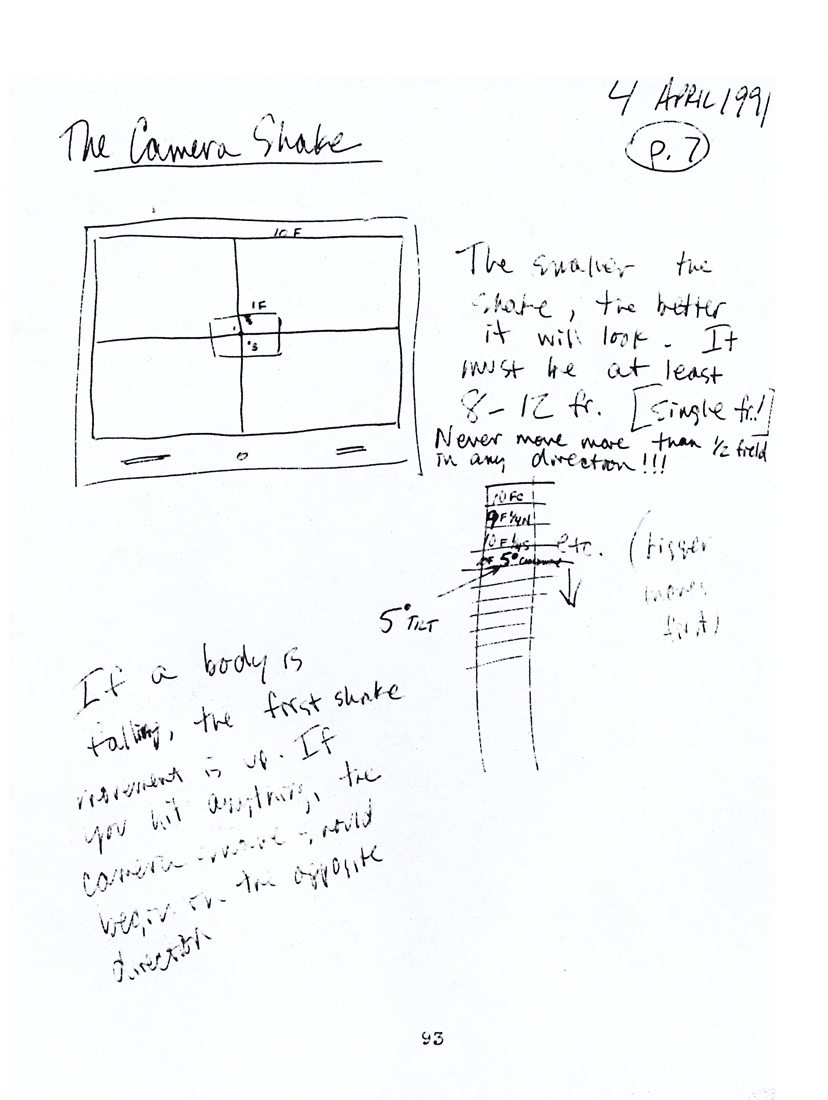 93
93
 94
94 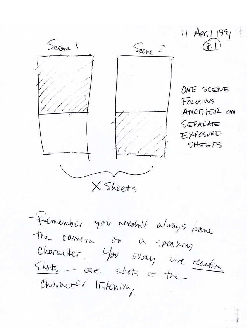 95
95
 96
96 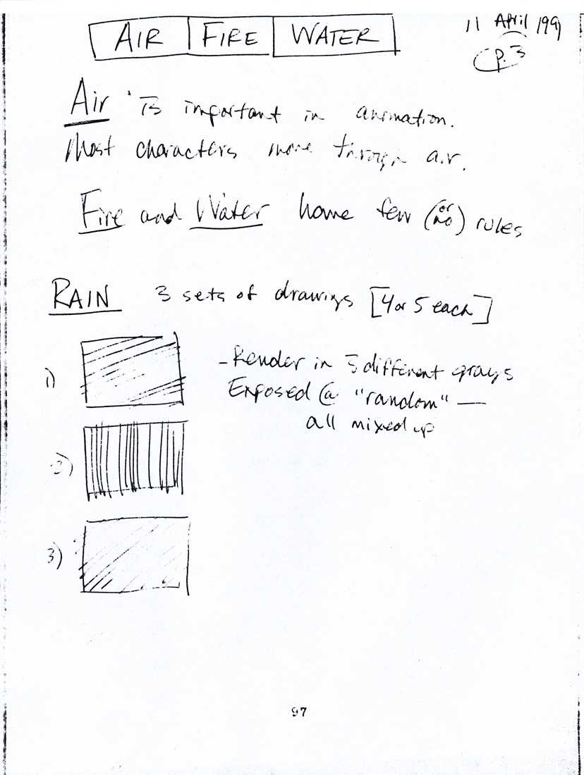 97
97
 98
98 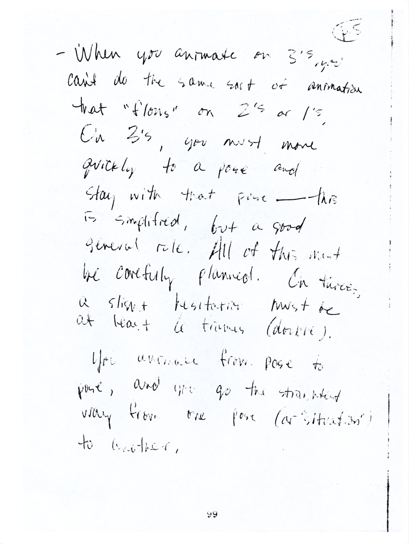 99
99
 100
100
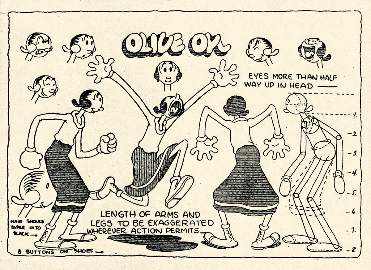
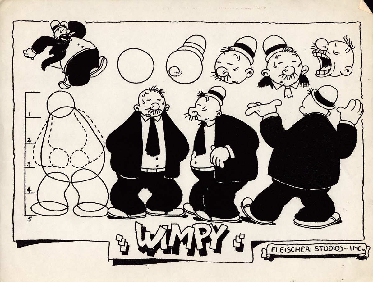
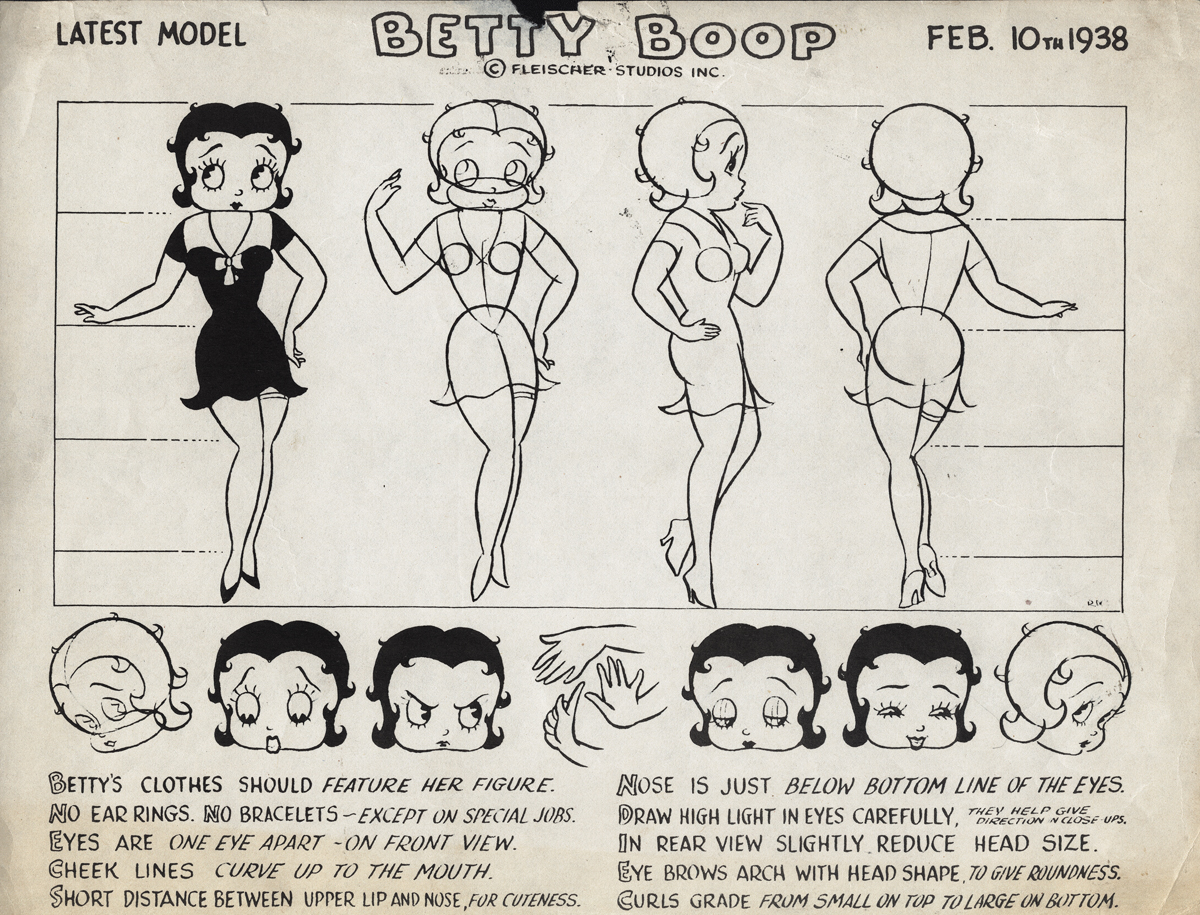
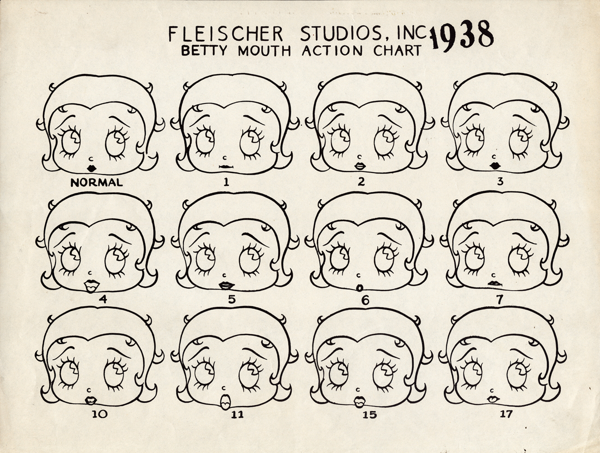
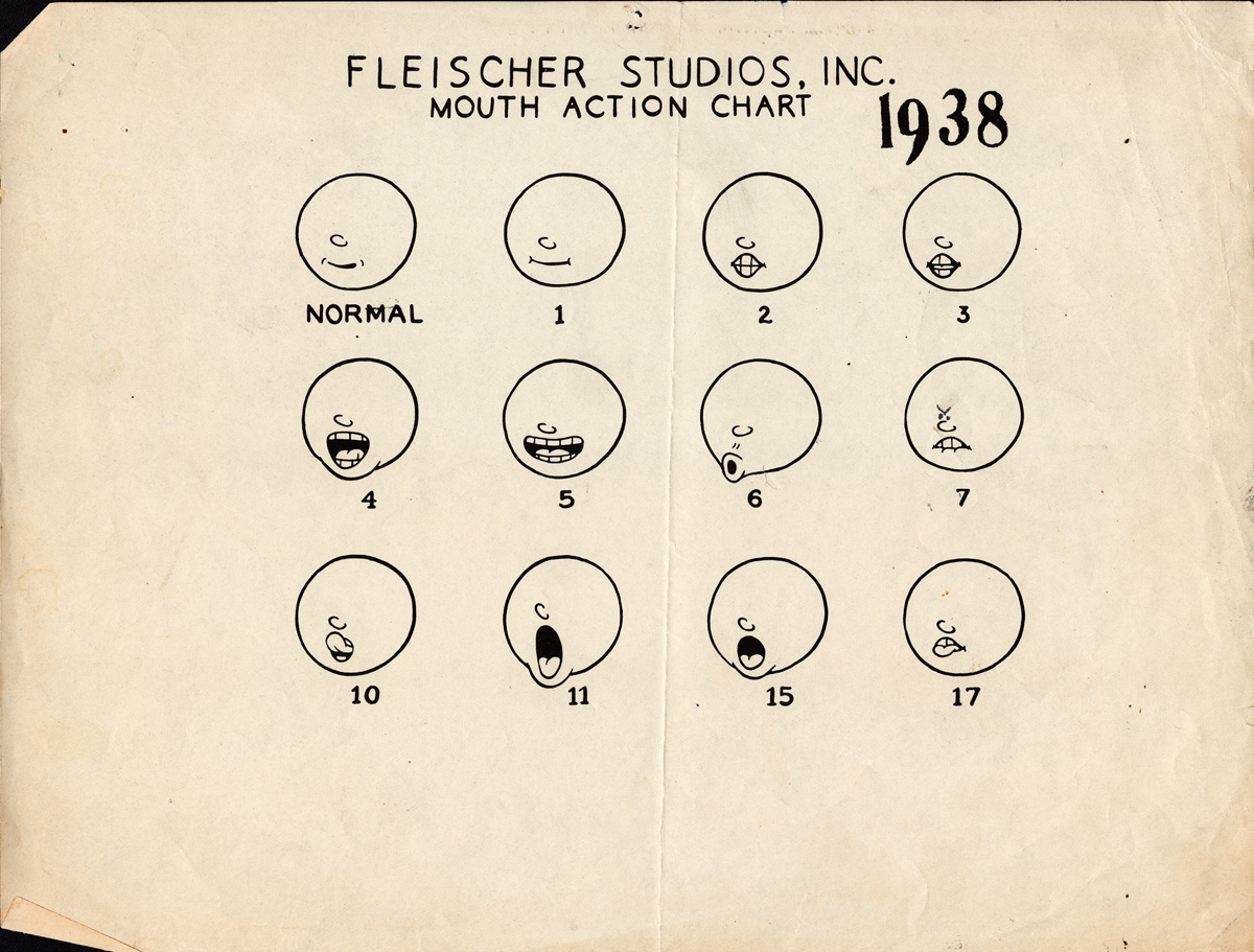
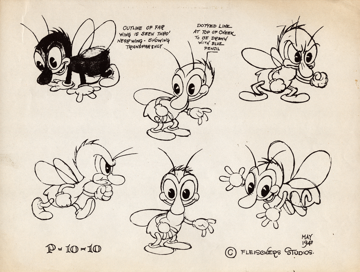
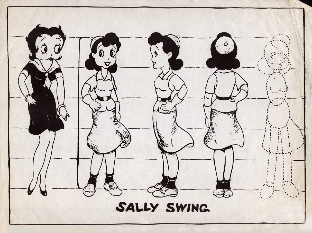
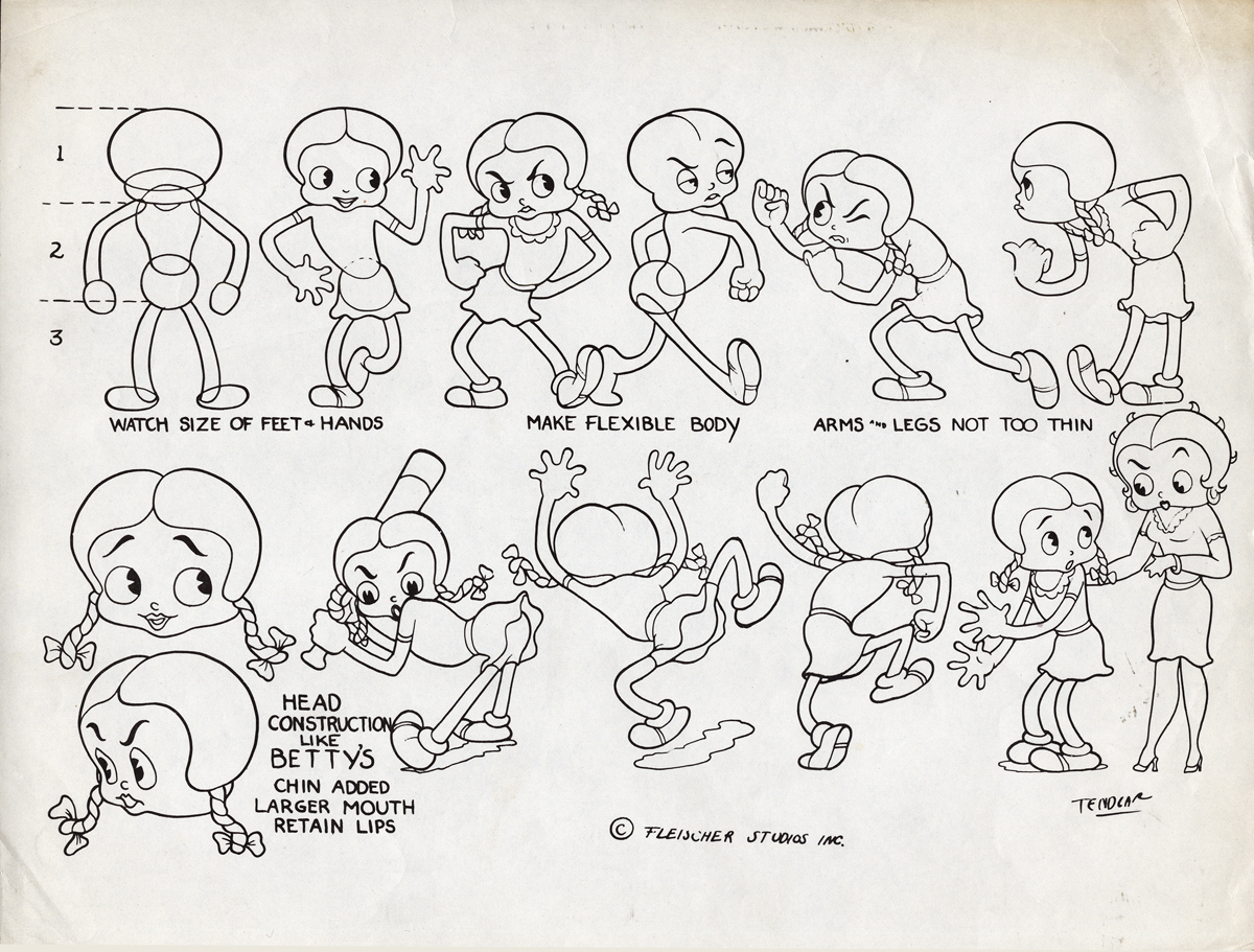
Animation &Animation Artifacts &Fleischer &Layout & Design &Models 10 Oct 2012 05:54 am
More Fleischer Models & Things
- Continuing on with the Vincent Cafarelli collection of artwork, I ran across some more Fleischer/Paramount models. One piece among them, I think, is something of a rarity. Here they are:
 1
1
 2
2
 3
3
 4
4
 5
5
 6
6
 7
7
 8
8
 9
9
 10
10
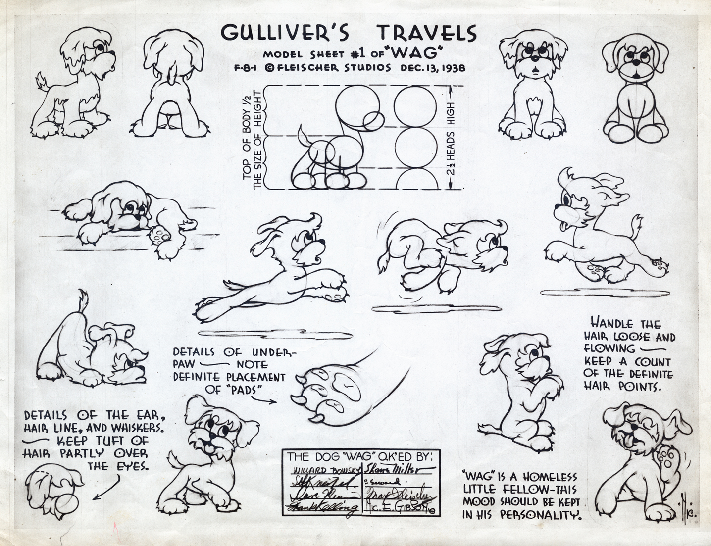
This seems to be a rarely seen model. “Wags” the dog from Gulliver’s Travels.
I think this was cut from the film, at least I’ve never noticed him.
 11
11
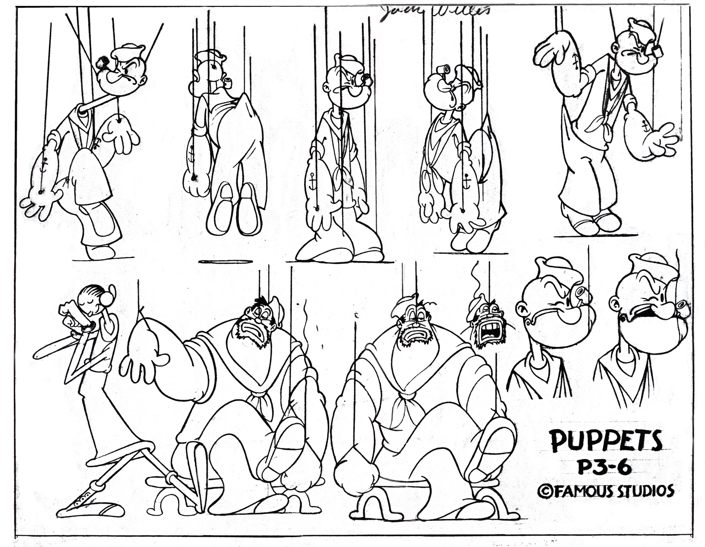
This, of course, is not Fleischer but a later Famous short.
 12
12
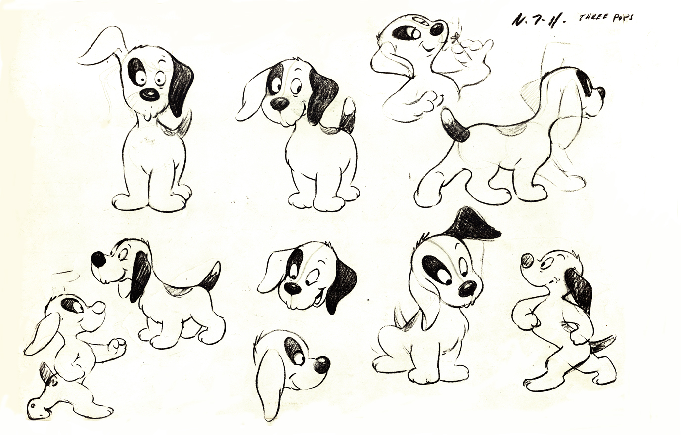
This appears to be from a later Paramount cartoon.
(Thad Komorowski identifies this as Bill Tytla’s
HECTOR’S HECTIC LIFE in the comment section of this post.)
________________________
- Here is something even rarer than that Gulliver “Wags” model sheet.
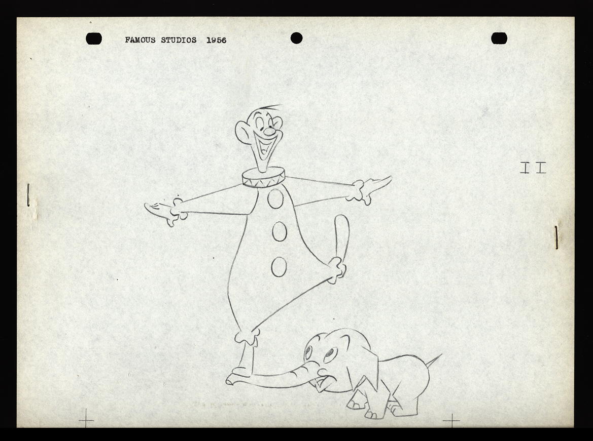
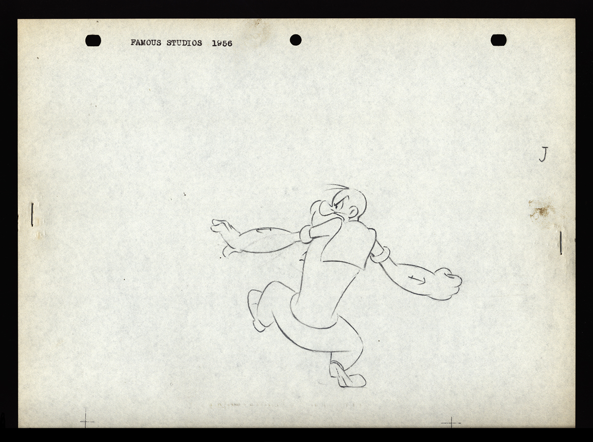
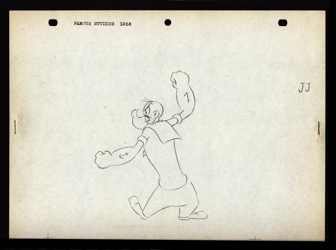
Apparently, new hirees at Famous Studios (at least in 1956) would go to an art school, of sorts. The following drawings are on reduced animation paper (although they’re the actual pencil drawings, not copies) and stapled – with two staples, one on either side – to black illustration board. Each has additional registration marks drawn at the bottom. Each is one of two drawings that are slightly different from one another. Presumably, they were designed to teach inbetweening. The pencil drawing line work is particularly thin, so I suspect these were projected with an overhead projector. I’d guess that the art student, new employee, would copy the projected drawings and then have to inbetween the pair of drawings.
The drawings start with simple lines and get progressively more difficult until it’s a full sized image of Popeye ready to throw a punch. For the sake of space, and since the first drawings aren’t very interesting, I’ve enlarged only the last half of them. The thumbnails for the first group are small, so you can see them and enlarge them, if you like. If you’re new to the field, try copying and inbetweening at least the last five pairs. It’s amazing that Vincent Cafarelli saved these, and fortuitous for us to be able to see them. Have a look:
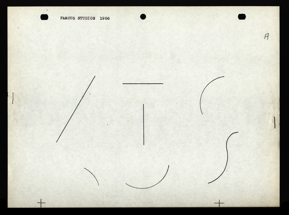 A
A 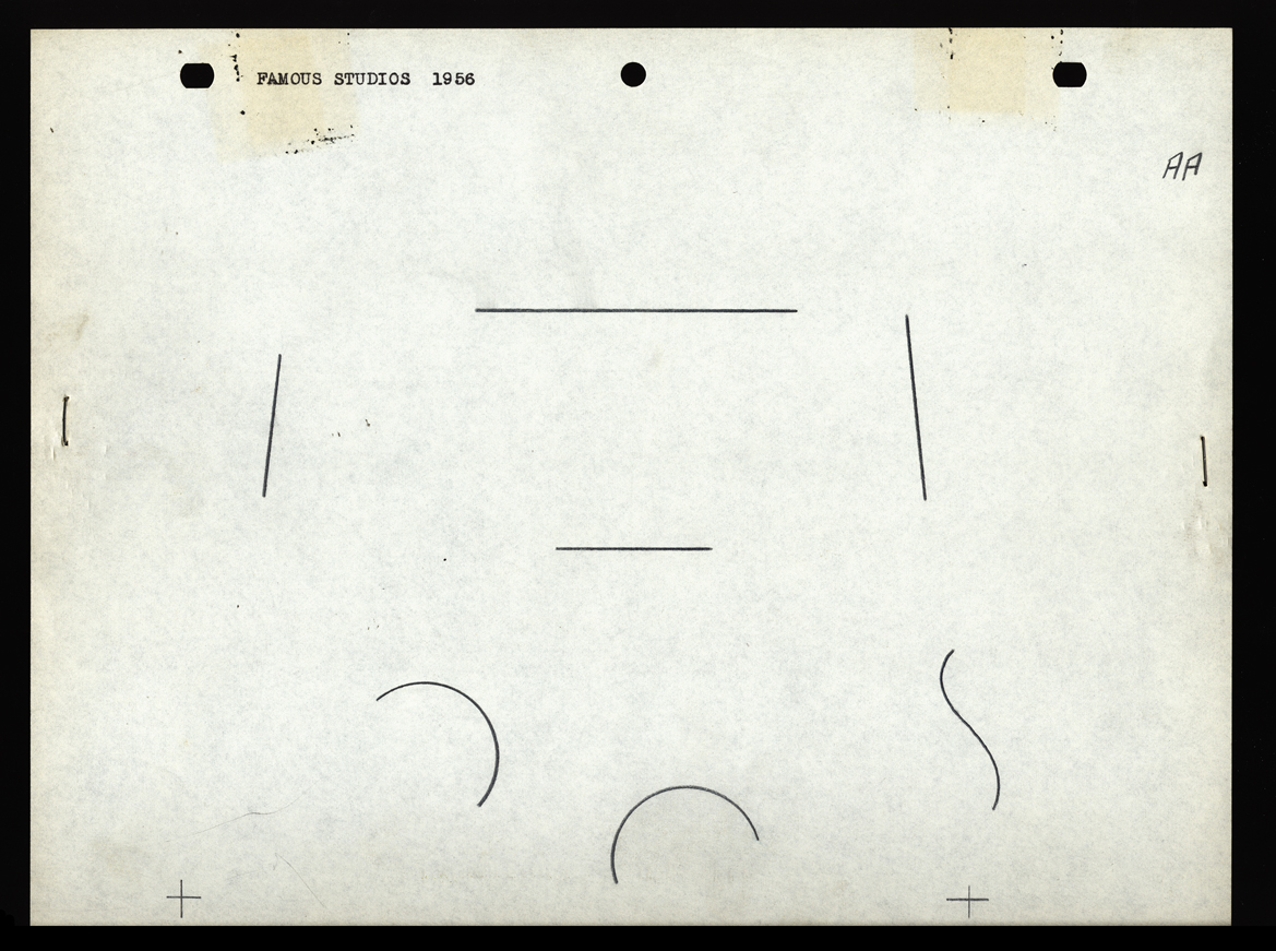 AA
AA
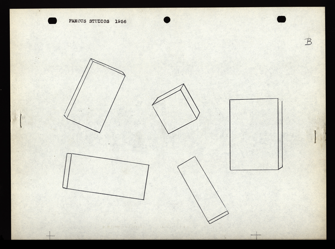 B
B 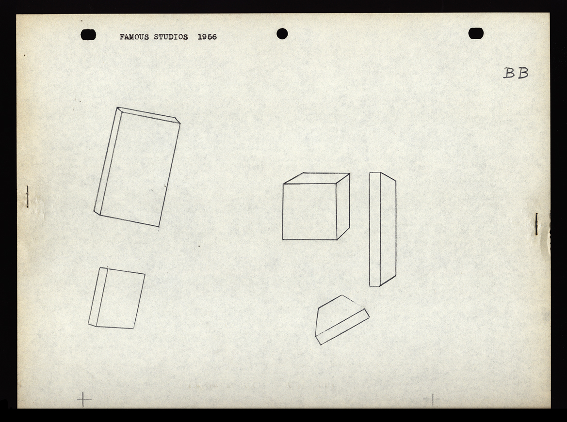 BB
BB
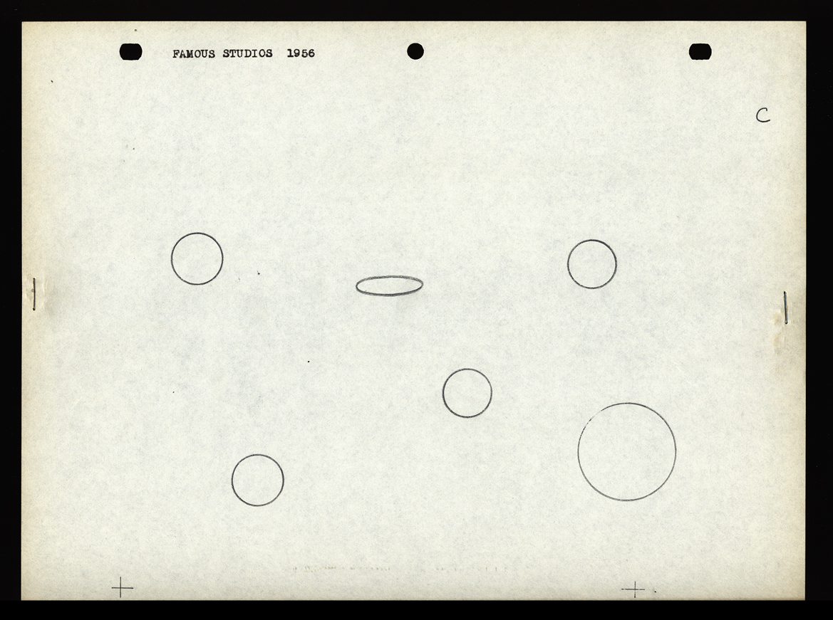 C
C 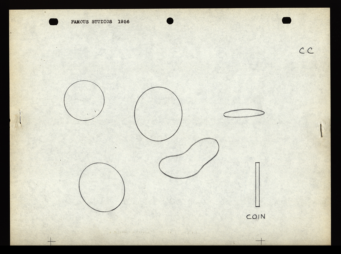 CC
CC
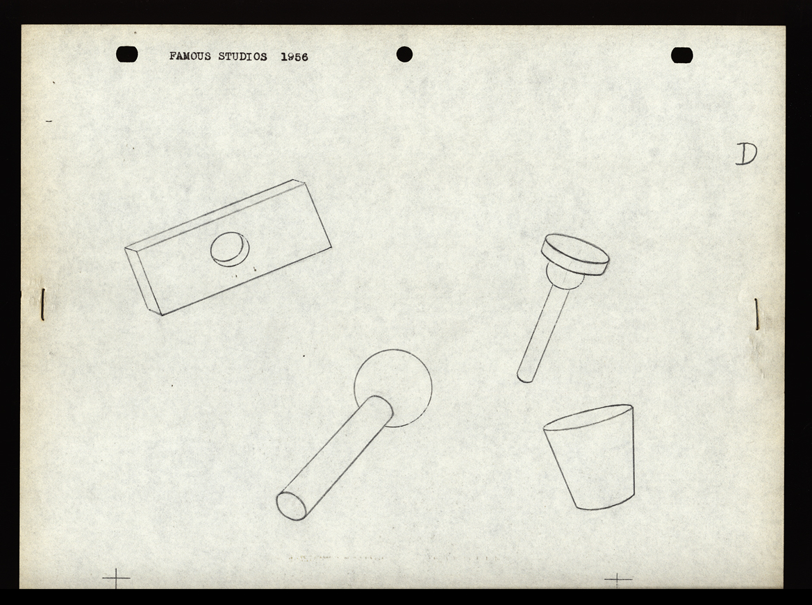 D
D 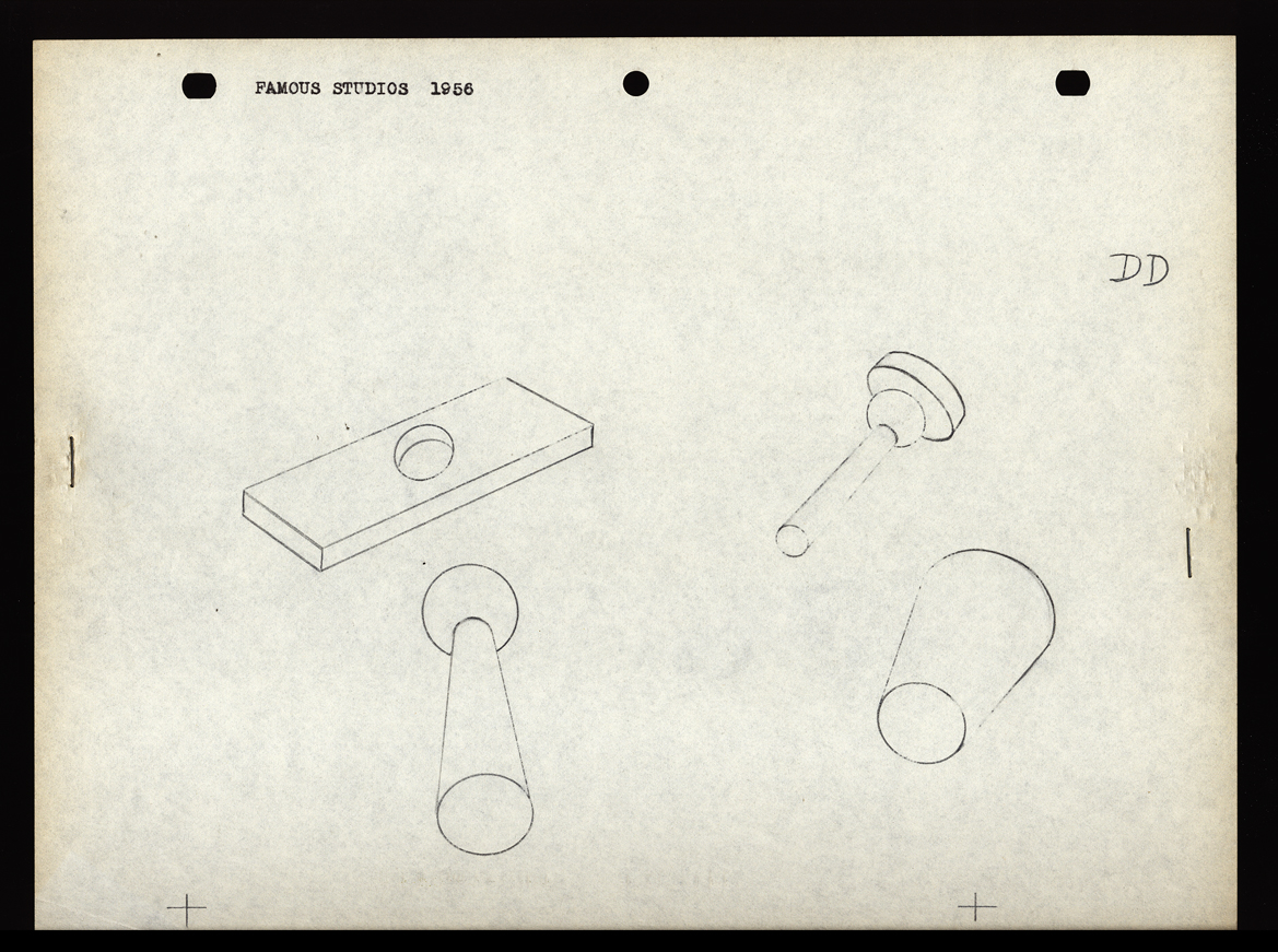 DD
DD
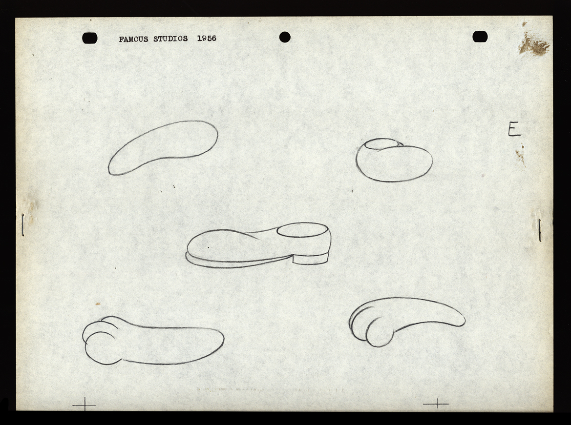 E
E 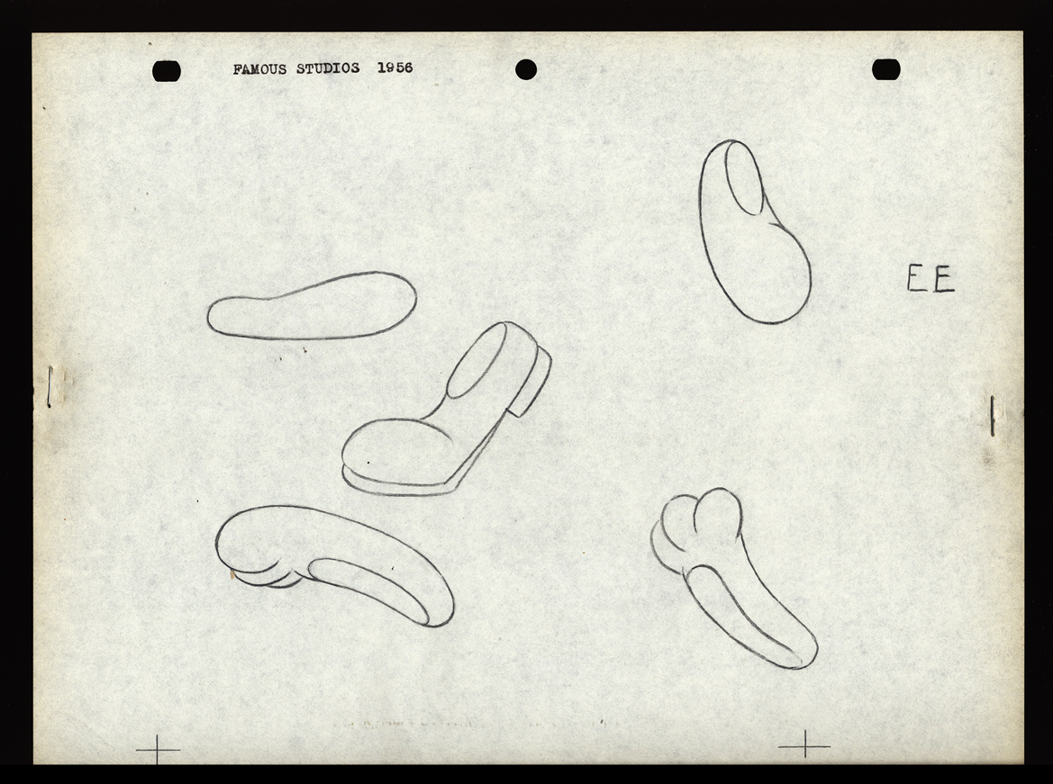 EE
EE
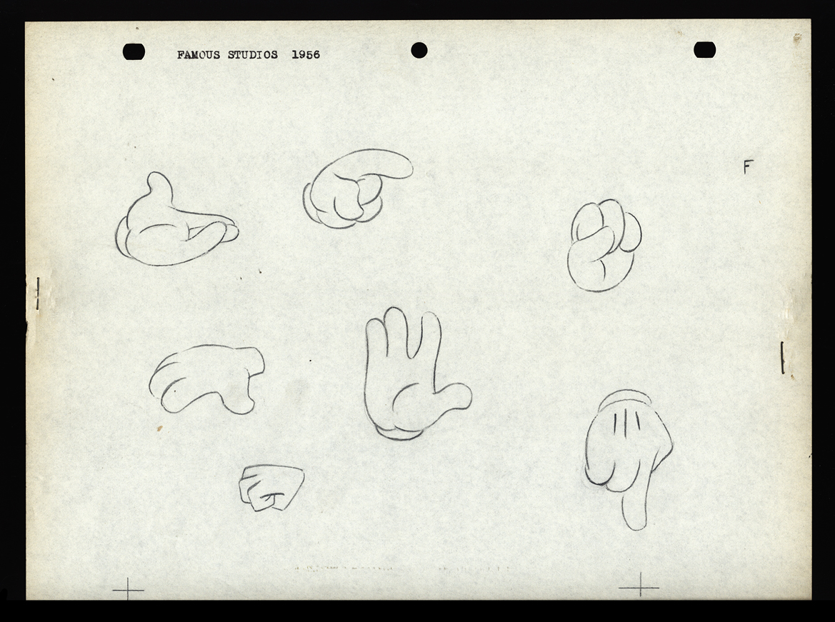 F
F
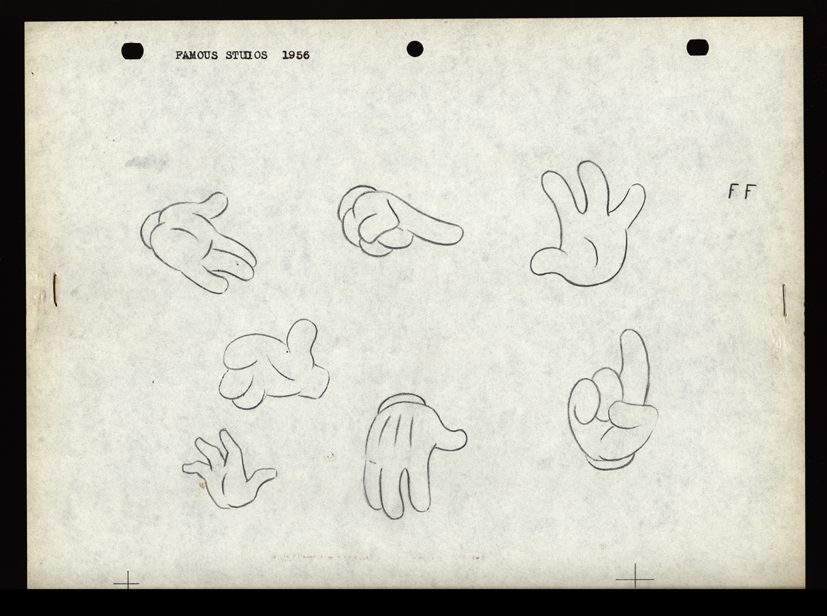 FF
FF
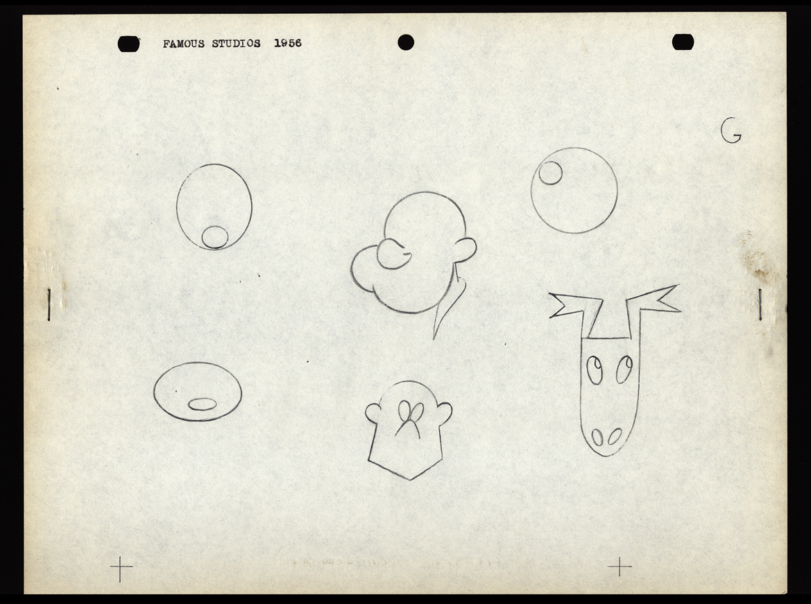 G
G
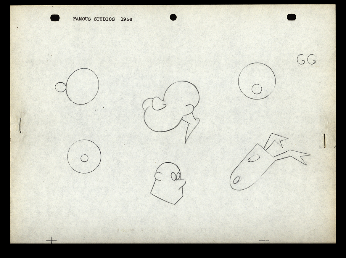 GG
GG
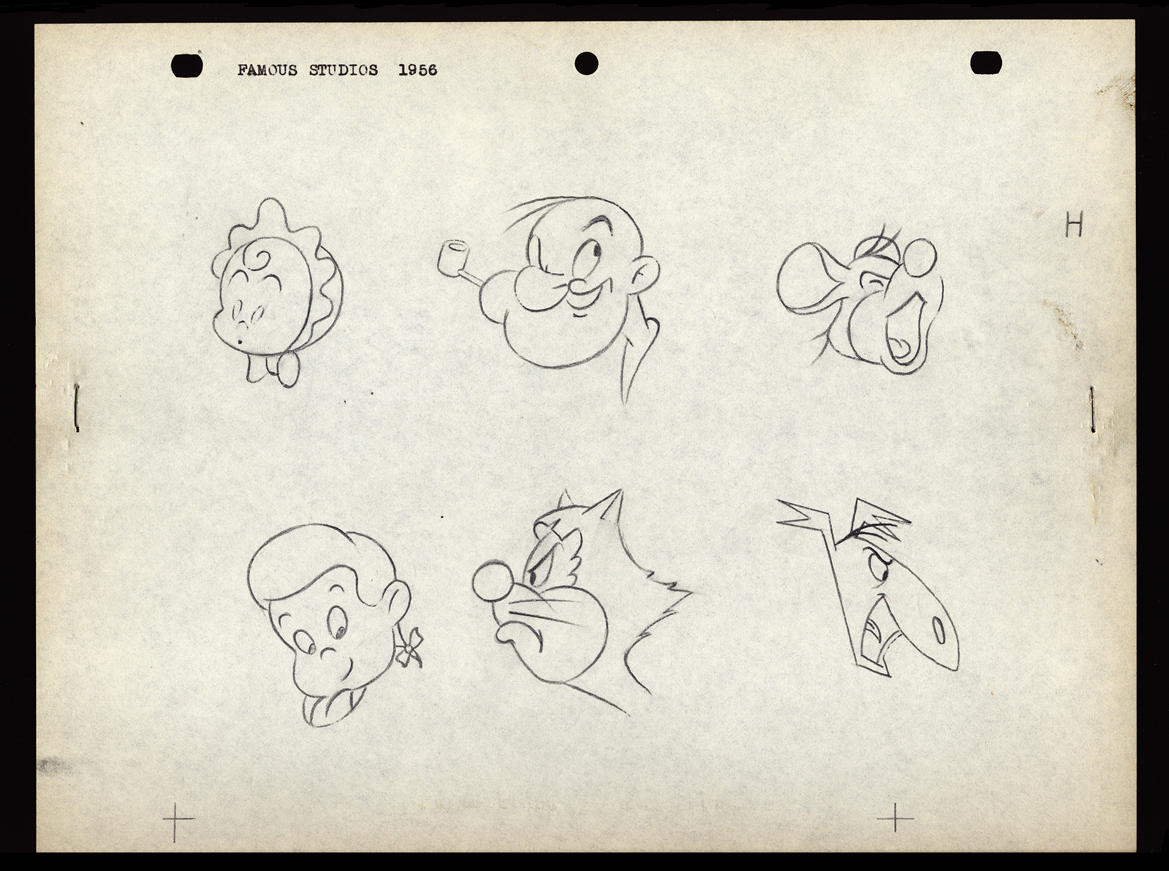 H
H
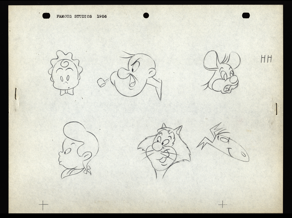 HH
HH
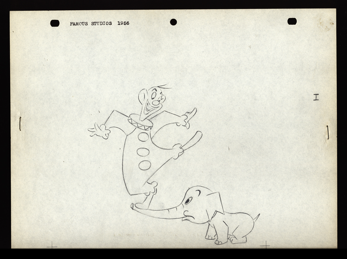 I
I
 II
II
 J
J
 JJ
JJ
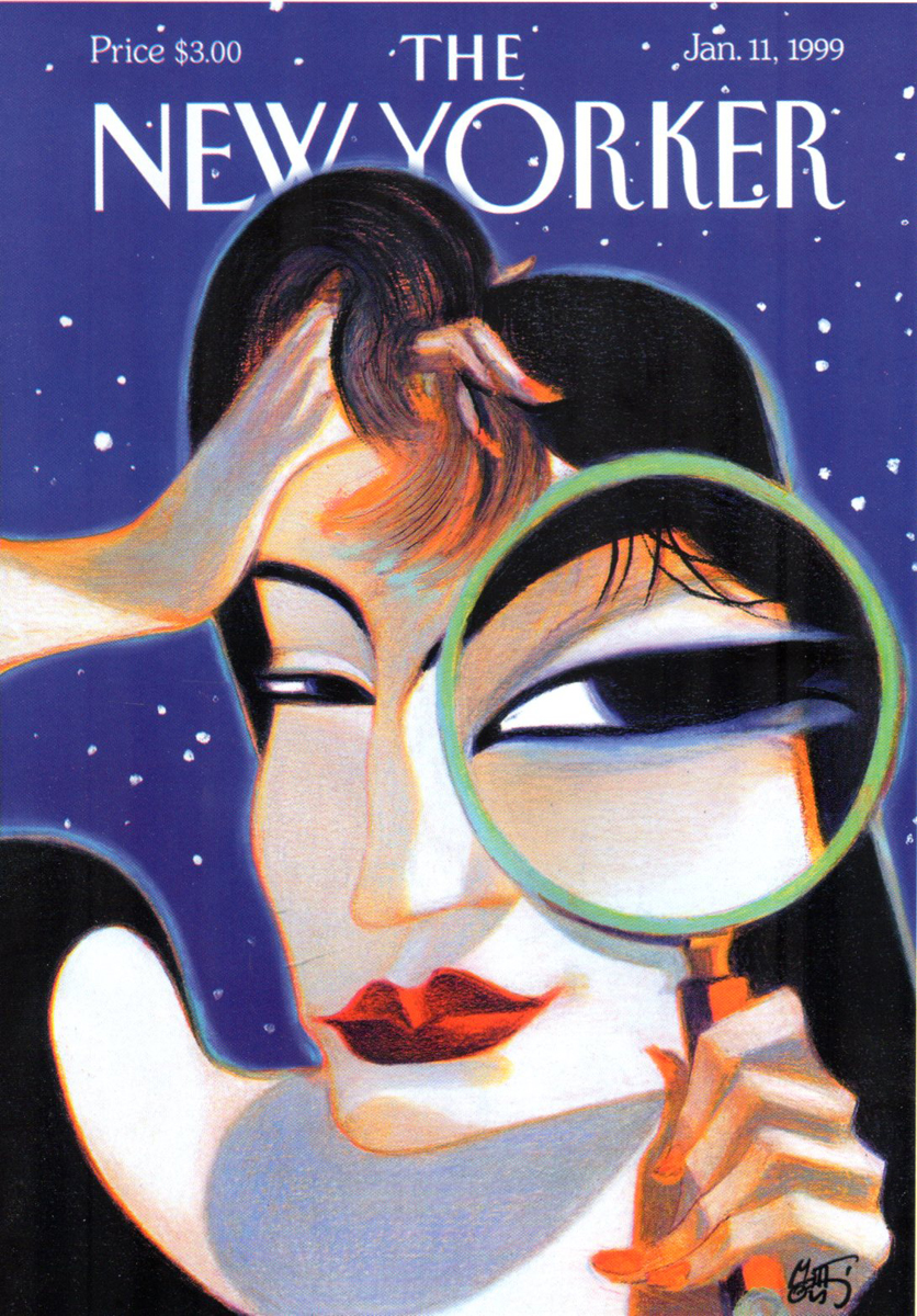
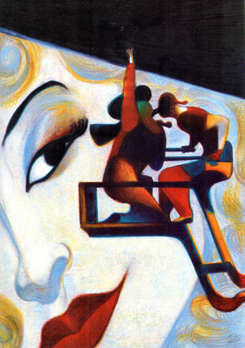
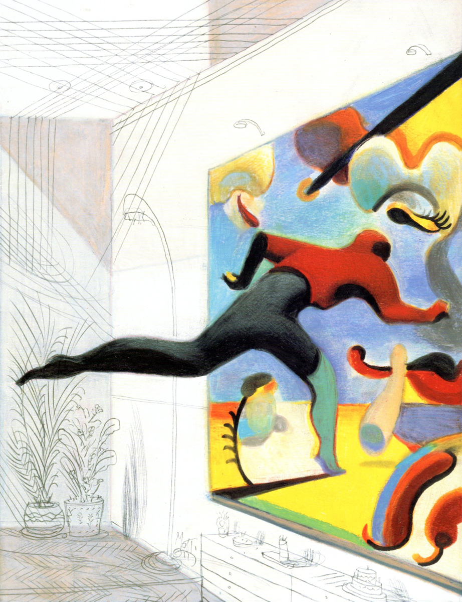
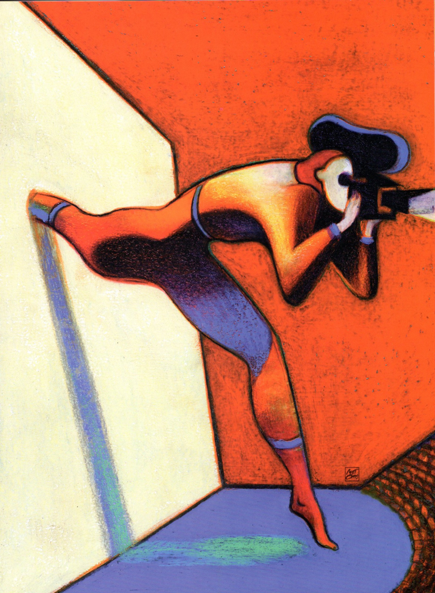
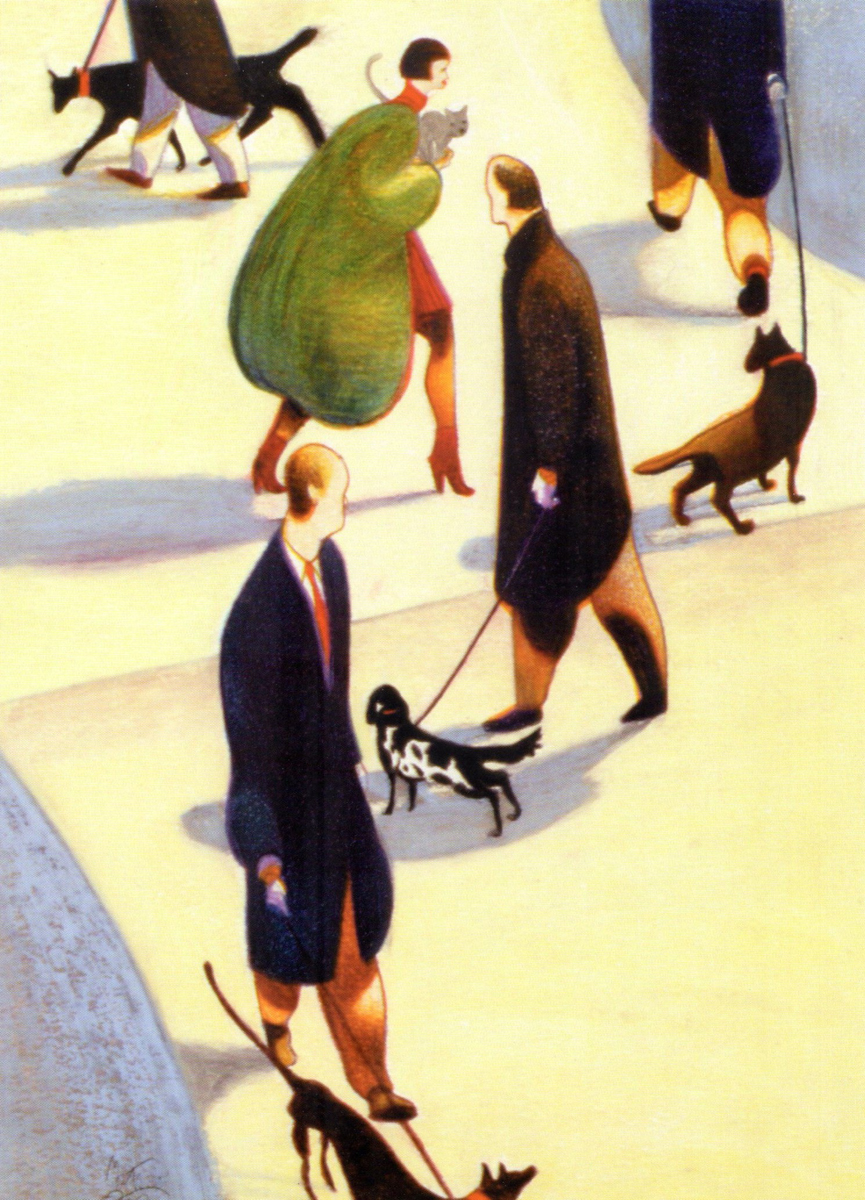
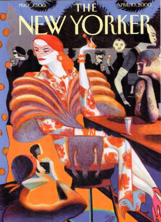
Art Art &Bill Peckmann &Illustration 09 Oct 2012 05:43 am
Lorenzo Mattotti
- Bill Peckimann reminded me of a great illustrater/artist who did many New Yorker covers for a short period of time. Lorenzo Mattotti is a sterling artist whose work always inspired. Bill put together quite a few pages from Mattotti’s book of artwork, and the results are exciting. Here are Bill’s comments:
- In the late 1990′s, Lorenzo Mattotti‘s New Yorker covers always had a way of jumping out of the newsstands and right into one’s briefcase! So it was a real delight when this book of his collected works came out in 2000.
If there happens to be a dark and dingy day and you want/need inspiration, this is it!
There are more beautiful drawings, sketches and colored images at:
the Official website (in English)
Mattotti blog (in Italian)
Here are some of his works:
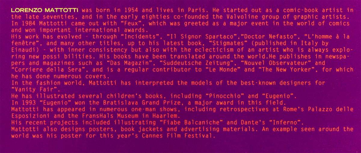
Click any image to enlarge.
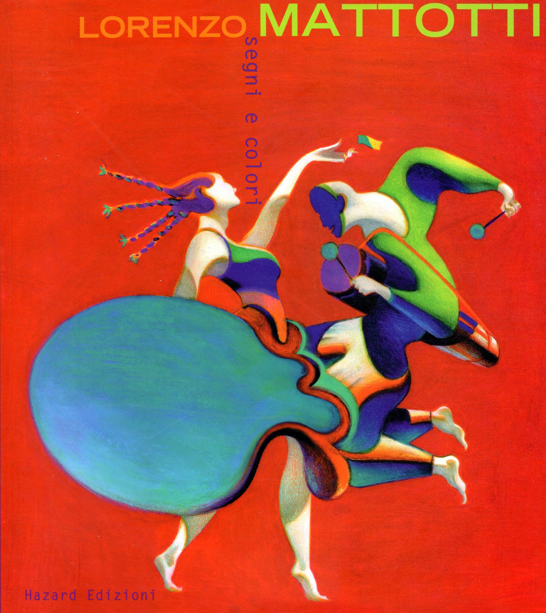
The book’s cover
 2
2
1999
 3
3
1995
 4
4
1989
 5
5
1992
1998
1998
 8
8
1998
 9
9
2000
 10
10
2003
 11
11
2000
 12
12
1995
2000
 14
14
2000
 15
15
2000
 16
16
1990
 17
17
1997
 18
18
1996
1999
2000
1999
2000
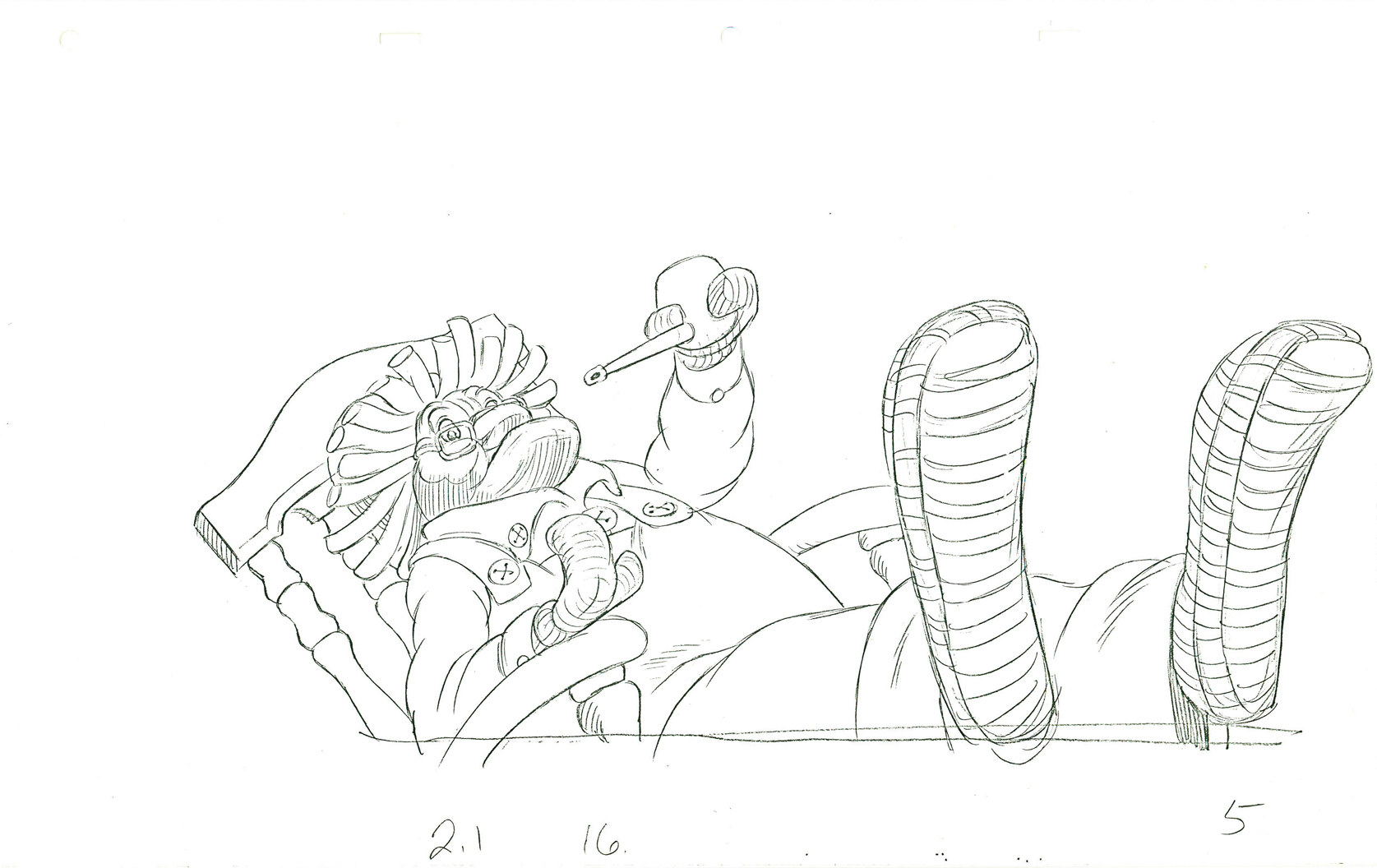
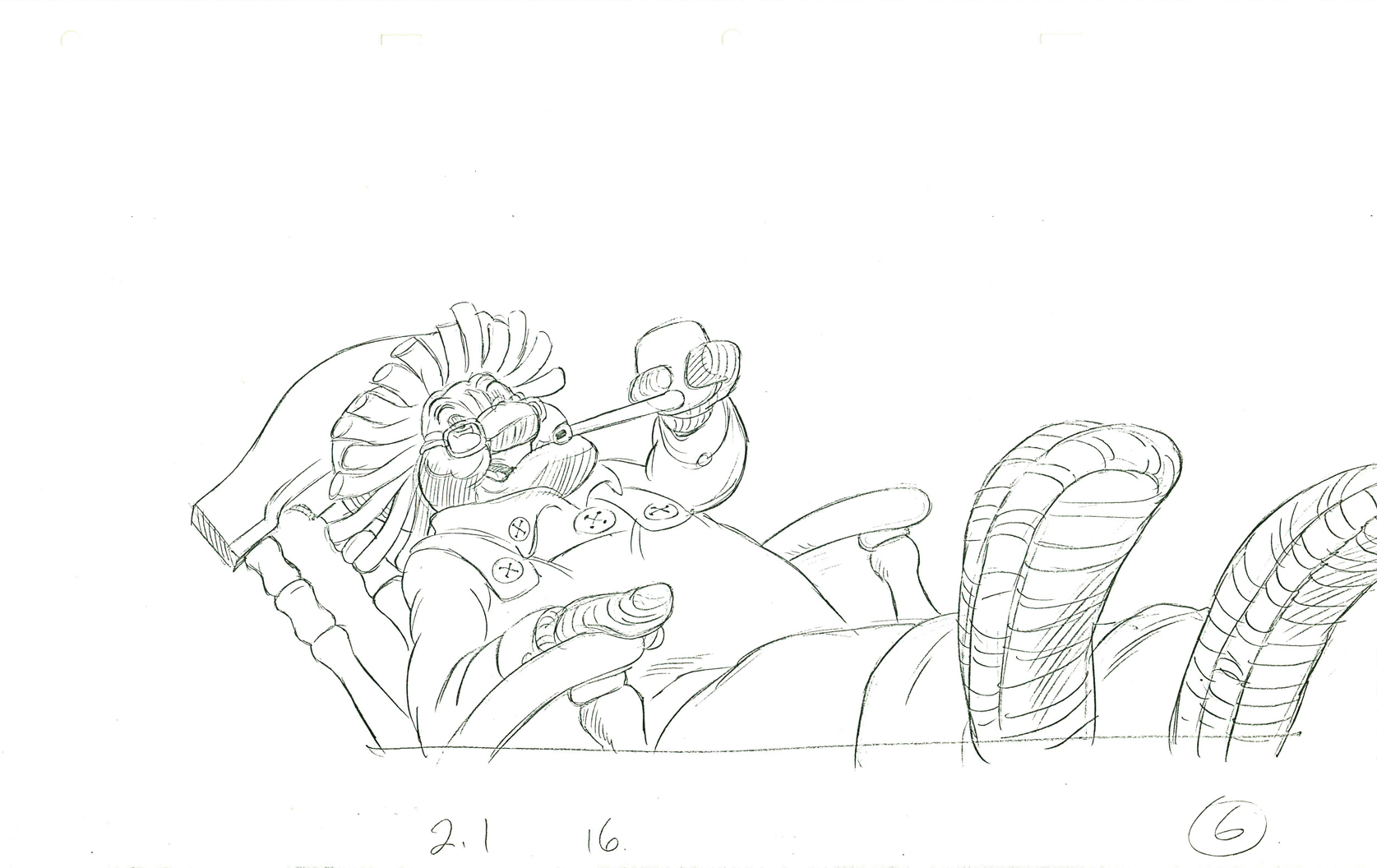
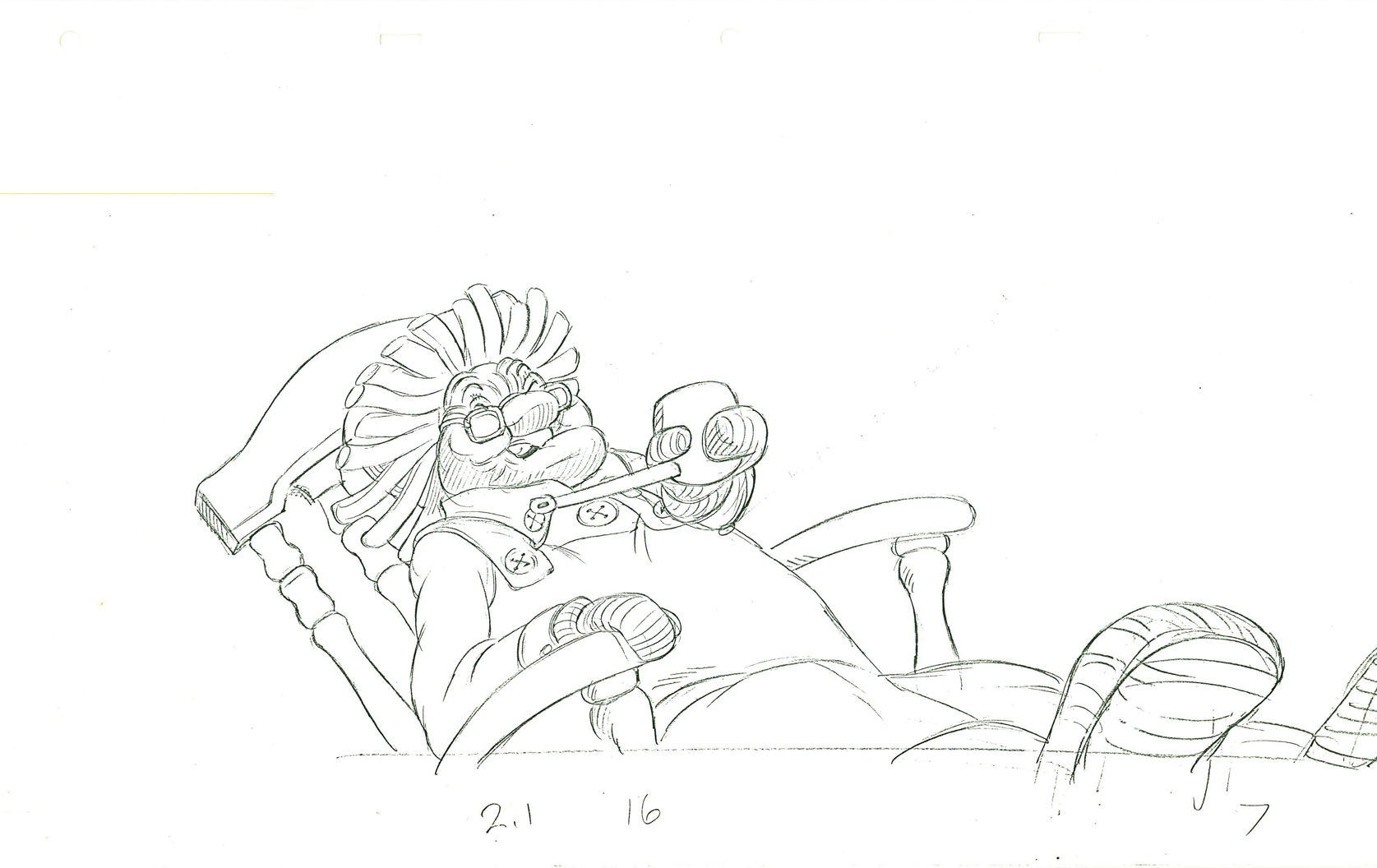
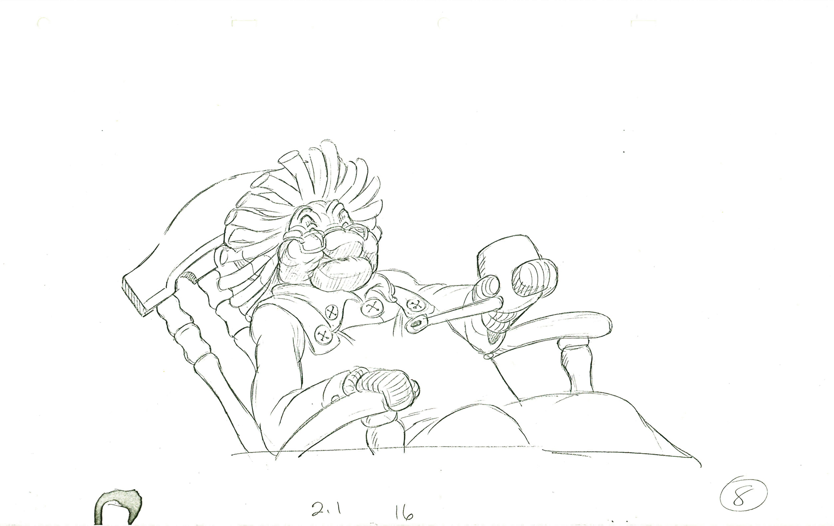
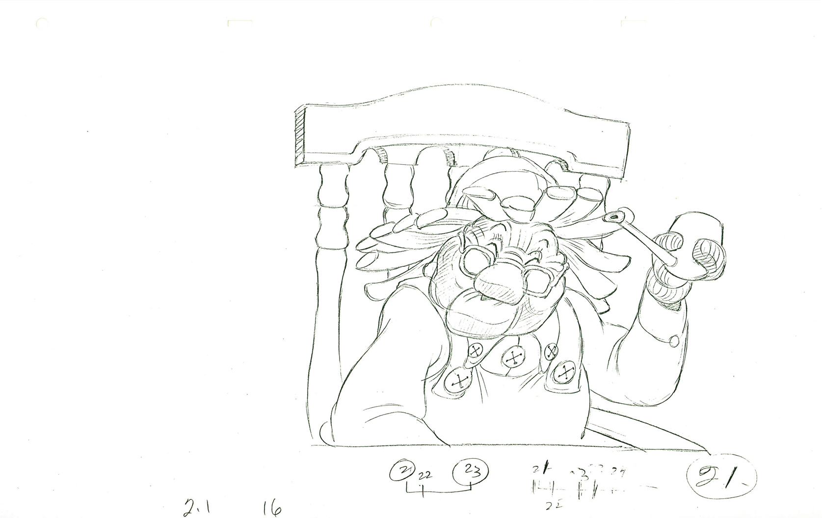
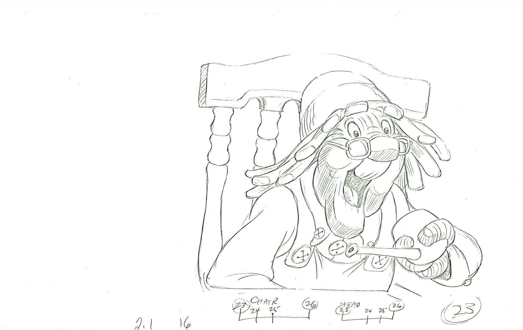
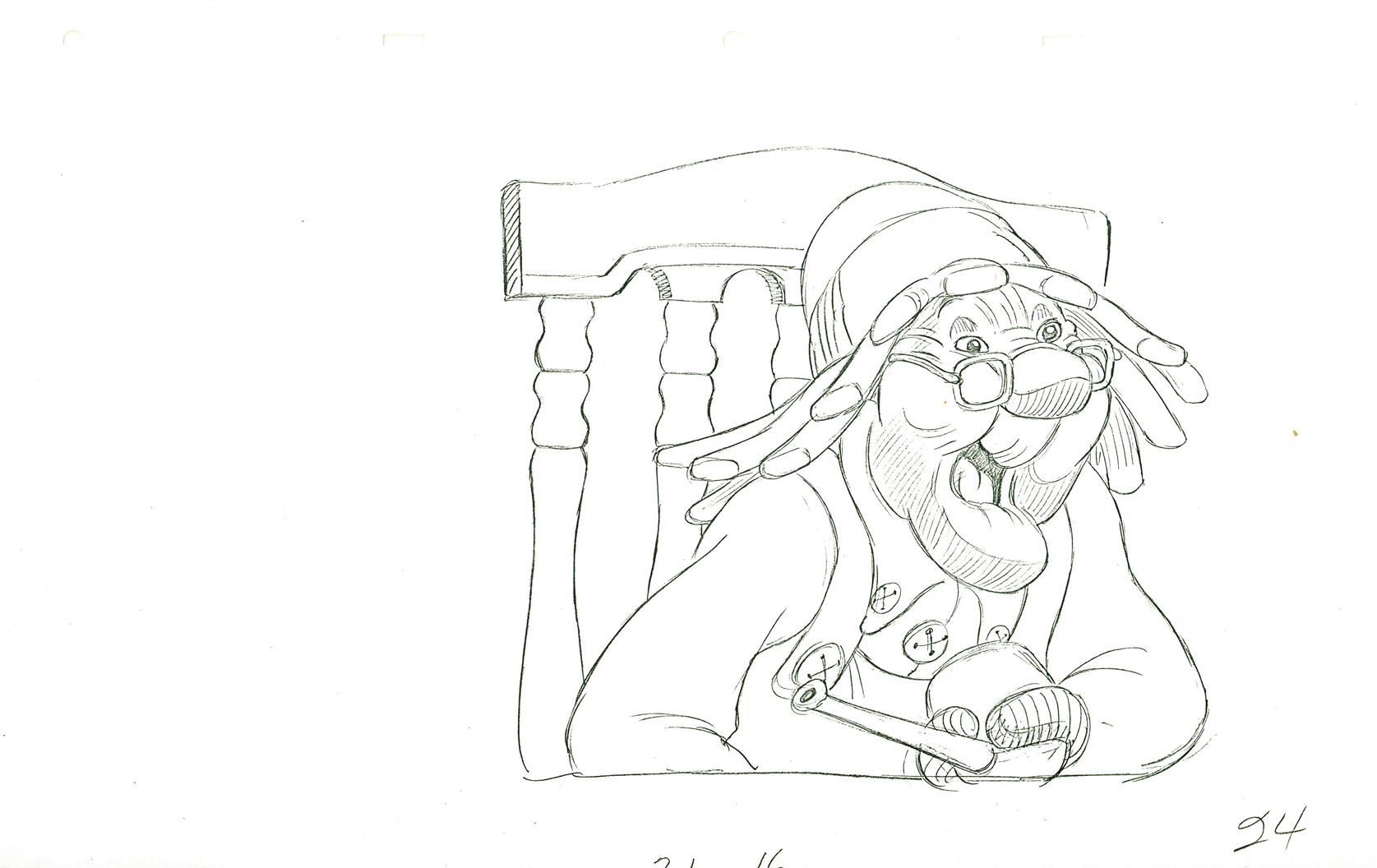
Animation &Animation Artifacts &Richard Williams 08 Oct 2012 07:24 am
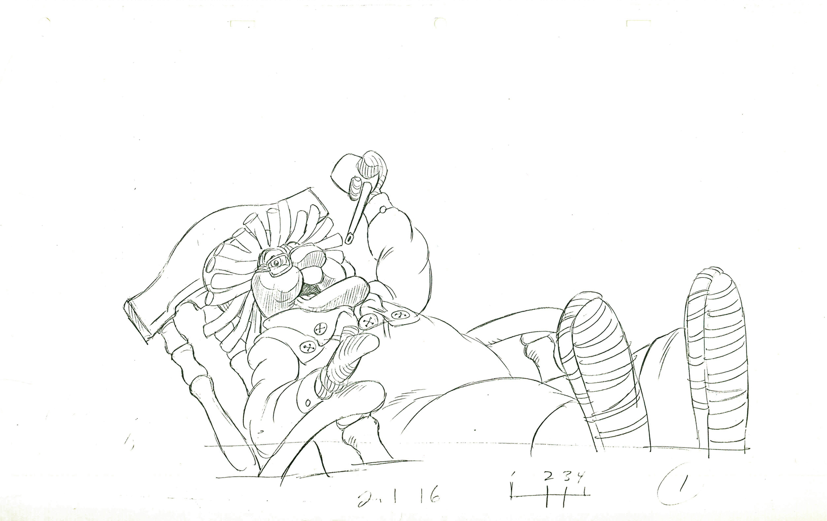
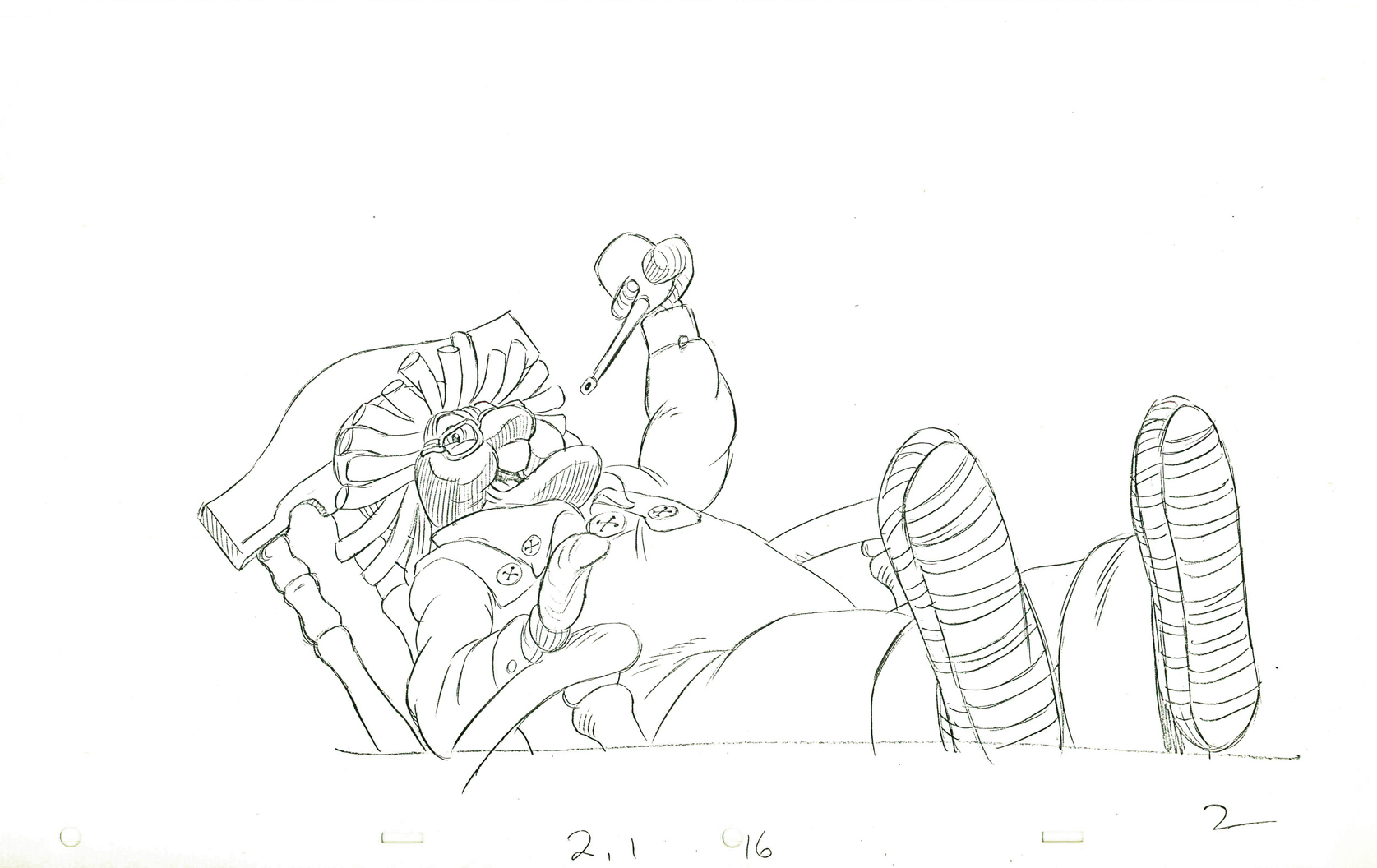
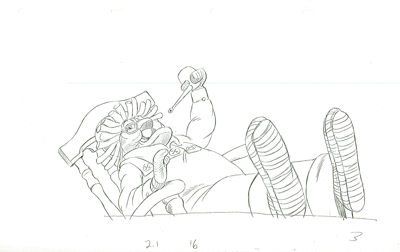
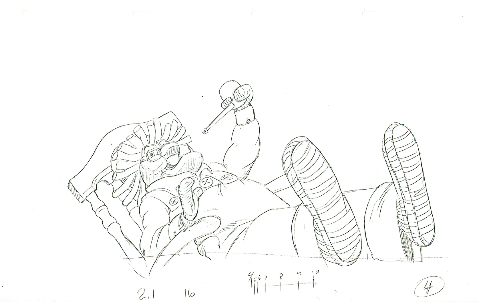
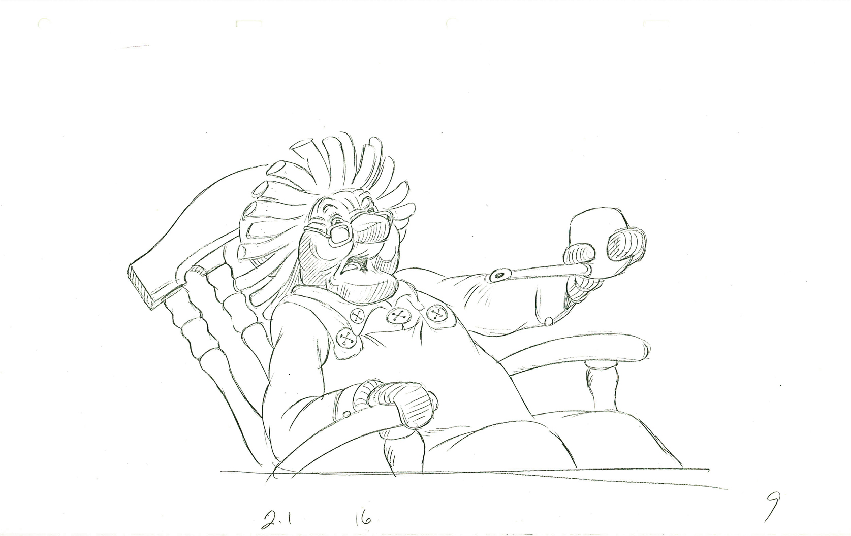
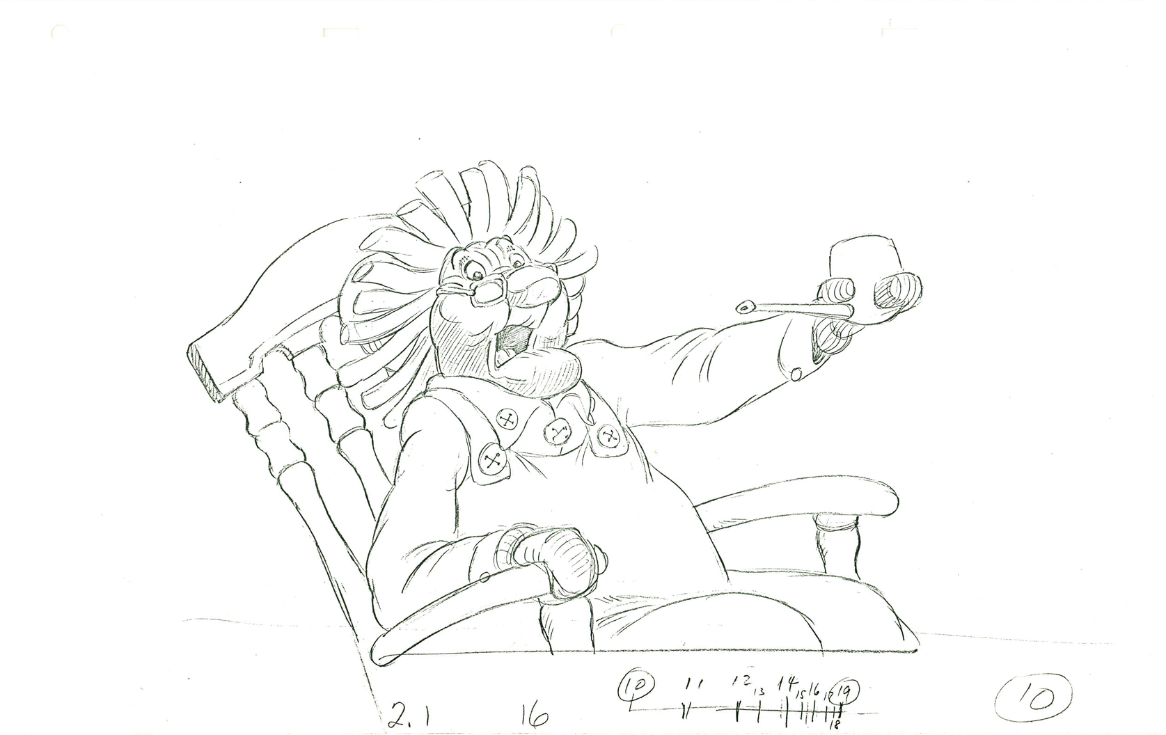
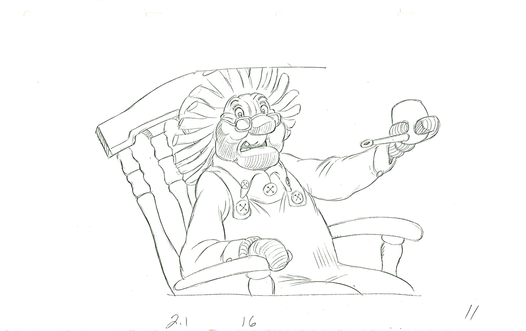
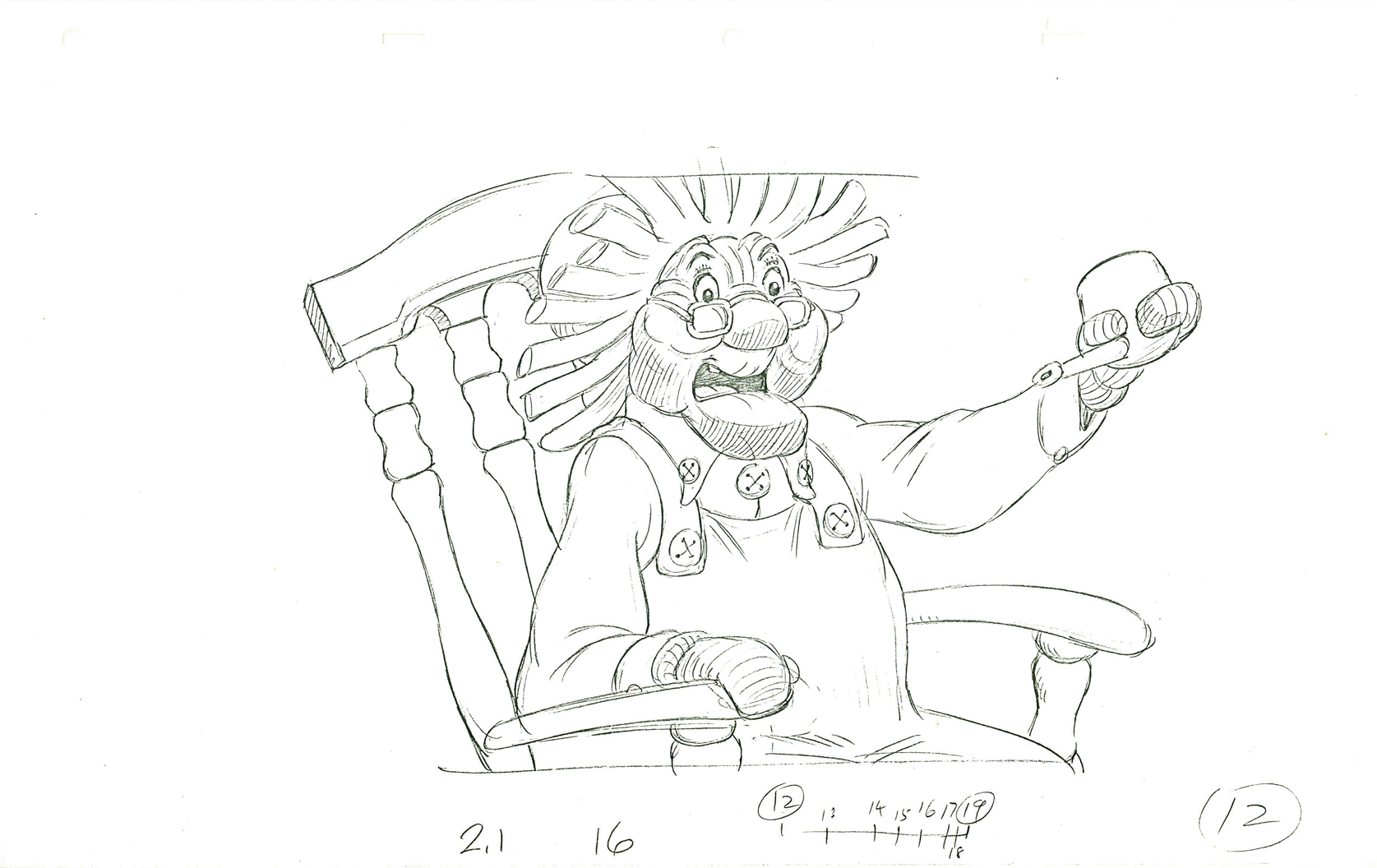
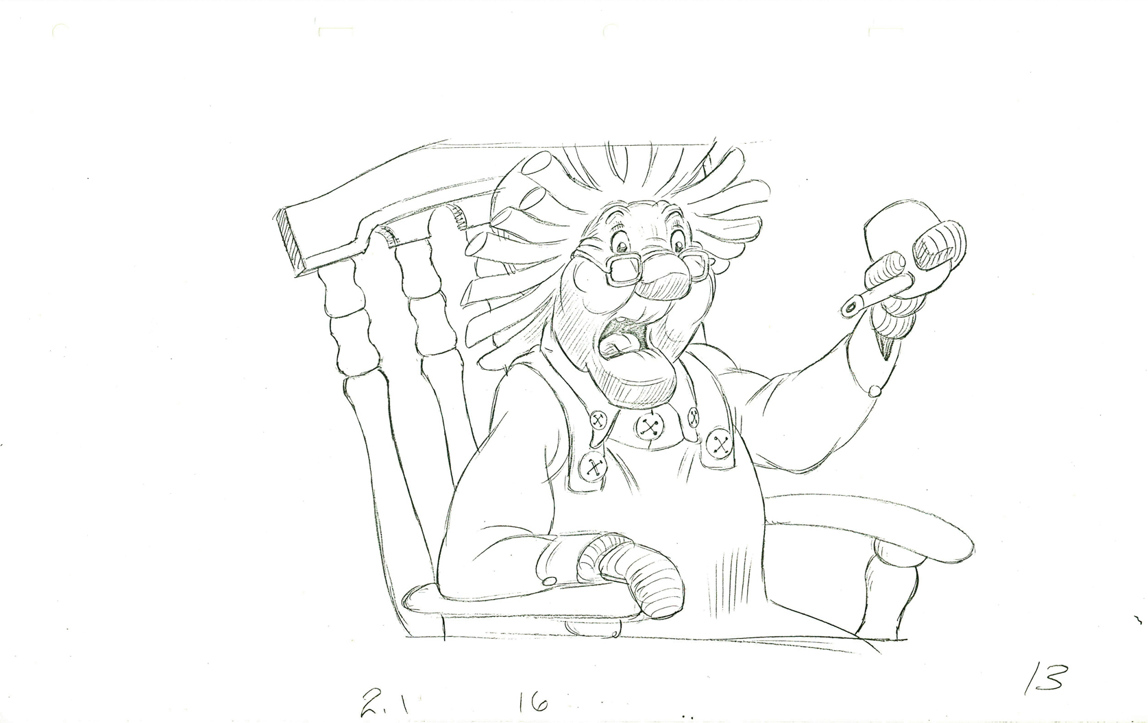
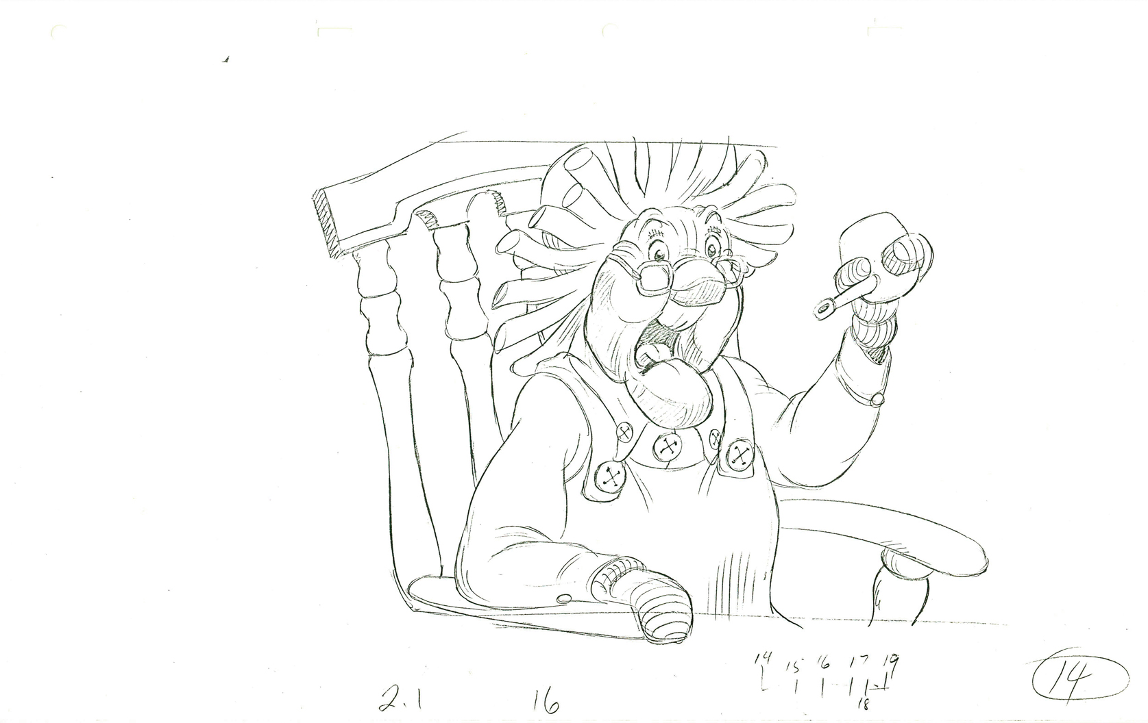
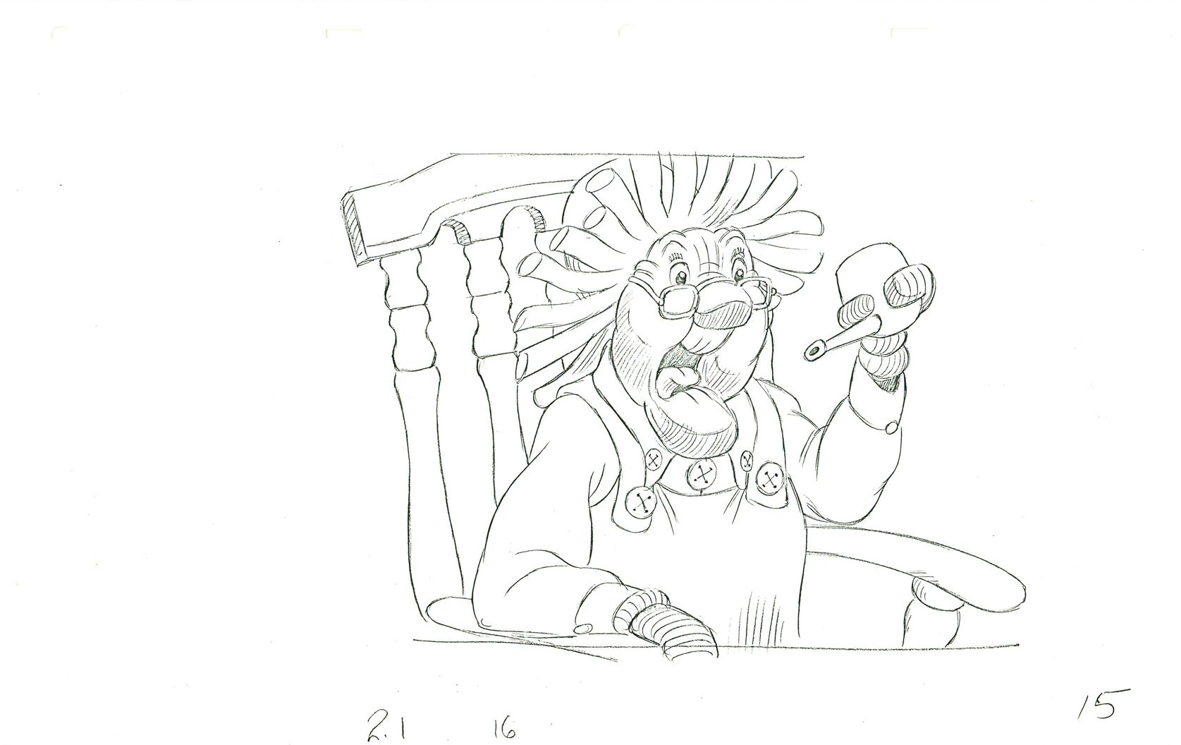
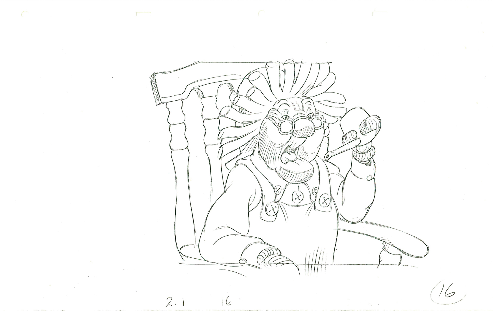
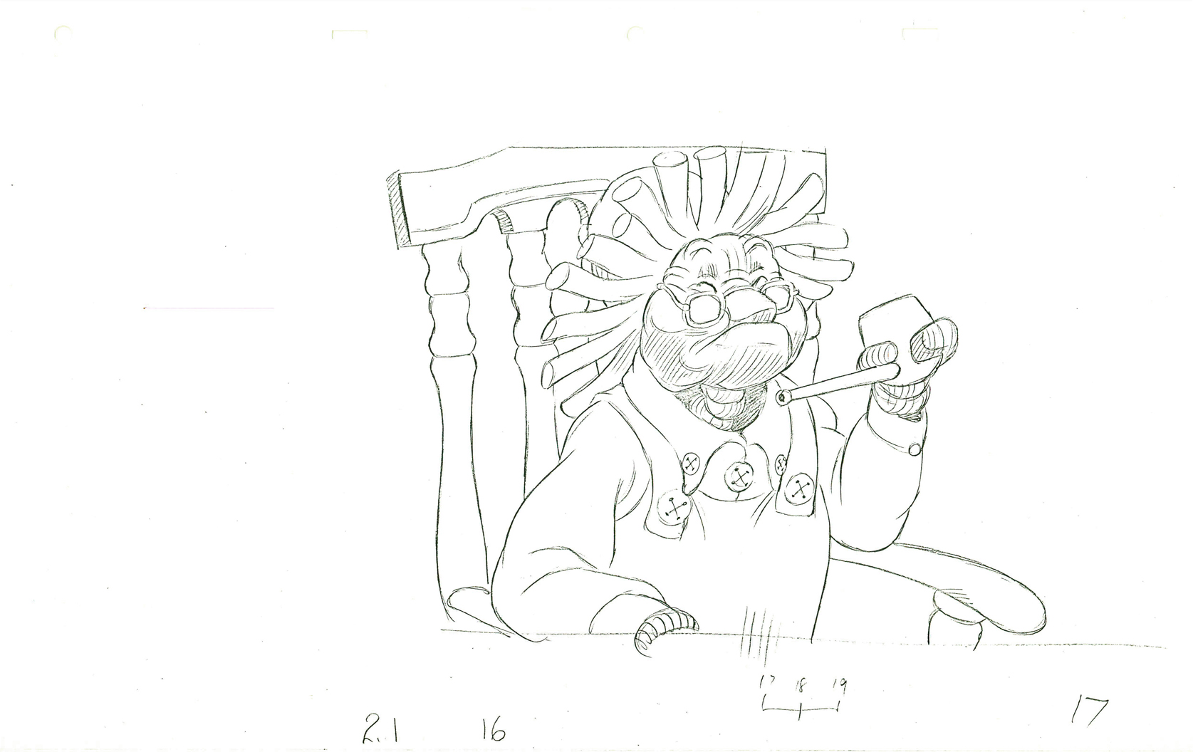
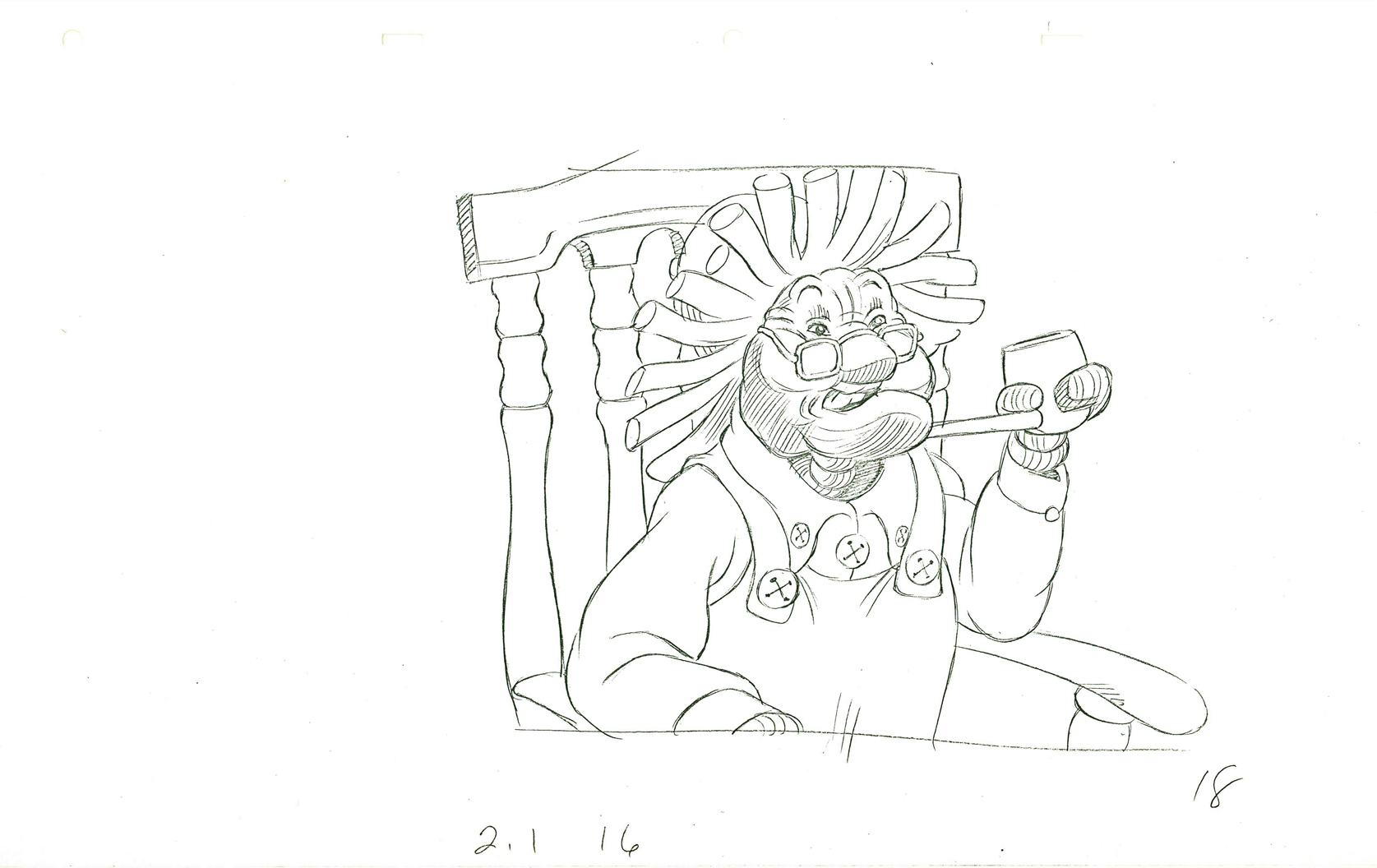
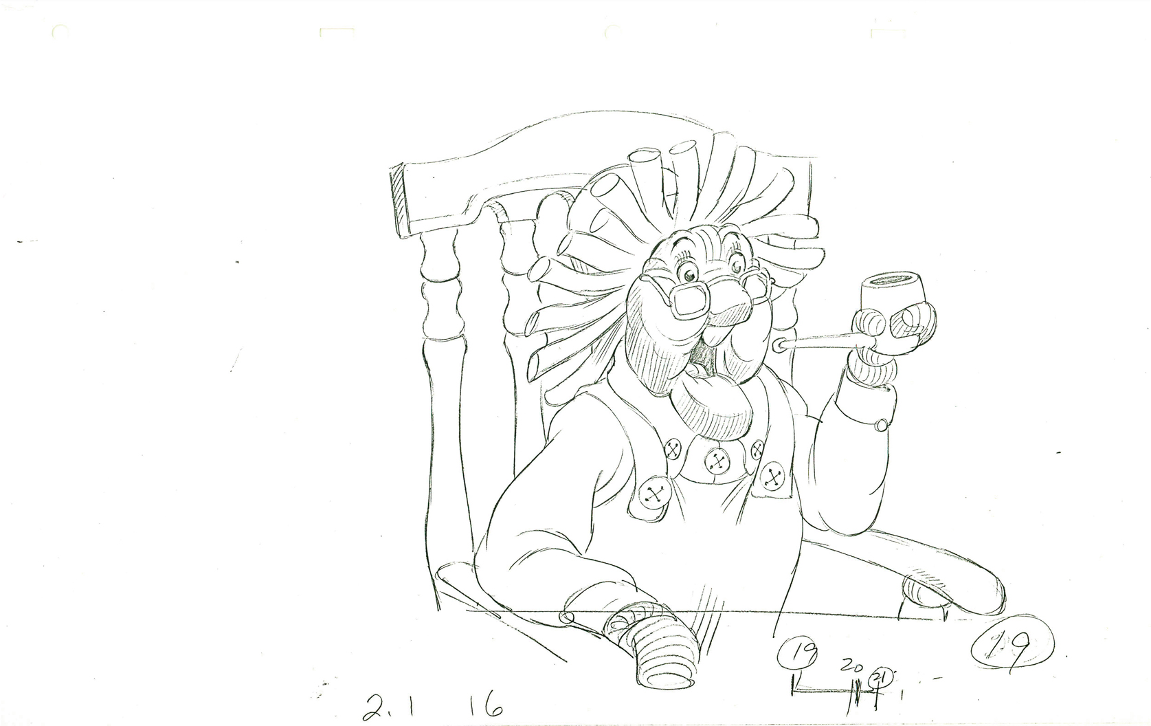
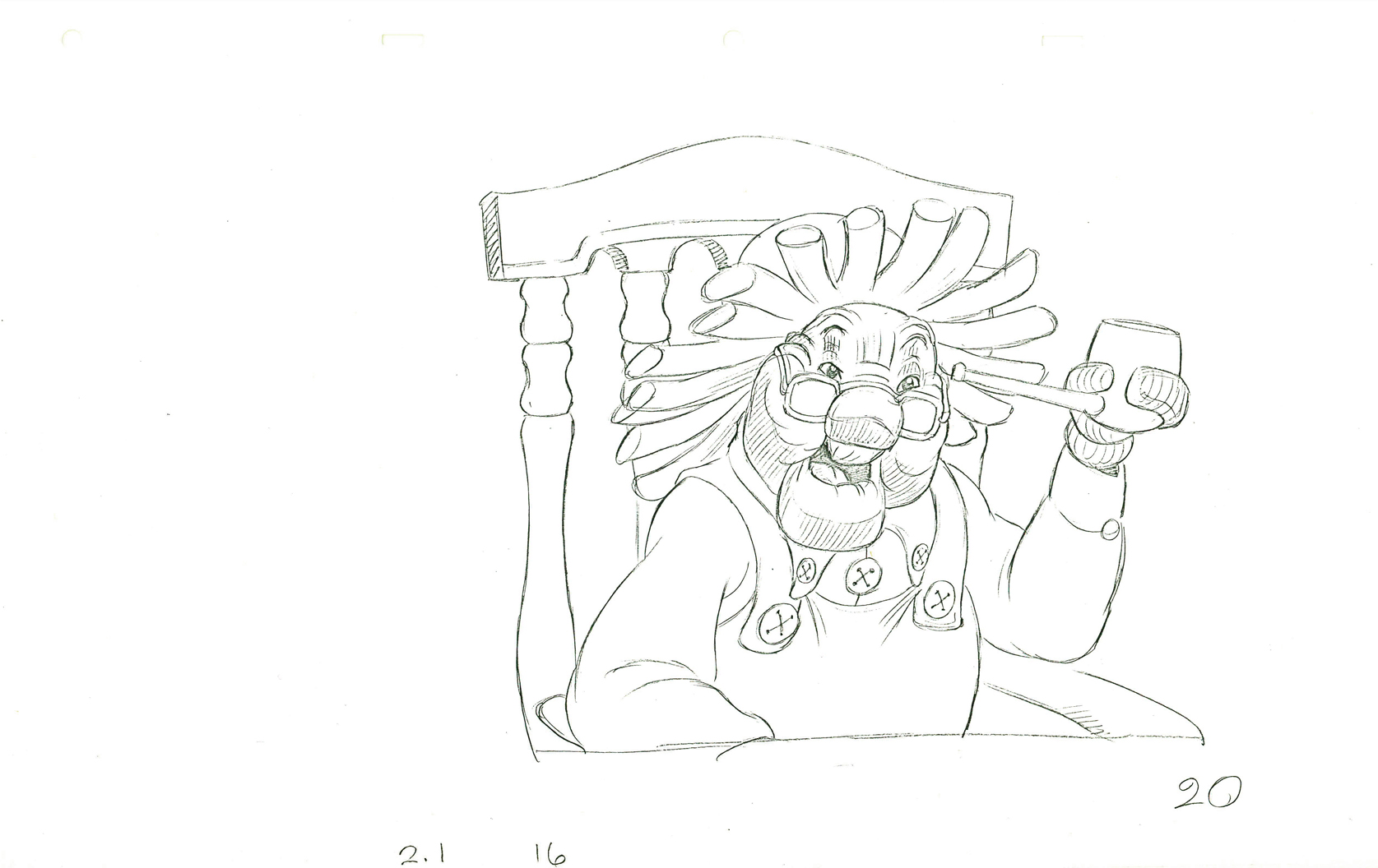
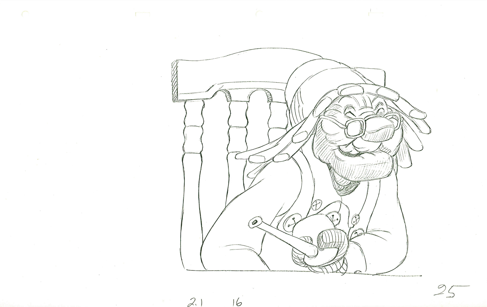
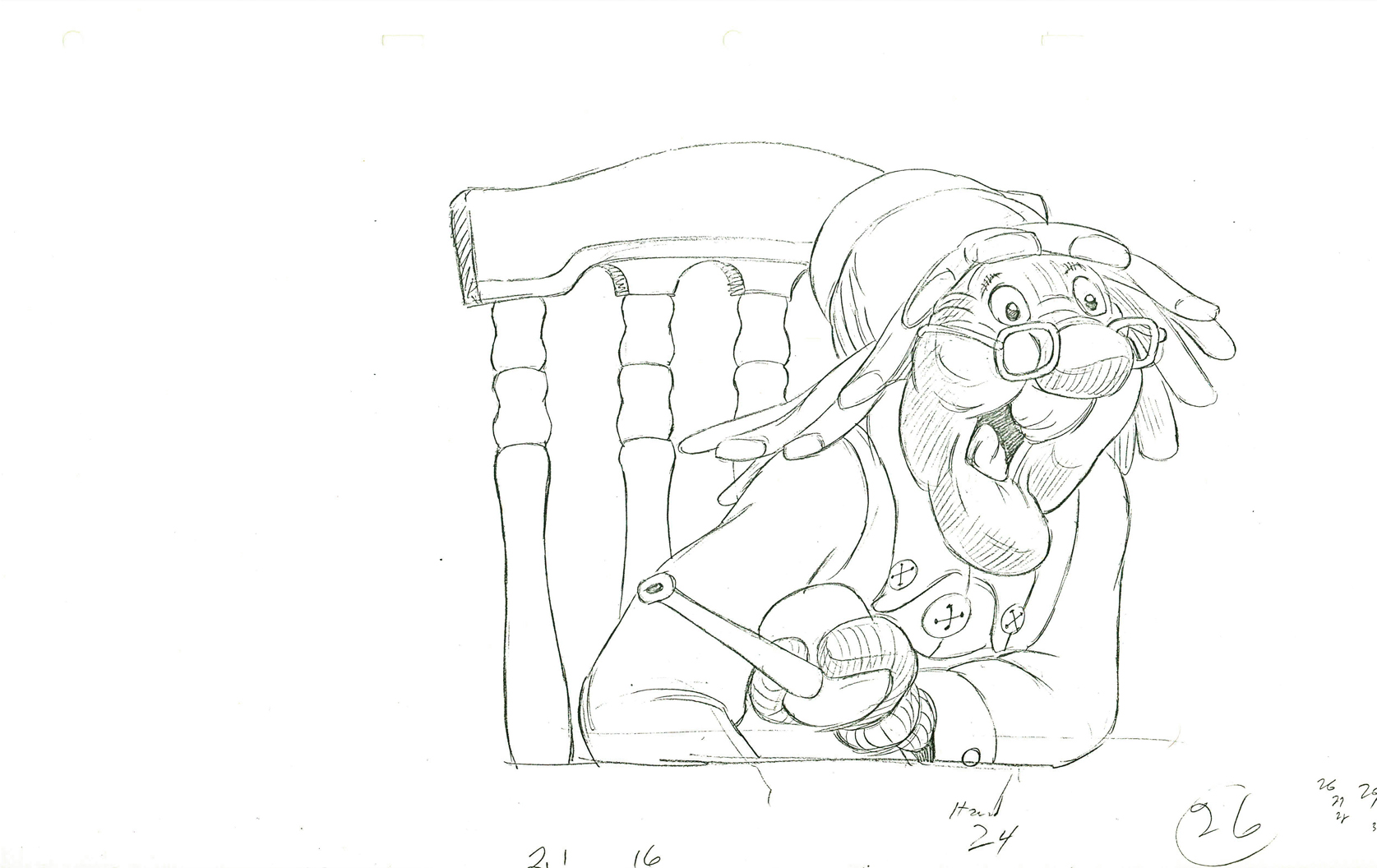
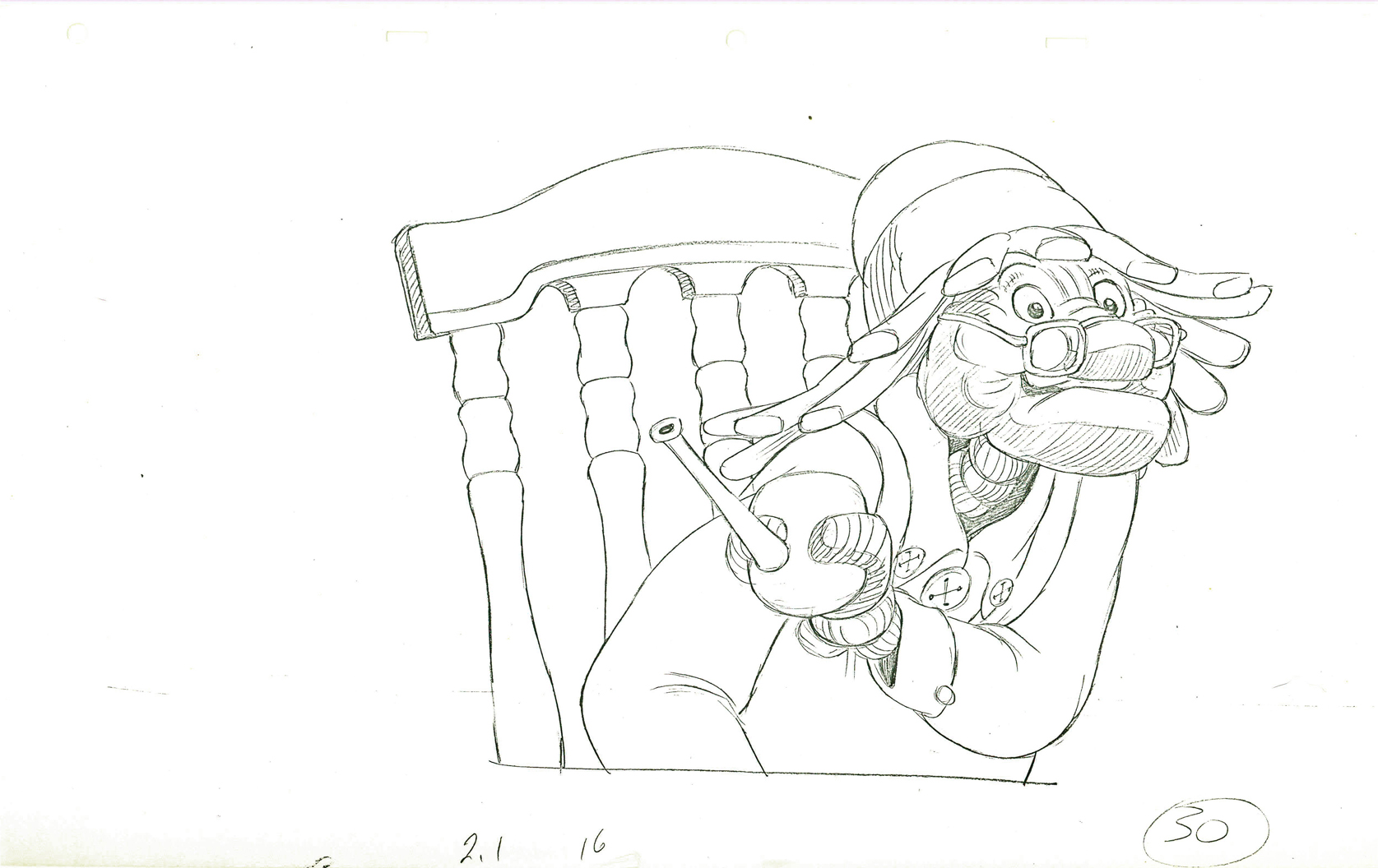
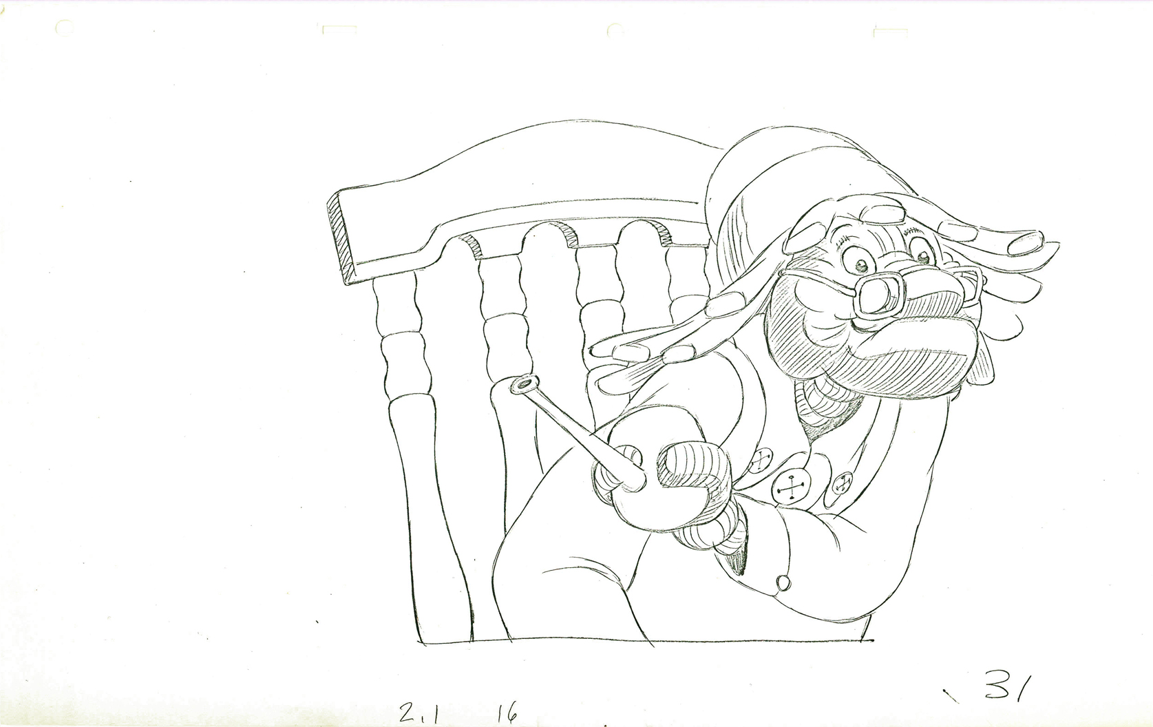
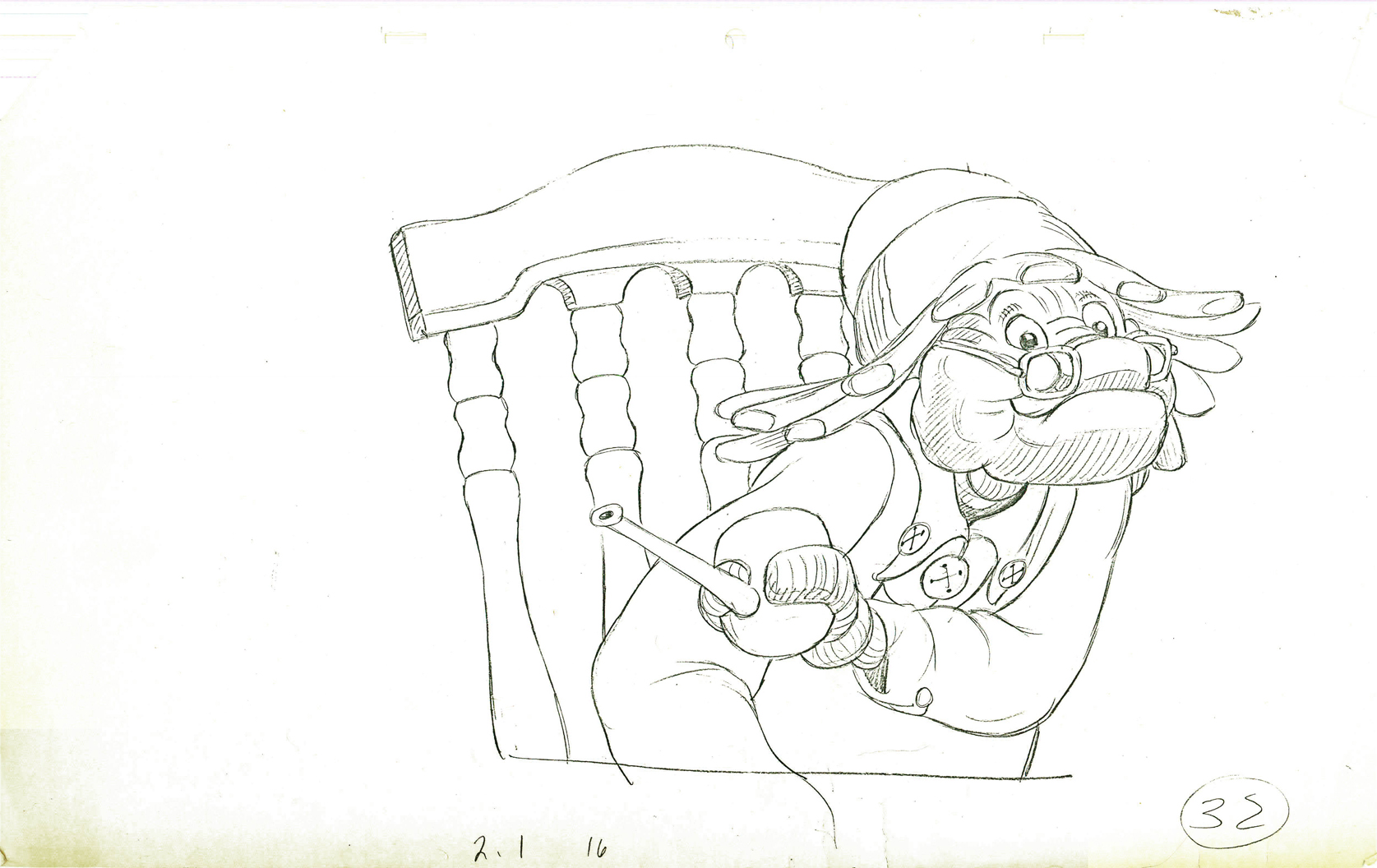
Gramps – anew
- I have the CU drawings done by Richard Williams for a small scene from Raggedy Ann & Andy. I had thought the original animation was done by Spencer Peel, though I’m not sure. The drafts seem to credit Gerry Chiniquy.
For the first half of the film, Dick spent much of the film holed up while assisting and inbetweening many of the animators at the film’s start. In doing this, he was also able to rework and retime the animation and, thus, have control over it all. Once Dick became involved in a scene, it’s hard to say who animated it.
The problem was that the director has bigger things to do that affect the big picture.
This scene, beautifully cleaned up, is typical of these playroom scenes. And yet, as far as I can tell this was eliminated from the final film. I don’t have time to check the actual film, but the drafts indicate that scene 2.1 / 16 was taken out of the movie. I’ll look at the film just to make sure, but it looks pretty certain to me.
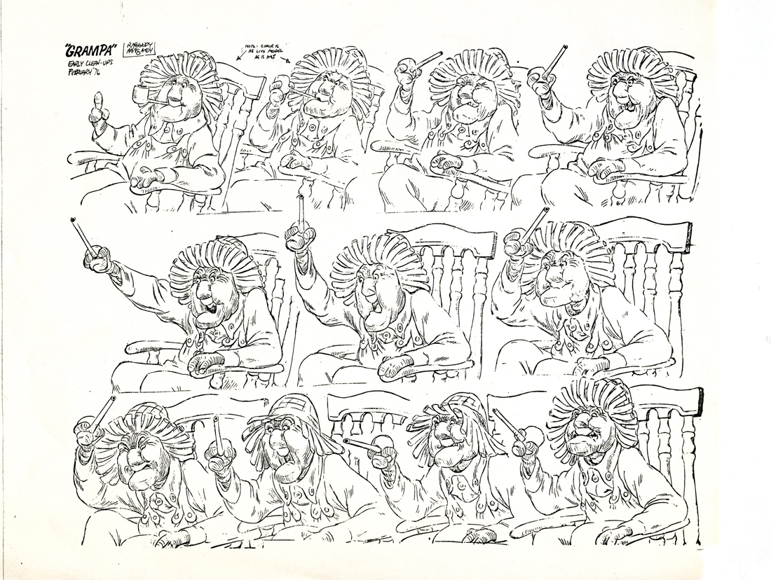
This is a model sheet taken from a similar scene in Raggedy Ann.
It’s obvious that his POV has shifted from left to right, and that may be
the reason for eliminating the scene pictured below.
The scene started out with 32 drawings, but it seems that Dick eliminated three of them (27-29) to hit an accent a bit harder than was done in the original animation.
 1
1
 2
2
 3
3
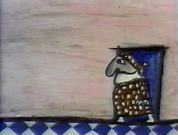
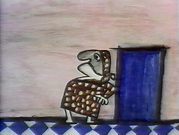
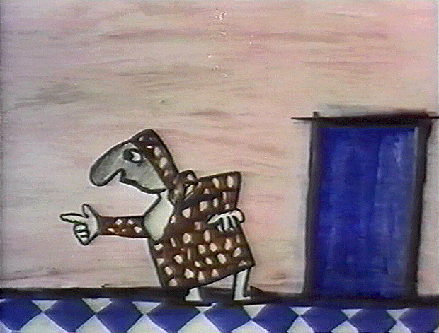
Dick had a unique animation and cleanup style. He would draw
his drawings incredibly light going quickly through the entire scene.
 4
4
The pencil line of that first round was almost invisible.
 5
5
Then he’d go back and work over those lines
just as lightly and just as quickly.
 6
6
then he’d do it again, and again, and again.
 7
7
This gave him the opportunity of changing and adjusting as he went along.
 8
8
It also is a method somewhat similar to the one
that Tytla and Ferguson used in the 1930s. They’d
go for the “forces” and then go back and build up from there.
 9
9
Williams used his light pencil lines to build up around his forces.
 10
10
Oddly the animation style is unlike Tytla and Ferguson and
more like the tight constructed, planned style of Babbitt.
 11
11
 12
12
 13
13
 14
14
 15
15
 16
16
 17
17
 18
18
 19
19
 20
20
 21
21
 22
22
 23
23
 24
24
 25
25
 26
26
 30
30
 31
31
 32
32
________________________
Here’s a QT of the cycle with a mix of one’s and two’s.
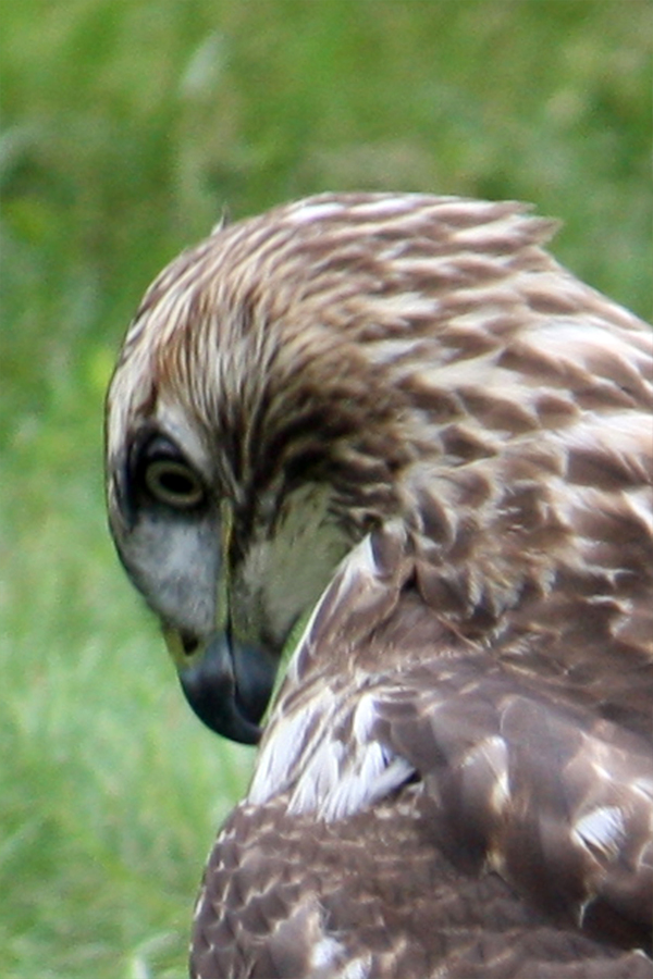
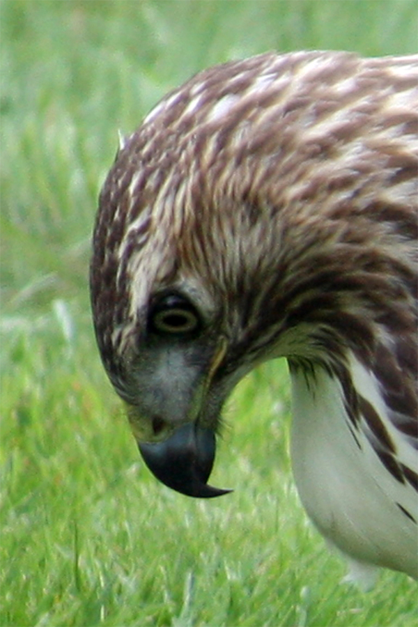
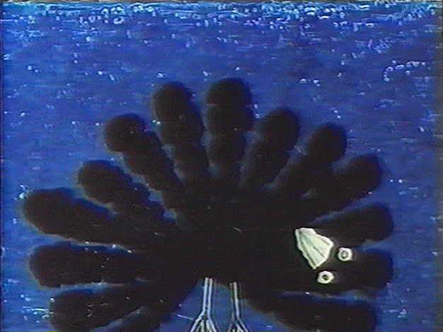
Photos &Steve Fisher 07 Oct 2012 05:30 am
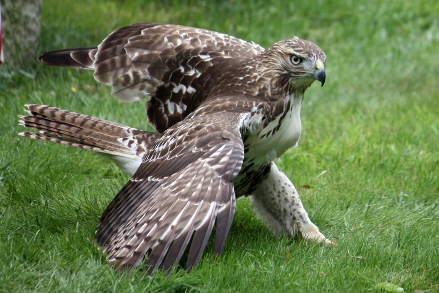
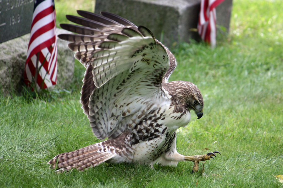
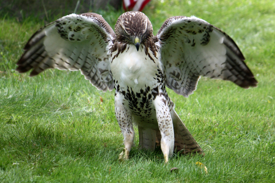
Hawk and Snake
- Late last night Steve Fisher sent some incredible photos. I pushed aside the post I’d prepared for today and got to work on the new Sunday edition. These are quite amazing pictures. Animation of real life. Here’s Steve with his last minute comments:
- I have it on good authority [my contact at the National Audubon Society] that the subject is a red-tailed hawk. I’m told that the brown tail means it is a juvenile and that it was hatched this year.
Unfortunately, we don’t know how old the snake was.
 1
1
 2
2
 3
3
 4
4
 5
5
 6
6
 7
7
 8
8
 9
9
 10
10
 11
11
 12
12
 13
13
 14
14
Commentary 06 Oct 2012 07:29 am
Effectively Functioning
photo by Mate Hidvegi
Predominantly, I’ve been completely absorbed by two things. Tissa David‘s memorial is just about organized. The rough cut of the film program has been assembled, and I’ll hand it off to my favorite editor, Paul Carrillo, who will add some rhythm and grace. Tissa deserves that much from me.
I need to thank Candy Kugel for offering her facility to put this together. It was a lot of work. Thanks also to Rick Broas for doing so much of the technical work that I have no facility to handle. He does and did it with a lot of patience and positive energy.
Other than that I am wholly focused on the introduction to POE, my feature film trying to find a start. I’m completely entrenched in these scenes and work them over and over trying to find the right way to give them birth. I love it and look forward to getting financing soon to really get it under way.
A lot, other than that, has had to do with scanning and planning for this Splog. Today I put together a gem of a piece. We found some incredibly rare pieces among Vinnie Cafarelli‘s archive of material. Some Fleischer and Famous leftovers were found and prove amazing. Look forward to that this coming Wednesday.
Signe’s Rocks
Signe Baumane has one of my favorite blogs on the internet, and I’ve been writing about it for years. She is such a unique and individual writer, and there’s a lot to be gained from reading what she has to offer. Every Tuesday she writes about her film in production, about her depression (the subject of the film), about her life and about art & animation in general. It’s always a good read.
Signe is primarily an animation artist who’s done some half dozen films and is now working on her magnum opus, a feature length animated film called Rocks In My Pockets. This week, on her blog she wrote about a trailer just completed and she posts that trailer. The film combines 3 dimensional backgrounds for many sections under the 2D animation. It has a great look and has me patiently waiting to see more and more until I can finally see the whole film. The trailer doesn’t include any of the 3D backgrounds, which I’m sorry to report. That is such a good look with constructed backdrops that have a distinct style that makes the film look very rich. I feel like she might be underselling it with only the 2D art. You can see samples of the look on some of her past posts (e.g: here and here and you can read about the set design and construction here).
Anyway, here’s her trailer:
WORK IN PROGRESS TRAILER from Signe Baumane on Vimeo.
You can read her blog about the making of the trailer here.
Signe is financing the film on a wing and a prayer. She often writes about the problems of fund-raising on the blog. She’s built a “Donate” button into her website in case you want to send her $10 or $1000 (or anything above, below or inbetween those amounts) to help out. I heartily recommend you do this if you can spare a couple of dollars. You’ll be supporting the arts and a project well worth investing in. A movie ABOUT something. Go to her website, Rocks In My Pocket here.
Events
- This was a busy week. Something was happening almost every day, to the point where I was punking out of some of them.
Sunday there was a party at Amid Amidi‘s office space in honor of Priit Pärn visiting
 from Estonia. I hadn’t met Priit in the past at any festival. Id only seen about four or five of his films, but I have to admit that I’m not that big a fan. His work is somewhat chaotic and not really “character” animation. Stylistically, he never pulls me in and the substance is a bit too dense for me to the point of impenetrable. I always give the blame for such to myself for not being able to figure out what the filmmaker is trying to say, but when it happens with every one of the filmmaker’s films, I heed the warningand usually back away. That, I’m ashamed to say, is the case with me and Mr. Pärn’s films.
It was a pleasure meeting him, though. He’s truly a sweet man, and was very affable. I hadn’t heard in years from another Estonian, Rein Raamat, and was able to ask Priit if he knew what had happened to the older man. I knew he’d retired years back, but there’s only been silence, and I was afraid he’d died. No, it turns out he’s just retired. You could sense the discomfort there was in talking about the older man. Priit Pärn felt as though he were backing away while answering my questions. I imagine that’ll be the case when someone asks what had happened to me as I go off into the sunset drooling over my favorite Disney collectible.
The party Amid threw was great. A great crowd of people kept it entertaining, to say the least. John Canemaker & Joe Kennedy, George Griffin, Debbie Solomon, Candy Kugel, Emily Hubley with husband, Will Rosenthal, Leah Shore, Richard O’Connor, Liesje Kraai, and,of course, Celia Bullwinkle. There were, naturally enough, plenty of others, but these are they who pop into my mind as I write away.
Many thanks to Amid for hosting the fine event.
On Tuesday, The Princess Bride got a grand resuscitation from the New York Film
 Festival as it honored Rob Reiner’s live action fairy tale. Actually it was an Academy reconstructed print, which is why I was invited. I’m not a fan of the film and had a hard time sitting through it again, but the Q&A was everything that night. On stage was director, Rob Reiner, writer, William Goldman, actors Cary Elwes, Robin Wright, Billy Crystal, Wally Shawn, Mandy Patinkin, Chris Sarandon, and Carol Kane. Rob Reiner was affable but slowly trned into a ham then a pig as he started to answer questions even when others were called upon to respond. He was oblivious to the audience laughing AT him at a couple of points. Billy Crystal, on the other hand, was truly funny. He kept everything moving smoothly with a great sense of humor. Mandy Patinkin was gracious honoring André the Giant the Giant who’d died in 1993. The hot spot was Cary Elwes who had a charming sense of humor with a number of funny bits.
The afterparty was a bust. Loud, overcrowded and irritating it didn’t take long for me to leave. They sent us away with a Goody Bag that included a book of the script filled with scrap from the film lots of stills, artwork of the sets and plenty of information if you’re a fan. They also gave us a T-shirt and as well as a Blue Ray copy of the movie. (I still don’t have a player) I was pleased to give away the bag to someone who really appreciated it.
 Wednesday was the height of the week – a TV night. The Yankees were playing for the championship of the AL East. If they won they got it; if the lost and Baltimore won they were just a team with a one-game playoff to go on Thursday. Yankees won, Baltimore lost.
Then the highlight of the night. The first Presidential debate aired from Colorado. Romney got the chance to look Presidential as he stood alongside the real President. The format went out the window as Romney ignored Jim Lehrer and fought him time after time after time. Obama curled up into a ball and didn’t fight for what he believed in. Romeny just kept lying and changing his opinion on everything. He’s been politicking on a tax cut for the rich these past 9 months, now he says that that’s not what he’s doing. I give up. Obama just stood there with his head down taking notes, for some reason. I got so frustrated by his performance that I was about ready to change the channel.
At least the Yankees knew how to win.
Thursday saw two films: The Paperboy starred Matthew McConaughey, Zac Efron, John Cusack, and Nicole Kidman. Lee Daniels directed his second film. (Precious was his first two years ago.) This film was a mess and tried so hard to be an artfilm. Trashy characters mix with each other until half of them are dead. Macy Gray was one of the only spots of dignity in it.
and
The Eye of the Storm is an Australian film starring Geoffrey Rush, Judy Davis, and Charlotte Rampling. It was directed by the pro, Fred Schepisi. This was a very well acted film. Judy Davis was near brilliant even though the script wasn’t as strong as it might have been. I really found enjoyment with the interplay of the characters and the actors who inhabited them.
I saw Bill Plympton at this screening and invited myself to his loft to say hello to his newborn baby boy. I’ll try to make it there this week.
Lots of screenings and parties and whatnot are on the schedule for the next week or so. I’m amazed with how much the Academy has been involved in the New York Film Festival this year. I’m also pleased with it.
Frankenweenie Reception
 Frankenweenie opened in NY yesterday, though I won’t get to see it until next Thursday (and will review it after I see it.) The film received some of the best reviews this year for an animated feature. Nationally, Rotten Tomatoes gives it an 85% rating.
Elizabeth Weitzman in the NYDaily News gave it four **** stars and called it a “Frankenweenie Delight.” The lst lines of the review are: “Despite the gently macabre tone, there are no gratuitous scares or elbow-nudging ironies. Just a witty, warm appreciation of cinema, science and the creativity of childhood.
___________________________________________What a rare and welcome treat.”
A.O. Scott in the NYTimes praises the film lightly but pulls back at each bit of praise. “The delights of “Frankenweenie†are abundant and real. Its opening scenes are beguiling in their strangeness, and its climax is wild and hilarious. But the movie, a Walt Disney release, also feels tame and compromised, a tissue of safe pop-culture allusions rather than an inspired, audacious engagement with older movies.”
Lou Lumenick in the NYPost gives it 3½ stars and fine praise. “‘Frankenweenie’’ is Tim Burton’s best film in years. With this expanded, beautifully realized and highly entertaining animated version of his famous 1984 live-action short about a young loner and his resurrected dog, Burton, whose films have gotten progressively more overblown and overproduced, goes back to ghoulish basics. It’s an endearingly modest and affectionate tribute to the classic 1930s monsters and their influence on daydreaming kids like Burton who grew up in suburbia four decades later.”
The Village Voice‘s Chris Packham has only high tribute to the film. “Frankenweenie Awakens the Pleasures of Reanimation” “Frankenweenie . . . is tight and brief, hitting all the marks you’d expect from an animated kid’s film, and enlivened by Burton’s visual style. The man should make more small movies like this one.”
One wonders what will happen to Adam Sandler‘s successful feature, Hotel Transylvania. (Interesting that I instinctively tought of this as Adam Sandler’s film and not Genndy Tartakovsky‘s film.) Will Frankenweenie kill this or vice versa? We’ll know by Sunday.
Hubley Films

- There will be an extensive program of Hubley films screened at The Museum of Arts and Design on Friday, Oct. 19th. The films to be screened are a large mix of those done by John, Faith and Emily Hubley. They include:
- Adventures of an Asterisk
1957, Dir. John & Faith Hubley
The Hat
1964, Dir. John & Faith Hubley
Eggs
1971, Dir. John & Faith Hubley
Cockaboody
1973, Dir. John & Faith Hubley
The Tender Game
1958, Dir. John & Faith Hubley
Time of the Angels
1989, Faith Hubley
Her Grandmother’s Gift
1995, Dir. Emily Hubley
Witch Madness
2000, dir. Faith Hubley
Pigeon Within
2000, dir. Emily Hubley
Northern Ice Golden Sun
2001, Dir. Faith Hubley
Set Set Spike
2002, Dir. Emily Hubley
And/or
2012, Dir. Emily Hubley
details:
The Museum of Arts and Design
2 Columbus Circle, New York, NY 10019 on
Friday, October 19, 2012 – 7:00 pm
$10 general / $5 members and students
New Savannah
A photo by Bill Benzon which seems to work exquisitely on his site.
- Bill Benzon continues with some of the most intellectual theses and conversations on his blog, the New Savannah. Recently, I directed you to a lengthy piece about Dumbo which Mr.Benzon had reworked into a PDF which was available for the clicking.
Lately, he has written about many big concept ideas such as the lack of cartoon animals as a stand-in for humans in modern animation. Where’d the Animals Go? discusses this subject in earnest. From South Park to UP to the Simpsons to Brave, humans dominate. Animals are animals, as in How to Train Your Dragon.
He’s written about Cuteness (the Infant Schema). An analysis of Tweety and other big-headed, big eyed, sweet characters.
He’s written about Ratatouille and the discussion of man, vermin and food. This has stretched on to three nice-sized posts. In fact this is the heart of this film, and it’s quite adroit of Bill Benzon to go directly to that place to discuss the subject. This, it seems to me, is what he often does.
It’s also what makes his blog a regular read for me. (I also love many of the photos he posts along the way.) This is a site unlike any other. Intelligent conversation about cartoons. No, it’s not about how many lines Bugs Bunny ahs on the back of his gloves from cartoon to cartoon, but it talks about the abstract. Considering that all cartoons and cartoon characters are abstractions, it’s interesting that there are no others like this blog.
I’ve had a rare few of my films given the intellectual approach in reviews. A scholar of Hans Christian Andersen‘s tales delved deeply into a number of my updated Andersen tales and he gave them a quite positive review in his two books on the subject. These were done without my knowledge; I learned of them only when a reviewer’s copy arrived in the mail compliments of the author. I have to say these are the reviews I most treasure. The analysis of the thoughts that went into the films. Someday, perhaps, Bill Benzon may take some interest in my work. (hint, hint)
Bill Peckmann &Comic Art &Illustration 05 Oct 2012 05:48 am
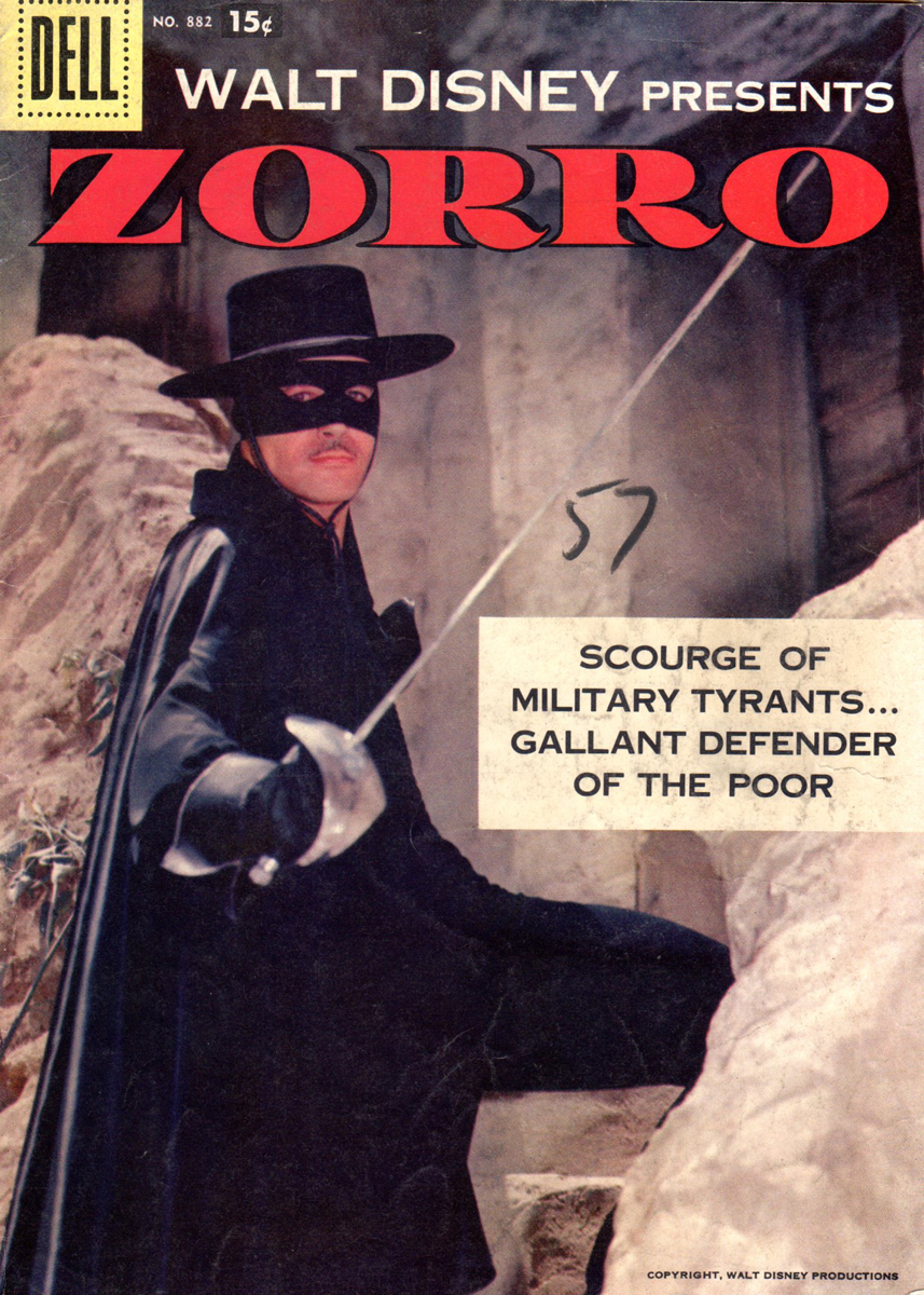
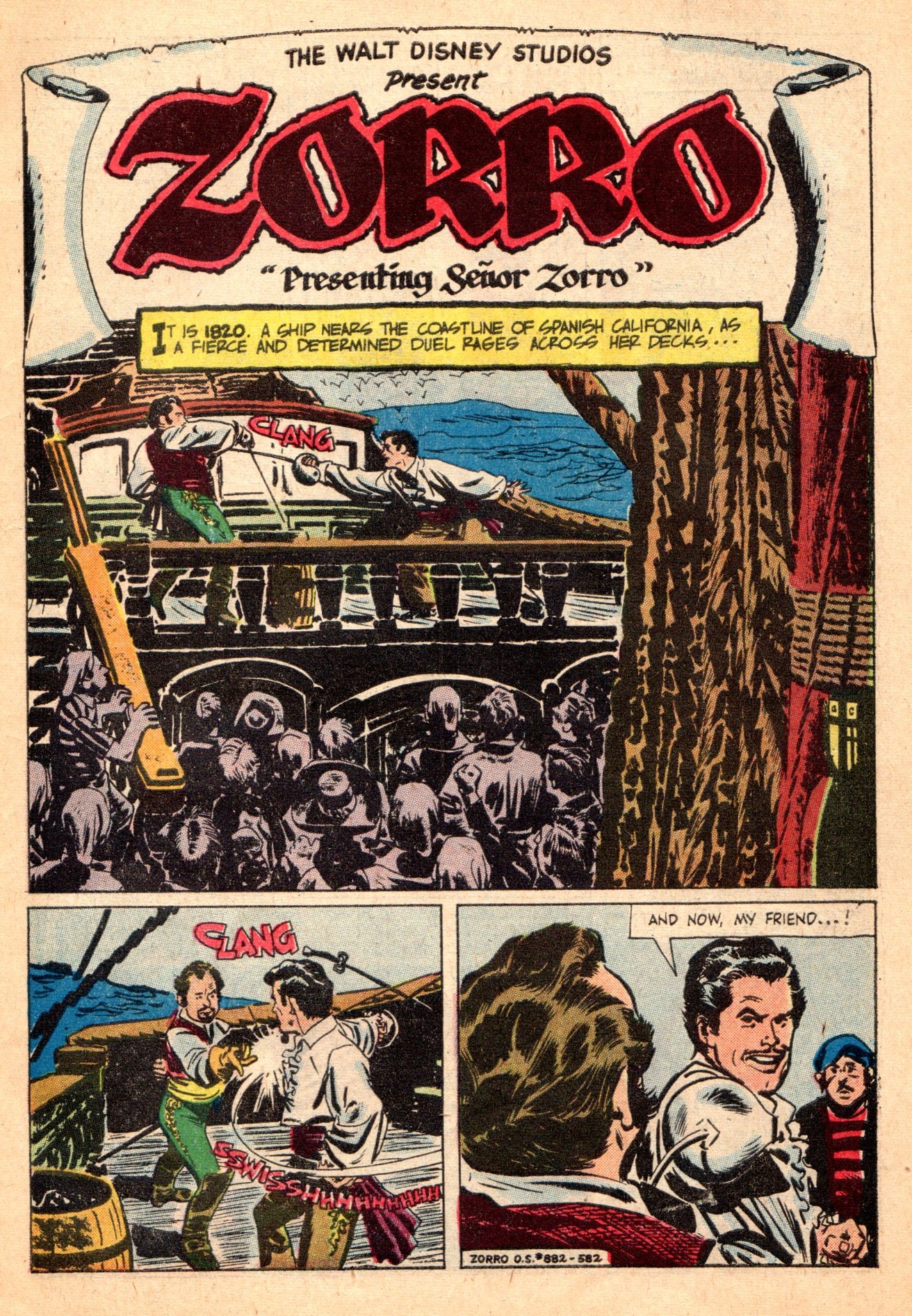
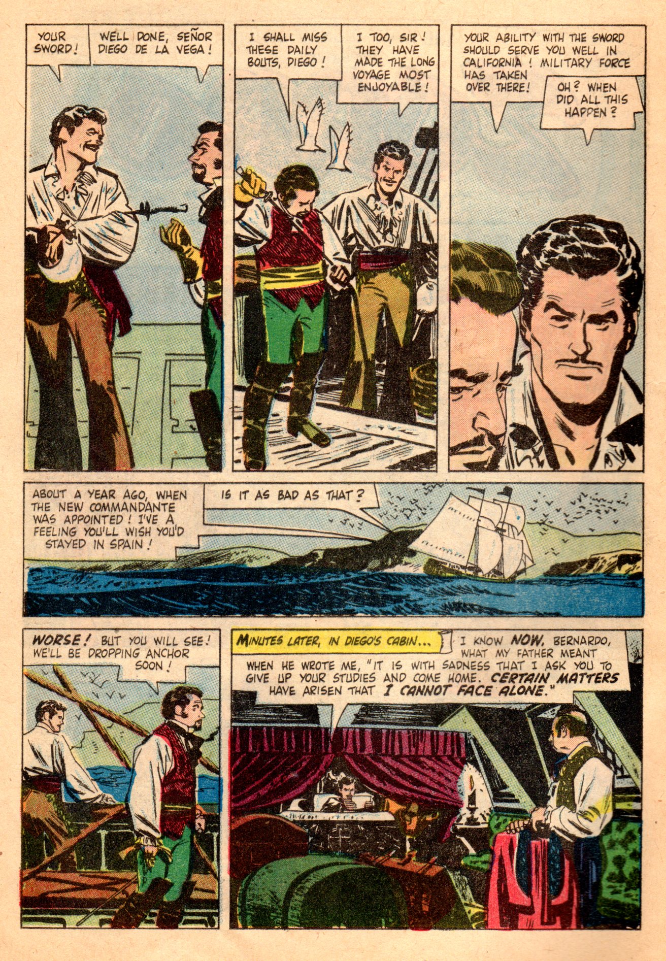
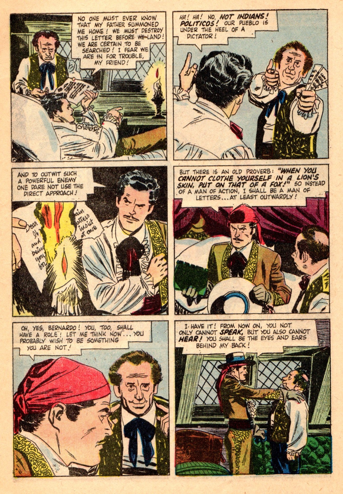
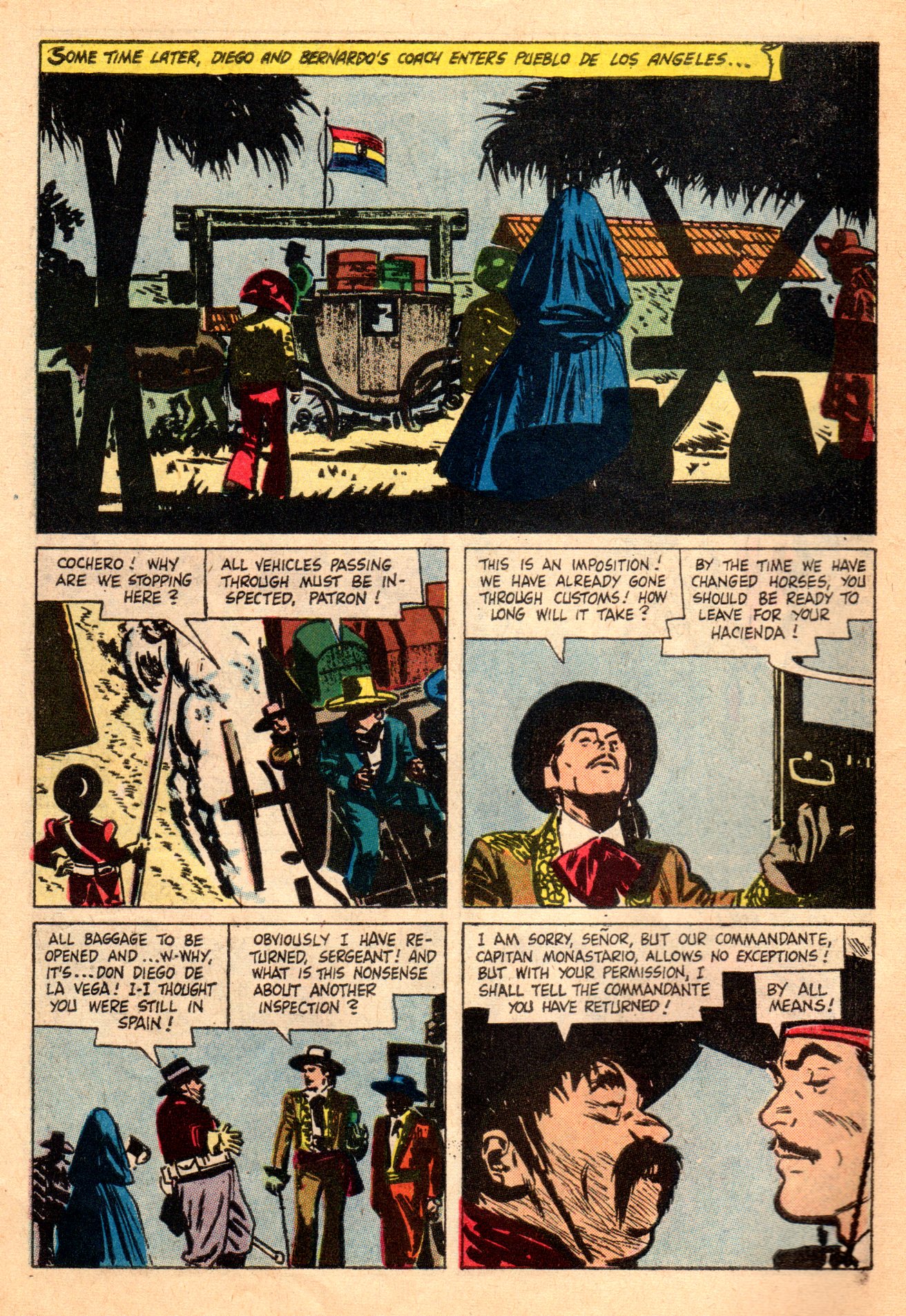
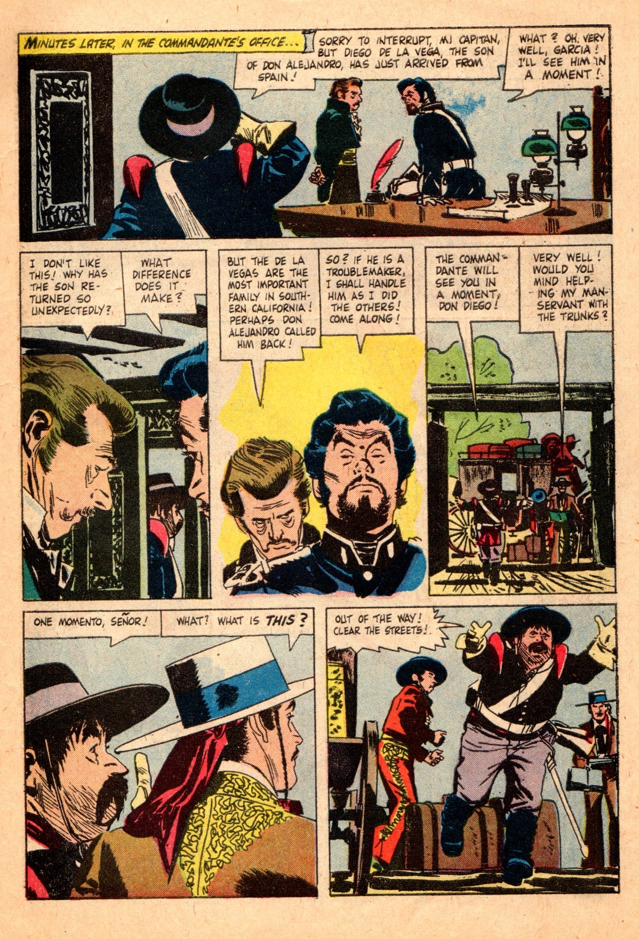
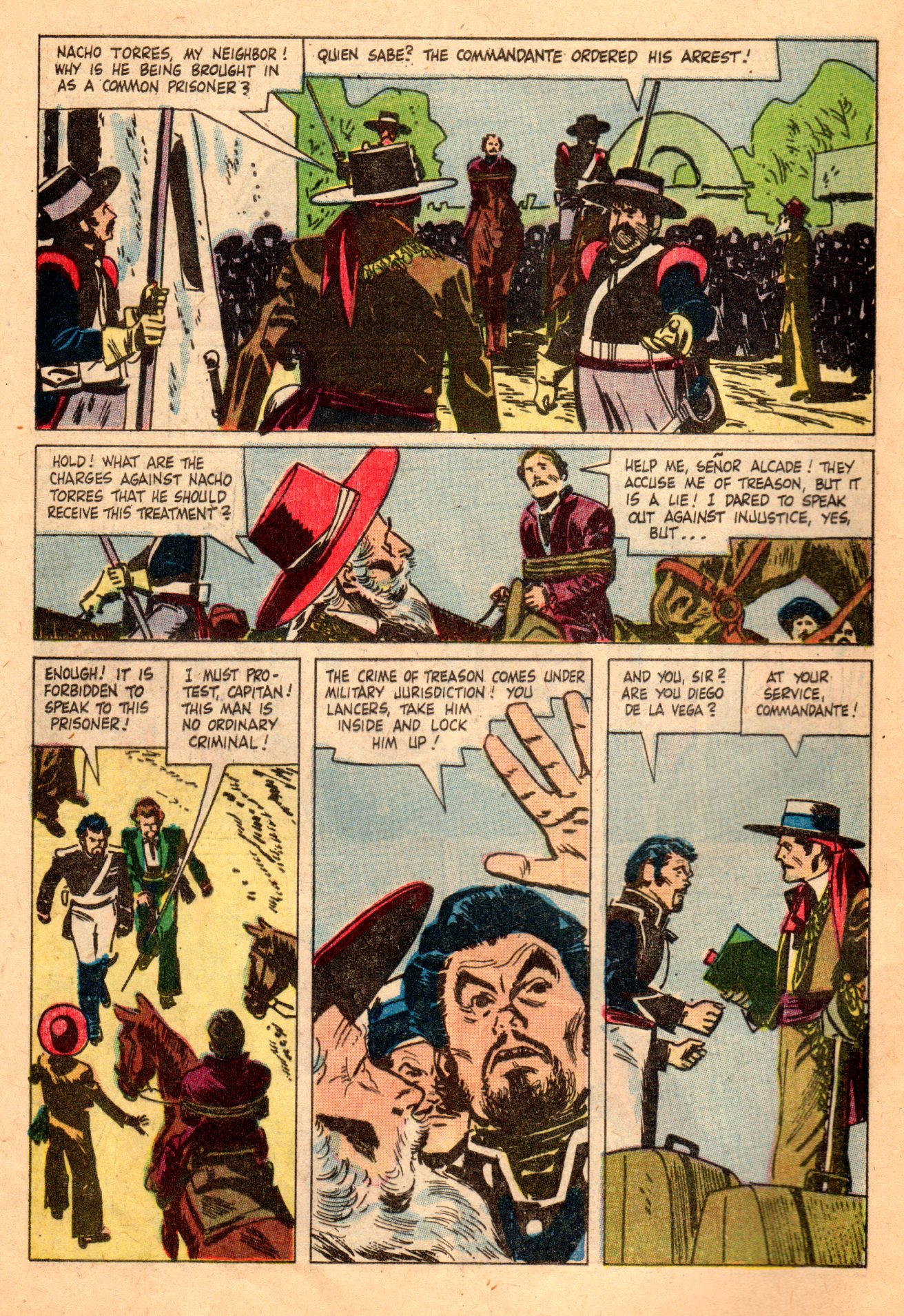
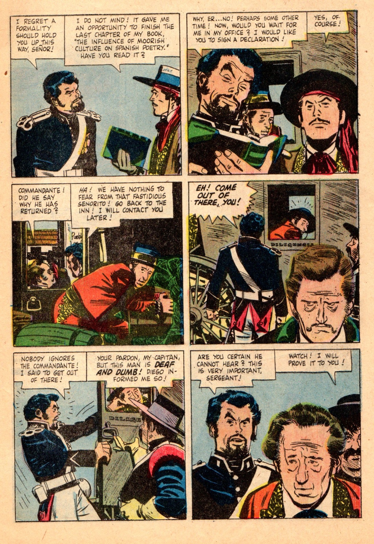
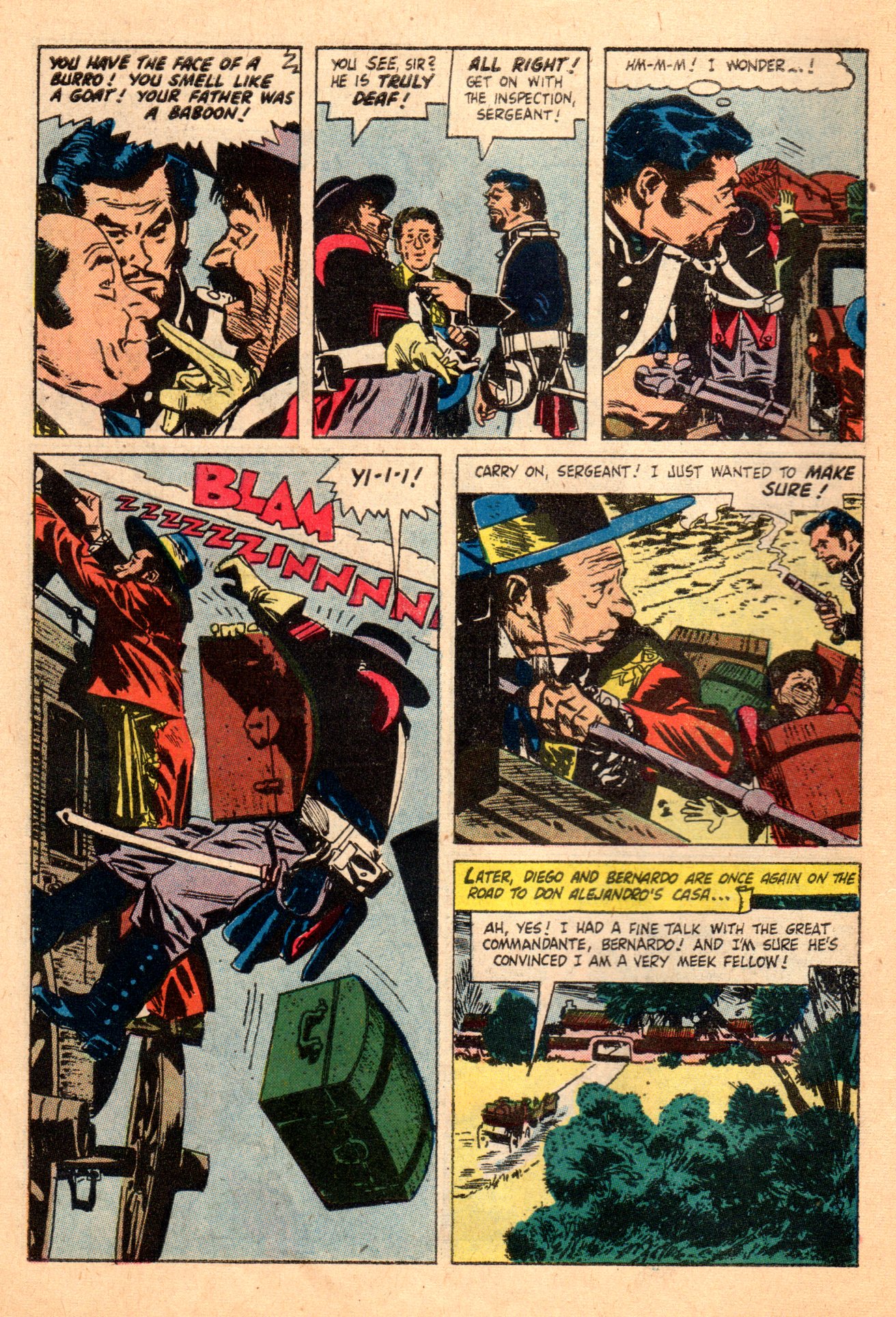
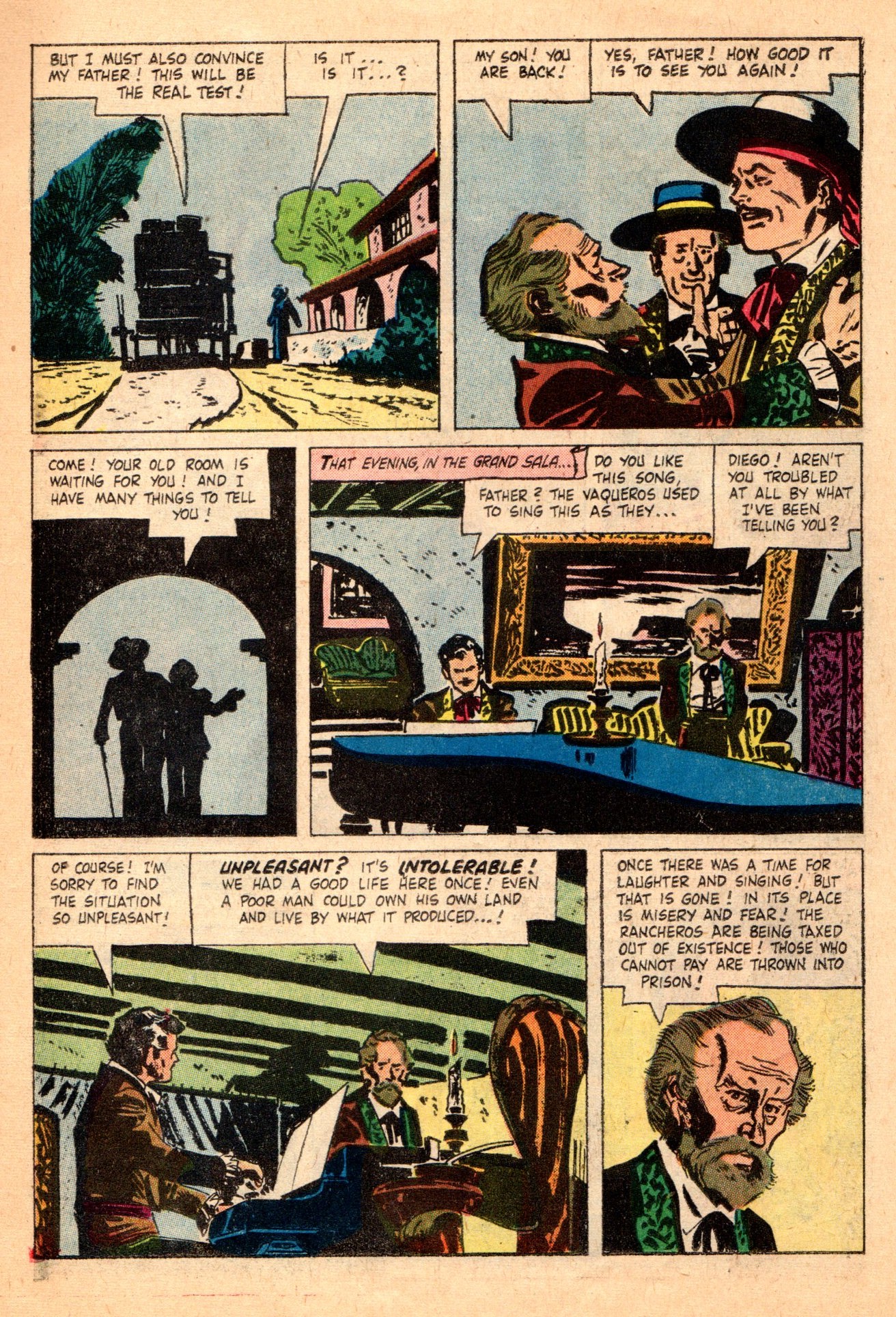
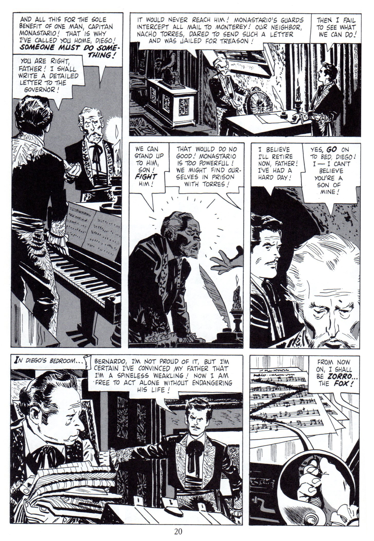
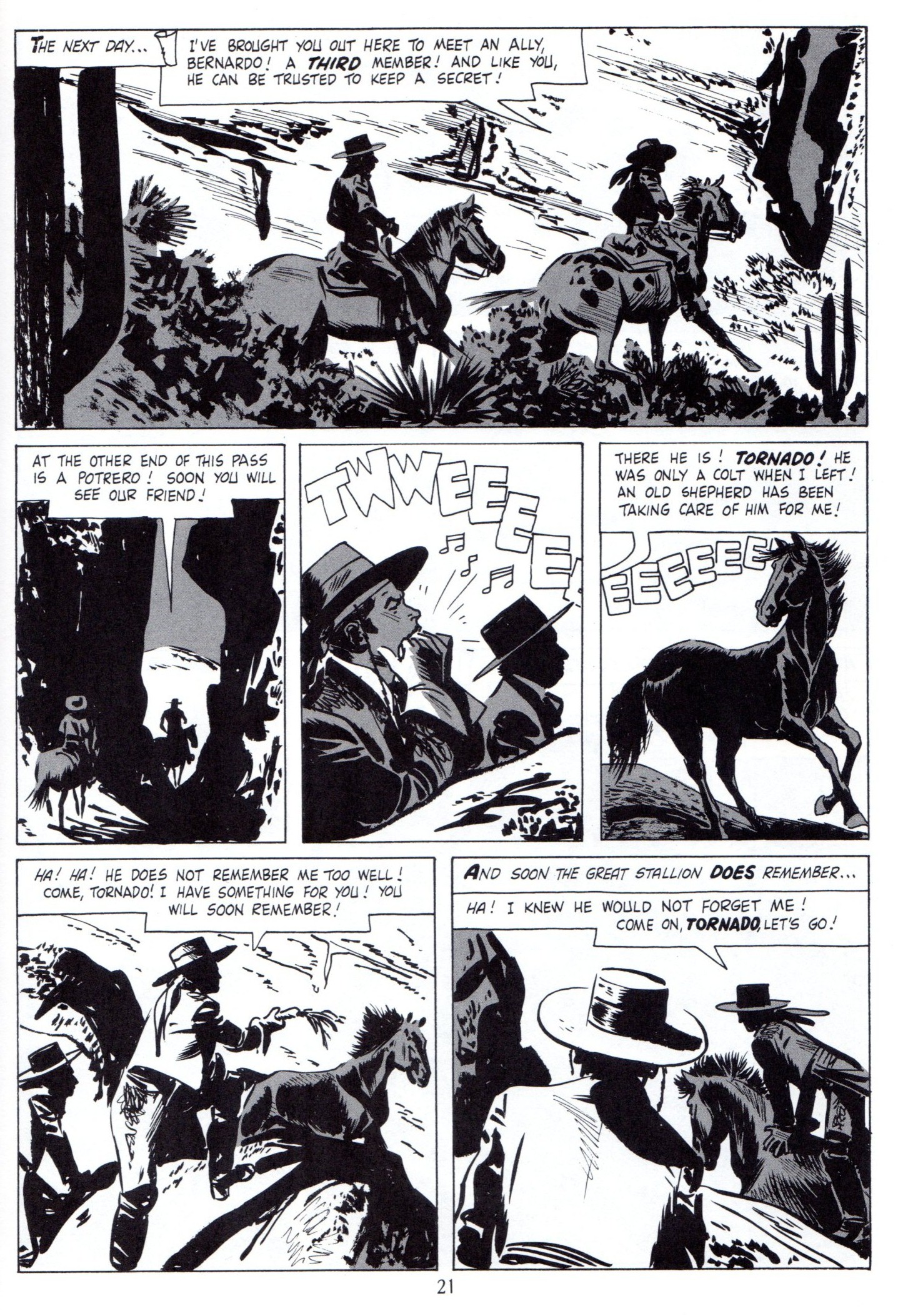
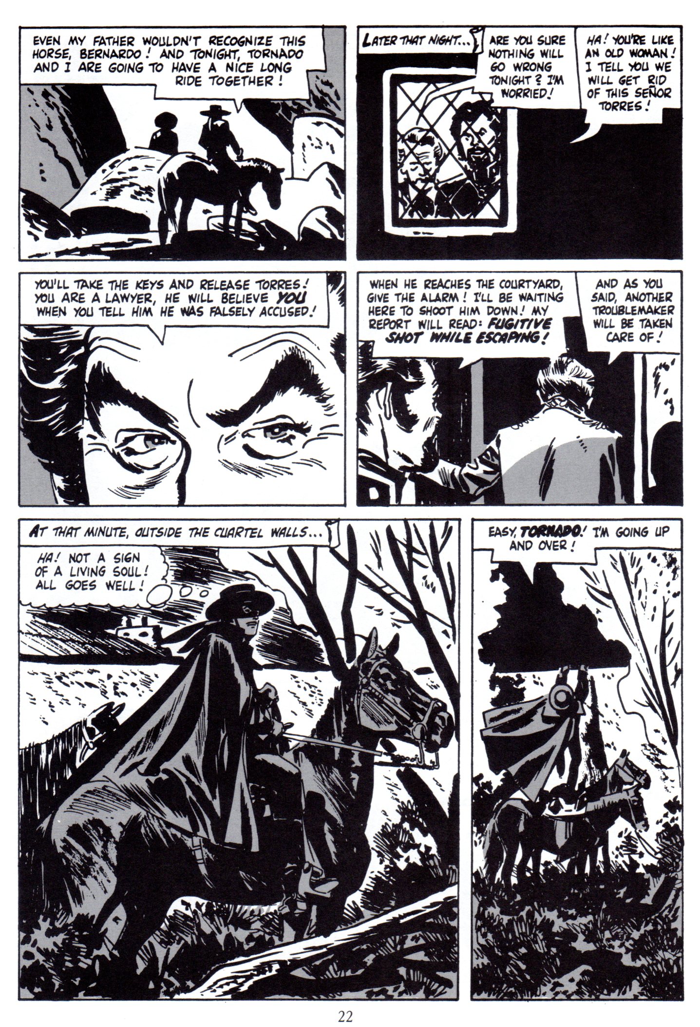
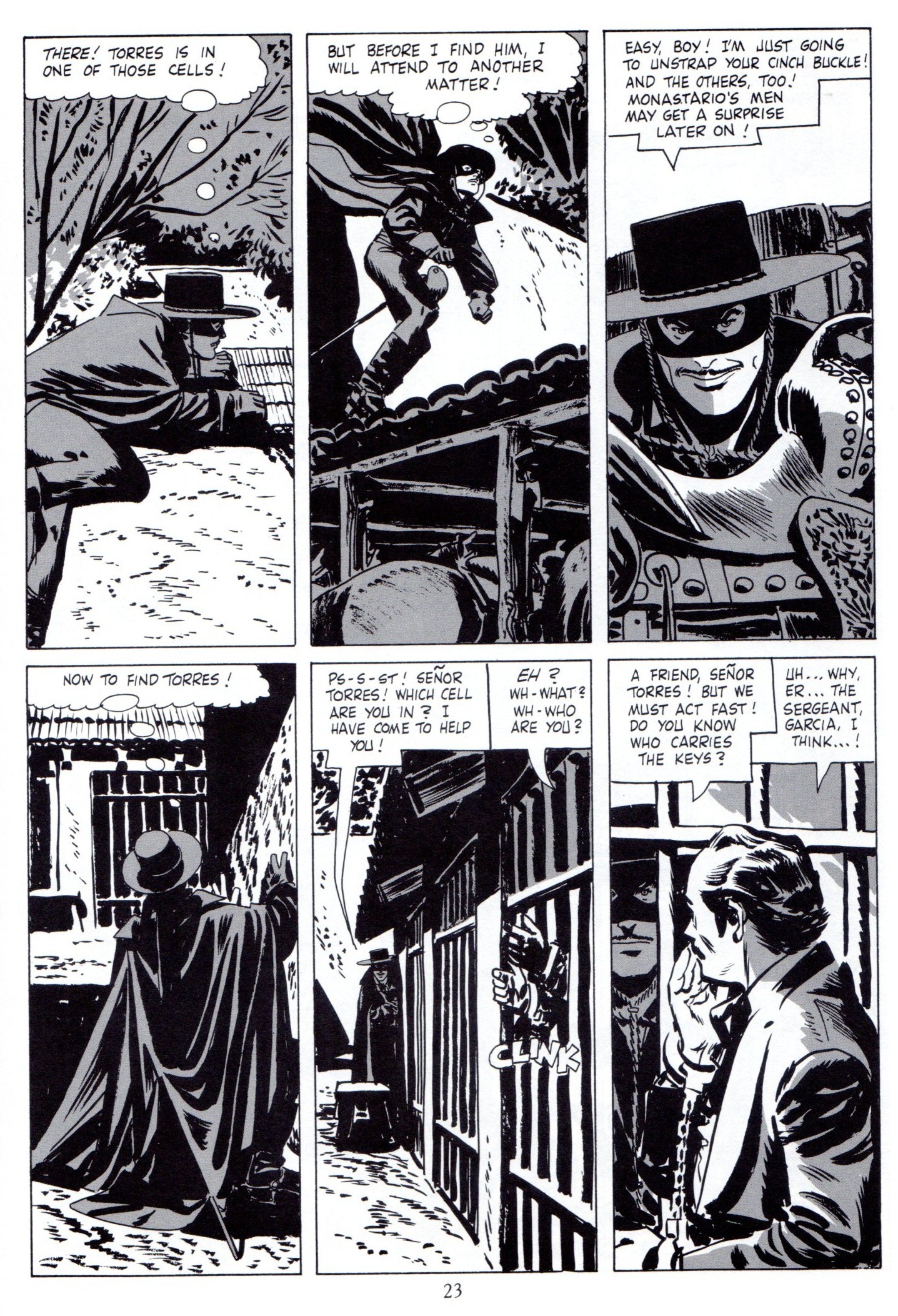
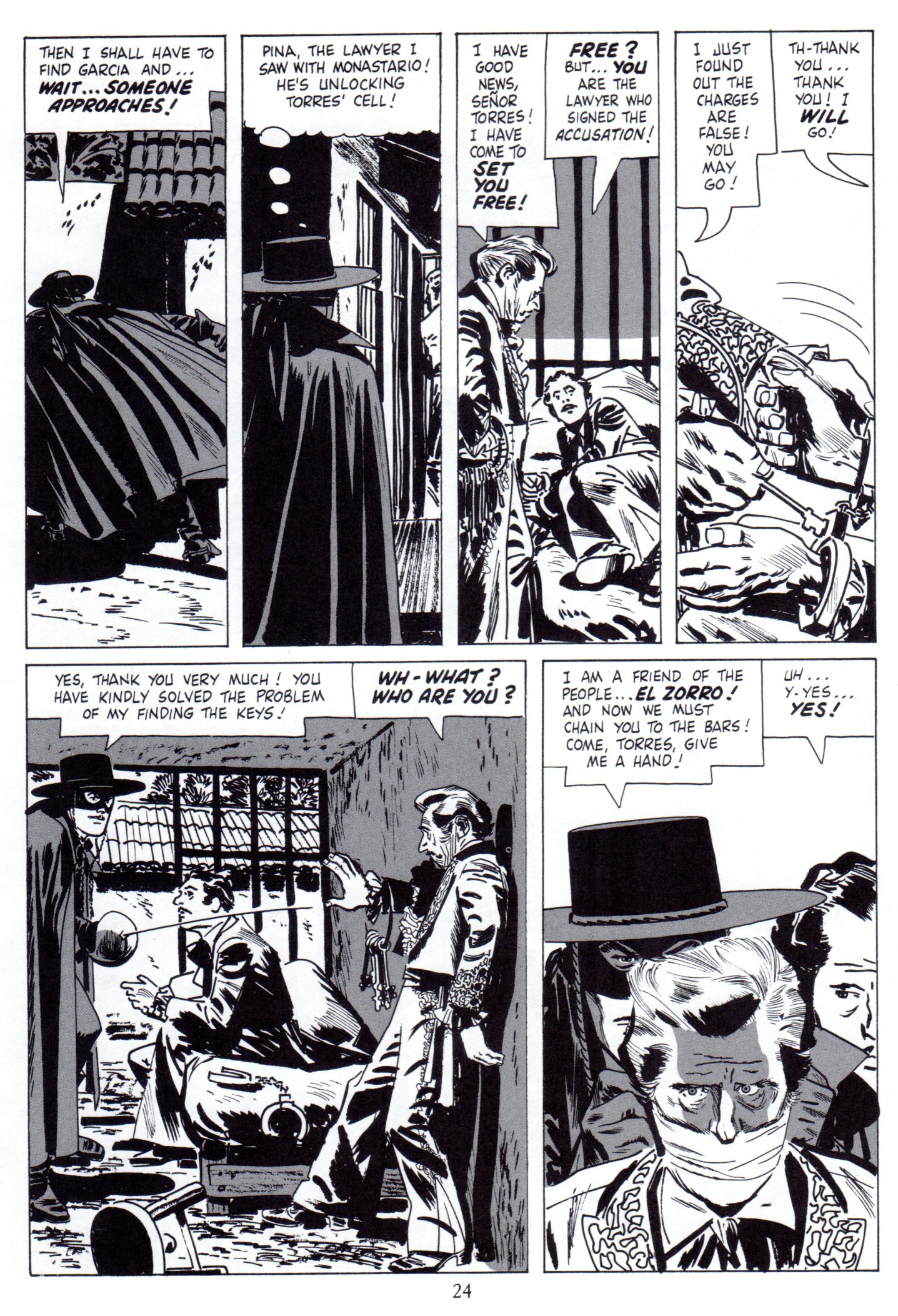
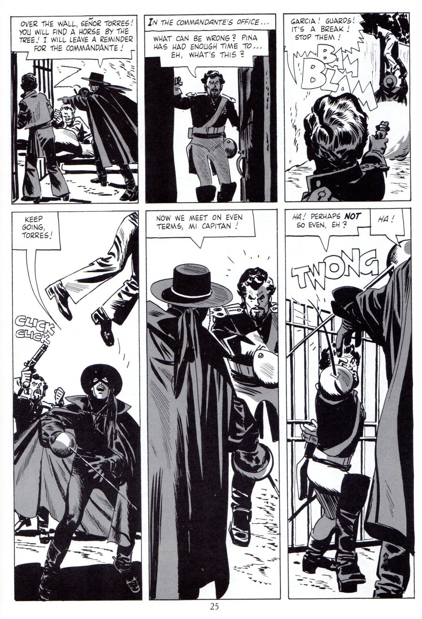
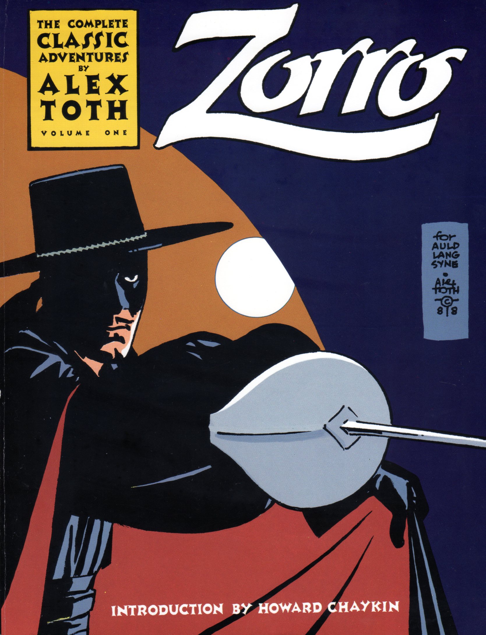
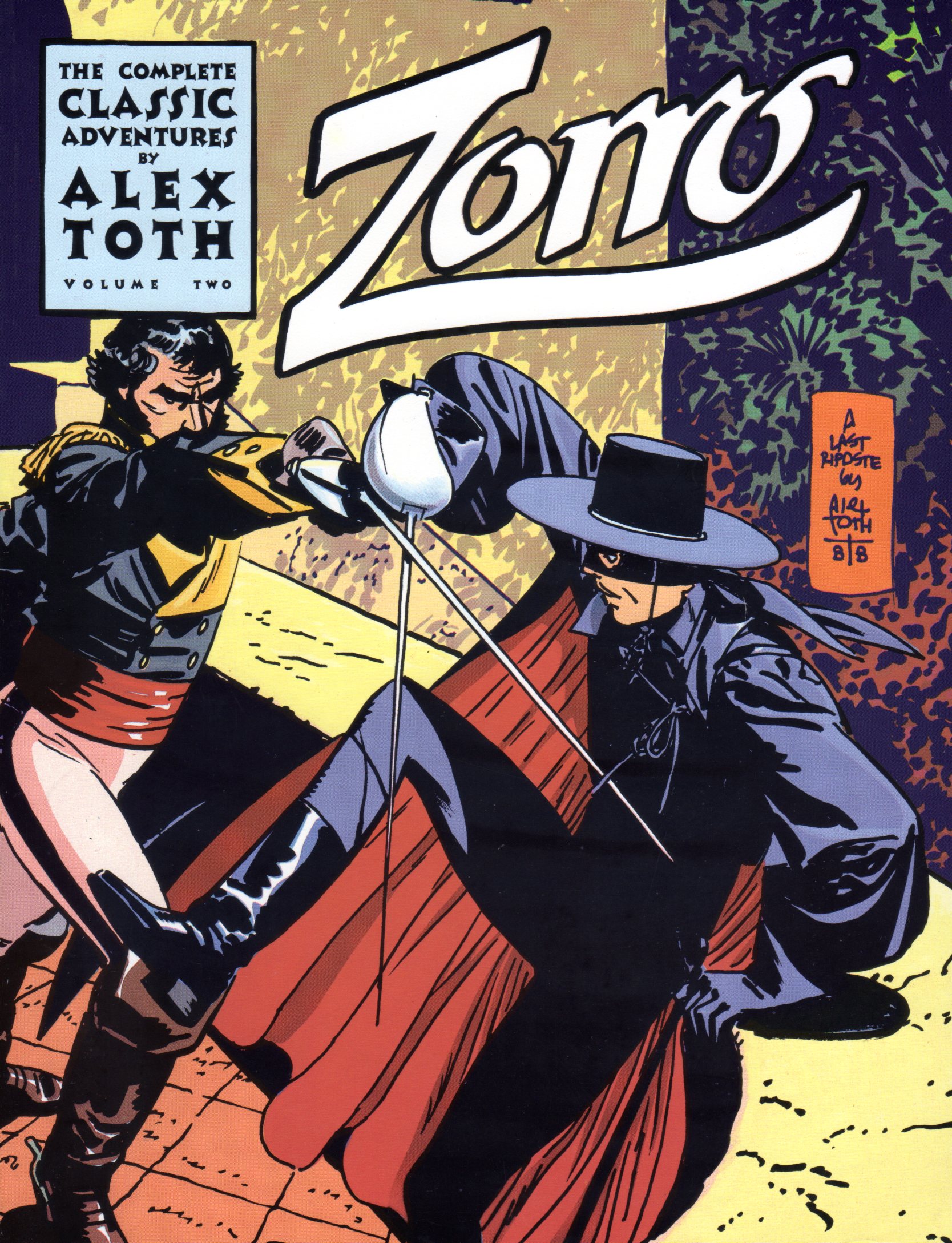
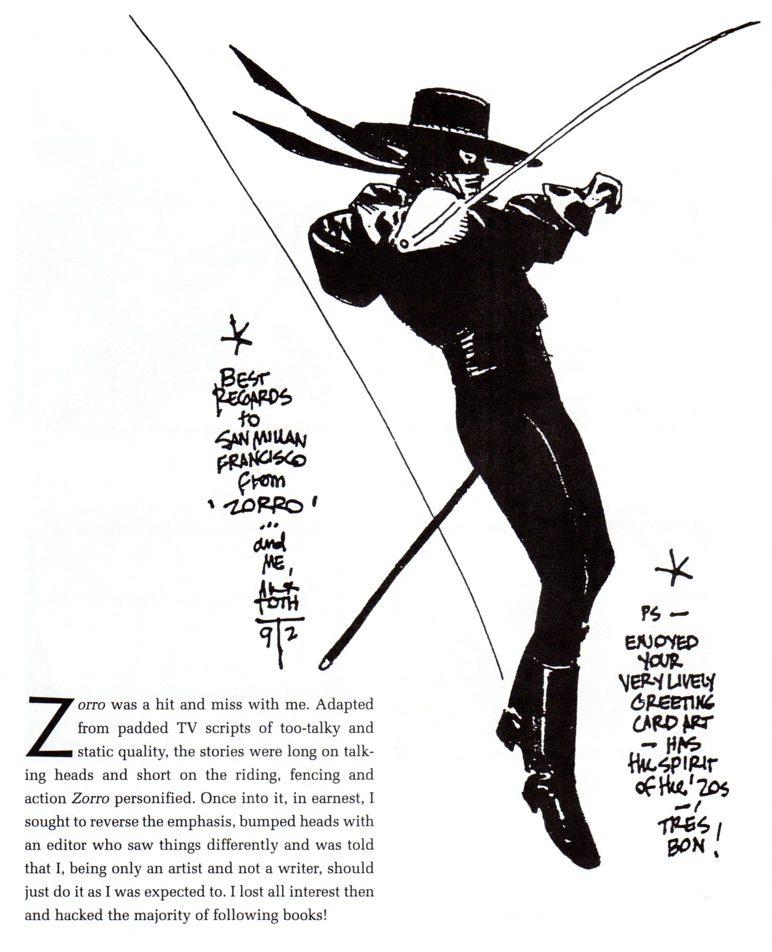
The “Z” that stands for “Zorro”
- When I was a kid in 1957, I was all hopped up on the start of a new series coming to TV. Every kid in America was. Zorro was promoted endlessly on the Disneyland Show and on Mickey Mouse Club. When it finally came time for the show to premiere, I was in trouble. I had caught the Asiatic Flu, troublesome in those days, and was violently sick. I wasn’t allowed to leave my bed. I was so upset at the idea of missing Zorro, that I was probably getting myself sicker. My father carried me out of my bed into the living room to watch the premiere, and I was ecstatic. The show was great (but probably not as great as the one that had built n my mind), and all was right with the world.
Naturally, I owned the comic book when that came out. Now here comes that very same comic via email. Bill Peckmann sent me scans and added a lot of additional material as well. I hope you enjoy it. Here’s Bill:
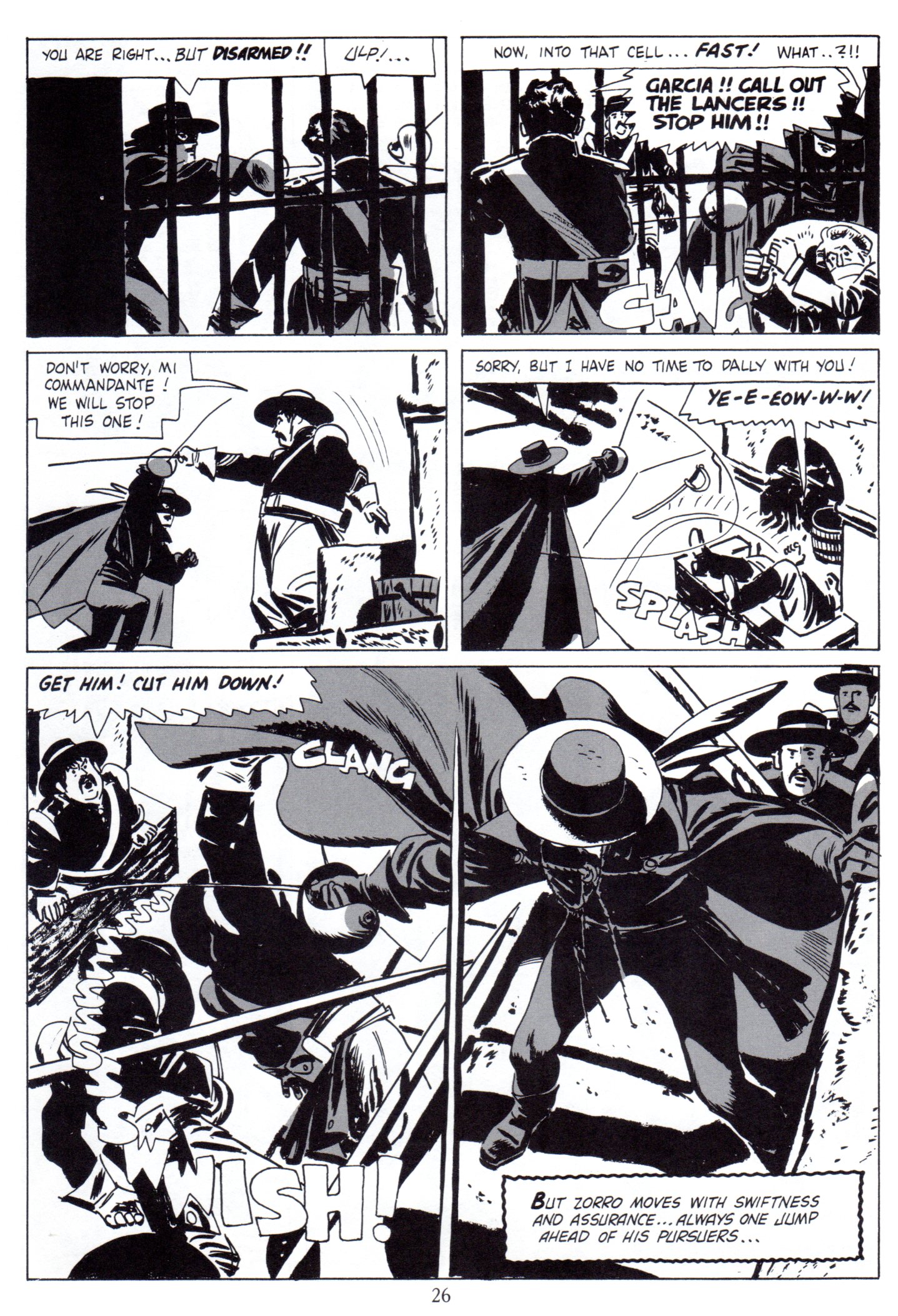
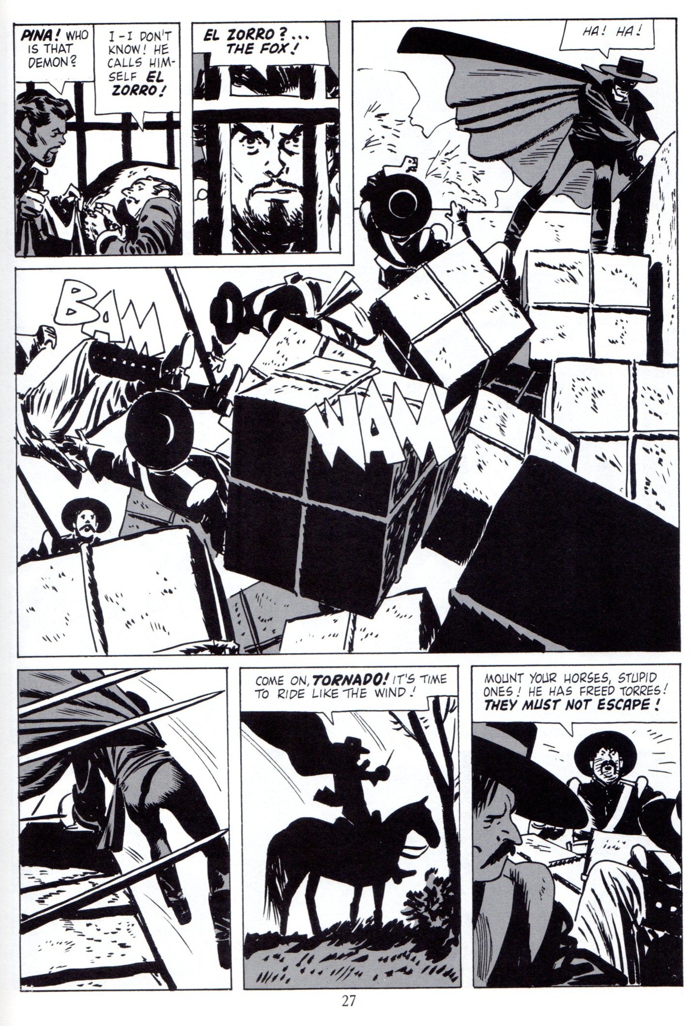
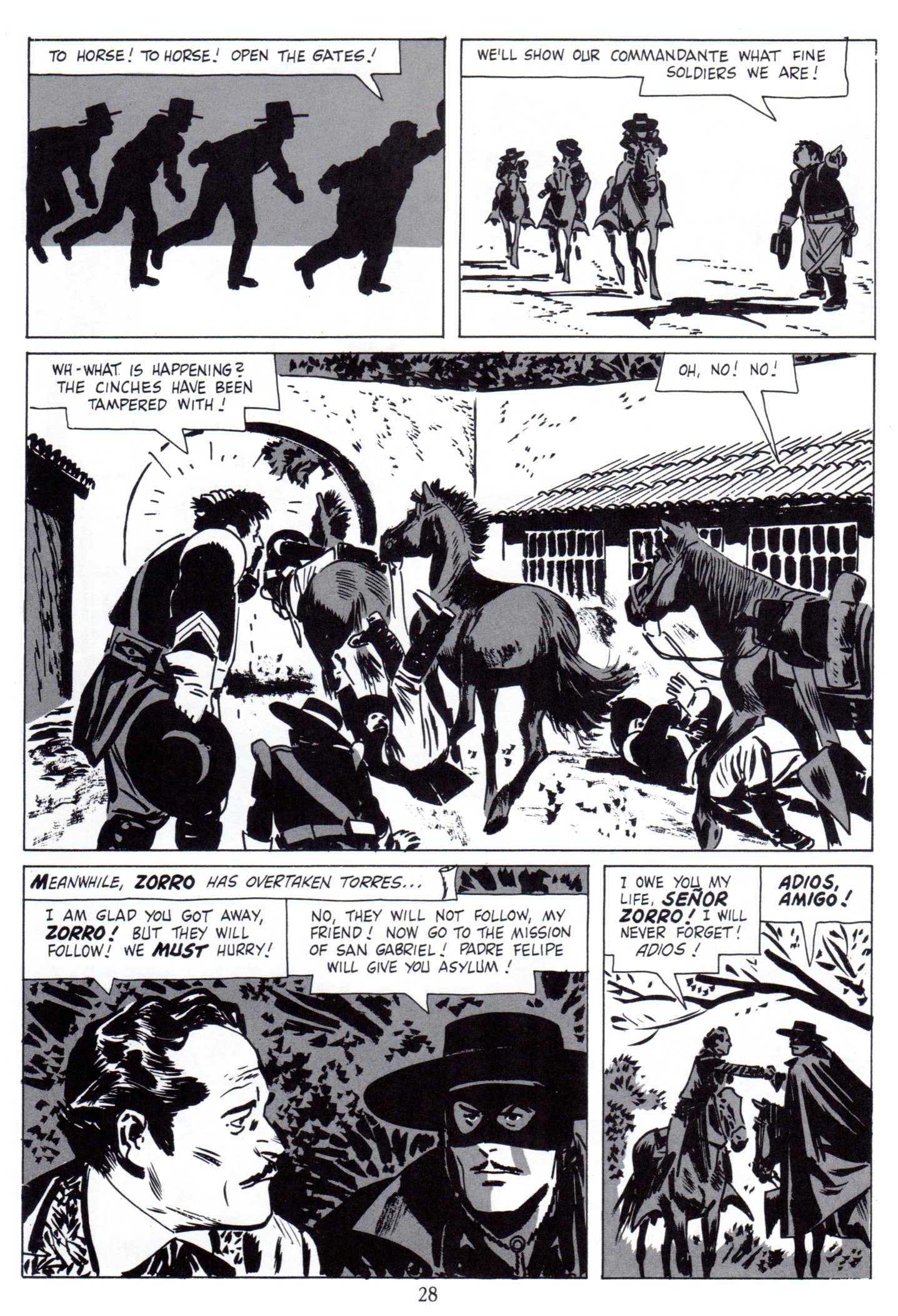
- What happens when you take a cartoonist who excels in designing and staging in black ink and give him the assignment of illustrating a western capped crusader dressed in black, you get the classic comic book series “Walt Disney Presents Zorro”, that’s what!
We lucky fans of Alex Toth always felt it was a match made in heaven, but Alex had a slightly different take on it, which you will read further into the post.
Here is a small scrapbook of “Zorro” art that spans over 40 years.
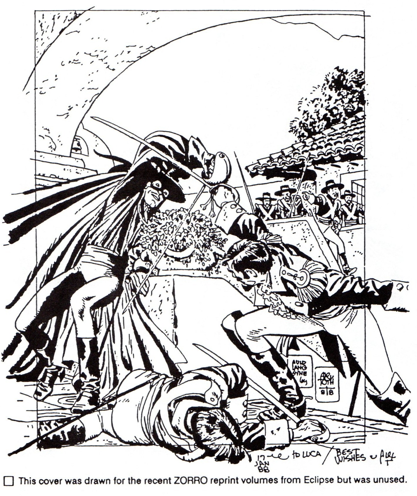
We start with the first Zorro (origin) story from Dell printed in 1957. The first half of the story is the original color comic book, the second half of the story is a black and white reprint version taken from Eclipse Books’ “The Complete Collection of Zorro” printed in 1988. Editor Dean Mullaney was able to get Alex to add new gray toning to the pages and do two new beautiful covers!
Magazine cover
 2
2
 3
3
 4
4
 5
5
 6
6
 7
7
 8
8
 9
9
 10
10
 11
11
 12
12
 13
13
 14
14
 15
15
 16
16
 17
17
 18
18
 19
19
 20
20
The two new covers done in 1988, Alex at the top of his game.
 21
21
This illustration is from Manuel Auad’s “Alex Toth” book.
 22
22
This is taken from Manuel Auad’s “Alex Toth” book.
 23
23
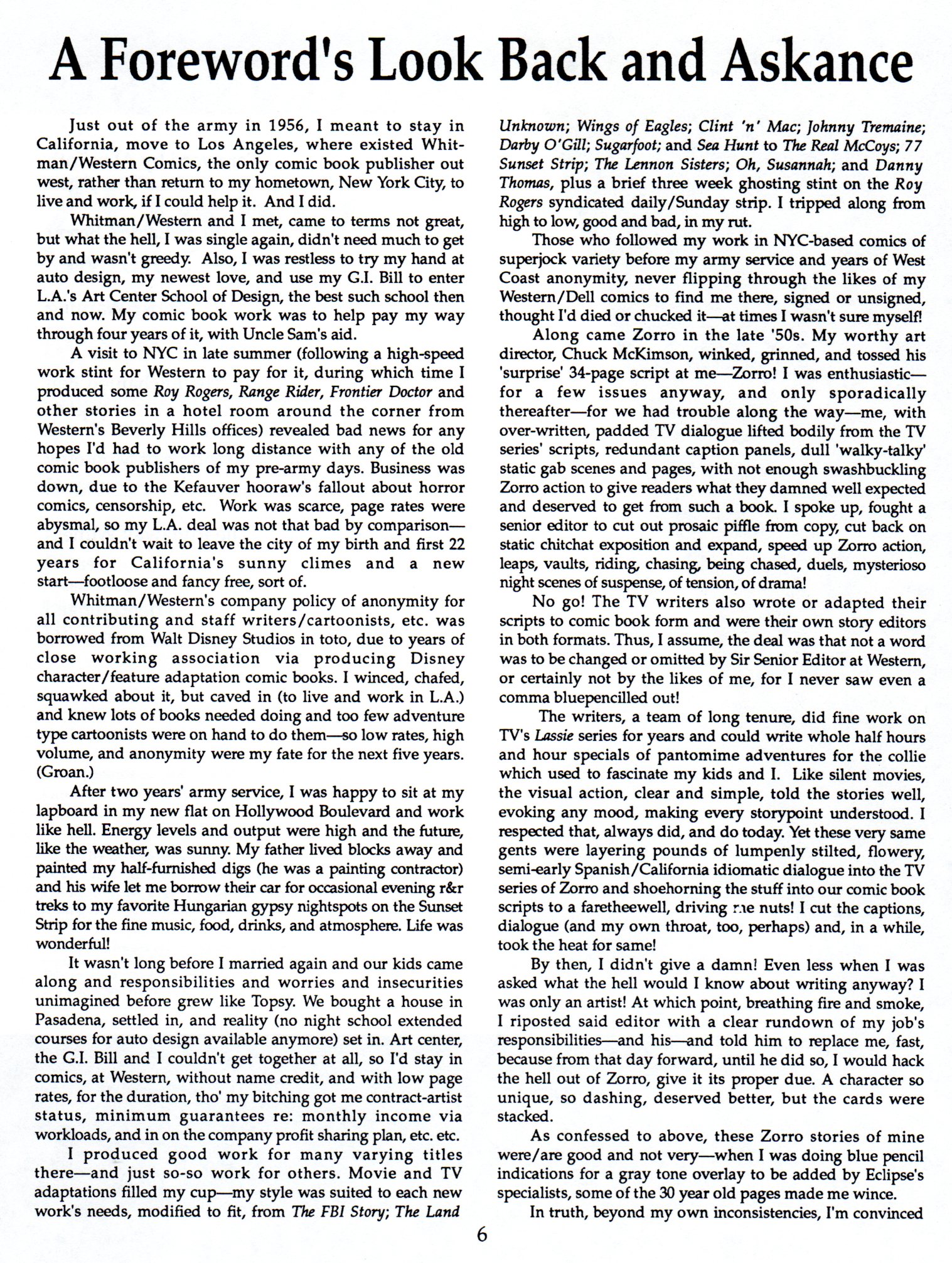
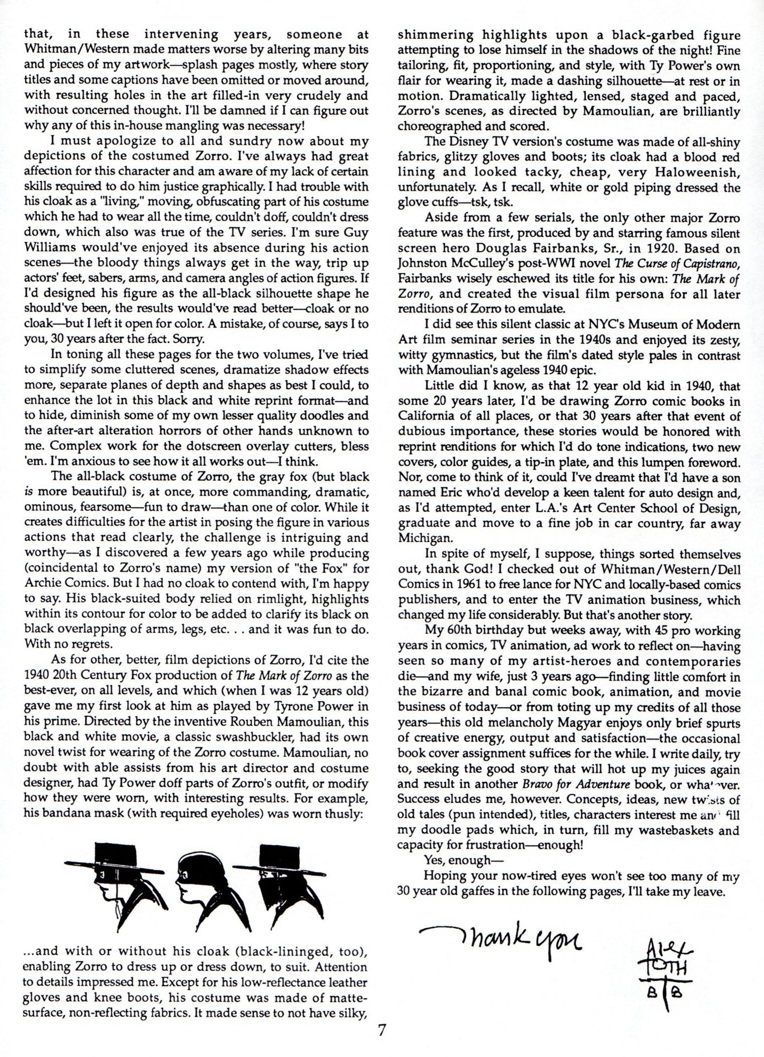
Alex’s thoughts on “Zorro” taken from Dean Mullaney’s Eclipse book.
 24
24
 25
25
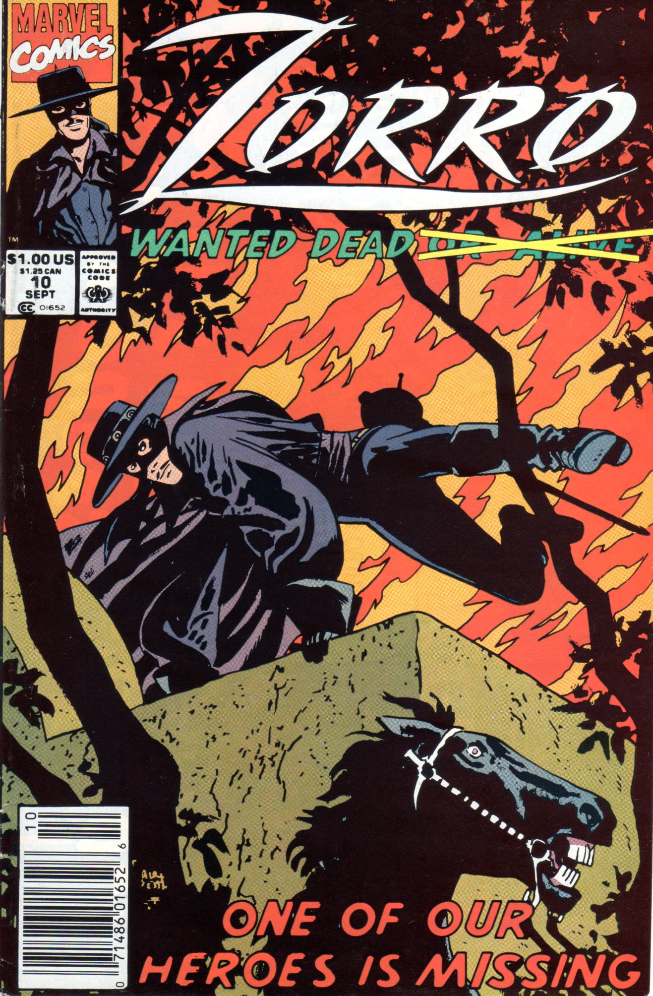
Marvel Comics brought Zorro out of retirement in 1991
and Alex did three covers for that venture.
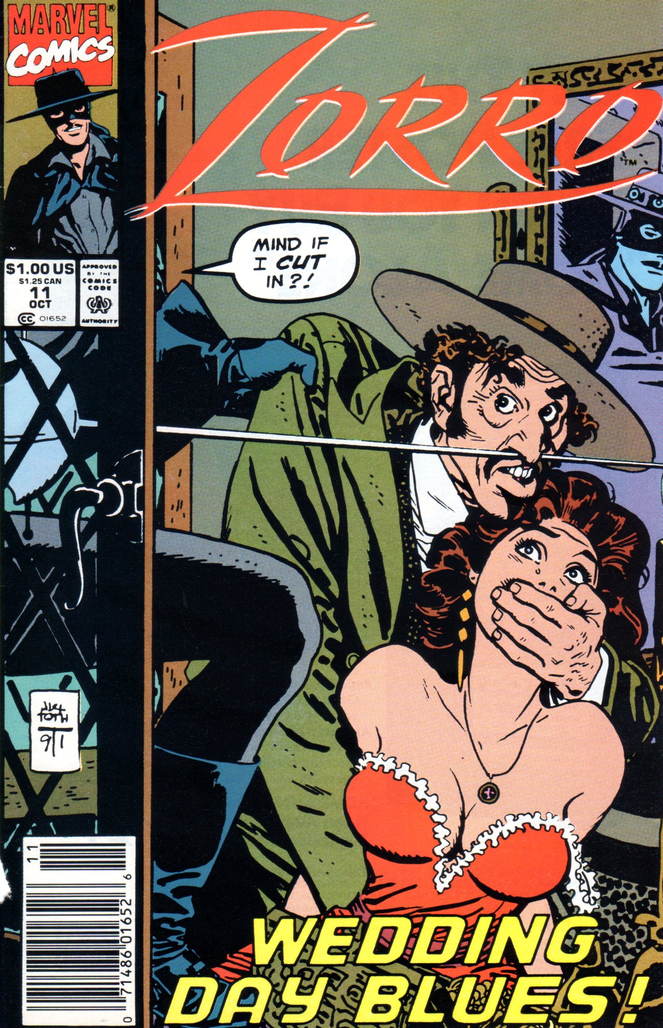 26
26
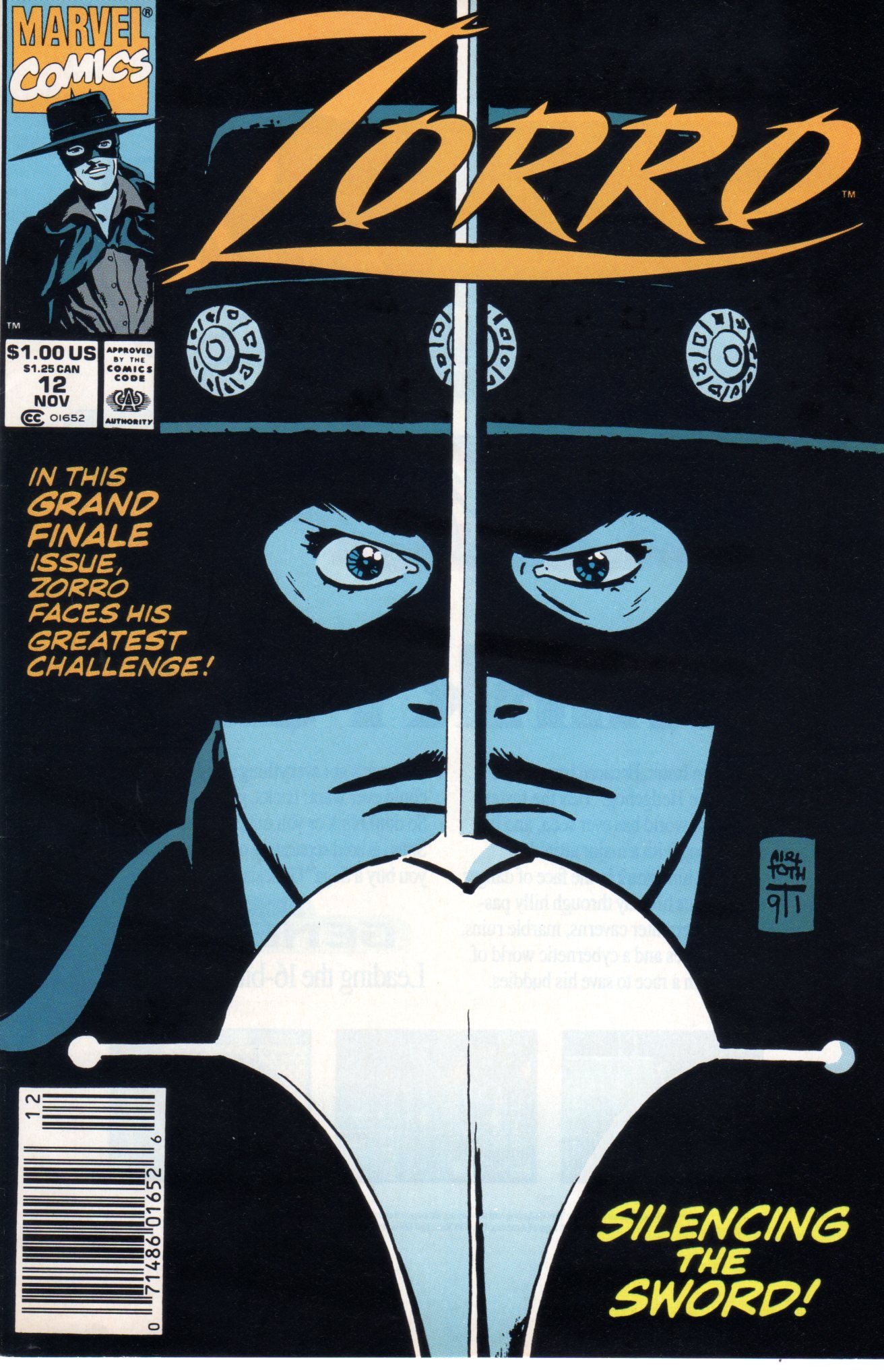 27
27
 28
28
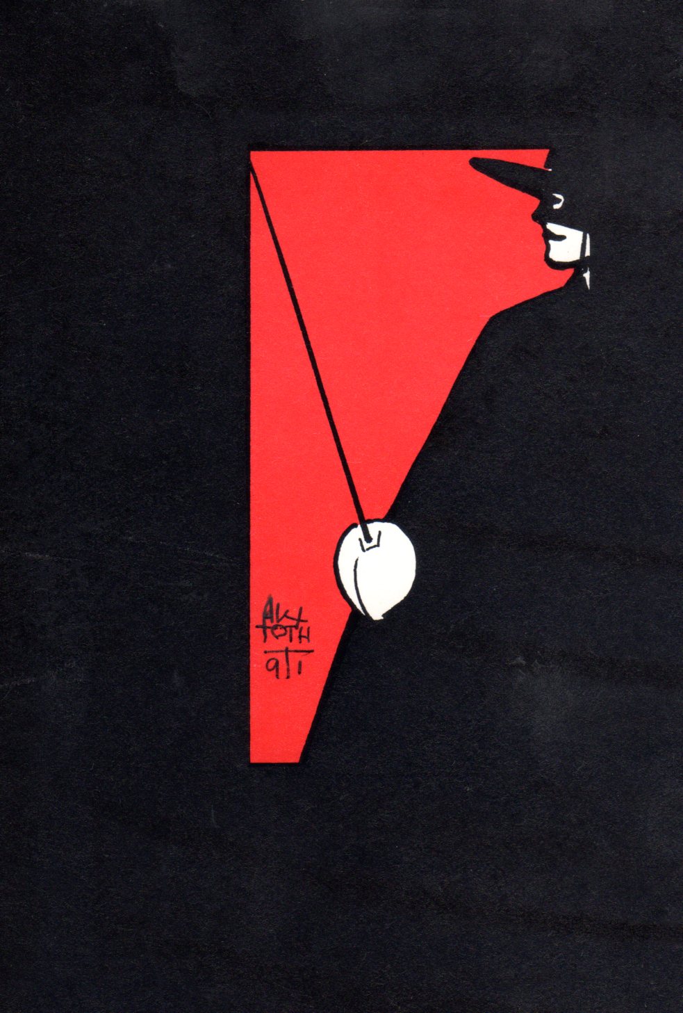
There was always need for a Zorro sketch here and there
and Alex always obliged!
 29
29
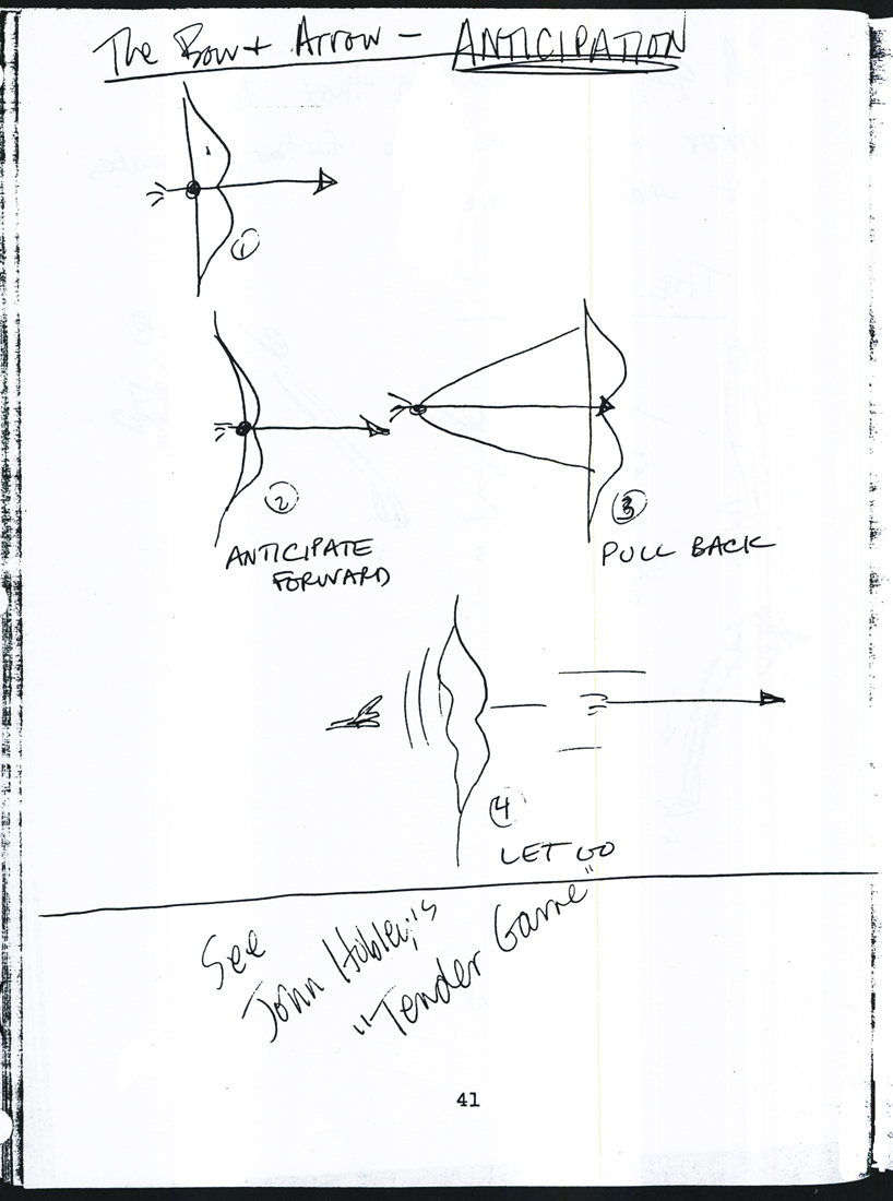
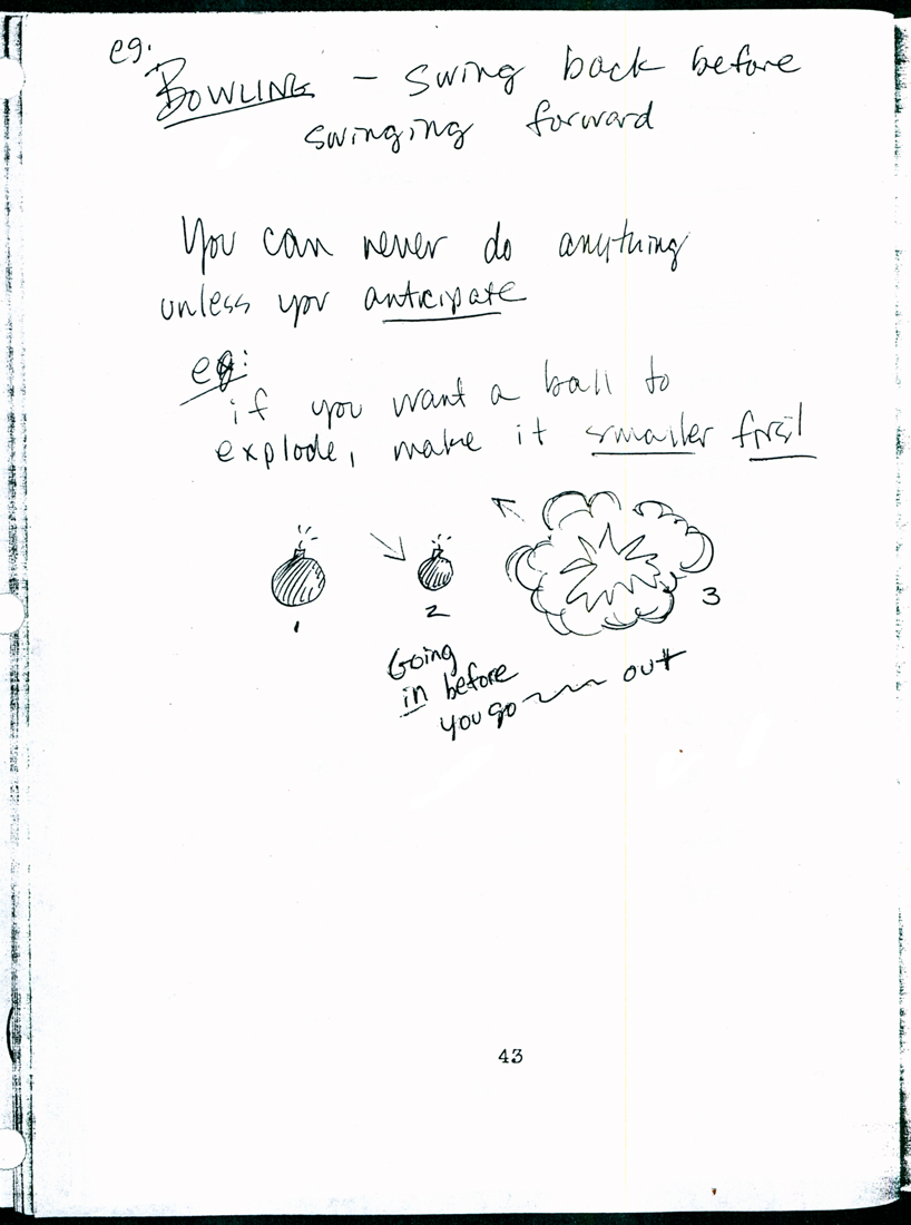
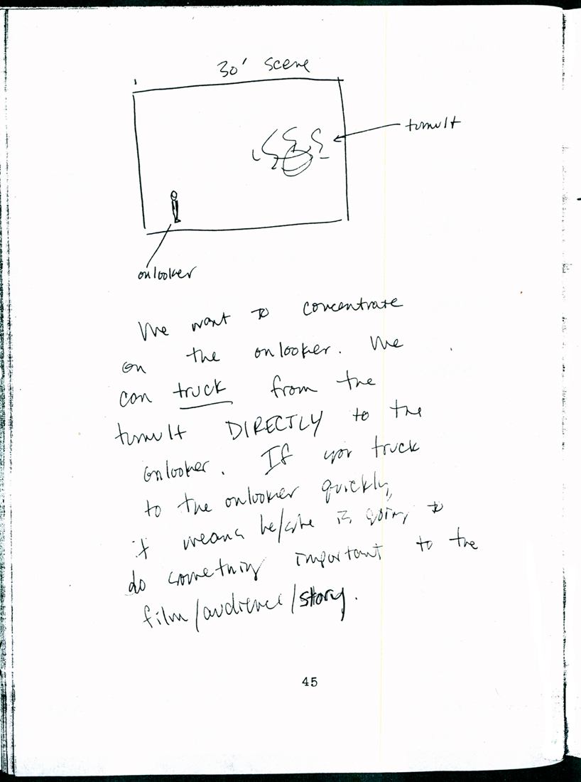
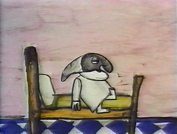
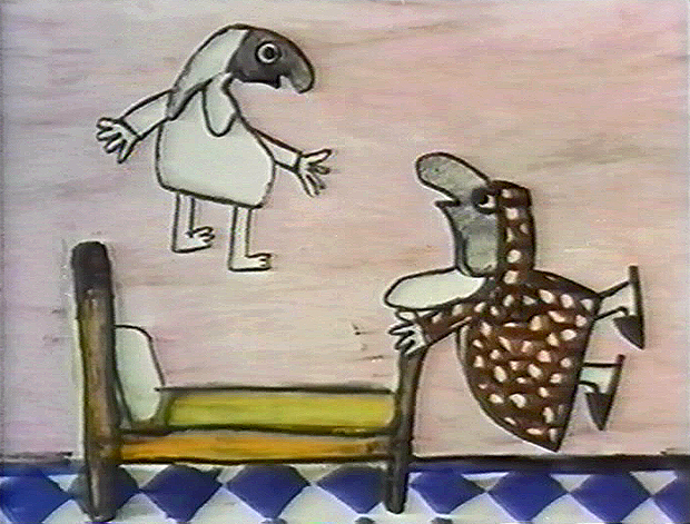
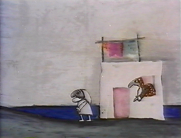
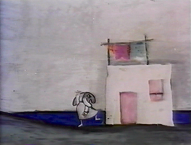
Action Analysis &Tissa David 04 Oct 2012 05:38 am
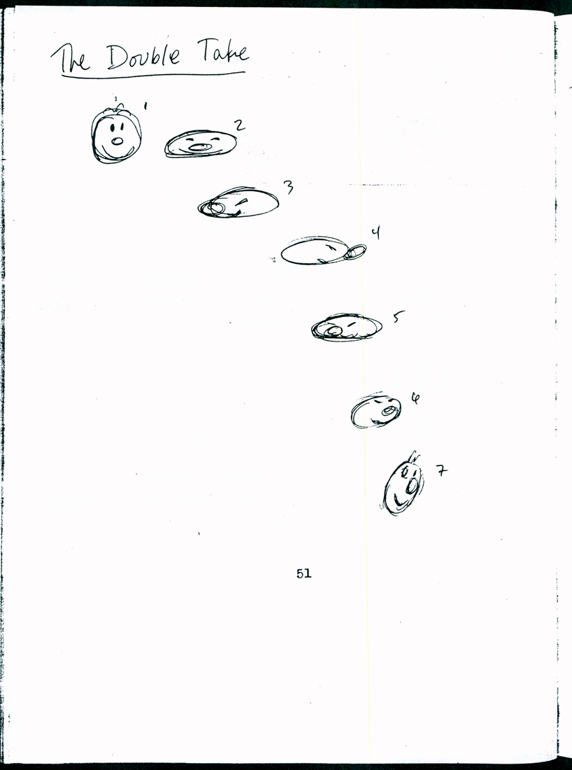
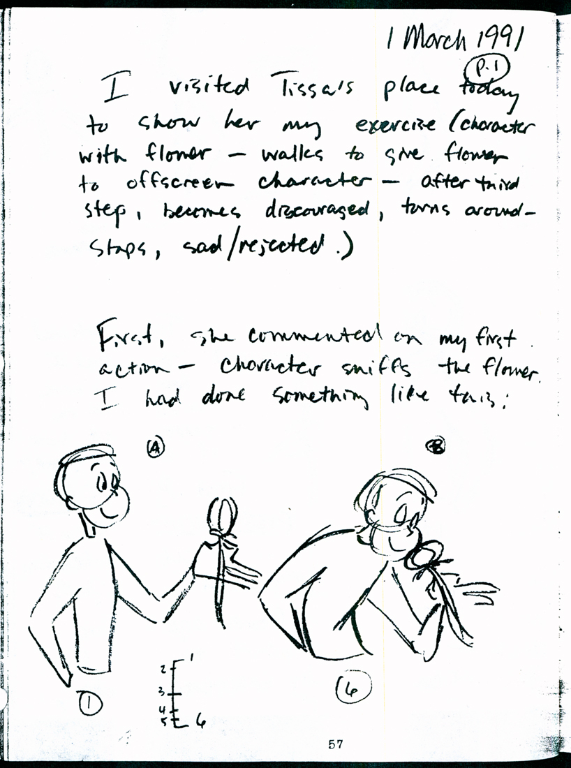
Tissa’s Class – part 2
- Last week I started posting parts of Eugene Salandra‘s notebook which he did while taking an animation class conducted by Tissa David at the Ink Tank. (Part 1) There was enough of a request for more that I can’t help but to post away. The material was so clear and evident and enormously helpful.
I pick the book up exactly where we left off. It’s wonderful for me to go through this even as a refresher course, trying to kick some of those bad habits. (What I take from this week’s lessons is that when you’ve gone as extreme as you can, go a step more. But don’t make it cartoony – unless that’s the effect you’re trying for.)There’s plenty of advice in there.
Animate away folks.
1 2I repeat these first two pages.
(Click any image to enlarge.)
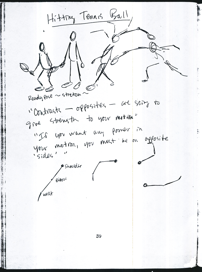 39
39 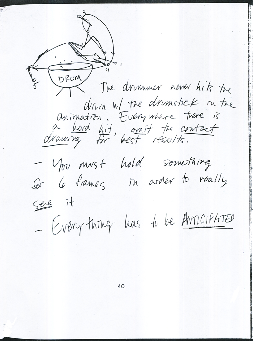 40
40
 41
41 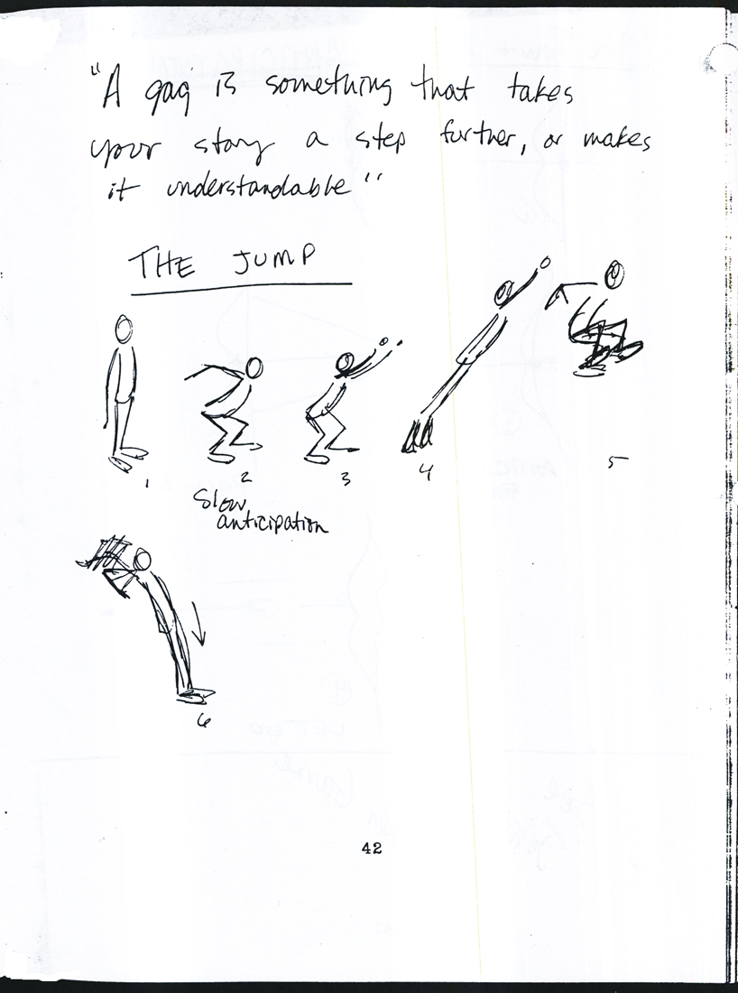 42
42
 43
43 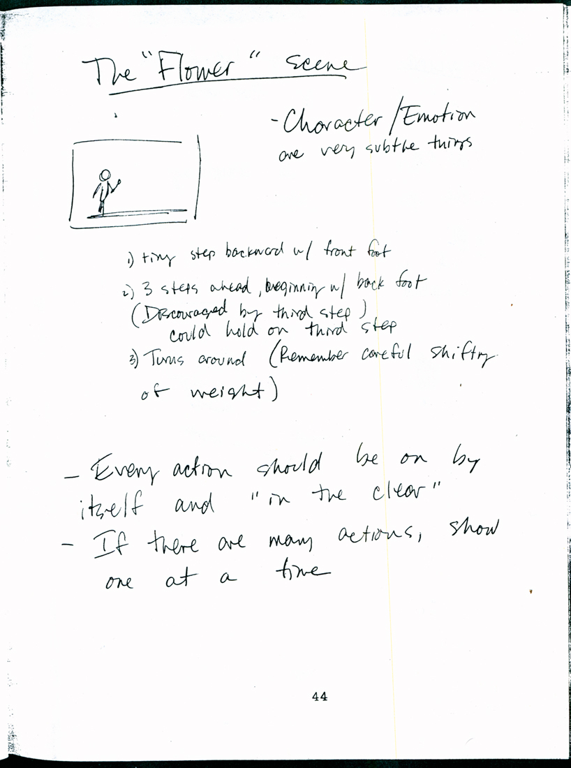 44
44
 45
45 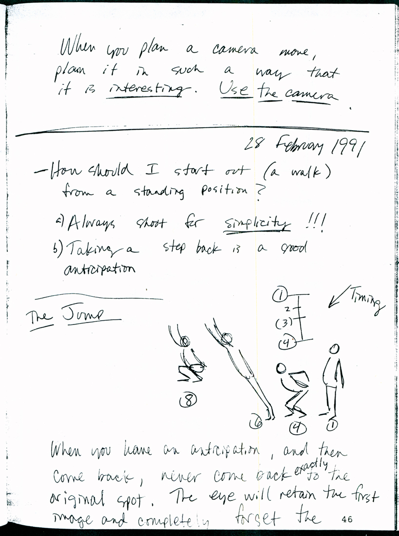 46
46
 47
47 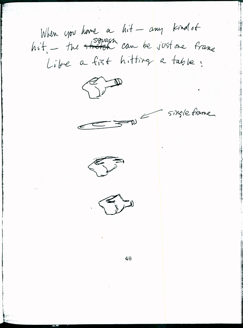 48
48
 49
49 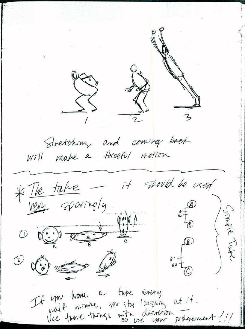 50
50
 51
51 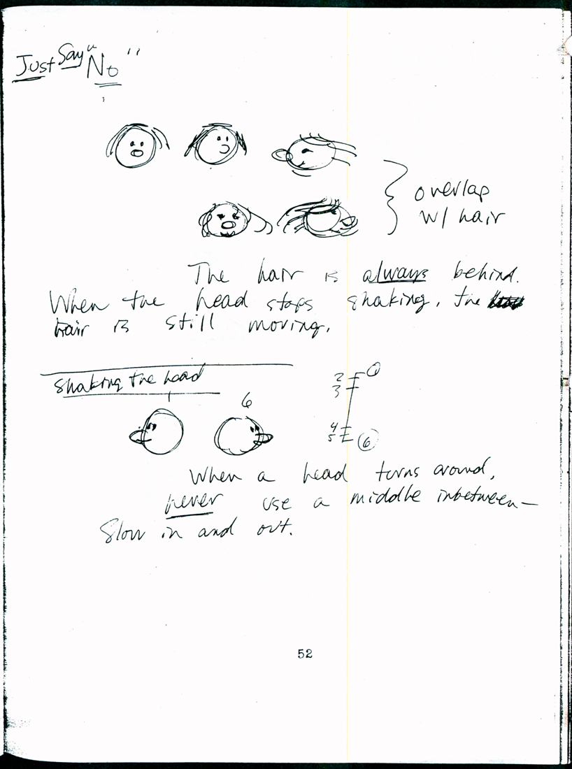 52
52
 53
53 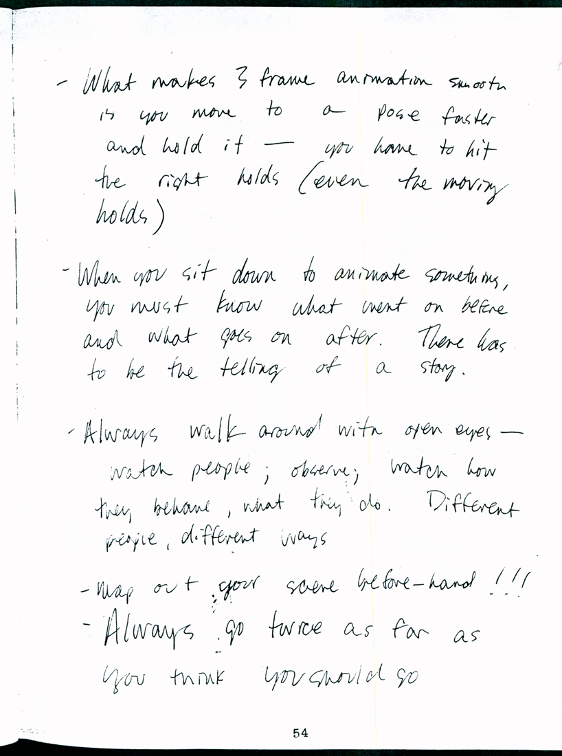 54
54
 55
55 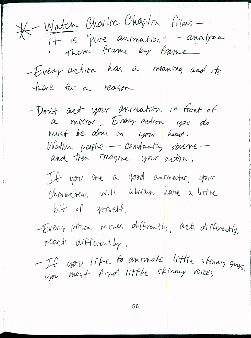 56
56
 57
57 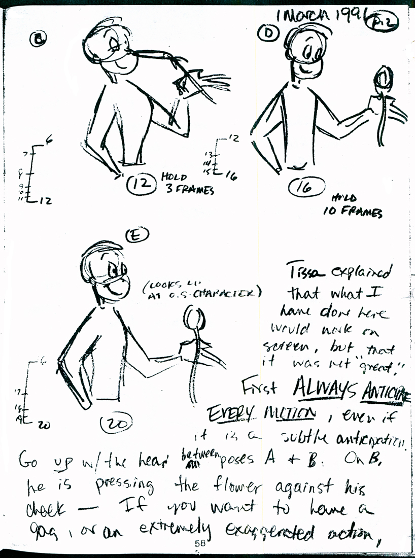 58
58
 59
59 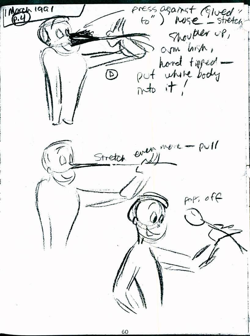 60
60
 61
61 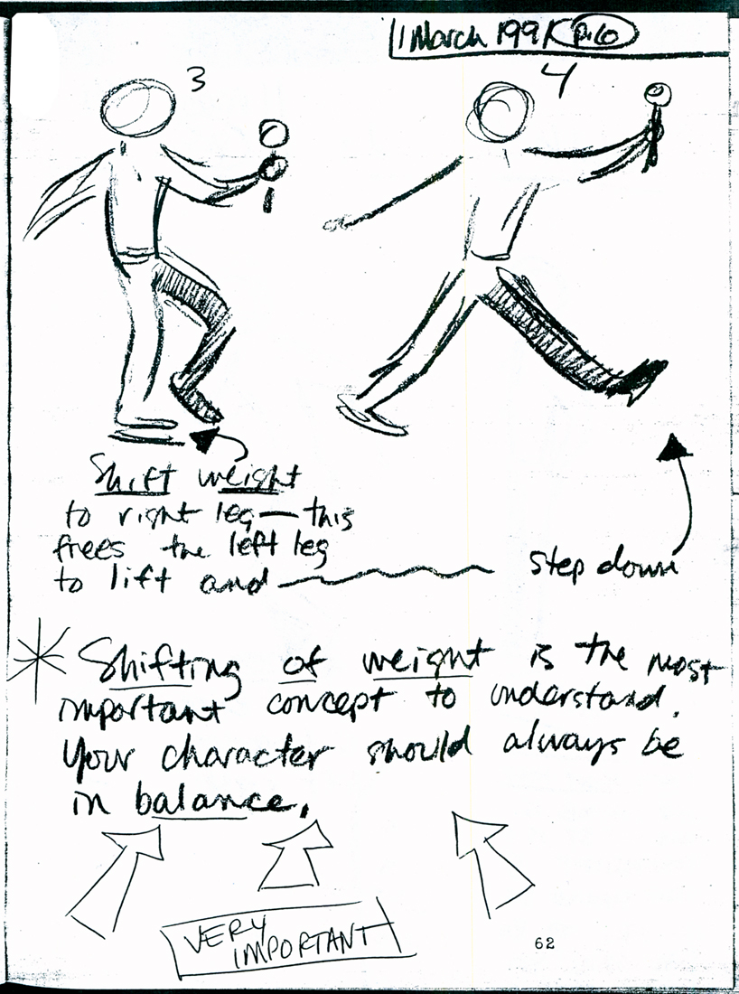 62
62
 63
63 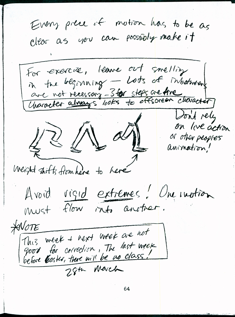 64
64
 65
65 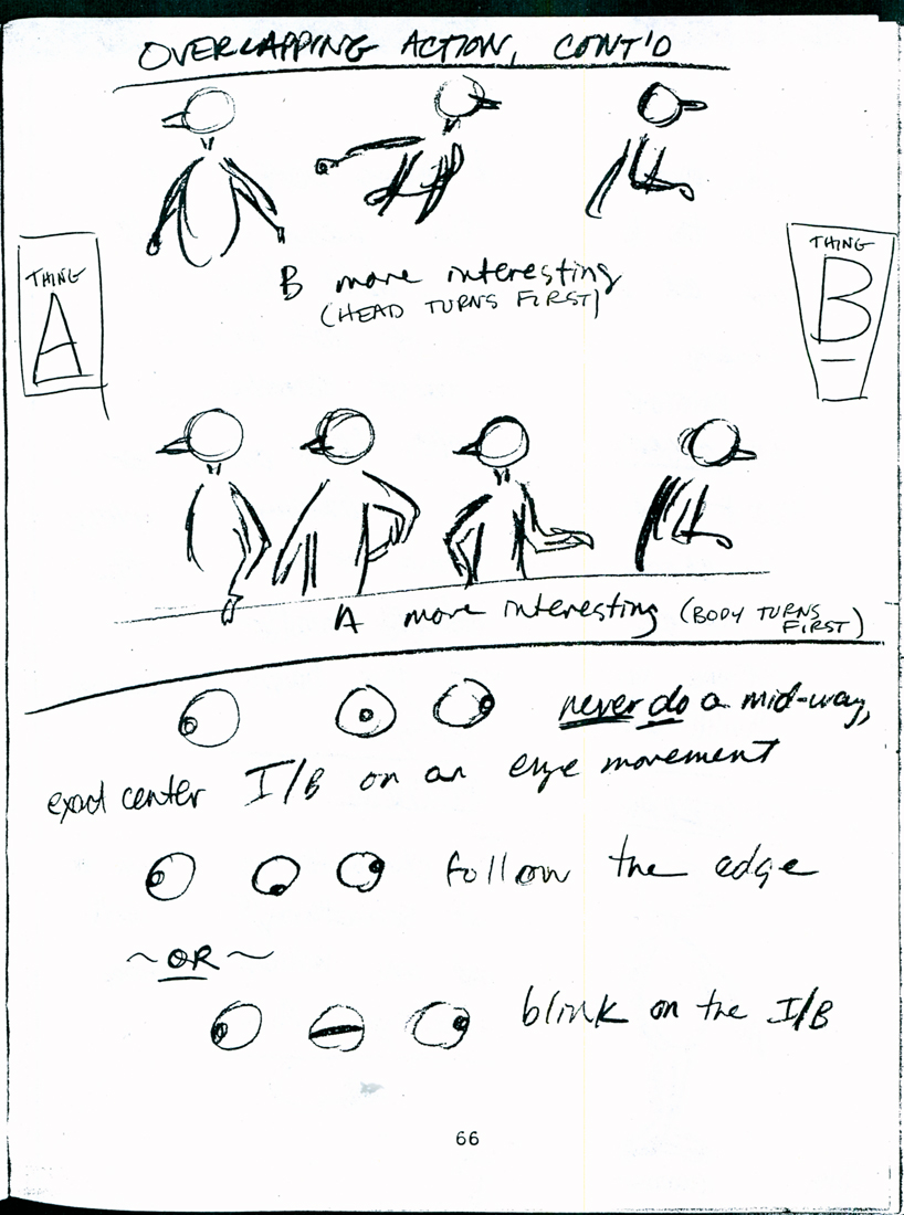 66
66
 67
67 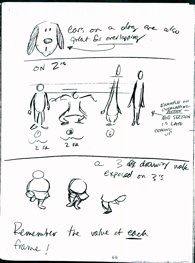 68
68
 69
69  70
70
To be continued next Thursday.
Animation Artifacts &commercial animation &Layout & Design 03 Oct 2012 06:46 am
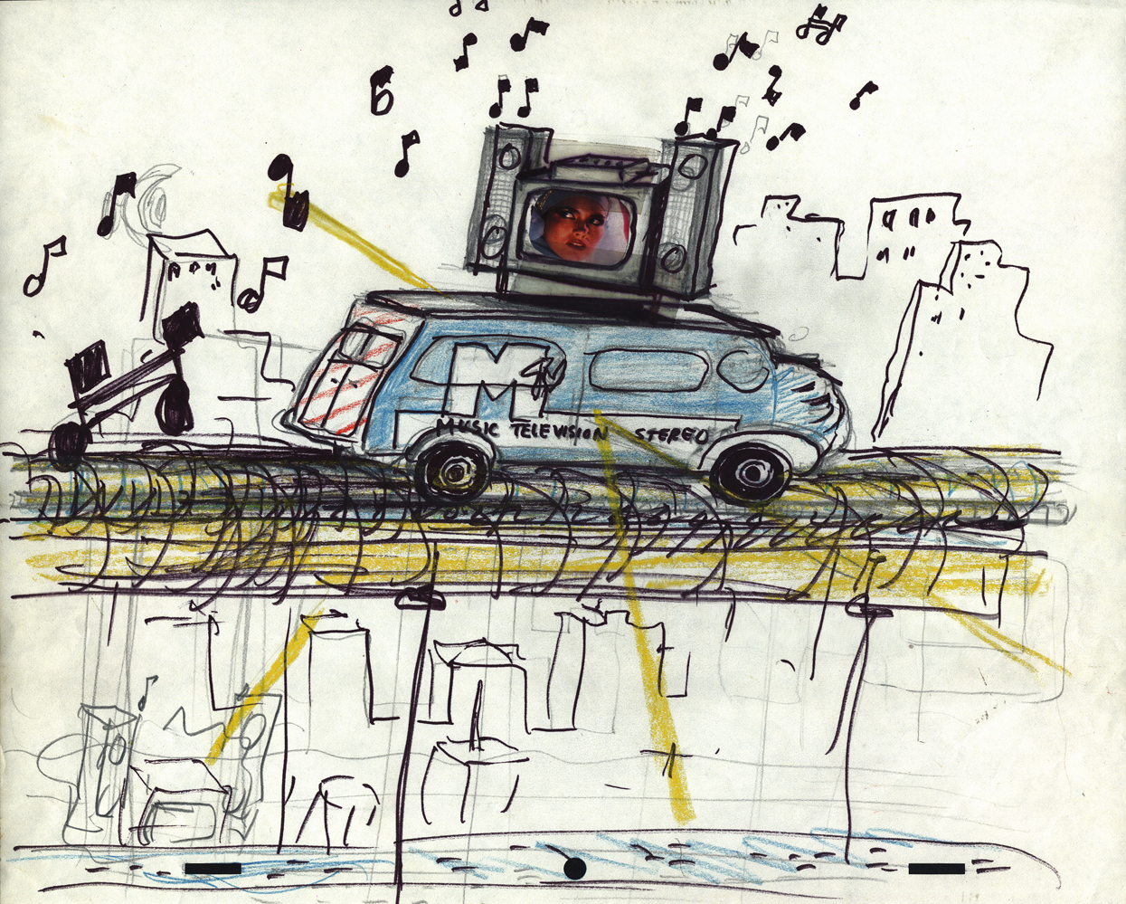
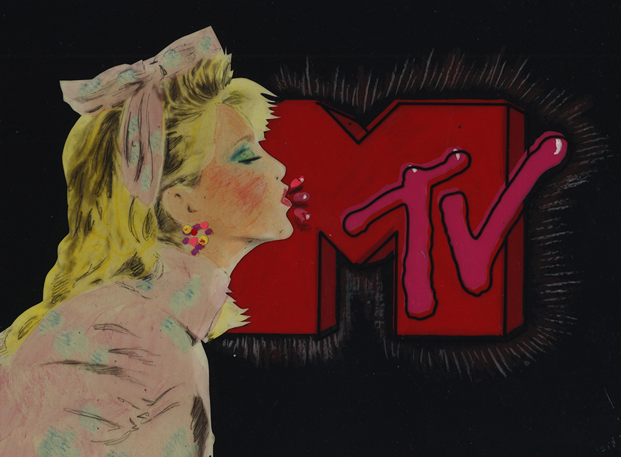
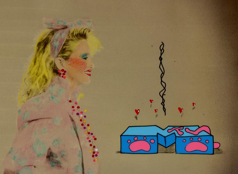
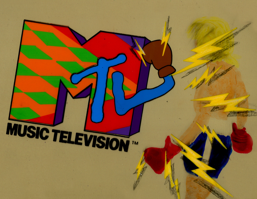
I want my MTV
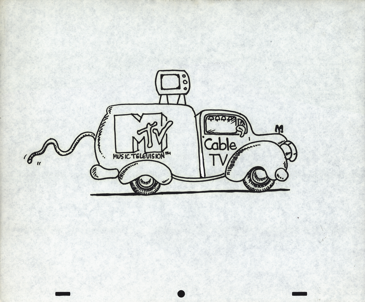
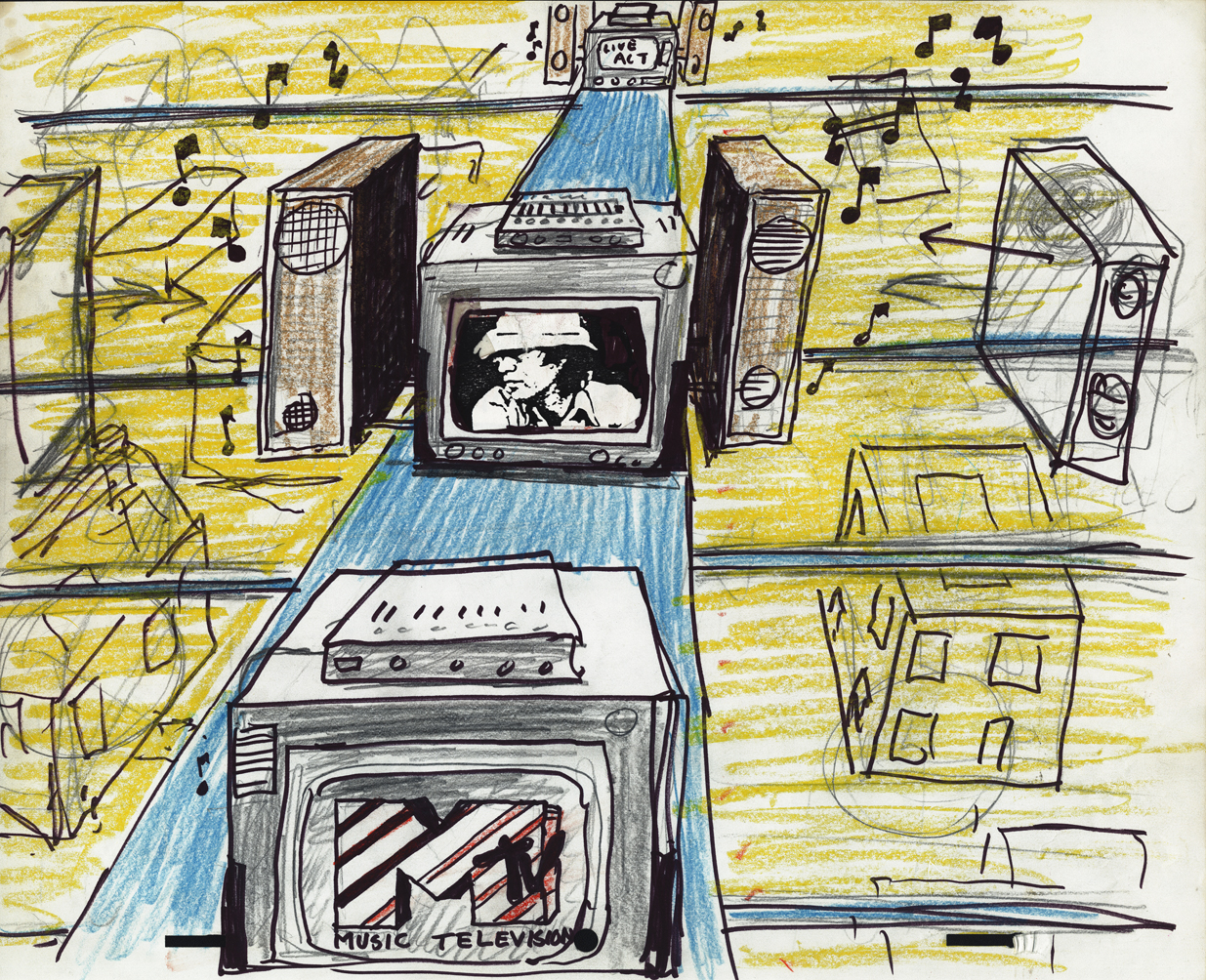
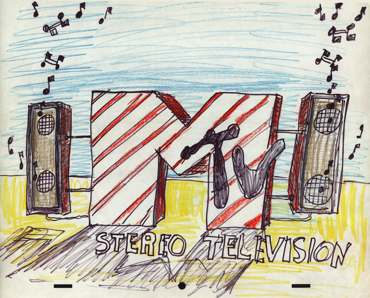
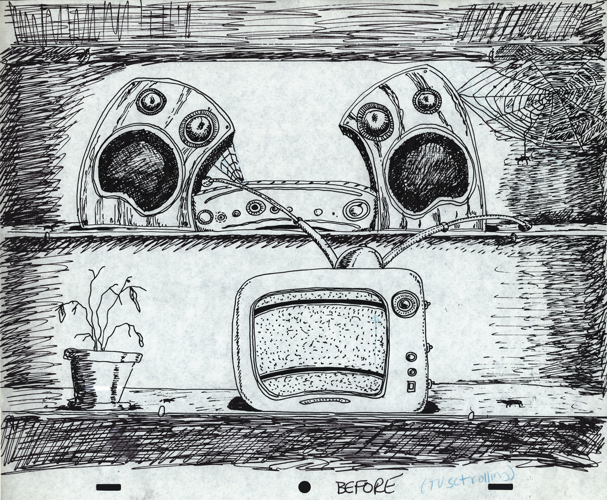
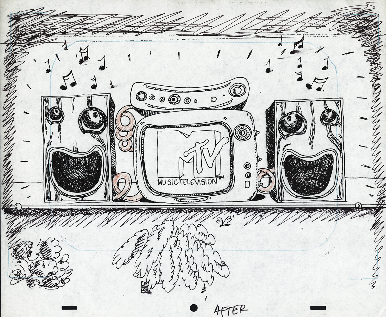
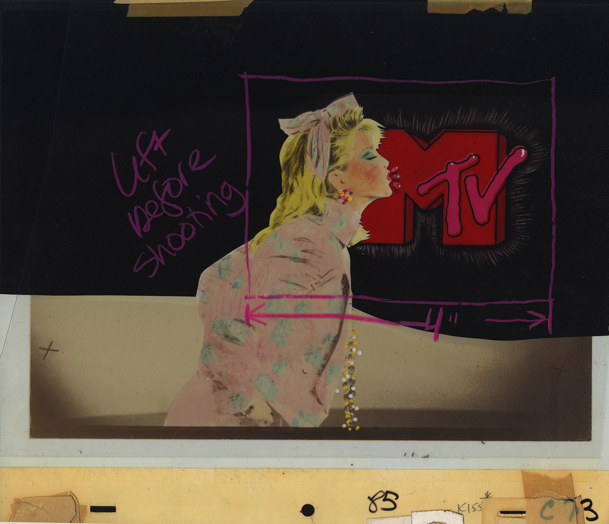
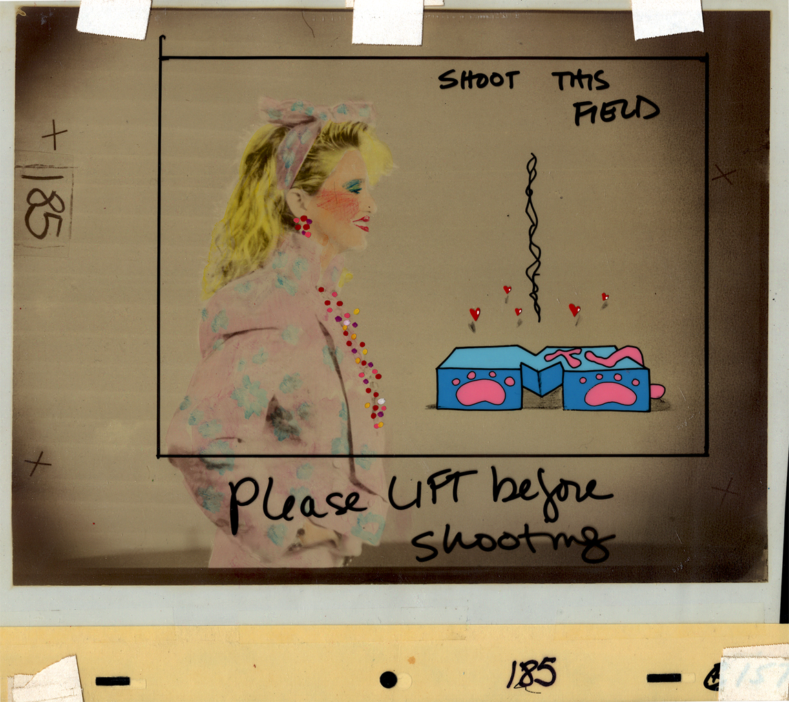
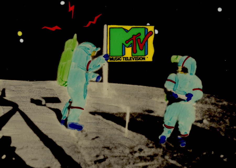
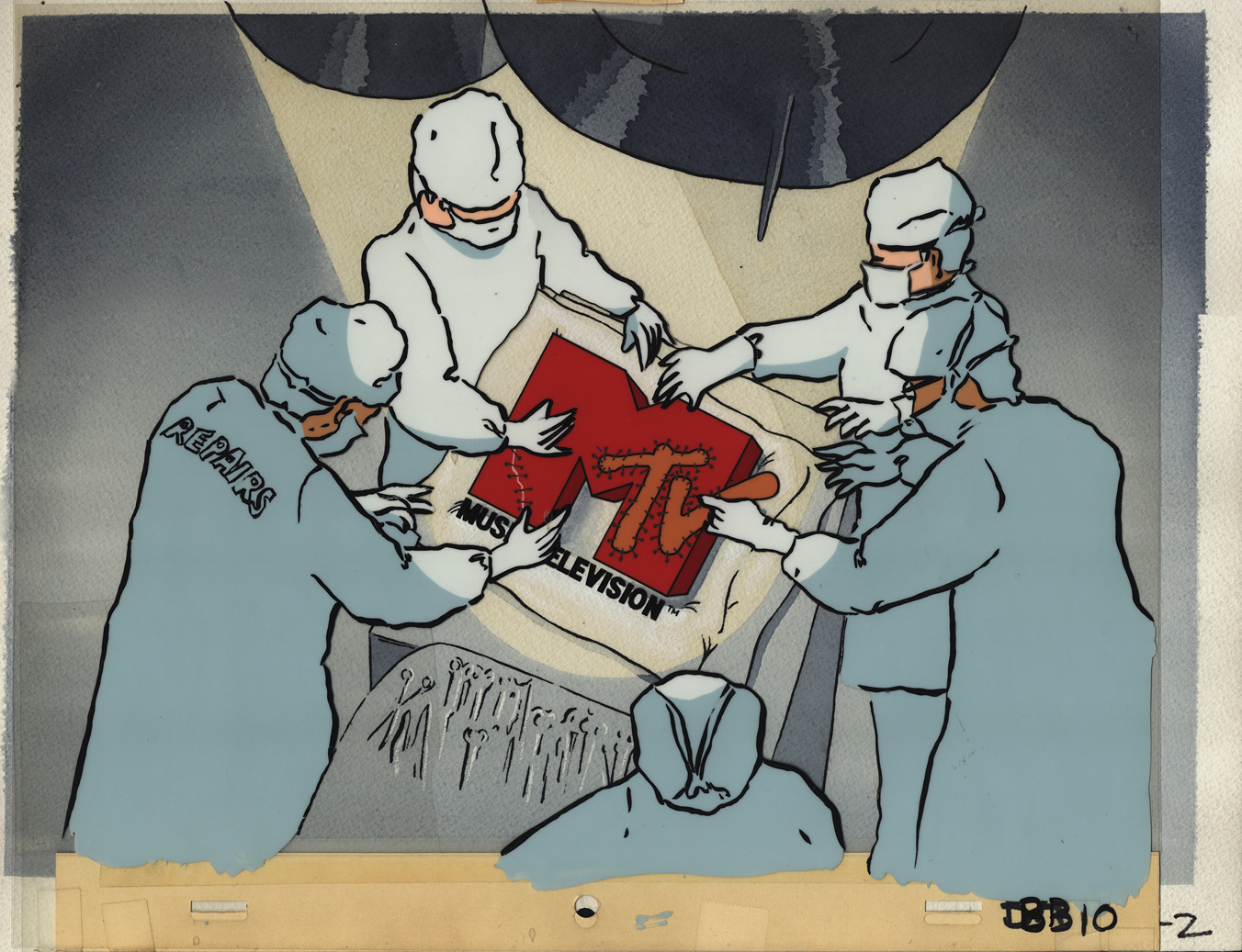
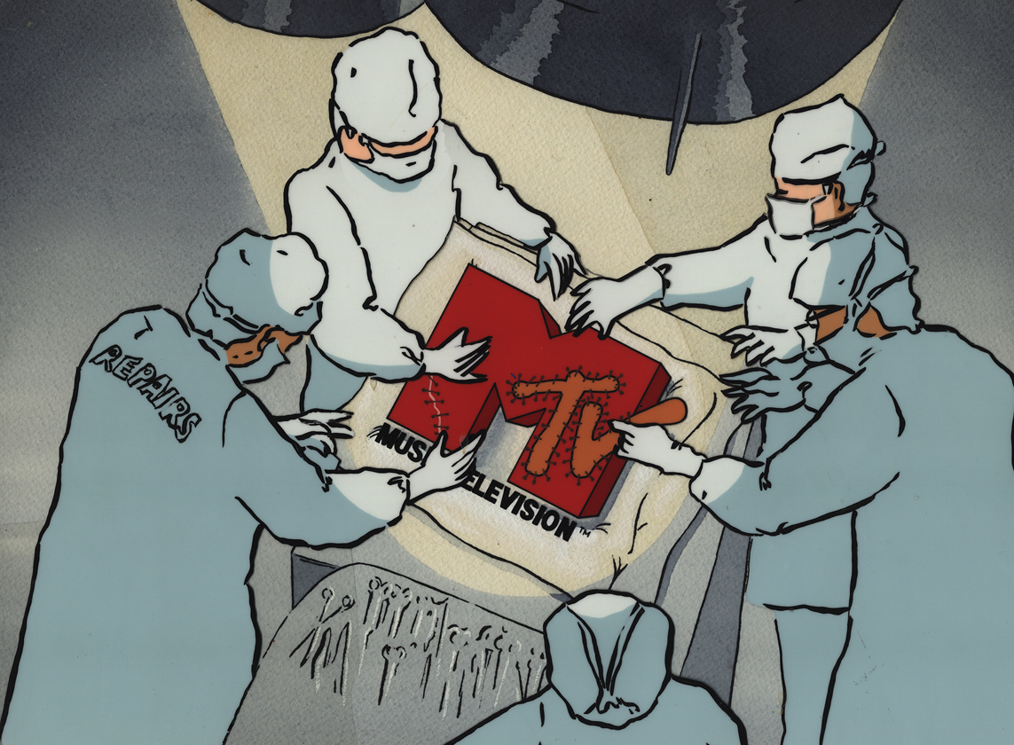
- In searching through the archives of work at Buzzco, where Vince Cafarelli‘s collection is housed, I came upon some MTV artwork. Some of you may remember that MTV had some wild art bumpers when they first started out. Buzzco did the lion’s share of these early logos. Candy Kugel did the artwork for them, and Vince Cafarelli wasn’t involved. These were done when Perpetual Motion was breaking up and Buzzco was coming into being. Buzz Potamkin would pull Candy into another room and give her the new assignment so that no one at Perpertual knew what she was up to. Once the split happened, Buzzco kept the account.The colors have deteriorated a bit in some of these. I’ve done some minor photoshop adjustments to brighten the colors a bit.
But first let me show some rough sketches for the very first promo for MTV in 1982. This came before the MTV campaign, “I want my MTV.” I vaguely remember this, but am not sure of it. I wasn’t a confirmed MTV watcher in those early days.
 1
1Drawing by Candy Kugel
 2
2
Drawing by Fred Mogubgub
 3
3
Drawing by Fred Mogubgub
 4
4
Drawing by Fred Mogubgub
 5
5
Drawing by Candy Kugel
 6
6
Drawing by Candy Kugel
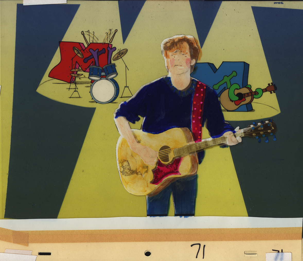
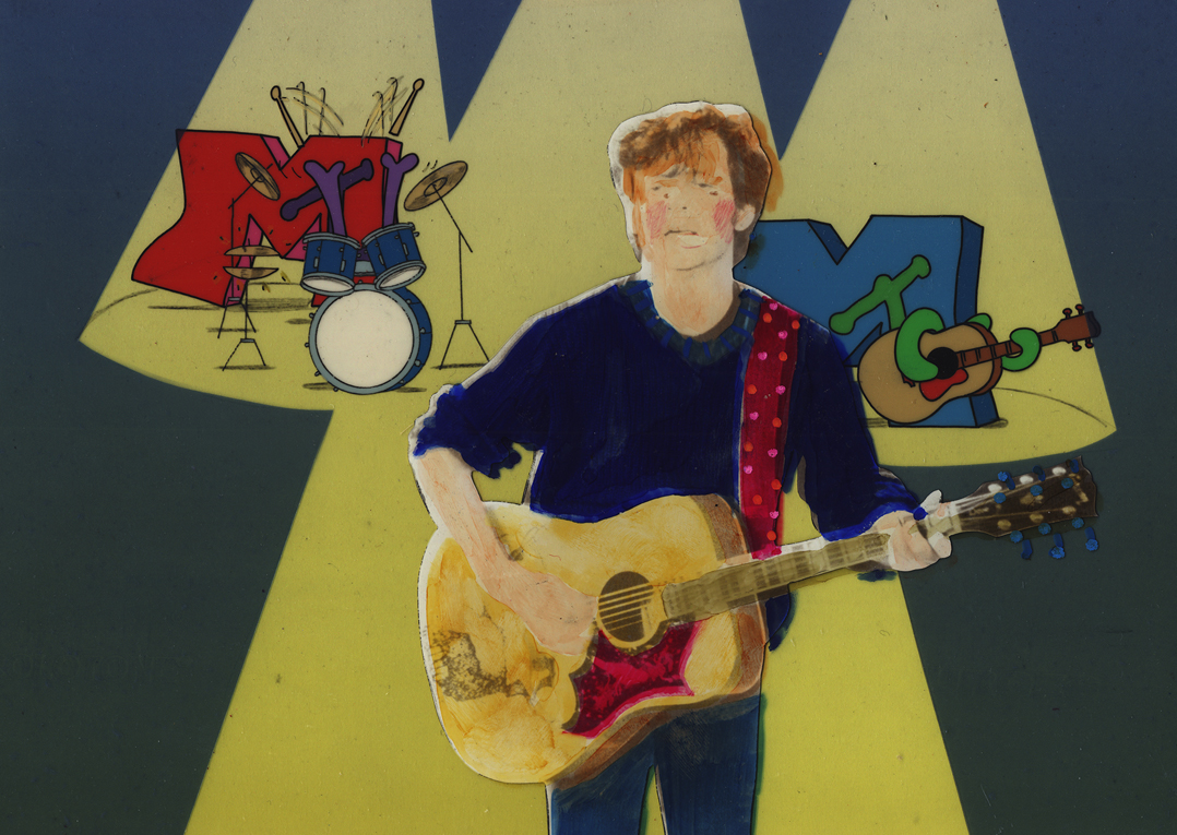
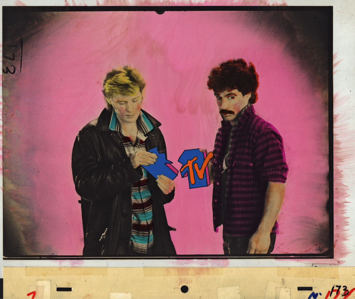
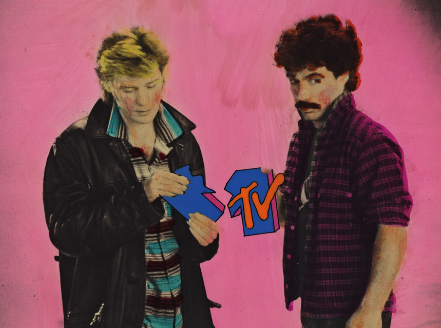
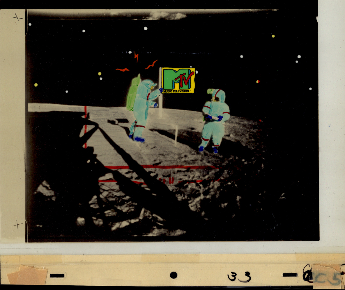
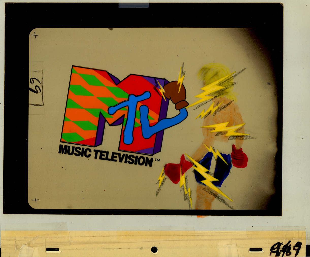
Here are eight of the color pieces. I’ll display two versions of each setup: the full artwork first, then the screen-sized art following so that you can see the proper framing.
 1a
1aDavid Bowie
 1b
1b
 2a
2a
Madonna
 2b
2b
 3a
3a
John (Cougar) Mellencamp
 3b
3b
 4a
4a
Madonna again (she was popular)
 4b
4b
 5a
5a
Hall & Oates
 5b
5b
 6a
6a
The famous Moonwalk
 6b
6b
 7a
7a
 7b
7b
 8a
8a
Joe Elliott of Def Leppard
 8b
8b
Animation &Articles on Animation &Luzzati & Gianini &repeated posts 02 Oct 2012 04:59 am
Luzzati & Gianini
- I spent some time rereading some material about Emanuele Luzzati and Giulio Gianini. I went back into my archives and found a lot of frame grabs and a bit of info about them at the time of their individual deaths. Ive put three of those posts together and am posting that today as sort of a retrospective piece.
Luzzati
Jan. 26th, 2007
 Emanuele Luzzati has died. He was the brilliant Italian designer, who worked with Giulio Gianini in creating some wonderful animated cut-out films.
Their films adapted operatic overtures in reworking the operas themselves. The two were nominated for the Oscar for “The Thieving Magpie,” done in 1965 an interpretation of Rossini’s opera and again in 1973 for “Pulcinella.”
Luzzati died Jan. 26th, 2007 on the way home from work. He collapsed just outside his home. He hadn’t been ill prior to this. He spoke on the phone with Giulio Gianini, who has been very ill for some time, that very morning.
 Luzzati designed sets and costumes for stage productions and operas, including the 1963 production he designed for Mozart’s “The Magic Flute.” Fifteen years later he turned the opera into an animated feature that remains one of his most famous works.
He’s illustrated and written quite a few books. See this list on Amazon.
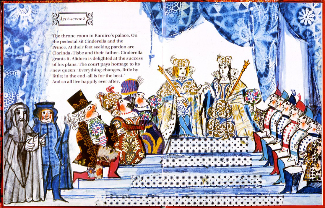
(Above: an image from his children’s book, Cinderella.)
The only Obituary I’ve seen for him was this one for the AP. It does give rather complete details of his life and work. AP Obituary.
 – I received a call from The Guardian in London. The newspaper was doing an obituary for Emanele Luzzati, and they couldn’t find any illustrations to color their report. They’d found some on my blog and wanted to know if they could use them.
(Go here to see all Luzzati/Gianini posts.)
Of course, I directed them to Luzzati‘s distributor who could give the clearances they needed.
But I found it all depressing.
This was one of the world’s greatest designers of Operas and Animation. His brilliant animated version of The Magic Flute is a feature that should be in theaters now. Unfortunately, it never made it to theaters (at least, not in the US), and his designs for the opera are equally as stunning.
Years of amazing art he’s produced, and there’s so little – even on-line – that could be readily found for his obituary. I find it confusing. This was the original reason I had for putting so much attention on his work, and the call from the paper pushes me back to do another post. Unfortunately, all I have are frame grabs.
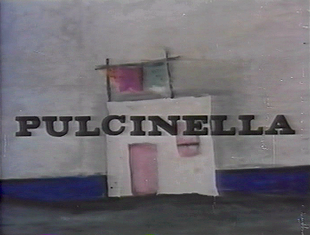
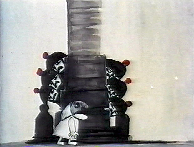
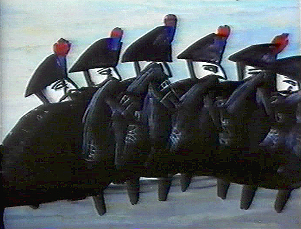
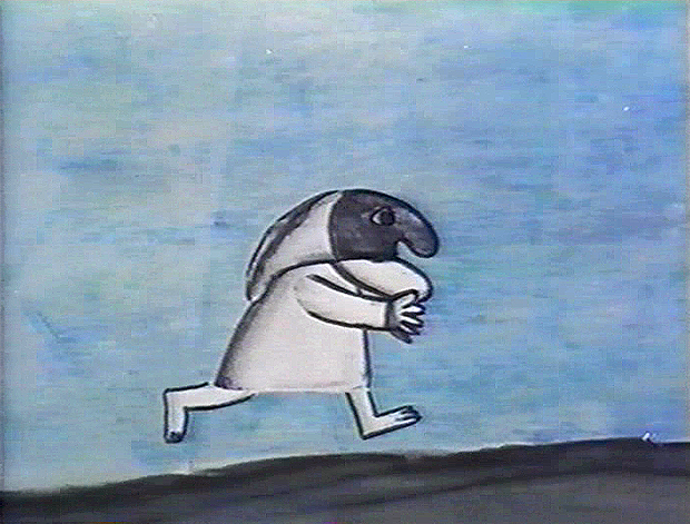
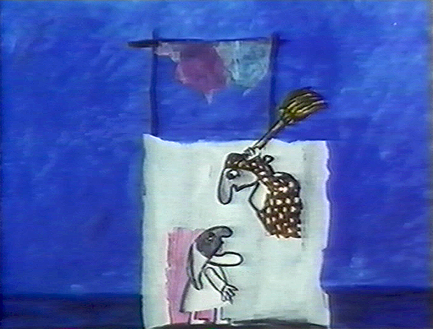
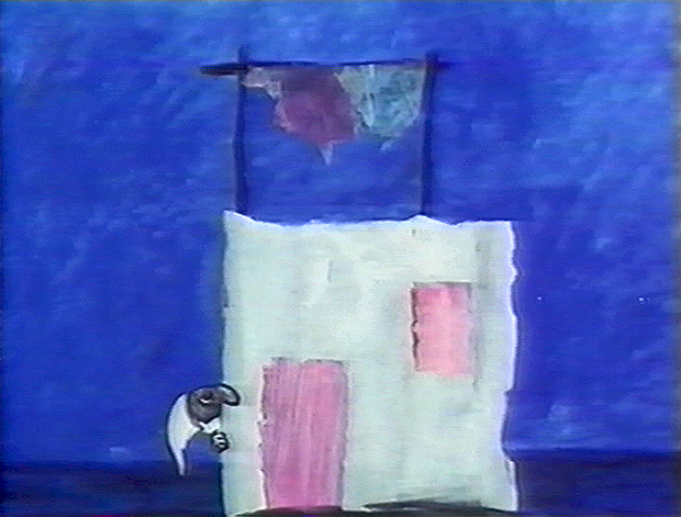
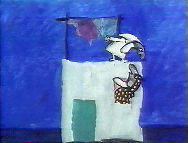
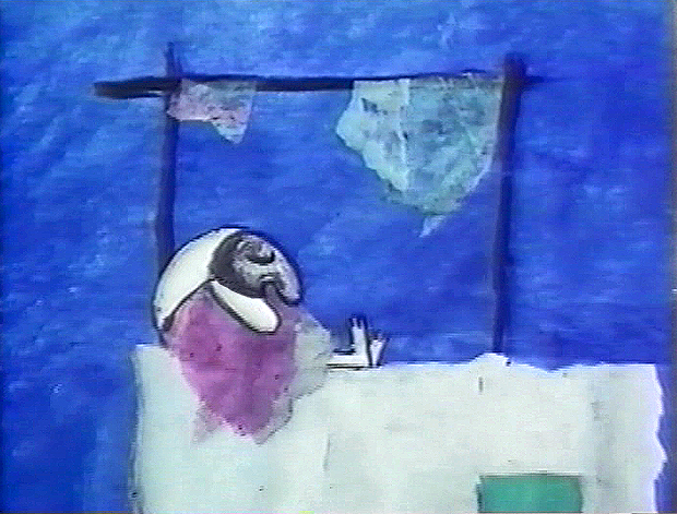
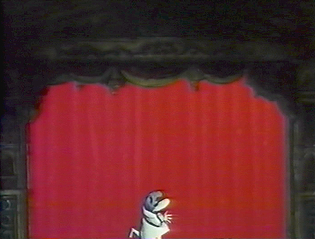
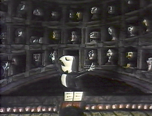
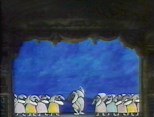
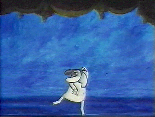
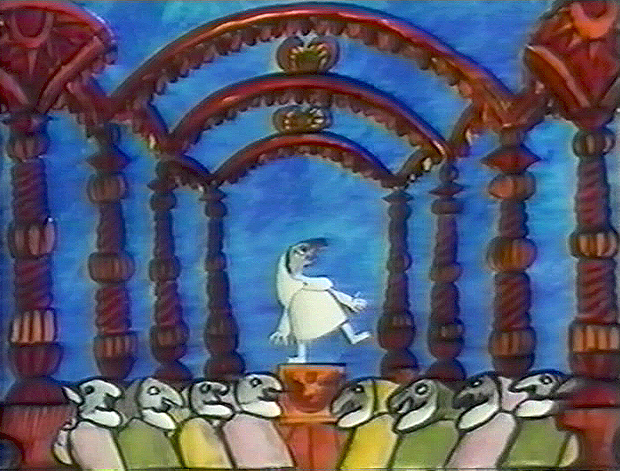
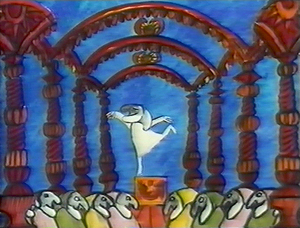
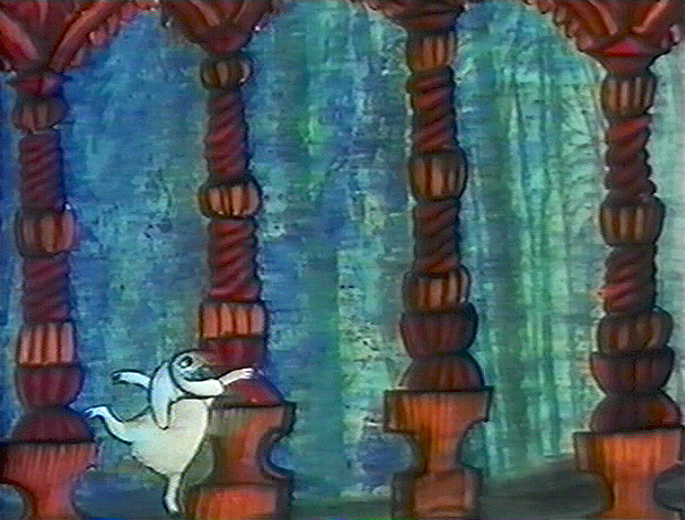
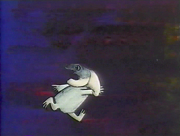
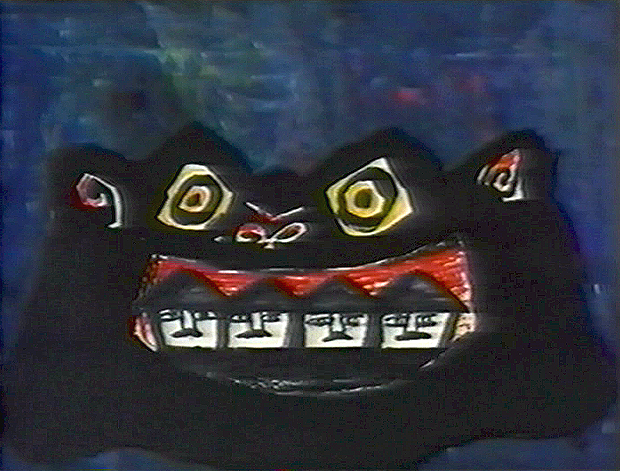
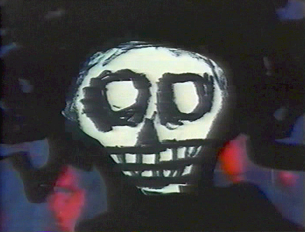
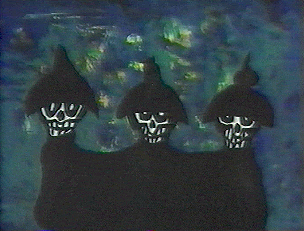
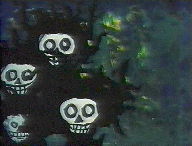
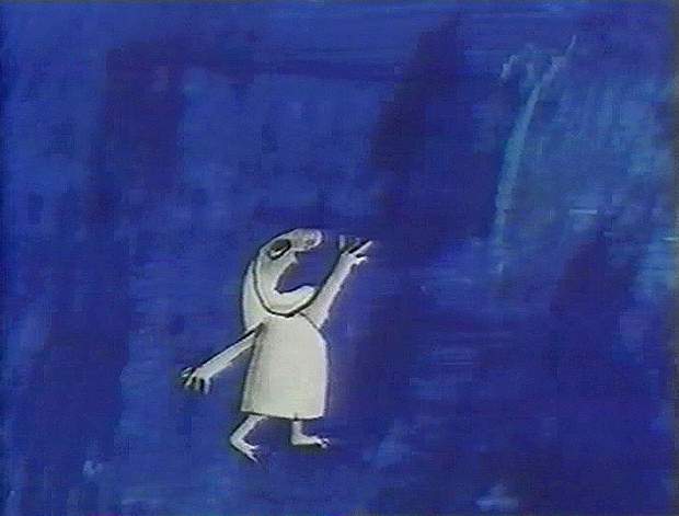
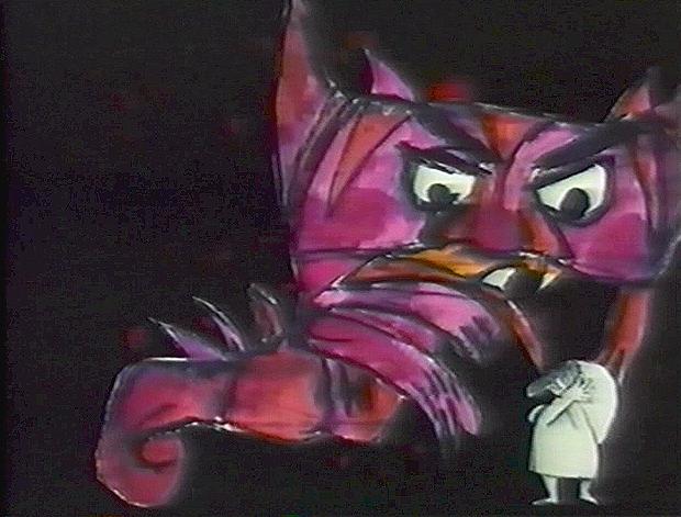
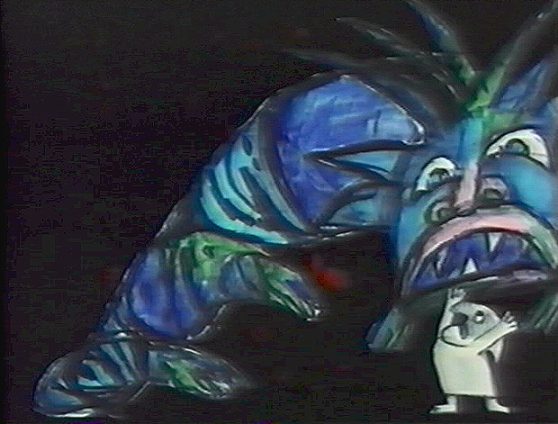
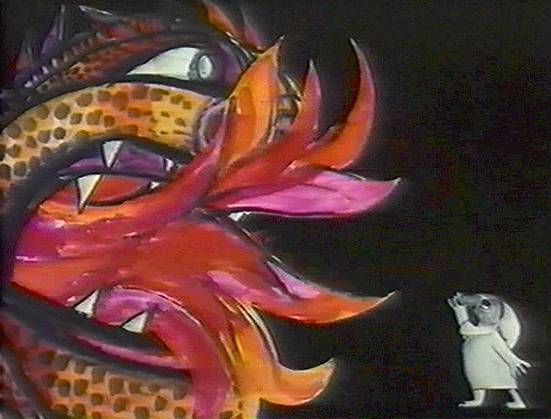
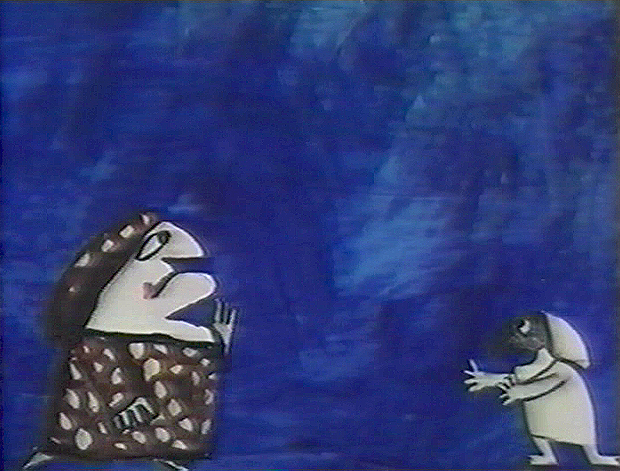
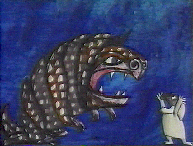
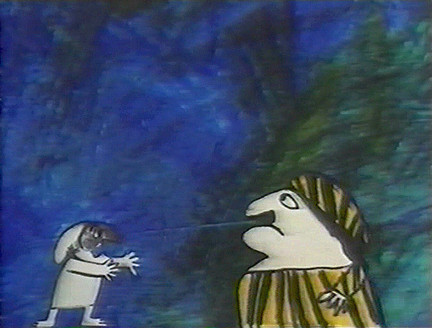
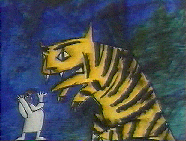
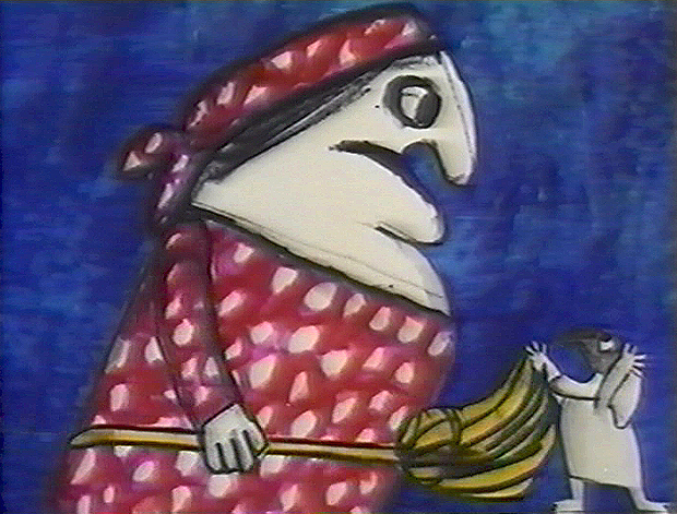
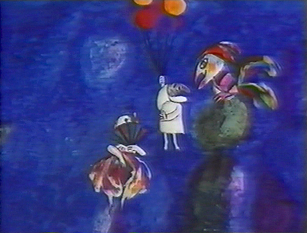
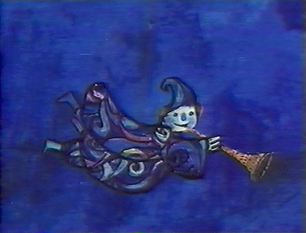
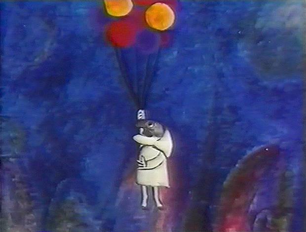
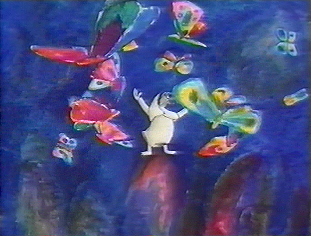
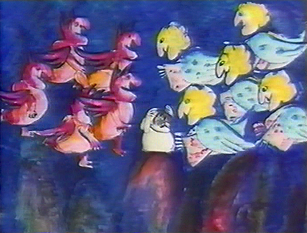
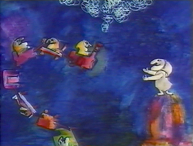
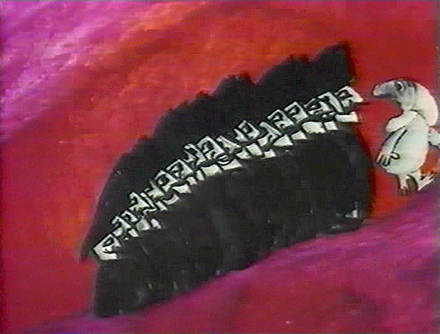
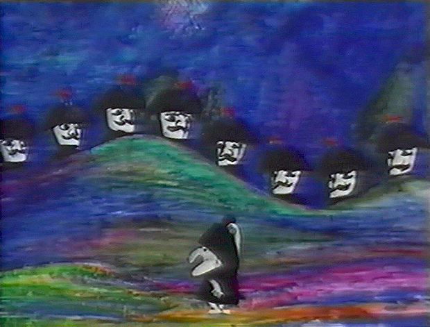
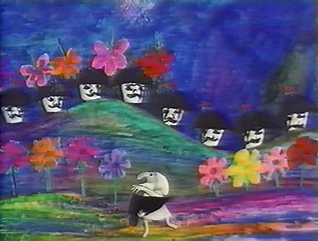
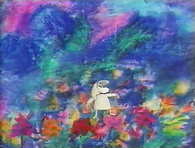
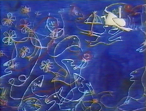
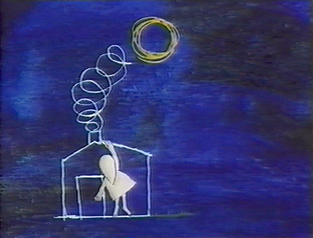
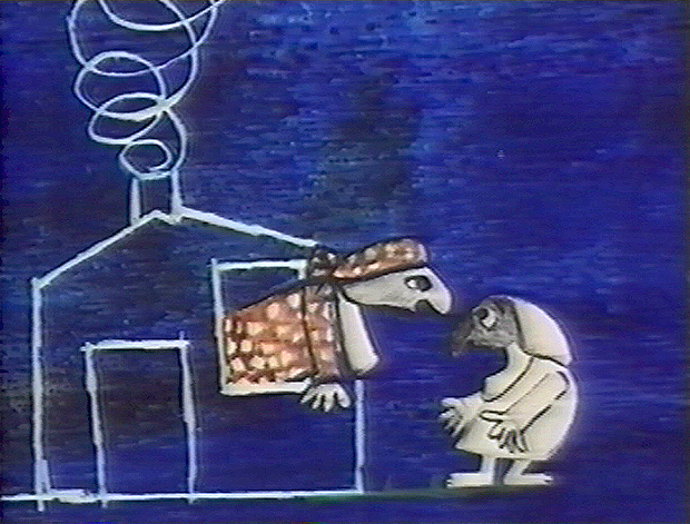
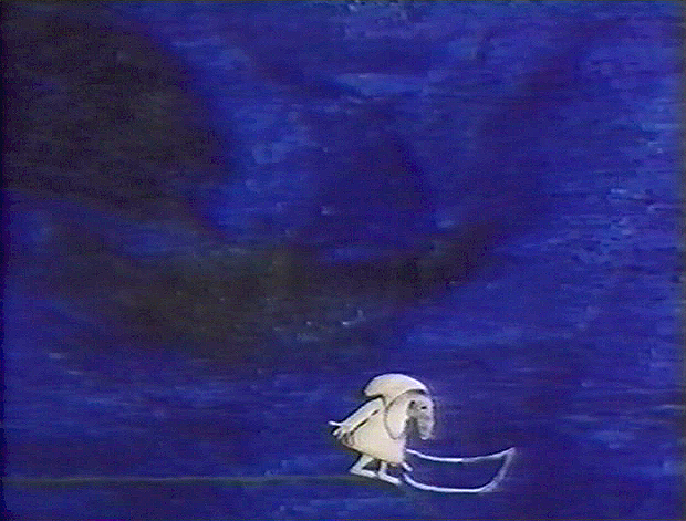
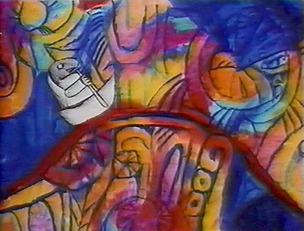
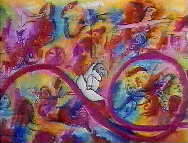
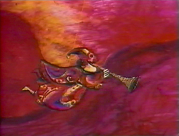
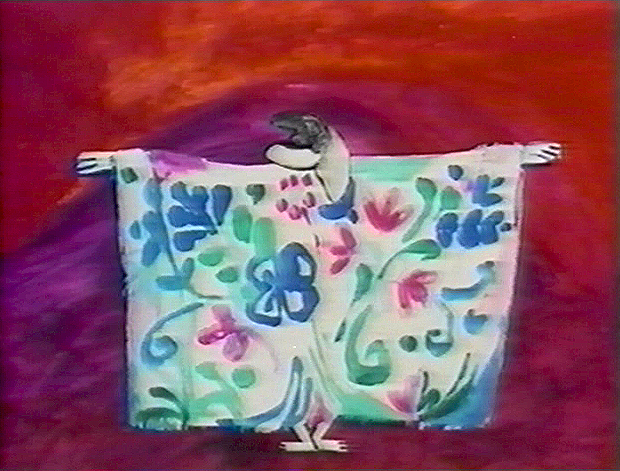
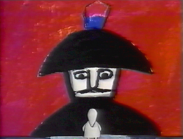
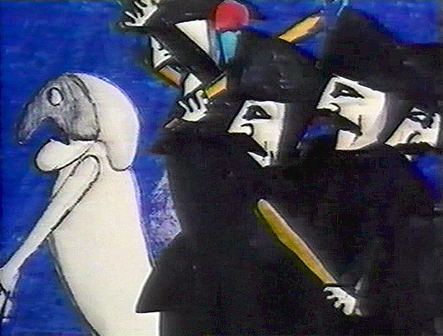
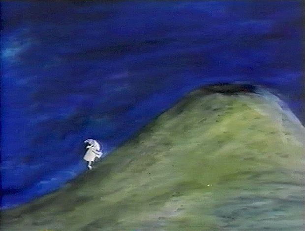
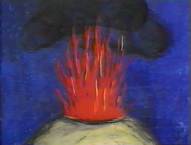
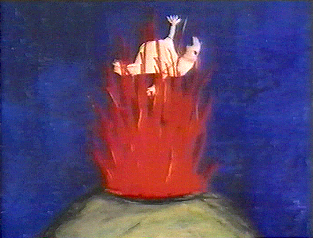
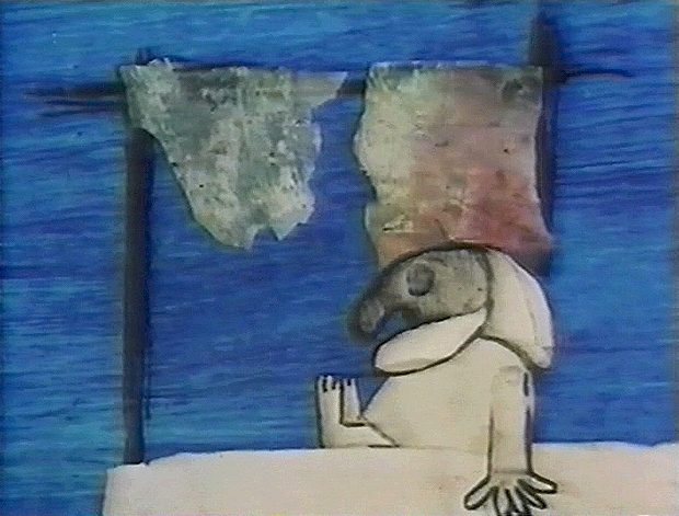
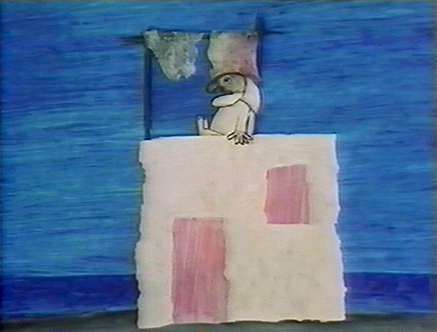
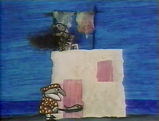
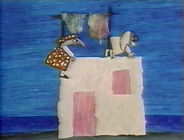
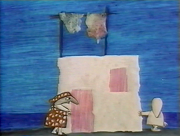
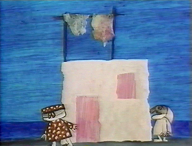
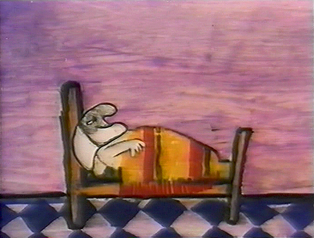
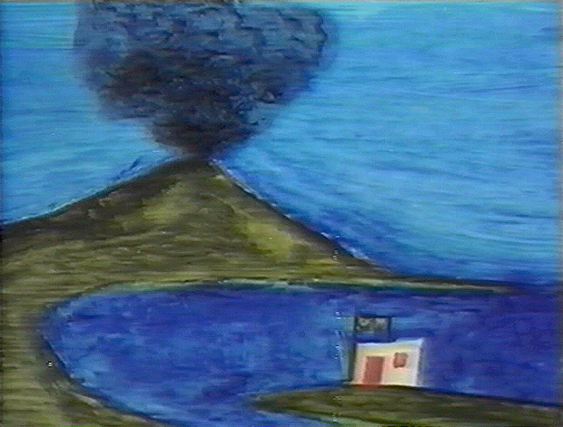
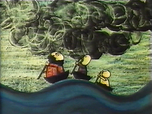
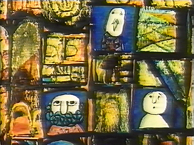
Here is Pulcinella. It is a short that was nominated for the Oscar in 1973. Another cut-out animated film, Frank Film by Frank and Caroline Mouris won the award. The Legend of John Henry by Sam Weiss, produced by Nick Busustow was also nominated.
Like other Luzzati/Gianini films, the score is taken from an opera overture, Rossini’s The Turk in Italy.
The animated film is an abbreviated, caricatured version of the opera. 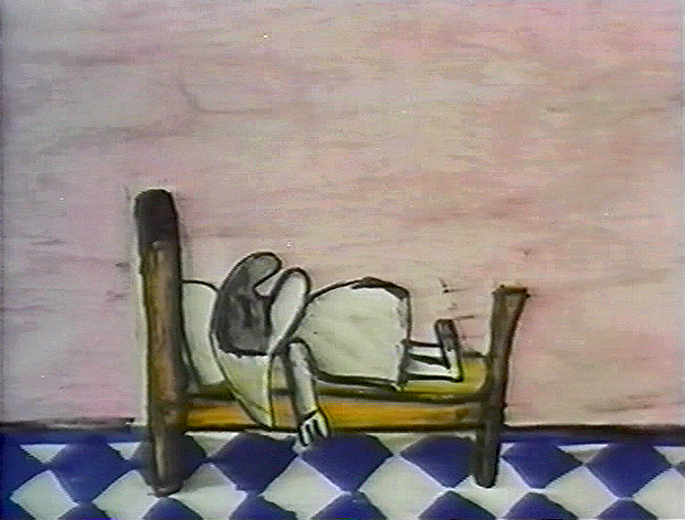
Pulcinella (Punch, as in Punch & Judy) is the principal character who dreams himself into a wild nightmare of a dream that leads us through an abstract world. It’s nice to see how the animators/designers play off the puppet character as well as the opera.
I’m just going to post the images without detailing the story. I like it better that way.
There are some 90 images, so it takes some attention to graphics.
(Click any image on the page to enlarge.)
Gianini
May 18th, 2009
 – I’ve been something of a fan of the films of Luzzati and Gianini. I’d met Emanuelle Luzzati at a function thrown at the Italian Embassy in New York, years ago. I bought a book by him, and the artist drew a beautiful pen and ink drawing in the frontispiece of the book.
In 1988, I met Giulio Gianini in Italy during a stay of a couple of pleasant days with an assistant of his at the festival in Treviso, Italy.
Mr. Gianini died this past Saturday, and I wanted to offer a bit of a memorial. Emanuelle Luzzati died January, 2007 and to memorialize that I posted some illustrations and information about the duo with a lot of frame grabs from a number of the Luzzati/Gianini films. It took a few posts, and I left off without wanting to overplay all of the art at my availability.
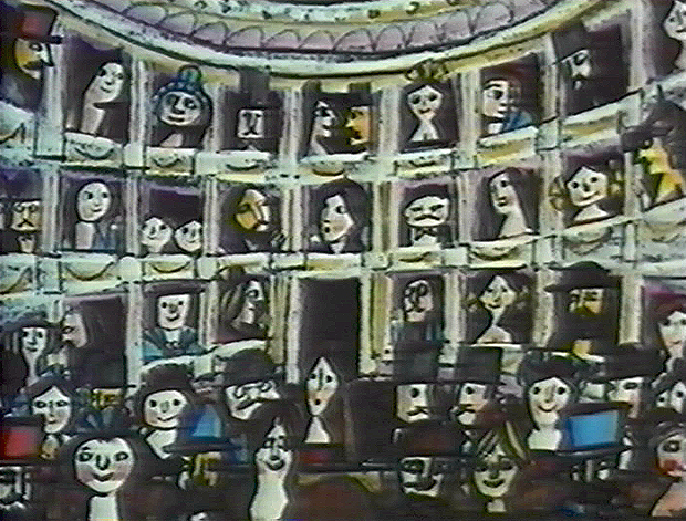
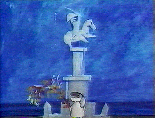
Luzzati & friend
The Thieving Magpie was the first of their films to receive an Oscar nomination, and it was the first of the frame-grab posts I showcased. I’d like to post it again in honor of Mr. Gianini. He was sick for several years and in particularly bad condition. His death wasn’t a surprise, but it is still an enormous loss.
 1
1 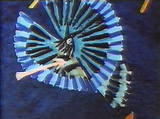 2
2(Click any image to enlarge.)
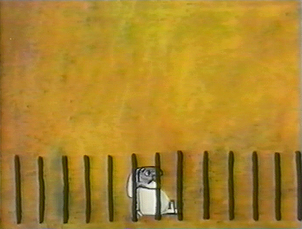
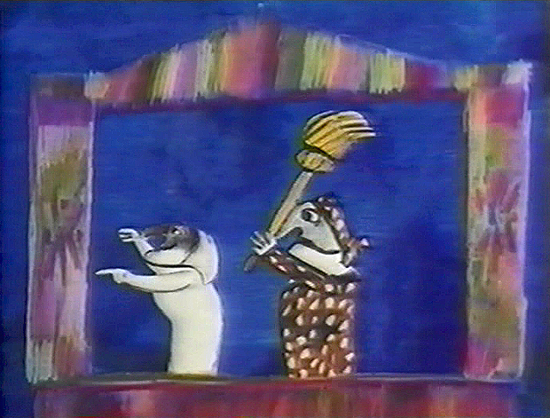
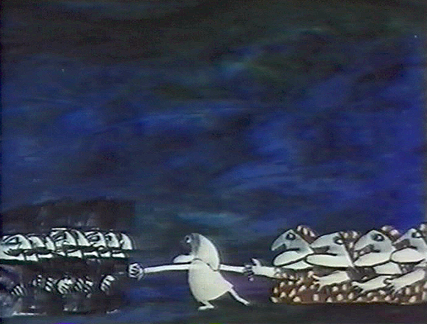
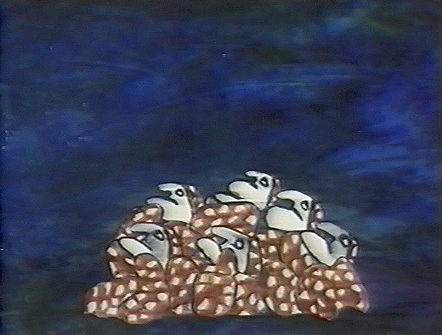
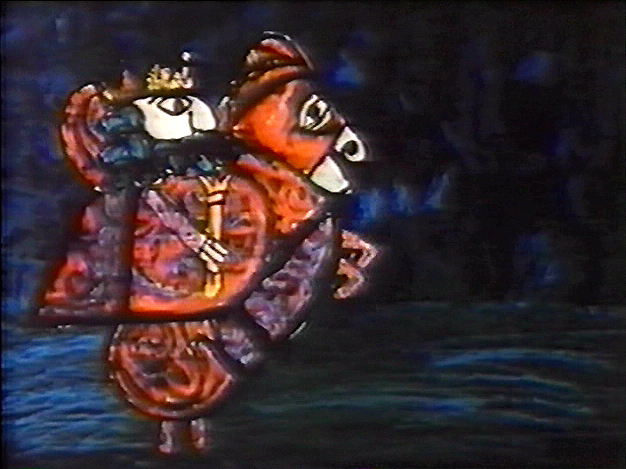
La Gazza Ladra (The Thieving Magpie) is a Rossini opera about a young maidservant who, accused of stealing a silver spoon, is sentenced to death for her crime.
At the eleventh hour, the real culprit is found to be a magpie.
A cartoon, if ever there was one. With great music!
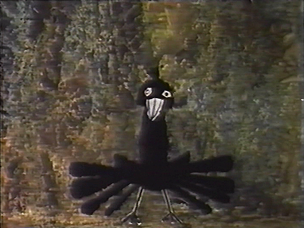
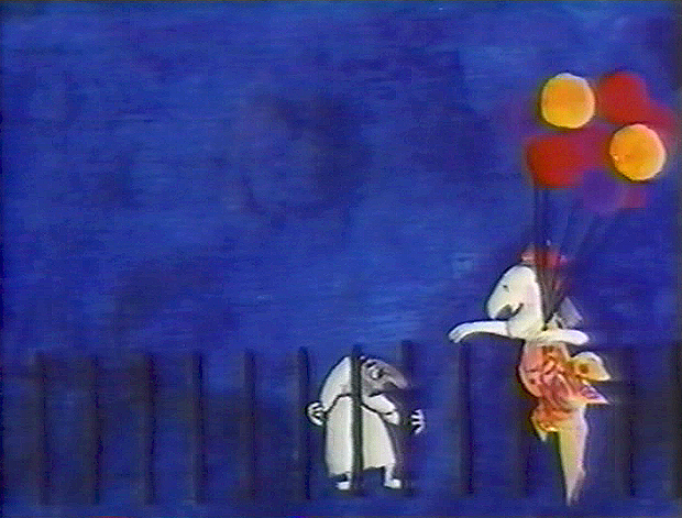
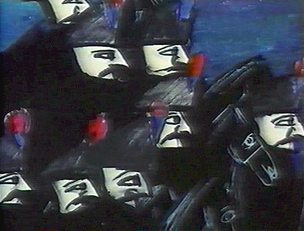
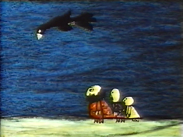
The film tells a tale wherein a king and his hunters, on a bird hunt, are beaten
by a magpie who steals their gems and ultimately destroys their village.
 4
4 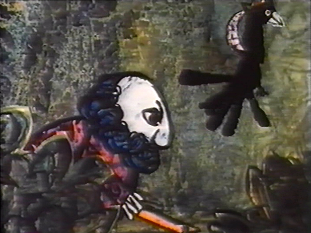 5
5
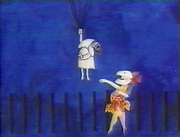
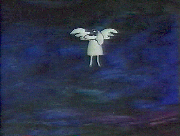
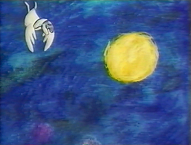
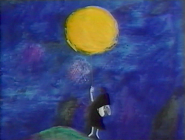
Luzzati who spent many years designing operas and ballets,
brought his knowledge to animation as the pair adapted several operas often utilizing the overtures of the operas they were adapting.
 6
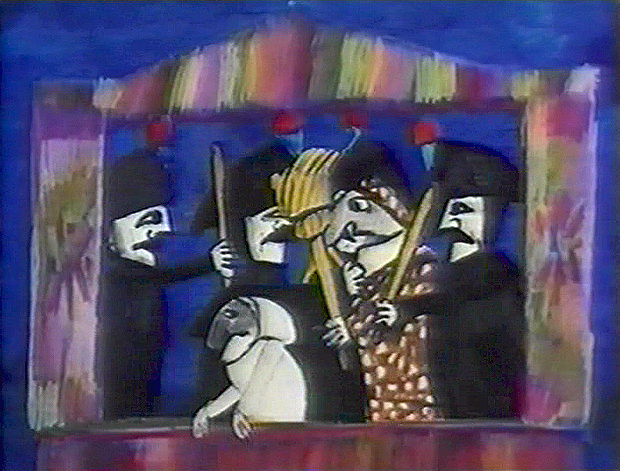
6 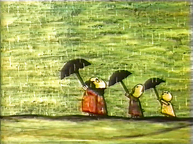 7 The film was nominated in 1964 along with
Clay, and the Origin of the Species by Eliot Noyes
and the winner, Chuck Jones’ Dot and the Line.
The Sound of Music won the Best Picture Oscar, that year.
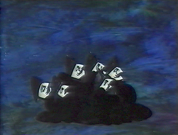
 8
8 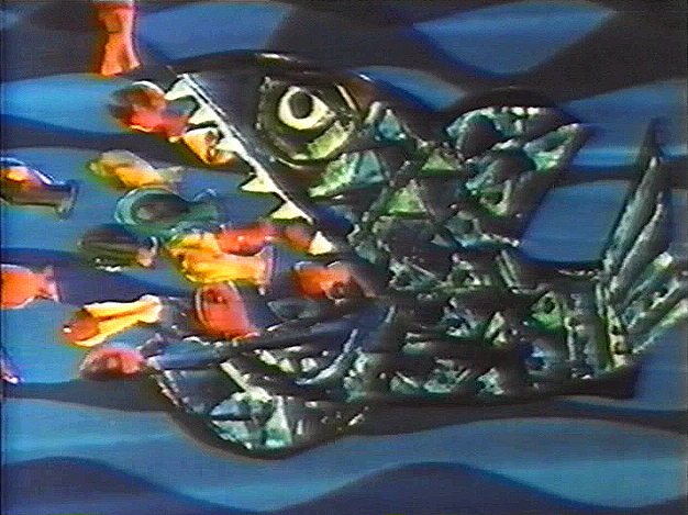 9 The use of cut-out animation wasn’t mainstream at the time.
This is years before Terry Gilliam made it somewhat fashionable. All of the
Luzzati-Gianini films were totally inventive and creative within the form they established.
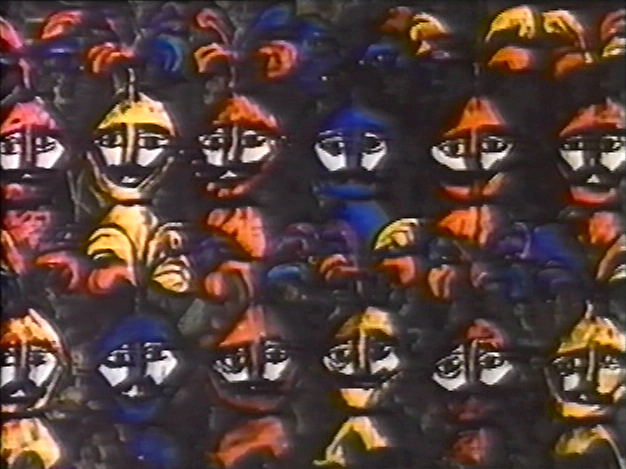
Gianini’s animation was as dreamlike as Luzzati’s exciting designs. The films
look to be designed somewhere between Chagall, Kirchner and
stained-glass windows; the sensibilities are all Luzzati and Gianini.
 Today we have Flash animation which does just about the same thing as cut-out animation, but the form used today is flat and vulgar and cartoony. It might be useful for practitioners of Flash to take a good look at what these two brilliant designer/animators did with a similar form under more complex and arduous methods. Ulltimately, it’s all related.
You can get a bit more information about Gianini and Luzzati from the website of the Luzzati Museum in Genova.
