Search ResultsFor "paul julian"
Daily post 08 Nov 2013 04:44 am
The Terror
The list of film on the animation short lis for Best Animated Short Film include:
The 10 films are listed below in alphabetical order by title, with their production companies:
Feral, Daniel Sousa, director, and Dan Golden, music and sound design (Daniel Sousa)
Get a Horse! Lauren MacMullan, director, and Dorothy McKim, producer (Walt Disney Feature Animation)
Gloria Victoria, Theodore Ushev, director (National Film Board of Canada)
The Missing Scarf, Eoin Duffy, director, and Jamie Hogan, producer (Belly Creative Inc.)
Mr. Hublot, Laurent Witz, director, and Alexandre Espigares, co-director (Zeilt Productions)
Possessions, Shuhei Morita, director (Sunrise Inc.)
Requiem for Romance, Jonathan Ng, director (Kungfu Romance Productions Inc.)
Room on the Broom, Max Lang and Jan Lachauer, directors (Magic Light Pictures)
Subconscious Password, Chris Landreth, director (National Film Board of Canada with the participation of Seneca College Animation Arts Centre and Copperheart Entertainment).
The Academy’s Short Films and Feature Animation Branch Reviewing Committee viewed all the eligible entries for the preliminary round of voting at screenings held in New York and Los Angeles. Short Films and Feature Animation Branch members will now select three to five nominees from among the 10 titles on the shortlist. Branch screenings will be held in Los Angeles, New York and San Francisco in December.
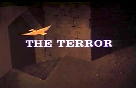
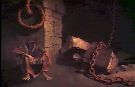
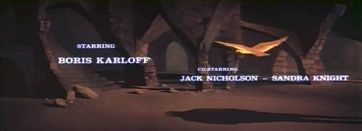
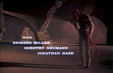
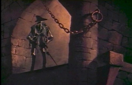
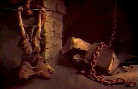
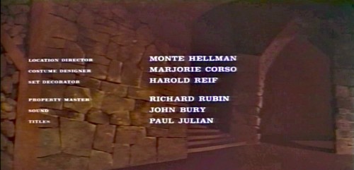
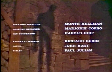
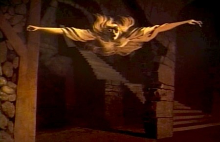
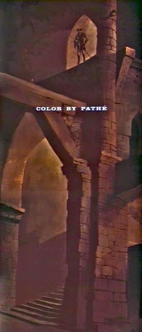
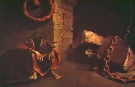
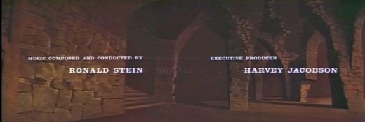
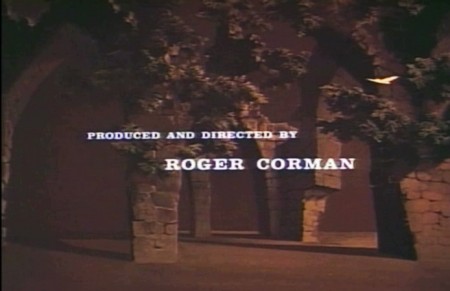
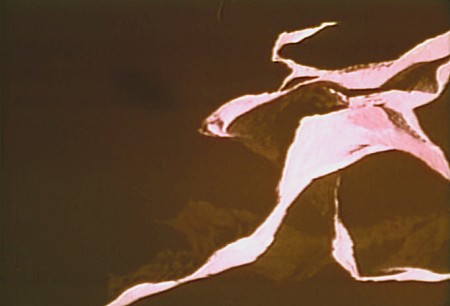
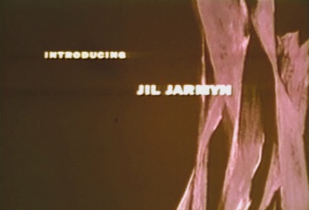
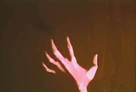
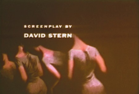
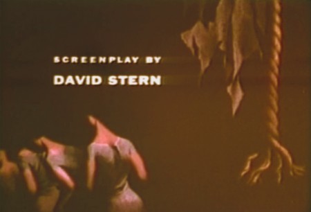
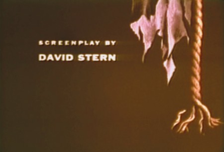
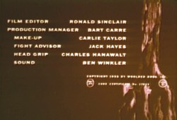
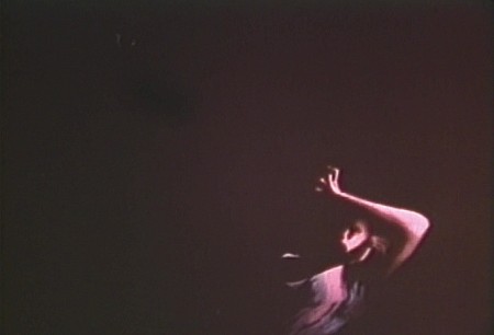
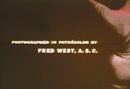
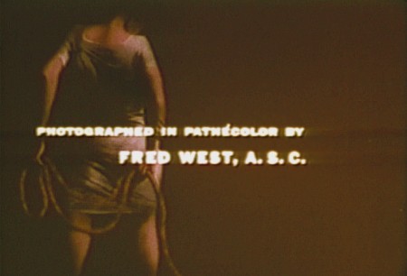
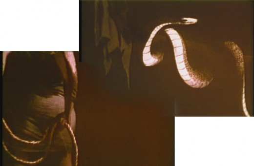
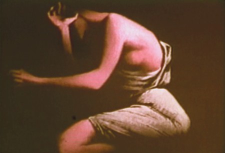
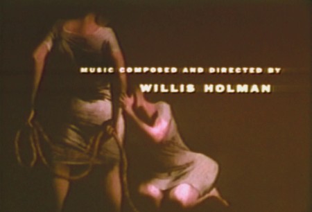
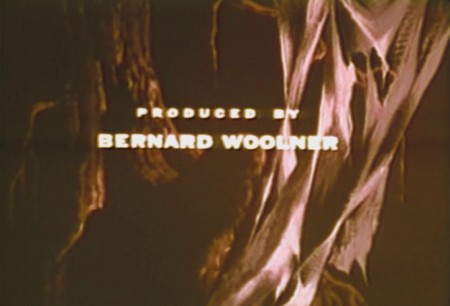
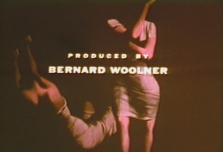
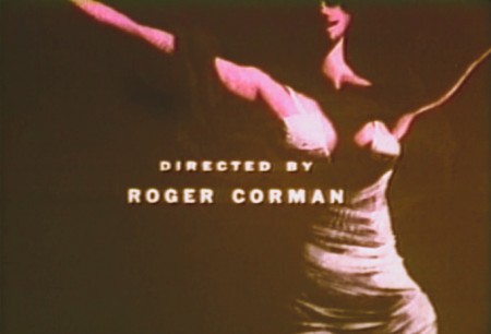
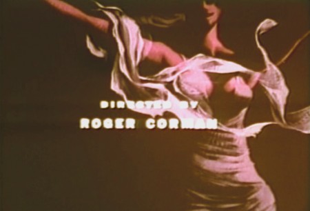
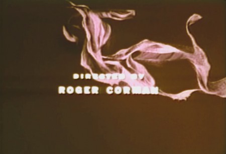
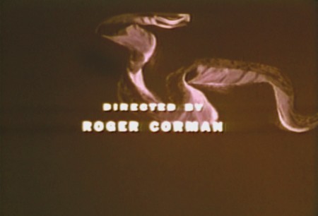
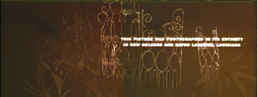
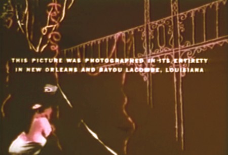
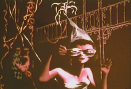
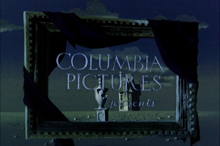
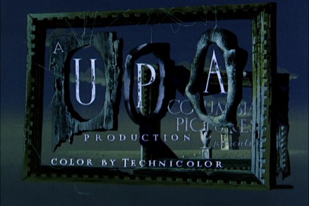
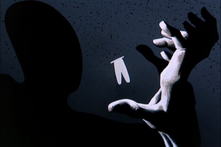
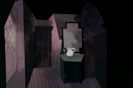
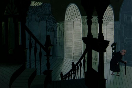
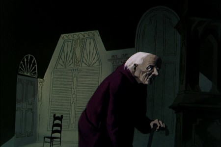
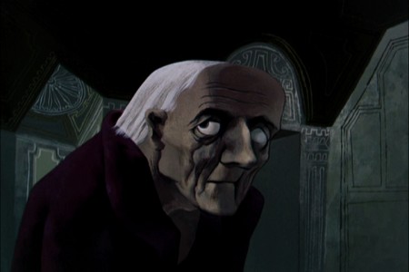
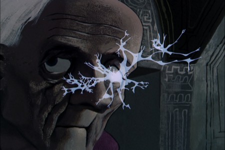
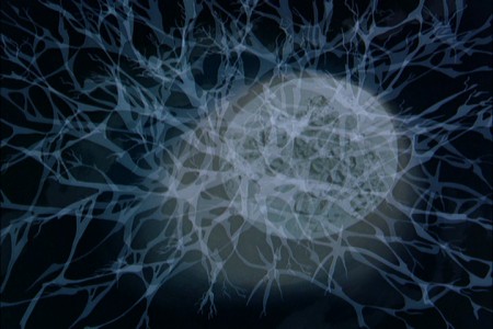
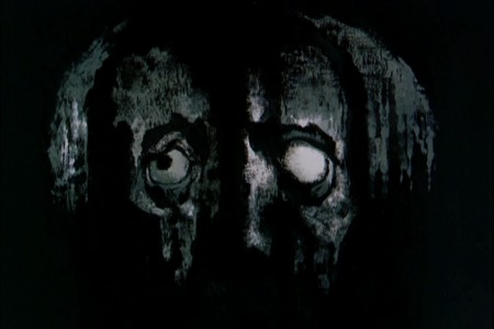
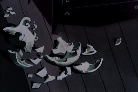
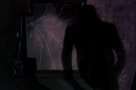
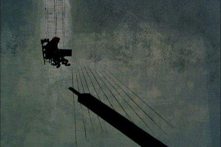
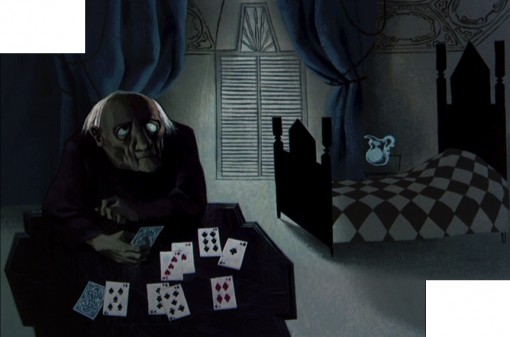
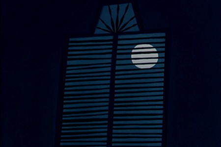
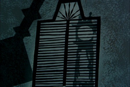
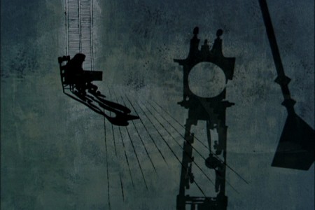
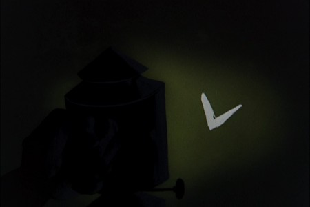
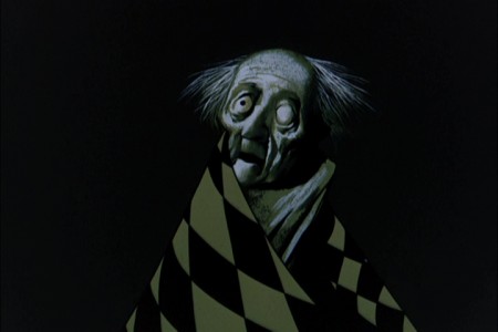
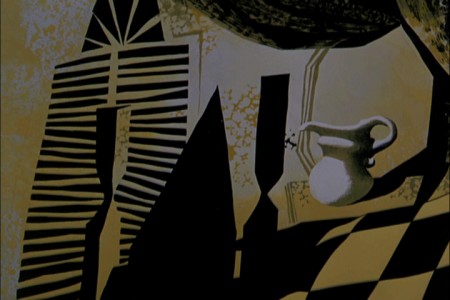
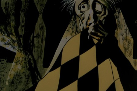
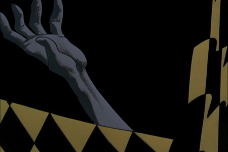
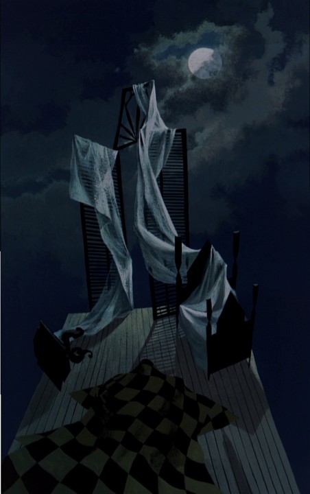
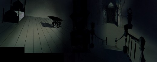
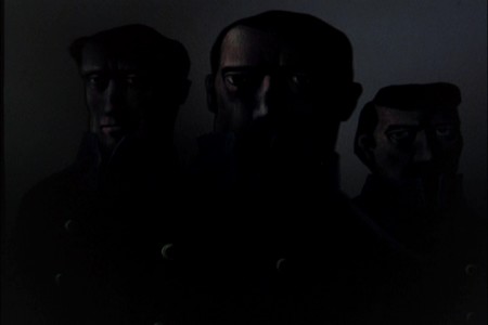
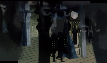
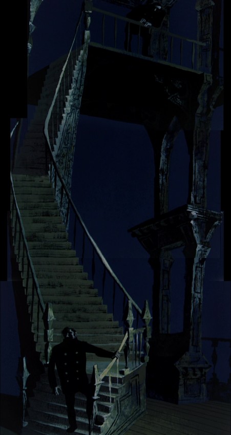
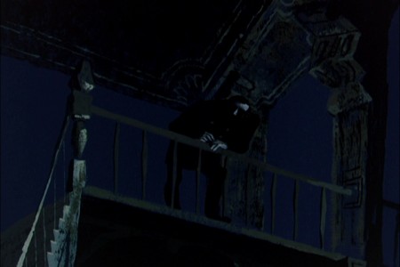
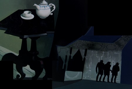
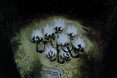
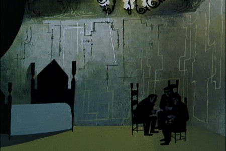
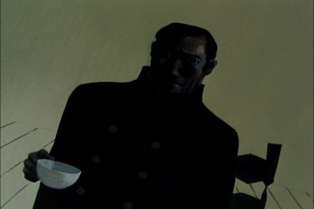
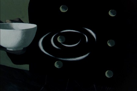
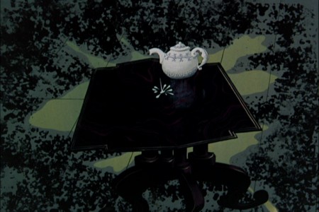
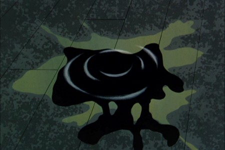
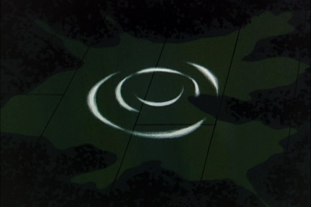
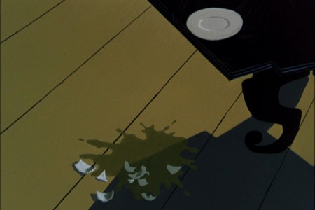
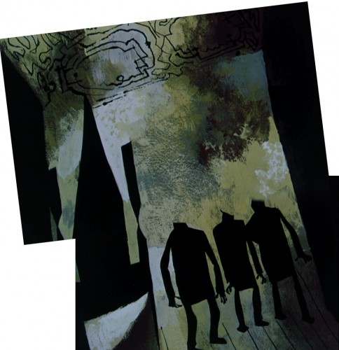
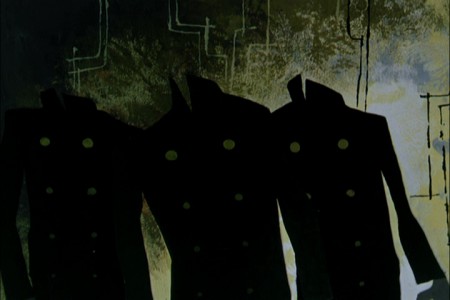
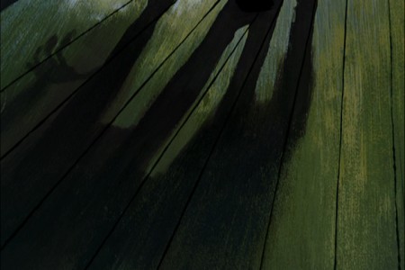
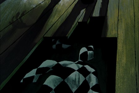
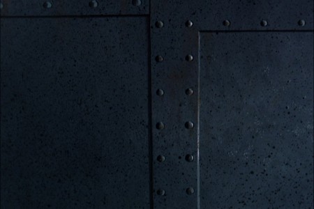
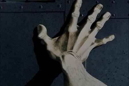
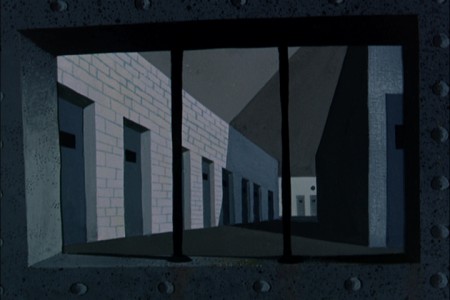
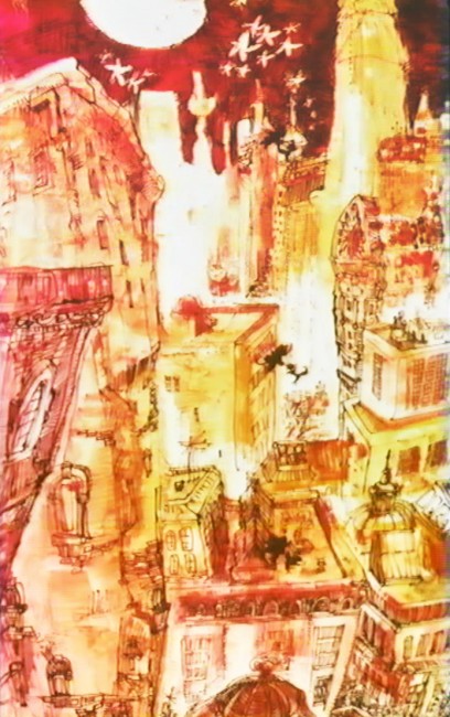
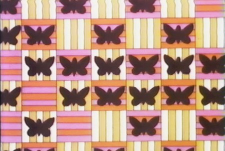
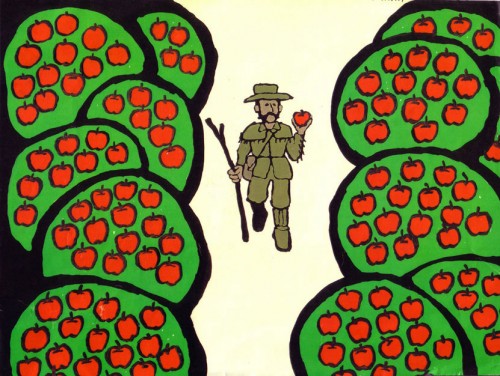
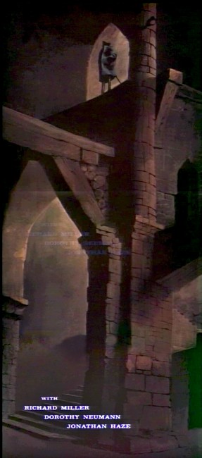
Paul Julian is one of my favorite BG painters. He did a number of titles on his own for Roger Corman’s horror films. They’re had o see, yet I’ve gathered a number of them. This title sequecence was for The Terror, They are just beautiful paintings despite the fact that some of the color prints have deteriorated. It’s eas to understand whyjOHN Hubley took such a liking for his work on THE FOUR POSTER and ROOTY TOOT TOOT.
I’ve continually grown more interested in Paul Julian‘s work. He’s known predominantly for the Bgs he did at Warner Bros and the art direction he did on The Tell Tale Heart. However, there’s more film work he did independently.
The Hangman was a short film he did with co-director Les Goldman. Maurice Ogden’s poem is read by Herschel Bernardi in a very earnest tone. The artwork by Julian absolutely saves this film which was nominated for the Oscar.
Roger Corman also used Paul Julian for a number of opening title sequences for the low budget films he did in the 60s. I’m going to try pulling some frame grabs from a number of these title sequences so that I can place some focus on Julian’s work in these forgotten films.
I start here with The Terror a film Starring Boris Karloff and Jack Nicholson. Julian uses a couple of pieces of artwork that he works over the course of the sequence with lots of lateral camera moves. Quite expressive work, though certainly not on a par with Tell Tale Heart.
 1
1(Click any image to enlarge.)
 6
6
Starts at the bottom and pans up.
You can watch a grayed-out version of this video on YouTube. The credits come on about a minute into it.
Corman’s The Swamp Women
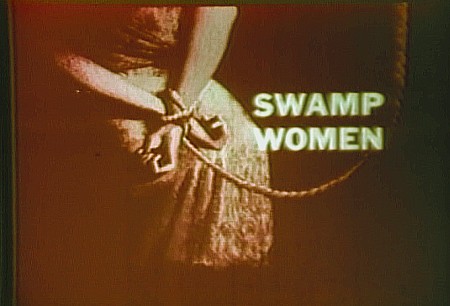
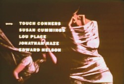
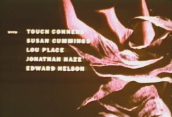
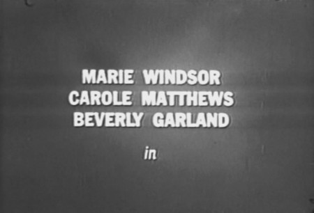
In this post taking frame grabs from Swamp Women, the print includes an obviously added on title card using B&W footage. The color film that follows is so deteriorated and choppy, in this print, that it’s hard to discern what color the original art was. So I’ve tempered it a bit to get rid of the magenta look. I suspect I’m getting close.
The imagery is definitely Julian’s. He had an obvious Ben Shahn influence to some of the work although he gets a bit more surreal in his compositions and designs.
There are fewer camera moves in this title. I’m sure the budget was low. I wouldn’t be surprised if it were in the hundreds (not thousands) of dollars.
(Click any image to enlarge.)
This first title on the rented DVD looks like it was pulled from a B&W print.
Daily post 19 Oct 2013 03:44 am
Hubley & Julian samples
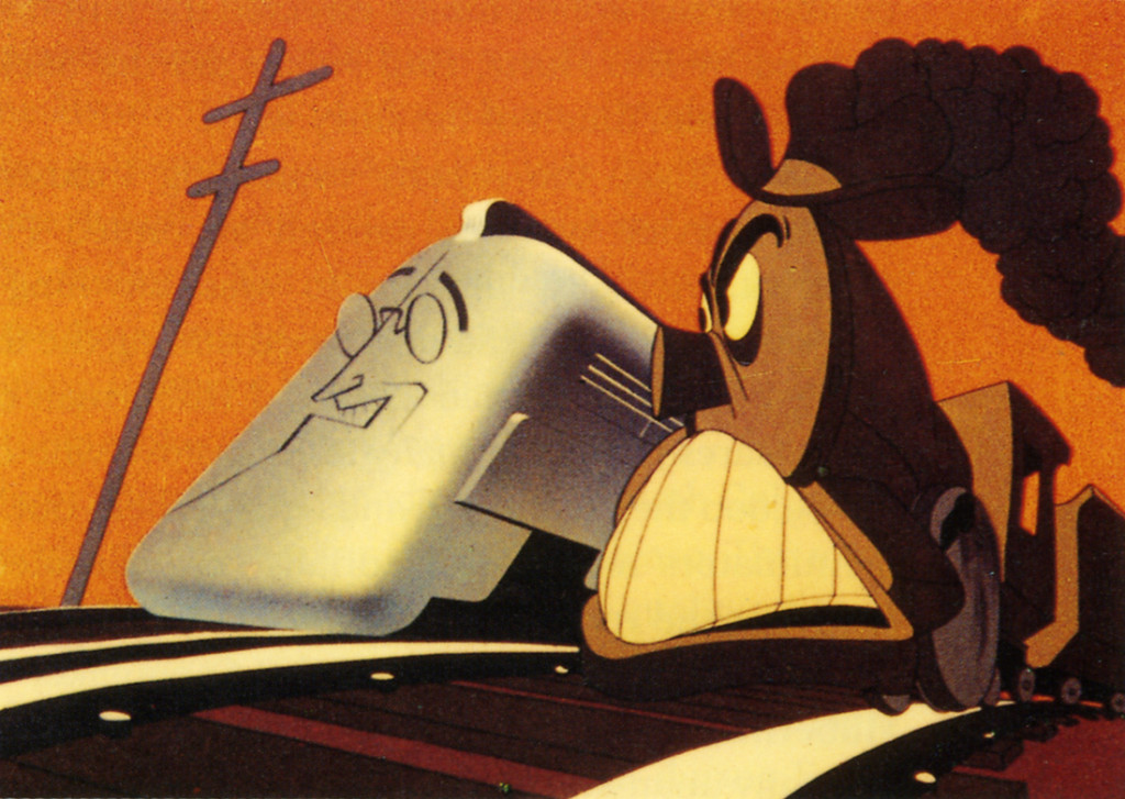 In his book, When Magoo Flew, The Rise and Fall of an Animation Studio – UPA,writer, Adam Abraham details the story of a group of artists working together a new series of films. John Hubley wasn’t always happy though he was undoubtedly one of the leaders of the artists who came together from different sources. Many from Disney, some from the US Army Signal Corps, others from Chouinard Art Institute -a school supported by Walt Disney in his attempts to gain artists for the films he made in LA.
The stories behind the films were done wholly to advance the new art forms being discovered in Los Angeles. It was their notion that by breaking the rules of 19th Century Art animation could begin to come truly alive as an original.
Two of the artists were truly original in the approach, and when they started working together a curtain unveiled something new.
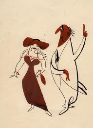 John Hubley was one of the bosses and one of of those who brought strength to the films he created. In the beginning he worked with the animator, However, he was bothereed by some of the color choices made others, particularly by BG artist artist Herb Klynn. Hubley was incensed at the ugly yellow/green that Mr. Klynn would incessantly choose. For this reason (among others) he brought in the gifted master painter Paul Julian to do the the background coloring. Hubley, himself, was a strong designer and a master painter. Who could question what he wanted to do with the department.
Once past a couple of near-sighted Fox and Crow films; Hubley wanted to do films about humans, not animals, and he eventually got his series featuring the near-sighted Mr. MaGoo. In the big picture, though, they were forced to follow many artistic constraints. Despite this, they two did a number of very successful shorts in changing the look and feel of animation globally.
The films done by both Hubley and Julia
Continue Reading »
Commentary 14 Oct 2013 09:20 am
Give me a good drawing
As animation left thee Thirties proudly moving into the Forties there was a lot to be proud of. In a short period, the animators had moved from stick figures to rubber hoses to fully rounded individuals acting through their pieces. The animation had gotten a bit sentimental (as were many live action pictures of the day), but they handled their tasks well.
The acting had grown full throated and offered more than just the surface performances.
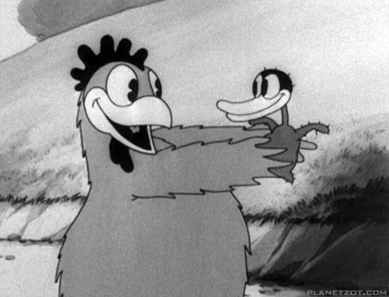
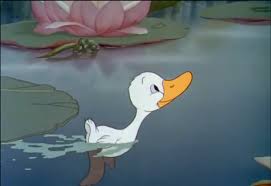
The early version of Disney’s Ugly Duckling and the Later one.
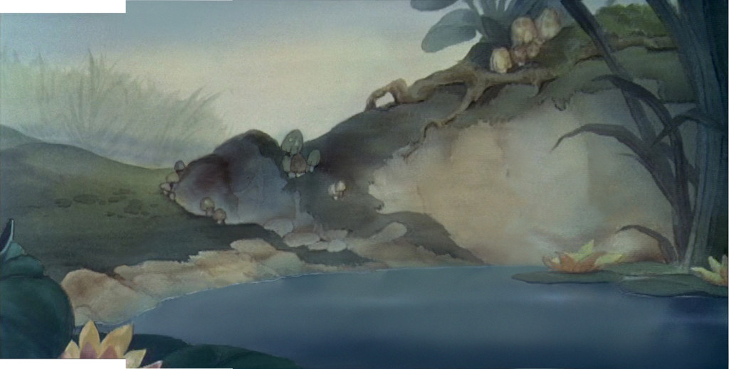
Hans Bacher’s beautiful reconstruction of the BG from the latter film.
Looking at a film like The Old Mill we see rich scenics animated, a film that played against The characterizations of the The Ugly Duckling or Ferdinand the Bull. Warner Bros were starting to slip into their Looney Tunes period as their characters grew smart and zany. This movement was led by Bob Clampett with Tex Avery showing him how to deal out wild paced timing and surrealiztic movement to play for any joke they could get. Disney was straight as an arrow but went for the beauty thing and achieved it as peers competed with each other in the varied studios.
Even Terrytoons were stealing Hollywoods gaga and pulling them off in a somewhat retro manner.
After the Disney strike and the entrance into WWII design and stylization started to grow up. They saw what the Russians had been doing in their attempts to animated the state-run propaganda, ad the art left some inspired, though it was obvious that the animation was living up to their designs.
Some of the animators on the sidelines pushed themselves into the forefront of graphic evolution in animation. Leading the pack in America were the free lanced group working for UPA and the military. The use of strong graphics allowed the aniamtors to get awa with a bit less animation while keeping the films strong. People like Hilberman and Zach Schwartz may have been on the wrong side of Disney’s politics, but they pulled out the stops with their pen and inks.
Films like Hell Bent for Election or A Few Quick Facts About Fear gave the artists the right to move daringl forward with their very strong artwork.
These led Chuck Jones to follow his designers like John McGrew to change the face of the animation. With The Dover Boys of Piemento University all of animation took notice and immediately tried to replicate the work going more and more daring with each film.

Hell Bent for Election
Immediately after the War, these new graphics returned with the troops as Disney made strong colored works dominated by the likes of Mary Blair and the story structure of Bill Peet. Warner Bros., mostly under the guidance of Chuck Jones brought their abstract art to the BGs with similarly strong painters like Paul Julian leading the way. Under John Hubley at UPA he had not only designed and painted films but also co directed the Oscar nominee The Tell Tale Heart.
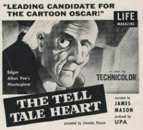
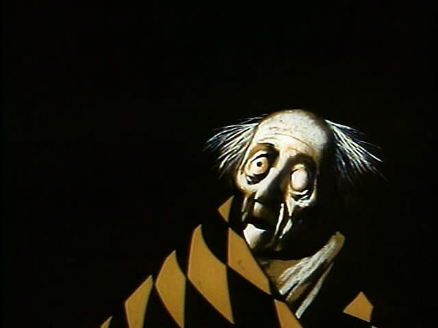
Poster and art for The Tell Tale Heart by Paul Julian at UPA.
Animation went such a distance in a short period of time. From the ball of uncontrolled mass called Oswald the Rabbit, to a rubber hose Mickey & Minnie Mouse to well defined circular characters. It led to more and more sophistication in the scripts and stories with the graphics trying to keep up.
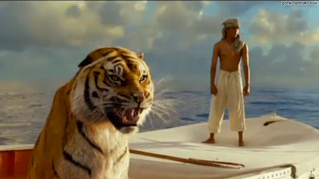
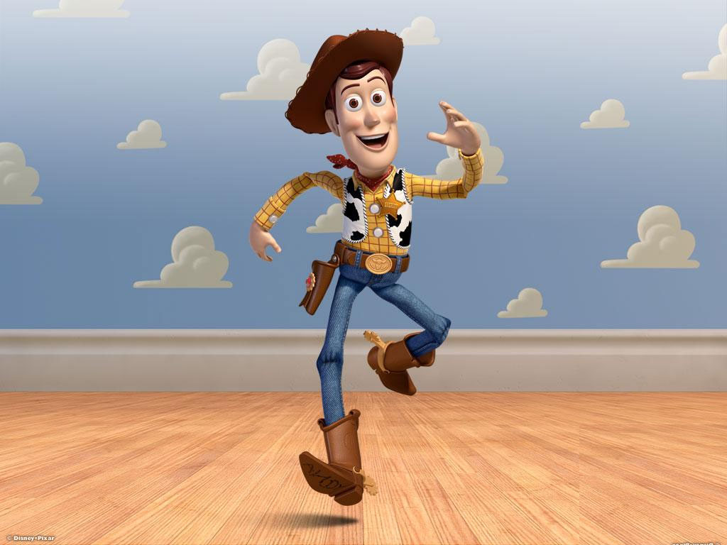 This all ended in 1995 as Toy Story burst onto the screen. The cgi graphics took time to grow up to the sophistication we have today with the likes of Brave or Despicable Me. Seeing the incomparable work in the 2012 Oscar winner, the even more precocious The Life of Pi, gives us pause for thought. We have no idea where animation is going, but for the moment it is definitely not graphically forward. It is difficult to sit by and watch when I have only my meager tools to work with – a pad and pencil. But I continue forward and hope wheat I do will be accepted.
Give me a good drawing. That’s all I ask.
Commentary &Layout & Design 13 Oct 2013 08:17 am
Just Give Me A Good Drawing
I want to write a couple of pieces about design and stylization in animation. This will start us off.
As animation left the Thirties, proudly moving into the Forties there was a lot to be proud of. In a short period, the animators had moved from stick figures to rubber hoses to fully rounded individuals acting through their pieces. The animation had gotten a bit sentimental (as were many live action pictures of the day), but they handled their tasks well.
The acting had grown full throated and offered more than just the surface performances.


The early version of Disney’s Ugly Duckling and the Later one.

Hans Bacher’s beautiful reconstruction of the BG from the latter film.
Looking at a film like The Old Mill we see rich scenics animated, a film that played against The characterizations of the The Ugly Duckling or Ferdinand the Bull. Warner Bros were starting to slip into their Looney Tunes period as their characters grew smart and zany. This movement was led by Bob Clampett with Tex Avery showing him how to deal out wild paced timing and surrealistic movement to play for any joke they could get. Disney was straight as an arrow but went for the beauty thing and achieved it as peers competed with each other in the varied studios.
Even Terrytoons were stealing Hollywood’s gags and pulling them off in a somewhat retro manner.
After the Disney strike and the entrance into WWII design and stylization started to grow up. They saw what the Russians had been doing in their attempts to animated the state-run propaganda, ad the art left some inspired, though it was obvious that the animation was living up to their designs.
Some of the animators on the sidelines pushed themselves into the forefront of graphic evolution in animation. Leading the pack in America were the free lanced group working for UPA and the military. The use of strong graphics allowed the animators to get awa with a bit less animation while keeping the films strong. People like Hilberman and Zach Schwartz may have been on the wrong side of Disney’s politics, but they pulled out the stops with their pen and inks.
Films like Hell Bent for Election or A Few Quick Facts About Fear gave the artists the right to move daringly forward with their very strong artwork.
These led Chuck Jones to follow his designers like John McGrew to change the face of the animation. With The Dover Boys of Piemento University all of animation took notice and immediately tried to replicate the work going more and more daring with each film.

Hell Bent for Election
Immediately after the War, these new graphics returned with the troops as Disney made strong colored works dominated by the likes of Mary Blair and the story structure of Bill Peet. Warner Bros., mostly under the guidance of Chuck Jones brought their abstract art to the BGs with similarly strong painters like Paul Julian leading the way. Under John Hubley at UPA he had not only designed and painted films but also co directed the Oscar nominee The Tell Tale Heart.


Poster and art for The Tell Tale Heart by Paul Julian at UPA.
Animation went such a distance in a short period of time. From the ball of uncontrolled mass called Oswald the Rabbit, to a rubber hose Mickey & Minnie Mouse to well defined circular characters. It led to more and more sophistication in the scripts and stories with the graphics trying to keep up.
 This all ended in 1995 as Toy Story burst onto the screen. The cgi graphics took time to grow up to the sophistication we have today with the likes of Brave or Despicable Me. Seeing the incomparable work in the 2012 Oscar winner, the even more precocious The Life of Pi, gives us pause for thought. We have no idea where animation is going, but for the moment it is definitely not graphically forward. It is difficult to sit by and watch when I have only my meager tools to work with – a pad and pencil. But I continue forward and hope what I do will be accepted.

Give me a good drawing. That’s all I ask.
Commentary &Hubley &Illustration &Models &Story & Storyboards 26 Jul 2013 05:06 am
Telltale Hearts Anew
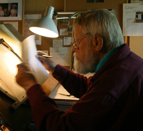 - In at least a half dozen posts I’ve written about Paul Julian‘s magnificent work. Of all of it, The Telltale Heart is probably the richest and most sophisticated of all of this artwork. Such a magnificent artist he was, bordering the realist with the surrealist. I love the man’s work and will continue to feature many of the pleasures he’s given me.
When the Jolly Frolics UPA DVDs were released, there were several films by Mr. Julian that I took great pleasure in analyzing, taking apart and studying anew. How appropriate that John Hubley, my all time favorite, brought the sophisticated Paul Julian into the studio to get him to paint with such elan.
This week, a surrealist one for me if ever there were one, between Verizon’s ample attacks on my phone and blog and the amazingly disturbing hernia operations thrown at me – just for the heck of it – by a brilliant surgeon from India who has worked well in New York City.
It was added b a delightful letter from Borge Ring, by way of his wife, Joanika. The letter prompts a good reason for my posting again the magnificent Julian artwork. I hope you enjoy it, but it’s posted more for my own amusement than yours. Don’t get me wrong, I really hope you enjoy it as much as I do.
Here, then, is the great anecdote b way of Borg:
- hi MICHAEL
Paul Julian’s “Telltale Heart” was shown at Annecy in the sixties. Some0ne asked
producer Les Goldman:
“How long did it take to make the film”?
“It took a year. A year for Paul to paint the film and a year for me to beg the
money together”
cheers
Borge
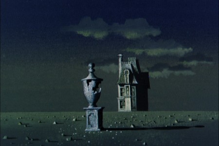
- Of all the pleasures I’ve gotten from the recently released UPA dvd Jolly Frolics the Backgrounds of Paul Julian are a particular enjoyment. His most famous and greatest achievement is, of course, the work he did on The Tell Tale Heart. This is his film. Ted Parmelee directed it, but I’m certain that he pretty much set the camera moves and timing, leaving all the design work for Julian.
The Tell Tale Heart is a tour de force of production design. It is probably one of the first non-war/propaganda animated films, since Baby Weems, to so feature this element of production over everything else – except story. Paul Julian‘s brilliant artwork oozes from the pores of every frame of this film. Together with James Mason‘s narration and Boris Kremenliev‘s strong musical score, the film evocatively tells the strong Edgar Allan Poe story. This tale has not been told on film any better since it was made in 1953. Ted Parmalee directed the film with authority.
 1
1
Commentary &Frame Grabs &Illustration &Models &Title sequences 08 Jul 2013 02:27 am
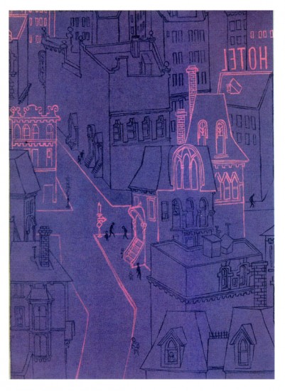
Paul Julian’s The Terror titles
After posting the book, Piccoli, a week or so ago, I’ve grown more interest in Paul Julian‘s work. He’s known predominantly for the Bgs he did at Warner Bros and the art direction he did on The Tell Tale Heart. However, there’s more film work he did independently.
The Hangman was a short film he did with co-director Les Goldman. Maurice Ogden’s poem is read by Herschel Bernardi in a very earnest tone. The artwork by Julian absolutely saves this film which was nominated for the Oscar.
Roger Corman also used Paul Julian for a number of opening title sequences for the low budget films he did in the 60s. I’m going to try pulling some frame grabs from a number of these title sequences so that I can place some focus on Julian’s work in these forgotten films.
I start here with The Terror a film Starring Boris Karloff and Jack Nicholson. Julian uses a couple of pieces of artwork that he works over the course of the sequence with lots of lateral camera moves. Quite expressive work, though certainly not on a par with Tell Tale Heart.
 1
1(Click any image to enlarge.)
 6
6
Starts at the bottom and pans up.
You can watch a grayed-out version of this video on YouTube. The credits come on about a minute into it.
Swamp Women’s title sequence will follow soon.
Daily post 27 Jun 2013 08:30 am
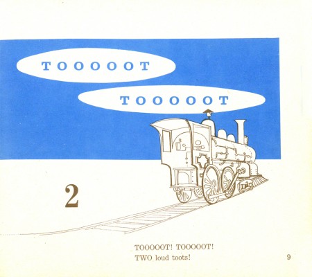
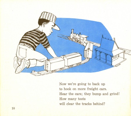
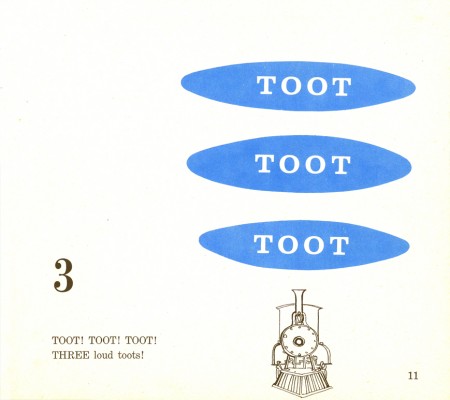
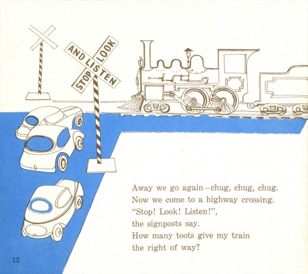
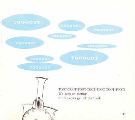
Paul Julian’s TOOOOT!
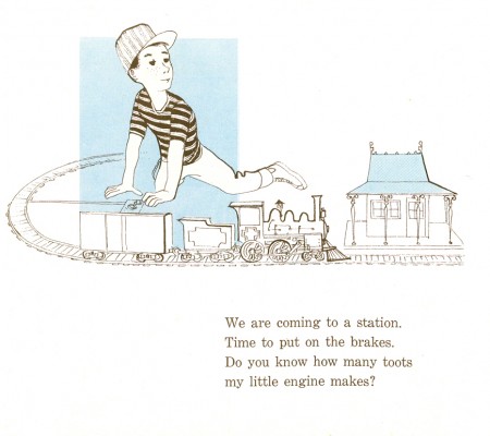
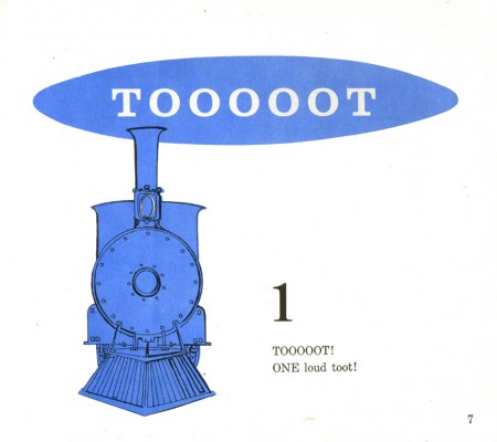
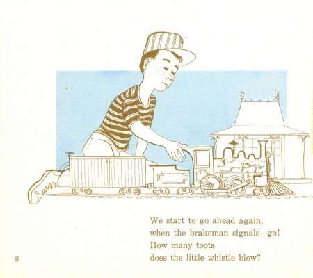
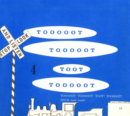
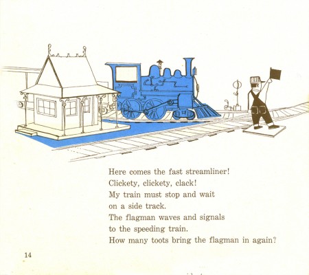
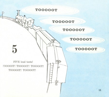
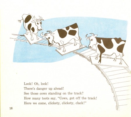
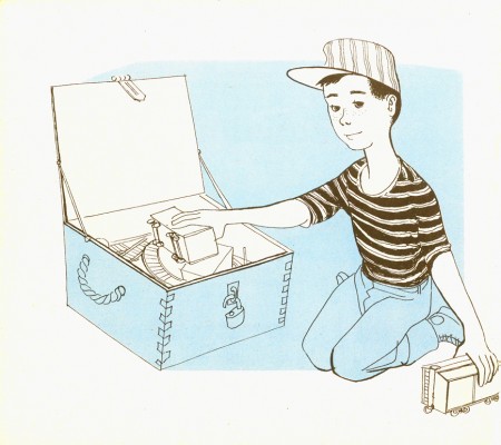
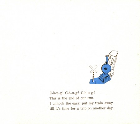
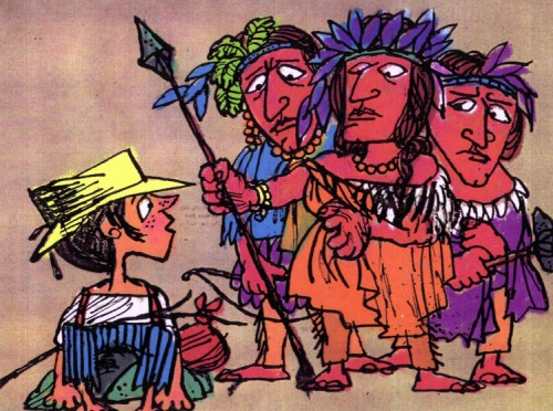
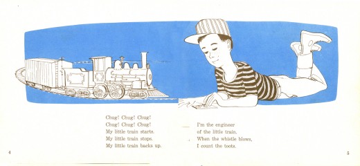
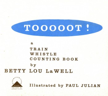 - Here are the illustrations for Tooooot! which is a book illustrated by Paul Julian in 1958 to a text by Betty lou LaWell.
It’s a two color book (black and blue) as were many books of the period. I’m always amazed at how much illustrators of the time got out of the limited color printing. So many big books (by the likes of Dr. Seuss, Bernard Waber, Maurice Sendak among others) were published at the time with more imagination than many of the current books with full color.
The artwork, unlike his other book Piccoli, is composed of graceful and delicate line drawings with the simple, flat color. The work looks very much a part of the brilliant illustrations and art coming out of the 50s, influenced by Ben Shahn and Gregorio Prestopino.
 2
2
and
Piccoli
m
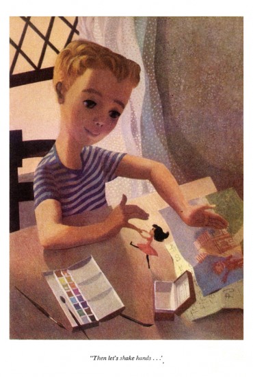
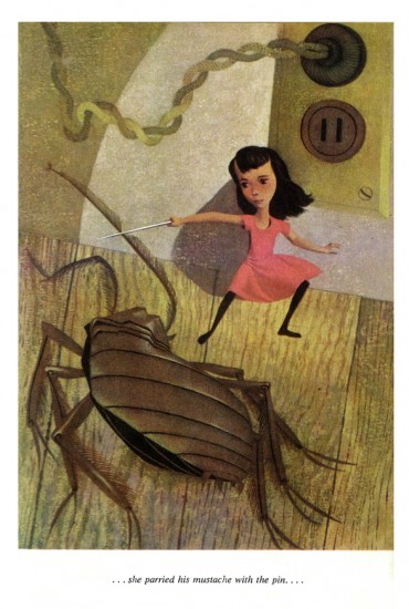
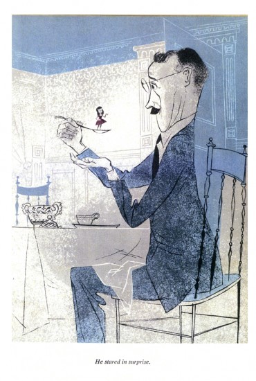
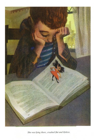
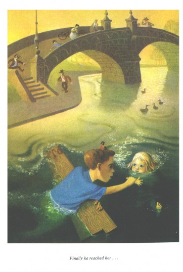
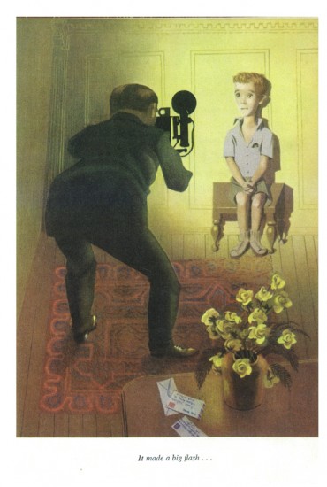
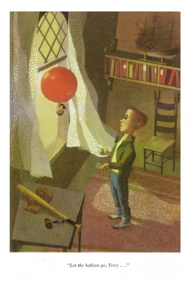
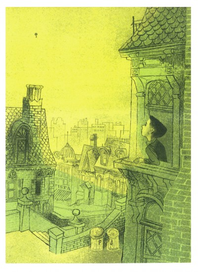
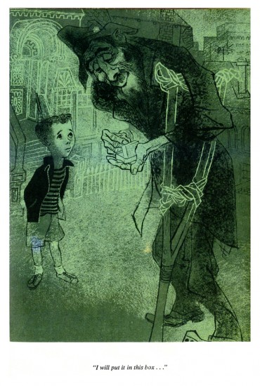
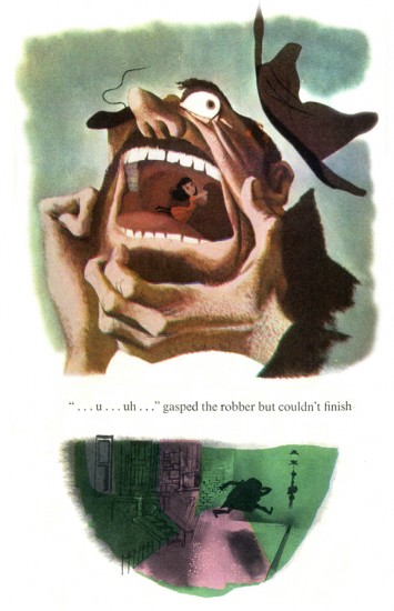
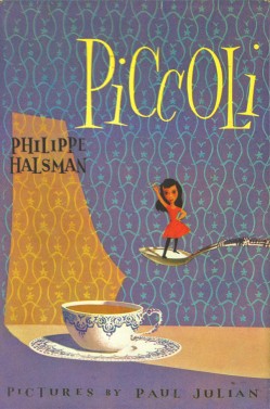 - The brilliant artist/designer/background artist, Paul Julian, illustrated a stunner of a children’s book in 1953. Piccoli is the story of Piccoli Sogni (little dreams) a tiny girl who lives in a matchbox. A stranger gives her as a gift to a sad young boy. She helps to inspire him creatively.
The story is by Phillippe Halsman which he had written for his daughters. He was a celebrated photographer who worked with Salvador Dali on the book Dali’s Moustache. In 1958 he was chosen as one of the 10 greatest photographers in an Internation poll. His 1959 book, Philippe Halsman’s Jump Book, collected more than 200 recognized photographs.
Paul Julian, of course, is well known by animation enthusiasts as one of the principal background artists for many of the most famous Warner Bros cartoons. He also gained some fame for his art direction of the UPA masterpiece, The Tell-Tale Heart.
His work has always seemed just slightly this side of the surreal, to me. His color choices were masterful and the many backgrounds he did reflect his own style. See this excellent post by Hans Bacher on his important blog, Animation Treasures.
John Canemaker loaned me a number of color copies of the book, and I tried to get an accurate read on the colors from the copies, but I suspect they’re still a bit off. Here are Julian’s illustrations for Piccoli:
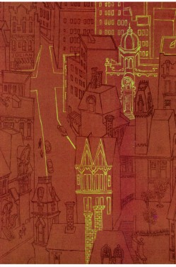
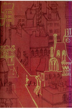
The inner cover of the book.
 2
2
At times the art looks influenced by Gregorio Prestopino.
 8
8
This is actually a composite of two different illustrations
on two separate pages in the book.
Animation &Animation Artifacts &Articles on Animation &Commentary &commercial animation &Independent Animation &Layout & Design 22 Jun 2013 05:13 am
John Wilson 1920 – 2013
A number of years ago I’d made a short trip to LA. During that visit, a man came up to introduce himself. It was John Wilson. He told me that he had just nominated me for an ASIFA Hollywood Award because he’d loved my work. I’d learned so much from watching Mr. Wilson’s films that it was wonderful to see that the mutual admiration society ran both ways.
John Wilson died yesterday. His son, Andrew, wrote to tell me of it. My feelings go out to the family and am enormously sorry that animation loses another one of its masters.
He was a director, designer and animator about whom I’d done a series of posts on his career. Out of respect for Mr. Wilson, I’d like to post all of those articles together (and hold them there for the entire weekend.)
Hope you’ll enjoy.
1.
Let me start by sharing some bio information about John Wilson and his company Fine Arts Films.
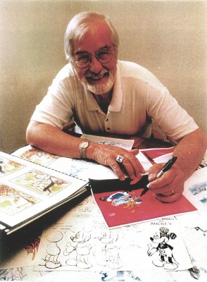 - John Wilson was born in Wimbledon in 1920. He attended the Royal College of Art and was working by age 18 as a commercial artist with Willings Press Service. In WWII he served with the London Rifle Brigade in African where he was seriously wounded. Recuperating in hospital, he drew many cartoons of which several were printed. Eventually he would recover and get work at Pinewood Studios in the art department where he worked on GREAT EXPECTATIONS and THE THIEF OF BAGHDAD, among other films.
- By the time he was 25, he was working in animation at Gaumont-British Animation, a newly formed division of J. Arthur Rank’s studio, working under the direction of David Hand on the “Animaland” series starring “Ginger Nut.”
- In 1950 he moved to the United States working in layout and animation at UPA. He found himself working with Bobe Cannon, Pete Burness, Jules Engel, and Paul Julian. Eventually he left for the Disney studio working in Les Clark’s ‘Tinkerbell’ unit on PETER PAN and with Ward Kimball on TOOT WHISTLE PLUNK & BOOM.
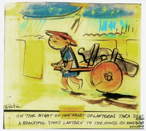
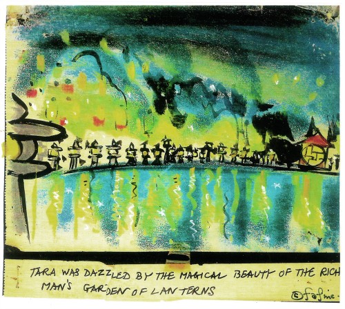
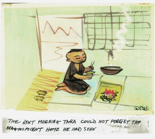
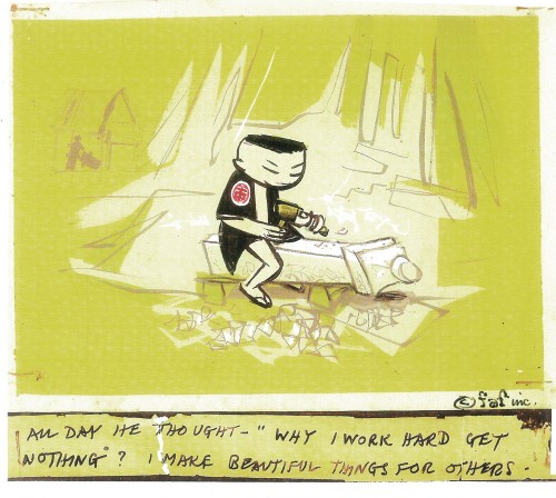
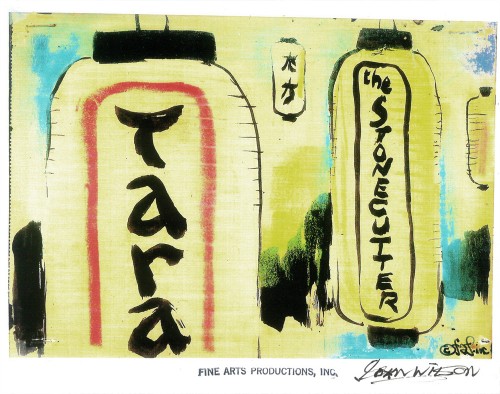
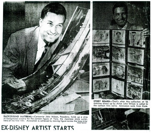
- He tried to sell Disney on the film Tara, the Stonecutter, but they weren’t interested. He completed it himself in 1955 using a Japanese style to tell the story. Wilson was impressed with the UPA style of modern art in animation, and that’s the route he took for his personal film. Thus his studio was born, called Fine Arts Films, in 1955. Tara had some success playing theatrically with the successful Japanese feature film, GATE OF HELL by Kinugasa (which had won the Oscar for Best Foreign Film.)
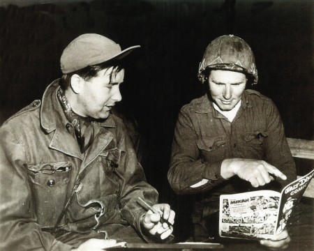
Wilson in Korea with the Bob Hope Tour to entertain the troops.
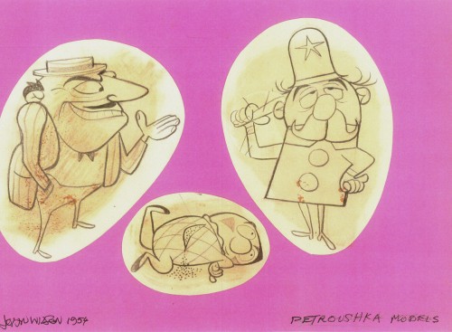
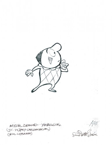
- This film led to his producing a verion of Stravinsky’s Petroushka for NBC which aired in 1956 as part of The Sol Hurok Music Hour. Notably, Stravinsky, himself, arranged and conducted the shortened version of the score suing the LA Philharmonic Orchestra. The film was designed by John Wilson and Dean Spille with anmation by Bill Littlejohn, Art Davis, and Phil Monroe. Chris Jenkyns, Dean Spille and Ed DeMattia designed the 16 minute show from Wilson’s storyboard.
- Fine Arts Films had produced ‘Journey to the Stars’, a project for the 1961 World’s Fair, an animated voyage through space for NASA, which was seen in 70 mm Cinerama by ten million visitors to Seattle.
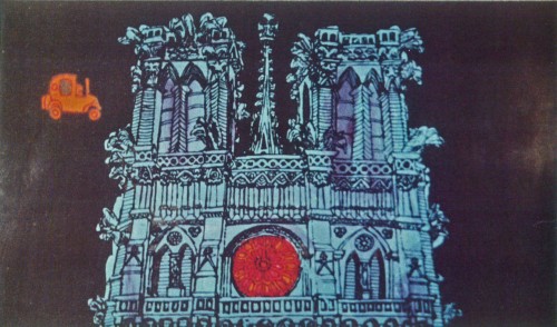
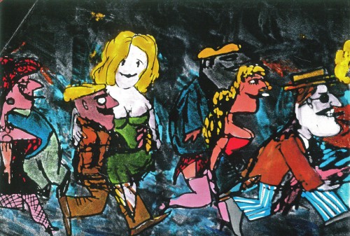
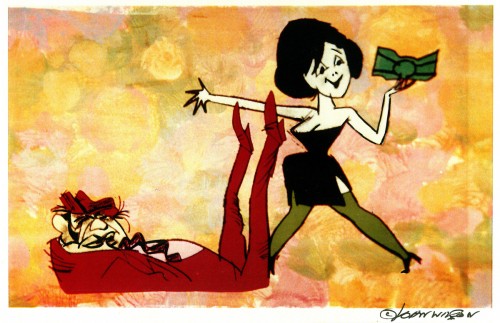
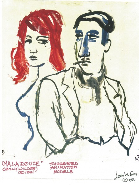
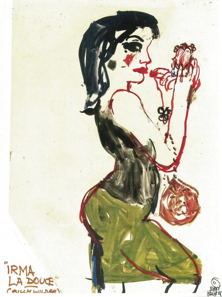
- Billy Wilder employed Wilson to do the titles for Irma La Douce after which they did a six-minute trailer for this Jack Lemmon, Shirley McLaine feature. It was all about Parisian prostitutes romping about in Montmartre, and animation could apparently make it acceptable. Artists Ron Maidenberg, Sam Weiss, Sam Cornell and Bob Curtis caught the vivid nightlife of Paris in a sexually charged animated short. It was a huge success in promoting the feature.
- In 1970 Wilson flew to Chicago to see Carol Channing and Eddie Bracken appearing in “archy and mehitabel in Shinbone Alleyâ€. On the basis of this theatrical musical, Wilson bought the screen rights to the book “archy and mehitabel” by George Herriman and began work on an animated feature which was released by Allied Artists in 1971.
- Fine Arts Films was also responsible for many animated commercials as well as weekly music video segments for the weekly CBS-TV series “The Sonny and Cher Show.†The songs included Joni Mitchell’s “Big Yellow Taxi†and Jim Croce’s “Leroy Brown.â€
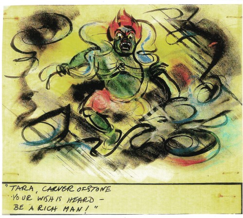
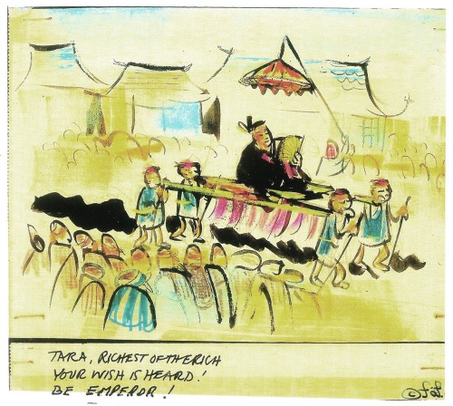
Here are some storyboard sketches by John Wilson for his initial short film, Tara, the Stonecutter. This film started it all for Wilson.
 1
1
I haven’t seen the finished film, but I understand that Japanese decorative papers were used in the backgrounds and costumes of the characters.
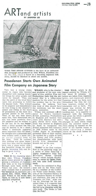
Here are two press clippings for this film from California papers.
(Click any image to enlarge.)
2.
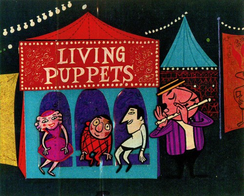
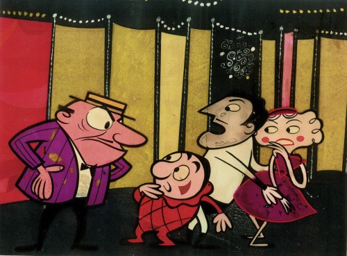
- After completing the film, Tara the Stone Cutter in 1955, John Wilson and his newly formed company,Fine Arts Films, was able to sell the idea of an animated version of Stravinsky’s Petroushka to NBC. They aired the 16 min. film in 1956 as part of The Sol Hurok Music Hour. Stravinsky, himself, arranged and conducted the shortened version of the score using the LA Philharmonic Orchestra.
The film was designed by John Wilson and Dean Spille; animation was done by Bill Littlejohn, Art Davis, and Phil Monroe. Chris Jenkyns, Dean Spille and Ed DeMattia designed the show from Wilson’s storyboard. This is considered the first animated Special ever to air on TV.
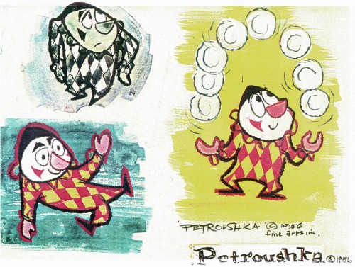
Here are some stills from that film and its artwork.
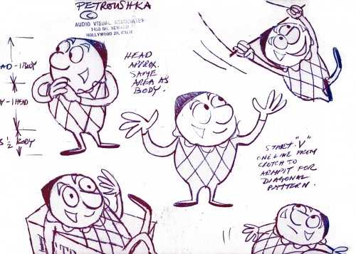 1
1Petroushka – model 1
 11
11
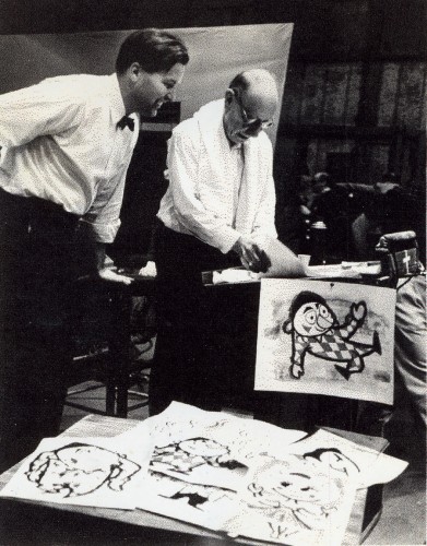
John Wilson and Igor Stravinsky preparing for recording of Petroushka
with the Los Angeles Philharmonic Orchestra (1955).
Here are copies of two reviews:
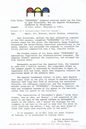
Los Angeles Time review (1956)
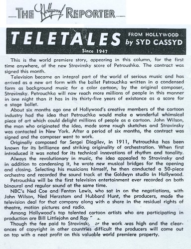
Hollywood Reporter review )1956)
(Click any image to enlarge.)
Petroushka was released on VHS tape combined with a number of the song pieces he did for the Sonny and Cher program. This tape, John Wilson’s Fantastic All Electric Music Movie, can still be found on Amazon but is pricey.
Thanks to Amid Amidi for the loan of this material.
3.
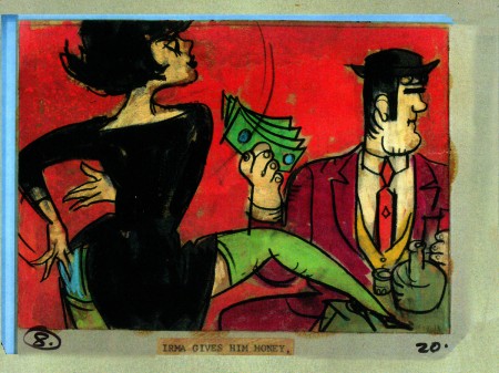
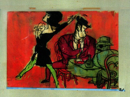
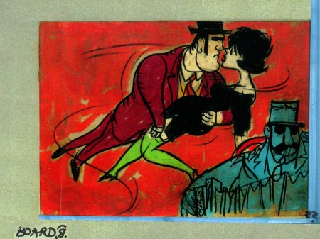
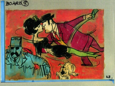
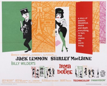 Irma La Douce was a racy film written and directed by Billy Wilder that starred Shirley MacLaine as a Parisian prostitute and Jack Lemmon as a French policeman who falls in love with Irma (Shirley MacLaine.) The film, for its time was daring, and came up with (heaven forbid) a “C” for Condemned rating from the Catholic church. This made it off limits for anyone under the age of 18. I was determined to go see the film, so I ignored the ban and went by myself. Naturally enough, no one tried to stop me. I wasn’t jaded by the movie anymore than I had been disturbed by the violence in all the Warner Bros. cartoons I’d seen. Looking back on Irma La Douce, it really is an innocent film, hardly risqué in any way shape or form.
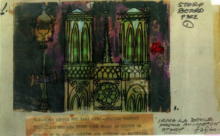
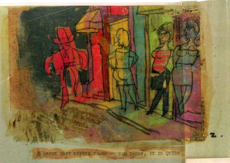
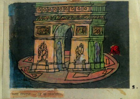
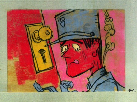
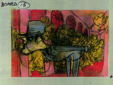
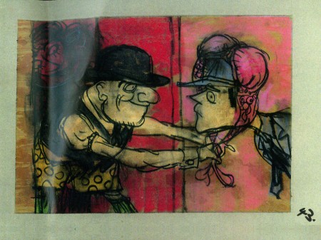
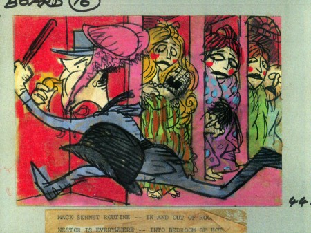
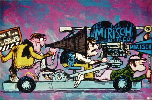
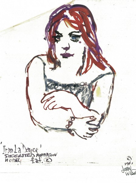
The film started with some nicely drawn animated credits which were done by John Wilson’s studio. Until recently I hadn’t known that Wilson also produced an animated short promoting the feature for the Mirisch Company. I have some preproduction art from that short as well as the color storyboard. The board is large enough that I’ve decided to break it into two parts. We’ll see part one today and the second part next week.
Each section of three images is long enough that unless I post one drawing at a time, it’ll be too tiny to see unless enlarged. I’d like to post each storyboard sketch a nice viewing size and still give you the option of enlarging it.
Let’s start with some production and post production stills so you can see what it looked like.
 1
1
A couple of pre-production drawings:
 1
1
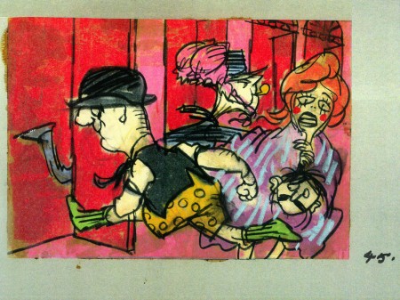
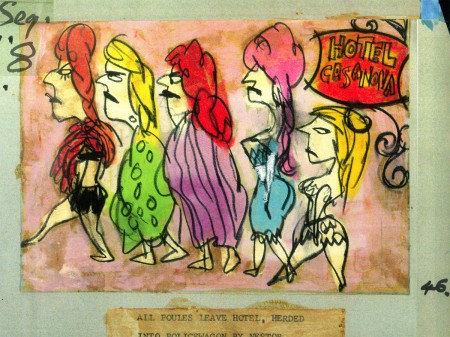
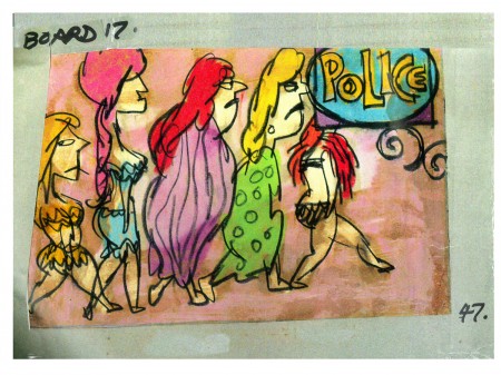
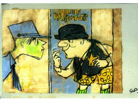
Then, there’s the storyboard. I’ll give an example of the three panel pull out and follow that with each individual image.

You can see why I’ve decided to enlarge the images.
4.
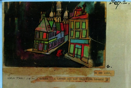
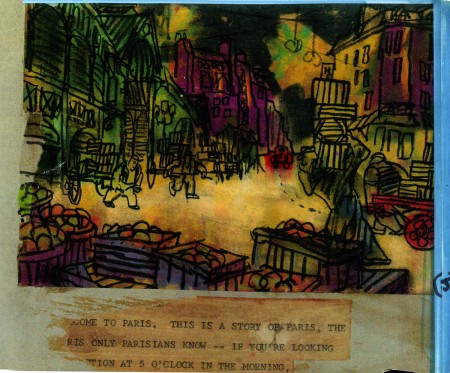
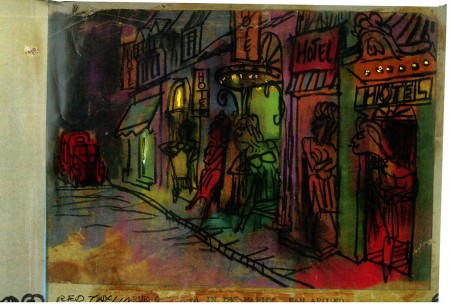
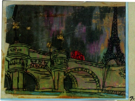
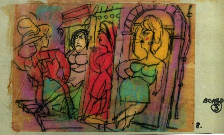
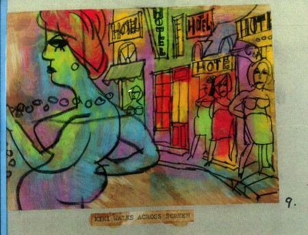
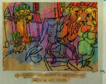
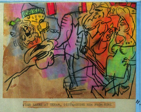
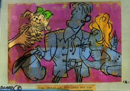
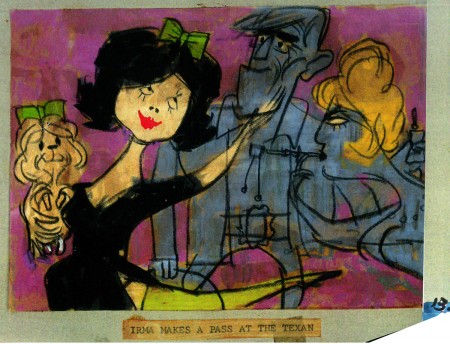
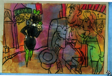
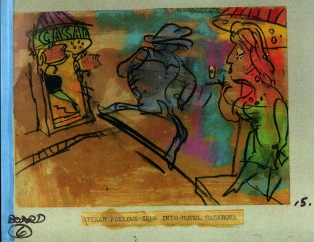
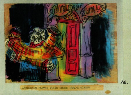
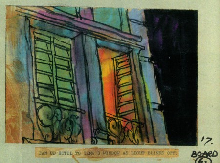
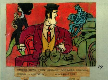
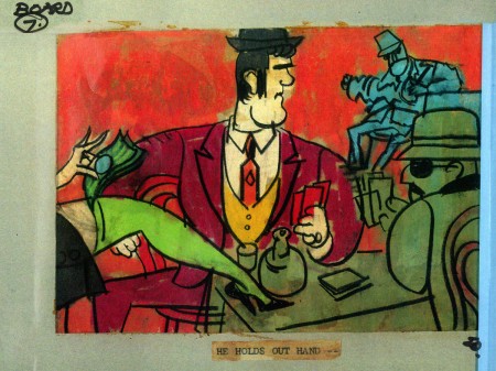
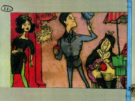
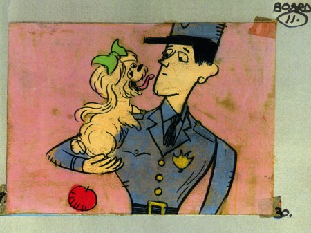
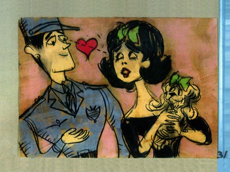
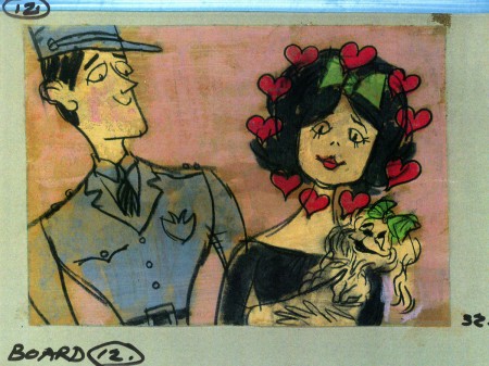
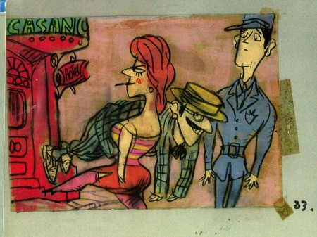
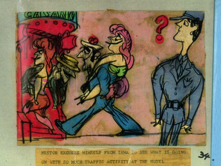
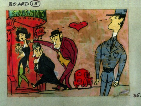
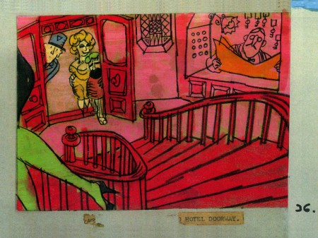
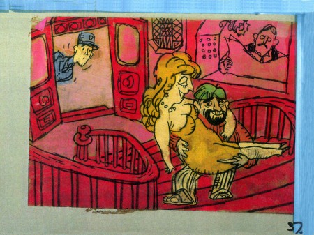
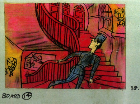
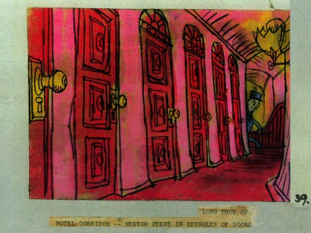
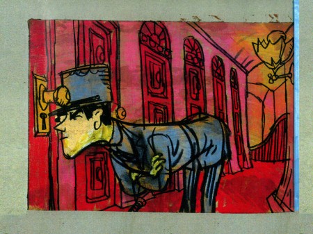
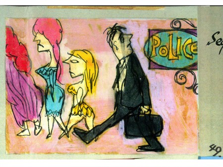
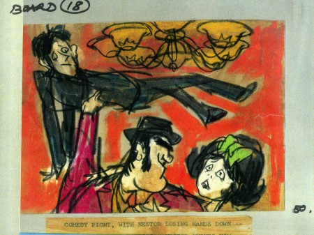
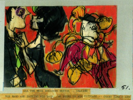
John Wilson created this storyboard for the Mirisch Corp. It was an animated trailer to promote Billy Wilder‘s coming film, Irma La Douce. The board comes in 18 pages of three storyboard drawings. Rather than post the sets of three images (and only being able to show them at a smallish size) I’ve taken each individual drawing and have blown them up to see them better on this blog.
Again, these were for a lengthy trailer for the film not the opening credits. The film’s credits do not use animation.
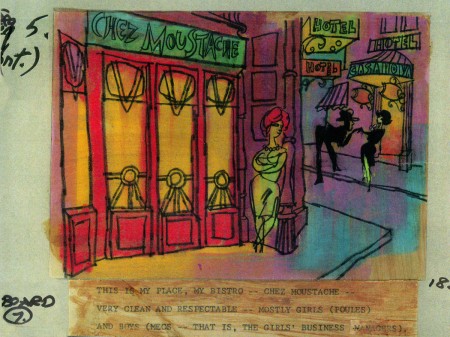 7a
___________________________
Here’s a YouTube version of the trailer. Not the brightest quality, but you can see it.
5.
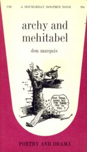 - Don Marquis‘ book, Archy and Mehitabel, garnered fame quickly and not least because of the extraordinary illustrations of George Herriman, the creator of Krazy Kat.
The first book was published in 1927 and others followed in 1933 and 1935. It wasn’t until the third book that Herriman took over the characters created by Marquis in his book of short stories, developed mostly, in poetry. An on-again off-again love affair, the story had two principal characters: a cat, Mehitabel, and Archy, cockroach. (You can read these poems on line here.)
In 1953, writer Joe Darion along with composer George Kleinsinger (the creator of Tubby the Tuba) wrote a musical theater piece. Tenor Jonathan Anderson played Archy and soprano Mignon Dunn was Mehitabel. At about the same time a recording of the showtunes was recorded with Carol Channing as Mehitabel and Eddie Bracken as Archy. The record was a success.
With the help of the young writer, Mel Brooks, they were able to get their show to Broadway in 1957, but it was now named Shinbone Alley. After 49 performances, the show closed, but the original cast album was recorded that same year. The songs stayed in the permanent repetoire of Carol Channing and Eartha Kitt.
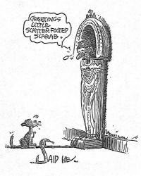 In 1971, John Wilson directed an animated feature starring the voices of Channing and Brackett and using the songs from the musical. The love affair between Archy and Mehitabel was penned by Archy, the cockroach; his poems tell their story.
The film suffers from its music. The songs are simple and sound as if they’re written for children, but the lyrics pull from the poems which are definitely designed for adults. It gets a bit confusing, as a result, and is a bit picaresque; the poems are short and illustrating them in animation would take more adaptation than seen here.
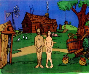 John Wilson had developed his studio, Fine Arts Films, on the back of the weekly, animated, music videos he did for The Sonny and Cher Show, an enormous hit in the early 70s.
These music videos were loose designs animated quickly and lively around the songs Sonny & Cher would schedule each week. There would always be one or two of these pieces, and they were highlights in the weekly one-hour musical/variety program.
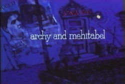 The graphics of Shinbone Alley aren’t too far from these Sonny & Cher videos. Loose design and animation with a design style not too far from the Fred Wolf’s made-for-ABC feature, The Point. This was the first feature made for television and featured the songs and story of Harry Nilsson, although Shinbone Alley featured a wilder color pallette.
Jules Engel, Corny Cole and Sam Cornell all worked in design on the film. The long list of 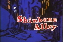 animators included Barrie Nelson, John Sparey, Spencer Peel, Eddie Rehberg and Jim Hiltz. Mark Kausler was an assistant on the show.
The film wasn’t an enormous success, but that was probably explained much by the limited distribution and the poor marketing of the film. I saw the film when it came out; I was living in Washington DC at the time (in the Navy). I was very disappointed. The animation is very limited and the style was a real let-down having known the George Herriman illustrations from the Don Marquis book. We’d already seen those limited animation Krazy Kat cartoons from King Features, so I knew the style could be done adequately – even on a budget. The style in this film just seemed a little too Hollywood cute, at the time, and it felt dated when it came out. I don’t feel too differently about it watching the VHS copy I own.
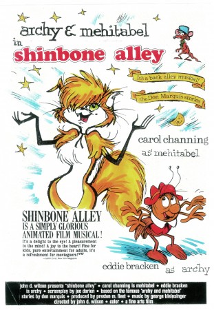
the film’s poster
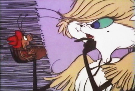
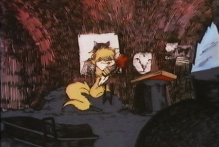
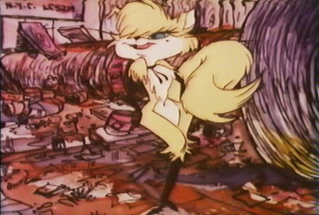
Here are some frame grabs from the first 1/4 of the film:
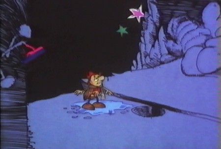
We’re introduced to Archy right off the bat as he
flies out of the river onto the dock. He realizes that he,
the poet, tried to kill himself and was sent back as a cockroach.
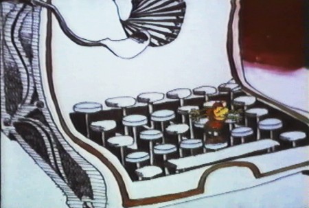
He soon finds a typewriter and goes straight back to work.
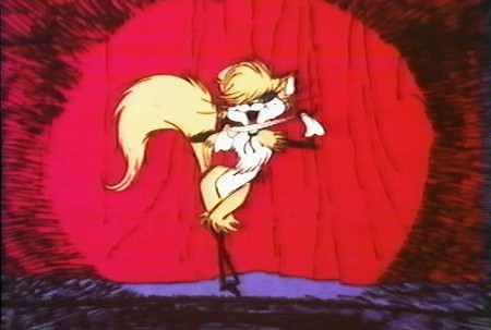
Mehitabel is a performer – with Carol Channing’s voice.
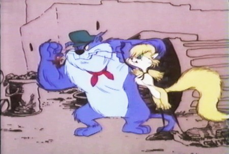
She has another boyfriend, voiced by Alan Reed,
who is also the voice of Fred Flintstone.
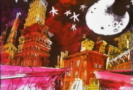
A song video takes us outside.
6.
- This final post featuring the work of John Wilson and his company, Fine Art Films, covers many varied film projects. Unfortunately, I found relatively few images available for posting especially considering the amount of film done.
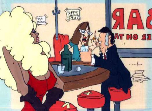
The Sonny and Cher Show was a long running Variety program on television in the 70s. Most weeks featured an animated music video as done by John Wilson. Some examples of this include:
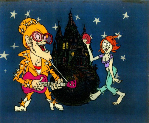
Helen Reddy’s song “Angie Baby”
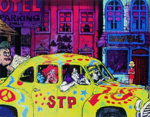
Joni Mitchell’s “Big Yellow Taxi”
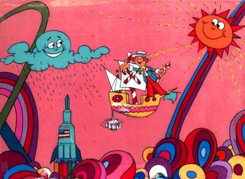
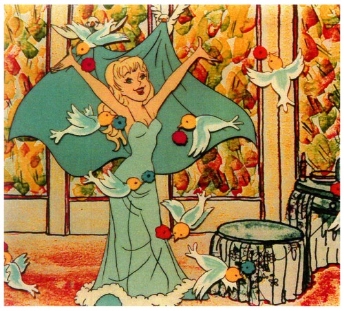
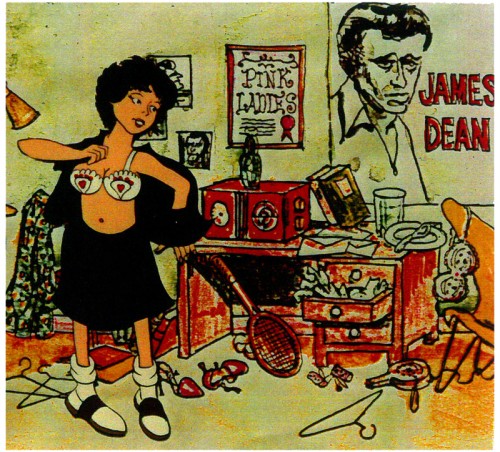
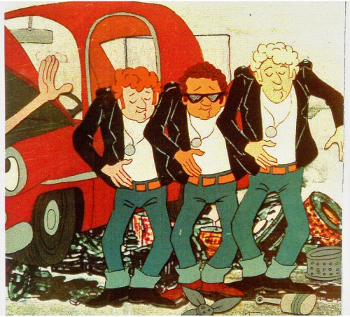
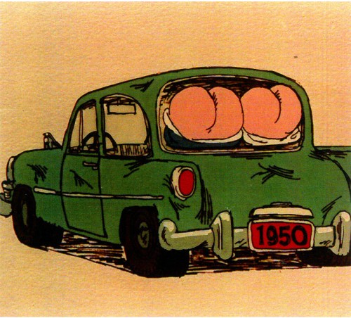
Fine Arts Films also did some movie titles and trailers. We saw, recently, the long theatrical trailer done for Irma La Douce. Here are a few stills done for the main title sequence for the 1978 musical, Grease.
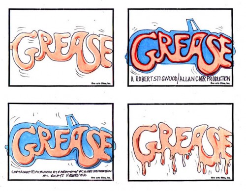
storyboard sketch for Grease.
Produced and Directed by John Wilson
Story and Layout by Chris Jenkyns
Music by Barry Gibb
John Wilson also directed a number of short films which appeared on television on the NBC program, “Exploring” between 1964-1966.
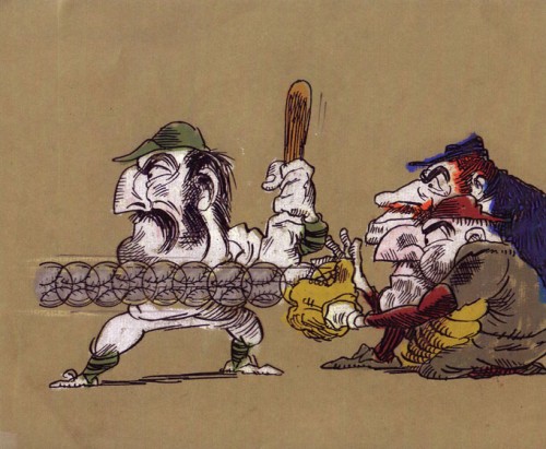
“Casey At the Bat”
Narrated by Paul Frees
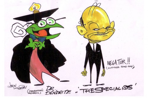
Finally, for MTV’s “Liquid Television” in 1992 John Wilson directed some of the 10 episodes of a series called “The Specialists.”
 1
1
Go here to see other episodes.
Animation Artifacts &Articles on Animation &Hubley &Independent Animation &John Canemaker 16 Jun 2013 04:53 am
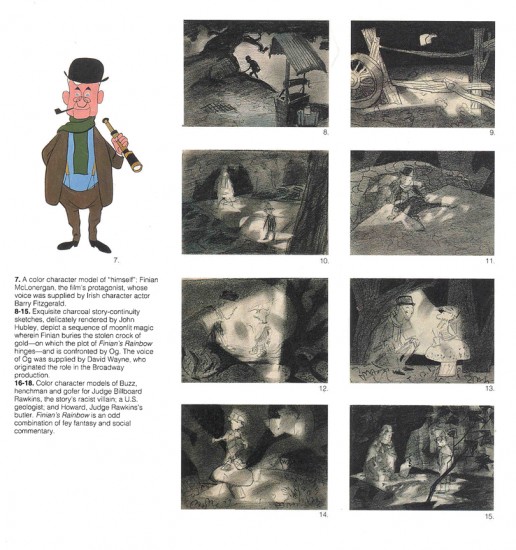
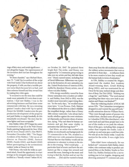
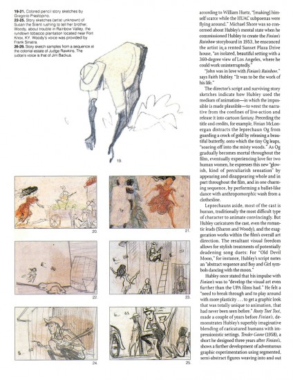
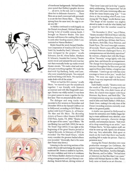
Finian’s Rainbow
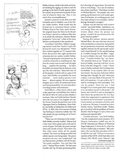
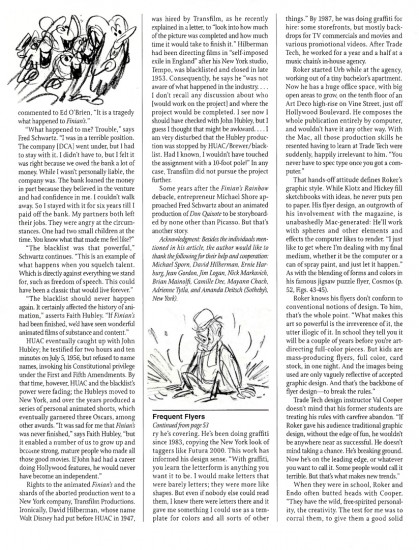
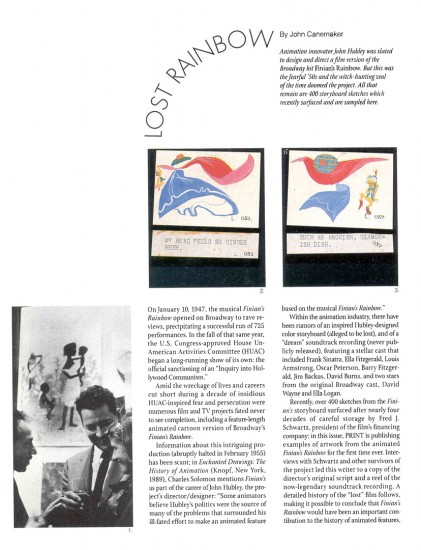
This article by John Canemaker is, to me, one of the most important pieces I’ve ever posted. I want to continue to give it some fresh air time, and I think today’s the day to post it anew. It’s one of the great articles ever printed in Print Magazine and a brilliant piece of historic recreation by John Canemaker. I’ve read it a couple dozen times, and am about to read it again, now. (Yesterday, I heard Duke Ellington perform “Tenderly” on the radio and that was enough to prompt me to repost it. I’d intimately known the Oscar Peterson/Ella Fitzgerald version of the song. Here was Ellington’s version which literally took the song apart and reconstructed it. Art was performed in front of me thanks to local radio.)
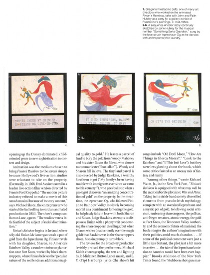
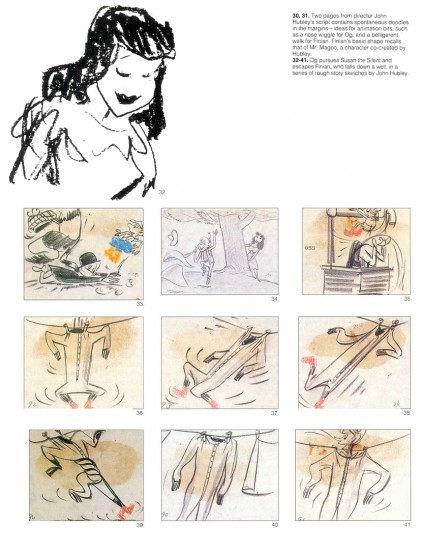
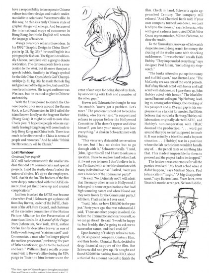
 - A treasure of a piece, John Canemaker wrote an article for the March/April 1993 edition of Print magazine an article about Finian’s Rainbow. This was an animated feature well under way in 1953 to be directed by John Hubley. It was to be an adaptation of the successful Broadway musical by Burton Lane and E.Y. Harburg. The film about racism twisted into a fantasy story about love and leprechauns would have been the first official adult film done by a team of brilliant animation artists. The soundtrack would have featured songs sung by Frank Sinatra, Ella Fitzgerald, Louis Armstrong, Oscar Peterson and Jim Backus.
I remember hearing stories about animation in production at the Bill Tytla studio, with Tytla animating on it. In Hollywood, Art Babbitt and Bill Littlejohn were animating, with Paul Julian, Aurelius Battaglia and Gregorio Prestipino art directing. Maurice Binder had assembled a LEICA reel.
Senator Joseph R McCarthy and the HUAC investigation brought the entire project down to ground and set back the history of animation some 30 years.
John Canemaker has generously allowed me to post this article again; I wanted to celebrate the artist and director,John Hubley.
 1
1
The story told to me by several people came most faithfully from Jim Logan, a long-time Asst. Animator working for Bill Tytla and sitting at a desk nearest Tytla’s office. Within his office there was a wall of mirrors. Tytla was in the middle of a hand out of a scene from Finian’s Rainbow. He was acting as an animation director for Hubley. He wanted the animator to practice the dance steps with him in front of the mirror. The animator was embarrassed to be asked to roll up his pants legs so he could better see how the move should animate.
Tytla was in his element. This was the first time since he’d left Disney’s that he was really being asked to do animation, get animation out of his staff for this eccentric and thoroughly adult animated feature. It was about Racism in 1956, and it was a serious attempt to do something serious and political and funny – all at the same time. Within days the animated scene had been collected by the producers who lost all their financing because of a ridiculous anti-communist comment thrown Tytla’s way. Tytla wasn’t the only one who lost; Hubley did as well. As a matter of fact, the entire industry lost. A second rate journalist made easy accusations, and the only thing to be done was to shut the production down.
Years later a young Francis Ford Coppola directed a young Petulia Clark with another Brit, song and dance man, Tommy Steele, playing the mischievous leprechaun. Needless to say, that film is a minor effort from Coppola’s resume.
Frame Grabs &Layout & Design &Title sequences 28 Jan 2013 06:18 am
Paul Julian’s The Terror titles – redux
After posting the book, Piccoli, a week or so ago, I’ve grown more interest in Paul Julian‘s work. He’s known predominantly for the Bgs he did at Warner Bros and the art direction he did on The Tell Tale Heart. However, there’s more film work he did independently.
The Hangman was a short film he did with co-director Les Goldman. Maurice Ogden’s poem is read by Herschel Bernardi in a very earnest tone. The artwork by Julian absolutely saves this film which was nomainted for the Oscar.
Roger Corman also used Paul Julian for a number of opening title sequences for the low budget films he did in the 60s. I’m going to try pulling some frame grabs from a number of these title sequences so that I can place some focus on Julian’s work in these forgotten films.
I start here with The Terror a film Starring Boris Karloff and Jack Nicholson. Julian uses a couple of pieces of artwork that he works over the course of the sequence with lots of lateral camera moves. Quite expressive work, though certainly not on a par with Tell Tale Heart.
 1
1(Click any image to enlarge.)
 6
6
Starts at the bottom and pans up.
You can watch a grayed-out version of this video on YouTube. The credits come on about a minute into it.
