Category ArchiveIllustration
Animation &Books &Hubley &Illustration 16 Jan 2011 08:52 am
Recap – Art Director Awards ’57
Here’s a recap of one of my favorite pieces. For some reason, I get turned on by every one of these stills. Perhaps because they were printed in the Halas book which was seminal to my education about animation when I was a child – I think I had the book on permanent loan from my local library. Whatever the reason, I love looking at these pictures.
.
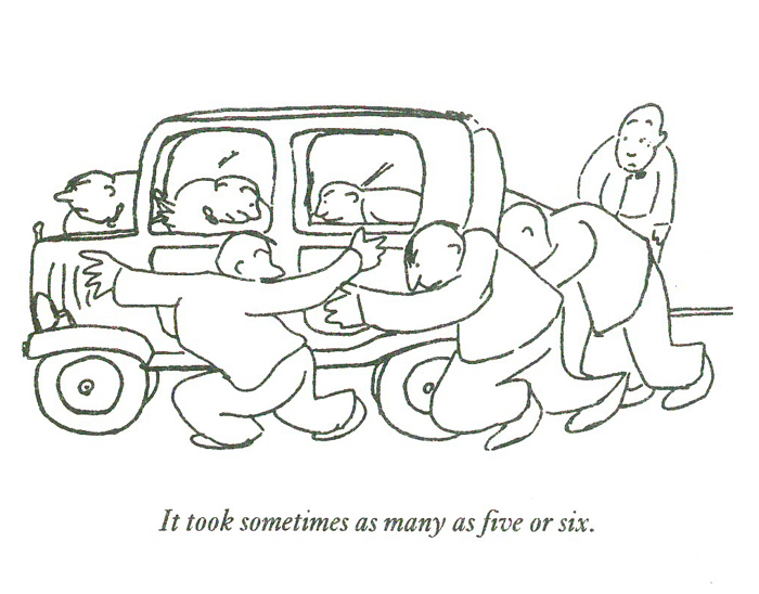
- I enjoy thumbing through the Art Director’s Annuals. There’s a lot of amazing illustration to view with plenty of ideas and sharp graphics on display. I have, as a good example of these hard-covered catalogues, the 1957 issue. 90% of the book is composed of illustration in the different advertising fields. A small section is devoted to TV spots and illustration. Naturally, I have a strong interest in this section.
Editorial Art, Advertising Art and Television Art all get their chapters.
Here is a pictoral list of the winners in animation for the TV commercials awards in 1957. A number of these spots have remained familiar (at least as images in old animation books – like Halas’ Technique of Film Animation.)
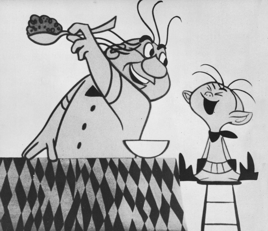
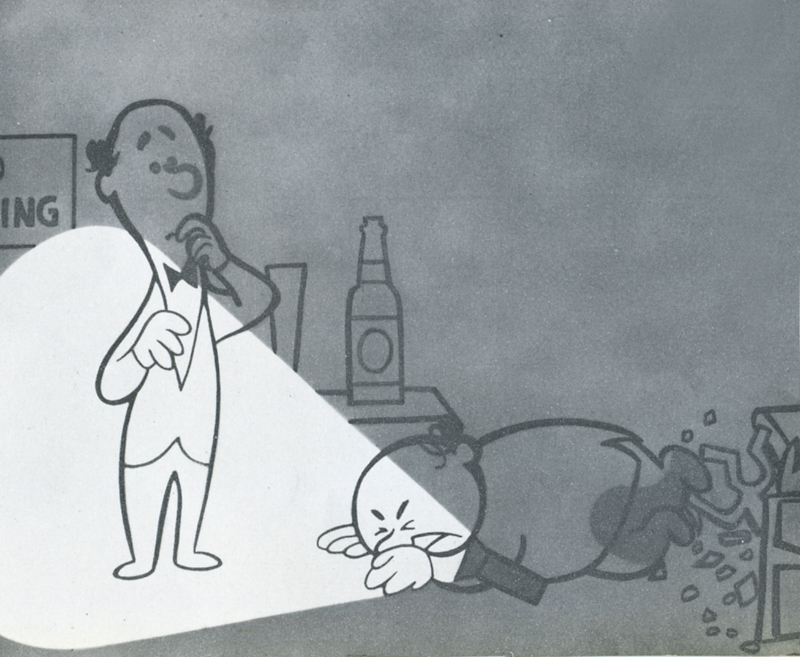
The biggest prize went to John Hubley’s Maypo commercial.
Storyboard Inc. – producer
John Hubley – Director & Art Director
Emery Hawkins – animator
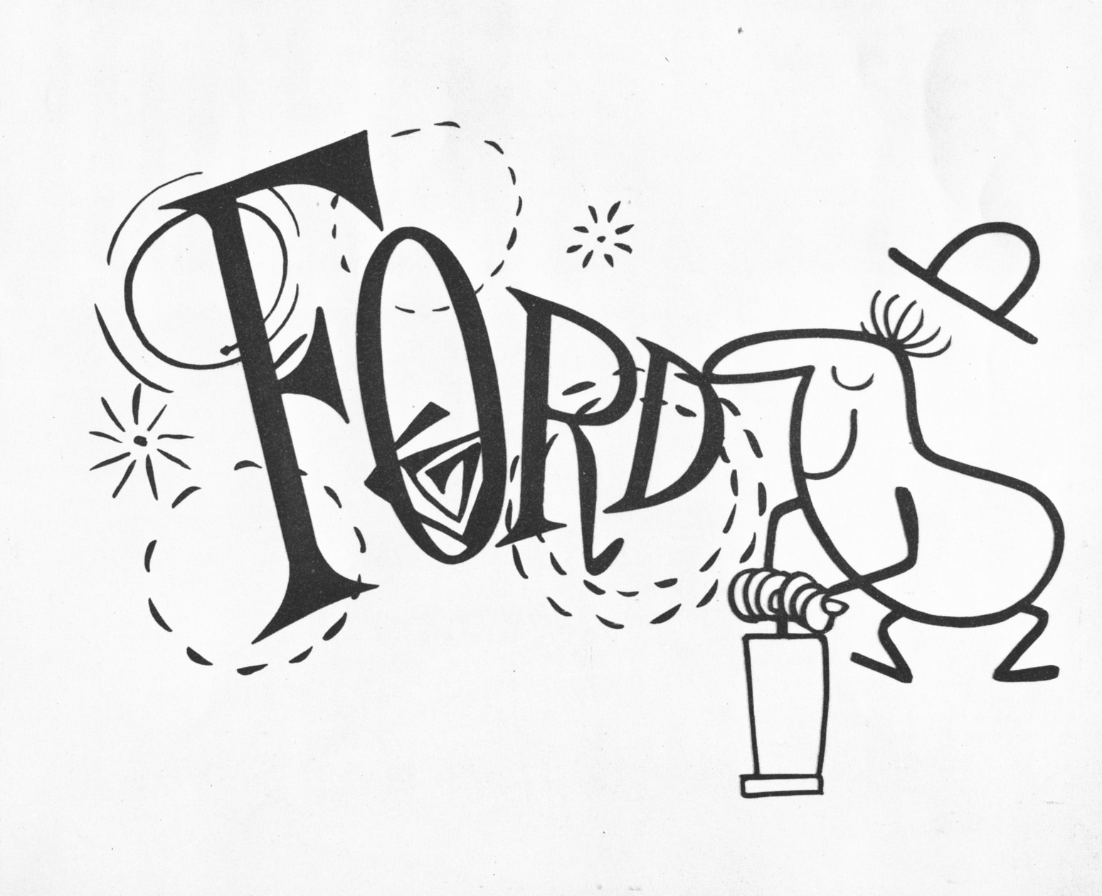
Ford commercial
Playhouse Pictures – producer
Bill Melendez – director
Sterling Sturtevant – Art Director
Bill Littlejohn – animator
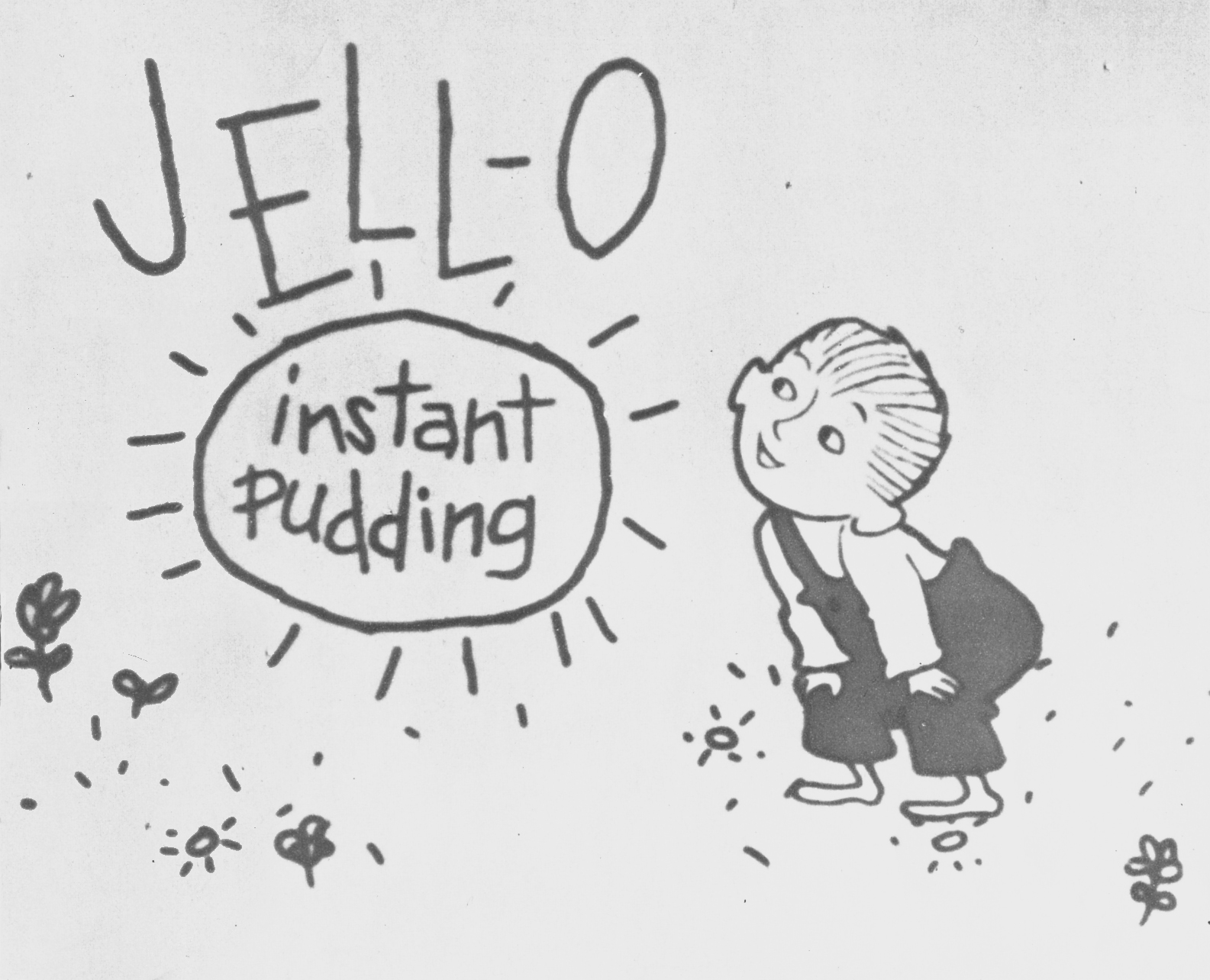
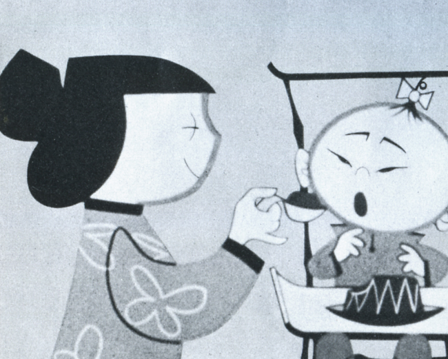
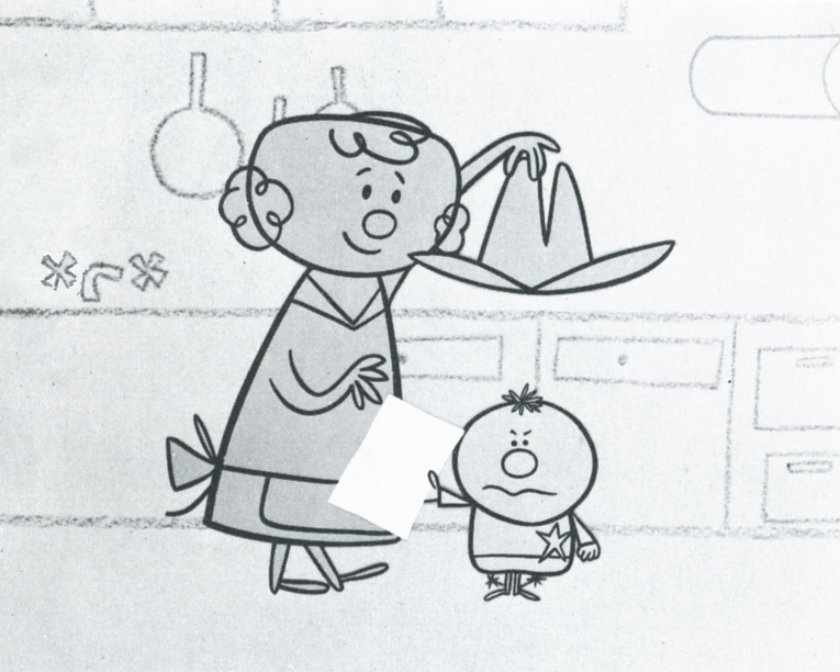
Jello
Ray Patin Productions – producer
Sonia Linker – Art Director
Maurice Sendak – artist
Maxwell House
Audio Productions Inc. – producer
Jerome Kuhl – artist
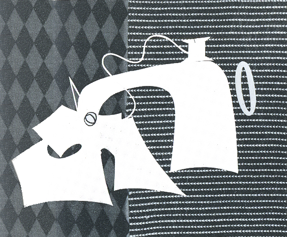
Piels Brothers Beer
UPA – producer
Jack Sidebotham – art director
Chris Ishii – designer
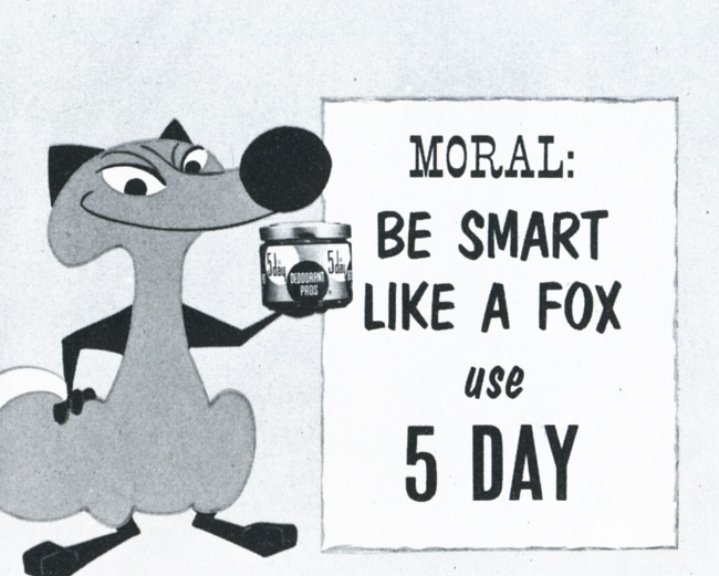
5 Day Deoderant
Storyboard Inc – producer
John Hubley – art director
Art Babbitt – animator
Jello Baby
Ray Patin Productions – producer
Ruchard Vab Benthem – artist
Ken Champin – photographer
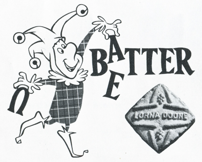
Lorna Doone
Bill Sturm Studio
Frank Broadhurst – art director
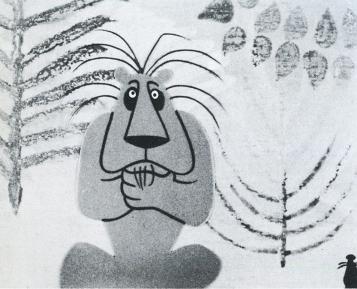
The Lion and the Mouse – Prudential
Storyboard Inc. – producer
John Hubley – director
Art Babbitt & Emery Hawkins – animation
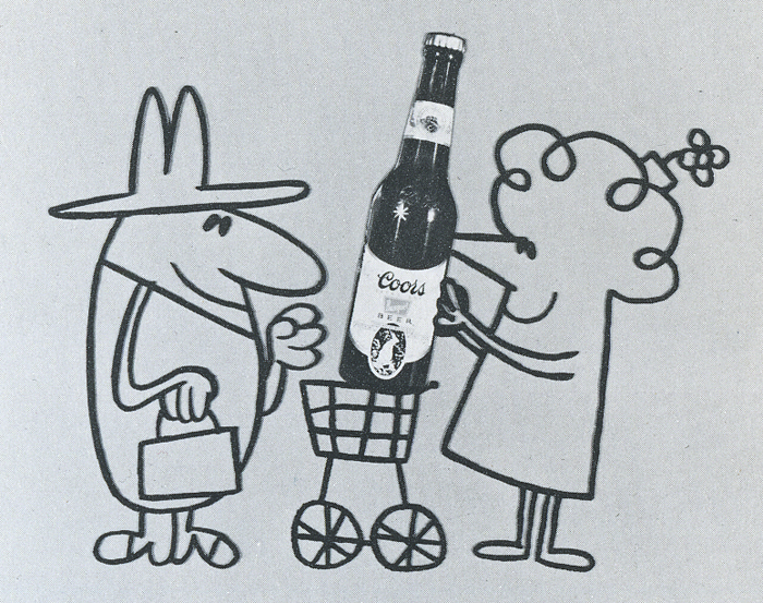
Coors Beer
UPA – producer
Jules Engel – director
Fred Crippen – art director
Scott Paper Co.
UPA – producer
Jack Goodford – art director
Grim Natwick, Sam Wiggenhorn – animators
Donahue Sales Corp.
UPA – producer
Jack Goodford, Chris Ishii – art directors
Cliff Roberts – animator
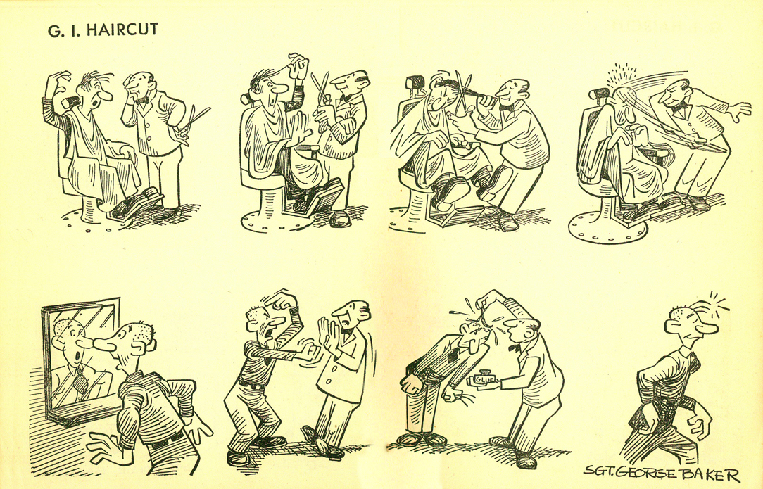
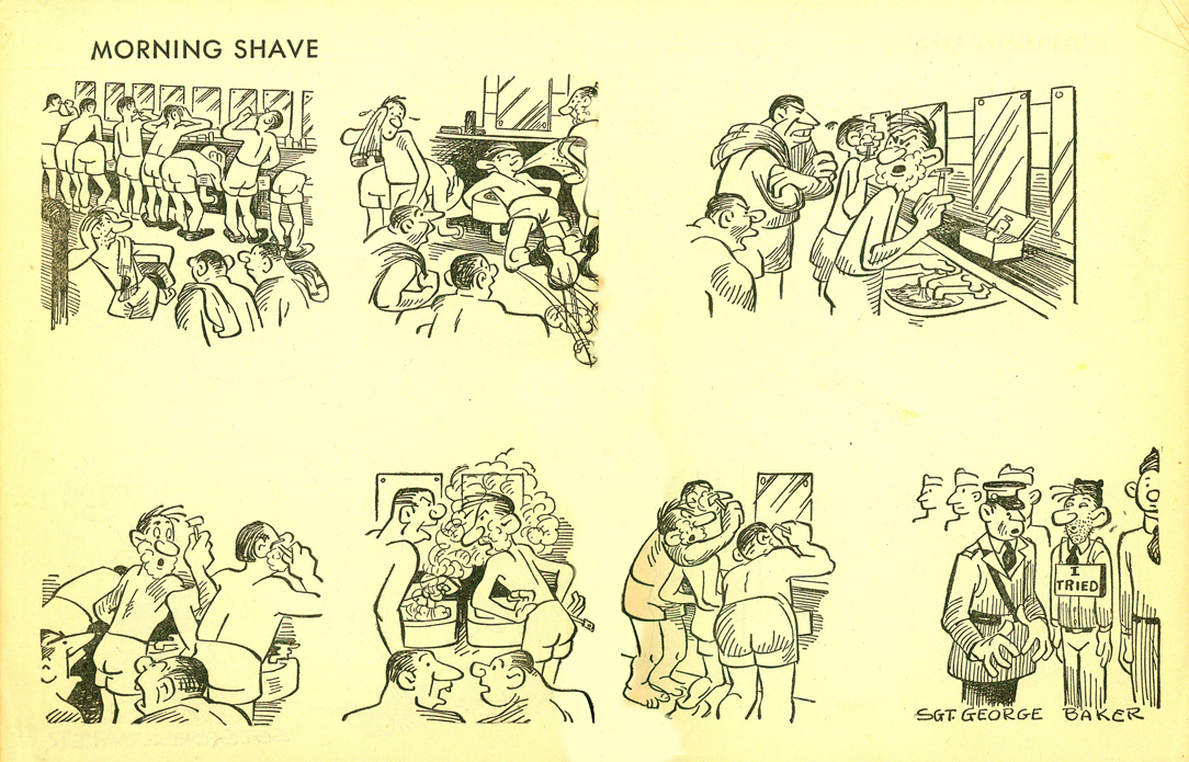
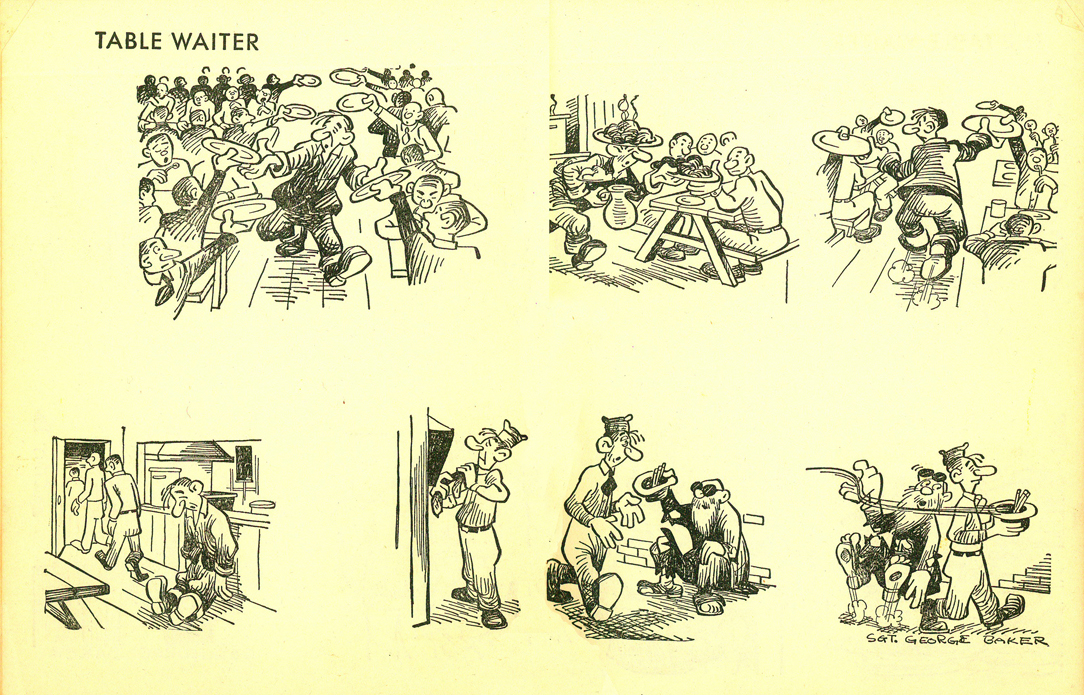
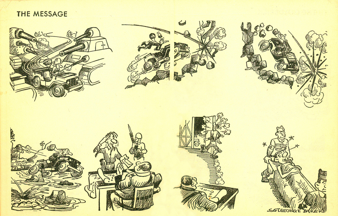
Bill Peckmann &Comic Art &Illustration 15 Jan 2011 09:01 am
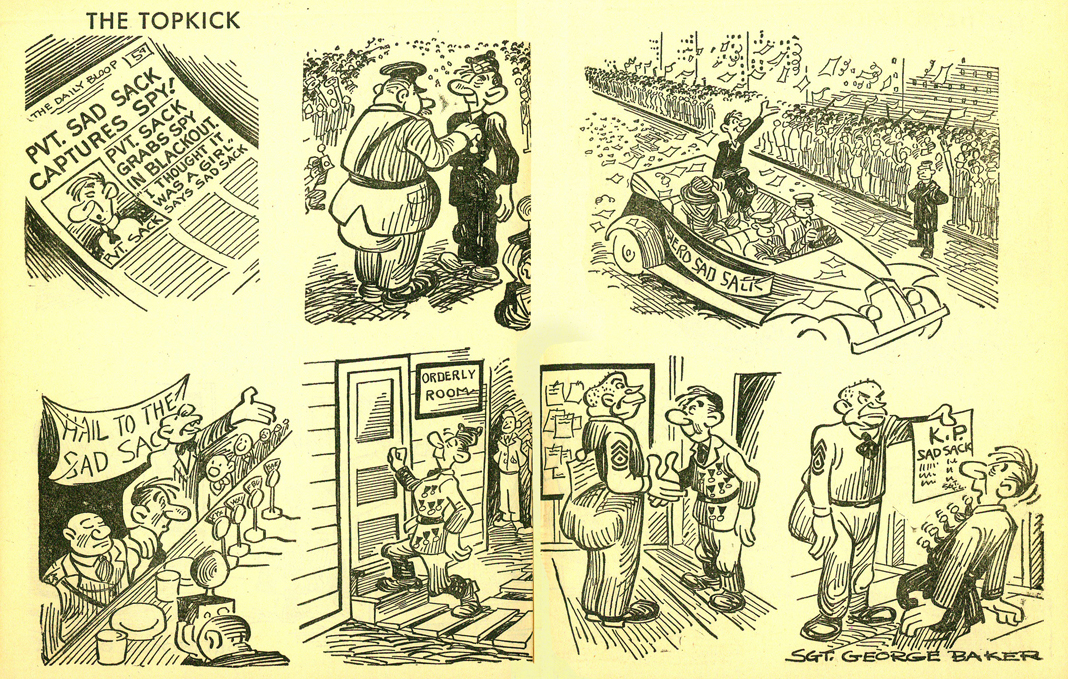
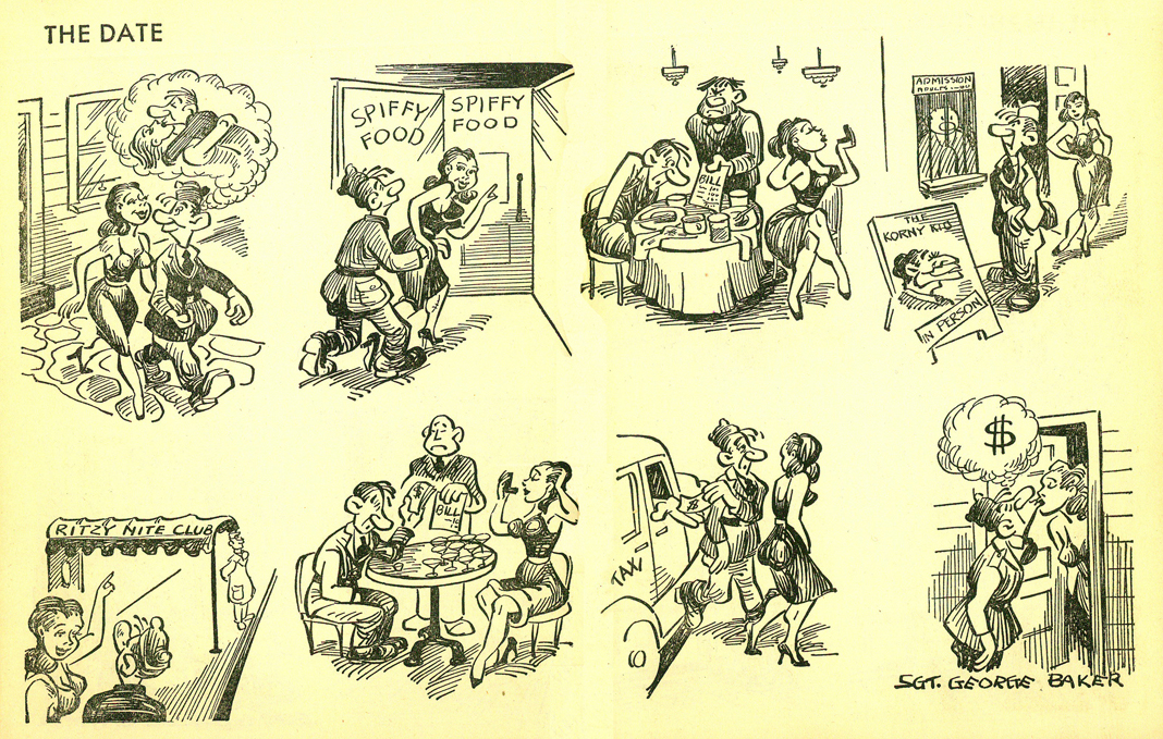
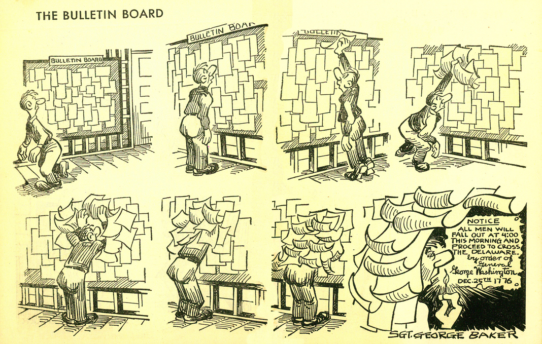
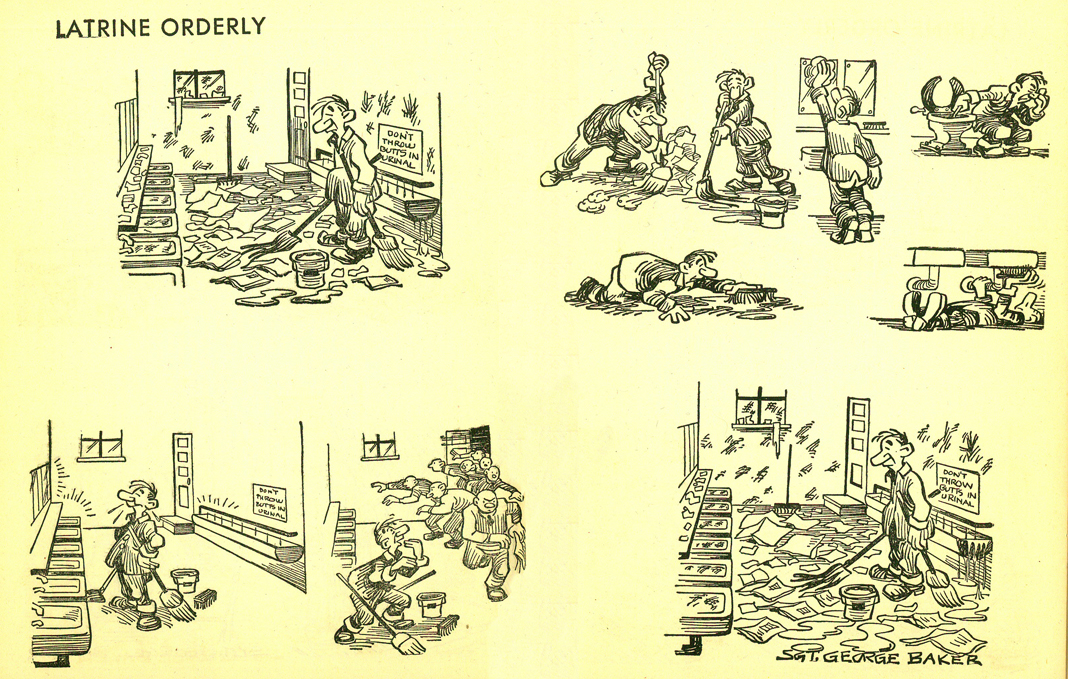
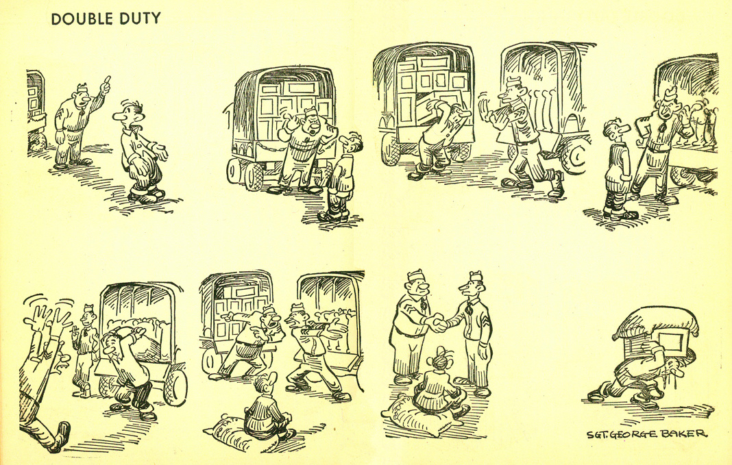
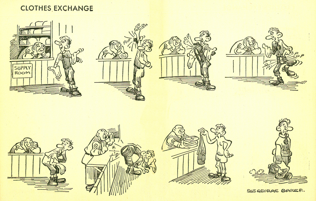
Sad Sack – 3
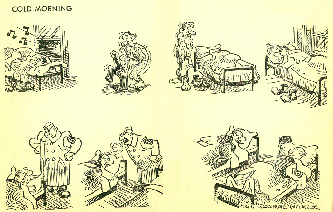
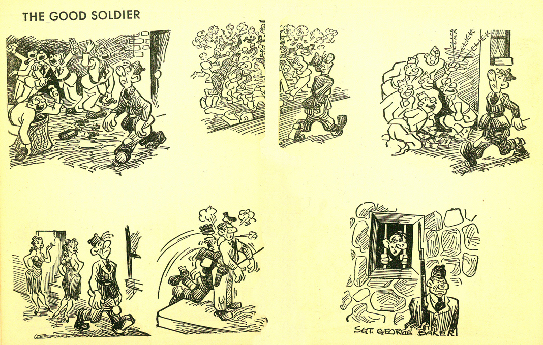
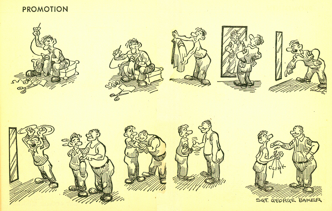
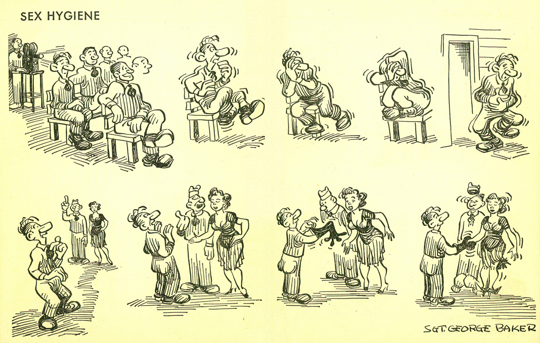
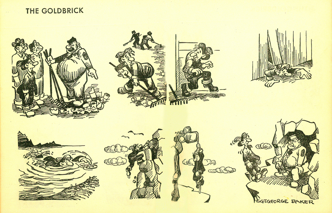
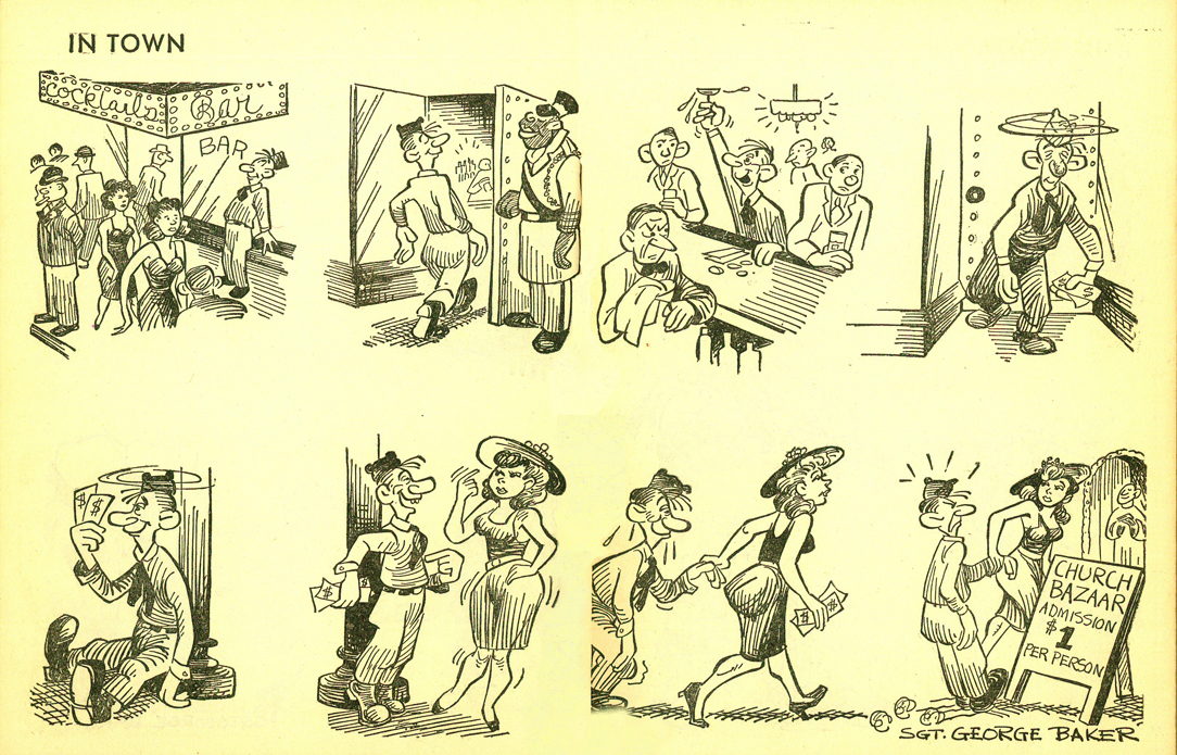
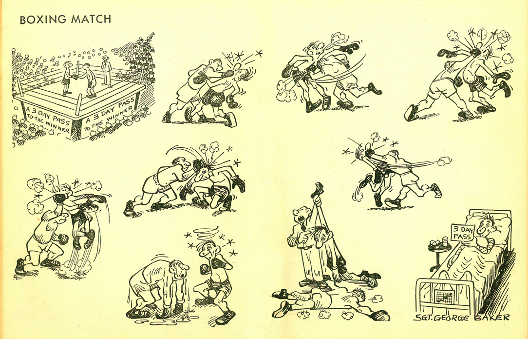
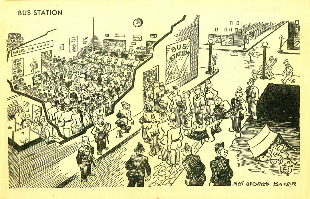
- I’ve been somewhat surprised by the number of people who came out of the woodwork to tell me that they liked seeing these Sad Sack posts. Most of those who commented to me are middle aged; I assume they remember the strip fondly or the War or something, but they liked what they saw. I hope younger fans can still enjoy the interesting pen and ink lines if not the jokes. There were no comments on the posts but the emails and casual comments in conversation leads me to believe they’ve been popular posts.
So, here’s part 3. This was all started by Bill Peckmann who sent me scans from a book he’s owned. I was interested enough to track down the book and scanned them, myself. Thanks to Bill for reminding me about George Baker’s soldier.
 1
1
 2
2
 3
3
 4
4
 5
5
 6
6
 7
7
 8
8
 9
9
 10
10
 11
11
 12
12
 13
13
 14
14
 15
15
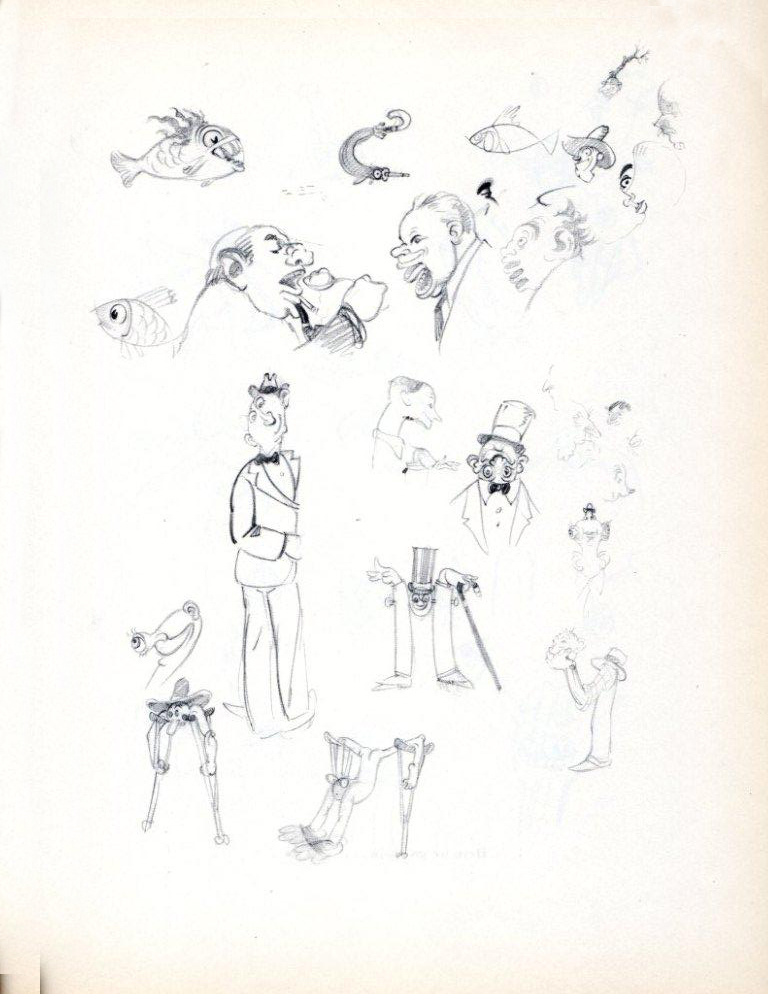
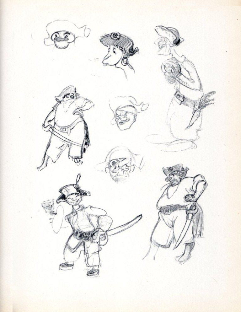
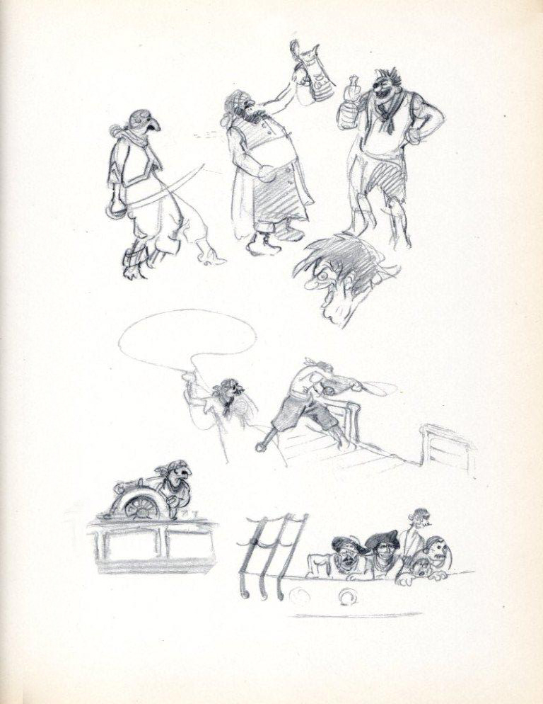
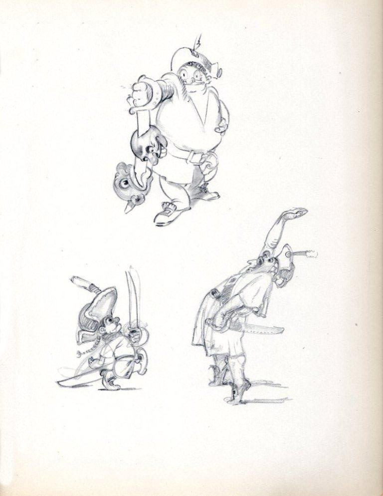
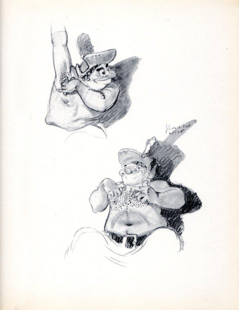
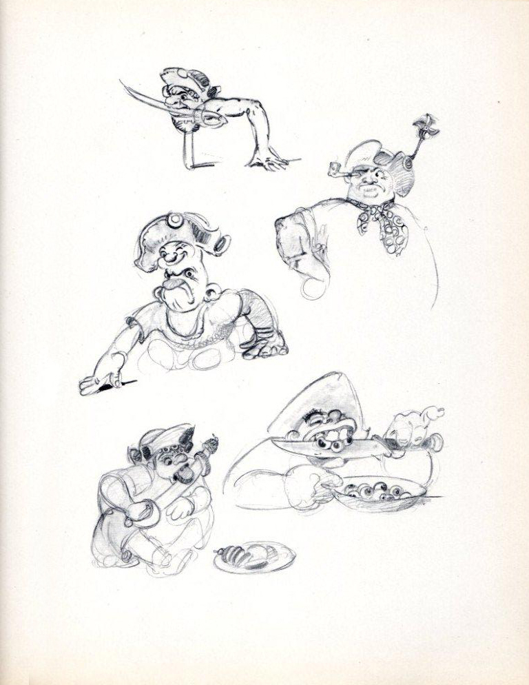
Bill Peckmann &Disney &Illustration &Models 14 Jan 2011 08:35 am
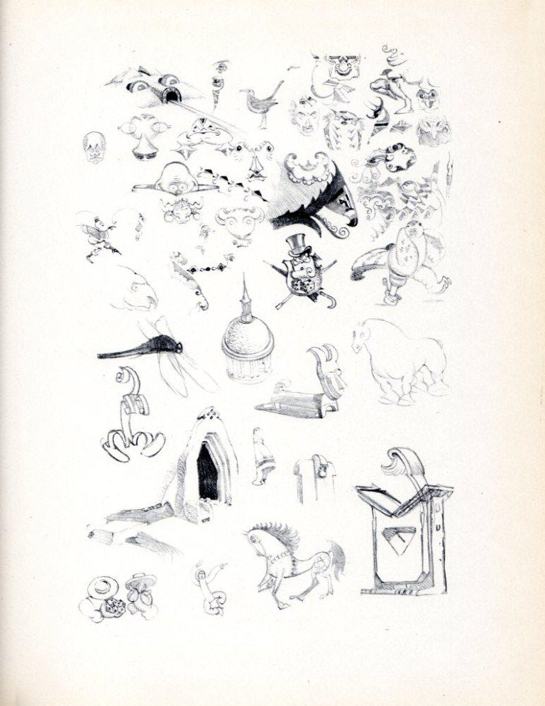
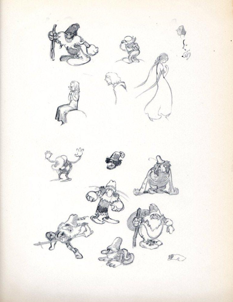
He Drew As He Pleased – 5
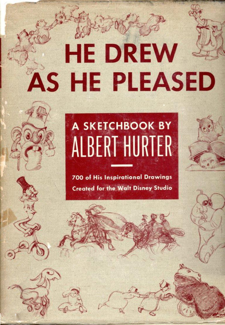 - It’s been a while since I posted more of Albert Hurter‘s magnificent book, He Drew As He Pleased (Simon and Schuster, 1948.) This gem is a rare book, indeed.
Albert Hurter was one of the European illustrators Disney brought into his studio for Snow White and Pinocchio. Hurter was the his own master, drawing designs which would be used generally to further the design of the features and Silly Symphonies.
He truly shaped the design of those early features, and his constant reference to features which didn’t get made until generations later, such as Peter Pan, indicate that there was some influence he had on those films, as well. Just look at all the ownderful pirates in this installment.
Many thanks to Bill Peckmann for the loan of the book’s pages and the arduous task of scanning these illustrations.
.
 1
1“Here we go again.”
.
 2
2.
“Notes on transportation.”
.
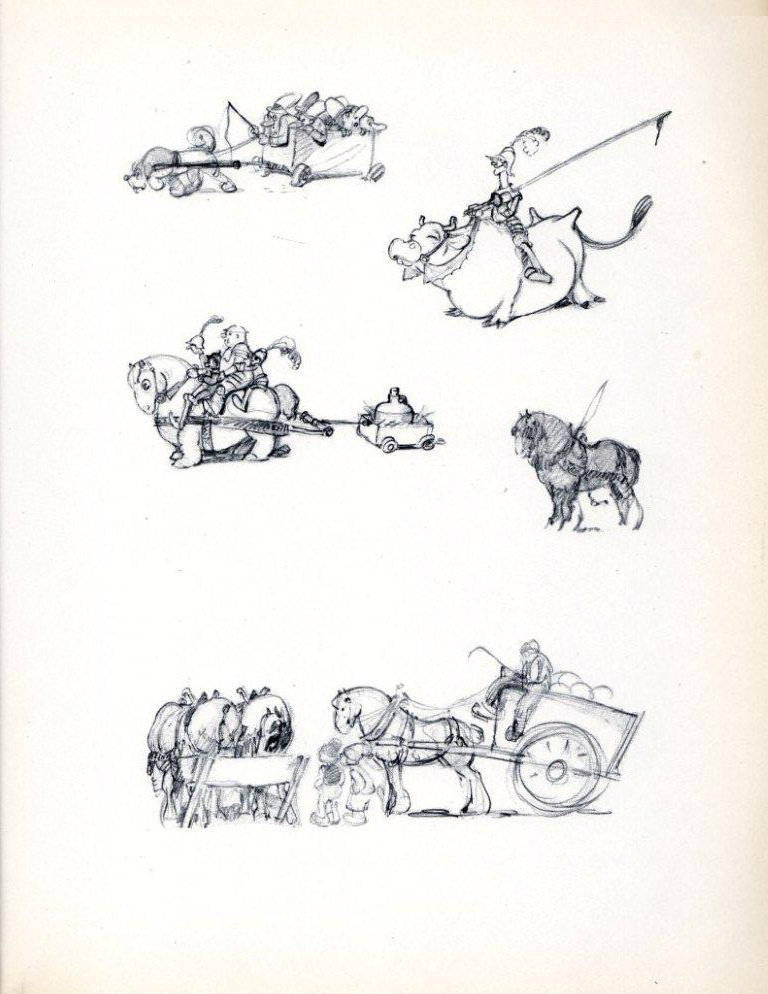 4
4.
 5
5“PeterPan . . . suggestions for Captain Hook’s Buccaneers.”
.
 6
6.
 7
7.
 8
8.
 9
9.
10“Including a few even Peter Pan never saw.”
.
 11
11“Pencil Wanderings”
.
 12
12“Assorted trolls.”
.
13“Senility can be fun.”
.
 14
14“Tame ones.”
.
 15
15“Wicked ones.”
.
 16
16“And a few fancy pups.”
.
To see past parts of this book go here:
Part 1, Part 2, Part 3, Part 4
Articles on Animation &Illustration 05 Jan 2011 08:30 am
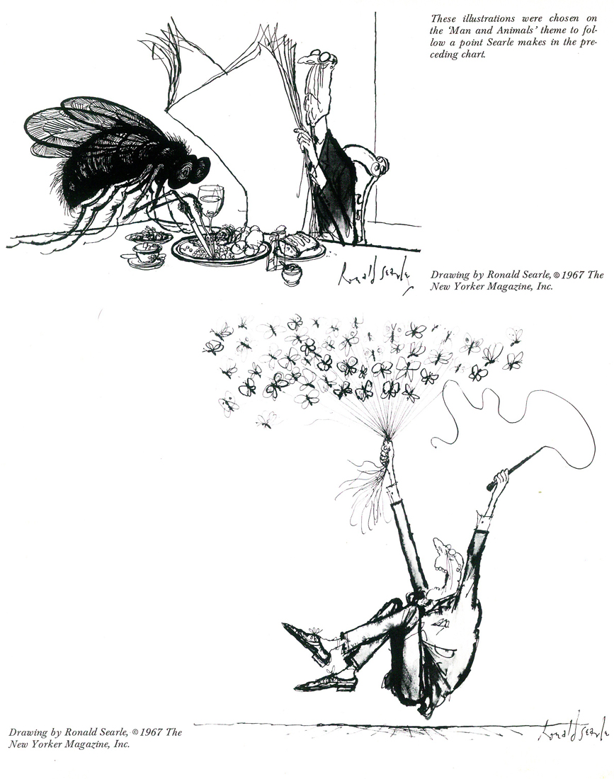
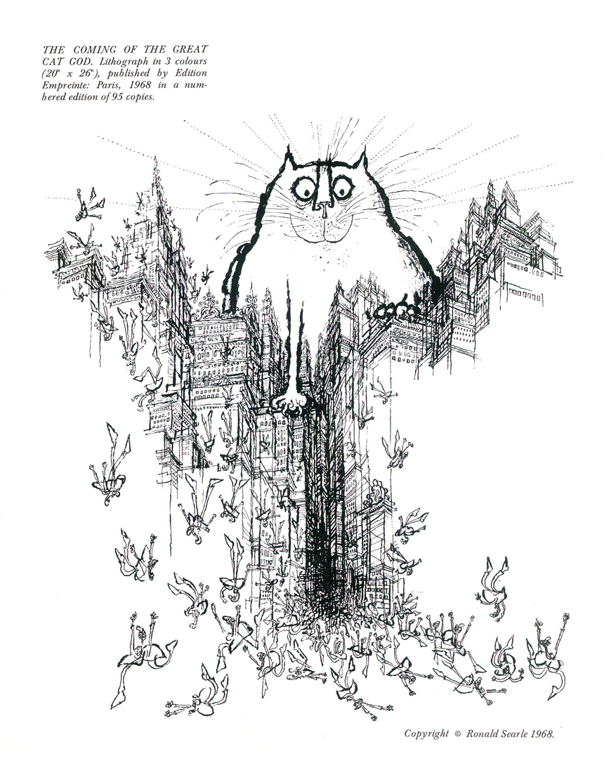
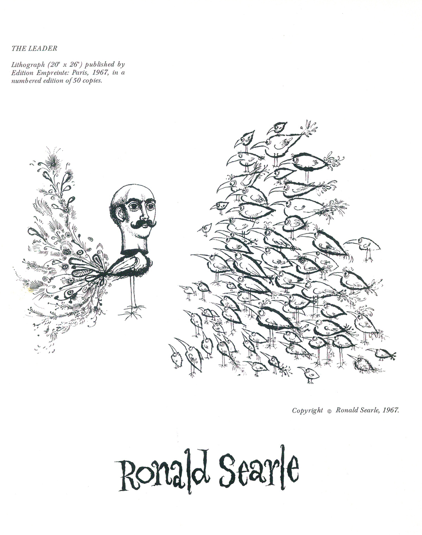
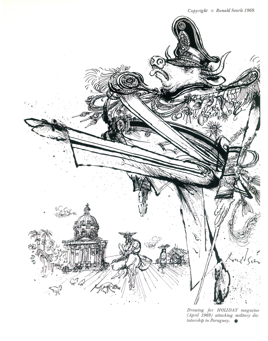
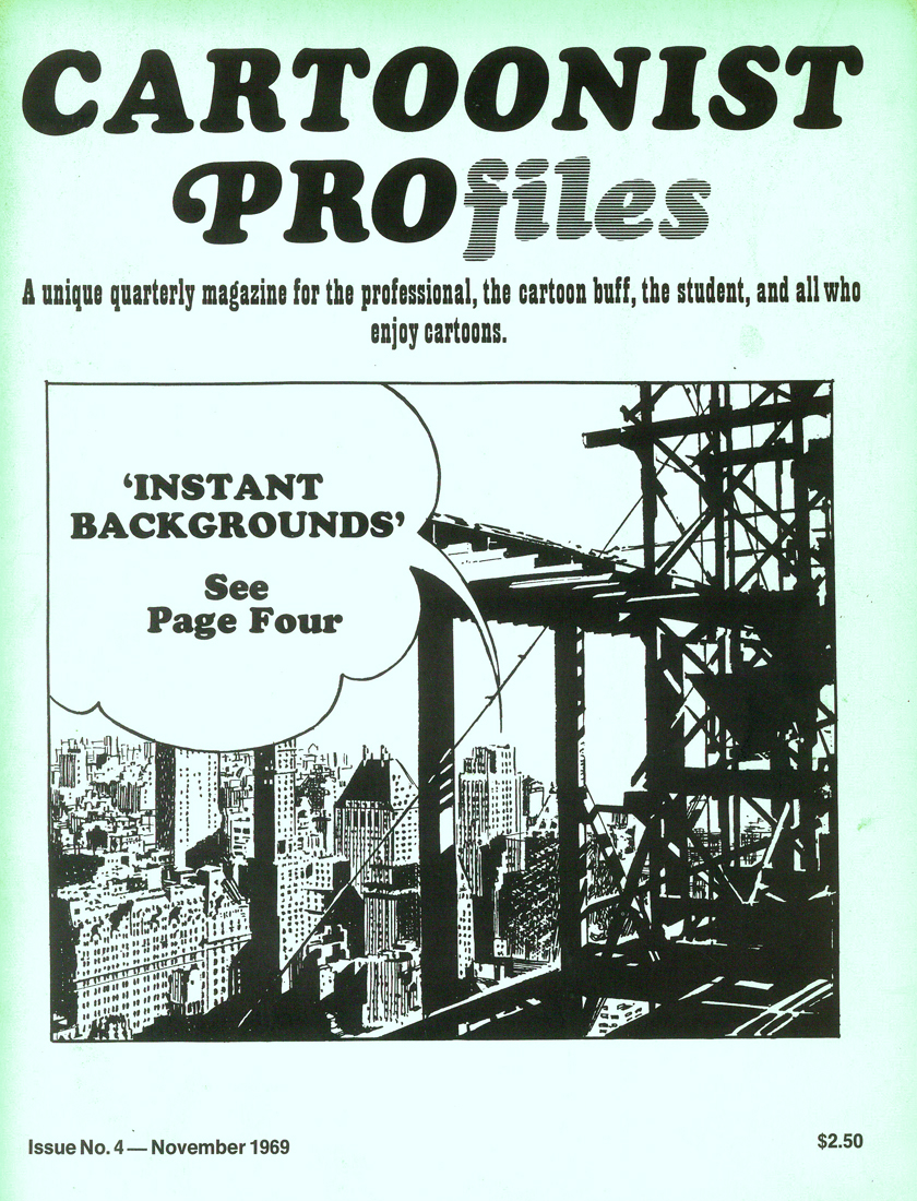
Ronald Searle in Cartoonist Profiles
- Here is an article about Ronald Searle pulled from a copy of Cartoonist Profiles issue #4. It dates back to November 1969.
Writes from
FRANCE
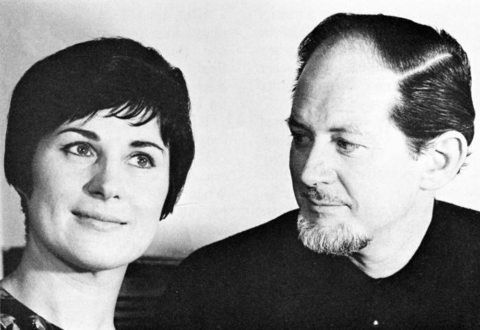
The following article, and the accompanying ‘ideas chart’, were written for CARTOONIST PROfiles by RONALD SEARLE, the noted European cartoonist who makes his headquarters in Paris. He created St. Trin-ian’s, which has become a part of English folklore, has illustrated more than 40 books in the past 23 years, has designed sets and costumes for films, made his own cartoon film John Gilpin’, and constantly does work for American, French and German magazines. One of his publishers describes him as Europe’s most accomplished cartoonist — a macabre black humourist, a lynx-eyed reporter, a gagman of genius, a draughtsman of the stammering line and the delirious arabesque that inimitably characterises his world.
My childhood was unremarkable apart from the fact that I was born and brought up in one of the most beautiful and ancient university towns in England. I drew before I could write legibly (I am left-handed), and I swapped comics in the school yard; no doubt gathering supplementary festering sores in the process. The dog-eared sheets which passed from filthy hand to filthy hand, were hardly recognizable as copies of “Comic Cuts”, “Film Fun” and “Chips ” — the most desirable titles at that time. The more pictures there were to a page and the less text, the happier I was, like all lazy-minded kids. My imagination was almost entirely visual and only faintly literary. However, my great love was books. I devoured everything in our town library, beginning with the infant shelves and graduating at the age of twelve to the adult library. My thirst was insatiable. I frequently took out five books in a day; making my way through A-B: “British Butterflies in Colour”(c. 1894)to Y-Z: “Zjululand, The journal of my encounters in” (c. 1901, I guess). By the time I was 13 I wanted my own library and I began to haunt the secondhand bookstalls and barrows in Cambridge. I earned, begged, and scraped together every penny I could and within five years I had accumulated some 500 volumes for a few pennies apiece. At the outset of my buying, one Saturday, I tumbled onto two or three volumes about caricature, at 6d. each. One of these volumes was Spielmann’s “History of Punch”. I had already decided I would be either an artist or an archeologist and with juvenile confidence I now added the intention of being a “Punch “cartoonist.
That Autumn I enrolled for evening classes in the Cambridge Art School. This had caused some argument between my mother and father for the fee was 7s.6d. a term (about $1.50 then), and we could not afford it. But the money was scraped together somehow. I can guess now that my mother probably put a thicker piece of cardboard in her shoe.
I was obsessed with drawing, and scratched away incessantly. I scrambled through the day at school and my homework afterwards and then rushed off at six in the evening, for three hours of art. By the time I was fourteen I had graduated from the plaster Discobolos into the life class, and painfully shaded my way through several years of floppy-breasted nudes with blue toes and purple legs. It was difficult to keep the fen winds, which blew across the North Sea from Siberia, out of our life-room. Side by side with my art-school work I scribbled comic drawings. The next year, when I was 15, the cartoonist of the local paper left for London and higher things. I stuck a cartoon through the letterbox of the “Cambridge Daily News”, utterly confident that the editor would take it, and that this would solve an important economic problem for me. He did take the cartoon and asked me for more at 10s.6d. a week (about $2.00 then). This represented all the drawing materials I needed, a bit for the family and something over for me.
I continued with those weekly cartoons from 1935 until the war, almost without a break. They were dreadful, but they taught me how to draw for reproduction.
By 1938 the local council had awarded me a full-time art scholarship, and I sweated away for over a year, as a “real, full-time artist”. Lautrec was more precocious, but he was never as happy as I was then. By the time I went into the army, at the outbreak of war in 1939, I had completely saturated myself in anatomy, perspective, history of costume, architecture, life drawing, and all subjects required for passing the Min. of Ed. Drawing Diploma. I missed failure by 2%, but achieved the solid Bolshi-Academic grounding characteristic of Cambridge in the ’30′s.
Also in 1939, I found on a secondhand bookstall, a small monograph by Marcel Ray on the work of George Grosz. It cost me 2s. and changed my artistic direction. I had already established a pedestal for Picasso as the foremost of my living heroes, and I was still grinding my teeth at being unable to raise the $35.00 he was asking then for a pen drawing at a local gallery. Forain I marvelled over, despite his loaded anti-semi-tism, and he had joined the line with Gillray, Rowlandson and Cruikshank, as my self-appointed guardian angels. Daumier’s work was difficult to find, and I had not been able to form an opinion of him then. Goya, however, was one of my gods, and I still day-dream that one day the Prado will drop me a note during a period of stocktaking, to say that they wonder whether I might be interested in accepting a couple of drawings of which they have duplicates.
If anyone influenced me in my work it was on the basis of draughtsmanship, rather than painting. I saw in line then, as I still mainly do now. Above all I admired “Roly’ Rowlandson, with his wit, genius, ability to handle line, ability to range from the broadest and most clownish grotesque to a cunning subversive charm. I cannot say that I have ever consciously had the desire to copy anybody. But if I have been influenced, it is by Rowlandson. And Grosz. Although I had known little about Grosz until I got the Marcel Ray book. I had seen the occasional Munchen album from the ’20′s, and had heard of his flight to America. From time to time I had come across a drawing of his in “Esquire”. But now he fitted into place for me. Grosz exposed the rotting military mind; the filth of war and the stench that lingered after it — and, how he could draw! With this book of his I headed off for my seven years as a soldier.
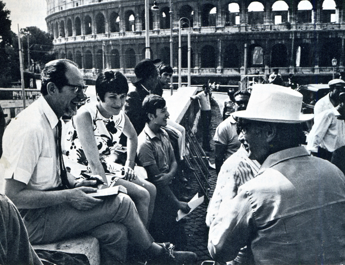
Searle and Monica on location in Rome last year, during the
filming of Paramount’s “Those Daring Young Men in their Jaunty Jalopies”,
for which he designed the animated credits sequence. Searle had previously
designed a similar sequence for the 20th Century Fox film “Those
Magnificent Men in Their Flying Machines”. Working with Searle was
the lively young English group “Trick-film”, who made the very successful
“Yellow Submarine”, and with whom Searle is now associated in the
formation of an animation workshop in London.
During those seven years I never stopped drawing. I was a conventional art-student when I went into the army. Before 1939 I had rarely left the town in which I was born. When I came out of a Japanese prison in 1945, after four rough years, I had enough experience of humanity and inhumanity to provide me with a measuring-stick for a considerable part of my life. I also had the facility of seven years of practical application with my drawing. I had documented almost every move I had made, from my first miserable night in the army to the other side of the world and back.
I had been isolated from the world for almost four years; but had also developed in that isolation.
It was then that I was faced with earning my living. I had nothing but fantasies in my head, and a small army pension between me and the post-war wolves at the door while I was getting rehabilitated and thinking about long-term plans for the future. It seemed to me that the only fast and easy way of keeping myself fed was to sell cartoons. So I sold cartoons. This I rapidly discovered needed no particular ability apart from being able to communicate a personal way of looking at things; and apart from having enough nose to smell out the flavour of what was going on and putting it to use. Coming as I did from an atmosphere of stinking cells, wasted bodies and grim humour, my humour was ‘Black’. But so was the post-war climate of rationed England, and my work found a ready market there. I cannot say that I ever thought of cartooning as an ultimate career. All I knew was that I wanted to eat and that I wanted to draw, and this was one way of being able to get some of the disgust I felt for human behavior into print (comically wrapped-up for public consumption). At that point I became a part-time cartoonist. I still am.
Drawing for me has never been a case of therapy because I was shy, or not outstanding in physical activities, or anything else. It was a compulsion. I carried a sketchbook day and night, because I could not stop drawing. To sell a sketch was a pleasure, because it meant a little less economic worry and more freedom to explore. But if I had not sold, I still would not have stopped.
To me line is something which one can explore endlessly, and which keeps me in a constant feeling of excitement and adventure. I know I shall never live long enough to say and do all I want in line. I can only hope to get up each day, bursting to push the exploration a little further. But line is useless if one has nothing to say with it. The artist must be driven with the desire to express something, and use any device to achieve it. He must be perverse. Everybody will want to mould him to their pattern. But in the end he has to satisfy himself — or spend his life trying to please other people.
If satisfaction with one’s work creeps in, the time has come to give up and take to prostitution. A sure sign that there is still hope is when one is miserable at not having met one’s own demands.
The hand is feeble and the artist has still to express with exactitude what his brain conjures up.
Some day it may be possible
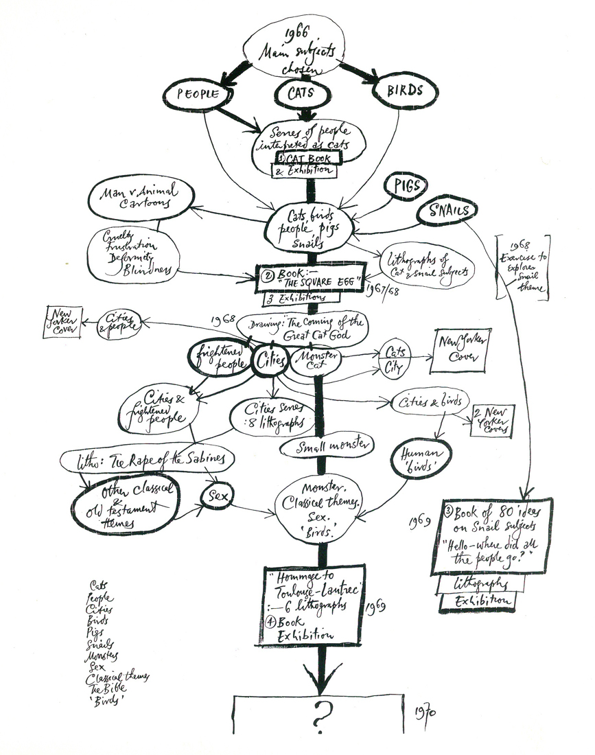
The apple tree on the opposite page was compiled out of curiosity in an attempt to answer the editor’s question: “What routine do you go through to dredge up ideas?”.
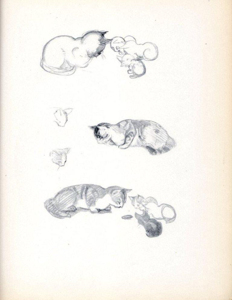
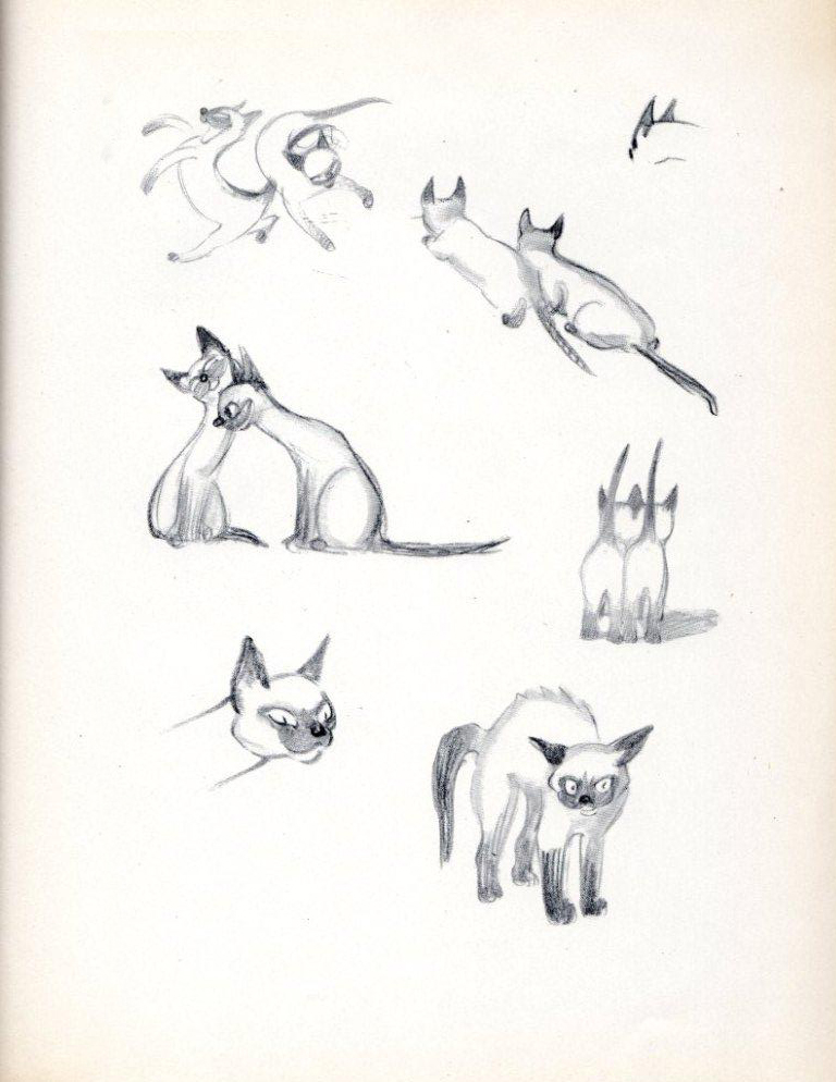
It covers the period 1966-1969, and covers the area of ideas only, as opposed to other work made alongside: Book illustration, cinema animation and so on. In 1966, I set out with three main themes as subjects: Cats, Birds, and People. Subsidiary themes, such as Pigs, and Snails crept in soon after. The first four subjects led me to three books, and the Snails led me to a fourth. Lithographs, New Yorker covers and cartoons, and a series of exhibitions developed alongside. As is apparent from the confusion above, I do not attempt to force ideas, but rather to let them drift inconsequentially — and frequently into a dead end. In this case I started out with Cats in 1966, and arrived at Toulouse-Lautrec in 1969. Some drift! I work with no fixed market in mind. Some ideas may best be expressed in lithography, others as large water-colours, others in pen. When they have been sufficiently developed I start worrying about placing them. The outcome of the three years in question was: some 30 large lithographs; 12 New Yorker cartoons and four covers; four books: “Searle’s Cats” (1966/67), “The Square Egg” (1967/68), “Hello – where did all the people go?” (1968/69), and “Hommage to Toulouse-Lautrec” (1969). In addition, 19 exhibitions in galleries in France, Germany, Austria, Sweden, Switzerland and England were arranged for 1966-1970. Here, either the originals or series of lithographs are for sale. Exhibitions are aided by the fact that, to publish books of this sort at an economic price, they need to be captionless and published in simultaneous co-production in England, France, Germany and America. Most of the material in these books has not been previously published — apart from the occasional sale of serial rights. As a working method it is not particularly scientific, or organized. The only factor I watch is: that whatever I do is thought of as an international idea — that it will have equal appeal in any of half-a-dozen countries. Or be equally rejected.
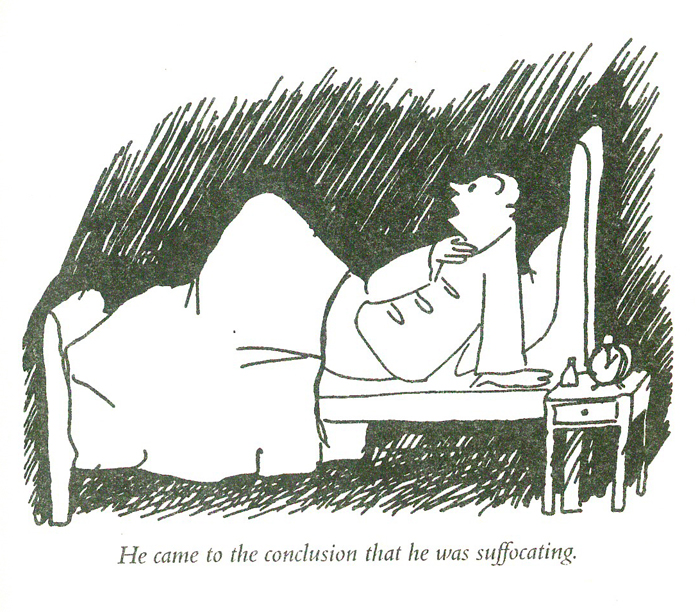
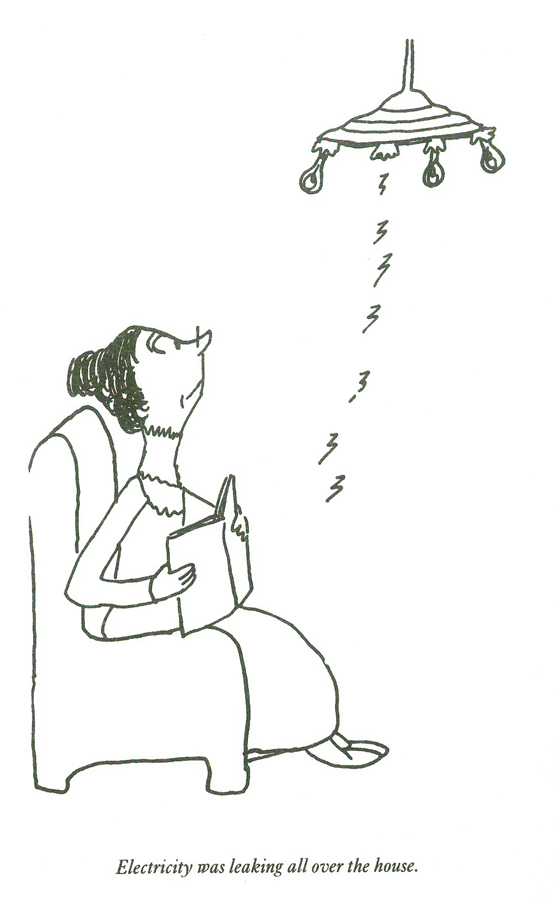
 1
1
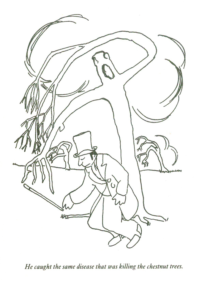
 2
2
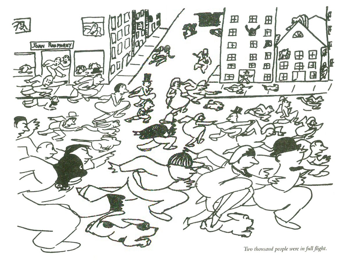
 3
3
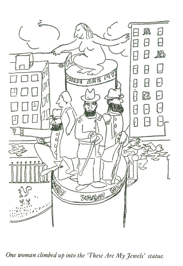
 4
4
 5
5
the cover of the issue
Books &Comic Art &Illustration 31 Dec 2010 08:19 am
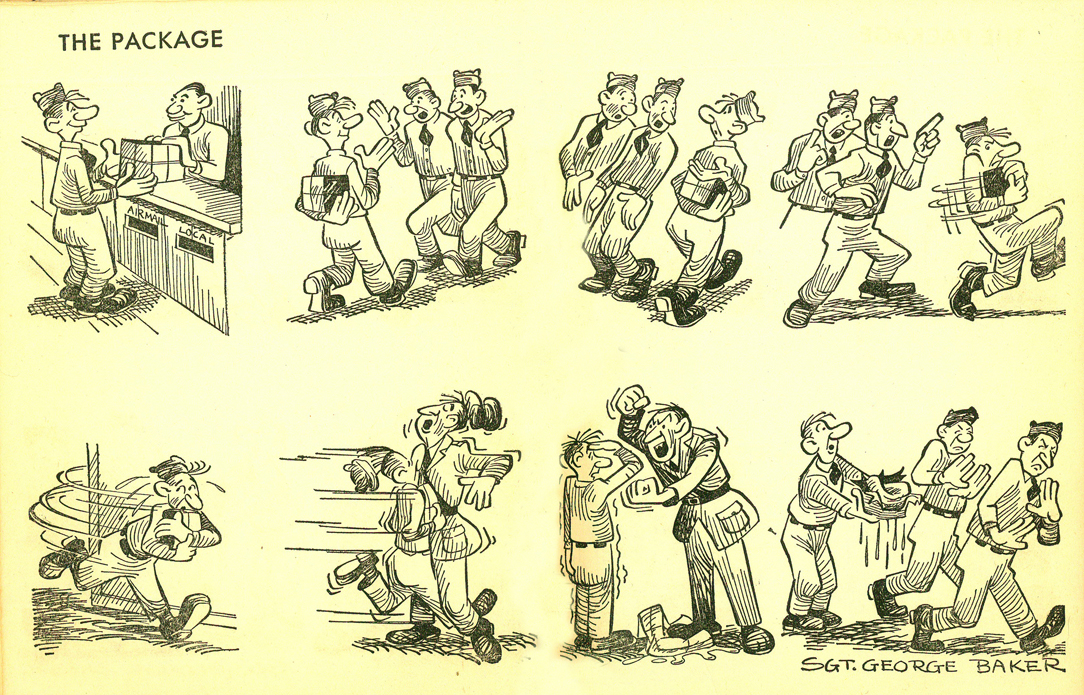
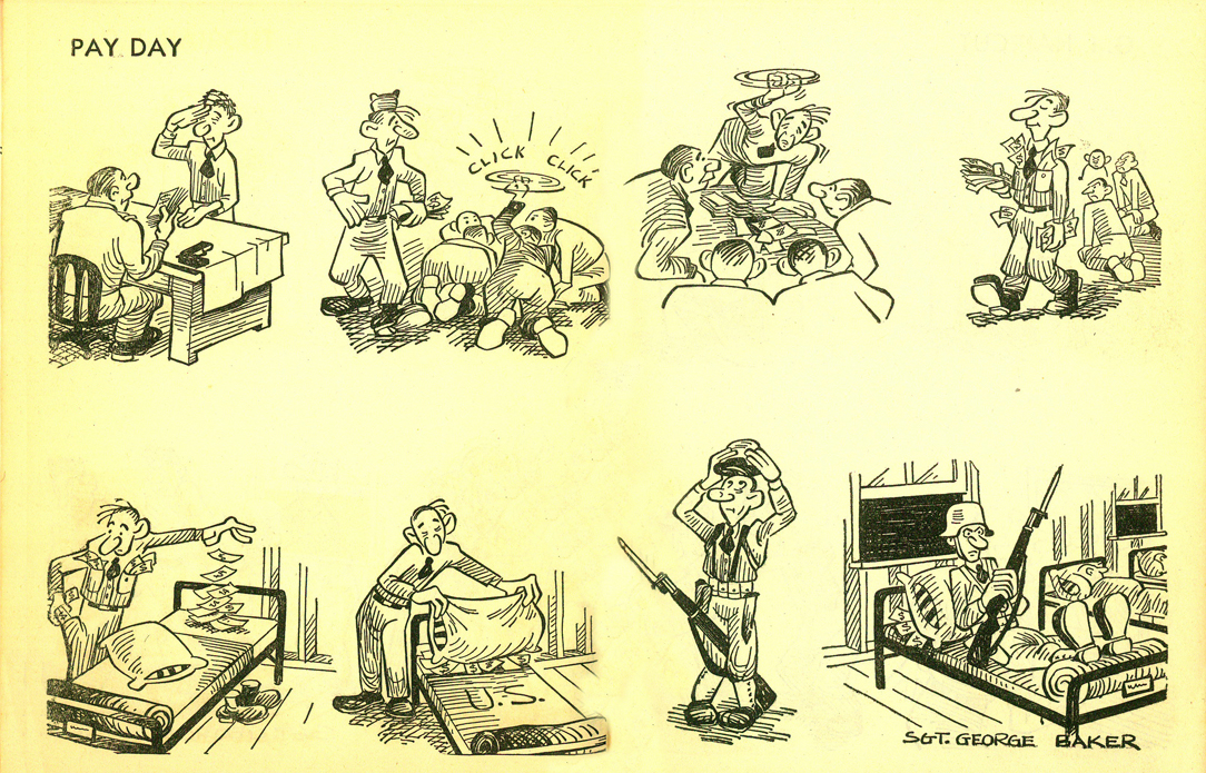
Sad Sack 2
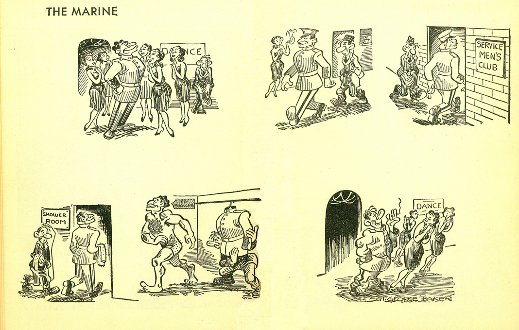
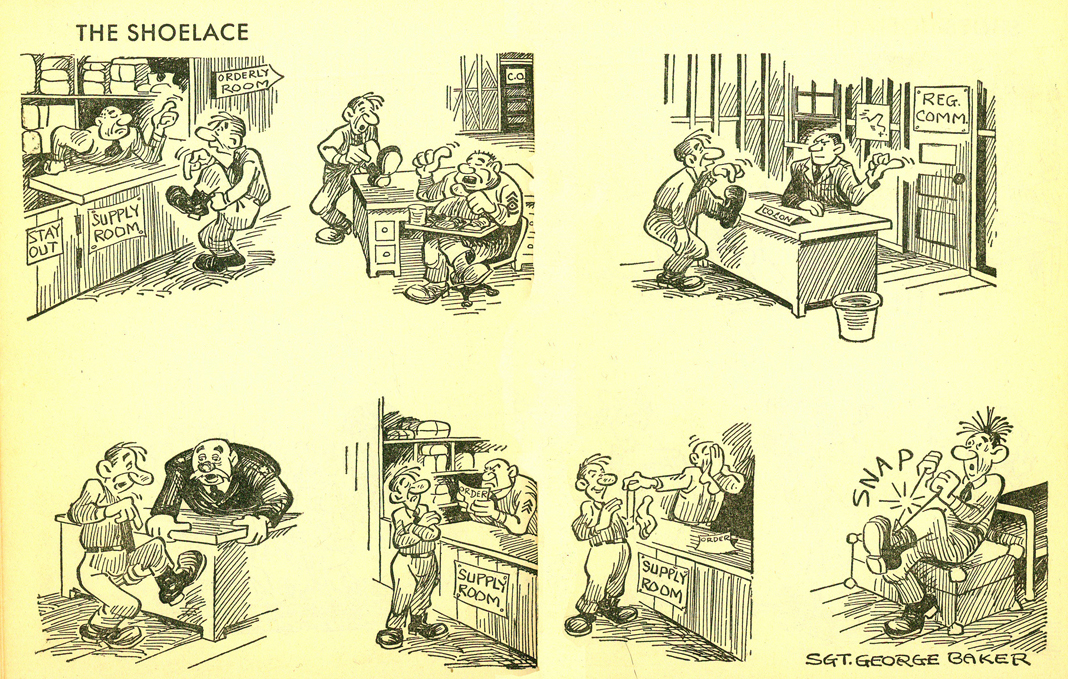
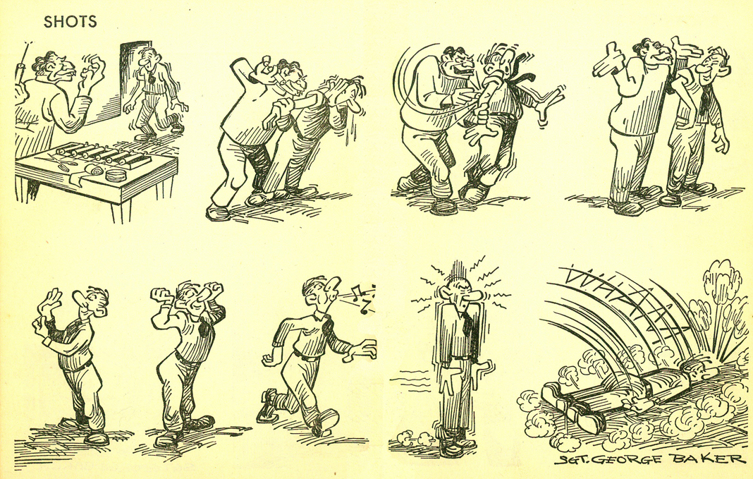
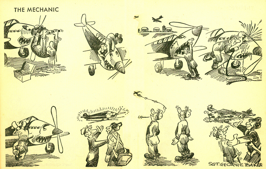
- A couple of weeks back I started posting some cartoons by George Baker from his collection of Sad Sack strips done while in the Army. This small book was introduced to me by Bill Peckmann. I immediately ran out and bought an old used copy, and now continue posting some of those strips.
I was a fan of the strip when it was a comic book in the early 60s. Looking back on the earlier artwork, as can be seen here, the original strip has a stronger look. The thick-thin outline makes it feel, in some places, like German Expressionist art, as we might’ve seen under Otto Dix’s pen. (This is particularly true in some panels on #6, 7 and 10.)
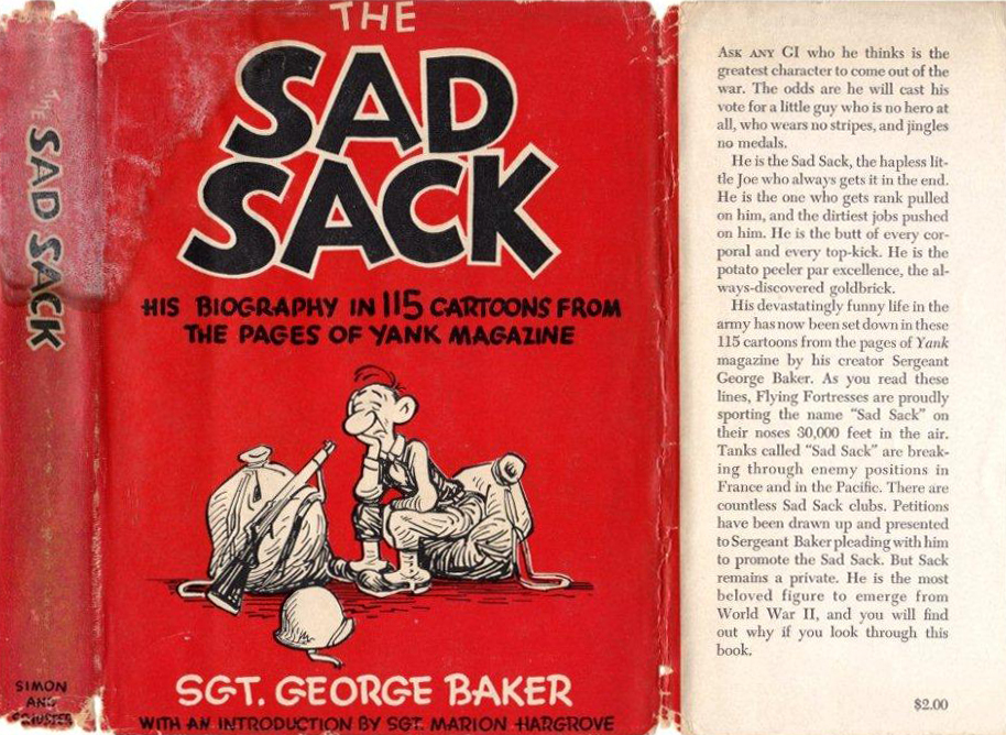
The front cover of the book in all its worn glory.
 1
1
 2
2
 3
3
 4
4
 5
5
 6
6
 7
7
 8
8
 9
9
 10
10
Animation Artifacts &Illustration 26 Dec 2010 08:28 am
Happy Holidays – 2010
I posted this back in 2006 and love it so much I’ve decided to put it up again.
Lu has since died, and I post this in memory of him.
- Years ago, Lu Guarnier, an older Warner Bros animator who relocated to NY after WWII and has been working here ever since, offered me a photostat of a christmas card from the WB studio back in 1937.
He told me two days later that he was heading out to LA, and he’d see if he could get any of those pictured to sign it for me. Imagine my surprise when he came back from California with the stat covered with original signatures. Even some of those not in T.Hee’s drawing signed it. (Unfortunately, not T.Hee). They’d all met at a local watering hole. (I guess animators drank together back then.)
Though the card has been seen on line before, I thought it a good image to put up for the holidays. I’ve identified a lot of the people in the picture. My favorite is Henry Binder; he stands out in his stiffness. The lord overseer. And the only one shorter than him is Friz.
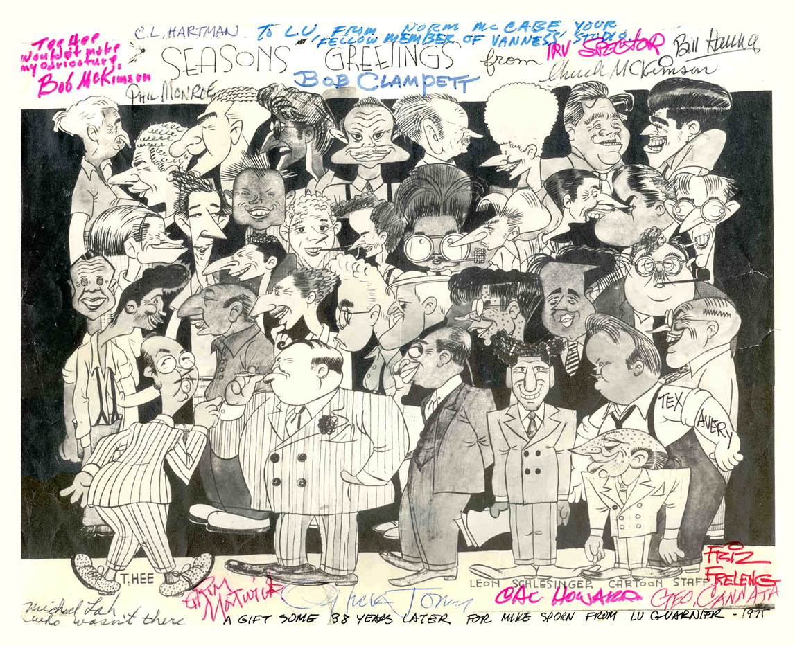
Below is the key to I.D. most of T. Hee’s caricatures in this picture.
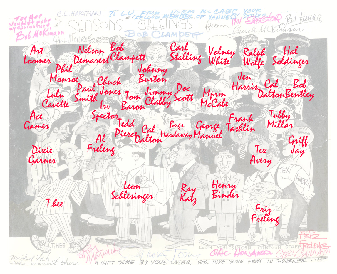
(Click on either image to enlarge.)
Illustration 18 Dec 2010 08:47 am
Chwast’s Dante – pt 2
 - Back in 1981, Richard Williams had a small apartment on East 32nd Street. This, I used as my animation studio for months. (Don’t ask.) The studio was half a block and across the street from Pushpin Studios. Passing this building daily reminded me of my frequent trips to the site when I worked with R.O. Blechman and Seymour Chwast, who was designing for Blechman. I knew what the building held. Designers and their assistants (especially their assistants) doing the daily dose of artwork. It had nothing to do with the building, and all to do with the people within the building.
Seymour was a quiet man who had helped found Pushpin Graphics in the ’60s. He developed a style that has held him well for many many years.
I’d recently read on the Huffington Post about his adaptation of Dante’s Divine Comedy in a graphic novel form. I was surprised to find it in my apartment recently. Heidi had brought it home, captivated by the idea and the illustrations. I have to admit I was, as well, the moment I picked it up. So, last week, I shared a bit, and I promised to offer more this week.
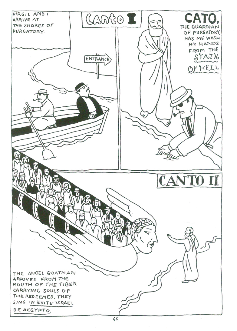
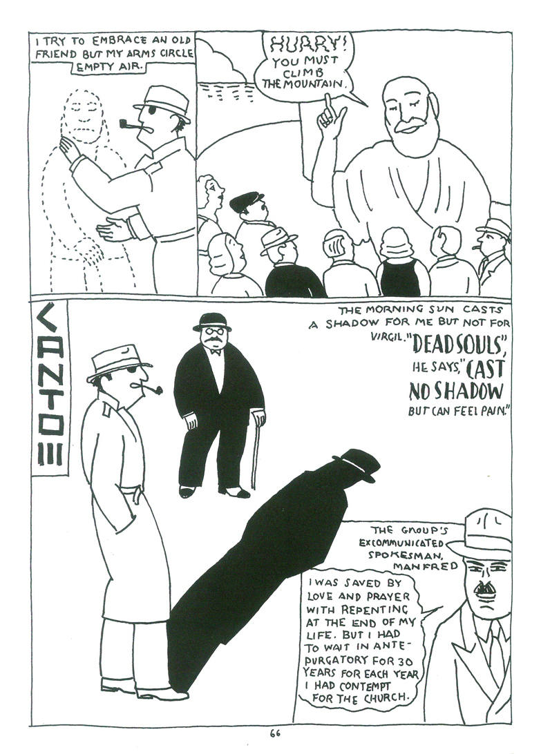
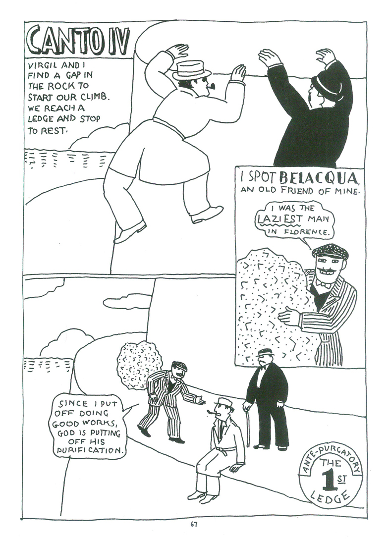
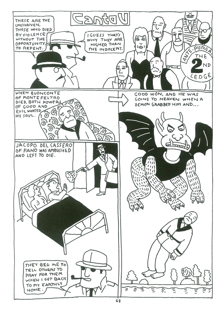
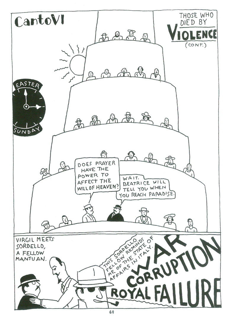
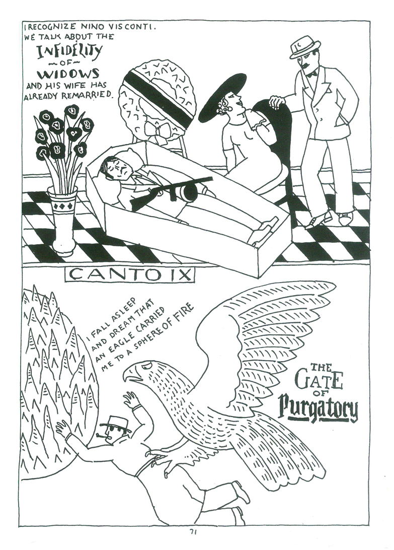
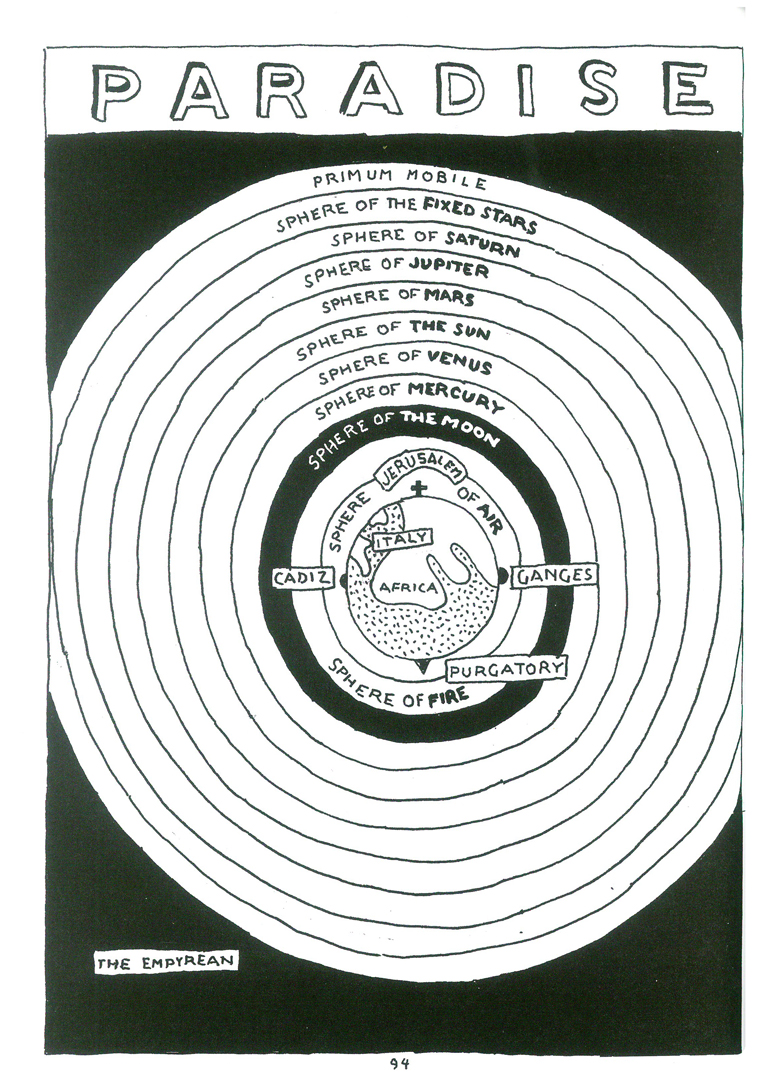
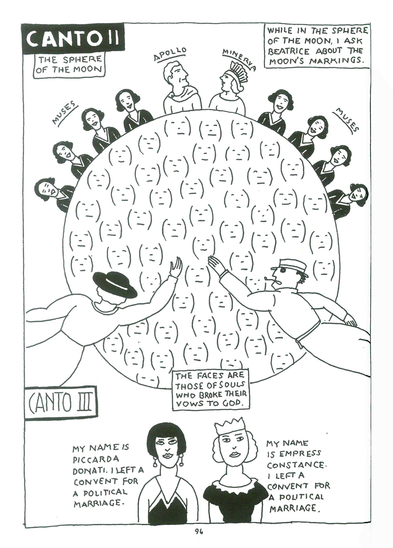
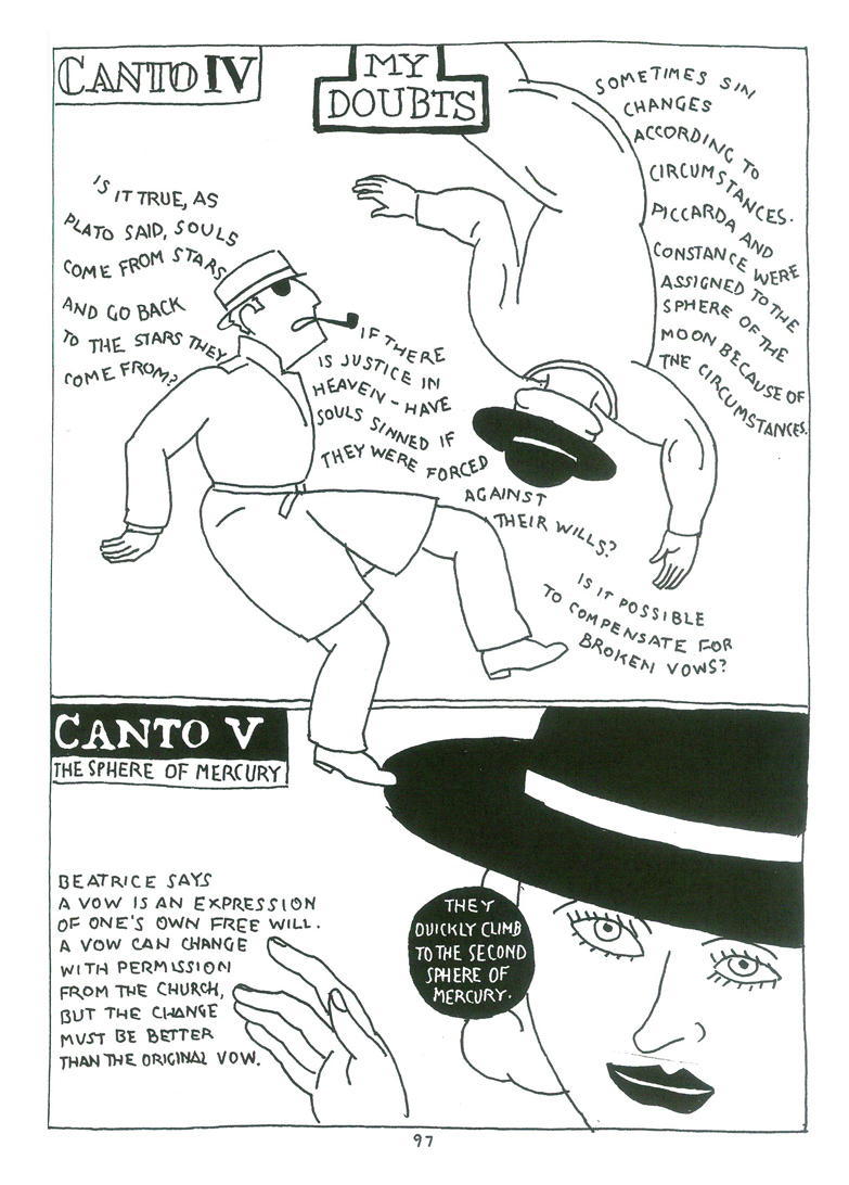
Here’s a sample of Book II – Purgatory and Book III – Paradise.
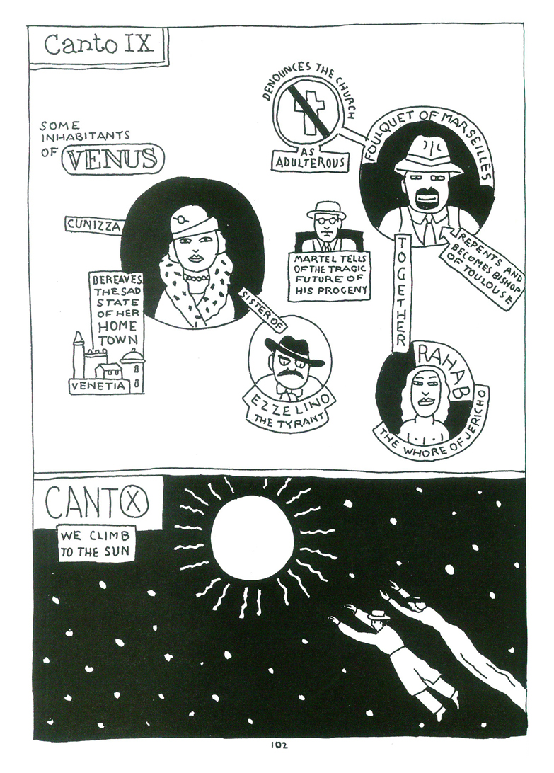
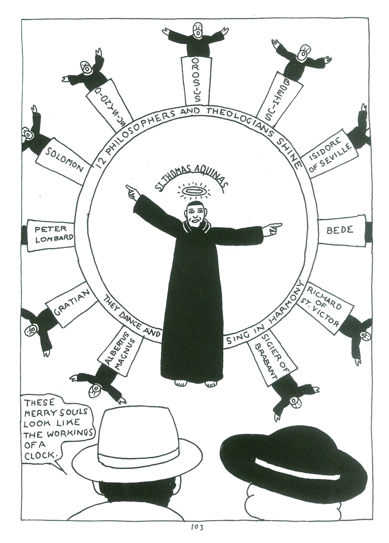
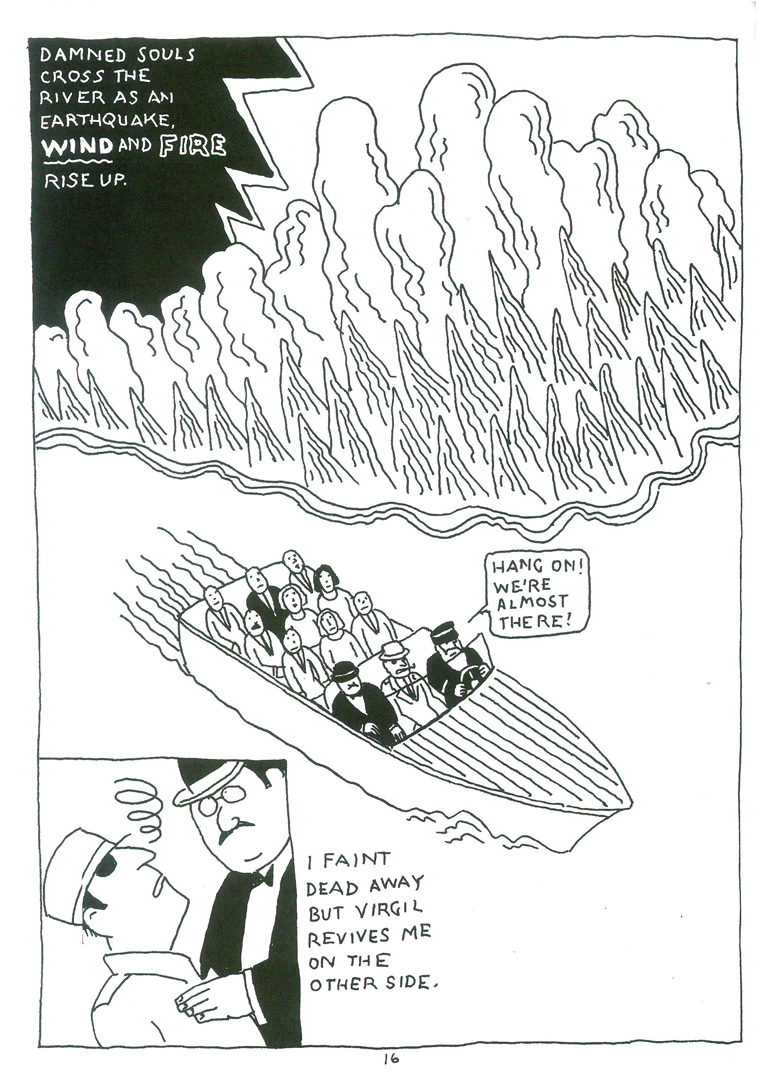
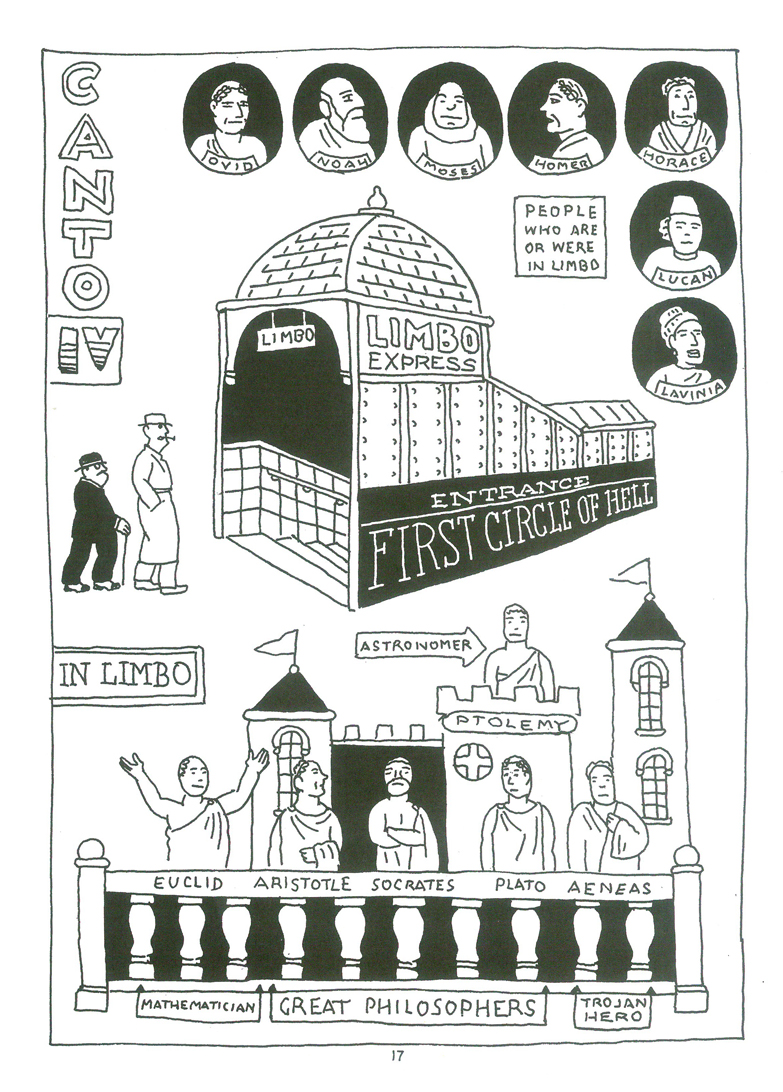
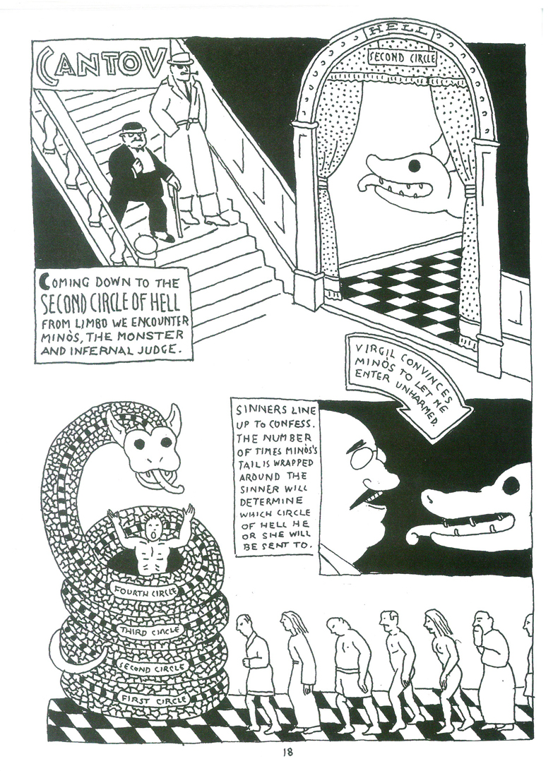
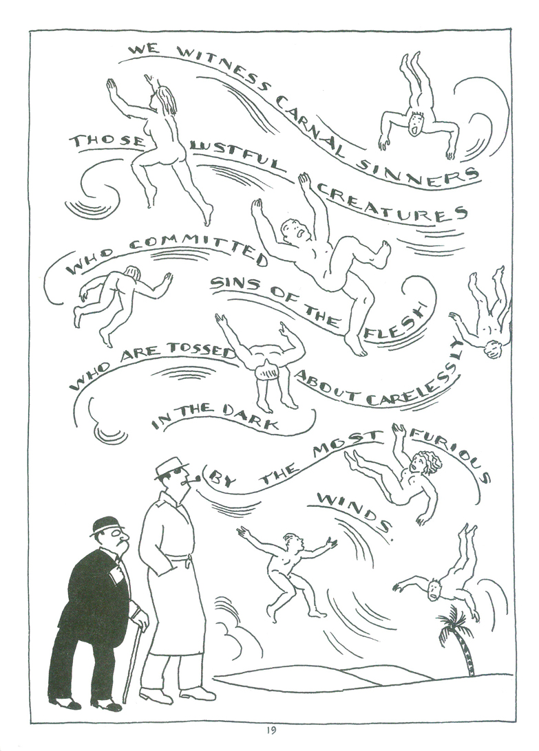
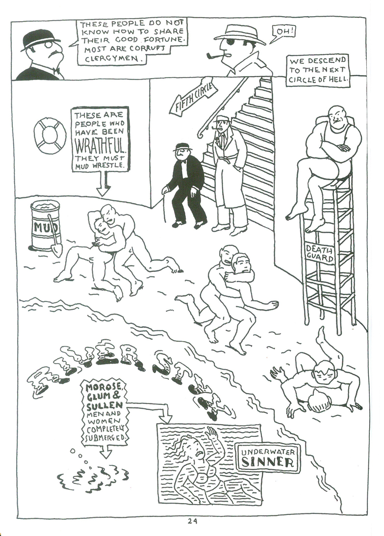
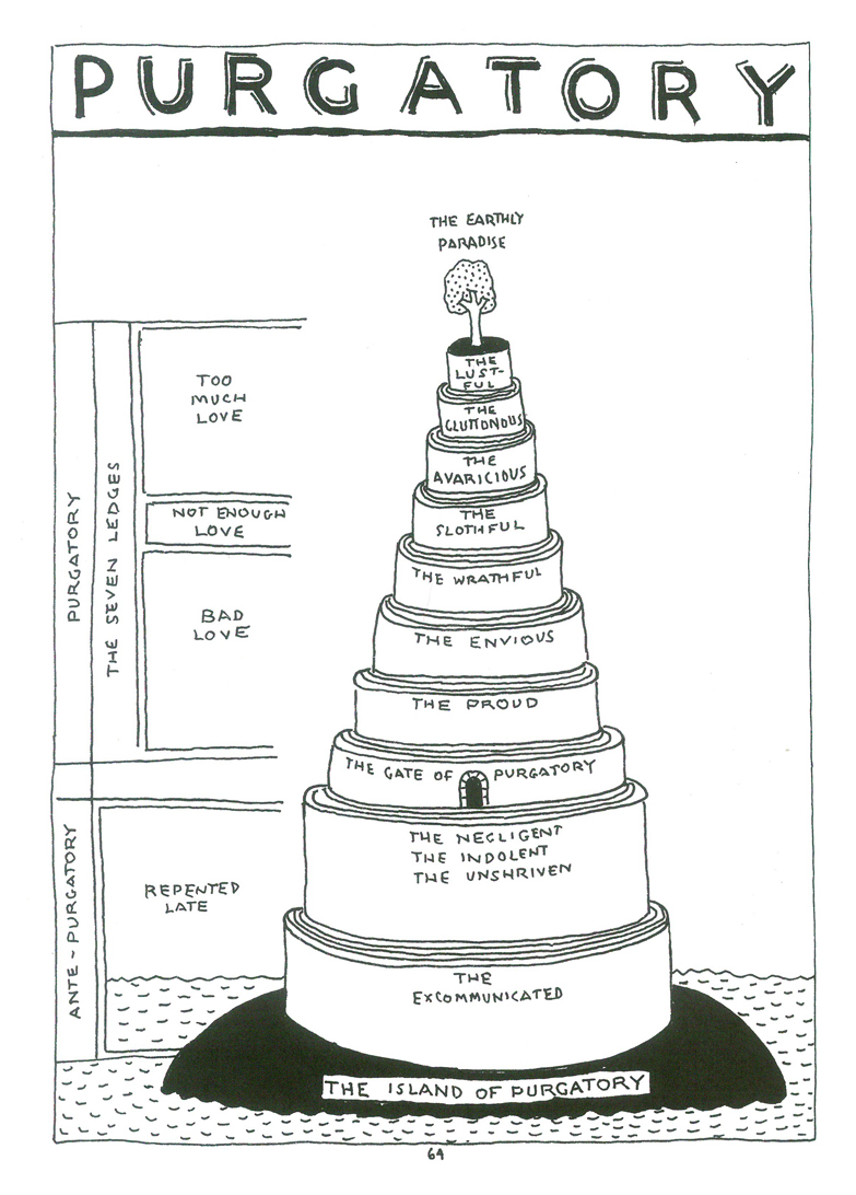 15
15After half a book of “Hell”, we enter Purgatory.
 16
16
(Click any image to enlarge.)
 17
17
 18
18
 19
19
 20
20
 21
21
 22
22
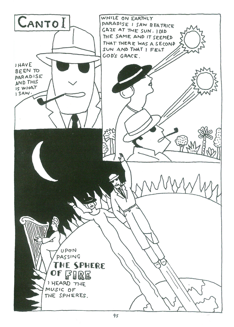
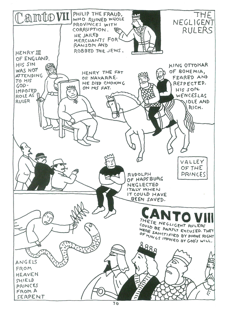
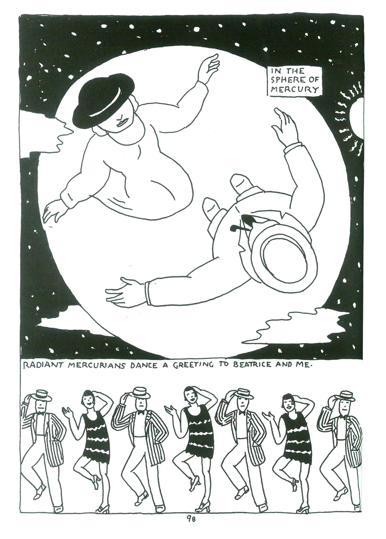
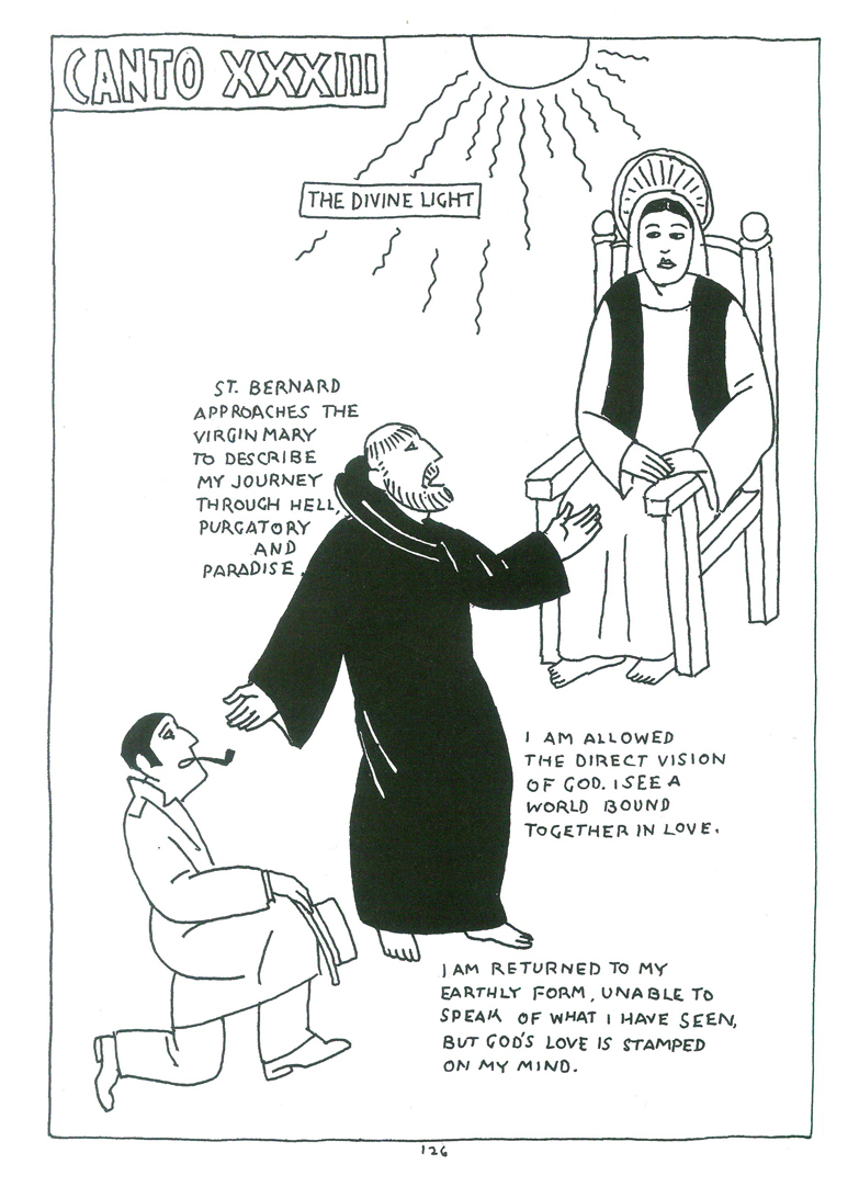
Later, we enter Paradise.
 23
23
 24
24
 25
25
 26
26
 27
27
 28
28
 29
29
 30
30
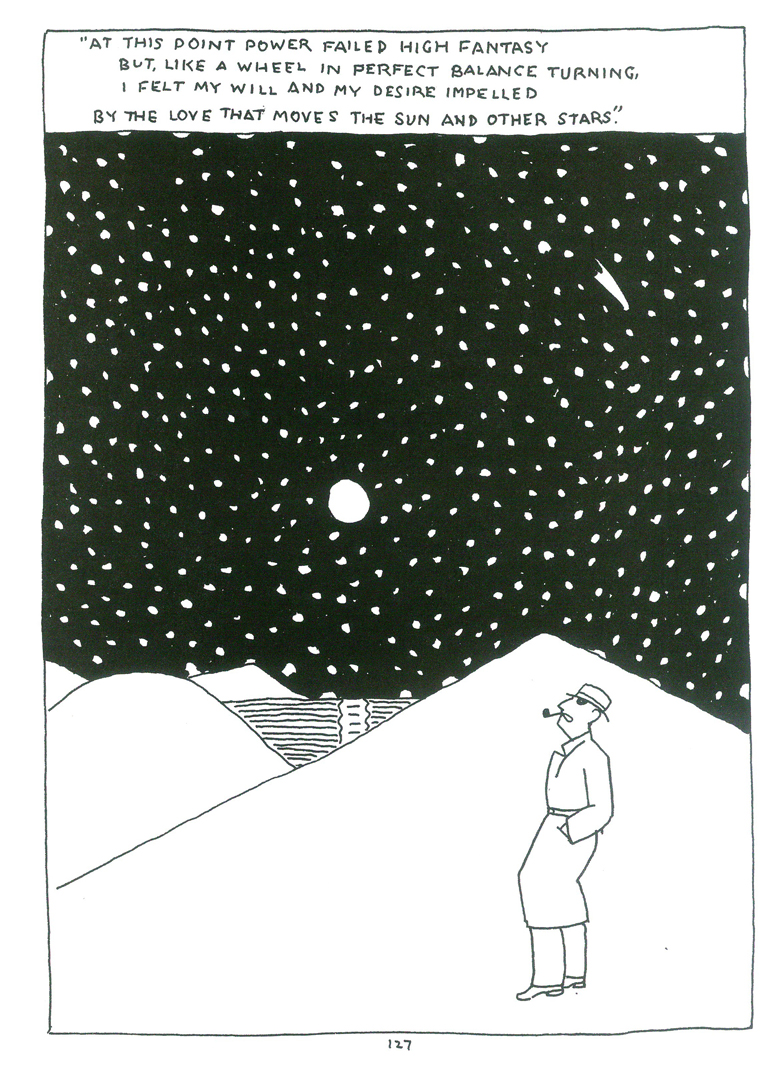
This is how the book ends. A high.
 31
31
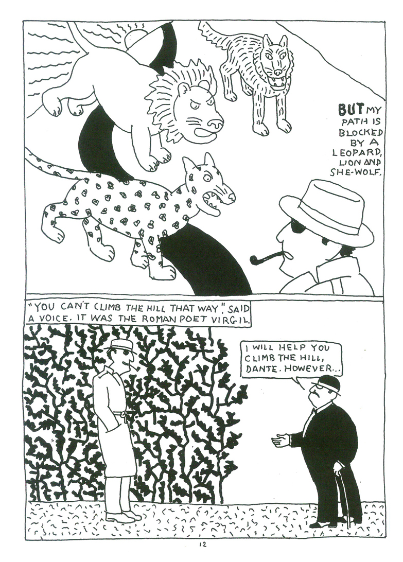
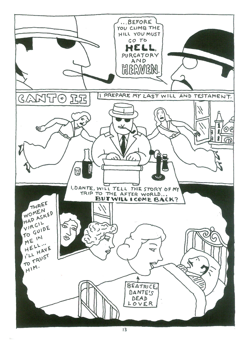
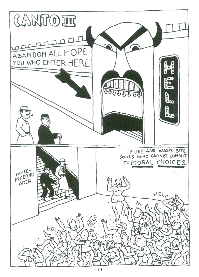
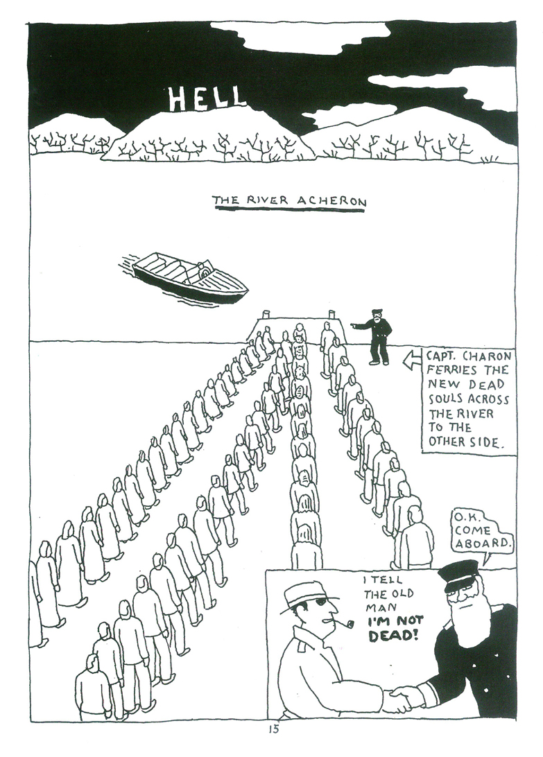
Books &Illustration 10 Dec 2010 08:20 am
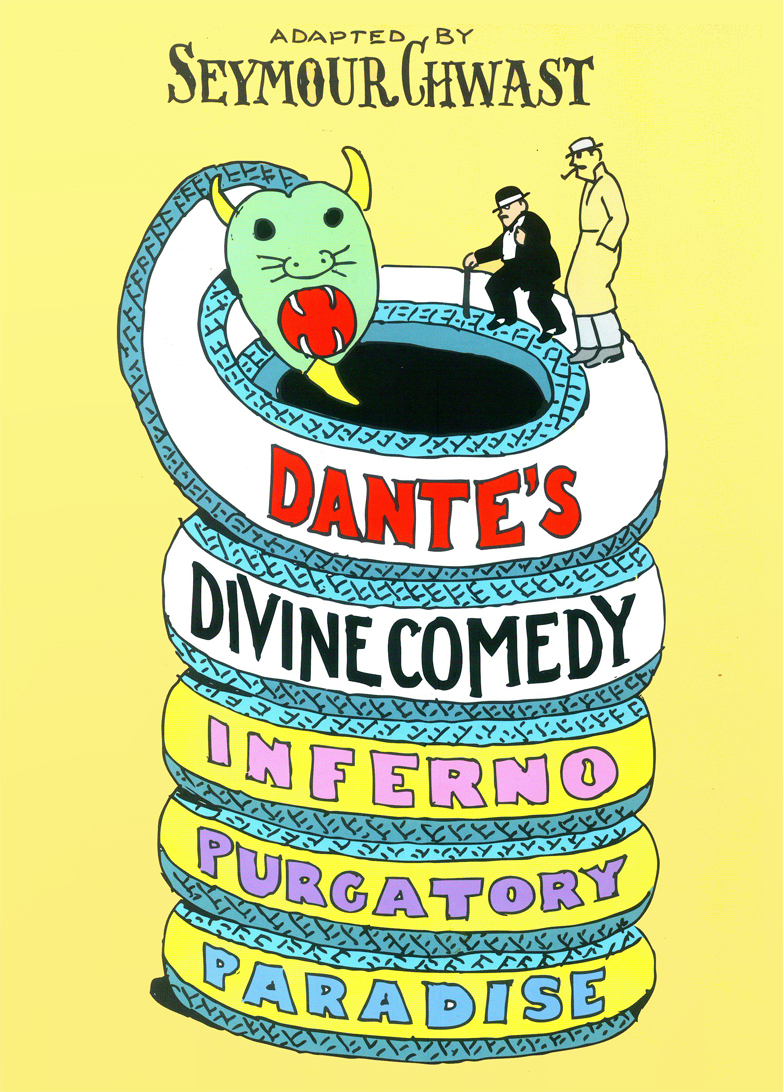
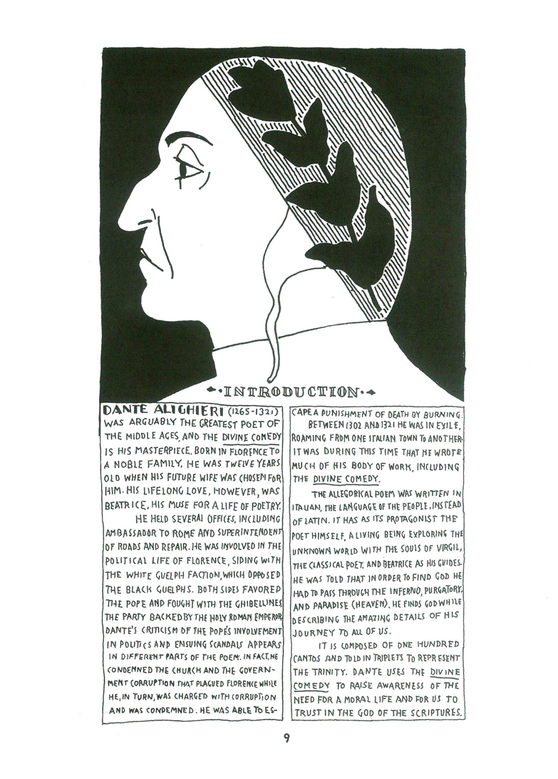
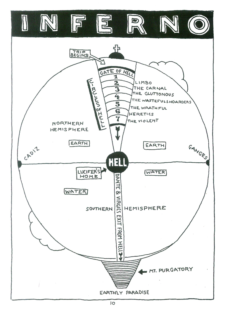
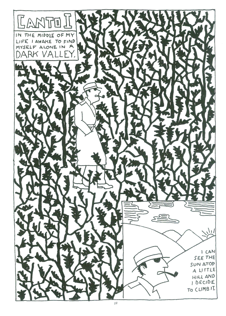
Chwast’s Dante
- Seymour Chwast has been one of our most important designers for generations, now. He has influenced art as one of the founding members of Pushpin Studios and has touched all phases of illustration and design.
This year he produced a graphic novel version of Dante’s Divine Comedy: A Graphic Adaptation. The book doesn’t simplify but has reduced the Epic poem to a detective story. The pages are black and white, but the color is all in the drawing. The only similar work I can think of is Robert Crumb’s The Book of Genesis, an equally brilliant work.
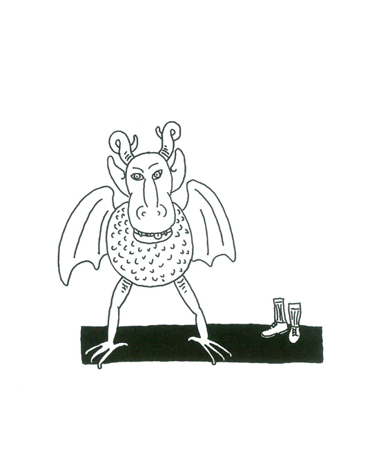
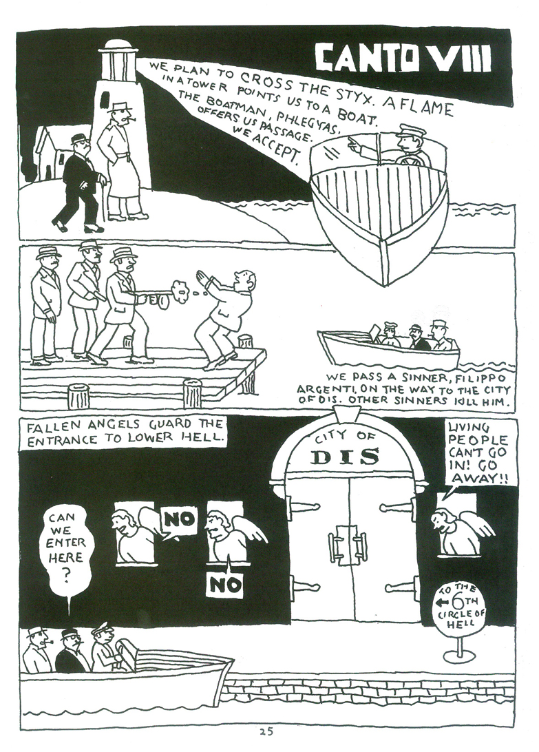
Here’s a sample of Book I – Inferno. In other posts, I’ll share a bit of the remaining two parts – Purgatory and Paradise.
cover
 1
1
 2
2
 3
3
 4
4
 5
5
 6
6
 7
7
 8
8
 9
9
 10
10
 11
11
 12
12
 13
13
 14
14
Illustration 09 Dec 2010 08:22 am
Thurber
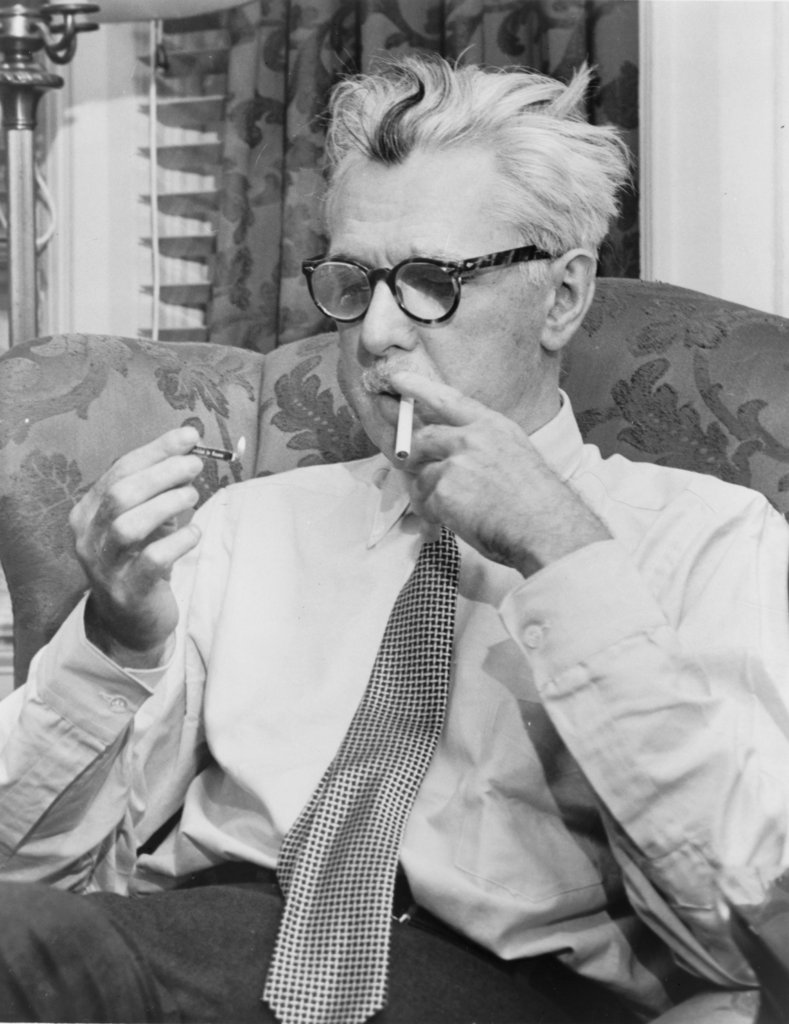 - James Thurber has long been a national treasure, both as a writer and a cartoonist. The only problem is that most of the younger generation has probably no idea who he is.
He’s been the go-to guy for design-y animation.
-It all started with the UPA animated short, Unicorn in the Garden. This was a holdover from the planned animated feature, titled Men, Women and Dogs, that UPA was going to make of his work.
- The William Windom tv series about a cartoonist at work, My World and Welcome to It, used his style.
- The War Between Men and Women, a movie starring Jack Lemmon, portrayed the story of a bachelor cartoonist whose love life fed his comic strip. The style of Thurber fed the animated version of his strip.
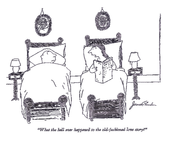
He was a New Yorker cartoonist and writer. Here’s a sample of the cartoons printed in that magazine.
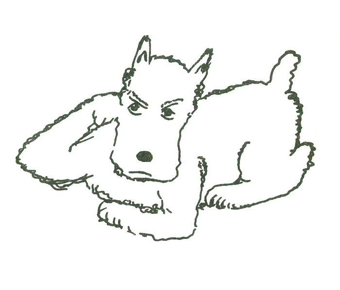
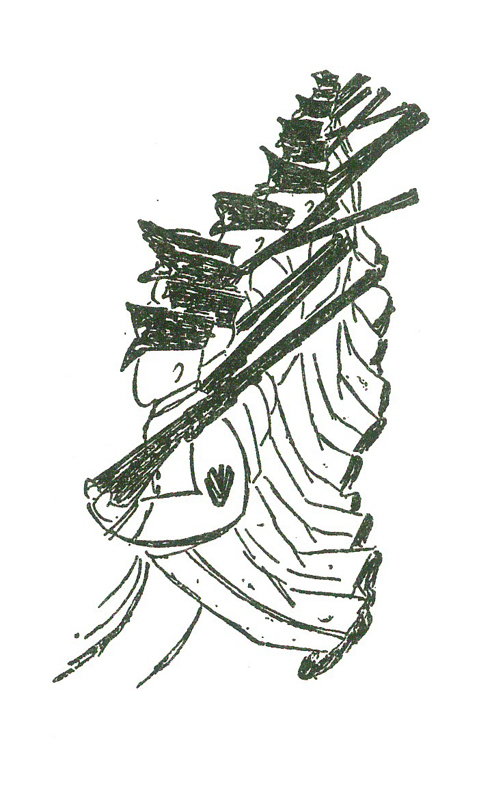
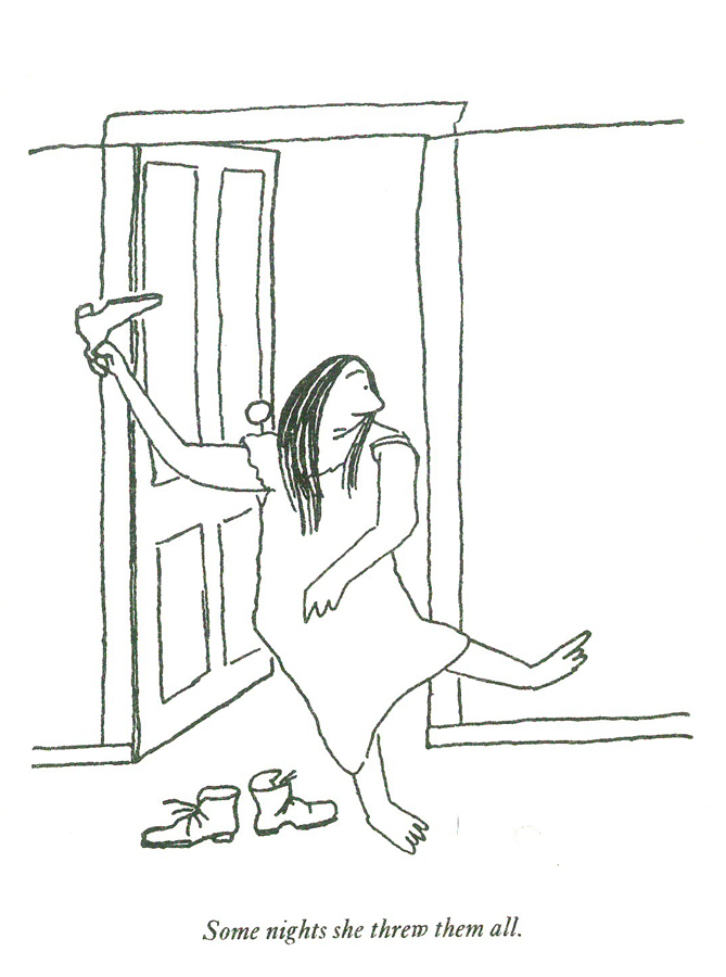
My Life and Hard Times was a big book for Thurber. Several of his biggest short stories are in this book, including: “The Night the Bed Fell” and “The Night the Ghost Got In.”
Here are the illustrations from that book:
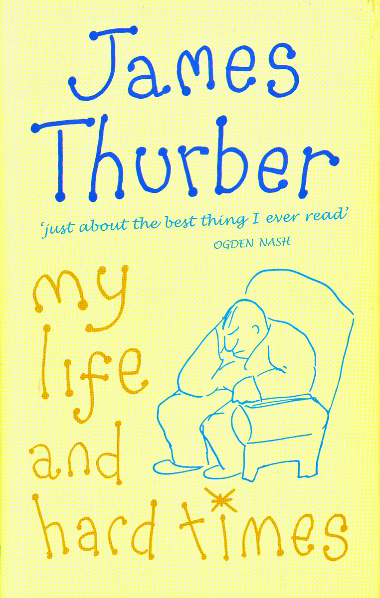
The book’s cover
 1
1
 2
2
 3
3
 4
4
 5
5
 6
6
 7
7
 8
8
 9
9
 10
10
 11
11
 12
12
 13
13
 14
14
 15
15
 16
16
 17
17
 18
18
 19
19
 20
20
 21
21
 22
22
 23
23
 24
24
 25
25
 26
26
 27
27
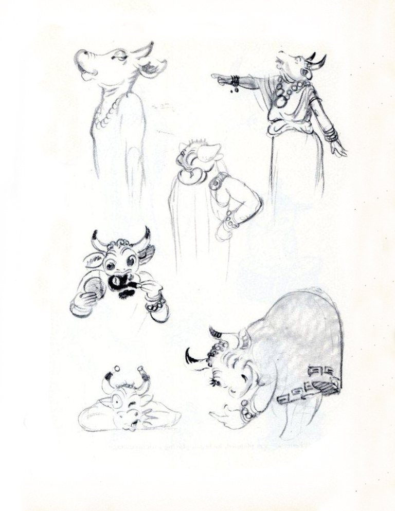
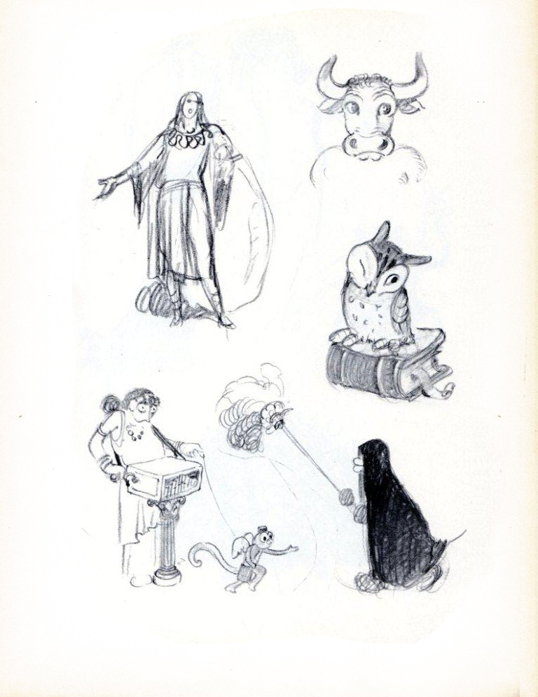
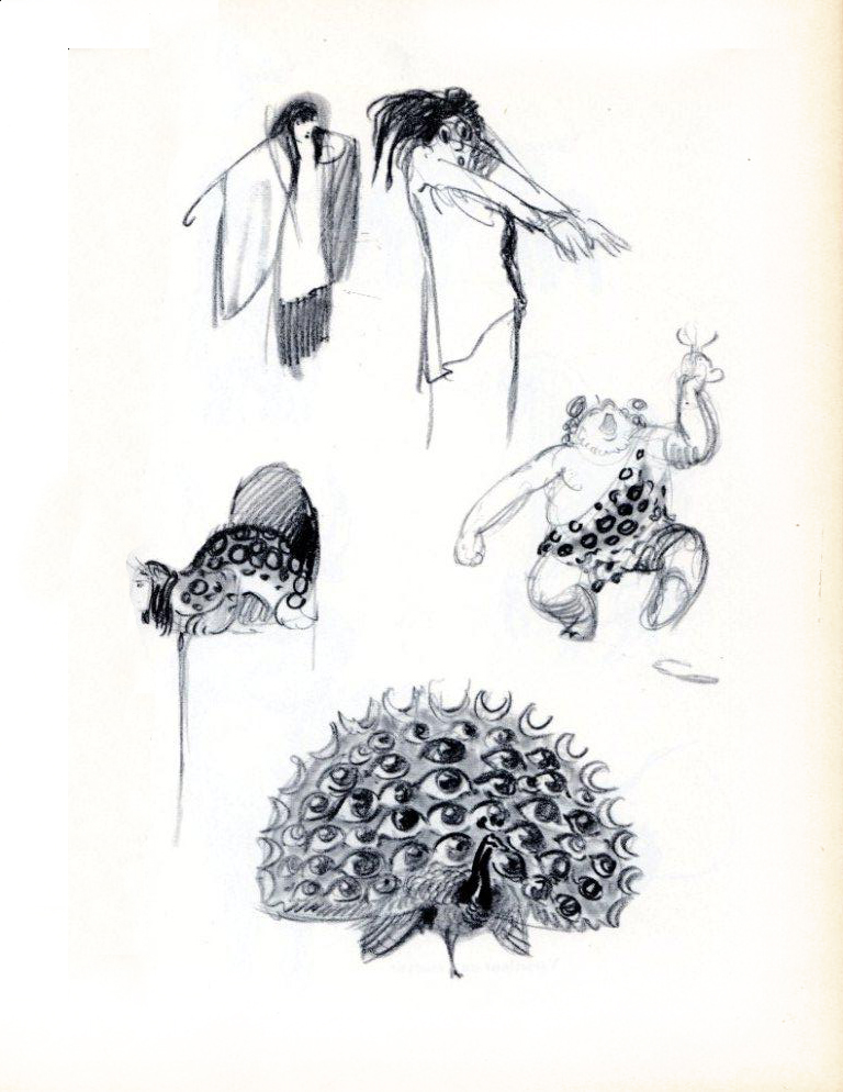
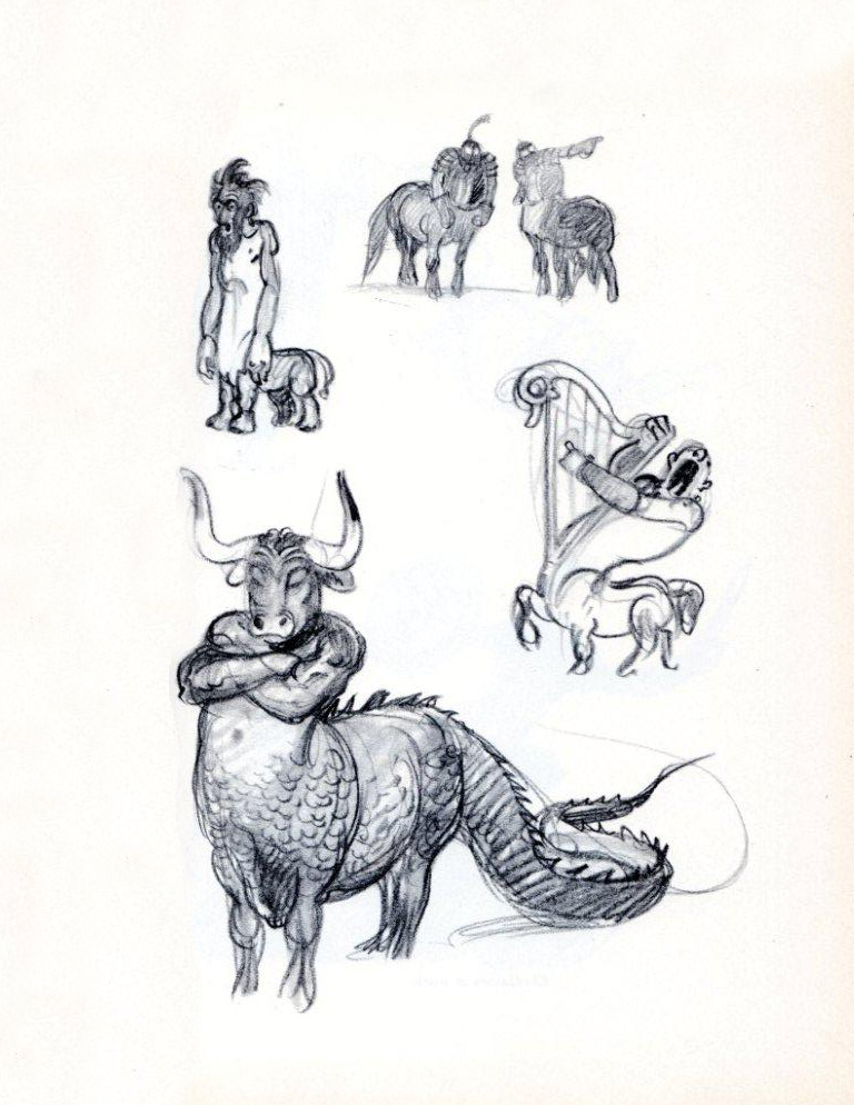
Animation Artifacts &Bill Peckmann &Books &Disney &Illustration 03 Dec 2010 09:53 am
He Drew As He Pleased – 4
- Here are more pages from the book by Albert Hurter, He Drew As He Pleased (Simon and Schuster, 1948.) This gem is a rare book, indeed.
Albert Hurter was one of the European illustrators Disney brought into his studio for Snow White and Pinocchio. Hurter was the his own master, drawing designs which would be used generally to further the design of the features and Silly Symphonies.
A similar position seems to have gone to Joe Grant when he worked in the period during the making of Beauty and the Beast through The Hunchback of Notre Dame. Some of his drawings, as can be seen in John Canemaker‘s book, Two Guys Named Joe, are just as brilliant. Indeed, there were a lot of brilliant artists floating around the Disney studio in the late Thirties, early Forties.
Many thanks to Bill Peckmann for the loan of the book’s pages and the arduous task of scanning these illustrations.
 50
50
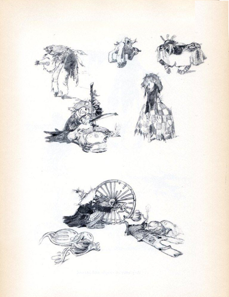
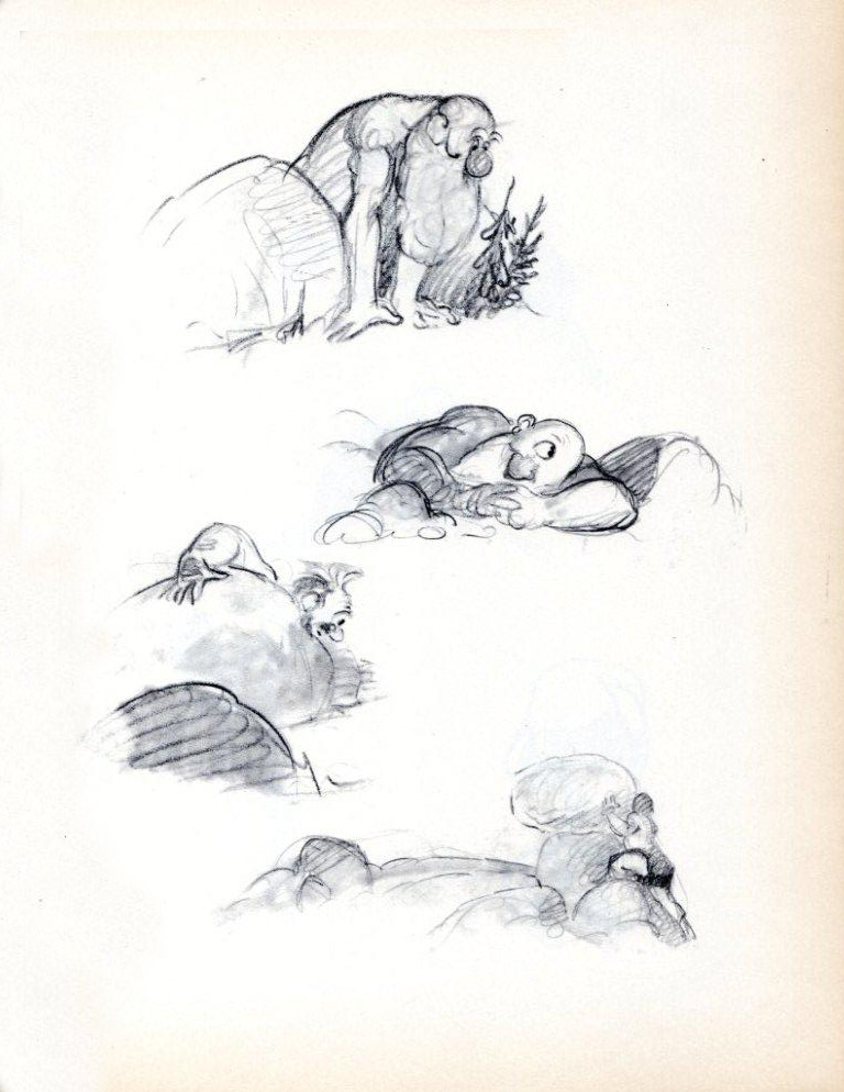
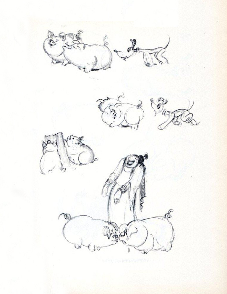
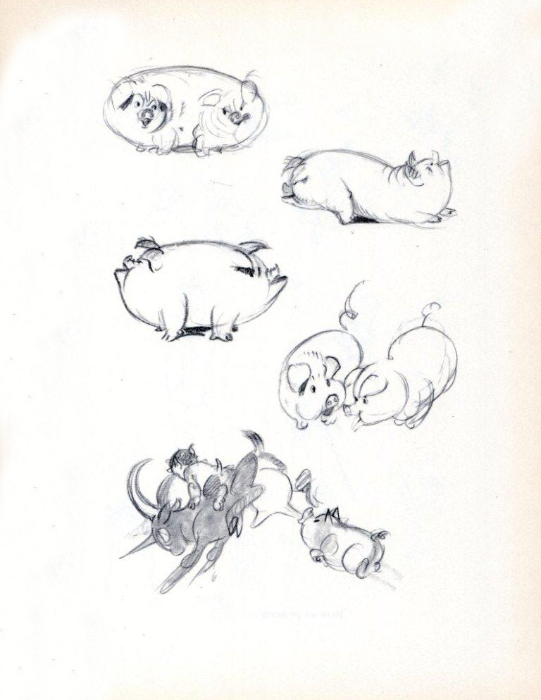
“He was fond of scarecrows . . . ”
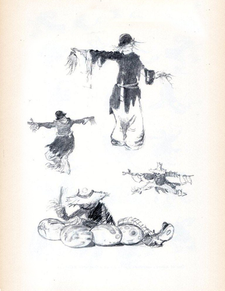 51
51“They were so simple and natural . . .”
.
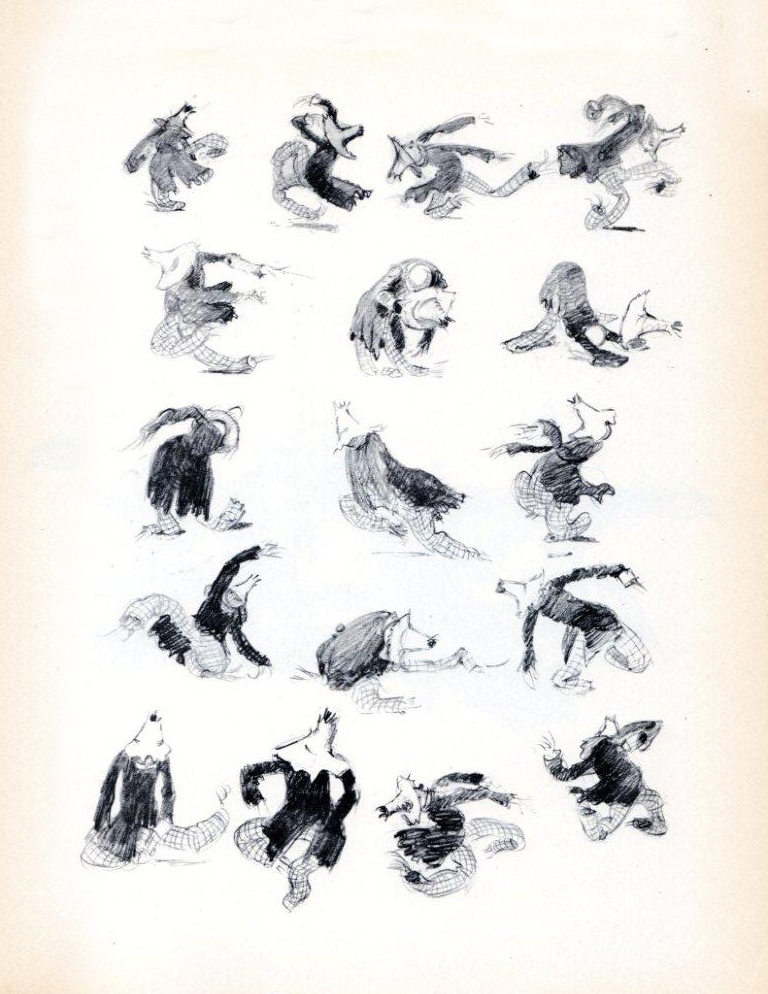 52
52“One of Albert’s ambitions was
to design a scarecrow ballet.”
.
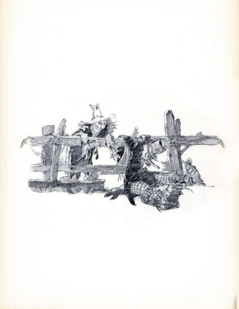 53
53.
 54
54“When Fantasia was planned,
he began playing with mythology.”
.
 55
55.
 56
56.
 57
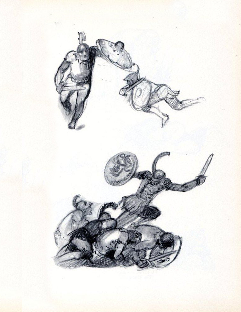
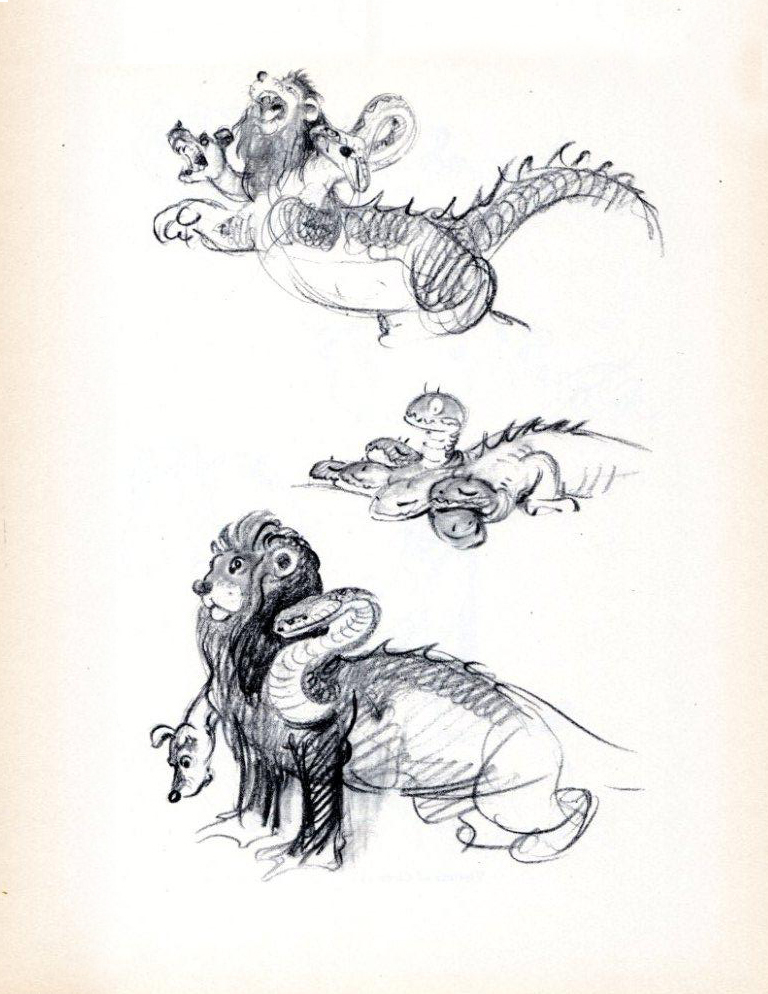
57Variations on a Centaur
.
 58
58Gladiators at Work
.
 59
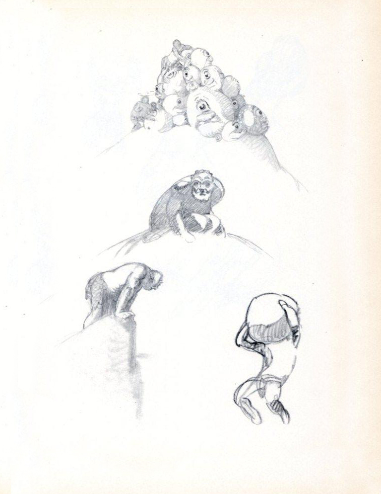
59The Titans
.
 60
60.
 61
61.
 62
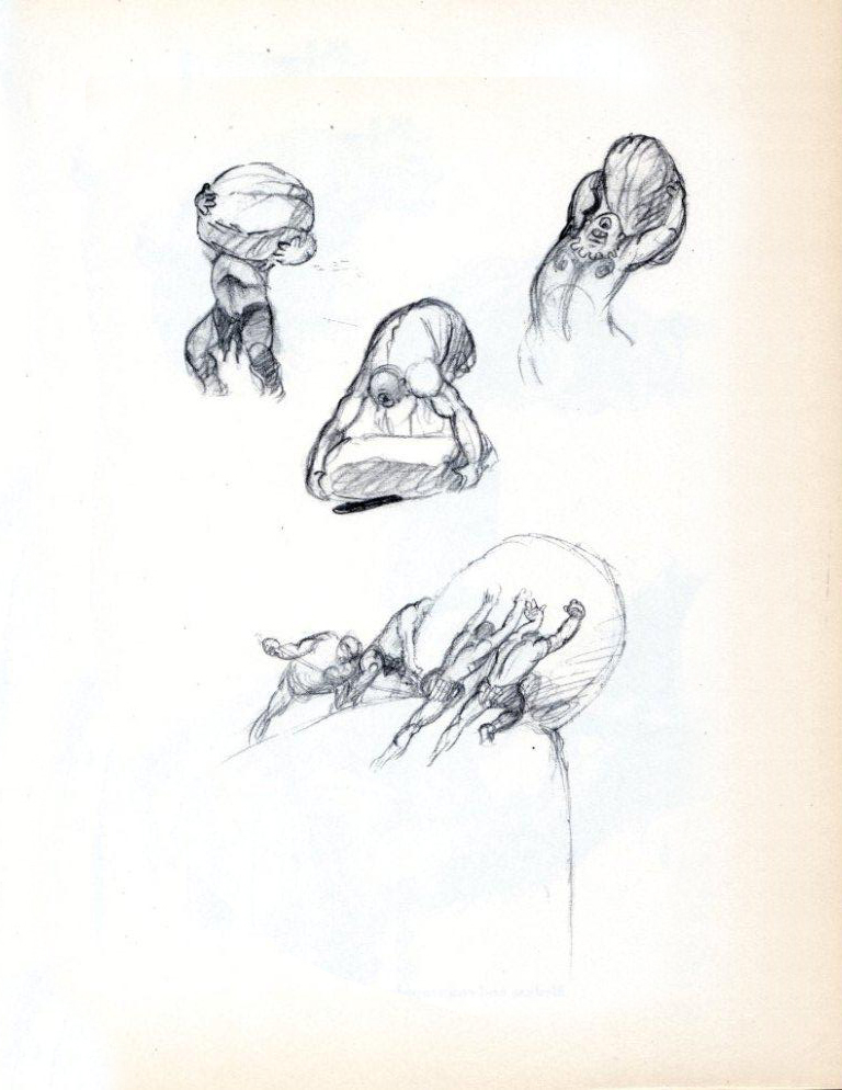
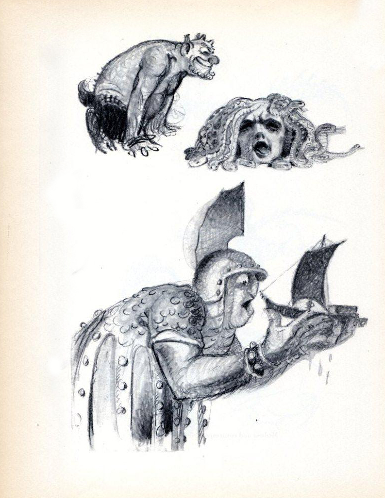
62Medusa and Contemporaries
.
 63
63.
 64
64Victims of Circe
.
 65
65Siamese and Otherwise
.
