Yearly Archive2009
Photos 01 Nov 2009 09:26 am
Sat Halloween Fotos
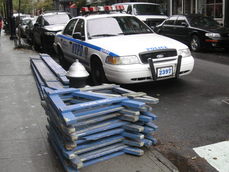
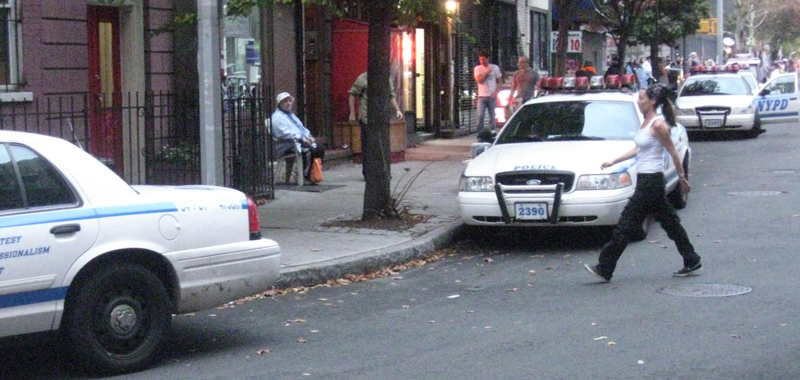
- This neighborhood is a nightmare come Halloween. The Greenwich Village Parade forms just a few blocks away and the march goes right through the area. Many hundreds of tourists wade through the streets during the day waiting for the nightfall.
 1
1I was greeted in the morning by many police cars
all surrounded by the material to build blockades to
harness the visitors into the smallest possible area.
 2
2 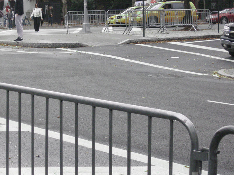 3
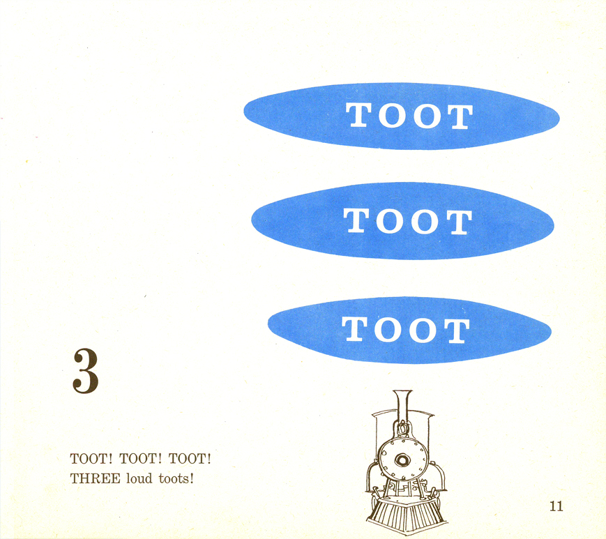
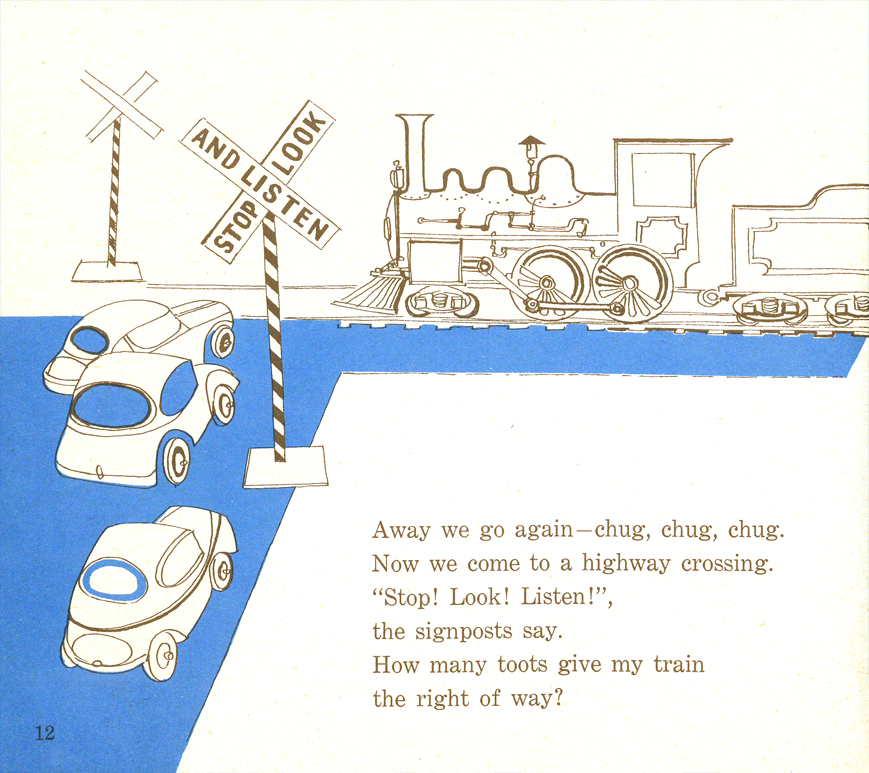
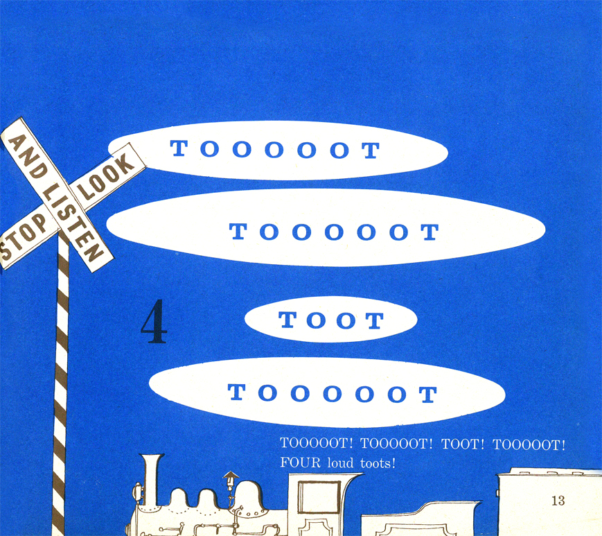
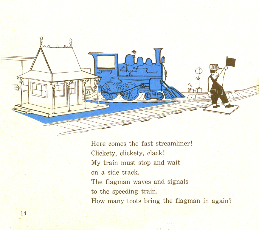
3
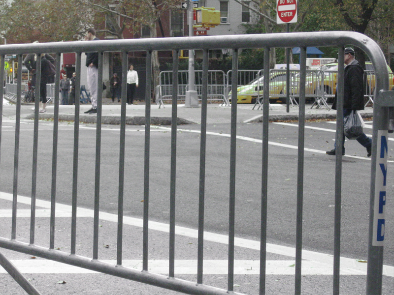
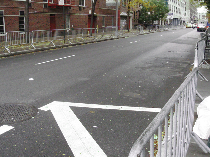
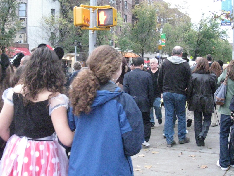
The entire area for many many blocks crossing and
intersecting with Sixth Ave. are blocked off to stop
pedestrian AND auto traffic. And this was at noon on Sat.
 4
4 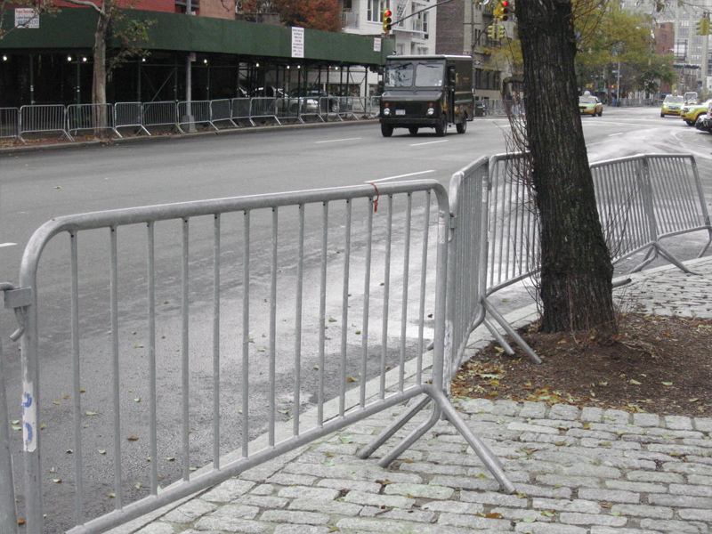 5
5
(Click any image to enlarge.)
 6
6
One door was nicely decorated.
 7
7
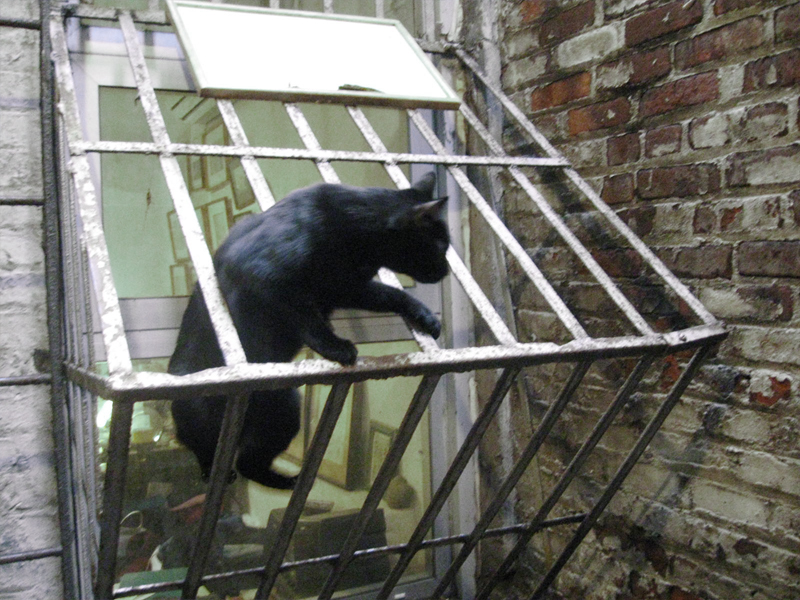
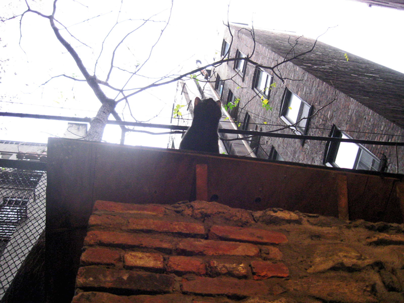
The studio’s black cat wanted nothing to do
with the Halloween brouhaha.
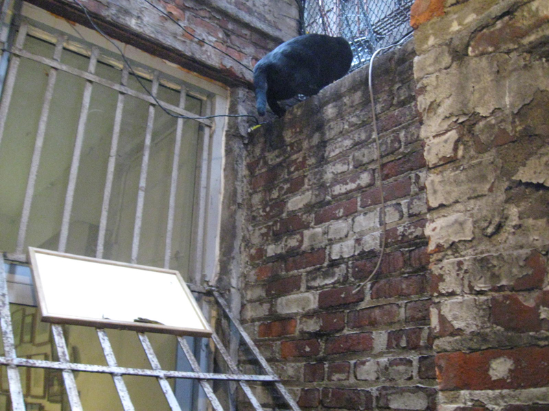 8
8
So he jumped to the top of the 12 ft. wall to be alone.
Security and danger.
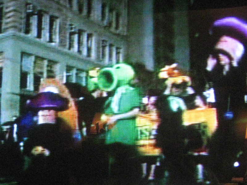
By the time I took off, about 6, there were
cops and people mixing everywhere in sight.
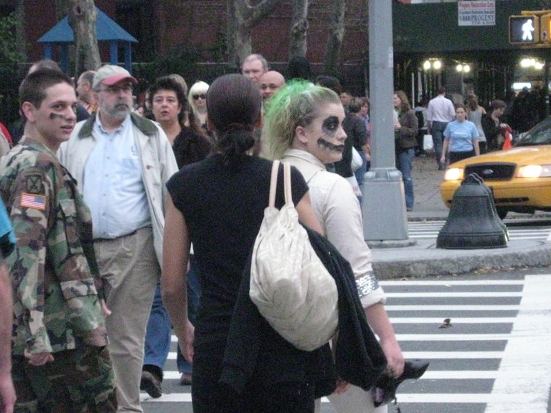
Crowds and more crowds were heading to the
blockaded area. Some in costume, some not.
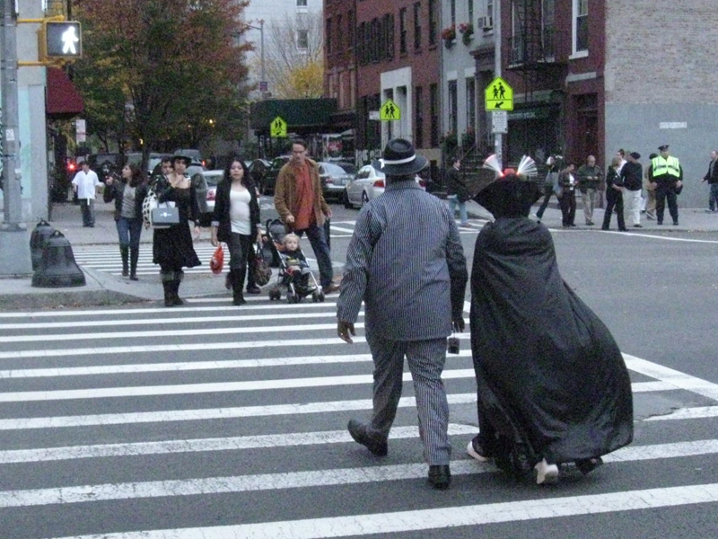
Even out of sight of Sixth Ave. people were heading there.
I got a front row seat for the parade . . .
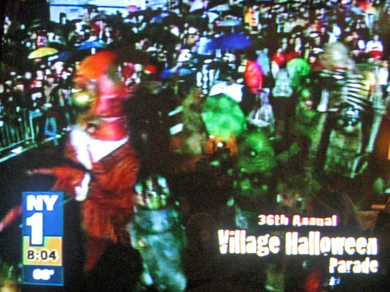
. . . watching it on television.
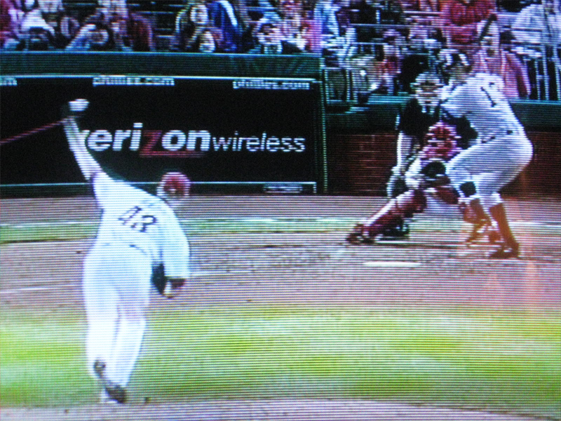
When the rain delay was over I switched to
the World Series to watch my Yankees win.
(Snapped just before A-Rod hit his home run.)
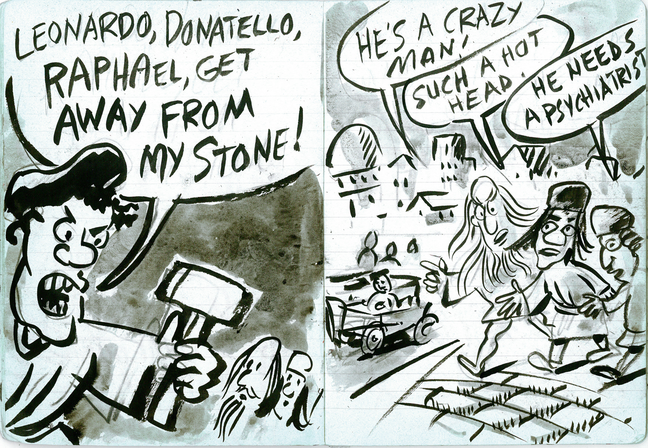
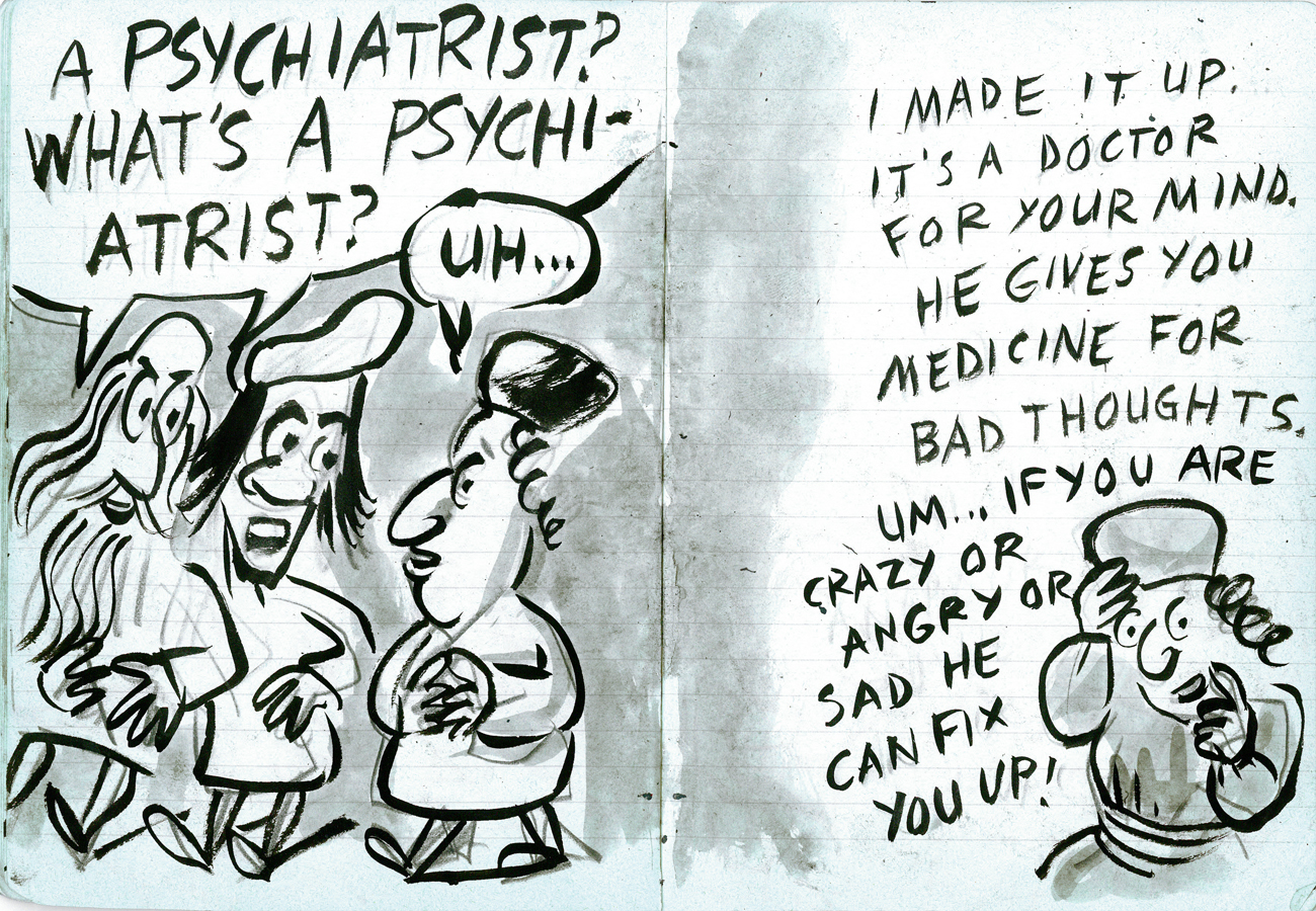
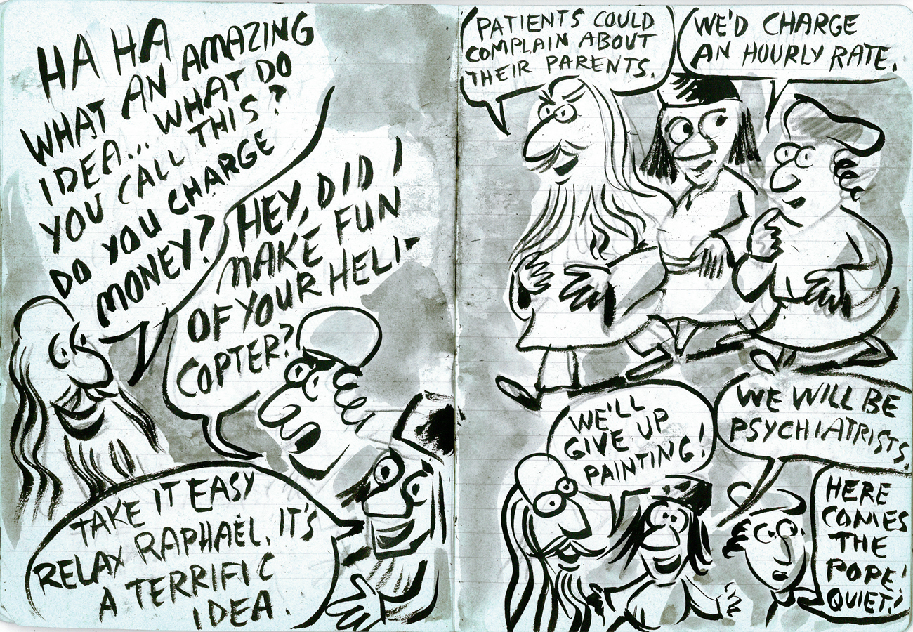
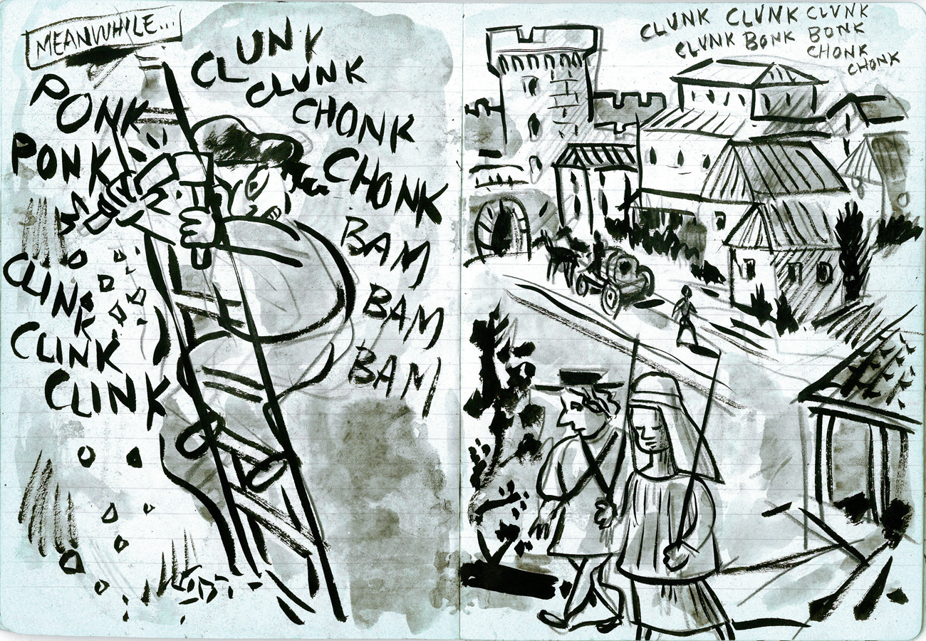
Comic Art &T.Hachtman 31 Oct 2009 07:35 am
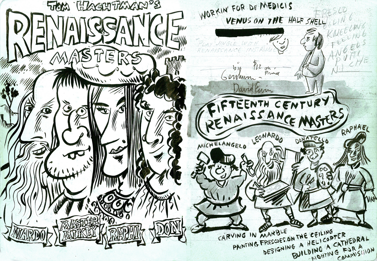
Renaissance Masters 1
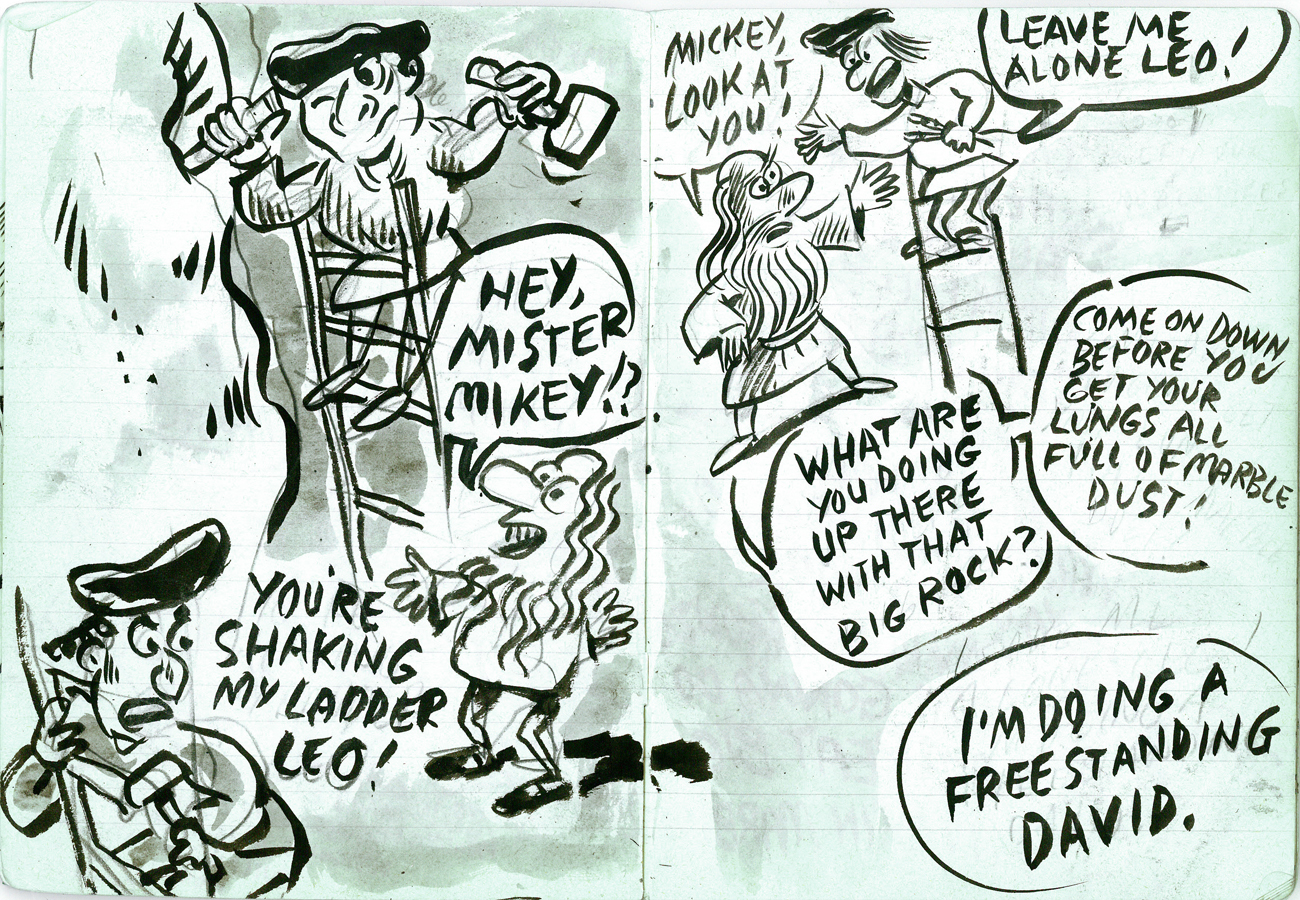
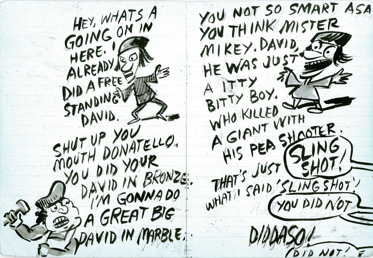
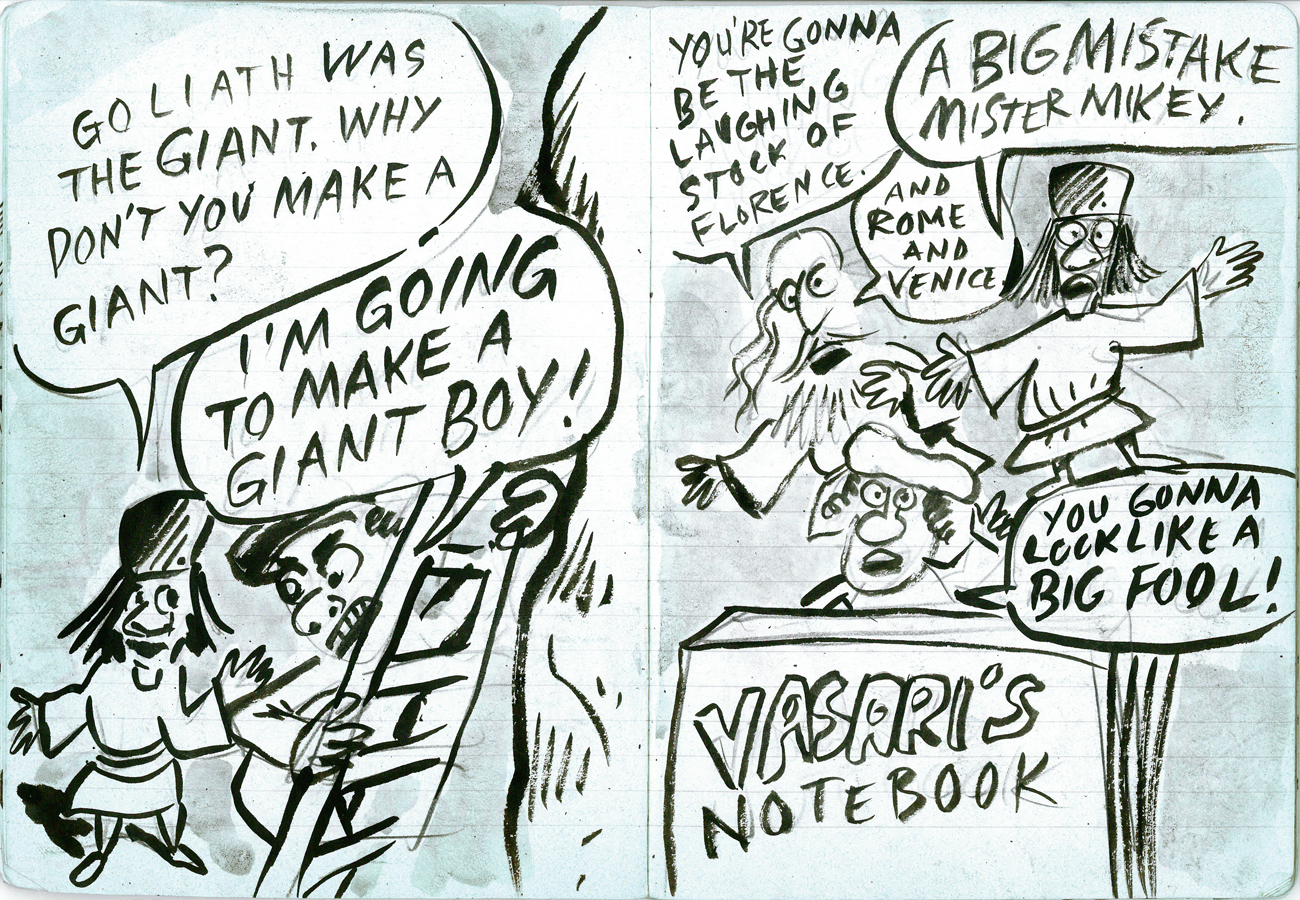
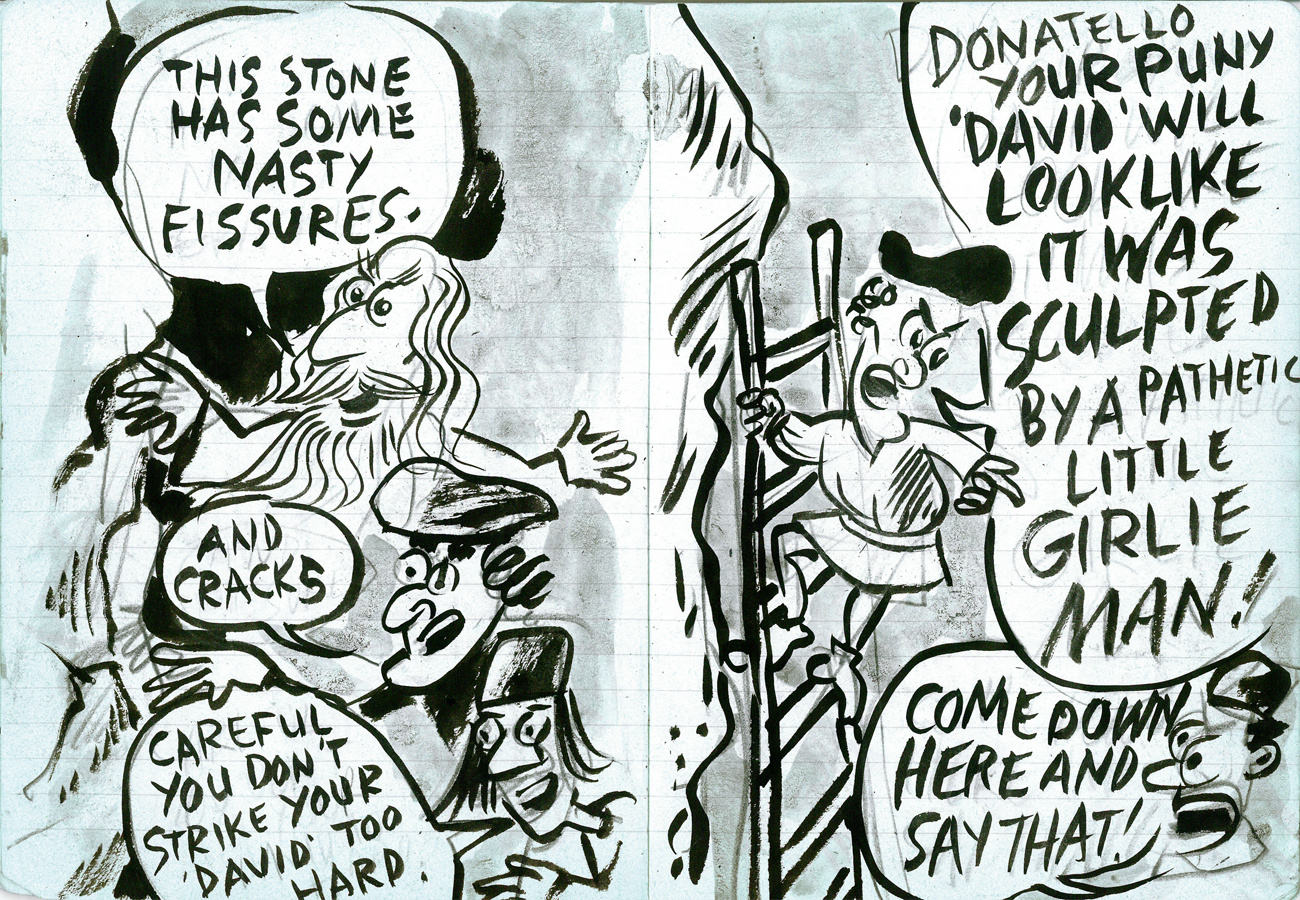
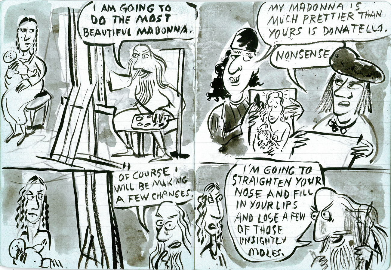
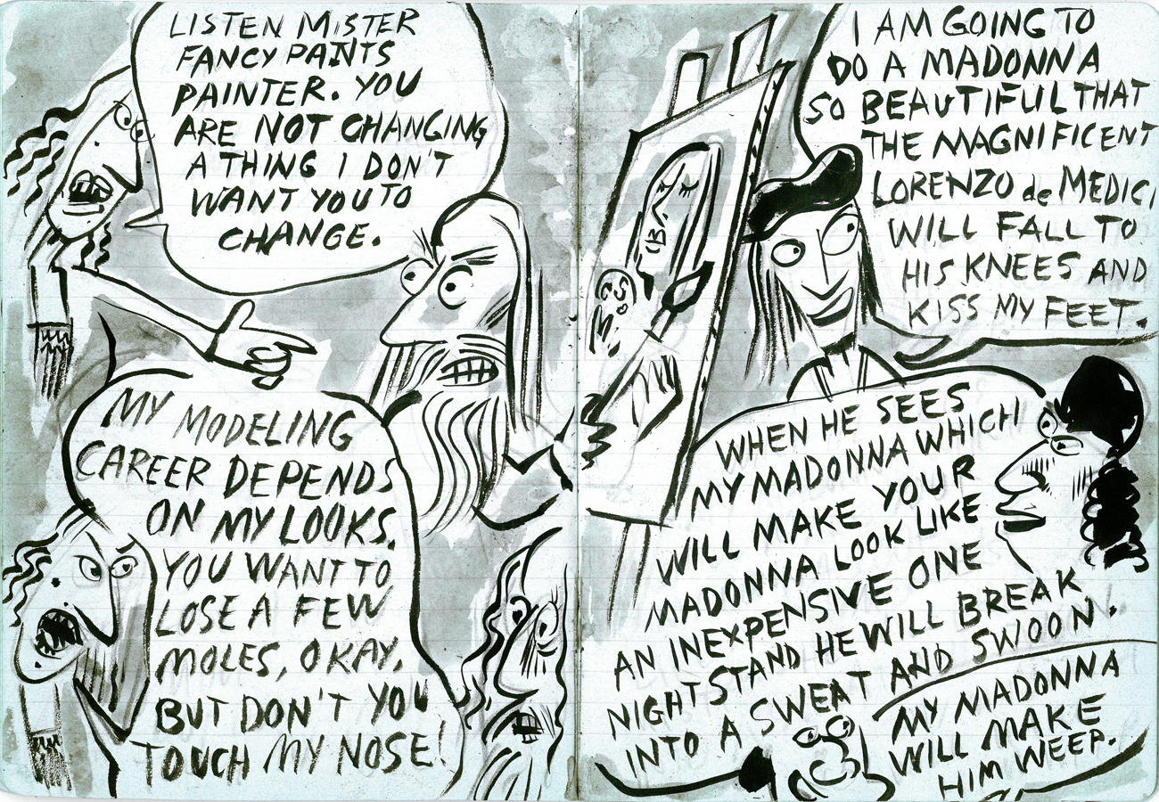
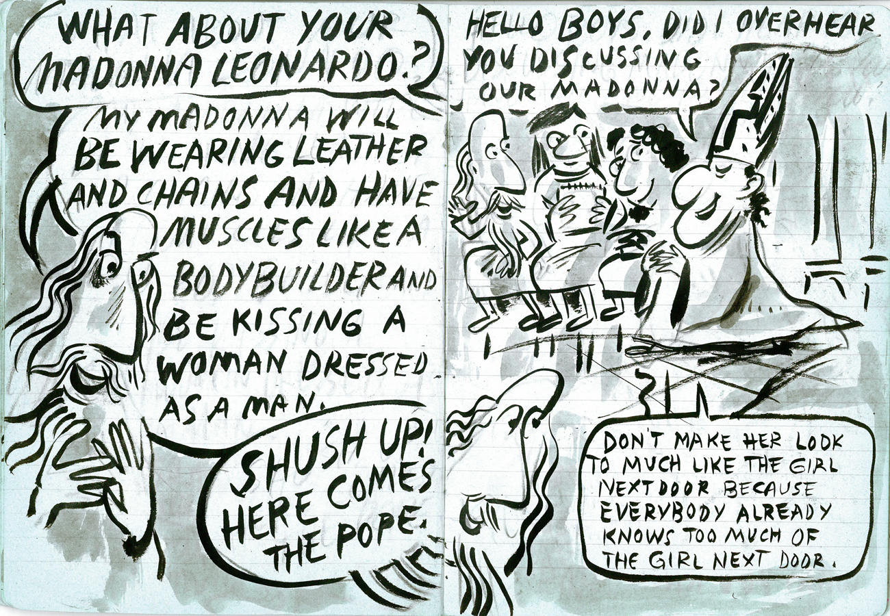
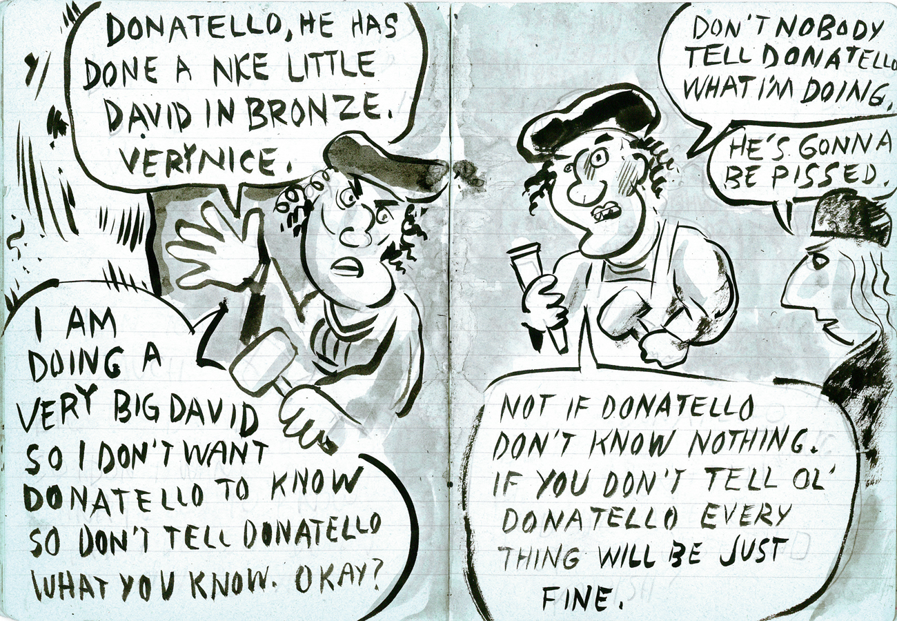
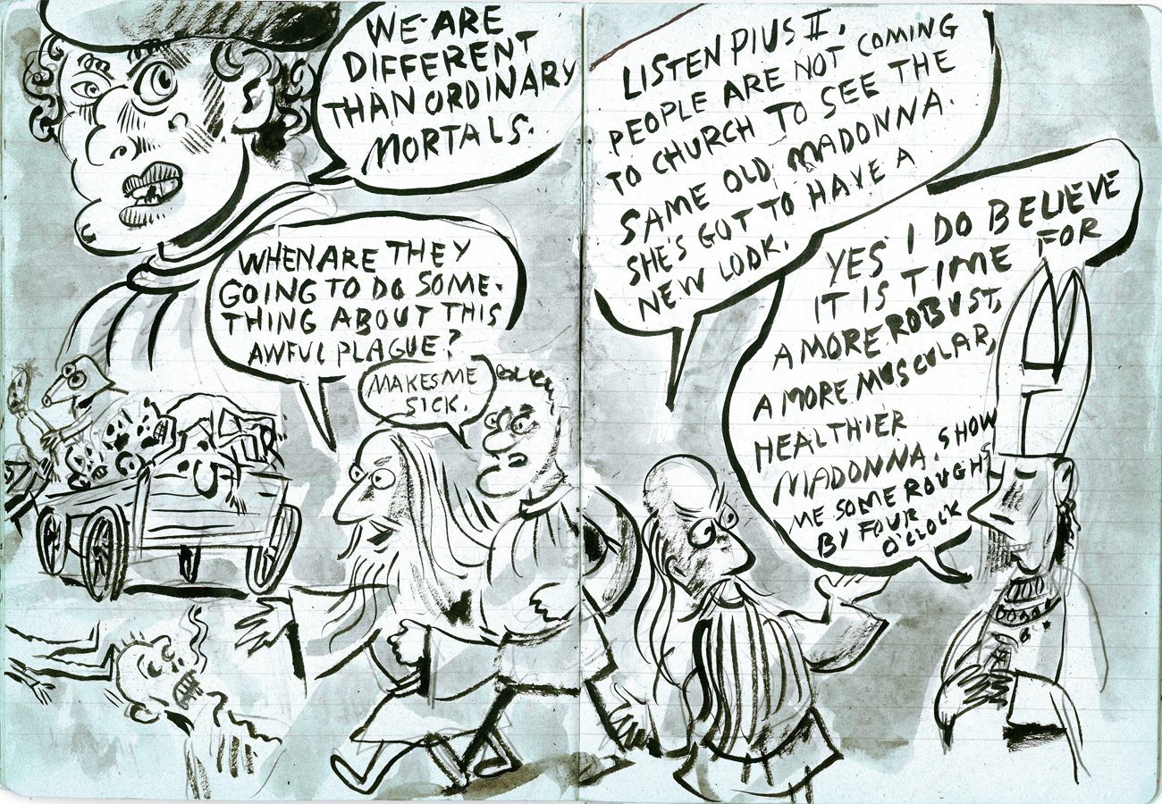
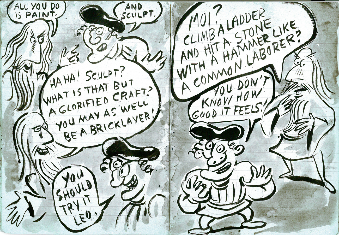
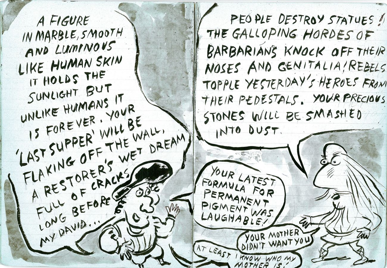
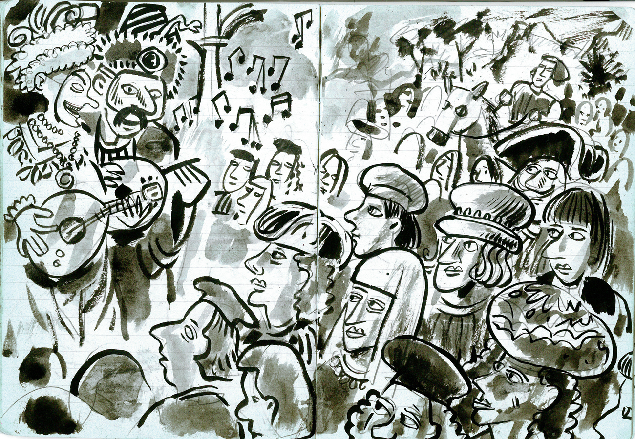
- Tom Hachtman, you’ll remember, is the cartoonist whose comic strip, Gertrude’s Follies, featured characters out the Americans and artists in Paris: Gertrude Stein, Pablo Picasso, Ernest Hemingway and others during the 20s – but set in modern day. The strip was a success, and I made a short or two out of it, trying to get interest in a feature.
Tom actually started to develop another strip. With this one he mined the Renaissance Masters, and that’s what he called the strip. Michelangelo, Leonardo, Raphael and all the other biggies are in there.
He did this strip in a notebook (with blue lines), and he gave me the book to post on this site – at my request, of course. So for the next few weeks, I’ll post all the double page panels done with India Ink and wash. At a good breaking point we’ll continue it next week.
Here they are, the Renaissance Masters:
 1
1(Click any image to enlarge.)
 2
2
 3
3
 4
4
 5
5
 6
6
 7
7
 8
8
 9
9
 10
10
 11
11
 12
12
 13
13
 14
14
 15
15
 16
16
 17
17
Articles on Animation &Commentary 30 Oct 2009 08:57 am
Live Action Directors Animate
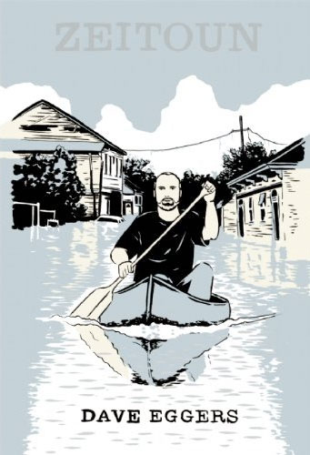 - The New York Times reported that Jonathan Demme is planning to make an animated feature of the book, Zeitoun by Dave Eggars.
The book is about the reconstruction efforts taking place in New Orleans done since the Katrina disaster effort.
Apparently Demme was taken by the illustration on the cover of the book and immediately saw it as animation. He’s quoted as saying, “I was staring at the book, and there’s this wonderful line drawing on the cover, the character of Zeitoun in his canoe, paddling through a submerged neighborhood. And I suddenly imagined, What if we could do an animated film and visualize the experiences of the Zeitoun family and all of New Orleans?â€
They haven’t decided what the style of the film will look like, but Demme favors a hand-drawn style for the film.
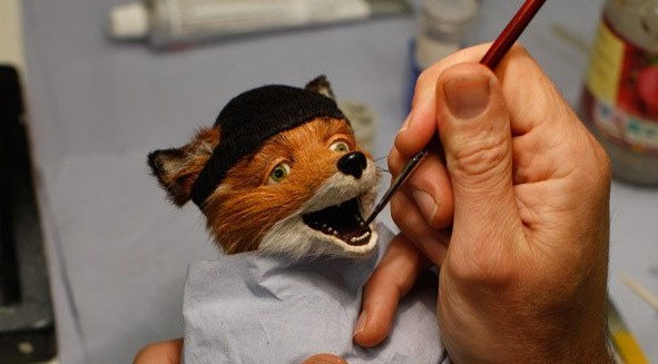
The New Yorker magazine has a profile of Wes Anderson. (I’ve given the link to the magazine, but it’s open only to subscribers.) Anderson is the director of Rushmore, The Royal Tenanbaums and The Darjeeling Limited. He’s also the director of the upcoming puppet film, The Fantastic Mr. Fox, which was based on the Roald Dahl book.
The article opens and closes with a couple of columns about the animated film, but primarily focuses on Anderson’s bio and career.
In reading the article, a short bit popped out at me.
- For stop-motion animation, the actors’ voices must be recorded in advance, so that the figurines’ mouths can be moved in synch with the dialogue. The recording is usually done in a sound studio. Anderson did things differently. In the fall of 2007, he took a handful of actors, including (George) Clooney and (Bill) Murray, to a friend’s farm in Connecticut. In order to make the voices and the film’s soundscape realistic, Anderson had his actors perform the motions—running, digging, and climbing—that the figurines would perform; he recorded the exterior scenes in the fields, and the interiors in the farmhouse.
Anderson’s direction, with its protracted long takes and tight closeups, treats the figurines like actors, emphasizing their “performances.” The production designer, Nelson Lowry, told me that Anderson’s approach to animation was “very counterintuitive.” He made, Lowry added, “unconventional choices, such as keeping characters still. Usually, animators keep characters constantly in motion; if they re doing nothing, they blink.” Lowry calls Anderson’s expressive stillness a “compression of character.”
Let me repeat part of that last sentence: “Usually, animators keep characters constantly in motion; if they re doing nothing, they blink.”
This is the notion that live-action directors (probably all live action film makers) have of acting in animation. And I can’t argue too much with that. This is a good deal of acting in animated films: keep it moving, keep it moving, keep it moving regardless of the thought the characters are supposed to be having.
However, Anderson’s notion of acting, “keep it still” isn’t acting either. I remember Ralph Bakshi giving a talk after making Lord of the Rings, just prior to a screening. He said that humans stand still most of the time, but that if an animated character would sit still, it wouldn’t be acceptable. It would look like poor limited animation. It’s a problem good animators enjoy solving.
 Unfortunately, what I’ve seen of The Fantastic Mr. Fox looks like poor limited animation in puppets – a bit like those old Rankin-Bass episodes of Pinocchio. The difference is that the characters, here, are covered with fur making them look more like an early Starevich film. (Regardless, I like Anderson’s films so I’m still looking forward to seeing this – however it’s animated.)
Getting back to some real animation, Hans Perk (in case you didn’t know) has been posting the drafts from Snow White. What a resource his site is! Many thanks, Hans.
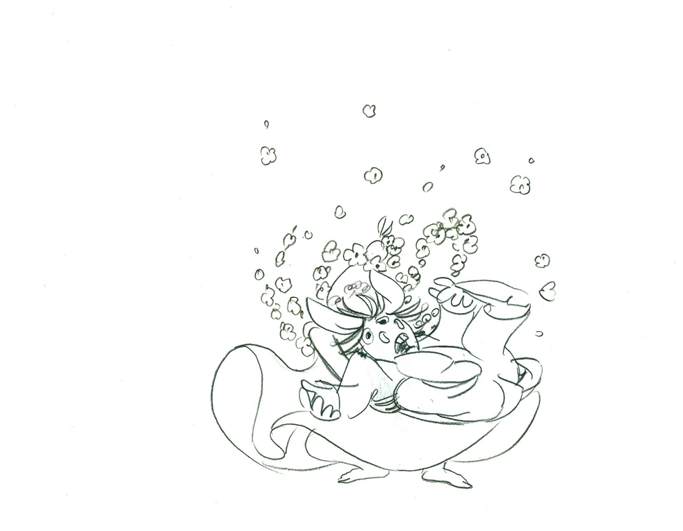
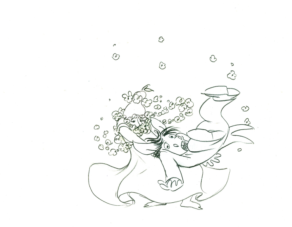
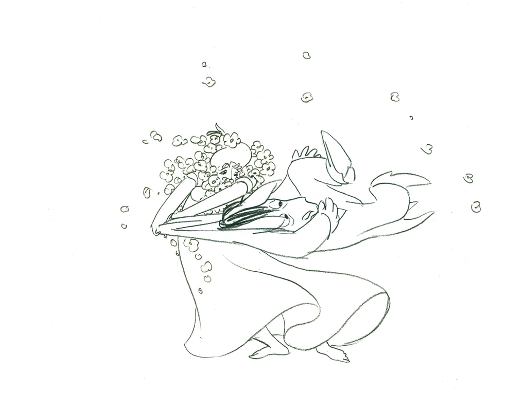
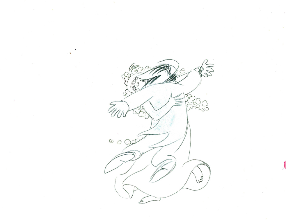
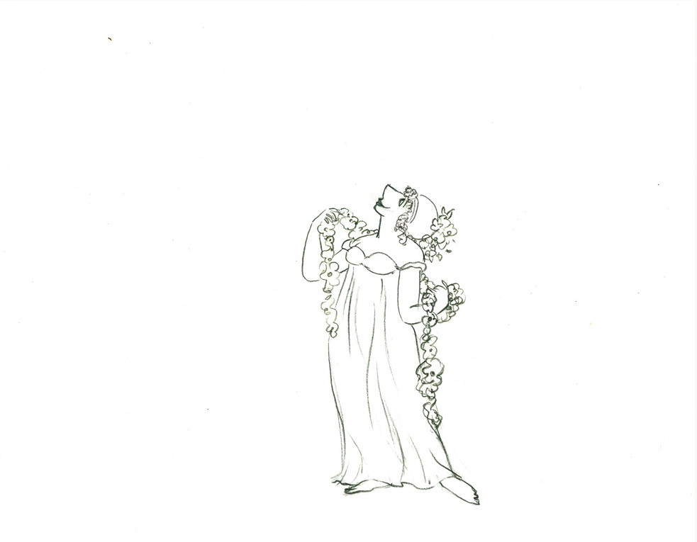
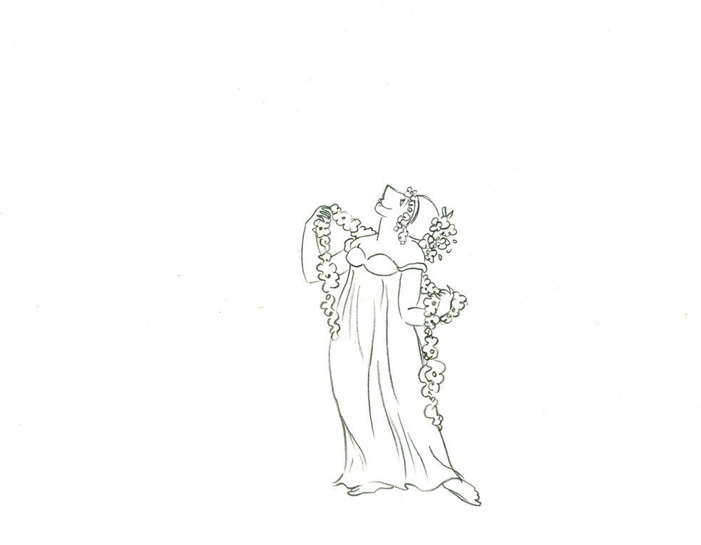
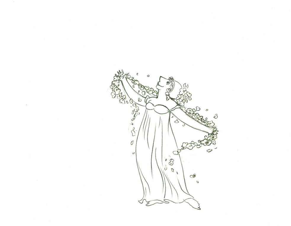
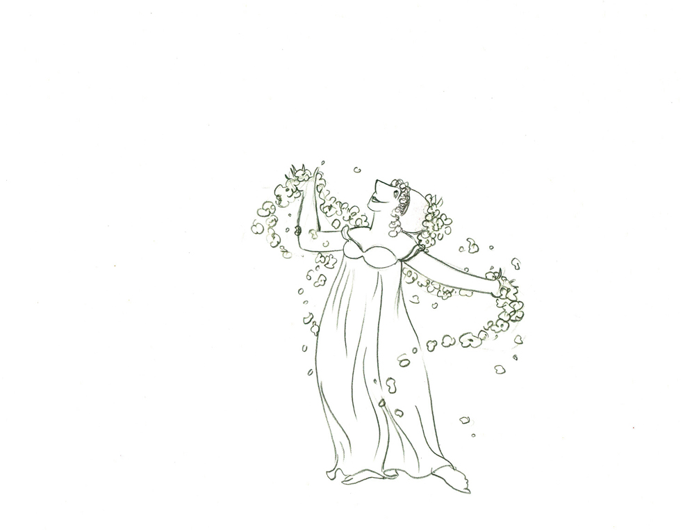
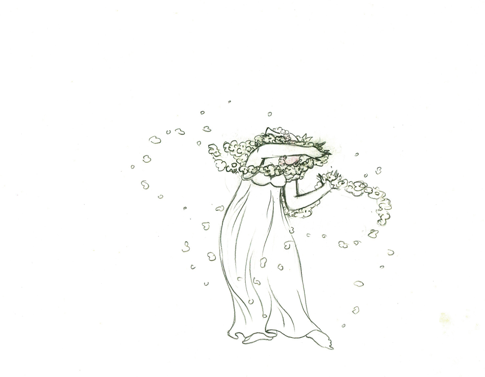
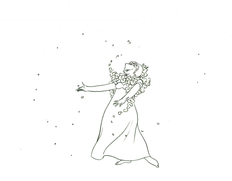
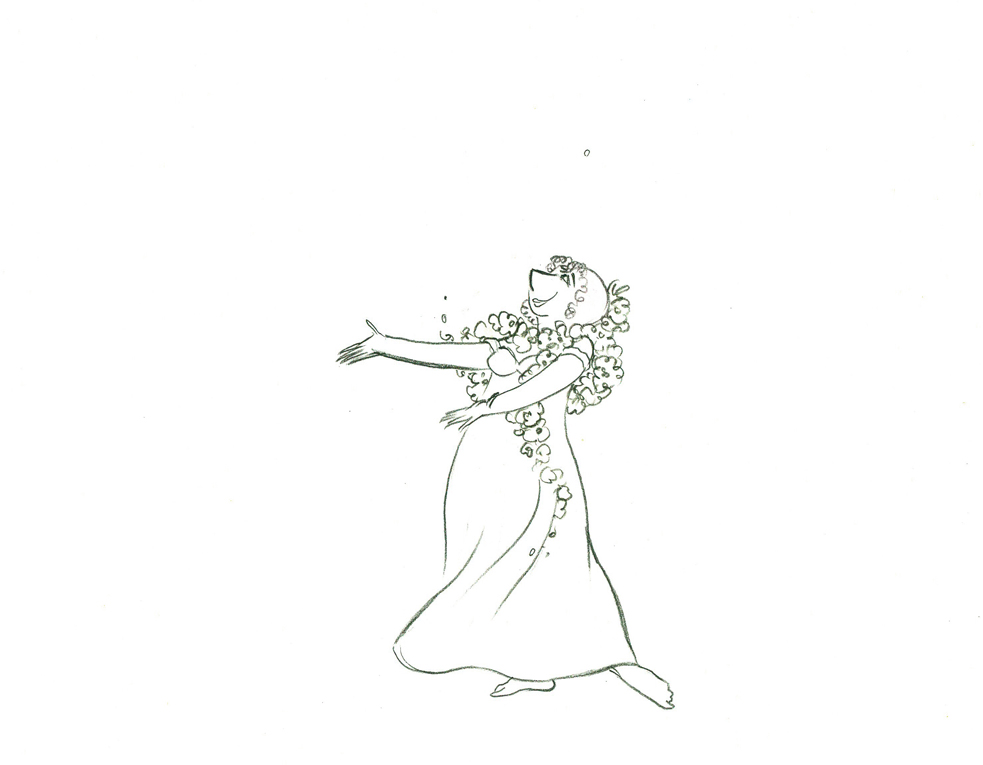
Animation &Tissa David 29 Oct 2009 08:00 am
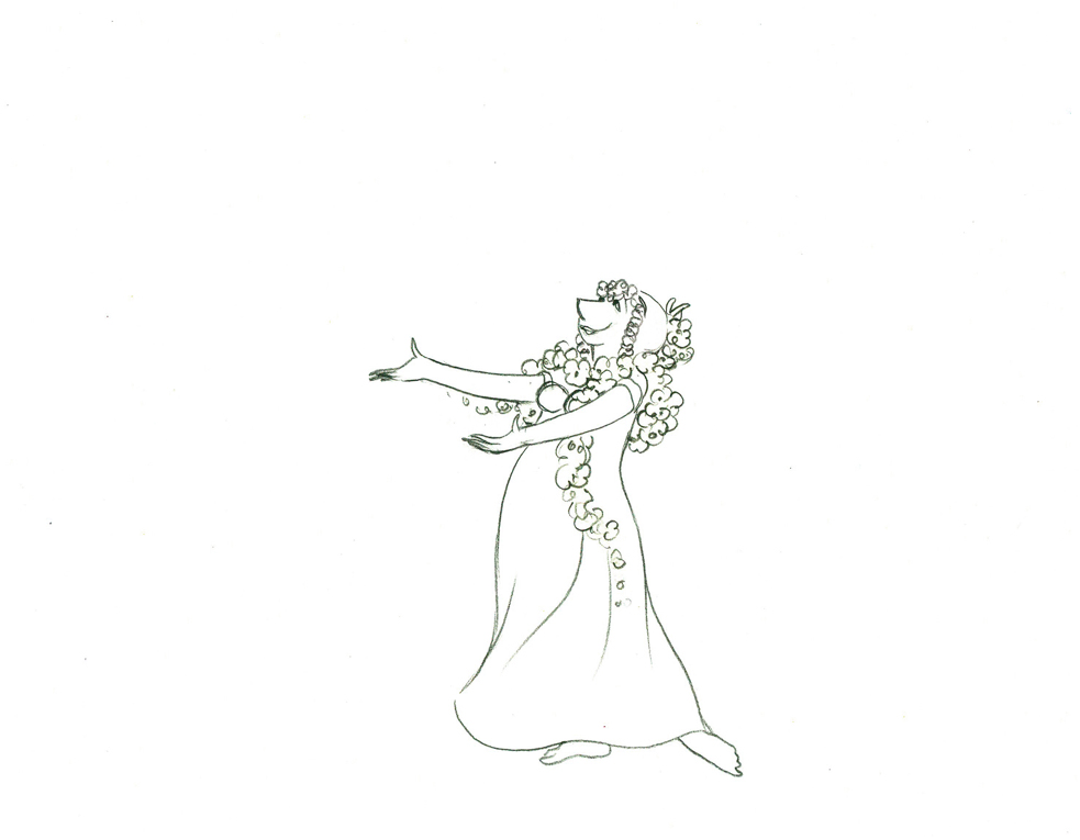
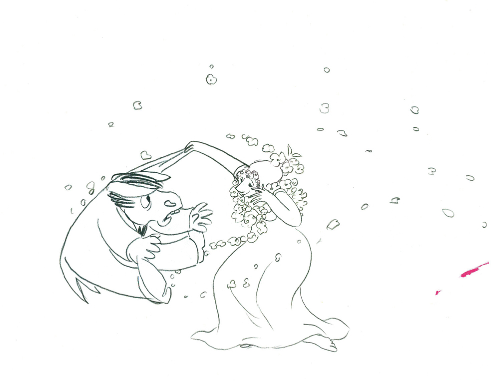
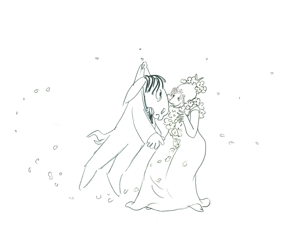
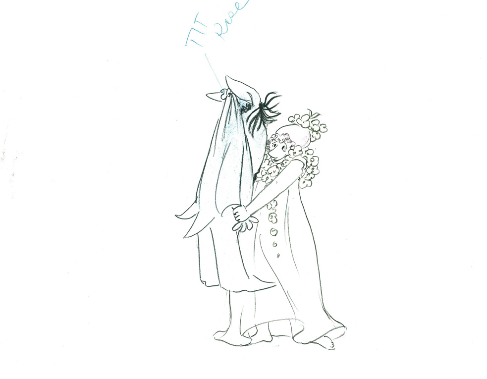
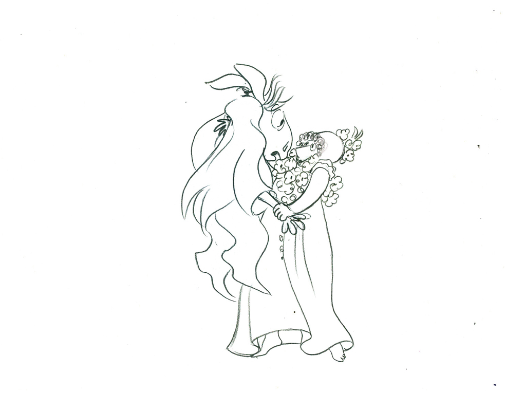
Titania & Bottom 2
- Continuing with yesterday’s piece, I’m completing the posting of all the Tissa David‘s drawings for this scene from The Midsummer’s Night Dream that she directed and animated with a few other Dutch animation friends.
I’ve backtracked a bit and include a couple of the drawings from yesterday so that the full movement is on display here.
 40
40
 42
42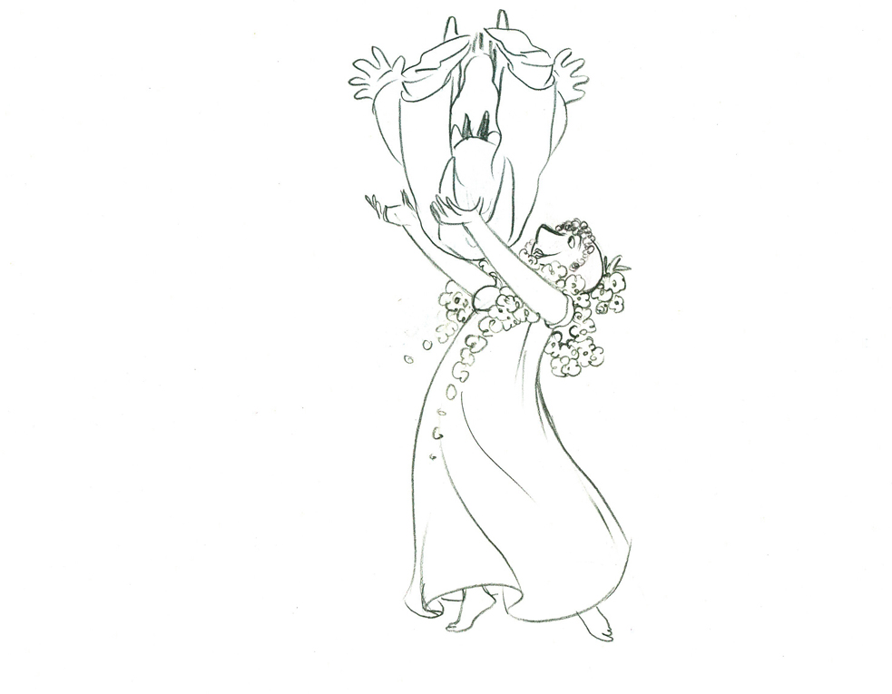 43
43
 44
44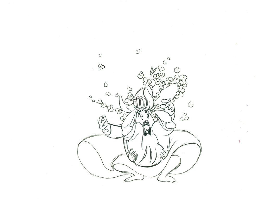 45
45
 46
46
 47
47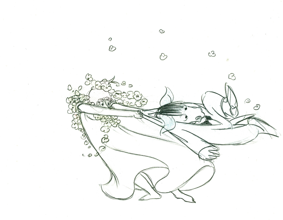 48
48
 49
49 50
50
 51
51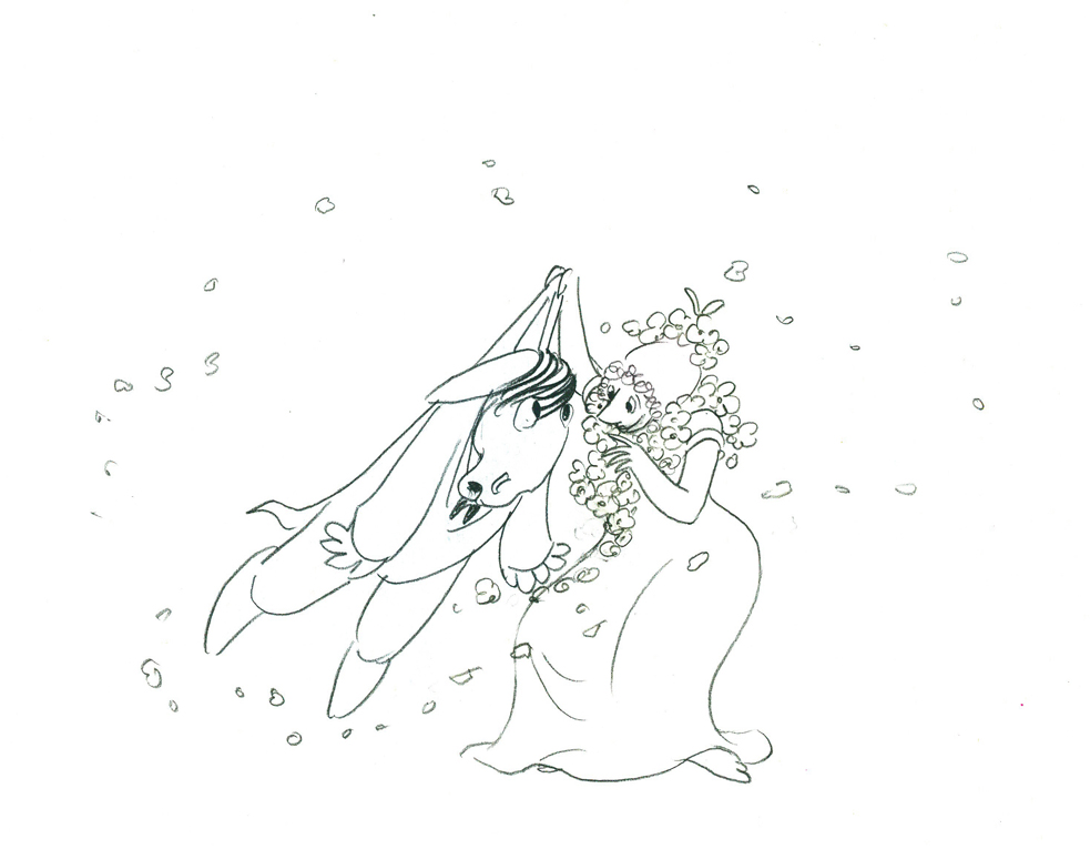 52
52
 53
53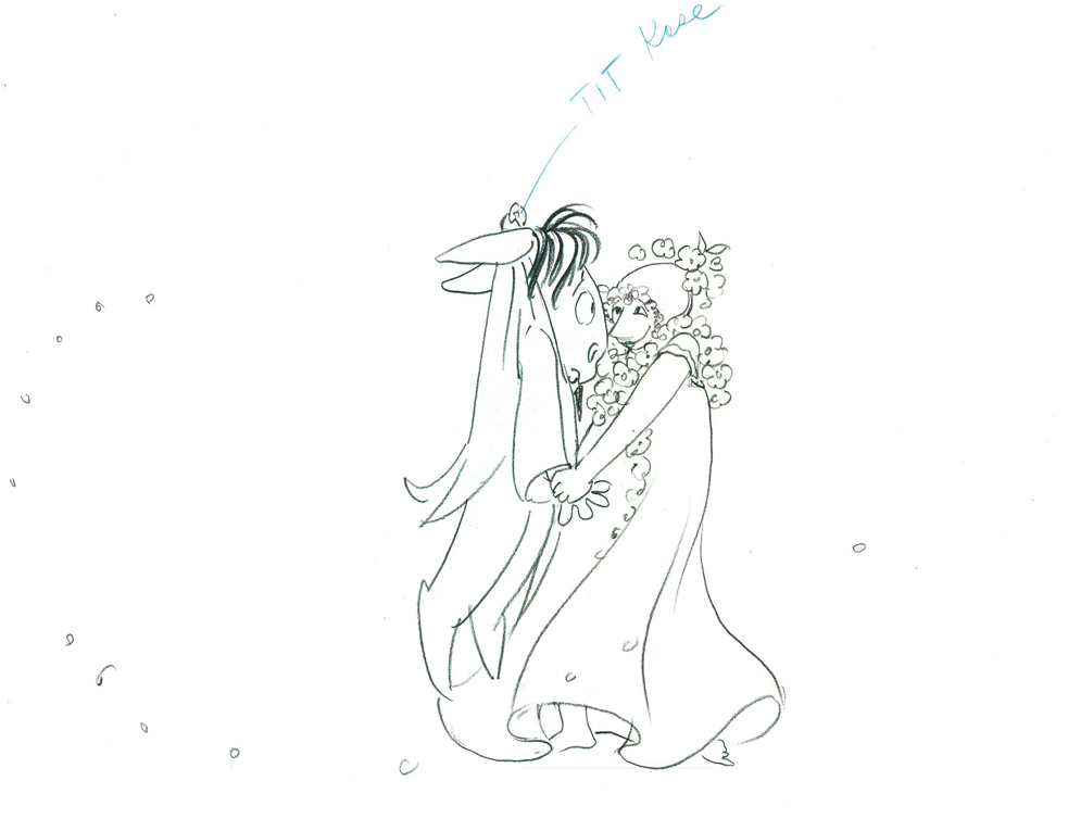 54
54
 55
55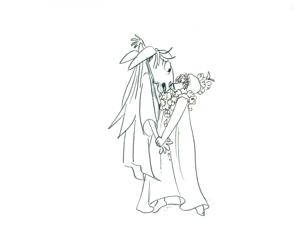 55½
55½
 56
56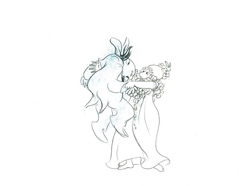 56½
56½
57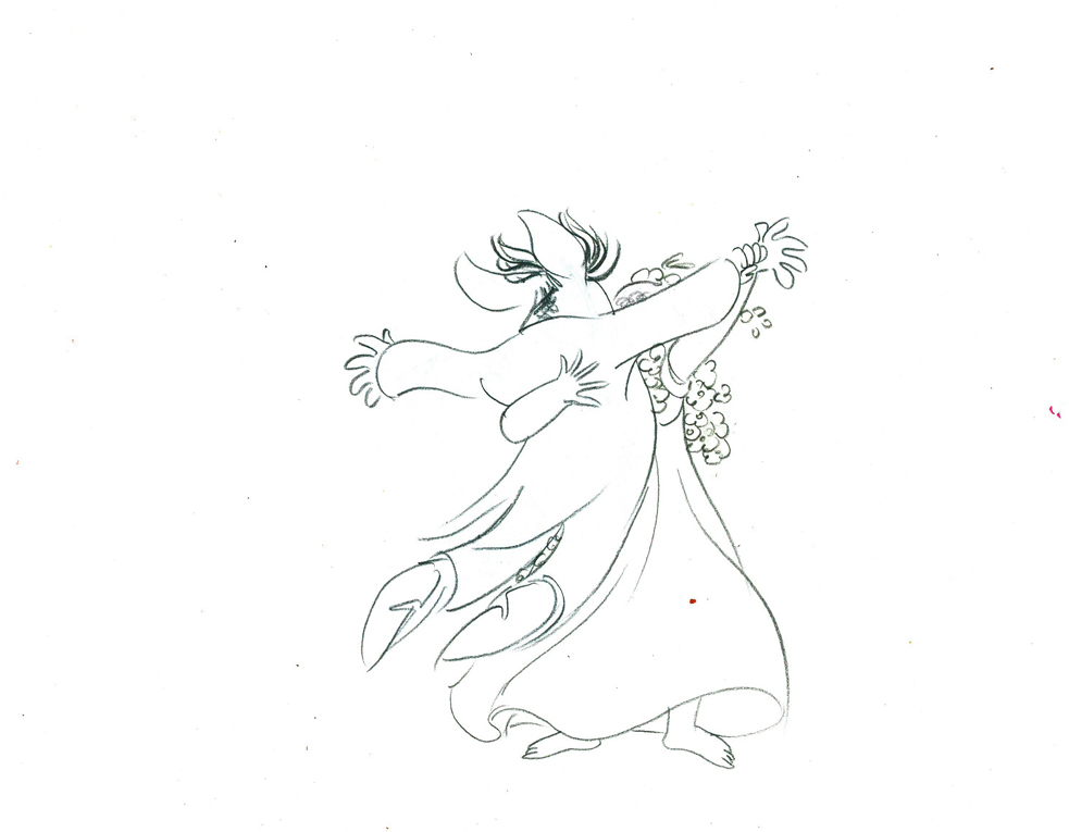 57½
57½
 58
58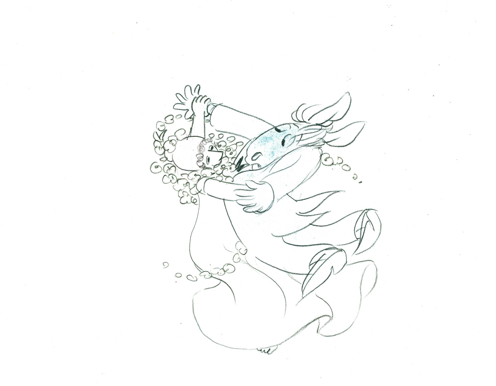 59
59
 60
60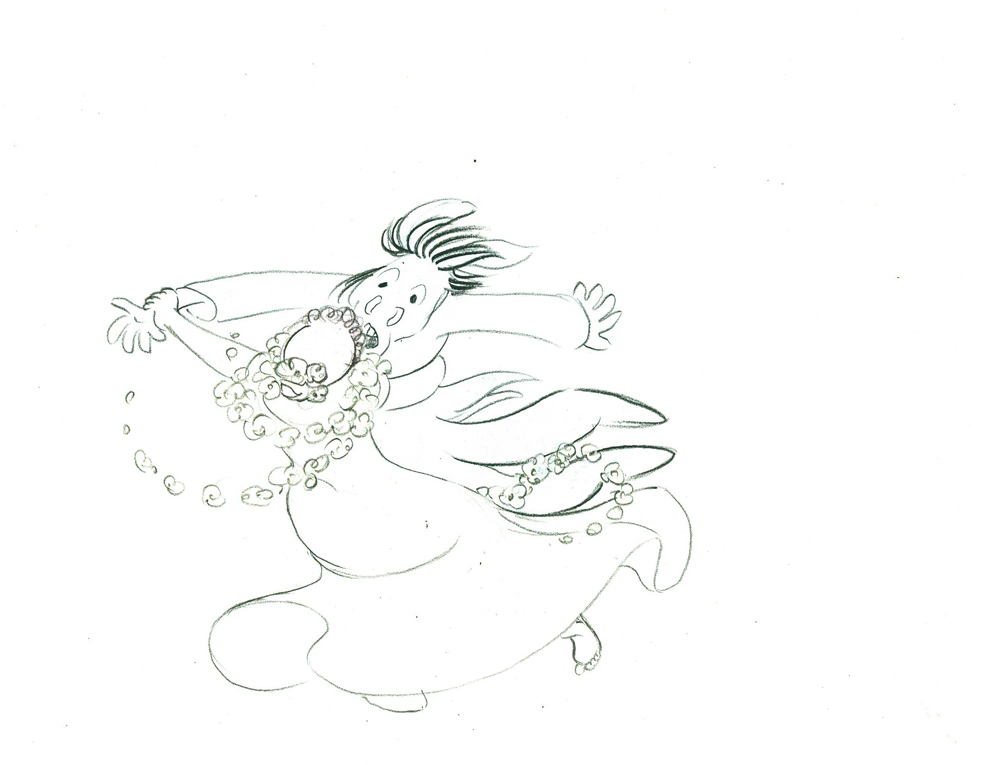 61
61
 62
62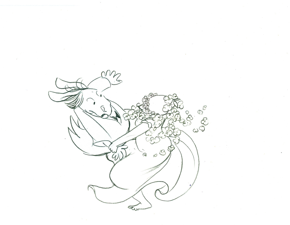 63
63
 64
64
 65
65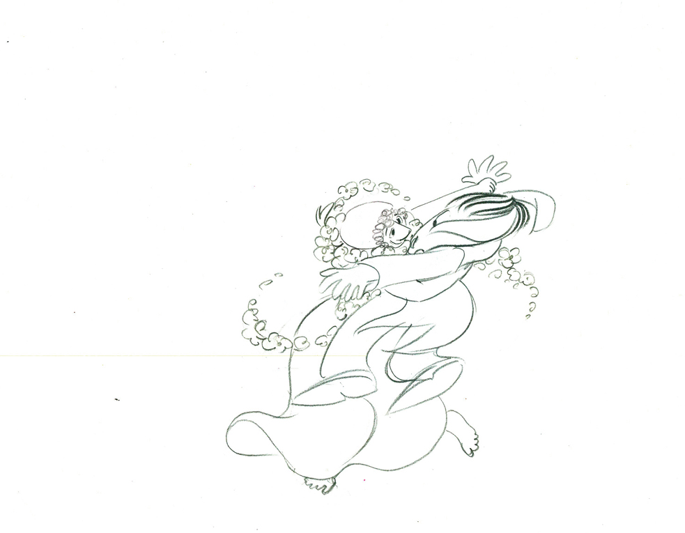 66
66
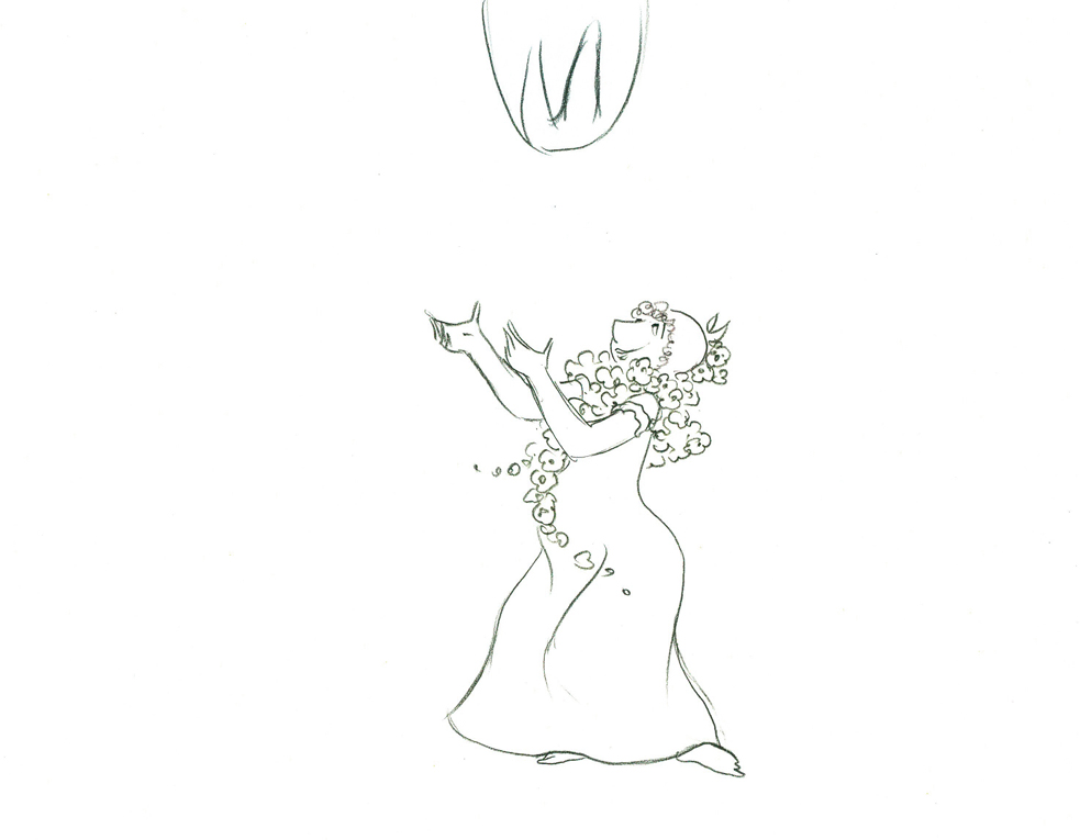
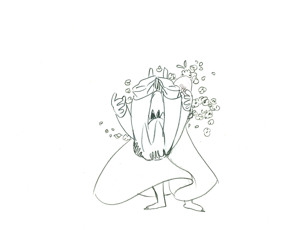
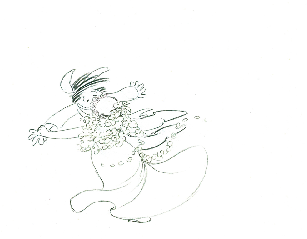
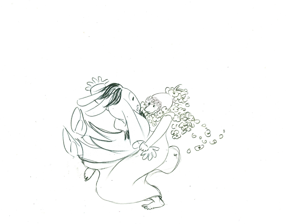
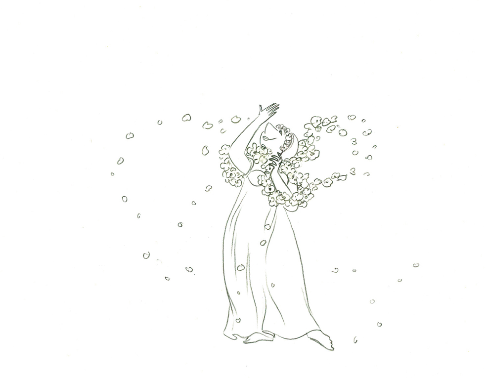
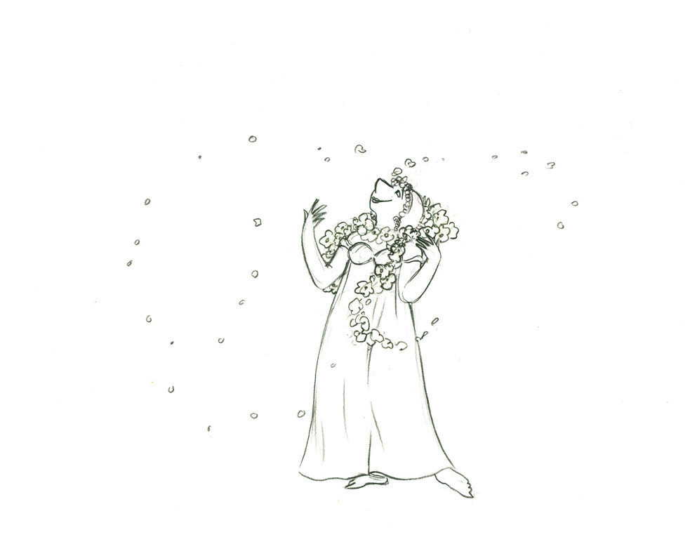
Titania Dances with Bottom
I took a guess at the timing of this putting the
action on three’s and adding two short holds.
All drawings from this scene (both posts) are included in the QT.
Click left side of the black bar to play.
Right side to watch single frame.
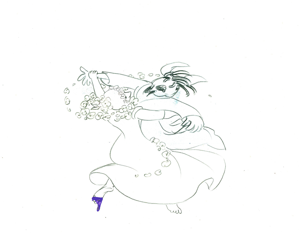
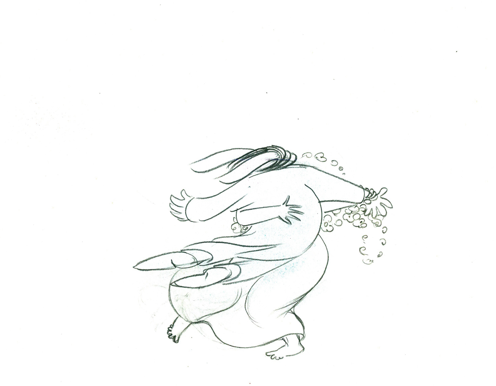
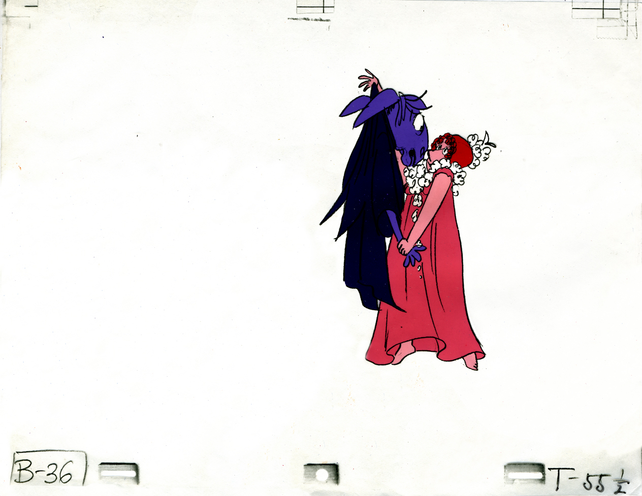
Animation &Tissa David 28 Oct 2009 07:23 am
Titania & Bottom 1
- In the past, I’ve done a number of posts about Tissa David‘s work on The Midsummer Night’s Dream. (see them here.) This was a film she directed and animated with three other people: Kalman Kozelka photographed, xeroxed the cels and coordinated it, Ida Kozelka-Mocsary color styled it and did most of the painting, and Richard Fehsl did the Bg designs and animated any of those Bgs.
The film aired on the BBC in 1983 and was released on VHS by Goodtimes Video
I’d previously posted a couple of the cels from a scene, and here I’m posting all the drawings. I do think the film looks better in pencil test, but then I’m partial to Tissa’s beautiful drawing style. Here, again, are those cels:
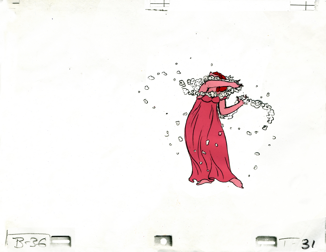
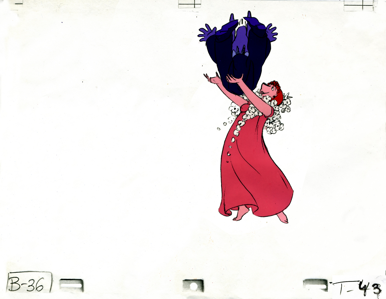
Titania catches Bottom in her arms.
Three cels from a sequence.
And Here are those drawings:
 21
21
 22
22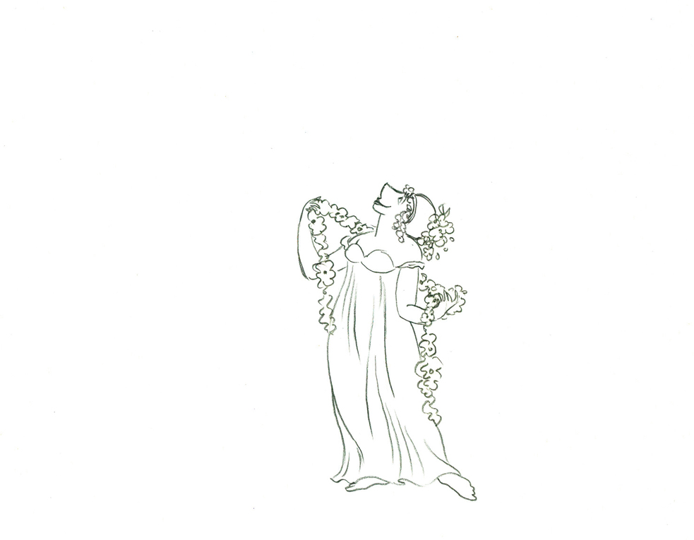 23
23
 24
24 25
25
 26
26 27
27
 28
28
 29
29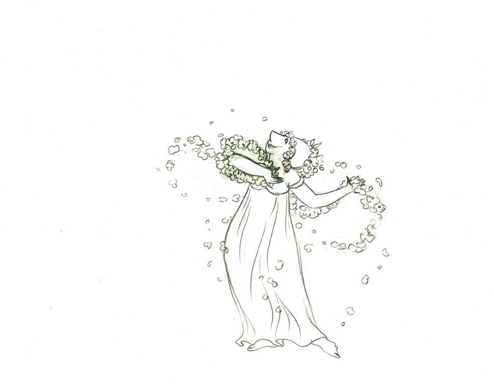 30
30
 31
31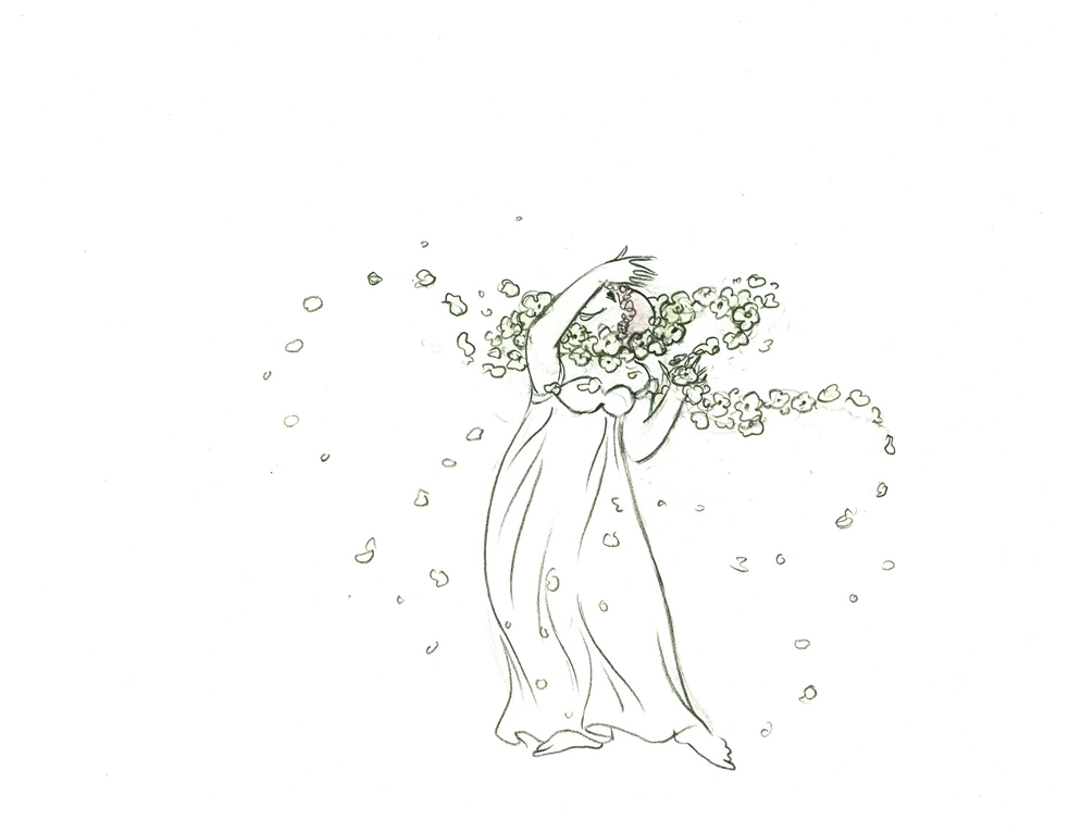 32
32
 33
33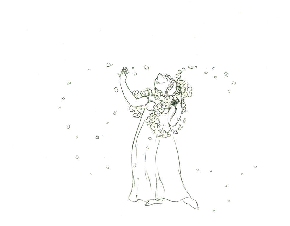 34
34
 35
35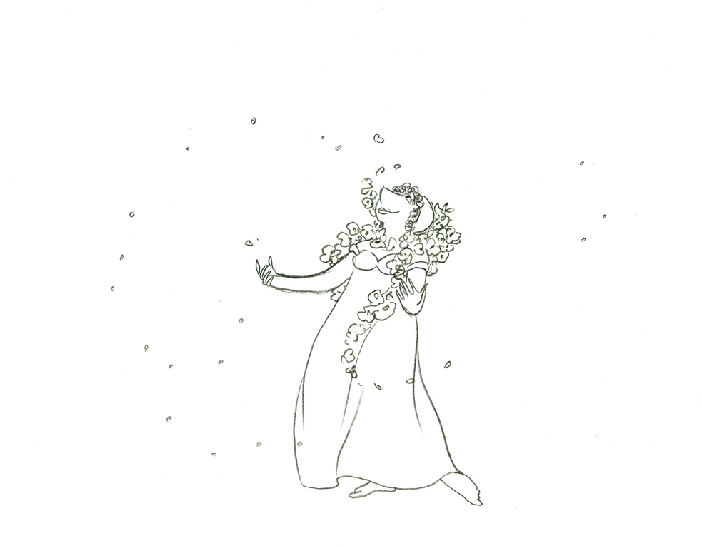 36
36
 37
37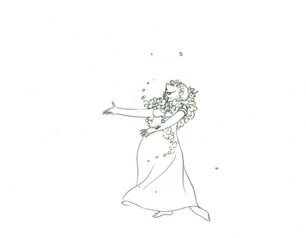 38
38
 39
39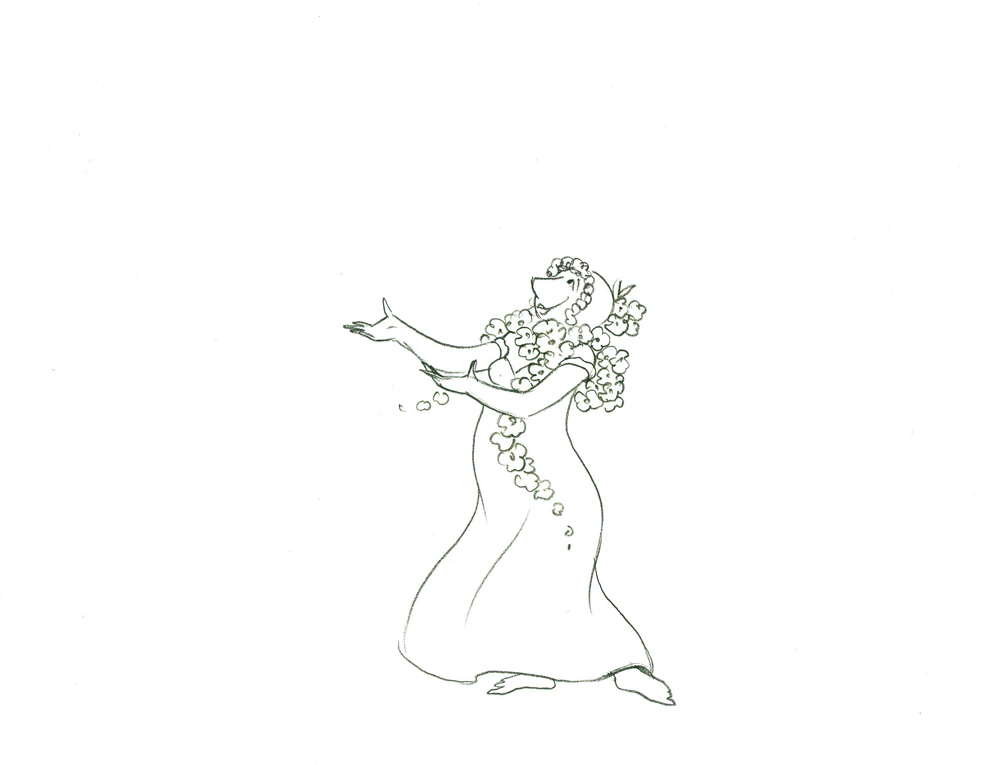 41
41
40
4243
4445
46
Titania Dances with Bottom
I took a guess at the timing of this putting the
action on three’s and adding two short holds.
Click left side of the black bar to play.
Right side to watch single frame.
All drawings from the scene (both posts) are in the QT.
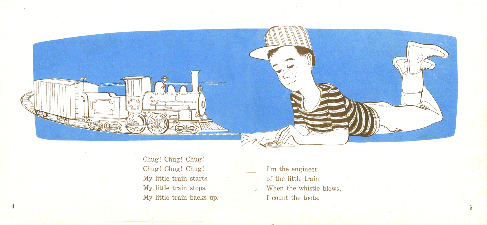
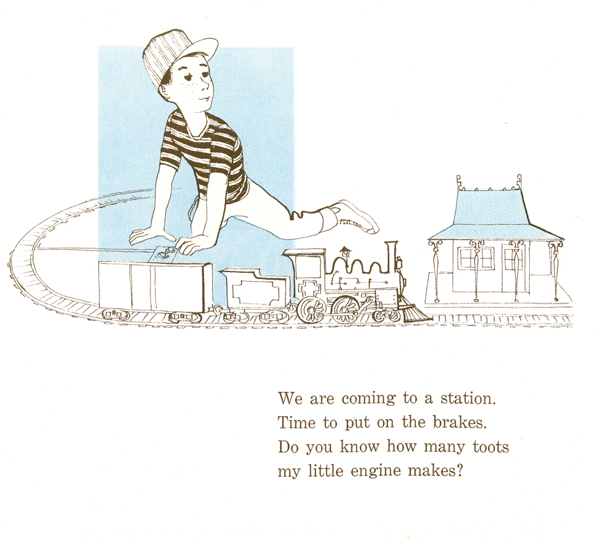
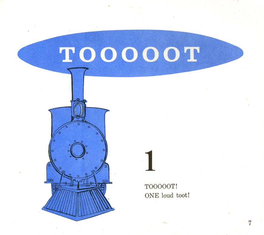
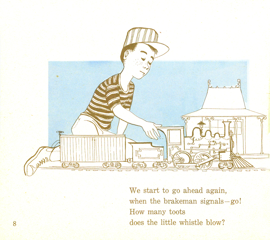
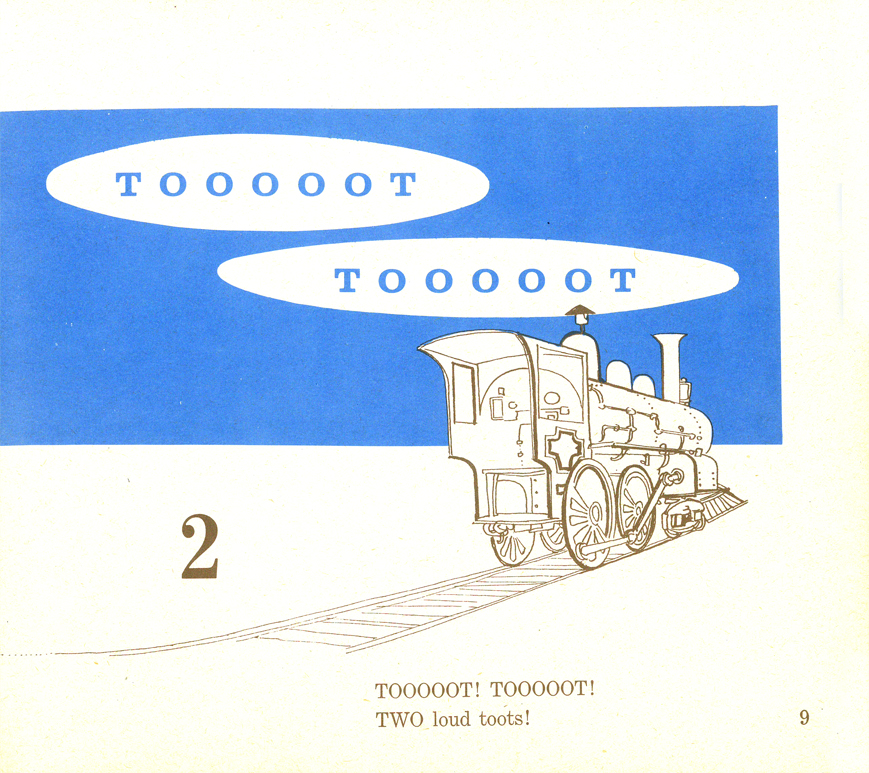
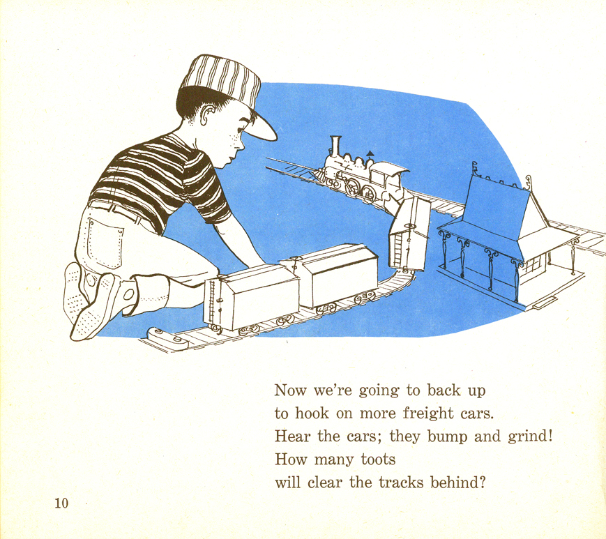
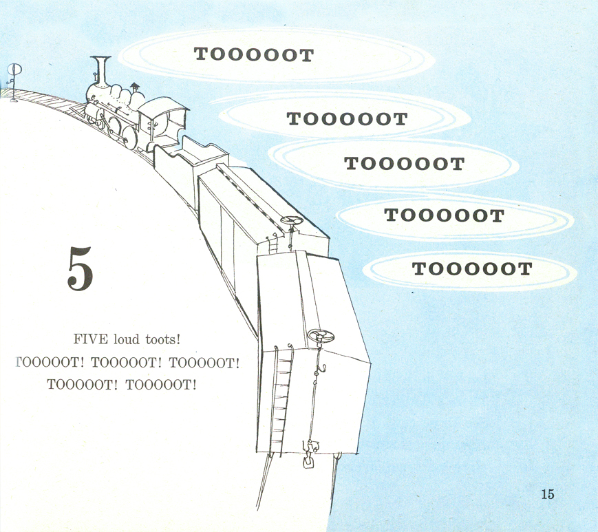
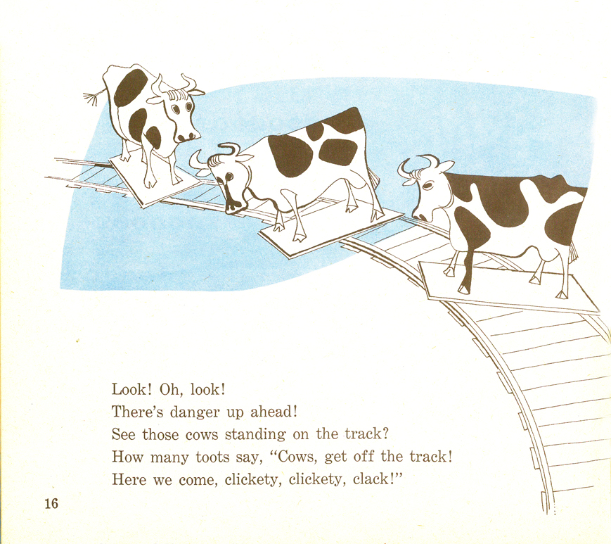
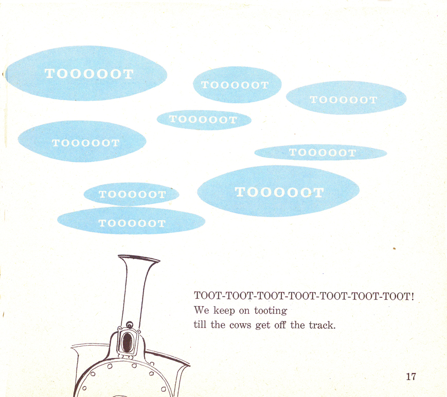
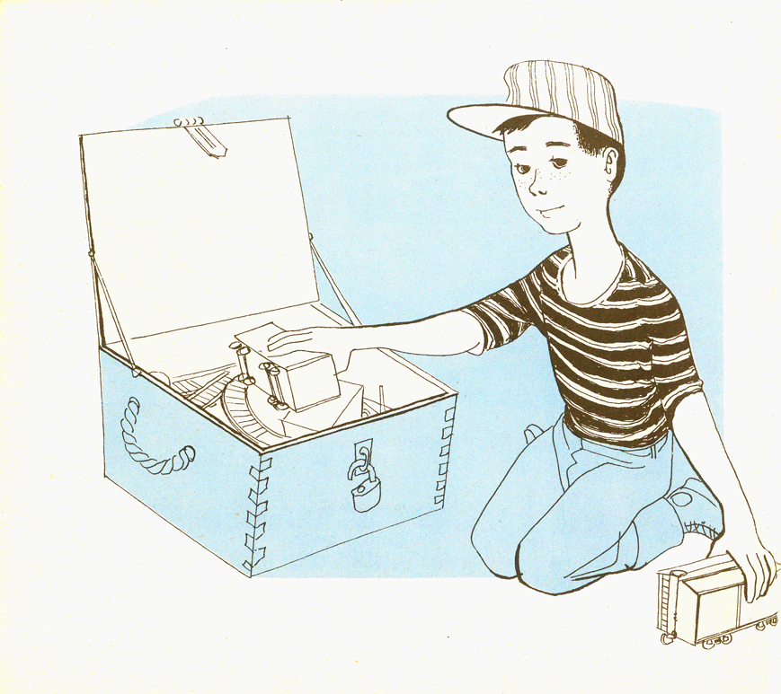
Books &Illustration 27 Oct 2009 07:49 am
Tooooot !
 - Here are the illustrations for Tooooot! which is a book illustrated by Paul Julian in 1958 to a text by Betty lou LaWell.
It’s a two color book (black and blue) as were many books of the period. I’m always amazed at how much illustrators of the time got out of the limited color printing. So many big books (by the likes of Dr. Seuss, Bernard Waber, Maurice Sendak among others) were published at the time with more imagination than many of the current books with full color.
The artwork, unlike his other book Piccoli, is composed of graceful and delicate line drawings with the simple, flat color. The work looks very much a part of the brilliant illustrations and art coming out of the 50s, influenced by Ben Shahn and Gregorio Prestopino.
 2
2
 3
3
 4
4
 5
5
 6
6
 7
7
 8
8
 9
9
 10
10
 11
11
 12
12
 13
13
 14
14
 15
15
16
Frame Grabs &Layout & Design 26 Oct 2009 08:31 am
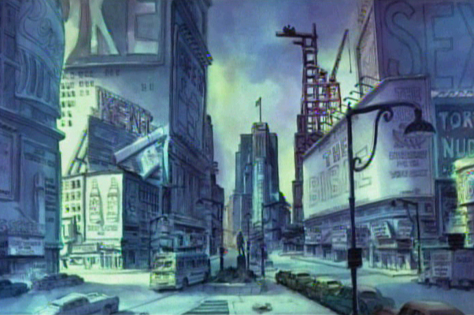
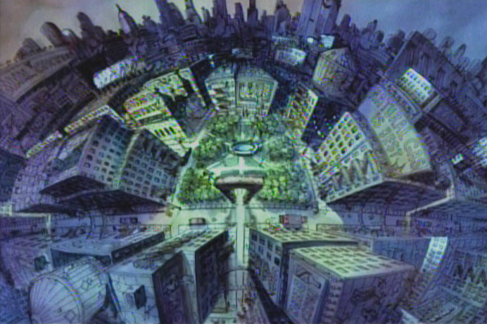
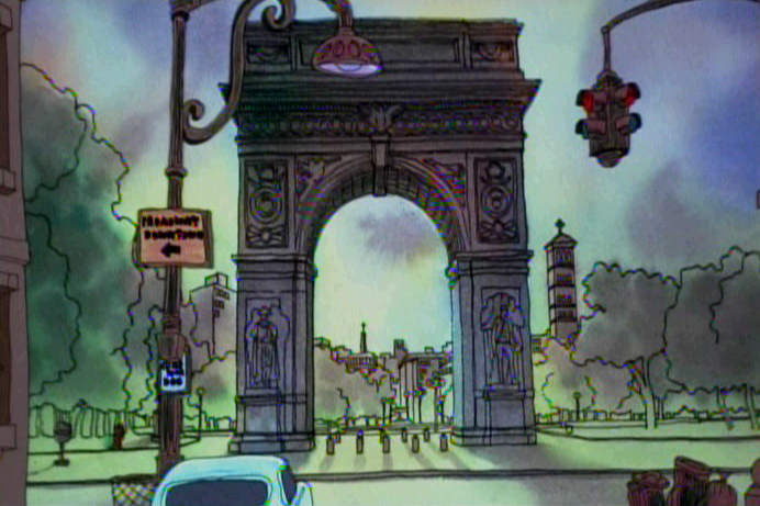
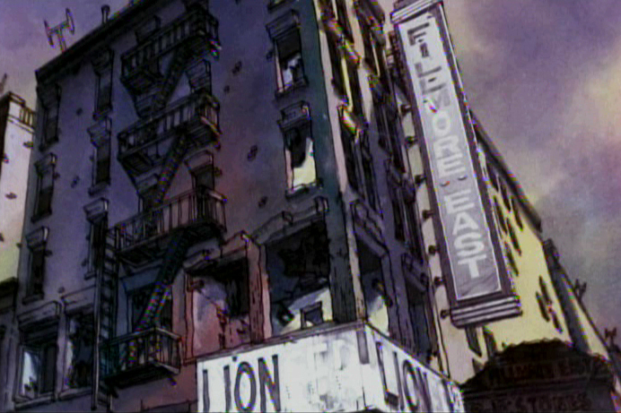
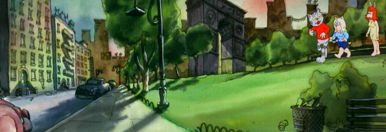
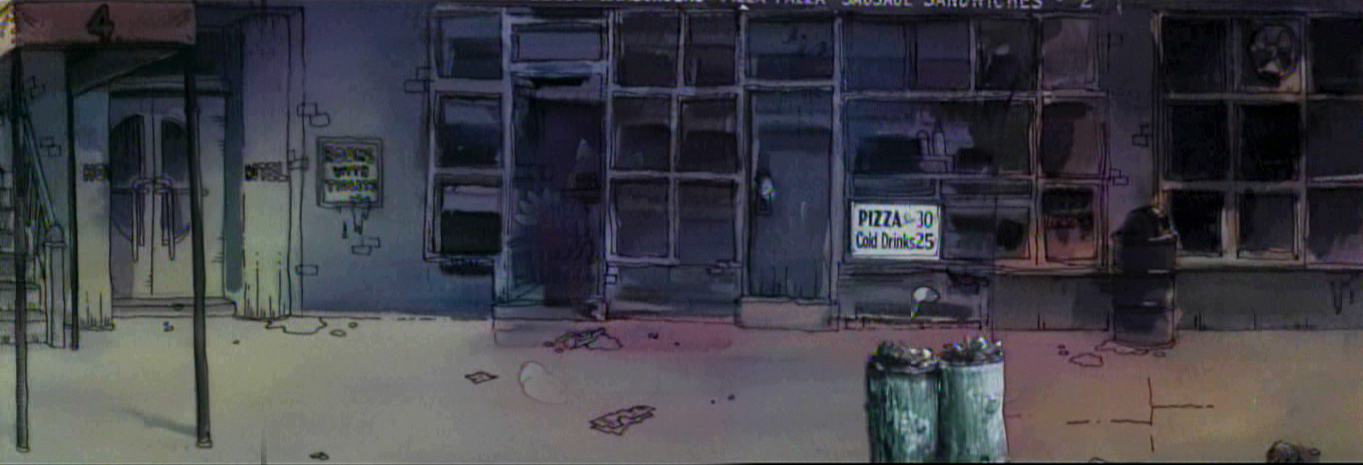
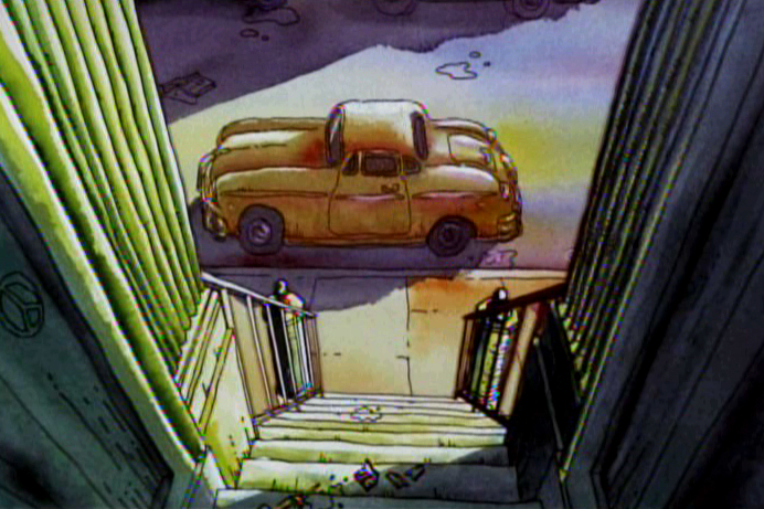
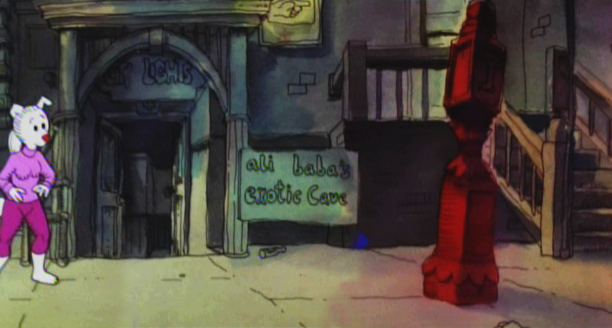
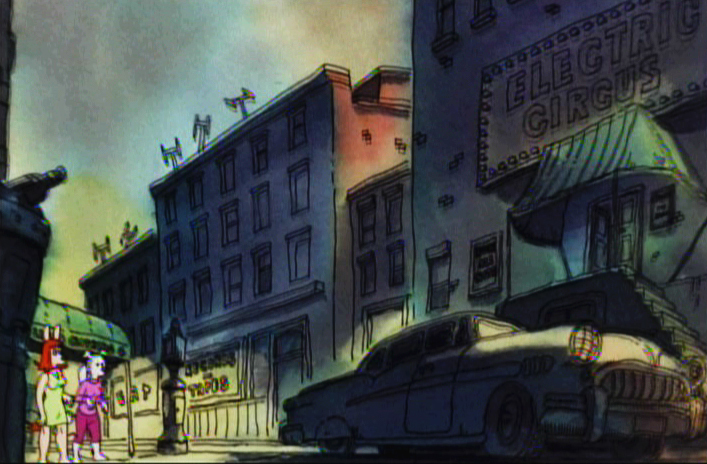
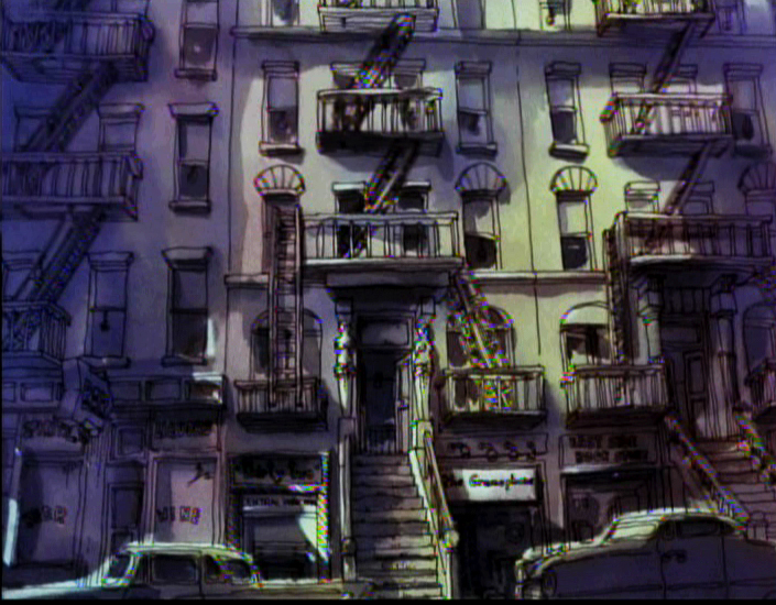
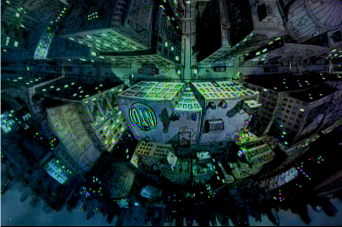
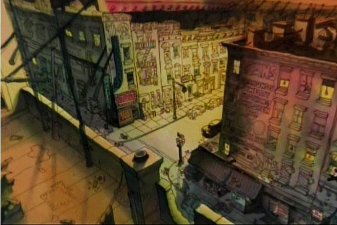
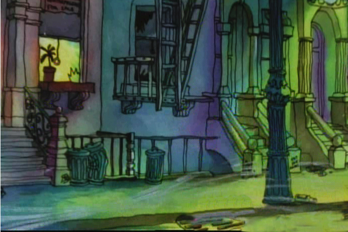
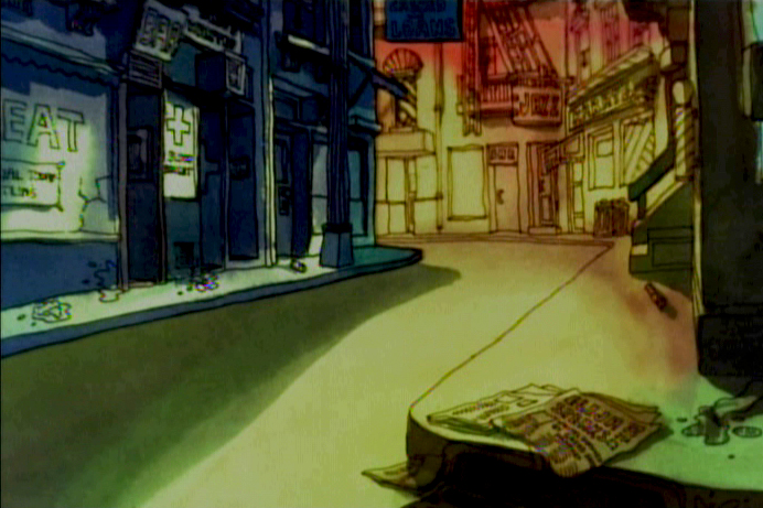
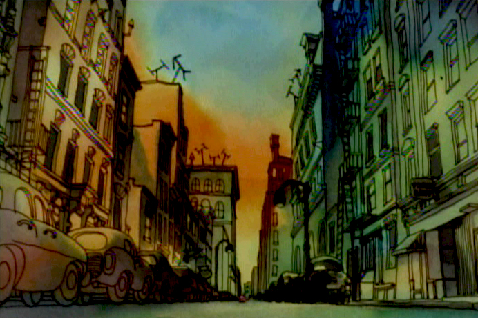
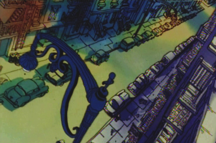
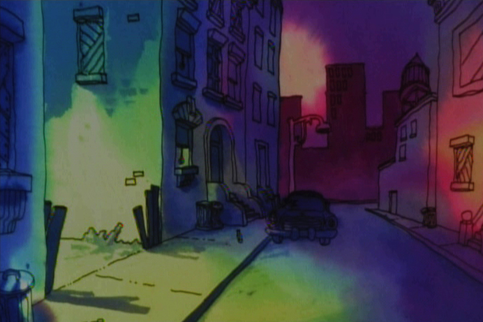
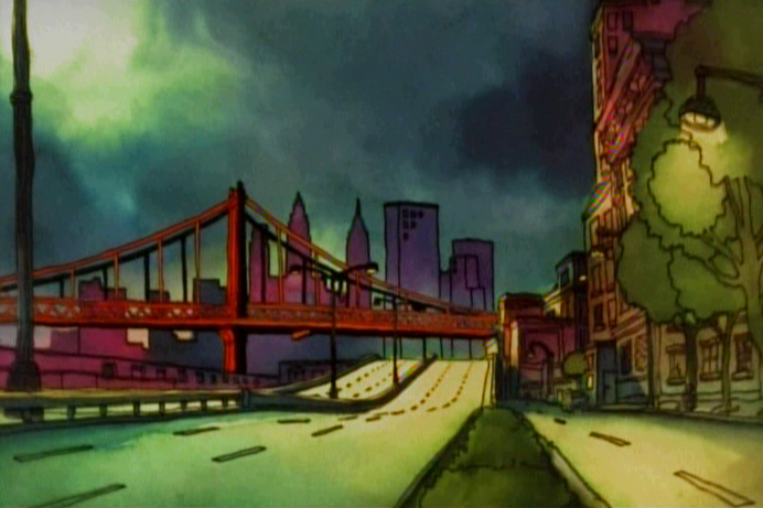
Johnny VIta’s Fritz the Cat
- Johnny Vita was a staple in the NY animation industry for some time. When Ralph Bakshi got Fritz the Cat as a feature, he brought Johnny Vita along as his Background designer and artist. This was arguably the best decision Bakshi made on the film.
Vita went out with the storyboard and photographed locations that actually existed. His camera was all over Greenwich Village and Harlem. Then he took these photos and did a linear tracing of the settings. Then he colored the images with Luma dyes under the lines that he had traced. These brilliant colors gave the gritty images a luminescent appearance. He manipulated the images and purposed them as the film’s backgrounds. This gave the film a reality that it otherwise didn’t have, and it made the bigger job easier for Bakshi to realize.
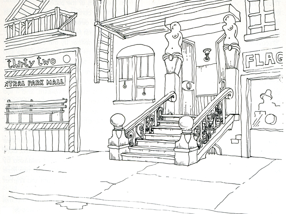
This drawing by Ira Turek was traced from a photograph and
Xeroxed onto a cel and background paper. The BG was painted
by Johnny Vita and the cel with lines was placed over the BG.
This is a similar process that was used in 101 Dalmatians.
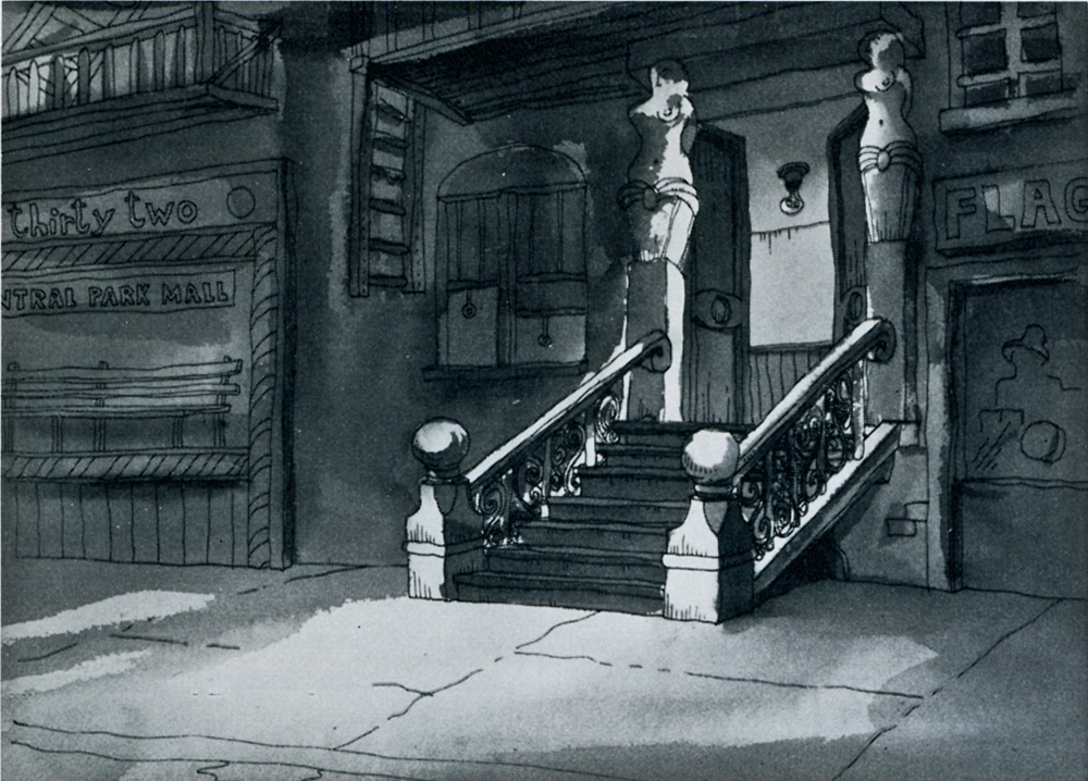
These photos were taken from a 1974 Print Magazine article
about Ralph Bakshi, whose Heavy Traffic had just been released.
The extra treat for New Yorkers was in seeing locations that were familiar to them. Oddly, all these years later, it still seems to work.
I’ve put together a number of these exterior background reconstructions from the first third of the film and present them as a sample of what Johnny Vita contributed to the film.
 1
1(Click any image to enlarge.)
 2
2
 3
3
 4
4
 5
5
 6
6
 7
7
 8
8
 9
9
 10
10
 11
11
 12
12
 13
13
 14
14
 15
15
 16
16
 17
17
 18
18
 19
19
Photos 25 Oct 2009 08:04 am
Pre-Halloween Photos
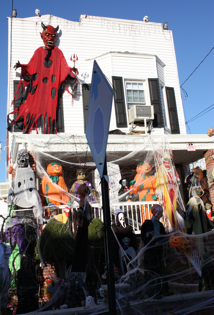
- In advance of Halloween, I’d like to post a couple of photos Steven Fisher shot of very scary houses in Queens. They’re all pretty amazing, and one has to believe that arts and crafts has risen to a new level in that borough.
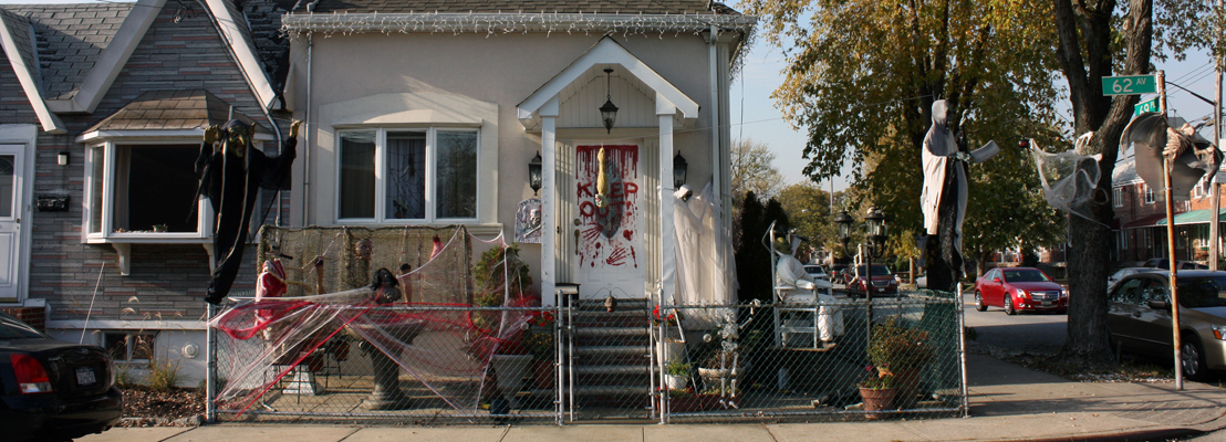
(Click image to enlarge; you won’t believe some of the detail.)
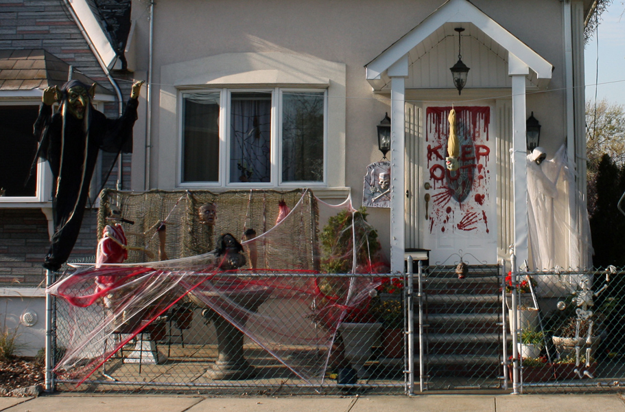
Here’s a close-up of one small part of that photo.
It must’ve been hell putting this one together.
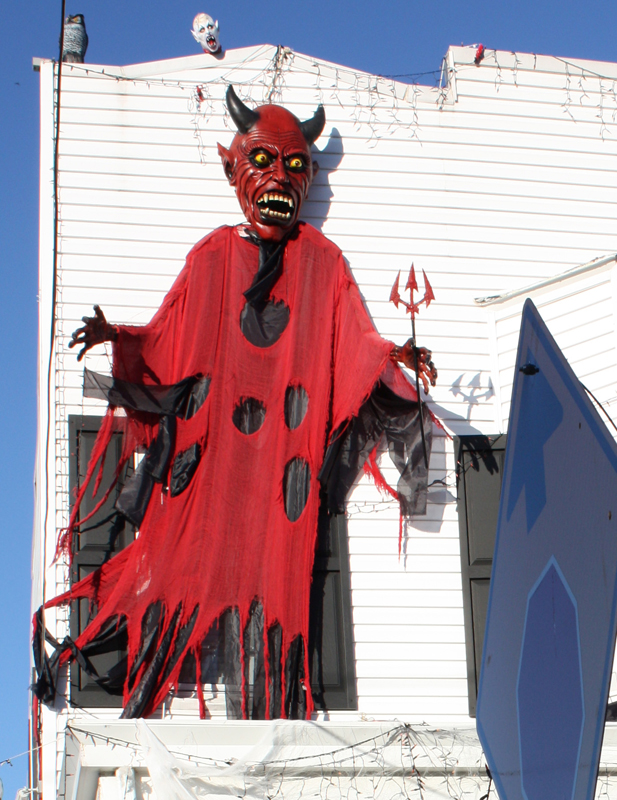
Here’s a closer look at the devil. He’s got to be big.
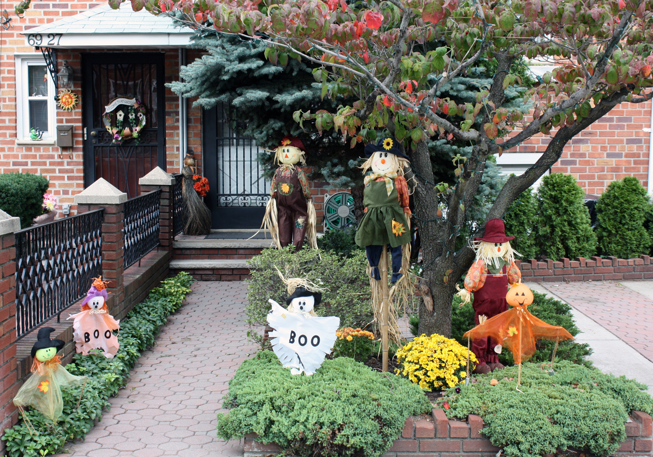
This one seems to have a more delicate touch.
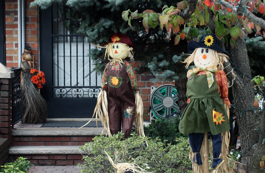
Still worthy of a closer look.
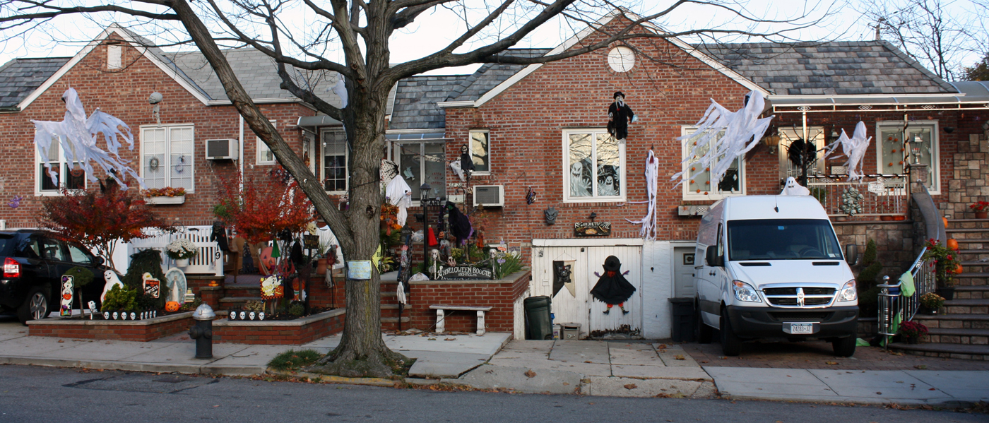
Of course there’s the attempt to keep up with the Joneses.
Still, worth a closer look.
Sometimes, you just get a nice shot.
Halloween’s not here yet, and I’m already thinking Thanksgiving.
Many thanks to Steven Fisher for the great pictures.
Commentary 24 Oct 2009 09:03 am
2D Art?/AstroBoy/Plymptoon/
- I recently received this email via Facebook:
- Hi
I’m a self-taught animator from Colombia, South America.
Today, I’ve found out that John K’s blog is going private. I think he was tired of some comments, or dissappointed by the reaction to some of his posts when he speaks his heart out. Well, it is a shame and I hope he’ll make it public again, or at least that he invites me to join.
Anyway, sometimes one takes for granted things, and your blog is one of my daily visits. It contains so much information, and I just want to thank you for sharing this knowledge, and to take your time to keep it active.
Well, if you wanna see some of the use I made with your info, check my practice blog: here. Also you can check a short film I made some time ago: here.
Bye and thanks again ![]()
Hasta Luego
I receive similar letters often as a result of my blog. It’s humbling to get them, but, at the same time, it’s part of the reason I keep doing this so enthusiastically. I enjoy sharing the bits and pieces that come my way, and I truly want to see 2D animation continue on a high road. Only by keeping the word out there and sharing the knowledge of those I revere can the stream stay alive.
I’m not quite sure why John K decided to make his blog Private, but I have no plans to follow suit. It is nice, once in a while, to hear that others enjoy it as well.
- Michael Barrier has a smart piece on his site. In Lost Illusions, he writes about the artist – in our case, the animation artist – who tries to stick to his sense of value and artistic integrity, but because of the way the medium is constructed, compromises set in and become an integral part of the “art” that the artist not only develops but defends.
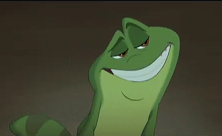 Mike’s commentary is a buildup to carefully analyze the six minute opening of The Princess and the Frog. Unfortunately, I agree wholly with what he has to say. I haven’t seen the six minute piece (apparently on the Snow White Blu-Ray disc), but I have seen various trailers. All contain scenes that are heavily affected by an unbearably unctuous frog, sarcastic and racy in the tedious way of all sitcom sensibilities. This isn’t adult; it’s just tawdry. Only 30 seconds, and I’m not sure I want to see more. But this is only a trailer, and I have to see the whole film.
I will see it – how can I avoid it, how can I not support 2D animation on a large scale. I hope that The Princess and the Frog will be better than I expect, but things don’t bode well with scenes seen in the trailers.
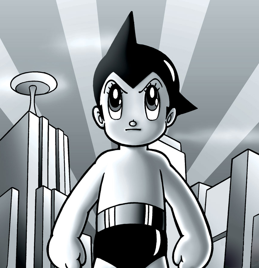 - Yesterday, this paragraph pretty much summed up the review Manohla Dargis gave to Astro Boy in the NY Times.
- Like a lot of movies, “Astro Boy†has been designed to function on different levels and serve different audiences, but in this case these multiple meanings and points of address have created a confusion of tone. The story’s undertow of darkness pulls you in one direction, while Astro Boy’s insistent cheerfulness, which seems more commercially motivated than personality-driven, pulls you somewhere else. This jaggedness extends to the visual design, which at times intriguingly recalls the flat, graphic style of the 1950s, yet also often looks thinly conceived, sketchy, even cheap. Somewhat more rounded than the original character, Astro Boy, meanwhile, now brings to mind the chubby mascot for the restaurant chain Big Boy. Maybe the fuller figure is part of his Americanization.
Wouldn’t it have been amazing if some industrious producer had stuck to the original look and feel of those cheap Astro Boy TV shows? 2D animation on fives and sixes with dialogue that sounded lip-synched even though it sort of worked. Cheap cartoons made to look like the high priced spread. Everything’s getting to look alike.
Is this one of those 15 eligible for the Oscar?
NYDaily News – 2 stars
NY Post – 3 stars
 - Speaking of Independent films, Bill Plympton has a Pencil Test of his latest short, Cheatin’, available on YouTube. It’s a work still in progress so the usual disclaimers have to be attended to. However, I have to say that some of the drawing in this film is among the best I’ve seen from Bill. Very inspirational.
Animation &Independent Animation &Layout & Design 23 Oct 2009 07:47 am
Pups of Liberty – Production Art
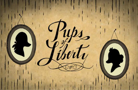 - Yesterday, I posted the first part of a look at a short film, Pups of Liberty. It included an interview with Bert & Jennifer Klein the Producer/Directors (and so much more).
Along with the interview response, they sent me a wealth of gorgeous artwork from various phases of the production, and I’ll try to get most of it in today. The text descriptions, below, are written by their Production Designer, James Lopez.
You can view a trailer from their film here.
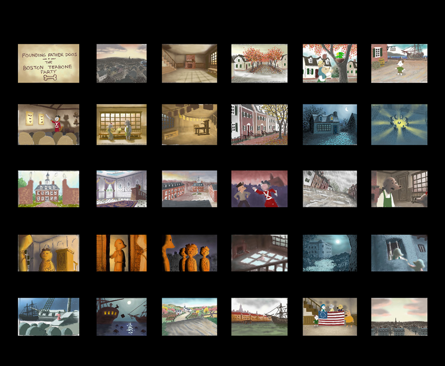
Pups of Liberty Color Script by James Lopez
For the colors, warm colors were chosen to represent the dogs’
surroundings and, in contrast, cool colors to represent the cats.
To start the film, the colors were to portray a pretty town but not
a vibrant one. Only as hope comes alive and tensions run high (The
Boston Tea Party & The Riot) are the more vibrant colors introduced.
Color influences came from some classic Disney films and a desire to
use natural lighting (direct & indirect) as opposed to “staged†lighting.
The story of the movie is left somewhat unconcluded so at the finale,
rather than going full-blown with color, there is a hint at what would be
to come (as the story’s narration suggests).

Pups of Liberty - Drawing Trees
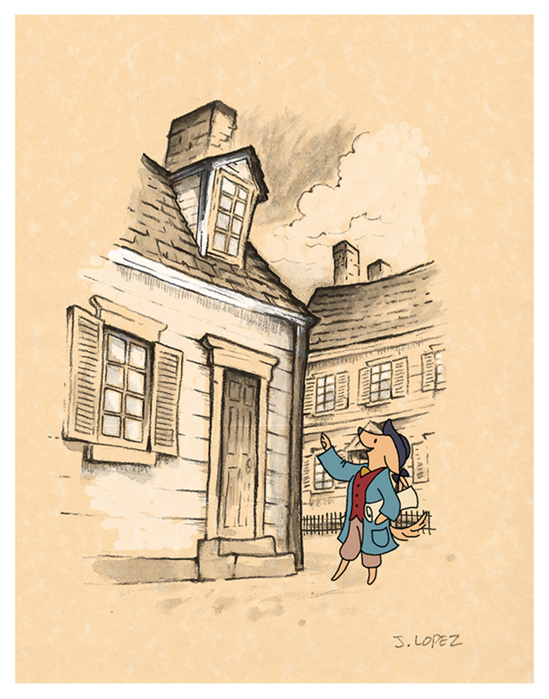
Pups of Liberty - In the style of Anton Pieck
Initally, the backgrounds were going to be influenced by the stylings
of Dutch artist Anton Pieck. Studies were made to see what the style
would look like with a Colonial theme.
A composite was made with the paint study and the character over
a parchment texture. We we were happy with the result of how the
drawn character married into the drawn environment.
It was a nice style but it involved a unique application that was a labor
to produce and proved to be impoprobable so we explored other, more
traditional styles.
We later settled for a pen and ink application on vellum paper in the
rough drawing style of the late Ken Anderson. It allowed us to stay
loose and if there were any mistakes or changes to be made, they
could still be done on paper.
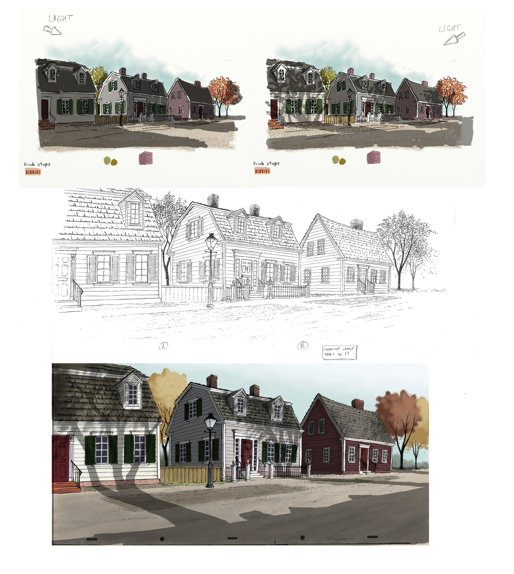
The top two illustrations are visual development for the color and
lighting treatment on the houses. The desired effect was trying to
capture the drama of the shadows cast from the trees by the sun
set low on the horizon.
The middle illustration is a clean-up layout by James Lopez
The bottom illustration is a Production Background painted by James Lopez
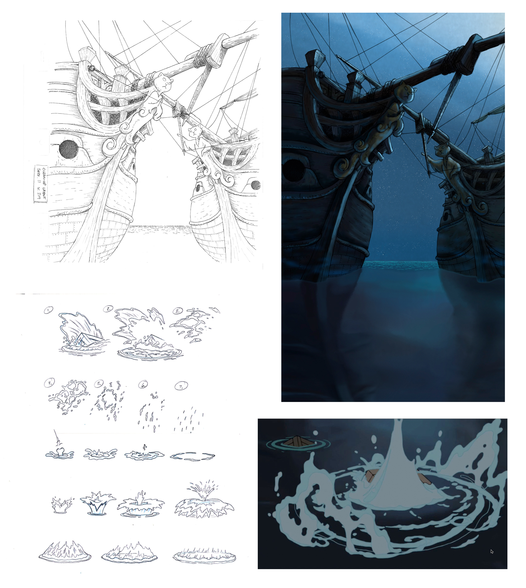
Pups of Liberty - Water Effects
Illustration (upper left) Clean-Up Layout by James Lopez
(upper right) Production Background by Barry Atkinson
(below left) water studies by James Lopez
(below right) Production still
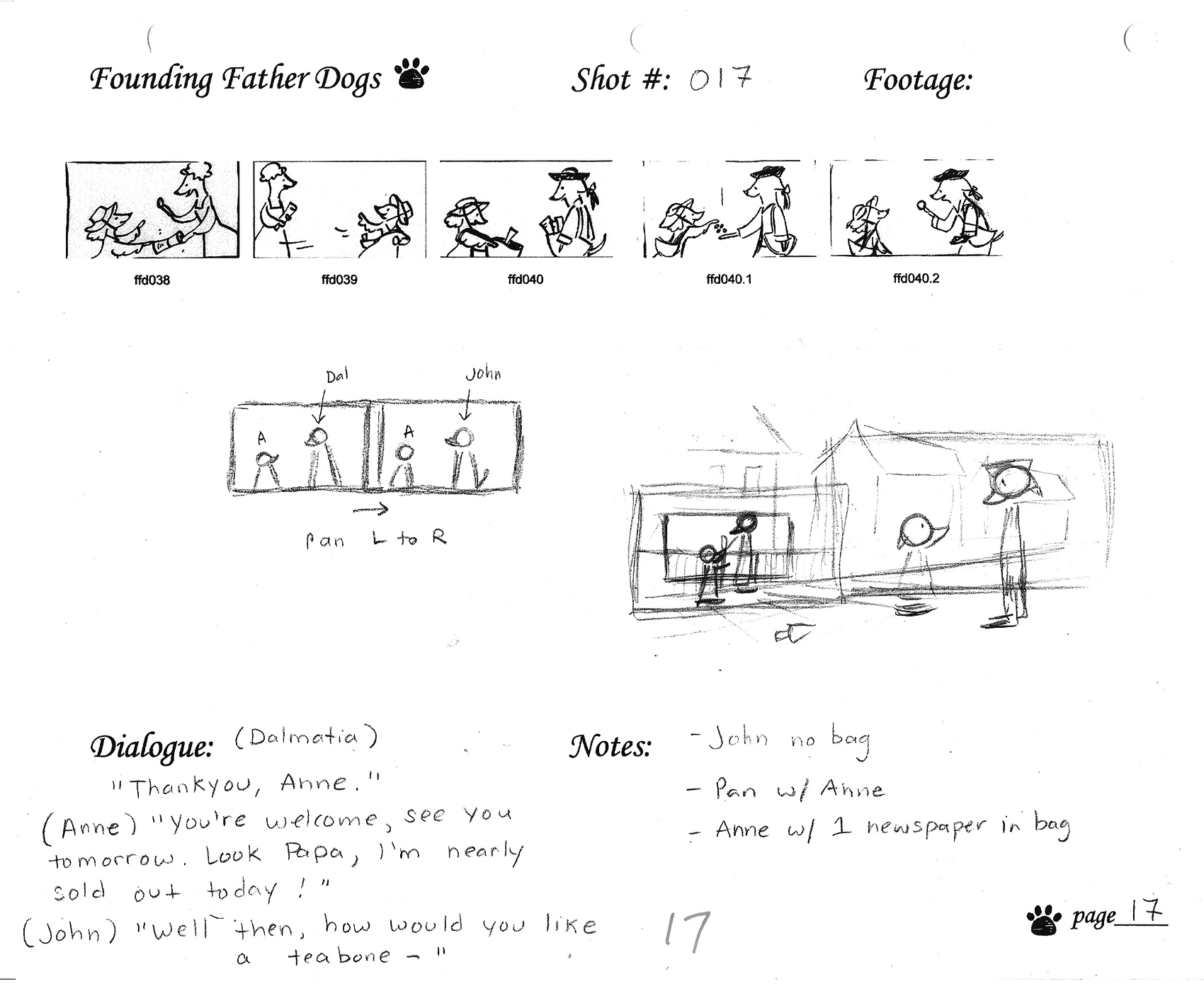
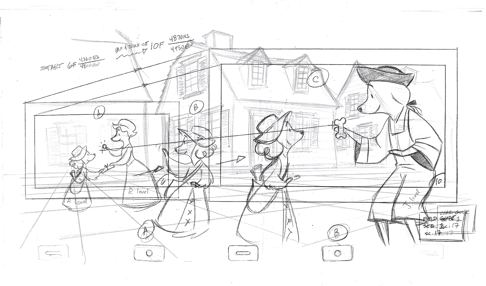
The above images represent a page from the Director’s workbook
for Sc. 17. Storyboard drawings are by Jennifer Klein.
This is the Layout for Scene 17
done by James Lopez.
The QT movies below are Pencil Tests of scenes by
Mark Henn.
Right side to watch single frame.
