Search ResultsFor "conrad"
Commentary 18 Mar 2013 04:05 am
Smears, Distortions, Abstractions & Emotions – 1
It took a full twenty years for the industrialized animated cartoon to develop into anything approaching a professional, never mind artistic, level. Thanks specifically to Walt Disney‘s efforts, in the twenties and thirties, animation developed as a process with guidelines, rules and specifics designed to create the most consistency. To have those characters moving in anything resembling the elements of real life, it took a real education. And the development continued past the zenith of Snow White so that things grew faster and faster in leaps and bounds. Studios outside of Disney’s were slower on the uptake fighting the inevitable costs that this better animation required. Just as a Paul Terry held off on turning to sound or color, until he had no choice if he wanted to compete in the marketplace, so, too, did he not approve pencil tests to better the animation in his films. The second largest studio at the time, the Fleischer studio, likewise was slow to agree to the new developments. Whereas the Color Classics exploited color film, the successful series, Popeye and Betty Boop stayed B&W. Likewise Fleischer’s animators didn’t get to see pencil tests except on more important product.
However, once we hit the early forties, animators started doing their own variations on differing ways of introducing “quality” to the animation. The artists wanted to explore the “Art” and ways to get there.
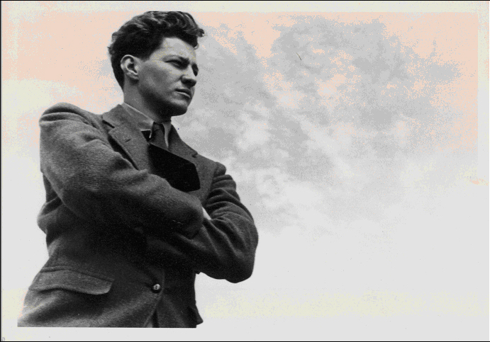
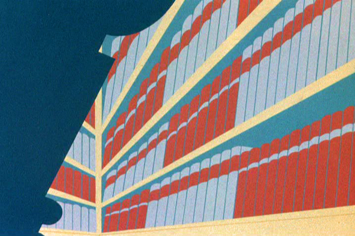
A sample of John McGrew’s work on The Arist-o-cat
Maybe they didn’t think they were doing “Art”, but that’s what I’d say they were doing. And god bless the soul that gets in the way of an artist and his dream works.
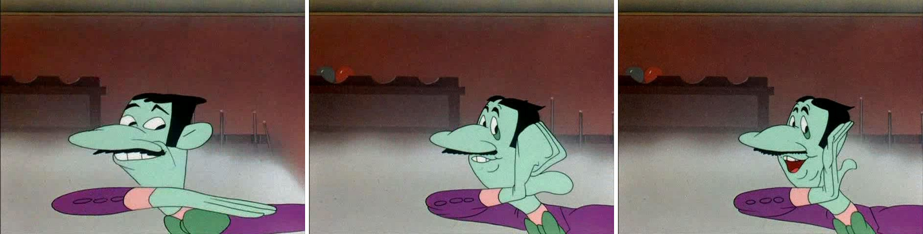
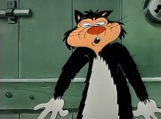
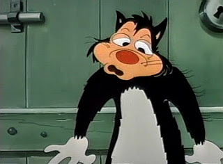
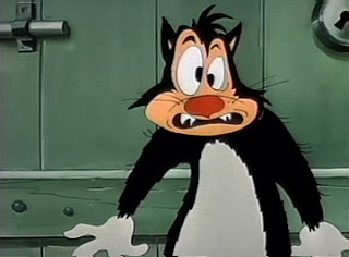
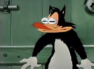
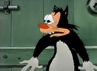
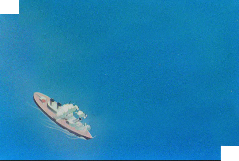
Chuck Jones was always looking to better his product; so was Bob Clampett. They had different ways of going about it. Jones’ work with John McGrew meant that the filmmaking was pushed beyond the obvious and the artwork got unusual and daring. Check out the insane film cutting from 6:40 on in Conrad the Sailor. The artwork also turned more abstract in the layouts and backgrounds.
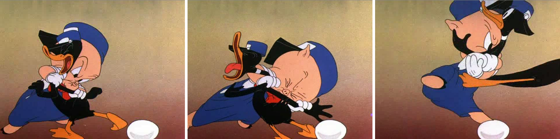
With Jones’ film, The Dover Boys, the animation was drafted to be daring as well. The animator, Bobe Cannon introduced smears. To pop a character from one extreme to another, accenting and parodying the 19th Century dramatic style Jones had sought. The character could move from one position to the next by smearing a couple of inbetween drawings and coming to a properly composed “hold.” It brought an unusual comedy bit to the scenes.
Frame by frame Cannon hurriedly smeared the artwork so that the character . . .
. . . could zip from one pose to another. This put the melodramatic action . . .
. . .blatantly into the action in a funny and purposeful way.
It also helped by accenting the peculiar track readings that Jones had caught from his actors. Immediately following The Dover Boys, the Jones team tuned out The Case of the Missing Hare. Smears abound as Bugs Bunny fights a magician against very stylized backgrounds. Cannon, Rudy Larriva and Ken Harris animated. No doubt Cannon’s smears were controlled a bit more as Chuck Jones experimented more with holds and freezes on his characters. John McGrew and Eugene Fleury designed them.
Cannon brought these “smears” into UPA with him, as an animator. He also started experimenting with the rule of “breaking of the joints” which meant that under no circumstances would an arm bend except at a wrist, elbow or shoulder. However, he allowed himself some distortion, flexibility to determine where the elbow was on the arm or how far the bend at the shoulder could be. Let’s just say he exaggerated. This was also an ideal form of animation for the limited animated practices at UPA. Grim Natwick had Nellie Bly corkscrew her arms around each other in Rooty Toot Toot. This was probably a direction Hubley called for in his quest for “modern art”. By this time, Cannon was already an Oscar winning director at UPA; Gerald McBoing Boing had won the previous year.
 It was at the same time Cannon and Jones were developing these smear tactics for their drawings that Bob Clampett was talking with Rod Scribner. Scribner was an enormous fan of newspaper cartoonist, George Lichty. Scribner wanted to pull the designed looseness of Lichty into his animation and allow it to take control. Distortions would represent inner emotions, and Scribner was desperate to try it. Clampett agreed as long as he, as director, was calling the shots. He would tell Scribner when to “Lichty” something. They first tried it in “A Tale of Two Kitties” (the first Tweety & Sylvester cartoon.) They immediately took what they learned into “Coal Black and de Sebben Dwarfs.” Scribner used it wildly in relaying the emotional intensity of the characters. Now, they were not only distorting the characters on the inbetweens, they were visibly distorting the extremes as well. Not only were the characters’ surface emotions visible, but the internal emotions were allowed to run rampant.
Rod Scribner had a different way of distorting.
The character would start off normally and distort by completely shifting . . .
. . . the masses of the character keeping the volume the same within . . .
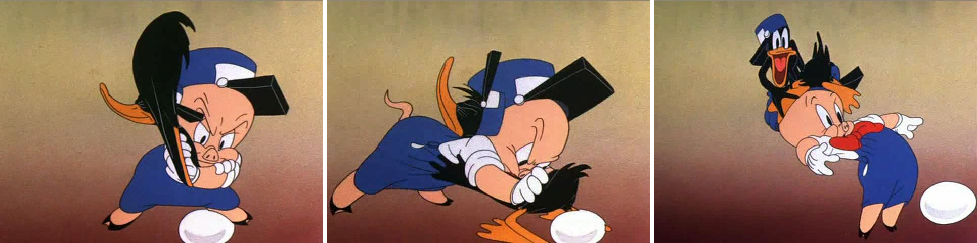
. . . the body of the character who’d end up somewhat normal again.
The experiments between this animator and director were enormously successful, just as had been Jones’ experiments with Cannon and other animators under him. And these experiments continued to play into other films by both directors. The control was strong and personal and unique. Clampett and Jones were doing similar things for different reasons, however subtle.
 On the East Coast, the animator, Jim Tyer was doing something altogether different. His style was bursting at the seams of control; he had been drawing his distortions more and more forcefully as his directors grew weaker.
I’m sure, at Paramount, he was kept under control. Assistants altered his drawings in their “clean ups” trying to pull Popeye back onto the model sheet. A number of them actually complained to me about it.
 The kindest animator in the world, Johnny Gentilella had a dig as well, “He had difficulty keeping his character on model.” Once Tyer landed at Terrytoons, that was it. All was clear for his graphic distortions. The characters never appeared on model, never mind their ever having been “cleansed” in “clean-up.”
There was a difference with Jim Tyer, though. It would seem to have been more a graphic adjustment rather than an emotional one that Tyer was drawing.
 The characters were not trying to break out of their skins emotionally, as they did under Scribner’s pencil. Here they stood out from everything else and every other animator’s style. There was no attempt by the Terrytoon directors to emotionally cast these graphic outbursts. A Tyer scene, wild as it might flow in its distortions, would be allowed to flow into the work of some very tight animator, then come right back to Tyer. One would expect his scenes to, at least, be the action scenes; but no, they could have been very
 quietly building up to the wild actions of another animator who would try to rein in the stylization.
The Terrytoons cartoons were all over the map, and in many a case they were held hostage by Jim Tyer. As a kid I enjoyed these outbursts, and I looked forward to watching another Mighty Mouse or Terry Bears cartoon to see what that crazy animator did. The problem, of course, was that Tyer’s animation separated from the film as a whole and broke down
 the entire short it came from. Mark Mayerson talked about this at length in his great piece, “Jim Tyer: The Animator Who Broke the Rules” (1990). As he points out, ” Tyer’s work is animation’s equivalent of a train wreck or a freak show. It’s not something you’d necessarily choose to look at, but once it’s caught your eye it’s hard to look away.”
This was unlike the work of Cannon or Scribner. All three are funny and to differing degrees. They,
 all three, have different levels of depth. However, whereas Cannon worked his style with one key director and Scribner did the same, Tyer worked against his directors – at least, one would guess that was the case. I can’t imagine a Connie Rasinski even talking about the style except to chastise Tyer, possibly to his face. I’m sure things got easier for Tyer after UPA and their “wild” stylization made his work more acceptable and possibly even more comprehensible for these directors like Rasinski,
 Eddie Donnelly or a Mannie Davis. Tyer seemed to have an autonomy over anything he was working on.I’m surprised, in a way, that he, himself, wasn’t more concerned about his work fitting more appropriately into the cartoon as a whole. It’s doubtful that he would have mentally dismissed the films he worked on – other than for his own animation.
Even Tyer’s still work shows signs of blowing up at any moment, as can be seen in this storyboard still or this comic strip. Paul Terry, himself, must have accepted, if not supported, this work. Tyer did it for so many years.
There was one other key animator who distorted his characters, but his was a greater example than any other. For a short time, he was producing some of the most important animation of is time. We’ll tackle him (again) in another post.Of course, I’m talking about Bill Tytla.
Commentary 05 Dec 2012 07:00 am
December 5th
- Yes, today is Walt Disney‘s birthday anniversary. He would have been 111 years old. It’s also the anniversary of this Splog. It’s seven years old today; my 2,552nd post. They’ve gotten a lot longer than the initial posts. They’ve also gotten more verbal rather than visual, though my attempt is always to keep it visual. I like putting up pictures, especially if the pictures are ones you see so infrequently.
Yesterday, was a first. I had prepared a review of the new McKimson book, I Say, I Say . . . Son!; I’d spent a hell of a lot of time putting it together. And I was supposed to post it yesterday morning. But I forgot. I never put it up. It’ll be posted tomorrow, but I can’t get over the fact that I’d forgotten to send it out there. Mark Mayerson caught it. This was the first time that I did that, and he checked in to make sure I was OK. Maybe I am, maybe not. Could be Alzheimer’s, could be I just forgot it. I have had some time with that review, and a lot of stuff has gotten in the way with it. I’ll be curious to hear any of your comments on it.
Over those past seven years, there are some posts that I’ve been particularly proud of having run and others that were just filler. It’s interesting how I get pleasure from some posts that you might not expect.
I certainly like posting things that one rarely sees on the internet and enjoy putting out material that every animator should own.
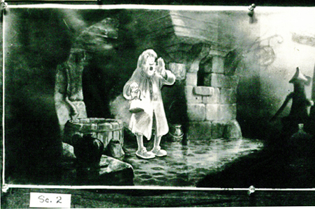 For example, I like putting up storyboard images such as these from Pinocchio: this was composed of photos from animation pencil tests from Pinocchio. Bill Peckmann and John Canemaker contributed.
Some of the actual board was here. The coachman’s ride.
I also enjoyed posting the board from Mr. Toad’s Ride, excerpted from The Wind in the Willows.
Or there was Dumbo takes a bath here.
There was also all the material from The Sword in the Stone as I posted not only the board from mad Madame Mim’s section of that feature, but I included some great artwork by Bill Peet from that film.
I also liked the walk cycles from 101 Dalmatians, here.
I’ve written often enough about his work for you to know that I’m quite a fan of Yurij Norshtein.
 There were the chapters from that wonderful little book about Yurij Norshtein:
Norshtein Comics – 1
Norshtein Comics – 2
Norshtein Comics – 3
Norshtein Comics – 4
Norshtein Comics – 5
Norshtein Comics – 6
As a matter of fact, there were a whole string of posts I did about Norshtein when I was reading Claire Kitson‘s brilliant book Yurij Norstein and Tale of Tales: An Animator’s Journey.
for example there was this post on Norshtein’s Battle of Kerzhenets.
Or there was this post about a breakfast I had arranged in my studio for Norshtein and Feodor Khitruk. It was a wonderful morning for me, and I enjoyed sharing it on my blog. (It was sad to note that Feodor Khitruk died this week, December 3rd. I’ll try to put together a proper post to note his life’s work.)
I have been enormously influenced by Norshein, the Hubleys and other animators, such as Tissa David or Jiri Trnka or Bill Tytla. It gives me pleasure to talk about such influences. You can just go to the blue names to the right of the blog to click on those names that are well represented.
Some of these stories really stand out for me. For example, there was this story about Finian’s Rainbow, a Print Magazine article by John Canemaker. I can’t tell you haw many times I’ve gone back there, myself, to look at the material again.
I also enjoy continuing a dialogue I see on the internet. If it gives me a chance to expound on animation, film or acting it often brings me pleasure. There was this post and others about it, thanks to a series by Mark Mayerson, that gave me time to think aloud on this blog.
 I have a strong love of design in animation, and I can’t help but call attention to it. George Cannata is a brilliant artist and deserves all the attention he can get. See here and here.
Or T. Hee was brilliant. See here or here.
I also have a wealth of artwork and plenty of information on Rowland B. Wilson. Start here or here or here.
You know, there’s just a lot of material here.
I haven’t even gotten into the wealth of material on loan from Bill Peckmann with his stunning collection of illustration and comic art. It’s just magnificent, and I am so proud to be able to post whatever he sends me whether it’s Rowland Wilson or Harvey Kurtzman, Gahan WIlson or Dick Moores. There’s just a bounty of artwork, and it all demands viewing. What a treasure is there. What a pleasure to post it.
All I can say is that I intend to keep it up. There’s so much more to post, so much more to enjoy,
Animation &Animation Artifacts &Chuck Jones &Frame Grabs &Layout & Design &repeated posts 06 Aug 2012 06:38 am
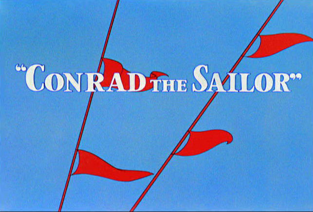
Conrad – again
I repeat this post for good reason. This is one of the prime films John McGrew planned for Chuck Jones, and the work is just dazzling. However, to our eyes it hardly looks unusual. Many of the tricks here were done for the first time, and others are so seamlessly done that we hardly notice them. It just looks like another War cartoon from WB. It ain’t.
It’s special.
 - Regulars to my blog know that I’m a big fan of the work of John McGrew. He was a designer/Layout Artist working in Chuck Jones’ crew at Warner Bros. in the late Thirties/early Forties. His work was daring beyond compare, and, I think, with support from Jones, he changed the look of modern animation backgrounds.
He designed the seminal film The Dover Boys as well as amazing pieces like Aristo-Cat, Inki and the Lion and Conrad the Sailor.
In an interview conducted by Greg Ford and RIchard Thompson, Chuck Jones was asked about McGrew’s style: 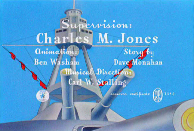
- Q: What about John McGrew’s style and approach, as compared with Noble’s?
A: John McGrew didn’t really have a style; he was experimenting all the time. Maurice does have a style. John McGrew, you might say, was more of an intellectual. You could be intellectual, and get away with it— but if you’re solely intellectual as a director, you weren’t going to get away with it. The result was, however, that he goosed me into thinking that it might be worthwhile to try some different things with backgrounds and so forth. And later on, I would find this kind of thing very useful, in that often it would make your gag work, and sometimes you wouldn’t even know why. Like that little abstract background at the end of Duck Amuck, with the sharply angled lines going off.
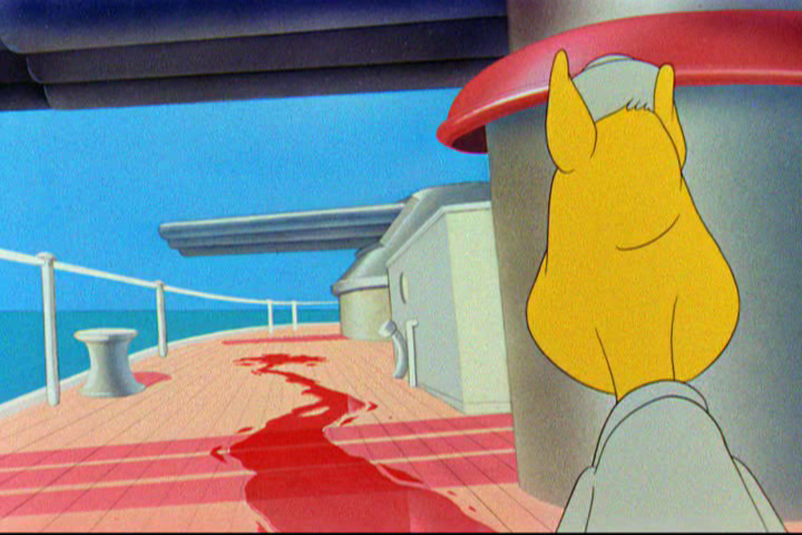
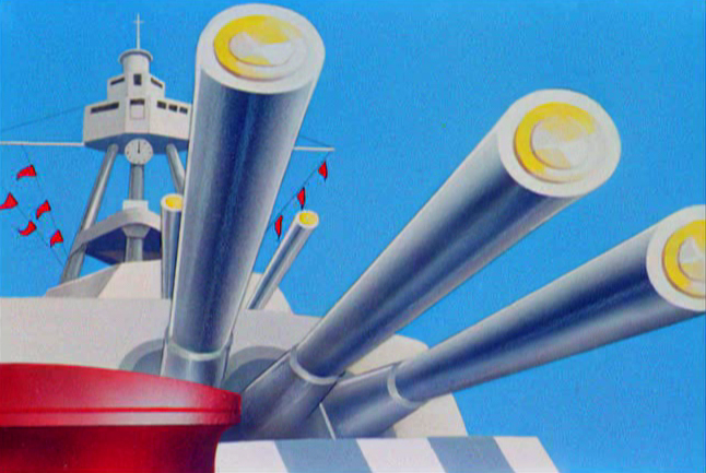
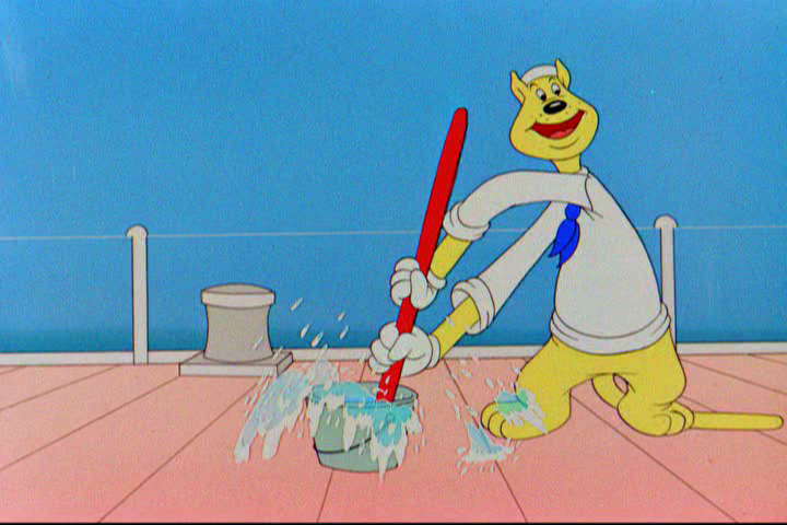
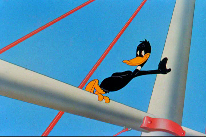
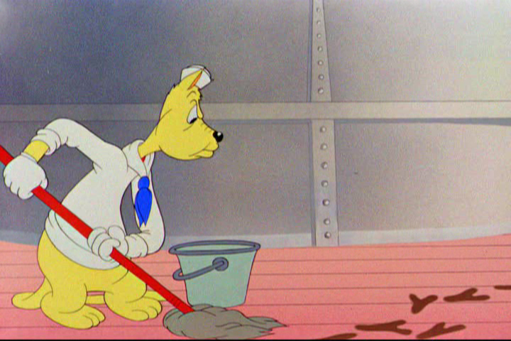
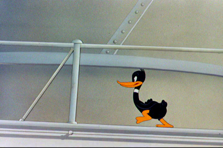
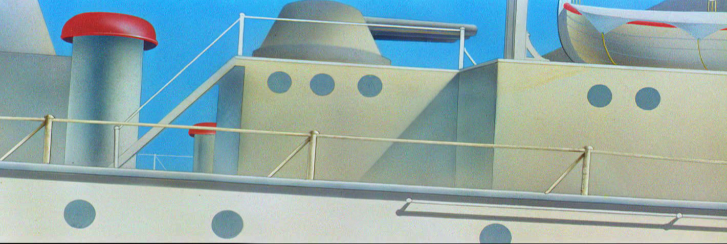
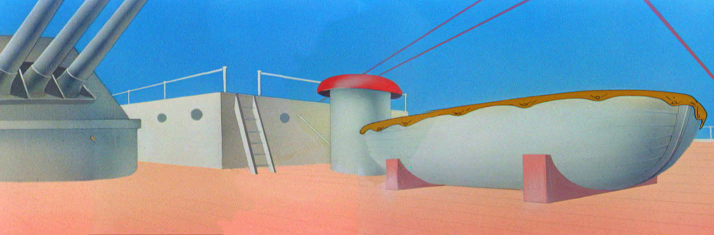
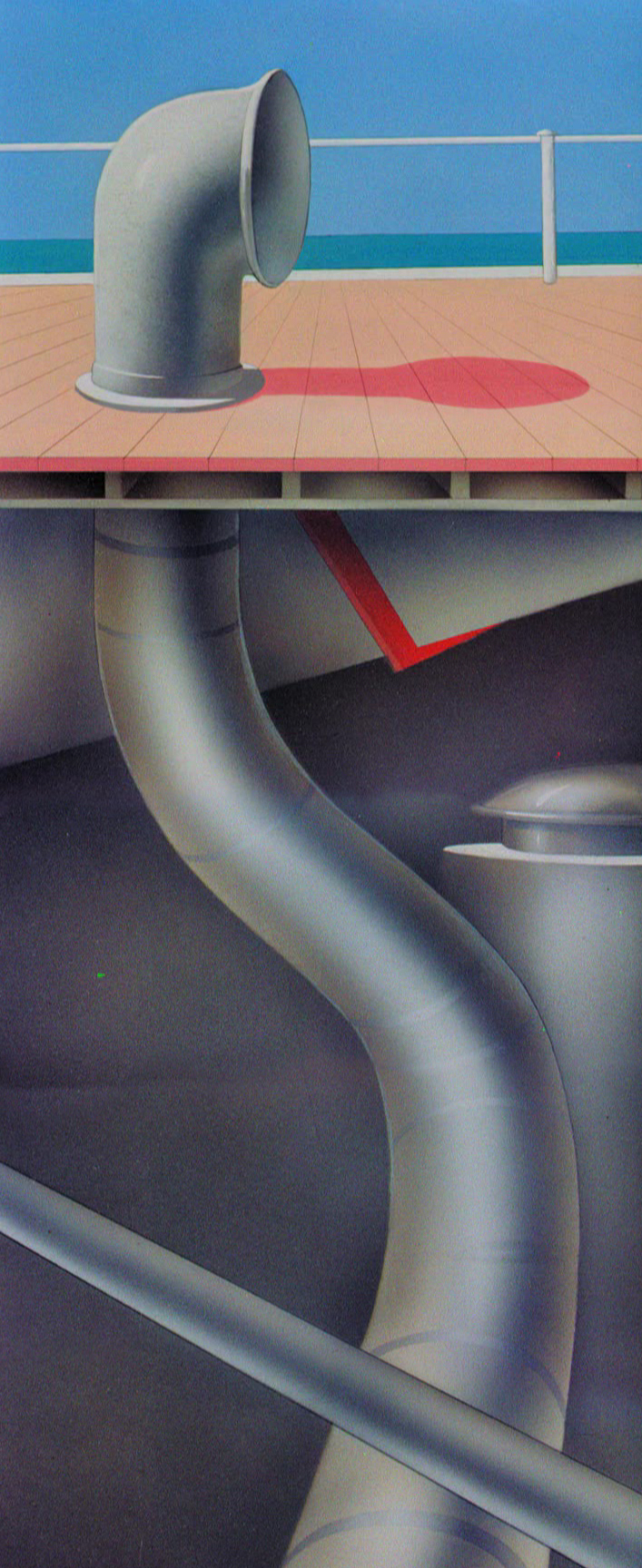
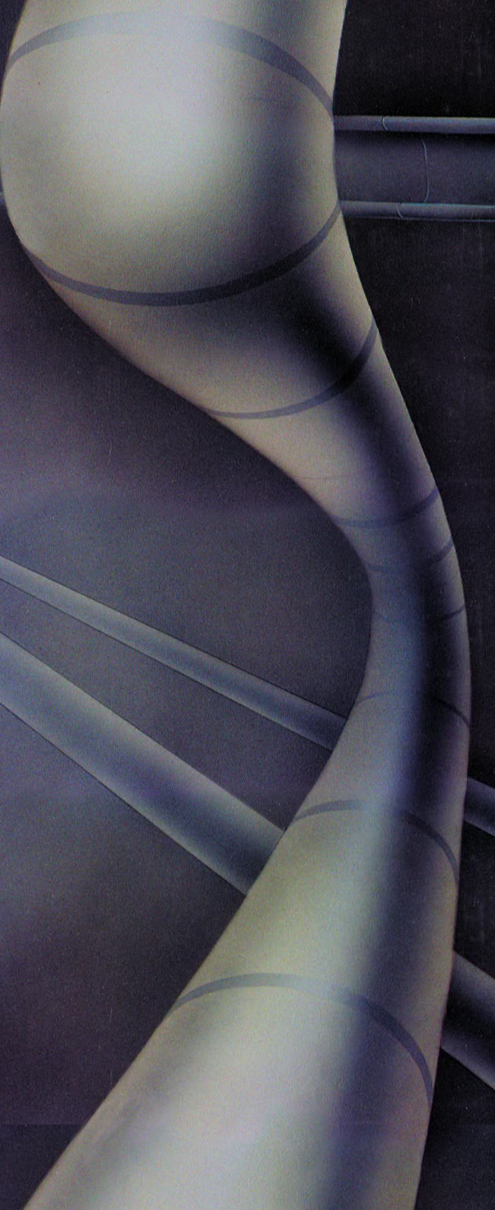
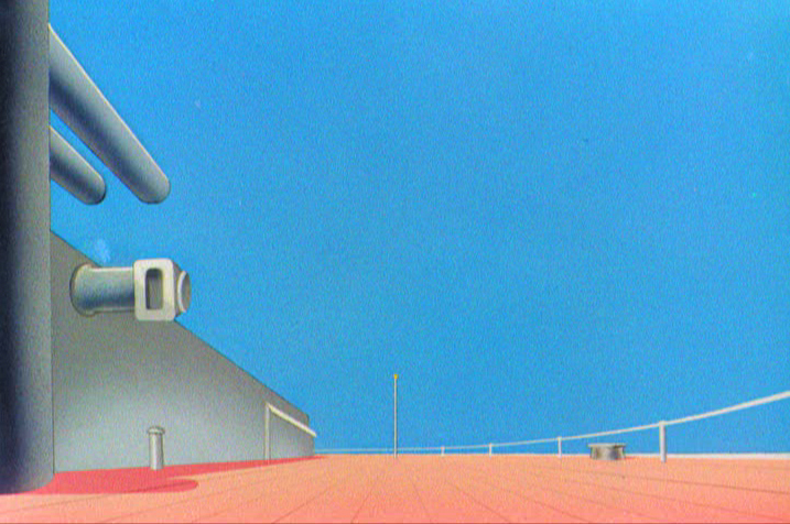
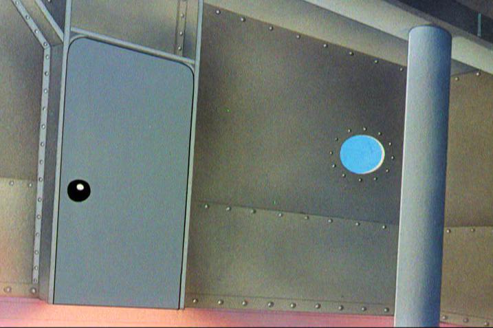
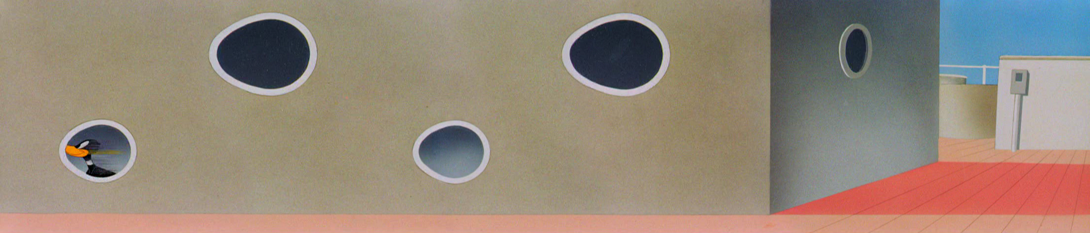
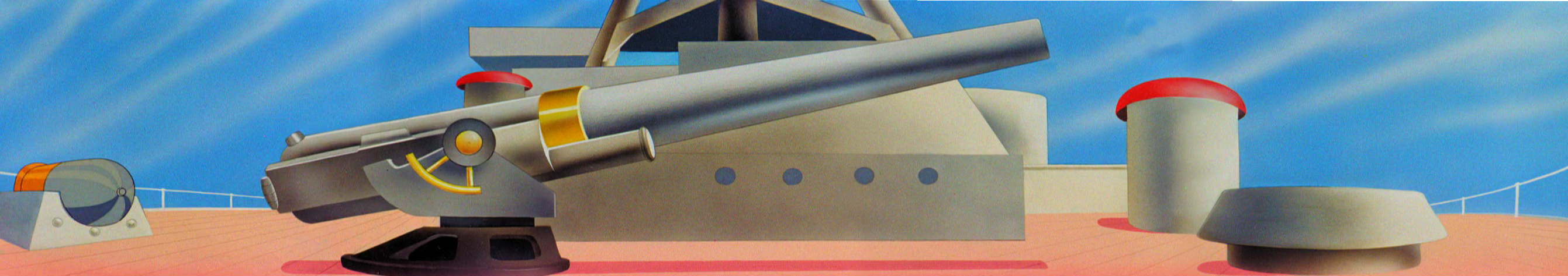
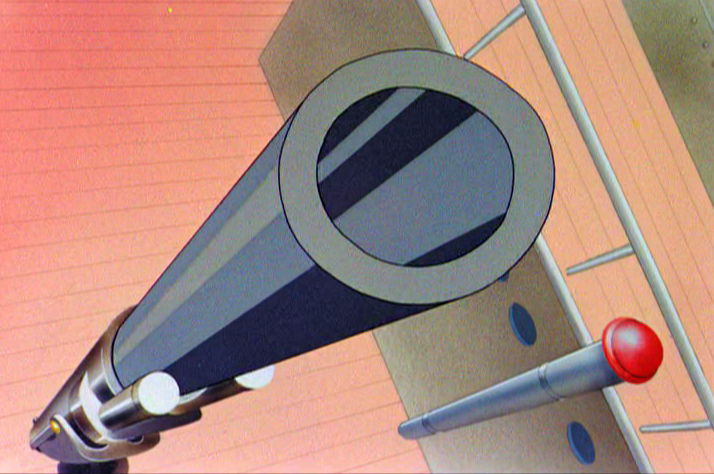
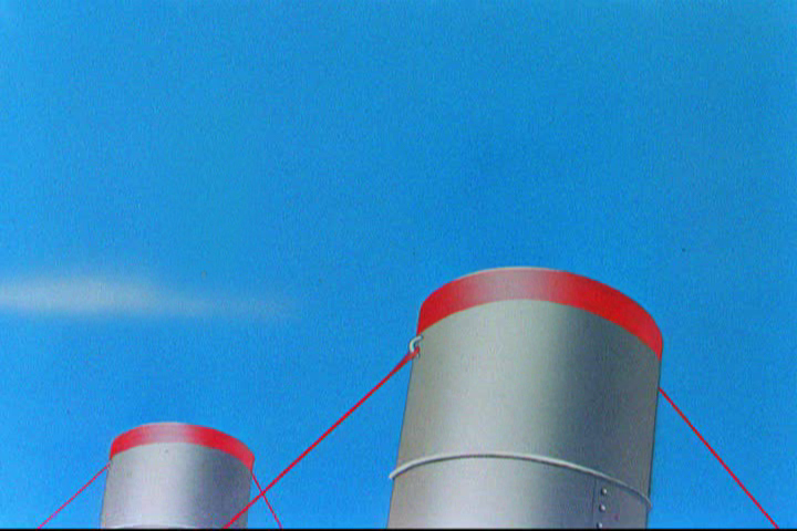
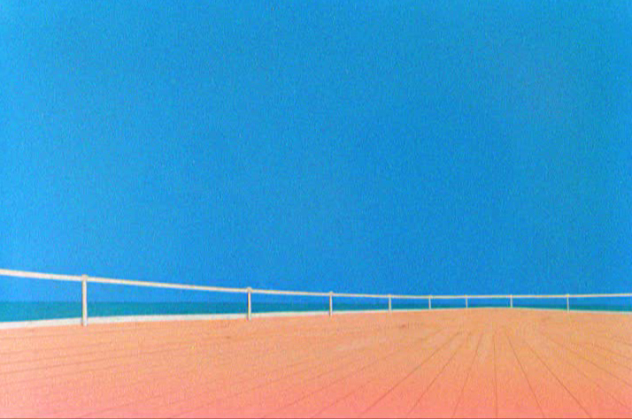
Today I’d like to feature some frame grabs from Conrad the Sailor. Where I could, I separated the characters from the backgrounds to just feature the Bgs. My guess is that the Bgs were painted by Paul Julian, but they were planned by McGrew.
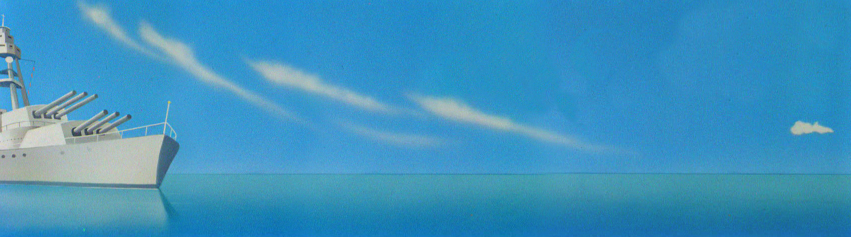
The one scene I don’t illustrate is the most original in the film. Daffy is shot into the air with a bullet. (illus #18) The camera does a 360° turn to head back to the ship. The Bgs don’t hold up on their own. Lots of blue sky and wisps of cloud. It works in motion.
Of this short & McGrew, Jones says:
- . . . we used a lot of overlapping graphics on that particular cartoon so that one scene would have the same graphic shape as an earlier scene, even though it would be a different object: first we’d show a gun pointing up in the air, then in the next shot, there’d be a cloud in exactly the same shape. It gave a certain stability which we used in many of the cartoons after that. John McGrew was the artist responsible for that sort of thing. Conrad was also the one where we used the first complete 360° turn, when the characters went up through the air.
For more information read Mike Barrier’s excellent interview with John McGrew.
 1
1(Click any image to enlarge.)
 4
4
 5
5
 6
6
 7
7
 8
8
9
 10
10
 11
11
 12
12
The following BG pan can be seen in full to the left. I’ve broken it into three parts for a closer look.
 12a
12a .
.
———-(Continue scrolling down.)
.
.
.
.
.
.
.
.
.
.
 12b .
12b .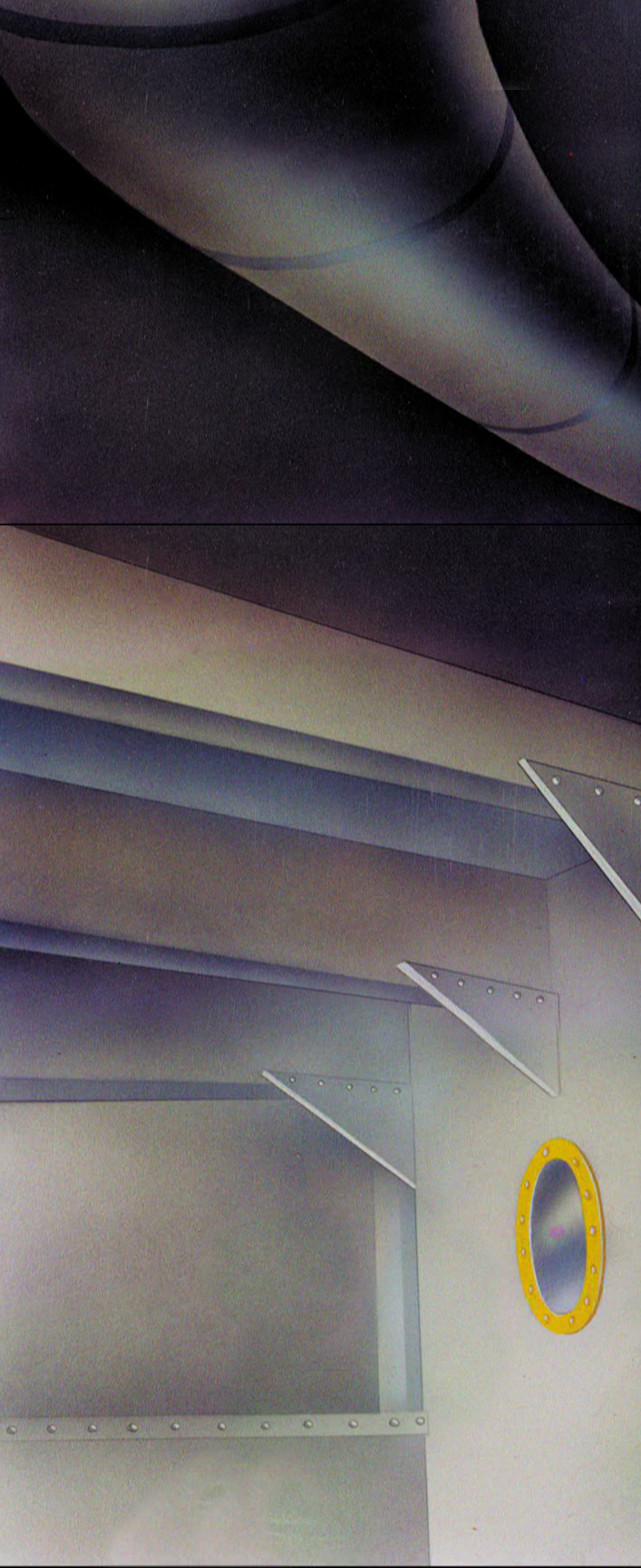 12c
12c
 13
13
 14
14
 15
15
A bicycle pan that keeps moving to the left.
 16
16
Continue moving right to left.
 17
17
 18
18
 19
19
 20
20
 21
21
 22
22
And here’s the cartoon.
Pay attention to the Layout in the sky from 6’25″ to the end.
It’s amazing.
Hubley 10 Oct 2011 08:02 am
Hubley Program
This will be the program for the Hubley show at the Academy in New York, tonight at 7pm.
I believe there many be some tickets still left for it, but check before you come.
The Academy of Motion Picture Arts and Sciences presents
A SALUTE TO JOHN HUBLEY (1914-1977)
October 10, 2011
Program curated by John Canemaker and Emily Hubley
Hosted by John Canemaker
1. PERSONAL REPORT – excerpt from 10 April 1963 Channel 13 TV kinescope with John Hubley and Harlow Shapley –
film courtesy Hubley Family Collection
2. Power Point introduction by John Canemaker
3. BROTHERHOOD OF MAN (1945) (UPA/United Auto Workers) – film courtesy AMPAS
Direction: Robert Cannon
Screen Story: Ring Lardner, Jr.; Maurice Rapf; John Hubley; Phil Eastman
Animation: Robert Cannon, Ken Harris, Ben Washam
Production Design: John Hubley, Paul Julian
Background: Boris Gorelick
Music: Paul Smith
Executive Producer: Stephen Bosustow
Source: “Races of Mankind” (1943) by Ruth Benedict and Gene Weltfish
4. FLAT HATTING (1946) (UPA/US Navy) – film courtesy NARA/AMPAS
Director: John Hubley
Layout: John Hubley, William Hurtz
Story: Millard Kaufman
Voice: William Conrad]
5. THE MAGIC FLUKE (1949) (UPA/Columbia) – film courtesy Sony/AMPAS
Direction: John Hubley
Supervision: Ade Woolery
Production: Ed Gershman
Story: Sol Barzman
Music: Del Castillo
Design: Herb Klynn, Jules Engel, Bill Hurtz
Technical: Max Morgan, Mary Cain
Animation: Bob Cannon, Rudy Larriva, Willy Pyle, Pat Mathews [sic]
Executive Producer: Steve Bosustow
6. THE RAGTIME BEAR (1949) UPA/Columbia Jolly Frolics) – film courtesy Sony/AMPAS
Direction: John Hubley
Story: Millard Kaufman
Production: Ed Gershman
Design: William Hurtz
Color: Herb Klynn, Jules Engel
Animation: Art Babbitt, Pat Matthews, Rudy Larriva, Willy Pyle
Technical: Max Morgan, Mary Cain, Jack Eckes
Music: Del Castillo
Executive Producer: Steve Bosustow
7. ROOTY TOOT TOOT (1952) (UPA) – film courtesy Sony/AMPAS
(released for Oscar consideration in 1951)
Director: John Hubley
Lyrics: Allen Alch
Music: Phil Moore
Choreography: Olga Lunick
Writers: John Hubley, Bill Scott
Animation: Art Babbitt, Pat Matthews, Tom McDonald, Grim Natwick
Color and Design: Paul Julian
Technical Supervision: Sherm Glas
Production Manager: Herb Klynn
Executive Producer: Stephen Bosustow
INTERMISSION
8. TV COMMERCIAL REEL (14 spots, c. 1950s & 60s) Hubley’s Storyboard Studio – film courtesy Hubley Family Collection
Design/layout: John Hubley
Animation by various artists, including Art Babbitt, Emery Hawkins.
9. ADVENTURES OF AN ASTERIX (1957) (Hubley Studio) –
film courtesy MoMA
Design and Direction by John Hubley
Story by John Hubley and Faith Elliot
In collaboration with James Johnson Sweeney
Animation: Emery Hawkins
Assisted by Ed Smith
Film Editor Faith Elliot
Music by Benny Carter
10. THE TENDER GAME (1958) – Hubley Studio –
film courtesy MOMA
Design and Direction by John Hubley
Editing by Faith Elliot
Musical interpretation by The Oscar Peterson Trio
Vocal by Ella Fitzgerald
Animation: Ed Smith, Robert Cannon, Jack Schnerk, Emery Hawkins
11. VOYAGE TO NEXT (1974) – Hubley Studio –
film courtesy AMPAS
Directed by John Hubley
Produced by Faith Hubley
Scenario by Faith and John Hubley
Music composed and conducted by Dizzy Gillespie
Voices: Maureen Stapleton and Dizzy Gillespie
Design and backgrounds by John and Faith Hubley
Animation: Phil Duncan, Bill Liuttlejohn, Earl James.
Assisted by Michael Sporn.
12. FACADE (c. 1960s) – Hubley Studio -
35mm animatic storyboards for unfinished short of William Walton/Edith Sitwell 1927 abstract music score –
film courtesy of Hubley Family Collection
No credits available.
13. John Canemaker moderates Q&A with Emily Hubley and Michael Sporn.
Animation &Frame Grabs &Layout & Design 24 Aug 2010 08:04 am
Conrad
- Regulars to my blog know that I’m a big fan of the work of John McGrew. He was a designer/Layout Artist working in Chuck Jones’ crew at Warner Bros. in the late Thirties/early Forties. His work was daring beyond compare, and, I think, with support from Jones, he changed the look of modern animation backgrounds.
He designed the seminal film The Dover Boys as well as amazing pieces like Aristo-Cat, Inki and the Lion and Conrad the Sailor.
In an interview conducted by Greg Ford and RIchard Thompson, Chuck Jones was asked about McGrew’s style:
- Q: What about John McGrew’s style and approach, as compared with Noble’s?
A: John McGrew didn’t really have a style; he was experimenting all the time. Maurice does have a style. John McGrew, you might say, was more of an intellectual. You could be intellectual, and get away with it— but if you’re solely intellectual as a director, you weren’t going to get away with it. The result was, however, that he goosed me into thinking that it might be worthwhile to try some different things with backgrounds and so forth. And later on, I would find this kind of thing very useful, in that often it would make your gag work, and sometimes you wouldn’t even know why. Like that little abstract background at the end of Duck Amuck, with the sharply angled lines going off.
Today I’d like to feature some frame grabs from Conrad the Sailor. Where I could, I separated the characters from the backgrounds to just feature the Bgs. My guess is that the Bgs were painted by Paul Julian, but they were planned by McGrew.
The one scene I don’t illustrate is the most original in the film. Daffy is shot into the air with a bullet. (illus #18) The camera does a 360° turn to head back to the ship. The Bgs don’t hold up on their own. Lots of blue sky and wisps of cloud. It works in motion.
Of this short & McGrew, Jones says:
- . . . we used a lot of overlapping graphics on that particular cartoon so that one scene would have the same graphic shape as an earlier scene, even though it would be a different object: first we’d show a gun pointing up in the air, then in the next shot, there’d be a cloud in exactly the same shape. It gave a certain stability which we used in many of the cartoons after that. John McGrew was the artist responsible for that sort of thing. Conrad was also the one where we used the first complete 360° turn, when the characters went up through the air.
For more information read Mike Barrier’s excellent interview with John McGrew.
1(Click any image to enlarge.)
4
5
6
7
8
9
10
11
12
The following BG pan can be seen in full to the left. I’ve broken it into three parts for a closer look.
12a .
.
———-(Continue scrolling down.)
.
.
.
.
.
.
.
.
.
.
12b . 12c
13
14
15
A bicycle pan that keeps moving to the left.
16
Continue moving right to left.
17
18
19
20
21
22
Chuck Jones &Frame Grabs &Layout & Design 21 Jul 2009 07:13 am
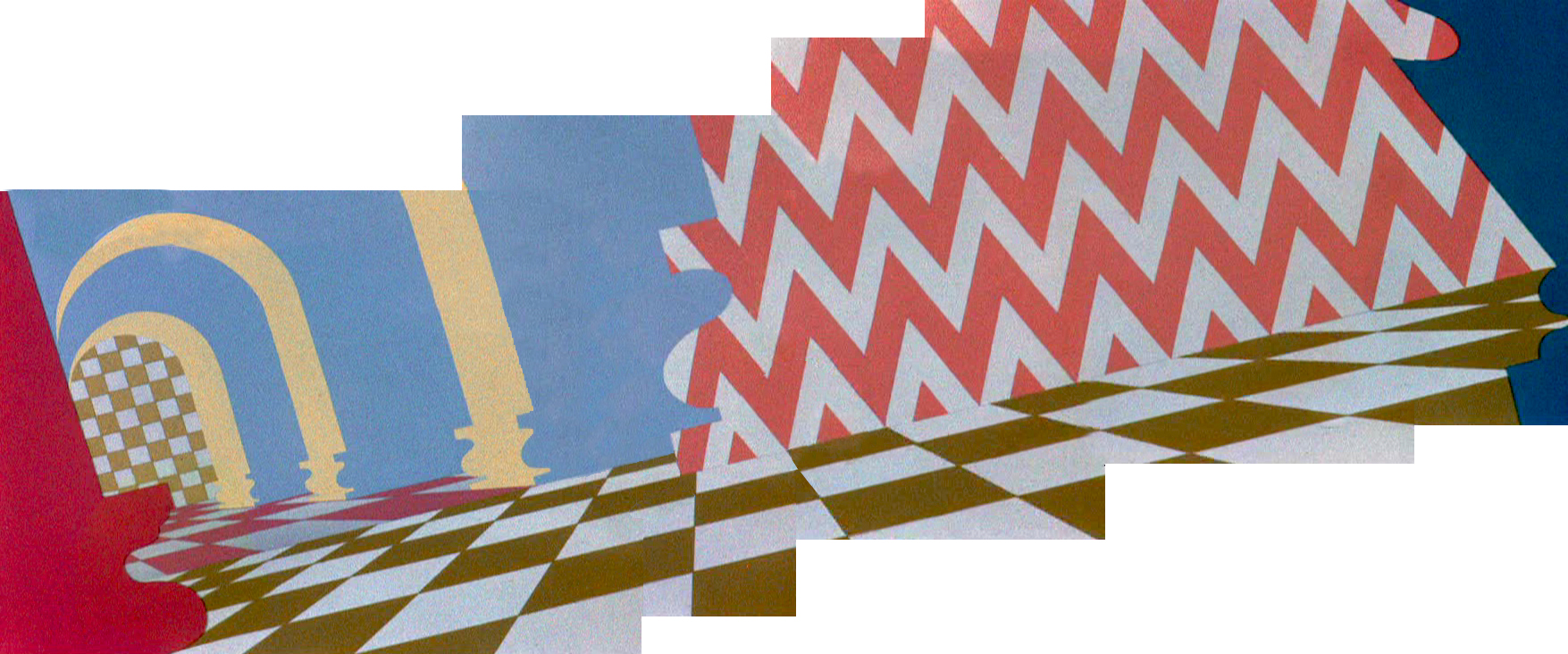
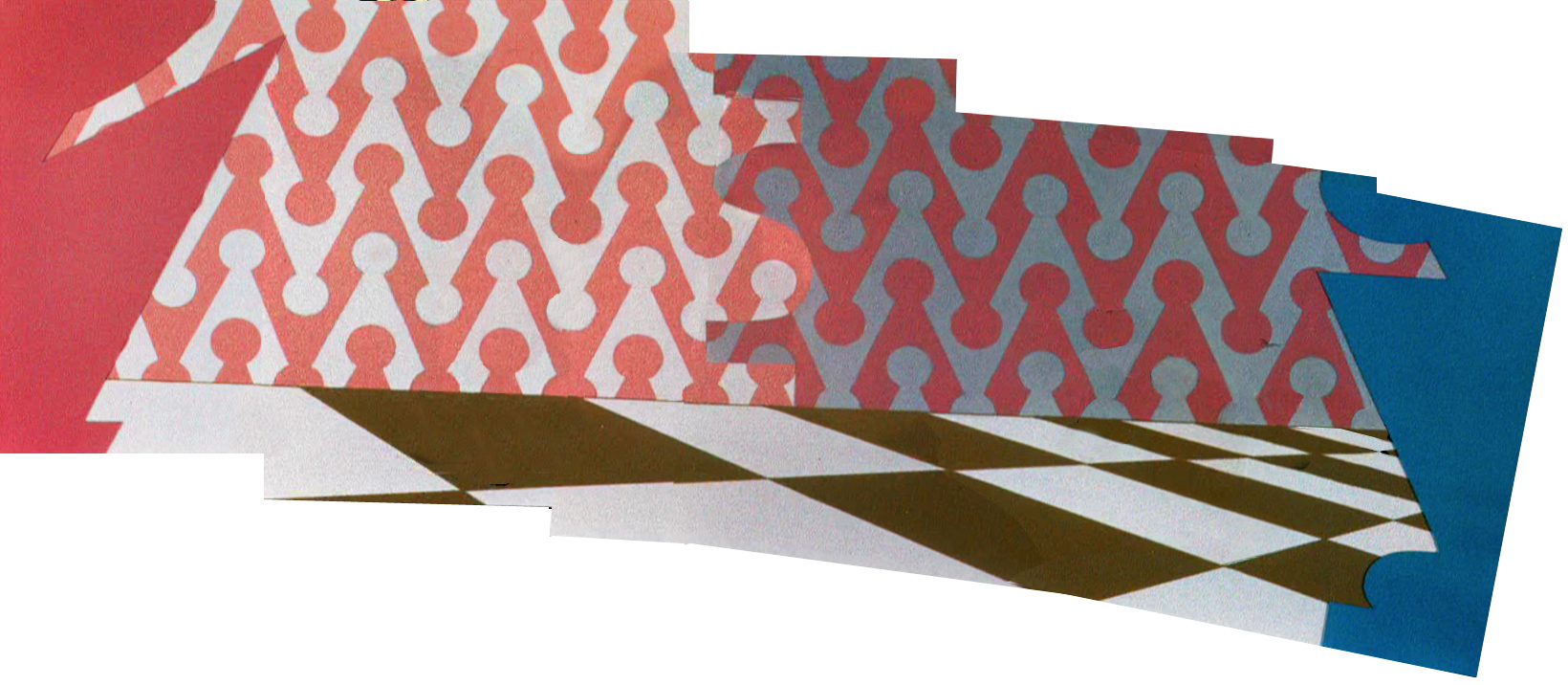
McGrew’s Aristocat
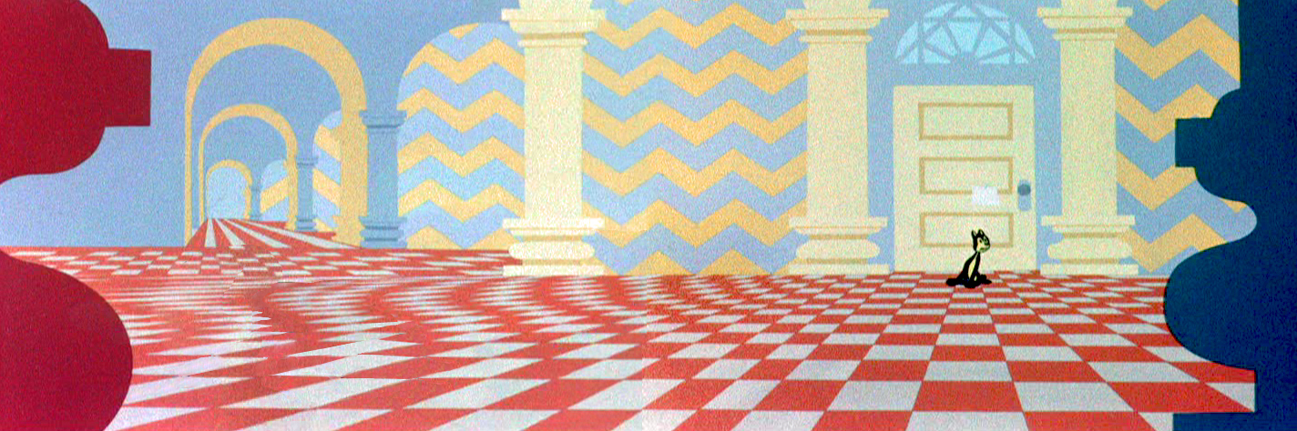
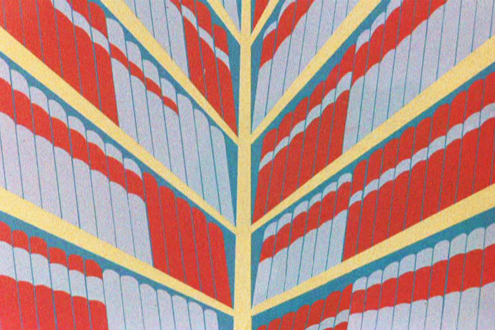
 – John McGrew is certainly one of my favorite LO and Background designers in animation. His Dover Boys work in 1942 set new goals for the remainder of 20th Century animation. He followed it with the daring work of Conrad the Sailor, Inki and the Minah Bird, The Case of the Missing Hare and others all for Chuck Jones, who was no slouch, himself, in encouraging exciting innovation in design and film cutting.
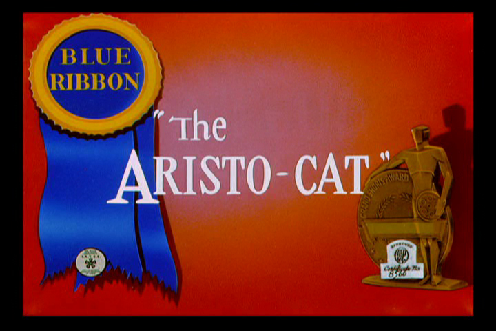 The Aristo-cat was probably the first of McGrew’s works that I saw when I was a kid. It made my eyes pop, even though I watched it originally in B&W. The dynamic design of wallpaper decoration combined with outrageous pans and camera work took me by force. The violently repeating patterns reach to the forefront of this short. All of this exuberant design completely acted to support the character’s state of mind. Anxiety, fear and terror jumped from the backgrounds to the fine character animation of Ken Harris, Rudy Larriva and Bobe Cannon.
Working with Jones and painter Gene Fleury, he surefootedly set the way for UPA and all the others that followed. Toot Whistle Plunk & Boom and Ward Kimball’s other Disney TV work, Maurice Noble and other thinking designers of the Fifties couldn’t have broken through if McGrew hadn’t been there first supporting and pushing Chuck Jones.
Go here for Mike Barrier‘s excellent interview with him.
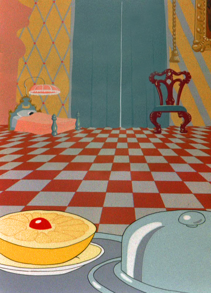
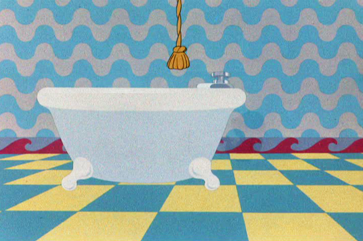
I’ve done some Bg recreations from the film, which meant assembling some exceptionally long pans that twist and turn. Unfortunately, I don’t think there’s a good quality copy of the film available. All of the grain in the DVD leads me to believe they copied a 16mm print.
As stills, they don’t come across as quite so daring, but they are within the moving short. It took some courage to do such work and enormous talent to be able to pull it off so successfully.
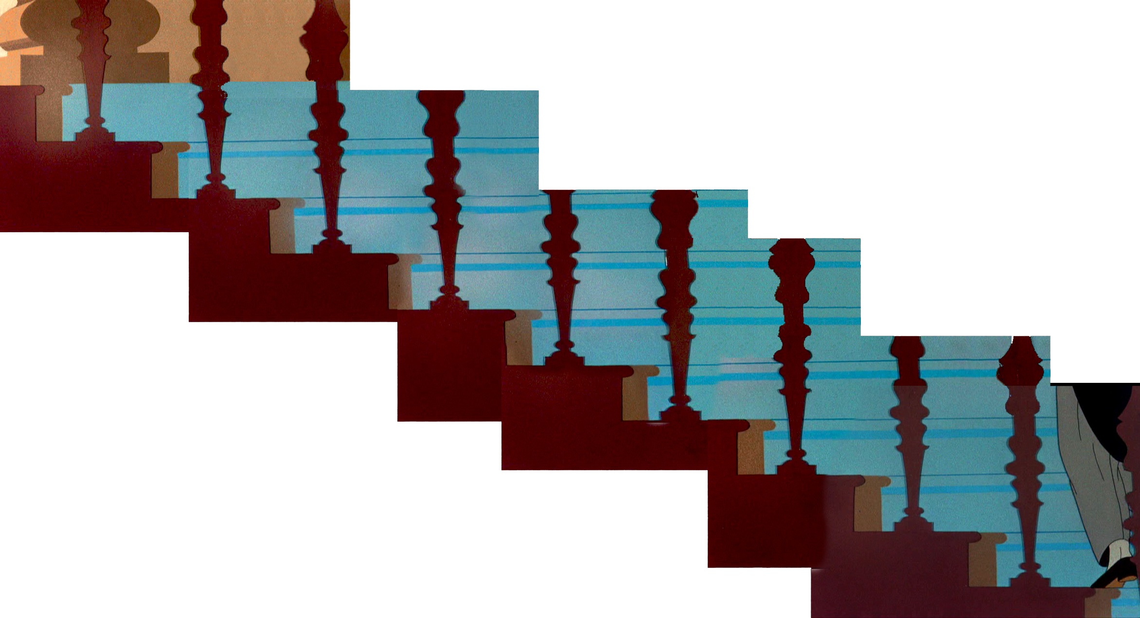
The butler walks upstairs.
He carries a breakfast tray into the bedroom.
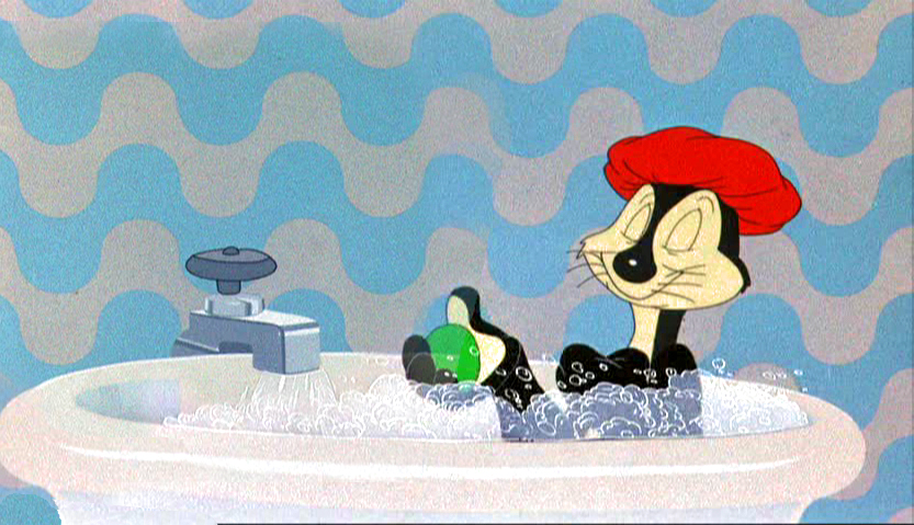
Taking a bath
Releasing a bar of soap to trip the butler.
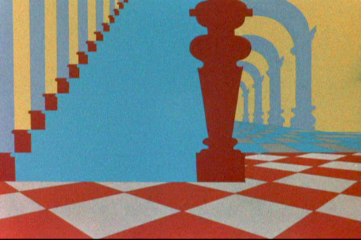
Downstairs to find the butler.
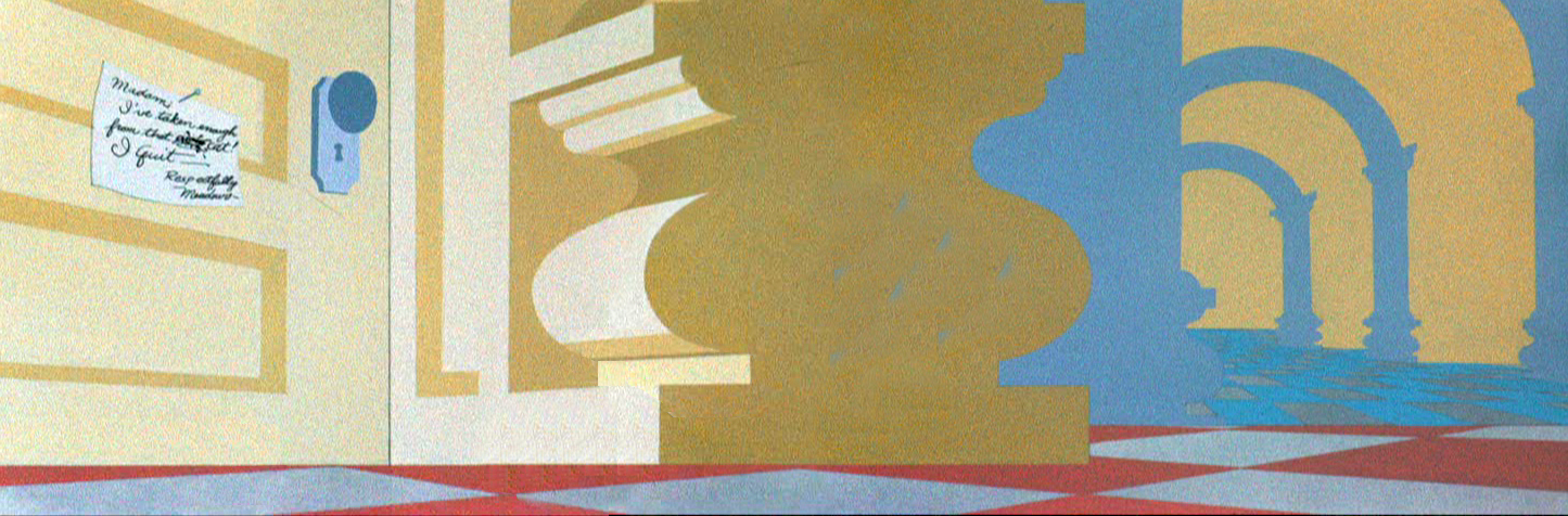
A note on the door.
Alone in the house.
Fear.
Danger.
Panic in the library.
A book hits him on the head.

Running away from a mouse.
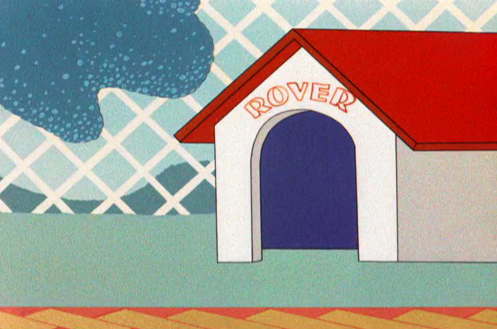
The dog in the doghouse. Repeated diamonds outside.
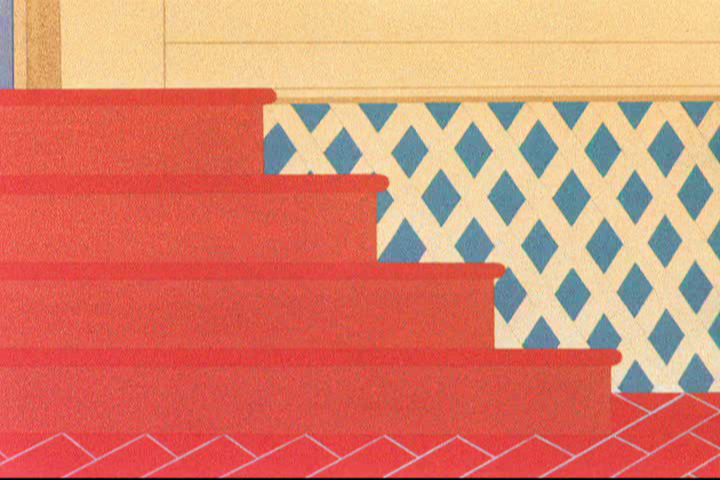
Back indoors. Still more diamonds.
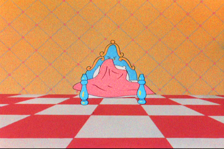
Safe in bed with diamonds and a checkered floor.