Search ResultsFor "disney model sheets"
Action Analysis &Animation &Commentary &Disney &Guest writer 21 Oct 2013 06:13 am
Women and Men, Boys and Girls, & Toads and Horses
I can’t believe all this nonsense I’ve been reading about what Joanna Quinn might have said about this Disney film or that. She’s right and anyone who argues with her has to be a real dullard and a total fake. If she says it’s easy or hard to animate women, take her word for it. (Not just because she knows how to animate women better than anyone on the planet, these days, but because what she’s saying is common sense.
Women are people, too, not just insipid cartoon characters the way the Disney people draw them. If a male is easy to animate, it’s because they’ve figured out how to design them as the cartoons they’re making. If women are hard to animate, it’s 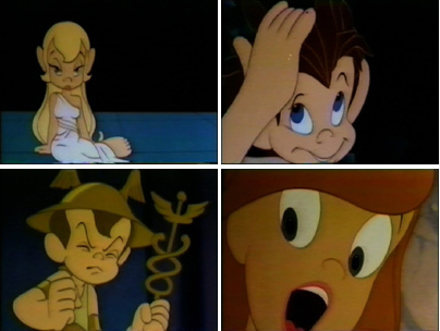 because the lead character in FROZEN looks like every other generic female these guys can draw. Give it up. Hire a few good women who can animate, and we’ll see what we see. (I expect nothing different unless the woman drawing the figure is a good animator (not just great, like Joanna Quinn) and knows how to draw well (not even great, as JQ can do). But the character they’re animating is well designed (unlike the lead in FROZEN).
It reminds me of the in-house joke around the film METAMORPHOSIS. The principals didn’t have names, and the model sheets read: “Lead Boy” and “Lead Girl”. The animators usually read their names as “Led Boy” and “Led Girl” because they looked generic and they could only make them move like “lead.”
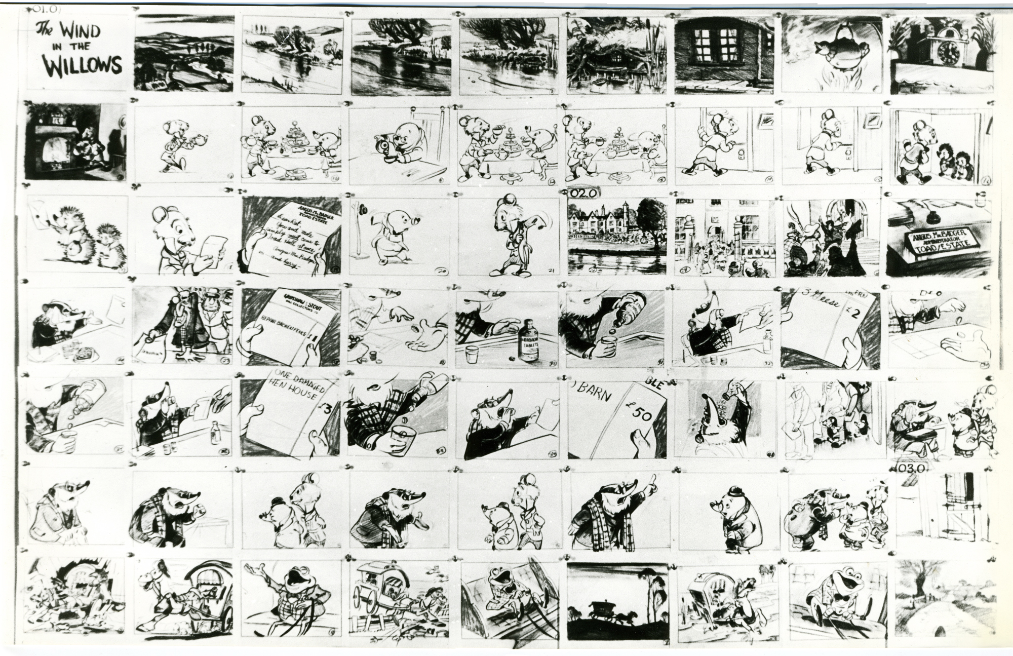
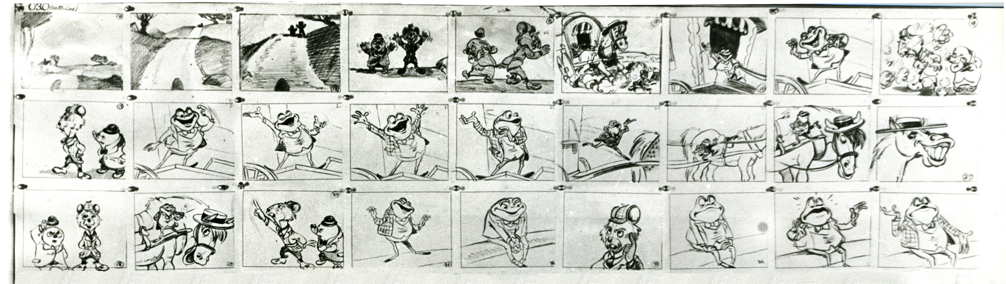
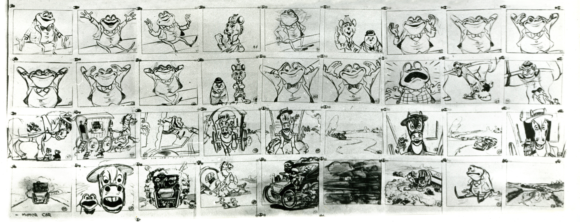
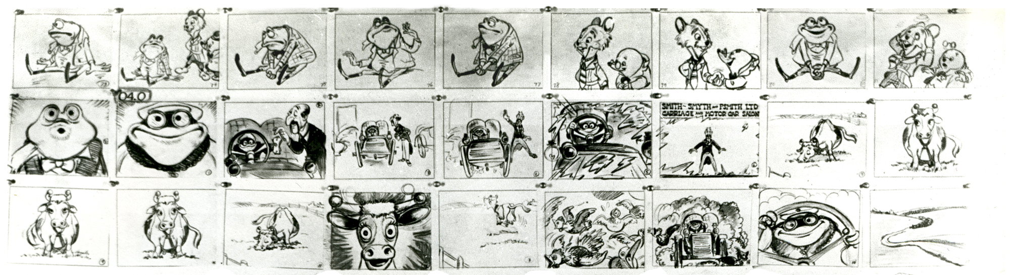
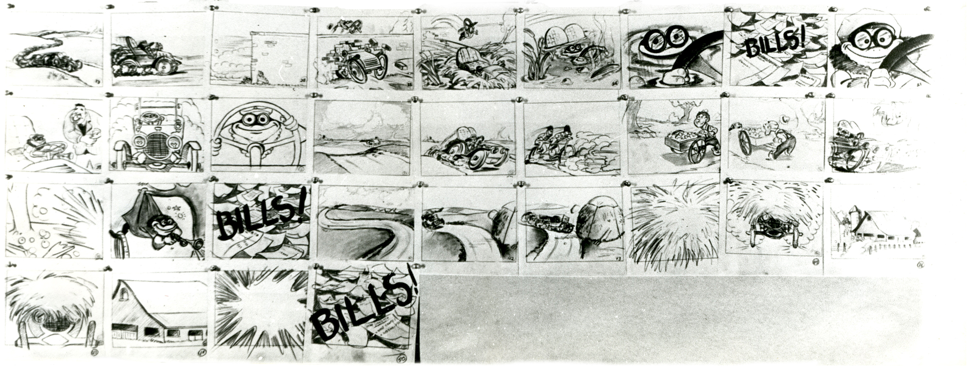
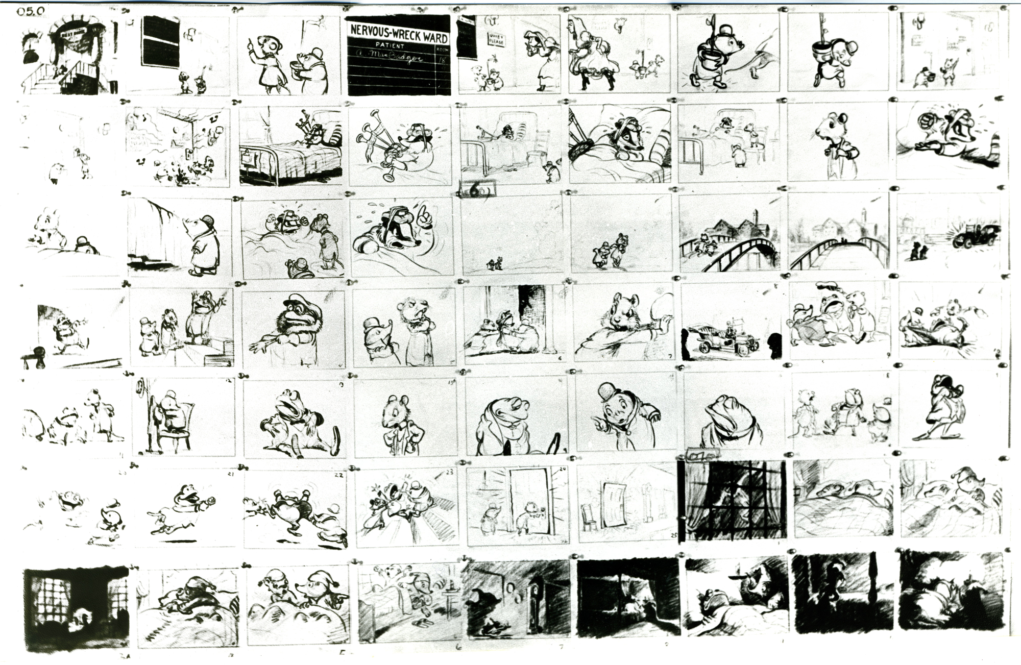
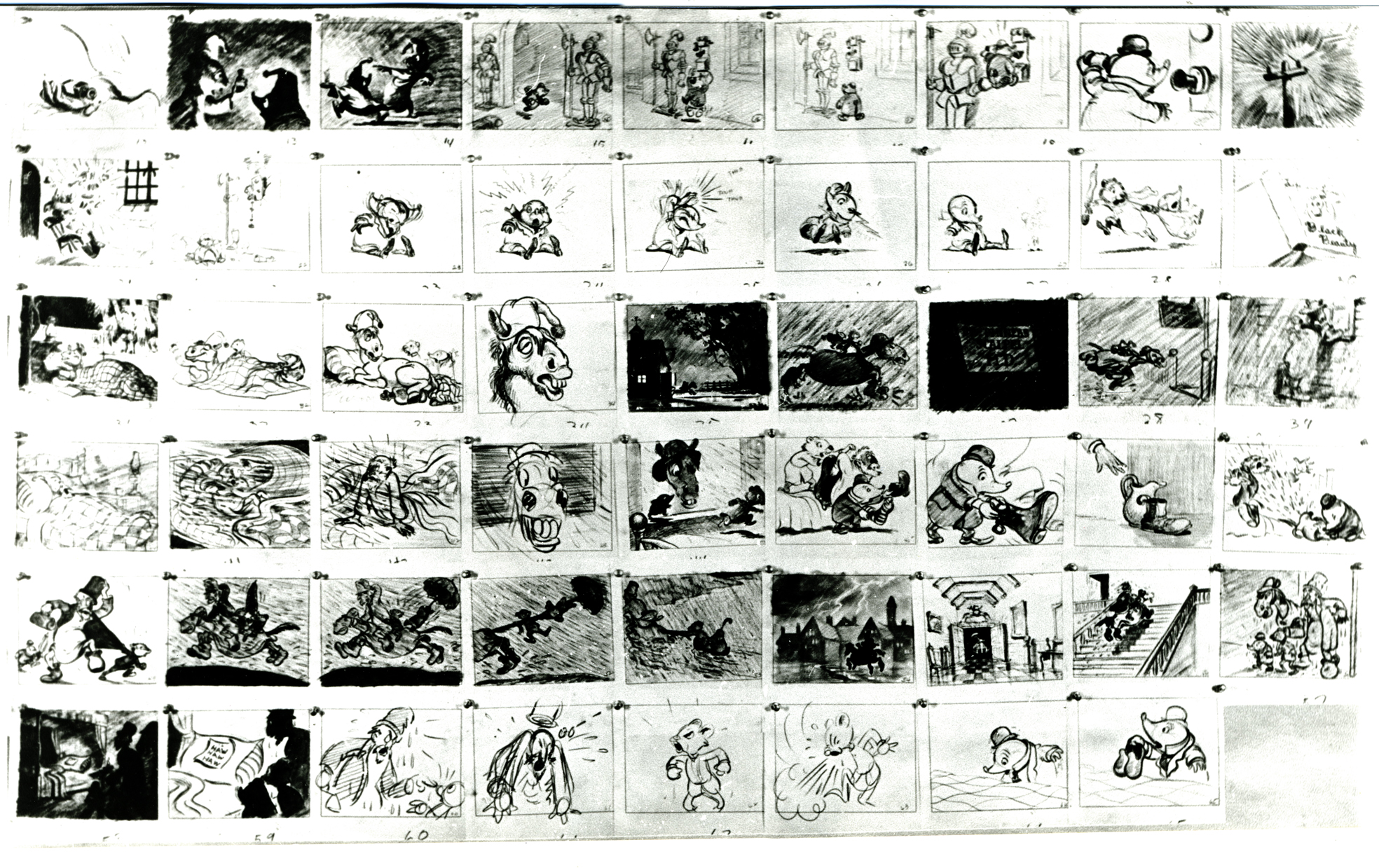
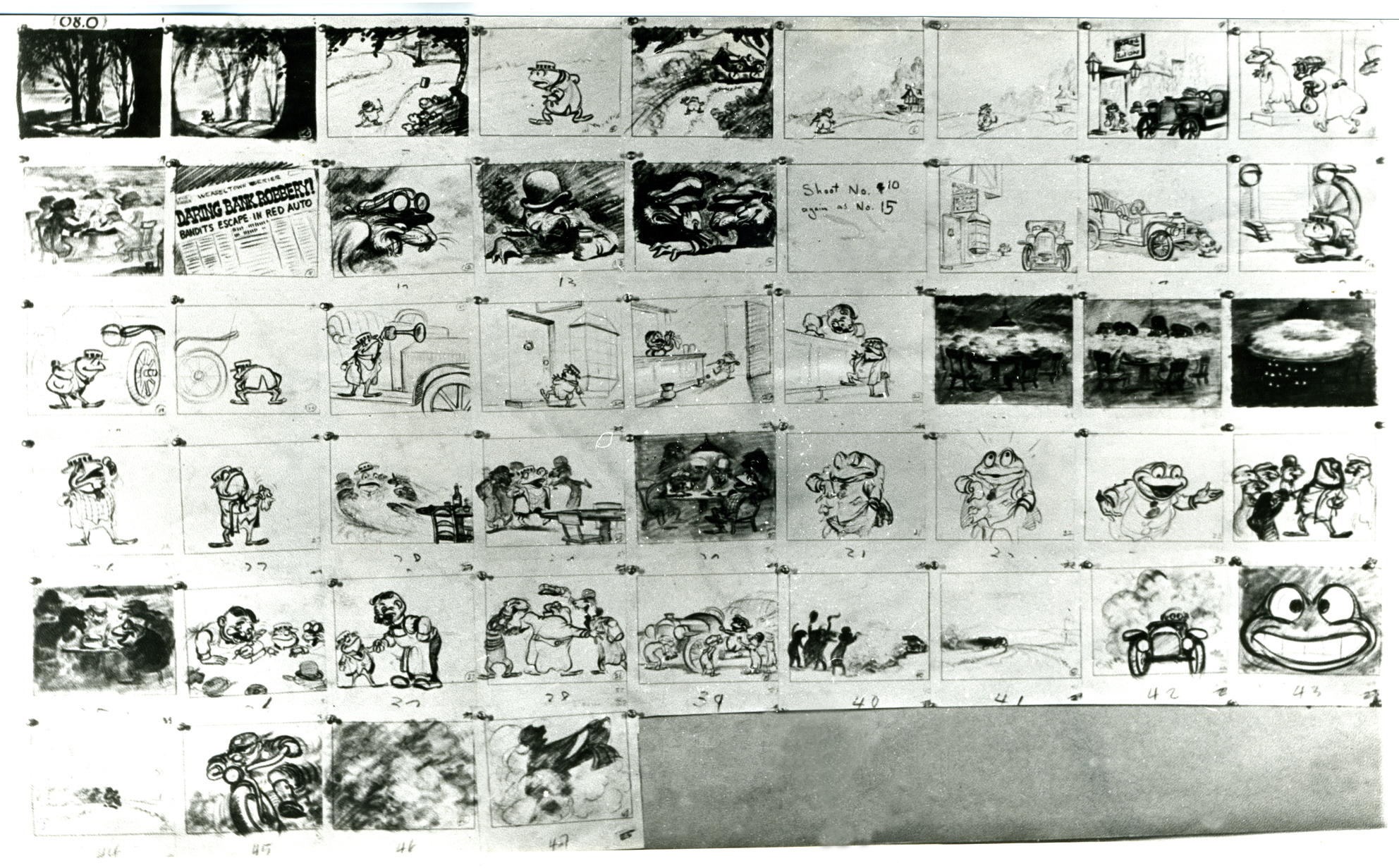
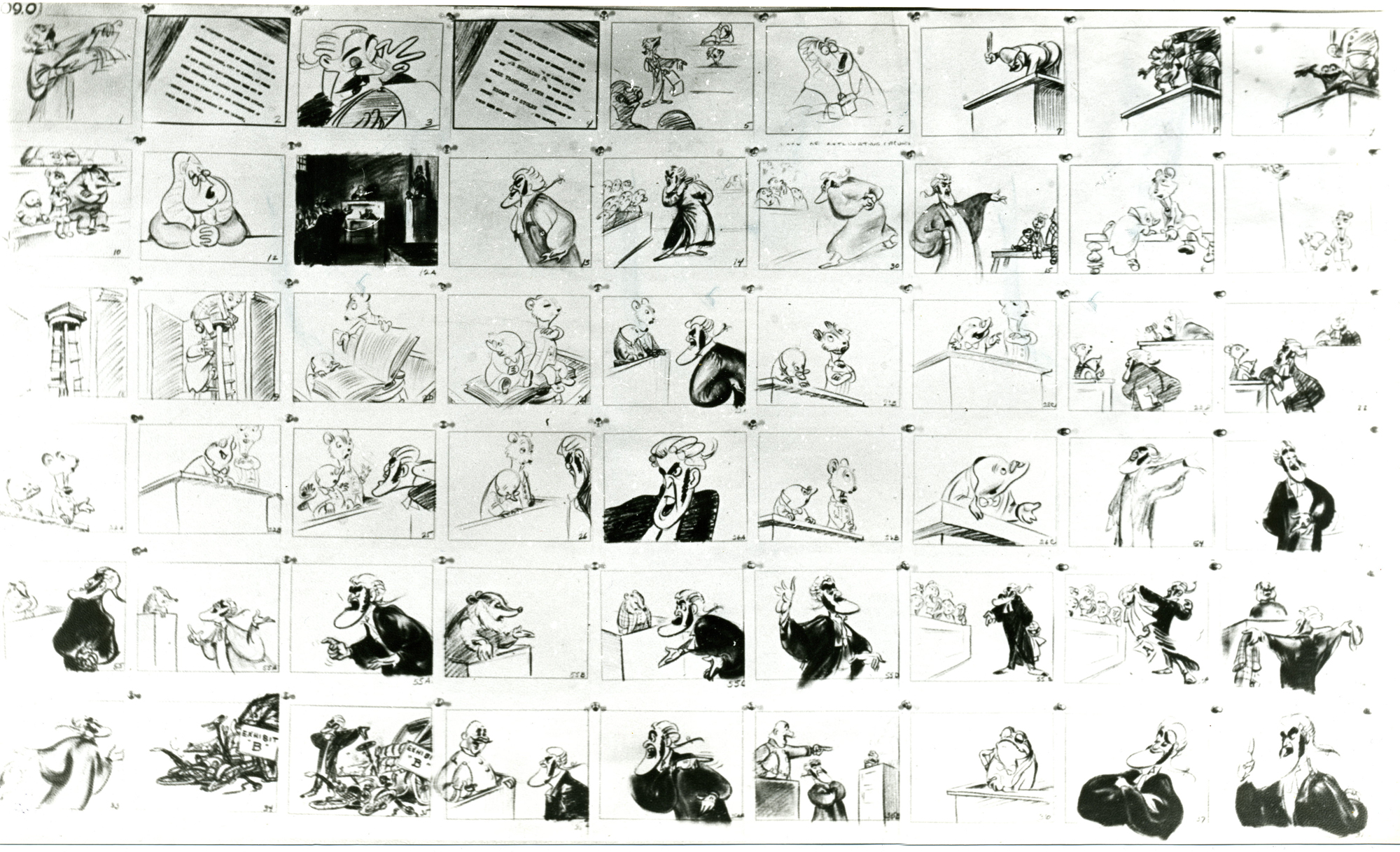
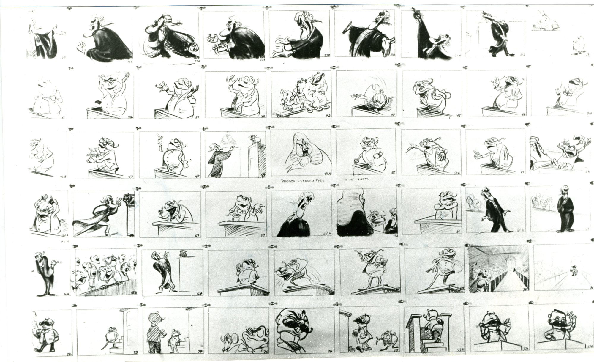
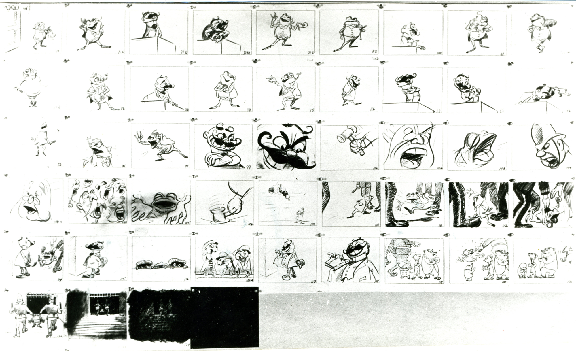
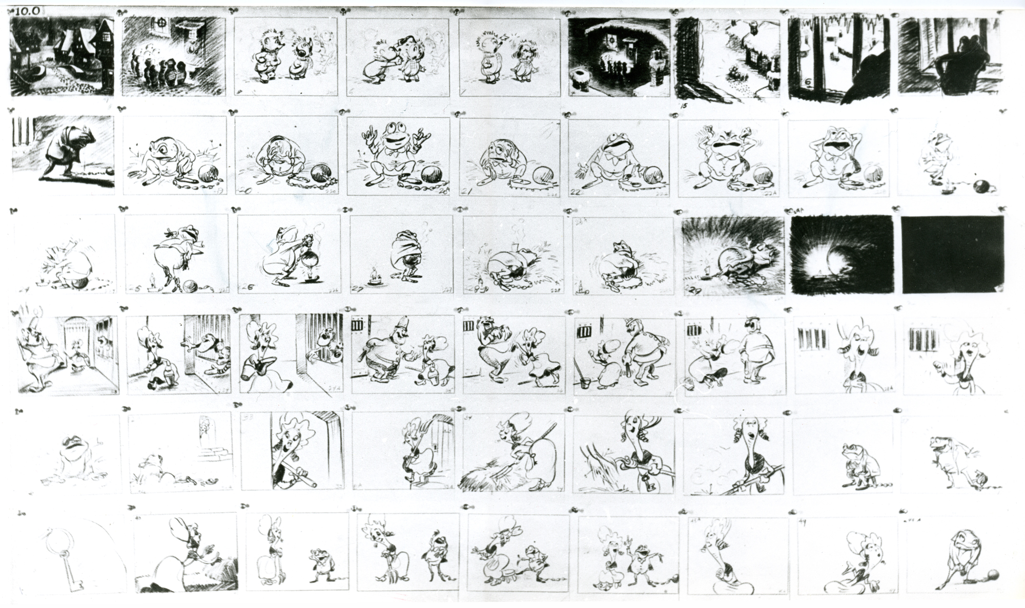
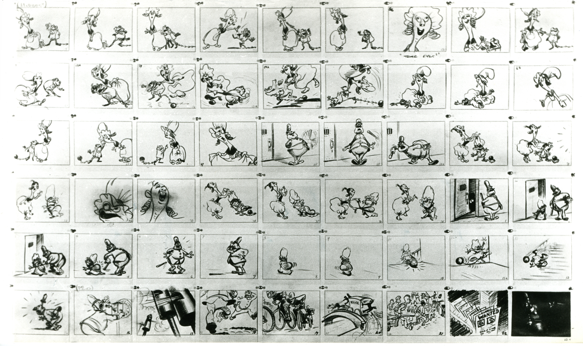
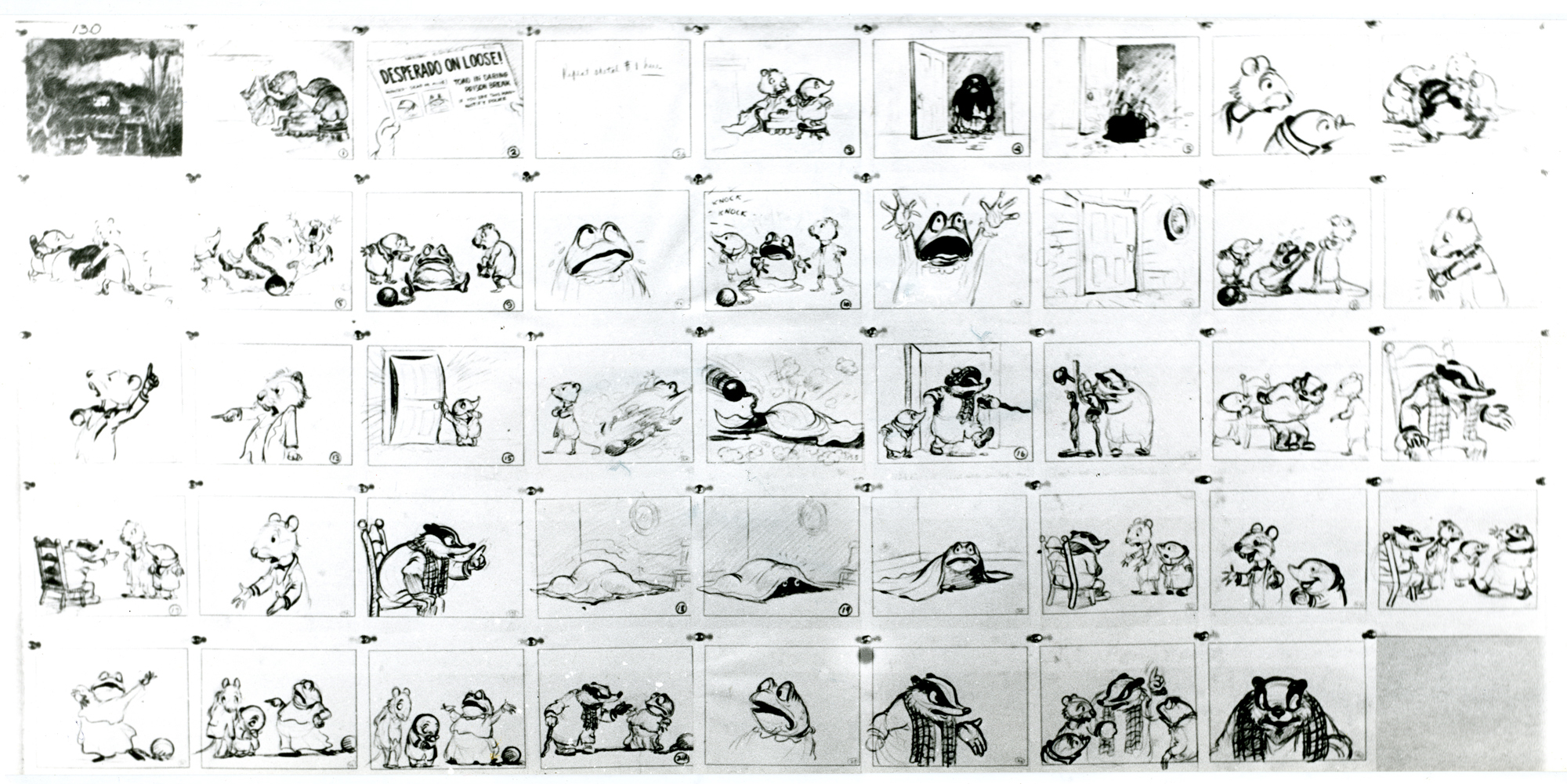
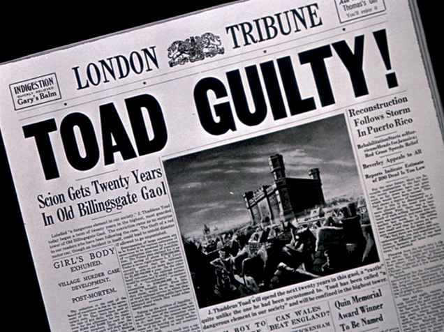
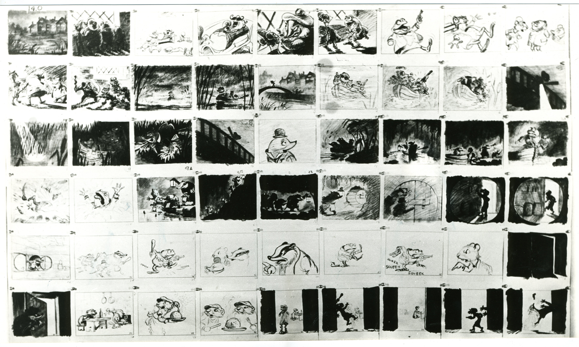
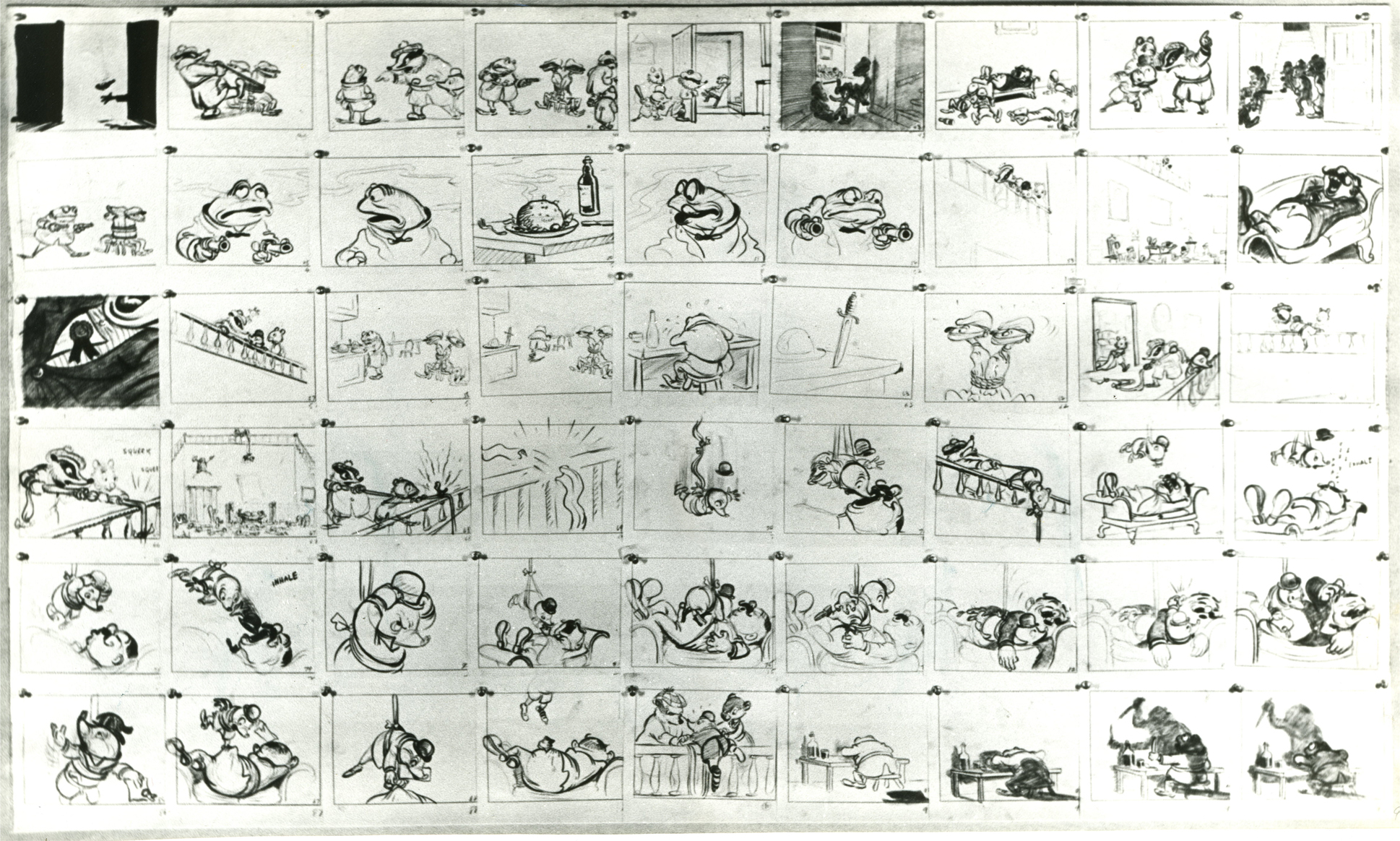
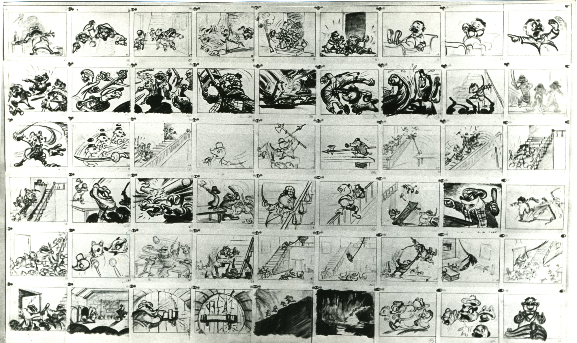
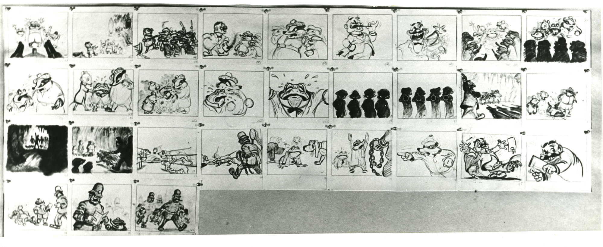
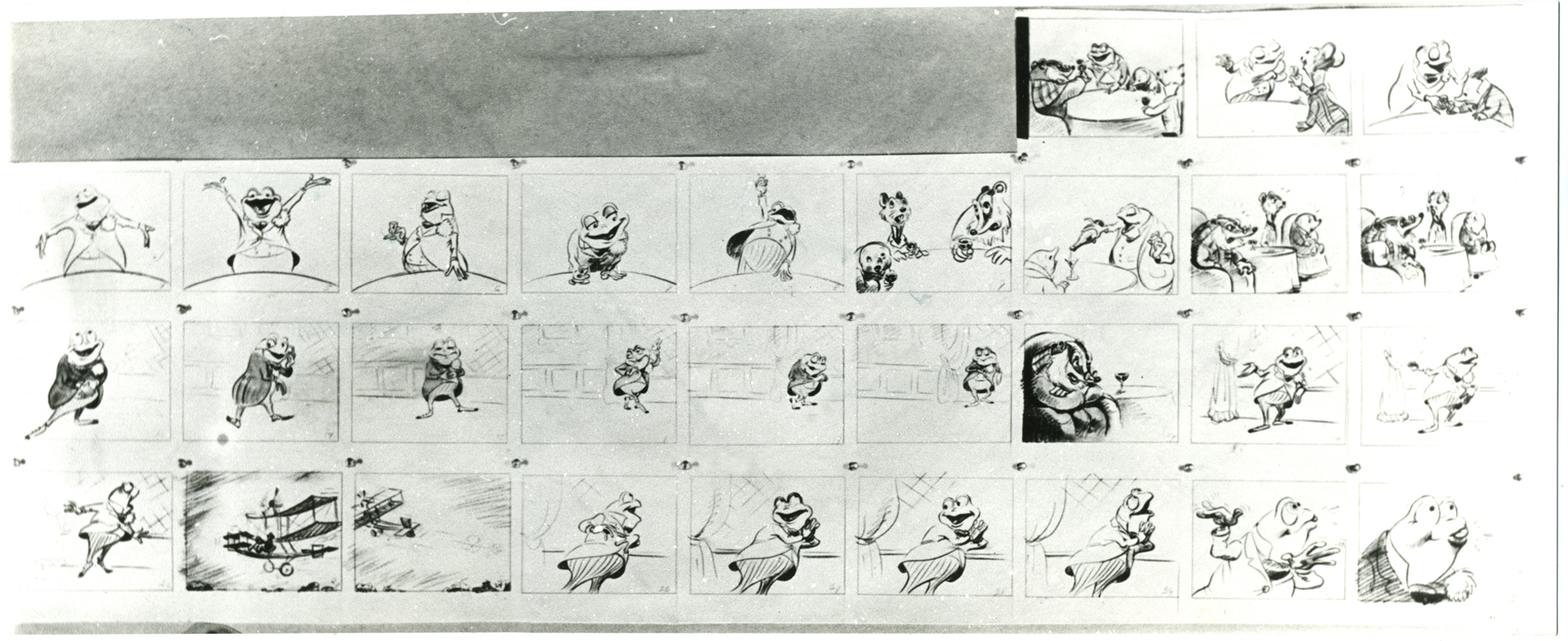
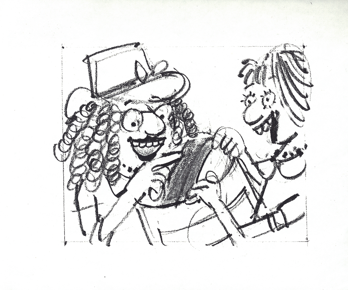
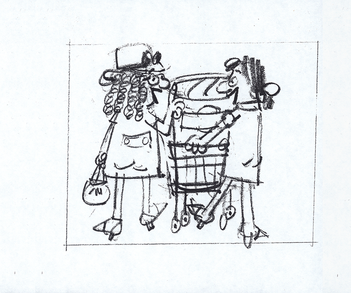
As long as we’re talking about drawing and designing and animating women let me repeat a segment of an older post. It includes storyboard from Disney’s The Adventures of Ichabod and Mr. Toad. Of course, the original of this was The Wind in the Willows by Kenneth Grahame.
My reason for repeating it has more than a touch upon Joanna Quinn’s fine comments. I received a letter from the great Borge Ring who pointed out who the artist was of this storyboard. An excerpt from his letter:
-
hi Michael
Re Give me a Drawing
Daan Jippes who worked on The Prince and the Pauper saw the storyboard of “The Wind in the Willows” and said:
“The story sketches of that opening sequence look exactly like the finished scene. How can they give an animator credit for something that has already been done ?”
The draft said the scenes were animated by Frank Thomas, and I asked Thomas:
“Frank,who drew the storyboard of the sequence?”
“I did – I am not sure I did much else”
greetings
from
Borge 92
PS
You mention Oscar Wilde
He is supposed to have said:
“Sexual gratification is so useful to us humans. Because it enables us to think
of other things too”
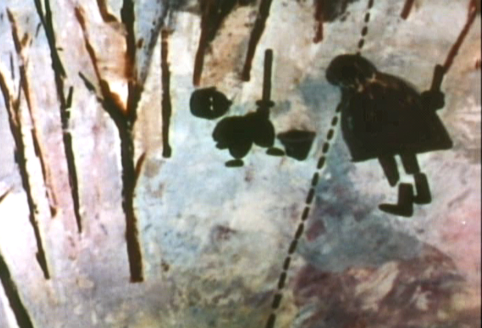
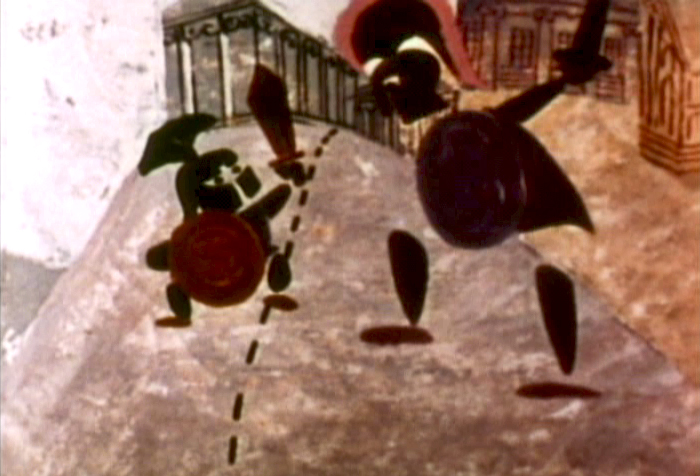
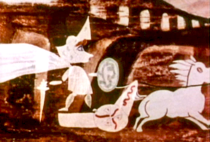
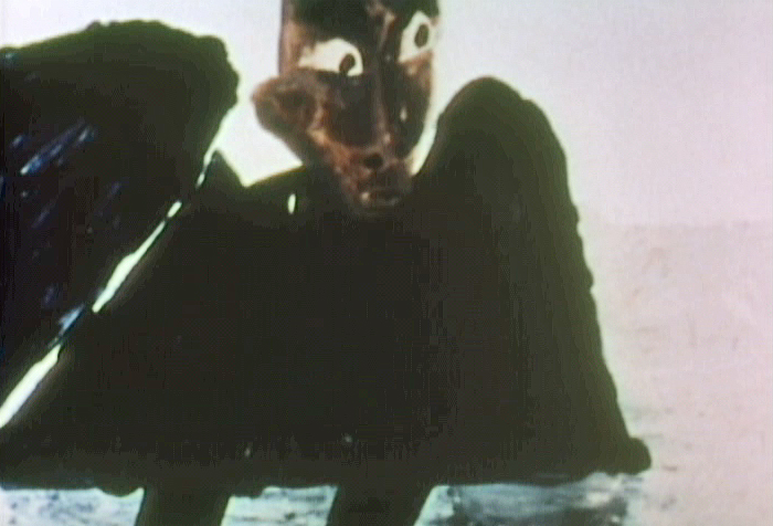
So here, then, is a bit of that storyboard – more from the end rather than the beginning.
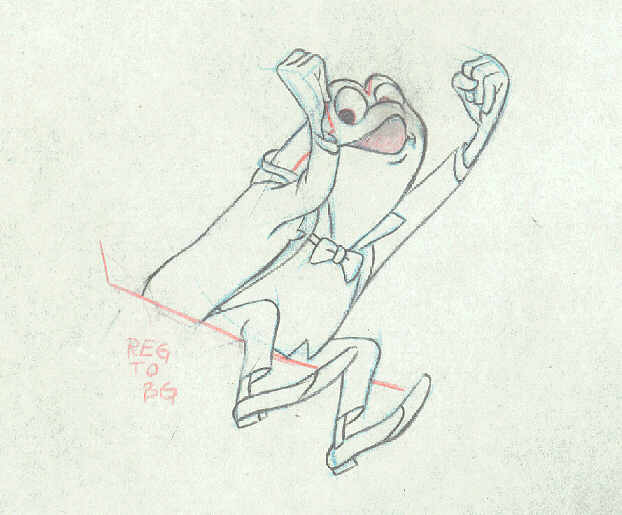
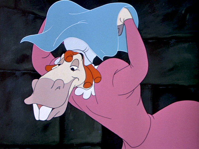
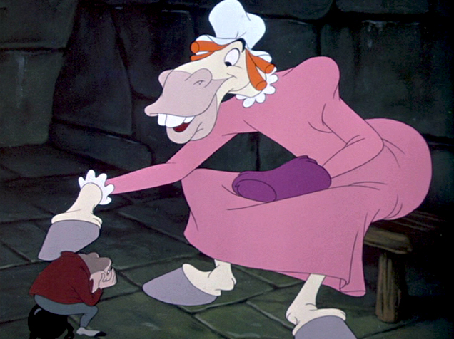
Talented those men were (they could even draw men, a toad and a horse, dressed as women pretending to be women – with very little success.
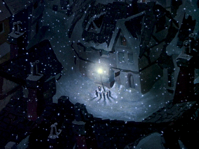
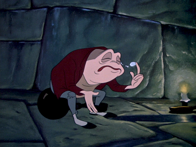
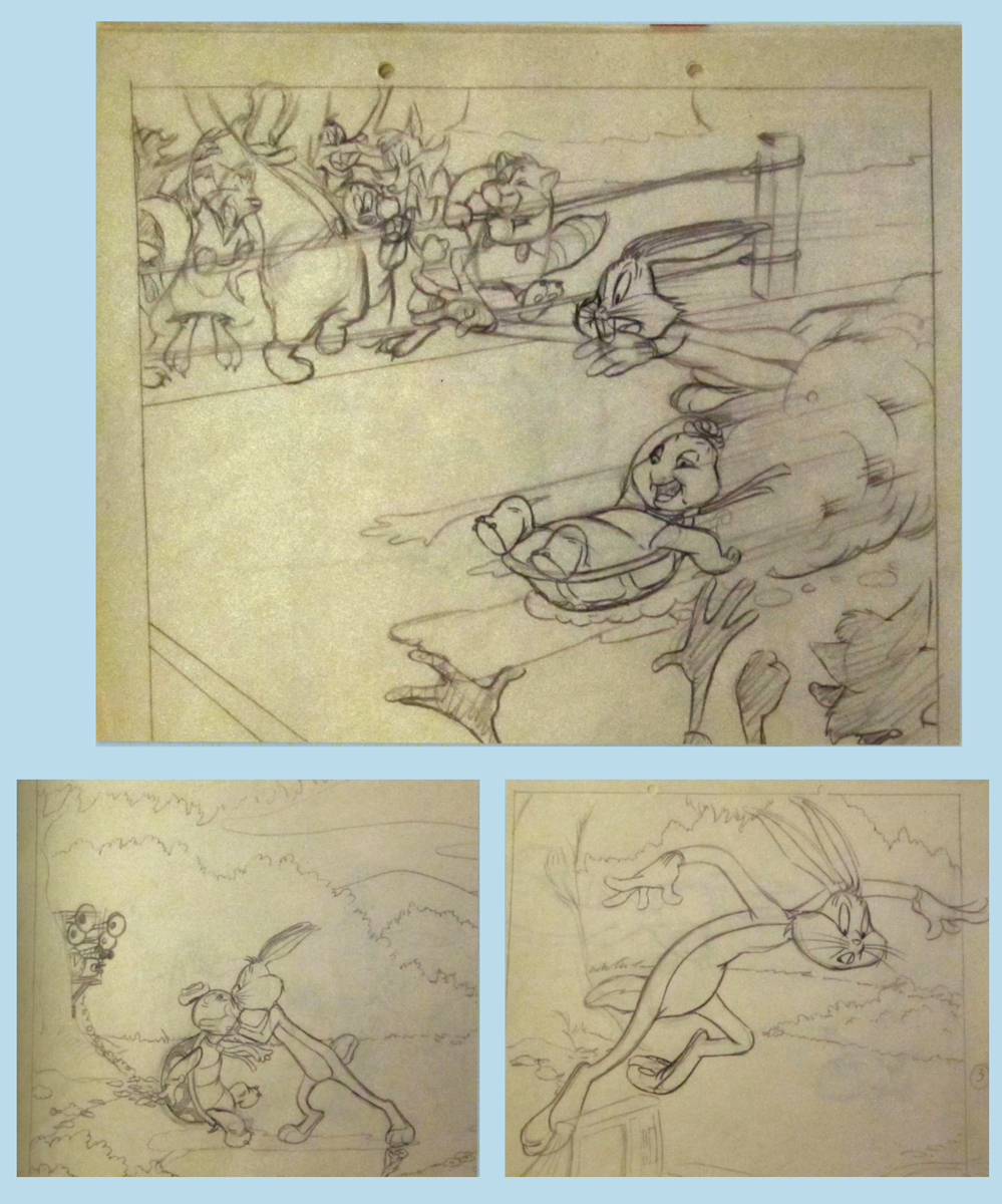
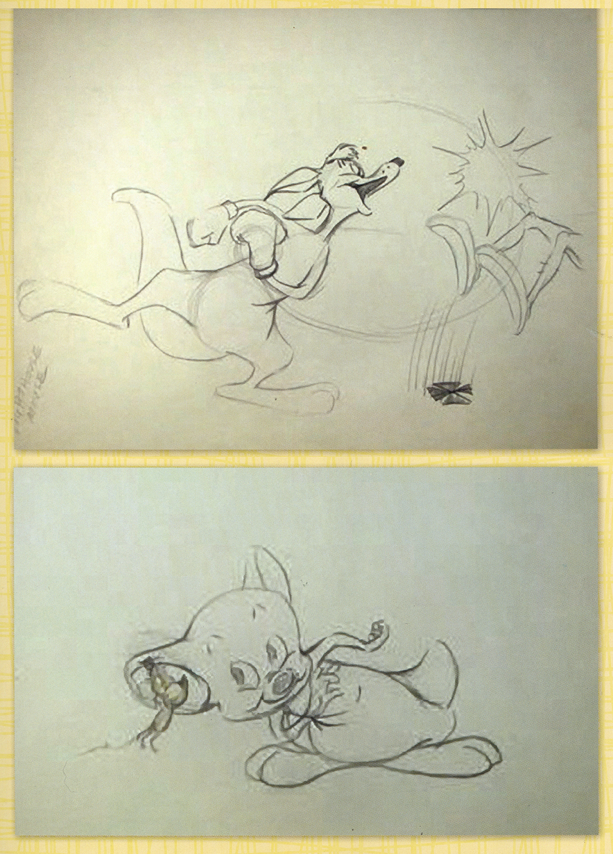
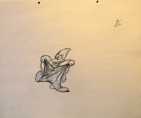
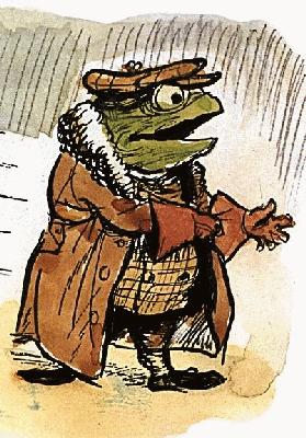 – Probably my favorite children’s book is The Wind In The Willows. There have been many animated adaptations of this book since it became a public domain item, but for years there was only one version, Disney’s Mr Toad half of The Adventures of Ichabod and Mr. Toad. The loudest most raucous parts of Kenneth Grahame’s delicate novel, blared their way onto this animated compilation feature.
We all know that the book was planned as a feature way back when Disney, in the late 30s, was buying up titles of famous children’s books to prevent other competing studios from turning them into animated features. Work began on adapting the book. They never quite broke it as they hoped, and it ultimately became a featurette with its primary focus on the loose cannon, Mr. Toad.
. . . . The film, as it exists now, has some positive elements and some fun animation, but the story was always a bit too quiet and British to successfully survive a proper adaptation in the Disney canon.
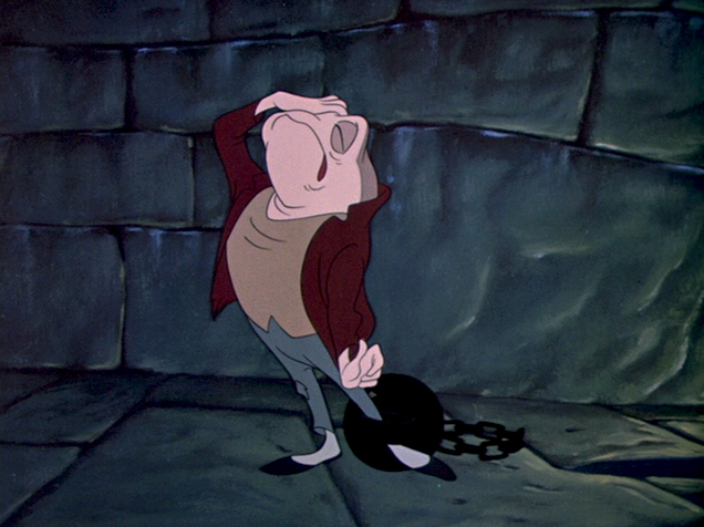
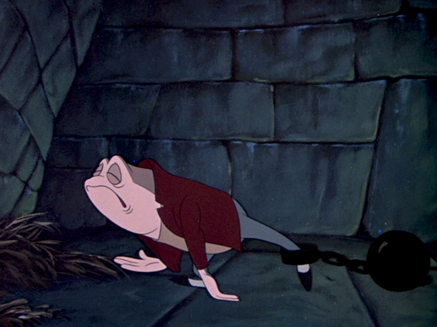
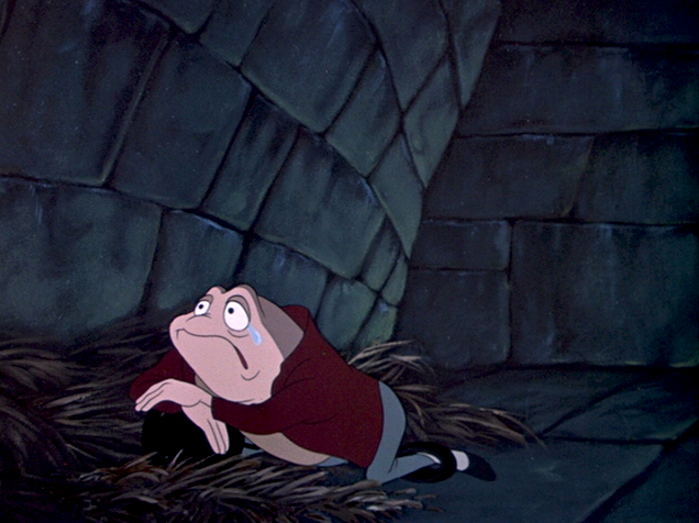
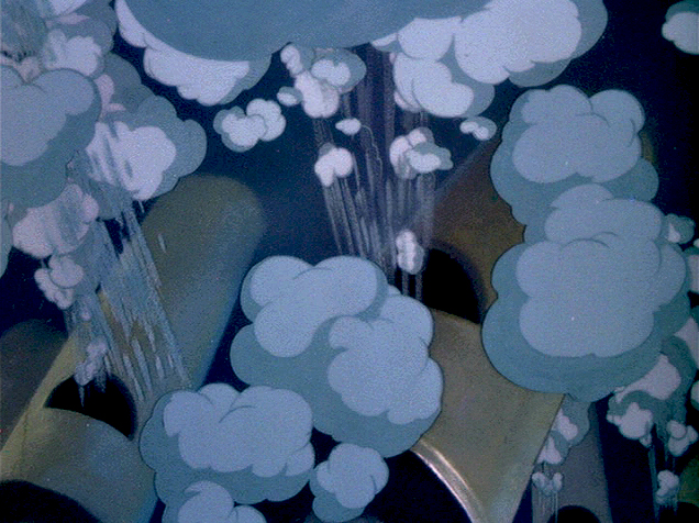
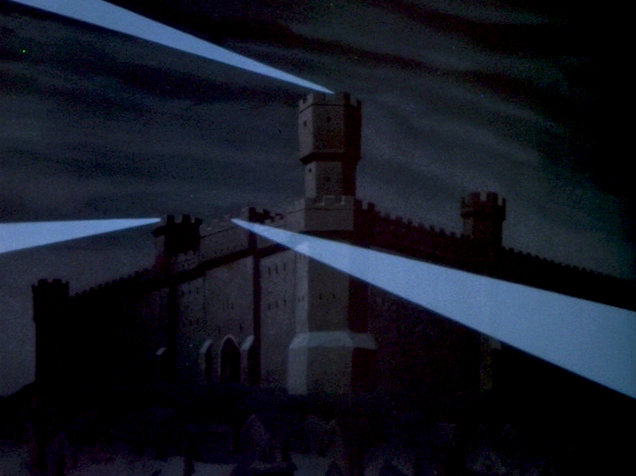
When John Canemaker loaned me his copy of the Pinocchio boards, he also brought The Wind In The Willows (not titled Mr. Toad). There are few captions here, but this obviously is designed for a full-out feature not an abbreviated featurette. The images on his original stats are small, so I’ve blown them up a bit and tried to marginally clean them up.
As suggested by Michael Barrier, this board was probably assembled to produce a preliminary Leika reel. The giveaway is the lack of dialogue and commentary underneath the drawings. The assembly was made to be photographed.
 1
1(Click any image to enlarge.)
 2
2
 b
b
 3
3
 b
b
 4
4
 5
5
 6
6
Disney’s Mr. Toad first aired on the Disneyland television program on February 2, 1955. You can buy the dvd of Ichabod and Mr. Toad on Amazon among other places.
If you’re interested you can read the entire book of Kenneth Grahame’s work (minus the beautiful Shepherd illustrations) here.
You can buy the book here.
Dave Unwin‘s version is my favorite adaptation in that it retains some of the flavor of the original book and isn’t afraid of being quiet at times.
 7
7
 8
8
 9
9
 10
10
 11
11
 12
12
 13
13
 14
14
 15
15
 16
16
 17
17
Animation &Commentary &Independent Animation 22 Jul 2013 04:25 am
A Friend in Lou
- I’ve been thinking a lot about my friend, Lou Scarborough, this past week. So why not write about him? That’s what I’m going to do. Just random thoughts, good and bad, I guess. All just random. I’m sure I’ll have other posts to add to this, eventually.
I met Lou years ago the same way I met a whole core of NY friends and folk.
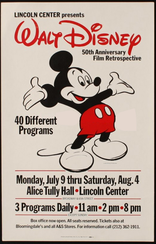 Back in 1978, Disney celebrated the 50th anniversary of Mickey Mouse’s creation. History for a lot of us – I mean, here, the celebration not the creation. The MoMA had a retrospective of all 50 years of Mickey cartoons in chronological order. They started with a bunch of silent Alice in Cartoonland followed by Oswald the Rabbit cartoons. They were shown silent. I mean SILENT – no audio, not even an organ. They ended that first program with Steamboat Willie. Now there was the invention of sound. You could hear it, you could feel it, you knew a new era had begun. Soundies.
Up at Lincoln Center, they were showing all the feature films, animated as well as live action films. Things like Pollyanna and Treasure Island as well as Lady and the Tramp and Dumbo.
The best part, though, was around the corner, daily, at the Library of the Performing Arts. Speaker/Guests included Animators: Frank Thomas, Ollie Johnston, Woolie Reitherman, Designer: Eric Anderson, and John Culhane moderated a bunch of it. They showed clips of a lot of the feature animated films; they told famous stories for the millionth time, they told stories we hadn’t heard before. (e.g. Reitherman wanted the disco ball and the changing colors as the cats of the Aristocats played jazz in the attic. His was not something others wanted in the film. The director got what he wanted including a lot of reuse animation. Reitherman learned something about Xerography other than inking stories during 101 Dalmatians.
Anyway, to get into this series of programs (I’m sure there were four of them) you’d sit on the ground in the hot sun waiting for the doors to open when they handed out tickets. I was working for John Hubley at the time. A lot of the others: Dan Haskett, Tom Sito, Pat Sito, John Lopez, Kevin Petrilak, Bob Lusk, and, of course, Lou Scarborough, all worked at a place called Tele-Tactics where they were paid horrible wages as animators working on something called The Days of Liberty.
Over time, a lot of those people went to Raggedy Ann in a direct route uptown once that studio opened. I was teh first hired there, so I got to watch the influx as animation began.
Lou went with a whole group directly into the Taffy Pit to clean up and inbetween the elaborate and gutsy drawings of the master, Emery Hawkins. Exhausting work but they were all friends and had a group all their own during Raggedy’s world. A new era of sorts had begun – the taffy pit folk. Ultimately, they all moved out to LA, worked at Disney for a bit and at a bunch of other feature studios for a bit.
- I also remember during the late 70′s and early 80′s that Lou Scarborough was closely involved with Wendy and Richard Pini‘s fantasy characters from Elf Quest.
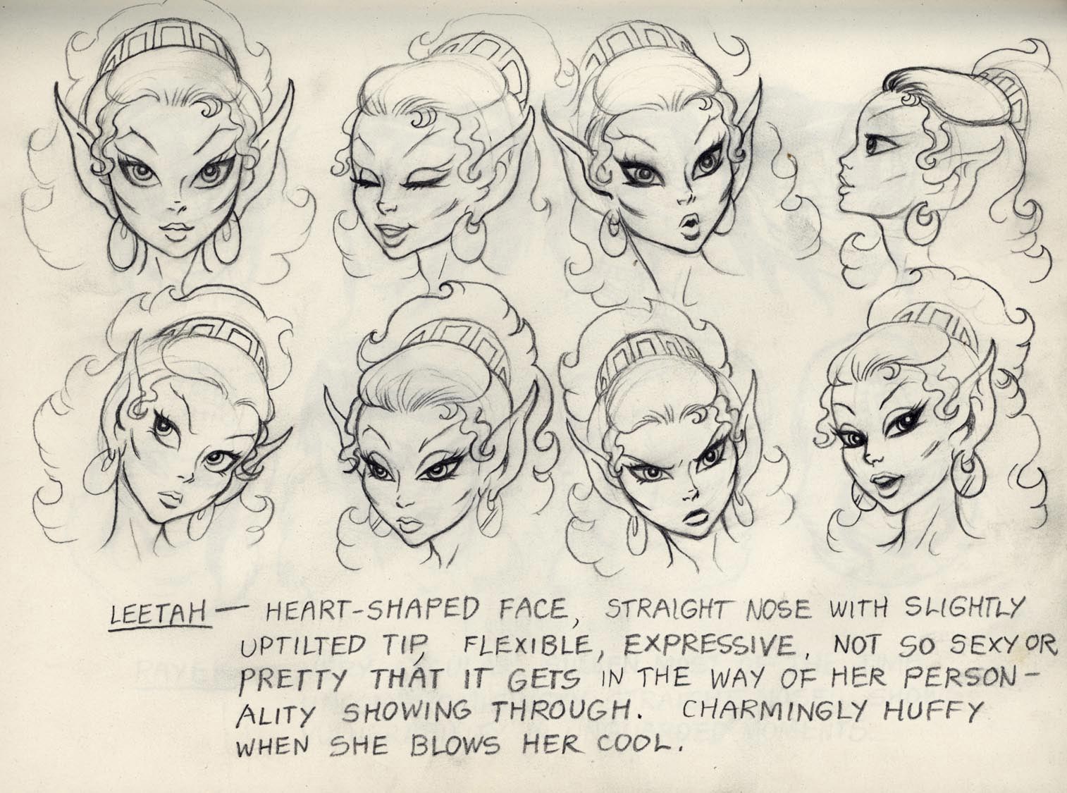
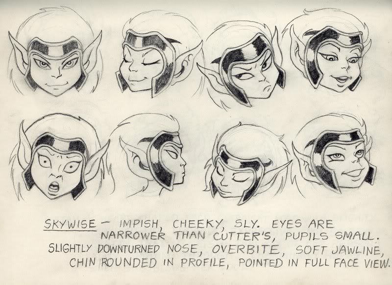
A sample of the Elf Quest art
Along with Dan Haskett and other friends he helped build model sheets and tried desperately to get the comic books animated. I don’t believe much happened with the work, especially after it moved to cgi. In my opinion it lost any magic it had in the 2D cartoon drawings and completely lost everything in the clumsy cgi artwork.
In a way, it seems to me that this art style seriously affected Lou. Though I was certainly not a fan, I did appreciate the hard work all the artists did in putting it together. The whole enterprise, though, seemed like too many other fantasy pieces that were out there.
Lou was one of the last to leave New York City for the West Coast. He did a couple of jobs for me before he left. There were some Sesame Street spots, dances, that he animated. Then there were a couple of episodes of a show called Brain Games done before Sheila Nevins moved in and took over at HBO. I did about 45 minutes of the six half hour shows Sheila produced with Jeff Schon as co-producer. . It was all fun work. Lou animated a centurian and oddly he had the guy move wildly from the forth pose to the fifth. There was an enormous surprise when this character moved, so traditionally drawn, and moved beautifully. The large
 arc worked for the character and found me imitating Lou’s move more than once in future scenes. A peculiar layout that worked so well. I was the only one who noticed it and the only one who worried about it. No problema, it worked.
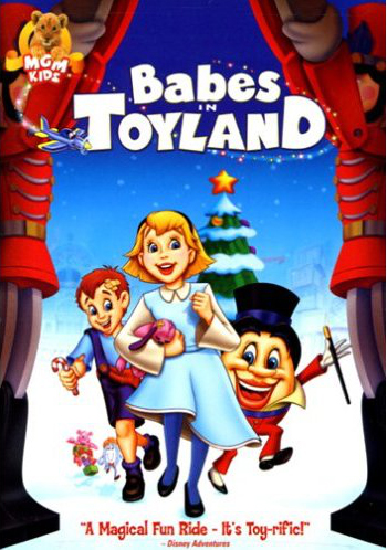
Lou moved to LA and worked on various business out there. He did a number of MGM musicals for home video. Things like Babes in Toyland, The Quest for Camelot, as well as The Adventures of Sonic the Hedgehog.
In the end, Lou ended up without money but still a lot of dreams. Now he’s fighting cancer in a hospital at a young age. Life’s tough, and I’m watching my friend closely. I hope his luck gives him a couple of good breaks.
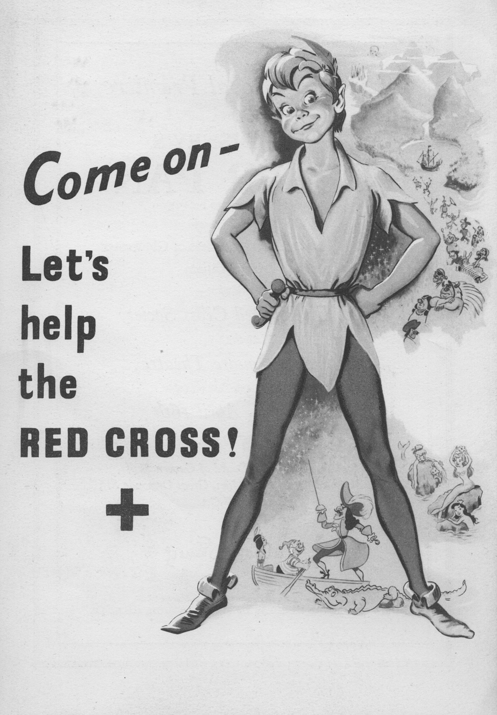
Animation &Books &Comic Art &Disney &Guest writer &Illustration 11 Apr 2013 05:09 am
Peter Hale’s Peter Pan
About six weeks ago, I was contacted by Peter Hale in the UK about a “strip book” of Peter Pan that was published in England to tie into the original release of the movie. Peter sent me some beautiful scans of the artwork in the book, and I posted it (here.)
Mr. Hale promised a second book that was also published at the time.
It turns out he has done some extensive research into the subject of the books in conjunction with the Disney film. This week, I received a complete breakdown of all the “Pan” books that were published in the UK, and the scans for another book. I’ve decided that I really have to post what Peter has written; it’s that extensive. I’ll follow up with another post of the books scanned.
Many thanks to Peter Hale for sharing this fine work with the “Splog” and its readers.
The rest of this post is over to Peter Hale who writes:
 My (superficial) research into the Disney-illustrated books of Peter Pan published
in the UK in 1953 has wandered off on several tangents.
Firstly a rough chronology of the development of the original book, and the Disney
film:
1902 – Barrie’s fantasy novel (for adults) The Little White Bird includes a sequence that
features Peter Pan, a 7-day-old baby who flies away from home so that he will never
grow up, and, after learning that he is not a bird, and therefore can’t fly, is
adopted by the faries in Kensington Gardens.
1904 – Barrie expands the idea of Peter Pan into a play, to great success.
1905 – The chapters from The Little White Bird that feature Peter Pan are republished for
children as Peter Pan in Kensington Gardens by his publishers, Hodder & Stoughton,
to cash in on the play’s popularity.
1911 – Because of the demand for Peter Pan products, Barrie publishes a novel based on the
play. He adds a coda wherein Peter promises to return each spring to take Wendy back
to Neverland to do the Spring Cleaning. But he starts to miss years, until he has
forgotten her altogether. Wendy grows up and has a daughter of her own. One day
Peter returns for her and is distressed to find that she is too old to fly away. But
he soon meets her daughter Jane and so takes her to Neverland, and when she grows
old, her daughter Margaret will take over – because he does need a mother.
1915 – Hodder & Stoughton publish an abridged version of Peter Pan for younger children,
written by May Byron with Barrie’s approval. They title it Peter Pan & Wendy.
1921 – A version of May Byron’s adaptation “retold for Little People” is published, with
illustrations by Mabel Lucie Attwell at Barrie’s request. Her drawings of babylike
characters presumably matched Barrie’s vision.
1929 – Barrie donates all the rights to ‘Peter Pan’ to the Great Ormond Street Hospital for
Children.
1935 – Walt Disney plans to follow Snow White with Peter Pan, but has difficulty securing
screen rights from Great Ormond St Hospital.
1939 – Having finally secured rights to make an animated film version, the Disney studios
schedule Peter Pan to follow Bambi and Pinocchio.
1941 – The entry of the US into WWII forces Disney to postpone productions.
1947 – The Disney Studios put Peter Pan back into production.
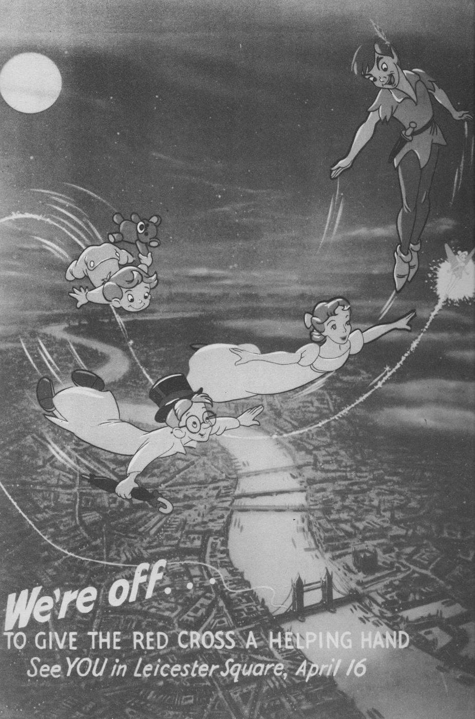
1953 – February 5th: Walt Disney’s Peter Pan premieres at the Roxy Theater, New York.
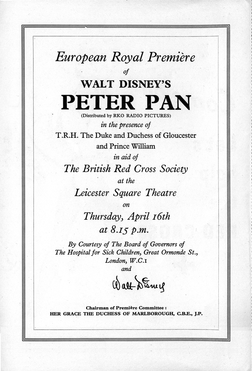
1953 – April 16th: Walt Disney’s Peter Pan has its UK premiere at the Leicester Square
Theatre, London.
1953 – May: Walt Disney’s Peter Pan is shown at the 6th Cannes Festival.
1953 – July 27th: Walt Disney’s Peter Pan goes on general release in the UK.]
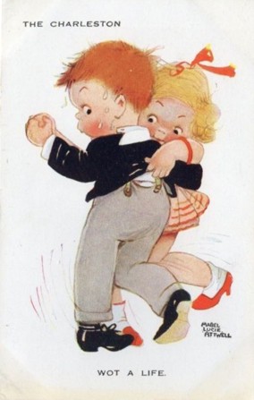
Through the 40s her characters became ever more chubby, stunted and stylised, but in 1915 she was still starting out as an illustrator.
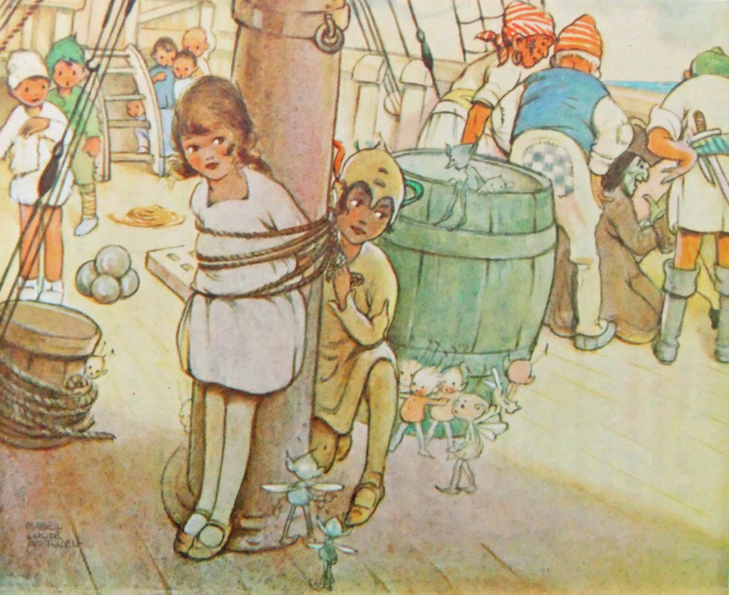
Here is her version of Peter freeing Wendy from the mast.
The illustrations she did then became almost as much part of the May Byron version of “Peter Pan and Wendy” as Tenniel’s were part of “Alice”, and it was still being published in 1980. A reprint of the 1921 edition was published in 2011.
Which brings us to the versions of Peter Pan published in the UK in 1953.
Jacqueline Rose, in her book “The Case of Peter Pan”, lists the following six books published in the UK that year:
- Barrie, J. M. Peter Pan in Kensington Gardens, illustrated by Arthur Rackham, ‘Peter Pan Books’ (from 9 years) (London: Hodder and Stoughton, I953)
- Bedford, Annie N. Disney’s Peter Pan and Wendy, ‘Peter Pan Books’ (London: Hodder and Stoughton, I953)
- Byron, May. Peter Pan in Kensington Gardens, illustrated by Arthur Rackham, ‘Peter Pan Books’ (for 6 to 8 year olds) (London: Hodder and Stoughton, I953)
- Byron, May. The Walt Disney Illustrated Peter Pan and Wendy, ‘Peter Pan Books’ (for 8 to 9 year olds) (Leicester: Brockhampton Press, I953)
- Pearl, Irene. Walt Disney’s Peter Pan, retold from the original story by J. M. Barrie, ‘Peter Pan Books’ (for 3 to 6 year olds) (Leicester: Brockhampton Press, I953)
- Winn, Alison. Walt Disney’s Peter Pan, retold from the original story by J. M. Barrie ‘Peter Pan Books’ (for 6 to 8 year olds) (Leicester: Brockhampton Press, I953)
as opposed to just one in 1952:
- Byron, May. Peter Pan, retold for the nursery, illustrated by Mabel Lucie Attwell, ‘Peter Pan Books’ for 3 to 6 year olds) (Leicester: Brockhampton Press, I952)
Two of these are versions of the Peter Pan in Kensington Gardens ‘origin’ story, which Disney had decided not to include in the film.
The remaining 4 are all “Illustrated by Walt Disney”. The Irene Pearl version is the strip book already posted, and scans of the May Byron book and the Alison Winn “Little Book” will follow. These all follow the Barrie novel rather than the Disney film, although with different simplifications and omissions.
The Annie N. Bedford book is one I have not been able to trace – she is the American author who wrote the Golden Books version of the Disney film, so this could be a UK publication of that book. It is given as published by Hodder & Stoughton, Barrie’s original publisher. The back cover of the Brockhampton ‘Little Book’ lists a different Hodder & Stoughton book.
“J. M. Barrie’s original Peter Pan and Wendy for older Boys and Girls, with illustrations by Walt Disney”. I have not been able to trace a copy of either book. These two books represent the two ends of the spectrum:
Barrie’s original text and the story of the film.
Finally there is the complication of Dean & Son’s Walt Disney’s Peter Pan, from the motion picture, a book of the film. This has no publication date. The illustrations are given as copyright Walt Disney 1953, but this is not a guide to the publication date, as Disney did not own the publishing rights and so the illustrations were always copyrighted to 1953, the year of the film’s release. It is probable that the Dean book was published later than 1953.
It is published ‘by arrangement with Hodder & Stoughton’, which either means it may be a reprint of the Bedford book, or just an acknowledgement that Hodder held the publication rights to Peter Pan.
In contrast I can only find one UK ‘Disney’s Alice in Wonderland‘ book that might have been published in 1951, and certainly no Carroll text with Disney illustrations.
So why so many Peter Pans? The UK’s wartime paper rationing ended in 1950 so that would not be an issue.
Was it because Disney did not have the publishing rights, so this collaboration was necessary to promote the film?
Was it just, as I’d thought previously, that the British might object to tampering with the story? Or was Disney just trying to overcome the sort of criticism that his Alice had suffered in the UK (that it was too Americanised and not sufficiently true to the book) by linking his film to the original text?
Comparing the 3 Brockhampton books the illustrations are all different, and by different hands it would appear, but all show fidelity to the Disney style. I am assuming that these illustrations were done by British illustrators specially for the books, as where the illustrations differ from the film the artists seem to have consulted the particular text they are working with for details.
Hence the May Byron text describes the adding of a shoe as a knocker, and John’s hat as a chimney, and the illustration shows the hat, although it also shows Wendy watching the building from outside, which is quite wrong!
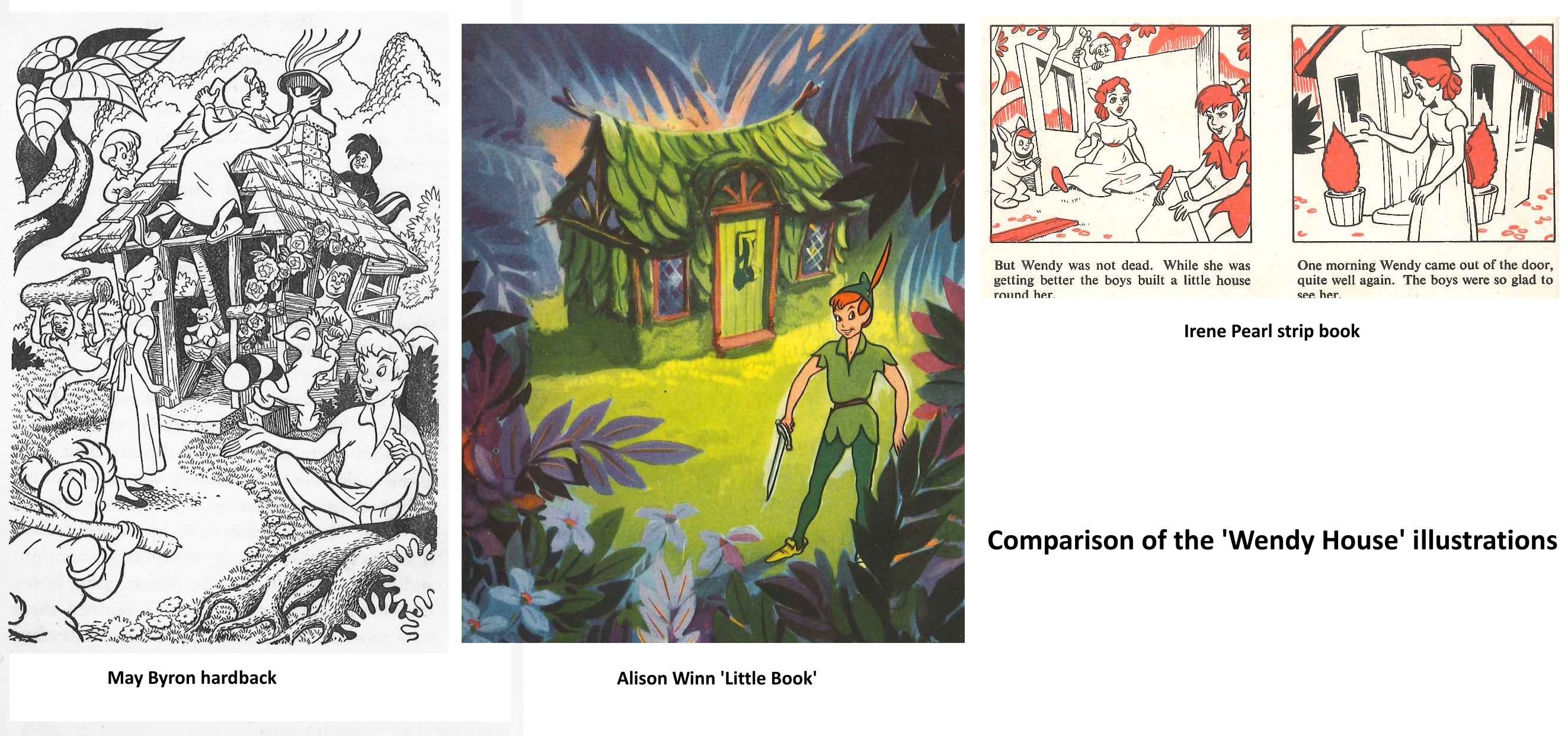
The marooning of Tiger Lily is done in the book by two pirates, with Hook turning up
later.
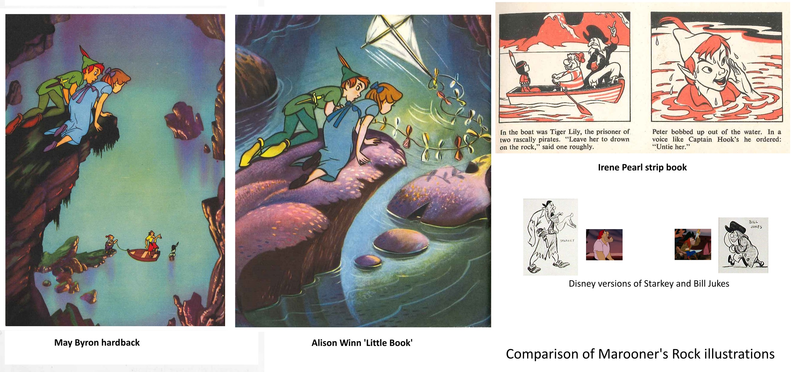
In the May Byron book they are named as Smee and Starkey, and the
illustration has Hook replaced by a likeness of the Disney Starkey (but with a
yellow shirt instead of pink). The strip book doesn’t name the pirates and Hook is
here replaced by Bill Jukes. The Alison Winn version omits the marooning of Tiger Lily entirely and just has Hook turn up to attack Peter.
All three books have Wendy exhausted and Peter injured after the encounter – both
stranded on the rock unable to fly back. John’s kite collects Wendy, while Peter is
rescued by the Never bird, whose floating nest serves as a boat. The Winn ‘Little
Book’ uses a version of the shot of Peter and Wendy watching Hook and Smee from on
high, but without the pirates, truncated to appear a low rock, and with a kite added
in.
This brought me to wonder how much Disney reference they were given, and what it
consisted of. Many of the scenes are close to shots from the film. But a look at the
Dean book, which seems to be taken directly from colour stills, shows that these are
not actually shots from the movie.
Anyone who has ever tried to put together presentation scenes from the cels of an
animated film knows that there are always problems – the best pose is poorly traced,
or one character is in an ungainly inbetween position – whatever, that perfect key
image from the storyboard just isn’t there in the actual film, where, deliberately,
nothing hits a strong extreme at the same time.
Hence it appears that the lobby card stills or coloured transparencies that Disney
circulated in their press packs etc. had been specially recreated – a lead animator
had redrawn the characters from various key frames as they ought to have looked, and
these drawings had been traced and painted on cel with extra care, and combined with
a new version of the background to be photographed by a stills camera. (I presume
the composites then went up on someone’s wall!) The same thing, of course, as the
re-posing of key scenes that is typically done by a stills photographer on the set
of a live action film after it has been shot.
The illustrators appear to have had coloured stills and model sheets to work from.
Does anyone know how much reference was supplied? Walt Disney Studios had an office
in London specifically to deal with promotion, distribution, licensing artwork etc.
Did they do artwork for any of the books – or just supply references?
Lastly, the curator of the Great Ormond St. Children’s Hospital Archives has kindly
sent me these scans relating to the London Premiere of Peter Pan on 16th April 1953
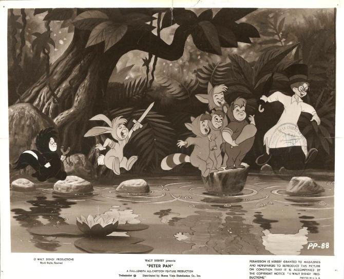
It’s worth taking note that Hans Perk has recently posted the animators’ drafts from the Disney film, Peter Pan. Go here to read and/or collect them.
Animation Artifacts &Commentary &commercial animation &Layout & Design &Models 12 Mar 2013 03:43 am
Larry Riley Recap Plus
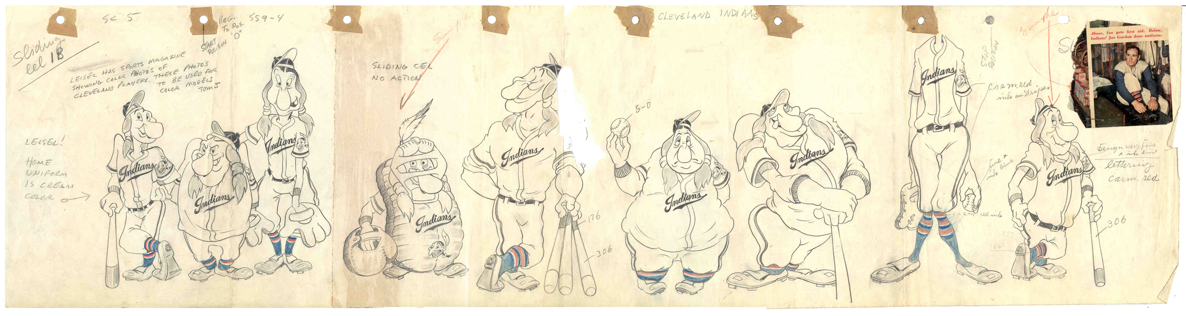
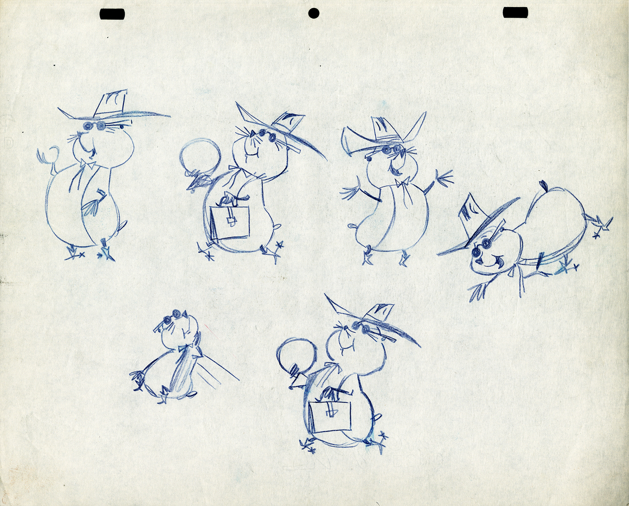
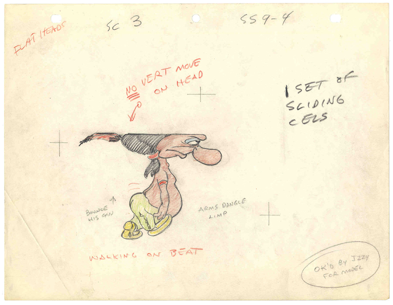 In celebration of the new season of baseball I have a couple of model sheets from a Paramount cartoon.
Larry Riley, a story writer, gave me these drawings back in 1972, but he never told me the film’s title. Thanks to Thad Komorowski and Bob Jaques – both left comments when I originally posted hese in 2007 – we know the drawings come from Heap Hep Injuns (1950).
______________(Click images to enlarge.)
Larry Riley was a wild guy. On my first commercial job at Phil Kimmelman & Ass. he and I were the inbetweeners working side-by-side on some of the Multiplication Rock series. Larry had had a long and busy career in animation.
He had been an asst. animator at Fleischer‘s, a story writer at Paramount, an animator at many studios. Like many other older animators, he ended up doing anything – including inbetweening at Kimmelman’s for the salary and the u-nion benefits.
The stories Larry told me kept me laughing from start to finish. There was no doubt he had been a writer for years. In a not very exciting job, it made it a pure pleasure for me to go to work every day to hear those hilarious stories. I can’t see Lucky 7 without thinking of laughing. It wasn’t the stories per se that were funny, it was his take on it.
Larry told me of his years at Fleischer’s in Florida where he was an assistant. He and Ellsworth Barthen shared a room, and, according to Larry, had lined one of the walls of their room with empty vodka bottles. Now, I’ve heard of frats doing this with beer cans, but doing it with vodka bottles requires some serious drinking. One of the many times I got to work with Ellsworth, I asked him about the story, and he reluctantly backed it up telling me what a wild guy Larry was.

Ellsworth was an interesting character in his own right. There were a group of lifetime Assistant Animators in New York when I started out. This is what they did and all that they aspired to do. They liked the steady work and didn’t want heavy pressure. Those I can name, off the top of my head, were: Helen Komar, Jim Logan, Gerry Dvorak, Tony Creazzo, Eddie Cerullo, Joe Gray, and Vincent Barbetta. They all have interestng stories I could tell. Maybe another time.
Ellsworth Barthen was one of these permanent Asst. Animators. He had his work life and he had his play life. Ellsworth lived in New Jersey with his brother and spent much of the time in his garden growing orchids. He had specialty breeds of orchids that he’d grow and enter in flower shows. Ellsworth loved it.
The other thing he loved was performing as Franklin D. Roosevelt. Just about everywhere he went, he took his pince-nez and would pop it on his eyes and go into character. Now I was born after Roosevelt had already died, so I couldn’t tell you if Ellsworth had been doing an accurate impersonation, but I saw him do it pretty often.
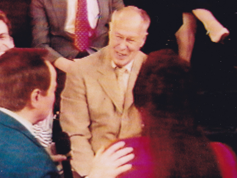
Ellsworth appearing on the Joe Franklin Show in NY
as Franklin D. Roosevelt. Joe Franklin is bottom left.
At Grim Natwick’s 100th Birthday Party in LA, Ellsworth came in character and stayed there all night. He was basically a big and shy guy, but this Roosevelt impersonation would bring him out and loud. Very curious character.
Back to Larry Riley:
________Forgive the racist pictures, but I guess they’re a product of their times.
Larry also told of a 3D process he’d developed for Paramount in the 50′s when the movies were all going 3D. I believe there were two Paramount shorts done in this process: Popeye: The Ace of Space and Casper: Boo Man. Larry offered to give me the camera on which he shot these films – he had it stored in his basement. He was afraid it would get thrown out when he died. I didn’t have room for it.
My regret; I still hear the sadness in Larry’s voice.
(When I originally posted this in 2006, Larry’s grandson, John, wrote to tell me that another collector took possession of the camera and kept it from destruction.)
The animator who drew these is Tom Johnson (he signs the second one), and they were approved by the director Isadore (Izzy) Sparber per the first one.
The drawings are deteriorating, obviously. The pan above uses a lot of glue to hold it together, and that’s eating away at the paper.)
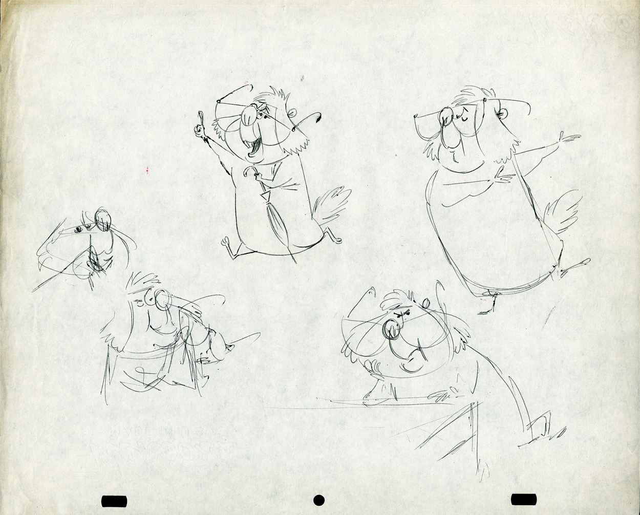
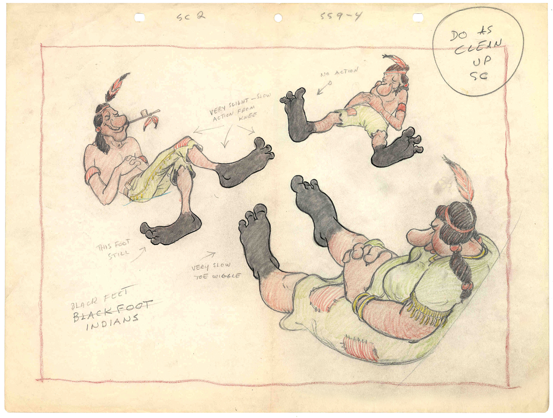 – This is the final model I have from Heap Hep Injuns a 1950 Paramount cartoon. Tom Johnson drew this image, prior to animating it, and Izzy Sparber directed the film. I’d heard some stories about I. Klein regarding this film, though he’s not credited, so I suspect he may have had something to do with model approvals, as well. Actually, he may have been the “Izzy” referred to on the pan posted yesterday.
______________(Click images to enlarge.)
I was never a big fan of the Paramount cartoons. Growing up in New York, we’d always get Paramount or Terrytoons shorts playing with features in the theaters. Only rarely did a Warners cartoon or a Disney short show up. (I don’t think I saw a Tom & Jerry cartoon until I was 17 when they started jamming the local TV kidshows with them.)
Saturdays there was always the placard outside the theater advertising “Ten Color Cartoons”. A haughty child, I naturally wanted to know why they didn’t show B&W cartoons – that’s what we saw on television, and I usually liked them more. I must have been insufferable for my siblings to put up with me.
The starburst at the beginning of the Mighty Mouse cartoons always got an enormous cheer in the local theaters. I don’t remember ever hearing that for the Popeye or Harveytoons.
(I love that if you go on a “Google search” for images of Larry Riley, you get dozens of title cards from Paramount cartoons. Go, Larry.)
Animation &Animation Artifacts &Bill Peckmann &commercial animation &Illustration &Models &Story & Storyboards 30 Jan 2013 08:26 am
More Misc Commercial Art
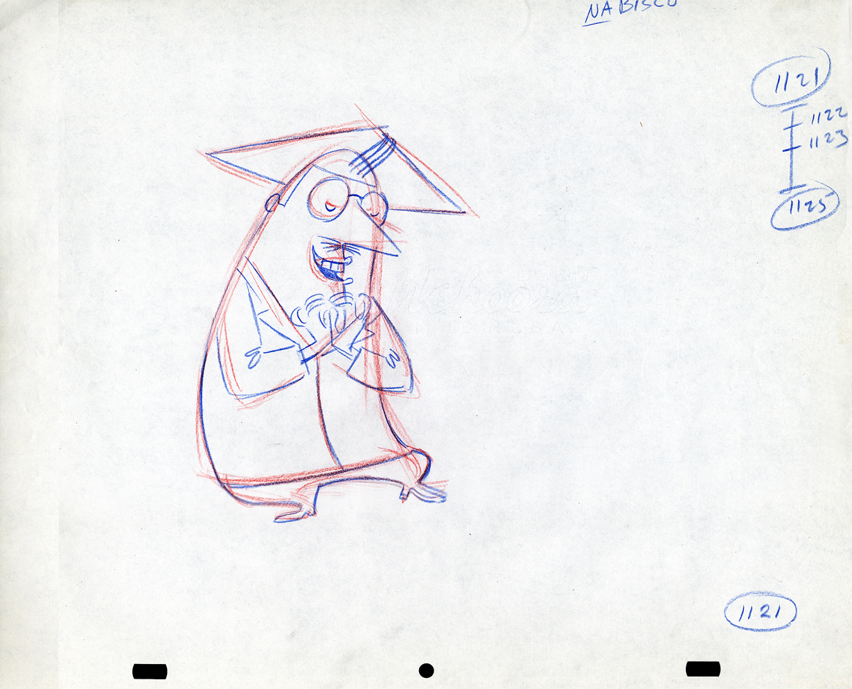
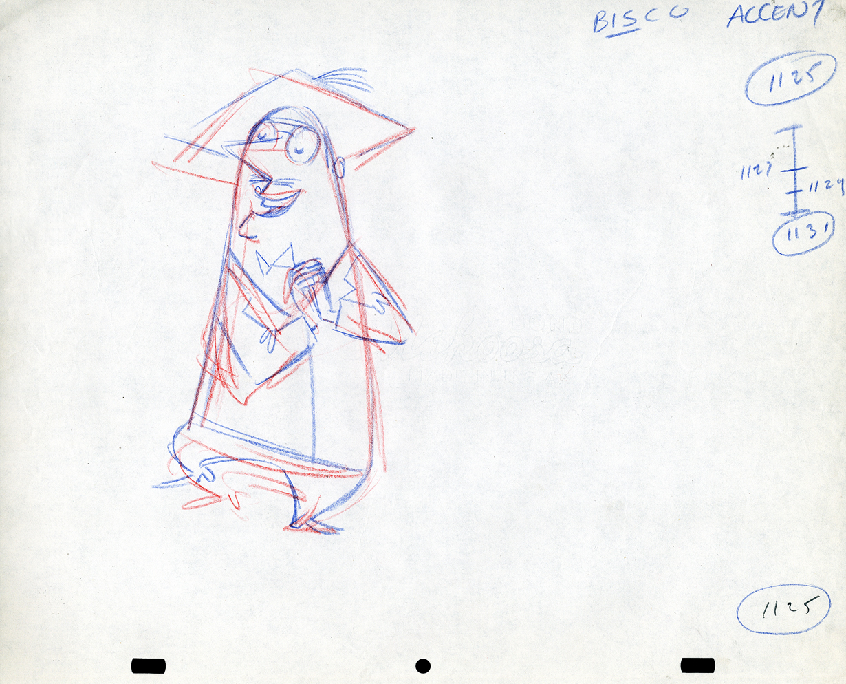
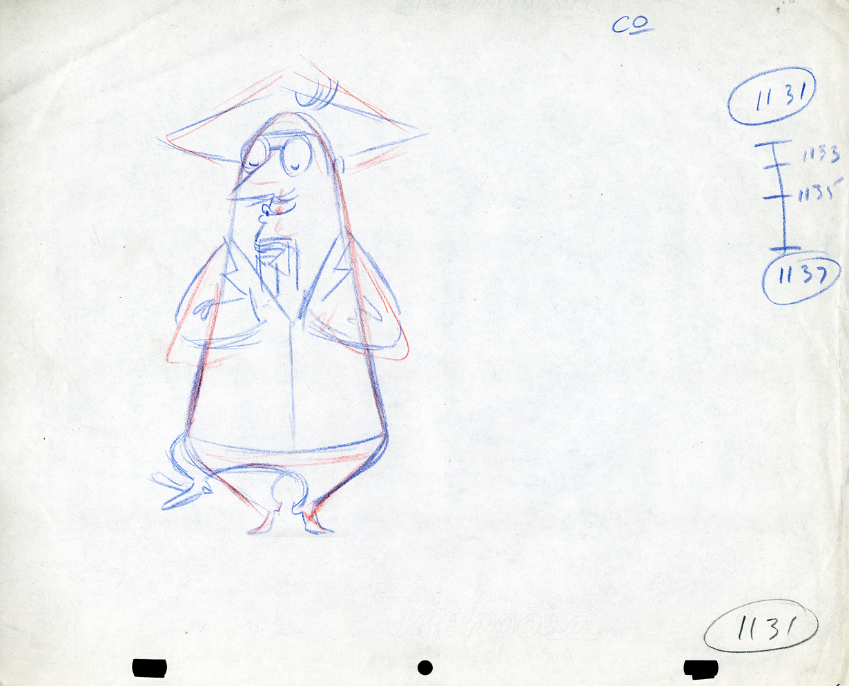
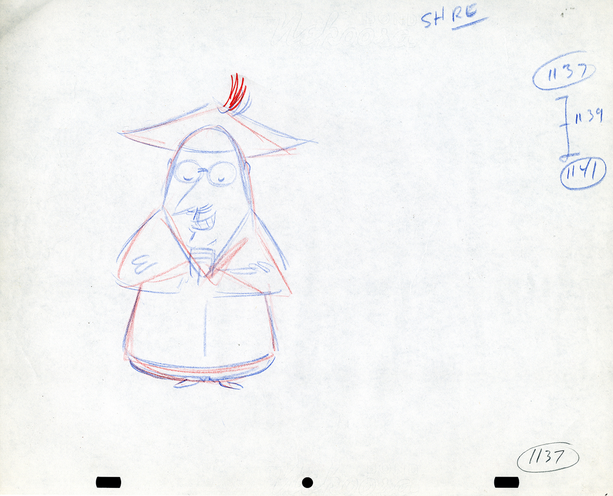
- Still left in the Vince Cafarelli collection of drawings from commercials he did, most probably, at Goulding-Elliott-Graham (for the moa part) are the drawings below. We know through some small bits and pieces of information what a couple of the sponsors were. (The wording of dialogue the professor speaks that the sponsor is Nabisco Shredded Wheat; the lion and the mouse ad is obviously for Vicks – drops or vap-o-rub.) However, too many other bits leave us empty handed. I can recognize cartoonist, Lou Myers‘ work anywhere, but no clue what they’re for. Candy Kugel and I were also able to delineate Lu Guarnier‘s drawing style (Vinnie was his assistant for years), and I know Jack Schnerk‘s great work. I recognize the brilliant and great hand of George Cannata from similar work that Bill Peckmann had recognized (see here) in a past post. So it is great to learn as much as we can, even though there’s a lot of guesswork in it.
The following are three storyboard drawings by cartoonist Lou Myers for some spot:
 1
1
 2
2
 3
3
The following drawings are for Nabisco Shredded Wheat. They’re animation drawings/ruffs by Lu Guarnier. The delicate pencil lines of these years turned into dark rougher ones in his later years. The timing charts were always the same right out early wB years. You’ll notice a lot of quarters and thirds in the breakdowns. This is something you’d never see from Disney. There, everything is broken into halves and halves again and again.
 1A
1A
 1B
1B
 1C
1C
 1D
1D
 1E
1E
 1F
1F
 1G
1G
 1H
1H
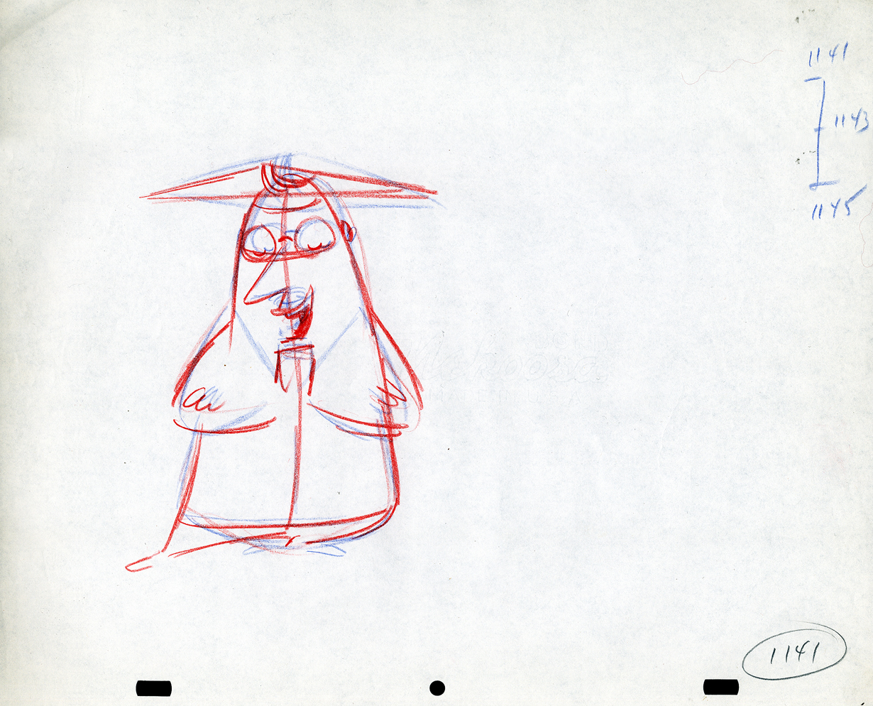
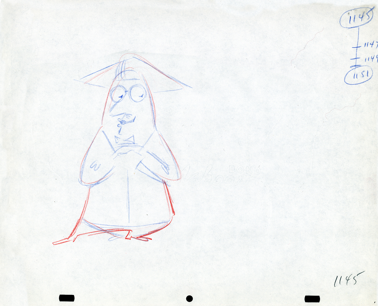
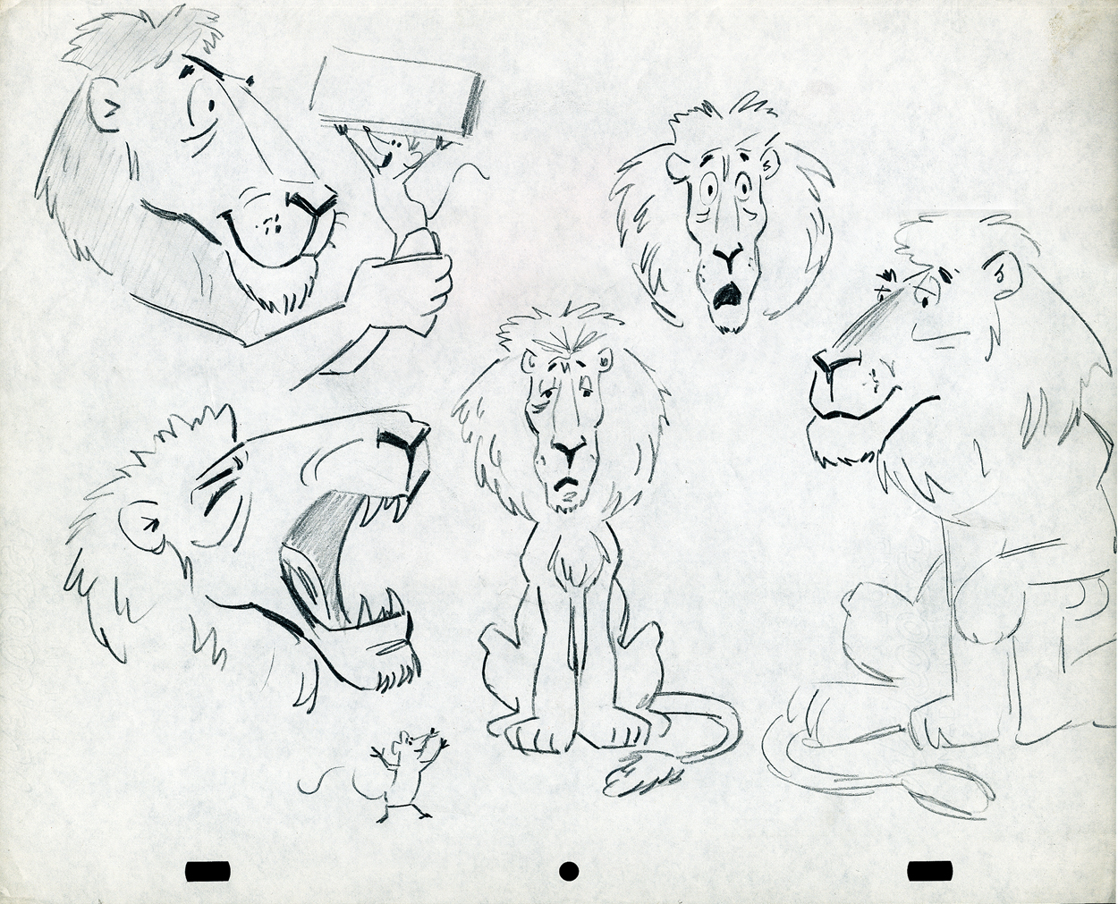
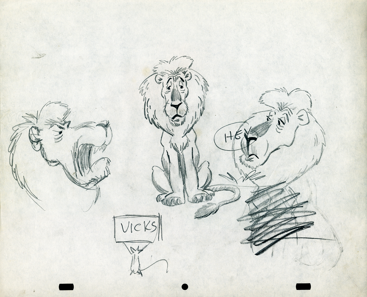
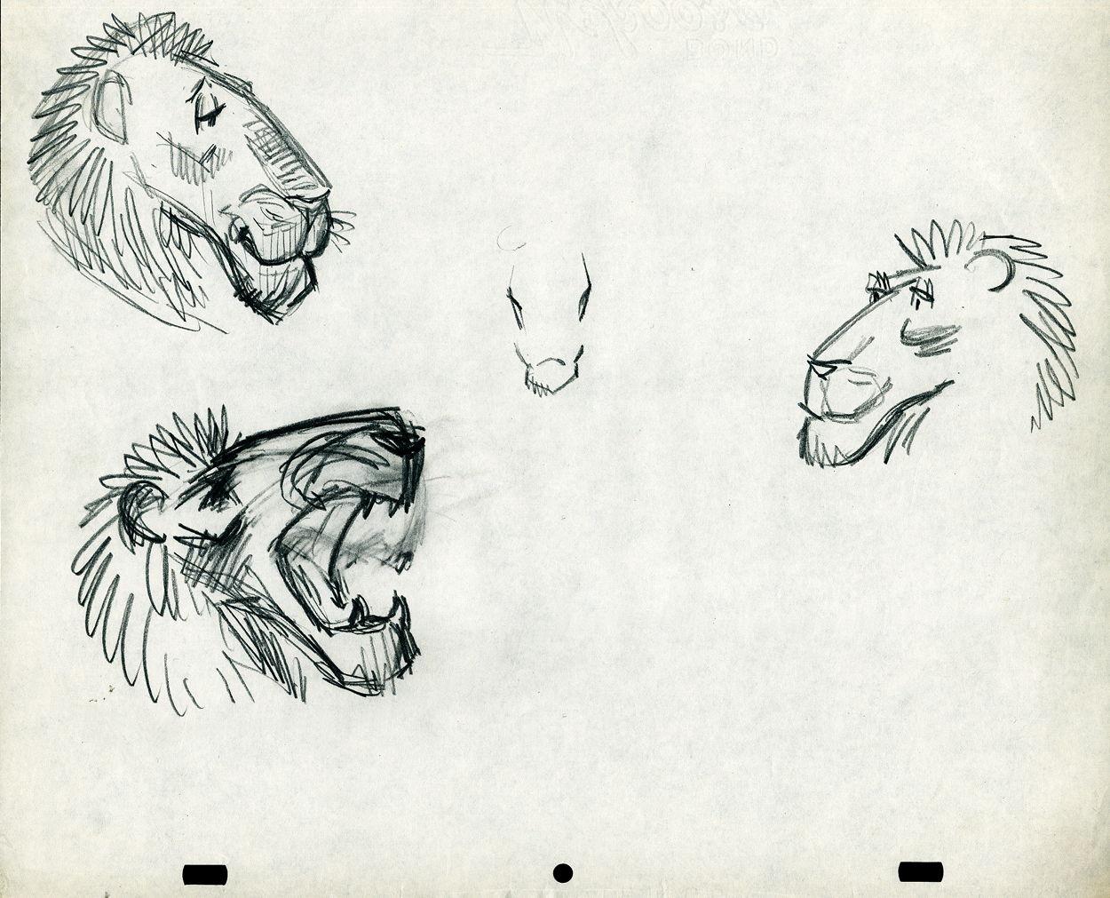
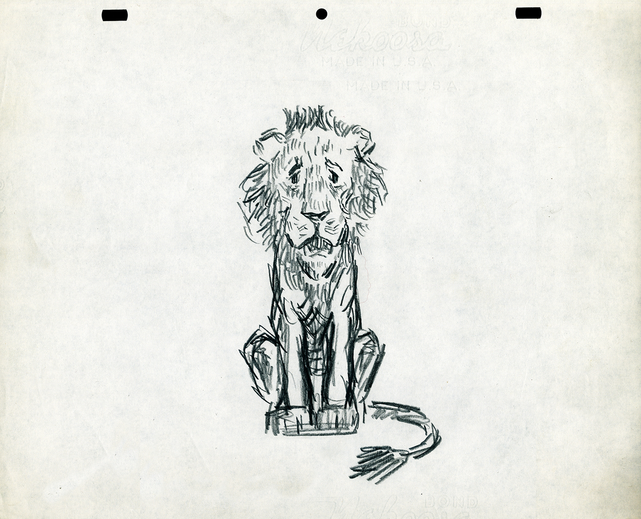
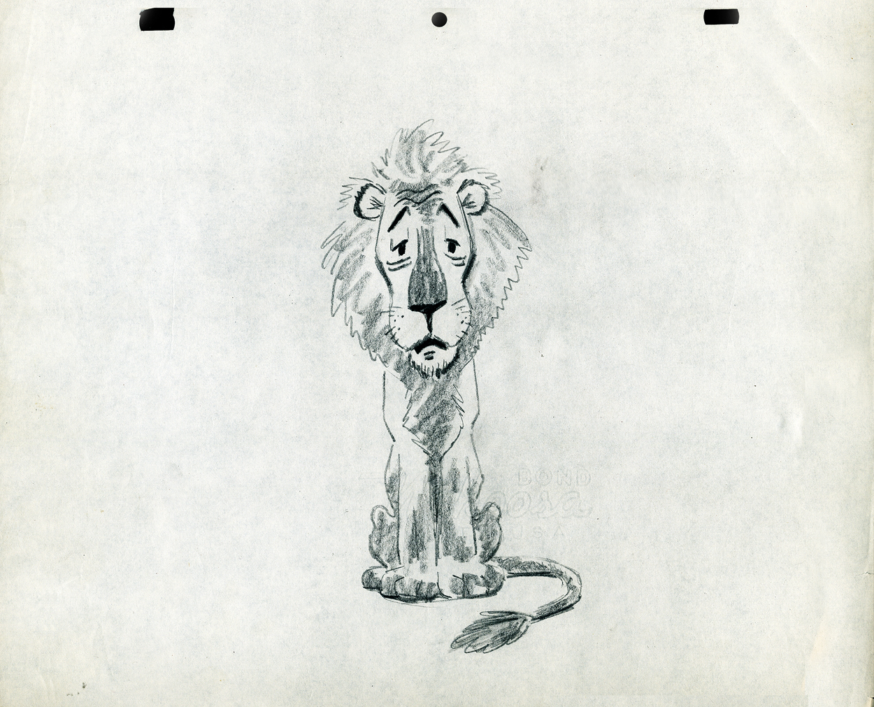
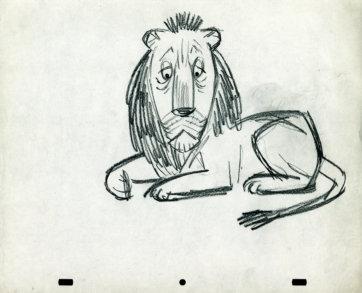
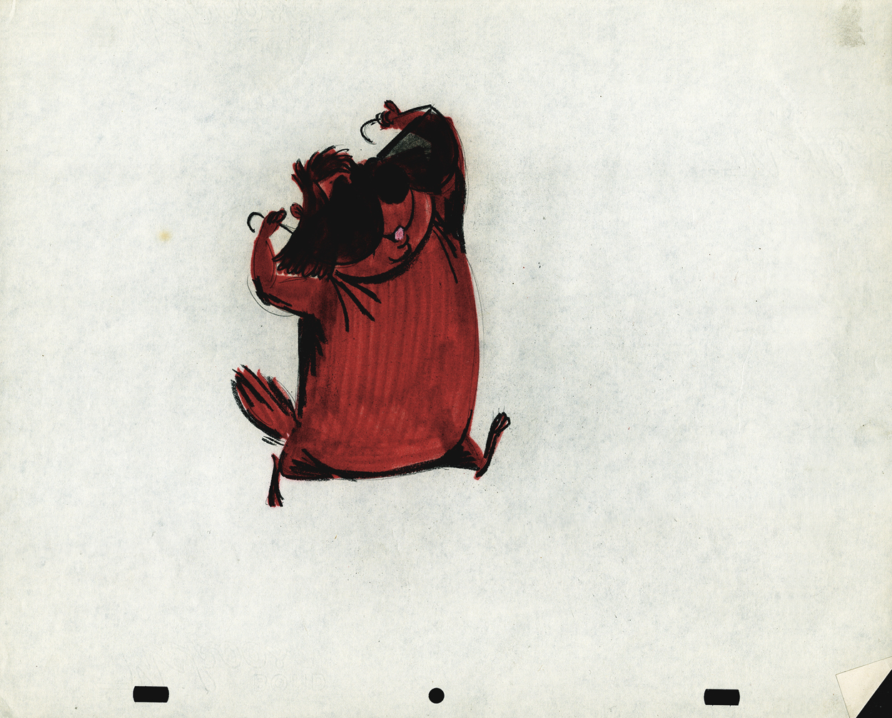
- The following lion is designed and animated for a Vick’s commercial. (Note the second model sheet.) There were quite a few commercials during the period that reworked this great Aesop tale for the sponsor’s use. The lion obviously has a cold. Rather than pulling out the thorn, the mouse introduces him to Vicks’ cough drops and the lion feels a whole lot better.
What has been left behind of this ad includes a couple of model sheets of the lion as well as a couple of animation drawings. I don’t know who the designer is, but the animation drawings are most definitely the work of Jack Schnerk. I suspect all the drawings here are by Jack. He probably kept reworking the model sheet until he got the character in his hand. I can remember him lecturing me on the quality of my drawings. Unless my drawings became roughs, rather than tight clean ups, he was convinced I couldn’t get good animation in my pencil. Jack’s work was rough. and it became much more rough than this, certainly by the time I knew him and was assisting him. He also had a peculiar style of roughness; very choppy angular lines chiseling out the fine drawings. You can get a good example of that with drawing labeled “2D”.
The last four drawings are all animation drawings. “2D” is a rough, “2E” is a clean-up by Jack. The last drawing is a beauty and probably the final look he hit upon.
 2A
2A
 2B
2B
 2C
2C
 2D
2D
 2E
2E
 2F
2F
Here we have some drawings by a designer. I suspect that it’s the work of George Cannata. I did a couple of posts on a designer at Robert Lawrence Studio a few weeks back. Bill Peckmann identified the primary designer whose work screamed out to me. Since then, I’d recognize that line anywhere, and it’s most definitely below.
The Groundhog below is obviously a character with a southern drawl. The first step was to try the obvious making him a cowboy (“3A”). But that soon changed. and the character got plenty more sophisticated (“3B & C”). After that the line got juicy and the color got bold. There’s really so much to a character like this who just about animates himself.
 3A
3A
 3B
3B
 3C
3C
 3D
3D
 3E
3E
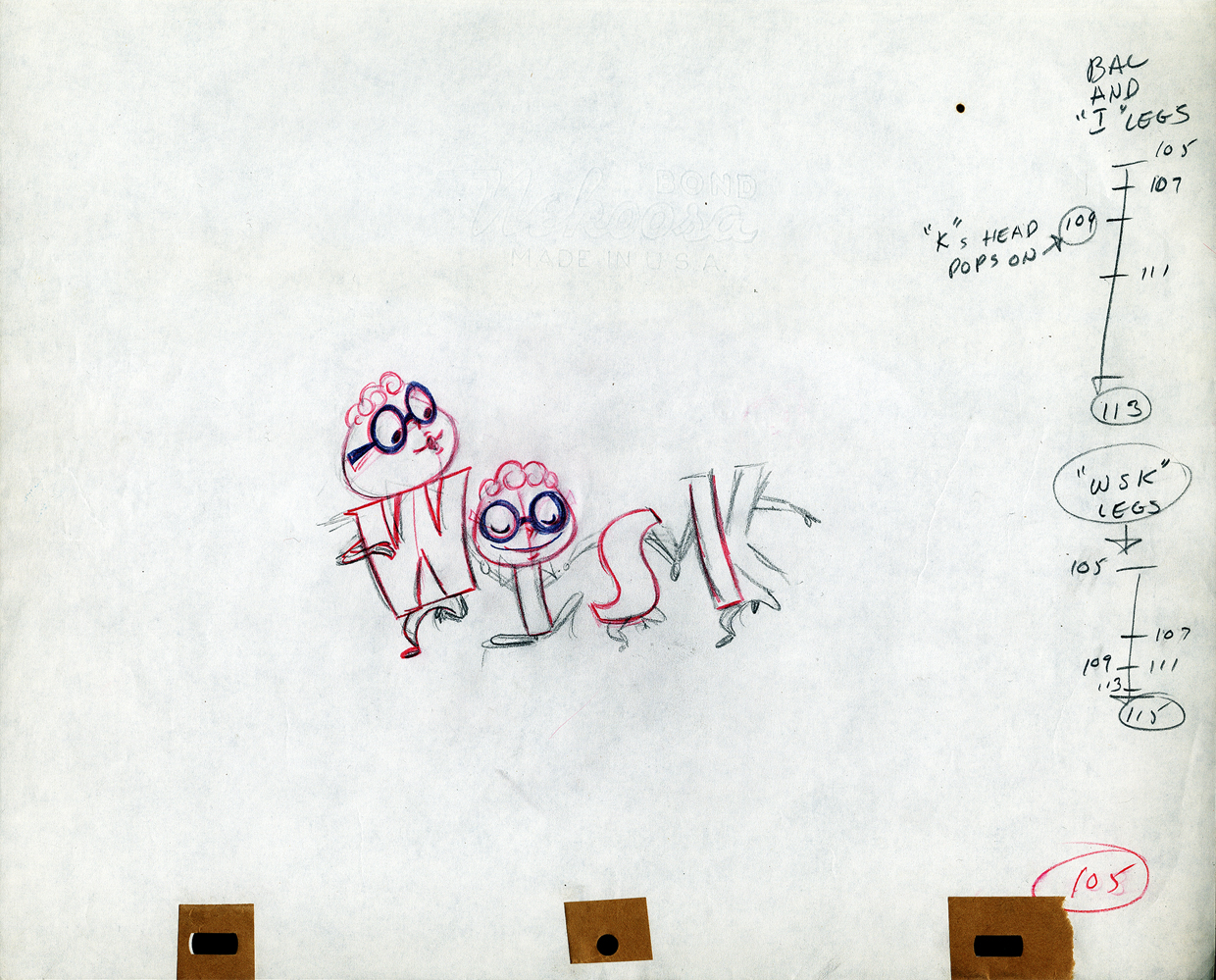
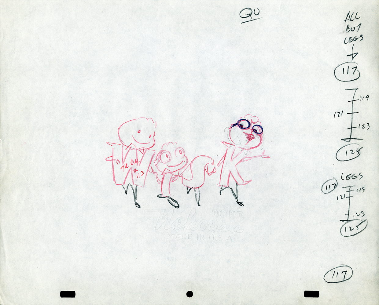
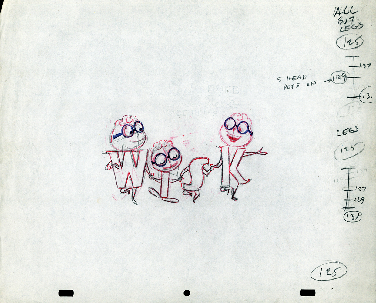
The following five drawings are for a WISK commercial. There are two model drawings and three animation ruffs. The primary model indicates that the spot is done for Screen Gems which was a viable studio in the early 60s and 70s. However, I don’t know who the animator was. Neither Lu Guarnier nor Jack Schnerk fill the bill.I know that Irv Dressler was at Screen gems for many years, but am not sure about this time especially since IMDB has him free lancing for King Features and other entertainment studios. The drawswing style of these animation drawings is right out of the Paramount/Terrytoons mold. Many animators’ work looked like these. People such as Johnny Gentilella, Marty Taras et alworked in a very similar style, though these are a little harder lines than either of those two.
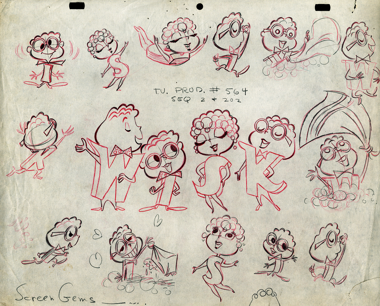 A
AThis is the primary model for the entire family. It’s a
beautiful drawing, and the characters have a lot of play
in them despite being connected so obviously.
Just look at the father’s hair. Beautifully done
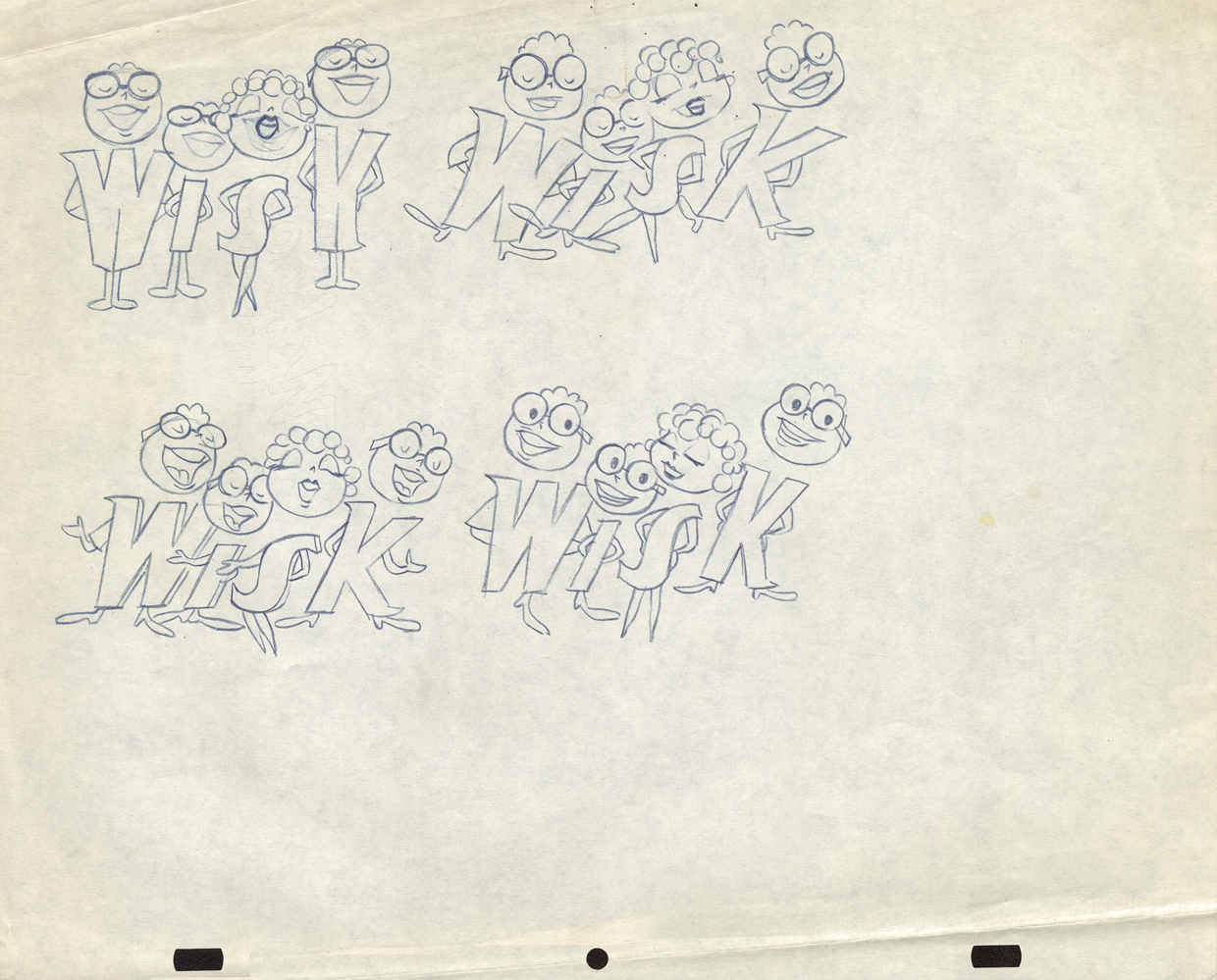 B
B
Here’s a secondary model. I suspect this is the animator
tracing off the characters and seeing what he can do with them.
 C
C
Animation drawing #105. Those breakdown charts are something.
 D
D
 E
E
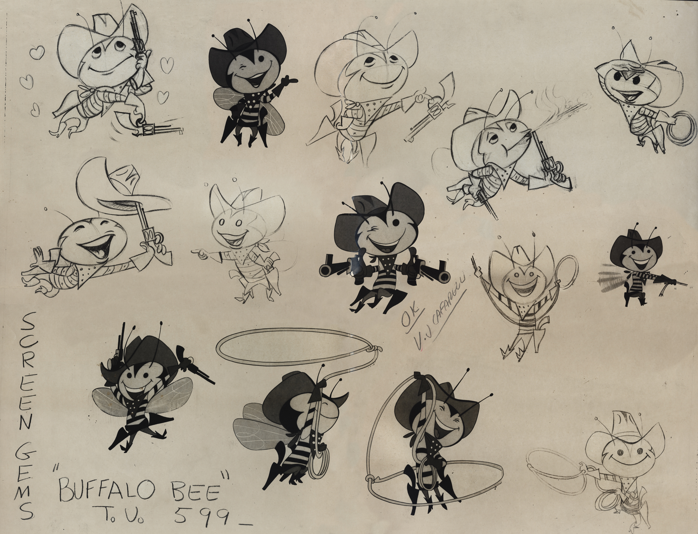
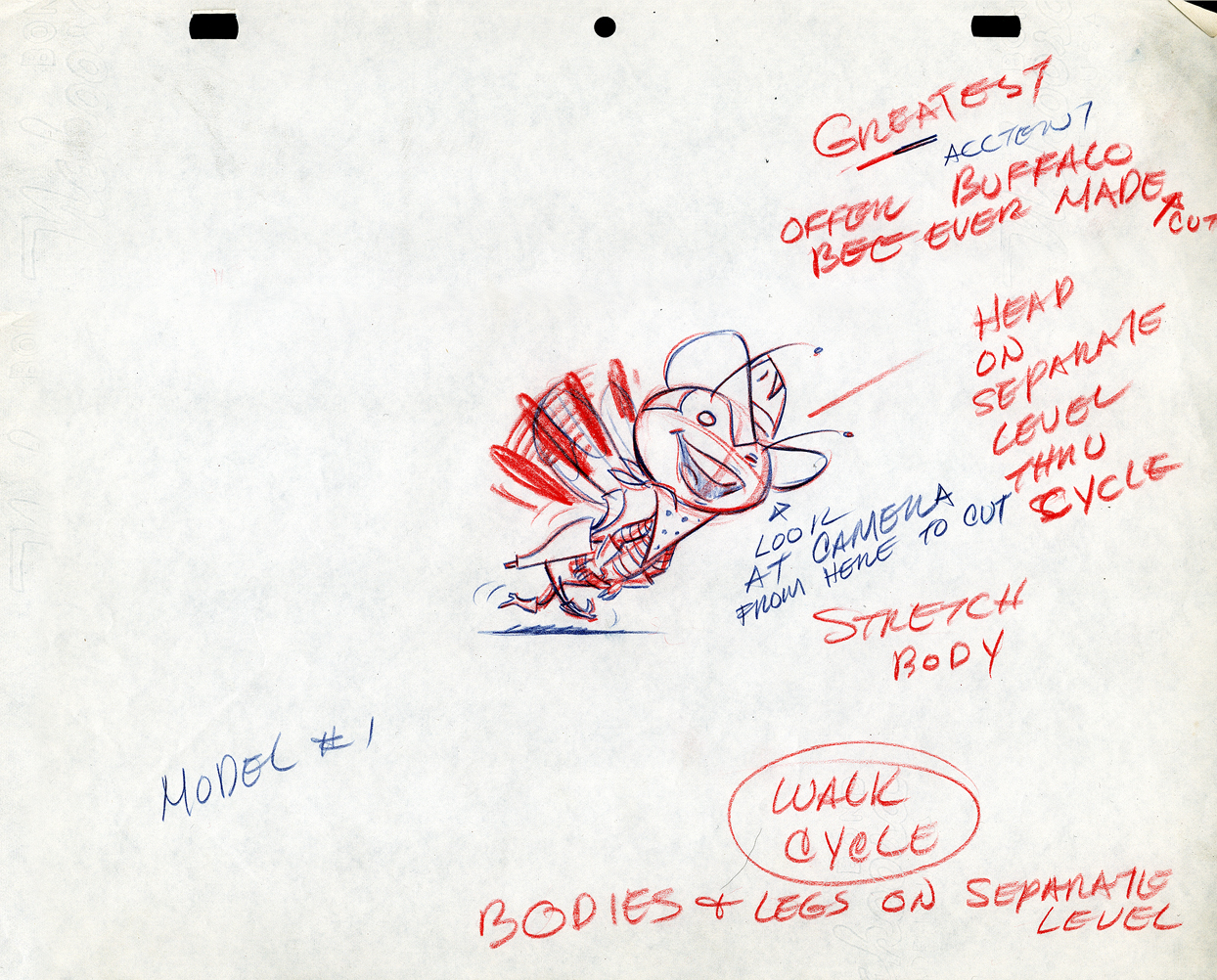
The Buffalo Bee for Honey Nut Oats is also a model sheet from Screen Gems. With it come an animation model sheet for the walk cycle of the character. These drawings look like Lu Guarnier’s to me, but there’s no official way I could confirm that, of course.
Model sheet
 1
1
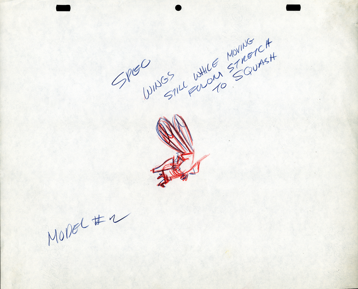 2
2
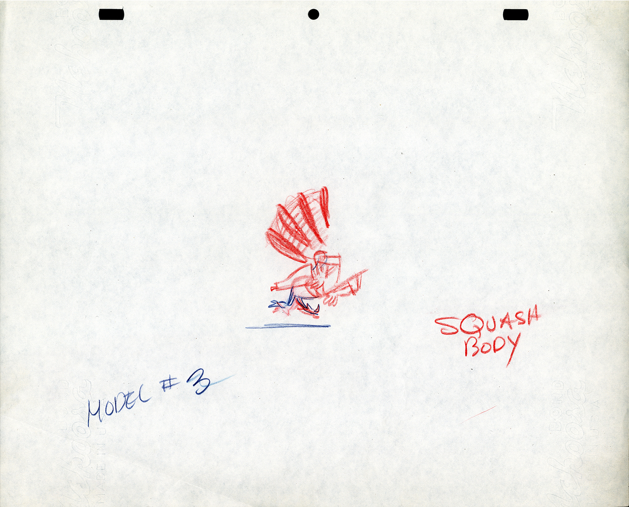 3
3
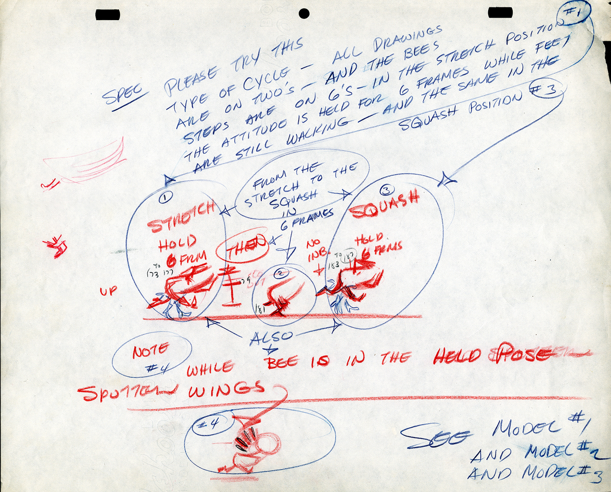 4
4
Action Analysis &Animation &Books &Commentary 06 Dec 2012 07:03 am
The McKimson Brothers
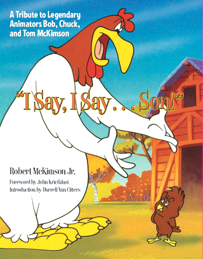 I Say, I Say . . . Son! This is the title of a book by Robert McKimson Jr. Any ideas what it might be about?
Sound anything like Foghorn Leghorn?
Yes, it’s a tribute to Bob McKimson with a big nod to Chuck and Tom McKimson, as well. This, to me, is something of a feat in its own right. The book is a workhorse of a picture book with lots of valuable images that you haven’t seen before. It’s not like the big glamour picture books that come out of Disney or Dreamworks. The Art of Whatever. It’s not one of those heavyweight oversized books that cause coffee table legs to bowl outward under their weight. No, this is a go to book on good paper; it’s solid. There are lots of drawings and photographs, frame grabs, newspaper clippings, and posters. Just looking at the pictures will give you a pretty good idea of the story the book is telling.
And it’s a valuable story – the part of the jigsaw puzzle that’s been left missing.
There have been about a half dozen books by and about Chuck Jones, one enormously expensive tome on Friz Freleng with lots of key references to him in most animation histories. Bob Clampett did a lot to promote himself; he gave us films and videos, not books. There are at least three Tex Avery books. This is the first on Robert McKimson – the other Warner’s director. And it was written by his son.
McKimson was loved by Leon Schlesinger who tried to make him a director early on. Yet, Bob didn’t feel that he was ready. He became the head of all animators in the studio, responsible for solidifying the style of all the different variations of the characters. He helped tie Jones’ Bugs Bunny to Freleng’s or Clampett’s Porky Pig to Tashlin’s. When Schlesinger sold the studio in 1944 and Eddie Selzer took charge, McKimson pushed himself into the directorial position, and he gave us meat and potatoes films with characters that were all his: Foghorn Leghorn, the Tasmanian Devil, Sylvester Jr., and some of the Speedy Gonzales work.
 Before reading this book I was certainly well aware of Bob McKimson‘s work, and I was not quite as familiar with the other McKimson brothers. I’m not sure much has changed about that. As an animator Bob McKimson was brilliant, but as a director I never quite saw the lyricism that we saw in some of his best animation. McKimson was the Milt Kahl of the WB studios. He could draw like dynamite and knew every trick in the
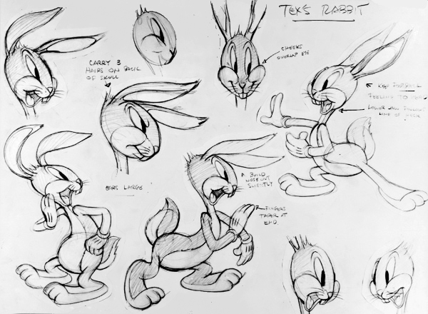
 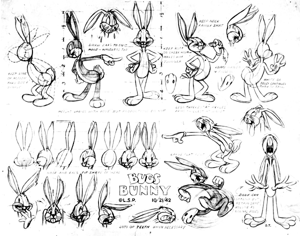 service of giving the tightest, sharpest animation possible. When you look at his scenes you’ll see beautifully drawn animation with solid timing and a muscular approach. Go to an extreme and take the pose as far as you can, and then go farther still, and then go even farther still. Bob not only did that, but his brilliant draftsmanship held the characters together in those unrelenting poses. It was near miraculous how _____2 of many Bugs model sheets drawn by Bob McKimson
he pulled that off. Animators
like Rod Scribner or Jim Tyer would go as far as he did, but their drawings blew up into funny. Bob’s artwork just got more solid. Bobe Cannon was probably the only other person at WB that could match him for drawing ability. Even still Cannon would purposefully distort his drawings more than McKimson would. Bobe was interested in the 20th Century Art, Bob was interested in the artistry.
 As may be obvious, I’m not the greatest enthusiast when it comes to Bob’s direction. It all shows so little panache that I must say I’ve easily dismissed it. The work is just that, a solid bit of work. The backgrounds are cartoon realistic. No flair the way you’d find in Maurice Noble‘s art, no personality as in Paul Julian‘s paintings. Dick Thomas, Cornett Wood and Robert Gribbroek did most of the design and background painting. All of the effort was put into the animation and little concentration seemed to focus on the design of the films. I can remember Mike Barrier talking about McKimson’s work. His layouts and the stacks of animation drawings that came from his cartoons far outweighed the piles of art from work by the other directors. Jones’ impeccable poses, Freleng’s exquisite timing. McKimson worked the funny into his cartoons and he got the same from his animators. He used drawings and more drawings. The style came from good, hard solid work, not timing or poetry.
There are all those stories about Rod Scribner and his wildly artistic period under Clampett. He was a different guy under McKimson. It’s hard to see the same animator in the two different phases. There’s pure delight in the animation under Clampett and solid workmanlike craft under McKimson. No doubt this was also because Clampett probably was off leaving Scribner on his own to do what he wanted. McKimson kept Scribner under his thumb and, in my opinion, didn’t get that great and wild personality that had been available. As a matter of fact, I suspect this was true of all the artists McKimson controlled. It probably worked well with the two brothers, Chuck working under Bob’s direction, but I’m not convinced it was the best way for most artists to work.
A Bob McKimson Layout for “daffy Duck Hunt” (1949)
For this book, there can be no doubt that a major source of information had to have been Mike Barrier‘s excellent interview with McKimson. (Go here if you want to read that – and you should have already read it.***) I’m afraid there is no interview with Tom or Chuck McKimson readily available. I would have liked to see more of them in this book. Toward the end of the book, we see roughs and stills from the illustration work the two have done for comics and coloring books. Robert McKimson certainly dominates the bulk of this volume.
It is the visual materials available here that shows the real value of the book and makes it important to own. For anyone who recognizes the importance of WB cartoons and wants the whole picture recognized this is the reason for this book. The artwork. There are some beautiful early drawings printed, especially, the pages of clean-roughs done by Bob that were animated by Tom. Excellent poses once again from Bob with no sign of Chuck’s drawing. Again, it’s only toward the end, when we get into the comic books and other print material, that we see some of Chuck and Tom’s artwork. These are definitely not up to that of Bob’s drawing, but if the focus is to be on all three, we need to see all three on display.
I appreciated the photos throughout as well as a reprint of the few articles about any and all of the brothers. Perhaps more of an analsis from the author about the variance from one artist to another. Despite their being brothers, they do have very different talents and we can see, despite the limited amount of art from Tom & Chuck, that Bob was the obviously the strongest draftsman of the three, but there for the lack of drawings goes this book.
Regardless, I’m glad to have what I do have. The excellent WB art of Bob McKimson and the familiar comic book covers of Tom. Both broght back memories of differing kinds. Chuck, he was the animator, he worked within his brother’s unit at WB, and there isn’t much sign of his drawing. But the films are there, and we can enjoy those films and the talent that went onto their making. I wonder if ever there were a conversation or a statement by Bob about his brothers’ work. Perhaps someday, that curtain will be opened a bit more. Until then, I’m grateful for this book.
*** Actually if you want to go the heart of animation history just go through Mike Barrier‘s archives and interviews, and you’ll have a good solid base. Take a tour of MichaelBarrier.com. Spend a lot of time there.} Perhaps someday we’ll get Mike Barrier’s article about the three brothers. Maybe a review of this book will bring him out on the subject.
Bugs Bunny and the Tortoise
Some roughs for a 1948 book by Bob McKimson.
Top – Layout for “Hippity Hopper” (1949) Bob McKimson
Bot – Layout for “Lighthouse Mouse” (1955) Bob McKimson
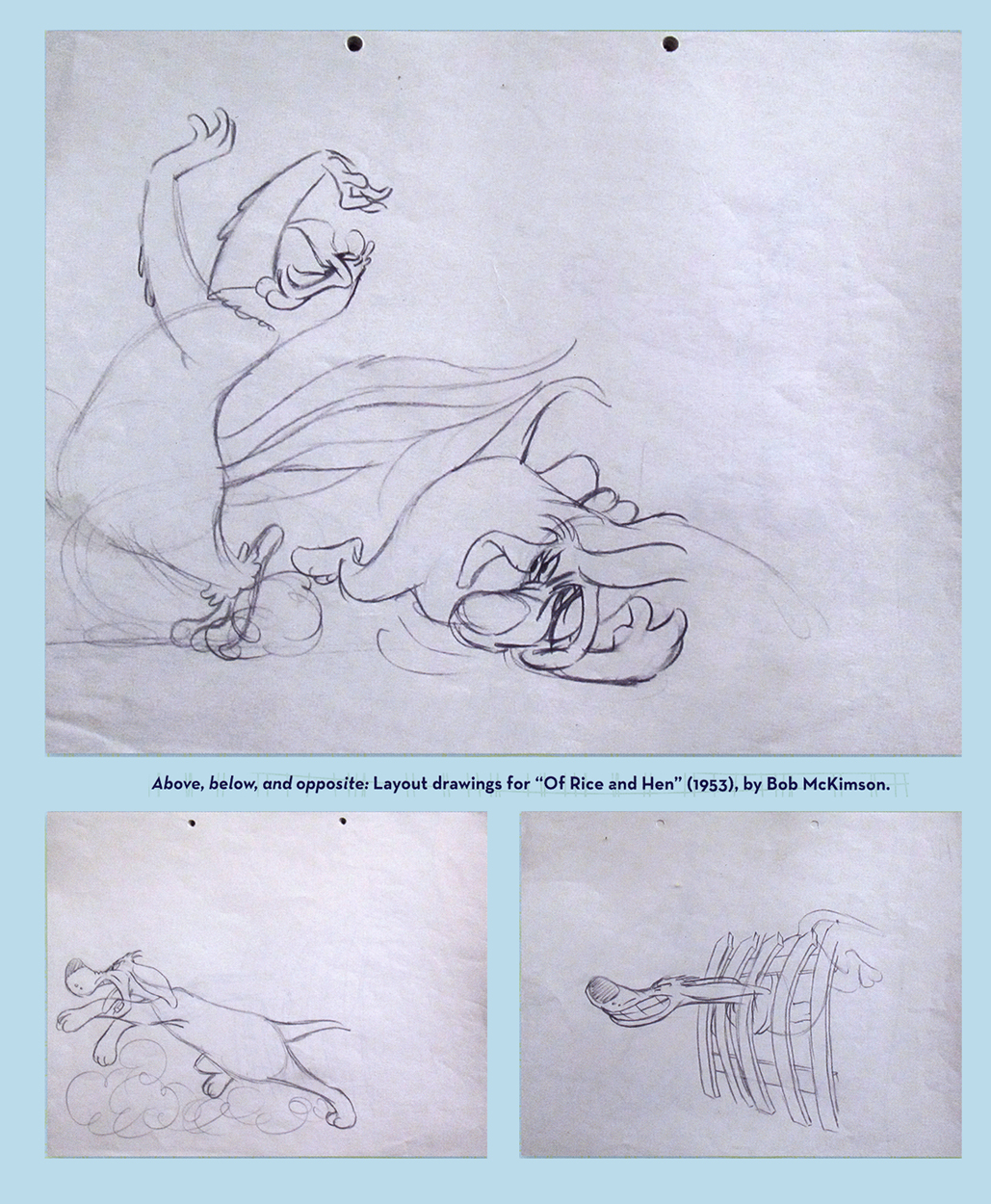
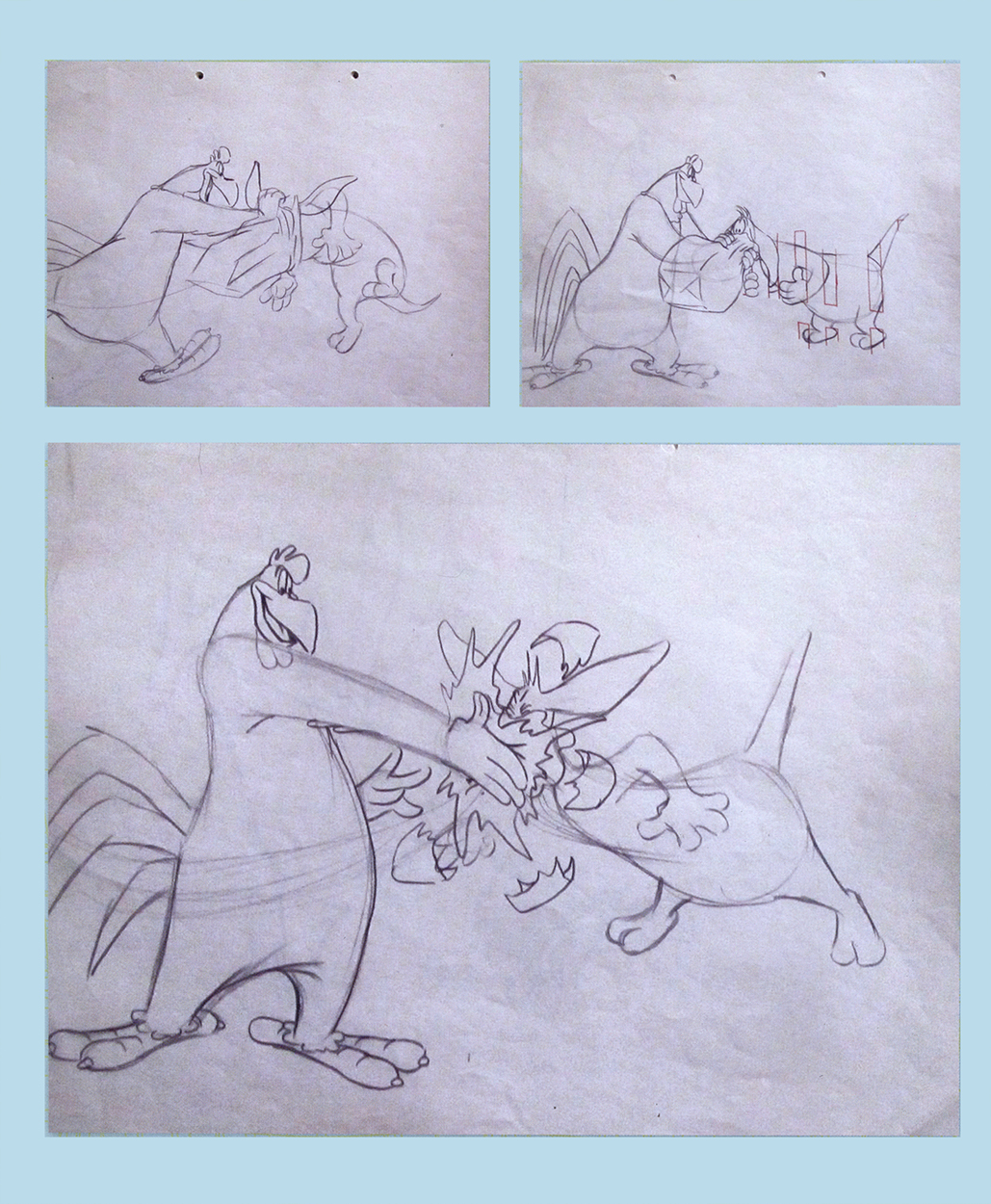
Some beautiful roughs for Layouts by Bob McKimson
for “Of Rice and Hen” (1953) directed by him.
A model sheet by Tom McKimson. One of a few in the book.
A comic book page by Tom McKimson
A very different model than Bob would have drawn.
A setup from “Calvin and the Colonel” directed by Chuck McKimson (1962)
Articles on Animation &Hubley &repeated posts &Story & Storyboards 17 Jun 2012 05:15 am
Hub Boards – repost
Yesterday, I posted some comments about a recent piece on Signe Baumane‘s blog. This made me think about this piece I wrote back in 2007. I think it’s worth a repeat.
- The conversation on storyboard use goes way back – before the internet. If you check out the 1969 book by John Halas, Techniques of Film Animation, there’s a Q&A session wherein a number of animation greats were asked several questions, and the answers are given by question.
Here’s one question about storyboards and the answers given:
To what extent to you think a storyboard should be developed prior to production?
- GENE DEITCH: I believe in complete scene and shot breakdown in story-board or a thumbnail board form before production begins. I use a thumbnail storyboard as a sort of bar-sheet, indicating all effects, dialogue and music cues, scene transitions, etc. Great savings in cost, and an overall perspective of the film in advance are to be gained.
JOY BATCHELOR : As fully as possible without detriment to the following phases of production.
STEHPEN BOSUSTOW: If time and money allow, the storyboard should include as many details as possible, particularly if it is to be assigned to a large production unit. However, if only a few people are to be working on the picture, the storyboard can be quite sketchy, with the details being developed during production by the key people who have an overall feeling for and knowledge of the story.
ADRIAN WOOLERY: The storyboard is the first step, after the idea. Every problem must be solved and the story completely resolved on the board prior to consideration of any production.
 JOHN HUBLEY: It has been my experience that the more detailed a story-board and the more carefully it is designed to reflect the appearance of the finished production, the more successful the film.
GEOFFREY SUMNER: The storyboard, or breakdown of the film, has as many different forms as there are ways of putting actions in relation to one another.
The classic storyboard is the set of working drawings of the sequence of a film used in large studios on the Disney model where numbers of subsidiary workers must conform to a total pattern they can almost never see.
It is used in conjunction with model sheets. It could be called the “model sheet” of the sequence of the film.
It is strictly for use within a studio and should not be shown to dangerous people like sponsors.
An earlier stage is the treatment, which can be specifically directed at sponsors. If the basic idea of the film is simple, the treatment need be no more than half a dozen drawings and a brief synopsis to convey a ten minute film.
A storyboard must necessarily be constructed after the music has been done. The musician and the director can work together from a stage following the treatment. From the finished recorded track the storyboard is made.
 For years prior to even meeting Hubley, I had remembered his response to this question. It impressed me. His storyboard development was pretty intense. The scripts generally were done visually and tacked to the wall.
I don’t remember ever seeing text up there. John would present the board to key people, and he would give an indication of dialogue verbally. We all knew this would ultimately be ad-libbed by actors.
With the Carousel feature, sections were boarded but then developed in greater  length through improvised sessions. The boards then grew out of the edited tracks. The voices often came first, here.
I suspect this is probably also true of the films like Cockaboody, Windy Day and Moonbird which were dependent on the children’s verbal play at the microphone. Something like The Hole or Voyage To Next were boarded visually, then recorded improv sessions which were adapted in newer boards.
Of course it has to be remembered that the two features done within this studio, Everybody Rides The Carousel and Of Stars and Men, both started out as text. Both were heavy-duty books that were adapted for film. In the case of Of Stars and Men, the author, mathematician Harlow Shapely had major involvement in the film’s script and narrated it as well. The concepts for both films were fully worked out before anyone started boarding. So essentially a script – of sorts – existed. Since CBS financed Everybody Rides The Carousel, you know they had to approve a script.
I, of course, only remember the board.
Commentary 31 Dec 2011 05:49 am
More Linkage, a Quiet Week & Animating
Two weeks ago I listed some links I visit weekly, if not daily. There are more that I’d like to add to that list. I don’t think less of any of these links, it’s just that I didn’t want that last post to be too long. The following are not personal art blogs; they update their material frequently, and it’s usually informative on some level.
 Andreas Deja‘s site, Deja View, has one of the most valuable animation links on the internet. He posts only impeccably beautiful Disney art from his collection. The images are always iconic and beautiful, and I find myself coming back to revisit the same posts over and over again. If you don’t know this site, go now and make up for lost time.
 - Hans Bacher‘s site, One1more2time3′s Weblog, is just about the most attractive site out there. Hans was an art director for Disney having great influence on a number of important animated features including Mulan and Beauty and the Beast. Not only does Hans share artwork from those films, but he offers images from many other influential studios and artists such as Richard Williams, Heinz Edelmann, and Zagreb Film. There are reconstructed backgrounds culled from frame grabs as well as Hans’ own beautiful art. I love this site.
- Gene Deitch tells stories. He’s a master who has walked through some of the most important history of animation. His site, Gene Deitch Credits, gives a personal view of many key people not usually discussed in animation history books. Jim Tyer, Phil Scheib, Duane Crowther, Jam Handy, Bob Kurtz and Eli Bauer share space with John Hubley, Jules Feiffer and Ralph Bakshi. It’s a principal stop for any animation addict.
 If you’re a fan of Hanna-Barbera‘s early work, Yowp! is the site for you. The shared material, here, is endlessly revealing: layouts, animation, music cues, newspaper clippings. It goes on and features something new just about every day. I love this site since finding only a few months ago. After all, I was really coming into my own at about the time H&B broke through with Huckleberry Hound and the Flintstones. Their work had a major influence on me. This site helps fill a missing need within me – all that great Ed Benedict design, all that beautiful brushwork inking.
- Animondays is David Levy‘s blog originally built for ASIFA East when David was their President. He continues on the site with fine interviews of people like Linda Simensky, PES and Rob Renzetti. He also writes fine essays which usually offer a levelheaded view of the business of animation. As its title suggests, the blog changes every Monday morning, so it’s worth the visit once a week.
- Mark Sonntag always has great and rare material on his blog, Tagtoonz. The material usually pertains to early Disney, and, as a result, it’s usually a lot of fun. Comic strips, posters and photos are always originals and just about impossible to see elsewhere.
 What About Thad? from Thad Komorowski changes infrequently, but the material presented is usually top notch. Posts of hard-to-see movies or comic strips are certainly well worth the visit, but he also gives strong analysis of some of the less noticed animators (such as Alex Lovy). I can’t tell you how often I’ve returned back just to revisit his posting of Lovy’s drawings from Ace In the Hole. The material is often esoteric, but the information is important.
There are also a few sites I enjoy visiting for their frame grabs or mosaics (many built on Hans Perk‘s drafts found at A Film LA.) Among these my favorites are:
-
Kevin Langley‘s Cartoons, Model Sheets and Stuff,
Sanek‘s More Mosaics and Stuff, and
Stephen Hartley‘s Likely Looney, Mostly Merrie and, his less frequently updated, Blabbing on Arts and Culture.
Finally, the last site usually has little to do with animation even though it’s written by one of our key animation people. And it’s as eccentric as you might expect.
- Tom Sito‘s site, Tom’s Blog, is a daily history lesson in the making. Tom gives an account of things that have happened in history on the day you’re checking in. What happened at Wounded Knee? The Howdy Doody Show premiered. When was Emperor Quang Tung of Vietnam crowned? I love such information. I can store it or forget it, but I enjoy reading it. Updates come every day with a quiz to start you off.
It’s always quiet this week between Christmas and New Year’s. I’ve been waiting for some word from several clients, and I can’t even reach them this week. As expected, I might add. Hopefully, the holidays won’t extend too far into 2012.
Movies have also been quiet. I did get to a screening of Bridesmaids on Wednesday. 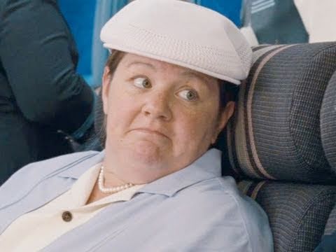 The film was better than I expected. I’ve never been very hot on Kristen Wiig. I thought her writing was fine, but the performance was a little bit shy and reserved. This is her usual; she never goes that extra beat needed for the type characters she plays. It becomes obvious the second Melissa McCarthy steps on screen. She steals the movie easily acting very natural in overdrive-mode. I laughed aloud with almost every scene she has on screen (except the last with a joke I don’t think worked for her character.) I’ll be interested to see if McCarthy gets an Oscar nod for Best Supporting Actress. The Actor/voters usually are reserved with nominations to comedians. It was a good movie, not a great one.
 Next week there are four animated features to view:
on Tuesday: ALOIS NEBEL and ALVIN & THE CHIPMUNKS : CHIPWRECKED
on Thursday: CHICO & RITA and CARS 2
ALOIS NEBEL looks to be MoCap with flat 2D-like animation.
ALVIN got good reviews and looks as horrible as I’d expect.
CHICO & RITA looks rotoscoped and interesting.
CARS 2 I’ve already seen and hated. It’s a bad movie.
Also on Wednesday they’re screening: W.E. and SHERLOCK HOLMES: A GAME OF SHADOWS.
W.E. is the Madonna-directed film about Edward VIII and Wallis Simpson.
SHERLOCK HOLMES 2 looks even worse than the first one. A violent, loud race to the end credits.
Last night, Heidi and I went to see the play THE ROAD TO MECCA starring Rosemary Harris, Carla Gugino and Jim Dale. The tickets were gratis since Heidi works for the Roundabout Theater Company. I love Carla Gugino and Jim Dale’s work, so was pleased to see them in the show. Rosemary Harris was also impeccable. It was a great show, and the actors have only been doing it for two weeks. Wait till it opens! Beautiful set, great lighting and fabulous acting in a classic play. What more could you want.
Having rushed out the animated Christmas Card over the course of a weekend, I couldn’t help but wonder why I wasn’t doing more of that same thing. Making short animated bits – that could maybe be tied together – over the rest of the year. It was a lot of fun doing it, and couldn’t possibly be a waste of time doing more. The only problem is, naturally, writing them so that they wouldn’t be a total waste of time. Who wants to see more bad animation out there? It’s something I have to think about, really. It was a lot of fun doing the one short; it cost me nothing more than my time and energy.
I think of this often when I visit Yoni Goodman‘s site. He does a lot of short animation exercises and posts them frequently. His work is exceptional, too. Take a look at the recent anti-cholera film he did; it’s a really fine piece of work, but those tests are what really get my blood roiling.
Books &Commentary 10 Nov 2011 06:45 am
Lutz
- This week, I posted a review of E.G. Lutz’ book, Animated Cartoons: How They Are Made, Their Origin and Development, and I commented that I have had this curiosity about who E.G.Lutz actually was. A quick Google search for biographical information comes up with nothing other than the Amazon listing of his books for sale and the references to him in other animation books.
It was a bit of a surprise to me to find that his singular animation book, published in 1920, is definitely not his best selling book. That would be Drawing made easy; A step by step guide to drawing for young artists. There are also another half dozen books he’s either written or illustrated.
I decided, then, to look in all of the books I own. The best place to start was with Donald Crafton‘s book, Before Mickey. Sure enough, there was an illustration by Lutz that was done in 1897. It depicted the “Lightning sketcher.” These were the artists who appeared on stage in Vaudeville theaters sketching an image at “lightning” speed. Georges Méliès enjoyed doing this for a while, and J. Stuart Blackton put it on film. Lutz illustrated such an artist.
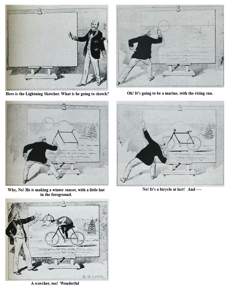
I’ve had to do a little retouching in photoshop to get
this image to read well. I retyped all the text there.
Crafton later quotes the Lutz book:
- The first book devoted solely to the craft was Animated Cartoons; How They are Made, their Origin and Development by former caricaturist Edwin G. Lutz. This book became the vulgate of modern industrial animation, canonizing the major studios’ practices. Its guiding philosophy was embodied in the statement that “of all the talents required by anyone going into this branch of art, none is so important as that of the skill to plan the work so that the lowest possible number of drawings need be made for any particular scenario.” Lutz illustrated the book with his own rather quaint drawings. He described peg registration, in-betweening, speech balloons, and studio organization, but curiously his description of cels was limited to their use as static overlays.
- Lutz’s book was a fountain of common-sense advice, such as limiting dialog so that films could be sold in foreign countries. Among its most important contributions were the detailed instructions for drawing perspective runs and other kinetic effects, which would grow increasingly visible throughout the 1920s, especially when combined with mobile and cycled backgrounds. Cycling, supposedly invented by Nolan, consisted of a sequence of eight drawings planned to match at the end of a cycle by making the first and eighth drawings identical. This effect may be seen in practically any 1920s studio production, but Paul Terry seemed to especially love it, With these and all the Other techniques explained in detail, almost anyone with the ambition could begin making animated cartoons. Of these neophytes, certainly the most ambitious reader of Lutz was Walt Disney of Kansas City—who, because he could not afford to buy it, checked the book out of the public library.
This, of course, is the story of how Walt Disney pored over the book slavishly to find out the tricks of the trade. Mike Barrier in his book, The Animated Man, describes this well:
- (Disney) was essentially self-taught as an animator; he wrote to an admirer many years later, “I gained my first information on animation from a book . . . which I procured from the Kansas City Public Library.” . . . According to its copyright page, Lutz’s book was published in New York in February 1920, the same month Disney joined Kansas City Film Ad, so he must have read it very soon after it was added to the library’s collection. He said of the book in 1956: “Now, it was not very profound; it was just something the guy had put together to make a buck. But, still, there are ideas in there.”
- As elementary as the Lutz book was, it still offered a vision of a kind of animation far more advanced than the Film Ad cutouts. Lutz wrote at a time when animators commonly worked entirely on paper. They made a series of drawings, each different from the one before, that were traced in ink and photographed in sequence to produce the same illusion of movement that Film Ad achieved by manipulating cutouts under the camera. Lutz advocated the use of celluloid sheets to cut down on the animator’s labor—the parts of a character’s body that were not moving could be traced on a single sheet and placed over the paper drawings of the moving parts. Such an expedient (and Lutz recommended others) would have resonated with Disney, who had been so impressed by commercial art’s shortcuts when he worked for Pesmen-Rubin.
Barrier also quotes Hugh Harman as saying, “Our only study was the Lutz book . . . that, plus Paul Terry’s films.”
This is one of the illustrations Lutz did for his book,
The Animated Cartoon.
Donald Crafton talks extensively of the management theory of Frederick W. Taylor. Taylor basically stated that lower paid jobs should be done by lower paid employees on what would basically become an assembly line. This was adapted by J.R. Bray and Thomas Ince. The Inbetweener was born. Crafton writes:
- In his 1920 manual, Lutz was still promulgating the taylorist philosophy—for example, when he described the tracers’ function in language echoing Bray. “It can be seen from this way of working in the division of labor between the animator and his helper that the actual toil of repeating monotonous details falls upon the tracer. The animator does the first planning and that part of the subsequent work requiring artistic ability.
Initially, Disney rejected this theory. This was something that Ub Iwerks brought to the studio after traveling from Kansas City to LA. We see this in Leslie Iwerks & John Kenworthy‘s book, The Hand Behind the Mouse:
- Ub brought the studio renewed energy and new techniques. Abandoning the stiff and rudimentary methods Or animation he had previously learned, Ub would begin to evolve bis own straight-ahead style of drawing, which did not rely on model sheets or extremes. A key aspect of the Lutz orthodoxy was pose-to-pose animation, in which, for any action, a character was drawn in its starting and ending positions (or “extremes”) and intermediate poses were filled in later. Model sheets were used to trace over the original figure, allowing the animator to simply alter the parts of the body that needed variation. Ub instead professed a new method. He felt he could coax more expressive feeling from a drawing if he used model sheets as rough guides rather than being chained to them. By trusting in his own creativity and sense of movement, he threw out all structure to make way for his own free-flowing impulses.
- Russell Merritt and J. B. Kaufman in Walt in Wonderland assert that “If Iwerks had made no other contribution to the Studio, he would deserve to be remembered for this one. It marked the beginning of the smooth, flowing ‘Disney style’ of animation; and one can see it developing, slowly but surely, as the Alice series progresses.”
We also know that one of the sore points between Disney and Iwerks, which helped cause Iwerks to leave the studio, was that Disney tried to force Iwerks to leave inbetweens for others to follow. This would get more animation out of Iwerks, who already had been the animator with the greatest speed. Ultimately, Disney fell back on what he’d learned from Lutz.
This is one of the illustrations Lutz did for his book,
The Animated Cartoon.
_________________
So, in the end, all this shows is that the Lutz book had a profound effect on animation in the developing 1920s. It also shows that Lutz did a lot of thinking about not only the process of how to make animated films and the technology available at the time of publication, but he thought of the methodology within a studio churning out many films.
We know from that initial “Lightning Sketch” illustration that Lutz was an artist. We also have to assume that he worked within an animation studio for some time to have been so thoroughly informed that he was able to describe the most meticulous details in the process of making films. Because he so completely details the workings of the camera (he also wrote a book in 1927 entitled The Motion Picture Cameraman) one would assume he must have spent some time actually shooting animation. I would guess that he started in that position, then moved into actually creating the art, as did Rudy Ising in the start of his career. It’s doubtful some producer wouldn’t use his artistic abilities in creating the animation.
This is one of the illustrations Lutz did for his book,
The Animated Cartoon.
However, this is all speculation. Perhaps he just had a strong interest and was given the authority to sit and watch within a studio. Of course, that would lead one to believe that the studio that allowed him access would have been promoted within the book. Yet. there is no studio mentioned, hence I’m led to believe that he had to have worked within a studio for some time.
I haven’t gone much farther than the books in my studio or the information on the Web. In the end, I don’t know a heck of a lot more than I started out with. I do know that Lutz’ animation book was the most important he’d written. It affected an entire industry and changed the way the process was done in the all important formative years of the studio system.
If anyone has more biographical information on Lutz, please don’t hesitate to leave it. I’d like to know more and will keep on looking.
Books &Daily post &Hubley 28 Sep 2011 07:33 am
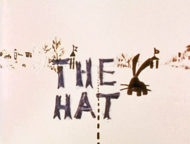
The Hat – even Bigger
As I wrote on Monday, with the AMPAS show about Hubley animation coming this Oct 10th, I intend to put a lot of focus on the work of John & Faith. This piece about THE HAT was originally posted in March, 2011. I’ve added to it.
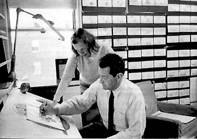
- The interview Mike Barrier conducted with John Hubley has me thinking about Hubley and my years back there and then. You might say, I’m in a Hubley frame of mind these past few days, so I’m into reminiscing. I posted part of this back in March, 2008; here, I’ve extended the article a bit.
 New York’s local PBS station, WNDT – that’s what it was called in the old days – used to have a talk show hosted by film critic, Stanley Kaufman.
(It turns out that this show was produced by the late Edith Zornow, who I once considered my guardian angel at CTW.)
This talk show was quite interesting to me, a young art student. I remember one show featured Elmer Bernstein talking about music for film. He gave as his example the score for The Magnificent Seven. He demonstrated that the primary purpose of the score, he felt, was to keep the action moving, make the audience feel that things were driving forward relentlessly. I still think of that show whenver I see a rerun of the film on tv.
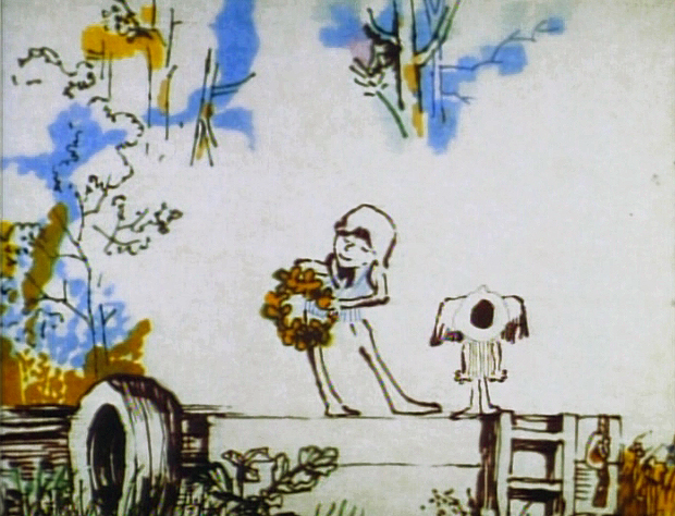
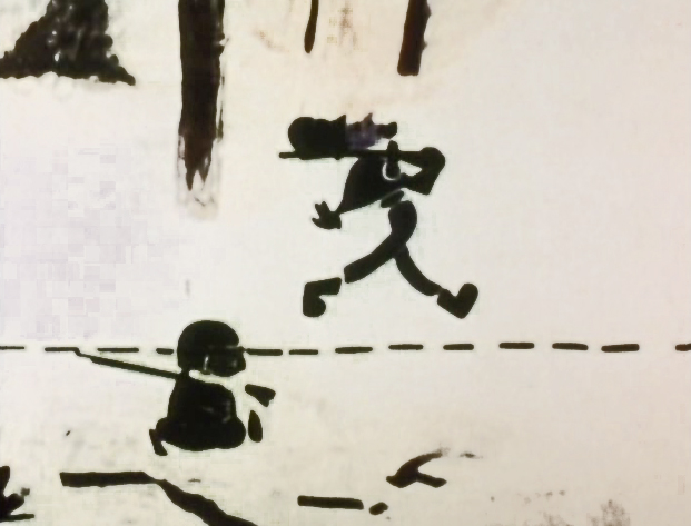
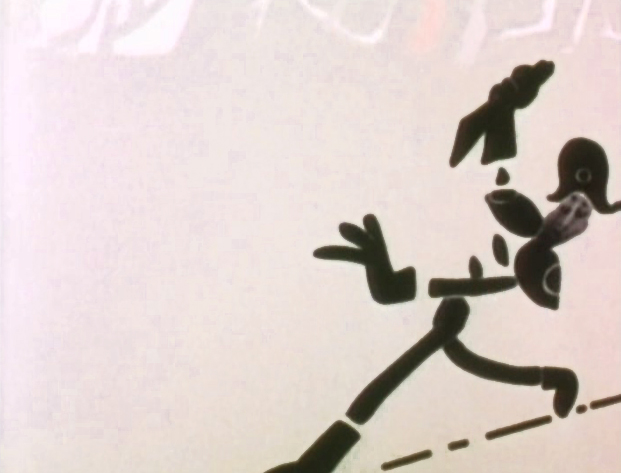
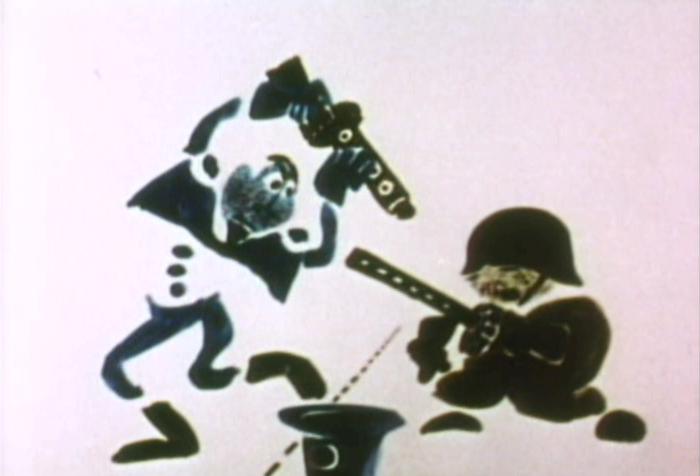
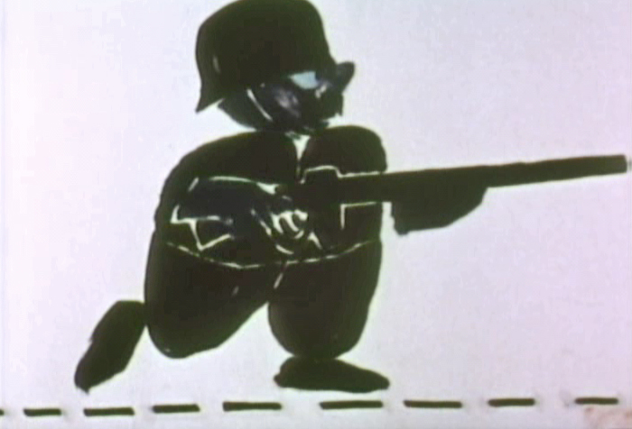
The surprise and exciting program for me came when John and Faith Hubley turned up on the show to demonstrate how animation was done. They were using as an example a film they had currently in production, The Hat. This film was about the silliness of border lines. One of two guards, protecting their individual borders, loses his hat on the other side of the line. Of course, all he needs do is to step over and pick up the hat, but he can’t. The other guard won’t allow him to cross the border illegally – even to pick up his hat.
The voices were improvised by Dudley Moore and Dizzy Gillespie (much as the earlier Hubley film, The Hole, had been done.) The two actor/musicians also improvised a brilliant jazz score.
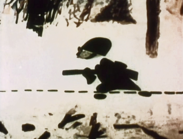
John’s design was quite original. The characters were a mass of shapes that were held to-gether by negative space on the white on white backgrounds.
 The animation of the two soldiers was beautifully done by Shamus Culhane, Bill Littlejohn, Gary Mooney and “the Tower 12 Group“.
Culhane animated on a number of Hubley films during this period, most notably Eggs and a couple of commercials.
Bill Littlejohn animated on many of the Hubley films from Of Stars and Men up to Faith’s last film.
Gary Mooney animated on The Hole and Of Stars and Men. He was an Asst. Animator at Disney, animated for Hubley then moved on to some of the Jay Ward shows before moving to Canada where he continues to animate.
Tower 12 was the company formed by Les Goldman and Chuck Jones at MGM. Apparently they were between jobs when Hubley was finishing this film, and Chuck offered help.

Of course, the colors of the film as represented by the dvd are pathetically poor.
It’s hard to even imagine what the actual film looks like, and it’d be great to see
a new transfer of all the Hubley films.
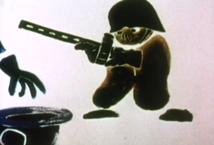 The design style of the film was an original one for 1963. It’s one that would often be copied by other animators afterwards. The characters were searated at their joints. No reel ankles, just open space. They were also broken at the wrists and belts. The taller man seems to have a collection of ribs and shoulders for his torso. Like the dotted line they walked but could not cross, these people were also a gathering of parts.
 This was one step removed from the earlier film, The Hole, which had just won the Oscar and went on to enormous success for the Hubleys. That film used what they called the “resistance” technique. They first colored the characters with a clear crayon. Ten painted watercolors on top of that. The crayon would resist the watercolor and a splotchy painterly style developed. The Hat literally broke those splotches into parts of the characters and put some of the control in the animators’ hands.
.
 The film was obviously political. Anti-nuclear politics played strongly in the story. This was a step just beyond The Hole. In that film, two sewer workers converse on what violent things might be happening above ground. The film ends with an accident, or possibly a nuclear crash.
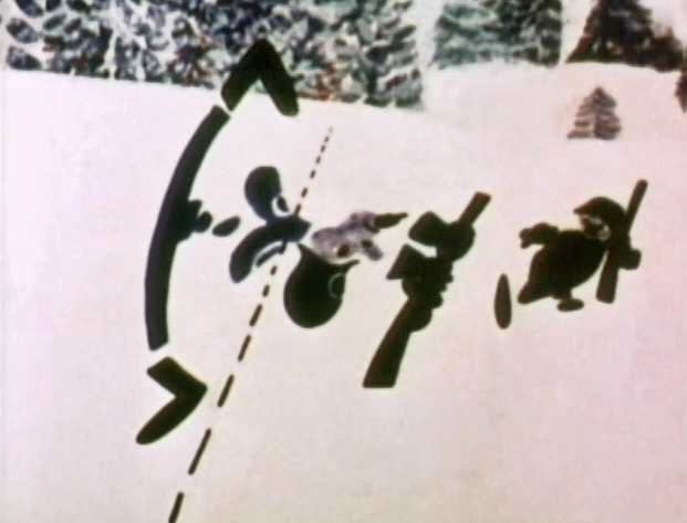
In The Hat, the two partisan soldiers discuss a history of man’s aggression all within their reach. At one point, it would seem, each of
 them is ready to press the red button calling for nuclear assistance – or, at the very least, a buildup of military force.
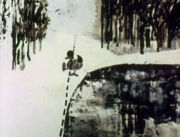
While walking up and down that line, they comment on how we reached the point of no return. All the while, bugs and small animals cross the line, indeed, walk on or over the “hat” lying on the ground.
The backgrounds for this history of War grow more violent, more expressionist. John’s painterly style comes to the fore, and the brush strokes take on a force we haven’t seen to this point.
When we return to the two leads, we find that they’ve changed. They’re darker, and they both have lines scratched into the paint of their bodies. Not as much emphasis is placed on their disjointed body parts.
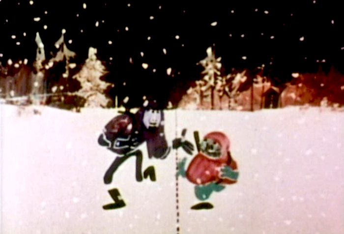
We leave them as we found them, walking that line. At this point, both of their hats lay on the ground and they’re deep into conversation. They don’t seem to notice anymore.
It has started to snow.
.
.
Shamus Culhane wrote about The Hat in his autobiography, Talking Animals and Other People. Here’s some of what he wrote:
- In 1964 the Hubleys wrote a short subject called The Hat. It was subsidized by an international peace organization. The picture featured two sentries marching on opposite sides of a boundary line. A clash occurs when one soldier’s hat accidentally rolls into enemy territory, and the other soldier refuses to return it until he has checked on the necessary protocol. During the ensuing discussion the two men become friendly, and the film ends on an optimistic note.
Although there were other characters and animals in the picture, the two soldiers accounted for about 80 percent of the footage. When Hubley asked me if I could do all of the animation of the sentries myself, I jumped at the chance. The last time I had drawn full animation, other than one-minute spots, was about twenty years before, when I worked with Chuck Jones at Warners.
The Hubleys were exciting to work with because they had a strong sense of adventure in their filmmaking. John was never tied down to techniques that he was already familiar with. Each picture was a new experience, because the appearance of the film was always dictated by the content. The Hat was no exception.
The design of the two sentries presented some odd problems in animation, in that the action was going to be normal, but the arms and legs were not attached to the bodies. Although we had detailed model sheets of each soldier, Hub’s layouts paid scant heed to his original designs. As the picture progressed his drawings of one of the soldiers became more and more Christ-like.
While I animated the picture at home, Hubley and I worked very closely together. Whenever I had a few scenes finished, we would have a conference on this work and the following scenes. Hubley was a very enthusiastic director. He would pick up the newly animated shots with obvious excitement, flip the drawings, and burst out laughing. His pleasure was so infectious that I would laugh, too. We shared a feeling of joy in the whole process or filmmaking.
The animation of The Hat took many months. During that time, with my usual curiosity about the working methods of great artists I have worked with, I studied Hubley’s approach whenever I could. In the first place he worked in a room that was crammed with the largest collection of art books I have ever seen in private hands. The subjects ranged from prehistoric cave paintings to Picasso, Klee, Chagall, and other modern artists. There were books on the art of every culture imaginable, Aztec, Mayan, Chinese, Persian, Greek, etcetera.
At the beginning of a picture Hubley would pore over a random selection of art books. Seemingly they had no relationship to each other, but he was using them to inspire his own sense of design. However, the final appearance of a Hubley film was never blatantly derivative. In The Hat, for example, I have the feeling that he was influenced (if that is the right term) by Chinese scroll painting, but that is just my own intuition.
Since Hubley was going to paint his own backgrounds, the layouts were usually little more than a vague series of scrawls with little or no detail, unless the background and the animation were going to be closely related.
Unlike Disney Studio, where the dialogue is broken down for the animator in meticulous detail, Faith gave me a very loose track analysis. Neither Faith nor John seemed to be concerned with precise synchronization of the mouth action and the dialogue track.
John’s instructions for the movement of the characters were also very loosely indicated on the exposure sheets. It seemed to be his feeling that the pace of the animation should be the shared responsibility of both the director and the animator.
The Hubley children had to be the luckiest kids in New York City. Not only were they encouraged to draw, write, and paint, but in their Riverside Drive apartment the Hubleys had built a small stage, so it must have been easy for the family to create the sound tracks for such imaginative films as Moonbird, Windy Day, and Cockaboody.
Like John Cassavetes, the Hubleys believed in the value of ad-libbing sound tracks, so a good deal of the children’s dialogue in these pictures was completely spontaneous material.
Whatever his formal education had been, Hubley was a very well-informed person, with a sophisticated view of life. One Saturday morning I dropped in to find John working alone, and in a very depressed mood. It happened that I was on the down side myself that morning. After we had talked over the work in the new scenes, our conversation drifted off into a very open discussion about the problem of being an alienated personality. We exchanged anecdotes about incidents that had happened to us because of alienation.
Somehow our talking acted as a catharsis, and we both found our moods lightened. We ended up laughing, and agreed that being alienated in our kind of society had more merit than most people realized. It was a very stimulating discussion.
