Monthly ArchiveMarch 2013
Commentary 11 Mar 2013 02:09 am
European Animation
I know I’ve written about some of this stuff before (repeatedly), and I hope my take on it here is a bit different. At least I’m leading somewhere different, so please have a bit of patience with the opening.
- When I was a kid, animation was in the dark ages for the general public. By that, I mean there wasn’t a hell of a lot of material available to allow you to know how it was done or learn how to do it. There were maybe a dozen or so books available.
- -
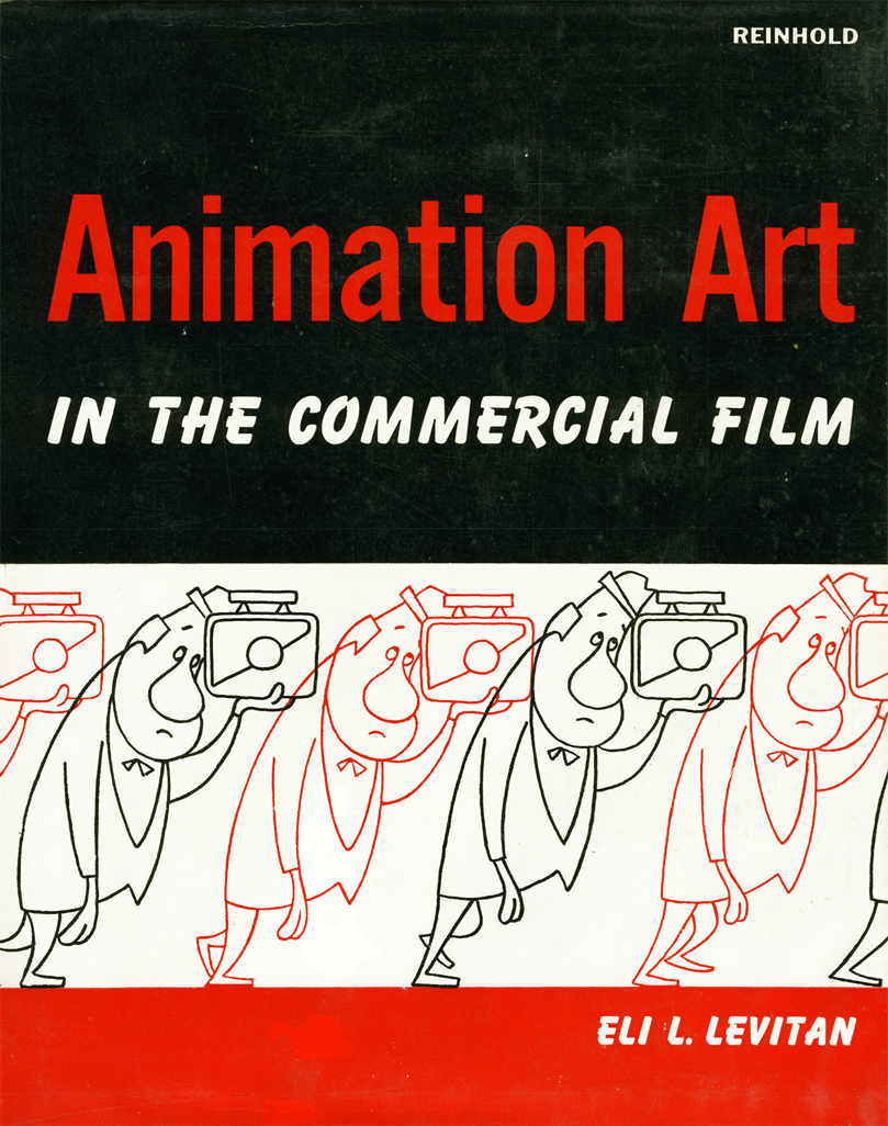 Of course the 40s Rob’t D. Feild book, The Art of Walt Disney. Some great information but not many illustrations. What are there are GREAT.
- The Preston Blair book, Animation, good and cheap. Very helpful for an amateur like me.
- Halas and Manvell‘s The Technique of Film Animation had more to do with animation as done in Europe, but it is extraordinarily helpful.
- Eli Levitan, an animation cameraman, had written several books. Animation Art in the Commercial Film is one of the better books.
There were a few others. My local library had them all, and I borrowed them endlessly and just about memorized them all. I owned the Preston Blair book (of course and my parents bought the brand new Bob Thomas Art of Animation for me Christmas 1958.
On ABC you had the Disneyland TV show which became The Wonderful World of Color when it moved to NBC. The Mighty Mouse Show was the staple on Saturday morning. Local channels featured Popeye and B&W Warner Bros cartoons.
I was completely intrigued with some silent cartoons that were run on the local ABC affiliate on early Saturday mornings. Every once in a while a sound Van Buren cartoon would pop up or a Harman-Ising MGM cartoon..
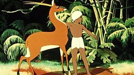 The show that also intrigued me was this horrible “Big Time Circus” starring Claude Kirschner (normally a VO announcer) as a ringmaster who talked to a $5 clown hand-puppet named “Clowny.” They showed cartoons, some B&W Terrytoons with Barker Bill and other early 30s things. They also showed a lot of foreign cartoons badly dubbed into English. They even had Russian features like The Golden Antelope serialized. They had a horrible title on the top of the film and a “The End” title pasted onto the end of the film. I used to tune in to see these B&W European and Russian cartoons. They moved so differently from what I was used to with the cartoons from the US. At 12, I could definitely see the difference and watched closely.
When I started collecting 16mm films I picked up a bunch of these shorts. The timing didn’t get any better.
On my second day at the Hubley Studio, I met the notorious Tissa David who dug into me quickly for my bad inbetweening. She offered to teach me after hours, which I certainly jumped to accept. In that first contact with her, I mentioned that I had a potential job offer from Richard Williams and I might go to England. She immediately said to me, “Oh, please don’t go there. Stay here. Only the Americans know how to animate properly.” After all those years of watching Russian and European cartoons, I understood what she was saying. (I was also working for my real hero, John Hubley, so I had no real plans to go anywhere.) Dick Williams came to me a couple of years later with Raggedy Ann. By then, I was knowledgeable enough to run the Asst. & Inbtwng dept – about 100-150 people.
But then Dick Williams was changing everything. He was teaching his people in England how to animate the way Disney people did it. He brought those people into his studio to teach: Art Babbitt, Ken Harris, John Hubley, Grim Natwick, and others. I believe Williams changed animation throughout Europe. Mind you, the problems of all those years of history is still there, but it’s enormously better.
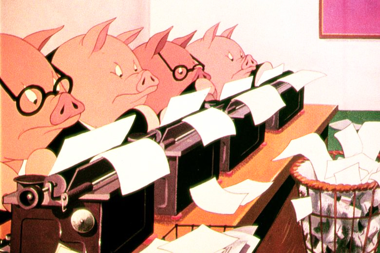
What do I call “European Animation”? Well, it’s all about the timing. The characters often move at such an even speed that there is no sense of weight or real character movement. Basically, all characters move the same. The Golden Antelope is all rotoscoped, so the movement is on ones and all traced off the live action. You can tell when it’s not; there’s a sameness in the motion. It’s almost like there are no extremes just motion.
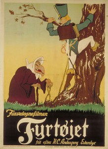 In Europe’s first attempt to imitate the US in a feature, The Tinderbox a 1946 film from Denmark, they were obviously trying to imitate the Fleischers of Gulliver’s Travels. Wild distortions and odd extremes but a lot of the evenly spaced timing. Consequently, with the distorted extremes moving in and out of position at an even pace, it’s doubly peculiar.
Halas and Batchelor‘s Animal Farm is so lethargic in its movement, it’s difficult to watch. However, whenever a Harold Whitaker scene pops up, it’s something to study. The guy was a fine animator. His work definitely sands out. He came from the Anson Dyer Studio, and had somehow learned to animate in the US methodology.
The Disney studio was having its effect , though as animators such as Borge Ring pretty much taught himself to go well beyond the basics of he European mold. He was close with a number of the Disney animators and studied Disney films religiously. His own personal style is definitely constructed from the US mold.
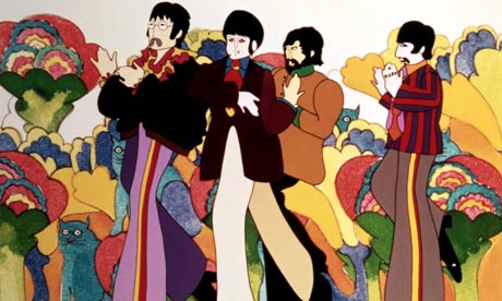 Even through The Yellow Submarine (1968), you see this flat style of animation. Of course, with the more graphic style of George Dunning‘s feature, the even pacing is better hidden in the mood of the piece.There’s also a lot of music that hides the timing problems.
After Dick Williams, began his effort to alter the look of work coming out his studio, there was a big change in the look of work coming from all over Europe. Sure they slipped into and out of the old school of animation, but now they had learned from Art Babbitt and Ken Harris. (I wish they’d had more of Grim Natwick.) Take a look at the marvelous animation done for Bruno Bozzetto in the Ravel Bolero section of his 1977 feature, Allegro Non Troppo. To some extent, now, the best animation worldwide is coming out of England and France, especially from the younger animators.
So let’s take a look at the differences between the two styles..
- The best of the US style can be seen in those dwarfs in Snow White or the Siamese cat song in Lady & the Tramp or Scar in The Lion King. It’s all in the timing.
- The European style is very obvious in Jiri Trnka‘s 2D animation as in The Four Musicians Of Bremen or Spring-heeled Jack. You can see it in about half of Sylvain Chomet‘s The illusionist (the other half was wonderfully done US style), or, as I’ve already written, Animal Farm – the entire movie.
The US tradition came directly from the wonderful work done mostly after hours at Disney’s studio in the 30′s. They learned how to time animation for weight, for mood, for expression and for balance. Bill Tytla, Marc Davis and Frank Thomas were brilliant at it (though they all did it). The word reached outside the Disney studio and others came into the fold: Ken Harris and Bobe Cannon, Grim Natwick and Rod Scribner, Jack Schnerk and Abe Levitow, Hal Ambro and Tissa David. There are another couple of hundred people I could include if we were naming names. These people all mastered their timing. They knew what they were doing and did it as planned. The animation never does what IT wants to do, but it is controlled by the animator and his (her) timing.
 The European style is a very different animal. The timing is flat. It’s usually even paced and moves robotically forward, not always by going in a straight line. The weight is always soft; the emotion is almost nil. The drawings are often beautiful, but there’s no real strength behind that movement.
Things have changed quite a bit since the advent of Richard Williams and his work, but even there I see it at times. In Dick’s work, I mean, I sometimes see it. (Not surprising since I infrequently see it in Art Babbitt‘s animation. – and lest you think I’m biased, I often see it in my own work and have to rework it. (I’m not trying to hurt anyone here, I’m just reporting what I sense and see and feel.) Just talkin’ animation here. It’s basic and can so easily be bypassed. Animation is ALL ABOUT the timing. Norm Ferguson couldn’t draw very well at all, but he was one of the GREAT animators of all time. There was no even-paced timing in his makeup; the same has to be said of Tytla or Grim Natwick. Babbitt did do it. He was one of our great animators, but he infrequently paced his work in a very dull way. I could give you examples, but I won’t look for yourself, because when he’s good, he’s brilliant. Take the scene he did in The Thief and the Cobbler where the evil Vizier, Zig Zag, shuffles the playing cards.
A great example of what I’m talking about has all to do with Tom & Jerry. Take a look at some of those produced by Gene Deitch out of Czecheslovakia in the early 60s. Don’t compare this with the fully-animated shorts produced by Hanna & Barbera at MGM. No, compare it to the films done by Jack Kinney using a pickup studio. Most of the staff was free lance California employees. Turks without a space to work in the studio. Those Kinney films, badly animated though they are, are pure US-styled animation. The Deitch films are equally, poorly animated, but these also are animated with a European staff that animated the way a European would. The timing is rigidly even in its pacing.
You often get that European feel in the cgi work done today.
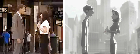
I can’t tell you how many times I’ve seen scenes where things suddenly go slack and move, seemingly, of their own accord in cg films. Perhaps the two arms will complete a motion that was started by an animator, and (s)he will allow the rest of the motion continue on its own to a final rest stop. It’s not animation anymore, it’s just a completion. I do quite dislike this when and if I see it. (Thought, admittedly, too often I’m not paying attention enough.) There’s a scene somewhere in Paperman where the male, standing in profile, has his two arms moving forward to a rest. They move at exactly the same speed, doing exactly the same thing, and it bothers me. Tissa certainly would have scolded me for allowing such a move to happen. I have to hope and believe that that’s what the animator wanted.
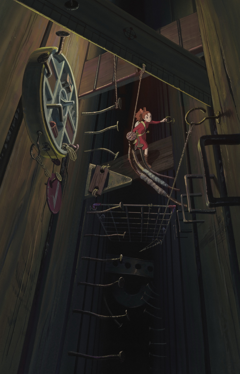 I had actually intended to keep going. One can’t really just say US and European animation styles. After all, there’s also the work out of Asia. The Japanese market, of course, is very different than the rest, and, thanks to what Miyazaki has been doing and his success in doing it, things are changing radically. Where he once blended in with the Anime animation that was all present, things are now changing to more of an emotional, Western appeal. My Neighbor Totoro started something, that changed wildly when he did Spirited Away and Ponyo. When I saw The Secret World of Arrietty, I knew things had changed completely. There was real character animation on the screen. One character was different from the next, and a lot of it had to do with the movement.
I was also fascinated with the work of Satoshi Kon, before his untimely death. His work was growing enormously with each and every film. The movies he made were adult in every sense of the word, and they were beautifully constructed, drawn and animated. I still go back to watch copies of his films. ________“Arrietty”
I was going to write about Katsuhiro Ôtomo, but I realize I’ve taken a sidestep. These are directors, and this article is about animators. In short, there is an Eastern style, and I’m glad to see that because of a couple of directors, they’re doing thier own take on the US version of animation character developement. It’s good to see it happening.
Essentially, the world is becoming smaller. Global animation styles are settling in, and I hope there will be a 2D animation so that the job can be complete in a few more years.
Commentary &Layout & Design &SpornFilms 10 Mar 2013 03:18 am
Bridget’s Art
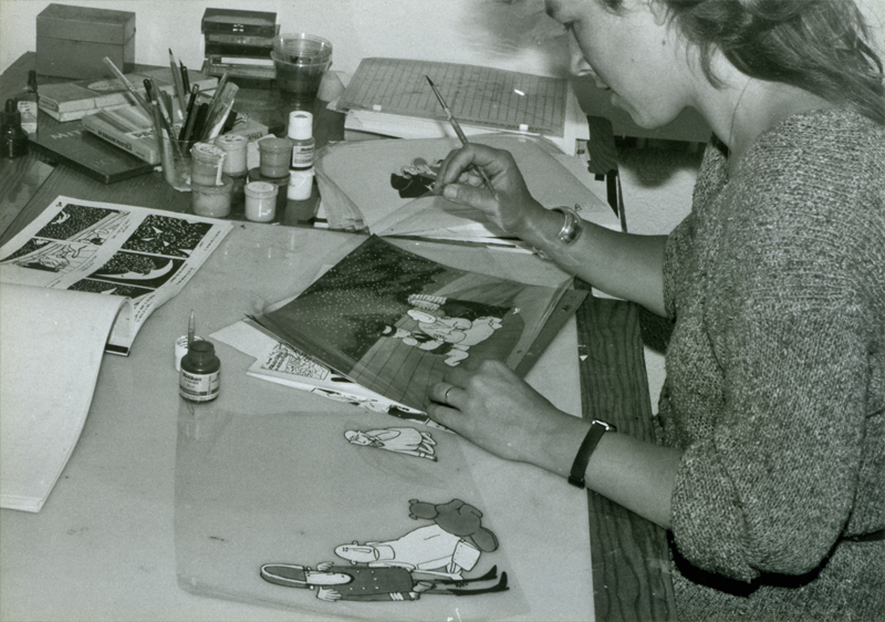
It’s time to put up some more Sporn Studio art. I had a couple of posts that celebrated BG art of Bridget Thorne. I’m putting a couple of these together and posting anew. Personally, I love this stuff and can’t get enough of it. I want to see Bridget doing BGs again; it’s been a while.
Bridget Thorne did the storyboard for
The Hunting of the Snark with me back in 1980.
We didn’t finish the film until 1989. She also painted the
backgrounds for the last third of the movie.
Bridget Thorne is someone who has been an invaluable part of the history of my films.
She has been an extraordinary Art Director and Background painter on quite a few of my favorite films produced within the studio, and I’ve put together a random sampling of some of those films.
(Click image to enlarge) Lyle, Lyle Crocodile (1987)
This painting is a key transition point in Lyle, Lyle Crocodile. The film had a looseness 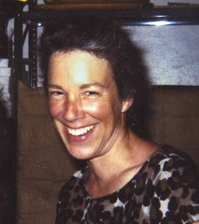 that Bernard Waber‘s original book art had engendered. I felt very much at home in Waber’s style, and I think Bridget did as well.
She worked out a color scheme for the film, and we both agreed to follow it closely through the film. Liz Seidman lead the character coloring. Bridget, of course, had a strong hand in all those character models, as well.
The scene pictured above follows the introduction of Autumn on “East 88th Street”, and the background brings us full force into it as we get “the girl’s first song” – Mrs. Primm’s report on what it’s like to have a crocodile living in your house.
 – Ira Sleeps Over was the second children’s book by Bernard Waber that we adapted. This is a very sweet story which involves a sibling rivalry; it focusses on a teddy bear and a sleep-over party. I pulled composer, William Finn, into the film and he wrote some great tunes for it. Prior to doing the script, I gave him the book and asked him to figure out where he would like the songs. In a week he had already written all the songs for the film, and they were brilliant. It turned out he used all the words of the book in his songs, and now I had to find a way of telling the same story using past, present and future tenses, as he did in the songs. It was a good challenge that worked out well and created a fabulous construction for the story.
 The style in this book was, if anything, looser than in Lyle. Waber did a lot of his illustration featuring duplicating printing techniques. Lino cut enabled him to repeat decorations throughout the settings. Bridget played with the lino cuts and was able to succesffully duplicate the technique in the backgrounds. In this one bg, at the beginning of the film, the foliage is a good example of this technique, printed over watercolors. The characters are markered paper drawings cut out and pasted to the cel overlays.
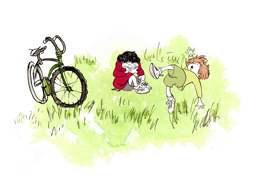
The book, like Lyle, featured a lot of white space, so we followed suit. When a book’s been in circulation for over 25 years, you have to realize there’s been a reason for it; find the reason and the heart, and take advantage of it. This use of white space made the actual backgrounds oftentimes little more than abstract shapes of color with a solid object on the screen. Here, for example, we see Ira and his friend, Reggie, playing against a blast of green and a bicycle.
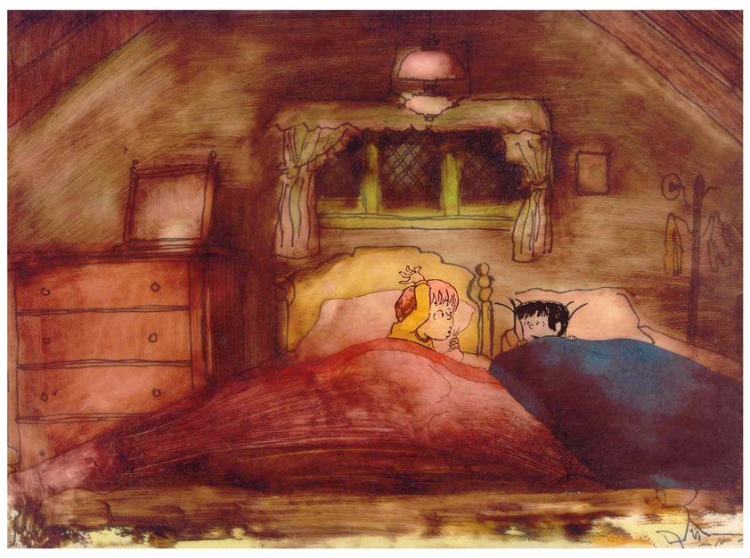 – At the end of the film, Ira and Reggie talk in the dark at the sleep-over. To get the look of the dark Bridget had to come up with something clever. The book resorted to B&W washes of gray and wasn’t very helpful. She came up with some dyes that were used for photo retouching. By quickly painting these lightly onto cel levels with a wide brush, she was able to get translucent cels with the brush strokes imbedded in the color overlays. By placing these overlays over the characters and backgrounds, we got the desired effect that let it feel connected to the very loose style of the film.
 -Abel’s Island is one of the few films we did that I treasure for its artwork. Bridget’s work on the backgrounds was, to me, extraordinary. The looseness I love was developed into enormously lush backgrounds using shades of green that I didn’t know could be captured in the delicate watercolors.
This film was a complicated problem that seemed to resolve itself easily and flow onto the screen without much struggle. The book had won a Newberry Award as best children’s writing of its year. It was not a picture book but a novel. The more than 120 pages featured fewer than 20 B&W spot drawings by author/illustrator, William Steig. We were on our own with the color.
 However, we had adapted Doctor DeSoto and The Amazing Bone as shorter films and could use what we’d learned from Steig on Abel. Bridget topped herself.
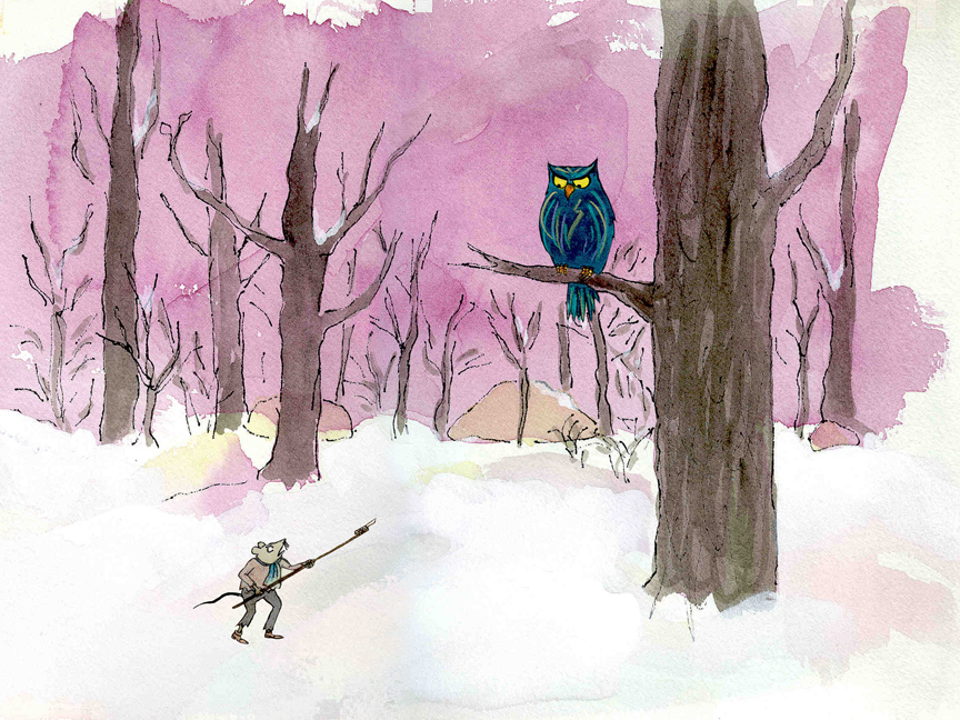
Several of the animators gave us more than I could have expected. Doug Compton‘s animation of Abel sculpting his statuary and living in his log was heart rending; Lisa Craft‘s animation of the big pocket watch, the big book and the leaf flying sequences was nothing short of inspired; and John Dilworth‘s animation of the owl fight was harrowing. This was all set up and completed by Tissa David‘s brilliant animation of Abel in the real world with wife, Amanda. She established our character.
 – At the end of the film, Abel, who has been separated from his new bride, trapped on an island for over a year, finally gets to come home. He sees Amanda in a park at twilight but decides to hold back. He races on ahead of her to greet her, privately, at home. The park sequence has a busyness as an acute counter to the lonliness we’ve watched for the previous 90% of the half-hour program. Setting it at early evening gave an opportunity for rich, royal colors. Bridget took full advantage of the opening, and underscored it all with a regal green not seen earlier. It was stunning and is one of my favorite backgrounds in the film.
Here are two more films Bridget Thorne designed for me.
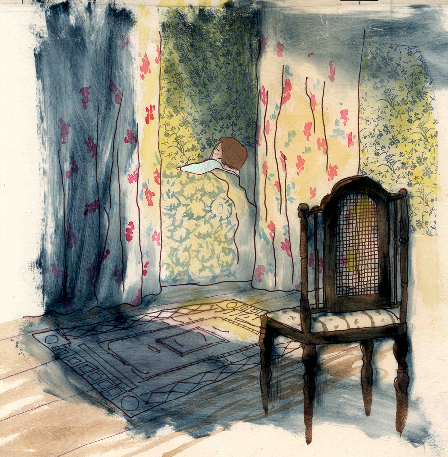
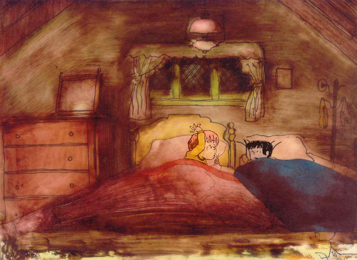
 A Child’s Garden of Verses presented new and different problems to explore.
It was a project generated by HBO. Charles Strouse and Thomas Meehan were going to write the book and song score. We met several times trying to discover a way into the book of poems. I’d suggested we use the verses in Robert Louis Stevenson‘s book to illustrate the author’s early childhood.
(Click on any image to enlarge.)
 Stevenson was a sickly boy who was always confined to his dark room. He was not expected to live long. The only visitor for days on end was his overprotective mother.
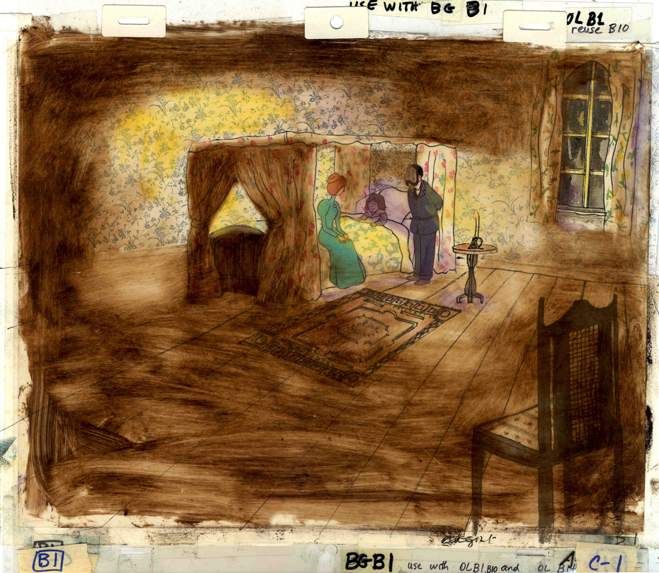
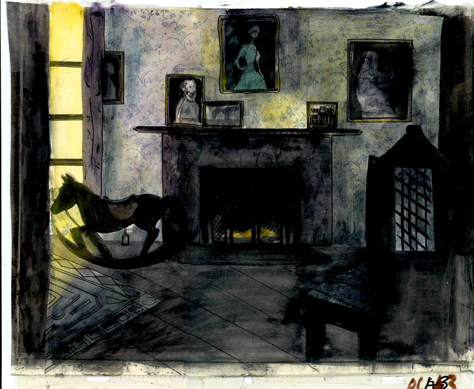
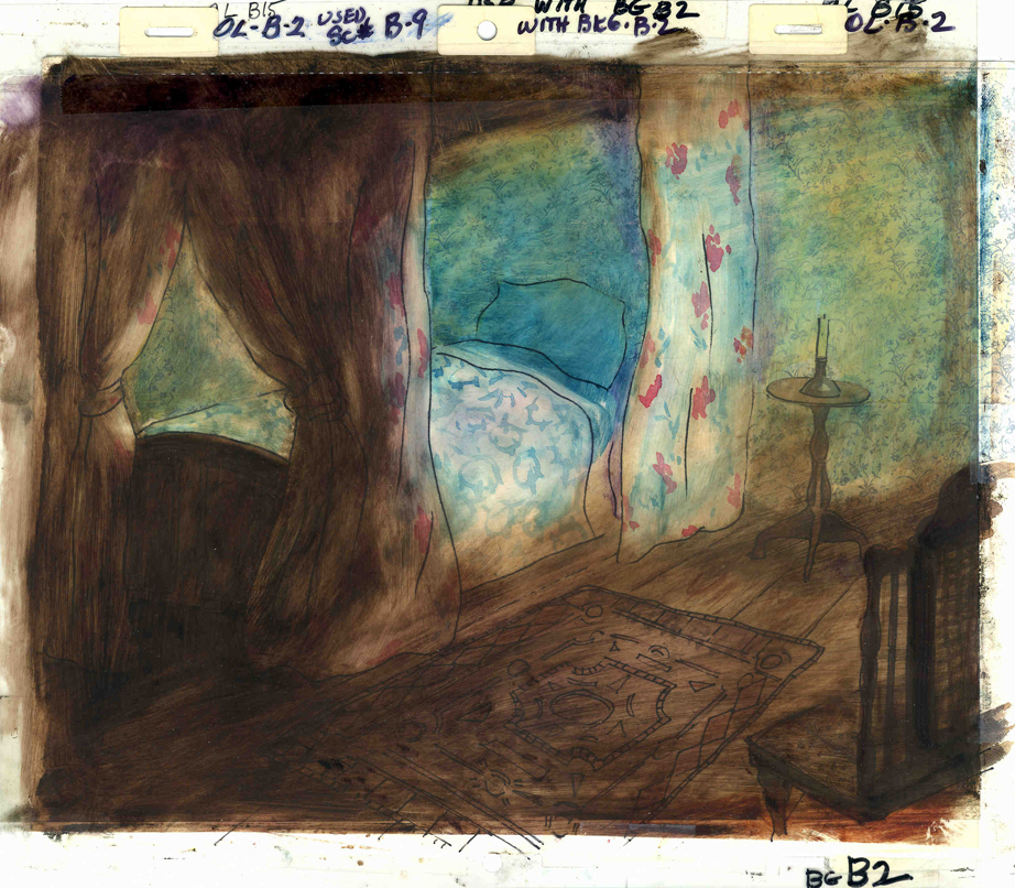
For much of the film, we had only the dark, child’s bedroom to explore. Artistically, I asked Bridget to delve deeper into the photgraphic dyes that she had discovered and used so well in Ira Sleeps Over. These dyes would allow us to keep the style, once again, loose while exploring dark areas and brush strokes to simulate the darkness “Robbie” lived in.
For the wallpaper throughout the house, Bridget used real wallpaper which was photostated; scaled down and reshaped to fit the backgrounds. Then watercolor washes colored these backgrounds and overlays were mixed and matched to get the desired results.
 I was never quite pleased with this film. The elements that worked well worked really well. Bridget’s work was a highlight. The acting was extraordinarily good. Heidi Stallings performed with an enormous amount of emotion yet barely raised her voice above a whisper. Jonathan Pryce was brilliant as Robert Louis Stevenson, the narrator and even sang a song when asked at the last minute. Gregory Grant as the young “Robbie” was vulnerable, sweet and all we could have hoped for.
However, there was too much of a rush given the delicacy of the piece, and the exterior backrounds done by me for the end of the film are poor. The animation is also hit and miss. Oddly enough, my favorite sequence used little actual animation but intense camera work. Ray Kosarin was the animator in charge of it, and it’s an impressive sequence.
- The Talking Eggs was done for a PBS series called Long Ago & Far Away. It was an adaptation of a Creole Folk Tale which Maxine Fisher updated for me. (Lots of discussion between WGBH, Maxine & me about what distinguishes a Folk Tale from a Fairy Tale. It seriously impacted the story we were telling and I wanted what I wanted and got.)
Bridget chose to use pastels and we searched for a paper that would bring out the most grain. I loved the end result. The characters, to match the look of the Bgs, were xeroxed onto brown kraft paper and colored up from there with prismacolor pencils. This was cut out and pasted to cel.
 Danny Glover was the narrator, and we chose to make him an on-screen character appearing intermitently in the film. His narration was recorded on a rush as he stopped off in LA from SF on his way to direct a film in Africa.
There’s a focus in these backgrounds that matches the content and mood of the piece, and it worked wonderfully for my purposes. I always like it when the medium is front and center; I want audiences to know that they’re watching animated drawings, and texture usually helps to do this. Of course, I also want the films to have a strong enough story that the audience gets past the point of knowing, to enter the film. It works some of the time, and I’m in heaven when it does.
 Bridget altered the color of the paper on which she was coloring with the chalks, and the different colored papers represented varied moods from sequence to sequence.
Naturally, there were some problems with the chalks under camera. All the fixative in the world didn’t stop the chalks from bleeding onto the cels or platen on the camera. (Lots more cleaning involved than usual.) We heard constantly from our cameraman, Gary Becker. The extra effort was worth it; the look was unique and successful.
The following is a short interview that we did in a publication I generated back in the ’80s.
Behind the Scenes with
Bridget Thorne
Interview by Denise Gonzalez
Bridget Thorne is a background designer who has been an important part of Michael Spom Animation for more than fifteen years. In that time she has enhanced the look of MSA films with beautiful backgrounds that are, in a way, part of the characters rather than just a scenic backdrop.
 DG: How long have you been working with Michael Sporn?
BT: I first started working for Michael in 1979 on Byron Blackbear And The Scientific Method, a fifteen minute short for the Learning Corporation of America. It is actually one of my favorites. I started out as a scenic painter for plays. I worked with a designer and basically dressed the set. We’d paint the exteriors, lay in wallpaper, marbleizing floors, etc. I started at Williamstown and at Playwright’s Variety in New York, I did a lot of off Broadway and off-off Broadway.
DG: Do you see background painting as a complete picture or as a supplement to animated artwork?
BT: It’s a supplement.
 DG: How do you take that into consideration when you start the backgrounds?
BT: Ideally, I take into consideration how the characters are designed. I like the characters to be part of the picture, not stand out like they do in Saturday morning cartoons. It all fits into a stylistic sensibility or pace more than anything else. I’m not a cartoon snob, I’m more of a two dimensional artist than a filmmaker. I design my backgrounds and line style according to the way the characters are designed. What I used to try and do was color the backgrounds, to match the colors of the characters. You work out of your home rather than at the studio. What are the benefits or drawbacks of working this way? I’ve just started doing this and yes, there are benefits. I can get into my own head, and I take off more with ideas because I’m not interrupted as much. But I like being in the studio and staying with the rest of the production as it goes along.
DG: Do you prefer working on original stories or from an existing book?
 BT: It depends on the story. Let’s say IRA SLEEPS OVER, it was great working out here on that because with an existing story you have a style to imitate, and it is easy for a whole bunch of people to follow that when they’re all working in different places. So as far as production goes, that makes it easier. The great thing about original scripts is that they allow for an incredible amount of individual input. What do you take into consideration when designing the look of a film and what preparation is involved? It depends on the story. I tend to have a knee jerk reaction at first or an impulse. I have a Fine Arts background, and I tend to rely on painters. I find fine artists are more in tune stylistically with Michael’s films than the more hard-edged graphic cartoons. (Though I will look at Disney inspirational drawings.)
Then I look at the layouts and the character design, so I sort of work on intuition and impulse. Then I look at the existing elements and put those all together and come up with a design. As far as preparation goes, what I consistently do is make 5×4 sketches of design ideas. For ABEL’S ISLAND I did lots and lots of little paintings of winter and fall and spring.
First three illustrations pictured above:
1. BYRON BLACKBEAR AND THE SCIENTIFIC METHOD.
2. A CHILD’S GARDEN OF VERSES.
3. IRA SLEEPS OVER
DG: When designing the film do you take into consideration that this will be seen by a child?
BT: I’m not a cartoony person so I don’t think about that. I tend to think more — sometimes I run into trouble this way — I think of it in a frame and ideally what I really want is a balanced look on the screen. A lot of times that’s hard because what I see in front of me is so different when it is filmed.
DG: What do you consider to be the best example of your work thus far?
BT: I guess ABEL’S ISLAND. I was able to abstract a little. I wasn’t confined to chairs and bureaus. I was able to match the mood of the movie to the backgrounds. If Abel was in trouble, I could put colors that indicated that, or I could abstract it. If something was calm I could paint it calmly. Abstraction, or looseness, is more my personal style. This is true of Michael’s style, as well.
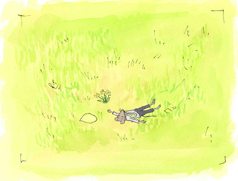
A scene toward the end of ABEL’S ISLAND.
DG: Have you ever worked on a film you couldn’t connect with?
BT: I’d say yes. It’s a hard question to answer off the top of my head. I sort of think of movies like they were kids; they are either noisy or funny or quiet or sad. They all have their own characteristics, and it is really the process of making the movie that attracts me to animation. I tend to have different feelings about each movie. But yes, sometimes a story irritates me or something comes in and it doesn’t suit my style or what I imagined. It can be very difficult. That’s an interesting thing about animation; there is really a sense of compromise; you are compromising all the time.
A scene of the narrator at the end of THE TALKING EGGS.

A background from A CHILD’S GARDEN OF VERSES.
home from school in WHITEWASH.
Commentary 09 Mar 2013 06:44 am
Comment Saturday
I haven’t mentioned yet that this is the 33rd year my studio’s been in business officially. That means Michael Sporn Animation, Inc. is as old as Christ was when he was shot down. I think it may make us the oldest studio in the City, by a mouse hair.
Buzzco is right up there, but I believe they didn’t officially incorporate until 1985. I have Feb 6, 1980 as my official start date in NYC.
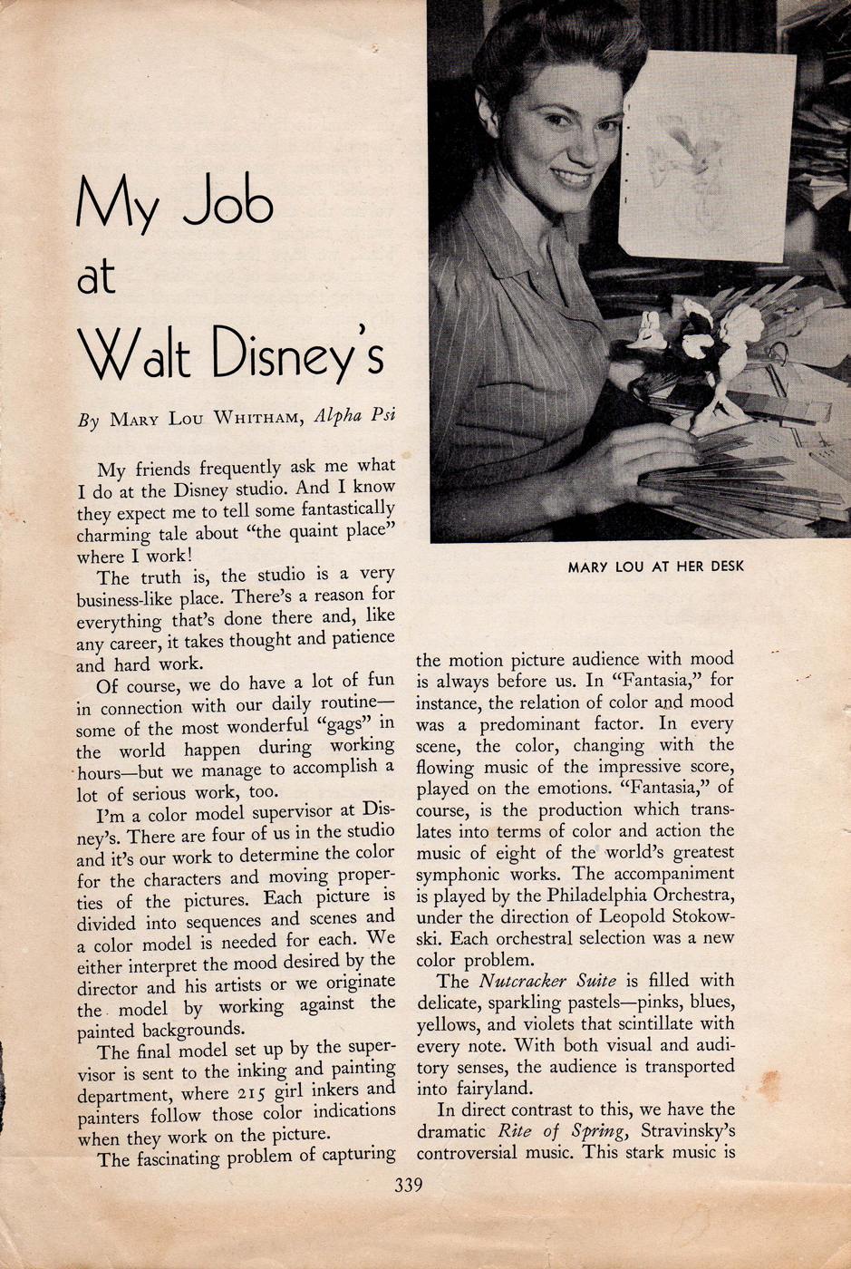
Mary Louise Whitham Eastman
_____________________________
Tony Eastman wrote me to say that his mother, Mary Louise Whitham Eastman, passed away last Wednesday, February 27th, 2013. She would have been 98 on April 30th.
He attached an article that he thought we would find interesting. It was published
in her sorority magazine sometime between her graduation from UCLA in 1937 and
marriage to her husband, P.D. Eastman, on April 26, 1941.
Tony’s parents met at Disney’s studio in the 30′s.
All our sympathies go out to Tony and his family as we also mourn the loss of this important woman.
 1
1(Click any image to enlarge.)
 2
2
Philip Dey Eastman, Tony’s father, of course, wrote the script for Brotherhood of Man, Private Snafu and Gerald McBoing Boing as well as many other UPA classics. he went on to write and illustrate his own popular titles for the Dr. Seuss Beginner Books series
A Wiz isn’t just a Wiz
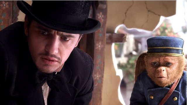
One of the two fine actors in the new movie, and it isn’t John Franco.
Maybe this should be about how all those great character actors were great radio personalities, and there ain’t a one of ‘em today. Frank Morgan, Margaret Hamilton, Billie Burke, Ray Bolger, and Charley Grapewin were all big radio stars.
Frank Morgan was a good ol’ character actor. His one real role claim to fame was as the Wizard of Oz in the movie of the same name. He was the guy behind the curtain who had that traveling magic wagon in the B&W sections of the film. His voice carried the character every bit as much as his acting. In the new movie, John Franco is supposed to be the young Frank Morgan. Not a chance in hell could one guy be the other. Franco is limited as an actor and keeps giving the same thing over and over again in the new movie.
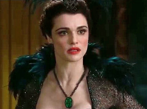 As a matter of fact, I think there were only two great performances in that film. I liked Mila Kunis until Rachel Weisz showed up and we got to see what real acting was – it made me knock my estimation of Ms. Kunis down about five chips. Without chewing the scenery, Ms. Weisz played evil of the nastiest kind. Another great performance by Mrs. Daniel Craig.
Michelle Williams is also an excellent actress but she’s at least four octaves away from Billie Burke, who played the original Glynda, the good. It took a little while but I warmed up to Ms. Williams; I never warmed up to John Franco as the wizard. As a matter of fact, I also have to wonder about the idea of building this film around a guy. Dorothy was vulnerable and it took the entire movie for us to realize she had the strength to carry all of those weak characters through Oz defeating the witch and buiding up a Wizard. In the new movie we have a con man who escapes from his lies by landing in Oz. He’s just a little too loveable for me.
I also have to think about some of the jokes that were just a little out of character when, in fact, they were popping the characters in the film. For example, Rachel Weisz shouts to Michelle Williams: “Run out of bubbles, Glynda?” You had to be there; it was funny but somehow it was out of place. Maybe they needed more jokes like that for the one to have fit.
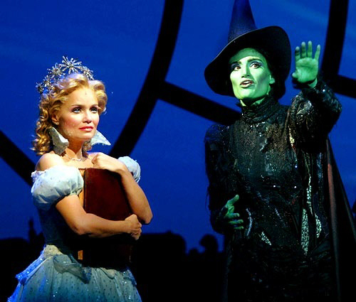 What the film really needed was songs. It was a musical without the songs. A musical uses song when the emotion is too great to be done without singing. That sure fit this film. Disney has the great tune-smith, Alan Menken, ready, willing and able to give some great tunes. I wonder if they could have gotten Steven Schwartz to do the lyrics. Remember he already wrote the musical, Wicked, which was basically the same story as this movie. Three witches fight for a guy. I can understand it if the guy is Clark Gable, but John Franco? Maybe Paul Rudd would have been the better wizard. _______Stephen Schwartz’ musical, Wicked.
As a matter of fact I know he would’ve been.
Basically, this film is a bunch of cgi animated flowers and smoke and other stuff with characters like Franco escaping flying baboons et al. Somehow it just didn’t have enough imagination for me to get lost.
Oh yeah, Rachel Weisz was the one great actress. The great actor was the animated monkey that acts as slave to John Franco after they’ve met. The character didn’t overact and gave up some real sympathetic moments. Kudos to whoever animated it.
Frank Morgan did a lot of animated voices for Harman-Ising.
It’s his voice that comes in as a traveling
eyeglass salesman, at about “200″. It works nicely.
Changing Sidebar?
I’ve been thinking about doing a lot of changes to my sidebar – over there on the right of the Splog. A lot of those blogs I’d included have dwindled down to posting not much anymore, and there’s not a lot of hope that Jaime Weinman’s Something Old, Nothing New, for example, will return to his blog. Yet I keep going back. So maybe I should dump it and put down some other blog that got a lot to offer. Don’t get me wrong, I love the Weinman blog, but he doesn’t.
There are some that don’t change a lot but have a lot of good material there, and I keep going back and wandering around even though not much has changed to the site. Patti Stren, for example, has a great blog that was put together (to Patti’s specs) by the brilliante Santiago Cohen.
 I know Patti from a great and original piece she did and she brought to me with the intent of animating it. I had that pleasure and we made a film of Mona Mon Amour. It was the diary of a young woman who gave us the rules of dating in New York City. It was great fun working on that movie short. At all the MoMA screenings we had years ago, that film got the biggest laughs. Patti also had one other book adapted to animation. Hug Me was produced by Nick Bosustow and directed by Sam Weiss. A sweet film. Patti recently did a new reworking of the book, Hug Me, and we’ve spoken about animating it. Blythe Danner has agreed to narrate it. I hope the movie happens. I could use a few laughs in my life.
Anyway, if you have any thoughts about the “sidebar,” don’t be afraid to let me know in the comments section.
Explicit Signe
The British site, Skwigly currently features an extended podcast/interview with one of my favorite local animators, Signe Baumane, and I encourage your listening to it.
 As we know, Signe has just achieved her goal of raising $43000 on a Kickstarter campaign to raise the funds to complete her feature length film, Rocks In My Pockets.
I’ve mentioned that I’d seen a rough test pre-screening of the film, and I was thrilled to report that I loved it. Lately, my body has been intolerant of bad movies. I seem to fall asleep in most of the films I go to see. In the old days, I would walk out. Now, I fall asleep. (I recently stayed awake for a full hour of the latest Mia Wasikowska film, Stoker before I walked out.)
Seeing Signe’s film on a tiny television posited atop a refrigerator some 25 feet away still kept me not only interested but wholly absorbed. I look forward to seeing the movie on a bigger screen, completed. It’s about something and it does the job of telling it well. That’s rare for film these days. This one is animated to boot!
Sqwigly warns that the conversation on the podcast is “explicit”; maybe that will encourage you. Personally, I only like explicit conversations.
See her blog while you wait for the film to show up at the local Loew’s.

Tracking Kim
It was a treat to see Kim Novak on an hour interview on TCM. She spent a bit of time talking about being bi-polar, something inherited from her father. This, of course, was an enormous problem during the Fifties. I can only imagine the difficulties she went through, just trying to care for her father. And then she said he walked out of the the premiere of Vertigo when she was hoping to finally impress him. With tears she said that he never once told her that he loved her in all his days. It was a very sad personal story.
She had built all her hopes into working with director Mike Figgis on the film, Liebestraum. However, she found that he wasn’t a good partner, and she had so little in common with the film he sought to make. She could only quit the business, which she did, retiring in the Pacific Northwest. She told this story through tears.
It was a treat watchng Bell Book and Candle again for the umpteenth time. I just love that movie. I believe Richard Quine, the director, gave advice to Jack Kinney when he directed Magoo’s 1001 Arabian Nights. They certainly shared the brilliant composer George Duning. (A great animation score.) However, only James Wong Howe could have photographed Novak and Stewart so beautifully in Bell Book and Candle.
Man of a Thousand Voices
Here’s a documentary you may have missed. It’s a one hour show about Mel Blanc and all of his Voice Over and other acting jobs. There are a lot of great interviews with people like June Foray (naturally enough), Bill Hanna, Chuck Jones and a lot of other pros.
The Rifleman
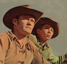 This morning at 6am, AMC ran an excellent episode of The Rifleman, that great tv show from the early 60′s starring Chuck Connors as the Rifleman, Lucas McCain, and ex-Mousketeer, Johnny Crawford, as his son, Mark. In this episode, Mark got typhoid fever drinking water from some roaming band of gypsys. The father & son were on the way to a friend’s house. The friend was played by the great character actor, Karl Swenson. A good part for Swenson, who usually only played bad guys in Westerns. Here he even got to use some kind of odd Eastern accent. You’ll know Swenson as the guy who played the voice of Merlin in Disney’s Sword in the Stone. The back story had to do with Mark’s remorse in growing up without a mother, who’d died when he was 6. A fun episode.
The best line of dialogue came when the doctor asked an older female friend standing in the background. “Are you a nurse?” She answered, “No, but I’m a woman.”
At the episode’s end, as Mark is slowly recovering, the doctor tells her, “Next time somebody asks, you tell them you’re a nurse!”
It doesn’t get any better.
Bill Peckmann &Comic Art &Illustration 08 Mar 2013 05:35 am
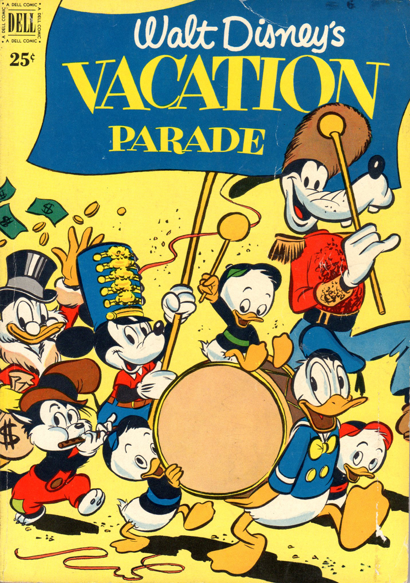
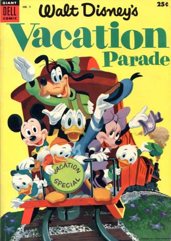
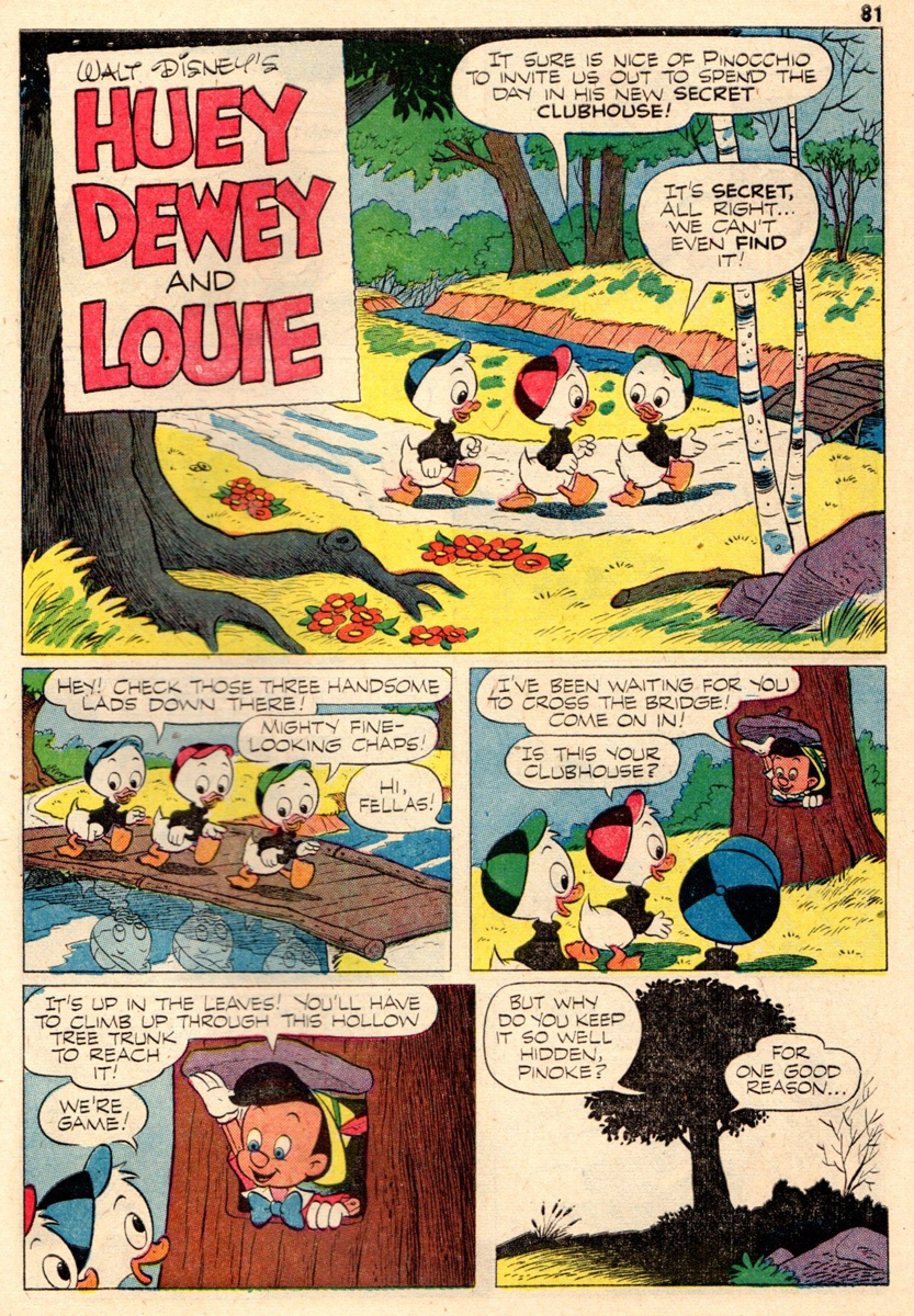
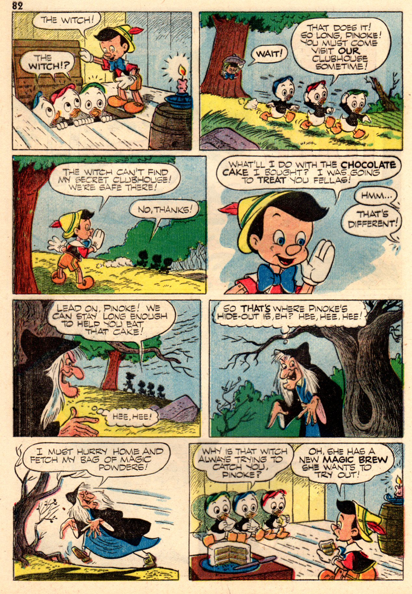
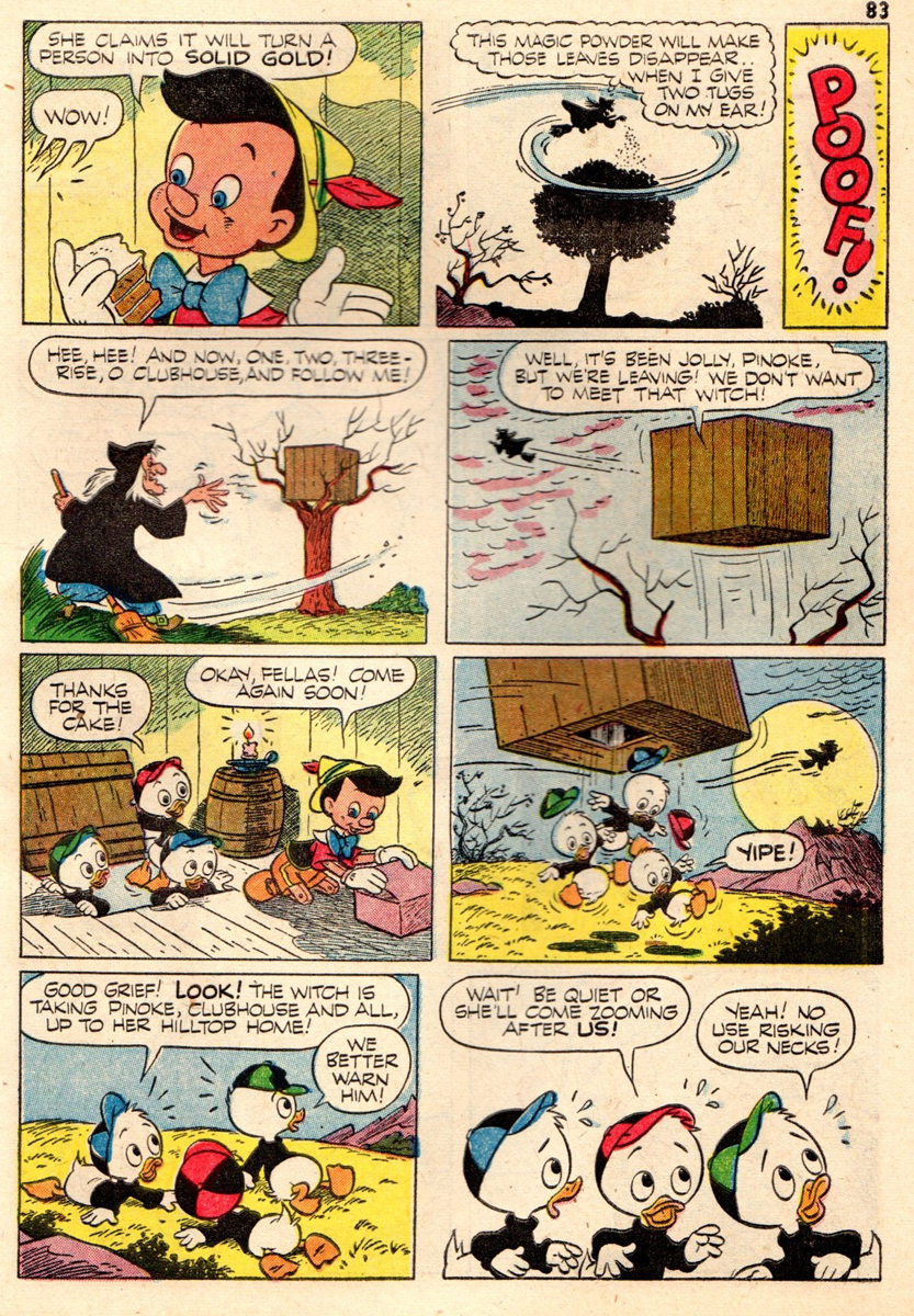
Vacation Parade
I’ve written in the past about how much I enjoy the work of Dick Moores. So I’m always pleased when Bill Peckmann sends comic art by him, and am excited to post it. Here’s the latest. From Bill:
- It may be a tad too early for summer vacation but it’s never too early for “Walt Disney’s Vacation Parade” comic books, especially if they contain two of the best of Uncle Walt’s comics bull pen! Back in those days, the New York Yankees had Mantle and Maris, the M&M Boys, Disney also had his own M&M Boys, Dick Moores and Paul Murry, also grand slammers!
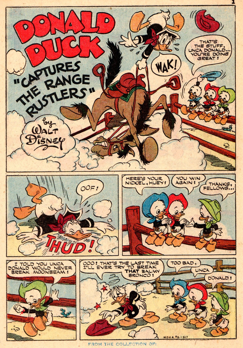
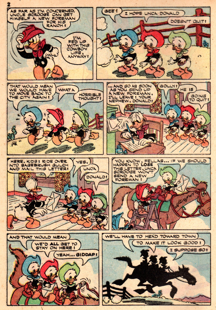
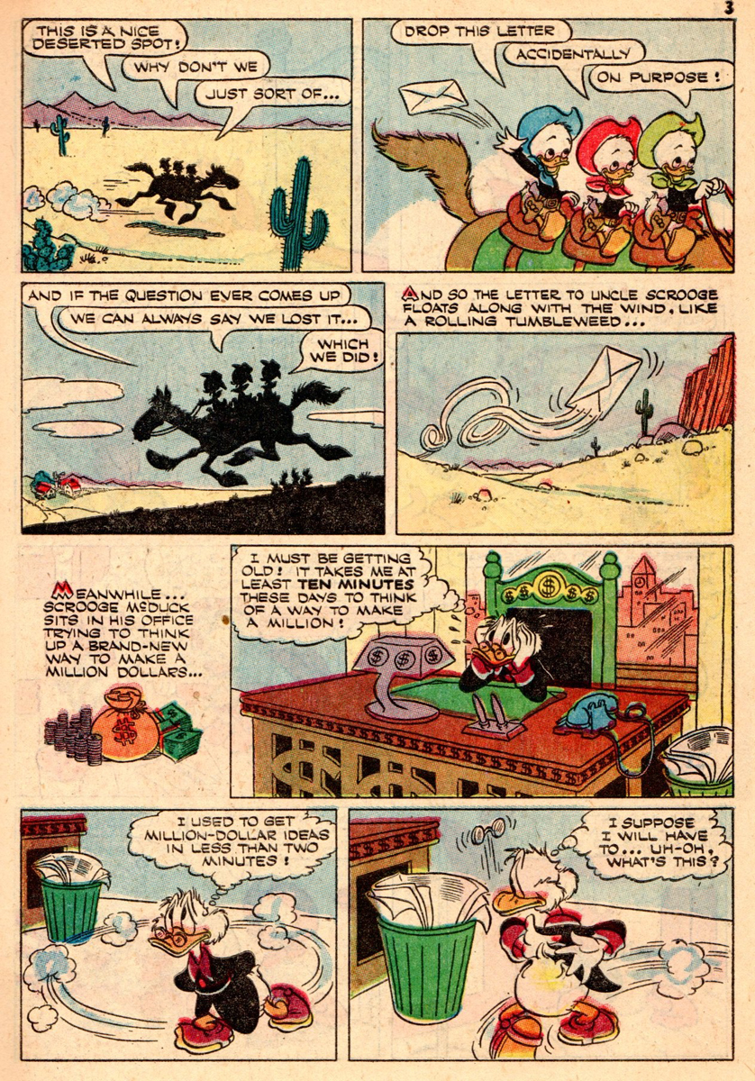
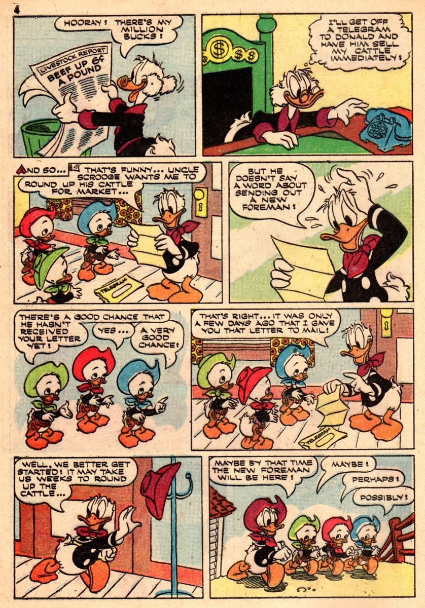
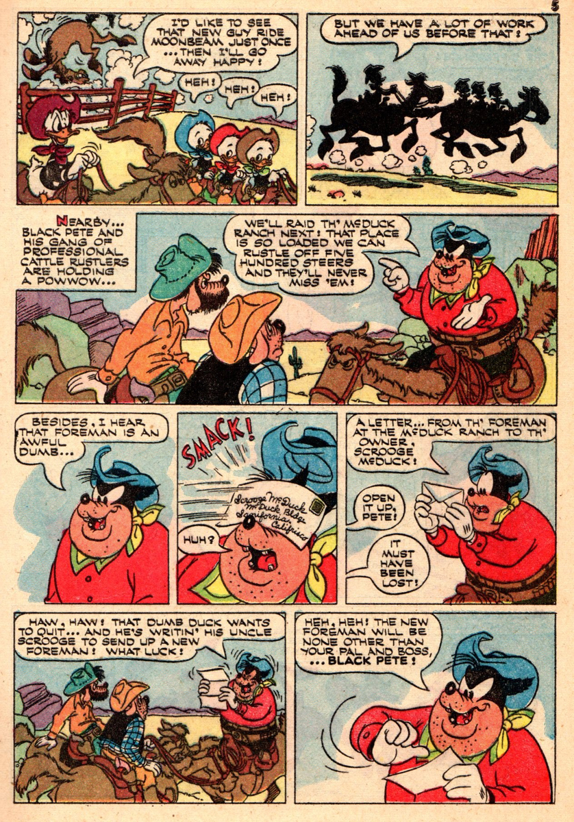
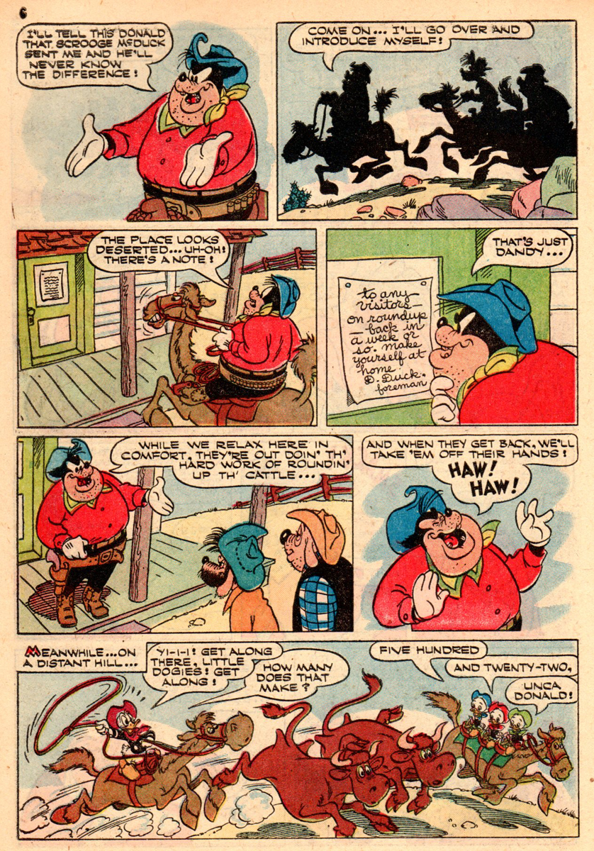
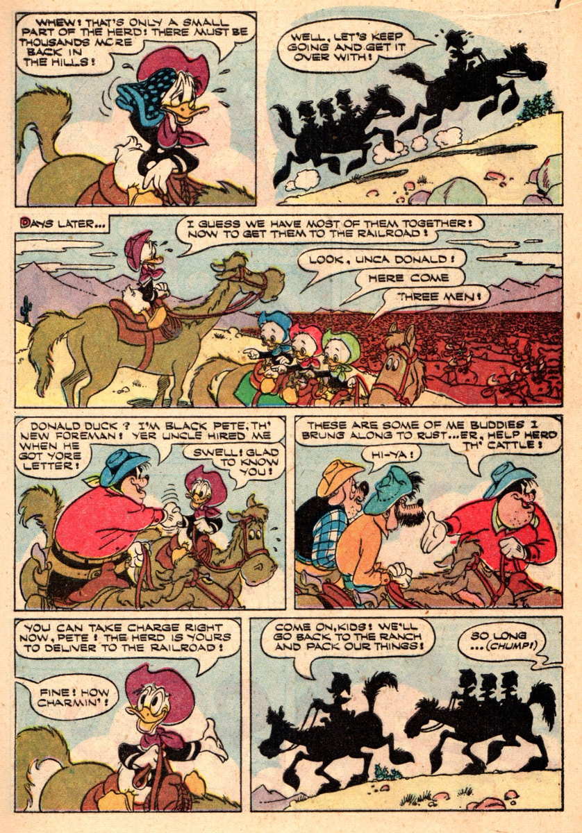
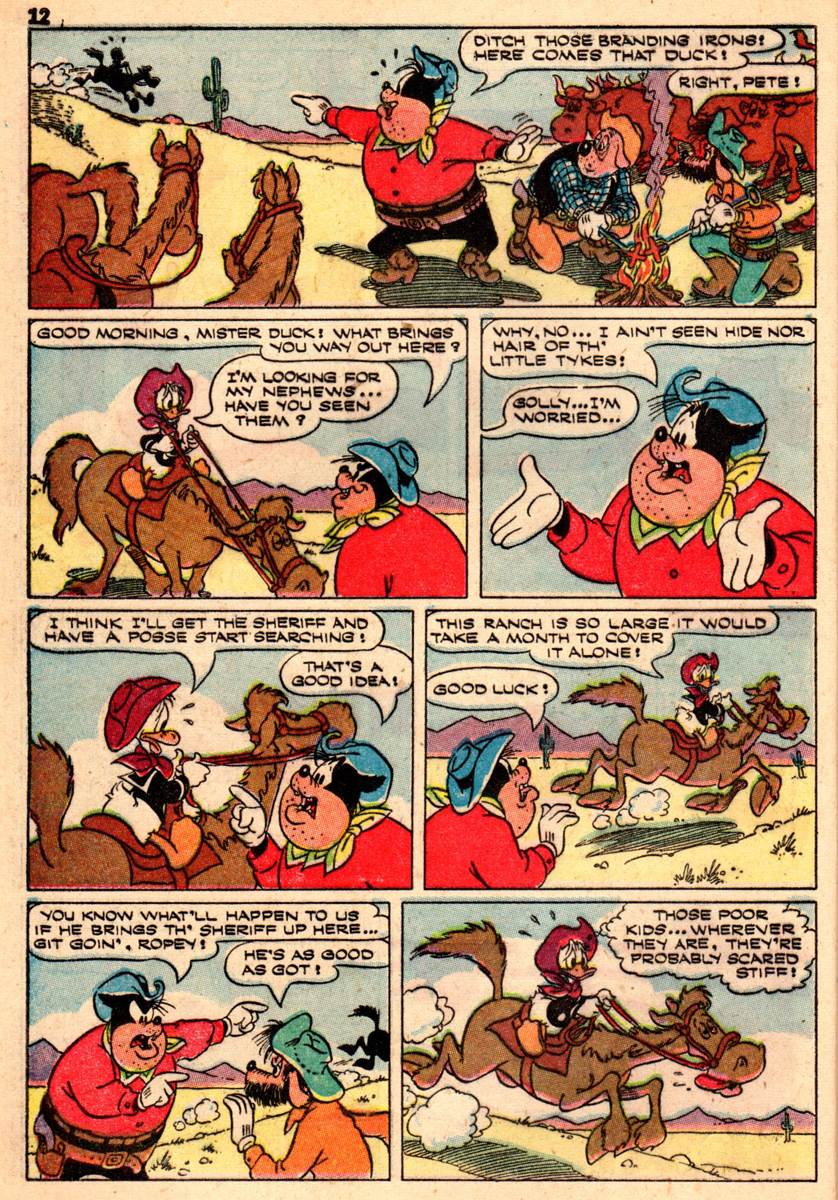
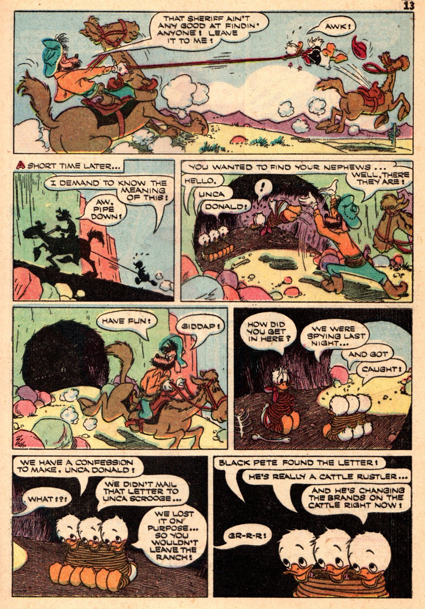
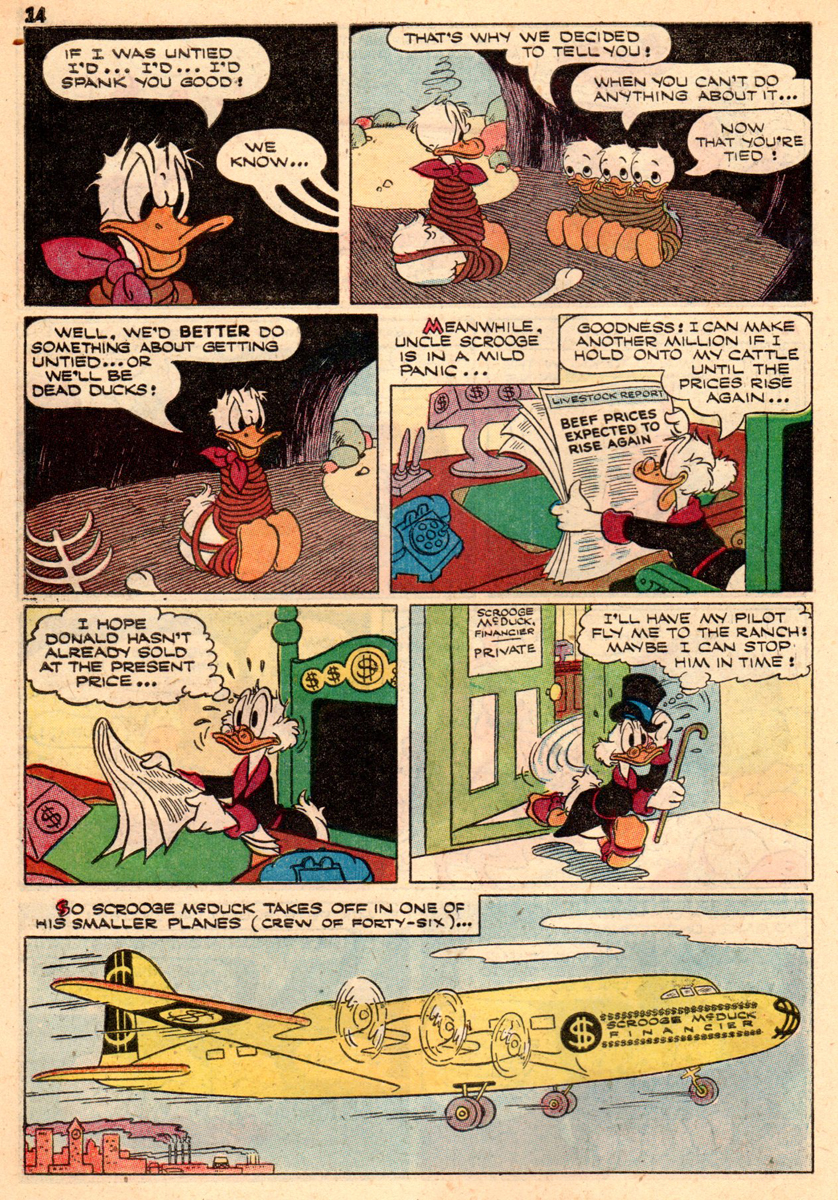
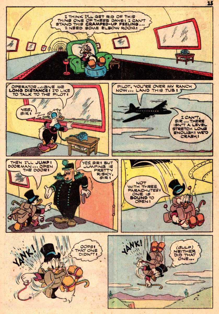
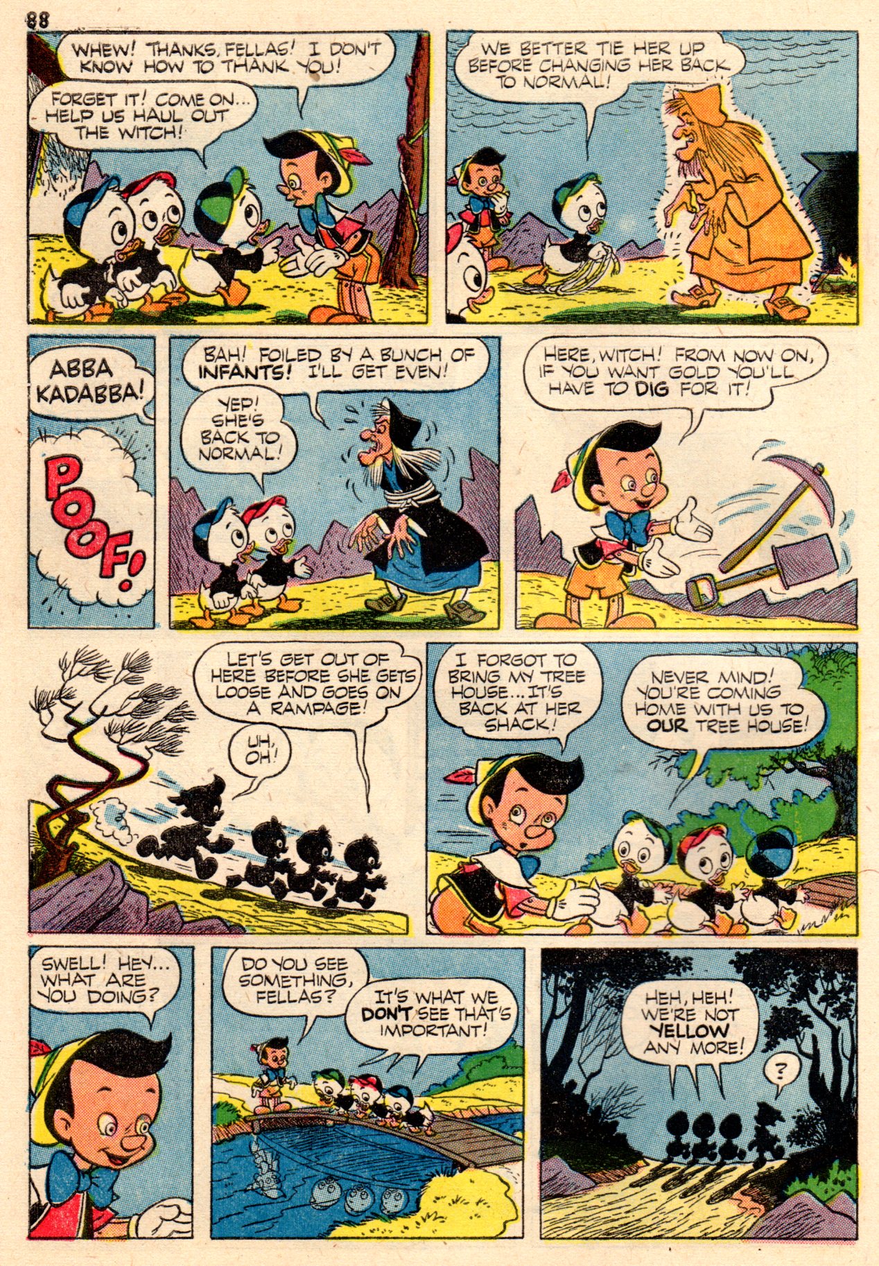
Here from “Vacation Parade” no. 2 is a 19 pager by Paul Murry, Donald heads the cast and we get to see how Murry handles Scrooge McDuck. The comic book is from 1951, just about the same time Paul was doing his daily comic strip “Buck O’Rue“!
Cover 1
 1
1
 2
2
 3
3
 4
4
 5
5
 6
6
 7
7
 8
8
 9
9
 10
10
 11
11
 12
12
 13
13
 14
14
 15
15
 16
16
 17
17
 18
18
 19
19

Back cover
Front Cover 2
 21
21
 22
22
 23
23
 24
24
 25
25
 26
26
 27
27
 28
28
 29
29
Back Cover 2
Articles on Animation &Hubley &Independent Animation 07 Mar 2013 05:24 am
Animation Learns a New Language
This is an article that was published in the July, 1946 issue of The Hollywood Quarterly. I thought some might be interested
by John Hubley & Zachary Schwartz
John Hubley is a director of cartoons at United Productions. He has worked as art director and director of Disney Studios, at Columbia, and in the First Motion Picture Unit of the Army Air Forces.
.
.
.
Zachary Schwartz was one of three organizers of United Productions, where he is now a director. He has worked on Disney productions and on wartime training films. He is now preparing a training film for State Department personnel.
.
.
Select any two animals, grind together, and stir into a plot. Add pratfalls, head and body blows, and slide whistle effects to taste. Garnish with Brooklyn accents. Slice into 600-foot lengths and release.
This was the standard recipe for the animated cartoon. That is, it was standard until Hollywood’s fantasy makers were presented the task of teaching people how to fight.
Six months before America entered World War II, the animated motion picture industry of Hollywood was engaged in the production of the following films:
- 1 Feature-length cartoon about a deer
16 Short subjects about a duck
12 Short subjects about rabbits
7 Short subjects of a cat chasing a mouse
5 Short subjects with pigs
3 Short subjects with a demented woodpecker
10 Short subjects with assorted animals
1 Short technical subject on the process of flush riveting.
Since that time, the lone educational short, dubbed by the industry a “nuts and bolts” film, has been augmented by hundreds of thousands of feet of animated educational film. Because of wartime necessity, pigs and bunnies have collided with nuts and bolts.
Sudden change from peace to war presented to government agencies, the military services, and industrial organizations a fundamental problem. This was the necessity of teaching millions of people an understanding of objective information with which they were essentially unfamiliar. The thinking and mechanical skills of millions had either to be changed or developed. And fast. Thinking, that is, and understanding regarding international policies, the nature of the enemy, coöperative safety measures, the fight against disease, price control, taxes, motor skills involving the thousands of tactical details of warfare for fighting men, and the hundreds of new methods for unskilled workers.
Thus it also became necessary for the craftsman-animators of the motion picture industry to analyze and reëvaluate their medium; for visual education, or more specifically the motion picture, bore the burden of this tremendous orientation program. Previously, animation usage in the educational film had been singularly undeveloped. While the theatrical cartoon developed an ability to emphasize and exaggerate for comedy purposes, and perfected the techniques of dramatization, “nuts and bolts” animation remained static. It consisted of rigid charts, diagrams, mechanical operations, maps, and labels. Unlike its Hollywood counterpart, it contained no humor, no personalized or intensified image, no emotional impact, no imaginative association of ideas to enable one to retain its content.
It presented cold facts, and left its audiences in the same state. But because of the urgency of the war situation; because of the varied specialized groups to be taught; because of the attitudes to be formed or converted, new and more effective means were necessary. The collision of these two animation methods occurred because of the need to present objective information in human terms.
Film units in the Armed Forces, and many professional studios producing educational films of infinitely varied subjects, soon discovered that, within the medium of film, animation provided the only means of portraying many complex aspects of a complex society. Through animated drawings artists were able to visualize areas of life and thought which photography was incapable of showing.
Psychological tests and reaction studies conducted by the military indicate an exceptional popularity and response to animated technical and orientation films. The Signal Corps found that the reaction to the animated “Snafu series” was greater than the reaction to any of the live-action films. The Air Forces Psychological Test Film Unit undertook a study of how much was learned through use of an animated training film as compared with how much through oral and written instruction on the same subject matter. The superiority of the film, both for learning and retention, was particularly clear when full use was made of the unique possibilities inherent in the medium.[1]
What are these unique factors? To understand them we must examine the basic difference between animation and photographed action. Now a single drawing, especially the cartoon, has always been capable of expressing a great many ideas. A drawing of a man, for instance, can glorify him or ridicule him. Further, it can emphasize aspects of his physical form and subdue or eliminate others. It can combine ideas, such as a human face on a locomotive, an animal in a tuxedo, a skeleton with a cloak and scythe, etc. It can represent a specific object (a portrait, a landscape, a still life). Or it can represent a symbol of all men, all trees; the drawing of Uncle Sam representing America; the eye representing sight; the skull representing death: the single image can represent the general idea. The part can be interpreted as a symbol for the whole.
Thus a drawing’s range of expression, its area of vision, is wider than that of the photograph, since the camera records but a particular aspect of reality in a single perspective from a fixed position. In short, while the film records what we see, the drawing can record also what we know. The photograph records a specific object; the drawing represents an object, specific or general.
Animated drawings are a series of single images drawn in the progressive stages of a motion, which, when photographed on film and projected, create a visual symbol of that motion. In this lies the significant element that creates the possibility of a new visual language.
Our general idea, our broadest observations of reality, can be visualized in terms of the personal emotional appeal of the specific idea. What does this mean in terms of the communication of ideas? It means that the mental process which the individual scientist has undergone to achieve a greater understanding of nature can now be visualized for millions of people.
For example, a scientist deduces that by grafting two plants a seed is produced that will bring forth a new type of plant. He then proves his deduction by experimentation and comparison. We can see the result. We can see the original plants; we can see the seed. But we only understand the process by means of a language whereby the scientist explains the development to us. He may use words, and is thereby limited to audio images. Or he may photograph the specific parts of his experiment in motion pictures and, by assembling the parts in conjunction with words, produce a segmentary progression of the process. Or, by using stop action or other camera devices, he may photograph the growing plant itself.
But were he to translate the process into animation, he could represent, by means of the dynamic graphic symbol, the entire process, each stage or degree of development; the entire growth, from the grafting, through the semination of the seed, to the resultant plant. This quality of compression, of continuous change in terms of visual images, supplies the scientist with a simple language and a means of representing his own process of observation to millions.
Since the artist controls the image of a drawing, he also has the ability to change its shape or form. He is able to change a tree to a stone, an egg to a chicken, in one continuous movement. And he can compress a process that would by nature take centuries, or days, into minutes, or seconds. Or he may extend a rapid movement, such as the release of atomic energy, from split seconds to minutes, that it may be more carefully observed. These aspects of natural movement, and simultaneous confiicts of opposite movements, such as physical action and reaction, positive and negative electricity, processes we know, we can now see.
We must be clear that the effectiveness of live-action photography is by no means reduced by animation. It is only necessary to understand photography’s functions and capabilities in relation to animation. This may be stated as an ability to represent a specific aspect of reality in very real terms. We can photograph reality. Or we can create a synthesis of reality, and record it.
For instance, we may see the subtle shades of expression on the face of a resistance leader before a fascist firing squad. This may be actual (documentary) or enacted. We see his bodily aspect, his clothes, his hands, the barren wall behind him, the distance between the man and the guns, the sky, the trembling, the blood. Dramatically, we are made to feel the relationship between the victim and the firing squad, the emotional conflict, the tension, the fear, the hatred. We can understand these emotions because we have experienced similar emotions. The specific situation is the focal point that gives us the clue to the general situation. We see this victim of fascism shot, and we gain a better understanding of the general nature of fascism.
With animation, this process is reversed. Instead of an implied understanding resulting from the vicarious experience of a specific situation, animation represents the general idea directly. The audience experiences an understanding of the whole situation.
Dynamic symbols, images representing whole ideas, the flags, the skulls, the cartoon characters, can explain the nature of fascism in terms of its economic roots, the forces behind it, the necessity for its policies of aggression, its historical roots, its political structure. The dynamics of changing symbols—ballots turning into guns, books to poison, plowshares to swords, children changing to soldiers, soldiers to graves—can carry a visual potency as clear as the growth of a seed into a plant. Our understanding of the process as a whole is experienced directly and immediately.
The significance of the animated film as a means of communication is best realized in terms of its flexibility and scope of expression. It places no limitations upon ideas; the graphic representation grows out of the idea. The broadest abstract theory may be treated in a factual manner and made interesting, clear, and memorable through the use of movement and sound. All degrees of the general and particular are within its normal scope because anything that the brain can conceive can be expressed through the symbol. For instance, the subject might demand an extremely impressive statement of reality. It might then be advisable to use a combination of photography and animation, the photography to state the facts of outward appearance and the animation to illustrate the inner construction, or comments upon the subject, or to suggest emotional reactions of the subject. This kind of treatment creates a super-reality in which we are conscious of many aspects simultaneously.
In animation, the artist and writer have at their command all the traditional means of graphic expression and the new means which grew out of moving symbols and sound. One of these is the concept of explanation through change from an object as it is to the thing it signifies. For instance, in explaining the function of the liver the picture changes from a liver to a recognizable sugar bowl filled with cubes of sugar. The cubes hop out into the blood stream and bob away into the circulatory system. Or, we might wish to give graphic expression to an emotional reaction. One person is being protected by another, and for a moment the protector animates up into a proud knight and charger. We hear the clank of metal and stamp of horse’s hoofs for just an instant, and then the whole image animates down again into its original form. Another example of this is the picturization of certain words in dialogue to stress a particular idea. A person is being taught a difficult mechanical technique involving rapid manipulation of buttons and levers, etc. He protests, “What do you think I am—an octopus?” At the moment the word is spoken the character changes to an octopus and then back again so quickly that the observer has just gotten a fleeting impression of the picture of the word. These examples indicate the kind of picture solution that can be evolved from an idea no matter how abstract.
We have found that the medium of animation has become a new language. It is no longer the vaudeville world of pigs and bunnies. Nor is it the mechanical diagram, the photographed charts of the old “training film.” It has encompassed the whole field of visual images, including the photograph. We have found that line, shape, color, and symbols in movement can represent the essence of an idea, can express it humorously, with force, with clarity. The method is only dependent upon the idea to be expressed. And a suitable form can be found for any idea.
Top Cel 06 Mar 2013 04:18 am
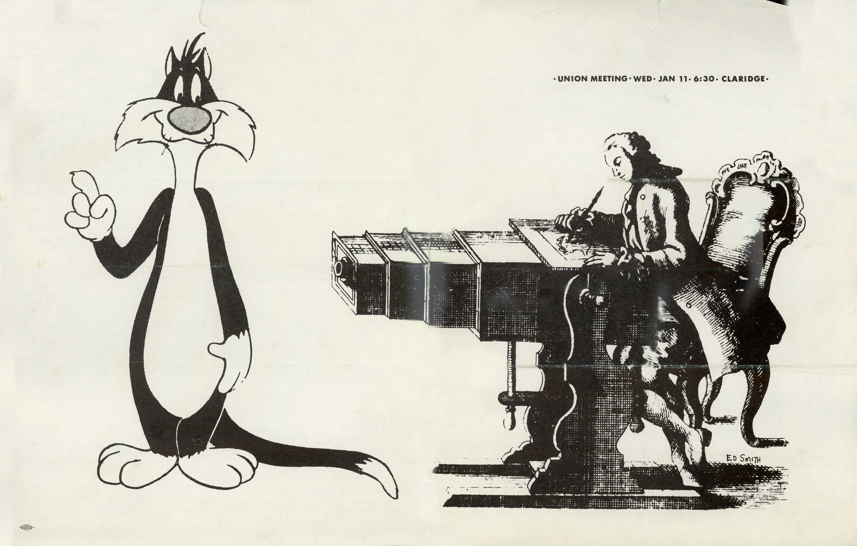
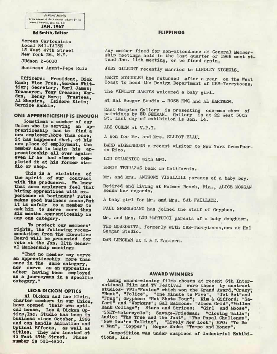
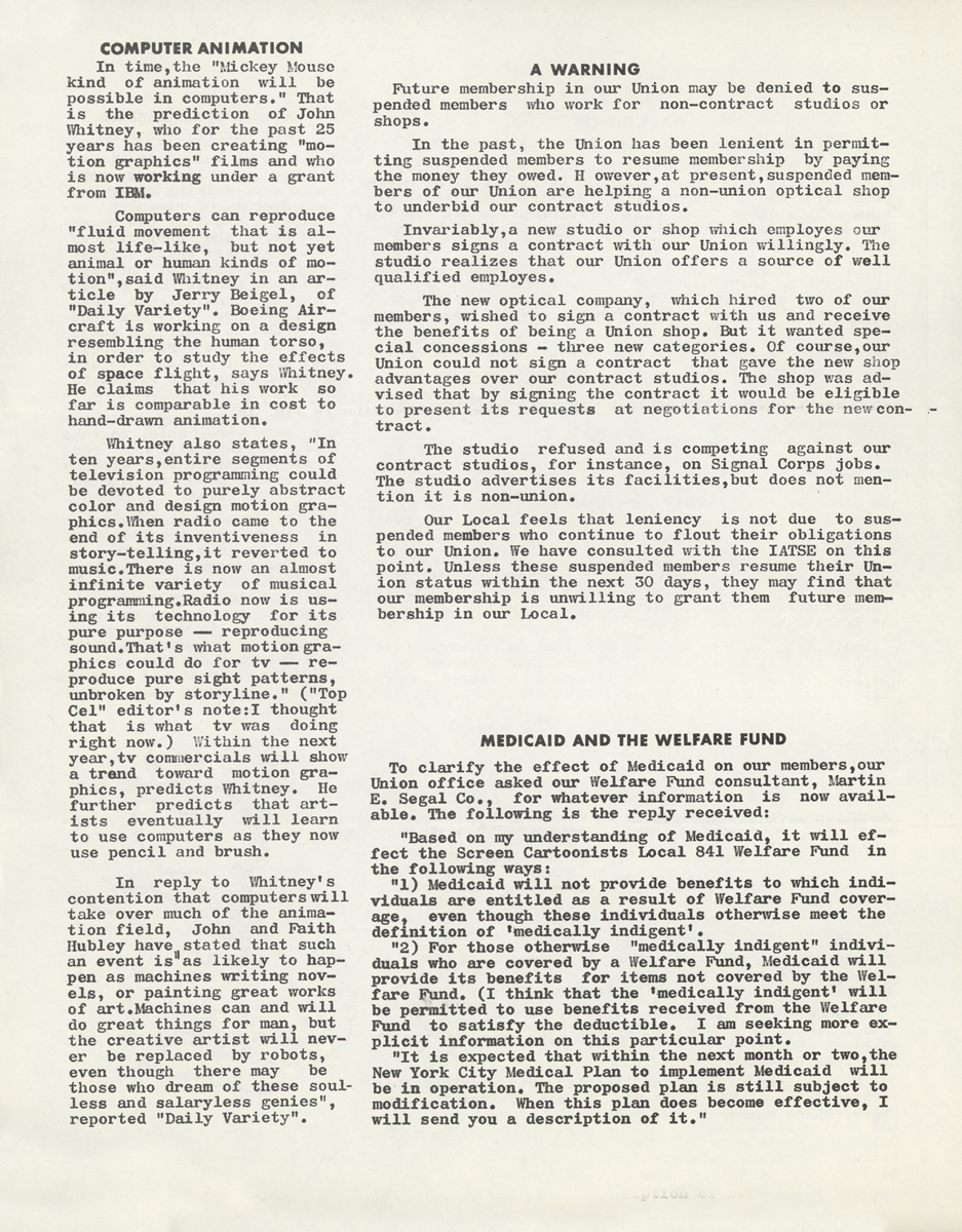
Top Cel – 7
Here are all of the Top Cel issues saved by Vince Cafarelli from 1967. These were all edited by the gifted animator, Ed Smith. Top Cel, of course, was the news reader of New York’s animation guild, Local 841.
January 1967, pgs 1 & 6
Designed and drawn by Ed Smith
 2
2 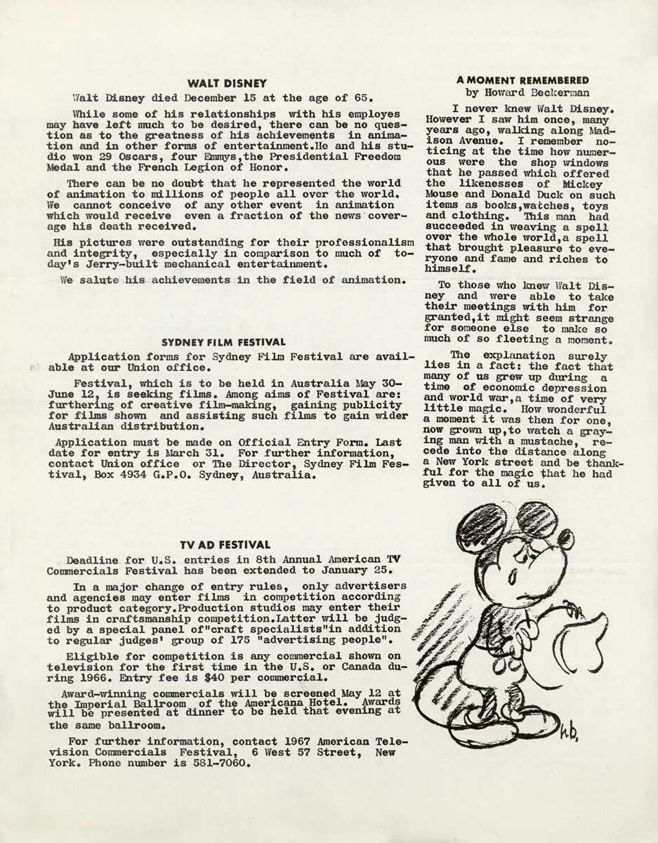 3
3
Walt Disney dies.
 4
4  5
5
February 1967, pgs 1 & 6
Designed and drawn by I. de la Rosa
 2
2  3
3
Jack Kinney resigns from Disney.
Bob Little resigns from Paramount after 20 years.
 4
4  5
5
March 1967, pg 1
Designed and drawn by Frank Scioscia
 2
2  3
3
Oskar Fischinger dies.
 4
4  5
5
 6
6
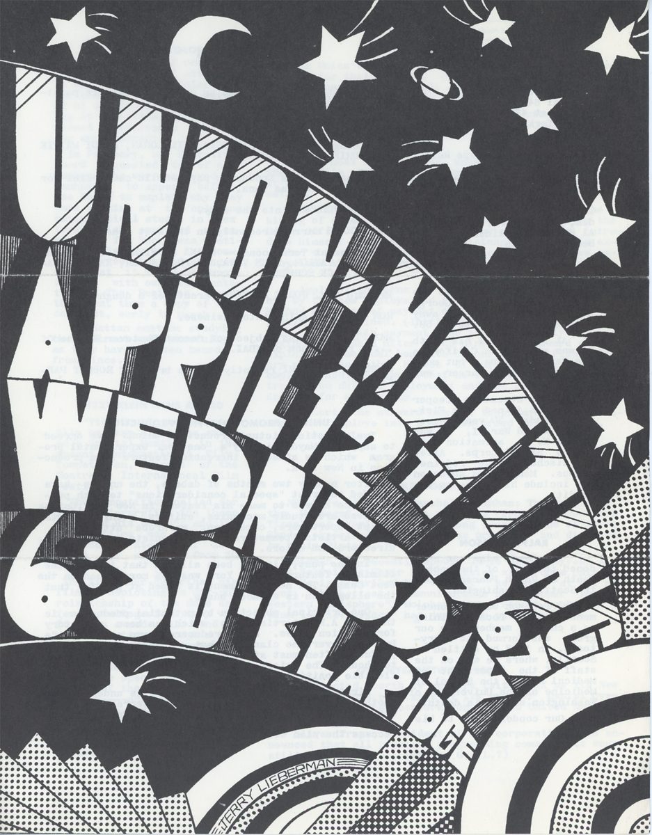
April 1967, pg 1
 2
2  3
3
George Germanetti dies at 58.
Bob Taylor, Dave Tendlar, Jack Schnerk & Johnny Vita leave Terrytoons.
 4
4
May 1967, pg 1
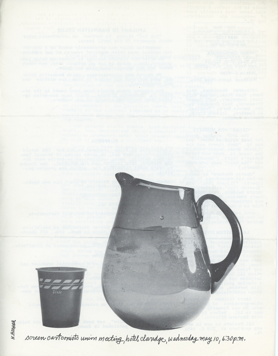
Designed and drawn by Karl Fischer
 2
2  3
3
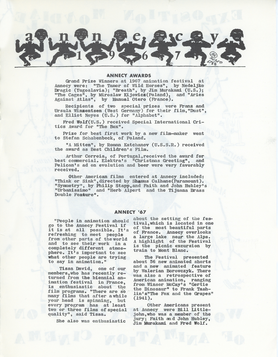
The Hubleys win the Oscar for “Herb Alpert & the Tijuana Brass.”
 4
4  5
5
 6
6
June 1967, pgs 1 & 6
Designed and drawn by Tom Turkoski
 2
2  3
3
Shamus Culhane resigns from Paramount
and is replaced by Ralph Bakshi.
 4
4  5
5
The Montreal Animation Exhibition opens with over
20 animation pioneers & professionals appearing.
July 1967, pgs 1 & 6
Designed and drawn by Bill Feigenbaum
 2
2 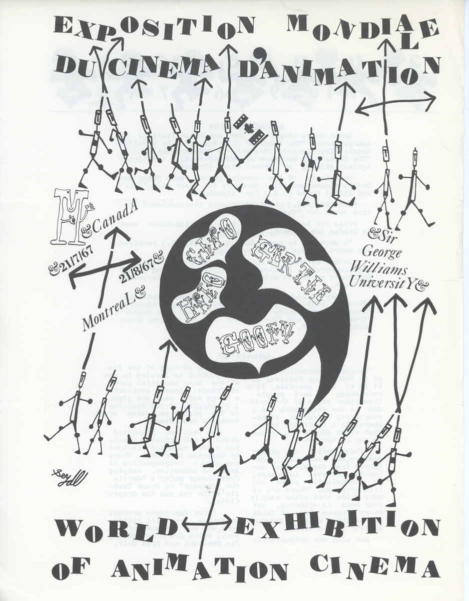 3
3
Jack Schnerk and Jim Tyer both leave for the West Coast.
Cosmo Anzilotti back at Paramount.
 4
4  5
5
August 1967, pgs 1 & 6
Designed by Ed Smith
 2
2 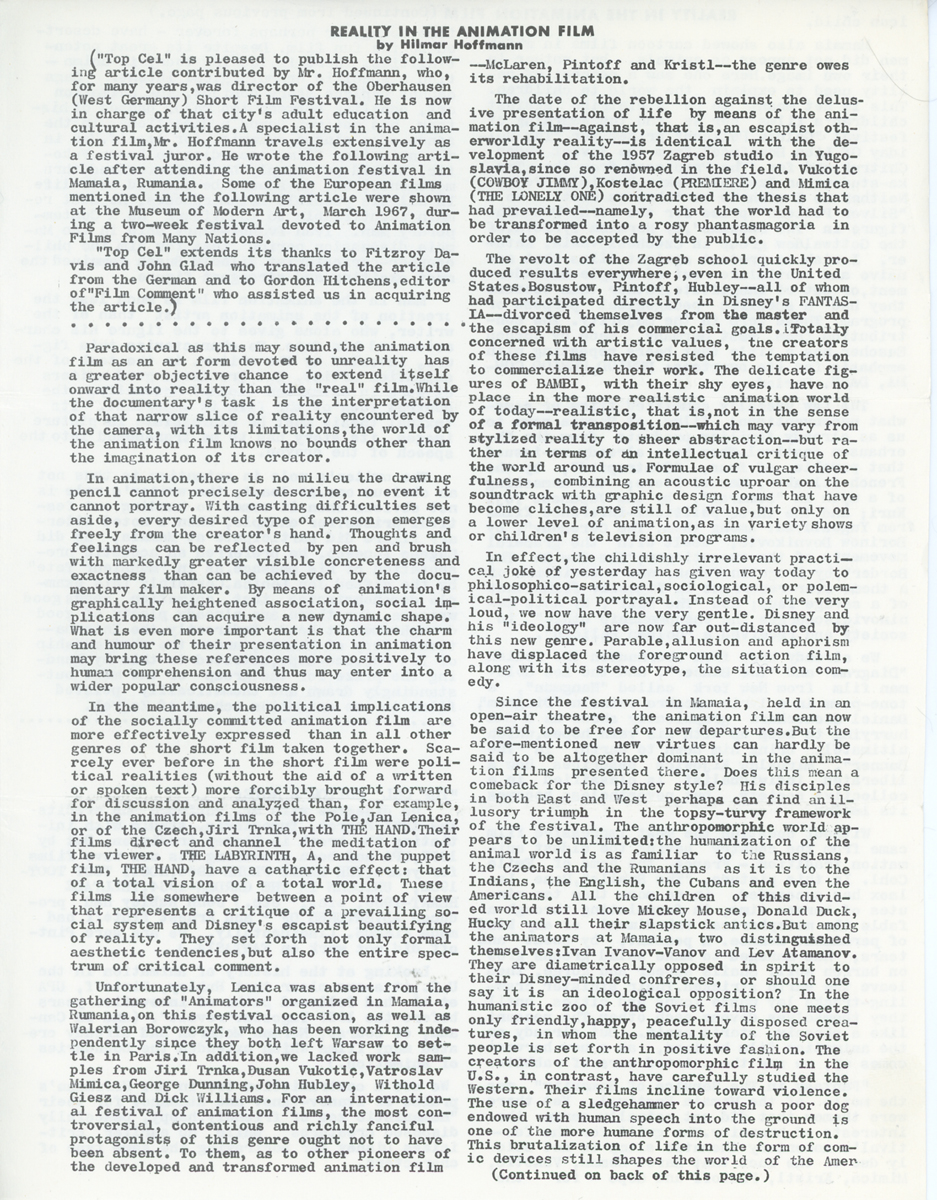 3
3
George Bakes, John Paratore and Clif Roberts form Poverty Pictures.
Art Babbitt represents Hanna-Barbera commercials at Montreal Expo.
 4
4  5
5
 6
6
November 1967, pgs 1 & 6
Designed and drawn by Ed Smith
 2
2  3
3
Bill Peckmann back at Focus after vacation in California.
Jim Tyer and Jack Schnerk back in NY after LA trip.
Pinto Colvig dies.
 4
4  5
5
 6
6  7
7
Animation Artifacts &Comic Art &Disney 05 Mar 2013 03:38 am
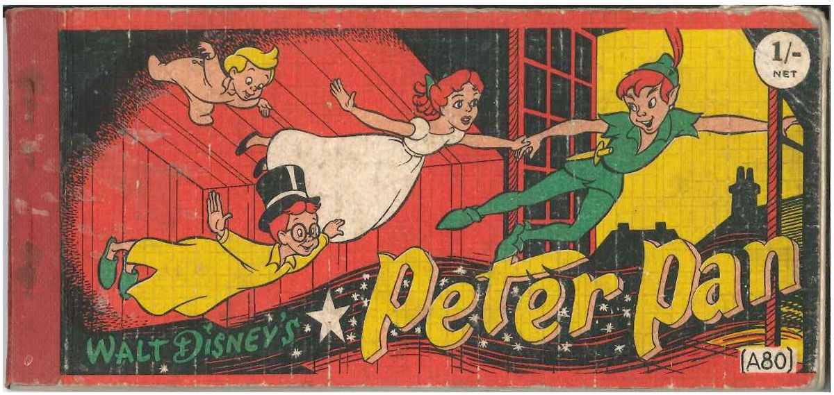
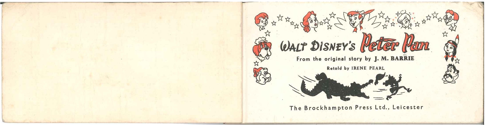
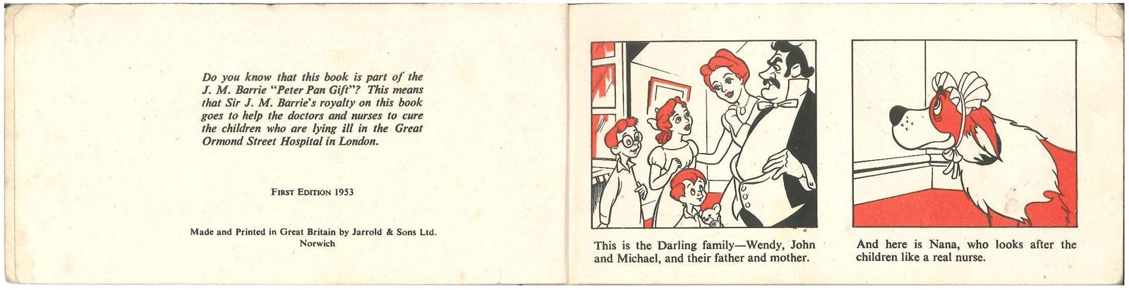
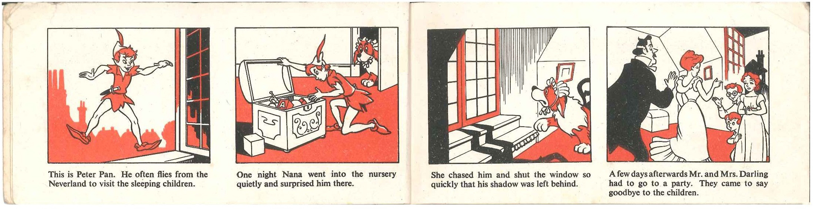
a Peter Pan Strip Book
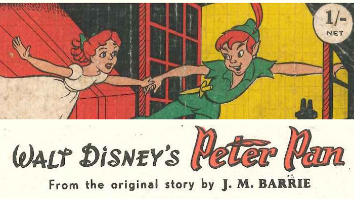
I received a wonderful email from Peter Hale. He wanted to send me this beautiful booklet adapting Peter Pan for children. What follows is Peter’s letter accompanying the book.
- Dear Michael
Following on from Hans Perk‘s recent drafts of Peter Pan, I thought you might be interested in this curious book, published in Britain in 1953.
Curious, not so much in it’s format (15mm x 7mm, landscape, 2 staples on left
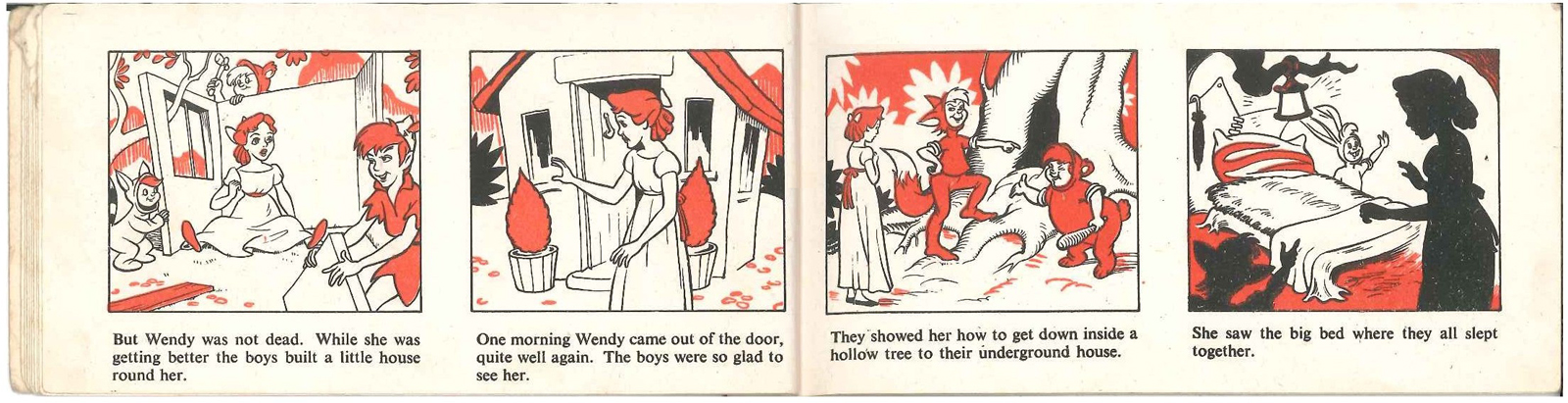
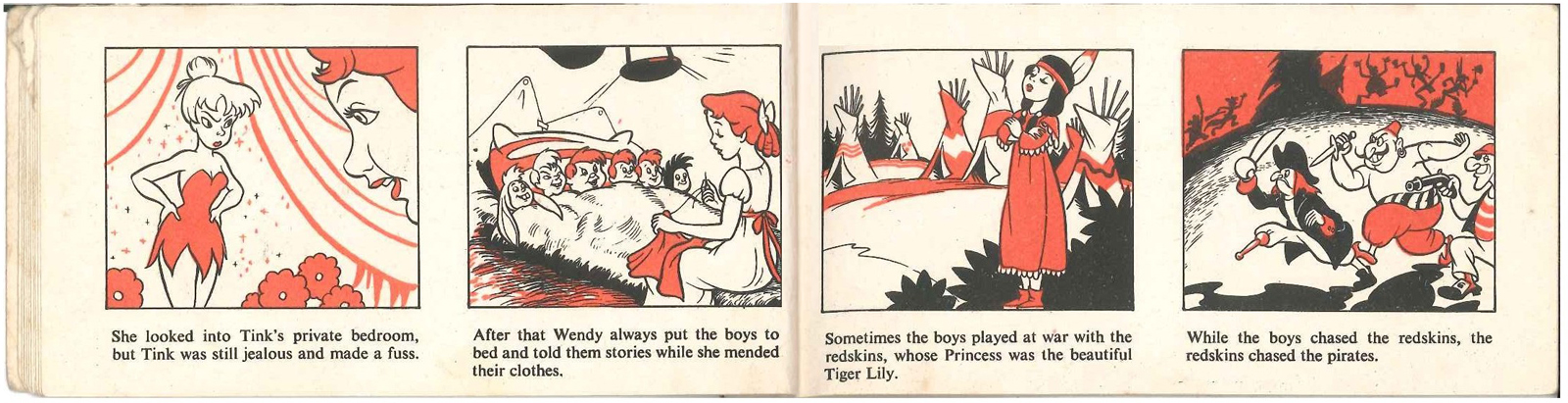
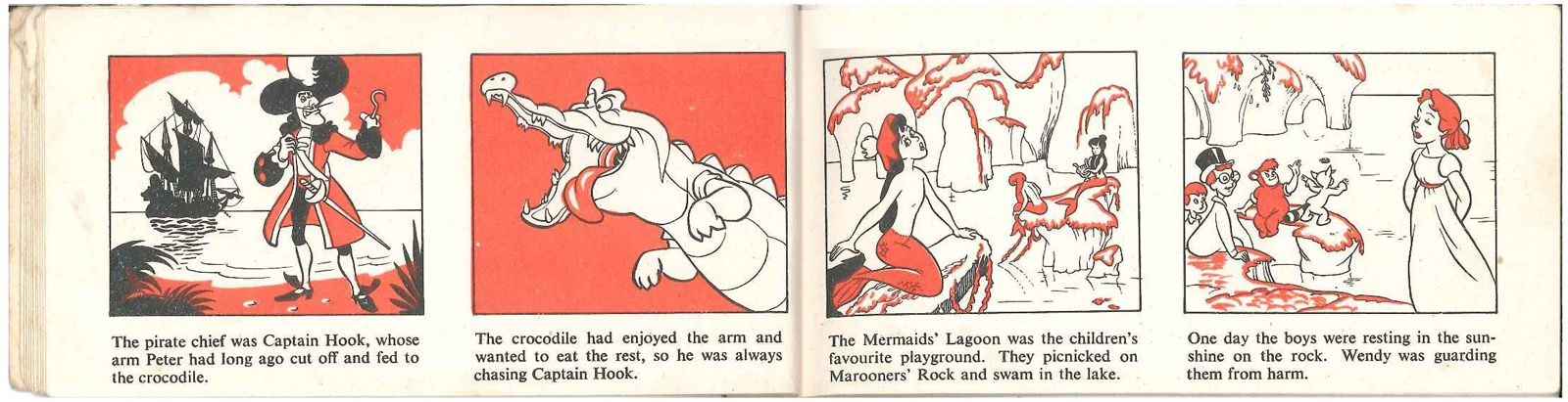
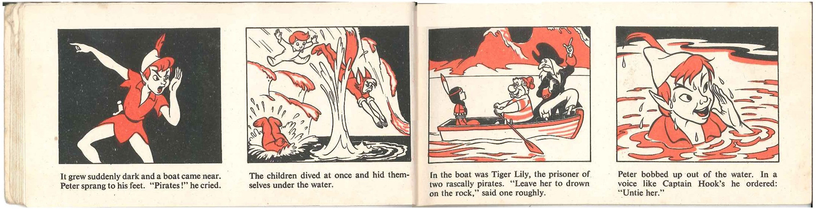
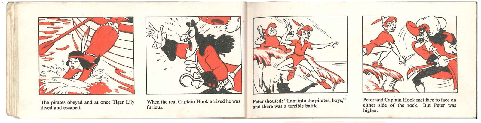
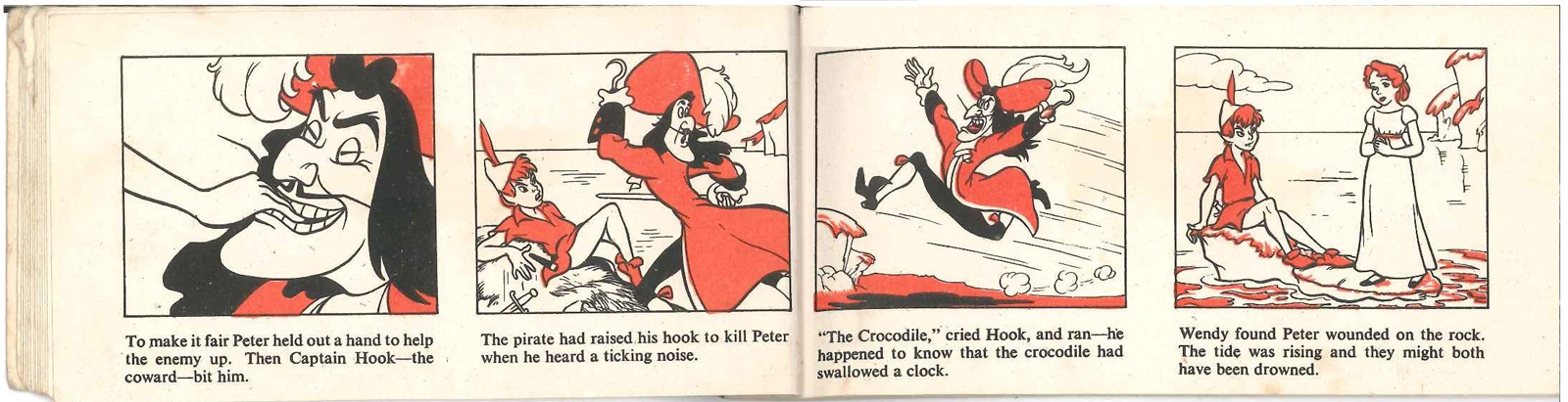
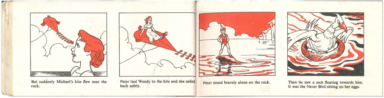
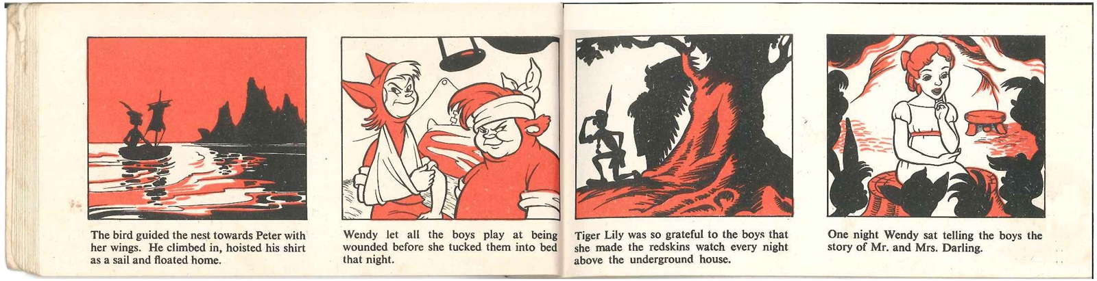
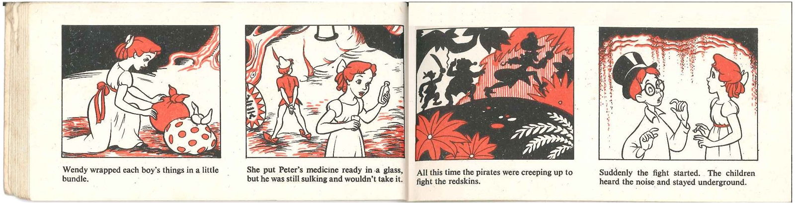
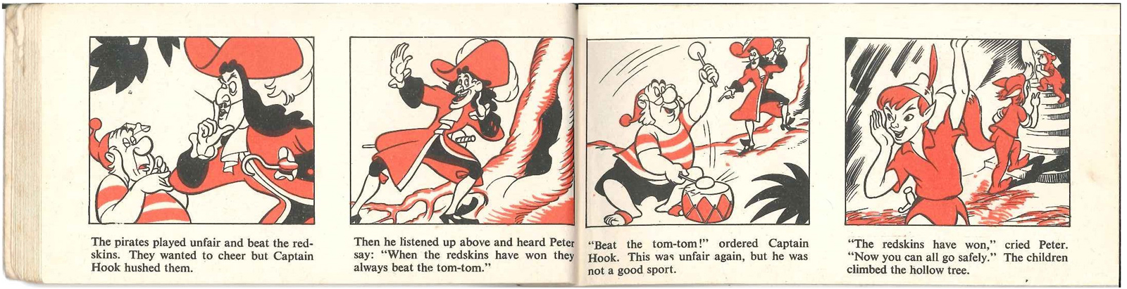
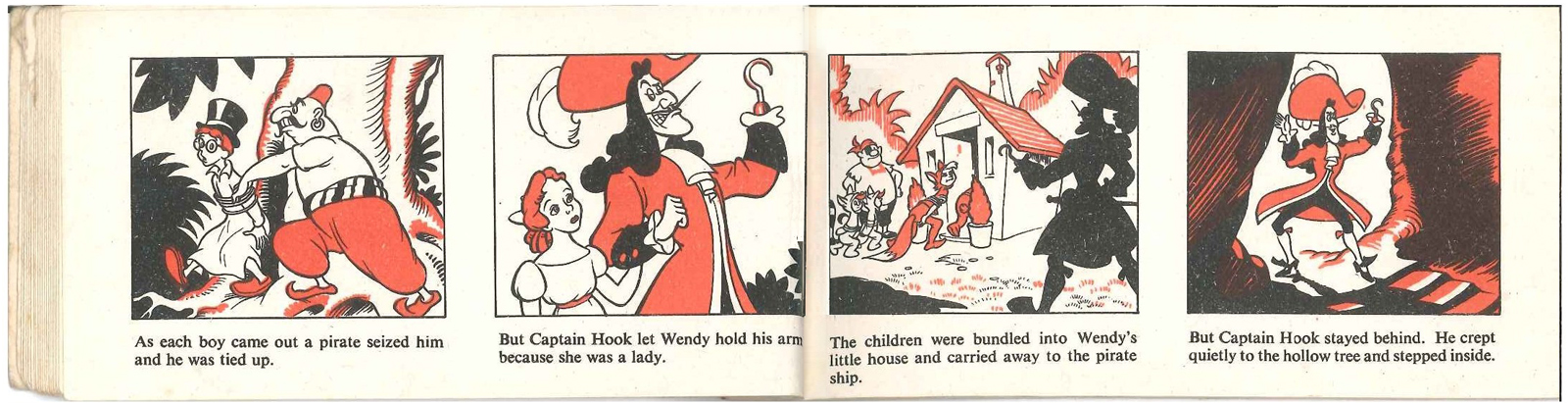
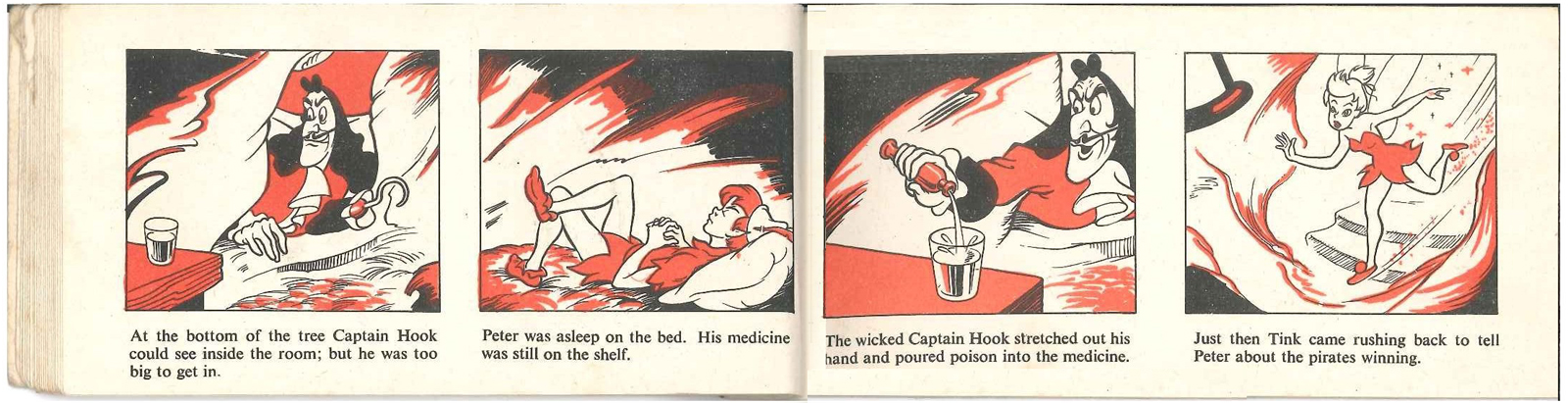
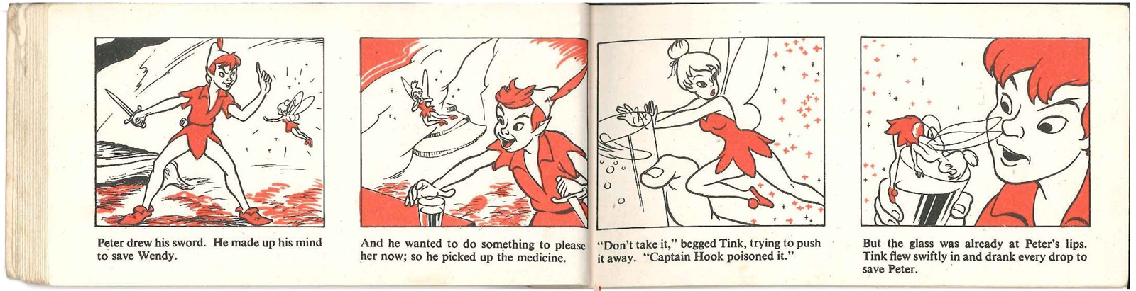
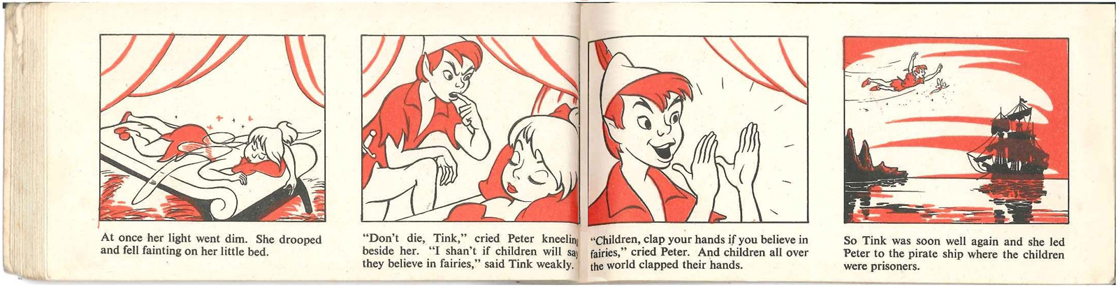
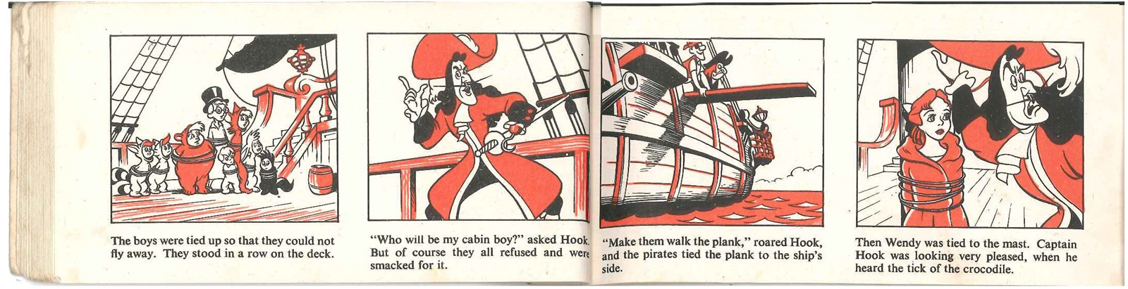
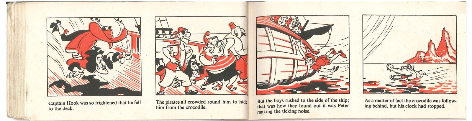
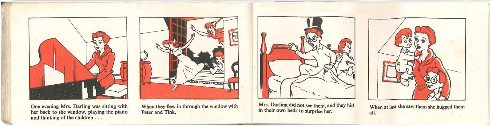
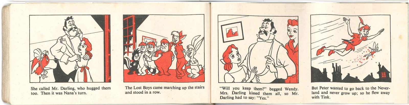
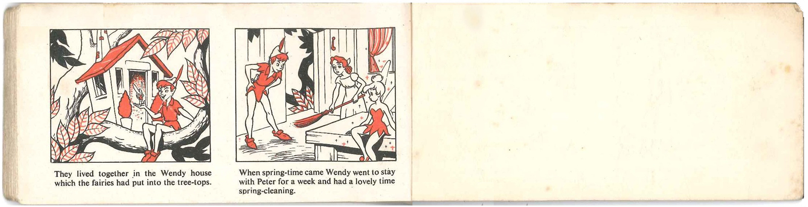
covered by cloth binding, and consisting of two panels per page with text beneath – Brockhampton Press produced a series of these, primarily featuring stories about Enid Blyton’s “Mary Mouse”, then “Jimmy and his Little Old Engine”, and subsequently some other one-offs) but in the fact that although drawn in the style of the completed Disney cartoon the story sticks closer to J M Barrie’s novelisation of the play (including building the Wendy House, Peter’s rescue by the Never Bird, and Tinkerbell’s drinking the poisoned medicine – see scans).
The story adaptation is by Irene Pearl, a children’s writer whose other works
include a series of ‘Nursery’ classics – retellings of such traditional stories as Alice in Wonderland, The Snow Queen, Sleeping Beauty, etc. – in the late 30s, for publishers Hodder & Stoughton, and later, in the 50s and 60s, some original stories of her own.
I had wondered if the “Nursery Classics” series that Irene Pearl had worked on in 1938 might have included “Peter Pan”, and if so whether the text might have come from it. A Google search revealed there had been a “The Nursery Peter Pan and Wendy”, but that it had been ‘retold’ not by Irene Pearl but by May Byron, who hadalso done other books in the series. The Publisher was given as Brockhampton, rather than Hodder & Stoughton, but I think that might just be a cataloguing error.
The book was a one-off intended to capitalise on the release of Peter Pan (there are no other Disney books in the series as far as I know) so the adherence to the Barrie version, with its need for drawings not derived from the film, is curious – perhaps it was thought that the British would not accept Disney’s deviations from Barrie in book form.
I do not know who the artist was. This version does not appear to have been printed in any other form.
I originally had a copy of this book as a child, but although I kept it for a long time it final got lost. I recently found another copy and have had the opportunity to regain my childhood!
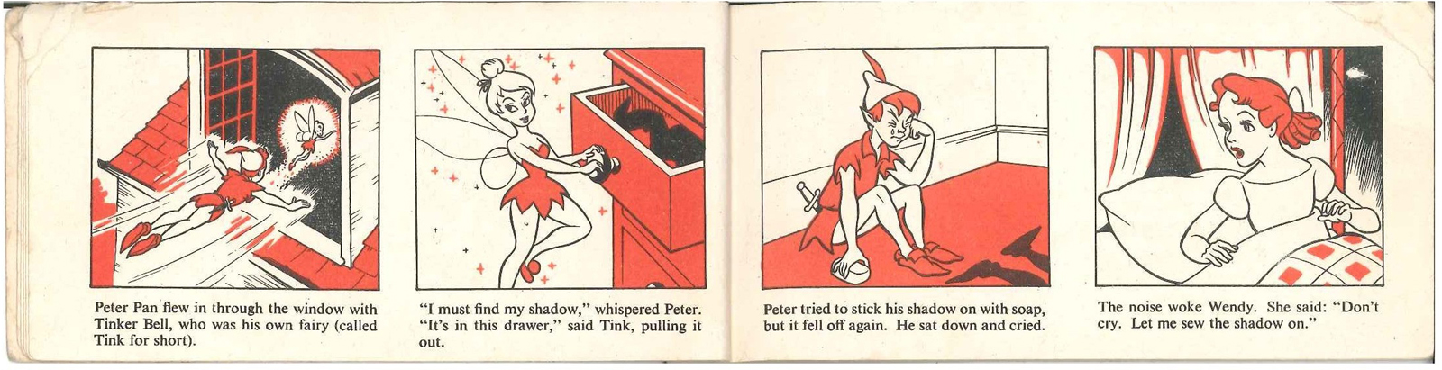
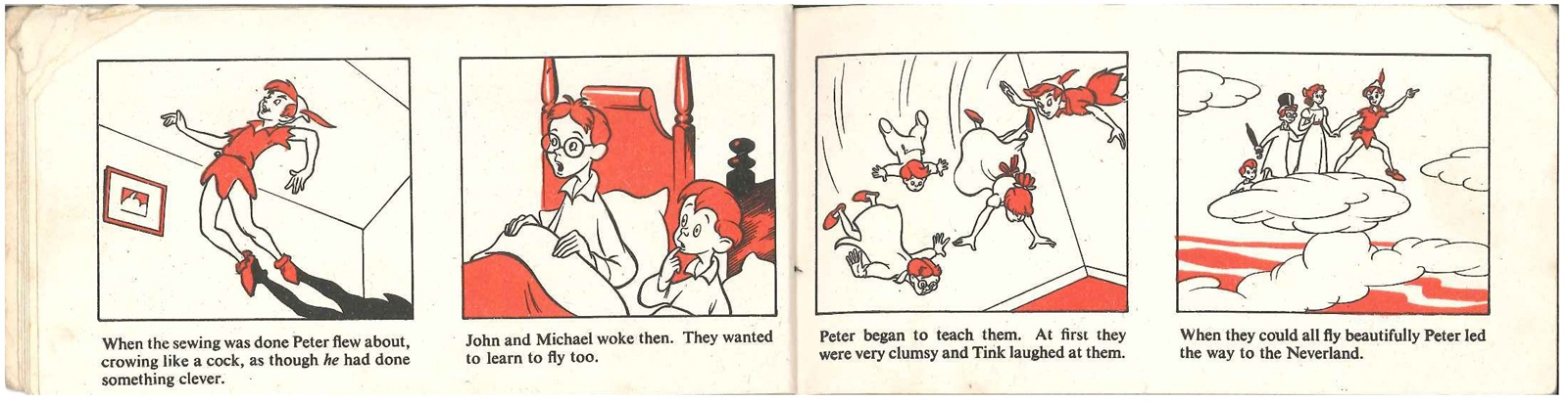
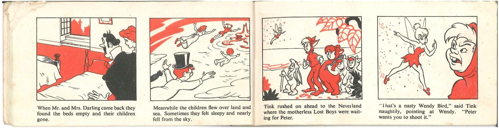
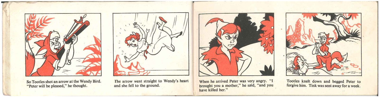
 1
1
 2
2
 3
3
 4
4
 5
5
 6
6
 7
7
 8
8
 9
9
 10
10
 11
11
 12
12
 13
13
 14
14
 15
15
 16
16
 17
17
 18
18
 19
19
 20
20
 21
21
 22
22
 23
23
 24
24
 25
25
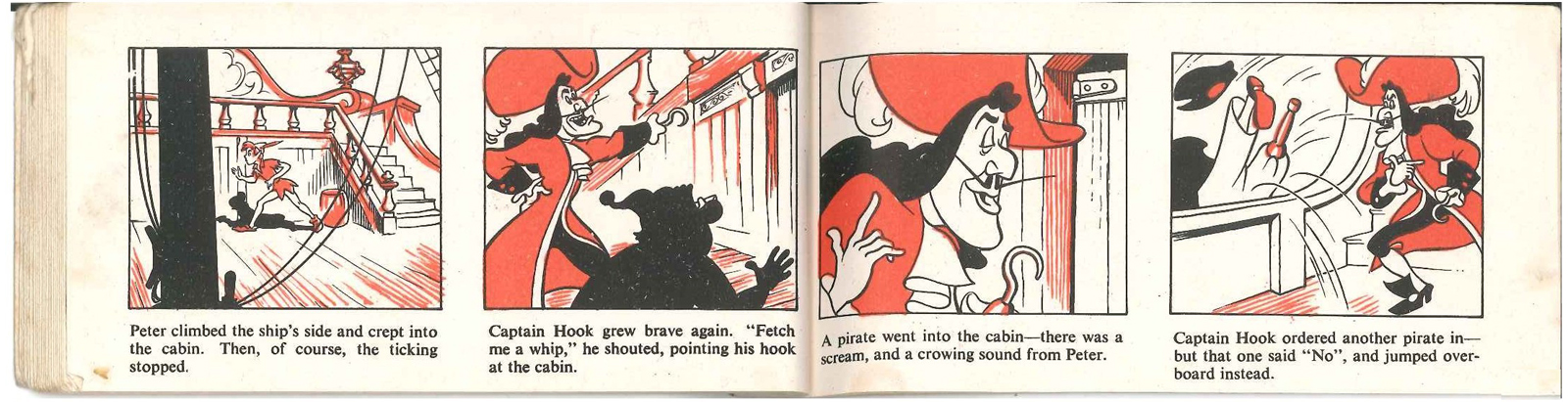 26
26
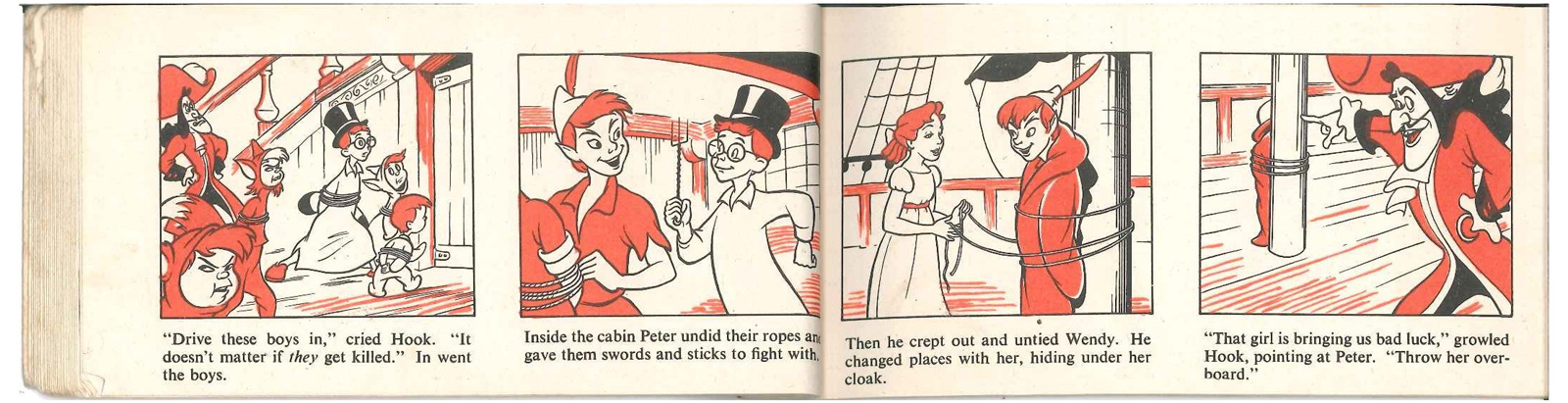 27
27
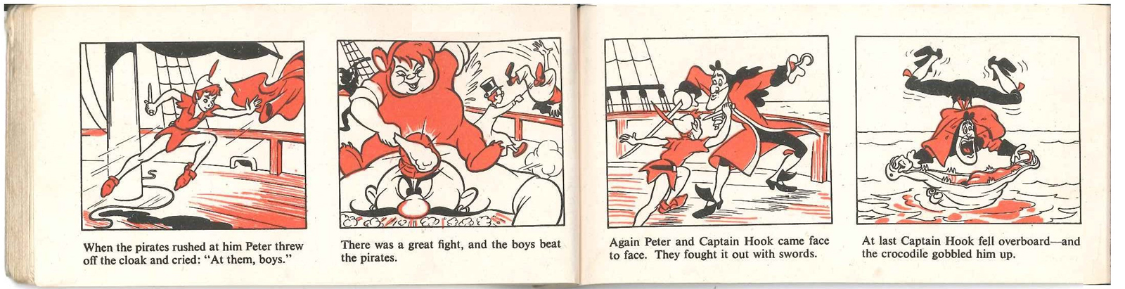 28
28
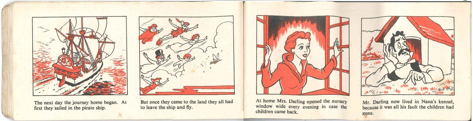 29
29
 30
30
 31
31
 32
32
 33
33
Many thanks to Peter Hale who took great care in scanning and preparing the material to present it all in its best possible light.
Articles on Animation &Books 04 Mar 2013 05:49 am
The MGM Cartoon Studio
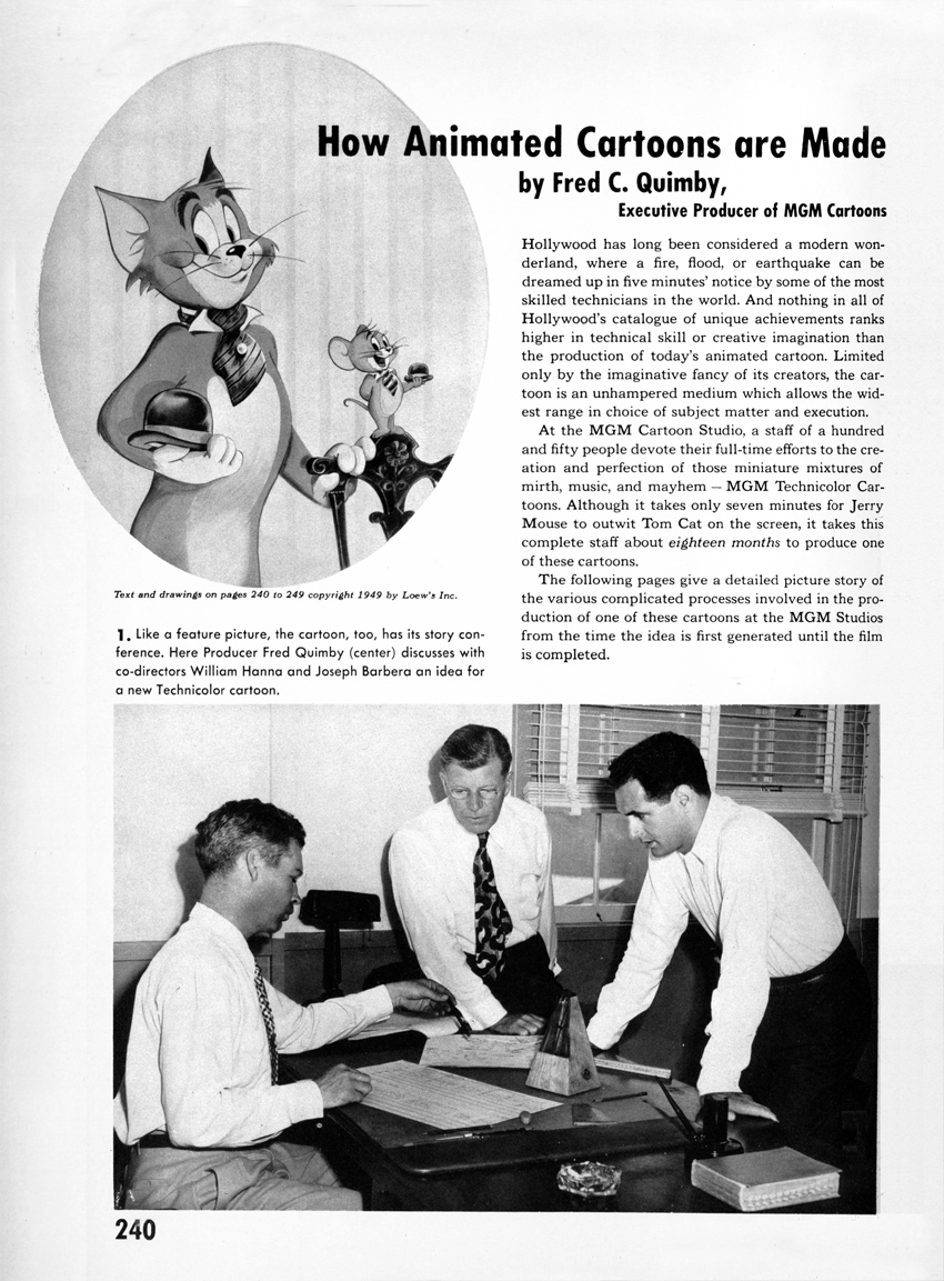
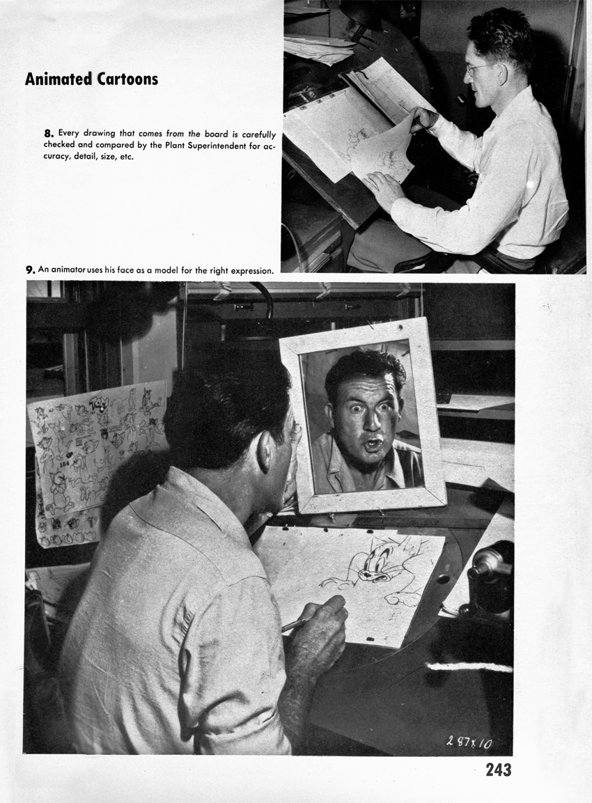
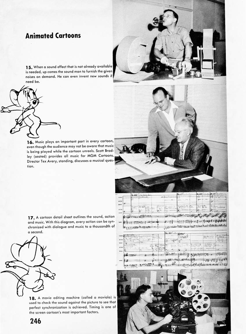
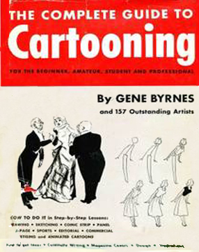 - When I was a kid the only animation books available were few and far between. Fortunately, I lived near a local library that stocked many of these books (6-10 of them, including the great book by R.D. Feild, Art of Walt Disney). One that I loved was this book by Gene Byrnes, The Complete Guide to Cartooning. It had a full chapter on the MGM cartoon studios and credits Fred Quimby as writer of the chapter. The book was a strong inspiration for me when back then, and it still sends a chill up my back and gets me wanting to animate when I look at a couple of those images.
The cartoon Cat Concerto is featured. Obviously the studio was pushing it for the Oscar, and a bit of publicity, appearing in this book, didn’t hurt. It did win the Oscar. The other five nominees included:
- Musical Moments from Chopin (Lantz, Dick Lundy dir)
Walky Talky Hawky (WB, Rob’t McKimson dir)
Squatter’s Rights (Disney, Jack Hannah dir)
John Henry and Inky-Poo (Par, Georg Pal)
3 cartoons featuring classical piano performances by the star cartoons character. Very interesting. This is the subject of the debate on-going at several sites.
Thad Komorowski brought up the controversy and discusses it n full. The debate of whether one short ripped off another actually started back in 1946.
Michael Barrier discusses the discussion adding some information.
Jerry Beck offers some historic material. just now. Watch the cartoon on Thad’s site.
If you recognize anyone in the photos and can identify anyone , please leave a comment.
 1
1(Click any image to enlarge.)
Bill Hanna and Joe Barbera are on opposite sides of the table.
Producer, Fred Quimby is in the middle.
 2
2
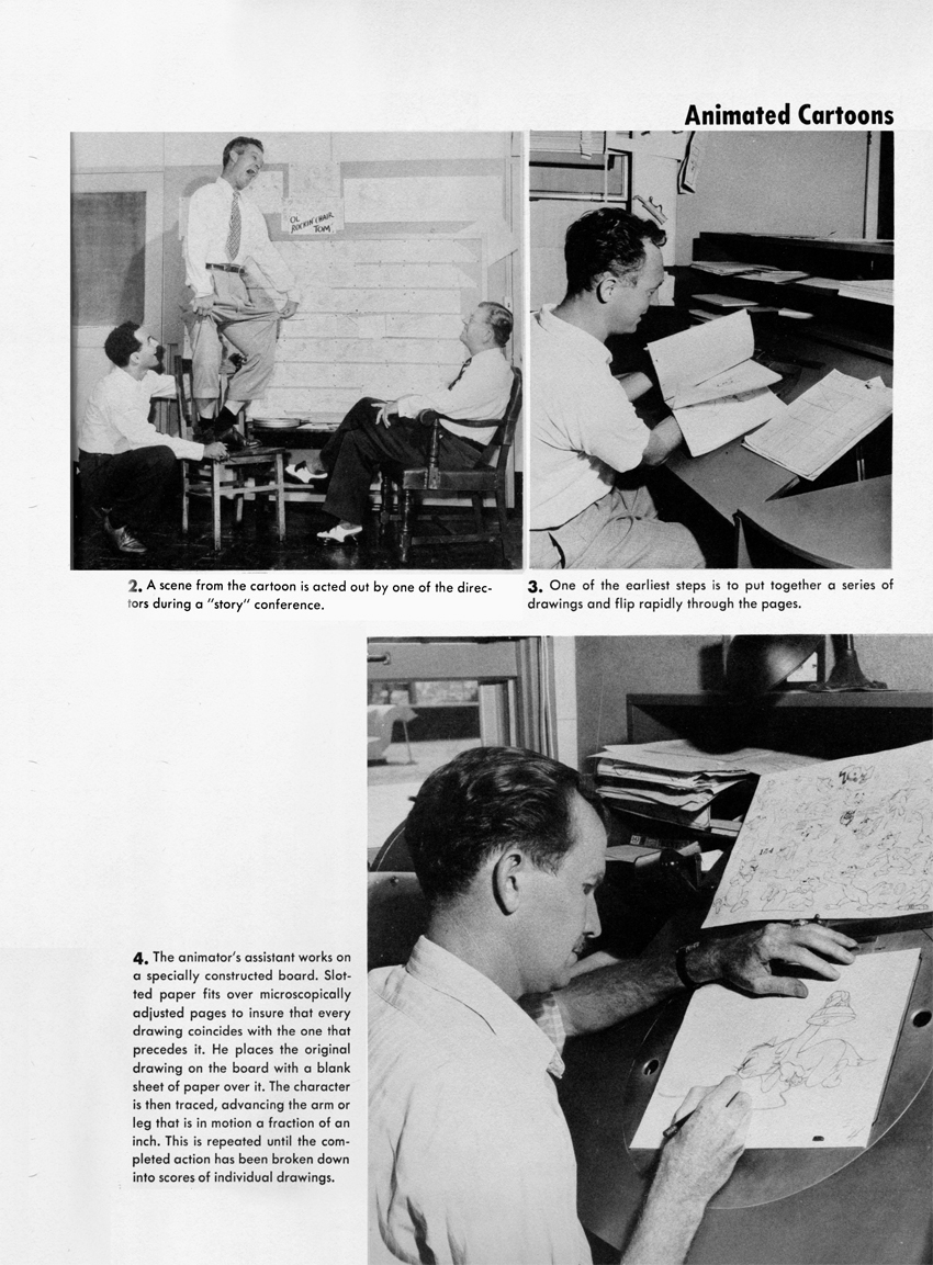
#3 Upper right: Preston Blair / #4 Bottom: Asst Animator Tom McDonald
 3
3
 4
4
#8 Upper: Max Maxwell head of checking / #9 Bottom: Irv Spence, animator
 5
5
 6
6
#13 is Johnny Johnson, BG painter
 7
7
#16 Middle: (standing) Tex Avery with (seated> composer Scott Bradley
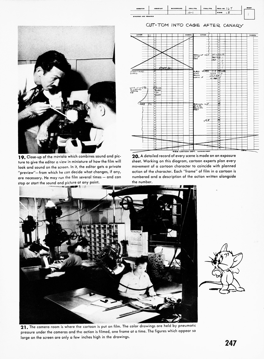 8
8
#19 Upper left: (standing) Animator, Mike Lah at movieola
 9
9
 10
10
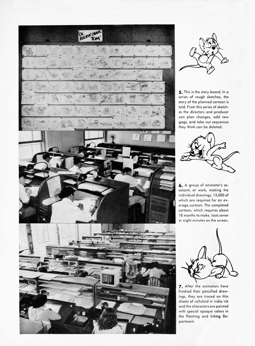
I’m enlarging the photo of the storyboard. Without the benday pattern and at a higher res, it’s a little easier to read blown up.
This book also includes some pretty great (non-animation) cartoonists. I still remember every page from my childhood when I borrowed this book countless times from my local public library.
Daily post 03 Mar 2013 03:35 am
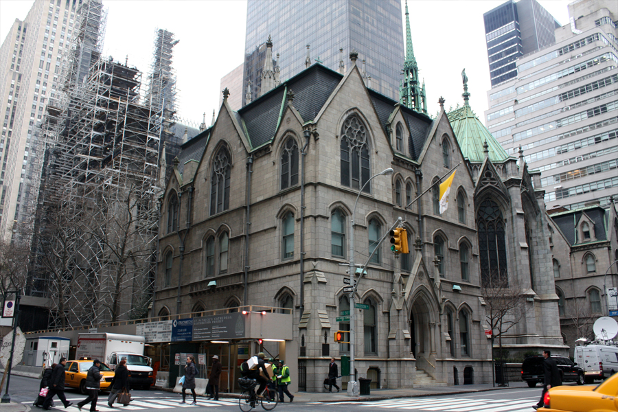
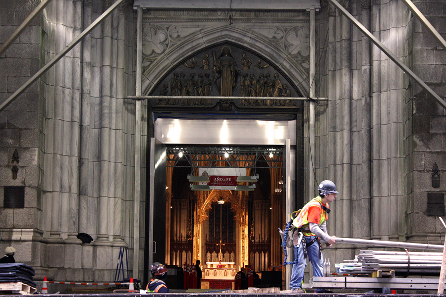
Church Under Construction
The cardinals are all in Italy about to vote for a new pope. White smoke or black smoke? Very soon this will be all the news that’s fit to print. Steve Fisher sent me some great shots of St. Patrick’s Cathedral which is under construction. Years ago, the building across the street had een torn down. A friend ran up there with a camera and, realizing it was the only time in his life he’d see the side of St. Patrick’s, he took a lot of pictures. e died a few years later and has taken the pictures with him.
Here’s Steve’s comments and his photos:
- St. Patrick’s Cathedral is currently undergoing a comprehensive five-year $175 million renovation. The plan for its full restoration includes work on the exterior and interior, as well as its stained glass windows, the completion of a new garden and a public greenspace.
 1
1
 2
2
 3
3
 4
4
 5
5
 6
6
 7
7
 8
8
 9
9
 10
10
 11
11
 12
12
 13
13
 14
14
 15
15
 16
16
 17
17
 18
18
 19
19
 29
29
 21
21
 22
22
 23
23
 24
24
White smoke or Black smoke?
Commentary 02 Mar 2013 05:15 am
Shows
- I was asked by Kevin Schreck to introduce, on Thursday at the 92Y Tribeca; it was the second of two evenings celebrating the work of Richard Williams. The three day program was timed to celebrate Dick’s 80th birthday. On March 19th he becomes an octogenarian.
Kevin is the film maker who has produced and directed a documentary about the history of Dick’s magnum opus, The Thief and the Cobbler. Kevin’s documentary, called Persistence of Vision, was unveiled on Friday night.
 AS I said, I introduced Thursday’s program (commercials, movie title sequences and the short, The Little Island) with a short telling of how I first heard of Dick Williams, then came to meet him, work for him, befriend him and, finally, sit at a distance from him. Dick’s one of the more interesting personalities I’ve met in my life. He’s one of those few characters you get to know who lights up a room whenever he walks in. Energy just overflows the room, and everyone is happier for their presence. In all my years I’ve known possibly three people who filled this description, and it always was enriching for me. Bedazzling.
 The program included a number of sample reels from Dick’s Soho Square studio. Mostly humorous commercials, all excellently animated. I wish there had been some of the earlier ones mixed in; the Pushkin Vodka commercial shown was not the one I think of as genius; it was the 2nd of two spots they did. The original 2 minute spot was everywhere back in the 70′s; now you can’t see it. The film that was shown is well done but doesn’t soar like the original. Both were designed and animated by Rowland B. Wilson and Russell Hall; they did a bang up job on it. Several of the commercials animated by Eric Goldberg were among those screened; naturally they were funny pieces. There was the cat who uses 8 lives trying to get his hands on a beer product (can’t remember the brand). There was the baby, animated by Russell Hall, and his Q-tips commercial; done in a thick/thin line with watercolor. These are brilliant when compared to today’s live action babies speaking for E-trade.
 The spots turned into the title sequences for Charge of the Light Brigade. The print for this was significantly better than that of the commercials. This was followed by other title sequences including What’s New Pussycat?, and Return of the Pink Panther. No Murder on the Orient Express newspaper sequences with the glorious music by Richard Rodney Bennett; no Prudence and the Pill. I’ve always had a small problem with Williams’ work on title sequences. It’s hard to read the titles/credits on display. That’s the purpose of the job, and yet the type is always at war with what’s behind it. It’s all beautifully, no . . . brilliantly done. Except for that legibility problem.
This show ended with the half hour long The Little Island. A very good print, this was the short Dick did virtually by himself with the help of Tristram Cary‘s strong musical score. The film is at least twice the length it should be, and feels somewhat dated. However, one can understand its success when it was originally screened at the early animation Festivals where it won many awards and brought Dick Williams some fame.
 Then last night we saw Kevin Schreck‘s documentary, Persistence of Vision. This was the story behind Dick’s feature, The Thief and the Cobbler. A 70 minute tour back through more than a decade’s worth of history on the making of an animated feature that never really was completed. Some patches and staples were added at the end so it could be released in the most shameful way possible, but that’s the way Dick’s “master piece” ended up.
Not all of the footage in the documentary was of the best quality. Some of the shots were a bit on the dark side. The information passed on was wholly there, though. Very good. The film gives us interviews with a number of truly fine artists. Roman Modiano, Richard Brett, Greg Duffell, Julianna Franchetti all spoke with Schreck’s camera about their history and involvement with Williams feature. They paint a relatively positive pickture of Dick Williams, though somehow bits of his blustery side come across clearly.
The film only barely touches on Omar Ali-Shah‘s financial games on Dick’s studio. He cooked the books, and didn’t do a very good job of it. Everyone was aware of his discrepencies. A hurtful separation with the Idres Shah (Omar’s brother) who wrote the book on Nasrudin which Dick had illustrated and was now animating as an animated feature. They left with any permission to do a feature starring their character. Dick had to completely overhaul his animated feature and rework the script as well as most of the completed animation. A setback.
The Thief and the Cobbler emerged, and Dick worked his tail off, destroying several marriages in the way of his work. He worked through The Christmas Carol, Raggedy Ann, Ziggy and Roger Rabbit all in pursuit of financial stability. He finally got the budget he asked for to produce The Thief, and sure enough, it wasn’t sufficient. Dick ran out of money without completing the movie, and the insurance company, the Completion Bond Co, was forced to step in and take possession of Dick’s movie, which now belonged to the Completion Bond Co. They hired 2nd rate all the way to rework the film, trying to make what they felt would be a success out of it. A friend who was a final checker on the movie, had to visit the morgue for drawings that could be reused. She came upon a mass of broken and crushed boxes with artwork spilling out covering the warehouse’s entire cemnt floor. This was the artwork that took many hours to color since its rendering was so delicately done in England.
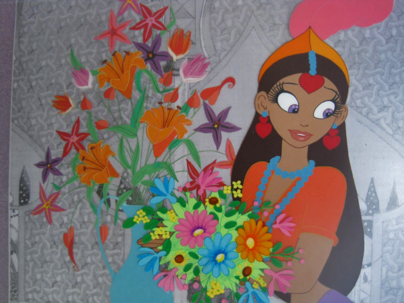 That, to me, was the sad ending. Tissa David had worked for more than a year animating the twin sisters, Yum Yum and her twin sister, Mee Mee. Tissa was left behind, and Dick cut Mee Mee from the film, reworking some of Tissa’s animation. I sat next to Tissa watching the Fred Calvert version of the film; I was aghast. Tissa was quietly sad as if a friend had died. It was a bit reminiscent of our watching Watership Down together after Hubley had been fired and had died of heart complications. We both cried during the “Bright Eyes” sequence of that film. Watchya gonna do?
Kevin Schreck captured the feeling of that film -The Thief and the Cobbler, I mean -in all its disappointment. He’s a young film maker, and seems to have caught Dick Williams in this documentary. That’s plenty.
Ursus
Signe Baumane shared this film with me yesterday; a friend of hers in Latvia. had sent it to her, and she wanted to see what I thought. The film went to Clermont Ferrand and 70 other festivals. It’s a real beauty and I couldn’t help but share it with you. I hope you enjoy it as much as I did.
Crood History
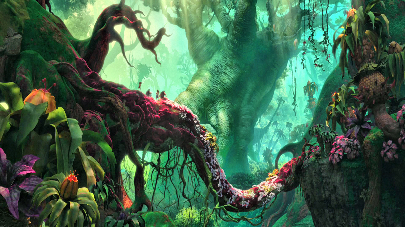
 Jim Hill has a piece in The Huffington Post about The Croods talking about its history – when it was to be done by Aardman and was co-authored by John Cleese. How and why it’s changed is revealed in this article.
Though in one sweeping sentence Hill says, “… Aardman Animations stepped away from its five-picture deal with DreamWorks Animation.” I question whether that’s what happened and if it can be so casually dismissed for the purpose of this puff piece. But it’s Jim Hill, so we’ll not get a full story.
Pictured to the right The Croods directors, Chris Sanders and Kirk DeMicco.
Speaking of Dreamworks, they are performing a “crood” measure. They’ve promised to lay off some 350 of their 2200 employees by the end of the year. I doubt this has anything to do with what is happening in Washington, but certainly that isn’t helping. Perhaps Katzenberg can help get some of the idiots in congress to “lose their jobs” by 2014. Maybe that’d help our economy. This news of the layoffs came from a Hollywood Reporter story and really has all to do with the poor performance of The Rise of the Guardians.
