Richard Williams &Theater 29 Jan 2006 07:44 am
Apple Tree and Aronson
Broadway Rhythms:
Broadway entered my life a long time ago. After seeing a BBC tv special, a tour of Richard Williams‘ Soho studio, I learned about his animated titles for A Funny Thing Happened On The Way To The Forum. Seeing the film, reintroduced me to Tony Walton‘s name. I knew his name from Mary Poppins where he acted as a “design consultant” for sets & costumes.
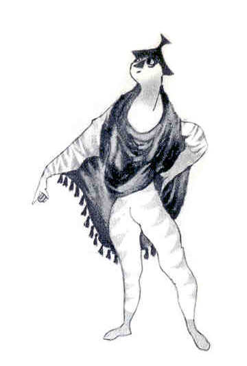
 When the musical, The Apple Tree, opened on Broadway in 1967, I went. Richard Williams had designed an animated piece that illustrated the rise to super-stardom of Barbara Harris‘ character, Passionella. A young Alan Alda also starred in the show. Robert Klein was in one of his first shows.
It was the set and the costumes that I really took home with me. I became a new fan of musical theater and at least as much a fan of Tony Walton‘s work.
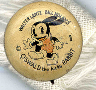
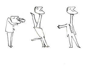
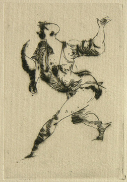
the logo designed by Dick Willliams
It took another three years before I found a musical to top that experience. Company was my first Stephen Sondheim show. In 1970, suddenly, theater had grown up for me. The story, songs and direction were sophisticated, urbane, and intelligent. The set by Boris Aronson had challenged everything I knew and took it to a new level. Chrome, glass, elevators and projections. The set seemed to constantly reconstruct itself and shift to something else: an apartment complex, an apartment, a disco, a bedroom, 42nd Street. It was all of these things with the help of my imagination.
I saw this show five times over the course of its run. For a young student, this was a large financial investment on my part, but I was hooked on Boris Aronson and planned to follow his work religiously.
Pacific Overtures (the original production in 1976) took theater to another level of sophisitcation. Aronson‘s set was overwhelming for me, and completely integral to this show. It was as much an necessary part of the show as the brilliant writing, songs, and direction.
He brought pre-Industrial Japan to the stage and moved the characters into the Industrial revolution. Aronson gave us dragons that were warships, a tree that expanded to a Japanese fan, a small meeting house and a throne room. We saw the simplicity of the culture and the complexity of  the big changes dev-
eloping.
-
Aronson designed several curtains for this production. The final one used is depicted on the left in a photo of the model.
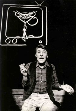
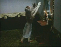
In 1981 Richard Williams introduced me to Tony Walton. Tony needed a character animated for the show, Woman of the Year. They’d planned on six minutes of animation in the show; I ended up producing roughly 12 minutes in six weeks. The key spot was a song and dance duet that lead actor, Harry Guardino, would do with the character, Katz. Tony Charmoli danced a number he had choreographed for me, and I filmed it with a 16mm camera. We started animating.
There was no time for Pencil Tests. We did it, and I raced to Boston to put it into the show’s try-outs there. It took another couple of days for the actors to rehearse the dance with the film, and I saw it in front of a live audience for my first viewing. They loved it.
Immediately, more animation was added to the show: several short sequences which allowed for set changes, behind the screen. Two weeks before opening, writer Peter Stone, composers Kander & Ebb, and director Robert Moore had concocted a new song and dance which would open the second act. I had to have it ready for the Broadway opening. I did, but there wasn’t enough time for Harry Guardino to rehearse with the animation. The number was cut.
Bran Ferren was a technical genius I met and first worked with on this show. He was credited with designing “projections” for the show. He did a lot more.
The film was rear-screen projected. This meant I had to animate everything in a flopped postion. The projector was up and projected down, and it was only about six feet from the 42 foot screen. The film keystoned like a large triangle. I had to draw the piece in a reverse keystone to accomodate for the technical problem.
Our sound track had to have two tracks completely separated: on one, the voice went to the audience; on the other, a click-track went to the conductor. Since dolby had some leakage of one track to the next, Bran created a new form of dbx processing for the optical track. It was a technical nightmare that the audience never saw.
Here, a character animates to life behind Harry Guardino as he sings about the creation of it. – photo by Martha Swope
The seemingly chaotic and hectic world of Broadway was a delight. There was little money in it and less time, but I loved every second.
I gained an endless amount of respect for Tony Walton and the brilliant design he contributed, as he has done for every piece he’s created. I also found that there wasn’t a far distance between the designers of live theater and those of animation. Obviously, the link is closer with puppet animation (sets, costumes, et. al. ), but as one who has been there I don’t feel that wide a gap. There are just different needs all in pursuit of art for an audience. I’ve learned a lot from the set design and production of live theater, and this I’ve applied to my films.
I still closely follow Tony Walton‘s career and work as I have watched numerous brilliant designers over the years. Theater has often enlightened some bits of my animation work, and I encourage everyone to see as much live theater as possible.

 I thought today I’d post some layout drawings done by
 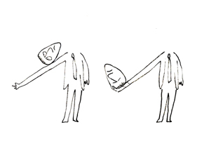 The commercial was done by Elektra Studios. Steig worked with a bamboo reed cut to form a point. He dipped that in ink and drew. The paper is particularly thick and is designed to absorb the ink. They’re punched with Oxberry peg holes top and bottom. I have one of the “pens” he used to draw these layouts. The final comercial was basically an ink line drawing against a white field.
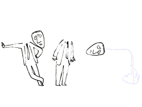 I’ve been a big fan of Steig‘s since my earliest days when I first discovered him in the
  By the time I saw my third exhibit of his work, I was able to barely afford one of the New Yorker drawings. It’s done on rice paper with the same type of “pen”. Years later, when I told Steig that I’d bought it, he said that it was the only drawing to have sold at that exhibit.
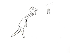
 However years before meeting him, I got to know Art Babbitt’s animation. I, of course, already knew about his animation from books and films. I’d been watching it carefully for over 20 years before working on
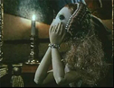
  I worked two rooms away from the editing room (two upright moviolas, one with an animation paper-sized viewing screen) across from the kitchen in the art room. One day, John came running in to call me out – this was unusual. It was obviously urgent and I ran behind him to the editing room. When we got into the close quarters, he asked if I wanted to see “one of the greatest peices of animation you’ll ever see.” I knew it’d be the mime. The moviola buzzed and played that opening scene. It was stunning.
 Months later – most of Art’s work had been completed and was already colored. The untrained inker had loosened the line a bit using colored marky brand markers, though a light watercolor wash had softened the line. Gold and blue were the watercolored washes that had colored the mime’s blouse. Charcoal grey tights. Drawing for drawing, I thought it still looked stunning.
 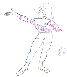 Art, of course, was upset. He knew he had done a good job and didn’t like that the timing on his animation had been changed. This information came to me via Dick; I’d brought him to the premiere screening of
 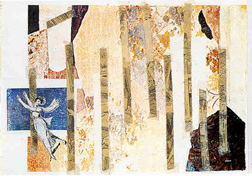 there for years:
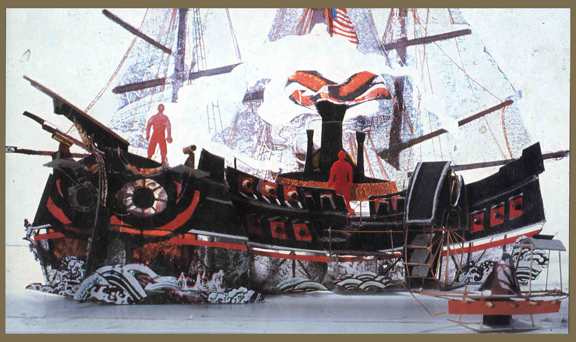
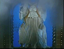
 The
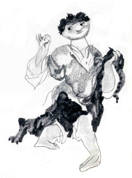
The  The illustration to the left is by Jiri Trnka.
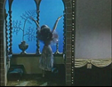
 - I am an ardent fan of the work of
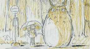
 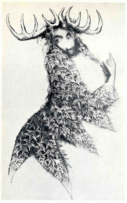 all be done by the same person, but I don’t think I’ll ever know. Hence, I have to give credit only to the director, Miyazaki and focus on the elements that are unique to his work, and there’s a lot of it.
 time on Turner Classic Movies. The new voices were sterling.