Search ResultsFor "toot art"
Animation Artifacts &Disney &Story & Storyboards 26 Sep 2011 06:47 am
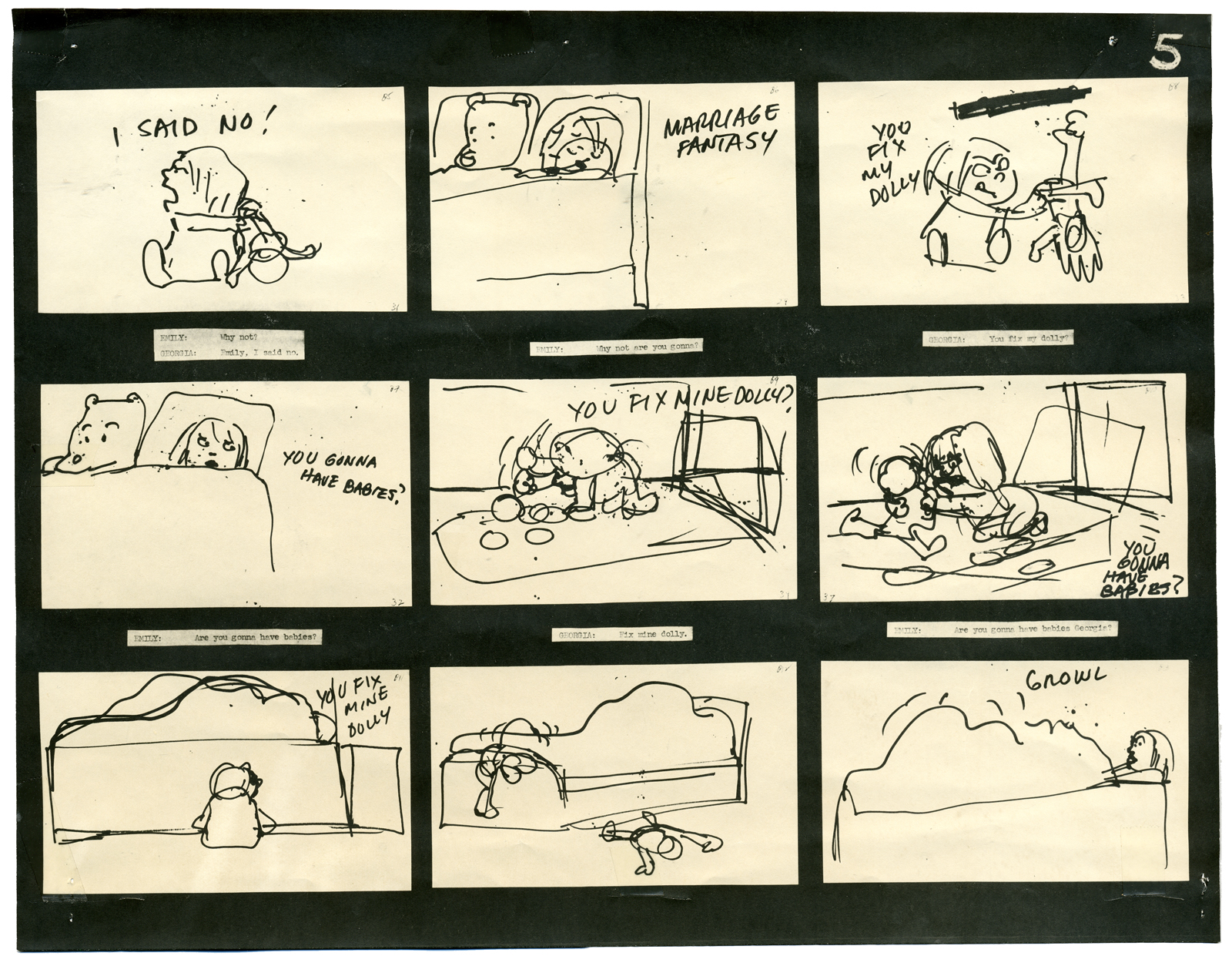
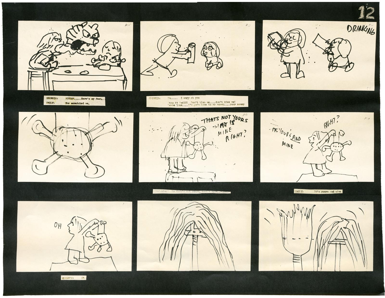
Cockaboody Board – recap
- On October 10th the Motion Picture Academy will present a program of films by John & Faith Hubley. John Canemaker and Emily Hubley have assembled the program and although it is composed mostly of films by John (I’m not sure he would have been happy about that), there will be a lot of his early films like Flathatting (for the Navy) and The Magic Fluke and Rooty Toot Toot (for UPA.) There will also be recently restored prints of Adventures of an * and Tender Game as well as the late film, Voyage To Next. The show will have plenty of surprises of very rarely seen and hard-to-find material.
To reserve a seat go to Oscars.org. Academy members – $3.00. General Public – $5.00. or you can pay by mail with a form you’d get on line. Don’t wait; it’s probably sold out by now.
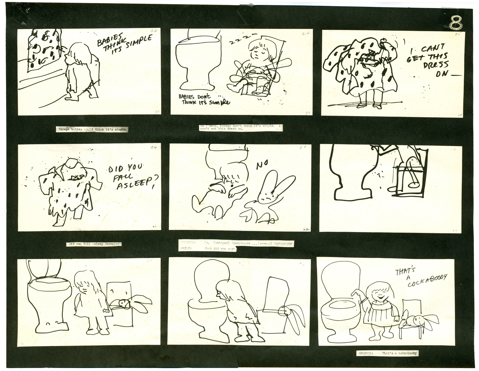
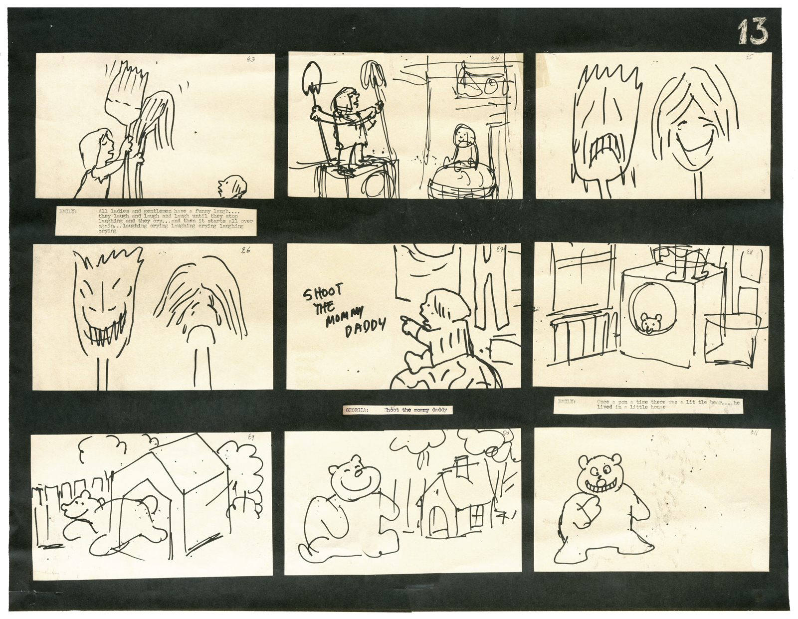
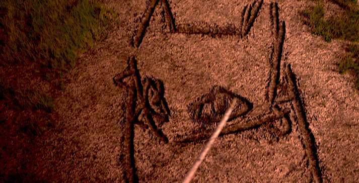
I will be posting as much of the Hubley art as I can in celebration of this show. To start with here’s the storyboard for Cockaboody.
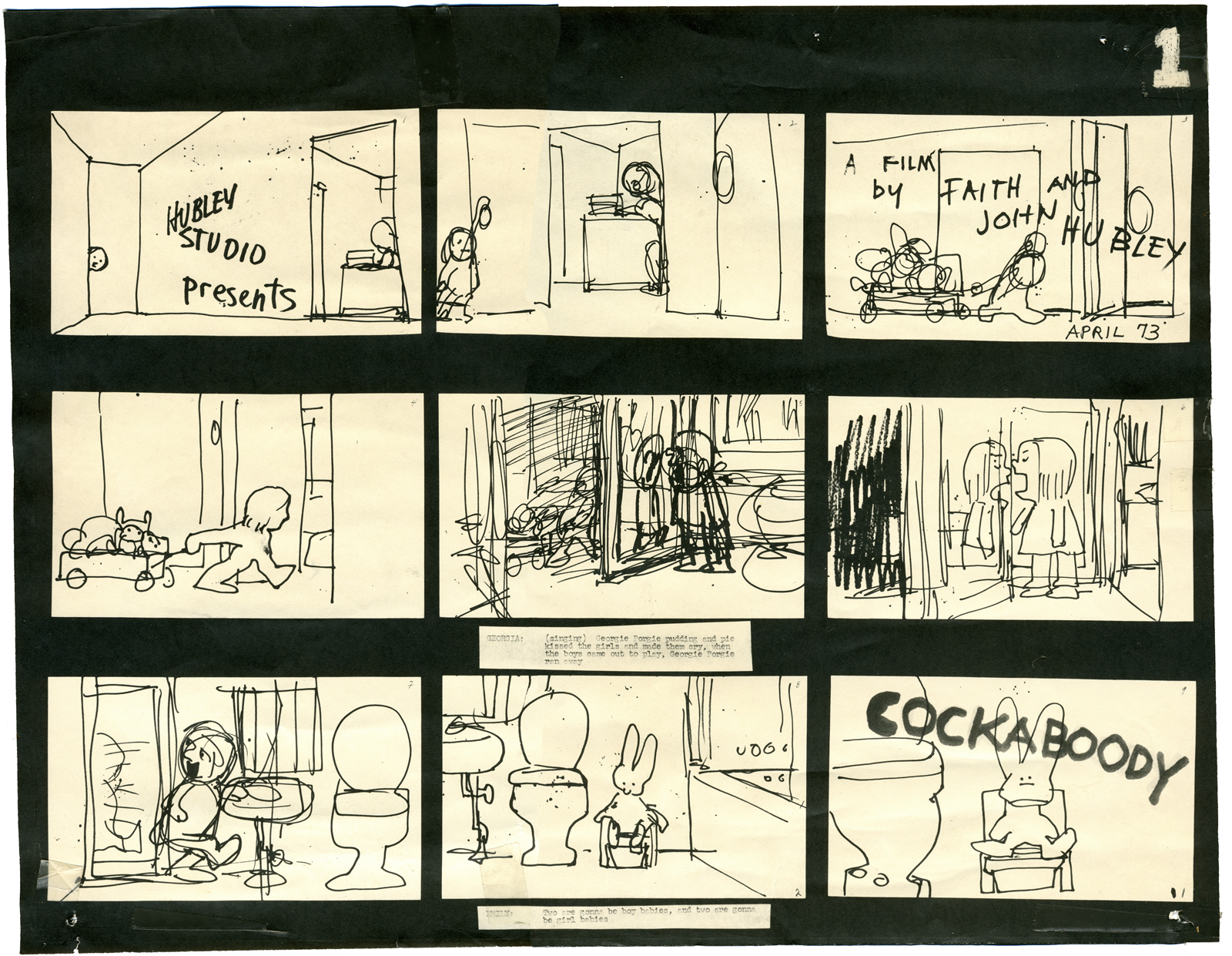
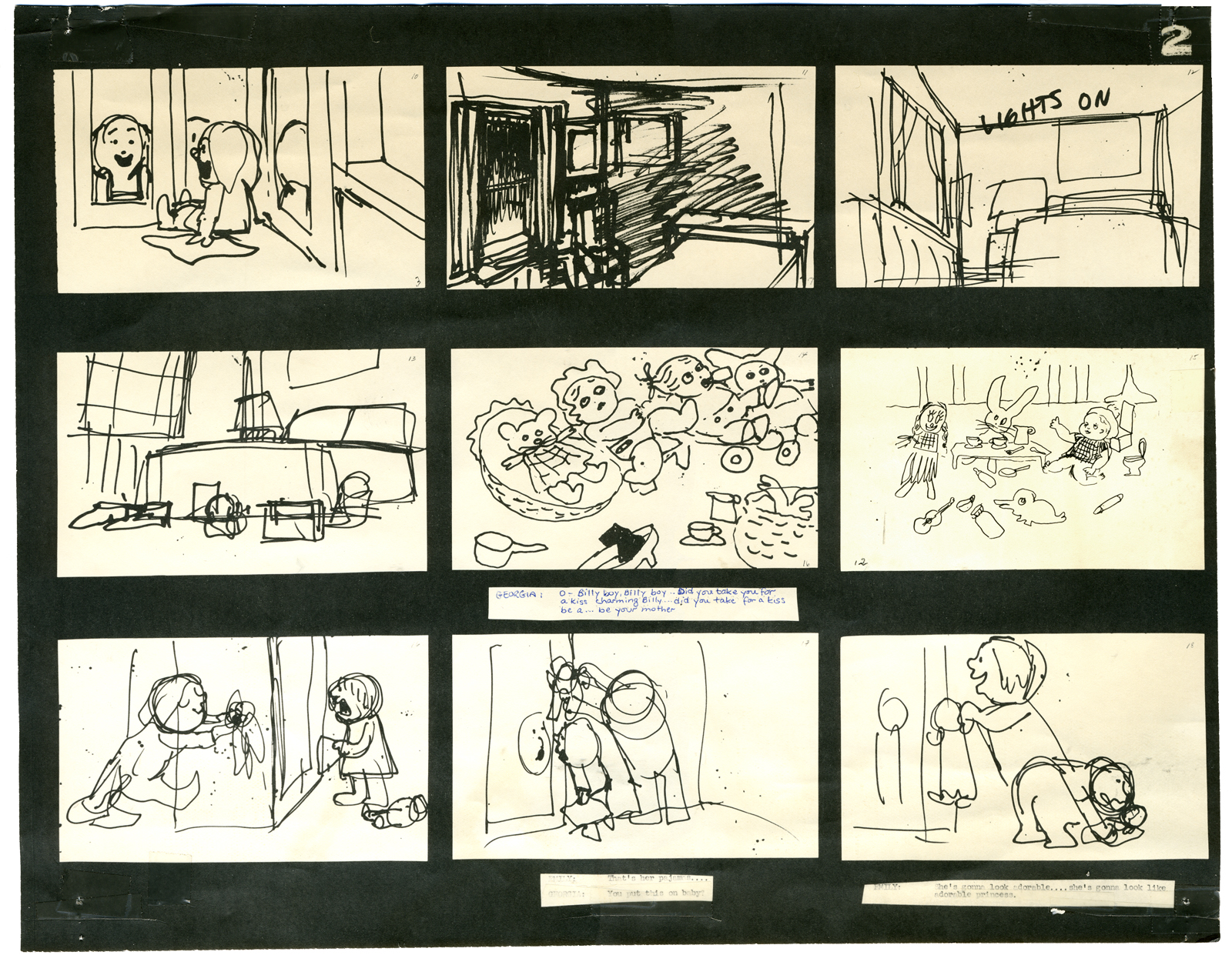
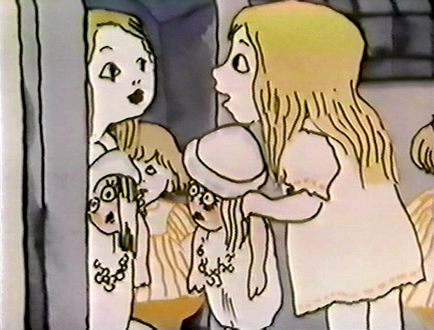
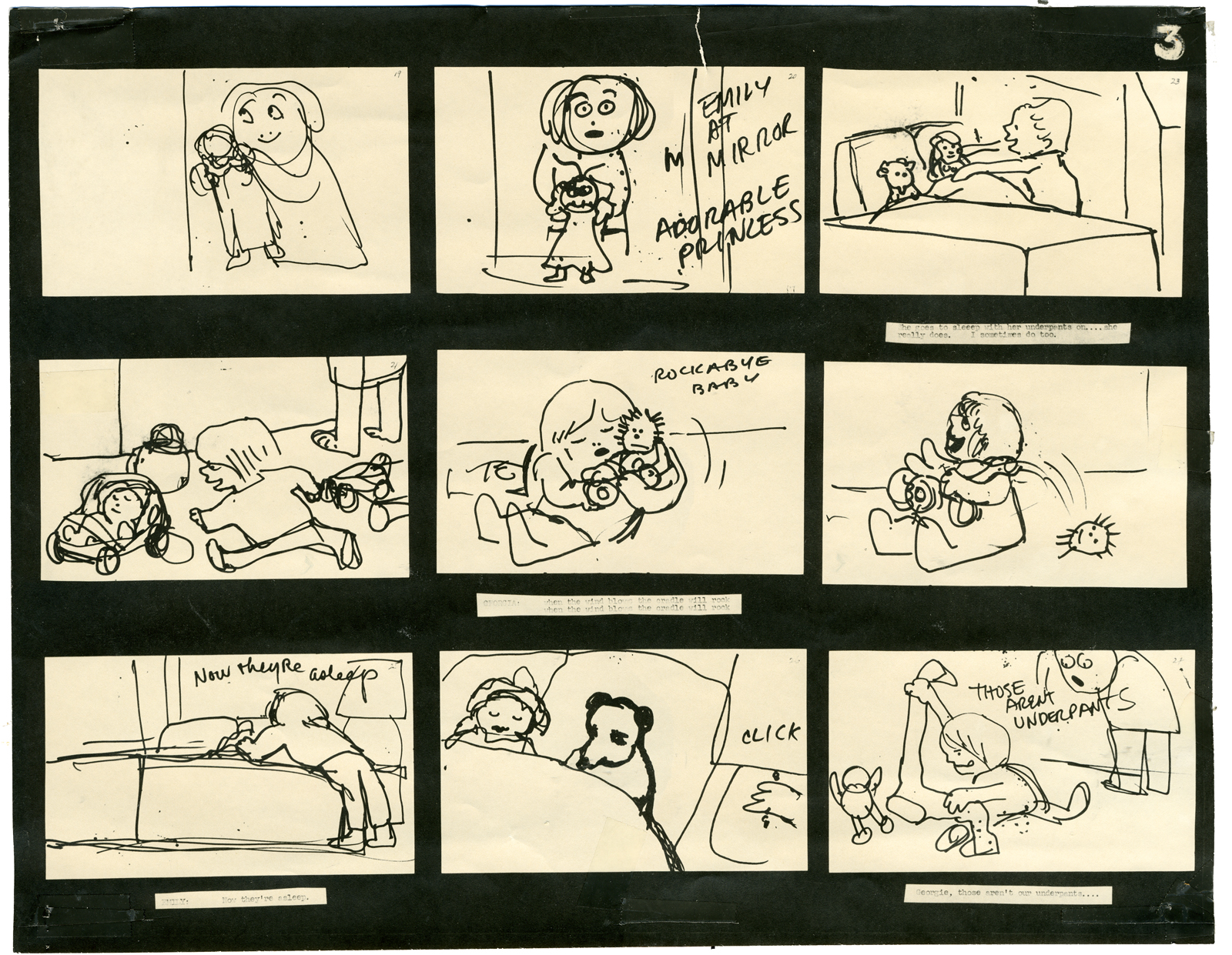
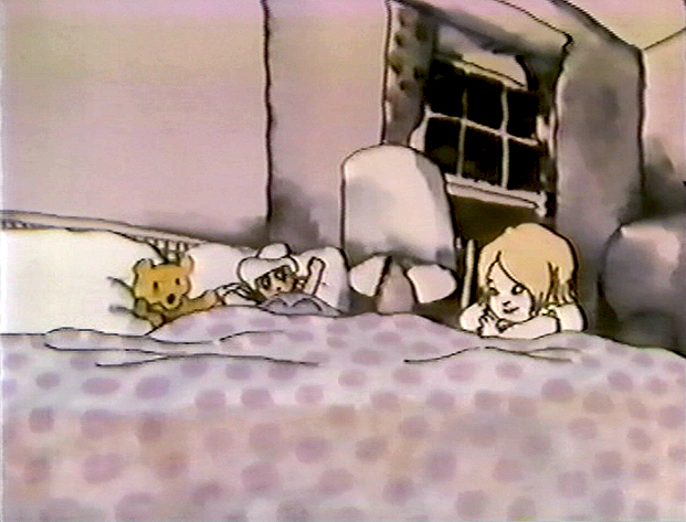
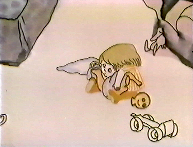
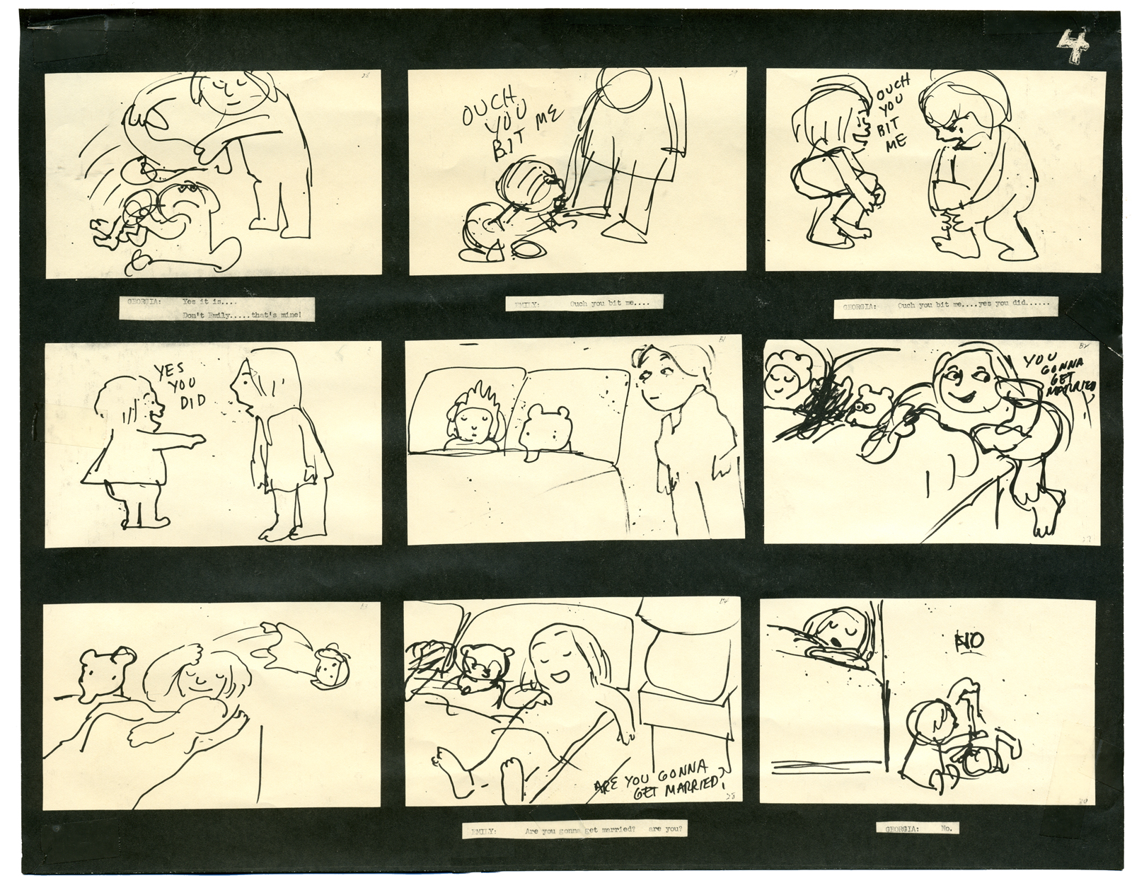
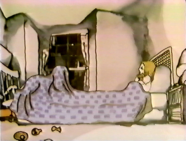
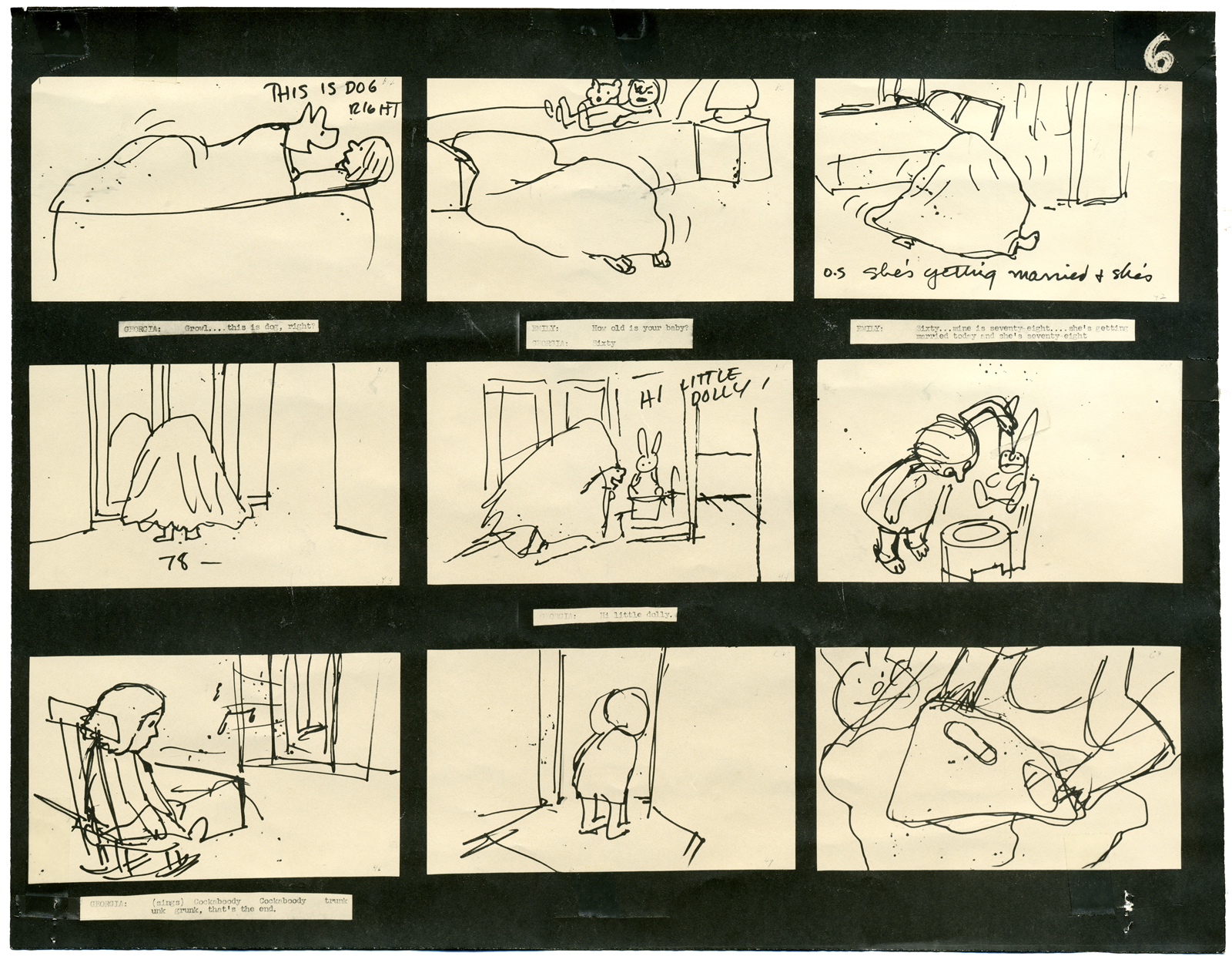
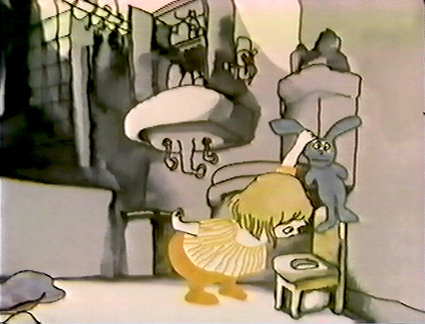
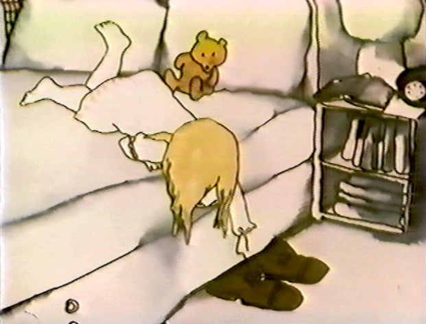
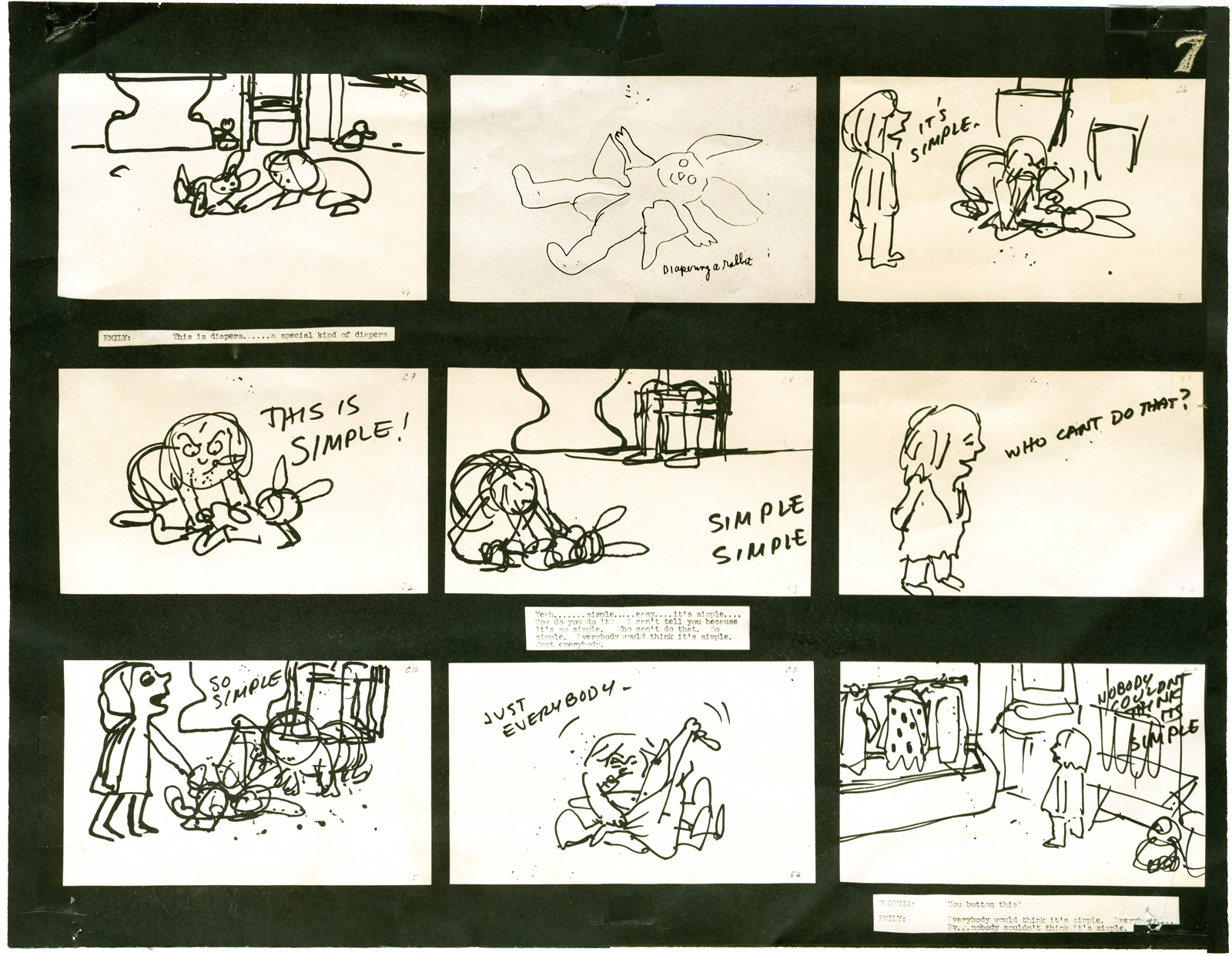
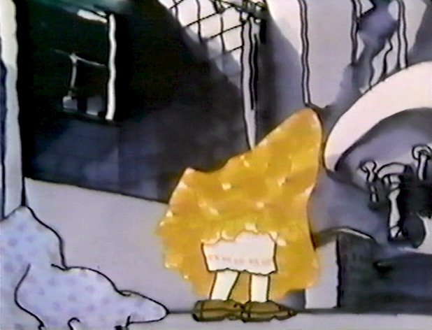
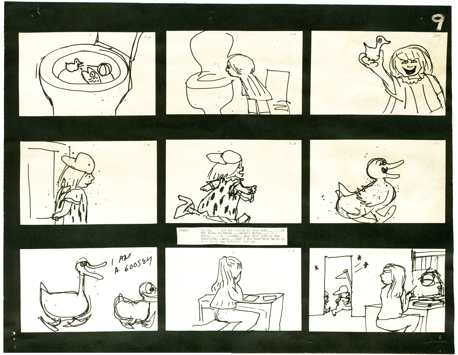
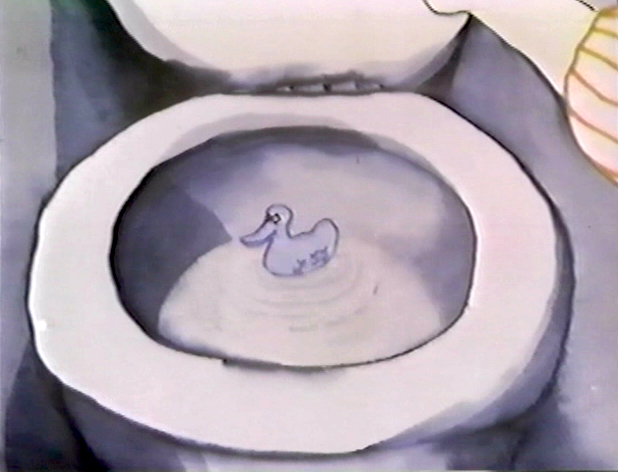
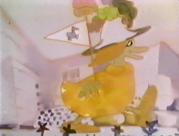
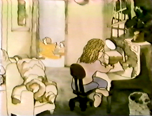
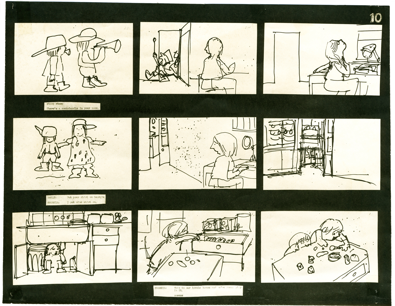
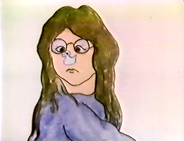
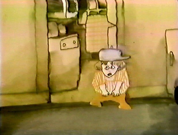
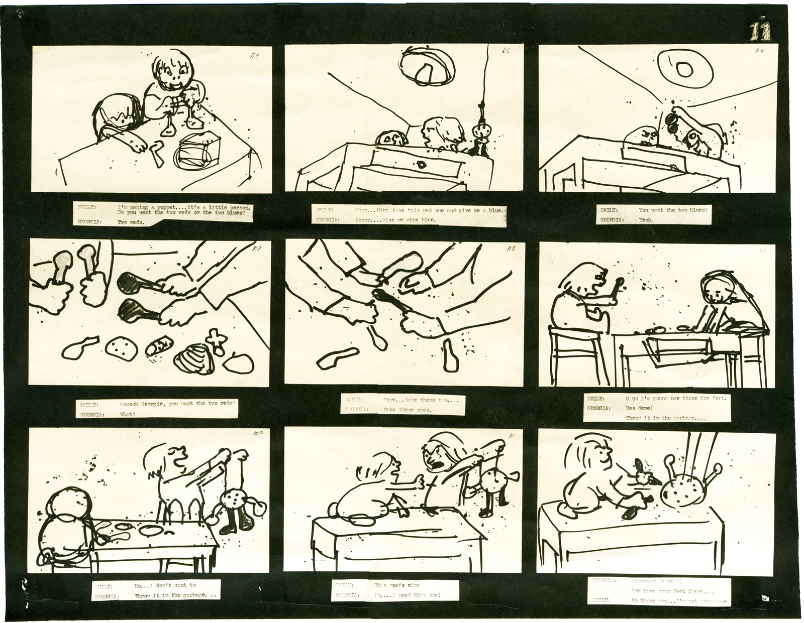
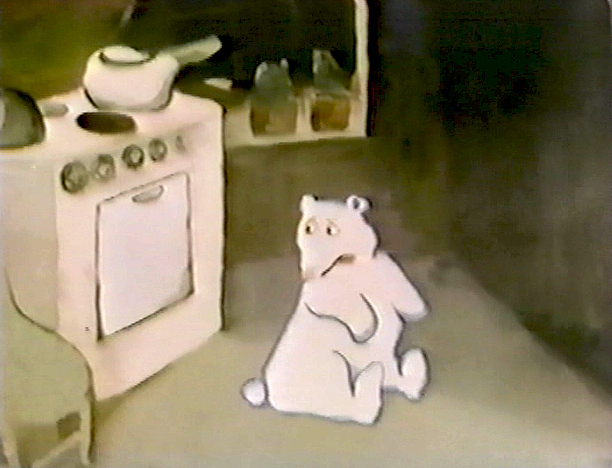
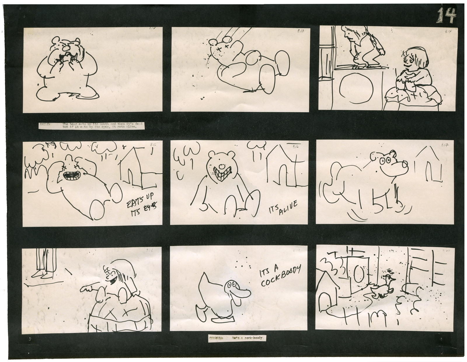
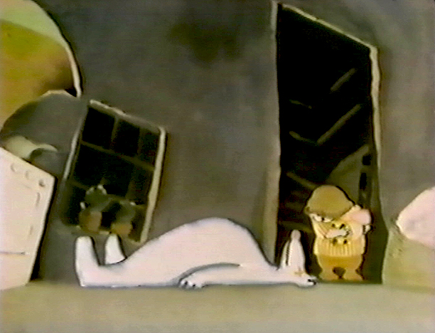
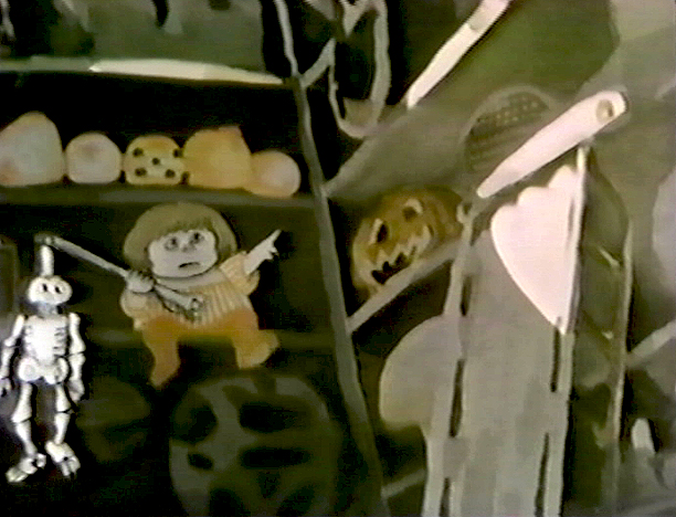
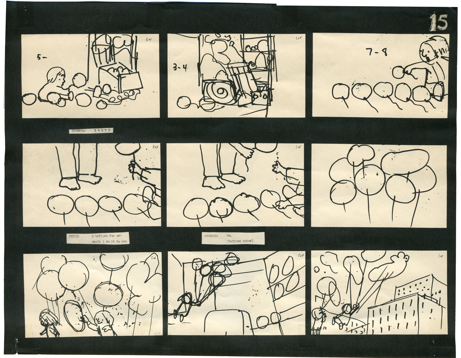
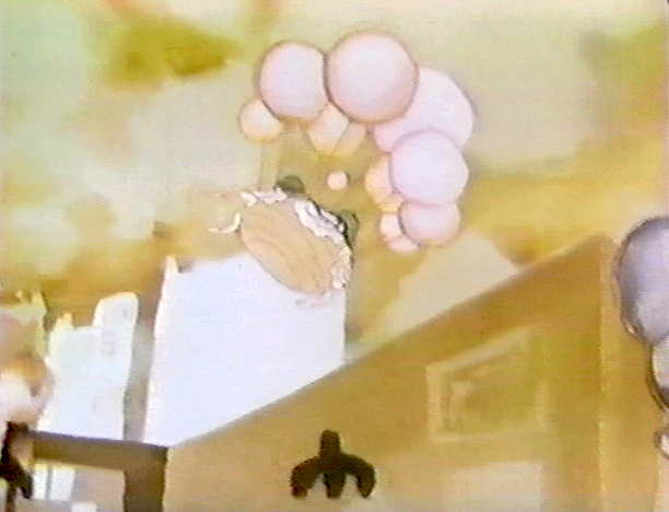
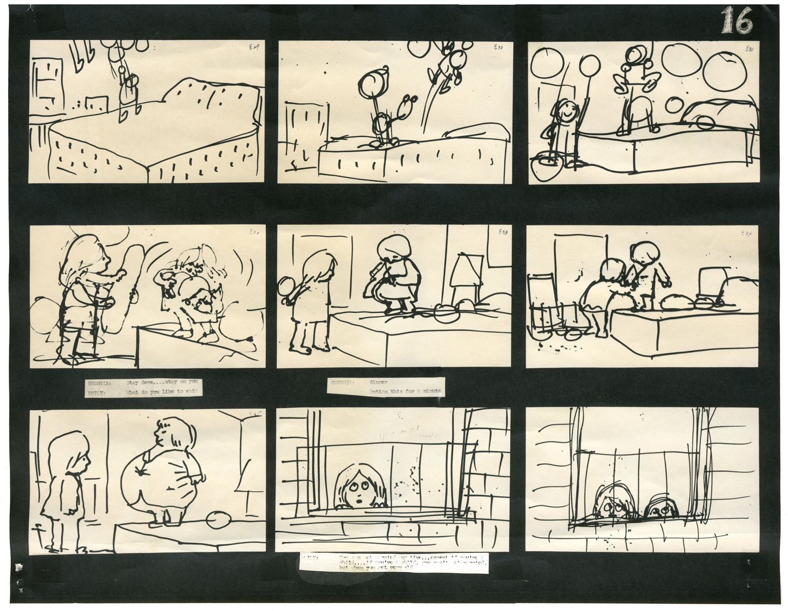
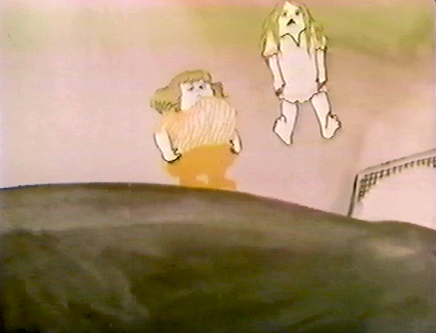
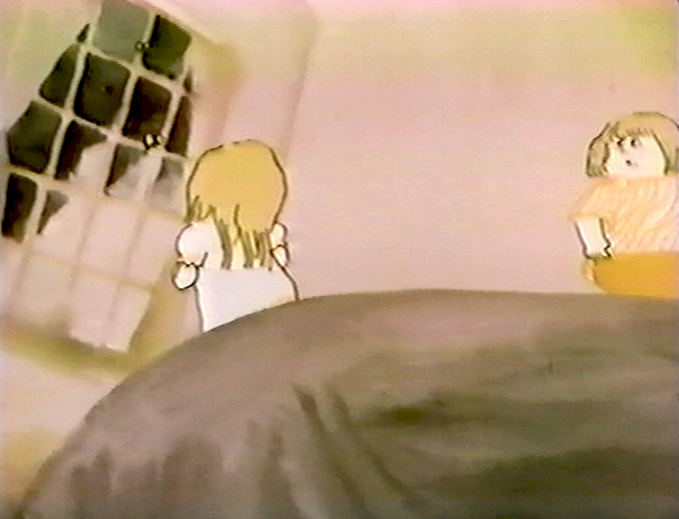
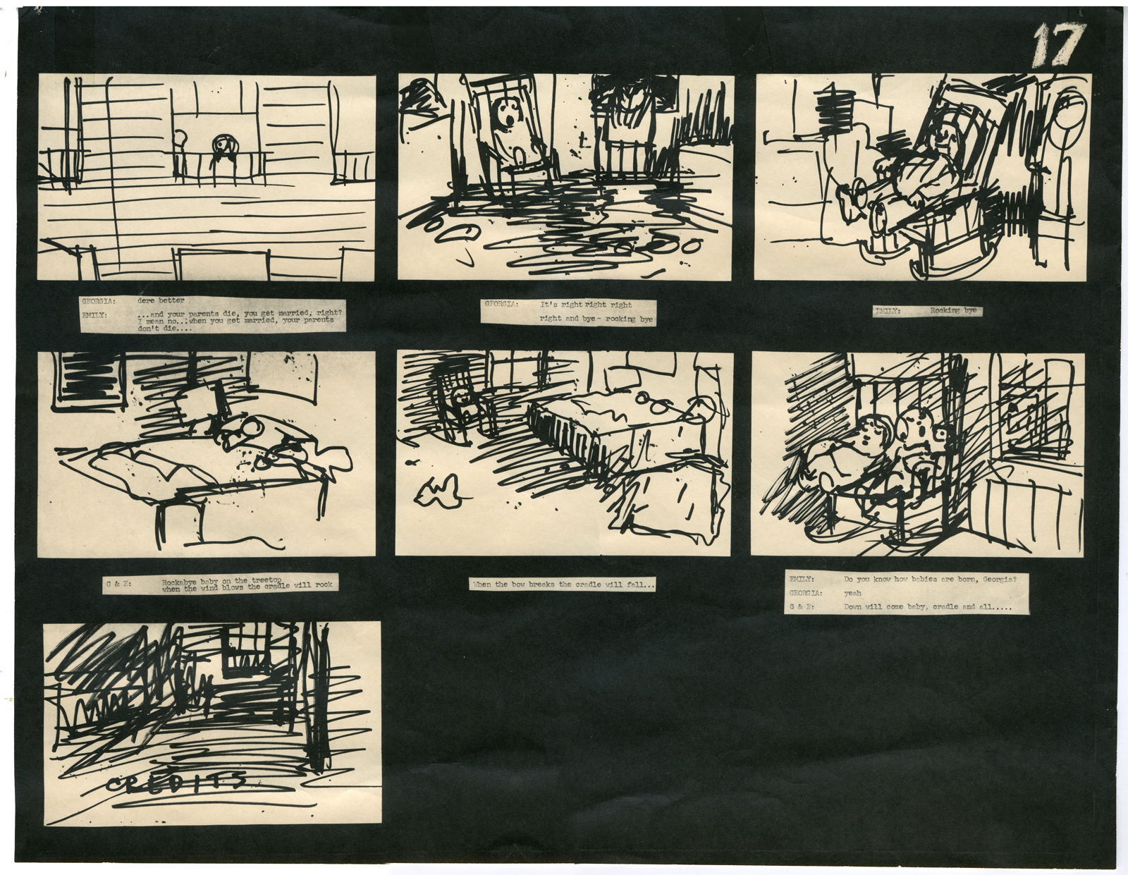
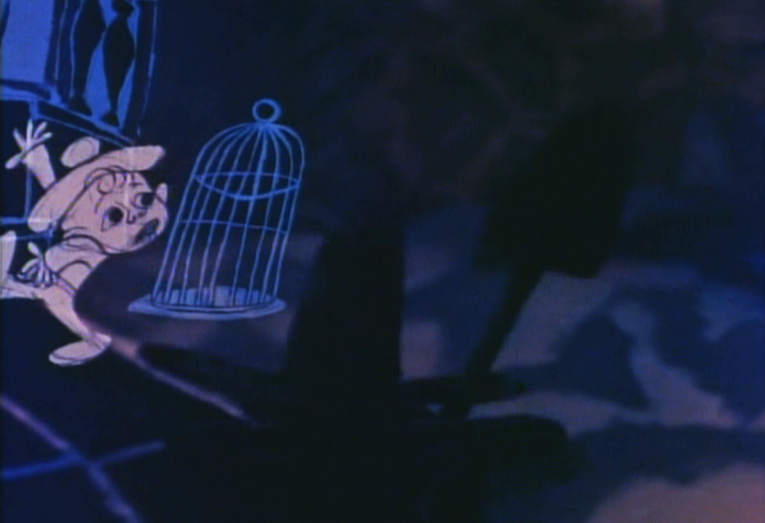
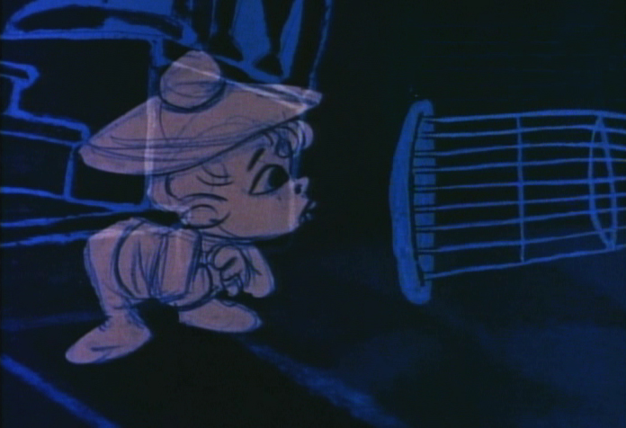
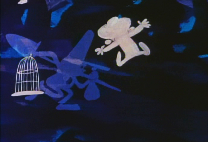
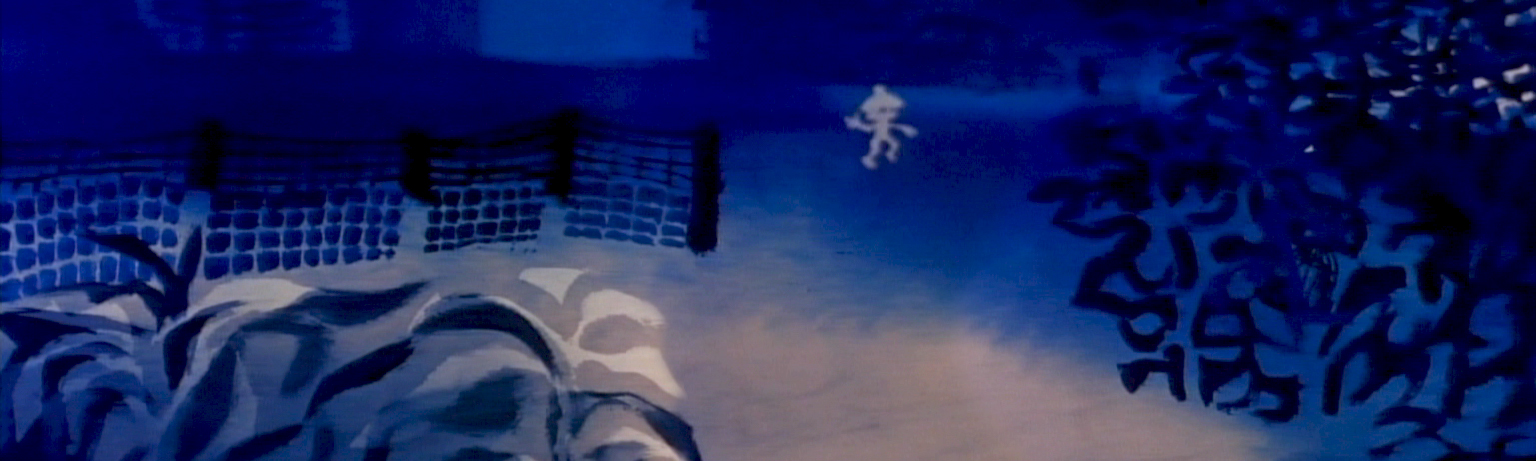
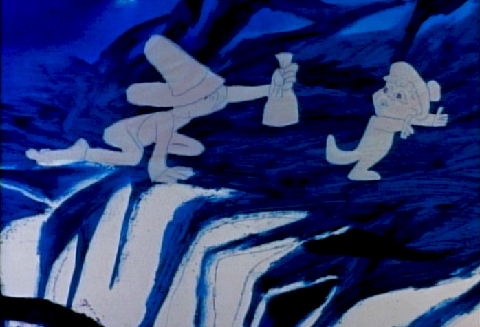
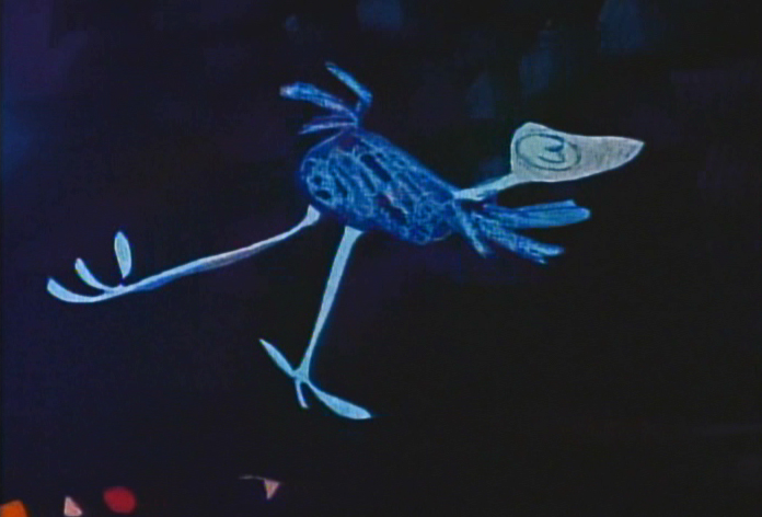
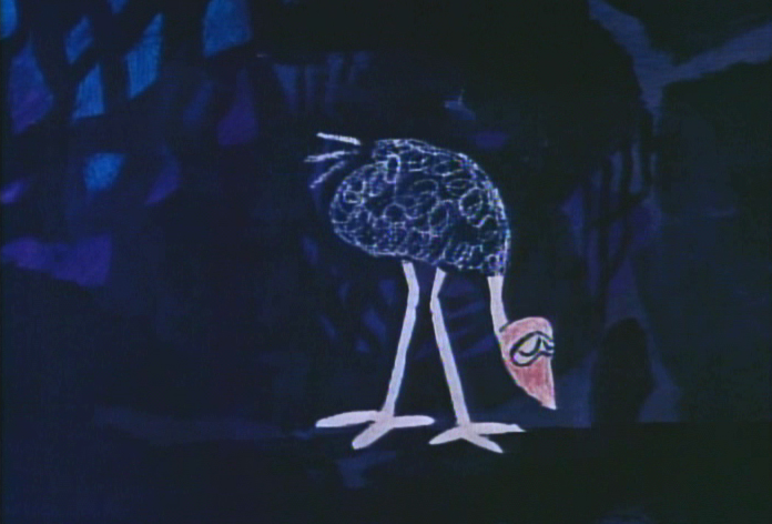
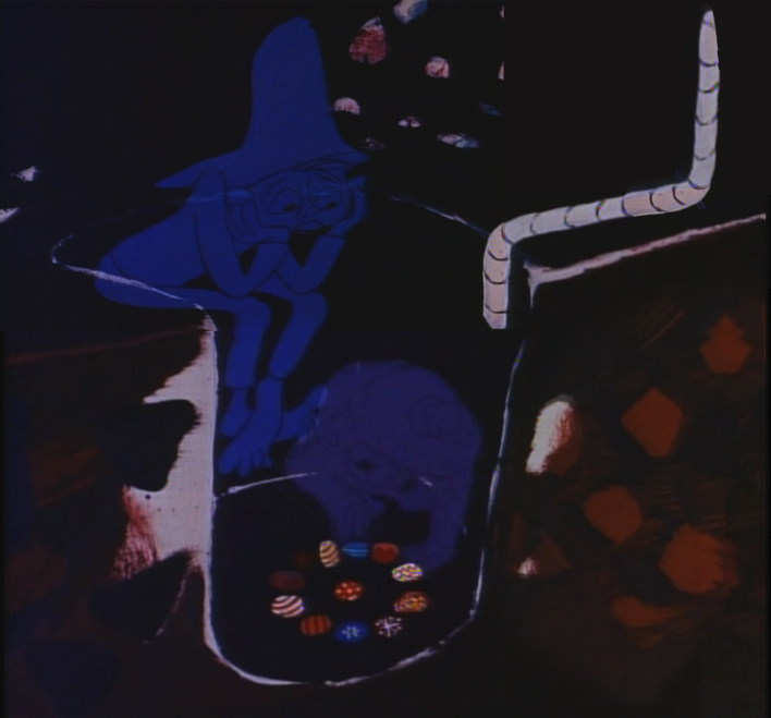
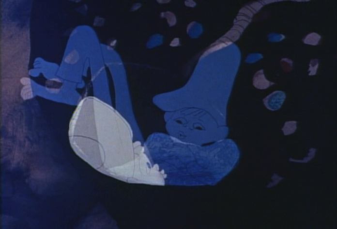
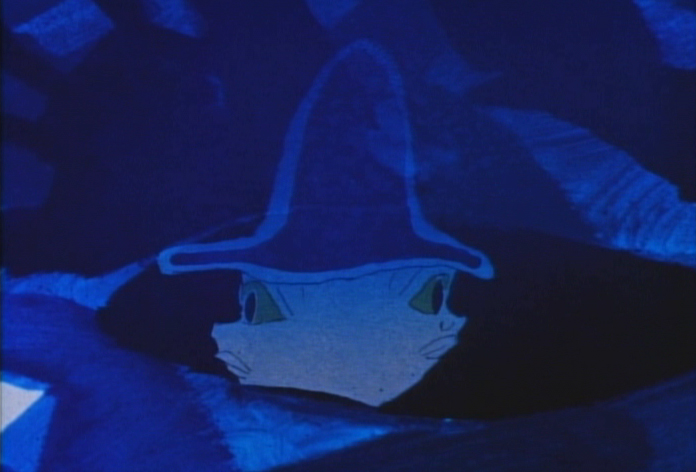
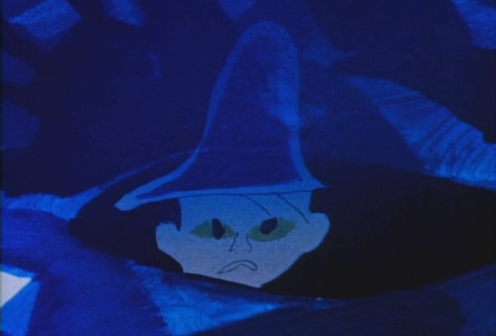
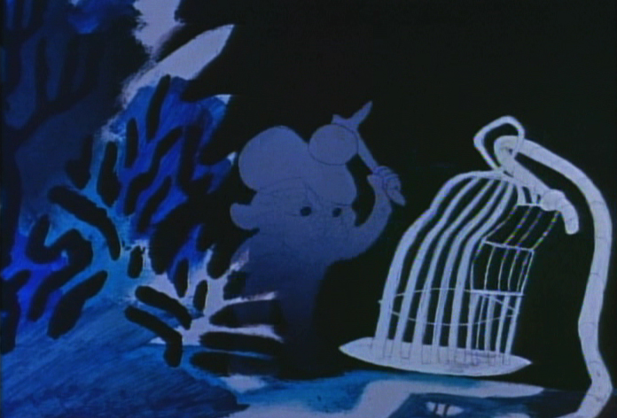
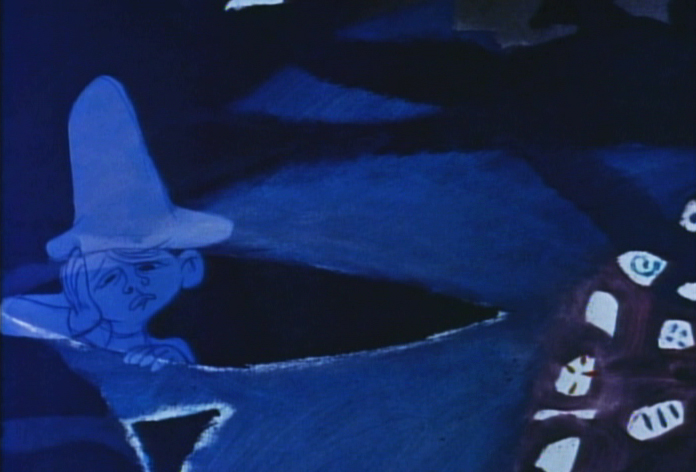
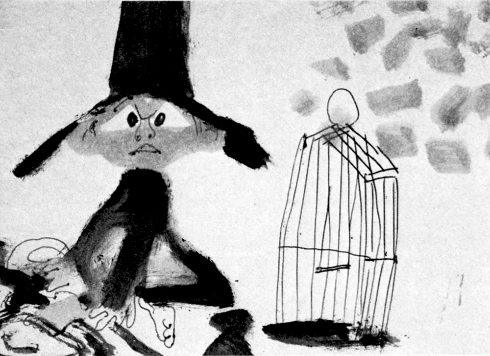
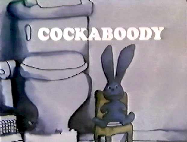 – I have a photostat copy of the storyboard to John and Faith Hubley‘s short film, Cockaboody. So I thought I’d post it to give a good demo of a storyboard from a master. The board was done in 1973.
I had worked at Hubley’s for four months on Letterman and was layed off when that work ran out. They started preliminary work on Cockaboody while I was working on the feature Tubby The Tuba.
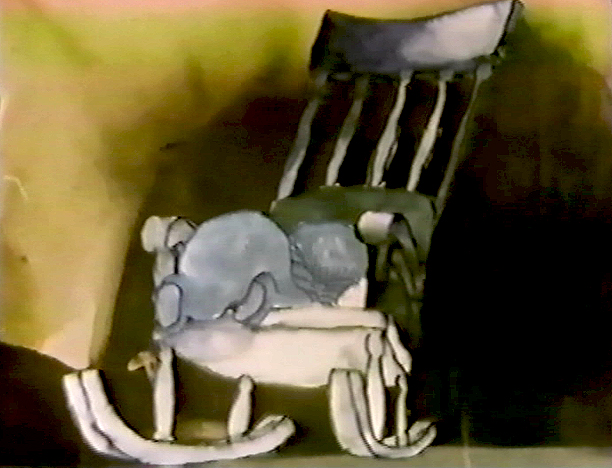
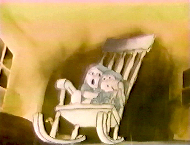
I left that project in time to get back to see the final scenes of Cockaboody colored, and I did a little animation of a rocking chair, with the two girls cradling it, at the film’s end. I didn’t do enough work on the film to receive credit, but I can still see my pencil lines on those two girls at the end of the film.
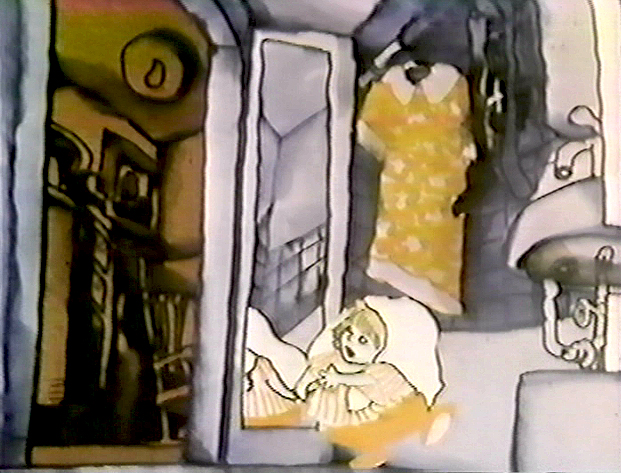
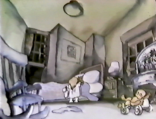
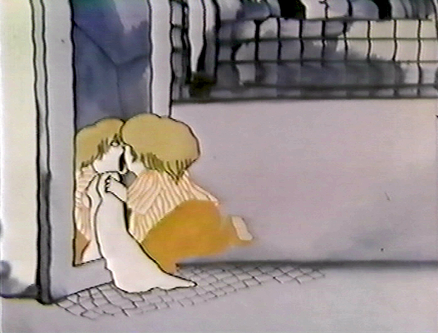
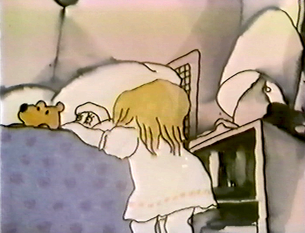
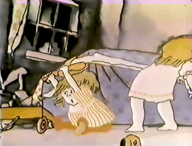
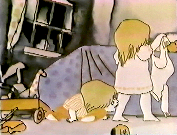
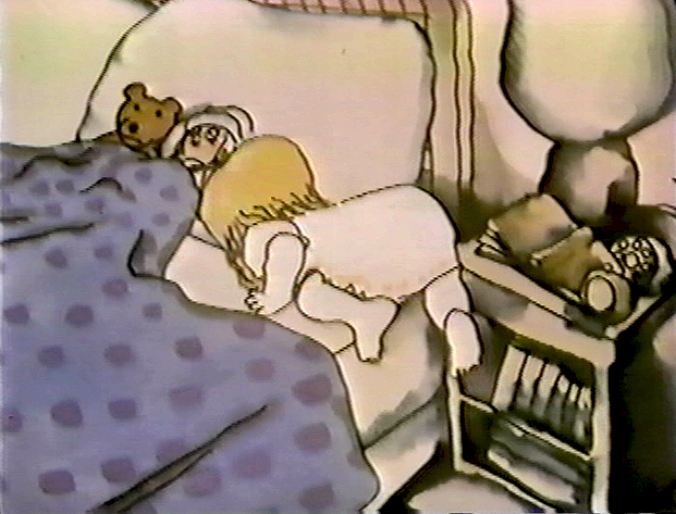
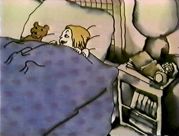
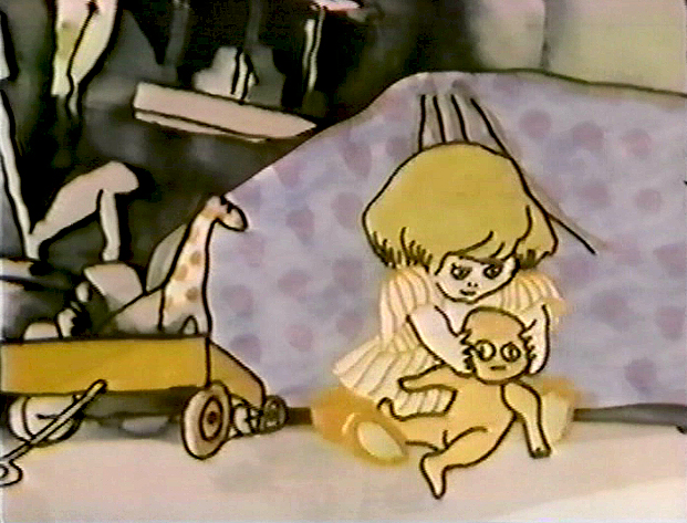
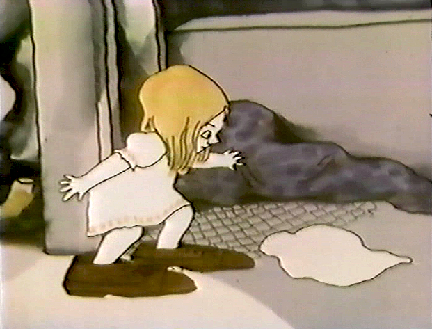
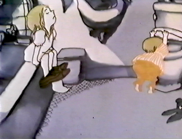
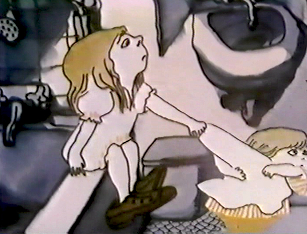
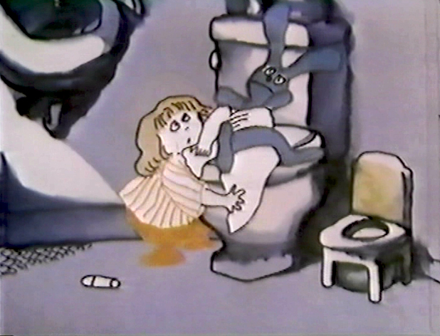
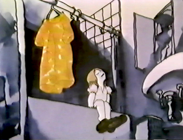
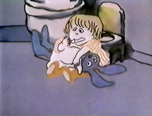
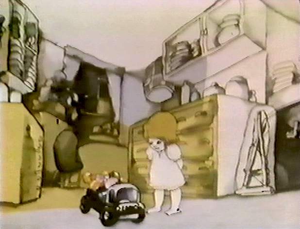
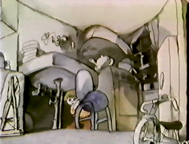
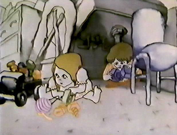
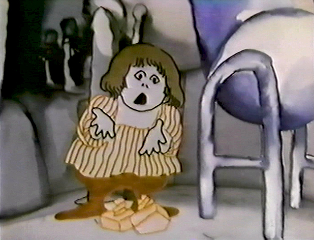
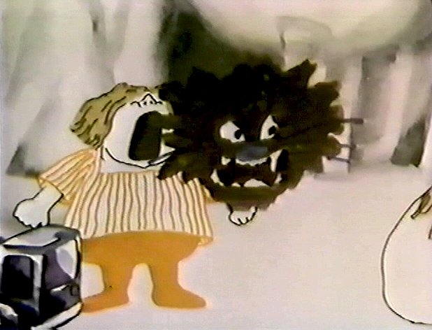
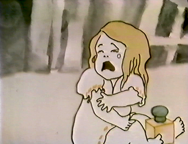
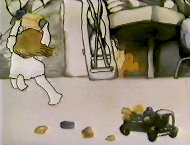
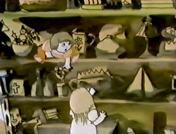
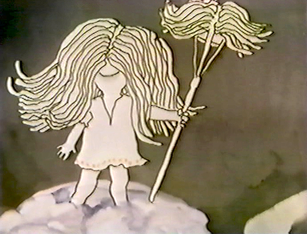
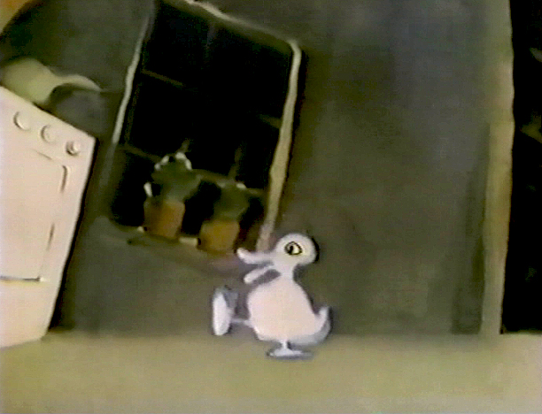
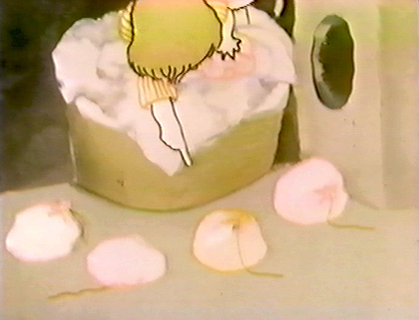
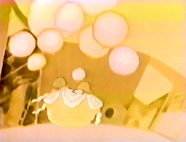
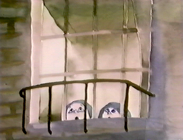
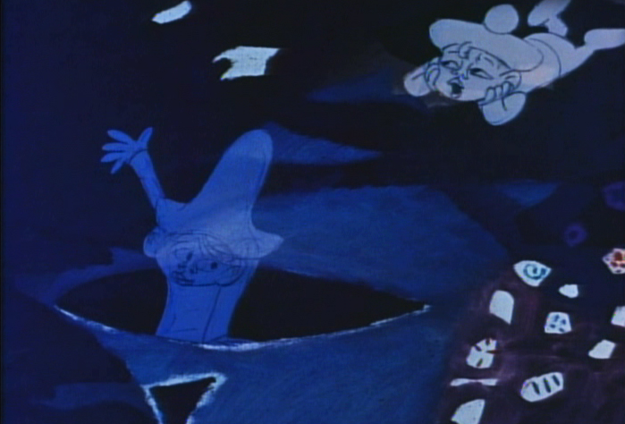
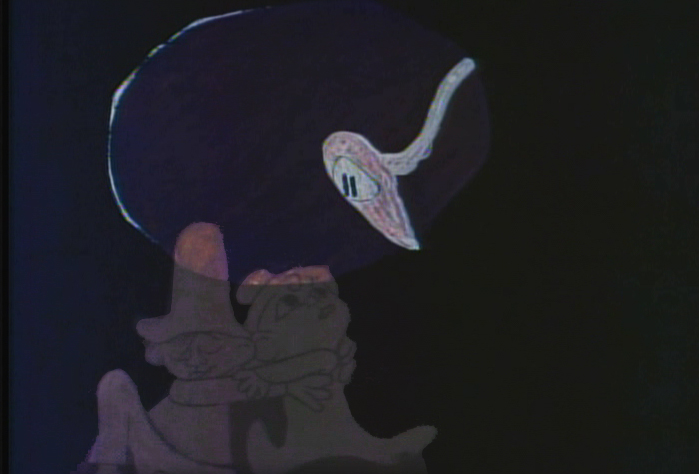
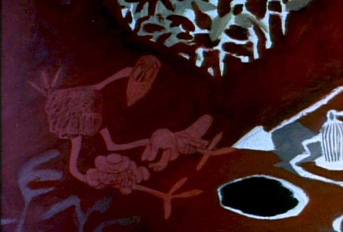
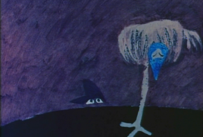
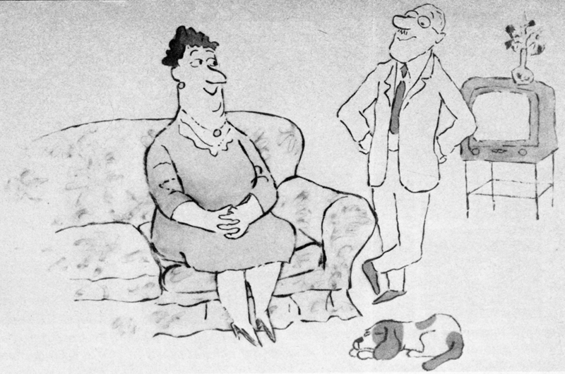
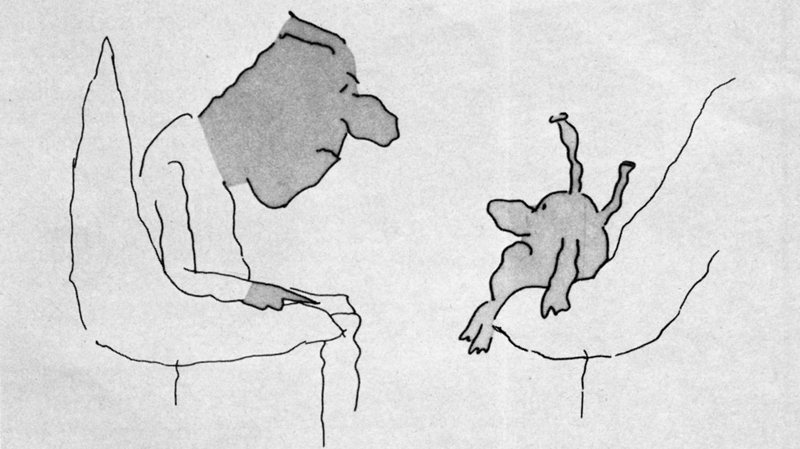
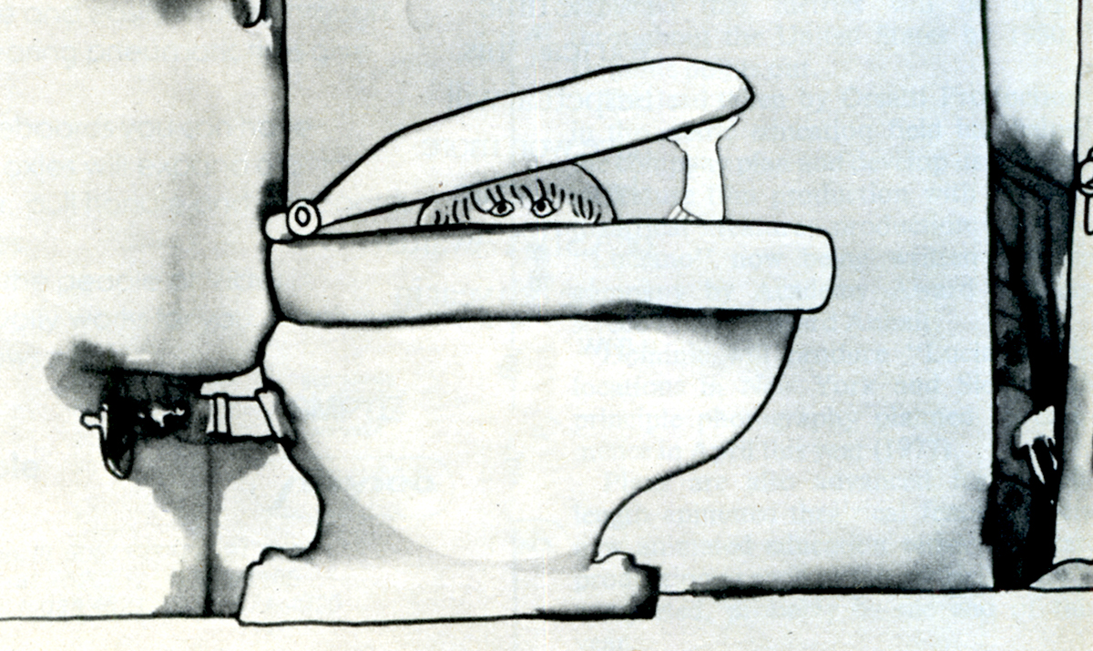
The film tells the story of two girls playing in a room next door to their babysitter. They laugh they cry they laugh they cry.
The audio track was improvised by Emily and Georgia Hubley in a recording studio years before they started the film. From the edited tracks a story was culled, and a storyboard formed. John did all of the drawings in storyboarding it.
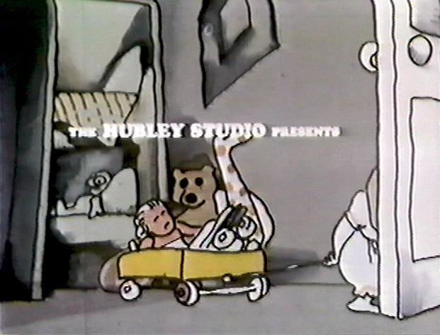
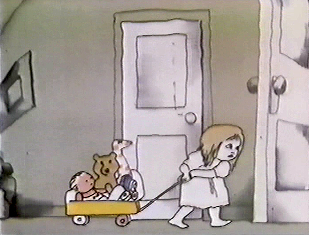
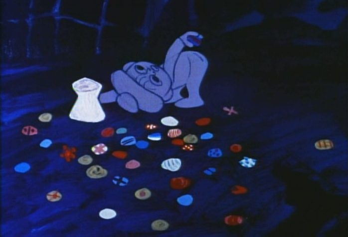
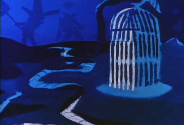
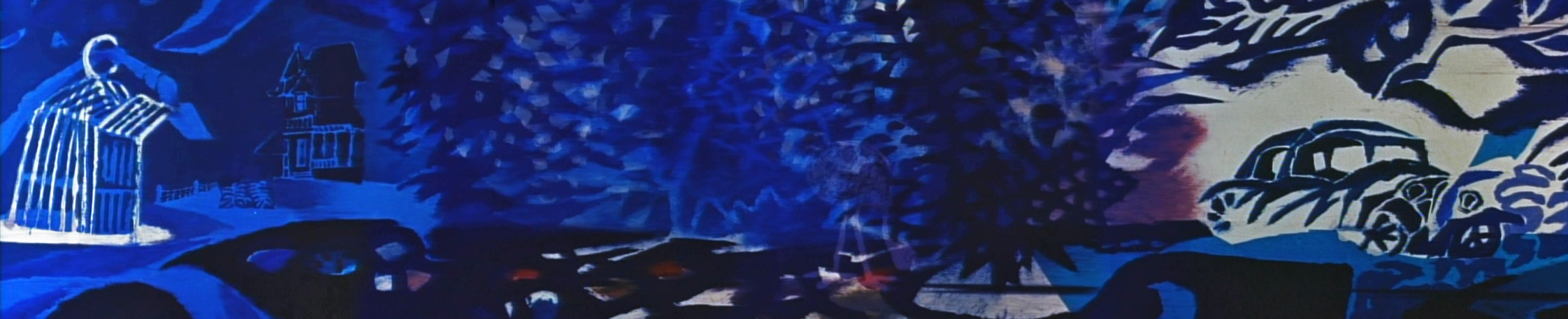
There are 17 pages of board in all. I’ve inserted frame grabs so you can see how the final turned out. Tissa David animated the entire film.
___(Click any image to enlarge.)
_
_
_
_
_
_
The storyboard, with all of the drawings done by John, was developed in conjunction with the Hubley’s class at Yale. The students actively discussed the board and offered their participation in the growth of the film’s origin. A documentary was also produced showing the production of the animated short.
You’ll notice that the action in the film varies from the setups in the storyboard. This undoubted had to do with Tissa’s involvement. She would often rework things with John and alter the filmmaking. John, and most of the directors Tissa works with, was open to this. She has a masterful sense of camera placement and uses it throughout this film.
(Click any image to enlarge.)
_
_
_
_
_
The film was an outgrowth of an early recording John and Faith made of their two daughters, Emily and Georgia. While teaching at Yale the Hubleys worked with the students in their class to help develop this storyboard. One of the students, Kate Wodell, came to work in the studio and was a mainstay there for many years and continued for a while helping Faith on many of her shorts after John died.
__
__
 _
_ _
_
__
__
__
 _
_ _
_
_
__
__
 _
_ _
_
__
__
__
 _
_ _
_
__
__
__
 _
_ _
_
__
__
__
 _
_ _
_
Commentary &Frame Grabs &Hubley 19 Sep 2011 07:23 am
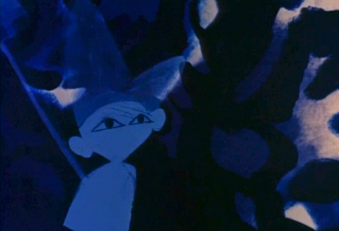
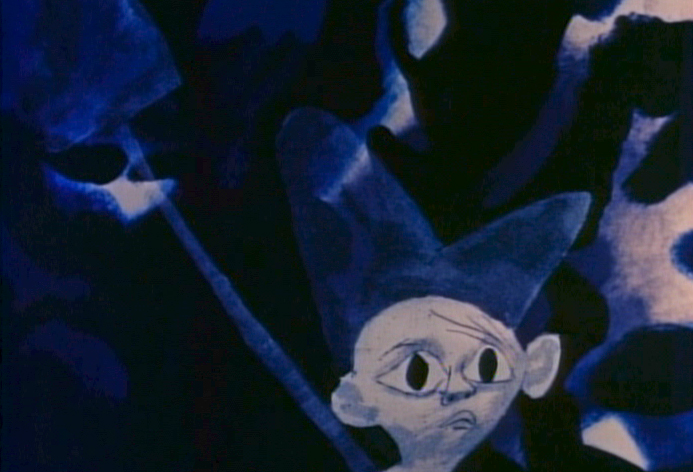
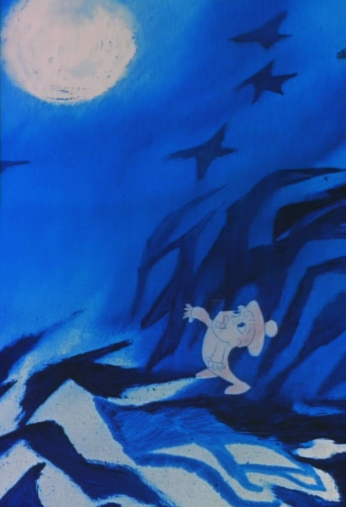
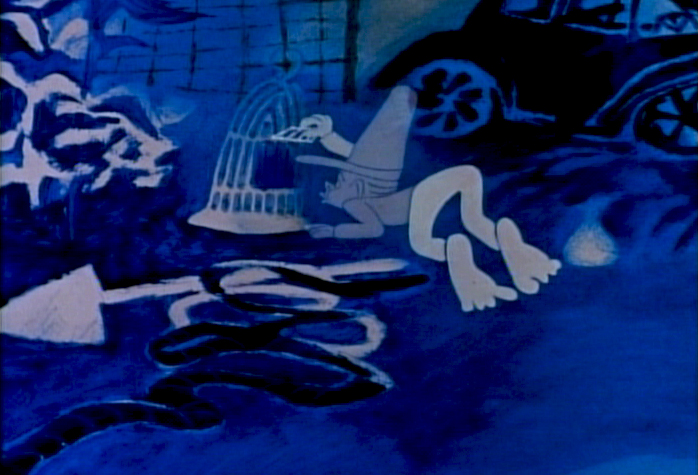
Moonbird
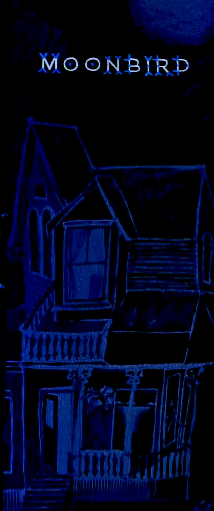
Opening title pan down- Moonbird
- In 1964, John and Faith Hubley‘s film, Of Stars and Men opened at the Beekman Theater in Manhattan. This was their first feature; it was accompanied by a number of their short films. I was in High School, and this is the first time I saw any of the Hubley films, and my life had changed at that screening.
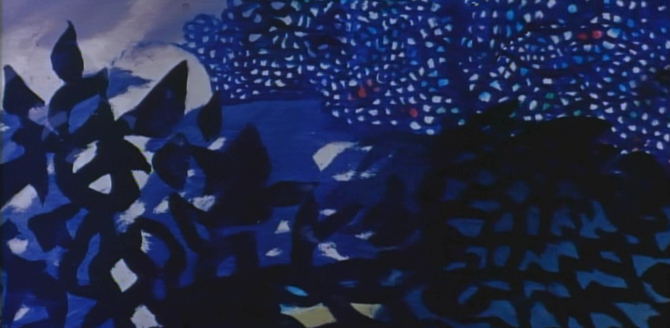
 The flat colors of the Disney and Warner Bros cartoons were suddenly replaced with textures. It wasn’t only the backgrounds that had a texture; it was the characters as well. I’d already taught myself quite a bit about animation, but this was something new for me. I sat with saucer eyes watching every element and filmic device John Hubley came up with in creating these flms.
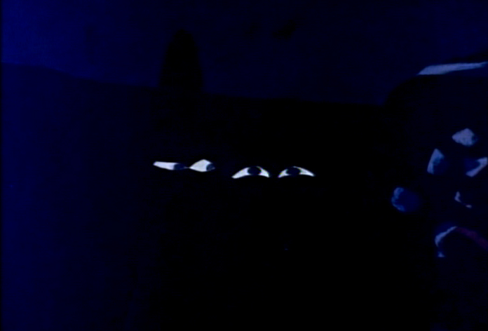
 It was so clear that Hubley was using a system of double exposures, doubling the characters in at an exposure of about 60% so that the white paper would be somewhat translucent over the dark backgrounds. The rough pencil lines of the animators clearly delineated the characters in this technique, though they picked up some of color of the Bgs. Obviously, the white paper of the character had been painted black – up to the animator’s lines so that the extraneous parts of the paper was matted out. What a brilliant idea!
I explain this process in depth in this post from the past.
.
This enabled us, the audience, to see the rough lines of the animators and brought the same life the Xerox line had brought to 101 Dalmatians. It was thrilling for me.
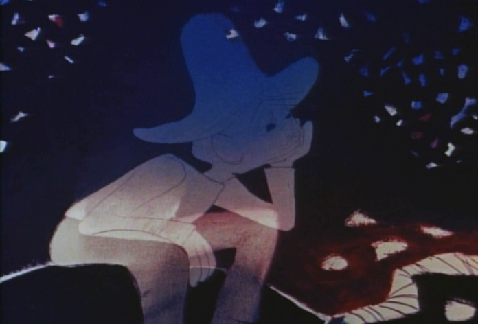
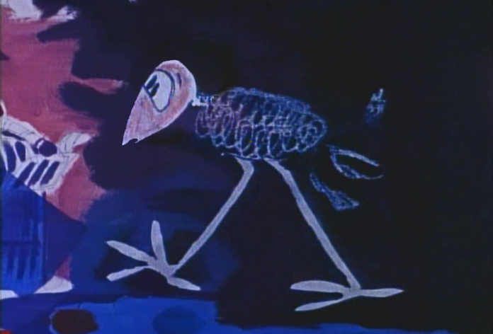
The sing-song muttering of a child introduces us to “Hampy”.
The rough lines of animator, Bobe Cannon, are a treat on the screen.
Glorious textures!
Every oil painting background beautiful, alive and modern.
The other amazing thing was that the films used real dialogue.
It didn’t sound like a script. It was obviously, somehow, improvised.
It took me a while to learn how this was done
and what a wonderful way they had of doing it.
Moonbird was different from the other shorts of that period.
Its soundtrack was completely improvised by the
two boys of the Hubleys, Mark and Ray.
. . . but it also used NO music track.
This is very different for the Hubley films that had
such a devotion to the use of jazz on the soundtrack.
The film not only looked different for the time, 1959,
but it sounded different.
This film had clearly been the results of years of experimentation.
After all those brilliant UPA shorts, particularly Rooty Toot Toot.
The original Hubley produced shorts took a new, brilliant turn.
Adventures of an * moved animation forward
in its pursuit of 20th Century Art.
Picasso and Steinberg had been mimicked in the UPA films.
With Adventures of an * the Abstract Expressionists
came under the magnifying glass as John Hubley used
the New York school as his inspiration.
With Tender Game they moved that style into a more emotional
character animation, and by the time they did Moonbird, they
had settled into a very rich style that animation hadn’t noticed.
Two of animation’s finest animators delivered
the brilliant lyricism in this film.
Bobe Cannon, for years, had delivered great animation.
His work with Chuck Jones had produced new and rich
experimental heights particularly in the 1942 short, The Dover Boys.
Hubley had stated that this film was an inspiration
in the move to 20th Century graphics in animation.
Cannon’s work with UPA, both directing and animating,
brought a new sense of poetry to the medium that finally
plays out in this film, Moonbird.
The young Ed Smith rose to great heights
while working for Hubley. His work on Tender Game
showed a natural warmth that spills over in this film.
Animation, double exposures, oil painted Bgs,
improvised voices, no music all pushed this film
to the forefront of animation at the time.
Despite the looseness of the style, it all blends
together as if it had been done by the one artist.
I love the soft airbrushed look Hubley was able
to pull off with much of this double-exposed artwork.
And yet the characters always remain front and center.
A tribute to the two animators and the directoral staging.
This delicate and lyrical film was followed by an anmiated
discussion of nuclear warfare and armament. The Hole
was twice the length and had a political point to make.
The characters’ colors change and fluctuate and sparkle
even as scenes progress, but this all becomes part of
the style which the Hubleys pursued for
the rest of their filmmaking life.
As in Moonbird, the voices in The Hole were improvised
. . . but this time by adults, Dizzy Gillespie and George Mathews.
The Hubleys took their process of improvisation to a new level.
In the end, animation grew up, once upon a time.
The question is whether we’ve squandered that development
and have retrogressed to the 19th Century illustration styles
that Disney pursued. Recently, we seem to have had only
bad drawing or cgi puppets to choose from.
Time to step up, ladies and gentlemen.
Books &Commentary &Disney 04 Jun 2011 06:52 am
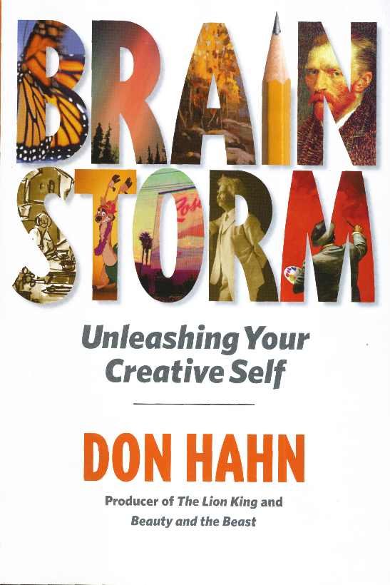
Don Hahn’s Brainstorm & Other Brickabrack
 - Don Hahn is a busy guy. Aside from producing Beauty and the Beast, The Lion King and The Hunchback of Notre Dame, he’s produced the Disney nature documentaries Earth, Oceans and African Cats. He’s also directed Waking Sleeping Beauty about the renaissance of Disney animation.
Mr. Hahn has also written a number of books, starting with Animation Magic through Disney’s Animation Kit as well as The Alchemy of Animation up to his most recent (non-picture) book, Brainstorm: Unleashing Your Creative Self.
I recently picked up Brainstorm and have read it, so I thought I’d write a few comments. I believe this is an updated and expanded version of the earlier book, Dancing Corn Dogs in the Night. In either incarnation, it’s an easy-to-read book with a light and casual sense of humor. Mr. Hahn is very comfortable in the skin of the light raconteur; he often tells stories that are witty and help to direct his point. This is a book about the creative process, and it tries to tell people how to get their artistic side out of their bodies.
 This process is best told in a story wherein a younger production manager calls Hahn in the evening asking to come up to his office. When they meet, the young executive says he needs advice: he’s trying to write a screenplay and is stuck. He wants Hahn’s advice as to how to get going. Hahn tells us that “the most successful writers write because they have to.” The conversation, he tells us, really came down to how much the writer “really felt he had to write.” Hahn says that he felt the writer had shortchanged himself; he needed the courage to be honest with himself and make big changes in his career path. “He had to be authentic.”
There are many such stories like this in the book, and they all feel authentic. It’s just that they all feel as though they’re adding up to be a Self-help book. There are many lines which I had to squirm through with ideas that no one would really have to tell an artist. The hardest line for me in the book is: “Shakespeare must have loved putting words together. He was like a phrase machine. If one guy was able to be that innovative with language in the sixteenth century, then why can’t we be more innovative?” The answer, of course, is that Shakespeare was the greatest living writer-as-artist that there ever was. He was a genius. I am not a genius, but I would never compare myself with Shakespeare. Maybe Stephen Sondheim might be comparable, but don’t ask me to be innovative so that I can be more like Shakespeare! I think of myself as someone trying my entire life to be an artist; I don’t have a problem being innovative, but I also can’t put myself in the same sentence with Shakespeare.
As such, I had a bit of a hard time reading it. I never in my life have had a hard time expressing myself artistically and have never needed advice on how to allow the muse to flow from myself. I don’t have a hard time getting started; more so I have a hard time stopping.
It was difficult for me to contain myself while reading a how-to book on the artistic process. “Art for Beginners” is not something I really needed to read, however the stories told kept me moving on through the book, and I’m sure they’ll entertain you as well. There’s the story of Dick Williams disappearing from his studio while preparing for a deadline in animating a scene, only to return very late in the deadline to whip it out. He had his own process of preparation. Or there’s the story of meeting Woolie Reitherman for the first time and hearing him call John Huston during the meeting (which leads to Hahn’s casual comparison between Reitherman and Huston.)
There are many stories we haven’t heard before, and for that alone, I felt the book was worth reading. I also appreciated that it might help some people to get the creative process going, if they are novices trying to think of themselves in artistic terms. I assume there are many such people out there.
2000
- This is the 2000th post I’ve put up.
No wonder my typing fingers are sore.
____________________
A Bad Start
 - Things started off roughly this week. First thing in the morning on Tuesday I was greeted with the news that Karen Aqua had died. It took a lot out of me that day. To lose so enormous a talent is difficult; to lose a friend in the animation community is even harder. We lost both with that email.
I posted my little post – not much more really, than Karen’s husband, Ken Field‘s telling of the news and information about a memorial service (when I know more about that I’ll pass the news on) – , but I found a wealth of Independent animators checking in to express thier feelings. Everyone from Candy Kugel to Kathy Rose, Joanna Priestly to Paul Glabicki. _____________Civilization by Karen Aqua
I realized with that open expression that there really is no place for the Independent animator to check in for news or stories about their work. Non studio artists are left to their own blogs and websites to promote their animation while multi-mega-budget films are given top headlines over whether or not they’ve broken the $100 million mark. It just doesn’t seem fair to me.
So I’ve decided to step tentatively into this water. I’m going to devote a day of the week (probably Tuesday or Thursday) to writing about some filmmaker/artist/animator. It’ll probably be a mix of reviews, interviews and bios of some of our best artists. Shameless promotion for the films that deserve more attention.
Independent animators: don’t hesitate to contact me if you have anything you’d like to promote or news you’d like to share or even if you’re just interested in having your films be a focus for a day.
- Speaking about that post, I was glad to see Cartoon Brew finally comment on Karen’s passing by directing people to my blog, but I was annoyed to see another blog lift my piece verbatim and post it on their site – not even separating my stills from their enlarged versions so that when you clicked a still it sent you to my site. Ordinarily, I wouldn’t mind, but I do like when they give my blog credit. Unfortunately, there was no naming of the origination of this post, and the blogger passed it off as if it were his own.
People, we have to have some modicum of courtesy out there !
I also contacted Ron Diamond at AWN to make sure they’d have a note about Karen on their site, (I knew they would, they’re usually just a tad slow in getting it done) and, indeed, they said one was in the works. It was posted that same day.
- The Holland Animation Film Festival has made a decision to move its date from Autumn to Spring. That means their next Festival will take place in the Spring of 2012, and there will be no Holland Animation Festival in 2011. The next edition is from 28 March through 1 April 2012.
I haven’t attended any of their Festivals, but for some reason I suspect this is one of the better ones out there. Maybe I should aim to go in 2012 if I can ever finish another film.
 - Hans Bacher has posted a number of beautiful posts on Paul Julian‘s work on The Hangman, a film he directed in 1964. Go here and here to see the two already up and they will lead you to past posts on Julian’s work.
In the past, I’ve posted a couple of Julian’s books, Toot and Piccoli.
I’ve also done posts about Paul Julian‘s work for Roger Corman. You can see those posts here.
You can see a reddish print on YouTube here.
Animation &Animation Artifacts &Commentary 12 Mar 2011 08:37 am
Interviews
- On his website, Michael Barrier has been offering some of the many interviews he and Milt Gray recorded in preparation for his seminal animation history book, Hollywood Cartoons.
Two of these interviews have recently surfaced: Robert McKimson and John Hubley. Something comes across in these two interviews, something that doesn’t quite make it to the history books that try to include all the facts and figures, statements and theories. Personality is what is evident in these interviews.
 I’d read about Robert McKimson for years, but I never felt much about him. To be honest, I wasn’t a big fan of the films he’d directed for Warner Bros. They’ve always seemed a bit overanimated and don’t always take the shortest route to the gags. I’ve felt a flatness in these films, something even Friz Freleng’s films don’t have. There’s a tightness to Friz’ cartoons, a tightness that shows off the director’s mastery of timing.
McKimson, to me, did incredibly beautiful artwork in those early model sheets for Bugs Bunny (well displayed on a sidebar piece on Mike’s site.) His animation certainly stood as strong in those shorts directed by Freleng. There was a bit more of a drive to the scenes he animated.
Reading the interview, I found a distinct personality. There was someone who needed to be in control, who had to take charge, yet never made waves when it didn’t happen. He quietly groused about the problem. A curiously complicated person. Suddenly, I felt more about McKimson the man than I had with all I’d read about him in the past. It makes me want to back up and revisit the shorts he’s directed. (Though not the Foghorn Leghorn films; I just flat out don’t like that character.)
 The John Hubley interview is different. I knew Hubley and knew this interview. Mike gave me a copy of it many years ago, and I’ve read it over some half dozen times. However, I can attest to John’s personality being right there.
You get the feeling that it’s tough for Hubley to spare the allotted hour for the interview. He’s answering all the questions, but you feel like he wants to run to do something else. That was definitely John – always on the run. The only time he seemed at peace, to me, was when he was painting. For animation, when I knew him, that meant rushing out the Bgs for whatever piece we were working on. Given the short amount of time planned for each bit of artwork, it’s amazing how masterfully they all turned out.
The couple of times I made a comment to John about his past work – usually UPA, I was stopped. I remember riding high the day after I’d seen ROOTY TOOT TOOT for the first time. There was no doubt in my mind that I’d seen one of the great animated shorts of my lifetime. So I told John. He just looked at me for a couple of seconds, then turned and exited the room. I don’t know what was behind it, but I knew I wouldn’t get much about his past from him.
It’s amazing, then, to see how much and what detail Mike pulled out of Hubley, and it seems so effortless. In so many words, John tells Mike that he wanted no interference from others over his direction. You’re not quite sure he always fought for it, but there’s no doubt he wanted it. Information, I thought I knew, was clarified in the interview. I was and still am impressed by that information gathering.
Read these two interviews. They’re important. These people are the backbones of our industry, and we can only learn from them.
To that end, you should also know that Mike has quite a few more interviews on his site: Hugh Harman, Joe Grant, Brad Bird, Fess Parker, Frank Tashlin, John McGrew, Art Babbitt and Ward Kimball are all there, as are more. Just scroll down toward the bottom of Mike’s blog, and you’ll find quite a few links to the right of the screen. There’s a lot there on this site.
Commentary 27 Nov 2010 08:52 am
How To Dragon – Movie
 – It’s taken me a while, but I’ve finally seen How To Train Your Dragon, albeit in DVD form. The film’s reputation preceded it when everyone from A.O. Scott to Mike Barrier have praised it. (Sometimes in both reviews it seems faint praise, but praise just the same.) I have to say I have a similar position on the film. It’s a frustrating affair.
It all starts with loud and violent warfare, Vikings vs Dragons. Lots of screaming, fireplay, quick cutting, aggressive movement all set to cacophonous music. John Powell, who did one of his first animation scores for my “Goodnight Moon,” has given a mixed bag of a score for Dragon. Excellent and delicate parts
 vs the loud and booming music which is played low in the background so as to create a bed of noise.
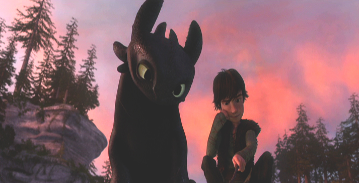
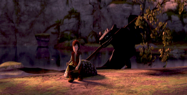
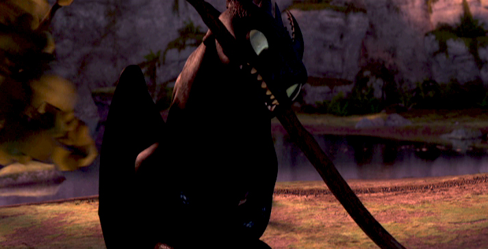
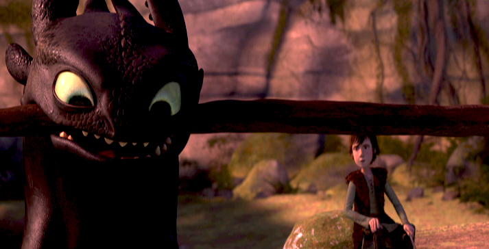
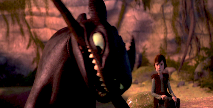
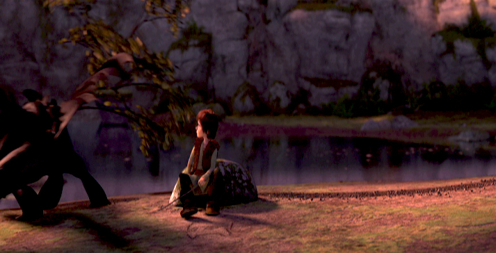
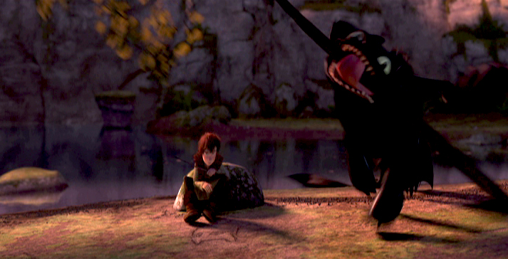
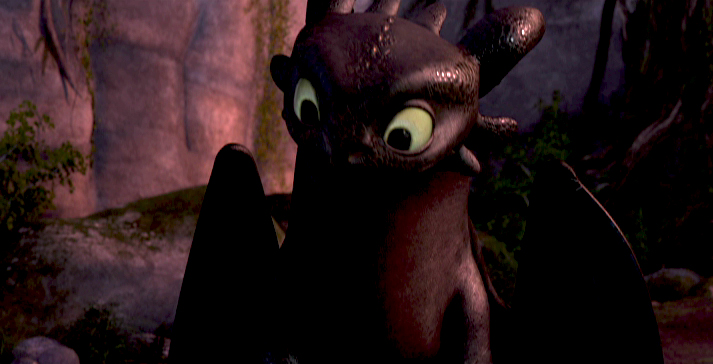
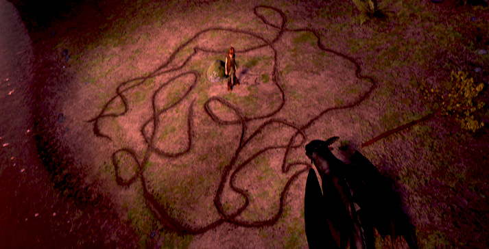
Then there’s the meeting between the hero, Hiccup, and “Toothless,” the dragon. These are fine sensitive scenes with interplay between human and dragon cleverly done without the need of dialogue.
(I suppose I’m supposed to say “Spoiler Alert” here.) However it doesn’t take long for the shouting to return as a trumped up ending resolves the film. (Hiccup having lost his leg took me by surprise and made me think of those in Iraq and Afghanistan, and I wasn’t sure I liked the comparison.)
Looking at the film from a distance, there’s a different feel to the big picture. Yes, you can see the “Acts” change in the script with all the clunking machinery dragged in behind it, but the Art Direction, I think, is so original that it makes you feel something else. It’s a real positive for the movie.
Directors Chris Sanders and Dean DeBlois have done a job equal to what they did on the Disney film, Lilo and Stitch. All the outer space nonsense from that film dragged it down to middling, when the scenes on earth between Lilo and Stitch were excellent. A similar problem holds true for Dragon. All the
 tiresome fighting between dragons and Vikings is tedious to get through for the friend-making scenes between Hiccup and Toothless.
There’s a touch of Miyazaki’s design in Sanders’ sketchbook. The face of “Toothless” looks not unlike “Stitch” which looks very much like “Totoro.” However, there’s something
 comforting in that look, and it’s certainly not a negative.
As a matter of fact, the character design is extraordinarily playful. The drawing can be felt through the cgi puppet-like creatures, and there doesn’t seem to be the visual “attitude” given most animated characters these days. (Take a look
 at Tangled to catch the “attitude” quotient for the year. Glen Keane should have looked a fourth time at his models; they’re embarrassing when compared to any pre-Keane designer.) Dragon seems to have left the visual clichés on the drawing table, and they produced an original. As I pointed out yesterday, when reviewing the “Art of Dragon” book,
 the artwork is all exemplary. It seems there isn’t a wasted sketch or painting that didn’t make it to the film. Of course, that means the book is well constructed and lets it feel naturally connected to the movie.
As a matter of fact, there are only a couple of the typical “Dreamworks” – type 20th century* jokes dragged
 into the film, and that is a blessing. However, as each one – dropped by Craig Ferguson’s character – falls, one can’t help but grimace. They’re so clunkily placed into the movie – something about his “underwear” is the only one I can remember. We can deal with a surfer-dude, as one of the trainee kids, as long as his dialogue seems appropriate to the
 film as a whole. Without these ties to the modern world, the film would have felt more timeless and have lasted longer on the shelf.
This film far excedes Toy Story 3 in all departments and is very much the better film. However, neither comes close to The Illusionist for originality and filmmaking ability.
* Note: I meant to say “20th Century” not “21st Century.”
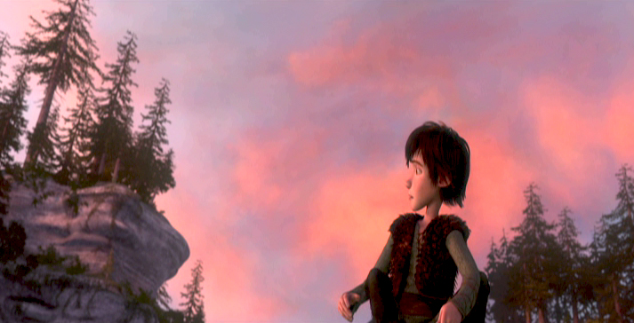
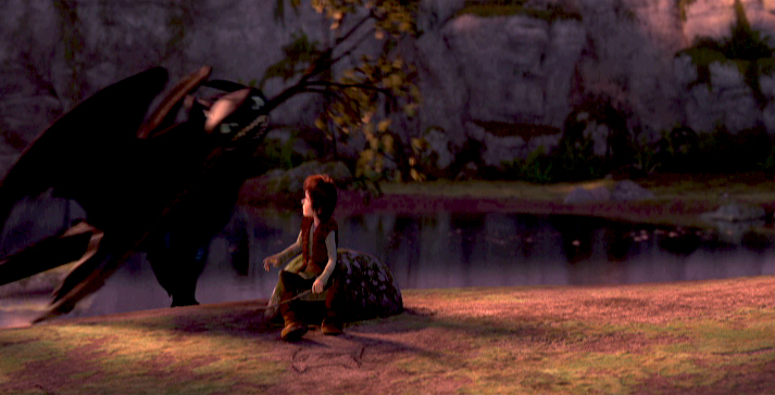
Note that the sequence of frame grabs is the same as the storyboard section I reproduced from the book, yesterday. Compare and contrast.
Articles on Animation &Richard Williams 26 Oct 2010 07:58 am
Goofy and Babbitt
 - The following article was printed in Sight and Sound, Spring 1974 issue. It begins with Art Babbitt‘s 1934 character analysis of Goofy and is followed up with Dick Williams’ 1974 analysis of Art Babbitt. Dick’s comments aren’t always on the money: Babbitt animated a good share of Rooty Toot Toot, but he didn’t animate most of the film. (As a matter of fact, Grim Natwick’s animation of Nellie Bly on the witness stand is, to me, the standout animation of the film.) Babbitt animated the bartender and the trial lawyer.
You can see the film on YouTube, here.
I previously posted the first half of this article with all the Goofy model sheets that it accompanied. You can see that here.
(The original, unfortunately, contains the “N” word instead of “coloured boy” as this edited version offers.)
.
Goofy and Babbitt
by Art Babbitt and Richard Williams
.
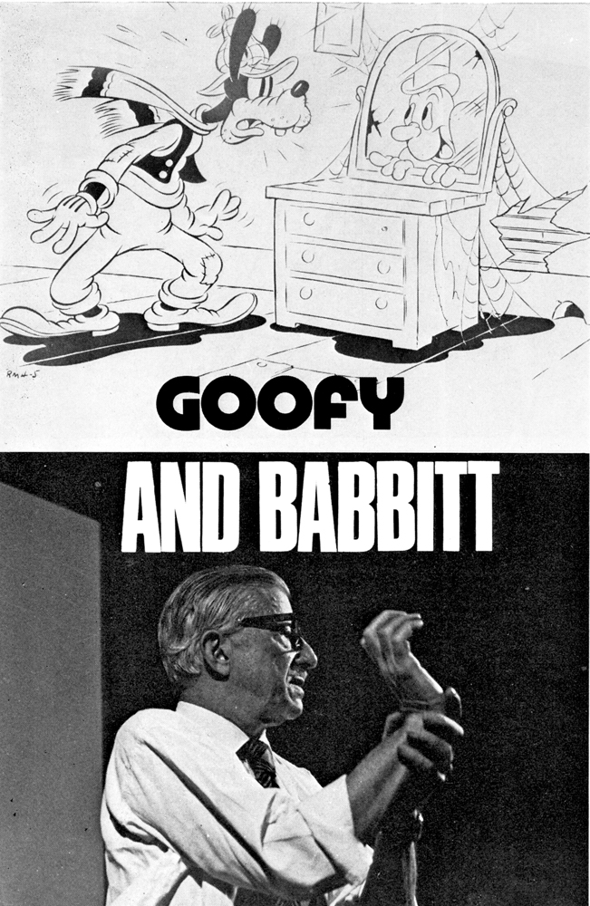 Two of the great artist-animators of the golden years of the Disney Studios, Art Babbitt and Grim Natwick, were working and teaching at the Richard Williams Studios in London last summer. To parallel Babbitt’s 1934 character analysis of Goofy, which has not previously been published, Richard Williams gives an impression of the animator himself.
CHARACTER ANALYSIS OF THE GOOF—JUNE 1934
In my opinion the Goof, hitherto, has been a weak cartoon character because both his physical and mental make-up were indefinite and intangible. His figure was a distortion, not a caricature, and if he was supposed to have a mind or personality, he certainly was never given sufficient opportunity to display it. Just as any actor must thoroughly analyse the character he is interpreting, to know the special way that character would walk, wiggle his fingers, frown or break into a laugh, just so must the animator know the character he is putting through the paces. In the case of the Goof, the only characteristic which formerly identified itself with him was his voice. No effort was made to endow him with appropriate business to do, a set of mannerisms or a mental attitude.
It is difficult to classify the characteristics of the Goof into columns of the physical and mental, because they interweave, reflect and enhance one another. Therefore, it will probably be best to mention everything all at once.
Think of the Goof as a composite of an everlasting optimist, a gullible Good Samaritan, a half-wit, a shiftless, good-natured coloured boy and a hick. He is loose-jointed and gangly, but not rubbery. He can move fast if he has to, but would rather avoid any over-exertion, so he takes what seems the easiest way. He is a philosopher of the barber shop variety. No matter what happens, he accepts it finally as being for the best or at least amusing. He is willing to help anyone and offers his assistance even where he is not needed and just creates confusion. He very seldom, if ever, reaches his objective or completes what he has started. His brain being rather vapoury, it is difficult for him to concentrate on any one subject. Any little distraction can throw him off his train of thought and it is extremely difficult for the Goof to keep to his purpose.
Yet the Goof is not the type of half-wit that is to be pitied. He doesn’t dribble, drool or shriek. He is a good-natured, dumb bell what thinks he is pretty smart. He laughs at his own jokes because he can’t understand any others. If he is a victim of a catastrophe, he makes the best of it immediately and his chagrin or anger melts very quickly into a broad grin. If he does something particularly stupid he is ready to laugh at himself after it all finally dawns on him. He is very courteous and apologetic and his faux pas embarrass him, but he tries to laugh off his errors. He has music in his heart even though it be the same tune forever, and I see him humming to himself while working or thinking. He talks to himself because it is easier for him to know what he is thinking if he hears it first.
His posture is nil. His back arches the wrong way and his little stomach protrudes. His head, stomach and knees lead his body. His neck is quite long and scrawny. His knees sag and his feet are large and flat. He walks on his heels and his toes turn up. His shoulders are narrow and slope rapidly, giving the upper part of his body a thinness and making his arms seem long and heavy, though actually not drawn that way. His hands are very sensitive and expressive and though his gestures are broad, they should still reflect the gentleman. His shoes and feet are not the traditional cartoon dough feet. His arches collapsed long ago and his shoes should have a very definite character.
Never think of the Goof as a sausage with rubber hose attachments. Though he is very flexible and floppy, his body still has a solidity and weight. The looseness in his arms and legs should be achieved through a succession of breaks in the joints rather than through what seems like the waving of so much rope. He is not muscular and yet he has the strength and stamina of a very wiry person. His clothes are misfits, his trousers are baggy at the knees and the pant legs strive vainly to touch his shoe tops, but never do. His pants droop at the seat and stretch tightly across some distance below the crotch. His sweater fits him snugly except for the neck, and his vest is much too small. His hat is of a soft material and animates a little bit.
It is true that there is a vague similarity in the construction of the Goof’s head and Pluto’s. The use of the eyes, mouth and ears are entirely different. One is dog, the other human. The Goof’s head can be thought of in terms of a caricature of a person with a pointed dome—large, dreamy eyes, buck teeth and weak chin, a large mouth, a thick lower lip, a fat tongue and a
bulbous nose that grows larger on its way out and turns up. His eyes should remain partly closed to help give him a stupid, sloppy appearance, as though he were constantly straining to remain awake, but of course they can open wide for expressions or accents. He blinks quite a bit. His ears for the most part are just trailing appendages and are not used in the same way as Pluto’s ears except for rare expressions. His brow is heavy and breaks the circle that outlines his skull.
He is very bashful, yet when something very stupid has befallen him, he mugs the camera like an amateur actor with relatives in the audience, trying to cover up his embarrassment by making faces and signalling to them.
He is in close contact with sprites, goblins, fairies and other such fantasia. Each object or piece of mechanism which to us is lifeless, has a soul and personality in the mind of the Goof. The improbable becomes real where the Goof is concerned.
He has marvelous muscular control of his bottom. He can do numerous little flourishes with it and his bottom should be used whenever there is an opportunity to emphasise a funny position.
This little analysis has covered the Goof from top to toes, and having come to his end, I end.
ART BABBITT
.
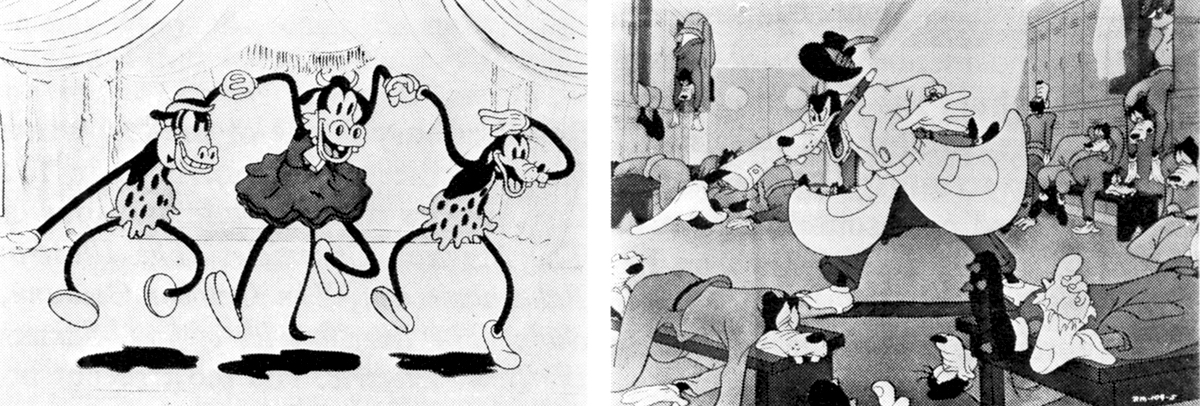
‘Orphans’ Benefit’ (1934). The Goof after Babbitt: ‘How to Play Football’ (1944)
.
CHARACTER ANALYSIS OF THE ANIMATOR—JANUARY 1974
.
He is a funny mixture. He has the bearing of a Marines sergeant (which he was during the war, after leaving Disney following the strike in which he was the principal figure); but he has the mind of a Viennese doctor—which is what he wanted to be. In his youth he always wanted to go to Vienna and study psychiatry; but he couldn’t because he was a poor boy from Iowa with relatives to support. So he went to New York and taught himself to be a commercial artist; and gradually got into animation—starting, I think, through Paul Terry.
Arriving at Disney, he was one of four animators on Three Little Pigs; and of course that was the great breakthrough in personality animation. Then he animated Goofy, and worked on shorts in preparation for Snow White. In the first Disney feature he animated the Queen where she was beautiful, up to the point where she is transformed into the hag. In Pinocchio he did most of the animation of Gepetto, and Gepetto almost looks like him. He had that sort of versatility, to characterise the horrid queen or the sentimental wood-carver. Then in Fantasia he did primarily the mushroom dance; but he was animation director on a lot of other material. On Dumbo he was a supervising animator.
The strike came in 1941. Babbitt had had a personal confrontation with Disney over the low payment of assistants; and Disney ill-advisedly fired him, giving as a reason his u-nion activities. This was directly in contravention of the Wagner Labor Relations Act, and the
U-nion took a strike vote. Babbitt fought Disney through all the courts; and they were obliged to reinstate him, for an uncomfortable period during which Disney would pass him in the corridor without speaking or even looking at him. He stood it for a year; then he quit.
After the war he and Natwick were with Hubley at UPA – Art did most of Rooty Toot Toot. Later he was with Hanna and Barbera. I had heard about him for years before I finally came to meet him. He had seen some of our work, and though he’d not exactly liked it (it was pretty slick) had decided that ‘here are some people trying to do an honest job, and that’s the first time I’ve seen that in ten years.’ He wasn’t all that impressed, but he went to the heart of it.
It turned out he was very interested in teaching people. He was thinking of writing a book to instruct people; and he’d done a course at U.S.C. of which we had copies of students’ notes. As it happened he had a fire at his house and all his own lecture notes were burned. So we were able to send him these student notes. He said they were all wrong; but it was something. Then finally I asked him straight out if he would come over and teach us, because we had gone as far as we could go on our own.
He is a great teacher. He has an astonishing lucidity. Most animators are completely incoherent; they are unable to tell you what they are doing. But Art doesn’t have any difficulty in showing you how a thing works. He just says: ‘Did you notice that that worked because such and such . . . and Hubley did this thing this way?’ And when Art says something is wrong, he’s invariably right—if you want it to work. He’ll say: ‘If you want the wheel to go round, this is the way to make it go round. This is the way to make a cypher for making it go round. And this is another way they used to give the impression of it going round. And your problem is that you are to do it with square wheels.’ He is completely eloquent. I’m sure that at Disney they created a language about what they were doing; and I’m equally certain that it was he who largely gave a verbal form to it, so that the others could understand it. He has a surgeon’s mind; which, I gather, Disney had also.
When he taught in our studio he insisted that people take the course. He started off by saying: ‘Please, in my lectures, do not be British. Be crude, be revolting; ask stupid questions. Please do not be polite; otherwise I’m wasting my time.’ He’s as tough as nails; yet it literally hurt him when someone couldn’t get a thing right, couldn’t understand it. Then when they got it right, he would dissolve in warmth. His patience was beautiful.
He knows so much about everything— about symphony construction, about the visual arts, about everything to do with the medium. He once decided he would teach himself to play the piano. He’s the one in the famous Disney story —when he was learning to play the piano, and Disney said, ‘What are you—some kind of fag or something ?’ He hated Disney for that, because he wanted to understand music to apply it to animation. He knew that Fantasia or something like it was inevitable.
On the course he told us: ‘An animator must possess a curiosity about everything that exists or moves . . . must be a student of everything that might or does exist. From the shiver of a blade of grass—affected by an invisible breeze—to the behaviour of a starving hobo eating the first steak he has had in years. From a baby, tentatively trying to walk for the first time—to an elephant doing the can-can.’
I just saw Fantasia again and the Dance of the Mushrooms; and he was doing things there—treating perspective as a subsidiary action—that no one else was doing at the time. And he does not do it by feel, as I might, but because he’s worked it all out and analysed it. On the course he would say: ‘This is the cliché. This is the formula. And this is how to break it.’ He would set up the rules and then make you bust them.
And as well as the analytical capacity and the intelligence is the ability to start from basics—to deal with the most minute detail. He knows how the labs process the material; the way celluloid is made, the way the pencil is made. People who know that kind of thing don’t usually have artistic ability into the bargain. The ability to discern basics extends to his gift for statements that seem entirely simple and yet reveal vital things one often has not recognized : ‘We must learn to create movements if necessary that are caricatures of reality— but done with such guile they are always convincing.’ ‘We must expand our sense of caricature—to realise that we are not simply exaggerating external appearances— but more important, the inner character, the mood, the situation. A caricature is a satirical essay, not just doubling the size of a bulbous nose.’
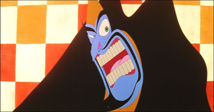
A Babbitt scene from Williams’ Cobbler and the Thief.
My portrait is idolatry, maybe; but how do you not idolize someone who after more than forty years work in his and your medium still can find it ‘wonderful, exciting, exacting … A medium that has barely been discovered, let alone explored. A medium that can be an art form that encompasses practically all other art forms. A medium that can gratify aesthetically, that is not earth-bound, that can be an invaluable aid in teaching everything from elementary chemistry to the Theory of Relativity.’
RICHARD WILLIAMS
Bill Peckmann &Comic Art &Commentary &Disney &Illustration 10 Jul 2010 07:32 am
More on Give-aways
On the post about Give-aways, I had a little story I was going to add, and at the last moment, I decided not to include it,=. So, why not now?
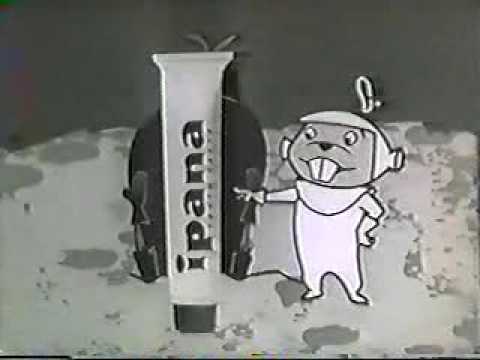 Back in 1957, when the original Mickey Mouse Club was in full swing, in conjunction with Ipana toothpaste, there was a TV offer of a mail-in of a book which included puppets of Jiminy Cricket and Pinocchio. As a puppet fan, I raced through the tube of Ipana to get to the new packaging to send away for it. $.50 for postage and handling.
It took about a month to receive the book of cardboard pages. There, inside, were punch-out pieces of Jiminy and Pinocchio. By following the instructions, you could put together puppets of the two characters. It was rather complex, but I did it, and boy was I pleased with the end result. By manipulating tabs in the back you could operate the mouth (similar to a ventriloquists puppet) of Jiminy – he always was the talker.
Pinocchio was the marionette and was operated by string. I still remember this give-away gift as if it were yesterday, and I’ve searched the internet for pictures of the book, but haven’t found it. I’m sure I eventually will.
Mind you, I’d made my own marionettes and hand-puppets by the time I came upon this book. I was 10-12 at the time and, through a book I’d borrowed from the library, I found that I could cut and sew muslin, stuffed with more muslin, to make some fine puppets. They all looked a bit like Mr. Potato Head when they were finished, but I was proud of them just the same.
Likewise, there was a book once put out by Dover publishing. Called Motion Picture Toys. The cardboard pages included punch-out objects that, when assembled, produced early animation machines: Praxinoscope, anascope and especially an excellent Zoetrope with animated strips. I remember using this book as a guide and followed it closely to make my own zoetropes that I gave to my siblings one Christmas. Of course, I did my own animated strips that they could interchange.
I’ve searched for that booklet, too, but have had no luck. I’ve even written to the company hoping they’d have some back copies they’d sell me, but they’re not to be found. Of course, that book wasn’t free, but it was pretty cheap and reminded me of the Jiminy/Pinocchio giveaway.
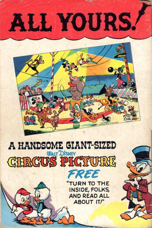
 - Michael Barrier left a comment on my Giveaways post, yesterday, and referenced a comic giveaway which was drawn by Walt Kelly featuring a circus milieu. Here’s that part of his comment reprinted:
- Kelly definitely did draw what I think is the most wonderful WDC&S subscription premium, a 10 x 14 (I think, without taking my framed copy down from the wall to measure it) sheet called “The Disney Gang at the Circus,†which shows about 30 Disney characters under the big top, doing all sorts of funny Kelly stuff.
Mike couldn’t illustrate that cover, but here is the ad for that giveaway, courtesy of Bill Peckmann.
To the right is the magazine cover of the issue that the ad appeared in.
Speaking of Mike, he has a brilliant post for all those interested in the history of Mickey Mouse. The old saw of Walt dreaming up Mickey Mouse on his train ride back from New York isn’t even considered when you read about the origins of the Mouse on Mike’s site. Stories about Ub hiding in closets aren’t even pulled out of the hat.
 As a fan of silent animated films, I’ve seen my share of Mickey Mouse wannabes that raced after Farmer Alfalfa in all those Terry-Moser Aesop Fables. Likewise just about any other cartoon maker in the pre-Mickey world; you’d see more than your share of mice that could easily be stunt doubles for Mickey. I always assumed it was natural that Mickey just came out of these mice that all animators seemed to be drawing. But no.
Mike goes into the true origins of the mouse, and the evidence seems certain.
Of course, anyone seriously interested in animation history or writing looks into Mike’s site regularly enough that I’m not reporting anything new. But for those of you who haven’t come across this essay by Mike, go there.
- John Canemaker has a new, fine piece about acting in animation on his Print Magazine blog page. Take a look.
Articles on Animation 01 Jul 2010 08:02 am
Commercials History
- Earlier this week, I’d posted an excellent piece by Mike Barrier on the work of the Hubleys. This article was taken from a 1977 Millimeter Magazine animation issue. In that same issue, is an article about the history of the TV commercial. There’s a lot of good information in the piece and the shortened history of a lot of important studios that many of you are unfamiliar with. Unfortunately, it also mentions a lot of ads you may not be familiar with. But there’s plenty there in the packed piece. So I thought it a good idea to put this info out there.
Here’s the piece by Arthur Ross.
A Retrospective View
by Arthur Ross
ANIMATE, according to the time-honored Webster’s definition, means “to give natural life to; to give spirit to; to stimulate; to rouse; to prompt; to impart an appearance of life, as to animate a cartoon.”
And that is exactly what animated TV commercials have been doing for the past 30 years. They have given life, spirit, and verve to the selling of thousands of products both in America and abroad.
Psychologically speaking, they work by expanding the fixed limits of reality, by creating new and exciting worlds of fun and fantasy, and by captivating the viewer with fresh perspectives that reinforce our basic drives and motivations for love, success, beauty, comfort, and self-esteem.
During the course of a single 60 second spot, we see 1,440 individual pictures, or frames, come to life! Often with the kind of humor, or whimsy, or charm that speaks to our unguarded and childlike selves, and in some instances, even to the deepest recesses of our unconscious.
That is precisely why they are so potent a sales tool for industry, an educational device for schools, and an entertainment vehicle unto themselves. They work by playfulness, destroying all logical opposition to the messages they may contain.
They dazzle our senses and charm us into belief. Or, at least, they help suspend our disbelief in the ideas they put forth. They are 20th century dreams — dreams that money can buy!
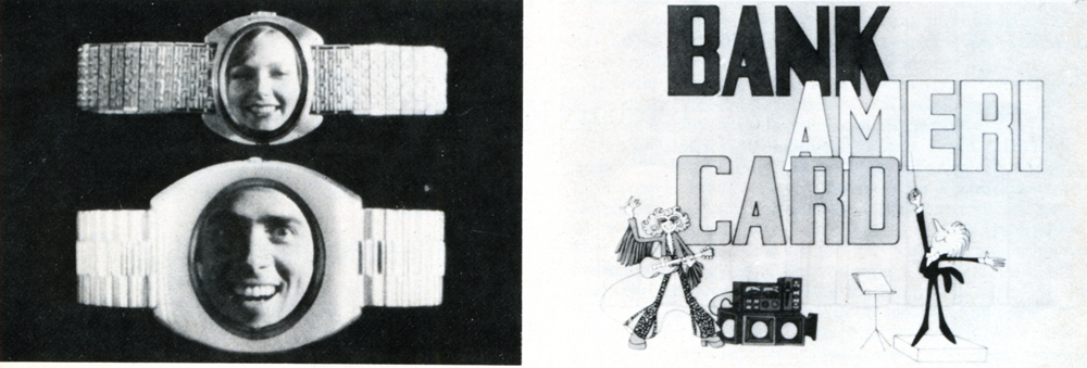
1. Object Animation: Speidel’s “Faces In The Watches”
created by John Gati of Action Pictures.
2. West Coast animation: Bank Americard (FilmFair) 1961-1976
While they operate on our most primative emotional level, animated commercials are highly sophisticated forms of art — employing words, graphics, color, motion, sound, music and symbols to activate the sale of goods and services.
Some of America’s foremost art talent has worked in the field at one time or another, including Saul Steinberg, John Hubley, William Steig, Saul Bass, to name a few.
The earliest animation in the forties was generally quite conventional — literally cartoon commercials of the straight Disney school of animation. It was essentially an extension of theatrical animation such as characterized the products of Warner Brothers, Paramount, MGM, and Disney at the time. Its novelty was successful and proved animated characters could sell products as well as live spokespeople. Everything was executed in glorious black and white, since color on TV was still years away. Commercial studios began to emerge in the late ’40s and early ’50s to supply the demand for animated spots — among them Academy Pictures, Shamus Culhane, Bill Sturm Studios, Film Graphics turning out such early “hall of famers” as the Ajax “Down the Drain” Bubbles and Mott’s “Singing Apples”.
In the early “50s a new trend entered TV commercials when UPA, creators of Gerald McBoing-Boing for theaters, introduced its unique avant-garde style of animation breaking away from the more conventional school of Disney design and execution.
We had the pleasure in the early ’50s of working personally1 with ex-UPA star John Hubley on some of the most successful of these avant-garde spots, including those for Speedway 79 gasoline, Altes Golden Lager Beer and Faygo Beverages (for the W.B. Doner agency in Detroit) as well as Chevrolet (for Campbell-Ewald, again in Detroit.) Other notable avant-garde entries during this period included the famous Saul Steinberg Jello “Busy Day” spot, as well as the classic Bert and Harry Piels spots (for Young and Rubicam).
Continuing through the mid ’50s, two trend-setting studios emerged when John Hubley formed Storyboard Inc. and Abe Liss joined forces with Sam Magdoff to start Elektra Films. Hubley continued his classic style with such winners as Heinz Worcestershire Sauce’s “Tongue-tied Spokesman”, Ford “It’s a Ford” series, and Maypo’s “I Want My Maypo” commercial. Elektra came forth with highly experimental works, creating new breakthroughs in photo-animation, multiple image and optical effects, and totally fresh avenues of design. During this time Elektra spawned such outstanding animation and graphics talents as Jack Goodford, Pable Ferro, Cliff Roberts, the Canattas, Lee Savage, Phil Kimmelman, and Hal Silvermintz, as well as Arnie Levin, Howard Beckerman, and Mordi Gerstein. Among the outstanding Elektra efforts of this era were the NBC Peacock, the legendary “Talking Stomachs” Alka Seltzer spot designed by R.O. Blechman, as well as award-winners for Chevron, Esso, Chevrolet, and Alcoa. One notable achievement, I fondly recall, was a 60-second spot done for the United States Army “Great Moments” series (which I had the pleasure of writing and producing) in which Elektra’s people (including the late Len Appleson) recreated the entire Louis-Schmelling Championship fight with stills quick-cut to the rapid beat of music and crowd cheers. It was a montage breakthrough that Sergei Eisenstein would have been proud of.
Following the success of Storyboard, Inc. and Elektra, more top studies and talent emerged in commercial animation. Pelican films emerged under the able leadership of Jack Zander and did notable work for American Motors, Volvo (designed by Mordi Gerstein) and Alka Seltzer (“The Blahs” designed by cartoonist Willilam Steig.)
Use of famous cartoonists and illustrators in TV Commercials:
Still from a commercial made in the 60s by Elektra Productions,
utilizing cartoonist Bill Steig.
Other fine studios of the fifties were those begun by Lars Calonius, Transfilm, Kim-Gifford, Robert Lawrence and Ernest Pintoff — the latter going on to win an Academy Award for “The Critic” some years later. Arnold Stone was a heavy contributor in those years to the Pintoff output, which included excellent animated spots for Proctor-Silex appliances, Yoo-Hoo Chocolate Drink, and The Bell Telephone Company.
These proved to be the “golden years” for commercial animation with many studios maintaining large staffs to cover the growing need for their excellent product. At one point, there was even a shortage of talent available to handle the work load and one had to “wait on line” for delivery.
In the ’60s, the trend increased towards graphics and we saw a sharp decline in traditional animation. New techniques were perfected — like the super quick cuts of Elektra and Ferro, Mogubgub and Schwartz. The latter also held the industry in marvelous disbelief at its outrageously “insane comic inventions” such as the award-winning “Crazy Hat” commercial for County Fair Bread (which we had the pleasure of producing with them).
Continuing the trend to more limited animation, which UPA orginated as an economical move to cope with the high cost of full animation, studios in the ’60s experimented with photomatics, “squeeze”, semi-abstracts, paper sculpture, and technique of combining live photos with animated bodies (perfected by Paul Kim of Kim-Gifford in a prize winner for the National Safety Council on preventing highway accidents.) Tighter budgets, a declining economy, and a swing away from animation to greater use of realism created massive layoffs in the commercial animation field in the late ’60s and early ’70s — and many good, long-established shops passed from the scene. Smaller one and two-man companies emerged to take their place and this trend continues up to the present day.
It should be pointed out that throughout the ’50s and into the ’60s traditional animation continued as a popular communications tool for many agencies and companies. Outstanding among these was William Tytla Associates. The late Bill Tytla was one of the foremost Disney animators, contributing greatly to the success of such Disney immortals as FANTASIA, PINOCCHIO, SNOW WHITE and DUMBO. In the ’50s, Bill took his talents into the commercial arena and did some outstanding work in the more conventional animation forms. We had the pleasure of working with him in the animation development of the worldwide symbol for Esso, “Happy the Oil Drop,” a fantasy figure that Bill brought to wondrous “life” through his skills as an animation director.
Simplicity of design in 50s & 60s; Still frame from the famous Blechman
“Talking Stomach” Alka Seltzer commercial produced by Elektra in the 60s.
In spite of downtrends in the economy, the late ’60s and early ’70s saw a brilliant new bursting forth of creative energy in animation influenced by Peter Max and the worldwide success of “The Yellow Submarine.”
Among the many fine companies that emerged were Focus Productions, which turned out such award-winners as Vote Toothpaste “Dragon Mouth,” designed by Rowland Wilson; Gillette’s “Moveable Features,” designed by Tomi Ungerer, and the Utica Club Beer series designed by Jack Davis and Mort Drucker. In 1972, Phil Kimmelman left Focus to open his own shop, Phil Kimmelman & Associates. Here, along with Bill Peckman, he has turned out some outstanding efforts including the Cheetos Mouse campaign, the Exxon Tiger, and the delicately sensuous Clairol Herbal Essence commercial.
Horror Fantasy in TV commercial animation (1976): Avis Rent-A-Car;
Designer/Director: Mordi Gerstein; Producer Phil Kimmelman & Associates.
Other exciting breakthroughs in the ’70s include the highly graphic look of computer animation, perfected by such companies as Dolphin Productions for use as station and program attractions; rotoscope animation brought to brilliant maturity by Ovation Films in New York and Snazelle Films on the West Coast. The Levi campaign is an outstanding example of rotoscope animation, bringing a fresh new excitement to the field.
On the West Coast, throughout the ’50s and ’60s animation led by UP A, and Storyboard, Inc., continued to expand along with the fine efforts of such companies as TV Spots for Johnson’s Wax, Lucky Lager Beer and L&M Cigarettes; John Sutherland Productions (“A 1580 Atom”); Playhouse Pictures (Ford, Falstaff Beer, H.J. Heinz) Quartet Films (Western Airlines); Animation, Inc. for Oscar Mayer, Soho Boron Gasoline and Pabst Blue Ribbon Beer; and Five Star Productions whose animation department headed by Howard Swift (another ex-Disney man) created some of the earlier TV and cinema commercials for Ford, Pabst, F.T.D., Coca-Cola, as well as bringing Speedy Alka-Seltzer to “life” via the George Pal puppet-type stop motion use of a series of replaceable heads. Interestingly, after a decade of experimenting with other creative directions, Alka Seltzer has just reverted back to using “Speedy” again in its current advertising.
It is an outstanding example of how things come creatively full-circle and how each generation rediscovers the “great ideas” of the past.
Joop Geesink continued to perfect the puppet type animation throughout the fifties, working in Holland for American companies through Transfilm in the United States. His “Brewster, the Goebel Rooster” and Heinz Aristocrat Tomato were two fine creations in this genre.
The use of “stylized” animation-type settings in which live action unfolds was another outgrowth of animation in the late ’50s. S. Rollins Guild whom we had the pleasure of working with at McCann-Erickson in the ’60s contributed greatly to the perfection of this commercial art form for such companies as Nabisco and Coca-Cola. Both series were produced by Bill Sturm Productions in New York.
Black-Lite, while basically a live photographic technique, creates a unique “animation” look to commercials. We had the opportunity of creating and producing the first such black-lite commercial in 1955 for Flagg Brothers Shoes (“Dancing Shoes”) which won numerous Art Director Club Awards for originality and effectiveness. The producing company was Sundial Films, headed by the multi-talented Sam Datlowe. It marked the first commercial assignment for young and talented Jerry Hirshfeld, who later became the ace of the MPO Productions staff, before turning to feature films.
One of the continuing trends in animation today, largely aided by Elektra and Jack Zander in the ’50s, is the use of well-known cartoonists and illustrators from outside the industry. Among the best are Bill Steig, Frank Modell, Charles Saxon, Seymour Chwast, Milton Glaser, and Peter Max, all contributing greatly to the resurgence of animation in the “70s.
Other outstanding work in animated commercials was achieved on the West Coast by Ray Patin, whose chief animator (another Disney graduate) was Gus Jekel, now the head of Film Fair, Inc. They accomplished some fine efforts for Y&R on Jello in the early ’50s through Jack Sidebotham, one of the really great art directors in the advertising field. These include such classics as “Banana-ana,” and “Chinese Baby.” Ray Patin also turned out the NY AD gold medal Bardahl series, aping Dragnet, as well as noteworthy campaigns for National Bohemian Beer and Jax Beer.
In passing, one must not forget to include in the pantheon of animation producers such fine organizations as Cascade Productions, Playhouse Pictures, Quartet, Imagination, Inc. all of whom executed award-winning series in the ’50s and ’60s.
In the ’60s, Gus Jekel’s Film Fair did noteworthy series for BankAmericard and Bardahl which won the Cannes and Venice Awards. Today, Film Fair does exceptional work with continuing characters, such as Peter Pan (Peanut Butter). Charlie Tuna, Tony Tiger, and the Snap, Crackle and Pop trio for Kellogg’s Like Elektra in the East, Film Fair nurtured a great deal of the best West Coast talent including Art Babbitt, Bob Cannon, Dick Van Benthem, Ken Walker, Fred Wolf, Norm Gottfredson, Ken Champin, and Corny Cole. It is one of the reasons the West Coast continues to do such exciting creative work in the field along with its East Coast counterparts.
One of the long-standing successful animation partnerships in the East has been Paul Kim and Lew Gifford, doing fine work in the field since 1958. Among their top creative efforts are award-winners for Piels Brothers, and the Emily Tipp series. Their Modess a delicate subject with taste, simplicity, and artistry. And their famous Winston “Montage” introduced a 14 way split screen in constant movement to the Winston jingle — breaking exciting new ground in the use of matte work and animation design.
Another top West Coaster is veteran animator Herbert Klynn, President of Format Productions. Herb served 16 years as designer and then Executive Production Manager for UPA, before organizing his own animation company. His Format Productions is active in entertainment series such as the Alvin Shows, the Lone Ranger and Popeye programs, as well as creating titles for such TV shows as I Spy, Smothers Brothers, and The Mothers-In-Law. Among his fine animated TV commercials are those for Max Factor, Post Cereals, Wells Fargo Bank, and Dreyfus Investments. During his tenure with UPA, Herb worked on such classic film cartoon short subjects as “Madeline,” “Mister Magoo,” and “Gerald McBoing-Boing.” Our own particular favorite is his treatment of Poe’s “The Tell-Tale Heart” for UPA.
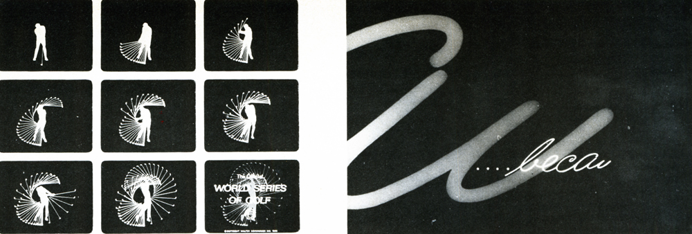
1. Graphic animation of a “strobe” like image of a golfer, made with 90 kodalith negatives
in registration. (World Series of Golf” Show opening by Goldsholl Associates.
2. The Unspoken Spoken Message: Modess “Because” (1962) Kim & Gifford Productions
Some fine animation has come out of the Midwest, too, in recent years. A key contributer from that area is Goldsholl Associates, an Illinois-based house that has brought fresh innovative graphics and experimental style to animated TV spots. In such commercials as 7-UP’s Sugar-Free “Carton Graphics” they infuse “life” into abstract dots to create a rich new imagery on screen. Colors, shapes, and textures all impart a “meaning” experi-entally to the message.
One of the more prolific of New York’s animators is Jack Zander. He began his career in 1946 at Willard Pictures doing an animated Chiclets commercial in which he animated Chiclets’ boxes like a choo-choo train to a music track taken off a 78 rpm radio transcription. In 1948, he started up the animation department at Transfilm, where he created the first animated Camel Cigarette commercials and helped develop the paper “cut-out” technique. In 1954 he and Joe Dunford opened Pelican Films and did successful commercials for over 16 years, along with Mordi Gerstein, Lars Colonius, Paul Harvey, Wayne Becher and Dino Kata-polis. During this period, Jack utilized the service of several wellknown cartoonists, including Charles Saxon for American Airlines, and later Bill Steig and George Price of “New Yorker” fame. It was also during this period that Jack did the famous Nichols and May “Jax Beer” animated series, as well as some of the early Bert and Harry Piels spots.
In 1970, Jack moved across the street and launched Zander’s Animation Parlor with his son Mark. He has created his share of “hits” in recent years, too, including the exceptionally fine Freakies campaign, beautifully animated by Preston Blair.
Another fine New York animation talent is Art Petricone who today heads up Ovation Films. In addition to his fine work for Eastern Airlines, his brilliant use of rotoscope can be seen in his work for Levi Strauss and Clairol Herbalessence.
In the area of object and figure animation and stop motion, John Gati, the Director of Special Effects, for Action Pictures in New York is unsurpassed. John has been working at his craft for 26 years and has won many awards for technique and innovation.
The art of Object and Figure Animation requires enormous craftsmanship. Basically, it resembles conventional (drawn) animation in that it follows the rule of “creating the movement” by the process of frame by frame photography. But as opposed to eel animation, which occurs on a two dimensional (acetate) surface, Object Animation is similar to live action photography taking place in a three-dimensional area.
John Gati’s creations succeed in making the product itself (the object) become the hero of the commercial, which is one of the basic tenets of good “sell” advertising. Complicated rigs and special dimensional lighting are required to make this form of animation truly work. It requires enormous intricacy to sustain the fantasy of “life” for these objects. John works with such materials as foams, wires, rubbers, vinyls, plastics, silks, clays and waxes to create the illusion of “reality.” Working in the tradition of the great artists and artisans of the past, John — like McLaren and Trnka and Geesink — has created a wondrous world of living and moving objects that reflect a “life all their own. Among his most recent successes are Fleischman’s “Egg Beaters” and Speidel’s “Faces In the Watch-bands. ”
In passing, we would also like to salute the following fine practioners of the art: Snazelle Films and Kurtz and Friends for their fine Levis efforts; Bill Melendez (Bill Melendez Productions); Hal Silvermintz (Perpetual Motion); Carlos Sanchez (IF Studios); William Littlejohn (William Littlejohn Productions); and Art Babbitt (Hanna-Barbera Commercials.)
The boundaries of animation are limitless. They defy time and space. They fuse reality with fantasy. They create new life out of old forms. Most animators believe the future will see the development of completely new and exciting techniques for the art. More use of famous illustrators and designers from the non-animation world. New developments in computer animation. More combinations of live action and animation within the same frame. More sophisticated “selling” within the framework of fantasy and humor. New breakthroughs in stop motion object animation. Fresh combinations of tape and film in animation. Unusual variations on dimensional and multi-plane animation effects.
For the most part animators strongly feel animation commercials can achieve greater results than live action, because “they can be funnier and they can be controlled absolutely” (Lee Savage); “You can get information across quicker” (Bob Godfrey);” ” “Animation makes an incredible statement real… In animation, sweeping moves are totally acceptable as opposed to the heaviness of human action (Mort Goldsholl).”
What is evident, too, is that small teams are creating the most significant new work in animation today. While the Disneys and Hanna-Barberas continue to produce a great volume of praise-worthy animation for film and TV, the breakthroughs are, for the most part, coming from the isolated artists and small creative teams working throughout the country.
And bridging the gap between these artists and the advertising agencies are producers like Harold Friedman of The Directors Circle, who fully understand the needs of both parties for creative expression, on the one hand, and sound selling messages, on the other. In the final analysis, an animated commercial to be successful must motivate the consumer to buy the product, or the service, or the idea put forth by the commercial. That is its major raison d’etre. It should be charming, to be sure, and filled with fun and fantasy — but it must ultimately sell its clients’ products in the marketplace to achieve its truest objectives.
Articles on Animation &Hubley &Independent Animation 29 Jun 2010 07:46 am
Traditional Animation Transformed
- Mike Barrier wrote an excellent article on the Hubleys for the 1977 Millimeter Magazine animation issue. Short and concise, it really put their careers and their work into fine focus. The magazine was released in February 1977, just prior to John’s death, February 27th of that year.
With Mike’s consent, and my grateful thanks, I’m posting it here. (I haven’t given enough attention to John and Faith lately.)
Traditional Animation
Transformed
by Mike Barrier
For more than 20 years, John and Faith Hubley have been hacking an idiosyncratic path through the jungle of post-war animation. Temperamentally — one might almost say ideologically — they are avant-garde, but they have little in common with the frauds and bores who have appropriated that label for themselves; you will not find their names in the index for the new book Experimental Animation. They have firmly and frequently turned their backs on the animation tradition rooted in Walt Disney’s cartoons — yet their films are linked to that tradition in various and subtle ways. The Hubleys have made films for television, but of all the people who have worked in that medium, they would seem the least likely to work on an animated special that was in any way conventional. However, they have now turned their hands to a TV special based on a comic strip.
Neither the comic strip nor the Hubley’s method of transferring it to the small screen are conventional, however. The comic strip is “Doonesbury,” and the Hubleys are making the special in close collaboration with Garry Trudeau, the strip’s artist-author. The storyboards are a mixture of Hubley and Trudeau drawings, and Hubley says that he, Faith and Trudeau cast votes of equal weight when decisions are made on the story. The special will be on NBC, probably in either the spring or early summer of 1977.
Trudeau and the Hubleys are not strangers; they met in 1968, when Trudeau was a student at Yale and the Hubleys were teaching their first classes in a course called “The Visualization of Abstract Concepts.” Animation courses are common now on U.S. campuses, but the Hubleys’ course is markedly different from most others. The students are not taught how to animate; instead, they are taught to think in certain ways. In effect, they are encouraged to devise animatable symbols for abstract ideas. The ideas generated in the course are converted into animated films later by the students as well as the Hubleys and their staff. Voyage to Next — in which nationalism is represented by boxes filled with people, floating aimlessly on the stream of history – went through the Yales class process as did Cockaboody and EVERYBODY RIDES THE CAROUSEL, a feature-length film, based on the writings of Erik Erikson, that was shown last fall on CBS.
Despite its origins in Yale’s rarefied atmosphere, the “Doonesbury” special will be aimed at a larger audience than the Hubleys have ever sought before (except in the TV commercials they used to make). It is, unavoidably, a highly commercial project, and so, filled with pitfalls for two filmmakers who have steadfastly turned their backs on mass taste.
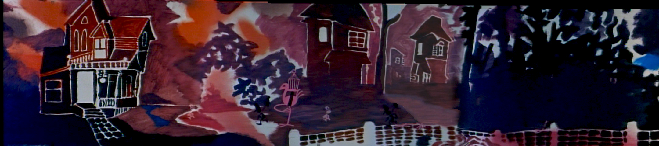
Cockaboody, a tender and sensitive commentary on childhood.
John Hubley ventured into the world of big money and high-powered entertainment in August 1975, when he became the director of an animated version of WATERSHIP DOWN. He was discharged from that job a year later, after sharp disagreements with the producer, Martin Rosen, over creative and production control of the film. Hubley had spent half of the 12 months he worked on the film in England, and half in the U.S., working with both American and British crews. (Bill Littlejohn and Phil Duncan were among his American animators.) Hubley’s comments about the break with Rosen are guarded, because he has filed a suit against Rosen for breach of contract; but it seems plain that Rosen wanted a more violent and emotional film than Hubley was prepared to give him.
Throughout their long collaboration, the Hubleys seem to have been happiest when they could work in an atmosphere entirely free of commercial considerations. Since they began working as a team in 1956, their work has fallen, roughly, in three categories: purely commercial films, like TV spots; sponsored films, which come equipped with fixed budgets but considerable creative leeway; and their purely personal work — Moonbird, Tender Game — which they financed with their earnings from the other kinds of films.
In all three types of films, the Hubleys have employed a dazzling variety of techniques, ranging from traditional line animation to the animation of blocks of color to the animation of cutouts. Two elements have been constant. All of their films reflect the influence of modern art — or, to be frank about it, modern art as it has been adapted and domesticated by commercial artists and designers. More important than the graphic style itself is the use to which the Hubleys have put it (and this is the second constant in their work): abolishing the traditional distinction between characters and backgrounds.
In a typical Hollywood cartoon of the ’30s or ’40s, the characters move against the backgrounds like actors working in front stage settings. The characters are composed of lines and flat, bright colors, against settings that are realistically modeled and painted in muted colors. The characters are treated as color accents; they “read” against settings that are designed to set them off.
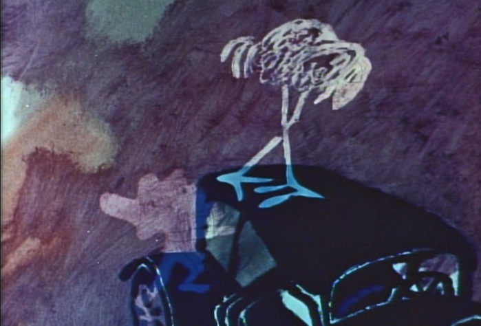
A still from Moonbird.
In most of the Hubleys’ films, no such boundary exists; characters and settings are cut from the same bolt. Movement alone sets them apart. This integration of characters and backgrounds — not any simple enthusiasm for modern art — was at the heart of the UPA studio’s rebellion against the Disney style in the middle ’40s. It was a layout man’s rebellion. The ultimate effect was to elevate design — the overall “look” of a film — at the expense of animation. Layout men, who had been subordinate to the animators at Disney’s, were now in the driver’s seat.
Two of UPA’s three original partners — Zack Schwartz and Dave Hilberman — had been Disney layout men, as John Hubley was. When Hilberman and Schwartz broke with Steve Bosustow (the third partner) in 1947, Hubley became a vice president of the studio, and its creative head. Hubley supervised the work of directors like Robert Cannon and Pete Burness, and directed a number of films himself, most notably Rooty Toot Toot (1952). The most distinctive UPA films thus bear Hubley’s stamp, more than that of any other man.
Hubley left UPA in the early ’50s; he was a victim, like many other UPA staffers, of the witch hunts by the House Committee on Un-American Activities. He formed his own TV-commercial studio, Storyboard, and then he married Faith Elliott, who had been hired as his assistant for an aborted production of Finian’s Rainbow. Faith — who had worked in live-action films before marrying John — has been his collaborator ever since; but their films are, in some ways, extensions of the work that John Hubley did at UPA, but reflect a less commercial, more personal approach. (Faith Hubley has completed two films of her own in the last two years: W.O.W. and Second Chance.)
UPA sold itself not only as an alternative to the Disney style, but as a repudiation of it. John Hubley still talks that way on occasion, and the Hubley films sometimes become pretentious and didactic. Films like The Hole (1963) and The Hat (1964) while nice to look at, suffer from windy, enervating dialogue tracks; the lessons they offer — about international boundaries and nuclear war — are too simple to bear repetition for even a few minutes. Of Men and Demons (1970), is also a “lesson” film — this time the Hubleys are concerned about the environment — but it is much better because the villains of the piece (demons representing fire, wind and rain), are ingratiating scoundrels; the characters are stronger than the ideas they are supposed to serve.
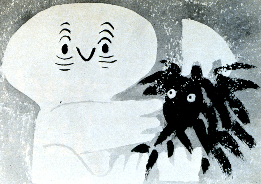
Adventures of an *.
Here we come to a paradox in the Hubley films. The best ones — the ones in which the Hubleys’ own feelings and experiences are to the fore — have a great deal in common with the Finest cartoons in the despised Disney tradition. Some of the very best Hubley films, such as Moonbird, Windy Day, Cockaboody and the opening sections of Everybody Rides the Carousel, are tender and sensitive commentaries on childhood. The graphic devices, the quicksilver metamorphoses — as children become what they imagine themselves to be, and beasts lunge from the mouths of howling babies — all serve, in the end, not to explicate ideas but to delineate character. In other words, these films are as much concerned with personality as are the best Disney films; they are very different from the Disney films to be sure, but they have sprung from the same seed, the urge to create new life.
The best Hubley films do not spit in the face of animation’s greatest tradition. Instead, they show how that tradition could be transformed and enriched, if it were still in the hands of people who cared as much about their work as the Hubleys care about theirs.
© 1977 Mike Barrier
Animation Artifacts &Bill Peckmann &Rowland B. Wilson 26 Mar 2010 07:42 am
Rowland Wilson Grab bag
- I have a few models by Rowland Wilson that I haven’t yet posted. I’m ganging them up, even though they come from several different projects. All of these come courtesy the collection of Bill Peckmann. Many thanks to Bill.
This first series comes from a spot Rowland designed for Phil Kimmelman & Associates. It featured a mountie and his trusty sidekick.
 1
1(Click any image to enlarge.)
 2
2
 3
3
The following two layouts came from the 2nd TV spot Rowland did for ‘Utica Club Beer’, featuring a Knight and a fiery Dragon.
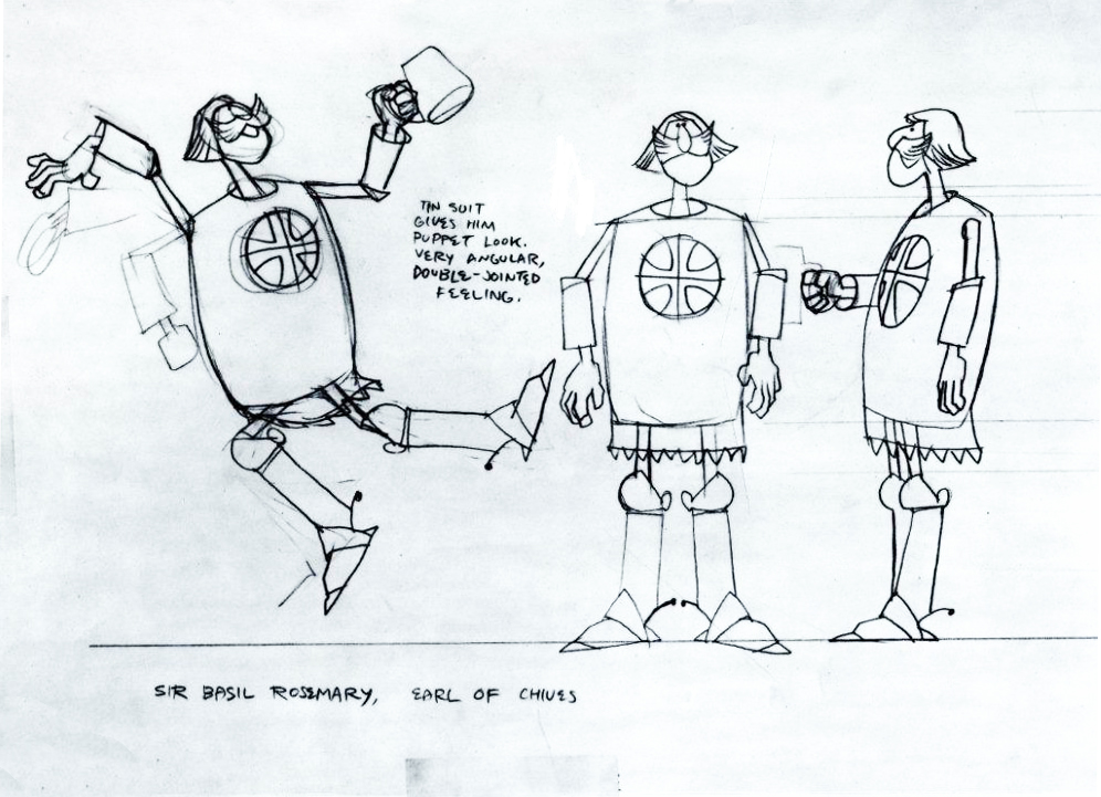
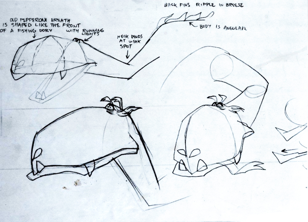
This is a rough that RBW did for a dog food animatic. It was a take off of Bogart’s ‘Casablanca’, hence the ‘play it again Sam’ scene with Bogie Basset.
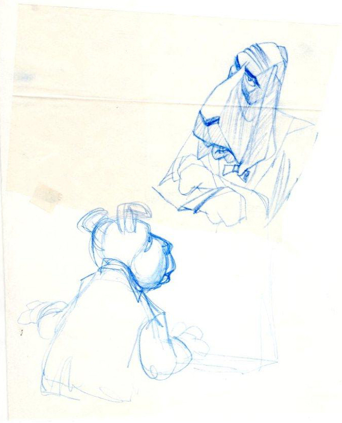
This is a LO rough for what’s probably a TV Guide illustration:
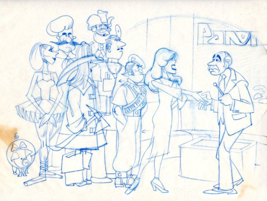
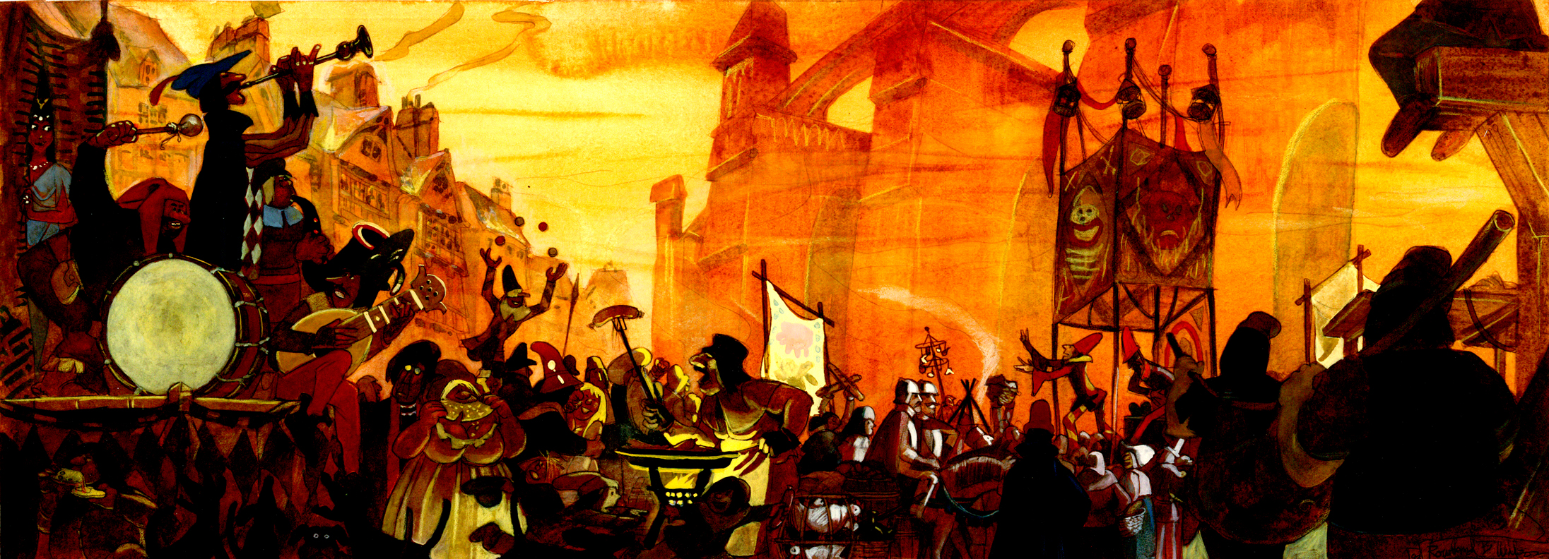
This is a painting by Rowland Wilson for
The Hunchback of Notre Dame “All Fools Day”.
Here is the same thing broken in two for better viewing.
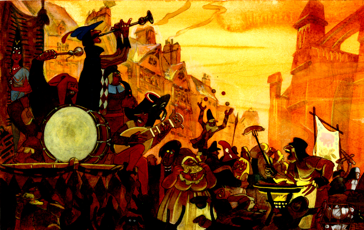 Left
Left
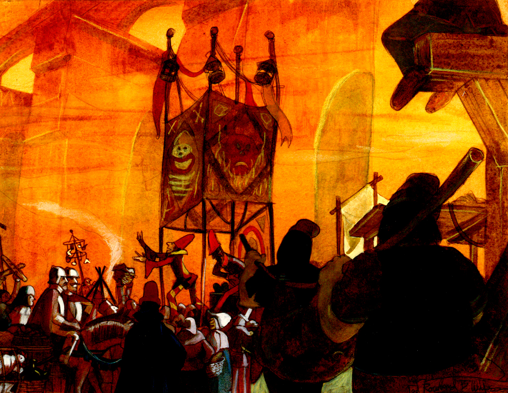 Right
Right
Here’s a group of Christmas Cards Rowland did. This is the note that Bill Peckmann included with the cards: “Years ago Rowland had an old school friend (‘Pete the Greek’, I’ve forgotten his last name) in Dallas (their home town) who owned the ‘Drawing Board’ greeting card company. Rowland did these professional (dentists, doctors, cpa’s etc.) Christmas cards for Pete. He loved doing them because Pete let him run with the ball, none of the usual looking over your shoulder advertising art direction.”
 1
1
 2
2
 3
3
 4
4
And here are two cards that were sent out by Rowland and Suzanne.
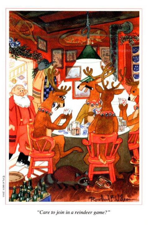
Here’s a caricature Rowland did of Grim Natwick and himself:
Finally, here’s a cartoon Bill Peckmann did of the staff at Focus, a company in NY just prior to Phil Kimmelman’s forming PK&A. Here’s a note Bill included with the drawing: “This was done by me when we were working on RBW’s second animated spot which was Vote Toothpaste’s “Combs & Plotzen.” His first was a Flying “A” gasoline spot animated by Lu Guarnier. Both circa ’68-’70. Of cours this pre-dated the Utica Club “Mountie”strong> caricatures.”
The caricatures pictured above are from left to right:
asst animator Victor Barbetta, designer Bill Peckmann, animator Jack Schnerk, owner Phil Kimmelman, designer Agnes Cannata.
