Search ResultsFor "eyvind earl"
Books &Chuck Jones &Commentary &Illustration &Layout & Design &Models 26 Sep 2013 08:22 am
Rhapsody in Working for Suherland
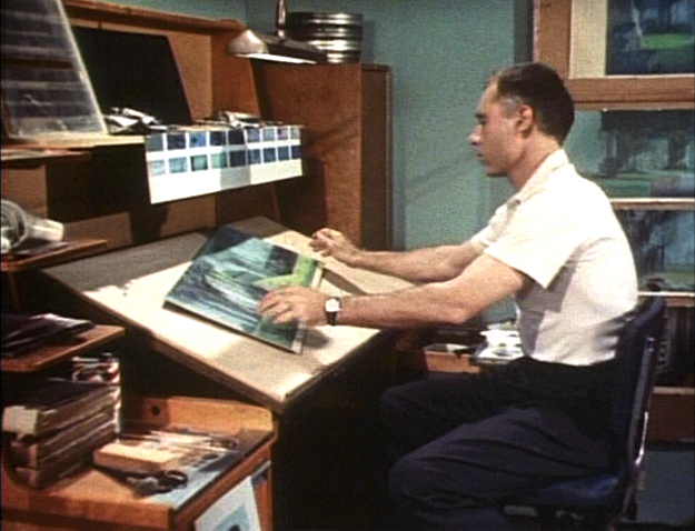
Maurice Nobel worked several years at Warner Bros. under Chuck Jones for the most part, but in 1950 he moved to John Sutherland Productions where he worked on lesser known projects. He had a money war with Eddie Seltzer at WB and accepted the higher price from Sutherland with Selzer telling him that the door would remain open.
WB tried to turn everything to 3D and gave up after one cartoon, Lumberjack Bunny. It’s obvious that some of Maurice’s LOs were prepared for 3D and were switched at the last minute. WB was closed for a year when it was decided to stop production on the 3D films. Noble had taken the right course in working for Sutherland for the few years he was there.
Color keys to the John Sutherland Prod
Gateways to the Mind
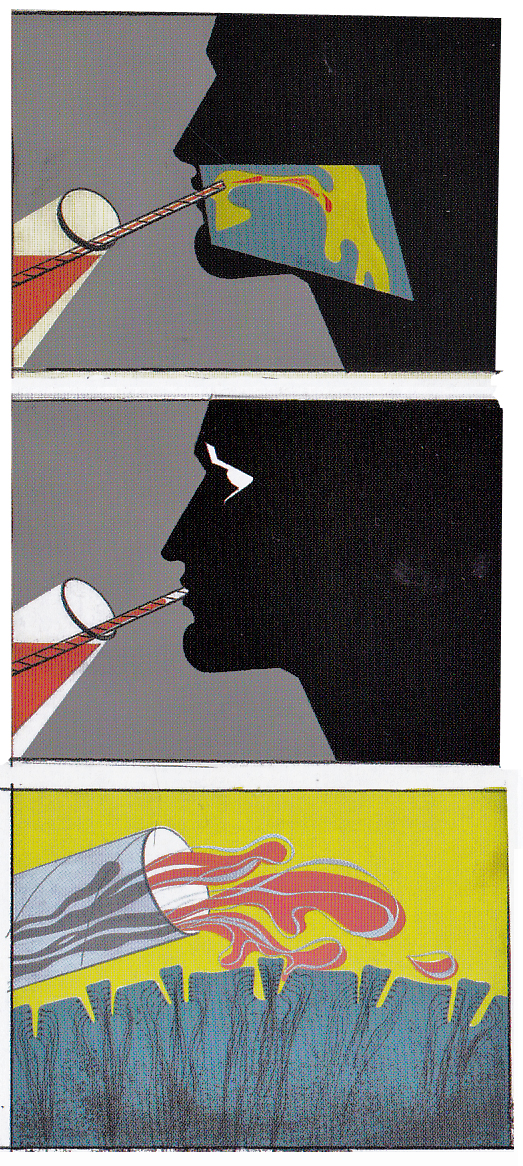
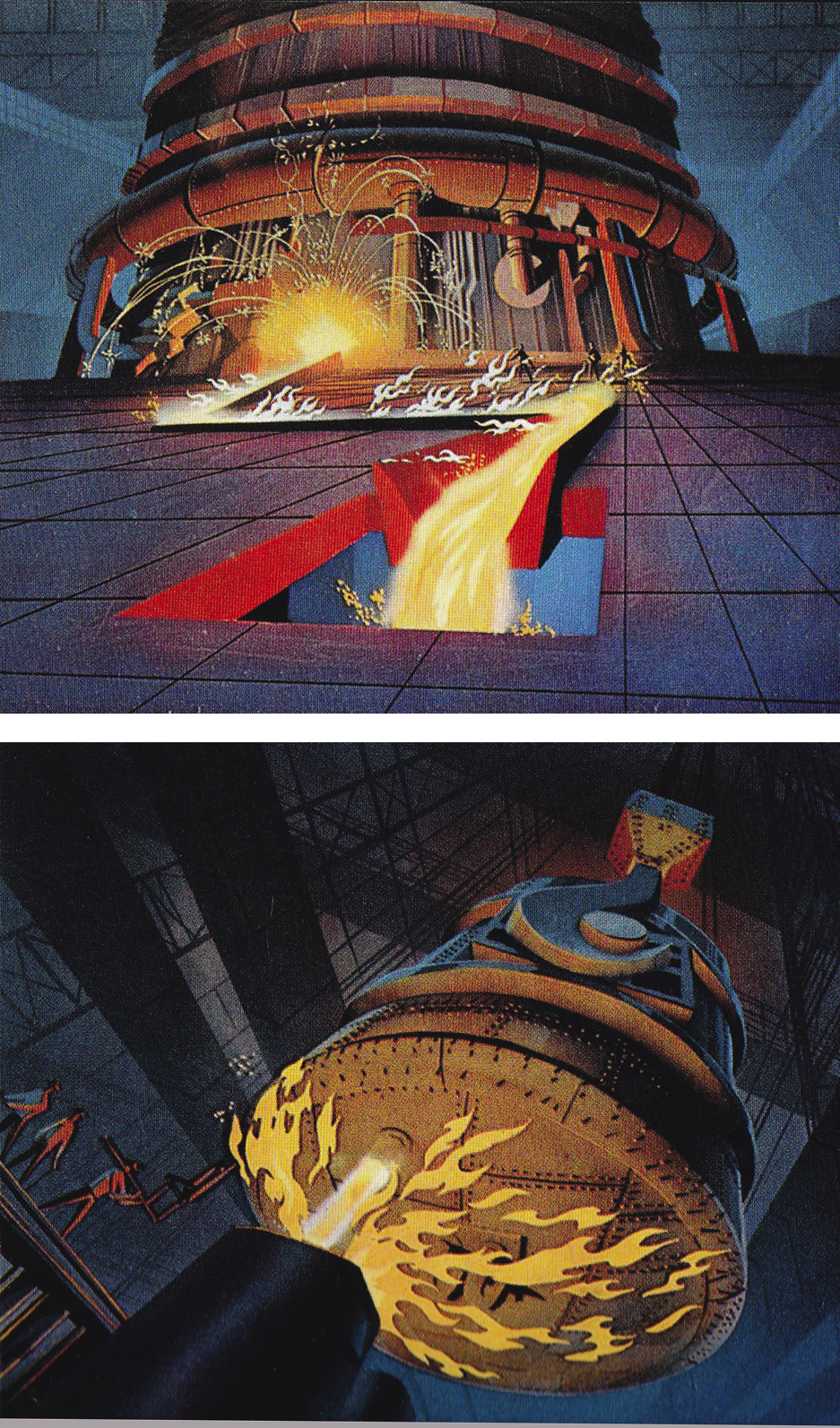
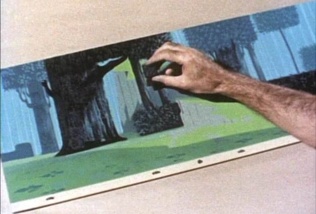
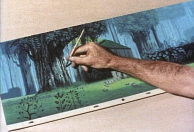
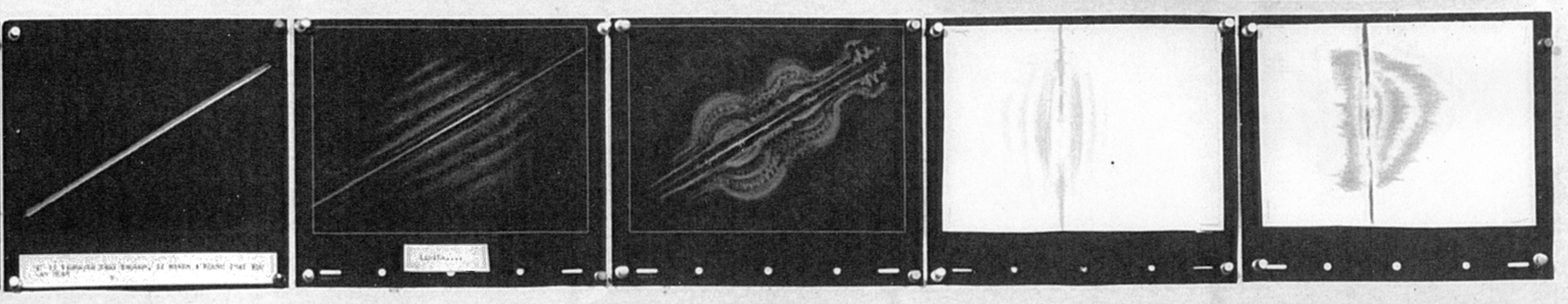
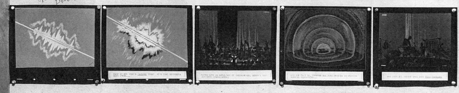
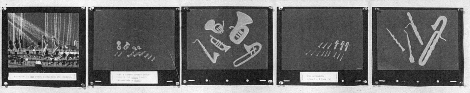
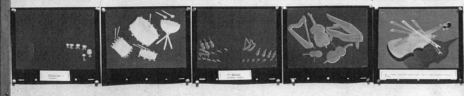
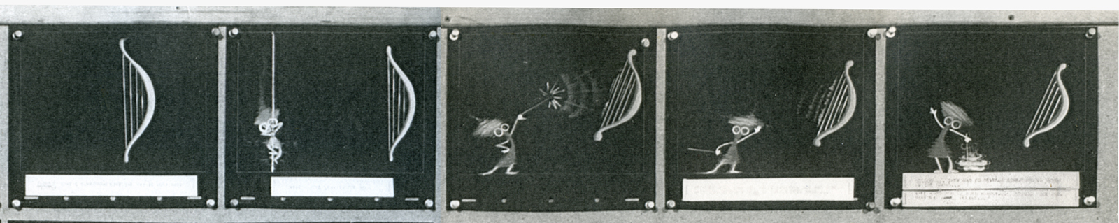
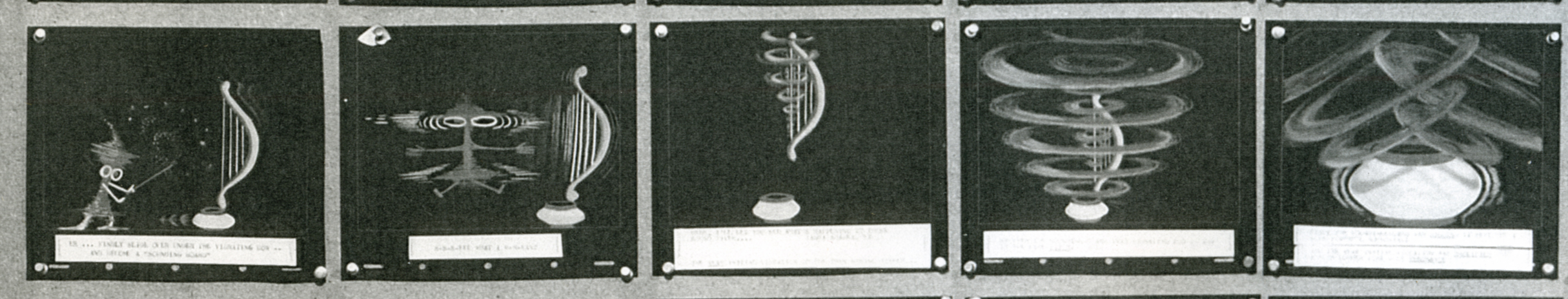
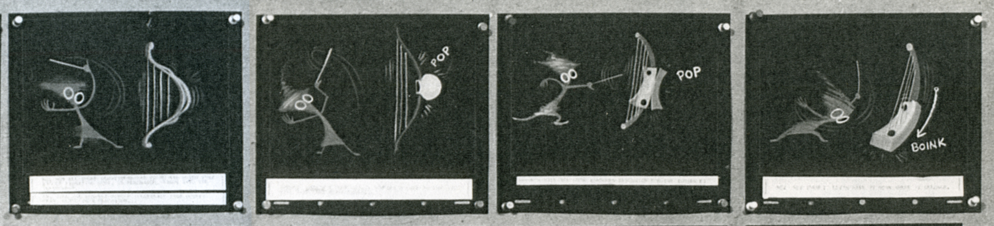
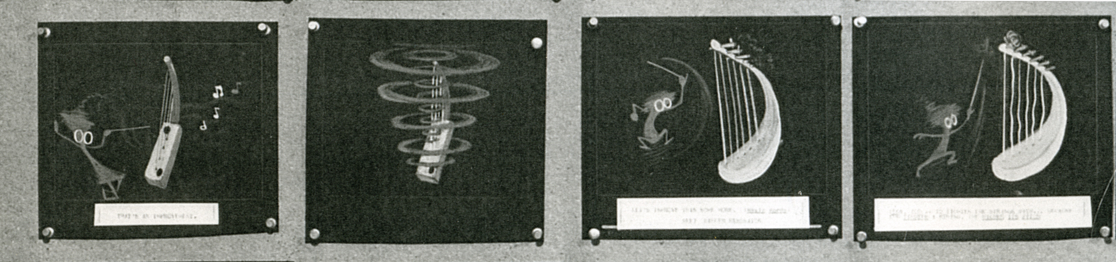
Rhapsody in Steel (below) was a high budget film for Sutherland with Eyvind Earle hired as Art Director. Ultimately he just painted the BGs that were designed by Maurice Noble. This beautiful film can be seen on YouTube, here.
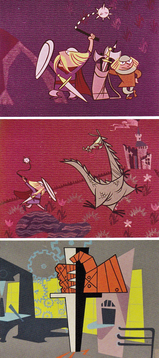
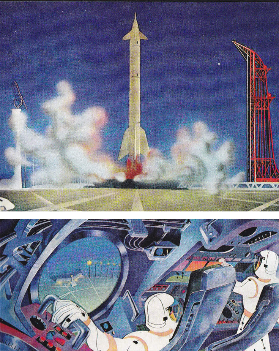
Rhapsody In Steel
Animation &Animation Artifacts 28 Aug 2013 06:14 am
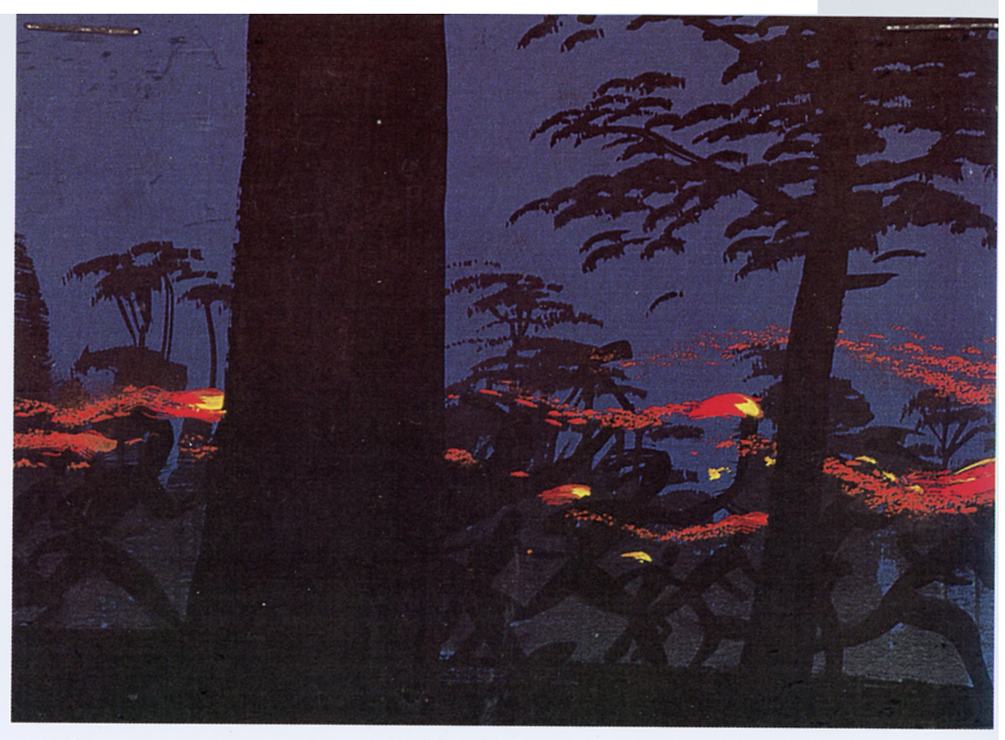
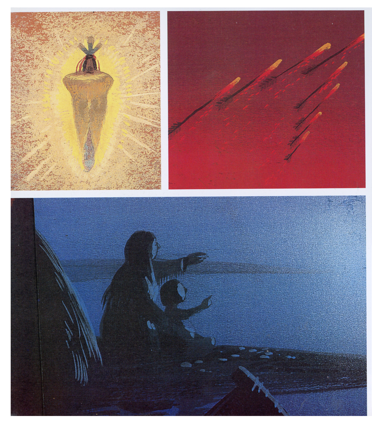
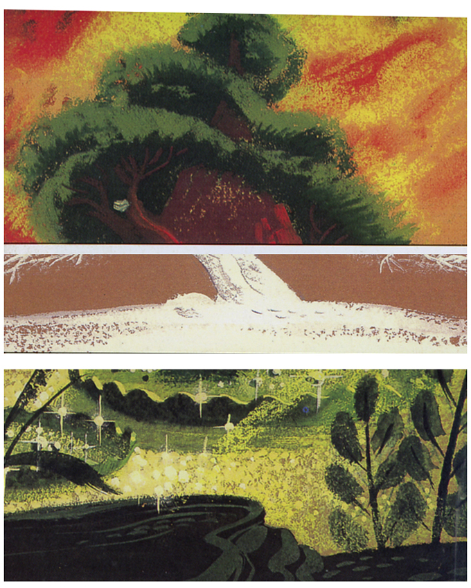
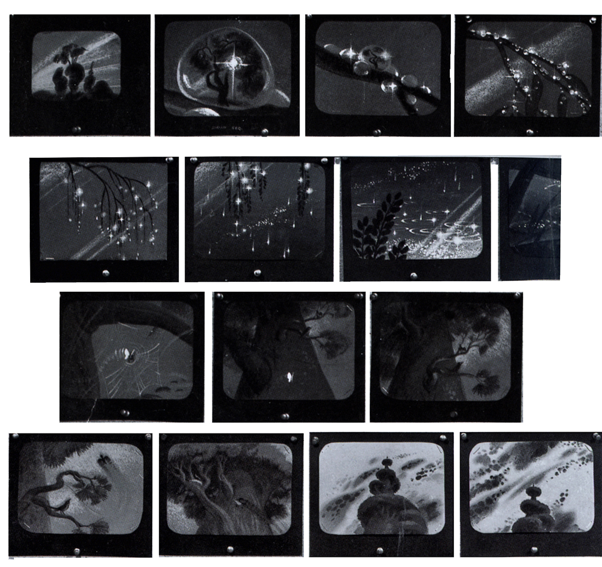
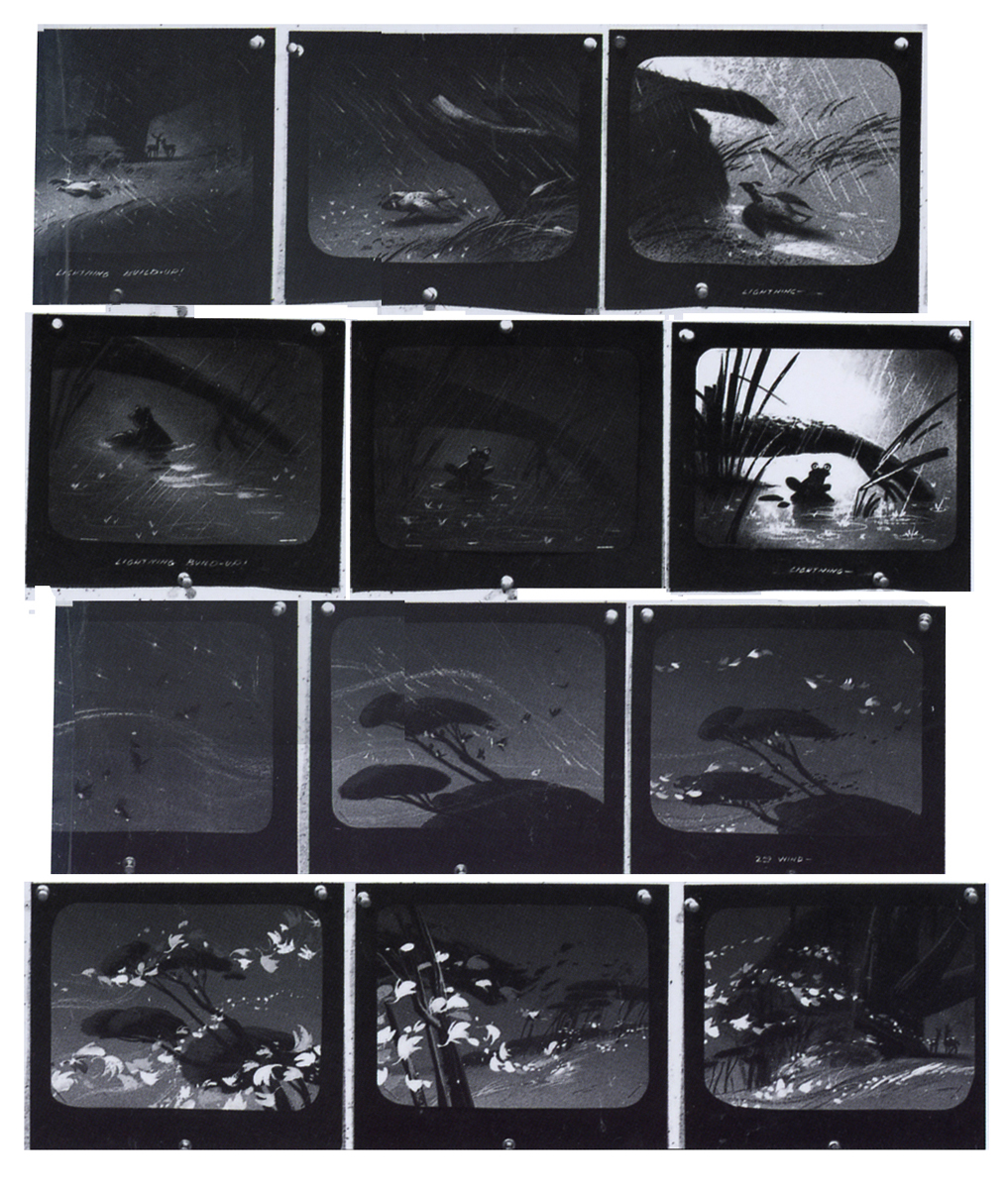
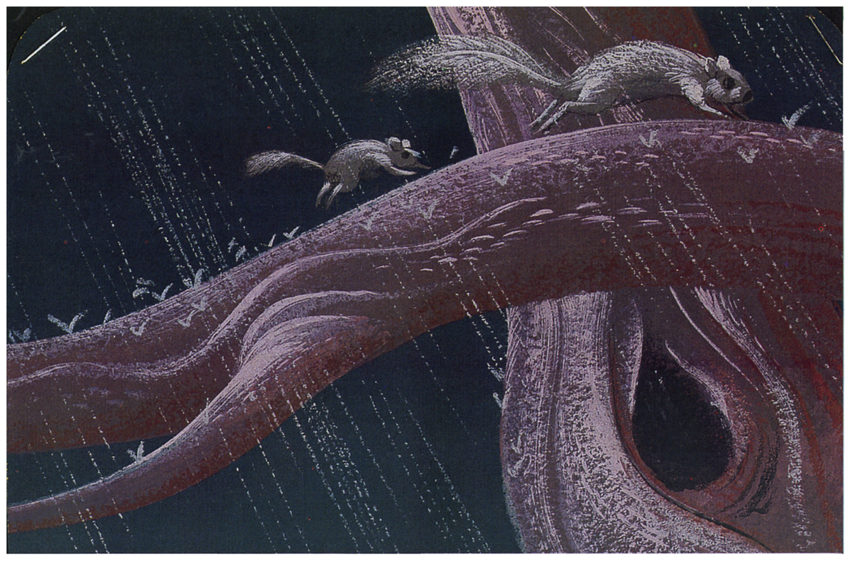
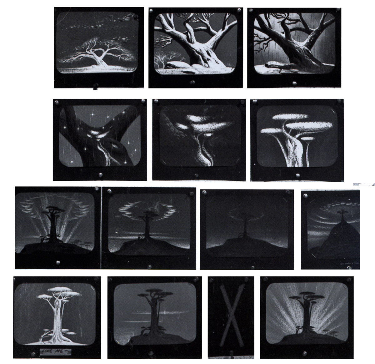
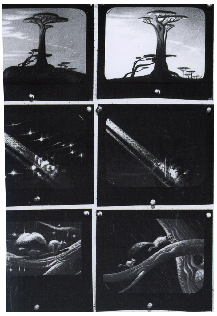
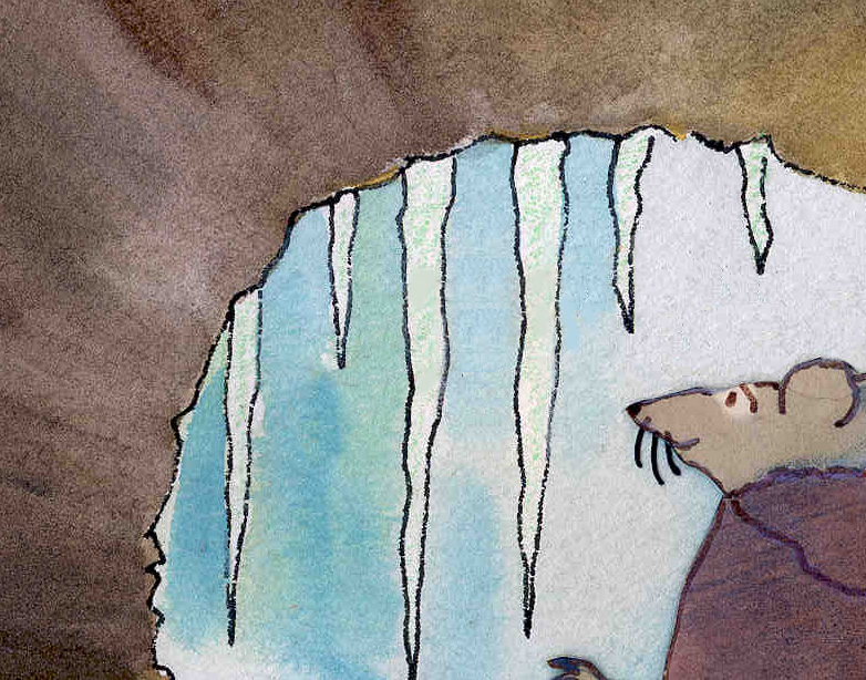
Only God Can Make a Tree
Given the holiday celebration of Martin Luther Kings’ elloquent statement re this subject, I’ve opted to post these images from Dick Kelsey. Richard Kelsey was one of those visual poets of the Disney studio. He’d probably have been the only one who could successfully tackle Joyce Kilmer‘s poem, Trees. He also brought Hiawatha to life with his strong beautiful watercolor and in sketches. (Needless to say, the sketches of one film often end up mixed in with the Hiawatha pictures.) Unfortunately, the film never completed production. We ;sten to third rate rate newcsasters give thier own fourth rate unditry of the day. Ricard Kelsey couldn’t offer much better than these images.
Trees was a seqment of the 1948 package film, Melody Time and blended in with a never-completed piece based on Longfellow’s poem. Hiawatha was never complete but was an amazing gift for sore eyes.
 9
9
 10-21
10-21
 20-7
20-7
 1-6
1-6
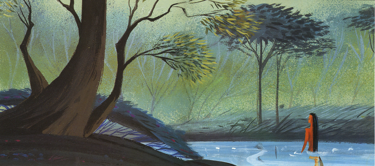
The art in these two pieces is often as touching as Eyvind Earle‘s majestic work for Sleeping Beauty. You can see how some slight grace and a more assured pen would have brought the backgrounds to Pocahontas closer to Sleeping Beauty.
They certainly had artists of character working for Disney back then (as do they do today; it’s just that today everyone seems to smell of fear. You also have to know how to keep the beauty of the art from dissipating after a few shallow and solo comments.
Models &Puppet Animation &repeated posts 02 May 2013 04:26 am
The Hand and Fingerprints
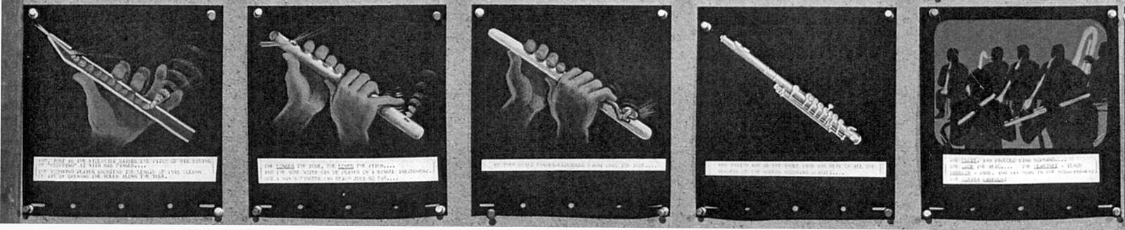
As you can tell, from some of my recent postings, I have always had a love affair with puppet animation. There’s something extraordinary about that medium that has drawn me in. I’ve always demanded a tactile approach to animation, including all of the 2D work I’ve done.
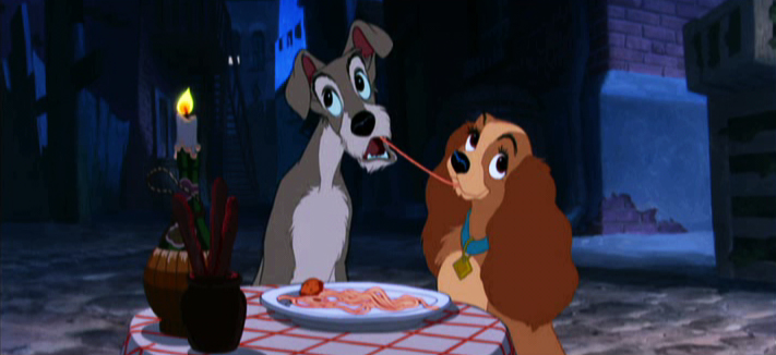
 I remember seeing Lady & The Tramp in 1955, on its first release (I was nine.) It was then that I consciously noted that one of the backgrounds in the “Bella Notte” sequence (I can now see that it was an Eyvind Earle BG) had texture in its paper. The board it was painted on came through the animation photography and reached out to me. The human hand became evident in the film.
Perhaps, this was what I loved so much about animation in the first place. Humans did it, and it was self-evident. Being reminded of it, in the subtlest ways – usually unintentional, added to my joy.
Perhaps this is what brought me to John Hubley’s films. Those films were so obviously painted: characters and BG were both used by the photographer to combine for us, and the unintentional was often caught on screen. (I immediately loved those highlighted rings double-exposed around the characters in Moonbird, the brush strokes of The Hole, the transparency of the characters’ paper in Of Stars and Men.) It added to the experience.
In a sense, I was brought out of the film but held in it and given the opportunity to love it even more.
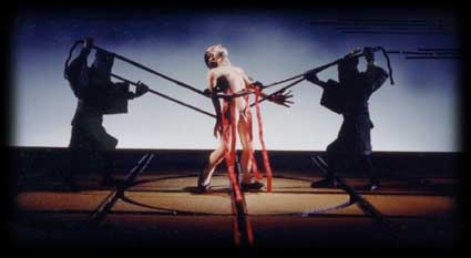
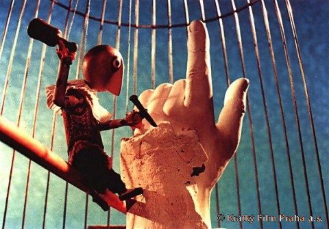 I’ve had this same sense with the best 3D animation. Though I was always there viewing it, I was also caught up in the emotions of the film. Trnka’s masterful film, The Hand, had my understanding those tears and sweat on the little potter were moistened ink that had been his painted eyes. But the anguish I felt the first time I saw the film and that effect has never left me. The perfections of the Human Hand in that film forced the imperfections of the puppet potter to be revealed until it destroyed him.
Perhaps this is also what keeps me from embracing cgi animation. Despite the faked textures of the computer, it’s so obvious that it is not real. At least not when the characters are cartoons.
A very small example of what I’m trying to communicate stands out for me in Cars. The paint job of newer cars has a flecking/speckling of glitter within the paint. In the right light, the main character, Lightning McQueen, had this paint job. Everytime I saw it, I was distracted and pulled out of the film. Like the real paint on a real car, that flecking was embedded within the paint, itself. It didn’t feel like the byproduct of a human hand; it felt like a computer trick.
 I am no more capable of coloring the computer skin of that computer hand than I am of painting a real car. It isn’t tactile for me, it’s just distracting.
It’s just something I never feel I can reach out and touch. This is something that has been overcome, for me, in a couple of films. The Incredibles gets very close often. Moments of Robots, such excellent design for the medium. Some of Toy Story.
(Click on any image to enlarge and enjoy the textures.)
Of course, I recognize that this is my problem. However, I recognize it’s a problem that other people probably have and wonder if there isn’t a solution. In The Iron Giant, the Giant is animated by a computer. I was told that the animation had to be rigged to be animated on “two’s” so that it wouldn’t separate from the rest of the hand-drawn animation. Oddly, it felt totally acceptable to me; I saw no problem and accepted that robot. There has to be, in there, a way to resolve it – I’m just thinking here and don’t expect anyone to try to follow what I’m saying. Perhaps if “human” problems, technical problems, were added to the animation. . . No this is even too stupid for me.
 Barry Purves has made a number of absolutely beautiful films and has created in his own studio some masterfully realized pieces. His work has a discriminating taste, graceful and controlled movement with superb acting, and an intelligence that is rarely found in animation today.
He was nominated for the Academy Award for his film Screenplay, a virtuoso work which follows the rules of Kabuki theater and presents a double-layered story of a man watching and revealing a story from his past which eventually rips through the past and tears at the present. It’s a work of animated puppetry, displayed as theater and a stunning film that should have won its Oscar.
 Rigoletto presents the opera in a condensed version that has been reduced for television. It’s a packed half-hour which places you into the full opera and allows you to follow it without any confusion. It has a majesty in its sweeping and dynamic camera moves which whisk you along in the luscious music; they carry you along through the depths of the complex story. It’s a wonderful film that certainly grows richer with each viewing.
Other works he’s done include a wonderful film about Gilbert & Sullivan: The Very Models gives us the pair as seen through the eyes of D’Oyle Carte. A rich and entertaining diary into the making of this film can be found on AWN and a short clip of the film is available there as well.
As a matter of fact, I found his diary there so entertaining, I’ve also followed the diary he keeps on his own website.
You can get a small glimpse of Barry Purves‘ craft by viewing the clip reel at Acme Filmworks. But you’re left without the full heft of his work until you’ve seen the complete storytelling ability he presents in the whole films.
Books &Daily post 29 Sep 2012 06:55 am
Egos, Books, and Michel Ocelot
There’s been a relatively short conversation going on at the comment section of my blog for an older piece I’d repeated this past week. The discussion has been about Eyvind Earle. The first few visitors who commented all wanted to express their dislike of this film (particularly the story) and Eyvind Earle’s design work, in particular. “Scott’s” dislike of Mr. Earle’s work extends to his personal attitude while working on the film. He, according to “Scott”, was thick headed and wouldn’t listen to any requested changes to his designs, allowing his ego to take charge of the work. (I’m not sure that I see that on the screen, nor did I really feel that when I met the man when I got to spend an afternoon with him as I accompanied Mike Barrier on an interview. I admit it is possible though.)
In fact, I think the ego is essential in breaking new waves and advancing the art form. Adam Abraham in his book When Magoo Flew writes about the ego of John Hubley in running his productions at UPA. If he wanted a specific blue, that’s all that he would settle for. The report is that he was oppressively insistent on it being his way only. I worked for Hubley for years and never got to see that side of the man. Oh, there was a well deserved and big ego there, but it never got in the way of the art being created.
Rooty Toot Toot
We’ve seen Bill Peet complain about Bill Tytla‘s use of his (Peet’s) drawings while working on Dumbo. According to what I’ve read, Peet complains that Tytla took full credit for the sequence of baby Dumbo running in and around his mother’s legs, when Peet felt it was his scene, his key drawings that made the scene the perfect piece that it was.
Chuck Jones, while working briefly for Disney (on Sleeping Beauty), told Walt that he had to leave the studio. When Disney asked what job Jones really wanted at the studio, Jones said, “Yours.” He felt that only Disney’s job was suitable for him. Talk about ego. The ego was even larger than that when you realize that it was Jones, hmself, that told me that story – however real it actuall was. The egos of Jones and Clampett and even Freleng vie over who created what character.
Egos are necessary in an industry of craftspeople and artisans, especially when an artist is trying to get something brilliant out of them. Thomas, Johnston, and even Kahl were brilliant actors with amazing abilities of draftsmanship. But the film, the bigger picture, needed a direction which Earle gave it. Just look at the wretched Reitherman films to see what Thomas, Johnston and Kahl turned out without the strong, smart director who was also an artist. Tytla took animation to another level, he was truly an artist, himself, but look at the miserable little films he directed when he left Disney’s studio. Even the support system of that studio wouldn’t have helped Leprechauns Gold or Snap Happy. (Mind you, I love Snap Happy, but it has no relation to art.)
Here’s a small piece David Parfitt wrote:
- Tytla was a tough guy who used abusive language and irritated his fellow animators. Ken Anderson (Disney Legend for Animation and Imagineering) went to Walt Disney to express frustration at the way Tytla treated his coworkers. Walt Disney replied, “What do you think of Chernabog, the God of evil, in ‘Fantasia’? What do you think of Stromboli in ‘Pinocchio’?†Anderson (the art director for both films) replied, “They are some of the most powerful and vicious villains we’ve ever done.†Walt Disney looked at Anderson and said, “Where do you think all that anger comes from?†Vladimir Tytla was a maverick who needed to release anger and energy to manifest some of the most powerful imagery ever produced by the Disney Studios. A maverick is difficult for a company to grapple with because of their abrasiveness and the way they go against the way things typically run. Yet out of the agitation and irritation often comes a new direction that could secure a company’s future.
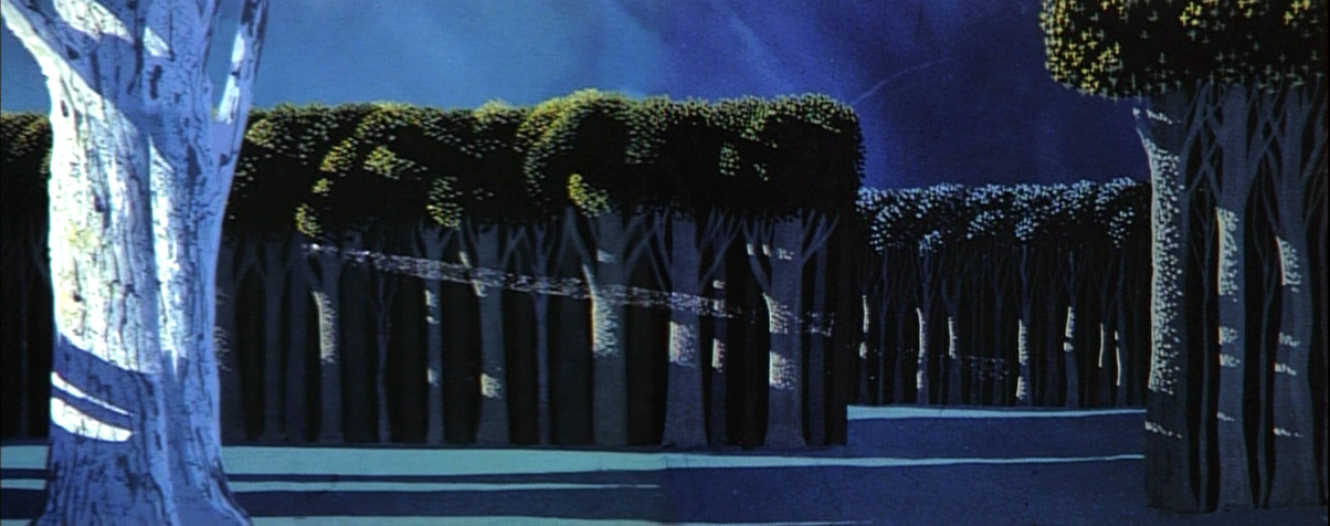
Sleeping Beauty changed the Disney studio forever. The animators and artists there, with the exception of Ward Kimball and a few others, fought against the use of 20th century graphics in their films, yet UPA’s influence slowly crept into the mix. Finally when Walt Disney, himself, chose Eyvind Earle and put full support behind him to design this film as he saw fit. The animators all fought Earle and continued to bad mouth him to the end of their days. Yet Earle’s style, as well as Tom Oreb‘s great character designs for that film, are frequently copied by the new generations of artists. The backgrounds and some of the character design are stolen directly from Sleeping Beauty. Even though the SB art is a play on 15th Century manuscripts and art, it was used for the Pocahontas forests.
Painting Sleeping Beauty
Pocahontas
Nothing at Disney, with the possible exception of Bedknobs and Broomsticks went back to the past to illustrate their films henceforth. Until, of course, today’s new artists in animation who just steal from other past films. Bluth‘s Small One or is virtually without style. Tim Burton is possibly the only exception I can see of this current view of the state of animation. The regurgitated past of other artists who deservedly had egos aglow. We go on. Perhaps someone like Genndy Tartakovsky will bring some of the panasche he brought to Samurai Jack.
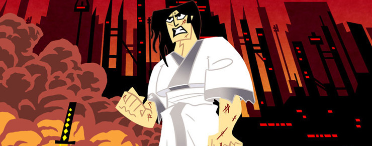
Samurai Jack
By the way, there’s a good interview with Tartakovsky on this week’s on-line version of the Village Voice.
Books
.
- There are a couple of books I’d like to write about.
.
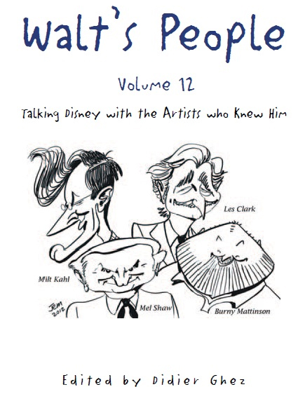
- Let me mention Didier Ghez‘ latest volume of his interview series, Walt’s People.
Just released is Walt’s People – Vol. 12. Just the idea of 12 volumes of any book in print, is quite extraordinary, and amazing feat for Didier Ghez to pull off.
I own about a half dozen of this series and have read all of them at least twice. Most of the interviews are exceptional, some are smart, and the rest are just very good. In all there are those interviews that give us some real insight into the process and history of the making of animated films by the professionals who did it. Les Clark, Larry Clemmons, Charlie Downs, Al Eugster, Sammy Fain, Milt Kahl, Burny Mattinson, Paul Murry, and Mel Shaw are among the many who are interviewed in depth for this new volume. Some of our greatest historians (Robin Allan, Michael Barrier, Albert Becattini, John Canemaker, John Culhane, Pete Docter, Chris Finch, J.B. Kaufman, Jim Korkis, Dave Smith, and Charles Solomon among others) conduct the interviews.
It’s just another great volume in the series. You should own them all; I should own them all, to be honest, and I will.
Ganesha’s Sweet Tooth
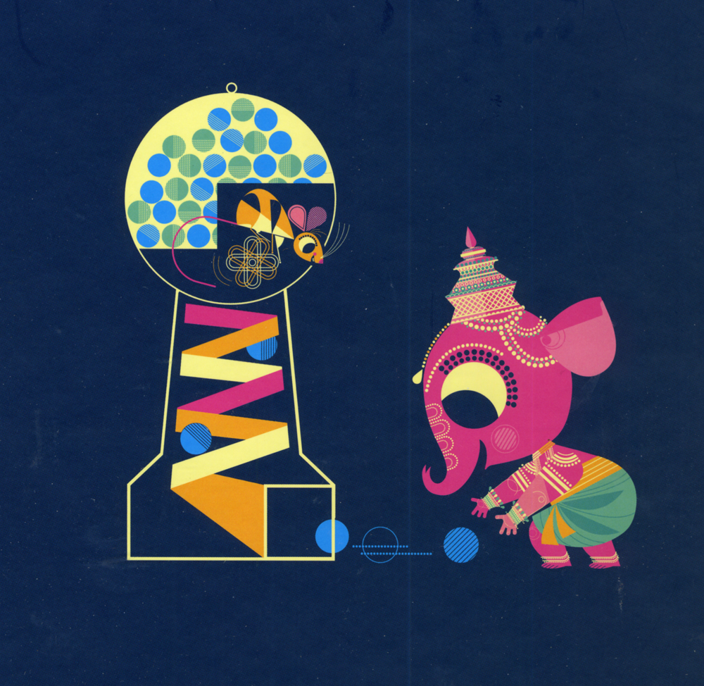
- As previously reviewed on this blog, Sanjay Patel will see his first children’s book, Ganesha’s Sweet Tooth released this week by Chronicle Books. I have a sore spot for Mr. Patel’s work. He’s an artist who works by day at Pixar and is an artist, with his own very defined style, working extensively after hours.
I’ve reviewed many of his books and have a real fondness for The Ramayana. Were I you, looking to explore this artist’s work, I’d buy Ganesha’s Sweet Tooth. Once you have it and want more – you will – go for The Ramayana. It’s a brilliant masterwork.
Snow White x 2
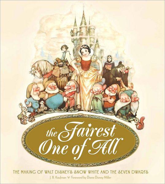
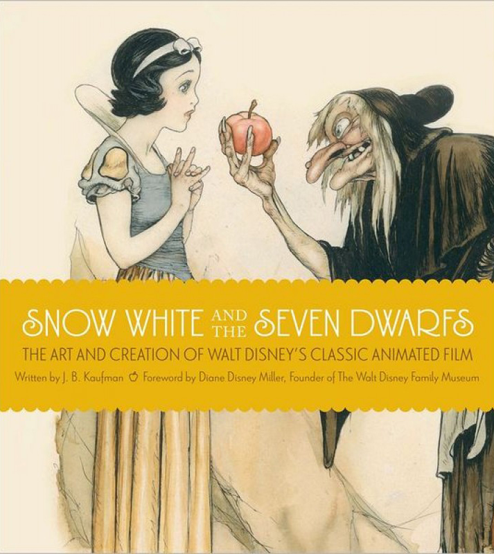
- Unless you’ve been hiding under a rock, if you’re an animation fan, you know that the brilliant historian, J.B. Kaufman, has not one but TWO books on Snow White about to appear on the market.
The Fairest One of All: The Making of Walt Disney’s Snow White and the Seven Dwarfs and
Snow White and the Seven Dwarfs: The Art and Creation of Walt Disney’s Classic Animated Film
are the two titles by Kaufman that focus in great depth on that film and its development. This is to celebrate the 75th anniversary of the feature, and will coincide with a display that will appear soon at the Walt Disney Family Museum in San Francisco.
Both books come from the Walt Disney Family Foundation in conjunction with the Walt Disney Family Museum. I’ve seen the Art of Creation book, and was completely taken with it. I will most definitely own both books. The film means much to me, and I want to own anything Kaufman writes. It’s a no-brainer – double my pleasure.
By the way, part of the reason I’m looking forward to reading these two books is to compare it with Michael Barrier‘s amazing writing on this period at Disney’s studio. In Hollywood Cartoons, there’s a large part of the book dedicated to the development andcreation of this particular film. Then in The Animated Man: A Life of Walt Disney Barrier tells the same information but from a different perspective entirely. This biography of Disney is wholly involved with Walt Disney, the man and artist. It’s a unique turn that we only see in the poorly written Diane Disney Miller book, The Story of Walt Disney. As Walt’s young daughter she could see the story no other way than from his perspective. While waiting for the Kaufman books to come out, read either of Barrier’s books for the best, to date, version of the Snow White story. It’s strong writing.
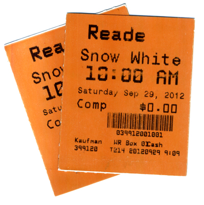 It’s appropriate that I was invited to a 10am screening of Snow White at Lincoln Center this morning. It’s part of the NY Film Festival’s 50th anniversary celebration. Eric Goldberg introduced the film with a brief and smart little talk about the animation. Talking about The Old Mill as a test run for the Multiplane Camera, talking about the Three Little Pigs first offering characters that looked alike but had characterization defined by their animation (as did the dwarfs), talking about The Goddess of Spring being an enormous failure for Ham Luske who succeeded animating Snow White. It was nice to say hello to Eric prior to the film. We haven’t seen each other in about five years. It was nice also to see the film projected. I saw the movie on tv/dvd only a couple of weeks ago, but it’s a very different experience on the big screen. The digital transfer was glorious, merciless and disastrous. The ink lines were so sharp that you could actually feel how deeply the crow quills cut into the cels. However there were many points where individual frames had slight digital distortion to hurt the ink lines, and the magic mirror actually had the detritus of digital compression across the center of the mirror. Someone should have been there to supervise the transfer.
Paperman played prior to Snow White. It was animated cgi, then flattened and lines were added atop the flattened drawings. I can’t for the life of me understand why it wasn’t just animated by hand. It would have cut the cost in half and had more life to it. Sorry, I don’t think it worth the Oscar. Though you never know it may be the best film, this year.
Tales of the Night
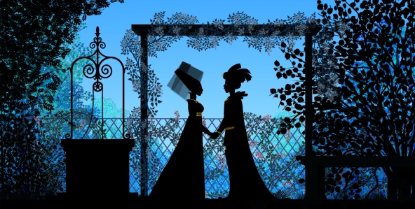
- Michel Ocelot has received another excellent review from the NYTimes. Tales of the Nightis reviewed by Andy Webster in the Times, and is Ocelot’s latest feature length animated film – his first in 3D – and the reviews are sensational. It’s screening as part of the Children’s International Film Festival and plays at New York’s IFC Theater through next Tuesday. This is a silhouette film in brilliant color.
His films are beautiful and deserve to be seen in a theater. I’d heartily recommend getting to the theater if you have the chance. Hopefully the distributor will submit this one for Oscar consideration. Though the look is 2D, the graphics are done via cgi as was the case with his past films, including Azur & Asmar, Kirikou et les betes sauvages, Princes and Princesses, and Kirikou and the Sorceress.
Some amazing animation is coming out of France these days.
More Reviews
 Now to the bigger release for the smaller film department:
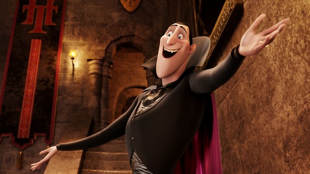
Adam Sandler‘s second animated feature, Hotel Transylvania, opened to mostly poor reviews by 2nd string reviewers.
NYTimes sent Neil Genzlinger to give his negative review. The most positive line is: “The movie loses its originality as it rolls toward its predictable conclusion, but it’s still lovely to look at.”
Someone named Sara Stewart reviews the film for the NYPost and gives it a middling 2½ stars. “Director Genndy Tartakovsky (“The Powerpuff Girls,†“Samurai Jackâ€) is a natural fit for this kid-and-parent-friendly flick. The animator’s wit and attention to detail enliven a collection of well-known ghosts and ghouls. (Though Tartakovsky’s more traditional TV-cartoon style is still superior, as evidenced by his playful closing credits.)”
Joe Neumaier, the 2nd rate first stringer of the NYDaily news gave it a mostly positive 3 star review. “This being a Sandler movie, the humor skews toward the infantile (fart jokes, peeing baby werewolves). But the sleek visuals are rich and glossy, placing the characters, who look like Halloween door decorations, in baroque hallways or secret passageways.”
I enjoy the reviews in The Onion, and their review for this film by Tasha Robinson doesn’t disappoint. A C+: “Tartakovsky gets a long way on wild design and visually daring sequences. His work has always been adventurous, experimental, and conceptually creative, and he hasn’t lost any of his energy or capacity for staging a memorable setpiece.”
Whatever happened to the feature length version of Samurai Jack that J.J. Abrams was going to produce wth Tartakovsky directing?
commercial animation &Disney &Illustration &Independent Animation 25 Sep 2012 05:29 am
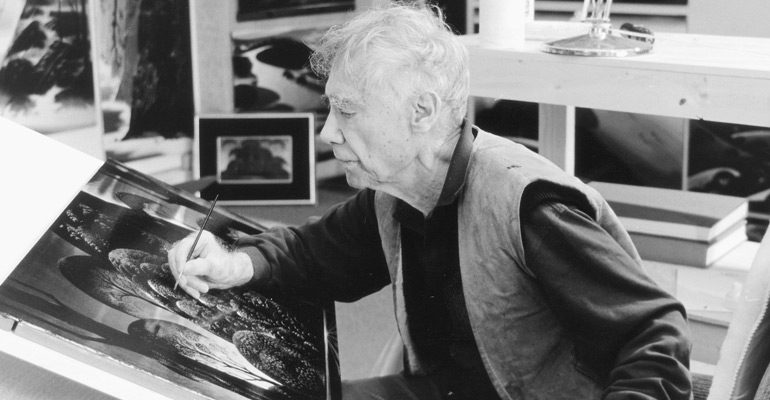
Eyvind Earle – recap
 – Let’s talk a little about Eyvind Earle. This is the artist who rose to fame when he was selected by Walt Disney to set the style for the long-in-production feature, Sleeping Beauty. The animators disliked his art direction and openly protested it. Walt remained true in his stance and supported Earle to the end; though it could be said that Walt was more involved in Disneyland’s construction and gave too little attention to the in-fighting at the animation studio.
I remember Frank Thomas, specifically, stating that he had done everything possible to supercede Earle’s style after he, Thomas, had animated the Merryweather scene as she creates Aurora’s dress and cake in honor of her birthday. He felt that the black bodice that Earle had designed took all the lightness out of his character’s delicate dance.
(Click on any image to enlarge.)_________________________________
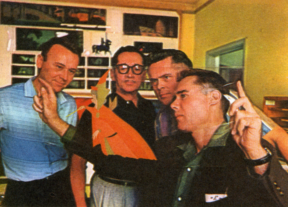
L to R: Al Dempster, Dick Anthony, Ralph Hulett and Eyvind Earle
Thomas publicly attacked Earle at the Lincoln Center celebration of Disney animation back in 1973. I’d already read something similar, and heard it privately. None of the others on stage at Lincoln Center – Woolie Reitherman, Ken Anderson or Ollie Johnston – countered in support of Earle.
 Sleeping Beauty was such a drastic change in look from the other Disney features, that I think it took deep hold in the minds of a lot of Baby Boomers growing up around this feature. Earle became a strong target of interest, and I think his reputation has grown annually.
I have to admit it was odd seeing the backgrounds of Pocohontas trying to emulate Earle’s Sleeping Beauty style, but in some ways it seemed fitting. The studio had been ripping off the films of the past for so long that it was only appropriate that they’d focus on someone who was such a dynamic force.
For a short period after he was released by Disney, in the post-Sleeping Beauty layoffs, he worked with John Sutherland Productions where he designed the short, Rhapsody of Steel. Then he formed his own studio, Eyvind Earle Productions, Inc. He did an animated trailer for the film, West Side Story, under the supervision of Saul Bass. He did an animated title for the Kraft Suspense Theater, and he did a Christmas Special for Tennessee Ernie Ford.
Ultimately, Earle made a success of his own art after leaving animation. He’s been represented by a number of very large galleries and has sold a lot of popular art in a style all his own. Here are a couple of examples found on line:

I’m not always a big fan of the color schemes in his graphics, though he always makes them work, but I have to give credit to Earle for his originality and the dynamic approach in his art.
His autobiography, Horizon Bound on a Bicycle, is a must for all real fans.
This is his animation resume:
- 1951 Started with the Walt Disney Studios as background painter on: FOR WHOM THE
__ BULLS TOIL, MELODY, and the Academy Award winner for “Best Short of the Year”
__TOOT, WHISTLE, PLUNK and BOOM which also received a Cannes Film Festival Award.
__Production Designer, Color Stylist and Background Painter for the DIsney animated __classic SLEEPING BEAUTY, as well as, PIGS IS PIGS, GRAND CANYONSCOPE,
__PAUL BUNYAN, LADY AND THE TRAMP, LONDON BRIDGE, and WORKING FOR PEANUTS.
__He designed 5 murals for Disneyland.
1958 Joined John Sutherland Motion Picture Company in Los Angeles.
1960-1966 Created 24 sheet poster for Hamm’s Beer.
__Started motion picture animation company, Eyvind Earle Productions, Inc.
__Created animated commercials for Chevrolet Motors, Chrysler Corporation, Marlboro
__igarettes, Motorola Television and the Kellogg Cereal Company.
__Created animated trailer for WEST SIDE STORY for United Artists.
1961 Created animated television special THE STORY OF CHRISTMAS starring
__Tennessee Ernie Ford and the Roger Wagner Choral.
1962 Created animated television special THE EASTER SPECIAL.
__Created title for the KRAFT SUSPENSE THEATER.
__Created the logo trademark trailer for Universal Pictures.
__Produced and created the theatrical short DEATH AND SUNRISE
You’ll find a lot of merchandise including all the books listed here, on the Eyvind Earle website.
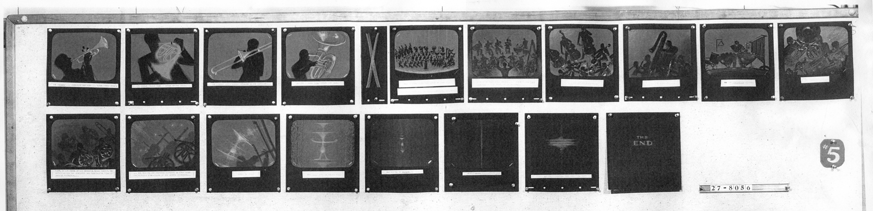
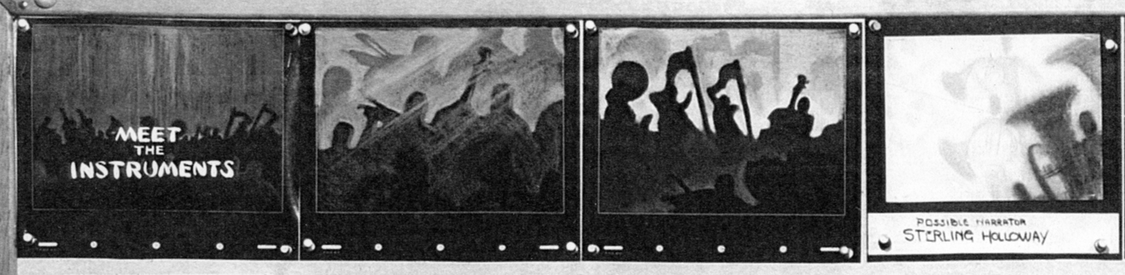
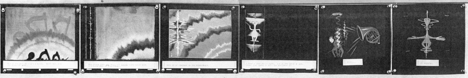
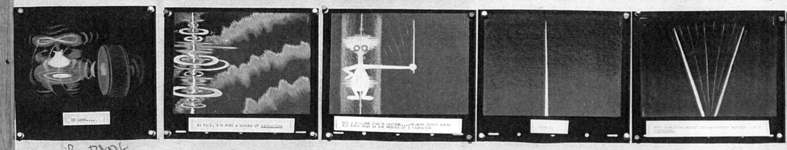
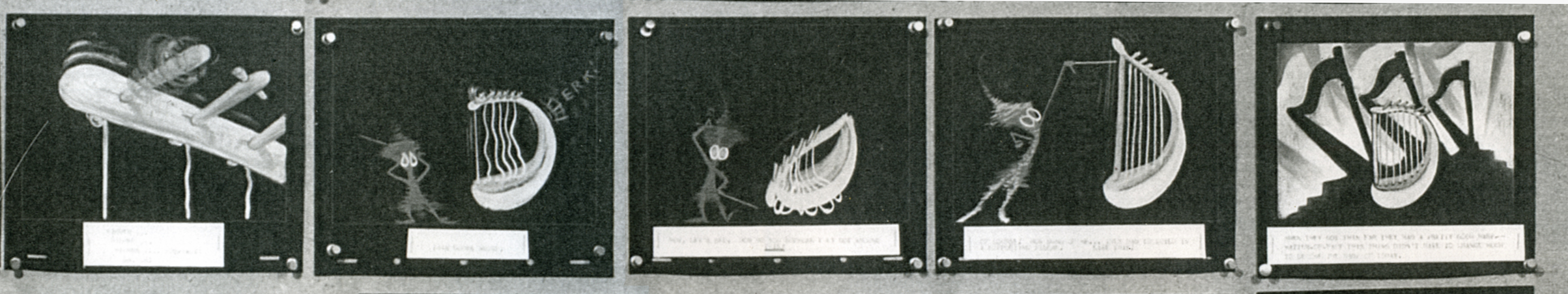
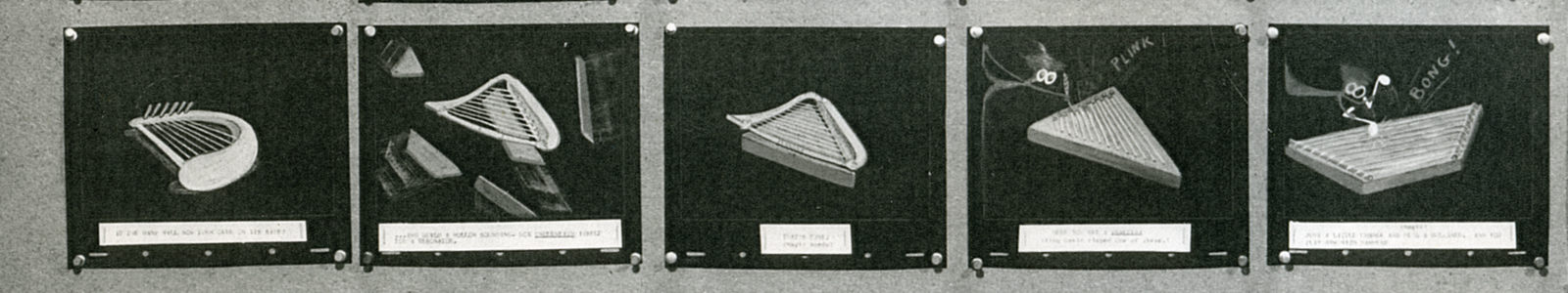
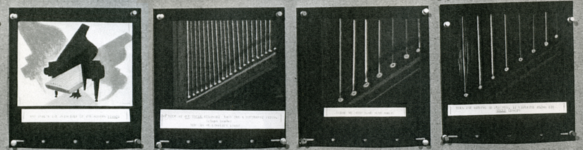
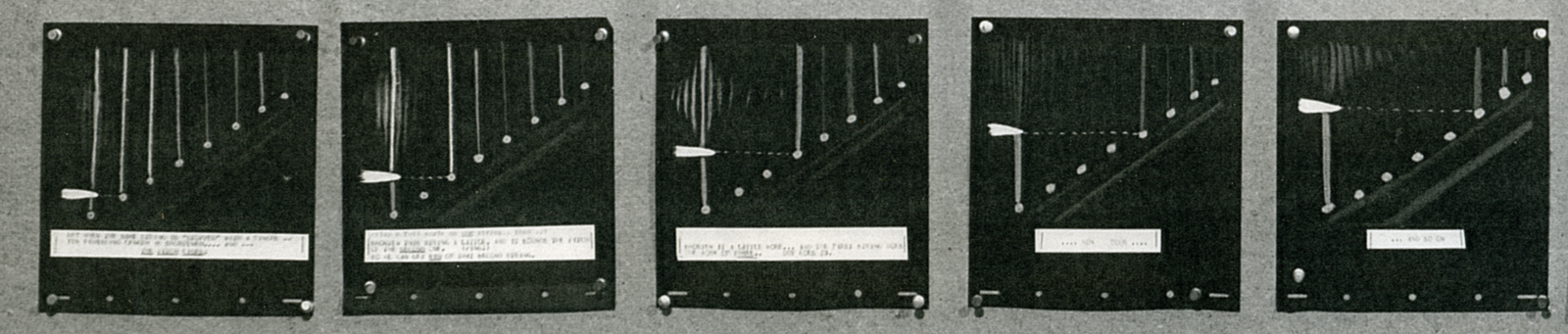
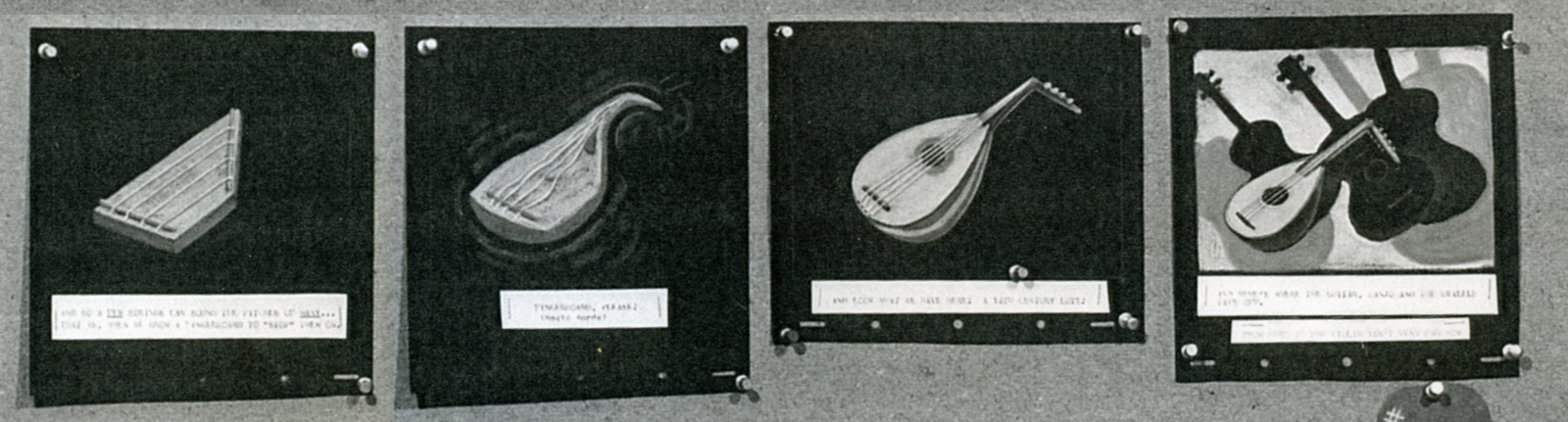
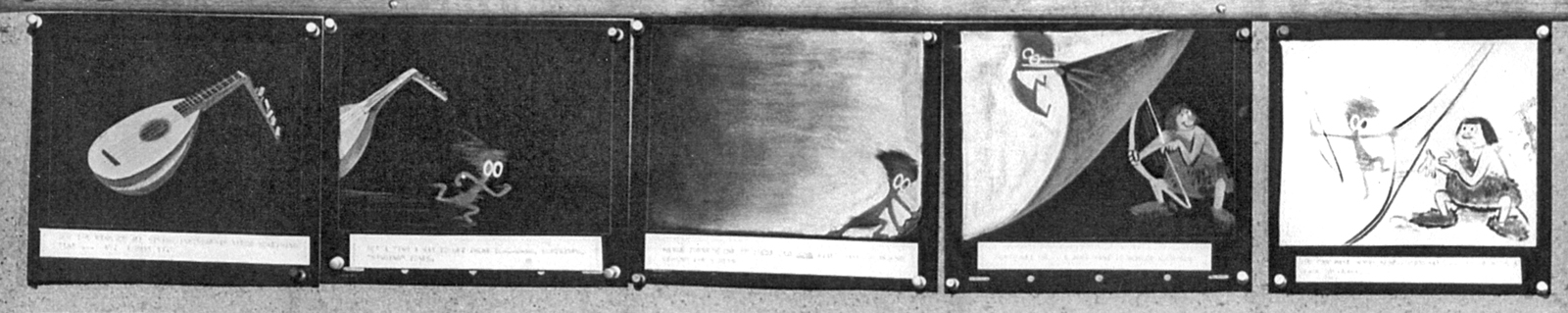
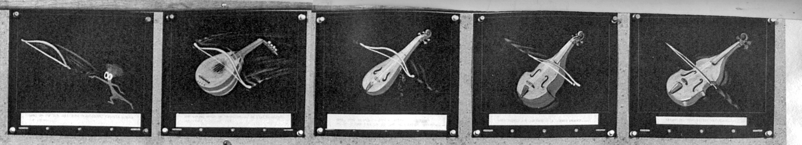
Animation Artifacts &Disney &John Canemaker &Story & Storyboards 02 Jul 2012 04:43 am
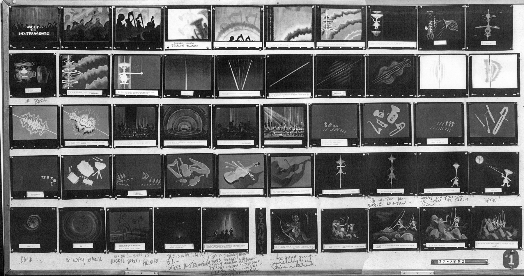
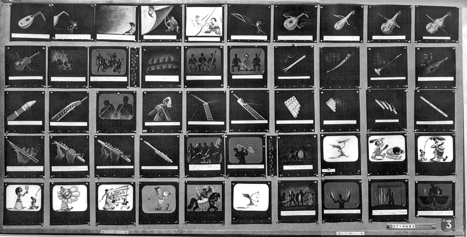
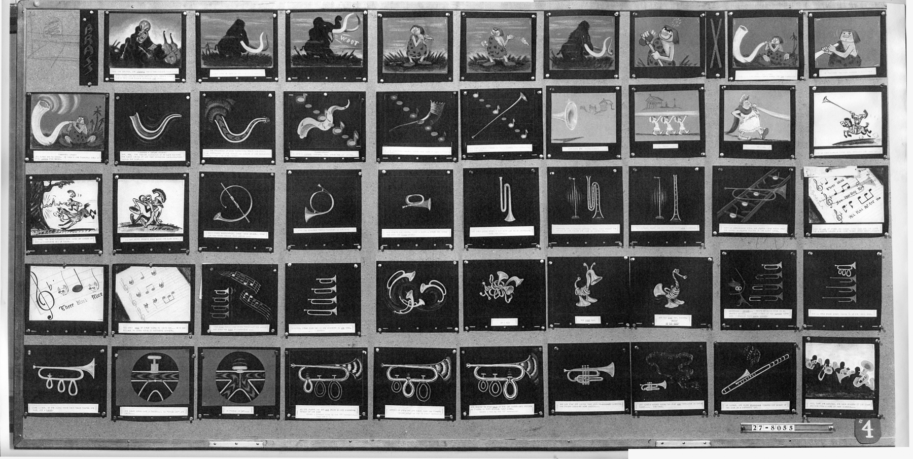
Toot Bd – repost
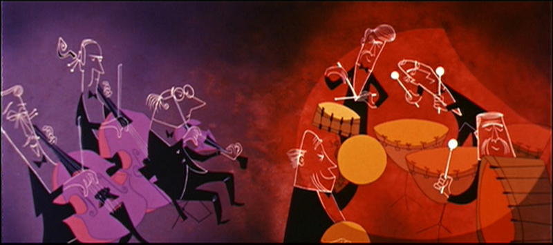
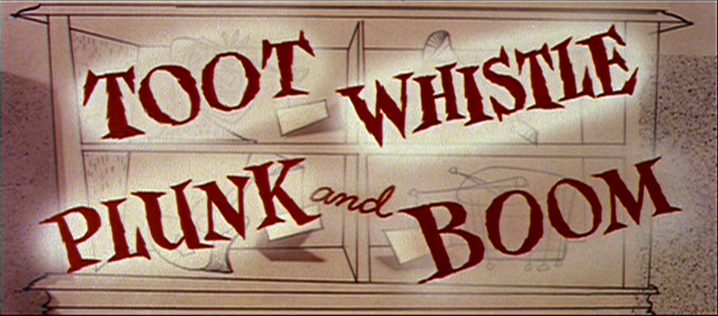 - Our Adventures in Music continue with the preliminary storyboard for what would ultimately become Toot Whistle Plunk & Boom. This is another board on loan from the archives of John Canemaker, and you can see the outgrowth from the prior film, Melody: Adventures in Music.
You can see how little of the magic was in this board, yet it obviously inspired others to keep it alive and make it work. Ward Kimball has to get most of the credit, though designs by Tom Oreb, Ken O’Connor, Eyvind Earle and Victor Haboush sure brought it to life.
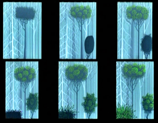
The material I’m posting here is on large photostat copies. The problem is that the images are a bit fuzzy, and the text beneath the boards is illegible. In some cases, the appropriate text has been hand written on the copies themselves.
 1
1
 2
2
(Click any image to enlarge.)
4
5
These are breakdowns of each row of the boards so that the images can be made as large as possible. Each row of images is split in two and labelled accordingly. #31a means Board 3 row 1 part a.
 11a
11a
 11b
11b
 12a
12a
 12b
12b
 13a
13a
 13b
13b
 14a
14a
 14b
14b
 15a
15a
 15b
15b
 21a
21a
 21b
21b
 22a
22a
 22b
22b
 23a
23a
 23b
23b
 24a
24a
 24b
24b
 25a
25a
 25b
25b
 31a
31a
 31b
31b
 32a
32a
 32b
32b
 33a
33a
 33b
33b
 34a
34a
 34b
34b
 35a
35a
Finally, something familiar.
 35b
35b
Ward Jenkins has posted some beautiful frame grabs from the completed film. Go here.
See this short on YouTube here.
John Canemaker deserves all the kudos he gets for lending this material to me as well as plenty more that he’s loaned this blog.
Commentary 25 Feb 2012 07:25 am
Cracks, Quips and Crits
- Today in Hollywood, the Animation Guild, ASIFA-Hollywood and Women In Animation will present “An Afternoon of Remembrance,” a celebration of some of those from our animation community who died in the past year. Among those scheduled to be remembered include a number of East Coast artists as well as several Independent animators.
Karen Aqua, Jordan Belson, Robert Breer, Vincent Cafarelli, Don Christiansen, Cornelius “Corny†Cole, Del Connell, Ray Dieter, Norm Gottfredson, Bill Justice, Earl Kress, Dorse Lanpher, Dwayne McDuffie, Dan Mills, Barney Posner, Hal Silvermintz, Paul Somner and others will be brought to a small communal closure.
I couldn’t praise the three organizations any more for doing such important work for the community. It’s a very sad event, but one that is an absolute necessity given the rising ages of many of our forbears. I only wish that I were in Hollywood to be able to attend such an event and to honor some of those veterans that came before us.
The Afternoon of Remembrance is free of charge and is open to all.
No RSVPs necessary.
Food and refreshments, 12 noon, Memoriams, 1 pm.
The Hollywood Heritage Museum (Lasky-DeMille Barn)
2100 N. Highland Ave. (across from Hollywood Bowl) in Hollywood, California.
The brilliantly talented Jeff Scher has posted a new advert he’s done for the latest Ann Arbor FIlm Festival. The ad, itself, should win the film festival’s top prize, if you ask me. Once again, Scher works with the very talented composer, Shay Lynch, who’s take a rock turn for the music to the spot. Hi energy for 30 secs. Worth watching a number of times.
 – There’s a lot of dirt being thrown about the Disney studio of late and the source of it all seems to be pointed at Andrew Stanton‘s live action film debut. John Carter of Earth, is the source of all the trouble. An article in The Beast reveals a lot when it talks about Disney Chairman Rich Ross‘ job being in trouble for the ever expanding $250 million budget.
- John Carter is . . . the kind of cautionary tale that keeps studio chiefs popping Ambien at night: a vanity project with sky-high expectations and a humongous budget* that now seems destined to land with a massive thud at the box office—unless it can somehow rake in more than $400 million to break even. In other words, it’s the kind of movie that causes heads to roll.
Stanton has denied that the budget had reached a quarter of a million dollars, but Disney seems to be stating that that’s the case. Everyone at Disney points to the film as a failure and they’re all expecting to see heads roll. Let’s hope there will be room for Stanton to get back into animation. I’m sure Pixar will be looking to do another Finding Nemo eventually.
Nothing in the trailers I’ve seen has made me excited about seeing this film, and of course I’m not being fair. However, the multiple computerized crowd scenes just reminds me of schlocky The Mummy Returns kind of thing, but this film doesn’t even have a Brendan Fraser at the center of the movie. Even that wouldn’t be enough for me to tolerate one of these overblown Hollywood epics that are never very epic – just loud. But, as I say, I might be wrong and will reserve my last judgment until I see it. I’m just not looking forward to it.
I still would have liked to have seen what Bob Clampett
would have done with this way back when.
Oh well, dreams of a rarebit fiend.
____________________
Executive Shuffle
- After Rango reaped a giddy success for Paramount Pictures, the movie company decided to set up their own Animation division. They put executive, David Swainton, in charge and they were off to the movies. Or so one would have presumed. Now Variety reports that Swainton, just four months into the job, has quit his post “for personal reasons/” Although Paramount had wanted to turn out one film a year beginning in 2014. As Variety writes:
- “At the time, the news was seen in part as a negotiating tactic with DWA, whose distribution deal with Paramount was set to expire at the end of 2012. Both parties asserted that the division would have no affect on negotiations — which weren’t even supposed to begin until early 2012. But sources outside the studio saw the initiative as leverage that Paramount could bring to the table.
“Though no film has yet been slated for release, studio has said several viable projects are in the works, including an adaptation of the graphic novel “New Kid.”
Paramount Motion Picture Group prexy Adam Goodman will take charge of the animation development team.
Fleischer Multiplane
- Looking back to Paramount Pictures animation division in 1938, Nicholas John
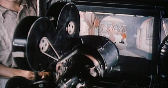 Pozega posts on his blog, Classic Cartoon Reviews, a number of screen grabs showing Max Fleischer and his 3-D setback animation camera.
The images are sharp, informative, and worth a look. Mr. Pozega pulled them from a “Popular Science” reel on the DVD “Popeye the Sailor: 1938-1940″. If you continue to scroll down on his blog there are also other newsprint images of the camera.
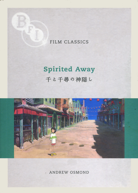
Spirited Away : BFI Monograph
 - After seeing The Secret World of Arrietty, I really got into the Miyazaki mode and have dug into a DVD set I own of his features up to including Spirited Away. They’re all in Japanese with English and/or Chinese subtitles, so there’s some purity in the viewing.
However, I’ve also been reading a wonderful monograph written by Andrew Osmond in 2008, Film Classics: Spirited Away. I raced through this book and have gone back to the front and am reading it again. It’s a very open-minded reading of the film taking in many of the negative critiques that came with the film and addressing some of them quite well. I’ve gotten quite a bit out of the book and wish Mr. Osmond had done similar works for other Miyazaki films. I’ll have to reread his 100 Animated Feature Films again. I wasn’t very positive about the book when I originally commented on it, in that I didn’t quite understand the reasoning behind the selection of titles chosen for that book. However, Mr. Osmond writes with such strength and self-confidence that he covers a lot of good territory. I’ll have to see if I think differently this time out.
I do recommend the BFI monograph, Film Classics: Spirited Away, though. It can be picked up a Amazon, of course.
A Beauty Awakens
Hans Perk on his excellent site, A Film LA, has shown us another side to the development of Disney’s feature, Sleeping Beauty. For the most part, we’re accustomed to the noble and stylized images from the hand of Eyvind Earle, the stylist who ultimately dominated that feature and made it the film we all know and cherish. However, Hans features some preliminary art by Danish illustrator, Kay Nielsen. Nielsen died in 1957 during the production of the feature.
To date only the one illustration he’d done, which appeared in John Canemaker‘s book, Before the Animation Begins, had come to light. Now Hans introduces us to more of this art which has recently come to light.
This website is one of my favorites. A great resource if there was one.
Books &Disney &Illustration &repeated posts 12 Jan 2012 06:45 am
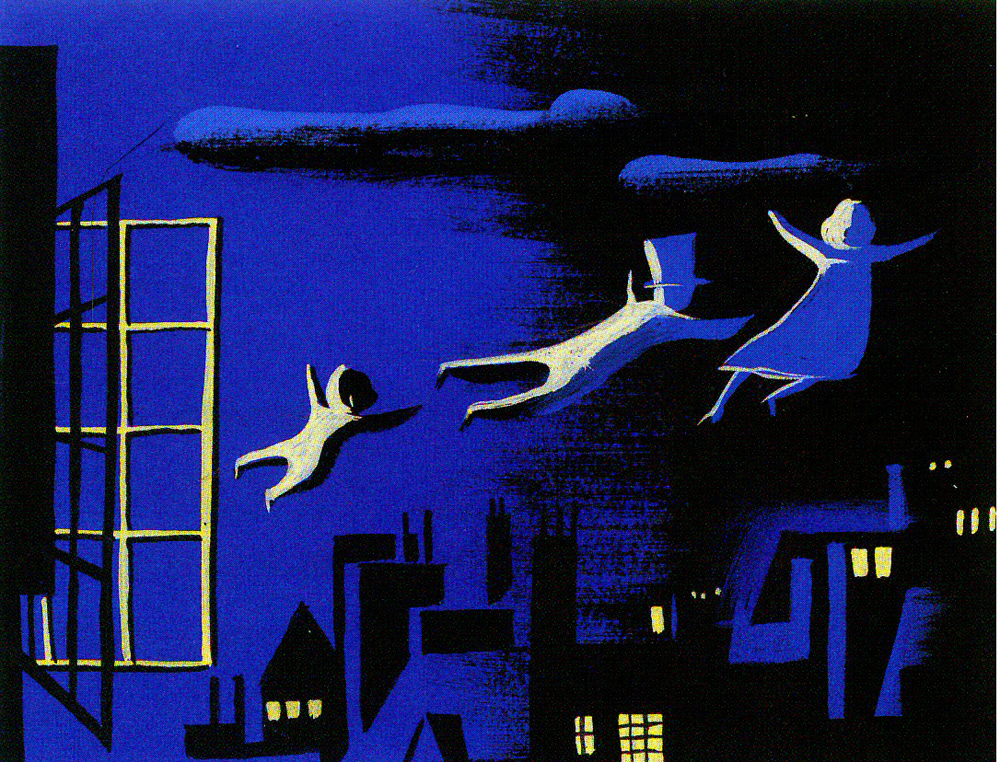
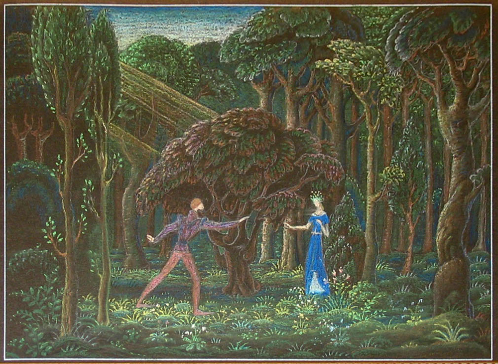
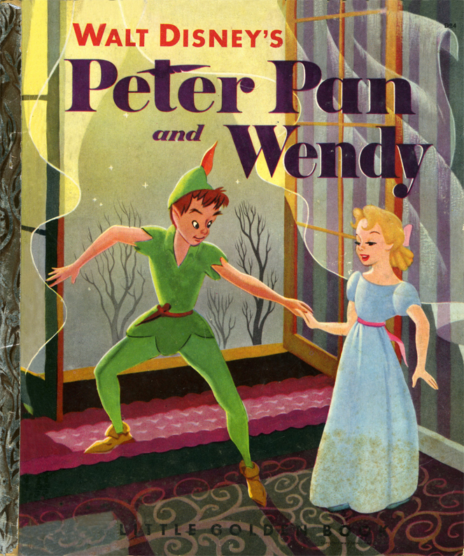
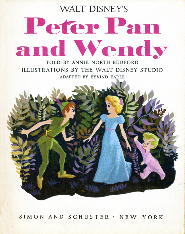
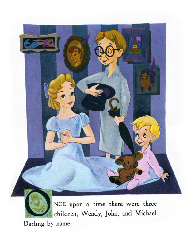
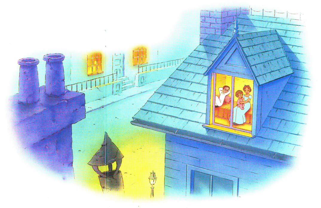
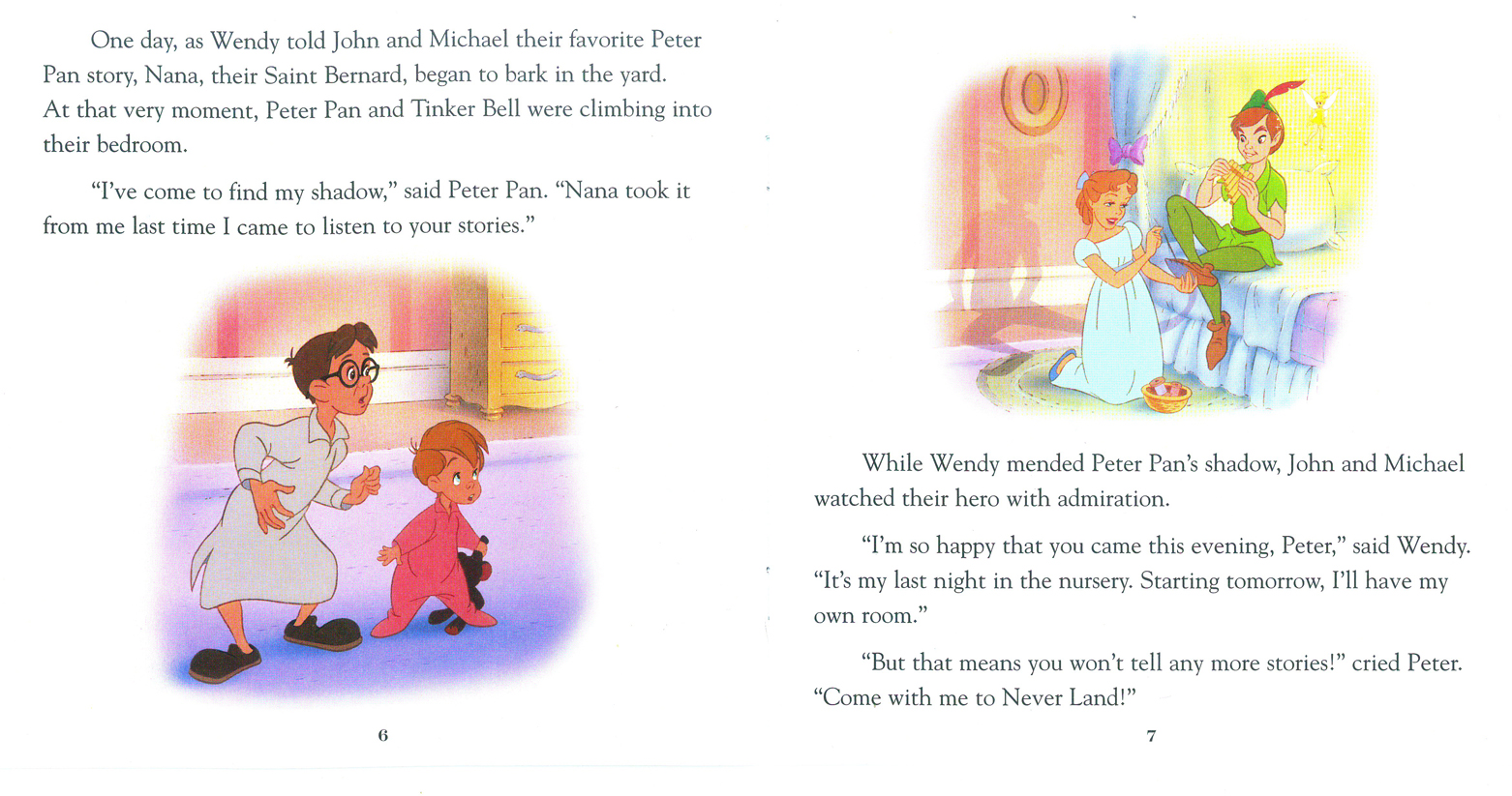
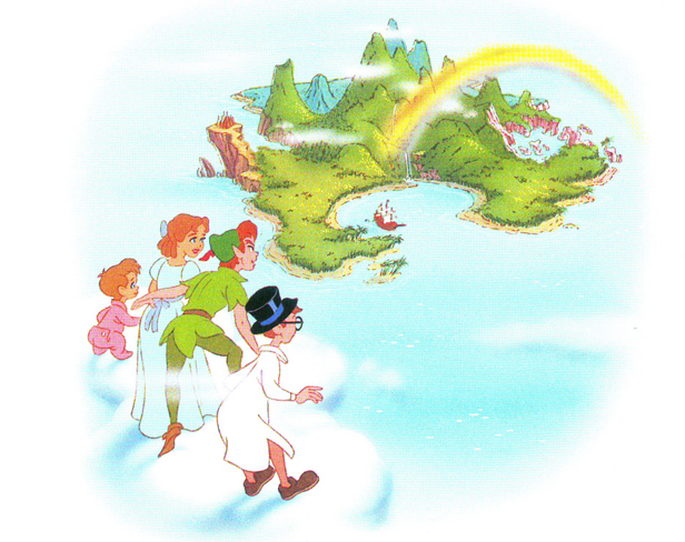
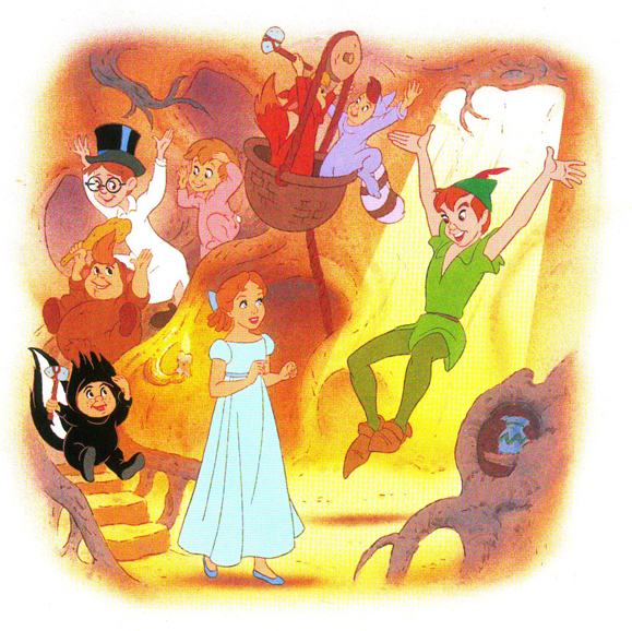
Eyvind Earle – Peter and Wendy
Back in 2007, I posted this piece on Eyvind Earle’s Peter Pan illustrations. I’ve combined the two parts and repost it here.
 – I’m an Eyvind Earle fan. I have been ever since getting my hands on Bob Thomas‘ original version of The Art of Animation (1959), which promoted Sleeping Beauty and its artwork, and then going up to Radio City Music Hall to see the first theatrical run of the film.
After the Disney film, I saw Earle’s Nativity film on the Tennessee Ernie Ford show and Paul Bunyan and other Disney shorts of the period made me more of a fan.
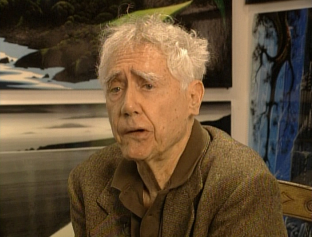
I got to meet the man thanks to Michael Barrier. We had one of the craziest interviews ever when we drove upstate to his house and sat in a somewhat darkening room as the afternoon dimmed and Earle continued to quietly answer the questions.
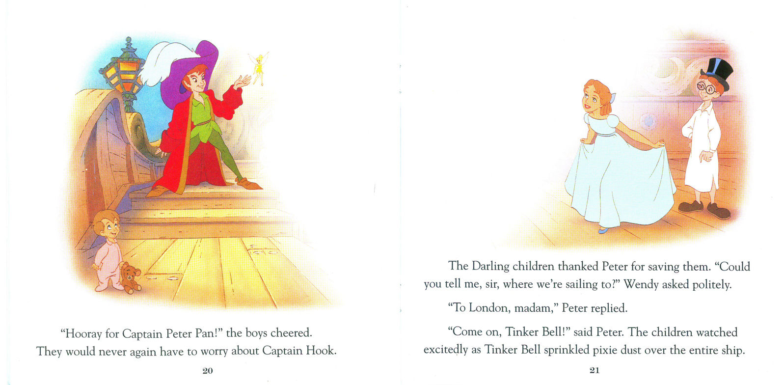
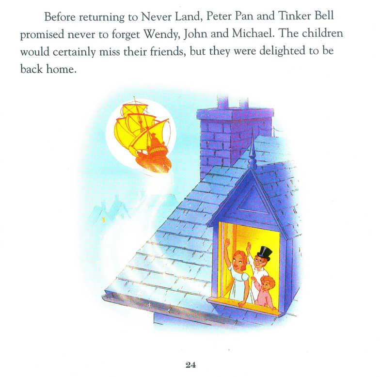
I loved that day, but I loved Earle’s work even more. After posting Retta Scott‘s Golden Book of Cinderella, I realized that I had this book, Peter and Wendy, which is Earle’s odd adaptation of Peter Pan. He’s obviously in love with Cinemascope in that most of the book’s illustrations are two-page spreads. Sort of wide screen proportions. This is unusual for a Little Golden Book.
The images look a bit like the backgrounds in Paul Bunyan, and the characters are not quite on model with the film. The printing, as with most of these books, is pretty dull. You know a lot has been lost in the transfer.
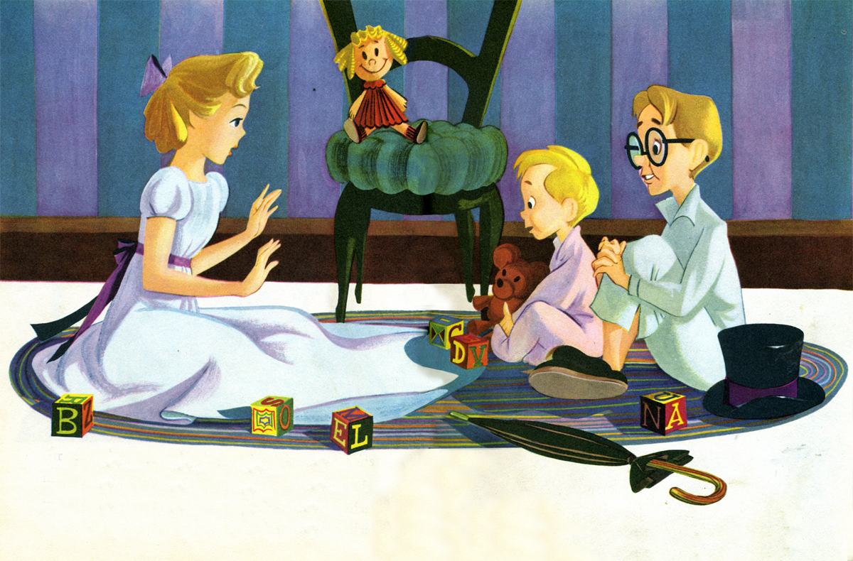
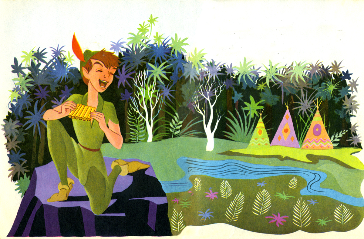
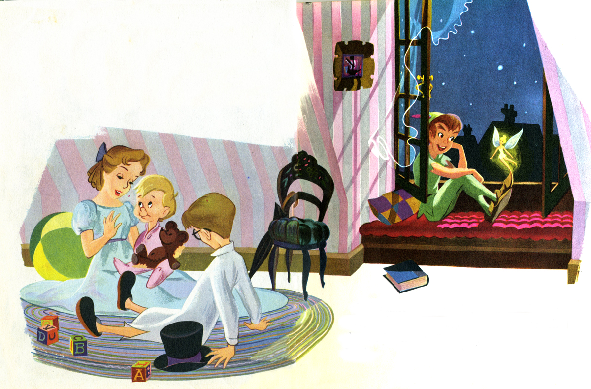
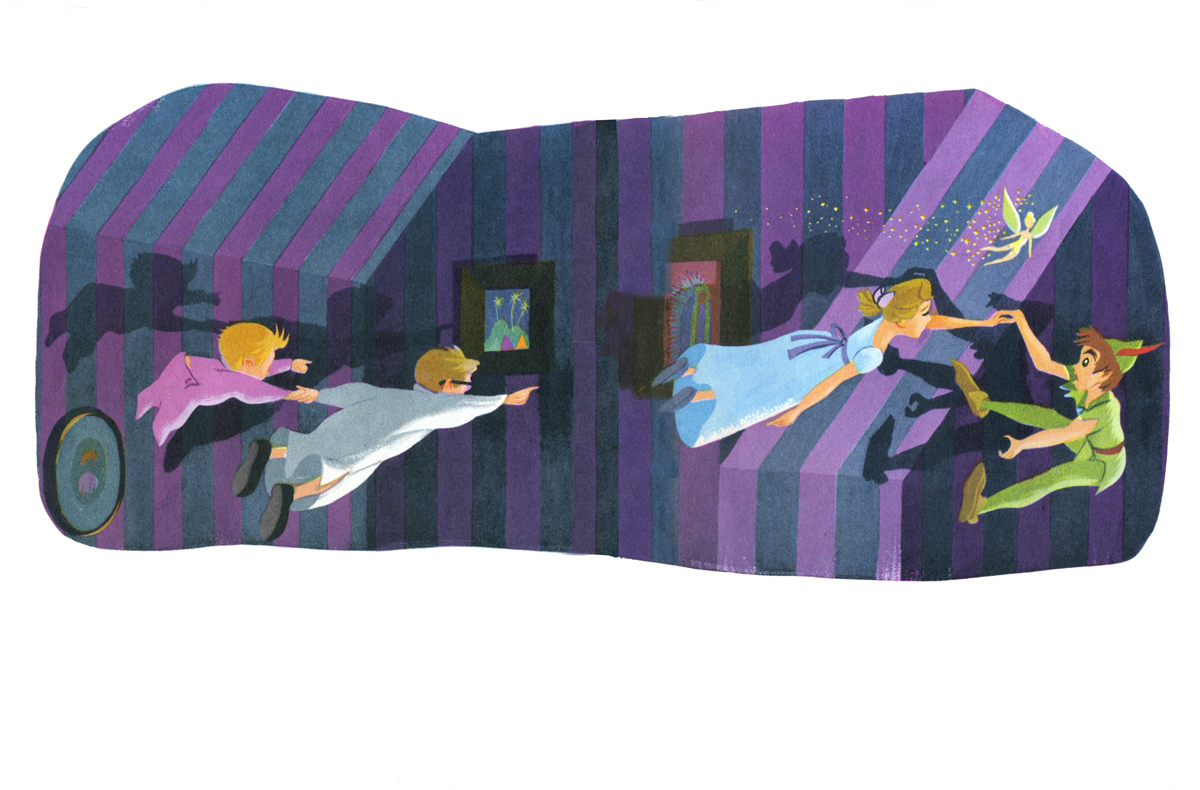

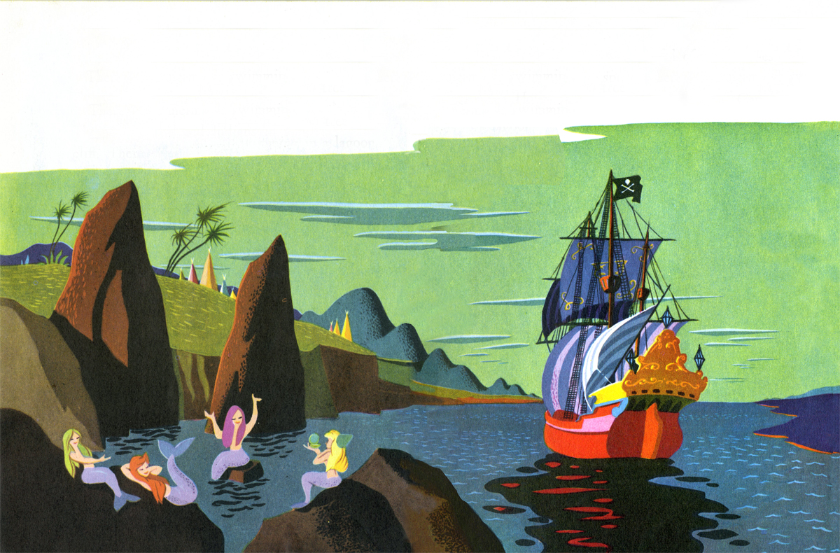
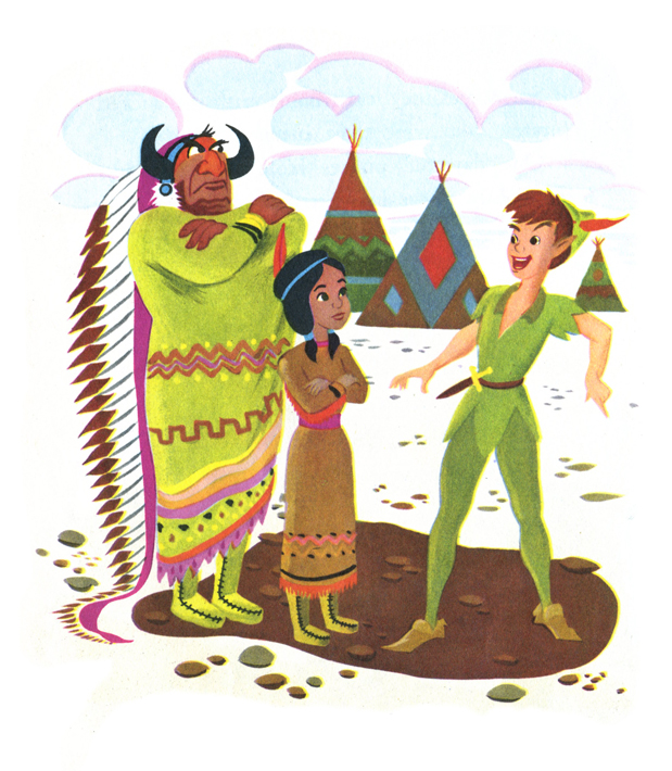
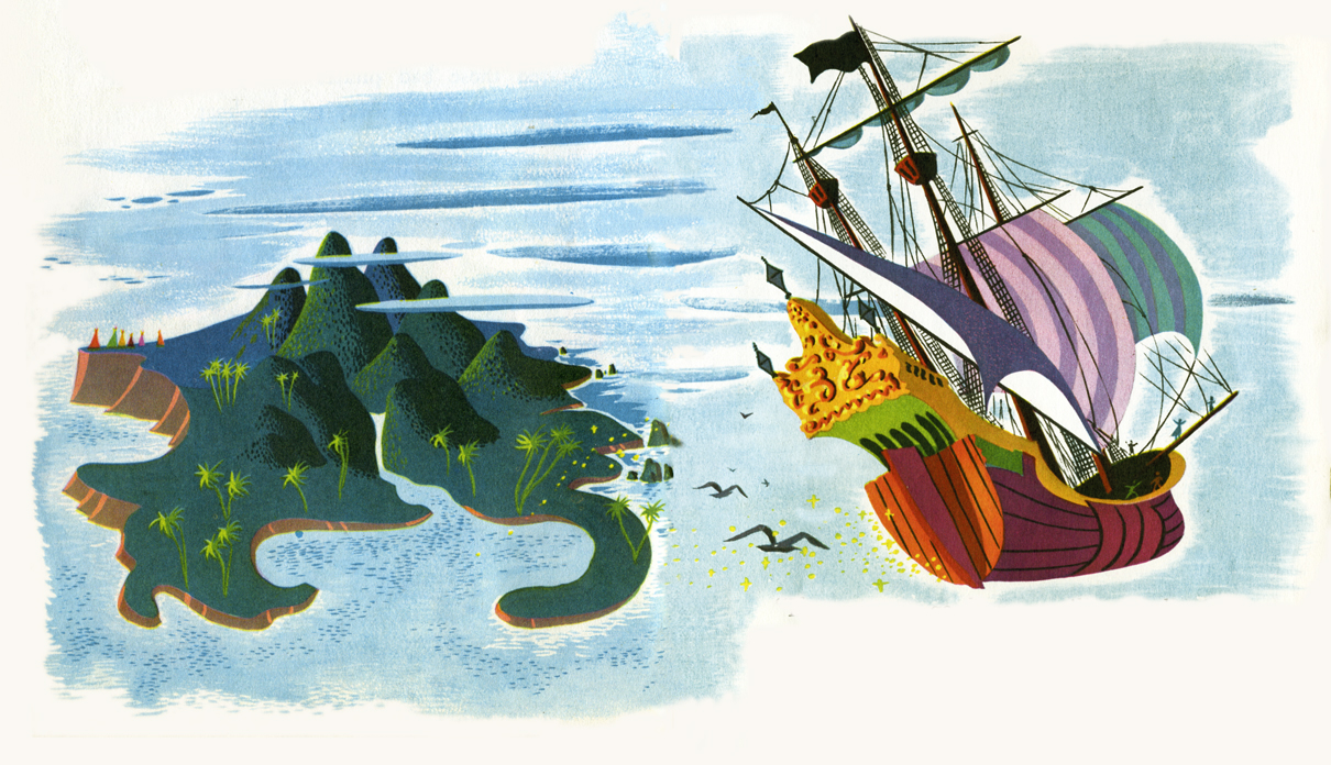
This last illustration is my favorite.
Commentary &Disney 18 Jun 2011 07:34 am
Sight Seeing
- This past week Jonna commented on this blog: I can only imagine how it would have been to see one of the classics at a theater (I was born in the 90’s). It would have been great fun if any of you told about a premiere or screening that you’ve attended (e.g. the first time you saw Sleeping Beauty or something).
So I thought of a couple of memories I have of seeing some of the classic Disney films theatrically for the first time. So kiddies gather round Gran’pa while he tells you a story.
 The first film I’d ever seen was Bambi. I don’t remember much about it, but I’m sure that the experience permeated my brain and sent me on a direction I could never return from. This is still one of my favorite classic Disney films. I’m not big on the cutesy aspects of the movie – specifically the “twitterpated” sequence, but I am big on everything else. Back in those days, there were often Surprise guests coming to the movie theaters to promote the shows. At this one particular event, to celebrate Christmas they drew back the curtain and had a pile of large gifts all wrapped in foil-colored gift wrap. Clarabelle the clown from the Howdy Doody Show was a special guest who was going to give out gifts to the boys and girls in the audience. He went through a short routine which ended with the supposed gift-hand-out. But it didn’t happen that way. Clarabelle took out his bottle of seltzer and started spraying the audience. The blustered theater manager called for the curtain to be closed, and that was that. Even at the age of 4 or 5, I knew we was robbed. No wonder I couldn’t remember much about Bambi.
 The second film I’d ever seen was Peter Pan. That would have been for the 1953 theatrical release. My father took me to one of those large movie palaces in upper Manhattan, the Loew’s 181st Street. I remember it playing with a film about a jungle cat of some kind; I’ve always remembered this as The Black Cat, but that title isn’t right. So I obviously don’t remember the title of the film, a B&W scary movie.
Re the animated feature, I remember most the swirls of color of Pan and gang flying; I don’t remember much else about it from that initial introduction. I was absolutely enamored with the moviegoing experience from The Black Cat to the brilliant cartoon. Remember, I was only 6 or 7 years old, at the time.
In 1955, I was in charge of about five kids (a couple of siblings and a couple of cousins) going to a local theater to see the NY premiere of Lady and the Tramp. Back then, it would cost 25 cents for a kid to get into the movies. When we’d gotten to the local movie theater for this film, they’d raised the price to 35 cents – more than our parents had allotted.
 Outside the theater we were counting up our monies and trying to figure out how much we’d need to get in and buy some candy or popcorn for all of us. Within seconds my cousin announced that she’d lost her money, and it was obvious there wasn’t going to be enough for refreshments. The cousin started crying loudly, bawling until the movie theater manager came up to ask what was the problem. She spluttered out the word that she couldn’t afford any candy now that she’d lost the money to get into the movie. The manager just reached into his pocket and gave me an additional dollar. Enough money for movie and candy and more importantly it stopped my cousin’s screaming.
Once inside the theater I ignored them – even though the cousins were badly behaved and squirmed about through most of the show. I liked the film so much that I made the whole group sit with me to watch it a second time. That big, wide Cinemascope screen. It was heaven.
We did this often back then. I remember another time going to see Pinocchio with my younger sister, Christine. We sat through Pinocchio three times before we left the movie theater. That meant we had to sit through the second feature (usually some live action dud) twice to get to the third showing of the cartoon. My sister reminds me often enough that when she turned around she’d seen that the theater was empty except for the two of us. The usher stood in the back giving us the evil eye.
Prior to Sleeping Beauty‘s release, I’d been doing some reading. I’d received Bob Thomas’ The Art of Animation the previous Christmas, and I read it over and over at least a hundred times. I memorized every still in that book and couldn’t wait to get my eyes on Sleeping Beauty.
The film opened at Radio City Music Hall, and I was given permission to make one of my first trips downtown to see the film. An hour subway ride for a 12 year old. I went into this largest of movie theaters in the City, and I picked a great seat. The audience wasn’t overflowing; the show wasn’t sold out. But it was BIG.
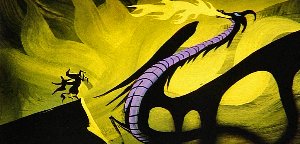
The screen is enormous in that theater, and Sleeping Beauty was made to fill such a screen, especially in its Technirama debut. But somehow I came out of the theater disappointed. I don’t know what had gotten into me. I don’t remember any reason for disliking it. As a matter of fact, I absolutely love the film now. Those Eyvind Earle settings; the great animation of Maleficent; the dragon fight. There’s just a million reasons I have for loving it, but something about that first viewing left me cold. And I remember trying to analyze, at the time, what I thought was missing from the experience. I had no answer.
I’ve seen all of the pre-cgi Disney films in theaters. I also remember all the experiences of sitting through them. Dumbo and Alice In Wonderland were the only two that I saw on TV first. They were both special presentations on the Disneyland show. Eventually, I’d see them both in theaters at special screenings.
Of all of them, Dumbo still stands as my favorite though in a close tie to Snow White. There’s something they both have that goes beyond the brilliant animation and the graphics on screen. There’s an emotion there that they both have, not quite an innocence but more like a daring. Without consciously saying it, you felt the Disney people were shouting, “Look what we can do!” And they did do it. (By the time they did Fantasia, they were too conscious of what they could and had done, and they’d lost it – for me.)
 Eddie Fitzgerald is either a genius or a real-life looney toon – who I treasure. Probably, I think both; he’s at least an original. His blog is like no other in that he gives us real deep rooted comedy that makes you laugh aloud. He puts together these photo-montage storyboards creating a wacky movie that you just gotta keep reading, and when he’s on the mark, there’s nothing short of brilliance.
Bob Clampett did a wacky WB short called The Lone Stranger and Porky. Obviously, it was a parody of the big radio show of the time, The Lone Ranger. Well, Eddie takes off on that parody and does Clampett one better. It’s crazy and hilarious and you have to check it out (if you haven’t already.) The Lone Stranger (Parody) via photomontage.
Someone should finance this guy to make a real movie. This artwork would take cgi in a direction that hasn’t been considered before. Maybe then they’d have the first REAL animated cgi film instead of all these cutesy viewmaster things we get.
 Last week I started a new series that I hope will go on forever. I’ve been interviewing Independent animators, the ones who are trying to make artful animation on their own. They don’t have the dollars that a Dreamworks would, but they’re using all of their resources to make movies that have something to say.
The first post was an interview with George Griffin, who has been something of an inspiration to me. Upcoming this Tuesday will be an in depth look at the amazing career of Kathy Rose. She takes animation, mixes it with dance and Performance Art and comes out with amazingly original work. I’m having a good time putting these pieces together, and there are so many who deserve the attention.
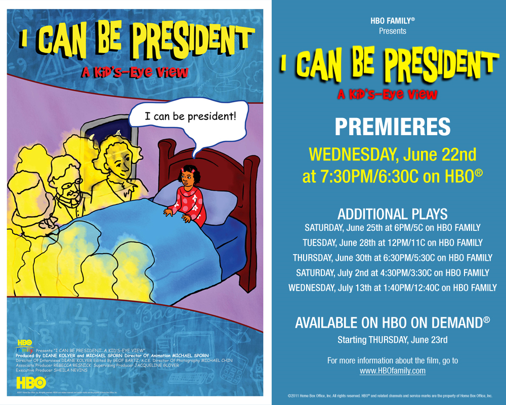
- I have one last bit of self-aggrandizement to post. THis coming Wednesday, June 22nd, HBO will premiere the latest Special we’ve done for them. (Notice how I date myself by calling it a “Special”. That’s what they were called when I was younger. These days I only know the industry word for them, “one offs”. I don’t like to think of my show as a “one off”; it’s a Special.)
The show is about half animated; the other half consists of kids saying the wackiest things. It’s fun. So there you go.
Books &Commentary 24 Mar 2011 07:15 am
Disney books
- Lately, Disney’s book divisions have done some wonderful work. The Archive series: Animation, Story, Design and soon to come Layout & Bg are all stunningly attractive books. These are top of the line items from Disney Editions. John Canemaker‘s Two Guys Named Joe also comes from the same division, and it’s a beautifully designed and attractively produced book.
But what about the lower end of the Disney Publishing empire? In the bygone days the animated features would be made into Little Golden Books utilizing artists from the studio. Mary Blair, Al Dempster, Bill Peet, and Eyvind Earle all contributed to books for the Western Publishing offshoot. Today there are still some Little Golden Books being made from Disney material. The Pixar product, such as Toy Story and Wall-E, as well the Disney Princesses and The Princess and the Frog all have editions.
However, I came upon something even lower down the pipeline. Here are three books that were produced for Walgreen’s pharmacy megastores. Heidi bought them 3 for $3.98. None of the books gives a hint of illustrator or writer. The illustrations, on a very cursory glance, look as though they might have been frame grabs pulled from the movies.
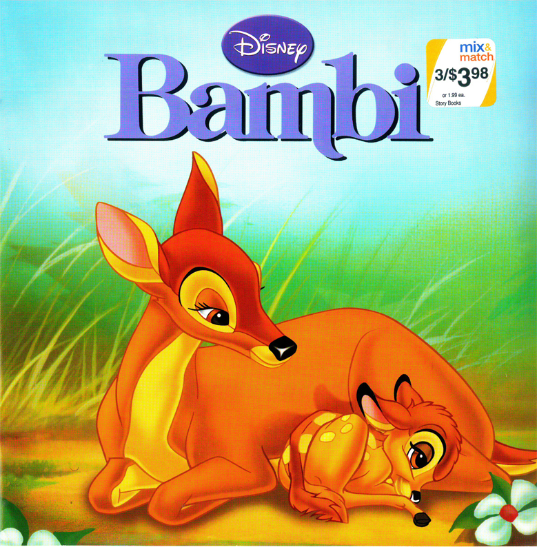
Bambi’s cover. It’s a nice watercolor evocative of the film. Though one
wonders why they played with the logo’s type. The “m” now has a
little swoosh on its lower right. Not part of any other version of this title.
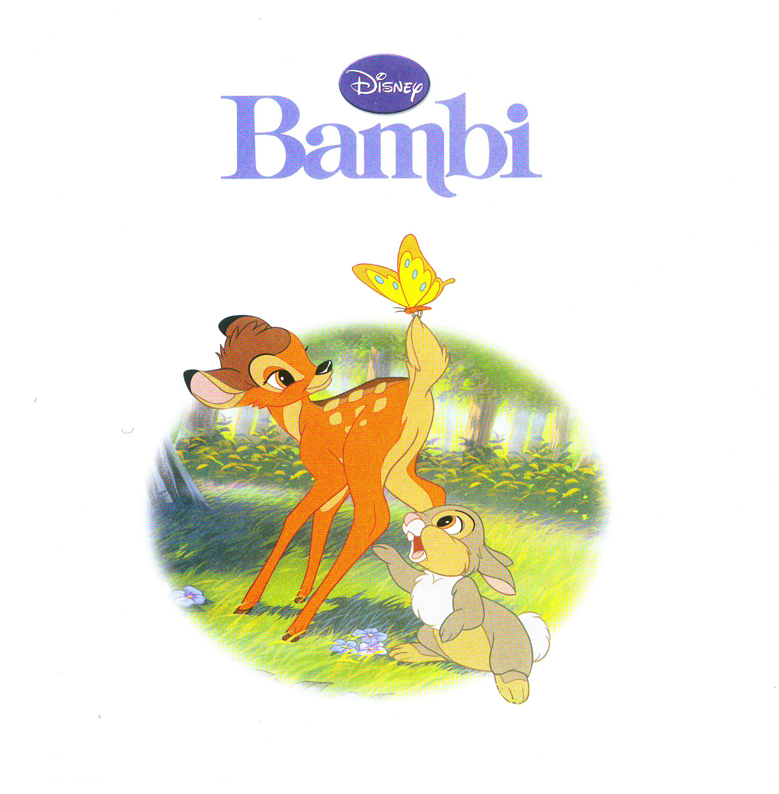
Our first interior illustration looks like it might
have been a frame grab from the film, itself.
This tries hard to look like it might have come from the film.
But all the characters are moved around differently.
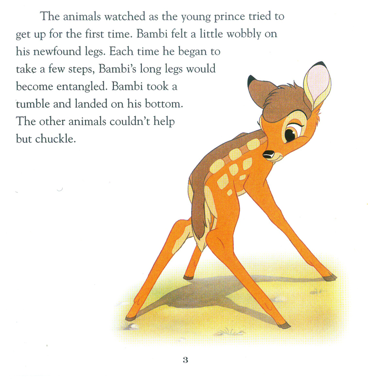
They do a nice job of layout using this iconic image against the type.
Looking at this book, I’m amazed how many well-know still images there
are in the original feature. Those old guys knew what they were doing.
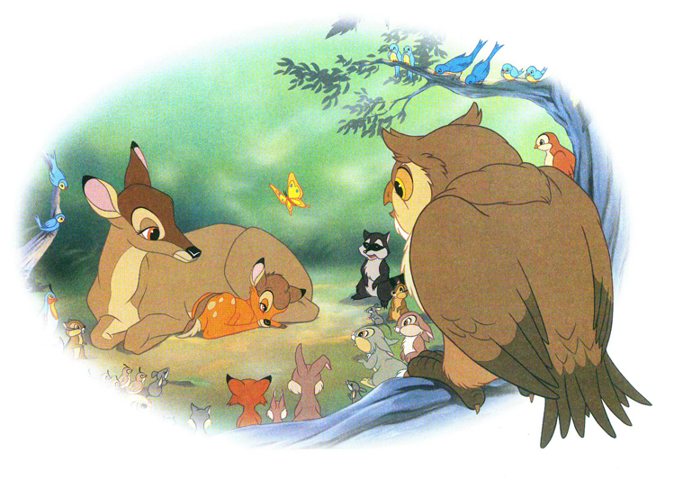
Here are a couple of double page spreads. I like the way they
handle them in these books. You can see that there is a plan.
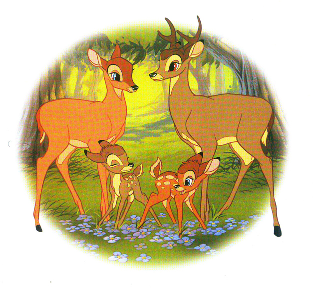
By now, the illustrations look more like Bambi 2 than the original.
The characters were obviously done on separate levels. Notice the
mother’s leg doesn’t match the background. She’s out of place.
Something you might have seen back in the days with the use of cels.
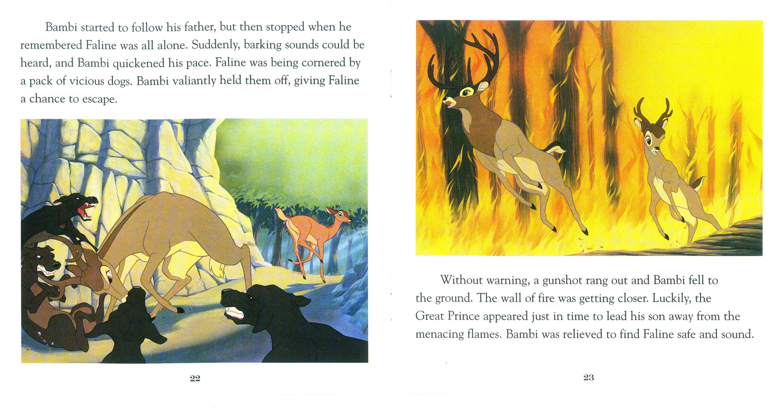
Two pages covers the climax of the film, Faline’s encounter
with the dogs and the fire rates one illustration.
The final illustration takes us into “Bambi’s Children” and
has nothing to do with the original film, anymore.
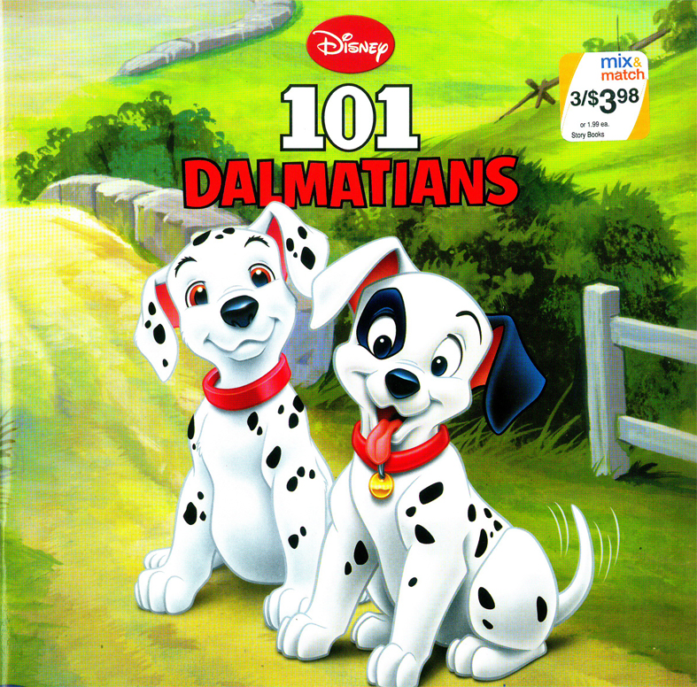
Peter Pan
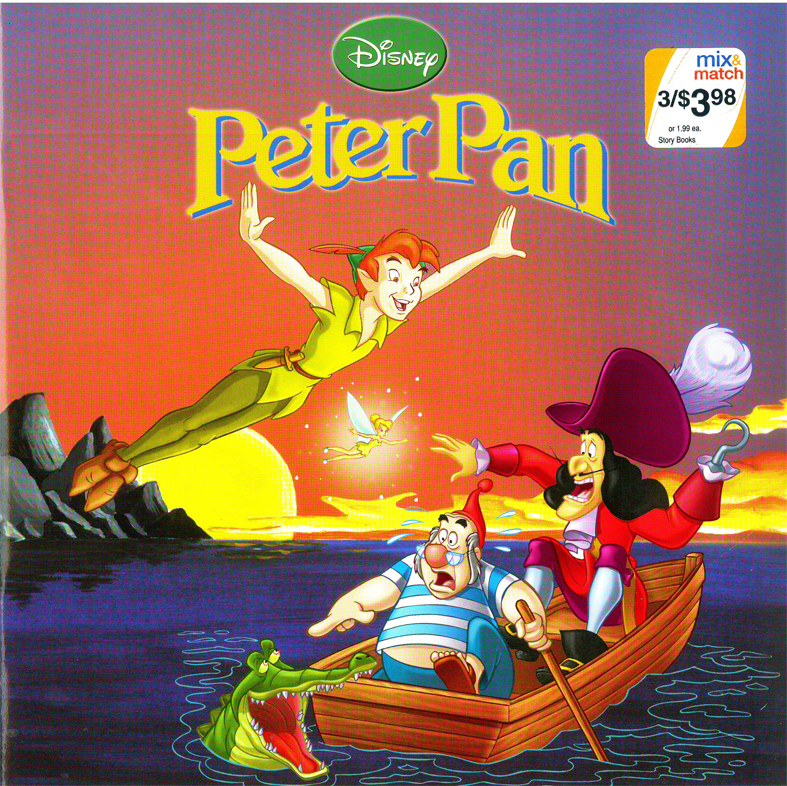
Peter Pan gets off to a bad start with a RED cover
and an action illustration. Not quite the film.
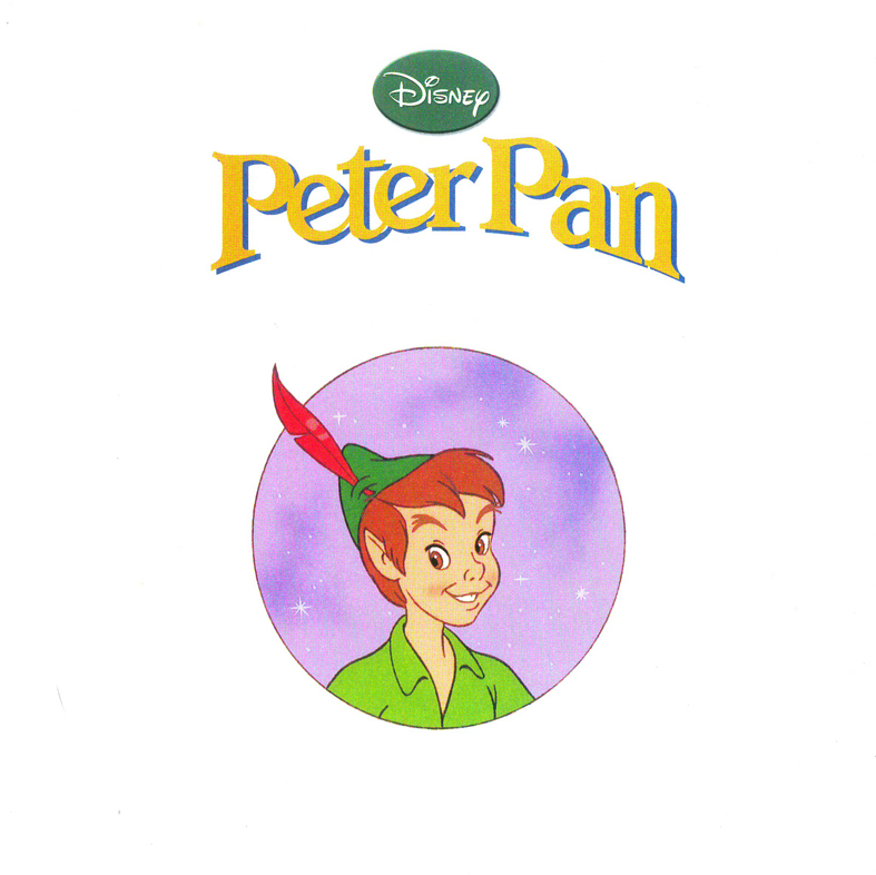
Get to the title page, and Peter is WAY off model.
Oh well.
When I think of that beautiful opening shot in the film, it isn’t
quite this. I’m afraid, the Bambi book will be the best of the lot.
The double-page spreads do still play a bit with the form.
Not much magic left in this Neverland.
Some nice action.
Most of the book is done in Long Shots. I’d say that’s
not the best choice for smallish illustrations. And the
airbrushed white is too opaque to work as a border; it
gets to look like a virus in the air.
The book is too much on the red side. Everything here is
violet and yellow. Not quite the colors invoked by the
orinal designers.
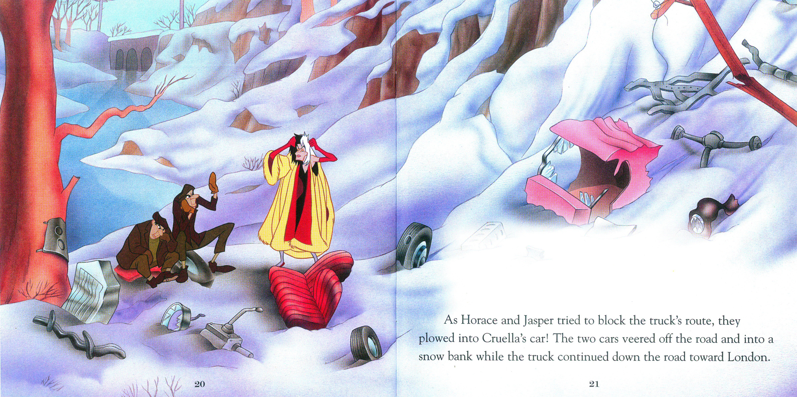
101 Dalmatians
Uh oh, we’re in trouble.
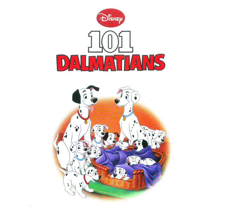
The title page makes for a good composition with bad colors.
The technique, using gouache starts to peek through.
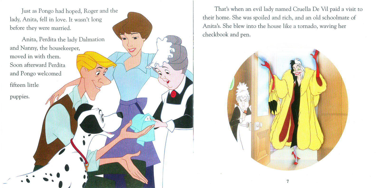
They’ve captured the pose and lost the film.
Where’s that beautiful cut-glass rose in the door?
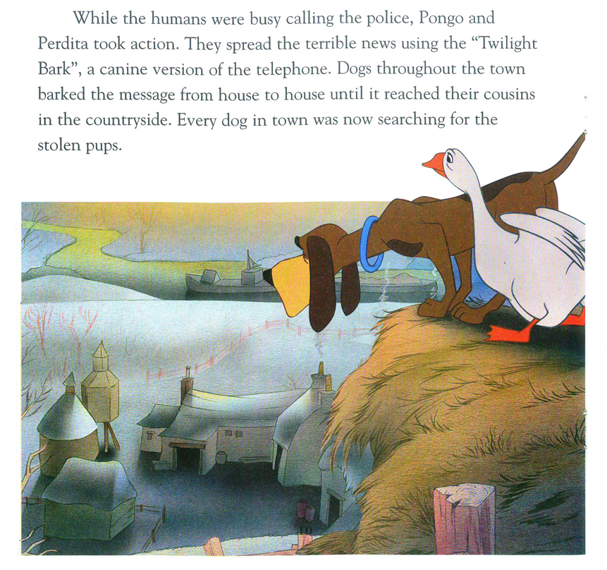
Too bad they’ve ignored the wonderful background styling
of Ken Anderson and the painting of Walt Peregoy.
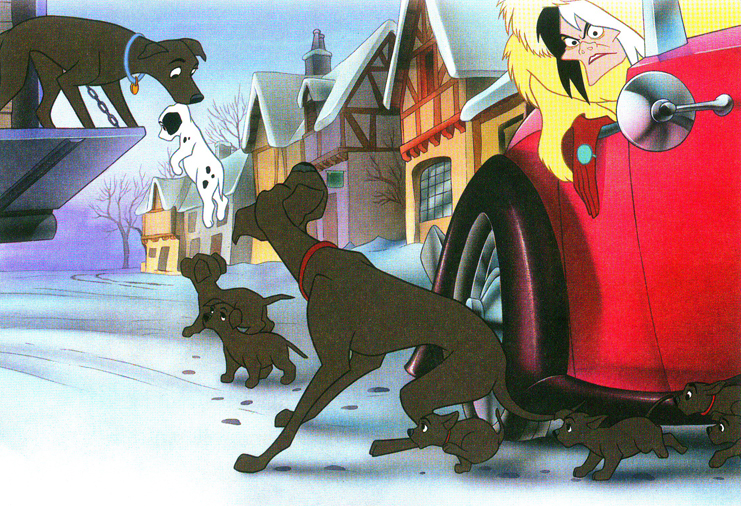
A lot of action. Not a bad image though Cruella’s been simplified.
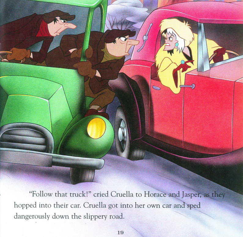
We’ve ignored the great design of the film and have gone to “storybook 2009″.
(The books were done in 2009.)
The two page spread makes use of its format, I have to say that.
Gone the xerographic look, this is how they end this book.
All in all, I’d have to say it’s probably not a bad deal for parents looking for cheap books to entertain their children. The Bambi book holds up nicely. Peter Pan wastes a great story and 101 Dalmatians works hard to reduce their story into a small book you’d buy in a drug store.
The art and delicacy of the Little Golden Books is gone. Take a look at this, or this, or this. They all varied wildly from the film, but with a sense of originality and design. These three Walgreen books all try doggedly to resemble the film while losing the artistry in the book.
