Search ResultsFor "eyvind earl"
Photos &repeated posts 23 Jan 2011 08:39 am
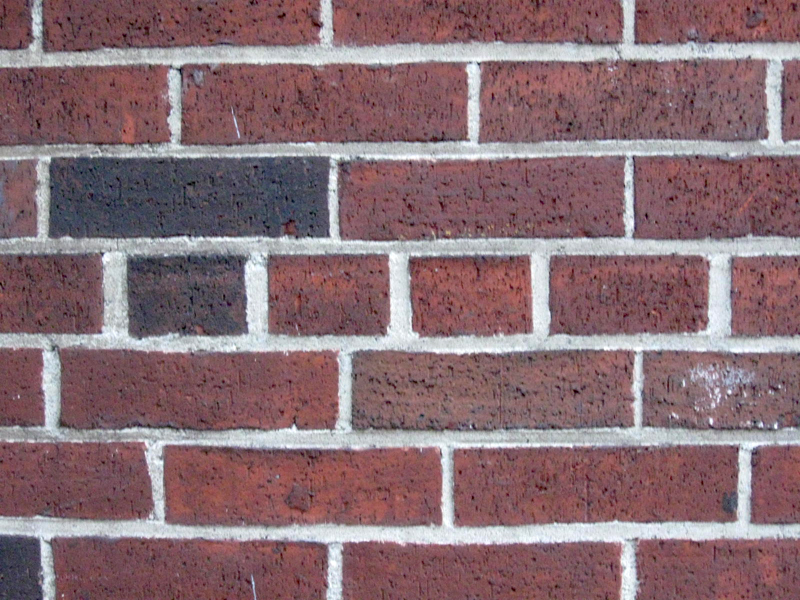
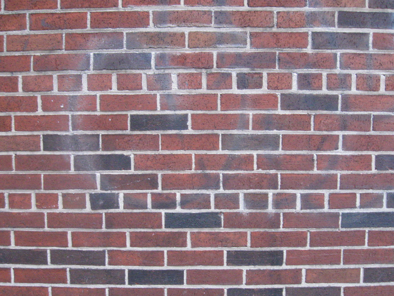
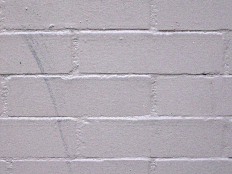
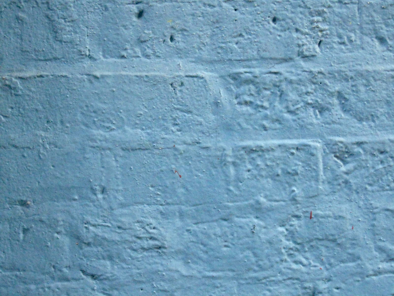
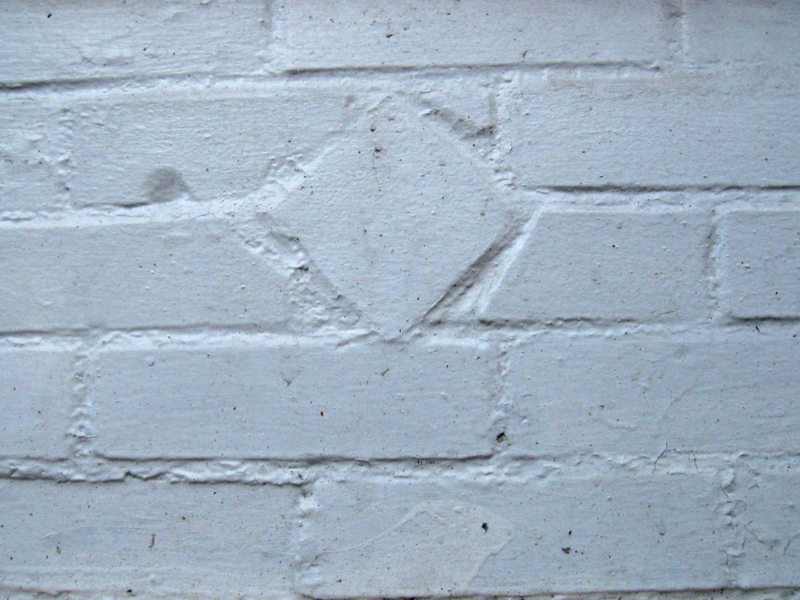
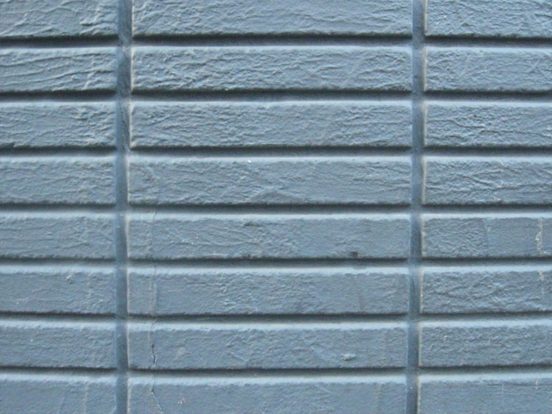
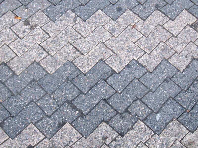
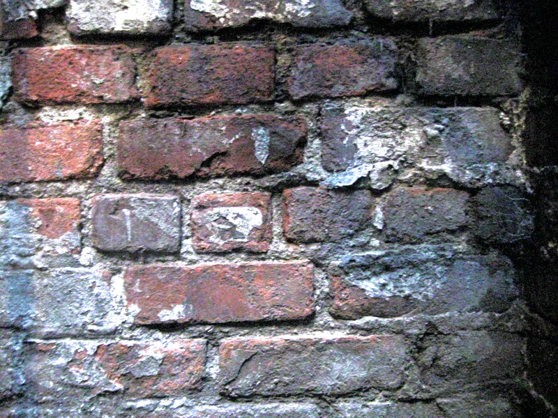
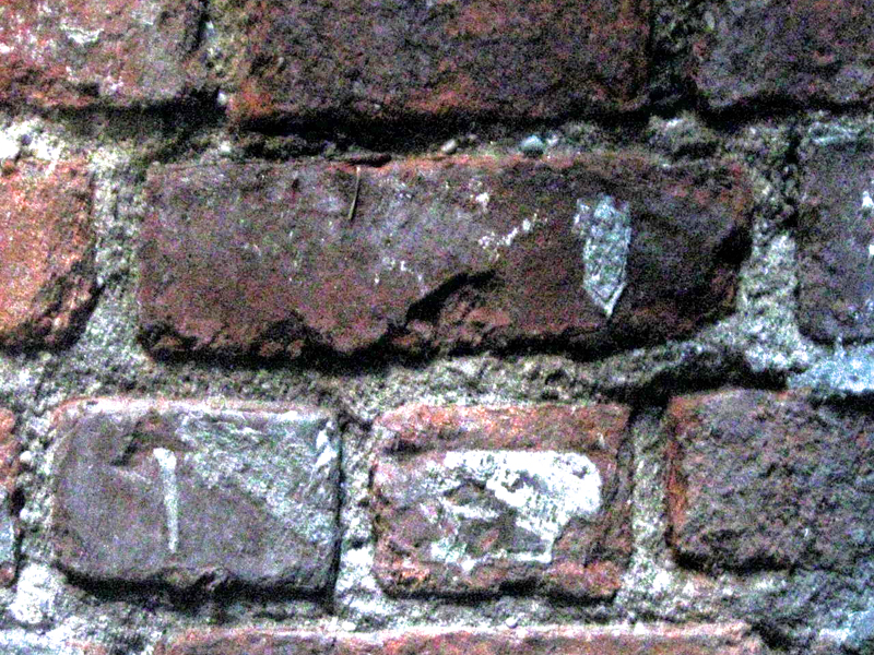
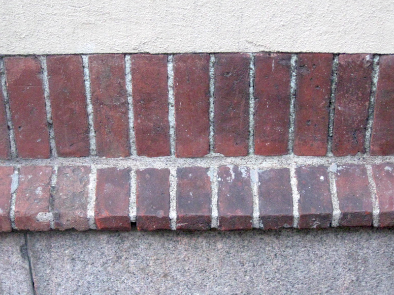
Recap – Brick Patterns
Here’s a recap of a photo spread I did back in January 2009. I like the way it turned out, and would like to post it anew.
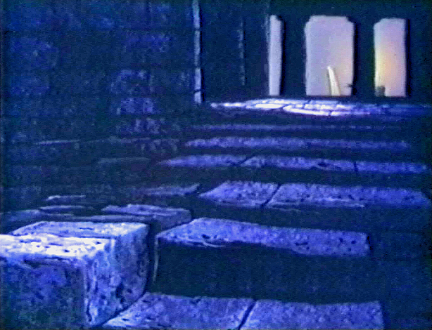
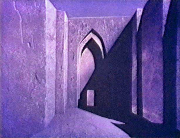
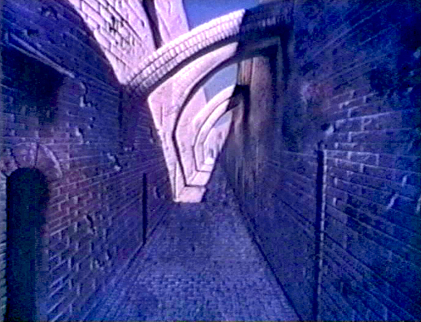
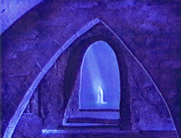
- For some reason I have always loved the simple structure of a brick wall. I’ve often included them in the paintings I’ve done, and I’ve been fascinated by the many and varied differences you see in every structure made of brick. It was wonderful to hear Eyvind Earle discuss the architect’s tricks he used in Sleeping Beauty to detail all the brickwork in the castle backgrounds. Just another reason I enjoyed his artwork in that film.


Frame Grabs &Layout & Design &repeated posts 12 Dec 2010 08:06 am
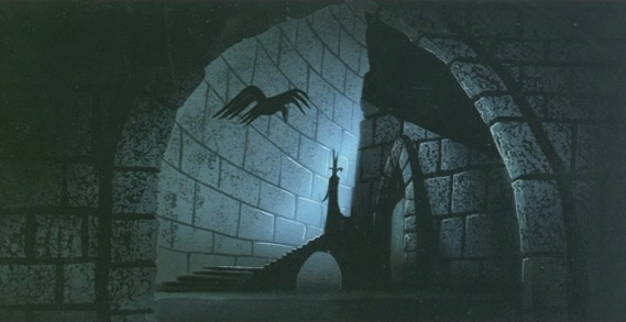
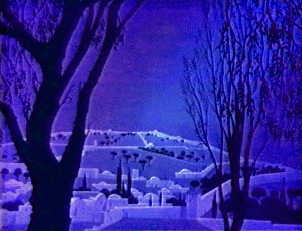
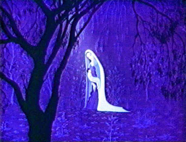
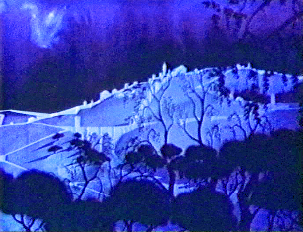
Return to an Eyvind Earle Christmas
- Here’s a piece I posted in December 2007. Since the crèches are popping up all about town, and since I’m such a fan of Eyvind Earle’s work, I love repeating it. The video would make a good Christmas purchase and can be bought here.
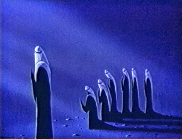
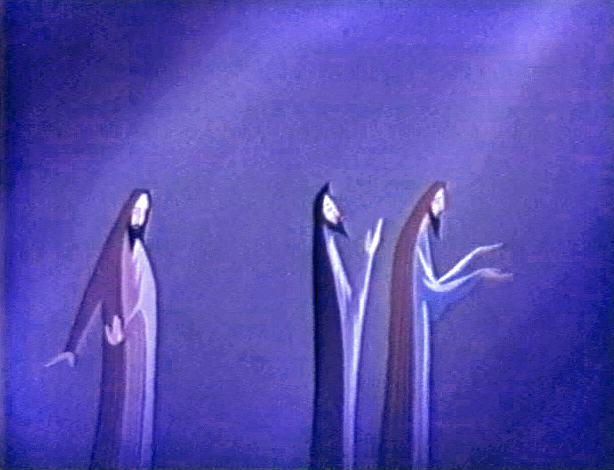
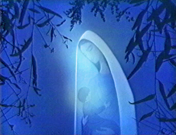
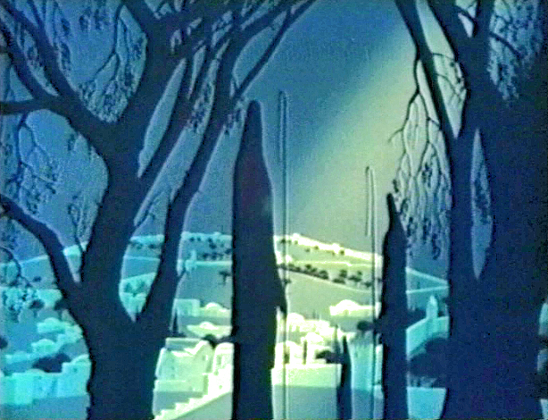
 - Here’s a celebration of the animated segments Eyvind Earle did for The Tennessee Ernie Ford Show.
“The Story of Christmas” is a piece which is about ten minutes long set within this half hour special. (Remember when they called them “Specials”?)
The entire show is a Christian sing-along featuring the Roger Wagner Chorale singing around Tennessee Ernie’s gospel read.
The whole is a very reverent piece with no attempt at lightness and comes off as very religious. This would certainly not work on television today, never mind ABC TV which is where it premiered as one episode of the Tennessee Ernie Ford series. Some of you may remember the animated Hubley titles for the show which can be found in John Halas‘ Technique of Film Animation.
Three segments feature the animated graphics with the group singing. The only real narrative tells the birth of Christ in animation. Otherwise the Roger Wagner Chorale, dressed in Dickensian outfits, gather around varied sets looking like the early 19th Century England.
(Click any image to enlarge.)
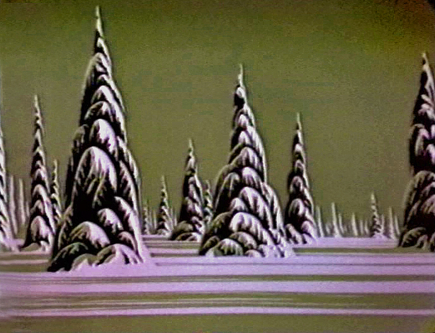
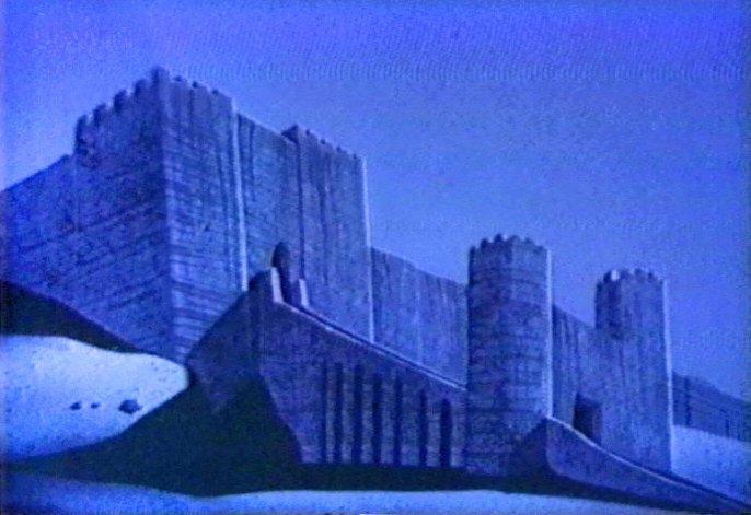
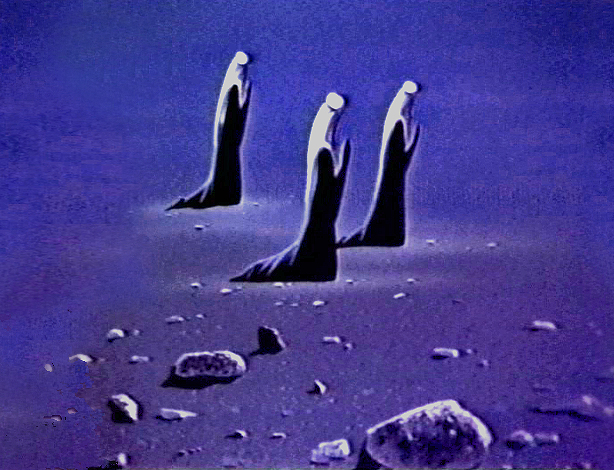
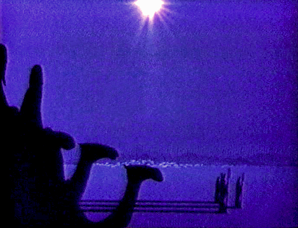
Earle’s animation was done immediately after Sleeping Beauty was completed. He’d left the studio (or was more probably left by the studio during their massive layoff at the time) and formed his own small independent studio to do work like this. I think this was probably his largest job, and it seems perfectly suited to his style.
Lots of pans and flare effects are built around sliding cells trying to imitate the look of the multiplane camera. There really is no animation here, just the sliding cels of the characters over the pans. It’s still quite attractive for what it is and holds the attention. The piece is well planned and shows off everything Earle had learned at Disney’s studio.
The following are frame grabs from many of the scenes:
 _
_
.
.
 _
_
.
 _
_
.
 _
_
.
 _
_
.

.
 _
_
.
.
 _
_
.
 _
_
.
 _
_
.
Commentary &Disney 16 Nov 2010 08:37 am
Tangled, indeed
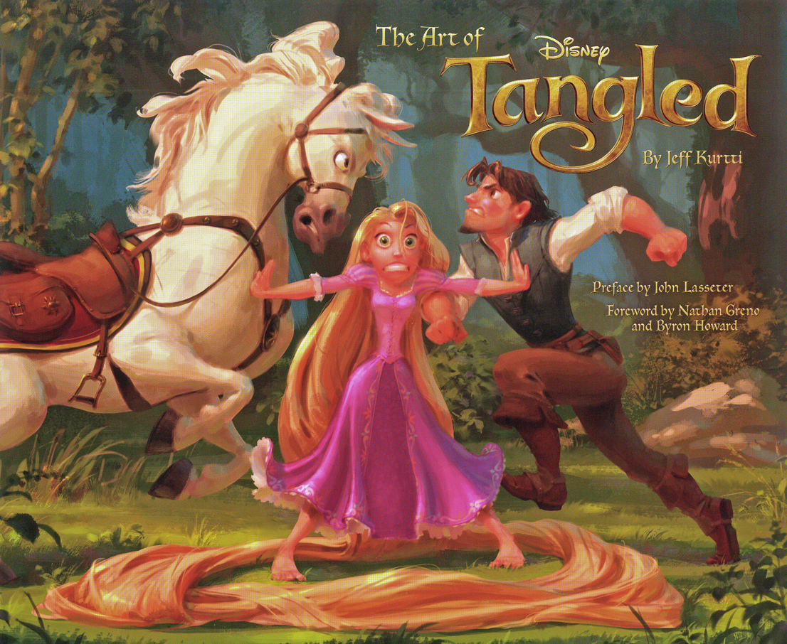
- Like many others, I received a copy of Jeff Kurtti‘s book, The Art of Tangled.
 I’m glad I did. It shows me that there was once a soul behind the new Disney feature, Tangled.
I have to admit to something unorthodox here. I haven’t seen this Disney film. I will see it Dec 2nd though it’s going to be a hard pull for me to go there. Yet I still have some commentary – just on all the clips I’ve seen. THere have been about seven minutes of them and none of them pretty.
Because Glen Keane was so intimately involved in the first years of this film, I was more than a little curious to see it. But, to quote Joseph Heller, “something happened”. Keane left the film as director and became an animation advisor – not even animating. The book says he had a “health attack”. The direction, thanks to the sanction of John Lasseter, went to the two responsible for the final version of Bolt, Byron Howard and Nathan Greno.
I’ve seen the clips, let me tell you I’ve seen clips. I’ve read reviews. The Variety review couldn’t be worse. (Quotes: “If the film is hardly one for the pantheon, that’s because it seems more interested in tossing off one-liners than in tapping into its heroine’s deepest desires in the tradition of the best fairy tales.”
“. . . there’s room for visual improvement, particularly a garish, unattractive underwater scene involving Rapunzel’s hair (which often resembles a very long coil of spaghetti, extra al dente). The dimming effect of the 3D eye-wear seemed especially detrimental at the screening attended, draining too much color and light from the image and causing skin tones to appear weirdly pixelated . . .”)
What we’ve seen in the clips is a macho tough guy relationship between the Prince/the thief/whatever he is and his horse. They constantly jab each other and play off each other in that sarcastic and smarmy way Dreamworks characters act. The horse doesn’t talk, but it may as well. He keeps elbowing the hero. (If only a horse had elbows.)
Originally, the story was called Rapunzel. That’s when the Brothers Grimm had something to do with it. Now the bright folk at Disney have taken a great and complex story and have turned it inside-out making the male the lead. You can’t call it Rapunzel anymore, hence the title, Tangled. All the timely gags, all the smart aleck comments make it seem ever more like a Dreamworks production. The film is dated before it’s released.
And it looks so ordinary, it’s annoying. Maybe they should have called it Megamind and changed the horse’s color to blue. He could have come from outer space to harness Rapunzel’s hair. The Variety review does say that the film settles down midway to just concentrate on the fariy tale story. That I’ll have to witness for myself.
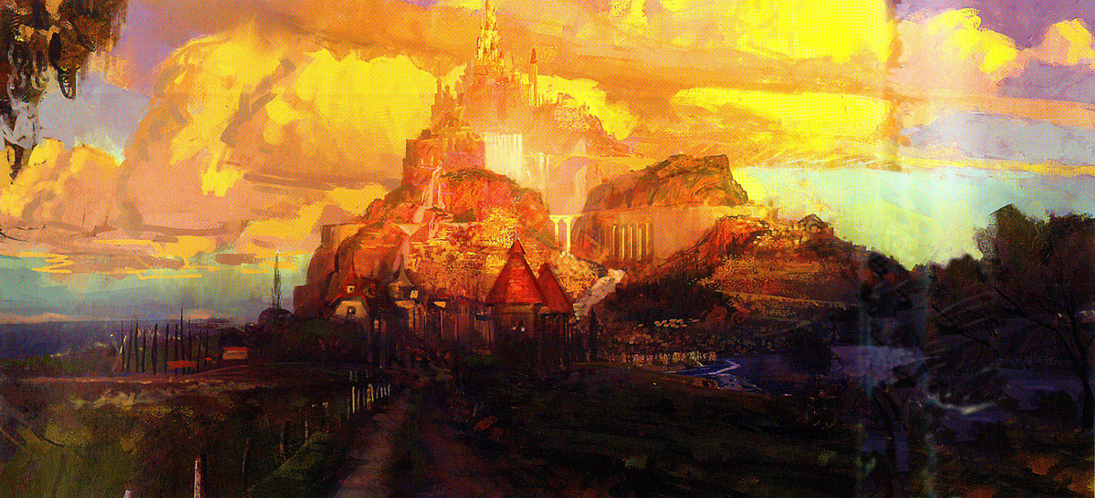
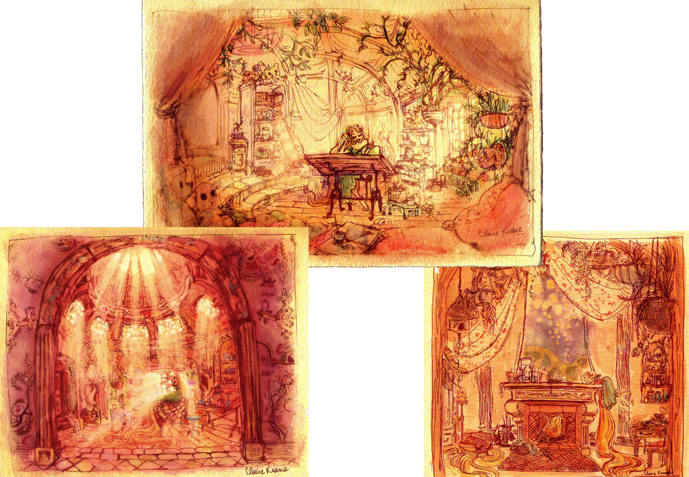
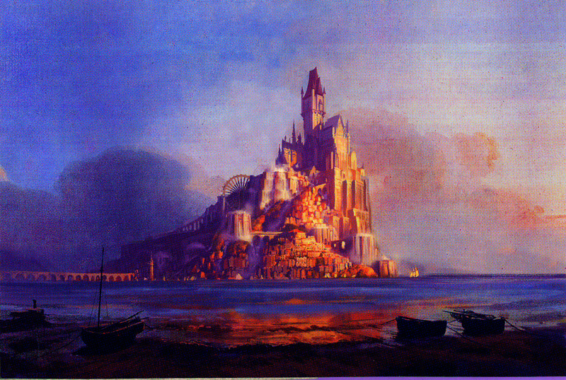 All this would be only so depressing, if we hadn’t seen the artwork in the book, The Art of Tangled. There’s some amazing art in that book, and very little of it seems to be cgi. Plenty of animation drawings and models by Glen Keane give an indication of what the characters could have looked like. Then those background paintings. Yes, some of them look like Eyvind Earle clones, but
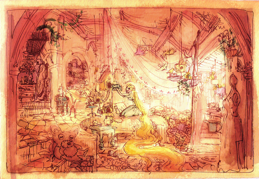 others look like they were watercolors painted by Rembrandt. They’re stunning.
You go through beautiful background after beautiful background, and the end result is the ordinary and dull thing they’ve put on the screen. Who’s responsible? Lasseter? Byron Howard and Nathan Greno? Glen Keane? – no, he seems to have been the guy who got the big shaft.
What a sell out, Mr. Lasseter! How sad I feel about the Disney organization. They can’t do ANYTHING with artistic merit. It’s so obvious they were going down that road, and things were stopped, pulled, and tangled.
They’ll probably get their 12 year old girl audience, and the film will go the way of the Bolts and the Treasure Planets and the Meet the Robinsons.
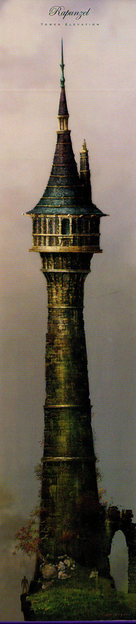
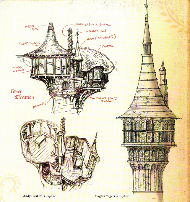
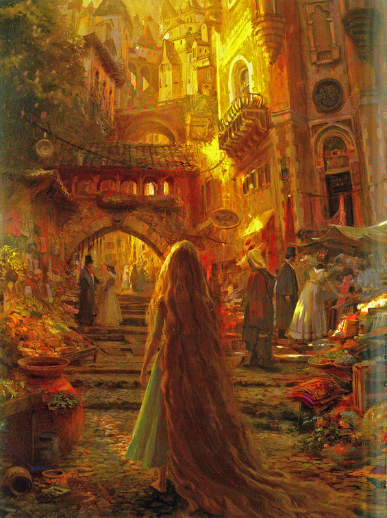
Here are some of the pretty pictures in the book. These don’t look inspired by other animated films, although the film certainly takes its look from earlier films.
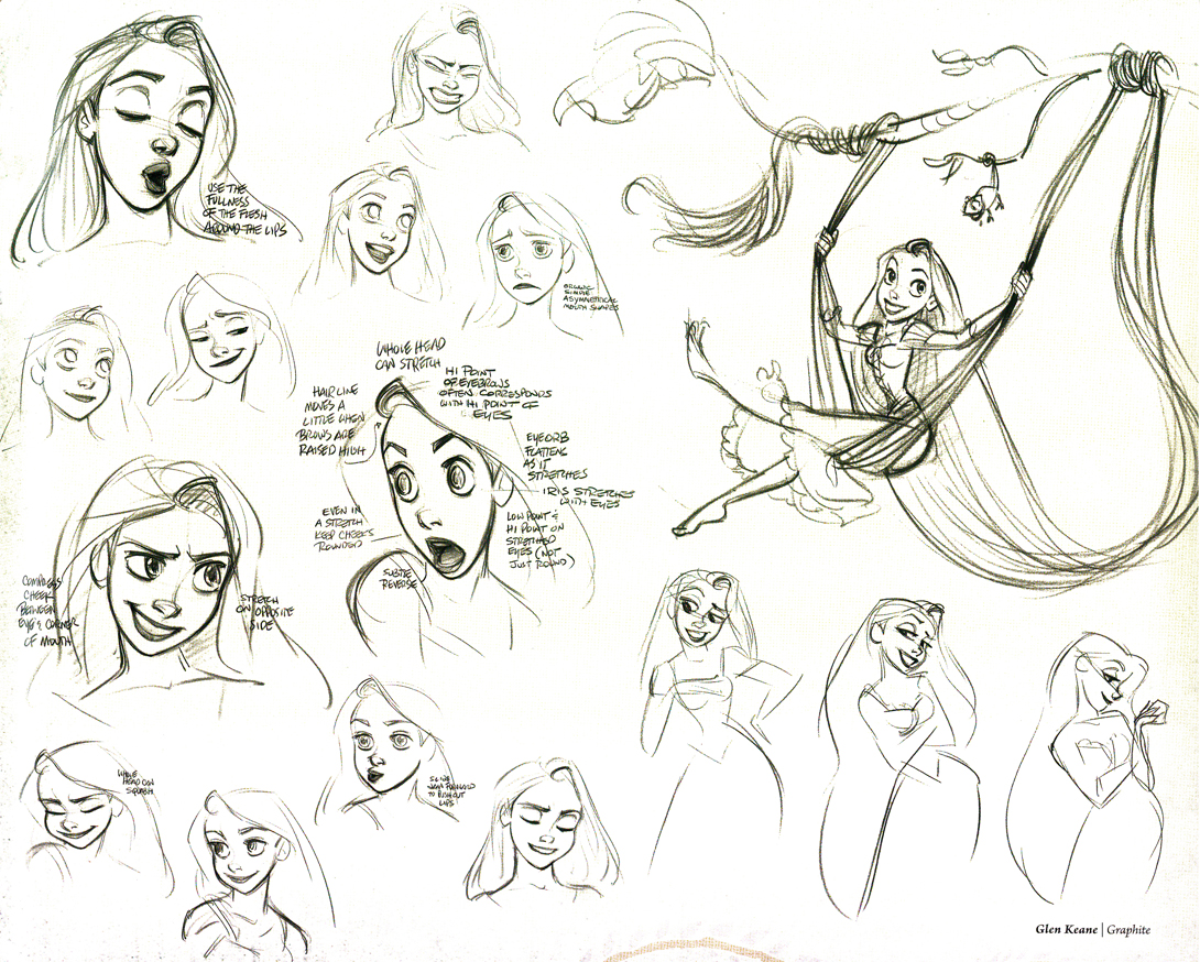
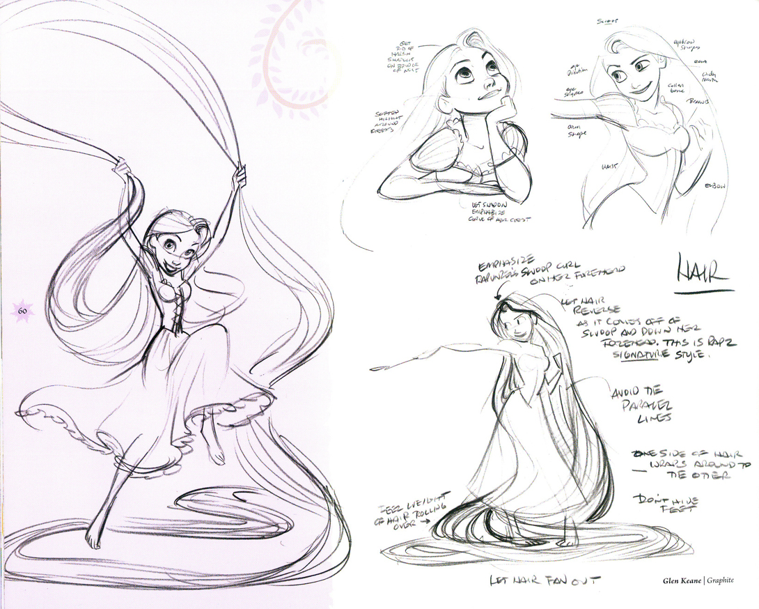
So here’s an Art of book that seems to matter. It shows us what we’ll never see. Glen Keane may have left the directing with a “health attack” (as Jeff Kurtti informs us), but he won’t say a bad word about the company or what followed. He’s a positive guy, well invested in the organization. I just wish some of what was in his mind actually made it to the screen. Perhaps that won’t happen again now that Disney isn’t invested in their 2D division. I can’t imagine Glen Keane has animated anything on the Winnie the Pooh film.
The pictures above were drawn/painted by:
cover: Glean Keane, graphit | Ian Gooding, digital painting
tower: Douglas Rogers, digital painting
island: David Goetz, digital painting
Rembrandt sketch: Claire Keane, digital painting
island: Craig Mullins, digital painting
Rembrandt sketches: Claire Keane, digital painting
2 character models: Glen Keane, graphite
towers: Andy Gaskill, graphite | Douglas Rogers, graphite
girl in town: Craig Mullins, digital painting
Photos 11 Jan 2009 09:16 am
PhotoSunday – Brick Patterns
- For some reason I have always loved the simple structure of a brick wall. I’ve often included them in the paintings I’ve done, and I’ve been fascinated by the many and varied differences you see in every structure made of brick. It was wonderful to hear Eyvind Earle discuss the architect’s tricks he used in Sleeping Beauty to detail all the brickwork in the castle backgrounds. Just another reason I enjoyed his artwork in that film.
Art Art 09 Jan 2009 09:20 am
Paul Glabicki & Christmas Passed
- Paul Glabicki is an artist who started out as an animator and has moved away from the moving picture to the framed image. He’s written to me about an upcoming art show opening in Chelsea this coming weekend.
From the gallery’s publicity release:Paul Glabicki transcribes each page of a 1930s Japanese accounting ledger as a foundation and underlying structure to create new images. Layered over each transcribed page are maps, calendars, counting systems, etc. – bits of incoming daily information.
Paul’s letter to me tells about his transition from animation to the gallery world:
- A break from animation a few years ago evolved into several drawing projects. The new work doesn’t move, but has clearly evolved from all that has come before. The ACCOUNTING FOR series is an ongoing transcription of a 1930s Japanese accounting ledger, layered (or continued) with new entries/information of my own (I should have
30 works in the solo show, with 3 ledger pieces in the January-Feb group exhibit). Things may be set in motion again at some future point, but for now, I’m enjoying hand and pencil/pen on paper.
The show will open Saturday at the KIM FOSTER GALLERY
(529 West 2Oth Street / New York, NY 1OO11 / tel/fax 212.229.OO44)
Hours: Tuesday thru Saturday, 11am — 6pm
I’ve long been a fan of Paul’s films, so I’m excited about viewing his artwork, and I’d encourage you to take a look as well.
Here are two more of the drawings on exhibit:
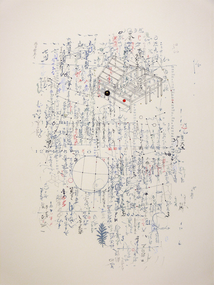
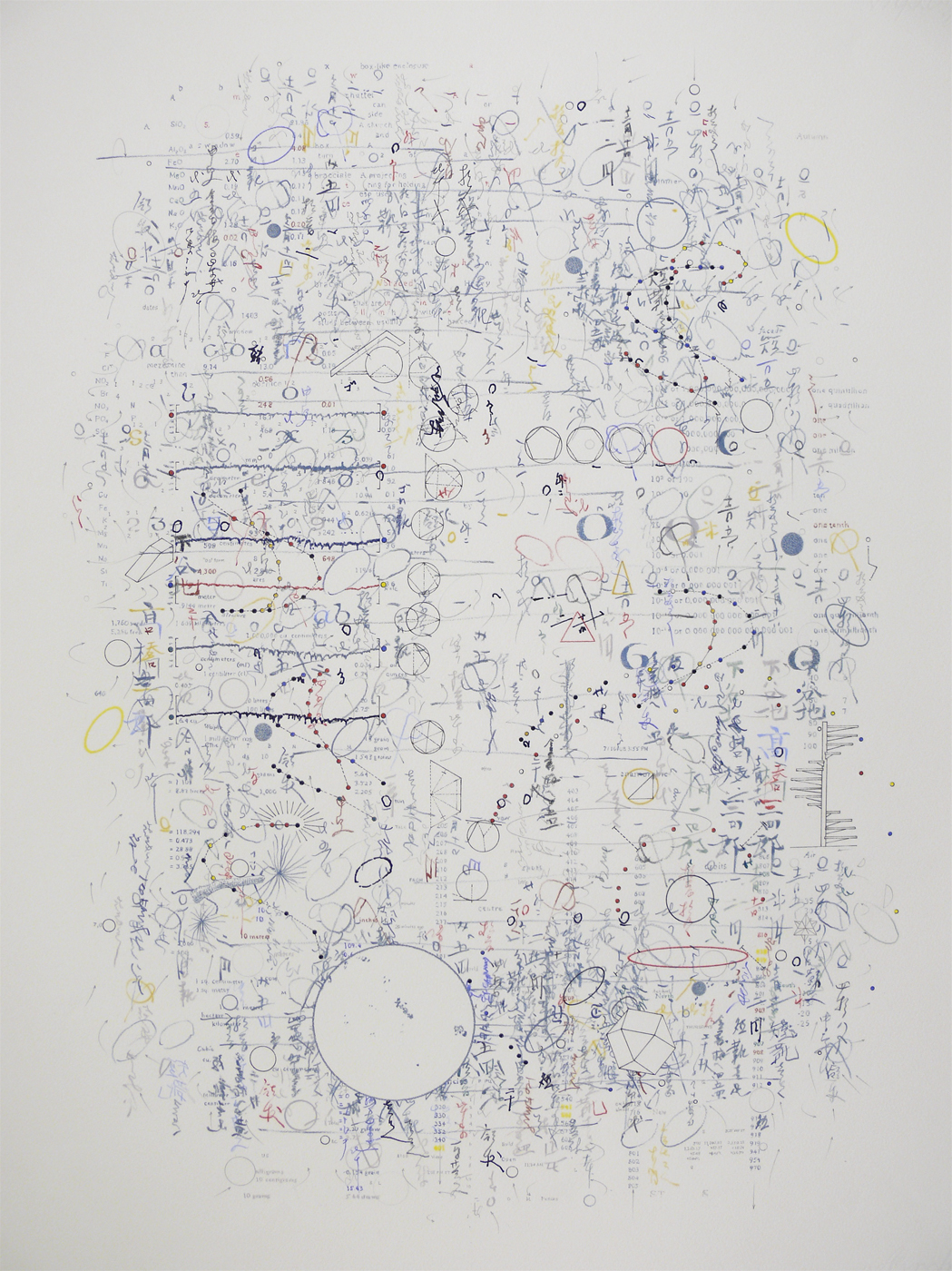
Accounting #4 | Accounting #18
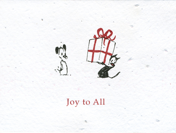
Christmas officially passed last Tuesday, Jan. 6th – sometimes called “Little Christmas”, the feast of the Epiphany and the 12th day of Christmas. I took down the decorations in the studio today and as with past years spent a bit of time treviewing the many cards that were sent to me. (Unfortunately, I wasn’t able to get out a card this year. There were pressured deadlines at work, and a health crisis for my mother at home. My time was so limited, Christmas became an after thought.)
However, I received so many beautiful and original cards that it’s probably imprudent for me to select any for display. Just the same, I would like to point out a couple of them.
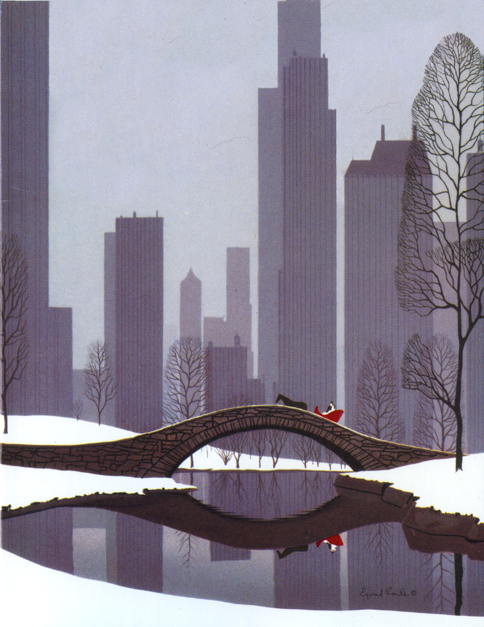
I’d received a card from a good friend which was printed by the Metropolitan Museum of Art. It’s an Eyvind Earle painting of Santa in Central Park. It’s a gem, as might be expected.
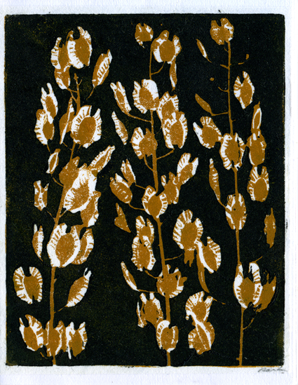
Dick and Harriet Rauh have sent their annual linoleum block print of floral patterns.
It’s always a treat to get their card.
Patrick McDonnell sent a card that was virtually green. Seeds were implanted in the paper, and I’ve already planted the card in soil for the Spring blossoms.
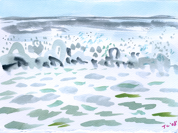
Finally, John Canemaker & Joe Kennedy sent us an original painting of the ocean,
bubbling and forcing its way toward us.
Commentary 03 Dec 2008 09:23 am
SB Pro & Con
- The new dvd of Sleeping Beauty has prompted a number of opinion writings on the blogs. Many of them are thoughtful, but they’re full of the usual ranting comments added on.
- The most articulate of the cons is certainly Mark Mayerson ‘s “Sleeping Beauty Puts Me To Sleep.”
The positive piece “Once Upon A Dream” appears on Brian Sibley‘s excellent blog.
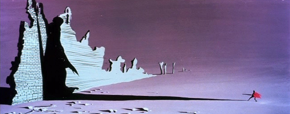
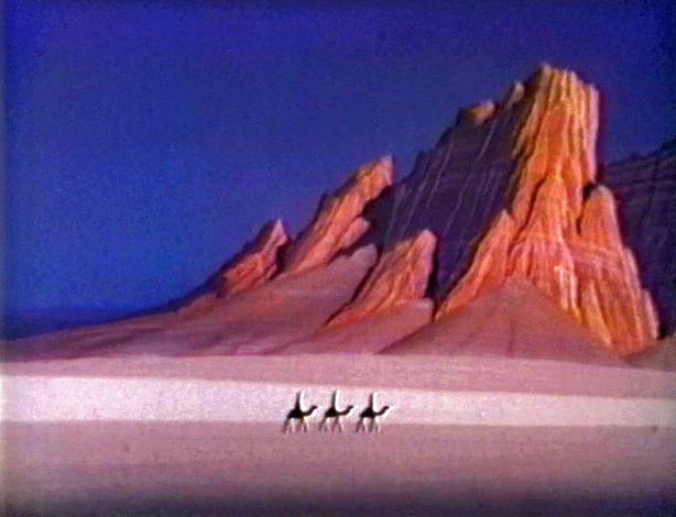
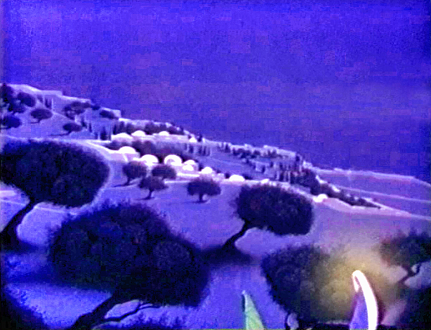
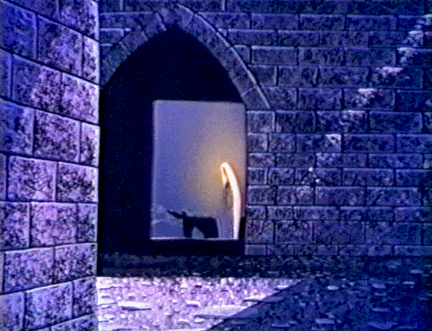
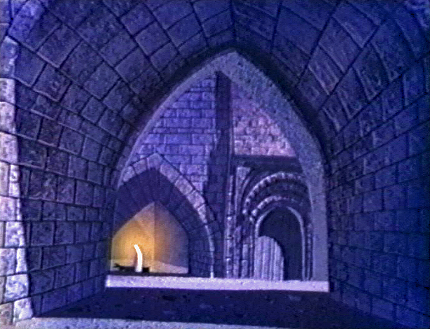
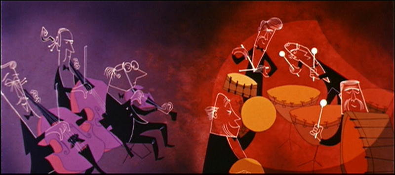
As for me I understand both viewpoints, but I am an enormous fan of Eyvind Earle’s work and having seen this film many many times I have grown attached it. I love the subdued nature of it all, the use of the Technirama camera, the stunningly attractive design, and some brilliant animation. It has a majesty and a formality to it that is unique unto itself. I frequently compare the film to opera whereas most of the others are musicals.
I once posted a piece (see it here) by Marc Davis wherein he compared animating Cruella deVil vs Malificent. He said Malificent was always giving speeches whereas Cruella was conversing with others. Two very different moods. That also, in a nutshell, describes the two films. 101 Dalmatians is chatty while Sleeping Beauty is presentational. Opera vs musical theater.
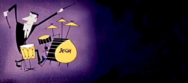
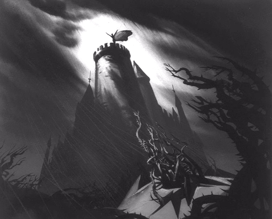 The film was born into struggle. The animation industry was challenged by a new modernity. The art was moving away from the 19th century graphics and into the 20th century. UPA wrought Toot Whistle Plunk & Boom which led to this film. Oddly enough, Sleeping Beauty aimed its art at the 15th century style of illustration; at least that was Eyvind Earle’s aim in designing the backgrounds. Tom Oreb’s character design was angled to try to work with the backgrounds almost as an amalgam between 15th & 20th centuries. For me, it works very well; others seem bothered by it.
I suspect that the general love of this film’s style has strongly influenced modern animation. Pocahontas, it seems, took it’s backgrounds directly from Earle’s work.
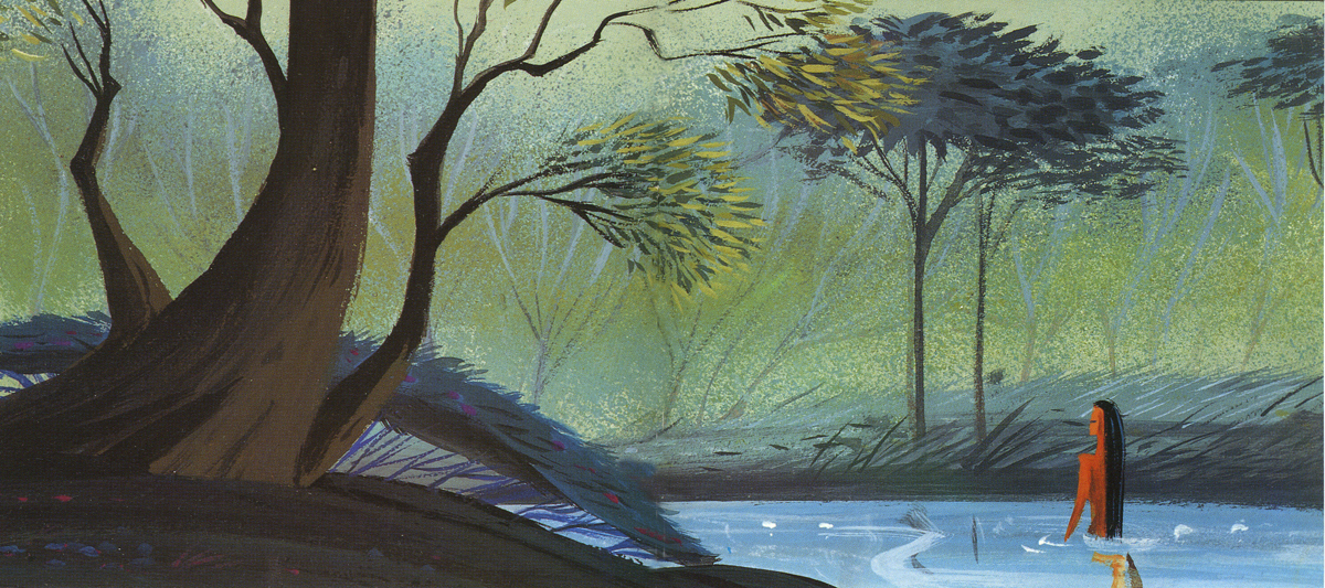
Pocahontas concept art by Michael Giaimo from the book “The Art of Pocahontas.”
The angled squirrels, owls and other forest animals, appeared in many other Disney features & shorts. Those characters were perfect designs to build on, and, what I call the CalArts style, seems to have grown out of that. Angles not circles. Flash was ideal for angles; so was this design. And so it goes. (Or, at least, that’s how it feels to me.)
- Speaking of Brian Sibley‘s blog, he has a fine piece on Eyvind Earle on his blog. His is a regular and enjoyable stop in my weekly internet reading.
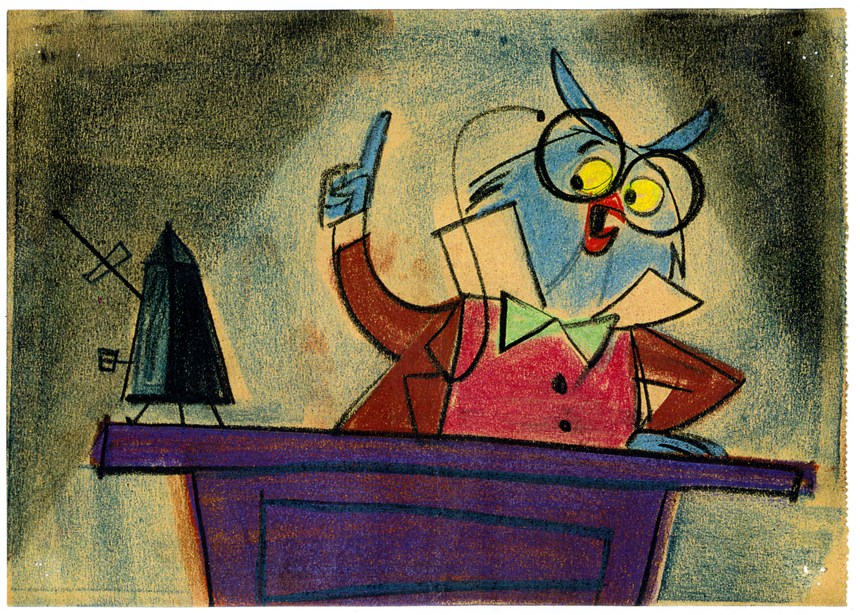
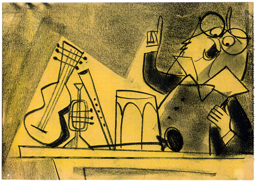
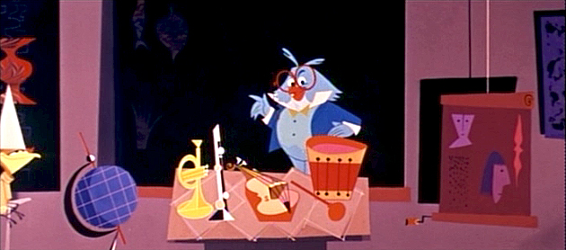
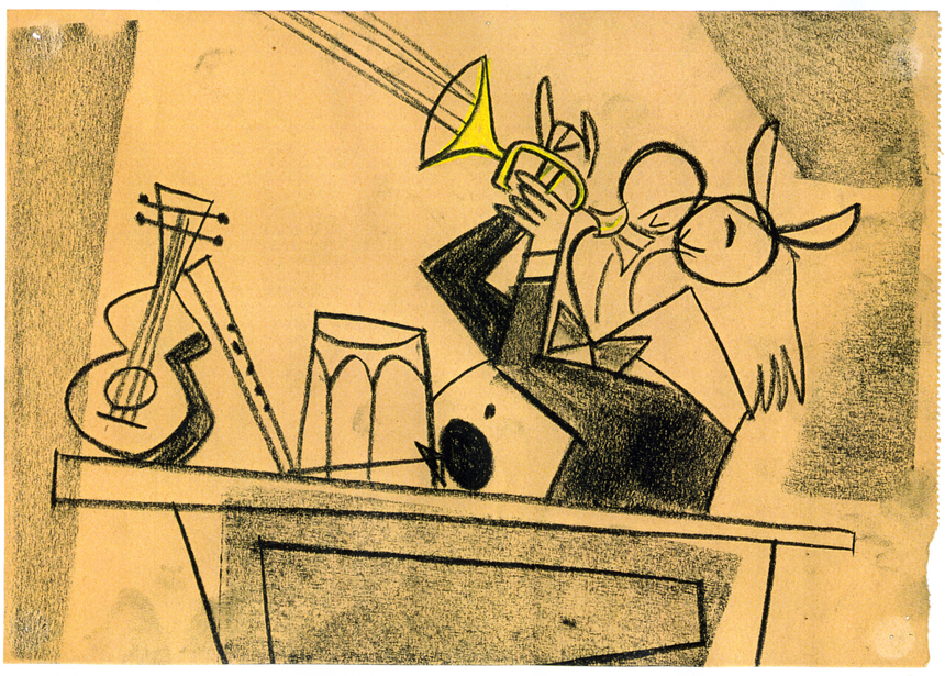
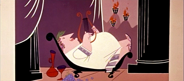
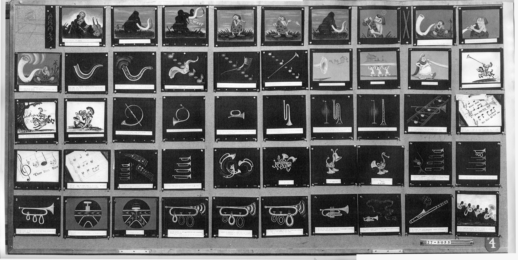
Animation Artifacts &Disney &Story & Storyboards 30 Oct 2008 08:35 am
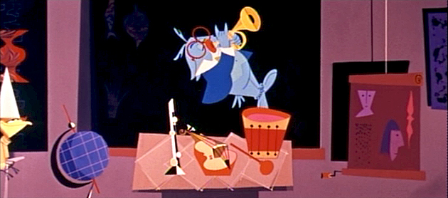
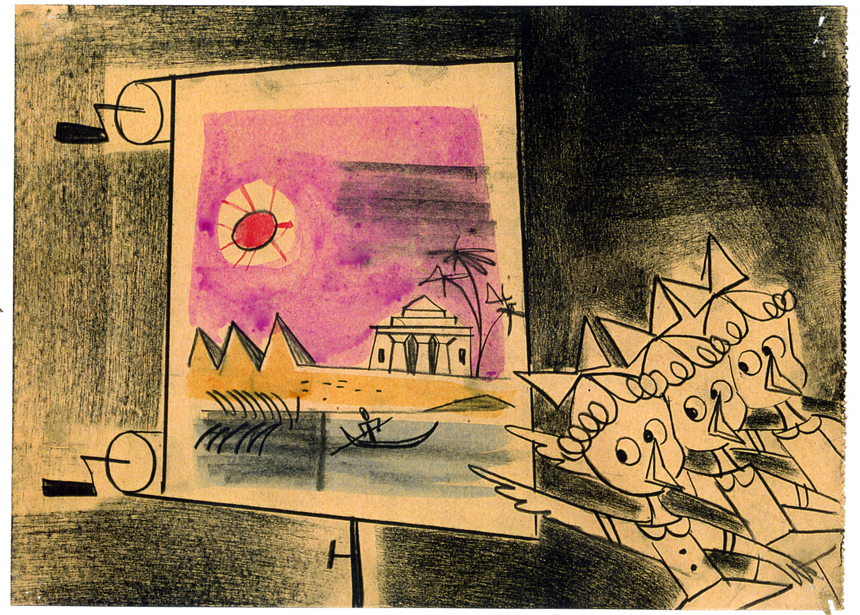
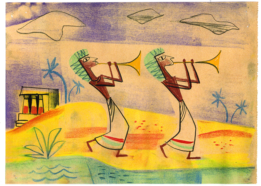
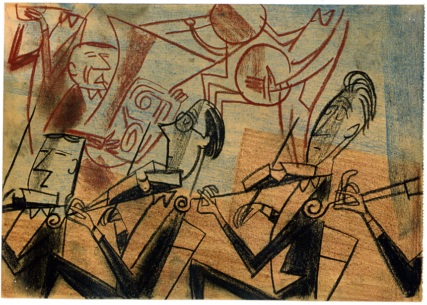
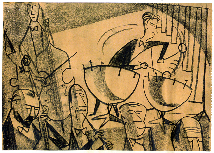
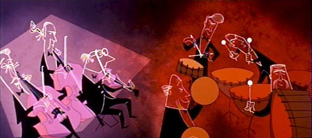
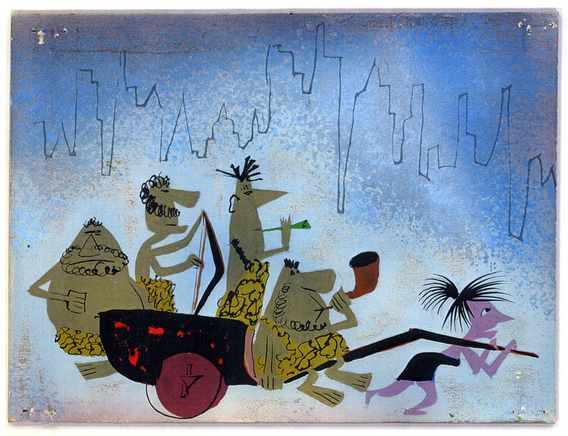
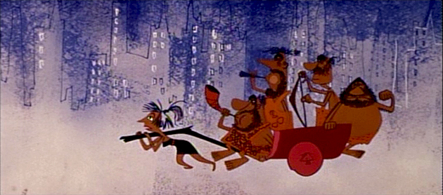
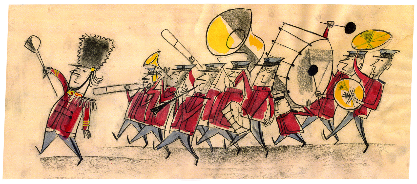
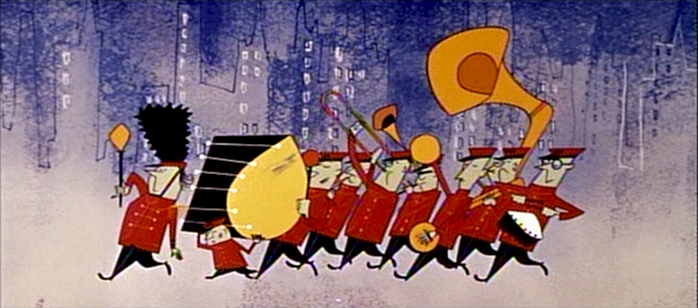
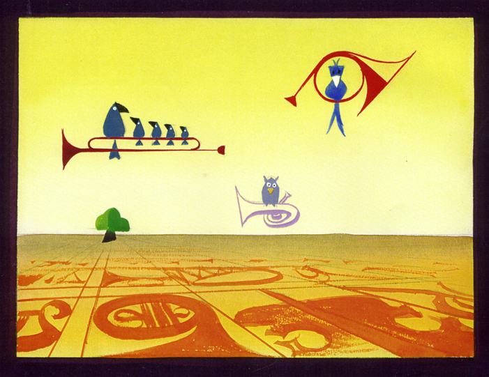
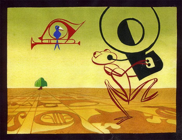
Toot Art
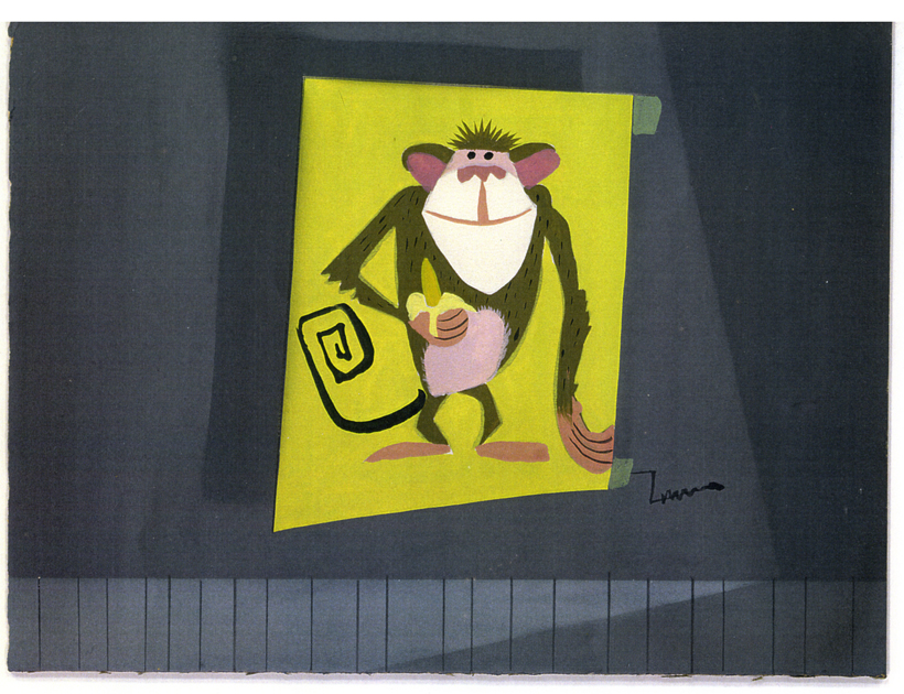
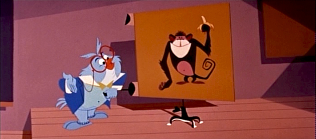
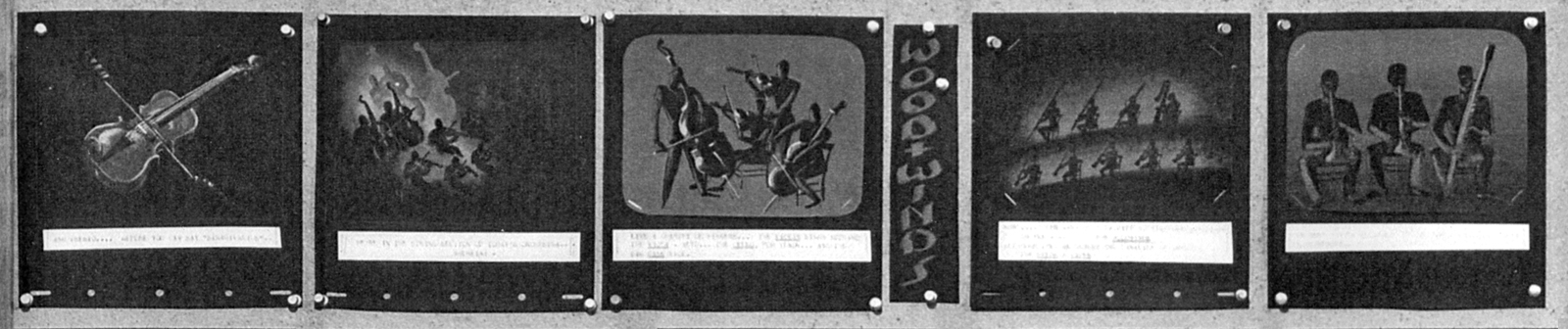
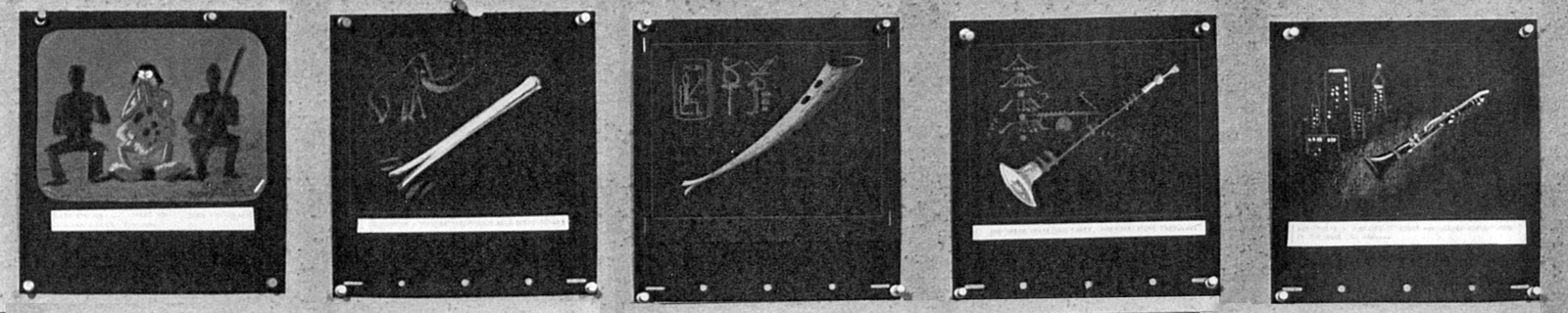
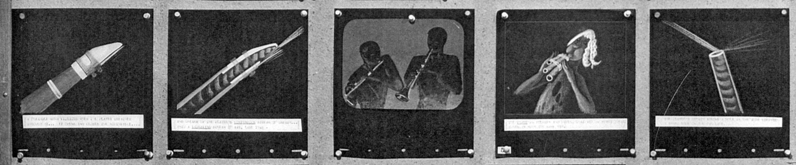
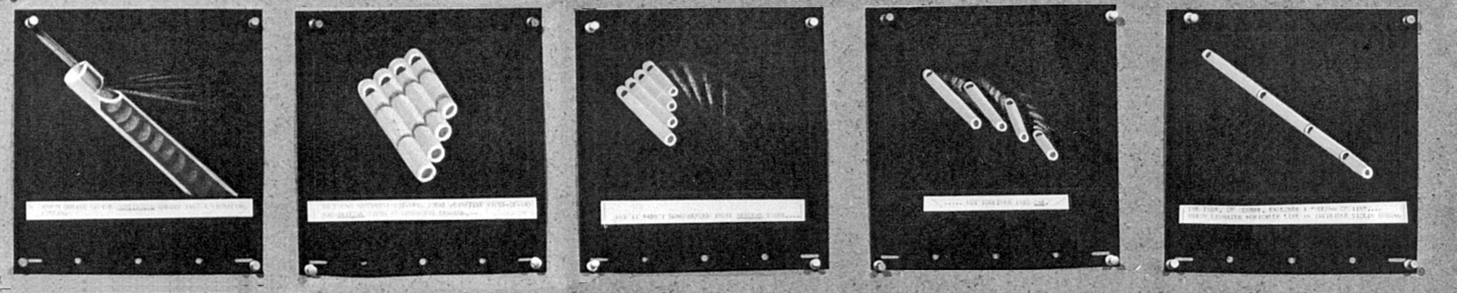
- This week we’ve seen the first draft of a storyboard for the Disney short, Toot Whistle Plunk & Boom. I’ll follow it up with the second version of the board (next Monday), however that doesn’t reveal the film that finally ends up on the screen.
These are some story sketches that were done for the final version of the film. I have enough of them that it’ll make at least two – possibly three – posts to get them all in. I’m also attaching some frame grabs designed specifically to show how some of the art ended up as it appears in the film.
This material is on loan from John Canemaker‘s collection, and I couldn’t be more grateful, certainly in light of the interest I have in this 1953 film.
Needless to say, the film was directed by Ward Kimball.
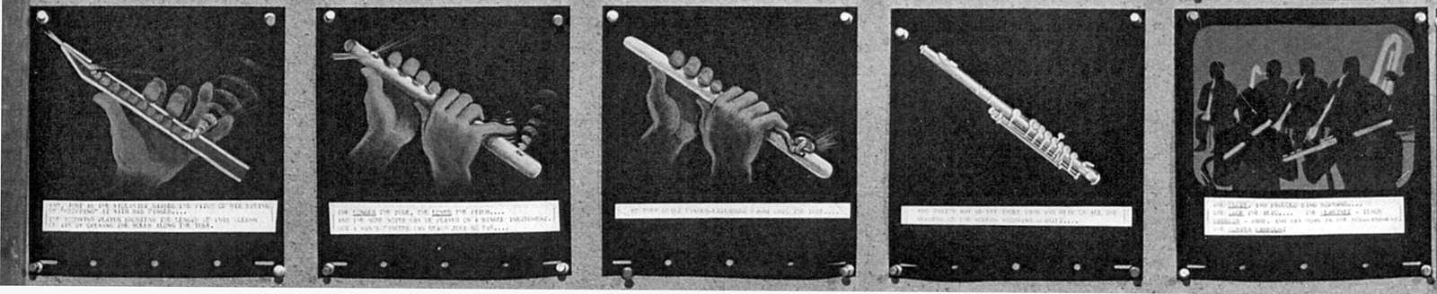
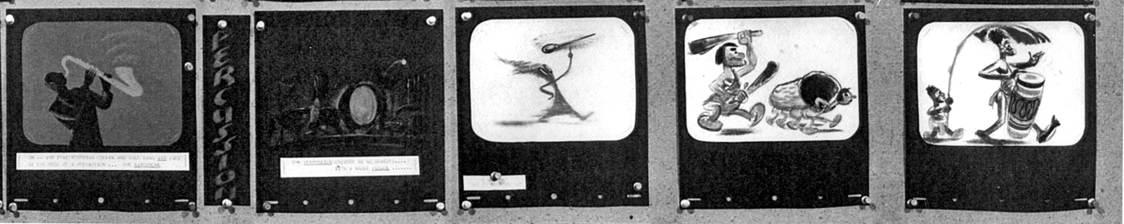
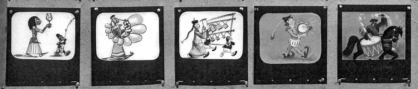
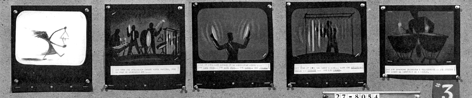
I’m not sure who did these drawings, but the Art Director was Ken O’Connor, Assistant Art Director was Victor Haroush, the Character Styling was by Tom Oreb, and the Color Styling was by Eyvind Earle.
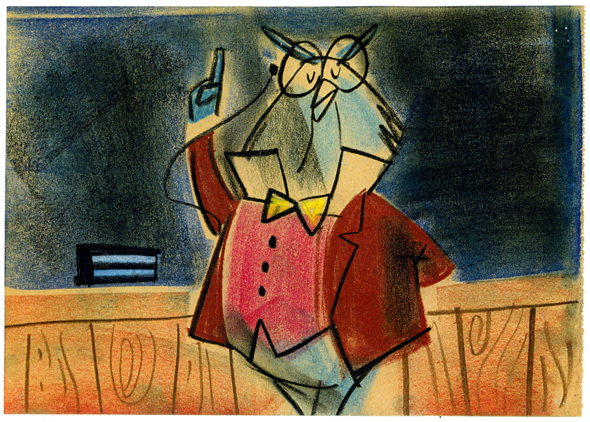
(Click any image to enlarge.)
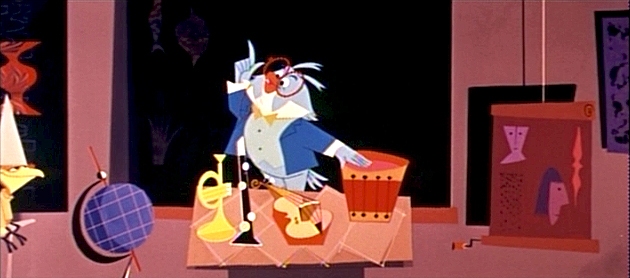
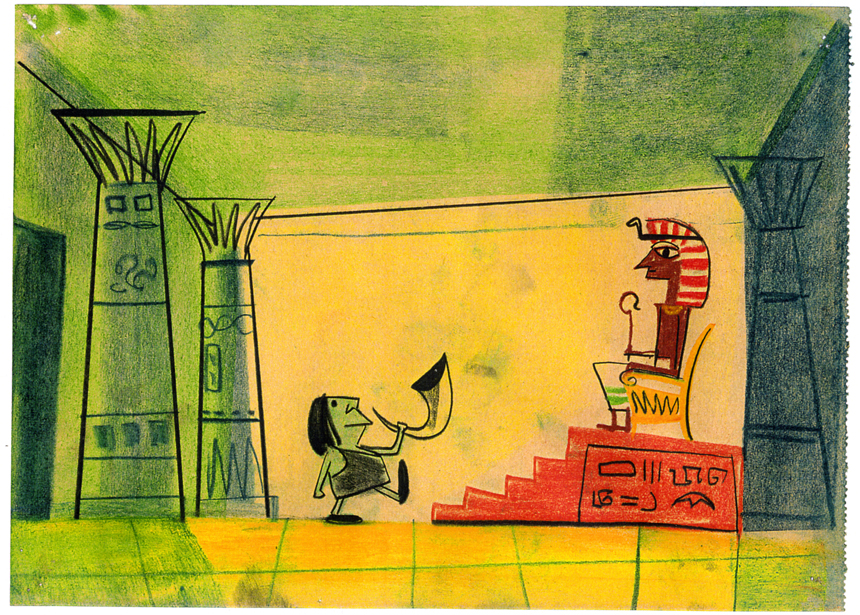
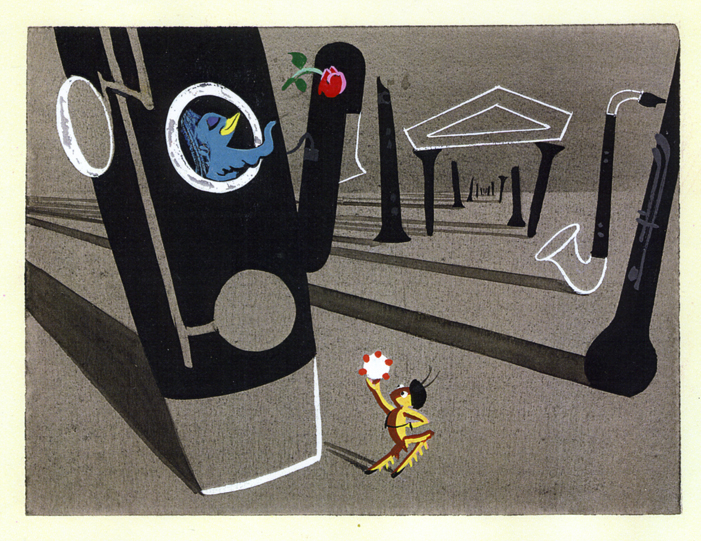
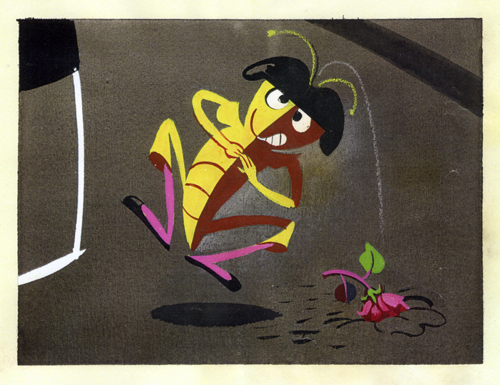
The board art calls for a number of different shots/cuts;
whereas the film has few cuts within this sequence.
Obviously this was done because of Cinemascope. Kimball understood
that overactive cutting in Scope created a different effect than desired.
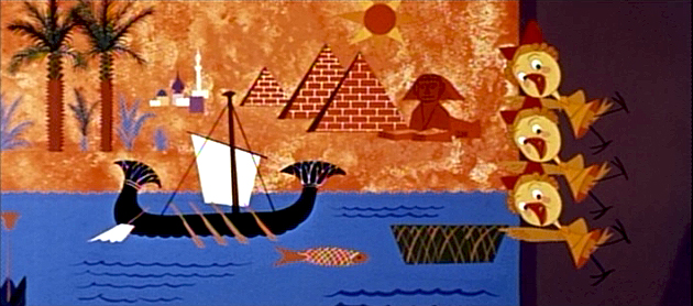
This drawing and the one below were combined into one scene.
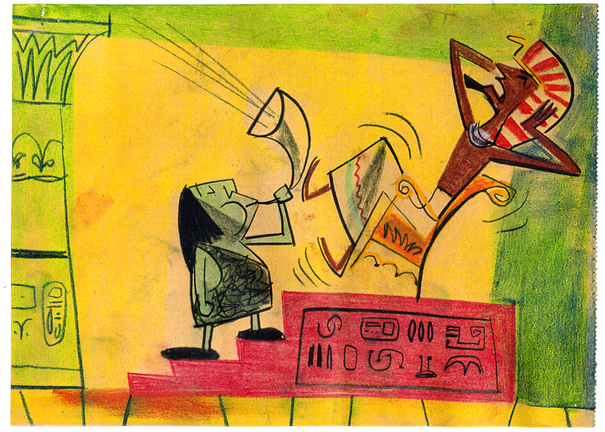
however, the payoff for the gag was different as . . .
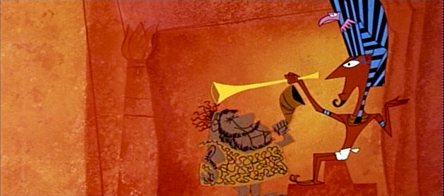
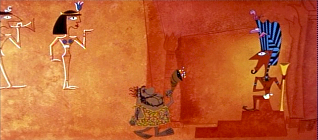
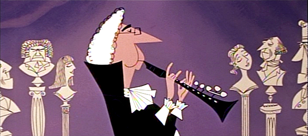
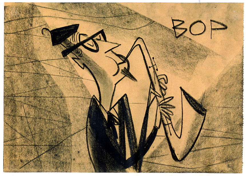
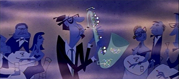
. . . the Pharoah bops the caveman’s head with the Egyptian horn.
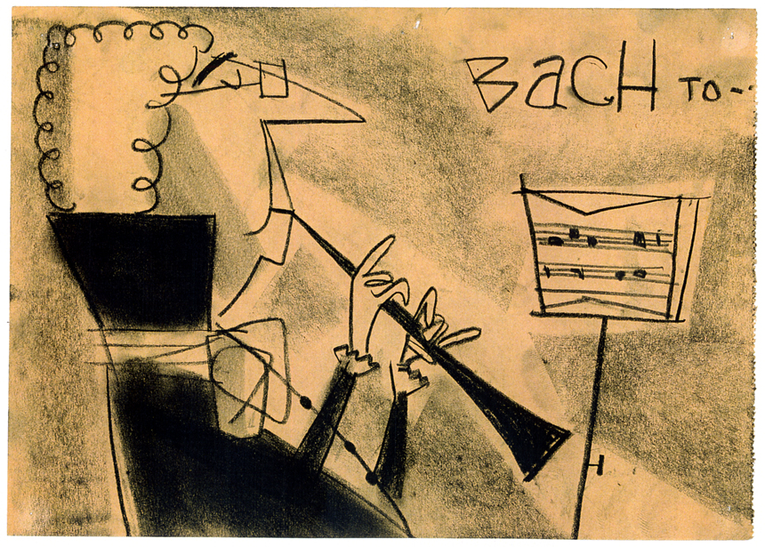
“Bach” and “Bop” are labeled in the story sketches.
The film just plays their scenes.
Cinemascope allowed Kimball to combine scenes that would have
been separate had they been in a traditional film.
I’m not sure if the art was placed in any particular order.
The order has no relation to where it actually ended up in the film.
And yet the film feels so finely tuned and well constructed.
The Scope format allowed for a lot of play in composition,
and Kimball took advantage of it.
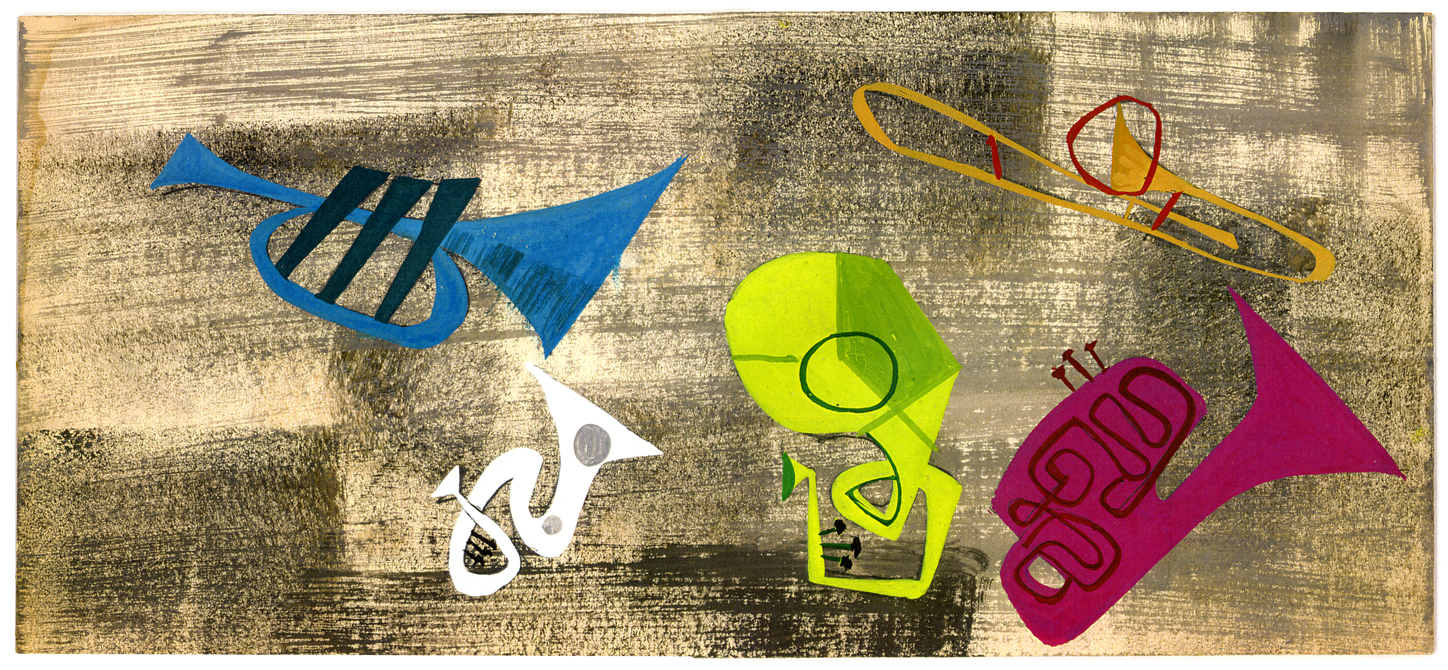
Needless to say, there’s more to come.
Animation Artifacts &Disney &Story & Storyboards 28 Oct 2008 08:03 am
Toot Bd – 1 pt 2
 - Here is the second installment of the first, preliminary storyboard for what would become Toot Whistle Plunk & Boom. You can see how little of the magic was in this board, yet it obviously inspired others to keep it alive and make it work. Ward Kimball has to get most of the credit, though designs by Tom Oreb, Ken O’Connor, Eyvind Earle and Victor Haboush sure brought it to life.
John Canemaker deserves all the kudos he gets for lending this material to me as well as plenty more.
Here are the three remaining boards as they appeared on the stats:
 3
3(Click any image to enlarge.)
 4
4
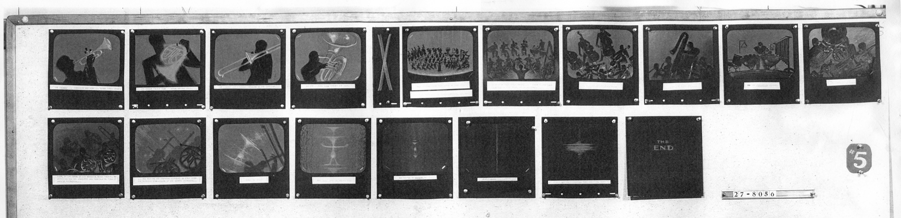 5
5
Now here’s the breakdown of the boards. Each row of images is split in two and labelled accordingly. #31a means Board 3 row 1 part a.
 31a
31a
 31b
31b
 32a
32a
 32b
32b
 33a
33a
 33b
33b
 34a
34a
 34b
34b
 35a
35a
Finally, something familiar.
 35b
35b
I’ll have a later, more relevant board up next week. As well as plenty of color artwork later this week.
Ward Jenkins has posted some beautiful frame grabs from the completed film. Go here.
See this short on YouTube here.
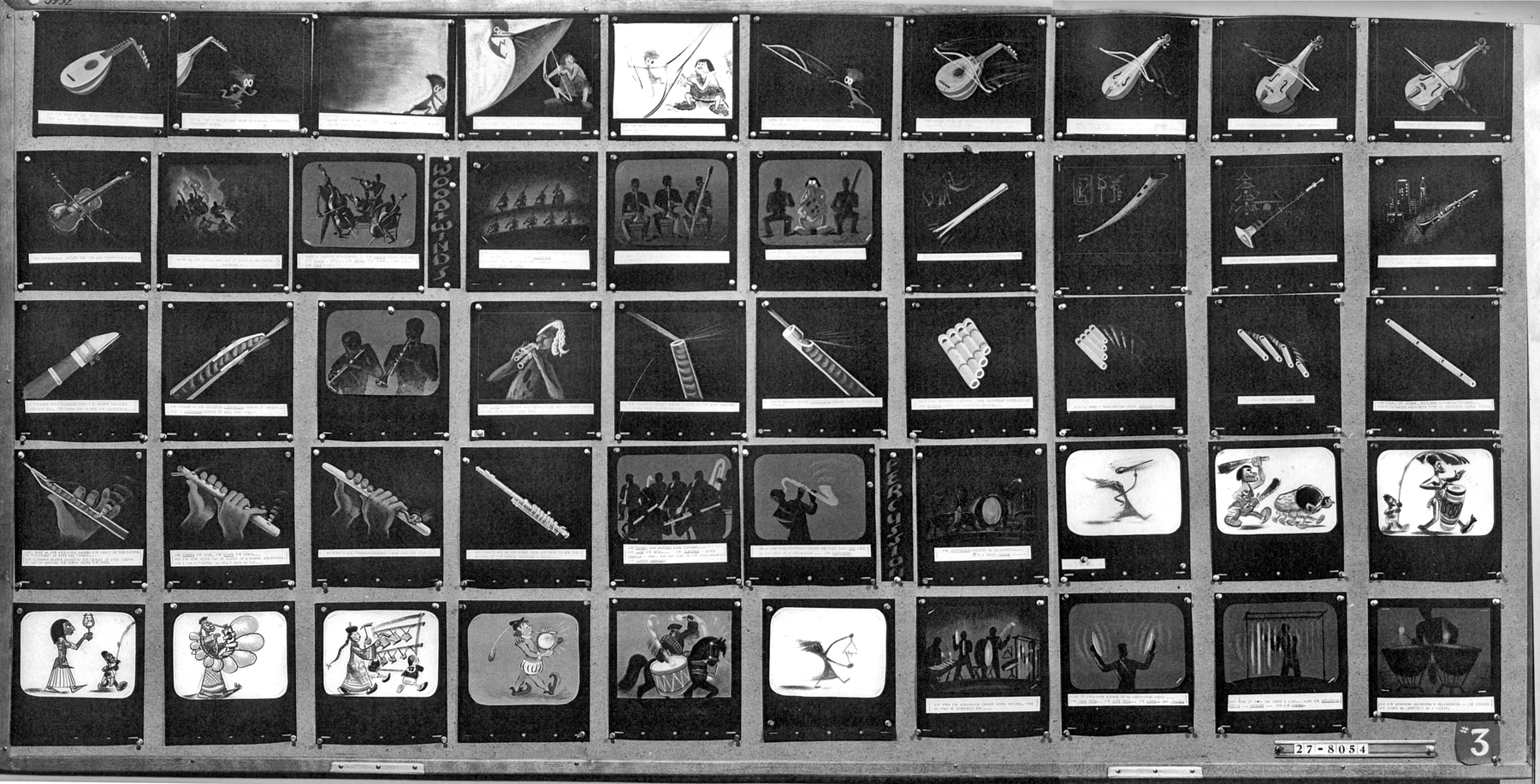
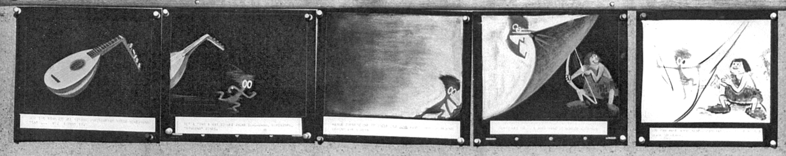
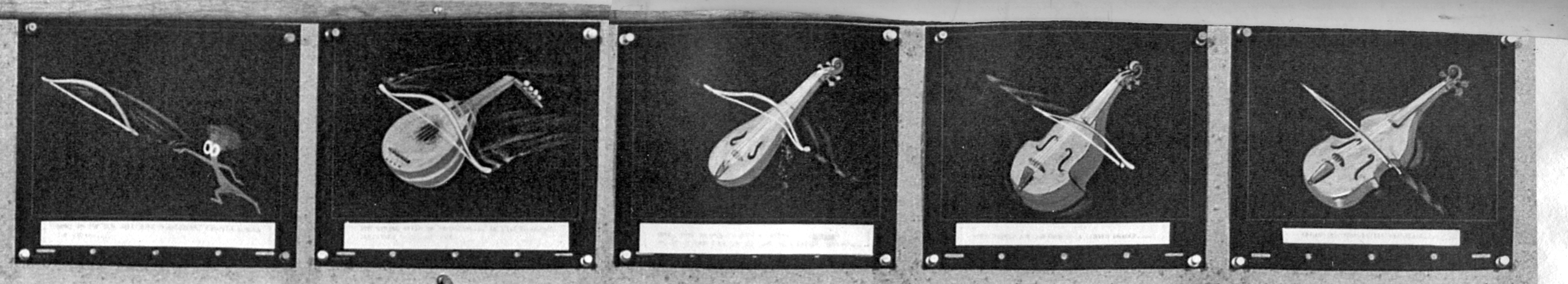
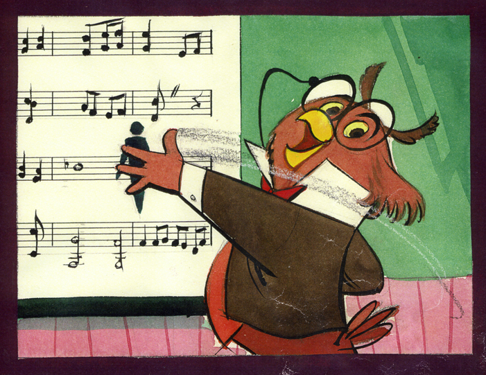
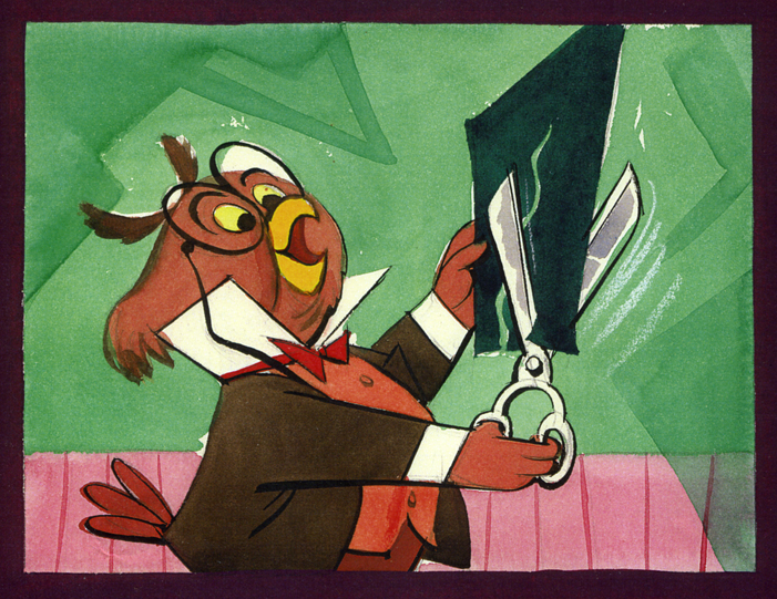
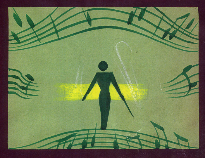
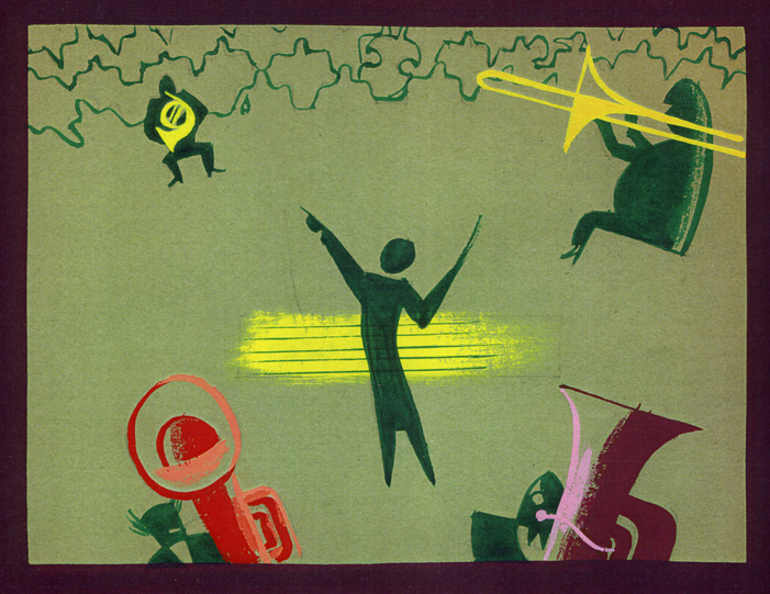
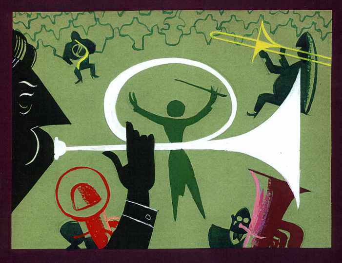
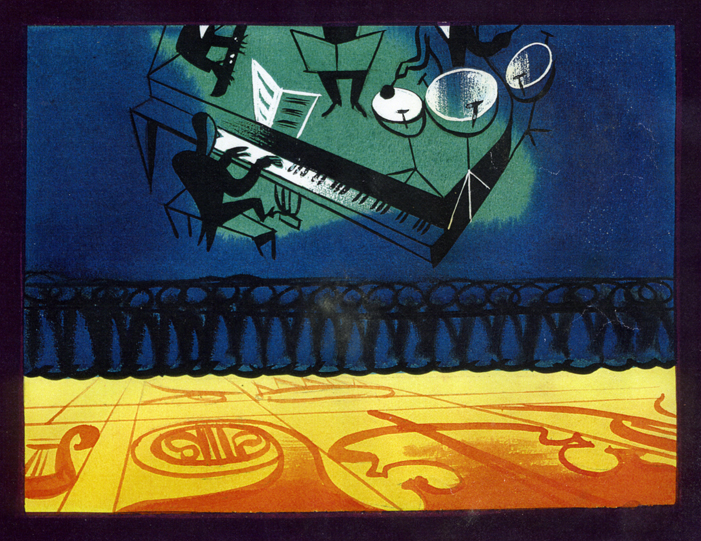
Animation Artifacts &Disney &Layout & Design &Story & Storyboards 02 Oct 2008 07:38 am
Melody Art
- When posting the storyboards from Melody: Adventures In Music, that were loaned me by John Canemaker, last Monday I mentioned that John had also offered some artwork from the film – color keys and story sketches. I’ll post these in two parts: the first here, the second next week after completing the board.
Unfortunately, I don’t know who the artists were that painted these.
Eyvind Earle is credited as Color Stylist; Ken O’Connor and Victor Haboush were credited for Art Direction.
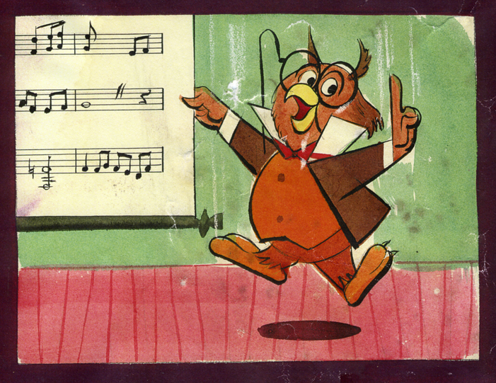
(Click any image to enlarge.)
To be concluded next week.
.
You can find frame grabs from this short on Ward Jenkins‘ site, The Ward-O-Matic.
MELODY is included in the Walt Disney Treasures: Disney Rarities dvd set and it is also found in the bonus features of the Fantasia 2000 dvd.
The film is also on YouTube (at the moment) in not the best condition.
Animation Artifacts &Daily post &Disney 14 Aug 2008 07:43 am
Blogged Me & Eyvind Earle
In the past two days I found myself the subject of a couple of animation sites. This is, no doubt, due to my two new dvd releases. Both have received a lot of attention on review sites and have been favorably reviewed, but these animation sites deserve to be mentioned.
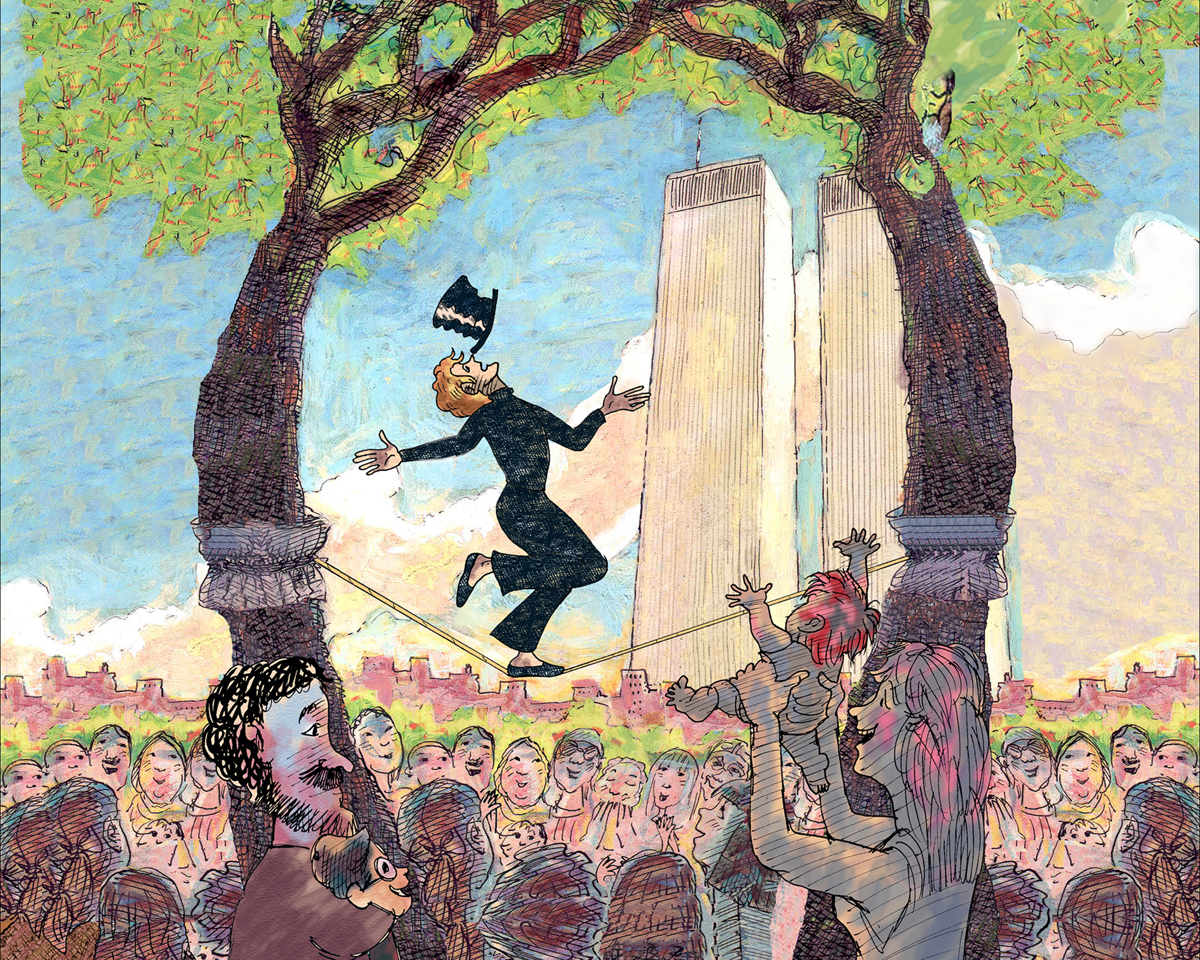 - Last week, I’d received an email from Mike Barrier with a letter he’d received from “anonymous.” The letter was a not-very-positive comment about Mike’s positive reviews of my film, The Man Who Walked Between the Towers. So I wrote a slightly annoyed response which Mike posted. I think if “anonymous” had had the courage to stand behind the letter by using his(her) name, I would have been more patient with it. Just the same, it all makes for a peculiar read. I can’t say I mind it, in the end. Take a look, here. ____________________ An image drawn by me that duplicates one in the book.
– Mike Dobbs, the estimable animation historian and former editor of Animato and Animation Planet, has posted an interview with me on his site, Animation Review.
By the way, Mike Dobbs has two other sites:
_____ Made of Pen & Ink is his book on the Fleischer
_______studios which is posted on line as he writes it.
_____ Out of the Inkwell is Mike’s general blog.
- Finally, David Nethery has posted a recommendation for my two new dvd’s on his site, Academy of Art Animation. Thank you, David. It’s much appreciated.
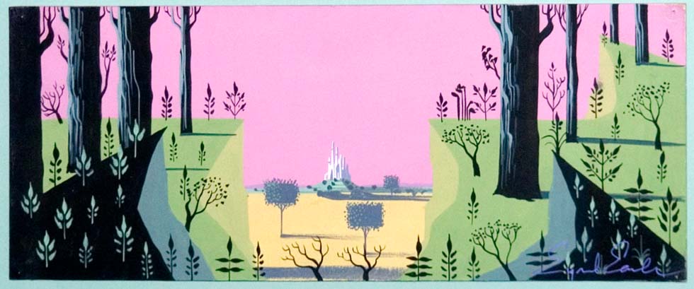
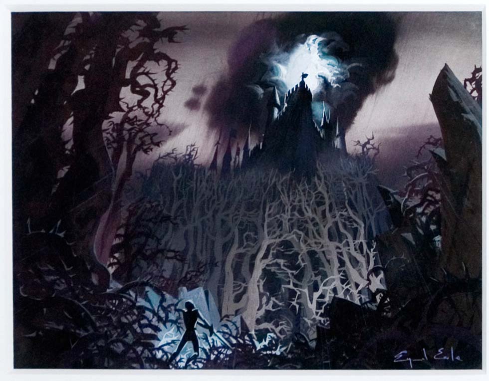
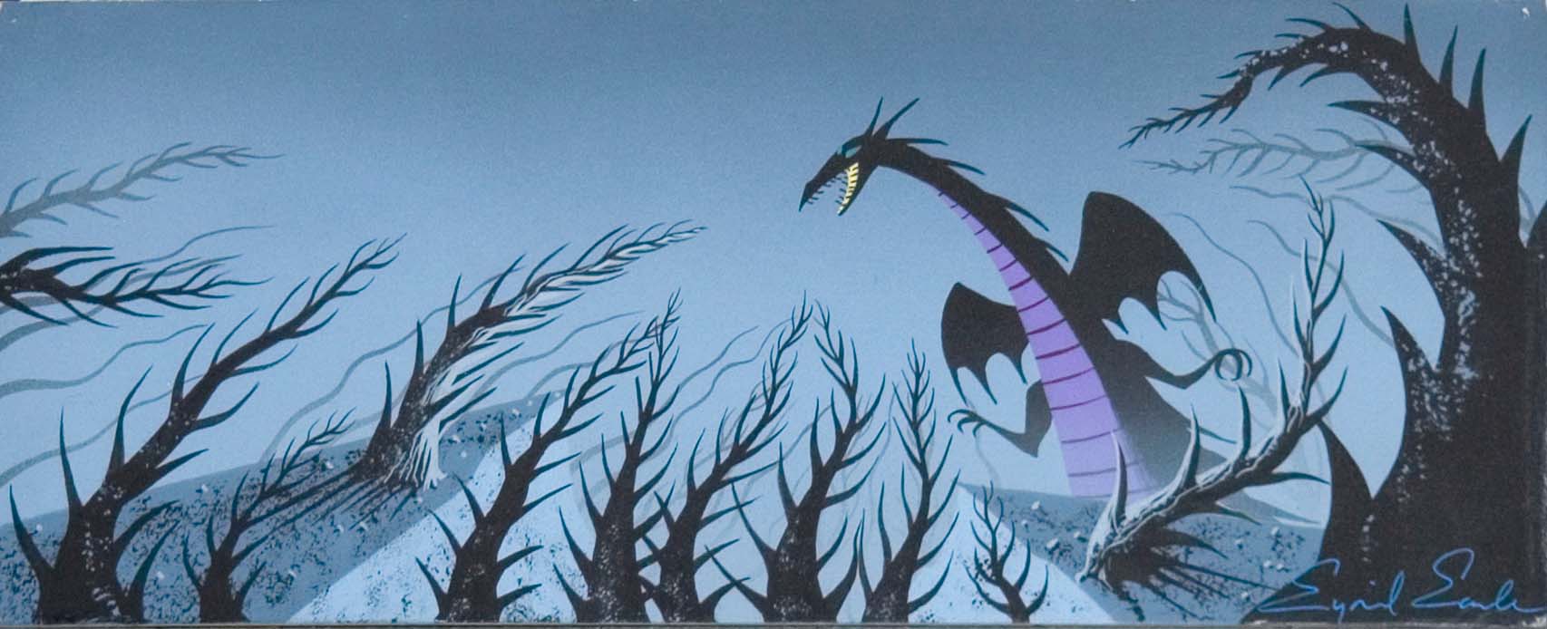
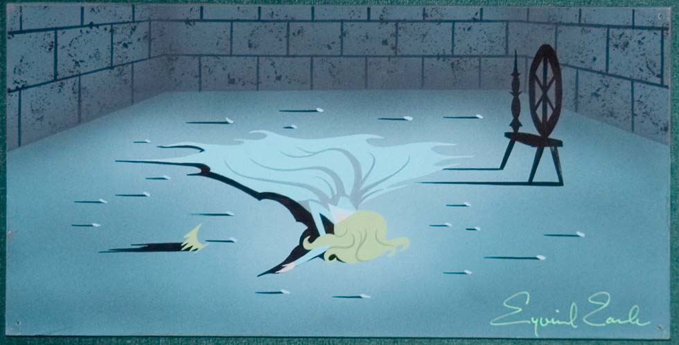
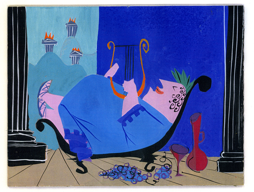
- And now for something completely different – let’s go back to Sleeping Beauty and Eyvind Earle. Bob Cowan responded to my posts of the art direction for that film by sending me some beautiful color pieces Earle did for the film. He’s given me permission to post them here. They’ve all been posted on Mr. Cowan’s site. There’s a lot of amazing artwork there – if you haven’t been following it, go. These five paintings are beauties.
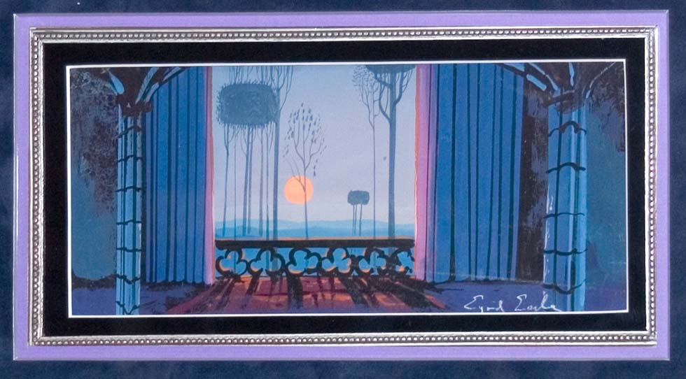
(Click any image to enlarge.)