Category ArchiveLayout & Design
Animation Artifacts &commercial animation &Layout & Design &Models &UPA 21 Nov 2012 06:56 am
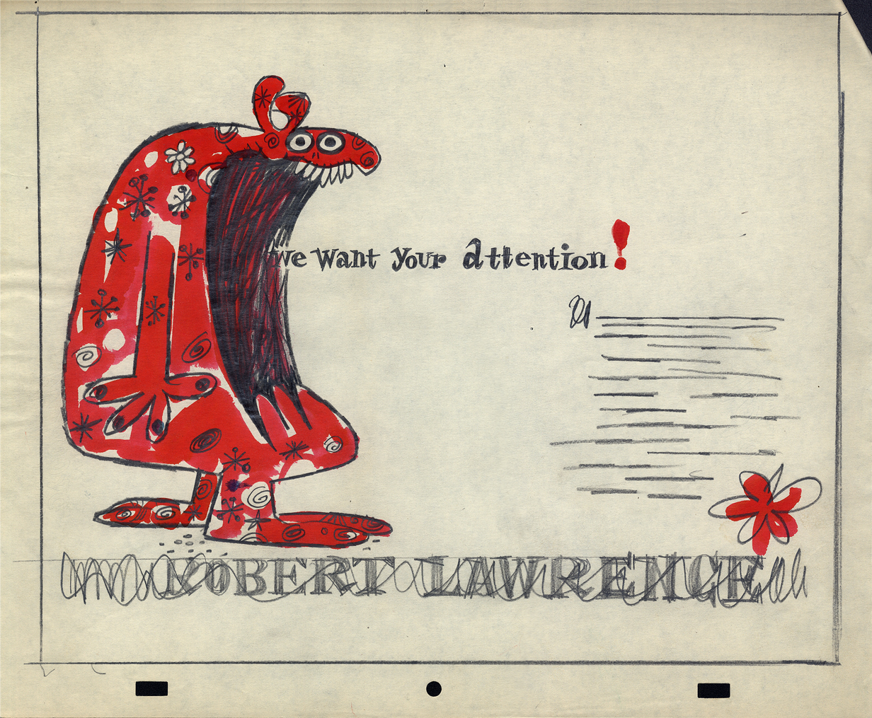
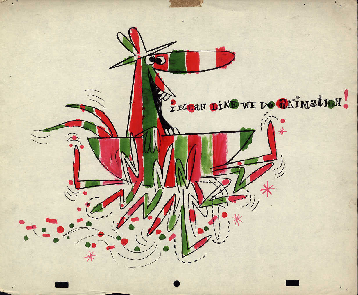
Robert Lawrence Prods. – part 1
- Robert Lawrence Productions was a thriving studio in New York in the days post-UPA. Many of the animators moved from UPA, once they closed, to Robert Lawrence. Grim Natwick/Tissa David worked there (freelance), Lu Guarnier/Vince Cafarelli worked there, and consequently, Vince collected a lot of artwork from the spots he did. This post features a lot of that artwork. You’ll see how great the design and styling was at the studio, even though I don’t know what clients or sonsors they were done for. The designers certainly took off where UPA left off.
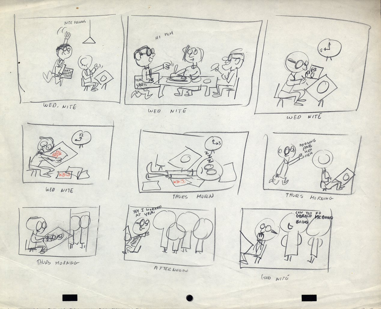
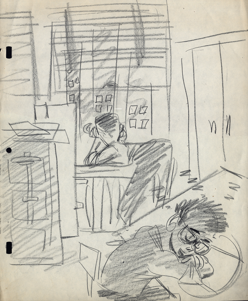
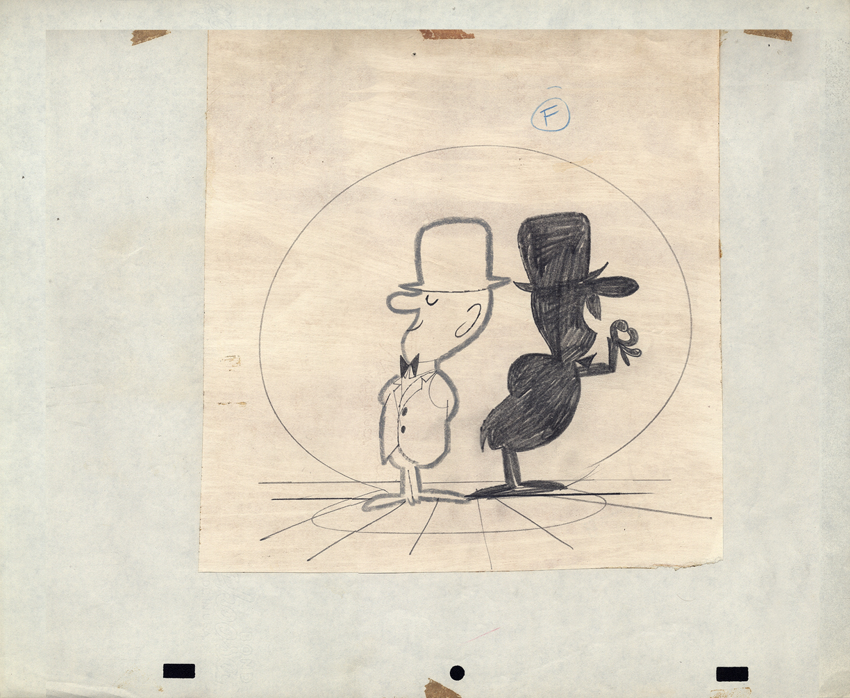
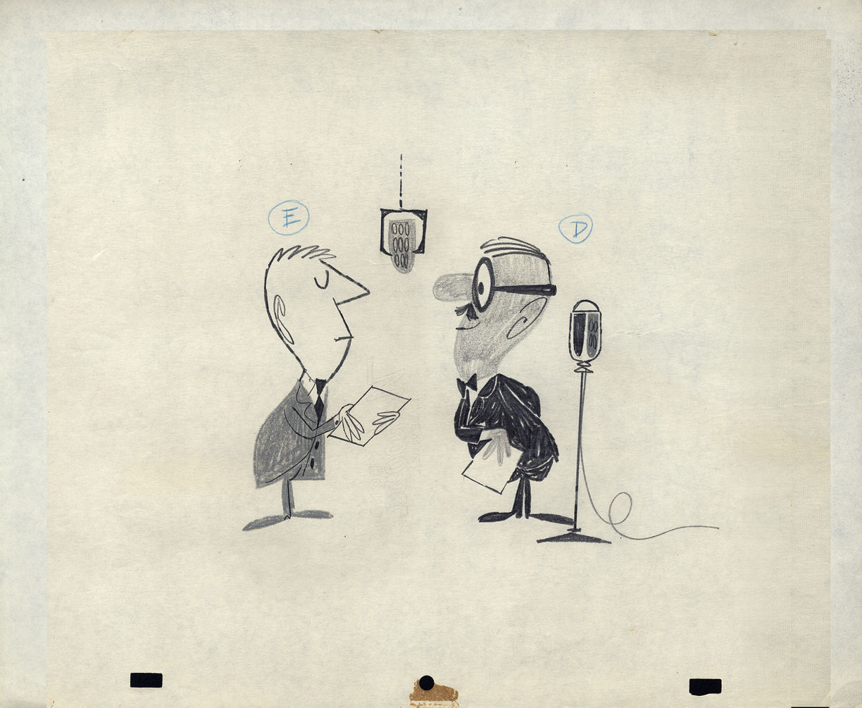
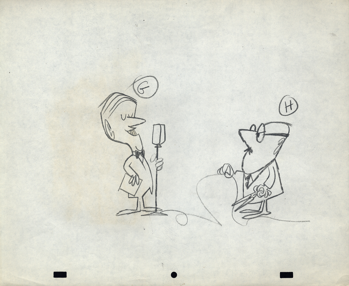
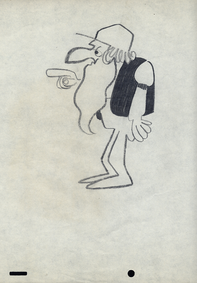
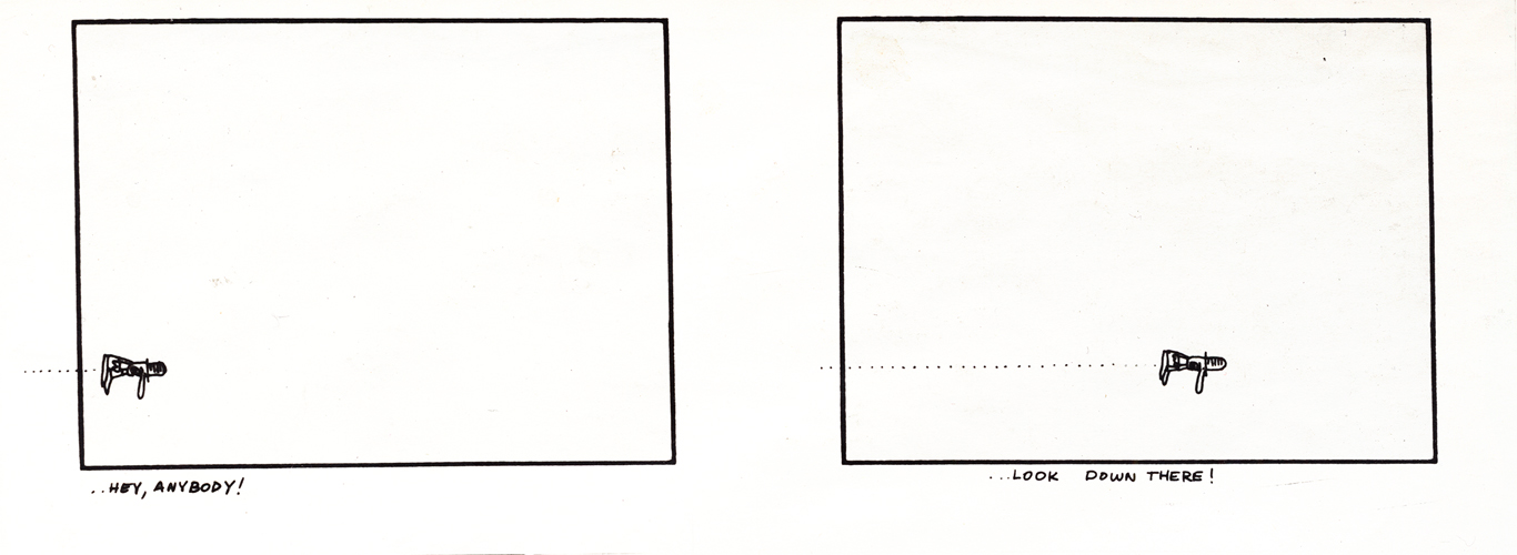
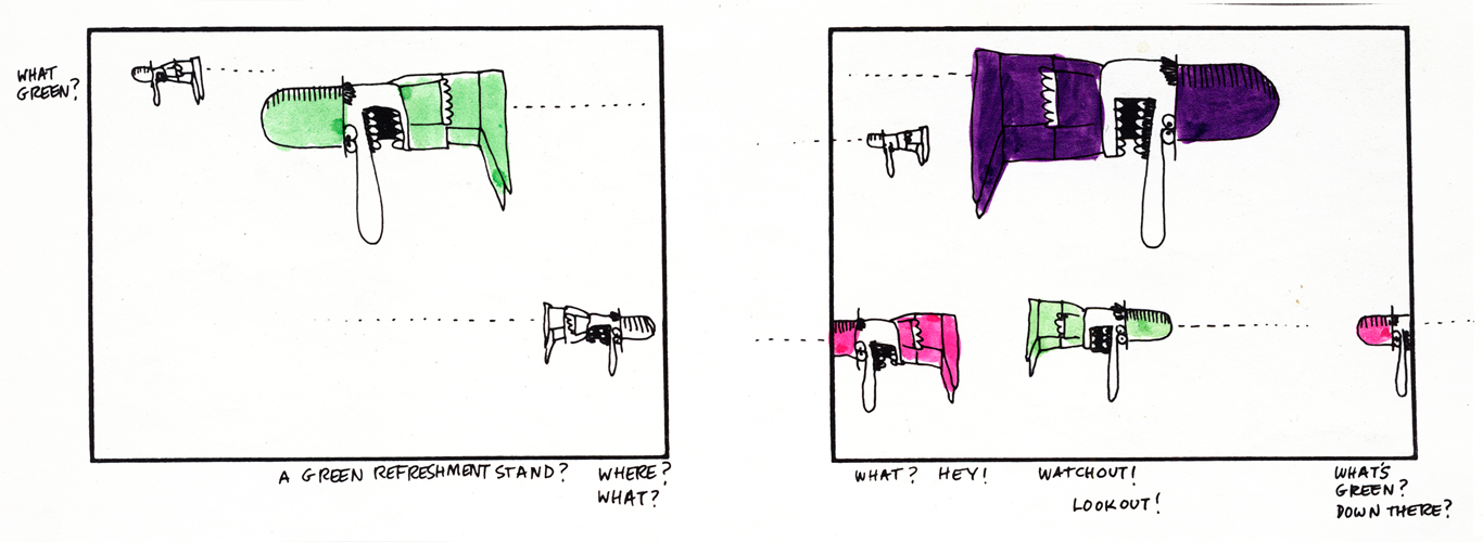
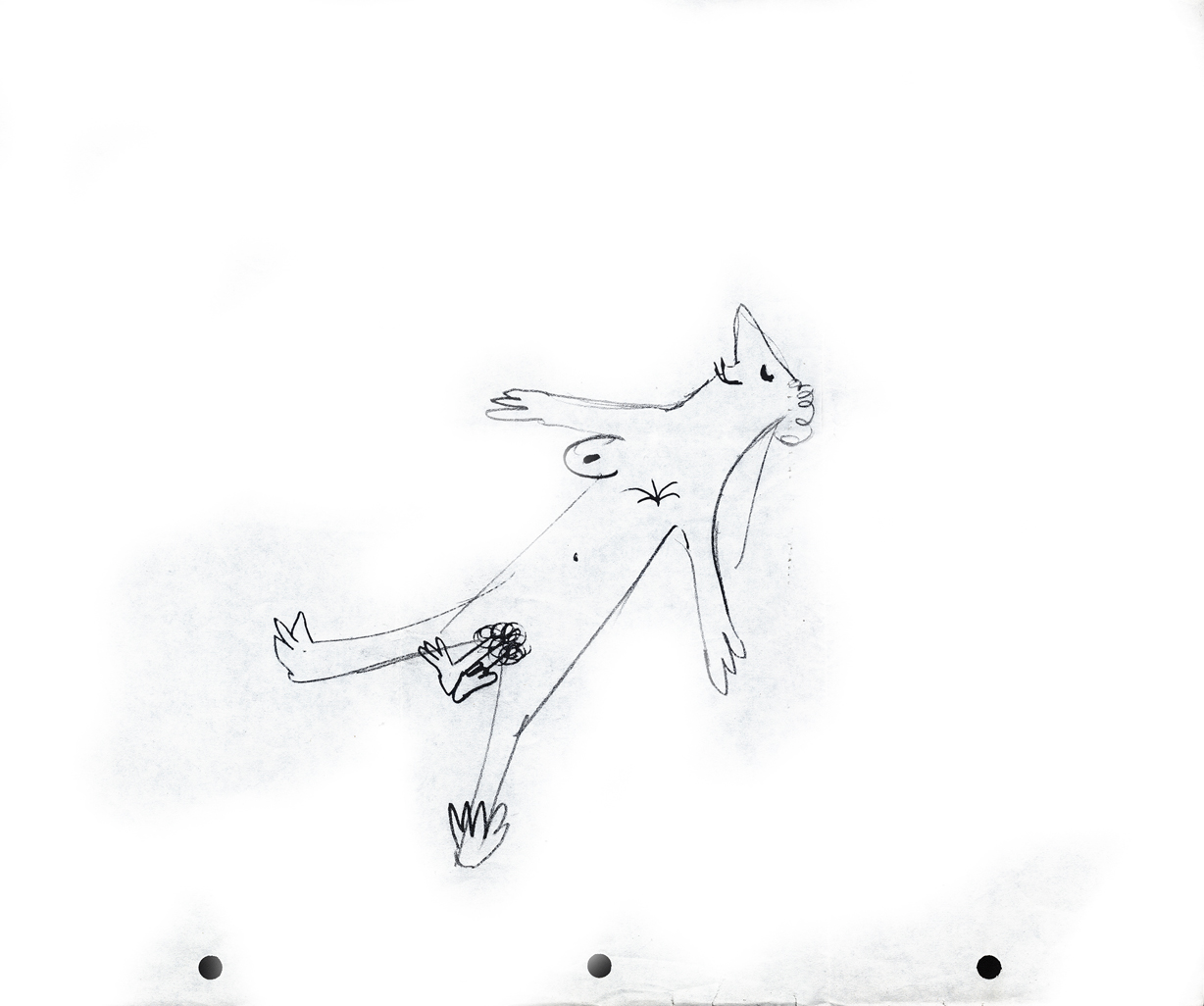
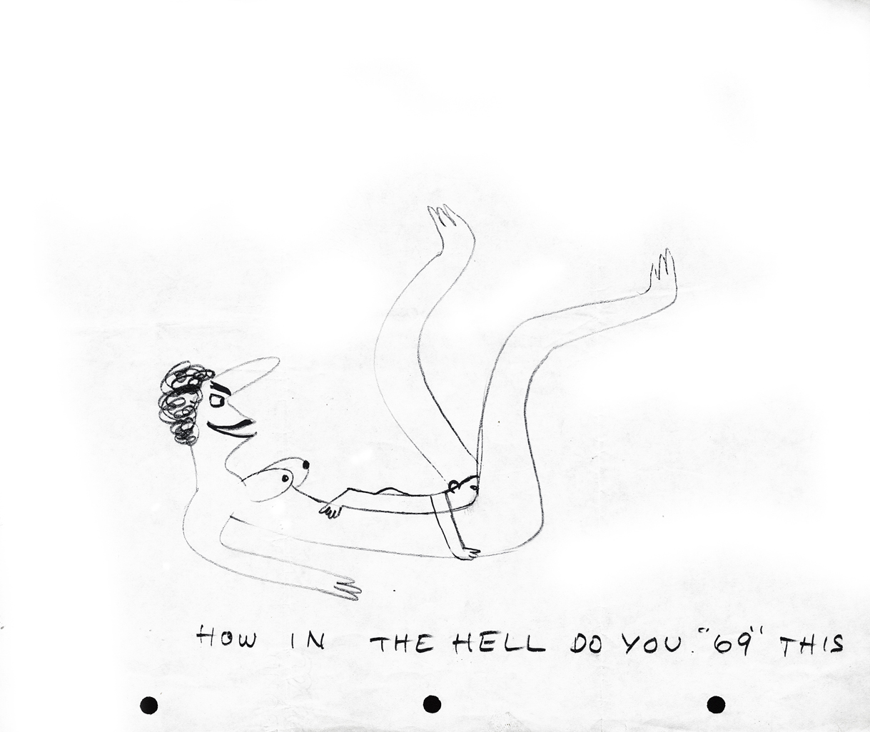
But first, let me share two in-house studio gags done at UPA.
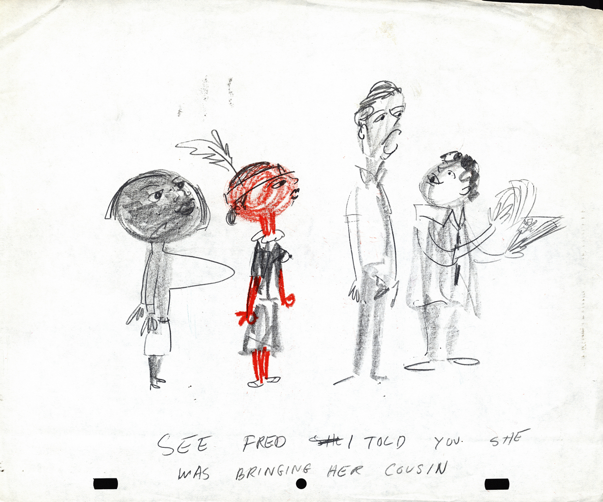
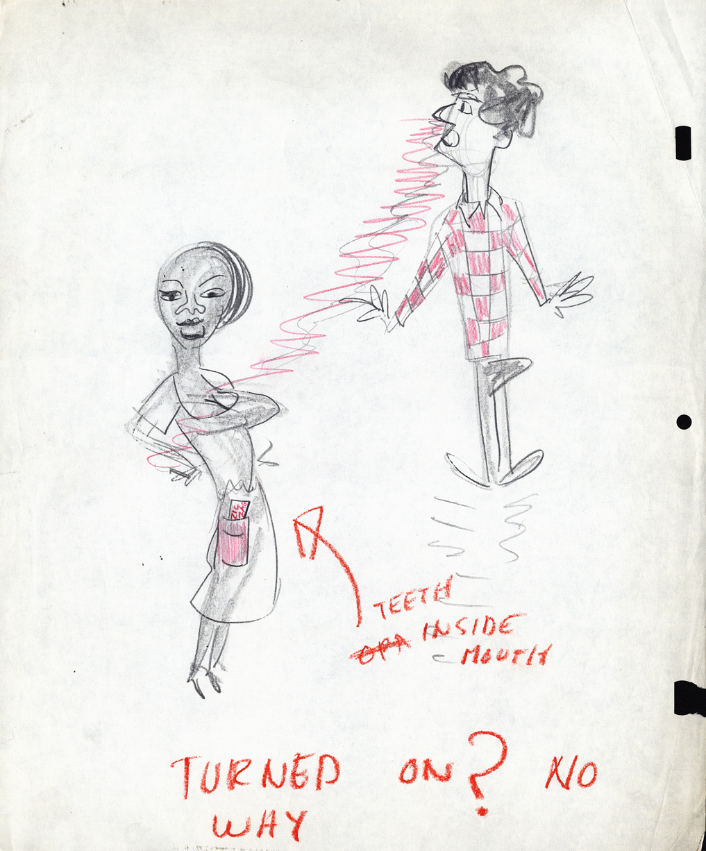
 1
1
 2
2
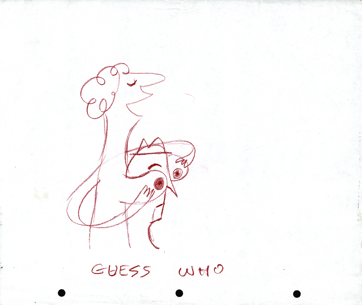
At UPA – NY, Lu Guarnier was the only animator
who had a window. Vince Cafarelli and Pablo Ferro
were Lu’s Assistants/Inbetweeners, so they also
had the luxury of a window.
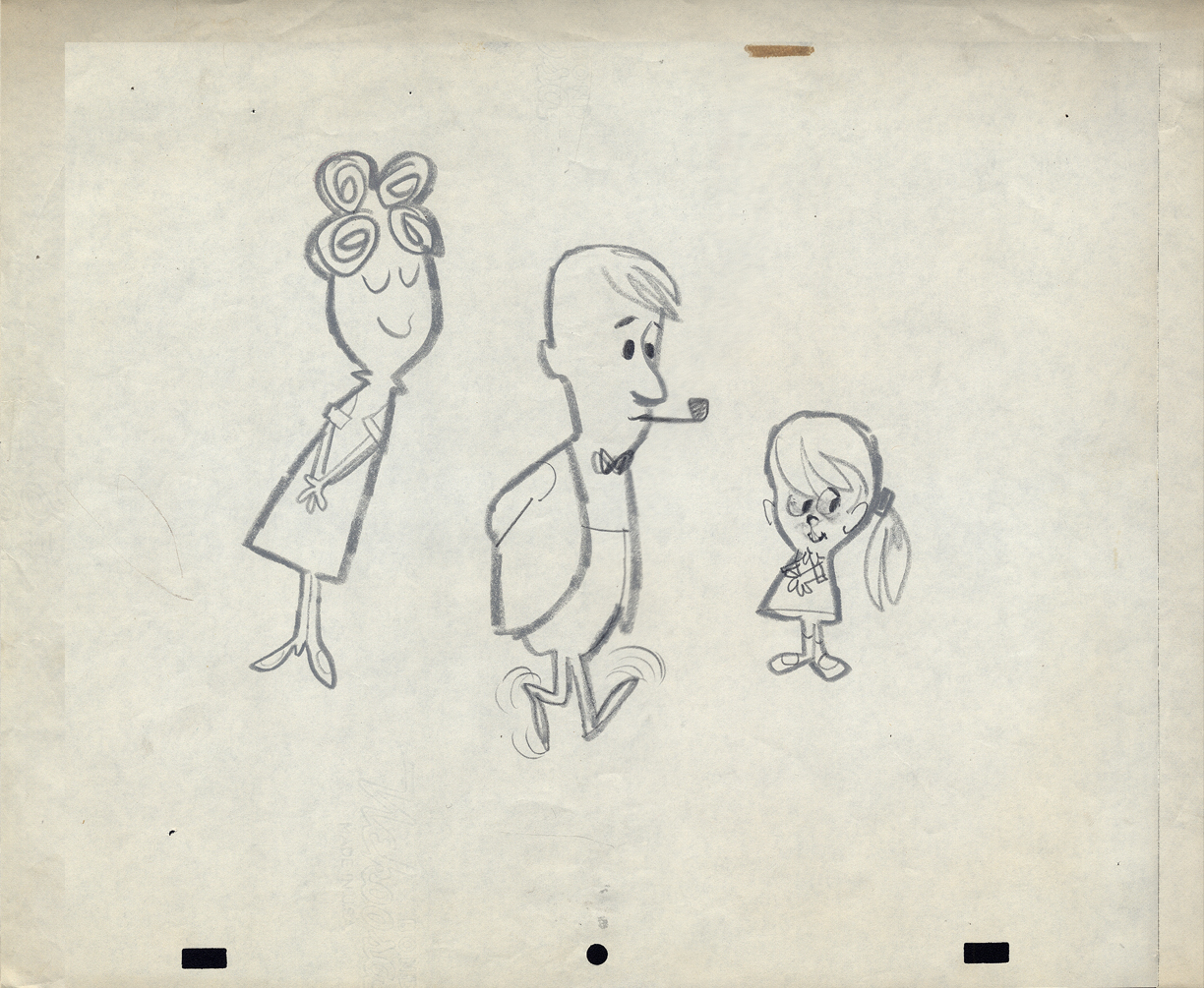
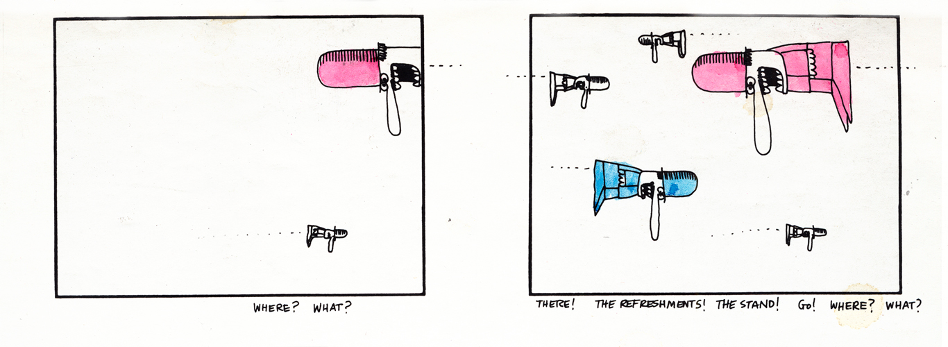
- OK, now onto Robert Lawrence. The more I look into this company’s work the more impressed I am. The quality of designers and animators on board was extraordinarily high. I have a lot of Layouts for films that are completely lost. I’m not sure what most of the images are for or what the stories of the spots was. I just have drawings, and most of them are impressive, even more so in some ways than much of the UPA work I’ve seen.
So let’s take a look.
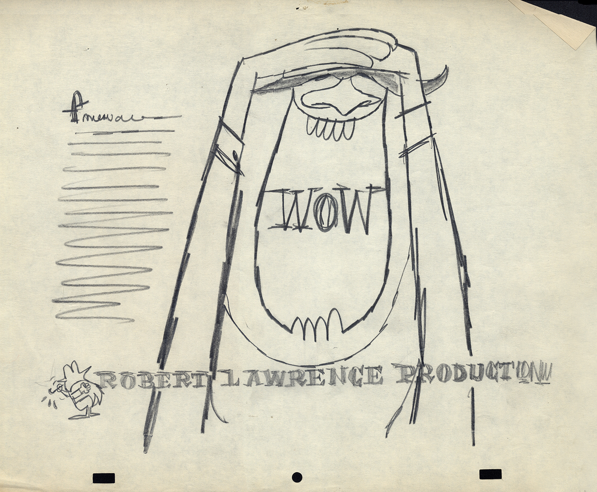
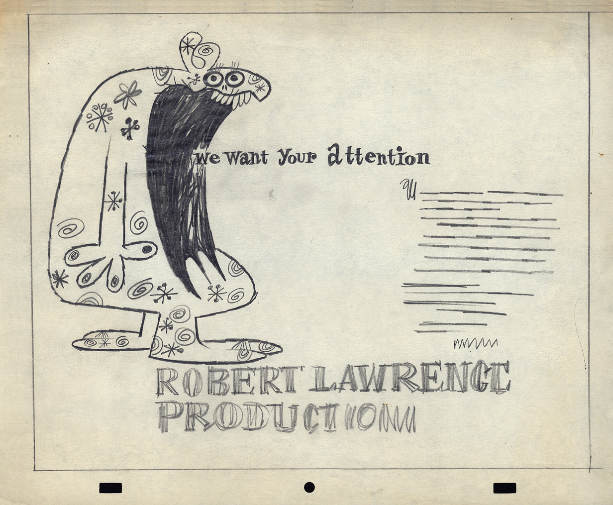
First there is the promo art. As an introduction to the company, here are four self-promo pieces that were used as trade ads for the company.
I’ve assumed that these images were created for a print ad in some magazine or another. There are three of them; one comes in a 2-color version.
 1
1
 2
2
 3
3
 4
4
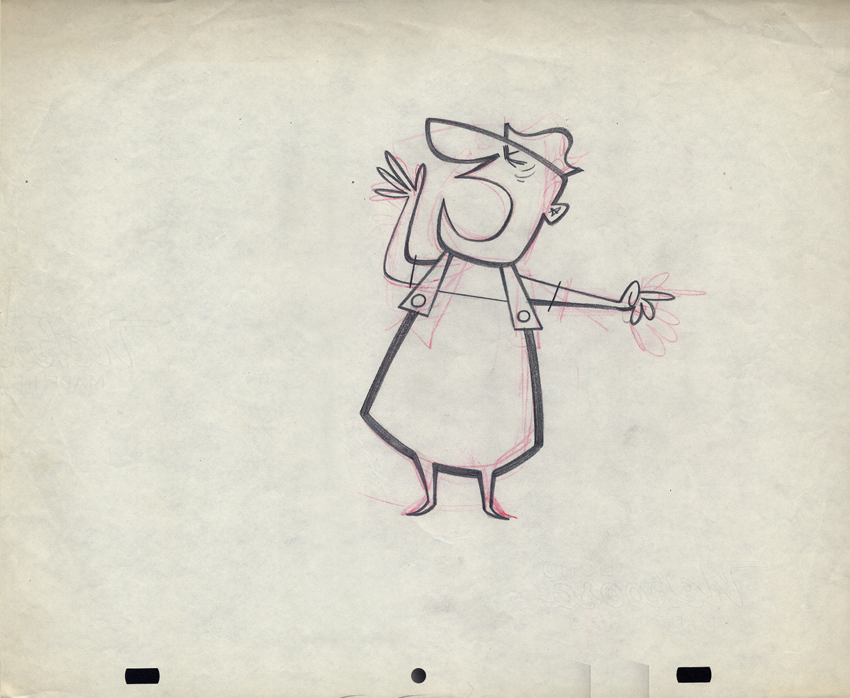
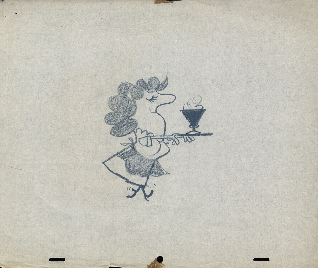
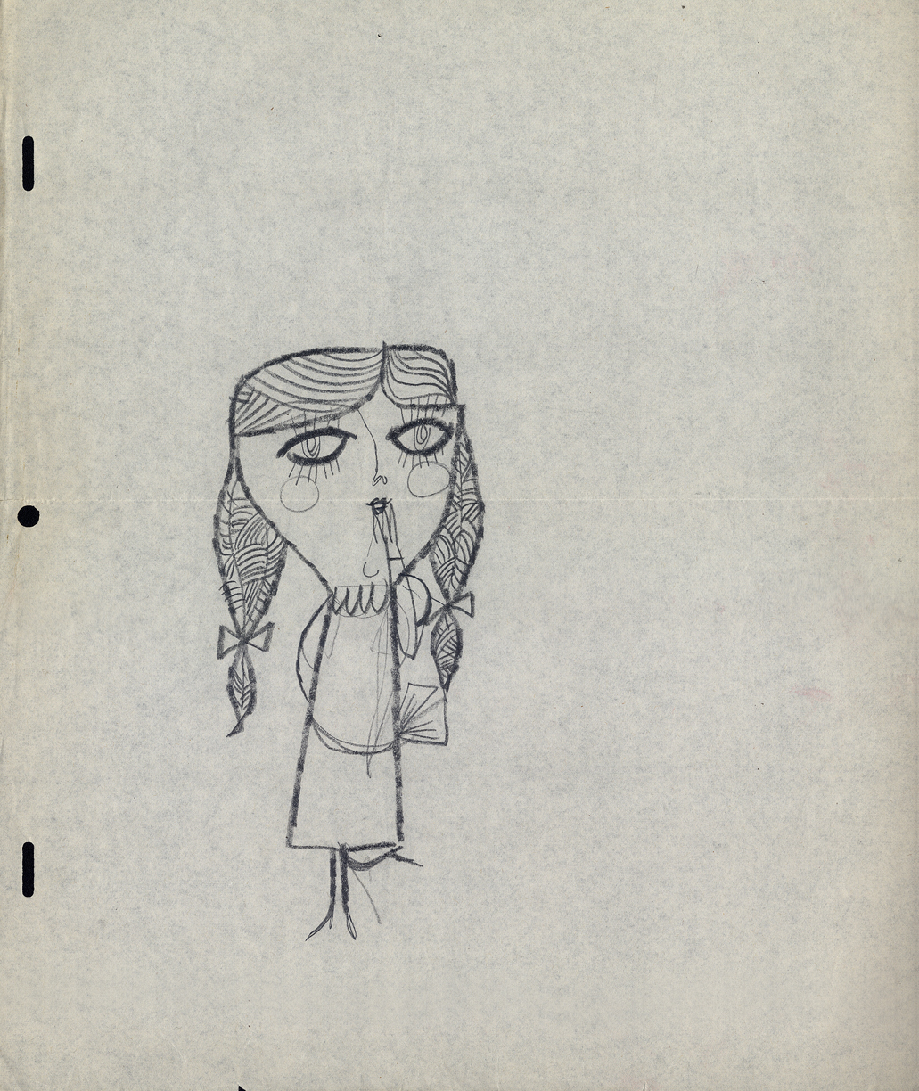
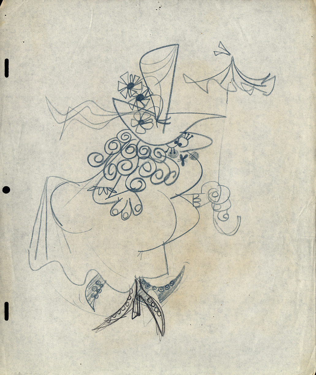
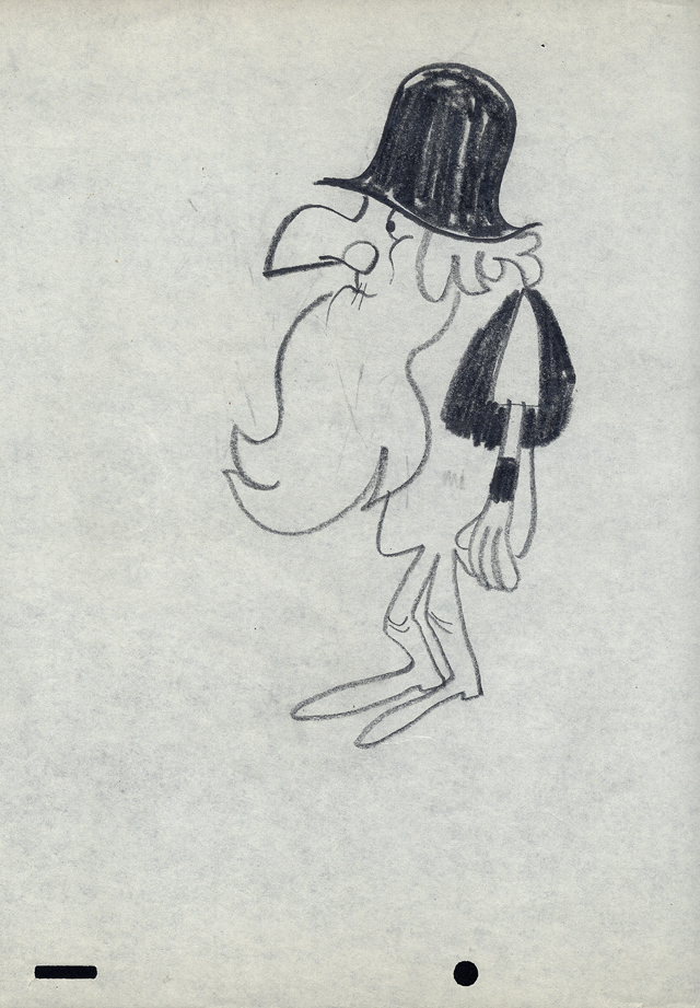
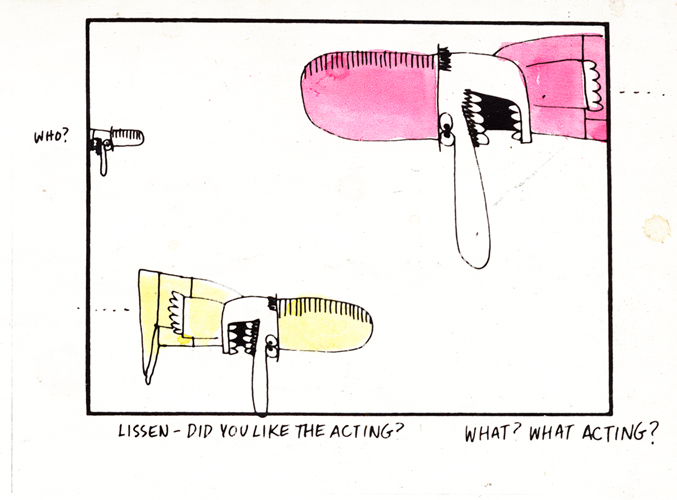
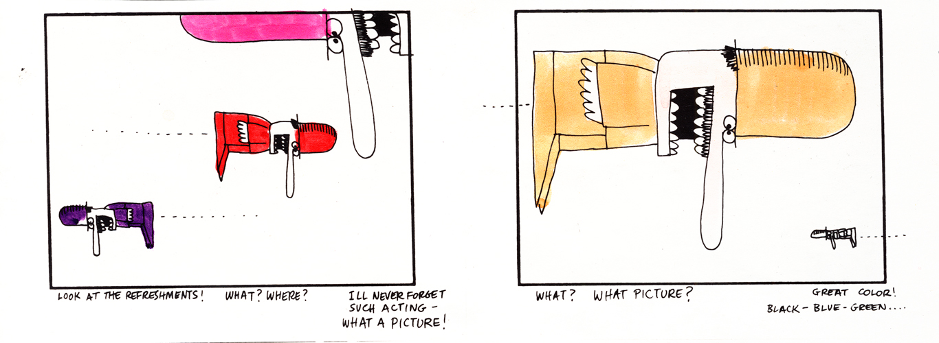
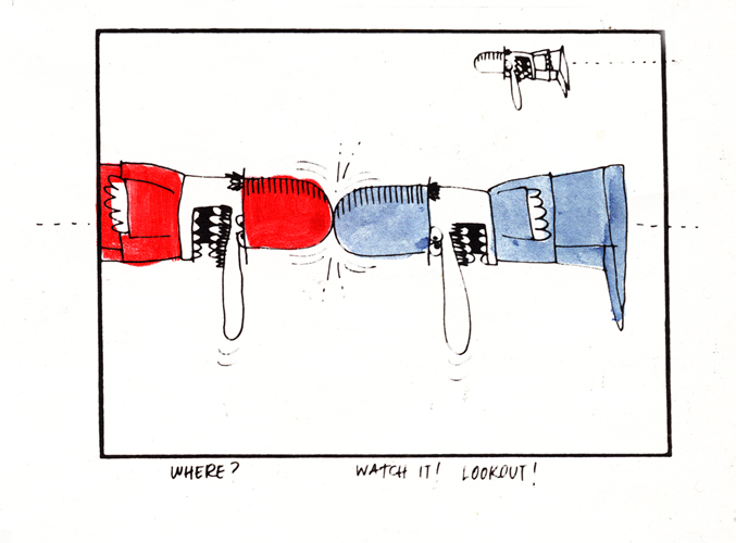
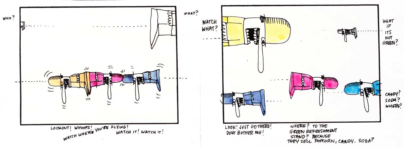
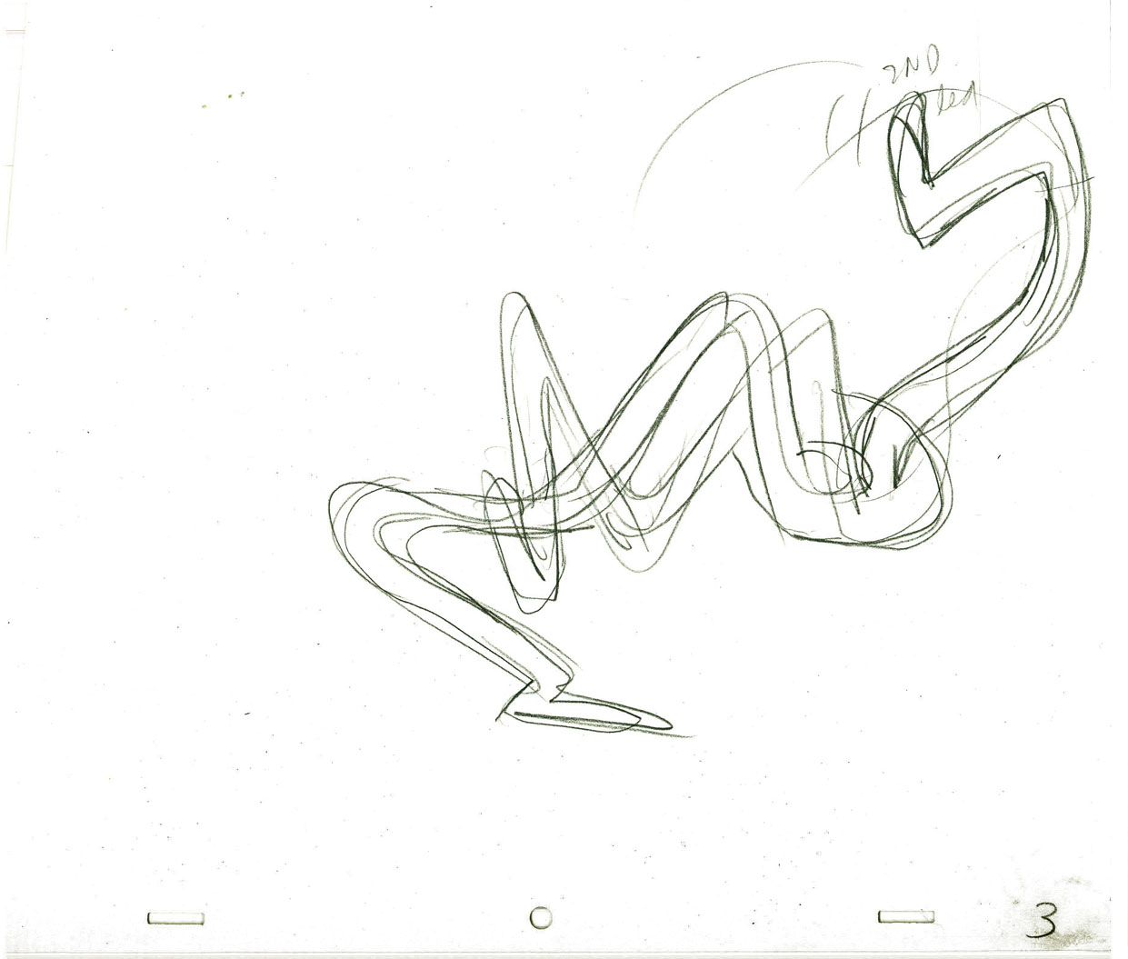
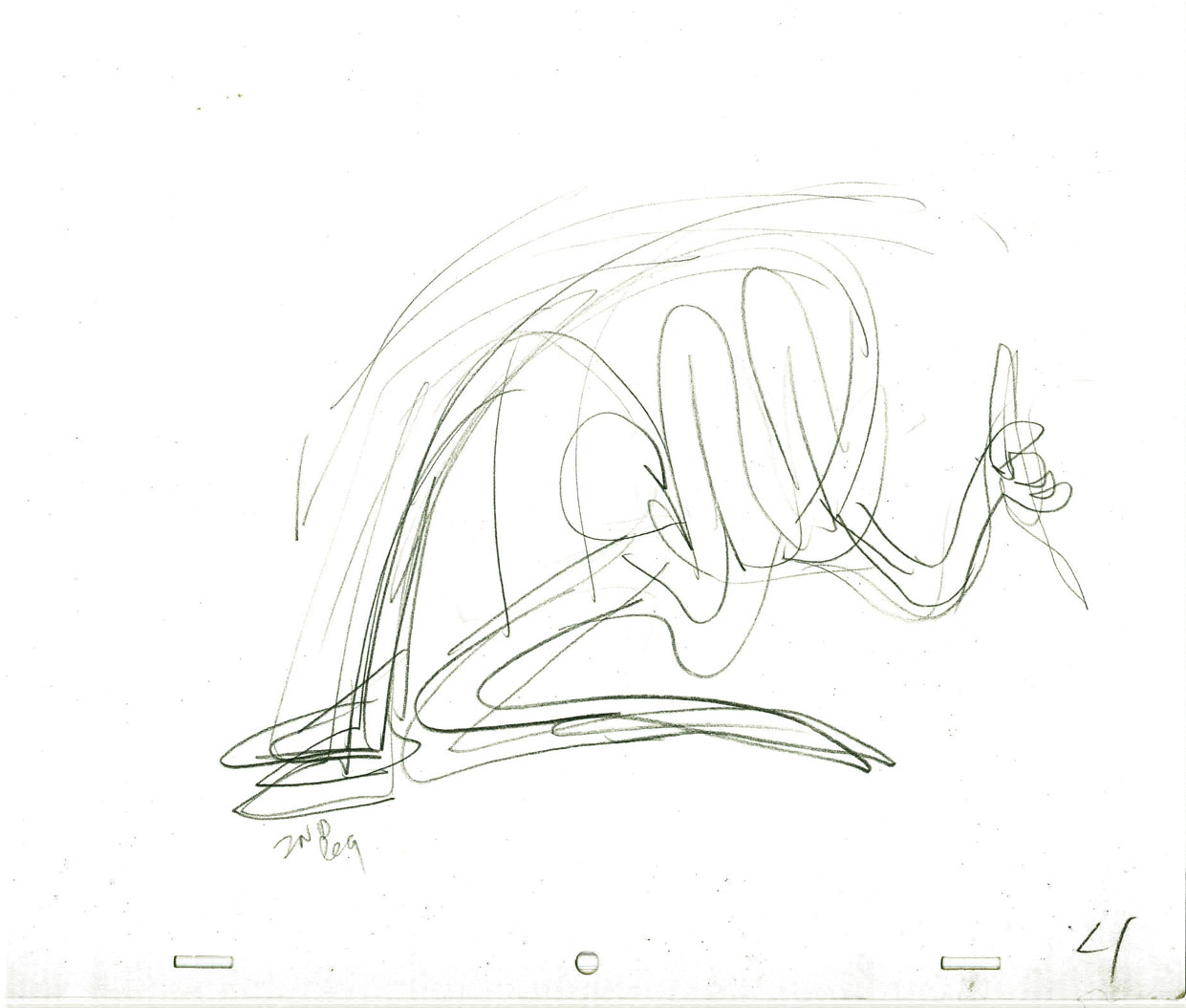
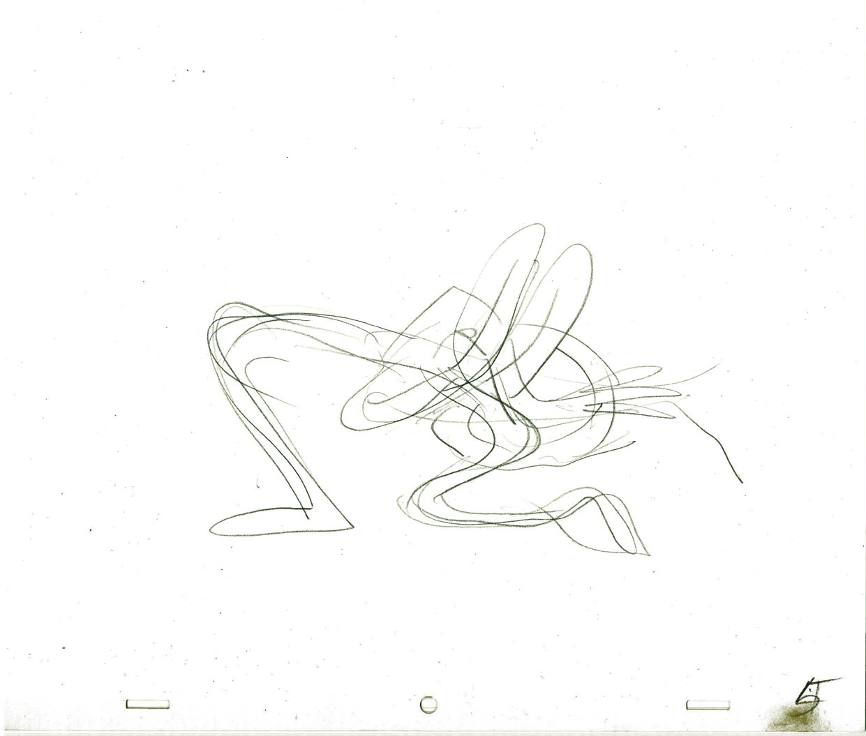
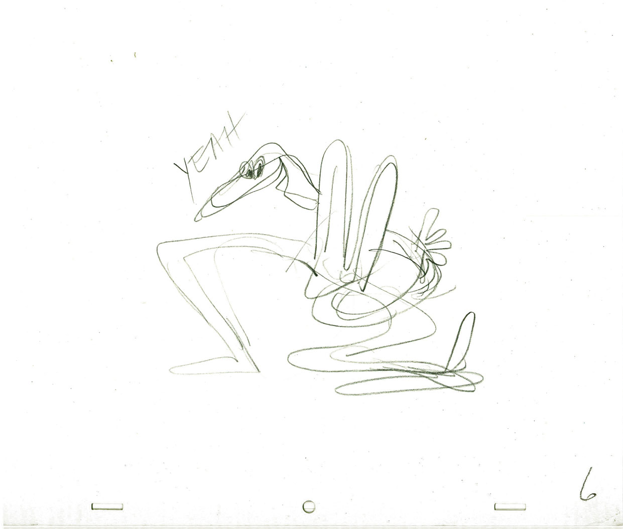
Now we get into some of the fun stuff. Here are the layouts done in a million styles, all beautifully drawn and designed. I feel like I want to say thank you to some of the artists involved. If only I knew who the artists were. The drawings and cels were all done on paper with a “Signal Corps” hole-punch. (Looks like Oxberry, but the center hole is the same diameter thickness as the square pegs.)
 1
1This is a beautiful gag told a million times,
but done perfectly in this drawing.
 2
2
 3
3
The inked arms in #1 are the variant. (Possibly a correction?)
 4
4
A cel not opaqued but beautifully inked.
 5
5
Obviously #5, 6, & 7 are the same characters in development.
It looks like #5 is probably the finished model.
 6
6
 7
7
 8
8
 9
9
 10
10
This looks a bit like Howard Beckerman’s style, but I’d
probably bet against that. The characters aren’t cute enough
 11
11
 12
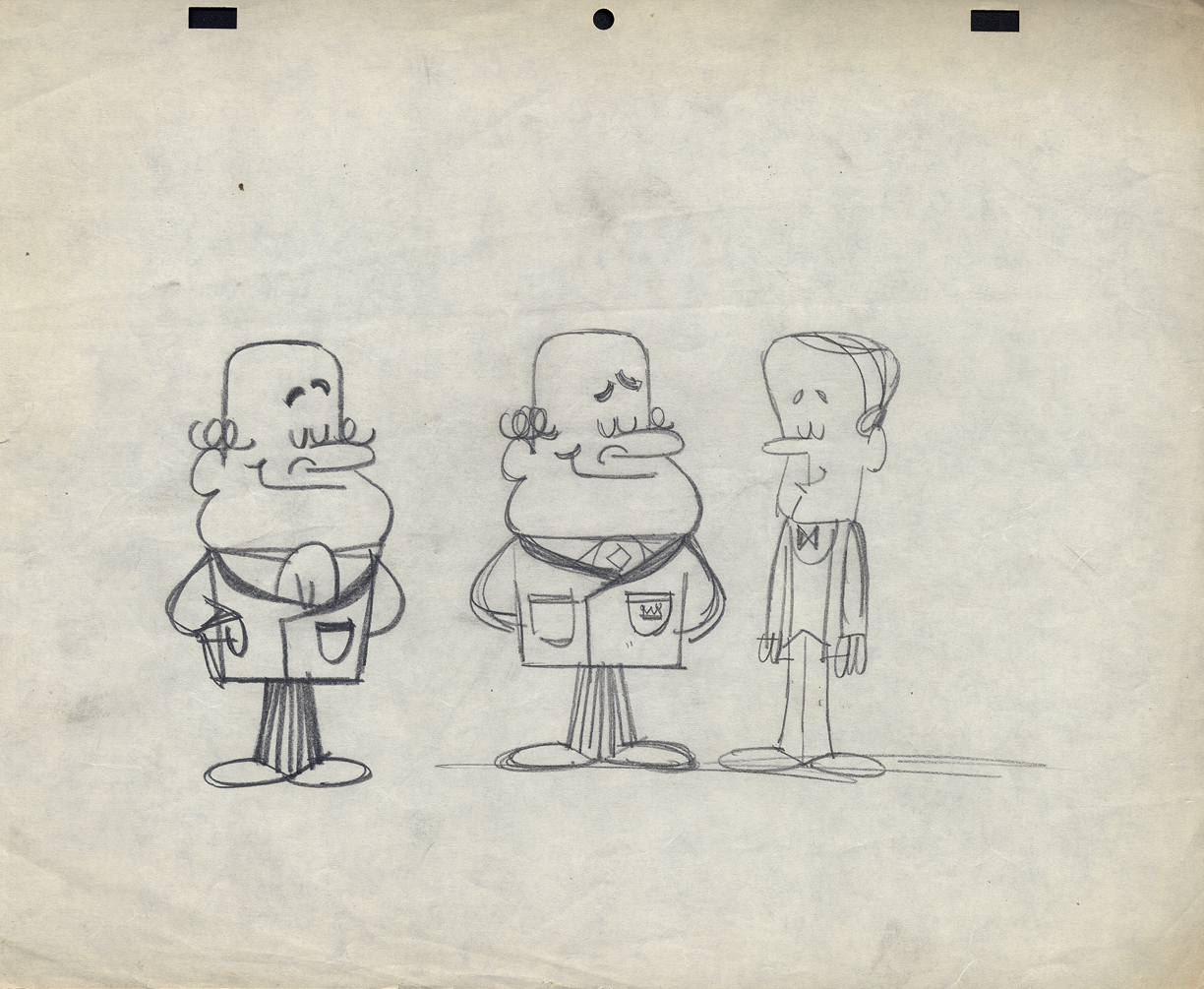
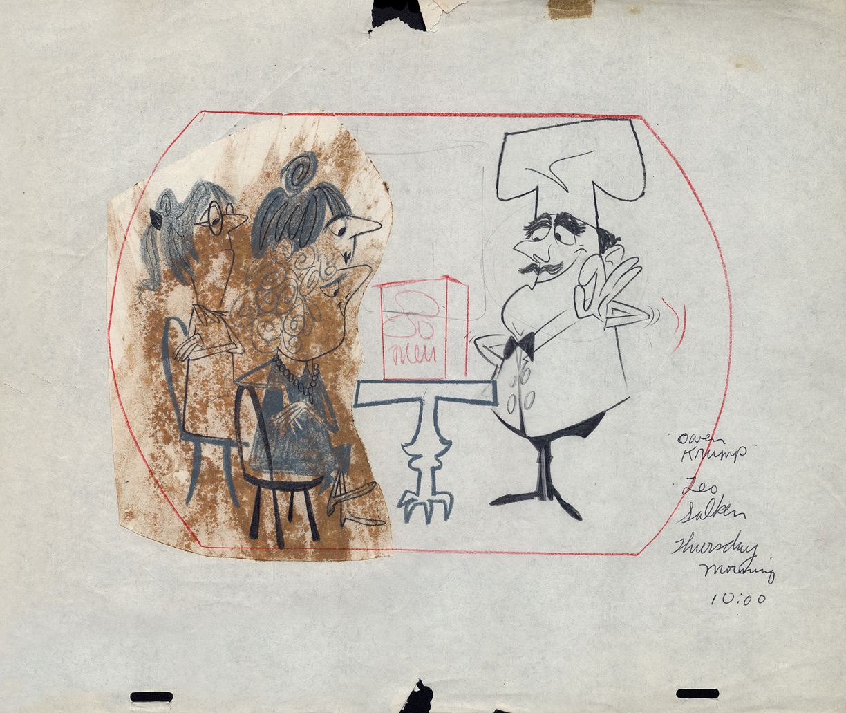
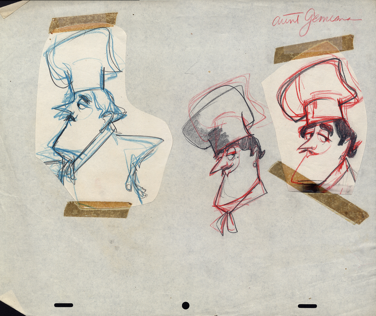
12
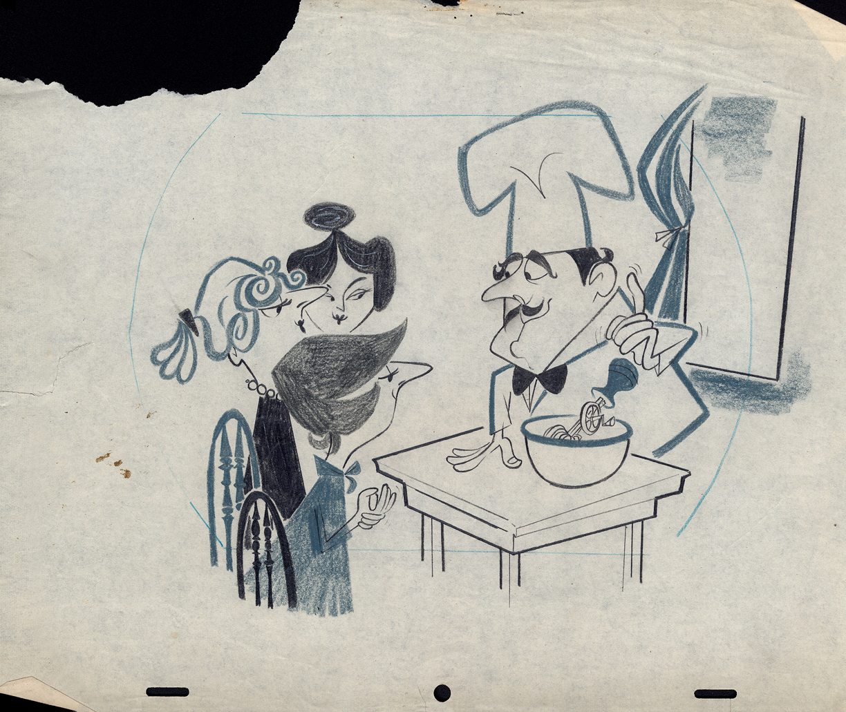
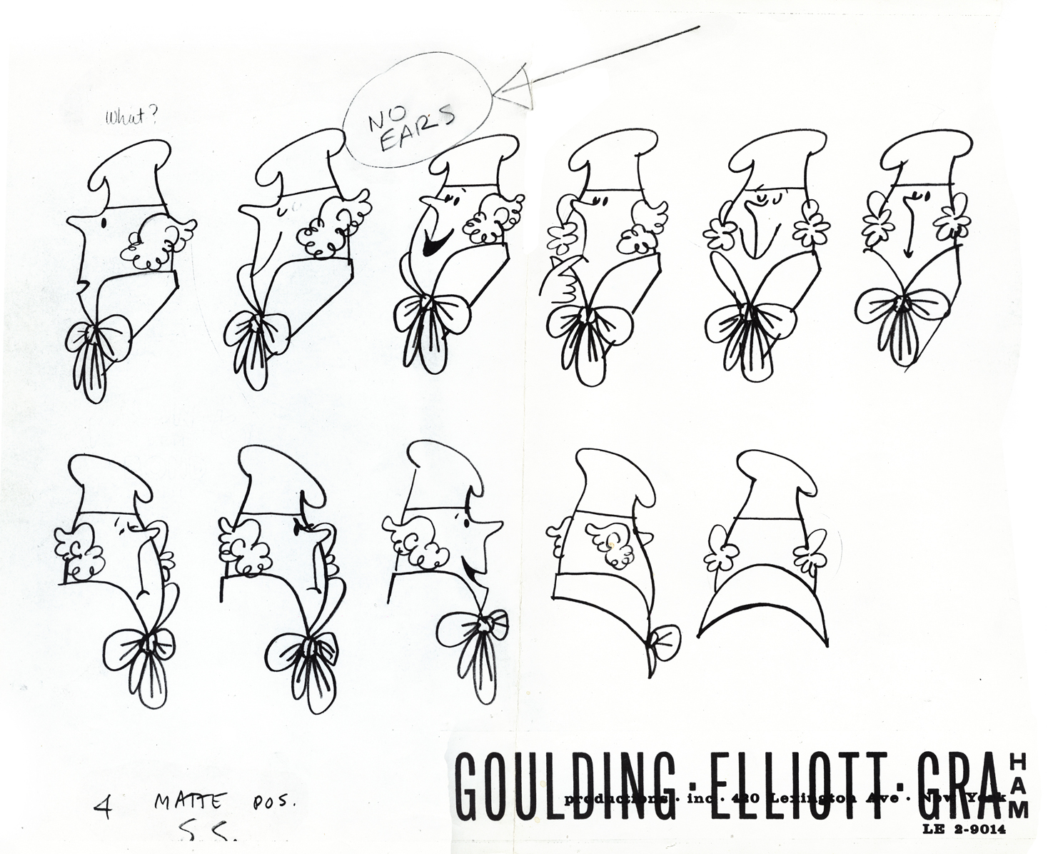
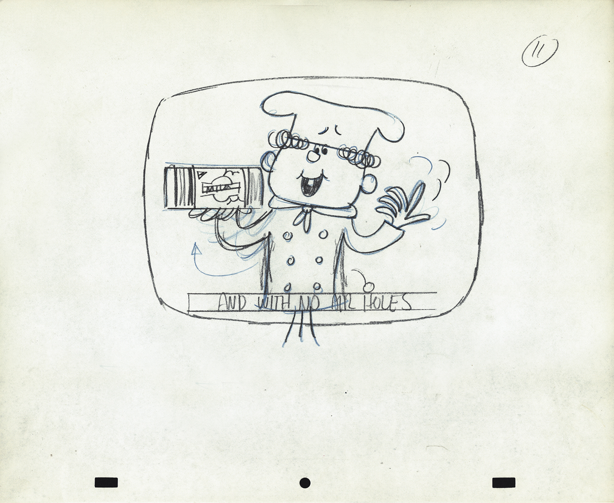
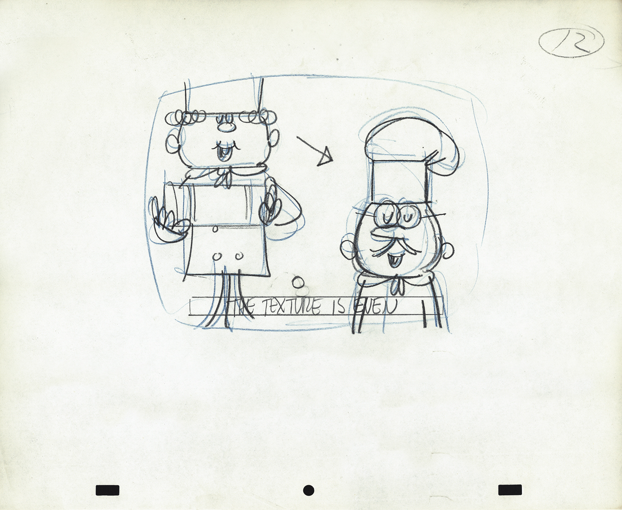
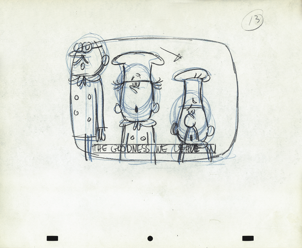
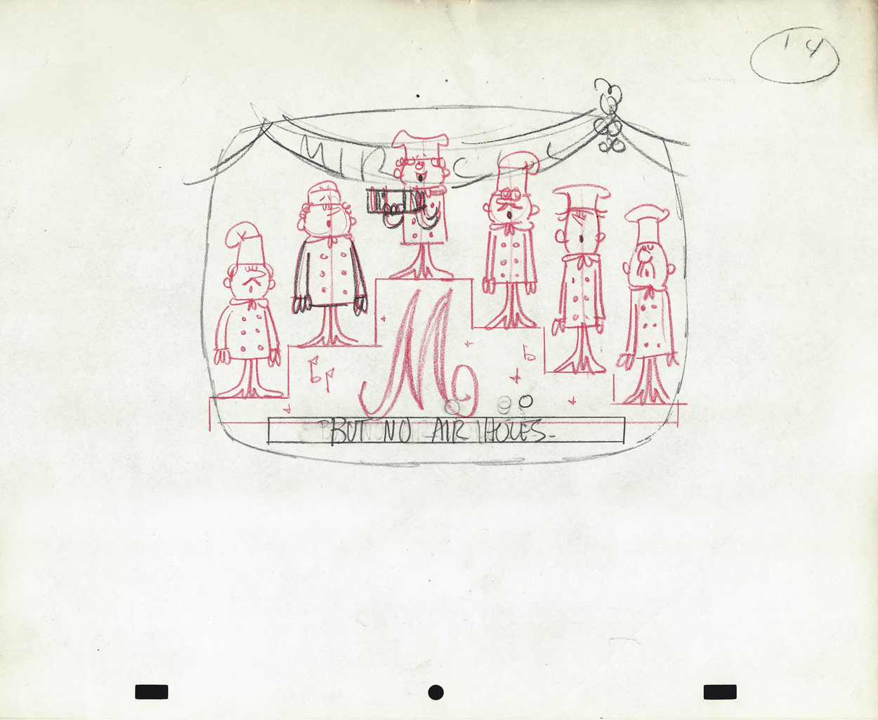
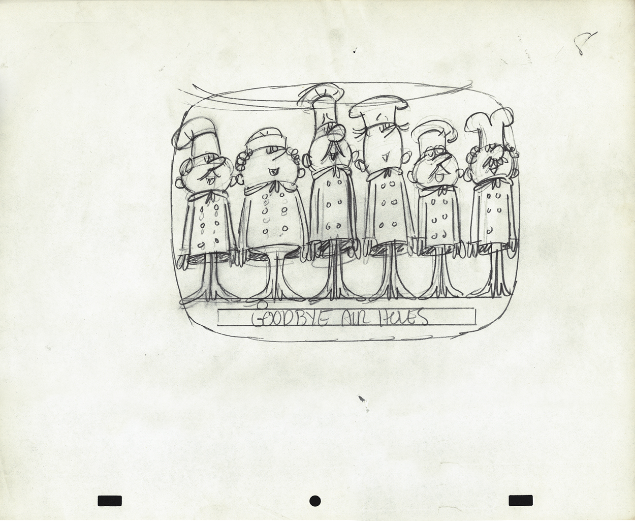
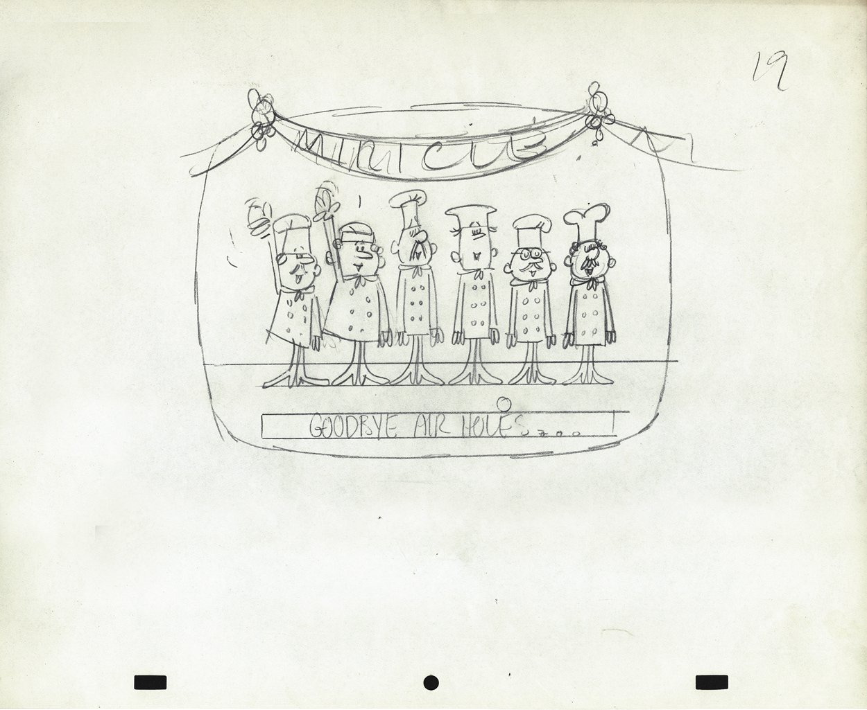
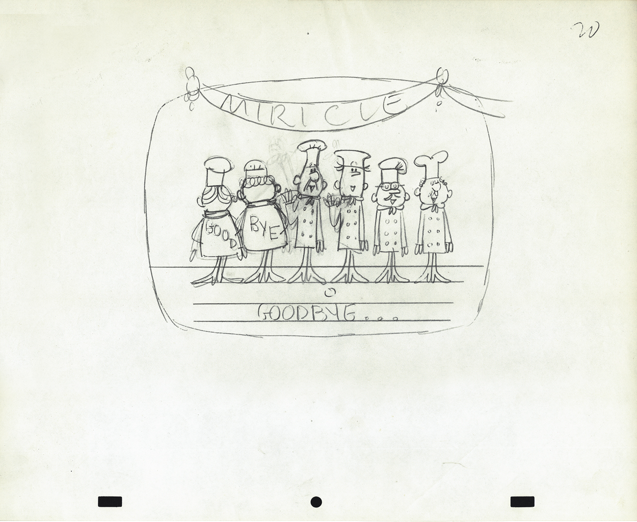
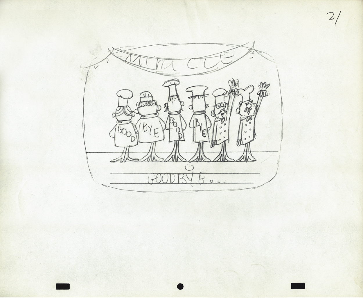
There’s a whole series of chef models
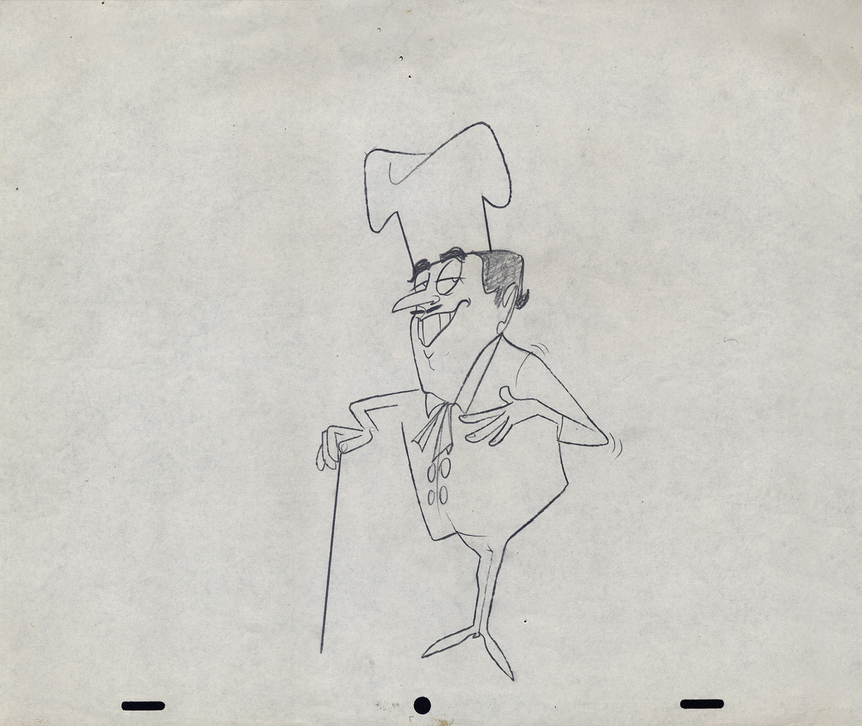 13
13
 14
14
 15
15
 16
16
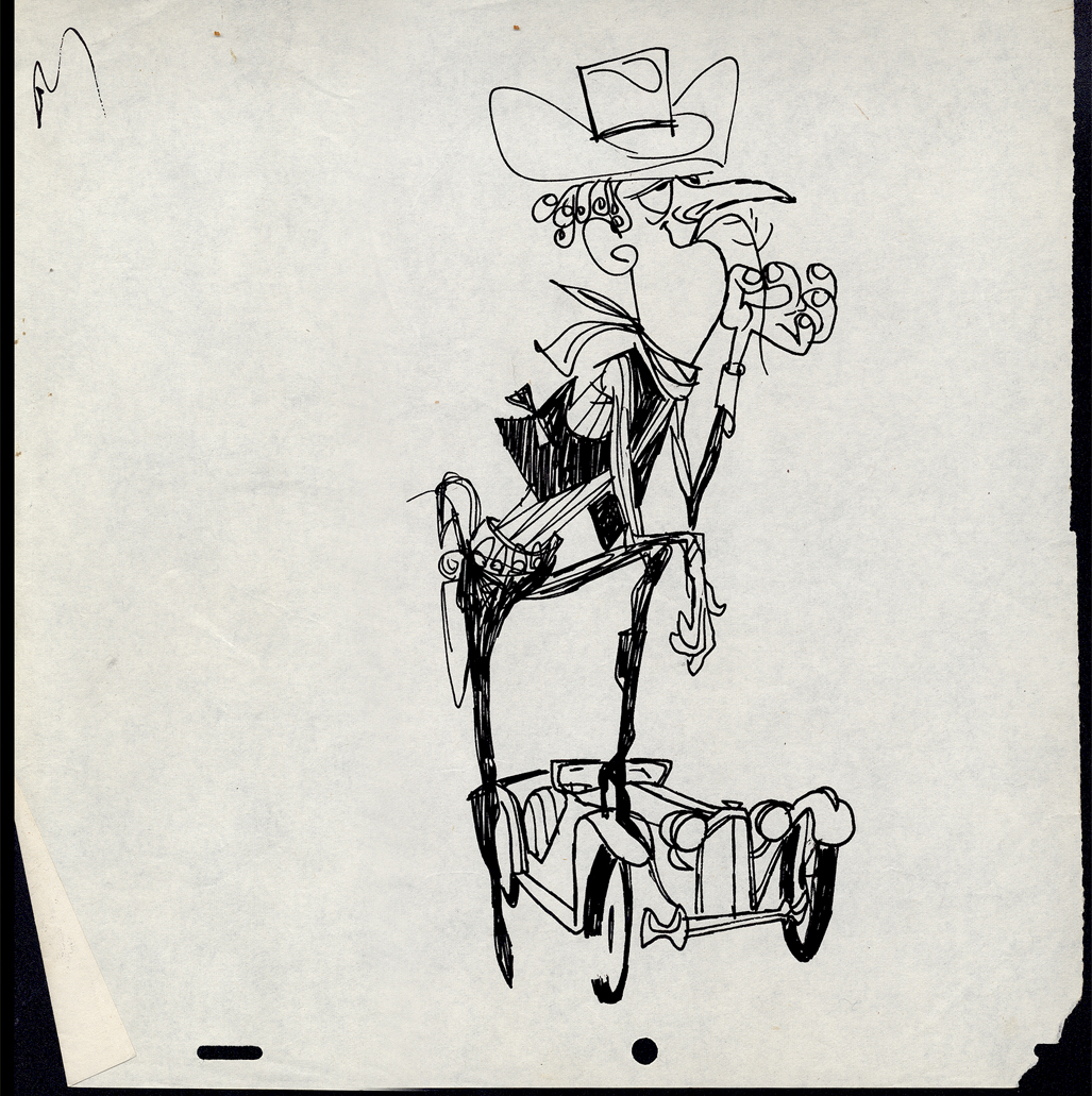
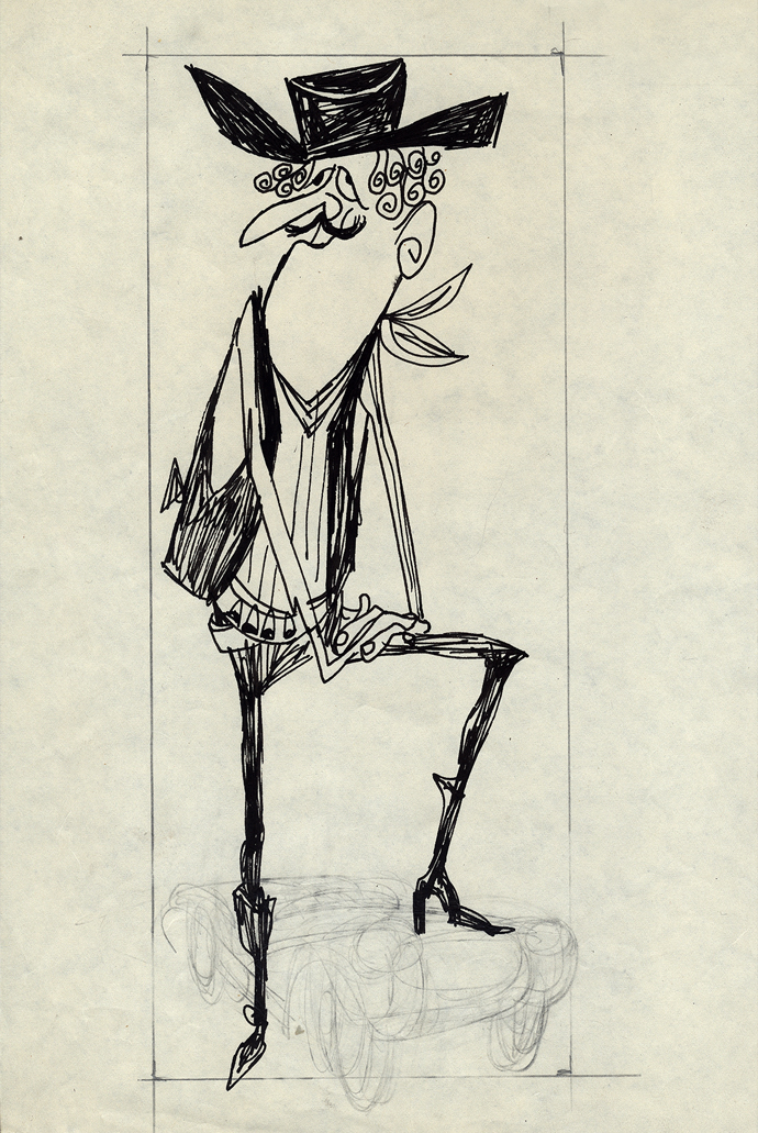
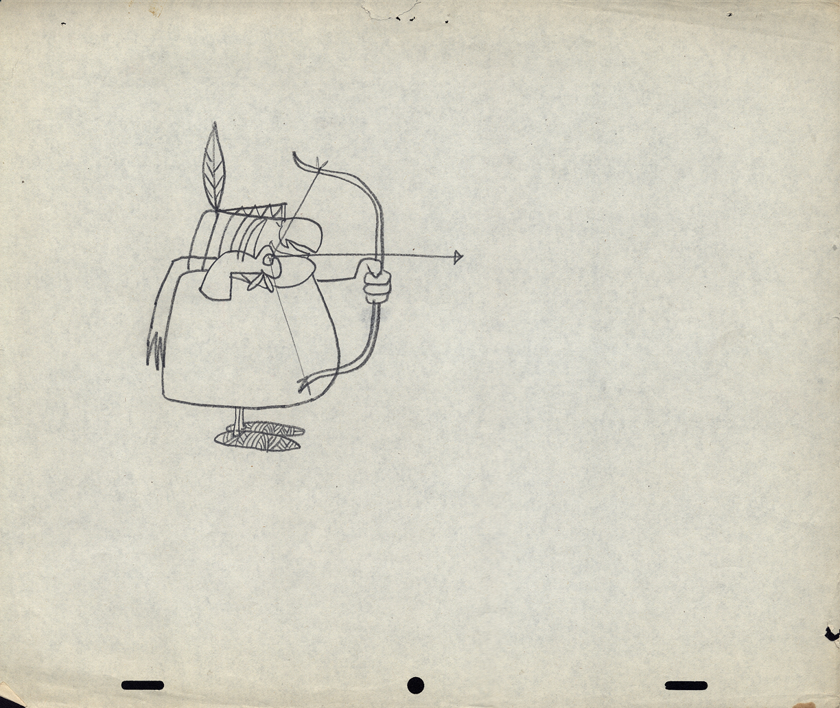
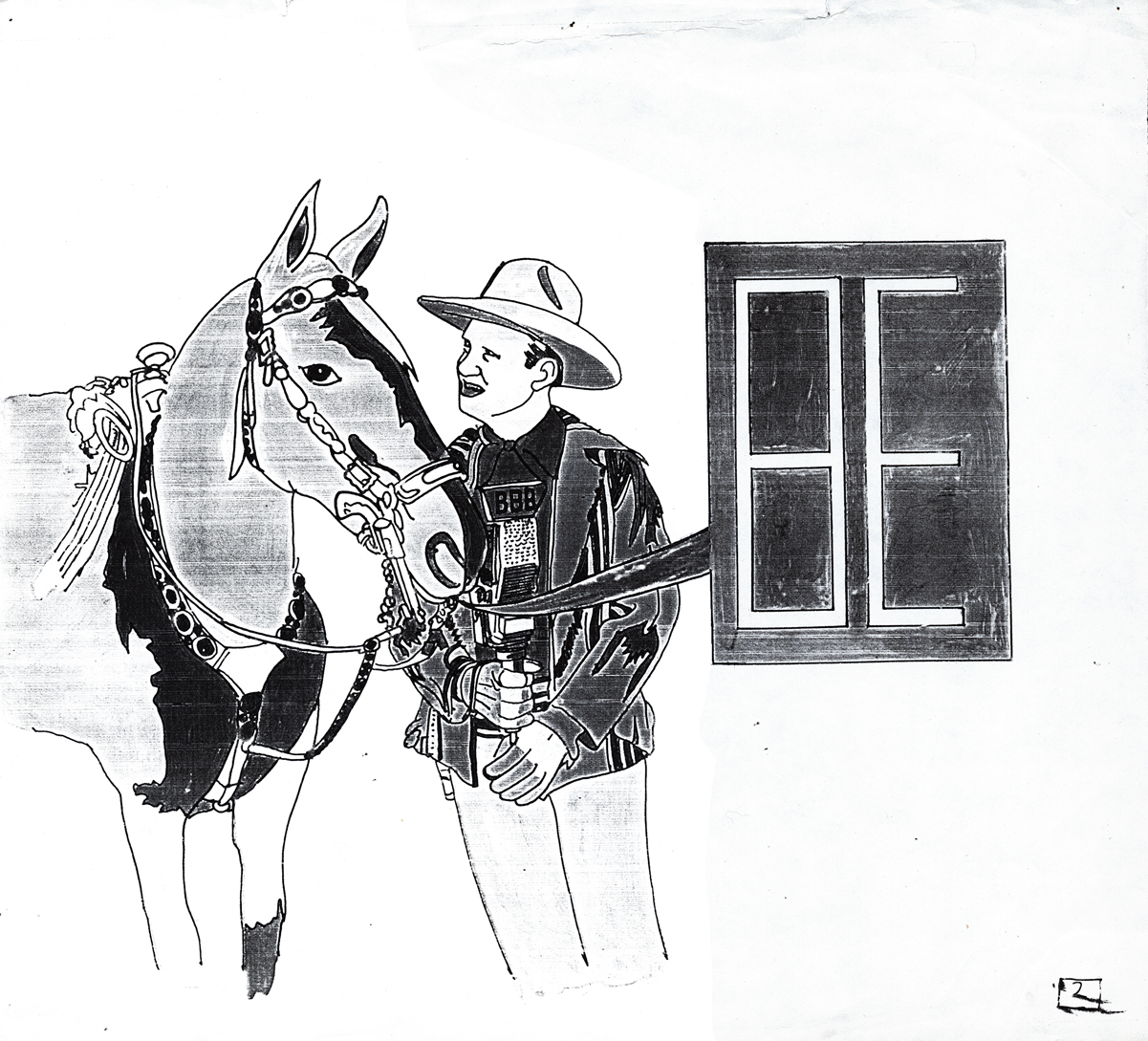
Then there’s a series of Cowboys.
 17
17
 18
18
 19
19
 20
20
 21
21
 22
22
 23
23
 24
24
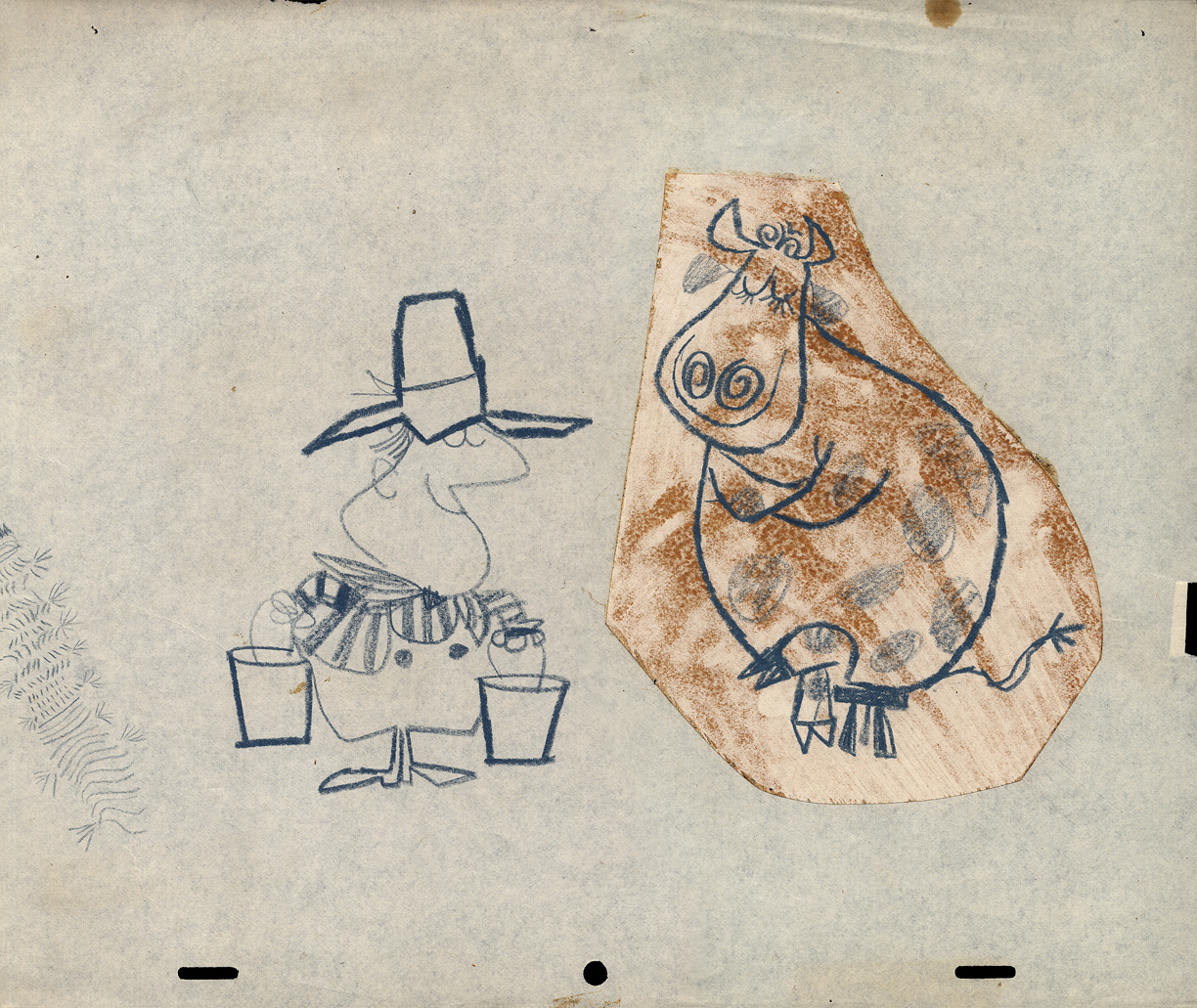
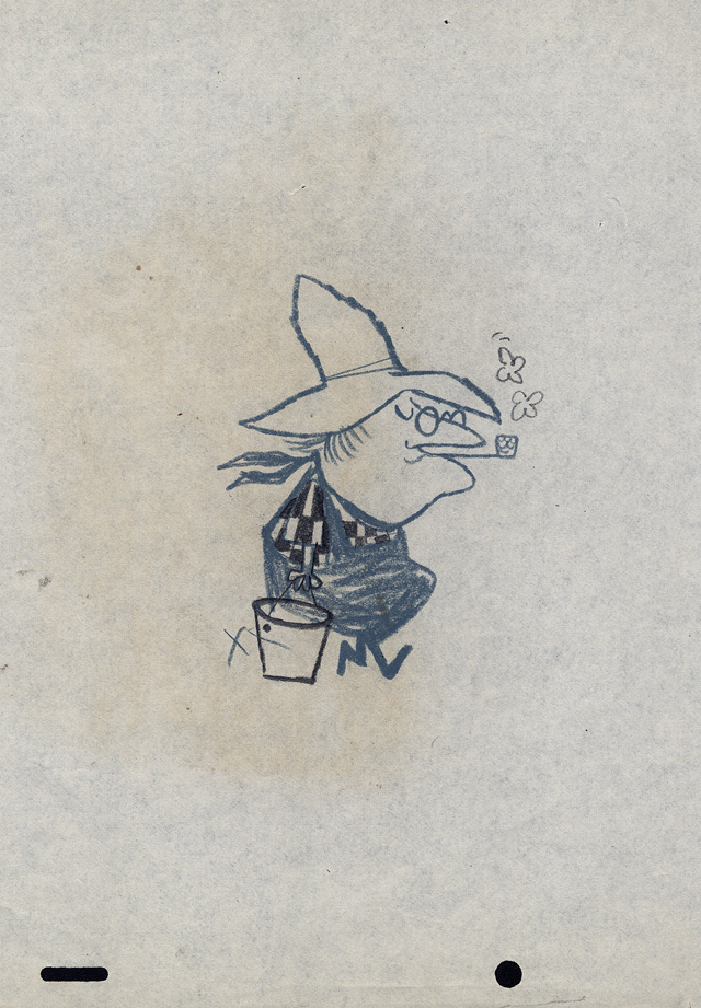
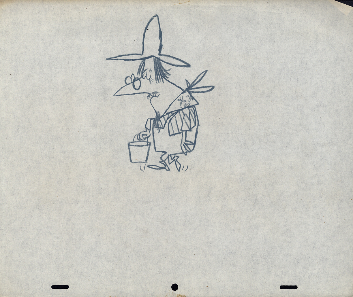
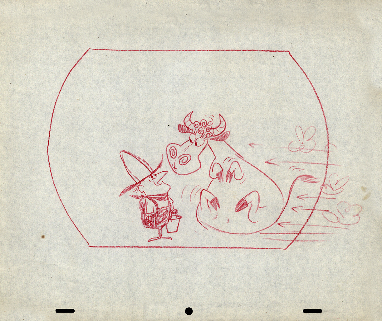
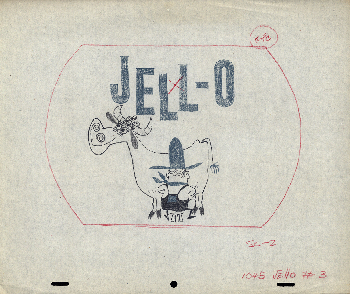
Then there’s the farmer milking the cow. Casting problems.
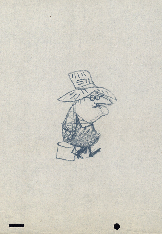 25
25
 26
26
 27
27
 28
28
 29
29
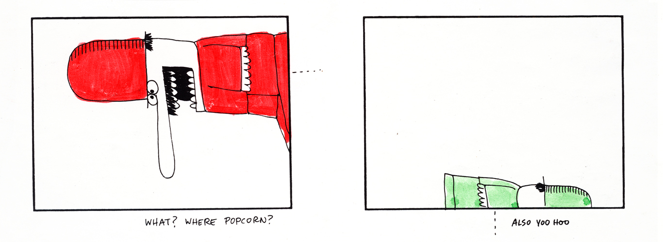
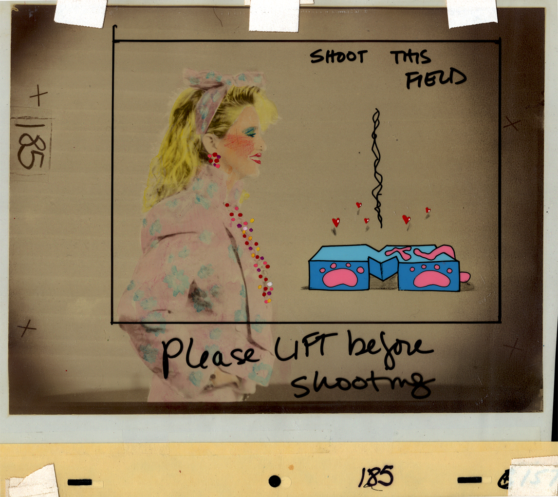
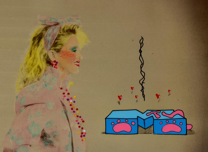
How adorable is that?
for Jello.
Illustration &Layout & Design 07 Nov 2012 06:19 am
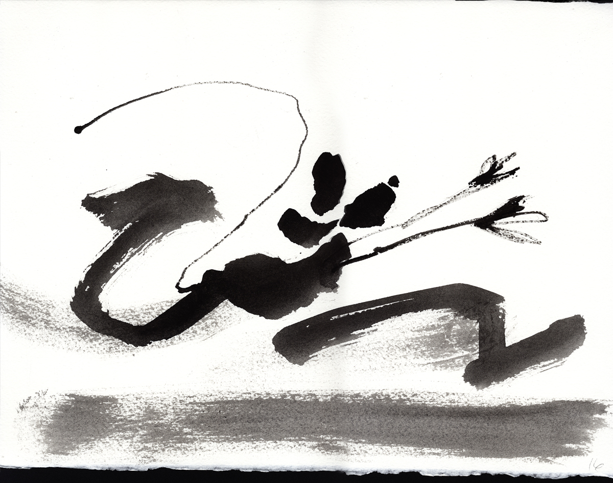
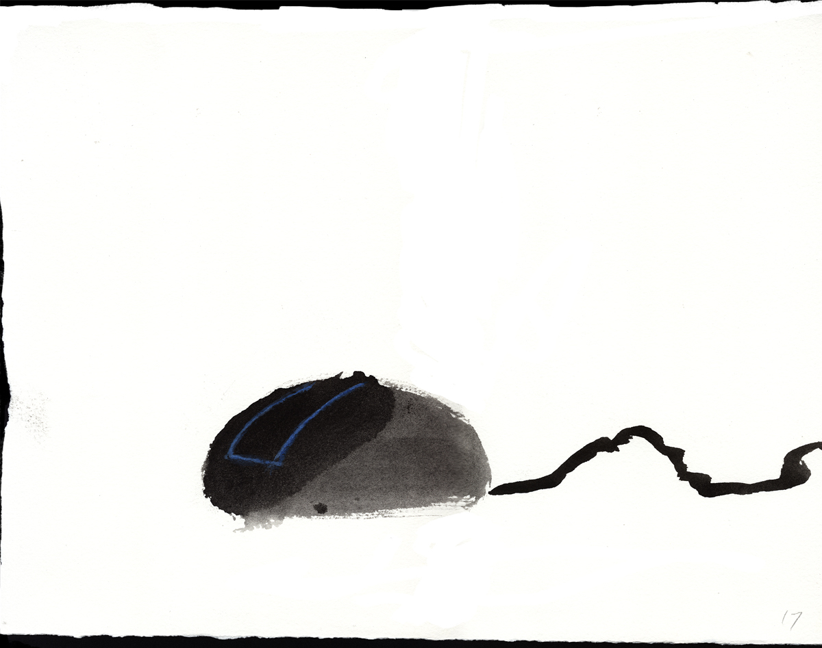
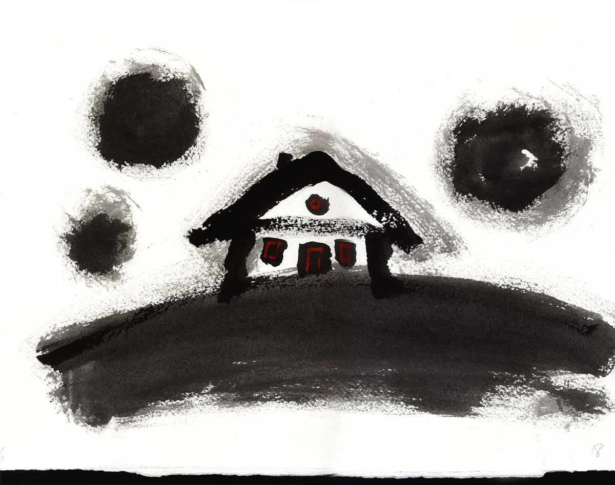
Hal Silvermintz
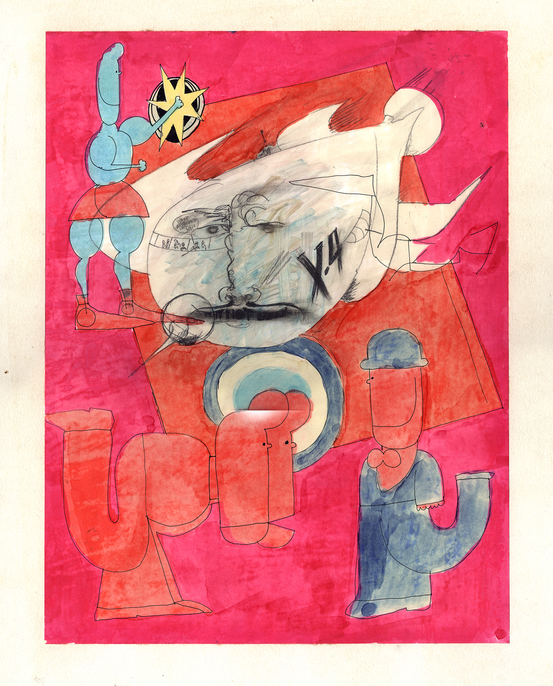
- Hal Silvermintz was the Art Director and Designer for Stars & Stripes Prods. Forever Inc. as well as Designer and partner in Perpetual Motion Pictures. His design work hasn’t gotten much attention lately, so I’d like to offer a couple of pieces in the archives held by Buzzco Associates. Candy Kugel, is sending a lot of their past artwork to the Museum of Modern Art, so I’d like to showcase a few of these pieces before they’re out of my hands.
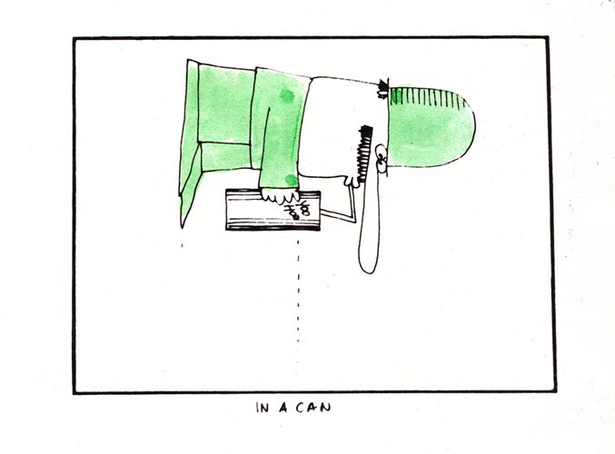
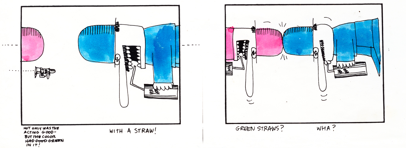
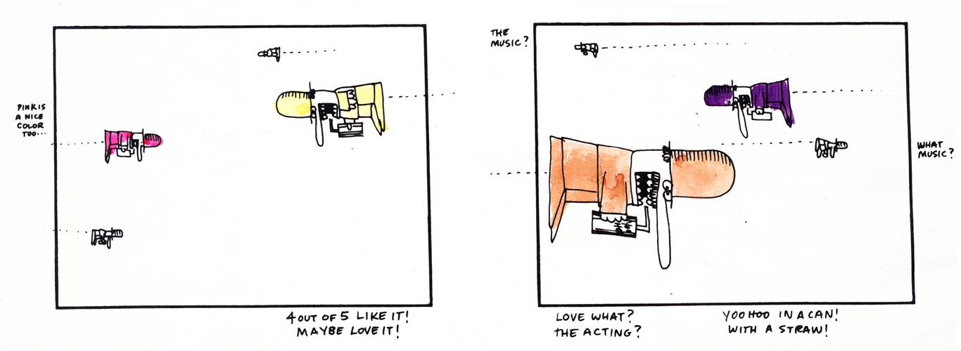
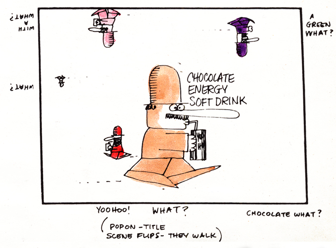
I’ll start with one of the screwiest looking storyboards I’ve ever seen. It’s for some kind of Chocolate Energy Drink. Since it’s one page and very large, I’ll present it in the one page version. Then, for you to be able to read it, I’ve broken it down into panes and will present it a second time. So here goes:
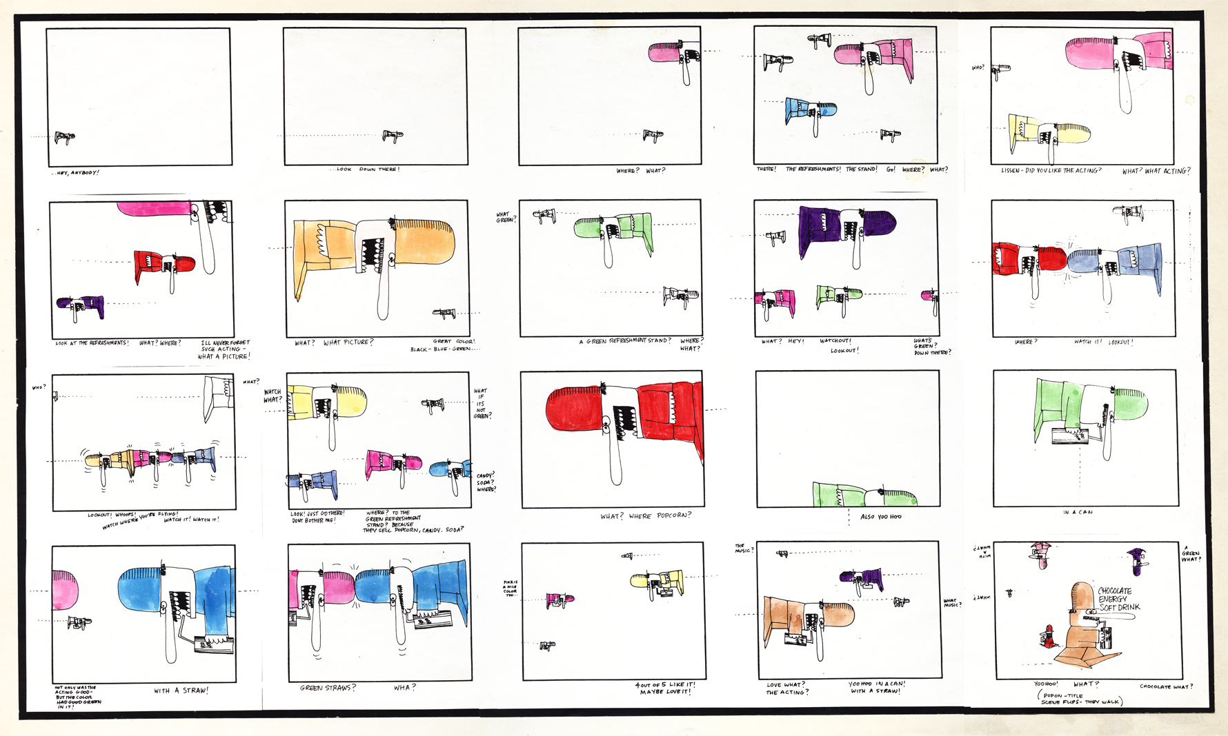
Full sized storyboard
The following are individual panels from the same board:
 1
1(Click any image to enlarge to read.)
 2
2
 3
3
 4
4
 5
5
 6
6
 7
7
 8
8
 9
9
 10
10
 11
11
 12
12
.
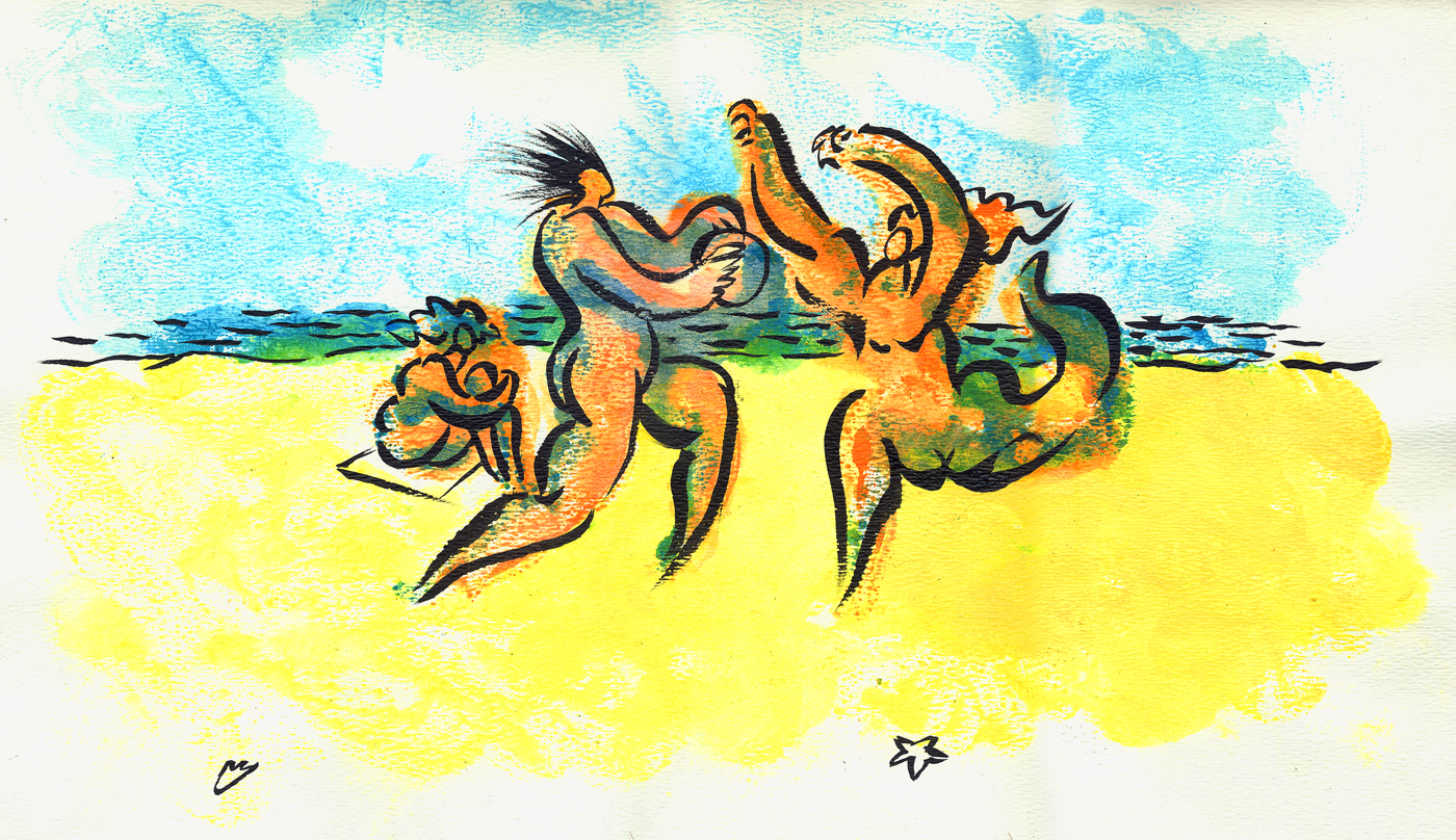
At one point Hal had designed “Fast Food Matador” for a personal film done by Hal, Candy Kugel and Vince Cafarelli. While the studio worked on the short Hal continued to turn out sketches of dancers (paint on cel) that really had nothing to do with the short, except mood.
Here are two of these.
 1
1
 2
2
.
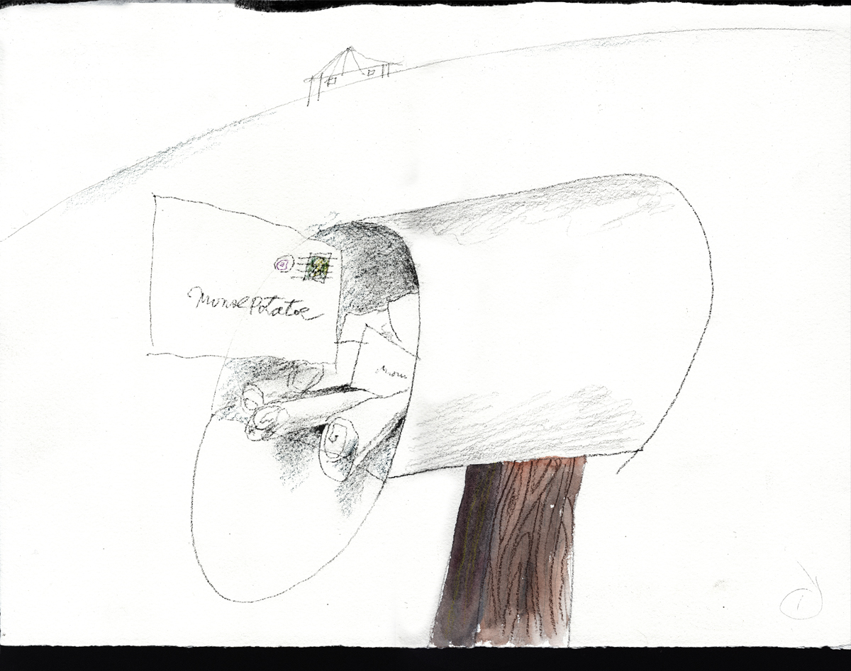
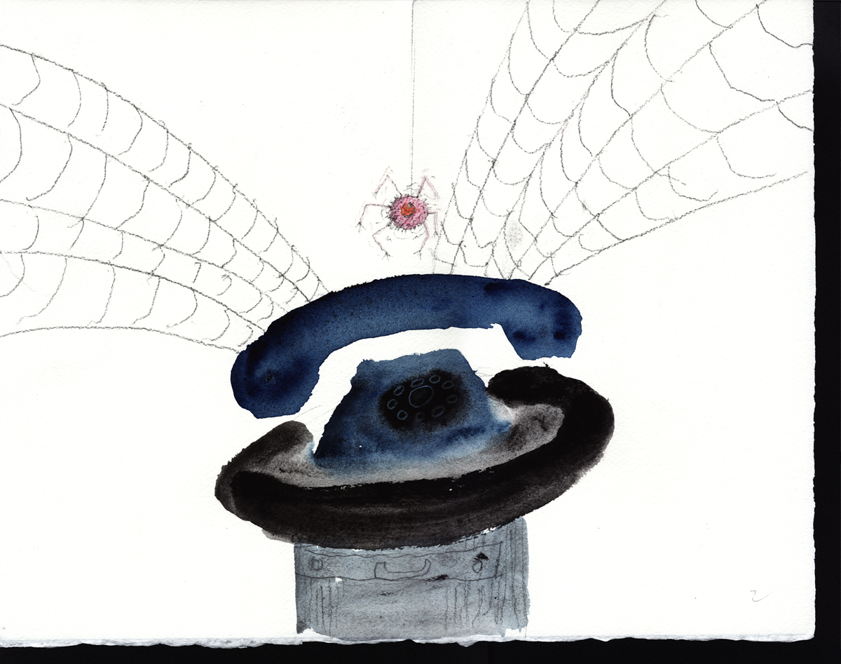
The following 18 pieces were done by Hal in preparation of a short the studio, Buzzco, was going to do called “Mouse Potato”. This was in 2002. The idea was it was the computer equivalent of a “couch potato.” Circumstances made them stop work on the film, but these large paintings still live on.
 1
1
 2
2
 3
3
 4
4
 5
5
 6
6
 7
7
 8
8
 9
9
 10
10
 11
11
 12
12
 13
13
 14
14
 15
15
 16
16
 17
17
 18
18
.
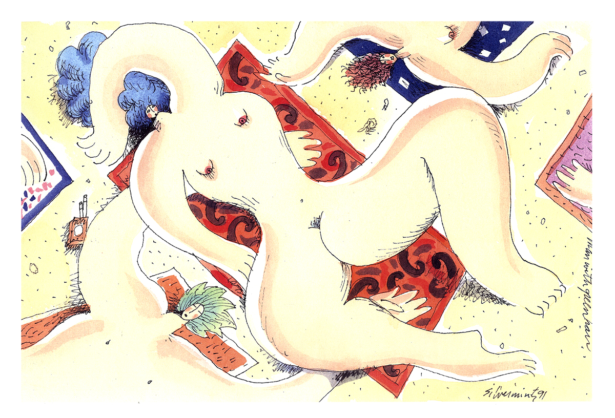
The following 4 pieces were done by Hal Silvermintz as personal works of art.
They weren’t done for any specific films.
 1
1
 2
2
 3
3
 4
4
Animation Artifacts &commercial animation &Layout & Design &Models 31 Oct 2012 09:27 am
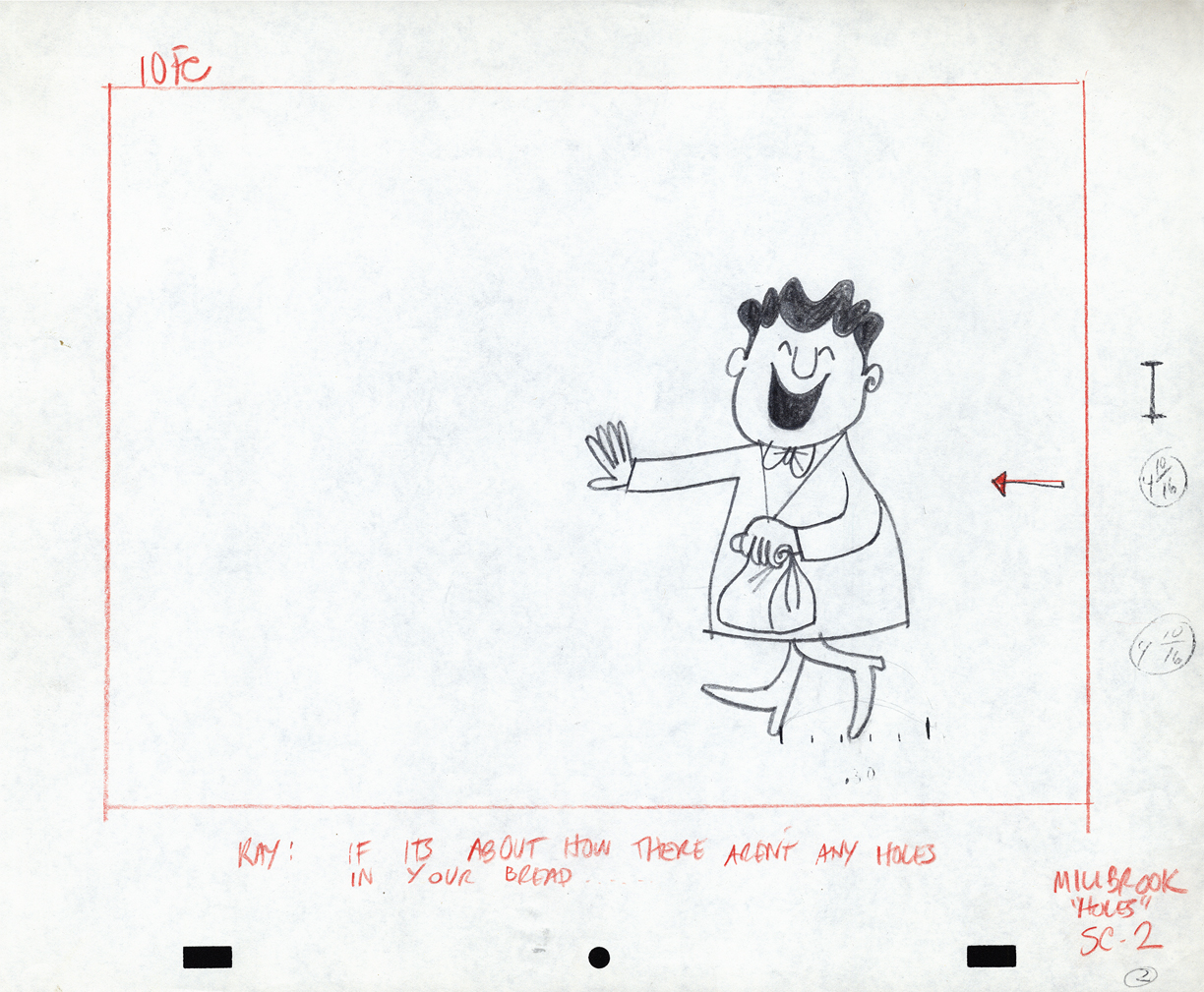
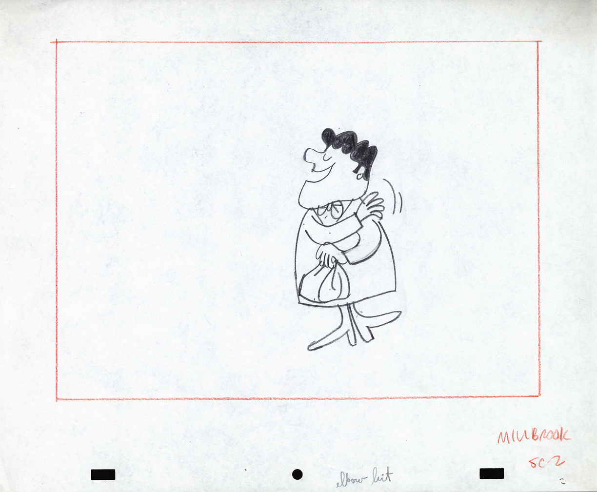
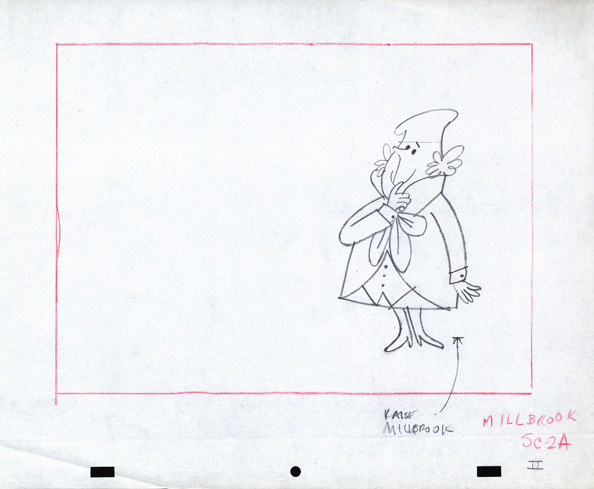
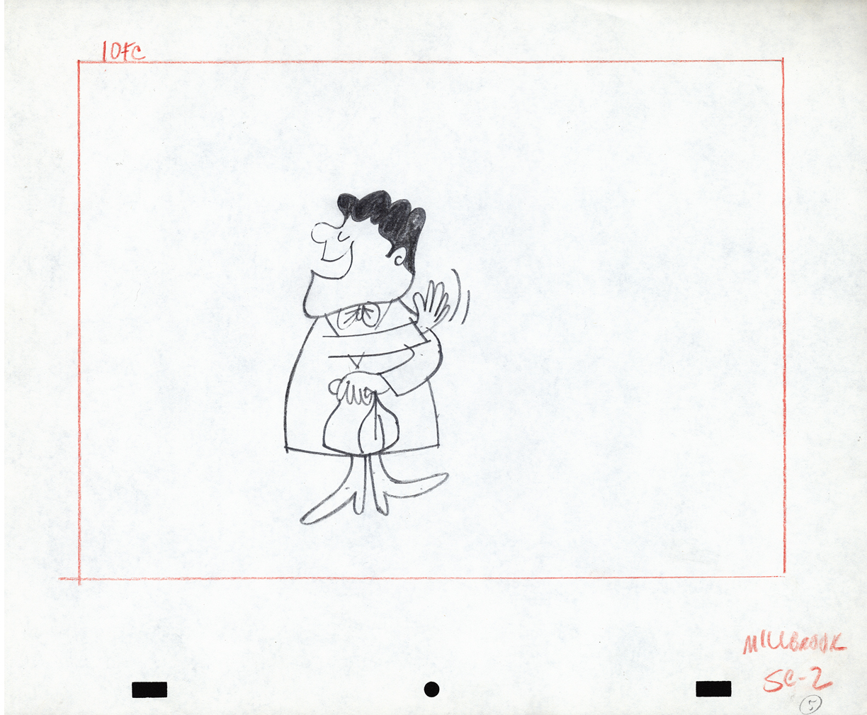
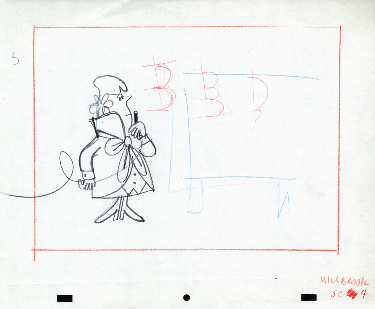
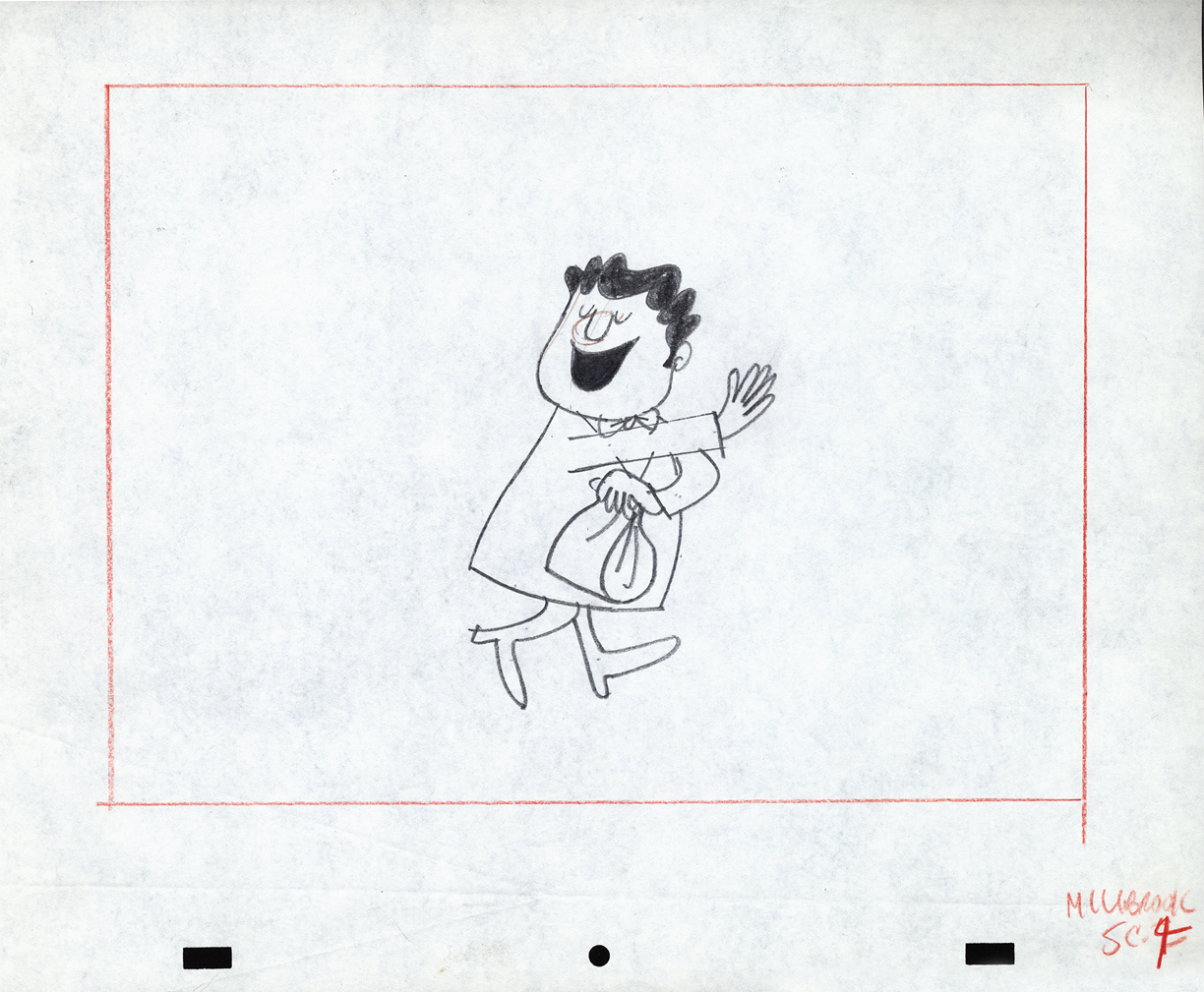
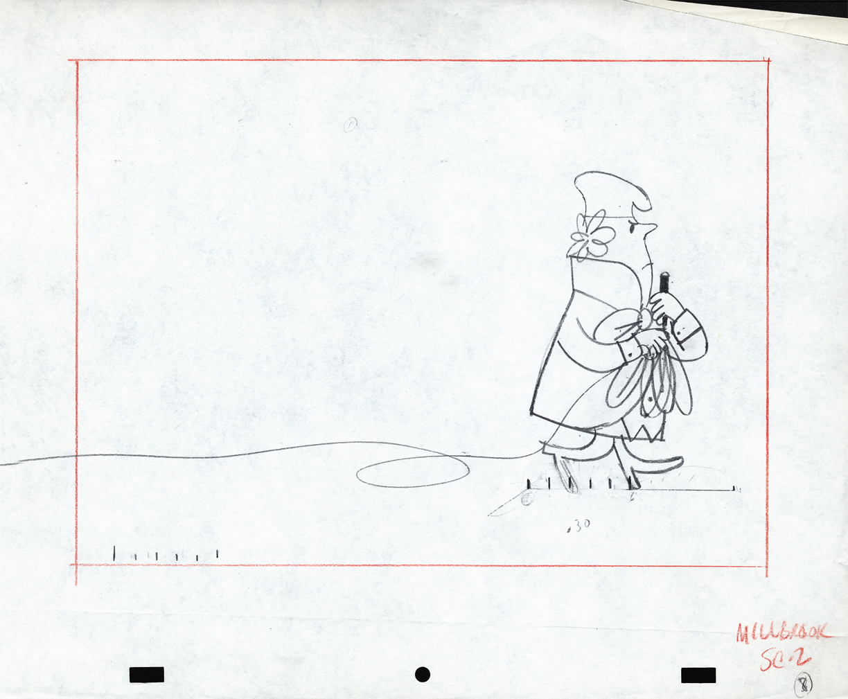
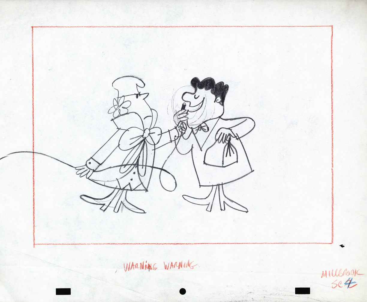
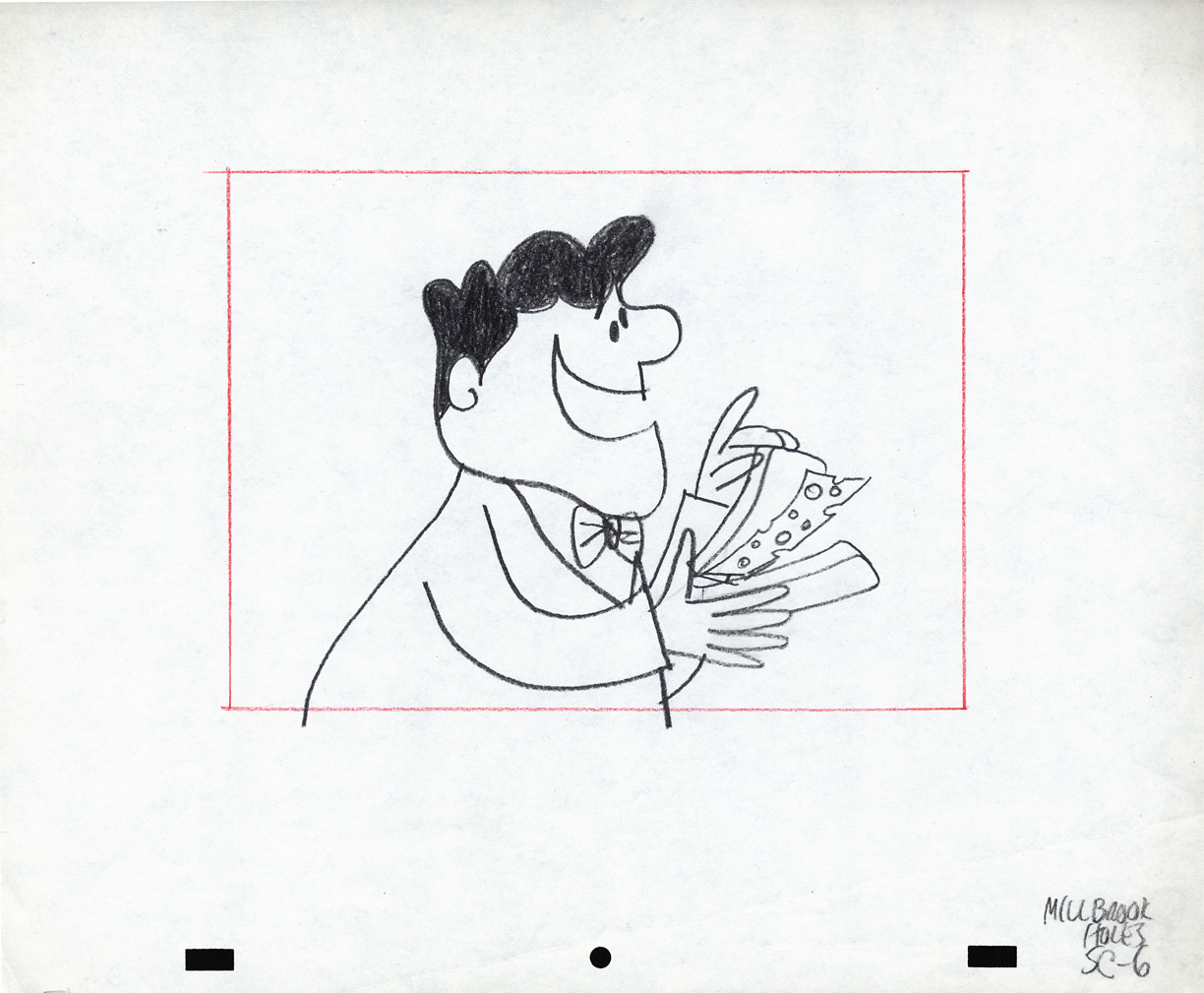
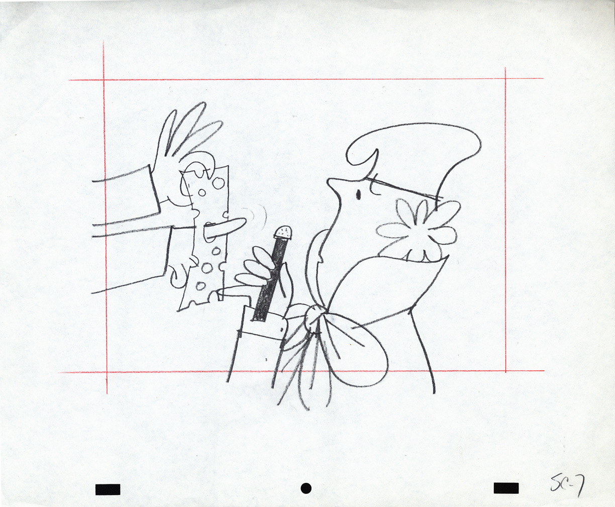
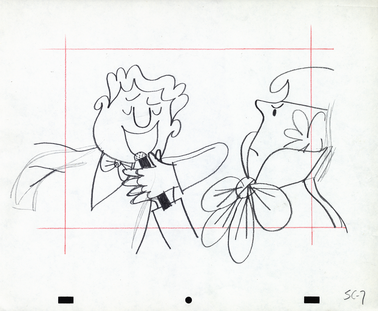
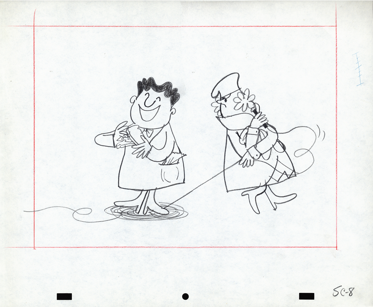
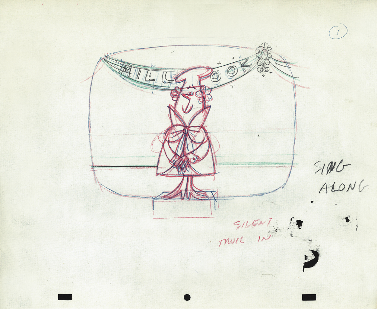
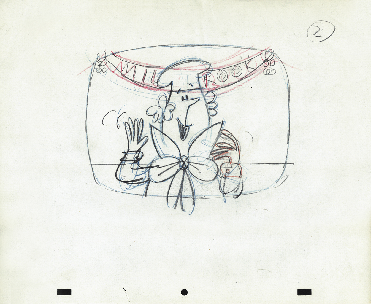
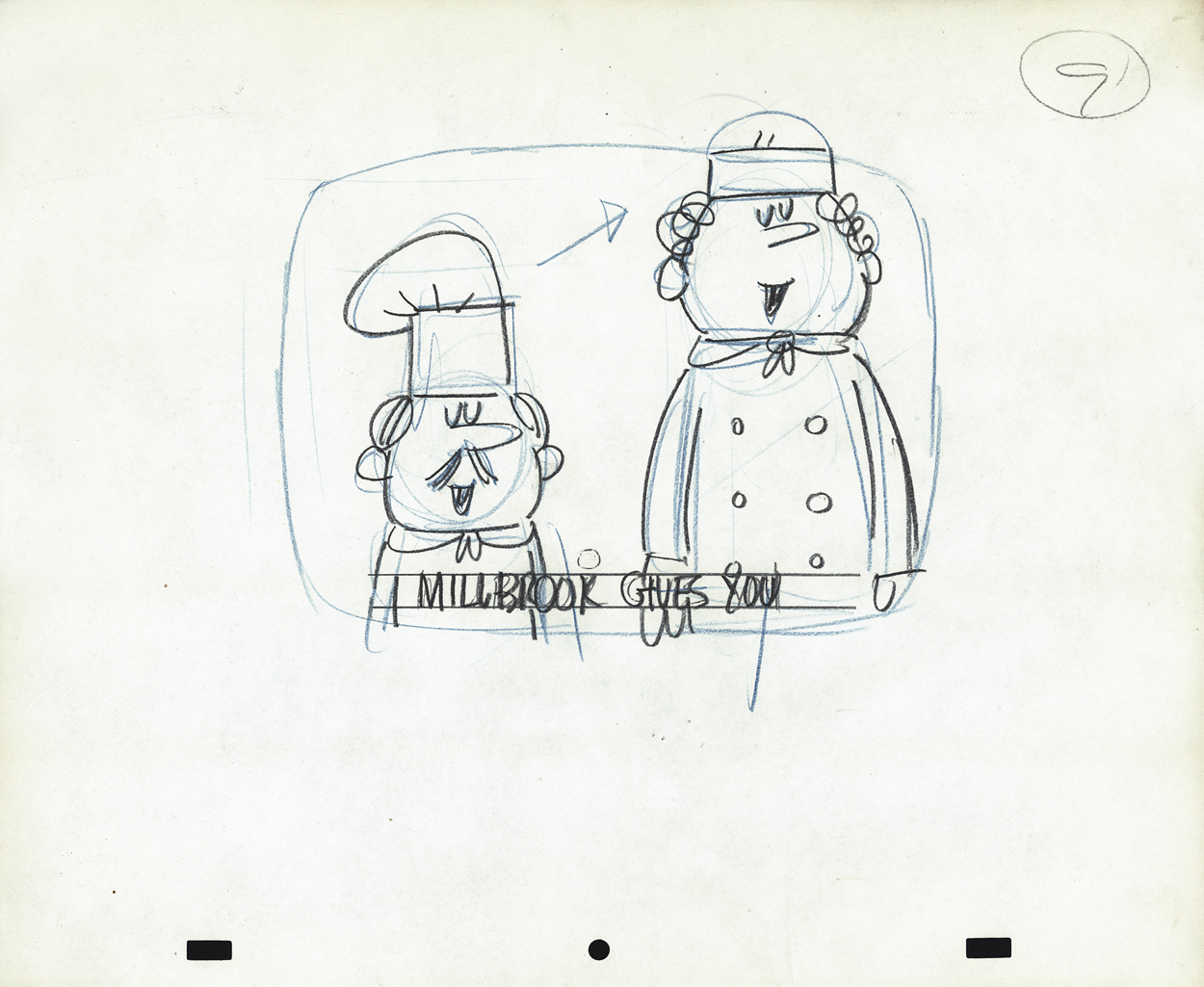
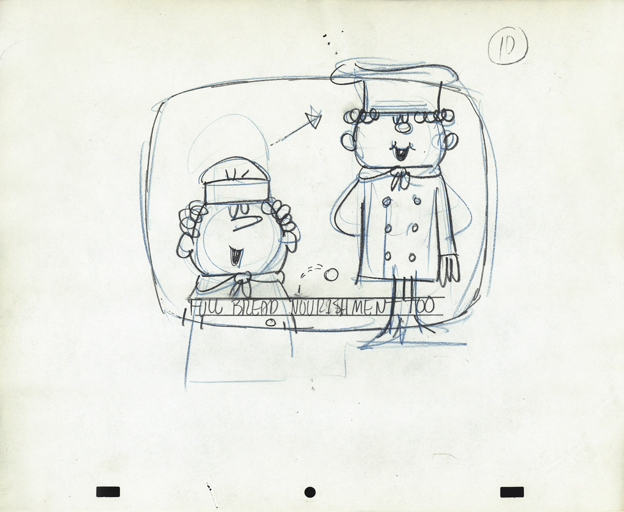
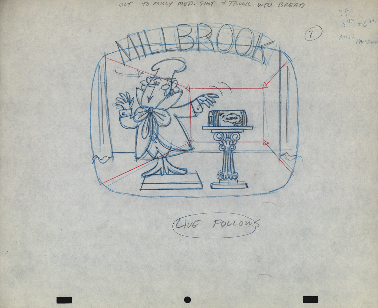
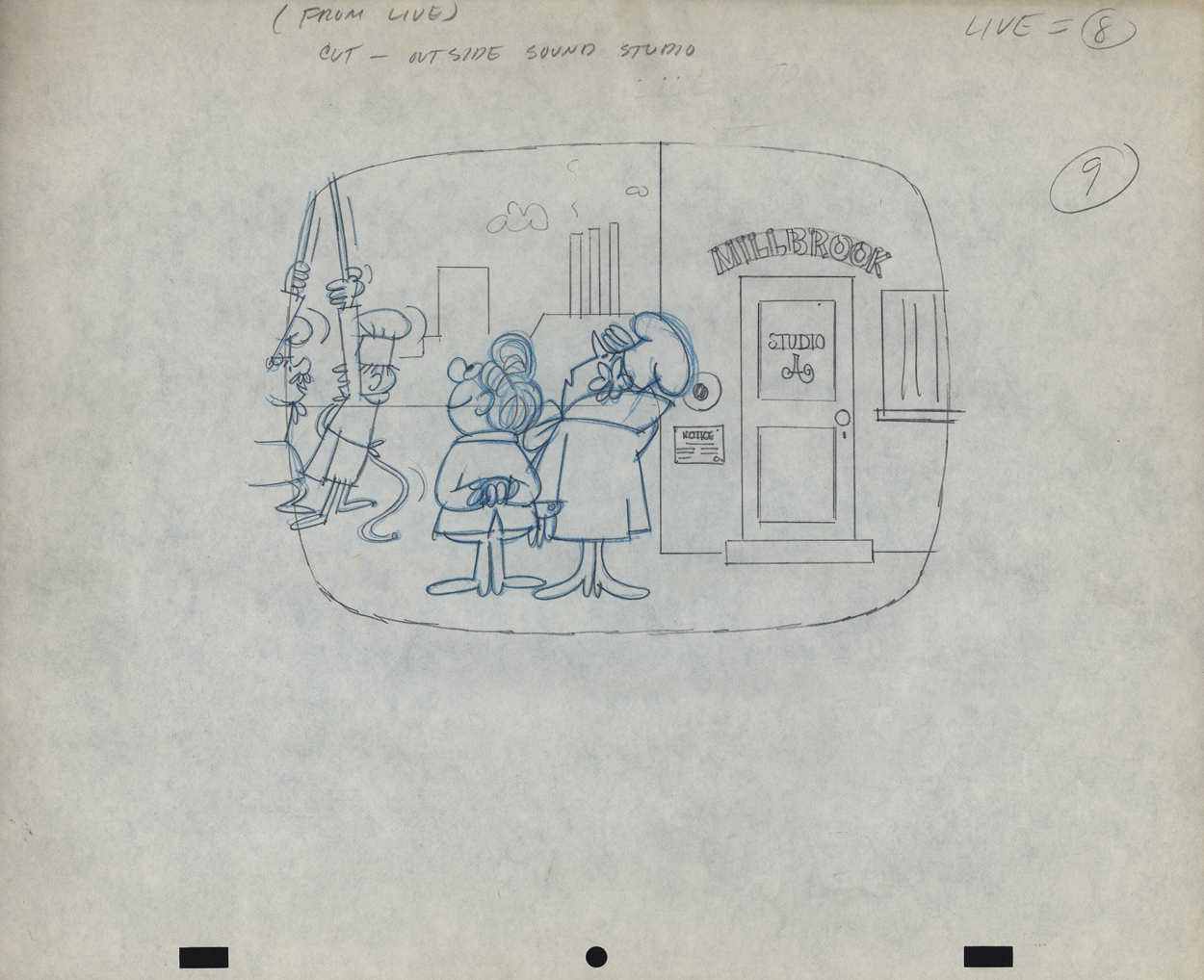
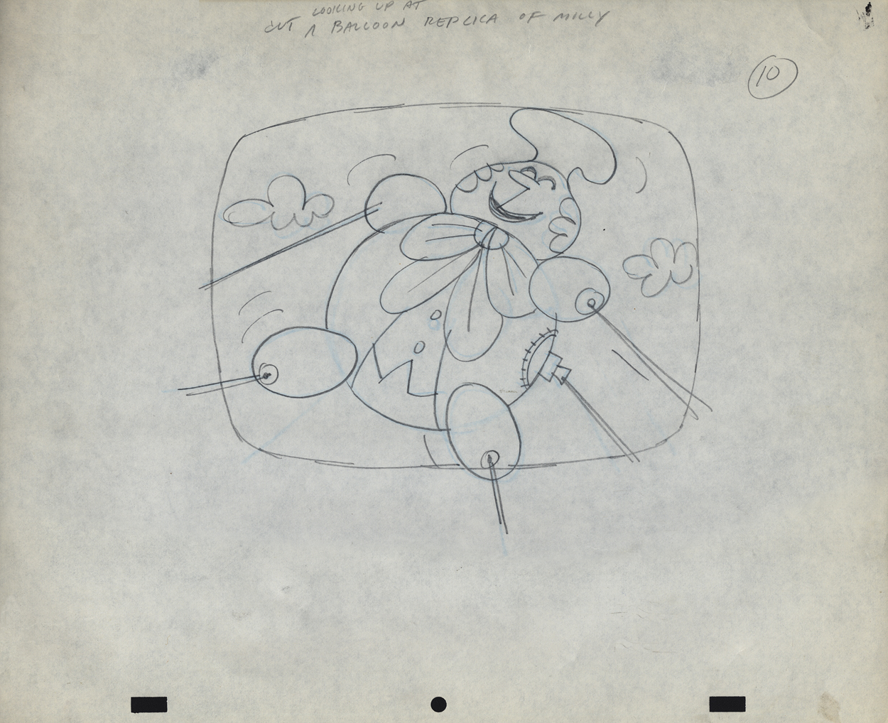
Vince Cafarelli’s Millbrook Bread – 3
- As I’ve shown in a couple of past posts, Millbrook Bread was a profitable series for the young animation studio, Goulding-Elliott-Graham. See posts 1 and 2.
Vince Cafarelli collected a lot of drawings from various commercials that he worked on over the years, and there’s an abundance of art from this small studio. All of it good to great. Unfortunately, very little of this art is well labelled, and a lot of the ordering of the artwork is pure conjecture to get it to fall into place. I’ve grown quite attached to some of the material from this series and its characters. The design, to me, is just very attractive. Consequently I can’t hesitate to add more to view. Here’s models and art from two more spots.
“Minny” the Baker Model 1
“Minny” the Baker Model 2
Ray Model
 1
1
 2
2
 3
3
 4
4
 5
5
 6
6
 7
7
 8
8
 9
9
 10
10
 11
11
 12
12
 13
13
 14
14
 15
15
 16
16
 17
17
 18
18
 19
19
 20
20
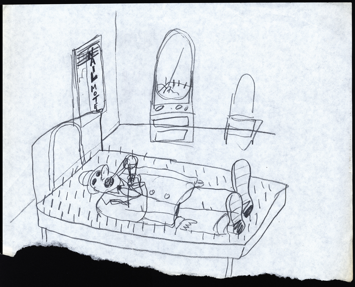
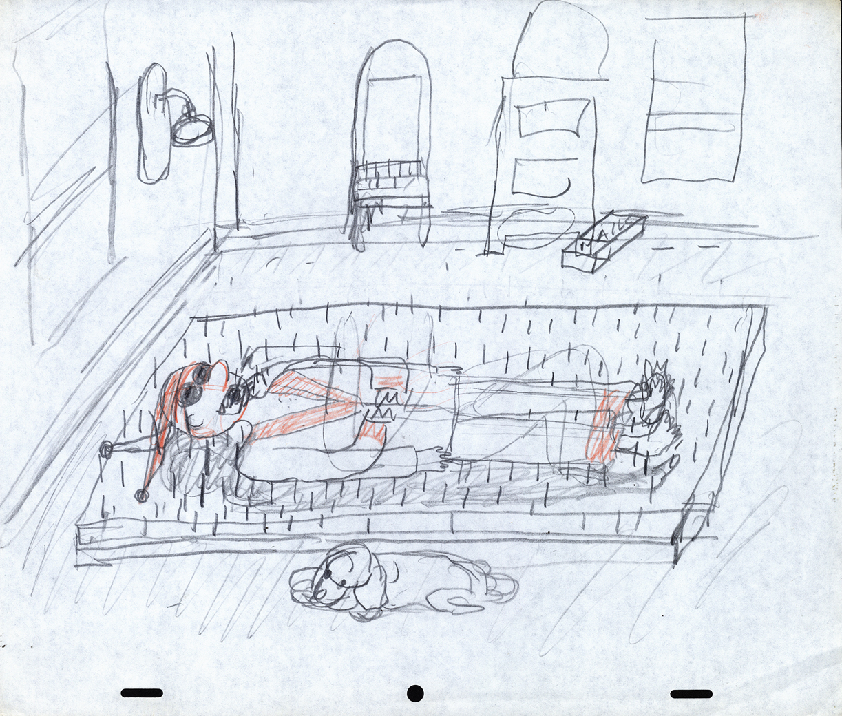
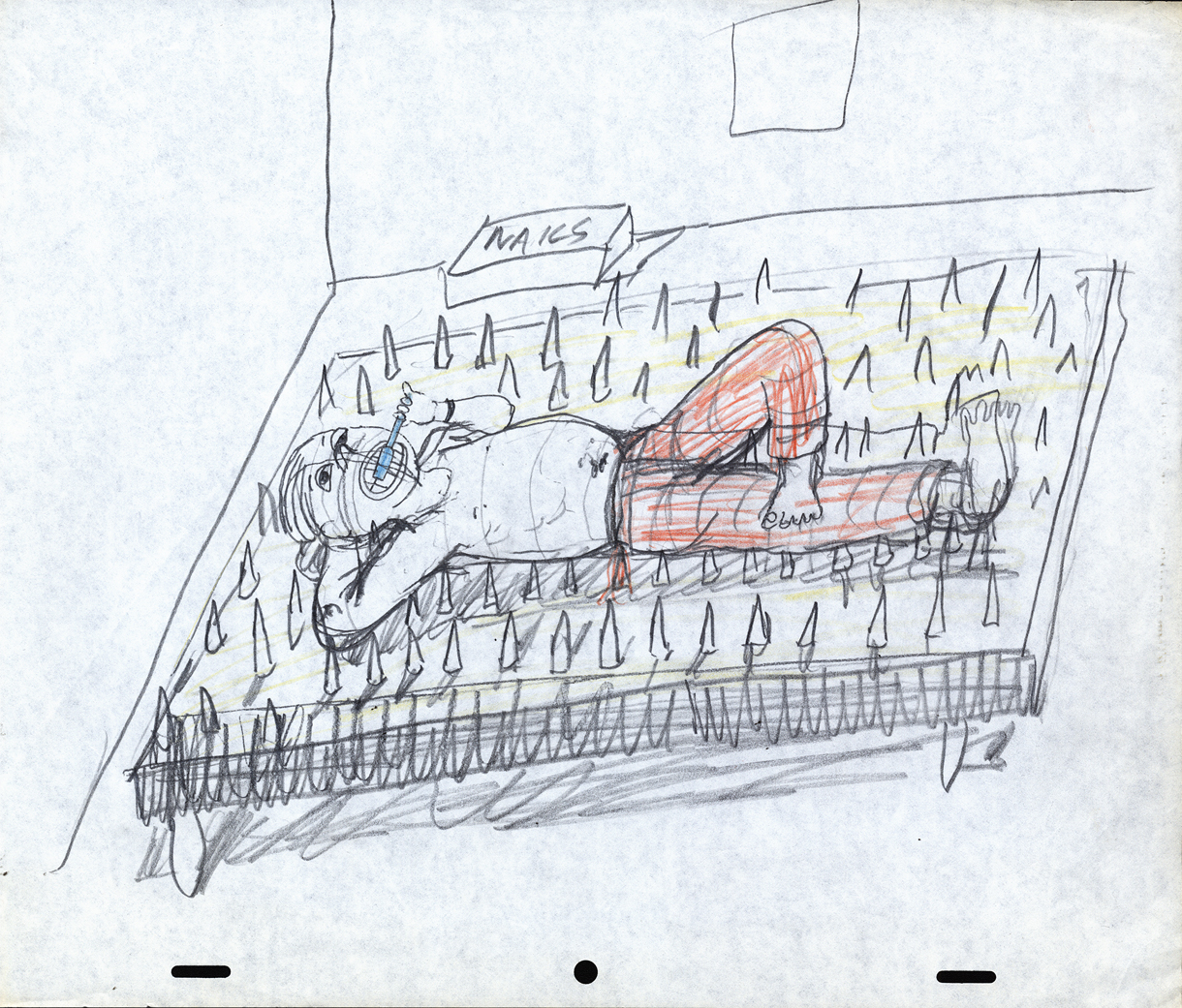
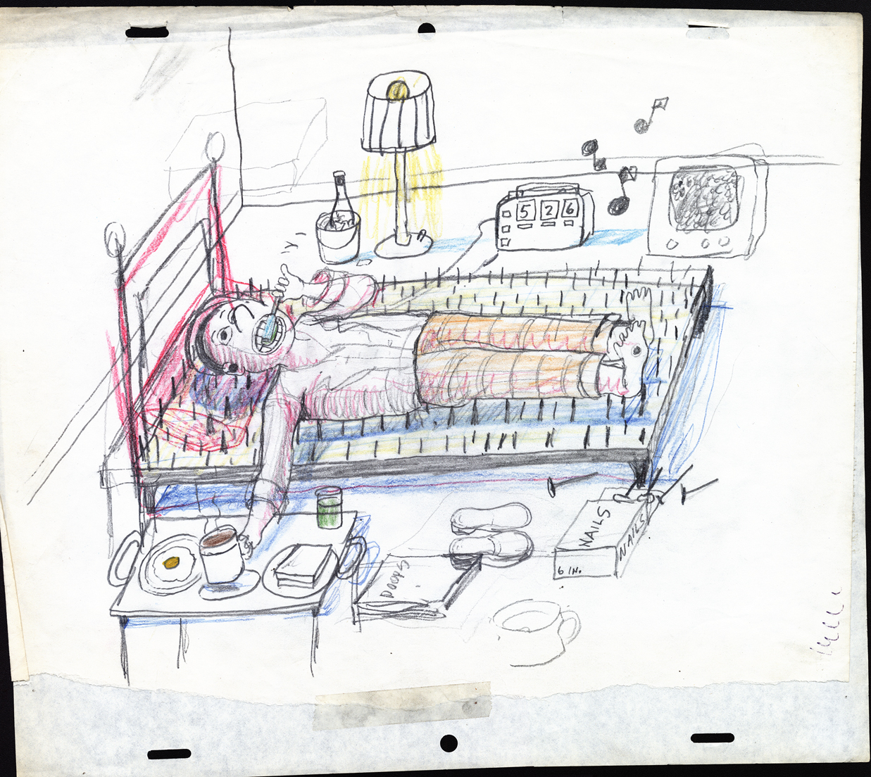
Animation Artifacts &Art Art &commercial animation &Layout & Design &Models 17 Oct 2012 06:21 am
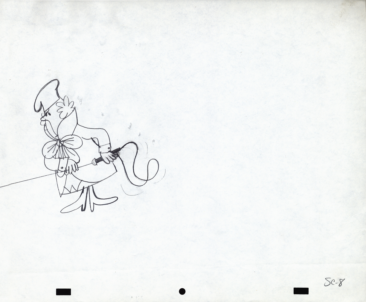
Mogubgub 2
- Fred Mogubgub was a rare bird in animation. He was truly out there. Maybe today we’d say he was ahead of his time.
He was a close friend of Vincent Cafarelli’s and did some creative work with their studio. He also left a residue of artwork behind him. I located a folder of layouts and such artwork.
There’s also the program for his Memorial service. I’ve decided to include that here in this post.
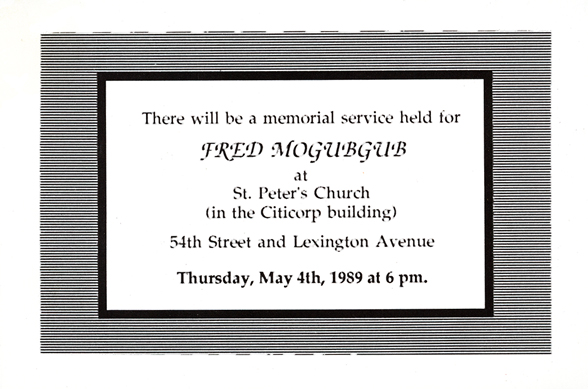
Invitation to the Memorial Service.
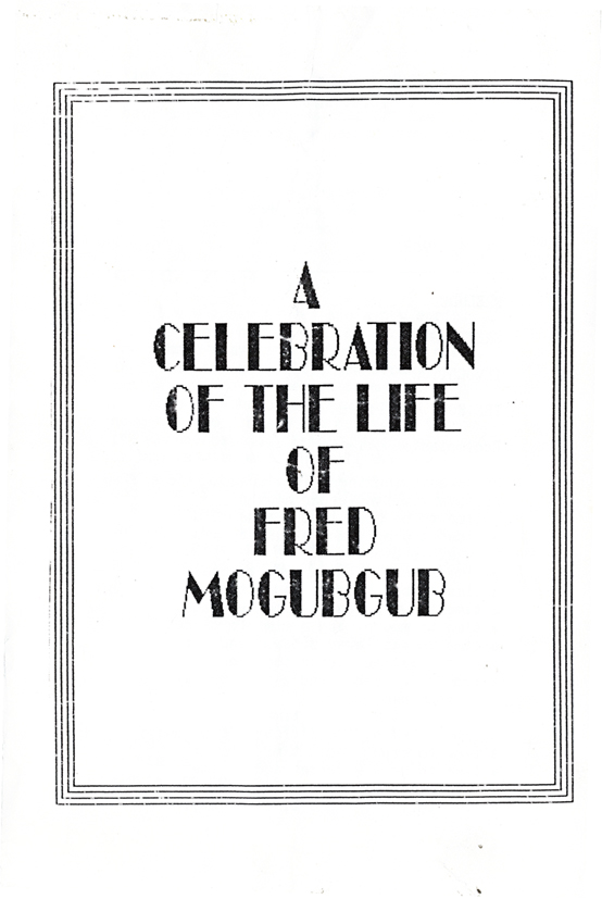
The cover to the Xeroxed program.
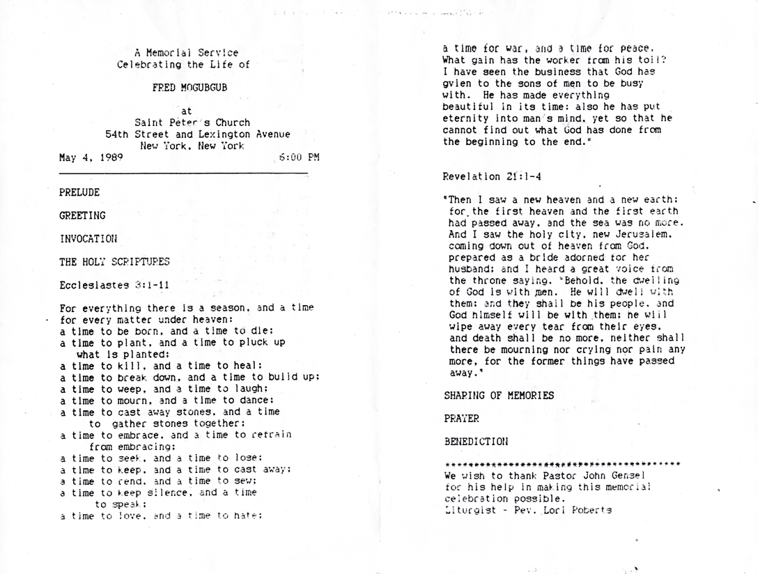
The program, itself. Undoubtedly a Catholic service.
Here are a series of drawings Fred did for a Yakov Smirnoff “Funfacts” piece for ABC tv. These were 20 second spots for the network.
 1
1
 2
2
 3
3
 4
4
 5
5
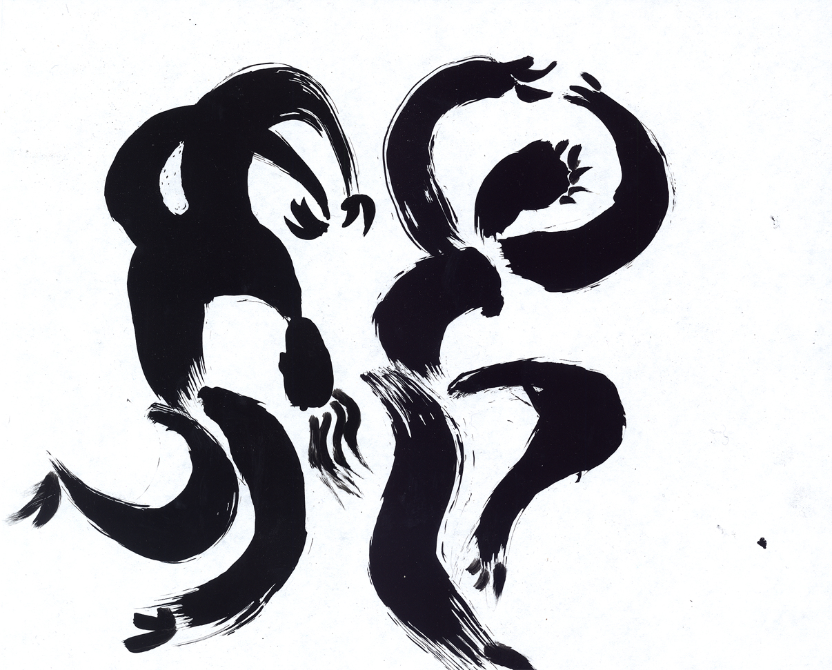
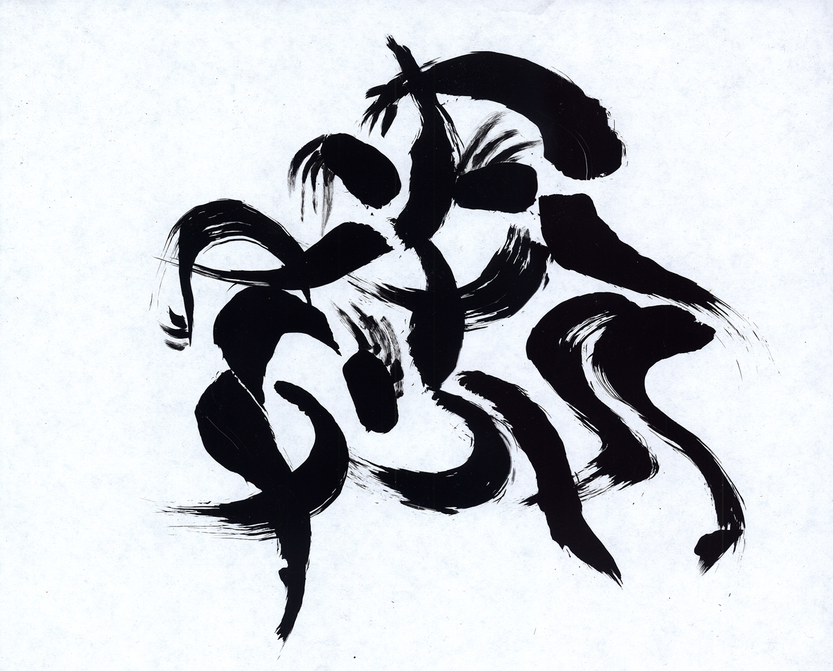
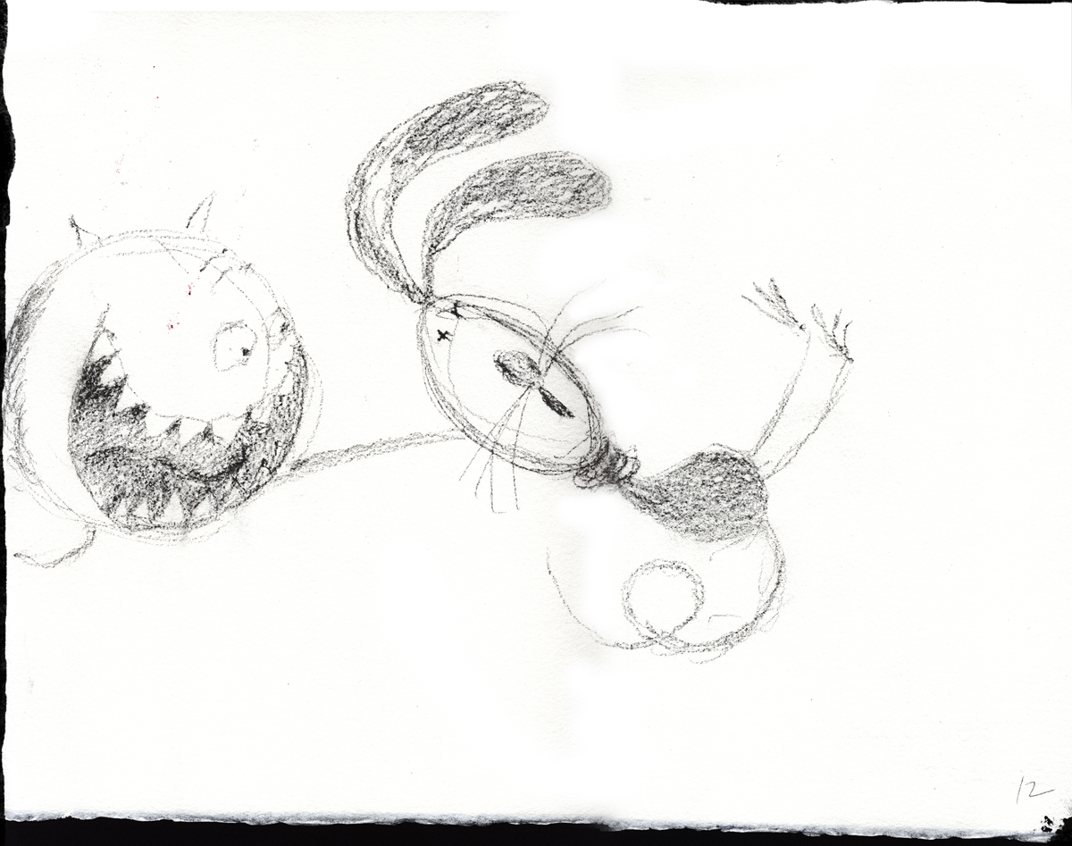
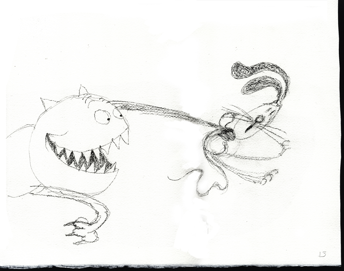
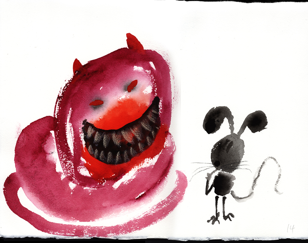
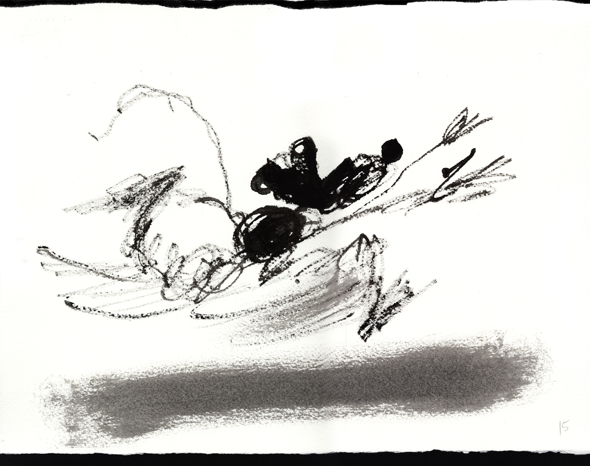
Here are some randy gags Fred drew – studio gags.
 1
1
 2
2
 3
3
 4
4
 5
5
 6
6
Fred had to balance the commercialism with the art.
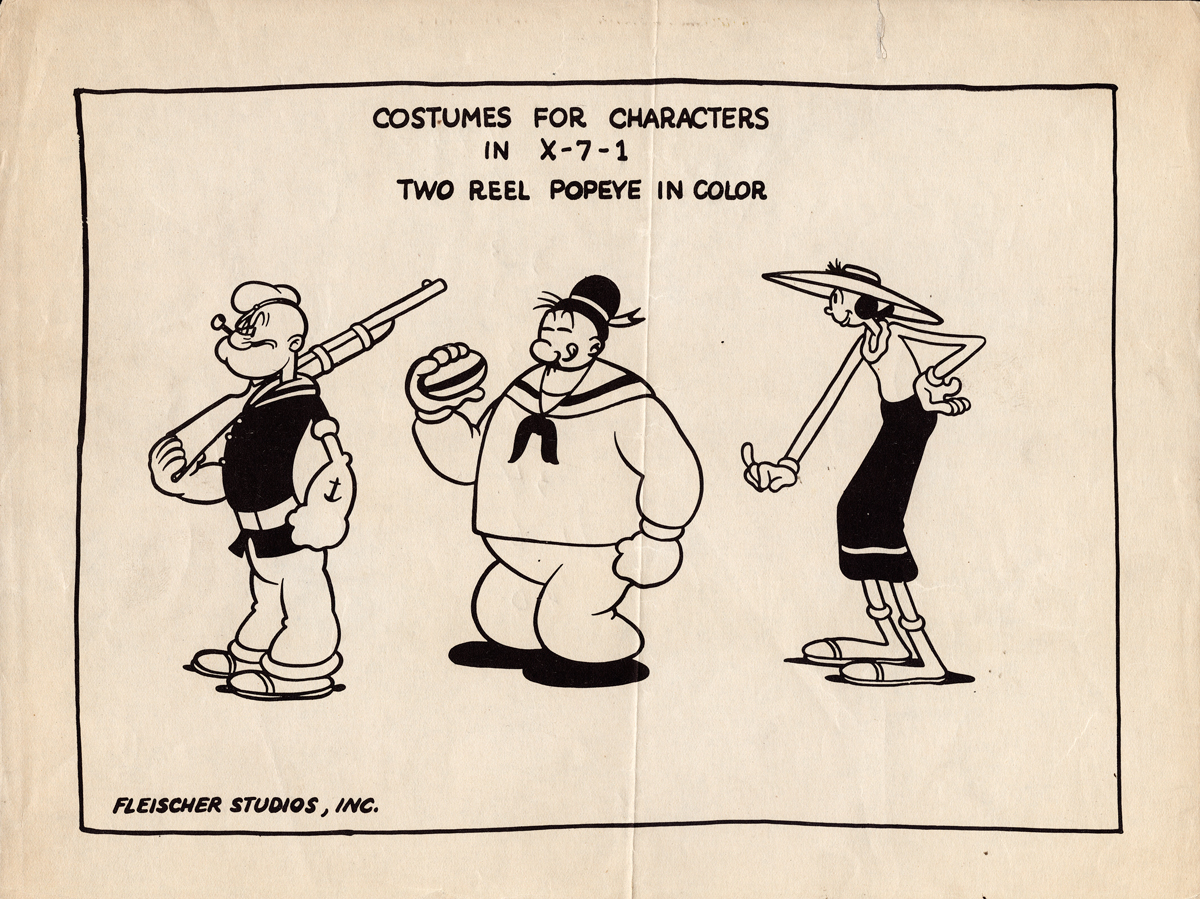
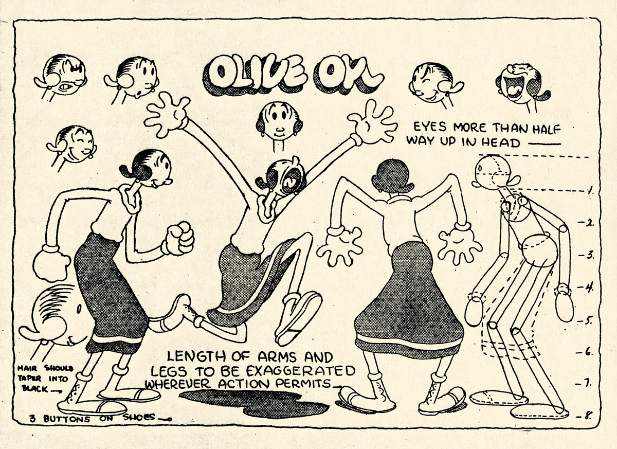
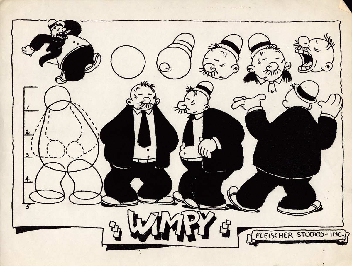
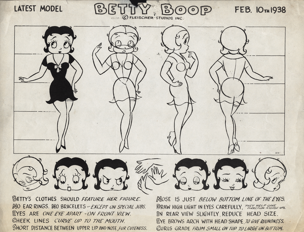
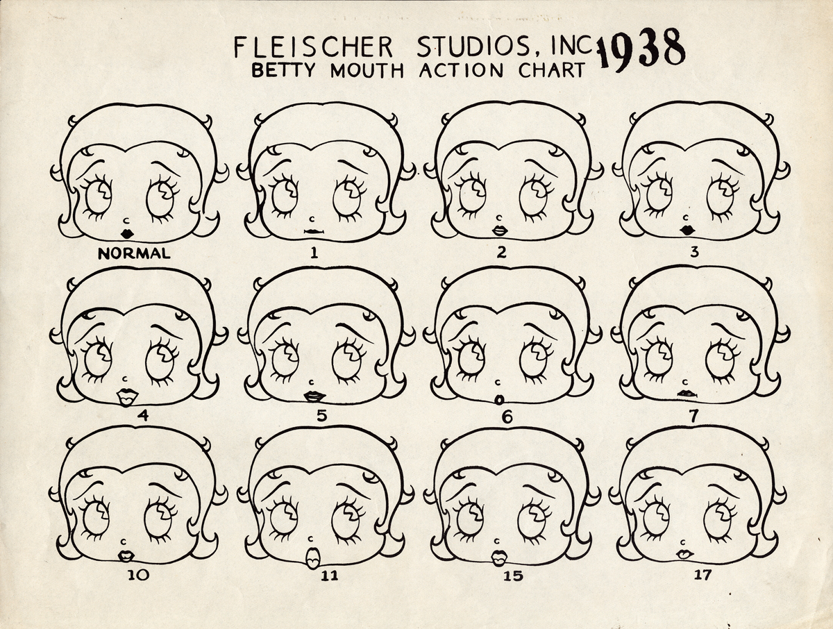
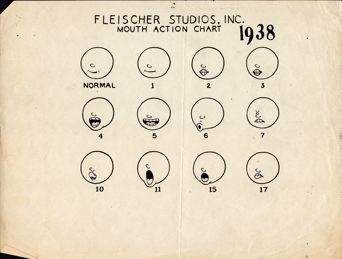
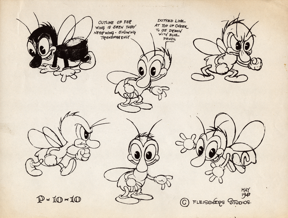
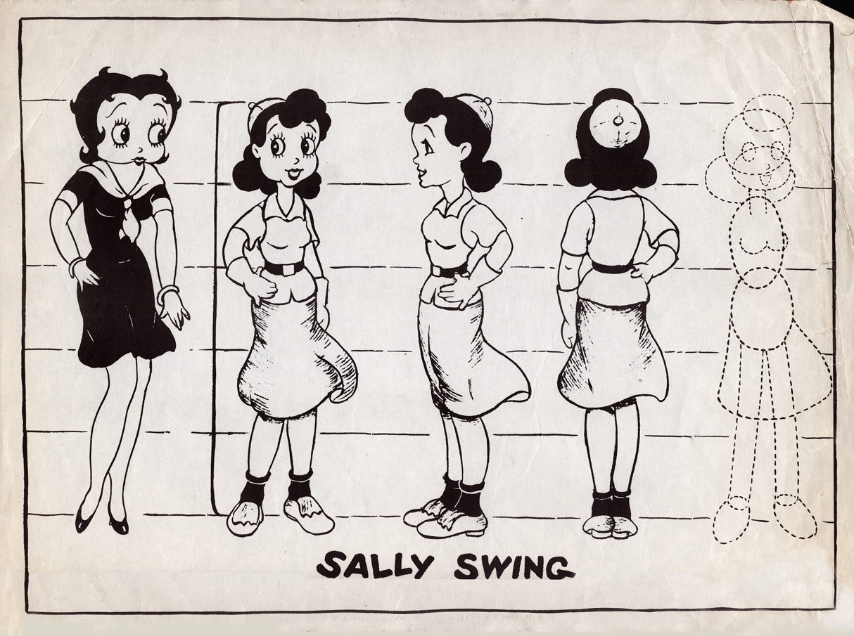
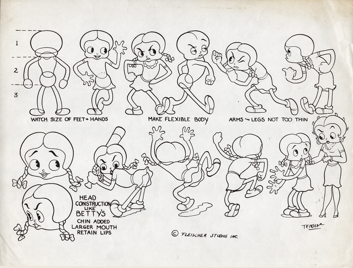
Animation &Animation Artifacts &Fleischer &Layout & Design &Models 10 Oct 2012 05:54 am
More Fleischer Models & Things
- Continuing on with the Vincent Cafarelli collection of artwork, I ran across some more Fleischer/Paramount models. One piece among them, I think, is something of a rarity. Here they are:
 1
1
 2
2
 3
3
 4
4
 5
5
 6
6
 7
7
 8
8
 9
9
 10
10
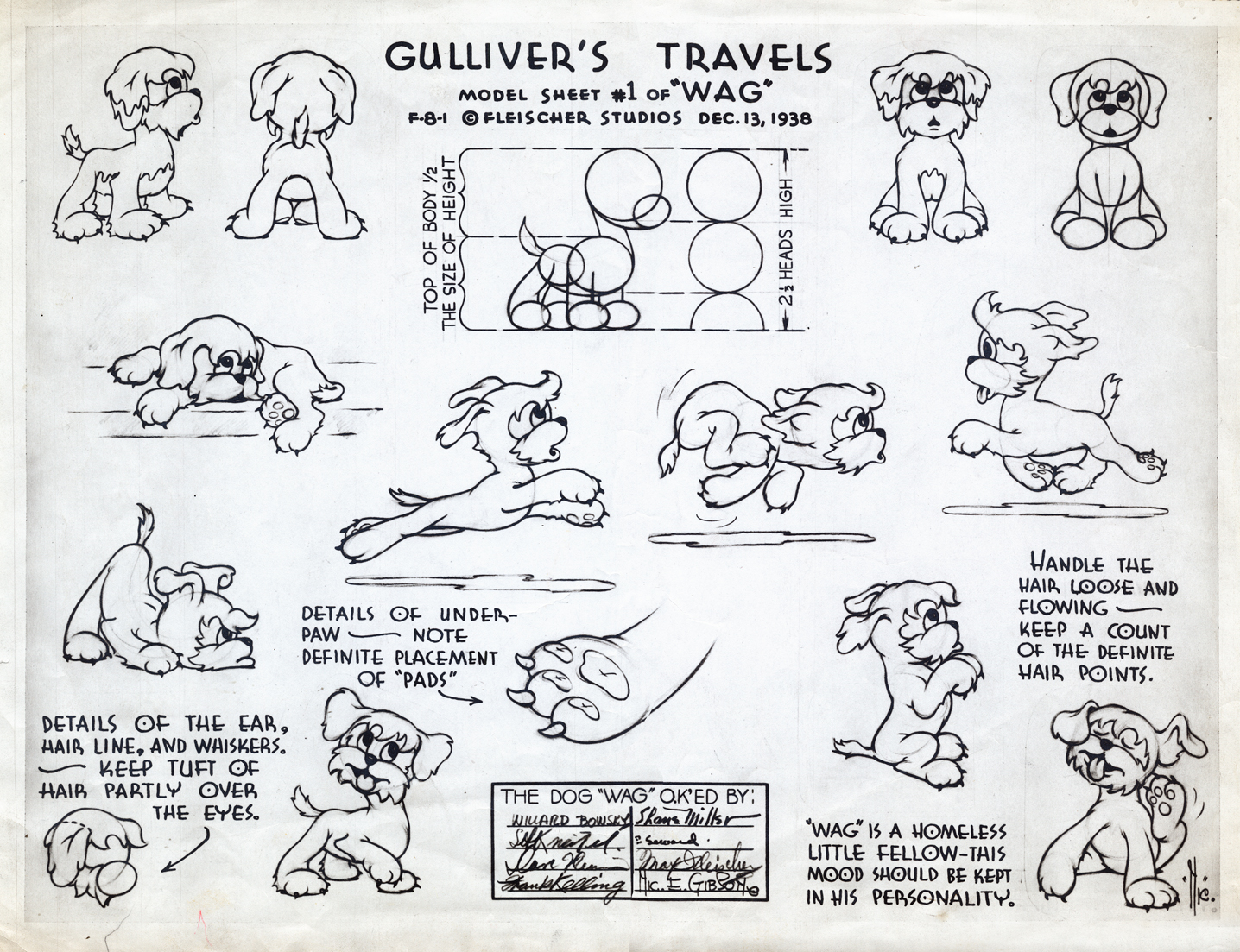
This seems to be a rarely seen model. “Wags” the dog from Gulliver’s Travels.
I think this was cut from the film, at least I’ve never noticed him.
 11
11
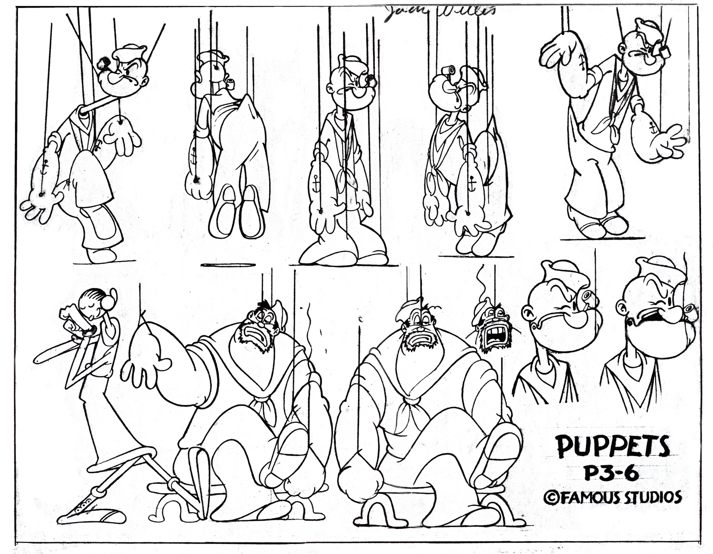
This, of course, is not Fleischer but a later Famous short.
 12
12
This appears to be from a later Paramount cartoon.
(Thad Komorowski identifies this as Bill Tytla’s
HECTOR’S HECTIC LIFE in the comment section of this post.)
________________________
- Here is something even rarer than that Gulliver “Wags” model sheet.
Apparently, new hirees at Famous Studios (at least in 1956) would go to an art school, of sorts. The following drawings are on reduced animation paper (although they’re the actual pencil drawings, not copies) and stapled – with two staples, one on either side – to black illustration board. Each has additional registration marks drawn at the bottom. Each is one of two drawings that are slightly different from one another. Presumably, they were designed to teach inbetweening. The pencil drawing line work is particularly thin, so I suspect these were projected with an overhead projector. I’d guess that the art student, new employee, would copy the projected drawings and then have to inbetween the pair of drawings.
The drawings start with simple lines and get progressively more difficult until it’s a full sized image of Popeye ready to throw a punch. For the sake of space, and since the first drawings aren’t very interesting, I’ve enlarged only the last half of them. The thumbnails for the first group are small, so you can see them and enlarge them, if you like. If you’re new to the field, try copying and inbetweening at least the last five pairs. It’s amazing that Vincent Cafarelli saved these, and fortuitous for us to be able to see them. Have a look:
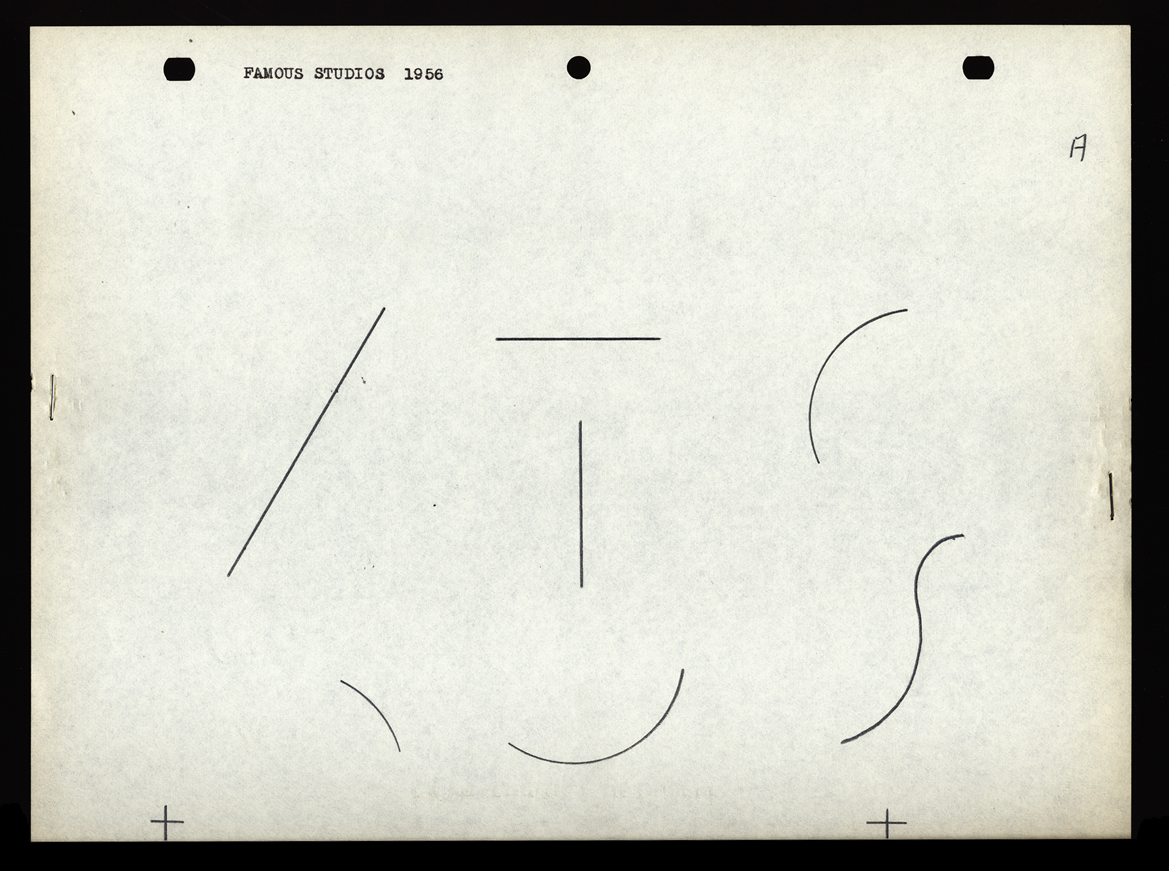 A
A 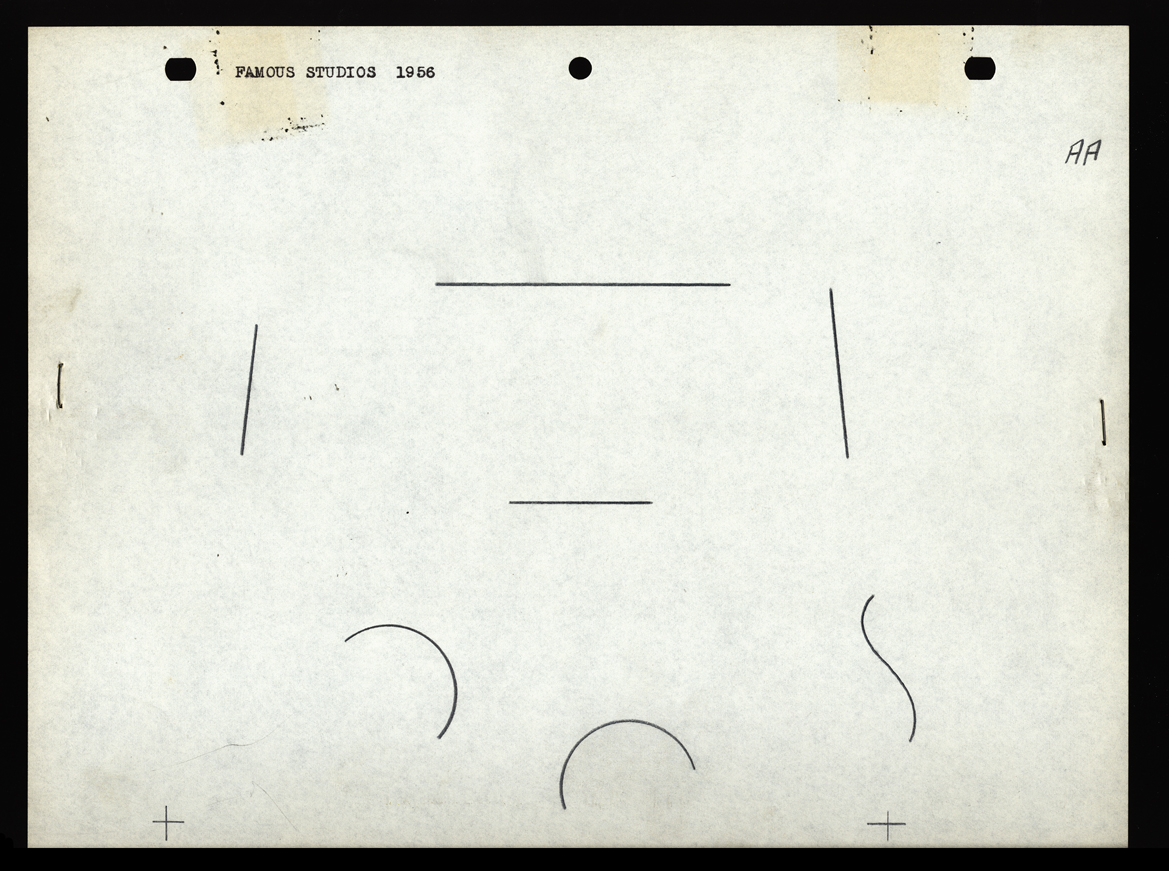 AA
AA
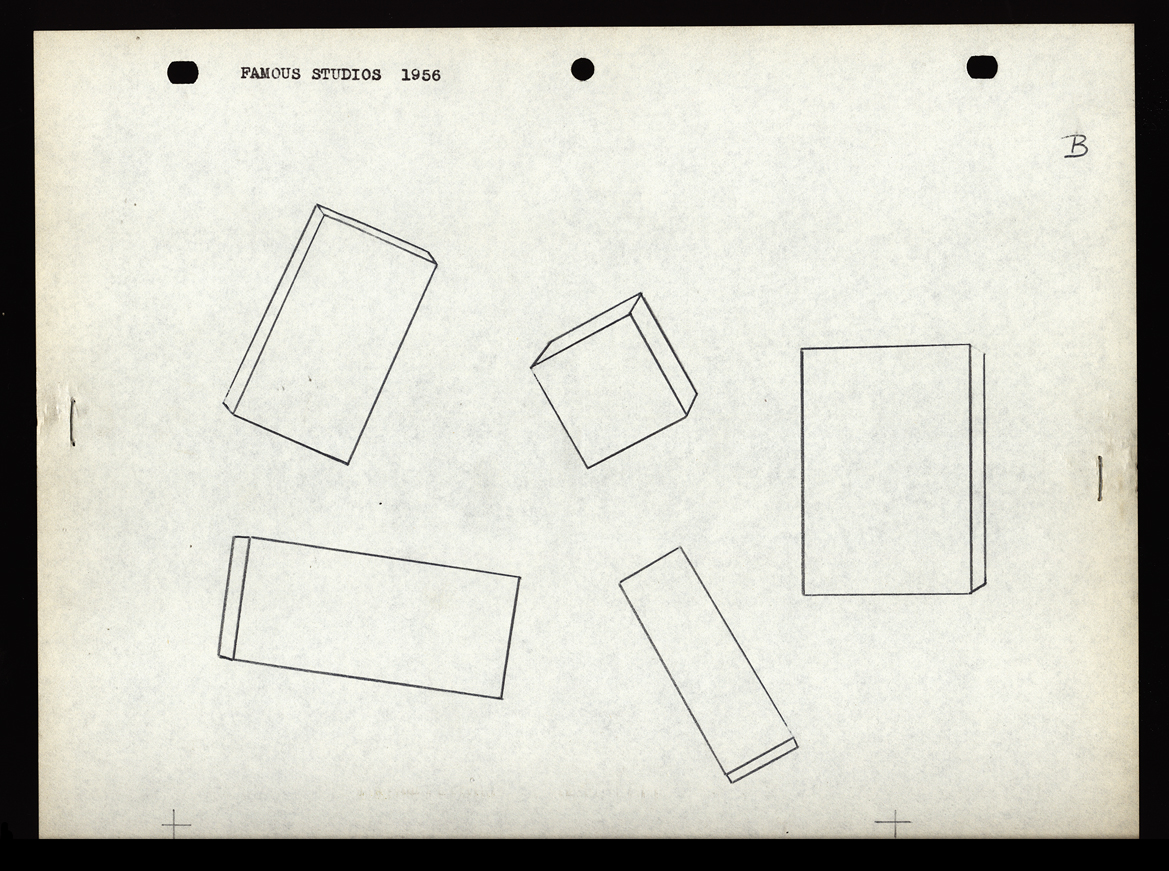 B
B 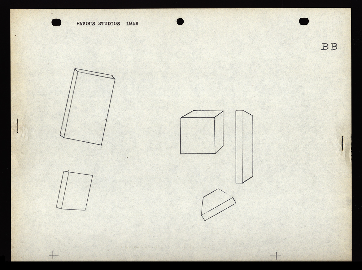 BB
BB
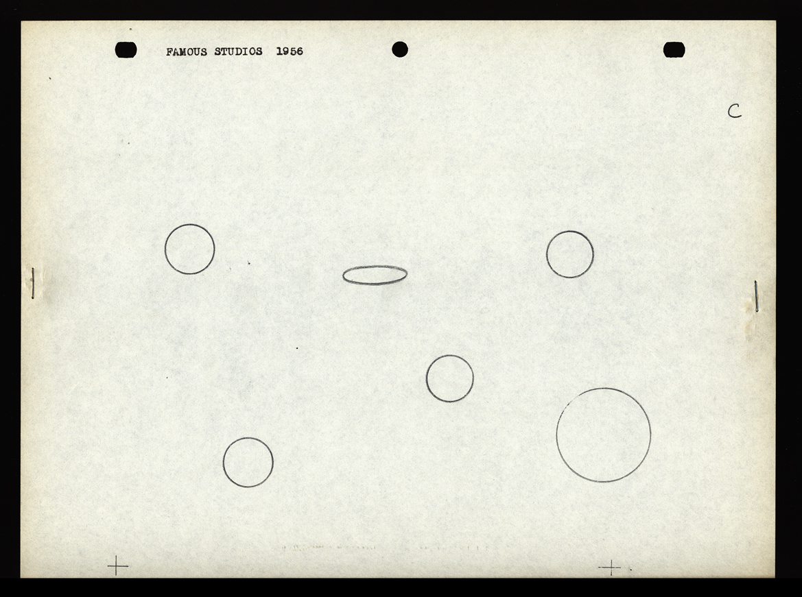 C
C 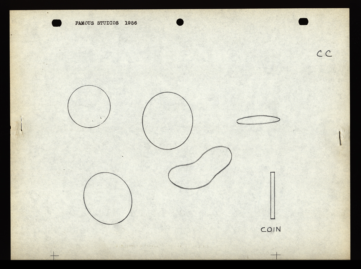 CC
CC
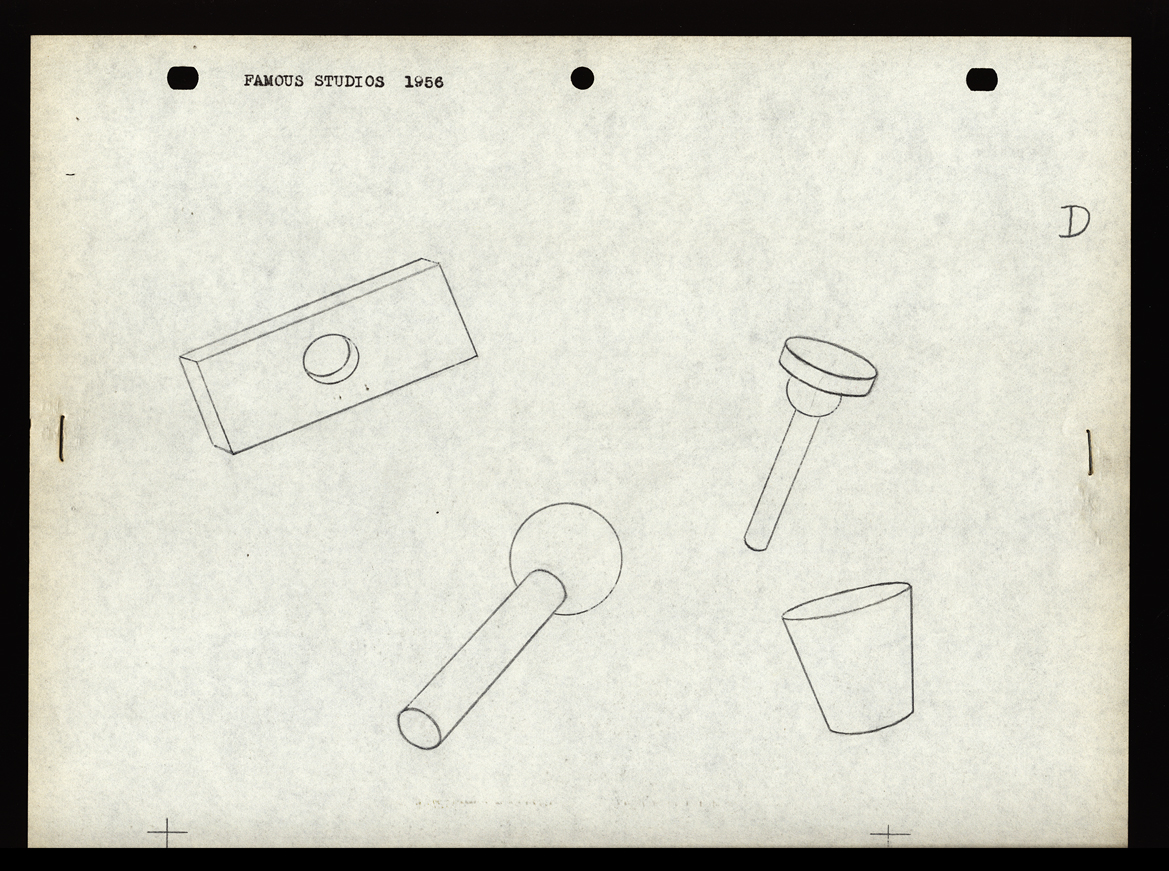 D
D 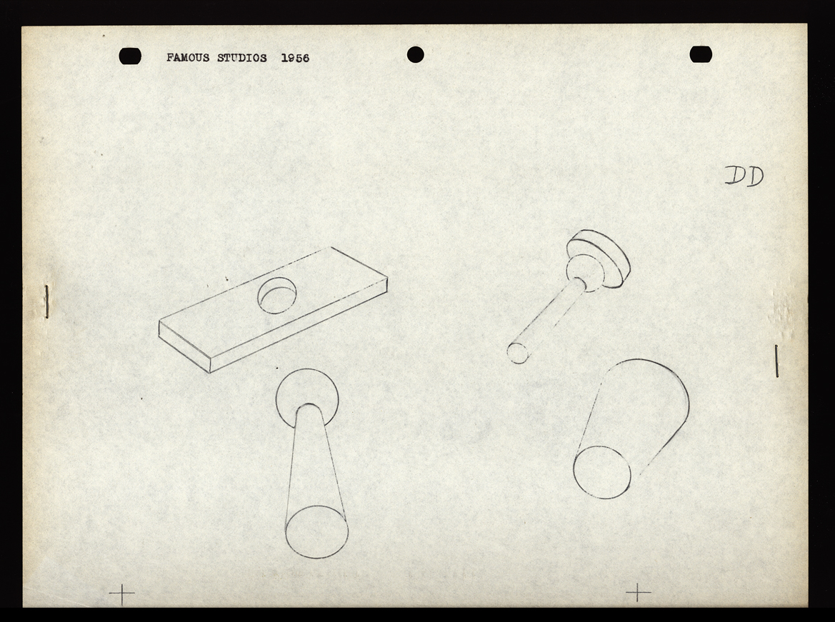 DD
DD
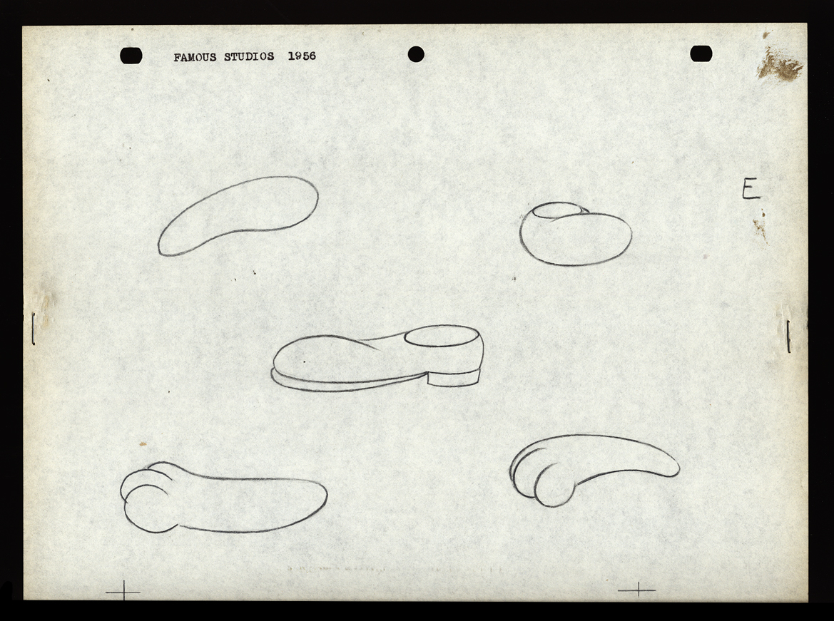 E
E 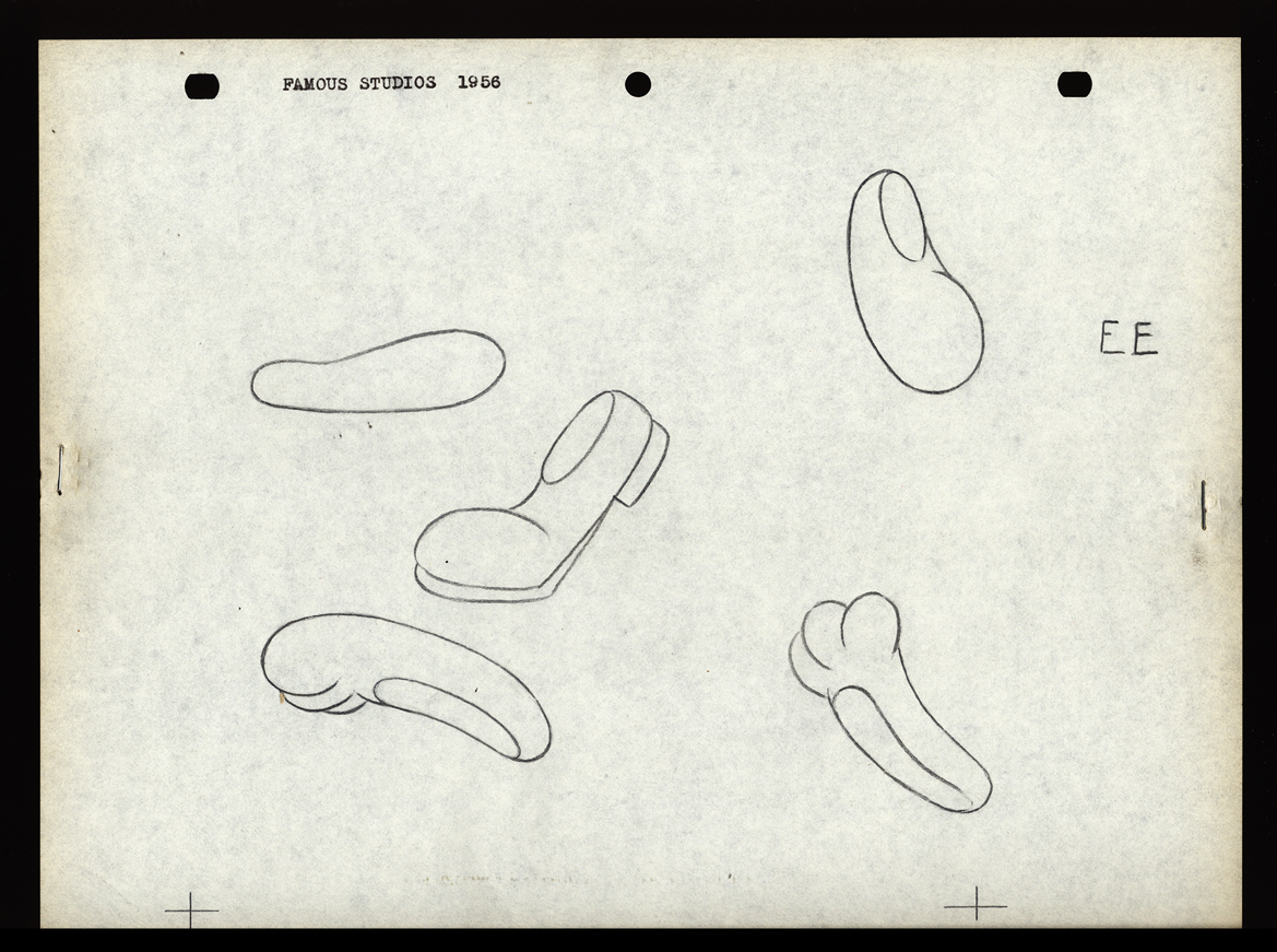 EE
EE
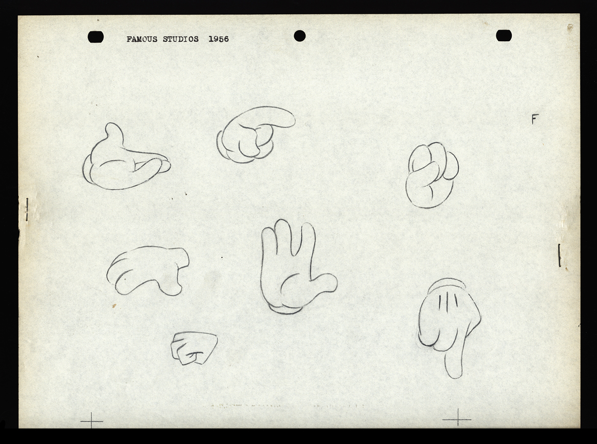 F
F
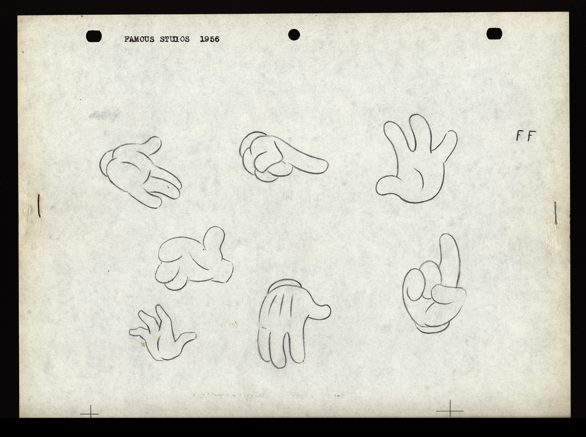 FF
FF
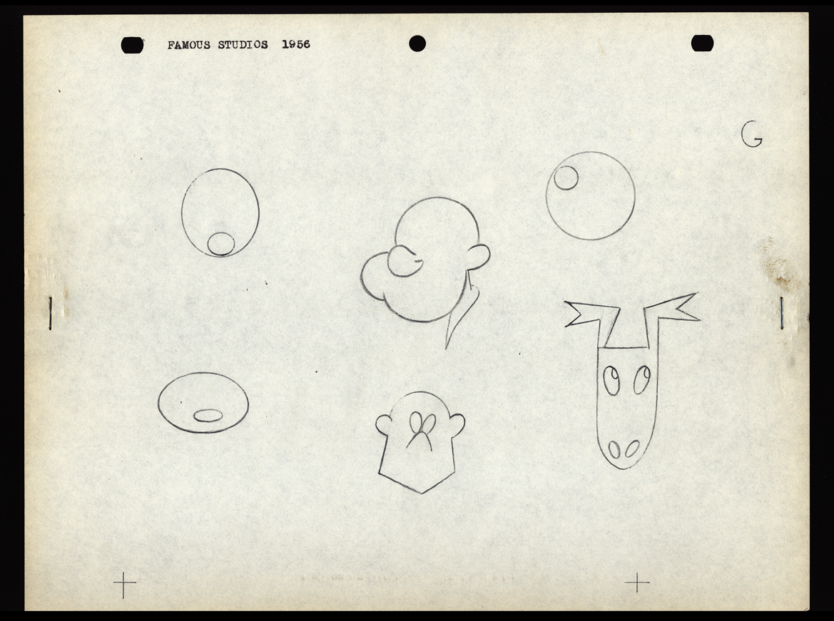 G
G
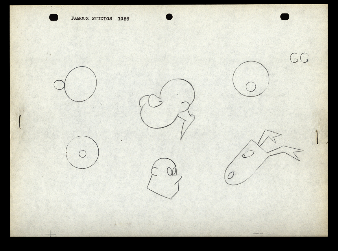 GG
GG
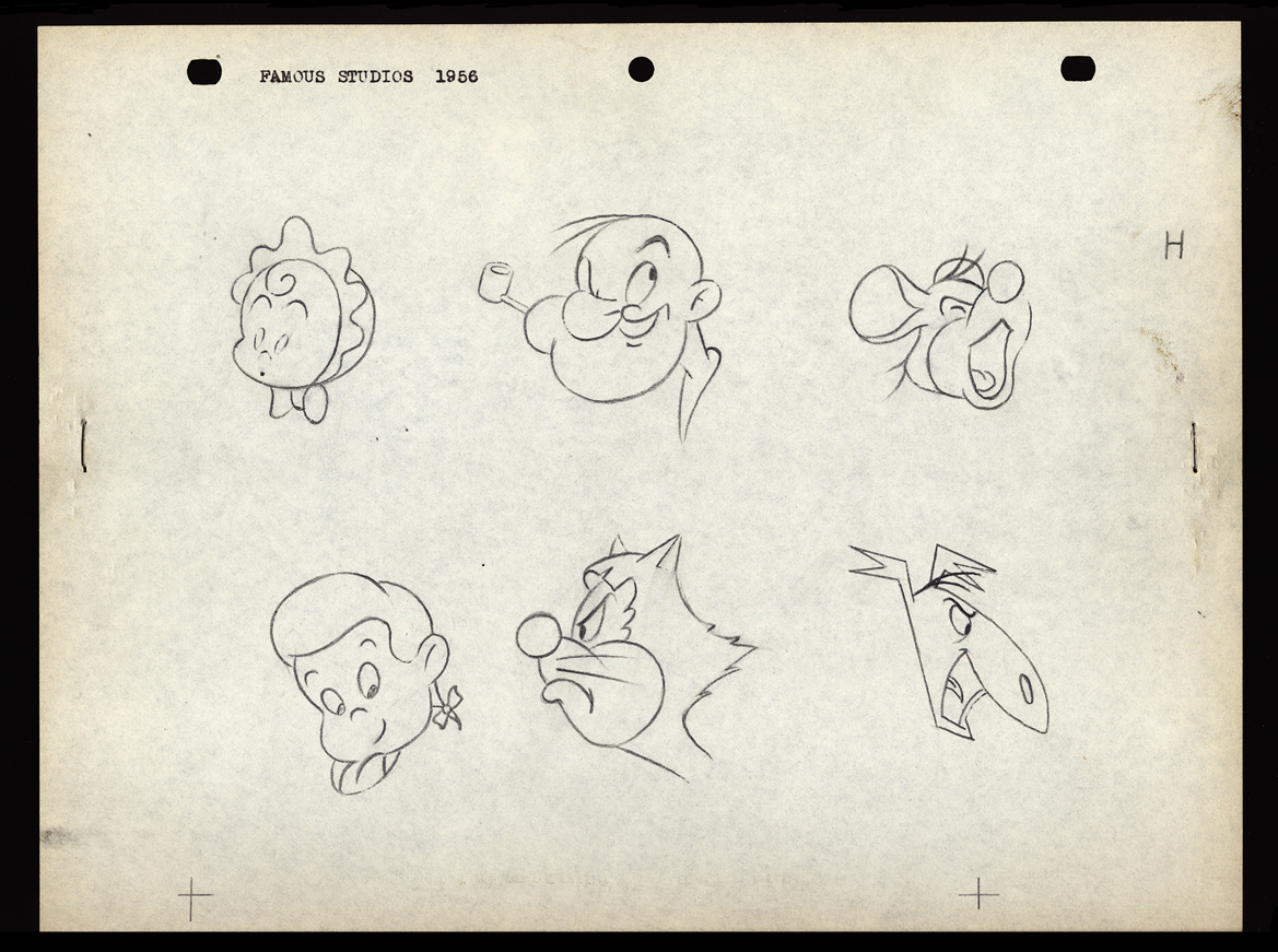 H
H
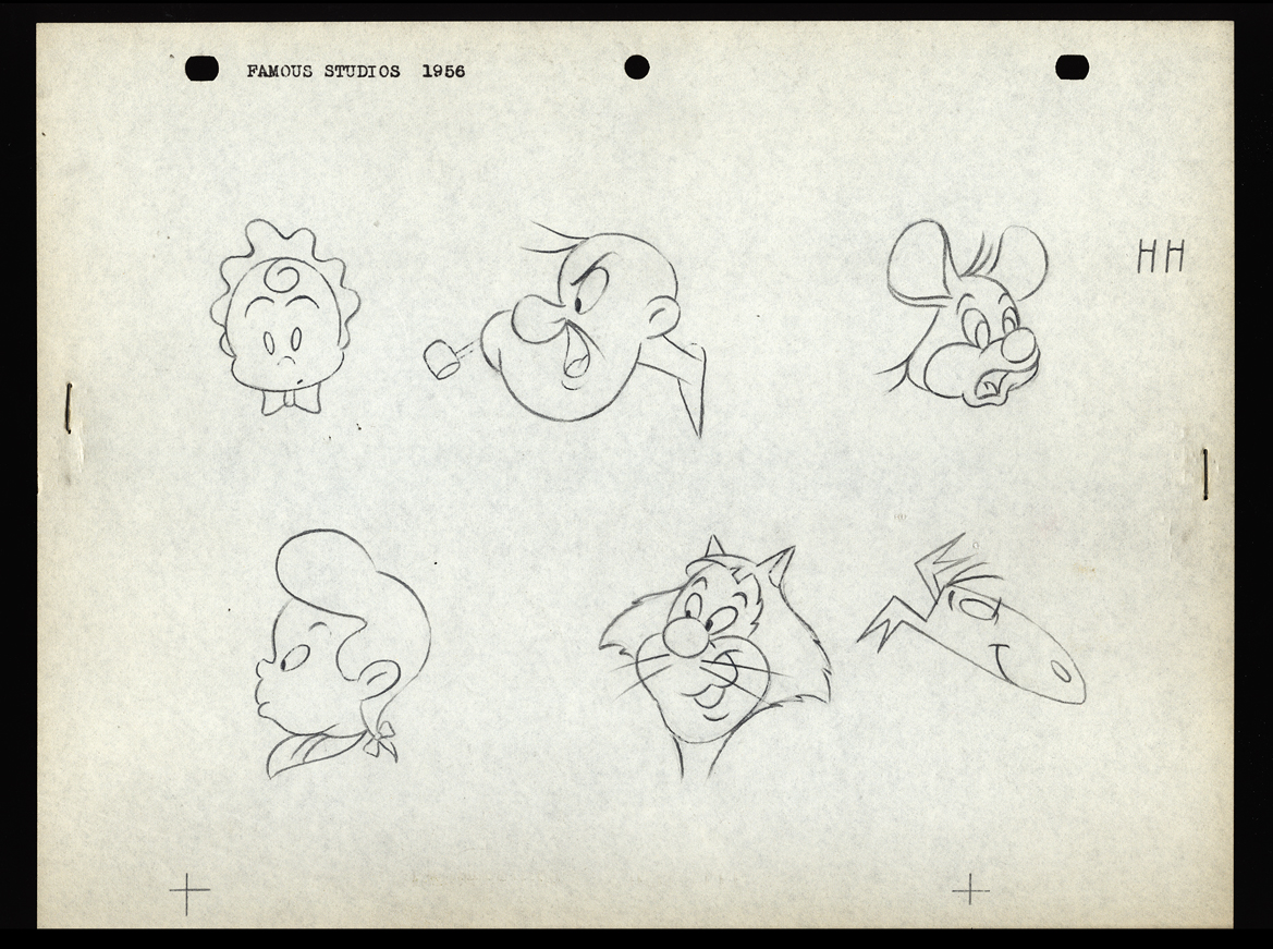 HH
HH
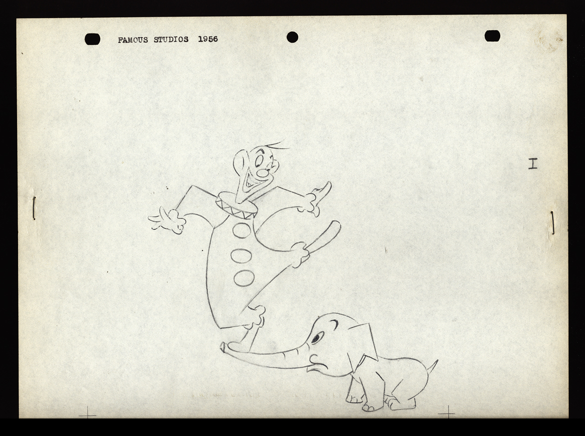 I
I
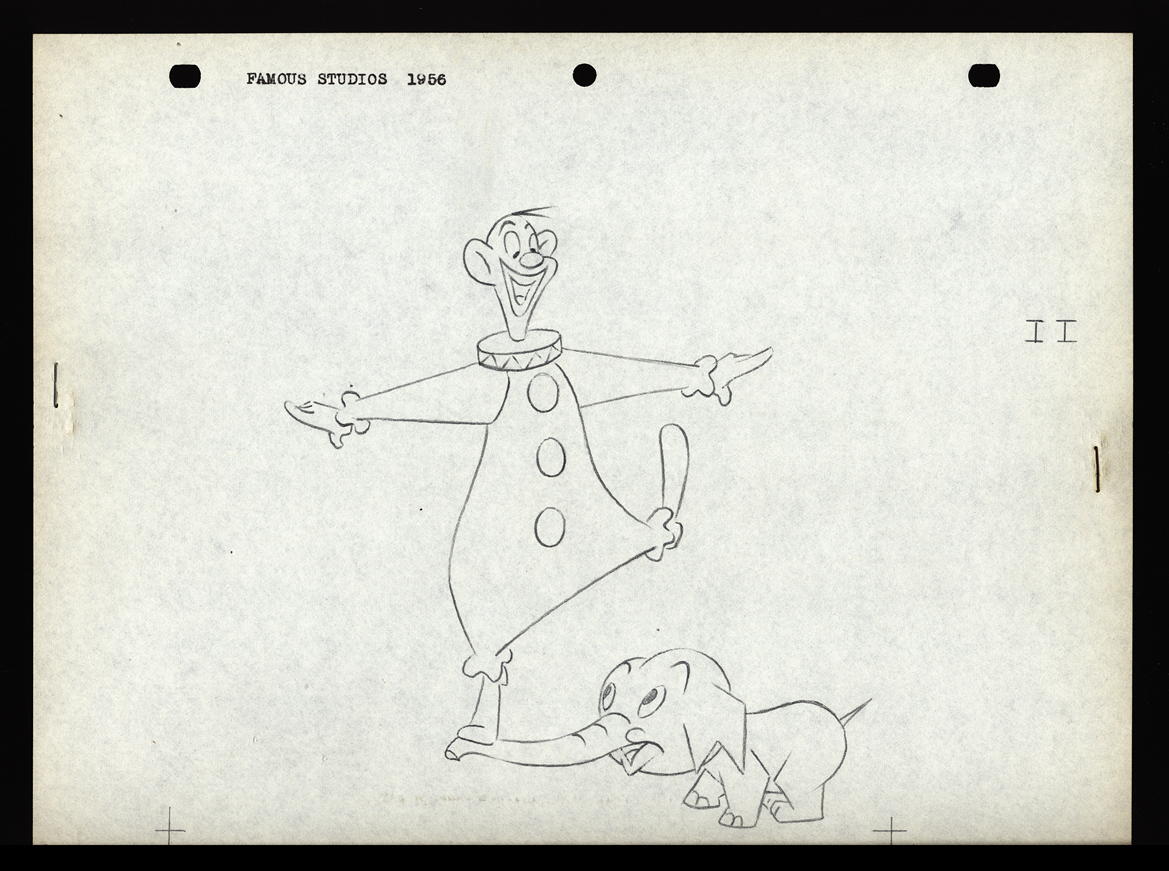 II
II
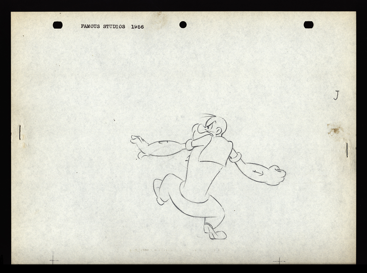 J
J
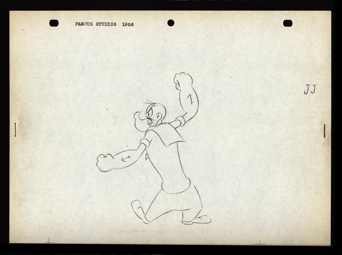 JJ
JJ
Animation Artifacts &commercial animation &Layout & Design 03 Oct 2012 06:46 am
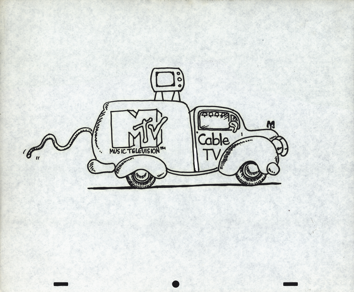
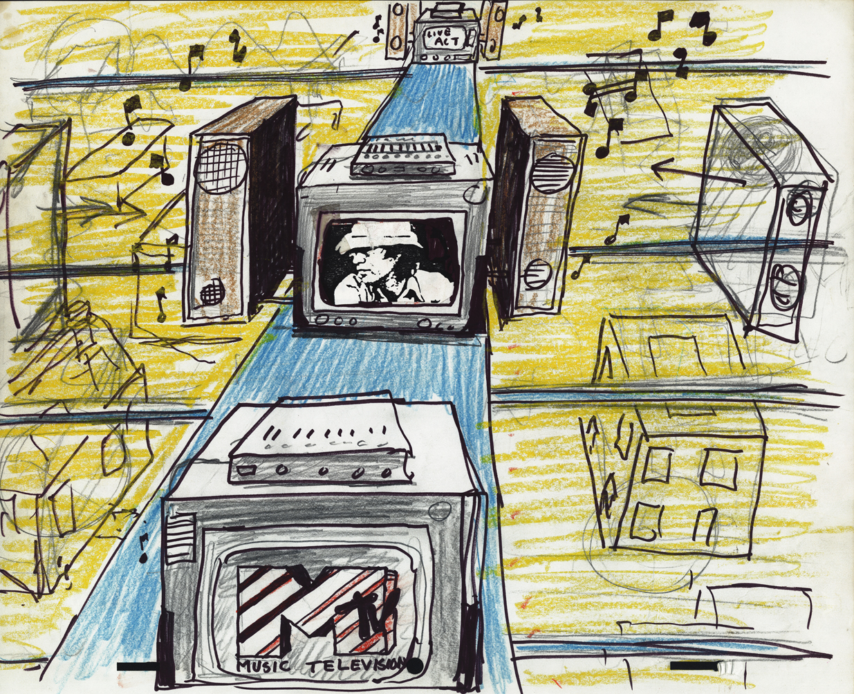
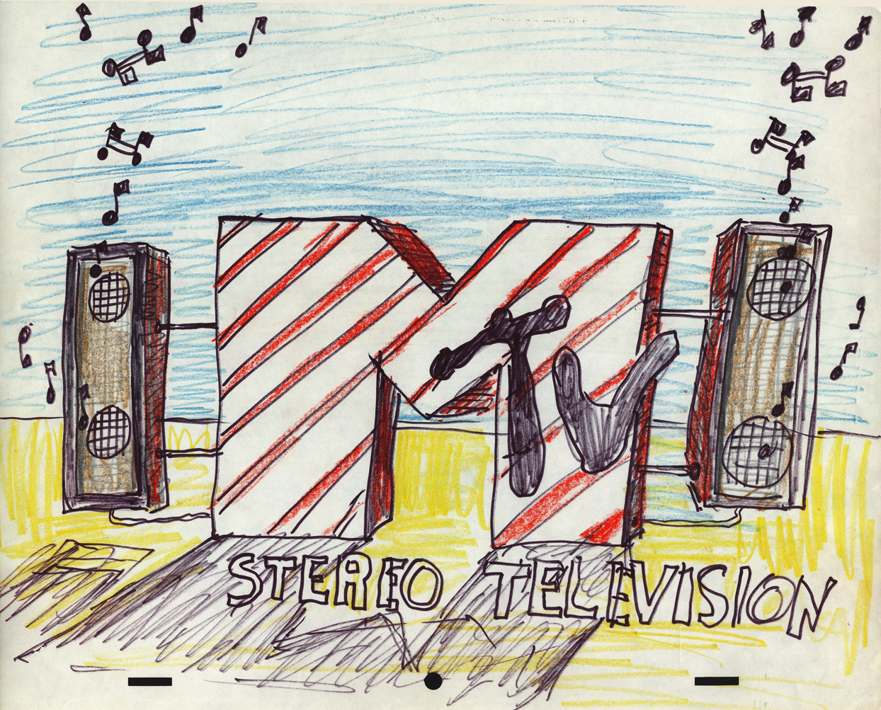
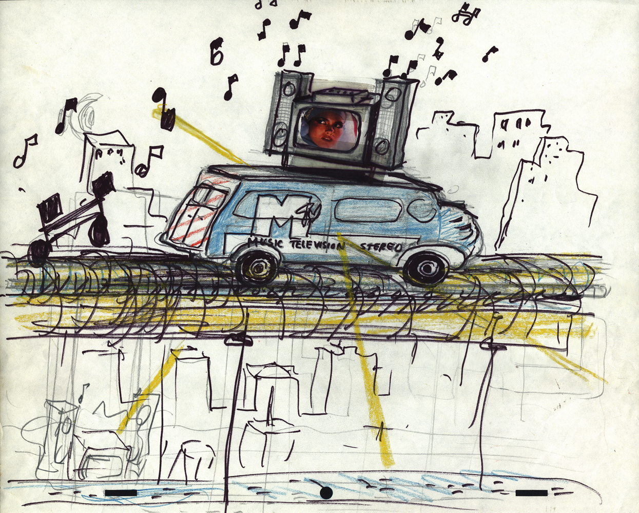
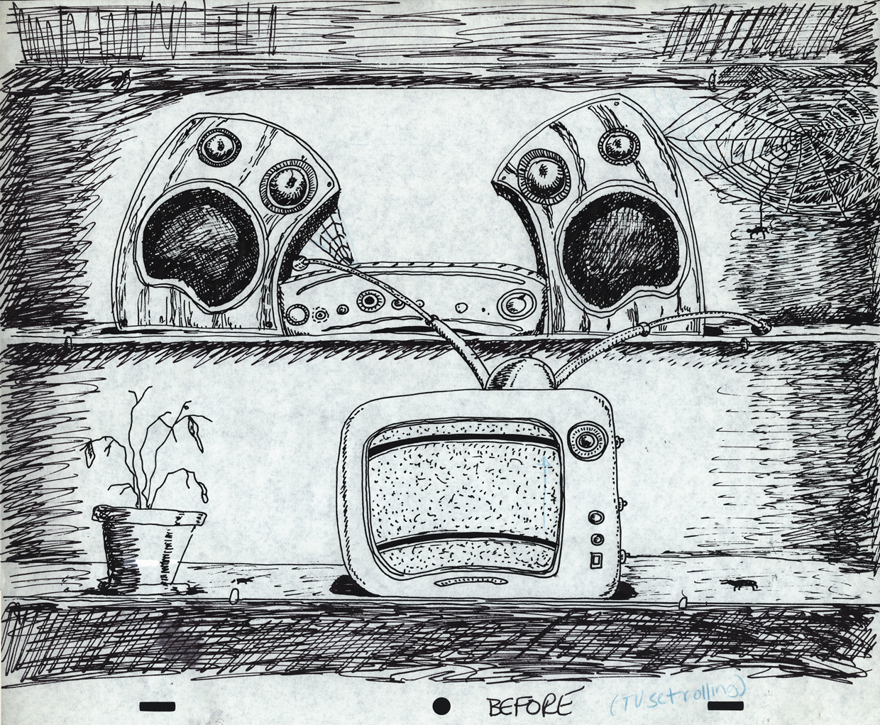
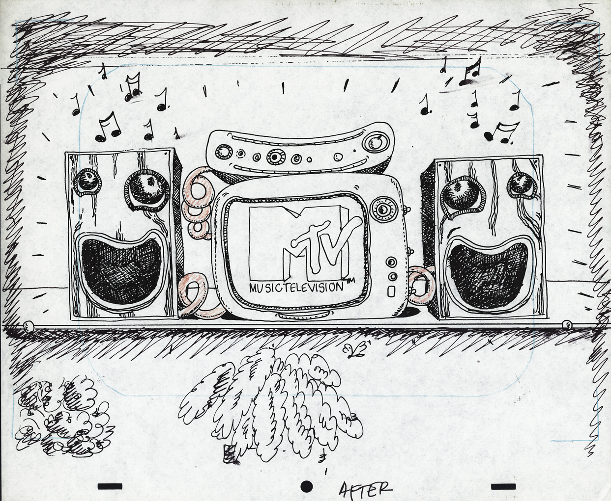
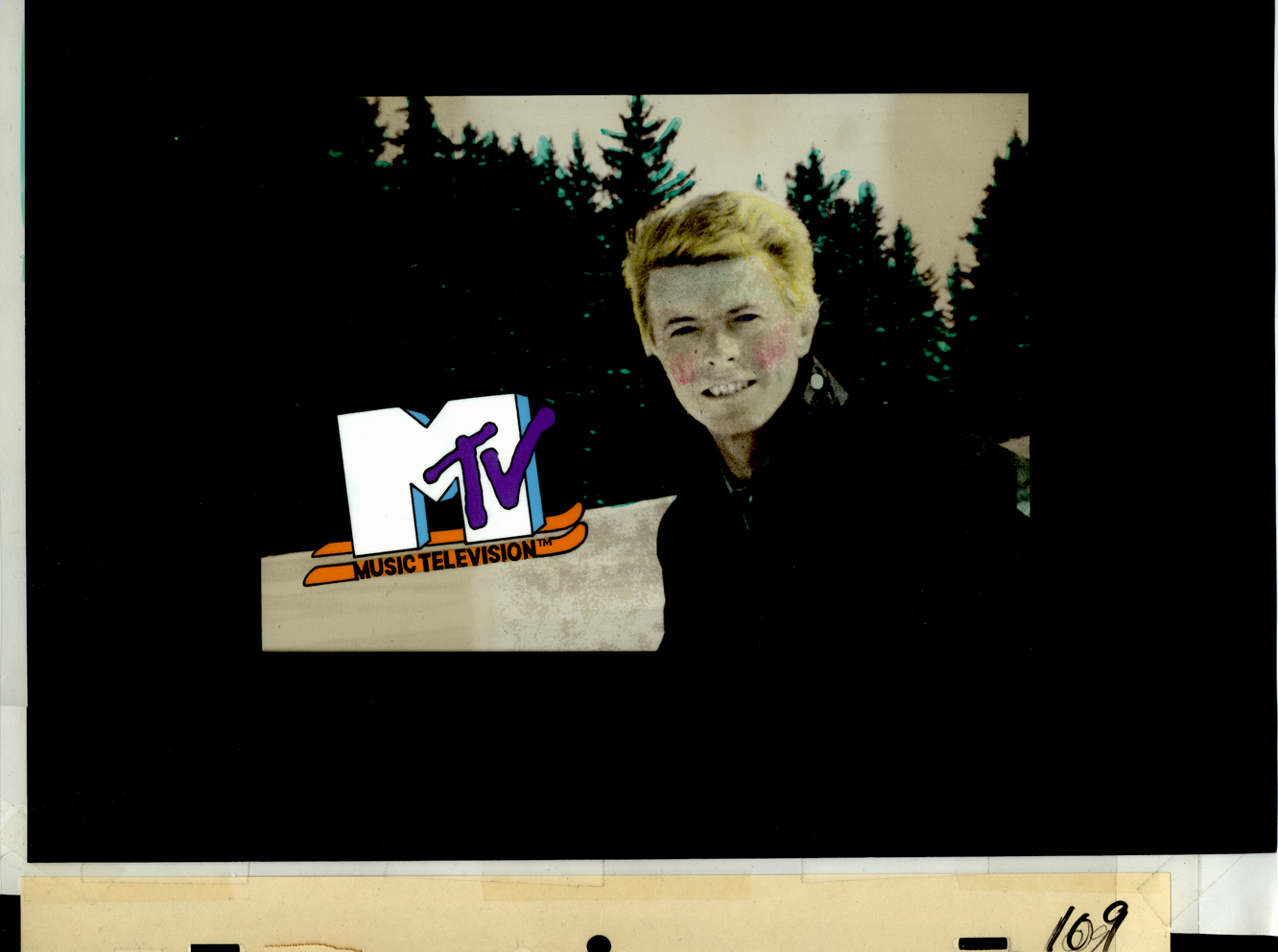
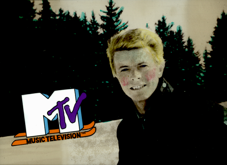
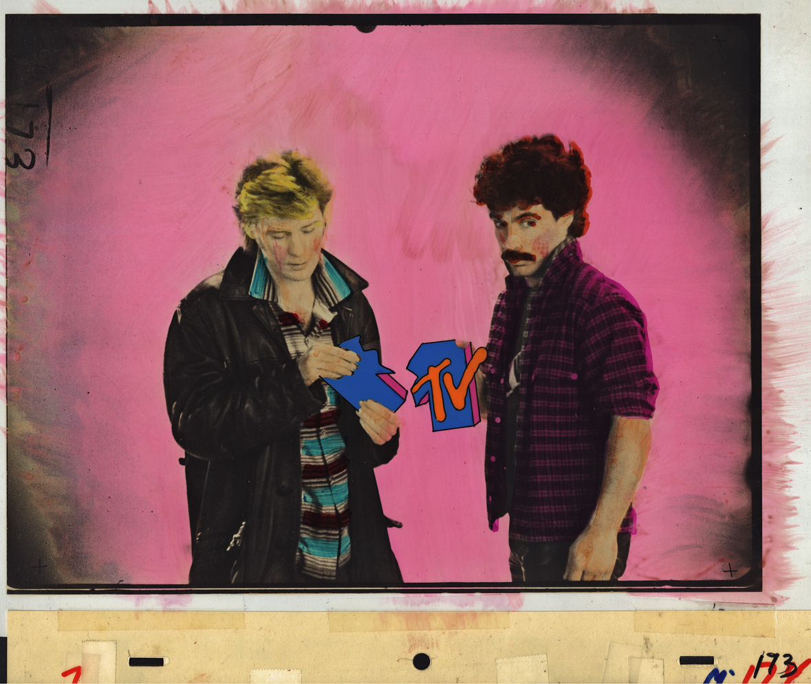
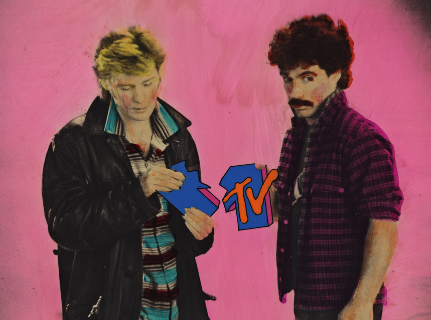
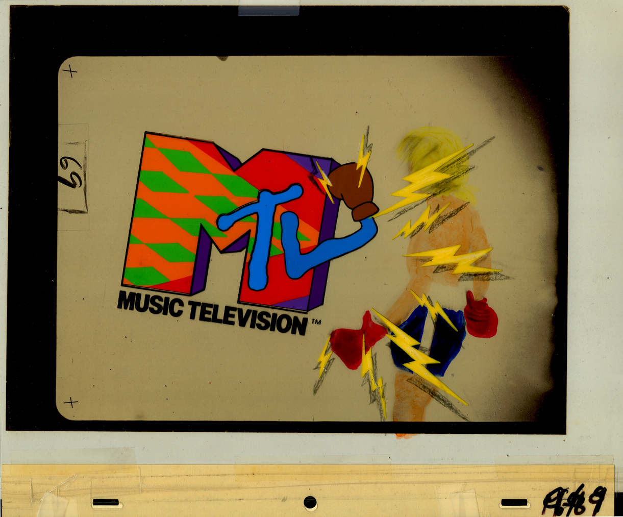
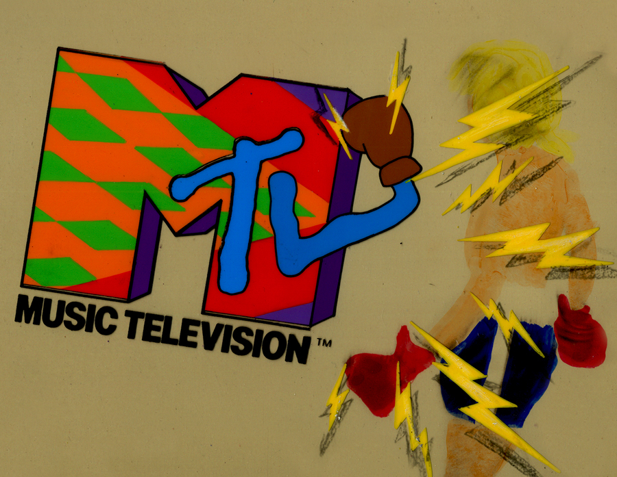
I want my MTV
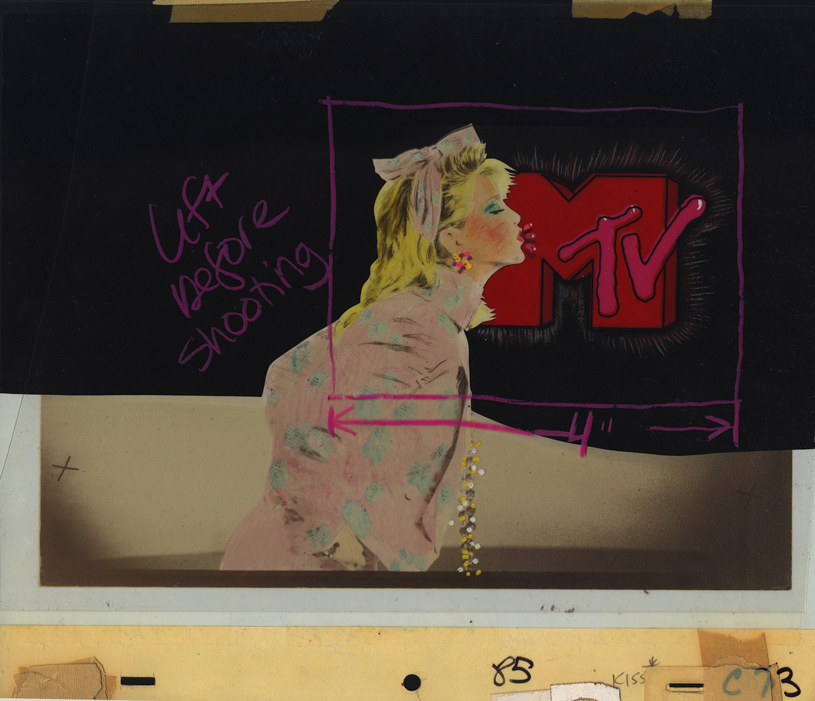
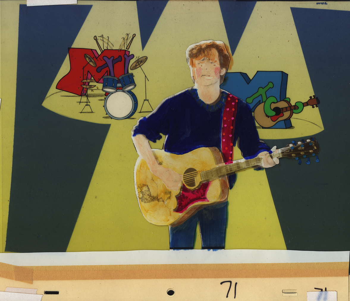
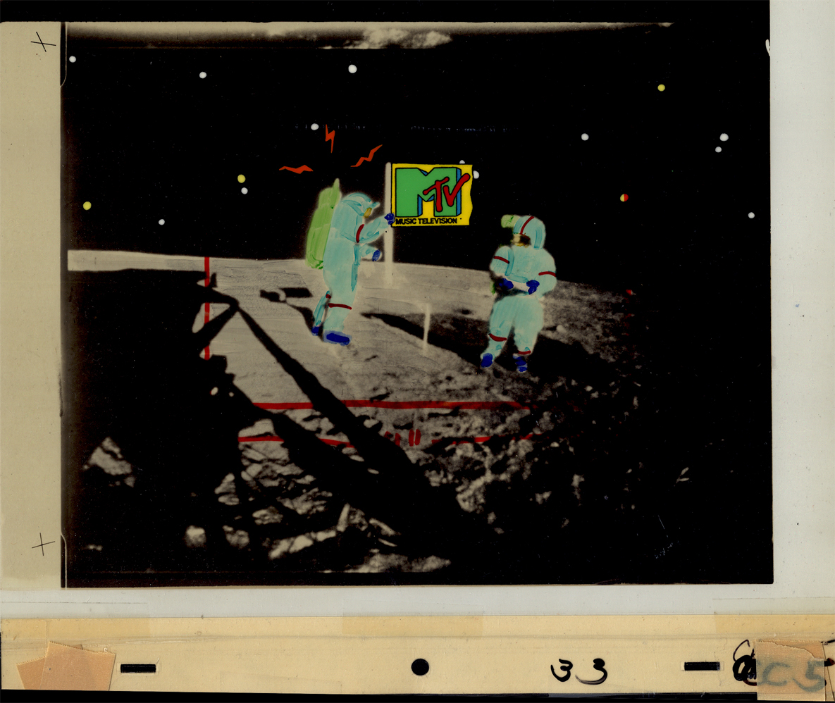
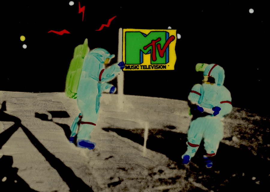
- In searching through the archives of work at Buzzco, where Vince Cafarelli‘s collection is housed, I came upon some MTV artwork. Some of you may remember that MTV had some wild art bumpers when they first started out. Buzzco did the lion’s share of these early logos. Candy Kugel did the artwork for them, and Vince Cafarelli wasn’t involved. These were done when Perpetual Motion was breaking up and Buzzco was coming into being. Buzz Potamkin would pull Candy into another room and give her the new assignment so that no one at Perpertual knew what she was up to. Once the split happened, Buzzco kept the account.The colors have deteriorated a bit in some of these. I’ve done some minor photoshop adjustments to brighten the colors a bit.
But first let me show some rough sketches for the very first promo for MTV in 1982. This came before the MTV campaign, “I want my MTV.” I vaguely remember this, but am not sure of it. I wasn’t a confirmed MTV watcher in those early days.
 1
1Drawing by Candy Kugel
 2
2
Drawing by Fred Mogubgub
 3
3
Drawing by Fred Mogubgub
 4
4
Drawing by Fred Mogubgub
 5
5
Drawing by Candy Kugel
 6
6
Drawing by Candy Kugel
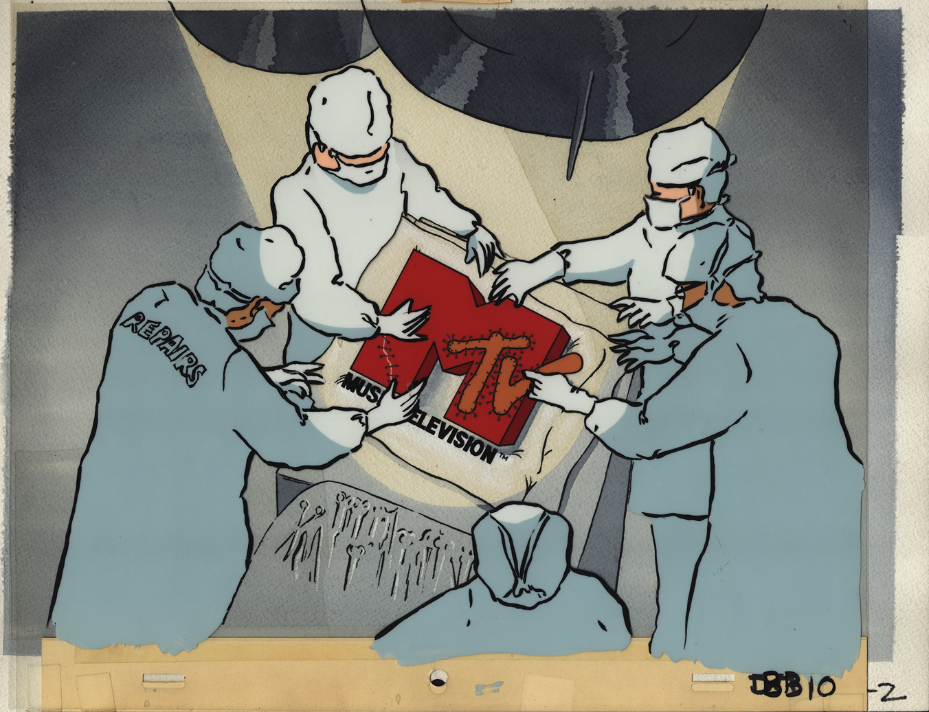
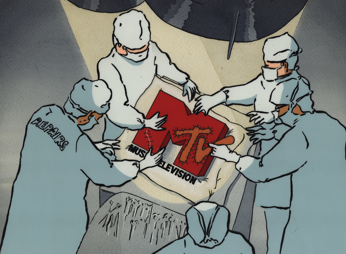
Here are eight of the color pieces. I’ll display two versions of each setup: the full artwork first, then the screen-sized art following so that you can see the proper framing.
 1a
1aDavid Bowie
 1b
1b
 2a
2a
Madonna
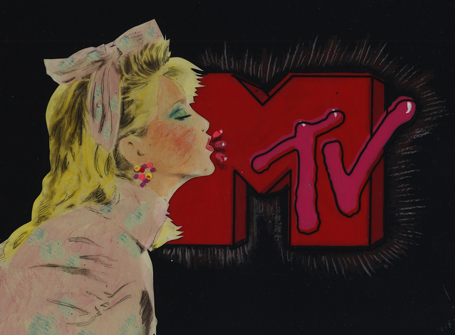 2b
2b
 3a
3a
John (Cougar) Mellencamp
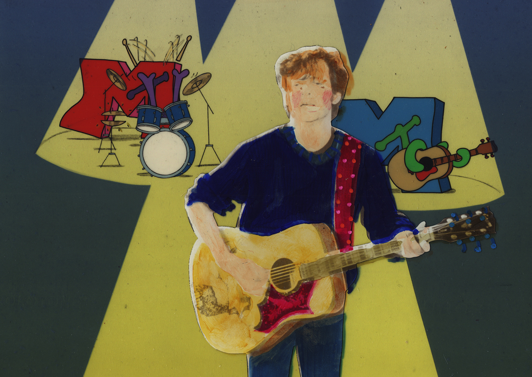 3b
3b
 4a
4a
Madonna again (she was popular)
 4b
4b
 5a
5a
Hall & Oates
 5b
5b
 6a
6a
The famous Moonwalk
 6b
6b
 7a
7a
 7b
7b
 8a
8a
Joe Elliott of Def Leppard
 8b
8b
Animation &Animation Artifacts &commercial animation &Layout & Design 26 Sep 2012 05:15 am
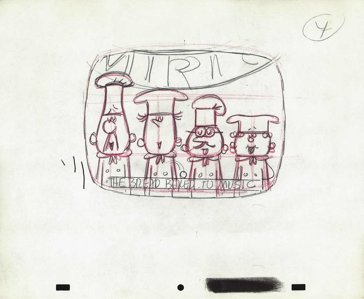
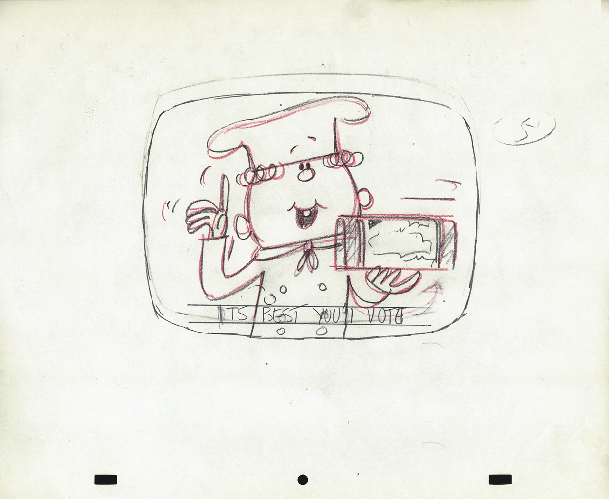
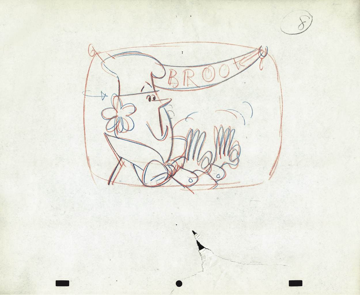
Vince Cafarelli’s Millbrook Bread – 2
- Last week we saw the first of these two spots Vince Cafarelli did while working for Goulding-Elliot-Graham Prods., Inc. Millbrook Bread was the client and the Piels Bros. voices, Bob Elliott & Ray Goulding, owned the studio with Ed Graham. They also did the voices for these bread spots. This particular one must have been pretty big; the video survived these many years later, and I’ve attached it to the end of this post.
But first, here are the Layout drawings which I believe were done by Vinnie Cafarelli.
 1
1
 2
2
 3
3
 4
4
 5
5
 6
6
 7
7
 8
8
 9
9
 10
10
 11
11
 12
12
 13
13
 14
14
 14-5
14-5
 15
15
 16
16
 17
17
 18
18
 19
19
 20
20
 21
21
 22
22
 23
23
Animation Artifacts &commercial animation &Layout & Design 19 Sep 2012 05:22 am
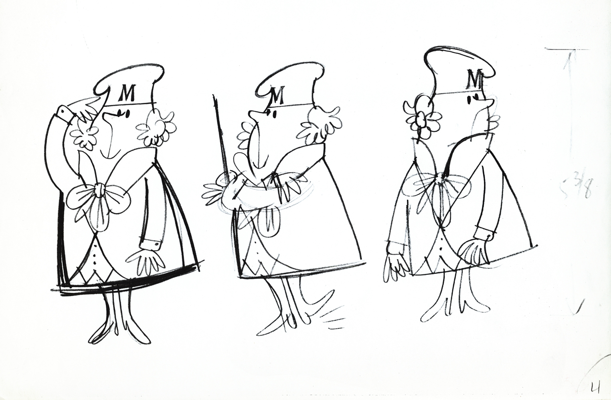
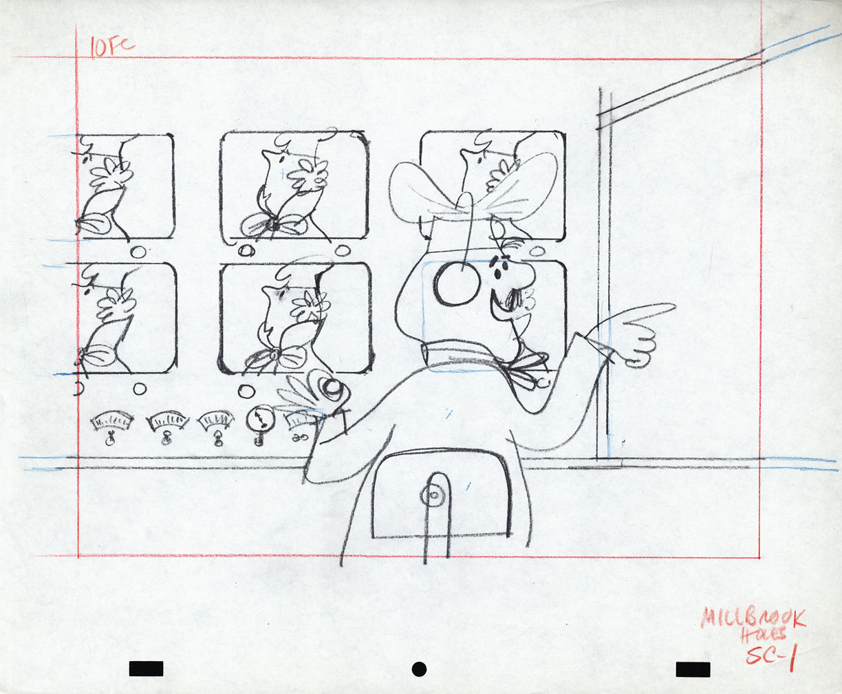
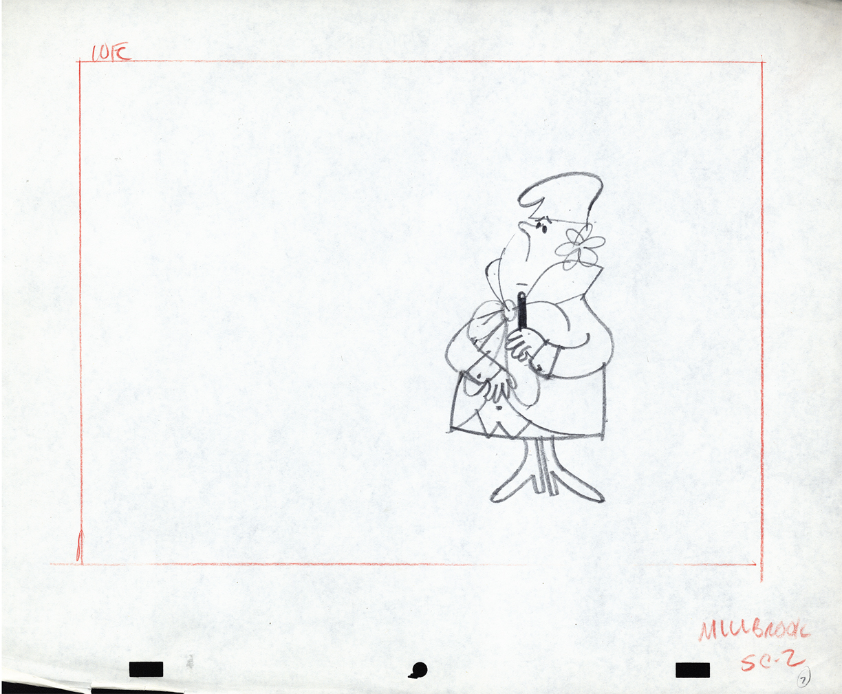
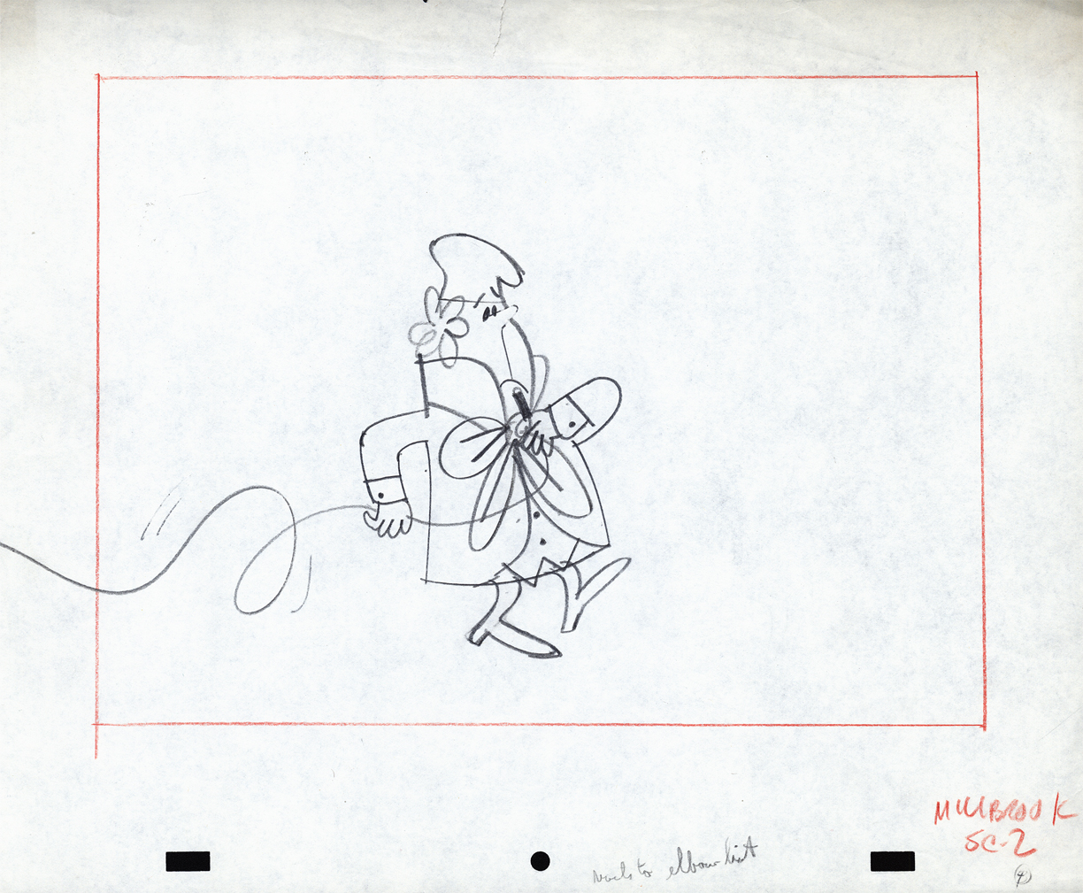
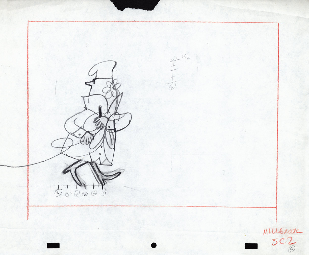
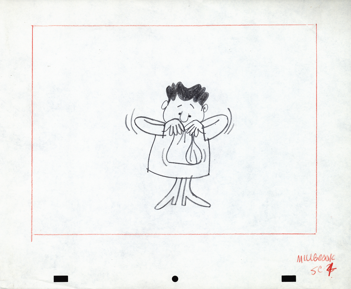
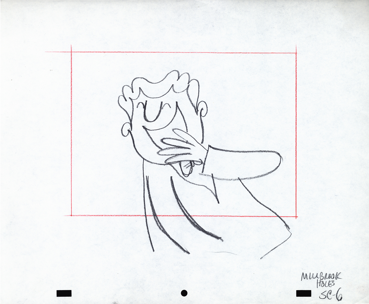
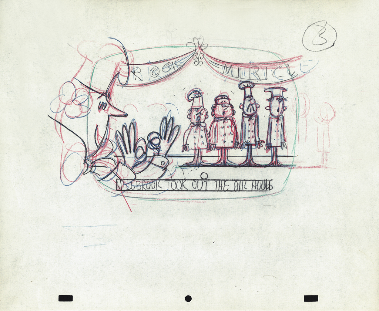
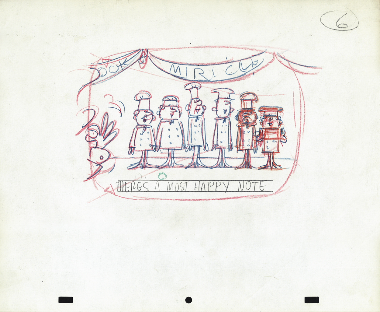
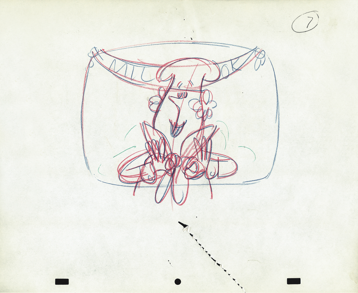
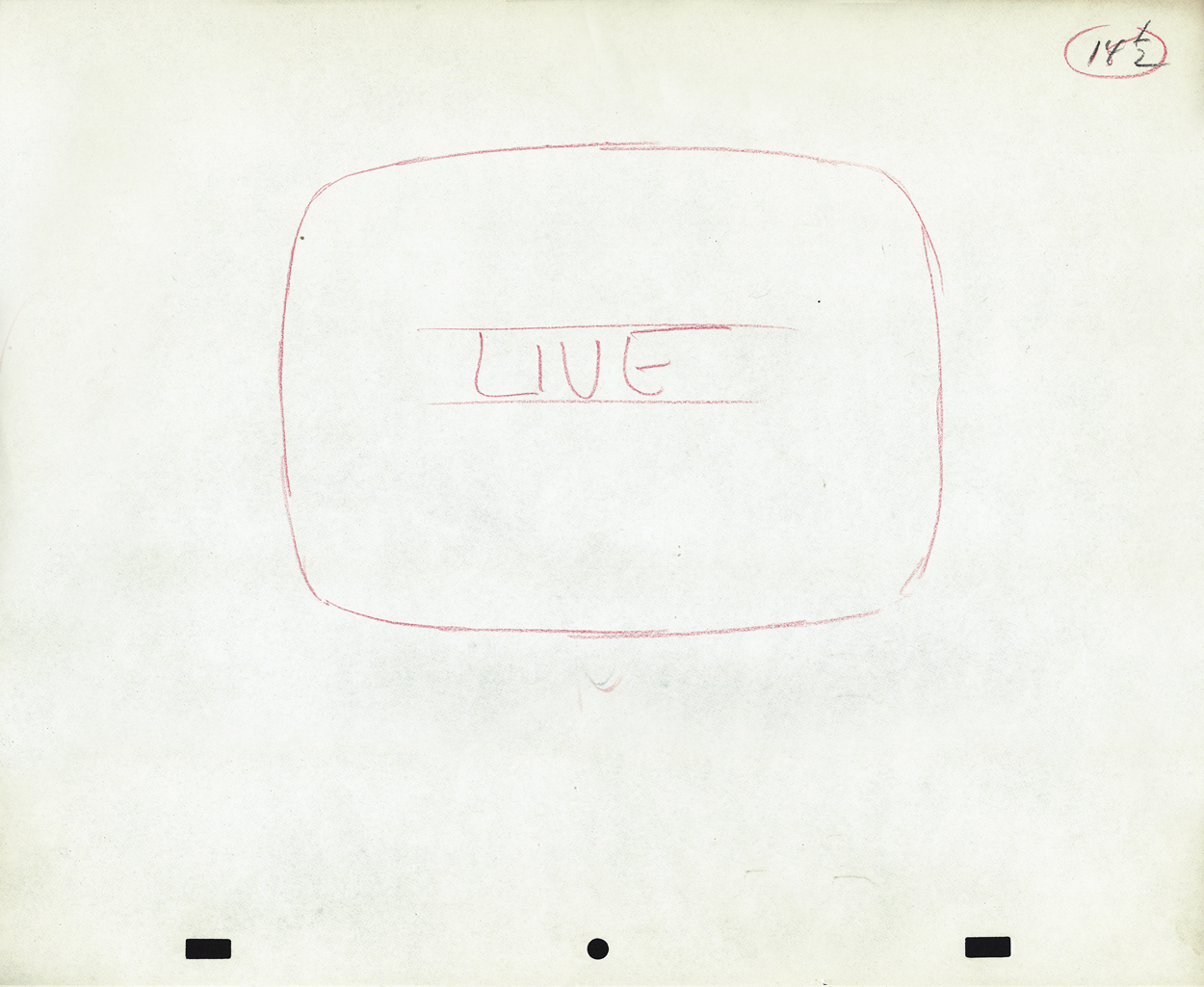
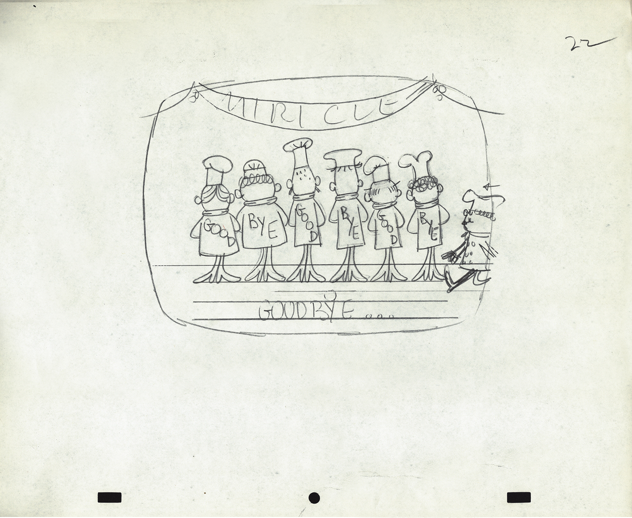
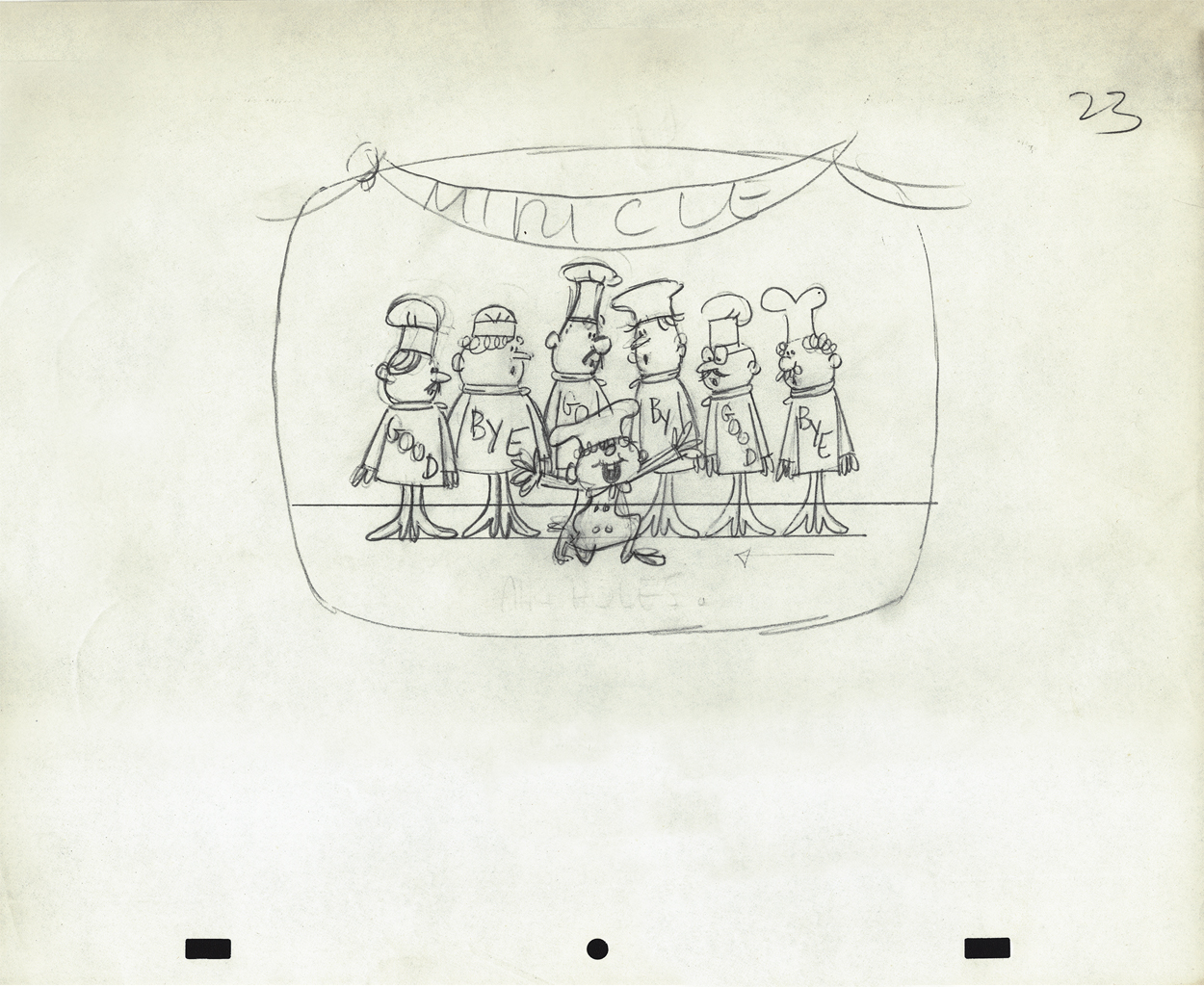
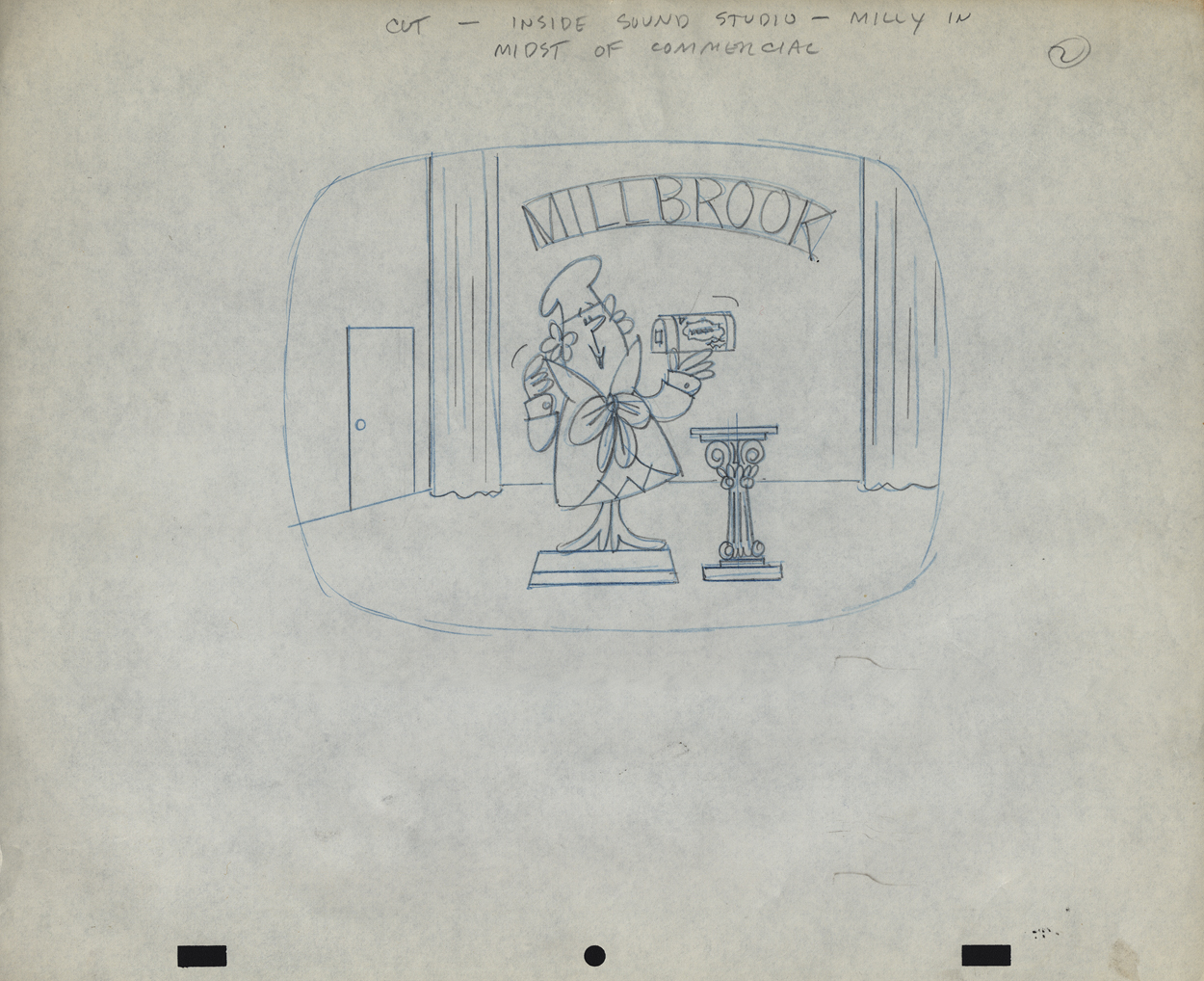
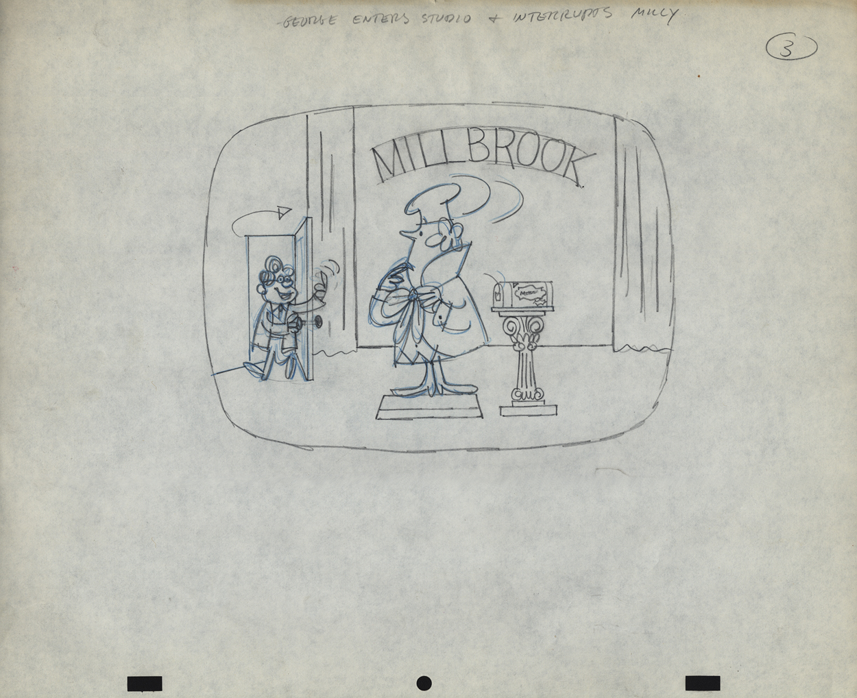
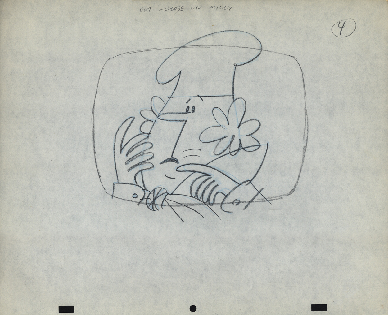
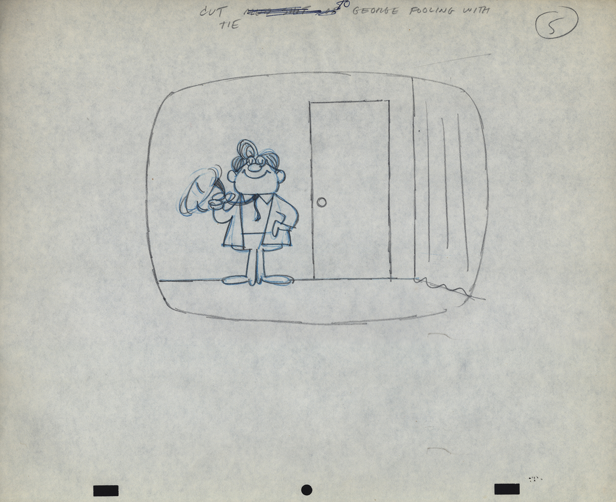
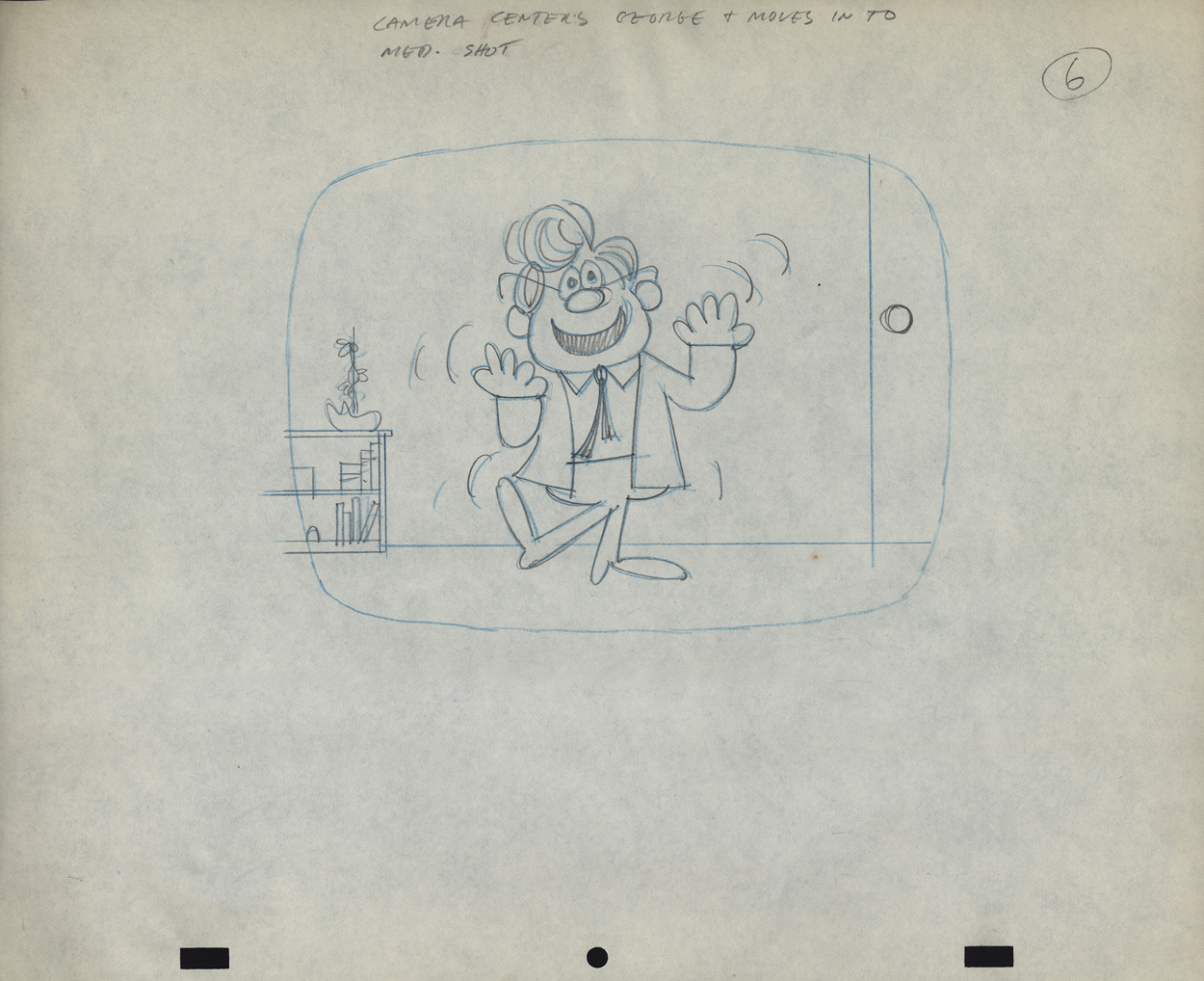
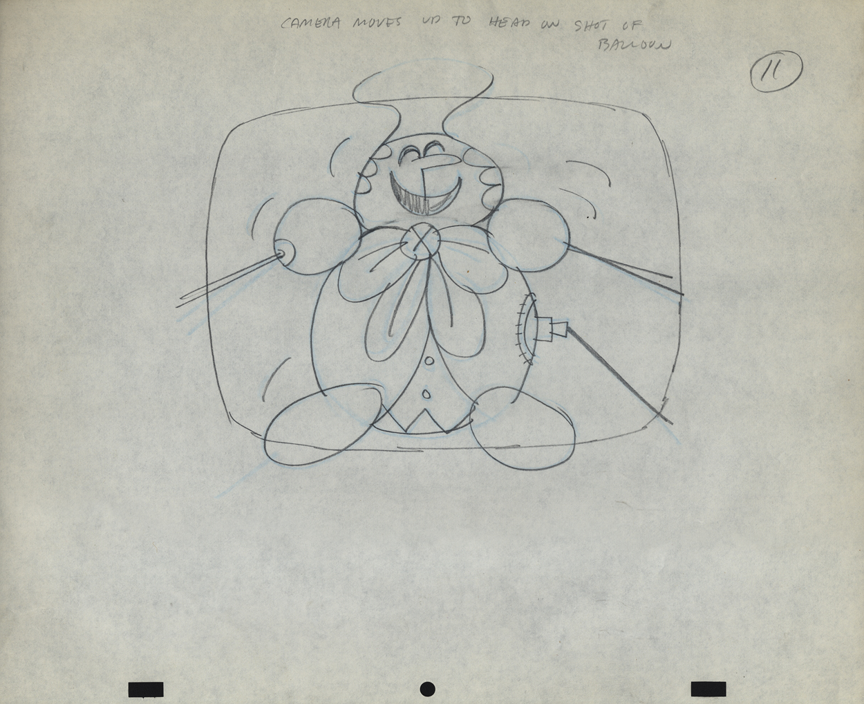
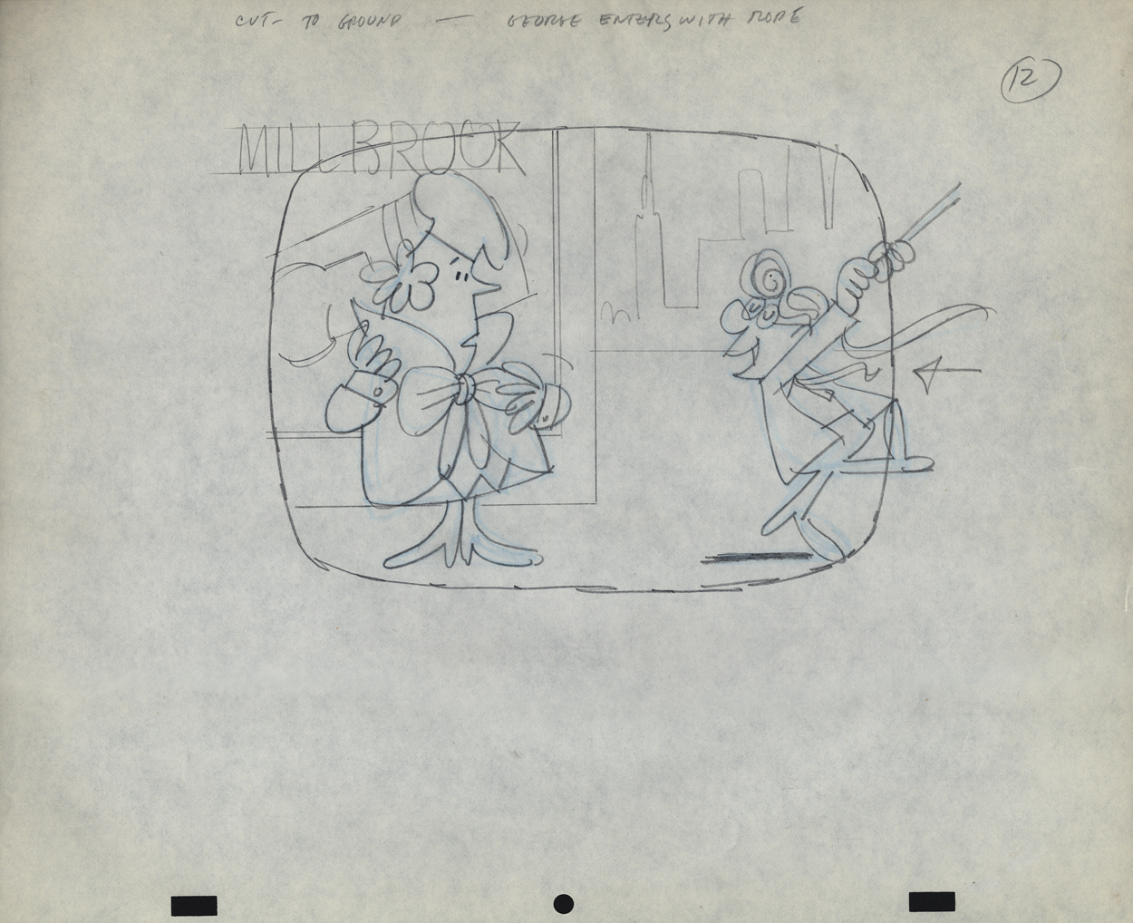
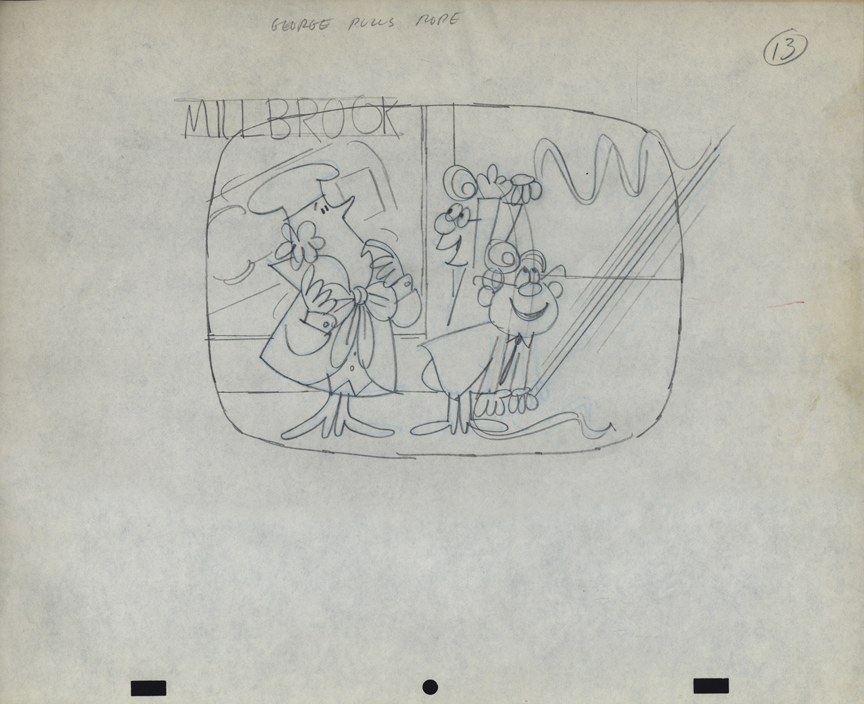
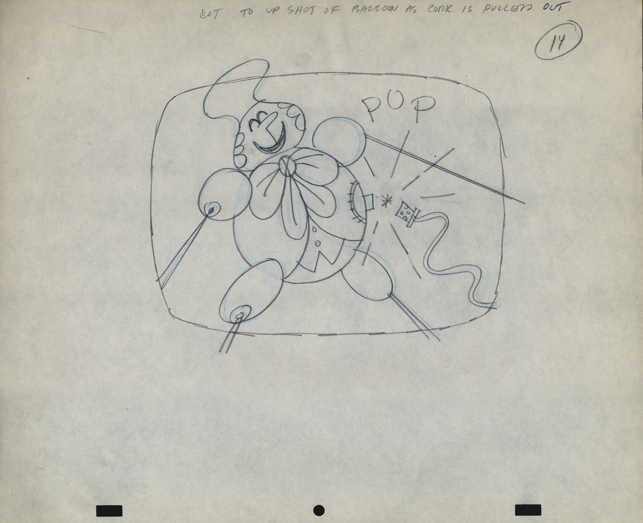
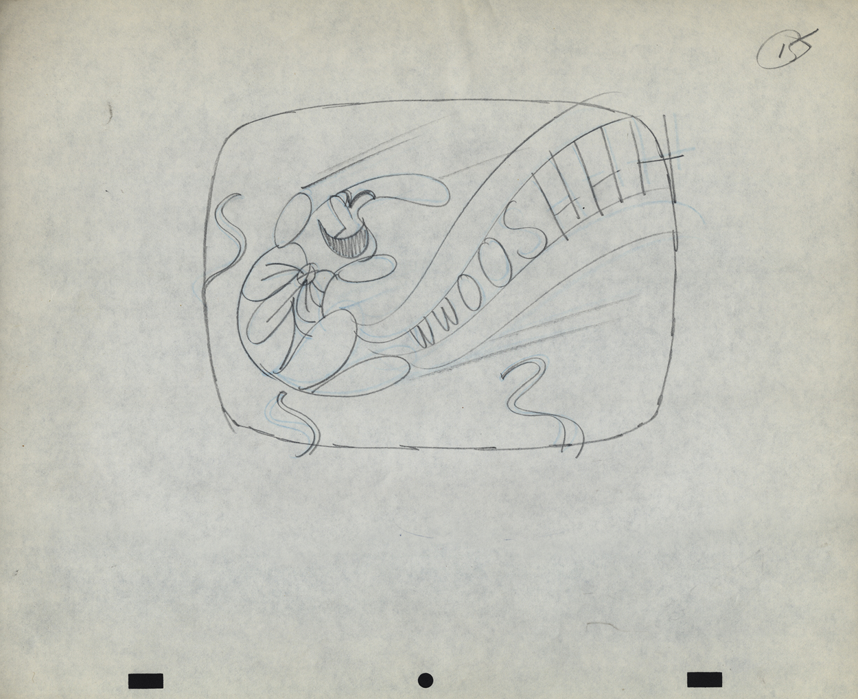
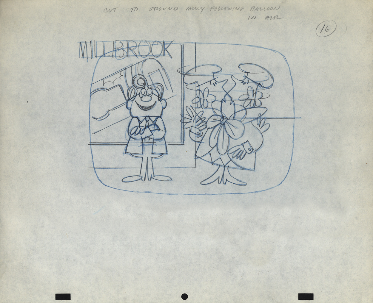
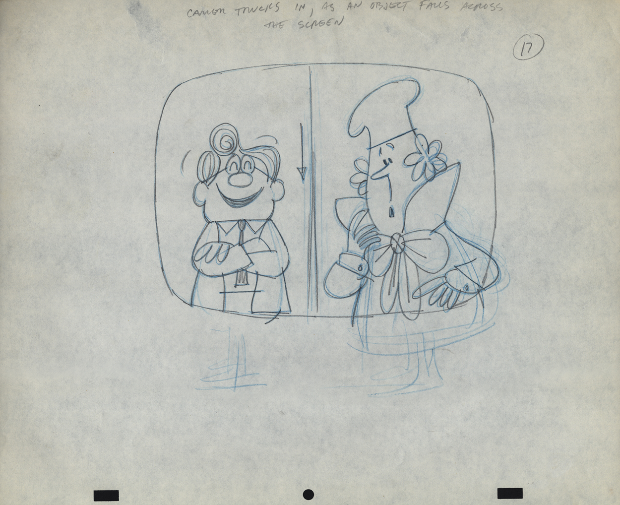
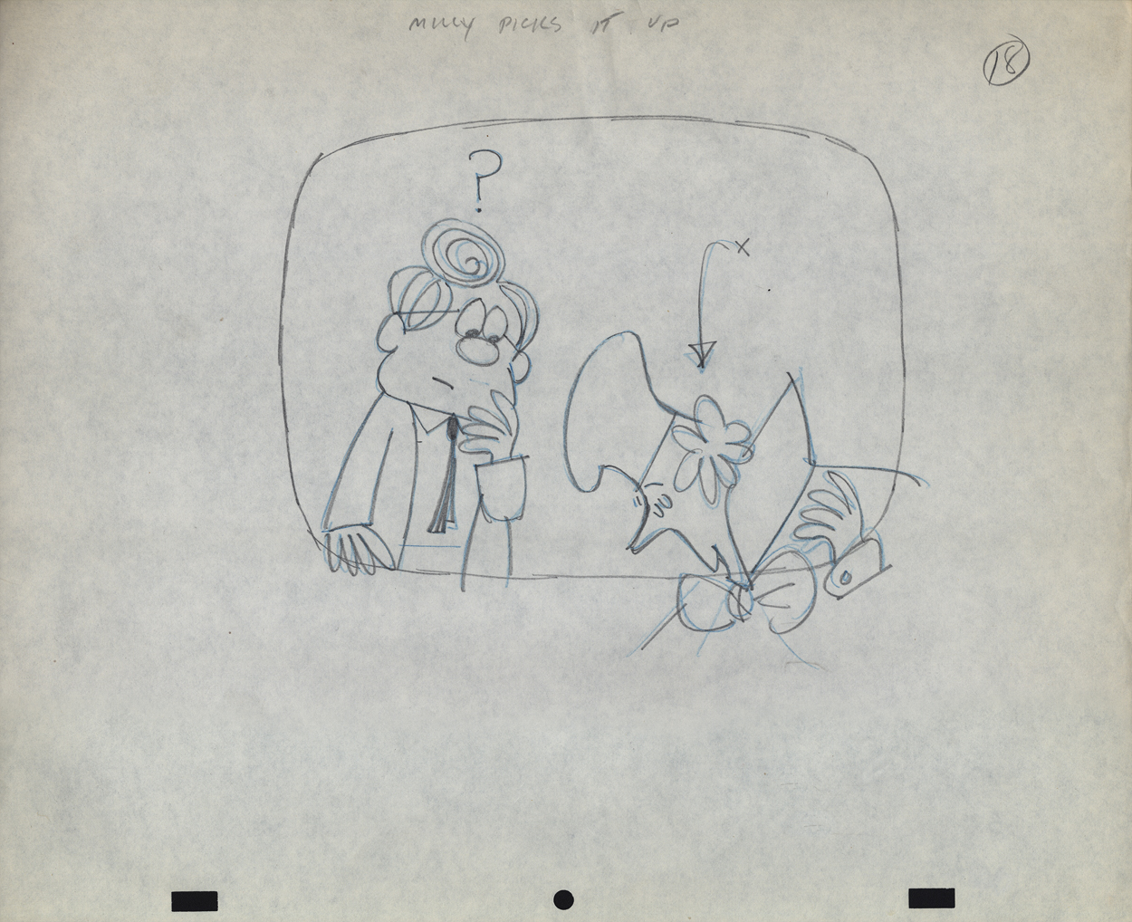
Vince Cafarelli’s Millbrook Bread – 1
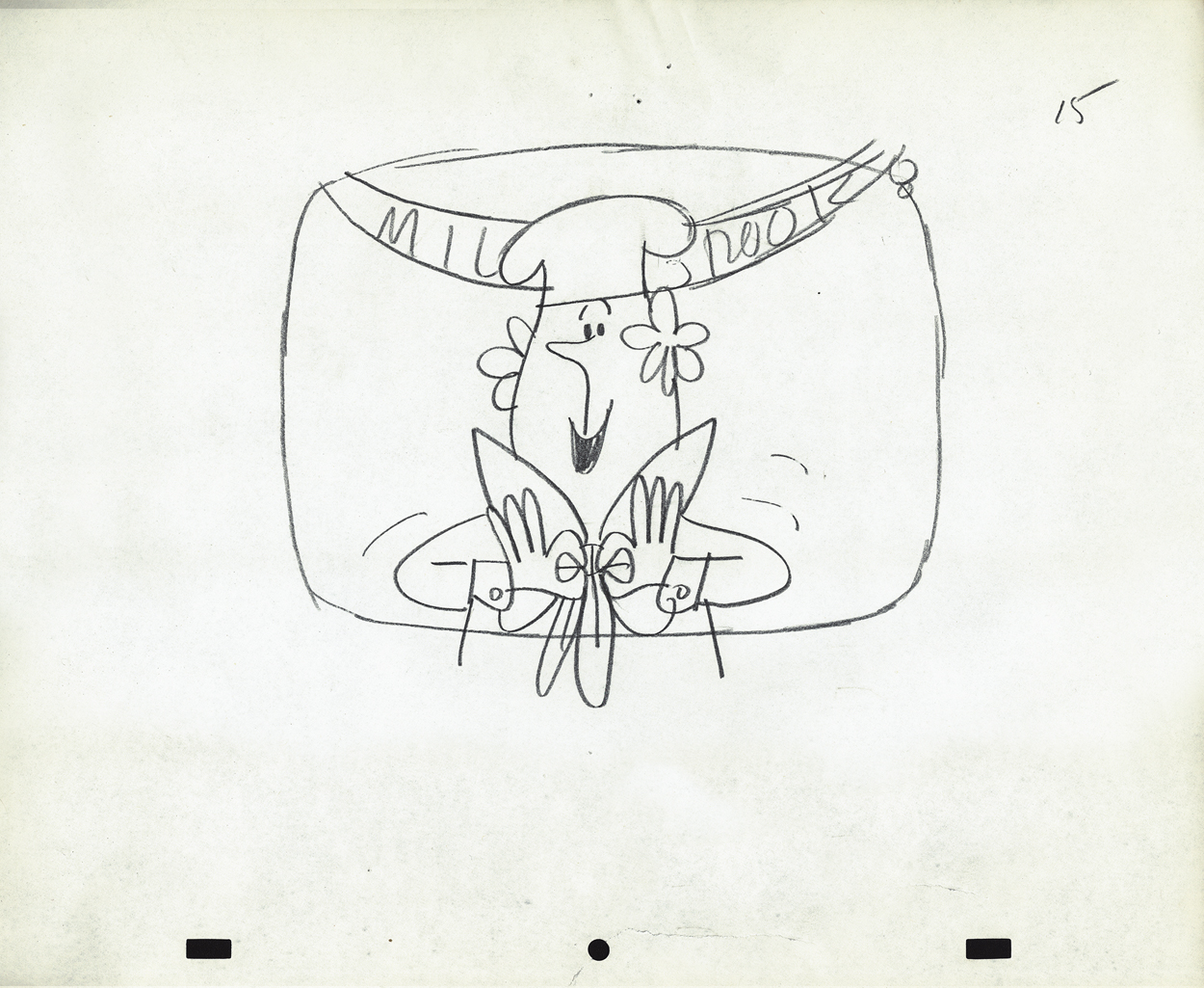
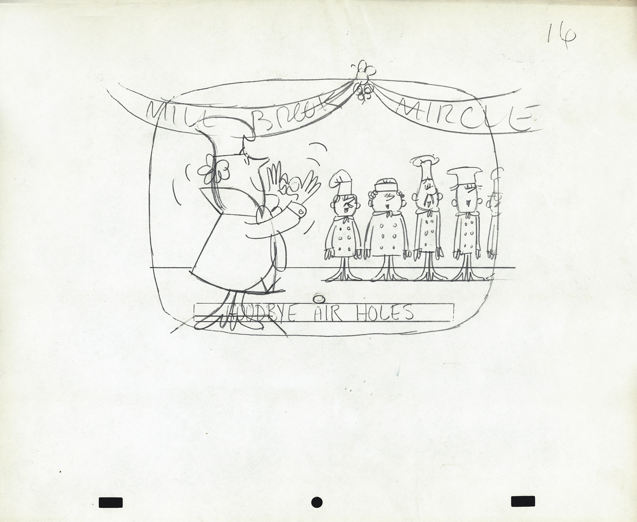
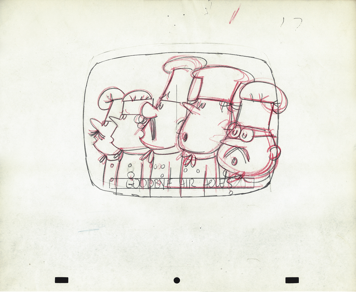
- When Bob Elliott and Ray Goulding (of Bob & Ray fame) found a chance, they scooped up the Piels Brothers account from UPA and, with Ed Graham, they opened their own animation studio to do the Piels commercials. The blend didn’t last long, and they soon went out of business. Vince Cafarelli worked at Goulding-Elliott-Graham Prods. for a while and several Millbrook Bread commercials were produced, featuring “Milly” the baker.
I remember these commercials from my childhood well. I loved the very graphic style of the spots. I remember seeing how the character turned his head (see number 16, below) and was taken by the movement. I think I was probably 11-12 years old at the time. The video records the date as 1963, but I’m sure they’re wrong – 1959, maybe?
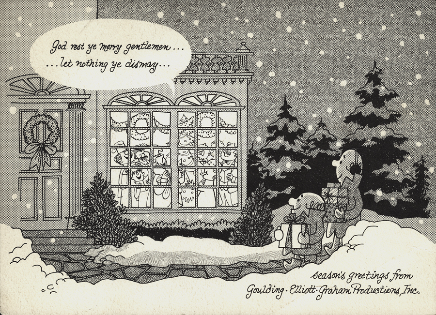
I previously posted this Christmas card from Goulding-Elliott-Graham Prods., Inc. If you click on the card and look in the window of the house, you’ll see “Minny” the Millbrook baker (centered) within, singing Christmas Carols.
Michael Smollin takes credit for directing the commercials, but I’m not sure he worked for Elliott-Gould-Graham. I thought that Ed Graham had directed all spots in house. Smollin may have designed the characters. We’re assuming that Vinnie drew these images. The writing is his. It’s doubtful he would have been directing at this point, so he probably drew the Layout drawings.
In Vinnie’s collection of art, the layouts for two of these spots were found. I’ll post these from the first spot this week and the second spot will come next Wednesday.
 1
1
 2
2
 3
3
 4
4
 5
5
 6
6
 7
7
 9
9
 10
10
 11
11
 12
12
 13
13
 14
14
 15
15
 16
16
 17
17
 18
18
 19
19
We don’t have a copy of this spot that we could post. However, to give you an idea of how the voices sounded, here’s a vradio spot done for Millbrook Briead by Bob and Ray.
Hubley &Layout & Design &Models &Tissa David 30 Aug 2012 05:15 am
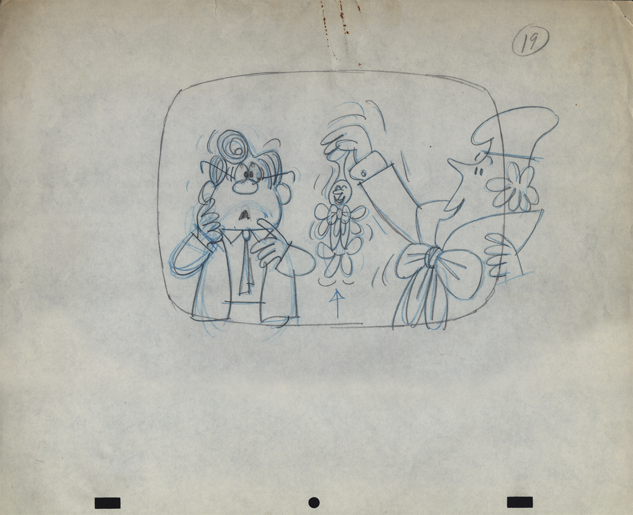
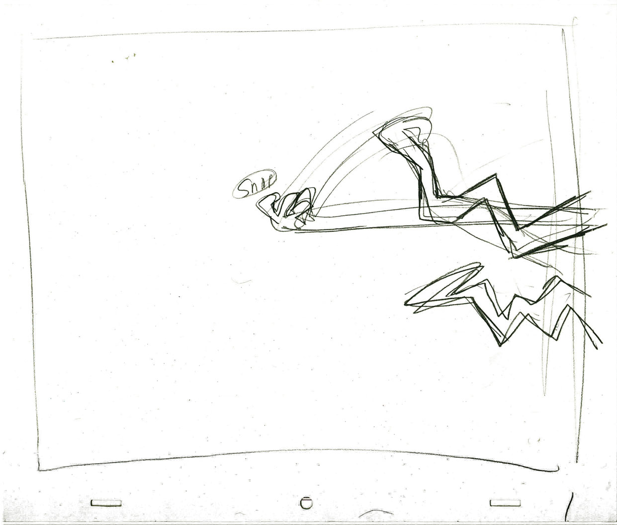
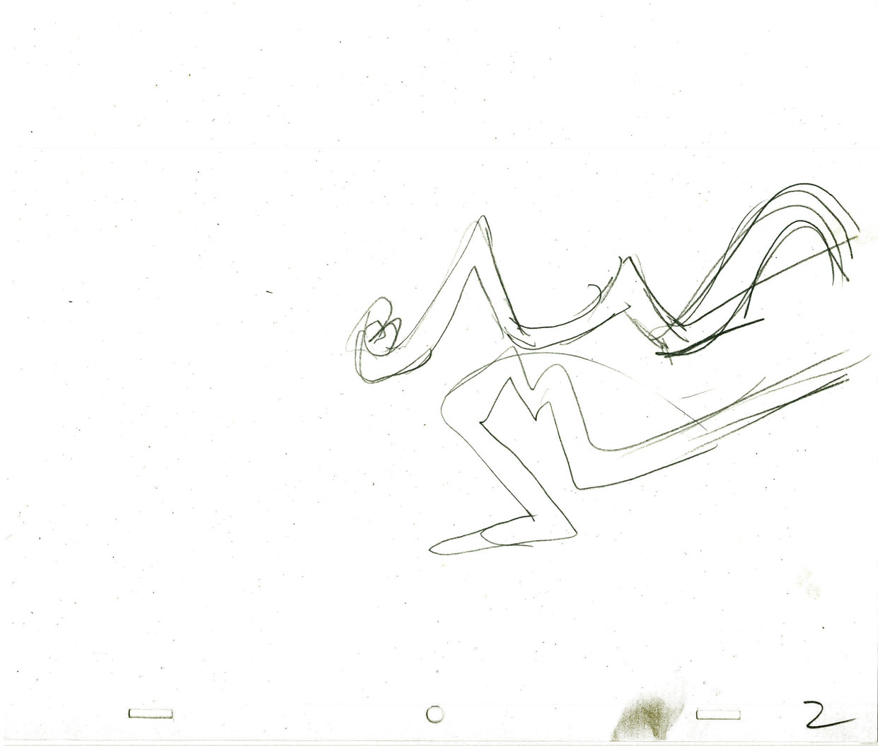
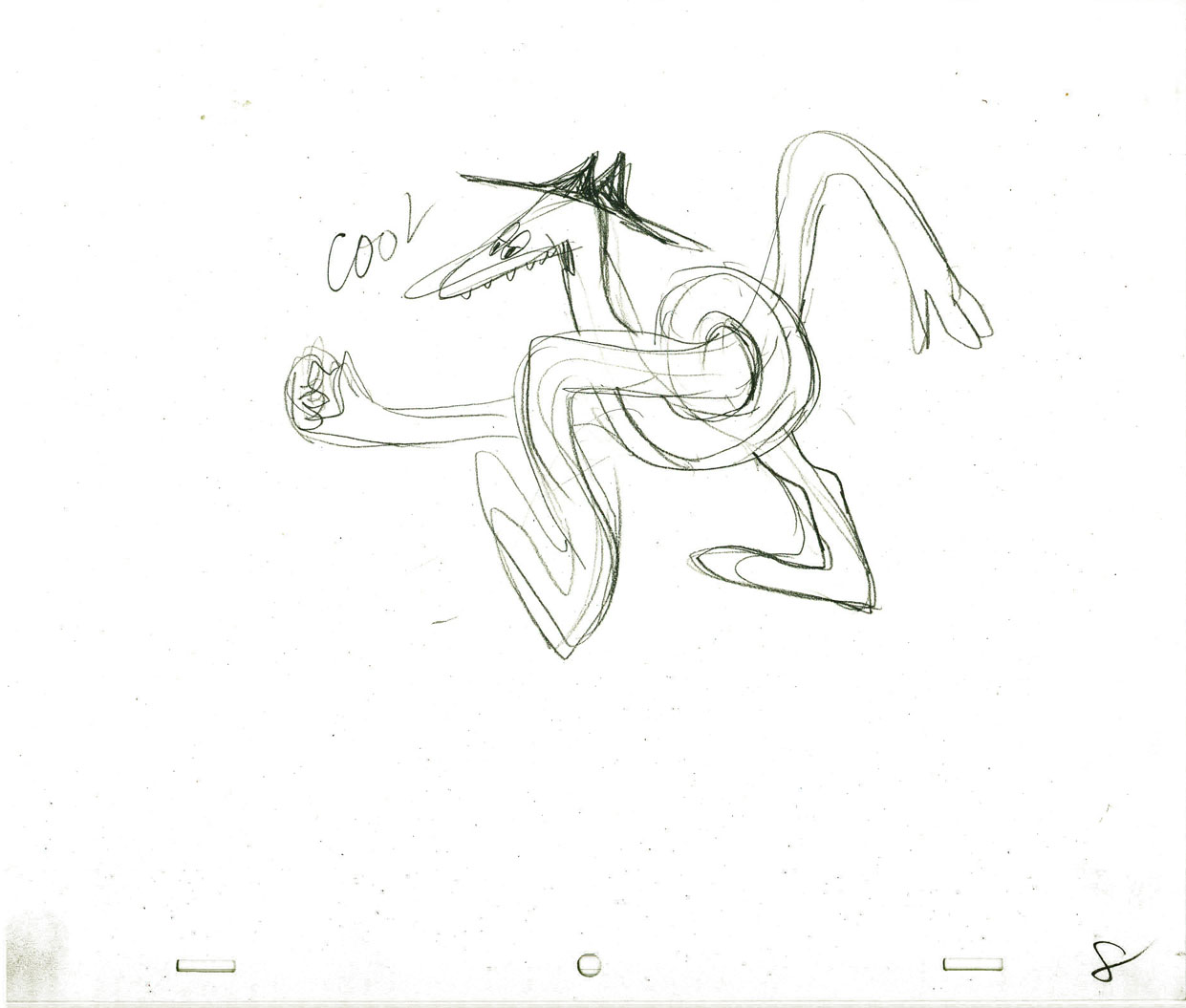
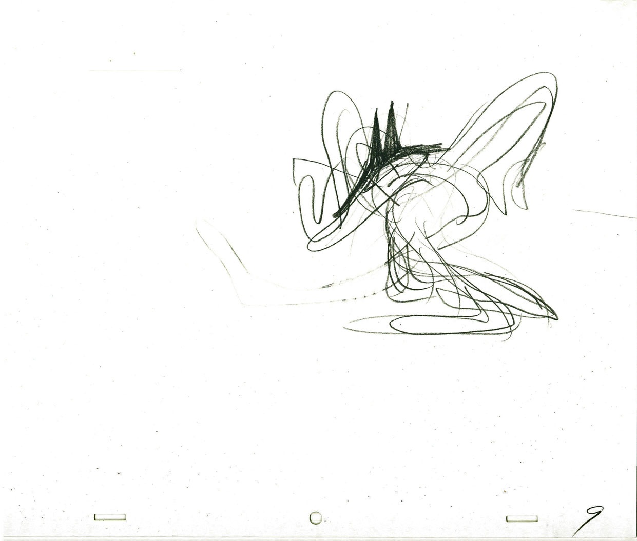
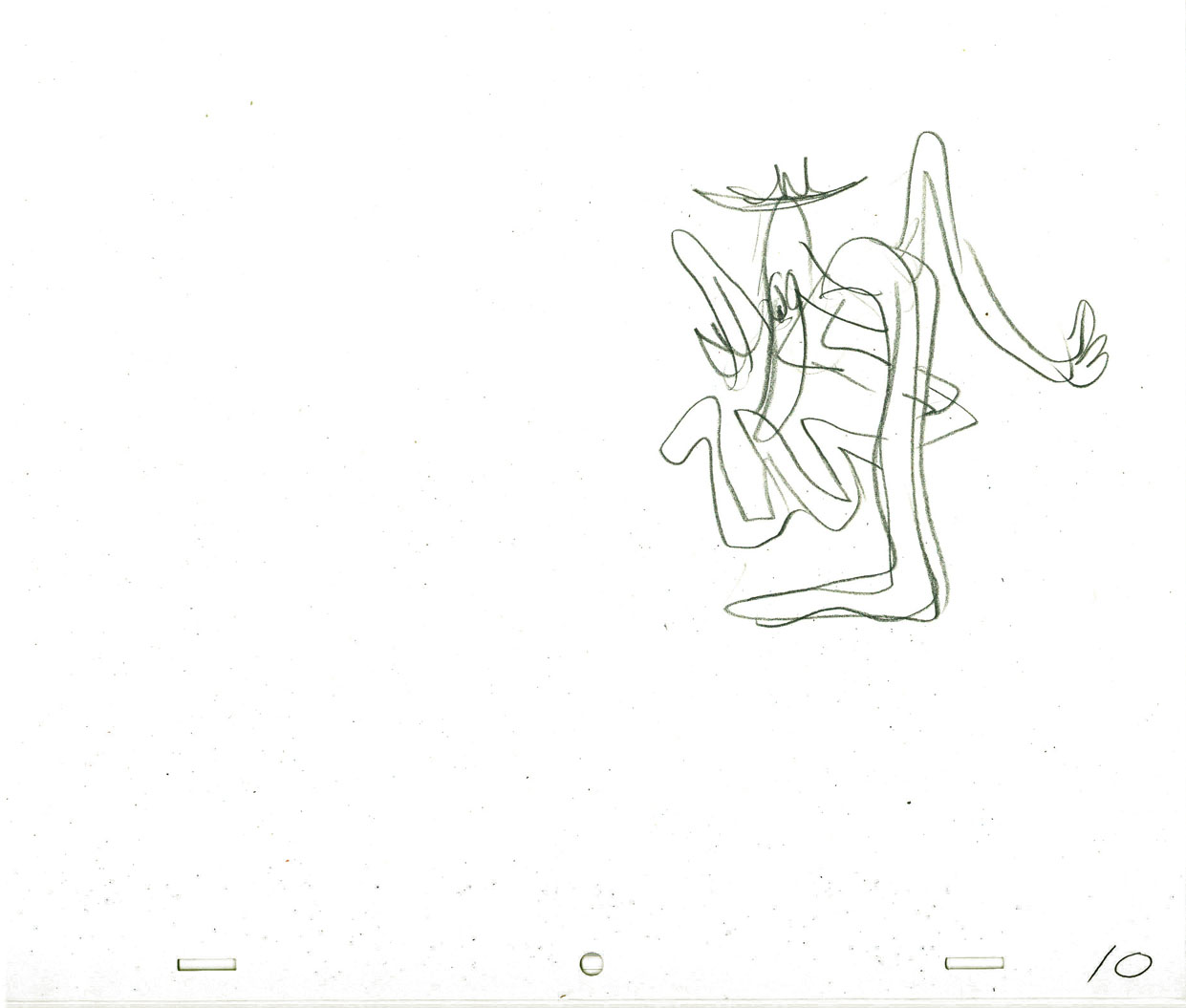
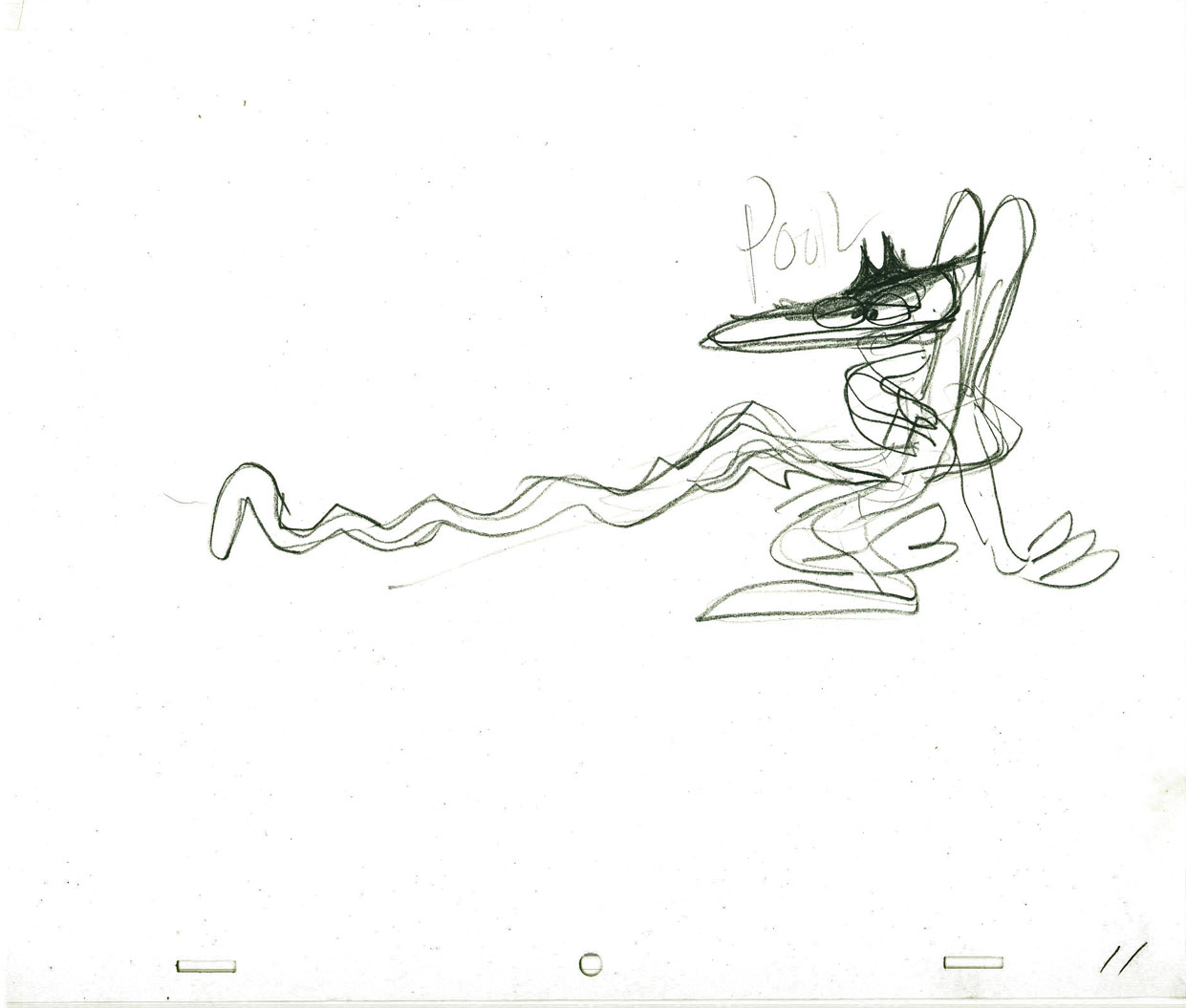
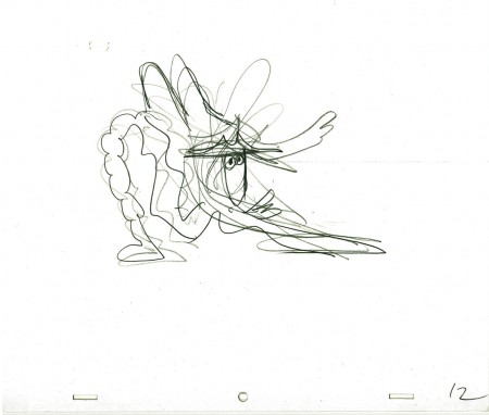
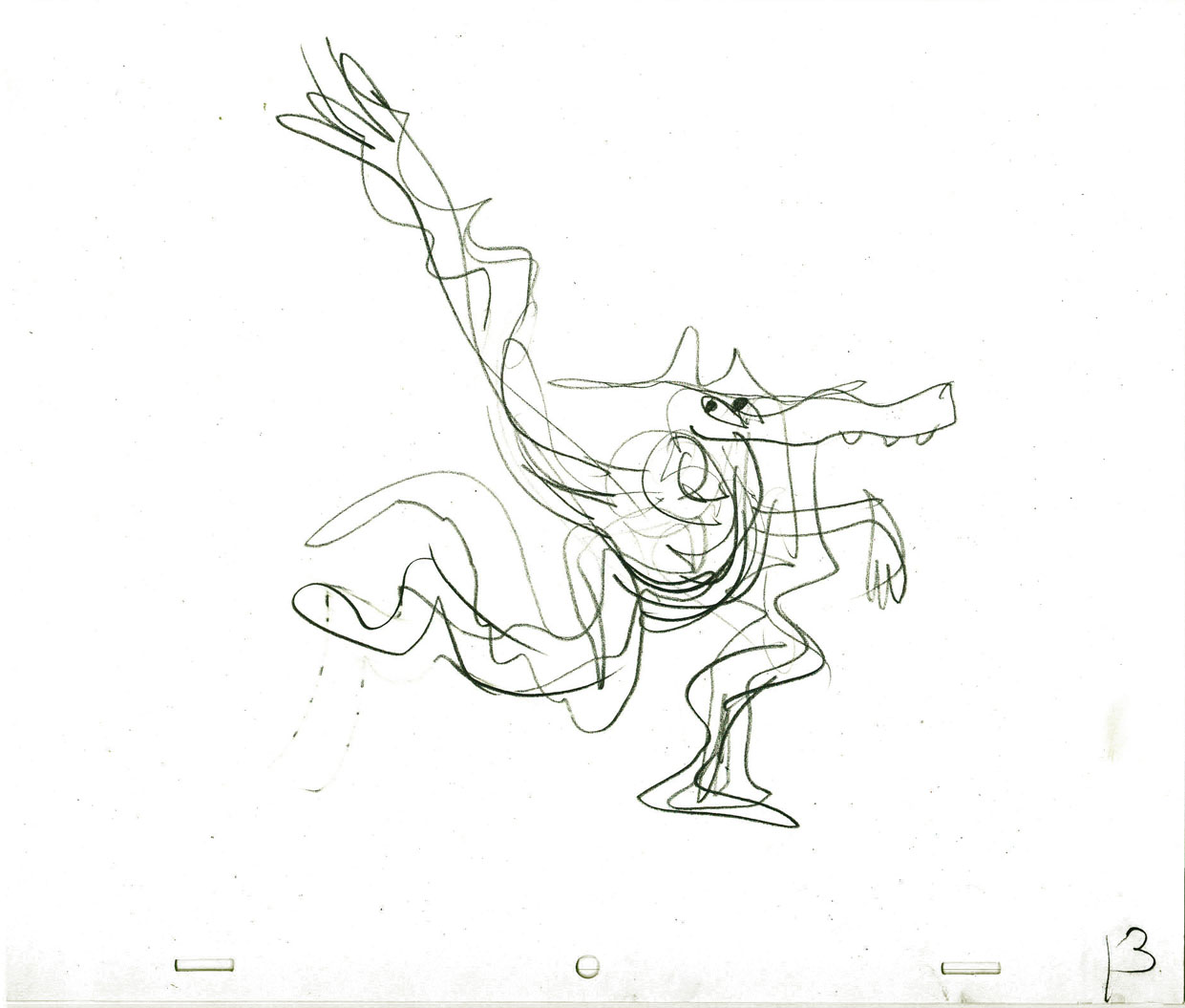
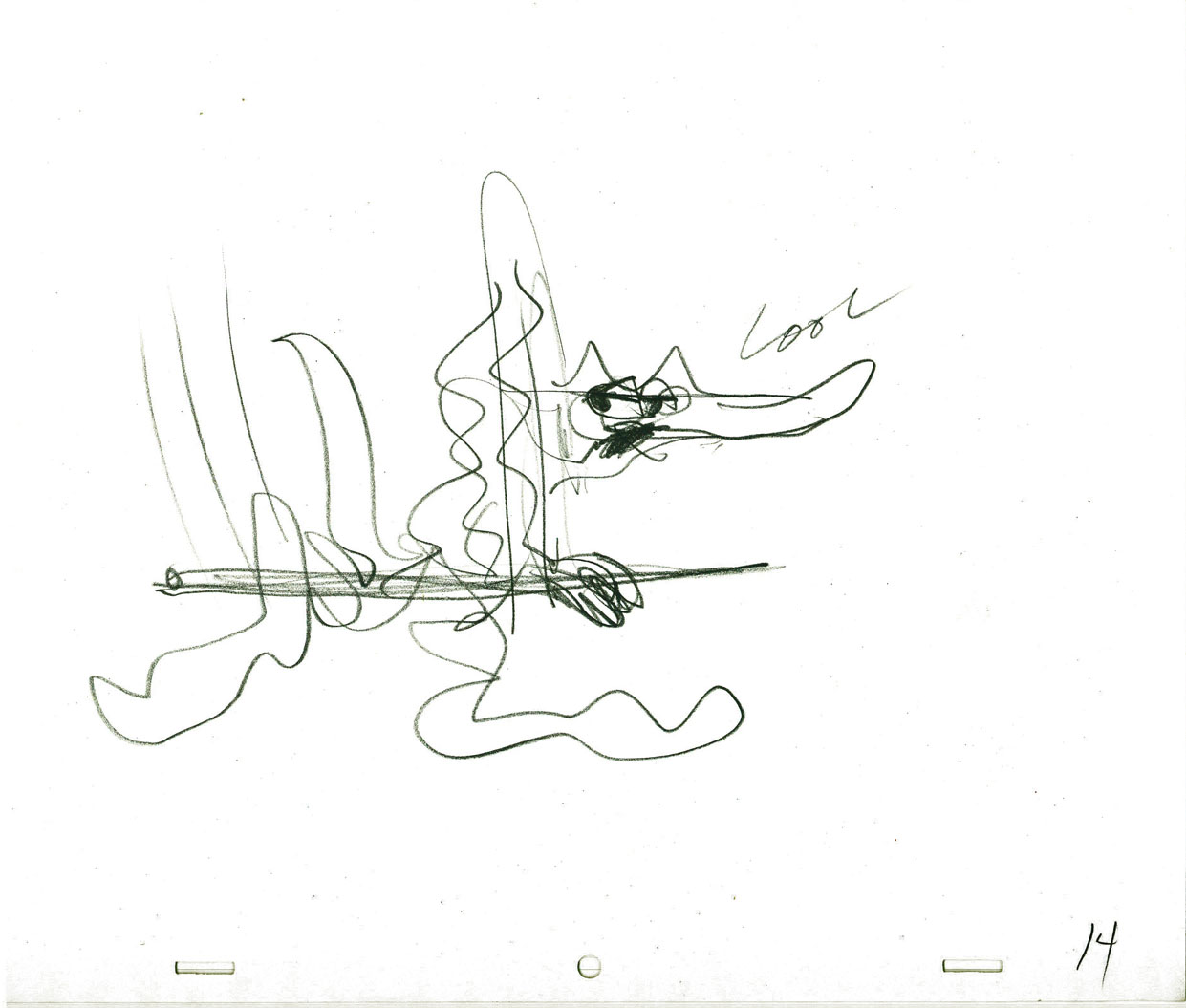
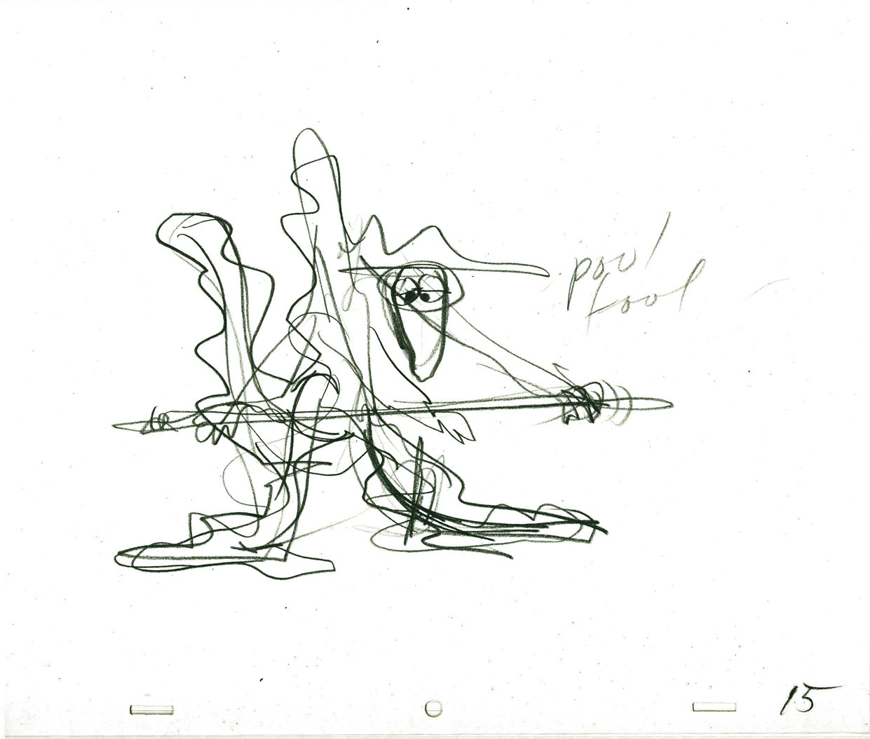
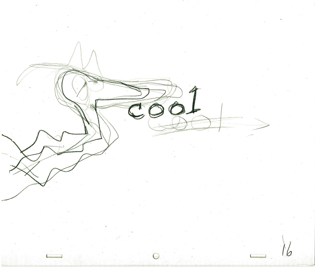
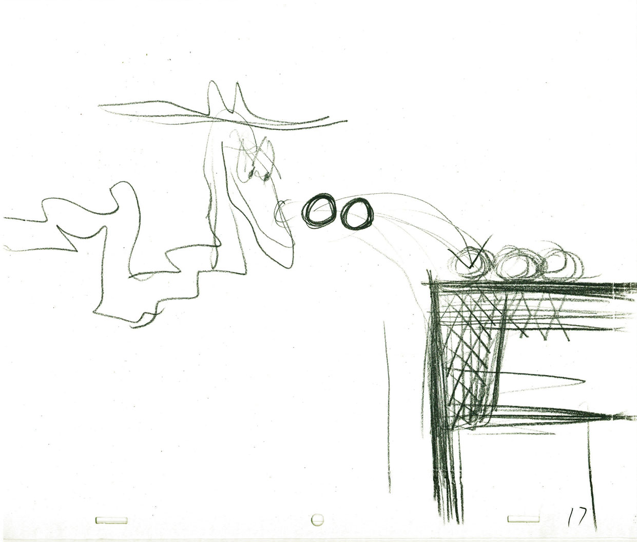
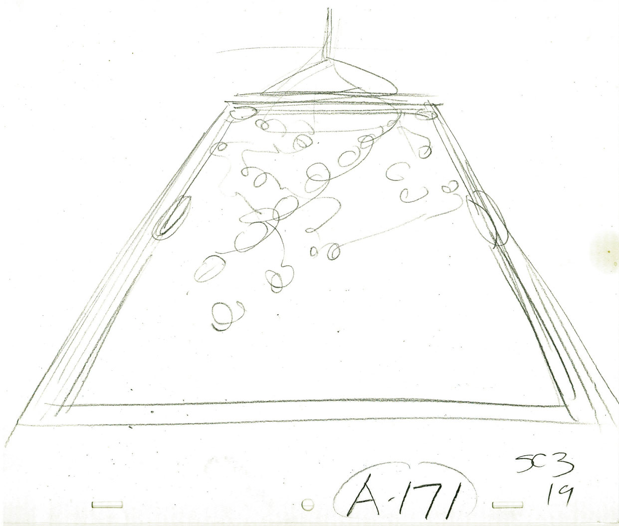
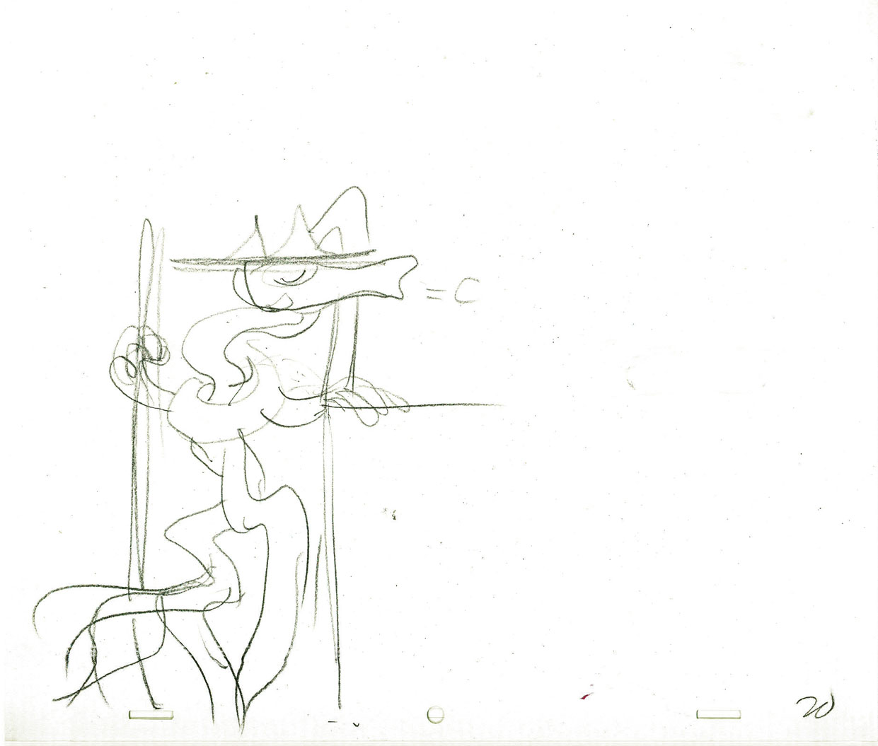
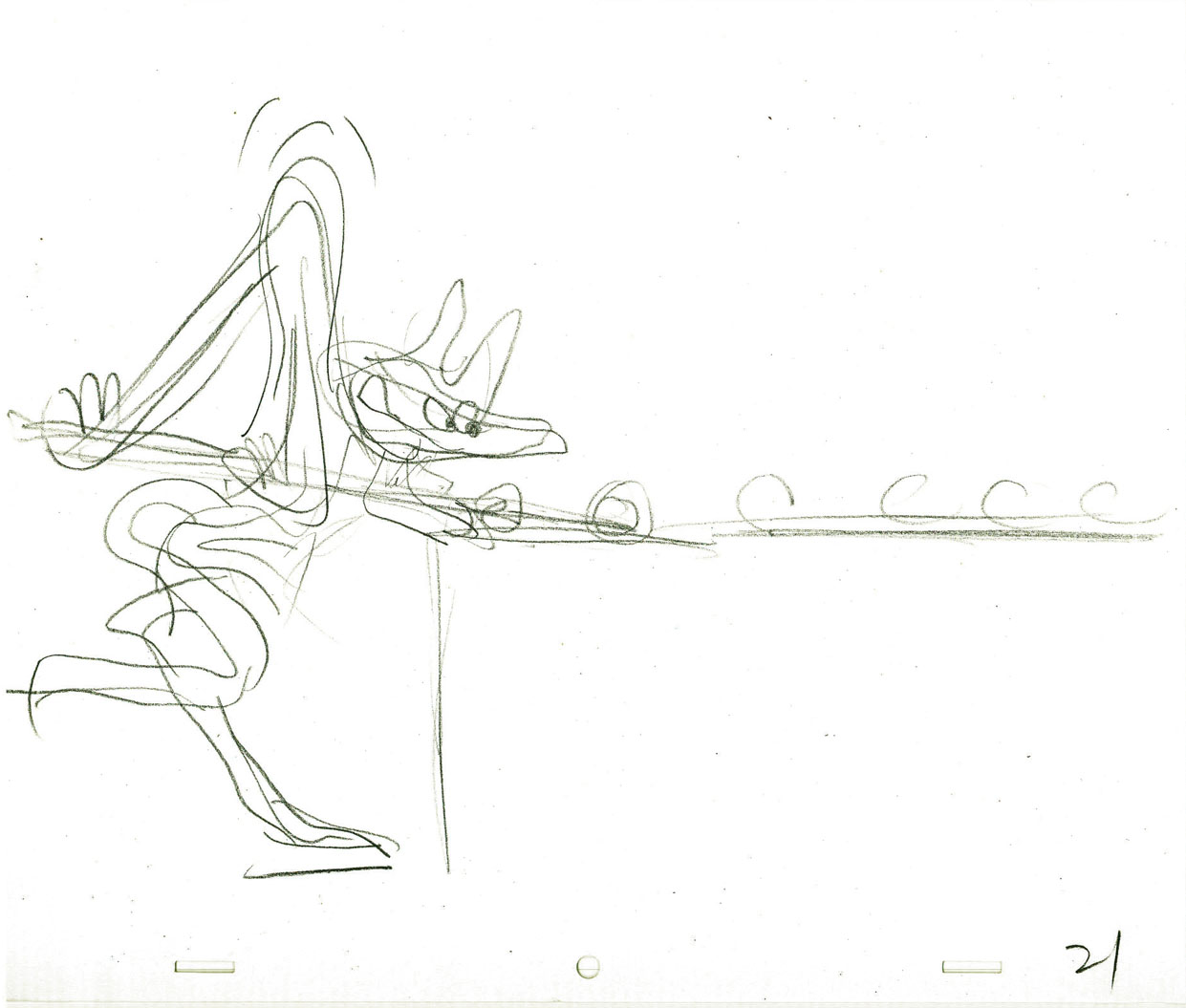
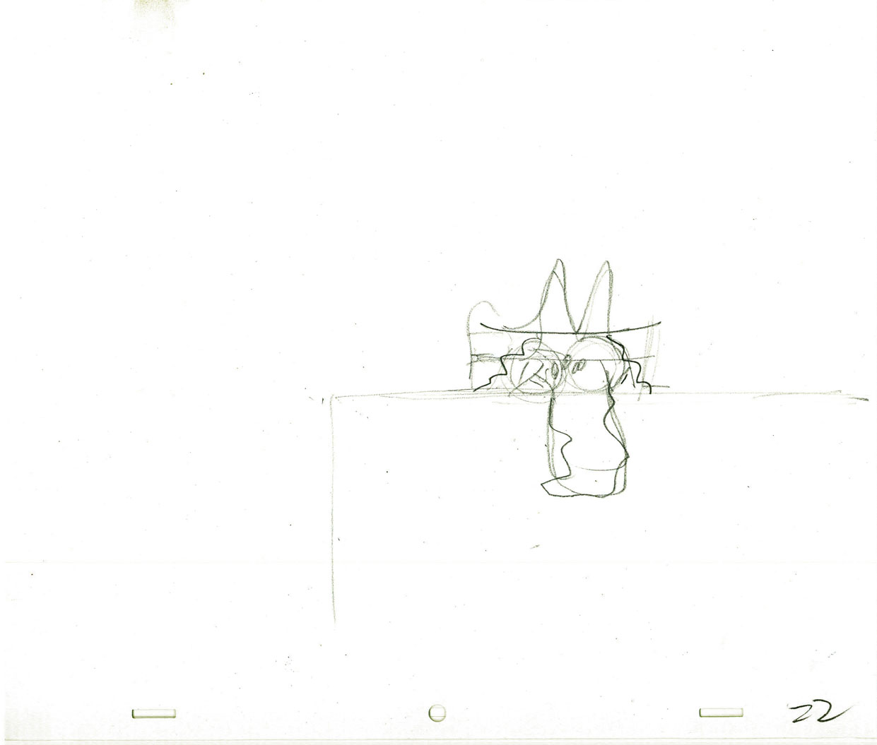
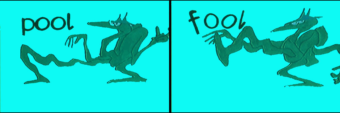
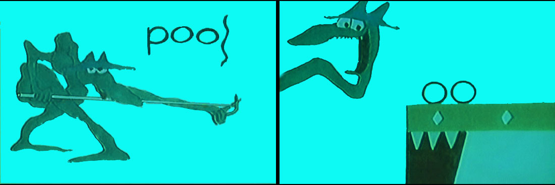
Layouts Cool Pool Fool – recap
- Here are the Layout drawings by John Hubley for the Electric Company piece, Cool Pool Fool. Tissa David animated from these layouts and the verbal instructions from John.
A couple of drawings are missing #7 and #18
 1
1
 2
2
 3
3
 4
4
 5
5
 6
6
 8
8
 9
9
 10
10
 11
11
 12
12
 13
13
 14
14
 15
15
 16
16
 17
17
 19
19
 20
20
 21
21
 22
22
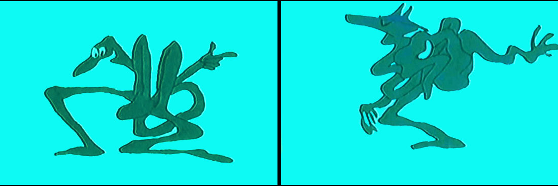
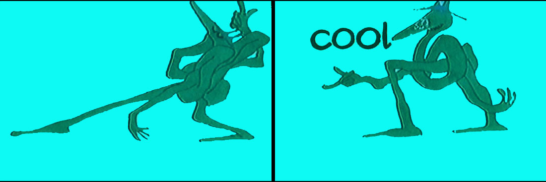
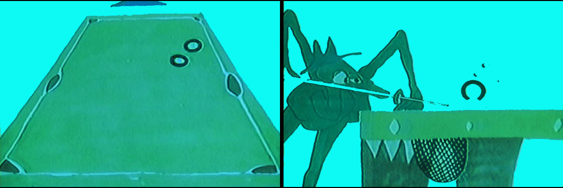
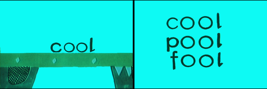
Here are some frame grabs from the spot. They’ve been severely touched up in photoshop since the video has lost all color and is almost unwatchable except as a silhouette film. I’ve reconstructed the colors as near as I can remember them. At any rate, the purpose of these grabs is for you to see what Tissa has done with John’s layouts.
 1
1
 2
2
 3
3
 4
4
 5
5
 6
6
 7
7
Thanks to RIchard O’Connor, here is the
poor YouTube version.
The indomitable Billy Taylor wrote and performed the music.
What a great piano! I had the treat of spending a couple of
hours talking with him about his music for the Hubley films.
We talked for about a half hour about this music.
Animation Artifacts &commercial animation &Layout & Design &Models 29 Aug 2012 07:45 am
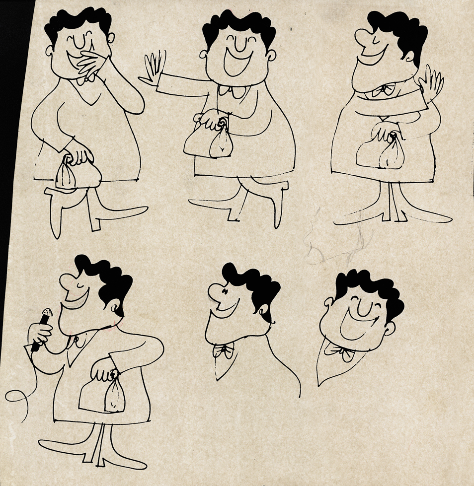
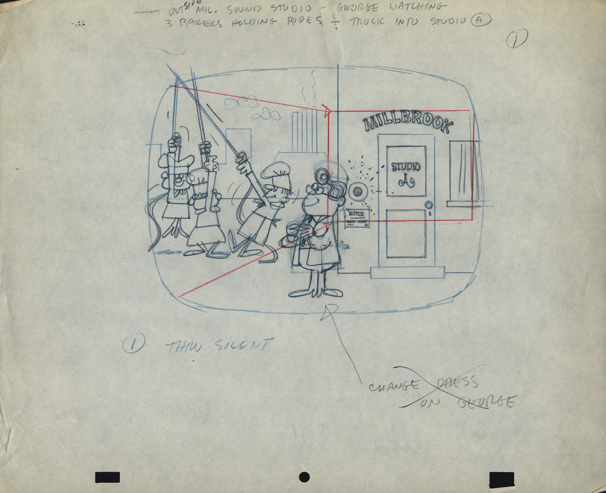
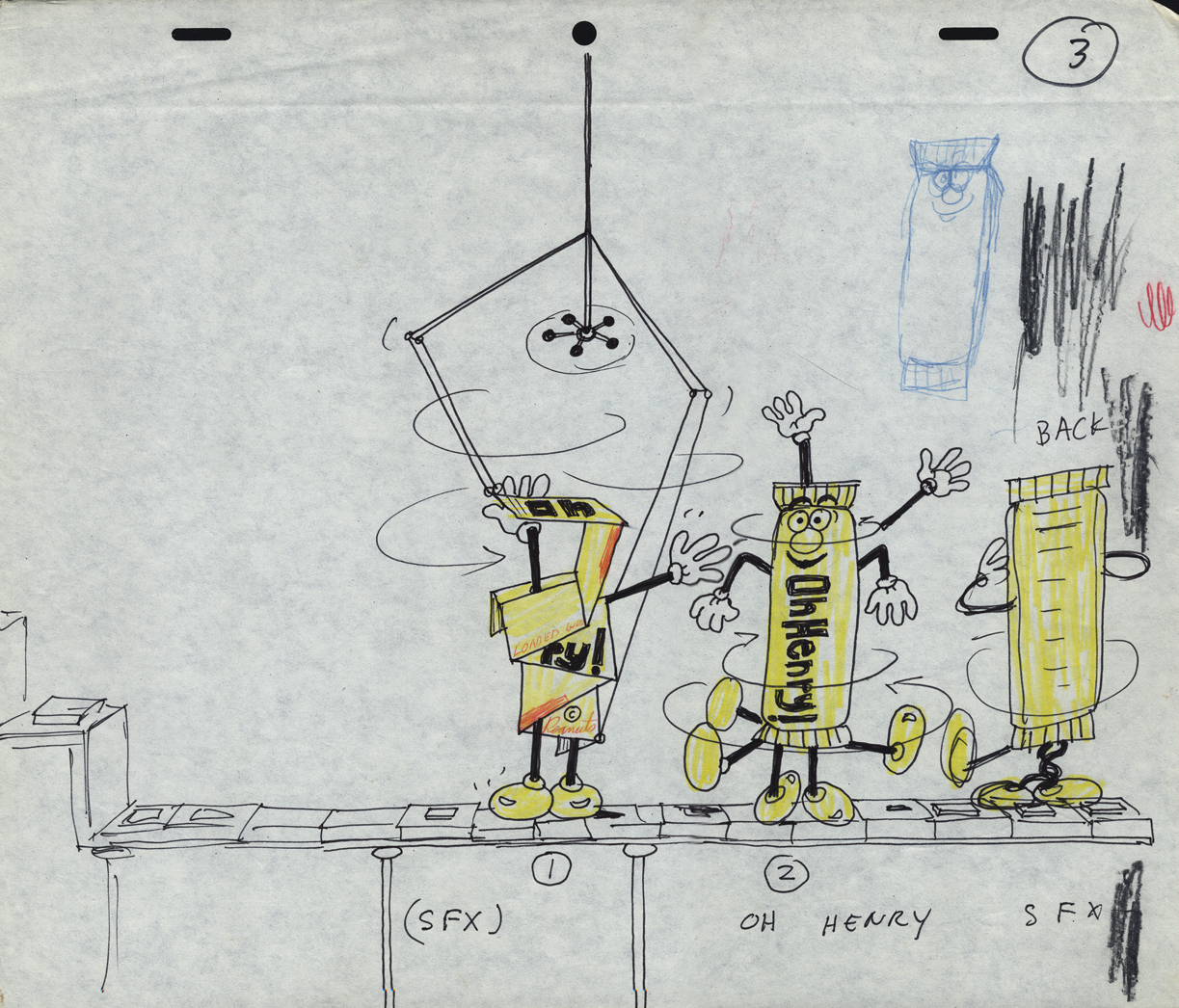
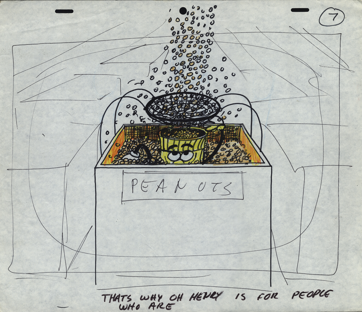
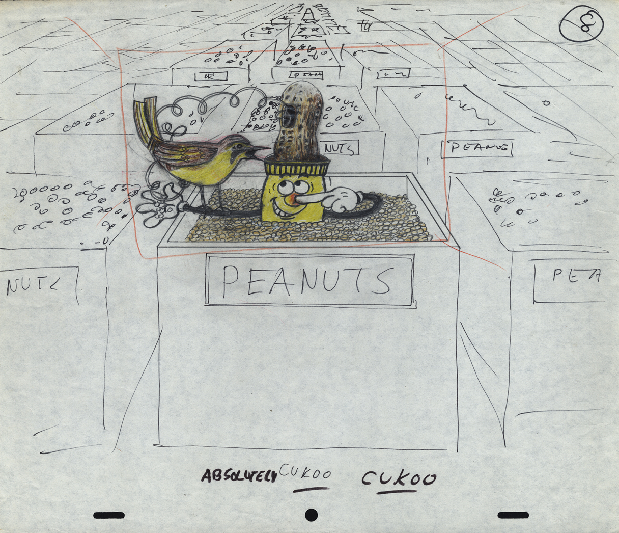
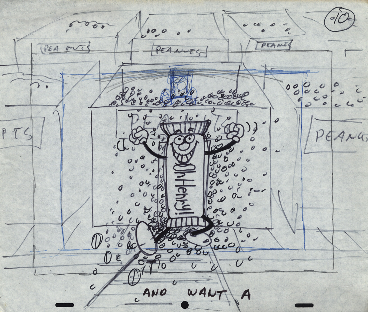
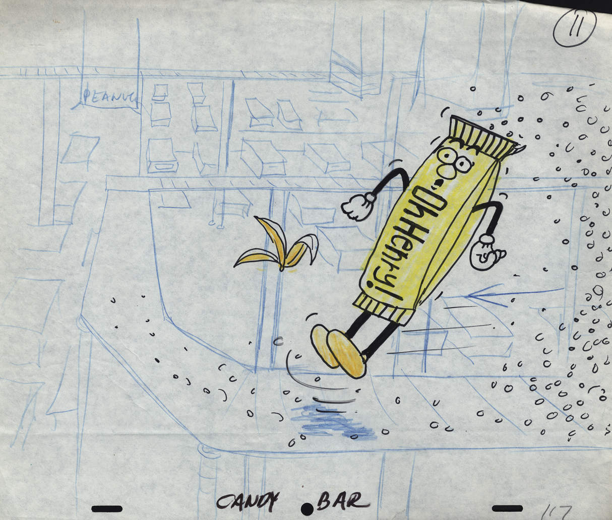
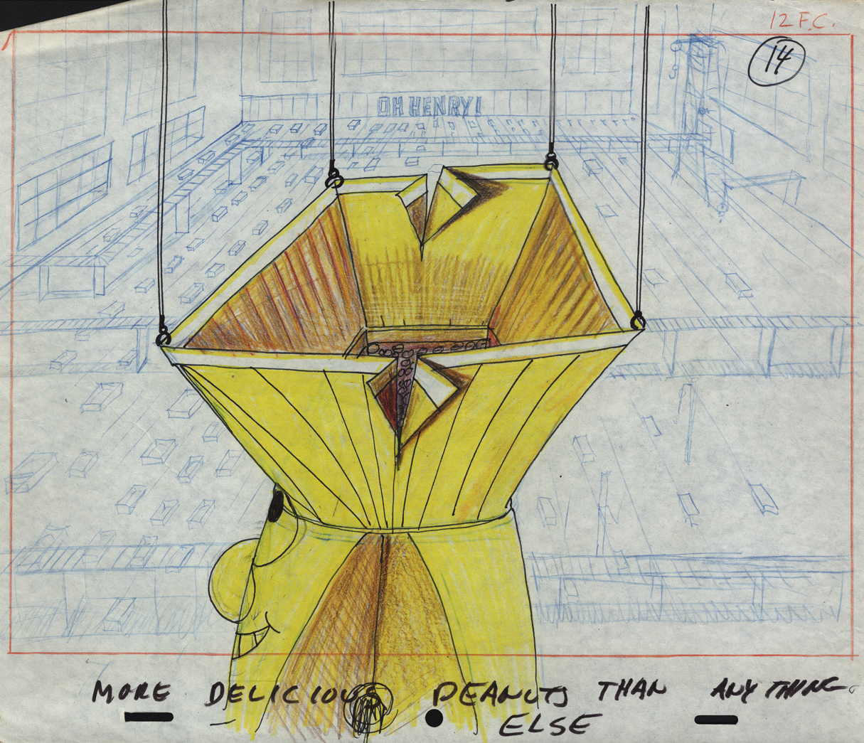
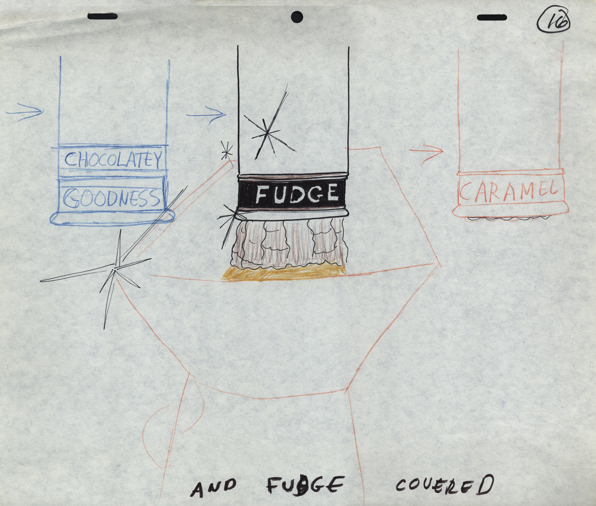
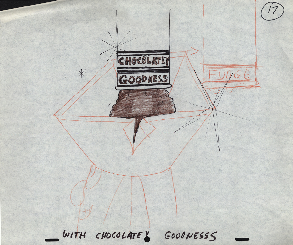
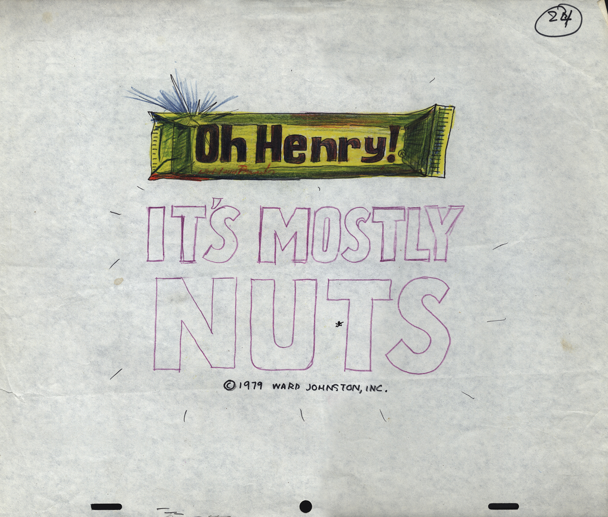
Mogubgub’s O’Henry Bar
- Sifting through the boxed archives of Vince Cafarelli‘s saved material, there are quite a few pieces of art from a number of commercials. One that stands out includes the LayOut drawings of Fred Mogubgub for an O’Henry Bar animated commercial. The spot comes from the early days of Buzzco, 1982 or 1983 when Buzz Potamkin was still the principal in the company.
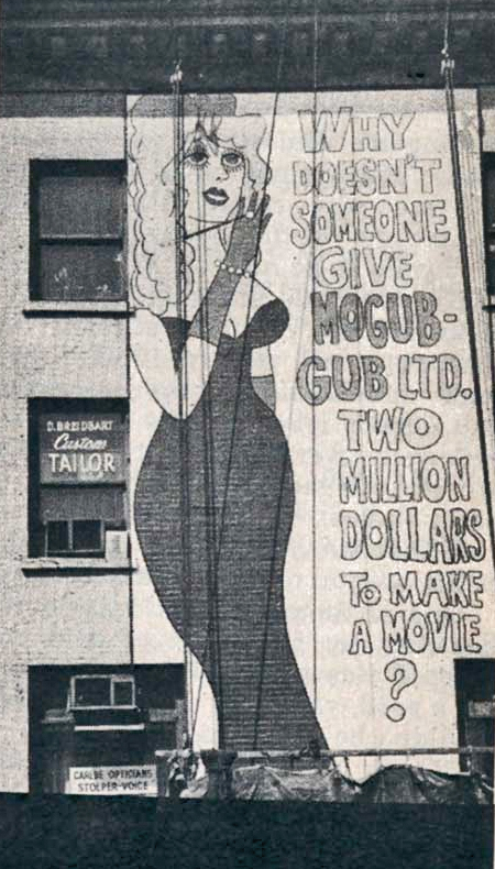 Fred Mogubgub was enough of an eccentric that I would be attracted to his artwork. (In case you’re unfamiliar with Mogubgub‘s work, here’s a four part series including his bio and some films.) I remember – as an art student in NY and desperately wanting to get into animation – the sign on 46th St and Sixth Ave: “Why Doesn’t Someone Give Mogubgub Ltd. Two Million Bucks to Make A Movie?” I asked Fred if he’d had any response. He said that ABC contacted him, and he gave them a script that was about a thousand pages big. It was about the contents of an ashtray. The characters were cigarette stubs, ashes and matches. To illustrate the script, he’d attached some used butts and matches within. They didn’t give him the money; you might have guessed.
On Blechman’s The Soldier’s Tale, there was a PT section of the animatic that Fred had done. We had to prepare this for a big screening for PBS trying to sell it for Bob. To get it into color, Fred and I would literally color the film, itself. He started at the head of the scene and I started at the end. We met in the middle. That piece of film had a life that was just too great. It couldn’t retain what we had done when it went to completion. Very exciting work and a fun afternoon coloring some footage with Fred.
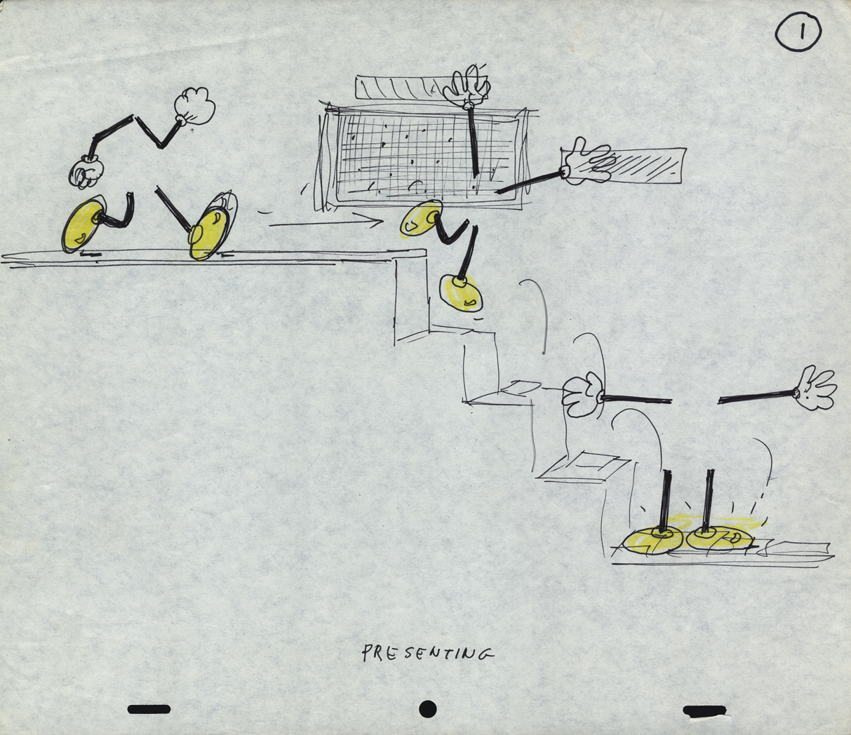
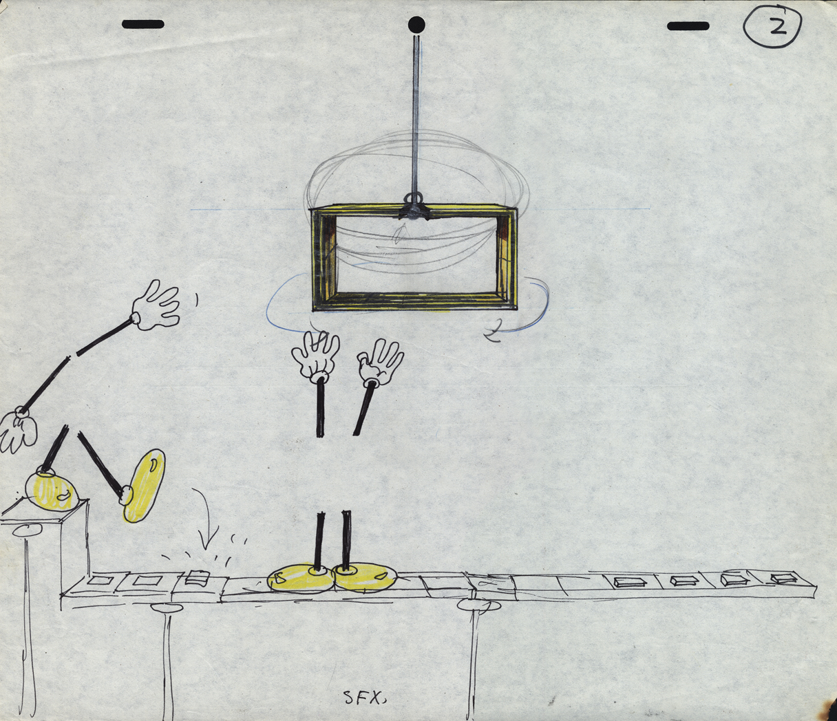
Here are the Lay Outs Vinnie had saved for the past 30 or so years:
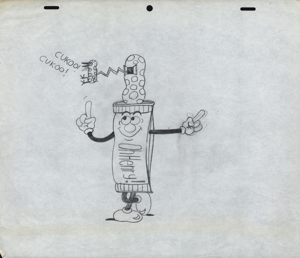
Our Lead Character – a model
 1
1
There seems to be no rhyme or reason
as to when things are top or bottom pegged.
 2
2
The pegs shift from drawing to drawing.
 3
3
 7
7
 8
8
 9
9
 10
10
 11
11
 14
14
 16
16
 17
17
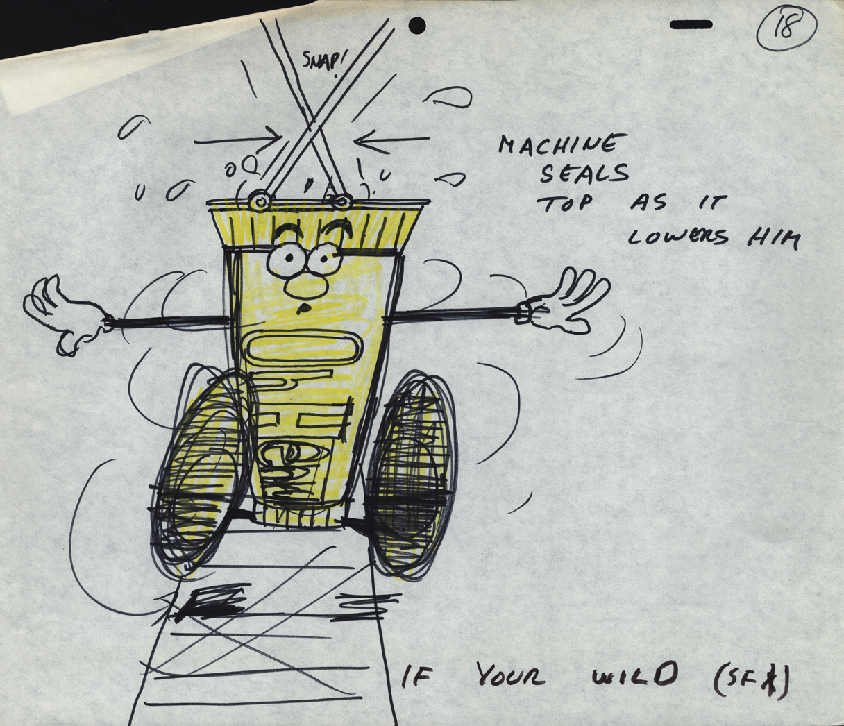 18
18
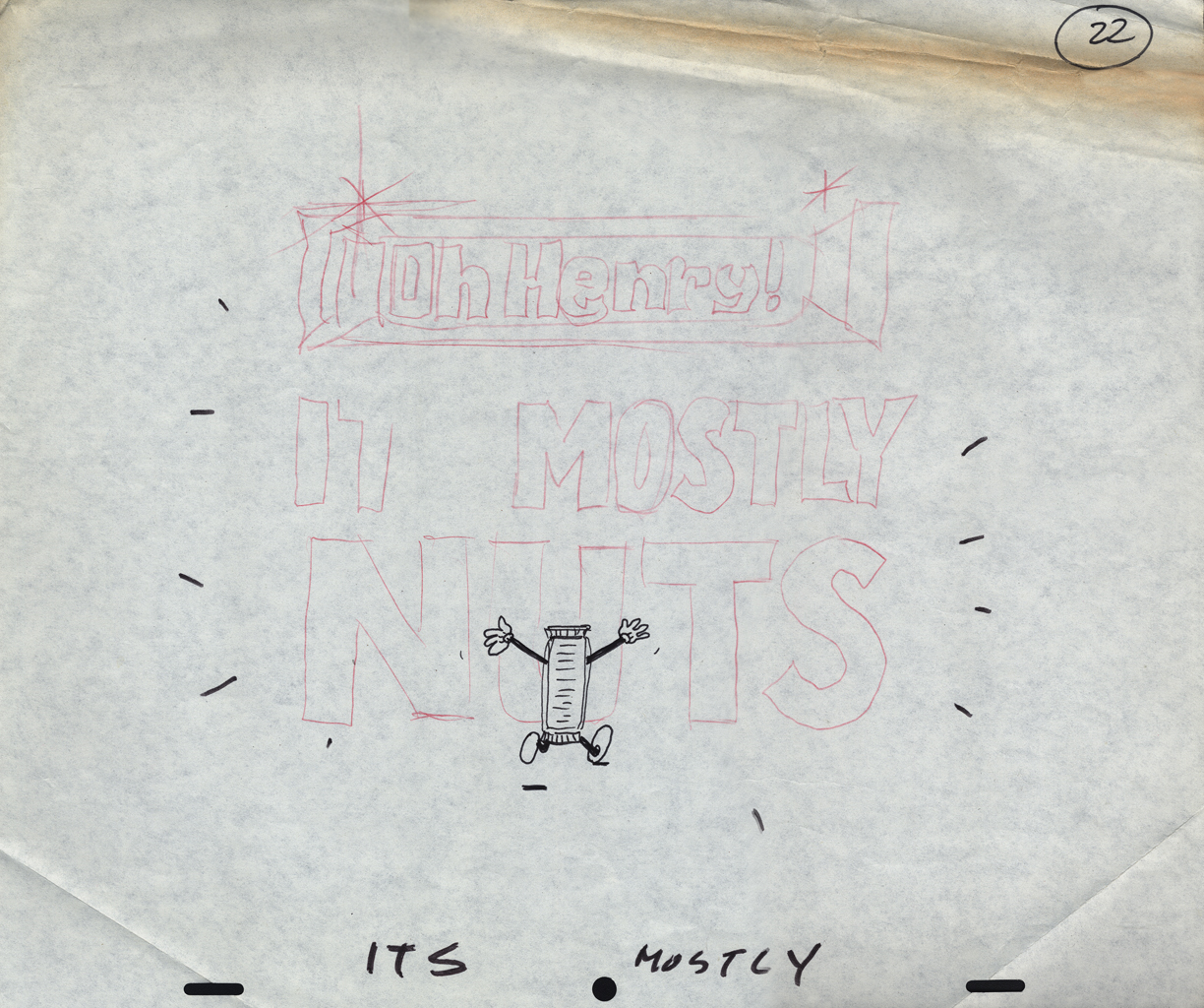 22
22
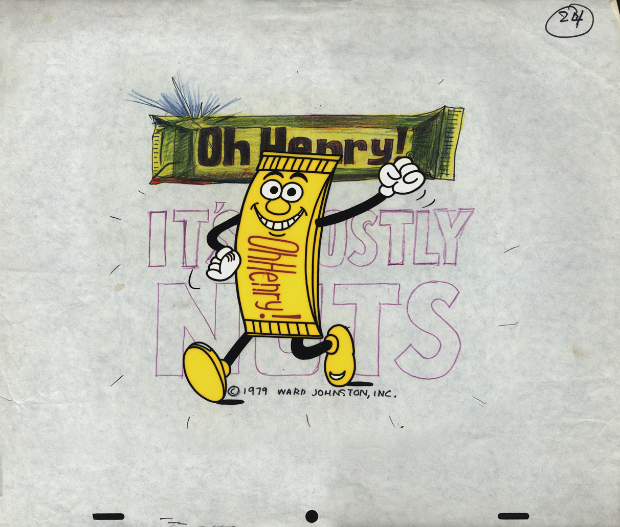 24
24
A cel setup.
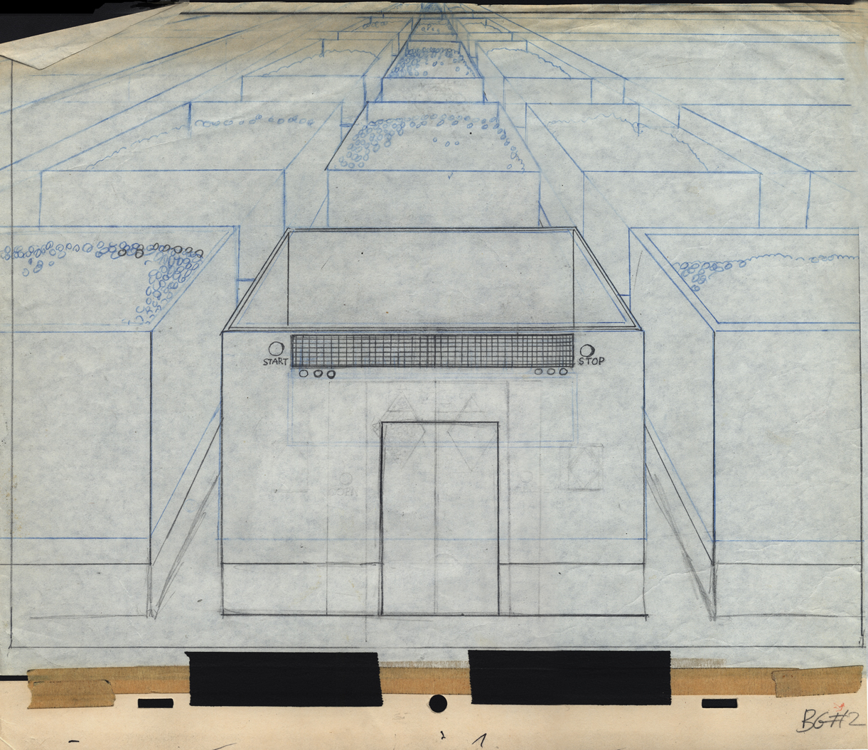
Bg LO 2
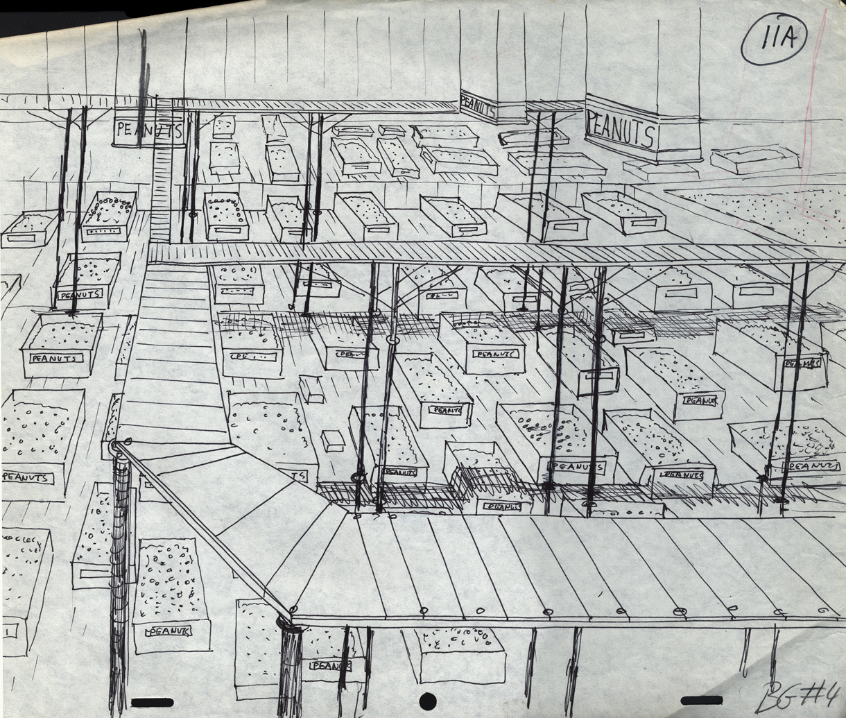
Bg LO 11
Bg LO 24
