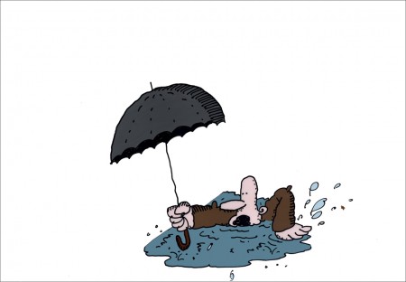
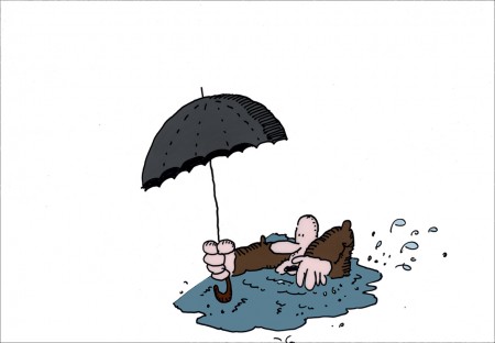
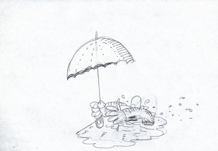
Category Archivecommercial animation
commercial animation &Errol Le Cain &Illustration &Independent Animation &repeated posts &Richard Williams &Rowland B. Wilson &Tissa David 10 Apr 2013 05:55 am
Dick’s Christmas
Richard Williams, when he had his own studio, was known for doing everything in a LARGE way. All of the commercials, title sequences, shorts were all done with a large, elaborate vision.
The Charge of the Light Brigade was a collection of 19th century graphics that are completely wrong, stylistically, for animating. All those cross-hatched lines. God bless the artists that pulled that off. The same was true for The Christmas Carol.
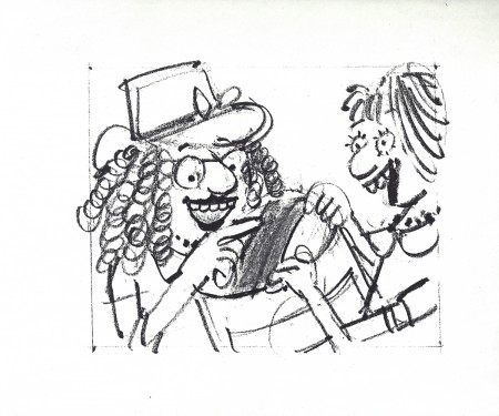
If the rendering style wasn’t impossibly difficult, then the animation was complex. Think of any of the scenes from Dick’s dream-feature, The Thief and the Cobbler. The many scenes where backgrounds were animated, with those backgrounds complete with complicated floor patterns or an entire city to be animated. Raggedy Ann was covered in polka dots and Andy was clothed in plaids. Both of the characters had twine for hair with every strand delineated. The commercial for Jovan featured a picture-perfect imitation of a Frank Frazetta illustration. Even the mountain on the background had to be animated and rendered.
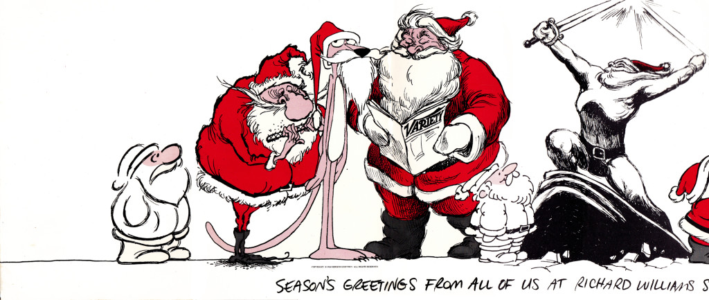
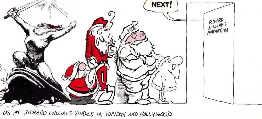
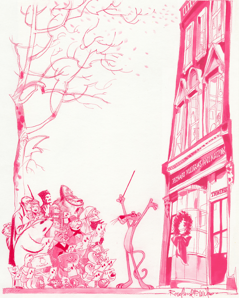
Well, when it came to Christmas cards, Richard Williams was the same. Enormous and beautiful cards were printed and signed by anyone who knew the recipient of the card. You were lucky being on the receiving line for these stunning cards. Tissa David once gave me a number of these cards. I held onto my copies of the cards until my space was flooded and the cards were damaged. I thought I’d post a few.
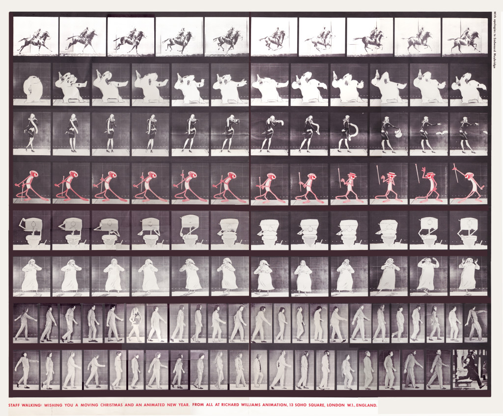
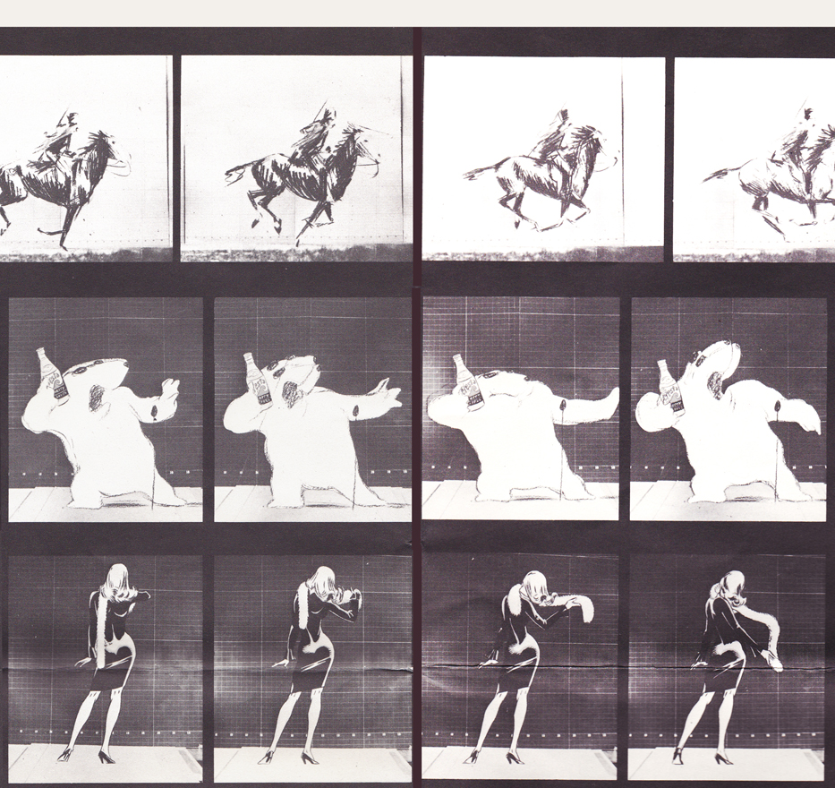
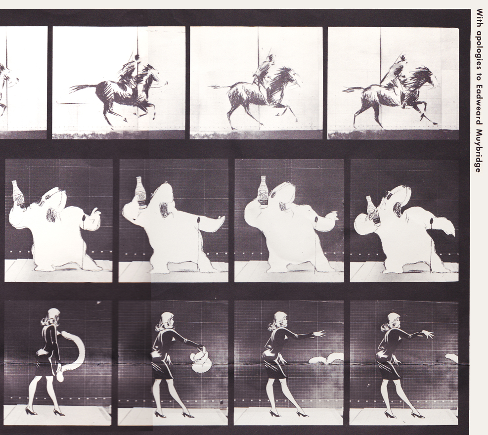
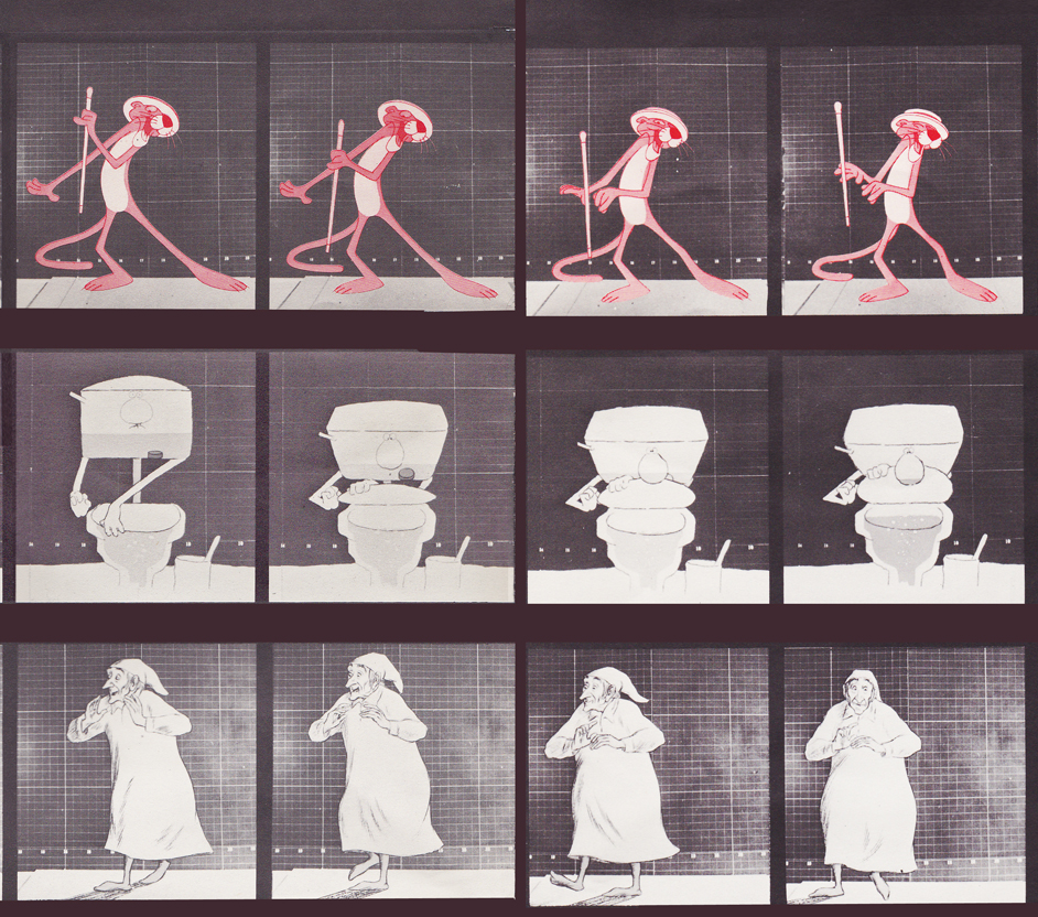
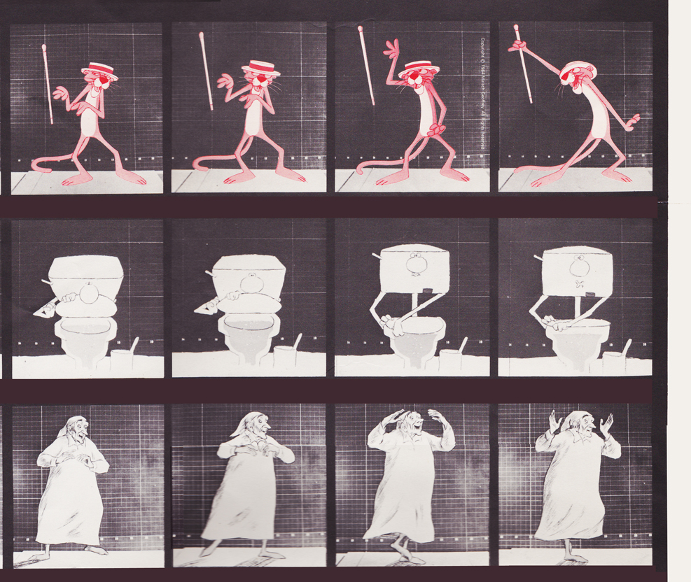
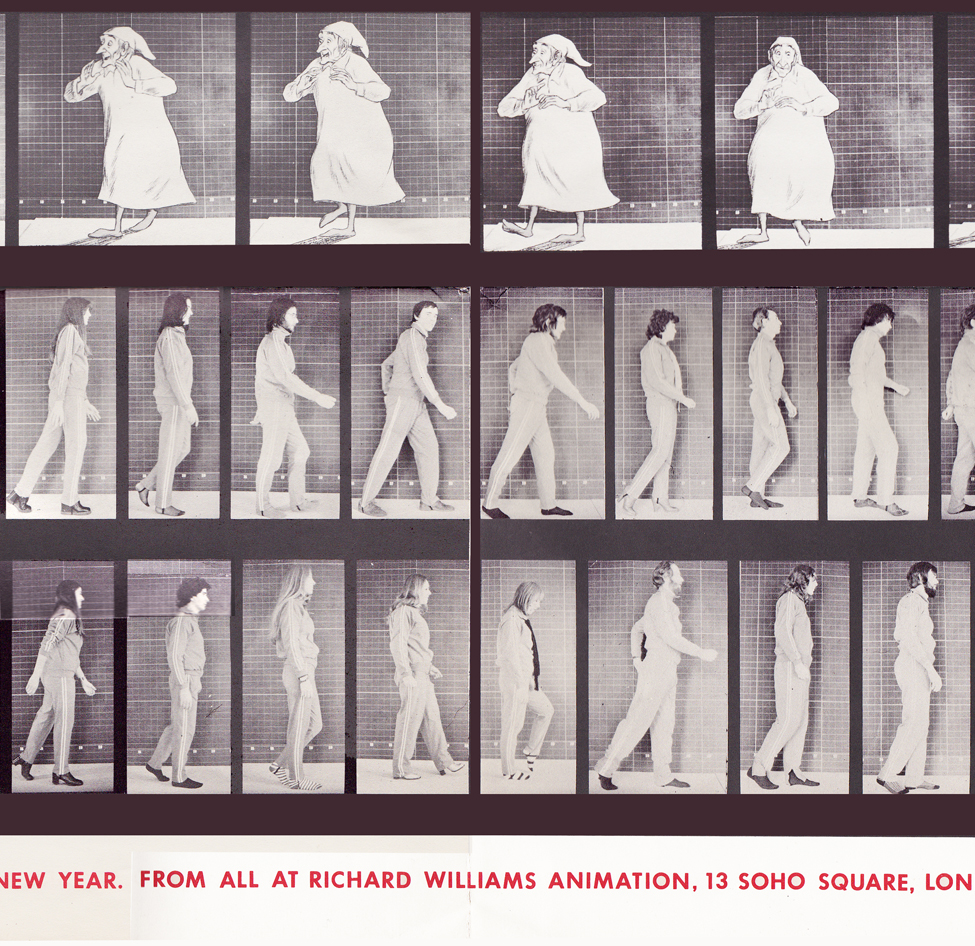
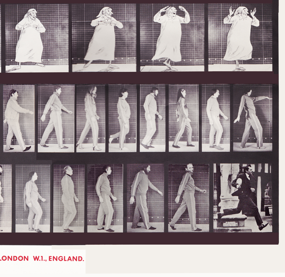
With card #1, a take-off of Muybridge with frame grabs from several of the better Williams commercial spots from that year, capped off by a number of key staff personnel positioned to continue the Muybridge motif.
(Here, I first post the entire card, followed by a break up of the card into sections
so you can more ably see the details.)
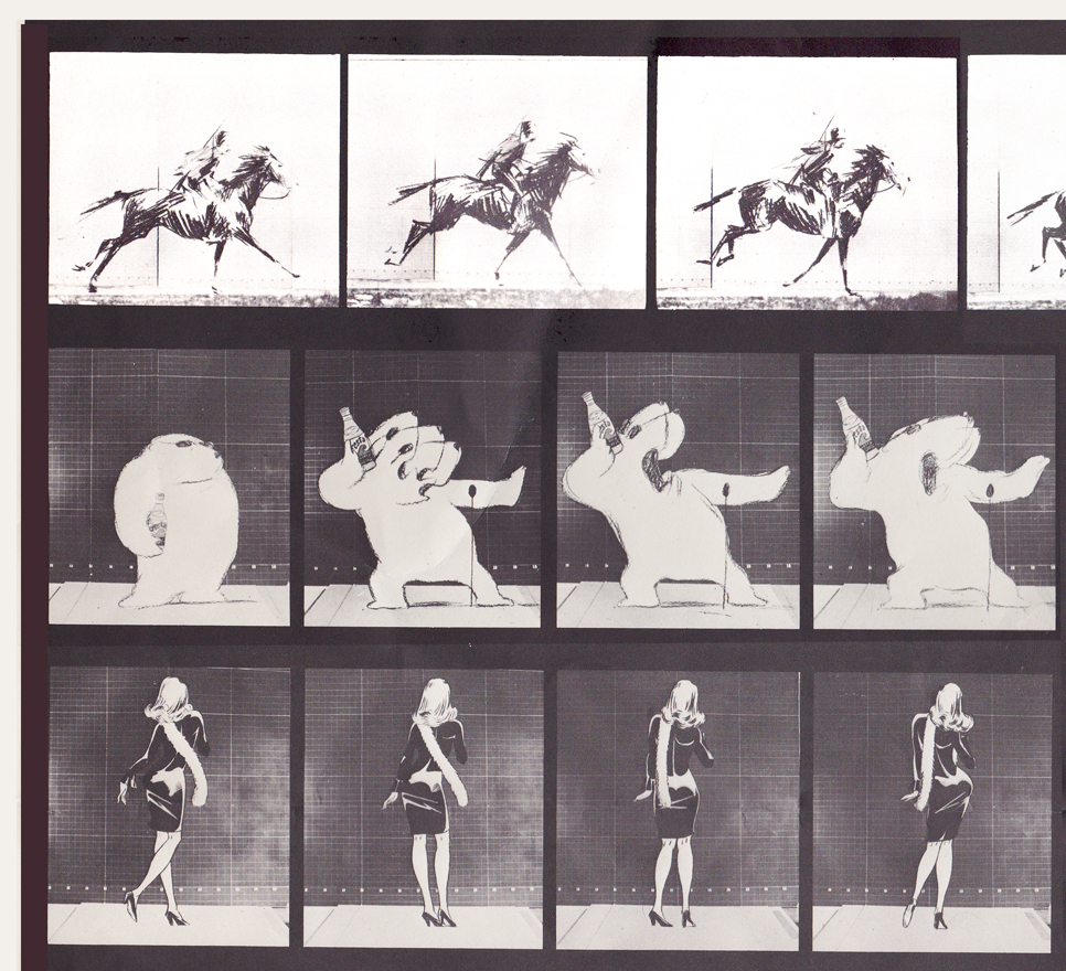
Top rows left side / Row 1: Pushkin Vodka ad
Row 2: Cresta Bear ad / Row 3. Tic Tac ad
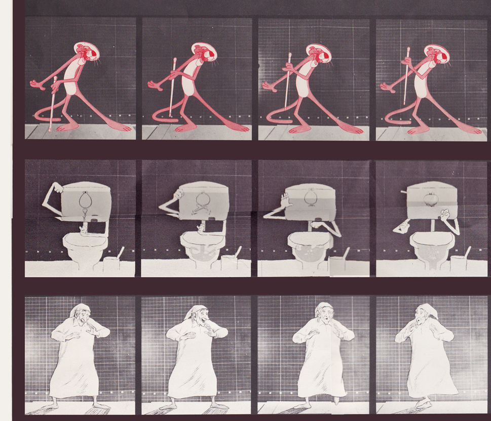
Middle rows left side / top row: Pink Panther titles
Middle row: Bloo toilet cleanser ad / Bot row: The Christmas Carol
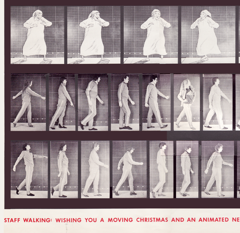
Bottom rows left side / top row: The Christmas Carol (repeated)
Middle row: staff / bottom row: more staff
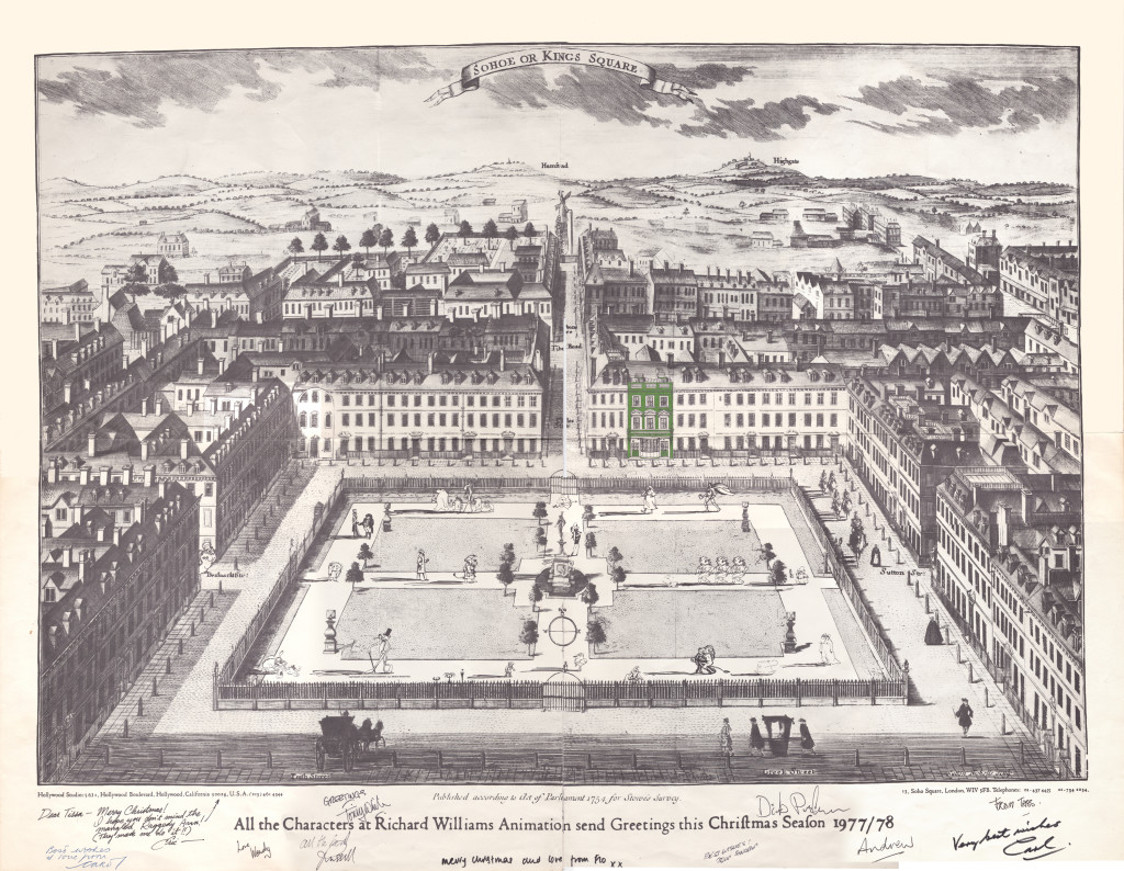
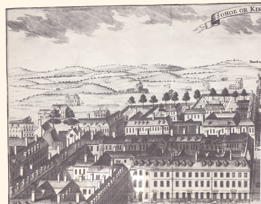
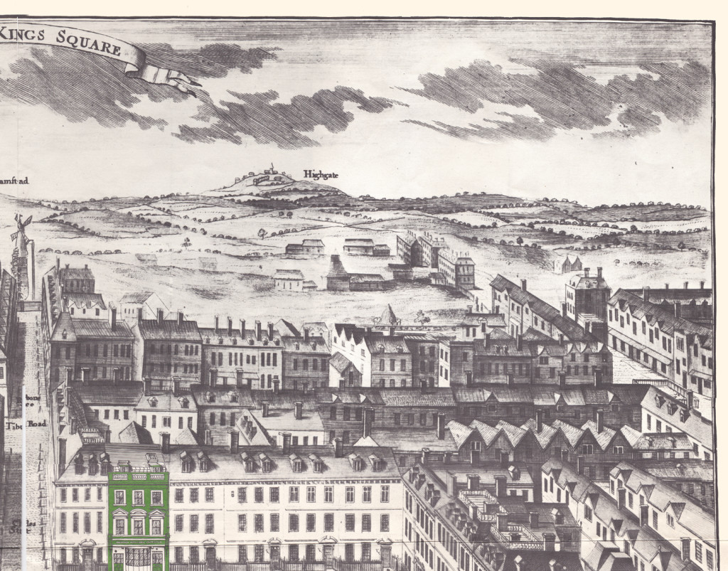
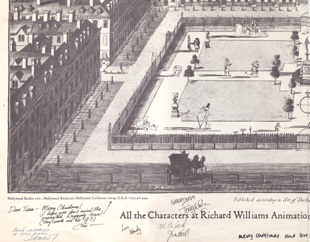
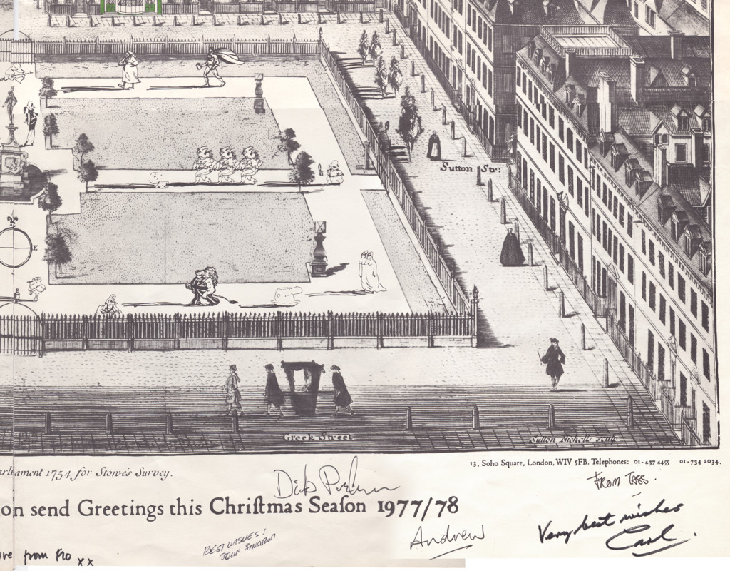
With card #2 we see Soho Square. The green front door
marks the location of Dick’s studio at 13 Soho Square.
(As with the first card, I posted the entire Christmas card,
followed by a sectional divide so you can enjoy the details.)
This is a folding card.
It comes folded so that you see the far left of the card
revealing part of the far right.
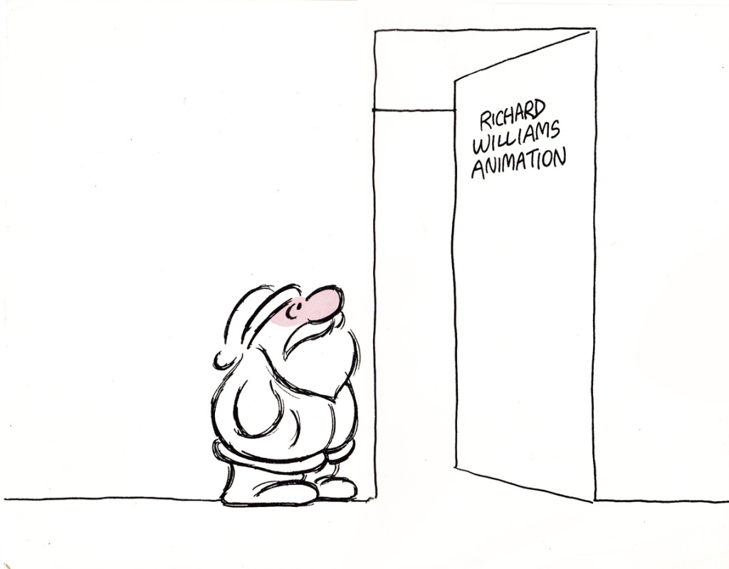
The card comes folded like this.
The left side (Santa up to doorway) is on the left side of the card.
The right side, on bottom, reveals the empty office.

It unfolds to reveal this long line of Santas.
Each Santa is in the style of the many illustrators’ styles
of those who designed ads for the studio in the prior year.
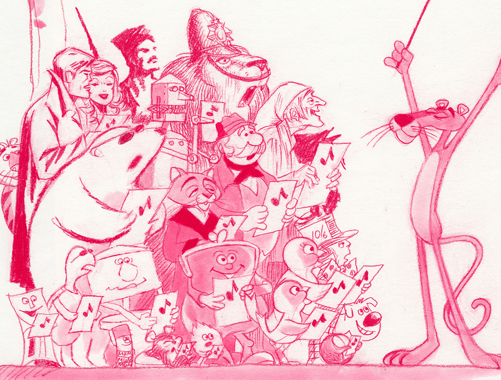
Suzanne Wilson sent in a Pink Panther Chistmas card; it was drawn by her late husband Rowland Wilson:
Below is a close up of that same card.
Here’s another full card.
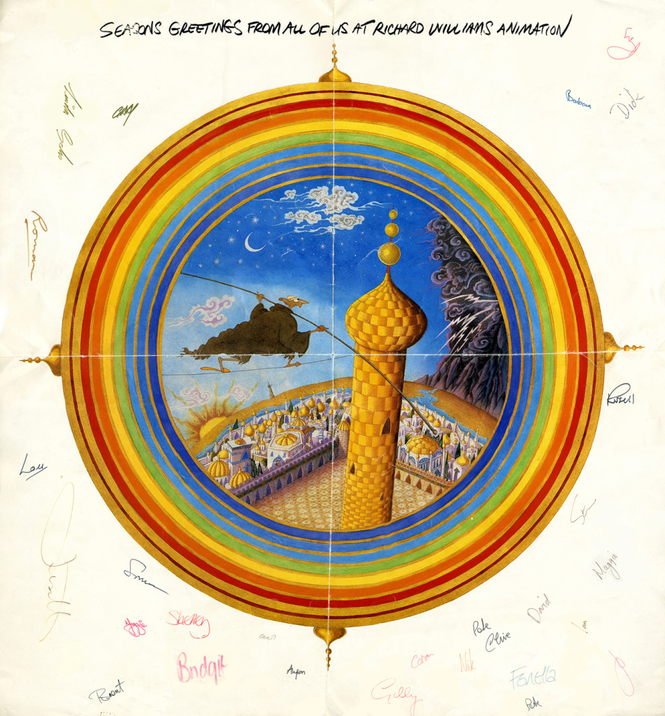
This one is designed after the McGuffin of Dick’s feature,
three golden balls over the city.
from The Thief and the Cobbler.
commercial animation &Frame Grabs &repeated posts &Richard Williams &Title sequences 19 Mar 2013 04:58 am
A Funny Thing Happened – again
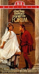 - Today marks the 80th birthday of RIchard Williams. To celebrate, I’ve chosen to post these images from the credit sequence of A Funny Thing Happened On The Way To The Forum. My first introduction to Richard Williams and his work came by way of a BBC documentary from 1965, The Creative Person: Richard Williams. It aired on WNDT’s ch 13 in New York (PBS before PBS existed.) Within the sequence there is once scene of a girl smelling a flower. (The Annette Andre credit.) I remember this as part of that doc, and Richard said that at times you should slow down the animation of a character if you want it to seem more real. There’s a dissolve animation going on here.
This is a great theatrical show and a mediocre movie. Despite the great cast, the brilliant people working behind the scenes (from Tony Walton‘s sets and costumes to Nicholas Roeg‘s extraordinary photography; from the incredible song score by Stephen Sondheim to Ken Thorne‘s excellent incidental music), somehow it all doesn’t really work.
However, animation enthusiasts would be primarily interested in the animated credit sequence by Richard Williams‘ fine animation. This was a sequence that brought Williams out of the cartoon world and into the more serious fold. Suddenly, his studio grew up.
Since we didn’t get to see his brilliant ads in the US, we had to seek out his title work. Credit sequences for future films such as The Charge of the Light Brigade, The Pink Panther sequels and What’s New Pussycat easily demonstrated how he really lifted his studio into the big time.
I’ve made frame grabs of the sequence from my recording, and thought I’d post them for your amusement. Sorry that the copy I have isn’t the most pristine and that the frames available are a bit soft. But I guess the idea comes across.
______________________________________(Images enlarge slightly by clicking them.)

The sequence starts at the end of the film. Buster Keaton runs on a circular treadmill, and dissolves to an animated version of himself.

He grows in the frames as some large-sized flies enter from the left.

Cut out to see a small Buster disappearing. The camera whips across to a picture of fruit. The flies zip over there and eat the picture. (This image of fruit was very dark on screen.)
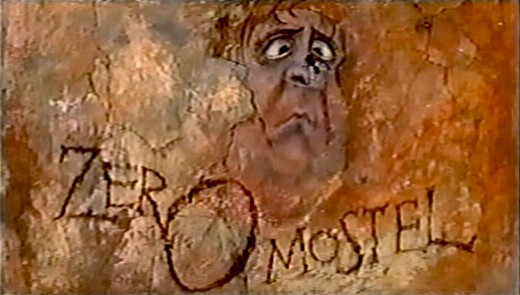
A fly lands on the nose of a CU caricature of Zero Mostel. His eyes cross watching the fly.
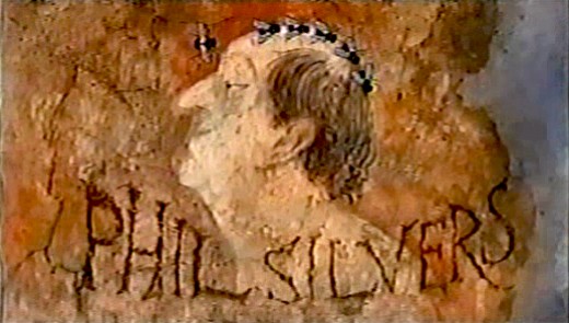
Flies land on Phil Silvers’ bald head and march across.

Buster runs across a painted frieze on the way to a series of inlayed boxes.
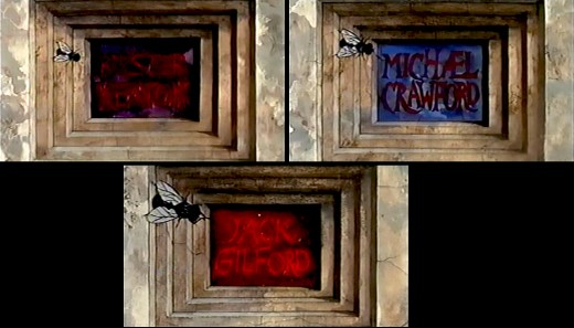
Zip to the second box credits Michael Crawford. Pan to the third box which features Jack Gilford’s name.
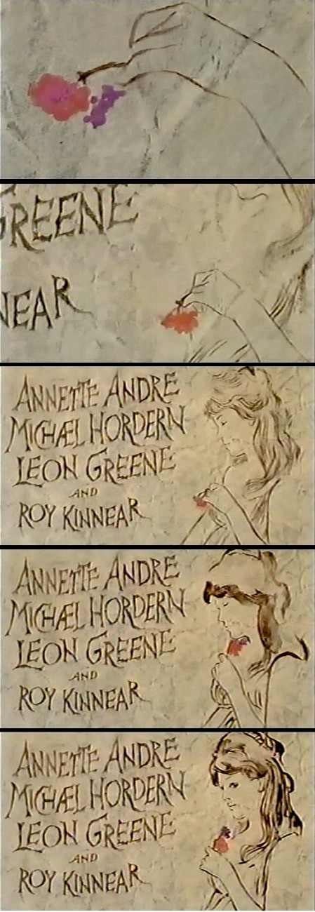
Dick talked with me about this scene in the film. He felt that to create realistic
characters in animation one had to slow everything down. He did it with dissolves.
It’s a technique he came back to often, quite noticeably in The Charge of
the Light Brigade.
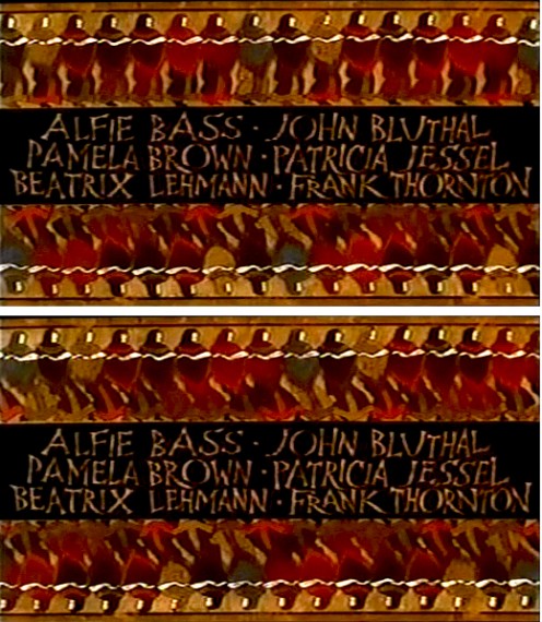
Errol LeCain’s art seems to be featured in this elaborate scene. The entire group – top
and (upside down) bottom – dance.
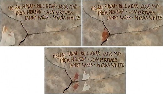
An animated version of Zero Mostel chases a female through and across a painted wall moving into and across the cracks.

The cornucopia of fruit starts in full color but goes to B&W before it’s done, in honor of the great cinematographer.
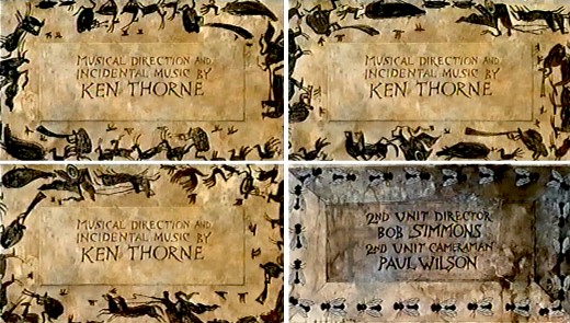
A very large cast of shilhouettes runs around this credit for Ken Thorne. There is no cycle here. This is a Dick Williams piece, so they’re all fresh drawings. They turn into flies for the next credit.

A Roman version of an Escher wall painting animates, confusing the fly trying to walk across.
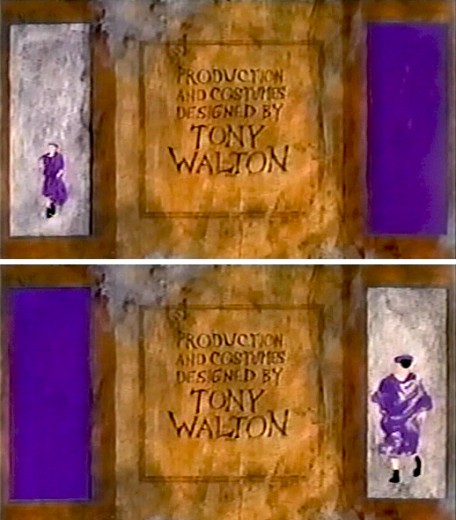
The animated Buster Keaton runs toward us on one side
and away from us on the other side.
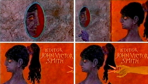
For the editor’s credit, a female looks at herself in a mirror. A hand comes in and clips off her pony-tail.
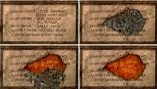
A slew of credits rots in one spot. This falls off revealing the choreographers’ names.
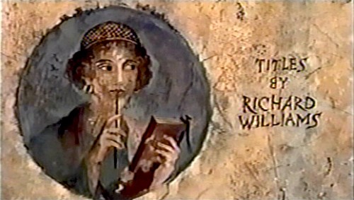
I’m always fascinated by the credit the designer gives himself. No sign of anyone else
who worked on this sequence. Titles have changed since then.
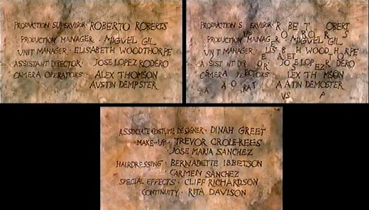
This is the first time I remember seeing letters from the type of one card falling down to match letters from the next card.
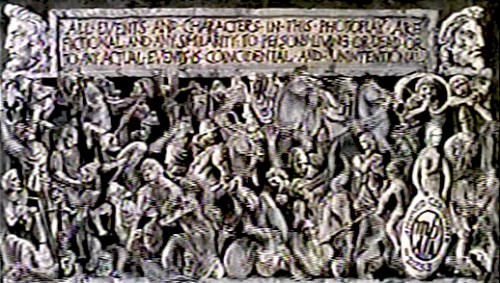
This card, the least significant one, comes back several times.
Of course it’s overanimated though it looks like a cycle.

The camera moves in on a fly crossing a checker board.
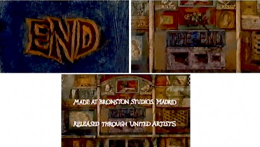
Truck out from “End” past “The End” to reveal several more boxes.
Happy Birthday, Richard. Thanks for all the wonderful gifts you gave animation, not the least being the obvious: a new respect for a medium that was dying when you stepped up to the plate. You restored its dignity at least once.
Animation Artifacts &Commentary &commercial animation &Layout & Design &Models 12 Mar 2013 03:43 am
Larry Riley Recap Plus
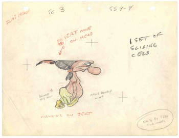 In celebration of the new season of baseball I have a couple of model sheets from a Paramount cartoon.
Larry Riley, a story writer, gave me these drawings back in 1972, but he never told me the film’s title. Thanks to Thad Komorowski and Bob Jaques – both left comments when I originally posted hese in 2007 – we know the drawings come from Heap Hep Injuns (1950).
______________(Click images to enlarge.)
Larry Riley was a wild guy. On my first commercial job at Phil Kimmelman & Ass. he and I were the inbetweeners working side-by-side on some of the Multiplication Rock series. Larry had had a long and busy career in animation.
He had been an asst. animator at Fleischer‘s, a story writer at Paramount, an animator at many studios. Like many other older animators, he ended up doing anything – including inbetweening at Kimmelman’s for the salary and the u-nion benefits.
The stories Larry told me kept me laughing from start to finish. There was no doubt he had been a writer for years. In a not very exciting job, it made it a pure pleasure for me to go to work every day to hear those hilarious stories. I can’t see Lucky 7 without thinking of laughing. It wasn’t the stories per se that were funny, it was his take on it.
Larry told me of his years at Fleischer’s in Florida where he was an assistant. He and Ellsworth Barthen shared a room, and, according to Larry, had lined one of the walls of their room with empty vodka bottles. Now, I’ve heard of frats doing this with beer cans, but doing it with vodka bottles requires some serious drinking. One of the many times I got to work with Ellsworth, I asked him about the story, and he reluctantly backed it up telling me what a wild guy Larry was.
Ellsworth was an interesting character in his own right. There were a group of lifetime Assistant Animators in New York when I started out. This is what they did and all that they aspired to do. They liked the steady work and didn’t want heavy pressure. Those I can name, off the top of my head, were: Helen Komar, Jim Logan, Gerry Dvorak, Tony Creazzo, Eddie Cerullo, Joe Gray, and Vincent Barbetta. They all have interestng stories I could tell. Maybe another time.
Ellsworth Barthen was one of these permanent Asst. Animators. He had his work life and he had his play life. Ellsworth lived in New Jersey with his brother and spent much of the time in his garden growing orchids. He had specialty breeds of orchids that he’d grow and enter in flower shows. Ellsworth loved it.
The other thing he loved was performing as Franklin D. Roosevelt. Just about everywhere he went, he took his pince-nez and would pop it on his eyes and go into character. Now I was born after Roosevelt had already died, so I couldn’t tell you if Ellsworth had been doing an accurate impersonation, but I saw him do it pretty often.
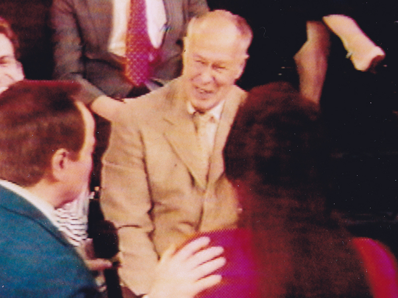
Ellsworth appearing on the Joe Franklin Show in NY
as Franklin D. Roosevelt. Joe Franklin is bottom left.
At Grim Natwick’s 100th Birthday Party in LA, Ellsworth came in character and stayed there all night. He was basically a big and shy guy, but this Roosevelt impersonation would bring him out and loud. Very curious character.
Back to Larry Riley:

________Forgive the racist pictures, but I guess they’re a product of their times.
Larry also told of a 3D process he’d developed for Paramount in the 50′s when the movies were all going 3D. I believe there were two Paramount shorts done in this process: Popeye: The Ace of Space and Casper: Boo Man. Larry offered to give me the camera on which he shot these films – he had it stored in his basement. He was afraid it would get thrown out when he died. I didn’t have room for it.
My regret; I still hear the sadness in Larry’s voice.
(When I originally posted this in 2006, Larry’s grandson, John, wrote to tell me that another collector took possession of the camera and kept it from destruction.)
The animator who drew these is Tom Johnson (he signs the second one), and they were approved by the director Isadore (Izzy) Sparber per the first one.
The drawings are deteriorating, obviously. The pan above uses a lot of glue to hold it together, and that’s eating away at the paper.)
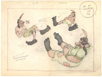 – This is the final model I have from Heap Hep Injuns a 1950 Paramount cartoon. Tom Johnson drew this image, prior to animating it, and Izzy Sparber directed the film. I’d heard some stories about I. Klein regarding this film, though he’s not credited, so I suspect he may have had something to do with model approvals, as well. Actually, he may have been the “Izzy” referred to on the pan posted yesterday.
______________(Click images to enlarge.)
I was never a big fan of the Paramount cartoons. Growing up in New York, we’d always get Paramount or Terrytoons shorts playing with features in the theaters. Only rarely did a Warners cartoon or a Disney short show up. (I don’t think I saw a Tom & Jerry cartoon until I was 17 when they started jamming the local TV kidshows with them.)
Saturdays there was always the placard outside the theater advertising “Ten Color Cartoons”. A haughty child, I naturally wanted to know why they didn’t show B&W cartoons – that’s what we saw on television, and I usually liked them more. I must have been insufferable for my siblings to put up with me.
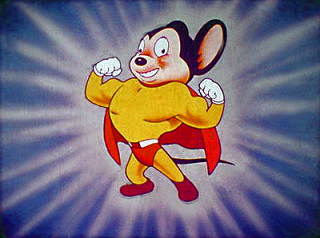
The starburst at the beginning of the Mighty Mouse cartoons always got an enormous cheer in the local theaters. I don’t remember ever hearing that for the Popeye or Harveytoons.
(I love that if you go on a “Google search” for images of Larry Riley, you get dozens of title cards from Paramount cartoons. Go, Larry.)
commercial animation &Top Cel 06 Feb 2013 04:27 am
Top Cel – #3
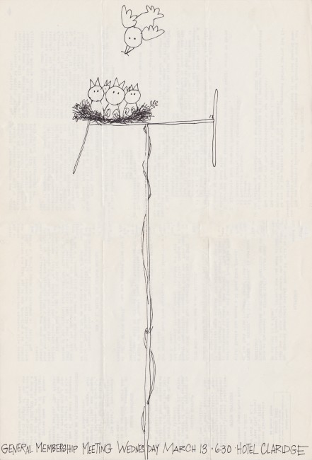
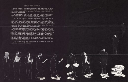
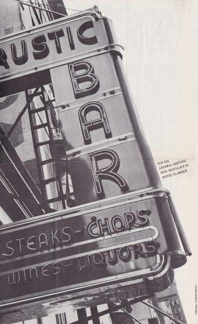
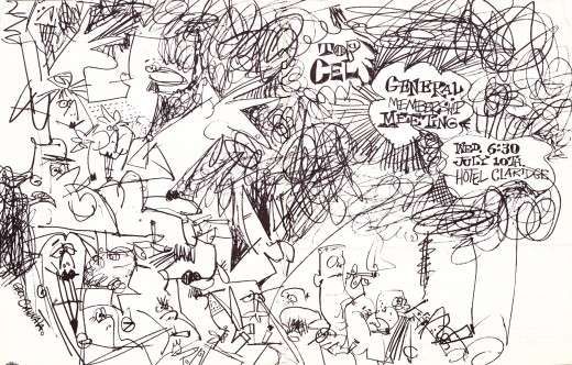
This is our third installment of Vince Cafarelli‘s collection of the Ed Smith edited issues of Top Cel the u-nion organ. Local 841 of the MPScreen Cartoonists had Pepe Ruiz as their Business Rep., Izzy Klein as the President and Howard Beckerman as VP.
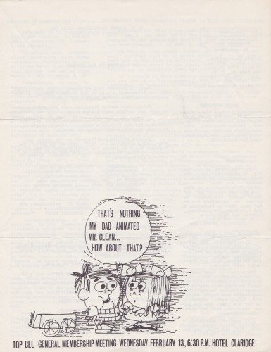
Feb 1963
 5
5
Pages 1 & 4 wrap around 2&3
March 1963
Cover unsigned but it looks like Ed Smith drew it
Pages 1 & 4 wrap around 2&3
April 1963
Drawn by Ken Kimmelman
 12
12
Pages 1 & 4 wrap around 2&3
May 1963
Designed by Bill Feigenbaum & Karl Fischer
Pages 1 & 4 wrap around 2&3
July 1963
Drawn by George Cannata
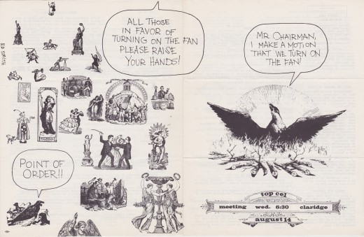
Pages 1 & 4 wrap around 2&3
August 1963
Desiged by Ed Smith
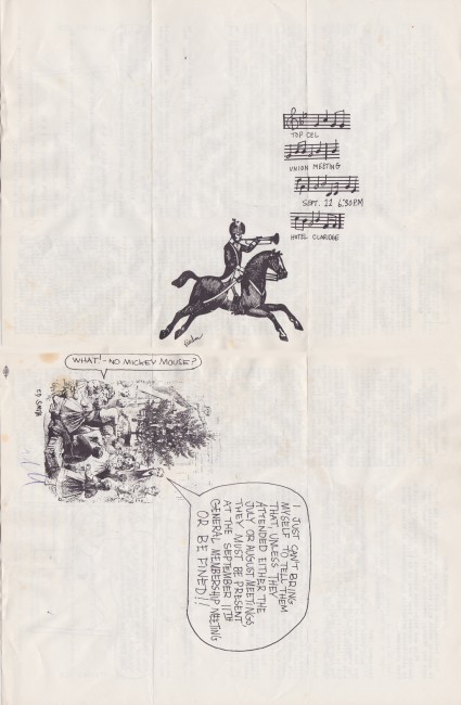
Pages 1 & 4 wrap around 2&3
September 1963
Desiged by Ed Smith & Karl Fischer
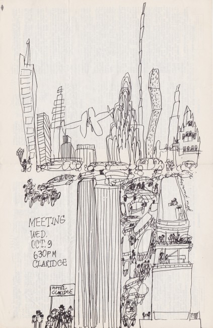
Pages 1 & 4 wrap around 2&3
October 1963
Drawn by Gloria Graves Kougal
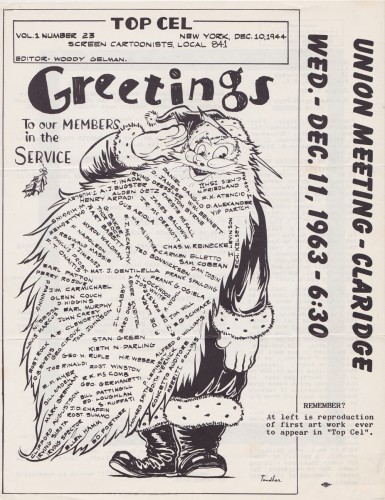
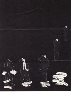
This cover was probably the most famous Top Cel cover.
It was originally printed in two colors – red & black and
was 8½ x 14 in size. Ed Smith did justice to it in this reprint.
Animation &Animation Artifacts &Bill Peckmann &commercial animation &Illustration &Models &Story & Storyboards 30 Jan 2013 08:26 am
More Misc Commercial Art
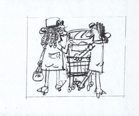
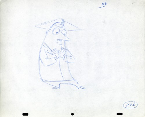
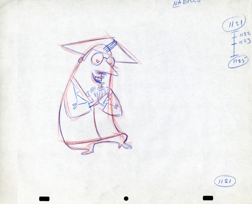
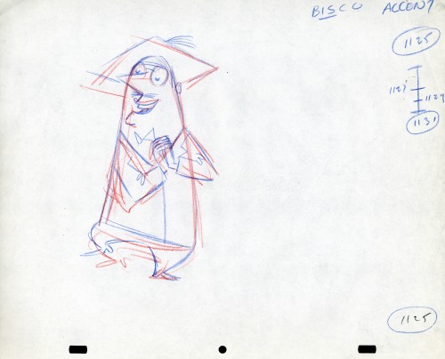
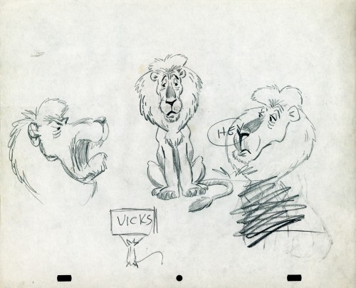
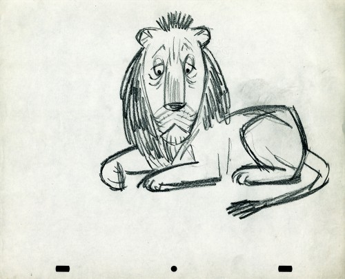
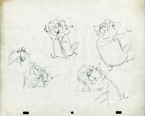
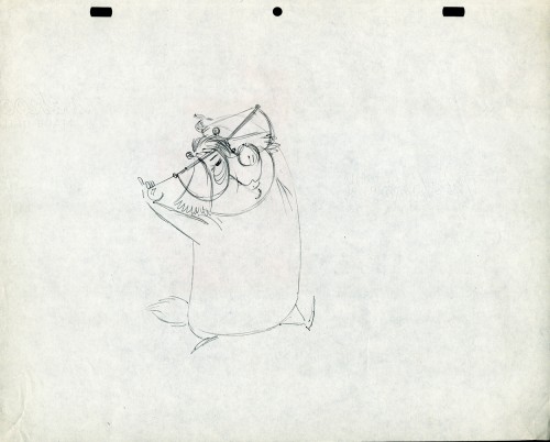
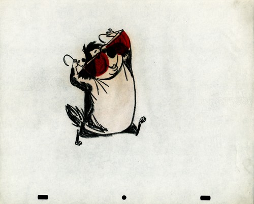
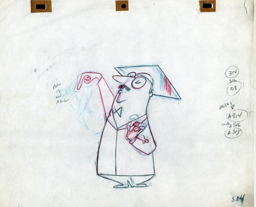
- Still left in the Vince Cafarelli collection of drawings from commercials he did, most probably, at Goulding-Elliott-Graham (for the moa part) are the drawings below. We know through some small bits and pieces of information what a couple of the sponsors were. (The wording of dialogue the professor speaks that the sponsor is Nabisco Shredded Wheat; the lion and the mouse ad is obviously for Vicks – drops or vap-o-rub.) However, too many other bits leave us empty handed. I can recognize cartoonist, Lou Myers‘ work anywhere, but no clue what they’re for. Candy Kugel and I were also able to delineate Lu Guarnier‘s drawing style (Vinnie was his assistant for years), and I know Jack Schnerk‘s great work. I recognize the brilliant and great hand of George Cannata from similar work that Bill Peckmann had recognized (see here) in a past post. So it is great to learn as much as we can, even though there’s a lot of guesswork in it.
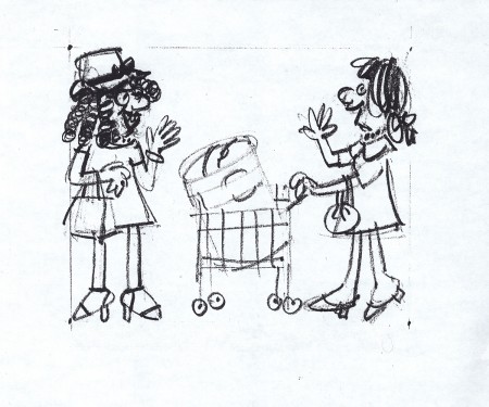
The following are three storyboard drawings by cartoonist Lou Myers for some spot:
 1
1
The following drawings are for Nabisco Shredded Wheat. They’re animation drawings/ruffs by Lu Guarnier. The delicate pencil lines of these years turned into dark rougher ones in his later years. The timing charts were always the same right out early wB years. You’ll notice a lot of quarters and thirds in the breakdowns. This is something you’d never see from Disney. There, everything is broken into halves and halves again and again.
 1A
1A
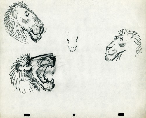
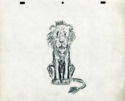
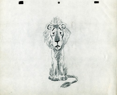
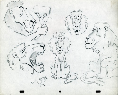
- The following lion is designed and animated for a Vick’s commercial. (Note the second model sheet.) There were quite a few commercials during the period that reworked this great Aesop tale for the sponsor’s use. The lion obviously has a cold. Rather than pulling out the thorn, the mouse introduces him to Vicks’ cough drops and the lion feels a whole lot better.
What has been left behind of this ad includes a couple of model sheets of the lion as well as a couple of animation drawings. I don’t know who the designer is, but the animation drawings are most definitely the work of Jack Schnerk. I suspect all the drawings here are by Jack. He probably kept reworking the model sheet until he got the character in his hand. I can remember him lecturing me on the quality of my drawings. Unless my drawings became roughs, rather than tight clean ups, he was convinced I couldn’t get good animation in my pencil. Jack’s work was rough. and it became much more rough than this, certainly by the time I knew him and was assisting him. He also had a peculiar style of roughness; very choppy angular lines chiseling out the fine drawings. You can get a good example of that with drawing labeled “2D”.
The last four drawings are all animation drawings. “2D” is a rough, “2E” is a clean-up by Jack. The last drawing is a beauty and probably the final look he hit upon.
 2A
2A
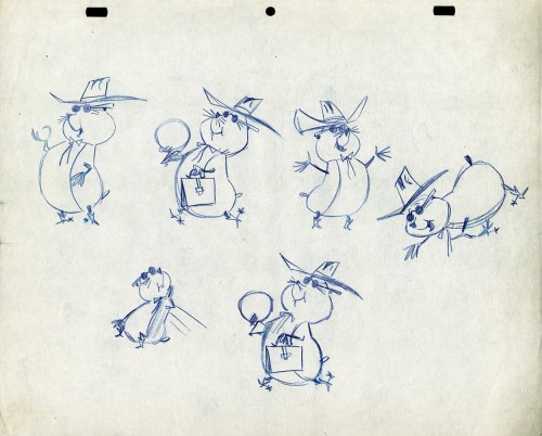
Here we have some drawings by a designer. I suspect that it’s the work of George Cannata. I did a couple of posts on a designer at Robert Lawrence Studio a few weeks back. Bill Peckmann identified the primary designer whose work screamed out to me. Since then, I’d recognize that line anywhere, and it’s most definitely below.
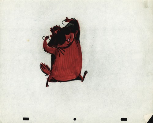
The Groundhog below is obviously a character with a southern drawl. The first step was to try the obvious making him a cowboy (“3A”). But that soon changed. and the character got plenty more sophisticated (“3B & C”). After that the line got juicy and the color got bold. There’s really so much to a character like this who just about animates himself.
 3A
3A
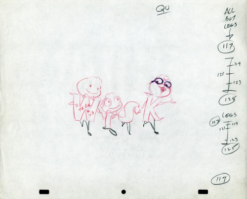
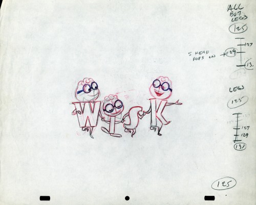
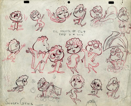
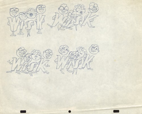
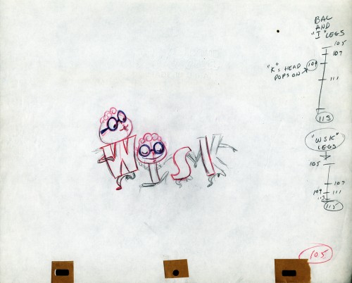
The following five drawings are for a WISK commercial. There are two model drawings and three animation ruffs. The primary model indicates that the spot is done for Screen Gems which was a viable studio in the early 60s and 70s. However, I don’t know who the animator was. Neither Lu Guarnier nor Jack Schnerk fill the bill.I know that Irv Dressler was at Screen gems for many years, but am not sure about this time especially since IMDB has him free lancing for King Features and other entertainment studios. The drawswing style of these animation drawings is right out of the Paramount/Terrytoons mold. Many animators’ work looked like these. People such as Johnny Gentilella, Marty Taras et alworked in a very similar style, though these are a little harder lines than either of those two.
 A
AThis is the primary model for the entire family. It’s a
beautiful drawing, and the characters have a lot of play
in them despite being connected so obviously.
Just look at the father’s hair. Beautifully done
 B
B
Here’s a secondary model. I suspect this is the animator
tracing off the characters and seeing what he can do with them.
 C
C
Animation drawing #105. Those breakdown charts are something.
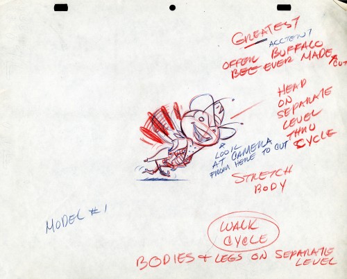
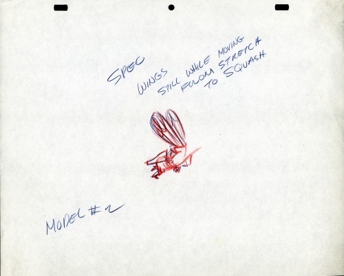
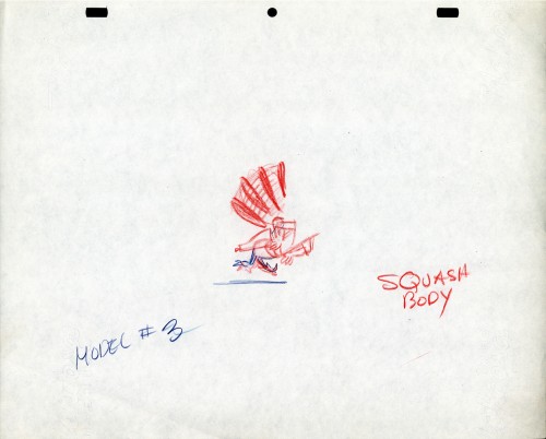
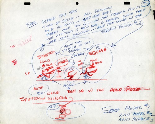
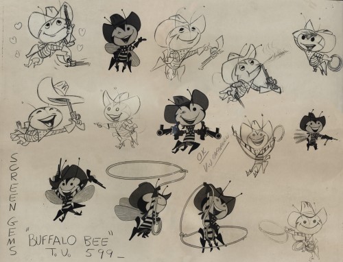
The Buffalo Bee for Honey Nut Oats is also a model sheet from Screen Gems. With it come an animation model sheet for the walk cycle of the character. These drawings look like Lu Guarnier’s to me, but there’s no official way I could confirm that, of course.
Model sheet
Bill Peckmann &Comic Art &commercial animation &Story & Storyboards &Toth storyboard 24 Jan 2013 07:10 am
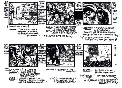
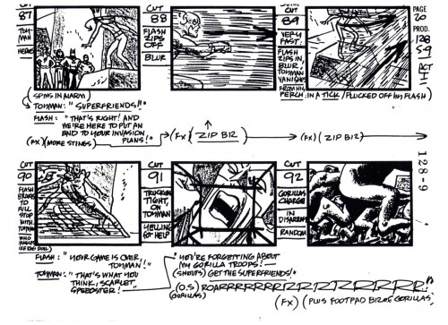
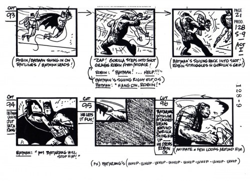
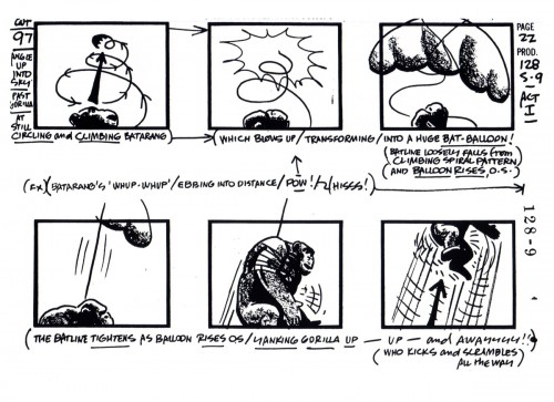
Toth’s SuperFriends Storyboard
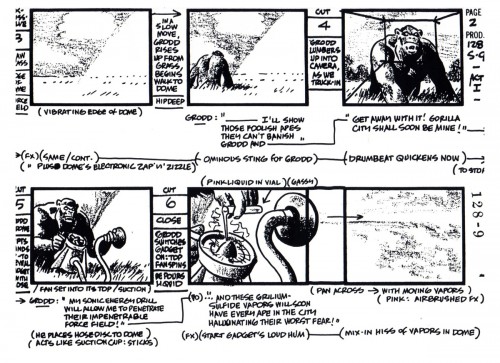
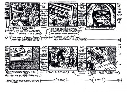
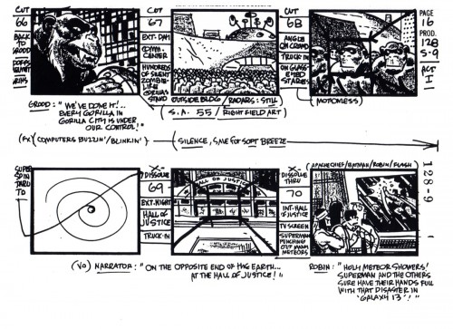
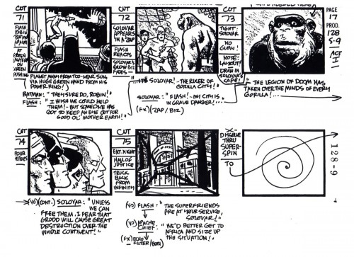
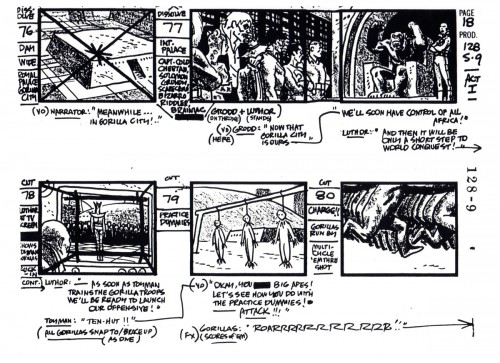
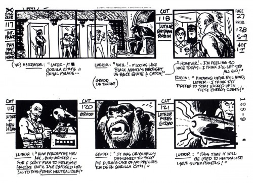
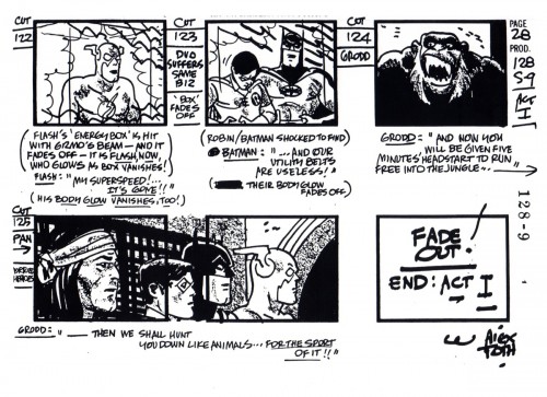
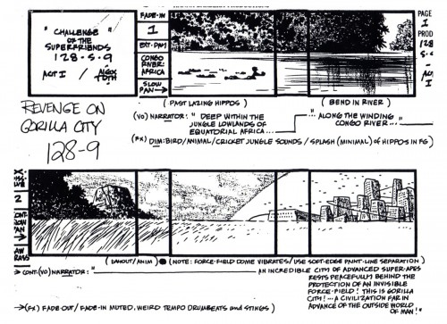
- Alex Toth did storyboards, too. Here’s one he did for Hanna-Barbera, and it shows the visceral strength of the “SuperFriends” project. More than the original comic book and greater than the final outcome. It’s a class act, and great thanks to Bill Peckmann and Manual Auad who brought it to him. To Bill:
- Many thanks to illustration art publisher, historian, fan extraordinaire, Manuel Auad, we are able to post 28 pages of a Hanna-Barbera “Super Friends” storyboard done by Alex Toth.
Even though the pages are Copies of Copies, they are nice clean copies that haven’t been covered with down-the-line production notes yet.
 1
1
Here’s another board he did which we posted a while back.
Animation Artifacts &commercial animation &Layout & Design 10 Jan 2013 06:25 am
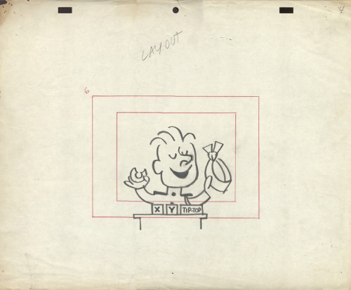
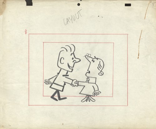
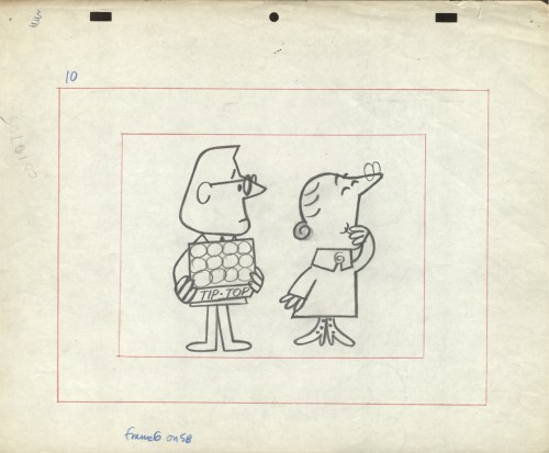
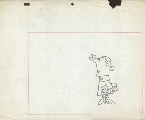
Emily Tipp Rerun
- Originally, after Vince Cafarelli had died, I was shown the boxes and portfolios full of artwork that Vince had very briefly and casually discussed with me for years. What I thought were a couple of drawings, ended up being a lot of brilliant work beautifully contained by Vinnie and his partner Candy Kugel, over the many ears they had their studio. It was work – meaning drawings, sketches, layouts and animation – that Vinnie had held on to and in some cases preserved because he knew it was valuable (not financially, but historically).
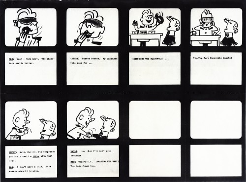
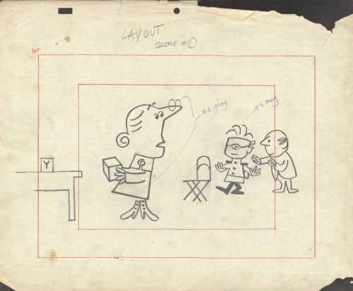
In the not-too-distant past (6/27/12 and 10/24/12), I posted material about an Emily Tipp commercial for Tip Top Bread. This spot, like all of those of the series, was well designed and animated and stood out among other spots on TV. It was commercial cartoon animation at its best during the 60s. Margaret Hamilton, memorably, the Wicked Witch of the West from The Wizard of Oz, provided the voice for Emily!
The problem for me was the disorganization. So little of it was labelled or attached to any others that were gathered in those boxes. So I started digging in and organizing while at the same time pulling art for display on this blog. What happened was pretty much what I expected. Some things got mislabeled and other items were separated from art which they should have been attached to. Here we have a prime example. Emily Tipp.
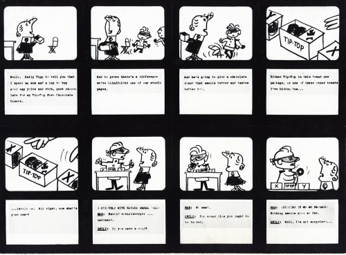
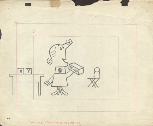
Gathered in one group/box were some of the layouts for this typical TipTop Bread spot. We’d already assembled some of the drawings that belonged together despite the fact that the were found in separate boxes representing different studios. It turns out that some work that was credited to Kim-Gifford Studio (the laouts below) actually were done by Elliot-Graham-Goulding.
So here, we have some story boards to connect with some layouts. Compare and contrast and enjoy.
 1
1
To see some of the Emily Tipp spots go here
at the Buzzco website.
 1
1
Books &commercial animation 07 Jan 2013 07:32 am
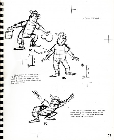
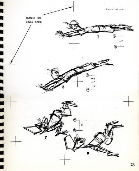
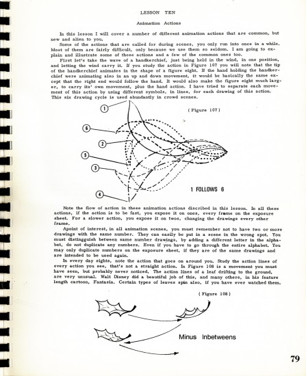
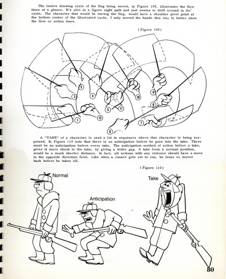
Heath Book – 4
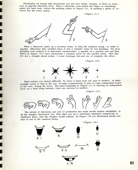
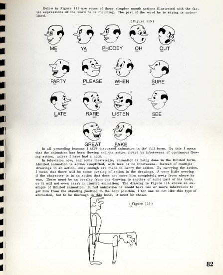
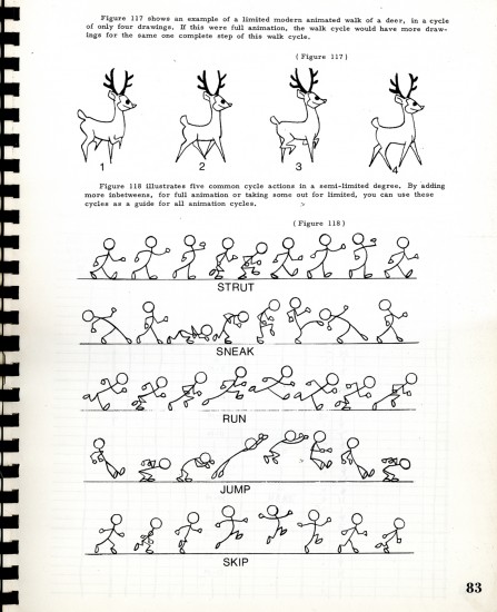
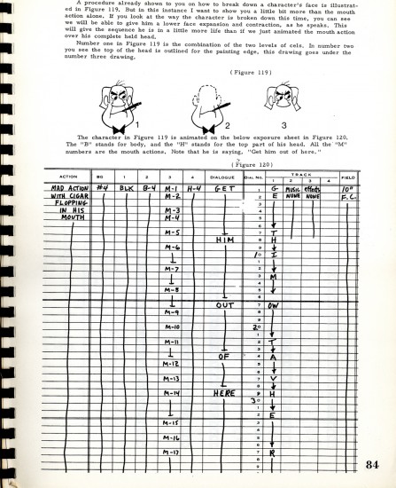
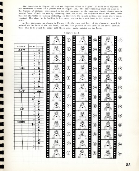
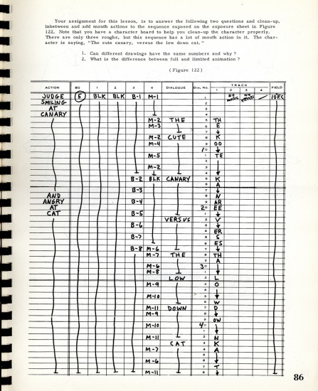
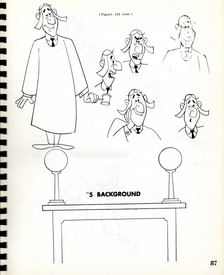
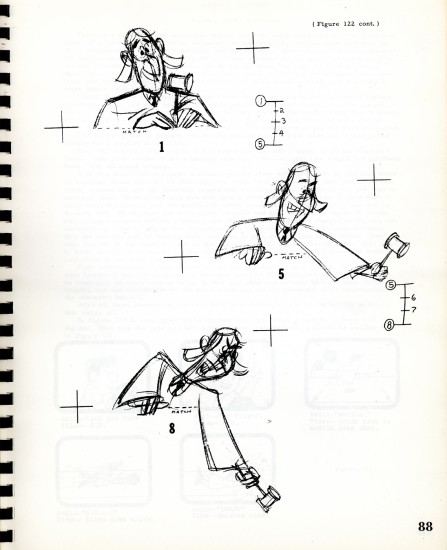
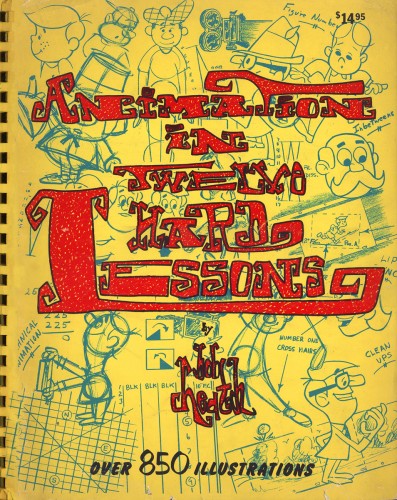 = For the past three weeks, I’ve been posting chapters from the Robert Heath book: Twelve Hard Lessons in Animation.
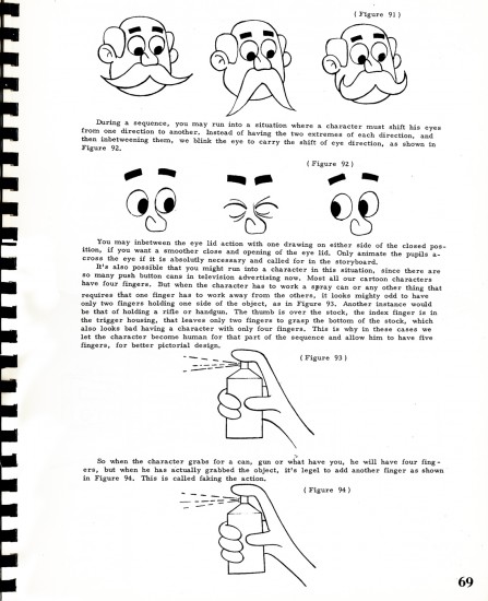
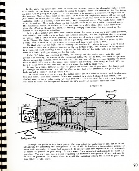
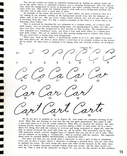
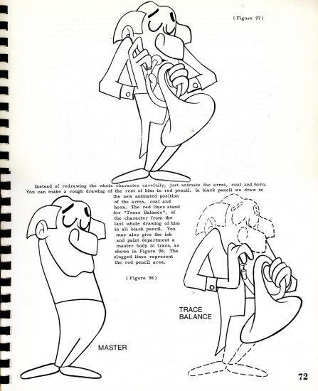
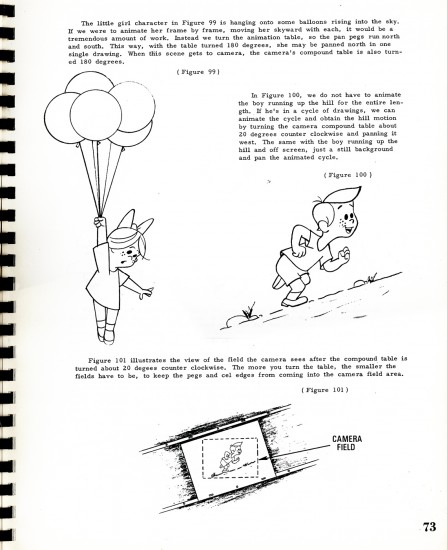
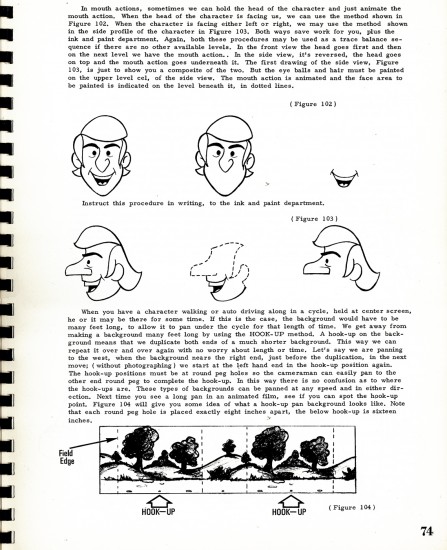
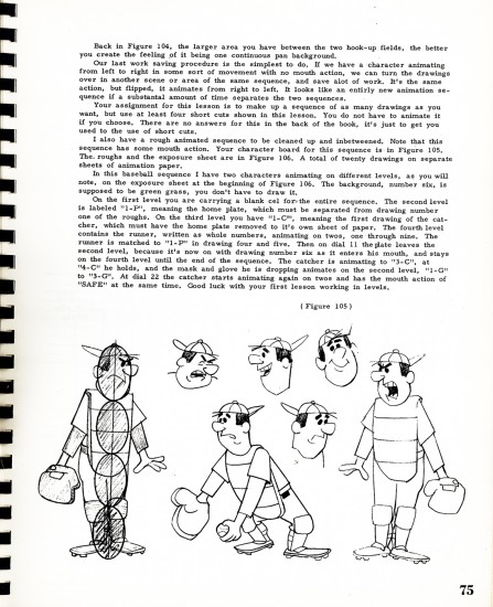
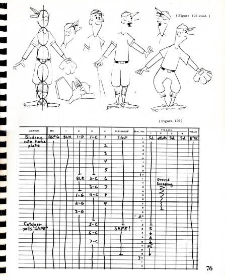
The book is an exercise in itself. It includes extremely complicated material mixed with the most basic. It’s an oversized book printed in the most basic way. A plastic binder holds it together and makes it feel like the workbook it is. There are plenty of exercises with the lessons and lots of examples (though these are often drawn pretty crudely) all designed to impart the information they want to get across.
As I’d written in the past, Tony Creazzo was one of New York’s finer Assistant Animators and Bob Heath was a cameraman. Together they make for an odd couple of a pair to author such a book. Yet, there’s no doubt that this material is first rate and there’s a lot to learn from the book they’ve given us.
To read past posts go here for: part 1, part 2, part 3.
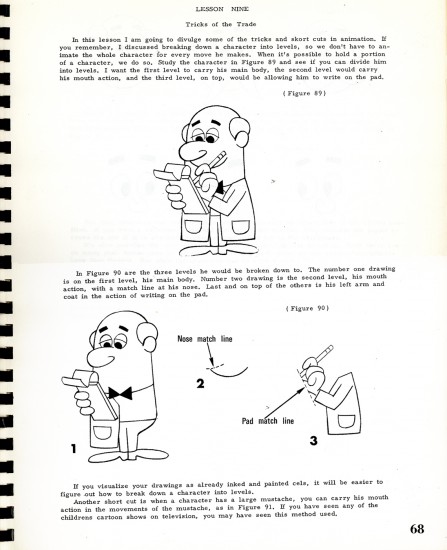
We pick up this week with page 68, lesson 9:
 68
68
Animation &Animation Artifacts &commercial animation &Independent Animation 26 Dec 2012 07:57 am
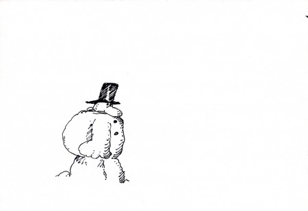
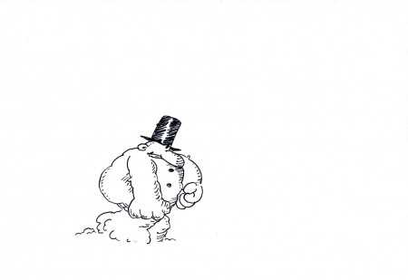
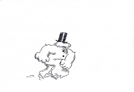
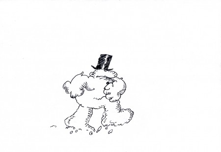
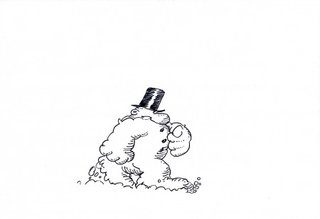
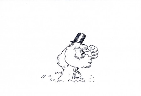
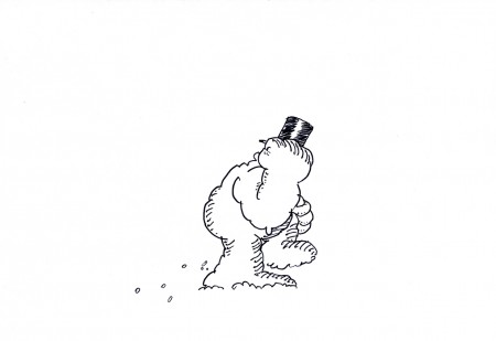
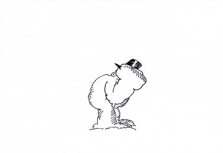
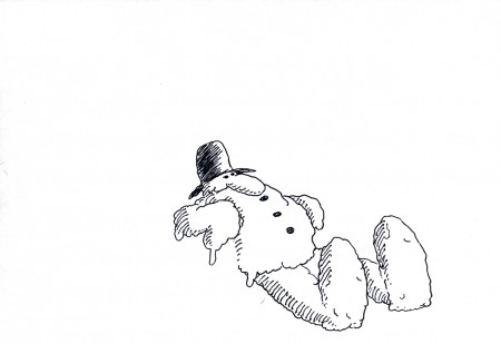
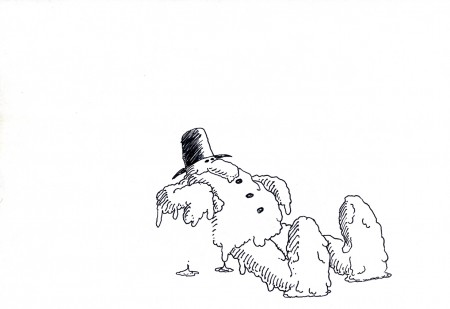
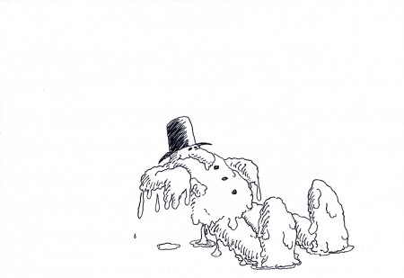
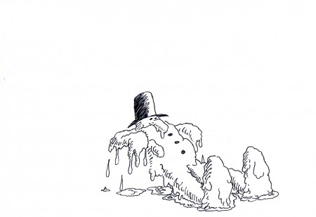
Len Glasser’s – “Snowman”
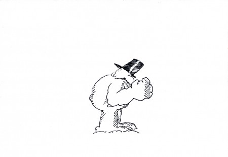
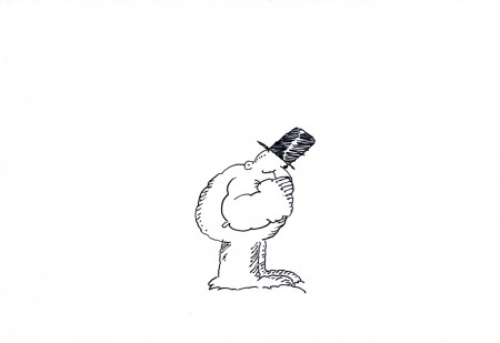
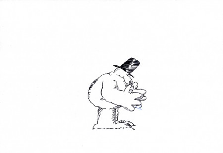
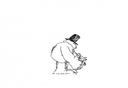
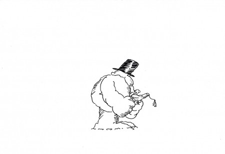
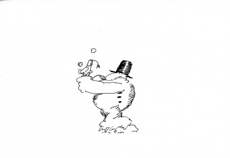
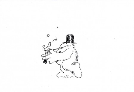
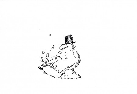
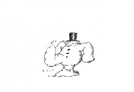
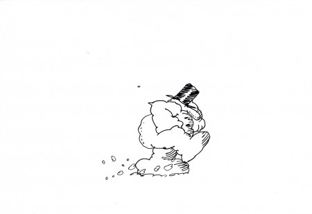
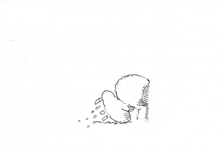
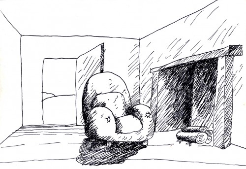
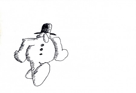
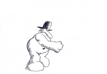
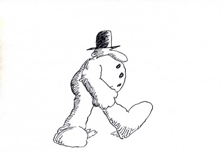
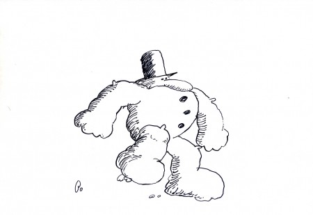
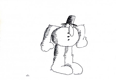
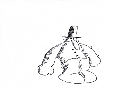
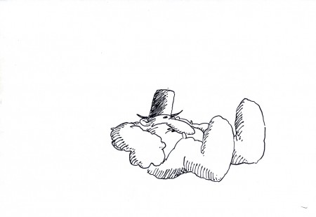
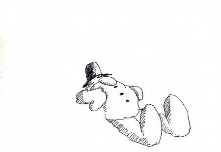
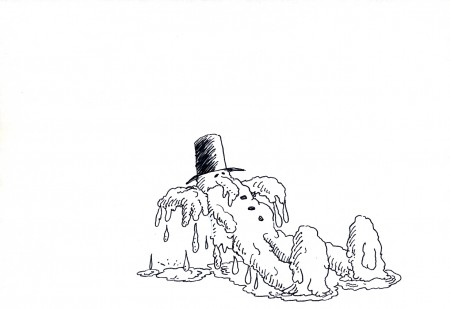
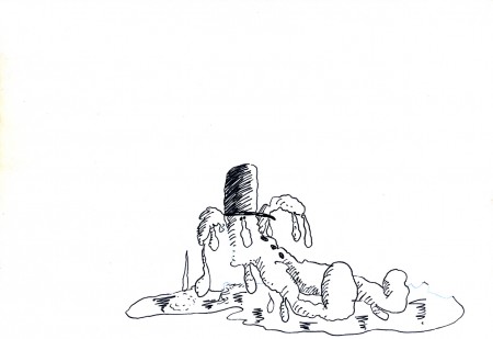
- Len Glasser had designed a number of pieces for Perpetual Motion Pictures. I wrote last week about two pieces that were designed and work was done on a job for CBS and their weather division. Ed Smith animated the originals which were killed and never aired. At some point a couple of years back, Vince Cafarelli built a miini-film out of what they had done. He animated anything they needed to complete this one flm. It’s built on a snowman that comes to life; the film was taken to its conclusion, but nothing was done with it beyond that. (I’ve suggested that they make an animated Christmas card out of it and send it out to everyone. It’s certainly entertaining enough.)
I’ll post every other one of the animated drawings here so you can see the animation and accompany them with the final QT movie of the piece. It should make a nice little post.
Here are the drawings predominantly animated by Ed Smith directly in pen onto paper. The drawings were xeroxed and/or inked onto cel, colored and shot traditionally. Here are the paper drawings with one or two odd comments added. Rick Broas helped Vince complete it.
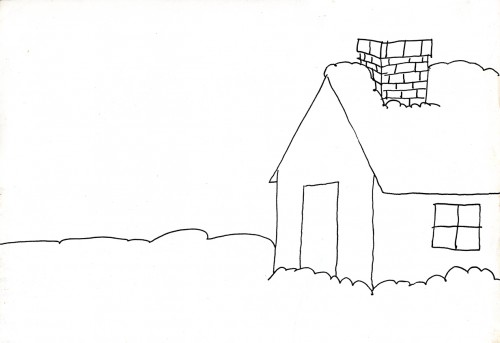
The Background to scene 1
 19
19
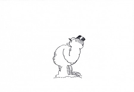
This is part of a cycle of the snowman banging
on the door of the house. (see the QT movie)
 29
29
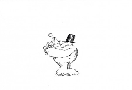
This is the best look we get (on this animation level)
of the character the Snowman terrorizes.
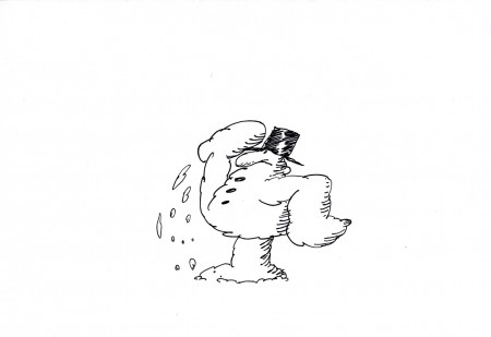 37
37
Wth this drawing the kicked guy moves
to another level as he fles into the distance.
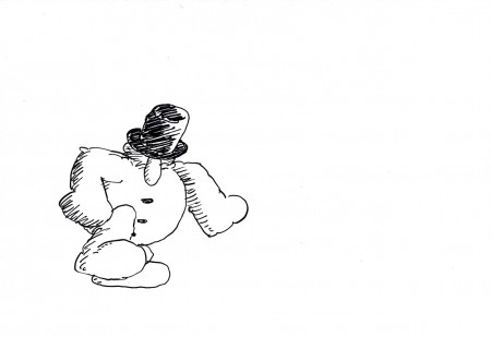 44
44
This even-numbered drawing is where the second scene,
the interior, begins. So I included it to the group.
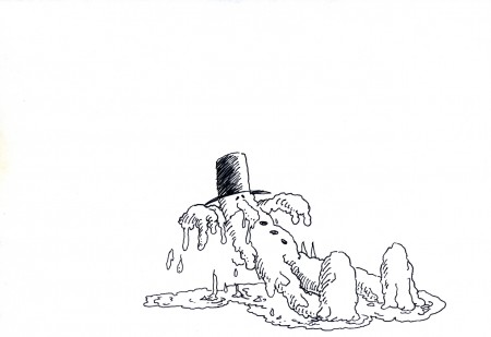 69
69
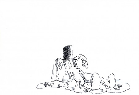
I like how the snowman, having fallen in front of
the fireplace begins to melt on the floor.
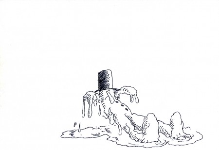 71
71
He falls back, naturally, and then comes up toward us as he
starts to melt. This little accent by Vince, in animating him . . .
 73
73
. . . seems to signal that, for the first time, the snowman
has found a release and can now be happy.
The End
_________________________
The final mini-movie
(I looped it. It could have used a hold at the end before starting over.)
Animation &Animation Artifacts &commercial animation &Layout & Design &Models 19 Dec 2012 07:48 am
Len Glasser’s “Rainman”
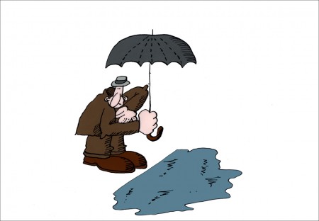
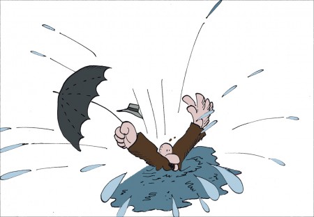
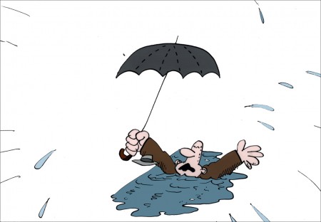
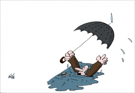
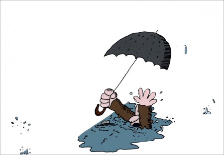
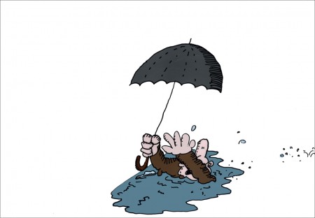
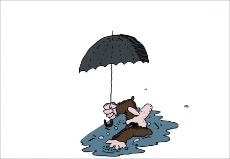
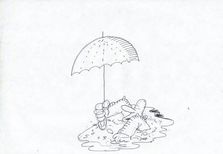
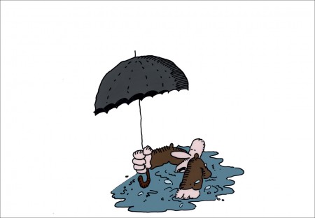
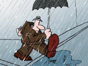 - In 1976 at Perpetual Motion Pictures, Len Glasser designed a series of spots for CBS and their weather service. Models and animation was done (Ed Smith did the original animation.) These short spots were obviously funny, but they were killed, just the same. Never completed and never aired. Two segments of these have remained. One, the “Snowman” spot was picked up by Vince Cafarelli a couple of years back and, reworked with Rick Broas assisting him. They extended the piece a bit and made a short short film. The film was colored on cels and a quick soundtrack was put together. There was also another film which didn’t make it quite as far; it dealt with rain. I’ve finished up the art that exists for that one as best I could and have run it through the AfterEffects mill.
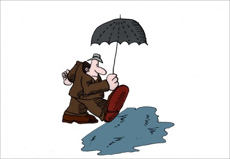
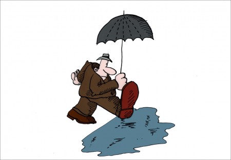
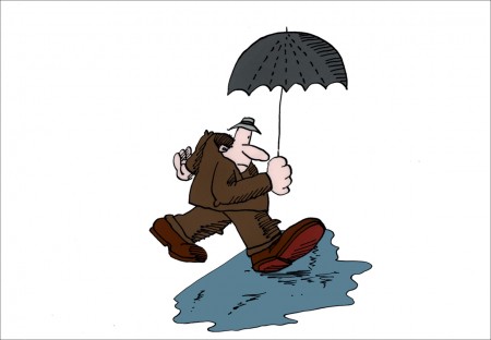
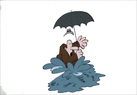
This week features that second spot, the one I’ve been calling “Rainman” – really it’s just a short gag that was never completed. Most of it is on cel, though I had to force a Bg out of a layout that I discovered, and I colored it. I’m sure this is not how Mr. Glasser would have seen the color, but I just wanted to highlight the limited bit of animation that is there. The same is true of the rain which he probably would have left black line with black, inked drops. I put some white into the rain to give a bit less of a focus on it.
Two of the animation cels weren’t painted, so I took the drawings that were there, they look like Ed Smith’s drawings, done in ink on animation bond. I painted them for the final QT I produced. As I say this is just an animation fragment with barely a beginning and no end. It’s all middle. However, I thought it interesting.
Even more interesting and very much more complete, is the “Snowman” spot which I will feature next week.
Here are the “Rainman” cels & drawings:
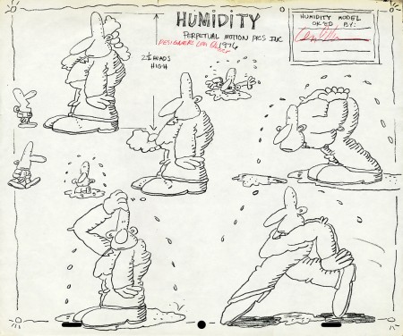
Early model sheet by Len Glasser ____________________
The following QT movie was made reworking the art a bit,
coloring some of the artwork that wasn’t completed and
exposing it as I saw fit. There was nothing to go by.
This is just a fragment of a scene.
The rain colors and the BG colors are my choices.
I can’t say Len Glasser would approve. My only
concern was getting all the animation to read – rain & guy.
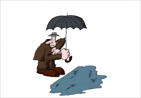
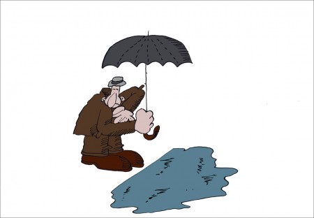
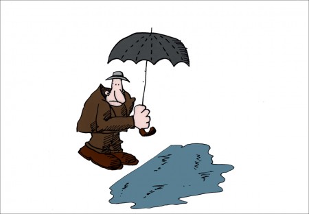
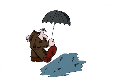
Next week’s spot is better. It has a laugh to it.
