Monthly ArchiveJune 2012
Animation Artifacts &Fleischer &Layout & Design 20 Jun 2012 05:36 am
Paramount Bgs & Gulliver Teaching Aid
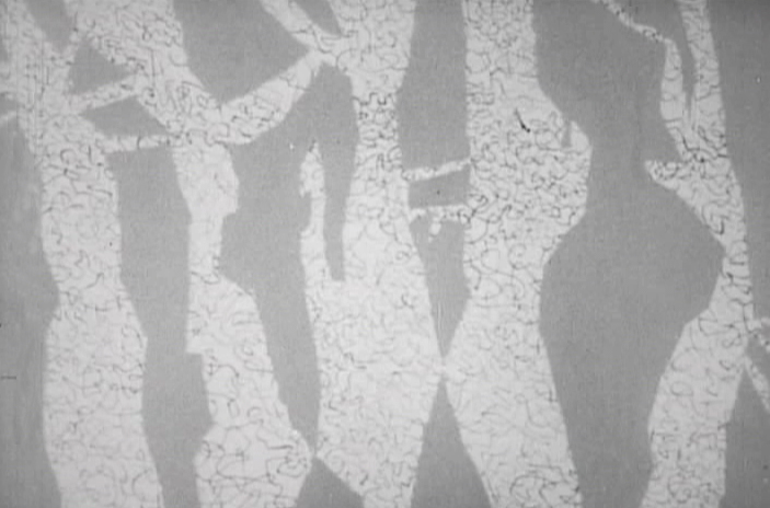
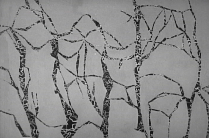
- For the past few weeks, I’ve been posting artwork from Vince Cafarelli‘s collection of animation artifacts. We’re coming down to the remainders in this box, and I’ll post most of it. There are a few color Background originals.
At first viewing, I thought these were possibly from Terrytoons, (here is a past post I did of Terry Backgrounds I own from the late Thirties) but they have a slickness that Terry Backgrounds wouldn’t have had. They also lack any sign of the glorious whimsy the Fleischer Backgrounds had. These, no doubt, come from Late 40s Paramount cartoons when Bob Little was the principal artist. There’s ample use of airbrush over the bright tempera colors. (I don’t remember seeing airbrush in any Terry cartoons of this period.) Physically, they were all done on bristol board and separated from the card back. This is also true of all the Terrytoons Backgrounds I’ve seen.
I’m sorry to say that I can’t ID any of these Backgrounds or tell you what films they’re from. Were I able to do that we might have been able to figure out who did them. If you know anything about them, anything at all, your comments would sure be appreciated, and I’ll keep updating the post to make sure they’re noted.
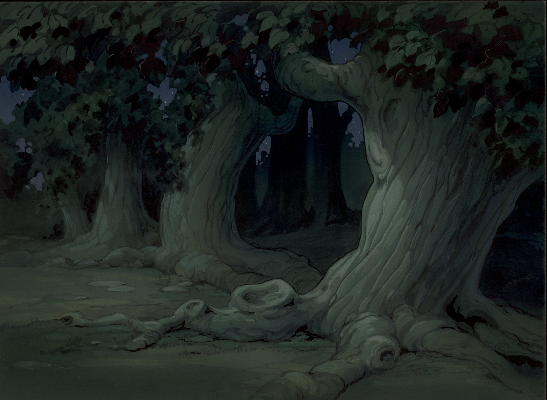 1
1This first one does a nice job of setting the mood for the scene.
 2
2
from Song of the Birds
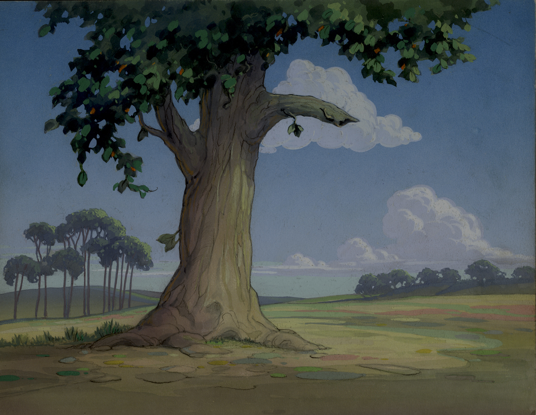
This one doesn’t really do much other than be a background.
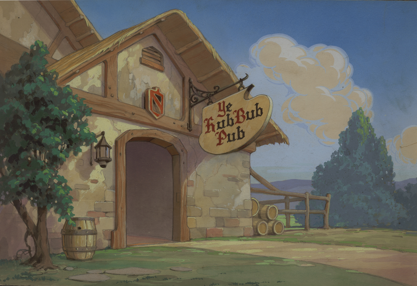 3
3
from Robin Hood-Winked
This tavern really does set up the scene. As a matter of fact,
it’s so specific it should be one of the easiest to identify.
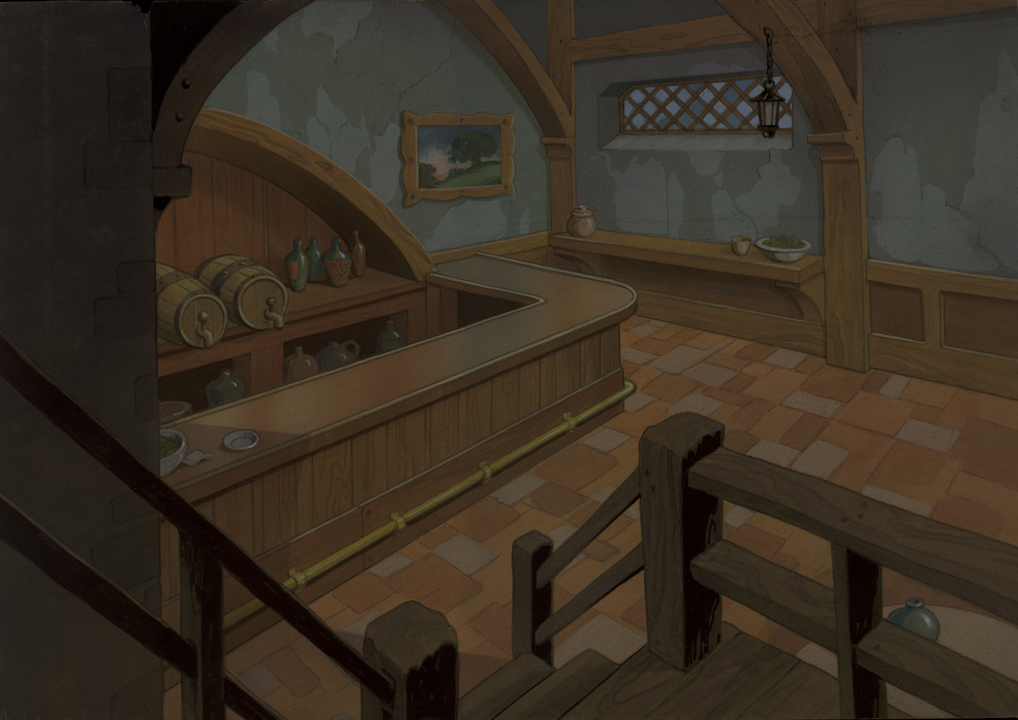 4
4
from Robin Hood-Winked
This interior is also more specific than most of the
Paramount Bgs of the period and feels as though
it may have come from the same film as the tavern, above.
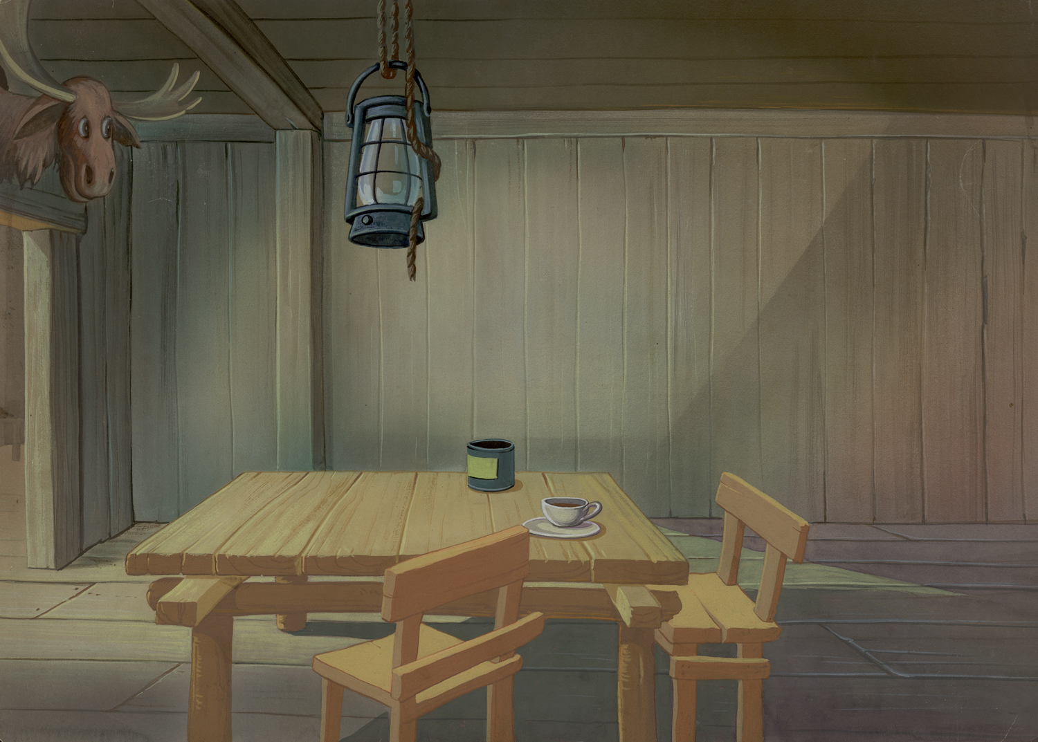 5
5
from Lumberjack and Jill
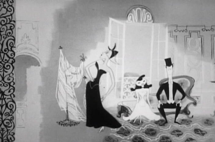
This one is so generic it may have come from any of a hundred
films of the period. It’s the Bg that felt like a Terrytoon to me.
 6
6
This Bg feels closer, stylistically, to #4, above,
than to #5. There’s a lot of airbrush in it.
 7
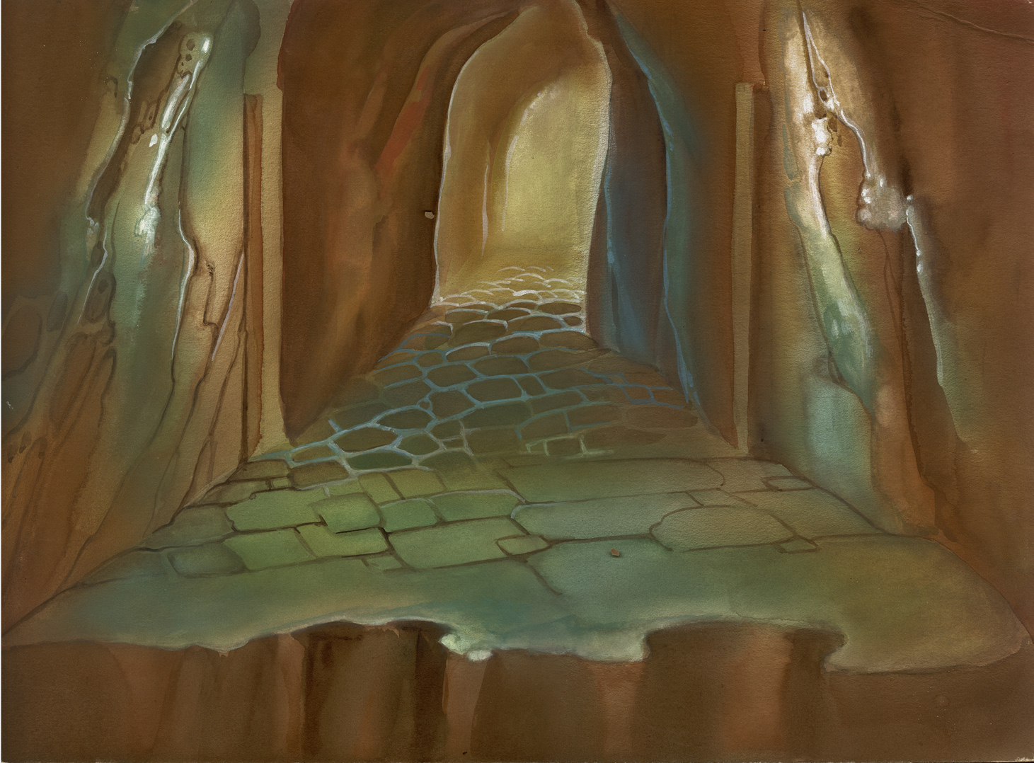
7
This Bg seems to have some chalk used on the white stone
of the building’s exterior. It reminds me of several other
Disney Bgs – not as good as Disney, but similar in feel.
 8
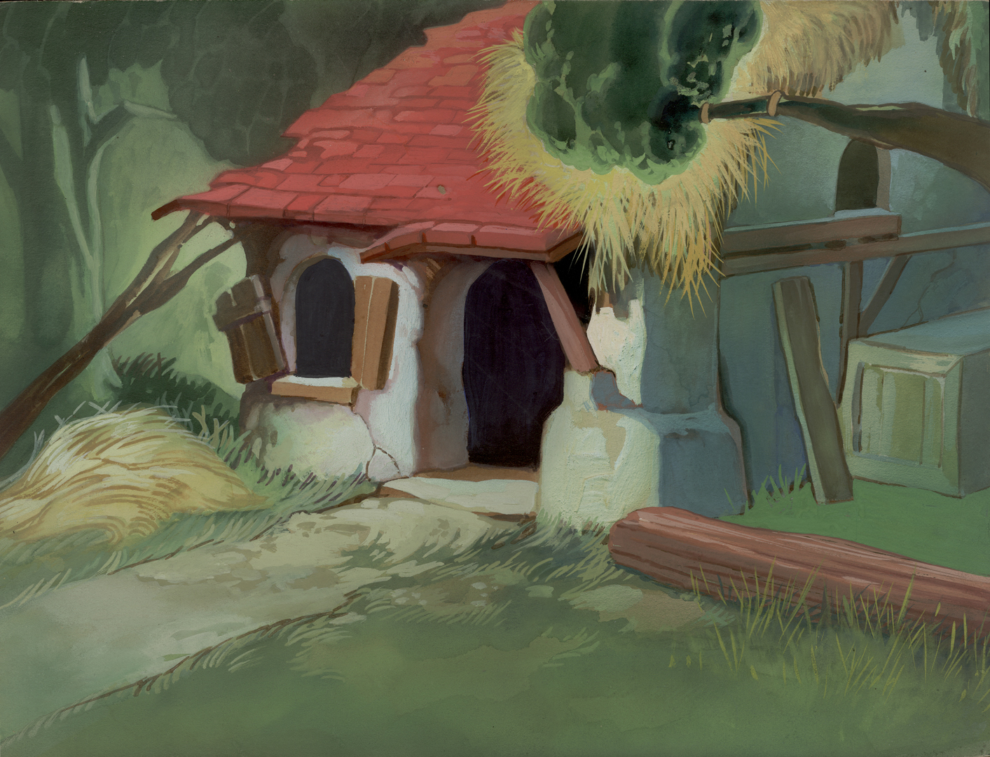
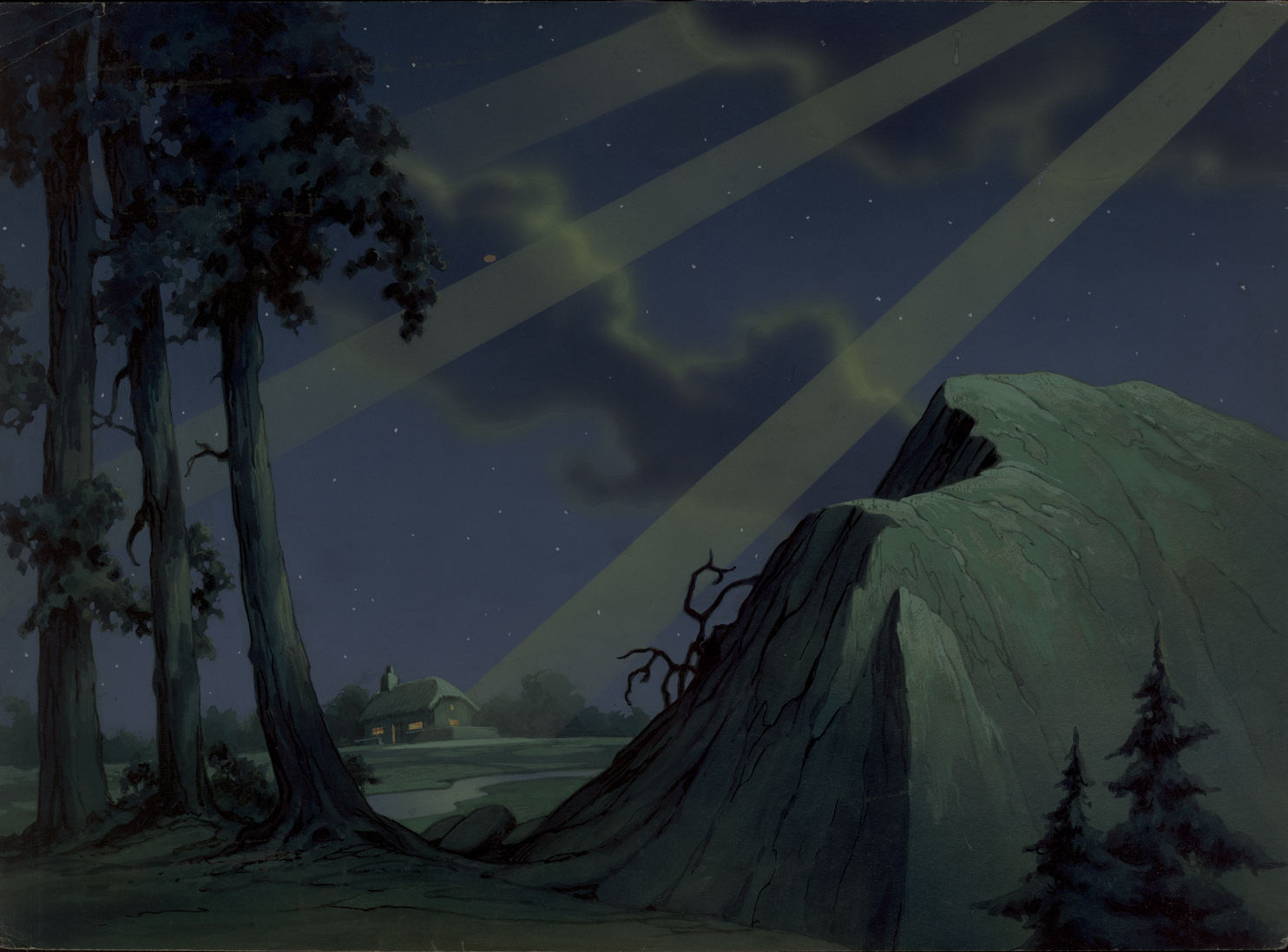
8
from Leprechaun’s Gold
Who knows what this Bg is. I guess god’s
looking down on the inhabitants of the hutch.
- As a bonus to add to these Backgrounds, here’s something completely unrelated.
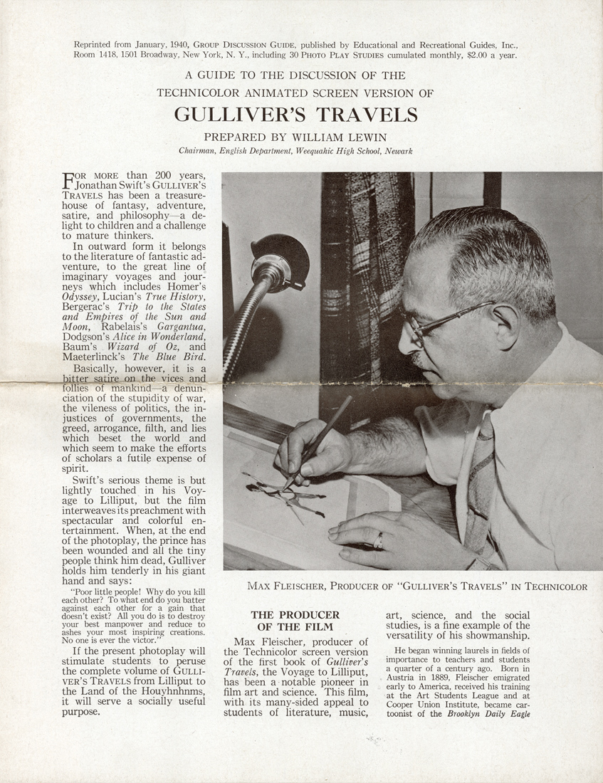
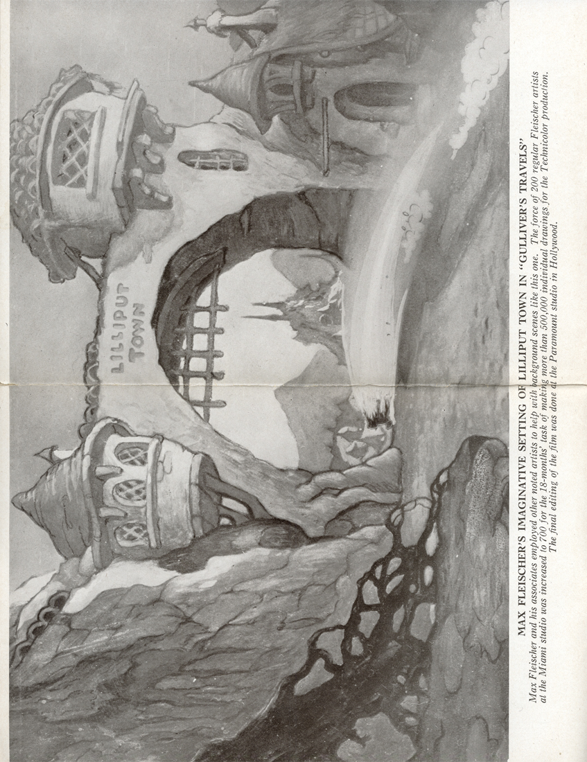
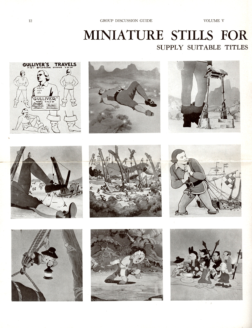
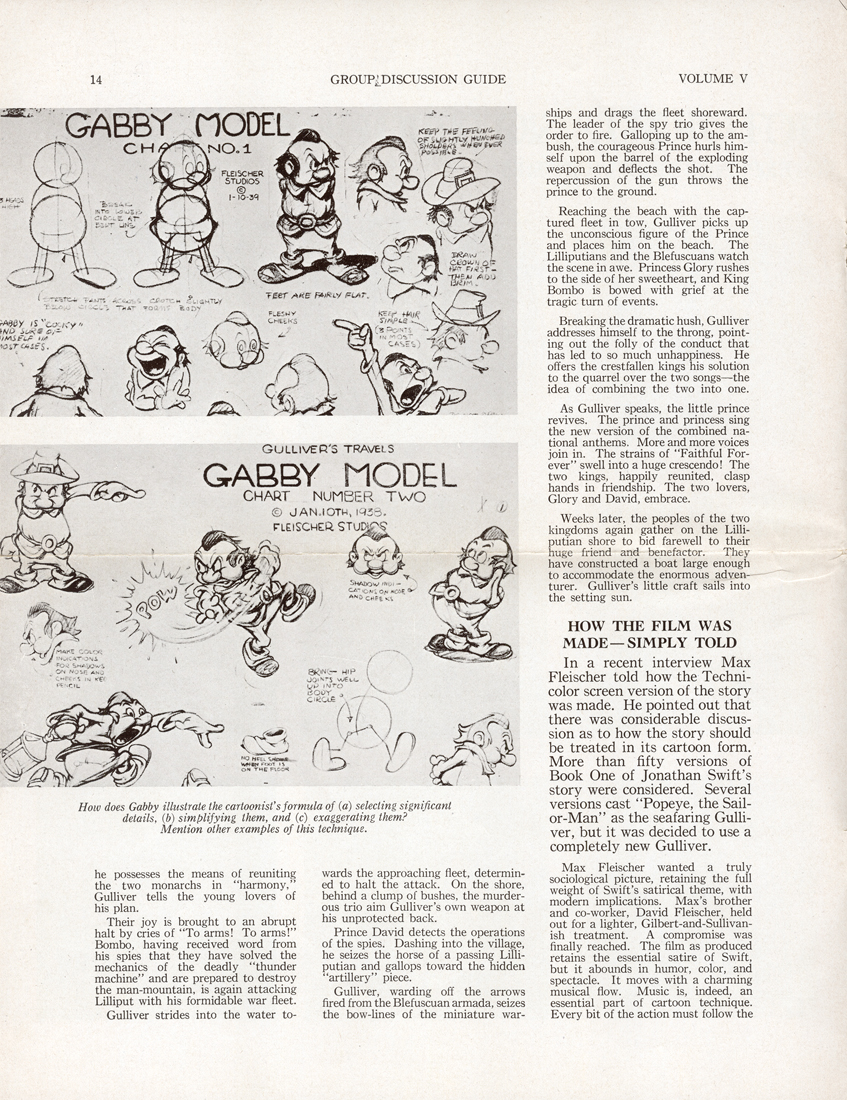
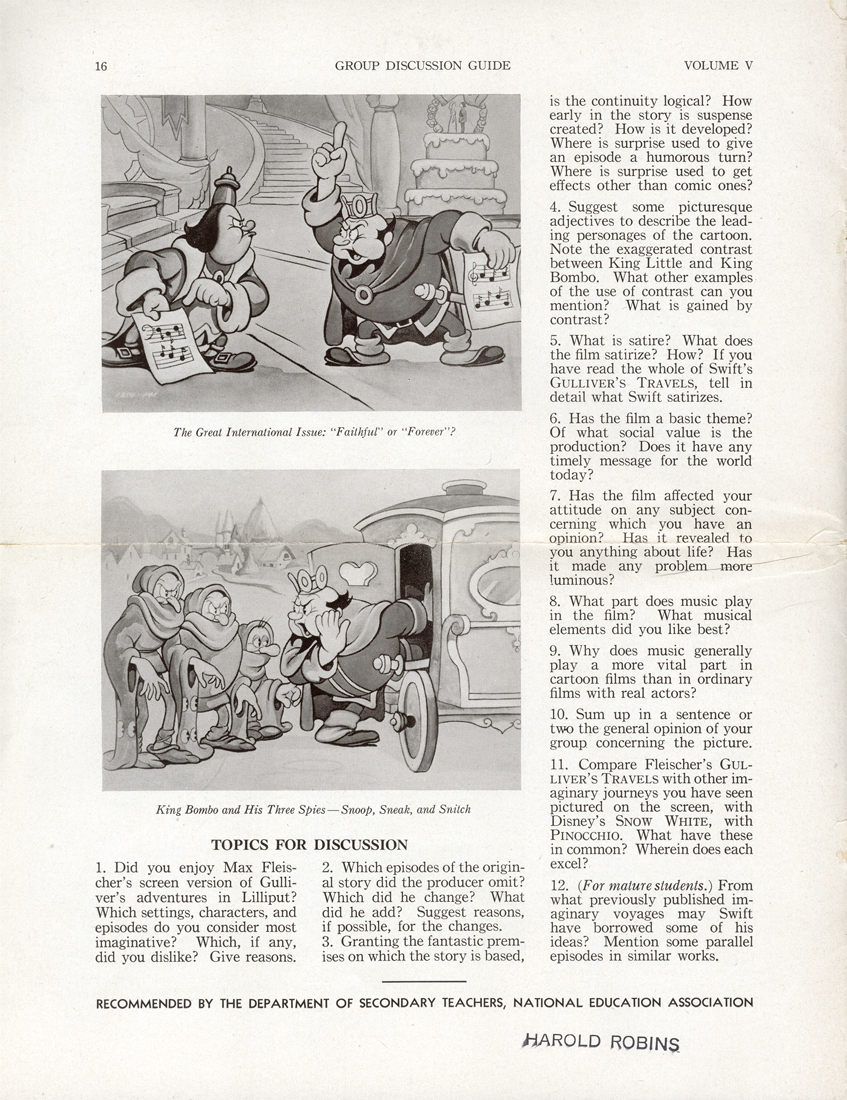
Today, when children’s films are distributed non-theatrically (meaning to schools and libraries) a teaching aid accompanies the film. This is usually a two or three page piece which gives information on how the film can be used to teach whatever subject to the students. This form has developed in quite a sophisticated way so that it is often very helpful to the teacher or librarian.
Within Vince Cafarelli’s collection of art and artifacts, there was a teaching aid – which seems half designed to be a give-away to students. It’s a primitive form of what is standardized today. The printing of the piece is quite rich on semi-gloss paper with nice B&W photo reproductions of stills from the film. I thought this would be of interest to some of you out there.
 1
1(Click any image to enlarge.)
 2
2 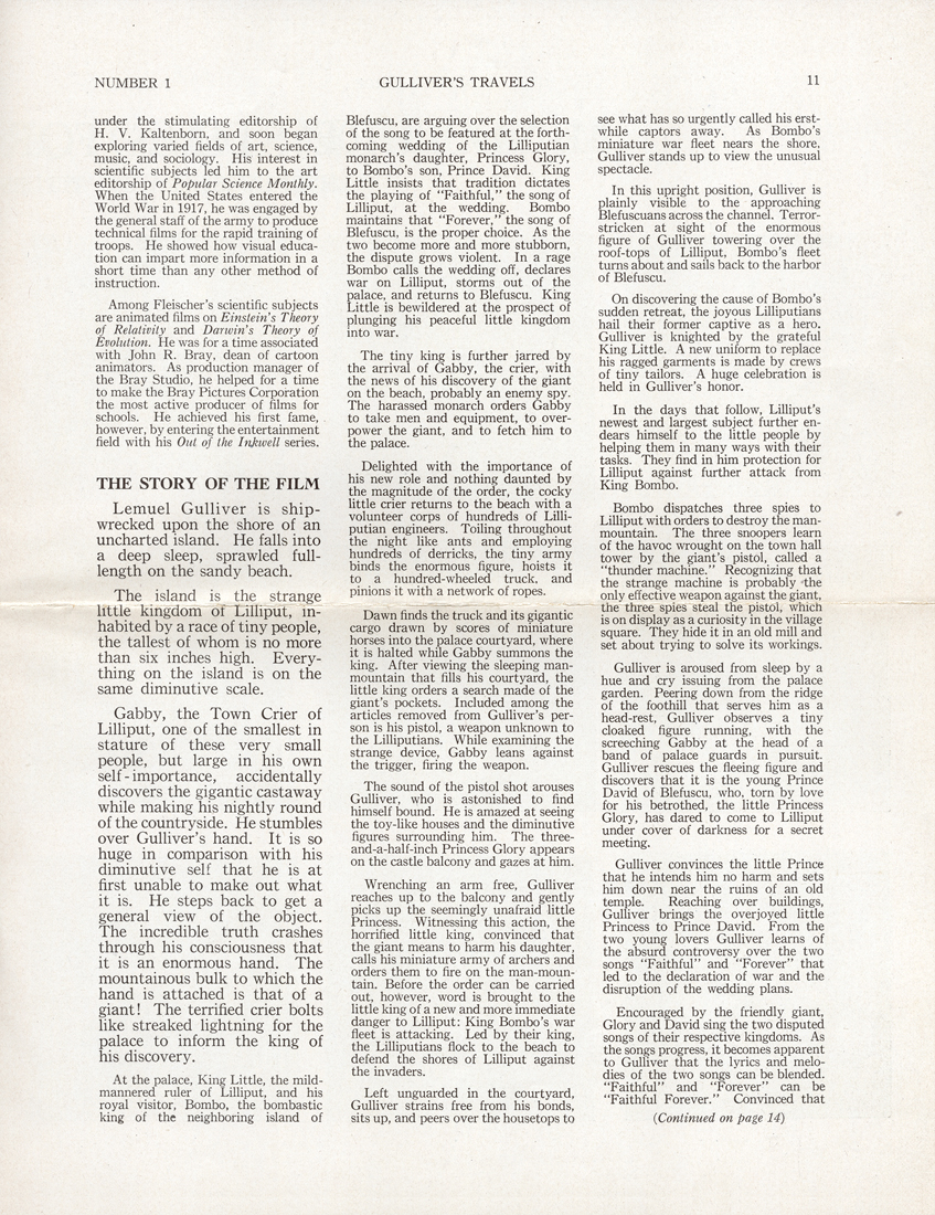 3
3
 4
4 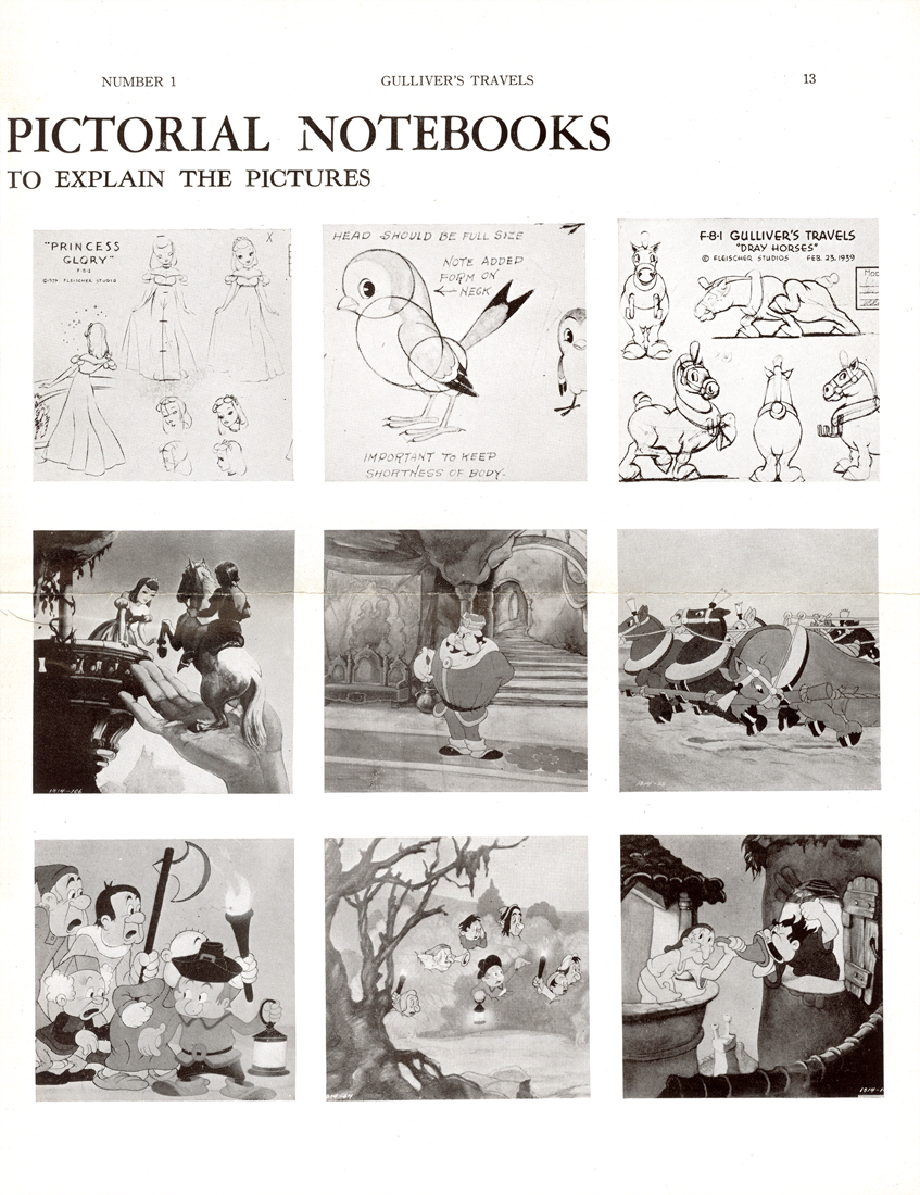 5
5
 6
6 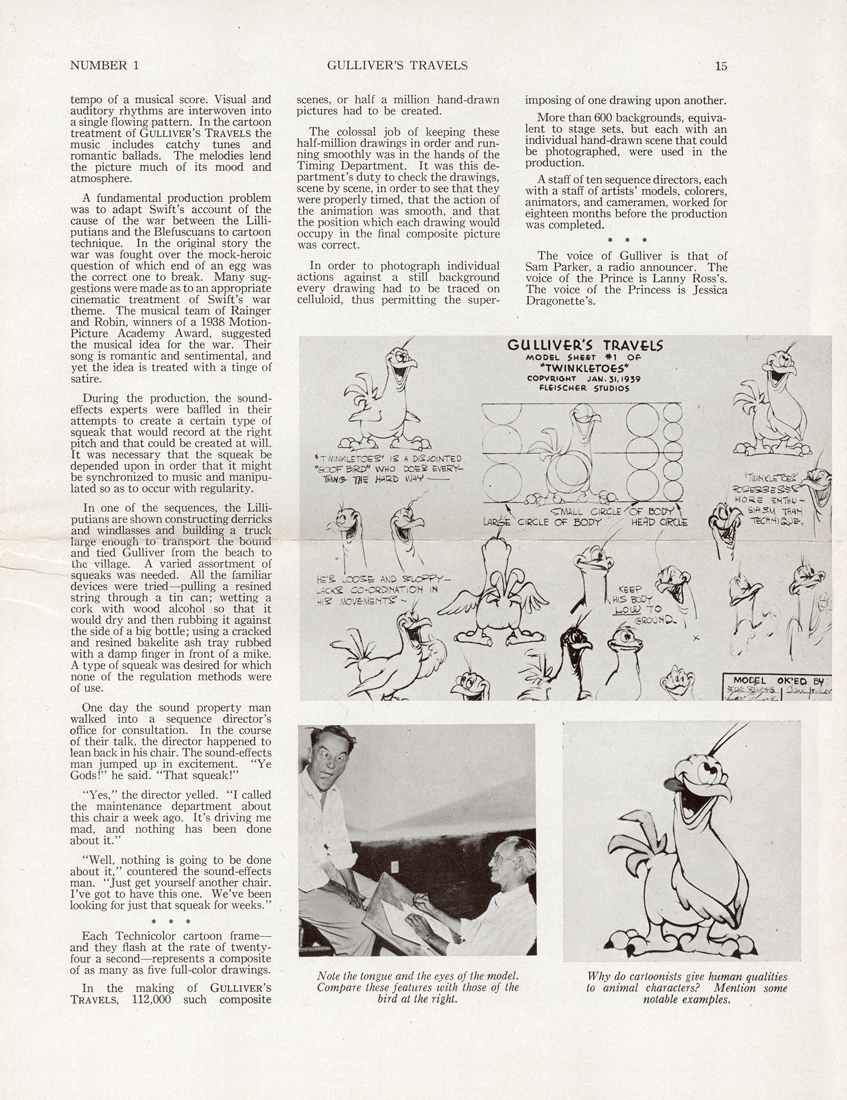 7
7
 8
8
Art Art &Books &Illustration &Independent Animation &Layout & Design &repeated posts 19 Jun 2012 06:23 am
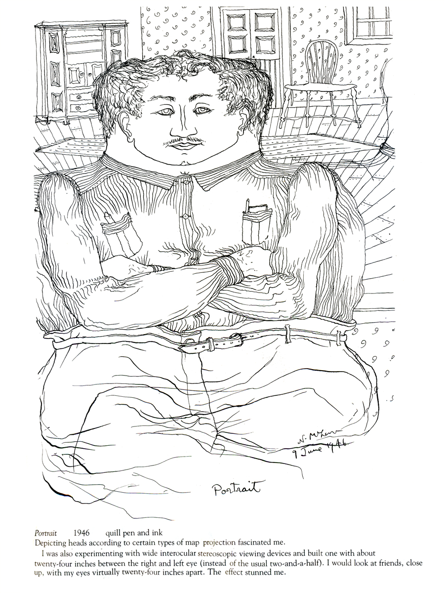
Norman McLaren Drawings – repost
 - I don’t intend to give an introduction to Norman McLaren or his work here, but he obviously was one of the solidly great film makers on the “Art” side of animation. His films are worth studying for their timing, if not for their sheer genius. As a matter of fact, his exercise films on timing are incredible (though I have no idea how you’d get to see them today.)
I do have a book of some drawings by him, and given the stories about China in the news today, I thought I’d post some of his drawings done in China. The book isn’t printed on the best of papers, so the quality of these drawings isn’t all it could be. However, I thought it might be worth showing this other side to his art.
 _
_
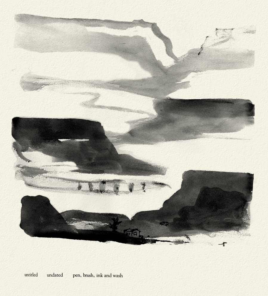 _
_
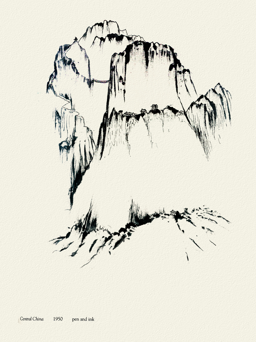
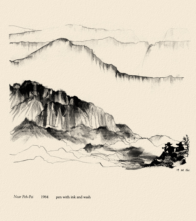
Moving away from China, there are two other drawings I thought compelling and
would like to share here.
 _
_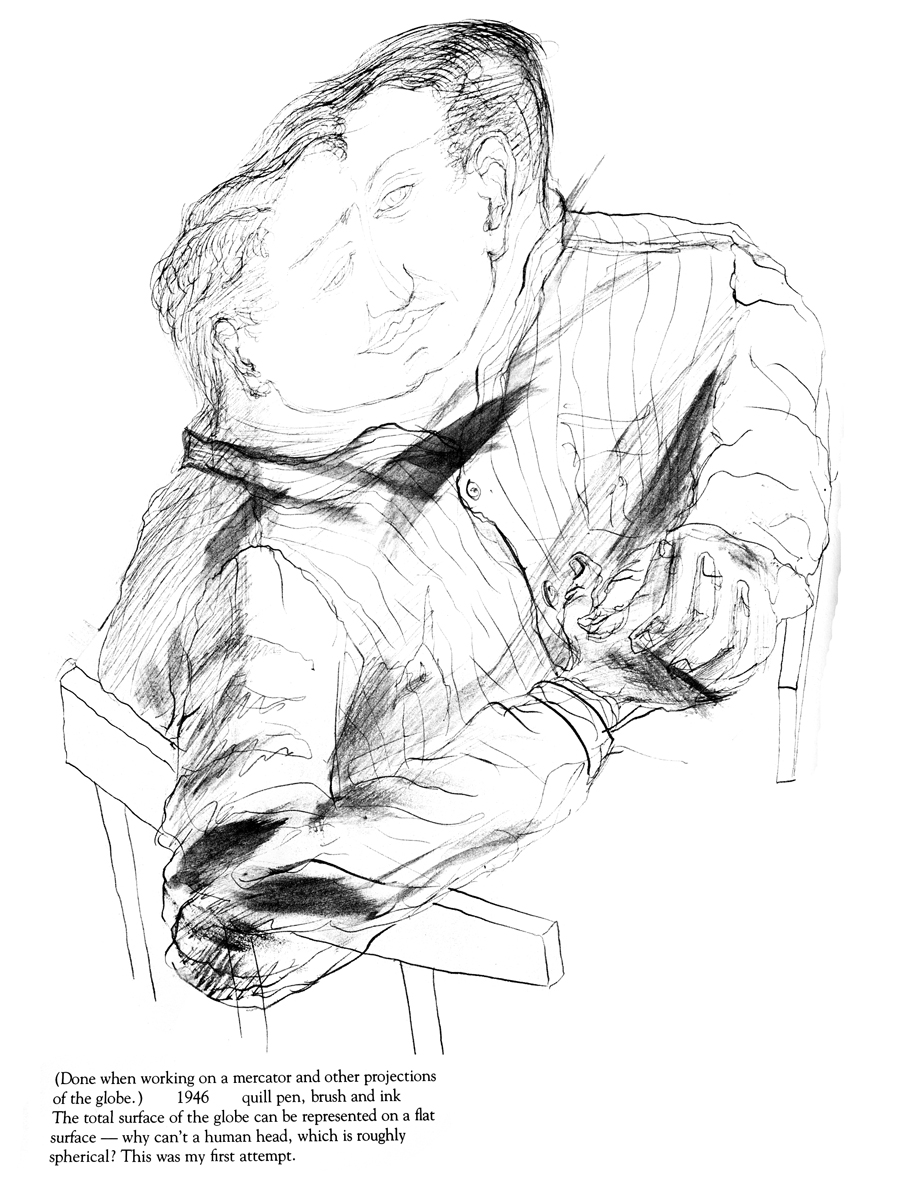


McClaren was certainly a brilliant artist, and his experimentation and developments brought about a real maturation of the art form. I wonder how he would have dealt with the technology we’re using today. Remember, he realized that the soundtrack could be drawn and did his own exploration of this part of the process.
The book was published in 1975 by Tundra Books.
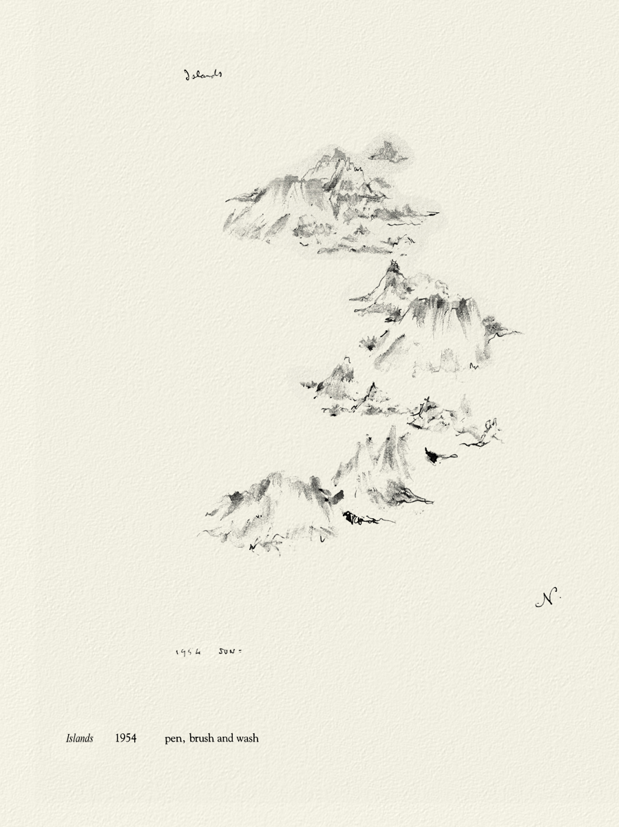
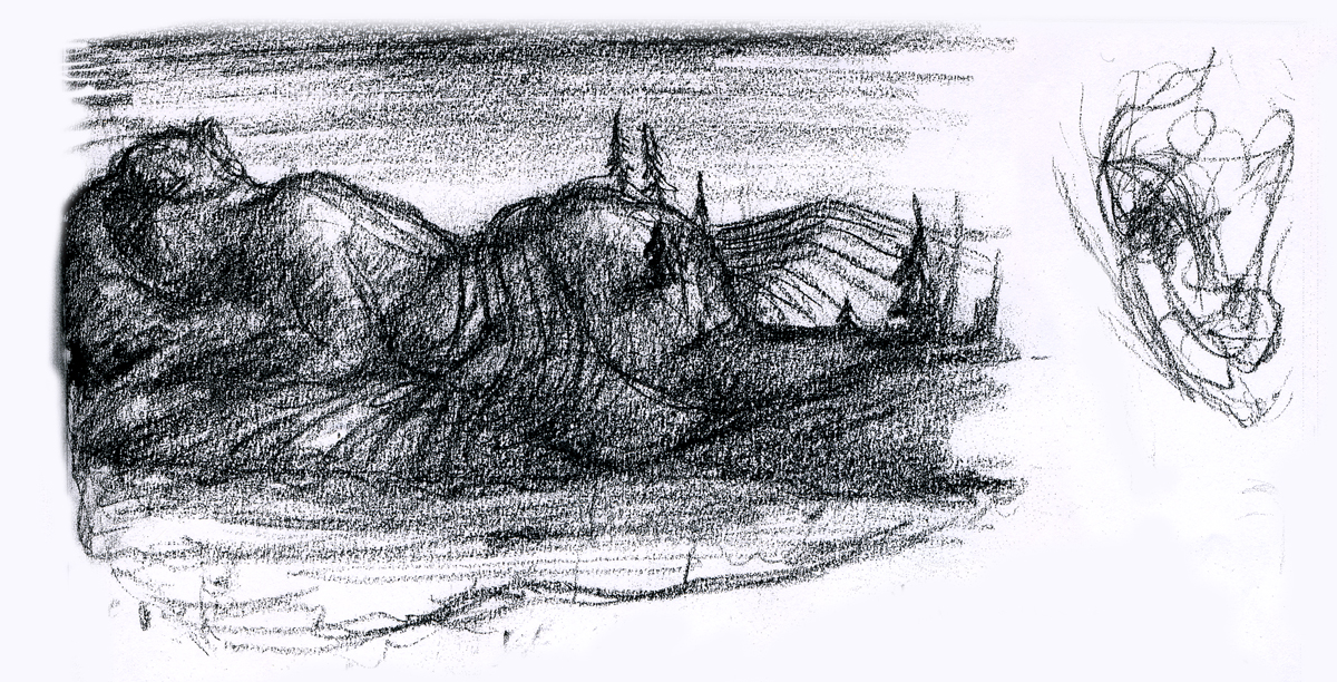
Because the one illustration which graces the book’s cover, was of such interest to those reading my piece, I’ll start with the rest of that page. It’s a series of sketches done for the film, “LÃ -haut sur ces montagnes” and was drawn in 1945.
__________________
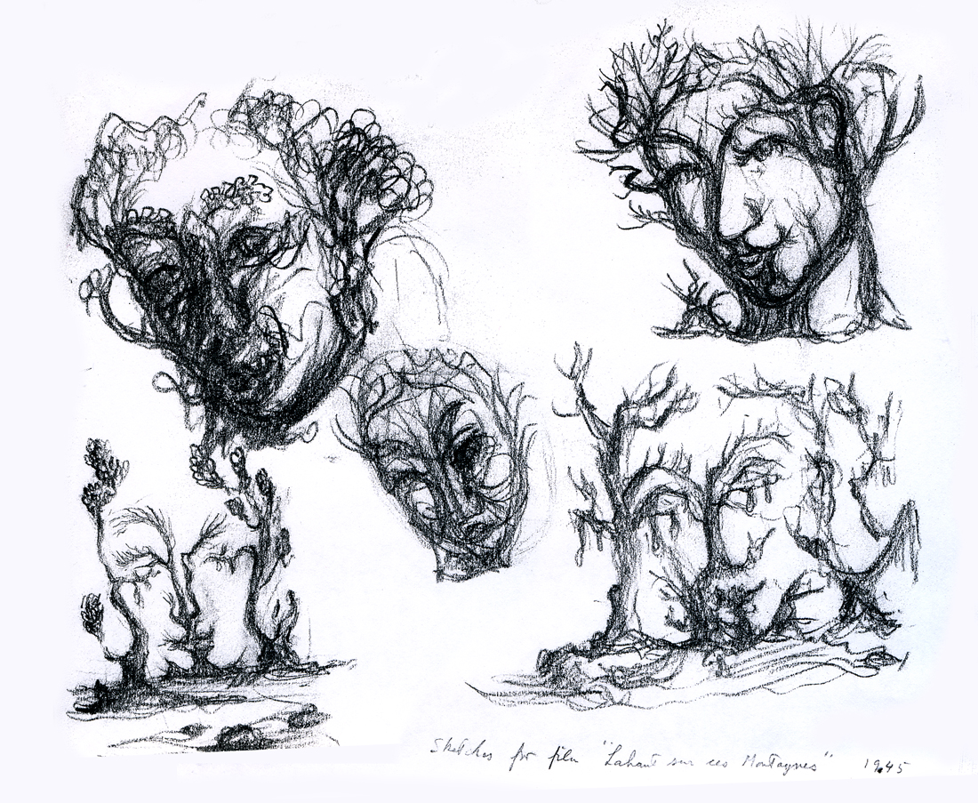
The two illustrations above are connected on the same page. I separated them .
The entire page is labelled: Sketches for the film, “LÃ -haut sur ces montagnes.”
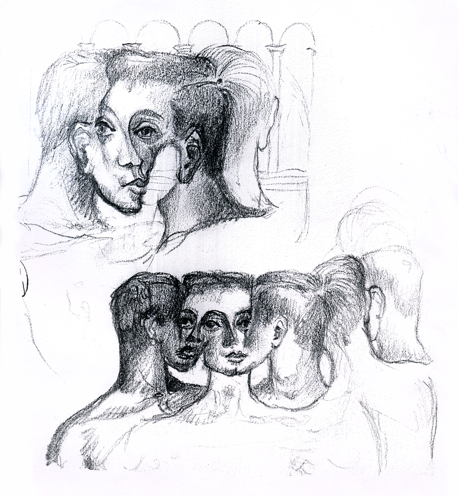
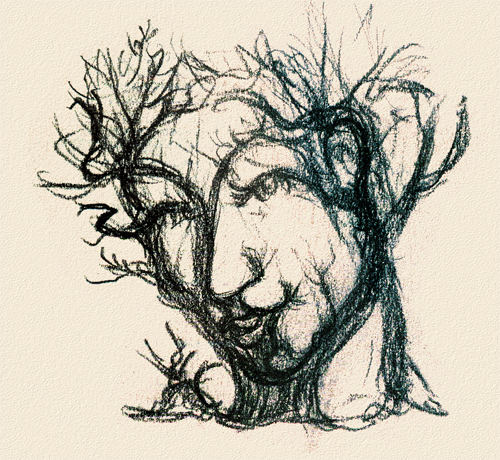
“Interlocking faces”
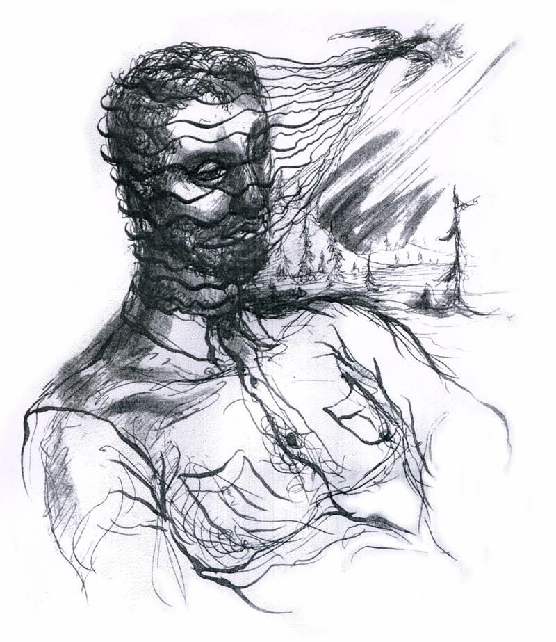
“Untitled”
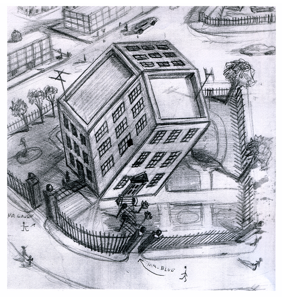
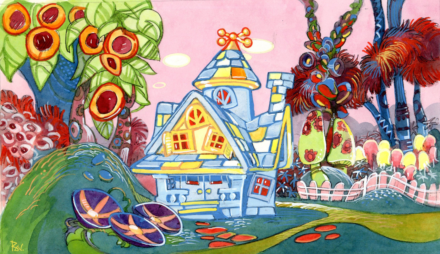
“Tesseractine House”
I’m fascinated that a number of his illustrations look not too unlike Steinberg’s work. It’s obvious he was an influence for a lot of animators in the late ’40′s.
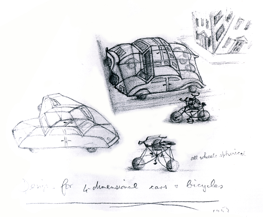
“Four Dimensional Cars and Bicycles”
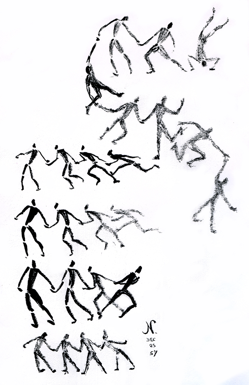
“Memory of A Mexican Beach”
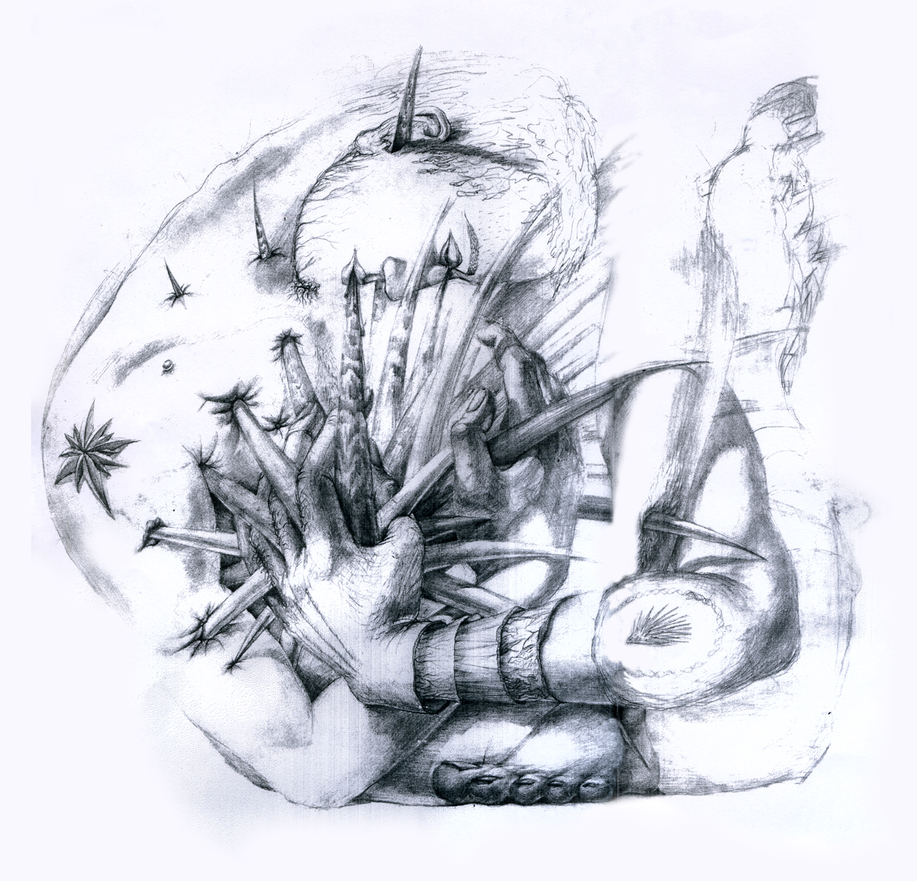
“St. George and the Porcupine”
Frame Grabs &Hubley &UPA 18 Jun 2012 06:40 am
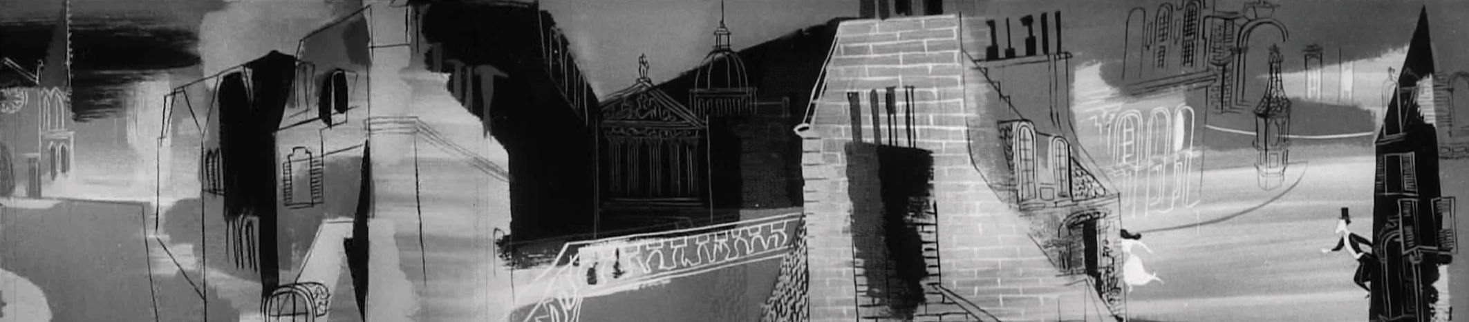
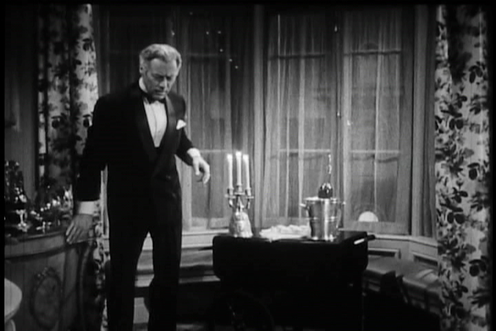
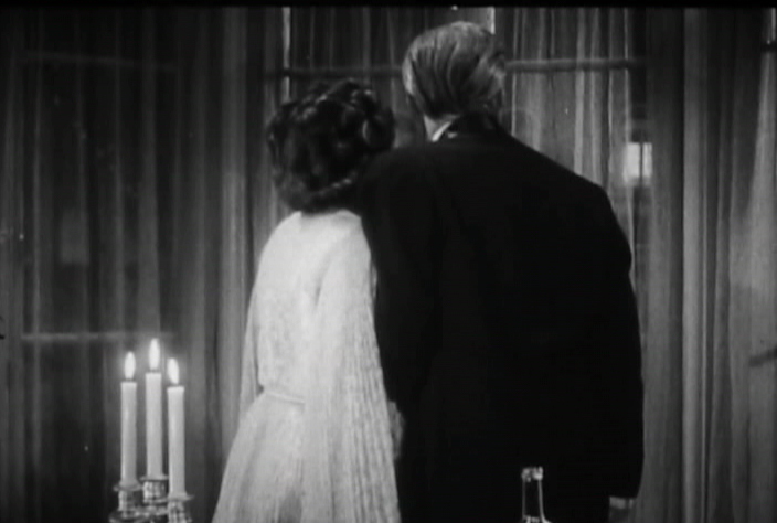
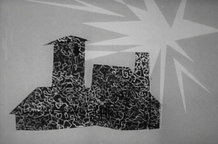
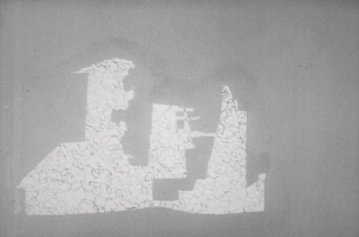
The Four Poster – part 4
- This is the fourth part of the animated segments from the live feature, The Four Poster, with animated segments from UPA directed by John Hubley with animation directed by Art Babbitt and design supervised by Paul Julian.
As I wrote with each of the past posts, the film is an adaptation of the play by Jan de Hartog which takes place wholly in one room – the bedroom – around a fourposter bed. We see scenes wherein the couple marries young and grows old together. The only time we stray from the room, in the film, we do it via the enormously creative UPA animation. The film starred real husband and wife, Rex Harrison and Lilli Palmer.
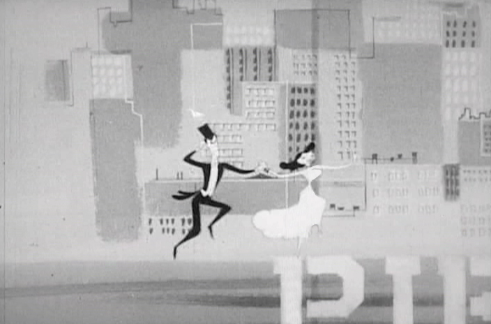
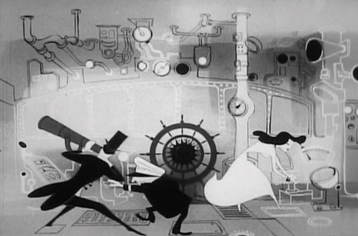
This sequence represents an attempt for the couple to come together again after a difficult period. They take a vacation to Paris, France.
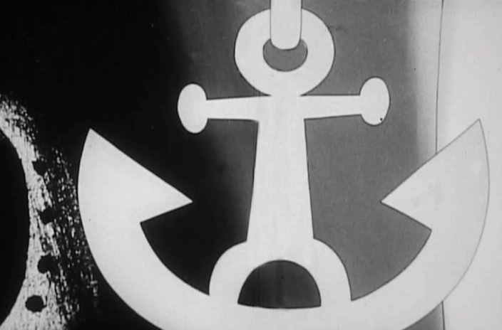 1
1Cut to an anchor being lifted.
 2
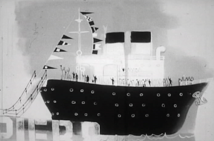
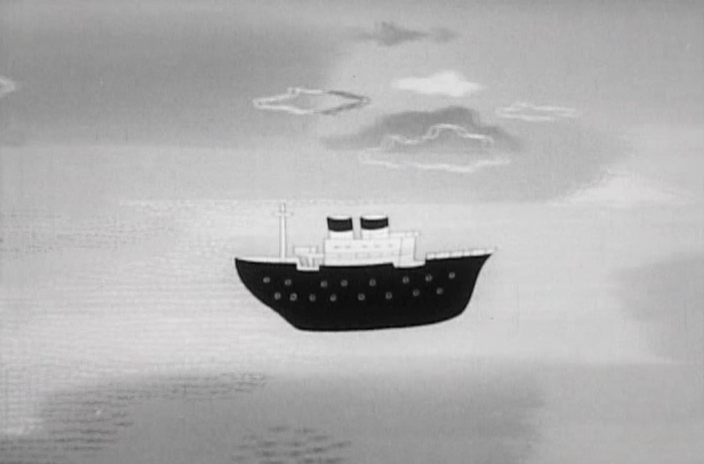
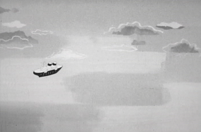
2
The cruise ship is set to take off.
 3
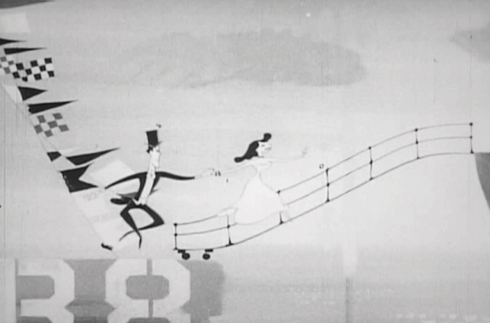
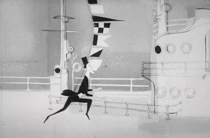
3
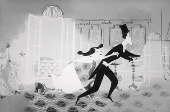
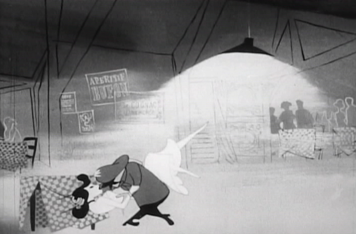
Our couple races to the ship, they’re late.
 4
4
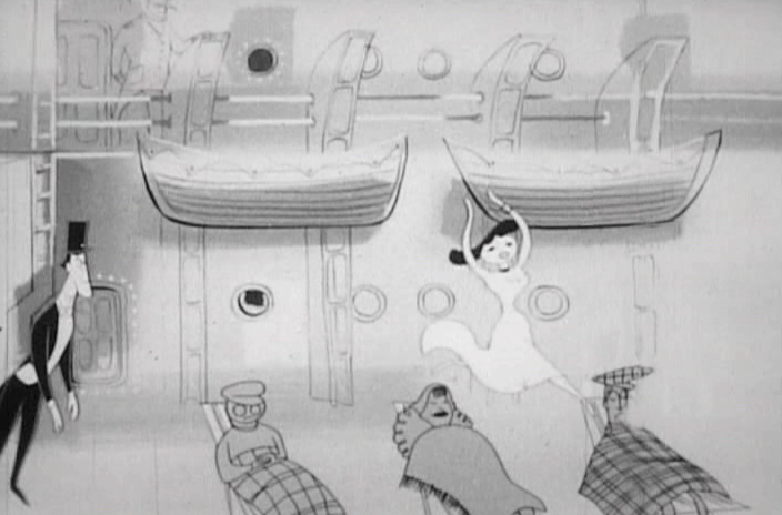
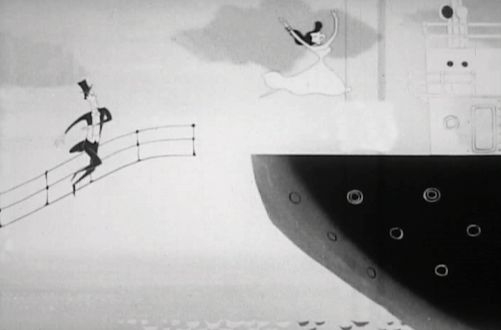 5
5
As the ship pulls away she jumps on board.
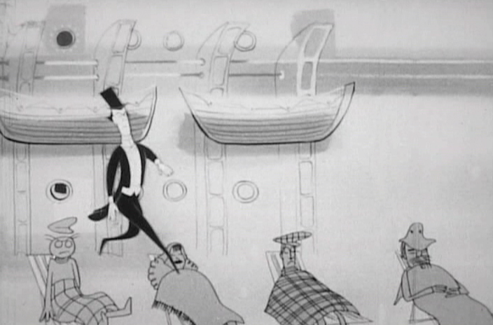
 6
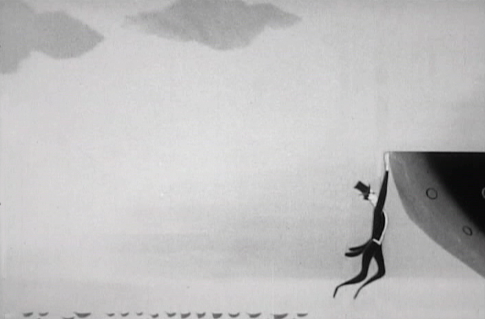
6
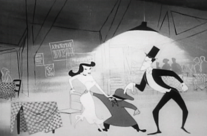
He tries and misses, hanging at the edge.
 7
7
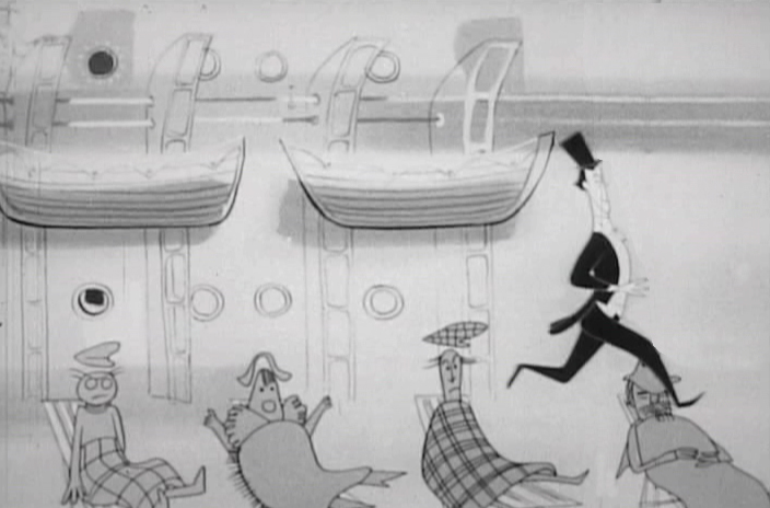
He lifts himself on board . . .
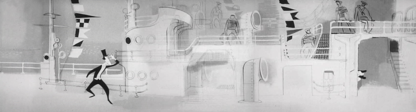
. . . but has to search for his wife.
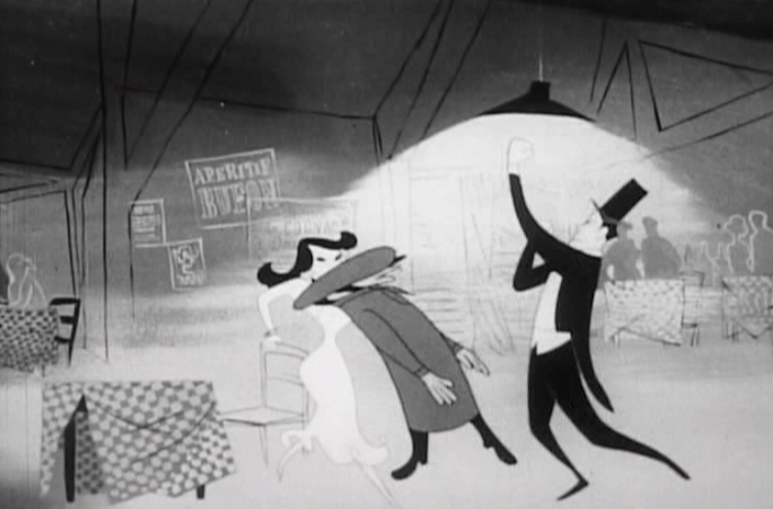
 11
11
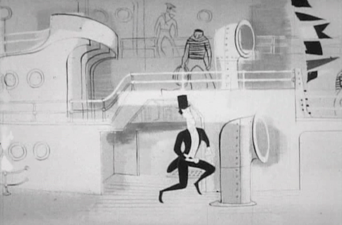
He continues to dance in search of his wife.
 12
12
She’s just a bit forward of him.
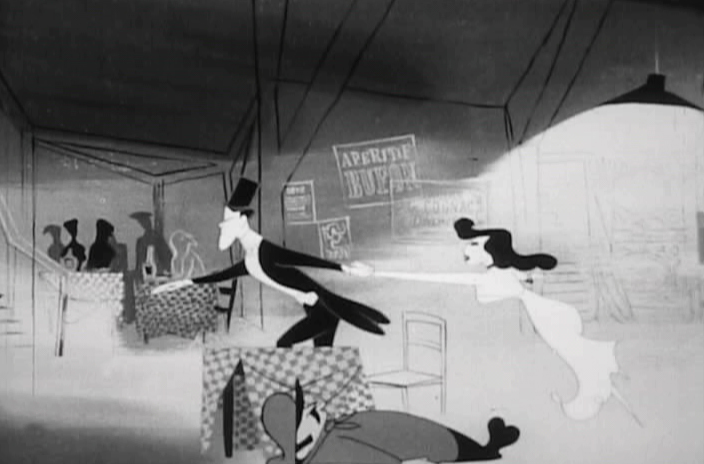
 13
13
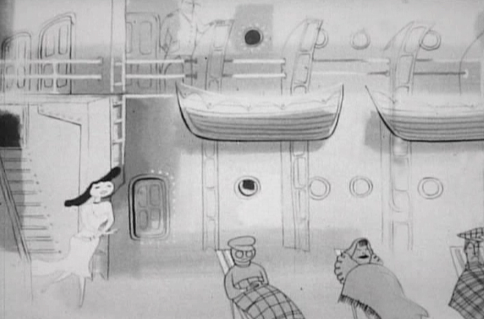
She dances over some resting passengers.
 14
14
He tries to do the same, but ends up . . .
 15
15
. . . stepping on each of the people in deck chairs.
 16
16
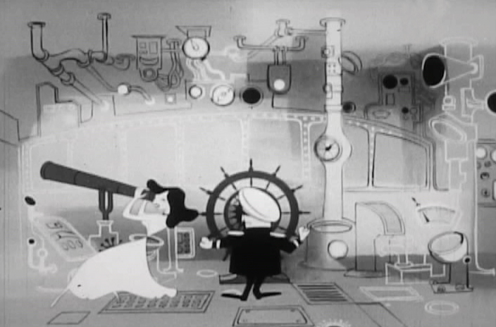
She’s in the captain’s chair looking through a telescope.
 17
17
He joins her to see what she’s been looking at.
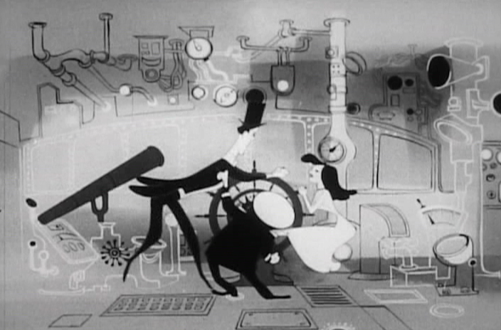 18
18
The two of them scrabble over the steering wheel.
 19
19
The ship spins about at sea.
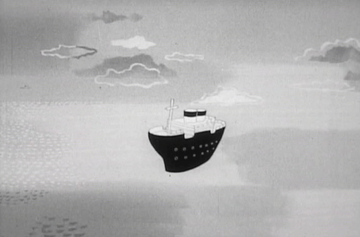 20
20
 21
21
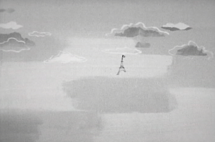
It goes spinning into the horizon.
 22
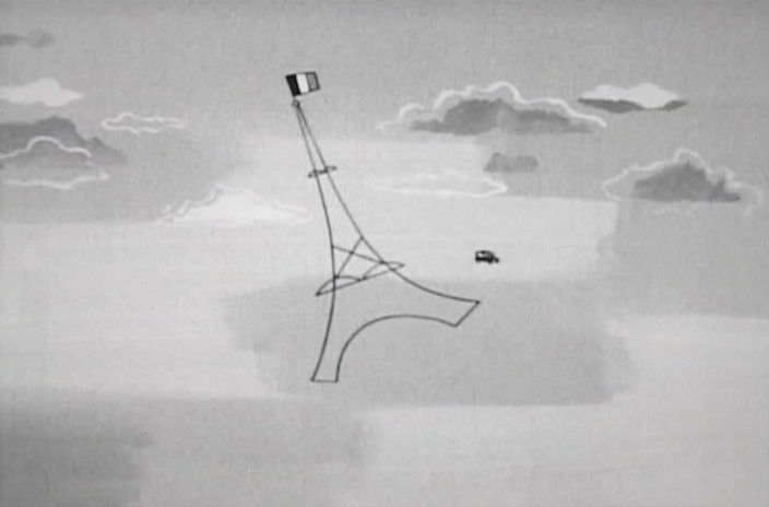
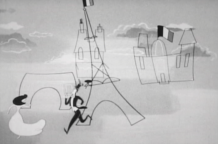
22
The Eiffel Tower dances forward.
 23
23
 24
24
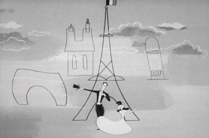
They finally join in front of the landmark.
 25
25
They run off screen.
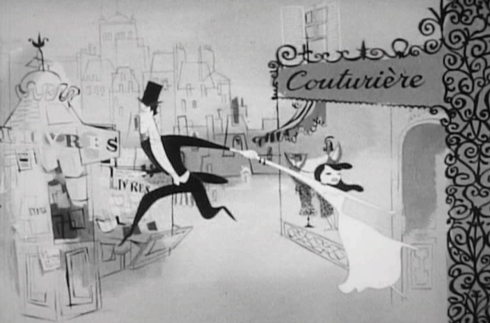 26
26
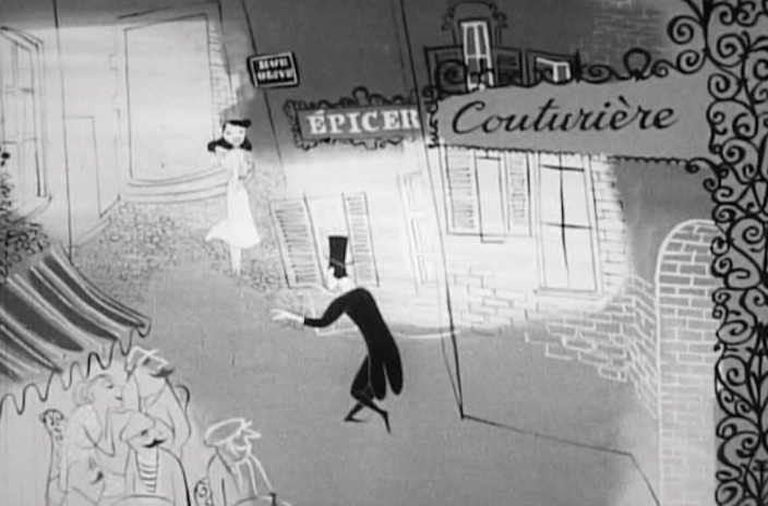
He tries to pull her away from a Couturier (dress maker).
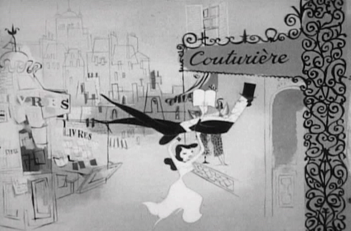 27
27
She ends up literally carrying him into it.
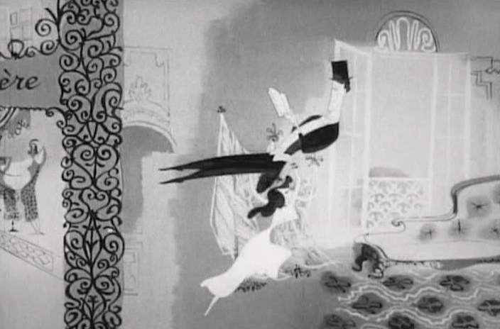 28
28
 29
29
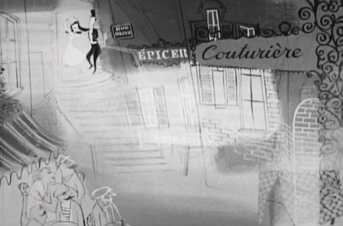
He’s seated on a devon to watch the fashion show.
 30
30
Finally, he pulls her further in . . .
 31
31
. . . and she leads him outside.
 32
32
They pause at the top of a stairway.
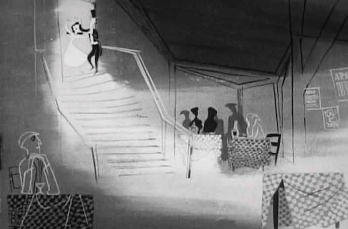 33
33
The background dissolves to a cabaret.
 34
34
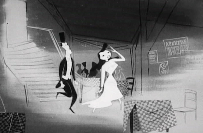
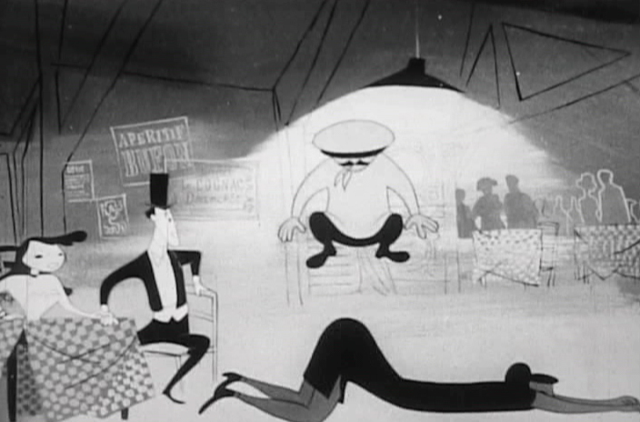
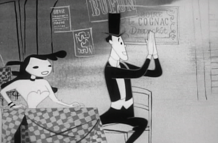
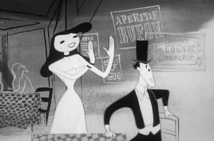
The couple enters and seats themselves at a table.
 35
35
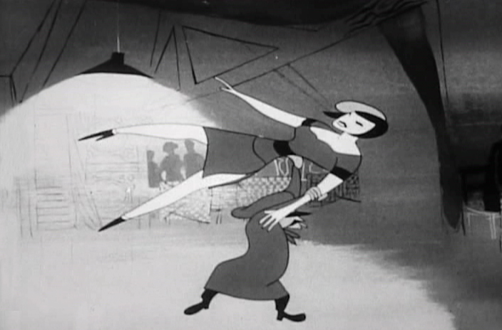
There’s no doubt that Art Babbitt animated this “Apache Dance.”
Pan across as an “Apache Dance” is in progress as the floor show.
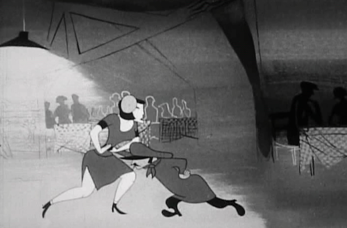 37
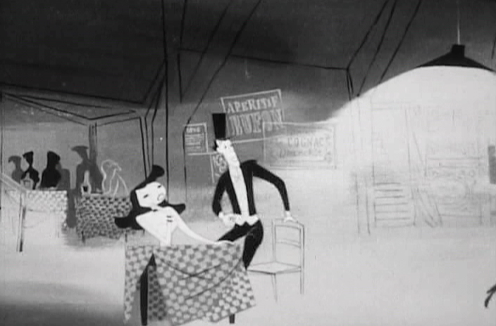
37
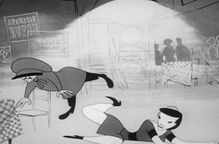
The male pushes the female back toward the couple’s table.
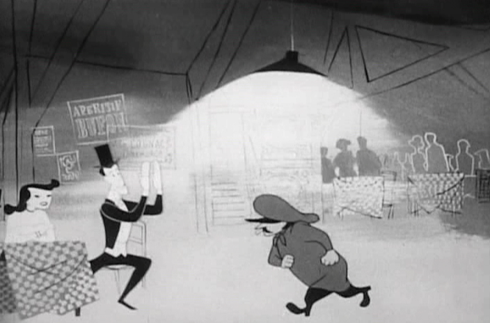
 38
38
He jumps on top of her, in rhythm to the music.
 39
39
2 shot – He applauds the dance.
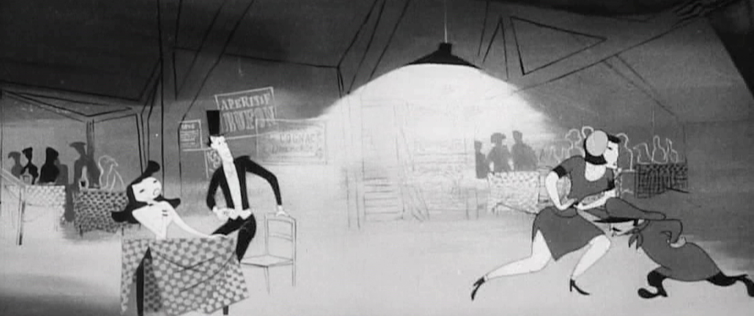
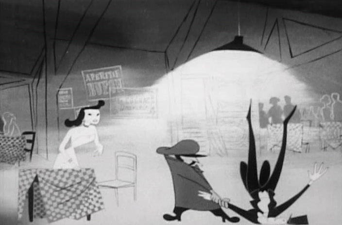
 40
40
She knocks the male dancer off his feet.
 41
41
2 shot – she applauds the female.
 42
42
The guy lift the female over his head
and off the screen.
 43
43
He then goes to our male and . . .
 44
44
. . . tosses him.
 45
45
The male then dances with her.
 46
46
Our hero enters, and taps the dancer on the shoulder,
as if it’s his turn to cut in to the dance.
 47
47
Instead, he knocks out the male dancer.
All to the rhythm of the song.
 48
48
Our couple dances toward the door.
Exit Paris.
. . . and the camera pans back . . .
. . . to the Live Action
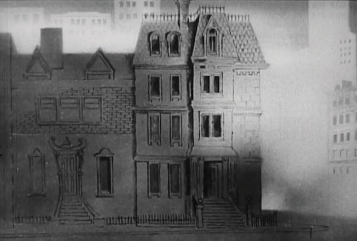
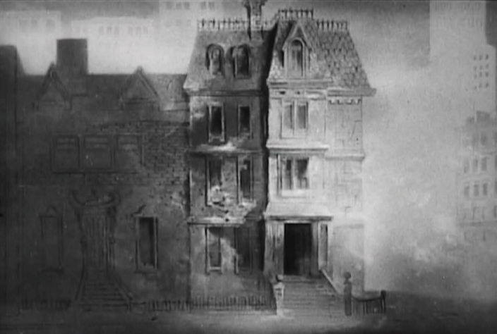
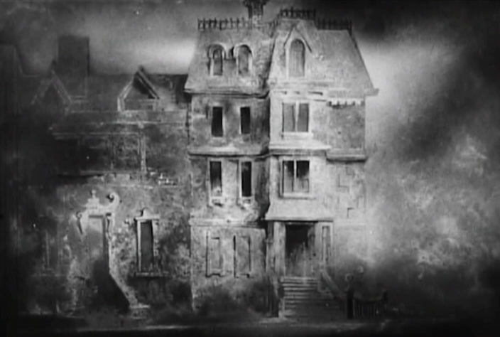
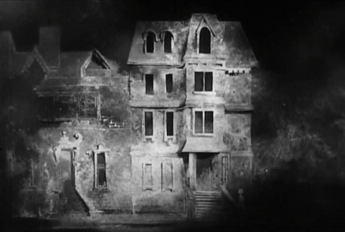
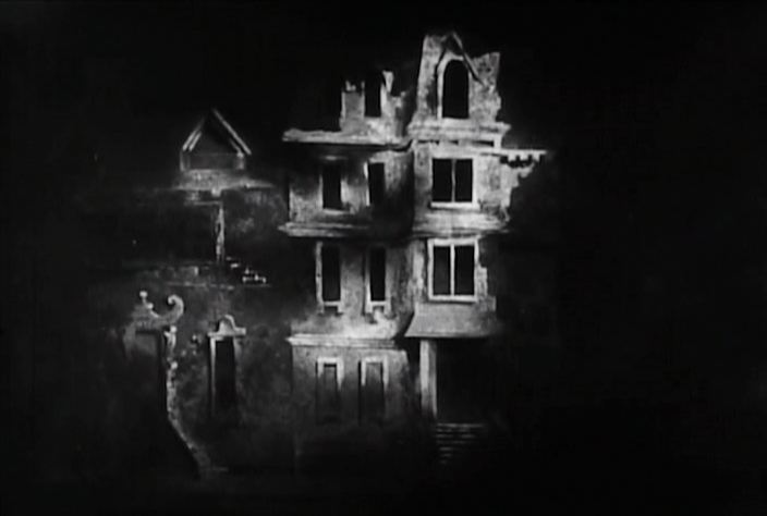
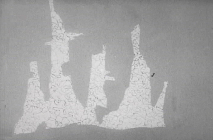
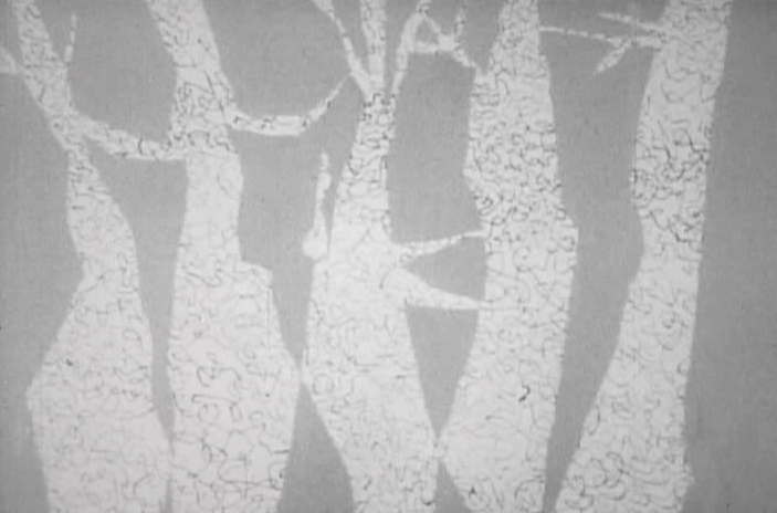
The final sequence begins with the couple elderly and close.
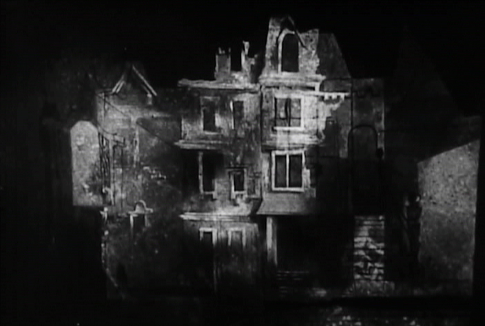
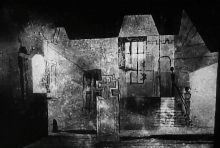
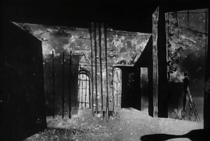
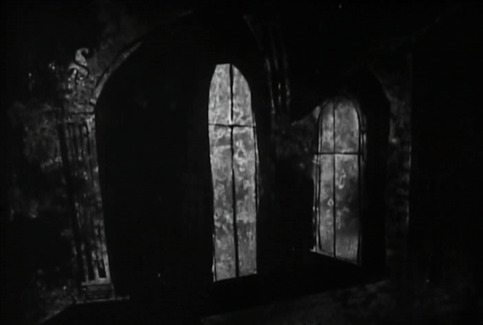
It becomes obvious that she dies as we move to him writing at his desk.
 1
1
We see a beautiful Paul Julian painted sequence which shows
their house as it grows old in a series of dissolves.
 2
2
 3
3
 4
4
 5
5
 6
6
 7
7
 8
8
 9
9
 10
10
 11
11
 12
12
Back in through the Live Action window.
We see him with his head at rest on his desk.
 13
13
It seems obvious to me, after all the time I’ve recently spent studying the UPA Å“uvre, that there were a lot of forward thinking individuals who were quite adept at creating modern designs, quite like new textiles or illustrations. However, it would seem to me that only a small few were actually artists. John Hubley and Paul Julian were certainly in this latter character. Hubley was incapable of drawing a cartoon, and Julian was painting his backgrounds in the same, serious style as his own Art. Together, they were brilliant. It’s only unfortunate that they didn’t have the assist of animation by Bobe Cannon. He is one who took the animator’s job to a higher order. We’d have to wait a decade to see Hubley and Cannon together, but, by then, Julian wasn’t available to them, and Hubley painted his own Backgrounds. See Adventures of an * or Tender Game, and try to see one of the stunning, newly reconstructed prints from MoMA.
Articles on Animation &Hubley &repeated posts &Story & Storyboards 17 Jun 2012 05:15 am
Hub Boards – repost
Yesterday, I posted some comments about a recent piece on Signe Baumane‘s blog. This made me think about this piece I wrote back in 2007. I think it’s worth a repeat.
- The conversation on storyboard use goes way back – before the internet. If you check out the 1969 book by John Halas, Techniques of Film Animation, there’s a Q&A session wherein a number of animation greats were asked several questions, and the answers are given by question.
Here’s one question about storyboards and the answers given:
To what extent to you think a storyboard should be developed prior to production?
- GENE DEITCH: I believe in complete scene and shot breakdown in story-board or a thumbnail board form before production begins. I use a thumbnail storyboard as a sort of bar-sheet, indicating all effects, dialogue and music cues, scene transitions, etc. Great savings in cost, and an overall perspective of the film in advance are to be gained.
JOY BATCHELOR : As fully as possible without detriment to the following phases of production.
STEHPEN BOSUSTOW: If time and money allow, the storyboard should include as many details as possible, particularly if it is to be assigned to a large production unit. However, if only a few people are to be working on the picture, the storyboard can be quite sketchy, with the details being developed during production by the key people who have an overall feeling for and knowledge of the story.
ADRIAN WOOLERY: The storyboard is the first step, after the idea. Every problem must be solved and the story completely resolved on the board prior to consideration of any production.
 JOHN HUBLEY: It has been my experience that the more detailed a story-board and the more carefully it is designed to reflect the appearance of the finished production, the more successful the film.
GEOFFREY SUMNER: The storyboard, or breakdown of the film, has as many different forms as there are ways of putting actions in relation to one another.
The classic storyboard is the set of working drawings of the sequence of a film used in large studios on the Disney model where numbers of subsidiary workers must conform to a total pattern they can almost never see.
It is used in conjunction with model sheets. It could be called the “model sheet” of the sequence of the film.
It is strictly for use within a studio and should not be shown to dangerous people like sponsors.
An earlier stage is the treatment, which can be specifically directed at sponsors. If the basic idea of the film is simple, the treatment need be no more than half a dozen drawings and a brief synopsis to convey a ten minute film.
A storyboard must necessarily be constructed after the music has been done. The musician and the director can work together from a stage following the treatment. From the finished recorded track the storyboard is made.
 For years prior to even meeting Hubley, I had remembered his response to this question. It impressed me. His storyboard development was pretty intense. The scripts generally were done visually and tacked to the wall.
I don’t remember ever seeing text up there. John would present the board to key people, and he would give an indication of dialogue verbally. We all knew this would ultimately be ad-libbed by actors.
With the Carousel feature, sections were boarded but then developed in greater  length through improvised sessions. The boards then grew out of the edited tracks. The voices often came first, here.
I suspect this is probably also true of the films like Cockaboody, Windy Day and Moonbird which were dependent on the children’s verbal play at the microphone. Something like The Hole or Voyage To Next were boarded visually, then recorded improv sessions which were adapted in newer boards.
Of course it has to be remembered that the two features done within this studio, Everybody Rides The Carousel and Of Stars and Men, both started out as text. Both were heavy-duty books that were adapted for film. In the case of Of Stars and Men, the author, mathematician Harlow Shapely had major involvement in the film’s script and narrated it as well. The concepts for both films were fully worked out before anyone started boarding. So essentially a script – of sorts – existed. Since CBS financed Everybody Rides The Carousel, you know they had to approve a script.
I, of course, only remember the board.
Art Art &Commentary 16 Jun 2012 06:06 am
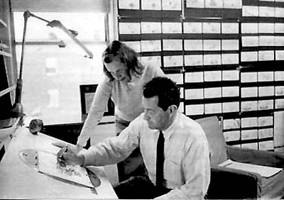
Promises
 - I don’t know about you, but I love to read interviews. The longer the better. When things go a while and there’s been nothing available, I’ll turn to Mike Barrier‘s site and find something in the archive to reread. For my money, the animation interviews he posts are by far the best available to me. There’s so much in his interview scripts that even rereading for the fifth or sixth time, there’s still plenty to be gleaned in them. I’ve certainly read the _________________Barrier & John McGrew
John Hubley, John McGrew and
David Hand interviews more than six times. You’d think I’d be taking notes, by now. No, I just enjoy them as reading material. It’s almost like rereading a Barbara Pym novel, I gobble them up and absorb the characters at play; I enjoy the thrust of the lives in discussion and it doesn’t matter that I know where the story is going. Of course, it helps a lot that I have a real interest in the players and what they’ve gone through, and, in fact, I’ve known a few of them. Many of the others, i feel as though I’ve known them from reading about them and/or studying their work.
Somehow it’s more fun to me to read them rather than listen to audio recordings of them. Especially if the interviewers are good. Michael Barrier and his coauthor, Milt Gray, are formidable at the job, and they seem to get so much out of even the quietest apple. The interview with Fred Kopietz is a fine example. He’s someone who didn’t dominate animation history, but the story he tells is enormous. We get such a good view and an understanding of some of the studios he attended. An interview like his doesn’t always happen; there are some who leave too many questions about what they’re remembering. Of course, the guide makes all the difference. Barrier so often gently coaxes the interviews onto a straight and arrow path. His mechanics in interviewing aren’t always evident, but one feels safe in his hands.
And then when a new interview is posited in the archive, it’s pure delight. This past week saw a very complex interview with Phil Monroe join the roster, and I’ve already read it three times. They’re too hard to read on line, so I usually print them out and have them in hand to read; That’s what I did with the Monroe interview. He had a lot to say about the organization of the Warner cartoon setup, and the material seemed relatively new for me. He had a lot to say about some curious characters – those directors, Jones, Clampett, Freleng and McKimson.
 The audio interviews at the Animation Guild Blog are good examples of the usual audio interviews. Steve Hulett does the interviewing and posts the pieces on the site. For the most part, they’re the voices of the living artist who has had a major career behind them. They have full histories that is usually trippingly told. It’s nice to hear the characters’ voices and the sound of their speech, but often the interviews are halting or repetitious and cumbersome. Sometimes, the interviews feel as though they’re forced in the approach and the stories don’t unfold simply. The interviewer becomes a character in his own right, and you almost feel as though you’re listening to two people being interviewed at the same time. You can tell when Mr. Hulett is excited by the material, and you can also hear when he’s not so involved in his part of the interview. __ Steve Hulett
There are always two personalities to follow in every one
of the interviews. I always listen to those Mr. Hulett posts, but I usually approach it more as a chore than as a pleasure. There’s something more enjoyable about the written word, and I sure prefer those. But I still don’t miss Mr. Hulett’s audio posts; I just haven’t been inspired to go back to listen to any of them a second time.
For the record, I have read Didier Ghez‘s collection of animation interviews, Walt’s People, and have gone through most of his books at least twice.
I’ve alslo enjoyed Don Peri‘s two books: Working with Walt and Workng with Disney. They’re both excellent books.
Animated Features
 - This coming Tuesday, the Academy is screening Pixar’s Brave. I’ll certainly see it, and I’ve invited a number of people to the screening. I want to make sure it has a good audience for that first screening. I wish I were a bit more excited about it, but I’m not and I don’t know why. I hope to enjoy it and will report on my thoughts next week.
Up to now, I’ve pushed to see any animated feature the Academy screens. Last year I had to sit through two full weeks of animated features to be able to vote for the Oscar nominees. It was a lot to take in, especially since most of the films aren’t great. So it’s better to take them on one-at-a-time during the actual year in order to assure I won’t have to cram them all in. I wish the Academy had screened Madagascar 3 for us, so that won’t be one of those many features I’ll be forced to absorb at the last minute.
Oh wait. I just remembered that the Academy isn’t going to let the NY contingent vote to select the animated feature nominees. Too few people showed up at last year’s event and the cost of shipping the films and screening them was prohibitive – given those who’d shown up. I have to admit I was disappointed that too few took part, but that’s the game.
Consequently, that means I’ll probably only see Madagascar 3 on DVD. And I guess I won’t get to see this year’s Whiskers or Chico & Rita unless I actually go to a theater to see them – if they become available. Whiskers still hasn’t played in NY. I could have seen it if I went, this year, to Annecy, but I didn’t.
Let’s face it, the animation members don’t all have the opportunity of voting on their category. This means that a few people in LA will control who gets nominated next year. The unfortunate thing is that it doesn’t make for the best for the category. The larger the vote, the better would be the outcome. The members, themselves, in NY are the problem, but what can be done. Personally, I think they should probably get rid of the category. Pixar will put a billion dollars into publicity to make sure the few in LA pick their movie, and it’ll probably win. It may even deserve it. But, to me, too few are selecting the sample, and the politics aren’t easy to overcome.
Harvestworks
 Harvestsworks is hosting an animation art program by artists, Gregory Barsamian, Emily Hubley, George Griffin, Holly Daggers and Jeff Scher. This art show and screening at Harvestworks is curated by Phyllis Bulkin-Lehrer. The works all explore the use of digital production in creating traditional projection methods. Whether using New Media or keeping it at arms length.
The show opened in New York this past Thursday and will continue thru until June 28th.
Location:
Harvestworks – www.harvestworks.org
596 Broadway, #602 | New York, NY 10012 | Phone: 212-431-1130
Subway: F/M/D/B to Broadway/Lafayette, R to Prince, 6 to Bleecker Street
The installation is open 1 – 6 pm Tuesdays – Saturdays and is FREE
Storyboard Approach
 - There’s an interesting post up at Signe Baumane‘s site. She does a video post of how she does storyboards for her in-progress feature, Rocks In My Pockets. She also posts a short video by Bill Plympton which explains how he does storyboards and how he uses them. The two have very contrasting methods.
Bill is an ex comic strip artist. To me, his storyboards are more comic strip than storyboard. They move from dynamic pose to dynamic pose without logically following the language of film. It tends to make for some uncomfortable cuts within his films but helps them appeal to the cartoonists out there. (I don’t think there’s a Plympton film that doesn’t have a cut where he crosses the 180, making it very frustrating to watch for people like me.)
Signe is a writer, so she doesn’t do storyboards. Or so she says. She starts each scene by going to the script and selecting text to illustrate/animate. Though she doesn’t properly board these scenes, she does a bevy of thumbnails for them. Then she plows into the animation and does the work. The interesting thing, to me, is that Signe DOES follow all the rules of filmmaking. My guess is that she does this instinctively from a long history of watching and absorbing film.
Two different approaches and unexpected results.
Take a look at the videos; they’re short.
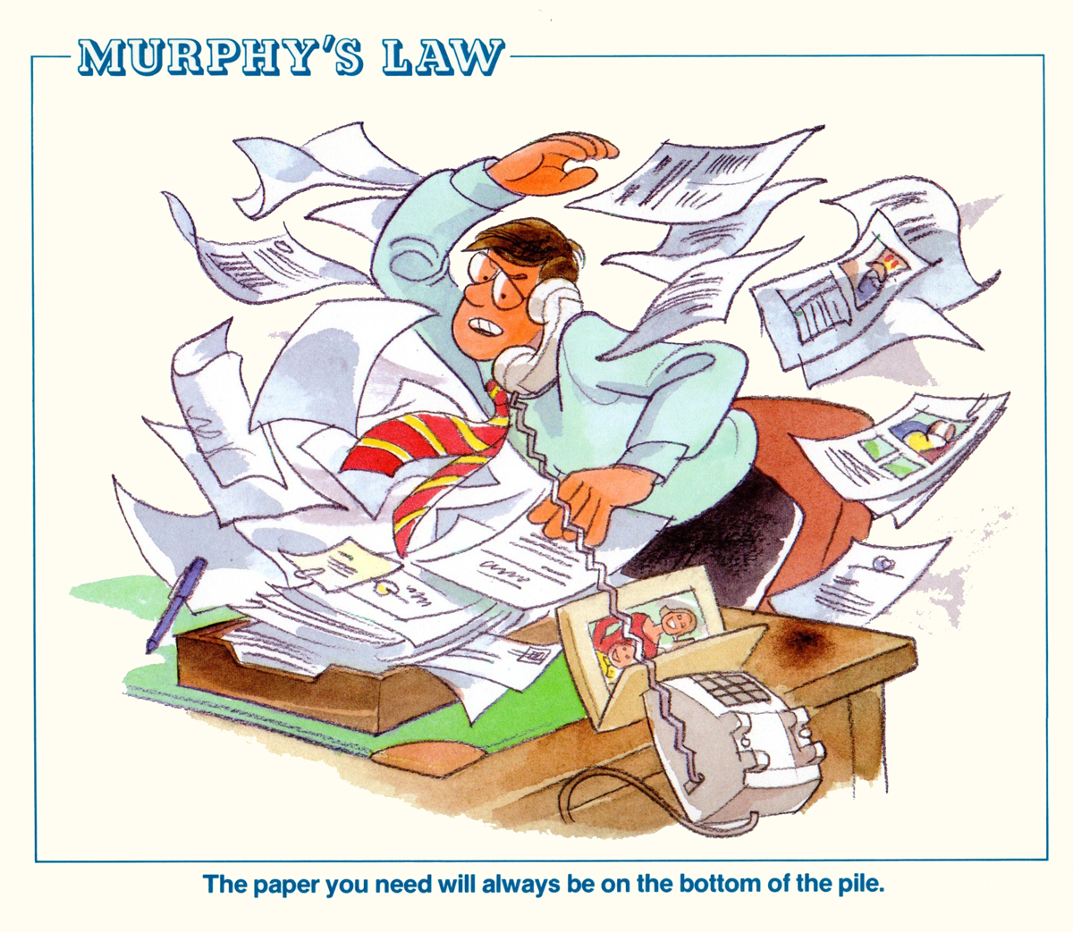
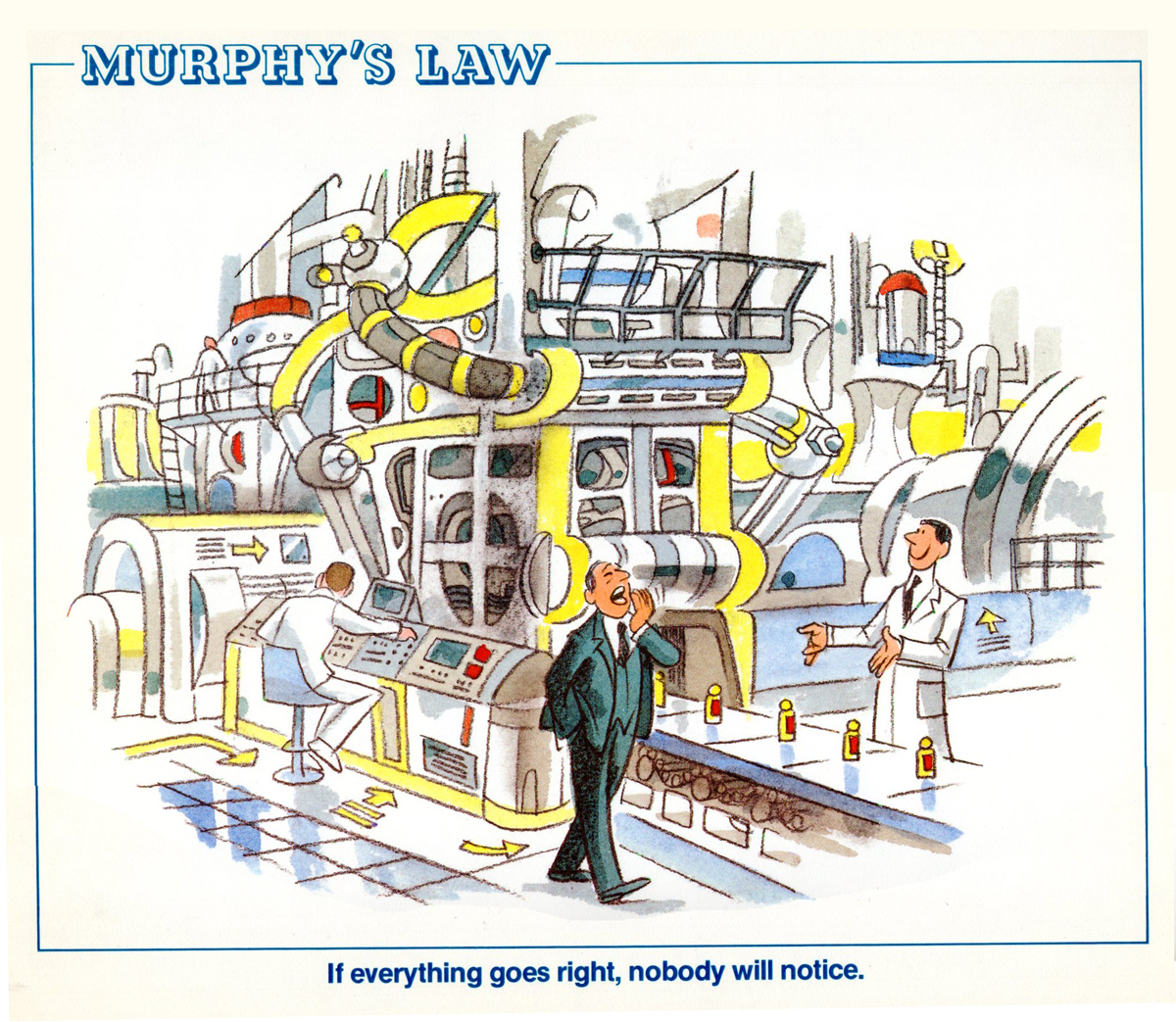
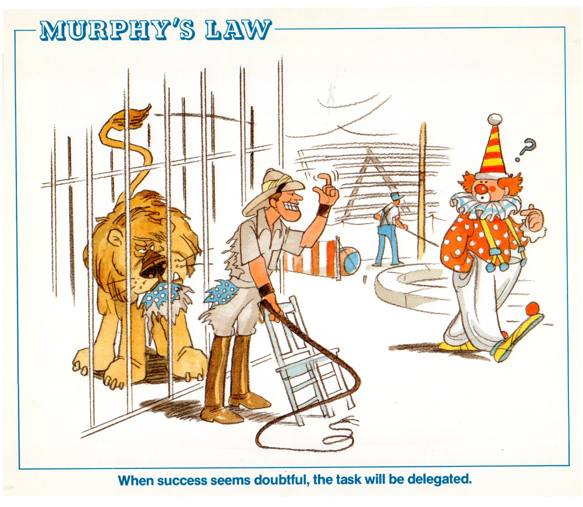
Bill Peckmann &Illustration &Rowland B. Wilson 15 Jun 2012 06:52 am
Rowland Wilson Calendar
- Continuing with the odd jobs posted yesterday.
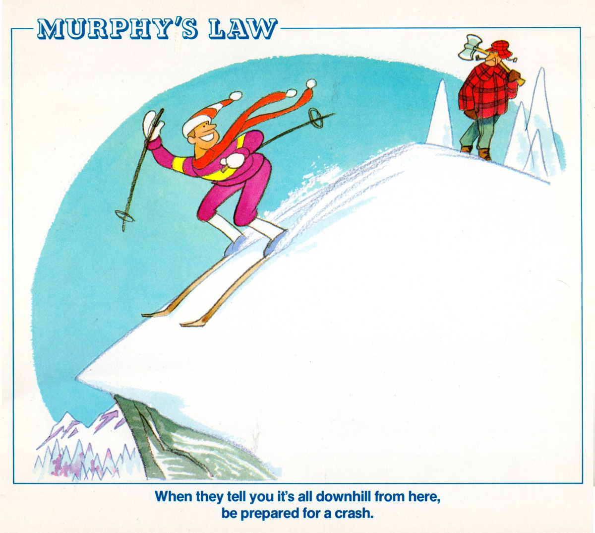
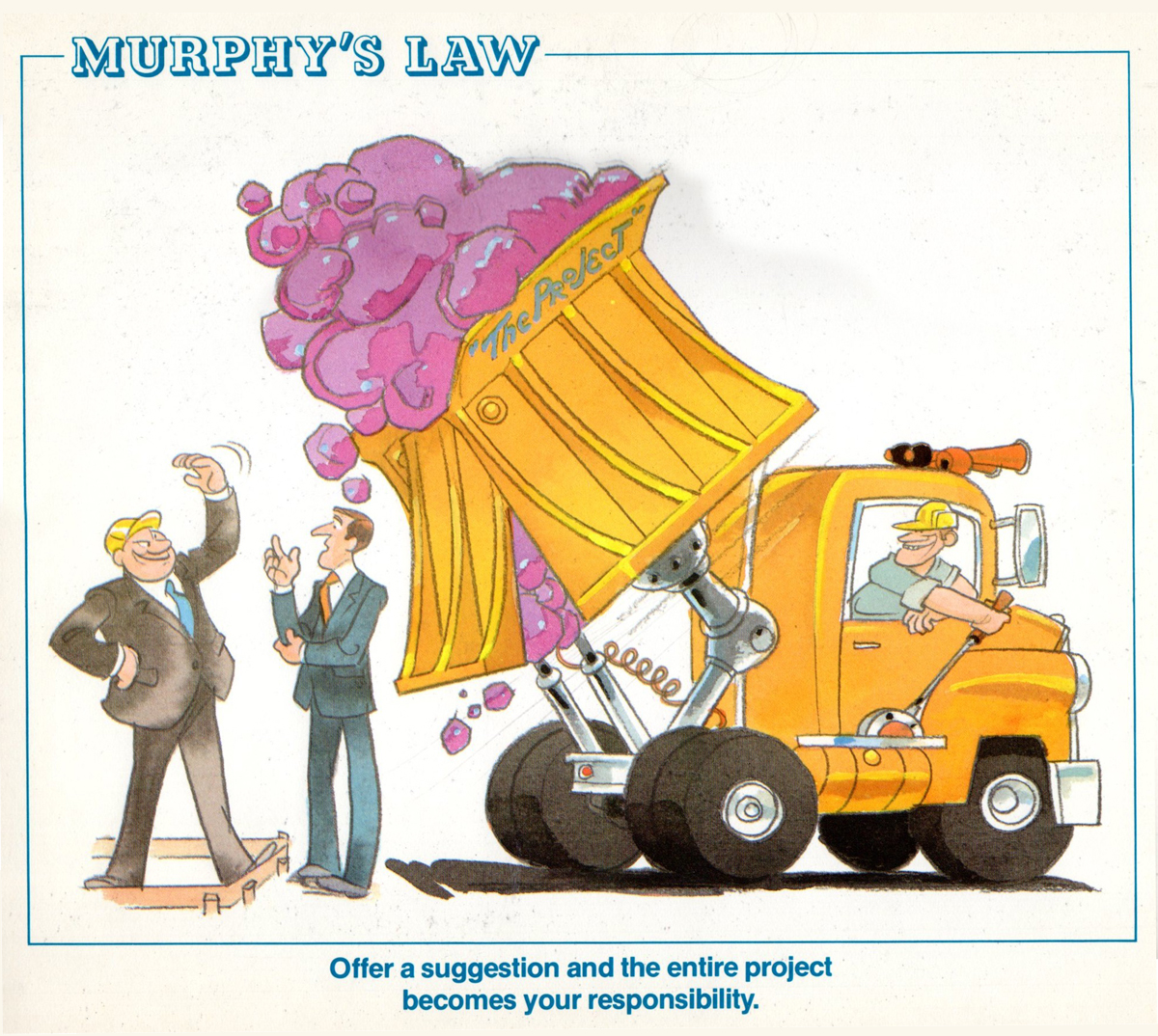
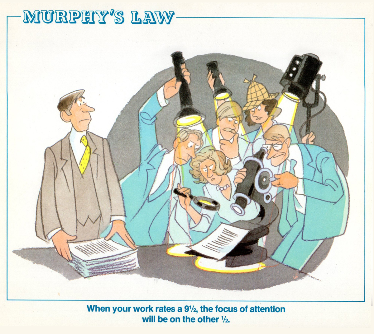
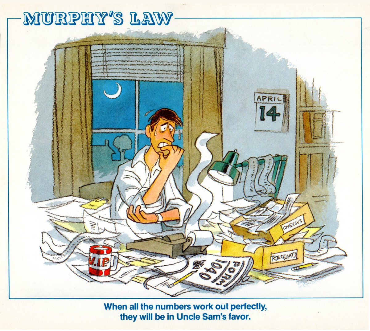
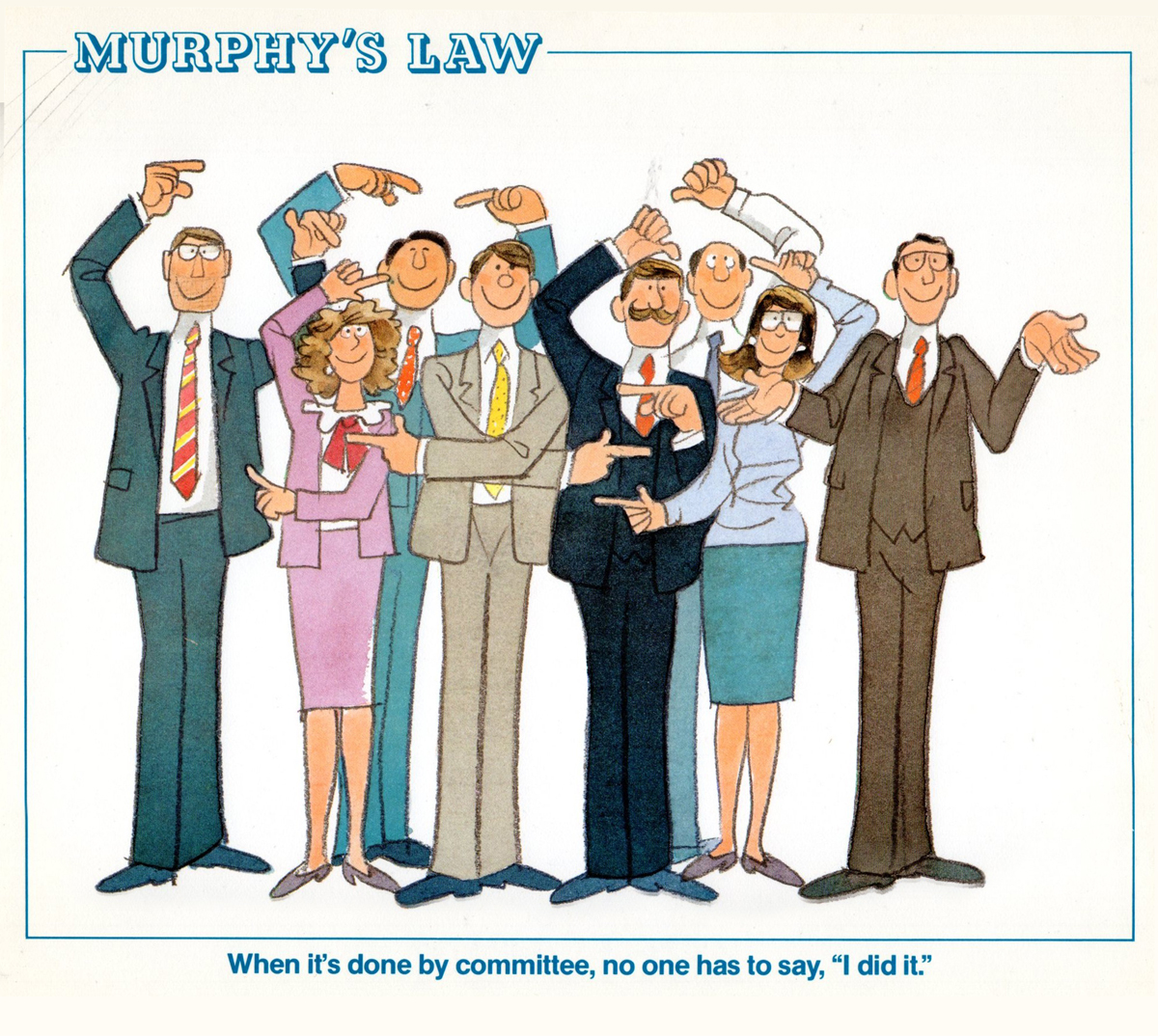
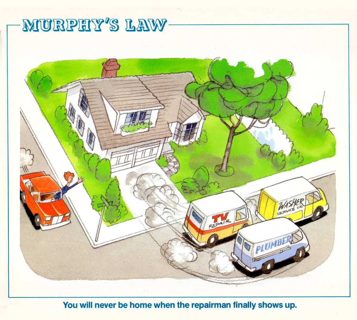
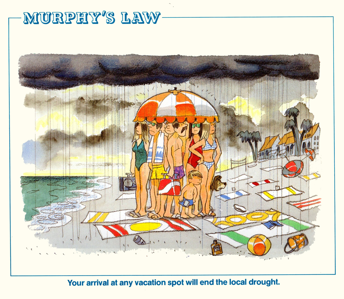
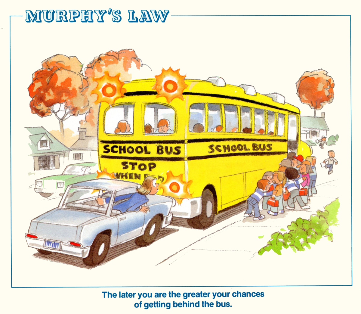
In 1987, Rowland B. Wilson released a calendar called Murphy’s Law.
Bill Peckmann has forwarded the illustrations from it, and I’m posting them here.
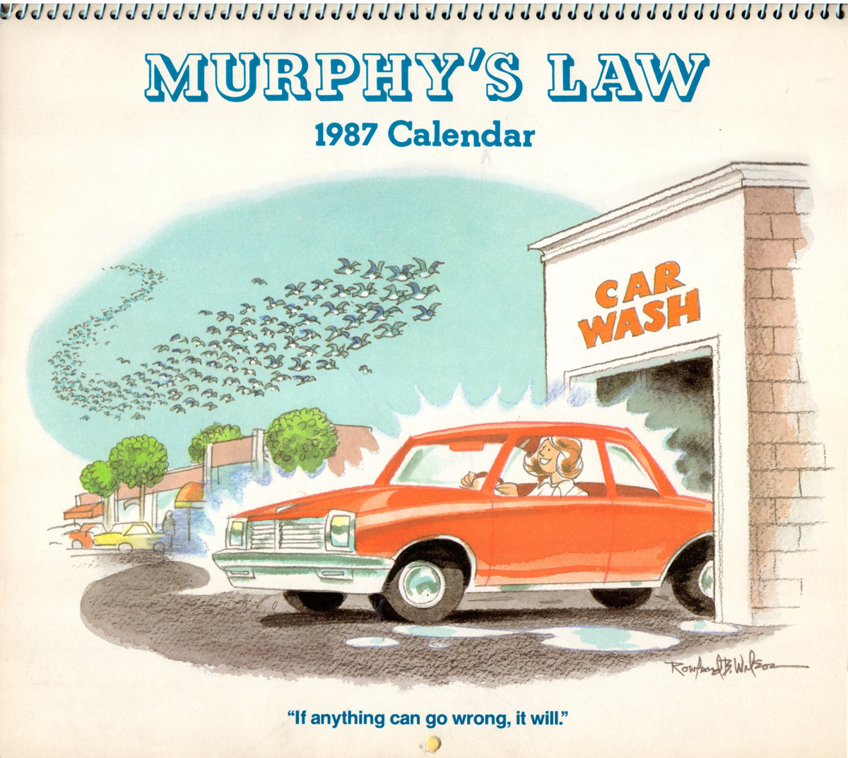
The cover and June
January
February
March
April
May
June is already visible as the cover.
July
August
September
October
November
December
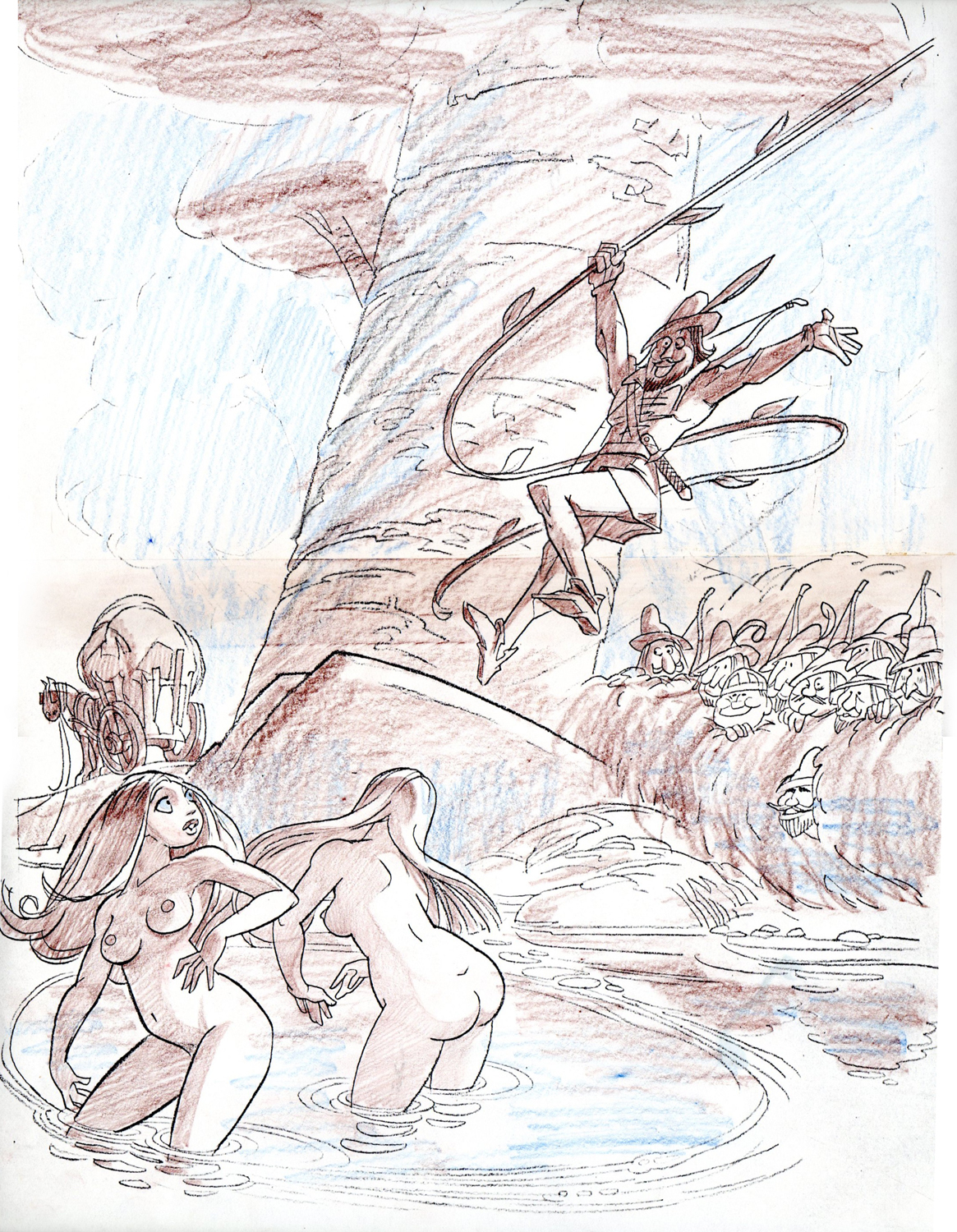
The following are some additional rough pieces by Rowland.
 1
1
A Xerox of Row’s line drawing before the color elixir was added!
Great posing!
 2
2
Unfortunately this is an old faded Xerox, but here is a New
England Life ‘Dog Show’ gag. I’m sending it because of all
of the dogs in it, man, you can’t shake a stick at them,
they are just phenomenal! Catch all of the different breeds.
 3
3
A TV Guide rough.
 4
4
Another TV Guide rough.
 5
5
Two small thumbnail sketches before
starting to paint Playboy ‘Robin Hood’ gag.
 6
6
For gags that were extra special to him, Rowland would
pre plan and work out the color shading on a Xerox of
his line drawing. Here again is ‘Robin Hood’.
Rowland would usually discard his roughs after finishing a job,
but for some reason he kept a small stash of them at PK & A,
so when the studio finally closed it’s doors and we asked Row
what to do with them, he said dump ‘em. Which I promptly did
into my attache case! Since then I’ve found out from Suzanne Wilson
that for what ever reason, RBW did not hang on to his roughs,
much to her dismay. So what we see here is something on the rare side.
It’s ironic because Rowland always understood the passion and
vitality of everyone else’s roughs.
.
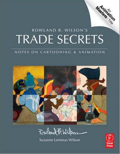 – Finally, Trade Secrets : Rowland B. Wilson’s Trade Secrets: Notes on Cartooning and Animation has had a release date changed. Amazon is promising it’s pre order customers that we should get our copy the beginning of Aug.
Rowland Wilson‘s journals, in which he wrote about illustration and animation, have been gathered by Suzanne Wilson and are collected in this book. The information must certainly be very informative to students; the book seems to offer quite a bit of attention to Mr. Wilson’s animation art, just as it does his brilliant illustration and cartooning. I’m looking forward to seeing the book and will certainly make sure you know what I think of it when it does come out.
Animation &Articles on Animation &Disney &repeated posts 14 Jun 2012 05:57 am
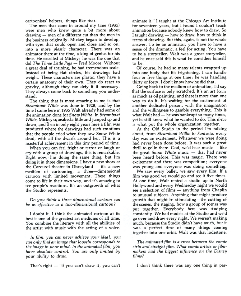
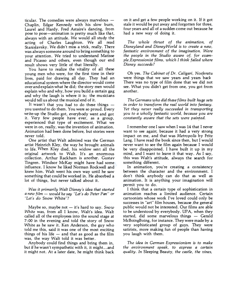
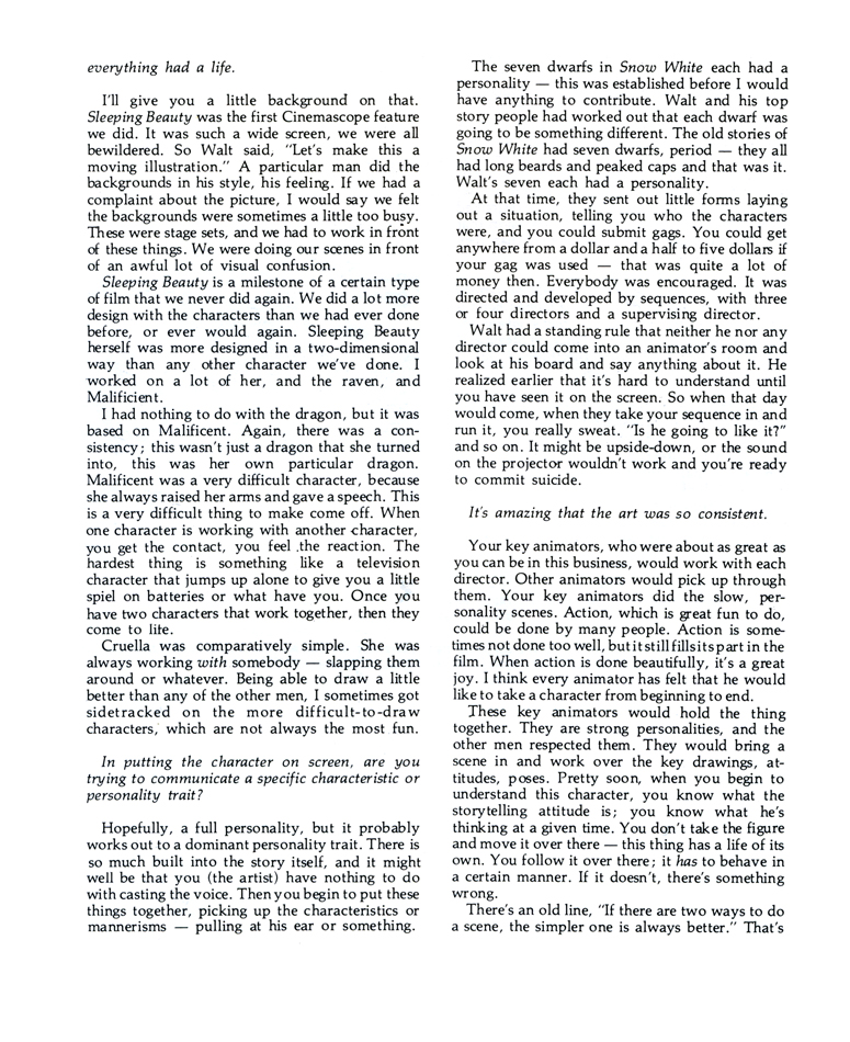
Marc Davis Interview
- On Tuesday, Andreas Deja posted a beautiful pair of drawings showing the transformation of Maleficent from a storyboard drawing to a Marc Davis animation drawing. The rise of draftsmanship, composition and performance was exhilarating. It reminded me of this interview with Mr. Davis which I posted back in June 2007. I’ve decided it’s a good time to post it again. Well worth rereading.
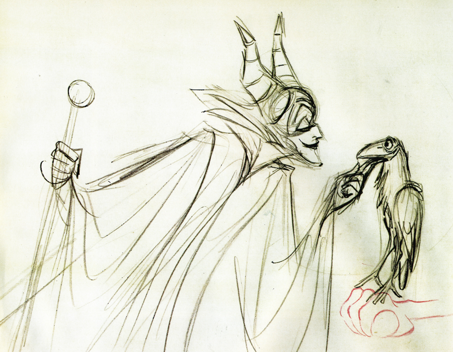 – Years ago I had a copy of a lecture that Marc Davis had given in which he compared the differences and the similarities between two characters he animated, Cruella De Vil and Maleficent. He discussed their motivations and their style of exposition. It was quite an extraordinary commentary, I’d thought, but somehow I seem to have lost that interview.
It was a great acting lesson from a great animator, and it seemed to offer depth that I haven’t found elsewhere. I’ve found myself paraphrasing from the comments Davis had made and thought to search for the document. I have found this interview that was conducted by A. Eisen for Crimmer’s: The Harvard Journal of Pictorial Fiction. This was published in 1975.
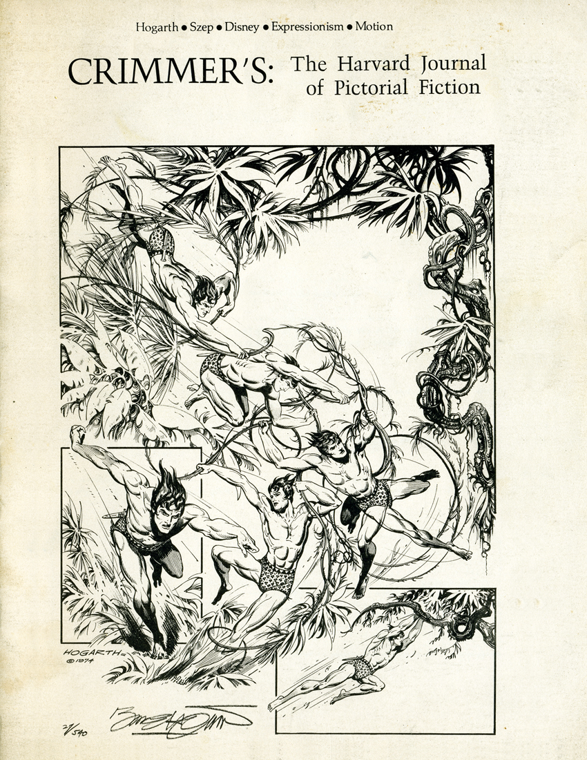 A
A 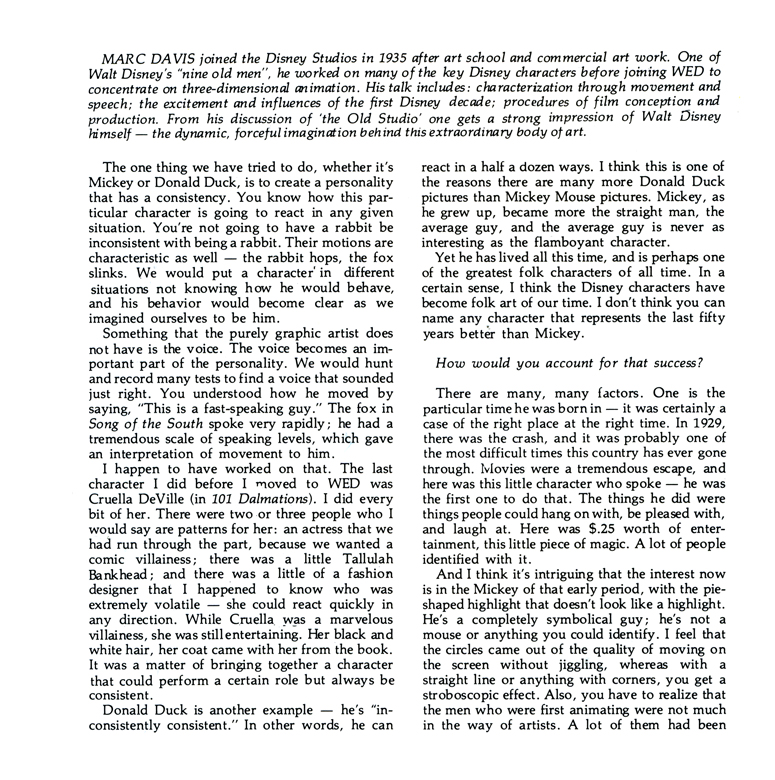 1
1
(Click any image to enlarge.)
There are other interviews with Marc Davis available. One of the best done with John Province seems to have been taken off line and now appears only in Didier Ghez‘s book, Walt’s People Vol. 1. It’s worth the book.
Animation Artifacts &Fleischer &Models 13 Jun 2012 05:30 am
Fleischer Model Sheets – Hoppity & friends
- I have always been a sucker for Hoppity Goes to Town. For some reason, from my first viewing in the early 60s, to tofsy, I have loved this film and everything about it. The score is magnificent, with those great Hoagy Carmichael / Frank Loesser songs, and the score by Leigh Harline is quite sophisticated; the character styling is absolutely the height of charm for Fleischer – so beautifully round -, and the animation is just bright enough to pull off the original Fleischer story. It also takes place in a recognizable New York City – something that will always win me over.
At one time I’d posted a copy of a children’s book I’d found which bounced off the film.
These are the model sheets the late Vince Cafarelli had in his collection. I would have liked seeing a Mr. Beetle or two and possibly a work sheet for how they were going to treat the rotoscoped humans. (The handling of the rotoscoped animation goes far beyond what they did in Gulliver’s Travels. There’s a nice little frame grab post featuring one of these scenes at Classic Cartoon Reviews. ) But I’m pleased to have what model sheets I do have to post. Here they are.
 1
1Hoppity
 2
2
Honey Bee
 3
3
Mr. Bumble
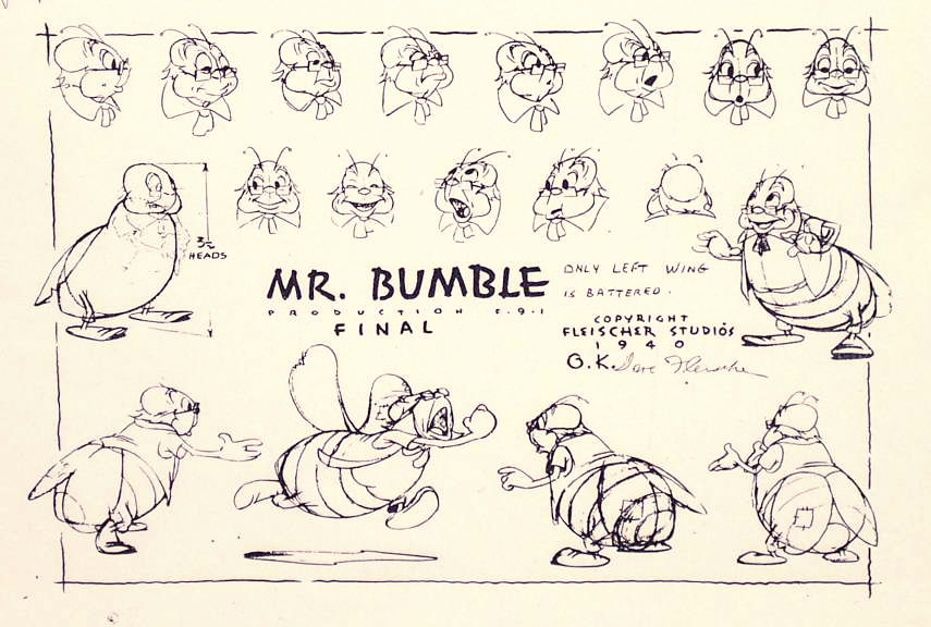 3b
3b
(I found this model of Mr. Bumble on line and thought it worth including.)
 4
4
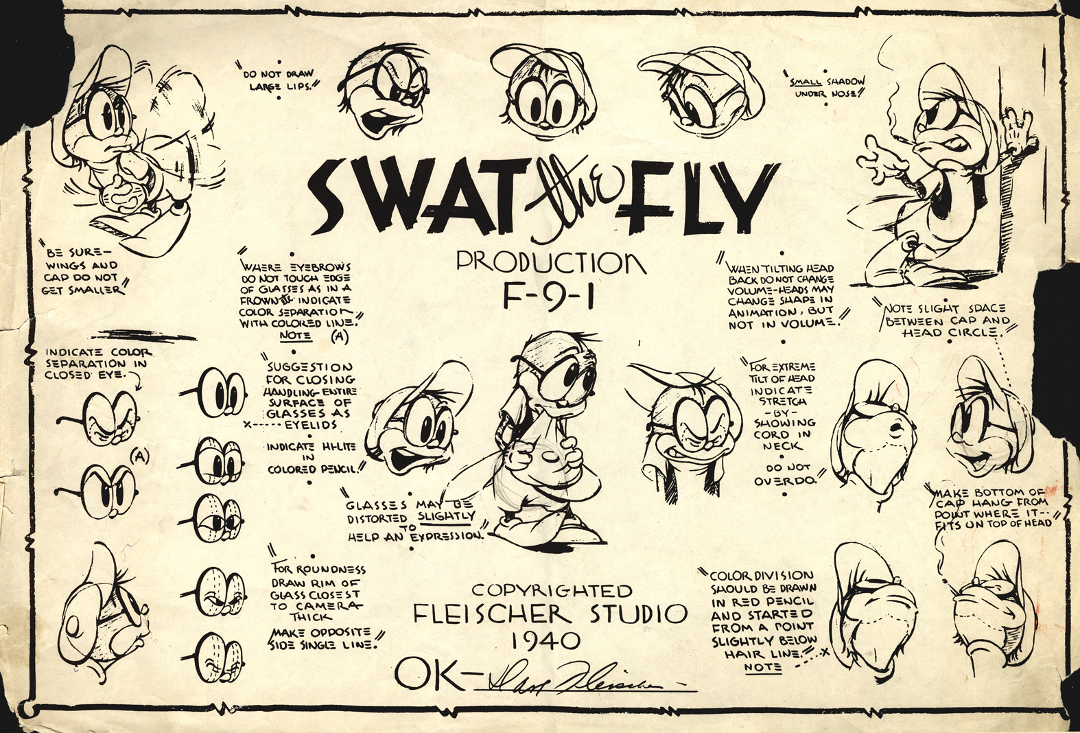
Swat the Fly
 5
5
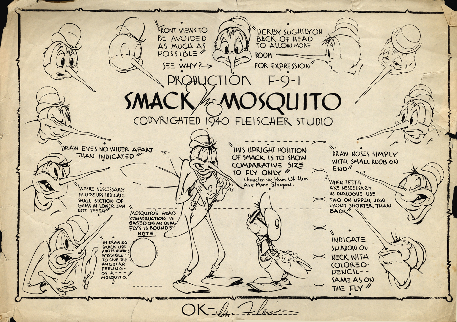
Smack the Mosquito – 1
 6
6
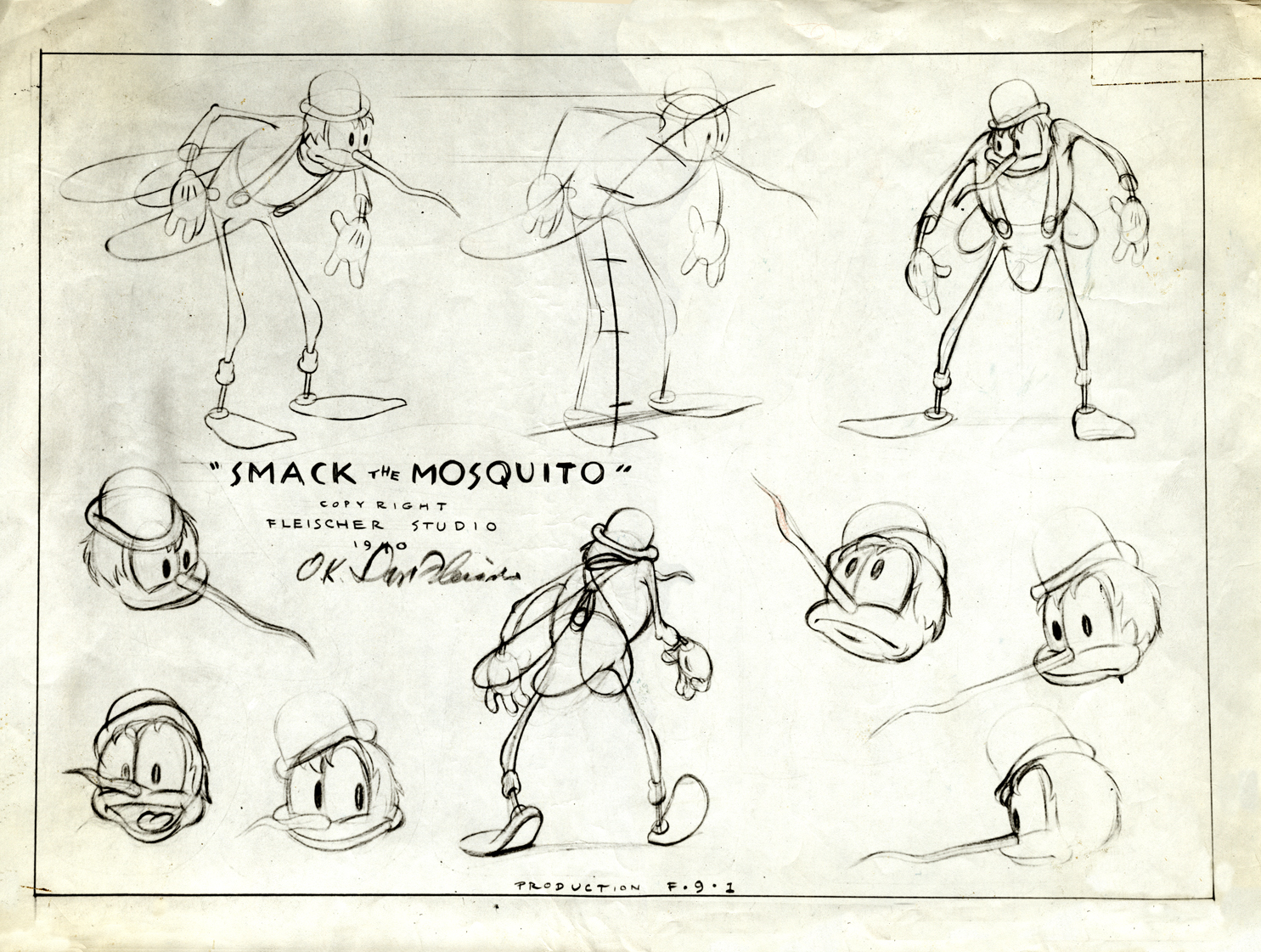
Smack the Mosquito – 2
 7
7
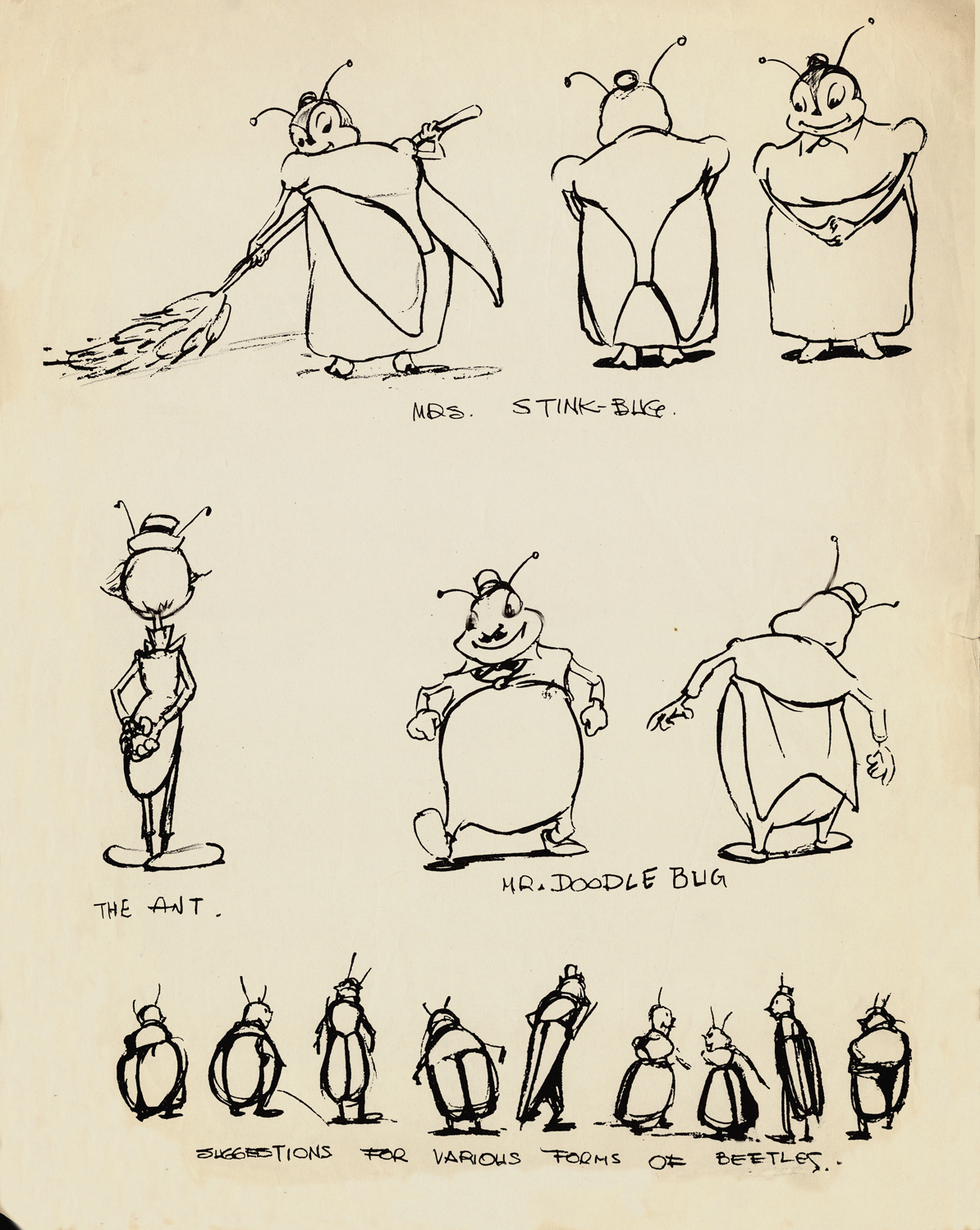
Miscellaneous Characters – 1
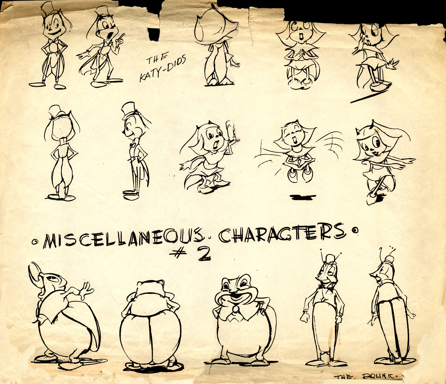 8
8
Miscellaneous Characters – 2
 9
9
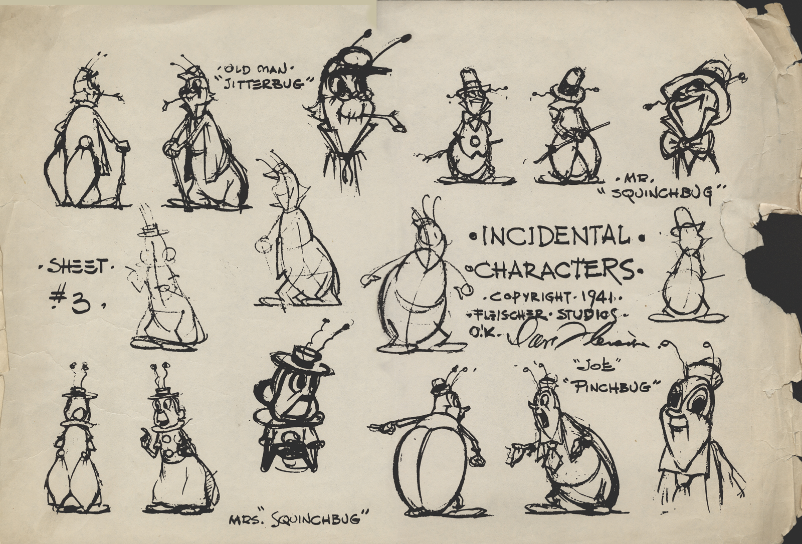
Incidental Characters
Bill Peckmann &Illustration &Rowland B. Wilson 12 Jun 2012 06:39 am
Rowland Wilson Assortment
- Rowland B. Wilson did many different types of illustration over the years. Thanks to Bill Peckmann and the loan from Denis Wheary we can post some of these oddities.
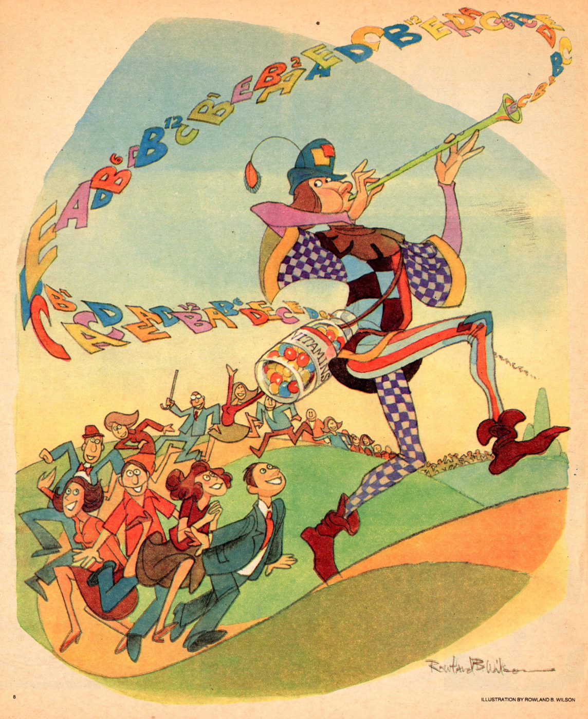
Here is a 1962 book from the Columbia Record Club titled ‘Musical Cartoon Album’. It included cartoons by an assortment of the well known cartoonists of the day. Rowland had his gag in there, fortunately for us.
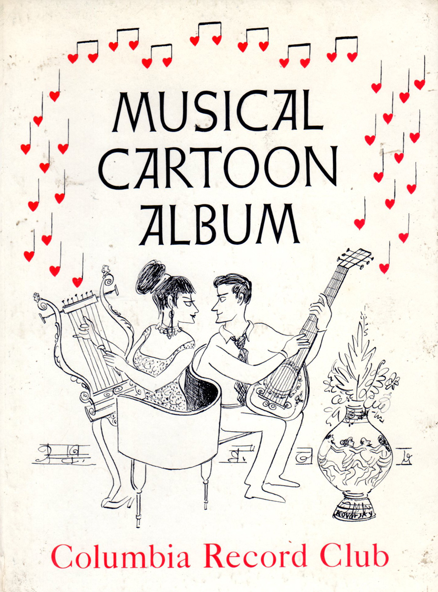
Front Cover / Back Cover
There is the prestigious job of doing a book for Colorforms. I’m not sure if they even have Colorforms today. It was a shiny plastic/rubberized sort of cut out doll that you’d pick up and place on the other pages of the book to form your own pictures. There was even a set in the Museum of Modern Art that just dealt with abstract shapes that you’d recreate into your own 20th Century Art Form. Bill Peckmann writes:
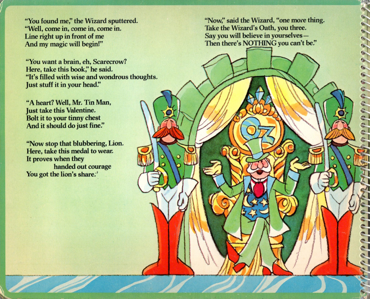
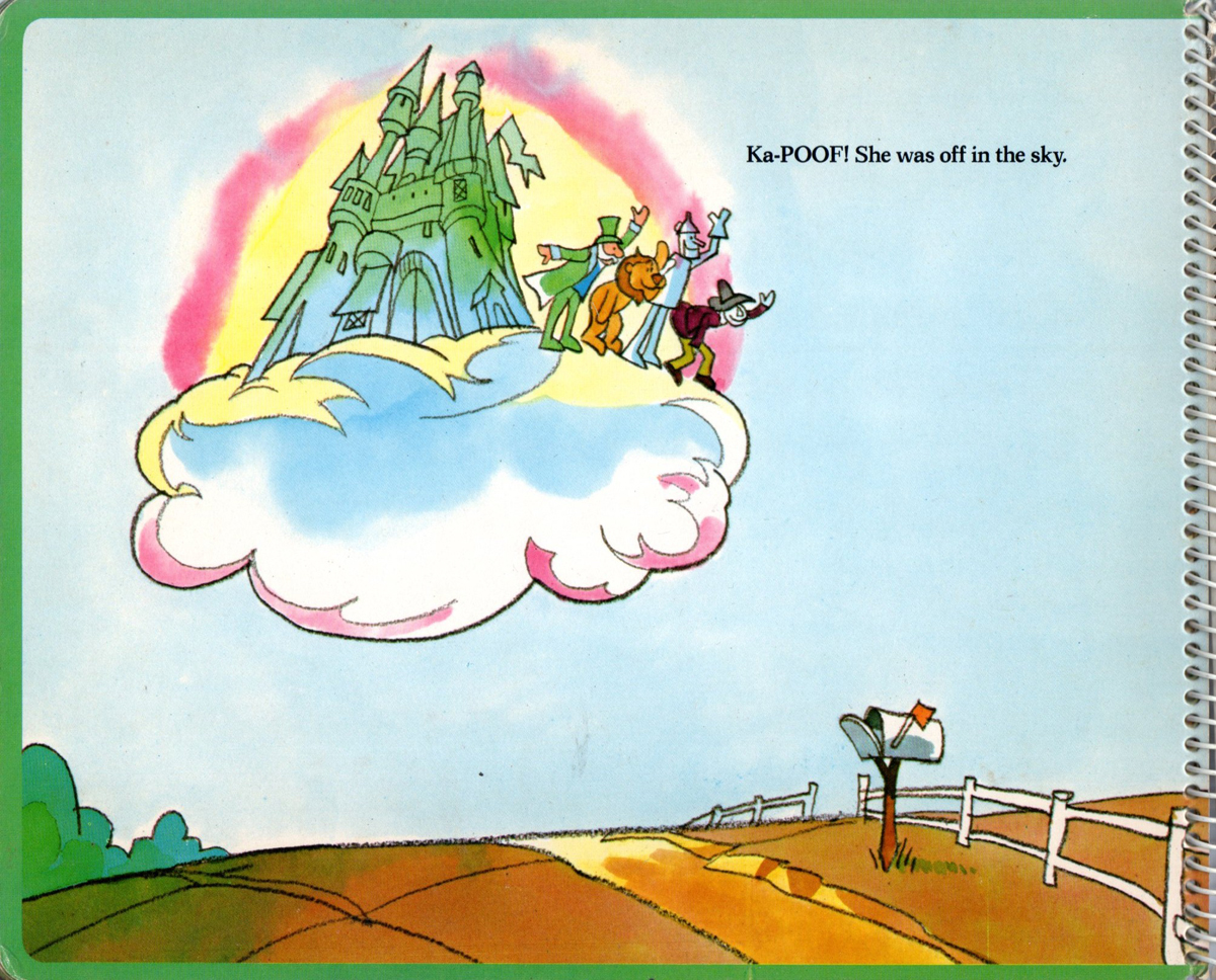
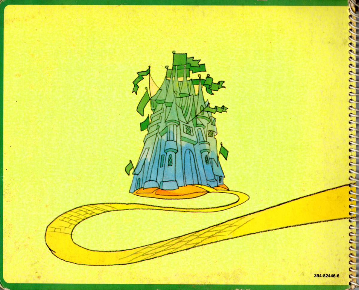
- ‘Wizard of OZ’ is a super find that Denis Wheary made. Both Suzanne Wilson and I were not aware that Rowland had done the book. We’re both trying to come with a publishing date, but the nearest we can come to is probably the very early 1970′s. It was definitely before Row went to Richard Williams in 1973. Those were the years RBW was very hot in the print world and a had an ace sales rep, he did not get much sleep in those days.
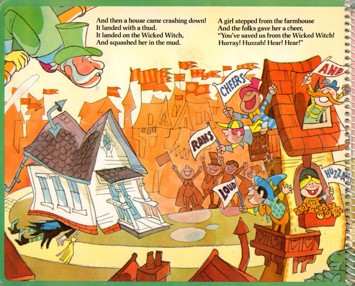
This is The Wizard of Oz, drawn and designed by Rowland. To get the sense of the book, I’ve posted small thumbnails of the images so they can sit side by side. If you click on any of the images it’ll enlarge to a good readable size.
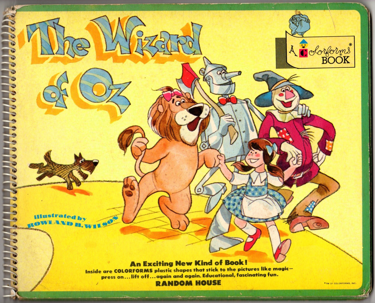
Front Cover
Inner
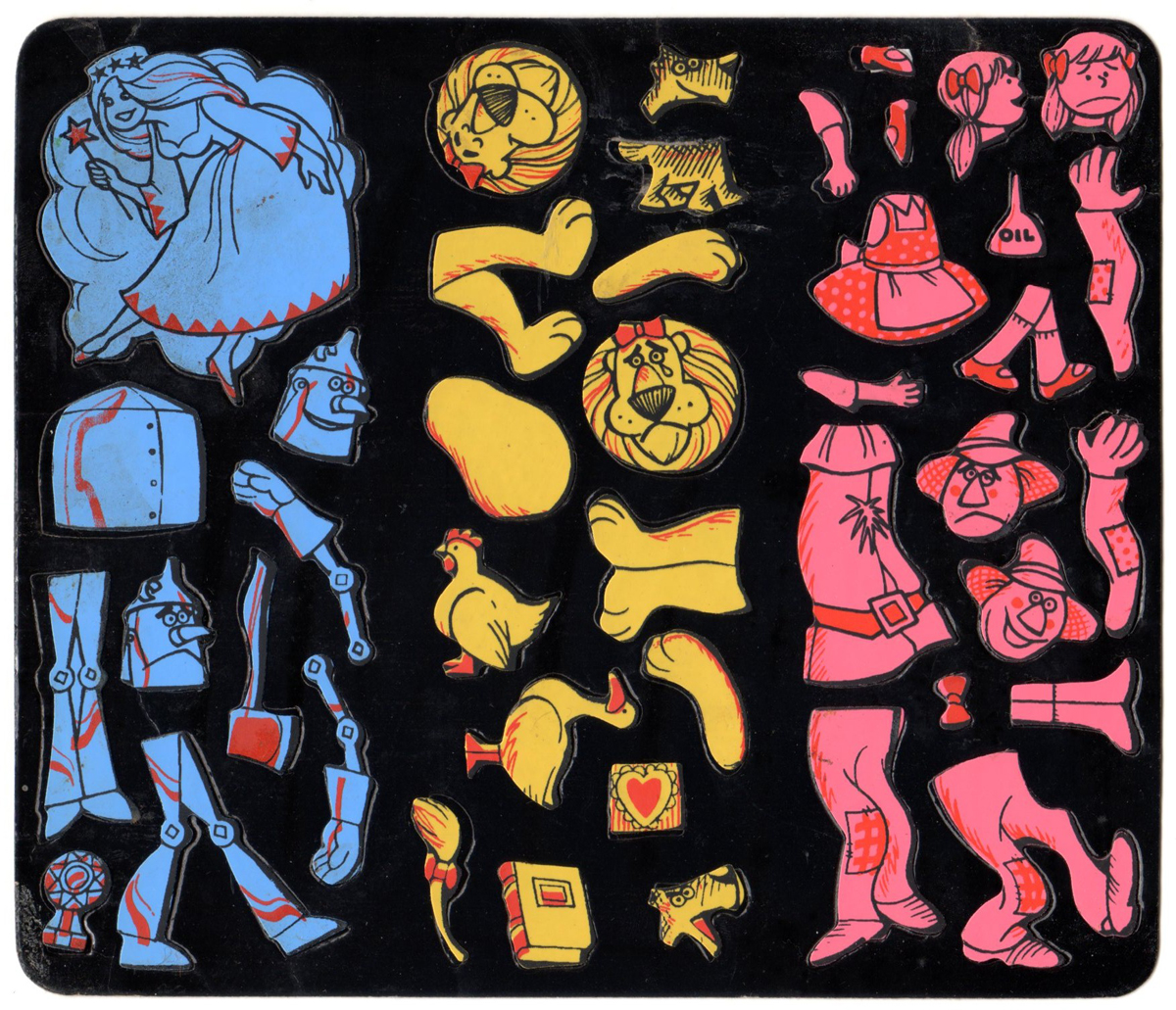
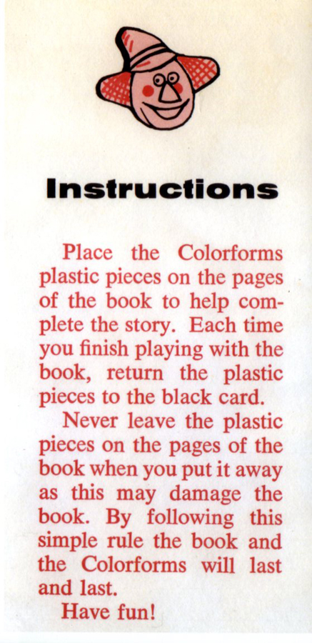
Colorforms page
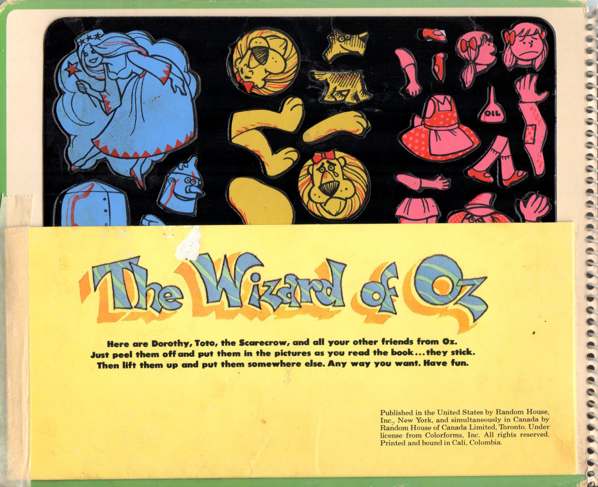
The card with the Colorforms on it came in a sleeve on the title page.
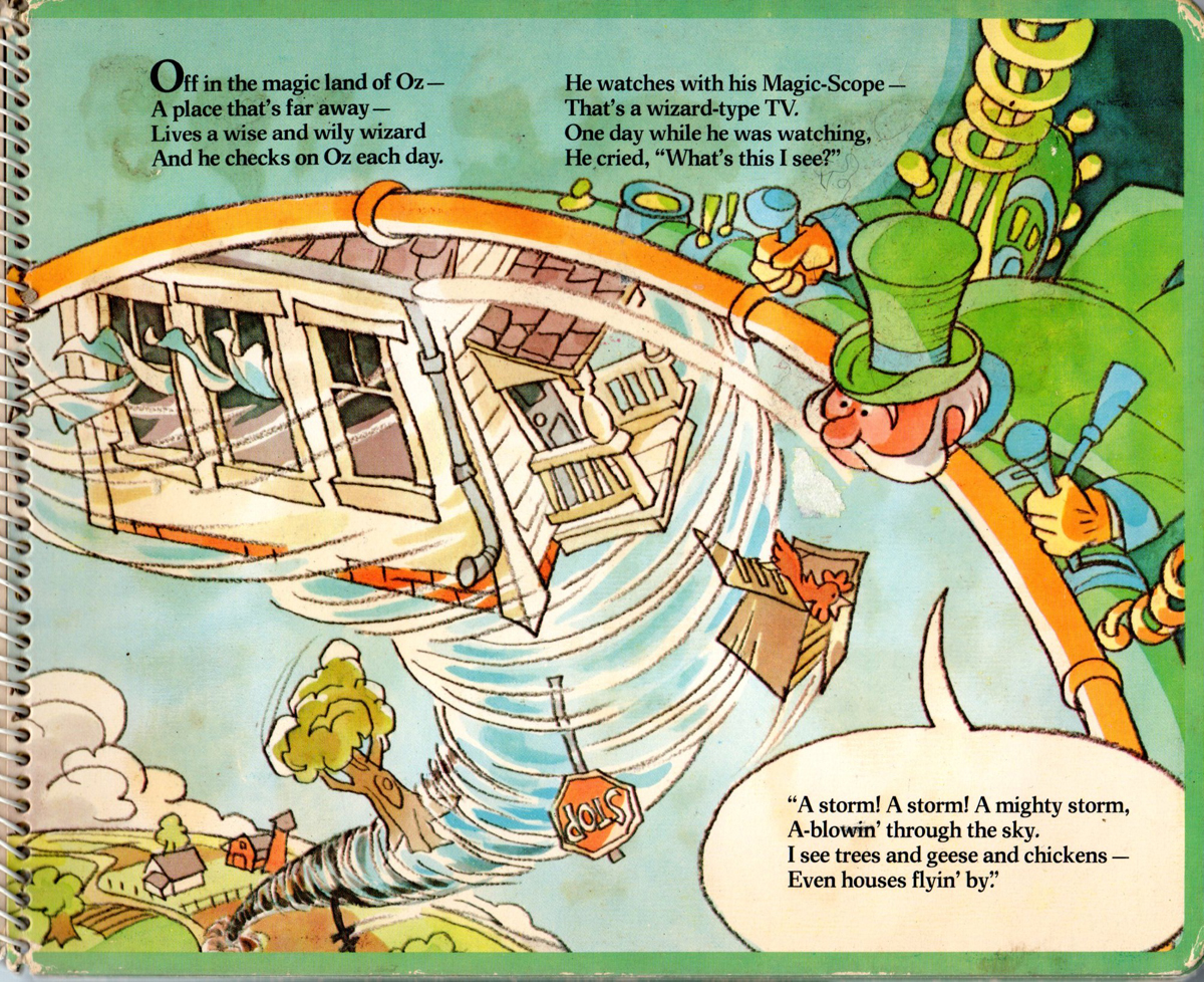 1
1
 2
2 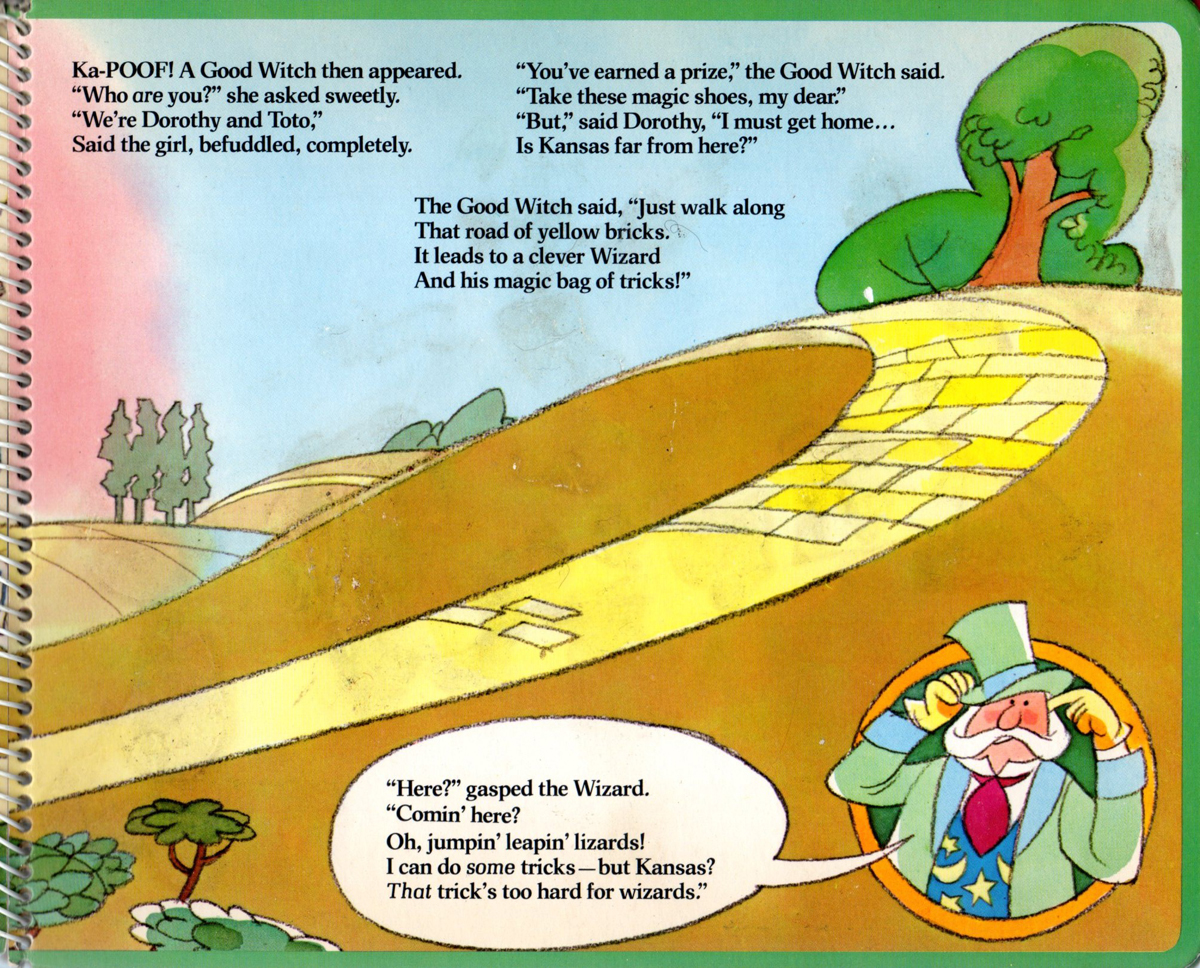 3
3
 4
4  5
5
 6
6 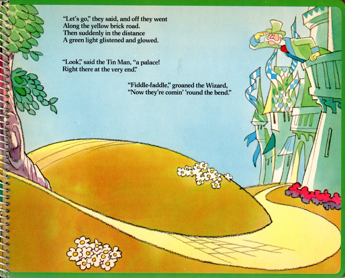 7
7
 8
8 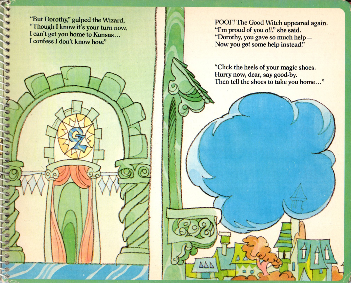 9
9
 10
10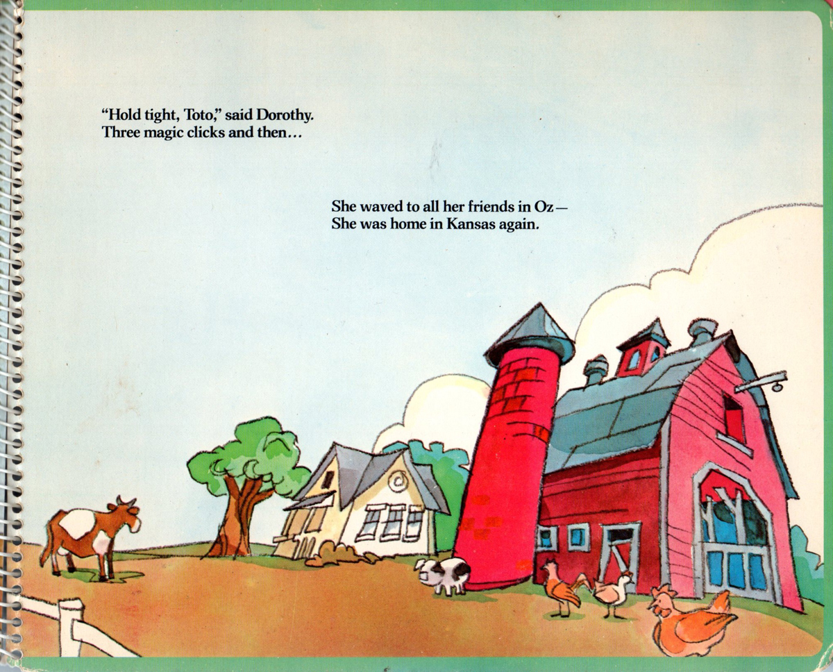 11
11
Back Cover
Here from 1977, is an editorial illustration Rowland did for the Sunday supplement of the New York Daily News. The yellowing of the newsprint paper is starting to show, but that seems to work with the subject matter of the illustration.
____________________________
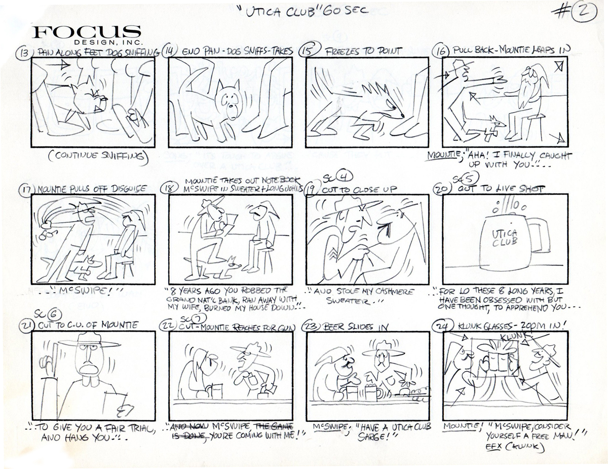
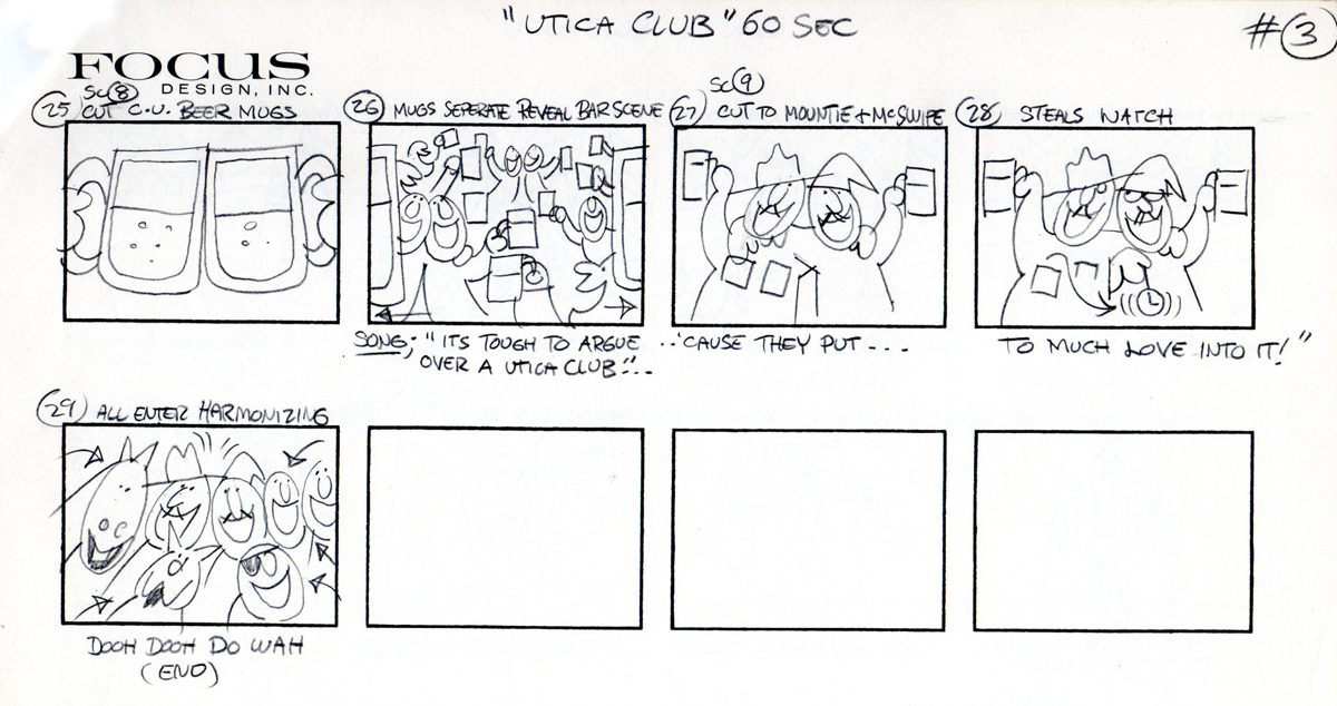
Since you’ve already posted art from Rowland’s 1970′s Utica Club’s ‘Mountie’ TV commercial a number of years ago, I thought you might like to see the original thumbnail, production storyboard of that spot.
It’s a collaboration between Rowland and Phil Kimmelman done at Focus Design Studios.
Rowland always knew how to make a person feel good, even years later after working at all of the different animation studios that he did, he would tell us, that he always remembered those early animated commercial days as some of his most favorite, he just loved those ‘jam sessions’, and man, so did we!. It also helped that ad agencies picked Rowland to do the spot, which meant he was given carte blanche!
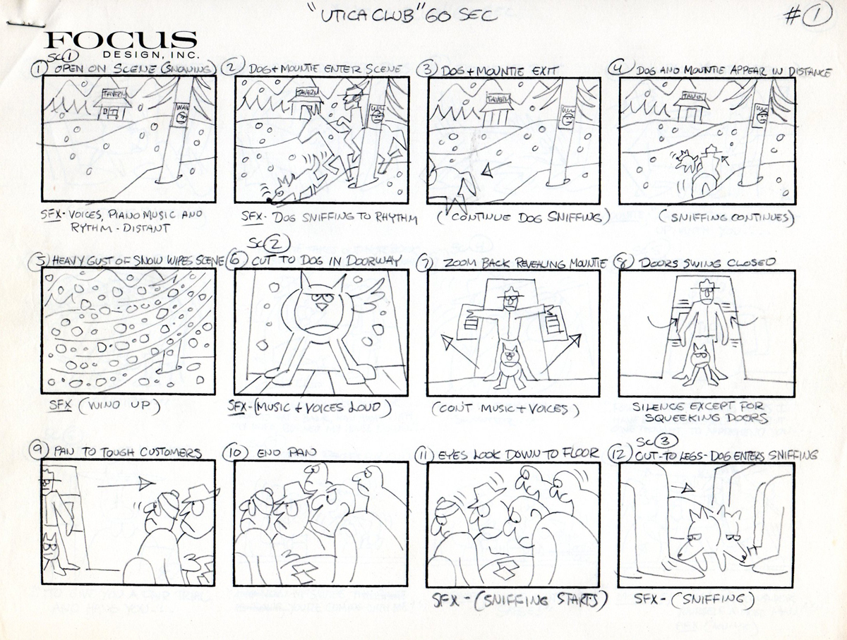 1
1
 2
2
 3
3
Finally, here’s a piece of RBW spec art done to land a TV spot at PK&A. Sadly the ad agency’s brains were out to lunch and the job never happened. (Circa 1980)
We’ll continue this post on Friday.
Frame Grabs &Hubley &UPA 11 Jun 2012 07:01 am
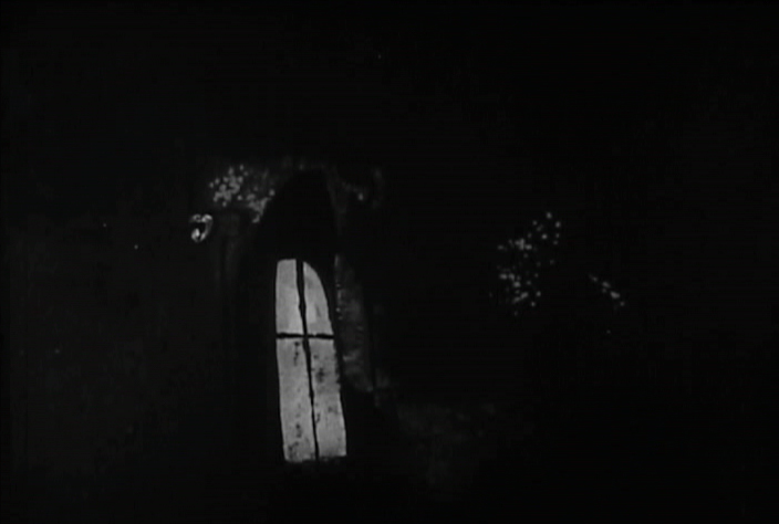
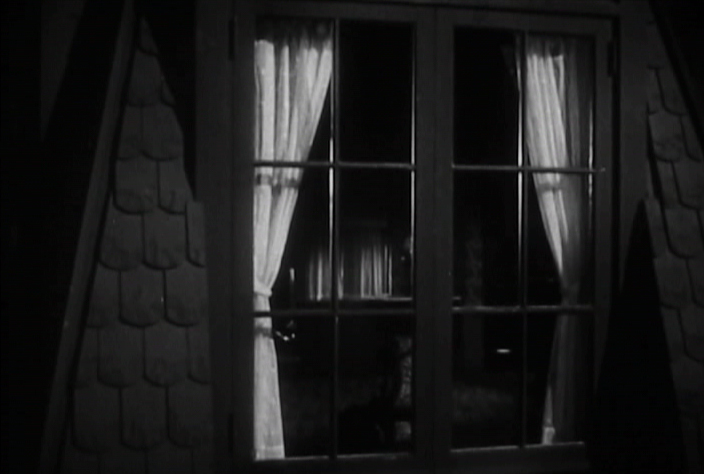
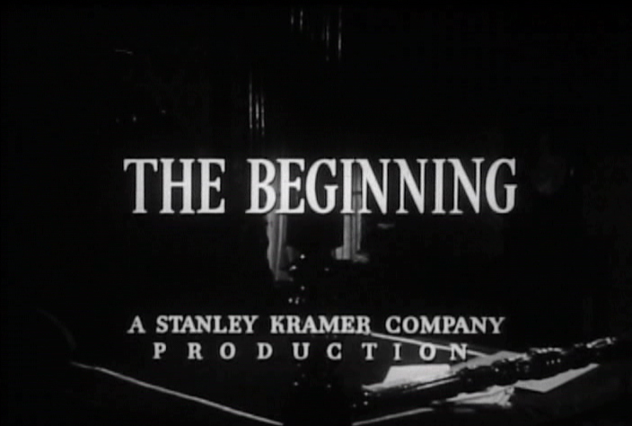
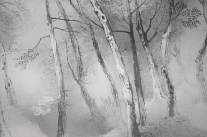
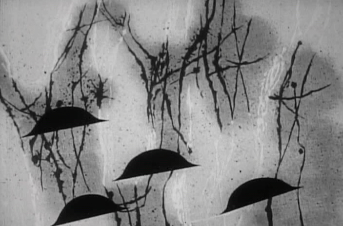
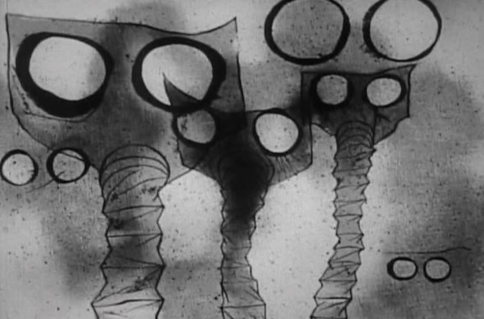
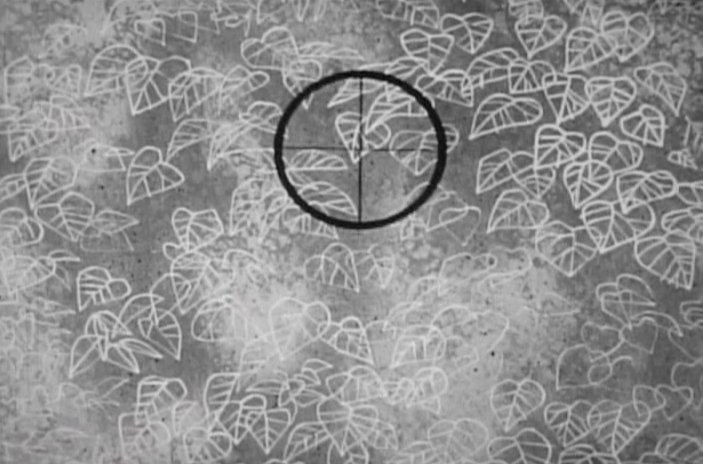
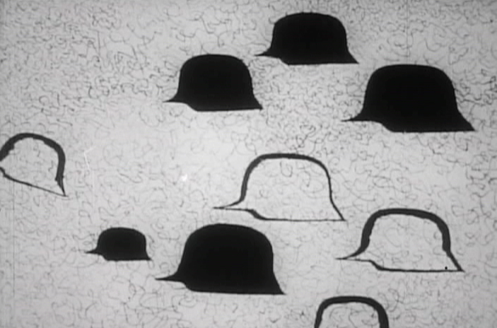
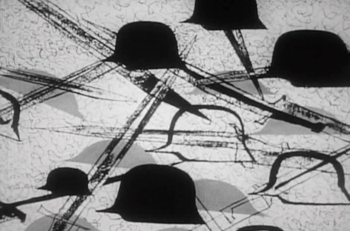
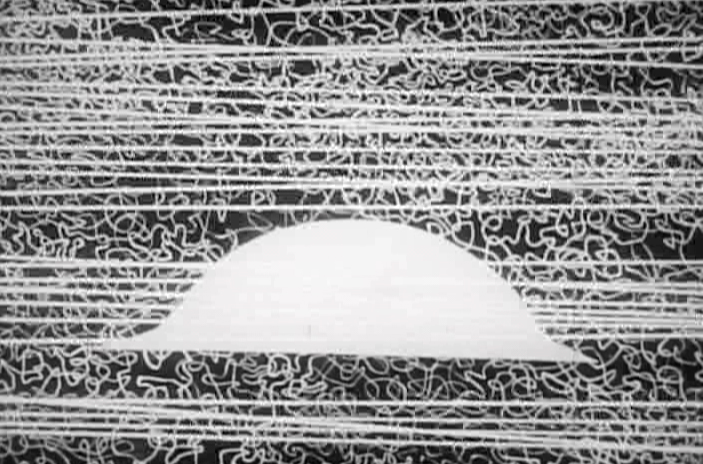
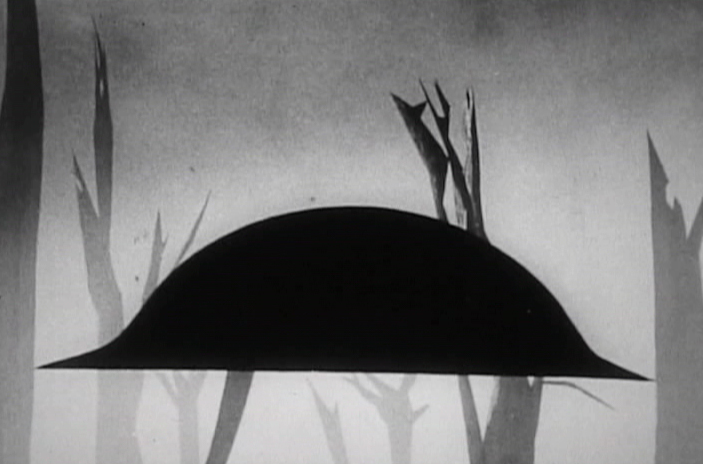
The Four Poster – part 3
- I’ve located a better copy of The Four Poster, so my posts will be more in focus henceforth. I’ve gone back and replaced the images in Part 1 and will do the same for Part 2 in the next week.
The Four Poster, in case I have to remind you, is a live action feature adaptation of a play by Jan de Hartog. It was produced by Stanley Kramer and directed by Irving Reis. The film takes place entirely within the bedroom of a married couple as they grow old together. To open up the film, they turned to animation working with the Columbia studio, UPA. John Hubley supervised all of the animation following his recently completed film, Rooty Toot Toot.
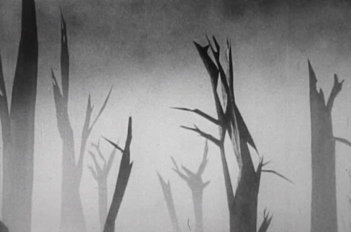
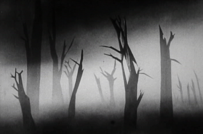
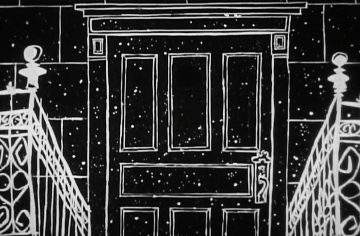
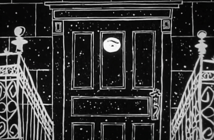
Part 3 starts as the couple’s child has grown up and gone off to War. World War I. The sequence was supervised by Paul Julian, and like most of his other directorial efforts it’s about beautiful paintings and graphic movement.
 1
1
 2
2
 3
3
 4
4
 5
5
 6
6
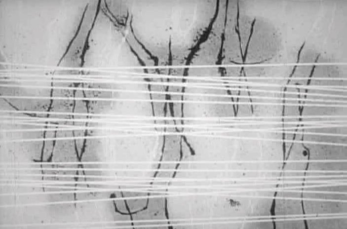 7
7
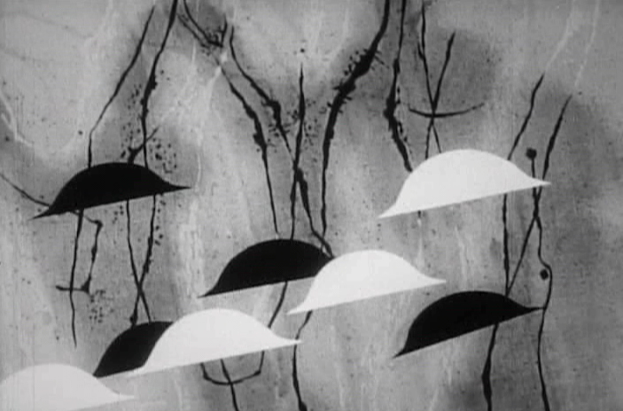 8
8
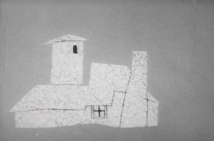 9
9
 10
10
 11
11
 12
12
 13
13
 14
14
 15
15
 16
16
 17
17
 18
18
 19
19
 20
20
 21
21
 22
22
 23
23
_______________________________
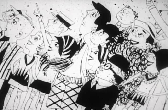
From the death of their son, the film takes us forward into the Roaring Twenties.
 1
1
 2
2
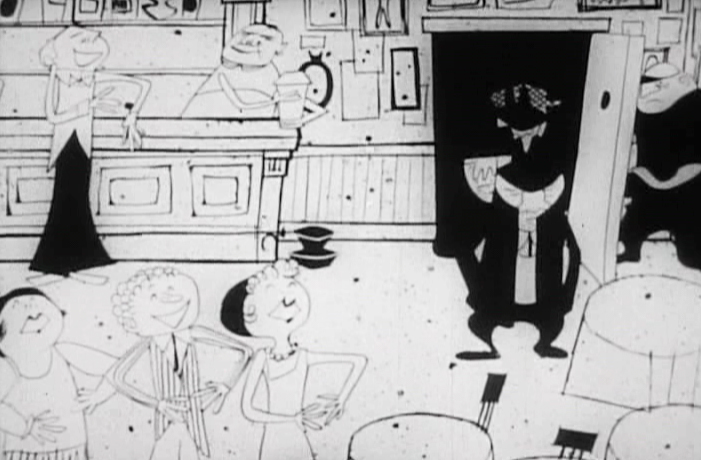
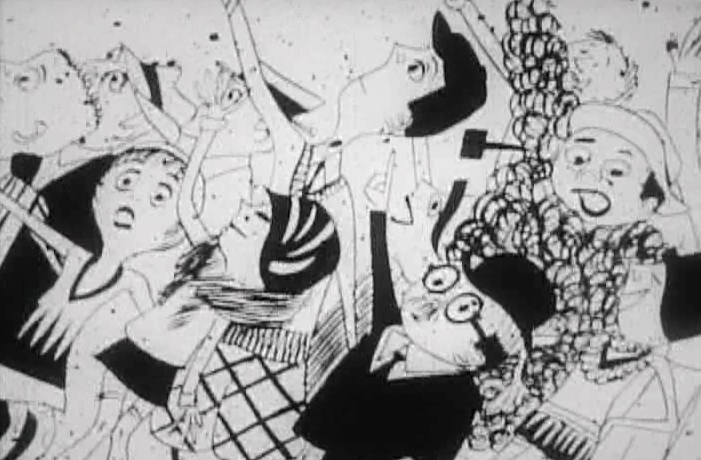
It’s a world of speakeasies.
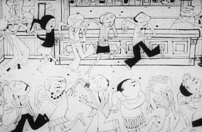 3
3
Flappers dancing and living the high life
 4
4
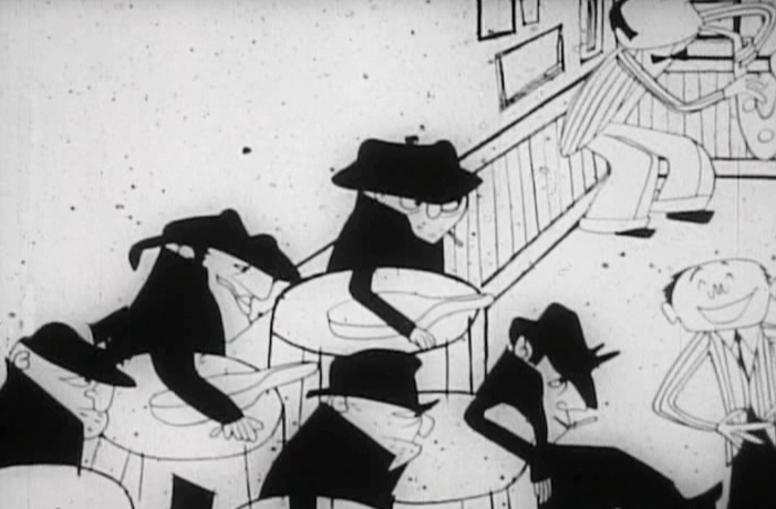
Mobsters
 5
5
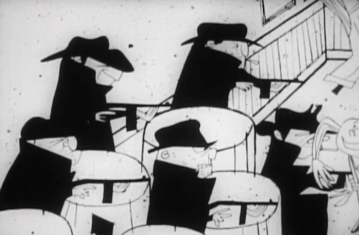 6
6
and their violence
 7
7
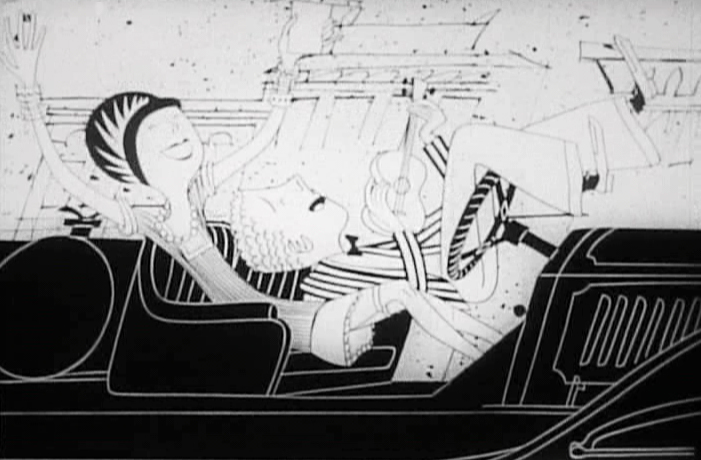
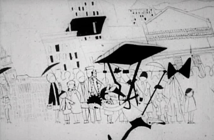
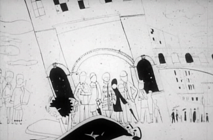
Fast cars
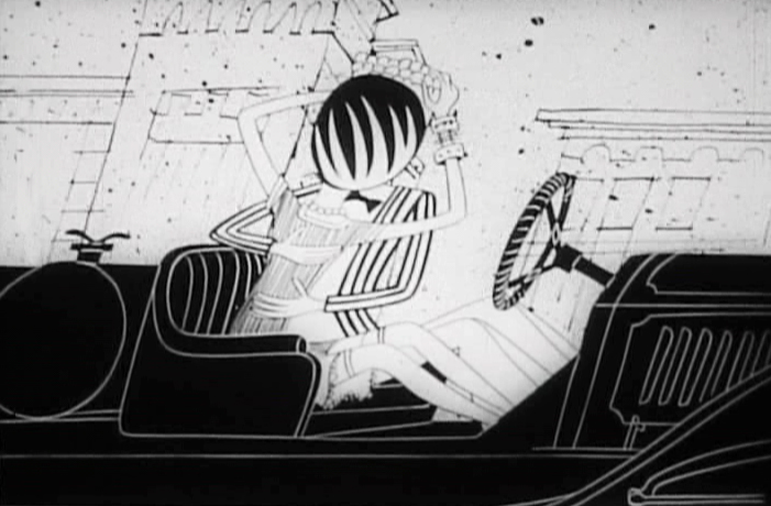 8
8
and flirting
 9
9
High flying inventions
 10
10
 11
11
 12
12
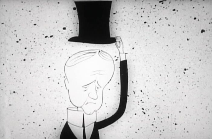
Calvin Coolidge
 13
13
and new ways of travel.
