Search ResultsFor "1939"
Articles on Animation &Books &Commentary &Disney &Illustration &John Canemaker &Layout & Design &Story & Storyboards 01 Jul 2013 07:29 am
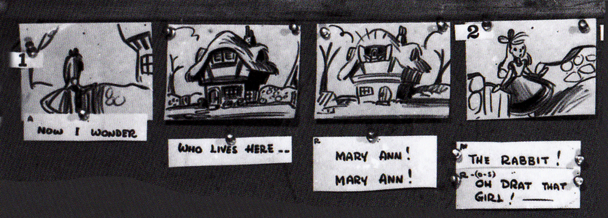
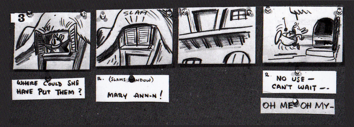
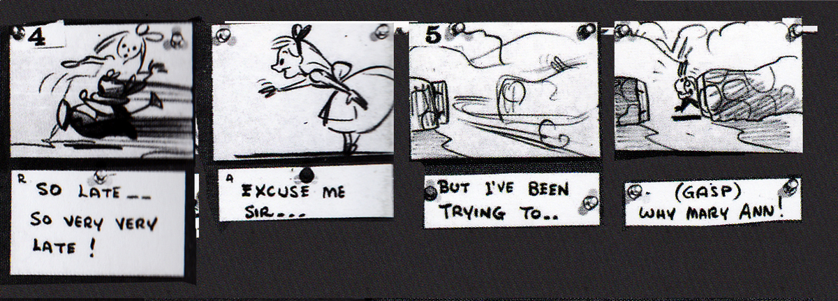
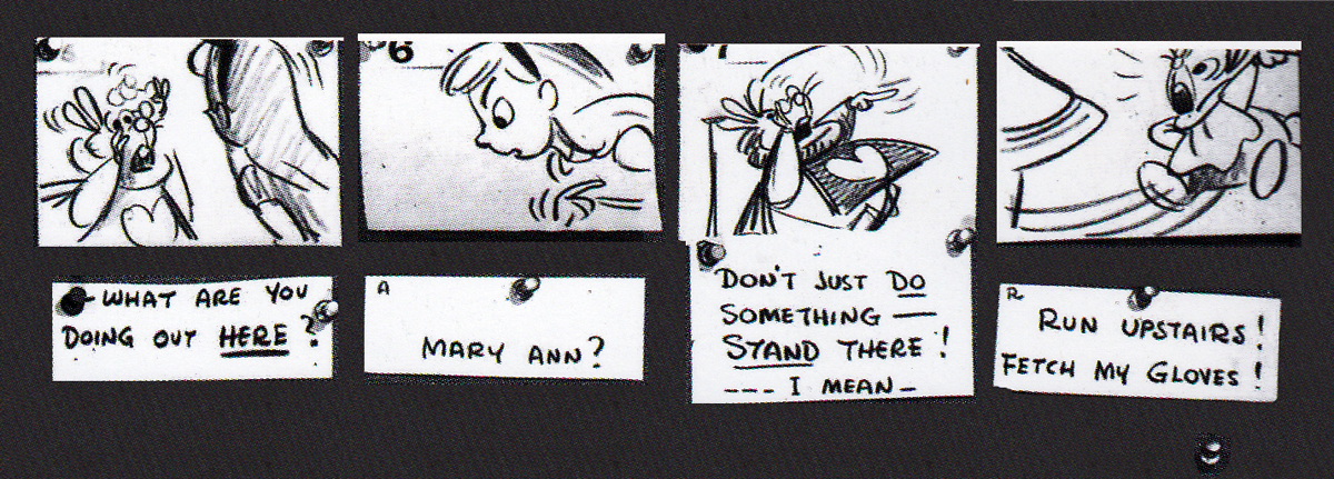
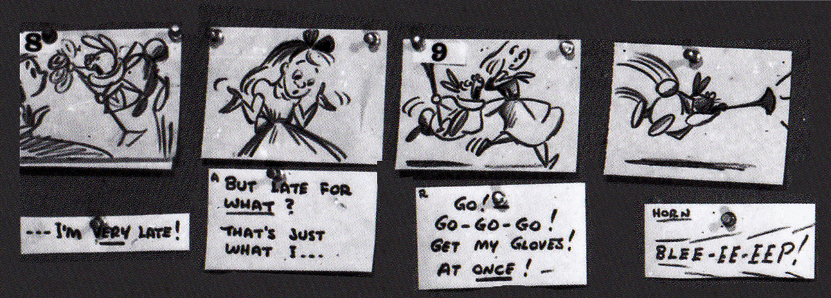
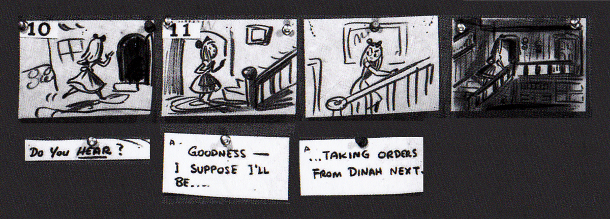
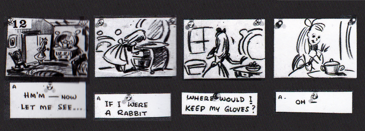
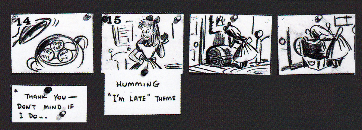
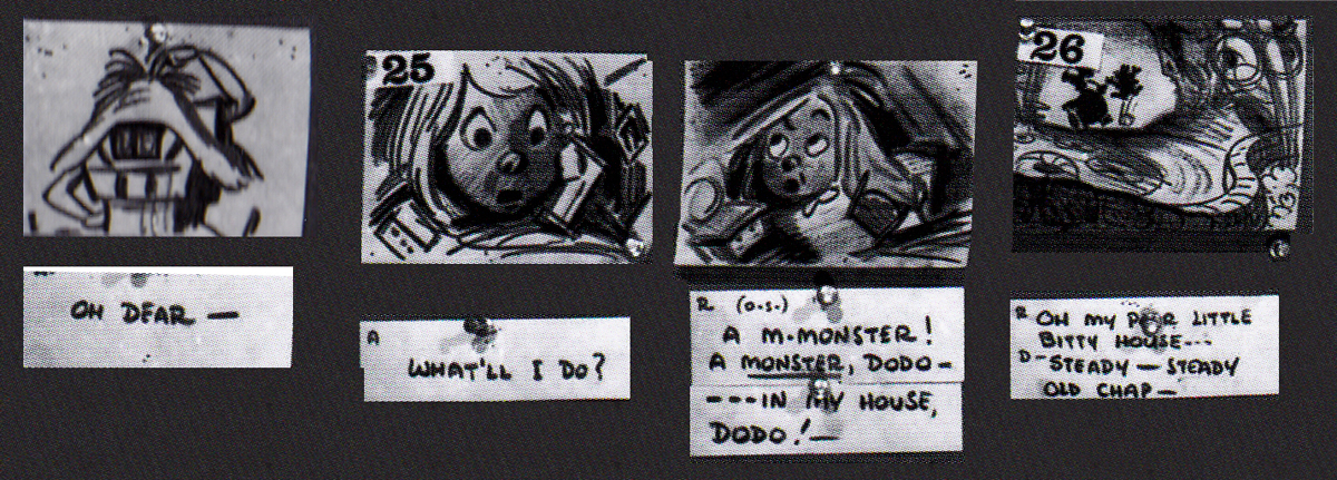
Alice Boards
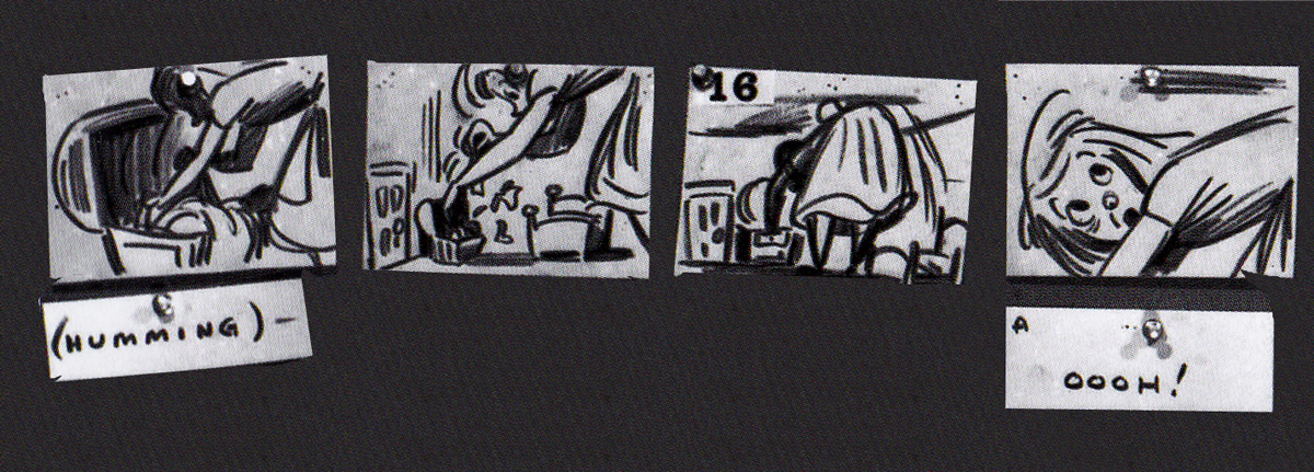
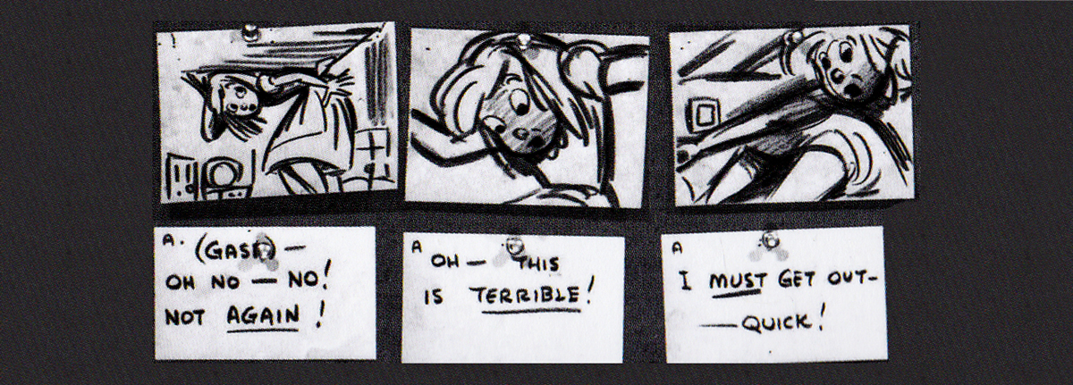
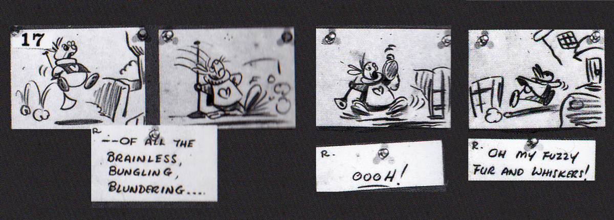
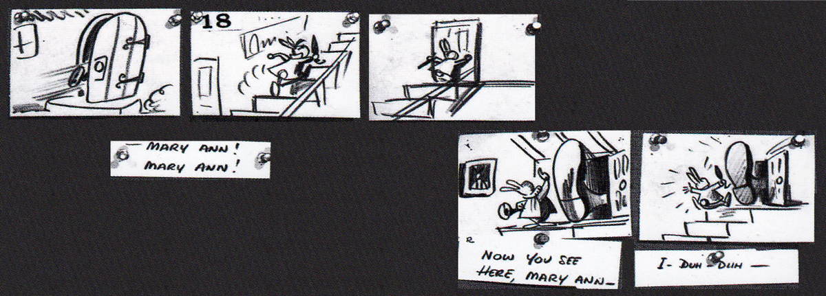
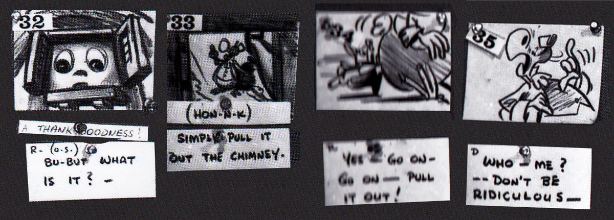
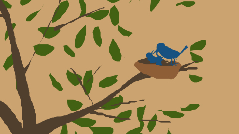
John Canemaker‘s book Paper Dreams: The Art & Artists of Disney Storyboards, is a brilliant work. As an example, take a look at this short piece for Alice In Wonderland.
The animated feature went through a long, slow birth.
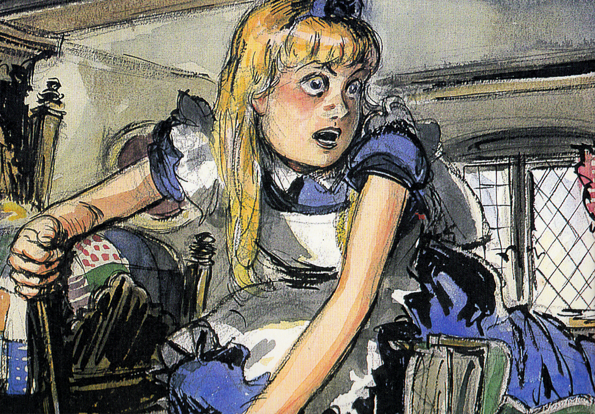
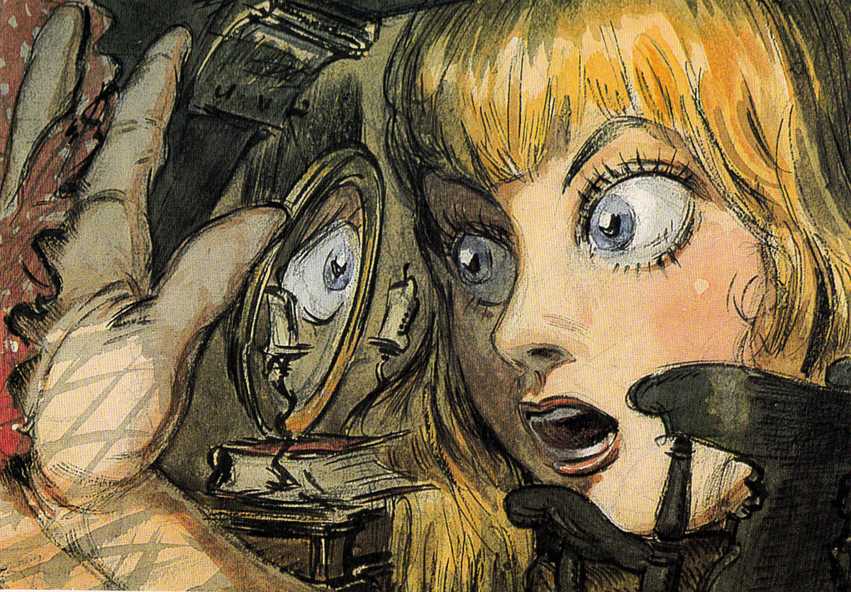
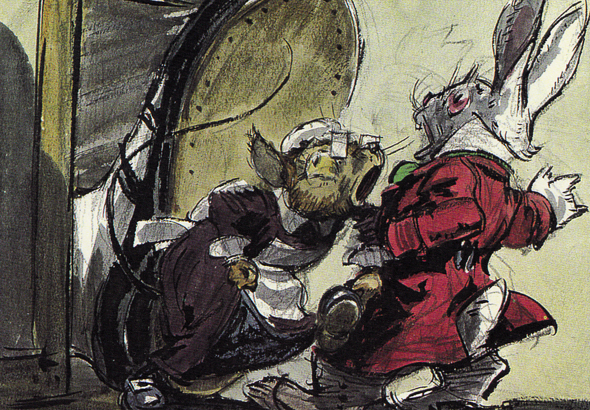
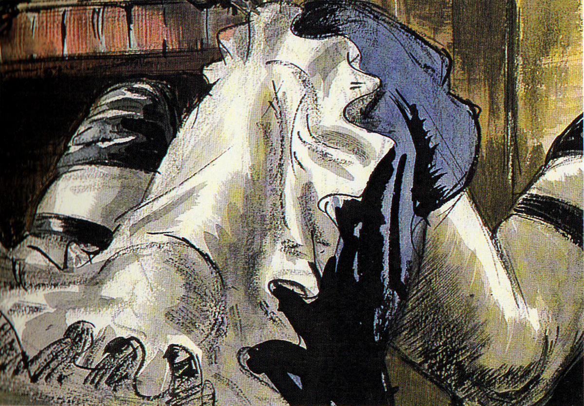
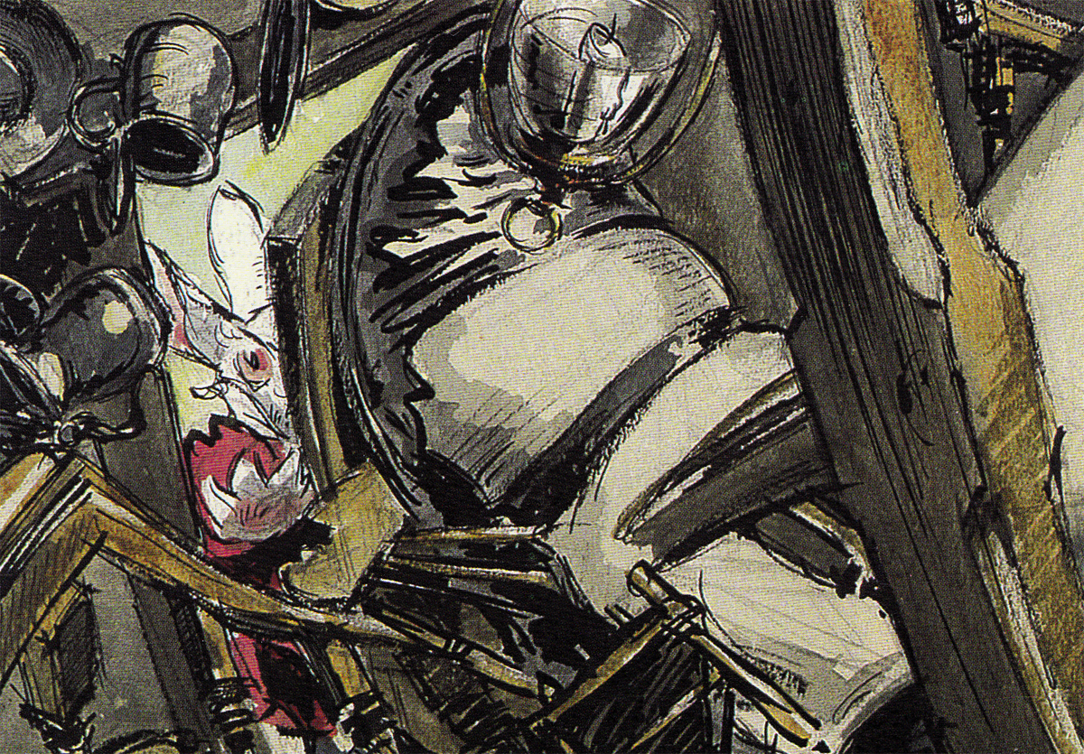
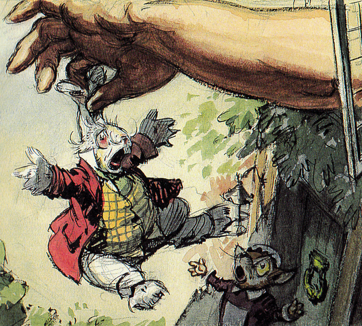
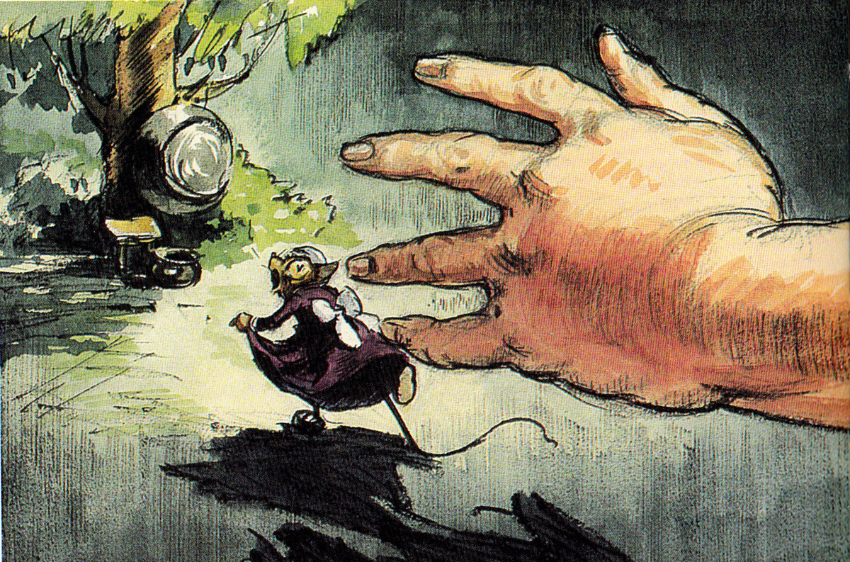
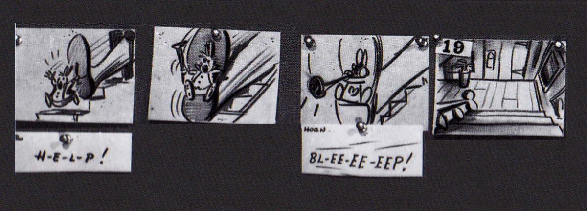
The first board, for this sequence, was by David Hall and was done in 1939, the late Thirties. Hall was originally a production artist for Cecil B. DeMille at Paramount Pictures; he worked as an illustrator who was called in to make many delicate watercolors. There was one sequence from the Carroll original which was kept for the final film. In it, Alice gets trapped within a house when, having bitten into a cracker, she suddenly starts getting larger and larger until she fills the white rabbit’s home with her head and overgrown body parts. Many a creature try to pull her from the house.
Here are some of the Hall watercolor images:
 1
1
 2
2
 3
3
 4
4
 5
5
 6
6
 7
7
 8
8
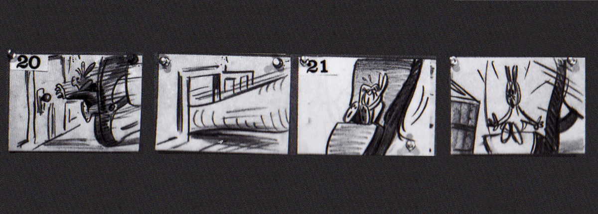
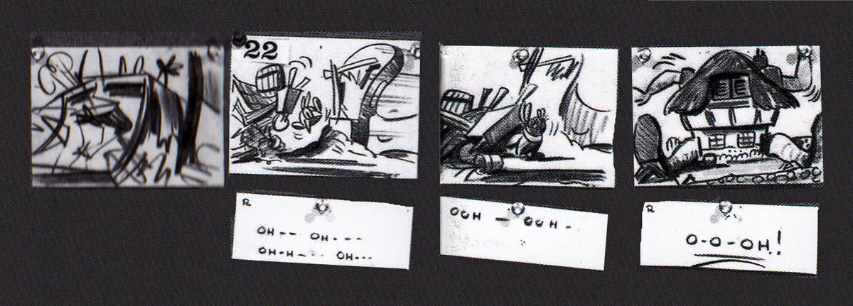
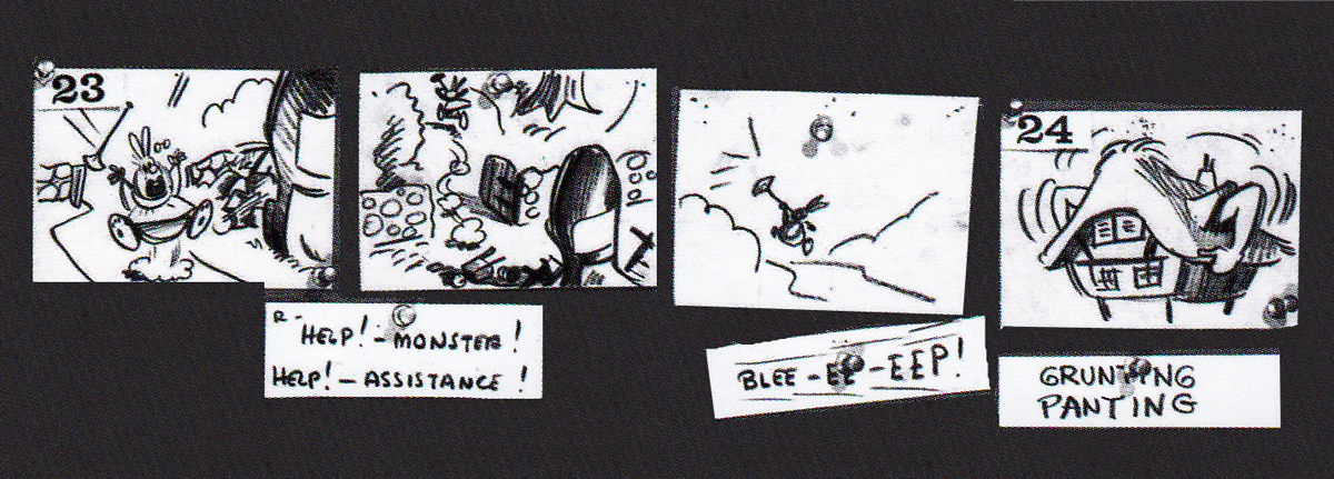
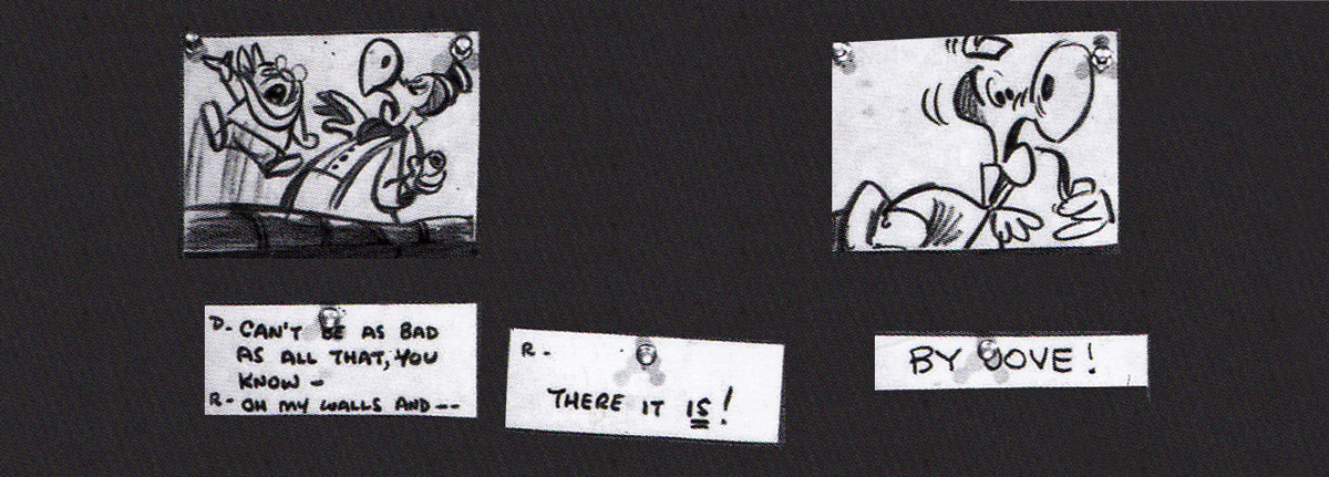
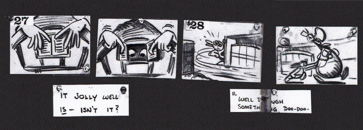
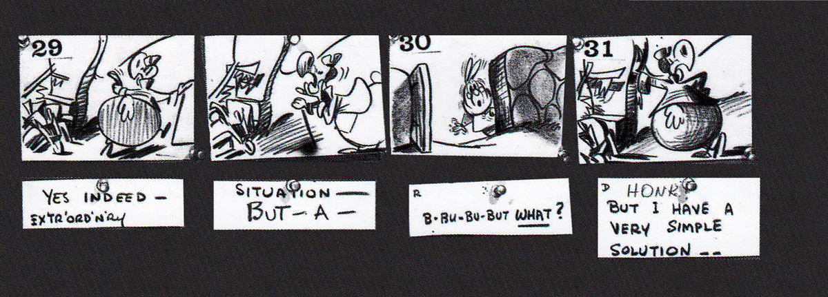
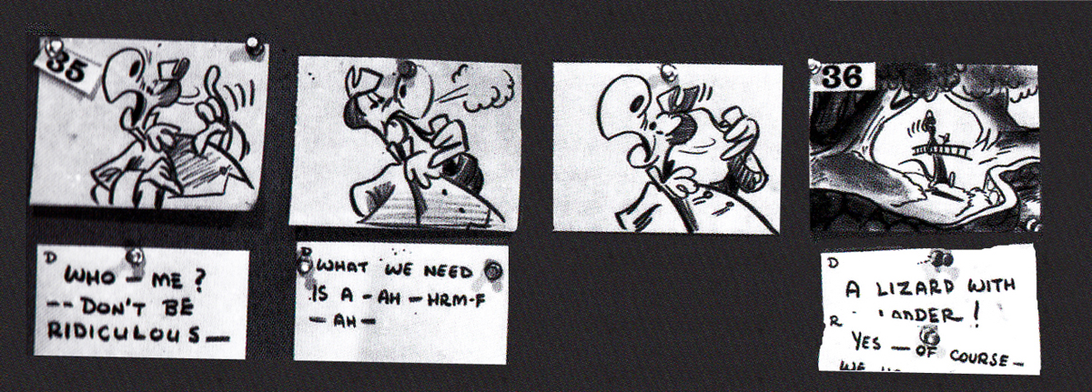
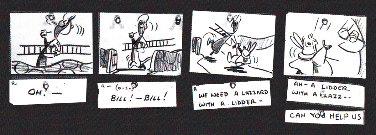
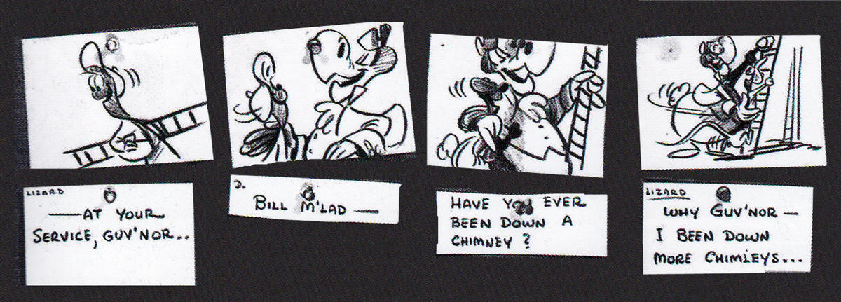
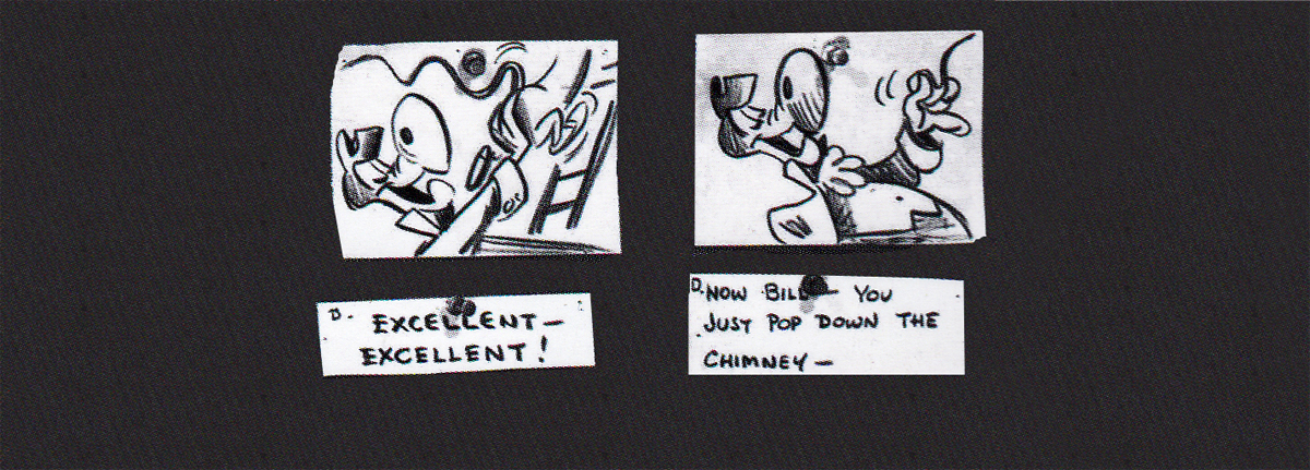
Following his version, there was an attempt at a script by novelist Aldous Huxley. Done in 1945, this was ultimately abandoned when storyboard continuity artist, Joe RInaldi, came in to make some more cohesive and funny drawings in 1950.
Here’s the full sequence, Rinaldi’s version.
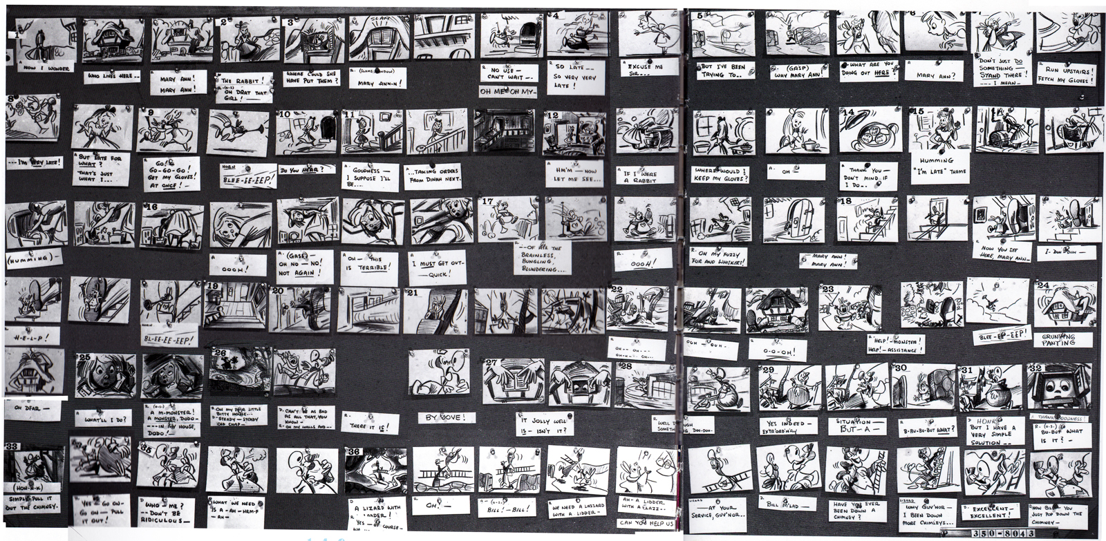
The following is Rinaldi‘s board enlarged for the sake of legibility:
 1
1
 2
2
 3
3
 4
4
 5
5
 6
6
 7
7
 8
8
 9
9
 10
10
 11
11
 12
12
 13
13
 14
14
 15
15
 16
16
 17
17
 18
18
 19
19
 20
20
 21
21
 22
22
 23
23
 24
24
 25
25
I have to give John Canemaker many thanks for allowing me to post these images. His book is a treasure. to those who appreciate the storyboard.
Commentary &Independent Animation &Photos 11 May 2013 06:04 am
Lookout
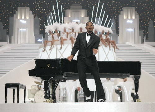
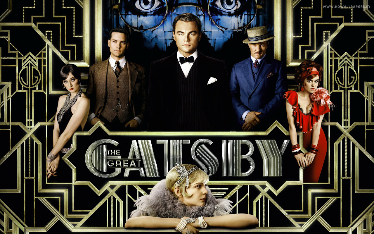
- I’ve been trying to think of what the new version of The Great Gatsby reminds me of, and in a conversation with Heidi, she smack dab put her finger on it. There was a film, called Idlewild, done in 2006 by hip hop artists, Andre 3000. That was it. I was in love with that film and wrote an exuberant review. See here.
Idlewild was a rich looking, spirited film about the mob in the 1920s. The screen burst with rhythm and excitement frame after frame. Animated objects appeared everywhere in George Pal like additions.
The difference between the two films – Ixdlewild and Gatsby – other than about $100 million, and the throng of “AAA” celebrities like Leonardo DiCaprio is that Idlewild has a hell of a lot more imagination. The two equal each other in exuberance and style, and Gatsby is adapted from one of the great books of the 20th Century. I suggest you rent a copy of this 2006 film from Netflix or whoever before or after or instead of seeing Gatsby. As a matter of fact it’s time for me to see Idlewild again; I’ll rent it, myself.
Camp Levy
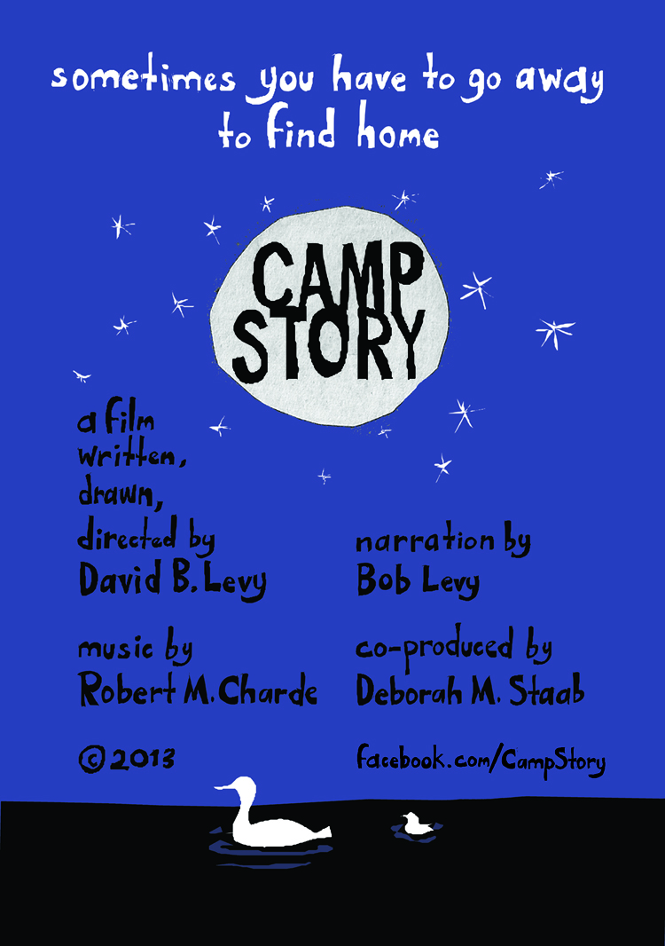
 David Levy recently announced to the world that he’d completed a new film. This time it’s a half hour movie animated to the narrated storytelling of Bob Levy‘s (Dave’s father) story of his trip to camp. This was a service for inner city poor children. Dave’s father actually received supprt to go for several summers, and tells the story of those Camp outs. He had a full $8 to spend for the first summer, and plays it to the max.
 The film is the third, done in a strong graphic style and uses material from the memory of Dave’s father.The other two films David animated: “Grandpa Looked Like William Powell,†and “Turning a Corner,†both made an impression. This short, “Camp Story,” exploits the father’s narrative without taking too many animation curves. Howard Beckerman used to say there was full animation and “Limited” animation, but
  he’d discovered a third style – “Enough” animation. “Limited” when it can be and full when it has to be. This film is “Enough” animation. More of an iconic graphic trip, often depending on silhouttes to relay the story. Using bold colors and large solids, it uses its Flash animation to the max. (I’m pretty sure it’s Flash though it might have been done on Toon Boom.)
The sound track is a solo guitar that’s played pretty low on the track, so it’s particularly unimposing. I don’t hear many effects if there are any, so the track is somewhat simple. This helps put a focus on Bob Levy’s voice as he narrates the qiet story.
The film will succeed in many festivals. The story roams a bit telling of many summers he’d experienced. There are times when it takes a bit too long to get there, so my preference is the last of the shorts David did, “Turning a Corner.†But this is a fine addition to Dave’s library. He’s found his metier. I just wonder if the story supports the length. I have to give him credit, though. It takes some kind of fortitude and determination to come home from work daily only to start work on your animated film.
And to keep it up. As a matter of fact, Dave has me questioning my own enthusiasm. It’s time for me to put some energy out there as well.
Keep your eyes open for this movie; it’s a truly Independent film and needs support.
Daily Motion and The Congress
The last time I felt such inspiration was when I contemplated Yoni Goodman‘s daily animated pieces for his blog, the Dailymotion. Perhaps you’ll remember my excitement for Mr. Goodman’s daily animated tests which he offered us. Anyway, his output was so inspiring it actually had me doing some personal animation. Unfortunately that didn’t last long enough to be productive.
I wondered what has happened to Yon Goodman’s “Daily Motion” pieces, so I went back.
He was the animation director for the Israeli feature, Waltz with Bashir. His blog was a way for him to keep it going for himself. It turns out, Mr. Goodman has been the animation director for another feature film, The Congress. This film will make its debut at Cannes this coming weekend. You can see some stills and get some information here.
It’s half animated and half live action. Stars include Robin Wright, Paul Giamatti, Jon Hamm and Harvey Keitel. It’s an animated adaptation of Stanislaw Lem’s novel “The Futurological Congress”. (From thte short synopsis I’ve read, this sounds like a very imaginative idea for a film.)
It’s another good film to watch for; one that was done in 2D. (Only in America are they afraid of that medium.)
A Public Reading of an Unproduced Screenplay
About the Death of Walt Disney
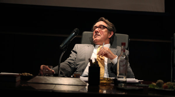
Yes, that is the title of the play which opened yesterday at the Soho Rep. A Public Reading of an Unproduced Screenplay About the Death of Walt Disney was written by Lucas Hnath and the play was directed by Sarah Benson, the artistic director of the Soho Rep. The show stars Larry Pine as Walt Disney. The actor has performed in many films and plays, usually as a positive role model of a character. Yesterday’s review in the NYTimes, by Charles Isherwood, takes the play to task for re-imagining Walt as someone impatient to prop himself up into someone more important  than he is. “. . . Walt is not “one of the most important people who ever lived,†as he grandiosely aspires to be, but just a mortal like anyone else. While apparently devoting his public life to bringing pleasure to millions, Mr. Hnath’s Walt Disney had a horror of being considered one of them.”
The show is completely sold out for its limited run (likely these are subscribers who knew of the show in advance and pre-bought tickets as part of a package.
It’ll be interesting if they do a filmed version of this play. I wonder what the rights are to such a thing. There’s a book I always thought would make a good film about Walt: The Oranging of America by Max Apple.
Larry Pine as “Walt”
More information about the play can be found here.
Coming Soon
I thought I’d give you an idea of what I’m planning for the coming week.
- We’ll complete the Raggedy Ann photos which finish John Canemaker’s collection of images he shot for this book, The Animated Raggedy Ann and Andy
- We revisit Norman McLaren with some odds and ends that he wrote in the last years of his life. Of course, he was a smart erudite guy right up to the end, and I believe that comes across in this writing.
- We’ll also look back at the career of Lilian Friedman Astor, the first woman to have animated in a major U.S. studio. From 1933-1939 she worked for the Fleischer studios, and we have a list of all the scenes she did. Perhaps we can showcase some of them.
- And we’ll begin to look at the Frank Thomas & Ollie Johnston book, The Illusion of Life. Bo do I have a couple of problems to discuss with these two masters.
- And of course there will be some surprises in store for both of us.
Animation &Books &Comic Art &Disney &Guest writer &Illustration 11 Apr 2013 05:09 am
Peter Hale’s Peter Pan
About six weeks ago, I was contacted by Peter Hale in the UK about a “strip book” of Peter Pan that was published in England to tie into the original release of the movie. Peter sent me some beautiful scans of the artwork in the book, and I posted it (here.)
Mr. Hale promised a second book that was also published at the time.
It turns out he has done some extensive research into the subject of the books in conjunction with the Disney film. This week, I received a complete breakdown of all the “Pan” books that were published in the UK, and the scans for another book. I’ve decided that I really have to post what Peter has written; it’s that extensive. I’ll follow up with another post of the books scanned.
Many thanks to Peter Hale for sharing this fine work with the “Splog” and its readers.
The rest of this post is over to Peter Hale who writes:
 My (superficial) research into the Disney-illustrated books of Peter Pan published
in the UK in 1953 has wandered off on several tangents.
Firstly a rough chronology of the development of the original book, and the Disney
film:
1902 – Barrie’s fantasy novel (for adults) The Little White Bird includes a sequence that
features Peter Pan, a 7-day-old baby who flies away from home so that he will never
grow up, and, after learning that he is not a bird, and therefore can’t fly, is
adopted by the faries in Kensington Gardens.
1904 – Barrie expands the idea of Peter Pan into a play, to great success.
1905 – The chapters from The Little White Bird that feature Peter Pan are republished for
children as Peter Pan in Kensington Gardens by his publishers, Hodder & Stoughton,
to cash in on the play’s popularity.
1911 – Because of the demand for Peter Pan products, Barrie publishes a novel based on the
play. He adds a coda wherein Peter promises to return each spring to take Wendy back
to Neverland to do the Spring Cleaning. But he starts to miss years, until he has
forgotten her altogether. Wendy grows up and has a daughter of her own. One day
Peter returns for her and is distressed to find that she is too old to fly away. But
he soon meets her daughter Jane and so takes her to Neverland, and when she grows
old, her daughter Margaret will take over – because he does need a mother.
1915 – Hodder & Stoughton publish an abridged version of Peter Pan for younger children,
written by May Byron with Barrie’s approval. They title it Peter Pan & Wendy.
1921 – A version of May Byron’s adaptation “retold for Little People” is published, with
illustrations by Mabel Lucie Attwell at Barrie’s request. Her drawings of babylike
characters presumably matched Barrie’s vision.
1929 – Barrie donates all the rights to ‘Peter Pan’ to the Great Ormond Street Hospital for
Children.
1935 – Walt Disney plans to follow Snow White with Peter Pan, but has difficulty securing
screen rights from Great Ormond St Hospital.
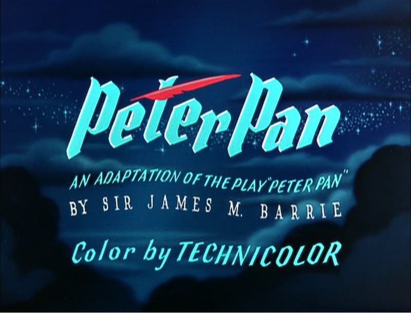
1939 – Having finally secured rights to make an animated film version, the Disney studios
schedule Peter Pan to follow Bambi and Pinocchio.
1941 – The entry of the US into WWII forces Disney to postpone productions.
1947 – The Disney Studios put Peter Pan back into production.
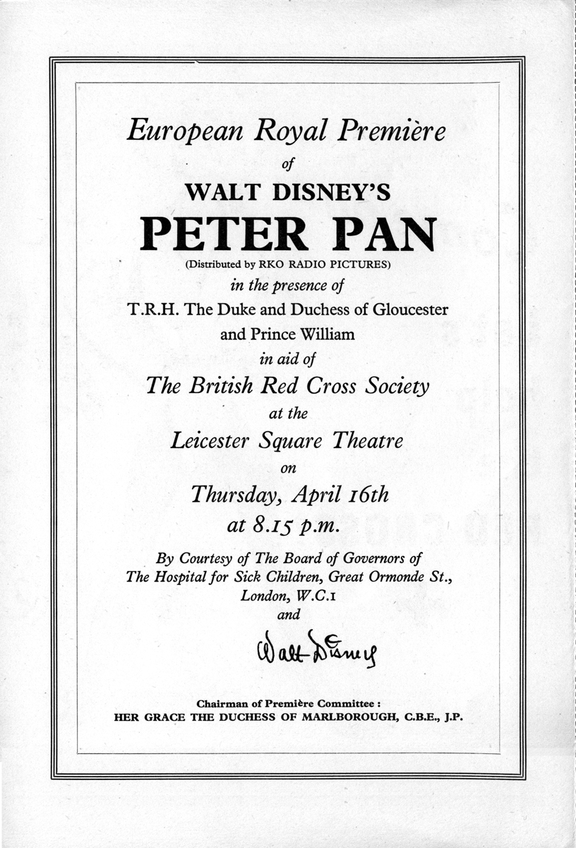
1953 – February 5th: Walt Disney’s Peter Pan premieres at the Roxy Theater, New York.
1953 – April 16th: Walt Disney’s Peter Pan has its UK premiere at the Leicester Square
Theatre, London.
1953 – May: Walt Disney’s Peter Pan is shown at the 6th Cannes Festival.
1953 – July 27th: Walt Disney’s Peter Pan goes on general release in the UK.]
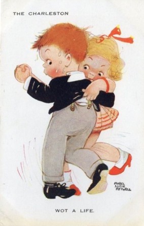
Through the 40s her characters became ever more chubby, stunted and stylised, but in 1915 she was still starting out as an illustrator.
Here is her version of Peter freeing Wendy from the mast.
The illustrations she did then became almost as much part of the May Byron version of “Peter Pan and Wendy” as Tenniel’s were part of “Alice”, and it was still being published in 1980. A reprint of the 1921 edition was published in 2011.
Which brings us to the versions of Peter Pan published in the UK in 1953.
Jacqueline Rose, in her book “The Case of Peter Pan”, lists the following six books published in the UK that year:
- Barrie, J. M. Peter Pan in Kensington Gardens, illustrated by Arthur Rackham, ‘Peter Pan Books’ (from 9 years) (London: Hodder and Stoughton, I953)
- Bedford, Annie N. Disney’s Peter Pan and Wendy, ‘Peter Pan Books’ (London: Hodder and Stoughton, I953)
- Byron, May. Peter Pan in Kensington Gardens, illustrated by Arthur Rackham, ‘Peter Pan Books’ (for 6 to 8 year olds) (London: Hodder and Stoughton, I953)
- Byron, May. The Walt Disney Illustrated Peter Pan and Wendy, ‘Peter Pan Books’ (for 8 to 9 year olds) (Leicester: Brockhampton Press, I953)
- Pearl, Irene. Walt Disney’s Peter Pan, retold from the original story by J. M. Barrie, ‘Peter Pan Books’ (for 3 to 6 year olds) (Leicester: Brockhampton Press, I953)
- Winn, Alison. Walt Disney’s Peter Pan, retold from the original story by J. M. Barrie ‘Peter Pan Books’ (for 6 to 8 year olds) (Leicester: Brockhampton Press, I953)
as opposed to just one in 1952:
- Byron, May. Peter Pan, retold for the nursery, illustrated by Mabel Lucie Attwell, ‘Peter Pan Books’ for 3 to 6 year olds) (Leicester: Brockhampton Press, I952)
Two of these are versions of the Peter Pan in Kensington Gardens ‘origin’ story, which Disney had decided not to include in the film.
The remaining 4 are all “Illustrated by Walt Disney”. The Irene Pearl version is the strip book already posted, and scans of the May Byron book and the Alison Winn “Little Book” will follow. These all follow the Barrie novel rather than the Disney film, although with different simplifications and omissions.
The Annie N. Bedford book is one I have not been able to trace – she is the American author who wrote the Golden Books version of the Disney film, so this could be a UK publication of that book. It is given as published by Hodder & Stoughton, Barrie’s original publisher. The back cover of the Brockhampton ‘Little Book’ lists a different Hodder & Stoughton book.
“J. M. Barrie’s original Peter Pan and Wendy for older Boys and Girls, with illustrations by Walt Disney”. I have not been able to trace a copy of either book. These two books represent the two ends of the spectrum:
Barrie’s original text and the story of the film.
Finally there is the complication of Dean & Son’s Walt Disney’s Peter Pan, from the motion picture, a book of the film. This has no publication date. The illustrations are given as copyright Walt Disney 1953, but this is not a guide to the publication date, as Disney did not own the publishing rights and so the illustrations were always copyrighted to 1953, the year of the film’s release. It is probable that the Dean book was published later than 1953.
It is published ‘by arrangement with Hodder & Stoughton’, which either means it may be a reprint of the Bedford book, or just an acknowledgement that Hodder held the publication rights to Peter Pan.
In contrast I can only find one UK ‘Disney’s Alice in Wonderland‘ book that might have been published in 1951, and certainly no Carroll text with Disney illustrations.
So why so many Peter Pans? The UK’s wartime paper rationing ended in 1950 so that would not be an issue.
Was it because Disney did not have the publishing rights, so this collaboration was necessary to promote the film?
Was it just, as I’d thought previously, that the British might object to tampering with the story? Or was Disney just trying to overcome the sort of criticism that his Alice had suffered in the UK (that it was too Americanised and not sufficiently true to the book) by linking his film to the original text?
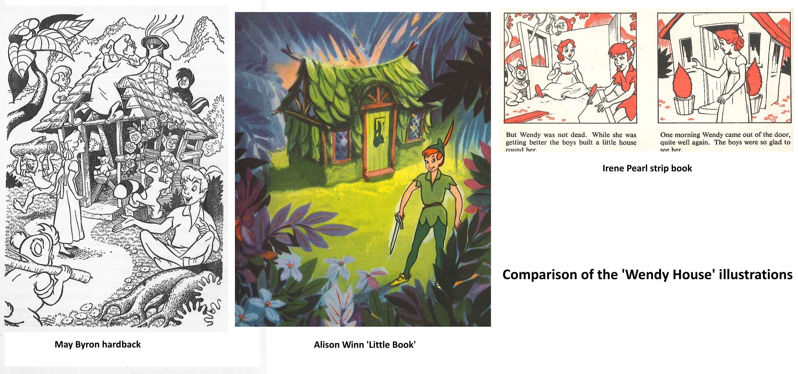
Comparing the 3 Brockhampton books the illustrations are all different, and by different hands it would appear, but all show fidelity to the Disney style. I am assuming that these illustrations were done by British illustrators specially for the books, as where the illustrations differ from the film the artists seem to have consulted the particular text they are working with for details.
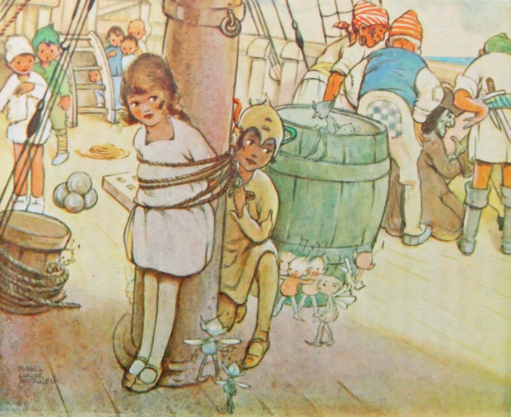
Hence the May Byron text describes the adding of a shoe as a knocker, and John’s hat as a chimney, and the illustration shows the hat, although it also shows Wendy watching the building from outside, which is quite wrong!
The marooning of Tiger Lily is done in the book by two pirates, with Hook turning up
later.
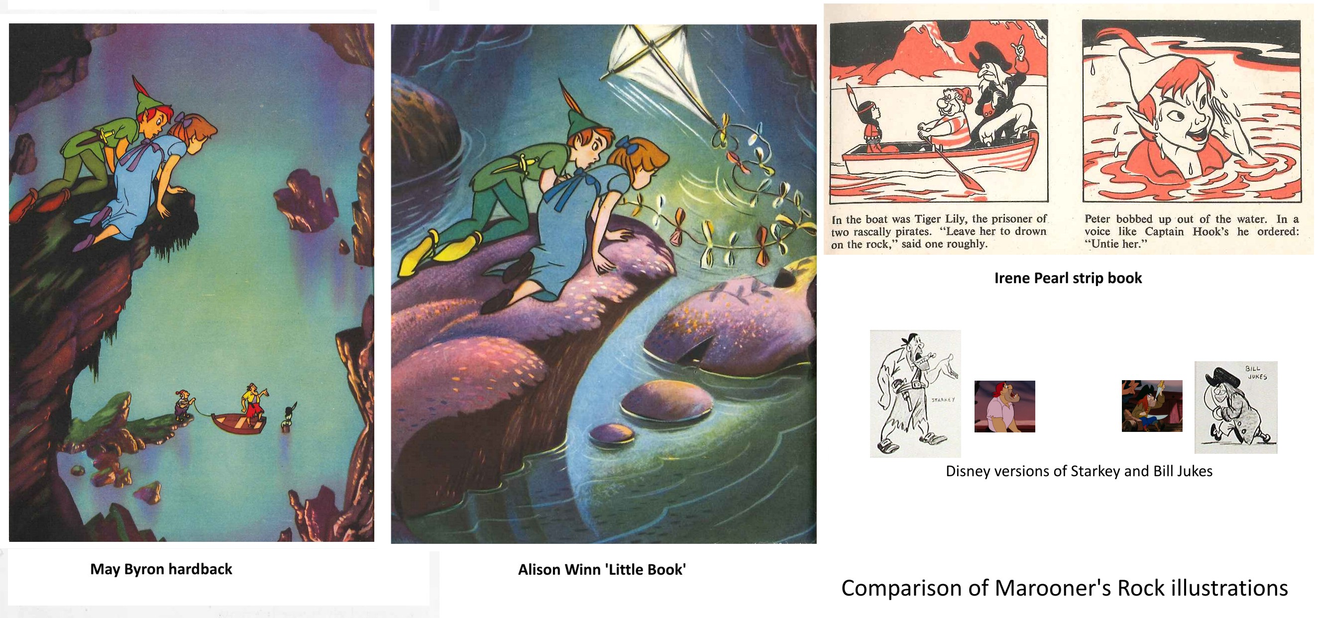
In the May Byron book they are named as Smee and Starkey, and the
illustration has Hook replaced by a likeness of the Disney Starkey (but with a
yellow shirt instead of pink). The strip book doesn’t name the pirates and Hook is
here replaced by Bill Jukes. The Alison Winn version omits the marooning of Tiger Lily entirely and just has Hook turn up to attack Peter.
All three books have Wendy exhausted and Peter injured after the encounter – both
stranded on the rock unable to fly back. John’s kite collects Wendy, while Peter is
rescued by the Never bird, whose floating nest serves as a boat. The Winn ‘Little
Book’ uses a version of the shot of Peter and Wendy watching Hook and Smee from on
high, but without the pirates, truncated to appear a low rock, and with a kite added
in.
This brought me to wonder how much Disney reference they were given, and what it
consisted of. Many of the scenes are close to shots from the film. But a look at the
Dean book, which seems to be taken directly from colour stills, shows that these are
not actually shots from the movie.
Anyone who has ever tried to put together presentation scenes from the cels of an
animated film knows that there are always problems – the best pose is poorly traced,
or one character is in an ungainly inbetween position – whatever, that perfect key
image from the storyboard just isn’t there in the actual film, where, deliberately,
nothing hits a strong extreme at the same time.
Hence it appears that the lobby card stills or coloured transparencies that Disney
circulated in their press packs etc. had been specially recreated – a lead animator
had redrawn the characters from various key frames as they ought to have looked, and
these drawings had been traced and painted on cel with extra care, and combined with
a new version of the background to be photographed by a stills camera. (I presume
the composites then went up on someone’s wall!) The same thing, of course, as the
re-posing of key scenes that is typically done by a stills photographer on the set
of a live action film after it has been shot.
The illustrators appear to have had coloured stills and model sheets to work from.
Does anyone know how much reference was supplied? Walt Disney Studios had an office
in London specifically to deal with promotion, distribution, licensing artwork etc.
Did they do artwork for any of the books – or just supply references?
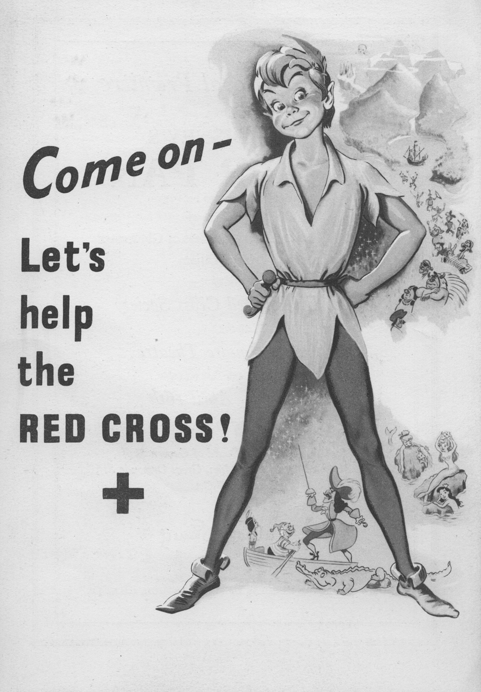
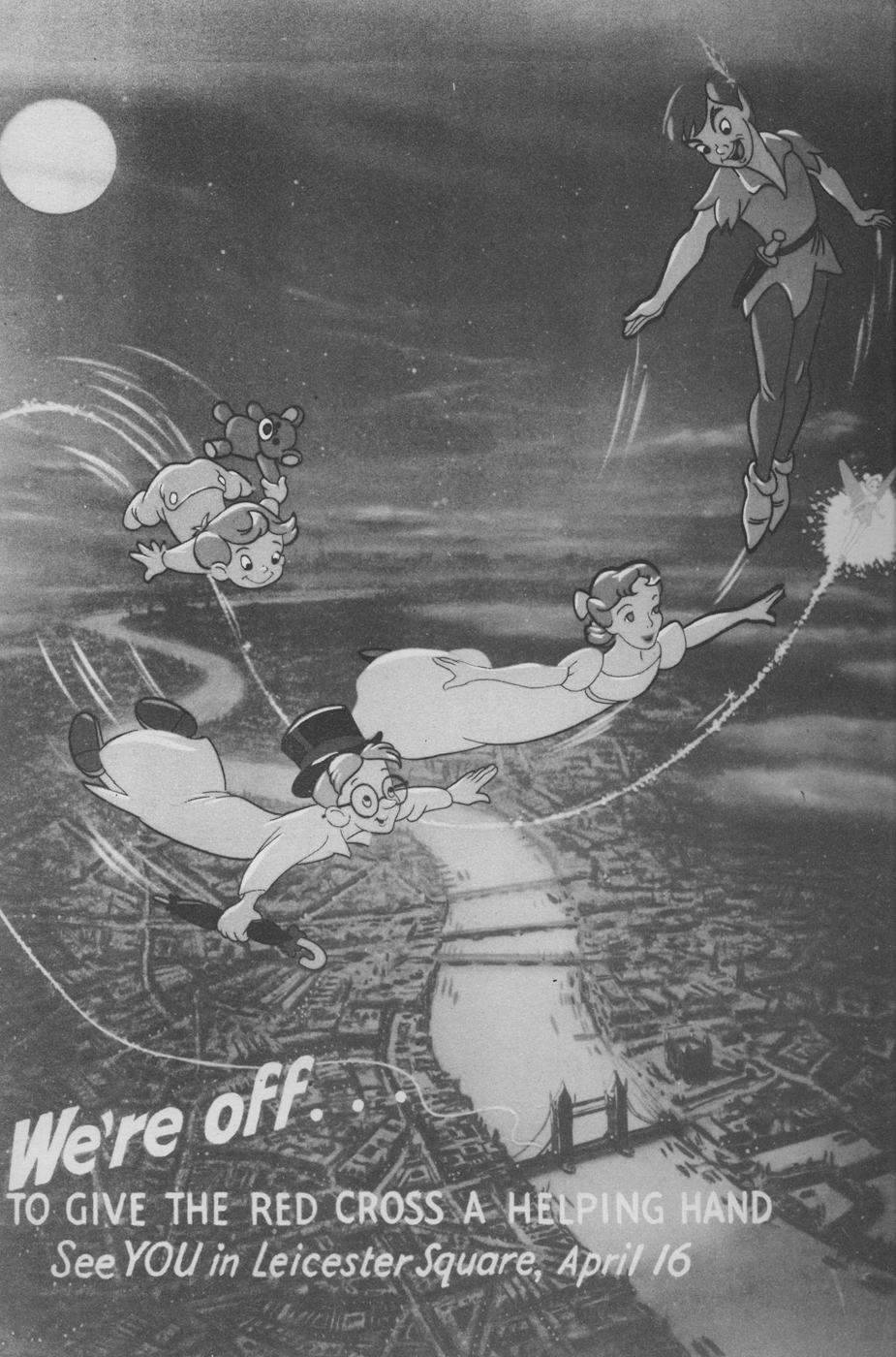
Lastly, the curator of the Great Ormond St. Children’s Hospital Archives has kindly
sent me these scans relating to the London Premiere of Peter Pan on 16th April 1953
It’s worth taking note that Hans Perk has recently posted the animators’ drafts from the Disney film, Peter Pan. Go here to read and/or collect them.
Animation Artifacts &Daily post &Photos 02 Dec 2012 07:01 am
Things
- Way back when, I did a couple of photo posts where I snapped some pictures of things that floated around me in my studio. Things I loved because they were around me, or maybe things that were around me because I loved them. I’m not sure which was which – the chicken or the egg. (See here and here.)
Well, as I once wrote, I’m currently working out of my home for the moment with my studio space in storage. Now, I’ve got a whole bunch of different things around me. These aren’t so obviously animation inclined, but I still love them. So let me give a show-and-tell around this room in the apartment.
 1
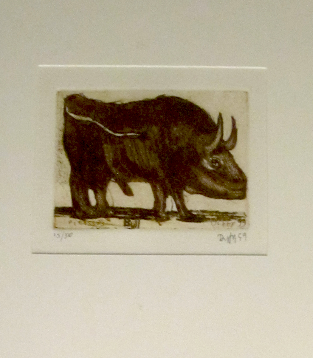
1This is an etching that Heidi bought me for a birthday or some
other gift-giving-event. It’s a tiny picture of a bull which is
framed and positioned over Heidi’s computer in the living room.
I like this little guy.
 2
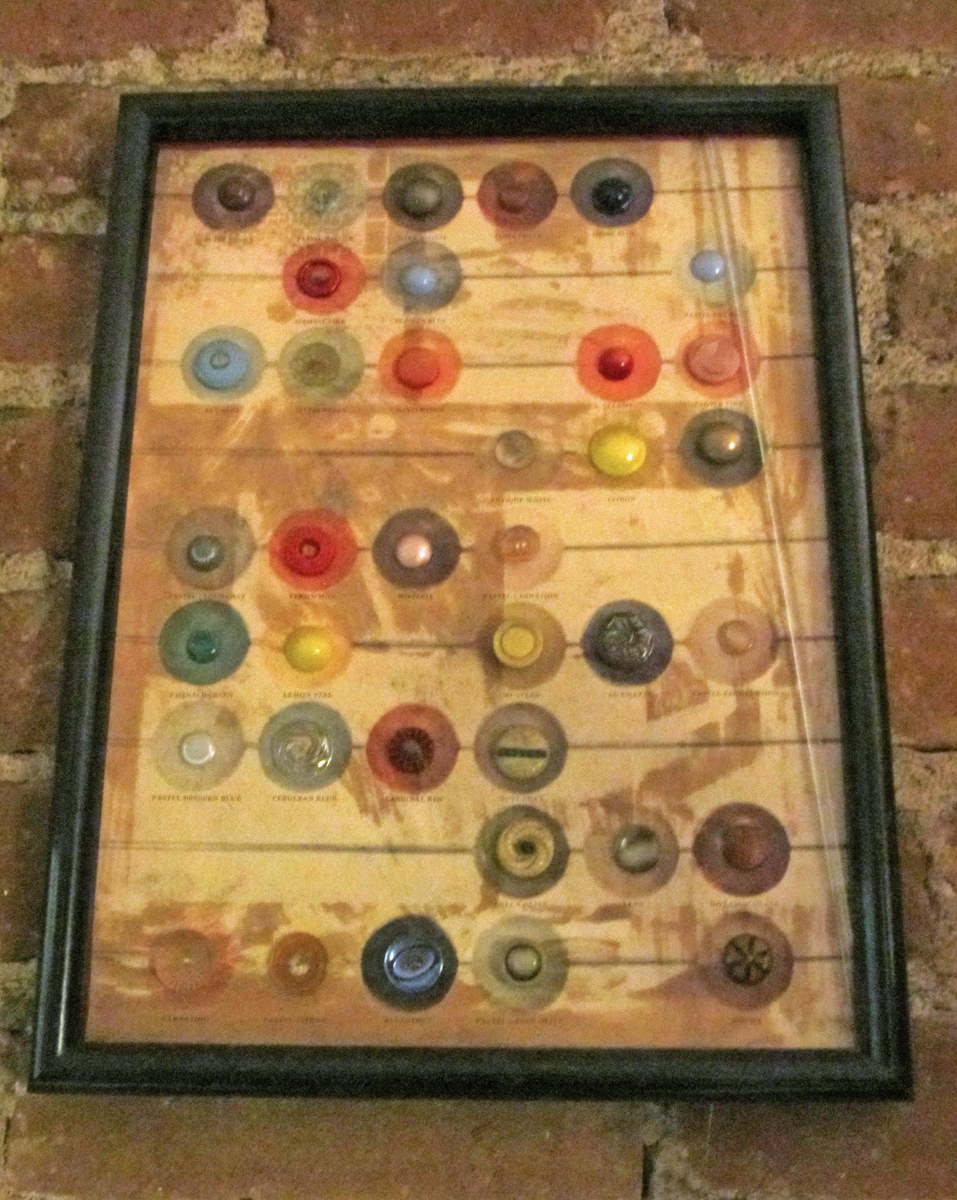
2
Heidi found this framed and dusty collection of buttons framed and
sitting inside the window of some garment-district store. I guess the
idea was supposed to be the display of the plastic buttons. It sits
hidden in the corner of the living room. I like it a l lot.
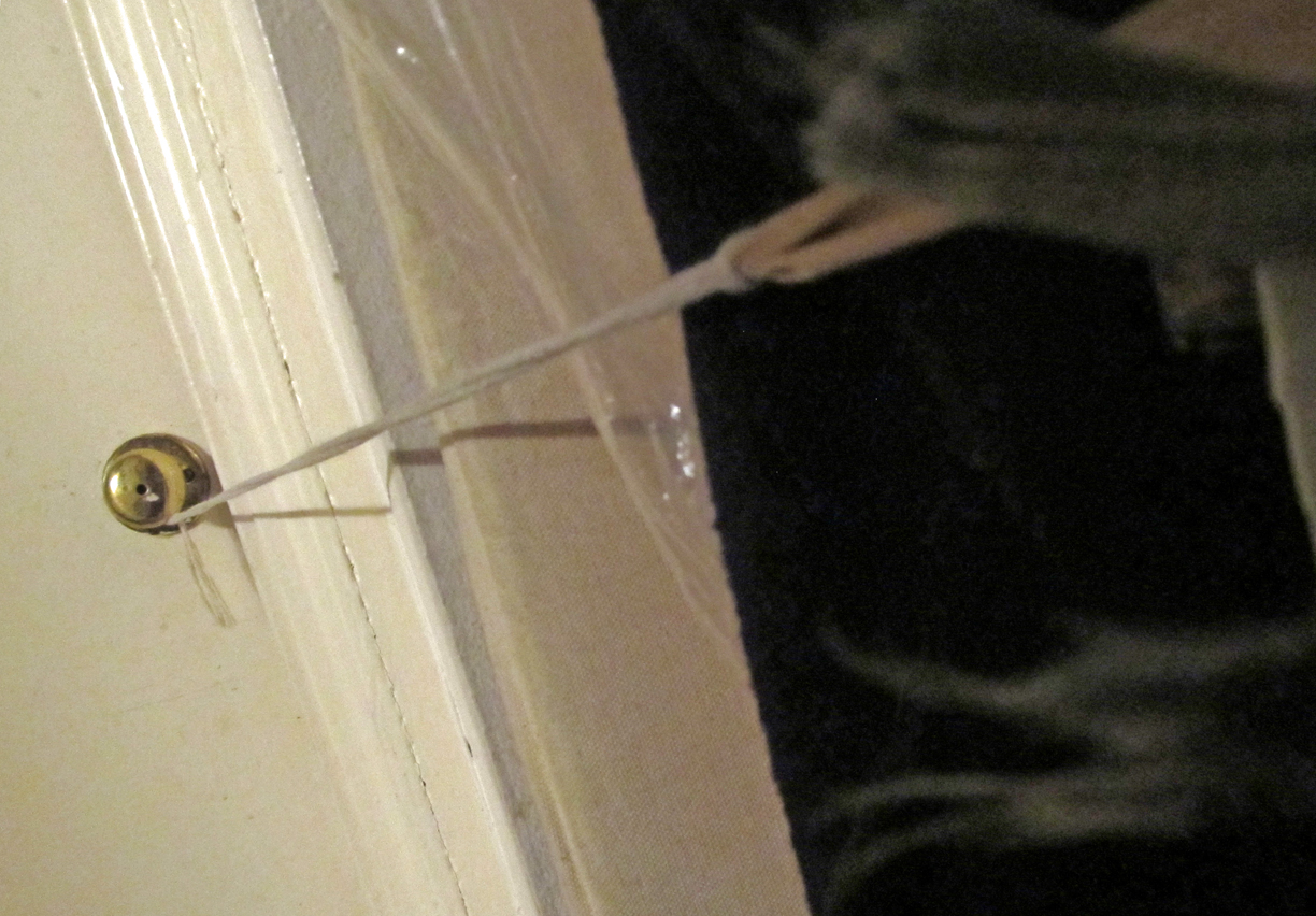
When we mixed our three cats together, Robbie, Alexander and Lola, it was
inevitable that they, all three, wouldn’t get along together. Robbie and Alex
are fighting friends (boys); Alex and Lola get along (boy and girl) ; but all 3
together don’t make it. Lola’s claimed the bedroom for herself, and if Robbie
even tries, horrendous cat cawls emerge from the bedroom. Of course, all
Robbie wants to do is get into that bedroom and start the wail we hear.
So a rope ties the bedroom door to a hall closet keeping the entrance impossible
for Robbie. The rope started out as a bathrobe belt, got some silk ribbons added
when that broke; and finally some twine extended it to the second door.
Whatever, it works.
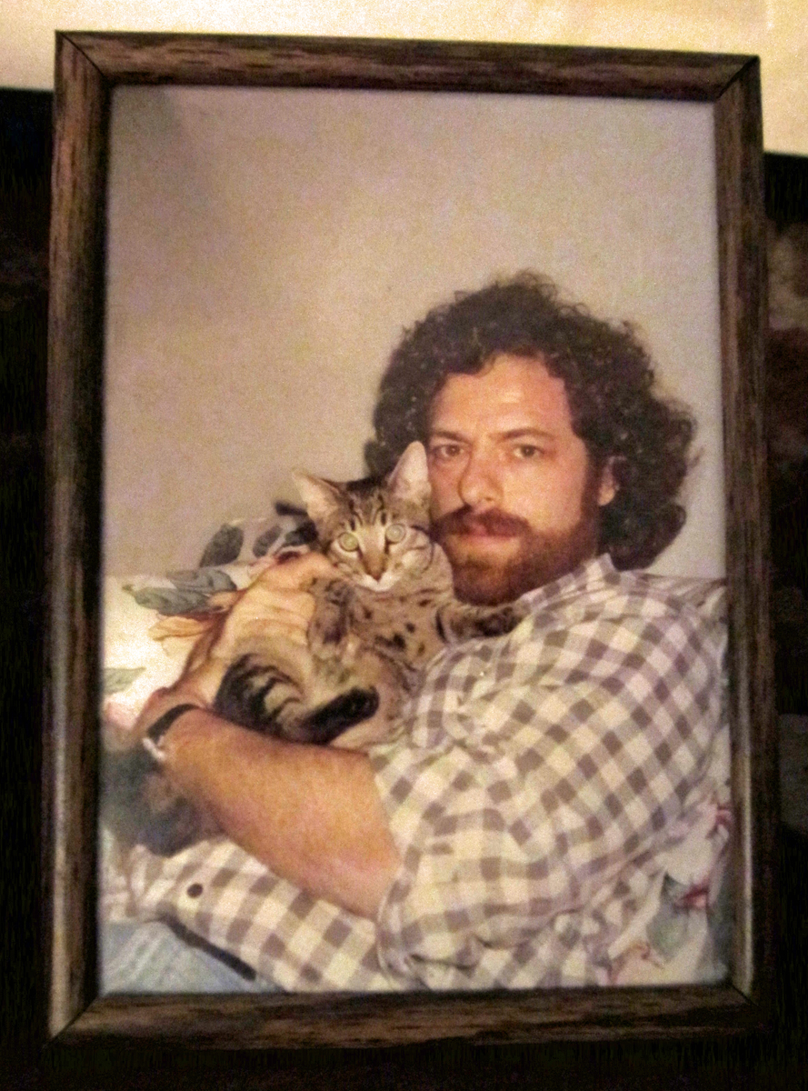 4
4
Ah, for the good old days of baby Claudie. I loved that guy.
He died in my arms on a final visit to the vet. He knew how
to do things, that boy. I loved him for 20 years.
His picture is over the piano in the living room.
 5
5
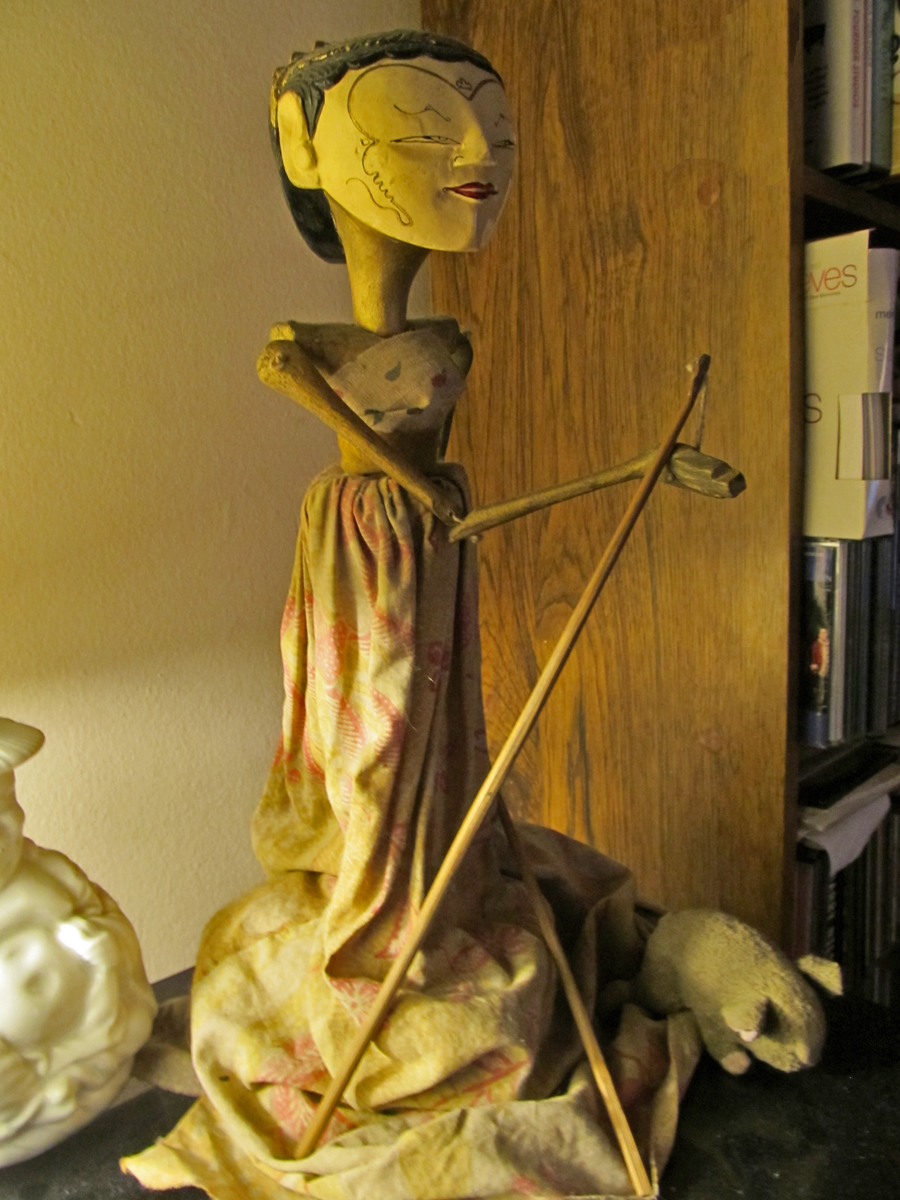
I’m sure you’ll remember that I’m a puppet guy.
This Indonesian rod puppet sits atop the no-longer-in-use
record changer. Both like to gather dust, and Heidi attacks
the dust weekly week or there abouts depending on the weather.
 6
6
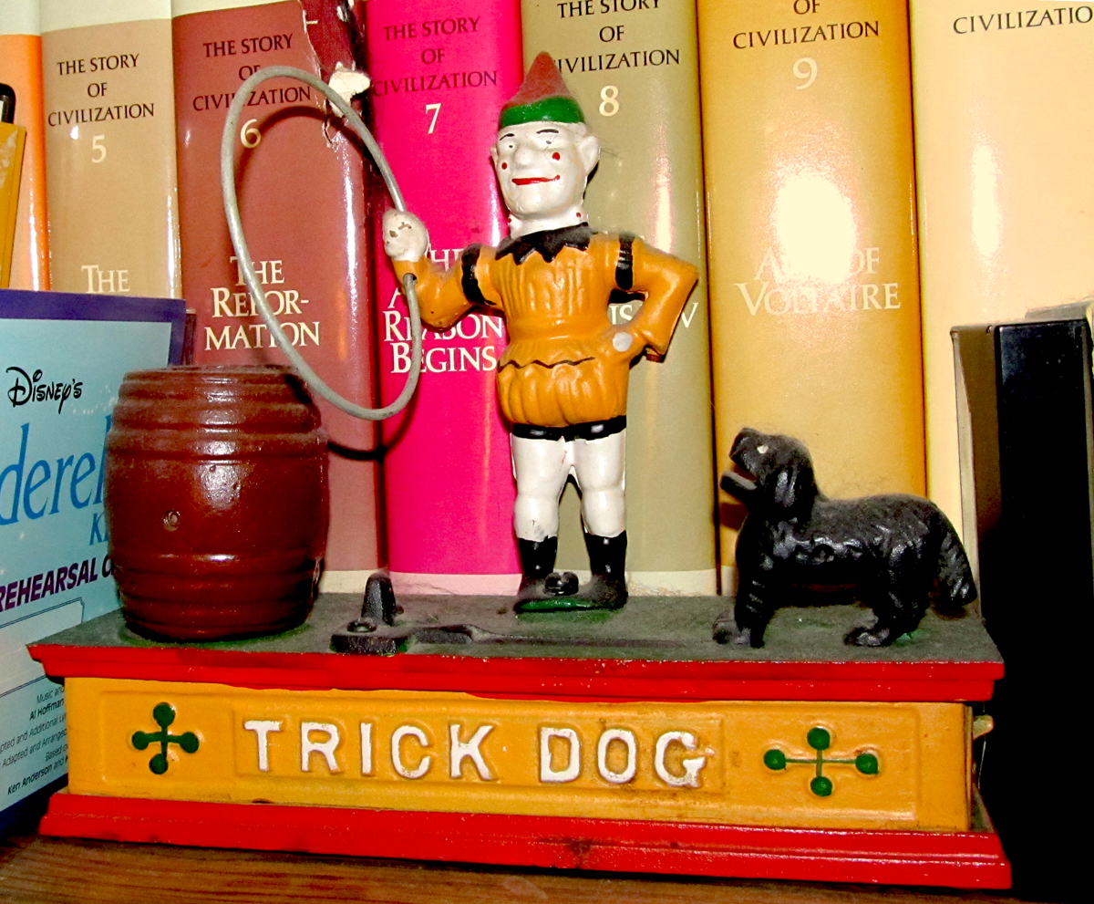
This trick bank is no doubt an iron reproduction, but
it’s still great just as it is. Put 5 cents in the dog’s
mouth, and he jumps through the clown’s hoop to
deposit the nickel into the barrel.
 7
7
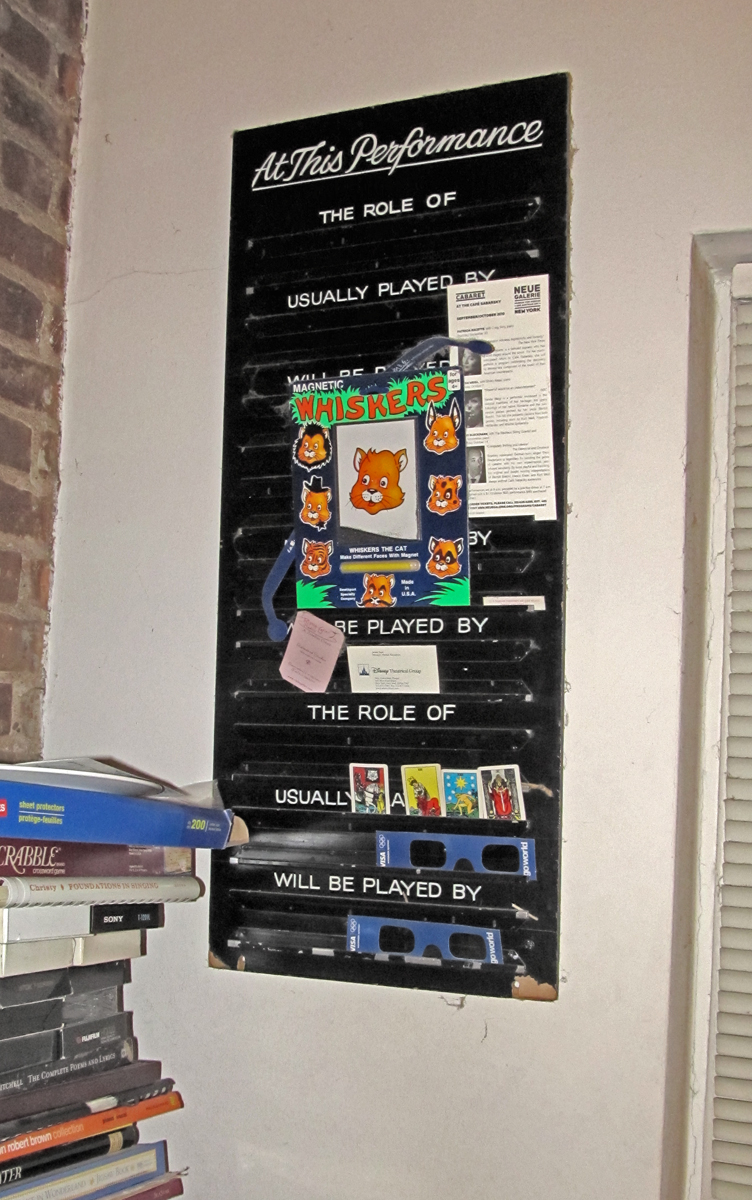
This replacement board came from the Winter Garden Theater.
When an actor doesn’t make it for a show, the board announces
the names of any replacements that’ll be going on. Heidi’s name
appeared here many times as she sat out the end of Cats.
When Cats closed and Mama Mia opened they got new boards backstage.
Lots of junk – such as 3D glasses – have replaced the sliding names
(which Heidi also has in the back. They don’t make the item any more
exciting.)
 8
8
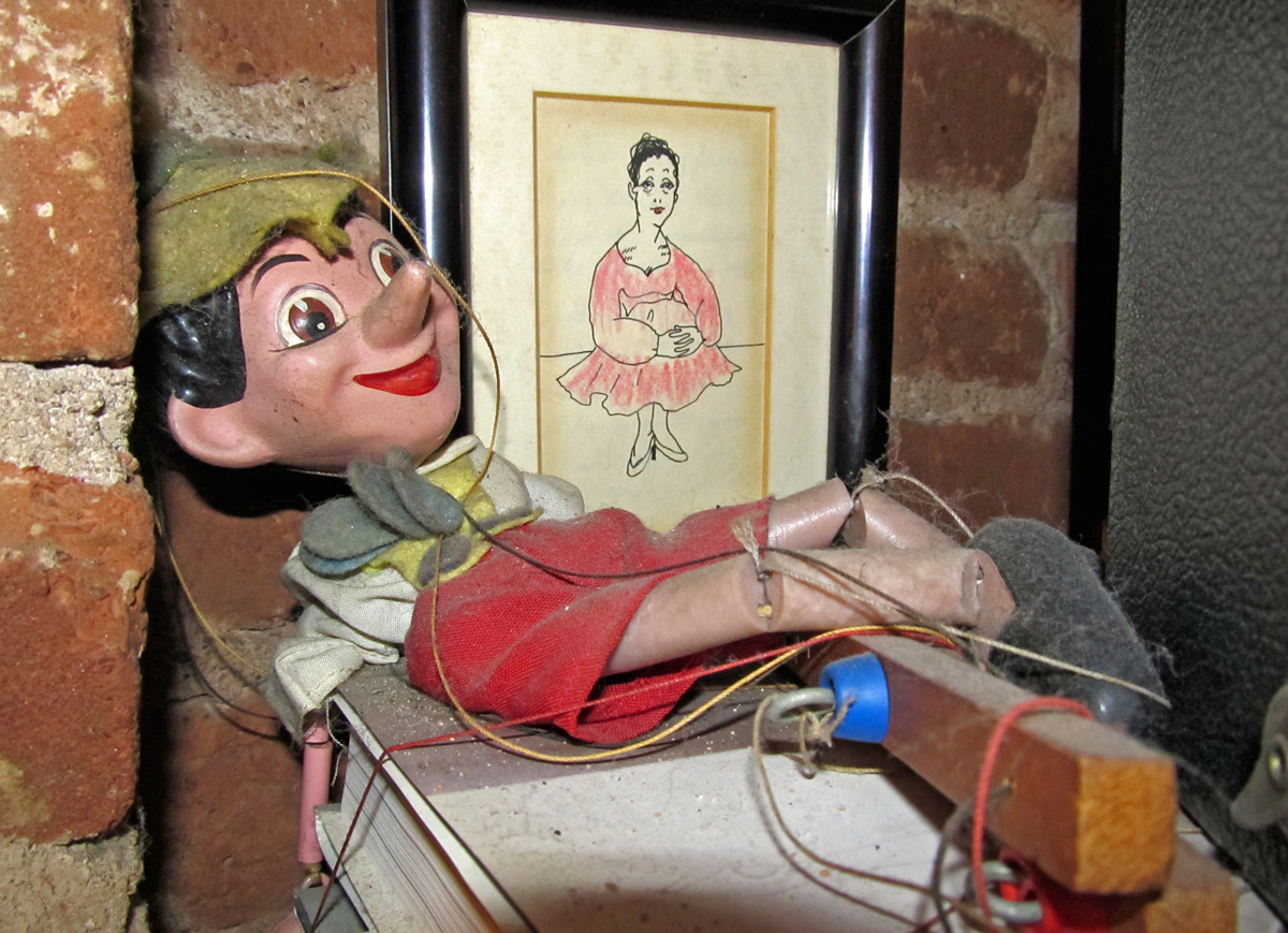
Pinocchio is something of an antique. The puppet sold in 1939
when the Disney film was released. It’s made of a wooden mulch.
Sort of a mix of sawdust combined with glue; he looks just like
the real thing. Behind Pinocchio is a picture drawn by a childhood
friend of Heidi’s.
 9
9
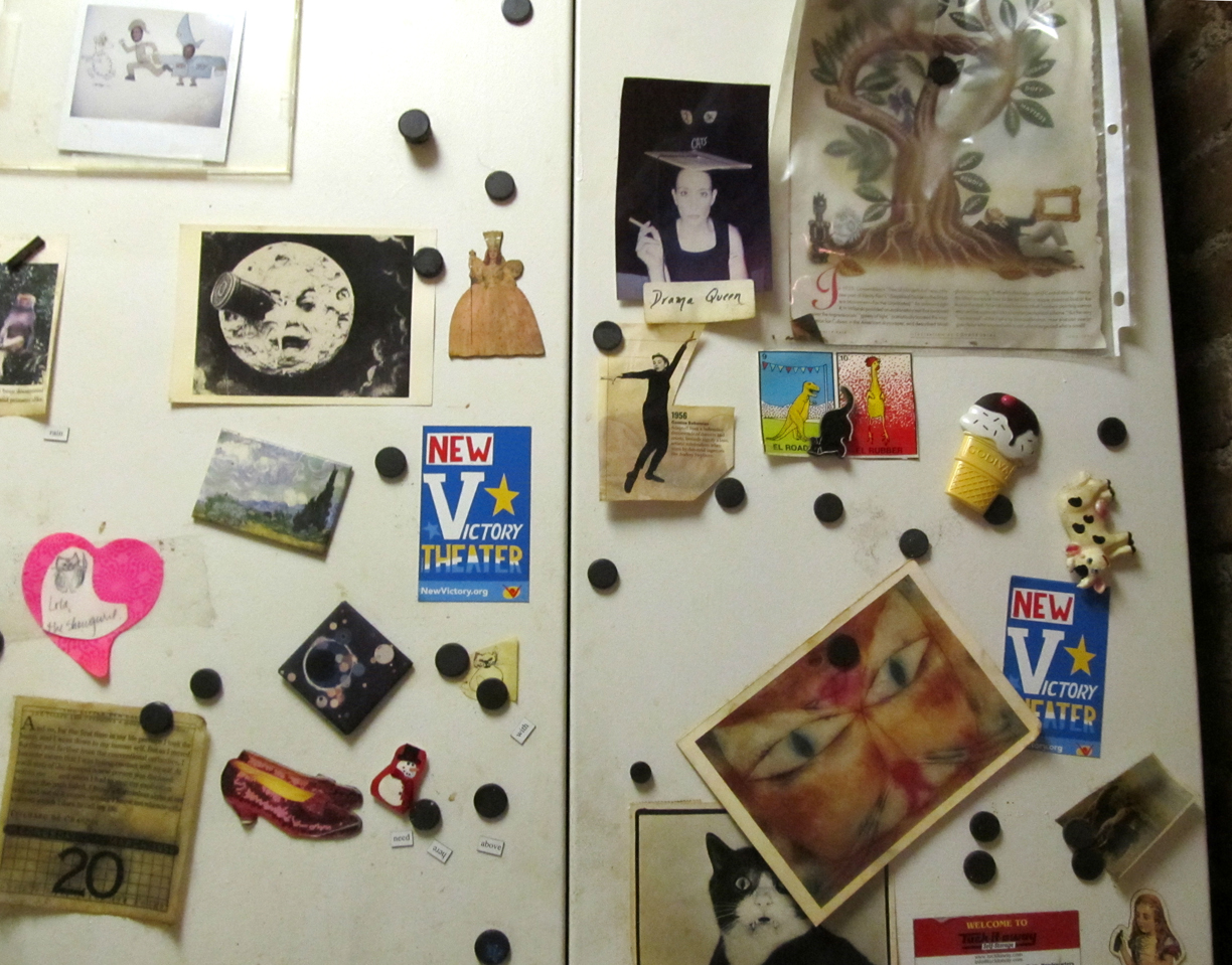
Finally there’s the metal kitchen cabinets. Magnets hold a lot of
pictures in place. God help us if there’s to be an East Coast
earthquake. Lots of magnets mixed with images would wind up
in the sink.
Commentary 15 Sep 2012 05:45 am
Commentarium
This was a really busy week as far as seeing movies went. The first three were Special Oscar preview screenings.
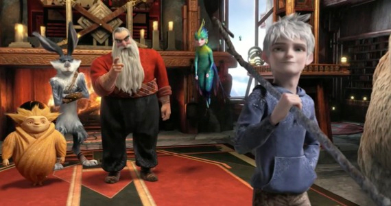 - Sunday night there was a screening of Dreamworks’ Rise of the Guardians. This was a rough cut; it had a lot of unfinished scenes. many were missisng proper lighting, the score was a temp track (a 101 strings big budget adventure-music type played LOUD and LOUTISH.) When I learned that the brilliant Alexandre Desplat was doing the music, I realized that I’d only seen 2/3 of the film. Desplat might actually be able to save this loud, annoying and tedious film. By the way, someone tell them that people don’t smile that much – visually, I mean – actually, aurally too (whenever there’s a hole in the track, they stab it with someone laughing), and females can do something other than pose cute. There isn’t one real female character in this film.
I met the director, Peter Ramsey, Jeff Katzenberg,the brilliant writer, David Lindsay-Abaire, who was wasted on this one. I met the producer, Christina Steinberg, and William Joyce, who fathered the whole thing. The film reminded me a lot of the Shrek films, stylistically, I mean. It wasn’t pretty.
Jude Law is brilliant and Alec Baldwin can do anything – including a Russian Santa Claus. Who knows maybe when they add the real and final score, when they finish coloring the scenes and when they put it all together properly it’ll be great. I seriously doubt that’ll happen, and it’ll be hard to sit through again. I do want to hear the new score, though. I like that composer and want to see how he scores this mess of a movie.
Monday night there was a screening of On the Road, the filmed version of the Jack Kerouac book. Directed by Walter Salles who did Motorcycle Diaries, this film doesn’t have the same drive as his last. The poster is a closeup of Viggo Mortenson, who in his two minutes in the film, brings it to life for a short bit. There are a lot of stars who make short appearances. I wish the lead actor had been someone with more screen presence. There weren’t too many people on the screen that you really cared about, and that certainly included Kristin Stewart who can’t act very well.
The tiny Disney theater was packed with celebrities (I sat next to Dianne Wiest) who all made it to the afterparty at Le Cirque. That was fun.
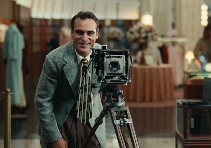 Tuesday brought The Master in 70mm to the Ziegfield Theater – one of NY’s largest and best. Lots of stars in the theater. I sat next to David Straithairn.
This was THE film of the year, so far. Joaquin Phooenix has a damn good chance of winning an Oscar. He was great. The film was eccentric and felt slow even though I never felt the need to check out my watch. Why don’t we get films like this in animation? Johnny Greenwood‘s (Radiohead) score is out of this world. The first really big film of the year. Although the film is about vague and elusive ideas, so much is left for the viewer to determine, the film has stuck in my head for the past five days replaying many of the scenes. I look forward to seeing it again at the Academy screening on Sept. 24th.
The film got an excellent review from AO Scott at the NYTimes.
Also excellent notices from the NYPost and the Daily News. But the best review I’ve read was Karina Longworth‘s review in The Village Voice. She responded to some of my thoughts on the film. An excellent piece of criticism.
Thursday I saw Arbitrage. Richard Gere, Susan Sarandon, and Tim Roth in a film about a corrupt hedge fund manager who accidentally kills his French paramour in a car crash. Can he get out of the financial predicament he’s in to save the company? Can he hide his involvement in his girlfriend’s death? A pot boiler that kept me interested, though the film is really about nothing. Richard Gere was good but no competition for Joaquin Phoenix or Phillip Seymour Hoffman in The Master.
Friday night I saw a new play that starred Jake Gyllenhaal and BrÃan F. O’Byrne. Called If There Is I Haven’t Found It Yet, (what a bad, unmemorable title) there were excellent performances from all four actors, but the play was a ghost of a show. Something about bullying an overweight high school girl in England. Mix that with something about global warming and have a set with a glass tank of water in the front of the stage. The furniture which is piled in a junk heap center stage is there for the actors to pick and choose the pieces they want to do the scenes with. Then they throw it into the tank of water at the end of the scene All scenes end with this violent action. When the girl tries to kill herself in the bathtub, water overflows leaving, on purpose, at least a couple of inches of water on the set. The actors play the last ten minutes ankle deep in water. (At one point, I actually wondered if the tank were going to overflow and water would come into the audience. I was sitting in the fifth row.) I think this is supposed to be a metaphor of some kind for the mess global warming is doing to the world which is a metaphor for the mess the world is making of families.
The play was not good. The actors were. They all play with Brit accents and all do well at it. I thought of waiting for Jake Gyllenhaal at the end of the show to say hi after Man Who Walked Between the Towers. However, there must have been a hundred people crowding the front of the theater to get a look at the star. I got outta there.
This afternoon, Saturday, I’m going to see Francine at MoMA. Melissa Leo‘s new film is being released by MoMA for the first week. The reviews haven’t been good.
- There’s a wonderful and extensive interview with Richard Williams on the blog One Huge Eye. The interview was conducted by Alex Amelines, the creÂator of oneÂhugeÂeye. He’s also the founder and direcÂtor at the LonÂdon based StuÂdio Tinto. Other interviews on the site include those with: David Sproxton, Eric Walls, Jeff Pratt and Nick Cross. (It’s obviously a Brit site.)
Inking for the Best of ‘em
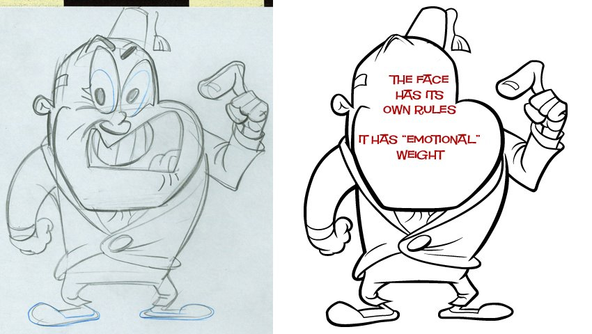
- John Kricfalusi has a tutorial, on his site, in how to properly ink his style. This, in many ways, is a lesson in how to ink (period). There are minor things that you would not do for every style — such as inking the entire externalline of the character in a heavier weight. This is purely a style preference. However, control of the thick and thin line as well as control of details is astute. Inking is such an enormous part of the animation process that it’s amazing to see how few pay proper attention to it. There have been many a film that have been badly hurt because of poor inking. I’ve seen beautiful inking on many a Peanuts special, but I’d also seen one that had a very poor, wavering inking rendering that episode almost unwatchable – for me. (The general public probably didn’t notice it.) If those lines are not right, it can damage the animation and takes the heart out of controlled assisting.
 Yet, the opposite is true as well. An exhibit at the NY Public Library at 42nd Street in 1998 was one of the best I’ve ever seen. It was a program of “Celebrity Caricature” mostly from the 20′s & 30′s. In among the magazine art was a small section on animated caricature. Drawings by Tee Hee and Joe Grant were on display with a couple of cel set-ups. The ink lines were stunning. They were drawn with delicate thick and thin lines done with crow-quill in multiple colors. Just as the models would be marked up for the different cel colors, it had markings for the ink line colors, as well. The Charlie McCarthy & W.C. Fields in the image to the right represents some of the beautiful caricatures from “Mother Goose Goes Hollywood”.
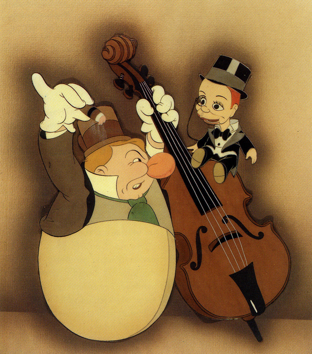
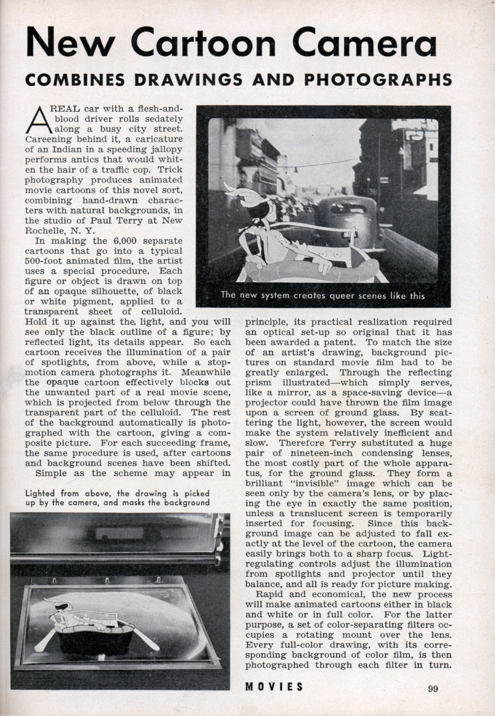
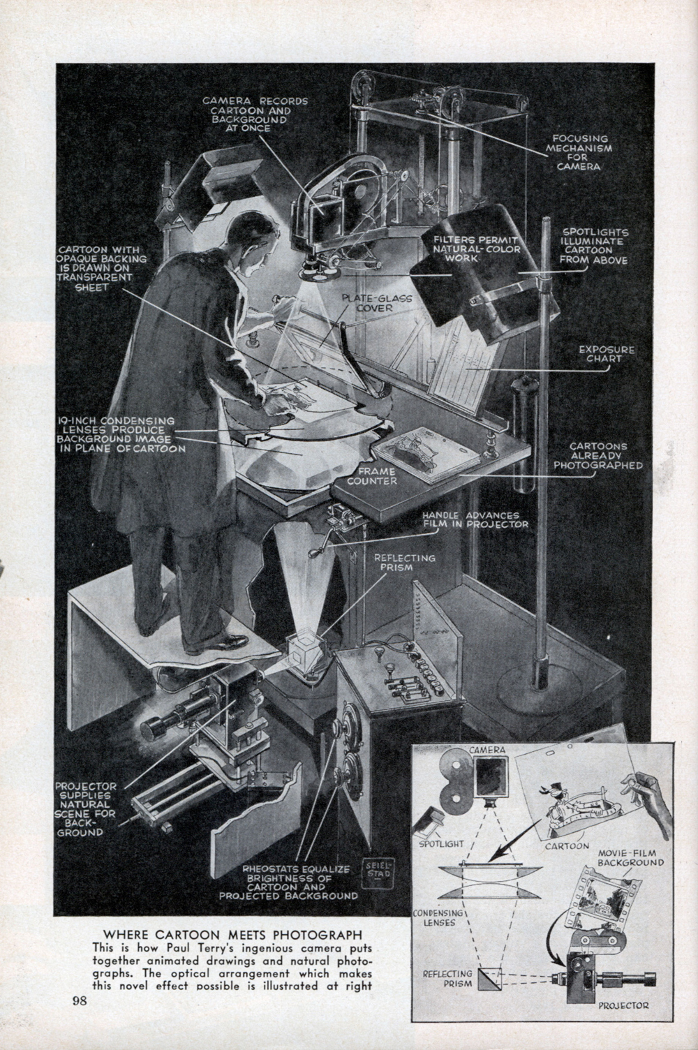
Terrytoons New Camera
After a piece about inking, how could we avoid an article about a brand new animation camera. The Terry cartoons introduced a new camera in 1939 which allowed them to film live action, projected one frame at a time, from beneath the platen. Thus you could easily combine live action and animation at the camera phase, thus avoiding any opticals.
Here’s an article from Modern Mechanix.
 1
1
 2
2
Dumbo’s Done
William Benzon has completed his lengthy article about Dumbo on his site, the New Savannah. He’s put all of these posts together into one big read. You can read it in PDF format by going here. Quite a work of scholarship by Mr.Benzon.
Books &Illustration &John Canemaker 15 May 2012 06:40 am
Les Passagers de la Grande Ourse
- Back in 2006, I posted a couple of pages of this book and, having found the film now on line, I thought it time for a new look at this Paul Grimault classic from 1942.
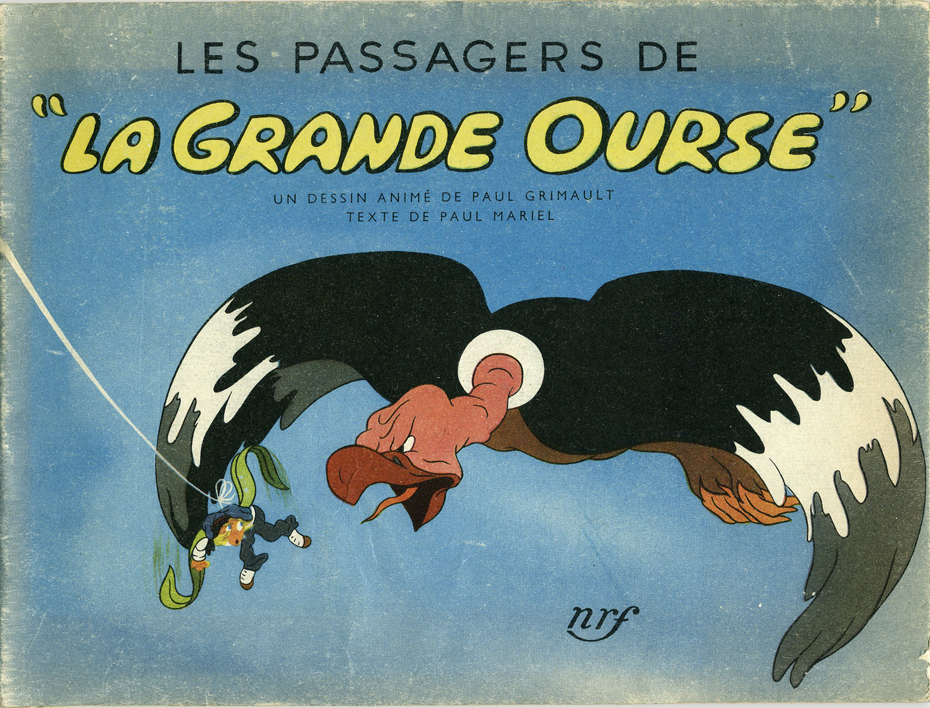 – In 1942 Paul Grimault released an animated film entitled Les Passagers De “La Grande Ourse.” The film had actually been completed in 1939 and titled The Passengers of the Great Bear, but because of the outbreak of WWII the film suffered setbacks and was released in 1942 with the new title.
Several years ago, John Canemaker gave me a gem of an attractive little book that was illustrated with images from the film. Grimault was the father of French animation, and I’d always assumed that this film was a feature. In fact, it was a nine minute short, but it was important historically because it was the first big French animated production trying to out-Disney Disney.
The story is very unlike American films. There’s a fanciful sense of imagination that is true of many French cartoons. In summation the story is:
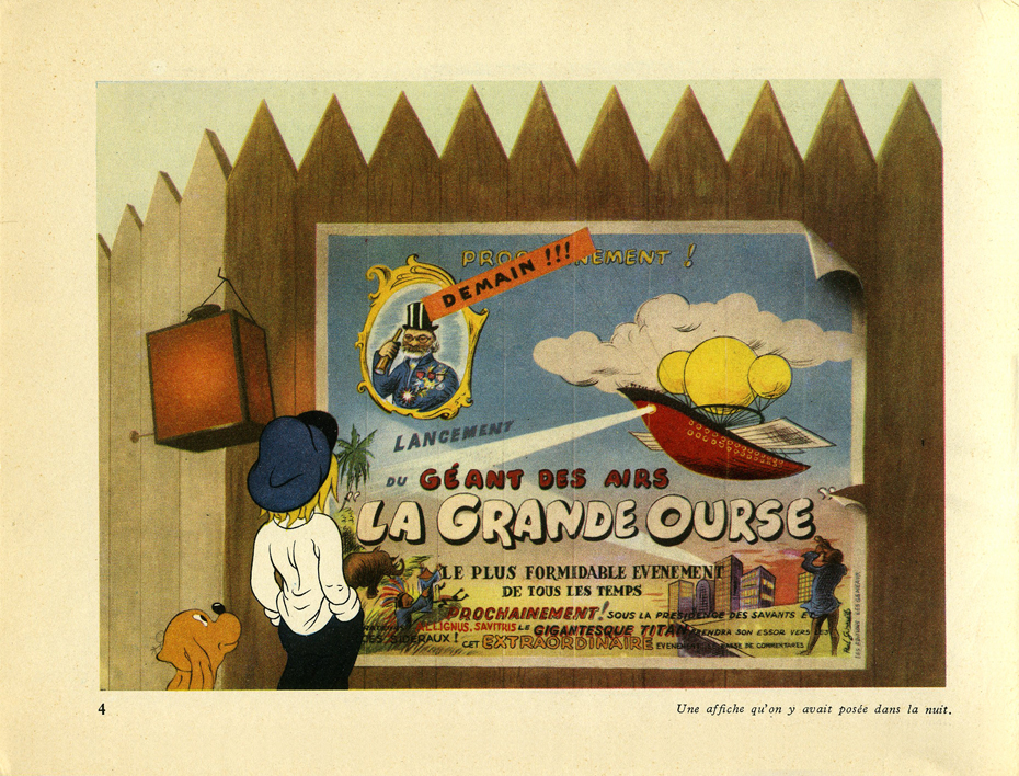
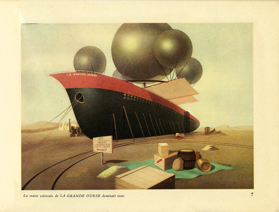
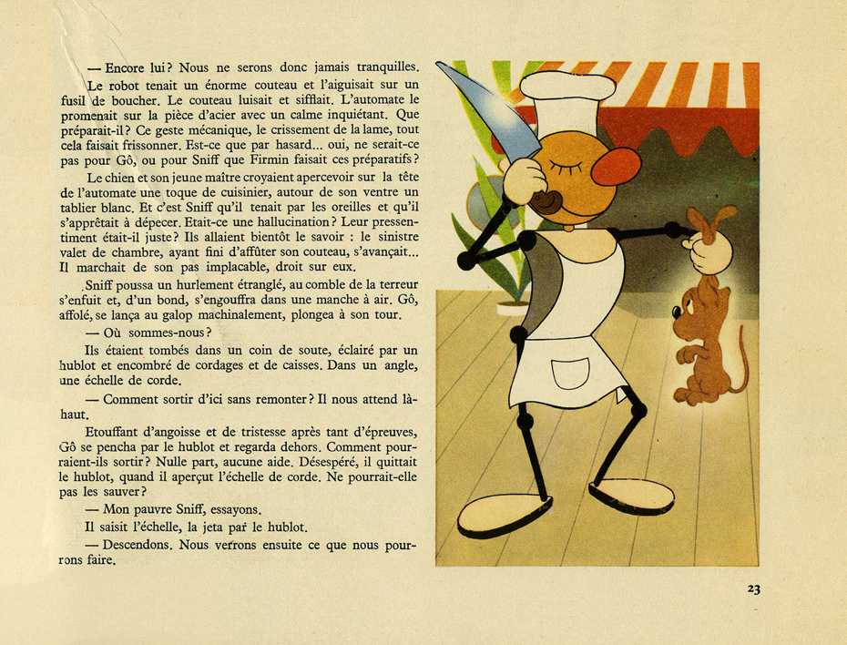
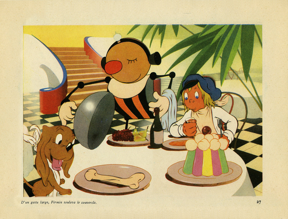
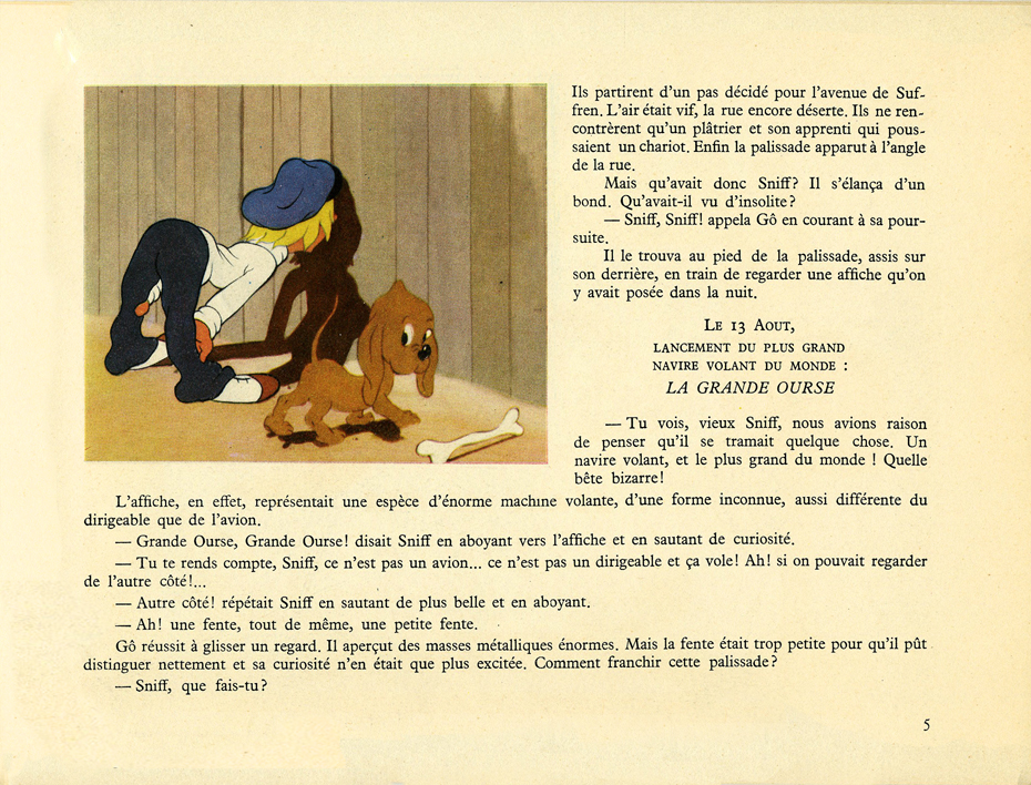 A little boy and his dog sneak into a shipyard and are grabbed by a crane which places them on a ship in dock, loading. This ship, “The Grand Ourse,†is an oddity in that it is fitted like a zeppelin with balloons to lift it into the air.
Boy and dog arrive in their compartment, accidentally, as the vessel starts to take-off into the sky. Adventures ensue with the boy and dog confronted by a restive eagle and a deaf and dumb robot
Here are some of the pages of the book:
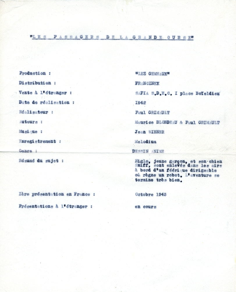
A carbon copy of the credits for the film was enclosed within the book when I received it.
It was copied onto one of those pieces of paper that could only be European, sort of a tissue that seemed delicate.
That’s attached to the left.
This past week I found a nice copy of the film posted on YouTube. You can watch it.below, and see how it compares to the published book.
Les Passagers de la Grande Ourse (Paul Grimault – 1941)
Bill Peckmann &Comic Art &Disney 30 Sep 2011 06:50 am
Jesse Marsh comic art
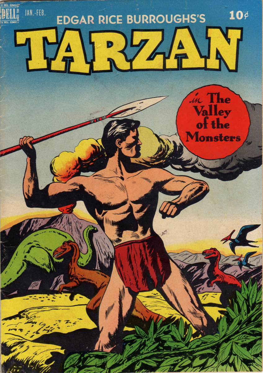
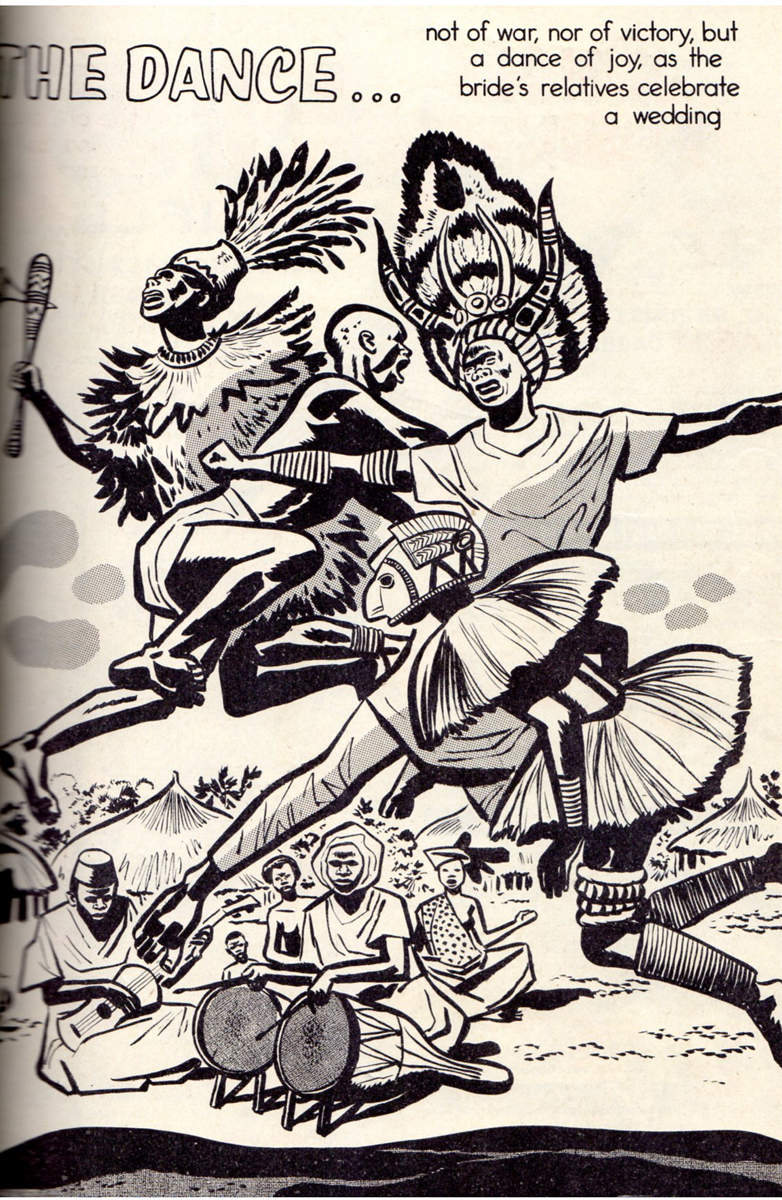
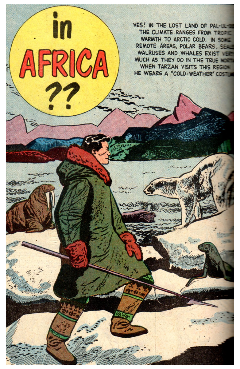
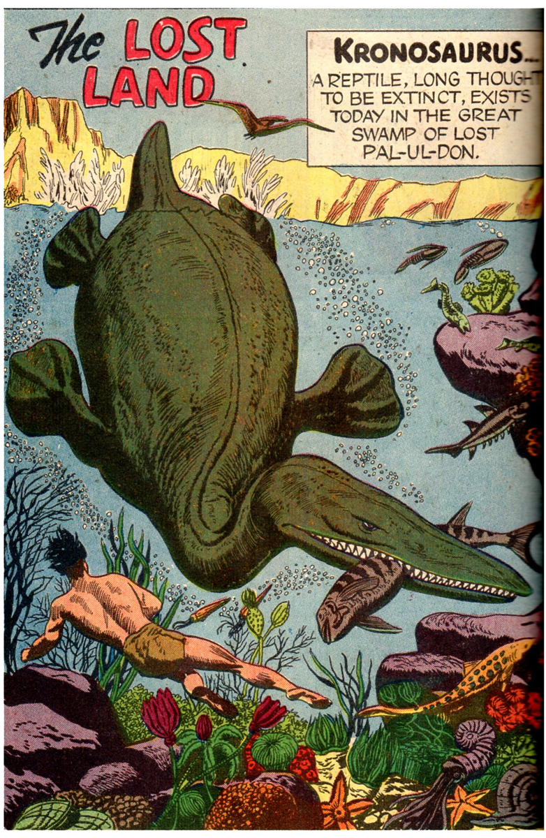
Jesse Marsh was a comic artist who, principally, is known for his work on ‘Tarzan’, the comic series published by Dell. He was a self-taught artist who started working for the Disney studio in 1939. He worked on Fantasia and Pinocchio in the story department. He served in the Army as a radar specialist and was wounded with a mortar shell. After the War and a long recuperation, he returned to Disney but also worked freelance at Western Publishing. He left Disney in 1947 to work at Western, where he took charge of the TARZAN series of comic books.
Jesse Marsh (L) and Tom Oreb (R) in the early 1940s
borrowed from Dan Nadel, posted Monday, March 29, 2010
.
Bill Peckmann sent some scans of various art by Jesse Marsh and I’m pleased to post them here. Many thanks to Bill. He writes:
-
“Before gaining success as DELL Comics’ TARZAN artist in the late 40′s and 50′s, Jesse Marsh, early in his career, worked for Disney in animation. The following material is some rarely published from that time period, They are taken from Charles Solomon’s 1995 book, The Disney That Never Was.”
The following is the accompanying article by Solomon about Marsh’s artwork:
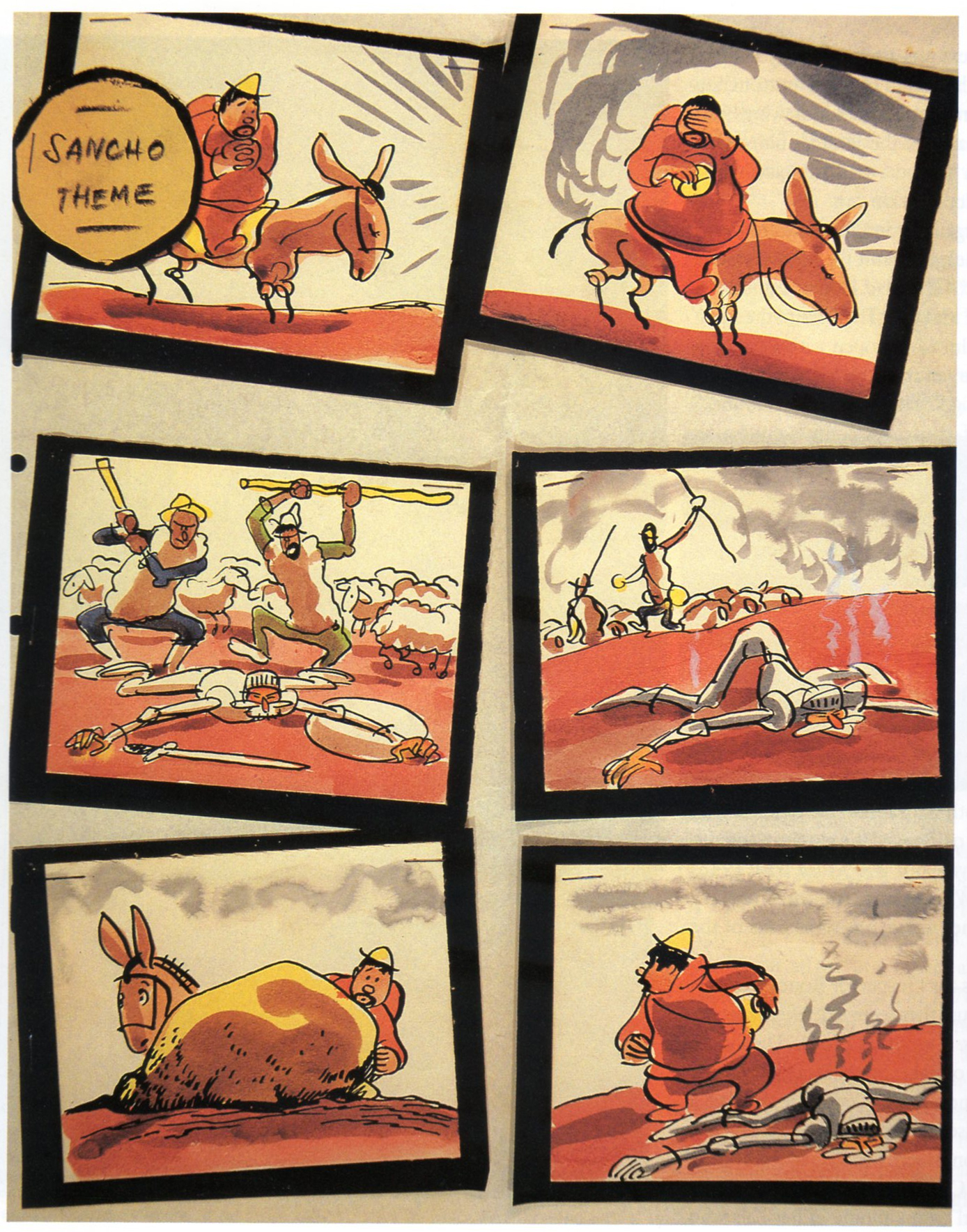
- In 1946, a second crew, under Jesse Marsh, returned to “Don Quixote.” This version would have been set to an adaptation of Richard Strauss’s tone poem Don Quixote: Fantastic Variations on a Theme of Knightly Character far Large Qrchestra, op. 35. Marsh prepared hundreds of neat pen-and-ink and watercolor cartoons, noting the musical themes that would accompany the action. He did enough rough storyboards for an entire film, beginning with a shot of the book resting on a table I flanked by suits of armor, and concluding with a sort of apotheosis: After Don Quixote’s death, he, Dulcinea, and Sancho Panza would ride through the clouds to a glittering castle beneath a rainbow. Like the earlier version, this incarnation of “Don Quixote” was apparently shelved before story meetings were held or dialogue prepared.
.
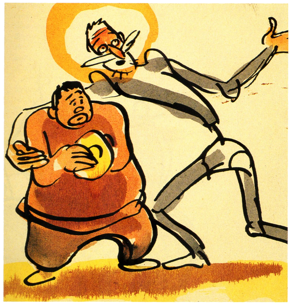
Preproduction work began for the third time in April 1951. This crew used an even simpler style that reflects the influence of such New Yorker cartoonists as Sol Steinberg and Otto Soglow; The rounded characters consist of little more than a few ink lines with monochromatic highlights in dull green or tan. Work on the film must have ended soon after it began, as only a few dozen drawings were completed.
 1
1
One of Jesse’s early Tarzan covers, 1949
 2
2
 3
3
 4
4
 5
5
The following is from the Disney True-Life Adventure comic book, 1957.
Jesse did not do the cover of this 1957 comic,
but he did do all of the 3 inside stories.
 10
10
This is the first of the three stories in this book.
 11
11
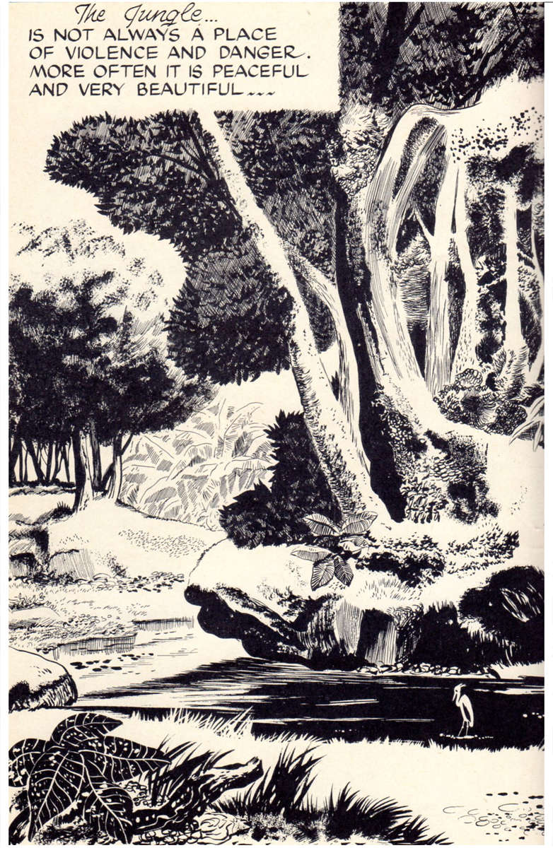
Combine Marsh’s “non slick” style with his beautiful panel and
page layout designs, and you got some impressive results.
 12
12
 13
13
 14
14
 15
15
 16
16
 17
17
 18
18
 19
19
 20
20
 21
21
A site called The Jesse Marsh Site offers the complete Dell TARZAN no. 1, from January 1948. This was actually the third TARZAN that Dell published.
Animation Artifacts &Illustration &Layout & Design 08 Jun 2011 07:35 am
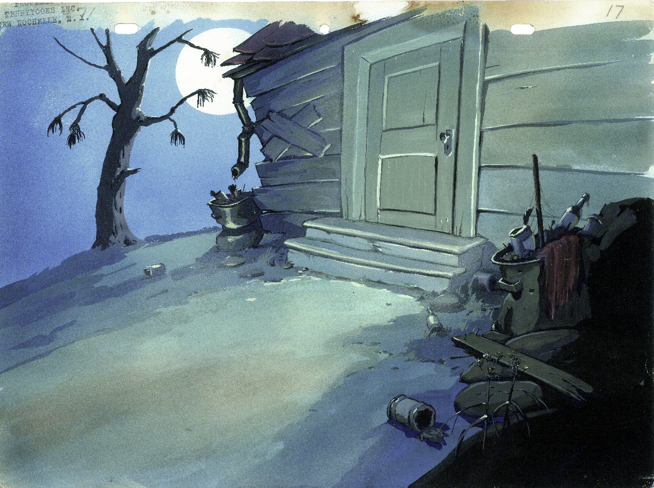
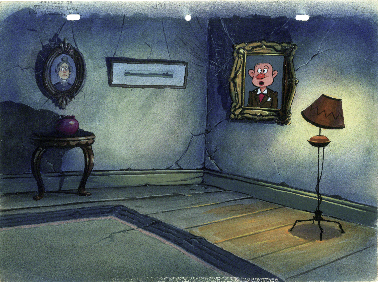
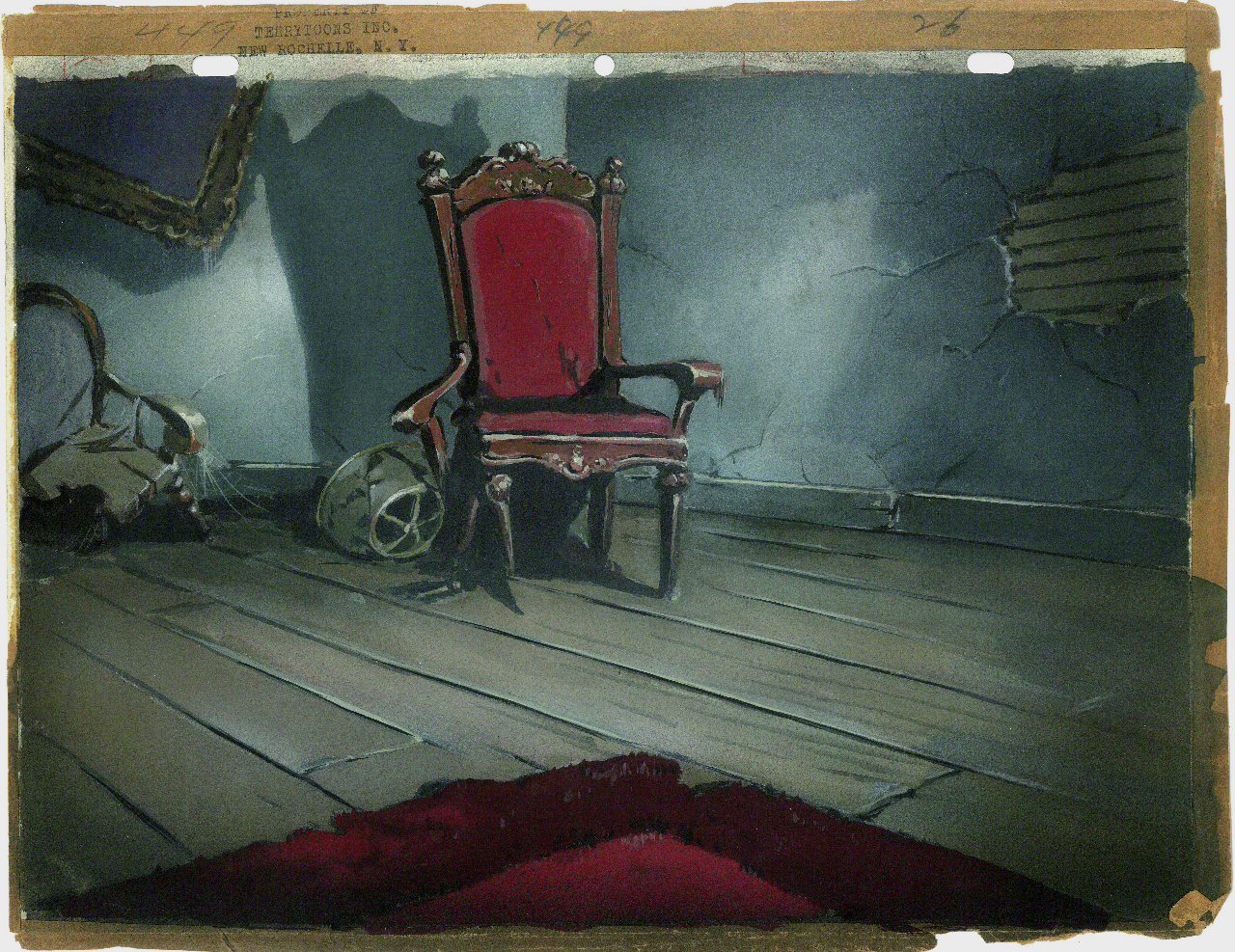
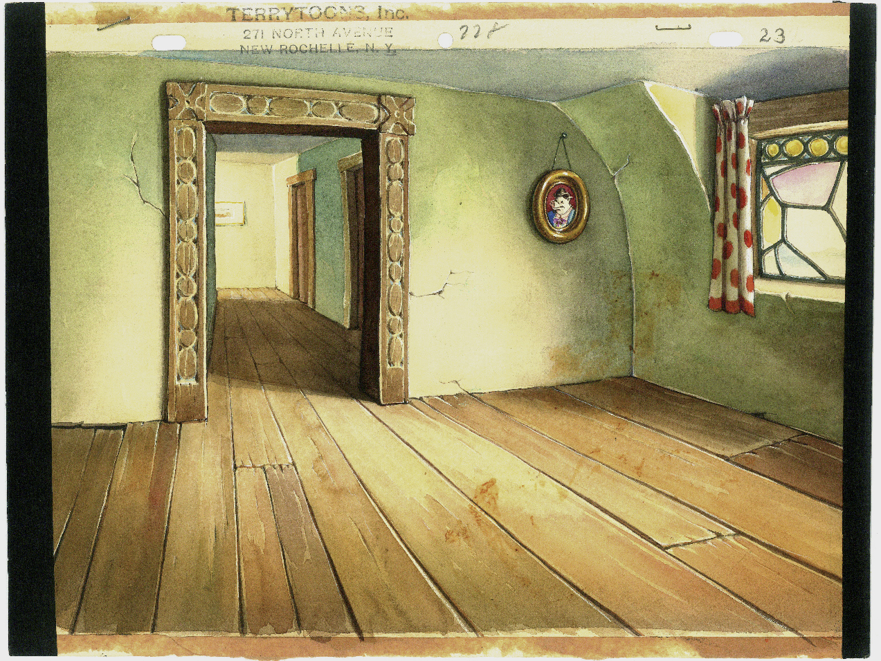
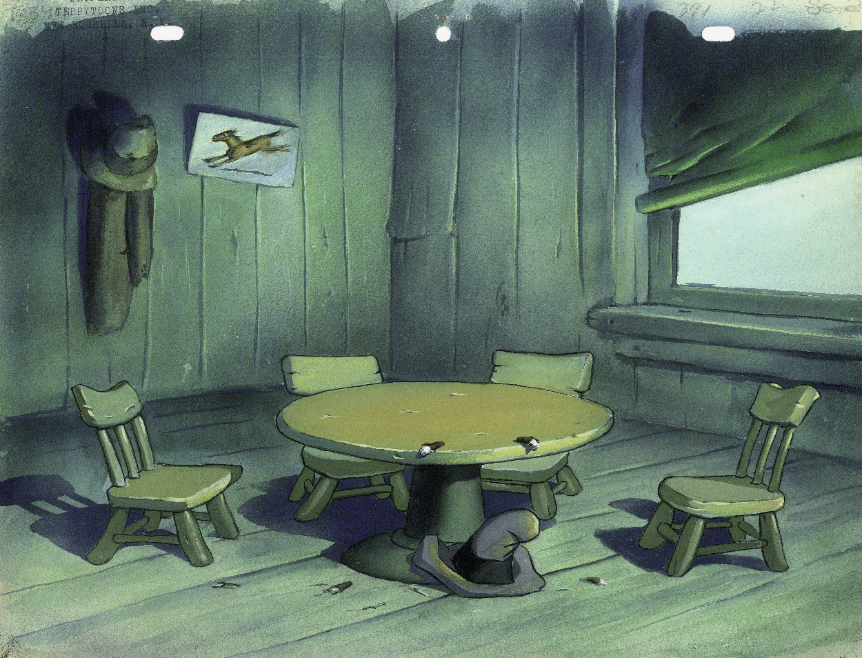
Terry Bgs
- I have a few Terrytoon Bgs and thought I’d post them today. They come from a number of different shorts from the late ’30s. If you have any idea of titles, please don’t hesitate to leave a note.
I have to say that I really am in awe of the watercolor and/or tempera painting abilities of the artists. They’re quite attractive in person. I must say that they stand up well against some of the other studio work I’ve seen. There were a couple of second rate watercolors done for some MGM Tex Avery shorts I’d seen only yesterday. I wouldn’t expect Terrytoons to be better, but they are.
Enjoy.
 1
1
 2
2
 3
3
 4
4
 5
5
 6
6
This Bg is from “The Three Bears” (1939)
 7
7
Possibly “When Knights Were Bold.”
 8
8
This is from “The Glass Slipper” Oct. 7, 1938
Art Art &Bill Peckmann 03 Apr 2011 07:39 am
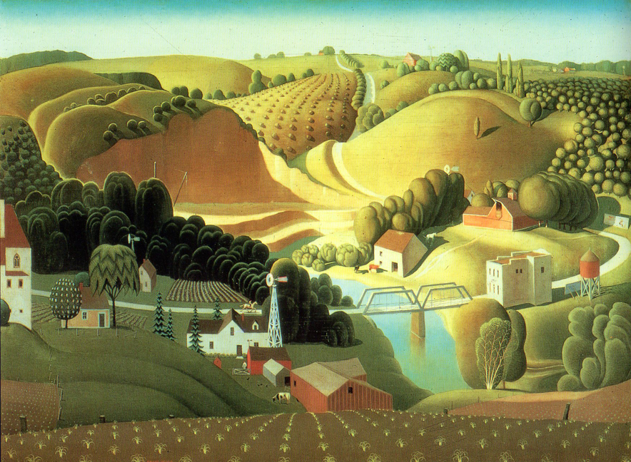
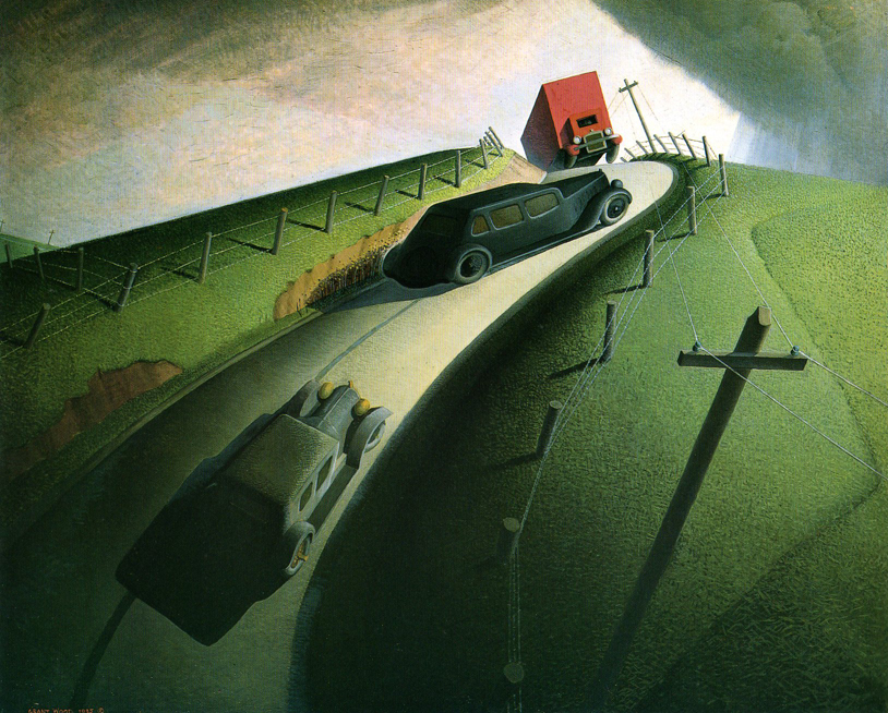
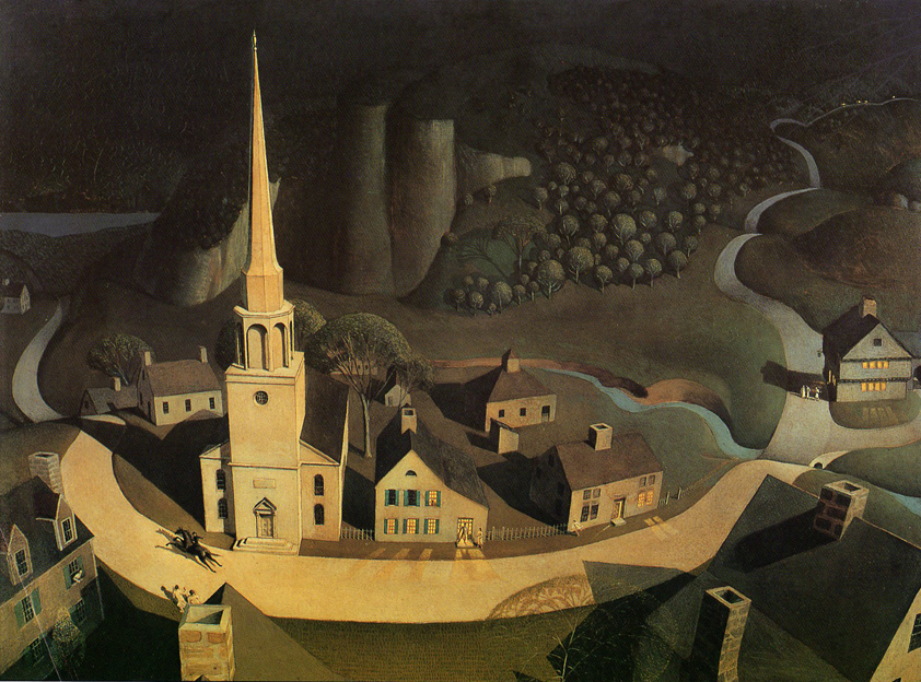
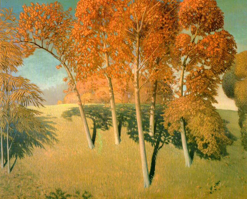
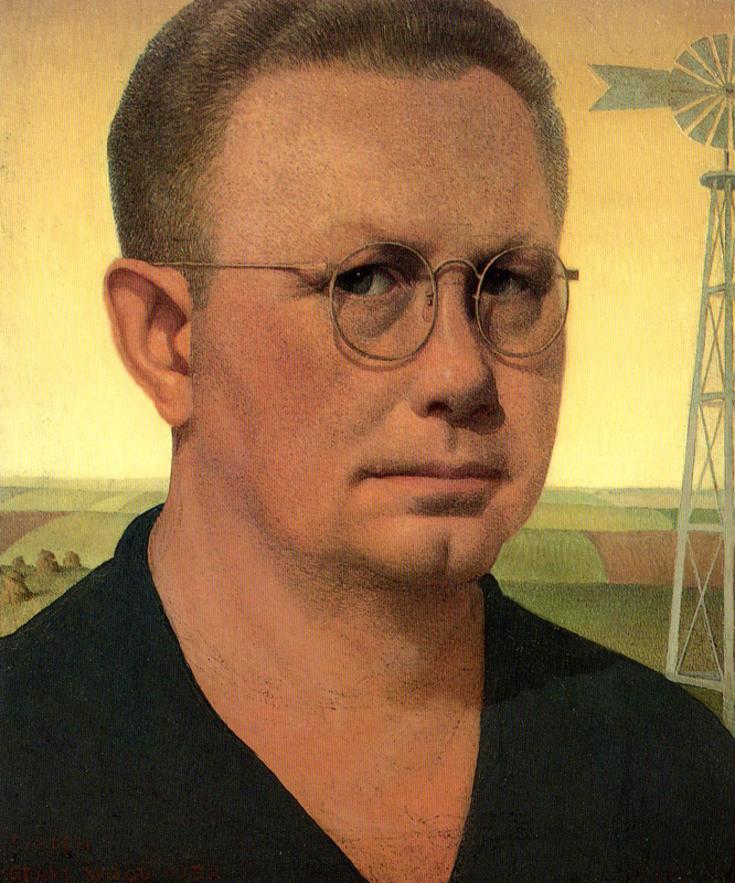
Grant Wood
- I was recently thinking about Grant Wood. This came out of my reading the biography of Maurice Noble by Robert McKinnon. And from Maurice Noble I thought about Paul Julian‘s great background work. Julian, and for that matter Noble, both look as though they were greatly influenced by Grant Wood..
So it was a surprise to receive a number of scans of work by Grant Wood from Bill Peckmann. We seem to be on the same wavelength. So I’m devoting today’s blog to this book of images from Wood. I think he influenced quite a few of the animation designers of the 40s and 50s.
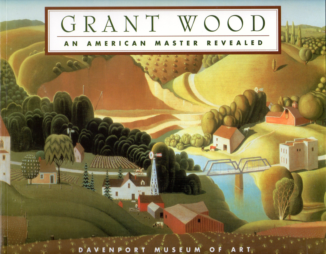
The cover of the catalogue.
 1
1
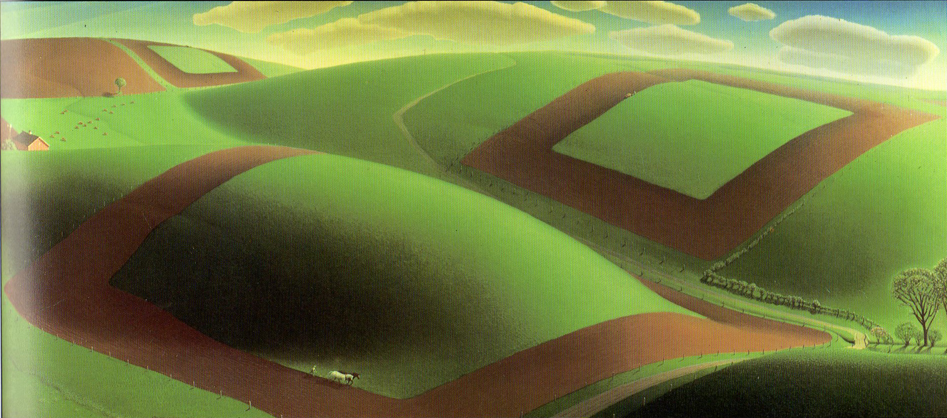
Spring Turning 1936
 2
2
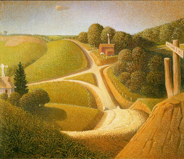
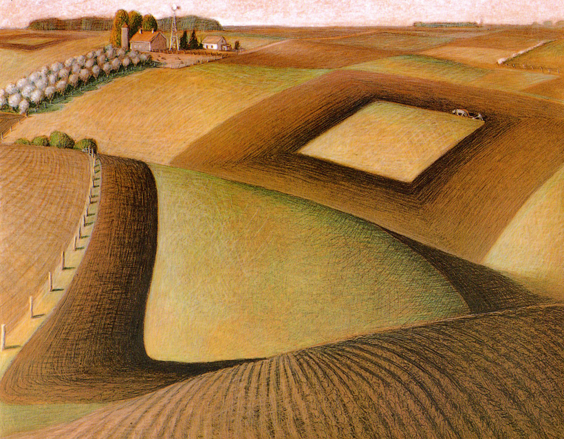
New Road 1939
 3
3
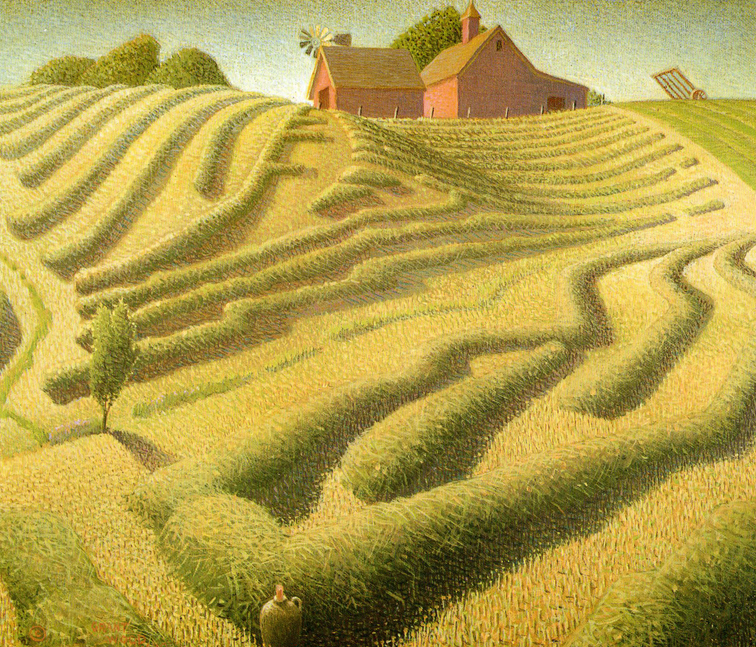
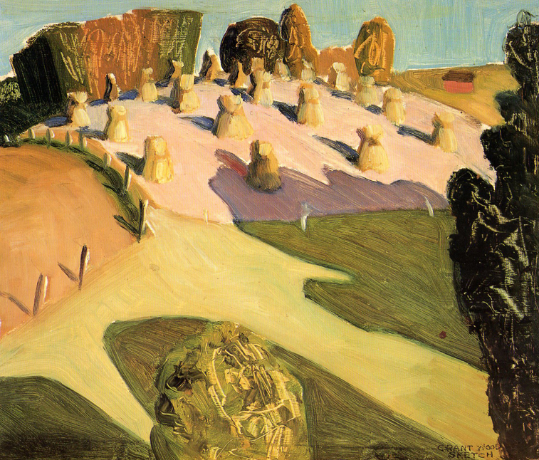
Haying 1939
 4
4
Stone City, Iowa 1930
 5
5
Death on the Ridge Road 1935
 6
6
Midnight Ride of Paul Revere 1931
 7
7
Fall Plowing 1931
 8
8
Autumn Oaks 1932
 9
9
The birthplace of Herbert Hoover 1931
 10
10
Iowa Landscape 1941
 11
11
Plowing 1936
 12
12
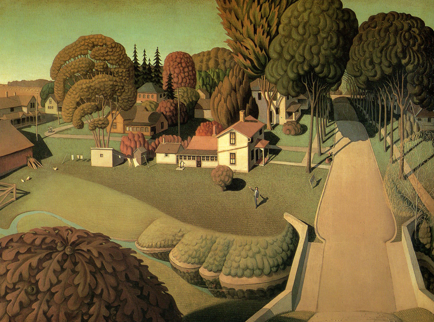
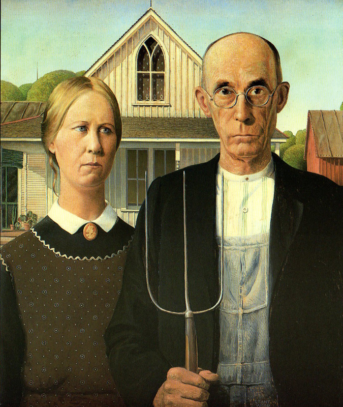
American Gothic 1936
 13
13
Self Portrait 1932
Many thanks to Bill Peckmann for sharing these works with us.
Articles on Animation &Illustration 05 Jan 2011 08:30 am
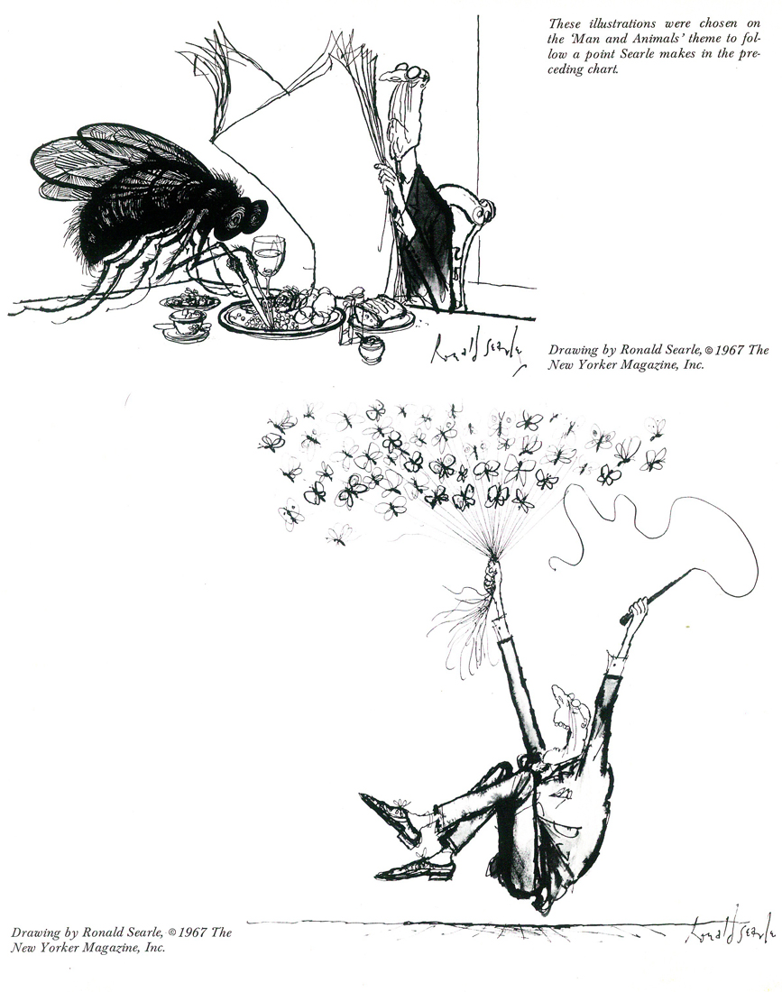
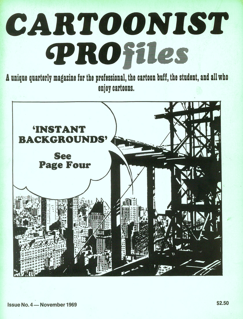
Ronald Searle in Cartoonist Profiles
- Here is an article about Ronald Searle pulled from a copy of Cartoonist Profiles issue #4. It dates back to November 1969.
Writes from
FRANCE
The following article, and the accompanying ‘ideas chart’, were written for CARTOONIST PROfiles by RONALD SEARLE, the noted European cartoonist who makes his headquarters in Paris. He created St. Trin-ian’s, which has become a part of English folklore, has illustrated more than 40 books in the past 23 years, has designed sets and costumes for films, made his own cartoon film John Gilpin’, and constantly does work for American, French and German magazines. One of his publishers describes him as Europe’s most accomplished cartoonist — a macabre black humourist, a lynx-eyed reporter, a gagman of genius, a draughtsman of the stammering line and the delirious arabesque that inimitably characterises his world.
My childhood was unremarkable apart from the fact that I was born and brought up in one of the most beautiful and ancient university towns in England. I drew before I could write legibly (I am left-handed), and I swapped comics in the school yard; no doubt gathering supplementary festering sores in the process. The dog-eared sheets which passed from filthy hand to filthy hand, were hardly recognizable as copies of “Comic Cuts”, “Film Fun” and “Chips ” — the most desirable titles at that time. The more pictures there were to a page and the less text, the happier I was, like all lazy-minded kids. My imagination was almost entirely visual and only faintly literary. However, my great love was books. I devoured everything in our town library, beginning with the infant shelves and graduating at the age of twelve to the adult library. My thirst was insatiable. I frequently took out five books in a day; making my way through A-B: “British Butterflies in Colour”(c. 1894)to Y-Z: “Zjululand, The journal of my encounters in” (c. 1901, I guess). By the time I was 13 I wanted my own library and I began to haunt the secondhand bookstalls and barrows in Cambridge. I earned, begged, and scraped together every penny I could and within five years I had accumulated some 500 volumes for a few pennies apiece. At the outset of my buying, one Saturday, I tumbled onto two or three volumes about caricature, at 6d. each. One of these volumes was Spielmann’s “History of Punch”. I had already decided I would be either an artist or an archeologist and with juvenile confidence I now added the intention of being a “Punch “cartoonist.
That Autumn I enrolled for evening classes in the Cambridge Art School. This had caused some argument between my mother and father for the fee was 7s.6d. a term (about $1.50 then), and we could not afford it. But the money was scraped together somehow. I can guess now that my mother probably put a thicker piece of cardboard in her shoe.
I was obsessed with drawing, and scratched away incessantly. I scrambled through the day at school and my homework afterwards and then rushed off at six in the evening, for three hours of art. By the time I was fourteen I had graduated from the plaster Discobolos into the life class, and painfully shaded my way through several years of floppy-breasted nudes with blue toes and purple legs. It was difficult to keep the fen winds, which blew across the North Sea from Siberia, out of our life-room. Side by side with my art-school work I scribbled comic drawings. The next year, when I was 15, the cartoonist of the local paper left for London and higher things. I stuck a cartoon through the letterbox of the “Cambridge Daily News”, utterly confident that the editor would take it, and that this would solve an important economic problem for me. He did take the cartoon and asked me for more at 10s.6d. a week (about $2.00 then). This represented all the drawing materials I needed, a bit for the family and something over for me.
I continued with those weekly cartoons from 1935 until the war, almost without a break. They were dreadful, but they taught me how to draw for reproduction.
By 1938 the local council had awarded me a full-time art scholarship, and I sweated away for over a year, as a “real, full-time artist”. Lautrec was more precocious, but he was never as happy as I was then. By the time I went into the army, at the outbreak of war in 1939, I had completely saturated myself in anatomy, perspective, history of costume, architecture, life drawing, and all subjects required for passing the Min. of Ed. Drawing Diploma. I missed failure by 2%, but achieved the solid Bolshi-Academic grounding characteristic of Cambridge in the ’30′s.
Also in 1939, I found on a secondhand bookstall, a small monograph by Marcel Ray on the work of George Grosz. It cost me 2s. and changed my artistic direction. I had already established a pedestal for Picasso as the foremost of my living heroes, and I was still grinding my teeth at being unable to raise the $35.00 he was asking then for a pen drawing at a local gallery. Forain I marvelled over, despite his loaded anti-semi-tism, and he had joined the line with Gillray, Rowlandson and Cruikshank, as my self-appointed guardian angels. Daumier’s work was difficult to find, and I had not been able to form an opinion of him then. Goya, however, was one of my gods, and I still day-dream that one day the Prado will drop me a note during a period of stocktaking, to say that they wonder whether I might be interested in accepting a couple of drawings of which they have duplicates.
If anyone influenced me in my work it was on the basis of draughtsmanship, rather than painting. I saw in line then, as I still mainly do now. Above all I admired “Roly’ Rowlandson, with his wit, genius, ability to handle line, ability to range from the broadest and most clownish grotesque to a cunning subversive charm. I cannot say that I have ever consciously had the desire to copy anybody. But if I have been influenced, it is by Rowlandson. And Grosz. Although I had known little about Grosz until I got the Marcel Ray book. I had seen the occasional Munchen album from the ’20′s, and had heard of his flight to America. From time to time I had come across a drawing of his in “Esquire”. But now he fitted into place for me. Grosz exposed the rotting military mind; the filth of war and the stench that lingered after it — and, how he could draw! With this book of his I headed off for my seven years as a soldier.
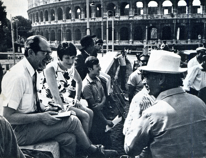
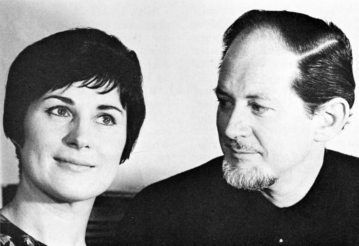
Searle and Monica on location in Rome last year, during the
filming of Paramount’s “Those Daring Young Men in their Jaunty Jalopies”,
for which he designed the animated credits sequence. Searle had previously
designed a similar sequence for the 20th Century Fox film “Those
Magnificent Men in Their Flying Machines”. Working with Searle was
the lively young English group “Trick-film”, who made the very successful
“Yellow Submarine”, and with whom Searle is now associated in the
formation of an animation workshop in London.
During those seven years I never stopped drawing. I was a conventional art-student when I went into the army. Before 1939 I had rarely left the town in which I was born. When I came out of a Japanese prison in 1945, after four rough years, I had enough experience of humanity and inhumanity to provide me with a measuring-stick for a considerable part of my life. I also had the facility of seven years of practical application with my drawing. I had documented almost every move I had made, from my first miserable night in the army to the other side of the world and back.
I had been isolated from the world for almost four years; but had also developed in that isolation.
It was then that I was faced with earning my living. I had nothing but fantasies in my head, and a small army pension between me and the post-war wolves at the door while I was getting rehabilitated and thinking about long-term plans for the future. It seemed to me that the only fast and easy way of keeping myself fed was to sell cartoons. So I sold cartoons. This I rapidly discovered needed no particular ability apart from being able to communicate a personal way of looking at things; and apart from having enough nose to smell out the flavour of what was going on and putting it to use. Coming as I did from an atmosphere of stinking cells, wasted bodies and grim humour, my humour was ‘Black’. But so was the post-war climate of rationed England, and my work found a ready market there. I cannot say that I ever thought of cartooning as an ultimate career. All I knew was that I wanted to eat and that I wanted to draw, and this was one way of being able to get some of the disgust I felt for human behavior into print (comically wrapped-up for public consumption). At that point I became a part-time cartoonist. I still am.
Drawing for me has never been a case of therapy because I was shy, or not outstanding in physical activities, or anything else. It was a compulsion. I carried a sketchbook day and night, because I could not stop drawing. To sell a sketch was a pleasure, because it meant a little less economic worry and more freedom to explore. But if I had not sold, I still would not have stopped.
To me line is something which one can explore endlessly, and which keeps me in a constant feeling of excitement and adventure. I know I shall never live long enough to say and do all I want in line. I can only hope to get up each day, bursting to push the exploration a little further. But line is useless if one has nothing to say with it. The artist must be driven with the desire to express something, and use any device to achieve it. He must be perverse. Everybody will want to mould him to their pattern. But in the end he has to satisfy himself — or spend his life trying to please other people.
If satisfaction with one’s work creeps in, the time has come to give up and take to prostitution. A sure sign that there is still hope is when one is miserable at not having met one’s own demands.
The hand is feeble and the artist has still to express with exactitude what his brain conjures up.
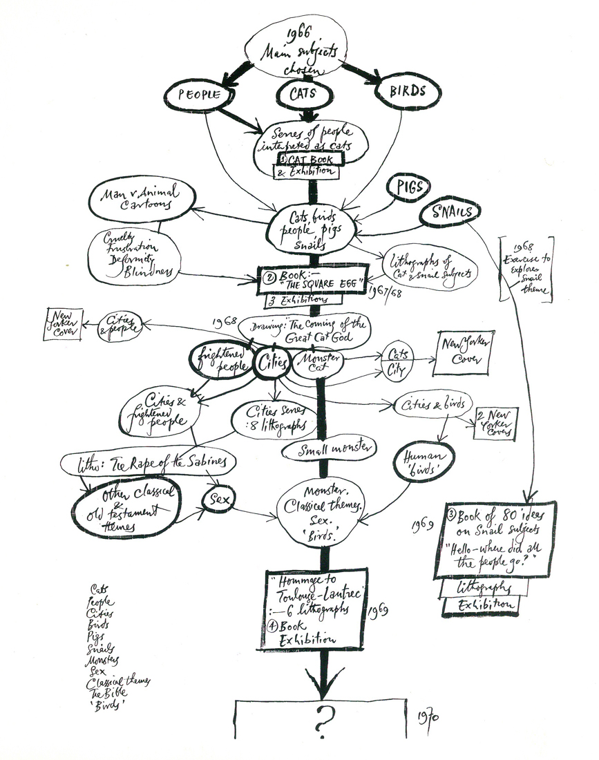
Some day it may be possible
The apple tree on the opposite page was compiled out of curiosity in an attempt to answer the editor’s question: “What routine do you go through to dredge up ideas?”.
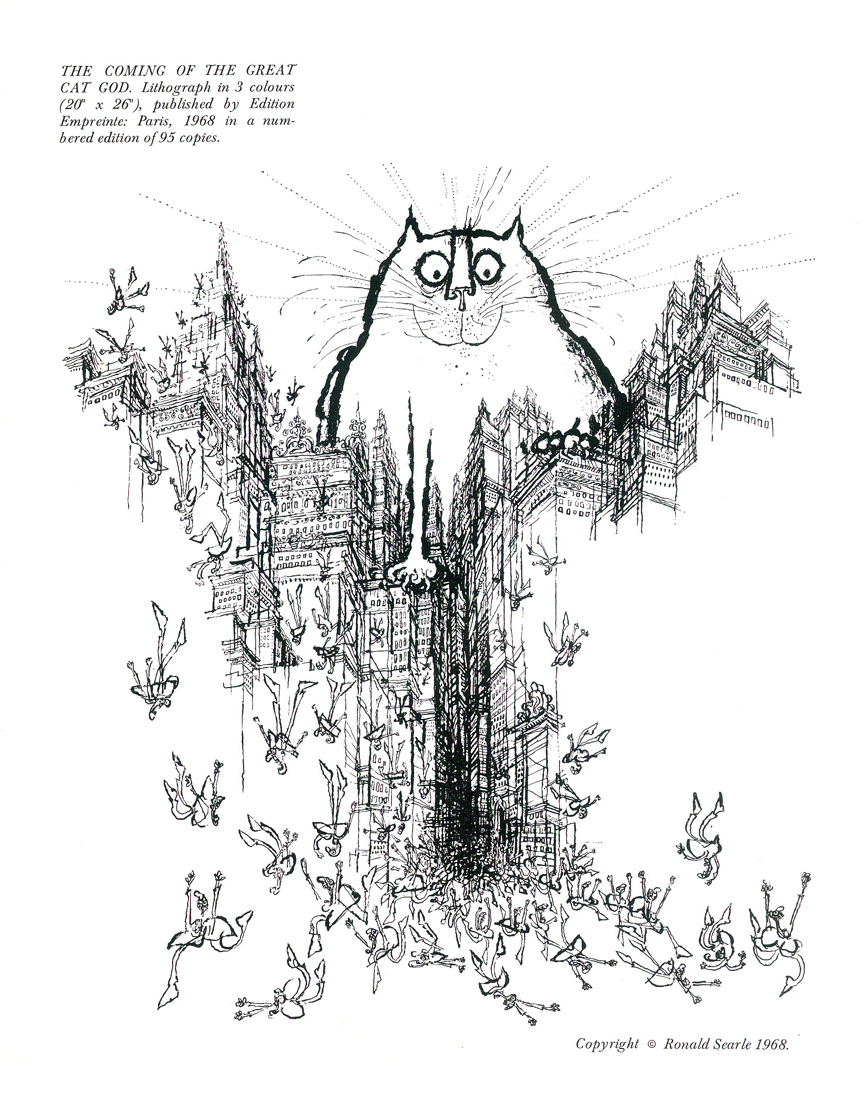
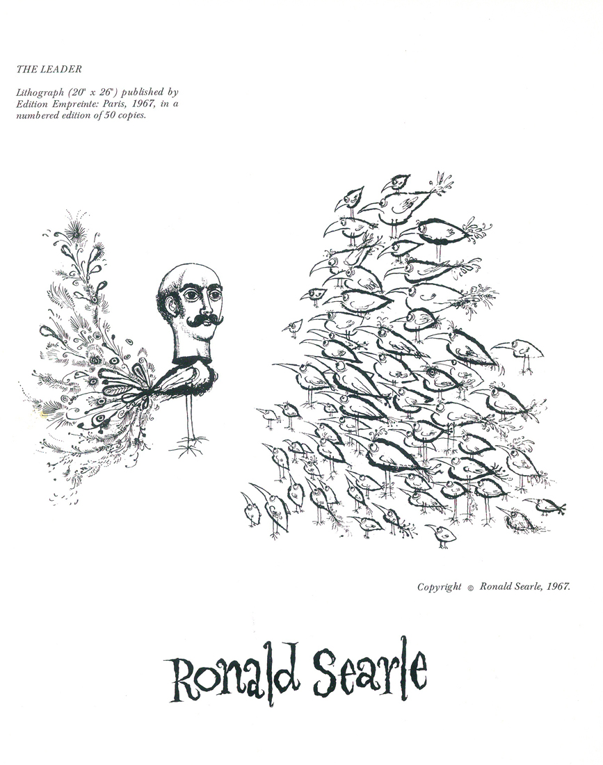
It covers the period 1966-1969, and covers the area of ideas only, as opposed to other work made alongside: Book illustration, cinema animation and so on. In 1966, I set out with three main themes as subjects: Cats, Birds, and People. Subsidiary themes, such as Pigs, and Snails crept in soon after. The first four subjects led me to three books, and the Snails led me to a fourth. Lithographs, New Yorker covers and cartoons, and a series of exhibitions developed alongside. As is apparent from the confusion above, I do not attempt to force ideas, but rather to let them drift inconsequentially — and frequently into a dead end. In this case I started out with Cats in 1966, and arrived at Toulouse-Lautrec in 1969. Some drift! I work with no fixed market in mind. Some ideas may best be expressed in lithography, others as large water-colours, others in pen. When they have been sufficiently developed I start worrying about placing them. The outcome of the three years in question was: some 30 large lithographs; 12 New Yorker cartoons and four covers; four books: “Searle’s Cats” (1966/67), “The Square Egg” (1967/68), “Hello – where did all the people go?” (1968/69), and “Hommage to Toulouse-Lautrec” (1969). In addition, 19 exhibitions in galleries in France, Germany, Austria, Sweden, Switzerland and England were arranged for 1966-1970. Here, either the originals or series of lithographs are for sale. Exhibitions are aided by the fact that, to publish books of this sort at an economic price, they need to be captionless and published in simultaneous co-production in England, France, Germany and America. Most of the material in these books has not been previously published — apart from the occasional sale of serial rights. As a working method it is not particularly scientific, or organized. The only factor I watch is: that whatever I do is thought of as an international idea — that it will have equal appeal in any of half-a-dozen countries. Or be equally rejected.
 1
1
 2
2
 3
3
 4
4
 5
5
the cover of the issue
